6 minute read
FOLLOW THE YELLOW


IT Follow the yellow: il rebranding di Movimënt è pura energia. Nuovo logo e nuovo sito: è con un look più giovane, fresco e ricco di carattere che i parchi in Alta Badia rilanciano la propria immagine in vista di una nuova stagione di neve e divertimento. Il logo richiama le montagne simbolo dell’altopiano, mentre il sito web si adatta perfettamente al profilo di ogni visitatore, offrendo un servizio personalizzato.
L’immagine rinnovata di Movimënt comprende, ovviamente, anche il sito, canale di ingresso privilegiato per entrare nel mondo Movimënt. Alcune domande poste ai visitatori permettono di creare una home page su misura: che siano soli o in compagnia, in coppia o con i bambini, amanti della natura, desiderosi di relax oppure alla ricerca di sport e adrenalina, potranno interagire con un sito calibrato sulle loro necessità.
Siamo in una delle località più divertenti delle Dolomiti, la neve è alle porte: è il momento perfetto per innovare la propria immagine e riallinearla al carattere che contraddistingue Movimënt: giovane, dotato di personalità. Un’operazione realizzata con l’agenzia di comunicazione Interagendo, che si è occupata del logo e del sito e con l’agenzia TinBob, a cui è stata affidata la fase di pre-lancio con le clip di presentazione. DE Follow the yellow: Das Rebranding von Movimënt besteht aus reiner Energie. Neues Logo und neue Webseite: Mit einem jugendlichen, frischen und charaktervollen Look beleben die Parks in Alta Badia ihr Image angesichts einer neuen Saison voller Schnee und Spaß. Das Logo erinnert an die Berge, die das Plateau symbolisieren, während sich die Webseite perfekt an das Profil jedes Besuchers anpasst und einen maßgeschneiderten Service anzubieten.
Das erneuerte Image von Movimënt umfasst natürlich auch die Webseite, den bevorzugten Einstiegskanal in die Welt von Movimënt. Einige den Besuchern gestellten Fragen ermöglichen die Gestaltung einer maßgeschneiderten Homepage: ob sie alleine oder in Gesellschaft, zu zweit oder mit Kindern, Naturliebhaber, sich entspannen möchten oder auf der Suche nach Sport und Adrenalin sind, können sie mit der Seite interagieren, die auf ihre Anforderungen abgestimmt ist.
Wir befinden uns an einem der schönsten Orte der Dolomiten und bald kommt der Schnee: Es ist somit der perfekte Zeitpunkt für eine Erneuerung des Images und einer Neuausrichtung des Charakters, die Movimënt auszeichnen. Denn die Marke ist jung und hat Persönlichkeit. Ein Projekt, das mit der Kommunikationsagentur Interagendo, die sich um das Logo und die Webseite kümmerte, und der Agentur TinBob, der die Phase vor der Lancierung mit den Präsentationsclips anvertraut wird, umgesetzt wird. EN Follow the yellow: Movimënt's rebranding is pure energy.
New logo and new site: with a younger, fresh look that is full of character, the parks in Alta Badia relaunch their image ahead of a new snow and fun season. The logo recalls the mountains symbol of the plateau, while the website adapts perfectly to the profile of each visitor, offering a personalised service.
The renewed image of Movimënt also includes - of course - the site, a privileged access channel to enter Movimënt's world . Visitors can create a customised home page by answering a few questions: whether they are travelling alone or in company, with their partner or with children, whether they are nature lovers, wishing to relax, or looking for sport and adrenaline, they can interact with a site tailored to their specific needs.
We stand in one of the most enjoyable places of the Dolomites, the snow is around the corner: it is the perfect time to recreate one's image and realign it with the character that distinguishes Movimënt: young, with personality. This project was carried out with the communication agency Interagendo, which dealt with the logo and site and with the TinBob agency, which was entrusted with the presentation clips for the pre-launch phase.
THE YELLOW
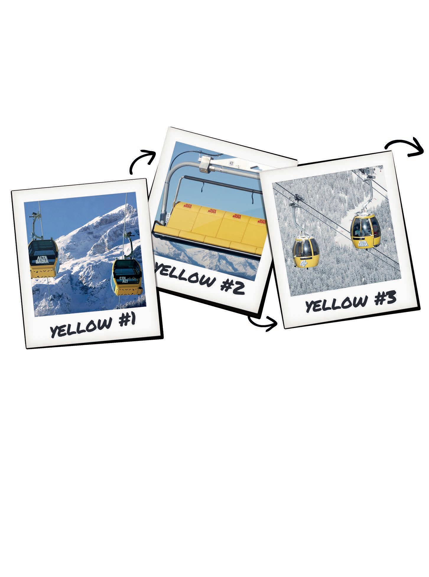
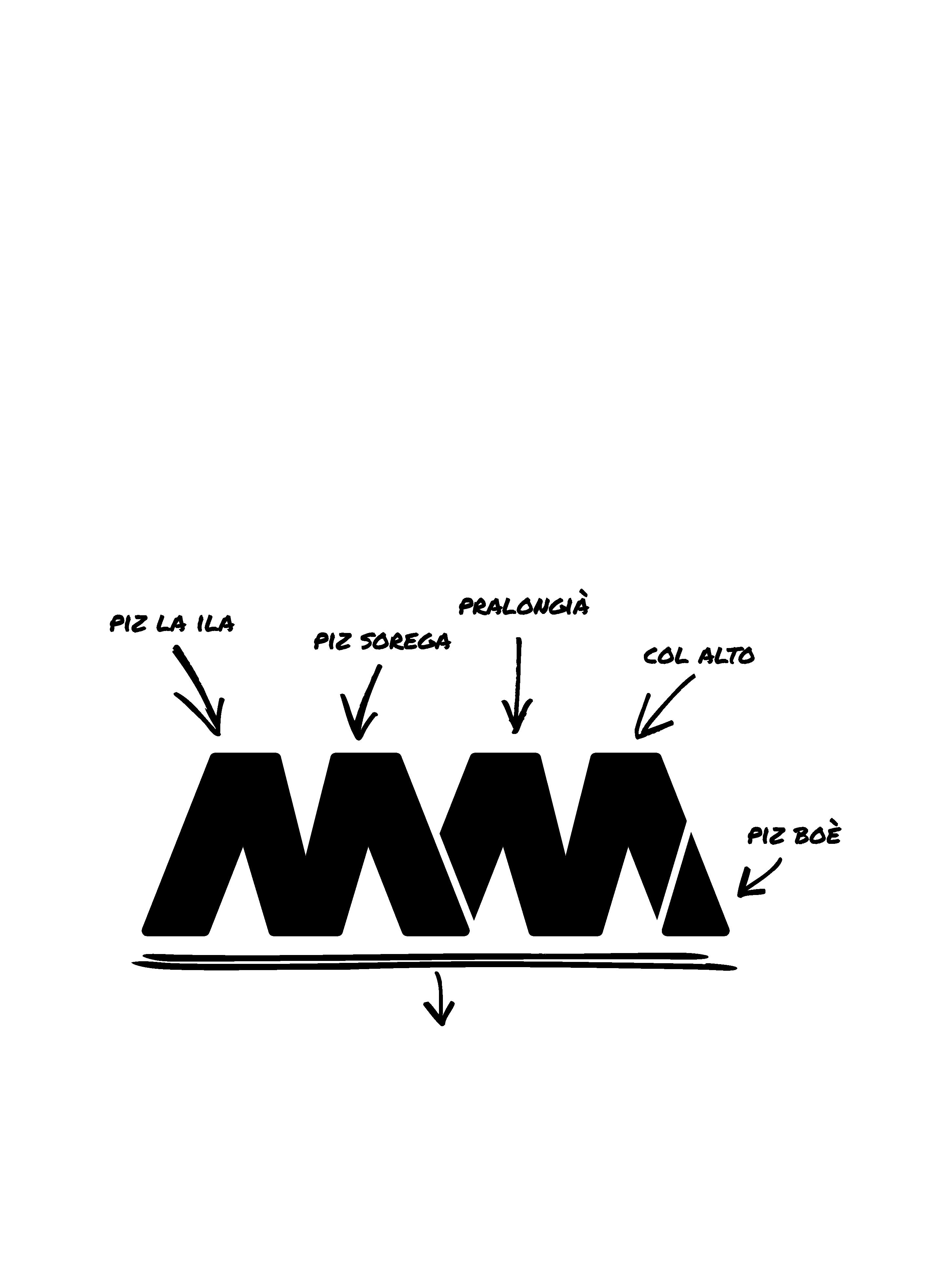
IT Il giallo: un colore che evoca il sole, la vitalità, ma anche il desiderio di inseguire i propri desideri immergendosi in una dimensione nuova, come il sentiero di mattoni gialli del Mondo di Oz. Movimënt torna alle origini, al colore vivace che contraddistingue da sempre i suoi impianti di risalita, per fare un salto nel futuro. Il rebranding dei parchi dell’altopiano in Alta Badia è un invito a ripartire con una rigenerante sferzata di energia. I canali social, Facebook e Instagram, hanno già adottato questa nuova comunicazione, raccontandola con immagini e miniclip dallo spirito leggero e pop. Sono le due M del nome Movimënt, a dare vita al nuovo logo, che evoca le cinque montagne che abbracciano i parchi. Piz La Ila, Piz Sorega, Pralongià, Col Alt e infine Boé sono come delle porte che schiudono ai visitatori un mondo sopraelevato, fatto di natura, sport, adrenalina, ma anche momenti da vivere in famiglia. Due M che danno valore al concetto basilare del marchio Movimënt: Muovi la Mente. Movimento fisico e mentale per provare un senso di benessere unico, circondati dalla natura dolomitica. DE Gelb: eine Farbe, welche die Sonne, die Vitalität, aber auch das Verlangen weckt, seinen Wünschen nachzugehen, indem man in eine neue Dimension, wie etwa den Pfad der gelben Backsteine der Welt von Oz, eintaucht. Movimënt kehrt zu seinen Ursprüngen und zur lebendigen Farbe zurück, die seine Skilifte seit jeher auszeichnet, um einen Sprung in die Zukunft zu wagen. Das Rebranding der Parks des Plateaus in Alta Badia ist eine Aufforderung, um mit einem regenerierenden Energieschub ganz neu in den Winter zu starten. Die Kanäle der sozialen Medien Facebook und Instagram haben diese neue Kommunikation bereits übernommen und erzählen sie anhand von Bildern und einem leichten und Pop-Miniclip. DE Nicht nur Farbe: Der Grafikstil ist linear, direkt und frisch. Es sind die zwei M des Namens Movimënt, die das neue Logo beleben, das an die fünf Berge erinnert, die die Parks umgeben. Piz La Ila, Piz Sorega, Pralongià, Col Alt und schließlich Boè sind wie Türen, die den Besuchern den Zugang zu einer höheren Welt verschaffen, die aus Natur, Sport, Adrenalin, aber auch aus Momenten bestehen, die man mit der Familie teilen kann. Die beiden M werten das Grundkonzept der Marke Movimënt, Move the Mind, auf. Körperliche und geistige Bewegung, um ein einzigartiges Gefühl des Wohlbefindens inmitten der Natur der Dolomiten zu verspüren.
EN Yellow: a colour that evokes the sun, vitality, but also the eagerness to pursue one's desires by immersing in a new dimension, like the yellow brick path of the World of Oz. Movimënt returns to its origins, to the lively colour that has always distinguished its ski lifts, to take a leap into the future. The re-branding of the highland parks in Alta Badia is an invitation to restart with a regenerating burst of energy. The social channels, Facebook and Instagram, have already adopted this new communication, telling the story with images and miniclips touched by a light and pop
IT Non solo colore: lo stile della grafica è lineare, immediato, fresco. spirit. EN But it's not just colour: the graphic design is linear, direct, and fresh. Both M's in Movimënt's name breathe life into the new logo, which evokes the five mountains surrounding the parks. Piz La Ila, Piz Sorega, Pralongià, Col Alt and finally Boè are like gates that open up a high-altitude world to visitors, one made of nature, sport, adrenaline, but also family moments. Two Ms that convey the basic concept of the Movimënt brand: Move the Mind. Physical and mental movement to experience a unique sense of well-being, surrounded by Dolomite nature.


