Brand Identity Book
Created for The Mount Saint Joseph AcademyFull

Full
The Mount’s logo combines two elements: the logomark, and logotype. These elements may be changed according to the variations guidelines in this brand book.
Used consistently, these guidelines will reinforce public awareness of the association.
Sometimes, often due to production costs, only one color of ink is available and so the logo must be reproduced using only one color. In this scenario, the logo, logotype, or symbol must be used following the convention of using a light color type on a dark background or in a dark color type on a light background.
The logotype and the symbol must be clearly distinguishable from the background color.
You must honor the logo palette when possible, using black or white if necessary.
RULES APPLY TO ALL LOGO VARIATIONS
The logo requires separation from the other elements around it. The space required on all sides is roughly equivalent to the height of the logo type. It never should be less than that. The logo must always fit into the clear space area and can not be intervened by other graphical elements which could hinder legibility of the brand.
Please note that text or pictorial figures which have strong impact or impression should not be placed near the logos even though you keep the isolation area blank.
Whenever you use the logo, it should be surrounded with clear space to ensure its visibility.
There are no predetermined sizes for the logo. Scale and proportion should be determined by the available space, function and visibility. In print & digital uses, the minimum size is 34 mm or 96px width.
Logo: Incorrect Use
Please note: The logo cannot be changed! Although creativity is appreciated please do not alter the logo in any way!
34mm or 96px
DON’T rotate the logo
Don’t use different colors
DON’T add a drop shadow
DON’T stretch the logo
DON’T outline the logo DON’T add gradients
RULES APPLY TO ALL LOGO VARIATIONS
The athetics logo requires separation from the other elements around it. The space required on all sides is roughly equivalent to the height of the logo type. It never should be less than that. The athetics logo must always fit into the clear space area and can not be intervened by other graphical elements which could hinder legibility of the brand.
Please note that text or pictorial figures which have strong impact or impression should not be placed near the logos even though you keep the isolation area blank.
Whenever you use the athletics logo, it should be surrounded with clear space to ensure its visibility.








There are no predetermined sizes for the logo. Scale and proportion should be determined by the available space, function and visibility. In print & digital uses, the minimum size is 34 mm or 96px width.
Please note: The logo cannot be changed! Although creativity is appreciated please do not alter the logo in any way!
34mm or 96px
DON’T rotate the logo
DON’T add a drop shadow DON’T stretch the logo
Don’t use different colors
DON’T outline the logo DON’T add gradients
In The Mount’s branding, Proxima Nova Regular and Extra Bold is used as the primary font for headlines and body copy alike.
Bold
In The Mount’s branding, Volkhorn Italic is used for secondary words in headlines.
ABCDEFGHIJKLMNOPQRSTUVWXYZ abcdefghijklmnopqrstuvwxyz
1234567890!Ӥ$%&/()=?;,.:-_
ABCDEFGHIJKLMNOPQRSTUVWXYZ abcdefghijklmnopqrstuvwxyz
1234567890!Ӥ$%&/()=?;,.:-_
ABCDEFGHIJKLMNOPQRSTUVWXYZ abcdefghijklmnopqrstuvwxyz 1234567890!Ӥ$%&/()=?;,.:-_
In this branding, we use solid and outlined fonts as well as an italics font to create contrast and interest.
Layout, for both print and screen, is one of the most important aspects of graphic design. Designs that extend across multiple pages or screens, whether containing large or small amounts of type, must be carefully controlled in a way that is enticing and easy for all to access.
Main title: Proxima Nova Ex Bold Solid and Outlined
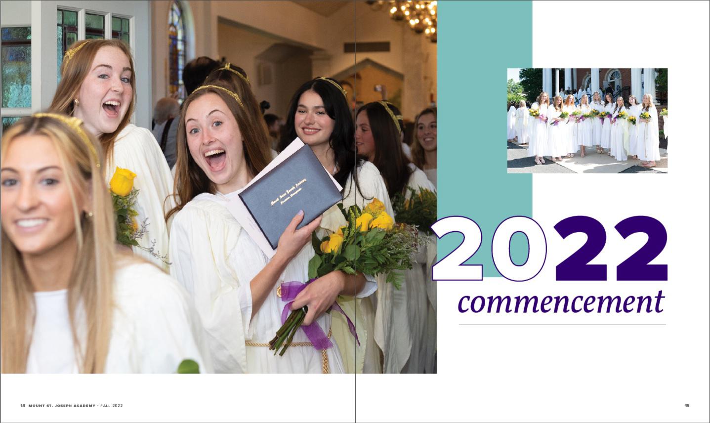
Subheading:Proxima Nova Extra Bold and Volkhorn Italic
Layouts using large heading and using outlined and solid Proxima Nova Extra Bold and Volkhorn Italic.

Body copy:
Lorem ipsum dolor sit amet, consectetur adipiscing elit, sed do eiusmod tempor incididunt ut labore et dolore magna aliqua. Ut enim ad minim veniam, quis nostrud exercitation ullamco laboris nisi ut aliquip ex ea commodo consequat.
Duis aute irure dolor in reprehenderit in voluptate velit esse cillum dolore eu fugiat nulla pariatur. Excepteur sint occaecat cupidatat

Here are some of the most common techniques for the designs.
The following palette has been selected for use in The Mount’s communications.
A comprehensive color palette has been developed to provide flexibility while creating a unified, recognizable appearance across all communications.
Primary Color
Secondary Color
COLOR CODES
Additional Color
COLOR CODES PMS ---
HEX #F2E697
Additional Color
COLOR CODES PMS ---
HEX #C179B9