

Your Dream. Delivered.
You’ve seen it in your dreams, we’ll make it real. With our customized process and deep network of the region’s best partners, your perfect vacation home becomes reality. Let our in-house team do the hard part, so you can get to work building memories—in a home your family will treasure for generations.

HIGH-DENSITY CELLULAR™ TECHNOLOGY




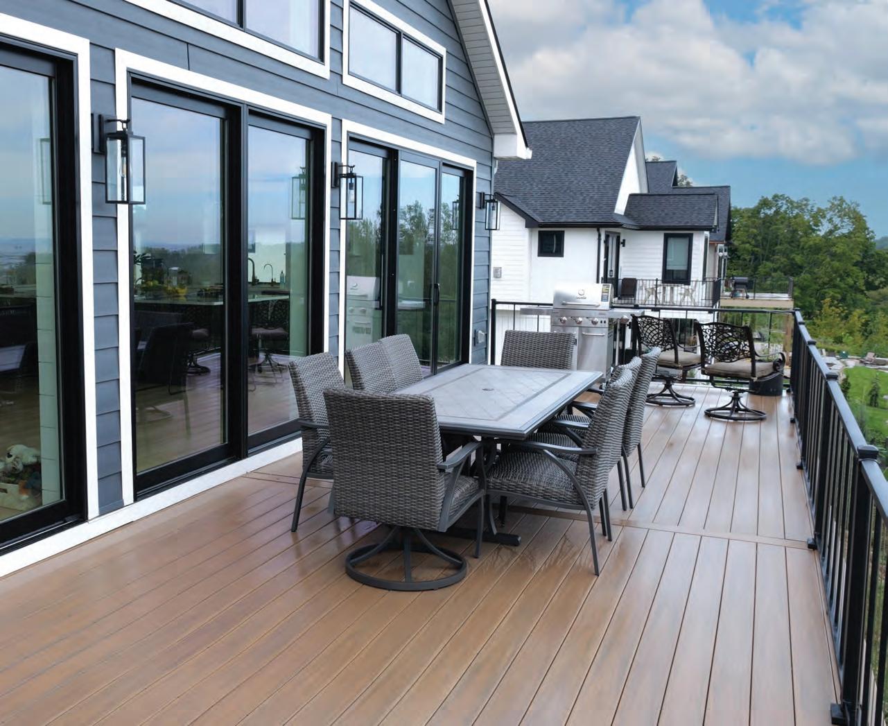


TROPICAL


Michael Wnek
Cara McDonald
Elizabeth Edwards
Emily Tyra
Carly Simpson
Allison Jarrell
Rachel Soulliere
Elizabeth Aseritis
Caroline Dahlquist
Tim Hussey
Theresa Burau-Baehr
Rachel Watson
Julie Parker
Erin VanFossen
Mike Alfaro
Ann Gatrell
Julie James
Meg Lau
Kirk Small
Erin Lutke
Ashlyn Korienek
Nichole Earle
Beth Putz
DESIGN

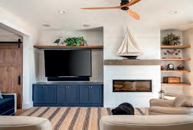


AND CONSTRUCTION work best when we collaborate and forge our ideas together.


When my colleague, emily tyra, lent me a copy of architect and interior designer Angie Lane’s book, "Midwest Modern Manifesto," I felt I’d had a gauntlet thrown down before me. In her book (excerpted in this issue) Lane offers an equation for the four design elements that she believes make up a Midwest Modern interior. (I won’t be a spoiler, so read on to find out what they are.)
But Lane’s book got my mind wandering outside of interiors: Is there a definitive Midwest Modern architectural style? And if so, how would one define it? Apparently my inner reflection rattled the gods of architecture— and maybe even the king of them all, Frank Lloyd Wright. Seriously, was it serendipity that as I pondered the question, information about a home designed by Aris Georges, a graduate of Taliesin School of Architecture (founded by Wright) and who was a senior fellow at the Frank Lloyd Wright Foundation, landed in my email? That lead turned into this issue’s story, “Little Modern House in the Big Woods.”
In the process of writing about this lovely jewel of a home, I had the opportunity to pick Georges’ brain on the subject of Midwest Modern architecture, which began with the Prairie School in Chicago—those long, low homes that accentuate the flat prairie landscape around them and eschewed the popular ornate Classical Revival Style with its European roots. Prairie School architecture was completely new and all American, and Wright was its leader. And as Georges further explained to me: “What bridges those early years to contemporary expressions of Midwest Modern is the distillation of his ideas in the Usonian designs of the 1930s, where he further eliminated the complexity of the Prairie School, and set the course for the minimalist, integral and exquisitely livable spaces that have influenced generations of architects since.”
But as Wright’s work would demonstrate later, there was more going on than just a style: there was an ethos based on organic materials and sitecontextual design. And this is where Wright’s designs, and those of his disciples, differed from the other Modernism of the mid-to-late last century. By other Modernism I mean the flat-roofed, monochromatic steel-and-glass boxes characterized by the International Style of architecture, later simply known as Modern architecture. Like Wright, those architects detested the ornamentation of the Gilded Age. But that was where the comparison ended. The style was more about the style, and not so much about blending into the site. Wright hated it.
Over the decades, as sustainability issues have unfurled, Wright’s ethos is more crucial than ever, and we are blessed in the Midwest to have its earliest imprint. Cue the drum roll while I introduce the third story in this issue, “Cabin Spirit.” While this home is not Modern by any conventional terms, it is definitely a flag-bearer for the Wright ethos with its use of honest organic materials, transparency to the outdoors and its careful siting that assured it blended into its beautifully wooded lakeside property. Wright pioneered all of those principles.

So, does a quintessential Midwest Modern architecture still exist? I’m pretty sure Wright wouldn’t have answered it exactly this way, but I will: You betcha!


 Lissa@traversemagazine.com
THE WORLD THROUGH ROSE-COLORED GLASSES
Move over, soothing greens and calm-inducing grays that colored the height of the Covid years. These six 2023 paint colors of the year are a message we’re ready to move to the warmer, more joyous side of the color wheel—and life.
 By ELIZABETH EDWARDS
TERRA ROSA, DUNN-EDWARDS
This lighter take on Victorian burgundy makes old houses feel young again and new houses look storied. Imagine a crisp white clapboard nouveau farmhouse painted this color— wouldn’t you just want to knock on that door and ask for a cup of tea? And maybe a hug.
RASPBERRY BLUSH , BENJAMIN MOORE
Where should you use this coral-tinged-with-pink hue? Any room where you might want to throw on a sarong and start dancing … kitchen, living room, bathroom, bedroom …


ALIZARIN, GRAHAM & BROWN
Ever wonder how Marco Polo felt when he was first introduced to cinnamon and nutmeg? I’m guessing he dreamed in this warm and spicy shade that night. Use it anywhere you want to invite drama—starting at the front door.
REDEND POINT, SHERWIN-WILLIAMS

Beige with a hint of dusty rose puts me back in my grandmother’s bedroom in the 1960s, snuggled up with hot cocoa and a Yogi Bear cartoon. Redend Point lends a cozy, vintage (there’s an ’80s vibe, too) feel wherever it is used.


CANYON RIDGE, BETTER HOMES & GARDENS
Picture yourself meditating on a mesa in the Southwest and you have the Canyon Ridge mood. This shade is especially evocative paired with white in a bathroom where it feels clean and just a bit sun-kissed.
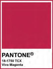
VIVA MAGENTA, PANTONE
Raise your hand if this was your favorite color in the Crayola box! The color gods and goddesses at Pantone sent a clear message with their choice of this bright, childlike tint: Choose optimism and joy. Viva Magenta begs us to experiment. Hint: Free yourself to color outside the lines.
my favorite space
DREAMY DEN
This cozy hideaway for all seasons is one of designer Dawn Whyte’s most delicious recent projects.
by ELIZABETH EDWARDS photos by PHOENIX PHOTOGRAPHYALTHOUGH she specializes in kitchens and baths, designer Dawn Whyte fell in love hard with this recent project—another useful and intimate space, this time a delightfully soothing den. She shares the elements that make the project sing.


“The wood ceiling design reminds you that the space was thoughtfully planned while the grass-cloth wall covering adds another layer of richness and provides high contrast with the lighter, brighter main spaces in the rest of the house. And, of course, the comfy yet luxe sofa invites you to linger longer.”
“Dark and moody, this den’s atmosphere draws me in with warmth and comfort! Layers of black, off-black, graphite and natural wood tones create a sophisticated space that invites you to kick back and relax. Maybe a glass of wine after a long day, a nip of brandy after dinner or a cup of hot cocoa and a movie? This space was designed to envelop you—and it does.
The fireplace, with its linen-textured granite facade capped by a natural wood mantel, provides ambiance and warmth. The flanking lighted display cases add elegance and a place to showcase treasured items.”


home LITTLE MODERN HOUSE IN THE BIG WOODS

BUILDING JUST THE RIGHT HOUSE ON JUST THE RIGHT SITE TOOK DECADES. BUT CAROL AND JEFF MORGAN WOULDN’T CHANGE ONE SQUARE INCH OF IT.
By ELIZABETH EDWARDS / Photos by DON RUTTBack in the early ’90s when their family was young, the Morgans would head Up North from their home in Ann Arbor as often as they could. They camped then, trying out a variety of campgrounds in Northern Michigan, finally deciding that their favorite sites were in the Platte River Campground in Sleeping Bear Dunes National Lakeshore. The campground was next to everything they loved including the popular beach at the mouth of the Platte River and the secluded Boekeloo Road beach that lies down a long winding narrow lane off M-22. The hiking trails in the National Lakeshore seemed endless, and the marina in nearby Frankfort meant they could easily put their boat into Lake Michigan. On one trip, Carol nabbed a local real estate flyer and scoured it on the ride home. That was how they found the six wooded acres, backed up to the National Lakeshore on the outskirts of the tiny village of Honor, that they purchased in 2005.
Given their sons’ busy schedules, the couple was in no hurry to build. Instead, they moved a fifth-wheel

camper onto their property, and eventually built a pole barn so, as Carol says: “We didn’t have to schlepp all of our toys back and forth.” Over the years the couple talked a lot about what they would want to build when the time came. They even staked out where they would want to build their future home, and cleared the site. In 2010 they added a well and septic. Still, they didn’t feel ready to build … until one day a few years back Carol was walking through a bookstore and the photo on the cover of Dwell magazine caught her eye. She purchased the issue and found out the photo was of a Lindal Cedar home, a company
founded in Seattle in 1945 that specializes in pre-cut, kiln-dried Douglas fir post-and-beam style homes. The house that had caught Carol’s eye was part of a strategic move by Lindal to brand the company’s post-and-beam building system as the ultimate modern home design. “The post-and-beam system is so appropriate for modern homes because there’s no structure inside the home. It’s all carried on posts and beams from one side of the home to the other so you can have big, open floor plans,” says Rick Fulmer, the Lindal representative in Traverse City whom the Morgans contacted and eventually worked with. Beyond the

open floor plans, the post-and-beam system allows for the expansive windows that are the signature of modern homes. And on an even deeper note, the clean, organic look of Lindal Homes hearkens back to the aesthetic of the pioneer of modern architecture, Frank Lloyd Wright.
The Lindal style was exactly what the Morgans came to realize they wanted. “It was modern rustic–natural and looked like it would just fit into the woods without shouting out,” Carol says. If they were sold on the style, it didn’t take long for them to become fans of their Lindal rep, Fulmer—a former president of Four
“YOU FEEL LIKE YOU ARE IN A SNOW GLOBE ESPECIALLY IN THE WINTER WHEN SNOW IS FALLING.”


Total Commitment to Quality




Winns boats who has also had a lifelong passion for building and designing. Fulmer in turn brought in architect Aris Georges whose deep résumé includes a Master of Architecture degree from Taliesin (the architecture school founded by Frank Lloyd Wright) as well as being named a senior fellow of the Frank Lloyd Wright Foundation. While Georges owns a private practice, OM Studios, he is affiliated with Lindal Homes—thus his connection to Fulmer and Fulmer’s clients. For Georges, the wooded setting of the Morgans’ home presented a new challenge—one that delighted him. “Most of the houses I’ve worked with have long vistas, but that one was special because it was surrounded by beautiful tall trees and so it had
a kind of coziness to it,” he says.
The team used virtual 3D modeling for everything from where the sun would hit their home in the winter and summer in order to gauge the depth of overhangs, to what the view from their elevated deck would look like. Fulmer and Georges worked with the Morgans for months to customize the home specifically to the site. “We can’t say enough about working with Rick,” Carol says. “He went above and beyond anyone that we have ever worked with as far as the time that he put in and the expertise that he brings to the project,” Jeff adds.
The Morgans broke ground just before the outbreak of Covid-19 and finished last year. Their new 2,400-square-foot home has the


elements of a modern home, indeed—two shed roofs and one flat, a handsome Western redcedar slatted front door that feels almost Asian, beautiful banks of windows and mid-centurymodern–style eave brackets. Architectural Douglas fir beams on the interior warm the clean, open great room. Above all, the home has the transparency to the outdoors that the couple wanted. “You feel like you are in a snow globe, especially in the winter when the snow is falling,” Carol says. Or as Georges describes it: “You come through the woods and suddenly you run into it. When you go inside, the house almost disappears around you because you’re in the woods again. It’s simply lovely.”


THE LINDAL STYLE WAS EXACTLY WHAT THE MORGANS CAME TO REALIZE THEY WANTED. “IT WAS MODERN RUSTIC—NATURAL AND LOOKED LIKE IT WOULD JUST FIT INTO THE WOODS WITHOUT SHOUTING OUT.”


WHERE LUXURY COMES NATURALLY.
resources
Lindal Cedar Homes
Representative Rick Fulmer, True North Trends
Architect Aris Georges, OM Studio Design
Appliances
Big George’s Home Appliance Mart
Countertops
Blasius Inc., Northern Michigan
Design Gallery
Cabinets
Wolverine Cabinet Co.
Gas Fireplace
Phillips Lifestyles
Stone Fireplace Facade

The Concrete Service Inc.
Tile Tile Craft, Inc.
Fixtures
Ferguson
Flooring Builders FirstSource
HVAC/Plumbing
Moore Mechanical
The perfect lighting. Precise palettes and textures. Every room in your home deserves a personal touch of style and simple pleasure. Wittock Kitchen and Bath offers a large selection of countertops, fixtures, faucets and more that bring both luxury and comfort into your living spaces. Visit one of our showrooms to see our growing selection of top brands.

wittock.com
BIRMINGHAM
950 S. Old Woodward Ave. Birmingham, MI 48009 (248) 283-8400
SHELBY TOWNSHIP
50800 Corporate Drive Shelby Township, MI 48315 (586) 731-4111

GAYLORD 1100 Gornick Ave. Gaylord, MI 49735 (989) 732-1690
TRAVERSE CITY
1610 W. South Airport Road Traverse City, MI 49686 (231) 946-5160
house and home

A ANGIE LANE’S MIDWEST MODERN MANIFESTO
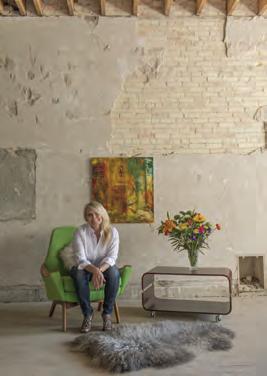
A MICHIGAN ARCHITECT/INTERIOR DESIGNER’S BOLD, COLORFUL DECLARATION THAT, YES, MIDWESTERNERS HAVE STYLE. AND HERE’S HOW IT WORKS. By ELIZABETH EDWARDSngie Lane was (partly) raised in the house her father was born in—an old, once-upon-a-time farmhouse in a small town outside of Lansing. While interior decorating wasn’t exactly her father’s thing, she does remember afghans hand-knit by her aunts (“some of them were, well, you know, hideous, but some of them I still have,” Lane says). Her dad and aunts also collected pudding stones—a rare composite stone left by glaciers found only in several places in the world, Michigan among them. As a child, she filed those objects away in her memory—cherishing their shapes, colors and the nostalgic feelings they conjured.
Later, Lane attended University of Michigan for undergraduate and graduate studies, leaving with a Masters of
Architecture degree. Before opening her own practice, Lane worked for several architectural firms, including one that also offered interior design services—a side of the design world Lane found she loved. “It’s so much more tactile than the architectural side,” she says. “You’re getting samples, you’re testing colors and searching for different furniture shapes.”
All of those shapes and colors got Lane thinking that she could figure out a “system” for isolating what makes an interior feel balanced—without repressing individual expression.
“It’s just kind of how my brain works, I like to simplify things,” she says. Eventually, Lane developed her own design formula: A (hard pattern) + B (soft pattern) + C (bright color) + D (nostalgic/ eclectic). Take those afghans—they’d give a room both A (hard pattern), C (bright color) and D (nostalgic/eclectic). The pudding stones? Those are B (soft pattern) for their curved shapes.
The magic in Lane’s formula is that
A, B, C and D don’t have to be equal parts—and the formula could be used in regions other than the Midwest— although the very warmth inherent in the formula rules out anything too spare and monochromatic. Lane had mused about writing a book demonstrating her theory for a while when Covid hit. The lockdown gave her the time to focus and 10 months later she had produced “Midwest Modern Manifesto—Easy Formula to Get Designer Style in Your Home.” Within the book’s 300-plus colorful pages is an explanation of Lane’s formula, as well as room photos of both her designs and a number of Midwestern interior designers. The book closes with an unexpectedly perfect nod to our regional brand of hospitality: a chapter on colorful, delicious cocktails. As she writes with exquisite Midwestern pragmatism: “You’ve flipped through this long-ass book, now it’s time to relax. Cheers!”
Order Midwest Manifesto at midwestmodernmanifesto.com.

Opposite:
A Hard Pattern: plaid ceiling, art piece
B Soft Pattern: window treatment, rug
C Bright Color: decor, trim, paint
D Nostalgic/Eclectic: letter A, rug, pyramid pillow
“This lounge concept was meant to be feminine meets old school lodge where the lodge elements were used in an atypical way: oversized plaid ceiling, abstract wildlife displays and vintage tapestries as pillows instead of wall hangings.”
Below:
A Hard Pattern: rug, windows
B Soft Pattern: nature pattern pillows
C Bright Color: blue wall, green bench
D Nostalgic/Eclectic: wide blue stripe on white wall and ceiling

Right:
A Hard Pattern: radiator cover, quilt
B Soft Pattern: table bases
C Bright Color: lamp shade, decor
D Nostalgic/Eclectic: antique chairs, tiki mug

“Here all the displays are abstract representations of all of the state symbols of Michigan. I like all the texture happening in this corner. We’re tactile beings and we like to touch stuff. There’s smooth ceramics, antique wood, basketweave and even concrete nuggets (on the table bases).”
Below:
A Hard Pattern: rug
B Soft Pattern: pillows
C Bright Color: wall, pillows, art

D Nostalgic/Eclectic: floral painting
“One of my favorite lighting tips: use a swag light from the center fixture spot to the light to end up where you want it. Especially in old houses, there can be limited light fixture locations as well as outlets for lamps.”
THE EAST COAST IS KNOWN FOR ITS PREPPY CLASSICISM. THE SOUTH IS KNOWN FOR ITS ADHERENCE TO TRADITIONAL INTERIORS AND MORE RECENTLY, THE WHOLE MODERN FARMHOUSE


THE WEST COAST HAS ITS BOHEMIAN VIBE AND LAID-BACK CALI COOL. WHAT DOES THE MIDWEST HAVE? WELL, NOW WE HAVE MIDWEST MODERN.


CABIN SPIRIT

When a well - traveled couple with michigan and Midwestern roots purchased a piece of property in the Grand Traverse area on a lake encircled by woods, fed by clear spring water and teeming with panfish, the last thing they wanted to do was desecrate its pristine shoreline. Even if that meant not disturbing so much as a single tree. To that mission’s end, the plan became to take down six small summer cabins—some that dated to the 1950s— and place the new home on the long-ago cleared site. A seventh cabin would be saved and turned into a bunkhouse.
Though the majority of cabins would be removed, the couple was determined to preserve their hand-hewn, midcentury spirit. The layout of the home itself is a tribute to the old cabins. “We took inspiration from the history of the property,” says architect Matt Rossetti, explaining that the home is laid out as four separate buildings (cabins, if you will), connected by breezeways. Breaking up the structure’s mass allows it to be better camouflaged in the shoreline landscape.
The decision to look to the past informed every detail of this meticulously designed home from its walls of natural stone that echo the old cabins’ stone

A BRILLIANT DESIGN-AND-BUILD TEAM WORKS WITH HOMEOWNERS DEDICATED TO PRESERVING THE CHARACTER OF THEIR NORTHWOODS LAKESIDE PROPERTY TO CREATE A SUBTLE MASTERPIECE OF RUSTIC STYLE.
“The owners wanted the home to be super comfortable and approachable,” interior designer Amy Meier says. The great room’s ceiling cladding of rough-sawn, lesser-grade pine adds to the relaxed cabin ambiance. The floor is reclaimed white oak as is the mantel—sourced from Surfaces in Petoskey. The dining room table is also fabricated reclaimed wood and purposely made not to look perfect—note the splintered leg in the forefront. The pendant over the table is one of the few new lights in the home. The rest are old, but have been refurbished and rewired.

THE DECISION TO LOOK TO THE PAST INFORMED EVERY DETAIL OF THIS METICULOUSLY DESIGNED HOME.
foundations, to the rough-sawn barn wood used to clad the great room’s ceiling, to old-fashioned screen doors that bang shut. Reclaimed wood was used wherever possible—barnwood from Wisconsin and North Carolina was integrated into the great room and bedrooms, old clapboard from some of the old cabins was cleaned and now graces the ceilings on several bedrooms. When a salvaged curly maple floor from a sewing warehouse in the South was delivered to the site, thousands of pins and needles rolled out.
From blueprint to stone and wood, it took intense collaboration with the team and homeowners to turn back time 75 years. Along with Rossetti, the architectural team included design consultants Holly Jonsson and Kyle Evans, all based in Detroit. Southern California–based interior designer, Amy Meier, who had worked with the homeowners previously, was integral to the design process, sourcing numerous vintage mid-century pieces that date to the era of the old cabins.
Eric Darooge and his Boyne City–based Eastmark Construction took the project over the finish line. Even though the experienced crew has numerous luxury homes to its credit, this one was especially memorable. “This project made all of us work a little bit out of our comfort zones because it didn’t fall into typical residential home construction norms,” Darooge says. “And I can say from everyone involved, from start to finish, we are very proud of the outcome.”
When Darooge made Eastmark’s skilled carpenter Mark Andres the project manager, it was as if the stars aligned and those old cabins were having their say: Andres continues to care for the property—and the home that honors the spirit of honest, timeless construction.
“We spent a lot of effort to get the glass to wrap around the corner,” says Meier of this lakeside nook in the great room. The chairs are mid-century by Italian designer Paolo Buffa. “They are very comfortable and I just love the way that they feel right at home here,” Meier says. The Shaker-style chaise was made by Mulligan’s in Los Angeles. The two tables are midcentury from England. “They’re highly lacquered so they look like they are from a boat. I love that parallel of being on the lake and having pieces that feel nautical,” Meier says. The mid-century floor lamp was acquired at an auction.

The French Lacanche stove backed by a thick “blue stone” tile (actually meant for flooring) backsplash is the centerpiece of the kitchen. Knotty, rough-sawn white-oak cabinetry conceals all of the appliances except the wine refrigerator. “Everyone these days is so used to putting on polyurethane and different waxes,” says Meier. “My client wanted them to be durable but look like natural wood.” The barstools are from Bicyclette.


Above: “This is such a fun area,” Meier says. “The clients really wanted a space where they can just hang with their kids and friends.” The cobblestone pavers are off-the-shelf from Home Depot, while the inset crisscross beams are reclaimed and sourced from Surfaces in Petoskey. The three oil lamps (one is not shown) are by mid-century Danish designer Hans-Agne Jakobsson. After being wired for electricity, they were screwed into the bar. The barstools are Italian mid-century by Matteo Grassi.
Top left: The “cabins” from left to right: the mudroom and screened-in porch; the main living area with the kitchen and great room above and the den/bar (Rossetti refers to it as a kind of grotto) below; the master bedroom; the guest bedroom. A green roof was chosen to mimic the moss-covered asphalt roofs of the old cabins. Siding varies from the board-and-batten on the main cabin to cedar shake on each end cabin, “giving them their own character,” Rossetti says. The windows are also different in each cabin, a touch that makes them look as though they were built in different time periods. The use of the black windows in the breezeways connecting the cabins was to “make them disappear,” Rossetti adds.
Bottom left: Exposed furring and beams in the guest bedroom give the impression of an uninsulated summer cottage. The floor, as was much of the reclaimed material in the home, was sourced from Surfaces in Petoskey. “It’s called a threshing floor,” says Darooge. “It’s from the part of the barn floor between the barn doors that gets the most traffic so it takes on a significantly distressed look.”

The guest room has traditional 9-by-11-inch mullions in the windows—panes that frame the view of the lake like individual charming paintings. “I think many people think mullions obstruct the view,” Meier says. “But [the homeowner and I] wanted them to give the feel of an old cabin.”
The heirloom-quality walnut, pencil-stick canopy bed was custom made by Dunes and Duchess in New Milford, Connecticut. The skirted sofa is new but made to look mid-century.

resources
Architect ROSSETTI
Builder
Eastmark Construction
Interior Design
Amy Meier Design
Design Consultants

Kyle Evans Design
Holly Jonsson Design
Windows
Old Mission Windows
Kolbe Windows and Doors
Stone
The Concrete Service
Hardwood Flooring
Surfaces Material Gallery
Cabinetry
Wolverine Cabinet Co.
Custom Molding & Millwork
Philip Elenbaas; Thomas Milliken
Vintage Lighting Refurbishing
Grey Wolf Creek
Ceramic Tile

Creative Touch
Fireplace
Source Julien
HVAC/Plumbing
Team Bob’s
Appliances
Bekins
Landscaping
Robinson’s Landscaping
Audio/Video A Better Sound
Roofing Mills Construction
Site Survey
Bob Mitchell & Associates


Site Work
Molon Excavating
Well Cluff Well Drilling
“Old Mission Windows prides itself on developing long-term relationships that are based on integrity and trust. The quality products and flexibility they provide is only surpassed by the service and follow-up my customers receive well after project completion.”


 Eric Darooge, President Eastmark


