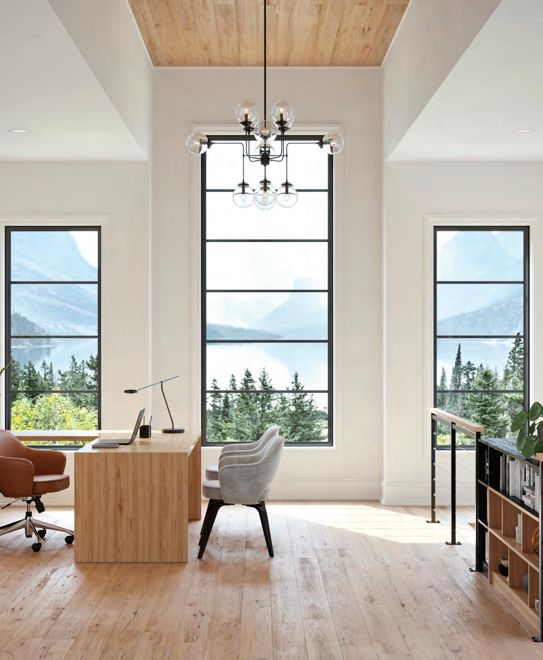




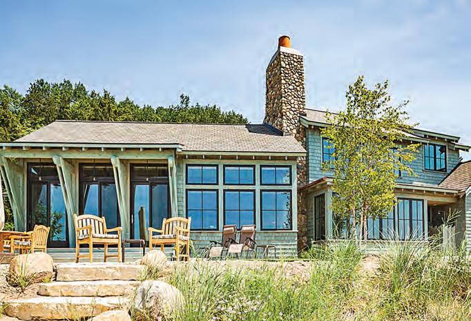
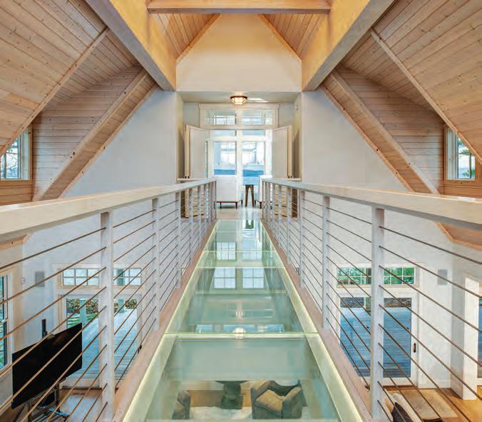
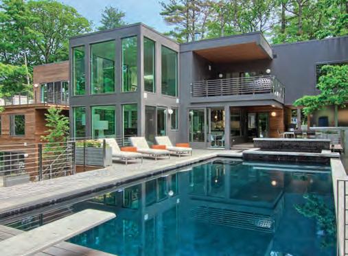
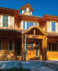
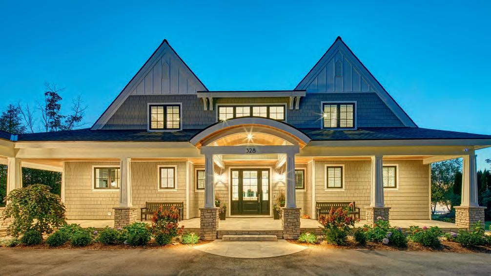
You’ve seen it in your dreams, we’ll make it real. With our customized process and deep network of the region’s best partners, your perfect vacation home becomes reality. Let our in-house team do the hard part, so you can get to work building memories—in a home your family will treasure for generations.
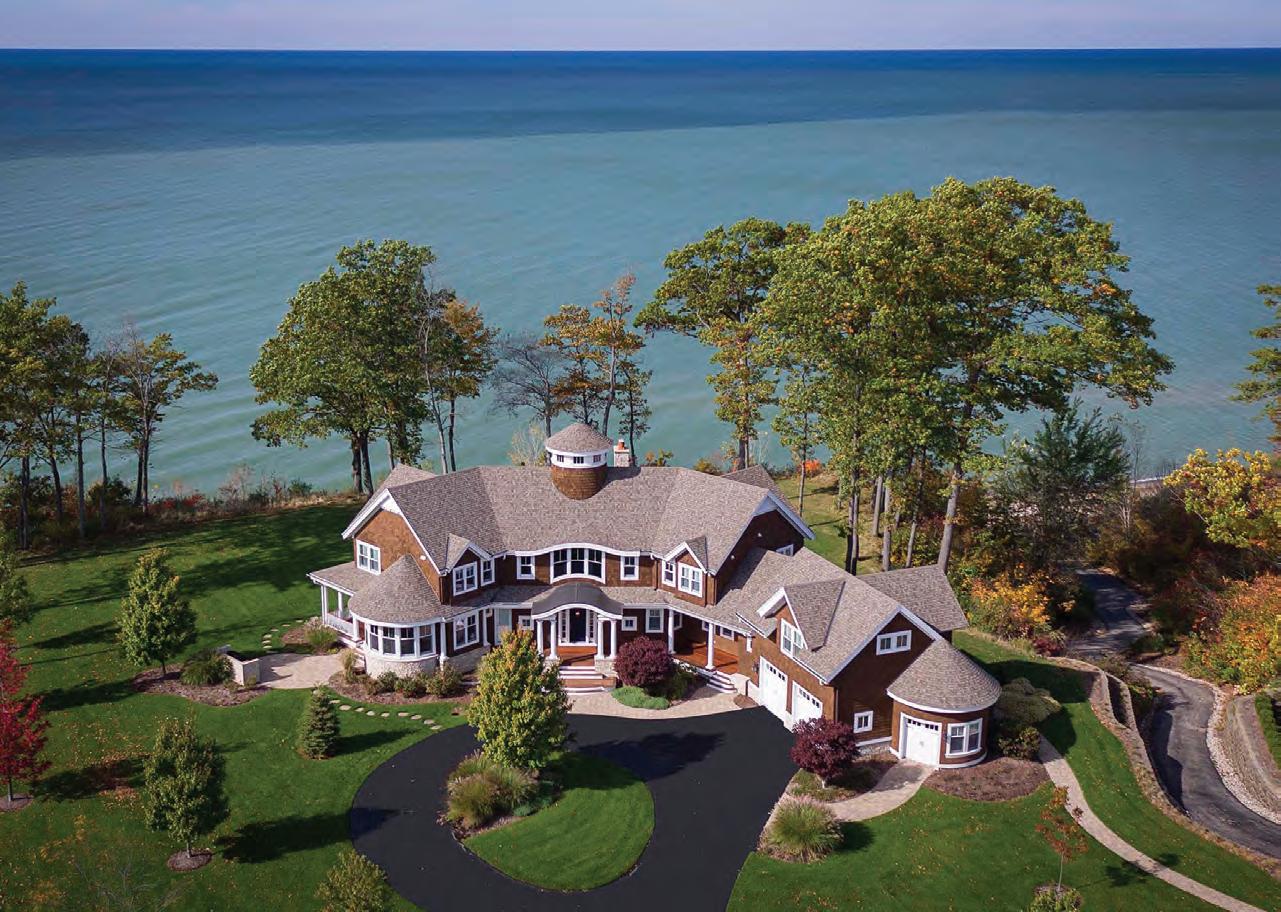
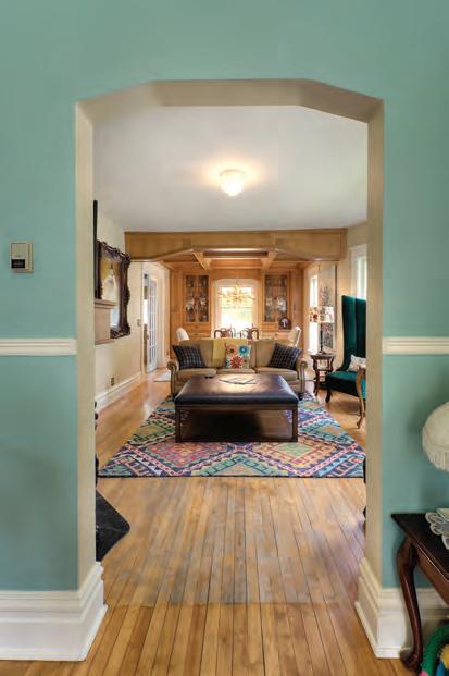
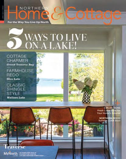
After a decades-long renovation, the owners of one of the North’s most successful design businesses have carefully brought their 19thcentury home into the new millennium while preserving its gracious old soul.
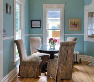
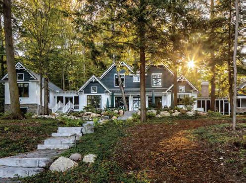
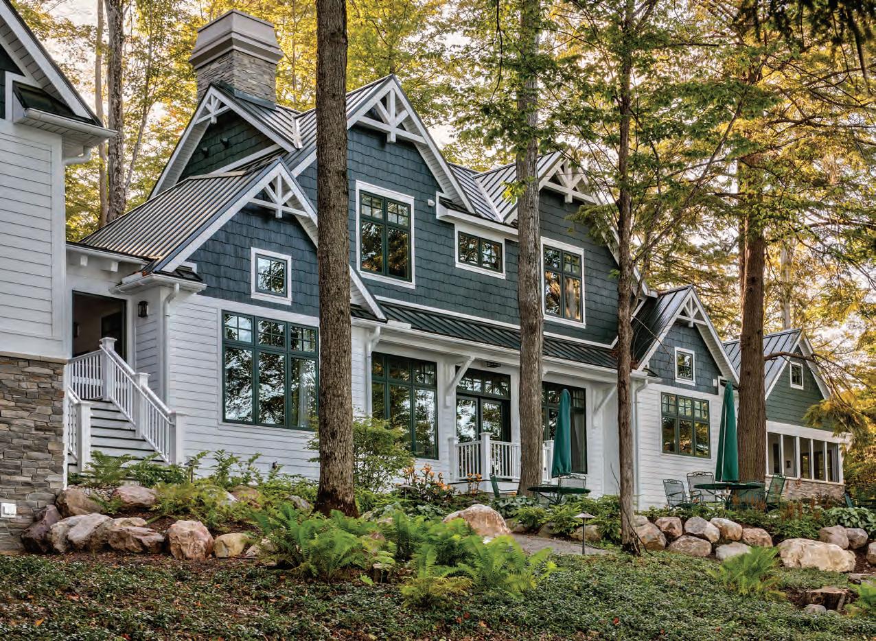
Gracing a steep slope and surrounded by ancient old-growth trees, this new lake lodge looks as though it has stood for a hundred years.

Drawn by Northern Michigan’s warm and welcoming community, the Johnsons decided to change their status from seasonal to yearround residents. They couldn’t be happier.







In the early 1960s my dad was a doctoral student in architectural history at University of Michigan. Any excursion with him—whether it be through Ann Arbor or a trip Up North to Glen Arbor to see my grandparents—was a lesson in architecture. “Look over there, Mare,” he’d cry excitedly to my mom, pointing out the car window, “There’s a Queen Anne!” Other times it would be a Greek Revival, a Gothic Revival, a just plain old Victorian … the list went on. From the back seat, I’d follow his gaze to see what the fuss was about. Invariably, there’d be some sweet, lacy slip of a home sitting demurely in the middle of a cornfield or along a tree-lined street. I grew to love what he pointed out—those pretty, decorative houses began to read like fairytales to me. Certainly they were once inhabited by beautiful young ladies and handsome young men.
When we moved to Paris in 1964 so that my father could pursue a Fulbright Scholarship, the architectural history lessons grew into our family’s pastime. Most families viewed sports together. Each weekend we set out to view architecture. In Paris, those architecture-based fairy tales blossomed in my mind to stories of princesses and princes. For sure, the prince took Cinderella to live in the Louvre.
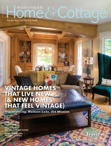
As an adult, I realized I had developed a skill that largely impresses no one, except maybe myself: Judging by the style, I can often pin the date of a home’s construction to within 20 years. Obviously, my fascination with old homes is hardly unique—all you have to do is tune into HGTV to see that there is a world of people obsessed with the items found inside the walls and crevices of old homes, and with the materials and craftsmanship that defined other eras. You can count Angela and Mike Goodall as two of them. The owners of one of the most successful design firms in Northern Michigan, the Goodalls honed their skills on their own late 19th-century home in downtown Traverse City. Check out the story of their decades-long reno in this issue. But sometimes, oftentimes, homeowners want the feel and ambiance of an old home with a new build. Read on as architect Joseph Mosey, known for his period designs, deconstructs the details that make a beautiful lake lodge feel like it has stood on the Walloon Lake shoreline since Ernest Hemingway summered there. We round out this issue with a third story about a modern farmhouse—a style that just never gets old. After all, who doesn’t want to feel like they’re coming home to a fresh piece of apple pie every time they pull in the driveway?

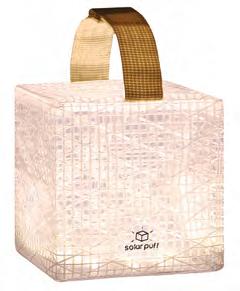
These pretty solar-powered lanterns brighten both the dark nights of winter and countless lives around the world.
By ELIZABETH EDWARDSREPLACE one lightbulb with solar light and you’ve saved 90 pounds of carbon emissions a year.
That's a fact that the designers of Solight lanterns live by. While these origami-shaped solar lanterns shine in the design department, Solight’s mission is nothing less than personalized access to solar power that can help save the planet and its people.
Lowering our carbon footprints should make us all feel good about using these self-charging lanterns
to light walkways, campsites and a multitude of other outdoor areas (they’re made from durable sailcloth and some models can even float).
But Solights can also help those left in the darkness after hurricanes or other natural disasters, as well as people in developing countries that have no access to electric lights— only dangerous and unhealthy kerosene lanterns. And then there’s Ukraine and its blackouts caused by Russian strikes on its power grid: “Currently we are working to
get light to a children’s hospital in Ukraine,” a member of the Solight design team tells us.
The folks at Solight assure us that their lanterns will work in Northern winters as well as summers. While you’re shopping for yourself on the Solight website, check out the Give a Light page to find out how you can help spread Solights where they are needed around the world.
solight-design.com


Why is flannel so often plaid?
The association of plaid and flannel dates back to 17th-century Europe, where flannel originated in Wales and then spread to Scotland with its famous tartans. In America, plaid flannel was made famous by none other than Hamilton Carhartt, founder of the eponymous Michigan work-wear company. Carhartt brilliantly fabricated his work shirts from plaid flannel and the look simply took.

So, what is flannel and what makes it so cozy and warm?
Flannel can be made from wool, cotton or synthetic fiber—though wool flannel is often used for clothing (think: “Mad Men” gray flannel suits). Flannel sheets are generally made from cotton or synthetic fiber. Whatever the fabric, flannel gets its softness by being brushed on either or both sides to raise its fibers—a process called napping.
Not only does this nap make it soft, but it also creates tiny, insulating pockets of air that help keep you warm. Portuguese flannel is widely considered as the softest, highest quality in the world. Flannel warmth is also gauged by its weight in either ounces or grams per square meter, GSM. The heavier the weight, the warmer it is, with most flannels running from three to six ounces or 85 to 170 grams.
Yes and no. If you have eczema or other skin conditions, the softness of flannel will be soothing. Another plus is that because flannel is naturally wrinkle free, it isn’t treated with formaldehyde, the carcinogenic chemical used to keep wrinkles out of most sheets.
That said, flannel made from cotton is healthier than flannel made with synthetic fibers as it doesn’t contain the nasty soup of chemicals used in synthetics. And the healthiest flannel sheets of all, certainly for the planet and the people who produce them from farm to factory, are woven from organic cotton.
In a world where we are all craving more cozy, flannel sheets are morphing from old-cabin staples to luxury items that turn your bed into a haven. Here’s the lowdown.

Leave it to Costco to give us a home luxury we can afford. Their 100 percent American cotton flannel sheets are woven in Portugal and brushed on both sides for extra softness.

4-piece King set: $54.99

Coyuchi textiles excel in farm-to-factoryto-consumer healthy goodness and these sheets are no exception. Made from 100-percent organic cotton grown in Turkey, woven in Portugal and extra-brushed for softness, they carry a hefty six-ounce weight. Slip between them and you won’t want to come out until the spring thaw.
4-piece King set: $308
It’s no surprise that the legendary outfitter of cabins knows its way around a flannel sheet. Made from 100 percent cotton and woven in Portugal, these sheets more than get the job done on a cold night. The Mainebased company might have been imagining the ocean when they came up with their Coastal Landscape design, but we think it looks like our freshwater shorelines.
4-piece King set: $149
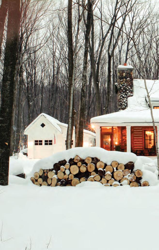
With every project she takes on, designer Kelly Konoske’s style is fresh, on-trend and an expression of the homeowners’ vision. But when she visits her grandparents’ cabin on Walloon Lake in winter, Kelly brings along her own cozy version of cold-weather chic.
 Curated by KELLY KONOSKE
C ottage Company built and designed Kelly’s grandparents’ cottage on Walloon Lake.
knows how a perfectly designed home can inspire friends and family to gather, relax, enjoy, be themselves, celebrate life’s pleasures and make the most of our beautiful region. Under her leadership, Cottage Company Interiors has become the most published and award-winning design firm in the region. She is also a recipient of the prestigious Detroit Home Design Rising Star Award, given to the top up-and-coming interior designer in the state.

Her Nili Lotan Hawthorn Sweater, made in Peru from 100 percent wool.

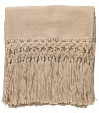
A set of flannel classic plaid sheets by Boll & Branch. Woven in Portugal from 100 percent organic cotton, heathered yarns that are then brushed for softness and sheared to resist piling.
(Read more about the wonders of flannel sheets on page 10.)

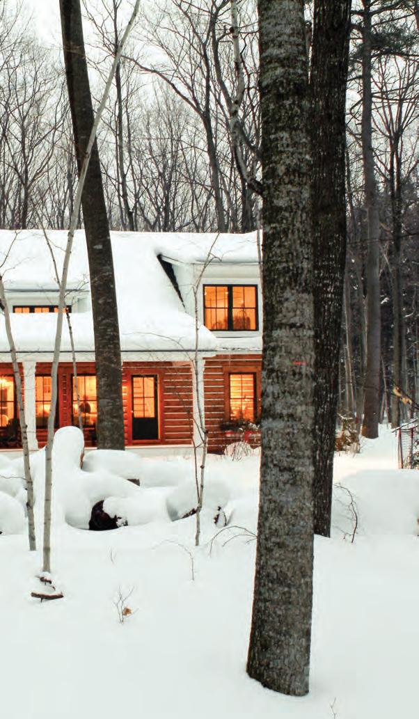
Make mugs of red velvet hot chocolate (she likes the recipe from The Spruce Eats), and sip them in front of the fire wrapped in a fringed alpaca throw by McGee & Co.

Cashmere socks, hat and gloves by N.Peal, the Londonbased, eco-friendly purveyor of cashmere to the stars.


Ice skates for those magical days when Walloon Lake freezes over.

 By ELIZABETH EDWARDS
HULET
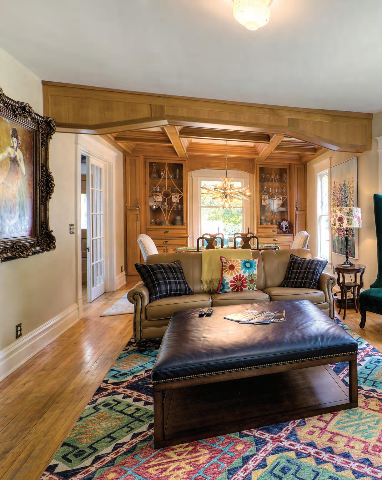
Twenty - six years ago , when mike and Angela Goodall moved to Traverse City, they bought acreage out of town where they planned to build a home in the countryside—a longtime dream of Mike’s. In the meantime, the couple rented a house on 16th Street, just blocks from downtown. About the time they were getting ready to start building, Mike told Angela that he liked city living more than he’d expected. Angela was thrilled, and the couple agreed to sell their property and look for an intown home.
After months of fruitless searching, they passed a home on Union Street, and Mike pointed to a For Sale sign in the front yard: “That’s what we’re looking for,” he said. Initially, the home was out of the couples’ price range, but
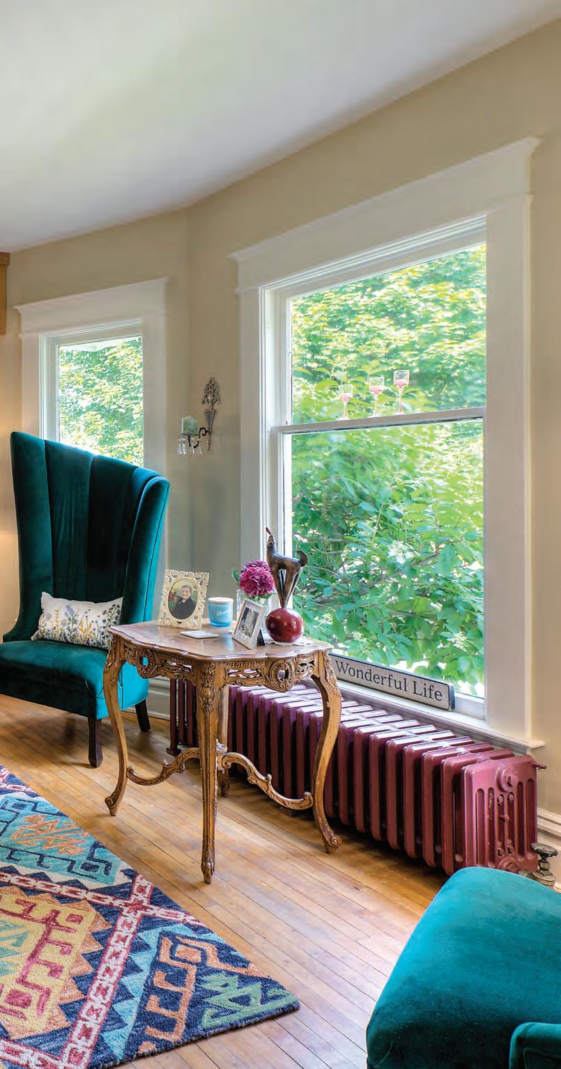
a few months later the price was lowered, and the Goodalls jumped at the chance to buy it. The 1895 home was stuffed with antiques (the homeowners had been antique dealers) and needed plenty of work, but the couple could see potential. They closed on the home on December 12. That day, Angela left work early and had it decorated from top to bottom for the holidays by the time Mike arrived home. Angela, who had majored in math, was discovering her inner designer.
When he wasn’t at his job with Elmer’s Crane & Dozer, Mike, working with his father, replaced the home’s roof (first removing three layers of asphalt shingles and one of cedar shake), then the furnace and wiring. Three years into it, the couple finally turned to updating the old kitchen. Using her math background and a new-found gift for
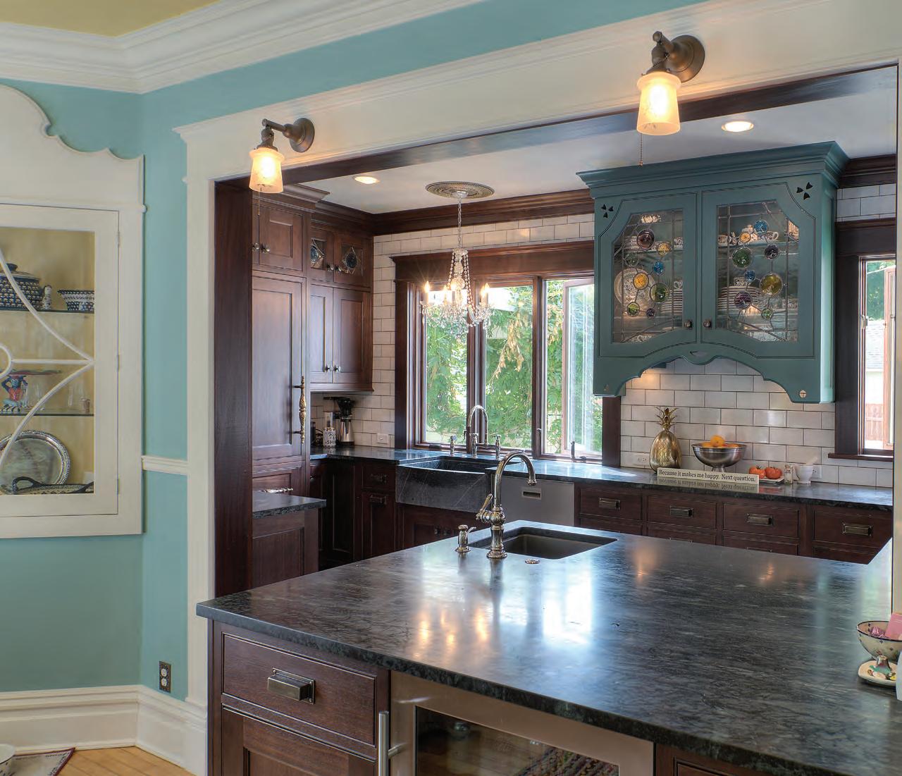
Clockwise: Removing a load bearing wall and re-locating the bathroom made room for expanding the kitchen to include a new peninsula outfitted with a vegetable sink and beverage refrigerator. The inset glass cabinet is original to the home—though Mike added the glass door.
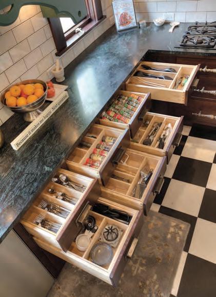
“Even though I was in this home for 20 years before we did this kitchen, it took time for me to realize how I would actually use the new space,” Angela says. “So I moved back into the kitchen and spent about three months working in it to see where I naturally gravitated to storing implements, before I added all of these very specific dividers.”
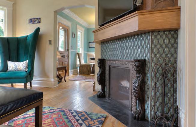
One of the only disappointments for Mike when they purchased the home was that it lacked a fireplace—so the ingenious couple put one in, a feat that included moving some of the home’s HVAC and creating a steel structure in the floor to support it being recessed into the framework, so it would look like it had always been there. Outfitted with an antique mantel from Belgium and faced glass tile from Tile Bar, the fireplace looks as though it is original to the old home. Angela found the carved lions on eBay.
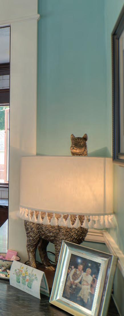
“When we bought the house it was white with red brick, and I knew I always wanted to live in a yellow house. The first summer we owned it, I came home and Mike was having it painted happy yellow for me,” Angela says.


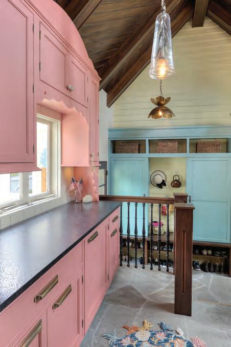
A new addition that connects the home to the garage offers both a utilitarian entry and extra pantry/storage space. The pink cupboards and blue closet are indicative of Angela’s love of color. “These two colors [PPG, Chili Pepper and C2, A Cappella] were the ones that spoke to me. I really want things to be bright and happy when we get home,” she says.
“I tend to be fairly traditional in nature but nobody really likes the formality of a traditional design, and so by using the brighter colors—whimsical elements—I think you still maintain something that is timeless, but is more up to date.”




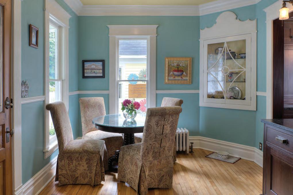
A breakfast table off the newly remodeled kitchen doubles as a place for friends to hang out while Angela cooks.
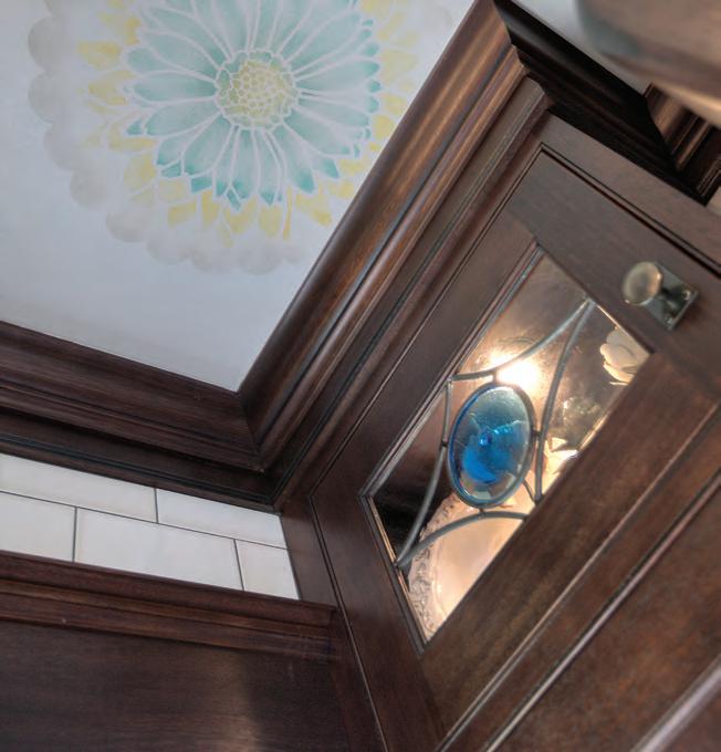
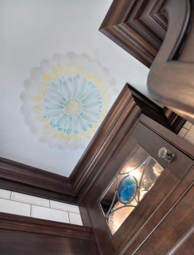
The handmade glass in the kitchen cabinetry (as well as the glass in the door from the garage entry) are by Guido Goldkuhle, owner of kuhl doors. The stenciled flowers are by Rick and Linda Smith of Artistic Innovations.
three-dimensional visioning, Angela drafted plans for custom cabinetry. When the cabinetmaker they hired saw Angela’s plans, he asked her to design for his business. That job launched Angela’s career as a kitchen designer, and in 2003 the couple founded Kitchen Choreography with Angela as lead designer and Mike as project manager. Several years later, they also founded their custom woodshop, Symphony Cabinetry.
Meanwhile, Angela was still not completely satisfied with her own kitchen’s remodel. The couple had originally eyed taking out a load-bearing wall between the kitchen and a small bathroom, then moving the bathroom to where a small bedroom was to enlarge the kitchen. But in those early years they lacked the confidence and weren’t one hundred percent sure they had the construction expertise to pull it off. Fast-forward almost two decades and the Goodalls, who have nearly a thousand projects across Northern Michigan on their résumé, knew they had the knowledge to make the load-bearing wall disappear and create the kitchen of Angela’s dreams. The kitchen has new Fieldstone Cabinetry (a line that Kitchen Choreography represents), new soapstone countertops and sink, and new SubZero/Wolf appliances. But best of all, Angela, who is a fabulous cook, finally has what she always wanted: room for guests to hang out with her in the kitchen.



Design & Construction Kitchen Choreography kitchenchoreography.net
Glasswork Guido Goldkuhle kuhlstudios.com
Ceiling Floral Stencils Artistic Innovations 231.947.7969
Cabinetry Fieldstone Cabinetry fieldstonecabinetry.com
Countertops Cadillac Cut Stone cadillaccutstone.com
Appliances
Max’s Service maxsservice.com

Fireplace
tilebar.com





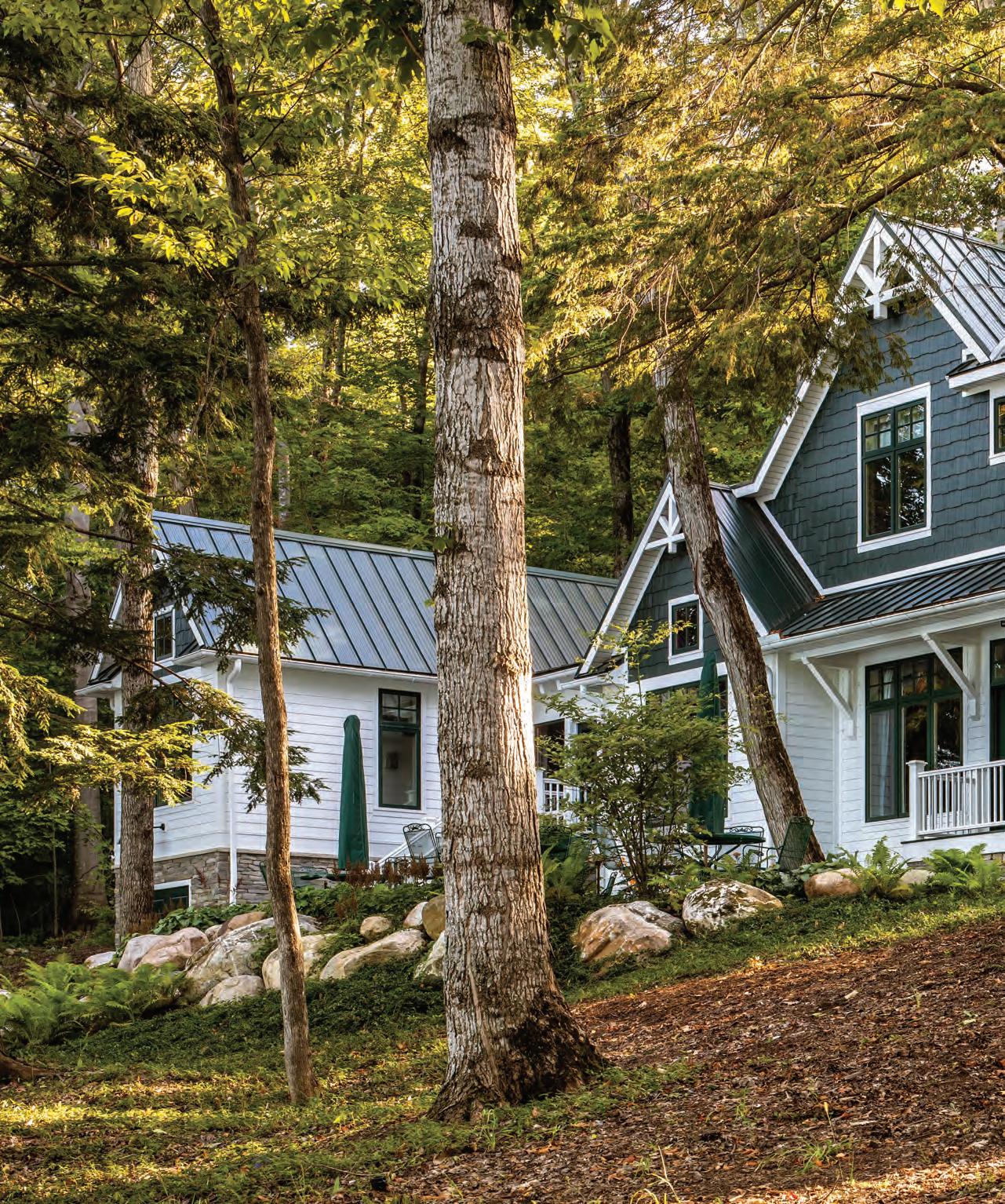
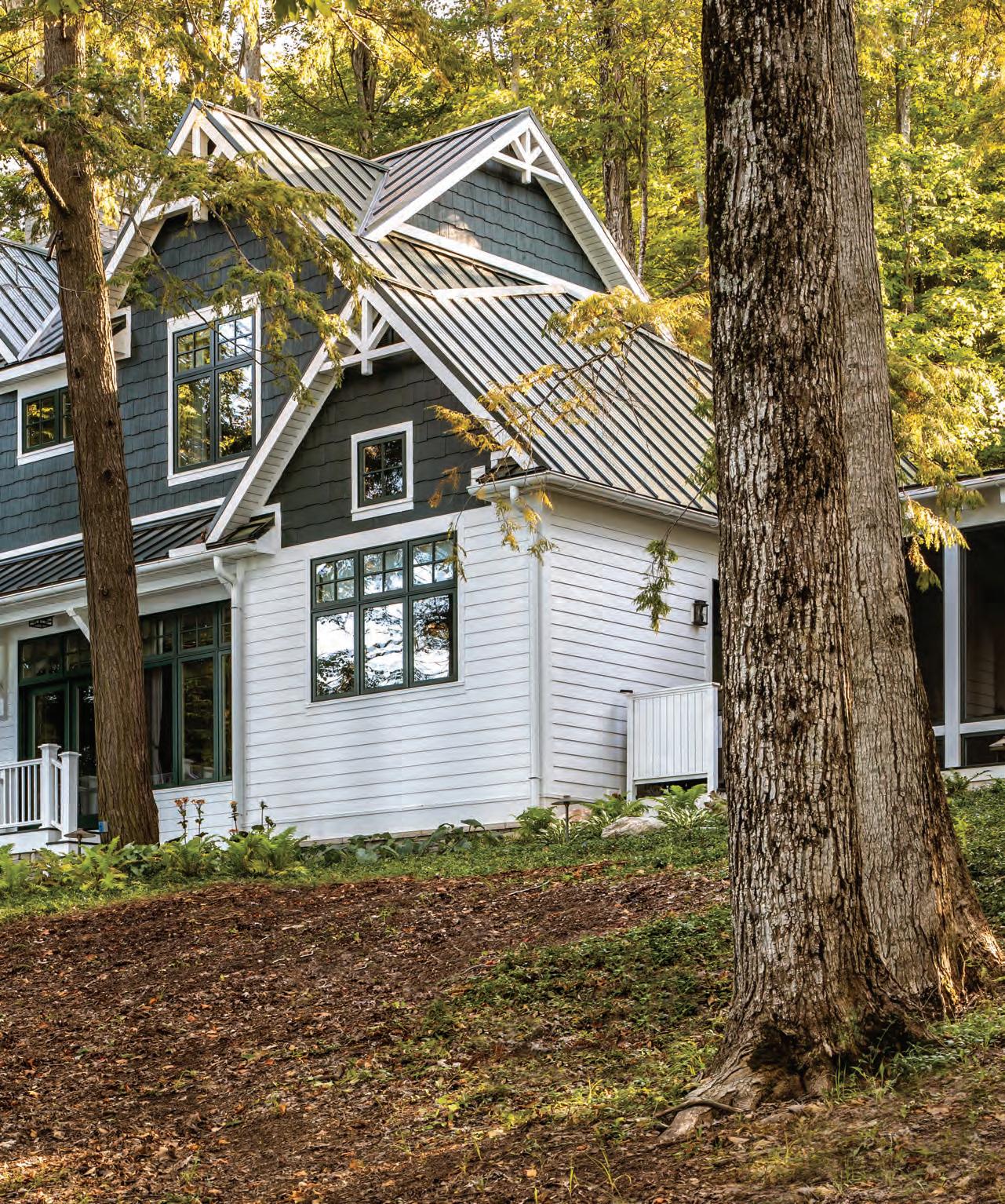
rchitect joseph mosey had his work cut out for him. His clients had purchased a beautiful lot on Walloon Lake, but due to both the steepness of the grade and zoning setbacks, finding a building site was going to take some serious problem solving. Add to that the fact that the homeowners, understandably, didn’t want to lose any of the ancient hemlock trees that grace the property. After careful consideration, it appeared that the best place for the home site was a long, thin plateau overlooking the lake—a spot that backs into a hill and drops off steeply on the lake side. Fitting a home on it was going to be a puzzle.
Fortunately, the style of home that the homeowners requested, a vintage lake lodge, was solidly in Mosey’s wheelhouse. The architect’s résumé is packed with stunning period homes including several on Walloon Lake—homes that meld beautifully with the lake’s rich history of early 20th-century summer cottages, including Windemere, where Ernest Hemingway spent his childhood summers.
Welcoming the design challenges that the site presented, Mosey rolled up his sleeves and started drafting. The result is a long, gracious dwelling that embraces the slope and slips through a stand of old-growth hemlocks. Builder Eric Render anchored it on deep helical piles instead of a traditional foundation, meaning his team didn’t disturb so much as a hemlock root during construction. “Great care was taken throughout the build to protect and maintain the health
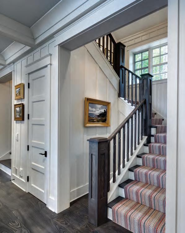
Coffered ceilings and board-and-batten paneling continue the lodge look on the home’s interior. The homeowner’s collection of vintage sporting and landscape paintings is spot-on with the vibe.
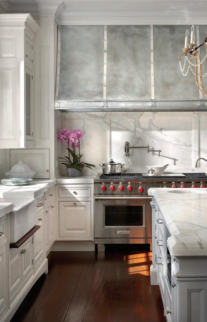
Shaker-style inset cabinet doors in the kitchen preserve the home’s honest, timeless feel.
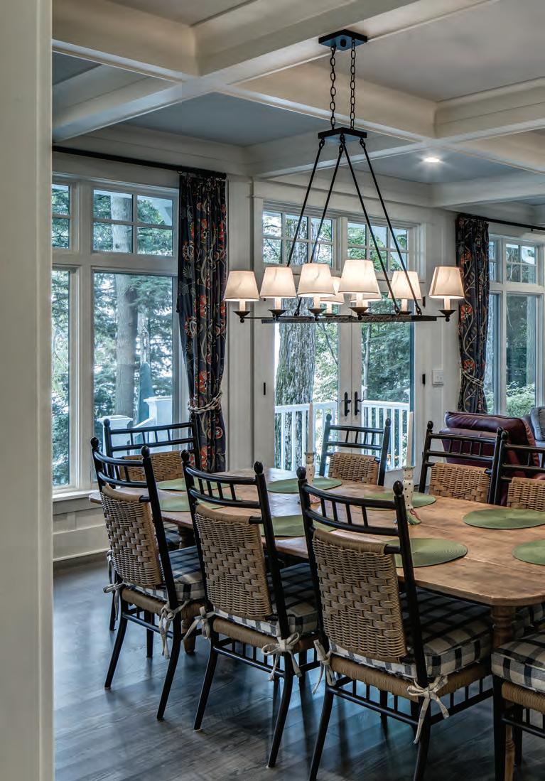

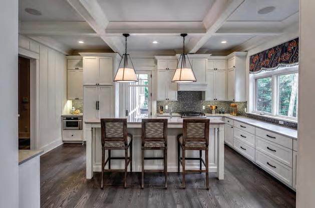
What Gives This Home Its Vintage Lake Lodge Character:
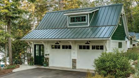
Multiple gables/sections that make the home appear to have been added on to over the years. Working from left to right, a guest suite is connected by a screened-in porch to the primary bedroom. The two large gables house the great room and upstairs bedrooms. The kitchen is tucked into the smaller gable on the home’s right side.
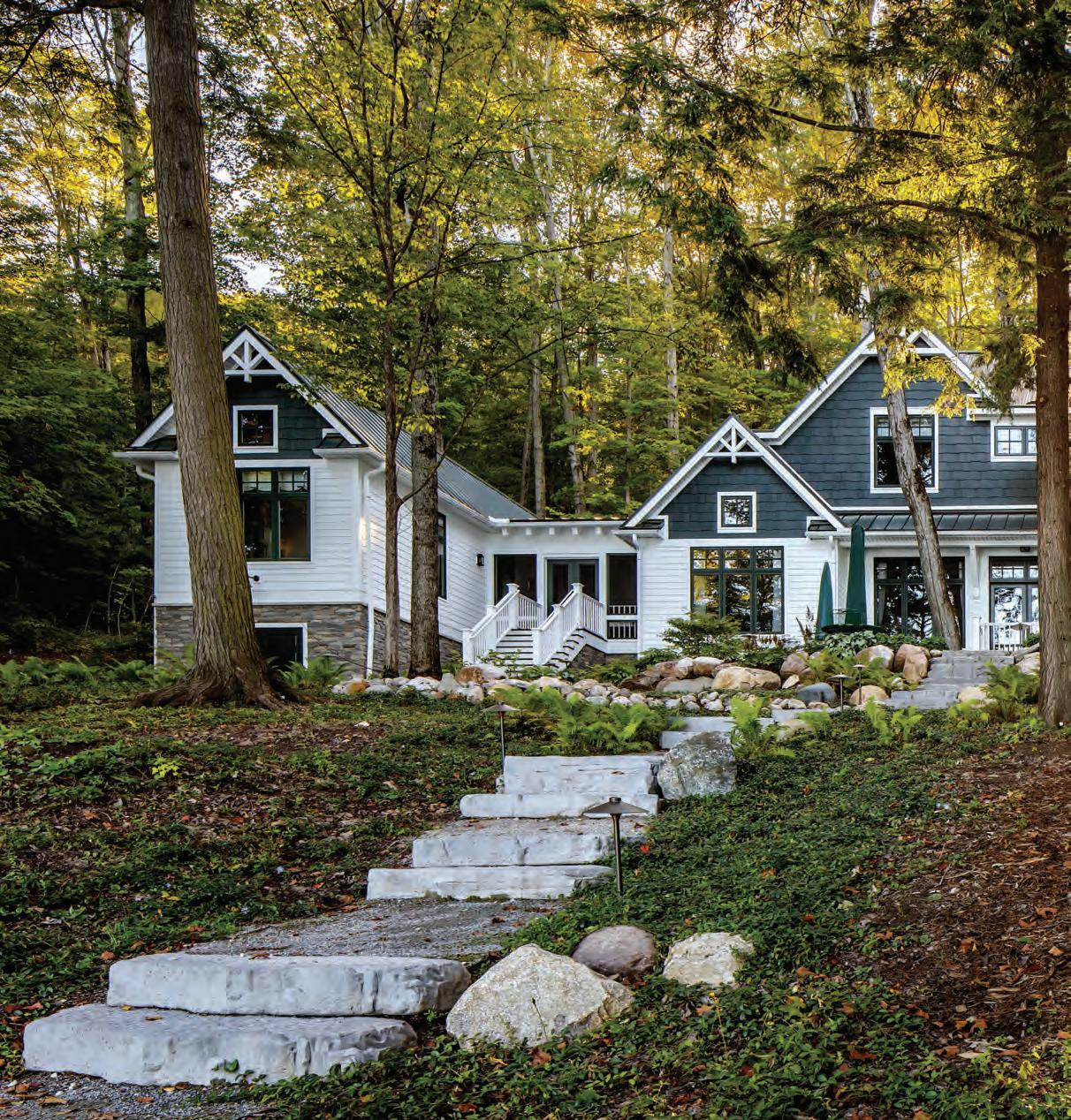
> Classic forest green cedar shake in the gables and white clapboard siding.

> Stone foundation.
> Screened-in porch on the lake side.
> Decorative gable brackets.
> Tongue-and-groove cladding under the eaves.
> Green-clad windows that match the cedar shake.
of these trees,” Render says.
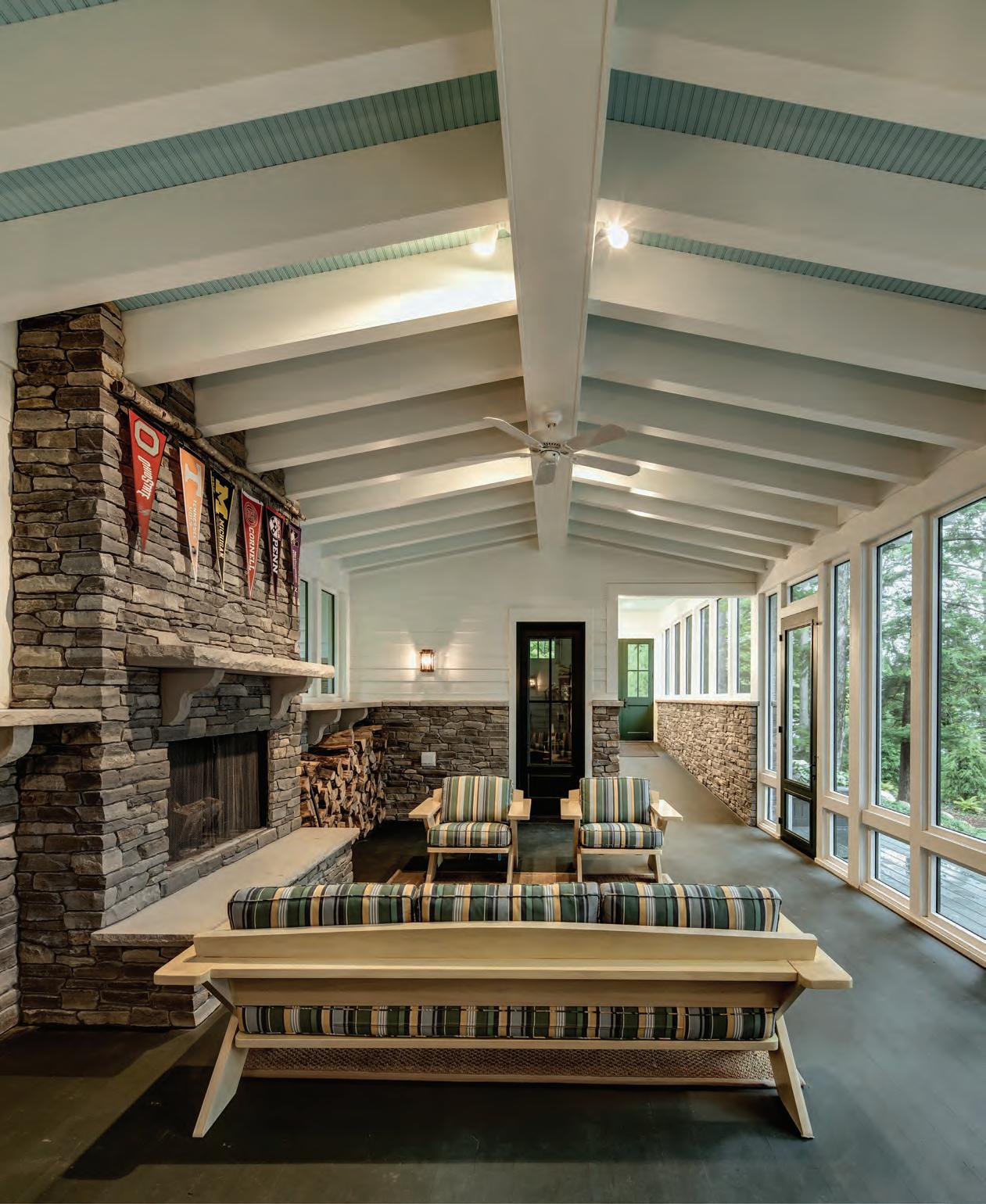
Mosey went on to turn a major site limitation— limited room for a main entrance—into a design advantage by tucking the entrance into one end of the back/driveway side of the home. The entrance leads into a screened-in porch that doubles as an entry while offering a shotgun view of the lake before opening into a seating area on the home’s lake side. With its stone fireplace, exposed rafters and beadboard ceiling, the porch immediately announces the home’s quintessential lake lodge vibe. “Entering through the screened porch, you decompress into lake life and lodge living right away,” Mosey says.
With vintage lodge details repeated on the interior, the new home embodies the Walloon Lake lifestyle—one that is still rooted as solidly in the woods and water as it was in Hemingway’s time.
Opposite: The classic lodge-style porch doubles as the home’s entry—the main entrance/door is at the far end of the hall. Touches like the painted beadboard ceiling, exposed beams and stonework and woodburning fireplace anchor the vintage lodge look.

Old-fashioned five-panel interior doors and the stained-wood railing system ring true to the lastcentury lodge era.




Architect Joseph Mosey Architecture josephmoseyarchitecture.com
Builder Render Construction renderconstruction.com
Landscaping Vidosh North LLC vidoshnorth.com
Excavation & Site Work Flynn’s Excavating 231.347.4771
Stone Masonry ACR Masonry 989.217.1866
Building Materials Preston Feather Building Centers prestonfeather.com
Windows & Doors Old Mission Windows oldmissionwindows.com
Millwork Thomas & Milliken Millwork tmmill.com
Audio, Visual & Home Automation
American Home Technology ahtech.com
Cabinetry Wolverine Cabinet Co. wolverinecabinet.com
OBrienHarris.com 231.439.0100 PETOSKEY
Neal and stephanie johnson have lived in some magnificent cities—Chicago, Seattle and Washington DC, among them. Vacations, however, were spent in Northern Michigan, where Neal grew up. Eight years ago, the couple purchased a 1960s ranch on West Grand Traverse Bay at the base of Old Mission Peninsula. As they lived and worked in DC then, it was for summer and holidays only—and possibly, one day, they would retire there.
And then the couple met their neighbors who actually lived Up North year-round. That changed everything. “When we were up here, they embraced us—Stephanie and me, and also our daughter and even our dog,” Neal says.
“The more time we spent here and
THE JOHNSONS ONCE BELIEVED THAT NORTHERN MICHIGAN WAS JUST FOR VACATIONING. THEN THEY GOT TO KNOW THE COMMUNITY AROUND THEIR SUMMER COTTAGE.
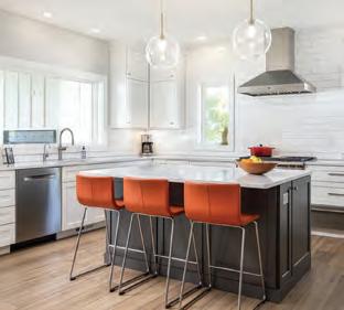
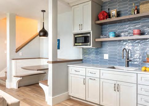
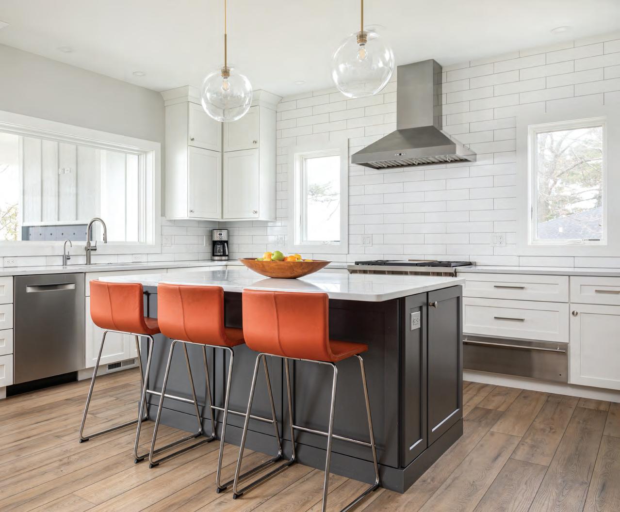
In the kitchen, mid-century modern bar chairs and pendants blend with traditional cabinetry.

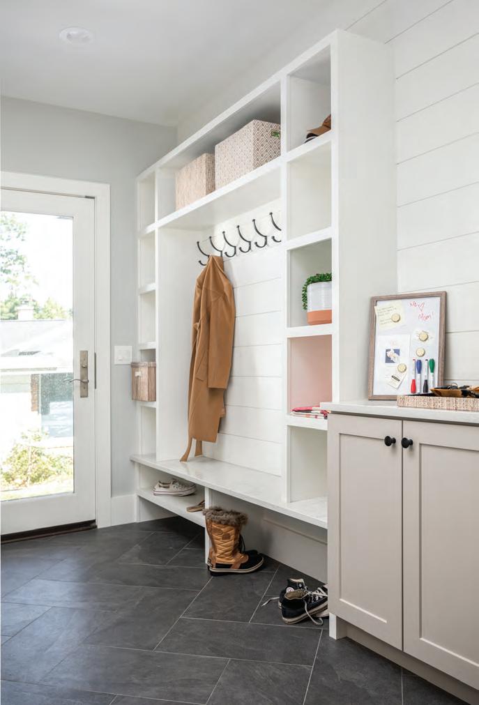
A well-thought-out mudroom is essential to living in harmony with Northern Michigan winters. Here, designer Marty Rhein added in plenty of coat hooks, a bench for putting on and taking off shoes and boots and storage for hats and gloves.
got to know the people, we realized this is an amazing place to live,” Stephanie adds. “And so, we put things in motion to figure out how we could get up here before our daughter started high school.”
Part of the plan to make their Northern Michigan move included replacing the small, outdated ranch with a home that would accommodate their needs—from now through their retirement years. As the Johnsons had become accustomed to doing, they took the advice of some trusted neighbors and called Dean Adams of Bay Area Contracting. Beyond Adams’ reputation as a contractor, his firm is affiliated with architect Ken Williams of Design Classics as well as the BAC Design Group, a company that guides clients through design decisions throughout the building process. “Interior design is not my strength, so to have the design piece coupled into the building process was very attractive to me,” Stephanie says.
Rhein and Adams suggested the built-in dining nook in the walkout. The Johnsons say it is perfect for working remotely and a hangout place for their daughter and her friends.
The back side of the home plays up its connection to the water with a walkout patio, upstairs terrace and glass railings to keep the view of the bay open.
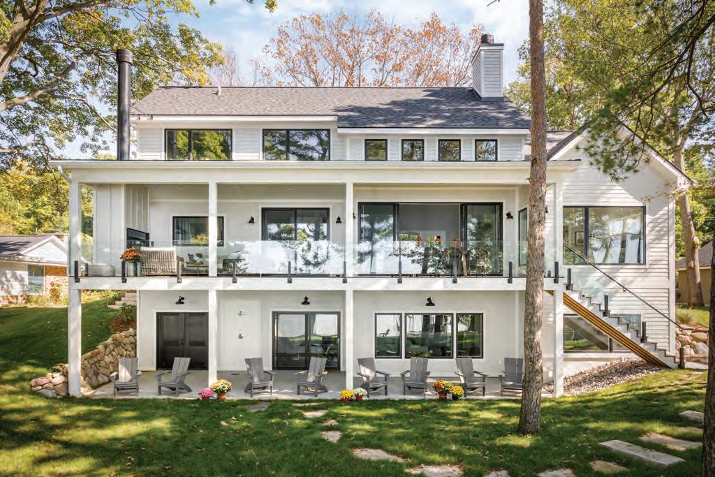
With its traditional gables and siding, the Johnsons’ home fits graciously into Old Mission Peninsula’s farmhouse vernacular.

From the first point of contact to the finished home, the collaboration between all the parties involved was full of ease. “Dean and Marty are the type of people who you don’t even need a contract with,” Neal says. “You know that they are always going to do the right thing.”
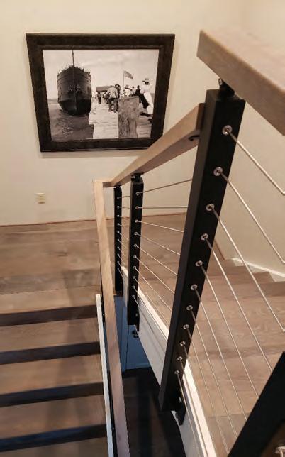
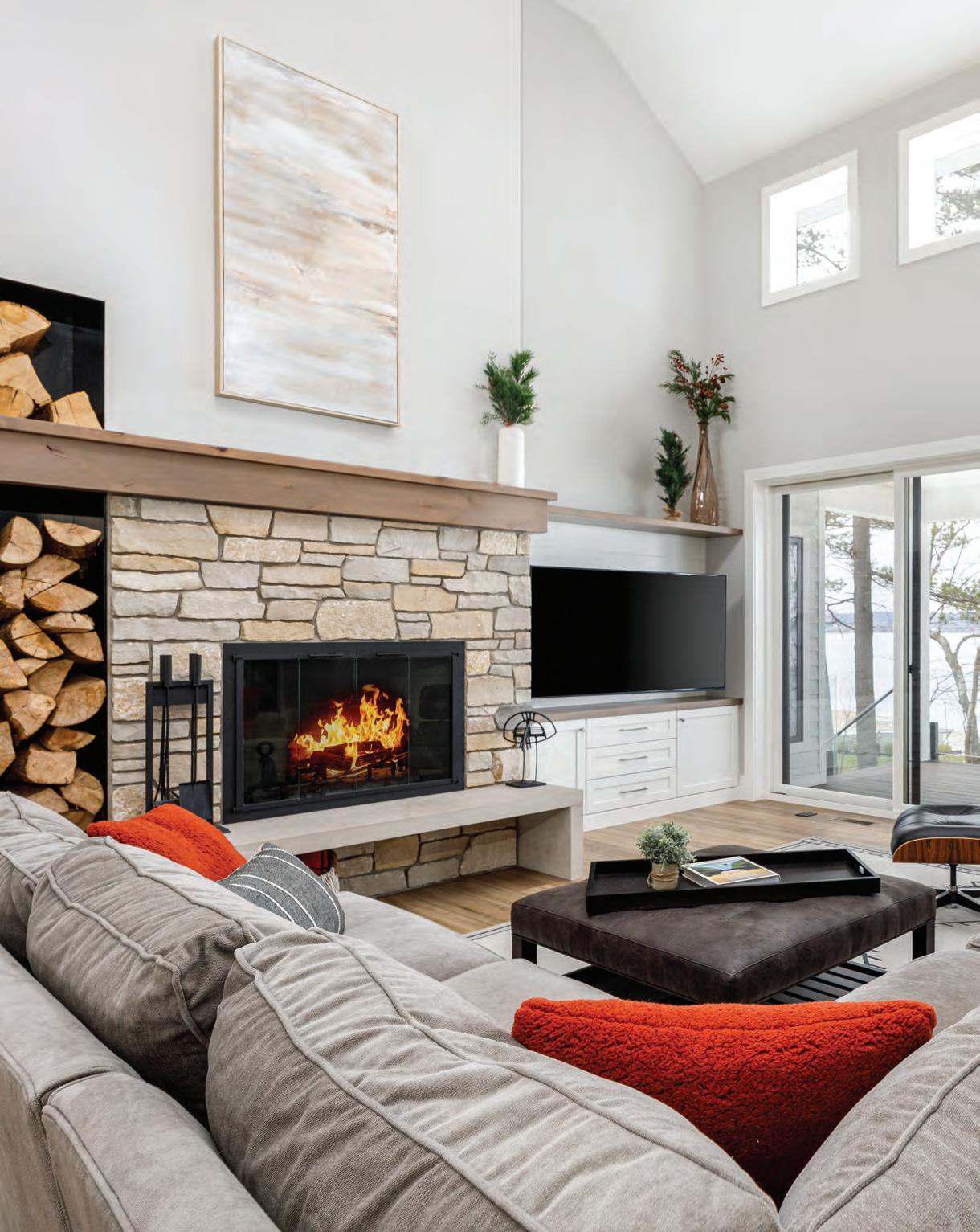
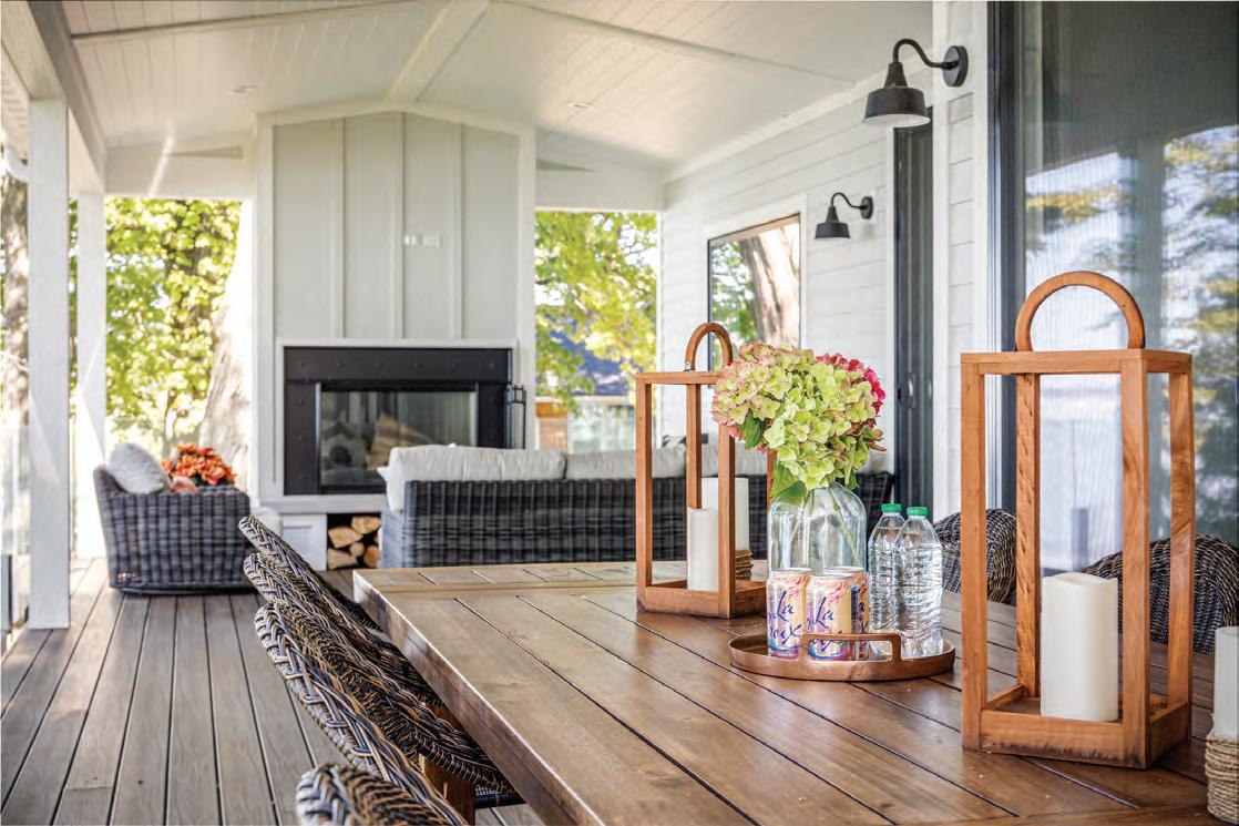
For Marty Rhein, senior designer at BAC Design Group, that “right thing” begins with listening to what his clients want. In this case, Neal wanted a wood-burning fireplace in the great room and Stephanie wanted a modern farmhouse that was more modern than farmhouse. Neal got his wish and more, with wood-burning fireplaces in the living room and on the covered lakeside terrace. Stephanie’s vision was realized in a blend of traditional and modern that begins at the home’s exterior with its gables and white clapboard siding that echo the last-century farmhouses dotting the peninsula. The interior, however, is clean-lined, open and light-filled—the antithesis of dark, cramped, old farmhouses. Touches like a steel railing system for the staircase and modern lighting and furnishings amplify the feel.
But as appreciative as they were for Rhein’s incorporation of their ideas, they were especially grateful for the way Rhein and Adams used their expertise to make the house a superbly livable Up
North home. “They really knew how to handle a waterfront property and its access to the beach,” Neal says, citing a space they designed into the walkout level to store paddles, kayaks, SUPs and other water equipment. “You just put it in there for the winter, shut the door and get it out in the spring—no carting it back and forth from the garage.”
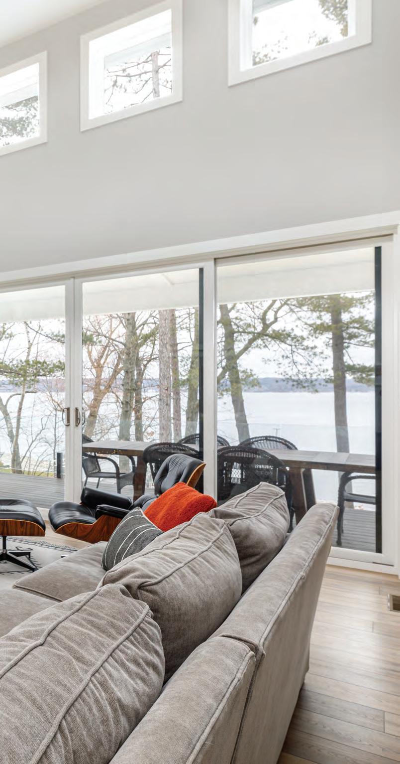
With one year under their belts as full-time residents, the Johnsons couldn’t be happier. Even the winter, which Stephanie admits she was anxious about, didn’t faze them. “I’m not a huge fan of cold weather, to be honest,” she says. “But in this house, you never feel cooped up because it’s so open— you are constantly looking at the water and the trees—it’s almost like you’re outside, except that you’re warm and cozy.”
The bathroom in the beachside walkout has plenty of storage for beach towels and bags, while the fun, nautical tile keeps the room from feeling simply utilitarian.

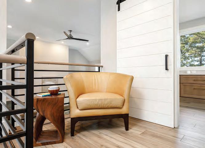
The blend of modern and farmhouse styles in the home is exemplified by a modern steel staircase railing and the barn door to the office.










Render Construction is a family tradition with a solid foundation built on integrity, quality and professionalism; it is these core values that have served us well over the years. Our relationship with Old Mission Windows is built on these values and allows us to exceed our clients expectations, which is critical in our design build process.
Render Construction is a family tradition with a solid foundation built on integrity, quality and professionalism; it is these core values that have served us well over the years. Our relationship with Old Mission Windows is built on these values and allows us to exceed our clients expectations, which is critical in our design build process.


— Eric Render, Render Construction
Kolbe Windows & Doors leads the industry with innovative products that push the boundaries and defy the limits of function, performance and style. Contact Old Mission Windows, northern Michigan’s premier window and door supplier since 1985, to schedule a personal design consultation today.
Kolbe Windows & Doors leads the industry with innovative products that push the boundaries and defy the limits of function, performance and style. Contact Old Mission Windows, northern Michigan’s premier window and door supplier since 1985, to schedule a personal design consultation today.
Kolbe Windows & Doors leads the industry with innovative products that push the boundaries and defy the limits of function, performance and style. Contact Old Mission Windows, northern Michigan’s premier window and door supplier since 1985, to schedule a personal design consultation today.
Kolbe Windows & Doors leads the industry with innovative products that push the boundaries and defy the limits of function, performance and style. Contact Old Mission Windows, northern Michigan’s premier window and door supplier since 1985, to schedule a personal design consultation today.
Kolbe Windows & Doors leads the industry with innovative products that push the boundaries and defy the limits of function, performance and style. Contact Old Mission Windows, northern Michigan’s premier window and door supplier since 1985, to schedule a personal design consultation today. info@omw.tc 231-947-2120 I
Kolbe Windows & Doors leads the industry with innovative products that push the boundaries and defy the limits of function, performance and style. Contact Old Mission Windows, northern Michigan’s premier window and door supplier since 1985, to schedule a personal design consultation today.
Kolbe Windows & Doors leads the industry with innovative products that push the boundaries and defy the limits of function, performance and style. Contact Old Mission Windows, northern Michigan’s premier window and door supplier since 1985, to schedule a personal design consultation today. info@omw.tc 231-947-2120I oldmissionwindows.com
oldmissionwindows.com
oldmissionwindows.com
231-947-2120 I oldmissionwindows.com
— Eric Render, Render Construction Kolbe Windows & Doors leads the industry with innovative products that push the boundaries and defy the limits of function, performance and style. Contact Old Mission Windows, northern Michigan’s premier window and door supplier since 1985, to schedule a personal design consultation today. info@omw.tc 231-947-2120 I oldmissionwindows.com
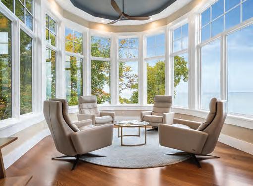
MODERN DESIGN. MADE FOR THE WAY YOU LIVE.
MODERN DESIGN.
MADE FOR THE WAY YOU LIVE.
MODERN DESIGN. MADE FOR THE WAY YOU LIVE.
MODERN DESIGN. MADE FOR THE WAY YOU LIVE.

Let Thomas & Milliken Millwork help you see Modern design differently.
Let Thomas & Milliken Millwork help you see Modern design differently.
Let Thomas & Milliken Millwork help you see Modern design differently.
Let Thomas & Milliken Millwork help you see Modern design differently.

Let Thomas & Milliken Millwork help you see Modern design differently.

