










BRINGING YOUR PLANS TO LIFE ONE HOME AT A TIME.


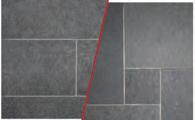


Launching this year, The Gault Collection features custom designed exterior porcelain pavers with one-of-a-kind finishes, pairing the versatility of porcelain with the beauty of natural stone for a variety of design needs.
Launching this
The




A husband-and-wife design team reimagines their dated Darien home for twenty-first-century living.
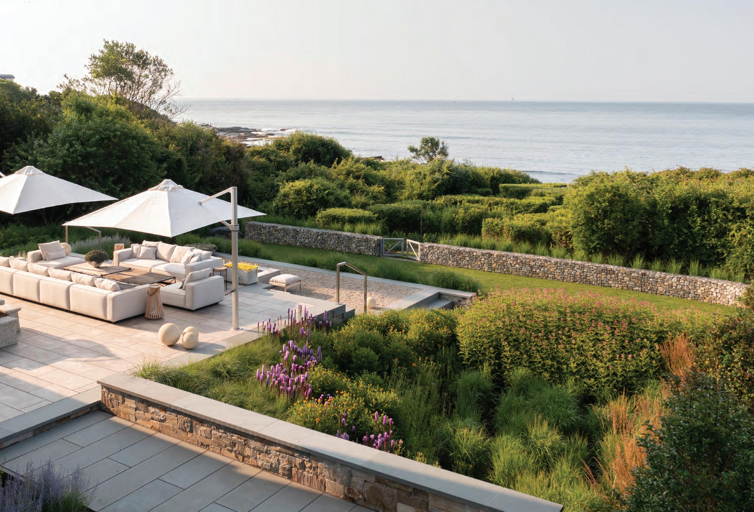
This Greenwich property is all about letting the expansive views take center stage.
An enchanting island retreat reflects a sense of place.

Design Dispatches
Mark your calendars for these must-attend events and read up on industry news.
A look back at a host of design-related events.
Institute of Architects Alice Washburn Awards
Heather





nehomemag.com
Editor in Chief Jenna Talbott jtalbott@nehomemag.com
Creative Director Robert Lesser rlesser@nehomemag.com
Managing Editor
Erika Ayn Finch efinch@nehomemag.com
Market Editor Lynda Simonton lsimonton@nehomemag.com
Copy Editor Lisa H. Speidel lspeidel@nehomemag.com
Senior Contributing Editor Paula M. Bodah
Contributing Editor Karin Lidbeck Brent
Contributing Writers
Fred Albert, Alyssa Bird, Tovah Martin, Kathryn O’Shea-Evans, Gail Ravgiala
Contributing Photographers
Willie Cole, Caryn Davis, Sissela Johansson, Rob Karosis, Joseph Keller, David McCaughan, Read McKendree, Andy Ryan Photographer, Daniel Wang, Tim Williams
nnn
Subscriptions
To subscribe to New England Home ($19.95 for one year), New England Home Connecticut ($15.95 for one year), or for customer service, call 800-765-1225 or visit our website, nehomemag.com
nnn
Editorial Submissions
Designers, architects, builders, and homeowners are invited to submit projects for editorial consideration. For information, email edit@nehomemag.com
Letters to the Editor
We’d love to hear from you! Email us at letters@nehomemag.com
Upcoming Events
Are you planning an event that we can feature in our calendar? Email information to calendar@nehomemag.com
Parties
We welcome photographs from designor architecture-related parties. Send highresolution photos with information about the party and the people pictured to info@nehomemag.com
nnn
Newsletter
Sign up at nehomemag.com/newsletters
Social Media
Engage with us at @nehomemagazine on Instagram + Pinterest + Facebook



nehomemag.com
Publisher Kathy Bush-Dutton kbushdutton@nehomemag.com
Associate Publisher, New England Home Connecticut Roberta Thomas Mancuso rmancuso@nehomemag.com
Executive Sales Manager
Jill Stoller jstoller@nehomemag.com
Sales Managers
Joyce Leavitt jleavitt@nehomemag.com
Marcia Noble mnoble@nehomemag.com
Kim Sansoucy ksansoucy@nehomemag.com
Marketing Designer
Jared Ainscough jainscough@nehomemag.com
Production Manager Glenn Sadin gsadin@nehomemag.com
Marketing & Sales Coordinator Camilla Tazzi ctazzi@nehomemag.com
nnn
Advertising Information
To receive information about advertising in New England Home, please contact us at 800-609-5154, ext. 713, or info@nehomemag.com
Editorial and Advertising Office 530 Harrison Ave., Suite 302 Boston, MA 02118 617-938-3991, 800-609-5154
nnn
New England Home Magazine, LLC
Managing Partners
Adam Japko, Chris Legg
Finance Manager
Kiyomi DeBay kdebay@nehomemag.com
Circulation Manager Kurt Coey
Newsstand Manager Bob Moenster


nnn
Media partners:



In the summer, I wake up with the sun. I’ve tried room-darkening shades to grab a few extra winks, but my eyes still pop open well before 6 a.m. Truth be told, I’m a morning person, so I really don’t mind (I never have to set an alarm!), but recently we removed an enormous tree from the east side of our home, and now that it’s gone, we might as well be sleeping outdoors. I do love the extra sunshine that pours into our kitchen, one floor below. But with all that light, the only thing I can see are the flaws in that space. Luckily, I’m at no loss of ideas for improvement thanks to the kitchens we highlight in this issue. One standout embraces an east-west orientation that allows for morning and evening light. While my future kitchen wish list is long, I pledge to preserve the current eastern exposure so that every day I can sip my first cup of coffee in sunshine.
No doubt you’ve hit your summertime stride by the time you’re reading this. I hope you’re taking full advantage of early morning sunshine (if that’s your thing) or reveling in gloriously extended summer twilight. This issue’s featured homes were selected for their easy flow from interior comfort to outdoor enjoyment. A midcentury home on page 112 luxuriates in a skillful update that preserves and improves its original viewsheds. The owners of a waterside Greenwich home on page 122 welcome fair weather by tucking away their walls, and a Nantucket home on page 134 honors the island’s historic architecture while providing every luxury outdoor amenity. Thanks for making us a part of your summer morning, afternoon, or evening respite—let the sun shine in!
JENNA TALBOTT
@jennatalbott

Joseph Keller has photographed it all, from homes to products to hotels to food. Over the past twentyeight years, the Boston-based photographer’s clients have included Better Homes & Gardens, HGTV, iRobot, and America’s Test Kitchen. When it came time to collaborate with producer Karin Lidbeck Brent on Seasonal Settings (page 58), he says the two creatives inspired one another. “Each table setting had a unique story, style, and mood, so my job, through lighting and composition, was to capture and convey those ideas and themes. It was such a fun shoot!”
Celebrate the art of design and the spirit of Nantucket at Nantucket by Design 2024. Beginning on July 15, four days of programming inspired by this year’s theme, Craftmanship, will raise funds for the Nantucket Historical Association. I’m looking forward to speaking with Heather Goodnow of Woodmeister Master Builders, Andrew Kotchen of Workshop/APD, Ed Hollander of Hollander Design Landscape Architects, and Gary McBournie during a panel discussion on coastal residential design. If you’re on island, please say hello! nha.org
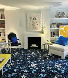
The 49th Annual Kips Bay Decorator Show House New York once again wowed us with design talent. A highlight for me was Greenwich star Patrick Mele’s primary bedroom, On A Clear Day, which he dedicated to the strong women in his life. Congratulations to all the designers on another beautiful show house and for the funds they raised for the Kips Bay Boys & Girls Club. kipsbaydecoratorshowhouse.org

From her home in Colorado’s Front Range, Kathryn O’Shea-Evans writes about design, travel, and food. The House Beautiful contributing editor is also the coauthor of LODGE: An Indoorsy Tour of America’s National Parks, and her newest book, Alpine Style, publishes in September. O’Shea-Evans, a selfprofessed anglophile, fell hard for Heather Ryder’s space in The New Old Kitchen (page 50). “I loved how she sourced things directly from England, from the Farrow & Ball paint color to the light switches from Forbes & Lomax,” she says.


This magnificent contemporary home is brimming with lavish amenities creating the pinnacle of luxurious living.
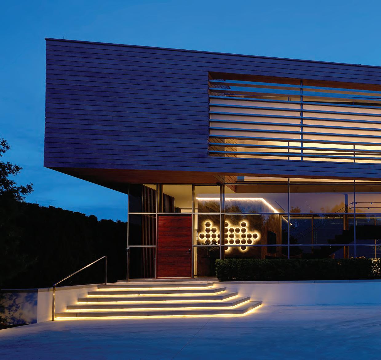

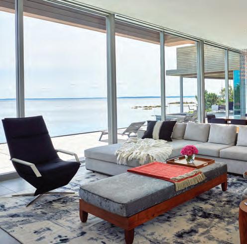


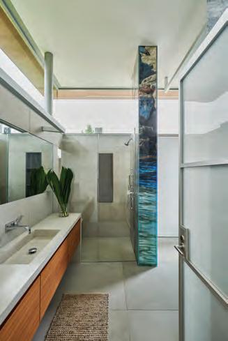


An addition turns a too-small kitchen into a multipurpose family space.
Text by GAIL RAVGIALA | Photography b y DAVID M C CAUGHAN

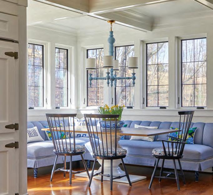
CLOCKWISE FROM RIGHT: A coffered ceiling reflects the traditional architecture of the house and unifies the new space. Behind the Wolf range is a marble mosaic backsplash, while the wall above the counter is sheathed in cornflower blue crackle tile from Ann Sacks. The second island, topped with knotty French walnut, is kid central; behind it, glass doors with decorative curved accents reveal shelves and drawers that hold school and art supplies.
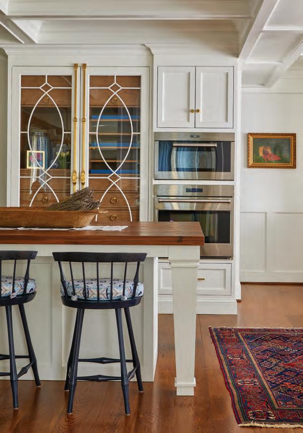
It’s an old real estate saw that kitchens sell houses. Conversely, a beautifully renovated kitchen can anchor a family in its forever home. For one Connecticut couple living with the spatial, culinary, and aesthetic foibles of an inadequate kitchen, a new, expanded space delivered not only a dream kitchen but a more functional house where they and their three school-age children could thrive and grow.

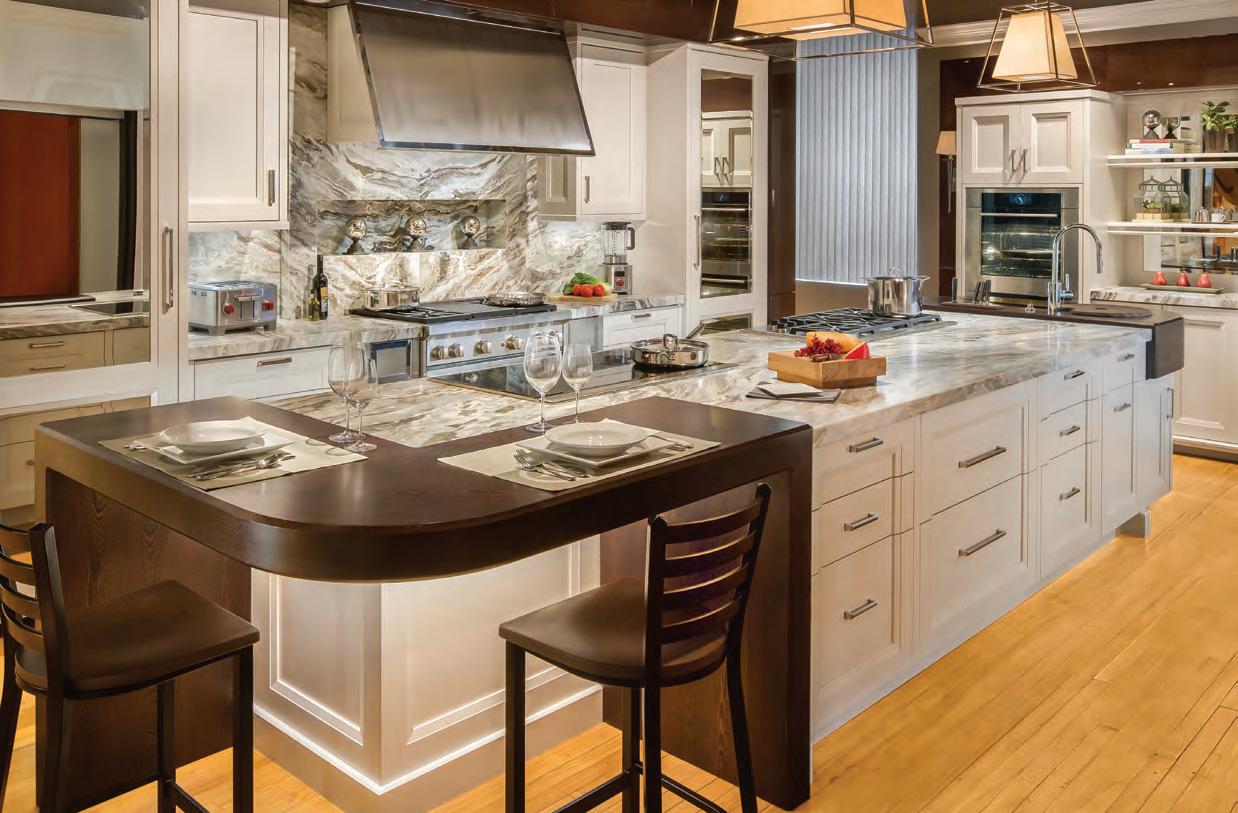


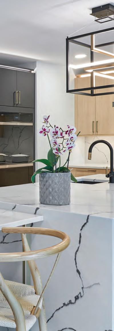
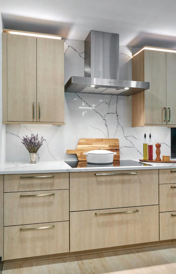
Spend an hour at a Clarke Showroom and one thing is clear: your time with a Clarke Consultant is the most valuable part of your kitchen journey. While they’re not designers, these are the people designers call on when it comes to appliance recommendations. You won’t buy anything at Clarke, so there’s simply no pressure. What you can do is compare more Sub-Zero, Wolf and Cove models than anywhere in New England. Explore a living portfolio of kitchens created by the region’s top designers. You will leave inspired with new knowledge to make your appliance selections with confidence.
Showroom Consultant
Gina Saltarelli’s unique knowledge will help you select the ideal appliances for your home and lifestyle. Informed by her experience as design consultant and real estate professional, Gina is practical, creative and well-versed in what makes a great kitchen. Boston & Milford, MA South Norwalk, CT 800-842-5275 clarkeliving.com


New England’s Official Showroom and Test Kitchen


Thomas Nolan, who handled the architectural aspects of the renovation, describes the existing house, built in 2004, as a French chateau with a Victorian flare. He credits Kimberly Levin of Verve Design with envisioning the expansion of the first floor, adding some 800 square feet to create not just a kitchen but a multipurpose family hub.
“This was a very involved project with a lot of moving parts,” says Nolan, noting that an optimum traffic pattern was a top priority. “The more you
control circulation,” he says, “the more useable the space will be.”
For her client, a busy mom who is “very organized and loves to cook,” functionality is key, says Levin. Her wish list included two islands, one that would allow her to do her thing and one where the kids could do theirs. Entertaining tends to the informal and impromptu. “Lots of seating was intentional for this on-the-go family,” says Levin, who designed the kitchen to accommodate a variety of dining styles,
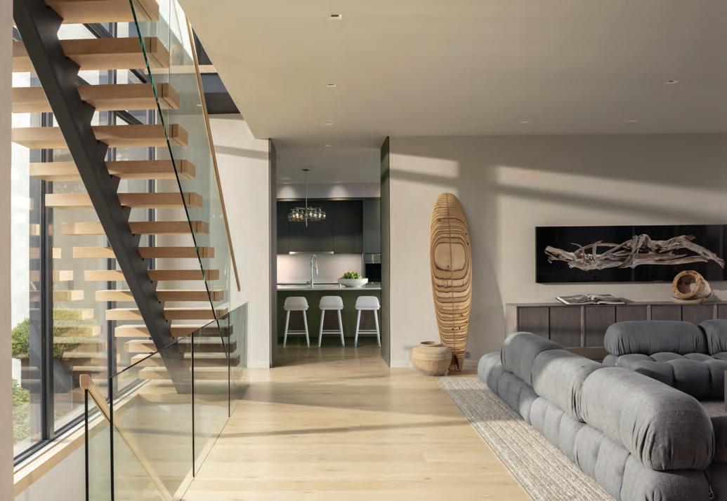
from a snack at the counter to a gathering at the cozy banquette in a light-filled corner of the room.
The coffered ceiling, which plays to the traditional architecture of the house, is elegant and cohesive. “It was a process to come up with the design,” says Nolan. “If it were too busy, it would be a distraction.”
The new floor plan opened the kitchen to the adjacent family room, while a butler’s pantry provides passage to the more formal parts of the house, including the dining room and front entry. Windowless with floor-to-ceiling cabinetry painted
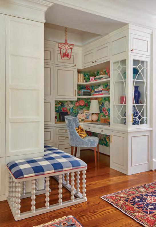
a moody navy blue, the pantry offers a beguiling, even magical, entrée to the welcoming gathering space beyond.
EDITOR’S NOTE: For details, see Resources.
ARCHITECTURAL DESIGN: Thomas Nolan Design
INTERIOR DESIGN: Verve Design BUILDER: Ridgewood Builders








Heather Ryder’s recipe for revamping a tired cook space called for stirring in plenty of soul. Text by
KATHRYN O’SHEA-EVANS
1978
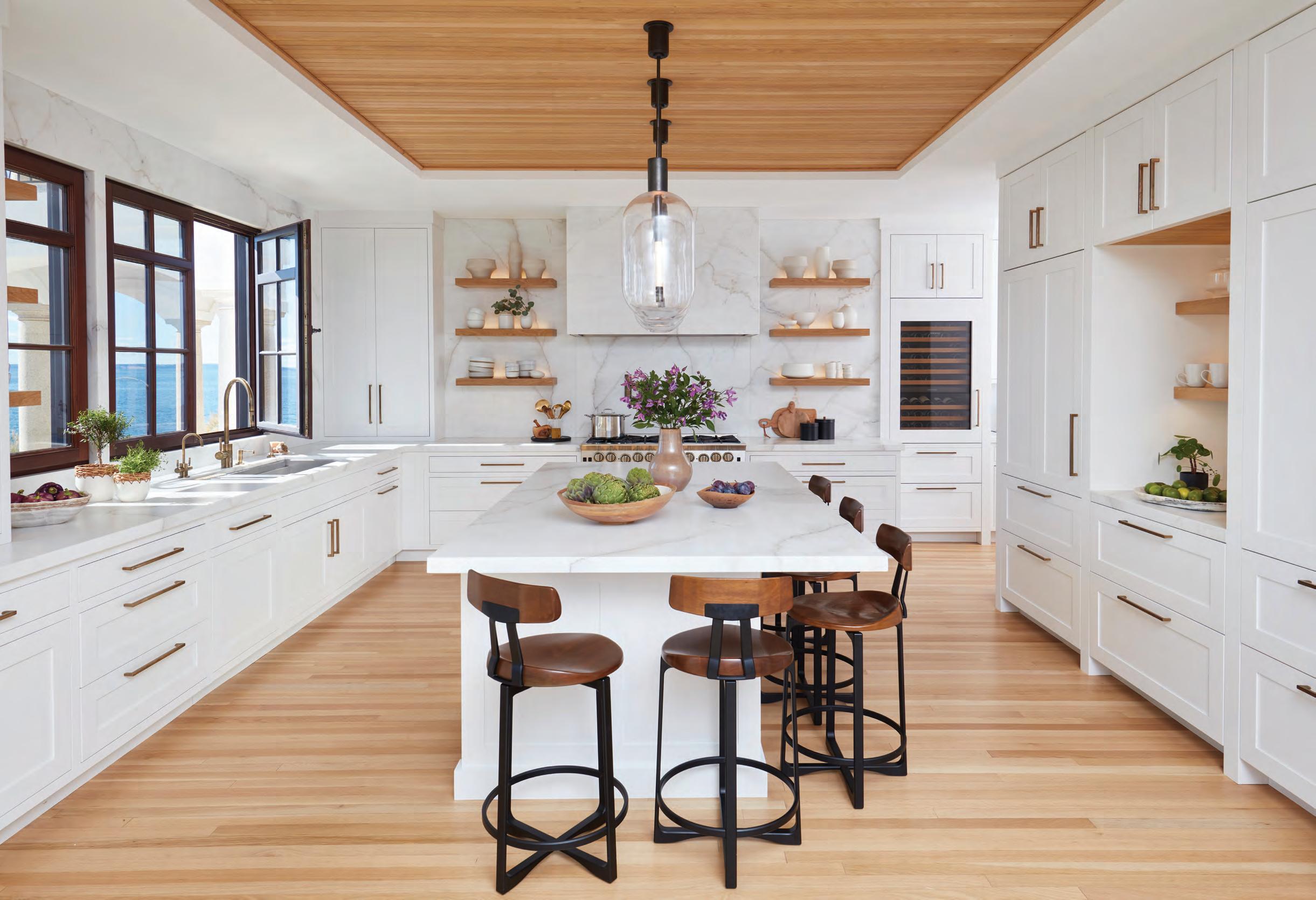
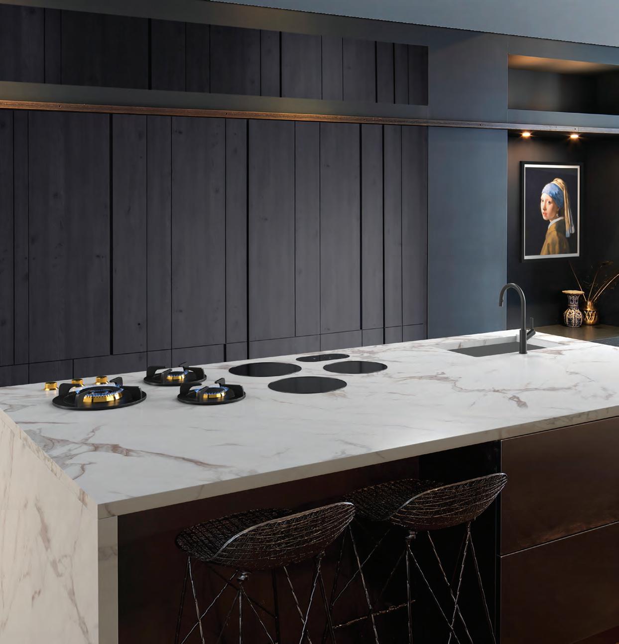
Interior designer and homeowner Heather Ryder longed to create an anglophile-inspired kitchen for her family of five and their two doodles. The counters and backsplash are Calacatta Paonazzo marble, which has a warm, rusty veining that complements the kitchen’s palette.
was a great year for soundtracks (both Grease and Saturday Night Fever were released). But kitchen design? Not so much. That’s what designer Heather Ryder discovered when she and her family moved into a center-hall colonial in Wilton.
“It had good bones, but the kitchen was still from ‘78,” the designer recalls, citing the treacly scalloped wood trim and a linoleum floor that had been covered over
with a layer of faux wood. “When I removed the oven drawer to clean, I could see the linoleum still under there. The previous owners painted the dark cabinets white, and they threw on some granite, but that’s about it. It still clearly had the hallmarks of 1978 everywhere.”
To bring the kitchen into the present day with nods to a more illustrious past, Ryder began by absorbing the existing
dining room to create an open space with room enough for a coffee bar and wine fridge. “It gives us east-west light: the sun comes up from the kitchen sink area and goes down in the kitchen table window,” Ryder says.
Plaster walls and a studied color palette, including Farrow & Ball Studio Green, which is deep and moody by night and lively by day, brings all that newfound

CLOCKWISE FROM LEFT: Under her farmhouse sink, Ryder had a drip ledge installed; without it, she says, cabinet paint starts to peel, and wood begins to degrade from the moisture. Ryder asked her builder to fit a countertop within the walk-in pantry for storing smaller appliances out of sight, and they made it work at just seventeen inches deep. The designer created a built-in she refers to as a “mudroom closet” between the family room and kitchen; the aged-brass light switches are from English company Forbes & Lomax.
breathing room down-to-earth. “I was inspired by lots of old-time-y English country kitchens,” Ryder says. “They use this color often, and they’ve used it for a long time. So it’s nothing new and innovative, but it was just something that I loved. It looks more like furniture to me than a kitchen, which is ultimately the goal I was going for.”
It also pairs well with another timeless finish, white oak, which gives the space a contemporary touch. “I was cognizant of the fact that this is a house built in 1978,” Ryder says. “I only have eight-foot ceilings, so I was very careful that I didn’t put too much of that green.” Above a Lacanche range there are no cabinets, which gives the illusion of height and light. “I didn’t want to feel like this kitchen was swallowing you up.” The result? A room that serves as the soundtrack of Ryder’s home.
EDITOR’S NOTE: For details, see Resources.
INTERIOR DESIGN: Heather Ryder Design
BUILDER: Polito Builders

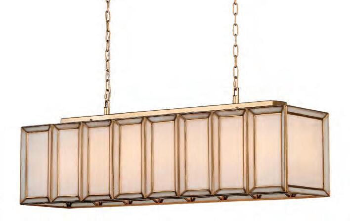
Daze Rectangular Chandelier by Currey & Company, Chloe Winston Lighting Design, South Norwalk, chloewinstonlighting.com
The New Generation of Cooling Three-Door Refrigerator-Freezer Combination by Gaggenau, Aitoro Appliance, Norwalk, aitoro.com

Peche Collection Cast-Iron Round Oven by Le Creuset, Williams Sonoma, various Conn. locations, williams-sonoma.com

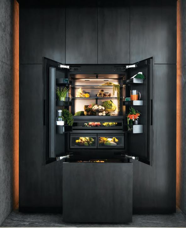
Things are heating up in the kitchen. Produced by LYNDA SIMONTON
and
by Ruvati, Stone Techniques, Norwalk, stone-techniques.com

Dining Table by Bernhardt, Tusk Home + Design, Southport, tuskhomeanddesign.com
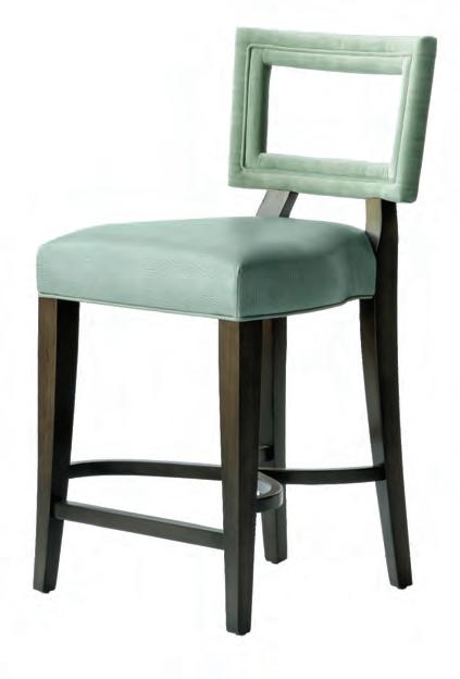

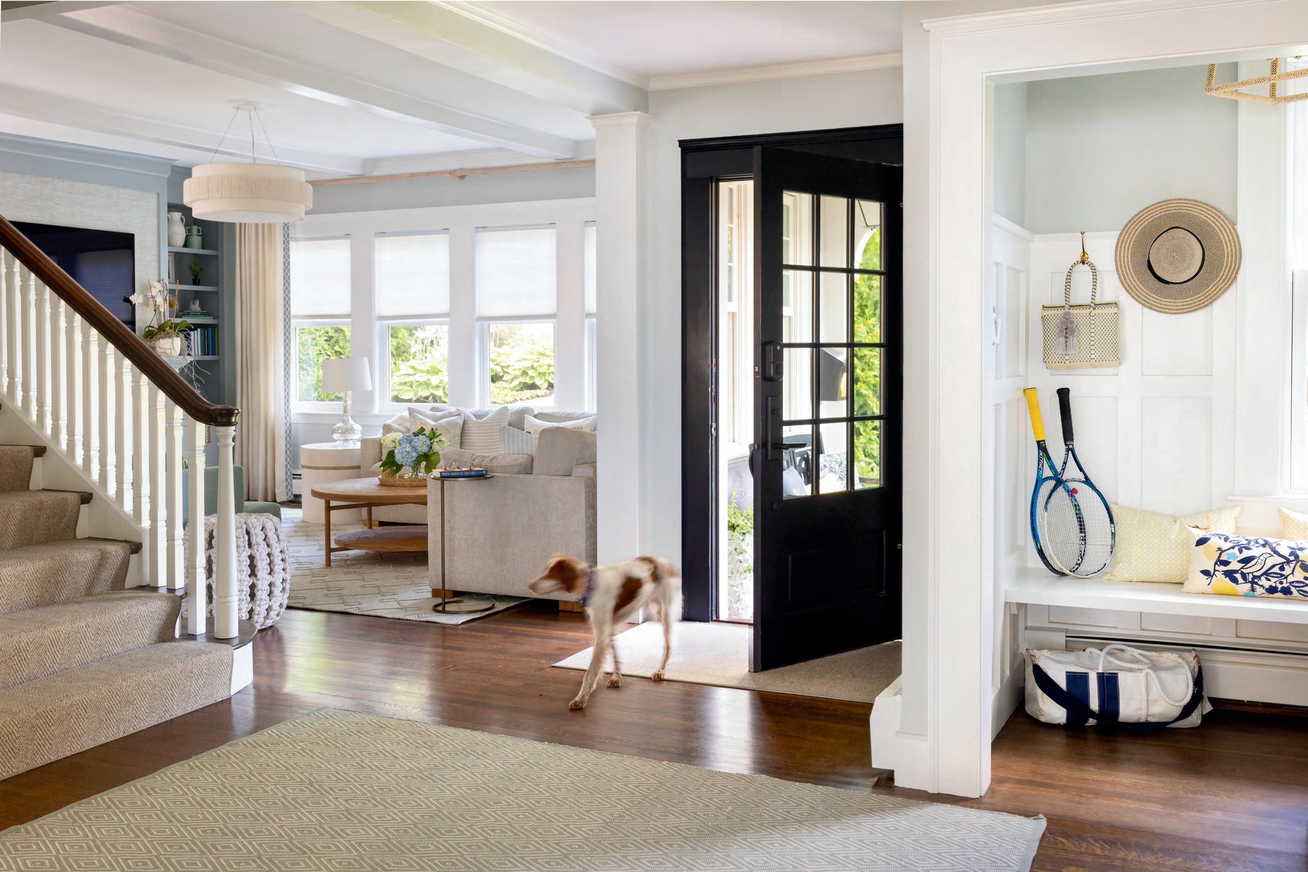


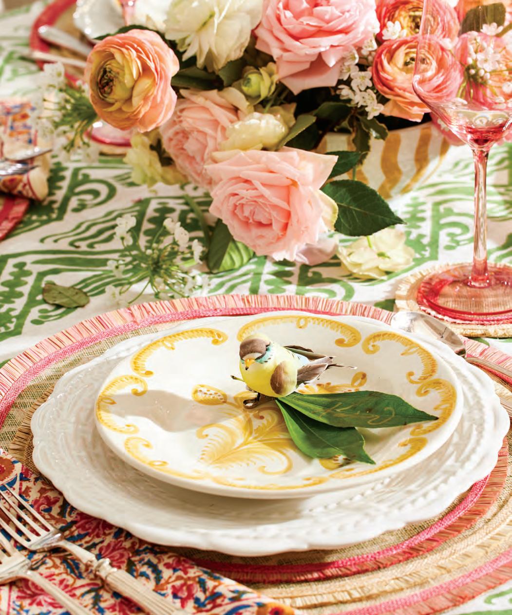
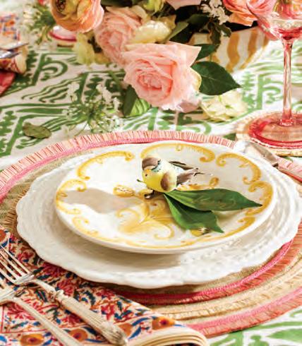
For Karin Lidbeck Brent, a dinner party’s tablescape is as important as the meal itself. The stylist shares tips for creating tableaus that reflect the joys of summering in New England.
Produced by KARIN LIDBECK BRENT and LYNDA SIMONTON
Photography by JOSEPH KELLER




ProSource offers a dedicated team of experts and private showrooms with the largest selection of products at wholesale prices. With convenient one-stop shopping, this one-of-a-kind combination supports our strong relationships with the most talented trade professionals in the business.

Text by TOVAH MARTIN | Photography b y CARYN B. DAVIS
A.
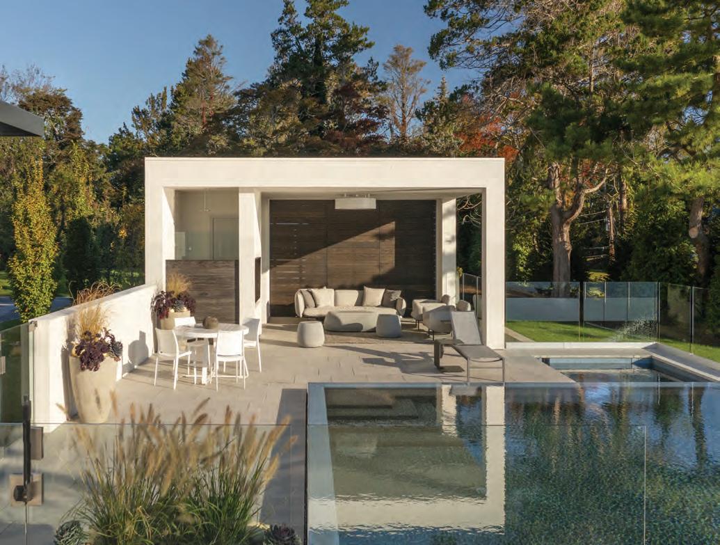
Jr., better known as DJ, designed the pool cabana to include its own wet bar. A bathroom and a changing room are accessed through side doors, and a gate in the fence leads to parking, streamlining pool parties for the resident teens.


Sarah Foley needed a garden—fast. She had purchased an Old Lyme hilltop house and its two and a half acres in April 2020, right as the pandemic was transforming life as we knew it. With three boys (two of them teenagers), outdoor space was imperative, and Foley was feeling more than slightly overwhelmed. Unfortunately, her new home’s “almost a jungle” landscape wasn’t helping. Beyond a more orderly, natural-with-purpose presentation, her main directive when she hired landscape designer David A. Noyes Jr. of Water Street Design Associates was low maintenance.
“Everything he proposed was spot on,” Foley says.
From Noyes’s perspective, Foley was the model client, but the landscape was a different story. Challenges were omnipresent, starting with the pool. For good
reason, Foley wanted to relocate it.
“The original pool sat directly at the bottom of a set of stairs,” says Noyes.
“If you tripped, you would fall in.”
BELOW: The
and bayberry.


Perched fifty feet above street level and boasting a breathtaking view of the Connecticut River Valley, the site was precariously steep, so terracing was vital. A narrow lounging/dining terrace now skirts the back of the house. Two levels down, Noyes designed a multipurpose cabana for the new pool. The structure speaks “a similar language as the house,” says Noyes, who incorporated formal columns and a pergola that shades outdoor lounging.
Foley envisioned an infinity-edge pool, and Noyes took that concept to another level (literally) by giving the necessary catch basin its own terrace, where the view is framed in billowing perennials. The serenade of the pool’s cascade into the basin makes the spot particularly tranquil. And a perennial-surrounded spa extends the water experience beyond summer.
Buffeting it all, naturalistic plantings



“WE CAN SIT OUTSIDE IN OUR OWN LITTLE SANCTUARY. THERE’S NEVER A DULL MOMENT.” —Homeowner Sarah Foley
serve up swaying, pollinator-humming swaths of color. The plantings needed to withstand strong winds, and Noyes selected stalwart Russian sage, ornamental grasses, hydrangeas, joe-pye weed, catmint, and mountain mint to provide year-round beauty. “It’s heaven on Earth, truly,” Foley says.
Ultimately, the team kept their promise to have the kids in the pool by July 2021 thanks to project manager Tim Kenniston. And the family’s appreciation for the space has only grown over time. “We can sit outside in our own little sanctuary,” says Foley. “There’s never a dull moment.”
EDITOR’S NOTE: For details, see Resources.
LANDSCAPE DESIGN: Water Street Design Associates


Former New York Yankees star Bernie Williams finds room to stretch out and relax in Connecticut.
Text
by
ERIKA AYN FINCH | Photography b y TIM WILLIAMS
Styled by ANNA MOLVIK
In the formal living room, interior designer Jody Fierz and the homeowners found a place for portraits depicting Ray
and Stevie
Two maple coffee tables can either fit together or be pulled apart like pieces of a puzzle, while the


When interior designer Jody Fierz met her new client, Bernie Williams (yes, THAT Bernie Williams), on a Zoom call, she cheekily showed up in a Boston Red Sox cap. Williams, a four-time World Series champ who played for the New York Yankees from 1991 to 2006, laughs at the memory. “I thought we were going to have to call security,” he jokes. “But seriously, her work spoke for itself, no matter what team she was wearing.”
Williams and his girlfriend reached out to Fierz about refreshing their Connecticut home base, a residence Williams had owned for ten years but never quite had the time to renovate. “It gave me the opportunity to see for myself the things the house really needed.”
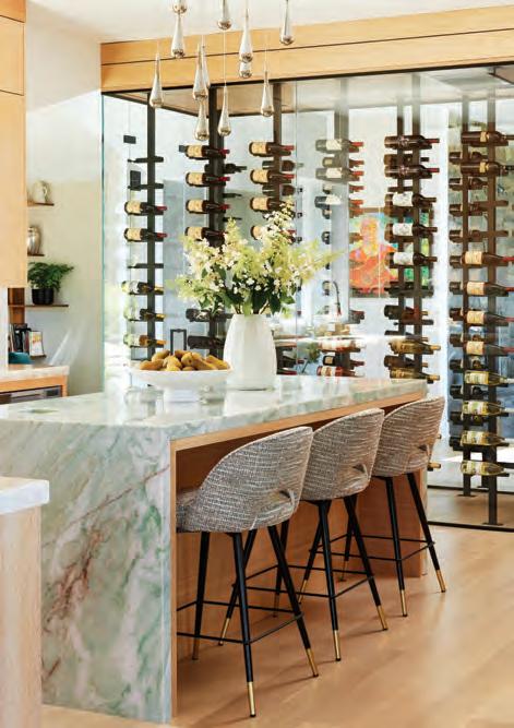
That list included more light-filled rooms and an open floor plan. But as the project progressed, the design team discovered issues with the foundation under the kitchen, which necessitated a gut renovation of that space. The renovation allowed for the addition of the glass wine “room” that separates the kitchen from the rest of the living area, apropos for a man who has collaborated with New York’s Millbrook Vineyards & Winery on his own blend.
LEFT: Former New York Yankees center fielder and jazz recording artist Bernie Williams relaxes in his home studio with a sampling of his guitar— and guitar case—collections. BELOW: Williams wanted to repurpose some of his existing furniture, like the family room’s swivel chairs that Fierz reupholstered in mohair. The chairs sit near a Rene Cazares coffee table that’s wood on top and upholstered on the sides.
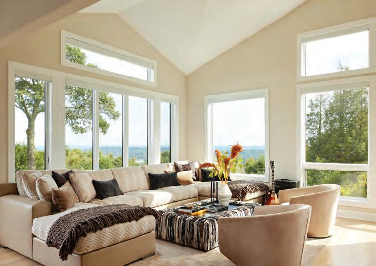
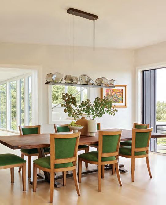
CLOCKWISE FROM RIGHT: Williams’s girlfriend came up with the idea for the slick wine “room” that separates the kitchen, designed by Erich Diller of Evolve Design Group, from the living room. A pool table, lit by a Hubbardton Forge slate chandelier, acts as the centerpiece for an area outside Williams’s studio. Massachusetts-based Saltwoods crafted the dining room tabletop from one solid piece of walnut; the lush foliage outside inspired Fierz to introduce a shade of green on the chairbacks that she says reminds her of a “newborn leaf.”
Fierz says the couple gave her a lot of creative freedom when it came to the interiors. “His style is more eclectic, and hers is more transitional,” says Fierz. “The challenge was combining two aesthetics and providing honest feedback on the extent of the updates.”
As with many tall professional athletes, ergonomics came into play, and most of the seating was custom designed.
Fierz also kept in mind Williams’s art collection, which includes paintings by his daughter, Beatriz Williams. And then there’s the guitar collection. Williams, a classically trained guitarist, has released two jazz albums and was nominated for a Latin Grammy
“IT’S A PLACE WHERE YOU WANT TO HAVE A CUP OF COFFEE—IT’S NOT A MUSEUM.”
—Homeowner Bernie Williams


in 2009. Ground-floor hangout spots like a room with a pool table, another one for playing board games, and a moody recording studio/bar treat the instruments like works of art.
Williams says the home, inside and out, feels like a sanctuary. “It’s a place
where you want to have a cup of coffee— it’s not a museum,” he says. “Outside, you can take a deep breath and enjoy the greenery and the wildlife. Inside, there’s that same feeling of relaxation—you might even be tempted to take a nap.”
EDITOR’S NOTE: For details, see Resources.

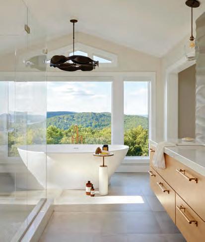
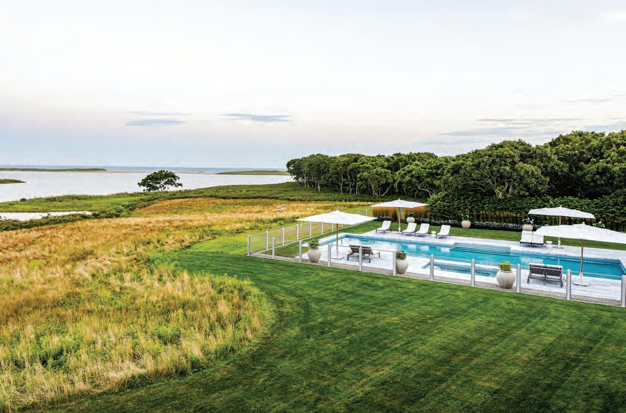
CLOCKWISE FROM TOP: The pool nestles into the private backyard and boasts views of a nearby lake. Diller also designed the primary bath, which features panoramic views of the surrounding hillsides. The Visual Comfort & Co. table lamps in the primary bedroom echo the statement-making Phillip Jeffries wallcovering and bring a touch of contemporary glam to the space.
ARCHITECTURAL DESIGN:
Evolve Design Group
INTERIOR DESIGN:
Jody Fierz Interior Design
BUILDER: LS Construction
LANDSCAPE DESIGN: Brook Clark
Landscape Architects


Edited by LYNDA SIMONTON
›› The Glass House Tours ONGOING
See what all the buzz is about! Tour one of Connecticut’s most noted architectural icons and favorite design destinations. New Canaan theglasshouse.org
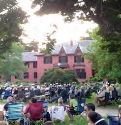
›› Twilight Lawn Concert Series
JULY 26, AUGUST 9
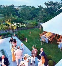
Spread out a blanket on Roseland Cottage’s lawn and enjoy an evening of music featuring The Flamingos in July and Triple Double in August. Woodstock
historicnewengland.org

›› Old-Fashioned Flea Market
SEPTEMBER 15
Enjoy the thrill of the hunt at The Lockwood-Mathews Mansion Museum while you peruse antiques, collectibles, crafts, and jewelry.
Norwalk lockwoodmathewsmansion.com

‹‹ Nantucket by Design
JULY 15–18
This year’s keynote speaker is Ken Fulk, while Aerin Lauder and Mark D. Sikes headline the popular Design Luncheon. Nantucket, Mass. nha.org
‹‹ Tour Frances Palmer’s Garden
SEPTEMBER 14
Tour gardens adjacent to potter Frances Palmer’s studio, where she grows an abundance of blooms including more than 100 dahlia specimens. Weston gardenconservancy.org

The Artisan Marketplace Summer Series
JULY 14, JULY 28, AUGUST 4, AUGUST 18, SEPTEMBER 8
Local artisans display a variety of wares, from hand-crafted jewelry to home decor, at MoCA Westport. Westport mocawestport.org
Guilford Art Center Craft Expo
JULY 19–21
Meet the makers at this contemporary craft and art show on the Town Green. Proceeds benefit the nonprofit Guilford Art Center. Guilford guilfordartcenter.org
Arranging Homegrown Flowers
AUGUST 24
Learn how to create bouquets of seasonal flowers at this hands-on event at Hollister House Garden. Washington hollisterhousegarden.org

‹‹ Artful Arrangements Dazzling Dahlias: Dutch Master Still-Life Floral Design
SEPTEMBER 26
Join master florist Trish O’Sullivan as she shares insights into creating arrangements at the Greenwich Historical Society. Greenwich greenwichhistory.org
The Stamford design scene continues to heat up this summer. Laura Michaels Design has opened a showroom at 17 Irving Avenue, Suite 2. The to-the-trade showroom features decorative elements, custom furnishings, and globally sourced materials. Additionally, the shop showcases Laura Michaels Design’s partnership with distributor ABC Stone, spotlighting tile from Borrowed Earth and surface materials from Lapitec.
NYC-based Sarah Jefferys Architecture + Interiors is expanding to the country with a new office in Cornwall. As a property owner in Litchfield County, Principal Sarah Jefferys is eager to accommodate the growing demand for contemporary, sustainably designed country homes in the region and beyond.
Connecticut designers once again made their mark at the Kips Bay Decorator Show House New York. Greenwich native Patrick Mele designed a floral-festooned bedroom featuring a wallcovering and fabric pattern by jewelry designer Hayley von Rigal. And Workshop/APD created a feminine retreat within the home’s primary suite dubbed Le Fumoir Féminin.
Designer Joanna Buchanan, known for her innovative tabletop pieces, has collaborated with The Metropolitan Museum of Art on two sets of wine charms based on objects from the museum’s collection. One set features shoes from the iconic costume archive, and the other depicts a series of flowers inspired by various museum paintings. Send good vibes to Haver & Skolnick Architects, whose kitchen in a Tudor Revival home is a finalist in the global Kitchen Design Contest sponsored by luxury appliance manufacturers Sub-Zero, Wolf, and Cove. Curious about the kitchen? Head to our website to see it and the entire home, which was featured in the summer 2021 issue of New England Home Connecticut. The winners will be announced in October.
Do you have news to share with New England Home? Email Lynda Simonton at lsimonton@nehomemag.com

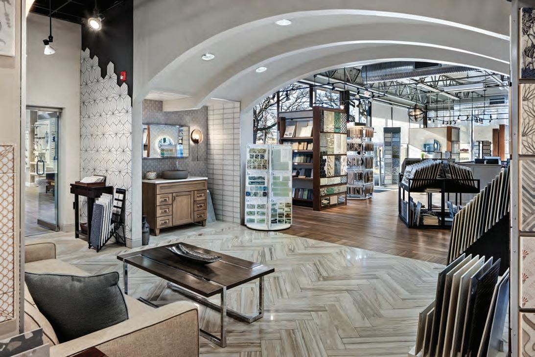


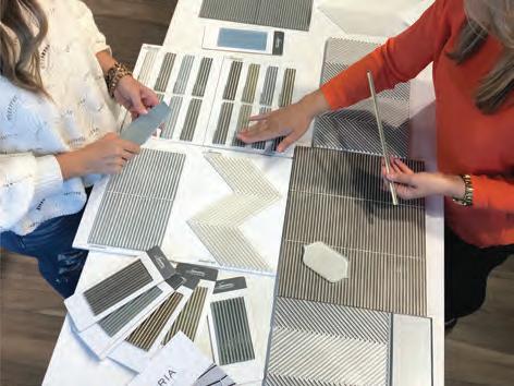
Our seasoned design experts and exquisite showrooms are ready to elevate your project.
CELEBRATING 60 YEARS AS A CONNECTICUT FAMILY BUSINESS
F A IRFIEL D M A NCHE S TER NE W HA VEN
NE W LONDON
ST AM FOR D W E ST HAR T FOR D


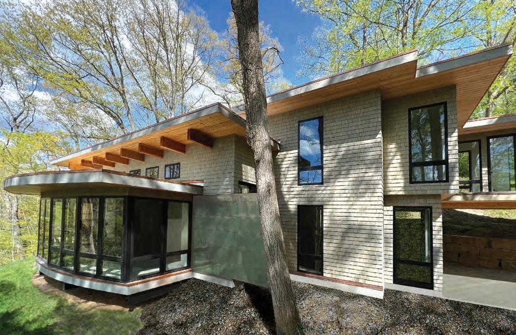

The Connecticut Chapter of the American Institute of Architects (AIA Connecticut) Alice Washburn Awards celebrate excellence in traditional house design. A prolific Connecticut architect and builder of the 1920s, Alice Washburn was a pioneer during her day. Building on her legacy, this year’s winners have submitted
projects celebrating traditional residential designs that have been meticulously modified to meet modernday needs. Winners are chosen in three categories: new construction, accessory buildings, and additions/ renovations. Here are the 2024 award-winning architects and their exceptional work.
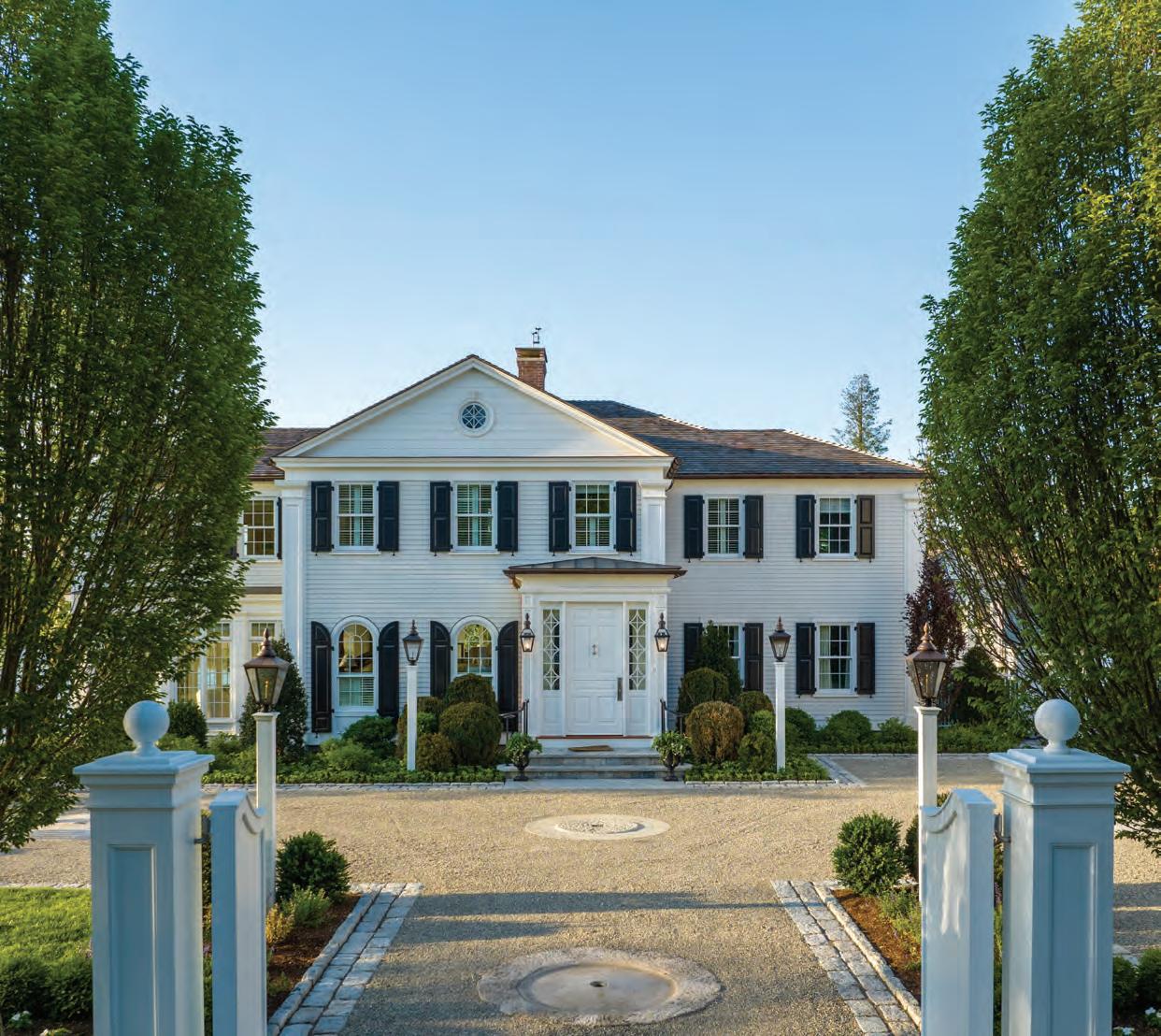
Additions/Renovations: Merit
HISTORIC HOUSE RENOVATION AND ADDITIONS
Architecture: Scot Samuelson Architect
Photography: Frank DiNardi
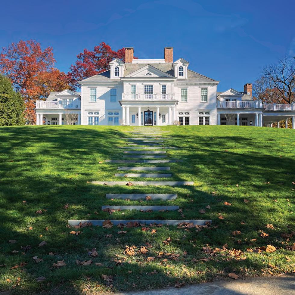
Originally built in 1932 by architect J. Frederick Kelly, who was known for designing houses with “colonial dignity,” this home had it in spades. Preserving that dignity was a key component of the renovation and expansion that Scot Samuelson Architect undertook. The home grew from 4,000 to 5,675 square
feet and was updated with many modern amenities in the process. The project included two new buildings that blend seamlessly with the surroundings, a pool, and—the pièce de résistance—a conservatory with floor-to-ceiling windows that boast stunning river views.


New Construction: Excellence SEASIDE SHINGLE
Architecture: VanderHorn Architects
Photography: Robert Benson Photography
Gracious and grand, this Shingle-style new build designed by VanderHorn Architects has a classic exterior with a doublegable front elevation and Tuscan columns that lend a hint of formality. In contrast, the water side of the home has copious windows to take in harbor views and French doors for easy


access to the terraces and pool beyond. Elegant interiors welcome guests, but the private spaces boast sweet surprises: note the sitting alcove tucked in a tower in the primary suite, and the nautical-inspired bunk area with a child-size ship for hours of maritime merriment.
Accessory Buildings: Merit POOL HOUSE
Architecture: Scot Samuelson Architect
Photography: Frank DiNardi
This petite pool house purposefully doesn’t scream summer —the goal here was year-round appeal. The team at Scot Samuelson Architect designed a Greek Revival facade that blends seamlessly with the pool and surrounding gardens as well as the other structures on-site. Inside, there’s a full bath, a kitchenette, a dining area, and an open living space complete with a fireplace primed for cozy evenings. Come summer, a private outdoor shower is at the ready for a peaceful post-dip rinse.
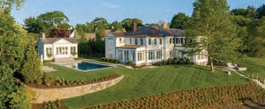


Accessory Buildings: Merit VILLA POMME
Architecture: Lovas Architects
Photography: Robert Norman Photography
French country style meets traditional Connecticut stone barn at Villa Pomme, a stunning outdoor oasis designed by Lovas Architects. While the materials palette is rustic, the overall scheme is formal and designed around a central axis that links all the major components: pool and spa, firepit area, pool house, and a walled garden with a fireplace. Cool details abound, from the pool house’s steel accordion doors that fully retract to let the outdoors in, to the alfresco spiraled stone shower. It all adds up to a special space suitable for quiet relaxation or a summer soiree.
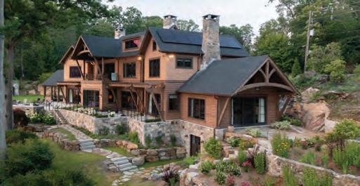
New Construction: Merit with Commendation for Sustainability
WATERFRONT POST AND BEAM
Architecture: Doyle Coffin Architecture
Photography: Neil Landino

Comprised of multiple interconnected volumes, this post-andbeam-style house was designed by Doyle Coffin Architecture to complement its lakefront location and follow the curves of the shoreline. The main living areas and primary suite are housed on the lower level to take advantage of water views and the terraces that line the house. Wood-plank ceilings, stone chimneys, and white-oak flooring lend warmth and speak to the surroundings, while sustainability initiatives—including geothermal heat, solar panels, and locally sourced materials— help minimize the environmental impact.
Edited by CAMILLA TAZZI
Gault Stone’s newly revamped Westport showroom buzzed with camaraderie as fellow design aficionados gathered to celebrate New England Home Connecticut’s spring issue. Guests mingled as they enjoyed woodfired slices from the Big Green Pizza Truck and a live cooking demonstration by Roble Studio. One lucky attendee won the raffle for a custom stone cheeseboard package.




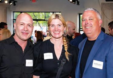




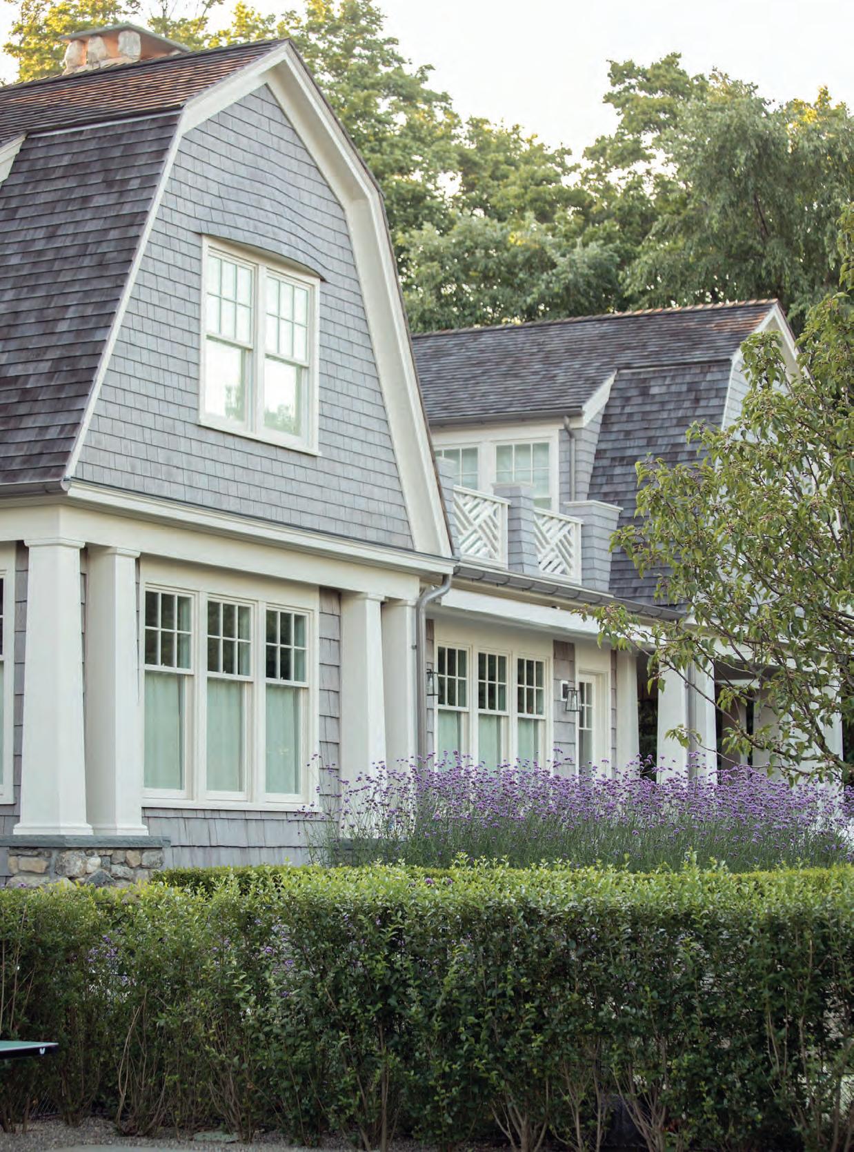
The Luxury Home Design Summit, presented by New England Home and Esteem Media, returned to Cape Cod’s Chatham Bars Inn for the fifth year, gathering leaders in the luxury home design industry for three days of innovative conference sessions and exclusive networking receptions.








The forty-eighth-annual Nantucket Daffodil Festival ushered in the spring season with vibrant color and cheer. New England Home sponsored Flower Power, which kick-started the weekend at the Whaling Museum. Partygoers took a peek at the museum’s current exhibits and enjoyed music, dancing, and hors d’oeuvres.


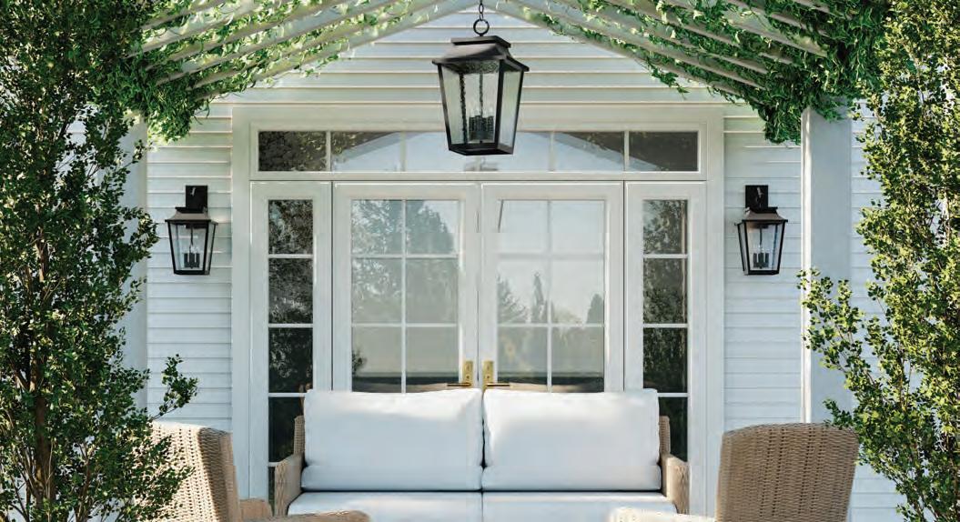
New England Home Connecticut cohosted a celebration at Ornare to commemorate the custom cabinetry showroom’s two-year anniversary in Greenwich. A panel discussion, moderated by Tony Aitoro, included George Pusser, Tina Anastasia, and Chris Pagliaro.





New England Home Connecticut, Eleish Van Breems Studio, and the Connecticut chapter of the American Society of Interior Designers hosted a lunch and learn on the evolution of modern design, presented by Phil Miller of Thayer Coggin.

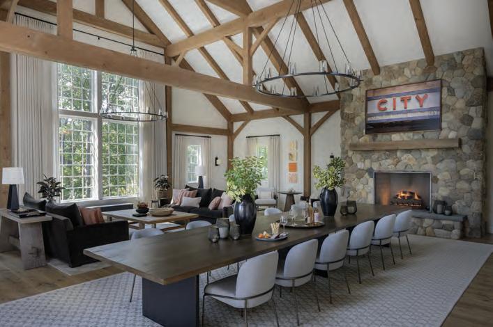
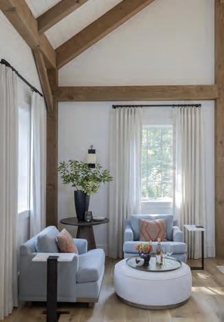
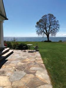
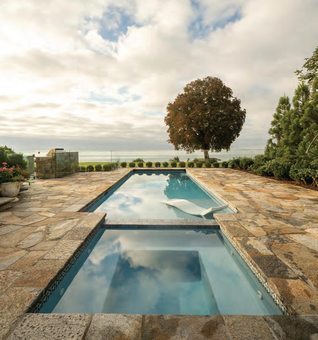



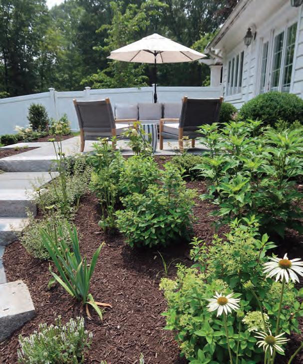
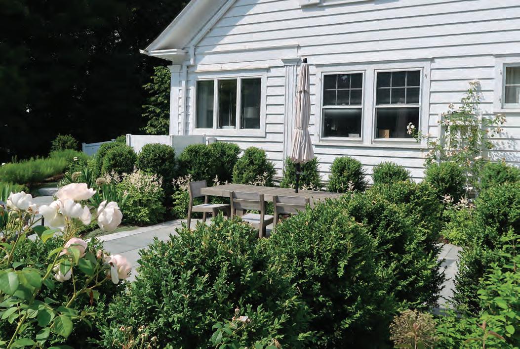


“A play on the traditional moonlight garden, the predominately white flowers are periodically punctuated by a subtle but complementary pastel accent.”


The Goal
Transform the backyard into a series of patios and garden rooms to create a relaxing environment that provides both privacy and visual access to the pool area below.
The Challenge
The Z-shape of the house combined with the rolling topography that separated the outdoor spaces made the property feel disconnected. The goal was to create a unifying theme and connections between activities.
The Elements
The soft foliage of amsonia leads visitors along the arced path that connects the dining and sitting areas. Layered plantings mask the steep embankment while also defining the garden rooms.
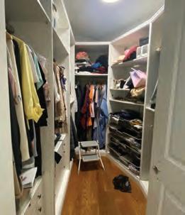


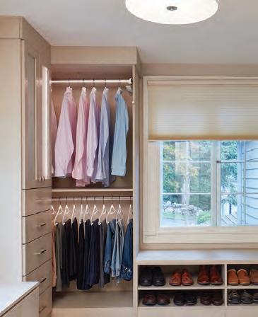
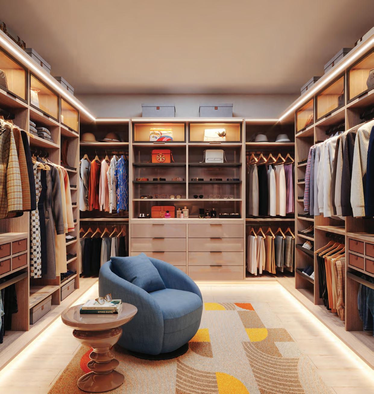
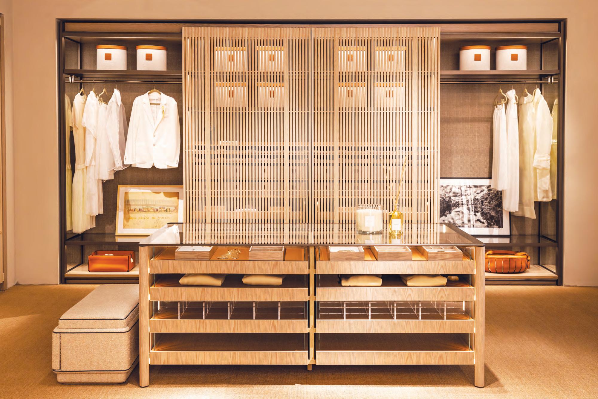
My clients’ goal was to create a proper primary suite that felt spacious and luxurious. They wanted the space to be more than just a closet to store their items. It needed to be a tranquil place where they could begin and end each day.
To achieve their dream space, the couple decided to remove the wall between the existing closets and a spare bedroom to make one large room. One of the most challenging aspects of this project was combining two separate spaces into one. Although the new room had more square footage, it contained three doors and three windows leaving limited wall space to build on. In the end, they decided to close up two of the windows so we could create an impact wall for continuity.
To make the space feel custom and special we added accent lighting with glass doors, a glass countertop above a jewelry display drawer, and slide-out pant racks. Under the remaining window, we created a bench that provides extra storage and a place to sit. The large center island has plenty of drawers eliminating the need for a dresser in the bedroom.


California Closets Showroom: 565 Westport Avenue
Norwalk, CT 06851
203-924-8444
@caliclosetsct californiaclosets.com


Designers at Christensen enjoy working with many clients to enliven their landscapes by transforming forgotten outdoor areas into meaningful living spaces that invite interaction, nourishment, and reflection.

325 Reeds Gap Road Northford, CT 203-484-0424
Christensen Landscape Services
christensenlandscape.com
325 Reeds Gap Road P.O. Box 593 Northford, CT 06472
203-484-0424
christensenlandscape.com @DonnaCLS
117
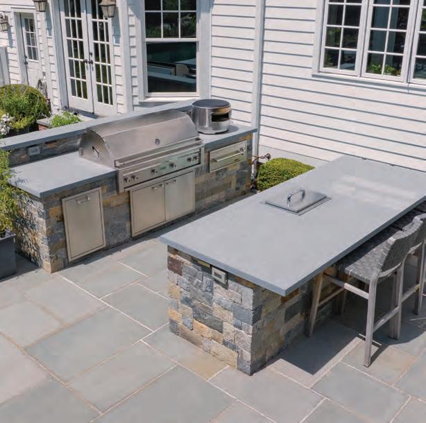
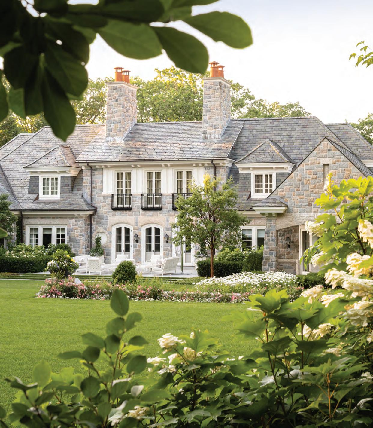
This gorgeous seaside home was in need of family-size entertainment areas and the all-important swimming pool. Our clients love an Old World style. We matched custom stonework to the existing stairs and expanded the patio. Hand-chiseled coping paired with Mediterranean tiles adds a timeless charm to the new pool and spa. A new dining terrace, ocean-view bar, and full outdoor kitchen invite lingering dinners by the sea. An expanded rear patio and gas firepit create a beautiful gathering spot for the end of the day.

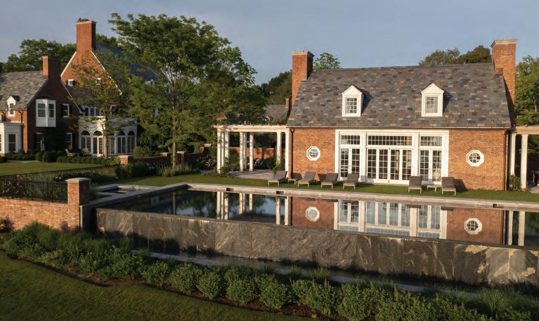


The house, originally designed by Roger Bullard and built in 1929, had become a summer retreat for the new owners. Over the years, the property had lacked regular maintenance and was in need of structural and architectural improvements.

Freddy & Co.
40 Belmont Street
Fairfield, CT 06824
203-855-7854
freddyandco.net

The clients wanted to update the property and add new features without affecting its original design and integrity. Hollander Design worked closely with the homeowners to create a comprehensive landscape design that mimicked the existing elements.
Reclaimed stone was sourced to give all of the new elements a sense of age and authenticity to complement the home. The oval pool was replaced with an expansive lawn to make room for an updated rectangular pool with two deep ends. After installing the new stone and completing structural and drainage work, we then installed mature landscaping elements and trees that are in keeping with the original aesthetic.
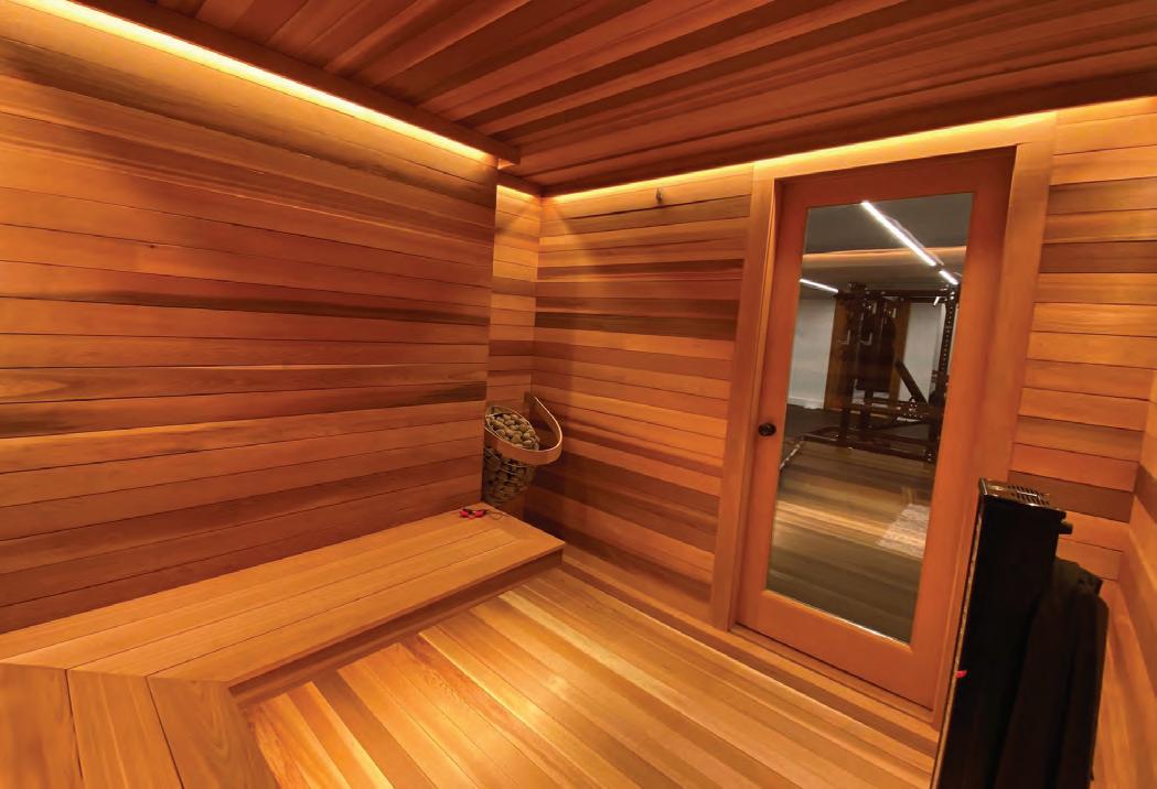


Our clients wanted to turn their partially finished basement and existing gym area into a more luxurious workout space and a dedicated high-end home theater where they could enjoy spending time together as a family. They wanted traditional theater chairs with the ability to recline, but they also wanted to be able to watch a movie or sporting event like they would on a normal couch, without any armrests blocking their ability to sit closer together.
The basement area had low ceilings that proved to be a challenge when it came to proper lighting design. We were unable to do recessed lights in the gym for fear the space would appear too much like a grid. Instead, we used strip lighting to make the area more visually pleasing while also providing proper illumination for the space. The sauna had absolutely no depth to regress any fixtures, so we installed strip lighting in ceiling coves and as toe kicks.

We were able to help transform a no-frills basement space into a high-end viewing area for the family and a well-lit and modern-looking exercise area and sauna. All spaces are controlled by a Savant control system and a Lutron lighting control system.










PROFESSIONAL. ALLIED. ASSOCIATE. EDUCATOR. STUDENT. AFFILIATE.





IF YOU’RE AN INTERIOR DESIGNER AND LOOKING TO GROW YOUR BUSINESS, STAY UP TO DATE ON INDUSTRY STANDARDS AND NETWORK WITH OTHER DESIGNERS, ARCHITECTS AND TRADESPEOPLE, THEN ASID CT IS THE PLACE FOR YOU! CT.ASID.ORG @ASIDCT
Being a member of ASID elevates your professional reputation. Membership provides access to monthly events including, networking, continuing education, round tables, webinars, social gatherings and more. And this year, ASID CT is focusing on all things SUSTAINABLE!
JOI N US NOW AND BE PART OF THE GREEN DESIGN MOVEMENT!


A husband-and-wife design team reimagines their dated Darien home for twenty-first-century living.
Text by FRED ALBERT | Photography by WILLIE COLE

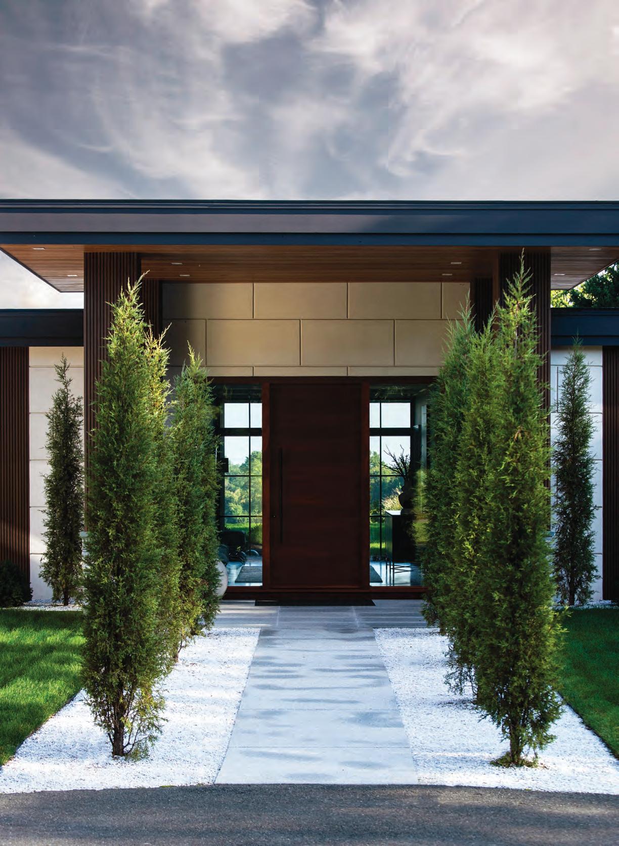
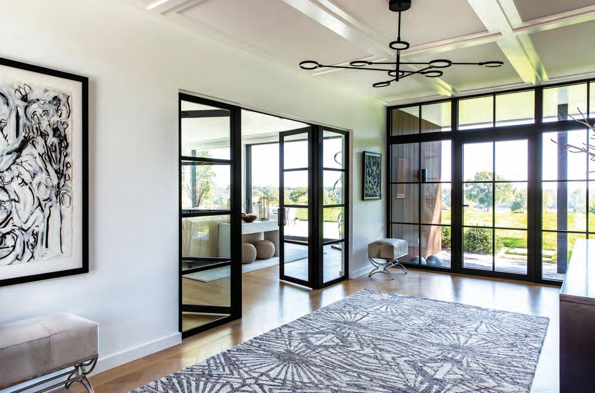
A portrait of Bob Dylan hangs above a Bernhardt credenza in the entry hall of this Darien home. Vestigial ceiling coffers and a custom carpet animate the space while respecting the home’s midcenturymodern roots. FACING PAGE: Rows of juniper flank the pathway to the newly expanded entry, which teases visitors with views of the landscape out back. White gravel was used in planting beds in place of mulch to minimize maintenance.
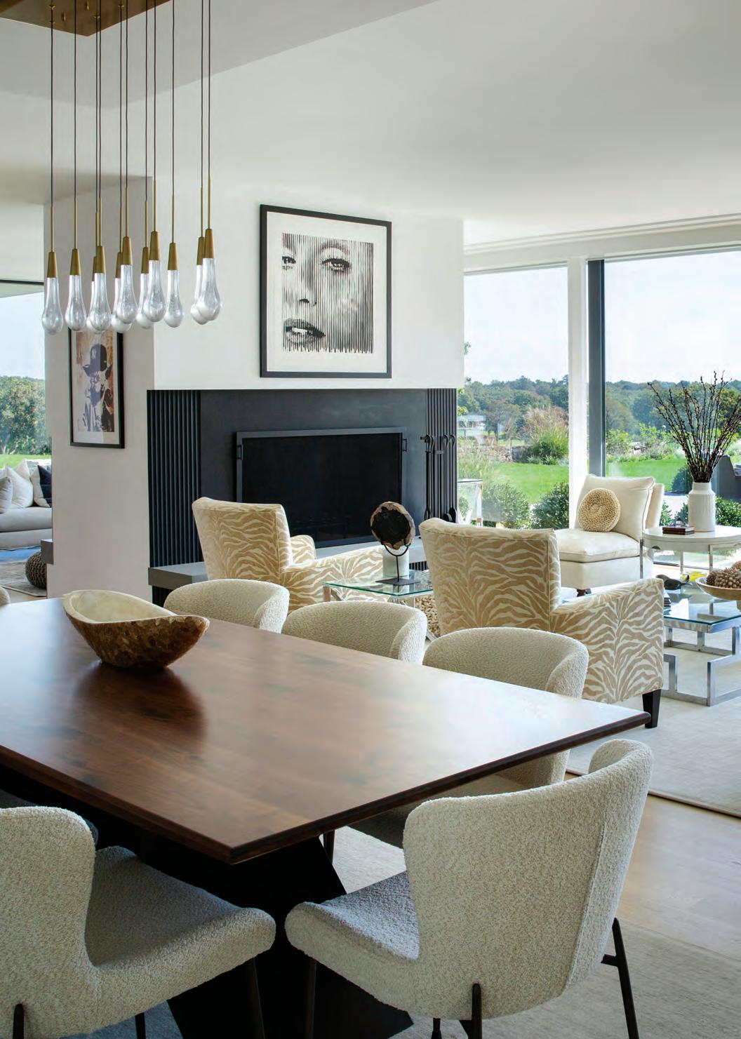
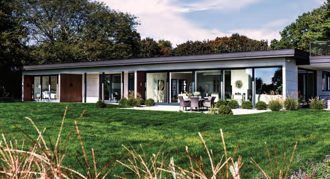
An Arhaus chandelier hangs from a dropped ceiling that helps define the dining area in the great room; the original brick fireplace was refaced in drywall and tile. FACING PAGE, TOP: The 4,300-squarefoot house occupies two serene hilltop acres with sweeping views of a golf course and Long Island Sound. FACING PAGE, BOTTOM: The entry hall culminates in a wall of windows; matching doors enclose the great room while sharing its light and views with the hall.

“Nothing ages so quickly as yesterday’s vision of the future,” writer Richard Corliss once proclaimed. And while Corliss was talking about movies, the same holds true for architecture, too. What once seemed prophetic often becomes passé. ¶ Consider the case of a contemporary home built in 1956 in Darien. Although it bore s ome of the hallmarks of Philip Johnson’s iconic Glass House four miles away, it lacked the latter’s daring, discipline, and detail. By the time Tom and Linda Carruthers purc hased the home in 2022, time and neglect had reduced it to a dingy, dated relic.
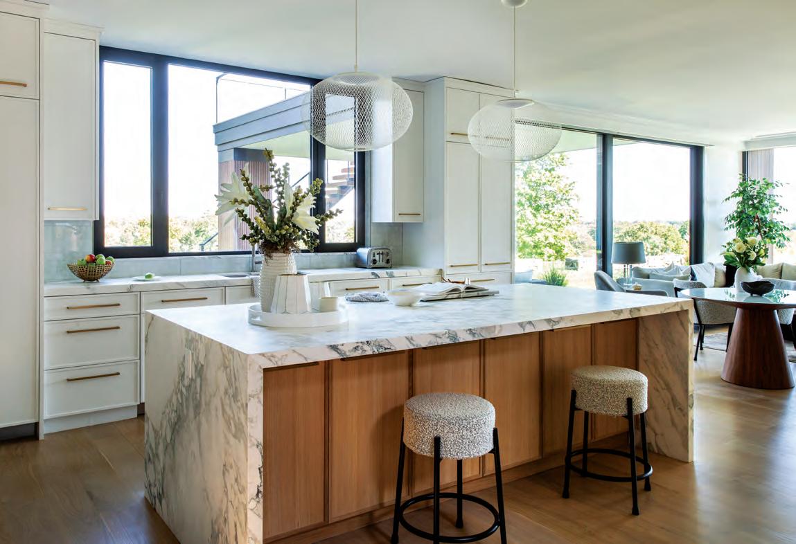
ABOVE: “I wanted everyone to congregate in the kitchen,” says homeowner and designer Linda Carruthers, who illuminated the marble island with diaphanous Moooi pendants.
RIGHT: A Rove Concepts breakfast table flanks a bank of white-oak cabinets; the wood is repeated in the fascia concealing the vent hood. FACING PAGE: A Crate & Barrel sectional anchors the neighboring den, where windows from Eco Windows are fitted with concealed electric shades.

“The flow through the house may have been good for the 1950s, but it was not a good scenario for today’s living.”
—ARCHITECT MATTHEW DOUGHERTY

A veteran design/build team that usually develops houses for others, the Carrutherses were enchanted by the home’s private hilltop setting, mature plantings, and sensational views of Long Island and the Sound. “We just fell in love with the location,” says Tom, who saw this as an opportunity to create something tailored to their own tastes and lifestyle.
Working with architect Matthew Dougherty and McCafferty Construction, the couple gutted the house and reworked the floor plan, eliminating walls in the public areas and giving every bed-
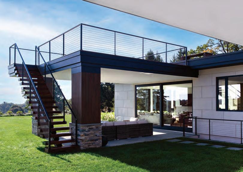
room its own bath. “The flow through the house may have been good for the 1950s, but it was not a good scenario for today’s living,” Dougherty says. The garage was converted to living space, and a new carport was added, along with a covered patio crowned by a roof-deck.
The resulting home honors the midcentury-modern style in spirit, if not execution. “We’re not purists,” concedes Linda, who was eager to trade stark minimalism for something more soothing that deferred to the landscape and view outside.
Dougherty enlarged the stingy front
door and raised the roof above it to lure visitors into the entry hall. “The front door was not very welcoming before, so we did a lot to emphasize where you should come into the house,” says the architect, who rewarded visitors with a panoramic view from the window wall at the end of the hall.
The vista continues in the great room, which Dougherty wrapped with floor-to-ceiling windows and sliders that set the interior ablaze at sunrise and welcome views of coyotes, bobcats, rabbits, and—on one occasion—a deer giving birth.

“I didn’t want a lot of pattern, and I didn’t want a lot of busyness. I just wanted it to feel serene.”
—INTERIOR DESIGNER LINDA CARRUTHERS


A dropped ceiling defines the dining area within the open plan, which Linda furnished with understated contemporary pieces in seductive shades of cream and white. “I didn’t want a lot of pattern, and I didn’t want a lot of busyness,” she explains “I just wanted it to feel serene.”
Shorn of its confining walls, the kitchen now enjoys wraparound views. The cabinets were painted white and adorned with the barest of Shaker frames.

“I don’t like a flat-paneled door, so I had to put something on them,” Linda remarks. A single wall of wood cabinets adds a welcome touch of warmth and echoes the white-oak floors throughout.
“We came from a big house that needed constant work,” Linda says, “so our goal was to have as little outside
maintenance as possible.” Stucco siding was incised to look like stone, then invigorated with easy-care accents of corrugated steel and fluted composite wood. The marriage of materials should keep the composition looking fresh in the days ahead—and well into the future.
EDITOR’S NOTE: For details, see Resources.
LEFT: The rooftop deck enjoys stellar views and is accessed by a skeletal staircase designed to preserve sight lines from below. BELOW: Expanded overhangs help shade the windows and conceal downlights that illuminate the exterior after dark. FACING PAGE: A covered patio was added outside the den for all-weather entertaining.
ARCHITECTURE:
Matthew R. Dougherty Architect
INTERIOR DESIGN: Carruthers Designs
BUILDER: McCafferty Construction
LANDSCAPE DESIGN: Thomas J. Costello Landscaping


This Greenwich property is all about letting the expansive views take center stage.

CLOCKWISE FROM ABOVE: An informal dining area in the great room—which is open to the kitchen—contains a custom banquette, a light fixture by Apparatus, and Serena & Lily bistro chairs. The clients requested a showstopping staircase to connect all four levels; a vintage center table and console bring additional character into the space. A pantry off the kitchen features deep blue cabinetry, wood countertops, and a Phillip Jeffries wallcovering.


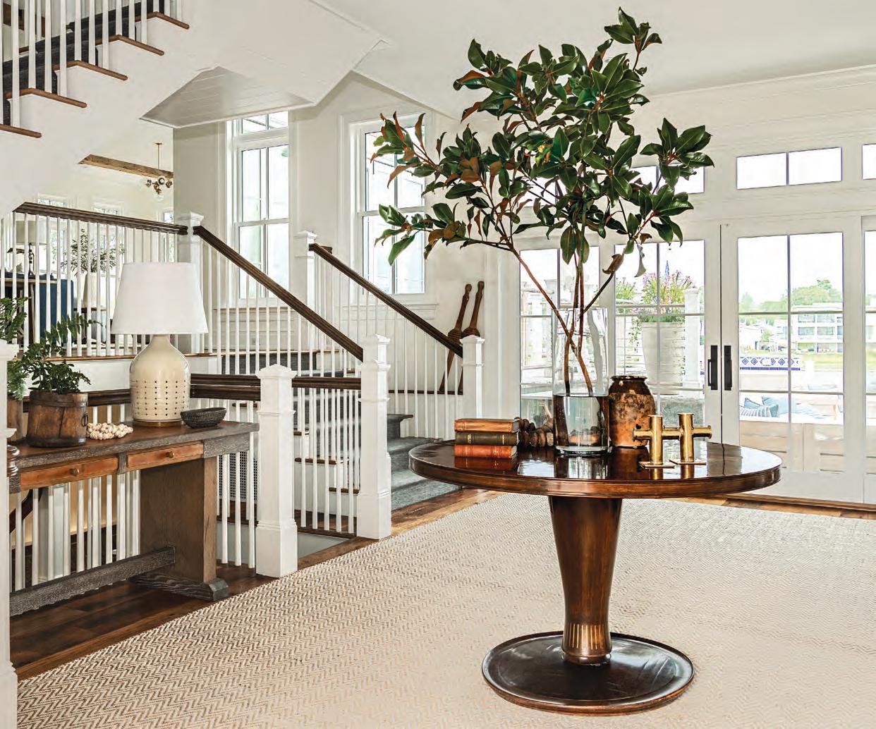
One of the most difficult tasks as a designer or architect is knowing when to exercise restraint, but when you’re presented with a spectacular waterfront location clamoring to be the star, it pays to listen to the site. Architect Jimmy Crisp and designer MarieChristine McNally did just that while working on this Greenwich new build for an active family that includes a baby, two older children, and a dog.

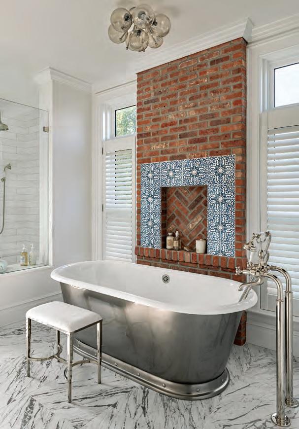
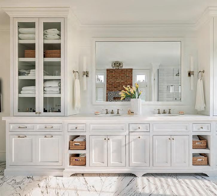
Crisp was already familiar with the homeowners’ aesthetic, having previously worked with them on a farmhouse renovation. When it came to their new contemporary Shingle-style residence, the couple asked for something more modern and open that would make the most of the views while still incorporating some of the more traditional, older materials that drew them to their farmhouse.
“The orientation and layout were prescribed by the site, which is a tight lot,” explains the architect. “Greenwich is very restrictive with regards to lot
coverage and volume, so we maximized the space we had. We also had to consider the flood plain, which meant that the lower level needed to be waterproof.”
The clients had a few additional desires, including a pool, multiple outdoor areas for taking in the sun and views, and a striking open staircase that serves as a focal point and connects all four levels.
“Aside from the lot restrictions, one of the biggest challenges was determining how to build this floating staircase, which required a lot of steel,” recalls builder Joe Pisoni.
Reclaimed oak details lend warmth to the dining room, which includes a custom table by Dos Gallos and a light fixture by Bocci. FACING PAGE:
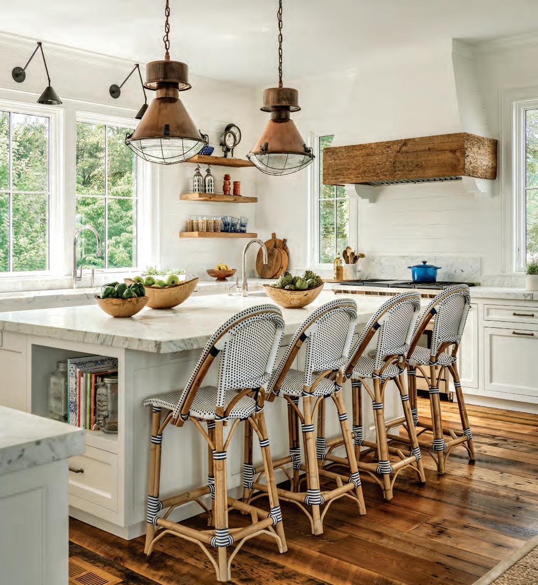
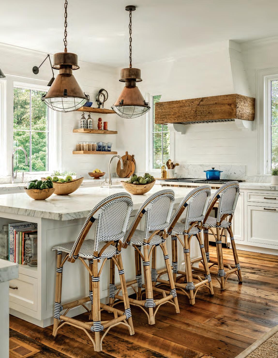
Reclaimed oak and vintage copper factory lights spice up a classic white kitchen.
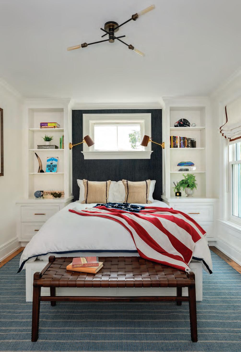
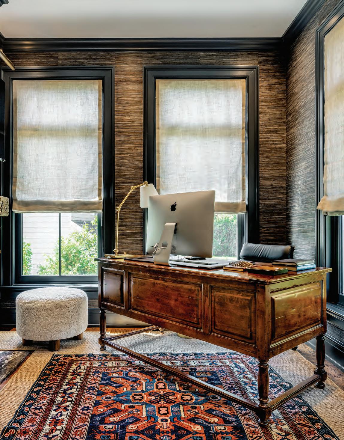
An upholstered headboard wall serves as a focal point in a child’s room. FACING PAGE: The office faces the street as opposed to the water, so McNally used the opportunity to embrace a clubby, cozy feel with rich woods, leather, dark grass cloth, and antiques. “It felt natural to create a darker jewel box here,” notes the designer.
Another time-consuming task that paid off in the end? Installing reclaimed oak flooring and beams—elements that both Crisp and the clients are partial to, having used them in the farmhouse project as well. “The imperfections found in reclaimed materials make them a bit harder to work with, as it requires picking through to find the perfect pieces,” explains Pisoni. But everyone involved agrees that the attention to detail is well worth it in the end. “These elements are critical in providing a feeling of warmth,” adds Crisp.
To accompany Crisp’s architecture, the clients tapped designer MarieChristine McNally to furnish the 5,400-square-foot home.
“Jimmy’s use of reclaimed materials works well with my interiors because I like to incorporate vintage and antique pieces,” says McNally, who also sells vintage items at her decor shop in East Hampton, New York. “My job was to
complement those materials and not overpower them. In the great room, for example, we took a quieter approach with neutral, non-patterned textiles, leather, and wood that don’t dominate
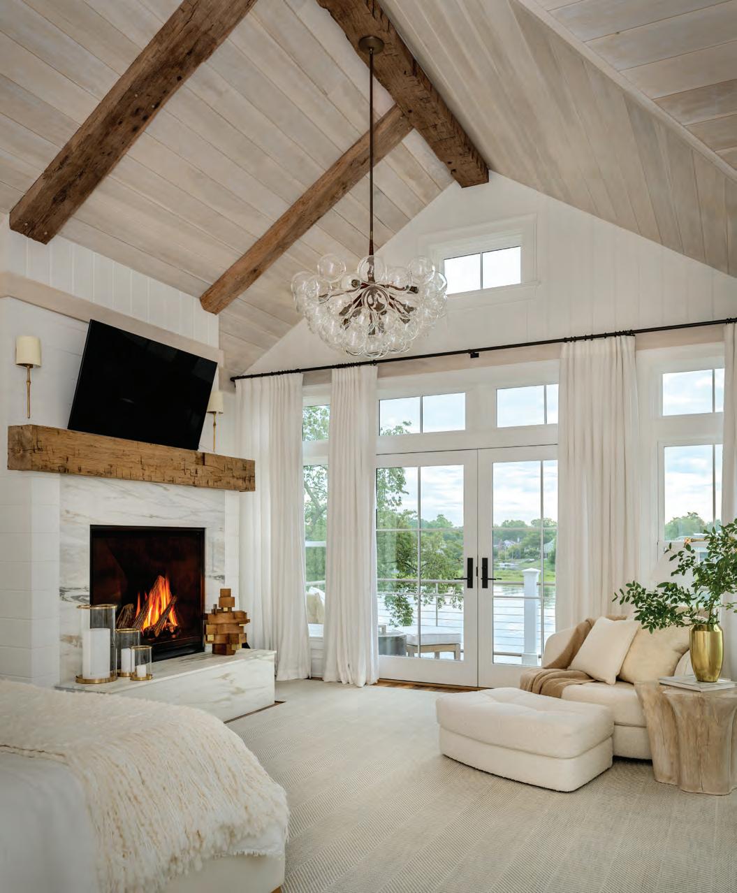
the materials or the views. The idea was to create bright, airy spaces using natural tones and blues that recall the feeling of water, air, and sunshine. It’s also very durable and practical.”
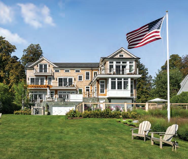


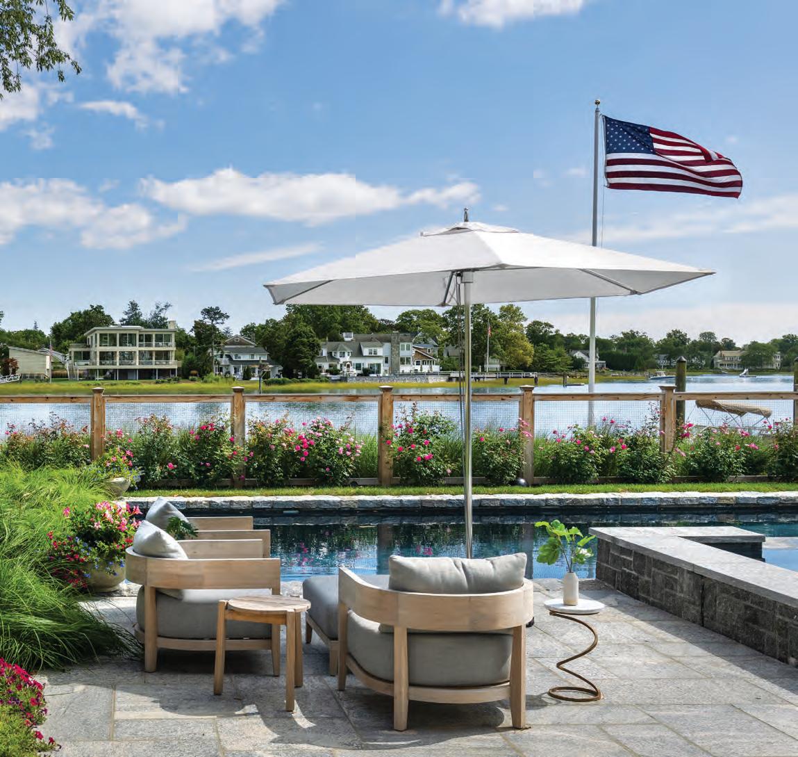
CLOCKWISE FROM TOP LEFT: “I wanted the lower level to feel powerful, so granite stones root the foundation,” says architect Jimmy Crisp. “Above that, the materials are much lighter.” For one of the outdoor sitting areas, McNally combined furniture from RH with a vintage side table, while Janice Parker Landscape Architects planted colorful flowers and textural grasses. One of the client mandates was a pool overlooking the water.
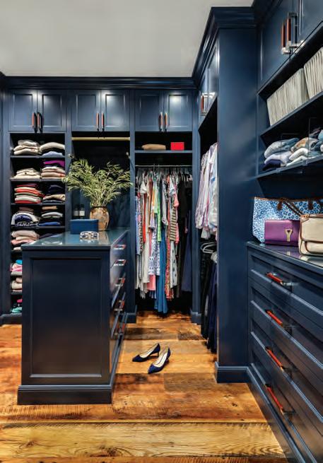
While the main water-facing rooms— including the primary suite—received a calm palette, McNally did take the opportunity to inject more color into the street-facing areas such as the “cozy, clubby” office and the dark blue pantry.
“We were able to go more dramatic in the rooms that aren’t as focused on the light and water views,” explains McNally.
And, of course, there are plenty of vintage items scattered throughout.
“It was fun to work with clients and an architect with the same appreciation for vintage furniture, patina, and imperfect materials,” says the designer. “These are the things that create an authentic, one-of-a-kind interior.”
EDITOR’S NOTE: For details, see Resources.
ARCHITECTURE: Crisp Architects
INTERIOR DESIGN: Marie-Christine Design
BUILDER: Stonecrest Builders
LANDSCAPE DESIGN: Janice Parker Landscape Architects
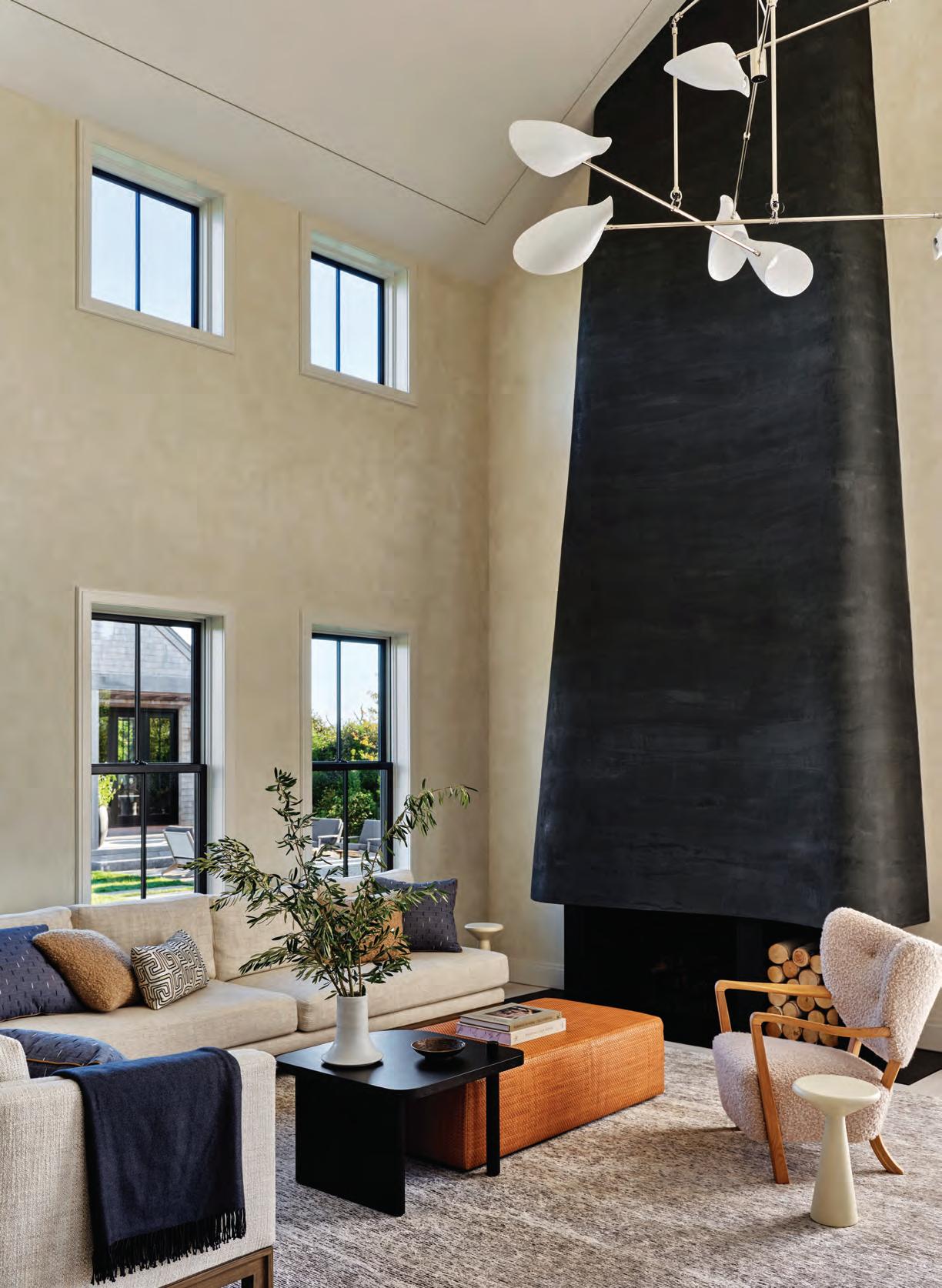
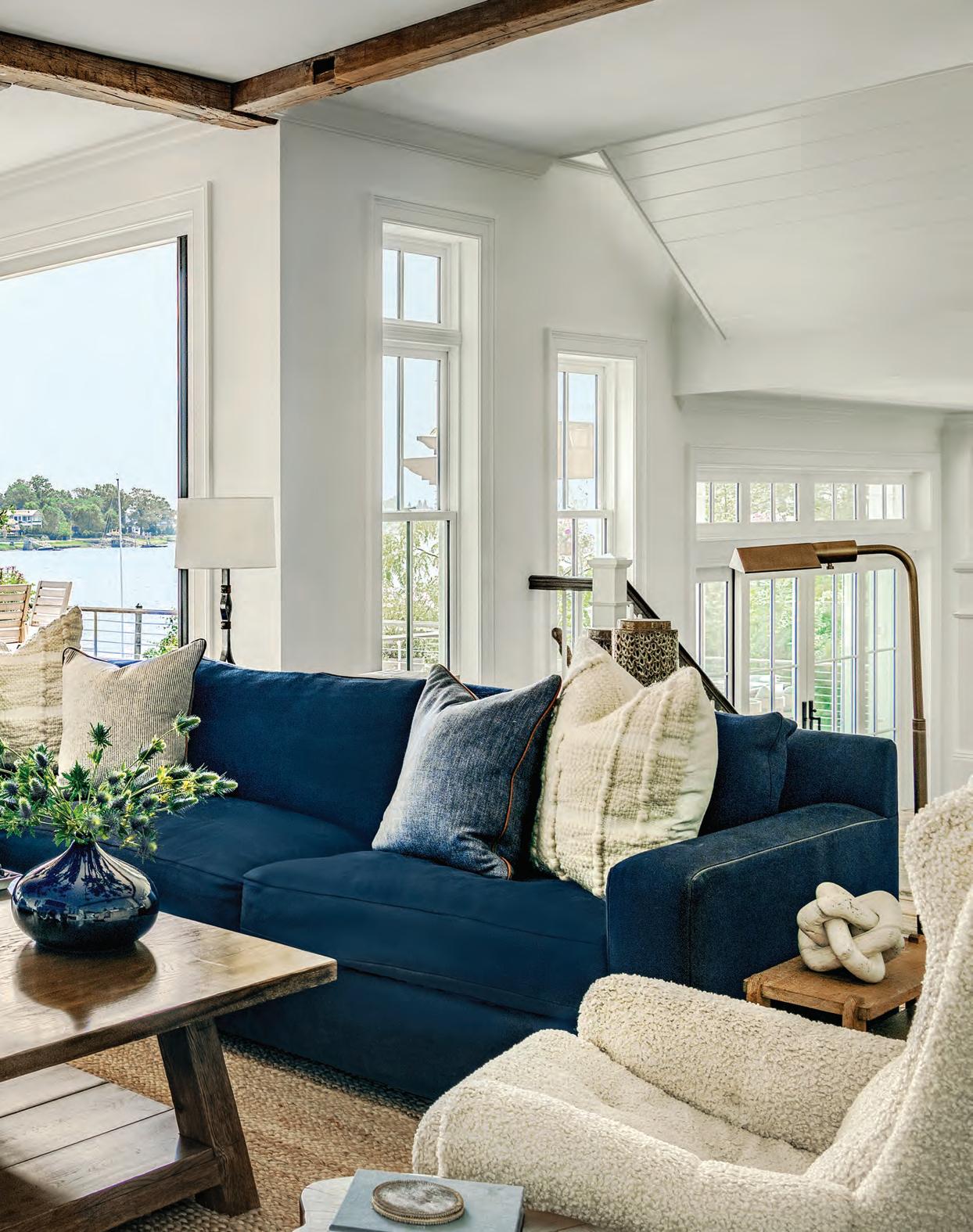
A gabled roof created the opportunity for a cathedral ceiling in the living area of this Nantucket compound. Flecks of black in the Symfonia chenille rug reflect the black window frames and fireplace.
FACING PAGE: At the basement level, the staircase culminates in a “fun space” outfitted with a sprawling daybed on an otherwise underutilized landing. Occupants can lay back and look up to the second floor.

An enchanting island retreat reflects a sense of place.
Text by GAIL RAVGIALA


At once wild and serene, Nantucket is a world unto itself. Depending on the weather, time of year, and the visitor’s state of mind, the island’s miles of beaches and bluffs can seem desolate or inspirational. The light is an artist’s dream; the misty fog a moody cloak for this “Gray Lady.” Whether you are landing by ferry at Steamboat Wharf, sunbathing at Surfside, or picking up produce at Bartlett’s Farm, one thing is certain, when you are on Nantucket, you know where you are.

That sense of place permeates its architecture as well as its natural habitat. The entire island is a designated historic district, and the powers that be enforce guidelines to assure the built environment reflects its eighteenth- and nineteenth-century oeuvre, whose main theme is simplicity of style.
After thirty years of designing houses on the island, architect Andrew Kotchen of Workshop/ APD fully embraces that reductive approach. Even in Nantucket’s heyday as the center of the lucrative whaling industry in the early 1800s, wealthy islanders were partial to the straightforward buildings of the Quakers who dominated the culture at the time. “It is a style with simple gable forms and little embellishment,” says Kotchen, one that he applied with great success to a residential complex for clients in the seaside village of Siasconset, a.k.a. ’Sconset,

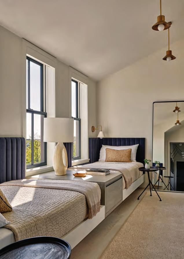

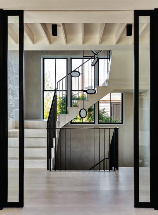
THROUGHOUT, the walls are finished with a decorative ECRU-TONED plaster that interior designer Nicole Ficano describes as SEDUCTIVE.
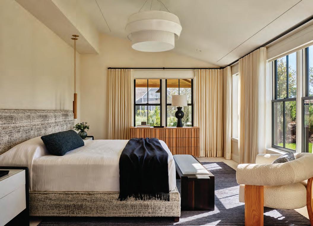
ABOVE: The custom headboard in the first-floor primary suite is another source of texture and warmth that designer Nicole Ficano has emphasized in the interior spaces. FACING PAGE, CLOCKWISE FROM TOP LEFT: The primary bathroom is lined with travertine, architect Andrew Kotchen’s favorite, from Bas Stone. A sitting area at the top of the stairs serves as neutral territory for the adjacent guest suites. A view of the staircase from the glass-walled home office highlights the ribbed ceiling. The second-floor bunk room is part of a family guest suite and doubles as a hangout space.
on the island’s east end. Working with two Nantucket-based contractors, Reid Builders and Miroslava Ahern Landscape Design Studio, who share his deep knowledge and appreciation for the island’s heritage, Kotchen’s vision for a home that complemented its surroundings was realized. “This project is very of this place,” he says.
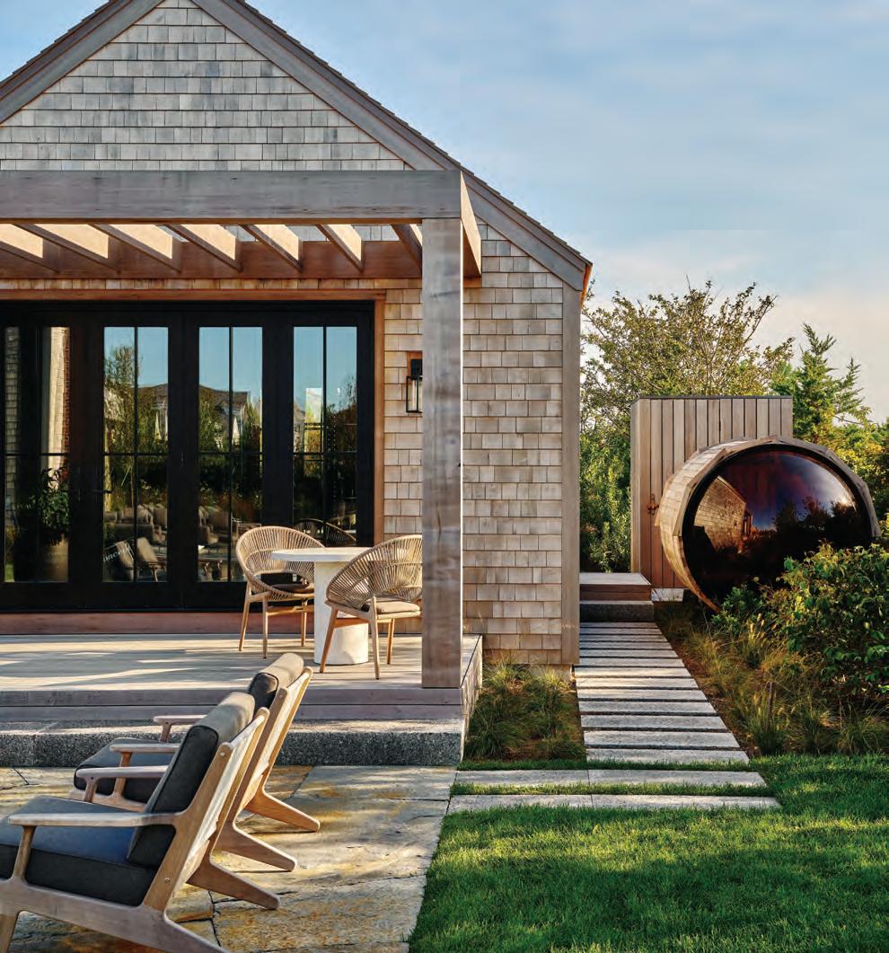
The complex consists of a 6,200square-foot, five-bedroom house, a garage with studio, a wellness pavilion with sauna, and a storage shed. Each structure reflects the simplicity of form and consistency of Nantucket’s mandated palette, which Kotchen describes as “wood, wood, and more wood” in the
form of cedar shingles and low-contrast fenestration. Miroslava Ahern took cues from the local oceanfront and vegetation to complete the picture.
“I always try to elevate the native aspects of the setting,” says Ahern. “Here, I wanted the nearby dunes to expand into the landscape.”
The simplicity of style continues inside, but Nicole Ficano, Workshop/APD’s director of interiors, deftly used warm tones and textured finishes and textiles to soften the look. Throughout, the walls are finished with a decorative ecru-toned plaster that she describes as seductive.
“It makes you want to touch the walls.”
The focal point of the living room is the
fireplace. Molded in dark charcoal-colored plaster, it soars to the double-height ceiling. “It is a vertical gesture that stands out in the space as a sculptural element,” says Kotchen.
The kitchen is “weaved into the home,” he continues, integrating the ebonized white-oak cabinetry and millwork into the architecture, essentially framing the space and giving it its own artistic weight while keeping it as part of the whole. Beyond is a long hallway that leads past the stairway, glassed-in home office,
and primary bedroom suite to the front entrance. It is distinguished by a ceiling ribbed with white-oak beams, an effective way to activate the utilitarian space. Necessary? The Quakers might think not, but we definitely approve.
EDITOR’S NOTE: For details, see Resources.
ARCHITECTURE AND INTERIOR DESIGN: Workshop/APD
BUILDER: Reid Builders
LANDSCAPE DESIGN: Miroslava Ahern
Landscape Design Studio
The cylindrical-shaped sauna next to the pavilion is reached by a stepping-stone path of Caledonia granite. Behind it is an outdoor shower. FACING PAGE: An inviting patio has direct access to the living room. The matching Grid Centre Unit Sofas by Gloster provide a conversation area around the outdoor fireplace.

ROOM FOR ALL
PAGES 43–48
Architectural design: Thomas Nolan Design, Portland, 860-424-6588
Interior design: Verve Design, Beverly, Mass., 860-978-4474, vervedesignllc.com
Builder: Ridgewood Builders, Windsor
THE NEW OLD KITCHEN
PAGES 50–54
Interior design: Heather Ryder Design, Wilton, 917-576-8306, heatherryderdesign.com
Builder: Joe Polito, Polito Builders, Wilton, 203-762-9055, politobuilders.com
Cabinetry: Frank Staltaro, Julie Heussner, Domestic Kitchens, Fairfield, 203-368-1651, domestickitchens.com
Decorative painting: Morgan Tallman, Megan Lindsey, Deux Femmes Decorative Art, Bridgeport, 203-296-2354, dfemmes.com
LEVEL UP
PAGES 66–72
Landscape design: David A. Noyes Jr., Tim Kenniston, Water Street Design Associates, Stonington, 860-415-9913, waterstreetdesignassociates.com
Landscape contractor: Teague Moyer, Moyer’s Landscaping Services, Killingworth, 860-663-2759, moyersland.com
Swimming pool: Dennis Sullivan, Custom Construction Designs, Griswold, 860-237-1139, customconstructiondesigns.com
Pool house builder: James Powers, JDP Homebuilders, Old Lyme, 203-803-0686
Fencing: MRF Fence, Clinton, 860-552-3144, mrf4fence com
Irrigation: Maxum Irrigation & Plumbing, Waterford, 860-525-7000, maxumirrigation.com
Electrical: Mendez Electrical Services, New Britain, 860-656-5270
PAGES 74–80
Architectural, kitchen, and bath design: Erich Diller, Evolve Design Group, Sherman, 203-470-7408
Interior design: Jody Fierz Interior Design, Ridgefield, Framingham, Mass., Stuart, Fla., 203-722-1447, jodyfierz.com
Builder: Louis Yorio, LS Construction, New Fairfield, 203-746-3000, lsconstruction.com
Landscape design: Brook Clark Landscape Architects, Sandy Hook, 203-275-9255, brookclark.com
Cabinetry: Jason Rodgers, J. Rodgers Builders, Southbury, 203-417-3536, jrodgersbuilders.com
Audio/video: David Febbraio, Structured Home Solutions, Sherman, 860-210-0855, shomesllc.com
BACK TO THE FUTURE
PAGES 112–121
Architecture: Matthew Dougherty, Matthew R. Dougherty Architect, New Canaan, 203-296-4669, mrdarchitect.com
Interior design: Linda Carruthers, Carruthers Designs, Darien, 203554-2605, carruthersdesigns.com
Builder: John McCafferty, McCafferty Construction, Newtown, 203-5371560, mccaffertyconstructionllc.com
Landscape design: Thomas J. Costello Landscaping, Greenwich, 203-633-3571, tjclandscaping.com
Cabinetry: Highland Woodcraft, Prospect, 203-758-6625, highlandwoodcraft.info
OUTWARD FOCUS
PAGES 122–133
Architecture: Jimmy Crisp, Crisp Architects, Millbrook, N.Y., 845-677-8256, crisparchitects.com
Interior design: Marie-Christine Design, New York, N.Y., 212-6653643, mariechristinedesign.com
Builder: Joe Pisoni, Stonecrest Builders, Ridgefield, 203-948-3251
Landscape design: Janice Parker
Landscape Architects, Greenwich, 203-340-2824, janiceparker.com
Cabinetry: JEM Woodworking, Greenwich, 518-828-5361, jemwoodworking.com
Audio/video: Robert Allen
Multimedia, New Canaan, 203-856-0058, ramultimedia.com
Landscape contractor: Petruzziello
Landscaping, Norwalk, 203-496-1524
Swimming pool: Haggerty Pools, Norwalk, 203-348-6899, haggertypools.com
Hardscaping: Gabriel Tenore Mason, Redding, 203-733-3366, gtenoremason.com
Surveyor: Rocco V. D’Andrea, Riverside, 203-637-1779, rvdi.com
NANTUCKET BOUND
PAGES 134–141
Architecture: Andrew Kotchen, Workshop/APD, Greenwich, Nantucket, Mass., New York, N.Y., 212-273-9712, workshopapd.com
Interior design: Nicole Ficano, Workshop/APD, Greenwich, Nantucket, Mass., New York, N.Y., 212-273-9712, workshopapd.com
Builder: Reid Builders, Nantucket, Mass., 508-228-2786, reidnantucket.com
Landscape design: Miroslava
Ahern Landscape Design Studio, Nantucket, Mass., 508-333-5138, ahernllc.com
Advanced Home Audio 35
AIA Connecticut 87–89
Amy Andrews Interior Design 28–29
Artemis Landscape Architects 16–17
ASID CT 110
Austin Ganim Landscape Design, LLC 98–99
Bevan & Company 111
Breakwater Renovation & Design, LLC 42
Burr Salvatore 24
California Closets 10–11, 100–101
Cardello Architects 40–41
Charles Hilton Architects 49
Chloe Winston Lighting Design 73
Christensen Landscapes Services 102–103
Christopher Pagliaro Architects 6–7
Clarke Distribution Corporation 45
Closet and Storage Concepts 32
Closet Factory 59
CORNERSTONE
Contracting 38–39
Crisp Architects 83
Crown Point Cabinetry 53
Crown Select 75
DEANE Distinctive Design & Cabinetry 20–21
Domus Constructors, LLC 55
Ecoshel 86
Eleish Van Breems inside front cover
Freddy & Co. Fine Landscape Services 104–105
Front Row Kitchens, Inc. 14–15
Gardiner & Larson Homes 91
Garrett Wilson Builders 33
Gatehouse Partners 18–19
Gault Stone & Landscape Supplies 22–23
Glengate Company 37
Great Country Timber Frames 81
Gregory Lombardi Design 61
Home Builders & Remodelers Association of Fairfield County 143
InnerSpace Electronics, Inc. 106–107
James Doyle Design Associates 77
Karen Berkemeyer Home 2–3
L&M Custom Carpets, LLC outside back cover
League of N.H. Craftsmen 108
Living Swell 57
Mackin Architects 63
Matthew R. Dougherty Architect, LLC 69
Michael Smith Architects 79
Morgan Harrison Home 4–5
Neil Hauck Architects, LLC 30–31
New Energy Works Timberframers 96
Nukitchens 8–9
Ornare 95
ProSource of Stamford 65
Quinndico 93
Rob Sanders Architects 109
Roughan Interiors 12–13
Segerson Builders 47
Shope Reno Wharton 1
SR Fine Home Builders 71
Superior Hearth, Spas & Leisure 111
The Hudson Company 67
The Linen Shop inside back cover
Tile America 85
Torrco 27
Tulip Cooking 51
Woodbury Supply Company, Inc./Marvin Design Gallery 82
Your Lighting Source 93
New England Home Connecticut, Summer 2024 © 2024 by New England Home Magazine, LLC. All rights reserved. Permission to reprint or quote excerpts granted by written request only. Editorial and advertising office: New England Home Magazine, LLC, 530 Harrison Ave., Ste. 302, Boston, MA 02118, 617-938-3991.
TO ALL THE CIRCLE OF CARE + PWB VOLUNTEERS: KYLIE’S ROOM SPRING 2024


The PWB’s 2024 charity initiative with Circle of Care, helps to provide assistance to children and families facing pediatric cancer treatment. Again this year the PWB is participating in the “Art From the Heart” program, and will be designing and building room makeovers for two children currently undergoing cancer treatment.
REVEAL DAY VOLUNTEERS: DONATIONS:
Rebecca St. Germain Tooher Ferraris Insurance Group
Michelle Hughes Tile America
Robin Carroll Karp
Lisa O’Mara SmartHome
Jennifer Vangele Cardello Architects
Rachel Foster Northeast
Ava Hunter
Chloe Winston Lighting
Della Heiter
Stephanie Rapp Interiors
Nicole Charney & Nick Schork Advanced Home Audio
Ramon Alvarado Guiltec
Bob’s Discount Furniture
BED, MATTRESS, BOX SPRINGS, NIGHTSTANDS & VANITY STOOL
Closet & Storage Concepts
CLOSET + INSTALL
Guiltec Development
CEILING LIGHTS, PAINTED ROOM, INSTALLED
CLOSET DOOR & MOLDING FOR CEILING LIGHTS
Michaud Brothers
CLOSET DOORS & MOLDING FOR CEILING LIGHTS
Advanced Home Audio
T.V. + INSTALL
Rings End
MOTORIZED BLINDS + INSTALL
New England Cabinet
PLAYSTATION FLOATING SHELF + INSTALL
Stephanie Rapp Interiors
ROOM DESIGN SERVICES + RUG
Chloe Winston Lighting LAMPS
Mara Skowronek PAINT
Polcer Home MONETARY DONATION
Northeast MONETARY DONATION
Katie Canfield VANITY
Lauren Vallario, Jennifer Vangele & NE Home
BEDDING
Cornerstone Contracting, Mindy Gerhardt TRAY
Lisa O’Mara
MINI FRIDGE
Marcia Noble
T.V. PILLOW
Lora Mazurak
FRAMES FOR FAMILY PHOTOS



Earlier this year, interior designer Georgia Zikas (left) was invited to participate in the Design on a Dime fundraiser for Housing Works, a nonprofit dedicated to providing housing and healthcare for people living with HIV/AIDS. Inspired by the human need for peace and tranquility, Zikas’s Olive Branch Room (above) took its cue from biophilic design, with a diptych painting by Connecticutbased Kate Tortland setting the stage. Zikas brought in locally made items including a console by IKAG and sconces by Dunes and Duchess to further the room’s artistic touch. The vignette also included furnishings from Dovetail, Villa & House, Visual Comfort & Co./Light New England, OKA, Four Hands, Schuyler Samperton Textiles, Samuel & Sons, Elizabeth Eakins, and Sagebrook Home. The donated furnishings and accessories were sold during the three-day event at New York City’s Metropolitan Pavilion, raising a combined $1.2 million for the nonprofit. Zikas, who studied at the New York School of Interior Design, is principal of Georgia Zikas Design, which has offices in West Hartford and Boston. housingworks.org; georgiazikasdesign.com

L&M Custom Carpets unveiled three exciting designer collaborations at High Point Market.
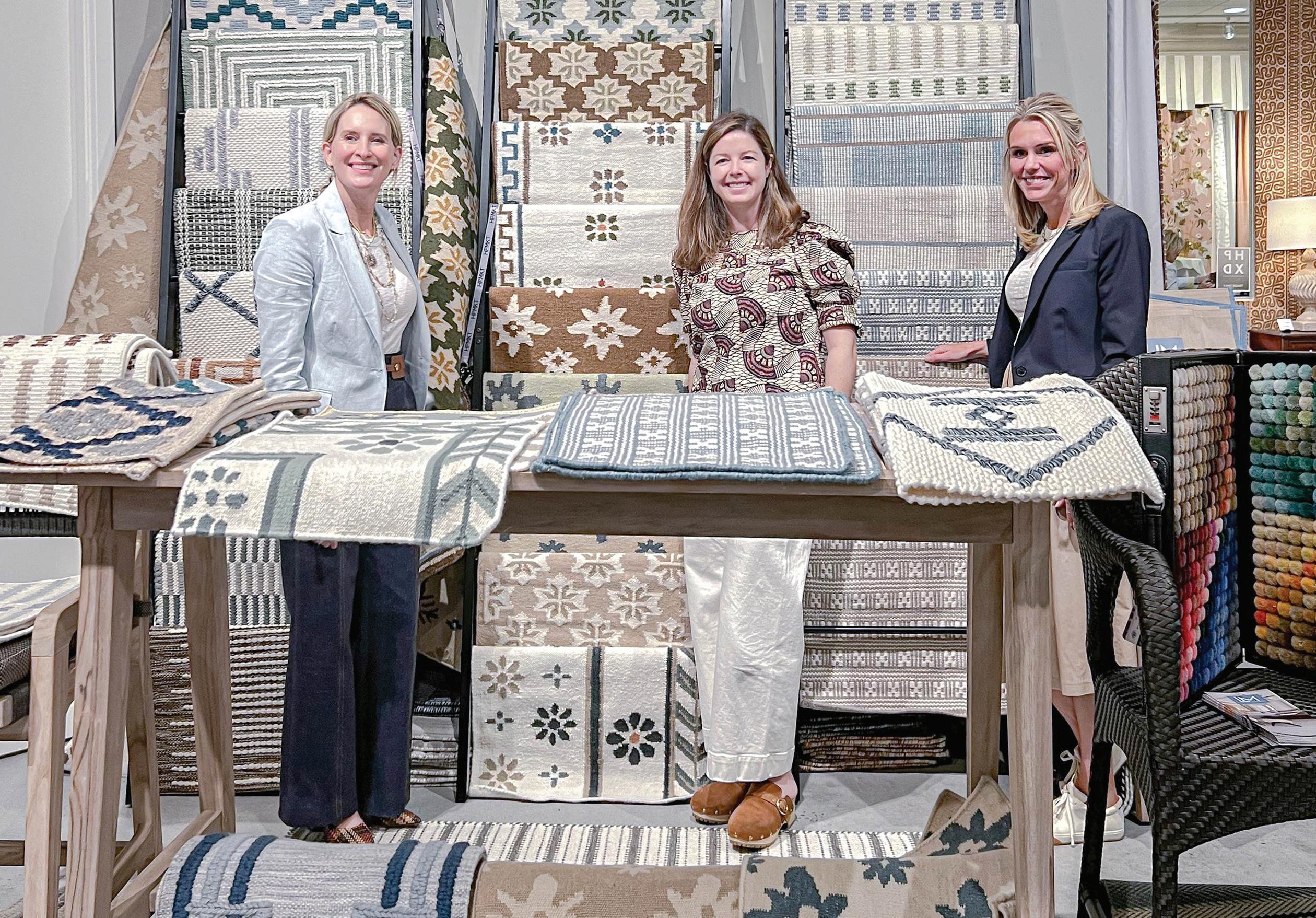
Celerie x L&M: Celerie Kemble’s second L&M collection features dimensional, HiLo Flat Weaves that add luxury to any space.
Sarah x L&M: Sarah Bartholomew’s collection of Flat Weaves showcases her signature style to deliver timeless pieces.
Lucy x L&M: Lucy Doswell’s Kilims fuse contemporary, classic, and transitional elements to create sophisticated spaces.
All patterns are exclusive to L&M and offered only to the trade. lmcustomcarpets.com | gary@lmcustomcarpets.com
New York | Johns Island | Nationwide lmcustomcarpets.com @lmcustomcarpets custom carpet s an d rugs