6 minute read
SERENE & CLEAN
INTERIOR DESIGN: Rob Turner, CRT Studio ARCHITECT: Jose Venegas, JJV Studio BUILDER: Rob Smith, E2 Homes PHOTOGRAPHY: Matuzak Photography

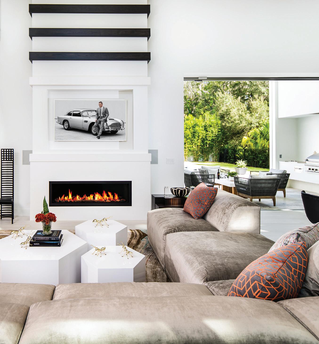
THE STUNNING STAIRCASE COMBINING EBONY-STAINED OAK, GLASS AND METAL WAS A COLLABORATIVE EFFORT. THE ABOVE LIGHT FIXTURE IS ACCENTUATED BY A DARKER PAINT COLOR. FOR THE FIREPLACE, ROB TURNER WANTED TO CREATE A VISUAL RHYTHM WITHIN THE ROOM BECAUSE IT’S SUCH A TALL SPACE. HE BROUGHT THE CEILING DOWN, ADDED BACKLIGHTING TO VISUALLY COMPRESS THE SPACE AND THEN ATTACHED EBONY OAK BANDS. THE VINTAGE MACKINTOSH CHAIR REPEATS THE THEME. THE SPACE OPENS TO THE OUTSIDE WITH THE POOL AND LAKE VIEWS AS WELL AS SPECIAL FEATURES LIKE AN ORCHID GARDEN AND RAISED VEGETABLE BEDS.

It’s often said, “teamwork makes the dream work,” and in the story of this home, that is exactly what led to a happy ending for everyone involved. Owner James Ekbatani was enamored with the natural beauty of the lot (one of only four) in Lake Maitland Owl Preserve and wanted that to be part of the aesthetic. He also requested a comfortable, open living space (without formal rooms), where family could easily gather.
James had looked at many houses and says they were, “too big and too cold. The goal here was to try to design and build a home that’s really comfortable and that covers our needs as a family, and not so much about entertaining — although this has become a great entertaining home. I wanted it to be practical, consolidating the things we really wanted like a gym with a sauna. We also have access to the lake where we can take our pontoon boat out and enjoy it on the weekends.”
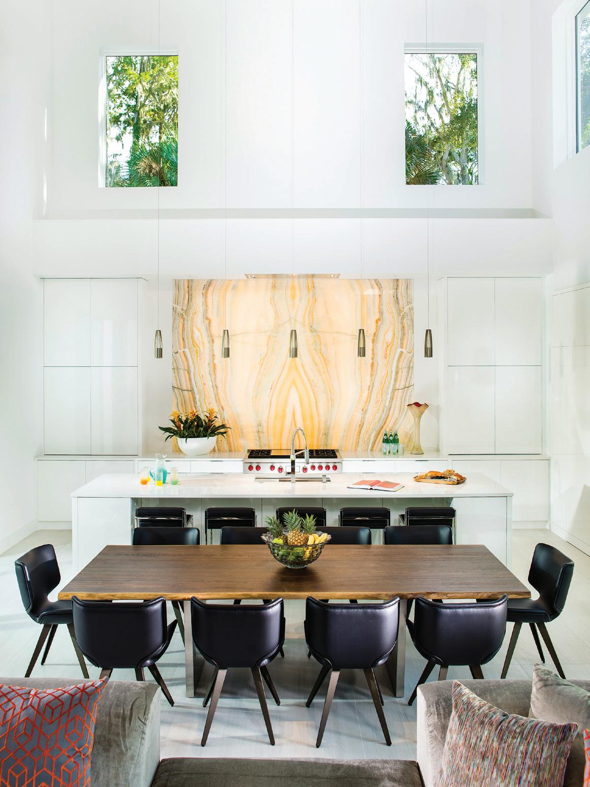
OPPOSITE: THE ONYX BACKSPLASH IS NOT ONLY A BOLD FOCAL POINT BUT INSPIRED THE PALETTE FOR THE REST OF THE LIVING AREA.
THIS PAGE: SLEEK LACQUERED CUSTOM CABINETS DESIGNED BY SANDRA AGURTO OF CABINETRY CREATIONS SEEM TO DISAPPEAR BUT ARE ENGINEERED FOR MAXIMUM FUNCTIONALITY.
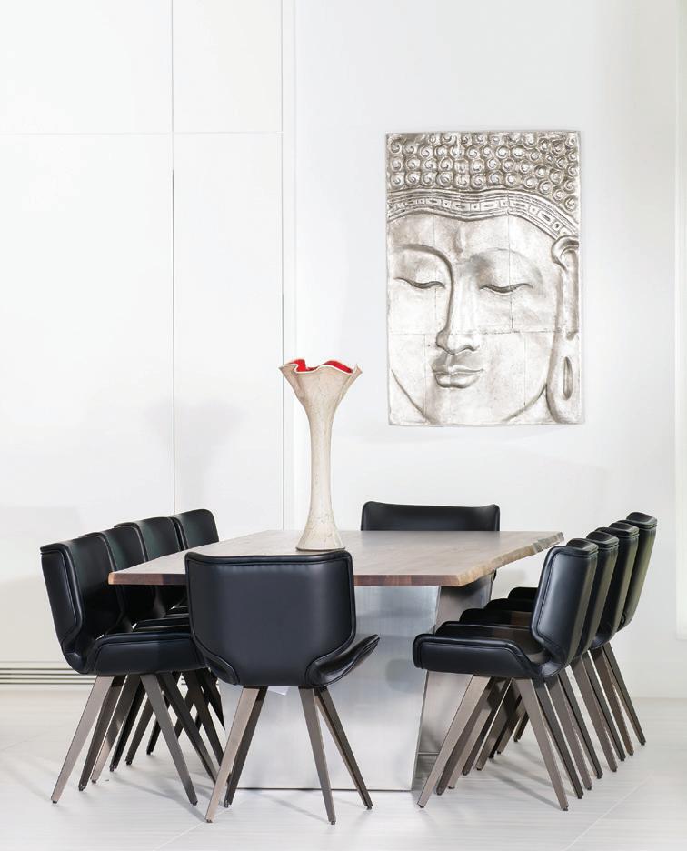
BETWEEN THE BAR AND THE TABLE THERE IS SEATING FOR 15. THE MIX OF MATERIALS AND FINISHES IS SUBTLE AND REFINED YET INTERESTING AND INVITING.
“My company developed this property and we had this parcel available. James randomly looked at it without knowing we were involved. Then we realized we were both talking through other people. We had a connection with each other through previous projects and have known each other almost 15 years. Since we had worked together and knew each other’s styles, it was a great fit,” adds Rob Smith, E2 Homes.
So, when the two started conversing directly, they knew this was going to happen. Another member of the team, designer Rob Turner, CRT Studios, knew just how to complete the vision. “Rob [Smith] brought me on board before the project broke ground. I am typically engaged early in the process so I can collaborate with the architect, builder and homeowner on the space planning,” he explains.
He was tasked with achieving the clean aspect of contemporary along with comfort colors and coziness. “Rob Turner is really great at warming up this more contemporary style. I think he captured what James was really after in a family-friendly, indooroutdoor living space. James had a lot of input and the backsplash in the kitchen is one of my favorite examples of warming up
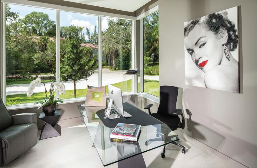
THE HOME OFFICE IS BATHED IN A WARM GRAY AND THE GLASS DESK AND LARGE WINDOWS KEEP EVERYTHING LIGHT AND BRIGHT.
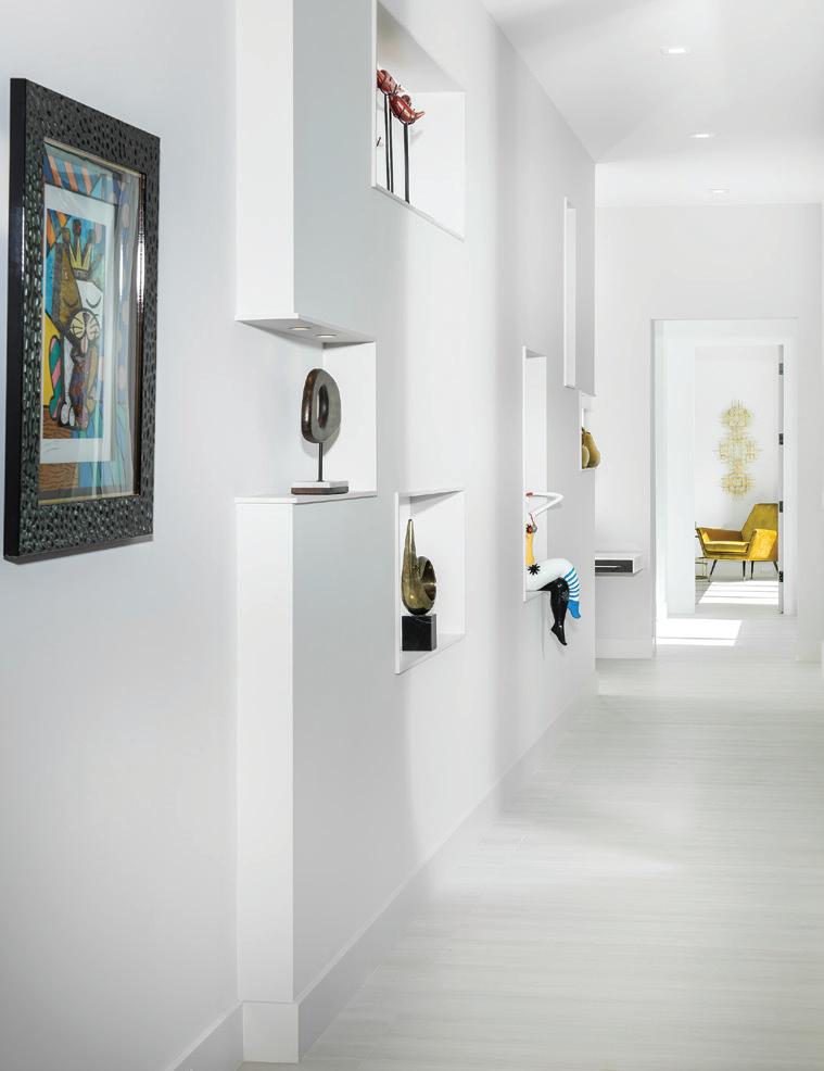
THE OWNERS ARE VERY INTERESTED IN BRITTO AND MIAMI ARTISTS AND BROUGHT SEVERAL PIECES WITH THEM. THE NICHE WALL IN THE HALL LEADING TO THE MASTER BEDROOM LETS THEM DISPLAY UNIQUE PIECES FROM DIFFERENT PARTS OF THE COUNTRY AND WORLD.
THE UPSTAIRS LOUNGE SERVES AS A MEDIA AND FAMILY ROOM. THERE ARE SEVERAL SEATING AREAS WITH COMFORTABLE FURNISHINGS AND MORE PIECES FROM THE OWNERS’ ART COLLECTION.

a room. It’s a prominent example of the attention to detail,” Smith explains.
And that stunning onyx backsplash served as the inspiration for much of the home’s design. “In one of our selections meetings at Mystic Granite, James and [girlfriend] Maya found this beautiful piece of onyx that we all loved. To use it as the kitchen backsplash, we book-matched it and backlit it. I took the colors from that to drive the concept of the house with reds, oranges and greens,” Turner adds.
The meticulous details throughout the approximately 5,000-square-foot home are immediately in focus from the front entrance punctuated by a sculptural statement. “The pedestal staircase has the metal part of the railing that starts on the right and becomes a spine, and to the outside on the left and the right is all glass that sandwiches in that spine,” Turner says of the ebony-stained oak stairs.
A team effort, Smith gives most of the credit to Turner, but explains that James actually redesigned the layout to gain a little more space in the living room. “We all bounced ideas around about the rail, treads and risers,” he adds. The collaboration is evident throughout, where special attention was paid to the homeowners’ interests.
“My ideal house would have all open spaces and I am fascinated by the lofts in New York. Although we have separate rooms in this house, the main living area is totally open with 35-foot ceilings. Maya came up
with a lot of ideas as well. Credit really goes to everyone. I would come up with an idea and literally within hours it would be in the plans. That’s what we love about Rob [Smith]. If it makes sense, he will do it,” James explains.
Smith admits this house may have gotten a little extra TLC. “It’s right around the corner from my house so it got a lot of extra attention. It was the first and last thing I saw every day,” he says. And Turner feels the project was special too. “It was very collaborative, and we had a lot of conversations about expectations. I made the initial presentation and from there it was an exercise in details and logistics,” he concludes.
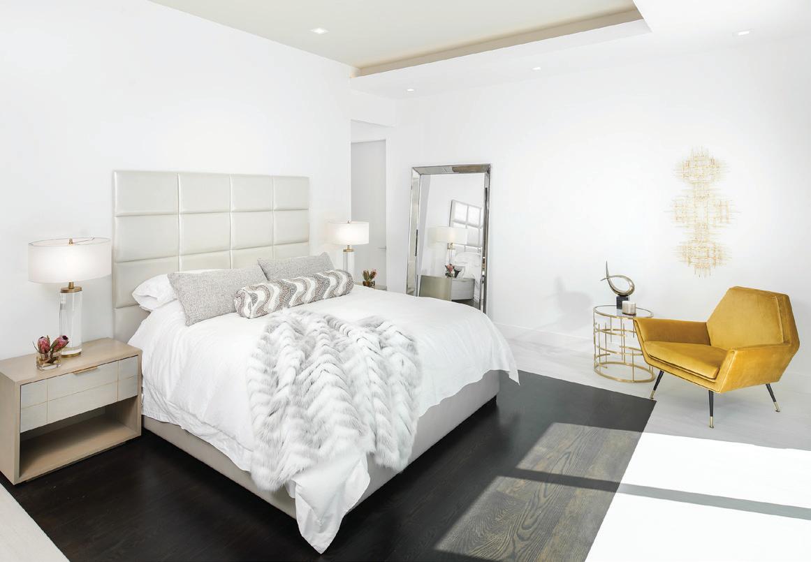
OPPOSITE: THE SERENE MASTER BEDROOM IS LAYERED IN LUXURY WITH SOFT COLORS AND TEXTILES. THE GOLD CHAIR, SIDE TABLE AND WALL SCULPTURE ADD A BOLD PUNCH.
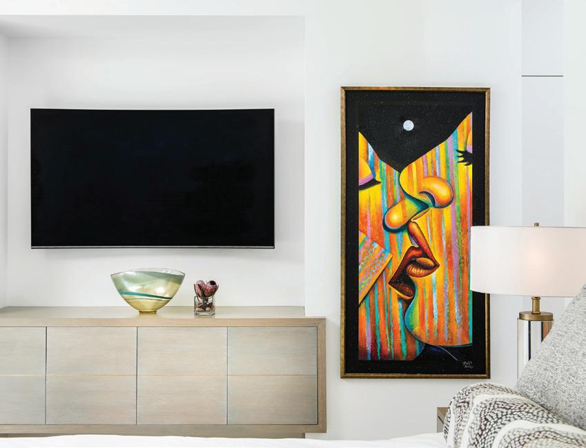
ROB TURNER DESIGNED THE BEDSIDE TABLES AND FLOATING DRESSER THAT WERE FABRICATED LOCALLY.
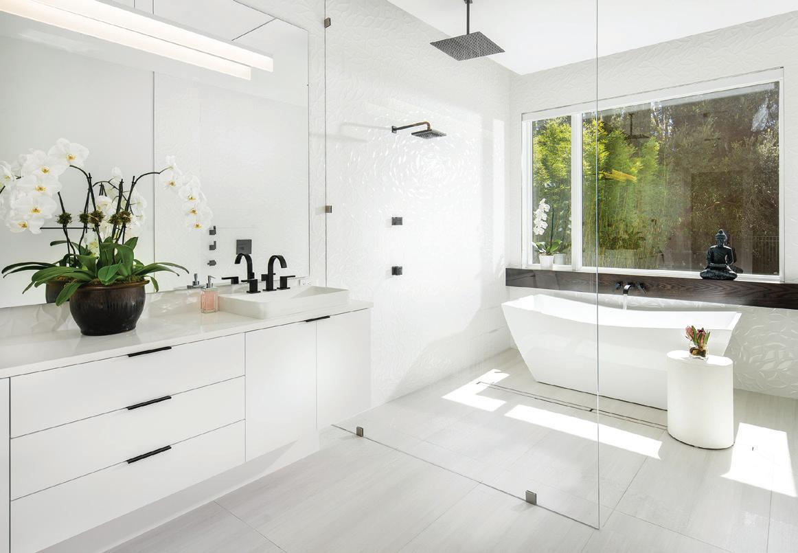
THIS PAGE: IN THE MASTER BATH THERE IS A MODERN TAKE ON THE JAPANESE SHOWER WITH A FREESTANDING TUB AND CLEAN-LINED WHITE CABINETRY BY CABINETRY CREATIONS.
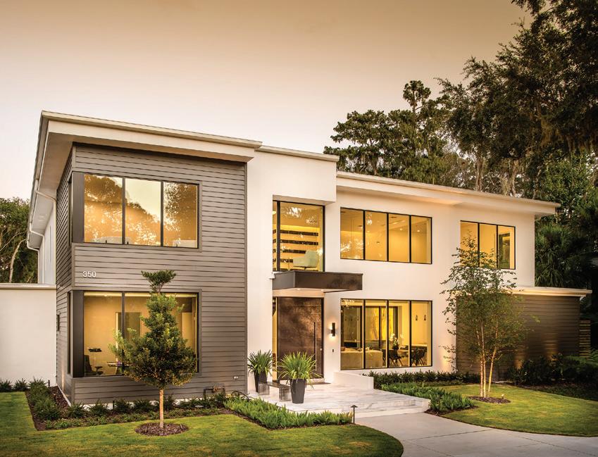
THE EXTERIOR OF THE HOME REFLECTS THE MODERN AESTHETIC IN COLORS PULLED FROM THE NATURAL SURROUNDINGS.
