

Exercises, provocations, and theories of digital representation.
CARL LOSTRITTO
WITH CONTRIBUTIONS BY VIOLA AGO, JULIE KRESS, AND HANS TURSACK
CHAPTER 1 19 Bits Mapped 21 The Pixel 23 Constructing Elements in Pursuit of Impossibility 25 1988, the Year of the Pixel 31 Pixel Creating Cultures 40 Preserving the Pixel, Releasing Style from Technology 45 The Contemporary Binary Bitmapped Surface 48 Draw by hand within the space of a digital image 78 Resolve to true or false with tons of information
CHAPTER 2 83 Every Grid is Material
CHAPTER 3 123 Using a Tree to Represent a Tree 127 Bonsai is an Action and an Element 128 Books About Bonsai are Like This Book 129 The Tree Behind the Tree 133 Designing Tools to Control or Release Natural Randomness 140 Random Salt Crystals 142 Who is the “User-Author”? 143 Using Software the Wrong Way 149 A Tree Yet Rendered is Three Hundred Text Files in a Folder 150 Sometimes a Tree Looks Nothing like a Tree 154 Everything is Bonsai when in Pursuit of Bonsai 156 Over Time, of Time 159 The Pot is a Diorama
BY
JULIEKRESS 87 Every tool is Pre-Gridded 89 Every Grid is Aesthetic 94 Every Grid is Constructed 99 Every Grid is Imposed 102 Build and Break a Scaffold 105 Every grid wants to go on infinitely 107 Every grid has mass 112 Contain a Grid 115 Every grid does not need to be the same 118 Un-Standardized Fixtures
CHAPTER 4 165 A Room that B ecomes a Diorama; A Diorama Afflicted with Room Envy 167 Almost but not Quite a Diorama: The Room, its Powers, and its Limits 172 Model your space with every regard for detail and no regard for accuracy 173 All Apertures Become Dioramas 184 The Room as a Diorama 188 Model from Memory 189 American Landscape as Diorama 196 Like (Performed) Magic 208 Can a Diorama be Separated from Its Content?
CHAPTER 5 217 Rendering the Almost Invisible 221 Straining to Become Invisible 226 Unrealistic Material 227 Massive, but Immaterial 238 Can a Diorama Become Invisible? 240 Everything but the Thing 242 What about the shape of the invisible element? 243 Essentially Animate
CHAPTER 6 249 Operating on the ViolenceAggression Axis
BY VIOLA AGO251 In the Space of Animate Memory Sequences 254 Transformation Matrix 256 Relational Architecture: Between Violence and Aggression 258 Chop, Drop (does it Roll?) 259 Intentionally Corrupted Surface, the Resurgent Line 266 Surface Frictions 267 Lyricism and Empathy (Or Bad Responses to External Calls) 271 On Haptic Sways Between Fiction and the Real 282 Overcoming Systemic Cognition
CHAPTER 7 287 Anxious Vision:Real Time and the First-Person PerspectiveView
BY HANS TURSACK289 Picture Windows 291 No Time Like Real Time 302 Tunnel Vision 305 Design Notes: Levels as Perceptual Arenas 310 Objects in a Networked Field: The Architectural Complex 312 Object-Buildings in a Complex 314 A Complex Without a Game 315 Linear Movement in a Complex 318 Play the Complex 321 The Creative Necessity of Gaming Discourse 322 Displacement of the Viewing Subject
CHAPTER 8 329 Transition Elements: Rendering by Drawing 332 The Case for Lines 342 Geometry of the Surface 349 Words and Reality 357 Optics of Material 365 Representation as an Open Loop 366 Represent, Disassociate, Operate, Re-associate with Something Else 370 Structure Discourse Around Exercises 375 Image Animation Index

First, I want to thank Viola Ago, Julie Kress, and Hans Tursack for trusting this project in its early stages. Each signed on with barely a project brief in hand. I had the privilege of seeing it all come together including the significant extent to which their work influenced the direction of the whole project. We’ve never all been in the same room at the same time, and I hope that can soon change. When we do convene, our guest of honor will certainly be Chelsea Limbird, who influenced this project as our reader and my most trusted advisor. Her curious candor has always been precious to me. She edits with empathy and intensity. I also note that some of our email threads resemble a book.
For the last few years, I’ve taught a series of studio courses to RISD architecture students. They’ve heard me say almost all of what’s written here. Their reactions, creatively and discursively, advanced my thinking about representation and digital media. Their surprising, critical, and exciting work regularly impressed on me that learning while creating work of an unusual and critical nature is possible. Thank you to the students who enrolled in All That is Solid Melts Into Air (2019), Eggshell Digital (2020), and Uncanny Realism (2021).
This is the second book project working with Managing Editor Jake Anderson at Applied Research and Design Publishing. Books are hard, but Jake makes it look easy. I’m thankful for Jake and the AR+D team, especially Publisher Gordon Goff, whose early enthusiasm to support this project and faith in our first collaborative endeavor, Computational Drawing, cemented what I hope will be a longstanding partnership. Pablo Mandel of CircularStudio designed and typeset both books. I did not make his job easy. I’m profoundly thankful for a creative collaborator who can get excited about strange constraints and self-imposed design prompts. Our early conversations influenced the structure of this book and throughout it was a joy to collaborate.
This project was supported by a RISD Professional Development Fund grant.

Most often, to render is to engage a thick software interface, to accept a photographic framework of variables and effects, and to assume an unquestioned posture that involves articulating material, mass, and color. But like drawing, rendering can be an interdisciplinary, algorithmic, historically rooted cultural practice as much as it is a digital vocation. Today, rendering is so intertwined with the digital that any serious inquiry into the cultural and technical implications of representing reality must also involve inquiry into what it means to operate with and within digital images, digital interfaces, and digital formats. Despite (and maybe even because) the presence of the digital is a given in our creative practices, it’s important to note that in the discourse that follows, digitality is itself rich with conflict and contradiction. For example, rendering consumes and produces digital images. Likewise, rendering requires mastery of the digital to subvert digital aesthetics. Throughout this book we’ll return to a reoccurring pattern: given some reality (often a digital reality), rendering captures it, yes, but also changes it. Sometimes that change is aesthetic. Sometimes that change is structural. But sometimes, that change becomes so disruptive that it affects our sense of reality. We’ll explore, for example, renderings in which the method becomes the subject or in which the rendered image can’t be seen as a consumable product and is instead positioned as a rhetorical performance. Said another way: this book proposes that rendering and many of the affiliated techniques can be interesting and relevant in a way that is more complicated, more critical, and more challenging than one might find in a computer graphics textbook or a theoretical analysis of rendering cultures.
No, not exactly. But don’t stop reading if you are interested in learning! The authors of this book do want to teach you, and this book is designed to help your creative practice directly. As authors we think about readers like our colleagues and students at the institutions we teach. We want to get into the details of how we make (and how you might make) with you, but we are writing for a reader who doesn’t want to be led by the hand to make what we’ve preconceived for you. We want to transmit knowledge and ideas, not tutorials to follow. Therefore, this isn’t a manual or a textbook. However, this isn’t a volume of pure theory or criticism either. This book is written for the reader who wants to make and theorize at the same time. In that spirit, authors aim to provoke and demystify at the same time.
As is the case with Computational Drawing, From Foundational Exercises to Theories of Representation, this book aims to use creative work to open up representation as a field of discourse. Yes, you will find new access to new skills and ideas within these pages, but that knowledge takes the form of prompts and provocations. You’ll notice that the exercises throughout the book stand out. Like the prompts in the studios we teach, you can take them literally. You can sit with this book and do the exercises. But you don’t have to. We hope the exercises also can work as rhetorical “what if?” statements that can be read in parallel to the other texts. Throughout, we hope you’ll find value from our perspective as creators who want to influence and enable others to create. We do this by setting the stage for discourse with a series of elements that have a slippery way of existing in new or varied forms of reality.
So, what are these elements? That’s complicated. Each author has a slightly different conception, but it can be said that the elements generally grow in complexity beginning in Chapter 1 with an inquiry into the most primitive of elements, the pixel. Because these elements are intertwined with (and sometimes created wholly through) the representational media that convey them, the act of unpacking, explaining, and sharing these elements is itself a project. Our methods are exposed, including (and especially) those that are strange, weird, messy, extravagant, and obscene. Ultimately though, our interest in elements reflects an obsession and discomfort with representation. Representation can often be misunderstood as merely a matter of visual communication. We posit, however, that representation is speculative, and that speculation is more than a matter of depicting proposals. It’s about how we see, affect, live, and exist in the world.
Various conceptions of realism are first order matters for architects, artists, and designers. Realism is tantalizingly powerful, but there is good reason to be skeptical of default realism. Let’s pause for a moment and pose a self-defeating question, “what is realism?” There is no answer without representation, but even then, software defaults, perceptual assumptions, or cultural aesthetic trends are all forces that conspire to reduce realism to a convergent aesthetic. Things look real because we’ve been conditioned to associate certain qualities with realism. It still doesn’t address what it means to confront the concept of reality in what we make. Further complicating the matter is the fact is that realism can also be problematic—a kind of jump to conclusion that leaves necessary abstraction and open-endedness off the table. Even worse, realism can be exclusive, requiring a shared and privileged understanding of reality to be “in” on the discourse. One contemporary tendency is to take a modest approach to rendering by making images that are self-aware of their limits by reining in or editing out the realism cues. Another approach is to withhold realism until after the design process, when it comes time to sell or market the project. This work does neither and instead comes at realism from the other side: that which is too real, over-real, extra real or “hyper-real,” to use our preferred lexicon for the measurably and reflectively extreme. In the chapters that follow, hyper-real means realer than reality as we are accustomed to it being represented. It’s ambivalent, contradictory, even enigmatic in its treatment of scale, material, form, and space. So real as to be impossible and extra at the same time.
And despite the range of element types that make up this book, the concept of the element is an essential ingredient in this discourse. Elements exist behind the scenes and in the scenes. Elements are essential for but can also essentially disrupt a conception of reality. Exposure to the nature of each element invites a convergent conversation between matters of topology, technology, and theory. Existential elemental discourse is likewise a matter of realism and representation. We’ll consider the question, what is elemental? Is it the pixel that makes up the digital rendered image? The mesh within the digital model? An “object”? Particle? Light ray? What happens when the act of rendering unifies what were once multiple elements into one single complex? When the notion of reality is at issue, elements are open for debate. Each chapter that follows defines and explores one or more elements. Their existence is always contentious as they are created and/or operate in model, image, and mind. But it’s not enough for each speculative element to exist. Elements interact to form compounds, and those interactions form multiple conceptions of architecture.
The geometry of this book is more like a spiral than an arc. The chapters reinforce a reoccurring pattern that on one hand suggests that the elements share a common nature as part of a curated collection. On the other hand, the elements advance from the foundationally primitive binary bitmap to the grids that make up those images into the realm of objects, containers, houses, and gaming spaces. Finally, we end near to where we started as we consider the rendered elements with respect to their relationship to drawing, which we frame as the image’s precursor and successor.

A book about realism must take note of the stillness of the printed image. As our discourse moves into the realm of dioramas, we’ll discuss stillness and animation (as well as death and movement) in more detail. But as a practical matter, many of the impossibly real elements live an animate existence beyond these pages. Is it essential to watch these play? Certainly not, but they exist, really, and for real, here:
http://impossible-real.how

A section cut through the fluid further patriciates in the image’s refusal to accept conventions of material mass even as it willfully expresses material and physical qualities.


36 eight by eight binary bitmap patterns included in MacPaint repeated within larger areas.

Let’s return to two terms mentioned earlier: “pixel-precision” and “pixel-subservience to gray tones.” Pixel-precision refers to the manual control of each pixel. We might use the term “by hand” to describe this craft. Such a label, though easily confused with the direct use of physical media, is accurate in the sense that the hand controls a mouse, which in turn can control an interface element that adjusts one or more pixels at a time and without delay. This is unlike the indirect execution of filters, procedures, or algorithms that take time or a sequence of steps to play out. The state of pixels are not generated, but controlled, directly. Pixel-precision leaves open the possibility that the individual or small clusters of pixels are perceptible in the final image at full size. Think of single pixel representing a star in the sky, a particle of mist, or a connected sequence of pixels representing a strand of hair. In these cases, the pixels retain their discrete and figural qualities; they don’t recede into each other. Yes, this phenomenon is dependent on the relatively low resolution (by today’s standards) of MacPaint images, but there’s something else at play.
Let’s now consider, “pixel subservience.” Using today’s image processing technology, one can easily open a digital photograph and convert it to a binary bitmap image. Most image editing software can do this using one of multiple algorithms. The “50% threshold” algorithm simply checks to see if the value of the input pixel was closer to black or white and outputs one of those two values accordingly. More complex algorithms would consider the grayscale value of an area of the input image and generate a pattern of black and white pixels to match that value. Each pixel would be subservient to the mission of articulating a gray value. That is, the perception of gray made possible by processing clusters of pixels together as a single value. The resulting image can be said to appear gray if one doesn’t zoom in too closely. But those processed pixels will likely lack a sensitivity to the content of the image. Lines and strong edges are especially difficult to sustain in a conversion into binary bitmap from a source image. Pixel-precision methods, on the other hand, allow (and require) the assertion of lines and hard edges.
Pixel-precision, when coupled with pixel-subservice, blurs the line between drawing and rendering in the sense that a pictorial scene with shadow and tone can be constructed (as in, rendered) but that scene is built up with a system of representation (like a drawing).
Crafting gradients with a mixture of pixel-precision and pixel-subservience is similar in concept to what can be achieved with hatching in a material


Start with an entirely black or white image sized between 500 and 1000 pixels in both directions. Prepare your software so that your drawing tool changes one pixel or more pixels at a time without any smoothness or blurriness. Initiate the construction of a 3-D scene by drawing a scaffolding first. This might be as simple as an isometric grid. Or you might draw some geometric primitives as oblique axonometric projections. Another option would be draw guidelines for a perspective scene. Now fill the scene with content. Don’t shy away from depicting, conjuring, or expressing qualities that are non-binary in their nature. This will force the pixel to represent more than that which is black or white. You’ll want to regularly zoom in to see and operate on each individual pixel and zoom out to read the entire image.


The search for content that when fused with pixels challenges those same pixels, brings us to some sloshing fluid. The smooth but variable surface calls upon a change of pattern from one small portion of the surface to another. It’s almost as if to see the MacPaint textures, one must look beyond or through the rendered content.


 by Julie Kress
3-D animation software comes prepackaged with a library of commonly used simulations, like hair, cloth, and fluid. The naming conventions imply a specific use case. What if we recalibrated a hair simulation to behave in unexpected ways?

This tradition of drafting grids most obviously originates from the grid used as a guide for perspective and orthographic projection. However, in her seminal essay on grids, Rosalind Krauss counters that perspective isn’t really an early instance of grids, because perspective was “the science of the real, not the mode of withdrawal from it. Perspective was a demonstration of the way reality and its representation could be mapped onto one another.”3 The grid according to her definition is “flattened, geometricized, antinatural, antimimetic, antireal. What art looks like when it turns its back on nature.”4 Artists working at the time of Krauss’s publication, like Agnes Martin, Larry Poon, and Jasper Johns were testing that extreme. They created grids that did not serve any purpose for accurately representing perspectival realities. Instead, they were purely studies of the 2-D perceptual field and meditations on the grid’s infinite expansion. They didn’t map anything but “the surface of the painting itself.”5 The grid overtook modernist art as something that was abstract and synthetic, but it should be recalled that it was also material, depicted in paint spread across canvas surfaces. Whether it’s drafted on trace paper, represented in paint strokes, or displayed on a screen, the grid will always have material origins, even if it remains a symbol of the digital that is anti-material and anti-real. This anti-material aesthetic permeates pop culture and sci-fi aesthetics. Consider TRON , 6 in which a game developer is transported into the software world of a computer. The world is awash with grids as a representation of “digital space.” Turning to a slightly more obscure example, we could reflect on the “Homer3” short in the Simpsons “Treehouse of Horror VI,”7 in which the cartoon Homer falls through a wall into a 3-D modeling space, indicated by an eerie glowing green grid and some floating mathematical equations. Marge calls, “Homer where are you?” Homer’s voice echoes from this other dimension, “I’m somewhere where I don’t know where I am!”
The Star Trek Holodeck is a virtual reality space used to transport characters to any place or time imaginable. In Star Trek’s fictional future, characters can program their own simulated realities. Ironically, the scenes in the Holodeck are as real as the show ever gets given the rare opportunity for characters to appear in contemporary clothes on earthly locations. Before a Holodeck program runs, it is staged as a plain black room gridded with thick yellow lines. The room completely disappears once it transforms into the infinite expanse of the simulated environment. It’s a simple but effective storytelling device to define the threshold between two realities. A yellow grid temporarily flickering into
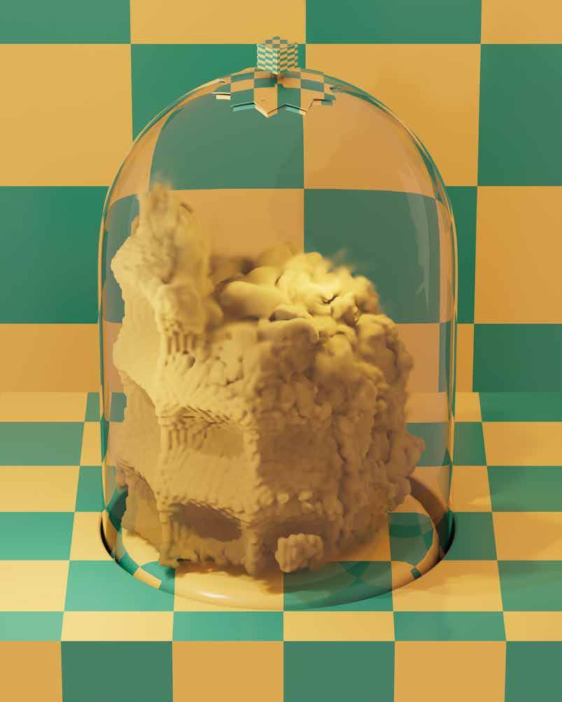
Smoke won’t hold a shape. Its most salient features are related to diffusion and dissolution. There are two options for how smoke can hold a grid. Either it’s a grid to start with, or it collides with one after. Terrariums, when sealed, create a scaled atmosphere that promotes plant growth. The closed system of the terrarium is also an optimal environment to prevent simulated smoke from dissipating too quickly.
The same tree data can be processed into tree renders that look little, if anything, like a natural tree.

The non-tree trees feel like anomalies, but nothing has been translated or transformed to achieve them. There is always interpretation between the elemental structure of the computational tree type, the text file format of the tree data, and the rendered tree. The trees that look nothing like trees only vary in the final step, the rendering. This reinforces the idea that rendering is not necessarily showing something that was already there, but creating something that was previously only nascent, immaterial, or invisible.

 George Inness, Harvest Scene in the Delaware Valley, 1867. Courtesy National Gallery of Art, Washington.

Viewed from the side, the shallowness of the diorama visibly conflicts with the implied depth of the perspective grid.


This drawing, part of House 2, is a design research exercise that results from the conflation of 2-D and 3-D information. The house proposal attempts to discover lineages between architectural elements and digital design operations.

 Star Wars, Atari, Inc., 1983. 286
 by Hans Tursack
 By Rainbird, Argonaut Software, 1988.


Tree-1 Outline

Tree-3


Tree-4


