
PRESBYTERIAN LADIES’ COLLEGE, SYDNEY
Technological & Applied Studies and Visual Arts
Higher School Certificate
CATALOGUE OF WORKS 2024


Technological & Applied Studies and Visual Arts
Higher School Certificate
CATALOGUE OF WORKS 2024
I have been very impressed by the industry and care of students in Year 12/2024. They are working thoughtfully. At our school we highly values the contribution of each student to her own education, the importance of the teacher as her instructor and guide, and the essential role of parents as ‘underpinners’ of whom each student becomes, as well as being a cheer squad and coach. All of these different contributions are evident in HSC Design and Art Major Works. At the PLC Sydney exhibitions you will see the visions students create, and you will sense the blood, sweat and tears that went into them. You will recognise the thoughtful wisdom and advice of their teachers. Parents will see their own ideas, efforts and energy reflected in their daughters’ works. In this way these works deserve to be viewed and enjoyed as a greater priority than that they are marked. We are honoured to come and gain an insight into the hearts and souls of our students. I add my congratulations and thanks to the students, to their teachers and the staff who work in The Croydon, and to parents on raising their daughters to be creative and hardworking.
Dr Paul Burgis Principal, PLC Sydney
I remember this time last year. I remember not knowing what path to take, how I would get there and even what my work was about. Then again that was only the beginning. Now we stand back at this time again except each and every one of us has created something beautiful and unique. This year group has worked incredibly hard to achieve meaning and sophistication.
A whole year later, I feel incredibly proud of the high resolve of work that everyone has managed to achieve. I can feel a great amount of passion and dedication from you all.
This exhibition celebrates our collection of works and most importantly the behind the scenes. It was a year-long process. Not without struggle, but it was indeed rewarding for every individual here. From conceptualisation to creation, we have all had to navigate the complexities of our chosen mediums, experimenting with techniques, while embracing both success and setbacks along the way. The Bodies of Work on display reveal the resilience and determination of my peers.
Everyone has engaged with their own strengths and interests and with the new art studio we have all grown closer in our relationship with one another. Whether it was through painting, sculpture, digital, or any other medium, every piece of work in this collection tells a story. They are reflections of our experiences, our emotions, and our pursuit of artistic expression.
I would like to thank Ms Gair and Ms Knight and the support from all the Visual Arts Staff. Thank you for guiding us along the way and fostering our spirit. You have been wonderful teachers. They have offered us their time, encouragement and critiques that have helped us refine and rework. Thank you for providing us motivation and ways through our challenges.
And of course I would also like to extend gratitude to our families and friends who have also supported us throughout the completion of our Bodies of Work.
I am very grateful that we have this opportunity together to celebrate this wonderful achievement.
Miss Anna Wang
Art & Design Captain 2024
The HSC design exhibition serves as a platform to celebrate the dedication, creativity, and practical skills of our talented Design and Technology and Textiles and Design students. Throughout the development of their Major Projects they have all shown creative vision, innovative design practices, and complex construction skills ensuring the creation of unique, functional products, resulting in a diverse range of inspired solutions.
Our Design and Technology students have explored diverse design fields that reflect their individual interests and passions. In the initial stages of the design process, they demonstrated empathy and exceptional problem-solving skills, leading to deep learning experiences and genuine design solution development. The complex design process included ongoing research, idea development, prototyping, and experimentation, enabling each student to create a broad range of high-quality solutions. Their enthusiasm and perseverance have been commendable. This journey has undoubtedly given them a deeper appreciation for the built environment they inhabit.
The Textiles and Design students have developed an exciting range of works that showcase a contemporary style and the creative application of historical, cultural, and contemporary sources of inspiration. Each design is the result of relentless experimentation and the meticulous use of high-quality decorative and structural textile techniques. Their portfolio documentation communicates the challenging development process leading to a quality final solution. Their perseverance and dedication have culminated in highly detailed and functional outfits.
I am immensely proud of their efforts and achievements. This exciting exhibition is a testament to the success and talent of our wonderful designers.
Mr Geoffrey Stewart Head of Faculty, Technological & Applied Studies
HSC Design Exhibition 2024
Textiles & Design Design & Technology

Isabelle Barakat
Design and Technology
Design brief
Design safe and compliant temporary housing in close proximity to the farm for migrants and fruit pickers. Include essential amenities such as a kitchen, bathroom, relaxation area, storage, and personalisation options to ensure comfort and well-being during their seasonal employment.

Isabelle Barakat
Textiles and Design
Design inspiration
My Major Textiles Project is an exquisite garment that blends the timeless elegance of ancient Greek fashion with contemporary flair. This two-piece ensemble features a delustered blush pink satin overbodice with hand embroidery and beading, layered over an ivory georgette skirt adorned with pink laser-cut flowers and gold vines. Inspired by the divine beauty of Aphrodite and the modern portrayal in Rick Riordan’s “Percy Jackson” series, this dress captures the ethereal essence of the goddess, symbolizing love and femininity.
“Aphrodite’s Grace” celebrates the enduring influence of Greek mythology on contemporary fashion, envisioning a harmonious balance between classical sophistication and modern trends.

Chauntelle Boustani
Design and Technology
Design brief
Design and create an accurate architectural model of procedural additions to Matavai Towers public housing in Waterloo/Redfern. This will incorporate the primary addition of a restaurant; employing processes to benefit the residents and effectively connect them to society. It also includes the redevelopment of one floor in the apartment complex, containing services such as various therapies, medical offices and educational resources, to equip the residents with effective access to resources, as well as help them to improve their long-term quality of life.

Macy Bushby
Textiles and Design
Design inspiration
“Sicilian Summer” is a two-piece apparel garment designed for a spring/summer event. It features a tiered ruffled skirt paired with an asymmetrical ruffled top. The silhouette is inspired by the Australian contemporary designer, AJE who are known for their voluminous, feminine outfits, while the 1920s was my historical period of inspiration where the introduction of frills began through the flapper dress. The soft buttery yellow colour of the set is inspired by Sicily, Italy, my cultural inspiration. Further, I have incorporated a traditional Sicilian tile print along the waistband and ruffle on the top and skirt. Along the edges of every second tier, I have manipulated cording in a royal blue colour in a wave-like design. This technique is a reflection of the highly embellished flapper dresses which often incorporated cornelli work to accentuate the silhouette of the garment.
Isla Court
Design and Technology
Design brief
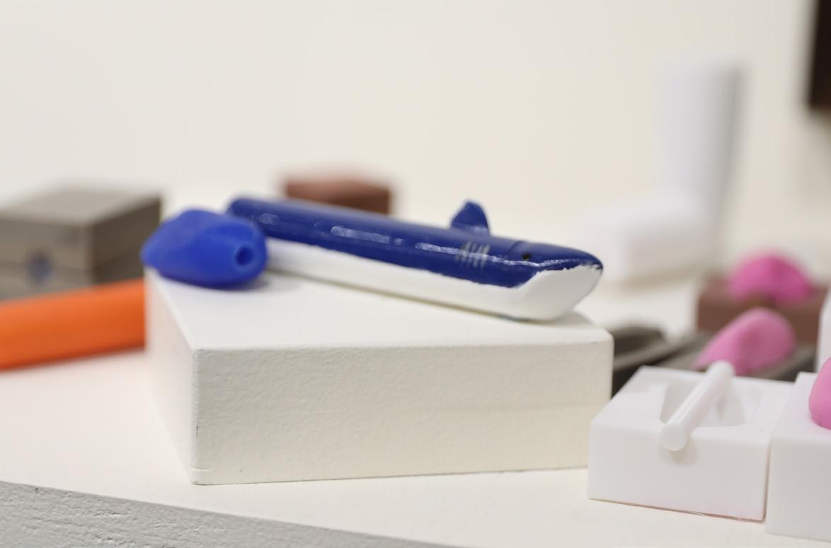
To develop an ergonomic pen sleeve/cover that incorporates weights and a customised pen grip that strengthens the lumbrical hand muscles, develops a pain tolerance when writing for extensive periods, increases the speed of writing as well as the posture of one’s handgrip.
Cleo Duong
Textiles and Design
Design inspiration
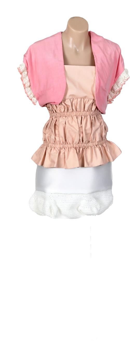
“La Sagrada Carrera” is designed for Lily Muni He, professional golfer and partner of Williams Racing driver Alex Albon, to be worn to the 2025 Formula 1 Spanish Grand Prix. Alex and Lily strive to inspire and create opportunities for young Asian kids wanting to become professional athletes in sports that are historically white, reflected in my organic interpretation of the race circuit with traditional Japanese sashiko embroidery on the top. The costume draws inspiration from the texturally intricate, vibrant and organic buildings of Catalan architect Antoni Gaudi, reflecting the rich culture of Barcelona in patterned crochet trims. “La Sagrada Carrera”, featuring a mini skirt, strapless top, and cropped racer bolero is influenced by the cultural and fashion movements of the 1960s, in particular designer Mary Quant’s ‘Mod’ look. Different shades of pink are inspired by the uniformity of camera shots and monochrome costumes in Wes Anderson’s films.


Amelie Haddad
Design and Technology
Design brief
To create a campaign that encourages children and young adults to pick up litter through a collection of promotional materials.
Ruby Hughes
Textiles and Design
Design inspiration
The “Fleur De Roche” is a two-piece apparel designed to be worn to multiple events such as parties, or concerts. This piece displays representation to my three different components that bring inspiration to this apparel design. The dark colours of this piece is inspired from my sub cultural group, 90s rock. Showcasing the grunge harsh colours from that era of rock fashion, as well as taking aspects of the use of tight framing clothing. As for my historical aspect, I have taken inspiration from the very popularised embroidered symbol Fleur de Lys from the Renaissance Period. As well linking the use of my contemporary source of street art to display contrasting colours within the embroidery, as well as the use of abstract dyes on the pants and the use of laying colourful pieces of fabric within the garment.
Mia Jamal
Design and Technology
Design brief
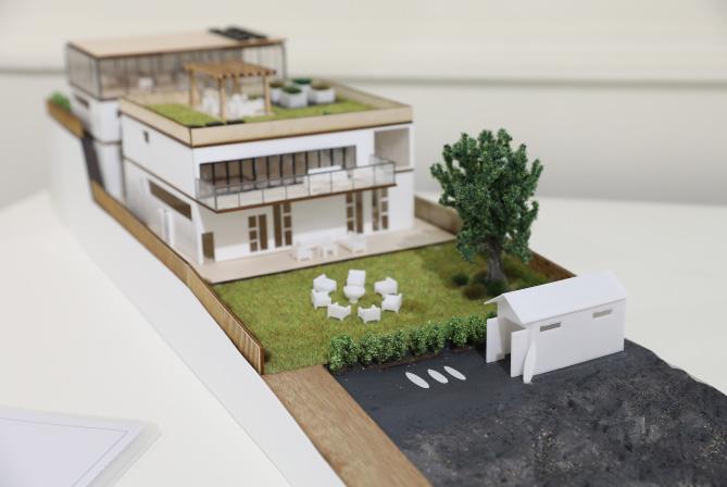
Design and create a prototype of a Remote Working Hub that will act as a residential, periodic alternative workplace to the traditional corporate office space. It will assist in the development of inter-employee connections, and therefore well-being, addressing the need of loneliness. It will respond to its surroundings in form and materiality, located in close proximity to nature, and consider environmental impacts.
Design and produce a theoretical model system of the runnings of the Remote Working Hub, including a roster and timeshare system of employee visits for business and for pleasure, as well as programs that will outline the events and activities each day.

Jacinta Luca Donato
Textiles and Design
Design inspiration
My formal white gown “Blossom”, is an elegant apparel item designed to be worn to multiple major events, showcasing both sophistication and a touch of cultural heritage. “Blossom” features a white base dress, adorned with intricate handembroidered floral embroidery, inspired by traditional Portuguese hand-painted pottery and the flowers which bloom on Portuguese lavender. This infusion is used to create movement, texture and depth within my design, making it visually captivating. The large, standout hip and shoulder features, inspired by Italian designer, Edward Arsouni, made of delicate and elegant chiffon fabric, inspired by fabrics used in the 1910s, are constructed in a segmented fashion to replicate the segmented appearance of Portuguese lavender, adding a harmonious blend of nature and artistry to the gown. They are embellished with hand and machine-embroidered flowers and a purple knitted tube, adding texture and layers to my design.
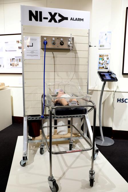

Jana Markopoulos
Design and Technology
Design brief
Human error can occur in high stress industries. To prevent this, mechanisms that minimise risk are essential pieces of equipment. In BankstownLidcombe Hospital in 2016, crossover in the pipework carrying oxygen and nitrous gas resulted in the death of one baby and the permanent brain injury of another. The purpose of this product is to create an effective alarm system for medical gas pipeline systems in hospitals to ensure the correct gas is administered to the patient and the staff are alerted of the error immediately. This product aims to assist those working in the frontline to be confident in the equipment they use to save lives.
Amelia McLaren
Textiles and Design
Design inspiration
The dress “Floral Serenade” is designed for a variety of special occasions and events, such as charity balls and cocktail parties. Drawing inspiration from Elie Saab’s Haute Couture collections, this dress features floral motifs, fine embroidery, beading and asymmetrical designs showcased in his 2000s collections. The floral embroidery exudes romance and elegance, further enhanced by the Regency-style silhouette, known for its romantic aura and simplistic design. Influenced by French Couture, the dress is adorned with tambour embroidery, a highly favoured technique from the European elite.

Elli Meitanis
Textiles and Design
Design inspiration
“Antoinette set” is a two-piece costume made for Madison Beer to wear at a performance at Versailles. Her music is feminine yet effervescent and bubbly, reflecting her personal style. Beer’s costumes incorporate a mix of glamour and youthful femininity. I have been inspired by the Rococo fashion era and Marie Antoinette’s Chemise á la Reine. This garment draws on the Rococo curving natural motifs, pastel colour palettes, and extravagance with the voluminous tiered bubble skirt and structured corset bodice mirroring the dramatic silhouettes of that time. The light pink delustered satin fabric is inspired by the sashes often adorning the Chemise á la Reine, adding a soft contrast of colour to an otherwise plain, white frock.
Katie O’Dea
Textiles and Design
Design inspiration
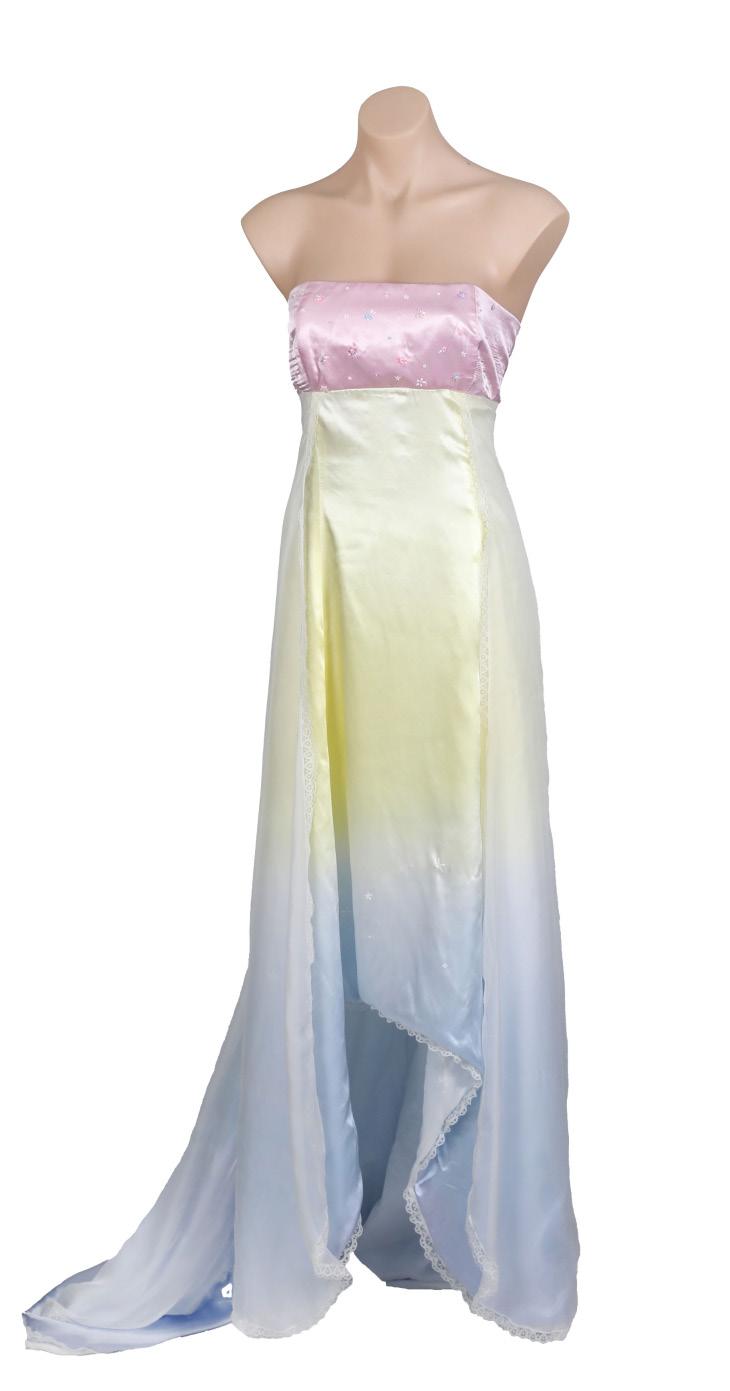
The ‘First Light’ is an apparel dress for a formal occasion set throughout the day. The colours of the dress is inspired by the artistic period, ‘Impressionism’. This artistic period is made from soft colours, that mainly represents skies or scenic scenes. Dip dying was the main technique that was used to represent this concept. The shape and appearance of the garment is shown from Hanfu which is a traditional Chinese garment that is worn by the Han people from China. This garment was worn by scholars and for ceremonies. Hanfu is a multi-layered garment that is made from silk and local materials. The material that makes the garment gives it a very flowy, elegant shape which is represented in ‘First Light’ by its satin base layer and the chiffon outer layer. The chiffon glides over the satin pulling impressionism and Hanfu together, impressionism is shown by the softening of colour from the layering and the layer is directly inspired by the Hanfu garment. The Empire waist is represented by the Regency Era, which was from 1811 to 1820 in Europe. This time period was different from previous time periods as a tiny, cinched waist wasn’t the ideal shape and corsets didn’t need to be worn with these types of garments. The Regency period wanted to give more free movement to the women wearing the garment. This is done by using an empire’s waist, this waist drops from under the chest and flows from there down to ankle length.
Lana Oueik
Design and Technology
Design brief
To create an accurately scaled representation, in the form of a model, of a temporary housing shelter to provide a safe and liveable environment to victims of domestic violence for women and children.

Stella Pasin
Textiles and Design
Design inspiration
‘Midnight in Florence’ is an apparel mini dress which is designed to be worn to the British Vogue x Luisa Via Roma runway show centred in Florence. This garment features a mini low waist bubble skirt with a boned strapless corset. The silhouette of the garment is inspired by contemporary designer Vivienne Westwood who revolutionised women’s fashion, in particular corsetry and mini crinis 1920s flapper dresses are my historical inspiration in which my Major Textiles Project embodies embroidered beading to add texture and glamour to the overall design. This garment is hand dyed a navy tone to complement my cultural inspiration Florence, Italy which favours rich tones. The accents of gold and embroidered swirl motif throughout my design are influenced by the Italian baroque period. The weave on the centre front of the bodice is inspired from a traditional textile mill in Florence ‘Antico Setificio Fiorentino’ which creates unique brocades and textiles.


Alice Playford-Aggs
Textiles and Design
Design inspiration
“Arabesque,” is a costume to be worn by India Amarteifio on the cover of Australian Vogue, as she promotes her new role as Queen Charlotte in the Bridgerton spin-off. The costume is inspired by contemporary Trochus pearl shells, found in Western Australia, particularly for their shiny, lustrous surface. The combination of contemporary sources of inspiration and traditional silhouettes from the Victorian Era and French ballet similarly addresses the relationship between Amarteifio’s role as Queen Charlotte and her contemporary, modern style. This is combined with inspiration from the Victorian era and French Ballet culture, both of which feature a tight bodice and full outward skirts, similarly influencing the contrast between draping, lustrous satin as inspired by Trochus Pearl Shells and the Victorian era and matte georgette fabric as inspired by French ballet on the godet inserts. Victorian era lace and floral patterns influenced decorative elements of the design, enhanced by layered fabrics on flower motifs and beading.
Chelsea Ryan
Textiles and Design
Design inspiration
This elegant ball gown is a luxurious mushroomthemed ball gown designed to be worn to a premier of the movie “Alice in Wonderland” with its fantasy-focused design. The gown is inspired by historic Renaissance fashion mixing upperclass fashion such as hoop skirts, multi-layered petticoats, and vibrant colours with more lowerclass peasant-like textiles such as gathered, plain shirts with off-white, neutral tones. This gown is also inspired by Romance Was Born’s unique use of shapes and vibrant colours seen in their garments. This elegant gown is based on an edited mushroom photograph of a Burgundydrop Bonnet mushroom with a softer more pastel version of an Amanita mushroom’s pattern and colouring. The use of layering of different fabrics and the use of shapes formed through corsets and hoop skirts with the loose oversized lantern sleeves and multilayered ruffled petticoat is used to mirror the shape and flow of the photograph.

Chantel Sargiss
Design and Technology
Design brief
To design and construct a 3-in-One product which contains a dog ball launcher, treat dispenser and water dispenser, in order to keep dogs entertained and prevent boredom.
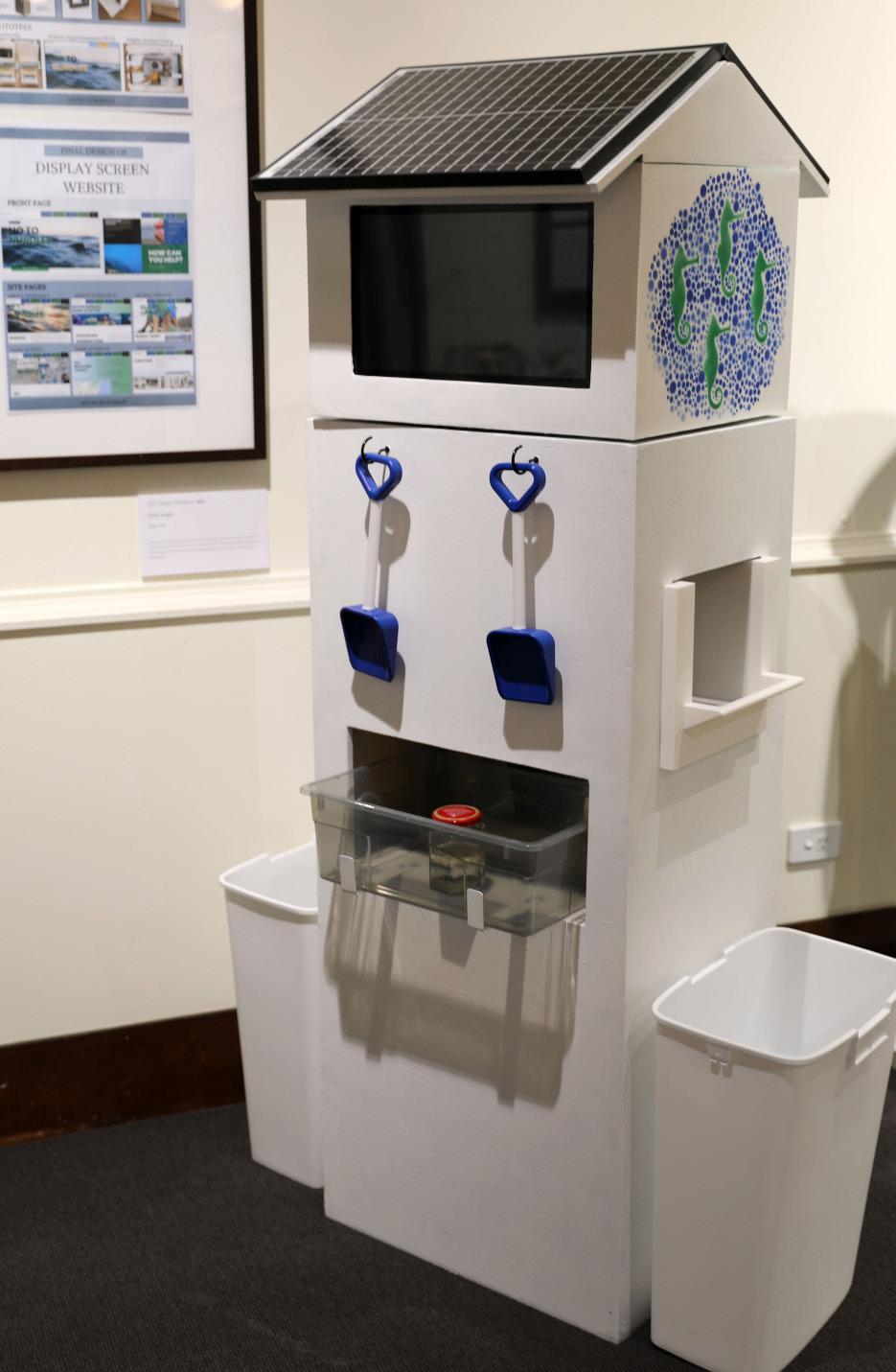
Chloe Sargiss
Design and Technology
Design brief
The design brief is to create a Nurdle Pollution Information Station which will encourage the collection of nurdles and benefit the environment. This will provide exposure to the problem of nurdle pollution whilst simultaneously involving the community in collecting nurdles to spread awareness and have a larger positive impact.
Amelia Stylianou
Design and Technology
Design brief
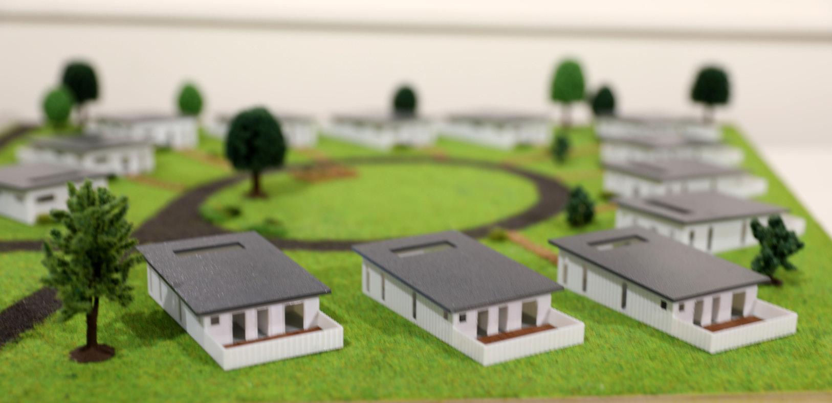
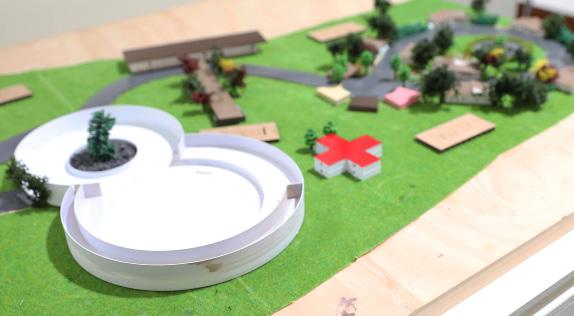
A specially designed residential community that provides a safe, supportive, and stimulating environment for people living with dementia, mimicking a normal village to enhance their quality of life and autonomy.

Emma Swan
Design and Technology
Design brief
Design a scaled model of a protective, hygienic, stimulating and spacious outdoor rabbit enclosure for two rabbits.


Alessandra Sydun-West
Textiles and Design
Design inspiration
“Midnight Forest” is a luxurious black ball gown designed to be worn at the Charity Gala Concert for Ukraine. This gown is floor length with a feminine silhouette and a one-shoulder draped bronze fabric. The gown is also scattered with stylised Ukrainian embroidery from the traditional Vinok (flower crown) on the skirt. This embroidery is in traditional pink, oranges, yellows and red, combining hand, free motion and machine embroidery to create different textures. A bronze Kreinik braid will be incorporated onto bronze vines through free motion embroidery. These 3D sections are inspired by Toni Matičevski’s use of texture and sculptural work through fabric manipulation. The Rococo era of fashion inspired the asymmetry and feminine silhouette of the dress, and the one-shoulder drape is interpreted from a traditional Rococo stomacher.
Mayah Tait
Design and Technology
Design brief
The Ba Vi Vietnam Disability Children and Elderly Centre urgently needs reconstruction to address several critical issues such as outdated and overcrowded facilities, limited accessibility, and a lack of essential support services. The current infrastructure does not provide sufficient recreational spaces and compromises safety. The project’s goal is to completely rebuild the centre, enhancing the quality of life for disabled children and the elderly in Ba Vi. This includes creating a scale model, digital representations of the interior and exterior of the reconstructed space, a mood board, and a pitch.

Alyssia Tomaras
Design and Technology
Design brief
To create a cultural and recreational hub for all types of people to come together to engage in cultural, educational and recreational activities. To promote social cohesion, foster creativity and enhance quality of life. Features through a library, meeting rooms, an amphitheatre, coffee and tea services, study space, an art gallery, gardens, paths, nature flora, outdoor gathering spaces, vegetable growers, market areas, stall areas and excursions.

Isabella Varone
Design and Technology
Design brief
To create an accurate architectural model of the redesign of the Doonside train station. The design must be constructed to strengthen community well-being, enhancing Doonside domain, decreasing the crime rate, and increasing public spaces.

Anna Wang
Textiles and Design
Design inspiration
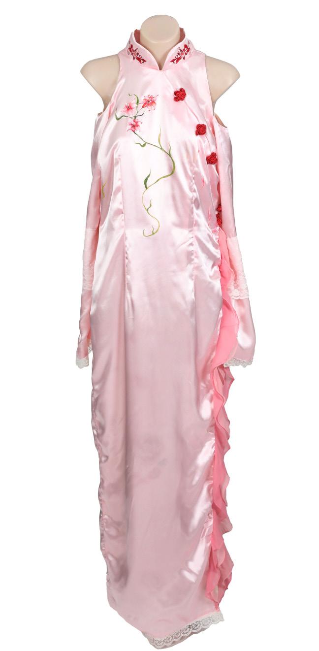
“Flower doll” is a costume for a character within the world of Studio Ghibli’s films and hence is characterised with unique stylisation embedded within the techniques of the work such as hand painting. It holds a strong feminine character with shades of pink as well as a formal touch and sophistication elevating the design through the silhouette of a traditional Chinese dress, Qipao with high collar and a slimming quality. The ruffles accentuate the split and surround the edge with texture alluding to the Victorian inspiration used to accomplish this effect accompanied by dyed lace along seam lines as well. The dress is cascaded with floral imagery connecting to the natural hand paintings of Studio Ghibli’s signature backgrounds which accompany the animation style. The use of both hand and machine embroidery are used to create a floral sensation within the design.
Jemima Watkins
Design and Technology
Design brief
To design and create a “third place” at Pioneers Memorial Park by providing a multipurpose pavilion and amphitheatre as well as other elements throughout the park. The pavilion will provide shelter to a flexible outdoor space lined by a cafe, workspace and community room in order to promote connection. A green roof with a sensory garden and accessible ramps will enhance belonging and contribute to placemaking. The design and creation of spaces and the pavilion at the heart of the park will provide opportunities for all different members of the community to enjoy the park and for it to become their third place.

Paloma White
Textiles and Design
Design inspiration
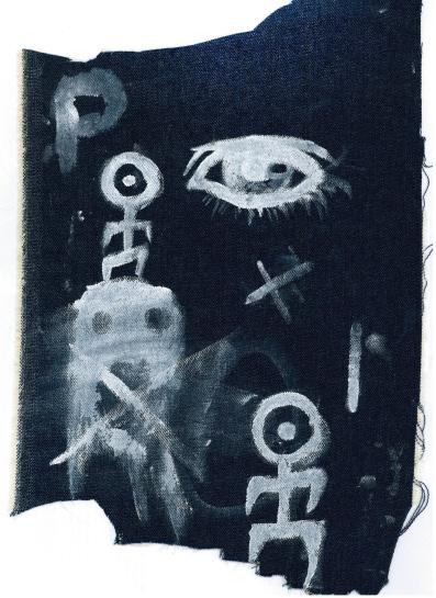
My Major Textiles Project is a costume designed to be worn on stage by a member of a punk, post-punk or gothic rock band, which are often characterised by their avant-garde appearances and style of music. The corset, concerning the fashion of the gothic subculture, is a symbol of non-conformity and a staple of the subculture as a countercultural movement against the hyperconservative and conformist society of the time (and of today). The piece is made from denim - a durable material, suitable for stage wear and frequent washes. The corset’s panels have been darkened with black dye and bear hand-painted patches, hand-stitched with purple thread on the right half, while the left half is hand-painted with a spider-web design in white. Its surface is composed of rough and wavering colours and textures, which gives the piece an organic and intentionally unpolished quality - a fitting characteristic often associated with punk and goth fashion.

Honey Wiepjes
Design and Technology
Design brief
To design and construct a model of a hotel that will represent the key aspects of Japan’s culture. The hotel should be accessible to elderly and disabled people to enable an accessible alternative to international travelling. The design should be cost-efficient and environmentally friendly to minimise the current issues regarding tourism.
PLC Sydney is very fortunate to educate many talented and dedicated Visual Arts students. ARTEXPRESSION 2024 represents the culmination of the HSC practical component, and the many years of building and refining skills, aesthetics and individual sensitivities. The Visual Arts Faculty offers diverse and challenging opportunities to investigate and experiment with expressive forms, critical ideas and subject matter. The ARTEXPRESSION exhibition and this catalogue celebrates the final Bodies of Work created within Year 12 which reveal the commitment to the artmaking process, hard work, imagination and authentic insight into our contemporary world through the lens of each artist’s vision. Our 2024 cohort is a vibrant and exceptional group of young women, who have worked with care and deep reflection to constantly elevate and extend their technical skills and visual aesthetics to the highest possible standard. The resulting works demonstrate what can be achieved through dedicated effort, critical reflection, and striving for excellence. The Visual Arts staff have shared this creative process alongside the group and couldn’t be prouder of what these artists have produced. As a cohort, the exploration of genres, issues, and themes is diverse, with accomplished explorations across the mediums of painting, drawing, ceramics, photomedia and printmaking. Each Body of Work is like no other, a testament to the authentic voice expressed by each individual who has explored meaning within their work significant to them on a deep level, whilst also providing a mirror to our contemporary world to resonate with the audience.
Congratulations to our HSC artists of 2024, you are a stellar group of young artists and it has been an honour for us to guide you and know you as creative young women. Your skill and innovation have the potential for positive change within the arts and will contribute beyond the school context to your future careers and enrich your lives. We share the pride of the College with your families, and friends for what you have achieved in your Body of Work. We all acknowledge your hard work and talent and thank you for the important message and memorable work you have created.
Ms Jo Knight Head of Faculty, Visual Arts
ARTEXPRESSION
Visual Arts Bodies of Work
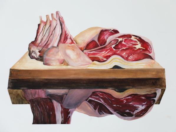
Emily Andrews Forde
Of the flesh
Painting
Of the flesh is a Body of Work composed to showcase the carnal reality of the meat we consume and its similarity to our own human flesh. The representation of organs, both human and animal, alongside cuts for commercial sale which are displayed on butchers blocks intentionally to blur the line between the sociocultural acceptance of animal meat consumption, and the abject notions of cannibalism. In our contemporary world animal organs are farmed and transplanted into humans to extend their life, and scientific research into organ manufacturing in the lab is fast advancing. I challenge the viewer to consider the ethics of consuming a living creature that is comparable to oneself. I wish to start a dialogue about what is ‘okay’ and what is ‘wrong’. My work is intended to ask people to think about the societal values associated with consumption. After all meat is meat, and we are all Of the flesh and should be equally valued as such.
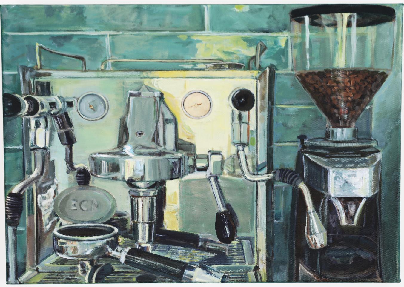
Jocelyn Arkapaw
99% Ethically Made
Painting
Within my painting series, I aimed to convey the inconsistencies within the coffee industry. I wanted to explore the differences between what is communicated and marketed to consumers; a type of ‘greenwashing’ and a façade of sustainability, and the reality of numerous instances of ethical scandals, slave labour, and a lack of concern for the environment with mass deforestation and pollution. I have achieved this through the green colour palette and reflective surfaces, symbols for the seemingly polished and clean yet deceptive use of advertising by large corporations. I have subtly used text within the work to encourage audiences to more closely examine the marketing material and challenge its authenticity. I have utilised intimate, domestic subject matter as well as images from expansive coffee plantations to enlighten our shortsightedness when taking companies at face value and forgetting their wider impact. After all, is 99% enough?
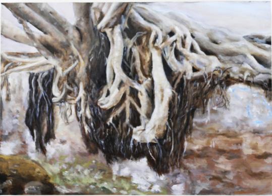
Isabelle Badger
The Ground We Share
Painting
Through my painting series The Ground We Share, I aimed to capture both the simple and complex relationship between humanity and the natural world. I achieved this by using a unified yet muted colour palette, to blur the lines between the human hands and tree root forms, forever entwining a physical and emotional connection between the two forms. I was inspired by Arthur Streeton’s impressionist marks in the way he captured the Australian natural landscape, emulating his fleeting and expressive strokes within my own practice. This influence is further evident in the way I approached painting the smaller less prominent roots. My intention has been to dramatise both the stillness and movement in the portrayal of the tree roots, appearing static yet forever in a state of growth. The Ground We Share also celebrates a deeply rooted connection to family and heritage, I was inspired by the notion of ‘family trees’ and the concept of tracing our lineage in the search for a purpose in life. This shared space belongs to our ancestors and the familial ties that the future will bring.
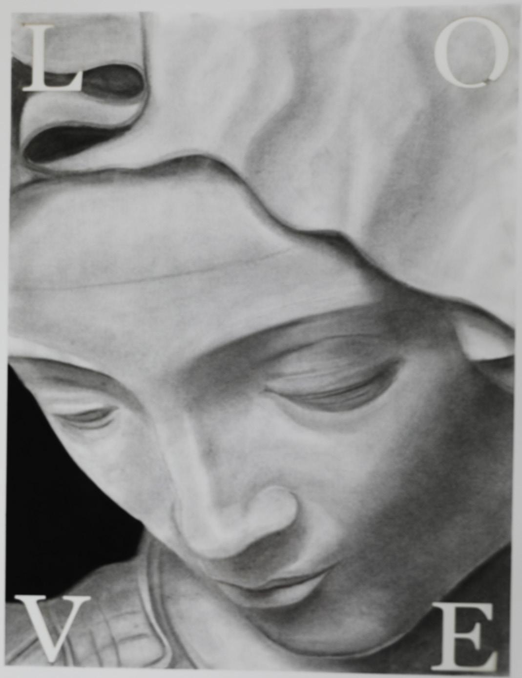
Isabelle Barakat
No one will love you like I do
Drawing
No one will love you like I do, is a series of largescale charcoal drawings that explores the hidden pain behind the serene façades of classical sculptures. By focusing on women’s facial and figurative expressions and the harsh grip of masculine hands, I aim to highlight the silent strength and vulnerability of contemporary women trapped in oppressive relationships. My conceptual approach aims to reveal how classical canons in western art often romanticised abuse within mythological narratives, glossing over the anguish within the women’s faces and their true psychological experience, until closely examined. Taking inspiration from American conceptual artist Barbara Kruger, known for her photomontages that combine black-and-white photographs with overlaid declarative captions, I have laser cut two phrases “No one will love you like I do” and “Love should not hurt” directly cut into my artwork, to confront the viewer with the stark reality that love, often romanticised, can be a source of deep pain. The phrase “No one will love you like I do” echoes the manipulative justification abusive men use for their actions, underscoring the toxic dynamics of control, coercion and possession. In contrast, “Love should not hurt” serves as a poignant reminder of what love should truly embody—respect, care, and kindness. This work is both a personal and universal social commentary on the resilience of women and a call to action for us all to challenge harmful dynamics in intimate relationships today.

Lola Birley
Mantis Manifesto
Printmaking
Mantis Manifesto is a satirical examination into the exploitation of workers and communities for the benefit of the ‘good of the people’ by governments past and present across the globe. Through the personification of the hierarchy of insects, the humble mantis becomes the suited tyrannical dictator, represented in differing symbolic places of power to act out his doctrine to Eat, Prey and Obey and achieve a revolution over the masses of ant and wasp colonies. My appropriation and rephrasing of Marx and the adoption of the visual language of printmaking aims to provide a familiar yet humorous social commentary on the at times harsh acts of governments as they come into power. My employment of the reduction relief printing process plays homage to the historical use of political propaganda posters as a persuasive visual tool during World Wars used to influence the masses. Ultimately, this Mantis Manifesto aims to reveal the differing guises that cruel dictators might adopt and a warning for audiences to be cautious.
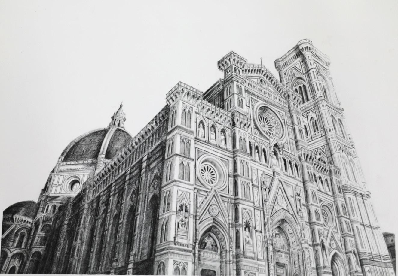
Olivia Chan
Study of a Divine Perspective
Drawing
My Body of Work, Study of a Divine Perspective is a series of graphite drawings in homage to the Cathedral of Santa Maria del Fiore in Florence, Italy; a masterpiece of Renaissance architecture and engineering. My compositions celebrate, revive and express appreciation for the meticulous craftsmanship that enabled grand architectural forms such as this Duomo to be realised. This sacred place of faith and worship, with its central dome, designed by Brunelleschi, embodies golden mathematical proportion whilst enhancing its transcendental qualities. The intricacy and detail of its structure may be easily forgotten and overshadowed by the sublime and touristic spectacle, thus dismissing the artistry of such iconic architecture thus emphasising ephemeral shifts in our values from the spiritual to the sublime. The repetition and attention to detail required to render form with accurate perspective in drawing attempts to imitate the challenging act of its original creation through laboriously handcrafting details in the ornate exterior façade. Through the tactility of the drawing process, my artmaking intends to reveal the slow craft of the design and construction of Renaissance architecture. These monochromatic works convey a gradual fading of the structure which disperses into light and shadow - symbolising how appreciation for architectural craftsmanship is being lost to the modern world, yet simultaneously dissolving into light to emphasise its ultimate prevailing divine purpose.


Dalia Hamade
Colours Between Us
Drawing
My array of three large-scale portraits aims to convey the ineffable nature of one’s true self, and the dissonance between who someone intrinsically is and what they are instead perceived as. Each portrait depicts a teenage girl whose face, in some way, is fragmented. This represents the chasm of their interior person and how it cannot be captured in the shared space between us. I have chosen a cool-toned monochromatic approach to each portrait, as the singular use of colour would typically represent wholeness and certainty, but this is used ironically as it is undermined by the fractured image of them we see. Colours Between Us is an ode to our inability to express one’s true self, and yet the persistence to continually try through the arts.
Matilda Hefferan
Double or nothing
Painting
Double or nothing intends to elicit the complete sensory overwhelm that comes from an abundance of choice within the world of gaming and the entertainment industry. The acidic lighting within my paintings illuminates the inherent artificiality of the nostalgic arcade space, wherein ‘fun’ is curated and curiosity is commodified. From the saturated pink acrylic framing surrounding each work, to the suspended soundscape; the viewer finds their attention being demanded in every direction, epitomising the hazy, fractured experience of the self under capitalism. Within this unease, there is also a sense of familiarity; nostalgic pinball games and corners that may awaken some childhood memory within the audience, if not their own memory, one borrowed from shared cultural consciousness. The disjunct between the arcade’s neglect and its legacy of childhood ‘fun’ creates a certain tension that exists in many disused commercial spaces, where the memory of what once was rubs up against our perception in the present digital age. Through this Body of Work, the artist urges the viewer to consider how the seemingly individual and voluntary pursuit of entertainment is, more often that not, a highly constructed pathway that leads not to unadulterated enjoyment, as promised, but products, manufactured deliberately for them that can ultimately lead to isolation, addiction and loss. ARTEXPRESSION2024ARTEXPRESSION2024.

Ariella Humphreys
Under the Same Sky
Photomedia
My Body of Work Under the Same Sky explores intricate details in the mundanity of the everyday. During a trip to Japan, I was inspired by the synergy between nature and urban structures. This photographic series seeks to bring to life the feeling of being present, noticing, and appreciating the minutiae through a broader lens. The deep contrast between light and dark intends to draw the eye to details almost hidden within the inky body of each photograph. The intentional choice to situate the images inside a clean white border reinforces the conceptual notion that beauty lies within the details of the bigger picture. The change in scale demonstrates how the environment has been interrupted by urban development, nevertheless, this comparison highlights its resilience to continue, under the same sky.

Emelie Johansson
Gasping for air
Painting
In my Body of Work, I explore the innate desire for escape and survival amidst the internal struggles of everyday life through a narrative of self-portraits. The uncontrollable, swirling ocean throughout my work represents the inevitable troubles that I have experienced throughout my life. The vibrant reds and teals reflected through the oxygen mask motifs are contrasted against the dull blues of the ocean - a representation of hope, freedom, and a search for survival. The conceptual exploration of helplessness is visualised through incorporating fragmented imagery, a distortion of the figure’s face and body, mirroring the disorientation one feels when overwhelmed by life’s challenges. The narrative that follows a battling between drowning, breathing, and reaching, reflects the constant struggle between sinking and the desperate gasp for air. It is through my material and conceptual practice that I seek to encourage the viewer to contemplate whether hope is futile in the face of life’s conflicts, or is it rather a gateway to freedom and survival.

Isabella Khoury
Luxury Exchange
Collection of Works
My Body of Work explores the obsessive consumption of luxury goods and the pervasive influence of consumerism and materialism in our contemporary world. It features a series of designer shopping bags, laser-cut with words and numbers that underscore the severity and compulsive nature of luxury consumption, both on a individual and global scale. Additionally, my paintings that interrupt the surface of these bags, draw inspiration from traditional still life and the cultural ideology of Momento Mori, juxtaposing classical items with contemporary objects of perceived value. This blend aims to highlight how the allure of luxury and materialism is overshadowing the timeless beauty of the world in which we live - the desire to have is absolute. The stock exchange is used as a visual representation of the catastrophic implications of high fashion, with the use of negative space symbolic of the physical impacts on both the natural environment and psyche of our youth, symbolising a stretching void that is in desperate need of repair.
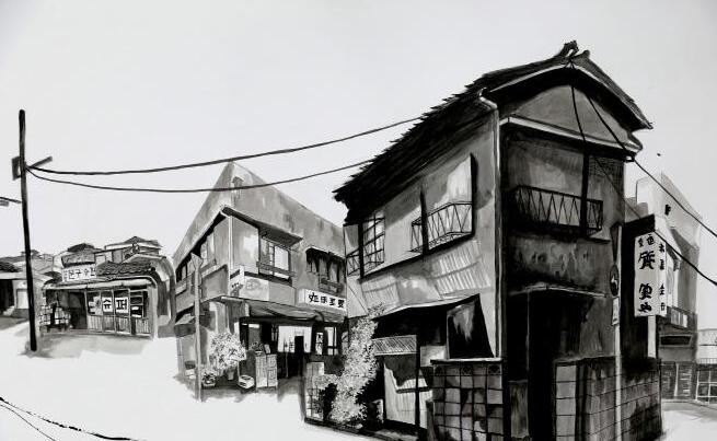
Joanne Kim

(Track to Busan)
Drawing
My Body of Work is a visual exploration of the decrepit buildings in Busan, Korea where my parents are originally from. Track to Busan conceptually seeks to rebuild the beauty of these buildings that are metaphorically fading into forgotten remnants of a city that once had a strong and vibrant heartbeat. The increase in technology, urbanisation and renewed architectural structures cast shadows on the world that once was. Through this, the old way of living is scraped away such as the spaces where children played and where there was a sense of community through these buildings. To bring a focus on the beauty of these buildings, I used ink to expressively convey the energy of Busan, the streetscape where children rode their bikes with the wind in their hair. A fading memory of a place that needed to be remembered.

Hui Qi (Vicky) Lei
Shutdown until further notice
Painting
My Body of Work is inspired by the energetic buzz of Chinese wet markets. When I was around the age of 8, I used to travel to these places holding my mother’s hand, the loud conversations, bargaining grandmothers, colourful fruit arrangements and silver fish in trays, come together to form the rich tapestry of community. A place where my grandmother selects food for my family’s supper, where I watched fish sellers hosing down their seafood and carefully planning for their day ahead. These cultural environments are so complex and, when you look closely, you can see the beauty in the often overlooked of the every day, revealing the necessity and significance of wet markets in China’s informal economy. However, despite all this, these markets have come under extreme scrutiny due to the coronavirus outbreak. Western views of its ‘unsanitary conditions’ and ‘unsafe environments’ encouraged the shutdown of these markets for a prolonged period of time, destabilising the community life of market vendors and the connection between people and place. These markets are not only vital for the staples they sell but are essential cultural institutions that embody social interactions, culinary traditions, and economic activities.

Sarah McPhail
Slowburn of simulacrum; ornamentation and divinity
Painting
“But what becomes of the divinity when it reveals itself in icons, when it is multiplied in simulacra?” - Jean Baudrillard
People have always tried to capture religion in a tangible form, and today, more than ever, I feel that we are losing the essence of religious divinity through hyper-real symbols of religion. Western society’s increasing capitalism has commercialised and aestheticised faith. My Body of Work explores how sacred objects of devotion lose their meaning and decay in a post-modern age. Objects from my culture have become ornamental, reducing their divine power that has guided religious worship for many centuries. Within my practice, I have chosen a classical still life representation as it embodies the cultural history of objects whilst simultaneously alluring the audience through its retinal qualities. Inspired by religious iconography from the Renaissance period, and recontextualising through a postmodern lens, my work seeks to disrupt and dismantle the hyper-reality of ornamentation and instead offer a rebirth of divinity.
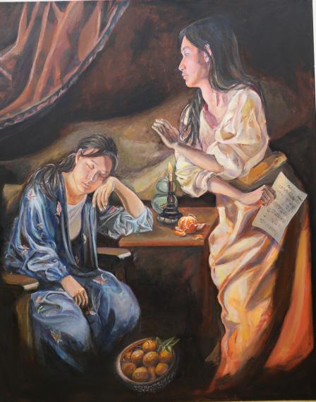
Jing Wen (Mabel) Mei
Confluence of cultures
Painting
My artwork explores the intricate balance between Western and Eastern cultural experiences. My transcultural experience is represented through a double self-portrait, symbolising the dual personas that bridge both cultures in my life. Drawing inspiration from Italian Baroque artist Artemisia Gentileschi, I have incorporated dramatic chiaroscuro to emphasise features reminiscent of traditional Western painting. Childhood objects, deeply rooted in my memories of growing up in China, serve as core visual motifs in my work, shaping the essence of my identity. The two identities within me are inseparable, fitting together like puzzle pieces; without them, my sense of self is incomplete.
I once doubted my identity and struggled to accept all aspects of myself, leading to a sense of internal fragmentation. However, through my artistic journey, I have reached a profound conclusion where I have embraced every part of who I am. This self-acceptance has led to a harmonious reconciliation of my diverse cultural influences, creating a sense of peacefulness and wholeness within me. My Body of Work invites viewers to reflect on the multidimensional nature of identity and the beauty of embracing all aspects of oneself, highlighting the universal truth that our identities, though complex and multifaceted, are the foundation of our unique selves.

Charlotte Morgan
Remnants of the Landscape
Painting
My Body of Work is an investigation into the Australian landscape and the nuances of colour and light that represent the iconic environment that we live in. The ghostly gum trees are captured in isolation, contrasted against the harsh and arid ground below. Inspired by the works of renowned Australian artist Fred Williams, Remnants of the Landscape celebrates the authentic scarred natural world and our representation of it as artists.
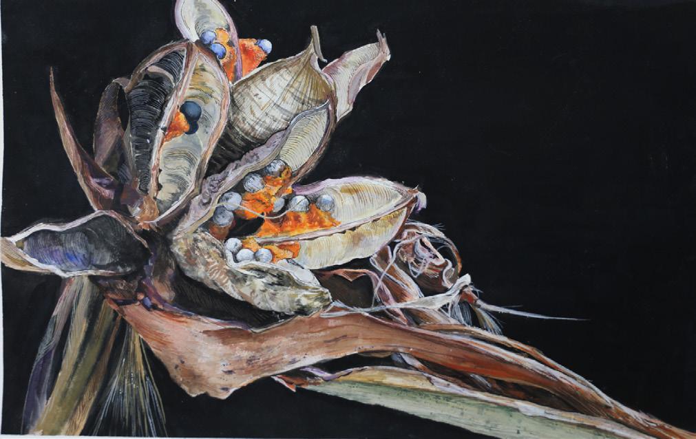
Anyue (Emma) Ni
Collecting and Cataloguing: A Seedpod Anthology
Collection of Works
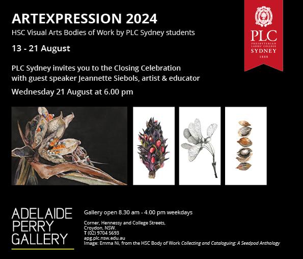
Two in five of the world’s plant species are at risk of extinction. Collecting, cataloguing and researching seeds has become an essential way to maintain the flora biodiversity on the planet. In contrast to the magnitude of a grown plant, we easily forget the significance of that tiny seed which contains huge energy and potential to bloom into sustaining life. Inspired by the forms of Sarah Rayner’s ceramics and Anna Laurent’s scientific photography, my Body of Work explores the diverse macro to micro forms of seeds and seed pods. The transition between blank sculptures, microscopic seed carvings on ceramic plates, seed pod drawings, whole plant paintings, the painting of the ground environment, and the gradual introduction of colour and life in my work; explore a comprehensive narrative of the seed pods and highlighting the aesthetics and significance of these capsules of life.
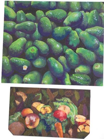
7.6 million tonnes
Painting
7.6 million tonnes aims to reveal the excessive food waste in Australia, and the role of supermarkets in the display, marketing of fruit and vegetables that shapes the expectations of consumers. Every year farmers have to dispose of their produce due to small blemishes, irregular sizes or slight discolouration due to their rejection by large supermarket chains who desire perfect aesthetic, colour and texture rather than the nutritional value of the produce. Further to the shocking statistic of 7.6 million tonnes annual food waste created by Australian households, is the additional environmental impact from over packaging and water wasted during farming. 2600 gigaliters of water is wasted for produce that is never eaten; equivalent to five Sydney Harbour’s worth of water. To engage the viewer with this serious contemporary issue, I have recontextualised familiar fruit and vegetable boxes with vibrant bold graphics, and inserted still life studies in repeated painterly rows to form a Warhol like installation.


Chelsea Ryan
The Water Will Rise
Photomedia
This series of photographs was taken at the Old Helensburgh Railway Tunnel after a downpour of rain that flooded the local area. Within my photographic practice, I have explored the beauty found within the liminality of such spaces, especially highlighting the remarkably new environments that are created after the effects of such intense weather patterns. The hauntingly beautiful landscape that was reimagined through the deluge, offers reflections of light and water, which were constantly reconfiguring the landscape. In capturing the flooded entrance, I sought to focus on revealing beauty in what most would not consider extraordinary. Photographing the murky flood water also reflected small flicks of golden from the sunset and the minute details of the disregarded and abandoned train line. This is contrasted with the intense darkness of the tunnel’s void, emerging as mass that pulls the viewer in throughout the series. The train line acts as vectors that guide the audience through to multiple focal points within the saturated natural world. Through this series a tension between the natural and built world is presented, and as the water rises, a new world is imagined.
Ella Simmonds
Off Script
Painting
Off Script is a series of oil paintings that form a narrative of love, disillusionment, violence, resolve and power. Like static movie stills, each canvas connects to the next, leading the viewer through a story that follows the journey of a female lead. These filmic qualities are emphasised by using shadows and closely cropped subjects to create a sense of foreboding, tension and suspense. Standing against a long history of the Visual Arts and cinema that has often eroticised violence against women, my work suggests a better future for the female protagonist, who in my work is empowered to walk away. A range of contemporary and historical artists have informed my practice including painters Anne Wallace, Heidi Yardley, and Anna Weyant, Surrealist photographer Lee Miller and director Alfred Hitchcock.

Rosie Telfer
PETA Rabbit
Drawing
My artwork, PETA Rabbit, explores the injustice of animal cruelty represented through a humorous role reversal, where rabbits are depicted as the perpetrators inflicting violence onto humans. I employed vibrant coloured pencil to portray the unjust treatment of domestic and farm animals, personified by the rabbits in my work through a satirical reimagining, intended to act as a wakeup call for the audience who buy commercial products oblivious to the testing, abuse and neglect that has enabled them to be mass produced for profit. People for the Ethical Treatment of Animals (PETA) is the largest animal rights organisation in the world, my reference to this acronym in my title, also plays homage to the popular children’s book series Peter Rabbit, about the mischievous fictional Beatrix Potter character, in an attempt to draw an emotional connection with the viewer, and generate awareness to the vulnerability of animals, including rabbits, commonly used for laboratory testing, to provoke societal change. The role reversal in my work intends to provide an alternative perspective on animal cruelty, one that is easier to understand due to the viewer being forced to place themselves in the rabbits’ shoes. Ultimately, the audience’s empathy garnered from the sudden awareness of the severity of this issue raised through my work, will hopefully result in a successful call to action, so that a positive improvement for the rights of animals can be made.
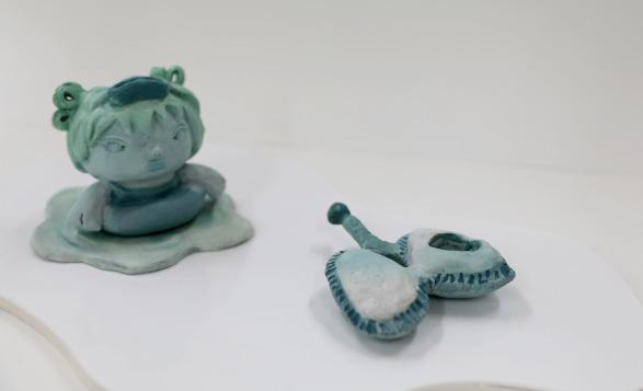
Anna Wang
Hurts to feel
Ceramics
These days I think I struggle to feel. The work reflects an emotional suffering. This kind of pain is the hardest to show and the hardest to understand by the people around you. Pain is relative. As we get older we experience more things, good and bad, it’s an accumulation. But sometimes time pushes us forwards and we suppress our emotions. The time spent dwelling on our internal suffering appears pitiful as if stuck in time unable to move on. Though, somehow we do move on, life is short after all, we numb ourselves, distract. But eventually, the pain catches up to you. It weighs you down in a heavy useless body. The wounded figures represent the expression of mental suffering that tolls and restricts the physical body which is desecrated in order to move on, without enough time to heal. It is trauma with nowhere to go. Through this series I have created ceramic forms that symbolically represent different physicalisations of suffering through the lens of a child.

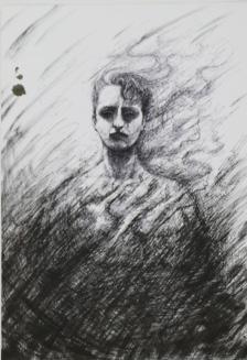
Paloma White
As Above, So Below
Drawing
In my Body of Work, I explore the evolution of my relationship with the spiritual, the esoteric, and the occult, and how my experience of traditional Christian dogma, interwoven with a childhood of undiagnosed neurodivergence, has contributed to the construction of my current spiritual identity and what I consider myself to be. It explores my transition from, as defined within Western esotericism, beliefs of the Right-hand Path, which includes Christianity, to those of the Left-hand Path, which is heavily influenced by my deep-rooted identification with the ‘other’- that which is feared, hated, and deeply misunderstood- that which, over time, has grown to become adversarial in nature.The directed hands of The Sabbatic Goat signal this division. I utilise ink’s unforgiving and incisive nature to highlight and challenge the harsh dichotomies of light and dark, purity and impurity, and life and death within traditional religion, which bleeds into common perception. Emptiness and death can be found within the path of “rebirth”, self-empowerment and fulfillment can be found within the path of destruction- in both exist the qualities of the other, and there is no real right or wrong. I am grateful to be in a learning environment that nurtures and supports diverse beliefs and self expression.


Honey Wiepjes
Do Not Reply
Textiles and Fibre
My Body of Work aims to unveil the hidden reality of the debilitating pain that young women endure from female health issues such as Endometritis, Polycystic Ovary Syndrome and Adenomyosis. Many women who suffer from gynaecological pain do so both physically and mentally because their experience has been historically dismissed as “hysterical”, “emotional” or “fabricated” pain by the medical profession. The embroidered doilies are from my grandmother, who grew up in an era where women were encouraged to make things as “nice” as possible, and to not complain. In the past, women not talking about pain was considered to be good etiquette, feminine and stoic. This notion of feminine virtue is extended by the employment of embroidery, a socially acceptable pastime for Victorian women, and a technical craft not traditionally valued within the male domain of classical fine art. Today, I recontextualise these doilies as a way to voice the pain gap between genders, reveal the suffering that women have had to silently endure, and to visualise the internal pain that cannot be seen. For many females it has been a long journey to find out the cause of the pain inside their bodies. My personal experience has involved a difficult process of trial and error, hormonal medication with side effects, and invasive hospital procedures that culminated with a bluntly sent text message with a shock diagnosis. The final auto generated statement Do Not Reply underpins the lack of empathy, humanity and validation of a woman’s experience of pain that urgently needs to be addressed within our health system today.

Maia Zammit
My Body of Work illustrates how one’s cultural connection overrides geographical distance and is preserved through early memories that can easily erase the passage of time. This concept is explored through portraying the lived experiences of my Maltese grandmother, Ines, following her immigration to Australia in the 1950s in her search for ‘a better life’. I have expressed the notion of displacement from her home country through the drawing technique of stippling. This process is often used in art restoration, to bring to life what may have been left behind or lost. Stippling involves creating tonal images built up with countless tiny dots. When the dots are placed very close together, they give the illusion of tonal continuity. The illusion of continuity is the analogy of my grandmother’s sacrifice, hard work and deep personal memories (seen in the blue drawings) in a bid to restore her Maltese identity in a faraway land. Every dot contributes to her story waiting to be told.
PLC Sydney would like to acknowledge the dedication, support, care and professionalism of our HSC
TAS and Visual Arts teaching staff at The Croydon in 2024. Thank you to our Head of Technological and Applied Studies, Mr Geoffrey Stewart, Design and Technology teacher, Mrs Lauren Clarke, Textiles and Design teacher, Mrs Maria Nastasi and Ms Jo Knight, Head of Faculty, Visual Arts and Ms Jen Gair Visual Arts teacher. Thank you to Miss Anna Wang for her professionalism and enthusiasm in performing the role of Art & Design Captain in 2024.
The quality of the HSC works exhibitions would not be possible without our wonderful support staff at The Croydon. Thank you to Mr Andrew Paxton, Adelaide Perry Gallery Manager and Senior Technical Assistant for his skill and patience in preparing works for exhibition and installation as well as the support of Mrs Karmen Martin, Administration and Mrs Nicole Rader, Art and Design Assistant.
Located in The Croydon Corner, Hennessy and College Streets Croydon NSW
AdelaidePerryGallery@plc.nsw.edu.au apg.plc.nsw.edu.au
Phone (+612) 9704 5693
Post C/- PLC Sydney
Boundary Street
Croydon NSW 2132 Australia