11 minute read
Appendix C: Metric ‘road test’ results
This appendix presents the road test results of the shortlisted metrics
Total utilised DER generation (#5)
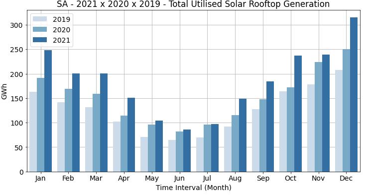
AEMO commissions the production of annual datasets for recent historical and forecast solar production based on trajectories developed by CSIRO. The following examples are based on South Australian AEMO data for solar PV generation only (up to 100 kW) for 2019–21 as it was not possible to separate out the transmission-connected larger-scale renewable energy such as utility-scale solar and wind. These datasets do not take account of curtailment, but because this is relatively negligible currently, accuracy is not strongly compromised in the short-term.
Source: AEMO Market data NEMWEB aemo.com.au/energy-systems/electricity/national-electricity-market-nem/data-nem/market-data-nemweb
The road test also experimented with different ways of expressing and visualising this metric according to its component parts in a ‘Total DER utilisation curve’. These two components pull in opposite directions: (i) Potential DER Generation (i.e., What would connected DER generation produce if unconstrained?) and (ii) Volume of Curtailment (also Metric #27). The metric representation in Figure 12 could help regulators to better understand the underlying performance trends to inform SPTIS target setting. It may help to understand when higher curtailment volume might be a desirable outcome in the context of facilitating greater DER connections and access. As shown in the contextual example below, if we compare the change in Expected (i.e., unconstrained) DER Generation (vertical axis) with the change in Total Volume of Curtailment (horizontal axis), then the higher the gradient of the line the better the performance outcome. If the gradient of this line is approaching zero (orange zone in the graph below), this is a poor performance outcome as it represents an increased volume of curtailment with a limited corresponding improvement in expected DER generation. If the gradient of this line is high (blue zone in the image below), it is a good performance outcome as it represents a limited increase in the volume of curtailment relative to a strong improvement in potential DER generation.
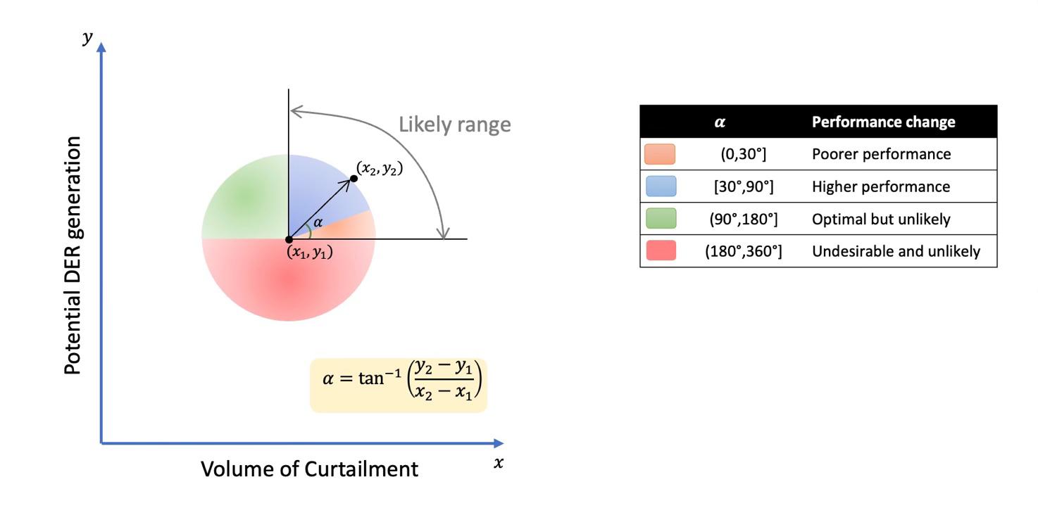
“The rate of change of Network A’s Total DER utilisation curve is +X, which is the strongest improvement relative to other networks and exceeds the performance benchmark of +Y. This performance improvement is reflected in the revised incentive rate and STPIS target for #5 Total Utilised DER Generation for the next Regulatory Control Period (RCP) of Z.”
More work would be needed to refine the application of such ways of viewing metrics with real network data and data scenarios in mind.
Duration of Full Export Access (#10)
Test 1
The goal of this test was to identify when customers are exporting at the received 'export limit'. The test analyses data for three SAPN Flexible Export Trial customers using their 30-minute net active power and flexible export limit signal data for a 7-day period in January 2022. As no dynamic curtailment occurred during the period of available data, this is simulated using synthetic data to represent the plausible bounds of unscheduled maintenance– an 'extreme case scenario' and a 'mild case scenario'.
‘Extreme’ Case Scenario (n-1 transformer winding)
This case simulates n-1 unplanned major works at a substation where reverse flows typically exceed the thermal limit for a substation transformer winding, resulting in 10 kW solar systems being constrained to 1.5 kW limit from 11.00 am–2:30 pm for one week. Results are shown below.
An extreme case like this is only likely to occur every 10+ years. Averaged across one year, one occurrence of the worst-case Customer 2 situation shown above would represent 0.003% of the time without full export access. Note that as the curtailment was simulated, the volume that would have been curtailed is accurately known from the metering data (14 kWh/day for Customer 2)
‘Mild’ Case Scenario (e.g., tap changes)
This case simulates n-1 planned works at a substation where reverse flows typically exceed the thermal limit for a substation transformer tap changer resulting in 10 kW solar systems constrained to 1.5 kW limit for 30 mins at 11 am and 1 pm for one week. Results are shown below.
A realistic circumstance is one instance of such an event every two or more years. Averaged across one year, one occurrence of the worst-case Customer 2 situation would represent 0.02% of the time without full export access.
Test 2
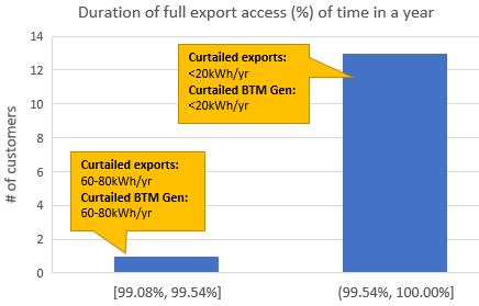
The goal of this test was to identify tripping curtailment events due to overvoltage. The test analyses data for up to 50 47 randomly selected SAPN customers using their 10-minute net active power and voltage data for the year 2020. It was assumed that gradual curtailment occurred from 253 V onwards (V-W curtailment), with full curtailment when the voltage is at 258 V or above. The results are shown in below.
Only 14 customers (28%) experienced curtailment across the year due to overvoltage with almost all of these at less than 0.5% duration and less than 20 kWh/year. Thus, while voltage tripping appears currently to be relatively small for SAPN, it is unevenly distributed by customer location on a line and needs to be analysed by customer type of worst-served customer.
The amount of BTM generation curtailed cannot be calculated without underlying customer load data (i.e., before being offset by solar generation) and rule-of-thumb estimates are required to be used in the absence of these data.
Test 3 Essential Energy data
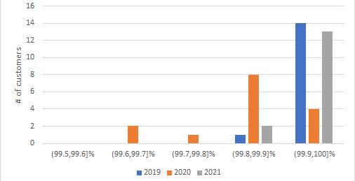
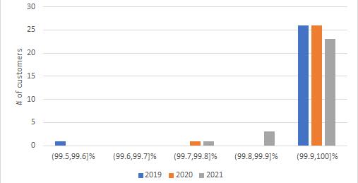
The goal of this test was to assess the developed metric and calculation approach using Essential Energy data, which allows testing of the proposed method under different operating settings and network arrangements. Essential Energy provided 30-minute resolution data of two groups of customers from 2019 to 2021. Group 1 includes data from 27 generators (in the size range of 0.2–120 MW) and Group 2 includes data from 15 commercial customers with on-site generation (in the size range from 0.2 to 1 MW). Since the provided dataset did not include voltage data, this test applied the methodology proposed in the CANVAS project. 48 The results for this test are shown below.
47 Due to meter churn the initial dataset of 50 customers was lowered to 39 with a full year of data.
48 See CANVAS final report for further details about the methodology
The results show that generators in both groups have similar performance with issues experienced less than 0.5% of the time (i.e., 99.5% full export availability) since 2019. Close scrutiny of the results reveals that the export performance for generators in Group 1 deteriorated from 2019 to 2020 but t hen increased in 2021. Further analysis may be required to identify the causes of this variation.
Volume of Curtailment (#27)
Building on the test conducted to estimate the Duration of Full Export Access (#10) metric, the volume of energy curtailed was estimated for the timeslots with curtailment events. Revisiting the results for the simulated extreme case scenario (i.e., simulated unscheduled transformer maintenance), the average volumes curtailed per day for customers 1, 2 and 3 were 7.1, 14.5 and 10.1 kWh, respectively. For the worst-case customer the total curtailed energy as a percentage of total energy generation if the unscheduled event only occurred once a year is less than 1%. Despite the minimal likelihood of this extreme case scenario occurring more than one or two times in 10+ years, the number of extreme cases was hypothetically extrapolated to assess the potential impact on the volume curtailed per year, as shown in below.
It is evident that this type of extreme event would need to happen 5 –10 times in one year to reach 3% and 6.5% of volume curtailment, respectively. As this is very unlikely, the impact of volume curtailed is still relatively low at the customer level.
Volume of DER System Services (#22)
This subsection includes some examples of DER market services reports and emerging insights from trials that assessed DER market services.
Demand response
Demand-side participation information is collected through the DSP portal. AEMO publishes annual reports with demand response statistics. Following the rule change on wholesale demand response 49 , AEMO’s reports will include an analysis of volumes and types of demand responses in its reporting which might facilitate t he estimation of this metric. Examples of current published data are presented below. 50 These statistics are currently reported for the NEM as a whole, so a special request to AEMO to disaggregate the data by jurisdictions and/or networks would be required.
DSP type Explanation
Market-exposed connections
Connections on fixed time-of-use tariffs
Connections on dynamic event tariffs
Directly controlled connections (fixed schedule)
Directly controlled connections (dynamic operation)
Not elsewhere classified
Covers connections exposed to spot price, either directly or via pass-through contracts. This includes loads responding under the wholesale demand response (WDR) rules and any connections that are only spot price exposed during specific events.
Includes connections exposed to fixed time-of-use pricing, including day/night tariffs.
Connections that are subject to dynamic tariffs which cost price consumption and/or connection differently for specific periods during the year. These periods are dynamically determined by the program operator and could relate to local or regional demand at the time.
Connections directly controlled based on a set schedule for the year irrespective of actual demand and/or spot prices at the time. This includes control of hot water load.
Connections directly controlled (or manually instructed) based on actual or forecast system conditions and/or price. This includes aggregated response of battery storage systems as a virtual power plant (VPP) and reduction in air conditioner load or controlled electric vehicle charging on extreme demand days.
This category allows for special cases that do not obviously fit into the above categories. Entries in this category will be reviewed by AEMO and reclassified into the above if possible.
Figure 15 summarises the reports sum of firm response by DSP type and program category. In total there are 1930 MW of firm response. Note that there may be additional responses that are unquantified or simply not reported, as noted in AEMO’s 2021 ESOO report.
49 See https://www.aemc.gov.au/rule-changes/wholesale-demand-response-mechanism
50 See AEMO, 2021, Electricity Statement of Opportunities for more details about DSP statistics. https://aemo.com.au/en/energysystems/electricity/national-electricity-market-nem/nem-forecasting-and-planning/forecasting-and-reliability/nem-electricitystatement-of-opportunities-esoo
Market exposed connections
Connections on dynamic event tariffs
Directly controlled connections (dynamic operation)
Directly controlled connections (fixed schedule)
Connections on fixed time-of-use tariffs
Additionally, AEMO estimates DSP in response to price or reliability signals. The price-driven response is determined by examining how flexible loads responded to price signals and calculated as the difference between the observed consumption and the calculated baseline consumption. The reliability response represents the estimated DSP response during reliability events. Figure 16 presents the estimation of cumulative response in MW for each state.
Another source of DER market services data is the RERT reports, which capture demand response services for reserve activation events to maintain power system reliability and system security. For example, on 15 June
2022, AEMO activated RERT reserves in NSW and QLD and the estimated volume for these regions were 1483.5 MWh and 241 MWh, respectively. 51
Fcas
The AEMO’s VPP demonstration project provided early insights on how DERs in VPPs are integrated into market frameworks including FCAS. In total there were eight VPP participants, which represented a registered capacity of 31 MW. This reached 3% of the market share of contingency FCAS in April 2021. 52 It is expected that DER participation in ancillary services will increase as AEMO’s ISP has estimated that by 2050 there would be up to 69 GW of distributed PV systems and almost 61 GW of storage capacity in a ‘s tep change’ scenario. 53
CO2 Emissions reduction (#17)
Building on the calculations for Total Utilised DER Generation, CO2 emissions reductions were estimated by multiplying the greenhouse emission factor and the gross generation of the assessed region. T his metric was tested using AEMO data for solar PV generation and the emission factor in South Australia (0.43 kg CO2e/kWh). 54 Figure 17 shows the estimated CO2 emission reductions in South Australia due to rooftop solar PV systems (only), which shows a steadily increasing contribution to reducing emissions, reaching almost 1 Mt CO2 reductions by 2021.
51 Note that RERT may include large industrial load or a group of aggregated smaller loads and unscheduled generation assets such as standby diesels. See https://aemo.com.au/energy-systems/electricity/emergency-management/reliability-and-emergency-reservetrader-rert for more details about RERT.
52 Australian Energy Market Operator (AEMO). (2021). NEM Virtual Power Plant Demonstrations. Knowledge Sharing Report #4, September 2021. https://aemo.com.au/-/media/files/initiatives/der/2021/vpp-demonstrations-knowledge-sharing-report-4.pdf?la=en
53 Australian Energy Market Operator (AEMO). (2022). Integrated System Plan. https://aemo.com.au/-/media/files/majorpublications/isp/2022/2022-documents/2022-integrated-system-plan-isp.pdf?la=en
54 Australian Emissions factors per region are available here: https://www.industry.gov.au/sites/default/files/2020-10/nationalgreenhouse-accounts-factors-2020.pdf
Customer Complaints (#12)
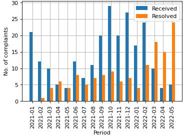
A dataset of SAPN customer complaints was analysed to estimate this metric. Currently customer complaints can be classified into six categories: 1) overvoltage, 2) undervoltage, 3) excessive interruptions, 4) flickering, 5) other and 6) proactive investigation. Among these categories overvoltage complaints are the most suitable to account for export service complaints. Figure 18 shows the number of overvoltage complaints received and resolved from January 2021 to May 2022. This chart shows the received and resolved complaints with assigned jobs. The total number of complaints received may not reflect actual issues if no jobs are assigned to resolve them. As seen in Figure 18, the number of complaints increased during the spring and summer seasons. The number of resolved complaints also accounts for complaints received in previous months that were solved during that period.
Dynamic Limits versus Static Limits (#7)
Note that this metric was included within the road test but later excluded as it was deemed more appropriate to include as a metadata field to allow breakdowns of other metric results to be undertaken according to export service product type.
Description
This metric provides an estimation of the number of customers and capacity under two types of management strategy: (i) static limits and (ii) dynamic limits. It also accounts for customers with no effective limit, that is, when the fixed static limit is equal to or greater than the panel or inverter capacity. This metric was included to reveal the trends in DSNP export management strategies and the performance achieved in each case. The ‘performance’ format seeks to inform customers of actual outcomes of export management strategy offers and for regulators to understand the general trend of export limit effectiveness alongside customer uptake.
Contextual examples
“The number of NEM customers with export limits increased by X% in 2021. For Networks A & B this included a X% reduction in customers under static export limits while Networks C & D saw a Y% increase in static limits.
On average, customers with flexible limits received X% higher Total Utilised DER Generation compared to static limits ” [Use case 2b] (note this example considers a combination of Metrics #7 and #5)
General calculation approach
General formulas:
• [Customers: No. or % of customers with dynamic/s tatic/no effective limit]
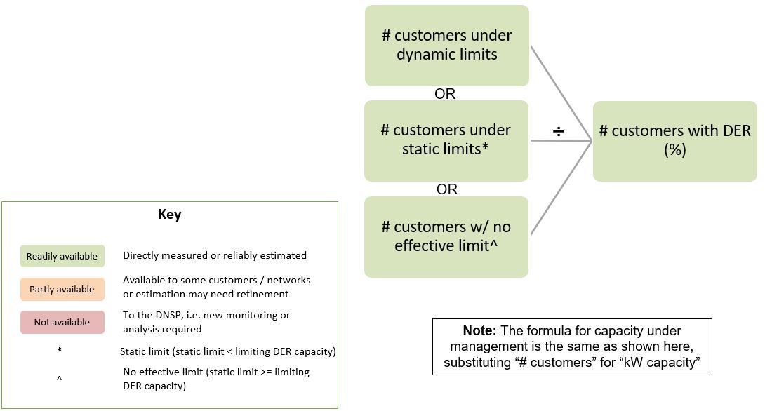
• [Capacity: Capacity under flexible/static/ no effective limit ÷ Total DER capacity]
• [Performance: % total production curtailed by export limit type]
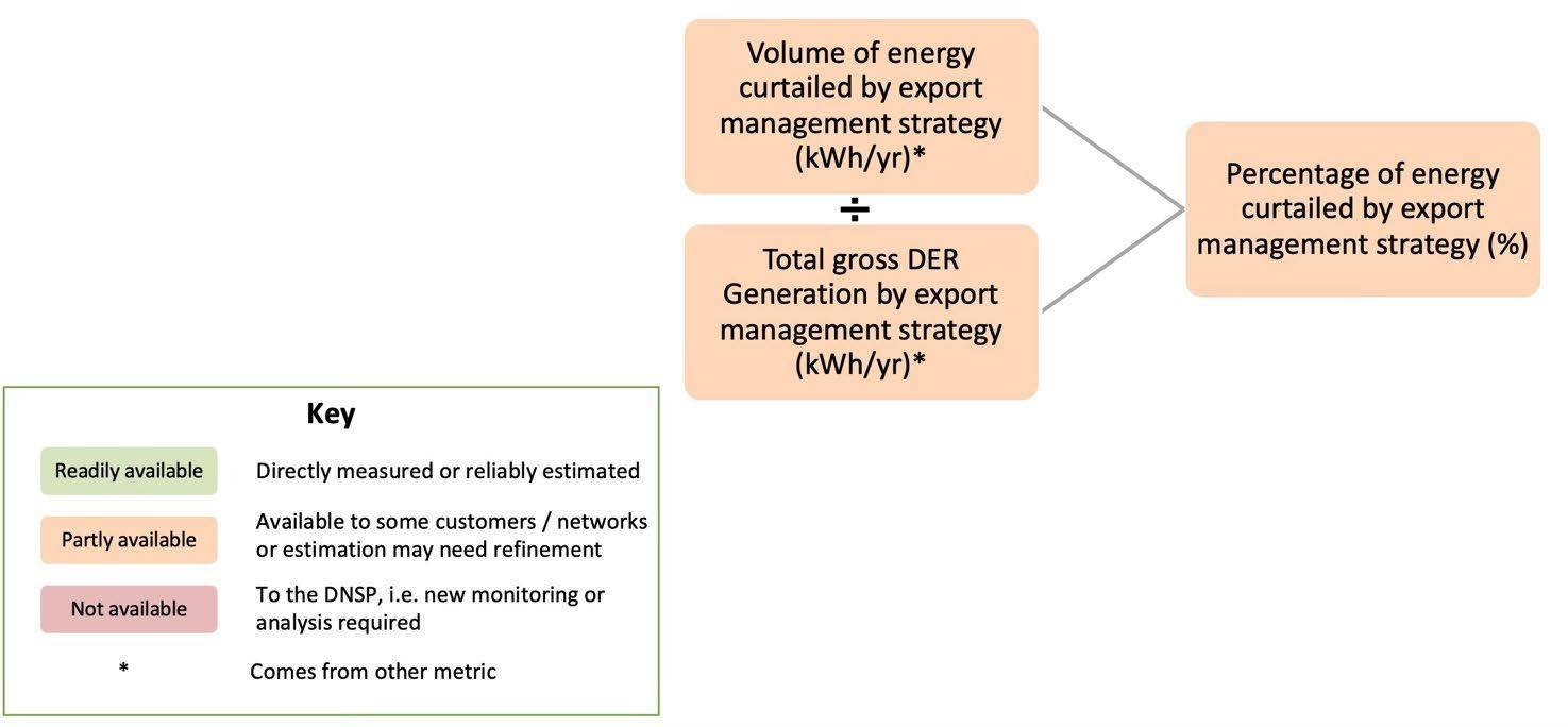
Simplified diagrammatic representations of these formulas are shown in Figure 19 and Figure 20 below.
Limitations and challenges
• Need to define the best way to classify and present metric forms many constituent parts could be useful (e.g., total numbers, capacity, %, change trends)
• May require working with data over time for trends to emerge to determine best forms
• Needs adjusted data management processes to calculate as static and dynamic customer datasets are stored in different formats
• This metric can capture whether an export limit constrains generation, that is, when the static limit is lower than the limiting capacity (minimum capacity between DER capacity and inverter capacity). However, this metric cannot capture when customers request a higher capacity than the allowed capacity. For example, a customer asks for X capacity but it is only given Y. These data are not recorded.
Road-testing results
This metric was tested using SA Power Networks data. Figure 21 presents the number of PV systems that can be classified per management strategy. Table 11 shows the number of customers (and percentage) and installed capacity for each strategy. There are around 1560 customers with dynamic and static limits, which is equivalent to installed capacities of 0.3 and 11.2 MVA, respectively. This metric can take different formats depending on the use case and type of customers. For example, a percentage format per DER size can be useful for customer communication use cases as shown in Table 12.
In general, this metric can take many formats depending on the use case, but its calculation process is simple and direct. The performance form of this metric can be calculated using a bottom-up approach by identifying the customers under each management strategy when calculating Metrics #5 and #27


