
2025
ARCHITECTURAL, WAYFINDING & ENVIRONMENTAL DESIGN
RAYMOND KUANG


Toronto, ON

raymondkuang794@gmail.com

www.linkedin.com/in/raymond-kuang/
EDUCATION WORK EXPERIENCE
UX Design
Brainstation
Continuing Studies
George Brown College
Ontario Building Code:
•
•
General Legal
Part 9: Small Buildings
Building Envelope
• Architectural Studies
University of Toronto
•
Major in Architectural Design
•
•
Minor in Mathematics
Minor in Human Geography

SKILLS
Adobe Creative Suite
(Illustrator, InDesign, Photoshop)

Mar 2024 - May 2024
Sept 2017 - Apr 2018
Sept 2013 - May 2017
SketchUp
V-RAY
Microsoft Office & Visio
SignAgent & Wayfindit
Nix Colormeter
Matterport 3D Scanner

CERTIFICATION
Ontario Building Code
• • Received Nov 2017 Received Oct 2020
General Legal 2012
Panel on Research Ethics
TCPS 2: CORE
Application Designer
June 2021 - Present BrandActive
Toronto, ON
Promoted from Production Designer in June 2023. Role advancement led to a greater focus on client communication, project management, documentation, leadership and technical consulting
Lead internal design initiatives and strategies to improve BrandActive’s expertise in brand implementation, technical skill and agency collaboration
Transition brand concepts into physical assets through environmental design, material specifications, prototyping and innovative design solutions
Design signage, fleet graphics, workwear, ID badges and interior environments with extensive reviews of their respective prototypes
Review ADA compliance, building code and local by-laws where applicable
Collaborate with technical and non-technical stakeholders to ensure design represents client while being a creative expression of the brand
General knowledge on sign fabrication techniques, materials and illumination
Junior Interior Designer
MMC Architects
Supported cross-functional teams throughout project lifecycle
July 2018 - Apr 2020
Toronto, ON
Maintained brand consistency of major retailers through architectural design, interior design, shop drawing reviews and communication with vendors
Created FF&E specifications, signage drawings, material boards, 3D models, renderings and presentation documents
Created immersive first-person POV walkthroughs of project spaces through 3D models and scans
Researched trends, curated material library, project site reviews, visualization exercises and report documentation
Building Operations Assistant
Rotman School of Management & Rotman Commerce
Facilitated 300-person move; re-organized various department offices
Created furniture plans from space planning exercise
Interviewed departments regarding spatial changes, flagging staff needs
Apr 2017 - June 2018
Toronto, ON


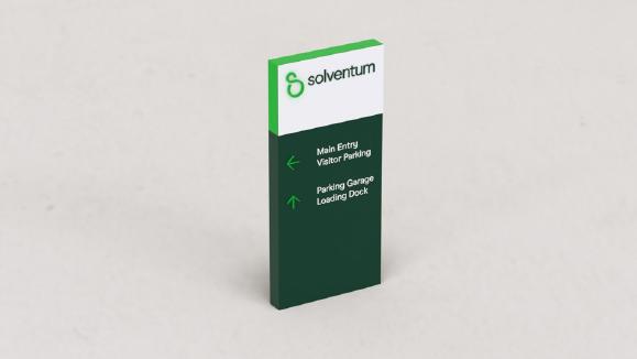
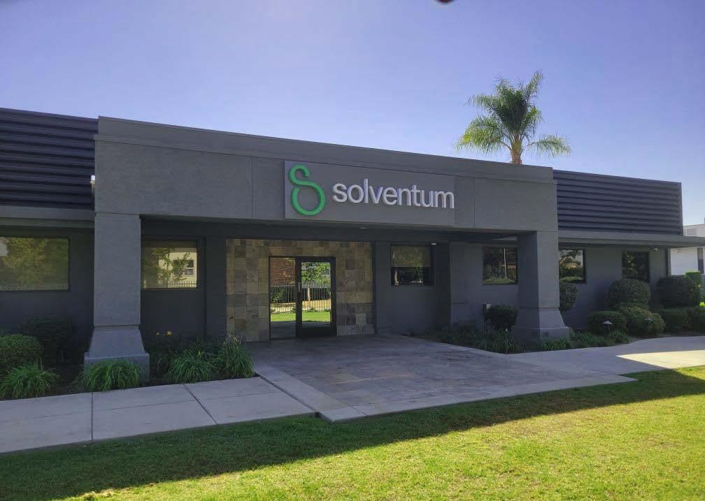
01 Solventum
Exterior & Signage | Branded Environments
Project by: BrandActive
Client: Solventum
Industry: Industrial & Commercial Manufacturing
Project Timeline: Nov 2023 - Present
Project Phase: Phase 2-3
Sites: 500+ locations globally
Collaborators: American Interstate Signcrafters, PSCO Kieffer, Modulex, Siegel+Gale and Bitro Group
Project Brief
Solventum (formerly 3M Health Care) is a spin-off of 3M focused on healthcare products. Solventum’s locations are primarily manufacturing plants, sales branches, warehouses, and repair centers.
Working with Siegel+Gale, the branding agency, my role was to refine the initial design concepts and usher them into the physical world. I coordinated with sign fabricators to construct prototypes, reviewed drawings and material samples, and developed comprehensive alignment guidelines. I managed client relations across various stages of the project, communicating with stakeholders about design decisions that would affect the brand as a whole.
Signs are currently under construction and being implemented globally.


Dark Green - Opaque Vinyl
Brand Green - Paint Swatch (WES6009 - Western Star)
Brand Color
The first step towards realizing a concept is understanding how the brand is meant to look and feel in the physical world. This includes determining which materials, colours, fabrication, and illumination methods are best suited for the signage. It also identifies potential limitations and challenges in the design, as well as any missing elements from the initial concepts.
Modifications
Arrow Modifications
I worked closely with the branding agency to understand the brand intent, fabricators to develop the materials and the client to know how they want their brand to be represented.
Arrow
Iconography supplied on Jan 10, 2024
Design Agency Arrow vs Fabrication Arrow
Comparison to Approved Samples and Pantone

Signage Modifications
vs Text Comparison

Option 2 - Minimum Stroke
Preferred approach as discussed Jan 23, 2024 Option 1 - Preferred Stroke
Preferred approach as discussed Jan 23, 2024
(Priority for HQ) - Return Illumination
Concerns: Manufacturing & Legibility
for exterior sign concepts is 4” tall the stroke width would be 1/4” thick potential manufacturing / installation challenges stroke: applications, light halo could obscure edges due to thin shape, straight edges in manufacturing applications, shadows around the arrows could obscure the time the thin stroke is more likely to peel due to less overall adhesive or debris, thin strokes are more easily obscured and cracks and damage due to fragile construction
• The smallest arrow size for exterior sign concepts is 4” tall
• With the supplied icon the stroke width would be 1/4” thick
Recommendations
Recommendations
• Best practice: at 4” tall, the thinnest stroke widths of arrows and text are typically 3/8” or 1/2“
and Tier-2
• Best practice: at 4” tall, the thinnest stroke widths of arrows and text are typically 3/8” or 1/2“
• Vendors are comfortable working with this thickness, routers and various manufacturing equipment may require slightly more thickness to ensure precision
• Stroke width could pose potential manufacturing / installation challenges
• Potential concerns over stroke:
• Vendors are comfortable working with this thickness, routers and various manufacturing equipment may require slightly more thickness to ensure precision
• Increased stroke width would provide more visibility when viewed at a distance and would be less likely to be obscured by light halos, shadows or weathering and debris
1. For push thru applications, light halo could obscure edges due to thin shape, difficulty in maintaining straight edges in manufacturing
2. For routed out applications, shadows around the arrows could obscure the the shape in the day time
Signage design requires an understanding of human perception, fabrication limitations, and other factors. These logistical considerations are often overlooked by branding agencies and clients. Before fabrication can begin, all stakeholders must understand why certain elements need to be refined and explore different approaches to build them.
• Increased stroke width would provide more visibility when viewed at a distance and would be less likely to be obscured by light halos, shadows or weathering and debris
• Note: In order for the supplied arrow to achieve 3/8” stroke width, the height must be 6 1/2” which is not be advisable for smaller sign applications (i.e., panels) but is the preferred size for illuminated ground signs (i.e. pylons)
3. For vinyl applications, the thin stroke is more likely to peel due to less overall surface area to apply adhesive
4. In instances of snow or debris, thin strokes are more easily obscured and are susceptible to cracks and damage due to fragile construction
5. Legibility challenges
Viewing distance for signage is approximately 8’-0” to 10’-0“ away every 1” tall copy (i.e., 4” tall icon should be visible 40’-0” away)
In order for the supplied arrow to achieve 3/8” stroke width, the height must be 6 1/2” which is not be advisable for smaller sign applications (i.e., panels) but is the preferred size for illuminated ground signs (i.e. pylons)
• at 6 1/2” the arrow is subject to the same best practices of viewing distances (i.e., should be visible approximately 54’-0” to 60’-0” away)
• at 6 1/2” the arrow is subject to the same best practices of viewing distances (i.e., should be visible approximately 54’-0” to 60’-0” away)
All versions can be tested in prototyping to confirm
During thr prototyping process, we develop multiple options to bring the signs to life.
• Best practice: Viewing distance for signage is approximately 8’-0” to 10’-0“ away from sign face for every 1” tall copy (i.e., 4” tall icon should be visible 40’-0” away)

All versions can be tested in prototyping to confirm
Location Monument Prototyping
The most challenging entry in the sign family was the illuminated ground signage. The branding agency envisioned edge-to-edge illuminated sides and top.


I conducted a feasibility study that identified the illuminated edge-to-edge returns as a potential manufacturing risk. The tight spacing could lead to multiple points of failure, both during construction and after installation. I explored various methodologies to refine the design, working closely with fabricators to devise a solution.


MN.L.X.I / Location monument
Location monument (Illuminated) technical specifications
MN.L.X.I / Location monument
Sign cabinet face
Location monument (Illuminated) technical specifications
Sign cabinet face
1
Sign cabinet return
Sign cabinet return
All aluminum construction and painted as shown. No visible through-face fasteners (c/s fasteners can be placed on returns). Seams on sign faces to be reinforced, infilled, sanded smooth and painted for a seamless appearance 2
2
All aluminum construction and painted as shown. No visible through-face fasteners (c/s fasteners can be placed on returns). Seams on sign faces to be reinforced, infilled, sanded smooth and painted for a seamless appearance
Clear acrylic with second surface applied translucent green vinyl placed between and flushed with aluminum sign faces for top portion of monument. Painted aluminum for remaining
Clear acrylic with second surface applied translucent green vinyl placed between and flushed with aluminum sign faces for top portion of monument. Painted aluminum for remaining
Logo element
Logo element


Routed out logo backed up with push thru 3/16” thick acrylic
S symbol
Routed out logo backed up with push thru 3/16” thick acrylic S symbol
3
First and second surface applied translucent green vinyl on clear acrylic; edges to remain exposed
First and second surface applied translucent green vinyl on clear acrylic; edges to remain exposed
Logo wordmark
Logo wordmark
First surface applied opaque dark green vinyl on 2447 white acrylic; edges to remain exposed
First surface applied opaque dark green vinyl on 2447 white acrylic; edges to remain exposed
4 Address line
4 Address line
Routed out and backed up with 3/16” thick 7328 white acrylic
Routed out and backed up with 3/16” thick 7328 white acrylic 5
Illumination (not shown)
5 Illumination (not shown)
Internally illuminated with Bitro Group LED 5000K white OpticsPro X LEDs or as specified by lighting vendor
Internally illuminated with Bitro Group LED 5000K white OpticsPro X LEDs or as specified by lighting vendor
LEDs are “butted up” against each other for the S symbol
Footings (not shown)
LEDs are “butted up” against each other for the S symbol
Footings (not shown)
6
To be provided by sign fabricator; must be engineered to fully support sign system, as required. Footing to be designed to meet all municipal, state, zoning and/or regional standards and regulations. Install inorganic granular drainage material (crushed stone) around sign foundation connections. Landscape finish to be completed by others. 2-3” mow strip with a brush broom finish preferred
Substitutions
Bidders shall submit (with bids), written notification of all proposed substitutions from specifications. Substitutions are welcomed providing there is an improvement to the current specs. Substitutions of any kind shall be approved by BrandActive prior to any sign fabrication. Please make your recommendations accordingly
Bidders shall submit (with bids), written notification of all proposed substitutions from specifications. Substitutions are welcomed providing there is an improvement to the current specs. Substitutions of any kind shall be approved by BrandActive prior to any sign fabrication. Please make your recommendations accordingly


We engineered a solution that achieved the original design intent without compromise. The prototypes were presented in person at a fabrication facility, where the client experienced their brand coming to life for the first time.
Main St
Interior Signage Prototypes
The interior sign family followed the same steps with a greater focus on ADA requirements and small details that could be experienced up close. Design decisions aimed to make the transition from exterior to interior as seamless as possible for a unified experience.


Exploded Isometric


Exploded axonometric view (RM.P.1) -


The final phase of rebranding Solventum’s spaces was to fully immerse people in the brand through the environmental design. Elevating these spaces through brand graphics, painting, feature elements and furniture where possible, to create a complete Solventum experience. The rebranding of spaces are currently scheduled for installation in Q3 2025.


Complete Brand Experience


Every sign has its own challenges and decisions, all of which are recorded and expanded upon in the signage guidelines.
Materials, alignments, aesthetics, and other details are shared between signs to unify the sign family and maintain brand consistency.
The signage guidelines ensures that fabricatord worldwide can consistently represent the brand and create a seamless consumer experience across regions.


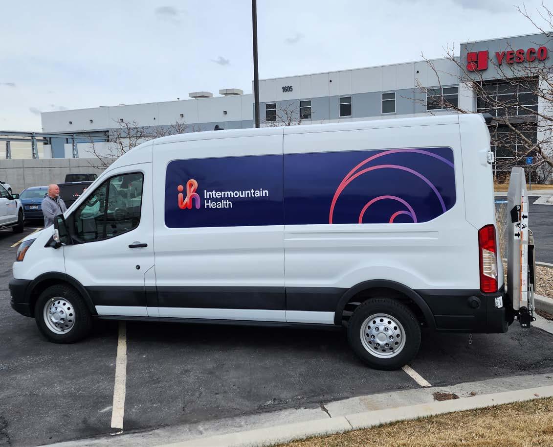


02Intermountain Health
Exterior Signage | Vehicle Graphics | ID Badge | Workwear
Project By: BrandActive
Client: Intermountain Health
Industry: Healthcare
Project Timeline: Dec 2022 - Present
Project Phase: Phase 2-5
Sites: 300+ locations within the US
Collaborators: YESCO, FutureBrand, Bitro Group and Miratec Solutions
Project Brief
Intermountain Health is a major healthcare provider in the Midwestern U.S. Multiple phases of development were deployed to transition various assets from the legacy brand.
Taking over from FutureBrand, the branding agency, my role was to take ownership of the new brand design, refine the initial design concepts, and manage multiple streams of the redesign. I guided the complete design-to-fabrication process for four key physical branded assets.
As the lead BrandActive designer, I managed multiple stakeholders, strategized work plans and schedules to ensure a successful brand implementation and a cohesive brand experience. Intermountain Health has transitioned 70% of its branded assets, wayfinding strategies and interior signage are currently under development.
The logo’s unique form allowed for significant experimentation during the concepting and prototyping phase. BrandActive developed a strong relationship with the client and was excited to see creative interpretations of the logo and concepts.
To bring these designs to life, specialty materials and out-of-the-box fabrication methods were all tested for scalability and brand experience. Not all designs were approved, but the prototypes gave the client a better understanding of how to translate their new brand into the physical world.


Healthcare brands manage a diverse range of vehicles, locations, and existing signage.
Different designs had to be applied while still maintaining a unified
and alignment with the rest of the


Pickup Truck Front View
Pickup Truck Driver’s Side View
Freightliner

ID Badge Designs
- Full-Time
Overview


• Spacing, alignment and elements breakdown for typical full-time employee badges
• The information on the front of badge is dependent on the employee’s position. This will not affect the overall placement or alignment of badge elements
• All text is top-aligned to their areas unless otherwise specified
• Grid blocks are 1/8” (3.175 mm) tall and wide


Left-aligned, placed directly after the employee name with a comma
To establish the brand on a personal level with staff and visitors, it needed to be reflected in intimate items they would interact with. The human-scale of these branded assets is what cement the brand in people’s minds — not just large-scale items like signage or vehicles.


Midtown Common
03
FF&E | Material Specification | Interior Signage
Project By: MMC Architects
Client: Cushman & Wakefield
Industry: Retail Real Estate
Project Timeline: Sept 2018 - Mar 2019
Project Phase: Phase 1-2
Sites: 201 1st Ave South, Saskatoon, Saskatchewan
Project Brief
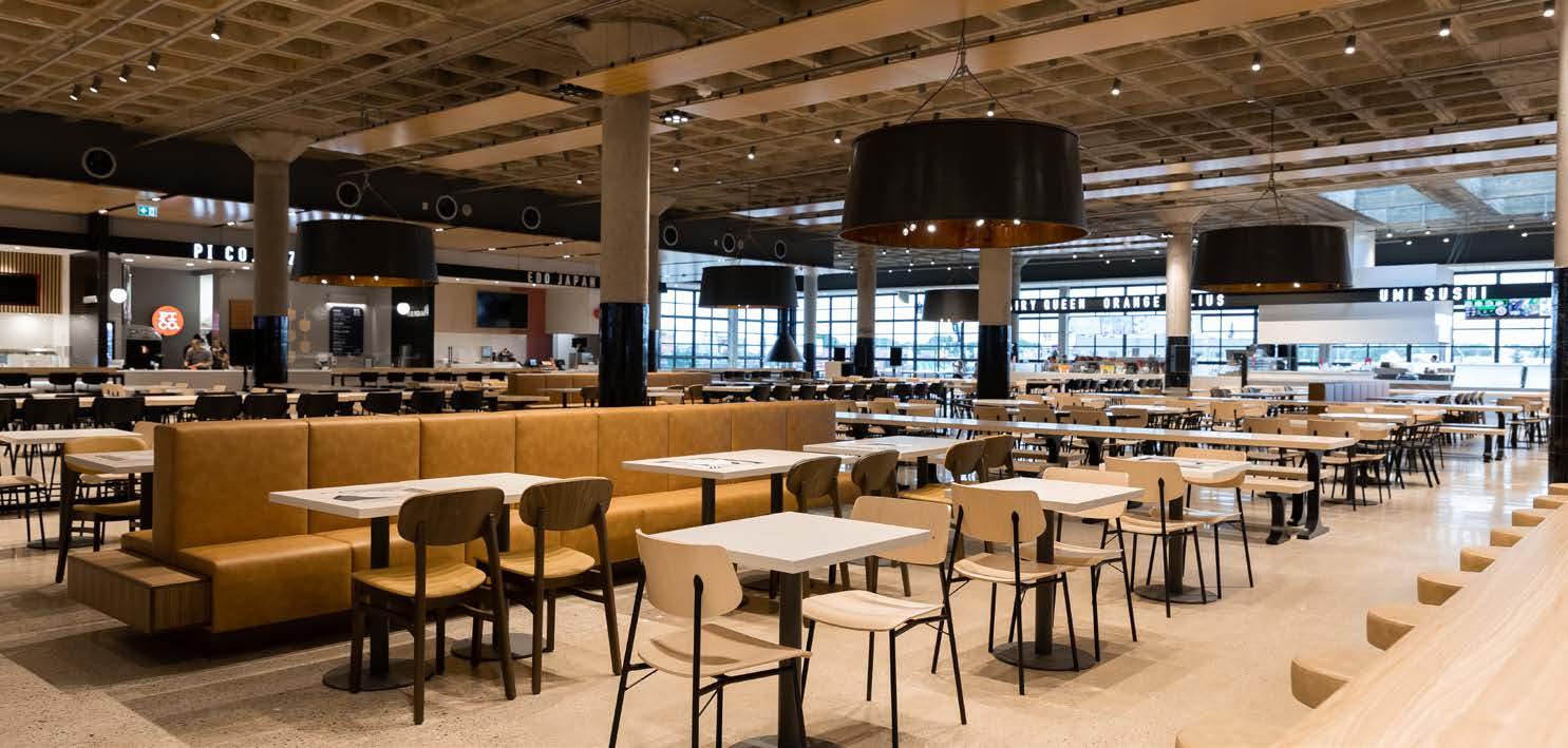
Midtown Mall is a popular shopping centre in Saskatoon, Saskatchewan. In 2017 their food court, “Midtown Common”, was relocated to the former anchor tenant space. This created new retail opportunities throughout the mall while significantly altering the circulation of the shopping centre.
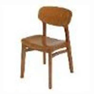
In phase 1, I worked on the FF&E package, seating plan, tenant design criteria, 3D modeling, renderings and the tender packages.
In phase 2, I create the tender package for the mall’s interior signage and wayfinding.


Typ. Tenant Sign


Tim Horton’s Innovation Cafe Patio Proposal
3D Modeling | FF&E | Material Specification
Project By: MMC Architects
Clients: Brookfield Properties & Tim Horton’s
Industry: Restaurant
Project Timeline: July 2019 - Nov 2019
Project Phase: Proposal Only
Sites: 130 King St West, Toronto, Ontario
Project Brief
In 2019, Tim Horton’s launched it’s only Innovation Cafe in Toronto as an enhanced brand experience. This location featured a more upscale aesthetic and menu. MMC Architects was not involved with the interior design of the restaurant but did work on the patio design proposal.
Working with the design aesthetic of the interior, I supported the visualization team with elements of the 3D modeling, presentation documents, FF&E and the seating plan.
The patio proposal was under review from Dec 2019 until early-2020. Unfortunately, the cafe was officially closed due to the COVID-19 pandemic. The general design philosophy was reworked into the 2023 interior rebrand of Tim Horton’s restaurants but this patio design remains unseen.


05 St. Dominic Hospital
Wayfinding Study | Consultation
Project by: BrandActive
Client: Franciscan Missionaries of Our Lady Health System
Industry: Healthcare
Project Timeline: Nov 2024 - Feb 2025
Project Phase: Phase 1
Sites: 969 Lakeland Dr, Jackson, Mississippi
Project Brief
As a preliminary study before rebranding their signage, Franciscan Missionaries of Our Lady Health System (FMOLHS) wanted to do a wayfinding audit to better understand how to improve navigation across their sites. The results of this research would inform the sign family, visual hierarchy and placemaking of the organization moving forward,
Working closely with project managers and business consultants at BrandActive, my role was to analyze and report design strategies, wayfinding principles and visualize diagrams — functioning as a design consultant. BrandActive positions itself as a solutionselling organization and this expectation extends to the design team as well.
FMOLHS is currently beginning the process of developing a new brand and sign family.
Understanding the Wayfinding Strategy
Through stakeholder interviews, on-site analysis and a strategy workshop with key stakeholders, we identified wayfinding challenges across the patient journey and developed targeted recommendations to enhance St. Dominic’s Health wayfinding
Five-step patient journey:
Observations
Inconsistent pre-visit communications across channels and between departments lead to confusion and varied patient experiences
Solutions
Standardize patient communications across all touchpoints, ensuring consistent nomenclature and clear directions to the correct entrance
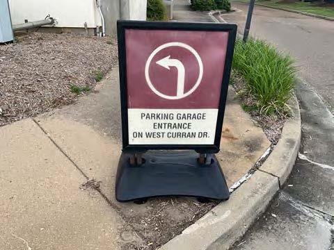
Inconsistent signage and poor road design cause congestion and hinders safe, clear navigation for both drivers and pedestrians
Lobbies lack the required tools for patients and visitors to affirm they are in the right place, orient with their overall journey and determine their next step.
Simplify signage, enhance visibility, and incorporate clear traffic and pedestrian guidance. Use consistent sign design, widely recognized road markers, and designated parking areas to reduce congestion and ensure safe, intuitive movement for drivers and pedestrians.
The
Place highly visible directory and map of the first floor at entrances and parking garage elevators.
Position clear signage at North and South entrance to guide visitors to registration upon arrival.
Poorly placed signs and inaccurate messaging hinder orientation and provide ineffective directions, causing difficulty reaching destinations
Implement a color-coed alphabetic zonal system and reinforce zones through directional signage.
Establish a clear circulation route and use branded environments as navigational landmarks. Restrict patient access to unnecessary areas and clearly label staff -only areas.
Destination signage is inconsistent and not aligned with required accessibility standards, creates disjointed environment, making key services difficult to find.
Establish clear destination categories and create a cohesive environment for each destination type that are ADA compliant.
layered navigation system is the foundation for an effective wayfinding strategy at St. Dominic’s Health
The layered navigation system is the foundation for an effective wayfinding Dominic’s Health
It establishes a clear, consistent system for naming, organizing, and communicating locations, ensuring consumer journeys are broken into logical, easy -tofollow steps. This scalable framework supports future site changes and provides a structure for wayfinding communications, fr om digital materials to physical signage.
It establishes a clear, consistent system for naming, organizing, and communicating locations, ensuring consumer journeys follow steps. This scalable framework supports future site changes and provides a structure for wayfinding communications, physical signage.
To understand the needs of a site, it is critical to understand its wayfinding hierarchy and user journey. Analyzing these elements reveal deficiencies and solutions to the site’s overall navigation.
Often, clients struggle to visualize or understand these concepts which is why the analyses are supported by strategy workshops, site visits, user interviews, and solution conceptualization.
Nomenclature
Purpose
Establish a sense of place and provide overarching orientation
Narrow the focus to specific areas within the exterior site
Indicate points of entry and specific access to the area
Divide buildings or areas into manageable sections for navigation
Direct users to the precise location of their goal
communications across all touchpoints, ensuring directions to the correct entrance
interpretation
interpretation of information, congestion experience day and night
Your appointment is confirmed:
interpretation of information, congestion day and night vehicular directions
X-ray, Radiology
April 9, 2025 11:00 AM
St. Dominic Health, Hospital
Getting there:
viewed from Lakeland Dr
1. Navigate to St. Dominic Hospital - 969 Lakeland Dr., Jackson, MS 39216
2.
viewed from Lakeland Dr South campus signage to be a minimum of directional signage
South campus signage to be a minimum of
2. Follow signs for the Hospital building.
3. Once on campus, follow signs for the South Entrance –parking is available at the entrance or additional parking throughout the campus
4. Enter through South Entrance
5. Follow signs for registration
6. Once registered, follow signs for Zone D
7. Once in Zone D, follow signs for Radiology
2.

2.
Vehicular journey to the South Entrance
Vehicular journey to the South Entrance


Hospital navigation begins before a user even arrives on-site.
Visitors rely heavily on navigation and directional guides which can be provided by appointment reminders and reinforced through exterior signage.


Current state: although all of these signs contain directional messaging for drivers, it is not intuitive with the
• Ambient lighting conditions and brightness: Illuminated signs need to be at least 20% brighter than the lighting conditions that surround
In an exterior environment that means measuring the surrounding lighting before specifying illumination. Interior-illuminated signs often need to be
Signage Considerations
differentiate from the existing illuminated environment.
• Color: Illuminated signs must be tested to ensure that the correct color is profiled on signs as well as containing a clear separation between distinct colors. There is a direct connection between brightness and color so signs must be carefully calibrated between acrylic and vinyl and the specified LED brightness. Signs need to have internal separation to prevent leakage of one illuminated color into the other.
Digital can be successful when the technologies are accessible by large populations. Most patients and visitors text messages as well as QR codes. These are easy to opposed to unique apps, portals or interactive directories knowledge. State of mind is also an important issue as environments often have higher levels of anxiety that may attention to complex systems.
Landmarks, Branded Spaces and Public Art
• Distance: The farther away an illuminated sign is to be read, either on the ground or on a building, the brighter it needs to be. Signs on tall buildings need to be the brightest.
core to wayfinding is the ability to see, recognize and respond to multi -sensory Legibility is the science of that practical human skill to see and respond. The Pennsylvania State University Transportation Institute created a series of three factors that are the core of how people navigate visual cues. Practices
and technology need to be as easy to read and systems.

Kevin Lynch, in
• Surrounding Environment: The eye gravitates to the brightest elements, which requires selection of landmarks, signs and other objects based on a hierarchy of visual need.
systems need to be maintained to be successful. Hospitals buy -in and an easy update system to be successful.
Detection: The fundamental ability to see a sign is a sign. In a healthcare environment this usually involves two factors: 1) Can the sign be seen at a distance or in low lighting conditions? 2) Can it be seen among the clutter of other information? Sign scale and separation are key indicators if they will be successfully seen in the environment.
Every sign should be strategically placed and guide users on an intuitive journey through the site and to their desired location. Most visitors and hospital managers have seen the best programs when they are a complement to static sign systems There have been stronger responses to digital map strong destination and wayfinding signs and trails or signs that serve as major cues at key decision points.

the
in wayfinding and general orientation. Landmarks and non both support larger wayfinding goals and improve cognition on more frequent trips to the hospital. There are three approaches to improved landmarks.
• Day/Night: Exterior-illuminated signs need to be legible during the day and at night. This requires careful selection of systems that reinforce this separation, including push-through letters, and day/night acrylic. In addition, letters need to be selected for the correct stroke width and letter separation to prevent light bleed that hinders readability.
• Channel Letters: If channel letters are specified, they require a balance between sign depth, vinyl color, acrylic type, stroke width, letter separation and LED selection to be successful.

sensory art: thoughtful donor recognition can also be utilized as landmarks as part of a larger wayfinding program. To be effective, these elements need to be strategically located at key decision points or integrated into maps and other wayfinding
More than most wayfinding systems, illuminated signs require expert prototype testing at multiple levels to ensure correct specification in unique environments.
Discrimination or context: Is the sign and its vocabulary recognizable for the role plays? Wayfinding is like learning a new language when encountering a unique environment. In a hospital, this usually means having a clear and consistent vocabulary of directory, direction and identification signs in places where they are easily understood and serve that role. Colors, symbols and alphanumeric addresses must be consistent and repeated often to be easily understood as a learned language in the space.

Branded environments can help support larger wayfinding goals in a similar way to public art. Branded graphics and patterns can highlight decision points and destinations as well as reinforce the hospital brand.


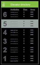
1. Update entrance directory to list primary and secondary destinations alphabetically by destination name and patient rooms and doctor’s offices in grouped together
2. Update elevator directory listing primary and secondary destinations on each floor and highlighting current floor
An effective sign family and wayfinding strategy must consider a multitude of factors and how each element interacts with other.
Readability: Is the sign able to be read and understood? The encompasses a variety of factors including letter height, contrast and stroke width and the ability to the specific destination name, address and symbols that will direct or inform. Effective readability also includes limiting the number of messages and elements.
3. Install overhead directional sign to direct to next zone and entrances
4. Install overhead destination sign (note: ADA sign will be located beside registration door not pictured here)
5.
6.
• Landmark signs: Signs and Landmarks can be integrated, particularly at destinations. These signs can also include symbols and branded elements to make places more visually identifiable.

1. Update entrance directory to list primary and secondary destinations alphabetically by destination name and patient rooms and doctor’s offices in grouped together
2. Update elevator directory listing primary and secondary destinations on each floor and highlighting current floor
3. Install overhead directional sign to direct to next zone and entrances
4. Install overhead destination sign (note: ADA sign will be located beside registration door not pictured here)
5.
6.
his seminal book, Image of the City, discussed
central role of landmarks


Directional signs
Directional signs
Directional signs


Mitigating Transit Frustration
An app cannot solve every transit issue but it can help mitigate commuter frustration — being one step in a greater solution. My project identifies the most common commuter frustrations and aims to address what is possible within an app.


Map


UX design requires the designer to empathize with users. By experiencing the problem firsthand, conducting interviews, and developing personas, the design needs can be identified. This is the foundation of experiential design.
Link to Figma Prototype (Click to Access)


06Brainstation UX Design Capstone Project
UX Design | User Research
Industry: Transit Technology
Project Timeline: Mar 2024 - May 2024
Project Phase: Prototype
Project Brief
There’s been a growing trend where architectural designers are transitioning into UX design fields. As part of my personal growth, I enrolled in one of Toronto’s leading UX Design classes to understand what I can learn. Experiential design and signage has been described as the “physical UX design” which guided my approach throughout the course.
My capstone project focused on the UX design behind a transit app. I’ve been a TTC commuter for my entire life and felt that designing a transit app would be a good application of UX principles with real-world implications.
Many of the principles I learned are applicable to any design field. Upon completing the class, I led a workshop at BrandActive to educate staff on UX design principles and collaborated with directors on how we can better work with branding agencies.
raymondkuang794@gmail.com
www.linkedin.com/in/raymond-kuang/