RESTFUL RETREATS











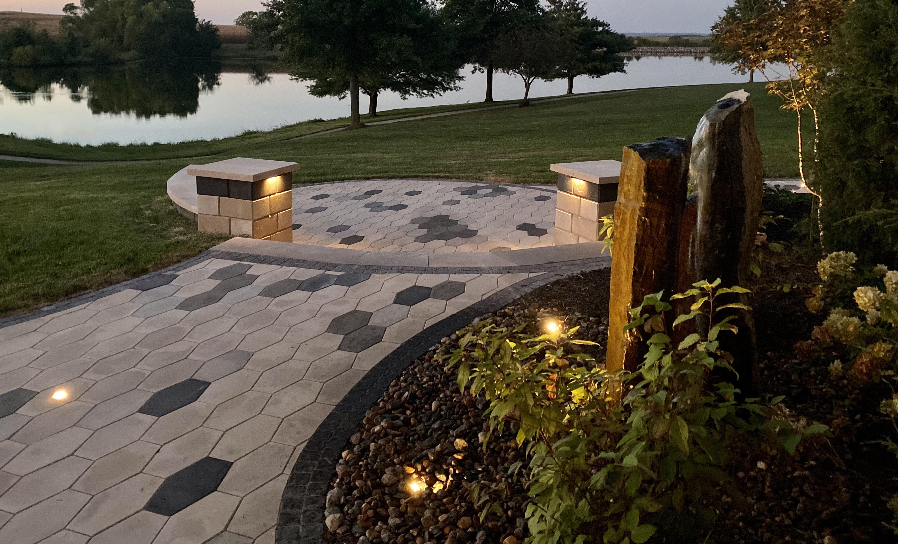



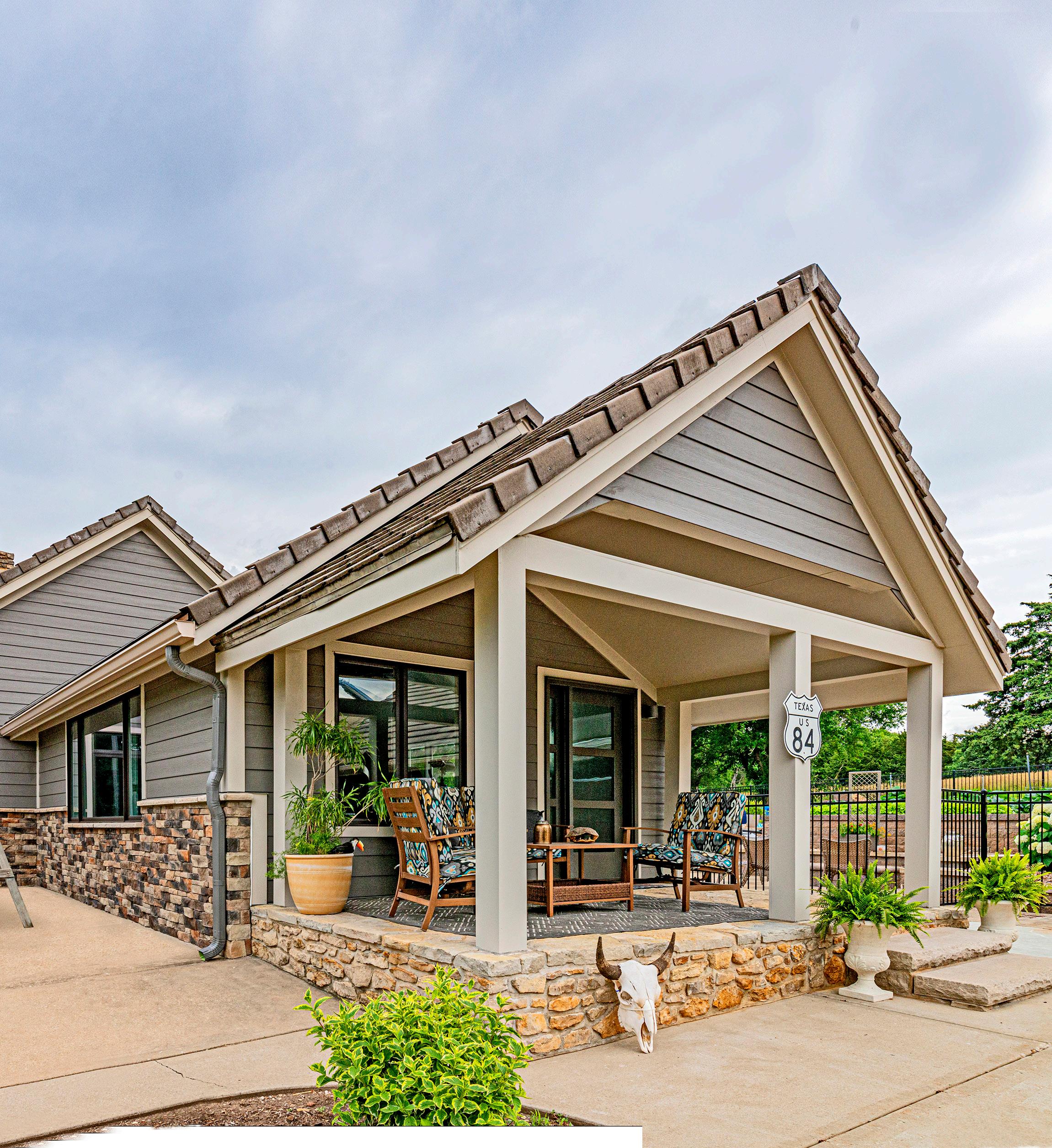
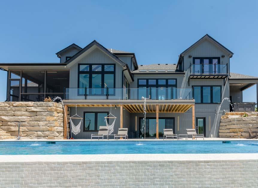
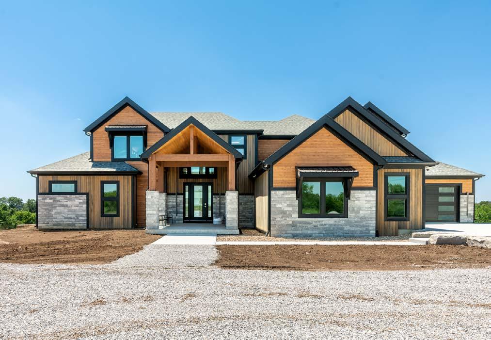
4309 NE Park Ridge Blvd, Lee’s Summit, MO
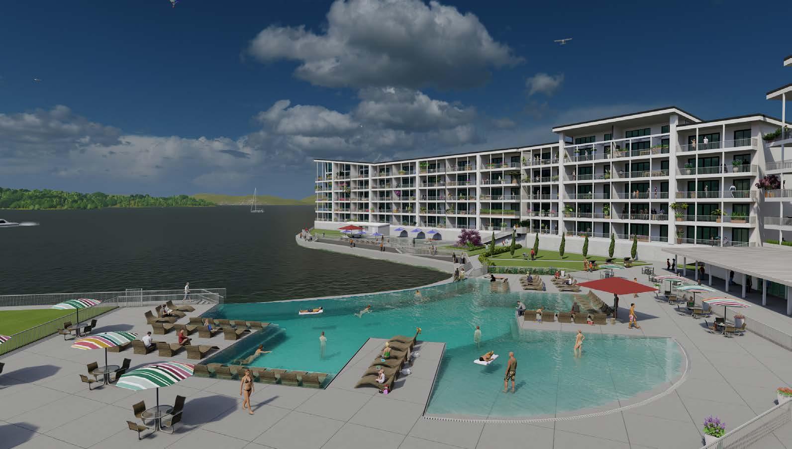
LOCATED just east of I–470 and M291 Highway on Woods Chapel Road in Lee’s Summit




At Noble Designs, our passion is designing homes and spaces for our clients that re ect their needs in a style that lasts. We are a full service interior design rm ready to help with your new build, renovation or just simple updates to make your home beautiful.

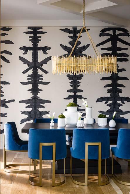




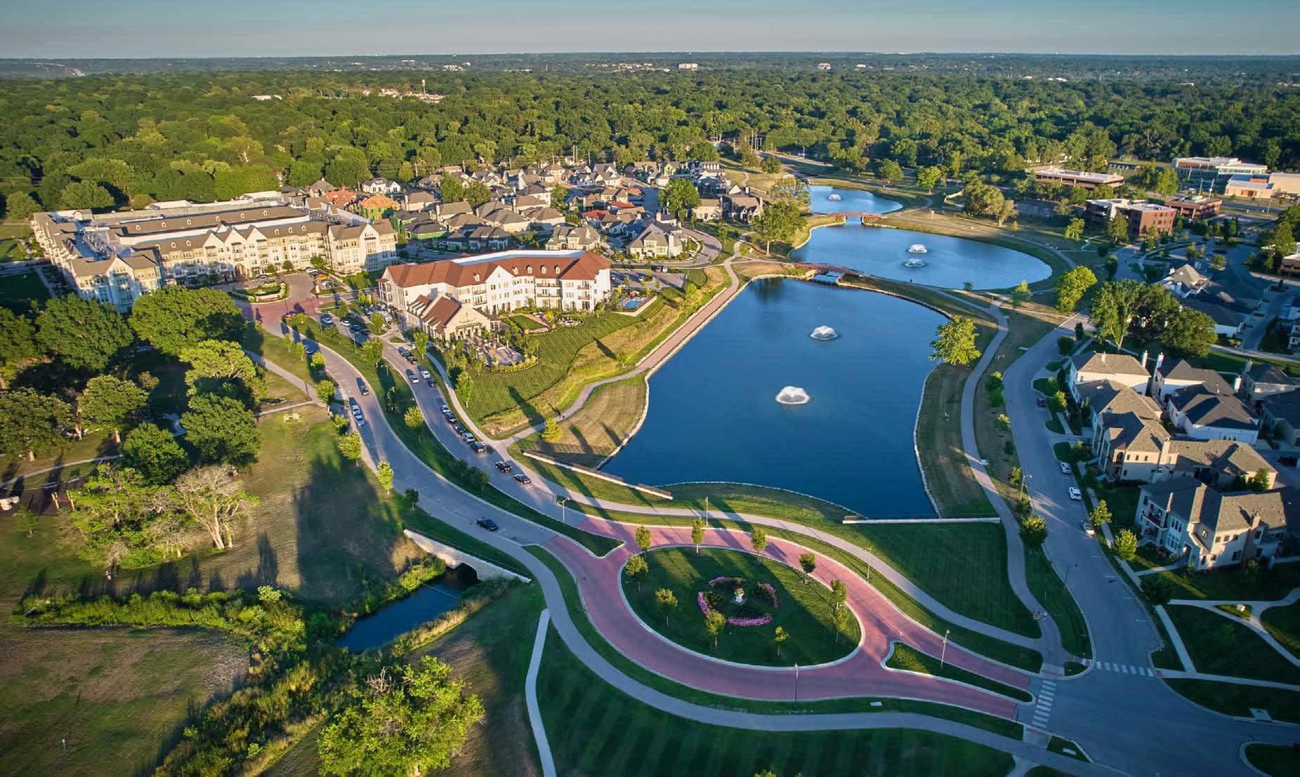

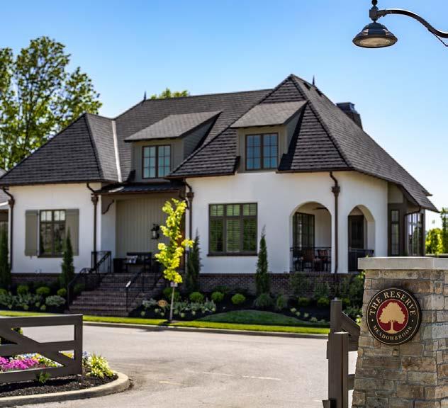



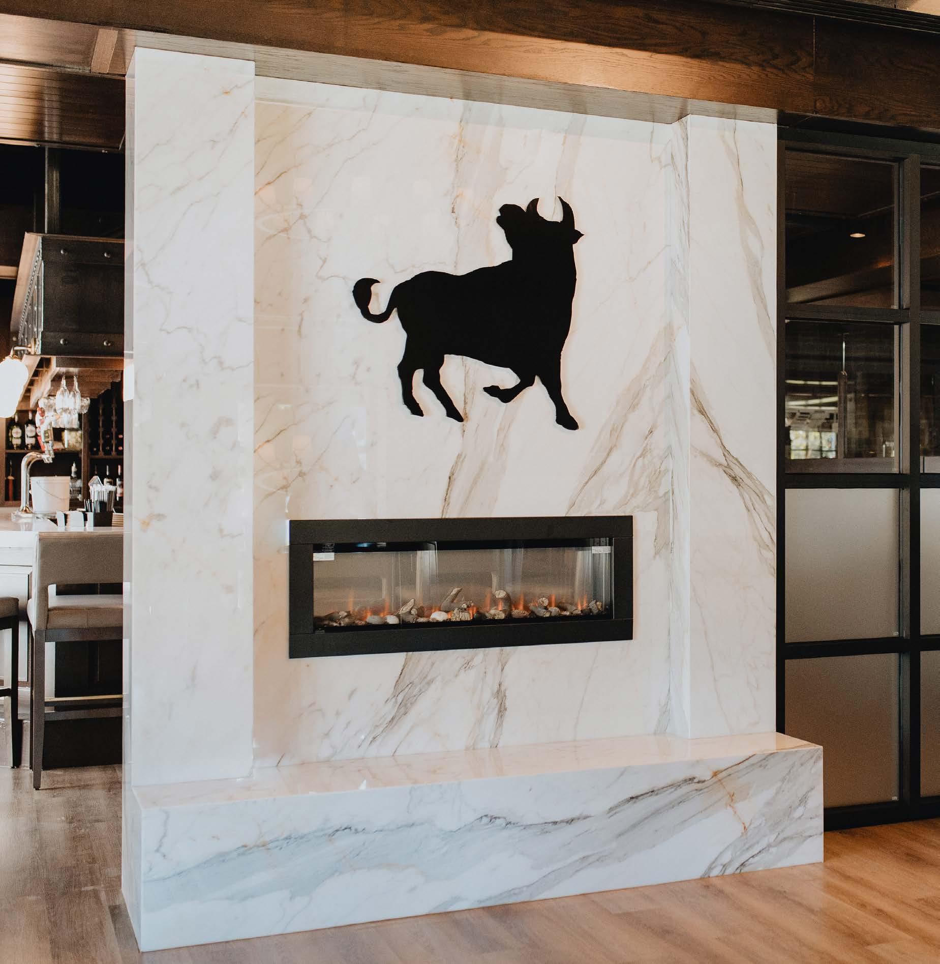
 Photo by Taylor Douglas
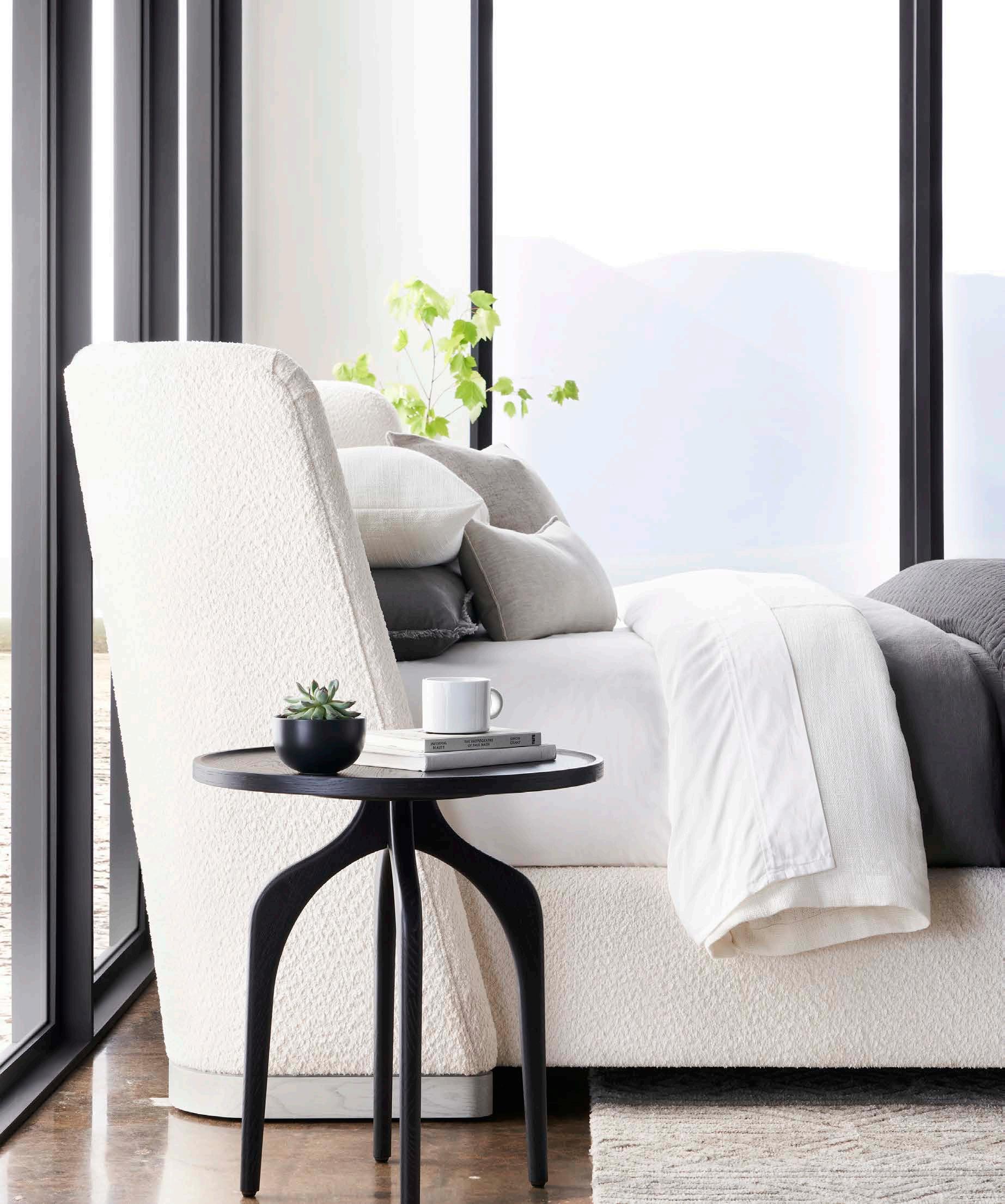


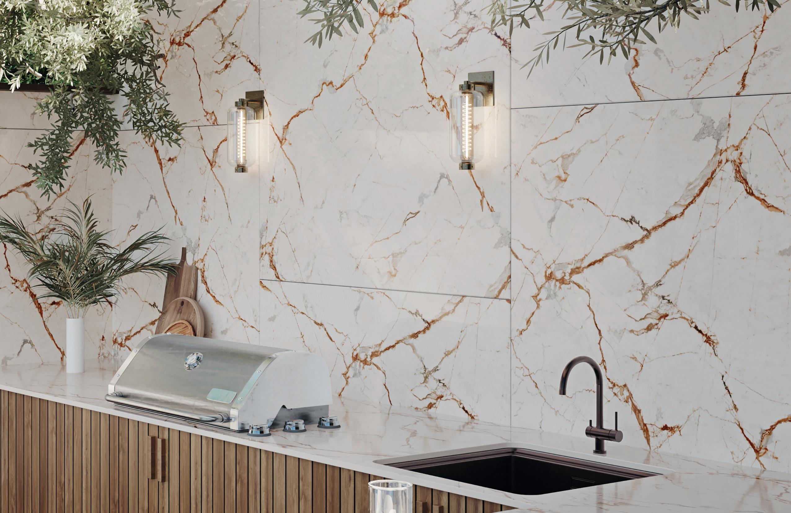







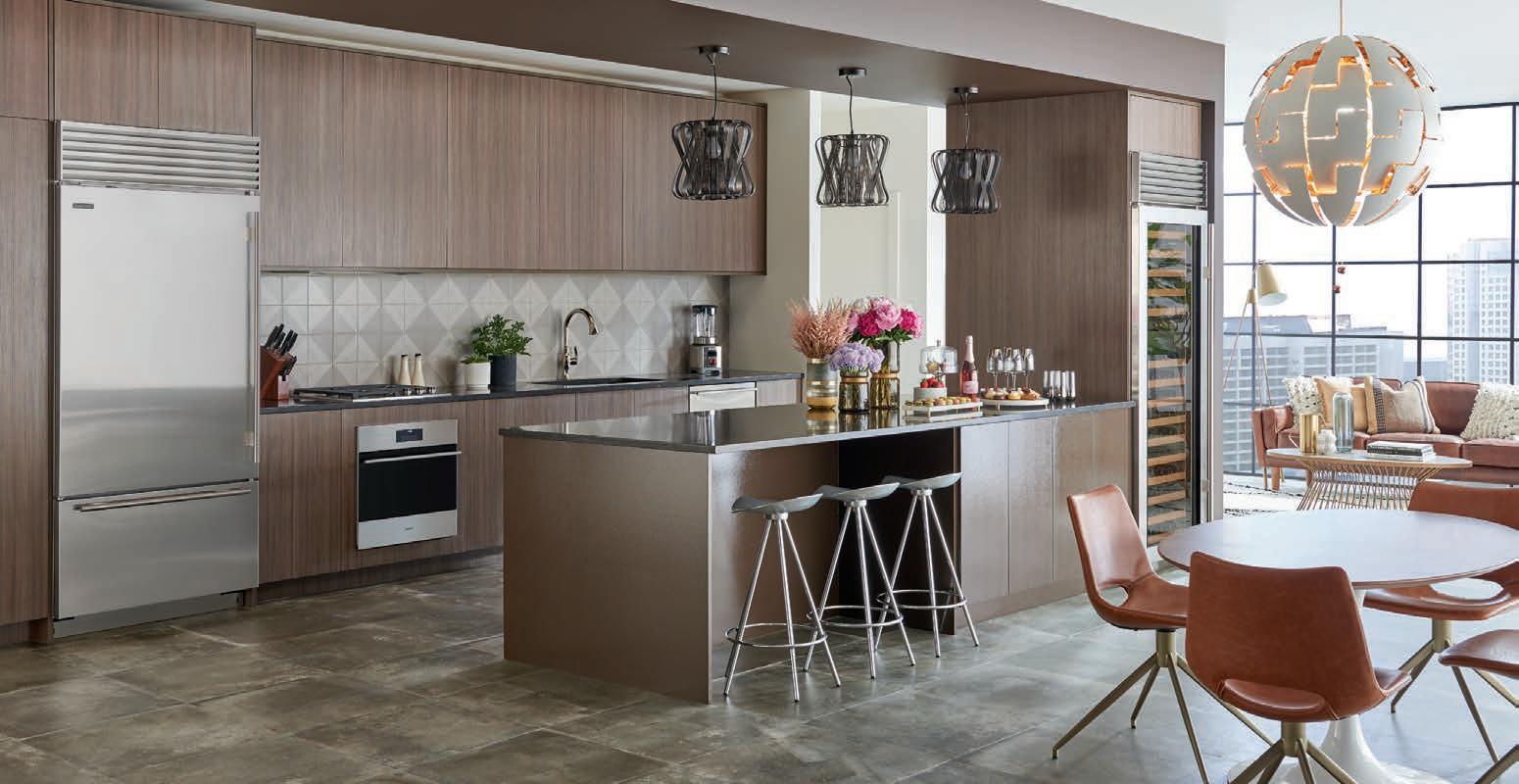
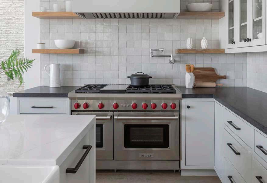
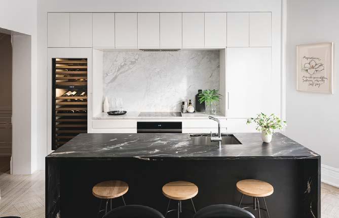
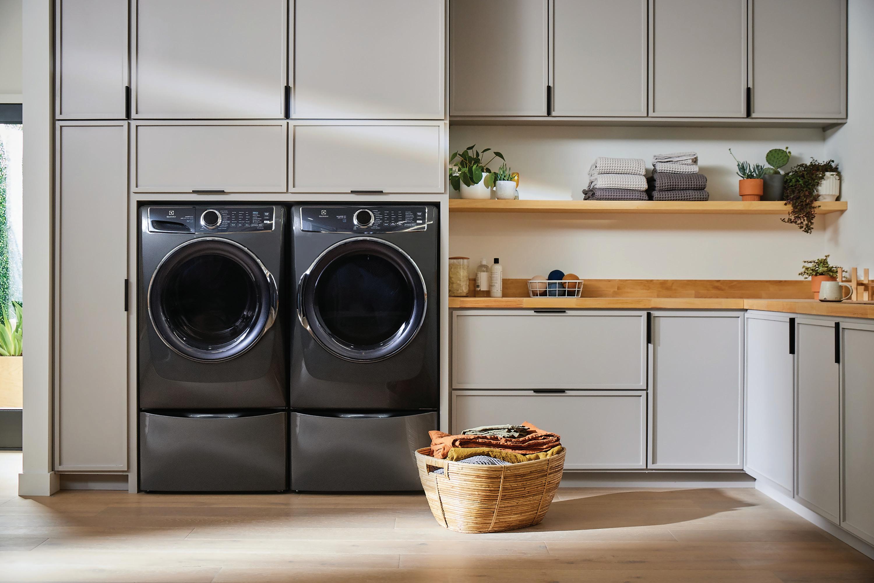
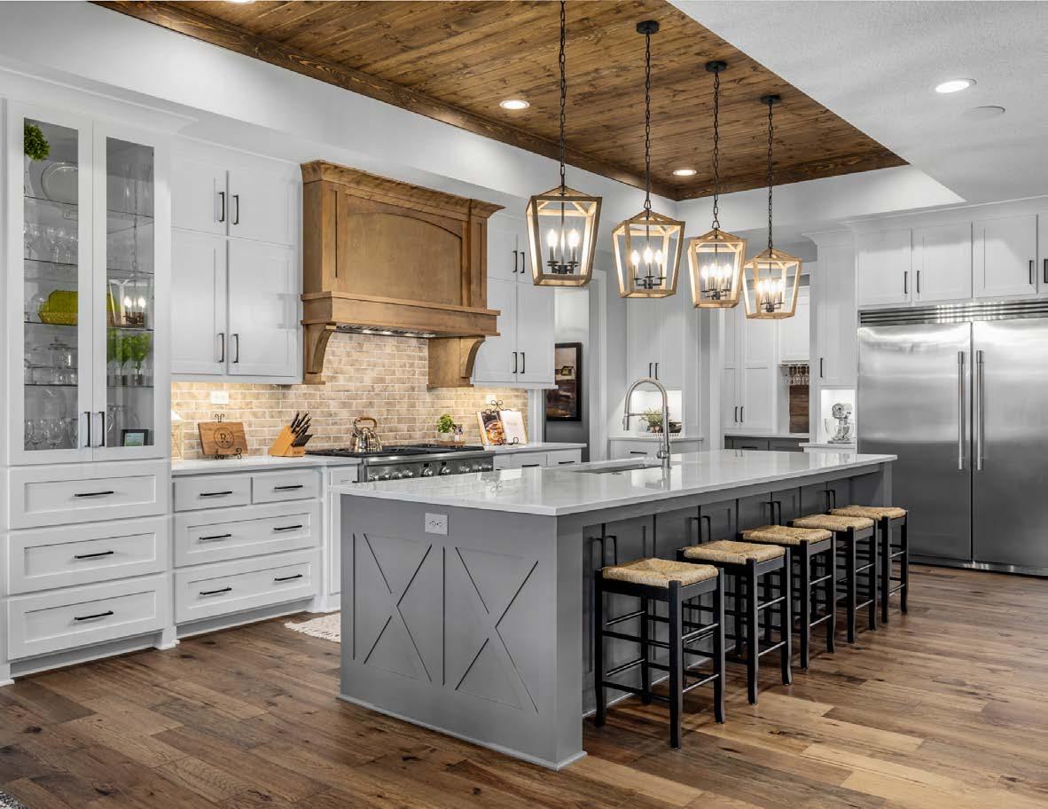
Factory Direct is now part of Ferguson, and our experts can’t wait to provide world-class service during your next visit. Shop online or schedule a personalized appointment from the comfort of your home today at fergusonshowrooms.com or KCFDA.com.
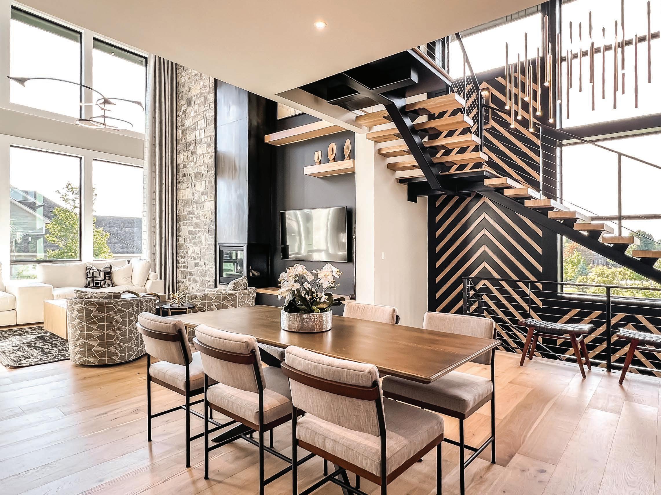


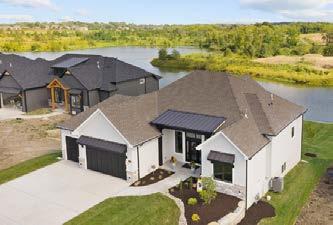
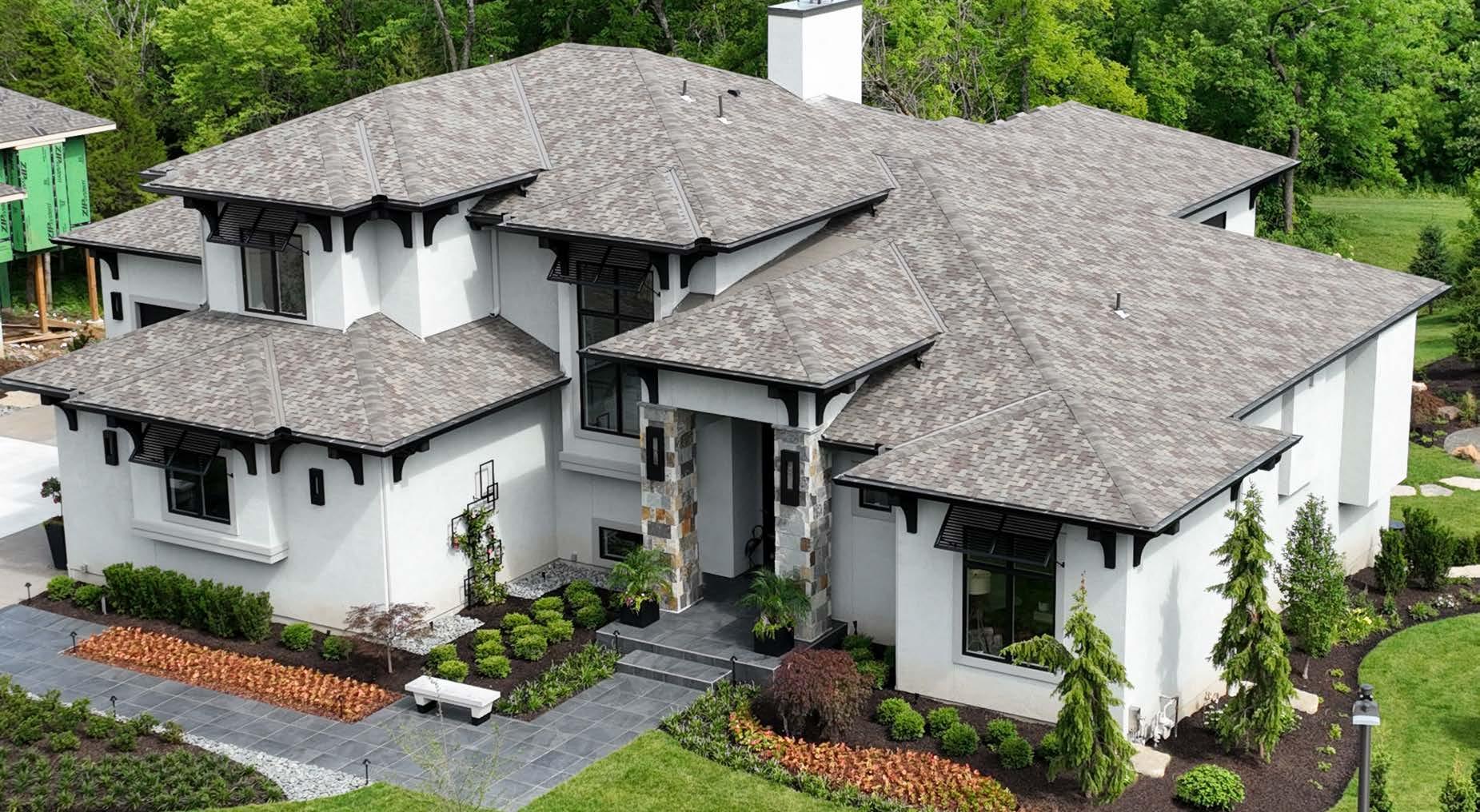
The Sanctuary is Matt Adam Development’s most recent luxury community.

Located at 175th and Quivira For waitlist information, please contact davidmombello@kansascityhomes.com or call (913) 239-8799.
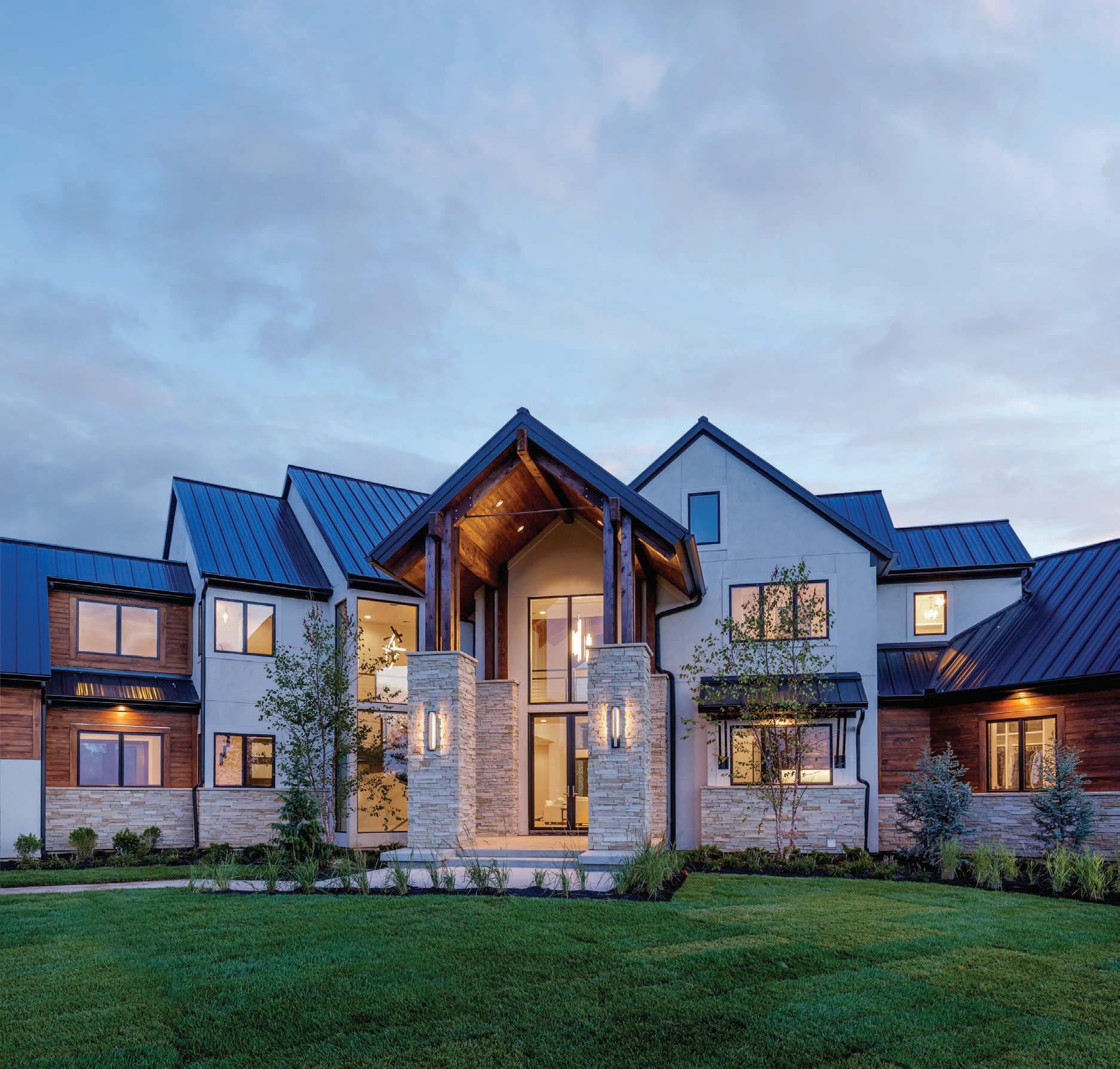 Peaceful, elevated living, surrounded by nature in South Johnson County.
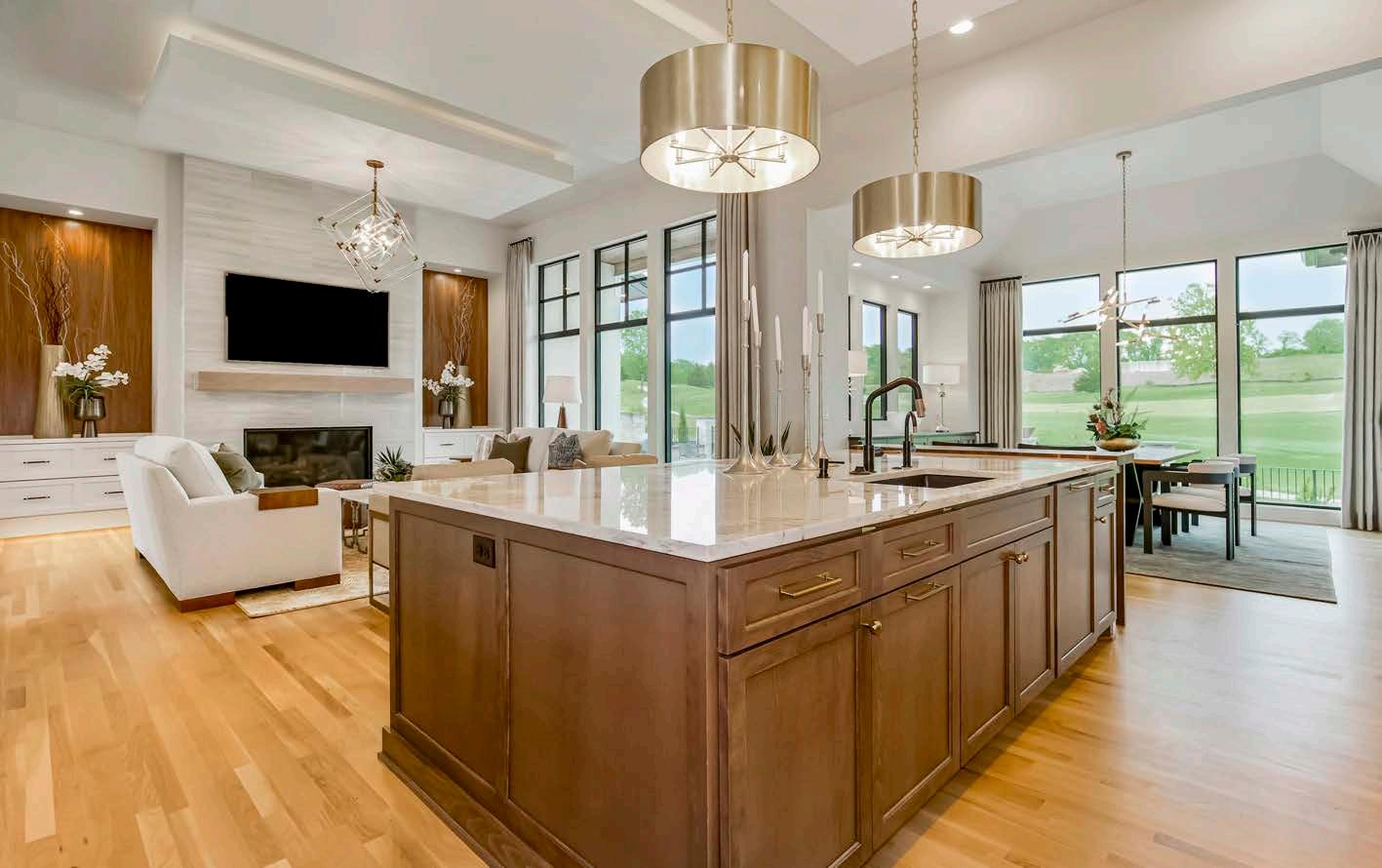
Home shown by Todd Hill Homes



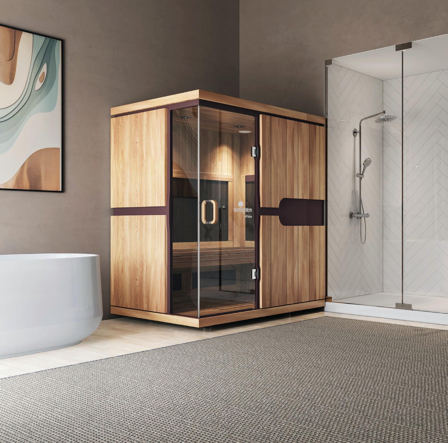
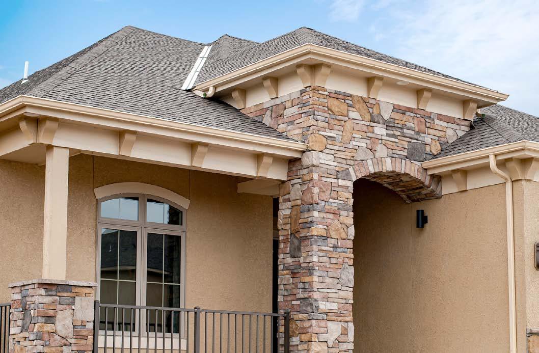
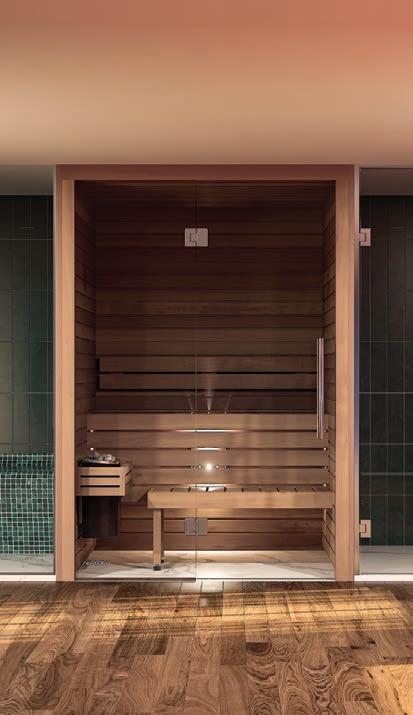
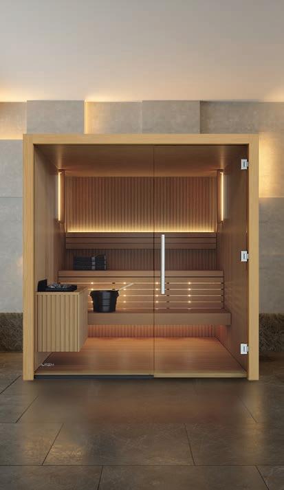
Create your own home spa with an infrared sauna. Elevate a master bath, home gym or pool house with elegant modern design for the ultimate self-care sanctuary. Cabin and custom saunas available from the world’s leading manufacturer right here in Kansas City. Visit Sunlighten.com/designKC
dream. design. build.



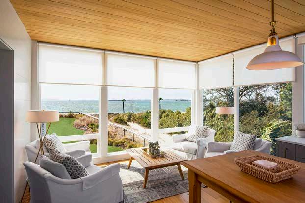
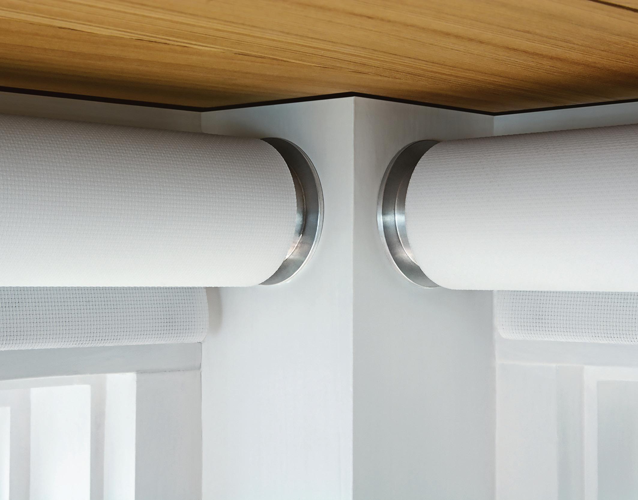
Modern, motorized functionality in a sleek, minimalist design. Rechargeable or hardwired systems. Integrates with virtually any method of automation or control. Expert installation for a precision fit.

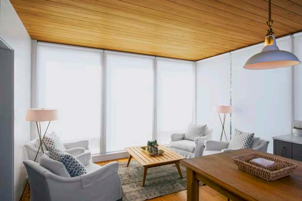
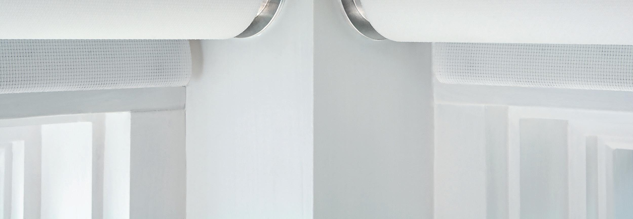
Ultra-quiet motors.


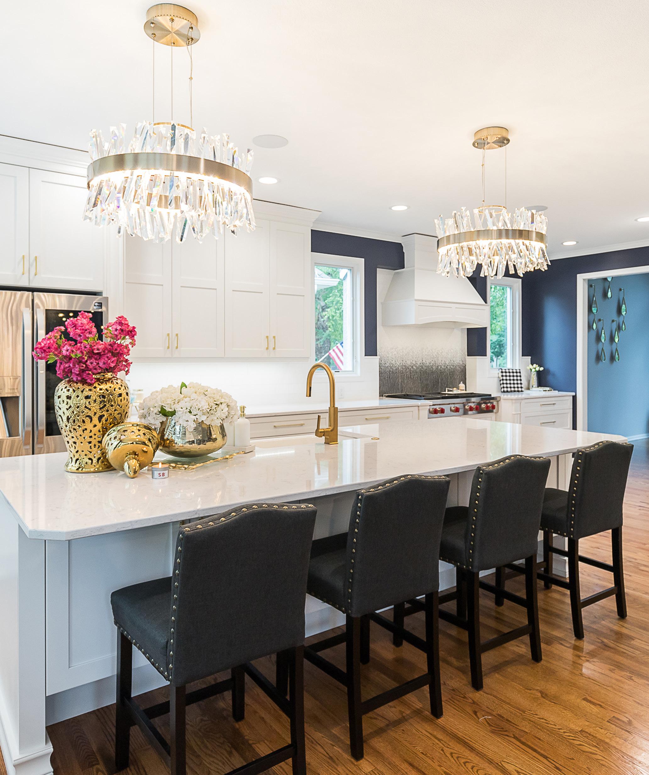


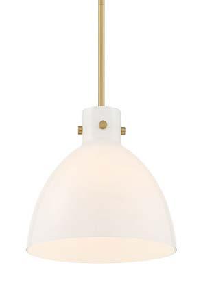
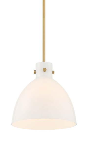
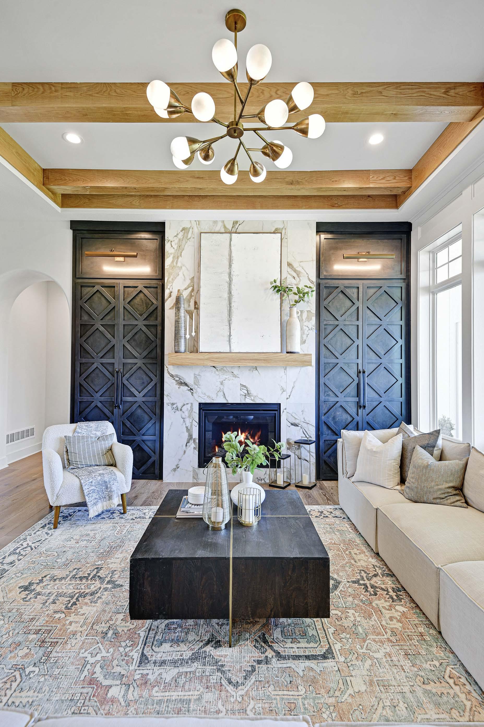
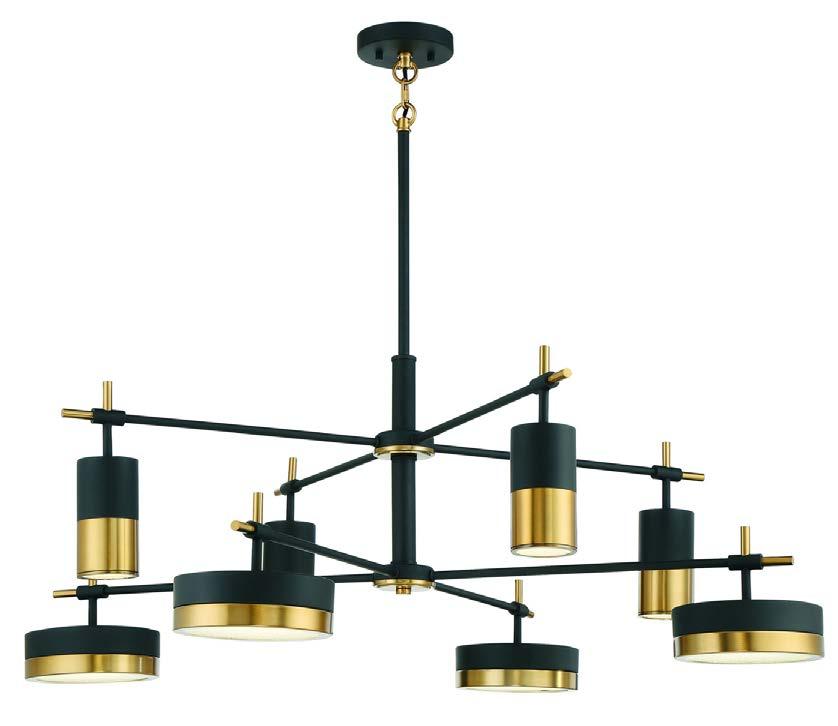
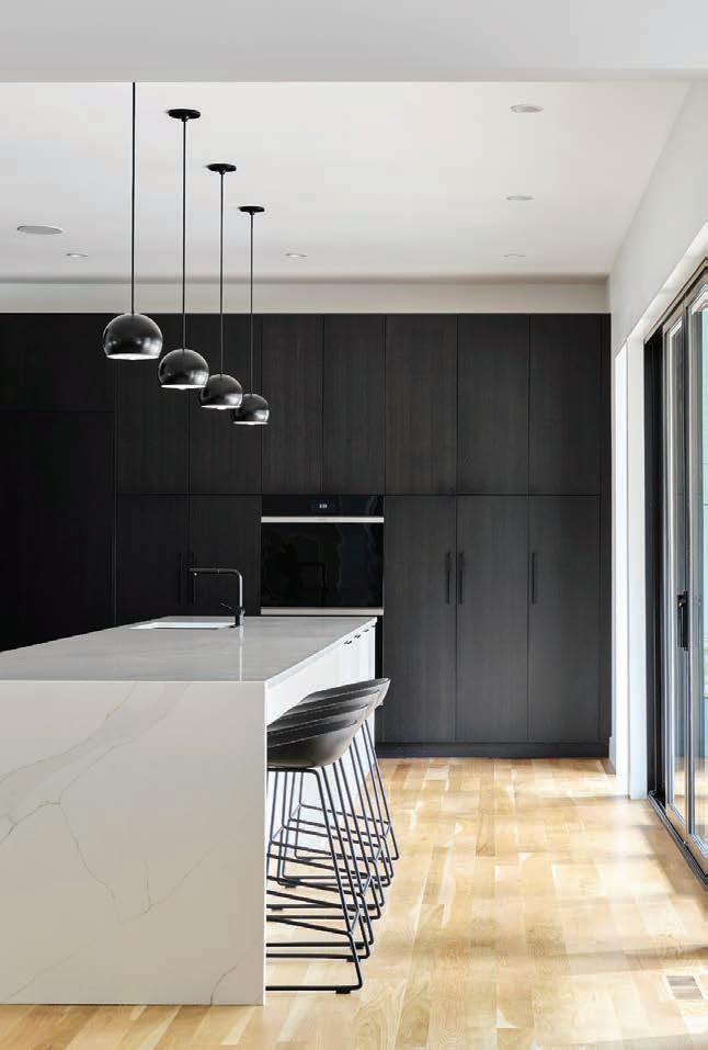
With reference to scandinavian minimalism and midcentury modernism, the ‘Chips’ chandelier mixes modern forms with materials and finishes that suit both transitional and modern environments. Come SEE, TOUCH, and TAKE HOME the newest lighting designs, home accents, and stunning artwork today from Kansas City’s best lighting store, Rensen House of LIghts.

ONLINE EXCLUSIVE
A thoughtful blend of light and dark brings contrast and nuance to a stately Mission Hills home.
An impressive, multifaceted outdoor fireplace is built to match the grandeur of its 100-year-old estate.
Tactile thrills from two nationally acclaimed (and locally loved) textile companies.
64
Date night out at a dozen atmospherically charged restaurants and bars.
The enhanced lifestyle benefits of maintenance-provided communities (hint: no snow shoveling required).

Two unique artists bring beauty—and playful delight—to the home using floral and metal modalities.
Lighting trends and fixtures that transform basic function into pure form.
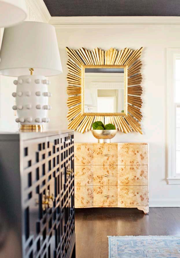
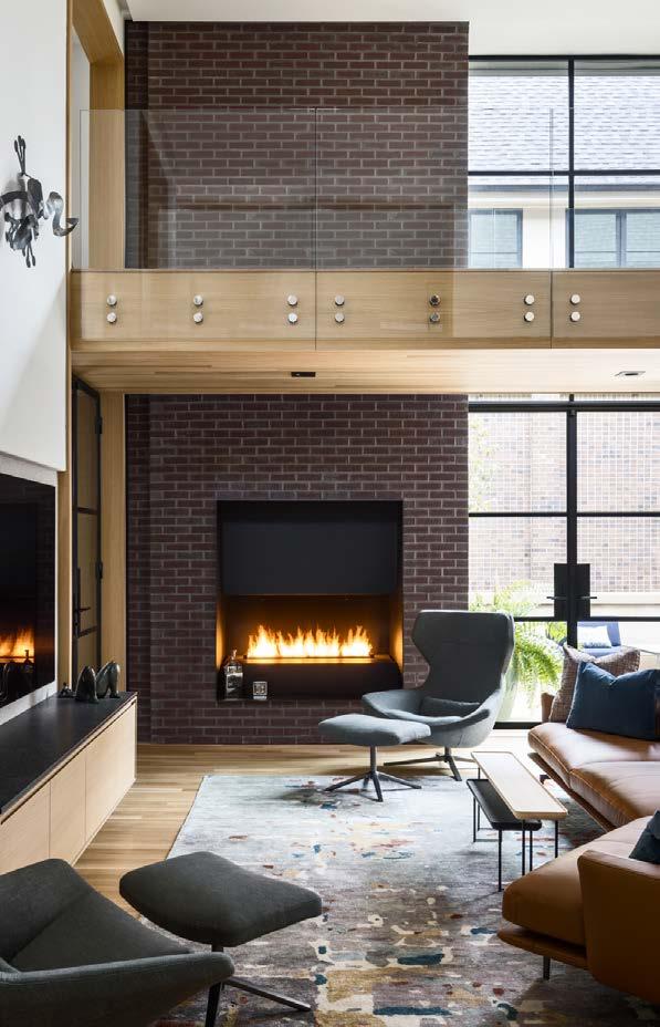
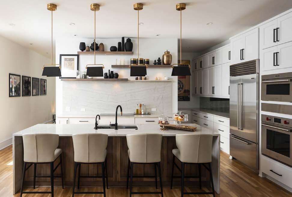
A Westside row home connects Kansas Cityʼs storied past with its hopeful future.
Coastal themes and mountainous scenes merge in maximalist style at this Lenexa home.

Timeless European influences and modern craftsmanship define the character of this 2022 Artisan Home in the Northland.

A modern home inspired by cube design dials in the details for living, working and entertaining in Prairie Village. 122 ROOMS WE LOVE

Luxury and romance reign in our ensemble of primary suites. 147 KITCHEN + BATH
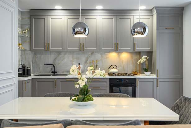
Moody blues enrich two renovated kitchens. 157
An antiques dealer displays his favorite treasures at his European-styled West Plaza home.
A shaded condo corner offers the option of visual respite from a busy city center.


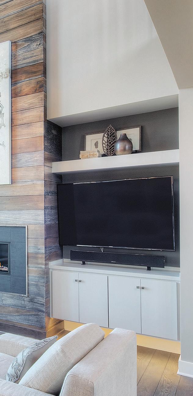
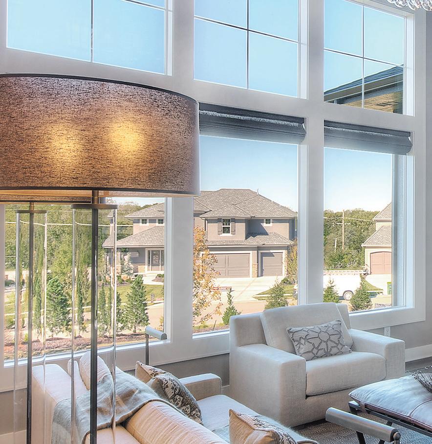




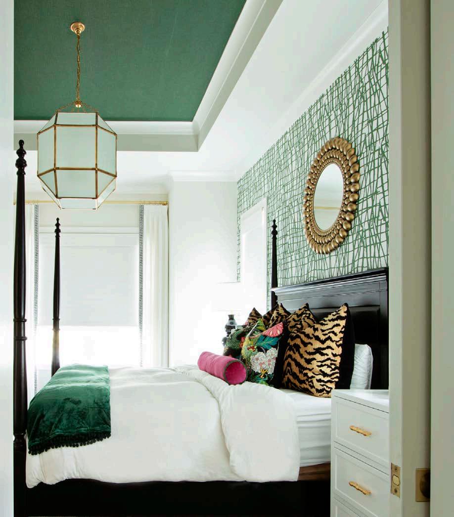
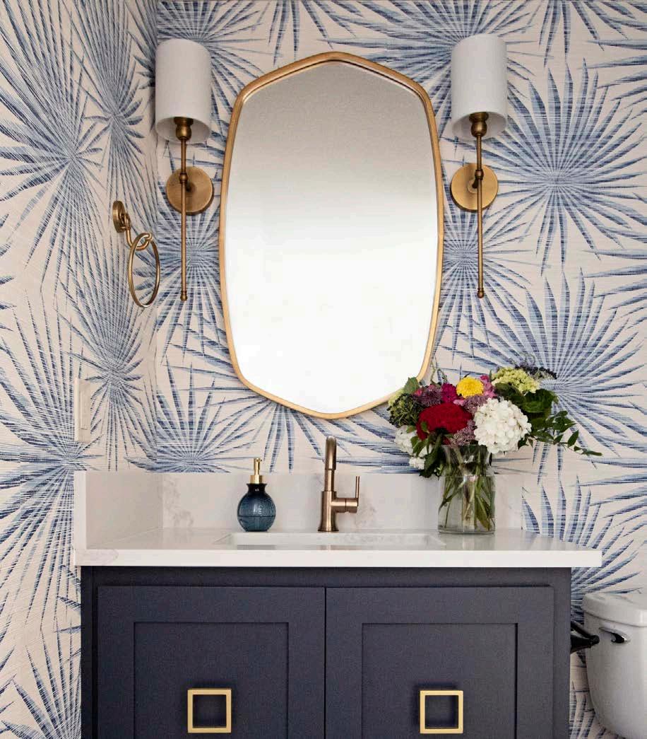
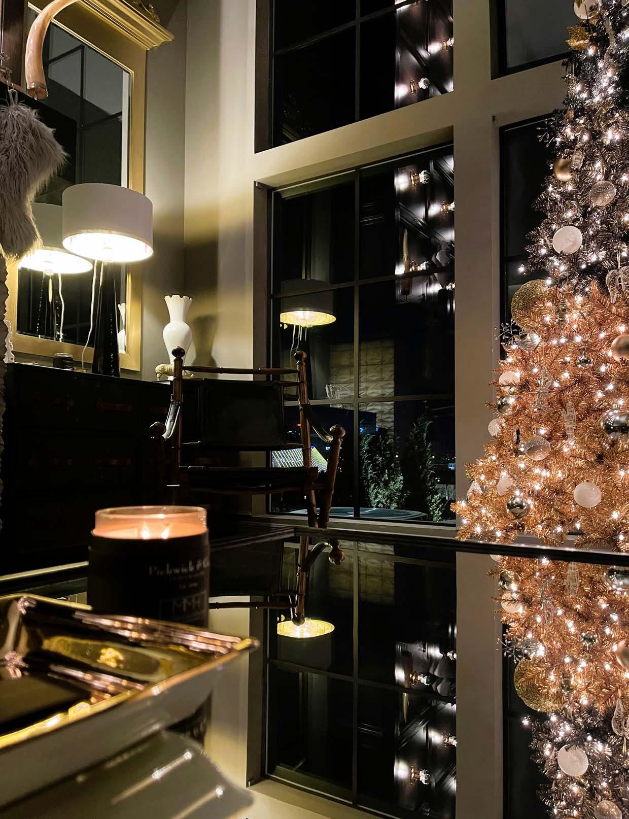
Itmight be pitch black outside at 5 p.m., but our world of interiors is lit Inside homes across the city—lights aglow, fireplaces humming, blankets blanketing— the world is cozy. This issue leans into dark and handsome hues: blues, blacks and wood tones—softened, of course, by textiles and the warmth of quality light.
On page 58, we announce the opening of Stark Gallery, exclusively at to-the-trade KDR Designer Showroom, featuring gorgeous rugs perfect for dressing up a room—as well as your bare feet. On page 104, we name the lighting trends weʼve been seeing in homes this past year and showcase some of our favorite collections that you can buy locally, along with a whimsical giraffe or crane for your living room (trust me, just turn to page 98).
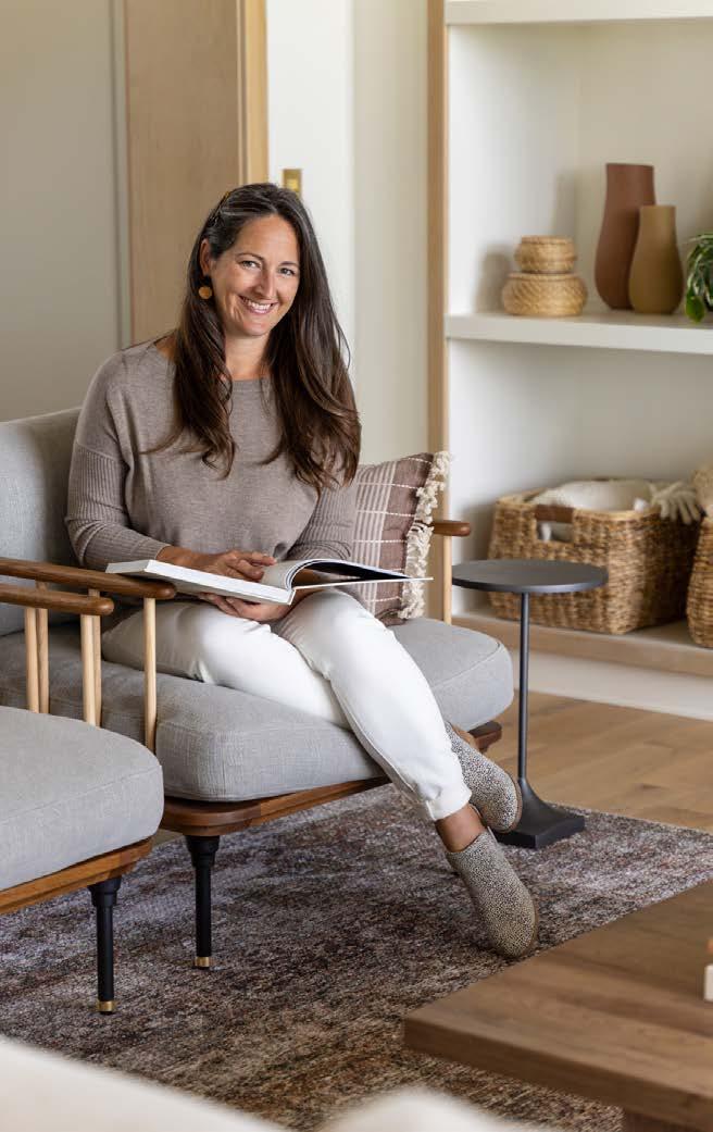
Maybe itʼs because of my familyʼs longstanding tradition of watching Charles Dickensʼ A Christmas Carol every year, but those scenes make me yearn for a library full of books and a four-poster bed. So I bestow this wish to you in the form of Blake Cragheadʼs West Plaza home on page 157, where a hearth room full of books and antiques will delight you readers and collectors out there. We also explore the feel of an English cottage at Cardinal Crestʼs Artisan Home on page 202 and the historically inspired row homes going up downtown by Edward Franklin Building Company on page 192.
One of the primary suites weʼve highlighted starting on page 122 features that four-poster bed of my dreams—curtains and all. But any one of the four
JANUARY 13-22, 2023
Find a list of participating establishments and start creating your own winter tradition! kcrestaurantweek.com
retreats would be ideal to settle in for a long winterʼs nap!
People say they love the Midwest for its change of seasons. There is much to appreciate, although I daresay few would name winter as their favorite season much past the holidays—especially if they have to dig out their driveway every time it snows. If you donʼt want to throw in the shovel and move to Florida, consider moving to a maintenance-provided community, which does all the dirty work for you. Find our buyerʼs guide on page 86.
If, on the other hand, youʼre ready to get out of your pajamas and doll up for a night out, weʼve got suggestions on our favorite places to sidle up to. One of the things I look forward to most every January is KC Restaurant Week. For the last 12 years, my own little quartet has visited a different restaurant and quite a few bars beforehand and afterward. What weʼve discovered—besides my husbandʼs ability to talk decibels above a noisy room, witty, though, he is—are bountiful places that tap into the full experience of the senses. Food and cocktails—oh, yes—but tasteful interiors, even better. The psychology of spaces intrigues me because looks dictate how you feel, and I want to feel like Iʼm someplace special if I have to get out in the cold. Turn to page 64 to find our recommendations for both new and time-tested establishments across the metro.
Cheers, everyone!





Nate Sheets
Christine Caso Ward
Jenny Wheat Event Photographer
Brian Rice Photography
Videographer 1593 Studios
Designers, architects, builders and homeowners are invited to submit projects. Email andrea@mydesignkc.com with photos and description.

Advertising Keith Sauro, Publisher keith@mydesignkc.com 913-908-2393
Subscribe mydesignkc.com/subscriptions
$20 for 1 year (4 issues) $35 for 2 years (4 issues) For subscription questions, lost issues, or to cancel a subscription: circulation@mydesignkc.com
Online + Digital mydesignkc.com mydesignkc.com/digital-issue
Find your dream home in our sister publication, another popular title from Rhythm Media LLC, free at grocery and retail locations in Kansas City.



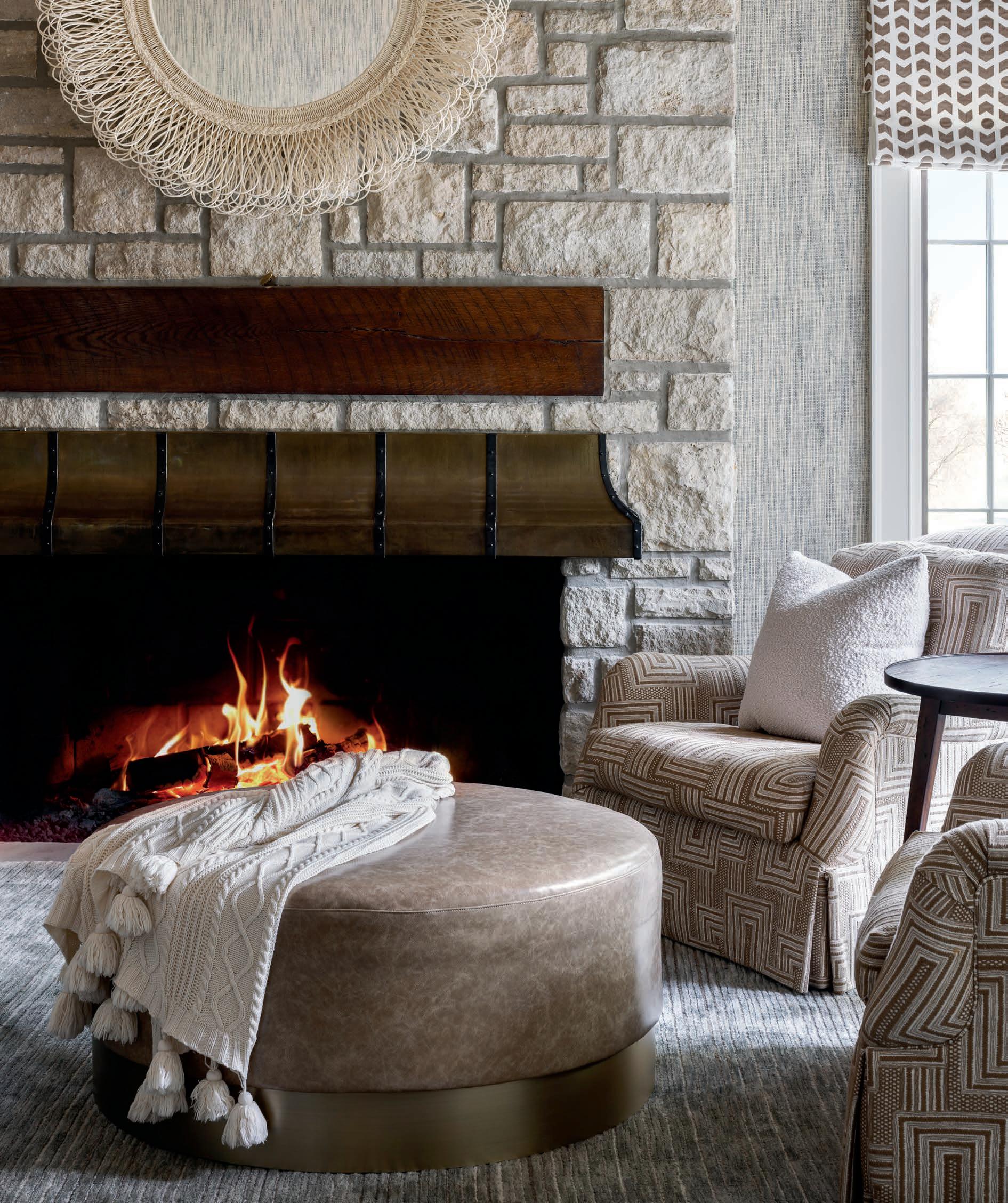
Cozy up your home this winter with mellow neutrals and woven textiles from two nationally acclaimed and locally loved artisans.
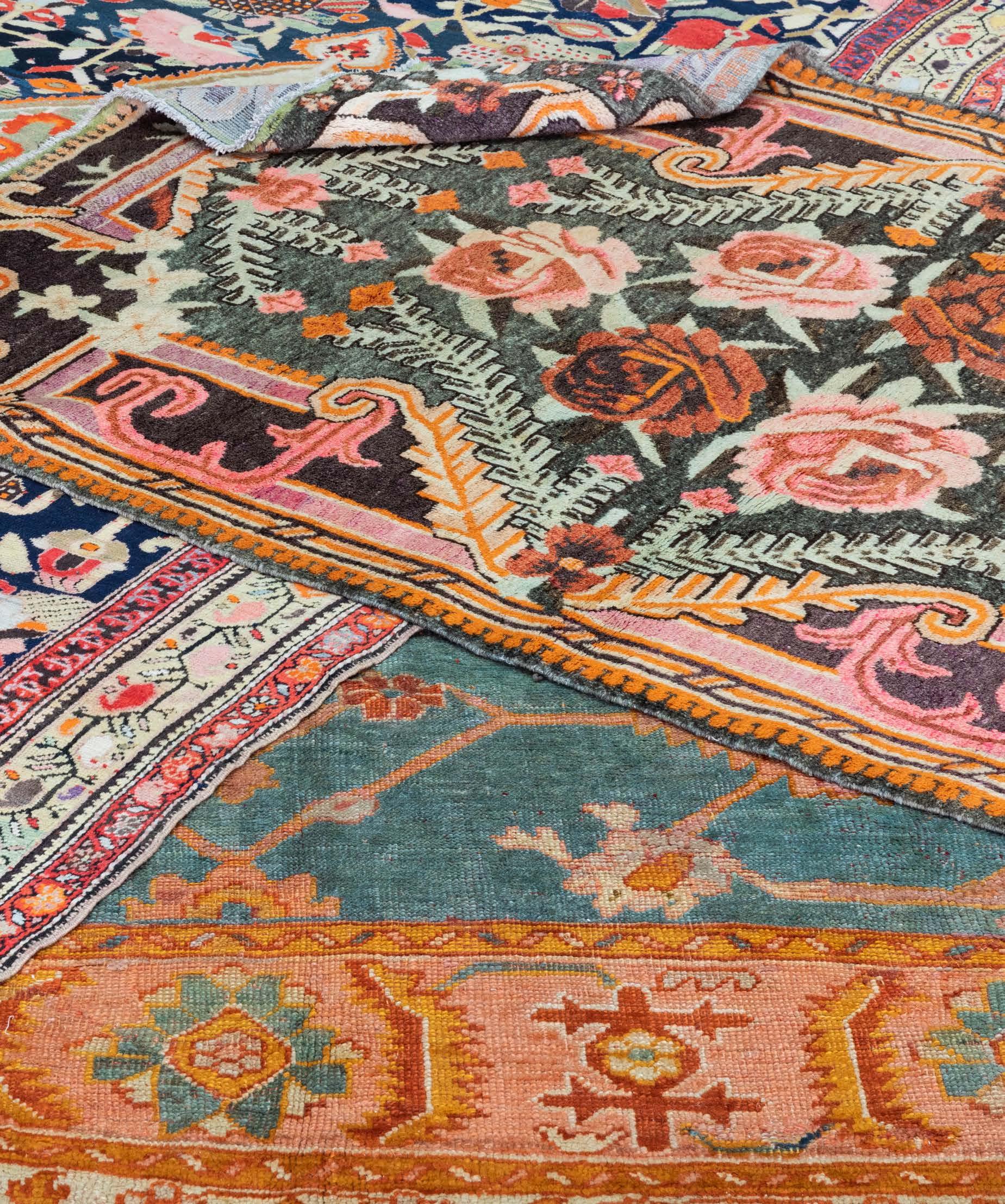
Words by Savannah Rieke NewsonAlong-awaited arrival, Kansas Cityʼs July 2022 gallery debut of the premier, eightdecades-strong carpet brand STARK is a dream come true for many local design professionals and luxury textile connoisseurs.

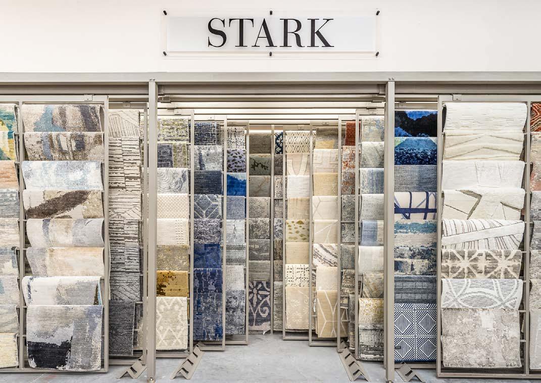
KDR Designer Showrooms of Lenexa, the new home of STARKʼs first brick-and-mortar gallery in the metro area, is thrilled to showcase the brandʼs expansive selection of products, including artisanal rugs, carpets and the new Ashley Stark Home line.
“Designers used to have to travel to Chicago, New York or Atlanta to see STARK products,” explains Kelly Specht, KDRʼs senior sales associate and STARK representative. “Now we have a large sampling right here in Kansas City!” From its stunning multi-line showroom to its multi-decade reputation for style and service, it is no wonder why KDR Lenexa is the chosen destination for more than 150 luxury lines of home interior products.
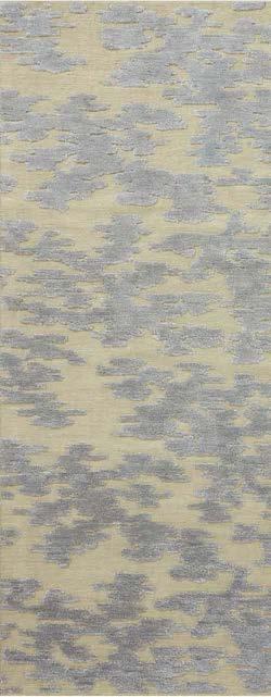
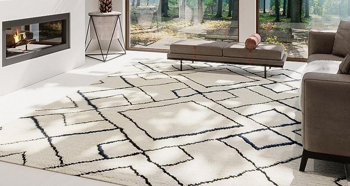
For designers seeking a warm and cozy feel this winter, Kelly recommends checking out STARKʼs Sorina line. Elegant and understated, this style comes in various beiges and grays reminiscent of comfy cable-knit sweaters. She also recommends exploring the Ashley Stark Home rug collection—
an innovative, modern-meets-classic lifestyle line curated by STARKʼs creative director, Ashley Stark. Samples of both lines can be viewed on-site. Kelly raves about the STARK exclusive products, calling the possibilities “limitless.” “If you can dream it, STARK can weave it!”
Turn the page
Showroom Location: 8510 Marshall Drive Lenexa, Kansas
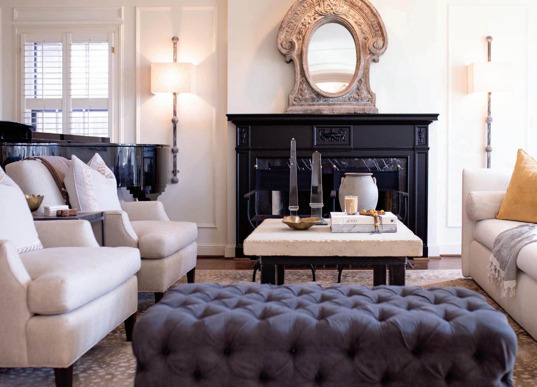

Eco-conscious meets chic and cozy at Happy Habitat—a homegrown Kansas City shop made famous for its fabulous and functional throw blankets.

A thriving success story over 11 years in the making, owner and designer Karrie Deanʼs journey as a small business owner has been colorfully woven by humble beginnings, endless creativity and strong ethical values.
“I had a great corporate job, got laid off,” Karrie says. “I thought I should do something awesome with my love of patterns and with my life in general…I didnʼt want to settle for average.”
Eventually, she found her joy as an artist and business owner by doing something that inspires joy in others: designing unapologetically fun and far-from-average blankets—“giant cozy art that stands the test of time.”
From soft and natural to assertive and geometric, Karrie is constantly inspired by and experimenting with various colors, patterns and textures to devise new, one-of-a-kind throws for her customer base, including adorable minis for the little ones. Regardless of size or feel, each piece is boldly designed and sustainably produced by a small knitting mill in the USA.
Right now, the India throw in ochre (shown far right) is on rotation between rooms at Karrieʼs house. “The rich gold color feels cozy but with a modern graphic touch,” Karrie says.
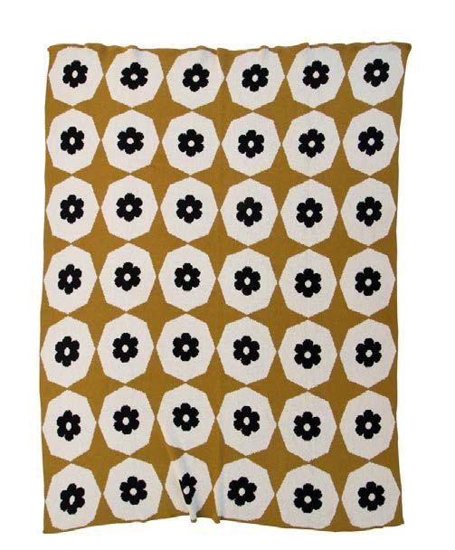
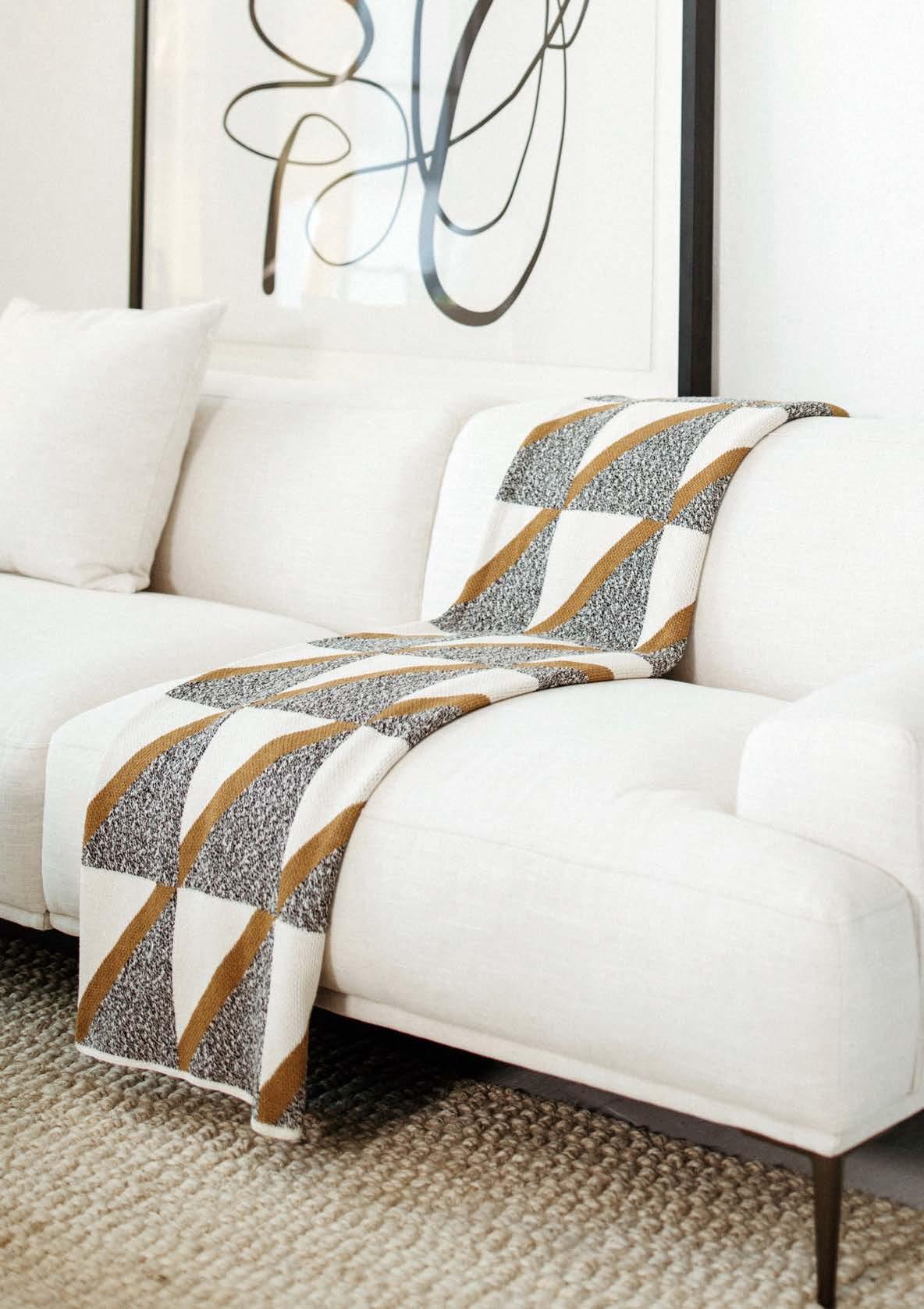
Her other must-have wintertime picks include the light and snowy It Takes a Villa throw in neutral and the soft and textural Xact-oh in ochre.
In-Store Locations: Golden & Pine in Prairie Village, Kansas Jorjy in Kansas City, Missouri House on Scott in Parkville, Missouri

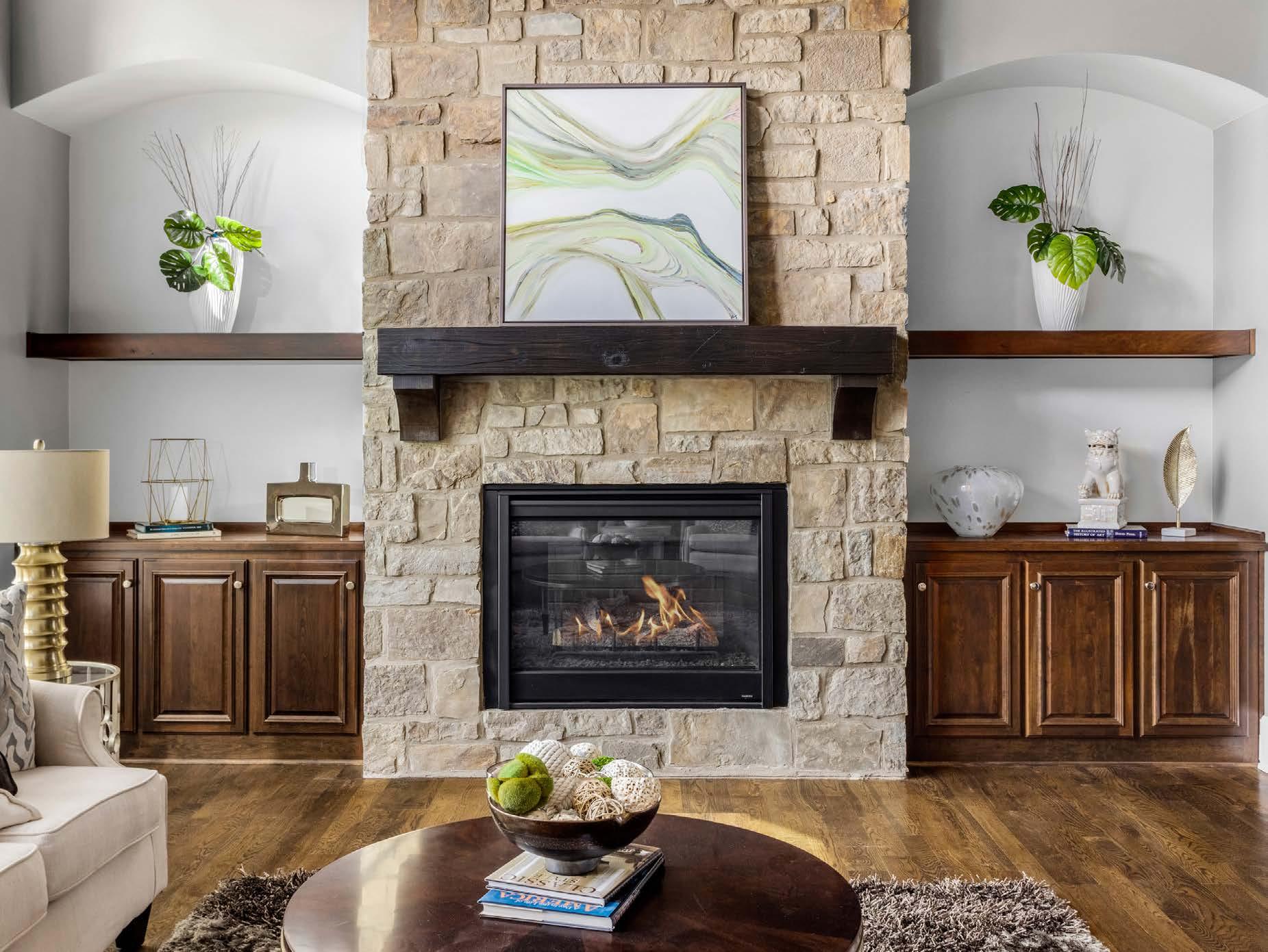



If you dare to step out for more than takeout, go snuggle up in a corner with your spouse—or be seen solo at the bar—at some of our favorite coziest and design-forward establishments.
Words by Lisa Waterman GrayPlateʼs second location opened in March at the former California Pizza Kitchen location in Park Place. Soft blue-gray chairs and booths punctuate the dining room, while neutral carpeting and broad windows accentuate the space. Sheer floor-to-ceiling curtains create more intimate dining areas, while natural wood accents add warm tones and design flair near the entryway and across the ceiling. Chef Jeffrey Thomas creates modern Italian cuisine. His traditional, simple and fresh food includes Neapolitan-style pizzettes, housemade pasta and entrees from steak to scallops.

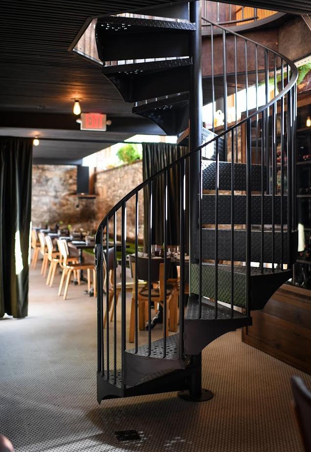
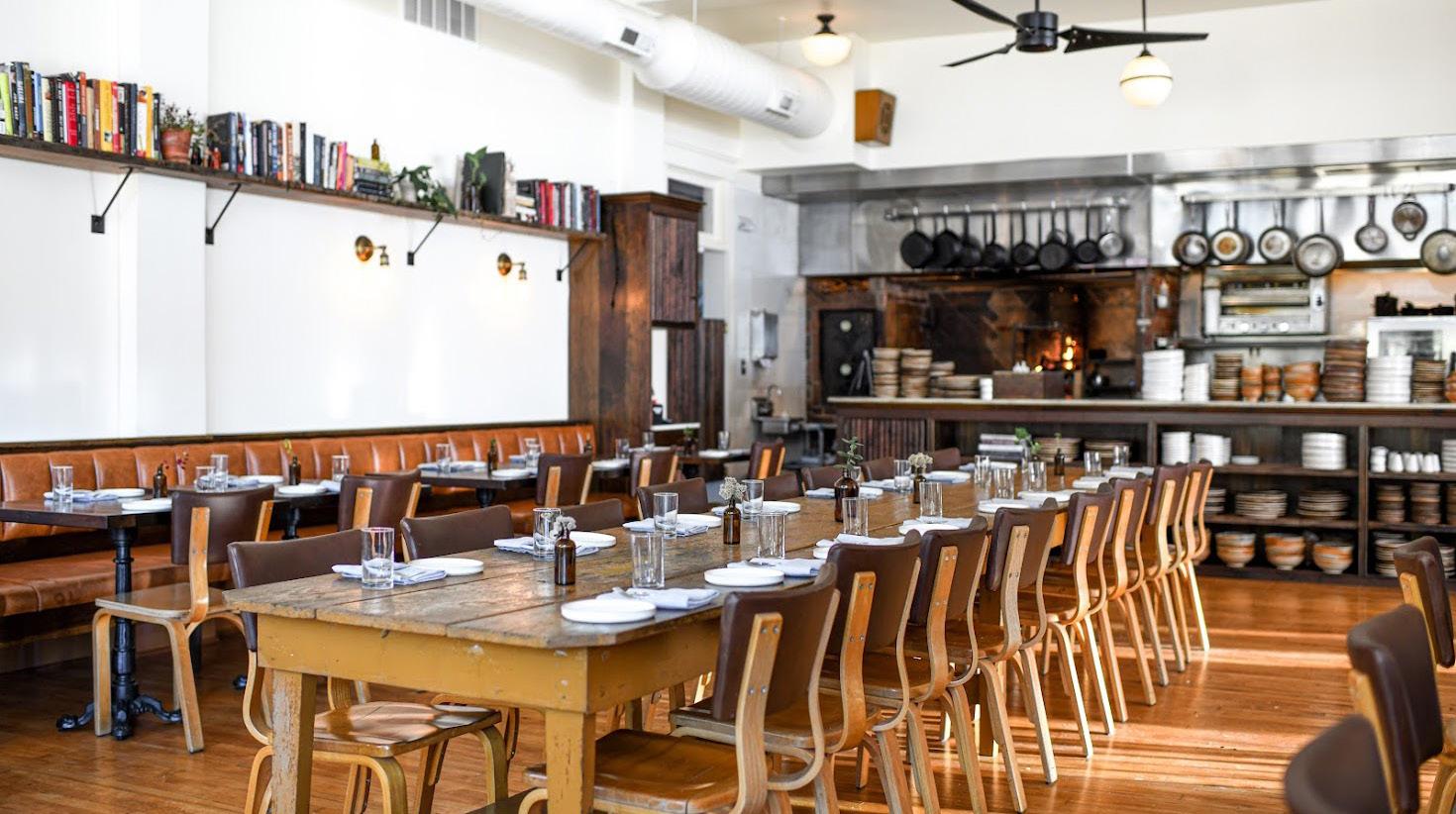
With interior design by co-owner Kristine Hull and renovation by building owner Adam Jones, this comfortable bistro occupies a Westside building built in 1907. A historic corner entrance accesses the bar level—a bright, airy room with high ceilings, reclaimed marble surfaces and leather booths. Thereʼs plenty of natural light and tropical plants. Bookshelves accentuate the kitchen level near the open-flame hearth. Here, chef Vaughn Good and his team prepare rustic plates from Smoked Beef Tongue to Tomato Greens Lasagna. An iron staircase connects to the bar level, and the lounge level features exposed stone walls and clerestory windows— plus the turntable and vinyl record collection that provides the restaurantʼs soundtrack.
Turn the page
2143 Summit Street Kansas City, Missouri FoxAndPearlKC.com / 816-437-7001
Fox and Pearl


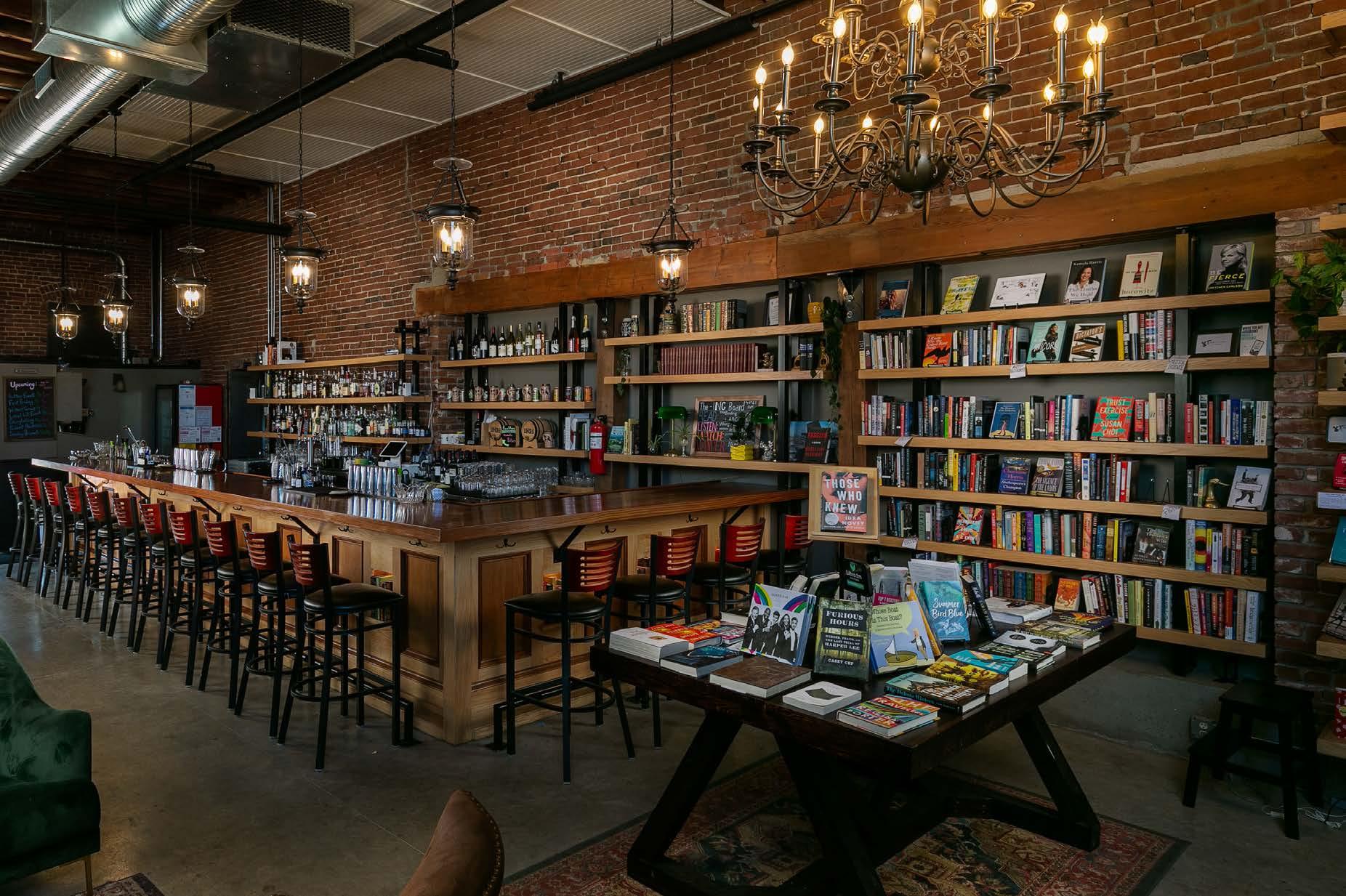
1834 Grand Boulevard Kansas City, Missouri AfterwordKC.com / 816-299-8360
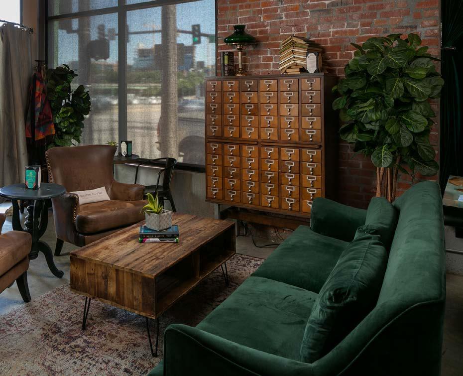
The casual vibe at Afterword Tavern & Shelves in the Crossroads Arts District begins with cement floors, wall-spanning windows, open ceiling beams and brass chandeliers. Dozens of chairs surround the handcrafted wood bar, while long tables facilitate meetings and social gatherings. Thereʼs vintageinspired art, a tall cabinet that resembles an antique library card catalog and, of course, book-lined brick walls. In addition, executive chef Sydney Montgomery has crafted a menu that beautifully complements the enormous cocktail, beer and wine menu—from turmeric hummus to a charcuterie board or mac and cheese. The tagline says it all: “A refuge for the thirsty and inquisitive of Kansas City.”

1228 Baltimore Avenue Kansas City, Missouri hotelkc.com | 816-895-0381
Bar seating at this Hotel Kansas City restaurant provides views of the sumptuous white oak–burning hearth, while individual tabletops made of wood and marble are flanked by tall leather booths and padded chairs. Backlit open shelving displays rustic pottery dishware near the open kitchen.
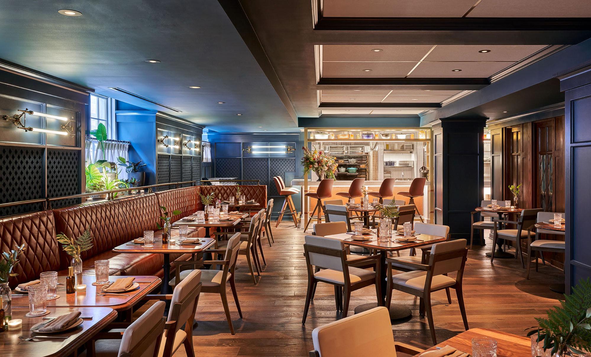
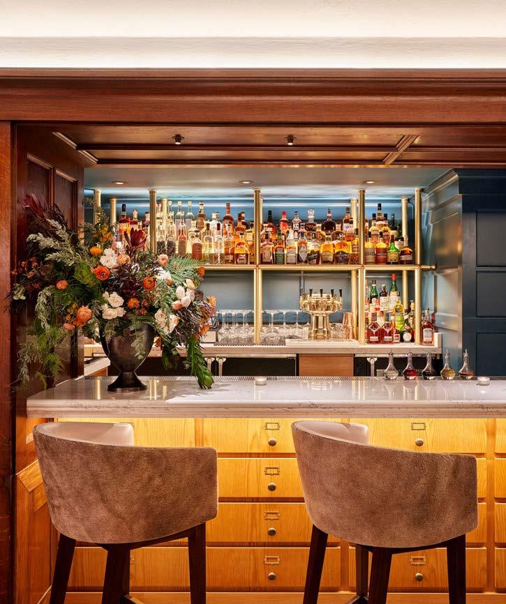
Executive chef Johnny Leach and his wife, executive pastry chef Helen Jo Leach, create modern interpretations of local culinary traditions, incorporating ingredients from local farmers, ranchers and other food purveyors. Think Chile Smoked Country Pork Chop or Albacore Tuna. The wine list also emphasizes indigenous varietals.
Turn the page


6325 Lewis Street Parkville, Missouri AcreKC.com / 816-321-2958
Acre restaurant
homage to a childhood full of hunting, fishing, outdoor cooking and local produce. Natural wood covers walls near the entrance, from floor to ceiling, and surrounds a well-lit dry-aging appliance. More wood is juxtaposed with black painted surfaces and chair cushioning, as a wall-spanning metalwork tree stores wine amid its spreading branches. Raw-edge wooden serving pieces contribute more rustic charm, as does the Argentine live-fire brasero-style hearth, which is fueled by Missouri oak, walnut and hickory. Changing menu items may include house-aged steak, braised rabbit or fresh Midwestern trout.
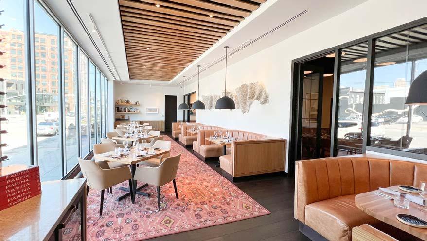

1901 Baltimore Avenue Kansas City, Missouri FarinaKC.com / 816-768-6600
A massive wall of windows provides views of the nearby bustling corner of the Crossroads Arts District. Wood planks decorate wide swaths of ceiling space, contrasting with the white ceiling, walls and banquettes. Lush, warm-tone area rugs also complement the wood floors. Elevated leather seating surrounds a dining bar and a cocktail bar. Farinaʼs Nancy Smith—general manager, partner and wine director—has created a carefully curated wine collection that perfectly complements Farinaʼs modern Italian cuisine—including house-made pasta—from chef, partner and
Chef Andrew Longresʼ pays Photo by Nate Sheets Design by Herron + Partners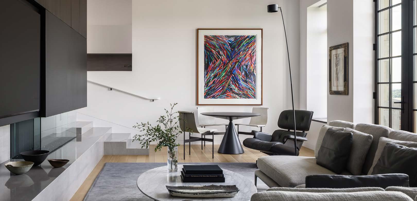

1111 Grand Boulevard Kansas City, Missouri
LonniesRenoClub.com / 816-326-7897
Located in the Ambassador Hotel Kansas City, a Coury Hospitality property in the financial district, this upscale jazz club and restaurant honors the original Reno Club, a Kansas City icon where Count Basie himself played. These days, living legend Lonnie McFadden lights up the stage on weekends. The clubʼs visual panache comes from CEO Paul Couryʼs wife, Kara, and daughter, of Gracie Turner Design. Dark walls, ceiling and linens create a cozy counterpoint to the red tones of the cushioned lounge chairs, curtains and carpet. Vintage black-and-white profiles also decorate the moody, inviting space. A prix fixe menu with three courses includes either a Caesar salad or an appetizer, an entree—from Basil Tortellini to Beef Wellington—and a decadent dessert. The American Reserve Bar and Grill in the Ambassadorʼs hotel lobby also makes a swanky stop on date night.

4622 Pennsylvania Avenue Kansas City, Missouri
PrimeSocialRooftop.com / 816-400-4210
Design by Knauer Inc. Photo courtesy of Prime Social

In its Country Club Plaza building, this rooftop cocktail lounge from Ohio-based Cameron Mitchell restaurants is full of massive windows and wood. Leather and upholstered chairs create cozy seating areas, while more than a dozen raised stools flank the polished bar top. Open shelves full of spirits glow in the surrounding light. Guests can also relax beside the firepit, amid panoramic views. Executive Chef Julio Juarezʼs bold flavors, textures and presentations perfectly complement handcrafted cocktails. Enjoy savory snacks, unique pizzas and shareable plates such as a nigiri and sake pairing featuring A5 Wagyu, colorful Ahi tuna and buttery salmon.
Turn the page


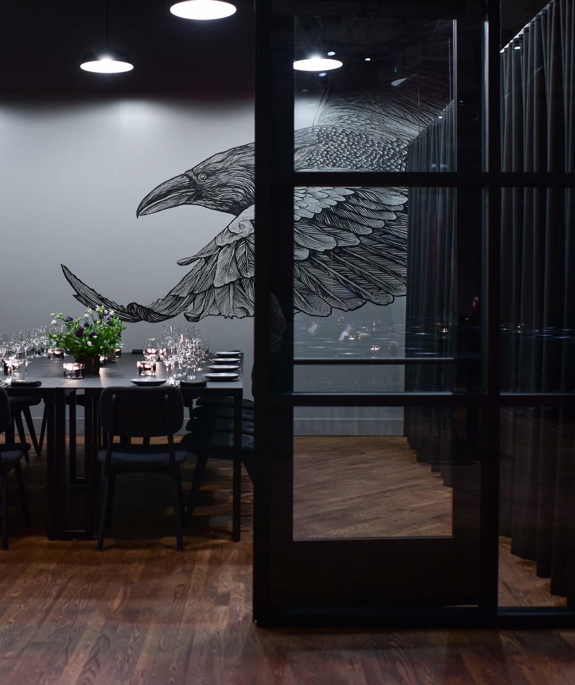
1830 Walnut Street Kansas City, Missouri Corvino.com / 816-832-4564
by Bonjwing Lee Design/Build by HufftSubdued tones and natural elements prepare the palate for an elevated dining experience from award-winning chef Michael Corvino and his sommelier wife, Christina, at their dual-concept restaurant in the Crossroads Arts District. A stage for live music honors Kansas Cityʼs musical heritage and incorporates a custom wood feature wall. The 110-seat supper club offers frequently changing, approachable, contemporary American cuisine. Shared plates such as the Red Snapper Tostada or Rigatoni Bolognese incorporate seasonal ingredients from local farms and niche food purveyors. The elegant 18-seat tasting room offers a three-hour prix fixe menu showcasing the chefʼs focus on ingredient- and technique-driven dishes.
Turn the page

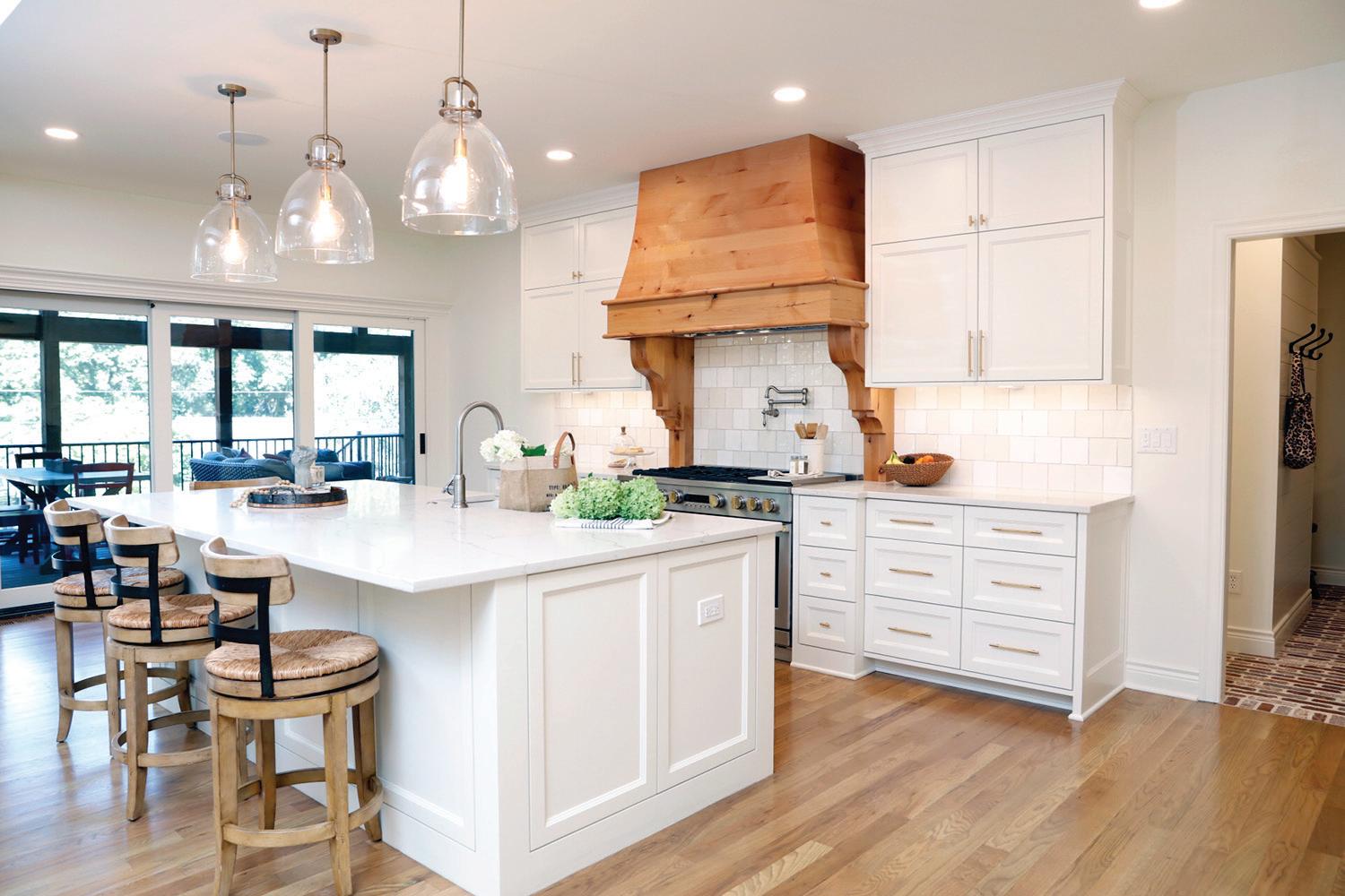
900 Westport Road, Kansas City, Missouri ChewologyKC.com / 816-325-3449
by Pilsen Photo Co-op Buildout by Straub Construction CompanyChewologyʼs owners designed this restaurant space based on key 1980s Taiwanese architectural elements, including floral tile walls created by MC Flooring. A window grill above the cabinetry features their signature stray kat logo design by KC Fab Solutions. Natural wood decorates the bar face, tables and chairs. Thereʼs bright neon signage, plenty of floral fabric and a green banquette and wall. Honoring her fond childhood memories, Chef Katie Liu-Sung and her staff craft gyoza (dumplings) with fillings from pork and cabbage to beef and kimchi. Bao (steamed buns) and noodle dishes are also on the menu.

This one-time off ice of corrupt political boss Tom Pendergast is now the Pendergast Lounge at Tomʼs Town Distilling Co. in the Crossroads Arts District. Reimagined by co-owners David Epstein and Steve Revare, it features original brick walls and a cozy fireplace. Guests—who enter on a first-come, first-served basis—appreciate the antique-inspired, laid-back ambiance. Itʼs full of leather couches, small chairs and glowing tabletop lamps. Thereʼs a dark tin ceiling and Art Deco touches, including a portrait of Pendergast, a 1920s-inspired mural by Gary Wilks and periodappropriate wallpaper. Classic cocktails featuring Tomʼs Town vodka, gin and bourbon can be paired with small plates such as classic deviled eggs or the Bourbon Onion Dip from chef Tim Tuohy.
Turn to page 82

1701 Main Street Kansas City, Missouri Toms-Town.com / 816-541-2400
Photo by Tony Pulford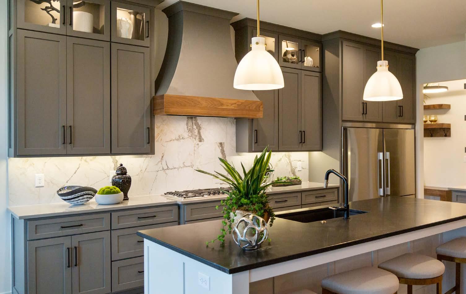






4141 Pennsylvania Avenue Kansas City, Missouri JulepKC.com / 816-216-7000
by Ashley Elwell Design by DRAW Architecture + Urban Design
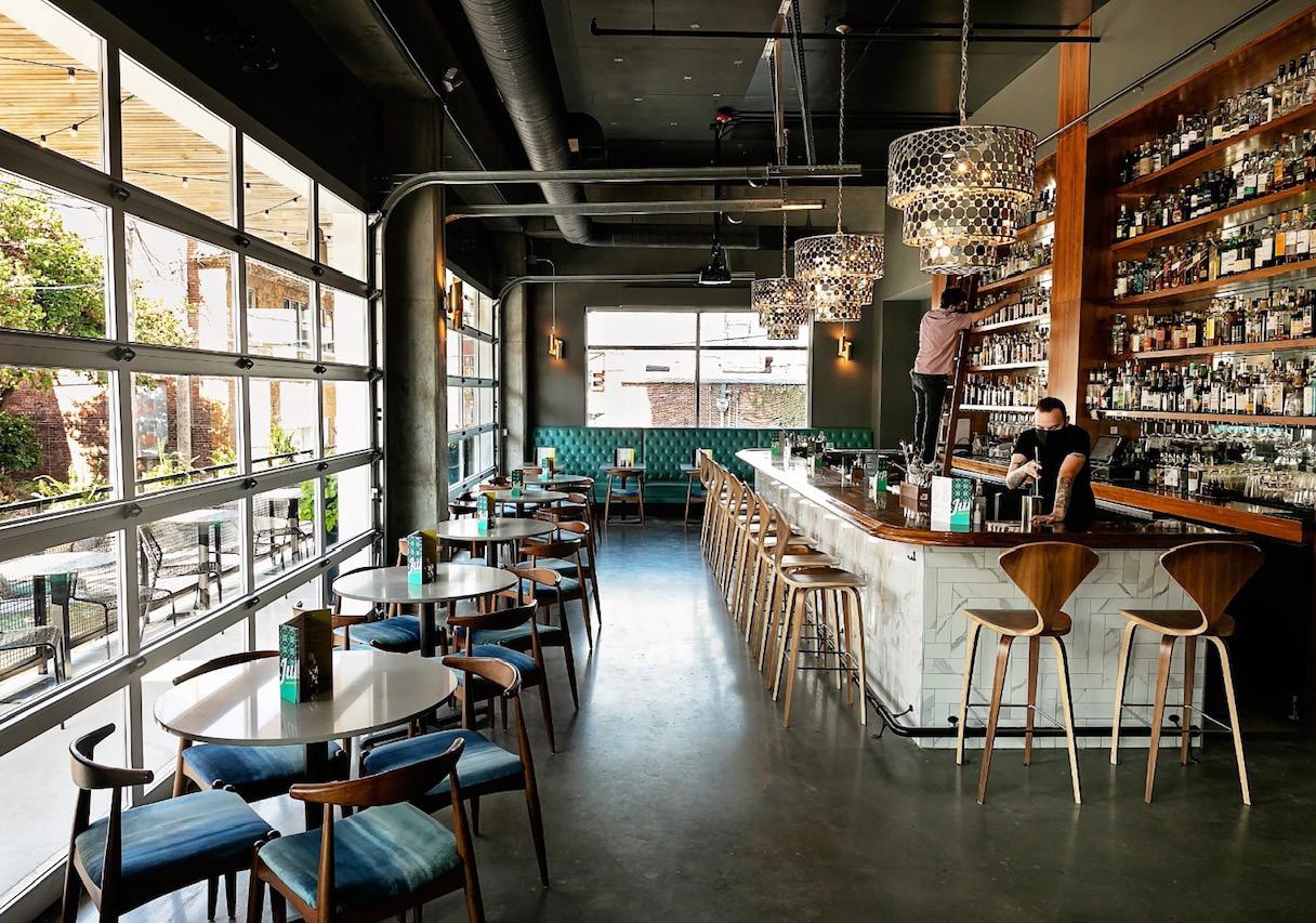
The ambiance at Julep Cocktail Club offers a casual take on Art Deco–meets–mid-century modern style. Teal tones inform much of the color palette, and chandeliers have a casual Deco vibe. Round floating glass pendants decorate the space, where polished cement floors meet exposed pipes along a dark ceiling, and broad garage doors bring the outdoors in during nice weather. Behind the bar, accessing a tall wall of liquor requires a sliding ladder. Chef Les Sterling and his staff create seasonal menus offering Southern-inspired cuisine with modern flair.








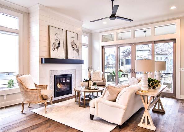


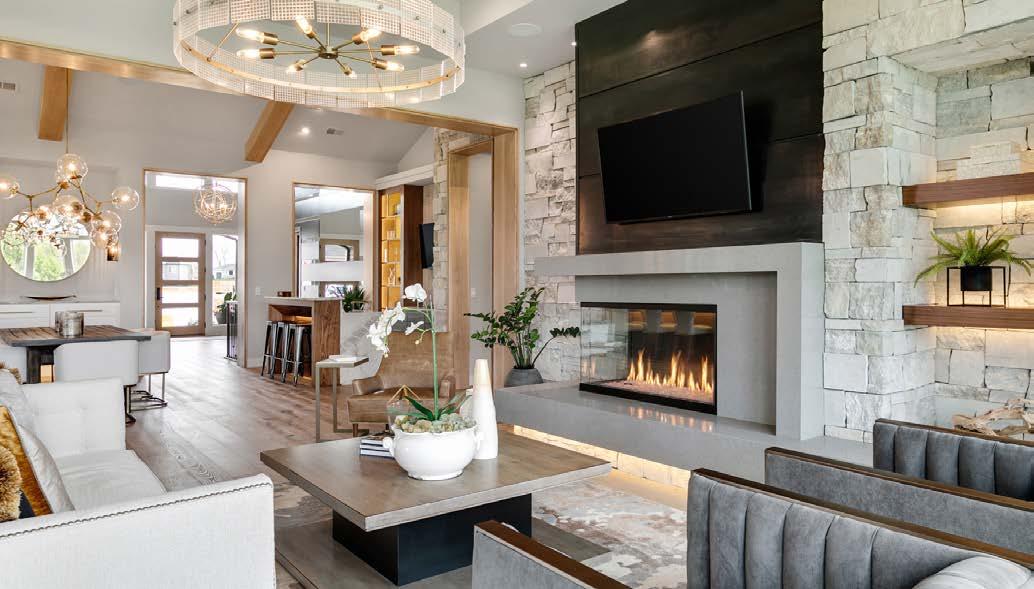


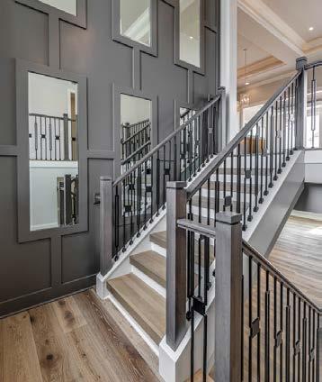

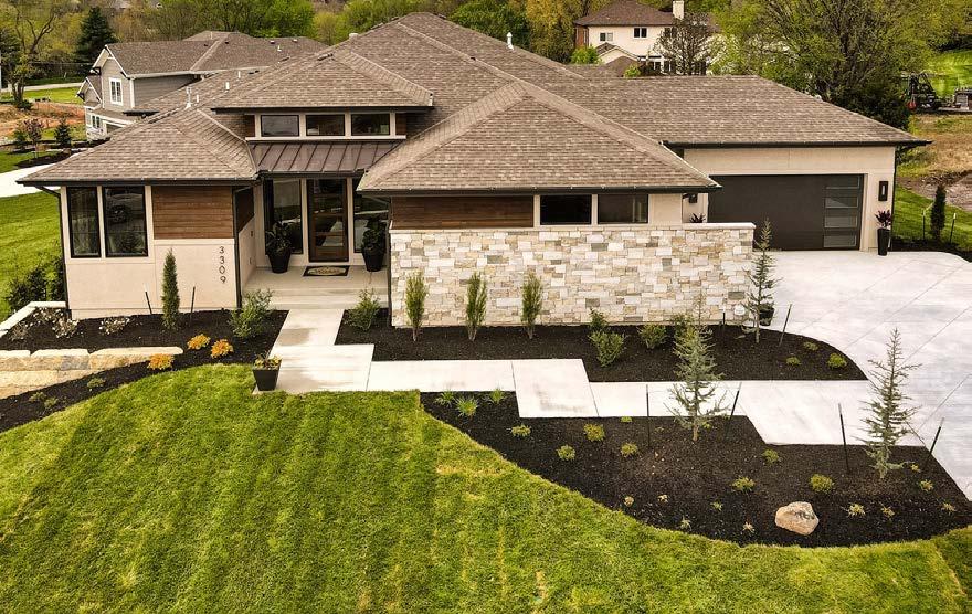
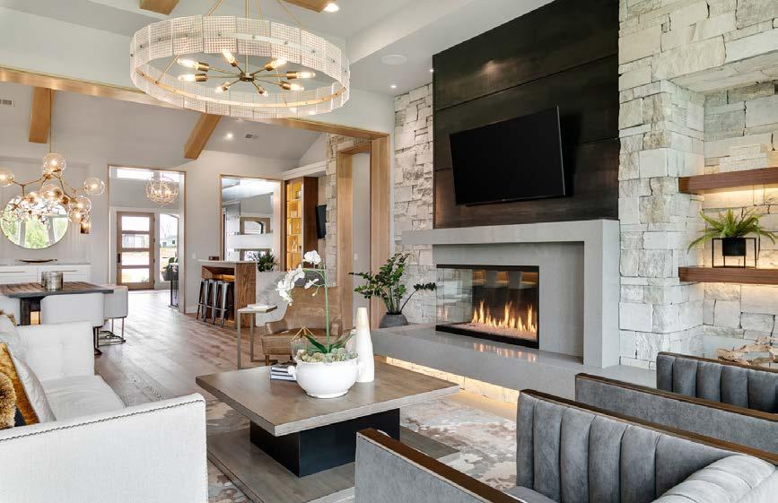
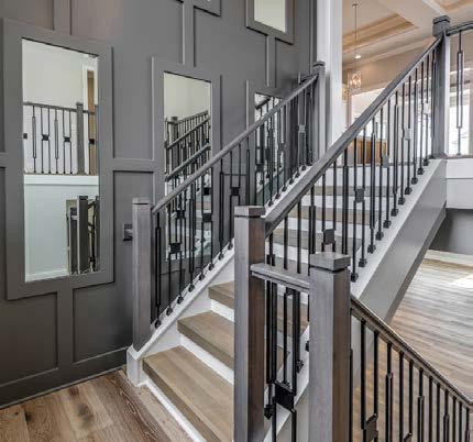

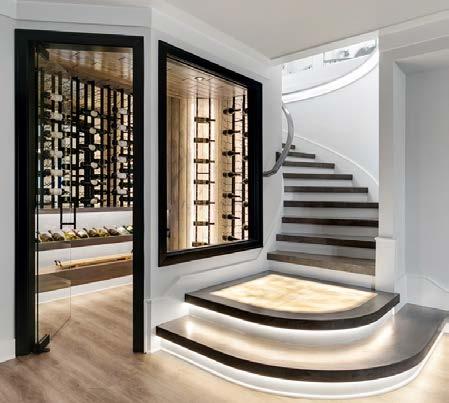
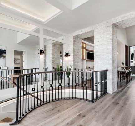


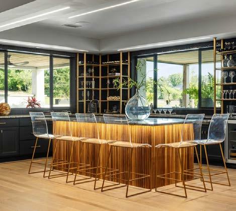
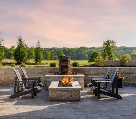

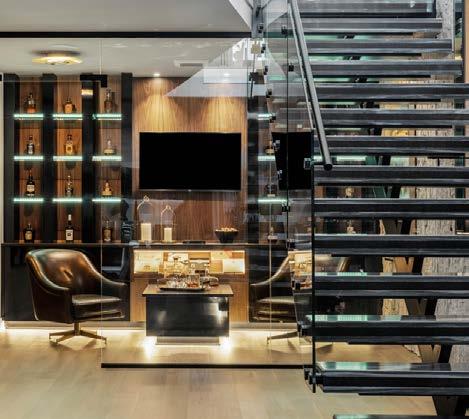


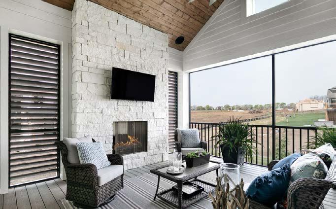


Maintenance-provided communities take over the honey-do list so residents can do what they please.
Words by Megan FellingThereʼs no such thing as an absolutely hassle-free home, of course—someone still has to wash the dishes! But there is a place where certain chores never land on your own to-do list. Instead, they get outsourced to a community team.
Maintenance-provided homes—also called villas—are growing in popularity across all generations. Villa living was once seen as something just for retirees or empty nesters. But a growing number of young professionals and young families are looking at maintenance-provided homes as a way to free up more time to focus on their careers or family or both.
Villa residents donʼt have to spend time taking care of exterior chores such as mowing the lawn, landscaping and snow removal. The lock-and-leave aspect also is attractive to those who travel often, regardless of age or life stage.
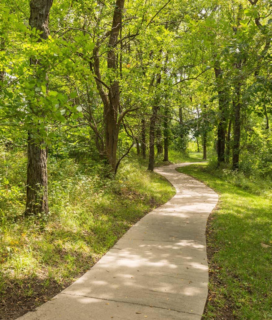
Monthly homeowner association fees usually include lawn care and irrigation, as well as snow removal. Residents often will enjoy amenities such as a community pool, park or walking trails.
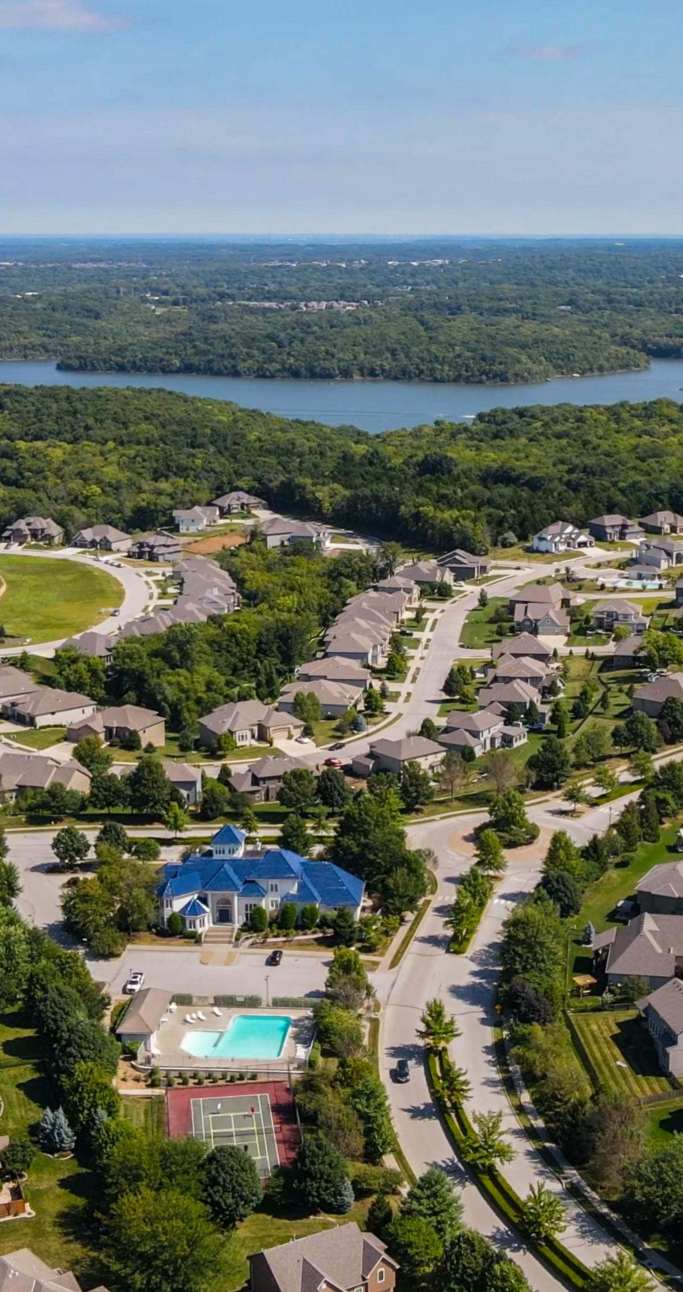
Villas range in size and style, but often they are smaller than a single-family home, include two to three bedrooms, and could present as freestanding, duplex or multiplex buildings. The most common difference is that villas frequently are one level, sometimes with a finished basement. Open floor plans are popular, with a great room instead of a formal dining and living room. Materials and finishes are typically selected for low maintenance.
“People want to spend time going out to dinner, enjoying time with their families or traveling—not worrying about yard work,” says Jim Lambie of Lambie Homes, who has built homes in several maintenance-provided communities.
“Maintenance-provided communities give them that option of worry-free living.”
Bill and Debbie K. are empty-nesters who just moved back to Kansas City from Phoenix. They were the first residents to move into Cadence Villas in the Northland.
“We knew we wanted this lifestyle,” Bill says. “We decided we had cut and watered enough grass and shoveled enough snow to last a lifetime, especially after living in Phoenix.”
The couple also enjoys the floor plan, with a large living area and two levels.
“When you find the right floor plan, it lives bigger than you think,” Bill says. “Although we downsized, we havenʼt had to get rid of anything yet. We have just moved in, but we are definitely looking forward to not shoveling this winter.”
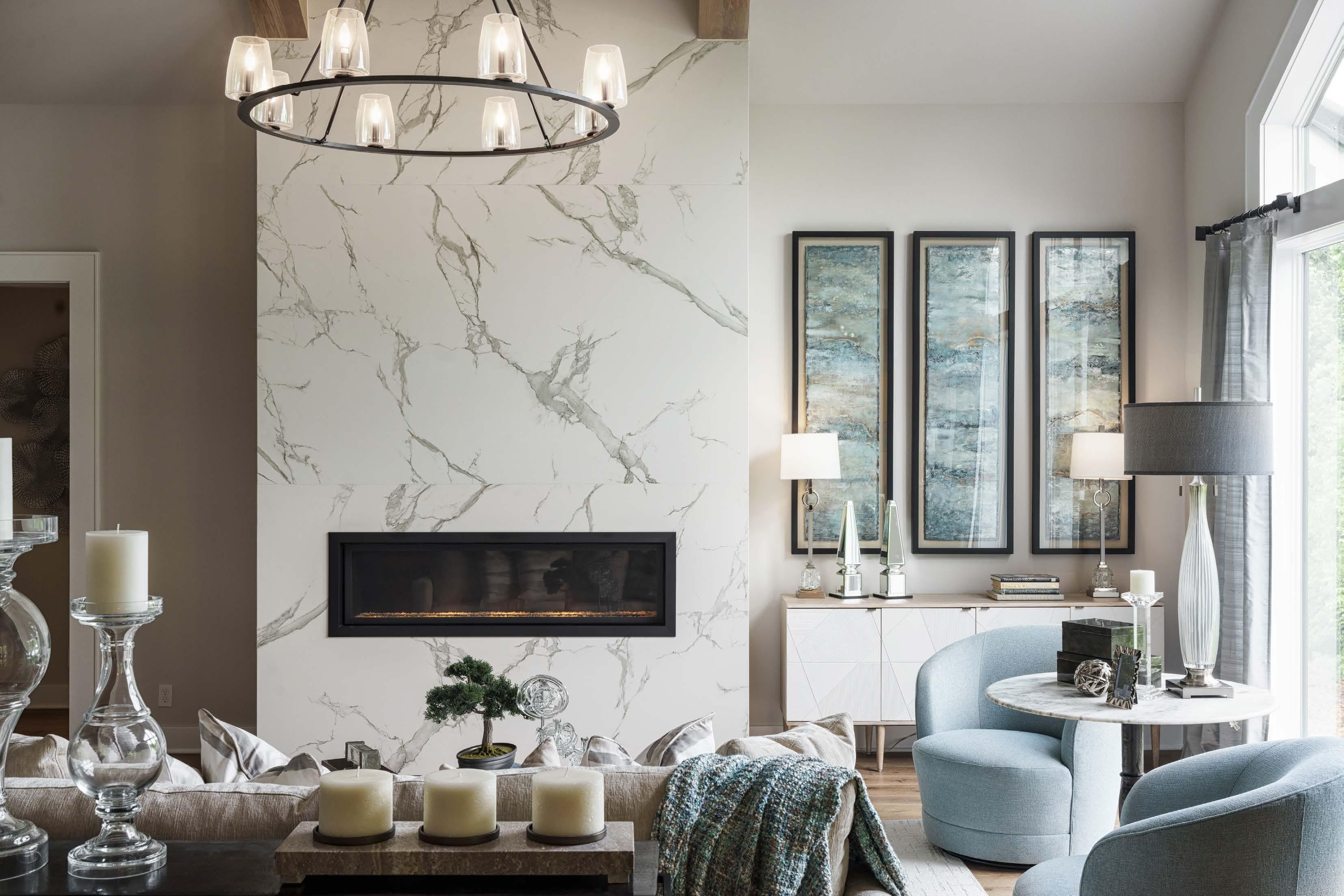

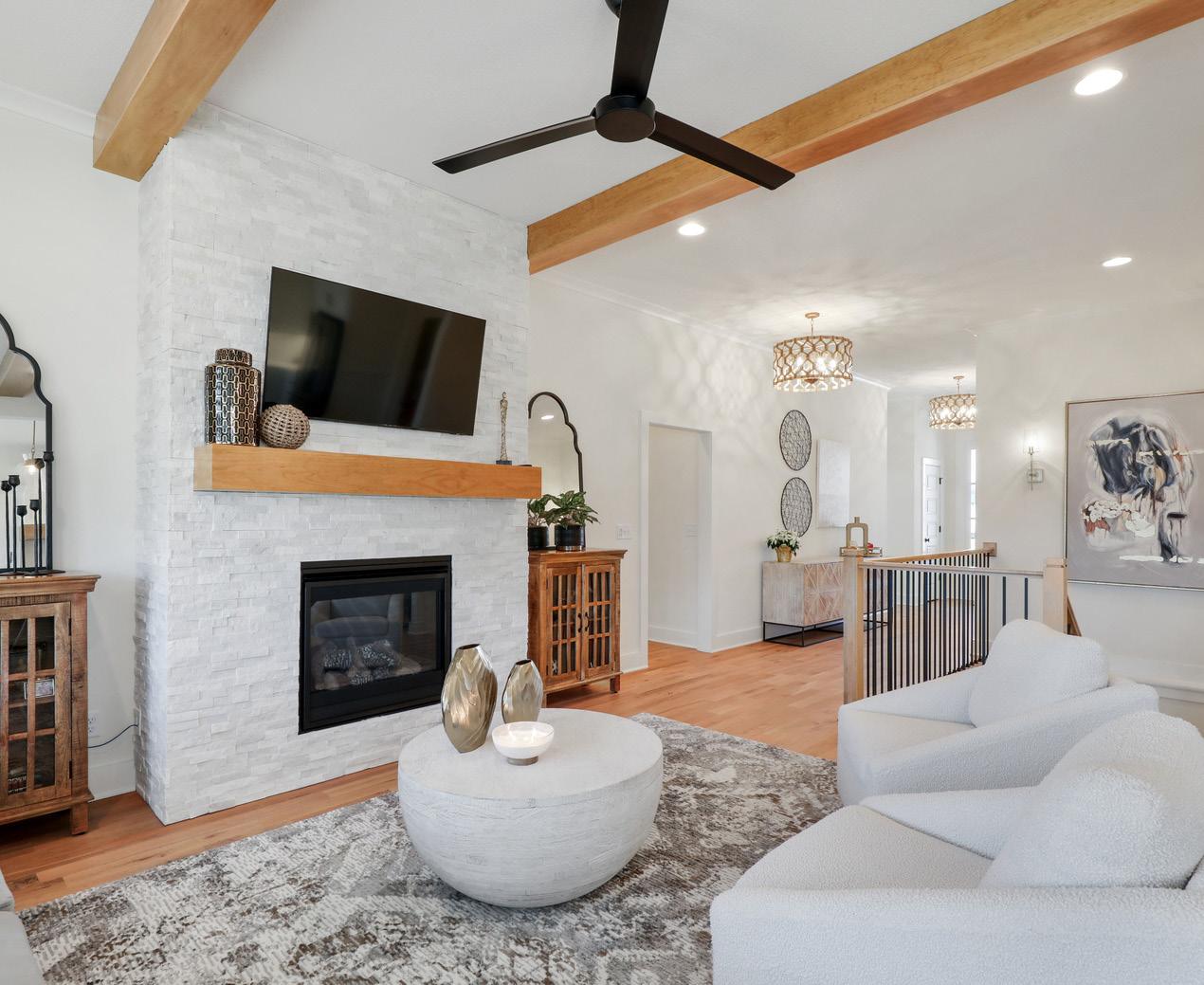
Sound like the ideal lifestyle for you? Here is a sampling of maintenanceprovided communities to consider:

huntmidwestkc.com
N Platte Purchase Drive and NW 100 Street in Kansas City, Missouri
Cadence Villas is located in the rolling hills of Kansas Cityʼs Northland and is just a quick commute to KCI Airport, downtown Kansas City and a wide variety of local shopping and entertainment hotspots. Whether you are looking to rightsize or simply to relax without having to worry about lawn care, Cadence Villas has a wide range of options from the areaʼs top builders, with inventory available now.
chapelhill.villas
175th Street and Pflumm Road in Overland Park, Kansas
Built on land that was once a family farm, 44 twin villas perfect for a lockand-leave lifestyle were designed with an emphasis on open, light-filled living areas—perfect for entertaining—and easy, main-floor living. The villas are conveniently located near Heritage Park and include access to the Chapel Hill communityʼs walking trails, clubhouse, pools and pickleball court.
kennethestates.com
71st Street and Pflumm Road in Shawnee, Kansas
Located inside the I-435 loop, this close-in development is built on what was the property of Kenneth Smith, who crafted tailor-made golf clubs for world-famous clients. It includes three neighborhoods connected with winding paths for nature viewing. The cottages are maintenance-provided single-family homes with walkout, daylight and level lots backing to trees, water views and greenspace.
creekmoor.com/club-villas
Route 58 and Foxridge Drive in Raymore, Missouri
The master-planned Creekmoor community is designed around Creekmoor Lake and an 18-hole championship golf course, and it includes a variety of neighborhoods designed to enjoy resort-style living with Creekmoorʼs extensive amenities. Nestled around the golf course, the club villas are detached villas built by SAB Homes and feature main-level living.
enclaveatmillcreek.com
Midland Drive near I-435 in Shawnee, Kansas These luxury attached homes built by Dusty Rhodes Homes are situated in duplex and fourplex buildings nestled around a cul-de-sac. Three-bedroom, three-bath floor plans start at approximately 2,600 square feet, and a covered porch extends the living space. Construction is underway, with two finished models available for touring.
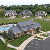
parkridgecommunities.com
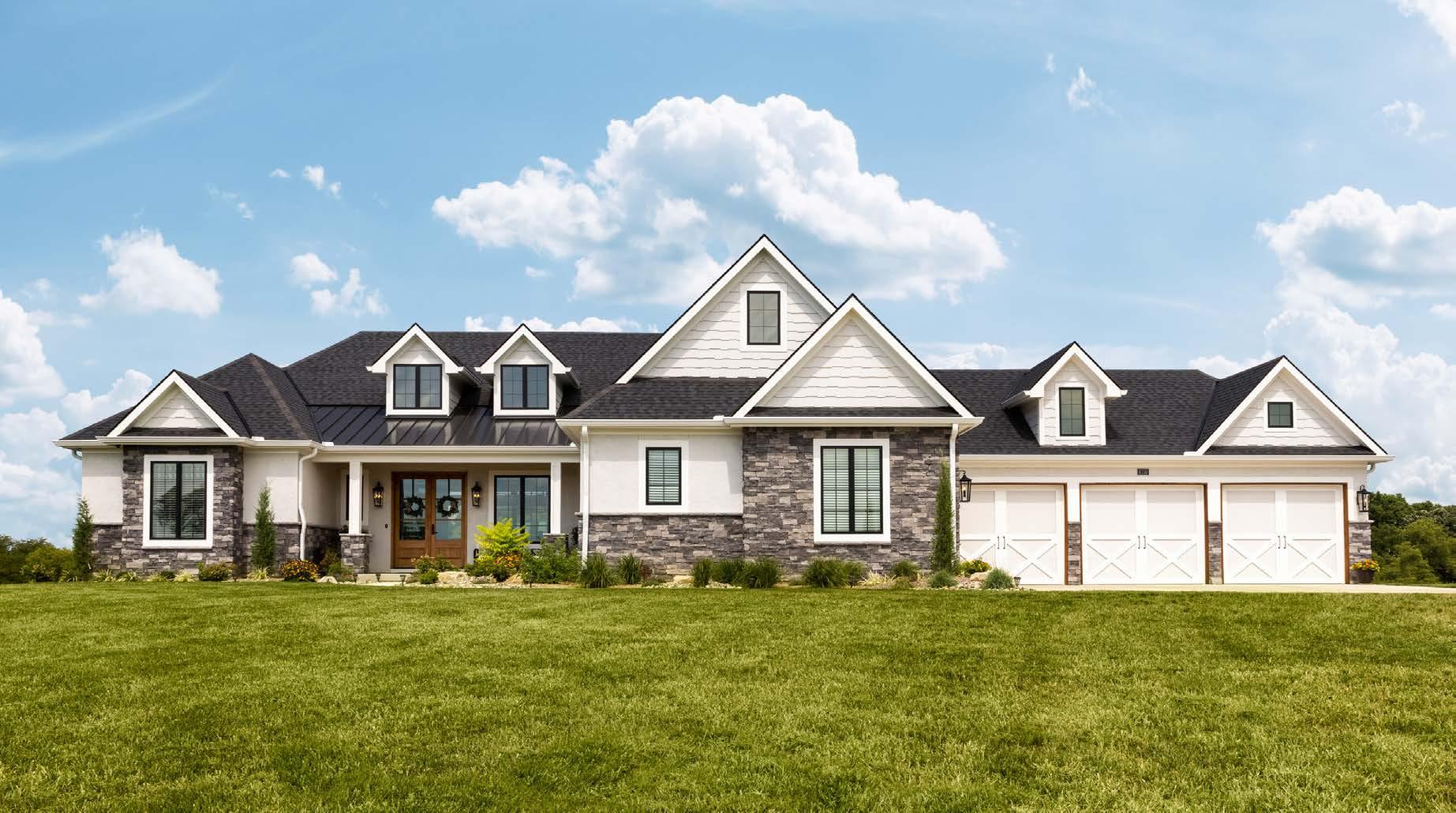
Woods Chapel Road and Park Ridge Drive in Leeʼs Summit, Missouri
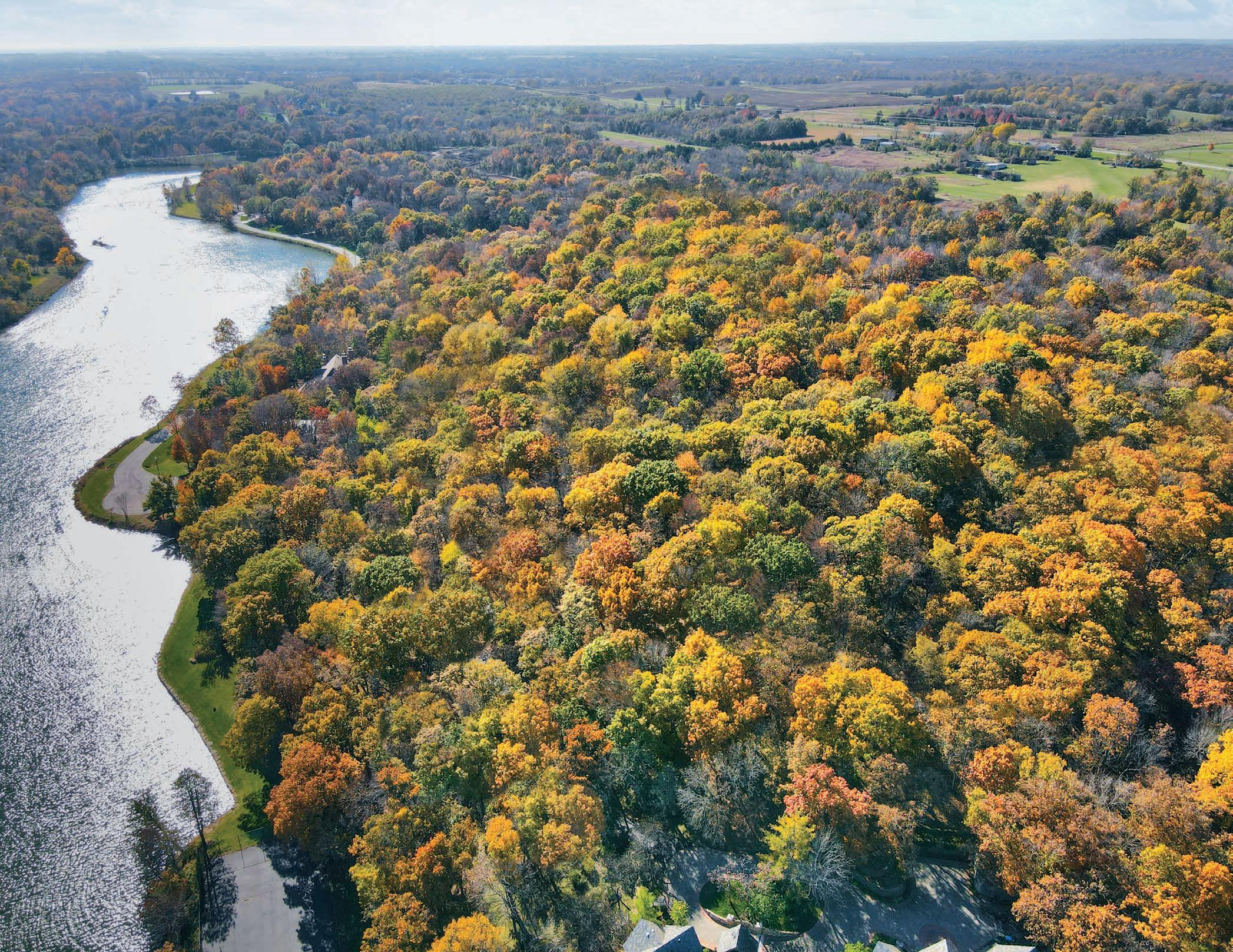
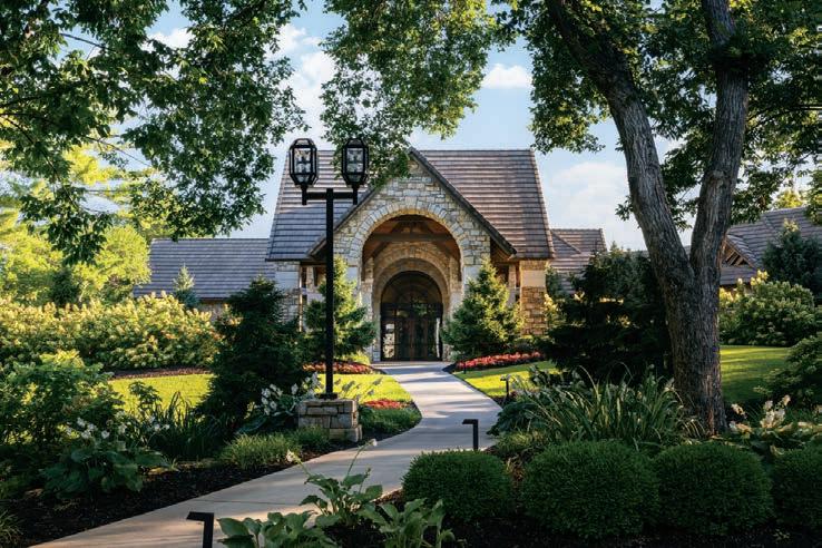
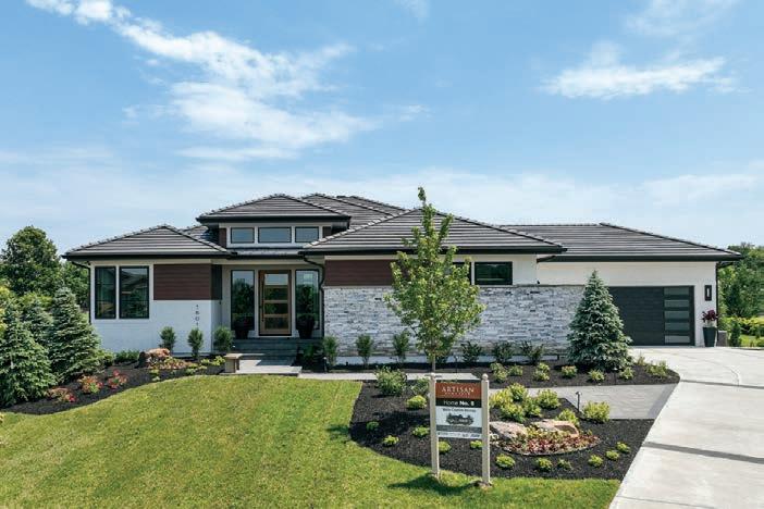
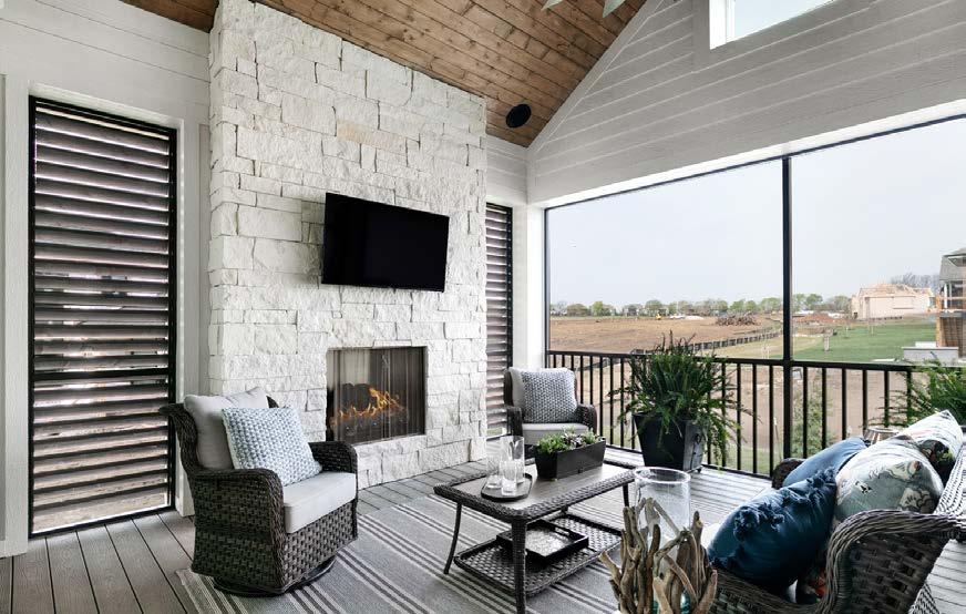
Consisting of single-family homes and maintenance-provided neighborhoods, Park Ridge offers many community amenities—including a notable clubhouse. Plus, itʼs tucked between Lake Jacomo and Blue Springs Lake. The HOA fees for the recently opened Park Ridge Manor include snow removal and all lawn care, including water costs for the sprinkler systems. Freestanding villas offer approximately 2,800 square feet, with a focus on main-level living.
Turn the page
KNOWS WHEN TO SAY “NO,” BUT STILL HASN’T SAID IT. HAS A SERVANT’S HEART AND A UNRELENTING WILL TO USE IT. MAY NOT KNOW THE ANSWER BUT DEFINITELY KNOWS SOMEONE WHO DOES.
We don’t sell things, we serve people. Our job is to take the ‘un’ out of the word ‘unknown’ so you can be as informed, prepared, and comfortable as possible with the home buying or home selling process. If you need it, we can find it. Especially if what you need is shaped like a house.

regentsparkleawood.com/twin-villas
135th Street and Kenneth Road in Leawood, Kansas
Developed by Rick Lashbrook and built by Lambie Homes, Leawoodʼs newest maintenance-provided community of luxury twin villas is conveniently located in the prime 135th Street corridor. They will feature two bedrooms and two baths on the main floor, with optional lower-level finish for additional living space. Lot reservations are now being accepted.
solerareserve.com
139th Street and Quivira Road in Overland Park, Kansas
Set amid curving streets on beautiful rolling green space, Solera Reserve has recently opened its third phase—offering a variety of lots, including wooded and walkout options. These luxury freestanding villas offer two bedrooms on the main level, heated and cooled all-season sunrooms, and covered porches.
rodrock.com
169th Place and Mur-Len Road in Olathe, Kansas
Coming soon! Two new areas are in the works within the Stonebridge community: New freestanding villas and attached triplex options featuring additional exterior building maintenance for truly carefree living. Endless amenities are available, plus Heritage Park is close by for outdoor enthusiasts.
Twin Villas at Meadowbrook meadowbrookpark.com/twin-villas
Nall Avenue and Meadowbrook Parkway in Prairie Village, Kansas
Built on a beautiful landscape that was previously a country club and golf course, Meadowbrook Park contains single-family homes, twin villas, luxury apartments, an inn, a restaurant and upscale senior living all within its boundaries. Located in the Parkside and gated Reserve neighborhoods of Meadowbrook, the twin villas built by Tom French Construction are stately homes that feature rear-loaded garages so homes face the areaʼs abundant parklettes, green space and lakes. Although the twin villas are nearly sold out, there are plenty of other options to consider as the entire Meadowbrook community is maintenance-provided.

rodrock.com
159th Terrace and Mission Road in Overland Park, Kansas
With lawn mowing and snow removal taken care of, these freestanding villas offer residents a carefree lifestyle ideally located near multiple dining, shopping and entertainment options. The villas are part of the overall Mission Ranch community, which features resort-style amenities including a zeroentry pool, cardio center, various sport courts and nature trails.

Inspired by the works of Dutch Masters at the Nelson-Atkins Museum of Art, Eden Floral + Events uses negative space and contrast to highlight their own compositions; here, they use zinnia, coral charm peony, ranunculus, garden rose, hydrangea, snapdragon, hanging amaranthus and lush eucalyptus greenery as their palette. “The beauty of arranging flowers in the Dutch Masters style emphasizes the wild, organic aesthetic of the flower and the informal way it presents itself in nature,” says Eden’s owner, Jenifer Hall.

Whether the modality is oral or metal, two unique artists bring beauty—and playful delight—to the home.
Words by Andrea Glinn
Jenifer Hall is rooted in flowers. Her maternal grandfather opened a flower shop in Oklahoma after returning from World War II, a business he ran for several decades. Her father then bought the business, so Jenifer grew up in this flower shop playing, pranking and working. Her family and the flowers—their vivid colors, variety of textures and rich fragrances—were her teachers. Now a third-generation florist, she has discovered a fundamental truth: Each flower has a voice and, with thoughtful arrangement, they will sing.
When Jenifer bought a boutique flower shop seven years ago, it was structured as a traditional Teleflora business whose accounts with hospitals and corporations made it profitable but restricted creativity. It was founded on the premise of flowers as commodity—not floral art. She didnʼt initially change the operational structure of the business, but ultimately decided to take a leap of faith and trust the process that she believed in. She canceled all existing accounts, quit Teleflora, renamed the shop Eden Floral and Events, and began focusing on weddings, events and tributes where she could use her creative skills and make meaningful arrangements to match the moments and people they commemorate.
“Each piece that goes out of here is a bespoke piece of art,” Jenifer says. Her in-house team of flower stylists are all creatives—many with art
backgrounds—who take much pleasure and pride in their work. “Itʼs a colorgasm,” she giggles when describing the atmosphere in her studio. Jenifer loves to collaborate with her employees and may have a competitive streak as well. Last winter the Eden Floral team won the Art of the Arrangement competition at Leawood Fine Art, where some of the top florists in Kansas City were invited to interpret the work of contemporary painter Heather L. Lowe as floral arrangements. As Jenifer recalls the planning and design of that project, she recounts each team memberʼs contribution, giving credit and acknowledging their involvement, while skimming over her own role. She seems as intent on praising her employees as she does the flowers, and it is easy to see why she is successful in her business.
In addition to honoring the flowers and her colleagues, she also honors the farmers by supporting local growers and by valuing the philosophies behind the Slow Flowers movement. The harmony of her values results in ethereal arrangements that are not only beautiful, but good for business as well. Turn to page 98
You’ll never see daisies and carnations here. Using striking blooms and colors brings their designs to life, while dark, sultry backgrounds and the placement of light creates the highly soughta er trend of distinction patterned a er the paintings hung in the finest art museums around the world. Featured blooms on this page: sweet pea, astrantia, hellebore, hypericum, acacia, rose, queen anne’s lace and ranunculus with lemon leaf and dusty miller foliage.










Jason Wilson is a metal artist who has eight years under his belt as a business owner but who made Kansas City his home just two years ago. His business, Dane Fabrication, has been gaining momentum and hasnʼt had any trouble standing out from the crowd with his whimsical and unique works. Take, for example, his seven-foot-tall gilded giraffe floor lamp. When Jason first stumbled across a company that sold cast iron molds of animals, he imagined fashioning the reproductions into a sort of svelte faux taxidermy that could go into posh homes and bring an air of playfulness to a space. Inspired by Moooiʼs Horse Lamp, Jason has created various versions of the giraffe floor lamp—some with the lamp dangling from the animalʼs mouth, others with the lampshade comically over the giraffeʼs head—as well as a range of other animal lamps, statues and table bases (snake, crow and deer, to name a few). But animal art is not his only gimmick.
Turn the page

Jason’s popular firepit is 40” diameter and set at a height for outdoor entertaining. The accompanying patio furniture is the Camden collection, using floating architectural design with a “puzzled” look.
One of Jasonʼs first connections in Kansas City was to developer Troy Moore of Madi Mali Homes, who asked Jason to build a bespoke firepit for one of their homes in Westside (featured in the Summer 2022 issue). Jason happened to already have one in his showroom, which he brought to the site to help determine the appropriate scale, and it was a perfect fit. Troy was able to buy the showpiece on the spot rather than waiting for Jason to build a custom one, so it was a win-win. But Jasonʼs works are typically custom commissions and he keeps minimal inventory. He prefers to work with developers and end-use customers directly, rather than having an interior designer as an intermediary, so he can maintain creative control and be free to explore and experiment instead of just fabricating someone elseʼs idea. Itʼs clear heʼs not opposed to taking risks, whether itʼs with funky furniture, sculptural firepits or whimsical lamps. That said, there is a big demand for more straightforward fabrication, such as for wine racks, handrails and steel doors and windows, and Jason takes on those commissions as well. While he prefers artistic expression, he enjoys having a variety of project types to keep things from becoming mundane. He doesnʼt want to narrow his focus just yet and intends to expand his design repertoire with decorative light fixtures next. Stay tuned.







Electricity may deliver light to our homes, but it’s the xtures from modern manufacturers that transform basic function into pure form.
 Words by Andrea Darr
Exciting things have happened in electricity since Edisonʼs bulb (although thatʼs still a delicate piece of beauty in itself). But the functional aspect of lighting a room has been elevated into a broad spectrum of aesthetics. Walk into any style of home and youʼll notice that light fixtures are an art form. Chandeliers, pendants and even recessed channels offer homeowners the opportunity to visibly express themselves, no matter their style. A few trends are lighting the way.


“New innovations in integrated LED as the light source for modern lighting designs are occurring every day, and this creative, energy-eff icient light source is a trend that is only going to continue,” says Wendy Rensenhouse of Rensen House of Lights.
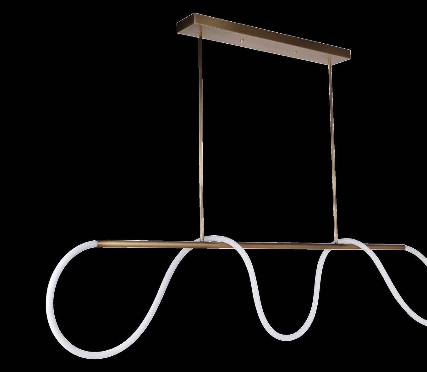
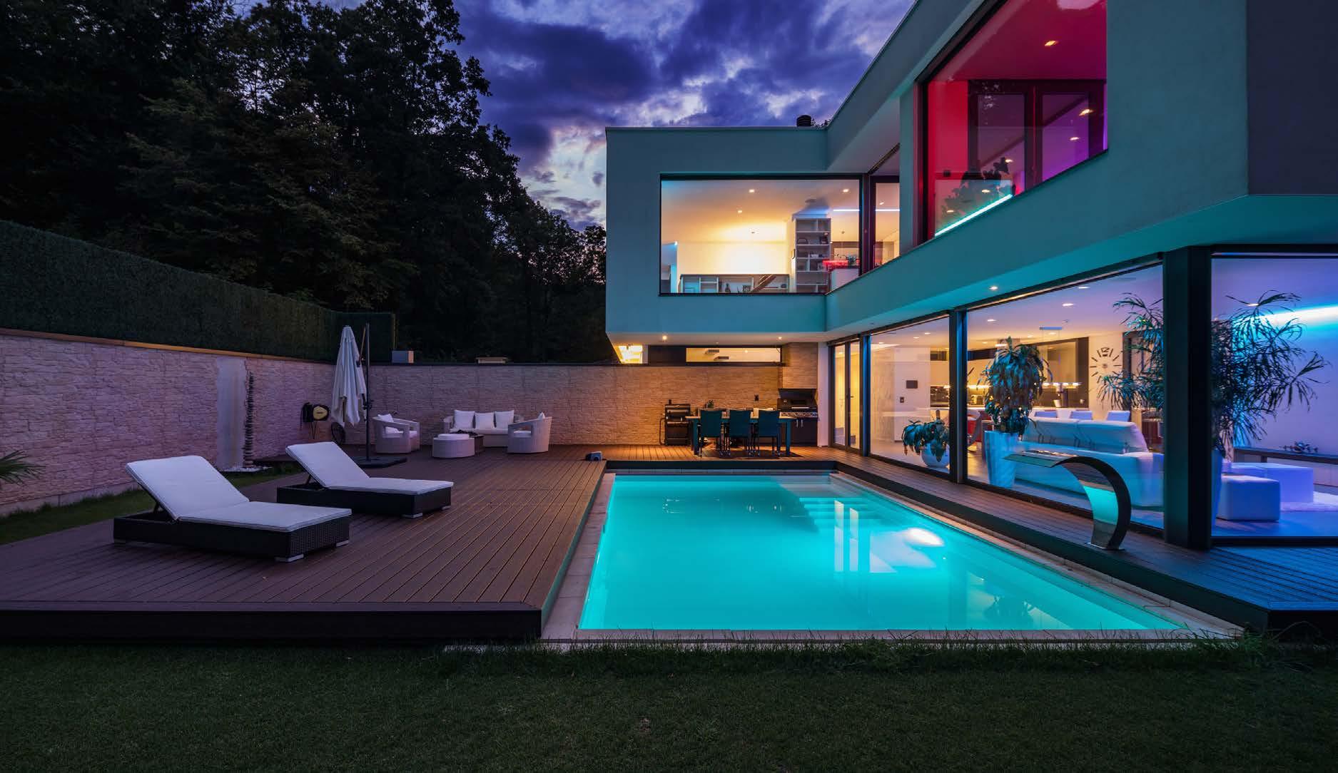
Builders can add in tape lighting at the sheetrock phase to seamlessly recess long, narrow strips into the ceiling. LED strips are also often used for backlighting mirrors in bathrooms or cabinets in closets.
Ferguson showroom consultant Jenny McDougall adds that LED use goes hand in hand with technology. “Manufacturers are aware of the wellness aspect associated with the cycle of light throughout the day and have created automatic color-changing lighting that start soft in the morning, get brighter during the day then get warm again at sunset,” she explains.
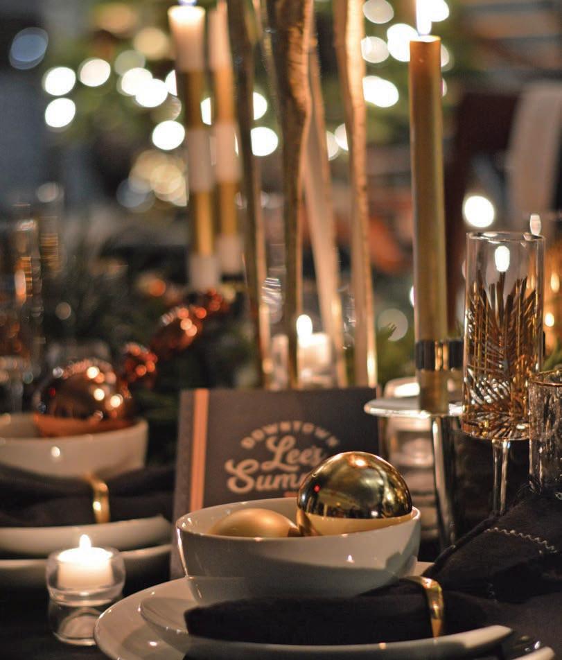
“Weʼre not seeing oil-rubbed bronze in fixtures much anymore,” Jenny says. “Brushed brass has taken its place. Some manufacturers are even offering champagne bronze. I think it will be around for a long time.”
Brass plays well with others—metals, that is. “If itʼs all the same thing, it loses interest,” says Dee Devine Frye of Wilson Lighting.
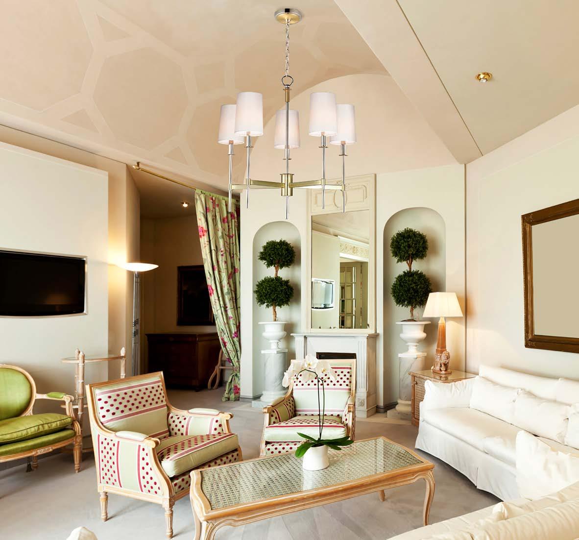


So manufacturers are mixing black with brass or combining polished and brushed finishes. “It opens a lot of options so you donʼt have to pick just one,” Jenny adds.
Black with brass is by far the best-selling combination, but even out-of-trend nickel can still have a (half) day in the sun, such as with the Uptown collection by Maxim, featuring satin brass and polished nickel.
Turn the page

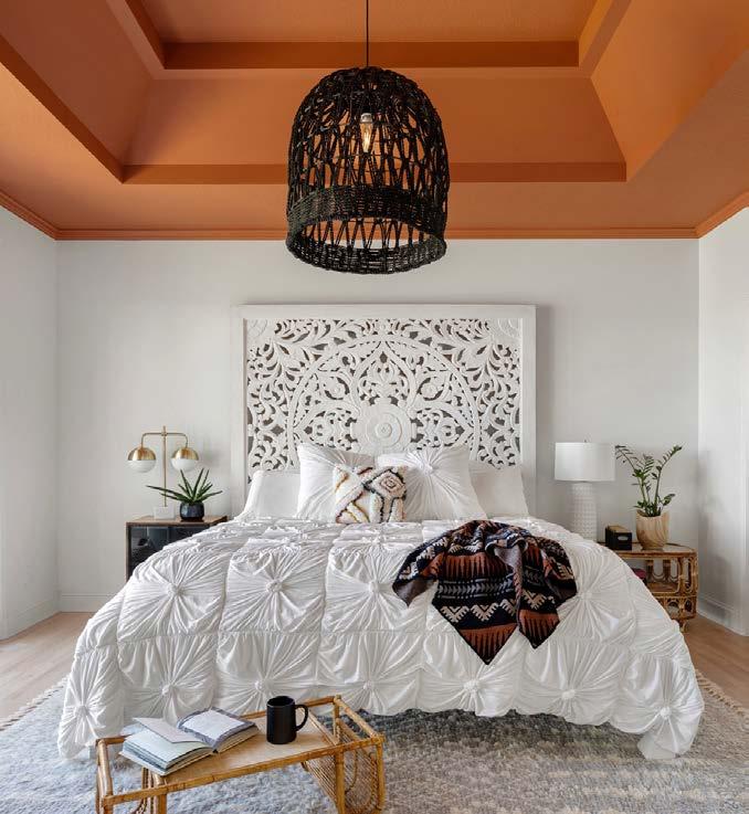
Also called Organic Modern, this style is all about texture—and blends. Rattan or other natural fibers are often paired alongside beads, glass, selenite, alabaster, quartz crystals or brass. It creates a relaxed look that makes you want to kick off your shoes. “Itʼs not so formal, like a room you donʼt want to sit in,” Dee says.

Turn the page


This is still the modest Midwest, after all, and plenty of people prefer to install something familiar. But, even classics can look outdated, so manufacturers have elevated timetested forms with new materials and cleaner lines. “Itʼs more airy and interesting,” Dee says. You may also see this old look filed under a new name or two: Grandmillennial or Grand Nostalgia.
Turn the page



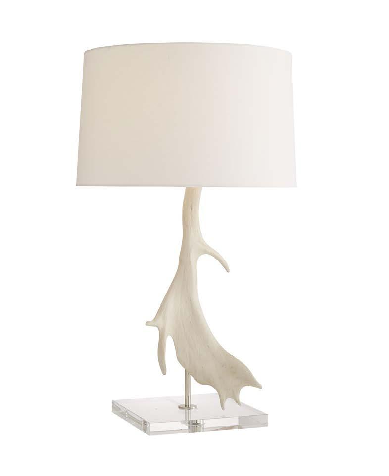
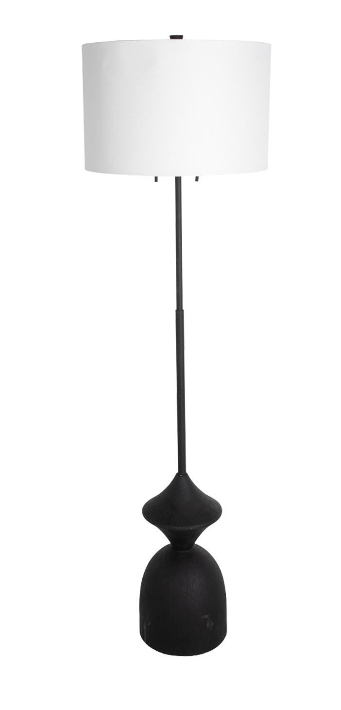
Pieces in this category skew retro or poetic. Clearly, clean lines are the priority. And again, familiar yet modernized.
When it comes to floor lamps, interesting forms and shapes—not just a stick—meet consumersʼ desires. And “retro drum shades are consistently strong,” Dee notes.

Turn the page
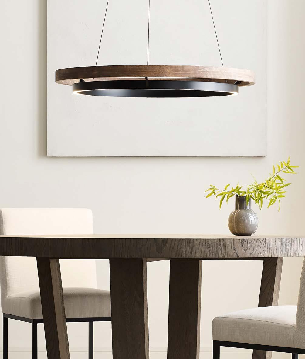
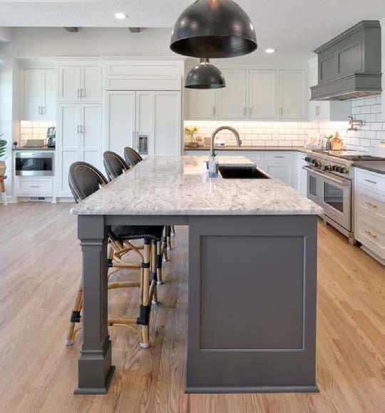


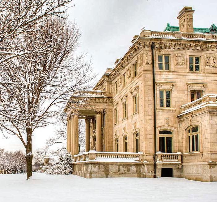

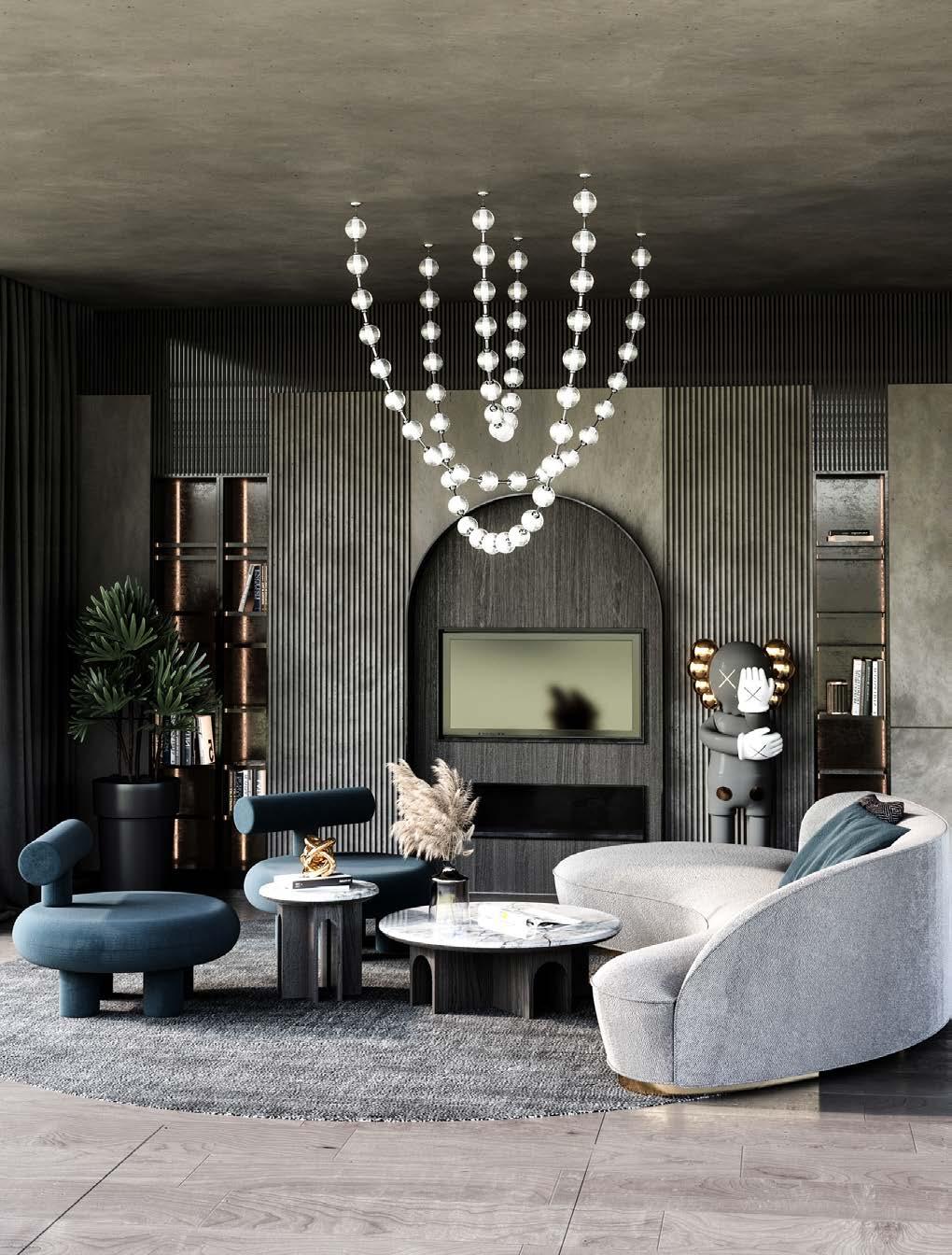
Whether they are crystal clear, bubbled or cut at angles, a collection of individual glass pieces massed together is a popular look. “They cast interesting shadows,” Dee says. “Think about having 15 of those cascading in a space.”

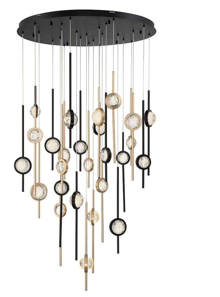
The Marni light from Alora Lighting (below) shows how individual strands of light can be stunning. “A touch of modern, mixed with elegant style best describes this light…or maybe we should call it hanging art!” Wendy says.

Turn the page




Lighting doesnʼt have to be serious—it can be lots of fun! Play with shapes and sizes to make a statement of your own.


Wilson Lighting is reinventing and experimenting with looks of their own for the showroom floor. They design a significant part of their inventory here in Kansas City.
The high-end looks are reminiscent of lines from RH and Hudson Valley Lighting. “Except ours is half the price,” says owner Bobby Wilson.
The in-house Mariana brand covers a broad category of styles, but its line of geometric pieces is quite popular and adaptable to many home design styles.
Hand-drawn patterns on the Franz table lamp from Generation Lighting use bold designs and contemporary style. “Black and/or white finishes are trending right now,” Wendy says, “and this lamp delivers on both counts.” Photo courtesy of Rensen House of Lights







Four designers create thoughtful places of sleep and sanctuary in this collection of primary suites.
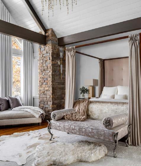
Words by Andrea DarrWhen you see what Jill Tran of Tran + Thomas Design Studio did to this whole house, you wouldnʼt believe that it sat on the market for such a long time.
Part of the reason, Jill believes, may have been because the primary bedroom and bathroom had no separation.
“It seemed very open—uncomfortably so,” Jill says. “The second you walked into the room, it felt like you were in the shower.”
For the engaged couple who bought the house, it wasnʼt a deal-breaker, but they did want a more private solution.
Several contractor meetings and a winning referral later, the couple found Jill.
“Our job is to solve problems, so we did,” Jill says. “We actually came up with a variety of solutions, and this one offered the most versatility.”
Function first, beauty second is Jillʼs mantra. Fortunately, her design for three sliding doors encompassed both. They allow for fully open, partially open and fully closed views between the two rooms.
The spacious suite, with its vertically soaring walls overlooking the treetops, is large enough to also accommodate a chaise lounge and writing desk. A stairwell from the primary suite o ers access to the home’s other two stories, including the massage room and the home o ice.
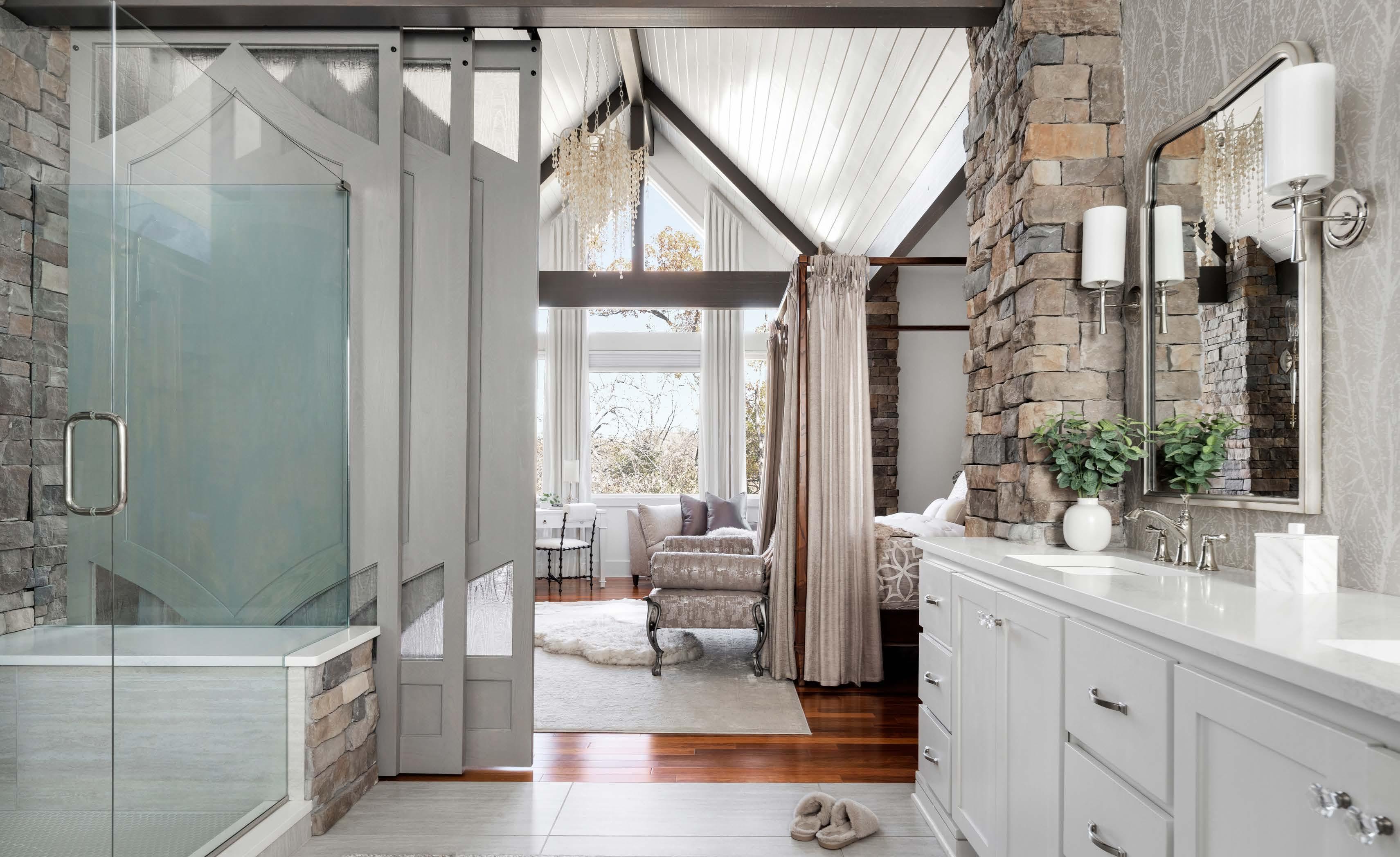

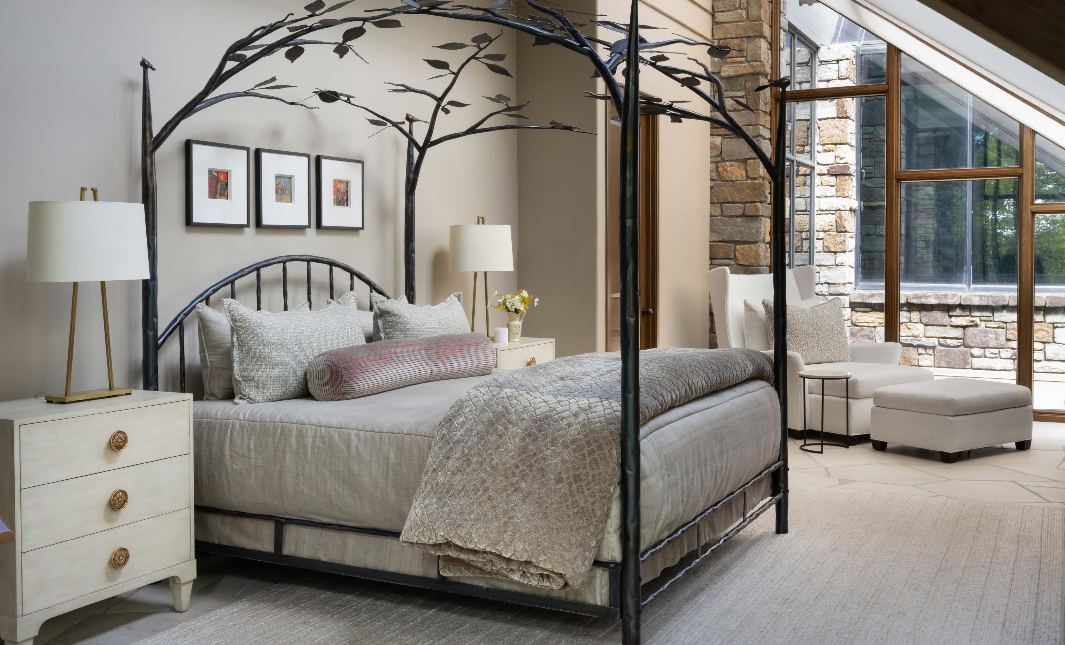
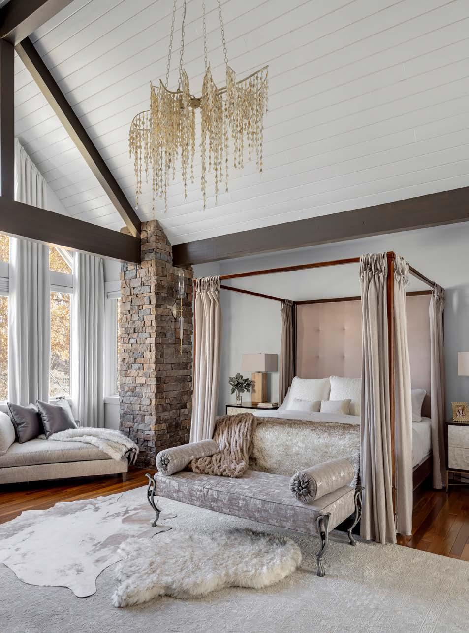
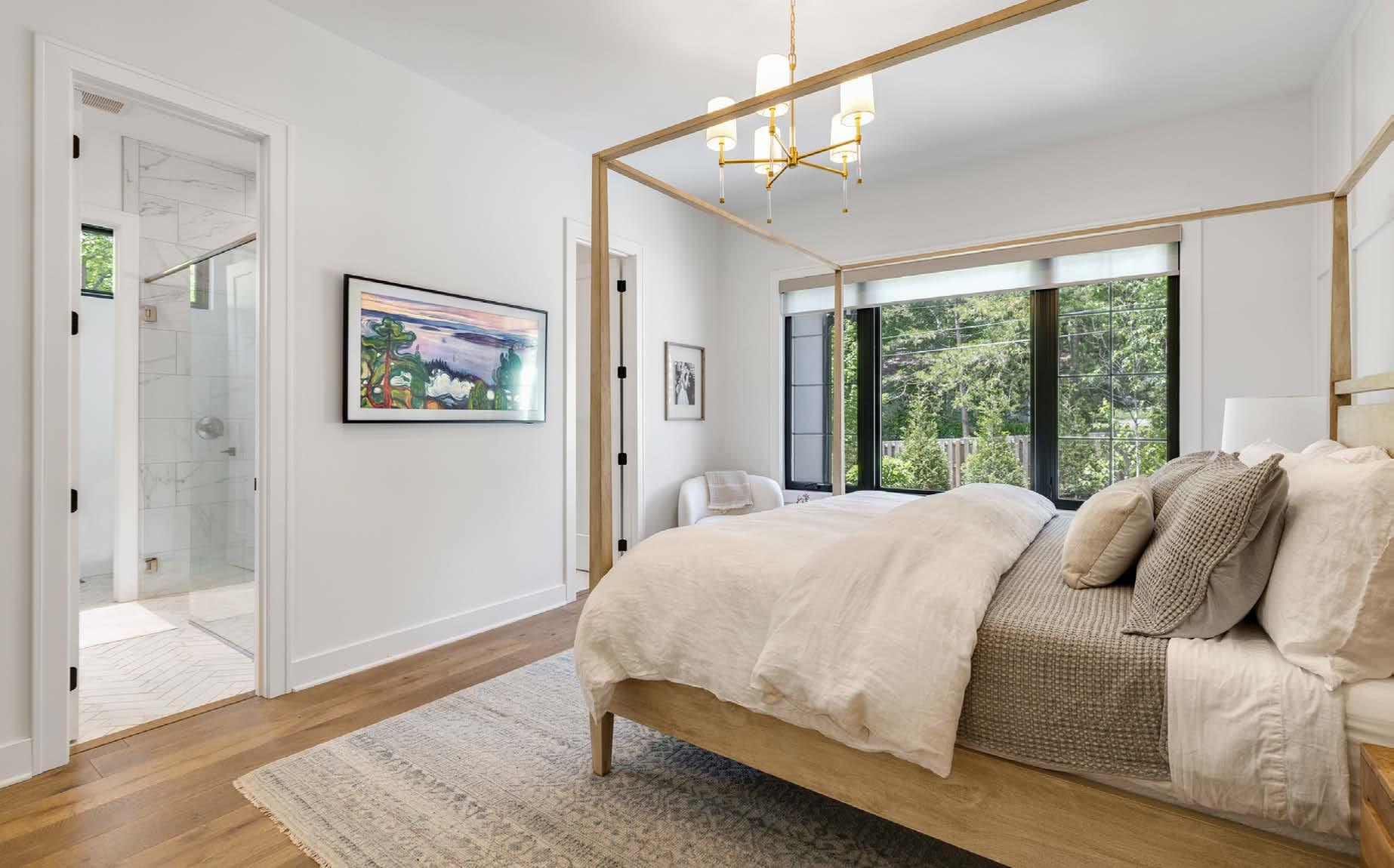
Below: Luxe textures and sheen glamorize the primary bedroom, which was significantly lightened with fresh paint. A four-poster bed suits the large scale of the room, with curtains that can close to make a cozier room within a room.
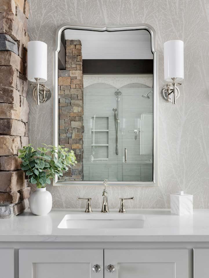
Right: Jill refreshed all the surfaces in the bathroom, including adding task and mood lighting, but the most special change was in the shower, where new tile and mother of pearl accents bring in the romantic look.
Contractor Matt Bichelmeyer custom made the doors, which each feature four glass inserts in a wavy pattern.
“That allows the light to move through, so they are flexible and pretty,” Jill says.
The bathroom received cosmetic updates, but the real transformation happened to the bedroom.
Stone columns, heavy beams and wood-paneled ceilings carried throughout the house and into the bedroom created continuity—but not exactly the right tone. “Everything was very orange,” Jill says.
She lightened the palette by painting the ceiling white and the beams in a thinned gray. Sconces were changed out to glass and bleached wood varieties, while an intricate dangling wood chandelier dances overhead.
For style cues, Jill looked at the clientsʼ wardrobes and talked to them about their lifestyle.
“She wanted romance,” Jill says. “I started naming things that would impart that look, and she grabbed onto a few.”
They included the four-poster bed with curtains and upholstered items in glamorous sheen. Layered rugs, cozy throws and detailed furniture legs add sumptuousness to the space.
With freedom bestowed by the client, Jill shopped at High Pointʼs Fall Market to purchase the unique rugs, lighting and furniture.
“When a client is ready to step out and relinquish control, we can do some amazing things,” Jill says. “They always end up being the happiest clients.”
Thatʼs a dreamy outcome for all.








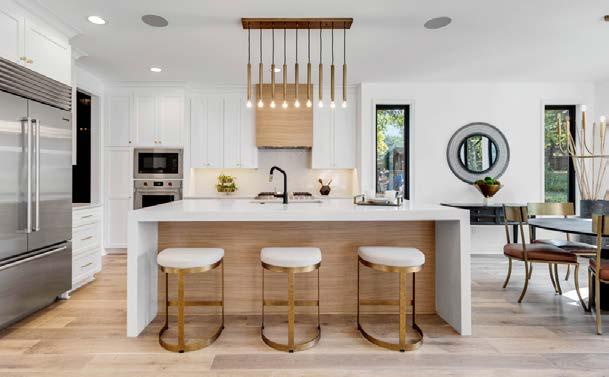


This home, featured as one of eleven on the Artisan Home Tour last summer, was originally planned as a model home—an example of the clean design and enviable lifestyle features that MOJO Built is known for.
Located on an infill lot in desirable Prairie Village, the house was mid-construction when a prospective buyer turned into the homeowner at the sheetrock phase. Enamored with the vision of what was underway, the new clients didnʼt alter the floor plan, which was well-planned to flow throughout three levels.
With a family of five, the buyers were ready to settle into a beautiful, functional home. Though hands-full with little ones, they worked hands-on
with the builders and designer Adrienne Meyers to coordinate the finishes.
At the top of any parentsʼ wish list is a relaxing private space to retreat to at the end of the day. Their primary suite is exactly that.
Decorative wainscoting behind the fourposter bed frame and a serene view of the treed backyard are simple yet effective at creating a calm environment.
“We think the bedroom is best suited for just a bed and nightstands,” says MOJO Built co-owner Joe Woods. “The dressers are located in the bathroom.”
Thatʼs where the design gets really innovative.
“What you donʼt see every day is his-and-hers ensuites,” Joe notes.
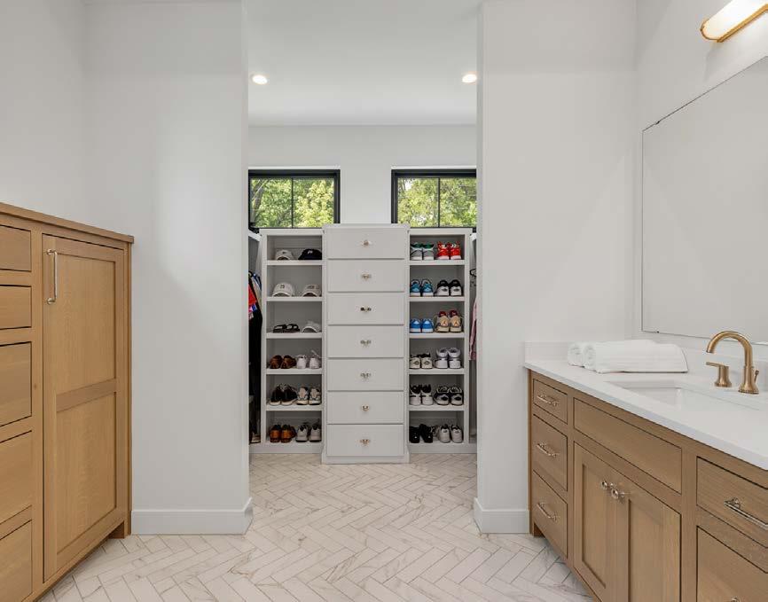
The unique layout diverges from the coupleʼs bedroom in two directions. His vanity and closet is to the right, with a custom shoe rack noticeably exposed as a focal point. “He didnʼt want to break the light, so we left it open,” Joe explains. “They both live neatly. This layout works for that.”
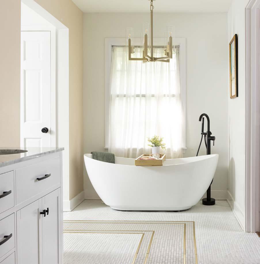
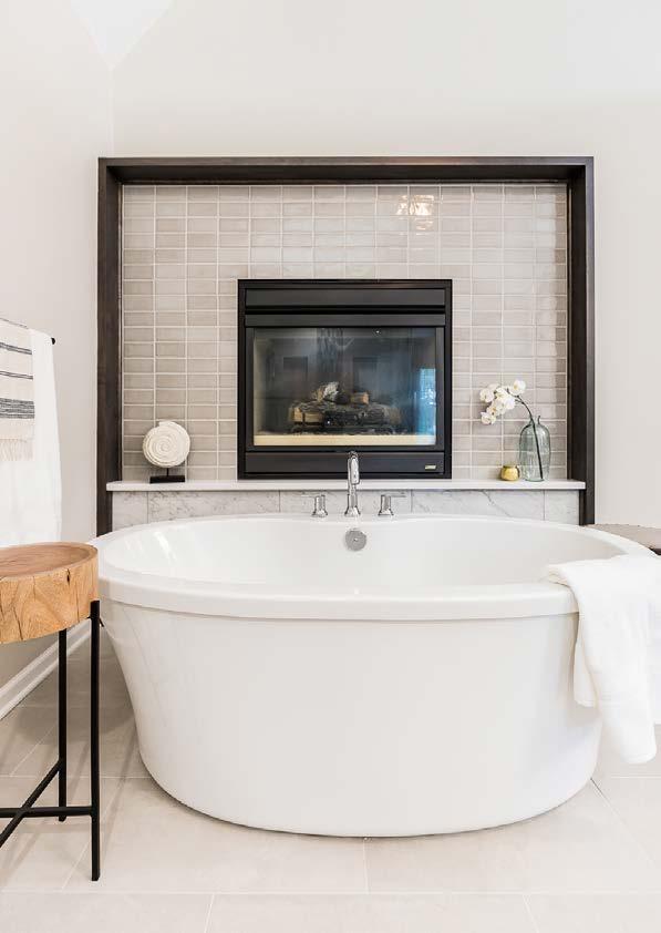
Her side includes an acrylic soaking tub with artwork and a statement chandelier, plus a makeup vanity.
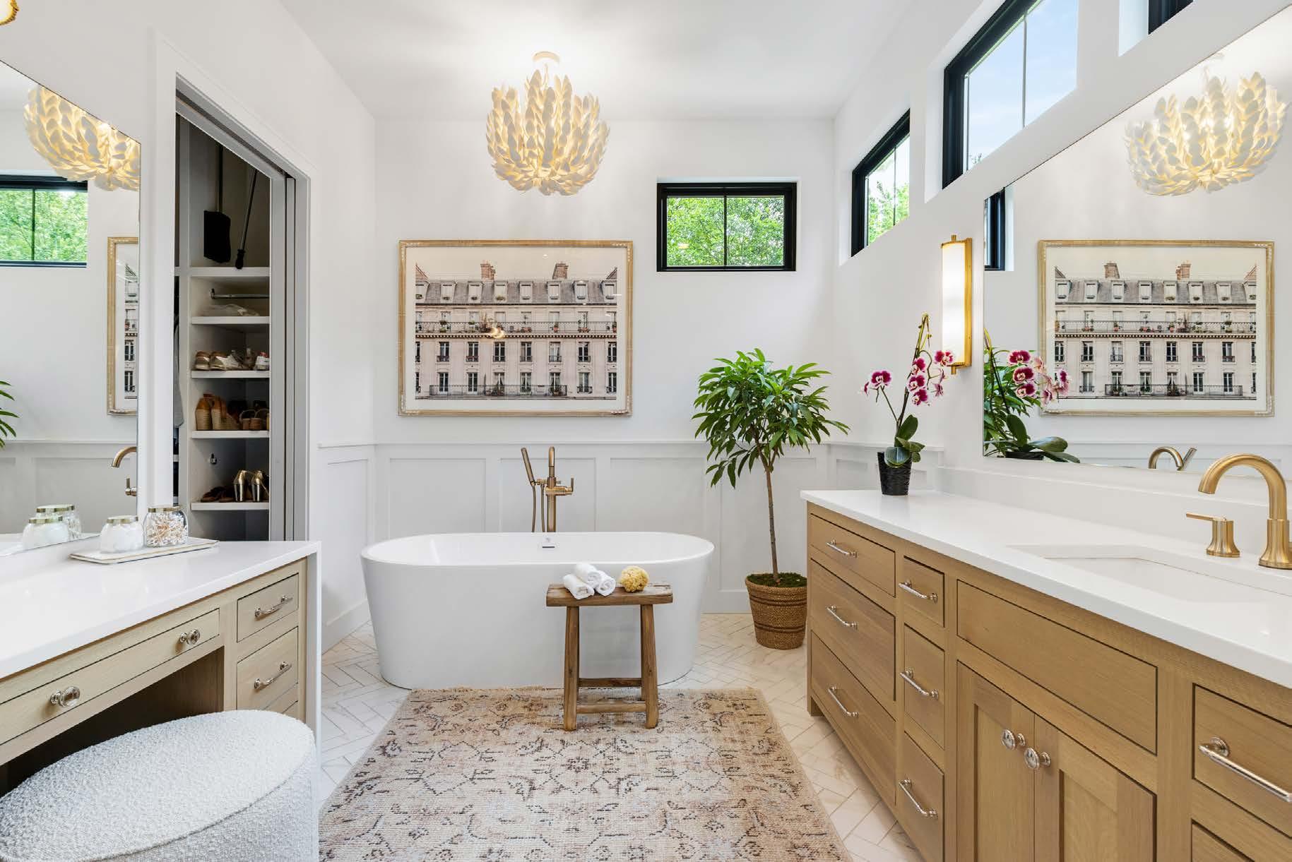
“The rug and art in the bathroom make it seem more luxurious,” Joe adds.
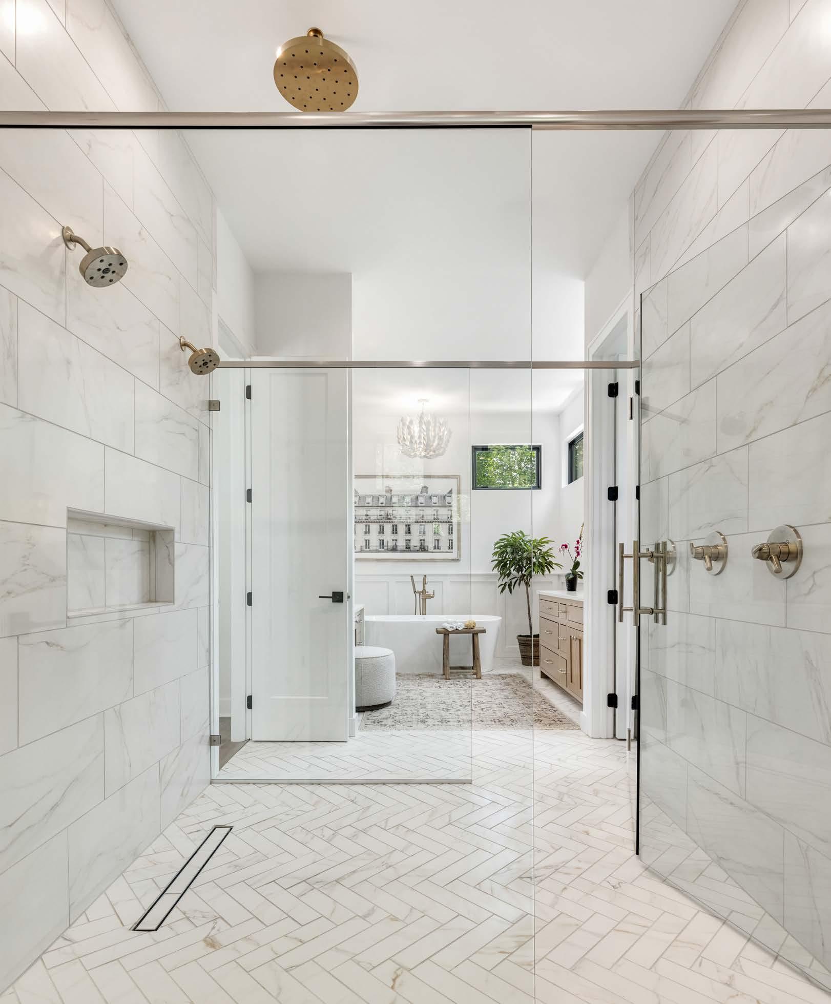
But the joint wow-feature is a glass-enclosed walk-through shower.
“In upper bracket homes like this, most builders donʼt do this layout; itʼs definitely not the norm,”
Joe says. “John [Moff itt, co-owner] and I like to do things that are cutting-edge, and we like the transitional/modern look without too much fuss. We donʼt want to overdo the details.”
The builders had done a similar layout in the past—and it was a stand-out feature. They brought it back for this biennial tour, where it feels fresh again.
“It makes perfect sense to have the shower in the middle of the bathroom,” Joe says. The glass panels allow light to fully pass through.
Another element the MOJO team likes to incorporate in their homes is high transom windows. “We do it in all of our first-floor primary suites when we have the opportunity,” Joe says. “Thereʼs no need for window treatments.”
The space is the perfect getaway for the tired and weary who are raising the next generation. Now if only they can find time to use it!







When something is a part of your life for multiple decades, it can be difficult to see past what is. That was where Kristyn Imanʼs clients were with their Prairie Village home when they reached out about renovations. The brick manse—the wifeʼs childhood home—had remnants of past design eras for Kristyn, owner of Design Spout, to work through.
“We studied the entire home and made recommendations to change most of it,” Kristyn says, who along with Nick Roberts of KM Construction, updated the main level, including the primary suite.
It started with the delicate process of reducing objects and art—or at least not displaying the coupleʼs collection in its entirety.
“There is less clutter now; itʼs a process,” Kristyn says. “Part of the process is learning how people live and whatʼs important to them. Once Iʼve got that information, the priority is tailoring the function based on their lifestyle.”
The practice of letting go holds true particularly in the primary suite, where simplicity is key, Kristyn says.
“A bedroom needs to be a safe haven, a place to feel completely relaxed,” she notes.
Although she did incorporate a TV above a new built-in media cabinet, the sleeping quarter minimally contains a high-backed upholstered bed to bring softness, nightstands for convenience and a chair for reading.
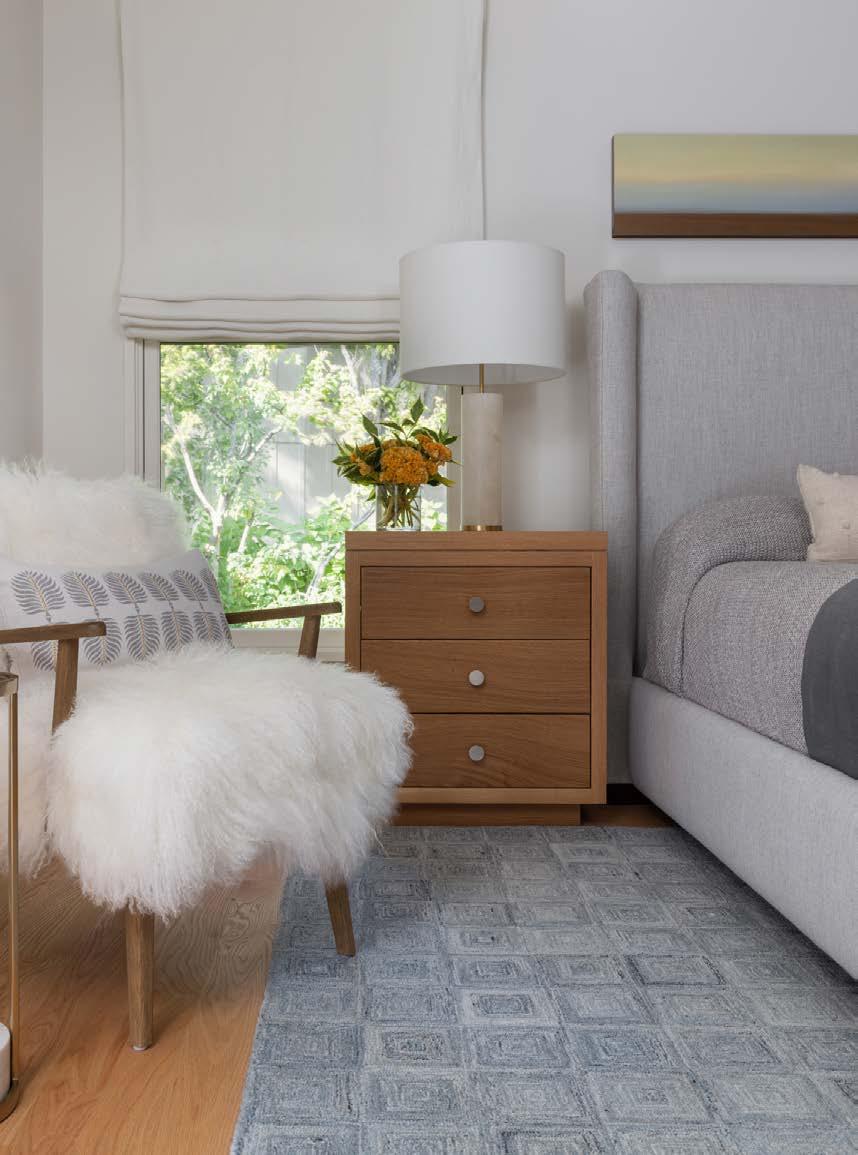

A rug from The Rug Studio, a to-the-trade showroom, adds a warm landing spot when stepping out of bed on cold mornings.
“Iʼm not opposed to broadloom carpet in a bedroom because comfort is a priority,” Kristyn says.
She made room for a couple of key pieces of the ownersʼ art by stealing space from the living room on the other side of the bedroom wall, creating a walk-in closet and removing a row of shallow bi-folding closet doors.
The homeowner says that was a pivotal decision in how they view the room.
“Freeing up some wall space across from the bed really changed the feel of the room,” the wife says. “Now we can look at beautiful artwork instead of a closet door.”
The bathroom was an even larger focus of Kristynʼs rearranging talent.
When studying the space in the 3D model, it was obvious to Kristyn that they should demolish walls to experience the full vaulted ceiling from the bathroom and closet.
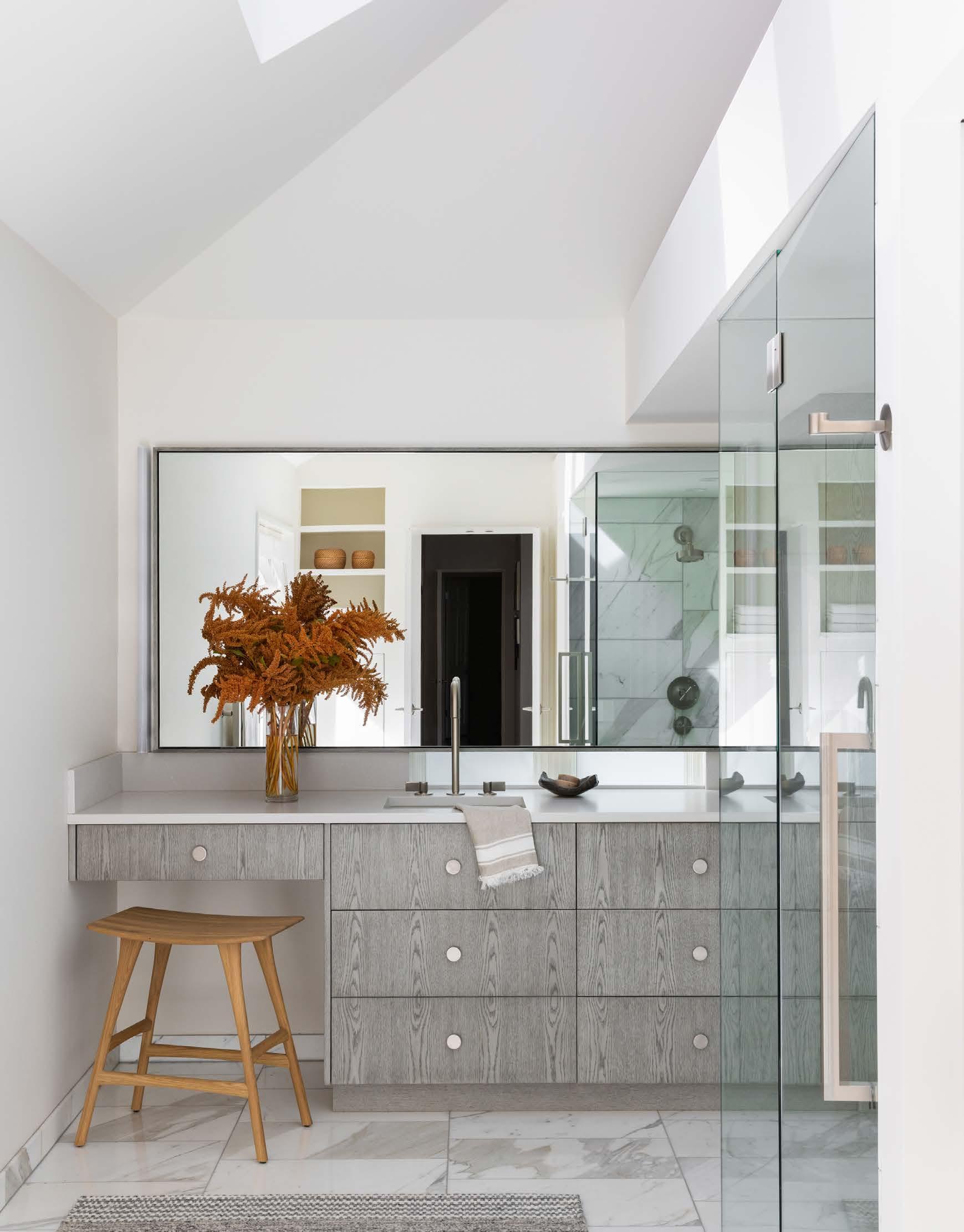
She kept the skylights for their incredible natural light, adding UV protection to the glass. She replaced a stained glass window with a frosted one and layered a framed mirror over the top so natural light peeks in from behind.
Notably, Kristyn did not include a tub in the redesign—a door to the back patio leads straight to an in-ground hot tub, the homeownerʼs preferred spot for a soak.
By creating a new floor plan, Kristyn was able to incorporate everything the homeowners wanted—and more.
“The space went from being busy to being highly functional,” she says. “Simple forms create a more peaceful environment.”
Rooted
v. root·ed, root·ing, roots v.intr.
1. To grow roots or a root.
2. To become rmly established or settled.

We are ROOTED in the belief that woodworking can inspire emotion in the process of creation, and in the end product. We believe that happens with exceptional design, craftsmanship, and technology. Through that, we will strive to continue to build a company known for excellence in woodworking of all types, ability to solve problems, and done with integrity.
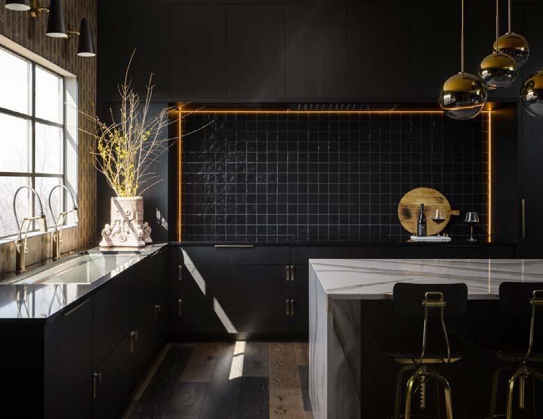
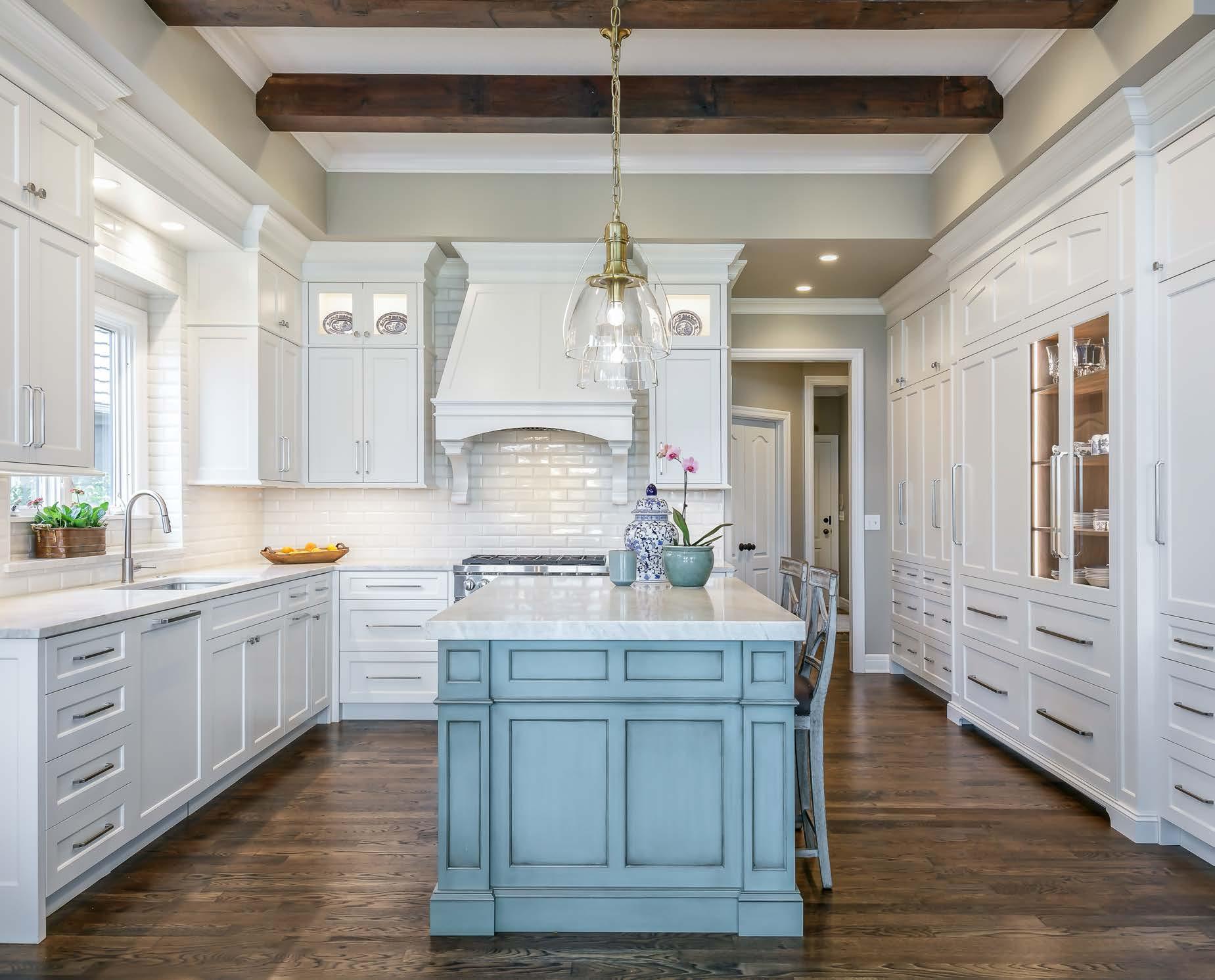






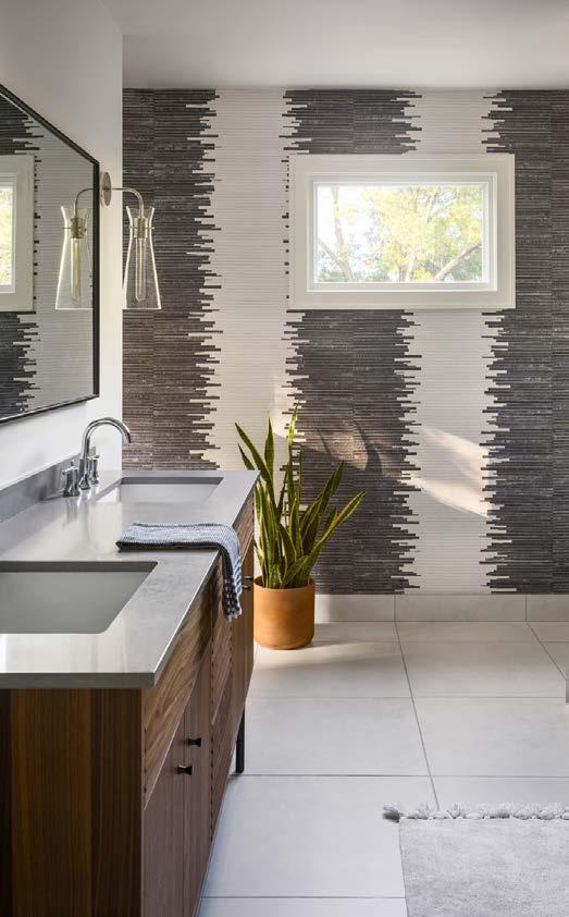
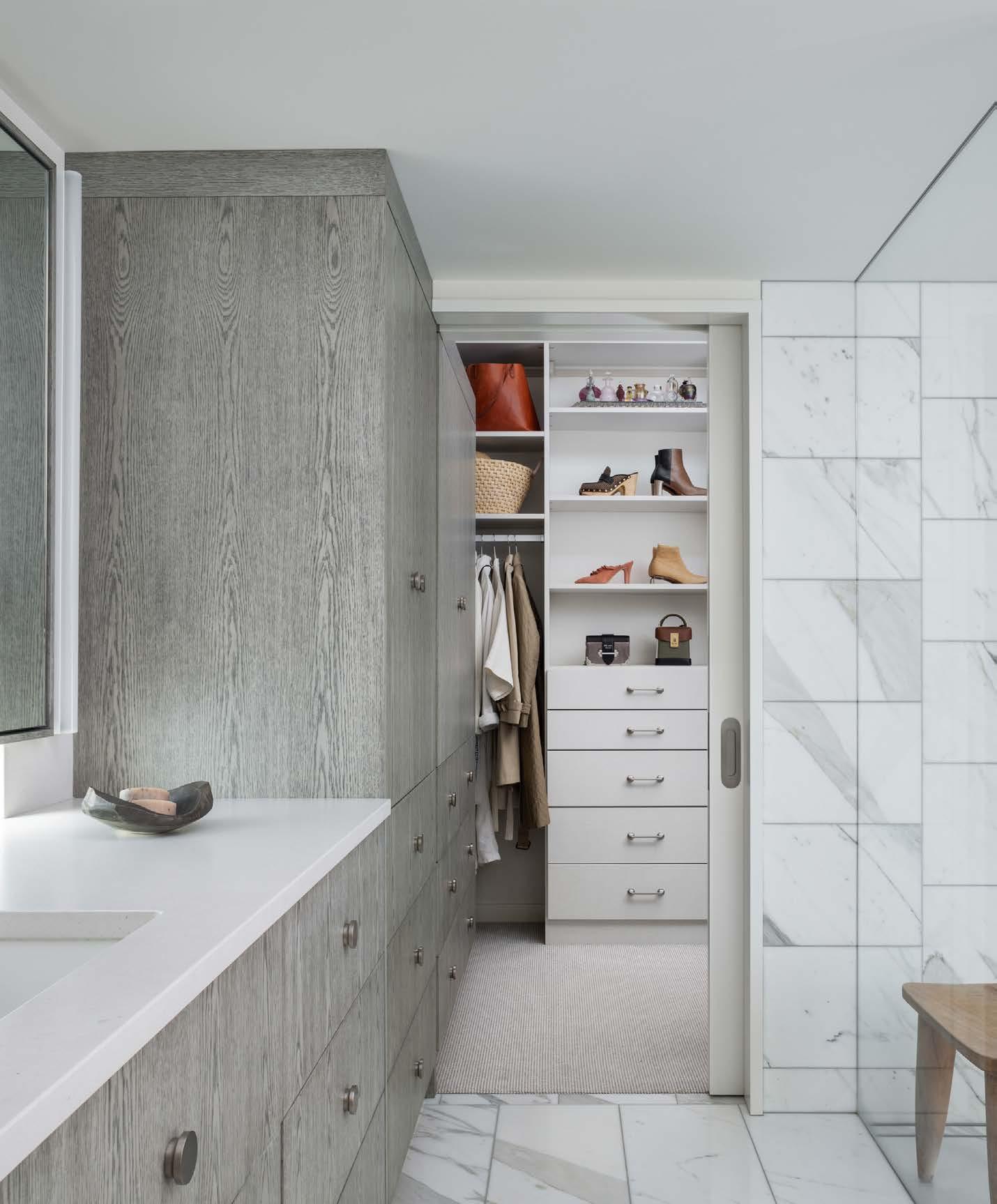
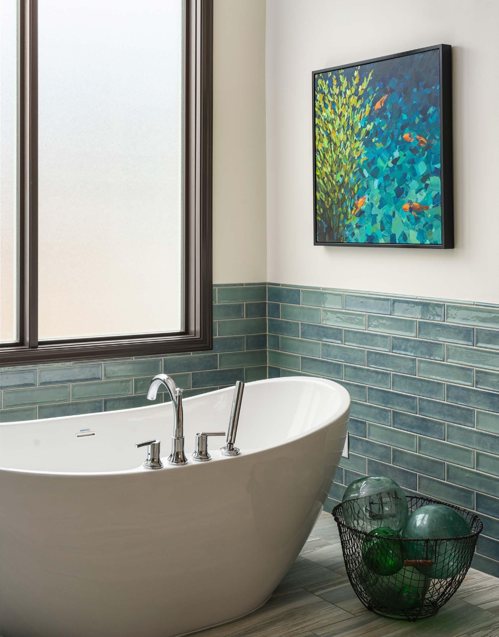
 Emser Raku tile in Ocean Gloss evokes the colors of the sea, while sliced pebble floor tile in natural tones on the shower floor emulates sand. A porcelain tile floor shares similar lines as the cabinetry. “The key is the blending of colors and textures,” Kelly says. The redesigned cabinetry maximizes the vertical space and creates useful deep storage. The unit connects to a walk-in closet designed by Inspired Closets.
AS“frequent fliers” of Schloegel Design Remodel, Carolyn and Dan Barnard are professional clients who know how to invest in their home and come to the drawing table with plenty of workable ideas.
“Carolyn has great style, great taste,” says designer Kelly Summers. “And she put in the research herself for three years, so she 100 percent knew what she wanted. She drove the design; I drove the process.”
The coupleʼs 35-year-old Leawood home had undergone a series of refreshes over the last couple of decades, including a large-scale kitchen remodel. This time, they set their sights on transforming their primary suite.
The dark, north-facing bedroom and bathroom dated back to when the home was a model in the 1980s—so it had “extra frills and woodwork,” Carolyn recalls, in addition to wallpaper, carpet in the bathroom, and that ubiquitous dust-catching plant ledge
that no one knew what to do with.
“Tastes change,” Carolyn says. “Iʼm much more into a contemporary, clean look.”
For her, design inspiration started with a piece of art by her favorite artist, Jill Van Sickle of Minneapolis. The ocean-like colors seemed apropos in a bathroom remodel with spa vibes.
“It makes sense to build your environment around what you love,” Carolyn says.
Material selection flowed easily enough. Blue-green tile steals the scene, while natural tones in cabinetry and flooring ground the space like sand meeting the ocean.
The biggest challenge was an angled cabinet that had little functional storage. “I had to figure out how to not make it look like a refrigerator,” Kelly says. “Itʼs the first thing you see when you walk in, so the wood color and varying grain helped with that.”
The transition between bathroom and bedroom required deep thinking, as well. The carpet—although well-maintained—showed a path of consistent use. Kellyʼs solution was to carry the hardwood floors in from the entry and give it a wavy edge. “I said, ʻLetʼs feng shui it!ʼ” Kelly exclaims.

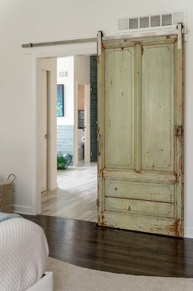
Carolyn spotted the vintage door at a warehouse in the West Bottoms and immediately knew it would make a great partition. “I like the combination of contemporary and rustic—not all one way or another— plus some vintage and antiques,” Carolyn says.
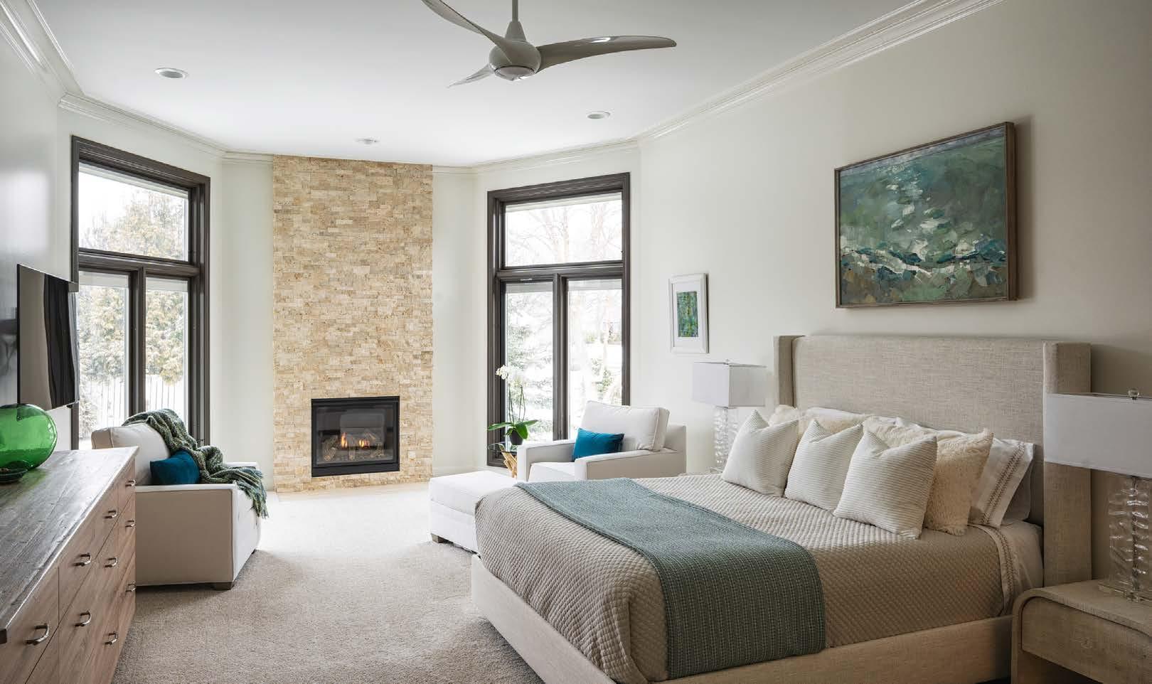
In the bedroom, Kelly revamped the fireplace by installing a new gas fireplace with travertine stone up to the ceiling and sized the width of the stack stone proportionate to the windows. Natural light streams in and connects the couple with their backyard landscape.
While this time around with Schloegel included working through a pandemic and recovering from a surgery, the Barnards applaud the entire team for a worry-free experience—and a wonderful outcome.
“Coming out of COVID, this feels like a lifestyle shift. All I need is a mini fridge and I could live in that room,” Carolyn says.
Le : A vintage door carefully hung on sliding hardware so ens the newness of the space with character and charm.






bisonhut.com


913.543.0340
We’re here to help you do the things that matter most. Now and years from now. That’s because our planning approach starts with you—tailoring financial strategies to your priorities today and down the road. From employee and executive benefits to investment strategies and long-term care planning, we’ll help you with all the things you live for. Spend your life living.®



When Tammy and Jerome Torres initially purchased their latest home project—a Mission Hills fixer-upper from the 1950s—they envisioned it becoming their personal home. That was in February 2021, before the endeavor grew and transformed into a house-wide gut renovation.
“We did not leave a singular internal wall the same,” Tammy explains.
As the founder and owner of Torres Design KC, Tammy is no stranger to design work. And this particular project was a labor of love.
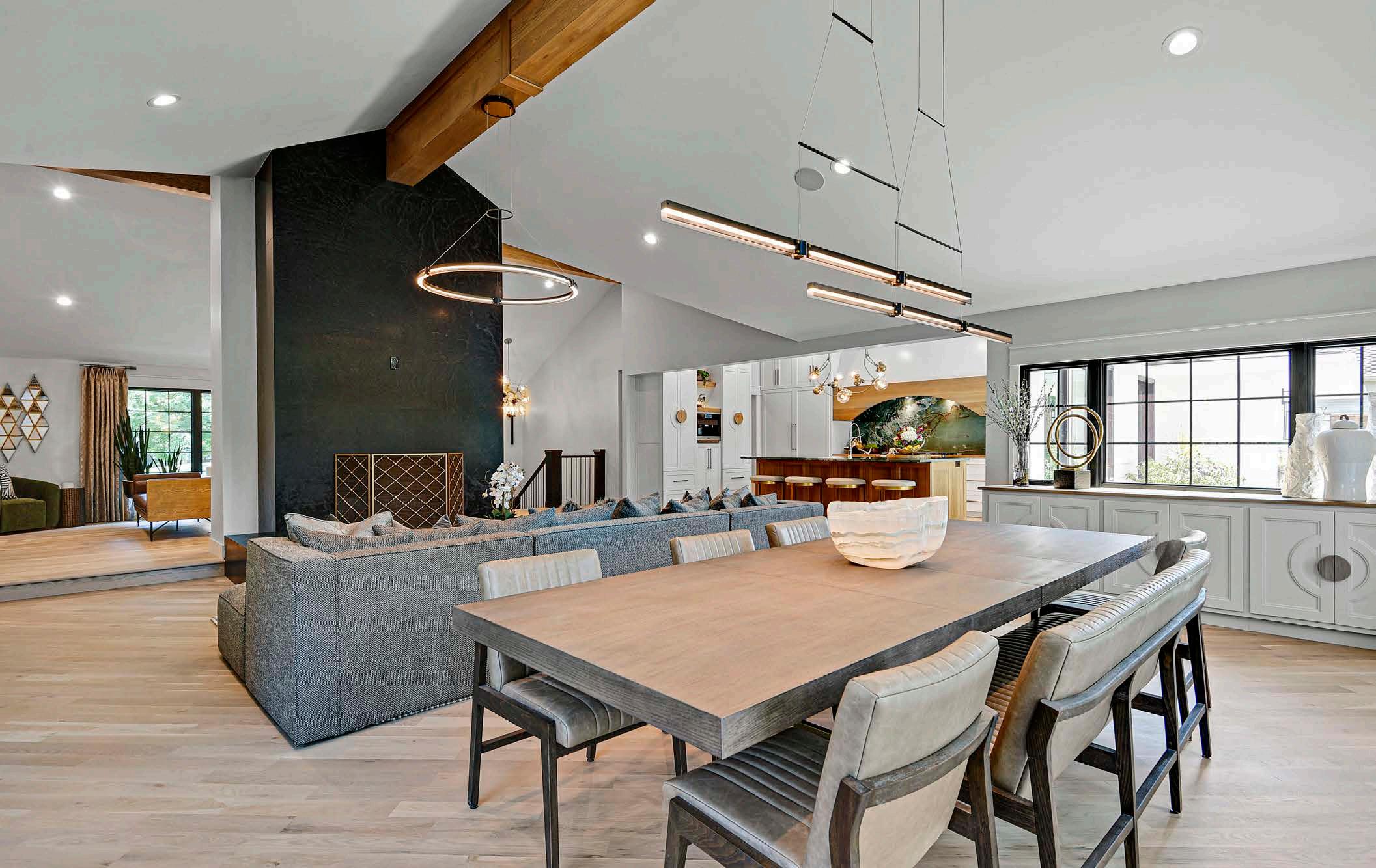
Working with Derek Decker of Black Hickory Construction, Tammy and Jerome reconfigured the entire floor plan, moved the interior walls, vaulted the ceilings and added oversized windows at every turn. Many of the more complex challenges that arose during the remodel were overcome by Derek. Whatʼs more, they managed to keep the project within the confines of the existing footprint, except for one small addition off the back of the house.
“The vision for the space was to have a modern, open layout,” Tammy says, “but to keep the midcentury modern elements of the original home.”
To achieve this vision, the kitchen became an integral part of the entire first floor, from the moment you open the front door. Tammy knew she wanted the space to be a standout moment, without losing its functionality. A back kitchen was
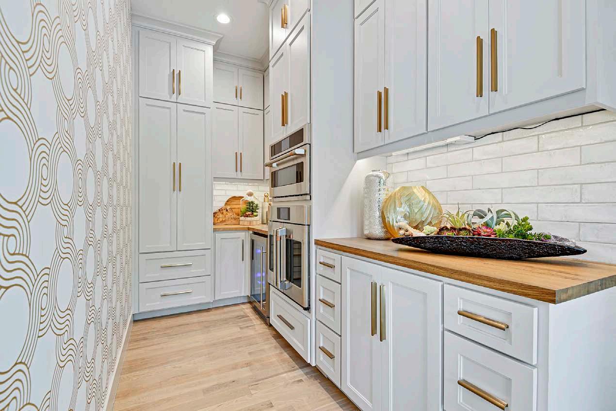
built behind the main kitchen space, a detail Tammy prefers for all modern homes.
“Itʼs a way to focus on beauty, while keeping the functionality in the prep area,” she explains.
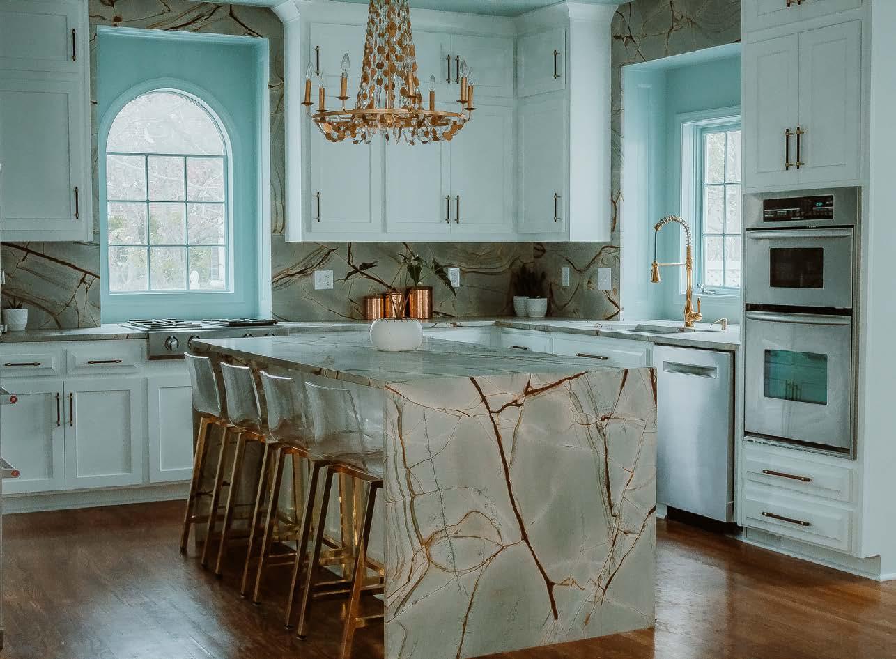
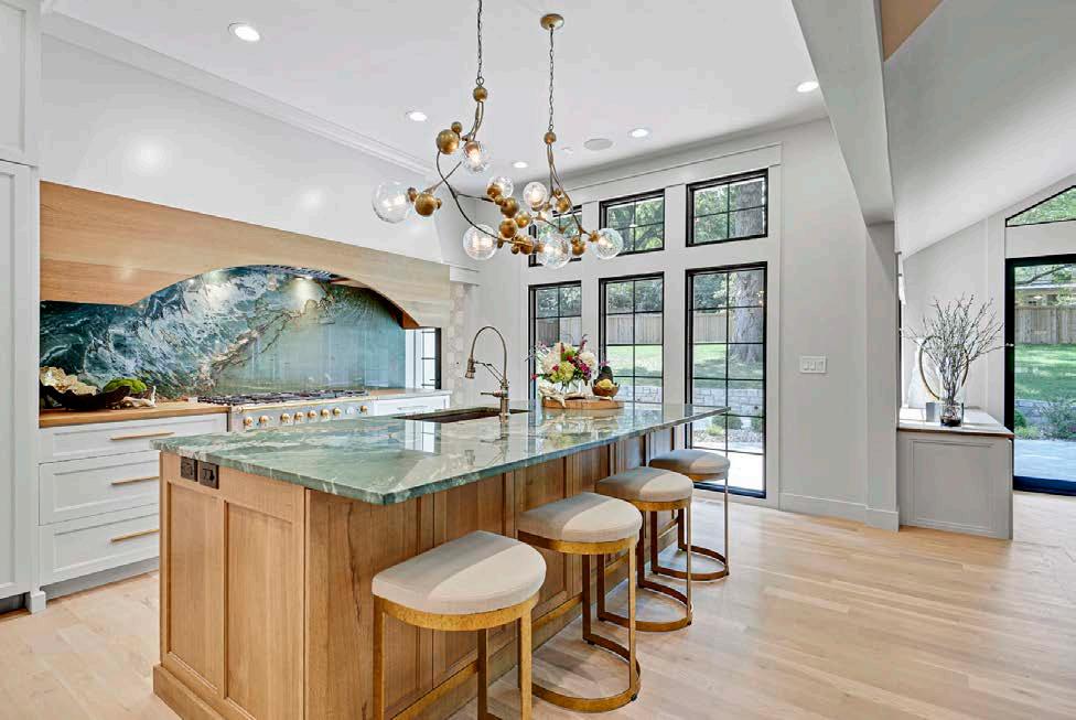
In the main kitchen area, she brought in two stunning blue-green natural stone slabs that she discovered in Austin, Texas. Both slabs were seamless, with one used on the island and one behind the range. The finished look created a perfect wave pattern from the island to the range wall.
“I think a lot of people get intimidated by color,” Tammy reflects. “But when you have a palette that is so neutral, like this home, you need something that pops.”
The kitchen is rounded up with a stylish built-in coffee station, loads of hidden storage and custom
wooden circular cabinet handles. The circular pattern is discreetly repeated throughout the house, a detail taken from the original front door design as a way of honoring the homeʼs story.
“It was a labor of love,” Tammy says of the project. “Thereʼs nothing that brings me more joy than doing a project like this.”
@TorresDesignKCScan here to see the full project.
Above: The Twist, from York Wallcoverings, enlivens the back kitchen, where secondary appliances and prep space keep the main kitchen uncluttered.
Tammy greatly enhanced the home’s connection and flow with the massive remodel, adding storage and luxury, like a built-in co ee maker, to the new floor plan. She also united the design theme with circles used throughout.




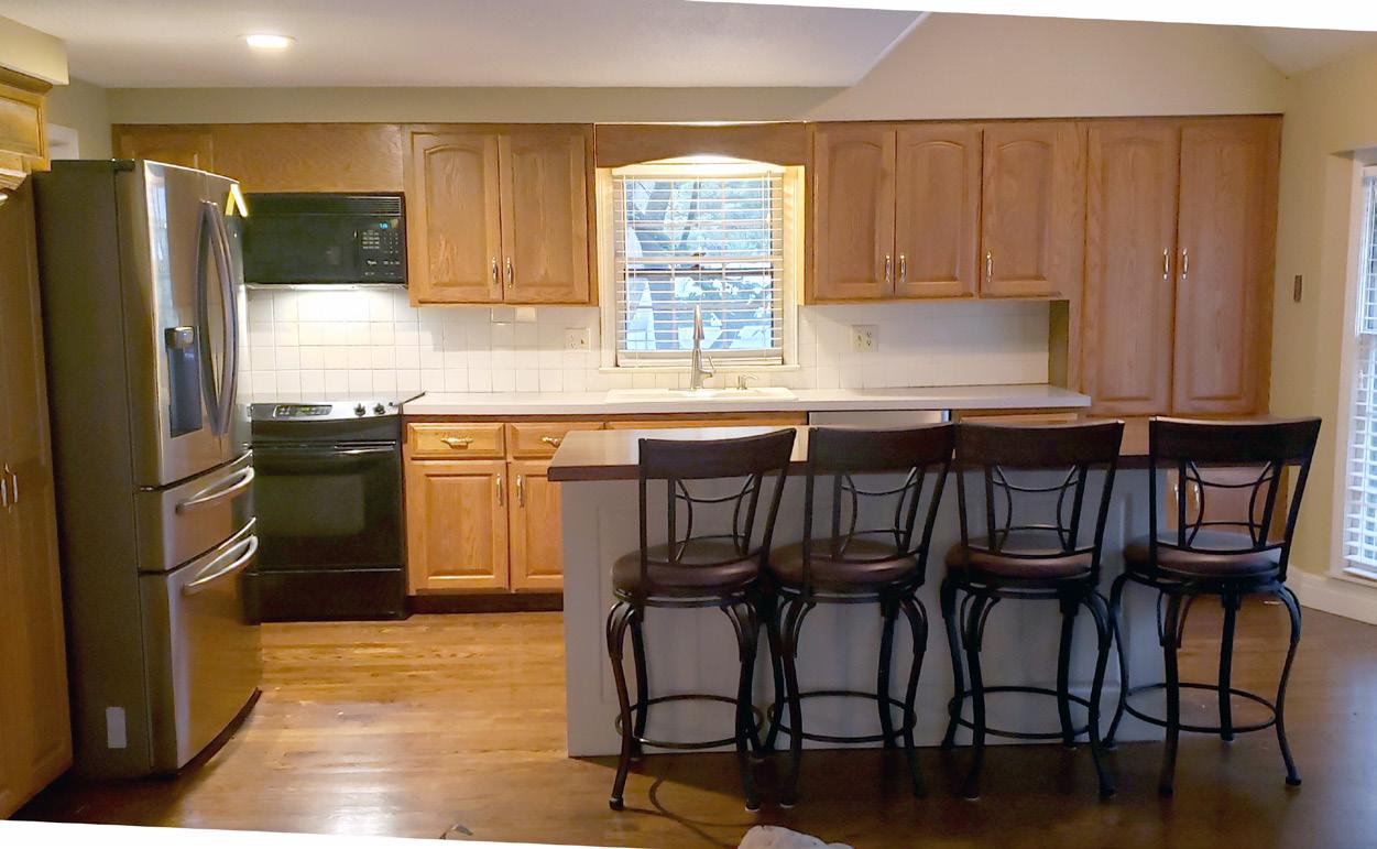
When Kate and Tyler Bachman decided to renovate their kitchen, it was a long time coming. After 10 years of living in a house they loved in a neighborhood they adored, the kitchen stood out as a sore point.
“I love our house,” Kate says. “But I hated the kitchen, and I hated that we didnʼt have a mudroom.”
She dreamed of a larger kitchen with more prep space, chef-quality appliances, extra storage and room to entertain. She envisioned an island large enough to oversee the childrenʼs homework and spend time together. She wanted something timeless and classic. And she wanted that mudroom.
Fast forward to two years ago, when Tyler came home from work one day, sat down, and looked at Kate. “You know that kitchen dream you have?” he asked. “I think we can do it.”
That same evening in bed, Kate pulled up the website for Cicada Co., a Kansas City-based design and building firm. She had been following the company for about a year, ever since a coworker had posted photos of their Cicada-designed home project on Facebook. She showed the brandʼs portfolio to Tyler, who immediately agreed.
Cicada is a boutique building firm helmed by husband and wife team Tara and Kyle Davis. They handle complete custom projects from start to finish: architectural design, interior design, contractor work, styling and furnishing.
“We really focus on the quality and personalization for each client,” Kyle says. “If we had a tagline, it would be ʻintentional design with quality execution.ʼ”
The new layout includes a farmhouse sink with a large window to let in natural light and open shelving in a tight corner.

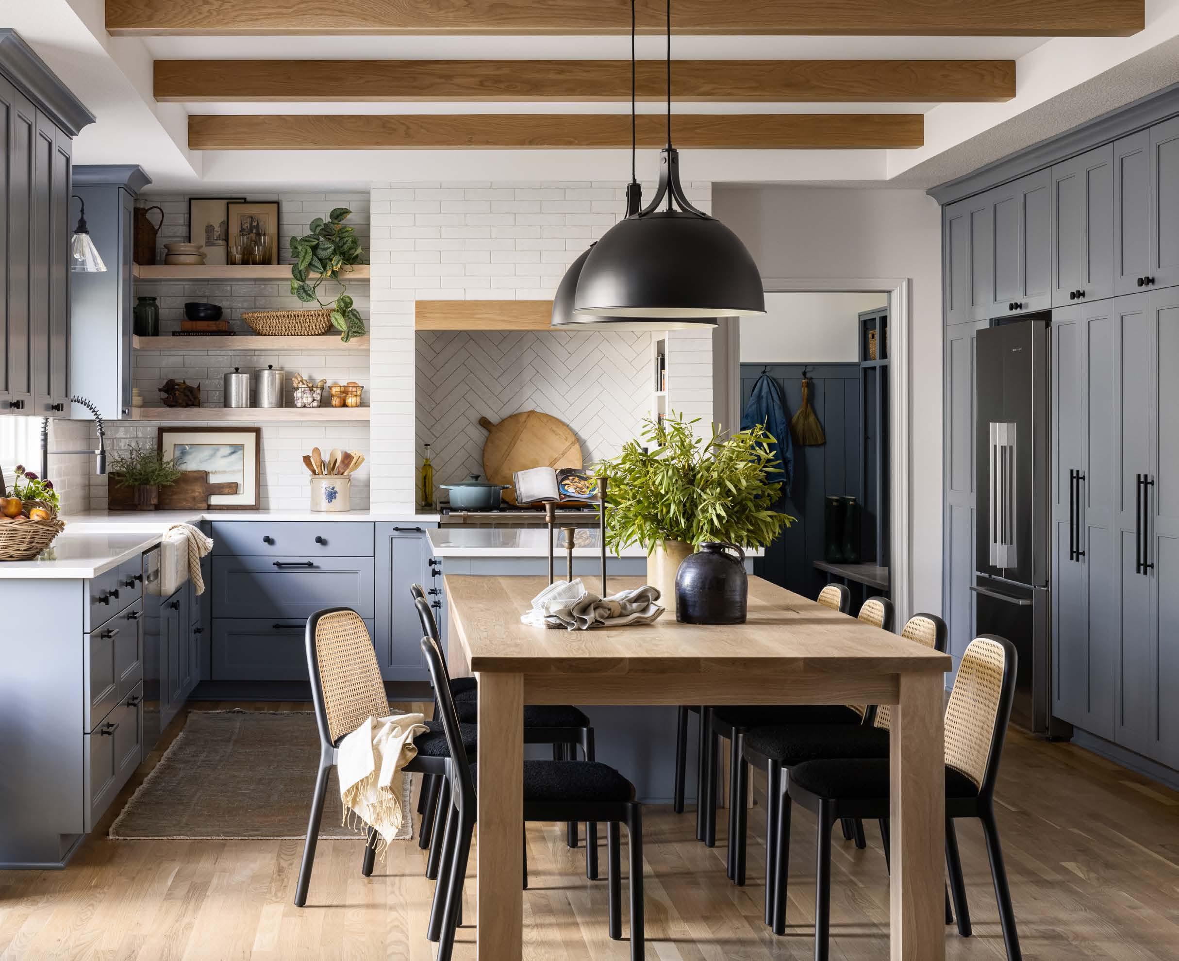
The spacious mudroom was created by cutting into a deep garage bay. Additional storage was created without losing any functionality in the garage or kitchen.

When the Bachmans called Cicada, they assumed it was for an addition to their home. After all, the original setup was dark and had a corner sink, tight corners, no mudroom and a too-small island. But after an initial walk-through of the kitchen space, Tara and Kyle noticed a lot of unused square footage. They pitched a more creative solution in which the kitchen footprint would remain but the layout would change. Not only would it save money, it would flow better.
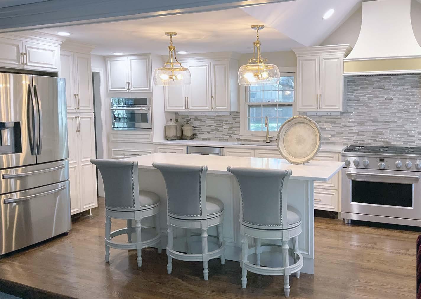
Over the next 12 months, Cicada completely transformed the kitchen with a centralized entertainment and dining space, plus a mudroom

created by taking over part of the deeper third bay garage. Other unique details include a custom dining table, dedicated knife drawer, tiled hood with open shelving, and a wall of storage with an appliance garage, pull-out pantry and bourbon bar.
But the element that ties it all together? That would be the blue hue of the cabinets. The color brings a warmth to the space that creates a beautiful setting, without being overdone, Kate says.
Tara continues, “Itʼs nice because it feels very calm and neutral, but it changes throughout the day. In different lights, it can look really blue or more gray.”
The Parade of Homes events in the fall and spring have been annual Kansas City traditions offering generations of home buyers the largest and most impressive displays of new homes in the Greater Kansas City metropolitan area.


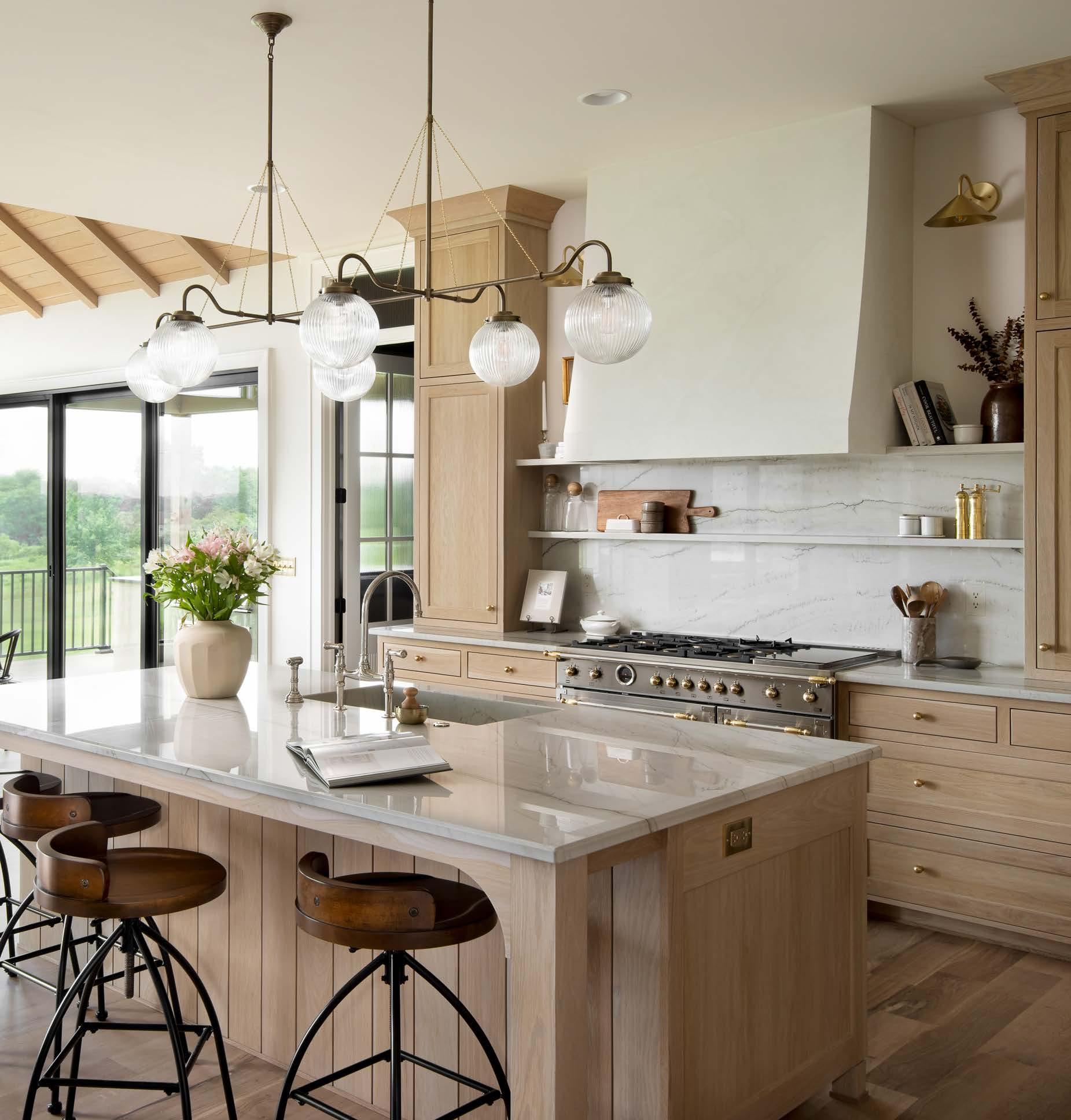


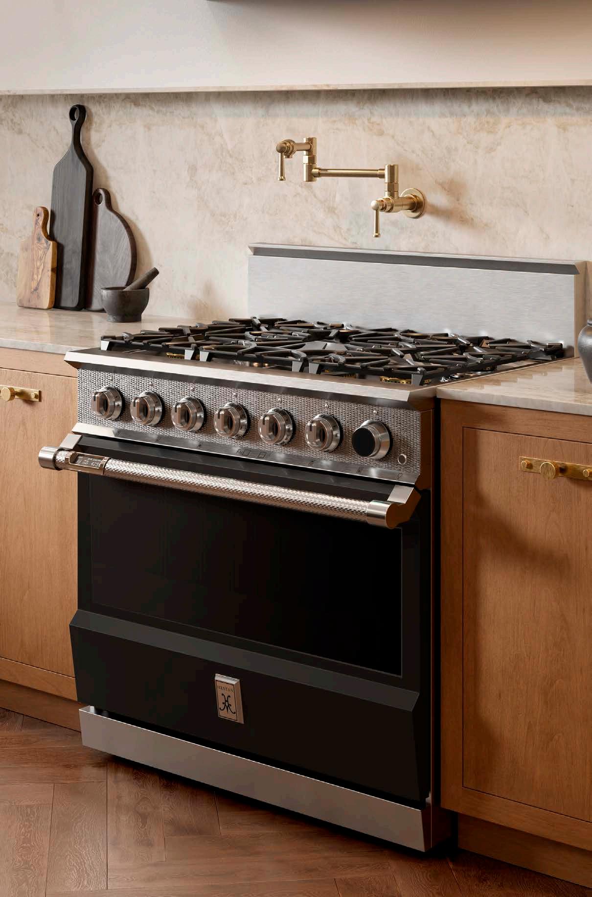
Hestan’s award-winning design and performance are born from years building kitchens for America’s most acclaimed chefs. Performance innovations like Hestan’s Smart Gas technology provide precision control. The Smart Gas burner allows you to control the exact gas burner temperature – not just a Lo to Hi power setting. Set the Smart Gas burner to the exact temperature you need and the burner maintains it for perfect results. Smart Gas technology is available on Hestan Dual Fuel Ranges and Gas Rangetops. All are available in twelve colors. From ranges to refrigeration and everything in between, Hestan brings even the dreamiest dream kitchen to life.
www.hestanindoor.com

www.ddius.com
14125 W 95th St., Lenexa, KS 66215 913.888.7820
Factory Direct Appliance 14105 Marshall Drive, Lenexa, KS 66215 913.888.8028 / kcfda.com
Kitchen Studio Kansas City
520 Avenida Cesar Chavez, Kansas City, MO 64108 816.221.3111 / kitchenstudiokc.com
Alexander and Ray’s TV & Appliance 1740 East Harold, Olathe, KS 66061 913.764.2424 / alexraytv.com
At his European-styled West Plaza home, an antiques dealer displays his favorite treasures.
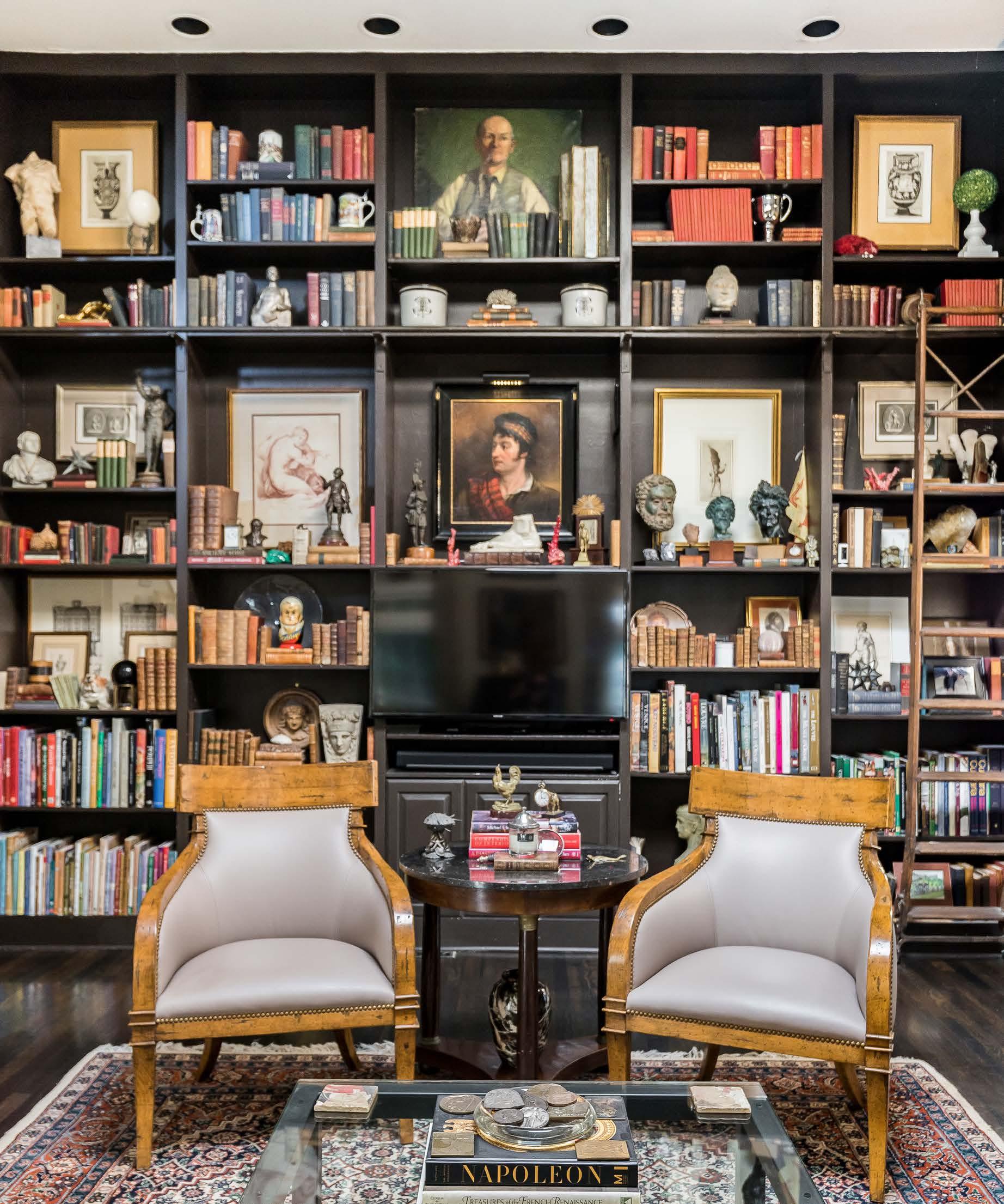
Woodson Antiques & Interiors owner Blake Craghead says he learned to love antiques as a kid, driving around mid-Missouri with his father to auctions. If a piece was made of walnut, he says, theyʼd likely stay all day to bid on it.
“He was, I guess you would say, a collector and a refurbisher,” Blake says, “and so the entire home was basically filled with antiques.”
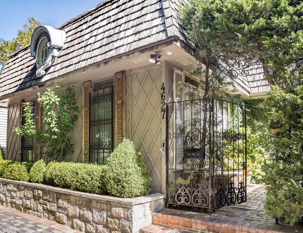
The same is true today of Blakeʼs ivy-covered West Plaza home, charmingly entered via cobblestone off-street parking and an iron gate. Spunky goldendoodle Woodson—also the shopʼs ambassador—may bark a greeting from the back patio, which is currently undergoing a transformation centered on a fence-height lionʼs head fountain from neighbor and longtime antiques dealer Linda W. Pearce.
The pair of homes stand out among the surrounding bungalows and modern infills, appearing as though in a faraway time and place of their own in terms of material choices, antique additions and landscaping.
Behind a hedge of European hornbeam, Blakeʼs one-bedroom home isnʼt large by todayʼs standards—but high ceilings and skylights make it feel quite
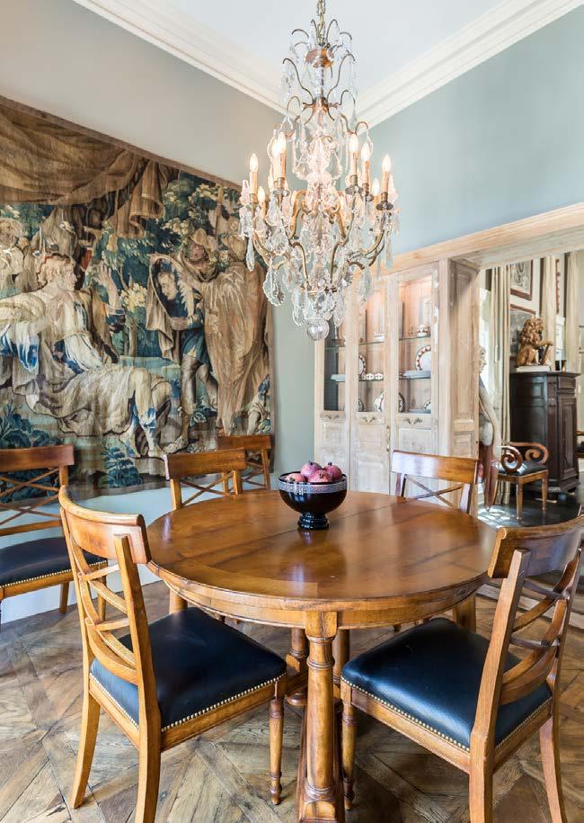
spacious. Blake enclosed a patio to gain extra space for a dining room, in which he hired an artisan to build out a cupboard using salvaged doors from France.
A large tapestry dated from 1580 makes a statement about the technology of the day: It shows Alexander the Great looking into the latest invention—the mirror.
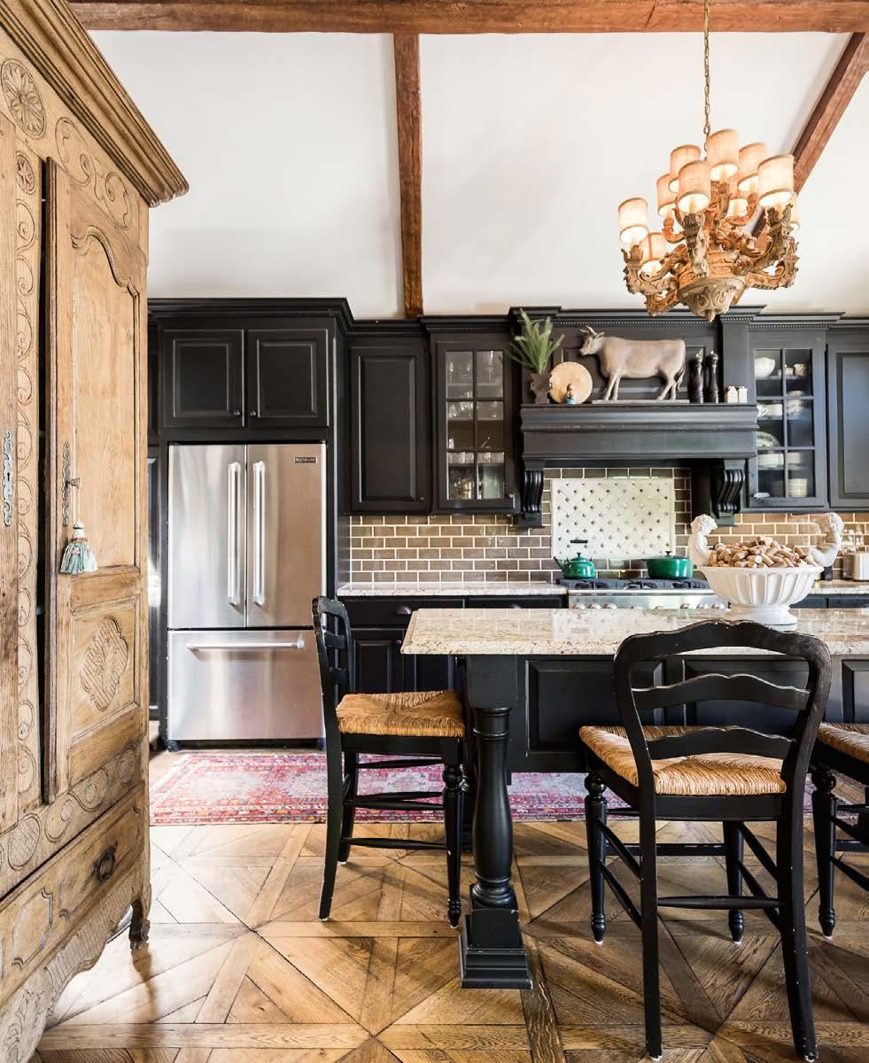
Blake also salvaged and restored patterned oak floors, which he had laid throughout the dining room and kitchen.
“They were painted blue and red, and I had to get out the sander with super gritty sandpaper to get it all off,” Blake says.
The home is the perfect capsule for Blakeʼs collections, of which there are many, gathered over a lifetime but most of them more recently.
Blake approached the former owners of Woodson Antiques & Interiors at their Civil War–era farmhouse in Raymore, Missouri, and asked them to let him know if they would ever sell.
“It combined two of my passions: antiques and travel, especially to Europe,” Blake says.
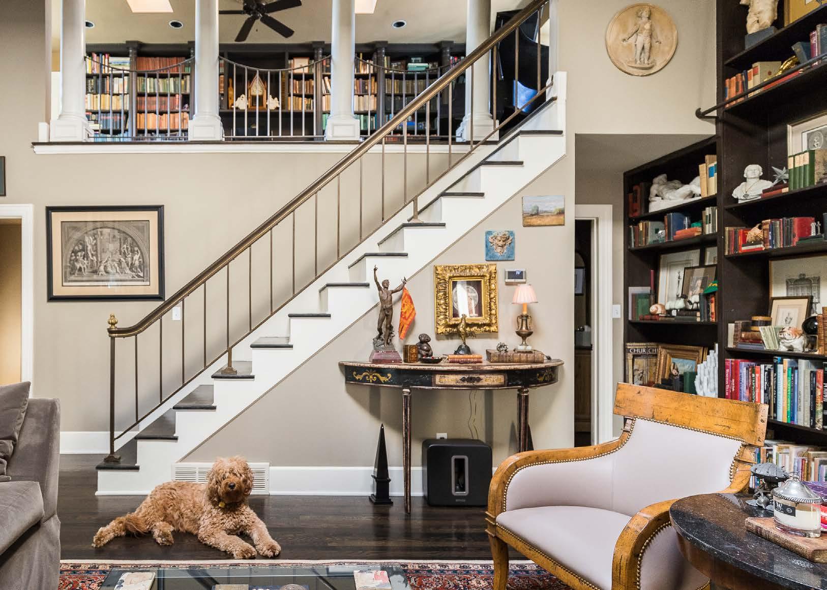
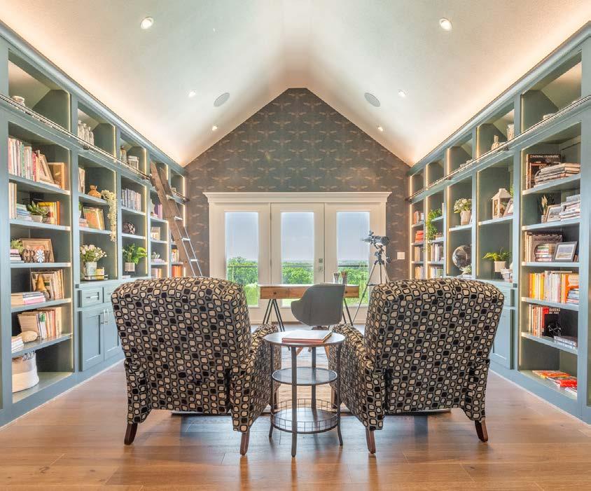
The kitchen features farmhouse charm with its salvaged wood floors and antique armoire used for storage. Previous page: The most prominent room in Blake’s house is a hearth room featuring floor-to-ceiling library shelving with a library ladder. Previous owners raised the ceilings to 14 feet and added skylights.
In 2010, he acquired the business.
“Itʼs seldom when passions and careers intersect,” he adds, “but when they do, you just take the leap and go for it.”
These days, Blake travels four or five times a year on buying trips to Northern France, Belgium and Holland. But thereʼs a certain amount of serendipity to it.
“Itʼs not like you can go over there with a specific list,” he explains. “You have to buy whatʼs available.”
“Most of the time, I buy what I like,” he continues. “And sometimes I buy things that I donʼt like, but I know that they sell well and that thereʼs a demand for them. So, itʼs a little bit of a mix.”
A collector of things ranging from art and books to corkscrews, inkwells and even canes and umbrellas, Blake says his line of work requires restraint.
“There are a lot of things that I want to keep for myself, but I have to eat as well,” he says with a laugh.


15395 Briar Rd, Suite A Basehor, KS 66007
At PCDI Homes, we believe that a custom home should be designed for the family living in it. From big ideas to small details, it all matters. Beginning with our in-house plan design service and curated selection center we combine all the details together in a beautiful and cohesive design. Working with our team of trusted and skilled trade partners, we then bring that design to life. We approach each home with a personalized experience and deliver a quality custom home that us, our trade partners, and most importantly, our homeowners are proud of.

The fireplace was inspired by grand hearths at the famous Biltmore Estate. Historical detailing and personal touches, such as the addition of the owls, make a fascinating display.
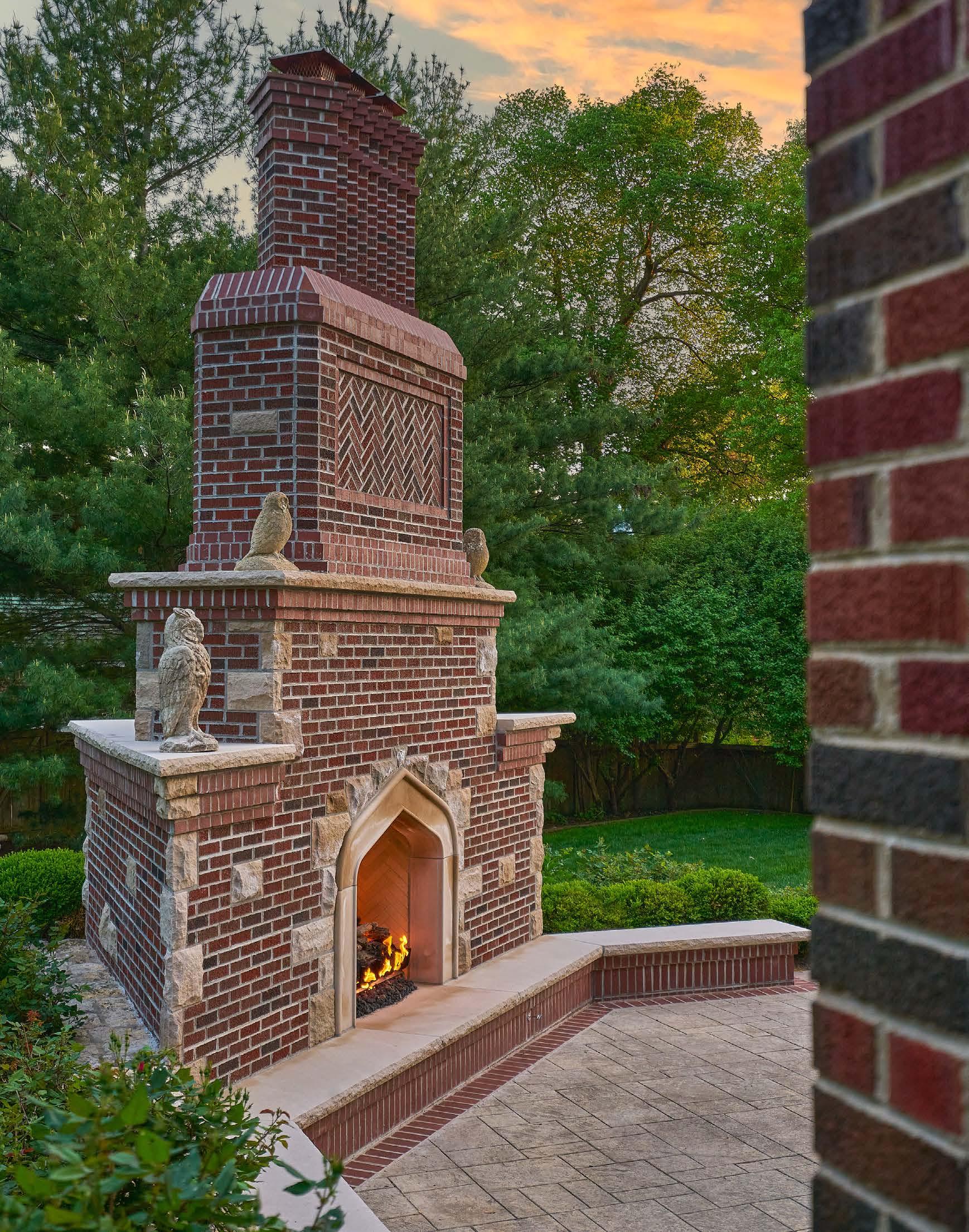
An impressive, multifaceted outdoor replace is built to match the grandeur of its 100-year-old estate.
Words by Corinne L. Casazza | Photos by Cory Finleyormer owners Mark and Stephanie Erceg got their initial inspiration for this stunning fireplace from admiring unique chimney stacks on their walks around Mission Hills. “We were also influenced by the considerable time we spent in England while living in Geneva, Switzerland,” Mark says. The couple had always loved Edwardian-era homes and wanted to incorporate that aesthetic into the design.
They were introduced to Caleb Kangas, owner of Third Space Design Build, and charged him with creating a fireplace to complement their stately brick home. The house is more than 100 years old, and it was important to the Ercegs that the fireplace look like it had been built alongside it.

To achieve this synergy, Caleb used a variety of bricklaying patterns, herringbone patterns, inlays and angles. “We put the stone on the sides of the fireplace and limestone caps in different elevations, so it has a turn-of-the-century gothic styling,” he says.
The Ercegsʼ design was greeted enthusiastically by the city. “When we went before the architectural review board, they said theyʼd never seen anything like it and couldnʼt wait to see it built,” Caleb says.
All the limestone used in the piece is Indiana limestone carved specifically for the fireplace.
“The hearth opening was fashioned along the lines of what you might see at Biltmore House in Asheville, North Carolina,” Mark says. “We wanted to capture in some small way the size, scope and scale of some of the fireplaces on display there.”
The limestone mouth of the hearth reveals a chevronpatterned firebox that adds texture—and a three-tiered gas log set custom-fabricated in Arizona. The hearth opening also draws the eye upward toward the carved mantel stone above it. The two owls perched there represent the Ercegsʼ twin girls. The owl on the lower level pays homage to their eldest daughter. The birds were sourced from an old English garden and are a point of pride for Mark, who added them to the piece himself.
At the top, the spires are turned at a 45-degree angle to the main stack. “Mark wanted to have three individual spires to create really great visual interest,” Caleb explains. The outside spires are dummy chimneys, giving the look of three smokestacks coming out the top, but only one actually works.
The overall effect of the multi-level piece is impressive; its architectural detail gives it a great aesthetic that matches the original home perfectly.
“We think it came out beautifully,” Mark says. “We have no doubt it will be there a hundred years from now.”
Anything less than this massive scale would feel dwarfed by the house. With historically accurate architecture by MindMade, the structure reaches nearly two stories up.
The living room was an exercise in toning down the scale of the main level, ultimately making it comfortable for two people recharging but also able to host larger events with ease.
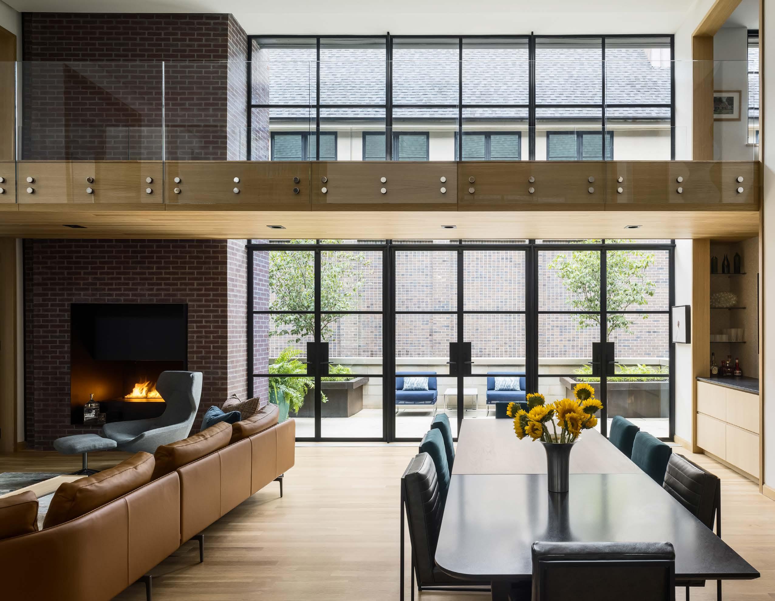
A spectacular art- lled home in Kirkwood provides an urban setting for a couple’s next chapter.
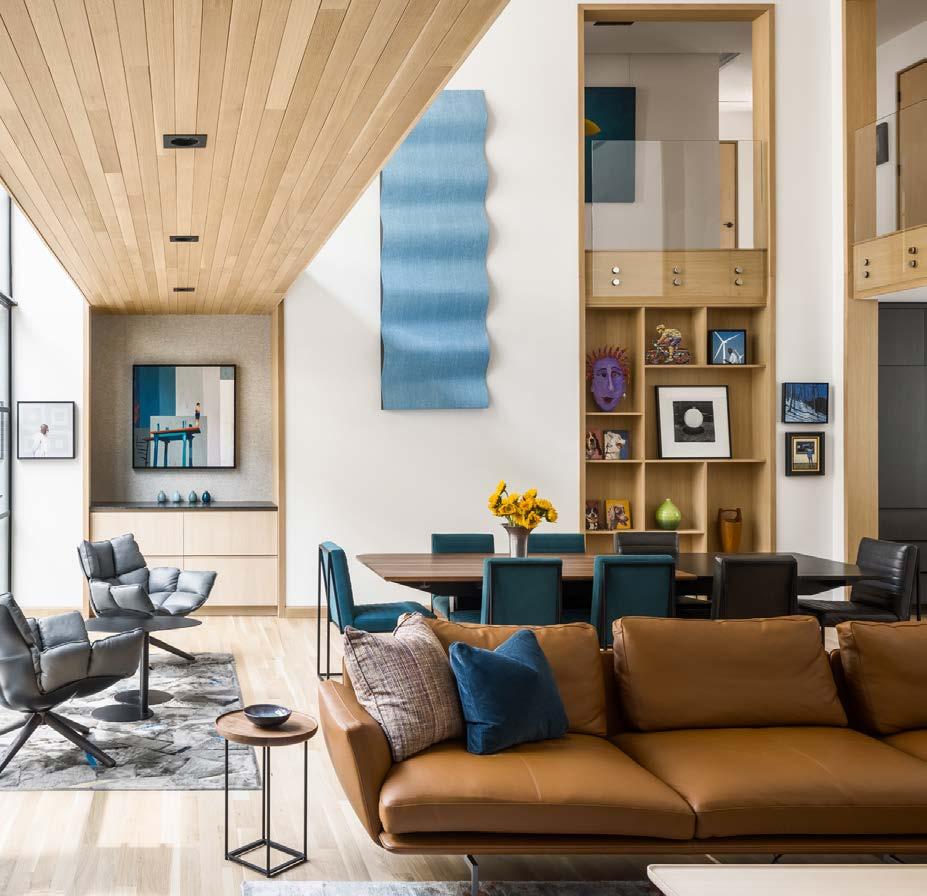
Intended as a timeless sanctuary for a coupleʼs extensive, eclectically curated art collection, this distinctive space allows pieces to be rotated on a whim and inspires a symbiotic dialogue between architecture, art and design—and capitalizes on a dynamic floor plan that embodies both indoor and outdoor living.
Richard Wetzel, cofounder of Centric Homes, had begun building the home speculatively on one of two remaining lots in Kirkwood, off the Country Club Plaza, when buyers were tipped off to this most auspicious opportunity. Its sister was featured in our Spring 2022 issue.
“Although they were radically different homes for radically different people, there was a common denominator—each homeowner loves art,” says Chris Fein, AIA, LEED AP of Forward Design | Architecture.

The homeowners tasked their longtime interior designer, Alan Karlin of Alan Karlin Design, with sourcing furniture that would support the artful ambiance and scale of the main level—while striking a balance between the wifeʼs affection for color and pattern and the husbandʼs desire for a more neutral, subtle palette.
 Words by Kimberly Winter Stern | Photos by Nate Sheets
Scan the code to see the full feature.
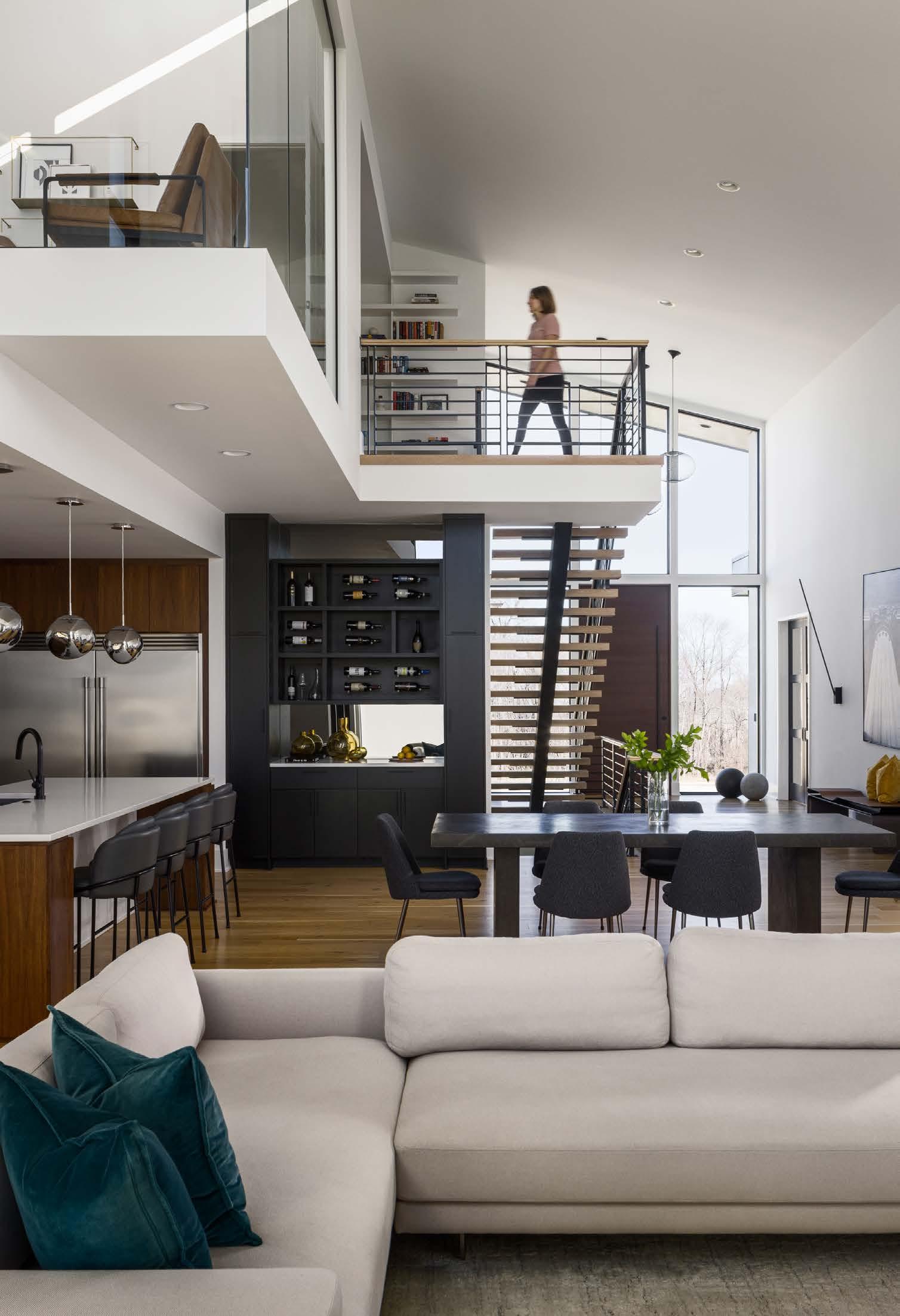
Blended into one continuous space, the living and dining room and kitchen harmoniously connect the home with unobstructed views, from the massive walnut front door to the back where wall-height windows infuse the space with natural light. Midway through framing the house, Shauna and Alex changed course on the main staircase. “Originally it was going to be a standard design, but we opted for a floating staircase with open risers, aligning with the modern feel of the house.”
A modern home inspired by cube design dials in the details for living, working and entertaining in Prairie Village.
 Words by Kimberly Winter Stern | Photos by Nate Sheets
Entrepreneurs Shauna and Alex Upperman lived in Kansas Cityʼs River Market for six years, using every precious inch of a 1,500-square-foot condo to accommodate their busy professional lives.
“My ʻoff iceʼ was the dining room table, and Alex worked in the guest bedroom,” Shauna says.
Yearning for a home to put down roots, they eagerly traversed the city beginning in 2018, scouring options from the compact, urban sophistication of Beacon Hill to the patchwork of competitive alternatives in Fairway, Mission Hills and Prairie Village.
Guiding the coupleʼs house-hunting expeditions was the image of a home yielding a modern but warm aesthetic where they could balance daily living, work demands, raising a family and gathering with friends and family. Following a prolonged search in which nothing on the market struck the right chord, the couple discovered Homestead Court, which at the time had two of its eleven plotted homes completed and another under construction.
The decision was made: the Uppermans would build from scratch.
Developed by Evan-Talan Homes, the meandering cul-desac near Homestead Country Club offered the Uppermans a fresh, exciting blank slate to create a home that would achieve their distinctive design objectives. At the top of their wish list: dedicated off ice spaces for Shauna and Alex, well-appointed rooms for relaxing and entertaining, and an abundance of natural light.
Dialing things up a bit, Shauna envisioned a dramatic, floor-to-ceiling glass off ice on the second level, looking down into the main level, where she could immerse herself in the details of her e-commerce company and still feel connected to the heart of the home.
Walkability to The Shops of Prairie Village was an attractive amenity drawing the couple to the area, with this home adding the benefits of a generous backyard
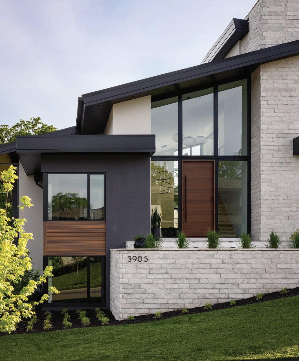
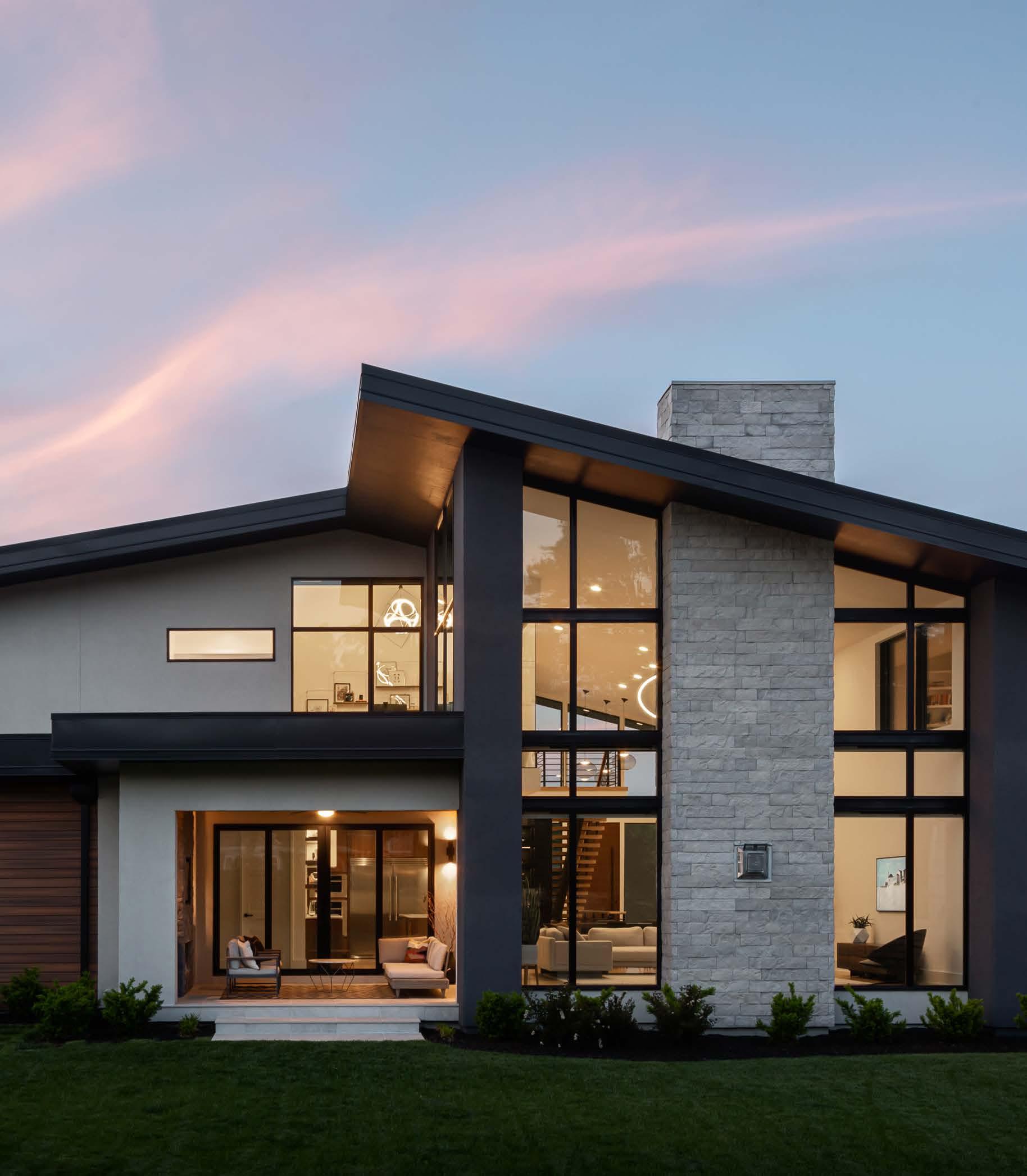
Built by renowned Evan-Talan Homes and designed by acclaimed architect Scott Bickford, the striking limestone exterior of Shauna and Alex Upperman’s modern Prairie Village home is a study in texture.

and mature trees. The slope of the street where their home is situated affords Alexʼs main-level off ice—where he conducts his real estate investment business—lush and expansive views, skimming the treetops of nearby neighborhoods across Mission Road.
The Uppermansʼ collaborative dream team comprised Cory Childress and Kevin Madden, both of Evan-Talan Homes, architect Scott Bickford and interior designer Kristen Ridler.
“Often when sharing with someone that youʼre building a home from the ground up, you hear about negative experiences,” Alex says. “Naturally there was some stress involved, but overall, the process was very positive for Shauna and me. Everyone treated the project like it was where they would live and took pride in their work. If we ran into a snag, viable solutions were discussed. Details were priority—important because we are detail people.”
Between when the design process was initiated in late
2019, the groundbreaking in February 2020 and move-in on April 6, 2021, a few surprises were encountered. The added unknowns of a global pandemic also contributed to the delay of the homeʼs completion. Additionally, Shauna found out during the build that she was expecting the coupleʼs first child, so it became essential to ensure the house would have functional practicality and durable materials, rugs and furnishings in addition to being visually pleasing.
After intense internet research, Shauna and Alex found a modern, cube-shaped Australian home on Houzz that resonated with them; Scott designed a similar home and, after submitting it to the city of Prairie Village for approval, found obstacles to some exterior structural details.
Back to the drawing board, the original floor plan remained, but the exterior was reskinned, the roof transformed from square and boxy to angular, meeting the cityʼs requirements, and components were added from other modern-leaning homes the architect had created.
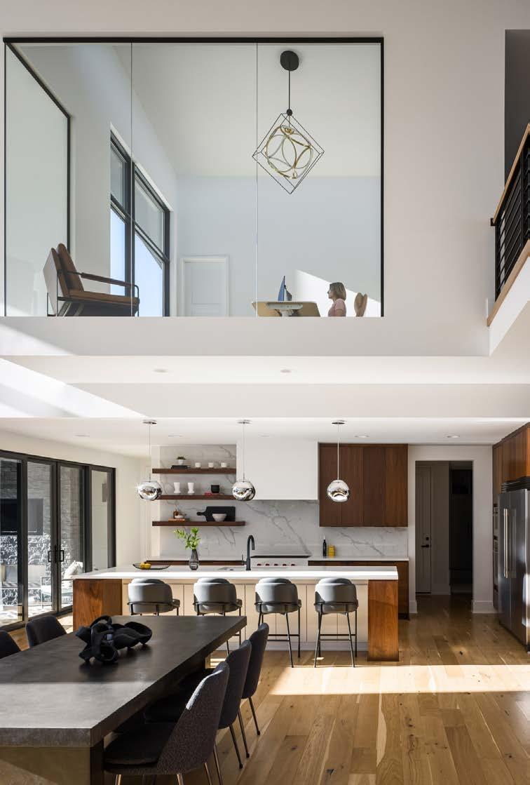 Shauna’s spacious second-floor o ice is one of the home’s unexpected showstoppers. The jewel of a space floats e ortlessly above the combined open-concept living room, dining room and kitchen.
The light show continues at the back of the house, where windows are plentiful. The flat roof on the lanai enabled Scott to add windows to Shauna’s glass-lined o ice.
“Part of the modern home’s innate beauty is its sheer simplicity.”
- Scott Bickford, Architect
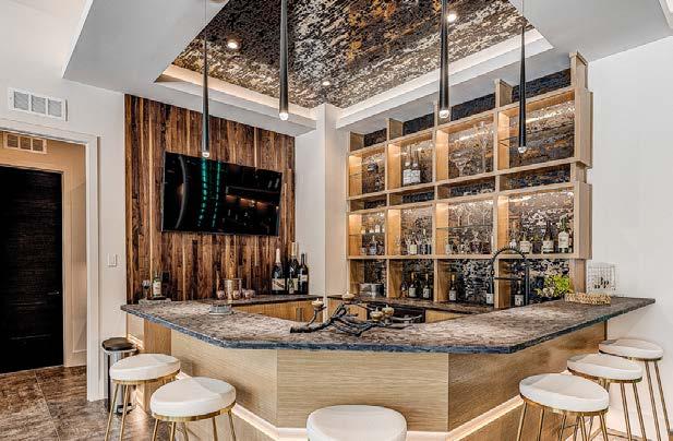
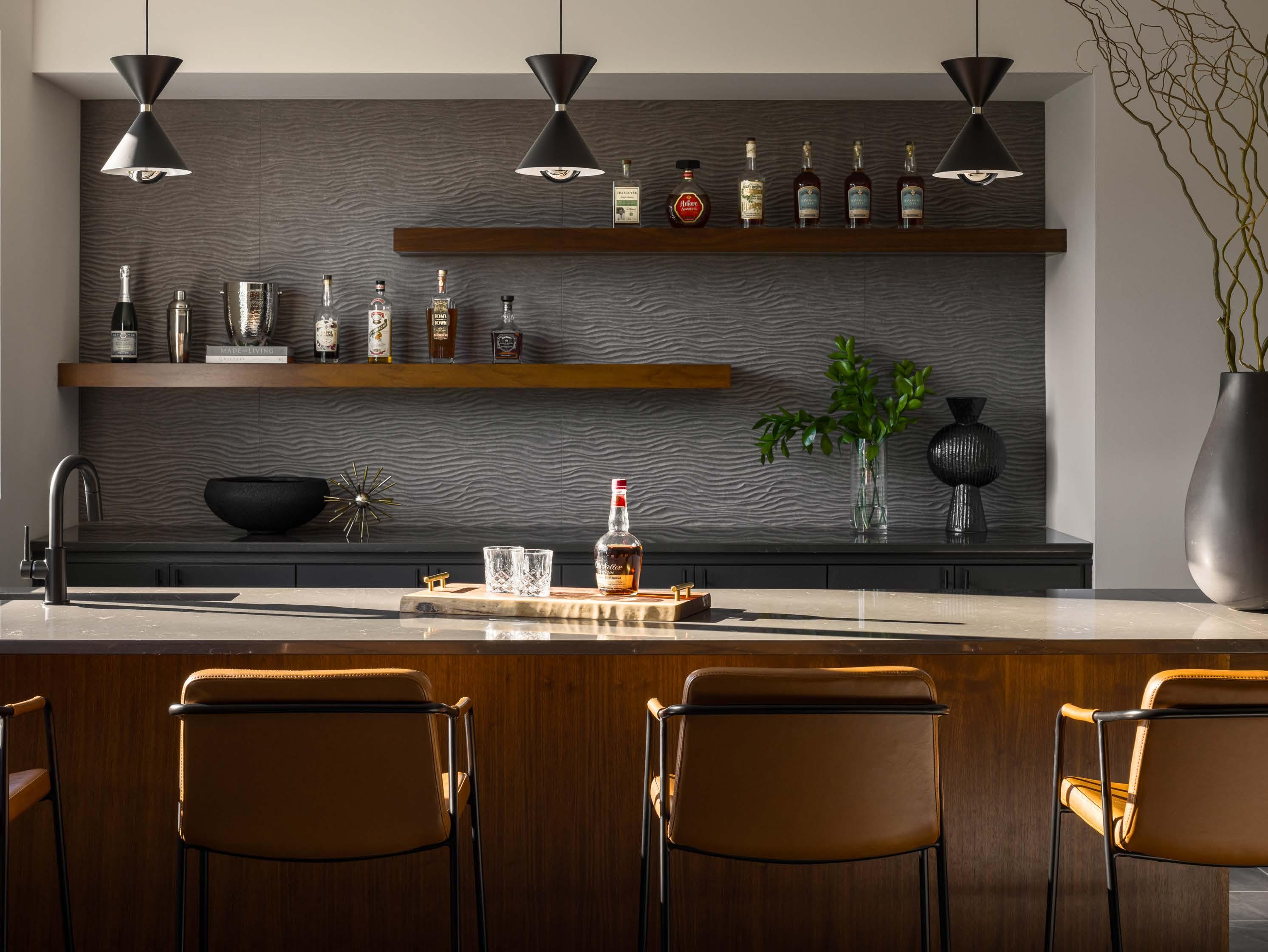
The lower-level bar, where Alex hosts regular poker night with friends, features two floating walnut shelves and a textural 3D tile wall from Kenny’s Tile that reads as carved stone. Three élan light fixtures contribute a mid-century modern vibe and Room & Board leather bar chairs ensure comfort for late-night poker players.
“There were typical design challenges and some unique, behind-the-scenes technical hurdles,” Scott says. “In traditional architecture, you can resolve issues by adding bits and pieces—for example, if a roof doesnʼt come together, add a dormer. With modern homes, the challenge is getting everything to work together while keeping it simple. Part of the modern homeʼs innate beauty is its sheer simplicity.”
A decision was made to do a flat roof over the lanai, allowing windows in Shaunaʼs statement second-floor off ice.
“The roofʼs shape ultimately let us add more windows and get daylight in the middle of the house, too,” Scott explains.
While the partial redesign pushed the schedule back, Alex admits “the new house suited us better.”

“Scott maintained the interiorʼs integrity, which was important to us,” Shauna says.
Teaming with Scott since launching his custom home building company 14 years ago, Cory notes the architect “never has a preconceived idea of what the client wants. He focuses on them, their style and taste, and is willing to make revisions until he captures that.”
A sought-after interior designer whose work appealed to the couple, Kristen was tasked with channeling the Uppermansʼ well-crafted design direction: a home with a modern aesthetic, riff ing off mid-century modern, with curated pops of color and an abundance of natural elements.
“Working with Shauna and Alex to deliver an interior tailored to their personality was truly a creative partnership,” she says. “It needed to have a minimalist touch yet be flexible for a growing family. A beautiful space that was also thoroughly livable.”
Blissfully settled into their stunning Prairie Village home, and thanks to their design and build team, today Shauna and Alex, their young son and goldendoodle Watson are enjoying every minute of their many-layered life.

An artisan is a person in a skilled trade, especially one that involves making beautiful things by hand. This is a fitting description for B.L. Rieke Custom Homesʼ first-ever entry into this past summerʼs 2022 Artisan Home Tour, hosted by the Home Builders Association of Greater Kansas City.
“This house has features everywhere,” says builder and developer Bruce Rieke. He and his wife, interior designer Toni Rieke, knew they had to “do it up right and go over the top” with their design choices.

Coastal themes and mountainous scenes merge in maximalist style at this Lenexa home.
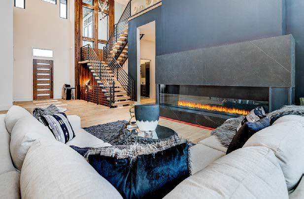
A full marble surround on the fireplace draws the eye toward it then up to a vaulted ceiling featuring alder beams that correspond with other angled features in the home.
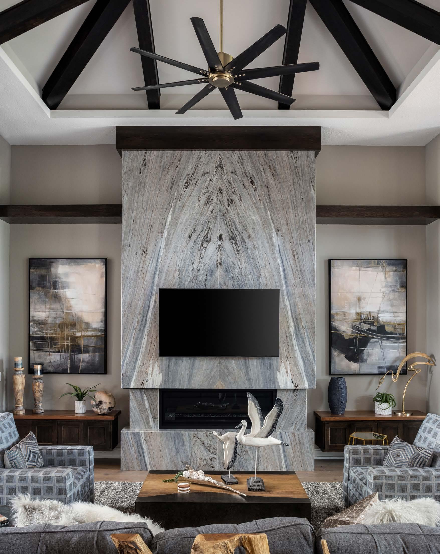
“Itʼs packed with incredible architectural details and one-of-a-kind finishes,” Bruce adds. “It was built for entertaining, functionality and relaxation.”
The Pensacola is a prime example of the builderʼs signature style: a harmonious blend of natural and unique details while still being practical. A fusion of various design styles, the home is handcrafted with organic elements and textures, including roughsawn beams, stone accents and solid wood details.
“Itʼs an eclectic mix of modern, contemporary, mid-century and rustic,” Toni describes.
The Bahama shutters on the outside, for instance, are reminiscent of the coastal Florida resorts that served as inspiration for the original design, while the location on a wooded corner lot feels reminiscent of Coloradoʼs mountains.
Toni followed her gut instinct on the interiors.
“What would people really use, and how would I want to live in the space?” she asks. “Thatʼs also really important to think about.”
Throughout the home, she repeats patterns, colors and other features to create a Zen-like and comfortable experience. “This house feels homey; we merged warm earth colors back into the design scheme to achieve that.”
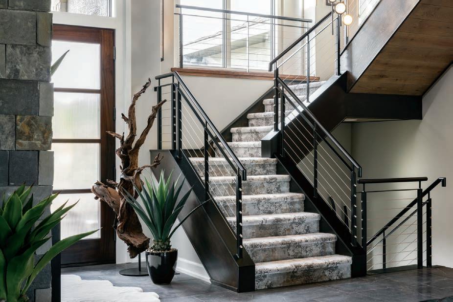
Soaring ceilings showcase a suspended staircase with live-sawn oak and walnut accents, cable railings and a light fixture containing 27 LED spheres, all hung by hand at various lengths.
The living room features an exotic marbleencapsulated floor-to-ceiling fireplace that Toni designed using two bookend-matching slabs. The


“
“It de nitely has that wow factor … every detail is tailored for easy living and at-home leisure.”
- Toni Rieke, Interior Designer
- Toni Rieke, Interior Designer
fireplace extends the view to the dramatic vaulted ceiling with beams and up-lighting. The flooring is live-sawn white oak planks with an eased, chiseled edge and an oiled finish, which the couple discovered on a trip to Pennsylvania with their flooring subcontractor.

White oak was also used for the kitchen cabinets— along with quartz countertops, shimmering backsplash tile and a hand-forged metal range hood custom-made in Colorado. The core feature of the space is the island top, with a solid-walnut countertop extension piece that functions as a serving area for large gatherings.
The hardware finishes were significantly upgraded and include black stainless steel, polished nickel, matte black and finely brushed brass.
“I love to mix metals,” Toni says. “Everything doesnʼt have to match; it just has to feel right.”
A fully finished and entertainment-ready lower level impresses with its wine room backlit by a vertical agate slab, curved banquette seating, and walk-out access to the lower patio and backyard.
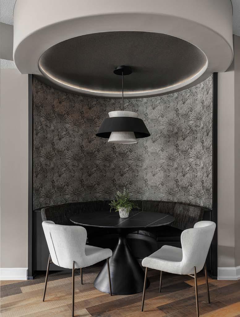
“The outdoor living package we had in mind included plenty of places to entertain,” Bruce says. “The setting on the lot couldnʼt have been better.”
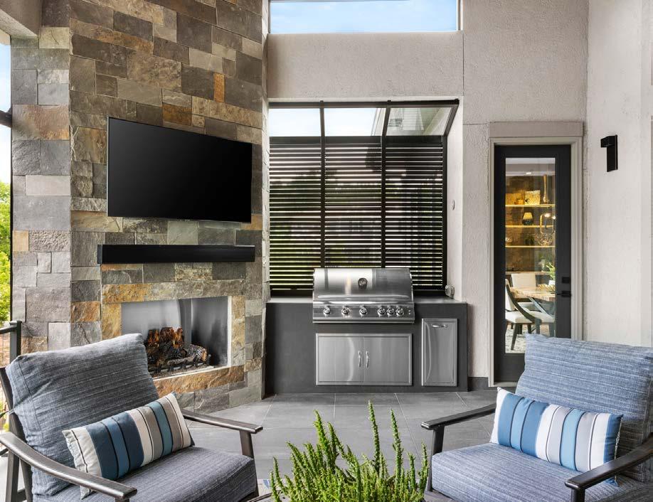 A covered deck o the kitchen can be enjoyed year-round: a motorized screen helps block the space from the hot sun, while the fireplace keeps it warm on chilly evenings. Bahama shutters on the home’s exterior add to its coastal vibe. The lower level o ers several distinct conversation areas serving multiple functions.
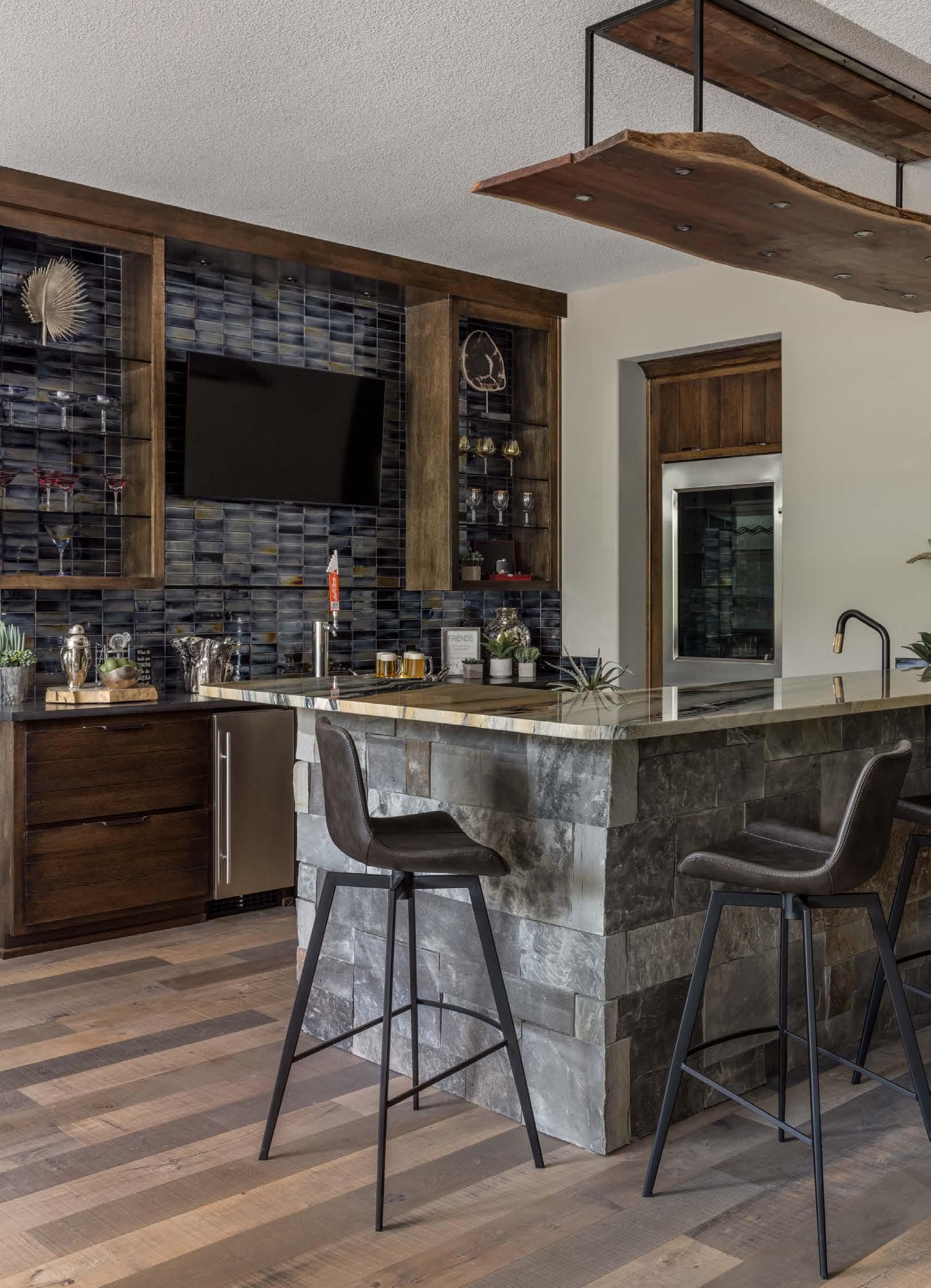
Outdoor living space is a recurring feature in all Rieke-built homes. The Pensacolaʼs main-level deck space was designed for maximum comfort and luxury leisure time with a motorized screen to create privacy as well as to keep the space cool from the sun. It also conveniently houses an outdoor grill.
At ground level, the future homeowners can enjoy the custom firepit, water feature, outdoor kitchen, lavish multi-level landscaping set off by mountain boulders, natural stone pathways and a built-in garden bed.
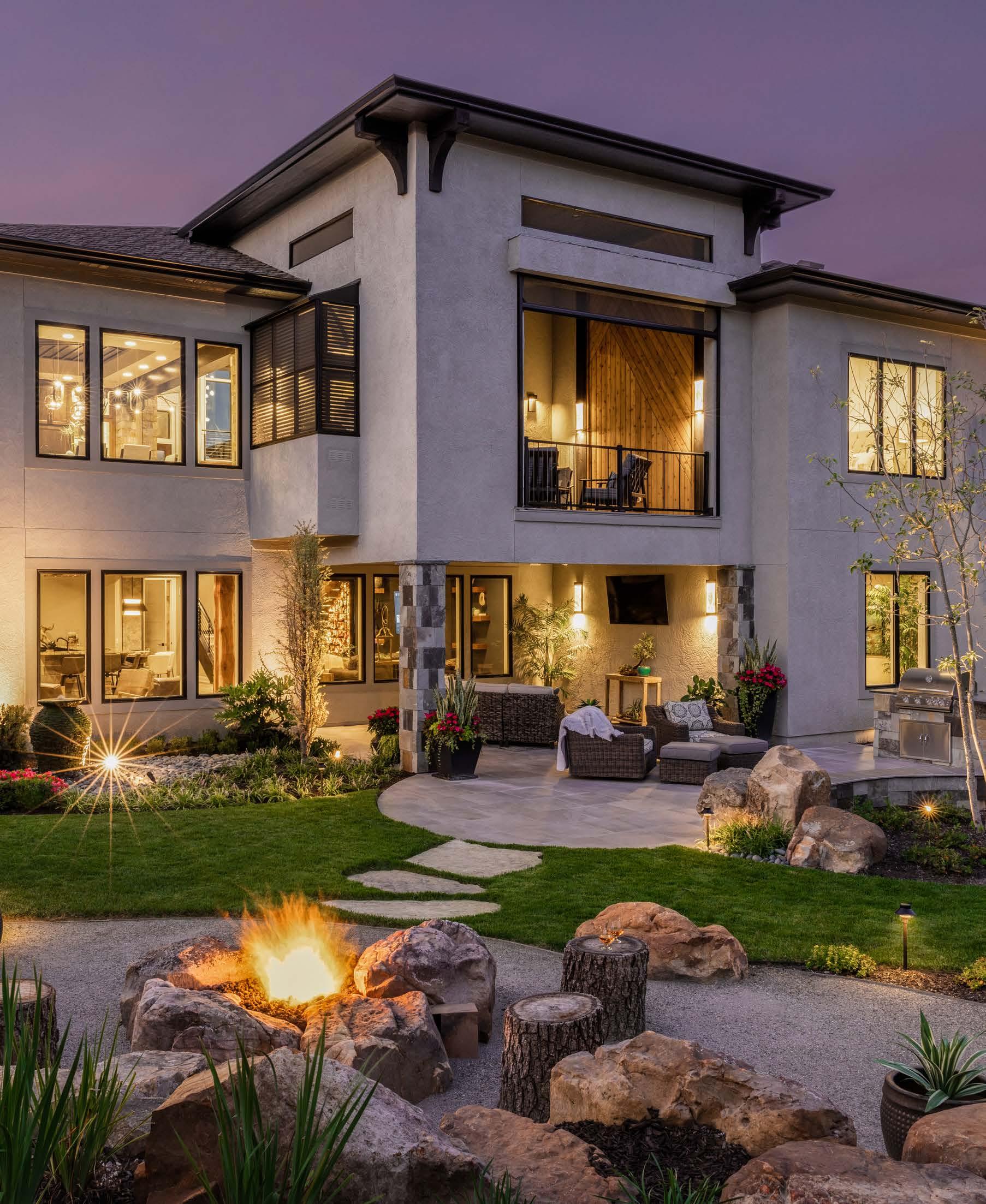
Riekeʼs residents also have access to the Timber Rock developmentʼs amenities, including a resortstyle pool, clubhouse, sport courts and walking trails.
“Our homes are a product of hard work, innovation and an amazing collection of talented craft smen—each one an artist,” Bruce says. “We bring the talent together and guide the ship.”
A tribute to the excellence of their work and crew, Bruce and Toni accepted two awards in the Fall 2022 Parade of Homes: the Pick of the Parade Gold Award and the Distinctive Plan and Design First Place Award.
“Our goal,” Toni says, “is to always build a house that just feels good.”
For the couple who built their first house for themselves as 22-year-old newlyweds, in over three decades and 1,300 more homes, some things havenʼt changed.
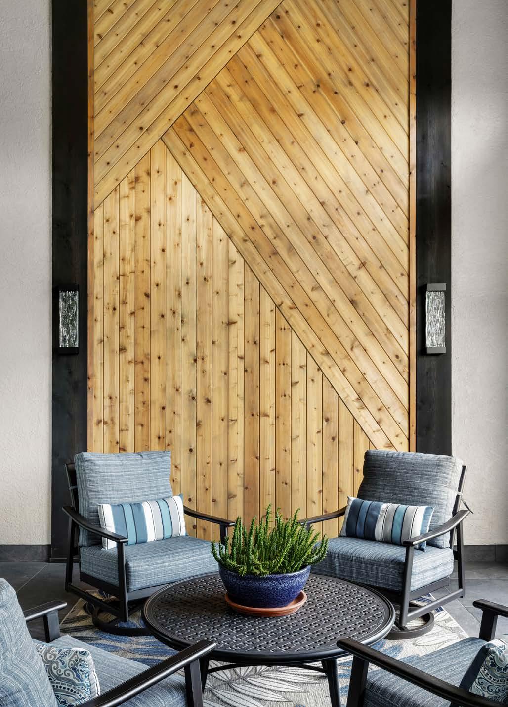
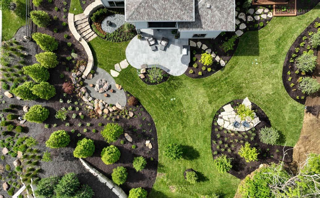
 The home’s extensive landscaping extends the living space outdoors, with several seating and entertaining areas connected by meandering stone pathways.
A thoughtful blend of light and dark brings contrast and nuance to a freshly furnished home.
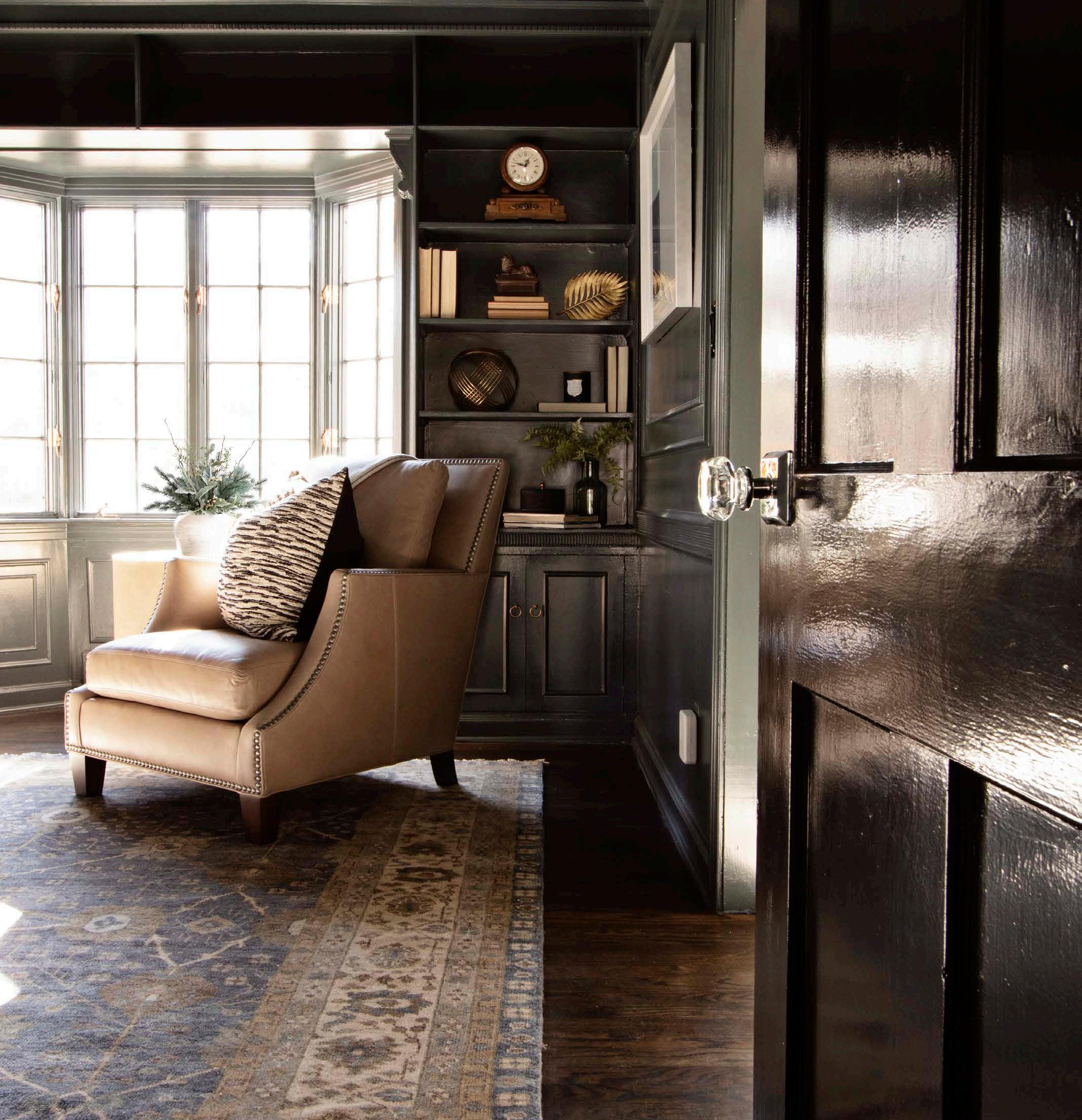 Words by Katy Ryan Schamberger | Photos by Laurie Kilgore

When Lee Dempsey bought a stately home in Mission Hills, he wanted professional guidance on the homeʼs interior design and furnishings. At the behest of a mutual friend, Lee reached out to Maureen Lindstrom, principal of ML Designs, to inject a sense of timeless sophistication into key rooms throughout the home—including the dining room, entryway, hearth room and library. The resulting aesthetic— rich yet nuanced—effortlessly shifts from an inviting entertaining backdrop to a cozy, quiet escape from Leeʼs hectic schedule as an attorney.
Lee and Maureen connected mid-pandemic, so the majority of their meetings and discussions were held virtually on Zoom rather than in person. He offered her some guidance—he wanted his home to be versatile so he could easily entertain and host dinner gatherings— but otherwise, he gave Maureen free rein.
“He really had no opinions,” Maureen says with a laugh. “Thatʼs fun because it enables me to get my creative

juices flowing, but itʼs also a lot of pressure. As I would suggest art or furnishings or color palettes, I kept thinking, ʻI hope he likes them!ʼ”
She would typically begin crafting the vision for a new project during a thorough walk-through of the home. Yet the previous owners hadnʼt yet moved out of Leeʼs new home and pandemic precautions forced a virtual tour.
“We did a Zoom call together and they walked me through the home and supplied me with all of the measurements I needed,” Maureen says.
That gave her a better feel for the home and also for the existing features she wanted to embrace rather than change. One example: the
lacquered library walls that shine then deepen throughout the day as the light shift s.
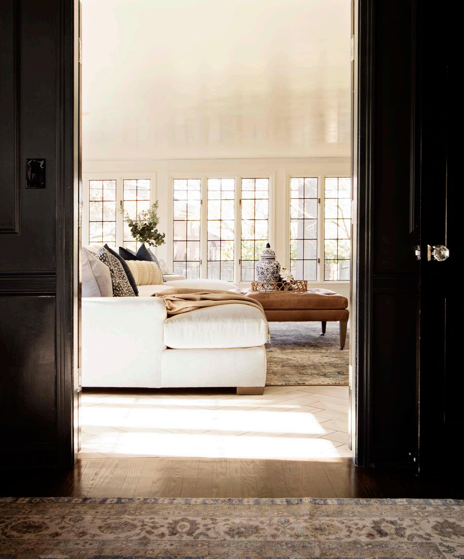
Maureen used the libraryʼs moody hue as a starting point for creating an inviting retreat that could easily function as a comfortable workspace or as a place to host a colleague for an after-work cocktail. She sourced a pair of deep armchairs covered in warm camel leather that coordinated perfectly with a hand-knotted rug featuring neutral hues interspersed with a smoky blue.
Eye-catching abstract art further enhances the unexpected wall color, while pops of lighter hues—a white accent table, a circular mirror framed by the subtle sheen of gold spheres—
By keeping the windows unadorned and unobscured, picturesque outdoor views— including an abundance of mature trees—are a principal part of the sunroom.
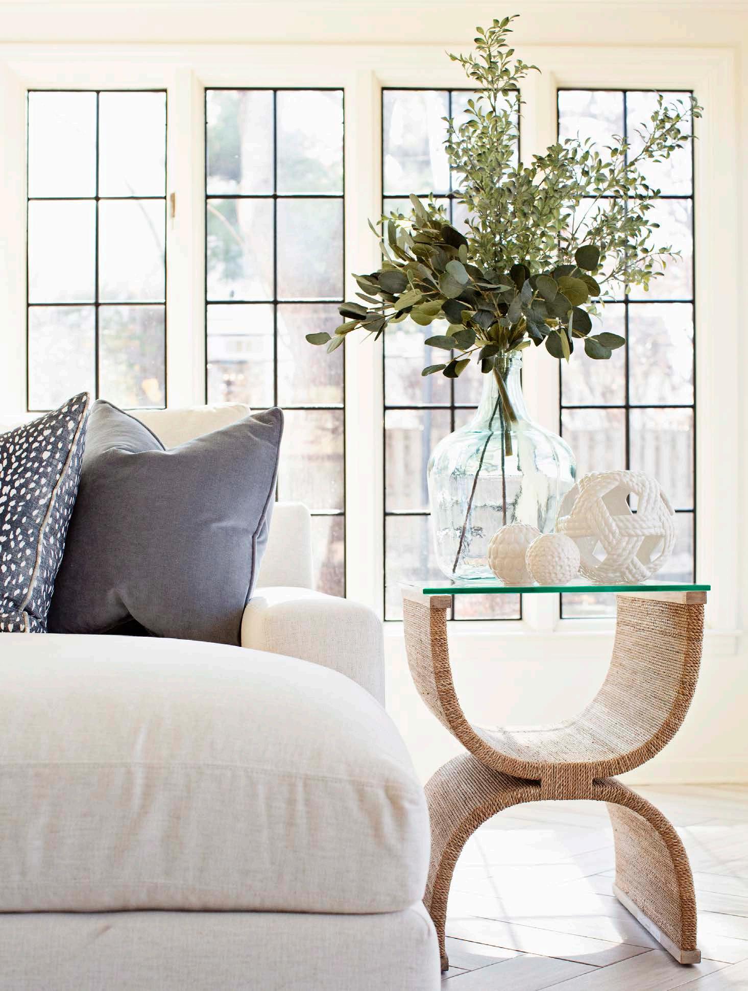
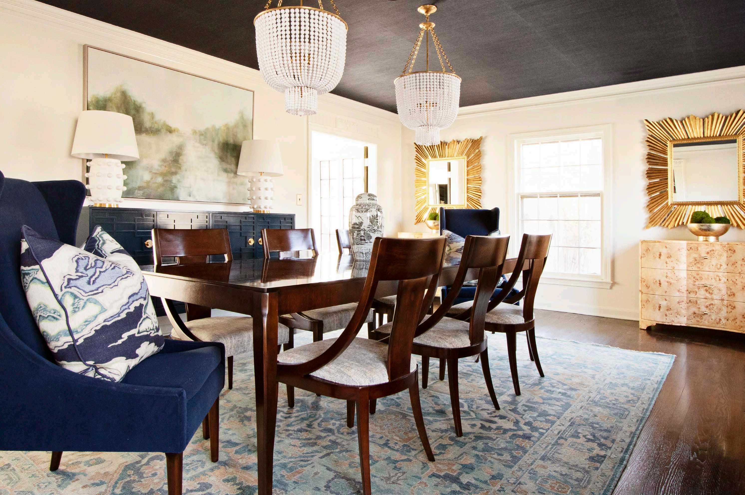
create an ideal contrast. Built-in shelves flanking the tall bay windows feature some of Leeʼs most treasured mementos, including baseball-themed collectibles, to make the space feel more uniquely him.
The virtual walk-through, combined with the clientʼs input, also revealed elements in the home that Lee wanted to change. That included the dining room, which Lee initially described as too big and not at all welcoming.
“When we were discussing the dining room, Lee said, ʻI hope youʼll make me like it by the end,ʼ” Maureen recalls. “Challenge accepted!”
In the long, rectangular space, another unexpected wall color waited: this time, a bright kelly green enhanced by navy grasscloth wallpaper on the ceiling.
“I loved the wall color in the dining room, but anything I paired with it felt a little too much— clown-like,” Maureen says.
The chic grasscloth remained on the ceiling for an unexpected mix of both hue and texture. And speaking of the ceiling, Maureen opted to preserve an ornate medallion mounted in the center of the ceiling so as not to disturb the wallpaper. Dual chandeliers flank the medallion, drawing the eye and also extending a secondary color—a muted matte gold—into each corner of the room.
The walls were painted white, a more versatile backdrop for the amount of art and furniture needed to fill the large, lengthy space. Part of Maureenʼs creative approach included an appealing mix of textures, colors and styles—from a burlwood chest with matching mirrors at the end of the room to a long credenza adorned with fretwork detail that she says is one of her favorite pieces. Additional finishing touches, including subtly abstract landscape art and Kelly Wearstler lamps, serve to both fill the space and unify the different styles in play.

Right: One of the home’s existing features, a built-in bar, makes at-home entertaining easy. The artwork in this space encompasses all the right shades of blue and enhances the relaxed vibe of the room.
All things in life benefit from balance, and this home is no exception. Maureen took full advantage of the homeʼs existing features and layout to strike a gentle contrast between darker, moodier spaces like the library with airy, light-filled areas like the sunroom.
“The sunroom was especially fun to design,” she says. “There are a ton of windows that showcase all of the trees surrounding the home. It feels like the outdoors are coming in, so we wanted to embrace that and keep the furniture light, too.”
The crowd favorite: a plush, buttery sectional that invites Lee and his guests to get comfortable and stay awhile—all part of Maureenʼs plan.
“We wanted to create a space that would be ideal for hosting a Kansas City Chiefs game watch party—a large yet cozy entertaining spot,” she says.
Elsewhere in the sunroom, she applied her talent for effortlessly mixing not just materials and colors but also time periods. A buffet trimmed in Lucite edges and brass studs adds a subtle modern flair to the more traditional floor plan.

“We love mixing traditional and modern, especially given this particular home and the clientʼs tastes,”
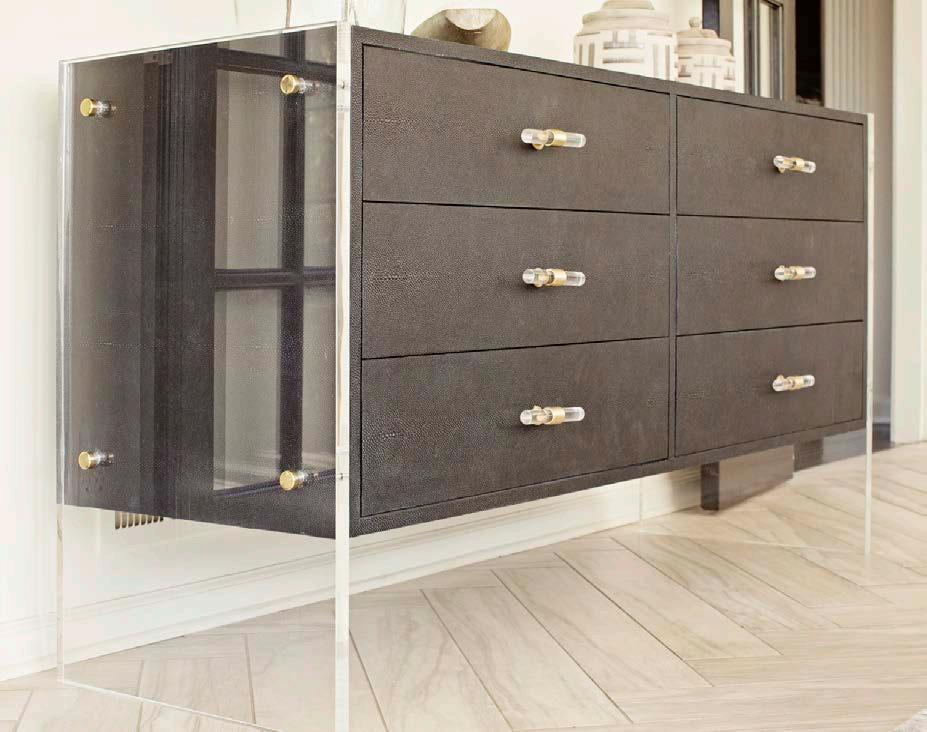
Maureen says. “Adding pieces with a modern edge keeps the overall effect interesting.”
Sometimes, striking that ideal balance of furnishings, fixtures and finishings can be more challenging. Part of Maureenʼs updates to the primary bedroom included a striking new light fixture. This focal point proved diff icult to source, however, as Maureen encountered many options that were too feminine in their style or materials.
She finally found what she had envisioned: a striking light fixture that nestles a muted bronze chandelier inside a dark shape, reminiscent of a birdcage. The showstopping fixture is balanced by dark walls, a classic fourposter bed and matching nightstands and lamps, all of which blend to create a feeling of subtle sophistication.
After the clientʼs unwavering patience with unexpected supply chain–related delays, Maureen and her team unveiled the finished masterpiece during a full-fledged reveal, surprising Lee as he arrived home from work.
The verdict? A home run!
“He loved it,” Maureen says.
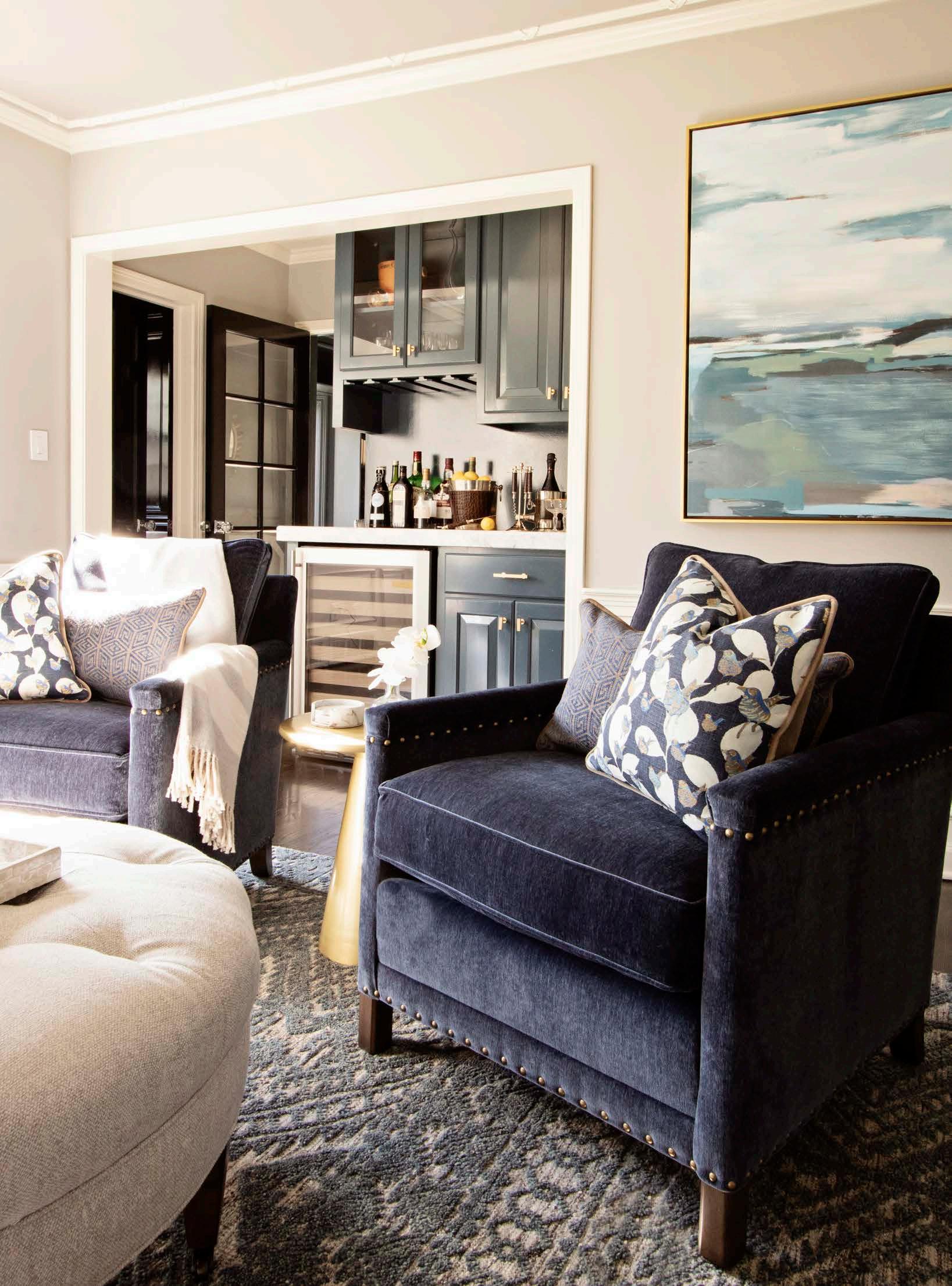
Known a ectionately by the homeowners as the rosé room, this space proves grown-ups can have fun attic playrooms too. The mirrored built-in bar o ers entertaining practicality since the kitchen is two levels below. The attic party space, complete with swiveling chairs from Restoration Hardware, leads out to the roo op deck so guests can easily mingle inside and out.
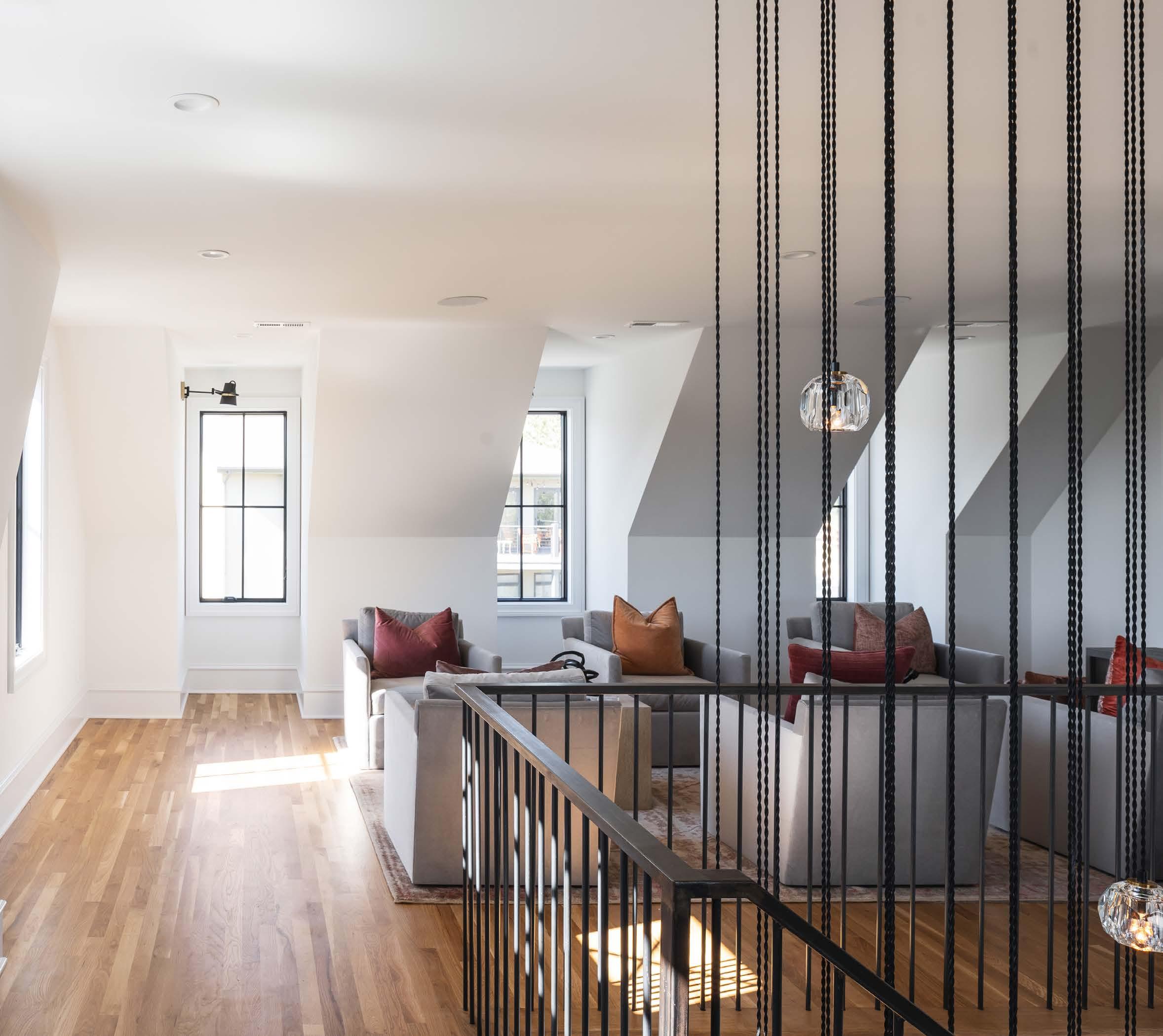
Just like the historic row homes in large cities, the Franklin Heights homes form a tidy, close-knit row. But they have a bit more breathing room between them to accommodate current building codes. The limestone brick is a nod to locally sourced, historically accurate materials, while the black window trim and metal roof give the home’s exterior a modern underscore.
Thereʼs nothing like an afternoon drive through Kansas Cityʼs historic neighborhoods. Each community has its own architectural calling card: the grand stone mansions in Hyde Park, the famed Shirtwaists in West Plaza and a cornucopia of Tudors, bungalows and Georgian Revivals in Brookside.
Drive up to the Westside neighborhood, and youʼll see an energetic set of row homes taking advantage of some of the cityʼs best views.
Theyʼre completely at ease in this particular historic neighborhood, but these row homes arenʼt 100 years old. Theyʼre new builds from Edward Franklin Building Company, designed in a lovingly coined Historically Modern style.

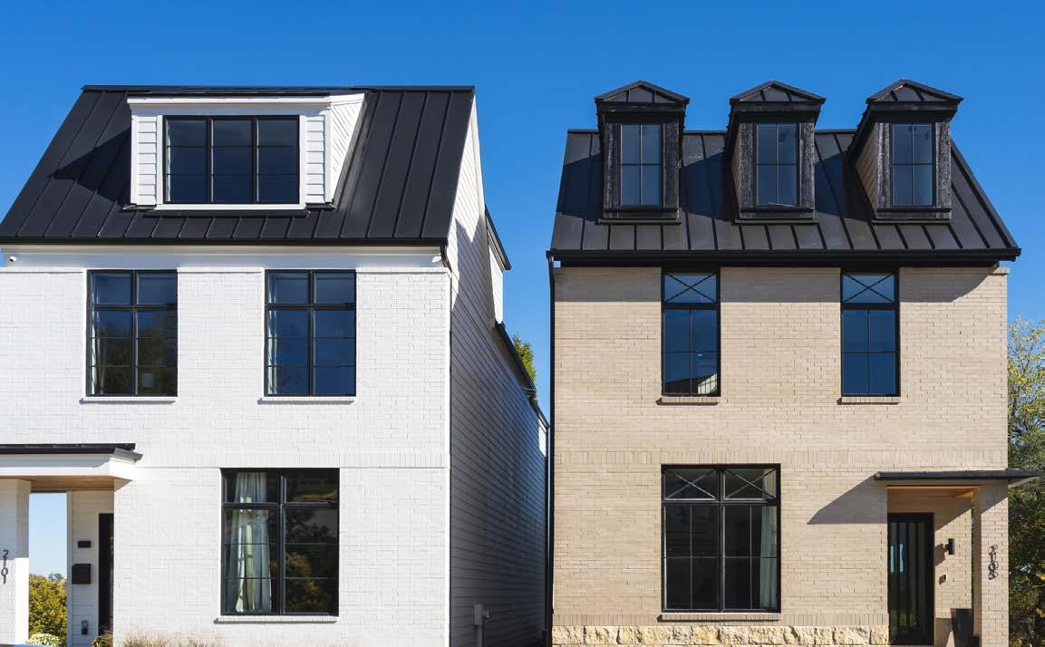
The companyʼs managing partners Grant Baumgartner and Chris Ruhl, who both grew up in Kansas City, have a deep appreciation for the cityʼs history. The company is named for Edward Franklin Baumgartner, Grantʼs grandfather, who was a longtime midtown resident and helped instill in Grant a love for the city.
“Thereʼs so much going on in downtown Kansas City, with the pride that we have in the city,” Grant says. “People have been looking for new homes in the urban core, but there just werenʼt enough infill new homes being built … So weʼre embracing
A Westside
home connects Kansas City’s storied past with its hopeful future.


the history and architecture of these neighborhoods and, at the same time, creating the kinds of homes that people are looking for now.”
As a company, Edward Franklinʼs vision isnʼt to replace a communityʼs existing personality, but to reenergize it with respectful-yet-imaginative renovations and new builds.
Edward Franklin saw success with their initial projects in the cityʼs northeastern Columbus Park neighborhood. After completing several homes there, they were looking to expand beyond that area when they found the perfect spot in Westside.
As Grant explains, they tore down a suburban-style house built in the 1970s. Then, to create the Franklin Heights row, they divided the large lot into smaller footprints. Not only is a smaller footprint more historically accurate for the neighborhood, but it also happens to be exactly what todayʼs urban home buyer is looking for.
Understanding this mindset, the Edward Franklin team builds purposeful spaces instead of
The primary closet, which mimics the proportions of the home itself, was conceptualized to make the homeowners feel as though they’ve stepped into their own private boutique.
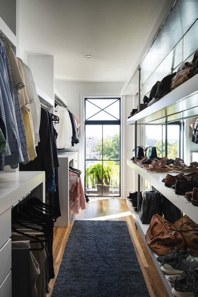
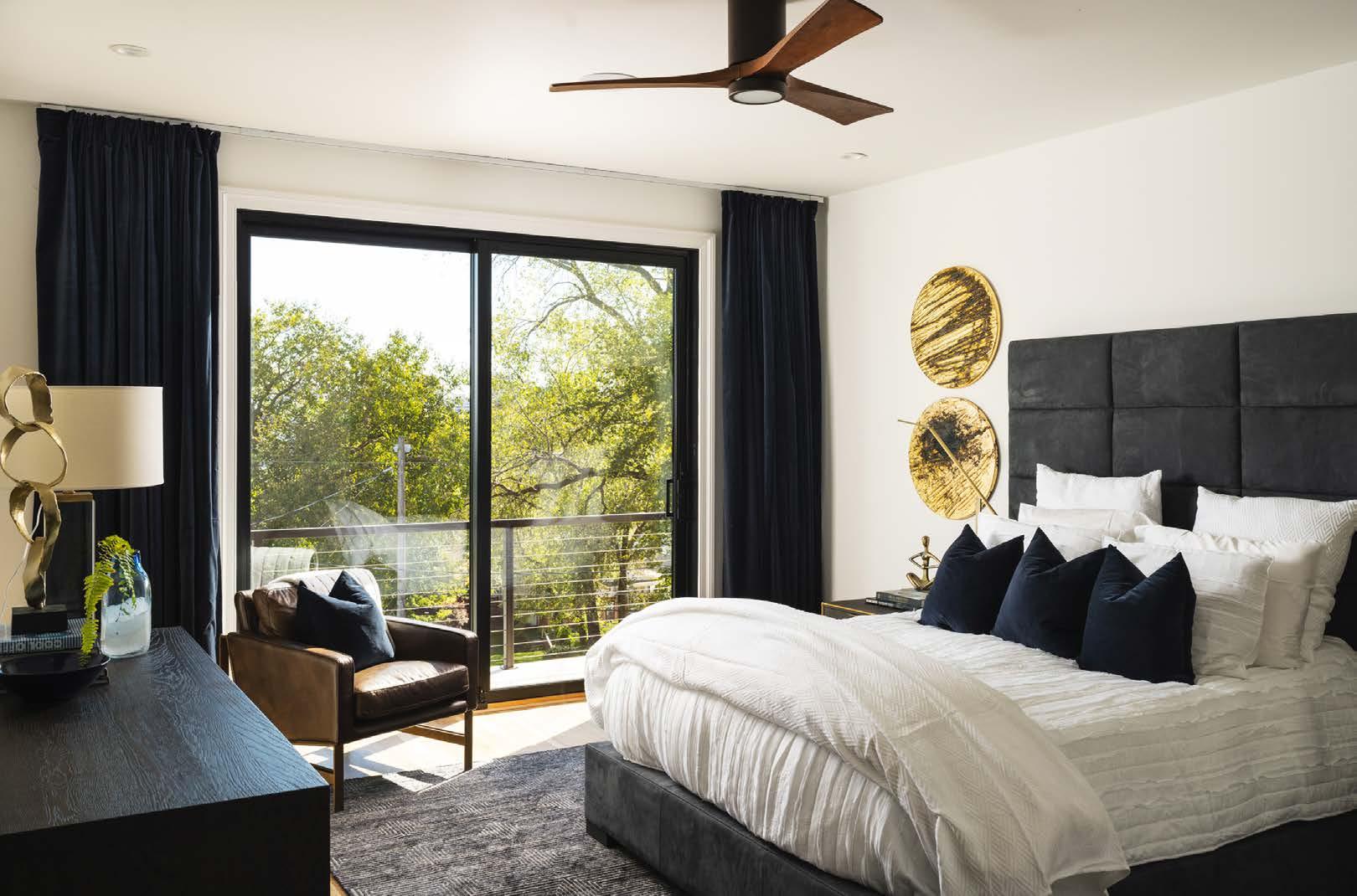
Below: Subtle variations in textures— leather, wood and velvet—create interest without disturbing the peace. A priceless sunrise view of the iconic Western Auto sign greets the homeowners from their bedroom each morning, where they can also enjoy a private balcony just beyond the large sliding doors.
Right: The primary bathroom is one place nobody wants to feel historical. Elegant marble tile and a mullioned window provide past context, while LED lighting and modern plumbing serve homeowners better.
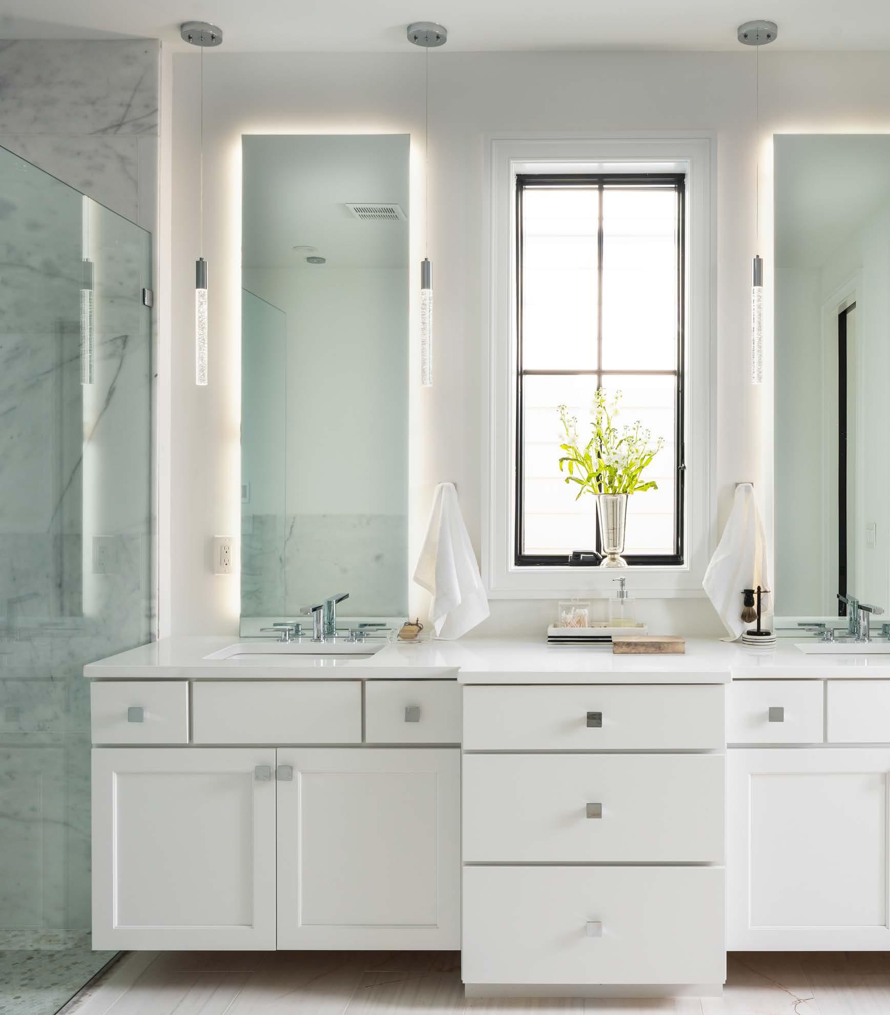
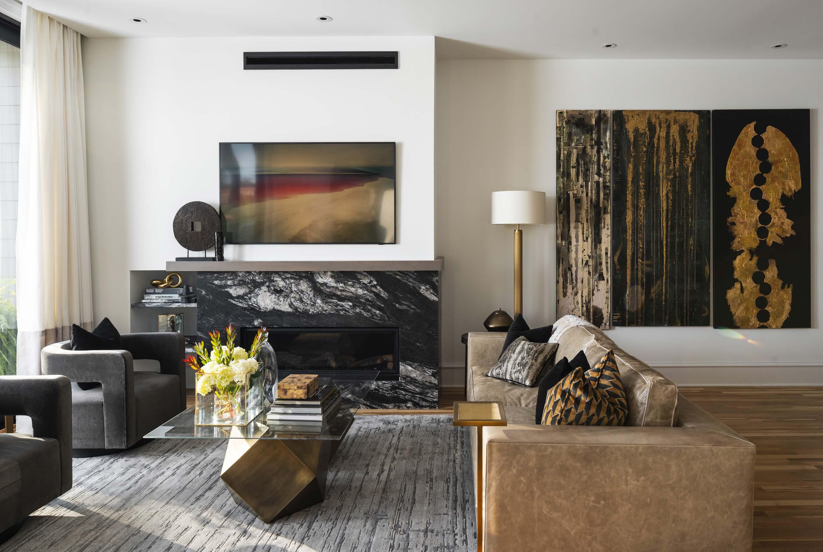
unnecessarily large houses. And in the case of their row homes, less is definitely more.
In 2021, the team finished the second home in the Franklin Heights row. As Edward Franklin designer Cody Brown explains, this is really where they honed their Historically Modern row home concept.

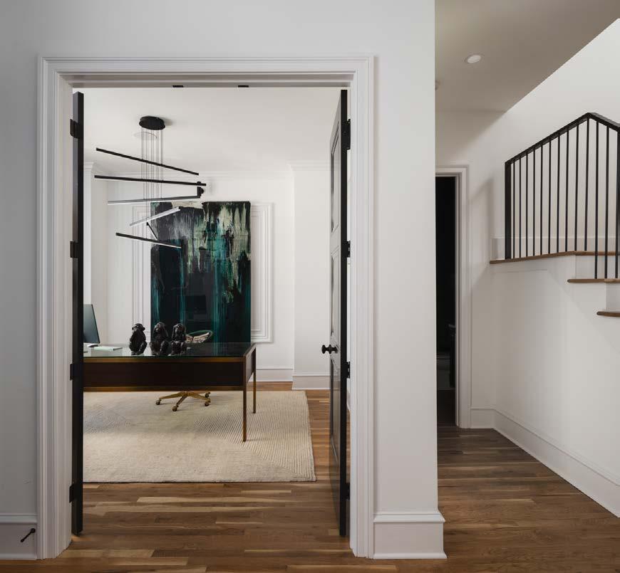
“A set of row homes shouldnʼt look like identical twins,” Cody says. “But they should look closely related, like theyʼre all cousins. Each row home has its own distinctive aesthetic, while sharing similar characteristics.”
This concept captivated the current homeowners. The couple, whoʼd moved from Nebraska and were renting in the Westside, knew right away they had to have this row home on a hill.
Row homes are a carefully considered use of space, typically just 22 to 26 feet wide. And this Franklin Heights home is no exception. But the vertical reach of this home echoes its geographical situation. It takes the horizontal space that we typically attribute as roomy, and, well, turns it on end.
A rare black-and-white brushed granite wraps the corner fireplace and anchors the modern design elements with the home’s more traditional architecture. Earth tones establish a groundedness, while splashes of metallics brighten the space with the sophistication of city life.From the roo op deck, you can see all of the Crossroads and Westside neighborhoods and look across the city to the east. Edward Franklin is continuing to build its brand by reenergizing historic neighborhoods—not replacing them. “Downtown Kansas City is a place where we can experiment with new concepts,” Edward Franklin cofounder Grant Baumgartner says. “We’re embracing the history and architecture of these neighborhoods and, at the same time, creating the kinds of homes that people are looking for now.”
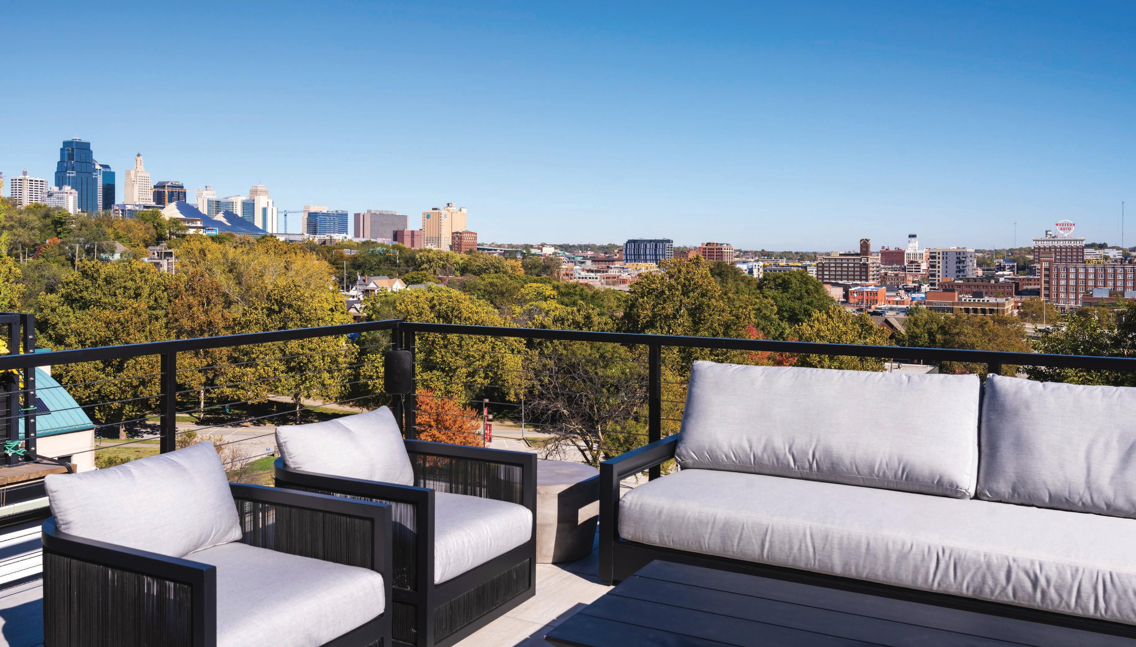
Four stories of living space unfold vertically, from an art studio in the finished basement to a full rooftop deck overlooking the city. And from the outside in, thereʼs an artful interplay of the 1920s and the 2020s.
“Moldings, wood floors, windows—all those more architectural things feel historical,” Cody says. “But then we infuse it with modern elements through lighting and furnishings.”
In selecting the finishing touches, Cody felt it was really important to capture the homeownersʼ sophisticated down-to-earth vibe. After all, this is a couple who moved from out of state to the heart
of Kansas City to kick off their retirement years. So earthy neutrals are paired with bold strokes of metallics. Soft white walls throughout the shared living spaces provide a serene backdrop while bouncing the light from the large windows.
“The floor-to-ceiling sliding doors, the large windows—they almost project the house out over the city to feel the energy of the nightlife thatʼs literally steps away from the homeownersʼ back door,” Cody says.

While thereʼs a busy hum that surrounds it, the home is also tucked into its close-knit row, in its unique community of Westside neighbors, shops
and restaurants. Itʼs a diverse, walkable area; the kind of neighborhood people associate with larger cities, forgetting theyʼre also the fabric of our own.
Two more Historically Modern homes will be added to this row soon. And a second phase of the Franklin Heights project, with five more row homes, is in the works at 21st and Holly Streets.
With the thoughtful touches of the Edward Franklin team, these homes hold the balance between comfort and excitement, like a city itself in a state of renewal. And with any luck, the Westsideʼs Franklin Heights row will still be a stop on an afternoon outing 100 years from now.
See resources on page 214.
@EdwardFranklinBuildingCoWhen photographer Matthew Anderson was driving away from his early morning shoot at the house, he looked in the rearview mirror and noticed wisps of low-lying clouds floating in the open field in front of the house. “Fog over wild grasses is literally exactly what I envisioned with an English cottage!” Joe says with a laugh.
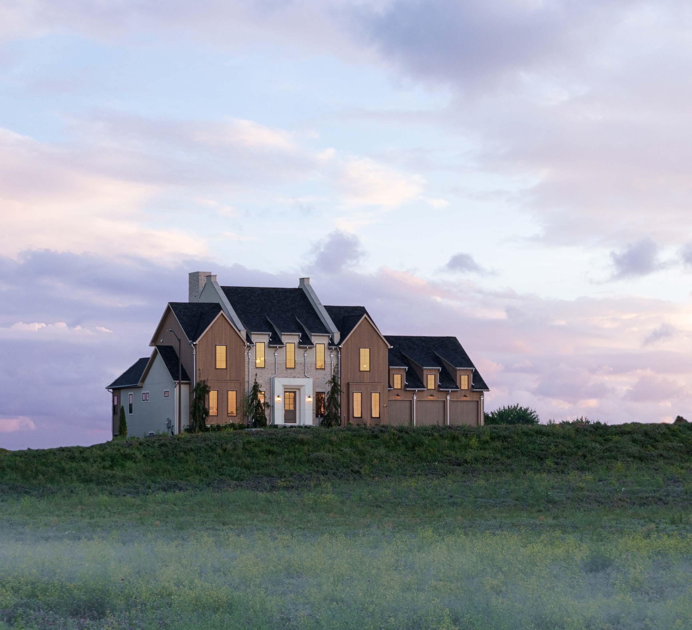
“a
or his 40th birthday, Joe Christensen and his wife went on a bike tour through Europe. Besides the incredible trip, what Joe got was inspired.
“Iʼm definitely inspired by travel—the settings, the things people do,” he says.
As the co-owner of Cardinal Crest Homes, Joe is constantly on the lookout for fresh ideas, methods and materials to use on new builds and home remodeling projects.

A style preference kept resurfacing from his trip: English Cottage.
“Typically when you think of an English cottage, you think of smaller, quainter homes,” Joe says.
But when the opportunity arose to be part of the Artisan Home Tour last summer, Joe knew this would be an ideal time to lean into the intricate, craft sman details of the style. And he knew just the place to showcase this particular home—in the Northland.
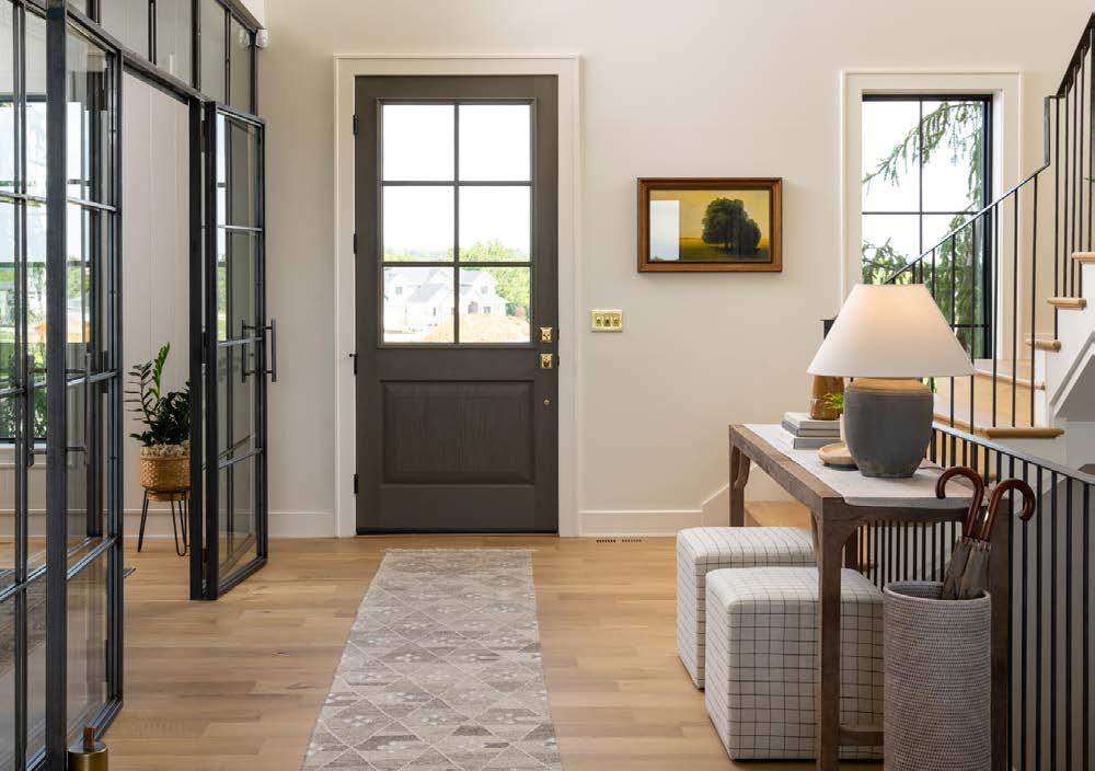
Shoal Creek isnʼt exactly the English countryside, but the golf course greens and gently rolling hills of Eagle Pointe are quite beautiful.
“Both Adam Shaeffer, my business partner, and I live in the area,” Joe says. “People see it as miles away, so this felt like an opportunity to show that it isnʼt.”
The homeʼs historically useful parapet walls are strikingly different from anything in the near surroundings—even distinguishable from Route 152.
“We wanted to place it in that historical timeframe, with updated modern features, of course,” Joe says. “It feels timeless and familiar, but built for today.”
At 7,500 square feet—and with a six-car suspended garage—its size fits the American Dream, while its extensive details place it outside of the usual. The front entry is highlighted by a limestone surround, vertical cypress siding and dormered windows. The back elevation continues to impress with its own attentive detailing. “Itʼs just as good looking,” Joe says, adding, “It isnʼt always done that way.”
The flat walkout lot is ideal for a pool—an element Cardinal Crest didnʼt build for the tour yet envisioned for the future homeowner.
“For the size of the home, we anticipate a family perhaps on their way to being empty-nesters but always hosting family and friends,” Joe says.

The 1.5-story floor plan is conducive to a range of lifestyles with its open-living concept, wide entry with a steel- and glass-enclosed home off ice and main-level primary suite.
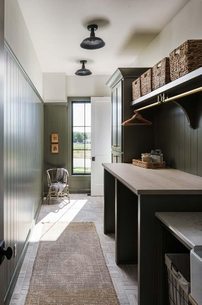

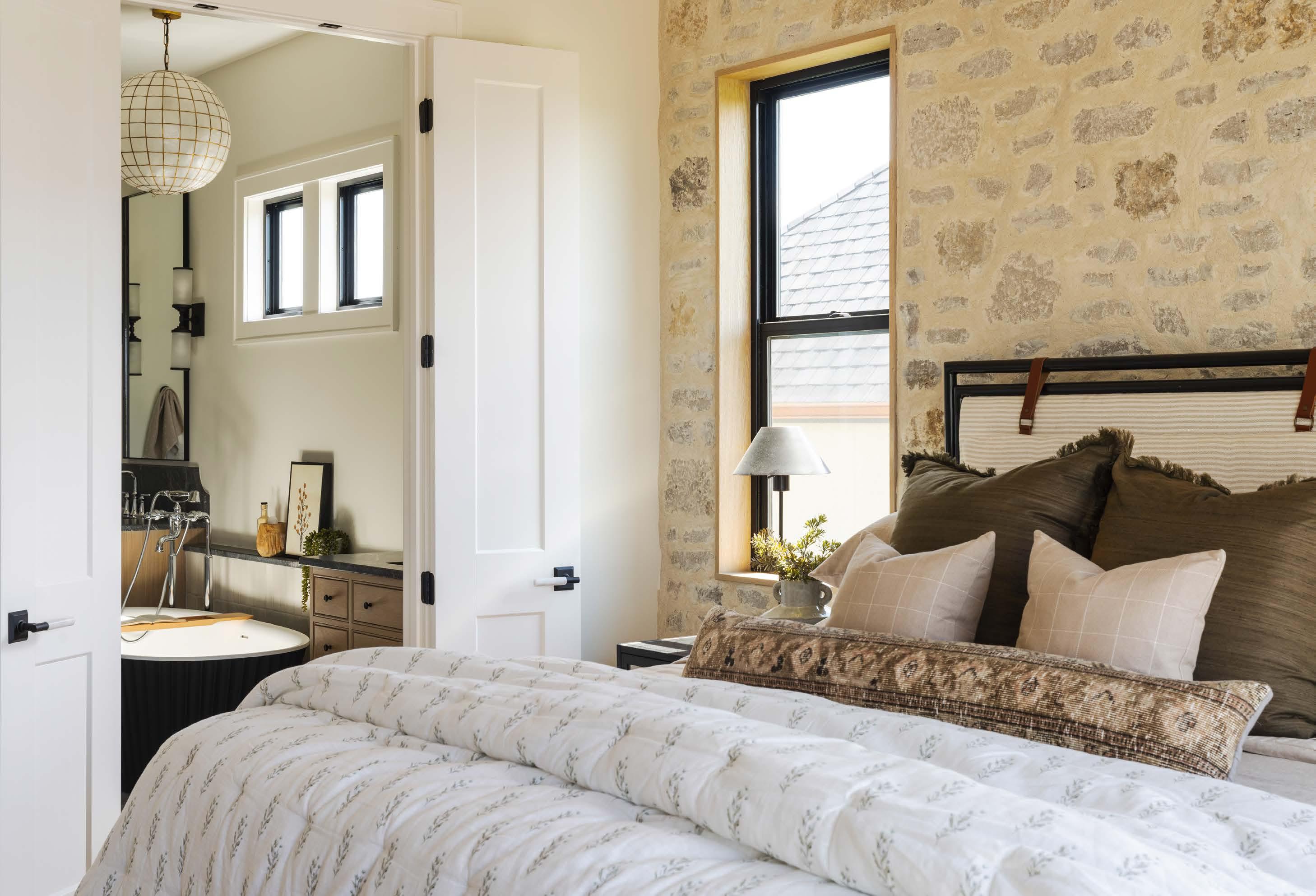
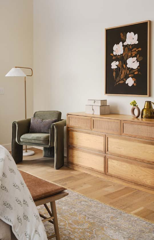
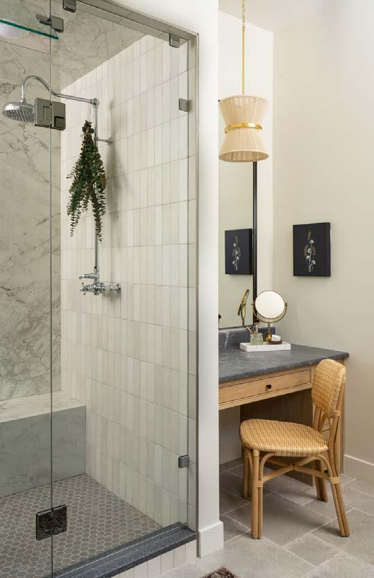
An over-grouted stone wall behind the bed in the primary suite adds textural grit to a so ly decorated space. The room is rightsized, with a vaulted ceiling, seating area, private balcony, luxurious bathroom and custom closet connecting to the laundry room—all on the main level.

Perhaps the herringbone firebox from days of yore would have burned wood, rather than gas, but modern living dictates comfort and ease. Nevertheless, clean-lined furnishing, warm accessories and layered lighting make this hearth room a grand one to gather in.
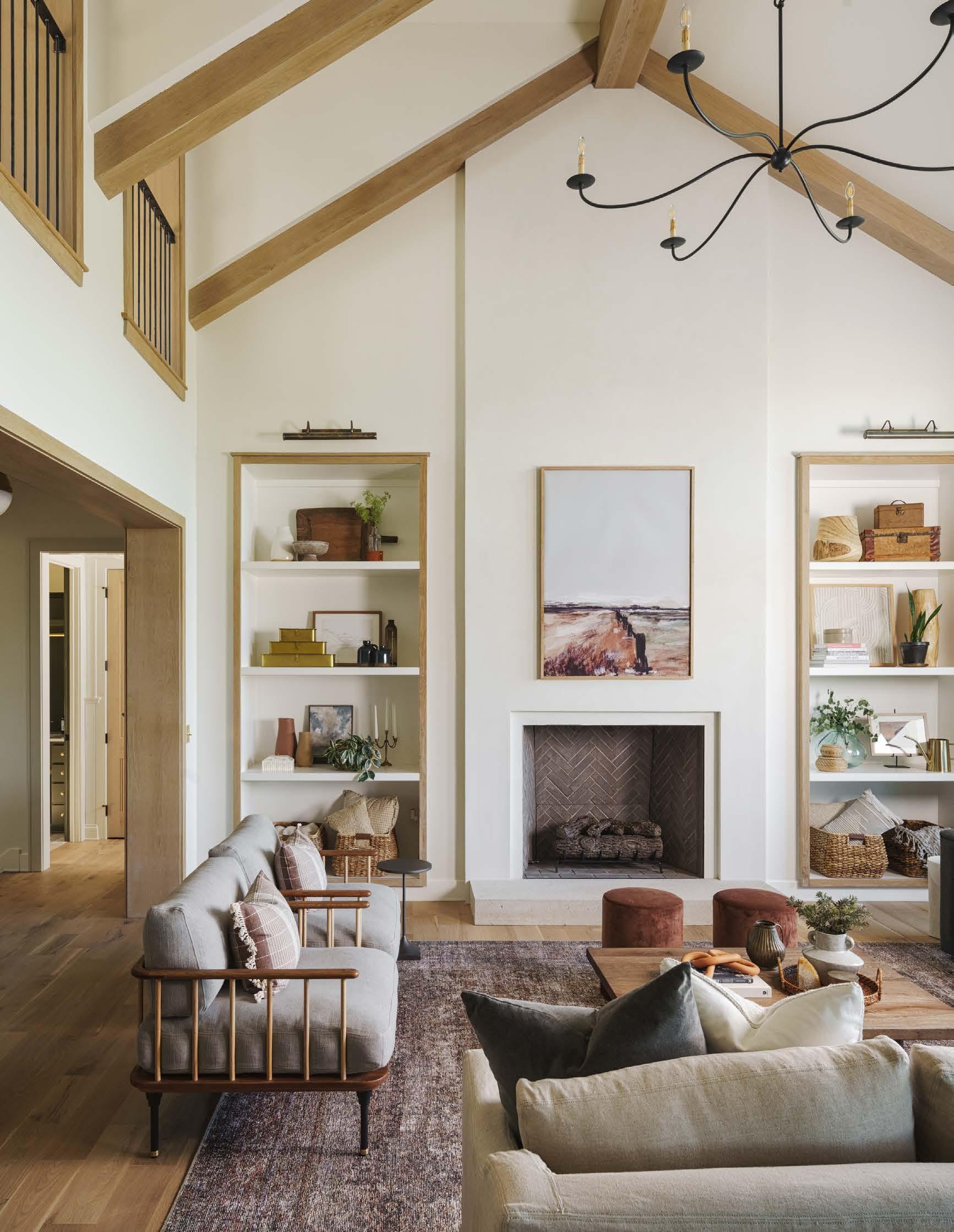
Vaulted ceilings and special ceiling treatments volumize and incentivize you to look up in nearly every room.
“We incorporated a ton of woodwork, beams and details on the ceilings,” Joe says. “We leaned into that experience of looking up. It adds a certain draw in any space.”
But small touches are equally striking. Vintage paintings and rustic furnishings make that cottage character shine through. For instance, in the laundry room, an antique chair placed against an emerald green wall next to a window stages a scene.

“Itʼs wild how the right interior design takes you to another place,” Joe says.
The walk-in pantry, featuring the same deep green color, is another crowd favorite, with a ceramic pendant softly lighting a farmhouse sink. A connecting larder (aka pantry) features a rolling ladder for reaching high-up items. Cute as it all is, it also encompasses the luxury of a wine fridge.
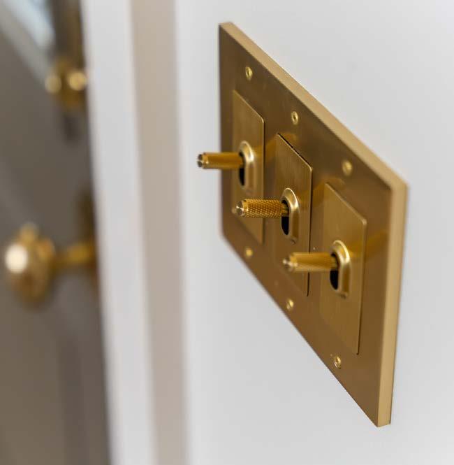
“Itʼs a balance of the modern finishes we want today while paying homage to the old,” Joe says.
Older textures are also featured throughout the home, including lime plaster, over-grouted limestone and a stone wall behind the bed in the primary bedroom.
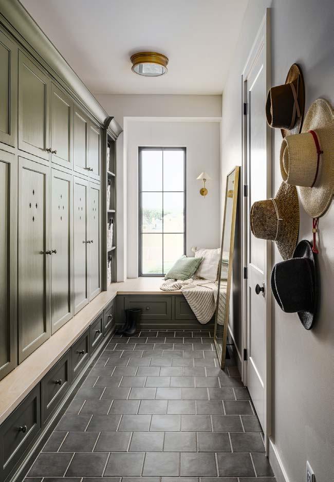 A functional back hall comprises individual storage cabinets and a deep window seat for wistfully looking out the window on rainy days.
“ The moment we clicked it, we knew it would be a hit,” Joe says.Brass switches transcend our digital generation and return the joy of manually flipping a switch.
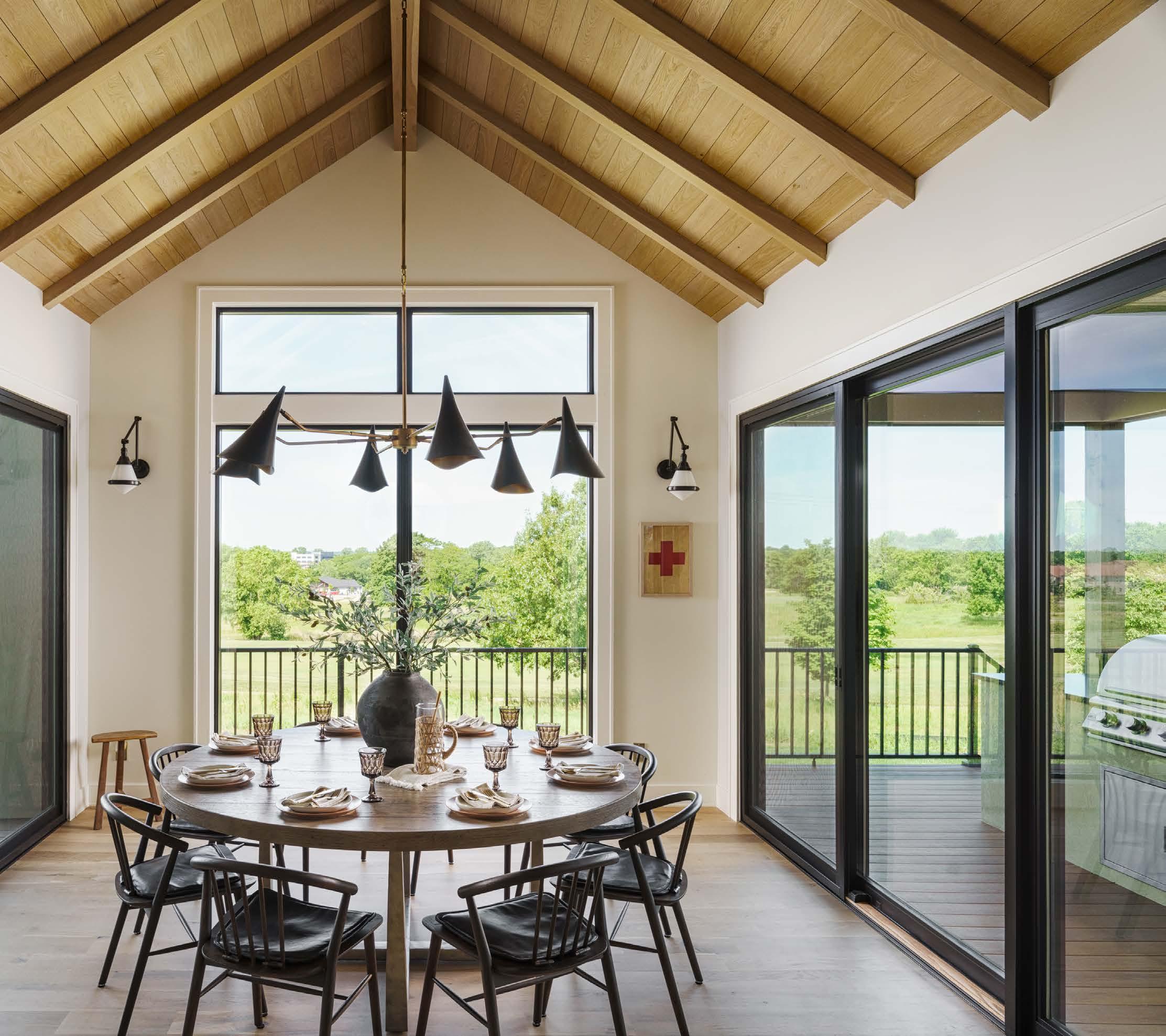
Le : Ceiling treatments add interest to many of the rooms, drawing the eye upward. The view out the dining room, overlooking the greens, ain't bad either.
Right: A lo -like media room upstairs is a cozy spot between bedrooms. As opposed to a larger playroom, such as is o en found in a basement, Joe says the smaller size is actually more enticing, comforting and convenient for kids.
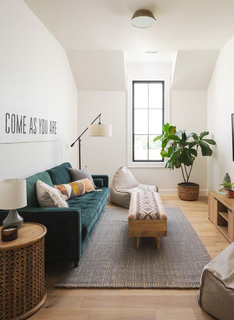
Even paired with newer materials—such as steel handrails and white oak cabinetry and floors—the finishes are natural and even raw looking when viewed up close.
“In modern buildings today, people are looking for perfection,” Joe says. “They donʼt appreciate the handcrafted work, but we like that part. Thereʼs something poetic about it.”
The kitchen, meanwhile, is a functional work of art. Natural quartzite countertops with an integrated sink serve many purposes and are easy to clean. A bridge faucet befits the cottage theme, while a large-scale light fixture accents the space in trendy grandmillennial style.
For those of us who predate the digital age, something as simple as a light switch can be fascinating. While the electrical outlets are purposefully concealed away in this house, all the switches stand out. Textured brass knobs bring a satisfactory click that delights every visitor.

These details and more came to fruition through the collaborative effort of Cardinal Crestʼs in-house team who worked two years to get this house ready for its debut. Though the home tour it was built for lasted only a short time, this house will long stay impressive.
“We love when people go back and say, ʻI didnʼt see this the first time,ʼ” Joe says. “My favorite thing is when a homeowner notices a detail six months after theyʼve moved in. Those small details tell a story, and the story is that we are thinking of lots of things, both big and little. Itʼs like leaving Easter eggs behind.”
@CardinalCrestKC
See resource on page 214.

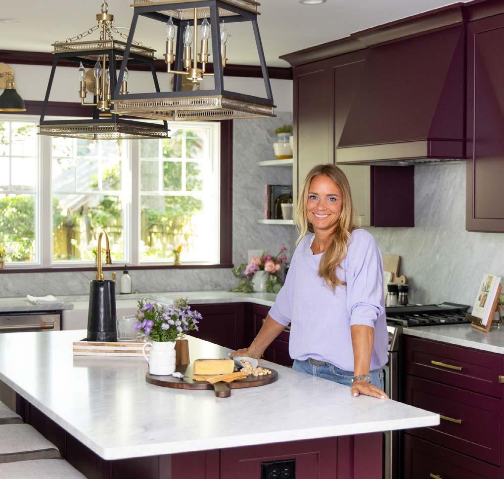


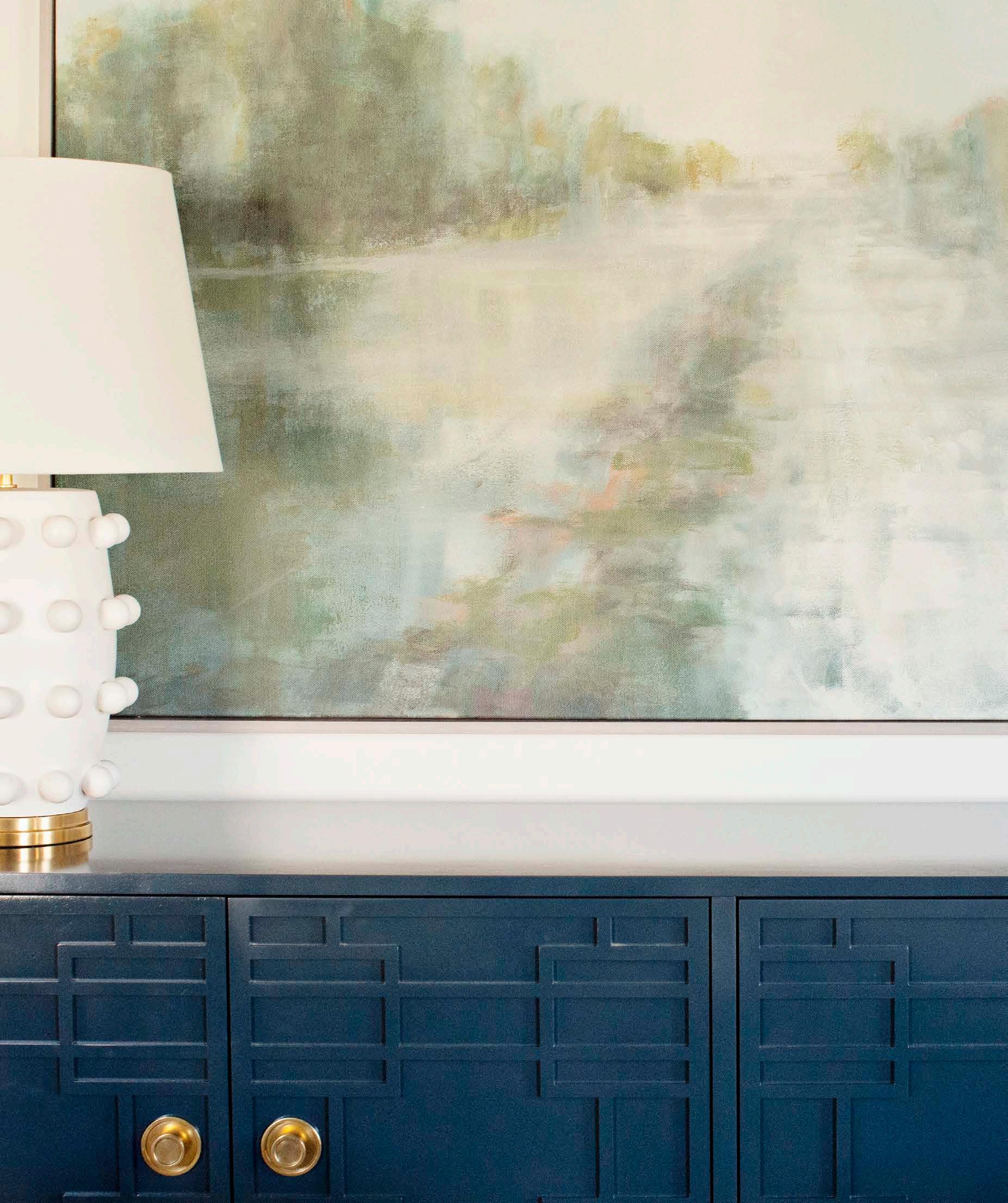


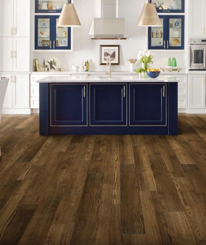


1 Perfect Door - Elizabeth Chiesa 119 1perfectdoor.com
A Thyme for Everything 107 athymeforeverything.com
Accent Remodeling & Renovation 121 accentremodelingllc.com
Aladdin Oriental Rug Company 41 aladdinorientalrugs.net
Area Rug Dimensions 69 arearugdimensions.com
Ashner Construction Company, Inc 51 ashnerconstruction.com
Assured Waitstaff 218 celbedil@aol.com
B.L. Rieke Custom Homes 2 blrieke.com
Bank 21 216 onlinebanking.bank21.com
Beacon KC 139 beaconkc.com
Berkshire Hathaway Lake of the Ozarks 221 searchlakeozarkshomes.com
Bickford & Company 35 bick.com
Black Hickory Construction 219 Blackhickory.KC@gmail.com
Bleu Grace Designs 125 bleugrace.com
Blooming Decor & Upholstery 93 bloomingkeepsakes.com
Bordner Home Improvement IBC thinkbordner.com
Brancatoʼs Catering 220 brancatoscatering.com
Bridget Brown-Kiggins / 67 Weichert Realtors Welch & Company bridgetbsellskc.com
Cardinal Crest Homes 155 cardinalcresthomes.com
Cecil & Ray Homes Inc 22 cecilandrayhomes.com
Central States Tile Inc 143 csttile.com

Centric Build 63 centric.build
Chapel Hill 80 chapelhillkc.com
Charlecote English Antiques Furniture & Accessories 125 charlecoteantiques.com Cicada Co. 27 cicadaco.com
CKF 52 ckfco.com
Colonial Gardens 102 colonialgardenskc.com
Conkrete Ink 34 conkreteink.com Cosentino 28 cosentino.com
Costain Construction 75 costainconstruction.com
Creekmoor 120 creekmoor.com
Dane Fabrication 84 instagram.com/danefabrication
Design & Detail to the Trade 55 designanddetailstl.com
Design Spout 117 design-spout.com
Designerʼs Library 26 designerslibrarykc.com
Doolittle Distributing 156 ddius.com
Eden Floral + Events 144 edenfloralandevents.com
Ferguson Bath, Kitchen & Lighting Gallery 29 build.com/ferguson
Gillpatrick Woodworks 137 gwoodllc.com
Good Earth Water Gardens 111 goodearthwatergardens.com
Growing Days 36 tamaraday.com
Hatch + Home 95 hatchkc.com
Heather L Lowe 62 heatherllowe.com
High Prairie Landscape Group 14-15 gohplg.com
Home Builders Association of Greater Kansas City 154 kchba.org
Homes By Chris 99 hbcbuilder.com
Imperial Roofing 161 imperialroofingkc.com
Inspired Closets KC 109 inspiredclosets.com/locations/kansas-city
Interior Design Beth Phillips 53 idbp.net
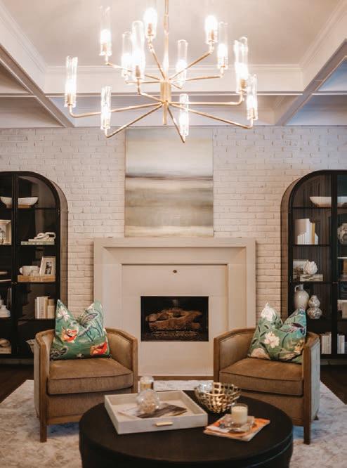
Jami Meek Designs 67 jamimeekdesigns.com
JCLC Homes 77 jclchomes.com
Jennifer Harvey Team / Compass Realty Group 150 jenniferharveyteam.com
Johnson County Siding & Window Company 131 jocosiding.com
Kansas City Museum 115 kansascitymuseum.org
Kansas City Regional Association of Realtors 89 kcrar.com
Kara Kersten Design 132 karakerstendesign.com
Karin Ross Designs 40 karinrossdesigns.com
KC Wholesale Carpet 215 kcwholesalecarpetstores.com
KDR Designer Showrooms 19 kdrshowrooms.com
Kennyʼs Tile 97 kennystile.com
Kitchen Design Gallery Inc 43 kitchendg.com
Kitchen Studio KC 65 kitchenstudiokc.com
Kitchens by Kleweno 101 kleweno.com
Knotty Rug Company 61 knottyrug.com
Koehler Building Company 83 koehlerbuildingcoinc.com
Kohler Signature Store by First Supply 223 stores.kohler.com/en/locations/kansas/overlandpark/kohler-signature-store-by-first-supply
Lambie Custom Homes 20 lambiecustom.com
Laughlin Design House 218 laughlindesignhouse.com
Lisa Schmitz Interior Design 73 lisaschmitzinteriordesign.com
LL Design Services LLC 111 instagram.com/lldesignllc
Loch Lloyd BC lochlloyd.com Continue on page 222.

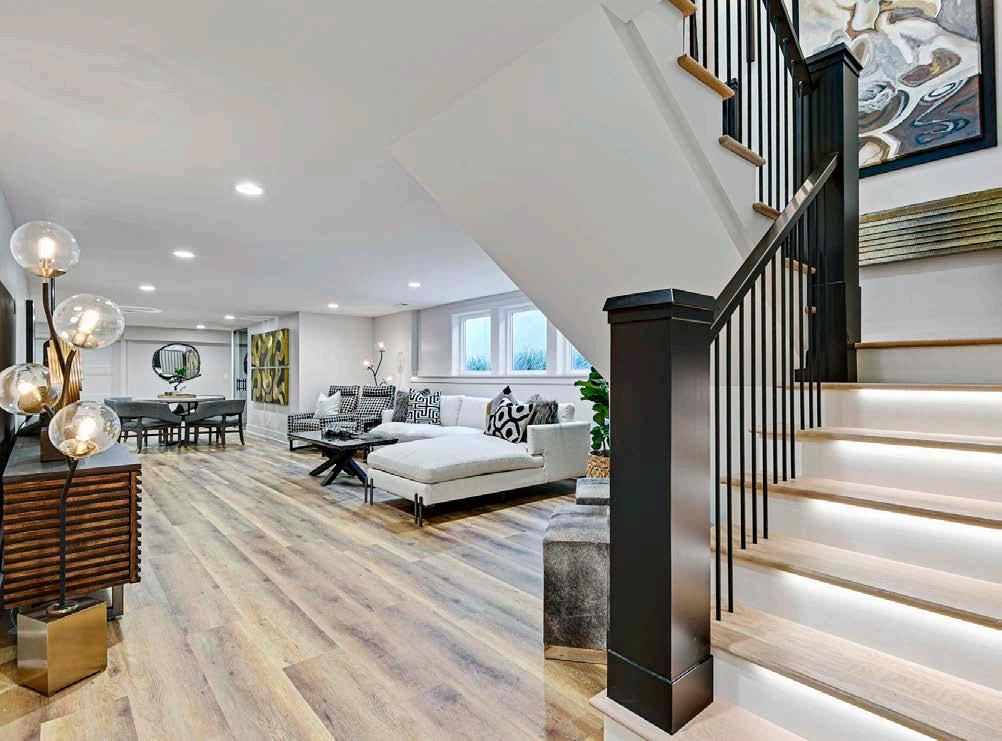
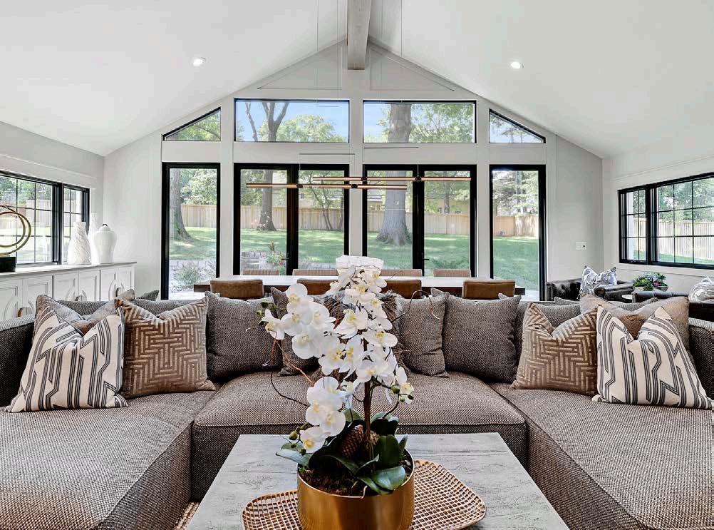
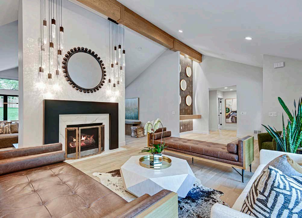


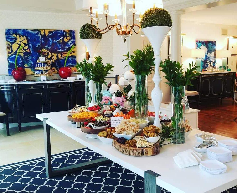




Locks & Pulls 54 locksandpullskc.com
Lorax Design Group 79 loraxdesigngroup.com
M. Sudermann Interior Design | Sid & Co. 17 msudermann.com
Madden-McFarland Interiors 31 maddenmcfarland.com
Mark Freeman Fine Art 126 getmarksart.com
McCray Lumber 133 mccraylumber.com Meadowbrook Park 24 meadowbrookpark.com
Meierotto Jewelers 6-7 mjewelry.com
Mix It Up Painting 105 mixitupcustompainting.com
ML Designs 49 mldesignskc.com
MMH - Madi Mali Homes 38 madimalihomes.com
MOJO Built 127 mojobuilt.com
My Home Contemporary Furniture 33 myhomecontemporaryfurniture.com
NARI 212 remodelingkc.com
Noble Designs 21 saranobledesigns.com
Northwestern Mutual - Imlay & Holder 146 imlayholderwealth.com
NSPJ Architects IFC-1 nspjarch.com
One Stop Decorating 23 onestopdecorating.com
Orion Design Inc 82 designbyorion.com
Overland Ridge - RET ReeceNichols 71 overlandridge.com
Park Ridge Communities 18 parkridgecommunities.com
Parkway Real Estate 59 parkwayre.com
PCDI 163 pcdihomes.com
Pella Windows & Doors 96 pellabranch.com/kansas-city
Portfolio Kitchen & Home 8-9 portfolio-home.com
ProSource Wholesale 216 prosourcewholesale.com/showrooms/ks-prosourceof-kansas-city-west
R & R Outdoor Living 101 rroutdoorliving.com
Ramsey Interiors 120 ramseyinteriors.com
ReeceNichols Signature 73 reecenichols.com
Regarding Kitchens 44 regardingkitchens.com
Reliance Construction Group 115 reliancekc.com
Renovations by Starr Homes 81 renobystarr.com
Rensen House of Lights 45 rensenhouseoflights.com
Reserve at Woodside Ridge 71 reserveatwoodsideridge.com
Rock Cottage Glassworks 126 rockcottageglassworks.com
Rock Tops 25 rocktopskc.com
Rodrock Development - Terrybrook Farms 30 terrybrookfarms.com
Rodrock Developmnet / Sundance Ridge 48 rodrock.com/communities/overland-park-ks/ sundance-ridge-archers-landing
rootsKC 132 rootskcmo.com
Roth Living 16 rothliving.com Schloegel Design Remodel 109 remodelagain.com
SCI - Surface Center Interiors 39 sci-surfaces.com
Seville Home 4-5 sevillehome.com
Shauna Ward Interiors 113 shaunawardinteriors.com Simplicity KC 113 simplicitykc.com
Six Twenty One 119 sixtwentyone.com
Starr Homes 81 starrhomes.net
Stephanie Stroud Interiors 105 stephaniestroudinteriors.com
Stone Creek Midwest 145 stonecreekmidwest.com
Storied Interiors 144 storied-interiors.com Sunlighten, Inc 37 sunlighten.com
The Bison Hut Company 146 craftykansan@gmail.com
The Grein Team / KW lake of the Ozarks 213 thegreinteam.com
The Rug Studio 150 rugskc.com
The Sanctuary- Matt Adam Development 32 mattadamdevelopment.com
Timber Rock 3 timberrockks.com
Tivol 12-13 tivol.com
Todd Hill Homes 56 thillhomes.com
Topsider 162 topsidercondos.com
Tran + Thomas Design Studio 57 tranthomasdesign.com
View Solutions Group / J Geiger Shading 42 jgeigershading.com
Walker Custom Homes 103 walkercustomhomeskc.com
Weave Gotcha Covered 10-11 weavegotchacovered.com
Weichert Realtors, Welch & Co 87 weicherthomeskc.com
Weinberger Fine Art 117 weinbergerfineart.com
Wendlandt & Stallbaumer Architects 222 architechnique.com
White & Associates Real Estate 91 whitecres.com
Will Brown Interiors LLC 107 willbrowninteriors.com
Willis Custom Homes 85 williscustomhomes.com
Wilson Lighting 79 wilsonlighting.com
Woodson Antiques & Interiors 143 woodsonantiques.com
X/O Exterior & Outdoors 138 xoexteriors.com
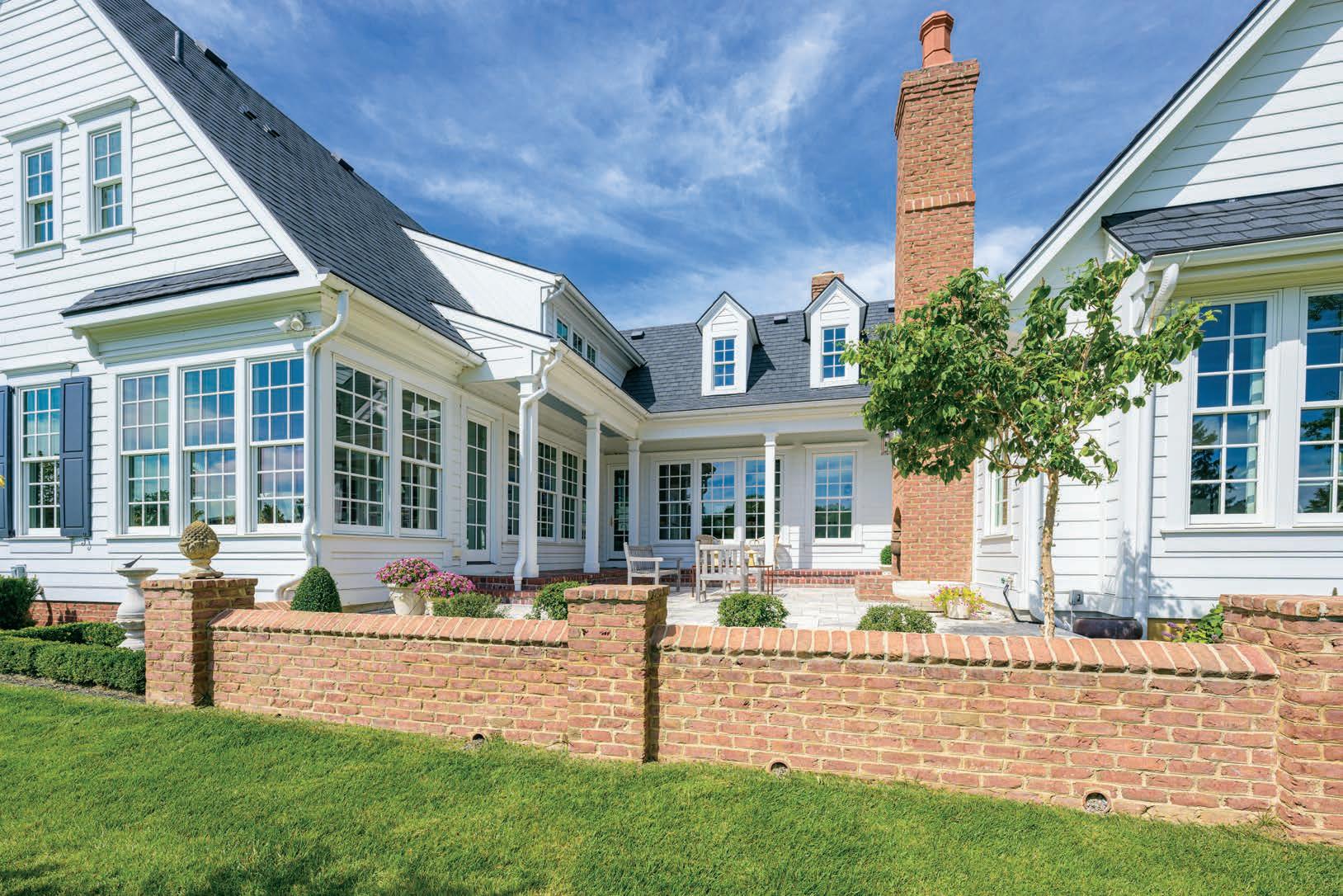


A cozy condo corner o ers the option of visual respite from a busy city center.
Words by Andrea Darr Photo by Matthew AndersonThe inhabitants of this space can shut out the noise of the world and enjoy the soft serenity of filtered light. But—binoculars at the ready—they can raise the shades and take in the majestic views of the Country Club Plazaʼs golden-hued Spanish-style architecture and bustling streets below.
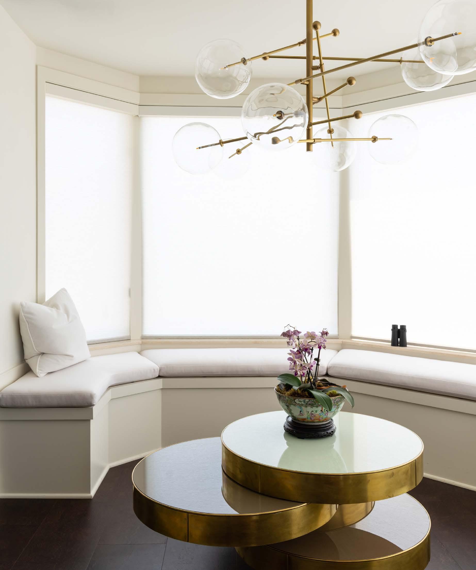
This image, pulled from our archives (Fall 2021), shows the work of Elizabeth Rishel, CKD, of Orion Design. Previously an eat-in kitchen, the casually upholstered nook with built-in storage invites a pause in the day for a quiet tête-à-tête, or, just as easily, makes a rocking entertaining scene for a crowd.
“Now itʼs a cocktail lounge to enjoy a drink or two,” Elizabeth says.

