

Brand Guidelines

Our Vision
One of the key priorities for a successful brand is a consistent presentation that prompts immediate recognition. Irrespective of where and when someone encounters the brand, be it a consumer or business partner, in print, direct mailing, or in a digital format he/she must always feel the same way. It can only be Realogics Sotheby’s International Realty—based on type color and aesthetic. This will take discipline and consistency but establishing that brand narrative is key.
The brand—as an idea, promise, and experience—must ful ll these 5 standards:
1. IT must be relevant to a real or projected need.
2. IT must be deliverable.
3. IT must be credible.
4. IT must be di erentiating.
5. IT must be both inspired and inspiring.
The identity comprises a very simple kit of parts, which used together carefully with the correct relationship, will form the distinctive visual expression of the Realogics Sotheby’s International Realty brand. This document outlines the components, their structure, and their relationships that will help you apply the Realogics Sotheby’s International Realty brand consistently across all communications. Every detail of the Realogics Sotheby’s International Realty brand identity has been created to ensure that it is expressive of the brand and its values. The identity is designed to meet the future challenges of a competitive business and to connect naturally to our customers.


When it comes to branding consistency is key.
Implementing brand guidelines help to maintain the quality and integrity of a brands image and eliminate confusion.


Primary Identity
To maintain the integrity of your company Logo Lock-Up, a minimum amount of clear space should surround the logo for online and print usage. The minimum amount of clear space should be greater than or equal to the dimension of the vertical capital “S” in the Sotheby’s International Realty® Logo.
• When presented in print, the Logo Lock-Up should never be smaller than 1 inch in height for the vertical Logo Lock-Up and 1.25 inches in length for the horizontal Logo Lock-Up.
• When presented online, the Logo Lock-Up should never be smaller than 40 pixels high from the endpoints to the center rule.
LOGO LOCK-UP Surrounding Clear Space LOGO LOCK-UP Surrounding Clear Space
LOGO
Division Logos
This is a subset of logos that de ned the three di erent divisions within the Realogics Sotheby’s International Realty brand. The rules outlined in the Primary Identity will apply to the division logos.
DIVISION LOGO Horizontal Orientation
DIVISION LOGO Horizontal Orientation
DIVISION LOGO Horizontal Orientation
LOCK-UP Surrounding Clear Space
LOCK-UP Surrounding Clear Space
Key Words & Phrasing Nothing
This list contains all of the headlines associated with the Nothing Compares campaign. Each headline is associated with a speci c message that is part of a larger audience.
**NOTE: This page is a baseline set of headline, supporting sub-headlines & call to actions. This list will continue to grow when presented the opportunity.
CORE MESSAGING
Your marketing powerhouse.
Exceptional service.
One agent. Worldwide reach.
Exceptional service.
Private properties for exceptional stays.
Short- or long-term getaways.
Global reach.
Unlock your potential.
CALL TO ACTION
DISCOVER MORE
LEARN MORE
START YOUR SEARCH NOW
VIEW HOMES
VISIT WEBSITE
NEW AGENTS
AGENTS & BROKERAGE
Trusted Heritage. Island Roots.
Connecting home and life, backed by the heritage of the Sotheby's brand.
Your services deserve our resources.
Leveraging our resources can help you level up your business.
Exceptional resources that elevate your business.
Open the door to resources like no other.
It would be a privilege to work with you.
Trust. Support. Leadership.
Expert Advisement. Uncomparable Advantage.
Market Leaders. Trusted Expertise.
Extraordinary homes. Exceptional experiences.
What Real Estate Should Be.
Move Beyond Your Expectations
Redefine Domestic Bliss
BUYERS
Expertise that’s wherever you are and wherever you want to be.
Expertise that reaches down the block and around the world.
Seeing is can’t believe-ing.
Whether you’re moving on or moving forward, nothing compares.
Movers shouldn’t be the only ones lifting weight from your shoulders.
Move beyond your expectations.
Your next move can be next level.
Don’t just look for a place. Discover a home.
Redefine domestic bliss.
Agile in our digital tools and our expertise.
Real estate marketing optimized in real time and in the real world.
SELLERS
A legacy of real estate. A mastery of real estate marketing.
The way you market your home should have that wow factor too.
Don’t just get it on the market. Get it the attention it deserves.
Real estate sold by real experts.
We know how to appraise emotional value.
Service that’s as elevated as your standards.
We’ll find what you want in a home. And what you never knew you could have.
From your first home on, an experience that only rises in value.
The service you receive should feel just as valuable.
Imagine an agent relationship that appreciates in value.
We open the door to everything you long for.
RENTERS
We’ll lead you to an escape that’s everything to write home about.
Even a temporary stay should leave a permanent impression.
Exceptional accommodations. A more than accommodating experience.
We can take you to a place that takes you away.
Typography
Our typography is as unique and elegant as we are. Typography is a key element in our brand. It works to maintain consistency, create clarity and provide equity to our brand. It is important to adhere to the typographic hierarchy speci ed in this document to help achieve brand consistency.
FREIGHT DISPLAY
The clean, highly legible Freight Sans font family has its roots rmly planted in a humanist design aesthetic. It's suitable for text or display use and features an extensive character set, comprised of roman, italic, small caps, italic small caps, old style, and tabular gures, spread across ve precisely tuned weights.
BENTON SANS
Benton Sans is a grotesque sans-serif typeface originally designed by Tobias Frere-Jones in 1995 and later expanded upon by Cyrus Highsmith. Benton Sans is available in an impressive eight weights—thin, extra light, light, book, regular, medium, bold, and black—each with the corresponding italic and small caps styles, as well as condensed, compressed, and extra-compressed widths.
Freight Display Pro
Freight Display Pro / Book
Freight Display Pro / Medium
Freight Display Pro / Medium Italic
Freight Display Pro / Semibold
a b c d e f g h i j k l m n o p q r s t u v w x y z 1 2 3 4 5 6 7 8 9 0 / ! ? @ # $ % ^ & * { }
Freight Display Pro / Semibold Italic
A B C D E F G H I J K L M N O P Q R S T U V W X Y Z
a b c d e f g h i j k l m n o p q r s t u v w x y z 1 2 3 4 5 6 7 8 9 0 / ! ? : @ # $ % ^ & * { }
Freight Display Pro / Bold
A B C D E F G H I J K L M N O P Q R S T U V W X Y Z
a b c d e f g h i j k l m n o p q
Benton Sans Benton Sans / Extra Light A B C D E F G H I J K L M N O P Q R S T U V W X Y Z
a b c d e f g h i j k l m n o p q r s t u v w x y z 1 2 3 4 5 6 7 8 9 0 / ! ? : @ # $ % ^ & * { }
Benton Sans / Book
A B C D E F G H I J K L M N O P Q R S T U V W X Y Z
a b c d e f g h i j k m n o p q r s t u v w x y z
1 2 3 4 5 6 7 8 9 0 / ! ? : @ # $ % ^ & * { }
Benton Sans / Book Italic
A B C D E F G H I J K L M N O P Q R S T U V W X Y Z
a b c d e f g h i j k l m n o p q r s t u v w x y z 1 2 3 4 5 6 7 8 9 0 / ! ? : @ # $ % ^ & * { }
Benton Sans / Regular
A B C D E F G H I J K L M N O P Q R S T U V W X Y Z
a b
Benton Sans / Medium
Benton Sans / Bold
Web Alternative
Our web-safe typography is a backup font that displays when a digital device doesn’t support the speci ed font. This is because the font is not installed on the device or originates from an unfriendly source.
LIBRE CASLON TEXT
There are already lots of digital Caslon's revivals, and lots of Caslon-esque fonts. Some are very good. But none of them were truly made for the web. While they look very good when printed on paper, they render very small when used for web body text on the screen. Libre Caslon Text, instead, was speci cally tailored to be used for web body text (typically set at 16px). It can be used at very small sizes and will still be readable on your website. .
OPEN SANS
Open Sans is a humanist sans serif typeface designed by Steve Matteson, Type Director of Ascender Corp. This version contains the complete 897 character set, which includes the standard ISO Latin 1, Latin CE, Greek and Cyrillic character sets. Open Sans was designed with an upright stress, open forms and a neutral, yet friendly appearance. It was optimized for print, web, and mobile interfaces, and has excellent legibility characteristics in its letterforms
Libre Caslon Text
Open Sans
Libre Caslon Text / Regular
A B C D E F G H I J K L M N O P Q R S T U V W X Y Z
a b c d e f g h i j k l m n o p q r s t u v w x y z 1 2 3 4 5 6 7 8 9 0 / ! ? : @ # $ % ^ & * { }
Libre Caslon Text / Italic
A B C D E F G H I J K L M N O P Q R S T U V W X Y Z
a b c d e f g h i j k l m n o p q r s t u v w x y z
1 2 3 4 5 6 7 8 9 0 / ! ? : @ # $ % ^ & * { }
Libre Caslon Text / Bold
A B C D E F G H I J K L M N O P Q R S T U V W X Y Z
a b c d e f g h i j k l m n o p q r s t u v w x y z 1 2 3 4 5 6 7 8 9 0 / ! ? : @ # $ % ^ & * { }
Open Sans / Light
A B C D E F G H I J K L M N O P Q R S T U V W X Y Z
a b c d e f g h i k l m n o p q r s t u v w x y z
1 2 3 4 5 6 7 8 9 0 / ! ? : @ # $ % ^ & * { }
Open Sans / Regular
A B C D E F G H I J K L M N O P Q R S T U V W X Y Z
a b c d e f g h i j k l m n o p q r s t u v w x y z 1 2 3 4 5 6 7 8 9 0 / ! ? : @ # $ % ^
Open Sans / Italic
a b c d e f g h i j k l m n o p q r s t u v w x y z 1
Open Sans / Semibold
Web Type Hierarchy
This hierarchy would pertain to the structuring of our digital ads and email newsletters that only rely on web fonts for typography selection. For all external newsletters represented by Realogics Sotheby’s International Realty, follow the hierarchy presented. There is exibility built within these, but the general rules would follow when determining headlines of serif vs sans serif. This can be determined by a broker’s target audience.
Headline Libre Caslon Regular
Headline Libre Caslon Italic
LARGE MAIN HEADLINE
Libre Caslon Regular & Italic
Leading is 8px more than Text Size Tracking at 0px
SMALL SECONDARY HEADLINE
Open Sans Regular & Semibold
Leading is 5px more than Text Size Tracking at 0px
Lorem ipsum dolor sit amet, consectetuer adipiscing elit, sed diam nonummy nibh euismod tincidunt ut laoreet dolore magna aliquam erat volutpat. Ut wisi enim ad minim veniam.
Testimonials & Misc.
Lorem ipsum dolor sit amet, consectetuer adipiscing elit, sed diam nonummy nibh euismod tincidunt ut laoreet dolore magna aliquam erat volutpat. Ut wisi enim ad minim veniam.
BODY COPY
Open Sans Regular & Semibold
Leading is 6pt more than Text Size
Tracking at 0 pt
Testimonials & Misc.
Libre Caslon Italic
Leading is 3pt more than Text Size
Tracking at 20 pt

Contemporary Design
AN IN DEPTH LOOK INTO THE USAGE

AN IN DEPTH LOOK INTO THE USAGE
Contemporary Design
Unlike modern design, contemporary design doesn't refer to a speci c period of time—it's constantly evolving to re ect the popular styles of present-day design. It borrows qualities from modernism, minimalism, Art Deco, and other global styles, without hyper-focusing on any one in particular. Though contemporary design is, by nature, fairly ambiguous, there are a few qualities that help de ne the contemporary style. Neutral palettes, stark minimalism, clean lines, and organic silhouettes are some of the prominent characteristics.
PRIMARY USES
- Internal documentation
- Internal presentations
- Luxury focused listing presentations
- External facing social media
- External facing newsletters
* NOTE: This is the preferred design delivery for any RSIR representated documentation
** NOTE: Depending on broker design preference they can choose either design direction with a baseline set of rules tailored towards their individual branding.
Color & Hierarchy
Our brand is underpinned with a color palette designed to be fresh, modern, and distinctive. Di erent combinations of these colors can dramatically change the tone and appearance of our brand, so it is important to consider how they work together. Keeping color consistent is a vital element for our branding. Color is the way we di erentiate and identify our brand in a crowded marketplace. To help achieve greater brand recognition our color palette must be applied accurately and consistently.
Pantone colors are used to print designs, rather than CMYK. Pantone colors will provide the maximum amount of consistency. In instances where this is not possible we have created optimized CMYK values.
SCREENS
Not all RGB colors render the same online. Therefore we recommend the use of hexadecimal colors when applying colors to screen.


Contemporary
Color Distribution
It is important to maintain a sense of hierarchy, balance, and harmony when using this color palette. Our color system is exible but exercise restraint. Unique and exciting color palettes can be created from as few as three or four colors in addition to the primary Realogics Sotheby’s International Realty palette.
Navy Blue Headlines, contrasting backgrounds & accents.
White
Layout white space & contrast color pop.
Charcoal
Sub-headlines, infographics & accents.
Light Gray
Sub-headlines, watermark, infographics & accents.
Gold
Infographic headlines, infographics & accents.

Contemporary
Type Hierarchy
Consistent application of typography allows our audiences to recognize materials from Realogics Sotheby’s International Realty. Large headlines should use Freight Display. Subheads may use Benton Sans Light or Medium title case, depending on scale relationships. Large blocks of copy should use Freight Display sentence case.
Headline
Freight Display Pro Book
SUB-HEADLINE BENTON SANS LIGHT
SUB-HEADLINE BENTON SANS MEDIUM
LARGE MAIN HEADLINE
FreightDisplay Book
Leading is the same as the Text Size
Tracking at 20 pt
SMALL SECONDARY HEADLINE
BentonSans Light & Medium
Leading is 5pt more than Text Size
Tracking at 0 pt
Aa
Lorem ipsum dolor sit amet, consectetuer adipiscing elit, sed diam nonummy nibh euismod tincidunt ut laoreet dolore magna aliquam erat volutpat. Ut wisi enim ad minim veniam.
Lorem ipsum dolor sit amet, consectetuer adipiscing elit, sed diam nonummy nibh euismod tincidunt ut laoreet dolore magna aliquam erat volutpat. Ut wisi enim ad minim veniam.
BODY COPY
BentonSans Book & Regular
Leading is 6pt more than Text Size
Tracking at 0 pt
Testimonials & Misc.
Freight Display Medium Italic
Testimonials & Misc.
FreightDisplay Medium Italic
Leading is 3pt more than Text Size
Tracking at 20 pt
General Placement
Typographic hierarchy is another form of visual hierarchy, a sub-hierarchy in an overall design project. Typographic hierarchy presents lettering so that the most important words are displayed with the most impact so users can scan text for key information. Here are some of the most common techniques for design.
Sample Text For Placement
Sample Text For Placement
Lorem ipsum dolor sit amet, consectetuer adipiscing elit, sed diam nonummy nibh euismod tincidunt ut laoreet dolore magna aliquam erat volutpat. Ut wisi
enim ad minim veniam, quis nostrud exerci tation
ullamcorper suscipit lobortis nisl ut aliquip ex ea commodo consequat.
SAMPLE TEXT
Aa
Sample Text
Lorem ipsum dolor sit amet, consectetuer adipiscing elit, sed diam nonummy nibh euismod tincidunt ut laoreet dolore magna aliquam erat volutpat. Ut wisi enim ad minim veniam, quis nostrud exerci tation
ullamcorper suscipit lobortis nisl ut aliquip ex ea commodo consequat.
SAMPLE TEXT
Lorem ipsum dolor sit amet, consectetuer adipiscing elit, sed diam nonummy nibh euismod tincidunt ut laoreet dolore magna aliquam erat volutpat.
SAMPLE TEXT
Lorem ipsum dolor sit amet, consectetuer adipiscing elit, sed diam nonummy nibh euismod tincidunt ut laoreet dolore magna aliquam erat volutpat.
Application
Brand application is simply the rollout of your brand on all of your marketing materials and customer touchpoints. Interacting with consumers through a consistent brand voice and aesthetic is a major step towards letting consumers get to know you as an organization.
Consistency across all your di erent brand applications ensures your brand feels more dependable. When starting to get to know your brand customers develop opinions, ideas, and assumptions based on each interaction. If you leave your brand open to a variety of interpretations, you’ll nd it harder (and much more expensive) to build brand awareness. That’s why it’s so important to be consistent at every application both on and o ine meaning every touchpoint your customers have with your brand should embody the brand promises and values dependably and understandably.


SOCIAL


Digital Ads
Brand application is simply the rollout of your brand on all of your marketing materials and customer touchpoints. Interacting with consumers through a consistent brand voice and aesthetic is a major step towards letting consumers get to know you as an organization.
Consistency across all your di erent brand applications ensures your brand feels more dependable. When starting to get to know your brand customers develop opinions, ideas, and assumptions based on each interaction. If you leave your brand open to a variety of interpretations, you’ll nd it harder (and much more expensive) to build brand awareness. That’s why it’s so important to be consistent at every application both on and o ine meaning every touchpoint your customers have with your brand should embody the brand promises and values dependably and understandably.


Trusted Heritage. Island Roots.
Trusted Heritage. Island Roots.
Trusted Heritage. Island Roots.
Trusted Heritage. Island Roots.
Trusted Heritage. Island Roots.
Trusted Heritage. Island Roots.
MODERN DESIGN
Modern design encompasses a lot of di erent incarnations, which can make it di cult to de ne. In its simplest terms, modern interior design refers to the re ection of the modern art movement on the interiors of the home. Modern design was meant to be the antithesis of the previous design styles which used heavy textures, carvings and wood tones throughout the home. Therefore, most components of modern design, from the furniture to the shape of the rooms, includes clean, straight lines with no additional detail. This di ers slightly from contemporary design, which uses curves and sweeping lines; modern design's lines are crisper, sharper and very spare.
Primary Uses
** NOTE: Depending on broker design preference they can choose either design direction with a baseline set of rules tailored towards their individual branding.

COLOR & HIERARCHY
Our brand is underpinned with a color palette designed to be fresh, modern, and distinctive. Di erent combinations of these colors can dramatically change the tone and appearance of our brand, so it is important to consider how they work together. Keeping color consistent is a vital element for our branding. Color is the way we di erentiate and identify our brand in a crowded marketplace. To help achieve greater brand recognition our color palette must be applied accurately and consistently.
Pantone colors are used to print designs, rather than CMYK. Pantone colors will provide the maximum amount of consistency. In instances where this is not possible we have created optimized CMYK values.
Screens
Not all RGB colors render the same online. Therefore we recommend the use of hexadecimal colors when applying colors to screen.
MODERN
Black White Light Gray Gold
Pantone
COLOR DISTRIBUTION
It is important to maintain a sense of hierarchy, balance, and harmony when using this color palette. Our color system is exible but exercise restraint. Unique and exciting color palettes can be created from as few as three or four colors in addition to the primary Realogics Sotheby’s International Realty palette.
Black
Headlines, contrasting backgrounds & accents.
White
Layout white space & contrast color pop.
Navy Blue
Sub-headlines, infographics & accents.
Light Gray
Sub-headlines, watermark, infographics & accents.
Gold
Infographic headlines, infographics & accents.
TYPE HIERARCHY
Consistent application of typography allows our audiences to recognize materials from Realogics Sotheby’s International Realty. Large headlines should use Benton Sans Light & Medium set in upper case (upper and lowercase). Subheads may use Freight Display title case, depending on scale relationships. Large blocks of copy should use Benton Sans upper case.
HEADLINE BENTON SANS
LIGHT & MEDIUM
Sub-Headline
Freight Display Pro Medium
Sub-Headline
Freight Display Pro SemiBold
LARGE MAIN HEADLINE
BentonSans Light & Medium
Leading is 1pt more than Text Size
Tracking at 0 pt
SMALL SECONDARY HEADLINE
FreightDisplay Medium & Semibold
Leading is same as Text Size
Tracking at 20 pt
Lorem ipsum dolor sit amet, consectetuer adipiscing elit, sed diam nonummy nibh euismod tincidunt ut laoreet dolore magna aliquam erat volutpat. Ut wisi enim ad minim veniam.
Lorem ipsum dolor sit amet, consectetuer adipiscing elit, sed diam nonummy nibh euismod tincidunt ut laoreet dolore magna aliquam erat volutpat. Ut wisi enim ad minim veniam.
BODY COPY
BentonSans Book & Regular
Leading is 6pt more than Text Size
Tracking at 0 pt
Testimonials & Misc.
Freight Display Medium Italic
Testimonials & Misc.
FreightDisplay Medium Italic
Leading is 3pt more than Text Size
Tracking at 20 pt
Typographic hierarchy is another form of visual hierarchy, a sub-hierarchy in an overall design project. Typographic hierarchy presents lettering so that the most important words are displayed with the most impact so users can scan text for key information. Here are some of the most common techniques for design.
GENERAL PLACEMENT Aa
SAMPLE TEXT
SAMPLE TEXT
Lorem ipsum dolor sit amet, consectetuer adipiscing elit, sed diam nonummy nibh euismod tincidunt ut laoreet dolore magna aliquam erat volutpat. Ut wisi enim ad minim veniam, quis nostrud exerci tation ullamcorper suscipit lobortis nisl ut aliquip ex ea commodo consequat.
Sample Text
SAMPLE TEXT
Lorem ipsum dolor sit amet, consectetuer adipiscing elit, sed diam nonummy nibh euismod tincidunt ut laoreet dolore magna aliquam erat volutpat. Ut wisi enim ad minim veniam, quis nostrud exerci tation ullamcorper suscipit lobortis nisl ut aliquip ex ea commodo consequat.
Sample Text
Lorem ipsum dolor sit amet, consectetuer adipiscing elit, sed diam nonummy nibh euismod tincidunt ut laoreet dolore magna aliquam erat volutpat.
Sample Text
Lorem ipsum dolor sit amet, consectetuer adipiscing elit, sed diam nonummy nibh euismod tincidunt ut laoreet dolore magna aliquam erat volutpat.

DIGITAL ADS
Brand application is simply the rollout of your brand on all of your marketing materials and customer touchpoints. Interacting with consumers through a consistent brand voice and aesthetic is a major step towards letting consumers get to know you as an organization.
** NOTE: This application would only apply to our core branded elements if the target audience has been identi ed to bene t the most from this design aesthetic.


TRUSTED HERITAGE ISLAND ROOTS.
Broker Adaptation
The broker determines their target audience and chooses the design direction that best re ects that audience. That is applied to the general type, color, and design rules while also considering blending their individual branding in the process. This can also be a nice selling tool.
**NOTE: This page is intended to show the general rules and o er key takeaways when applying an agents personal branding within our standard documents. There is exibility within this when using branding, headlines, color accents & potential branded elements.


Iconography
Iconography refers to all of the images and symbols that will appear on your website and across your marketing paraphernalia. When used correctly, icons are a highly e ective way to convey big ideas without using a single word.
**NOTE: This page is a baseline set of icons, the creative department will continue to build upon this set when presented the opportunity. This set is intended to show a general visual structure.
An infographic is a collection of imagery, charts, and minimal text that gives an easy-to-understand overview of a topic. Infographics are a valuable tool for visual communication. The most visually unique, creative infographics are often the most e ective because they grab our attention and don’t let go.
**NOTE: This page is a baseline set of infographics, the creative department will continue to build upon this set when presented the opportunity. This set is intended to show the general visual structure and information ow.
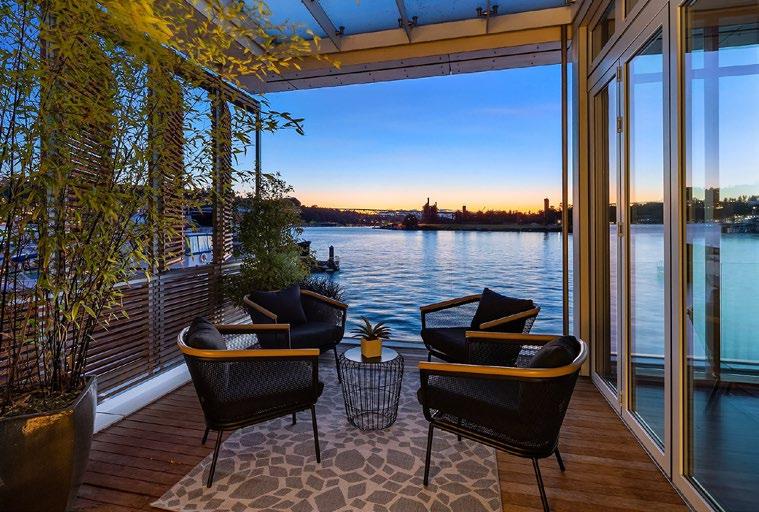
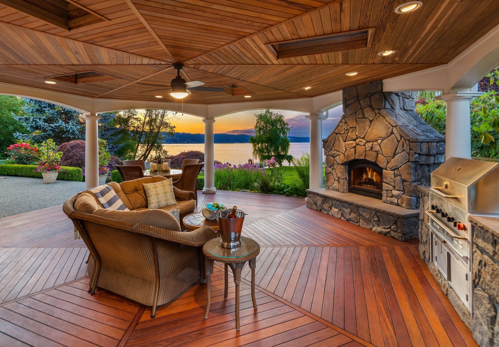
Photography
Images are an important part of every Realogics
Sotheby’s International Realty design and the right visuals can take your marketing piece from ordinary to outstanding. While it takes time and resources to nd appropriate, high-quality photos to support your content, the results speak for themselves.

Because photos are side by side in these compositions, it’s important to create enough contrast for the images to stand apart despite being juxtaposed to one another. Photos with detail are necessary in helping depict a full picture of the property, but selecting property photos that are simple and without as much detail is crucial to help prevent the images from blending in with one another.
Here are some areas of focus to assure our photography captivates our audience.


I. O ce & Retail focus
J. Technology focus


Glossary
CORPORATE IDENTITY
A corporate identity is the overall image of a corporation or business in the minds of diverse publics, such as customers, investors and employees. It is the primary task of the company communications department to maintain and build this identity to accord with and facilitate the attainment of business objectives.
IDENTITY MANUAL
A formal reference document establishing technical and creative standards for a visual identity system. Typical standards include descriptions and speci cations for reproducing the logo or logotype stationary system, common print and web applications and examples of use on merchandise.
LOGO
A logo is a graphic mark or emblem commonly used by commercial enterprises, organizations and even individuals to aid and promote instant recognition. Logos are either purely graphic (symbols/icons) or are composed of the name of the organization (a logotype or wordmark).
BRAND
Brand is the "name, term, design, symbol, or any otherfeature that identi es one seller's product distinct from those of other sellers." Initially, branding was adopted to di erentiate one person's cattle from another's by means of a distinctive symbol burned into the animal's skin with a hot iron stamp and was subsequently used in business, marketing and advertising.
TYPEFACE/FONT FAMILY
In typography, a typeface (also known as font family) is a set of one or more fonts each composed of glyphs that share common design features. Each font of a typeface has a speci c weight, style, condensation, width, slant, italicization, ornamentation, and designer or foundry. There are thousands of di erent typefaces in existence, with new ones being developed constantly.
PALETTE
A given, nite set of colors for the management of digital images.
PRIMARY COLORS
The core selection of identifying colors that are used in a logo.
TEMPLATE
A pre-developed page layout in electronic or paper media used to make new pages with a similar design, pattern or style.
CMYK
The CMYK color model (process color, four-color) is a subtractive color model. Used in color printing and is also used to describe the printing process itself. CMYK refers to the four inks used in some color printing: cyan, magenta, yellow, and key (black). The "K" in CMYK stands for key because in four-color printing, cyan, magenta, and yellow printing plates are carefully keyed, or aligned, with the key of the black key plate.
RGB
The RGB color model is an additive color model in which red, green and blue light are added together in various ways to reproduce a broad array of colors. The name of the model comes from the initials of the three additive primary colors, red, green and blue.


DOWNTOWN SEATTLE BRANCH
2609 First Avenue
Seattle, WA 98121
206.538.0730
BAINBRIDGE ISLAND BRANCH
240 Winslow Way E
Bainbridge Island, WA 98110
206.842.0842
KIRKLAND BRANCH
15 Lake Street
Kirkland, WA 98033
425.658.5300

MADISON PARK BRANCH
4031 E. Madison Street
Seattle, WA 98112
206.466.2409