RESIDENTIAL

- 2 -


Rowland+Broughton Architecture / Urban Design / Interior Design is a progressive, full-service design firm of more than 40 design professionals. With studios in Aspen and Denver, Colorado, our design expertise informs and enhances a wide spectrum of projects, including custom residential, hospitality, commercial, interior design, and historic preservation. Our collaborative design process is profound and continues to push the boundardaries of architectural design throughout the United States and beyond.
- 3 -


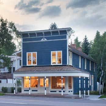
Founded in 2003 by Principals John Rowland, AIA, and Sarah Broughton, AIA, NCIDQ, Rowland+Broughton (R+B) has since grown into a thriving team of dedicated architects, interior designers and administrators. The Aspen studio is located on Main Street at the entrance to town in a restored 1890s historic landmark building, and the Denver studio is located in a restored 1892 historic commercial building in the vibrant downtown neighborhood of LoDo.
Our consistent design approach is credited to the fact that our collaborative process tests conventional thinking. This thread connects across all of our projects, allowing our diverse project experiences to inform one another no matter their type or locale. Our design thinking ranges from ‘macro to micro’ instantly, with the driving force always based on context, spirit of place, environment, and experience.
Ultimately, the satisfaction we experience from building lasting relationships with our clients, and the opportunity to work with them all over the country as trusted advisors, transcends all accolades received for our work.

“It was the most enjoyable project we’ve done and we’ve done a lot. There was never a problem you couldn’t solve or a challenge you didn’t meet head on! Thanks again for your professionalism and the outstanding working relationship we have had through this. You are a gifted Architect and we are thrilled with the outcome. Thank you for everything.”
Nancy Crown, Owner MOUNTAIN RETREAT
- 4 -
Aspen Studio
Denver Studio

Our process begins with you.
We believe in clear communication and transparency, which is why you have direct and easy access to your R+B team from day one. We are leaders, collaborative, agile, and fun; always operating with integrity, respect, and accountability.
This combination of strengths produces creative solutions that consistently reach new heights with each assignment.
“When you look at R+B projects, you see clean lines, creative applications sourced globally and highly functional spaces. What you won’t see is repetition or formula. You won’t recognize an R+B project by its look, because every location, every situation, is unique.”
Blaine Wesner, Owner RIDGE HOUSE
- 5 -
SITE Architecture has a tremendous ability to impact a site, and therefore a responsibility to respect it.
R+B believes the key to unlocking truly timeless architecture is through having a thorough understanding of the land—climate, geography, history, culture, flora, fauna, light, zoning, man-made and natural physical features. We interlay these understandings with your functional needs and lifestyle as we optimize and embrace the site.


Spiritual connectivity to the land is typically not an accident. We hold ourselves accountable to create balance and harmony among the landscape, buildings, furnishings and art. This integrative approach is applied across all R+B projects from the small, individual building sites to large, master planned properties with multiple buildings.

SITE

- 8 -

- 9SITE


- 10 -


- 11SITE

- 12 -

- 13SITE
ART
Art and architecture are invariably intertwined.
Architecture creates spaces that are welcoming and thought provoking. Art is positioned in the architectural context with a focus on experience. They both share properties of space, light and shelter. For R+B, art is both an inspiration and a programmatic element, influencing our work in both dimensions.


For many of our clients, art is an important passion in their lives. Some make it, others collect it, and others find inspiration within it. Early in the design process, our team asks those leading questions about their collection that help us create optimal qualities of space where the architecture and art are in balance; aesthetically and functionally. We seek to understand those pieces that might become a part of the finished home; or those pieces that have inspired the client, no matter their medium. The information conveyed through a sharing of art is invaluable to the architectural process each time. Like art itself, great architecture should stimulate our emotions and provide a theatrical intervention.
- 37ART
“In the process of doing the house, we kept in mind where art was going to be and designed specifically for placement.”
Rona & Jeff Citrin, Client THE LOOKOUT

- 38 -

- 39ART


- 40 -

- 41ART


- 42 -

- 43ART
Art Barn
Art Barn is a home designed for displaying various forms of mixed media contemporary art and for spirited philanthropic gatherings.
Sited at the edge of a steeply-sloped mountainside, the home is positioned so that the entry façade addresses a pastoral ranch meadow and the rear façade frames panoramic views of Aspen below.

- 44 -
CASE STUDY

- 45 -
The design was predicated upon the vision of allowing the ranch meadow and rural vernacular to feather their way onto the site. The simplicity of the singular gable form, along with the minimalist detailing of the “shou-sugi-ban” wood siding and fenestration pattern, begins to suggest a clarity and rigor, which is carried through inside.
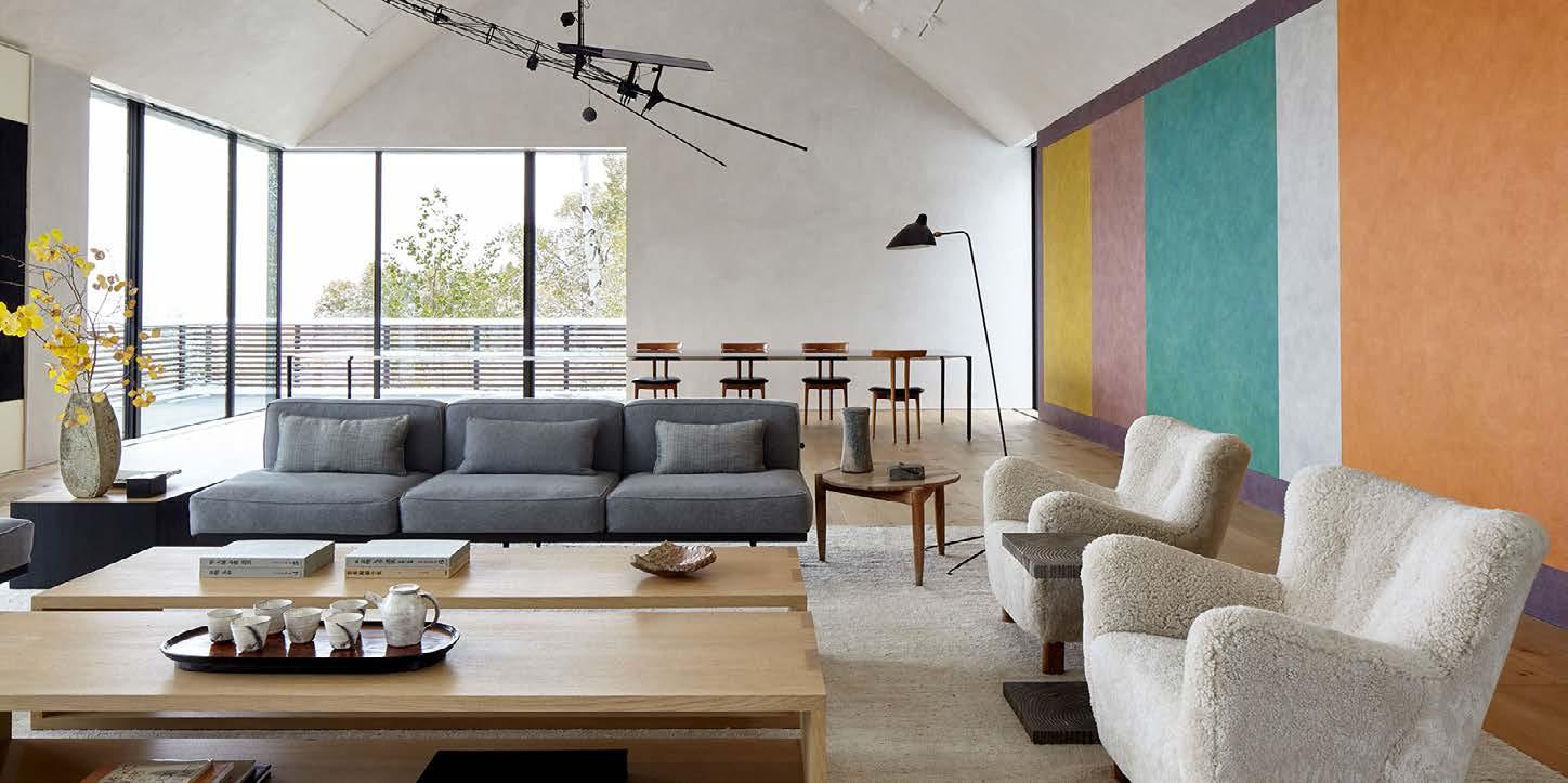
A consistent interior palette features natural materials, meticulously detailed with special attention to the precision of alignments. The great room is designed for maximum flexibility with furniture easily removed for large dinner parties, musicals, and other philanthropic events. Two gallery spaces, one on each level, are designed to display a vast range of video art arrangements based on how an artist conceives a piece should be experienced. In addition, the auto court doubles as a pre-function space, where guests can enter through large, fully pocketing windows.

- 46 -


- 47CASE STUDY: ART BARN

Art Barn’s crescendo is its tearoom. Designed as a modern interpretation of an authentic Japanese tearoom, and to accommodate traditional tea ceremonies, the space is located behind hidden doors at the lower level video art gallery. It is accessed via two entrances, one for the tea master and one for guests. An indoor/outdoor connection with the garden beyond is experienced through a large, corner sliding glass door.

- 483

- 49 -
Thunderbowl
Tucked sensitively into the surrounding mountainscape with ski-in, ski-out access to Aspen Highlands slopes, this tri-level 9,217 square foot family vacation home comfortably accommodates multiple generations.
The purposeful juxtaposition of old and new creates a refined sensorial atmosphere. The addition of color throughout adds a sense of playfulness.

- 50 -
CASE STUDY

With the intention of bringing architectural rigor to the original 1990s home while injecting character and vitality, the team undertook an extensive interior remodel. On the main level, thoughtful editing of the space, including the demolition of certain walls (between the kitchen and family room, and in the living room, for instance) resulted in a more open plan that encourages a modern lifestyle. A remotely located guest bedroom and sitting room suite offers privacy for elders. A skiin, ski-out gear room provides easy access to the slopes and storage for multi-seasonal sporting equipment.

- 52 -


- 53 -

Throughout the home, special attention was given to existing woodwork. A lightening of the overall palette included bleaching the original floors and ceilings to enhance texture. The introduction of lighter oak wood in certain areas purposefully emphasized the juxtaposition of old and new. Two existing staircases were re-finished and new modern, edgy mesh guardrails were designed to complement existing metal detailing on ceiling trusses.

- 54 -

Upstairs, the primary bedroom suite was edited into a single continuous gable volume flanked by an office and an ample sitting area. Open trusses connect the private spaces in the suite, distributing natural light and accentuating the roof form. A pair of children’s bedrooms playfully reflect individual personalities.
- 55CASE STUDY: THUNDERBOWL


Ridge House
Set along a ridgeline amidst immersive mountain views, Ridge House is a family home that thoughtfully blends the old and new through the renovation of an existing 1960s structure.
The home’s original architect, Ellie Brickham, was the first female architect in Aspen, and the legacy of the building was worthy of thoughtful modernization. To accomplish this, the R+B team maintained a delicate balance throughout the design process by cleaning up unsystematic renovations and additions that had been implemented over the years, while also ensuring the home become thoroughly enjoyable for the thriving, contemporary client family.

- 58 -
CASE STUDY

- 59 -


The interior is oriented along a central defining spine, which encourages progression from public to private spaces. Carefully designed volumes with modern architecture and interspersed details, such as a wide range of furnishings, allow for a layering of history and a connection to the ranch-like character of the site. The existing wood-burning fireplaces throughout the home were revived and are an integral part of honoring Ellie Brickham’s design. Further, strong indoor-outdoor congruence is granted with large floor-to-ceiling windows and sliding doors throughout the home.

- 621) Remnant Stone Walls define the architecture allowing a slipping of the landscape. 3) Mountain Views are emphasized by large windows to the west. 2) Clear Circulation establish a North - South axis. Ridge House Clear relationships and a modern design connect to expansive mountain views.

Additional goals for the home included utilizing new materials that would, like the original structure, patina and improve with age, creating a strong indoor-outdoor connection, connecting the home to its remarkable mountain views, creating fluid spaces that have visual and/or actual connections to other spaces within the house while remaining distinct; and establishing sites within the home for treasured art objects.
- 63CASE STUDY: RIDGE HOUSE
Meadow House
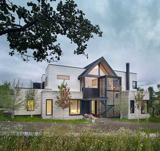
At 8,500 SF, the 5-bedroom home is nestled on a 2.5-acre site, at the edge of a meadow formed by ancient glaciers that shaped the dramatic Roaring Fork Valley in which it’s located.
The site was purposefully selected for surrounding gambel oaks that provide privacy from neighbors. Panoramic Valley and Aspen ski mountain views afforded by the gently rolling slope of the land became the primary organizing element of the home. An L-shaped building plan was designated to provide wind protection and an east-west axis was programmed for family areas for optimal solar gain. An iconic gabled form (a nod to agrarian architecture in the area) was designed to gradually peel up from a traditional symmetrical front to an open back that transitions into the landscape and focuses on views.

- 64 -
CASE STUDY

- 65 -
Addressing the client’s desire for vertical living, the team devised an open tri-level plan, the interior of which flows naturally from room-to-room and level-to-level, much of which is oriented toward views and all within the maximum allowed height of 28 feet. A defining element linking main and upper levels is an open stair riffing off and directly aligning with the exterior screen element. Austrian spruce treads align with same-species wide-plank flooring flowing throughout.
Vertical stacking allows public spaces including kitchen, living and dining rooms, office, and study to be located on the main level, with private spaces including the client’s bed/bath suite, childrens’ bedrooms, and a craft room on the upper level. A theater, A/V room, wine room, storage, and mechanical room are on the lower level.
Throughout, clean white plaster walls provide a backdrop for custom and curated furnishings, the client’s contemporary art collection, and specially commissioned elements such as fireplace surrounds by Haas Brothers.

- 66 -


- 68 -


- 69 -


- 70 -

The soothing palette of the natural surroundings also influenced selection of exterior materials. Lowmaintenance cedar siding and gray-brown stone contrasts with black-metal-framed windows and semi-opaque, shou sugi ban screens. Additional elements include flat, standing seam, and flush joint black metal, steels channels, stone pavers, and glass rails.
Both the shell and core of the home were designed and engineered with energy efficiency and sustainability in mind. Significant features include passive brise soleils, radiant heat and a 6.365 kW PV system. A separate greenhouse building was designed to house a year-round edible garden and enable a farm-to-table learning experience for the family.


