ANNAPOLIS HOME
THE INTERIOR DESIGN ISSUE

Glass House
SHINES AGAIN & MORE
THE FINEST ARCHITECTURE AND DESIGN OF THE CHESAPEAKE REGION
Vol. 14, No. 5 2023


WITH McHALE YOU CAN. Imagine… SINGLE SOURCE DE SIGN + BUILD McHALE LANDSCAPE DESIGN LANDSCAPE MASONRY CARPENTRY MAINTENANCE CONSTRUCTION LANDSCAPE ARCHITECTURE mchalelandscape.com MAIN: 301.599.8300 EASTON: 410.770.9449 MCLEAN: 703.760.8600 ANNAPOLIS: 410.990.0894 CLARKSBURG: 301.972.9090 Winner of over 400 National & Local Awards of Excellence in Landscape Design, Installation, Craftsmanship & Maintenance
 Insert photo by: Glenn A. Miller


Scan to view more of this Ultra Home


 Allen & DeLalio Architects David Burroughs Photography
HIGH PERFORMANCE CUSTOM HOME ON WEEMS CREEK
Design That Moves You™
TruStile doors transform the whole home experience, elevating the look, feel, and flow of a space.

www.trustile.com

Vol. 14, No. 5 2023 9 WWW.TWPERRY.COM ANNAPOLIS HYATTSVILLE BALTIMORE LEESBURG SPRINGFIELD GAITHERSBURG SILVER SPRING Visit Our New Window & Door Showroom 302 Harry S. Truman Pkwy., Suite F Annapolis, MD 21401 For more information contact Ken Clark kclark@twperry.com (240) 687-4782


202 Legion Ave. | Annapolis, MD 21401 | 410.263.4900 | kitchenencounters.biz


ADU.COM
Absolutely Elegant

410 987-5905 / winchesterinc.com
McAlpine Tankersley Architecture / Cashmere Interior Design Studio Kaiser Trabue Landscape Architecture / Alan Gilbert Photography

INSTALLATION | DUSTLESS SANDING | FINISHING 1811 M c GUCKIAN STREET, ANNAPOLIS, MD 21401 410.280.1420 | ELITEHARDWOODFLOORING.COM


Explore Our Garden Center and Discover Our Passionate Approach to Landscaping! HIMMELSGARDENCENTER.COM Himmel’s is a woman-owned business with a mission of helping our neighbors build a better, healthier, and more beautiful world. Offering a full array of landscaping and hardscaping services plants and flowers native plant and pollinator habitats and knowledgeable staff ready to provide unparalleled customer service. C a l l ( 4 1 0 ) 2 5 5 - 7 7 3 0 t o s c h e d u l e a c o m p l i m e n t a r y c o n s u l t a t i o n 410.255.7730 | 4374 Mountain Road, Pasadena, MD 21122 landscaping@himmelsgardencenter.com


2062 GENERALS HIGHWAY, ANNAPOLIS, MD 21401 410.266.5254 | ARCHWIN.COM
Bayview Builders Purple Cherry Architects

Minimum
An architect creates an airy home that feels bigger than it is, thanks to an efficient floor plan and plenty of glass.

Learn about the distinct vision and style of three interior designers who also share tips and techniques.
Learn about the ancient history of the incredible Iris and how to care for this easy-going perennial.
Three exceptional design professionals share their favorite spaces.
18 ANNAPOLIS HOME 20 Publishers’ Letter 21 Robert’s Picks 65 Top Talent: Interior Designers You Need to Know 91 Design Forward 102 Beauty Room | Fall Fantasy 106 Powerhouse Realtors 132 Straight Up on Dining Out | Dry 85 134 Home & Professional Services Guide 136 High Design | Have a Seat CONTENTS DEPARTMENTS ANNAPOLIS HOME THE FINEST ARCHITECTURE AND DESIGN OF THE CHESAPEAKE REGION
82
42 3
94 A Breeze Blows Through It
My Favorite Room
Interior Designers
34 On the Cover: Stairway
Peak Visuals
A cramped ranch house on the Eastern Shore is transformed into a breezy retreat.
from “Magothy River Glass House Reimagined.” Photo by
Spacious
at
Square Footage 58
The High-Heeled Gardener Iris: Goddess of the Rainbow
Magothy River Glass House Reimagined
The iconic glass house has received a dramatic makeover that ensures it will endure for years to come.
 Photography by Peak Visuals
22
Publishers
Kymberly B. Taylor
Robert E. Haywood
Editor
Kymberly B. Taylor
Creative Director
Ryan Gladhill
Senior Designer
Samantha Gladhill
Director of
Advertising & Business
Development
Elizabeth Davis
Account Executive, Advertising & Client Services
Marjorie Boyd
Photographers
Steve Buchanan
Dave Bruffy
Max Burkhalter
Stacy Zarin Goldberg
Geoffrey Hodgdon
Peak Visuals
Jenn Verrier
Writer
Dylan Roche
Copy Editor
Patricia Stainke
Bookkeeper
Amber Trainer
Annapolis Home is published bimonthly by Taylor Haywood Media, LLC. No part of this magazine may be reproduced in any form without express written consent of the publishers. Publishers disclaim any and all responsibility for omissions and errors.
Publishers disclaim any and all responsibility for an advertiser’s products, services, or claims. The views expressed in this magazine are solely those of the writer. All rights reserved.
© 2023 by Taylor Haywood Media, LLC.
Annapolis HOME
PUBLISHERS’ LETTER
Thirteen years ago, we started Annapolis Home Magazine in the basement of our home in Severna Park. The first issue of Annapolis Home, September 2010, featured the infamous “Glass House” on the Magothy River. People who cruise the Magothy on a boat or kayak know this landmark home in Pasadena. The home was originally built for prominent developer Leroy Merritt, and after his death, it almost fell into disrepair.
Kymberly Taylor wrote the original story on the Glass House, which included her interview with Merritt. You can read the original story on the AHM website at annapolishomemag.com. Thirteen years later, we revisit this home after Rob Merritt, Leroy’s son, totally remodeled it, inside and out. As Taylor notes in her story, Rob Merritt put together a talented team who brought a new look to this exceptional river house.
Two other stories in this issue of Annapolis Home focus on homeowners who decided to redesign and wholly update existing structures rather than tear them down completely and start from scratch.

Along with these total home projects, we are pleased to present interior design stories and profiles that allow you to see a range of options when you are ready to hire an interior designer for your own home. An experienced interior designer is a critical member of any team committed to creating a beautiful home.
We hope you enjoy this fall issue, and as always, we welcome your feedback.
kymberly@annapolishomemag.com | robert@annapolishomemag.com
For subscriptions, visit annapolishomemag.com
For operations, contact Robert Haywood at robert@annapolishomemag.com or call 443.942.3927.
For advertising inquiries, contact Elizabeth Davis at edavis@annapolishomemag.com or call 443.618.2201
For mailing, contact ahm@annapolishomemag.com
20 ANNAPOLIS HOME
Kymberly Taylor & Robert Haywood Publishers
Serving Greater Metropolitan Annapolis PLUS Meet the Annapolis Design District In the Garage with Gill Tough Fabrics A RIVER house of GLASS September/October 2010 $4.95 garden • dock • garage
Robert’s Picks
Annapolis
Jose Guadalupe Posada: Legendary Printmaker of Mexico at St. John’s College
Don’t miss this exhibit featuring work by one of Mexico’s most renowned artists—albeit one who was never appreciated in his lifetime—Jose Guadalupe Posada, whose thought-provoking images will be displayed through October 1. For info, visit sjc.edu/ mitchell.
Annapolis Symphony Orchestra performs Masterworks I and II
The first two installments of the Annapolis Symphony’s Masterworks series, bringing together some of the finest selections of music by a variety of composers, are set for two-night engagements in September and November at Maryland Hall. Get info at annapolissymphony.org/ events/masterworks-series.
Classic Theatre of Maryland presents Something Rotten
One of Broadway’s biggest hits of the past decade, the musical comedy Something Rotten sets Shakespearean farce to song and will take the stage at Classic Theatre of Maryland from October 5-22. Get info at classictheatremaryland.org.
Metro D.C.
Dorothea Lange: Seeing People at the National Gallery of Art
See more than 100 photographs by groundbreaking photographer Dorothea Lange, known for capturing the lives of depression era Americans, starting November 5 at the National Gallery of Art. Get info at nga.gov/ exhibitions/2023/dorothea-lange-seeing-people.html

The Kennedy Center presents Maxwell: A Night at the Symphony Renowned soul singer Maxwell takes the stage with the National Symphony Orchestra for a limited four-night engagement October 11-14 at the Kennedy Center. For times and tickets, go to kennedycenter.org/nso/home/2023-2024/maxwell.
Shakespeare Theatre Company presents Evita Andrew Lloyd Webber’s acclaimed musical about the life of Argentinian First Lady Eva Peron gets fresh treatment in this production by Shakespeare Theatre Company, playing now through October 8. Showtimes and tickets at shakespearetheatre.org.
Eastern Shore
Spatial Reckoning: Morandi, Picasso and Villon at the Academy Art Museum
Go abstract at this exhibit that brings together the work of three trailblazers who defied realism and approached art differently throughout the 20th century. Now on display at the Academy Art
Museum through October 22. Learn more at academyartmuseum. org/spatial-reckoning-morandi-picasso-and-villon.
The Addams Family at Garfield Center for the Arts
America’s favorite creepy, kooky family gets the musical treatment in this theatrical favorite now taking the stage at the Garfield Center for the Arts at the Prince Theatre, running September 22-October 8. For tickets, visit garfieldcenter.org/gcaevent/addams-family/2023-09-22.
STOMP at the Ocean City Performing Arts Center
You’ve never heard percussion like this! The sensational music group STOMP brings their innovative performance style to the Ocean City Performing Arts Center for a one-night engagement on November 1. Get tickets at ococean.com/event/stomp/1656.
Have an event you would like us to consider for Robert’s Picks? Send all the details to ahm@annapolishomemag.com
Vol. 14, No. 5 2023 21
Dorothea Lange
Human Erosion in California (Migrant Mother), March 1936, gelatin silver print image, The J. Paul Getty Museum, Los Angeles.
MAGOTHY RIVER
 The iconic Glass House has been transformed top to bottom by designers, artisans, artists, and a highly skilled custom builder.
Glass
House REIMAGINED
BY KYMBERLY TAYLOR
PHOTOGRAPHY BY PEAK VISUALS
STYLING BY KRISTEN ALCORTA

The Glass House has over two dozen glass walls and 8 roofs. Built by the late multi-millionaire Leroy Merritt in 1986 for entertaining, it is now family-friendly.

“To walk through this home is to stroll through the imagination of an artist.”
Witheight roofs and over two dozen glass walls, the glass house in Pasadena, MD, remains one of the most celebrated homes in the region. Designed by architect Leo D’Aleo in 1986, the home was the vision of the late Leroy Merritt, a gregarious self-made millionaire with a touch of the Wild West to his personality. When building the modernist “glass house” that rises from a bluff overlooking Sillary Bay, he shocked the mostly traditional-minded Magothy River community, dotted with Cape Cods, shingle-style homes, and cottages.
I toured the glass house with Leroy in 2008 and featured it on Annapolis Home’s inaugural cover in 2010. I saw something I have never seen before nor since: an Italian hand-carved hot tub in the living room framed by marble columns. The hot tub is gone, but the home still retains Leroy’s innovative exuberance, thanks to his son Robb Merritt. Robb began dramatically remodeling the home in 2020, preserving his father’s legacy while forging his own.
Robb notes that his dad, who lived in Baltimore, built the house as a getaway with the primary purpose of entertaining. “The living room basically had a grand piano, a hot tub, a couple of chairs, and not much else,” he reminisces. Leroy left the house to Robb and his wife Sheila when he died in 2010. So, they decided to renovate, update, and call it home. However, changes were necessary. “There was so much marble everywhere. We wanted it to feel comfortable and homey, a place where our daughters could hang out, a place for grandchildren,” he says.
For assistance, Robb turned to designer Joe Karlik of Locust Grove Studios and custom builder Delbert Adams of Delbert Adams Construction Group and Sunnyfields Cabinetry. Karlik masterminded the 9,700 square-foot home’s grand transformation from pleasure palace to elegant family-friendly estate, designing many of its furnishings. Karlik notes that they preserved the glass and concrete structure but changed virtually everything else, knocking out all interior walls and reconfiguring the floor plan.
A significant modification began with the exterior entrance, which was nondescript. Now, there is a floating stairway with bluestone and Ipe siding and also an elevator that opens to the first floor, conceived by Locust Grove partner Brian Ghiloni. The exterior facade facing the river, once light grey, is now darker, clad with bluestone and Ipe siding. Replacing huge concrete blocks on the commercial-grade structure was a colossal task, note project managers Clay Coulstone, Kent Darrell, and Ken Zacheri. Significantly, they rebuilt much of the interior wood framing due to termites, which entered through a tiny hole near the corner of the pool. The team also installed a new, more powerful HVAC system that occupies the ground floor and now resembles, says Darrell, “the engine room of a large ship.” The house has 19 zones, with almost every room independently controlled, explains Coulstone.
When it came to the interior, Robb and Sheila expressed their preference for the same monochromatic and calm tones that appear in their Baltimore condominium. They desired a similar ambiance in the glass house. “You could call it ‘Industrial light,’” says Robb. Karlik followed through. The design palette from top to bottom is subdued in honey and amber hues to ensure the panoramic water views remain paramount and that the artwork stands out. Instead of color, materials captivate the eye and include glass, metal, wood, and leather, adding a tactile quality and becoming part of the home’s living texture.
Vol. 14, No. 5 2023 25
 Ipe and bluestone siding replace concrete and glass, grounding the home in its riverside setting.

 The dining table was created by furniture artist Vicco von Voss from a 200-year-old sycamore tree.
To walk through this home is to stroll through the imagination of an artist. Indeed, many were hands-on and involved. Karlik notes his 5-member team has art, interior design, and sculpting skills. Also assisting were furniture maker Vicco von Voss, lighting designer Chad Shapiro, and glass artist Tim McFadden. A fixtures specialist, concrete artisan, and custom blacksmith added to the mix.


Once inside, there is something poetic about the 20-foot ceiling and the space it encloses. Stanza in Italian means ‘verse’ and ‘room’. One may experience the floors of this home as floating stanzas, each a small essential universe serving its inhabitants. On the first floor are three bedrooms for the Merritts’ three daughters. The sisters wanted them almost identical in size and comfort level, symbolizing the ease and equality among them. This floor has two kitchens. They remodeled the first kitchen, a small one original to the house. A second larger one is deep in the east interior of the home. The large chef’s kitchen is for Robb, who loves to cook. To add definition and a sense of intimacy, Karlik designed floating planes that hover overhead, echoing the exterior’s concrete floating roof planes and adding architectural interest.
In the open concept first floor, divided by levels, a visual harmony resounds. Colors never collide but rather elide, one into the other. The white oak wood floor is stained to complement the amber-honey tones of the table, explains Karlik. Von Voss carved some furnishings from a 200-year-old Sycamore. They include the kitchen’s wood bar, dining table, and vanity with a living edge in the powder room. On all his surfaces, he applies a custom varnish that amplifies the wood’s grains and beautiful flaws. There is also a custom whiskey bar fabricated by Blacksmith Sawyer: Steel and Custom Build. “The top slides back so the liquors are protected from the sun but also easily accessible,” says Karlik, who notes the constant sun streaming through the windows can warm the interior quickly.
Vol. 14, No. 5 2023 29
This modern 3-story chandelier is composed of giant glass pendants by Baltimore glass artist Tim Mcfadden.
Vicco von Voss designed the bar in the kitchen; floating planes overhead help define the space.
The whisky bar located in front of the window wall is designed to shield its contents from the sun.
A spiral stair winds to the second and third floors and is centered by an astonishing custom glass lighting fixture by McFadden. Hanging pendants are visible as one ascends each floor. They are suspended by thick ropes containing a 1/16-inch steel cable made by a company in Texas so they can’t fall down, explains Karlik. He views the lighting fixture as a stand-alone art installation. “As you go up the stairs, you can interact with them and be close to them, which is fun. There are little waves in the glass that show up on the walls in the evening that are just beautiful.”
The subdued hues and emphasis on materials continue upstairs. The primary bedroom has a custom-made bed of leather and wood crafted by von Voss, with an invisible giant flat screen that drops down from a canopy at the touch of a button. The master bath is not only well-appointed with multiple custom shower fixtures and fittings; it also features another flat-screen TV so Robb can keep up with sports and news.

French philosopher Gaston Bachelard reminds us that houses love to be inhabited and absorb the personalities of their owners, holding them close long after they have moved away. Leroy’s business card described him as “the last of the big spenders” whose skill set included “brawls organized, football games fixed, and dinosaurs neutered.” This home, with its courageous glass walls that have weathered over 17 hurricanes, retains vestiges of Leroy’s innovative spirit. A framed picture of Leroy smiling out at the world, the glint of mischief in his eyes, is displayed prominently on the kitchen wall, where Robb can easily see it while concocting his favorite dishes. “If you are at the whiskey bar, looking at the kitchen, it’s right there,” notes Robb.
 The powder room vanity has a rippling “living edge” carved by furniture artist Vicco von Voss.
The custom bed is made with wood and leather. A canopy overhead hides a flat screen.
Whiskey seems appropriate if only to raise a glass to the reimagined glass house, finished in 2022. Robb, who once tried to sell the home, reflects incredulously that some potential buyers wanted to tear it down. It is to his credit that he and his family moved down from Baltimore to breathe new life into this glass icon and to recreate, most importantly, a home “that I still call my Dad’s,” he says.
For more photos, visit annapolishomemag.com.
ORIGINAL ARCHITECT:
Leo D’Aleo, 1986
CUSTOM BUILDING:
Delbert Adams, Delbert Adams Construction Group, dacgllc.com; Sunnyfields Cabinetry, sunnyfieldscabinetry.com
INTERIOR DESIGN:
Joe Karlik, Locust Grove Studios, locustgrovestudios.com
CUSTOM STEELWORK: Blacksmith Sawyer Co., @blacksmithsawyerco
CUSTOM FURNITURE DESIGN: Vicco von Voss, viccovonvoss.com

CUSTOM GLASS:
Tim McFadden, mcfaddenartglass.com
LIGHTING DESIGN & AV: Chad Shapiro, sterlingsv.com
CUSTOM FIXTURES:
John Ramsey, Deep Landing Workshop, deeplandingworkshop.com
ARTWORK:
Carla Massoni, Massoni Gallery Chestertown, massoniart.com
ARTISAN CONCRETE:
Mat Warrington, Mackinaw Creations, mackinawcreations.com
Vol. 14, No. 5 2023 31
AH
The roof deck has been expanded and rebuilt to include seating for the family.

32 ANNAPOLIS HOME 302 HARRY S TRUMAN PKWY SUITE A ANNAPOLIS | MD 21401 443.224.0700 | CST-STUDIO.COM ANNAPOLIS’ PREMIER STONE & TILE SHOWROOM


FINE RESIDENTIAL CONSTRUCTION 410-295-3313 www.lynbrookofannapolis.com
Alt Breeding Schwarz Architects Anne Gummerson Photography
Spacious AT MINIMUM SQUARE FOOTAGE
BY DYLAN ROCHE PHOTOGRAPHY
The formal vestibule is similar to those in large center-hall Colonials and makes the space seem bigger than it is.
 BY STEVE BUCHANAN
 The eyebrow above the custom front door adds a traditional flair to the entrance.

“SOMETIMES THE SMALLEST PROJECTS ARE THE HARDEST PROJECTS… [THE HOMEOWNERS] HAVE THE SAME NEEDS AS A 6,000-SQUARE-FOOT HOUSE.”
– Jonathan Rivera, Architect
The steep slope in the back and septic system in the front of this home made expansion almost impossible.The double boat house is original to the property.
Take
a walk through the waterfront home that Jonathan Rivera designed for Ryan and Candace Walterhoefer, and you might be surprised to learn the entire house encompasses only 1,976 total square feet of living space. As Rivera describes it, the house “lives big.” Although the redesign sits on roughly the same footprint as the original single-story house that once stood on the lot, it feels spacious and comfortable, suited for busy family life and welcoming for visits from friends. “Sometimes the smallest projects are the hardest projects,” Rivera says. “Because you really need to fit stuff in. They have the same needs as a 6,000-squarefoot house.”
The lot boasts a breathtaking view of the Severn River, but with this ideal location came a few challenges. The steep slope in the back and underground septic in the front meant the house could take up only so much space. Additionally, Anne Arundel County codes limit improvement to no more than 50% of the original square footage. Rivera recognized that these factors meant he couldn’t expand very far in any direction. Nevertheless, he resolved to redesign it in a way that wouldn’t feel cramped or too confined.

Thus, creativity and ingenuity were necessary. In collaboration with builder Al Procopio of Procopio Homes, Rivera rose to the challenge. From the outside, the house maintains a traditional aesthetic. The symmetrical twosided gambrel roof is sloped on the sides, creating extra space for a second floor. The front door opens into a foyer where hallways on either side lead to the bathroom on the right and the main staircase on the left. This entry is the first of several surprising elements of the home’s layout. “One thing you do not expect in a house of this size is to enter from the front door into a formal vestibule,” Procopio says. “This is my favorite element of the home, as it gives the home the feeling of a ‘center hallway’-designed home that you typically see in larger scale homes.”
The vestibule leads directly into the main living space, an open layout where a vast span of floor-to-ceiling glass overlooks the river. This space, comprising the kitchen and family room, feels spacious and airy thanks to the abundance of natural light and interior designer Courtney Mullen’s use of clean white throughout. Coastal shades of blue in the throw pillows and window treatments lend interest to the space, as do the coastal charm
Vol. 14, No. 5 2023 37
The kitchen, though small, is equipped with appliances and built-ins and ready to serve a large family.
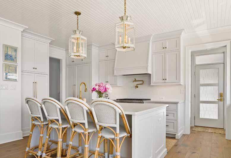
Coastal shades of blue in the throw pillows and window treatments lend interest to the space.

of the rattan and wood elements and the brushed gold on the light fixtures and kitchen plumbing. These accents add texture, shine, and sophistication, creating an ambiance that is elegant and upscale, while still feeling relaxing and laid back.

The practical use of limited space—something Rivera describes as “the theme of the house”—continues beyond the main level to the upstairs. Transom windows over each bedroom door allow natural light to pass through the entire second floor, and backband trim lends a majestic flair to the tasteful simplicity.
The home’s coastal aesthetic draws inspiration from the single feature of the property that remains untouched by the renovation—a boathouse out back at the end of their private pier. An architectural element built long before modern county codes imposed restrictions, the grandfathered-in structure provides living and entertaining space out on the water, an extension of the rest of the home.
Creating this “small space, big living” redesign presented several challenges beyond the smart use of the square footage. Not only did the build process have to fit in a tight, contained space, but the narrow winding road leading up to it restricted vehicular access, and the small lot left little room for parking. From the delivery of materials to pouring the concrete for the foundation, the combination of factors called for precise planning, resulting in the process taking several months longer than it typically would, according to Procopio.
Despite the challenges that Rivera and Procopio faced in creating the house, they agree the finished product lacks any kind of constraint. The Walterhoefers’ growing family needed a home that felt large, even if it was built on a small footprint. This little gem might be only 1,976 square feet, but it still offers all the upscale living of a home twice or thrice that size.
AH
For more photos, visit annapolishomemag.com.
Vol. 14, No. 5 2023 39
A generous side counter with built-in appliances adds functionality to the compact kitchen.
ARCHITECT:
Jonathan Rivera Architects, jonathanrivera.com
CUSTOM BUILDING:
Albert Procopio, Procopio Homes, procopiohomes.com
INTERIOR DESIGN: Courtney Mullen, courtneymulleninteriors.com
KITCHEN DESIGN & CABINETRY: Woodworking by Design, woodworkingbydesignllc.com
LANDSCAPE ARCHITECT, HARDSCAPE & INSTALLATION: Ben Rankin, Walnut Hill Landscape Company, walnuthilllandscape.com

APPLIANCES:
Appliances Distributors Unlimited (ADU), adu.com
AUDIO & HOME AUTOMATION:
Vintage Security, vintagesecurity.com
DOCK: Brady Christian, Chesapeake Pier & Pile LLC, cppmarine.com
ELECTRICAL:
Deshaies Electric, deshaieselectricalservices.com
FLOORING & TILE: The L & L Company, thelandlcompany.com
FIREPLACE: Fireside Hearth & Home, fireside.com
HVAC: Cool Breeze, coolbreezeplumbingheatac.com
LIGHTING: Build with Ferguson, build.com
PAINTING: Progress 21, progress21llc.com
PLUMBING FIXTURES: Thomas Somerville, tsconline.com
STAIRCASE: Choice Companies, choicecompanies.net
WINDOWS & DOORS: Pella Windows & Doors of Annapolis, pella.com
WINDOW TREATMENTS: Addie Designs, addiedesigns.com
WALLPAPER INSTALLATION: Jose Villatoro, (@jv_wallpaper)
40 ANNAPOLIS HOME
A deck is just the right size for a corner dining table, umbrella, and wicker chairs.


Proudly Serving the greater Annapolis, the Eastern Shore, and Washington DC Metro Area 877.542.8481 | QWDINC.COM/ANNAPOLISHOMEMAG Representing multiple lines of everyday, quality, luxury, and specialty window & door products. Providing consulting, installation services, and after-the-sale warranty service.
Donald Lococo Architects
Anice Hoachlander Photography

INTERIOR DESIGNERS
 BY DYLAN ROCHE
Like a superior artist, architect, or landscaper, an accomplished interior designer has a distinct vision and style. Everyone talks about making their client happy—and that they should. But… the whole point in hiring a professional designer is to bring someone into your life who, with their training, experience, and sharp eye, can transform your living space into something highly aesthetic—something you would not have been able to realize on your own. The three interior designers presented in these pages show us how distinctive a style can be. When you look carefully at the different spatial arrangements, materials, textures, and colors that characterize each project, you realize that not one of these designers could have achieved the same effect that the other two achieved in their projects because each designer brings a vision of their own. RH
Vol. 14, No. 5 2023 43
3
KATALIN FARNADY STRONG FORMS
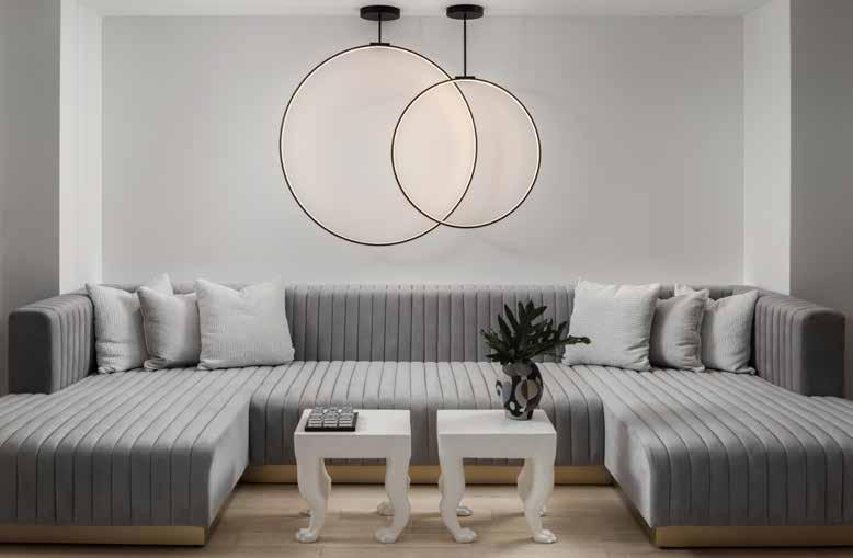
“Bold” isn’t a four-letter word for Katalin Farnady of Farnady Interiors, as evidenced in her recent design of an entertainment level for a Sharps Point home where high contrast and a well-conceived sense of balance achieve what she describes as “a sense of quiet drama.” Incorporating such spaces as a lounge, a game area, and a bar, the entertainment floor creates distinct sections where the owners can enjoy themselves at home or host guests for movie nights, billiards, or happy hour.
Clean shades of white, moody grays, and distinctive black work well to create that sense of drama Farnady envisioned. The space is one where a person could easily feel relaxed but not bored, thanks in large part to the big geometric patterns used throughout, along with the modern art and the statement light fixtures. Touches of gold stand out against the mostly monochromatic color palette, and the conscious use of texture in places like the carpet and the wallpaper lend interest to the room’s clean, sleek feel.
Every practical aspect of the room has its own character. This is particularly evident in the seating, where sofas, armchairs, and barstools each create a different vibe. Practically speaking, the diverse aspects of the room mean the owners and their guests could have a new experience every time, whether they are gathered around the bar for refreshments, kicking back on the sofa for a movie, or migrating somewhere in between.
What role does art play when you’re designing a space?
I use art to transform and finish the spaces. Art also helps bring personality to the design, adding richness and depth to any space. When you’re choosing art, you want it to be harmonious with its surroundings and to anchor the scheme. I’m a big advocate for local artists, so in every job I do, I’m trying to use work by a local artist if I can.

44 ANNAPOLIS HOME

There are so many bold parts to this design—how do you balance all of them without making it seem too busy?
Establishing a sense of space, drawing the eye to a focal point, and enhancing architectural elements all play a crucial role in creating a mood. Every time you are going for bold, you must also know how to avoid doing too much. You can also play with the scale.
At some point, you know how to create the balance. Yes, it will be very punchy, and it will be very strong. But then again, if you keep everything else light, it balances out. It gives me a lot of pleasure when people aren’t afraid of bold and dark.
When you’re working with dark colors, such as the wallpaper and the sofa behind the pool table, is there ever a risk that it could feel heavy or gloomy? How do you avoid that?
I believe using dark colors will not make a space look smaller or gloomy but will create a sense of drama and contrast. When you’re designing with dark colors, the key is to keep a sense of balance that you can create with added textures and a mix of materials.
You should be less afraid to push boundaries. It doesn’t have to be loud and crazy. Make it not too busy. You also need to know how to take something away. Once you have everything laid out in the design process, you can step back and say, “Okay, if I really want something
to stand out, I really have to make sure there’s nothing that’s going to draw the eye away from it.” You don’t need to be afraid of bold and dark—dark won’t make it sad or gloomy. You can use patterned wallpaper, and it won’t make it too busy if you keep everything else quiet.
These designs have a clean sleekness to them, but there are pops of texture throughout. How do you decide where texture is going to be the most effective? How do you decide which textures are most appropriate for a room? This comes naturally—it’s my trained eyes, and I just feel it. It always depends on the spaces or items that are being used. For example, the 3D wall panels we used in the movie room are made of felt, and they are used to absorb the sound.
I like to tell a story with my design and whatever I put in. I like it to have a presence. It can be as simple as the stitching on the sofa or the wallpaper pattern. I don’t like boring.
Interior Design: Farnady Interiors, farnadyinteriors.com
Architect: Peter Miles, The Drawing Board, Inc., thedrawingboardinc.com
Appliances: ADU, adu.com
Stone & Tile: In Home Stone, inhomestone.com
Jenn Verrier Photography
46 ANNAPOLIS HOME
Furnishings:
Cabinetry – Crystal
Flooring – Ultimate Flooring Design
Plumbing – Thos. Somerville Co.
Sitting Room Art – BB LaMartina
Wallpaper – Phillip Jefferies; Maya Romanoff; Kravet, Osborne & Little
3D Panels – CW Woodcraft
Lighting – Visual Comfort & Co.; Kuzco; Arteriors; Hudson Valley
Furniture – Bernhardt; Nomo; TOV; Vanguard

Vol. 14, No. 5 2023 47
ERIN PAIGE PITTS EASY BREEZY
Before this home’s design even came to fruition, Erin Paige Pitts and her clients referred to it as “the hideaway.” The idea was to create a second home that could be a sanctuary and an escape from everyday life—something calm, something tranquil. The owners’ primary home on Capitol Hill in Washington, D.C., felt unsafe after the January 6 insurrection, and they wanted somewhere they could go to be at peace.
Paige set about creating a feel-good retreat. “This house was an escape from everything their normal life was,” she says. The clean white walls and flooring provide a perfect background for its relaxing color palette of coastal blues and greens and rustic wood textures.
In the main living space, where expansive windows look over the water, woven rugs anchor distinctive areas for relaxation, including one with swings hung from the ceiling for an unusual seating option. The kitchen, boldly paneled in patterned tiles, looks crisp and sleek with its white counters and open shelving. The overall effect is elevated by touches of brushed gold on the hardware, including the trim of the range hood.
Light fixtures stand out with their wicker covers, which add to the relaxing beachy atmosphere. These colors and textures extend to the bedrooms, where wallpaper is used to create accent walls, and breezy curtains grace the windows. It feels, indeed, like a hideaway—fresh and clean and free of all the encumbrances of normal daily life.
How do you go about making a white room interesting?
I don’t see this house as all white. I see it as sort of clean and fresh. In good design, there are many layers to a well-designed space. So you’ll notice even though it has a lot of white walls and the white floor, it’s like a canvas for all

48 ANNAPOLIS HOME

the other colors. All the other colors pop more when they are on a backdrop such as that. Then we toned down the white with the use of a lot of natural materials. Whenever you put natural materials in any space, it gives it a lot of warmth and depth and character. So the white is kind of just a very clean, crisp, refreshing backdrop that allows all the layers to take center stage. Those layers are the colors and textures and different elements we added in.
How do you mix and match texture and color?
The truth of the matter is we start with a lot of elements, and then it is an editing process. We have a lot of things we like, and then we play with them and move them around and remove some of the things until the mix is balanced and feels really good. The best designs are those that have cross-relationships, and those cross-relationships are very subtle. But that’s what ties a lot of elements together, particularly in large spaces, without ever feeling matchy-matchy. So, these cross-relationships: We might bring in an element in one space, but we’ll tie it into an element in another adjacent space, one you can only see at a distance, but there’s still that distance and balance of color. You move and finesse and play with it until the balance is good.
What do you need to consider when creating a balanced room?


It’s different in an open-plan space: a house that has several contiguous spaces that are all open to one another in the main living area. In some respects, you treat it as one big space, but you don’t want it to be blank or uninteresting. That’s where balance comes into play. You might give a little bit more color in a certain area or dial a bit back a little. We have lots of things that we want to incorporate, whether it’s tile, a fabric, a floor covering, or furniture material. After you’ve been doing it for so long, you know when it’s right and when it’s not right.
We have a rule in our office: we work it to a point, but then we step back. And it’s usually when we step back from the project and take a break that the magic happens. Because your mind has a chance to figure out what is working and what isn’t working. It’s usually when we come back to the project that all of a sudden, our brain figures out what needs to go and what needs to come. During the
break, you figure out what you couldn’t figure out when you were so overly focused on it.
What are some good reasons to forego cabinetry in the kitchen? When would be a time to avoid this design choice?
This is a second home, so it’s not meant to be full of clutter and all the things you have in your main house—it’s supposed to be light. It’s supposed to be a cold glass of lemonade on a very hot day. It’s meant to be refreshing. It’s bright and cheerful and a sanctuary from the things they were trying to escape.
The house has only what they need. It’s not minimalism—it just doesn’t bear the weight of normal life. It’s fun. It’s freeing. It’s fresh. That’s different from minimalism. I don’t think anyone would call me a minimalist in my design style, but I think they would always say I have a very clean approach.
What should you consider when choosing lighting?
I am known—and have been for a long time—for very strong statement lighting. I don’t look at light fixtures as a functional source of light. I look at them as a functional source of light that can also bring an enormous amount of design, texture, and interest to space.
Sometimes, they’re really big. Actually, some of the fixtures in this project are really, really big. The two over the dining table are enormous, but it is also what helps create intimacy within a large space that has a high ceiling and a lot of windows. It’s very bright. Those types of fixtures make spaces far more intimate, even when they are big spaces. That’s very consistent in my work: whether it’s a polished nickel chandelier or a basket chandelier, they’re generally quite large, and they’re usually a statement. So, they’re giving you more than just a light source. They’re giving you a design element that is almost a focal point.
Interior Designer: Erin Paige Pitts Interiors, erinpaigepitts.com
Contractor: Karl Wentz, Kitchen & Bath Outfitters
Appliances: Ferguson, ferguson.com
Geoffrey Hodgdon Photography
50 ANNAPOLIS HOME
Furnishings:
Living Room Sectional – Lee Industries
Coffee Table – Mr. and Mrs. Howard for Sherrill Furniture
Wood-Backed Chair – Four Hands
Lamps – Visual Comfort & Co.
Dining Table – Four Hands
Dining Chairs – Made Goods
Dining Room Pendants – Jeffan
Art – Leslie Thornton
Kitchen Barstools – Selamat Designs

Kitchen Backsplash Tile – Ann Sacks
Kitchen Pendants – Napa
Sunroom Console/Desk – Made Goods
Sunroom Wicker Settee – Selamat
Hanging Chairs – Selamat
Bunkbeds – Custom by designer
Bunk Room Rug – Jaipur Living
Bunk Room Wall Covering – Schumacher
Bunk Room Wall Sconces – Palecek

Vol. 14, No. 5 2023 51
STEPHANIE BRADSHAW
PERSONALITY INFUSED
This design sprang from unfortunate necessity after the owners’ long-time home was lost in a housefire. As a builder worked to construct the home anew, expanding on the existing footprint by adding more square footage in the process, the owners enlisted Stephanie Bradshaw to design a new aesthetic for their freshly built home. Their vision was to pare down the large collection of knickknacks and décor they’d acquired over the years and focus on a more refined look instead.
Drawing on the mid-century aesthetic of the original home, this design uses color and texture to create an atmosphere that’s sophisticated while still being fun and inviting: a place where two busy professionals can feel at ease but still show visitors a good time. Throughout the home, layers of neutral colors—specifically, shades of gray—are punctuated with bright pops of vibrant hues, including deep blue, bright yellow, and rich red. Further interest is added using items with striking patterns, as seen in the throw pillows, the upholstery, and the carpets that anchor different sections of the open-concept main living space. Artwork makes a statement in nearly every room, and the prominent use of green plants brings undeniable life to the environment.
This is a design that features a lot of artwork. Are there rules or guidelines for incorporating artwork into a home design?
We curated probably 50% of the artwork that was in this house. I think one of the reasons people enlist our help is because we do have a focus on artwork curation, and we place a lot of emphasis on helping homeowners find the right piece of art for the right spot. It’s such a personal decision. So, if homeowners come to us with existing art from their travels or something that they’ve loved for a long time, we’re more than happy to work around that, but we end up curating a good portion of the artwork that is in our projects.

52 ANNAPOLIS HOME

What’s the best way to make a modern design feel warm and inviting?
I think a lot of that has to do with the colors and the textures that you bring in. It’s important to start with a good floor plan, and then you can layer the space with those textures and colors that really help create the vibe. The other thing that brightens up a space is the addition of plants; the greenery brings your eye to a certain space.
This design makes prominent use of grays and other neutrals. What do you need to keep in mind when you’re working with a lot of gray?
We used a lot of grays and neutrals, and often people think that goes kind of cold. But we did it in a way that is warm with the undertones and the texture. Then you can add in prints and patterns—large scale, medium scale, small scale—to give you a balance throughout the space. You can choose prints that are modern but still choose textures that give you the warmth you’re looking for. In the great room, you can see the rug is designed for a larger loom—it’s kind of nubby. Then there’s the geometric pattern on the ottomans. While the room feels neutral in the base layer, that brings the color more forward, such as the red poppies in the artwork in the foyer. There are a lot of different finishes of wood throughout the house and a lot of texture in the window treatments as well.
What kind of personality can a statement light fixture or lighting piece bring to a room?

The light fixtures are really like the jewelry of the space. Lighting is so imperative to the design, and it really sets the tone for the aesthetic. We did try to choose things that were interesting and provided different elevations of light and different rhythms throughout the house but kept everything really modern.
Interior Designer: Stephanie Bradshaw, stephanie-bradshaw.com
Builder: Batton and Son, battonandson.com
Stacy Zarin Goldberg Photography
54 ANNAPOLIS HOME
Dining Room:
Rug – Stark
Dining Table – Crate & Barrel
Chairs – Crate & Barrel
Buffet Table – Made Goods
Lamp – Visual Comfort & Co.
Mirror – CB2
Light Fixture – Graypants
Window Treatment – Grand York; Fabric: Romo
Artist – Michelle Poirer-Mozzone, Sorelle Gallery
Fireplace Sitting Area:
Art – Ted Collier, Oliver Cole Gallery
Living Room:
Sectional – Mitchell Gold; Fabric: Schumacher
Swivel Chair – Mitchell Gold; Fabric: Pierre Frey
Ottoman – Bernhardt; Fabric: Hines
Rug – Floors Etc.
Side Table – Arteriors
Table Lamp – Visual Comfort & Co.
Light Fixture – Regina Andrew
Millwork – Lyndon Heath Cabinetry
Den:
Sofa – Mitchell Gold; Fabric: Osborne & Little
Sofa Pillow Fabric – Holly Hunt
Chairs – Bernhardt; Fabric: Cowtan & Tout
Rug – RH
Light – Lumens
Millwork – Lyndon Heath Cabinetry
Window Treatment – Grand York, Fabric: Kravet Window
Art over Sofa – Artist Jeroen Broux Art
Kitchen:
Countertop – Rock Tops
Millwork – Bath Kitchen & Tile
Counter Stools – CB2
Pendant Lights – Visual Comfort & Co.

Vol. 14, No. 5 2023 55


Three B Architecture 410.879.3121 | 888.886.1213 BAYPILEDRIVING.COM A+ Rating with the Better Business Bureau. SHA Erosion and Sediment Control Certification. Member of The Maryland Marine Contractors Association. MHIC Licensed # 120670, MDE State Registered Marine Contractor (047E), Fully insured. Piers | Platforms | Pilings | Catwalk | Bulkheads | Retaining Walls | Boatlift Installation | Shore Erosion Control | Stone Revetments | C-Loc Vinyl Bulkheads | Rip Rap | Jetties | Breakwaters | New Construction and Repair | Commercial & Residential Jeff and Laura Gosnell, Owners DRIVING FOR SUCCESS IN MARINE CONSTRUCTION THROUGHOUT THE CHESAPEAKE BAY


The goddess Iris, though not as well known as Athena or Hermes, is with us today. One of the asteroids of the asteroid belt, 7 Iris, is named after the goddess. The chemical element Iridium was also named after the goddess of the rainbow because of its colorful salts.

The High-Heeled Gardener
Iris• Goddess of the Rainbow•
By Kymberly Taylor
If one pays close attention, nature communicates the divine. The regal bearded iris, with its astonishing ruffles, is particularly eloquent. When my iris bloomed en masse for the first time, I stood in a state of rapture, transfixed before a deep purple blaze. Pulitzer Prize-winning poet Louise Gluck devoted an entire book to this mesmerizing monocot. In The Wild Iris, the iris speaks to us:

You who do not remember passage from the other world I tell you, I could speak again: whatever returns from oblivion returns to find a voice:
from the center of my life came a great fountain, deep blue shadows on azure seawater.
Vol. 14, No. 5 2023 59
Gluck writes from the viewpoint of the iris, addressing the reader from “the other world” that is deep below ground. The iris breaks through the surface of the earth to find its voice, to share, exquisitely, what it is like to burst into being, into bloom—“from the center of my life came a great fountain...”
Gluck is not alone in her devotion to the iris, which has an enchanting history. The iris is named after the Greek goddess Iris, the goddess of the rainbow. In the Greek language, the word “iris” means rainbow, and “eiris” means messenger. The Dictionary of Greek and Roman Biography and Mythology notes that in addition to generating rainbows, Iris used her light to create multicolored flames to deter enemies. Iris also traveled on rainbows, carrying messages from the gods to mortals. Legend has it that colorful flowers sprung up wherever she stepped. To this day, we call them iris.
The cultivation of the iris dates back over three thousand years to 1469 B.C. King Thutmose III of Egypt was an avid gardener obsessed with acquiring new plants. When Egypt conquered Syria, he found iris growing in abundance. Shortly after introducing them to his gardens, the iris became popular. To the Egyptians, it symbolized both the essence and renewal of life. Depicted in many ancient carvings, the shapely flower may have inspired the fleur-delis emblem adopted by the French monarchy in the medieval ages. This iconic symbol still permeates modern culture.
The most popular iris today may be the bearded iris (Iris Germanica). They have brightly colored fuzzy “beards” that appear on the “falls” or petals that droop downward and attract pollinators. The upright petals on an iris are called “standards.” Ben Schreiner helps manage Schreiner’s Iris Gardens in Oregon, founded by his great-grandfather F. X. Schreiner in 1925. Schreiner, who handles over five million irises a year, notes that iris are not only beautiful and available in hundreds of hues and color combinations, they are very easy to grow. “We dig out the iris in September, put them
Irises made their way to the New World with the arrival of European settlers. Early records indicate irises were planted in Virginia in the 1600s.
in black trays, and leave them outside all winter with no medium [dirt] in the trays. When we plant them in April, they will grow in the field,” he explains. Occasionally, he has dropped an iris only to find it growing on its own, sprouting roots and “planting itself” right in the ground.
He explains that iris are not bulbs, as many assume, but “rhizomes.’ September and October are ideal months in Maryland for planting and transplanting iris. To plant, lay each one down sideways in a shallow trough and cover lightly with dirt, with the top slightly exposed. They prefer slightly acidic, well-drained soil and at least six hours of full sun. Iris take a year or two to bloom but multiply year after year and become larger and more beautiful as they age.
However, keep an eye on them. Divide your iris every three to four years, or they may stop blooming. No need to stress out over this, says Schreiner. Simply lift the rhizome out, snap off any protruding “limbs,” and replant the largest ones. To encourage bigger blooms, Schreiner suggests fertilizing with bonemeal or a 6-10-10 fertilizer one month prior to budding. In our zone 7, this would be late April.

Iris is the perfect plant for the beginner. If you don’t have any, shop for them locally or find a friend who has transplants to give away. For a treat and an education, check out Schreiner’s website to browse prize-winning cultivars and bi-colored Japanese hybrids. I suggest planting 5 to 7 at a time.
I promise your garden and your being will never be the same. It is never too late to pay homage to this gorgeous creation, to study its intricate anatomy, and to summon the rainbow to the garden.
AH
Schreiner’s Iris Gardens, schreinersgardens.com
Historic Iris Preservation Society, historiciris.com
The Wild Iris (Ecco Press, 1992), bookshop.org
60 ANNAPOLIS HOME
Come Away With Me
How to Plant Iris


• Plant iris in full sun (6 to 8 hours a day).

• Dig a shallow trench, sprinkle bonemeal, and place sideways.
• Cover with soil, leaving the top of the rhizome partially exposed.
• Water once. Do not overwater.
• Divide every 3 to 4 years.
Celebration Song
Absolute Treasure Can’t Touch This Anvil of Darkness
Brash and Sassy
Smith Rock


BEAUTIFUL HOMES THAT FIT YOUR LIFESTYLE 301.621.7703 | 410.551.8454 | procopiohomes.com MHBR #5572 Visit our Custom Home Gallery


Owings Baltimore Annapolis annapolis 1801 McGuckian Street | 443.333.1618 owings mills 45 Gwynns Mill Court | 410.363.7363 baltimore 801 Light Street | 410.244.7237 chesapeaketileandmarble.com
TOP TALENT
INTERIOR DESIGNERS YOU NEED TO KNOW
Leading designers share details about their favorite projects.
ANTONELLA CESTONE INTERIORS
C. NEWMAN INTERIORS
FARNADY INTERIORS
FITZSIMMONS DESIGN
INTERIOR CONCEPTS
IVORY STONE INTERIORS

JAMIE MERIDA INTERIORS
KAREN RENÉE INTERIOR DESIGN
KATIE RAINEY DESIGN
OLEXIA INTERIORS
SERIOUSLY SARI INTERIORS
SIMPLY WESLEY
SPONSORED SECTION
Photo courtesy the Phillips Collection
 Stylish Productions Joy Design + Build
James McDonald Architects
REDEFINED LUXE
Interior Concepts, Inc., led by Arlene Critzos, has been crafting captivating interiors for over four decades. With a foundation rooted in European Studies, worldly travels, and an appreciation for decorative arts, Critzos and her team have curated a portfolio that exemplifies diversity and sophistication. Recent projects span the style spectrum—from a serene island retreat to a modern mountain haven, an urban contemporary abode, and a refined Italian villa.
The team approaches every design with an unwavering commitment to creativity and professionalism, starting with understanding clients’ needs, budgets, quality expectations, and timing. Established in 1979, Interior Concepts has evolved into a full-service, multi-tiered, award-winning design firm with 60 employees and a 50,000-square-foot warehouse.

2560 Riva Road, Annapolis, MD 21401
interiorconceptsinc.com | 410.224.7366


INTERIOR CONCEPTS
 Moor Baker & Associates Architects PA
Interior Photos: Jessica Glynn Photography
Portrait Photo: Maureen Porto Photography


WESLEY PEHLKE Owner/Designer simplywesley.com 443.994.6757

FUNCTIONAL DRAMA
When the owner of this home wanted a custom kitchen to reflect her global travels, she turned to designer Megan Reiley, Principal of Seriously Sari Interiors. “My client wanted a bold, elegant space that would flow with her furniture and art from around the world,” Megan explains.

Custom cabinets are finished in a dark charcoal gray with a custom mahogany-trimmed range hood to reimagine old-world aesthetics in a fresh, modern style. A mitered porcelain countertop adds a touch of drama to the island, while a custom mosaic backsplash balances colors found throughout the house.


Bold artwork, placed against textured wallpaper, is another vibrant touch. Each of Megan’s dramatic selections rests on a foundation of comfort and functionality, ensuring timeless appeal and usability for years to come.
 Designer
SERIOUSLY
seriouslysariinteriors.com | 203.927.3225
SARI INTERIORS MEGAN REILEY Owner/Principal
 Stacy Zarin Goldberg Photography
COLORFUL SOPHISTICATION
Bold floral wallpaper, lacquered millwork, and a linen ceiling are bold elements that play against traditional décor elements in this Murray Hill home designed by Cathy Newman, principal of C. Newman Interiors. Newman’s fresh designs and striking palette transformed this historic residence into a sophisticated, colorful home. “Instead of being stuffy or stilted, it is a comfortable place that is equally suited to entertaining as it is to raising a family,” says Newman.

Drawing on her experience as an abstract artist, Newman uses the interplay of color, texture, and pattern to create timeless, sophisticated interiors.

C. NEWMAN INTERIORS CATHY NEWMAN
Designer cnewmaninteriors.com
Owner/Principal
| 410.507.1308
Karen Renée Interior Design, Inc. strives to listen carefully to their clients so that they can turn a homeowner’s dreams into reality. When designing this home in Bethany Beach, the firm’s designer, Stephanie Simmons, kept the oceanfront location in mind. The designer selected natural textiles and textures in a palette of various shades of blue and white.


The furniture has a relaxed coastal vibe with a focus on comfort. Simmons sourced artwork and accessories to compliment the rooms and used a coastal palette combined with natural materials to create an oceanfront vibe. The designer gave the client choices, kept her organized, and went room by room to pull all the elements together for a continuous flow through the home.

DESIGN
INTERIOR
karenreneeinteriors.com | 410.647.0435
SEASIDE CALM KAREN RENÉE
Pictured left to right: Sophie Honeywell, Stephanie Simmons, Karen Osborne, MD CID, NCIDQ, and Lisa Smith
Geoffrey Hodgdon Photography
Fitzsimmons design has exciting news! Owner Gina Fitzsimmons will soon be opening an office in Palm Harbor, Florida, which is just a bit north of Tampa and Clearwater. Stay tuned for more details!

Fitzsimmons Design, an award-winning design firm in Annapolis, has been in business for over 30 years, delivering beautiful, imaginative interiors that go beyond trends to express your unique style. Their success is due to the fact that they are able to design custom architectural details into the space and to select inspired yet cohesive furnishings to complete the picture. They even design Kitchens and Baths! With one designer, the client does not have to work with two to three different people to tie a house together.

A very interesting tidbit is that 75% of their clients live on the water! Their relaxed, comfortable, carefree designs are permeated with easy-care fabrics and stylish selections curated especially for the client.

FITZSIMMONS DESIGN GINA FITZSIMMONS, ASID, NKBA Principal/Designer fitzsimmonsdesign.com | 410.269.1965
COMFORT
CLASSIC
Steve Buchannan Photography
When the new owners of The Oaks Waterfront Inn needed someone to helm the interiors for its top-tobottom renovation, they turned to Jamie Merida Interiors, based in nearby Easton, Maryland. Lead designers Carol Wheeler and Leigh Mayhew Draper selected a harmonious palette of coastal blues, gentle creams, and luxurious gold accents for the guest rooms, cottages, bar, and lobby—and completed the project in time for its first wedding in May.
Jamie’s retail arm, Bountiful Home, first opened its doors in 2000. Since then, his company has grown to become the premiere interior design firm for residential and commercial projects in the Mid-Atlantic region and beyond.

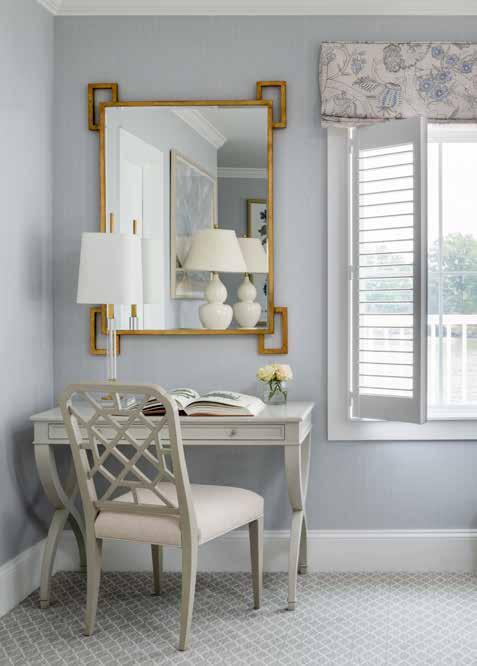

JAMIE MERIDA INTERIORS + BOUNTIFUL HOME JAMIE MERIDA Owner/Principal Designer jamiemerida.com | 410.819.8666 COASTAL HARMONY
Photography: Stylish Productions/Robert Radifera
Luxurious finishes and a gentle, coastal-inspired color palette were chosen to welcome guests at The Oaks Waterfront Inn.
The “Easton Mirror” is designed by Jamie himself as part of the Jamie Merida Collection for Chelsea House.
A light interior will appear fresh and make a positive impression. While the scope and the finishes feel simple, a closer look reveals the combination of different textures and unexpected details to enhance the beauty of this home.


Born and raised in the capital city of Hungary, Katalin Farnady developed her interest in style, design, and architecture at an early age. After graduating from business school in Hungary, Katalin moved to the U.S. and has been designing residential and commercial interiors around the world for over 20 years. In 2002, she became a member of the American Society of Interior Designers.
Katalin has won multiple industry awards and has been featured in numerous design publications. She launched her furniture line in 2021. Katalin, a world traveler, is constantly soaking up unique designs, structural shapes, and historical architecture to draw inspiration for her next project.

FARNADY INTERIORS KATALIN FARNADY, ASID Owner/Interior Designer farnadyinteriors.com | 443.822.3248
MONOCHROMATIC GLAMOUR
Lynbrook of Annapolis The Drawing Board, Inc. Jennifer Hughes Photography
WATERFRONT INSPIRED DESIGN

Recognized as one of the top luxury interior designers in the Chesapeake region, Katie Rainey specializes in delivering interiors that are inspired, clean, and feel like a year-round vacation. She has a talent for partnering with professionals and families who seek solace in the water, offering a deep breath from their fastpaced personal and professional lives.

“This project was for a busy family of five,” says Katie. The original house was on a beautiful waterfront lot, but the entire space was dysfunctional, outdated, and dark. Her transformation injects vibrancy and light as well as much-needed space and flow. Most importantly, her family-driven designs will stand the test of time, ensuring her clients will enjoy their new home, inside and out, for years to come.

KATIE
DESIGN KATIE
katieraineydesign.com | 843.214.4179
RAINEY
RAINEY Owner/Principal Designer
VIBRANT MODALITY
Olexia Interiors is a residential interior design firm with a focus on interior architecture, luxury materials, and creating spaces that reflect the lifestyles of our clients.


Principal designer Erin Olexia has always believed that each project and client is a unique opportunity to design something that clients will love for years and years. The interior design should be a bit unexpected and surprising but also classic enough to translate through current trends. Our selection of the finest materials and finishes and an emphasis on artwork and accessories provide the creation that transforms a space from a room to a feeling.

OLEXIA
ERIN
olexiainteriors.com | 410.212.6171
INTERIORS
OLEXIA Owner/Principal Designer
The custom range hood unifies the unexpected mix of pewter and aged brass accents, which are used throughout the space. A cerused wood island brings warmth and enhances the lush quartzite countertop, balancing the custom case piece.


GRACIOUS LIVING
Antonella Cestone creates timeless, innovative interiors—always with a touch of unexpected detail. “This kitchen is a sophisticated but inviting space,” explains Antonella. A combination of materials and finishes draws guests and the homeowners alike through the space. “It unveils itself subtly, with each feature accentuating the next while creating a functional space for the clients,” Antonella notes. The hand-crafted details of the island cabinetry are the artful pièce de résistance.
Antonella honed her style early in her career while previously working for a high-end DC design firm. Since launching her own business in 2018, she has expanded her client base throughout greater Annapolis and the Eastern Shore, Virginia and metro DC. She collaborates with architects, custom builders, and the finest vendors and craftspeople to create elevated spaces that reflect her client’s style, delivering spaces that are as functional as they are beautiful.

ANTONELLA CESTONE INTERIORS ANTONELLA CESTONE
Owner/Principal Designer
antonellacestoneinteriors.com | 410.703.8689
The reeded detail adds a special design element to the kitchen island.
NATURAL ELEGANCE
Principal designer and owner of Ivory Stone Interiors Laura Bauer designed an impressive primary suite for a charming home located on Le Trappe Creek on Maryland’s Eastern Shore. With a 12'x23' footprint, bringing scale to the vast bathroom space was the primary challenge. To accomplish this, Laura gave each area its own focal point. The freestanding tub is highlighted by an original painting by the owner’s father. The shower became its own room with a dramatic waterfall floor-to-ceiling slab of marble. The water closet contains wall-to-wall custom linen cabinetry accented with natural grasscloth. Polishing off the space is a contemporary chandelier that unifies the entire room.

Summing up the project, Laura says, “While I love all things old and weathered, it’s the modern elements that bring a breath of fresh air to my designs. The end result is a balance that is appreciated and admired across the style spectrum.”
IVORY STONE INTERIORS
 Owner/Principal Designer
ivorystoneinteriors.com | 443.618.1096
A waterfall slab of Dover White Antolini marble adds drama to the shower room, while penny tile flooring mimics an aged copper patina

LAURA BAUER, ASID
Custom cabinetry and oversized mirrors with inset sconces are an elegant focal point in the primary bathroom of this La Trappe Creek home.
My Favorite Room
Annapolis Home invited a builder, an interior designer, and a designer specializing in fabrics and window treatments to share a recent room they are especially fond of. One is an elegant kitchen on Capitol Hill, another is a colorful living room, and the third is a comfortable great room and outdoor space in Deep Creek, MD. Each room is distinctive and reveals very different living environments of the twenty-first century.
RH

82 ANNAPOLIS HOME


Bret Anderson
Pyramid Builders
In the charming Dupont Circle neighborhood, where historic row houses dot the landscape, a hidden gem that perfectly blends a careful mix of historic beauty and modern luxury has emerged. Nestled within this meticulously transformed 107-year-old townhouse, a remarkable, highly functional kitchen stands as a testament to the entire home renovation and collaboration among Pyramid Builders, Zoe Feldman Design, and Thompson & Cooke Architects. From top-to-bottom, all finishes and systems were removed and reconstructed.

The kitchen is a central component of the modernization of the residence and was a feat that not only met the expectations of its owners but exceeded them. The sun-drenched space serves as the hub of the home a connecting point to the outdoor deck through a custom Loewen door, a sophisticated greeting from the lower level recreation zone, and a passageway to the formal dining room, living room, and the upper levels. Despite the construction limitations of a DC row home, the design delivers a harmonious recipe of seating, storage, and style. The eclectic lighting gives a dose of whimsy and urban energy.
Custom-crafted walnut cabinetry lines the available perimeter, offering ample pantry shelving and a stunning camouflage for a Sub-Zero refrigerator and all the appliances the family requires. The warmth of the walnut, in contrast with the coolness of white, emphasizes the modern aesthetic, and a unique tamboured kitchen island stands as a centerpiece that fuses form and function. The curved, fluted panels open to reveal gliding drawers and depths of clever storage.
Marble and quartz countertops grace the workspaces, providing a utility surface for cooking and family gatherings. Completing the space and encouraging precious conversation, the casual dining table and upholstered bench-style seating carry the day from coffee to cocktails.

The journey from a historic, divided structure to a unified, modernized home with a luxurious kitchen at the core has been one of vision and dedication.
Pyramid Builders, pyramid-builders.com
Thompson & Cooke Architects, thompsoncooke.com
Zoe Feldman Design, zoefeldmandesign.com
Max Burkhalter Photography
Vol. 14, No. 5 2023 85
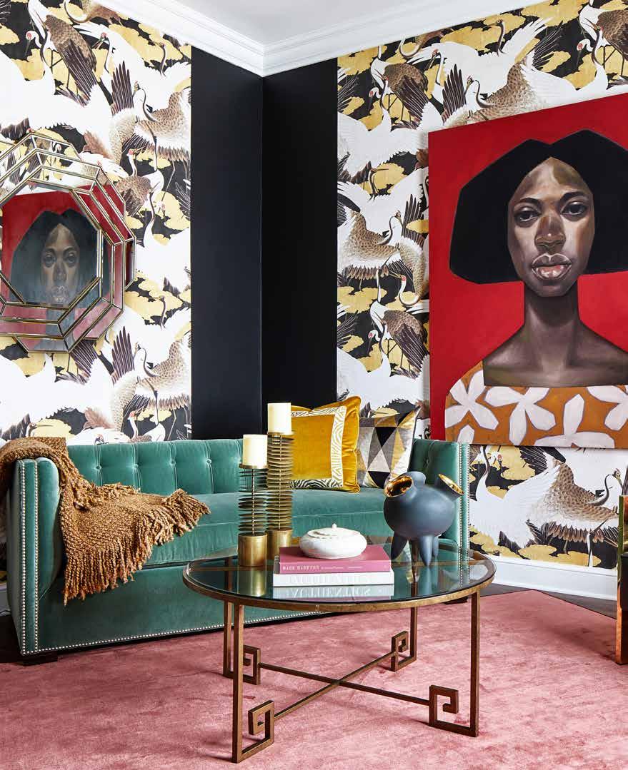
Sheryl T. McLean

McLean and Tircuit
I love to play with color that creates a moodiness and sense of mystery. The harmonious mixture of texture, color, and design styles creates a global flair that gives this space an international appeal. The original painting from Ronald Jackson Artworks is a central design element. The velvet sofa from Century Furniture, custom rug from Stark, vintage brass coffee table, chandelier from Arteriors, and handcrafted Peruvian accent pieces all make this space special.
McLean and Tircuit, mcleanandtircuit.com
Stacy Zarin Goldberg Photography


Margaret Blunt
Sew Beautiful
This recently updated 50-year-old cabin at Deep Creek Lake is an exquisite blend of modern luxury and rustic charm. As you step inside, you are greeted by a seamless combination of natural wood elements and contemporary design. The open layout allows for abundant natural light to filter in, highlighting the stunning views of the lake and surrounding trees.
The great room, anchored by a cozy stone fireplace, features plush furnishings in earthy tones, complemented by pops of color inspired by the vibrant flora of the area. Modern amenities, including a gourmet kitchen with sleek appliances, seamlessly integrate into the cabin's rustic aesthetic. A spacious deck extends from the room, providing the perfect spot to savor morning coffee or enjoy a starlit night. This cabin retreat is my family’s favorite getaway, where we gather to enjoy the tranquility of nature and quality time with family and friends.

Designers: Sarah Krauss, Sew Beautiful, sewbeautifulwindows.com; Trish Albano, Trish Albano Interiors, trishalbanointeriors.com
Contractor: Brosnihan Builders, brosnihanbuilders.com
Dave Bruffy, Smoke N Mirrors Photography
Furnishings:
Custom Live-edge Console – CL Woodworking
Sofa & Chairs – Century Furniture
Custom Ottoman – Jonathan Wesley
Area Rug – Jaunty
Drink Tables – Uttermost
Dining Table – Gat Creek
Banquette Fabrics – Kravet and Greenhouse Fabrics

Lighting – Light and Day
Jay Fleming Art over Mantel – Annapolis Art Gallery
Accessories, locally sourced – School House Earth and Deep Creek Pottery

BALTIMORE SULPHUR SPRING RD ANNAPOLIS BESTGATE RD californiaclosets com CALL OR VISIT US ONLINE TODAY TO SCHEDULE YOUR COMPLIMENTARY DESIGN CONSULTATION 410.247.8088 MAKE ROOM FOR ALL OF YOU ©2023 California Closet Company, Inc. Each California Closets® franchised location is independently owned and operated.
Frankel
Photo:
Laurie
Design FORWARD


FALL REFRESH
Beautiful spaces can still present dimensional challenges in unexpected places. With ceilings under 8 feet, visual strategies including neutral fabric colors, open chair framing, and a lighter blond wood tone achieve room function with an open feel. Seating grouped in the middle with poufs under a console keeps traffic free-flowing. A subtle circular pattern area rug and coffee table balance the room’s strong rectangular lines.

SUSTAINABLE FIRE
For fall, we are very excited about the new NetZero E-one electric fireplaces. The E-one’s depth and sculpted logs play perfectly with the holographic flames that make its virtual fire ultra-realistic, with zero fossil fuels and zero emissions. NetZero’s no-vent design allows you to enjoy fire sustainably, with endless installation possibilities. Multiple configuration possibilities meet every client’s unique design vision. The E-one is the future of fire!

KITCHEN REVIVAL

Our favorite fall projects are small kitchen refreshes. It’s the perfect project to prepare for the holidays without a lengthy renovation. Pairing cabinet refinishing with a new backsplash and updated fixtures can bring your kitchen back to life. Cabinet refinishing is the way to go whether you want to stick with neutrals or bring in a pop of color.

BLUE STAR PAINT &
BLUESTARPAINT.COM
KAT
SHAFFER EMBARK DESIGNS EMBARK-DESIGNS.COM DARDEN PICKALL & WILL SHEILS
PROPERTY
MADISON YFF-LINCOLN BAY STOVES BAYSTOVES.COM
David Lebow Photography


Nancy Hammond Editions Annapolis, MD • www.NancyHammondEditions.com • 410 - 295 - 6612 On The Watch, a Triptych
68 Maryland Avenue Annapolis, MD 21401 410.280.1847 | 703.989.9043 jo@jofleming.com joflemingcontemporaryart.com Coastal Indoor/Outdoor Wall Sculpture
by Nancy Hammond


Fall in Love with Your Home youngerconstruction.com | 410.626.8602 YOUNGER CONSTRUCTION Custom Building and Remodeling Bob Berry brings over 23 years of Award-Winning Global Design Excellence to Three B Architecture, with a focus on custom residential projects of all sizes. THREE B ARCHITECTURE 111 CATHEDRAL STREET, STE 301, ANNAPOLIS, MD 21401 | 443.791.6193 | THREEBARCHITECTURE.COM
Hammond Wilson Architects
 Custom builder Greg Younger and his team created a luxurious patio with a roof over the fireplace and custom hanging swing.
A
Breeze Blows Through It
Ranch House Reconceived on Prospect Bay
 By Kymberly Taylor
Photography by Steve Buchannan
When a homeowner purchased a 1960s rancher on a large, wooded lot on Prospect Bay, she faced a dilemma. She loved the views, the deep-water pier, and the resident osprey, but she could barely glimpse the water from its musty three-season porch. Could there be a way to “dial up the cool and downplay the frump,” as one homeowner puts it? What were her options? When it comes to most ranch houses, there are usually two clear choices: to restore or tear down. This homeowner chose restoration.

However, when custom builder Greg Younger investigated the foundations, he found a crawl space filled with water and rotting timber. “The crawl space down below was a big challenge because it was super wet, and it had two or three layers of old crappy plywood from the 1960s. We had to pull all that out and get it dried out,” he recalls. The original plan? Not an option. “We were going to try to add on to them... but it was so bad and so hacked up, we just decided it would be easier to start over,” he reflects.

Vol. 14, No. 5 2023 95 Before
Architect Stephanie Cook designed a new home adding only 500 square feet to the original footprint of the 1960s-style rancher.
Stephanie Cook of Speight Studio Architects stepped in to conceive a flowing floorplan, adding 500 square feet and a second story to the original footprint. She calls the new style a ‘hybrid.’ “It is a confluence of different styles; there are some shingle roots because of the roofs and gables and how it all comes together. But basically, it grows from what was there, which was an iconic postwar American generic box.”

The box is no more. In its place is a 2800 square foot three-bedroom home with pitched roofs and very few walls on the first floor. The layout is so airy it seems like a perpetual breeze blows through it. How was this achieved? Key elements are modern light fixtures, high ceilings, and a disciplined neutral palette, including 10-ply engineered white oak floors. Dramatic 18-foot ceilings in the great room are spanned by custom-milled timbers by Guy

96 ANNAPOLIS HOME
“You don’t need to feel tiny. You don’t need to feel tight. But there is a good scale for space and how we interact with it.”
– Stephanie Cook, Speight Studio Architects
Pitched roofs and a second story replace the original one-story home.
The homeowner did not want a “beachy” or “cottagey” aesthetic, so chose modern light fixtures for all of the spaces.
Modern light fixtures, narrow shaker-style custom cabinetry, and light, bright colors and finishes ensure a contemporary ambiance.


The marble floor in the primary bath was designed, piece-by-piece, by the homeowner and interior designer in the primary bedroom during construction.

Wheat, who also supplied the fireplace mantel composed of “a chunk of white oak” that is most likely reclaimed barnwood. Paint colors, hardware, tile, and furnishings are composed of whites, blue-greys, and tans, explains interior designer Elizabeth Horne.
“The homeowner did not want the usual ‘coastal cottage’ look,” says Horne. “She wanted something clean, flowing, and contemporary but welcoming. She wanted a place where her nieces could come over and ‘feel free to play and not worry about spilling water on the floor.’ ”
The contemporary floor plan encourages interaction. The great room and dining room flow into the kitchen and butler’s pantry, distinguished by soft white cabinets offset by grey-veined granite countertops. The kitchen was designed by Brad Kreer; Horne selected all the light fixtures, furnishings, and hardware. “The kitchen is a blend of traditional and modern elements. For the built-ins and cabinetry, we used a classic Shaker style door, but narrower” to make it a little
A crisp white board and batten ceiling, a wall of custom cabinetry, and black trim around the windows ensure a clean, calm aesthetic.

more contemporary, she explains. The island countertop, adjacent to the wooden bespoke dining table, is composed of a natural stone that looks like sand.
Several almost invisible features throughout the home contribute to its distinctively modern aesthetic. One such feature is the cove molding—one of Younger’s specialties. The custom panels in the foyer and on the second-floor landing are another. Milled in his expansive workshop in Davidsonville, they are painted a warm white, accentuated by black trim, and free of hardware. Closets and hidden compartments spring open at the slightest touch.
This subtle aesthetic continues on the second floor. The primary bedroom, tucked between sloping rooflines, is distinguished by Younger’s signature white wall panels, many operated by touch. In the primary bath, large porcelain wall tiles minimize the appearance of grout lines. The master bath features large 3 x 4 ft. tiles, and the floor is Calcutta marble.
98 ANNAPOLIS HOME


Vol. 14, No. 5 2023 99
The timbers supporting the roof, milled by Tucker Hardwood, add warmth to the home’s cool white palette.
A custom fireplace and covered roof with knotty pine built by Greg Younger’s team add elegance and charm to the property.
Because of these techniques and details, this home looks anything but busy. Set back from the water and framed by trees, it seems to fit right into its quiet neighborhood, even though it is brand new. This is the result of mindful design and carefully calculated proportions. “It is well scaled… We do a lot of talking people out of scaleless spaces, you know, ten ft. ceilings and 20 ft. rooms. You don’t need to feel tiny. You don’t need to feel tight. But there is a good scale for space and how we interact with it,” reflects Cook.
There is no doubt that comfort has been achieved. The homeowner is no longer trapped in a cramped “Florida Room.” Instead, she can gaze through sliding glass doors that open to a generous deck, flanked at one end by a massive fireplace with a covered roof and hanging swing, all crafted by Younger’s team. Banishing any vestiges of the plain rancher that once stood in its place, the deck, fireplace, and swing swaying in river breezes make this house a home. The frump is long gone, replaced, literally, by a cool breeze.
For more photos, visit annapolishomemag.com.

ARCHITECT:
Stephanie Cook, Speight Studio Architects, speightstudio.com
CUSTOM BUILDING:
Greg Younger, Younger Construction, youngerconstruction.com
INTERIOR DESIGN:
Elizabeth Horne Design, elizabethhornedesign.com
FURNISHINGS:
Kitchen Cabinets & Vanities – Pioneer Custom Cabinets
Kitchen Finishes – Farrow & Ball
Countertops – Atlas Stone Fabricators
Appliances – SubZero Wolf
Faucets – Rohl
Dining Room Light – Currey & Co.
Tile – Porcelanosa; Mosaic Home Interiors and Atlas Marble & Tile
Sofa – Benchmade Modern
Dining Table – Bespoke Design
100 ANNAPOLIS HOME
AH
The home was designed by architect Stephanie Cook to reflect the low-key Prospect Bay vernacular.


314 MAIN STREET, STEVENSVILLE | 410.643.4040 | 314DESIGNSTUDIO.COM timeless, custom, creative .
Beauty Room
Fantasy Fall

CARTIER Indomptables Collection cuff, cartier.com

CHRISTIAN LOUBOUTIN Lip Queen sandals, christianlouboutincom • $1,195
BRENT NEALE Rainbow Sapphire Mushroom necklace, brentneale • $16,950
HUBLOT Big Bang, Unico Titanium Rainbow watch, hublot.com • $69,500
COACH Signature Monogram Heart bag, coach.com • $325
VIKTOR & ROLF Haute Couture dress, viktor-rolf.com
While most practices specialize in either making you look better or making you feel better, ProMD Health has the tools and expertise to do both. Our providers act like the conductors of a great symphony, properly cueing the right instruments at the right time to have you both Looking and Feeling your best.


B O T O X / D Y S P O R T F I L L E R T H R E A D S C U L P T I N G A E S T H E T I C L A S E R M I C R O N E E D L I N G H Y D R A F A C I A L
H O R M O N E O P T I M I Z A T I O N T H E R A P Y E M S C U L P T N E O I V T H E R A P Y P R P T A T T O O R E M O V A L S K I N T Y T E V A G I N A L R E J U V E N A T I O N www.ProMDHealth.com @ProMDHealth L O O K Y O U N G E R F E E L Y O U N G E R


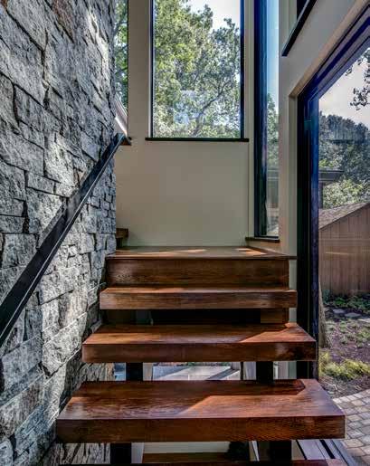
W W W H WALTER WORKS WARE HARDIn Annapolis FINE DECORATIVE HARDWARE KITCHEN BATH AND DOOR 420 CHINQUAPIN ROUND ROAD 410-263-9711 www.WalterWorksHardWare.com 314 MAIN STREET | STEVENSVILLE, MD 410.643.3334 | LUNDBERGBUILDERS.COM MHBR #748 MHIC #11697 The Difference is in the Details


REALTORS POWERHOUSE
Erica Baker
Georgie Berkinshaw
Reid Buckley
Connie Cadwell
Laura Carney
Kara Chaffin
Donofrio
Jennifer Chino
Joanna Dalton
Michele Deckman
Betsy Dunigan
Travis Gray
Sarah Greenlee
Morse
Brad Kappel
Malina Koerschner
DeeDee McCracken
David Orso

Ashley Stanwick
Snyder/Bradshaw Group The Tower Team
Day Weitzman
Our special Powerhouse Realtors section offers profiles of leading agents so that you can more easily find the best agent for you!
SPONSORED SECTION
THE CHESAPEAKE REGION’S HIGHEST SALES end
of 2023
ANNE ARUNDEL COUNTY
1. 15 Eastern Avenue, Eastport: $9,500,000
5 beds | 6.5 baths | 9,014 sf | .36 acres
Listing Agent: Martha Janney, Coldwell Banker Realty, Church Circle
Buyer’s Agent: Phil Gerdes, Real Broker, LLC
2. 986 Melvin Road, Annapolis: $8,350,000

5 beds | 5.5 baths | 6,746 sf | 3.82 acres
Listing Agent: Georgie Berkinshaw, Coldwell Banker Realty, Church Circle
Buyer’s Agent: Brad Kappel, TTR Sotheby’s International Realty
3. 2701 Wild Holly Road, Ferry Point: $6,00,000
5 beds | 4.5 baths | 6,711 sf | 1.24 acres
Listing & Selling Agent: Brad Kappel, TTR Sotheby’s International Realty
QUEEN ANNE’S COUNTY
1. 200 Magdee Lane, Stevensville | Eastern Bay
$6,300,000
6 beds | 5.5 baths | 8,100 sf | 15.55 acres
Listing Agent: Brad Kappel, TTR Sotheby’s International Realty
Buyer’s Agent: Corrie Robinson, RE/MAX 1st Choice
1. 7751 Rollyston Drive, Saint Michaels Miles River: $8,750,00

9 beds | 9.5 baths | 13,617 sf | 91.19 acres
Listing Agent: Thomas Keane, Washington Fine Properties, LLC
Buyer’s Agent: Chuck Mangold, Benson & Mangold Real Estate
2. 330 Serenity Lane, Chester | Crab Alley Creek $4,338,000
7 beds | 7.5 baths | 9,638sf | 2.58 acres
Listing & Selling Agent: Laurie Dellane, Chesapeake Real Estate Associates, LLC

TALBOT COUNTY
$8,500,000
7 beds | 5.5 baths | 9,833 sf | 670 acres
Listing Agent: Schuyler Benson, Benson & Mangold Real Estate
Buyer’s Agent: Jay Phillips, Holiday Real Estate, Inc., LLC
3. 3019 Bennett Point Rd, Queenstown | Wye River $3,500,000
7 beds | 8.5 baths | 9,689 sf | 5.71 acres
Listing Agents: Thomas Keane & Marc Bertinelli, Washington Fine Properties, LLC
Buyer‘s Agent: Barbara McCaffery, Redfin Corp.
5 beds | 5.5 baths | 9,210 sf | 8.14 acres
Listing Agent: Thomas Keane, Washington Fine Properties
Buyer’s Agent: Chuck Mangold, Benson & Mangold Real Estate
2. 2924 Ocean Gateway, Trappe | Choptank River
3. 24528 Beverly Road, Saint Michaels San Domingo Creek: $4,895,000
200 Magdee Lane, Stevensville Brad Kappel, TTR Sotheby’s International Realty
15 Eastern Avenue, Eastport Martha Janney, Coldwell Banker Realty
7751 Rollyston Drive, Saint Michaels Thomas Keane, Washington Fine Properties


1524 Cedar Lane Farm Road | ACTIVE $6,995,000 168 West Lake Drive | ACTIVE $4,995,000 1811 Whitehall Road ACTIVE $2,985,000 205 Lighthouse View Drive ACTIVE $2,495,000 357 Overlook Trail ACTIVE $1,488,000 1604 Winchester Drive | ACTIVE $19,995,000 For Those Seeking The Exceptional • Visit BradKappel.com
Co-Listed with David DeSantis


©2023 Sotheby’s International Realty Affiliates LLC. All Rights Reserved. Sotheby’s International Realty® is a licensed trademark to Sotheby’s International Realty Affiliates LLC. Each Office Is Independently Owned And Operated. SIR1 100% 5-STAR REVIEWS Annapolis Brokerage 209 Main Street, Annapolis, MD m +1 410 279 9476 o +1 410 280 5600 brad.kappel@sothebysrealty.com bradkappel.com Make Your Move with Brad Kappel Brad Kappel Executive Vice President Achieve TOP DOLLAR for your home #1 Waterfront Agent in Maryland Industry leading marketing platform #1 Luxury Real Estate website in Anne Arundel County Free professional staging One-on-One White Glove service every step of the way
You Deserve The Best.
If real estate agents charge about the same fee then why wouldn’t you hire the absolute best to represent you? Similar fee with different client outcomes doesn’t seem fair. The market has shifted and the stakes have been raised which make it paramount to hire the professional you deserve; the very best in their field. David Orso is celebrating his 20th year in real estate which has led to a curated system for maximum client outcomes for both sellers and buyers. Since 2013, David Orso has been the #1 agent in Anne Arundel County for total real estate sales. This unprecedented accomplishment is wholly due to his CEO level marketing and negotiation skills combined with his deep commitment to superior client outcomes. When asked his secret to year over year elite performance he stated, “When my clients win; I win. Always in that order.” This new market requires more than glamour shots and a couple good years during the real estate boom. Now is the time to evaluate your potential real estate representation closely and dig deep into their experience in challenging markets.
You deserve the best... so hire the best.

O. 443.372.7171 | M. 443.691.0838 | DAVID@DAVIDORSO.COM 8 EVERGREEN ROAD | SEVERNA PARK 1997 ANNAPOLIS EXCHANGE PARKWAY | ANNAPOLIS IN ANNE ARUNDEL COUNTY SINCE 2013 #1 AGENT ACROSS ALL BROKERAGES


 5 Boone Trail, Severna Park SOLD – $4,950,000
202 Norwood Road, Annapolis SOLD – $4,500,000
1122 River Bay, Annapolis SOLD – $2,500,000
1527 Shipsview Road, Annapolis SOLD $2,550,000 – Buyer Represented
RECENTLY SOLD PROPERTIES
1945 Orchard Point, Pasadena SOLD $1,675,000 – Buyer Represented
2701 Willow Hill Road, Annapolis SOLD $7,750,000 – Buyer Represented
3240 Harness Creek Road, Annapolis SOLD $5,300,000 – Buyer Represented
312 Kyle Road, Crownsville SOLD $3,450,000 – Buyer Represented
309 Cove Road, Riva SOLD – $2,050,000
203 Marlbrook Road, Severna Park SOLD – $2,650,000
A ®2023 BHH Affiliates, LLC. An Independently owned and operated franchise of BHH Affiliates, LLC. Berkshire Hathaway HomeServices and the Berkshire Hathaway HomeServices symbol are registered service marks of Columbia Insurance Company, a Berkshire Hathaway affiliate. We are proud to be an equal employment opportunity employer.
150 Boone Trail, Severna Park SOLD $2,500,000 – Buyer Represented
Trust The Tower Team
The Tower Team of TTR Sotheby’s International Realty represents the best services in the industry. Bringing true local knowledge, experience, & integrity to all clients since 1969, the Tower Team’s outstanding reputation has made them the top area team for decades. As experts in Downtown Annapolis & Eastport, historic renovation, luxury, and waterfront properties as well as second homes, condos, and starter homes. The Tower Team represents all price points and provides the finest services to every client providing Pre-Market Prep, Complimentary Staging, Effective Digital Marketing, Professional Photography & Videography, Expert Advice & Guidance, Skillful Negotiation & Closing. Our experience is the key.


ON THE MARKET 700 South River Landing Road | South River Landing 66 Franklin Street Unit 509 | Acton’s Landing | $1,750,000 101
|
|
under contract 410 693 8890 , towerte AM ho M es@g MA il.co M Visit our weBsite thetowerteAM.coM
Fogle Drive
Hillsmere Estates
$1,779,000



Vol. 14, No. 5 2023 113 RECENT SALES BY THE TOWER
TEAM
1360 E West Shady Side Road | Shady Side SOLD - $3,850,000
75 Charles Street | Historic Annapolis SOLD - $2,775,000
12 Cheston Avenue | Murray Hill SOLD - $1,995,000
302 Holly Road | Holly Hill Harbor SOLD - $1,975,000
3639 Branhum Road | Selby on the Bay SOLD - $1,495,000
38 Arundel Road | Wardour SOLD - $1,400,000
81 Market Street | Historic Annapolis SOLD - $1,375,000
198 Prince George Street | Historic Annapolis SOLD - $1,375,000
1252 Clarendon Court | Historic Annapolis SOLD - $1,275,000
2 Kimber Ridge Court | Eastport SOLD - $1,060,000
22 Wainwright Avenue | Bay Ridge SOLD - $1,025,000
© 2023 TTR Sotheby’s International Realty. All Rights Reserved. The Sotheby’s International Realty trademark is licensed and used with permission. Each Sotheby’s International Realty office is independently owned and operated, except those operated by Sotheby’s International Realty, Inc. TTR Sotheby’s International Realty fully supports the principles of the Fair Housing Act and the Equal Opportunity Act. All offerings are subject to errors, omissions, changes including price or withdrawal without notice. AnnApolis BrokerAge, 209 MAin street, 410.280.5600 | ttrsir.coM
133 Market Street | Historic Annapolis SOLD - $975,000


WIMBLEDON HOUSE | UNDER CONTRACT MELVIN ROAD WATERFRONT | SOLD COLONY HILLS EASTPORT ANNAPOLIS ROADS EASTPORT | SOLD WEST ANNAPOLIS | SOLD HARNESS CREEK | UNDER CONTRACT Coldwell Banker Realty | 3 Church Circle • Annapolis, Maryland 21401 | O: 410.263.8686 ©2023 Coldwell Banker® Realty. All Rights Reserved. Coldwell Banker® Realty fully supports the principles of the Fair Housing Act and the Equal Opportunity Act. Owned by a subsidiary of Realogy Broker Group LLC. Coldwell Banker, the Coldwell Banker logo, Coldwell Banker Global Luxury and the Coldwell Banker Global Luxury logo are registered service marks owned by Coldwell Banker Real Estate LLC. Georgie Berkinshaw GBerkinshaw.com | GBerkinshaw@CBMove.com | C: 443.994.4456 #1 Coldwell Banker Agent in the Annapolis Market & Greater Baltimore Metro Jean Berkinshaw Dixon Jean.B.Dixon@CBMove.com | C: 443.995.2791 GEORGIE BERKINSHAW ANNAPOLIS REALESTATE Premiere Annapolis waterfront location on 3.82 acres with private pier, pool and tennis court. Offering 5 BRs, 5.5 BAs and comfortable living spaces. $8,350,000 Reminiscent of storied summer homes and a simpler lifestyle, this is the original farmhouse at Wimbledon Farms. Magical waterside 3-season porch, great waterviews and pool. $5,299,000 Totally renovated 4 BR, 4 BA home located on spacious, fenced, corner lot with detached studio/workshop. Lots of off street parking and only minutes to City Dock. $469,000 Charming, expanded Cape Cod with adjacent 50 x 130 buildable lot (has its own tax ID#). 3BRs, 2 FBs, and all the upgrades you are looking. Great location! $1,795,000 Updated ranch home in amenity rich water community on Lake Ogleton and the Chesapeake Bay. HW floors, 4 BRs, 3 FBs, 2 wood burning FPs and great rear yard. $565,000 Open floor plan includes a main level primary suite, great room and kitchen that open to outdoor entertaining spaces. Detached garage with studio apartment. $1,710,000 Beautiful Craftsman close to restaurants and Navy Stadium. 4 BAs, 2.5 BAs, expanded kitchen and finished 3rd level...all full of charm! Detached garage with office. $1,250,000 Gracious residence that has been continuously upgraded and meticulously maintained. 5400 SF of living space, fabulous kitchen, great room and expansive deck. $1,250,000


HISTORIC DISTRICT 215 King George Street PENDING | $3,850,000 DUNKIRK 283 McKendree Court SOLD | $692,000 ANNAPOLIS 28 Fleet Street SOLD | $660,000 ANNAPOLIS 843 Spa Road SOLD | $525,000 JOANNA DALTON REALTOR ® Multi-Million in Sales • Coldwell Banker International President’s Circle • Global Luxury Certified Serving Anne Arundel County and the Eastern Shore 410.980.8443 | JOANNA.DALTON@CBMOVE.COM 3 Church Circle, Annapolis, MD 21401 | 410.263.8686 ©2023 Coldwell Banker® Realty. All Rights Reserved. Coldwell Banker® Realty fully supports the priciples of the Fair Housing Act and the Equal Opportunity Act. Owned by a subsidiary of Realogy Broker Group LLC. Coldwell Banker, the Coldwell Banker logo, Coldwell Banker Global Luxury and the Coldwell Banker Global Luxury logo are registered service marks owned by Coldwell Banker Real Estate LLC. HISTORIC DISTRICT 99 Compromise Street, Unit 3 SOLD | $1,800,000 RIVA 3121 Stonehenge Drive PENDING | $725,000 ANNAPOLIS 2106 Cheapeake Harbour #201 PENDING | $689,000 EDGEWATER 231 Galewood Drive SOLD| $579,900 Thank You to All of My Clients, Referrals, and the Community!
You Need More Than Just An Agent...
ANNAPOLIS, MD 21409
OFFERED AT $1,399,000
This one-of-a-kind modern farmhouse is ideally tucked away in the serene Annapolis community of Waters Ridge. Architecturally stunning, every element of the home is infused with the finest materials, fit, and finishes with high ceilings, architectural moldings, ebonized wood floors, and design-inspired details.
21146
OFFERED AT $1,385,000


UNDER CONTRACT
Presenting extraordinary Cypress Creek views, this waterfront rancher in the highly coveted Severna Park community of Cape McKinsey was perfectly planned to highlight its stunning location.

21108
OFFERED AT $1,150,000
Thoughtfully designed around the concepts of leisure, comfort and function, this five-bedroom, three-full bathroom Cape Cod in the coveted water-privileged community of Point Field Landing exudes traditional elegance.
The Snyder | Bradshaw Group Difference Starts With Our Team

• In-house Staging & Design Team
• Personalized & Experienced Marketing Department
• Dedicated Operations Staff
• Five Licensed Agents


• Waterfront & Water-privileged Community Specialists
The Snyder | Bradshaw Group is led by two real estate veterans, Carol Snyder and Tina Bradshaw, who partnered to create an unmatched real estate experience. They have curated a team of professionals to support their clients through this changing market. A real estate transaction is a far more comprehensive process than it once was, and having the right support can make all the difference for a successful outcome.
537A BALTIMORE-ANNAPOLIS BLVD. SEVERNA PARK, MD 21146 O. 443.906.3848 | D. 410.216.0018
WWW.SNYDERBRADSHAW.COM

THE REAL ESTATE MARKET HAS CHANGED,
1604 WATERS RIDGE COURT
All offices are independently owned and operated.
614 CAPE MCKINSEY DRIVE SEVERNA PARK, MD
464 OLD ORCHARD CIRCLE MILLERSVILLE, MD


Represented by Nothing compares to what’s next. 4 BR MAIN HOME | 2 BR POOLHOUSE | 4 BR COTTAGE | 91+ ACRES OFFERED AT $7,200,000 © 2023 TTR Sotheby’s International Realty. All Rights Reserved. The Sotheby’s International Realty trademark is licensed and used with permission. Each Sotheby’s International Realty office is independently owned and operated, except those operated by Sotheby’s International Realty, Inc. TTR Sotheby’s International Realty fully supports the principles of the Fair Housing Act and the Equal Opportunity Act. All offerings are subject to errors, omissions, changes including price or withdrawal without notice. Easton Brokerage, 17 Goldsborough Street, +1 410 673 3344 Laura Carney Easton Brokerage lcarney@ttrsir.com m +1 410 310 3307 24578 Deep Neck Road, Royal Oak, Maryland 6 BR | 5 BA | 121 ACRES OFFERED AT $5,250,000 4190 Evergreen Road, Oxford, Maryland From top to bottom: 5 BR | 2.5 BA | 3,985 SQ FT OFFERED AT $1,195,000 13 N. Aurora Street, Easton, Maryland
Betsy Dunigan
CREATIVE. COMPASSIONATE. COMMITTED.
Betsy has been selling the Annapolis lifestyle for over 20 years. Her love of coastal real estate and keen eye for details provides a wealth of knowledge for her clients. It is Betsy’s approach that sets her apart, building life-long relationships with her clients so she can guide them in buying their dream home. Betsy’s understanding of her clients’ desires allows her to help them navigate through any challenges and make their dreams a reality. Along with an extensive knowledge of the current market, Betsy brings with her a team of experts including stagers, contractors, and craftsmen. Whether you are buying or selling, Betsy makes it happen!


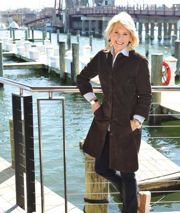
Betsy Dunigan m +1 443 994 1239 bdunigan@ttrsir.com Annapolis Brokerage 209 Main Street, Annapolis, MD 786 N
Drive Annapolis, MD | SOLD $2,000,000 1848
1908
©2023 Sotheby’s International Realty Affiliates LLC. All Rights Reserved. Sotheby’s International Realty® is a licensed trademark to Sotheby’s International Realty Affiliates LLC. Each Office Is Independently Owned And Operated. SIR1
Holly
Milvale Road Annapolis, MD | $5,950,000
Hidden Point Road Annapolis, MD | $5,200,000


Connie has a wholehearted passion for helping families find homes. Consistently ranked as one of the Top 100 Agents for Coldwell Banker Realty, Connie is a luxury real estate specialist with extensive knowledge of the Annapolis real estate market. From her many listings including Bay Ridge cottages, Spa Creek/Eastport condos and majestic estates on the South River/Chesapeake Bay, the residences in her portfolio span all price points…her priority is finding her clients a place they can truly call home. COLDWELL BANKER REALTY 3 CHURCH CIRCLE, ANNAPOLIS, MD 21401 Owned and Operated by a Subsidiary of NRT, LLC RECENTLY SOLD PROPERTIES Associate Broker CONNIECADWELL.COM M. 410.693.1705 | O. 410.263.8686 110 E Lake Drive | SOLD $3,307,000 610 S River Landing | SOLD $2,130,000 1403 Falls Run Court SOLD $1,620,000 11 Spa Creek Landing SOLD $715,000 212 S Southwood Avenue SOLD $1,150,000 33 Dean Street SOLD $450,000


$1 BILLION in WATERFRONT SALES MEET with a WATERFRONT SPECIALIST 410-266-6880 320 Sixth Street, Annapolis MD 21403 BOM: 410.260.2800 WaterfrontHomes.org MrWaterfrontTeam MrWaterfrontTeam 30 YEARS OF HELPING WATERFRONT CLIENTS.
Buyers, Offered
Multiple Offers
14%
List Price
UNDER CONTRACT: 3359 Harness Creek Rd Representing
at $5,299,000 UNDER CONTRACT: 2002 Kurtz Ave, Chesapeake Bay Offered at $1,225,000 -
SOLD: 8118 Forest Glen Dr, Main Creek $1,250,000
Closed
Over
SOLD: 917 Childs Point Rd, South River $3,330,000
Brent Allen, Reid Buckley & Meagan Buckley Licensed Realtors
15 ½ HILL STREET
PRESIDENTS HILL COMMUNITY OF ANNAPOLIS
SOLD for $1,050,000

This is the first home sold in Presidents Hill for OVER $1 Million Dollars.


HERE’S WHAT CLIENTS ARE SAYING ABOUT MALINA:

“Our experience with Malina as a realtor has been nothing less than excellent. My husband and I were first time home buyers and she made the process easy and answered all of our questions thoroughly. She was extremely knowledgeable in the Annapolis area neighborhoods and home buying process. I would recommend her to anyone as an new or experienced home buyer.”

“I can’t say enough positive things about working with Malina. She is professional, communicative, thoughtful, and makes buying a house a personal, fun, and insightful experience.”
“We spent a year working with Malina to find the right property in Annapolis. Throughout the process she was very professional, attentive, and motivated. She is extremely knowledgeable of the area and very resourceful. So glad that she was referred to us! Highly recommend!”
MALINA KOERSCHNER Mobile: 410.493.9059 | Office: 410.263.8686 Annapolis Church Circle Office 3 Church Circle, Annapolis, MD | malina.koerschner@cbmove.com SOLD for $1,025,000 1848 LESLIE ROAD SOLD for $2,050,000 309 COVE ROAD Waterfront in Riva – Represented Buyer Waterfront in Annapolis – Represented Buyer


4 CUMBERLAND CT | ANNAPOLIS SOLD $1,510,000 | REPRESENTED SELLER 512 N. HIBERNIA RD | CENTREVILLE SOLD $2,925,000 | REPRESENTED BUYER 15 WEEMS CREEK DR | ANNAPOLIS SOLD $1,350,000 | REPRESENTED BUYER Professional Service. Integrity. Community Leadership. RECIPIENT OF TTR SOTHEBY’S INTERNATIONAL REALTY COMMUNITY LEADERSHIP AWARD BOARD VICE PRESIDENT, ANNAPOLIS FILM FESTIVAL ©2023 Sotheby’s International Realty Affiliates LLC. All Rights Reserved. Sotheby’s International Realty® is a licensed trademark to Sotheby’s International Realty Affiliates LLC. Each Office Is Independently Owned And Operated. SIR1 Sarah Greenlee Morse m +1 410 303 1522 | sgmorse@ttrsir.com | www.SarahGMorse.com Annapolis Brokerage 209 Main Street | o +1 410 280 5600 | ttrsir.com Sarah Greenlee Morse
Travis Gray
PERSONAL ATTENTION UNMATCHED
GLOBAL NETWORK
BEST IN CLASS REAL ESTATE SERVICE


“We have had the pleasure of working with Travis on several occasions. He is an absolute professional. He is not merely an agent that markets a house but actually does the hard work of finding the right value, critically thinking about the deal, offering meaningful guidance, and then being present during the entire process. We have bought and sold homes with Travis and each time, it is refreshingly easy. I have referred Travis to my colleagues and they consistently rave about his service.”
For more about Travis & for more reviews...
From Annapolis to Abu Dhabi and everywhere in between, Engel & Völkers opens the door to a world of possibilities. Whether it’s a house across the street or a holiday home in Tuscany, with over 16,000 real estate advisors across the globe, our network allows me to provide an experience unlike any other.
Travis Gray | A ssociate Broker Engel & Völkers | Private Office M 301.641.0809 | O 443.292.6767 Travis.Gray@evrealestate.com 138 West Street · Annapolis · MD 21401 ©2023 Engel & Völkers. All rights reserved. Each brokerage independently owned and operated. Engel & Völkers and its independent License Partners are Equal Opportunity Employers and full support the principles of the Fair Housing Act.
ESTATE WORLDWIDE
FINEST REAL
– Annapolis Home Seller Kristi E.
This elegant, gated 20-acre waterfront estate is nestled high on the banks of the Severn River, just minutes from downtown Annapolis and less than an hour from Washington, DC. Enjoy coveted western exposures from the French-inspired main residence, adjacent guest house with carriage house and pool, offering 11 bedrooms, 12 bathrooms and 23,000+ sqft of interior living space. All complemented by manicured lawns, lush gardens, mature trees, and an expansive terrace. Very private, 900 ft shoreline with 350 ft pier, four deep-water slips and two lifts. Also includes seperate wing with motor court, 2-story great room with 18th-century French carved limestone mantle, elevator, library, gourmet kitchen with Aga range, wine cellar with tasting room, home theatre, full gym with sauna, and much more.


|

$14,995,000


DayWeitzman.com | Coldwell Banker Realty | 3 Church Circle | Annapolis, MD | Office: 410.263.8686 Affiliated real estate agents are independent contractor sales associates, not employees. ©2023 Coldwell Banker. All Rights Reserved. Coldwell Banker and the Coldwell Banker logos are trademarks of Coldwell Banker Real Estate LLC. The Coldwell Banker® System is comprised of company owned offices which are owned by a subsidiary of Realogy Brokerage Group LLC and franchised offices which are independently owned and operated. The Coldwell Banker System fully supports the principles of the Fair Housing Act and the Equal Opportunity Act.
938OldCountyRoad.com
Day Weitzman | 410.353.0721 dweitzman@cbrealty.com Robert Weitzman | 410.703.6012 robert.weitzman@cbrealty.com
Offered at
SEVERN RIVER WATERFRONT ESTATE


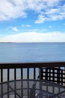

A ®2023 BHH Affiliates, LLC. An Independently owned and operated franchise of BHH Affiliates, LLC. Berkshire Hathaway HomeServices and the Berkshire Hathaway HomeServices symbol are registered service marks of Columbia Insurance Company, a Berkshire Hathaway affiliate. Equal Housing Opportunity. Ashley Stanwick REAL ESTATE RESULTS THAT MOVE YOU C 301.643.3350 | O 410.266.0600 ASHLEY.STANWICK@PENFEDREALTY.COM ANNAPOLIS OFFICE 1997 ANNAPOLIS EXCHANGE PARKWAY, SUITE 101, ANNAPOLIS, MD 21401 OFF MARKET IN HISTORIC ANNAPOLIS 246 PRINCE GEORGE ST. | SOLD FOR $969,500 EASTPORT WATERFRONT 7 SPA CREEK LANDING B3 SOLD FOR $635,000 EASTPORT WATERFRONT CONDO 2022 QUAY VILLAGE CT. #101 SOLD FOR $775,000 EASTPORT CONDO 7024 CHANNEL VILLAGE CT. #101 SOLD FOR $530,000


13 Elliot Road, Annapolis Experience the exceptional with Erica, a top-ranked realtor known for her market expertise, integrity, and innovative approach. With a track record of success, glowing reviews, and a passion for community involvement, she goes above and beyond to achieve top dollar for her clients. Erica’s global industry expertise empowers her to guide clients effectively. As a full-time, qualified, and experienced realtor, Erica’s unwavering dedication and drive ensure exceptional service. ERICA BAKER m +1 410 919 7019 | o +1 410 280 5600 ebaker@ttrsir.com | ericabaker.sothebysrealty.com Annapolis Brokerage 209 Main Street, Annapolis, MD ANNAPOLIS 1915 TOWNE CENTRE BLVD #612 SOLD FOR OVER ASKING PRICE $875,000 EDGEWATER 2813 FENNEL ROAD SOLD FOR $757,500 – Represented Buyer SEVERNA PARK 199 TOPEG DRIVE SOLD FOR $905,000 ANNAPOLIS 1039 SUN VALLEY DRIVE SOLD FOR $585,000 – Represented Buyer HARWOOD 4789 S POLLING HOUSE ROAD SOLD FOR $520,000 Represented Buyer ©2023 Sotheby’s International Realty Affiliates LLC. All Rights Reserved. Sotheby’s International Realty® is a licensed trademark to Sotheby’s International Realty Affiliates LLC. Each Office Is Independently Owned And Operated. SIR1 FOR SALE: LAND $190,000 OR LAND+BUILD $794,900
Off-Market Properties for my clients


JENNIFER CHINO
SeniorVice President
Team Leader, Jennifer Chino and Stahley Thompson Homes is your premier choice for real estate in Annapolis. With only a select amount of properties available, I've honed my skills to find off market solutions that bring buyers and sellers together. The reward is fulfilling— creating an optimal experience for both sides without the hassle or stress normally associated with real estate transactions. I have over 17 years of experience selling residential real estate throughout the Chesapeake region. I understand how to leverage the power of local expertise with the reach of the iconic Sotheby’s brand. Let my passion for real estate deliver results for you.
m +1 443 494 9091 | o +1 410 280 5600
jchino@ttrsir.com | stahleythompsonhomes.com

Annapolis Brokerage 209 Main Street, Annapolis, MD


SOLD 8178 FOREST GLEN RD, PASADENA Specializing in finding
SOLD 141 WEST ST #402, ANNAPOLIS SOLD FOR $875,000 SOLD 738 SHARPSBURG DR, DAVIDSONVILLE SOLD FOR $725,000 SOLD 325 MICHELSON LN, ANNAPOLIS PENDING 818 PARKWOOD AVE, ANNAPOLIS $925,000 ©2023 Sotheby’s International Realty Affiliates LLC. All Rights Reserved. Sotheby’s International Realty® is a licensed trademark to Sotheby’s International Realty Affiliates LLC. Each Office Is Independently Owned And Operated. SIR1
Who do you know that needs a professional agent in Annapolis or the DMV?


For the past 19 years, Kara Chaffin Donofrio has lived and breathed real estate…and loves it! From leading several of Long & Foster’s most profitable offices, overseeing 200+ agents and managing over $2 Billion in sales volume, she has incredible knowledge of the market, the industry and how to best serve clients.
And now, with her own KCD team of professionals, Kara loves being home, back in Annapolis where she grew up. Bringing the best of both worlds together, all the knowledge and reach, Kara is back in force following her true passion, serving clients on a deeper level, one home at a time. Recognized locally and nationally as a real estate icon who cares deeply about results and customer care—Kara is committed to excellence and to helping her clients and community achieve freedom and connection through real estate.

Annapolis: 145 Main Street, Annapolis, MD O: 410.263.3400 DC Metro: 1355 Beverly Road, McLean, VA O: 703.790.1990
BRINGING MY BEST TO ANNAPOLIS & THE DMV
KARA CHAFFIN DONOFRIO OF LONG & FOSTER REAL ESTATE C: 703.795.7238 kcdrealestate.com kara@kcdrealestate.com @karachaffindonofrio ANNAPOLIS, MD SOLD for $2,000,000 ALEXANDRIA, VA SOLD for $1,285,000 ARNOLD, MD SOLD for $628,000 WASHINGTON DC SOLD for $1,759,000 ARLINGTON, VA SOLD for $975,000 WASHINGTON DC SOLD for $2,050,000 CROWNSVILLE, MD SOLD for $800,000 WASHINGTON DC ACTIVE $699,990


Global Luxury Specialist, CRS, GRI 170 Jennifer Road, Suite 102 | Annapolis MD 21401 O: 410.224.2200 | C: 410.739.7571 | dmccracken@cbmove.com DeeDee McCracken, REALTOR® The Real Estate Market is Changing. Let the Expert help you navigate the changing market. DD McCracken Home Team of Coldwell Banker Realty Affiliated real estate agents are independent contractor sales associates, no employees. ©2023 Coldwell Banker. All Rights Reserved. Coldwell Banker and the Coldwell Banker logos are trademarks of Coldwell Banker Real Estate LLC. The Coldwell Banker System® is comprised of company owned offices which are owned by a subsidiary of Anywhere Advisors LLC and franchised offices which are independently owned and operated. The Coldwell Banker System fully supports the principles of the Fair Housing Act and the Equal Opportunity Act SOLD 1011 Penny Drive | Stevensville SOLD 125 Tanners Point Drive Stevensville SOLD 323 S Lake Drive Stevensville SOLD 914 Sportsman Neck Road | Queenstown

John Brennan, President 301.261.8177 (Direct) Katherine Brennan Grammes, Chief Operating Officer 703.917.0001 Serving buyers and sellers for more than 30 years. Residential and Commercial Settlement Services • Estates, Trusts and LLC’s • Investor Services Deed Preparation • 1031 Tax deferred Exchange Intermediary With locations throughout Maryland, Virginia, Washington DC and Delaware to serve you better BRENNANTITLE.COM 410.224.1400
DRY 85
 By Christine Fillat
We went to DRY 85 on a tip from a friend who said it has good steak and burgers. The fact that the Main Street location has been here since 2014 is a nod to its staying power in Annapolis.
The interior is dark and welcoming. With the atmosphere of an old-school taproom, this place invites you to sneak off for a lost afternoon with a secret friend. Or you could belly up to the curved bar to make some new friends watching the Os while sampling from the staggering collection of this, that, and the other thing.
We visit on a sunny, warm late summer evening and opt for outdoor seating: Main Street, front row. This is a great place to sit and watch the world go by. We try some cocktails: Lavender Fields of Kentucky, Whisky Sour, and the Vieux Carré, for starters. Lavender Fields of Kentucky is a tasty, sweet drink that is a complete and total delight. We all agree about the superiority of this cocktail. The whisky sour is less satisfying. While lovely to look at, the beverage is not bold enough to warrant having another. The Vieux Carré is a delicious, rich drink with lots of floral notes.
The bill of fare trends toward comfort food. Fried Green Tomatoes look pretty, nicely crusted with Panko and garnished with a drizzle of balsamic and a beurre blanc sauce on the side. But with centers that are oddly tough and chewy, these tomatoes are less than perfect. An optional add-on of
Straight Up on Dining Out
crab salad is disappointingly ‘off.’ Brussels Sprouts of the Day are better, well prepared with a smattering of feta.
The DRY 85 Burger is one ambitious sandwich with a lot going on, but it all works together beautifully. A half-pound burger topped with pulled pork, thick-cut bacon, and a bourbon barbecue sauce, this sandwich is not pretty to look at. In fact, it came to the table looking homely and squashed. But one bite confirmed the genius of putting all that stuff into a bun. Paired with hand-cut fries and sriracha ketchup, this burger is a real winner.
The filet mignon is a different story. Arriving perfectly medium rare but tepid, the steak was rather disappointing. Scalloped potatoes are heavy with beef flavor. A green salad, while served with ample ingredients, is ordinary.
While the pork ribs are fall-apart tender in a blueberry sauce, the meat was cooked too long to have any of that delicious flavor you would want in ribs. Cheesy grits, although not a standout, are true to their name: creamy and cheesy. The coleslaw is quite good, too.
Bottom line? DRY 85 is a fun place to sample whisky. Its award-winning selections are well worth exploring. We will come back at a later date to try the Blue Cheese and Fig Burger, topped with caramelized onions. And maybe another Lavender Fields of Kentucky!

Design & Décor Food Bar Service 5 = truly memorable 2.5 = needs improvement 1 = forgettable DRY 85 193B Main Street Annapolis, MD 21401 dry85.com | 443.214.5171 Hours of Operation: M-TH 11:30 am – Midnight F-Sat 11:00 am – 2:00 am Sun 10:00 am – Midnight AH
AHM Rating
HOME AND PROFESSIONAL SERVICES GUIDE
ARCHITECTS
ABS Architects pg. 105
410.268.1213 | absarchitects.com
Becker Morgan Group pg. 104 beckermorgan.com
Hammond Wilson pg. 11
410.267.6041 | hammondwilson.com
Three B Architecture pg. 93
443.791.6193 | threebarchitecture.com
CUSTOM BUILDERS
Bayview Builders pgs. 6-7
410.280.0303 | bayviewbuildersmd.com
Blackketter Craftsmen, Inc. pg. 135
410.923.3111 | blackcraft.com

Gate One Builders pg. 17
410.268.0778 | gateonebuilders.com
Lundberg Builders, Inc. pg. 104
410.643.3334 | lundbergbuilders.com
Lynbrook of Annapolis pg. 33
410.295.3313 | lynbrookofannapolis.com
Procopio Homes pg. 63
410.551.8454 | procopiohomes.com
Pyramid Builders pgs. 2-3
410.571.7707 | pyramid-builders.com
Winchester Construction pg. 13
410.987.5905 | winchesterinc.com
Younger Construction pg. 93
410.626.8602 | youngerconstruction.com
DESIGN PROFESSIONALS
Antonella Cestone Interiors pg. 80 | 410.703.8689 antonellacestoneinteriors.com
C. Newman Interiors pgs. 72-73 410.507.1308 | cnewmaninteriors.com
Embark Designs pg. 91 embark-designs.com
Erica’s Events & Décor pg. 135 301.404.7625 |ericaseventsanddecor.com
Farnady Interiors pg. 77 443.822.3248 | farnadyinteriors.com
Fitzsimmons Design Associates, Inc. pg. 75 410.269.1965 | fitzsimmonsdesign.com
Interior Concepts, Inc. pgs. 66-67 410.224.7366 or 301.970.8009 interiorconceptsinc.com
Ivory Stone Interiors pg. 81 443.618.1096 | ivorystoneinteriors.com
Jamie Merida Interiors
+ Bountiful Home pg. 76 410.819.8666 | jamiemerida.com
Karen Renée Interior Design pg. 74 410.647.0435 | karenreneeinteriors.com
Katie Rainey Design pg. 78 843.214.4179 | katieraineydesign.com
Olexia Interiors pg. 79 410.212.6171 | olexiainteriors.com
Seriously Sari Interiors pgs. 70-71 203.927.3225 | seriouslysariinteriors.com
Sew Beautiful pg. 57 410.544.3300 | sewbeautifulwindows.com
Simply Wesley Interior Design pgs. 68-69 | 443.994.6757 simplywesley.com
EXCLUSIVE KITCHEN OR BATH DESIGN
314 Design Studio pg. 101 410.643.4040 | 314designstudio.com
Kitchen Encounters pg. 10 410.263.4900 | kitchenencounters.biz
Maryland Shower Enclosures pg. 135 | 410.626.1222 marylandshower.com
Stuart Kitchens Back Cover 410.761.5700 | stuartkitchens.com
The Somerville Bath & Kitchen Store pg. 62 | 410.266.1122 thesomervillebathandkitchenstore.com
BEAUTY Profile MD pg. 92 410.544.4600 | profilemd.com
ProMD Health pg. 103 410.449.2060 | promdhealth.com
HOME SERVICES
84 Lumber Kitchen & Bath Design Studio pgs. 4-5 410.757.4684 | 84designstudios.com
ADU, Your Appliance Source pg. 12 | 410.267.7110 | adu.com
Annapolis Carpet & Flooring America Insert 410.777.5800 annapoliscarpetandfloors.com
Architectural Window Supply pg. 16 | 410.266.5254 | archwin.com
Bay Stoves pg. 91 baystoves.com
Blue Star Paint & Property pg. 91 bluestarpaint.com
California Closets pg. 90 410.247.8088 | californiaclosets.com
Chesapeake Tile & Marble pg. 64 | 443.333.1618 chesapeaketileandmarble.com
Compass Stone & Tile Studio pg. 32 | 410.224.0700| cst-studio.com
Elite Hardwood Flooring pg. 14 | 410.280.1420 elitehardwoodflooring.com
In Home Stone Marble & Granite pg. 105 | 410.626.2025 | inhomestone.com
Quality Window & Door pg. 41 | 877.542.8481 qwdinc.com/annapolishomemag
TW Perry pgs. 8-9 443.808.1481 | twperry.com
WalterWorks Hardware pg. 104 410.263.9711 walterworkshardware.com
OUTDOOR LIVING
Bay Pile Driving pg. 56 410.879.3121 or 888.886.1213 baypiledriving.com
Campion Hruby Landscape
Architects Inside Back Cover 410.280.8850 | campionhruby.com
Himmel’s Landscape & Garden Center pg. 15 410.255.7730 | himmelsgardencenter.com
McHale Landscape Design
Inside Front Cover + pg. 1 410.990.0894 | mchalelandscape.com
Walnut Hill Landscape Company 410.349.3105 or 410.690.0977 walnuthilllandscape.com
PROFESSIONAL SERVICES
Brennan Title Company pg. 131 410.224.1400 | brennantitle.com
The Frame Shoppe, Inc. pg. 135 410.721.9479 | theframeshoppeinc.com
Green & Bean Boutique pg. 135 greenbeanboutique.com
Jo Fleming Contemporary Art pg. 92 | 410.280.1847 | 703.989.9043 joflemingcontemporaryart.com
Nancy Hammond Editions pg. 92 410.295.6612 | nancyhammondeditions.com
REAL ESTATE
Ashley Stanwick of Berkshire Hathaway Homeservices PenFed Realty pg. 126 c. 301.643.3350 | o. 4410.266.0600 ashley.stanwick@penfedrealty.com
Betsy Dunigan of TTR|Sotheby’s International Realty pg. 119 443.994.1239 | bdunigan@ttrsir.com
Brad Kappel of TTR|Sotheby’s International Realty pgs. 108-109 m. 410.279.9476 | o. 410.280.5600 bradkappel.com
Connie Cadwell of Coldwell Banker Realty pg. 120 | c. 410.693.1705 o. 410.263.8686 | conniecadwell.com
David Orso of Berkshire Hathaway Homeservices PenFed Realty pgs. 110-111 c. 443.691.0838 | o. 443.372.7171 davidorso.com
Day Weitzman of Coldwell Banker Realty pg. 125 m. 410.353.0721 | o. 410.263.8686 dayweitzman.com
DeeDee McCracken of DD McCracken Home Team, Coldwell Banker Realty pg. 130 c. 410.739.7571 | o. 410.224.2200
Erica Baker of TTR|Sotheby’s International Realty pg. 127 m. 410.919.7019 | o. 410.280.5600 ebaker@ttrsir.com
Georgie Berkinshaw & Jean Berkinshaw Dixon of Coldwell Banker Realty pg. 114 gb. 443.994.4456 | jbd. 443.995.279 o. 410.263.8686 | gberkinshaw.com
Jennifer Chino of Stahley Thompson Homes, TTR|Sotheby’s International Realty pg. 128| m. 443.494.9091 o. 410.280.5600 stahleythompsonhomes.com
Joanna Dalton of Coldwell Banker Realty pg. 116 c. 410.980.8443 | o. 410.263.8686 joanna.dalton@cbmove.com
Kara Chaffin Donofrio of Long & Foster Real Estate pg. 129 c. 703.795.7238 | o. 410.263.3400 kcdrealestate.com | kara@kcdrealestate.com
Laura Carney of TTR|Sotheby’s International Realty pg. 118 m. 410.310.3307 | o. 410.673.3344 lauracarney.com
Malina Koerschner of Coldwell Banker Realty pg. 122 c. 410.493.9059 | o. 410.263.8686 malina.koerschner@cbmove.com
Michele Deckman of The Tower Team, TTR|Sotheby’s International Realty pg. 115 c.410.353.3703 | o. 410.280.5600 micheledeckman.com
Sarah Greenlee Morse of TTR|Sotheby’s International Realty pg. 123 | m. 410.303.1522 o. 410.280.5600 | sarahgmorse.com
Reid Buckley’s Mr. Waterfront Team of Long & Foster Real Estate pg. 121 | 410.266.6880 waterfronthomes.org
Snyder Bradshaw Group of Monument Sotheby’s International Realty pg. 117 | o. 443.906.3848 d. 410.216.0018 | snyderbradshaw.com

The Tower Team of TTR|Sotheby’s International Realty pgs. 112-113 Alex Tower Sears: 443.254.5661 Michele Deckman: 410.353.3703 Merrie Louise Raynolds: 516.993.5083 o. 410.280.5600 | thetowerteam.com
Travis Gray of Engel & Völkers pg. 124 c. 301.641.0809 | o. 443.292.6767 travisgray.evrealestate.com

301.404.7625
info@ericaseventsanddecor.com


Quality Home Improvements
Proprietors: Scott Blackketter - Gretchen Bandy View our portfolio: blackcraft.com 410.923.3111

Remodeling • Additions Restoration • New Construction


Send a token of appreciation with our eco-luxe gift boxes. GREENBEANBOUTIQUE.COM


Come visit our Annapolis pop - up or shop with us online ! 1915 Towne Center Blvd., Unit 120, Annapolis

FINE SERVICES 410.626.1222 1809 McGuckian Street Annapolis, MD 21401 MarylandShower.com Visit Our Beautiful Showroom!
YOUR HOME YOUR VISION OUR DESIGNS SCAN ME! Curating functional, polished, and aesthetically beautiful spaces ERICASEVENTSANDDECOR.COM
High Design
HAVE A SEAT
Just think about how much time we spend in chairs each day. On any given day, you might move from a desk chair to a living room chair, a kitchen chair, an outdoor chair, and so on. That is why there is a huge industry and designers who focus on chairs. We present here three contemporary chairs, including a “poet sofa” and another by an Annapolis designer who redesigns used chairs with unexpected fabric combinations.
RH
MONICA CORTRIGHT DESIGNS
Custom Upholstered Arm Chair


From “The Whiter Shade of Pale” Collection, this chair and others are for purchase at Cortright’s Maryland Avenue storefront.
monicacortright . com
GABRIEL TAN
Soffi Swivel Chair

A soft and voluminous lounge chair inspired by inflatable furniture of the ’60s and ’70s.
gabriel - tan . com
FINN JUHL
The Poet Sofa
A small two-seater sofa inspired by surrealist art forms.
finnjuhl com


Hot Summer Nights. campionhruby.com | 410.280.8850 ROBERT GURNEY ARCHITECT


SINCE 1955, WE’VE BEEN FIRST CHOICE FOR THE BEST KITCHEN IN THE NEIGHBORHOOD. COME VISIT OUR SHOWROOMS. EVERYTHING YOU NEED FOR THE ROOM YOU’LL LOVE THE MOST IS HERE IN ONE PLACE. AND, YOU’LL UNDERSTAND WHY SO MANY PEOPLE SAY, “NOTHING ADDS MORE VALUE TO YOUR HOME.” NNAPOLIS S HOWROOM 2335B F OREST D R . 410-761-5700 ETHESDA S HOWROOM 8203 W ISCONSIN A VE . 240-223-0875 STUARTKITCHENS.COM You AlwAYs Know A stuArt Kitchen.


 Insert photo by: Glenn A. Miller


 Allen & DeLalio Architects David Burroughs Photography
HIGH PERFORMANCE CUSTOM HOME ON WEEMS CREEK


 Photography by Peak Visuals


 The iconic Glass House has been transformed top to bottom by designers, artisans, artists, and a highly skilled custom builder.


 Ipe and bluestone siding replace concrete and glass, grounding the home in its riverside setting.

 The dining table was created by furniture artist Vicco von Voss from a 200-year-old sycamore tree.


 The powder room vanity has a rippling “living edge” carved by furniture artist Vicco von Voss.
The custom bed is made with wood and leather. A canopy overhead hides a flat screen.


 BY STEVE BUCHANAN
 The eyebrow above the custom front door adds a traditional flair to the entrance.


 BY DYLAN ROCHE


 Stylish Productions Joy Design + Build
James McDonald Architects


 Moor Baker & Associates Architects PA
Interior Photos: Jessica Glynn Photography
Portrait Photo: Maureen Porto Photography


 Designer
 Stacy Zarin Goldberg Photography


 Owner/Principal Designer


 Custom builder Greg Younger and his team created a luxurious patio with a roof over the fireplace and custom hanging swing.
 By Kymberly Taylor
Photography by Steve Buchannan


 5 Boone Trail, Severna Park SOLD – $4,950,000
202 Norwood Road, Annapolis SOLD – $4,500,000
1122 River Bay, Annapolis SOLD – $2,500,000
1527 Shipsview Road, Annapolis SOLD $2,550,000 – Buyer Represented


 By Christine Fillat


