INTRODUCING PACKAGING, LABEL AND ASSORTMENT UPDATE


This year Rymax Lubricants has updated its label and bottle design. All 1-, 4-, and 5-liter bottles now have a unique Rymax design. The labels have been updated accordingly, following extensive research on quality and usability. The label for the Rymax 20-liter pail has received a full makeover. Later this year the Rymax drum (60- and 205 liter) will also be launched. In this document, we explain the most significant changes.

The goals for the re-design are:

1. Have compelling impact in the context of point-of-sales and service.
2. Visually and verbally reinforce the overall brand positioning.
3. Provide the right information to stimulate purchases.
We have researched different variables of effective packaging labels. As a part of this we investigated if the label communicates the most important product features and benefits to consumers and traders. The new Rymax packaging needs to emphasize the most important product benefits to consumers and traders. To leverage the Rymax brand, we have also investigated what information needs to be emphasized on the front and back label, as well as attractive design elements to realize a positive brand attitude.
When considering a purchase, customers tend to prioritize the aesthetics and brand elements displayed on a bottle to make an informed decision. The initial factors that capture their interest and gain their trust include the brand, color, and a simple yet visually appealing design.
Following this, customers proceed to assess whether the motor oil is suitable for their specific vehicle or machine. In this evaluation, they seek functional attributes and visual cues that indicate compatibility, such as explicit indications for use with cars, trucks etc., viscosity ratings that signify whether the oil is synthetic or mineral-based, and specifications for the engine fuel type the oil is designed to work with.
Only once these functional requirements are satisfied, customers delve into the performance benefits. These advantages encompass various aspects, including fuel efficiency, extended engine life and mileage, cleansing properties, enhanced overall performance, and the incorporation of advanced technologies.
The results of our research showed that there was room for improvement to our packaging. With the innovative designs we focus on easy, trustworthy, and captivating ways to simplify the customer’s choice. We also focus on our heritage and the brand recognition we have already built. This means a focus on our Dutch origin and a recognizable evolution of our orange bottle. Across regions, consumers and traders defined five core elements that are important for the Rymax product packaging:
• It needs to tell the customer immediately what the brand is all about.
• It needs to keep it simple and easy to understand.
• It needs to give confidence that it is the right choice for their application.
• It needs to communicate the most essential information, at first glance.
• It needs to be easy to pick a Rymax Lubricants product at the point of sale.
The Rymax logo is an insurance that the quality of oil is high.
The Rymax logo should be big and prominent to be eye-catching on first glance. It is the top priority to choose a good quality lubricants product.
The Rymax symbol needs to be in a prominent position. It’s important to show the manufacturers identity.
On the front label, the main aim is to bring forward the branding because people who know the oil will buy it upon seeing the brand and its logo and colors.
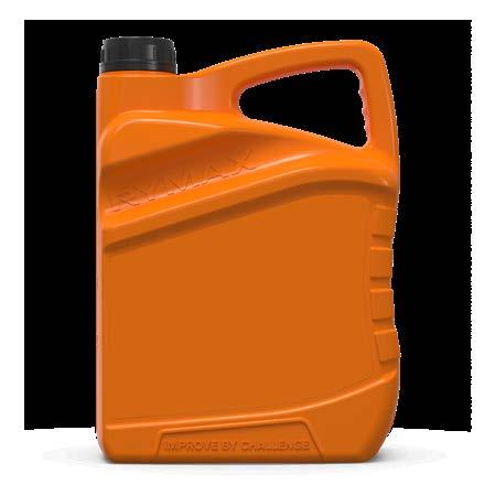
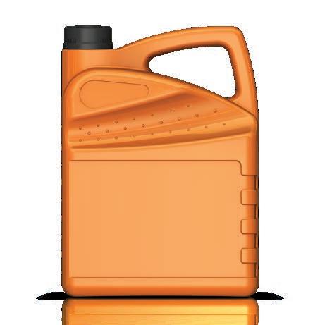
Most significant changes:
• We now have our own exclusive mold.


• Optimized shape for better handling and transportation.


• Integration of the Rymax logo-name to emphasize brand identity and prevent counterfeit products.

• Addition of Rymax’s company slogan ‘Improve by Challenge’ as a motivating and inspiring theme and to differentiate from the competition.
• All the above while maintaining the distinct and recognizable shape and color that your customers are used to.
Prominent branding also functioning as grip
Unique branding element: Rymax’ company slogan
Improved grip
Modernized and unique shape providing more strength
More and attractive space for label placement
The most significant changes are:
• More focus on the Rymax brand: INCREASED LOGO SIZE AND MORE PROMINENT PLACING ON THE LABEL.

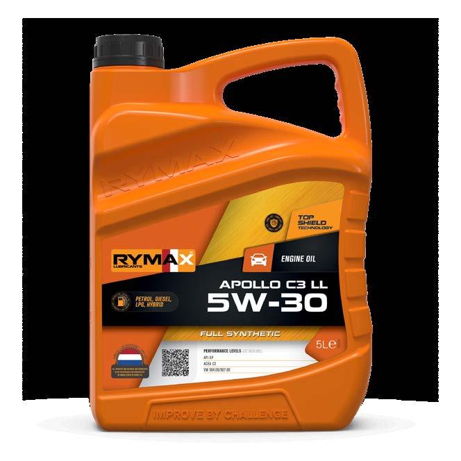
• More focus on our origin: LARGE VISUAL ELEMENT HIGHLIGHTING THE DUTCH FLAG.
• More focus on the most relevant product information: MORE VISIBILITY FOR THE VISCOSITY.
• CLEARER BASE OIL INDICATION.

• CLEARER PRODUCT APPLICATION.
• CLEARER FUEL TYPE INDICATION.
• Opportunity to provide additional brand content ahead of the competition: QR CODE AUTOMATICALLY LEADS TO MOST RECENT TDS.
• Technology platform endorsing the product’s high quality: PRODUCT TECHNOLOGY.
• Emphasize product USPs: ICON TO REPRESENT THE PRODUCTS MOST IMPORTANT FEATURE.
• Retained quality orientation based on Bronze, Silver, and Gold.
As the orange Rymax 20-liter pail is an industry-standard in terms of design, the plastic bottle itself has not been updated. However, the label has undergone a major makeover.
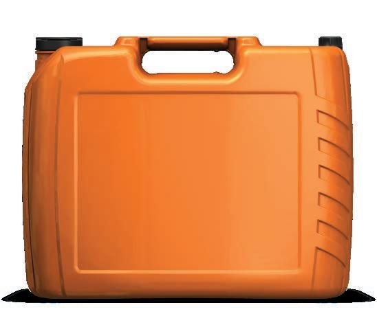

The new label not only serves as an essential information carrier for product information but also plays a crucial role in enhancing the branding of Rymax Lubricants.
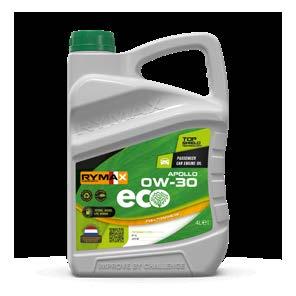
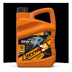
We have made significant improvements to the label, focusing on our updated corporate brand identity, and following the updates to the 1-, 4-, and 5-liter labels and drums. Here are the key changes:
• The black & orange Rymax logo has been prominently placed for greater impact.
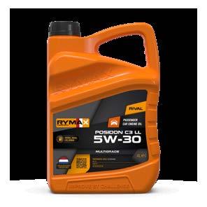
• We have added the Dutch flag to emphasize our origin.


• The graphical design has been modernized, featuring straight lines and clear shapes.
• The new label ensures a better presence and increased impact when these products are displayed in your stores.
• The positioning of product information has been optimized for more clarity.
• Larger dimensions for better placement on the pail and drum and more space for branding

Rymax has used this opportunity to also update the carton box for the 1-, 4-, and 5-liter bottles. As the boxes are often displayed in retail locations and stores, they are an important carrier of information and branding.

The new carton box has an updated design, following the Rymax house style and label update. Clear lines, sharper edges, a bigger logo, and no more dotted design. The box now also shows a QR code leading to the international Rymax website.
• The design has been modernized, featuring straight lines and clear shapes.
• More focus on our brand, featuring a bigger Rymax Lubricants logo.
• More branding value when displayed in retail location.
• QR-code that links to the global Rymax website.
To complete the packaging redesign, we also introduce a completely updated version of the iconic Rymax drum for 60- and 205-liter product packaging.

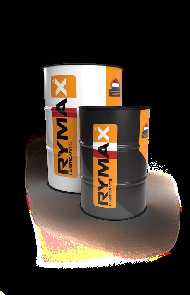
Key changes:
• The design has been modernized, featuring straight lines and clear shapes.
• More focus on our origin: large visual element emphasizing the Dutch flag.
• Still recognizable as our high-quality, full color drum that is appreciated all over the world.
We have a fresh outlook for our portfolio wherein it becomes easier for everyone to associate with the product, and to better understand it commercially and technically. Minimum change with maximum value has been the focus here. As is known, Rymax offers premium products to its customers, so it is important for us to have a scope that prepares us for the future as well. The change itself is focused on PCMO (Passenger Car Motor Oils) and HDMO (Heavy Duty Motor Oils) segments.

This document communicates the changes and rationale behind it.
• Our semi-synthetic products are going to be called synthetic blend products or synthetic products

• On smaller packaging (1, 4, 5ltr); the color of the packaging indicates what the base oil of the product is. This is easier for customers to understand right from the shelf without looking at the product.
• On the front label of smaller packaging, there is a small write up “See Back label” next to performance levels which indicates to see the full performance levels on the backside
• The front label will have more of industry standard specifications or important specifications necessary for that specific product.
• SAE and ISO VG are being removed from the product names on TDSs and Preprint labels. This aligns us well with the major competitors

Base oils (or others)
With this portfolio launch, we become consequent of what our colors stand for. On the right side of the label, you will notice the color of base oil or what the product is.
Color Indications Explanation
Bronze Mineral base oil
Silver Synthetic Blend base oil
Gold Full Synthetic base oil
Black (Rival) Attractively priced, non-approved formulation product (Mineral/Synthetic/Full Synthetic)
Products that are 0W-X or biodegradable
Platinum ( R series) Products suited specifically for racing applications
Orange Coolant products do not associate with minerals or other terminology. Hence, they are created with a neutral color which will always stand for coolants.
These are the major impacted products. If there are, it will be aligned well with the base oil terminology. Also, on the bottom of the front label, you will notice what the base oil for product “X” is.

With this portfolio launch, we always increase our quality management in terms of informing customers of the products that they receive. With the QR code, you will always be aware of what product you receive via our TDS. So, when you have a specification question, always check the QR code to know what you have been sold.
Since the front label has space constraints to fill all the performance levels, we decided to have industry standard specifications like API/ACEA and key specifications of product “X” (wherever required). Next to the performance, you will notice the “See Back label.” This indicates that you will see the full set of performance levels product “X” on the back label.
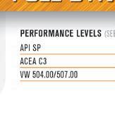
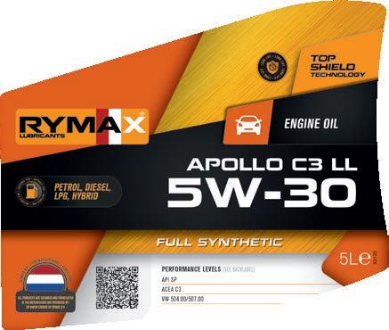

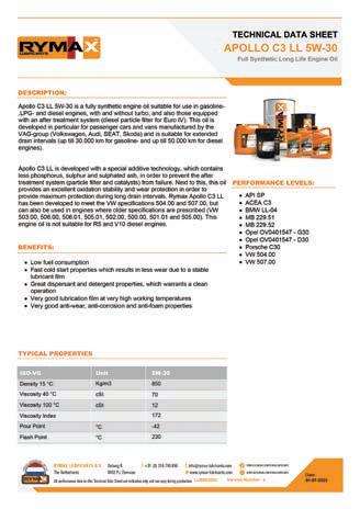
You will notice some changes wherein you will no longer see many specifications cramped to front label.
Technology
At Rymax, every range of products has been formulated with set additive technology. As we have seen over the years and the feedback we receive from customers; the Asian and Latin American markets are keen to have marketing technology added to our product naming. We wanted to make it more meaningful, hence this terminology has been created. Here is an explanation of them.
Range Technology
Helios CLEAN FLOW TECHNOLOGY
Posidon MULTI GUARD TECHNOLOGY
Apollo TOP SHIELD TECHNOLOGY
R series
EXTREME PERFORMANCE TECHNOLOGY
ECO SECURE TECHNOLOGY
Endurox ACTIVE DEFENSE TECHNOLOGY
Motrax POWER FLOW TECHNOLOGY
Alpheus AQUATEC INSIDE
Gevitro TRIPLE PROTECTION TECHNOLOGY
Atexio PURE SHIELD TECHNOLOGY
Leto
POWER FORCE TECHNOLOGY
Vector SAFE SHIELD TECHNOLOGY
Dione COOL GUARD TECHNOLOGY
Industrial SMART GUARD TECHNOLOGY
Agricultural
GREEN SECURE TECHNOLOGY
Explanation
With Rymax CleanFlow Technology unleash engine purity. Experience impeccable cleanliness, optimal combustion, and unrivalled oil flow for peak performance.
Rymax MultiGuard Technology empowers sustainability. Embrace modern demands with innovative combustion efficiency, safeguarding equipment's longevity while advancing sustainability.
Rymax TopShield Technology ignites cleaner combustion, amplifies fuel economy, reduces emissions, and extends equipment lifespan with unparalleled efficiency.
Rymax Extreme Performance Technology elevates component performance with finest ingredients, guaranteeing unparalleled results.
Rymax EcoSecure Technology optimizes environmental preservation with economic prowess, ensuring supreme protection with a sustainable edge.
Rymax ActiveDefense Technology ensures heavy duty equipment with advanced additives, supplying unbeatable protection and reliability.
Rymax PowerFlow Technology masters' small engines with intelligent additives and innovative technology, unlocking exceptional performance.
Rymax AquaTec Inside dominates marine environments with unrivalled lubrication and protection, unleashing optimal performance.
Rymax Triple Protection ensures the best PAO technology to provide excellent wear and rust protection, high viscosity index and outstanding oxidative stability.
Rymax PureShield Technology ensures the ultimate wear and rust protection, high viscosity index, and outstanding oxidative stability.
Rymax PowerForce Technology unlocks the best performance for hydraulic systems, excellence for power steering and levelling, optimizing performance.
Rymax SafeShield Technology ensures optimal brake fluid quality and performance in the most demanding circumstances to keep you safe.
Rymax CoolGuard Technology ensures excellent antifreeze performance based on SOAT technology.
Rymax SmartGuard Technology cleverly combines the most modern technologies to guard the performance of your industrial equipment.
Rymax GreenSecure Technology masters' advantages for multipurpose usage, secure environmental sustainability, unlocking a new era of maintenance.
Segment Icon:
This is something that we have taken from the earlier design wherein the product indicates what it is. You will not notice much change here, but this icon will indicate where the product is primarily marketed for.

Segment and Application:
This is right next to the segment icon. In the past, we had subtitles which indicated what product “X” is. But now strategically, we have decided to have what the product stands for.
Marketing Icon and Fuel Type:
On the left side of the front label, you will notice what the product’s purpose is. If the product can be used in petrol/diesel or otherwise. Apart from that, on top of the segment icon; we have introduced marketing icons like the “Fuel economy” or “Long life” icons. Again, this is an exercise that we had in the previous design but will be using it more to stress the uniqueness of the products that are sold.

Overall, the Rymax portfolio becomes more consequent which helps us be prepared for the future. Even though there are lot of changes, most of them are subtle. It is important to understand the impact of these changes in terms of how useful it could be to your customers.


For more detailed information about our products please refer to our Technical Product Data (TDS) sheets available at www.rymax-lubricants.com/products
For technical advice contact your Rymax contactperson or dial +31 (0)316 – 740 856. You can also e-mail us with all your inquiries: info@rymax-lubricants.com

The information in this publication is accurate and complete at the moment of printing. All possible effort has been taken to ensure the correct contents of this brochure. However, this information is subject to change. Please visit www.rymax-lubricants.com for the latest product information. Please consider personal advice by your Rymax contactperson when choosing products from this publication. Rymax Lubricants accepts no liability for any reliance on this publication’s content.
