16 minute read
Color

The visible spectrum of light consists of a range of wavelengths from 400 nanometres (nm) to 700nm. Below 400nm is UV radiation and X-rays and above 700nm is infrared (all capable of being recorded photographically). When the visible spectrum is viewed simultaneously we see ‘white light’. This broad spectrum of colors creating white light can be divided into the three primary colors: red, green and blue. The precise mixture of primary colors in white light may vary from different sources. The light is described as cool when predominantly blue, and warm when predominantly red. Human vision adapts to different mixes of white light and will not pick up the fact a light source may be cool or warm unless compared directly with another in the same location.
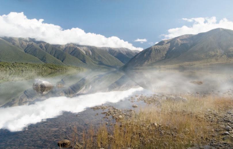
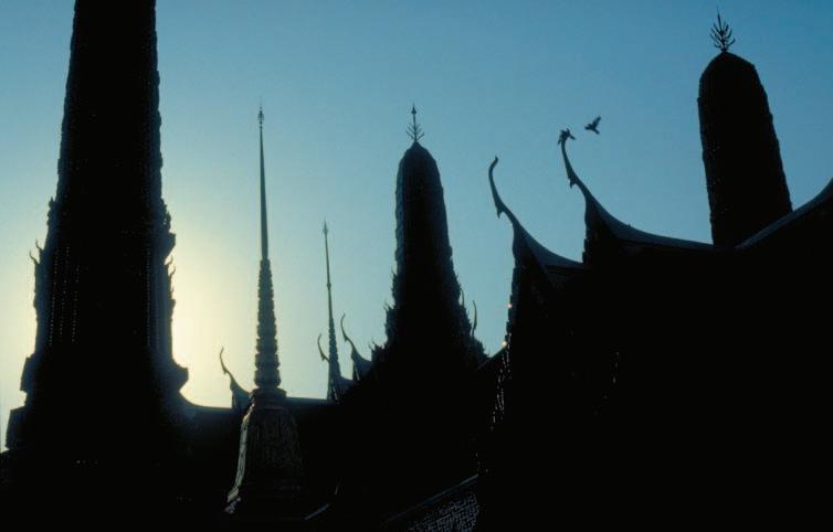
The light from tungsten bulbs and firelight consists predominantly of light towards the red end of the spectrum. The light from tungsten lamps is also predominantly light towards the red end of the spectrum. The light from flash consists predominantly of light towards the blue end of the spectrum. Daylight is a mixture of cool skylight and warm sunlight. Image sensors balanced to ‘Daylight’ will give fairly neutral tones with noon summer sunlight. When the direct sunlight is obscured or diffused, however, the skylight can dominate and the tones record with a blue cast. As the sun gets lower in the sky the light gets progressively warmer and the tones will record with a yellow or orange cast. The color of light is measured by color temperature, usually described in terms of degrees Kelvin (K). This scale refers to a color’s visual appearance (red - warm, blue - cold).
Advertisement
Color correction
When using a digital camera and saving to JPEG or TIFF color correction is achieved by adjusting the white balance to the dominant light source. Alternatively save to the Camera Raw format and assign the white balance in post-production.
Note > To achieve color consistency it is recommended to use a ‘Custom’ white balance or white balance preset rather than the ‘Auto’ white balance setting. When using Auto white balance small variations of subject color, rather than changes in the color temperature of the light source, can also lead to variations in the white balance selected by the camera.
Activity 5
Experiment by using a warm colored filter over a flash unit to capture a room lit with tungsten light (be sure to use an exposure that will record the available light present, e.g. a ‘slow sync’ flash setting). Take a second image without using the filter and compare the results.
All digital cameras capture in Raw but only the medium- to high-end cameras offer the user the option of saving the images in this Raw format. Selecting the Raw format in the camera stops the camera from processing the color data collected from the sensor when each image is captured. Digital cameras typically process the sensor’s color data by applying the white balance, sharpening and contrast settings set by the user in the camera’s menus. Selecting the Raw format prevents this image processing taking place. The Raw data is what the sensor ‘saw’ before the camera processes the image and many photographers have started to refer to, and use, this file as the ‘digital negative’.
Working with a Camera Raw editor
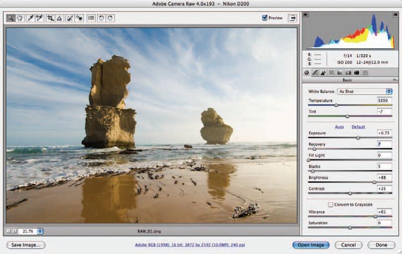
To harness the full power and functionality of the Raw format, a dedicated Raw editor is required. Whilst many stand-alone versions of such software are available, Adobe released a plug-in (known as Adobe Camera Raw) for Photoshop 7 back in 2003 and it is now fully integrated into all versions of Photoshop. To retain the white balance setting as originally selected in the camera at the time of capture, click the ‘As Shot’ option in the software used to edit your Raw images. However, if it is felt that changes need to be made to these parameters, they can easily be achieved by use of the ‘Temperature’ and ‘Tint’ sliders. In particular, moving the Temperature slider to the left shifts the colors to the blue end of the spectrum to compensate for a yellowish cast resulting from an image created with a light source of low color temperature. Similarly moving the slider to the right will compensate for a high original color temperature by adjusting the image in the yellow direction. The Tint slider enables further finetuning in the green/magenta directions, which are most commonly needed for images captured under fluorescent lighting environments.
Have you ever walked into a TV shop or the cabin of an aircraft and noticed that all the screens are all showing the exactly the same TV program but no two pictures are the same color? All of the screens are receiving exactly the same signal but each screen has its own unique way of displaying color (its own unique ‘color characteristics’). Different settings on each TV for brightness, contrast and color only make the problem worse.
In photography software and hardware manufacturers such as Adobe have made this elusive world of color consistency possible across all devices by implementing the concept, and workflow, called ‘Color Management’. By defining or ‘profiling’ the color characteristics of each device we can ensure that the same image appears the same on each and every device.
One image displayed with variations of color - the results of a non-color-managed workflow
Color management is the term given to the process of maintaining colors’ accuracy from capture to output. The secret to color managed success is to adopt a professional workflow that takes the frustration out of seeing your colors shift as your image moves from camera to monitor, and from monitor to print. Color consistency has never been more easy and affordable to implement and relies on device profiles and the use of color spaces which are device independent.
The concept of using a Color Working Space
Color spaces come in all shapes and sizes, from the small (sRGB) to the very large (ProPhoto). A typical digital camera is capable of capturing a range of colors much larger than can be displayed by a typical monitor or output to a typical printer. A working color space can be chosen in the image-editing software that encompasses all of these colors until the user decides where the image is destined to be output. Colors captured by a camera or scanner are converted from the device space into the working space and can then be optimized for a broad range of different output devices. A copy of the image can then be converted to the smaller ouptut color space, as with CMYK conversions, or converted to the output space as the image is being sent to the printer driver.
Choosing a color space for the capture device
Select one of two profiles in camera when using the JPEG or TIFF file formats so that the image editing software can know the precise color values that were recorded by the digital camera. The two profiles are Adobe RGB and sRGB. sRGB is the smaller of the two spaces and should only be selected when the user requires images for screen display or automated printing workflows that may be optimized to this profile (popular with consumer quality cameras and the labs that may print these type of images). When capturing in the Raw format these profiles are not embedded in the images. The profiles for the camera reside with the raw editing software and can be applied as part of the post-production editing workflow.
In the Color Settings of your editing software you need to choose the working space that best suits your workflow. This can be one of the following three choices: - Adobe RGB for print. - sRGB for screen. - ProPhoto for fine print.
Calibrating and profiling a computer monitor
Every commercial photographer must calibrate and profile their monitor if color accuracy is important to their photographic workflow. The Industry standards are: Whitepoint (color temperature) - D65 Gamma (mid-tone brightness) - 2.2 Luminance (overall brightness) - 100 to 140 cd/m2
Note > A standard unit of measurement for luminance is often stated as candela per square metre or cd/m2 .
Straight out of the box just about all monitors are too bright and too blue for photo editing (gray tones are not neutral), so we need to change them to settings that are commonly recognized as ‘standard’ amongst professional photographers. This process is called ‘monitor calibration’. The next part of the process is to measure the color characteristics of your unique monitor so that your image editing software understands how color is displayed on your screen. The color characteristics are saved in a file called a ‘color profile’ that uses the file extension ‘.icc’. Image-editing software such as Adobe Photoshop can then read the monitor profile to ensure that images are displayed accurately on your screen. If the photographer only takes one action to improve their color management it would be to plant the cornerstone of color management - calibrate and profile the monitor you are working on. Image-editing software such as Photoshop will now display what your camera saw when you first captured the image. Any adjustments you now make to the color or tone of the image will be appropriate and not misguided due to a monitor that has not been calibrated and skews the colors so that they appear incorrect.
White balance
Are the image colors displayed on your computer screen accurate just because the image file and the monitor both have profiles and your image-editing software is managing the colors? Not necessarily. Both of the images above were assigned a profile in the camera but were then assigned different white balance presets (shade on the left and daylight on the right). Auto white balance in the camera makes a guess at the color temperature from the range of colors it is presented with, in each and every frame (variation is the name of the game here). The colors in an image can only really be accurate if the photographer creates a manual white balance from a known value (a neutral tone) or creates a reference image of the color temperature of the light source.
White balance reference cards such as the WhiBal or products such as the Expodisc can help the professional photographer establish an accurate white balance setting in camera.
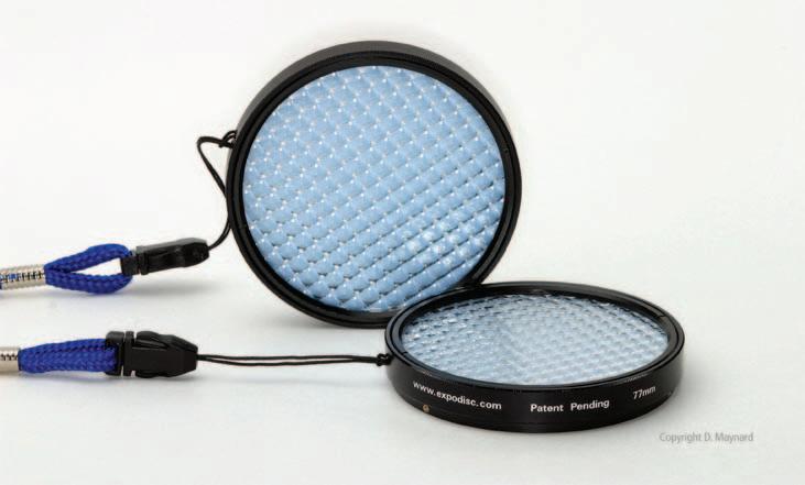
The Expodisc is placed in front of the camera lens and can measure the appropriate exposure and the color temperature of the dominant light source
The first step in optimizing the color and tonal values for the color space we have chosen to work in is to set the white balance by choosing one of the presets from the drop-down menu. If a white balance was performed in the camera, the ‘As Shot’ option can be selected. If none of the presets adjust the color to your satisfaction you can manually adjust the ‘Temperature’ and ‘Tint’ sliders to remove any color cast present in the image. The ‘Temperature’ slider controls the blue/yellow color balance while the ‘Tint’ slider controls the green/magenta balance. Moving both the sliders in the same direction controls the red/cyan balance.
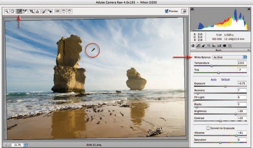
Alternatively you can simply click on the ‘White Balance’ eyedropper in the small tools palette (top left-hand corner of the dialog box) and then click on any neutral tone you can find in the image.
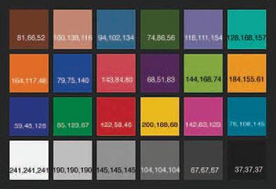
Note > Although it is a ‘White Balance’ you actually need to click on a tone that is not too bright. Clicking on a light or mid gray is preferable. A photographer looking to save time may introduce a ‘gray card’ in the first frame of a shoot to simplify the task. If precise white balance is extremely critical the photographer can shoot a Gretag Macbeth ColorChecker Chart that uses a range of color and gray patches. The user can then target the Red, Green and Blue patches and fine-tune the white balance using the Calibrate controls in ACR. Precise measurements for the colors can be found on the website www.brucelindbloom.com
A Gretag Macbeth ColorChecker Chart
There are four choices of color space in the ACR dialog box and it is important to select the most appropriate one for your workflow before you start to assign color values to the image in ACR (using the controls on the right side of the dialog box). ColorMatch RGB is rarely used these days (it was a space commonly used before color management came of age back at the end of the last decade) so the choice is now limited to just three. The main difference between the three major spaces is the size of the color gamut (the range of colors that each space supports). There is not much point in working with a color space larger than necessary as the colors outside of the monitor space will not be visible and they cannot be reproduced by an output device with a limited gamut range. The three color spaces are as follows:
sRGB – This is the smallest (with a range of colors similar to a typical monitor) of the three common color spaces and should be selected if your images are destined for screen viewing or are destined to be printed by a print service provider using the sRGB color space.
Adobe RGB (1998) – This space is larger than the sRGB space and is the most common color space used in the commercial industry, where the final image is to appear in print. It is a good compromise between the gamut of a color monitor and the gamut of an average CMYK printing press. It is also a space that is suitable for some Print Service Providers and standard quality inkjet prints, e.g. a budget inkjet printer using matte or semi-gloss paper.
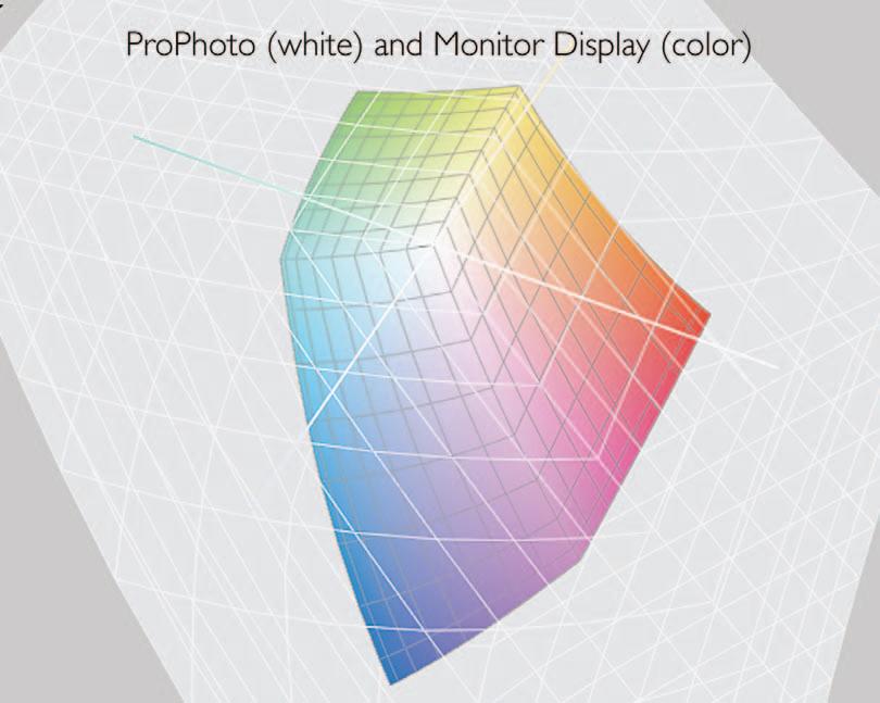
ProPhoto RGB – This is the largest color space and can be selected if you have access to a print output device with a broad color gamut (larger than most CMYK devices are capable of offering). When working in ProPhoto the user must stay in 16 Bits/Channel for the entire editing process. Converting to smaller color spaces in Photoshop’s main editing space usually results in loss of data in the channels regardless of the rendering intent selected in the conversion process. This loss of data may not be immediately obvious if you do not check the histogram after the conversion process. The data loss is most apparent in bright saturated colors where texture and fine detail may be missing as the color information in the individual channels has become clipped in the conversion process.
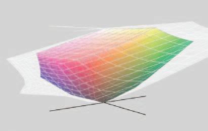
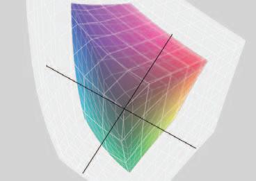
The wide gamut ProPhoto space (white) compared to the Adobe RGB (1998) space (color)
Assigning a profile in Adobe Camera Raw
In the full version of Photoshop you can assign a color space to an image in ACR by choosing one of the options in the Workflow Options dialog box. When the image is opened in the main editing space or saved as a TIFF or JPEG the image is tagged with the working space profile. When using ACR in Photoshop Elements the image is tagged with the color space that has been chosen in the Color Settings (Always Optimize for Computer Screens or Always Optimize for Printing). In Photoshop Lightroom the color space is selected in the Export dialog box or automatically when the images are processed for the web galleries. Note > The native working space in Photoshop Lightroom is ‘Melissa RGB’ which has the broad color gamut of ProPhoto RGB and the luminance values of sRGB.
Convert images destined for screen presentation to sRGB
If images have been opened in Photoshop and tagged with the Adobe RGB or ProPhoto RGB profile for printing purposes the photographer needs to convert the profile to sRGB if the photographer then decided to use the images for displaying on the web or via another piece of software that is not color managed, e.g PowerPoint. It is important to convert the images to sRGB otherwise the images will appear less saturated when they appear in software that is not color managed. Images that are already open in Photoshop can be batch converted to sRGB by using the Image Processor dialog box. For users of the full version of Photoshop the Image Processor can also be accessed directly from Bridge (Tools > Photoshop > Image Processor).
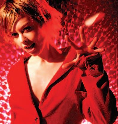
Th e size of the color space dictates how saturated some of the colors can be raised before clipping occurs. Clipping saturated colors can lead to a loss of fi ne detail and texture. Saturation clipping is especially noticeable when you have selected the smaller sRGB color space and have captured an image with highly saturated colors. Th e Vibrance slider that has been introduced with recent versions of ACR and Photoshop Lightroom applies a non-linear increase in saturation (targeting pixels of lower saturation). It is also designed to protect skin tones in order to prevent faces from getting too red. It should create less clipping problems when compared to the Saturation control.
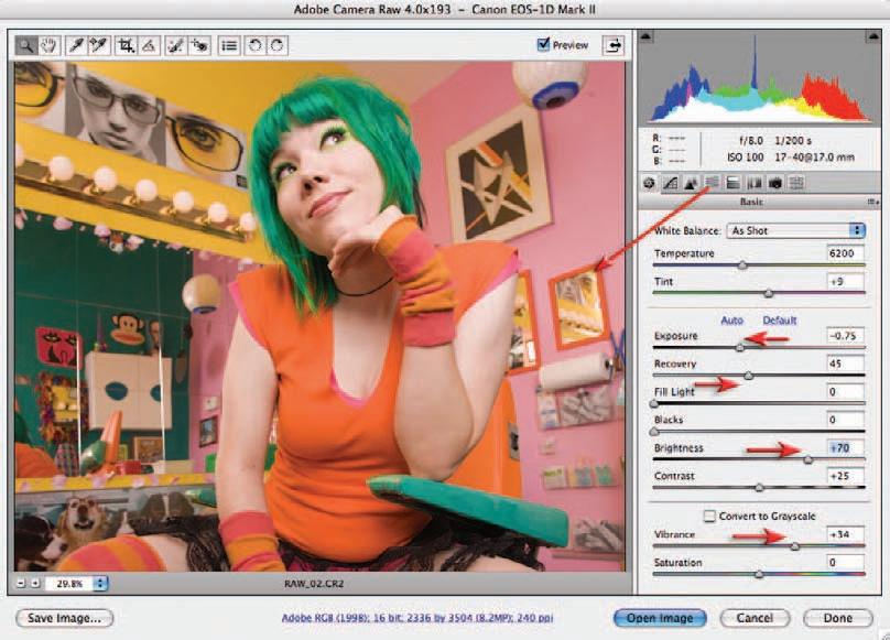
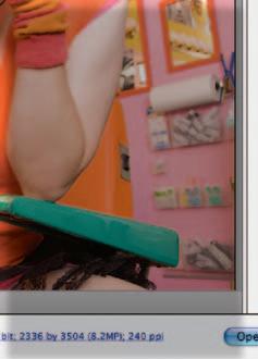
High levels of saturation clipping present in this fi le were corrected with the help of the Saturation controls in the HSL tab - saturation could then be increased reasonably non-destructively using the Vibrance slider. Image of Melissa Zappa by Victoria Verdon Roe
In images where some colors readily clip due to their natural vibrance (especially when using a smaller gamut such as sRGB), lowering the global saturation in order to protect the clipping of a single color can result in a lifeless image. In these instances the user can turn to the HSL tab to edit the saturation or hue of colors independently.
Note > Choosing a larger color space such as ProPhoto RGB, where the colors rarely clip, is only a short-term solution. Th e color gamut must eventually be reduced to fi t the gamut of the output device. ACR in the full version of Photoshop is currently the best place to massage these colors into the destination space.
Andrew Boyle
exposure and light meters


Mark Galer

essential skills
Gain a knowledge and understanding of exposure and its relationship to lightsensitive media, depth of fi eld and selective focus. Understand the use of hand-held and TTL light meters. Understand the difference between refl ected and incident meter readings and their relationship to lighting ratios and exposure. Create images demonstrating an understanding of metering techniques. Document the progress and development of these skills.