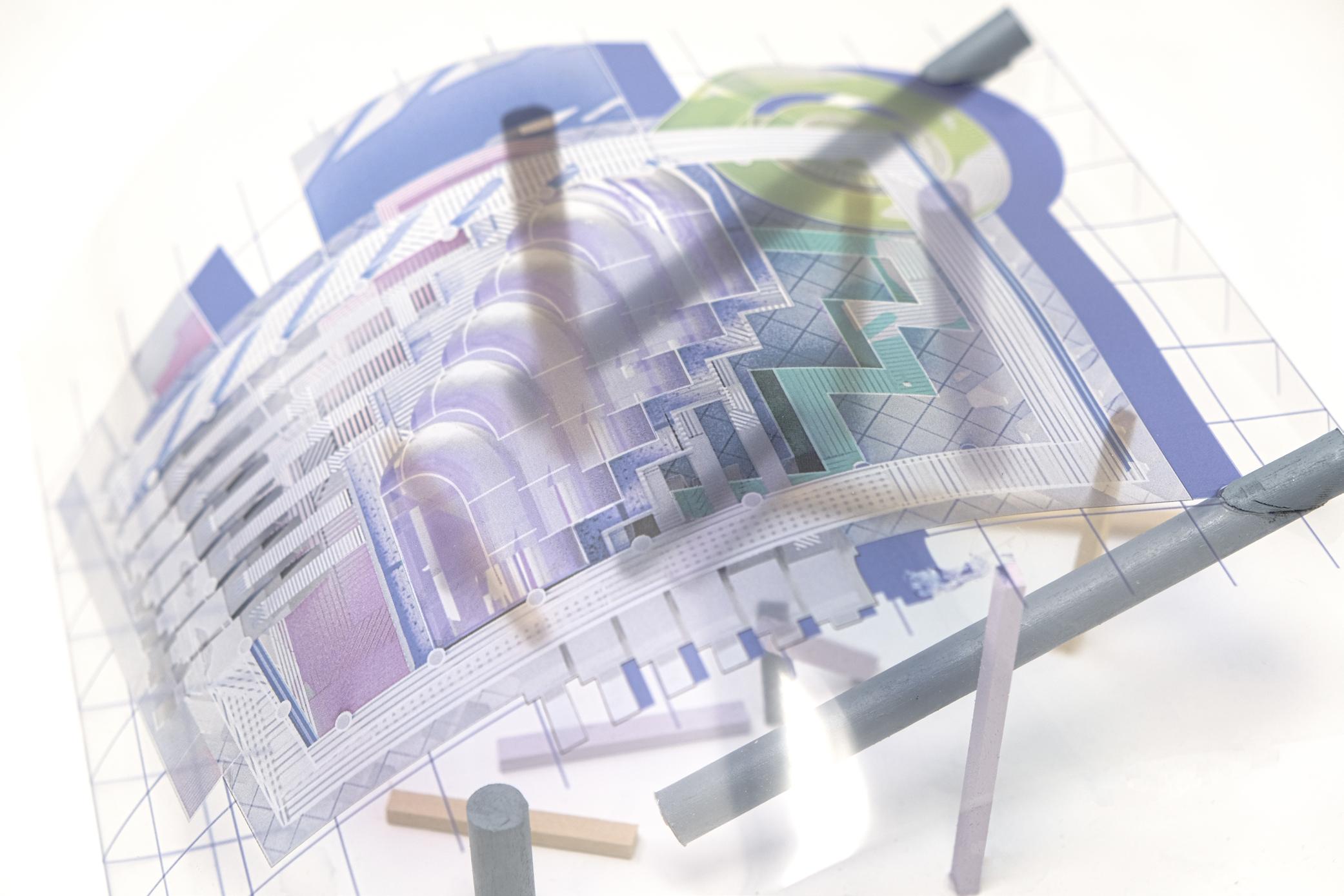
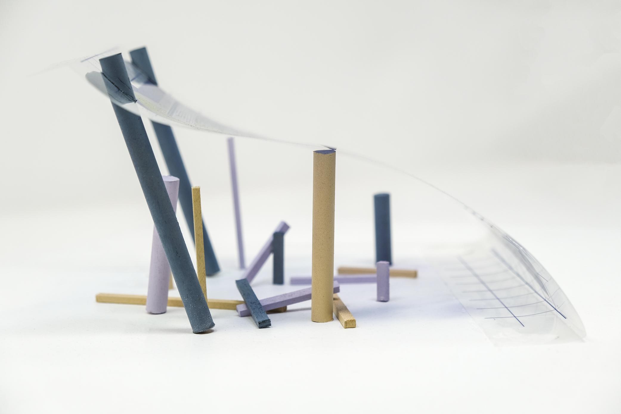
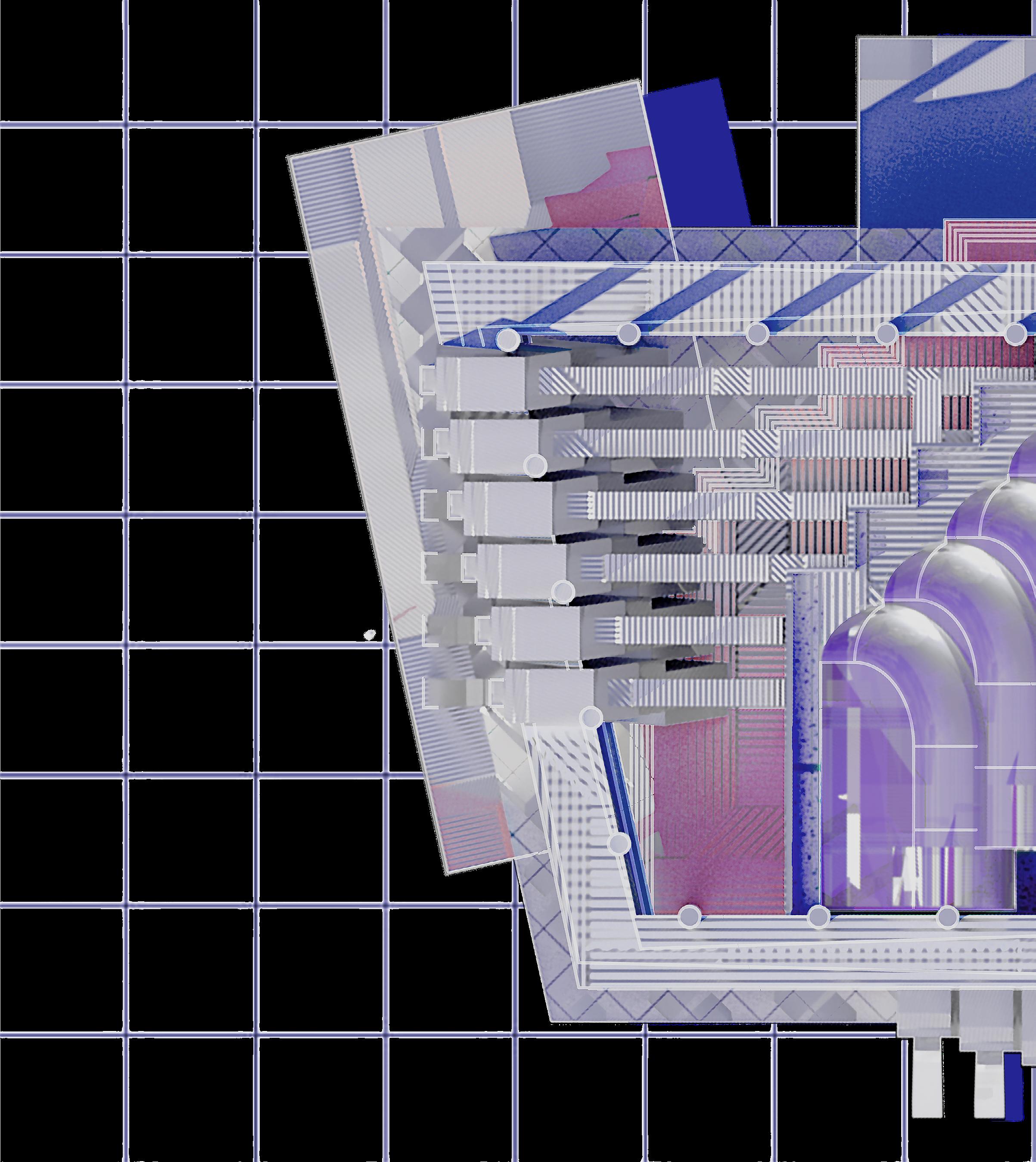
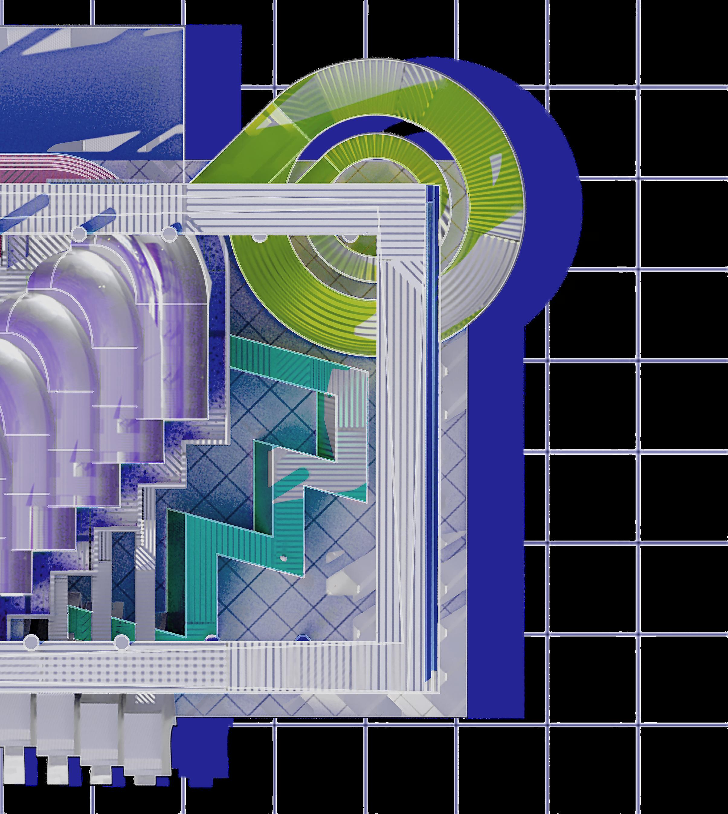
VOIR DIRE
Projection, Perception, and the Reimagined Jury Deliberation Room
 Graduate Thesis 2023 Wan-Yu Chen

 Graduate Thesis 2023 Wan-Yu Chen
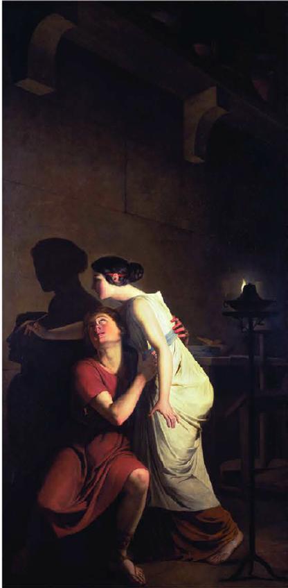
“The Invention of Art of the Drawing” is a significant painting in art history. Many painters have used this story as a theme for their works. It is a mythological story about Greek potter Butades’ daughter setting up the light and trying to draw her lover’s silhouette by the shadow projected on the wall before he departed on a journey abroad. So she could remember him clearly. This profile had then become an important reference for her father to create a sculpture for her daughter in relief.
This painting brings up two interesting ideas of projection. First, geometry can be projected in a two-dimensional plane and three-dimensional space. And there is an inconsistency between the two projections. However, because of the inconsistency between 2D and 3D, we can create the illusion three-dimensionally within a twodimensional medium and vice versa. In the book “The Projective Cast,” Robin Evans said, “Projection operates in the interval between things. It is always transitive.” He proposed that projection is a process between two or more objects rather than within a single object. Secondly, a space composition could be the projection of the space itself, objects, activities, and events inside and corresponding to the narrative. Like a kaleidoscope, many factors can interplay with each other and then affect the composition. These factors can change the space the protagonists are in but also our perception from different viewpoints.
This thesis interest lies in exploring projection as a tool to influence perception and perspective and creating illusions and different dimensions within a two-dimensional medium.
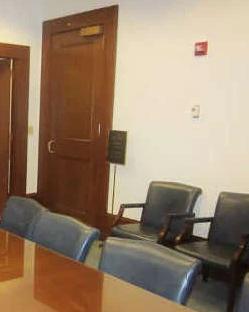
The jury deliberation room tends to be underappreciated in discussions of court building design. In its current form, it is lackluster, lacking in design and quality, and is often used as a space attached to the side of the courtroom. The central role of the jury is to ensure equal responsibility under the law, but this role is often downplayed in society. Jury duty is generally viewed negatively as a burden. However, the jury is an important expression of the power of the people.
By reimagining this space, we can create a new form of jury room that is inclusive of different perceptions and ideas, elevating the importance of people empathizing with different perspectives on ideas. This transformation will enhance the role of jurors and change the perception of their function.
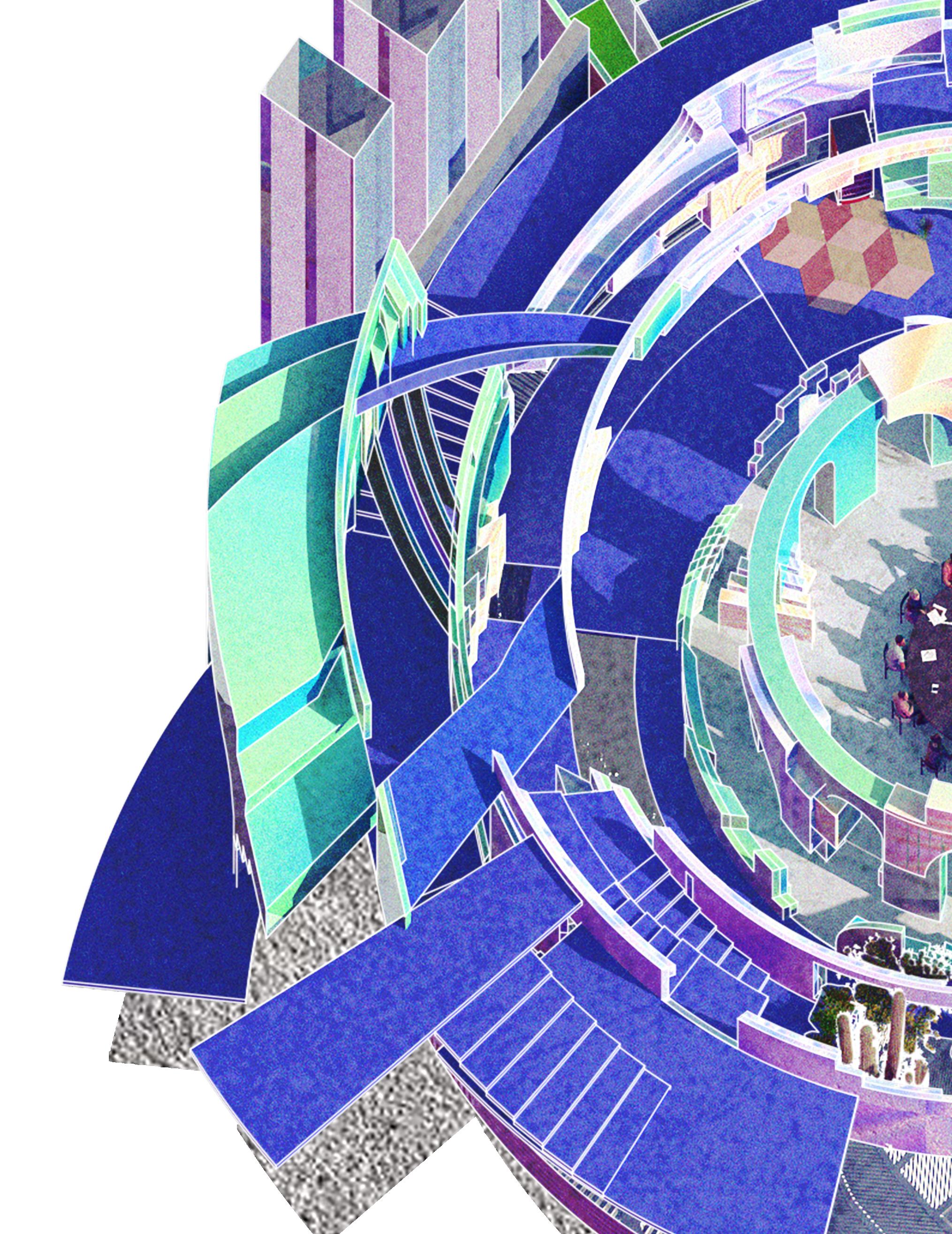
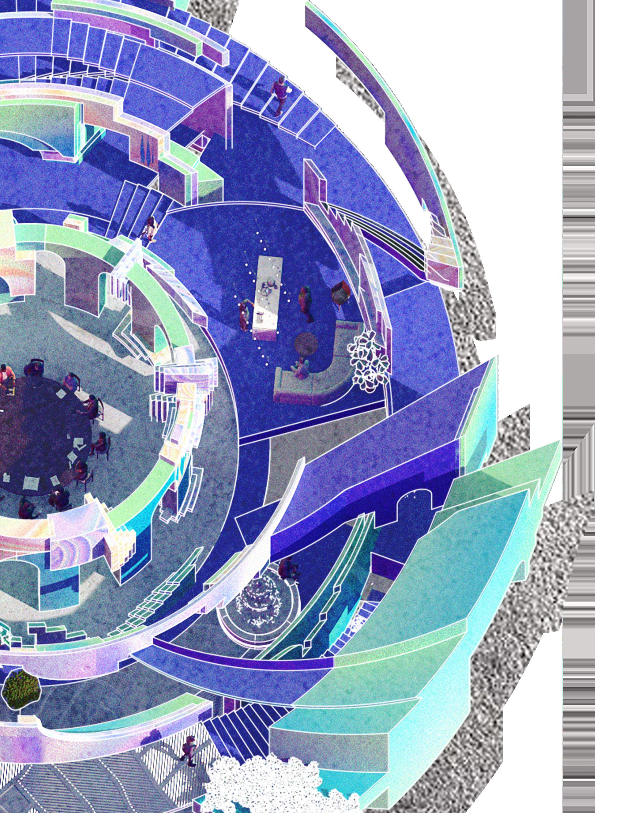
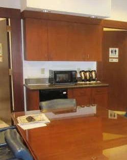
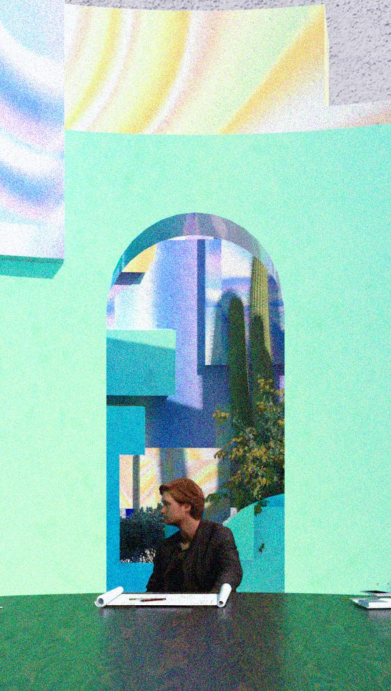
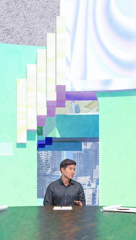
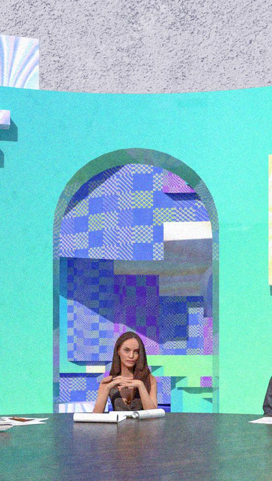
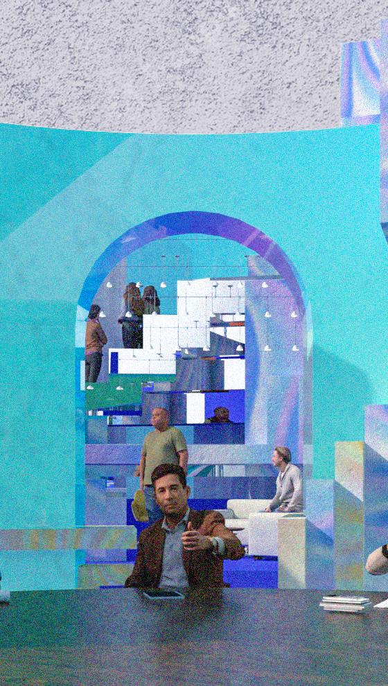
The new jury deliberation room consists of concentric circles of different sizes from inside to outside. From the inside to the outside, there is a space for the jurors to finalize their deliberations, a sitting area, a hallway, a pantry, a restroom, and a circulation path that connects to the outside space. When viewed from the center of the circle, the 12 jurors are seated behind a backdrop of overlapping, folded projections of the above spaces. The homogeneity of the space makes it impossible for the jurors to recognize the presence of the 12 backgrounds as they roam around the space. However, when the 12 jurors are seated at the round table in the center, they will find 12 projected spaces with completely different effects. This will stimulate the jurors to look at things from different perspectives and to think in different ways.
By manipulating people’s perception of space, I want to create a new form of courthouse architecture centered around the jury room that will elevate the importance of the jury room to new heights in the court’s and the community’s perception. In doing so, a tangible connection will be made between the architectural design and the profound notion of justice symbolized by the jury.
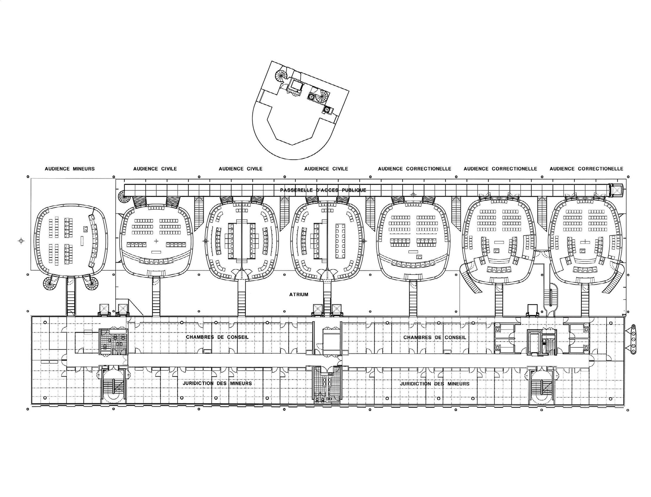
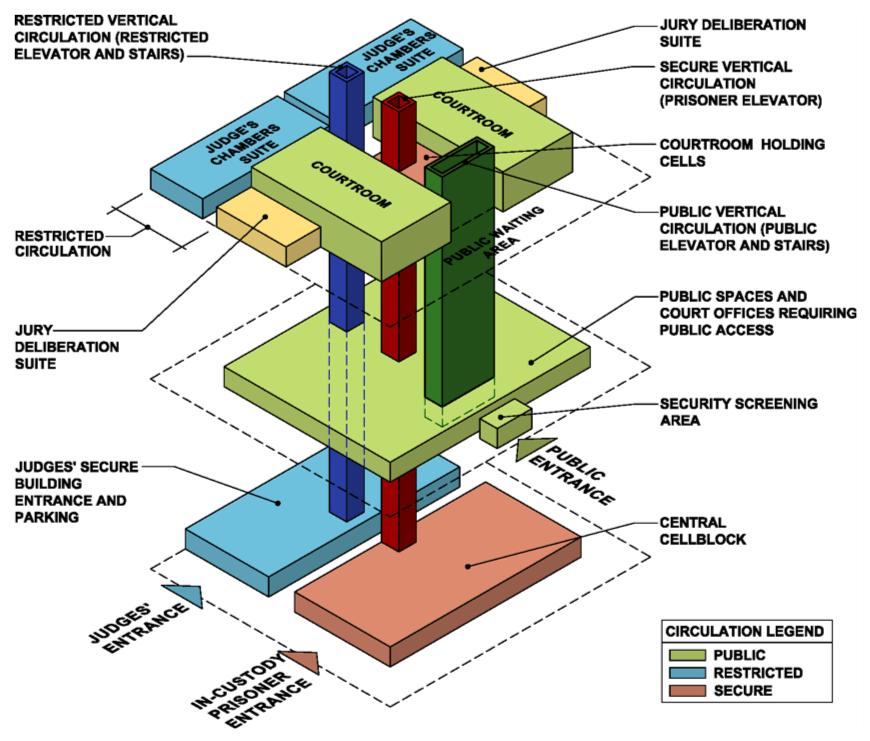
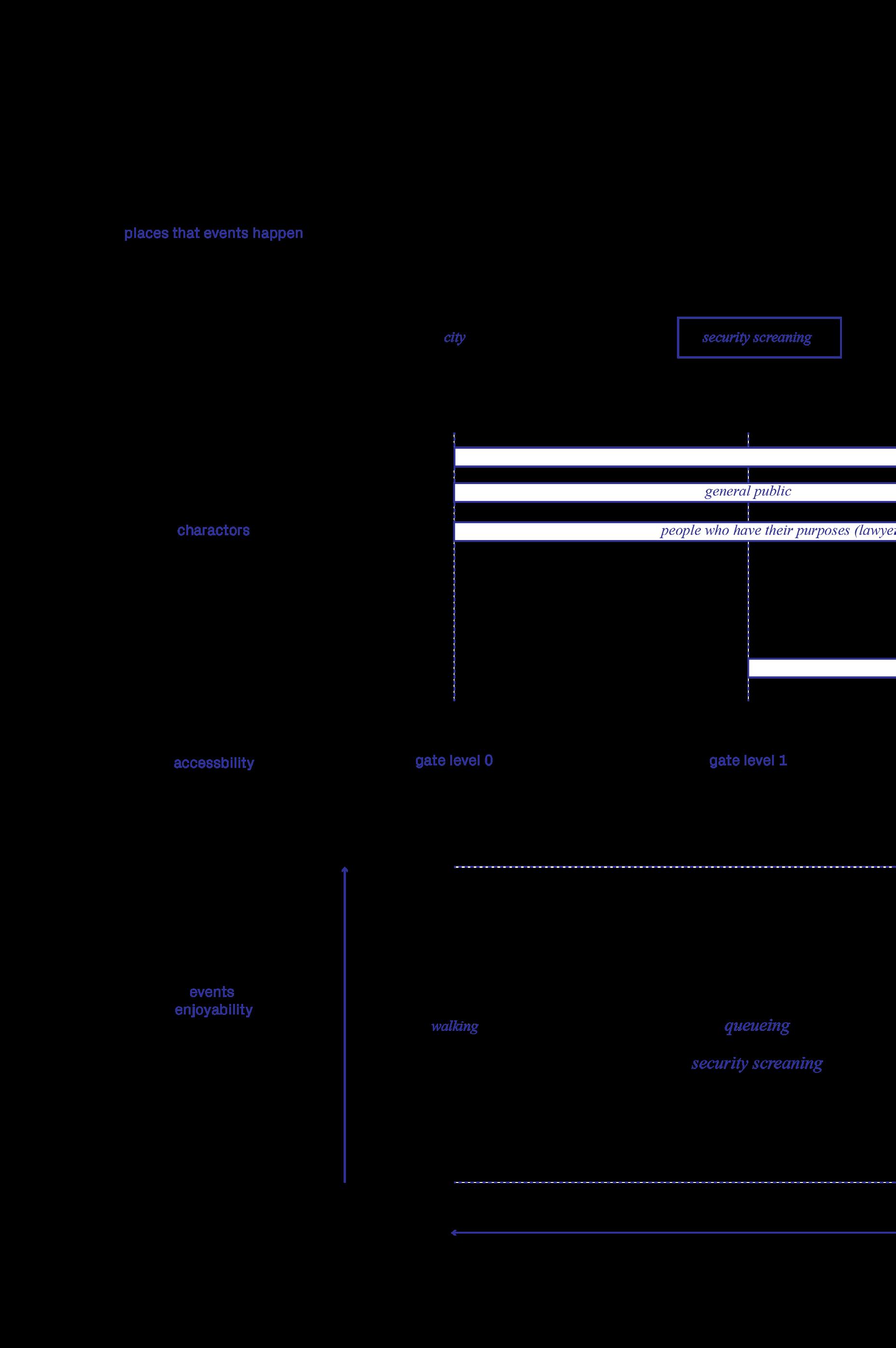
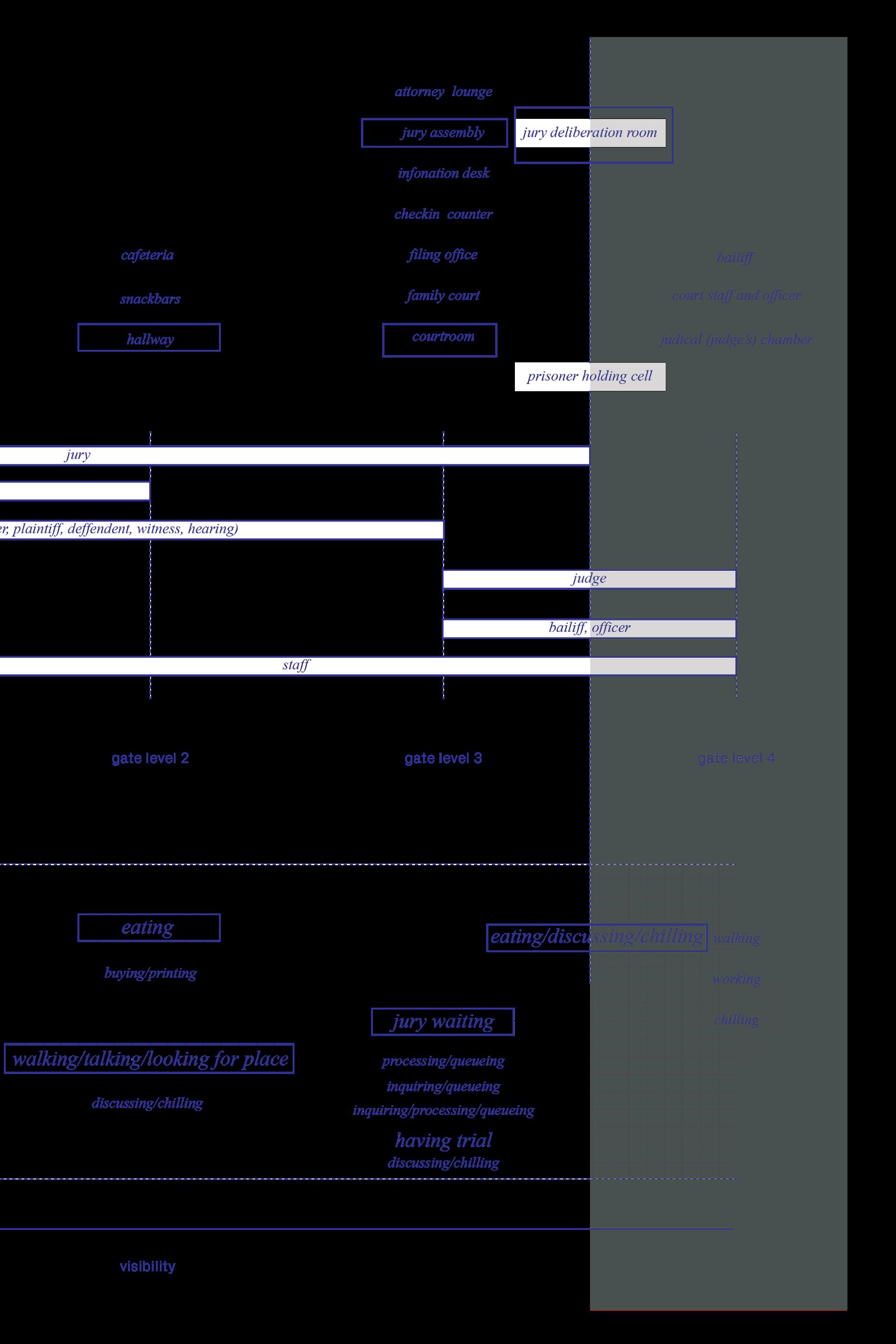
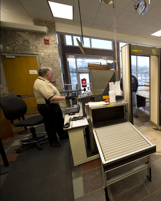
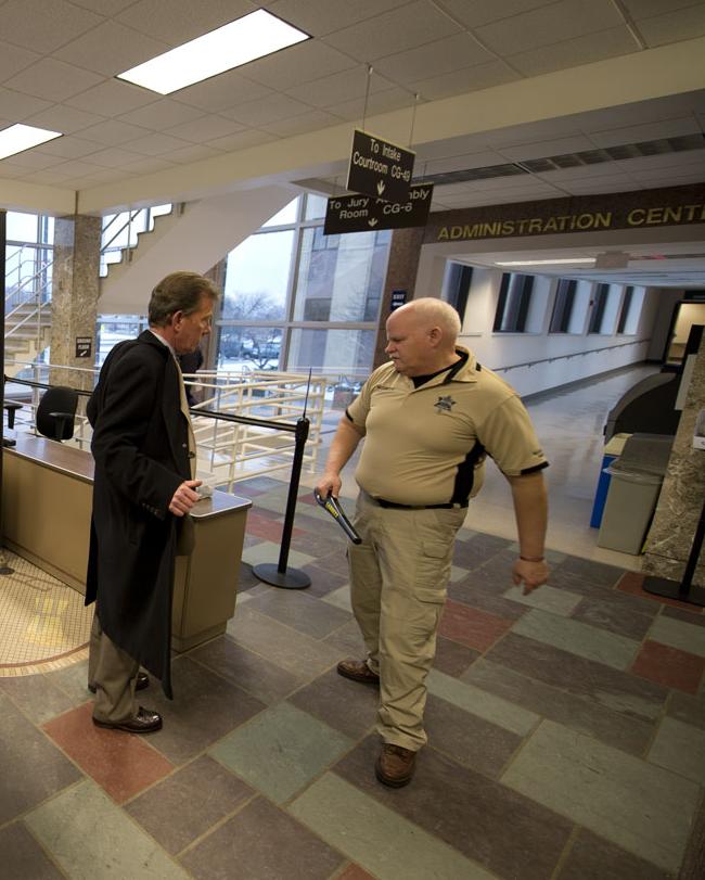
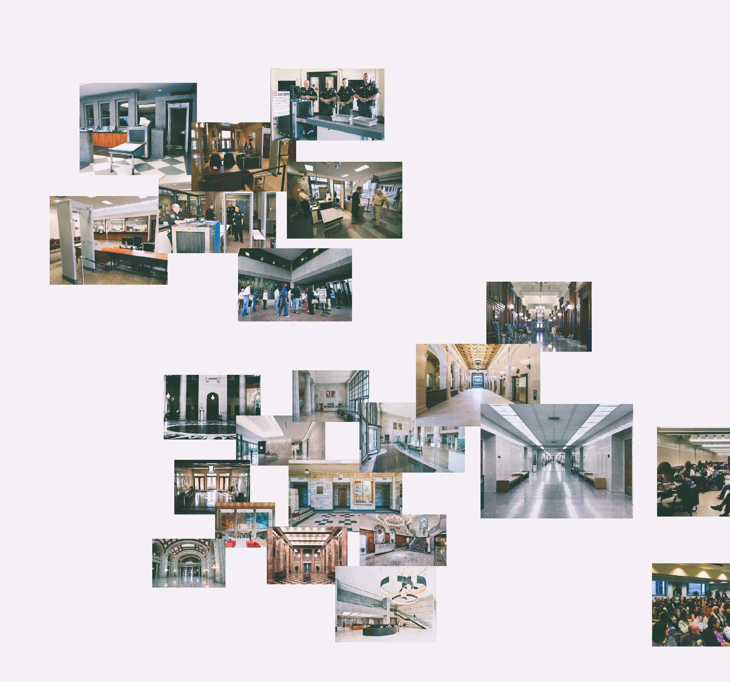
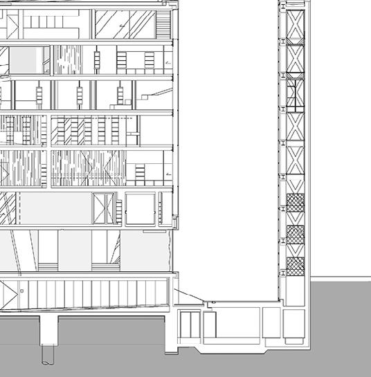
A courthouse is a place with a complex but clear circulation that regulates the way different people use the space. If you look at the spatial composition of the courthouse in the plan or in section, you can see that there is a clear front of the house and back of the house, and the general
logic of the arrangement is that, apart from the vertical circulation of movement, the circulations of the different groups of p eople are arranged in a parallel manner. And the courtroom, as a meeting place for people, is located in the middle.

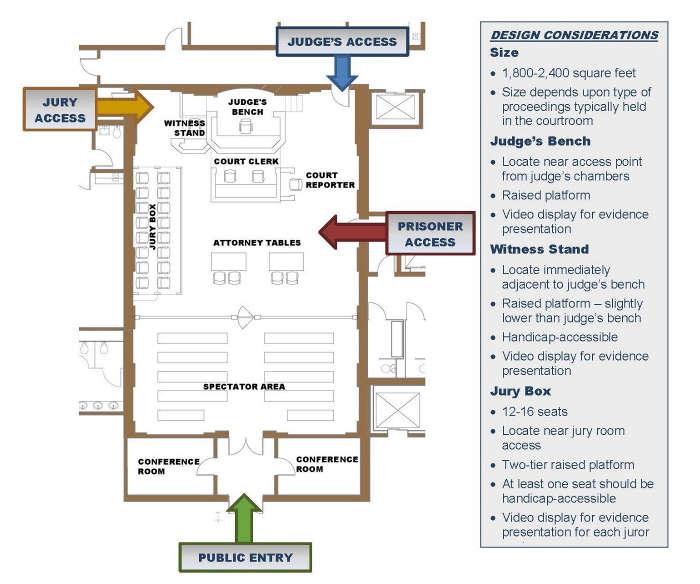
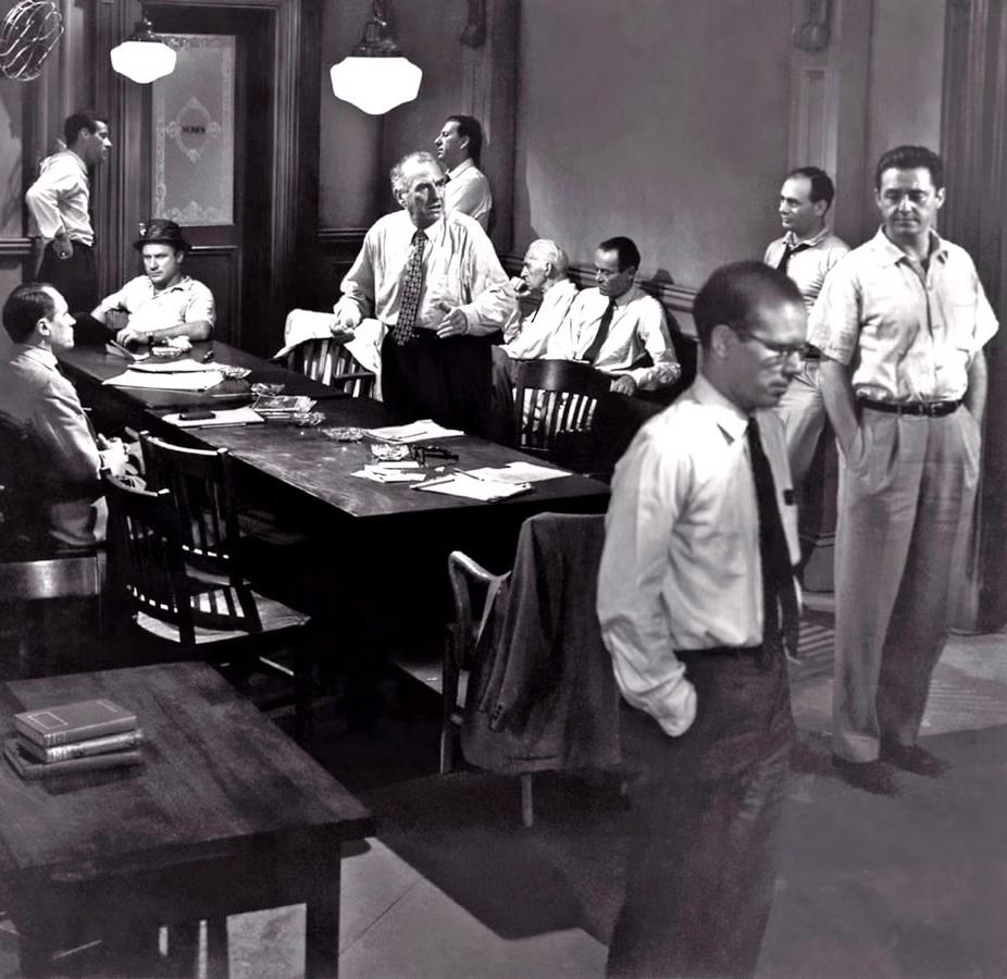
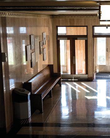
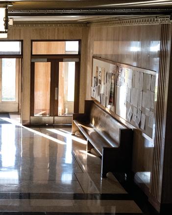
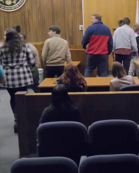
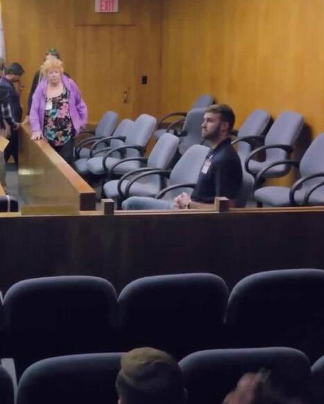
The movie 12 Angry Men takes place in the jury deliberation room. It tells the story of 12 jurors debating a seemingly clear-cut case over and over again and finally coming to a verdict. The jury deliberation room, where jurors ultimately decide on the guilt or innocence of the accused, is often located on the side of the courtroom as an ancillary space. In its current form, it is lacklustre, lacking in design and quality, and is often used as an ancillary space on the side of the courtroom. The central role of the jury is to ensure equal responsibility under the law, but this
role is often downplayed in society. Jury duty is often negatively perceived as a burden. However, the jury is an important expression of the power of the people.

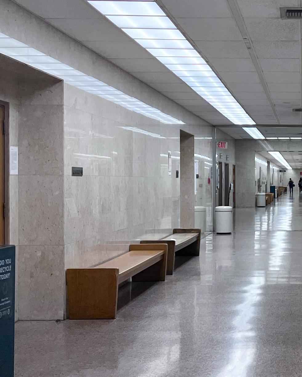
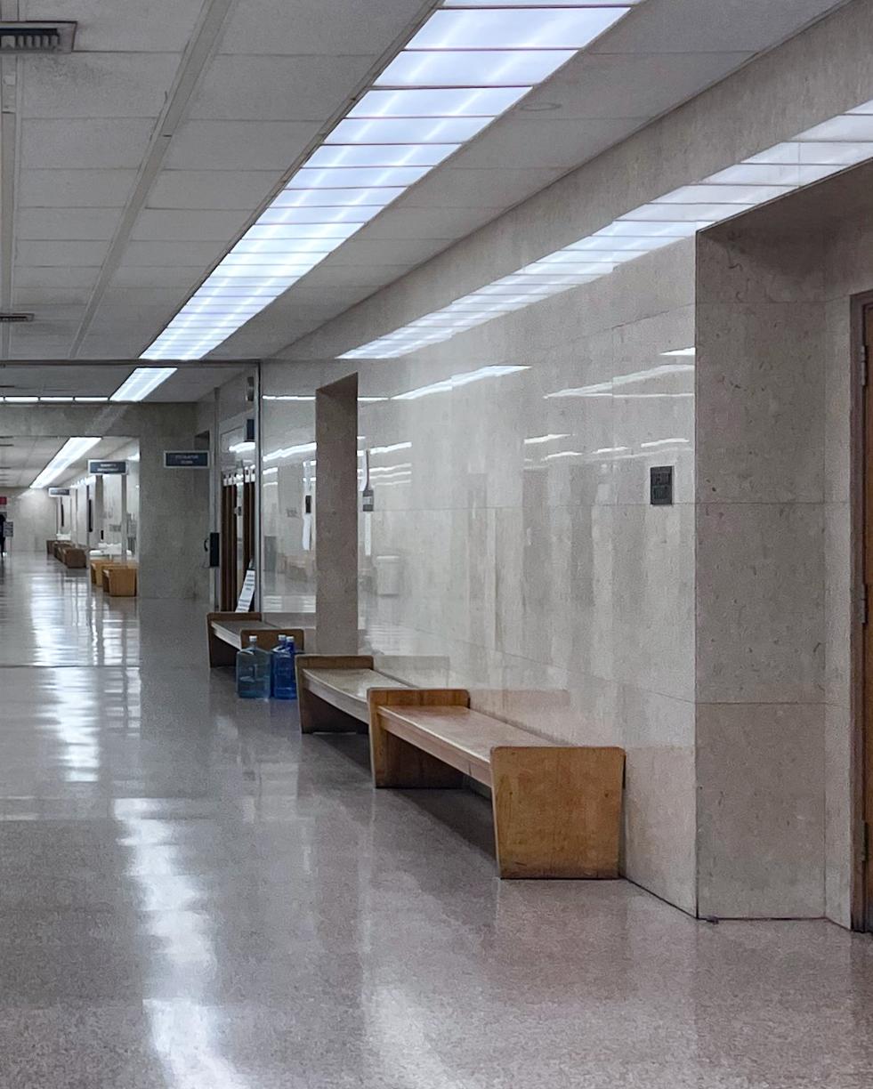
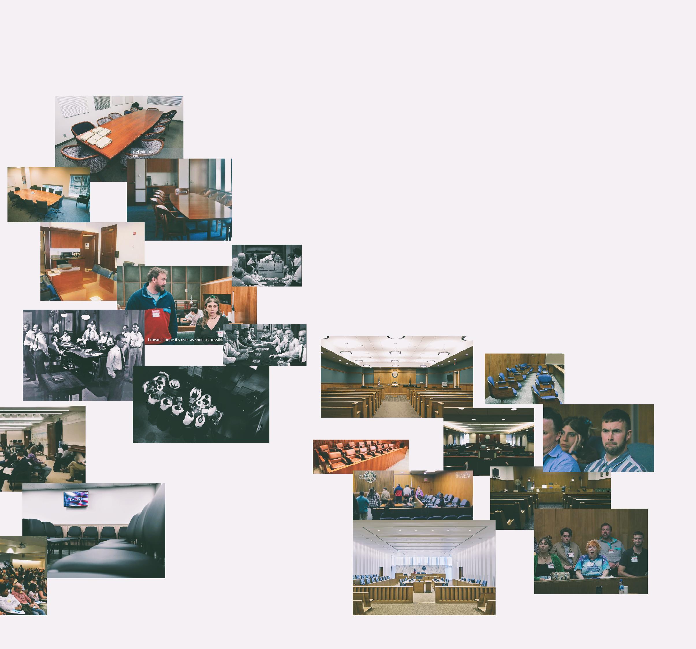


By reimagining this space, we can create a new form of jury room that is inclusive of different perceptions and ideas, elevating the importance of people empathizing with different perspectives on ideas. This transformation will enhance the role of jurors and change the perception of their function.

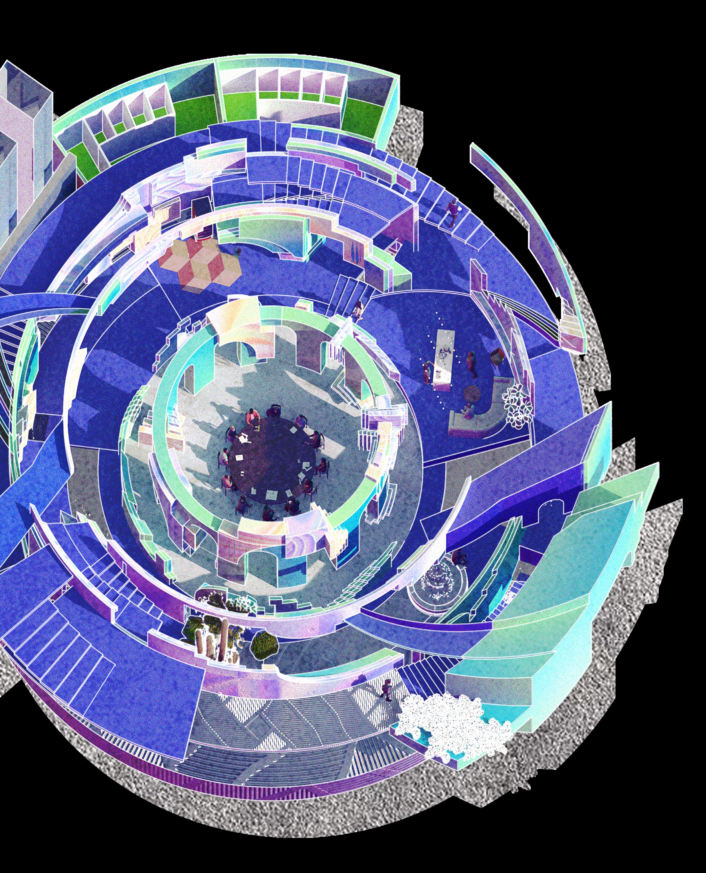
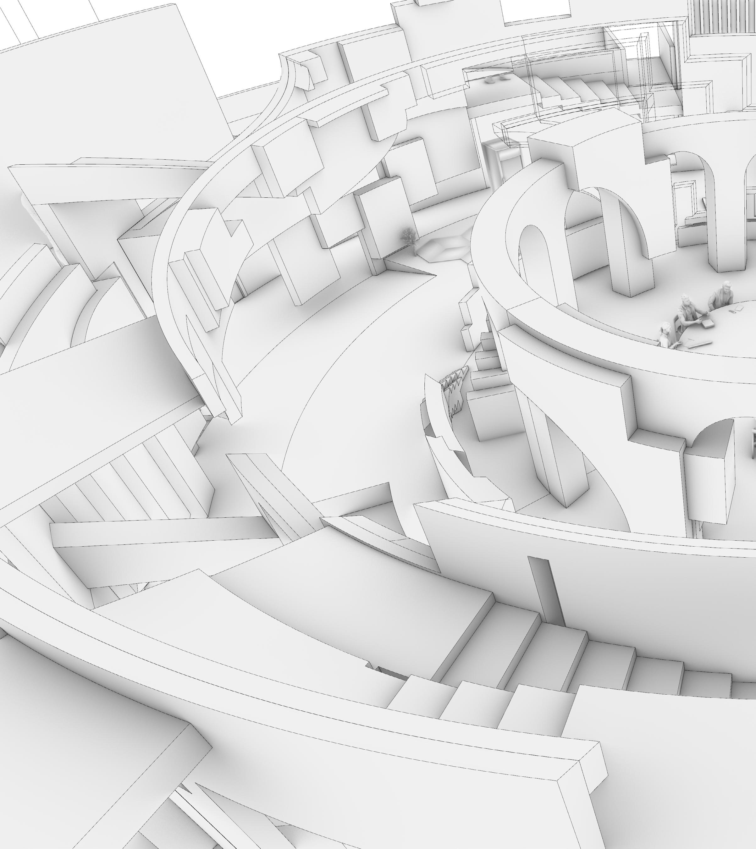
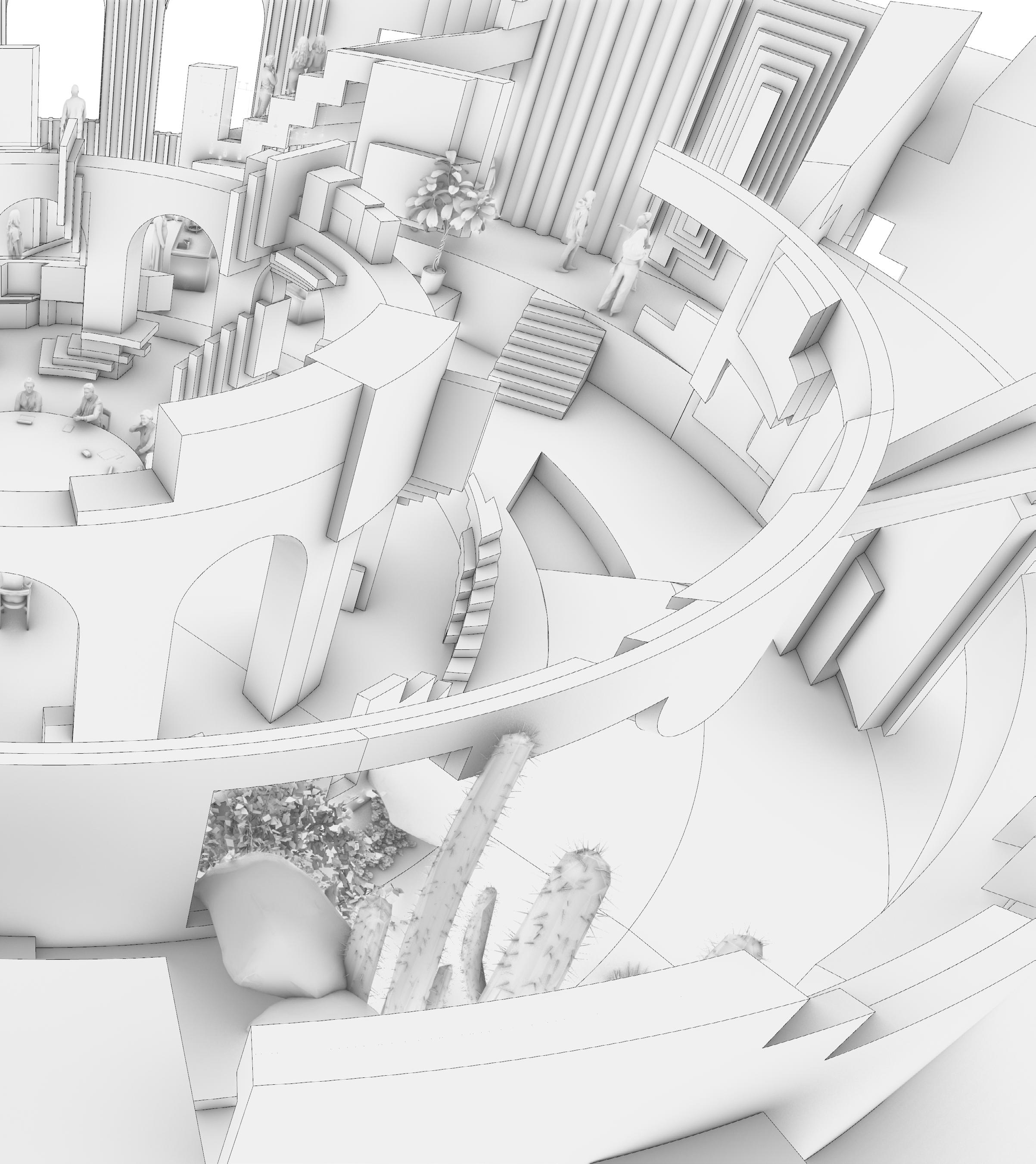
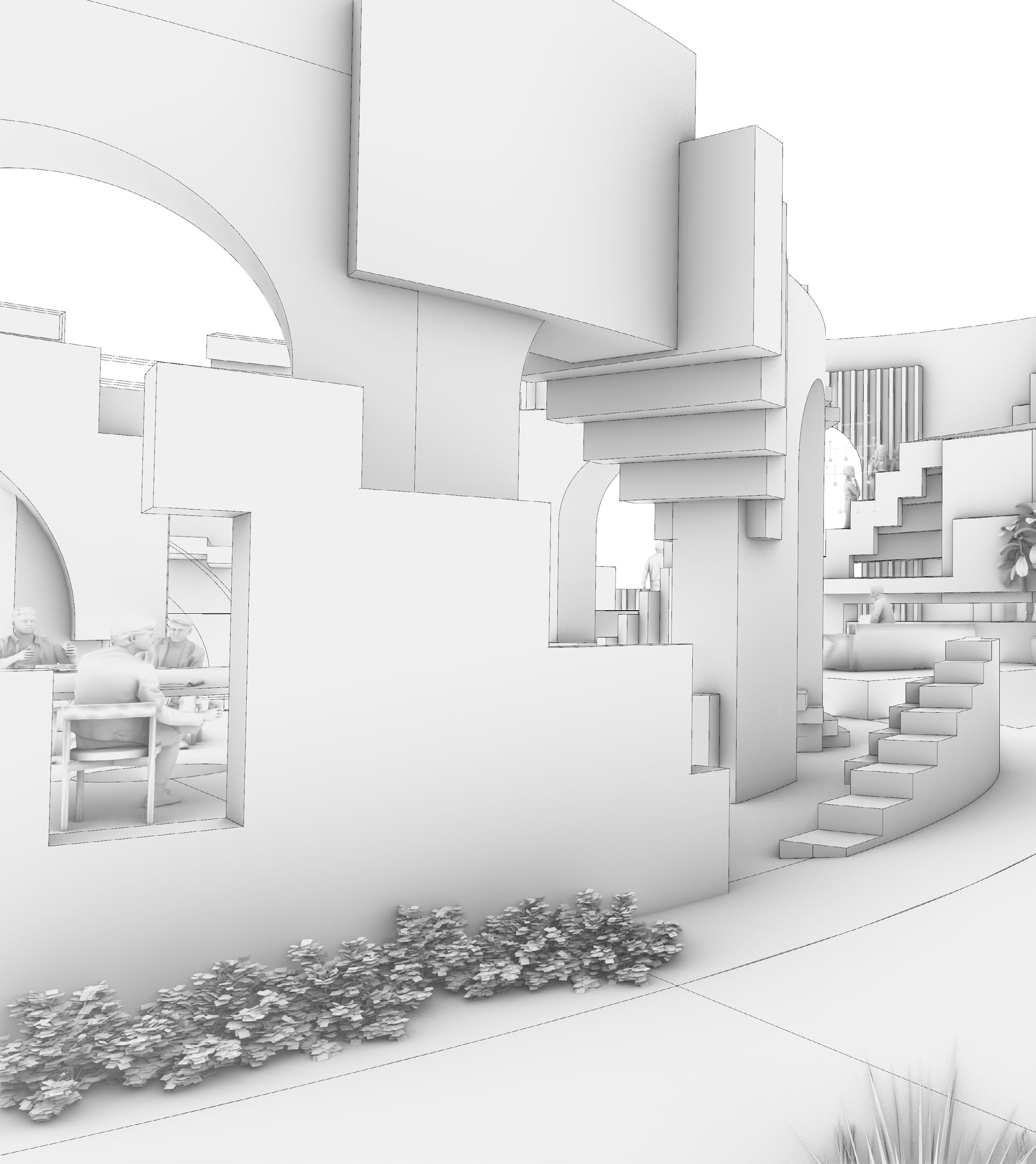
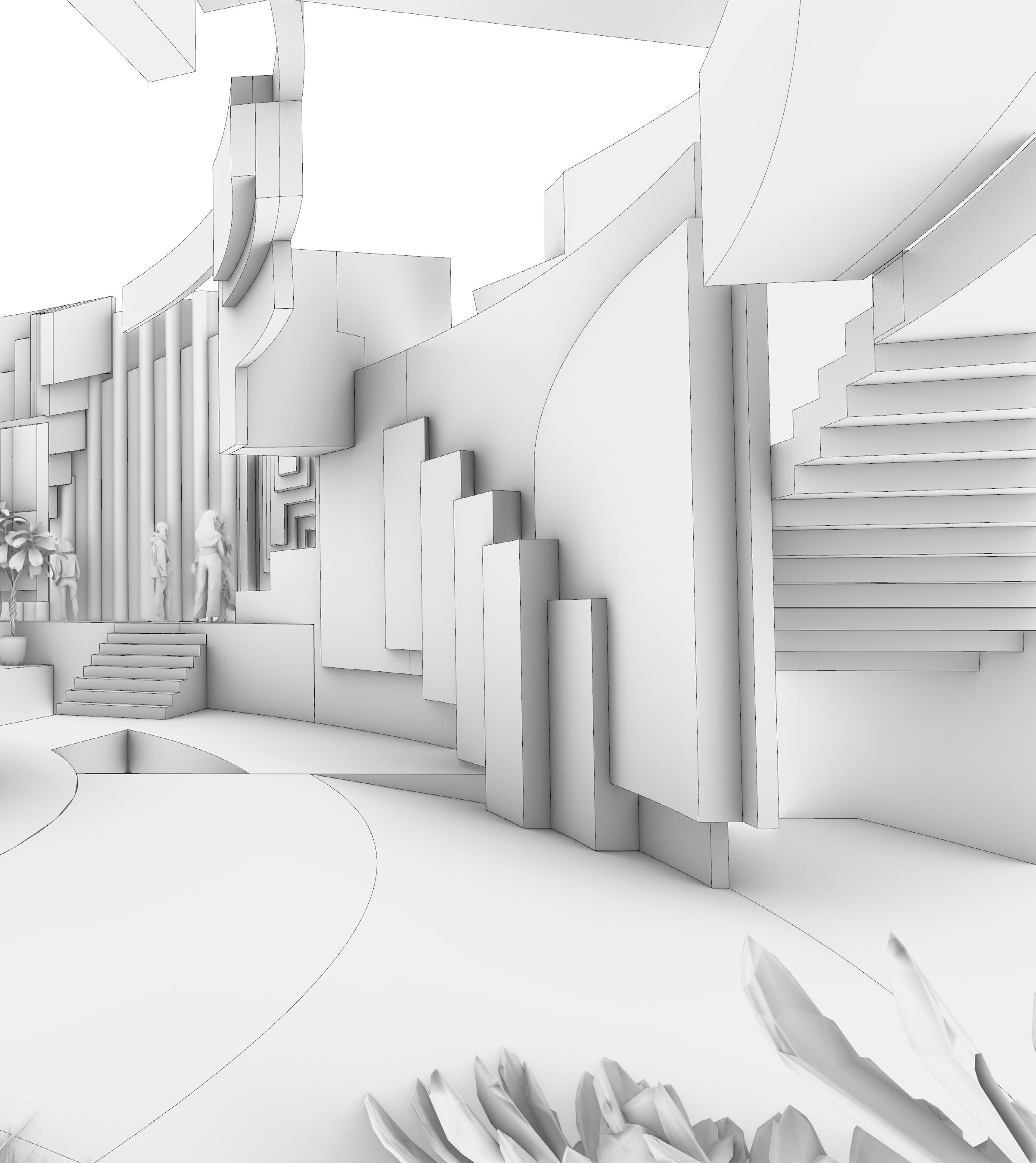
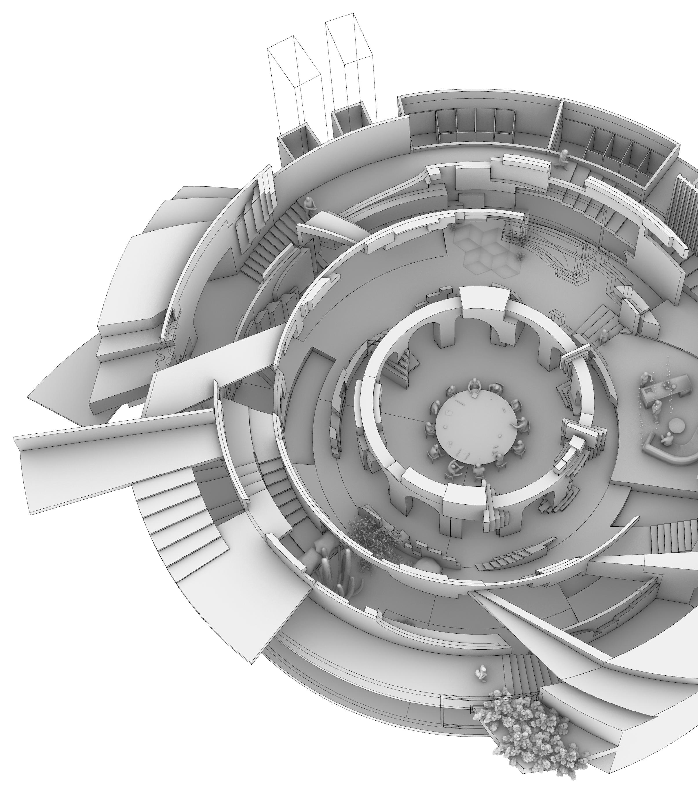
The new jury deliberation room consists of concentric circles of different sizes from inside to outside. From the inside to the outside, there is a space for the jurors to finalize their deliberations, a sitting area, a hallway, a pantry, a restroom, and a circulation path that connects to the outside space. When viewed from the center of the circle, the 12 jurors are seated behind a backdrop of overlapping, folded projections of the above spaces. The homogeneity of the space makes it impossible for the jurors to recognize the presence of the 12 backgrounds as they roam around the space. However, when the 12 jurors are seated at the round table in the center, they will find 12
projected spaces with completely different effects. This will stimulate the jurors to look at things from different perspectives and to think in different ways.
By manipulating people’s perception of space, I want to create a new form of courthouse architecture centered around the jury room that will elevate the importance of the jury room to new heights in the court’s and the community’s perception. In doing so, a tangible connection will be made between the architectural design and the profound notion of justice symbolized by the jury.

View Point from The Scene of Garden
View Point from The Scene of Puzzle
View Point from The Scene of Peaceful

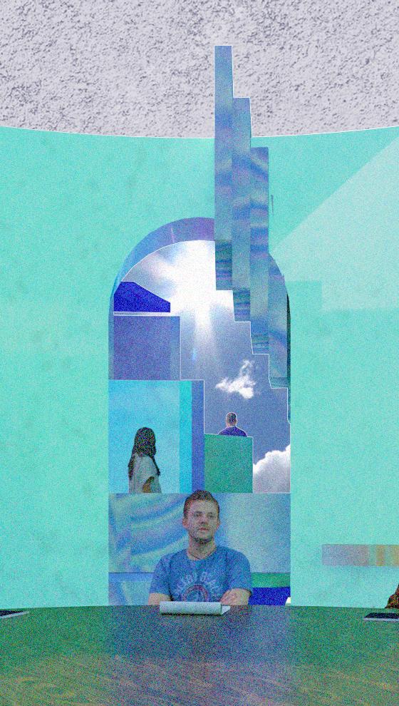
View Point from The Scene of Transparent
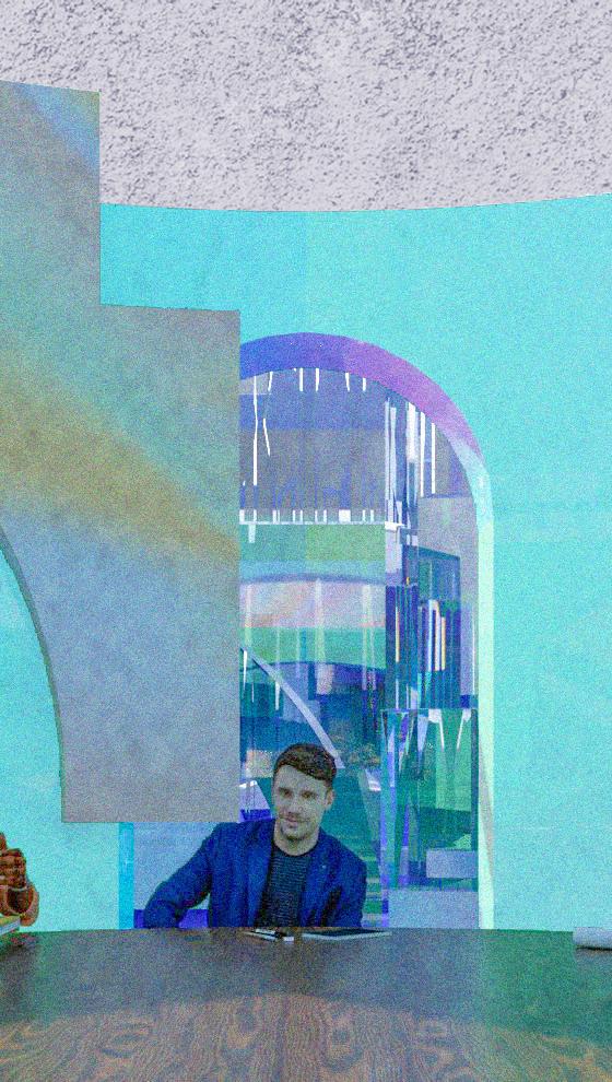
View Point from The Scene of Mystery
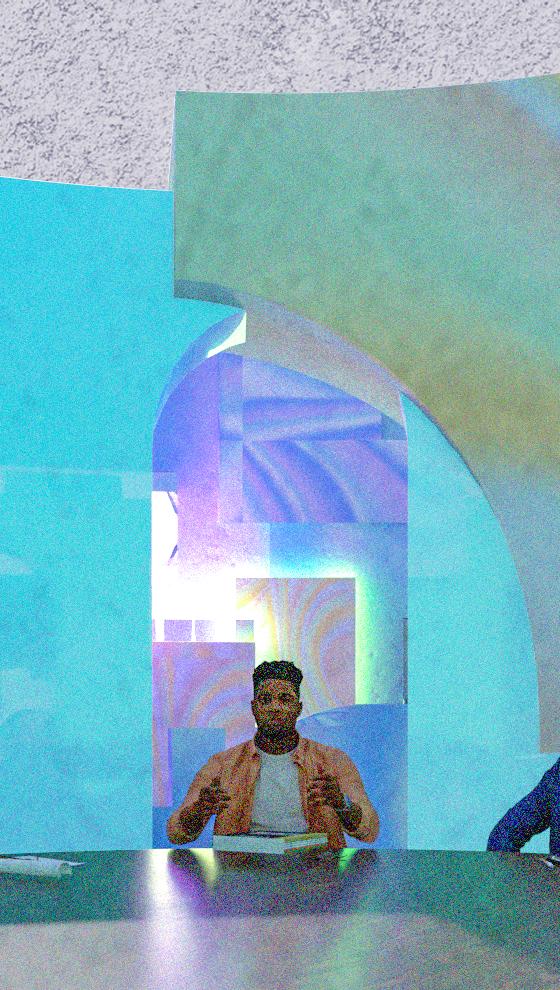
View Point from The Scene of Rigidness

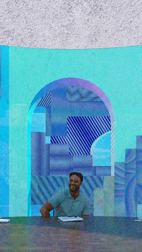
View Point from The Scene of Roops
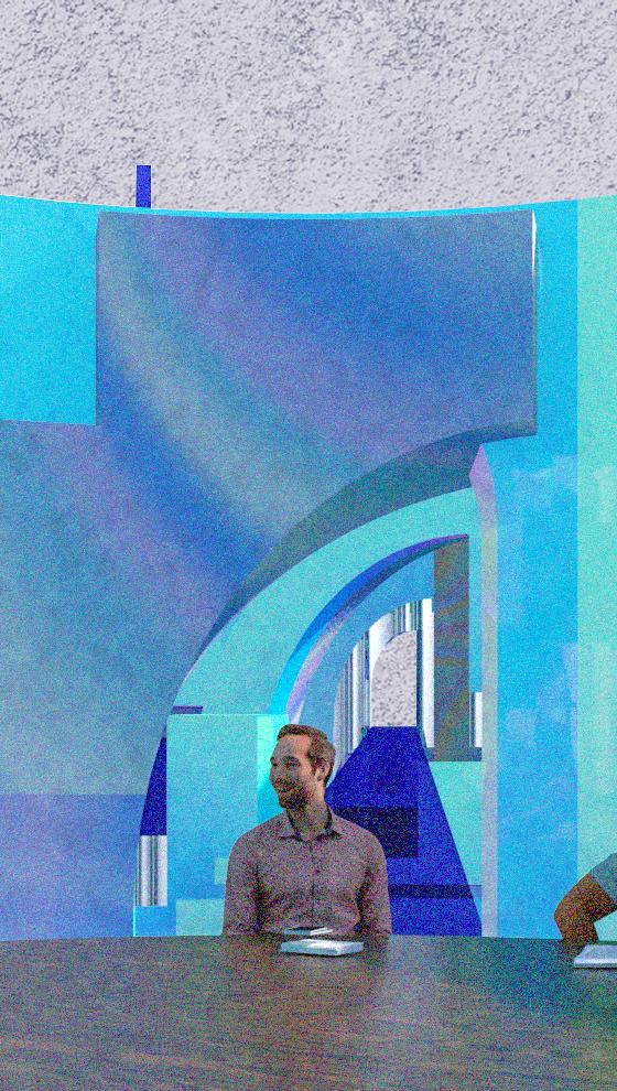
View Point from The Scene of Contrasts
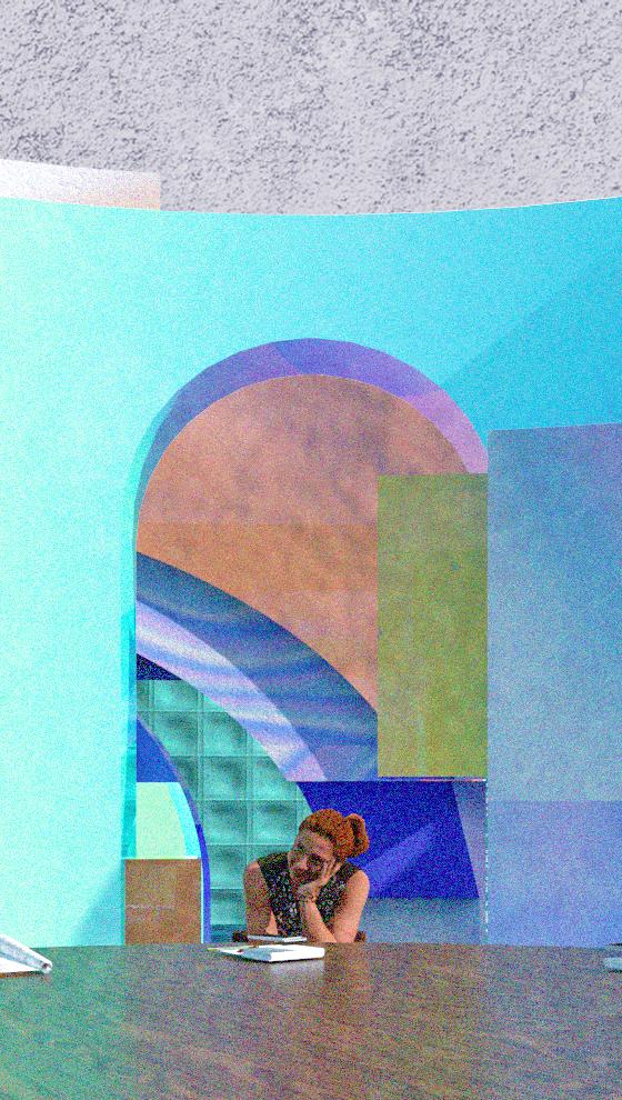
The Scene of Hope
The Scene of Pieces of Everyday Life

The Scene of Peaceful
The Scene of Contrasts

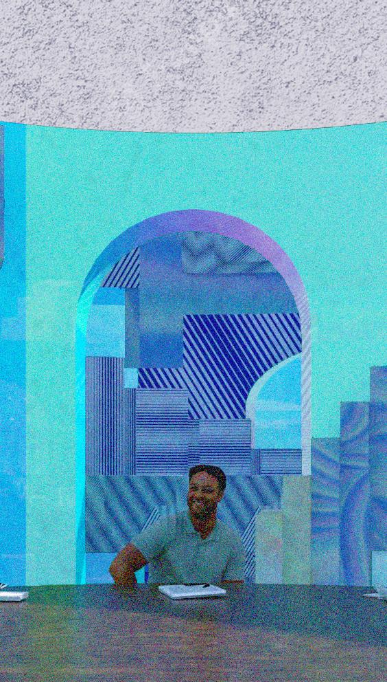
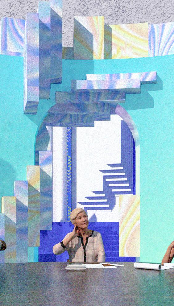
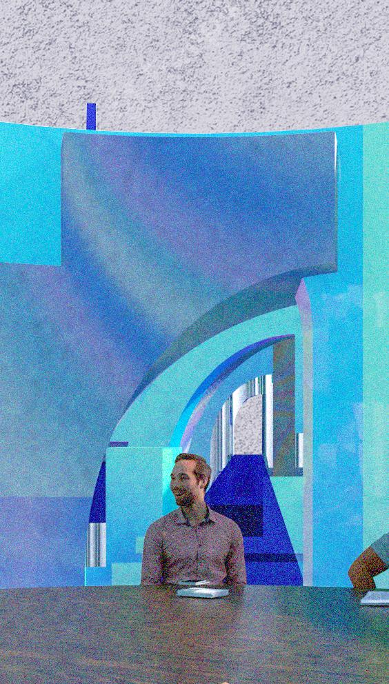
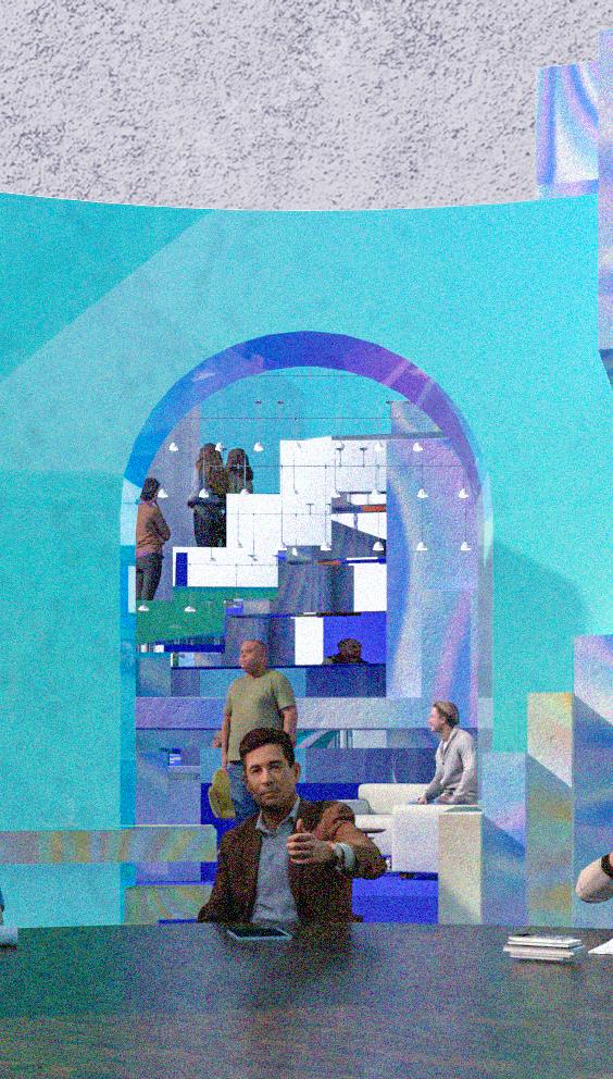
The Scene of Roops
The Scene of Unstableness
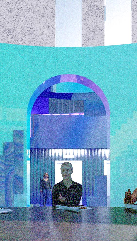
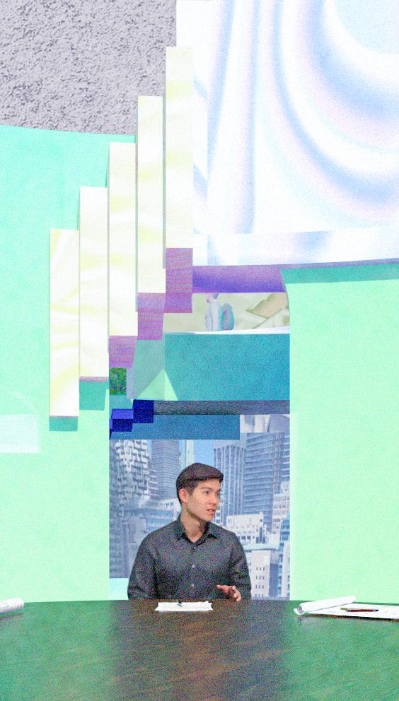
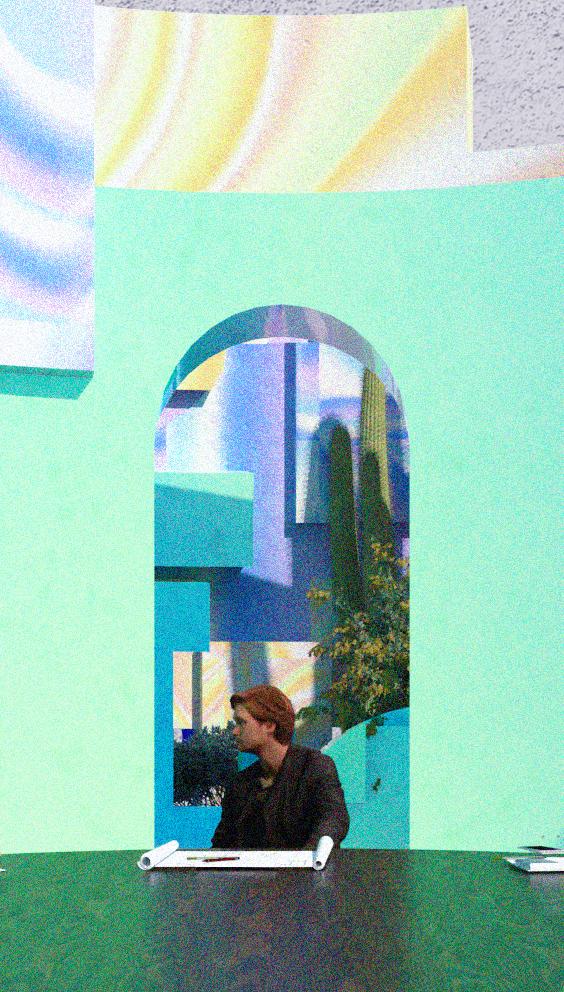


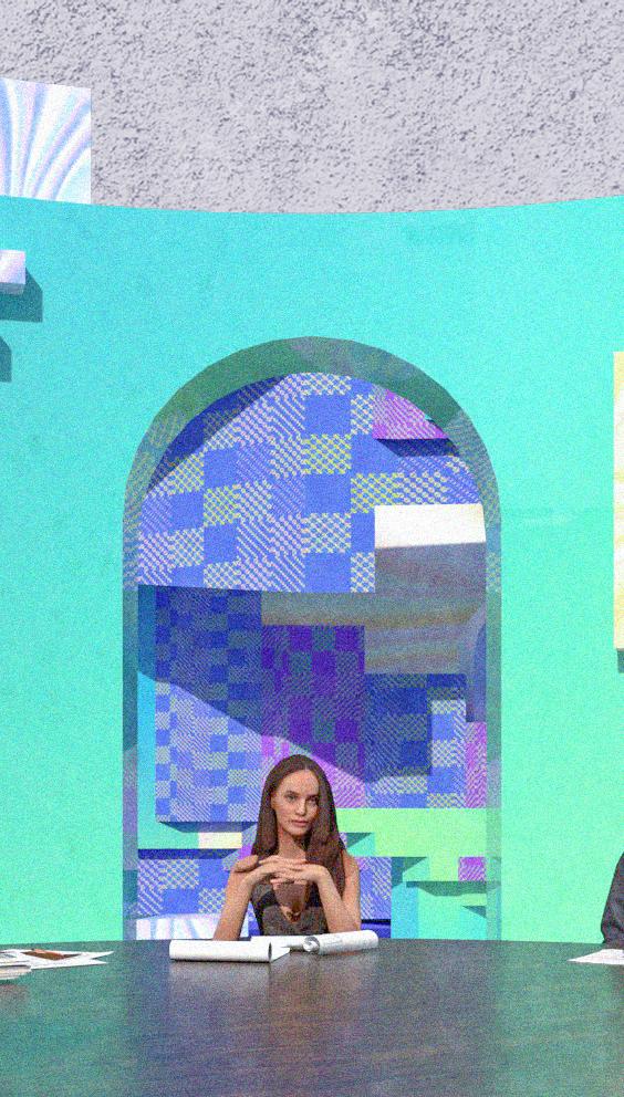
“A space that can be read, interacted with, and understood by different points of view and formats.”
Scope 1.Space or opportunity for unhampered motion, activity, or thought
2.Any of various instruments for viewing
3.To look at especially for the purpose of evaluation
Diverse
1.Differing from one another
2.Composed of distinct or unlike elements or qualities


Rhino_Visibility Hide/ Show/Isolate
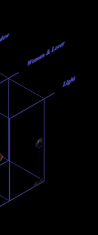


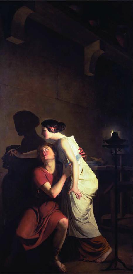
In Atmosphere of Projection, the author uses the famous painting The invention of the art of drawing to explore the relationship between projection, atmosphere, and the people and space in the picture. The painting tells the story of a woman who, before separating from her lover, sketches her shadow on the wall with the projection of a candle. Over time, many different versions of this famous painting have been created, but the story and details are similar.
This painting brings up two interesting ideas of projection and a question about the relationship between space and people: Can projection be understood as an environment, or conceived as
an atmosphere?
First, geometry can be projected in a twodimensional plane and three-dimensional space. However, there is an inconsistency between the two projections. The projection of shadow from the potter’s daughter’s lover became a sculpture at the end is a good example of it. It is a process of a subject in three-dimensional space that had been projected two-dimensionally and then back to the three-dimensional world. This projection process involves the transfer of threedimensional space onto a two-dimensional plane, resulting in shadow, which could be a flattened, distorted image that is often difficult to read
accurately. Same as transforming the shadow back into sculpture. It could be distorted during translation progress. There is an inconsistency between the two projections. However, because of the inconsistency between 2D and 3D, we can create the illusion three-dimensionally within a two-dimensional medium and vice versa.
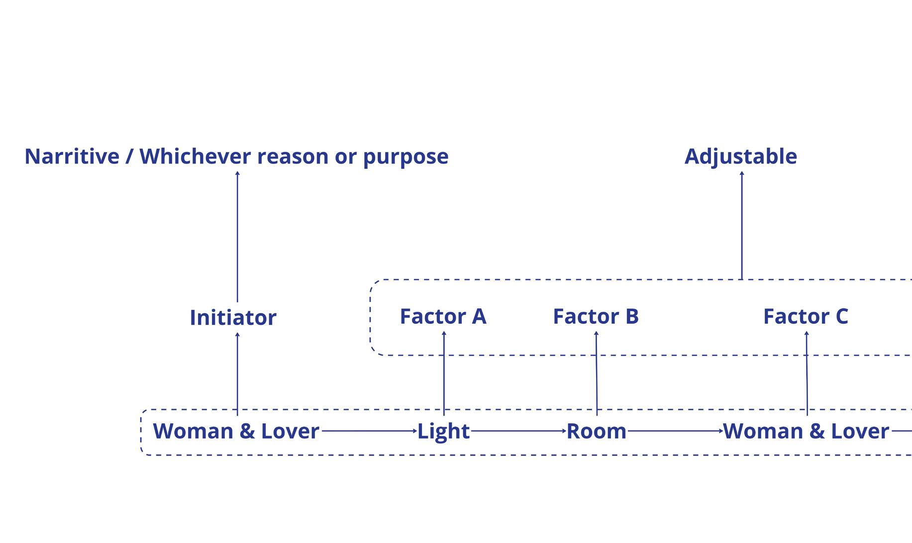
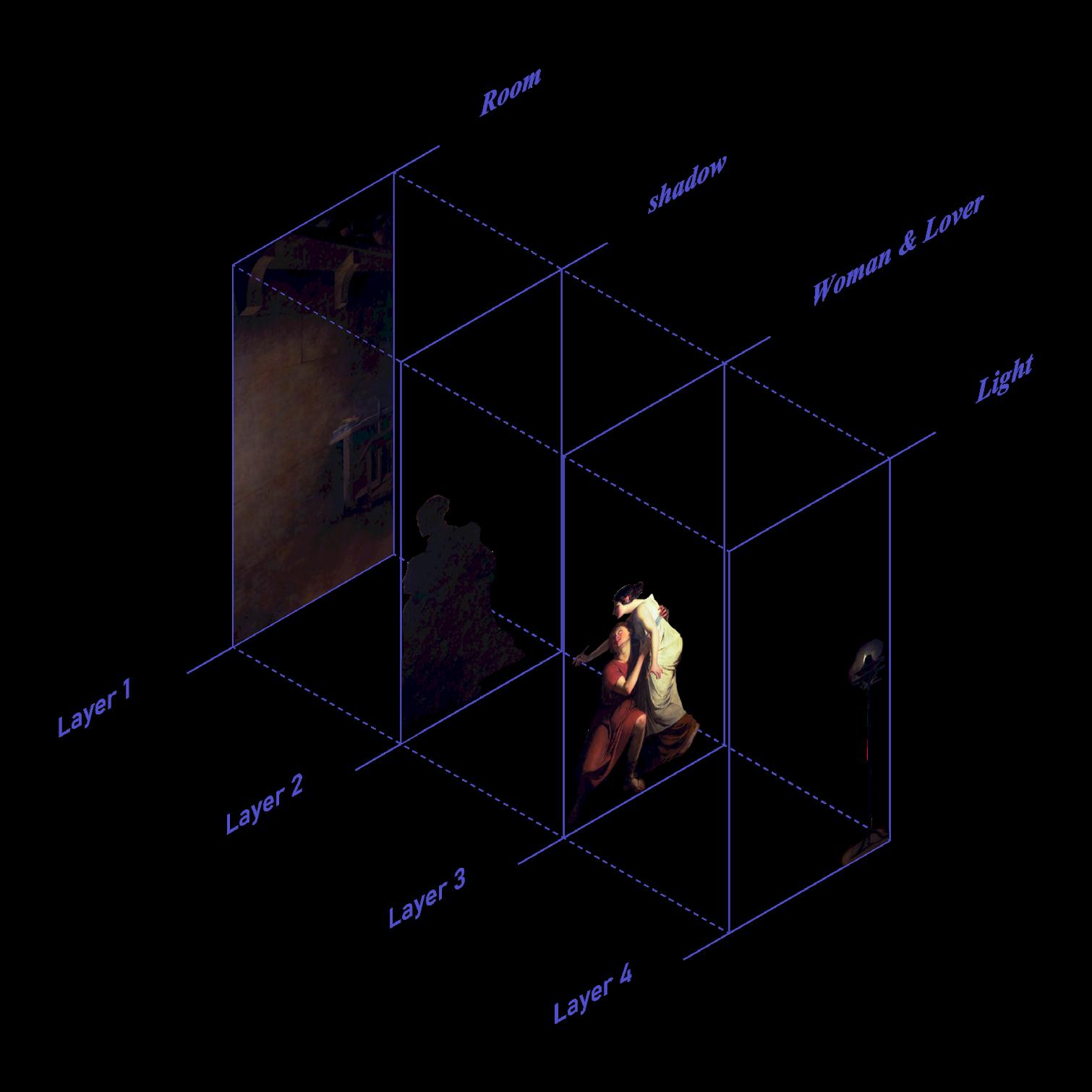
Secondly, a composition of space could be the projection of the space itself, objects, activities, and events inside. By deconstructing JosephBenoît Suvée’s version of this painting, we can see that the composition is achieved by small interactions between the protagonists and the objects projected inside the painting. Candlelight has been intentionally placed in front of the protagonists to cast a shadow on the wall. This projection technique allows the composition to happen, which viewers eventually perceive outside the painting. Like a kaleidoscope, many factors can interplay with each other and then affect the composition. These factors can change the space the protagonists are in but also our perception from different viewpoints.
This painting emerges as the hierarchy that constitutes the painting, which can be broken
down into five different layers. The first layer is the subject of the painting, the woman and her lover; the second layer is the candle placed behind the woman; and the third layer is the shadow created by its illumination of the woman and her lover. The fourth layer is the background of the picture, that is, the place where the event took place; and the fifth layer is the final picture presented to the viewer. These five layers are progressively related to each other. If the woman had not set up the candle, there would have been no third layer of projection. If the candle is projected at a different angle, the shadow will have a different result. Ultimately, all the variables will affect what the viewer sees.
When applied to architectural spaces, distorted space or drawings in architecture can provide visual and optical effects by deliberately manipulating the representation of space, scale, and form.
These distortions can create unusual spatial and image effects that are not necessarily reflective of the actual built environment, but instead are designed to evoke a particular emotional or sensory response in the viewer.
3. Decontruction of The Invention of The Art of Drawing
4. Interplay relationship behind
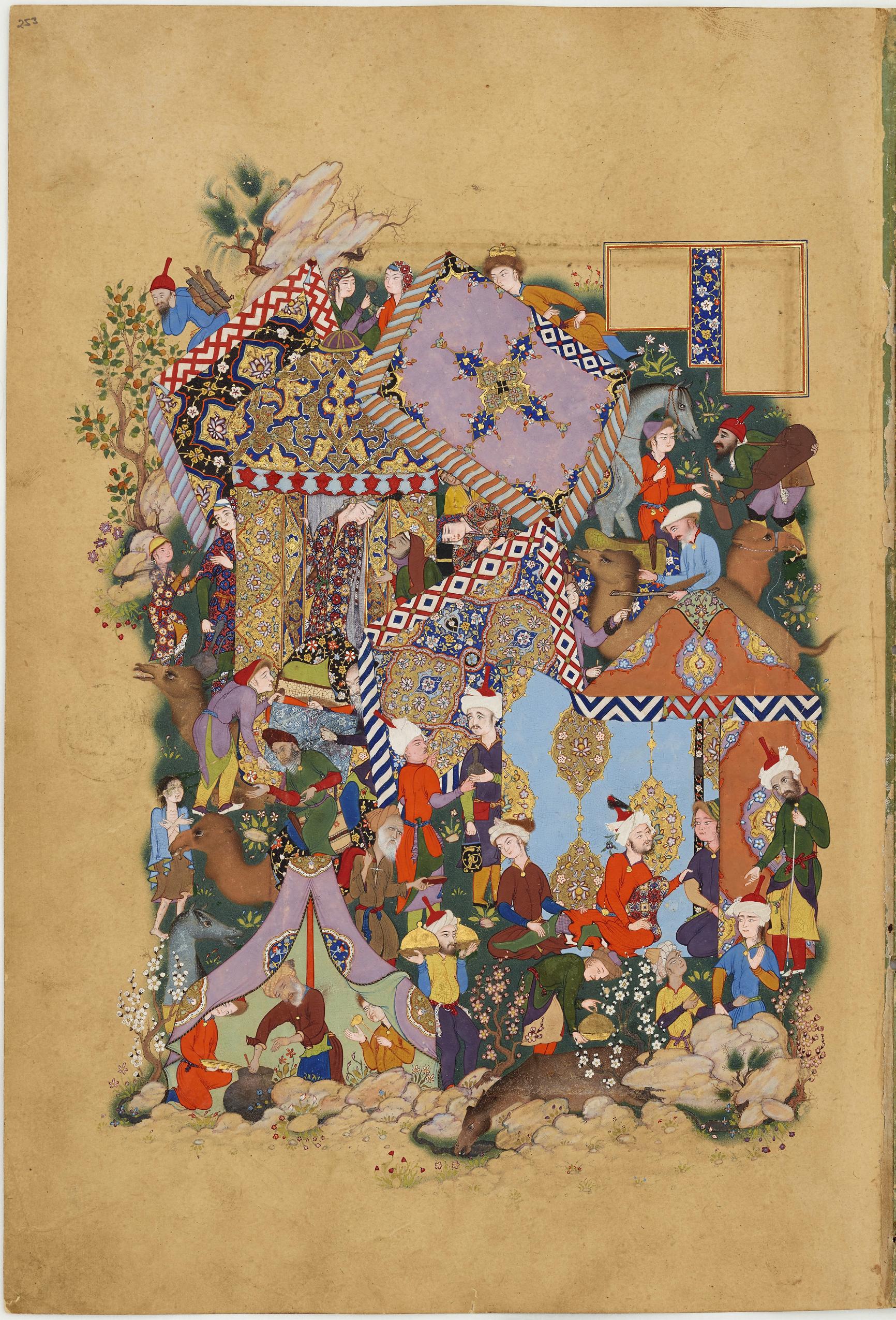
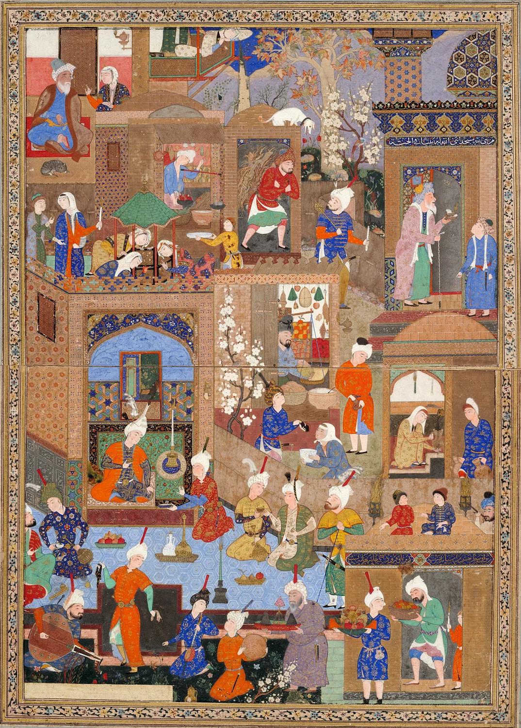
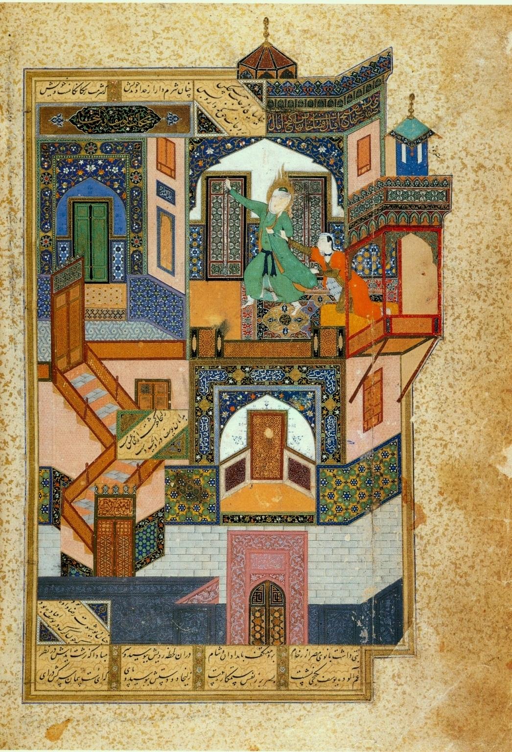
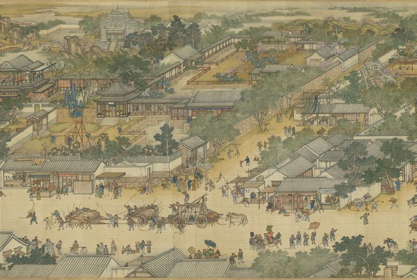
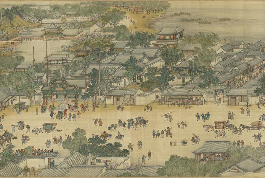
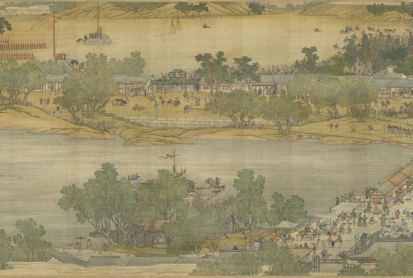
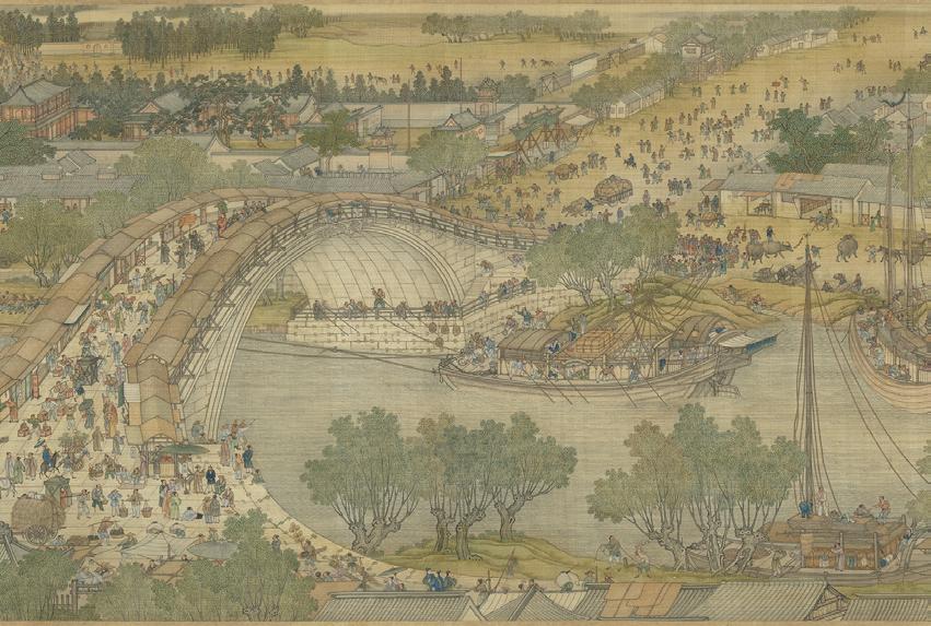
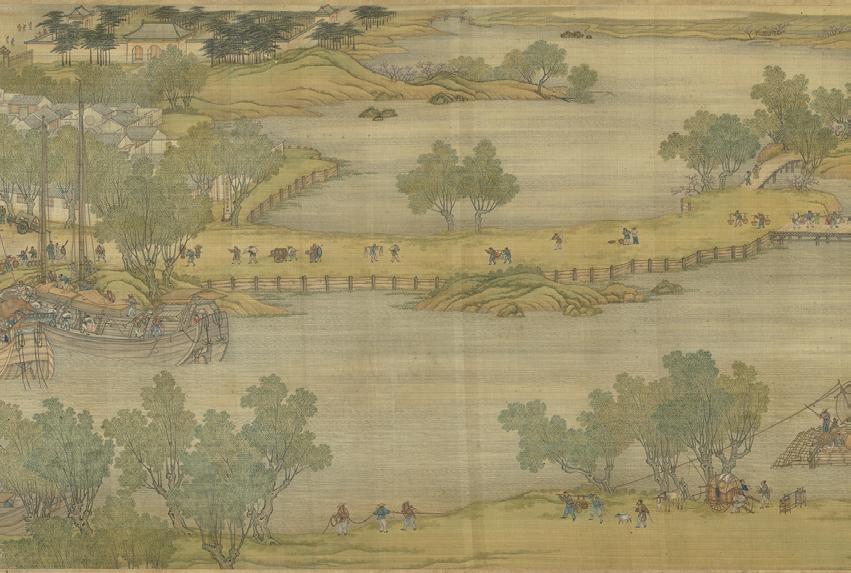
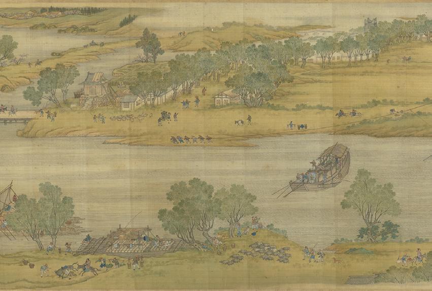
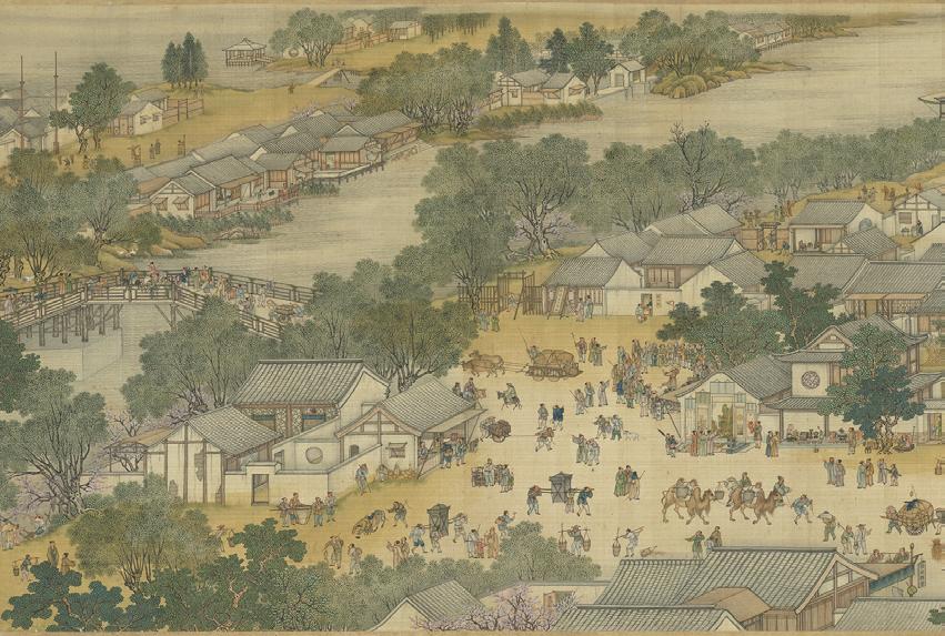
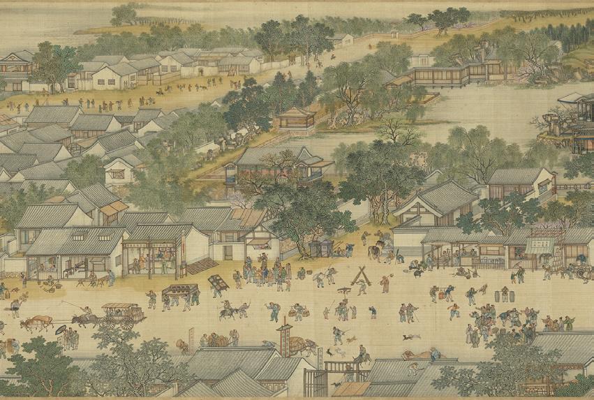
We can find many interesting ideas of perspective and geometry in these ancient art creations. Different cultures have different compositional logics and forms of expression in their paintings. Take the Persian miniature, for example, it is a small Persian painting on paper, whether a book illustration or a separate work of art intended to be kept in an album of such Paintings are usually depictions of figurative scenes. Walls and other surfaces are shown either head-on or (for the modern viewer) at an angle of about 45 degrees, often giving the modern viewer the unexpected
impression that the building’s floor plan is (say) hexagonal. The proportions of the figures in the paintings are based on the social status of the figures themselves, rather than on perspective and telephoto relationships. Buildings are often shown in complex views, mixing internal views through windows or “sections” with external views of the rest of the façade. This presentation is somewhat similar to modern parallel-projection architectural drawings, except that there is no relationship of scale, providing a God’s-eye view of the painting.

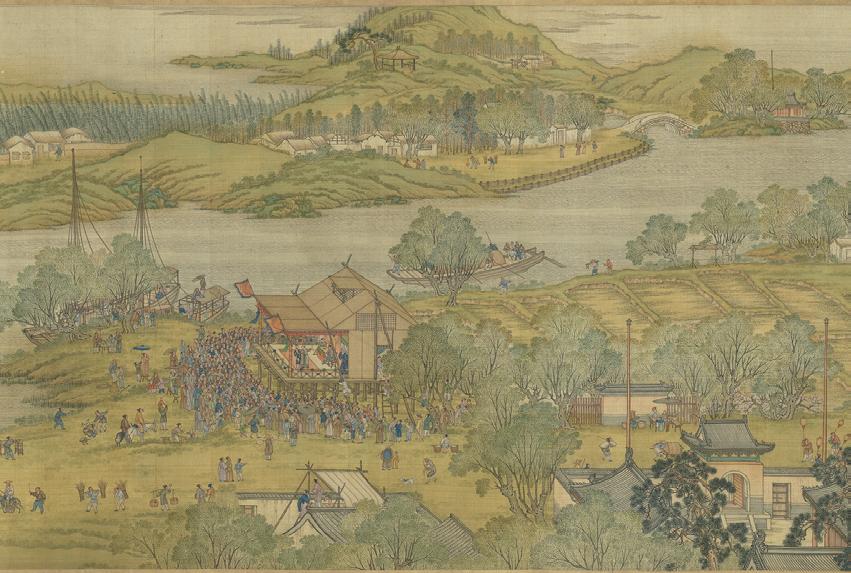

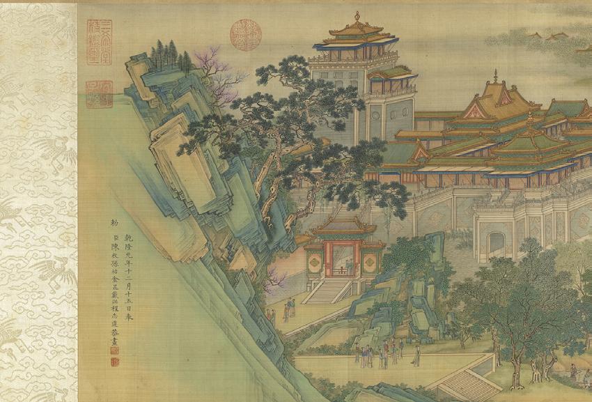
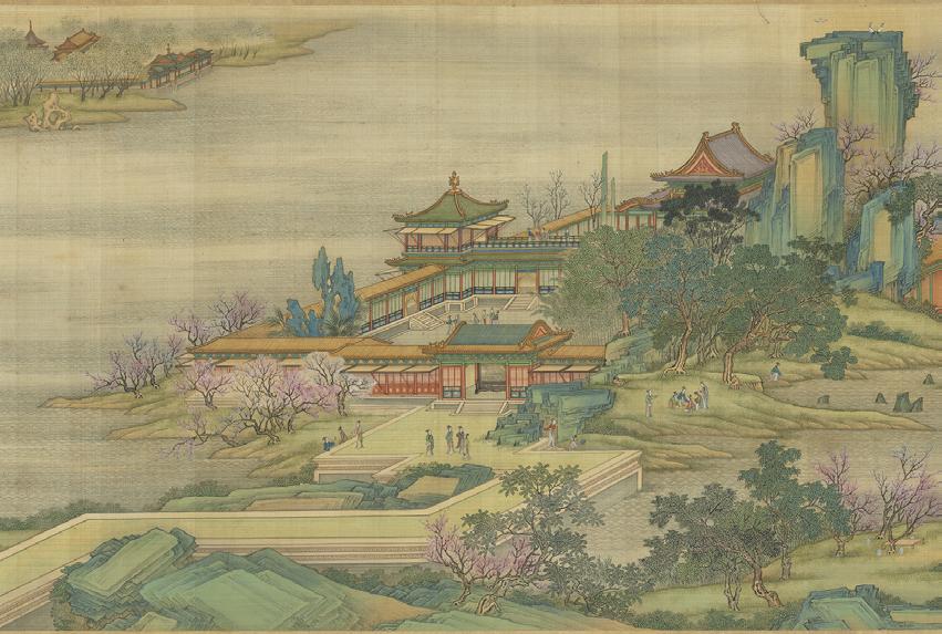
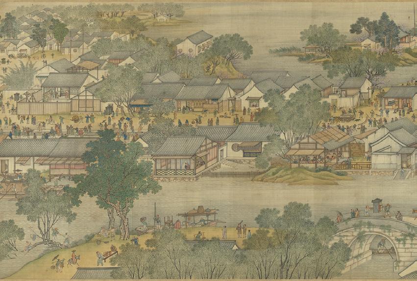
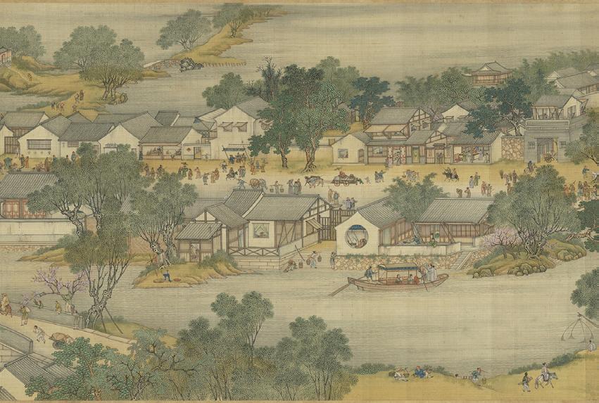
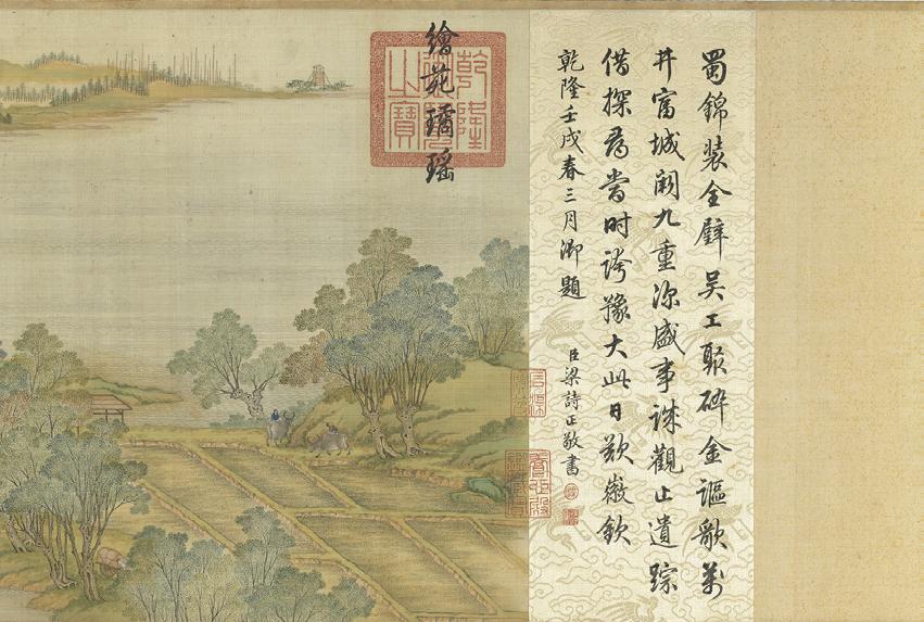
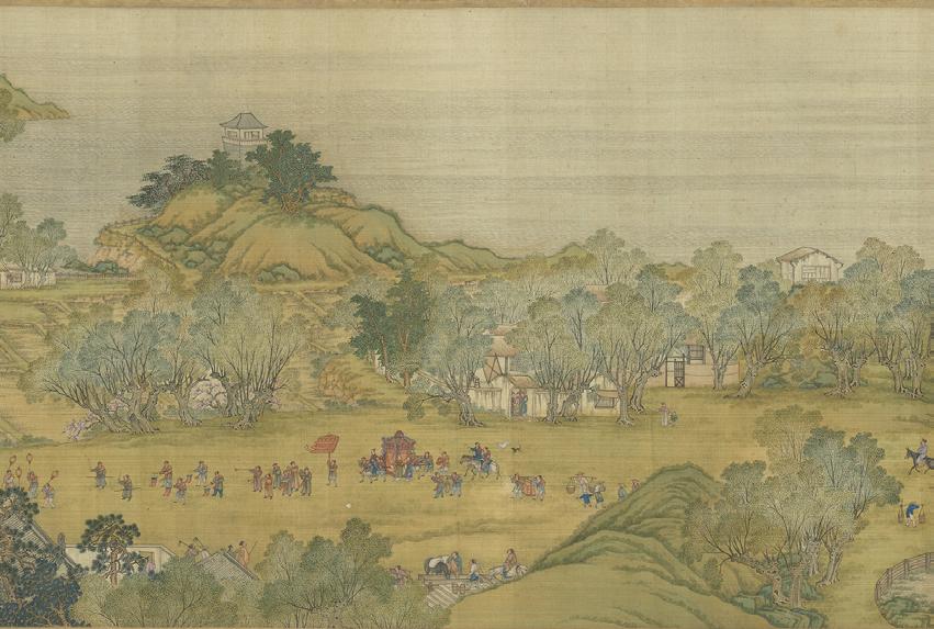
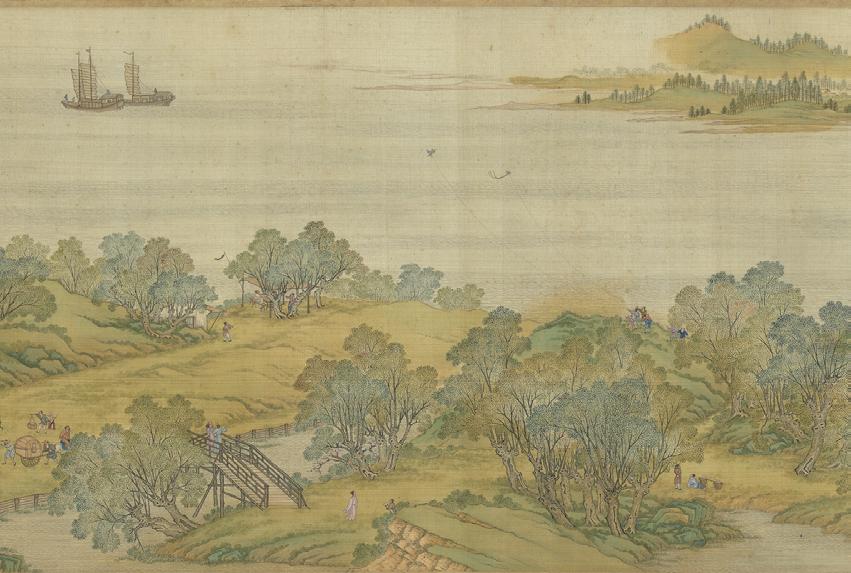

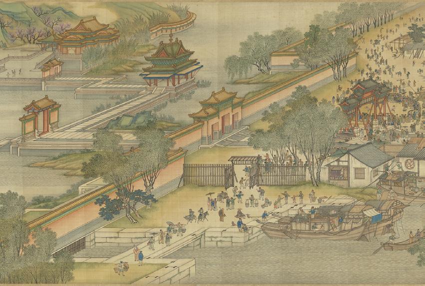
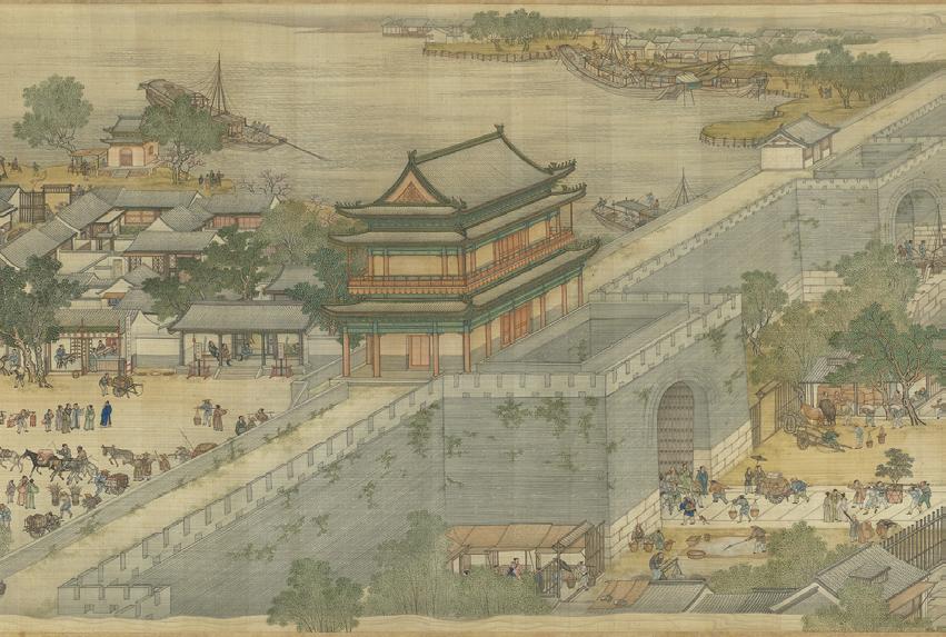
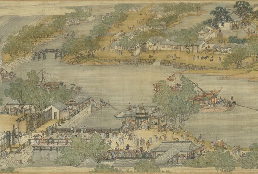
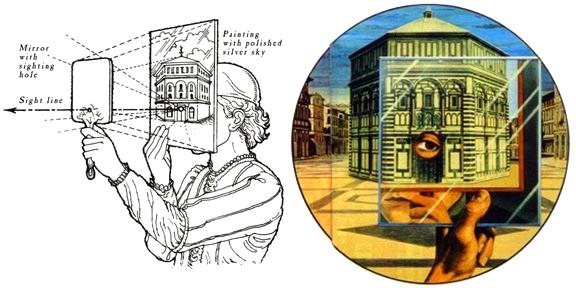
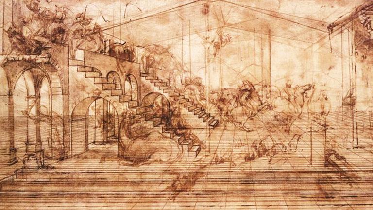
The study of perspective on drawings dates back to the pre-Renaissance period. Alberti’s veil is an idea proposed by Leon Battista Alberti, referring to creating visual depth in architectural works through the use of perspective. According to this principle, the farther away an object is, the less detail it should have, and its edges should be less defined. This creates the illusion of a veil that covers distant objects and makes them seem more distant, creating a sense of spatial depth. This principle was an important innovation in the Renaissance and was applied to many architectural and artistic works, including paintings, drawings, and architectural designs. With the evolvement of the times, the study and expression of space in two dimensions has been advanced to the three-dimensional architectural space and optical illusion.
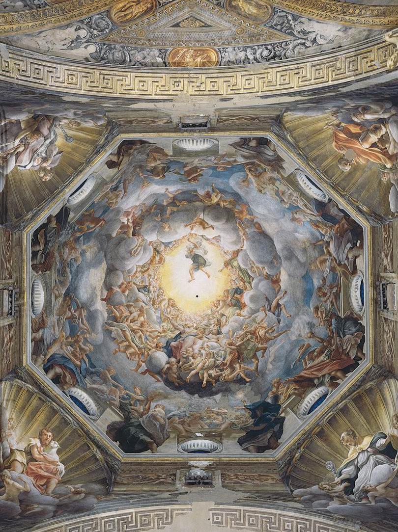
In 18th centery, Trompe l’oeil is often used in architecture, where it is employed to create the illusion of depth or texture on a flat surface. For example, a painted ceiling may include a trompe l’oeil depiction of a dome or skylight, creating the
illusion of a larger and more grandiose space than is actually present. It is also frequently used in art, where it is used to create realistic or fantastical scenes that appear to be three-dimensional.
The Scala Regia is a grand staircase that connects the narthex of St. Peter’s Basilica to the papal apartments in Vatican City. The staircase was constructed in the early 16th century by Antonio da Sangallo and was later renovated by Gian Lorenzo Bernini in the mid-17th century. However, the area allocated for the stairs was narrow and posed a challenge for Bernini’s design.
To create the illusion of a grander staircase, Bernini used an optical technique called perspectival diminution. As one ascends the stairs, the walls appear to narrow, the columns seem smaller in diameter, and the distance between the columns and walls appears shorter. This optical illusion was used to counteract the narrowness of the space and create the impression of a grander and more spacious staircase.
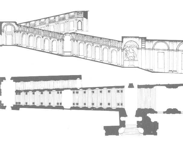
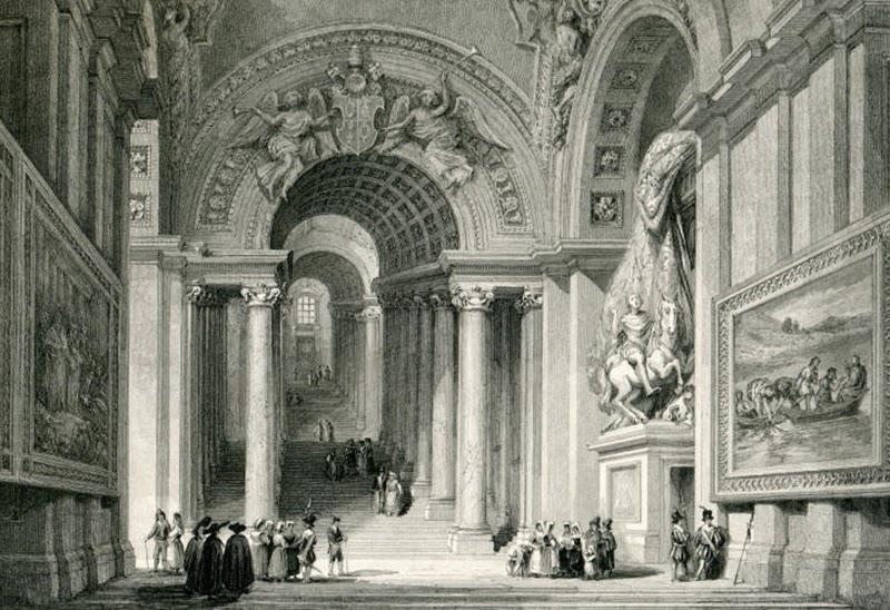
1. Scala Regia Vaticano Bernini
2. Scala Regia Vaticano Bernini plan and section
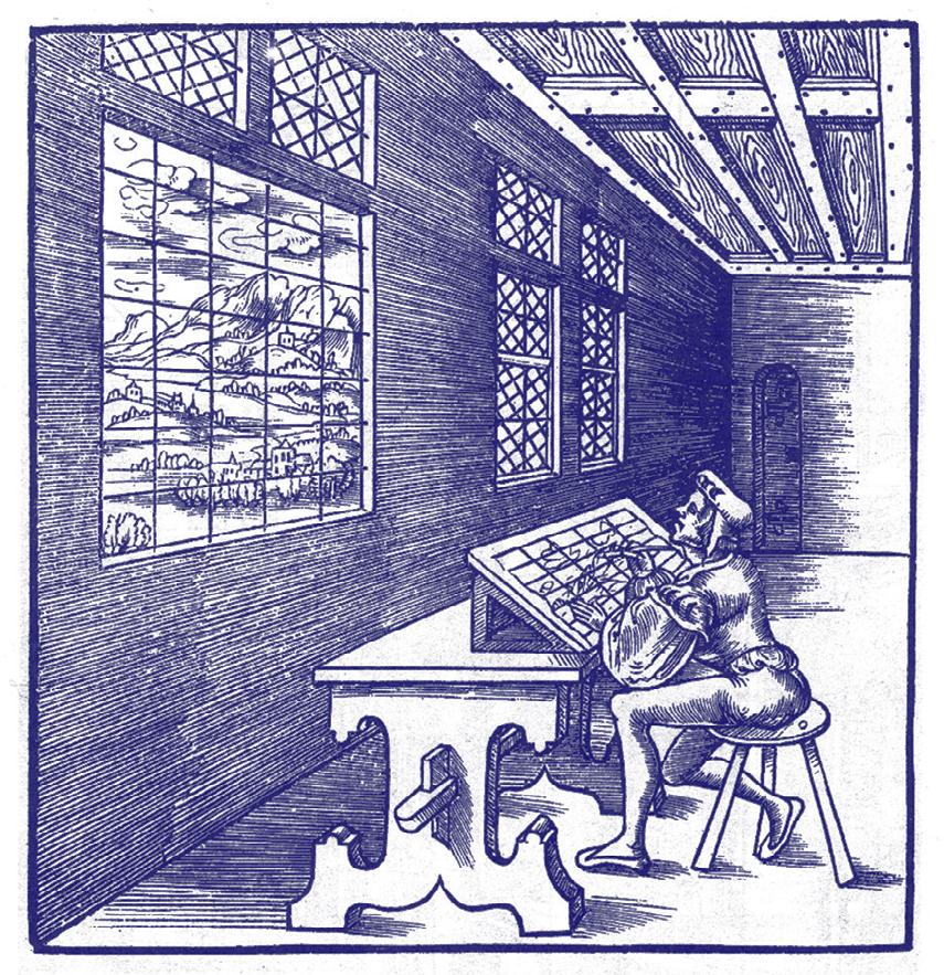
3. Alberti's Veil
4. Brunelleschi's peepshow
5. Leonardo da Vinci, Study for the Background of the Adoration of the Magi, around 1481

6.Ames room mechanism
7.Ames room mechanism
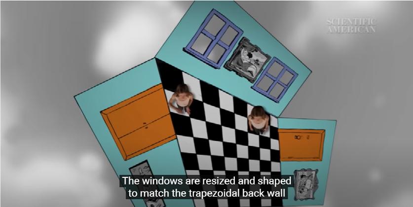
8.Ames room plan explaination
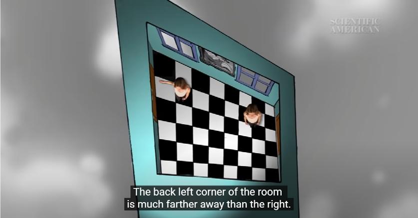

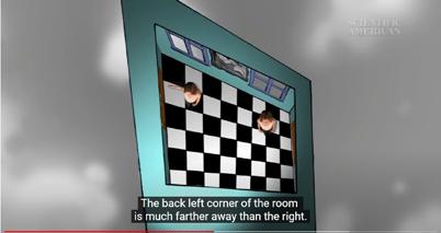
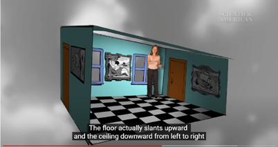
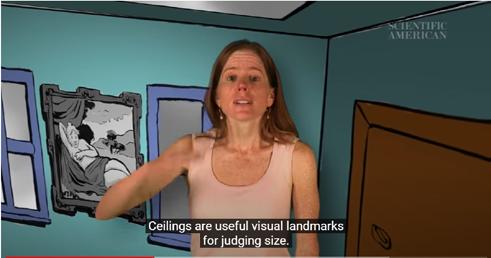
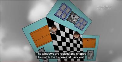
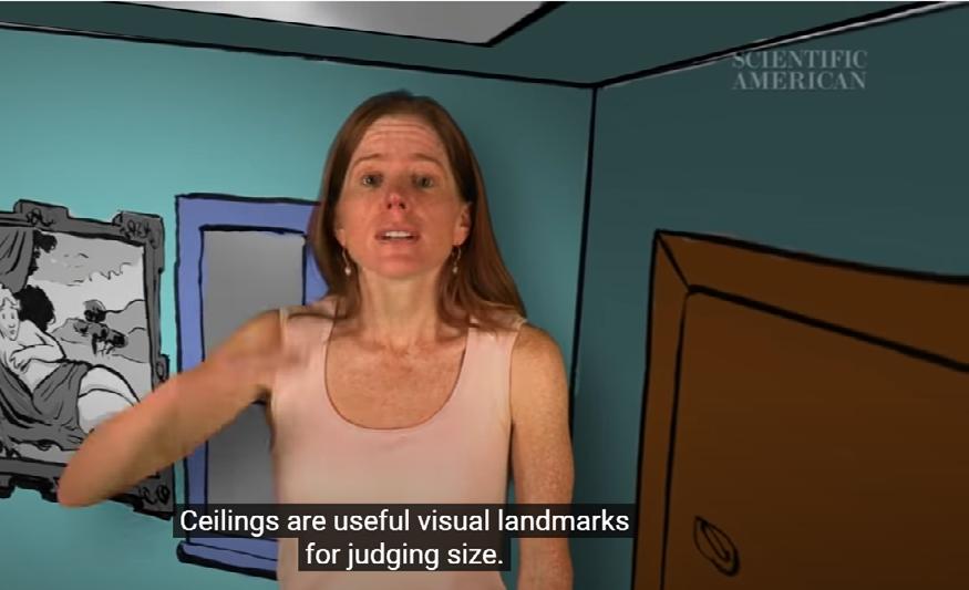
The Ames room is an example of spatial manipulation of vision to produce a special visual effect. The Ames room is a distorted room that creates an optical illusion. It was invented by American scientist Adelbert Ames Jr. in 1946, and constructed in the following year. It was invented by American scientist Adelbert Ames Jr. in 1946, and constructed in the following year. If the observer looks through the observation hole, there will be a significant difference in size
between the two real-life objects on either side of the room. The mechanism of the room is simple, that is, by using people's preconceived notion that the room is a square layout, the projection, the floor pattern, and the height of the floor and ceiling are adjusted to create an enclosed space that actually has different depths in the corners.
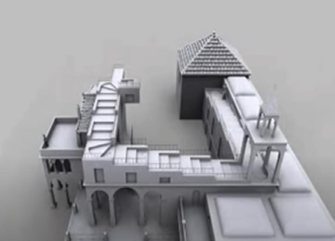
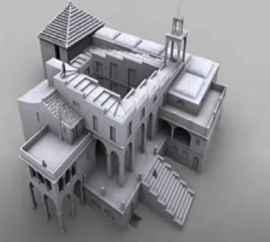
Maurits Cornelis Escher’s works are characterized by their intricate and precise execution, as well as their use of mathematical concepts and optical illusions. Many of his works explore themes of infinity, tessellations, impossible constructions, and transformations.
Escher was particularly interested in exploring the relationships between shapes and patterns, and his works often depict complex interlocking forms
that seem to morph and shift. He used a variety of techniques to achieve these effects, including lithography, woodcutting, and mezzotint.
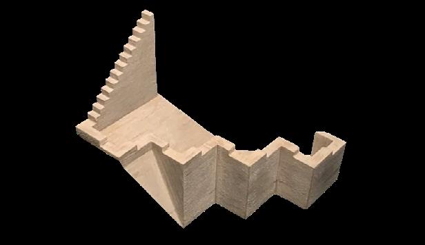
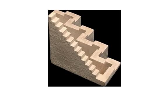
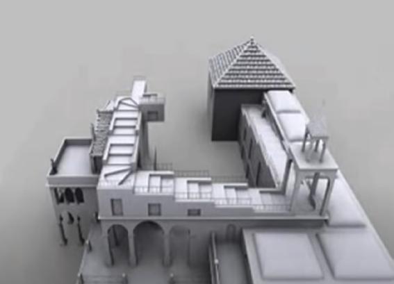
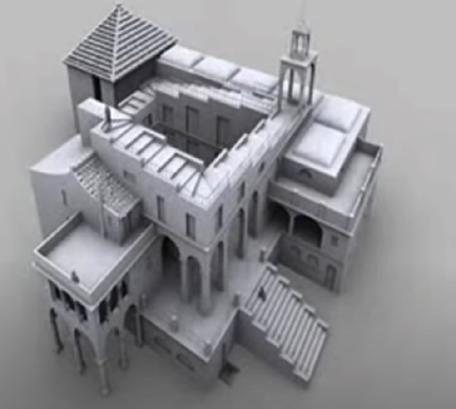
One of Escher’s most famous works, “Relativity,” depicts a staircase that appears to defy the laws of gravity and perspective, with figures moving in all directions. Similarly, “Ascending and Descending” shows a group of figures endlessly climbing and descending a staircase that loops back on itself.
6.7.
8.9.
10.11.12.
13.14.

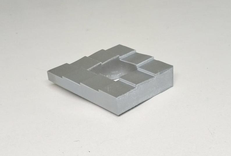
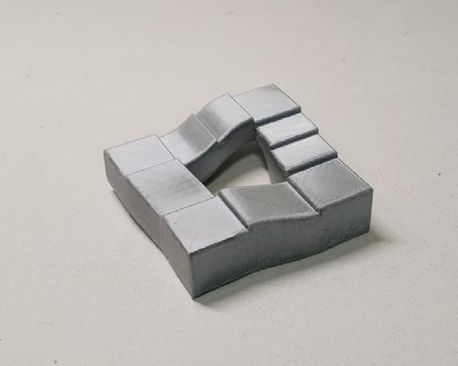
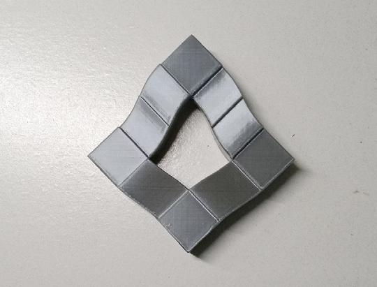

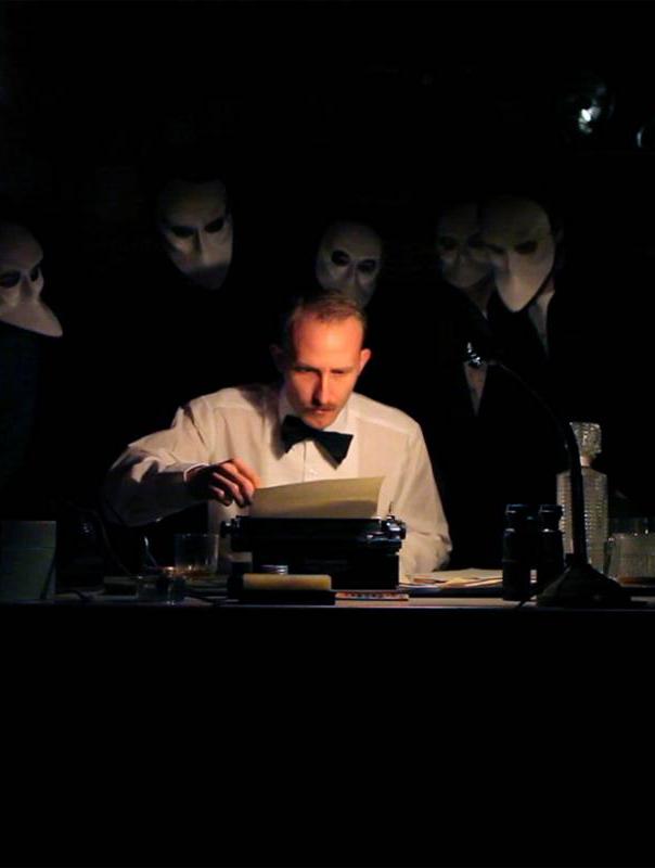
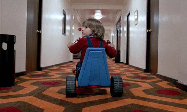
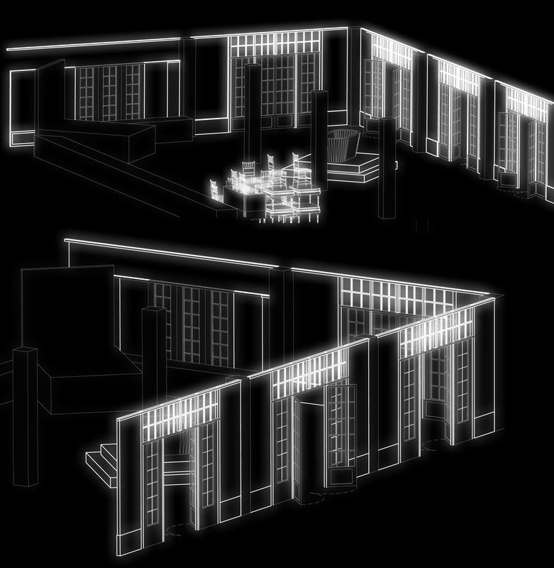
The film and the theater are a record of fictional space and time, and a venue for fictional performance. Both are art forms that lie between reality and illusion. The story itself creates the layers of space and time. As the space in the picture mainly serves the plot and narrative, the space itself is fractured or, even dislocated, dysfunctional.
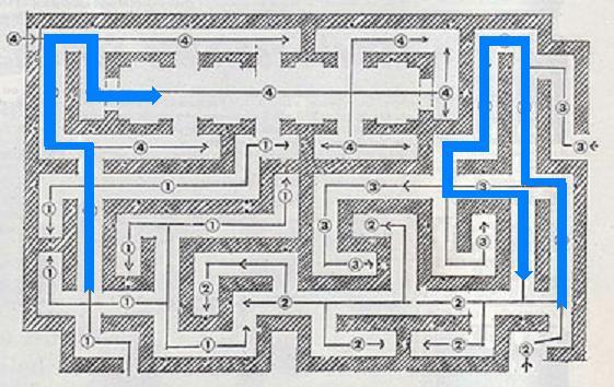
In the film of Ghost Shop, in order to create an endless hotel corridor, the set design shapes the corridor like a maze. It is not visible from the film's viewpoint, but it is easily visible from the plane.
Wes Anderson's film uses sections as a narrative way to present the relationship between different spaces and the story in progress.
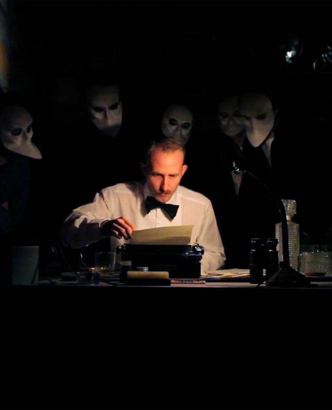
The immersive theater, "Sleep No More", arranges all the scenes of the play into a hotel building. The scenes and the space of the scenes are seemingly unrelated but arranged in the same plane. By lightly partitioning and controlling the light in the environment, the different scenes are divided and transitioned.


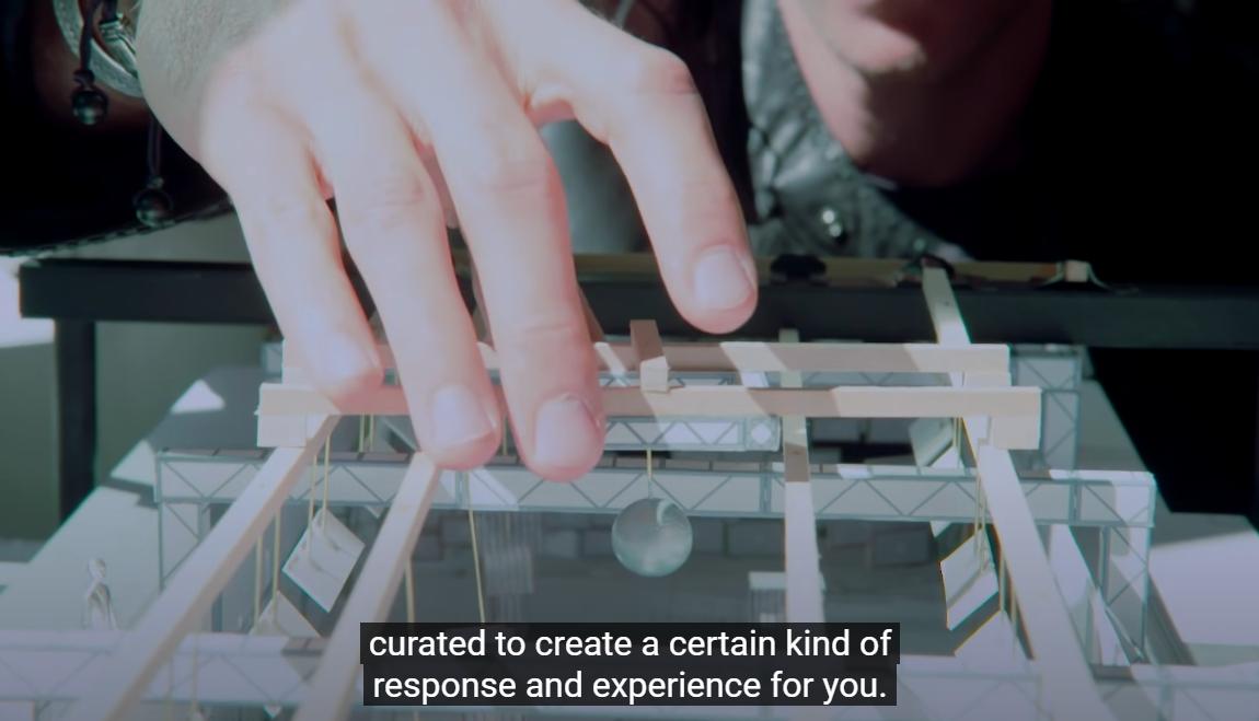
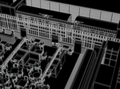
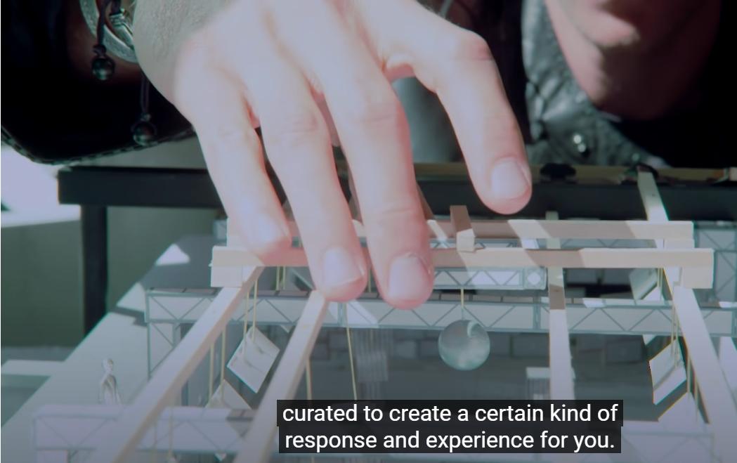
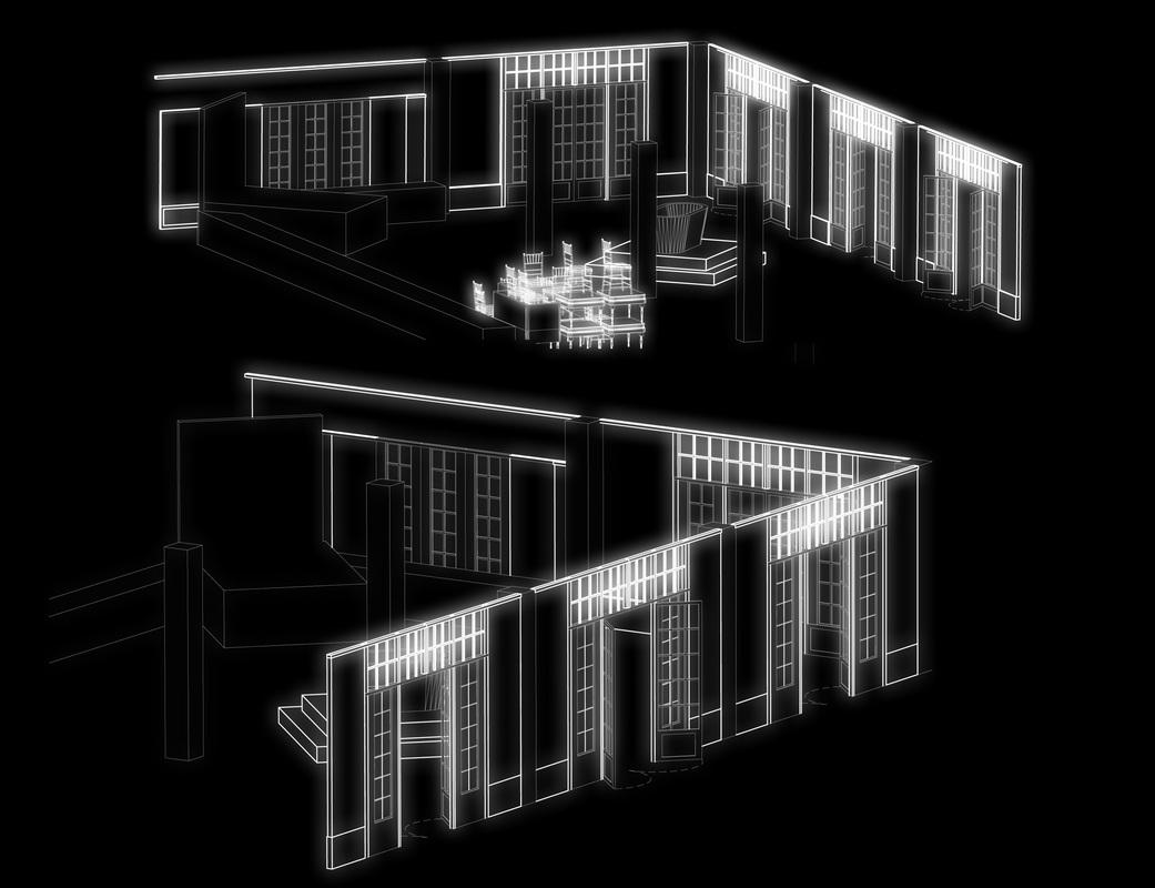
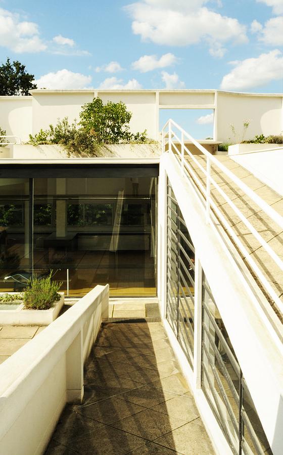
Our perceptions of space are shaped by the projection of things that only shows in our sight. There are always inconsistencies between our perception and the actual space. An architectural promenade can act as a course of deconstructing the space through projection by our sight, forming the people’s experience, perception, or deception of the space.
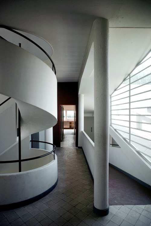
The architectural promenade that Le Corbusier created in Villa Savoye is a powerful example.
A sequence of Arrival: When people arrive at Villa Savoye, they are first greeted by a long driveway leading up to the house’s entrance. This gradual approach allows visitors to take in the scale and
proportions of the building before they enter it.
Circulation: Once inside the house, people are directed through a series of interconnected spaces that are carefully arranged to create a sense of movement and flow. The open plan design allows for easy navigation, with the central ramp acting as a spine that connects all the spaces.
Framed Views: Throughout the house, the design creates framed views that showcase the surrounding landscape. These views are carefully composed and framed by the architecture, creating a visual connection between the interior and exterior spaces.
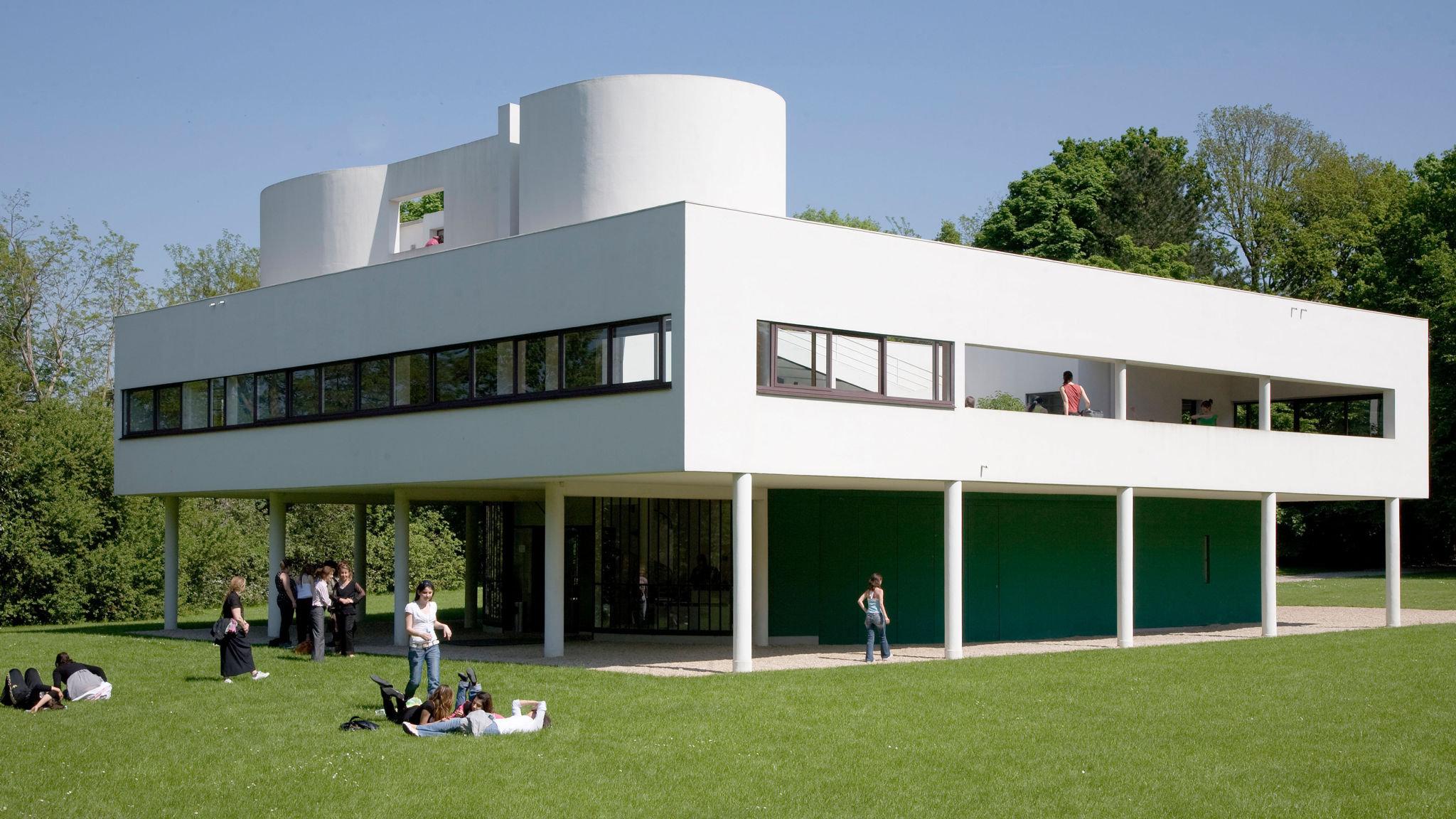
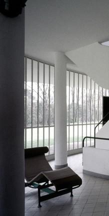
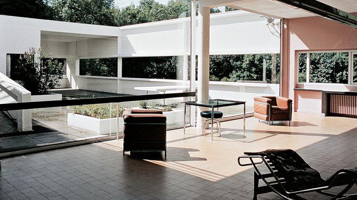
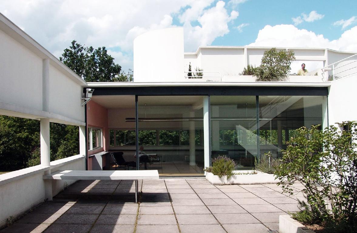
By curating the detail of handrails, stair treads, doors, the scale of furniture, the height of the window, the color of the wall, ceiling, and architectural elements, Le Corbusier created spaces that vary in scale, proportion, and texture, and invited people to experience each space from
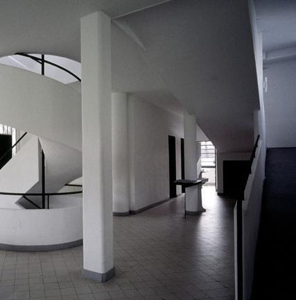
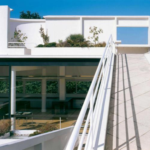
a variety of perspectives and angles. Also, different spatial and sensory experiences allow people to encounter in only that specific spaces when they move through a building or space in a sequential and choreographed manner.
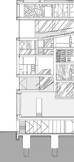
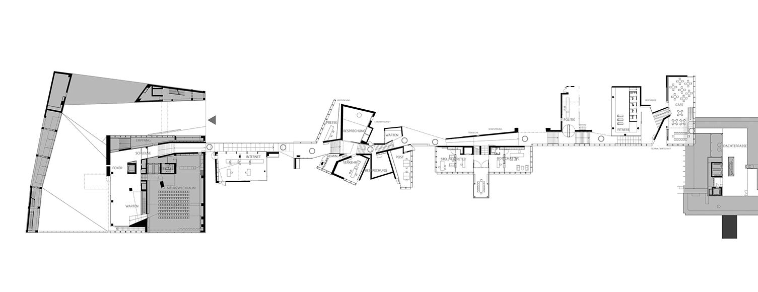
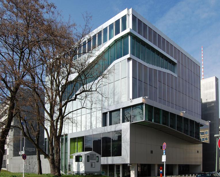
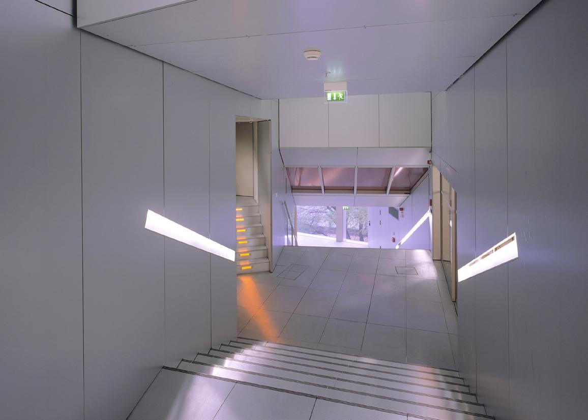
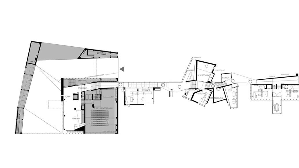
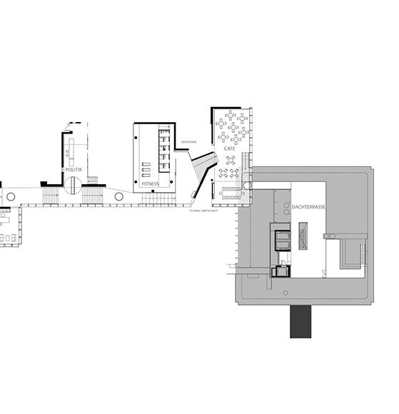
The promenade of the Dutch Embassy designed by OMA refers to the continuous circulation routes that run throughout the building, connecting all spaces and creating a sense of openness and transparency. The spiral-folded promenade is a key element of the building’s design, designed to facilitate the exchange of ideas and information between embassy staff

and visitors. It also represents the Embassy’s commitment to transparency and openness in its diplomatic relations. We can glimpse the intentionally arranged activities within the circulation route and the spaces it faces and connects to the external environment through the plan and section of the unfolding roaming space.

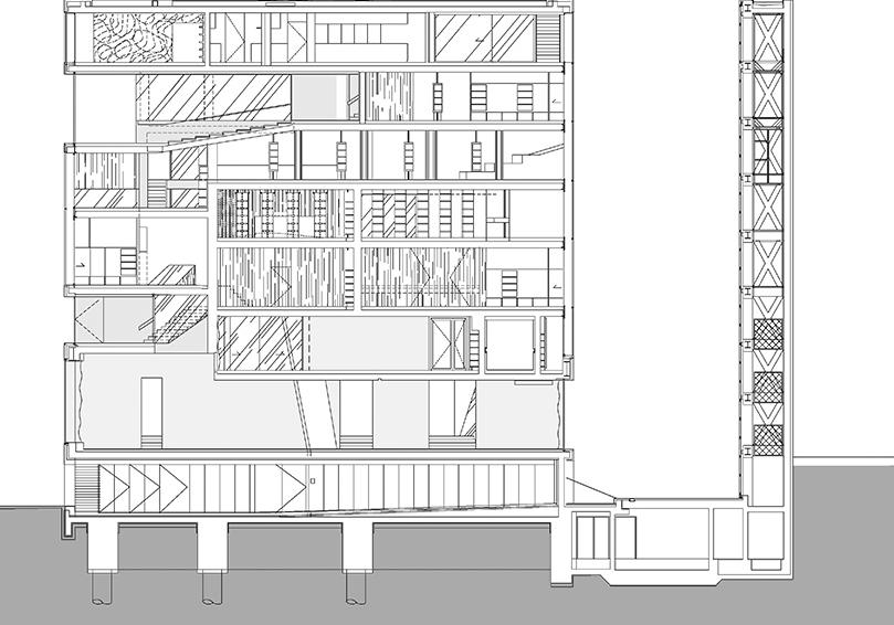
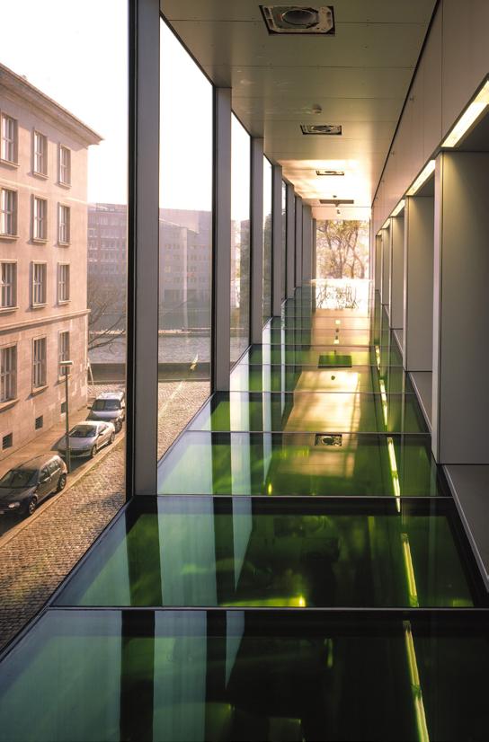
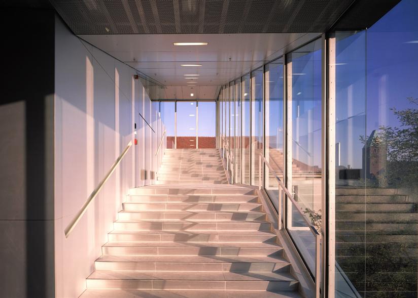
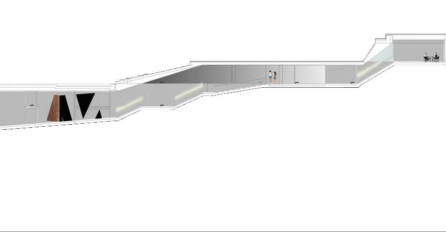
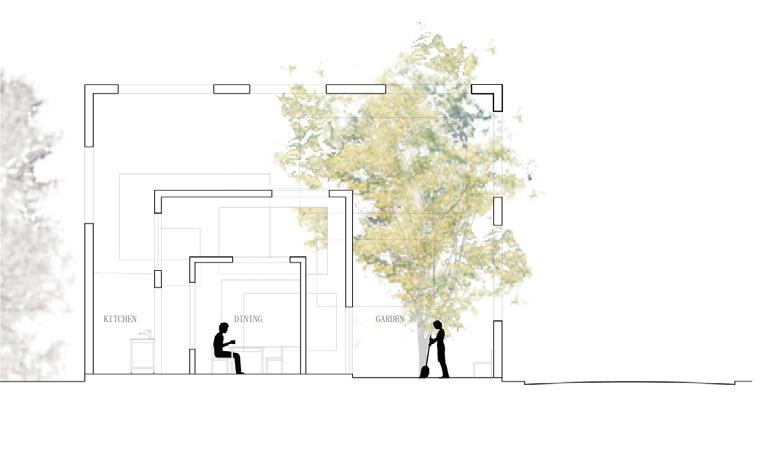
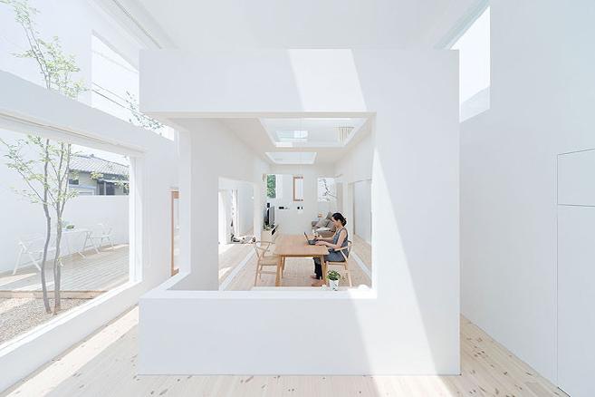
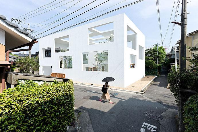
A similar technique has been used in Sou Fujimmoto’s House N. The house is constructed in three layers of envelopes with openings on them. It creates different levels of privacy in the house as well as framed views and experiences. People’s

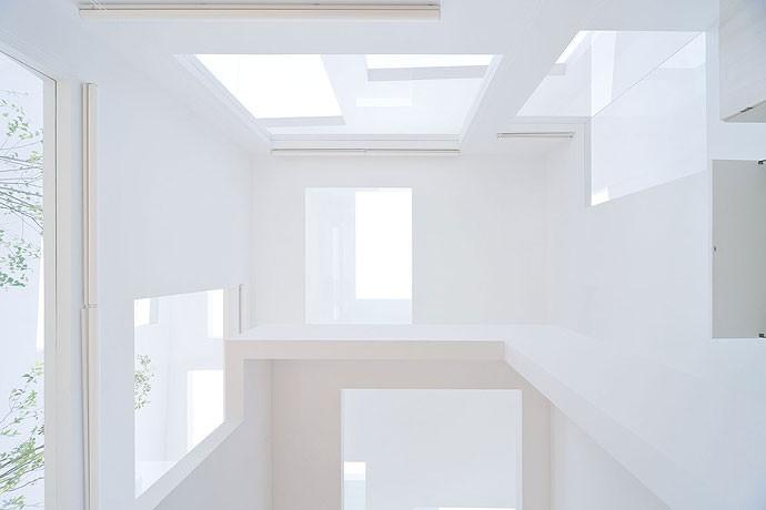
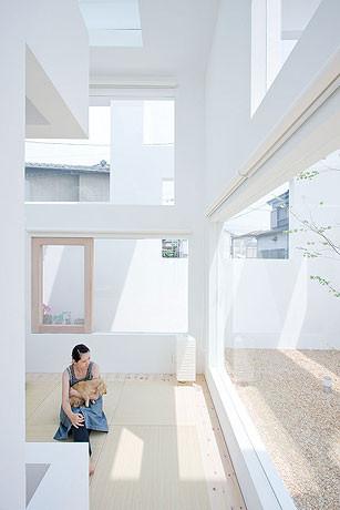
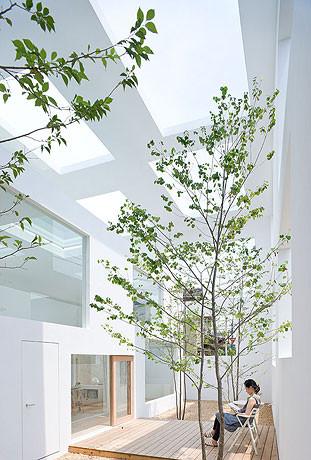
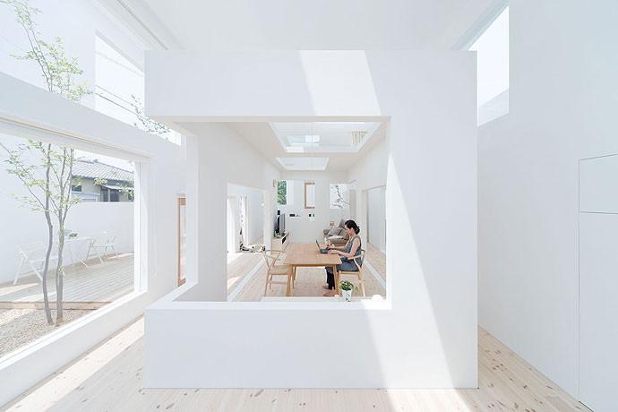
perceptions of the space from different layers can be constructed differently. And the promenade experience from inside or outside the building is like people’s perception of the space being turned on and off by the opening in the walls.
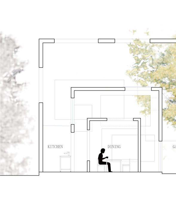
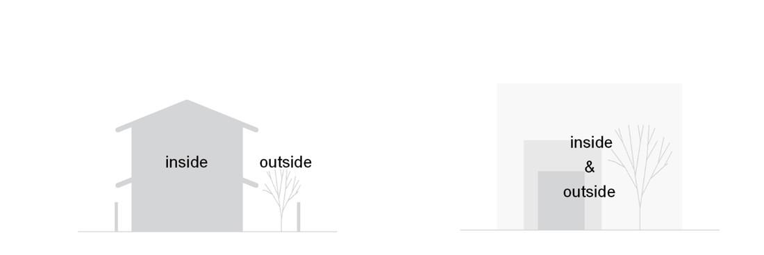
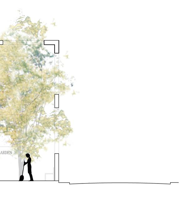
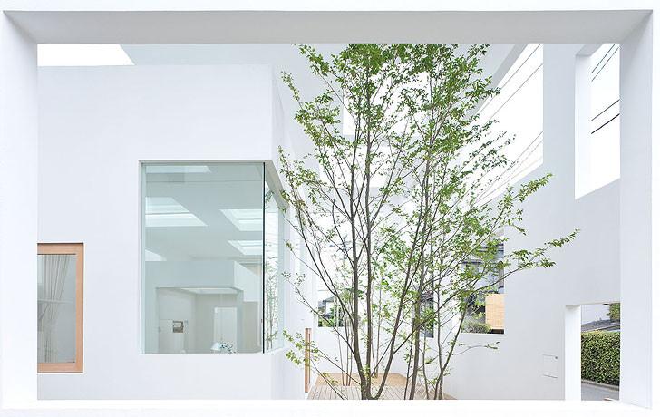
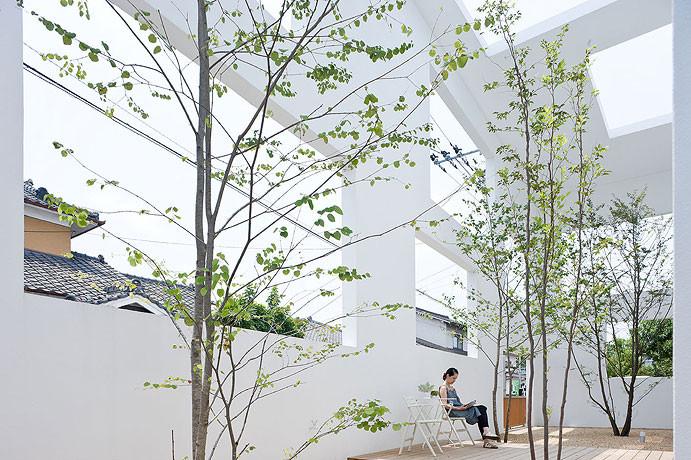
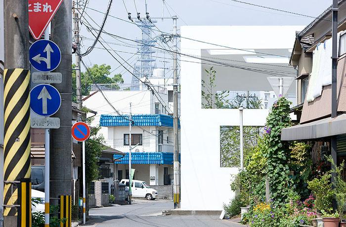
Due to the field of view of the human eye, people’s experience and perception of architecture can sometimes be blocked by space, resulting in incoherence or inconsistency. Architectural promenades can be used to deconstruct space through visual projection to form people’s experiences, perceptions, or deceptions of space.

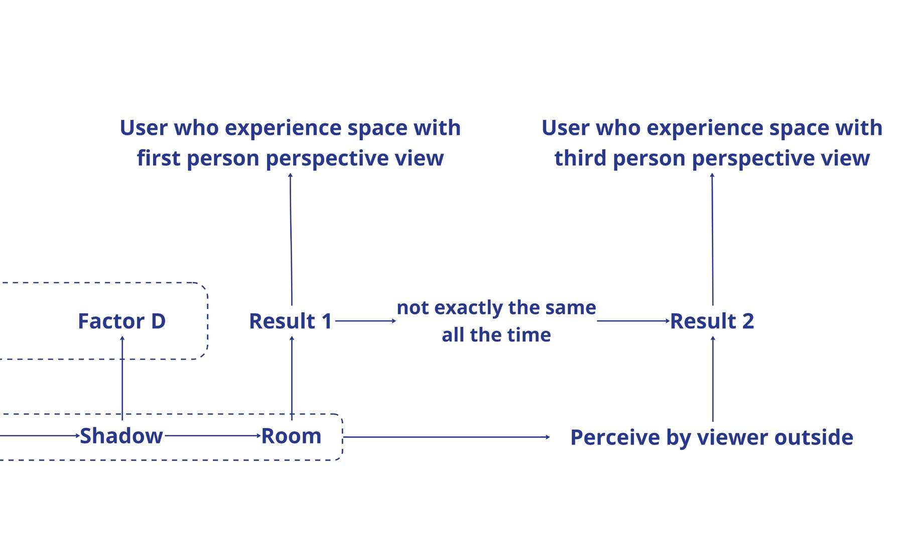
These experiences, perceptions, or deceptions of space are like layers in modeling software such as rhino that are turned on or off as people view the space from different perspectives.
If experiencing architectural space is like reading a book, then people’s experience of space is the narrative in the book. We can get a first-person perspective reading experience by viewing the space from different perspectives through the architectural promenade. Or we can get a thirdperson perspective reading experience when the space provides you with more understanding or allow you to reorient in the space by specific viewpoints or perspectives when the perception and curiosities of the space resolve together.

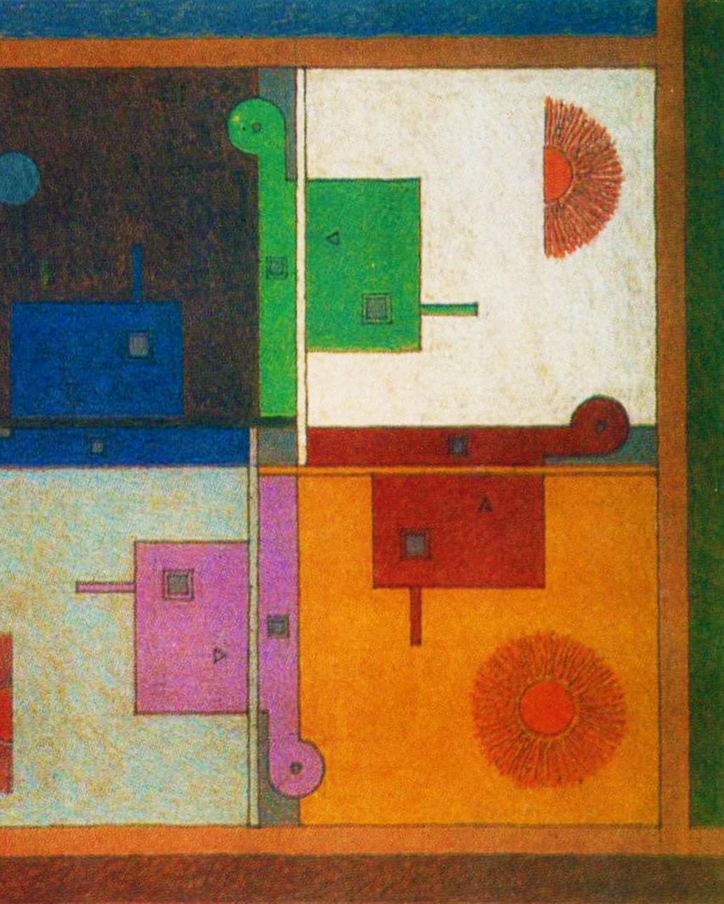
Why would we need architectural promenade series of distorted anamorphic illusions, and reoriented the potential of the existence of unresolved spatial architecture? What promenade be like?
a new form of an promenade through a anamorphic planes, optical reoriented spaces? What is significance resolved and spatial relationships in will 2023 version of
Our perceptions of space are shaped by the projection of things that only shows in our sight. There are always inconsistencies between our perception and the actual space. An architectural promenade can act as a course of deconstructing the space through projection by our sight, forming the people’s experience,

perception, or deception of the space.
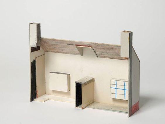
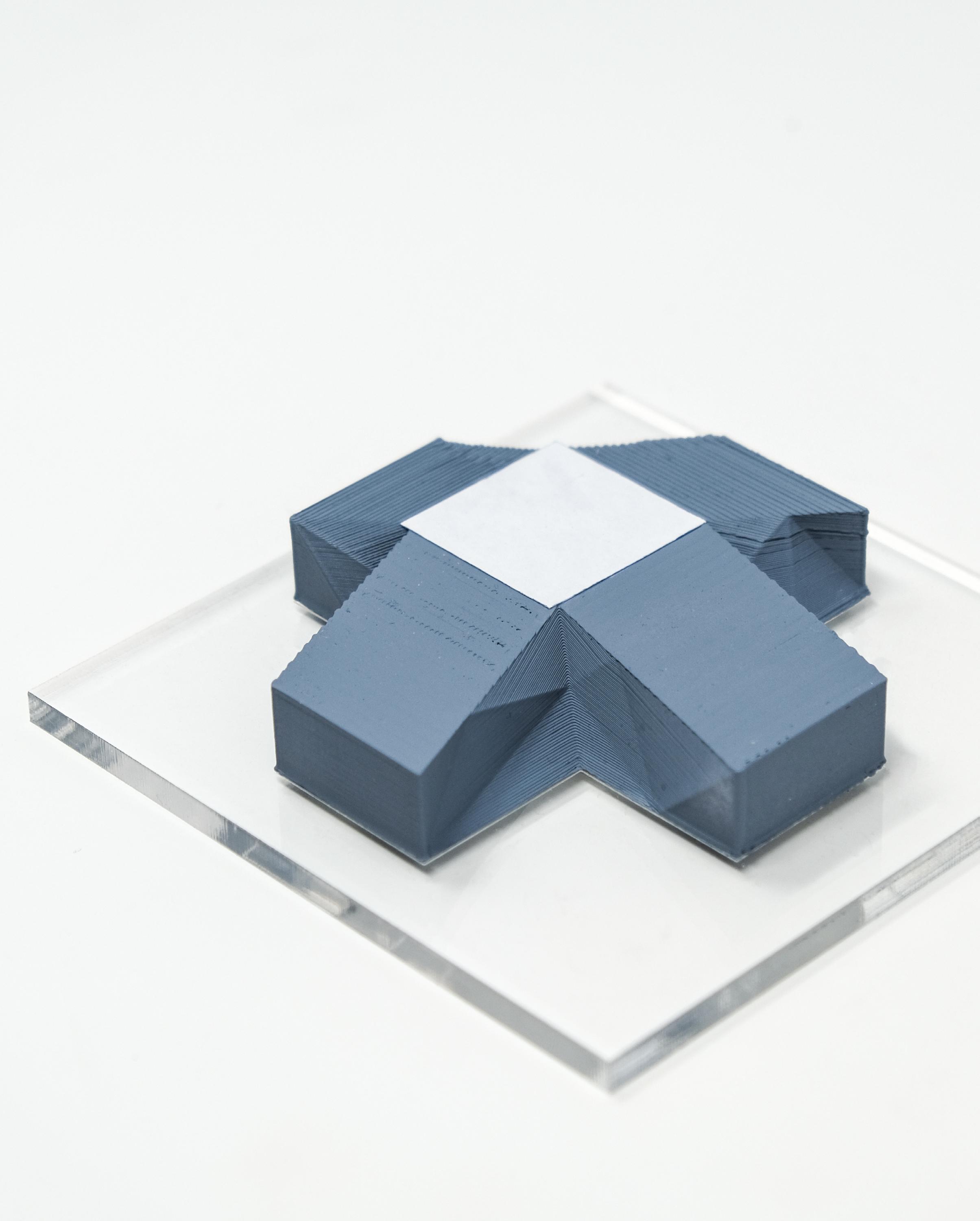
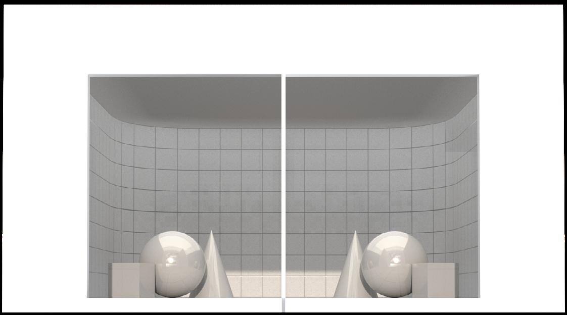
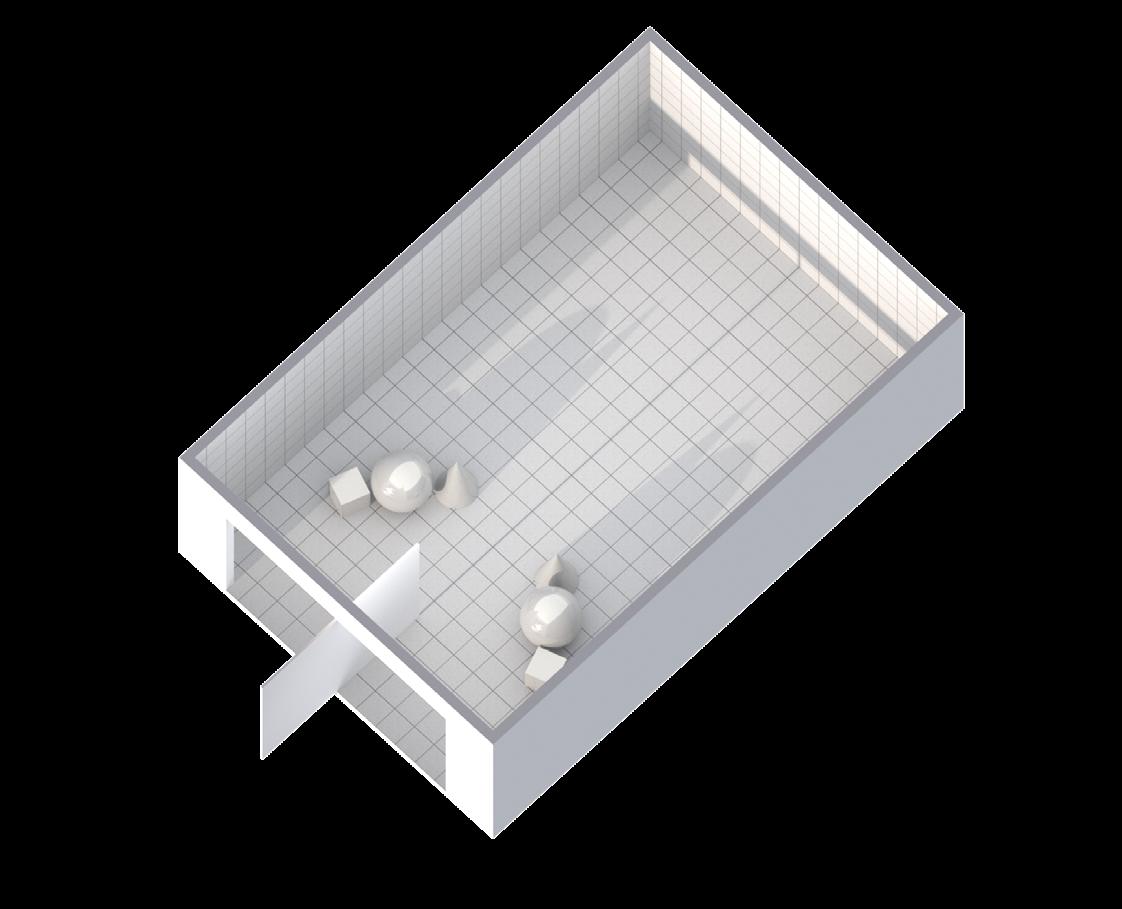
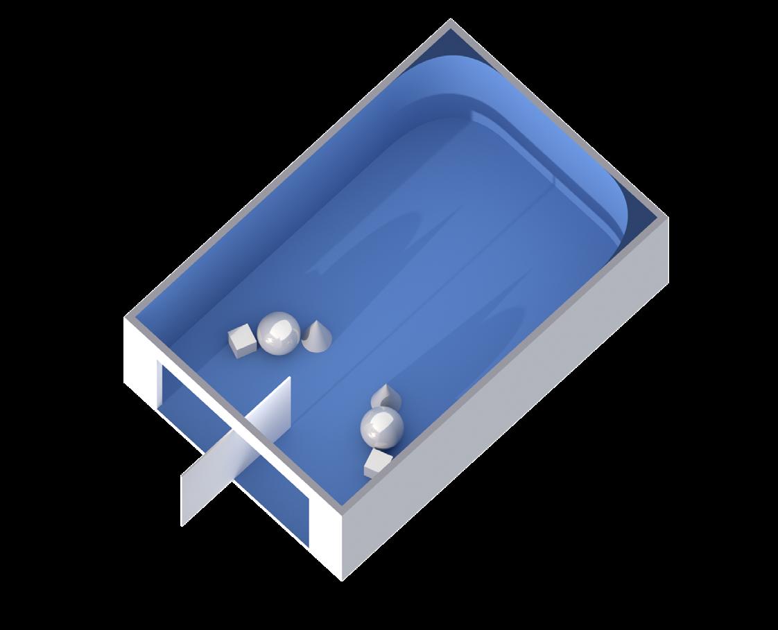
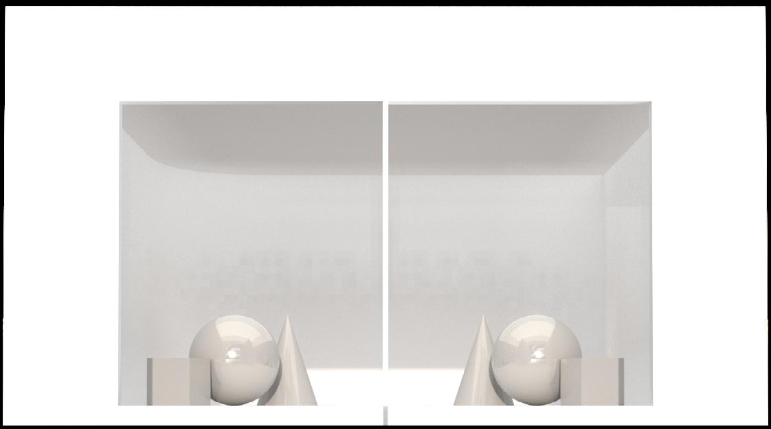
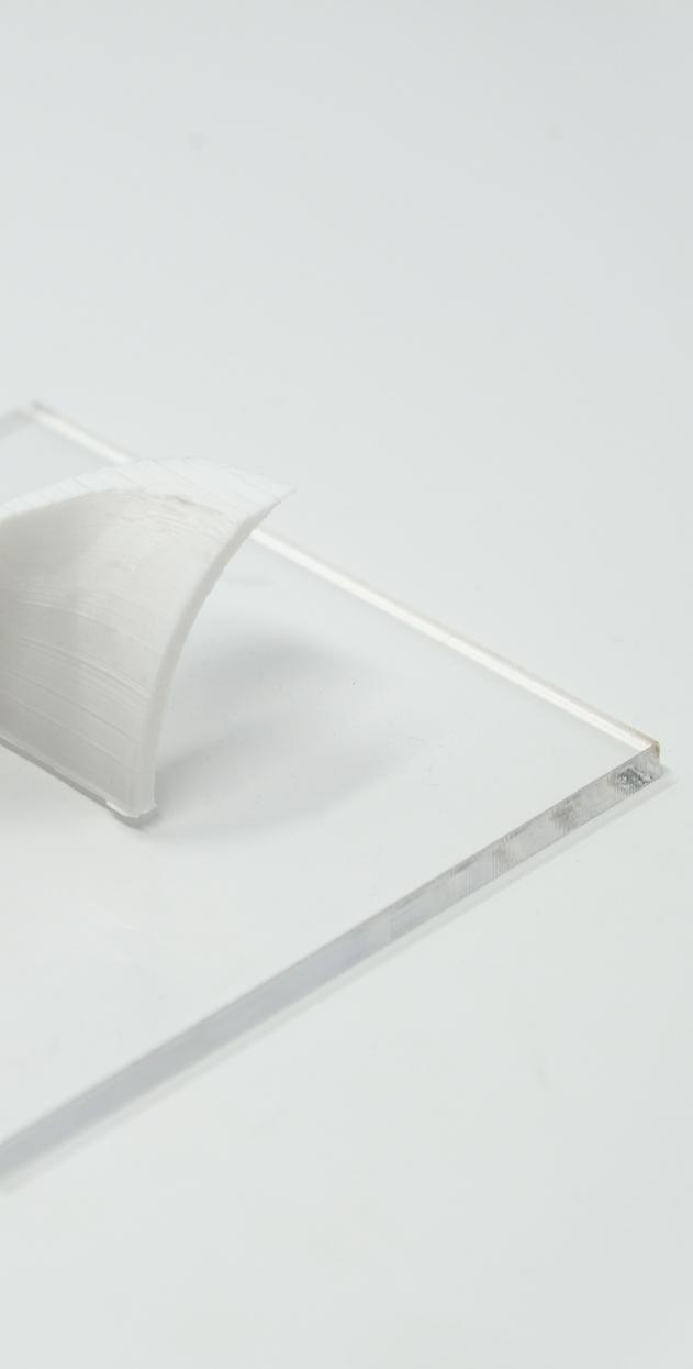
The models a series of experiments exploring the deception the forms and spaces in terms of optical illusions, distances, colors, and anamophics.
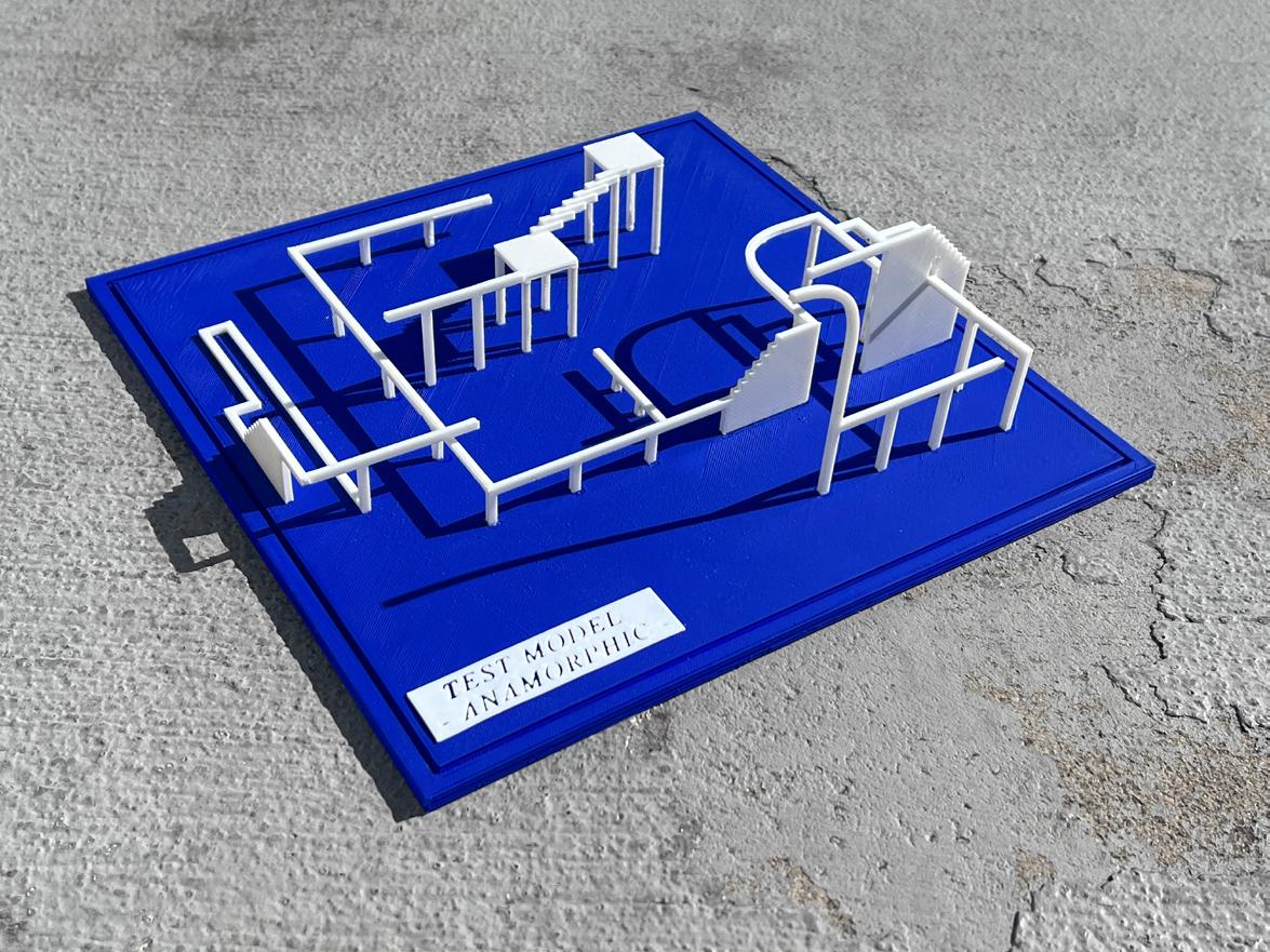
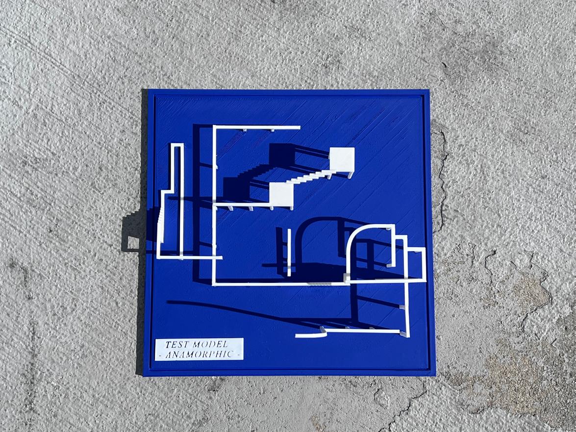
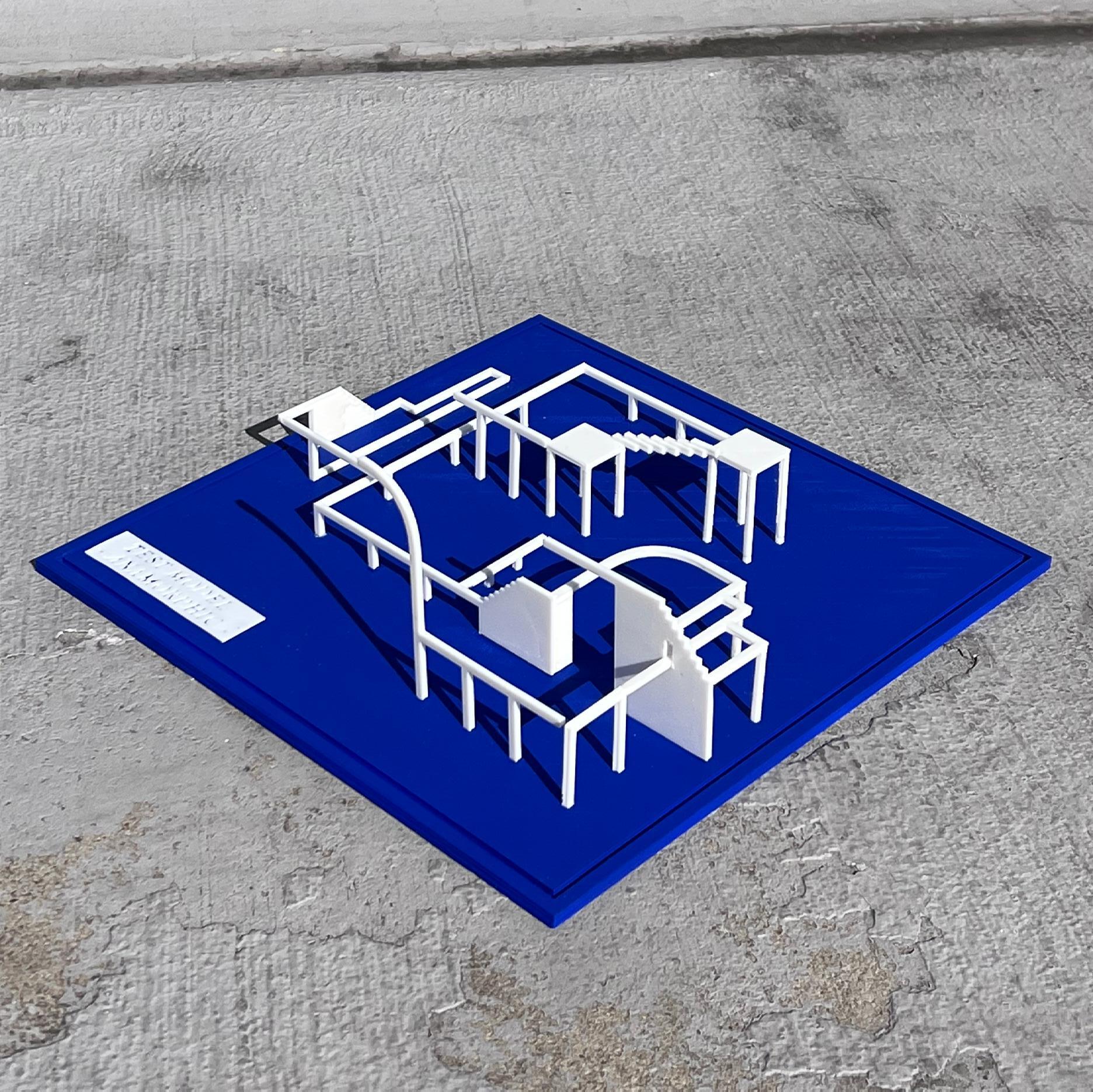

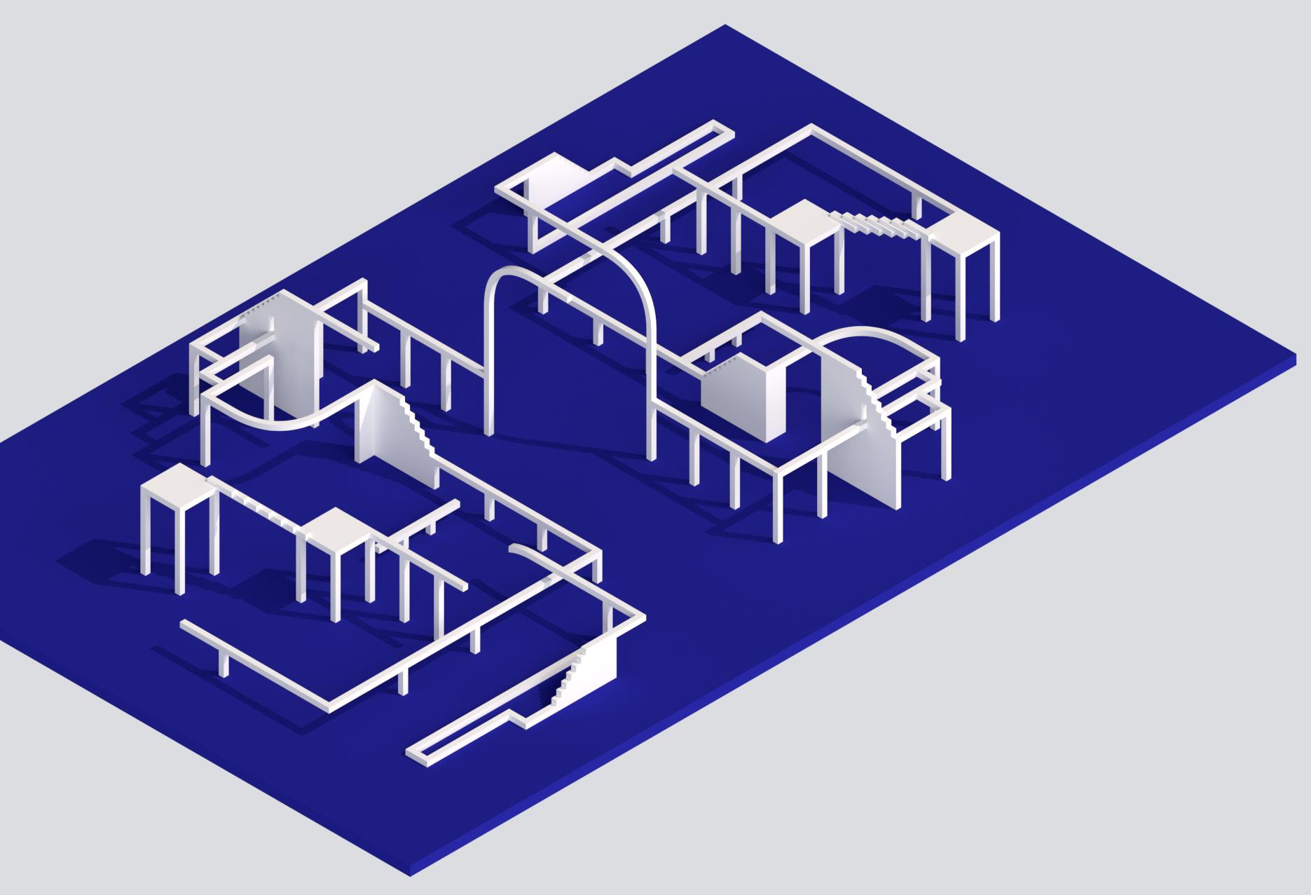
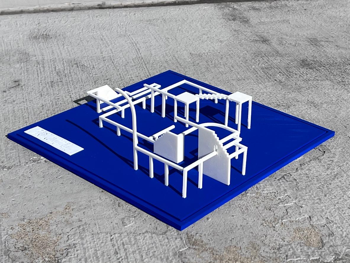
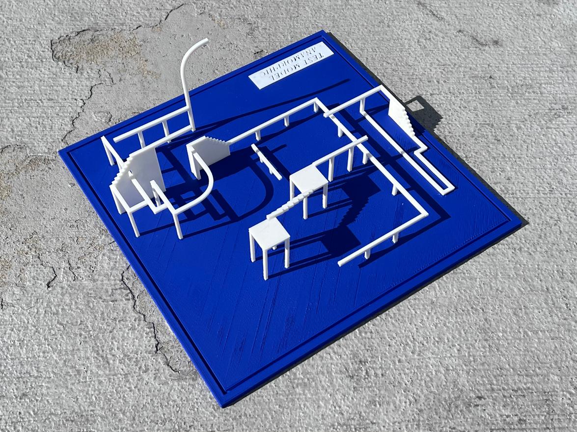
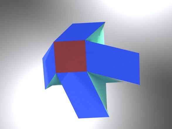
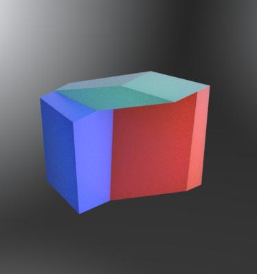

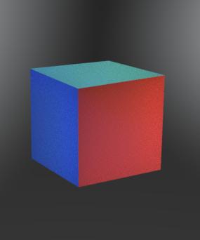
viewpoint 2
viewpoint 3
viewpoint 2
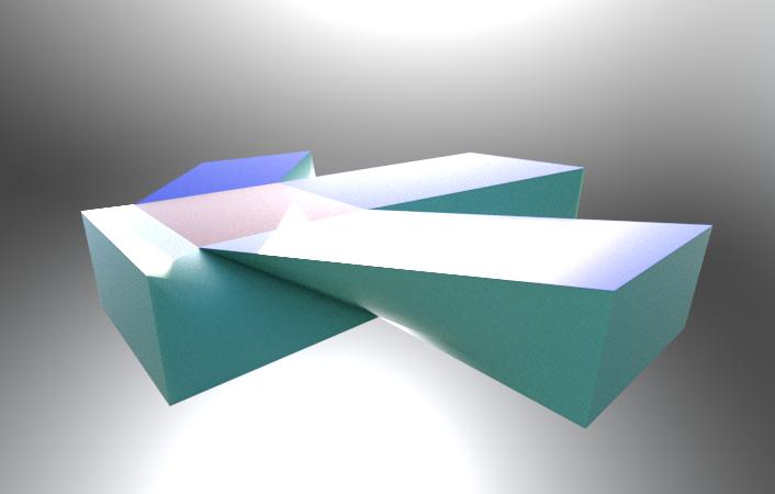
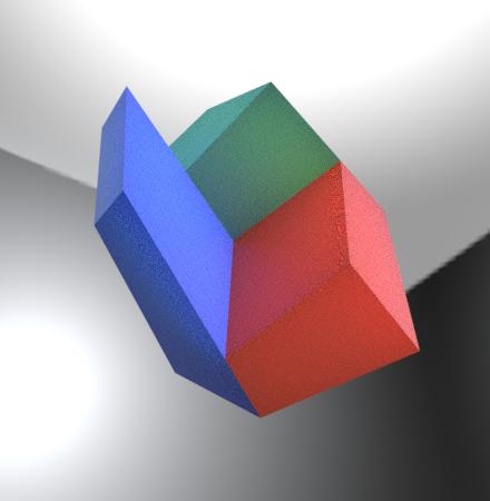
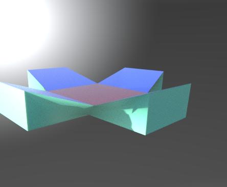
viewpoint 3
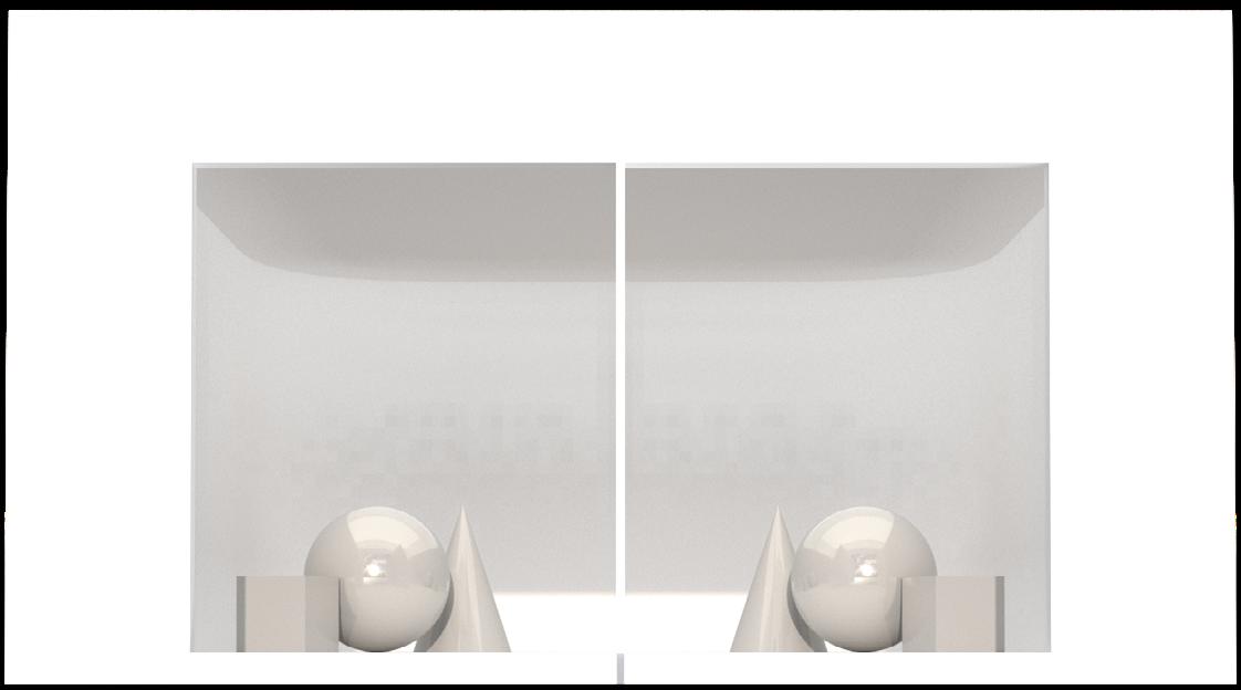
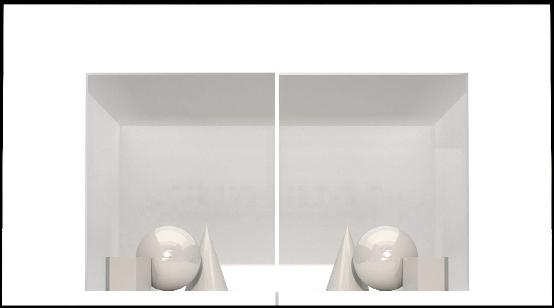
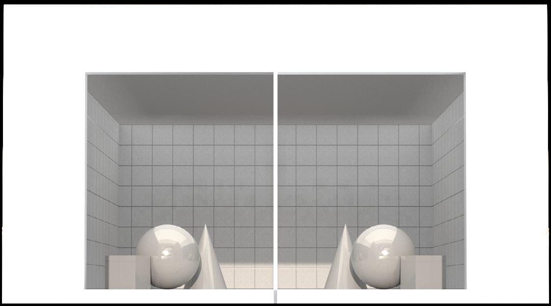
same geometry set + right angle corner background
same geometry set + fillet corner background

visually: left = right visually: left = right
same geometry set + fillet corner background with color
visually: left = right
same geometry set + right angle / fillet corner background


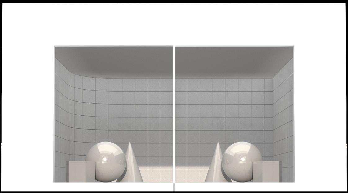
visually: left = right
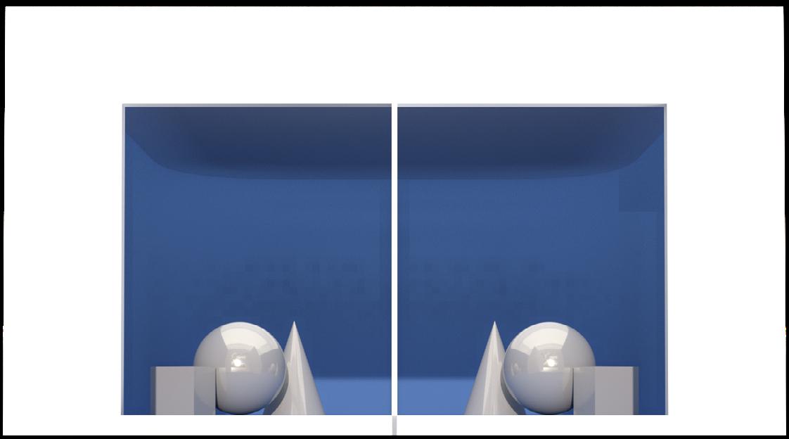
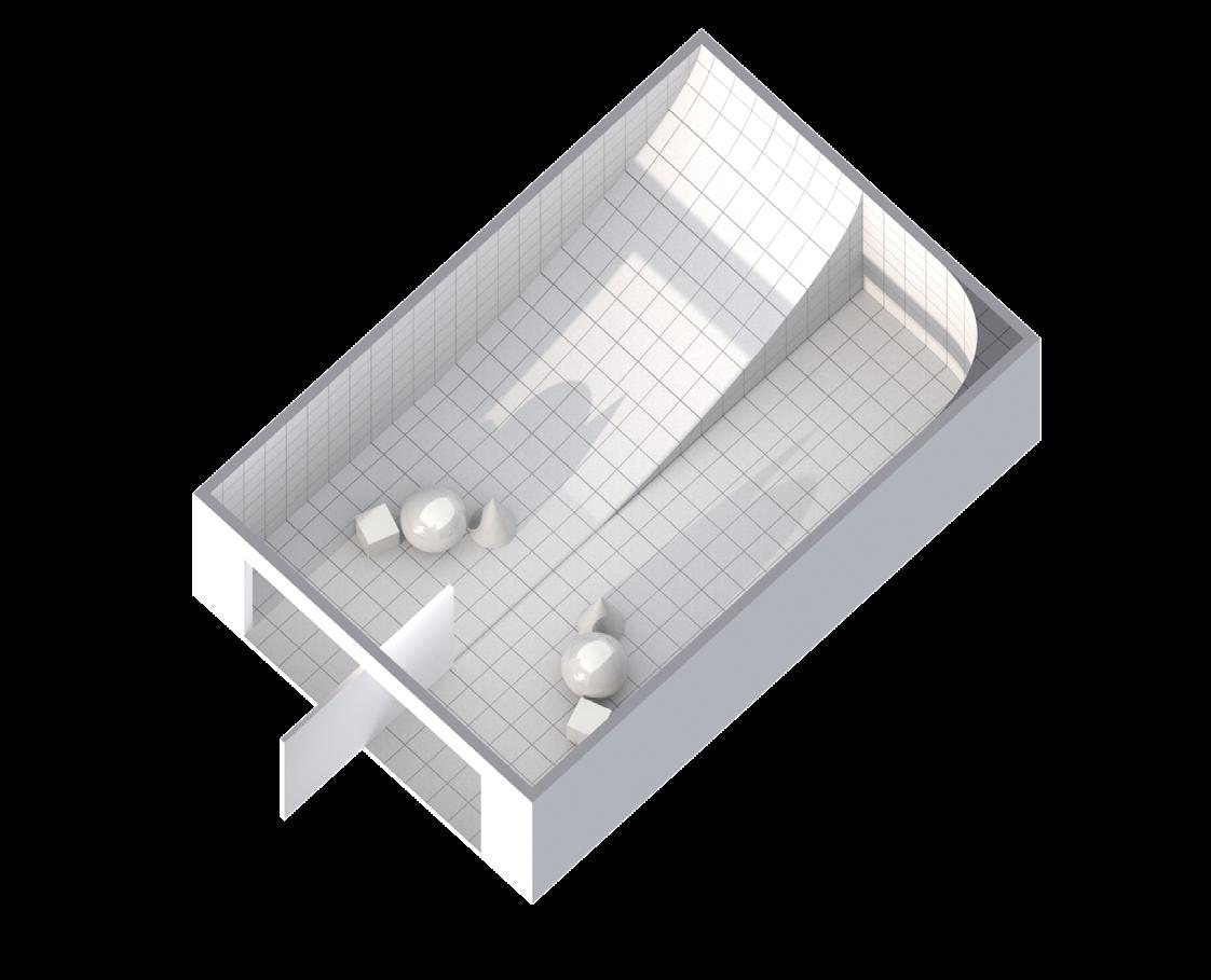
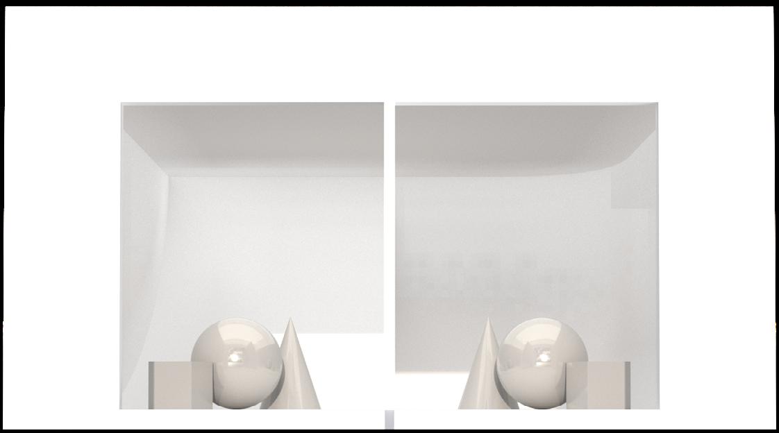
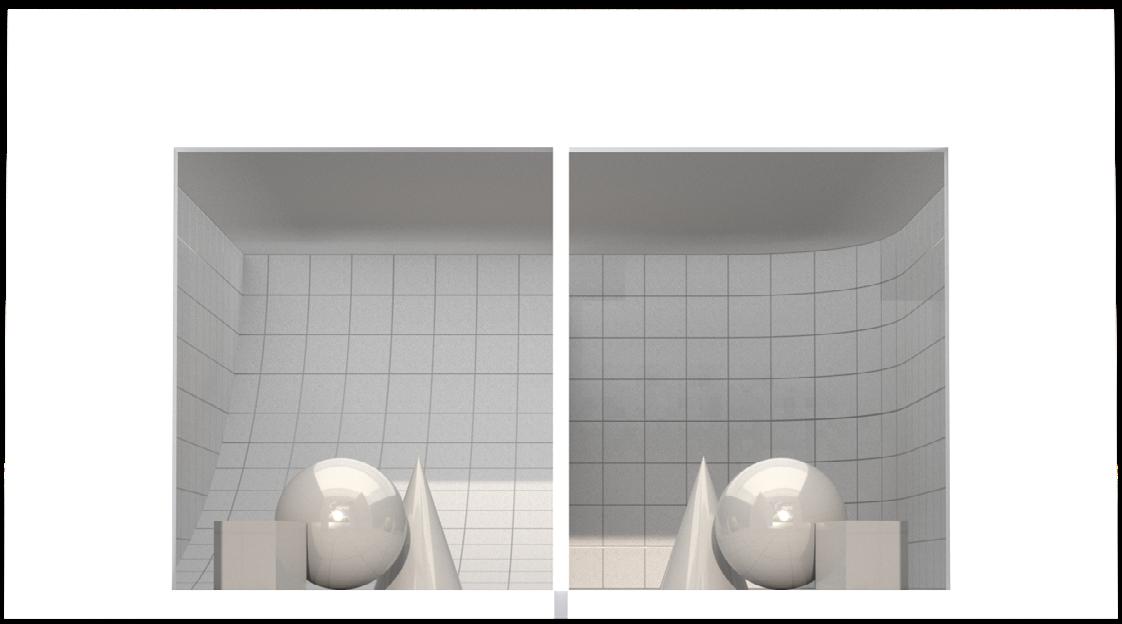
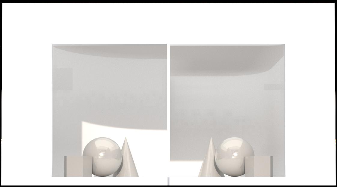

same geometry set + fillet corner background in depths and scales
visually: left < right
same geometry set + Y / Z axis fillet corner background right
visually: left > right
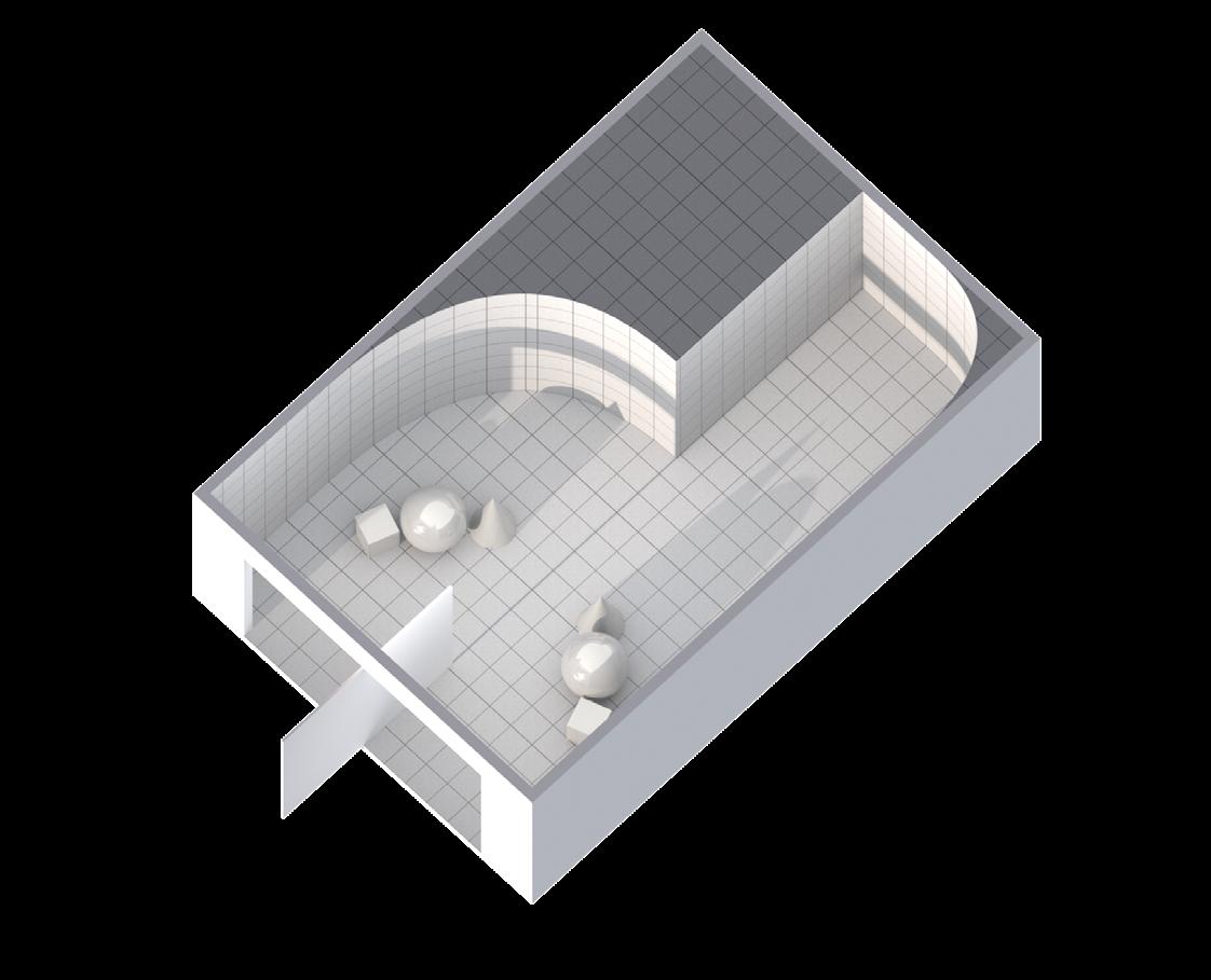
same geometry set + right angle corner background with different grids
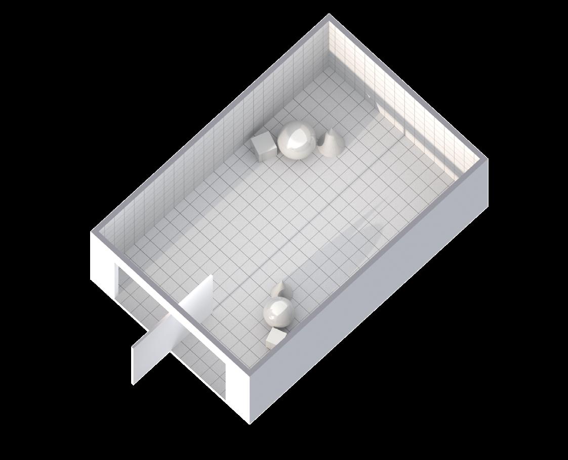

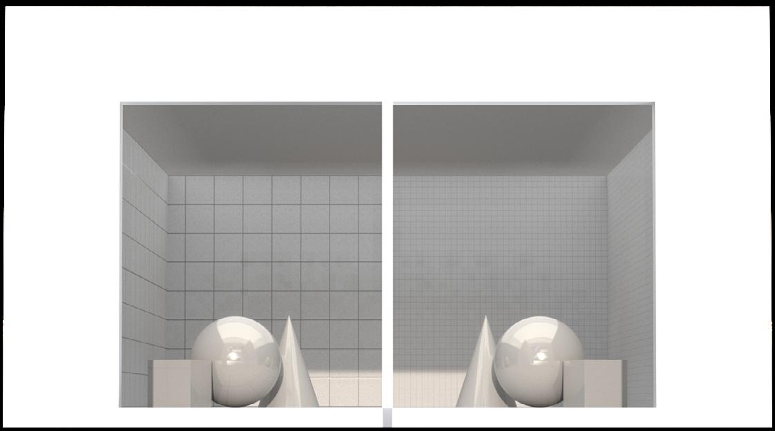
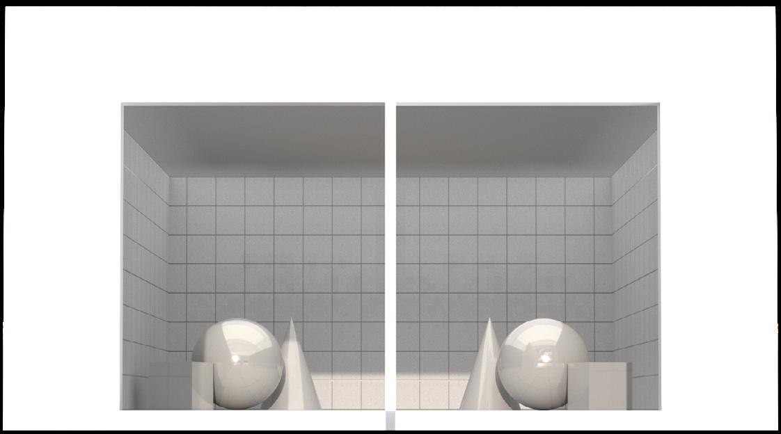
visually: left < right
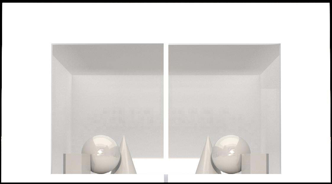
bigger geometry set / same geometry set + right angle background
visually: left = right

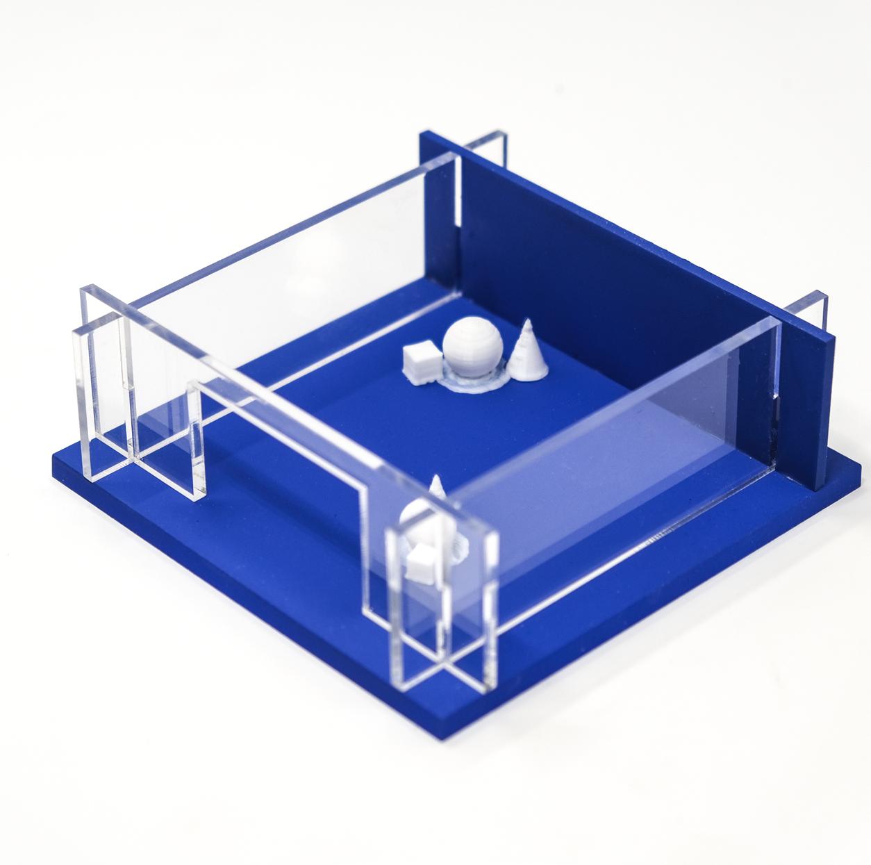

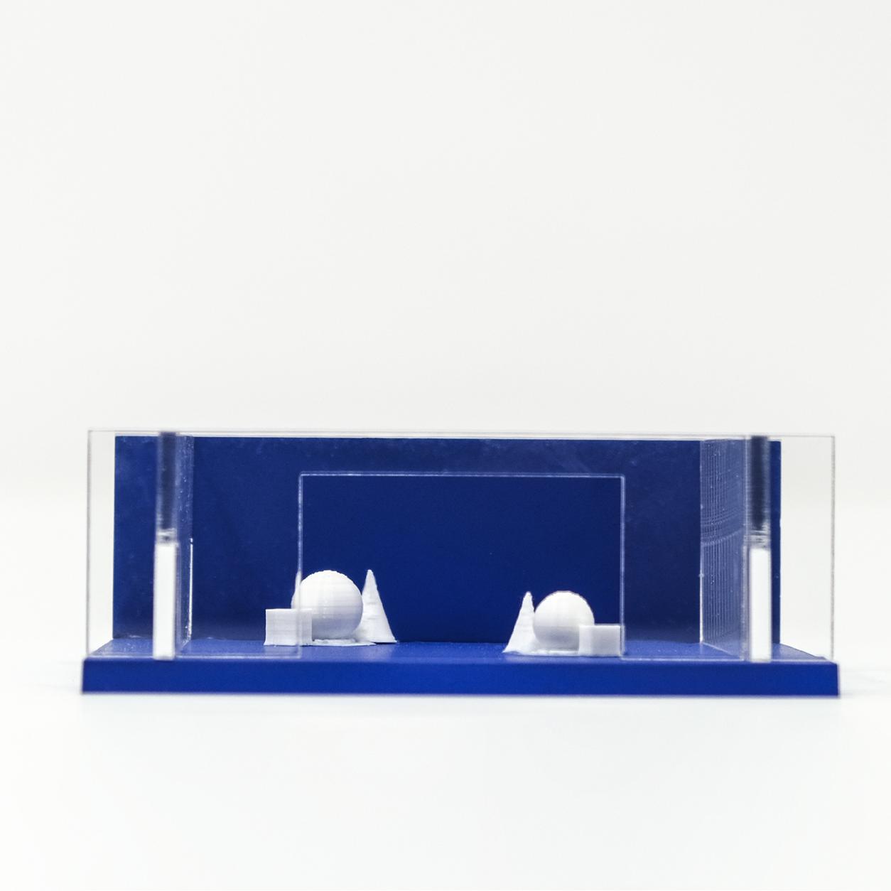

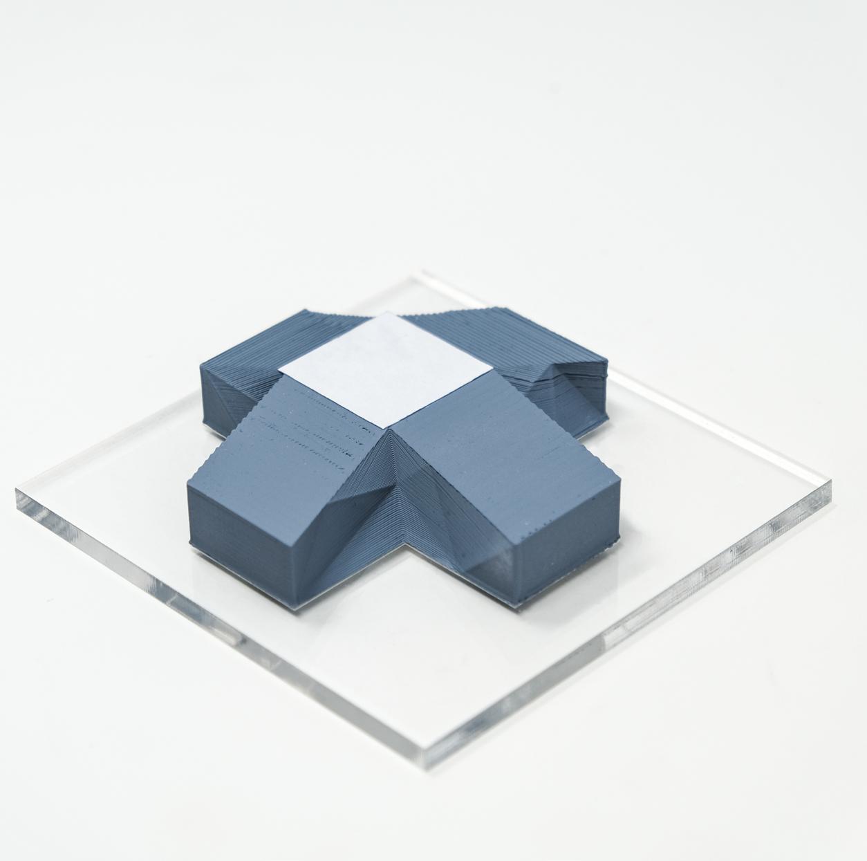
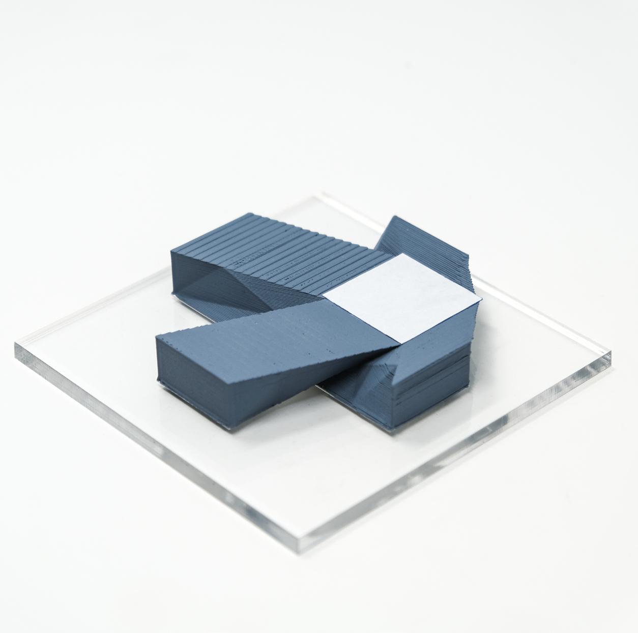
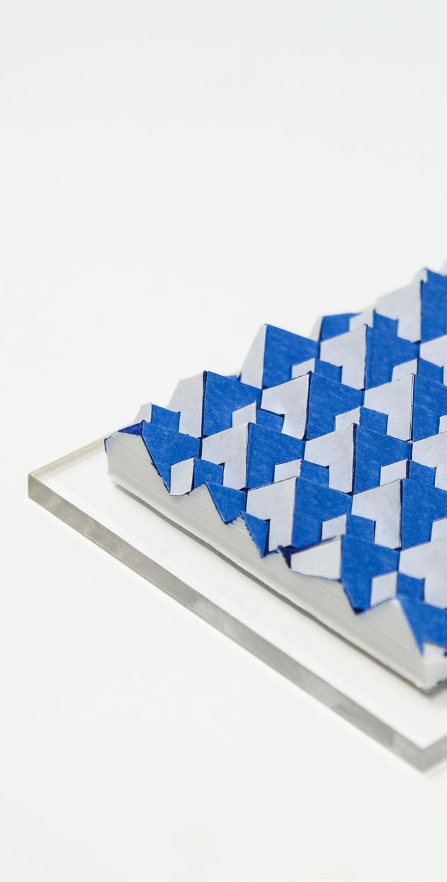
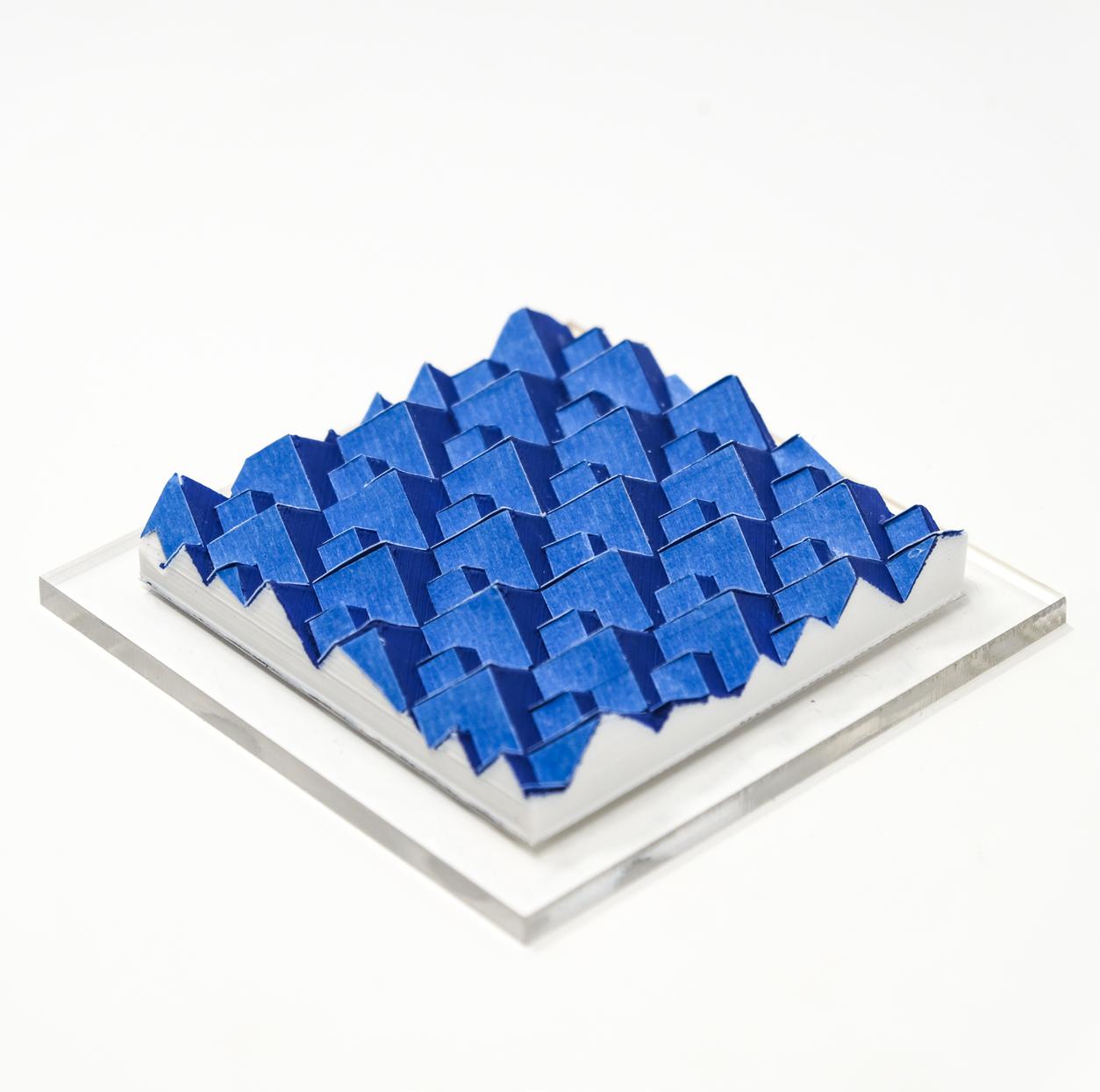
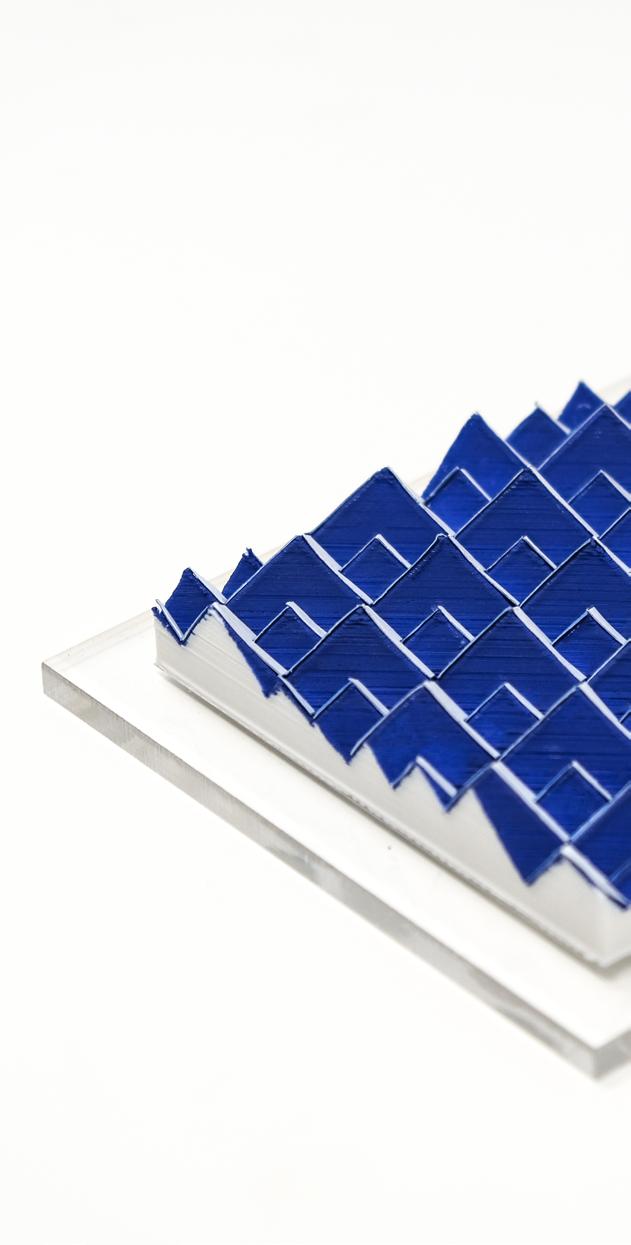
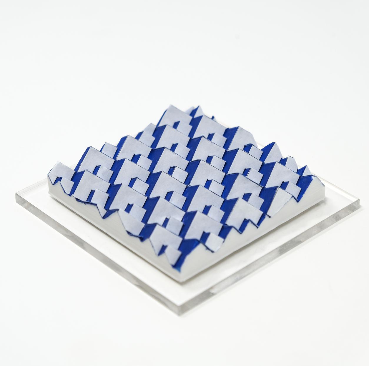
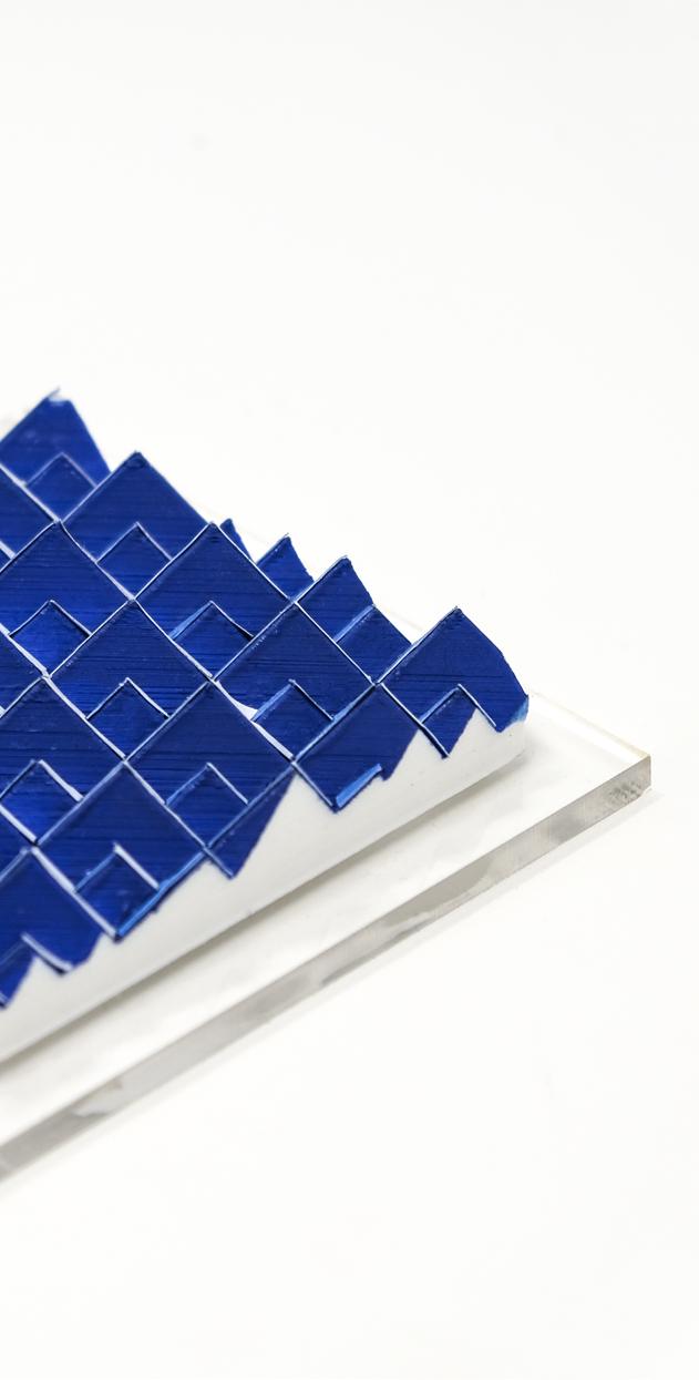
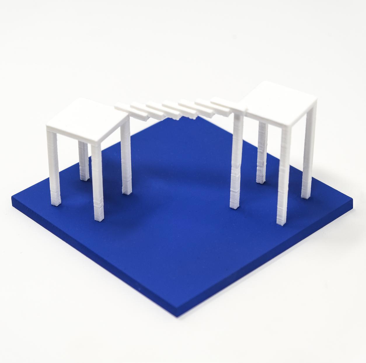
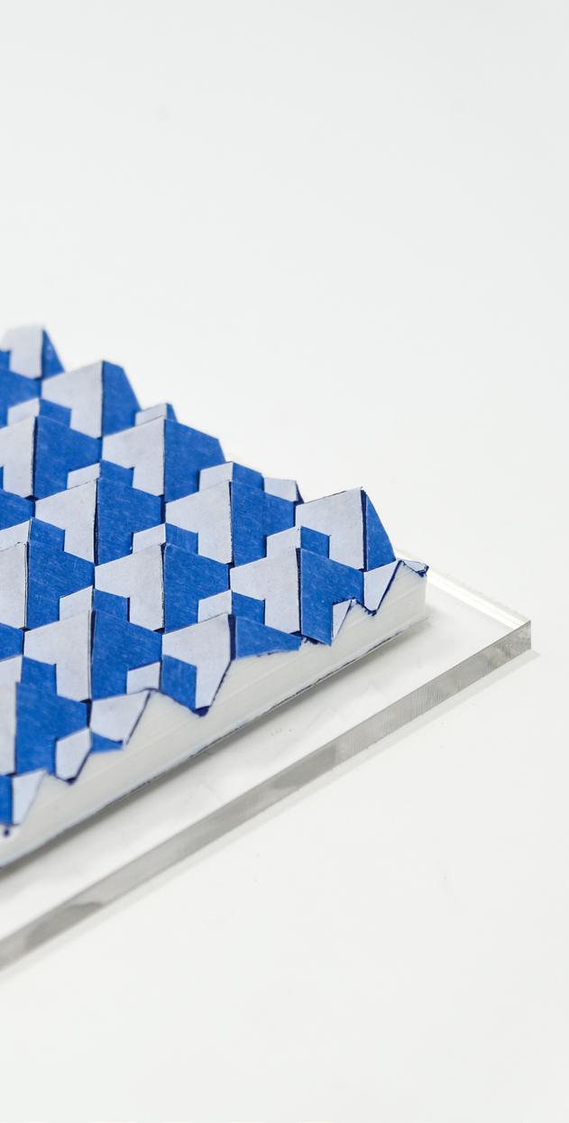
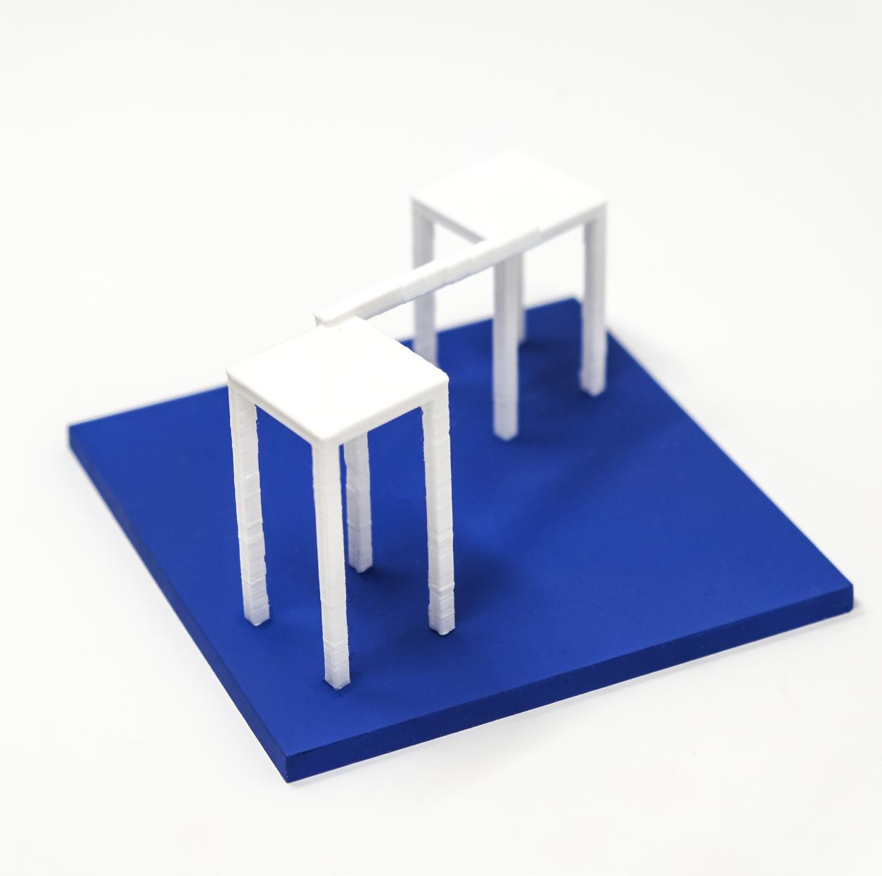



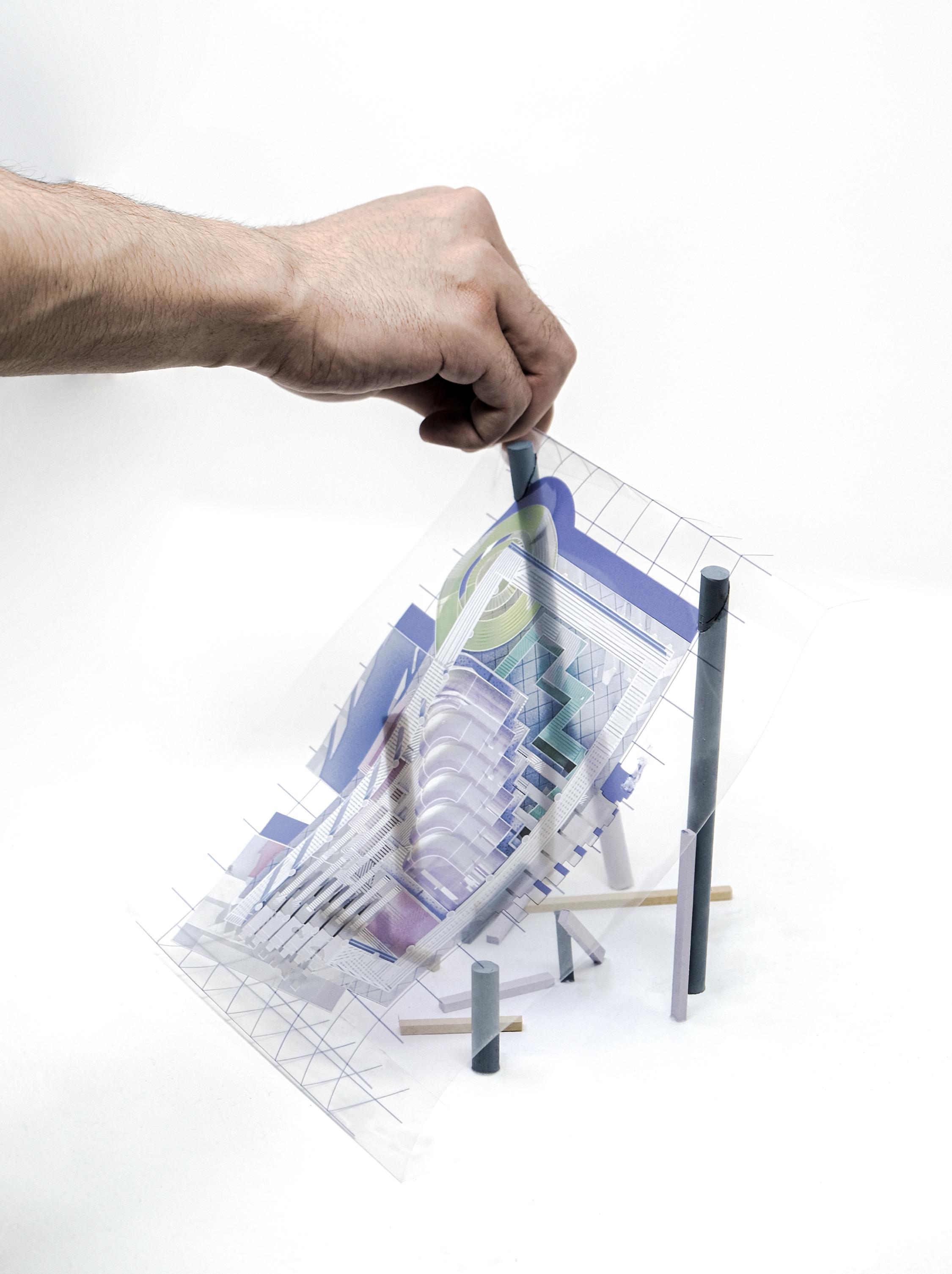
In the beginning, the design is more focused on the circulations in the courthouse. To discuss the topic of experiencing different perspectives and switching the view between the first person perspective and third person perspective both in 2D and 3D format, the idea of the courthouse is to create a “plan” projected on a slope and then make them projected back to the top view and front view. By determining the front view as
the privileged view from a specific viewpoint, the building showcases the activities inside the building and provides an overall understanding of the building while the view is standing outside the building. To fulfill the certain look from the front view, the massing of the building will be distorted to unexpected forms and then create different experiences inside the spaces.
