


• Modernism in architecture ...It was associated with an analytical approach to the function of buildings.
• A strictly rational use of (often new) materials, structural innovation and the elimination of ornament.
• The style became characterized by an emphasis on volume, asymmetrical compositions, and minimal ornamentation.
• Ex : Sydney opera house , Brasilia ,Coventry cathedral, park hill etc.
• The most common characteristics of International Style buildings are

- Rectilinear forms
- Light
- Taut plane surfaces that have been completely stripped of applied ornamentation and decoration
- Open interior spaces and a visually weightless quality engendered by the use of cantilever construction.
• Ex : Villa Savoye , Bauhaus school , Lovell house etc.

• Brutalist buildings are characterized by minimalist constructions that showcase the bare building materials and structural elements over decorative design.

• The style commonly makes use of exposed concrete or brick, angular geometric shapes and a predominantly monochrome color palette
• materials, such as steel, timber, and glass, are also featured.
• Ex : Boston city hall, Rudolf hall, Barbican center etc.

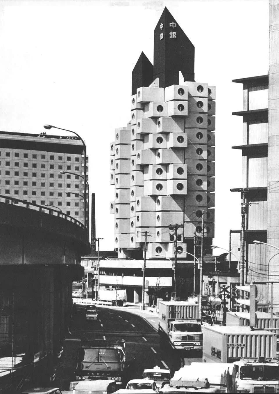
•Architects: Kisho Kurokawa

•Location: Ginza, Tokyo, Japan
•Typology: Residential / Apartments
•Materials: Steel and Reinforced
Concrete
•Stories: 13 Floors (140 Units)
•Total Floor Area: 3,091.23 m2
•Project Year: 1970 – 1972
Materials

structural innovation
Rectilinear forms
plane surfaces
Open interior spaces

Volume
Asymmetrical compositions
Minimal ornamentation.
Brutalism

concreteconstruction

geometricshapes
monochrome color
Advantages of prefabrication style
• Brings innovation in building materials and construction techniques.

• Improvement of construction accuracy.
• Reduction of energy consumption in buildings.
• Reduce in loss of construction material.
• Saving lots of labor cost.
• Saving construction cost and time.
2 interconnected concrete towers

11 & 13 floors housing
Cells filled with
• a bath unit
• conditioning system,
• color television.
Capsule joinery

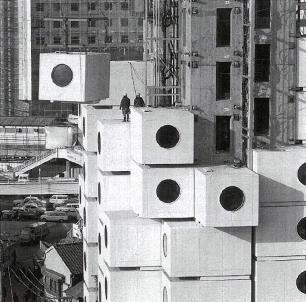
Each capsule is connected to one of the two main shafts only by four high-tension bolts and is designed to be replaceable.
140 identical Prefabricated capsules.
DIMENTION : 2.5 m by 4.0 m
Window Diameter : 1.3-m

 Section and Elevation
Floor Plan of the tower
Movement against traditional, classical styles and sought to make buildings dynamic and fun while breaking the rules.
Anti-reaction to the simple & plane modernism style { where ' less was more ' (minimalism) , no relation with history and ornamentation. }
• Typically, colored glass, ceramic tiles andstones are used on exterior surfaces.

• Use of bold primary colors and metallics .
A secret weapon among Postmodern architects.
• Break up large commercialbuildings into different, smaller structures to represent their meaning and function.
• Mix of different building materials and a variety of Heights can allow each building or home to be unique
Asymmetry , an important element .
No floor plan in a Postmodern house is completely symmetrical, which helps contribute to the personalization and uniqueness of the home.
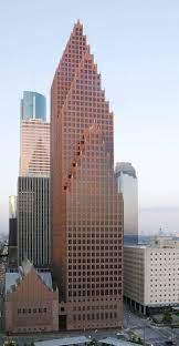
Ex : Bank of America Center
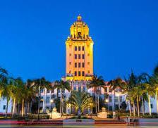
Beverly Hills Civic Center

•Architects: Arata Isozaki
•Location: Los Angeles, California, United States
•Typology: Museum
•Client: MOCA
•Yearof completion: 1986
•Topics: Postmodern Architecture, Colour in Architecture


• colored glass and stone used on exterior surfaces.
• Use of bold RED color in façade.


Varying Height
Each part of the building has its separate function & form.


Use of different shape volumes which give the building assymitrical elevation ..


Theater
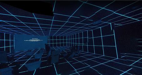


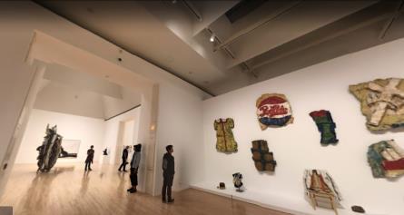
Museum
Museum




Entrance Outdoor Eating


Day Building and Binoculars
Los Angeles
1991
•Architects: Frank Gehry


•Location: Los Angeles , California
•Typology: Commercial building ( Advertising)


•Materials: Steel and Reinforced Concrete, glass
• Total Floor Area: 75,000m2
•Project Year: 1991
Bold Primary colors
Grey Brown
Each part has different Form & Function

Boat Binocular Trunk


You might have heard the phrase “if walls could talk.” If Postmodern walls could talk, they would be hilarious. While you might have never thought about architecture being expressive of humor, Postmodern style uses “camp” humor –meaning something that’s so bad, it’s actually good. For example, a building that appears like it’s about to collapse, but it was strategically designed to look that way.
Playful and extravagant forms, often using decoration that is not functional (anti-“form follows function”)


The building is situated next to the main street and it can be notable from three different styles used on the main facade. The front view of the building shows massive sculpture of binoculars that functions both as pedestrians as well as car entrance.


Interpretation of The copper tree like building.

Interpretation of The binocular building.
The building is made primarily of two materials: steel frame and concrete.
The Binoculars, 43 feet tall, act as the entrance portal to the interior and the exaggerated, decorative focal point of the building as a whole.
The exterior of the Binoculars building got its look from the painted cement plaster and the interior is done from the gypsum plaster.
The sculpture-like building is to unite the white, boat-like building, and the copper treelike building. The Binoculars, forty-three-feet tall, act as the entrance portal to the interior and the exaggerated, decorative focal point of the building as a whole.
Interpretation of The boat like building.
 Floor Plan of the binocular building
• Deconstructivism is a movement of postmodern architecture which appeared in the 1980s.
• It gives the impression of the fragmentation of the constructed building
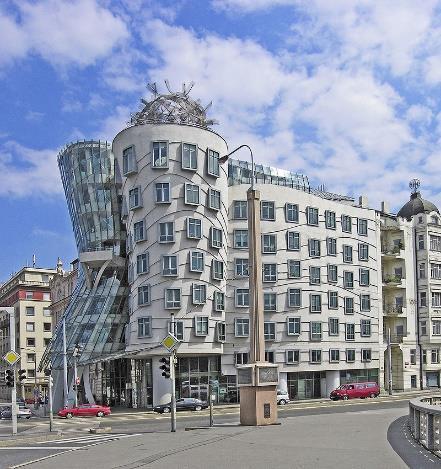

• characterized by an absenceof obvious harmony, continuity, or symmetry.
• Besidesfragmentation, deconstructivism often manipulates the structure's surface skin and deploys non-rectilinear shapeswhich appear to distort and dislocate established elements of architecture.
• Ex : walt Disney concert hall, Vitra design Museum , Günter Domenig’ s Jewish museum , Dancing building etc.

Bilbao
1991-97
•Architects: Frank Gehry


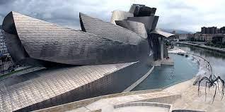
•Location: Bilbao,Spain
•Typology: Museum
•Materials: Steel and Reinforced Concrete, stone glass and titanium
•Total Floor Area: 24,000m2
•Project Year: 1991 – 1997
Curves on the exteriorof the building were intended to appearrandom

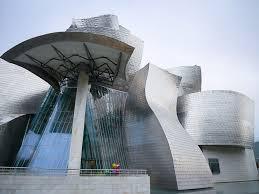
Randomnessofthe curves are designed tocatchthe light
Brilliantly reflectivepanels, reminiscentof fishscales

Interioris designedaround a large, light-filledatrium with views ofBilbao'sestuary
Urban context,unfolding its interconnectingshapesof stone, glass and titanium
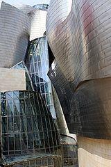

Glass ofthe windows has also beentreated to preventlight fromdamaging the exposed pieces

TheGuggenheimMuseumisafusionofcomplex,swirling forms and captivating materiality that respondstoanintricate programandanindustrialurbancontext.
• Themetallic formofthe exteriorlooksalmostfloral fromabove,fromthegroundthe buildingmorecloselyresembles aboat, evokingthepastindustriallifeoftheportof Bilbao.

• Constructed of titanium, limestone,and glass,theseeminglyrandomcurvesofthe exterioraredesignedtocatch thelight andreact tothesunandtheweather.
Structure :
• Thebuilding’swalls andceilingsareload-bearing
• containinganinternalstructureofmetal rodsthat formgridswith triangles.
• CATIAcalculated thenumberofbarsrequiredineachlocation,as well asthe bars’positionsandorientations.
• Inadditiontothisstructure,thewallsandceilingshave several insulatinglayersandanoutercoating oftitanium.
• Organic architecture is a philosophy which promotes harmony between human habitation and the natural world.
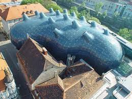
• Organic architecture strives to unify space, to blend interiors and exteriors, and create a harmonic built environment that is not separate or dominant from nature but part of a unified whole.
Ex
Among the many famous structures Wright designed, two of the most celebrated are:
•Fallingwater - Wright's most famous work, it uses natural stone and an existing mountain stream to blend habitation and nature.
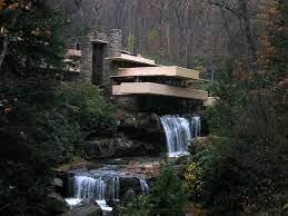
While Sullivan believed that "form follows function," Wright argued that "form and function are one.“
• The structure must therefore be designed as if it was molded by nature for and from that landscape.
• Likewise, the color scheme must derive from fields and woods to match the elements of nature.


Another key component of this architectural style is simplicity.
Open spaces are valued as the amount of rooms is reduced.

Satellite House Complex
•Architects:JavierSenosiain
•Location:StateofMexico,Mexico
•Topics:OrganicArchitecture,Color Architecture

•Type:Houses
•ProjectYear:1995
Organic Architecture is not a style of imitation, but rather, a reinterpretation of Nature's principles to build forms more natural than nature itself.


• This small complex of four houses is located in Ciudad Satellite, on the outskirts of Mexico City.


• The inclination of the lot, which rises approximately 1.5 meters above street level, was used to bury the units partially.
• As one approaches the complex, an undulating façade resembling two eagles with outspread wings seems to envelop the four pedestrian entrances.

Followed the rule :
• No Straight Line
• No plane texture
Lots of use of Natural vegtation , flora & Green cover ( to make it feel as if naturally made )
Interiors with hard texture , the round shape of the structure represents organic architecture

The units of the house that buried partially in under ground.

The shape of the unit like satellite , the façade resembling two eagles with out spread
The structure is partially under ground
 Section of satellite house
Influenced by architects such as Gaudi, Hundertwasser, and Frank Lloyd Wright,