SCOTT SINGER
DELIVERABLES
Annual Report
REQUIREMENTS
Redesign a Annual Report that is already existing.
SKILLS
Adobe Photoshop
Adobe Illustrator
Adobe InDesign Typography
Annual Report

Advanced Editorial and Publication
This particular project was interesting to create. As someone that has hasn’t created something of this magnitude, it was definitely a challenge. The assignment was to redesign an annual report for an already existing company. The report needed to be a minimum of 24 pages, with all of the existing information. However, we needed to include original photography and supporting imagery. The report needed to be laid out using Adobe InDesign, however we were also allowed to use Illustrator for design elements, and Photoshop to edit our supporting images..


Project 2
Futura Type Poster
Typography
DELIVERABLES Type Poster
REQUIREMENTS
Counter (Closed)
display type or paragraph type, this can be ABCDEFGHIJLMNOPQRSTUVWXYS abcdefghijclmnopqrstuvwxys 123456789!@#$%^&*()
Paul Renner and wa designed to contribute to
the New Frankfurt project. The design is made
up of simple geometric forms such as triangles,
squares and near-circles.Throughout the font
styles remains even except for letters such as
lowercase aʼs. these specific elements provide a
stylish elegance and help differentiate it from
Paul Renner
seen in many historic projects. Apex Hairline
other san-serif fonts. Futura can be used as a FUTURA 1927
DELIVERABLES
Logo, Packaging , visual code, static website, digital Ad

REQUIREMENTS
Redesign a Annual Report that is already existing.
SKILLS
Adobe Photoshop Adobe Illustrator Typography Illustration
Project 3
The Basics Branding
This project was one that I really loved doing. We needed to design a hypothetical brand for a product line of our choosing. The design needed to be created for a specific target audience we identified. My goal was to design a universal brand appealing to both males and females. We had to create a brand standard that would be used to ensure cohesiveness. This included visual coding, typography, and hierarchy. The product that I chose to design was shampoo conditioner, soap and lotion. Though only 1 required to create a single set, I designed 4 additional sets to show how the visual coding would work for the different scents.


DELIVERABLES
Album and Tour Poster
REQUIREMENTS
Create a poster and album cover a particular song.
SKILLS
Adobe Photoshop Typography
Album and Tour Poster
Intro to Photoshop
Going into this project was overwhelming, it was the first time I had to use 3 different Adobe programs to execute the final design. The project criteria was to develop a tour poster, based upon a song. The song
I was given was “I Can’t Wait to be King,“ from the Lion King. I wanted to include imagery that was symbolic of the movie. The eye was completely designed in Photoshop, which symbolize Scars’ and Simba’s eyes. The claw marks are to symbolize the harsh nature of the film and to depict the various animals.


Logo
REQUIREMENTS
Create a logo that is universal SKILLS
Adobe Illustrator Typography
Sharp Edges
Client Project
This particular design was created for a freelance client. The client wanted a logo that could be used universally, and suited the clients service of most landscaping. The logo is different than the typical design element used for most landscape brands. I decided to include a tree and an abstract element designed to mimic blades of grass.
Sharpe Sharpe Edges Landscaping Edges
Landscaping


DELIVERABLES
Typographic book
REQUIREMENTS
Design a typographic book that focuses on a typeface, such as history, anatomy, weights and styles

SKILLS
Adobe Illustrator
Adobe InDesign Typography Illustration
Typographic Book
Typography
This was one of the first projects using InDesign and it ended up being one of my favorites. The project criteria was to create a typographic book about a specific typeface. We were required to display the various weights, and full alphabet in lowercase and uppercase, and I chose a color palette that matched the time period that the typeface was created. The final book was 16 pages displaying the varieties and details of the typeface, Acumin Pro. Acumin is versatile font that can be used for a multitude of designs, and I wanted to create something that showcased that.


Book Cover Redesign
Client Project
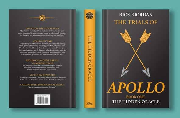
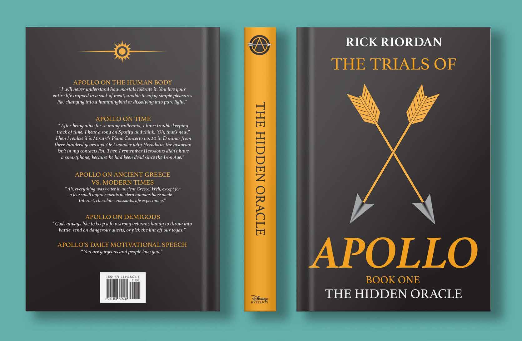
I was tasked with redesigning an existing book cover. The book that I chose was The Trials of Apollo, by Rick Riordan. The original cover was targeted to appeal to a younger age group. I chose to create a design that was more universal and less illustration heavy. I kept the design minimalistic and symbolic, two arrows crossing as the symbol of Apollo, bow n’ arrow. The crossing symbolizes that it would be hard to gain the status of a god again.


DELIVERABLES
Menu, business cards, signage
REQUIREMENTS
Work with a culinary to brand a fictitious restaurant
SKILLS
Adobe Photoshop
Adobe Illustrator
Adobe InDesign Typography
Second City Pub

Design Team
Design team seemed like it was a daunting class but it was a glimpse into to the true life of a designer. Second City Pub was the first client project that I received in the class. We had to work as a team and have the design styles cohesive. We worked with a culinary team, that had to create a restaurant, and set the brand standard. We were tasked to create a menu, large and small, signage for directions, stickers, business cards, and a recipe book. The design is cohesive and matches what the culinary team wanted. A theme that is Chicago street art, family friendly, and pub style.
MENU
CARAMEL POPCORN V
AQUA FRESCA V $1
Chilled beverage with peach and watermellon
SUNRISE SPRITZER V $0.75
Pineapple and cranberry topped with club soda
CAJUN STYLE WINGS D $1
Cajun style marinade, with a honey siracha sauce; served with ranch dressing made in-house with celery and carrots
CLASSIC LOADED FRIES D $1.25
Served with tomato, pickled red onion, jalapenos and ground beef, topped with cheese sauce
ITALIAN SUB DG $3
Virginia ham, Genoa salami, pepperoni, capicola, provolone, iceberg lettuce, tomato, pickled jalapenos, mayonnaise, olive oil and vinegar, served with salted fries
CHICAGO STYLE HOT DOG G $1.50
100% beef, tomato, white onion, relish, jalapenos, pickles, ketchup, dejion mustard, mayonnaise; served with salted fries
DEEP DISH PIZZA DG $1.75
Ground pork, green and red bell peppers, white onion with mozzarella cheese (can be veretarian)
ELI’S
tm STYLE KEY LIME CHEESECAKE D $1.50
Single serving topped with whipped cream; garnished with lime zest
Consuming raw or uncooked meats, poultry, seafood or eggs may increase your risk of foodborne illnesess esprecially if you have certain medical conditions
Please let one of us know if someone in your party has an allergy
V-vegetarian G-gluten D-dairy
Second City PubDELIVERABLES
Full Page Ad, Half Page, 1/6 page, Google banner, Billboard, Google ad, and Google text ad
REQUIREMENTS
Advertising Campaign
Advanced Editorial and Publication
This particular project was exciting to create. As someone that is of legal drinking age, it was interesting to be the target audience for a design. The target age ranging from 21-40 years old, for both males and females. The project was designed using a combination of Adobe Illustrator, InDesign, and Photoshop. As part of the project parameters, we needed to create a campaign for the product, and promote it through different advertising formats.

Eastern 21 is a rich and smooth liquor that provides the individual with the effects of coffee but also the rich smoothness of bourbon. It is aged in a bourbon barrel for 15 years. The barrel itself was burned and smoked with coffee essence. Doing this provides the aroma of coffee without giving that strong coffee flavor and scent. It is dark but is able to be included in mixed drinks.


2022 Summer Olympic Branding
Print Production
This particular project was a challenge. There were strict and extensive brand standards to follow for the Olympic Brand Guidelines. The parameters of the project were to create a promotional campaign for the 2024 Summer Olympics, for a location of our choosing Once branded, we had to design promotional design collateral relative to that city. I chose Portland, Maine, and incorporated the states colors.


 COMMITTEE OF THE 2024 SUMMER O YMPICS
DELIVERABLES
Infographic
REQUIREMENTS
Design an infographic Illustrating the process of specific type of printing.

SKILLS
Adobe Illustrator
Layout
Infographic
Print Production
As someone that tends to design on the simple side, being tasked with creating an infographic was both fun and challenging. This project was designed using Adobe Illustrator and incorporates all original content, from the written content to the press-roller setup. The descriptions are color coded to match the numbers in the illustration. It blends the various aspect of the process of a offset printing, while additionally illustrating how the press operates.
4Blanket Cylinder
The blanket is often times a rubber material. It is wrapped around the blanket cylinder. With the help of the plate and the dampening system, the ink from the image is transferred. The image however changes to wrong reading.
Delivery System
The delivery system is simple. It transports the material from the feeding tray or role to the delivery tray or collating tray. The paper is picked up by suckers called feet. These move the paper to grips that hold the paper at the ends at the smallest increment.
Blanket Cylinder Plate Cylinder
The plate is a thin piece of metal that is coated in a chemical compound. At the first the plate is printed with the right reading of the image with Liquid Dot. The plate is then coated with a chemical compound called gum arabic. The plate is right reading, however the image becomes wrong reading when in contact with the blanket
The blanket is often times a rubber material. It is wrapped around the blanket cylinder. With the help of the plate and the dampening system, the ink from the image is transferred. The image however changes to wrong reading.
Impression Cylinder
In order to make the image right reading again, it needs to be transferred to the final material/paper. This process if completed by the impression cylinder. The final product is then finally delivered via the delivery system.
3 4 5 6
Delivery System
The delivery system is simple. It transports the material from the feeding tray or role to the delivery tray or collating tray. The paper is picked up by suckers called feet. These move the paper to grips that hold the paper at the ends at the smallest increment.
Dampening System
The Dampening system is critical in the offset-printing process. The whole system involves the balance of water and oil. The solution in the dampening system is called fountain solution and is water based. It is used to make the non-image areas ink resistant.
Plate Cylinder
The plate is a thin piece of metal that is coated in a chemical compound. At the first the plate is printed with the right reading of the image with Liquid Dot. The plate is then coated with a chemical compound called gum arabic. The plate is right reading, however the image becomes wrong


Blanket Cylinder
The blanket is often times a rubber material. It is wrapped around the blanket cylinder. With the help of the plate and the dampening system, the ink from the image is transferred. The image however changes to wrong reading.
CBD Oil
Package design
For the first project in my packaging class, it was fun to work in illustrator and creating and constructing prototypes. We were assigned the task of creating branding, and designing and prototyping hanger tab package design. I chose to create a CBD brand for different animals, ranging from large livestock, to the common house cat. Each packaging has its own visual coding. The 4 different packages correspond to a different strength, followed by a specific color and image.


