001 Mikhail Lychkovskiy GEO — SDGS FLOWERS FOR THE HUMANITY
Poster for the SDGS Taiwan International Image Design Invitational Exhibition (Tunghai University and National Taiwan Normal University). Sustainable development goals (SDG) lead to the flourishing of humanity, which is literally interpreted through the prism of flowers.
MULTI DIMENSIONAL
3D—a technology that has completely changed our idea of spaces and shapes. Spatiality was used in art and architecture long before the digital era, but it wasn’t until the first computer graphics in the 1960s that the real revolution began. What once began as simple wireframes has now evolved into impres sive, realistic 3D worlds that have become indispensable in areas such as film, art, and product design. The works in this chapter offer an exciting insight into the creative diver sity made possible by 3D techniques.
002 Dennis Hoelscher
DEU —
[J]UGGERNAUT
As part of a series these letter sculptures blew up to reveal certain parts inflated by force and others pinned to keep the shape. This letter “J” is also projected as a texture on the surface which adds a second layer of abstraction through deformation. [J]UGGERNAUT—a massive inexorable force.
011 Anton Burmistrov ESP —AI EXPLORATIONS
While many creators, designers, and artists are hesitant to use AI in their work due to copyright concerns, Anton is exploring how to incorporate this technology into his proj- ects. He exper- iments with shapes and tex- tures to create entirely new, unique type designs.
047 Jasmin Sonderegger CHE GSCALC.PY
Visual research based on the Gray-Scott model, which simulates a chemical process. Two substances react with each other. One substance is consumed, the other is formed. By adjusting the parameters accordingly, new, distorted characters are created. The implementation was done in Python. The parameters for controlling the reaction are very sensitive, so the process is mainly based on trial and error, which on the other hand always leads to surprising results.
048 Emelie Gannert, Chantal Meilick DEU
WORKSHOP-WEEK-POSTER
Poster for the Workshop-Week of the type department of the Bauhaus University Weimar (Germany). Grids, patterns, outlines, and the interplay between typography and background—exploring the boundaries between the readability of text and pattern.
098 Matej Vojtus CZE —
A DREAM ABOUT AN EXHIBITION
Experimental exhibition poster.
099 Andrei Turenici ROU
FICTION TUESDAYS
Poster for the 2024 spring edition of Fiction Tuesdays—a film screening series organized by the Czech Centre Bucharest.
AWAY FROM KEYBOARD
In an age where digital media dominates, it is important to recognize the value of physical materials and craft techniques. Material works bring design to life, creating a tangible connection between concept and execution. In corporating traditional craftsmanship enhances visual impact and celebrates the tac tile pro cesses that enrich the final creation.
139 Morgane Vantorre FRA
—
PIXELS ENGRAVED IN STONE
Vantorre’s intention was to experiment by engraving lettering inspired by embroidery and bitmap language, composed solely of the same unit. The gesture of the process is entirely dependent on light, which makes the approach to “drawing” the letter interesting.
145 Aysel Kopuz DEU — EAT ME
Experimental typography on the human object.
146 Alec Vivier-Reynaud FRA MYCOGRAPHIÆ: FUNGAL AND TYPE MATTER SYMBIOSIS MYCOGRAPHIÆ proposes typography as living beings through a bio-printing process with biological inks made of molds and yeasts. Like micro-fungi that permeate the layers of life, new forms of symbiotic writings come to life to redefine the experience of an image / letter: a letter that’s now cultivated. In this act, the fungus no longer reproduces a sign; it digests its form, seizing it to redefine its structure and vitality : the sign gradually gains an organic autonomy that escapes the designer.
147 Hares Bassil FIN OVERWHELMED OVERWHELMED visualizes thought triggers in an oversaturated medium / mental state. A modular, dot-based letter system was created with sodium acetate crystals. The crystals expand from single points and merge with others until the basic letter shape is completely engulfed / consumed in the crystalline structures, depicting rising intrusive thoughts taking over an oversaturated mind, the Petri dish. The chemical reaction creates arbitrary forms within the characters, a feature this project embraces.
148 Parco Studio ITA —
LETTERING FOR MILANO ARCH WEEK 2024
Parco Studio designed a campaign focused on the word “weak,” that, spreading like a tag on walls, quickly invaded urban spaces—almost like a temporary graffiti. The lettering has a handmade and rough character, in order to give an organic and human feeling to the communication. The visual project is inspired by the importance of vocabulary in conveying messages and the communication is based on key words presented on a large scale to create a provocative shouting effect.
149 Clara Wendt DEU
WERKSCHAU DESIGN 2024 FH POTSDAM
This work is a ubmission for the visual identity of the design department exhibition: the design includes various digital and analog formats. The typography focused on an experimental approach, using analog materials to create different letters. These were combined with existing display fonts, reflecting the department’s strong practical and interdisciplinary teaching approach. The type design was developed in the workshop Typographic Playground by Laura Hilbert, in the class of Susanne Stahl.
150 Svitlana Korniienko UKR EXPLORING ACCIDENTS
Korniienko explores the influence of various analog mediums on the character of letters. She works spontaneously and intuitively, embracing failed, accidental, and imperfect shapes as the foundation of her letterforms.
151 Christian Stifani, Sofia Cambiaggio ITA
ARRIVEDERCI E GRAZIE—THERMAL
TRACES
This experimental lettering is one of the results of visual experiments conducted for the ARRIVEDERCI E GRAZIE publishing project. It is a letterset created by blackening receipts, exploring the thermal paper properties. Many letters show residues of other words contained in the receipts themselves. This practice is inspired by the work of M. Duchamp who used ready-mades to create art by giving them a second life. Following the same principle, even the receipts can reveal something unexpected. A modern rebellion.
163 Alexandra Sagalow DEU PIXEL
For her experimental type, Sagalow used her iPad and a hair-gel–water mixture. Sagalow wrote the sentences “I miss my pre–internet brain,” and “the downside of being connected is that you’re connected” with the mixture on a pixel background. The letters have a 3D effect and enlarge the pixels. With the claims and the technique she wanted to reflect the problem of excessive phone and media use, which many of us know.
164 Taekyeom Lee USA CAN IT BE TYPOGRAPHY?!
In the process of experimenting with punched and folded paper using a 3D-printed gadget, the long paper strip could be turned into a letterform. The study of the letterform, material, and process ended in a series of explorations.
165 Matilda Greiner DEU —
YOUR WORDS CHOKE ME
Though written words are merely letters strung together, they possess immense power over our emotions. this typographic necklace made out of sheet metal represents a feeling of suffocation. “CTRGFS” is the chaotic result of smashing your head on the keyboard in frustration.
170 Moritz Stolz DEU IT’S A MAGNIFICATION
Stolz experimented with the microscopic enlargement of printed letters on various papers and materials in order to gain a new perspective on type. This work is a hundredfold magnification of an embossing with letters on aluminum foil.
196 Daniela Vogel DEU —
EXPLODE FONT
The font captures the essence of fireworks, radiating from a central point and becoming increasingly intricate as they expand. Much like fireworks, it offers an experience that demands patience and perseverance from the viewer. By engaging with the graphical forms, the hidden information gradually reveals itself, all while delighting the viewer with its captivating visual display.
211 Sasha Bychenko, Kultura Studio UKR — THERMAL PRINTER CONCRETE POETRY
We, as designers, constantly strive to improve our skills, tools, materials, and workflow. This is a normal part of our work in the capitalist market. But what if we consciously downgrade our own tools? This visual poetry was created on a simple thermal printer using only two non-letter symbols from its limited basic glyph set. By abandoning content and message, the observer gain the opportunity to focus more on sensations and form creation.
196
212 Pola Małaczewska POL —ELEKTOR PATTERN SYSTEM
ELEKTOR PATTERN SYSTEM is an experimental tool in the form of a font. ELEKTOR functions as a pattern language that originated from a deconstructed imageprocessing experiment. Its foundation consists of various illustrations of digital circuits recovered from hobbyist magazines from the 70s to 90s rotting in the digital archives. Małaczewska pixelated them and set together as a font. The font comes in two styles: Regular & Round. This way they become a language that may be used as a system for creating pixel patterns.
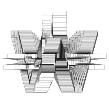
222 TimDEUStange
CHROME CONSTRUCTION 208
228 Fabian Hoffmann DEU
170 Moritz Stolz DEU —
IT’S A MAGNIFICATION
Stolz experimented with the microscopic enlargement of printed letters on various papers and materials in order to gain a new perspective on type. This work is a hundredfold magnification of an embossing with letters on aluminum foil.