Some Magazine Ready


Interview: Yevheniia Shyrchenko
Pictures: Francis Broek, Elea Lackner
Julia Schimautz is a graphic designer and printmaker from Austria, currently based in Berlin, where she runs her design studio, Don’t Try Anything New. Julia utilizes geometric shapes and unique textures to create bold and vibrant Risograph print animations. Her work is distinguished by its distinctive aesthetic, embracing the imperfections, misregistrations, and unpredictability inherent in the Risograph printing process.
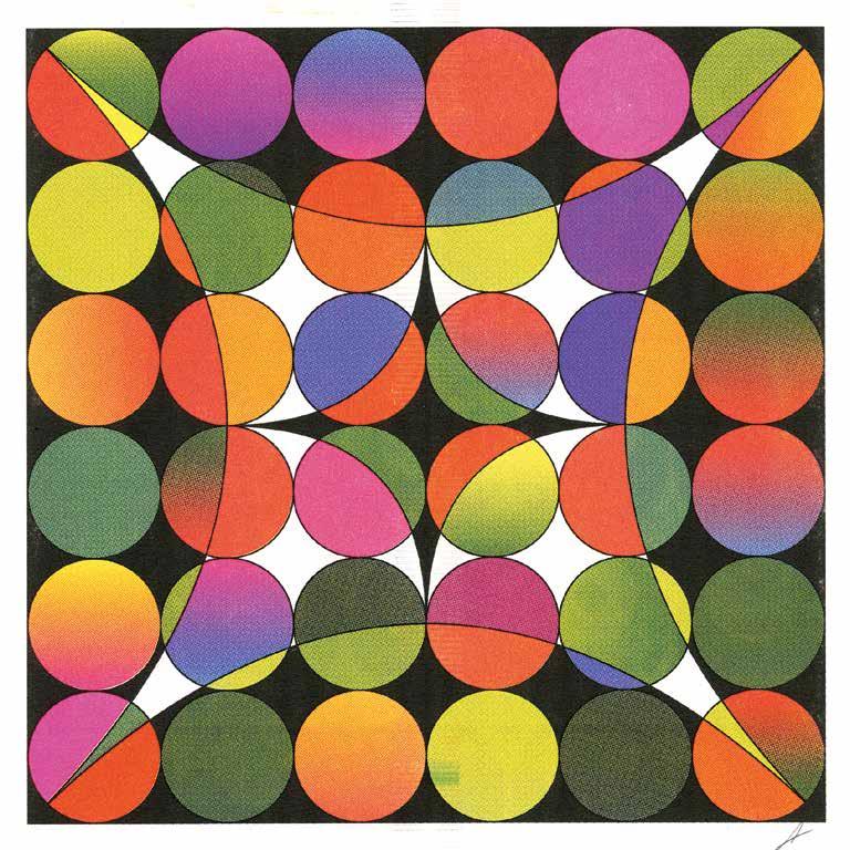

A print for Palestine Poster and Animation
If you could experiment with any new medium or technique that you haven’t tried yet, what would it be?
There are so many possibilities! I’d love to delve into 3D art, creating my own worlds and creatures. Additionally, I’m fascinated by pre-digital graphic design techniques, like using old Letraset type.
Where do you draw inspiration from for your design work?
My inspiration comes from many different sources. I enjoy flipping through design books and magazines from the 1960s to the 2000s to spark new ideas. Music is another great source of inspiration, especially album covers and artwork from the 1960s and 1970s. Of course, digital resources are invaluable—I have a folder on my phone where I save designs that catch my eye.
You have a big collection of design books. Which one is your favorite and why?
My favorite is my collection of Japanese Graphic Design Magazines from the 60s to the 00s. It’s incredible to see such a diverse range of artists and designers from around the globe, many of whom were previously unknown to me.
Which other designers inspire you and your work?
There are so many, but a few standouts for their use of color, gradients, and shapes are Judy Chicago, James Turrell, Mitsuo Katsui, and Julian Stanczak. Their work continually inspires me.
Can you walk us through your typical workflow from initial concept to final print? How do you balance digital
design with the analog printmaking process?
Sure! I usually start with motion design. I animate everything in After Effects first to visualize the final outcome and decide on the colors I will use. This gives me a clear idea of how the animation will look. Once the animation is ready, I export the frames and compile them into an InDesign document to see the entire sequence laid out. Next, I move on to the analog process. I print and scan the frames, then tweak them in Photoshop before making any final adjustments in After Effects. This digital-to-analog transition is straightforward and essential for my work. The analog part of Risograph printing is my favorite. I love experimenting with different color combinations and overprints. Color plays a significant role in


Interview: Fiete Prüfer
Pictures: Jana Edisonga & Jonathan Meese
Special Thanks to Jone Szmania
“ART ALWAYS OVERSTEPS THE HUMAN ASPIRATION, SO ART IS NOT OUR LIMIT, BUT ITS OWN MOST PECULIAR BOUNDLESSNESS”
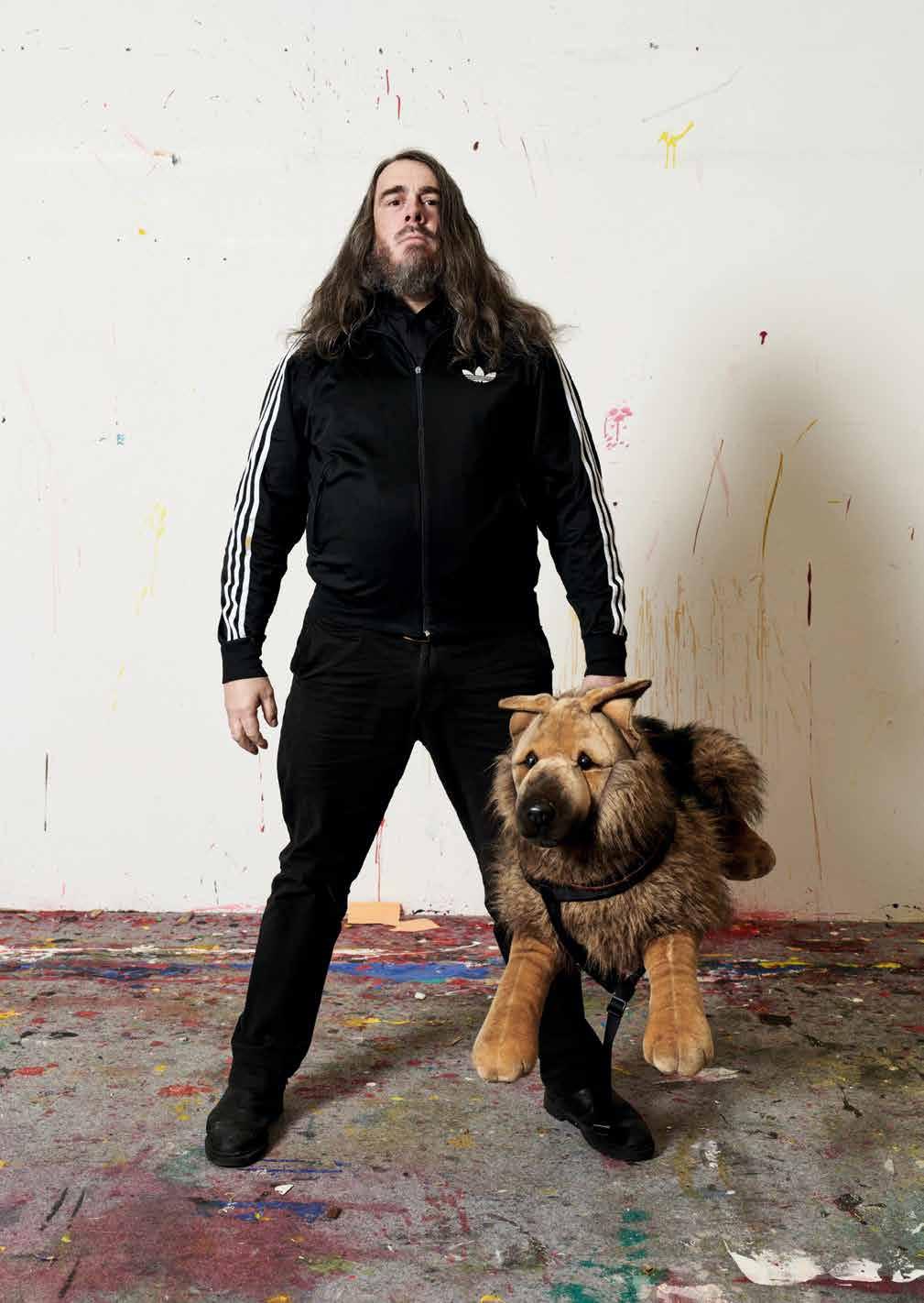
We considered many artists for this issue of the Some Magazine. One of the artists we thought was least likely to respond was Jonathan Meese. The painter, sculptor, performance and installation artist based in Berlin and Hamburg however agreed almost instantly. Even though our request came at a time of intense exhibition and project periods Meese was willing to help out. Not in person but over email. What follows are eleven questions and eleven very “meesian” answers by one of the most prolific and inimitable artists we have today.
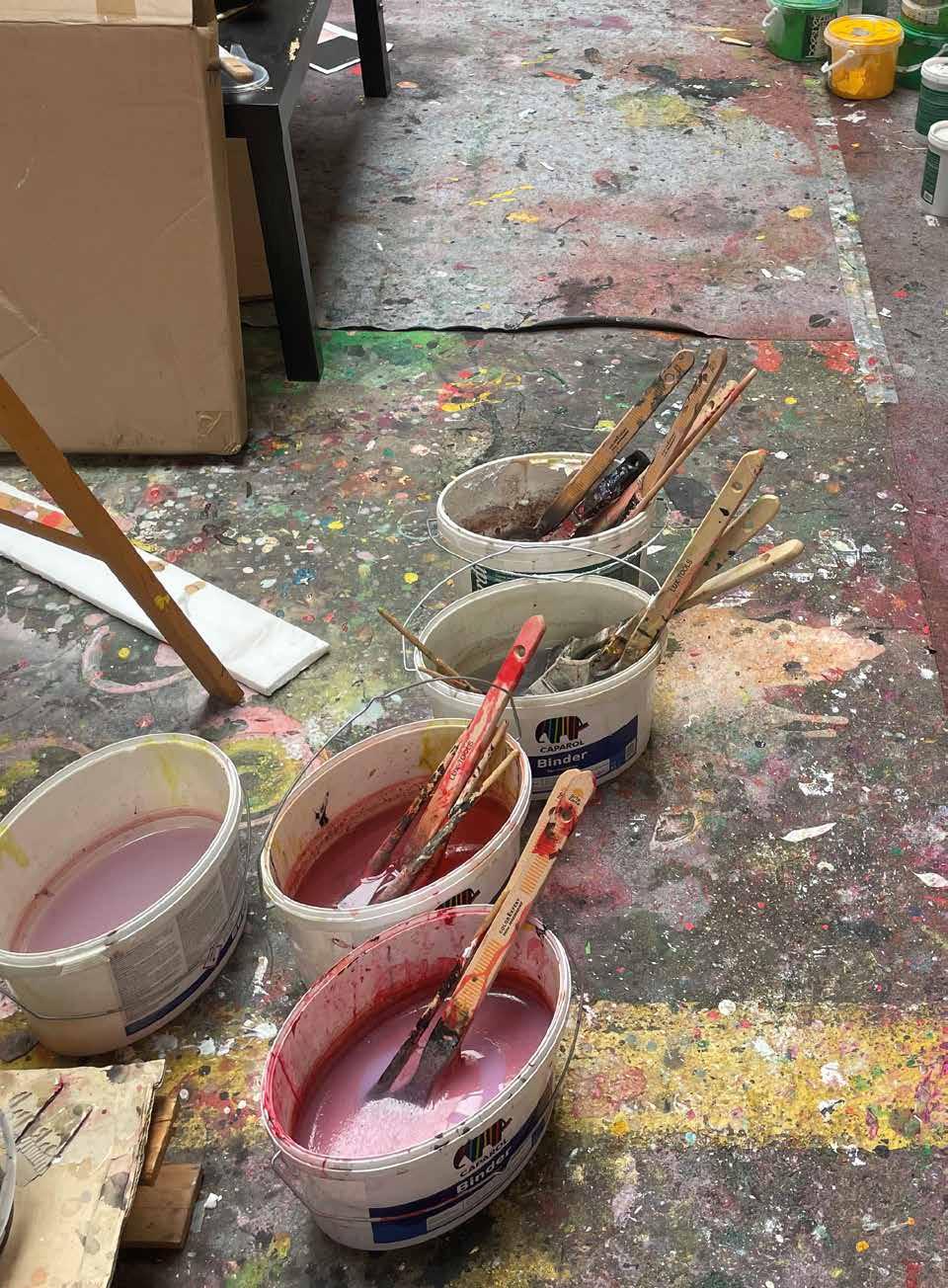
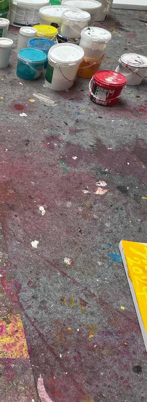
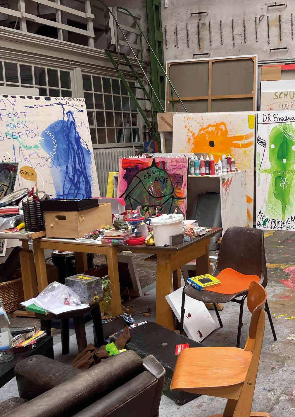
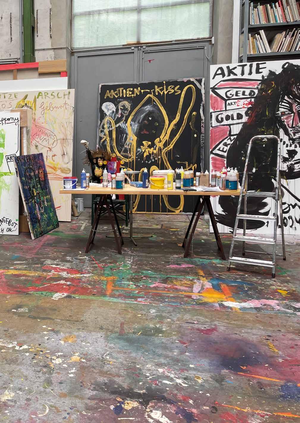
Previous Page: Studio of Jonathan Meese, photo by Jonathan Meese
Left page: Studio of Jonathan Meese, photo by Jonathan Meese
Q: Beeinflusst Sie Kritik? Passen Sie sich auch Meinungen an oder sind Sie um jeden Preis Sie selbst?
A: MEESE IST IN DER KUNST IMMER KOMPLETT KOMPROMISSLOS, KLARST, EVOLUTIONSFLEXIBELST UND LIEBEVOLLST UNTERWEGS UND AUCH IMMER AUF TOTALSTEN ANGRIFF GEBÜRSTET, ABER IM NORMALEN ALLTAG IST MEESI VOLLENDS HERMETISCHST, LERNFÄHIGST, AUCH EVOLUTIONSFLEXIBELST UND AUSGLEICHENDST, WIE DIE MUMINS, EMMA PEEL, JOHN STEED UND PIPPI LANGSTRUMPF!
Q: Was ist Ihre Haltung zu Deadlines? Fühlen Sie sich unter Druck gesetzt oder finden Sie die zeitliche Begrenzung sogar unterstützend?
A: LIEBEVOLLSTER SACHLICHSTER DRUCK IST EINE GRUNDVORAUSSETZUNG VON KUNSTAKTIVITÄT (KUNSTVULKANISMUS), DESHALB MAG MEESE IMMER SEHR GERNE SINNHAFTE »DEADLINES«, DIE DAZU FÜHREN, DASS ETWAS BEENDET WIRD, UM DAS NÄCHSTE KUNSTZIEL ANZUPEILEN UND DANN DARÜBER HINAUSZUSCHIESSEN, UM WEITER ZU MACHEN, MACHEN, MACHEN UND MACHEN!
Q: What does collaboration mean to you? Does it help you or do you sometimes feel restricted?
A: THE GREATEST GESAMTKUNSTWERK GERMANY AND EVERY OTHER GESAMTKUNSTWERK IS THE COMBINATION OF ALL UNIQUENESSES LIKE HOW RICHARD WAGNER OR LUDWIG THE SECOND OF BAVARIA ALREADY POINTED OUT: ART IS THE COLLABORATION OF ALL WORKS OF ART IN THE NAME OF THE MOST TOTAL ART, THUS IN THE SENSE FOR THE MOST TOTAL FREEDOM!
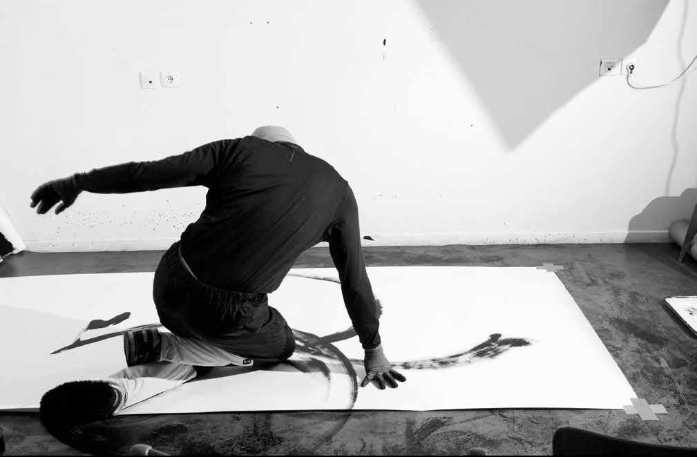
Dance could be defined as art, entertainment, sport or all at once.
by Marius Jore
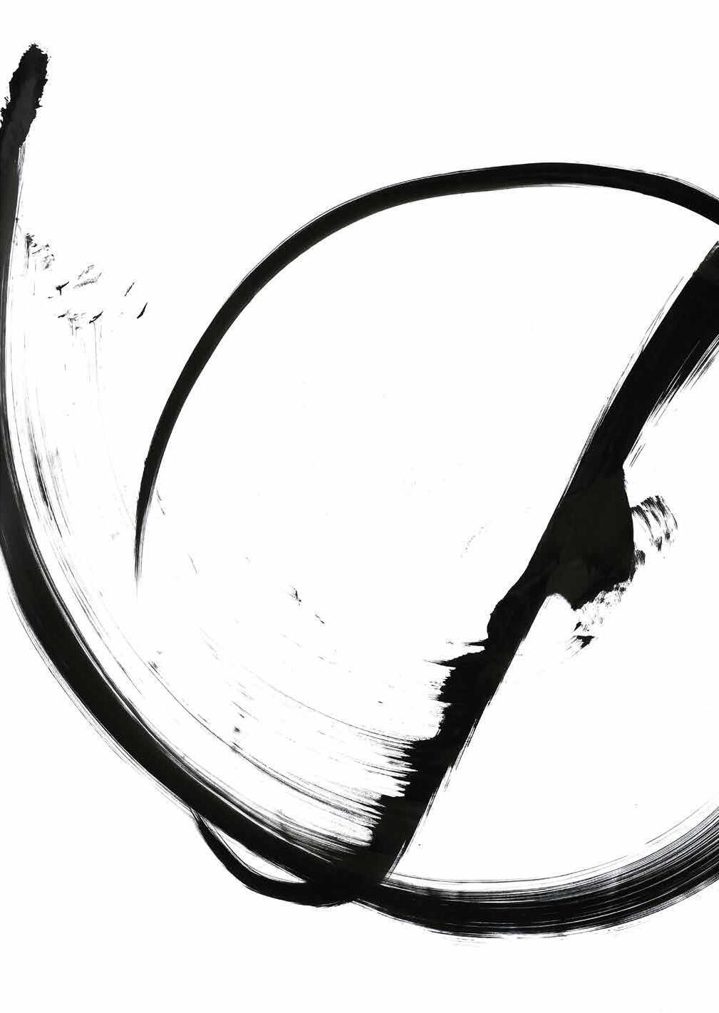
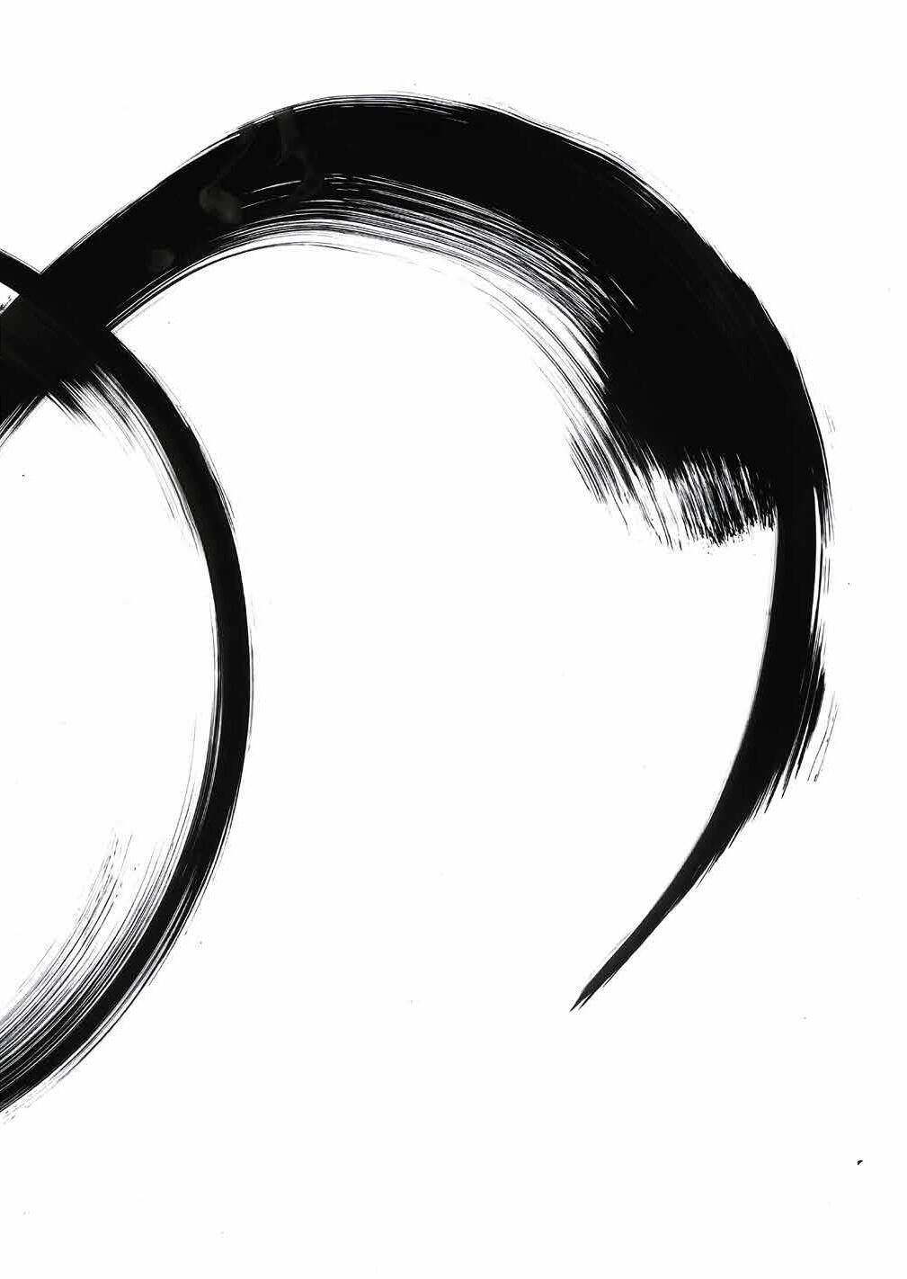
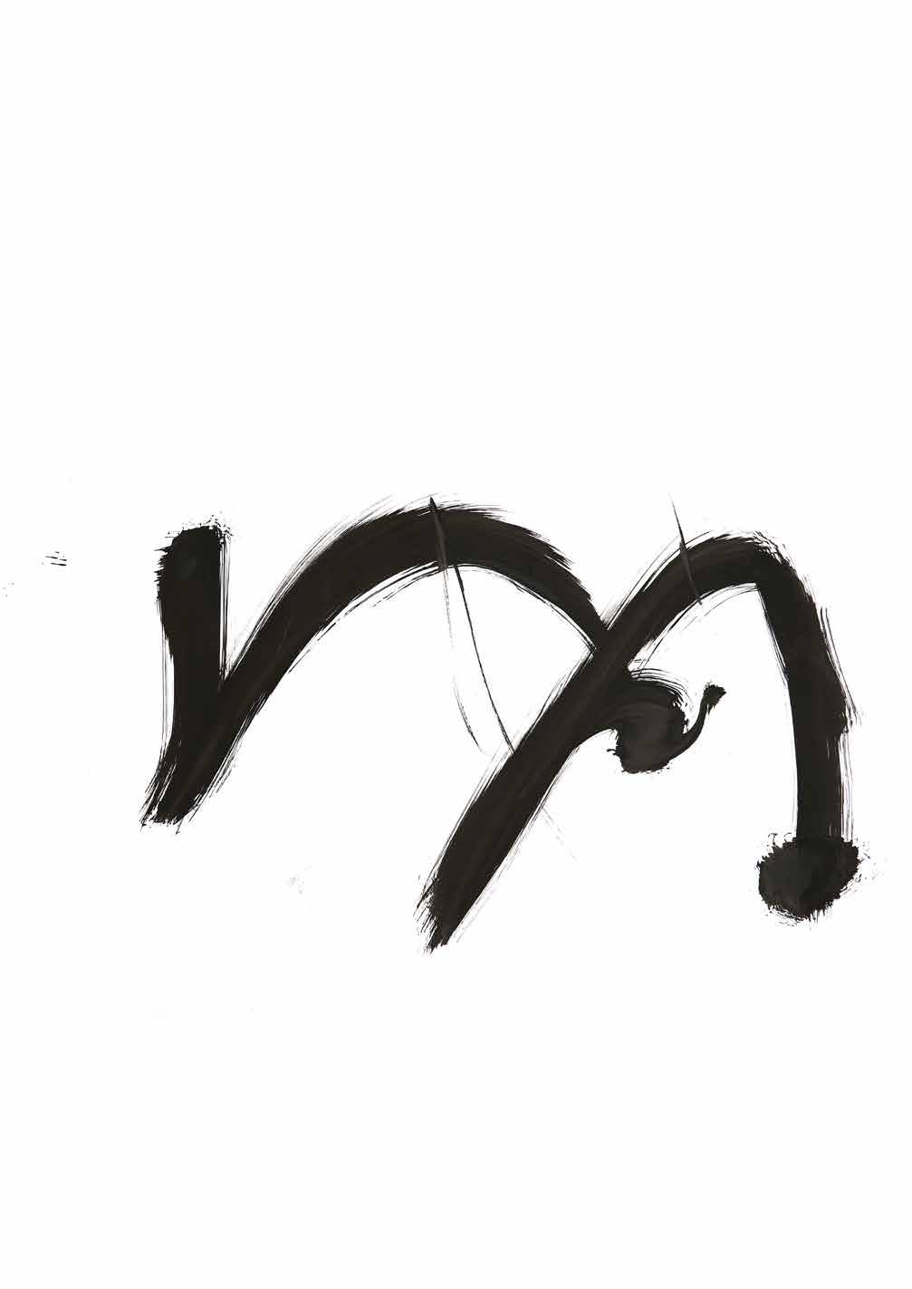
You need to see my work more like a scientific work rather than an artistic one because the idea was to capture the movements basically. I did one movement and I saw an interesting shape on the paper and then I tried another one and I could see that two different movements gave two different forms. I was like, okay, now let’s mix two movements together and we have a completely new form. From that point on I wanted to do a collection of glyphs. When I saw the first mark I was like, oh, it looks like a letter. It looks like a glyph. It looks like a calligraphy. I was like, okay, it’s interesting. So I tried this movement and that movement creating surprising shapes and I started collecting all of them. So it’s really like a game. It’s a gamification on a scientific work rather than just try to portray emotions. I think the emotions come after that. That’s why I keep on going. Every time I do a move, the glyph will always be different. It’s exactly like dancing. You will never dance the same time again.
We are all struggling with finishing stuff. When do you know your moves are done?
Actually, it’s really definite. I try to capture each movement, to capture the energy and the trace. I know in advance what I will do. Because breaking is really codified. You have combos, foundation moves, and you have combos that can mix different movements together. That’s basically what I do on canvas. The idea is that I perform the movement as if I was not on canvas. I do it as if I was in a training room, as if he was in a jam. I stand up and
then I watch the shape be drawn. As soon as the movement is finished, the glyph is finished. I never redo a glyph because you need to see my work as calligraphy. When you see calligraphy painters, they draw glyphs, they draw letters, they draw poems. If you take a Japanese calligrapher, he knows what he will do in advance. He knows, “Okay, I will draw this kanji or that one.” I follow more or less the same process. I have a Japanese calligraphy teacher who gave me some lessons. Calligraphy really has to do with breathing. It’s meditative. I follow this process when I’m practicing. I’m just myself on canvas or on paper. When I feel it, I just do the move at once in one breath and that’s over. One glyph alone doesn’t make sense. But when you take all the glyphs together, that’s when it makes sense. On my website you can see my vectorized forms. I draw a huge graphic system. That’s where the power lies, in the composition. It’s like a puzzle.
Can consistency and productivity be learned?
Yes, it depends on personality but can be learned. A lot of people just have ideas and without discipline or consistency their ideas remain ideas. And when you are consistent, you can do what you have in mind. It doesn’t have to be art. It can be whatever. Gardening. Cooking. Consistency allows us to act and create. Many have ideas but lack the discipline to realize them. Consistency helps you stay focused amid distractions, enabling you to bring your ideas to life.
Are you currently holding any exhibitions?
Yes, I have an exhibition in the 15th arrondissement in Paris, organized by the Olympic Museum. It led to other projects, including a collaboration with the Olympic Museum for the next Olympic Games in Paris. Breaking will be included in the Olympics for the first time, and the museum wants me to create glyphs with the winners, capturing their movements. This project excites me, as I aim to collaborate more with other dancers.
Tell us about the artists that inspire you. How did these artists influence your artistic style?
All of these artists prove that you can go beyond what you think is possible. That’s what I like about the story of Jackson Pollock. His dripping paintings are his most famous works, but when he presented them for the first time, he received a lot of criticism. He shows that you can pretty much do whatever you like, as long as
it has meaning. The same goes for the French calligraphy artist Fabienne Verdier. She uses a huge brush and has to use her whole body to move it. Kazuo Shiraga is a Japanese painter who paints while bouncing on a rope. I like it because it’s a crazy idea, but they prove you can do it and be successful with it if you just keep going. Each of them involves their bodies, space, and gravity, and that’s what I like about them. I really need inspiration like this. I think sometimes you can go deeper and try more niche or weird things. To some, it might look or sound stupid, but that’s where the beauty is. When it’s well done, it can make sense. This is just my opinion, but maybe many people are in a rush because there is so much to see in the world, like advertising, and sometimes they have to force themselves to go to a place where art is displayed, like an exhibition. It’s a space to relax and think about how the art is made, what the intention behind it is, and simply appreciate the work. I remember when Agnes Martin and Jackson Pollock met in New York. They said that music doesn’t need an explanation to be enjoyed, but visual art often does. It can be difficult for people to connect with art because they feel like they need an explanation. Art requires repeated viewing to truly understand and appreciate, while music provides an immediate emotional response. I think we need all kinds of visual art, music, dance, and theater. It will do good for everyone.
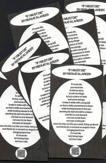
Can you share how the idea for “The Syrian Design Archive” came to you and what the process of working on this project looks like right now?
While working on my master’s thesis, I wanted to explore Arabic identity in design, but I quickly realized it would be a massive project. So, I decided to focus specifically on Syrian identity. As I searched for materials, I was amazed by the talented designers and the quality of their work. Discovering incredible poster designs from the ’50s and ’60s that still hold up to modern design principles was particularly eye-opening. I had the privilege of accessing these materials thanks to my dad, who works as Professor in Faculty of Fine Arts | Damascus University at the department of interior design and in IUST University. His network provided me with valuable resources. I realized I could use what I had and start this project, but I knew I
needed help. So, I teamed up with two friends, Sally Alassafen and Hala Al Afsaa. We decided to use social media, particularly Instagram, as our platform to test the project’s flow and gather data while gauging public reaction.
To avoid overwhelming our audience, we divided our content into several accounts: Media, Streets, Prints, and Stamps. We’re also working on a Banknotes section and are always ready to document new areas. What’s fascinating about this project is that we document everything, even if it’s not perfect, even if it’s not ready. The public’s response has been fantastic, with people interacting, sending more data, and enjoying the project. In summary, our goal is to create a freely accessible platform for anyone interested in exploring Syrian design and learning more about its designers—a limitless design archive for everyone.
Interview: Conquista Weineck, Ben Raisic
Photos: Ricki Nalu, Jill Senft
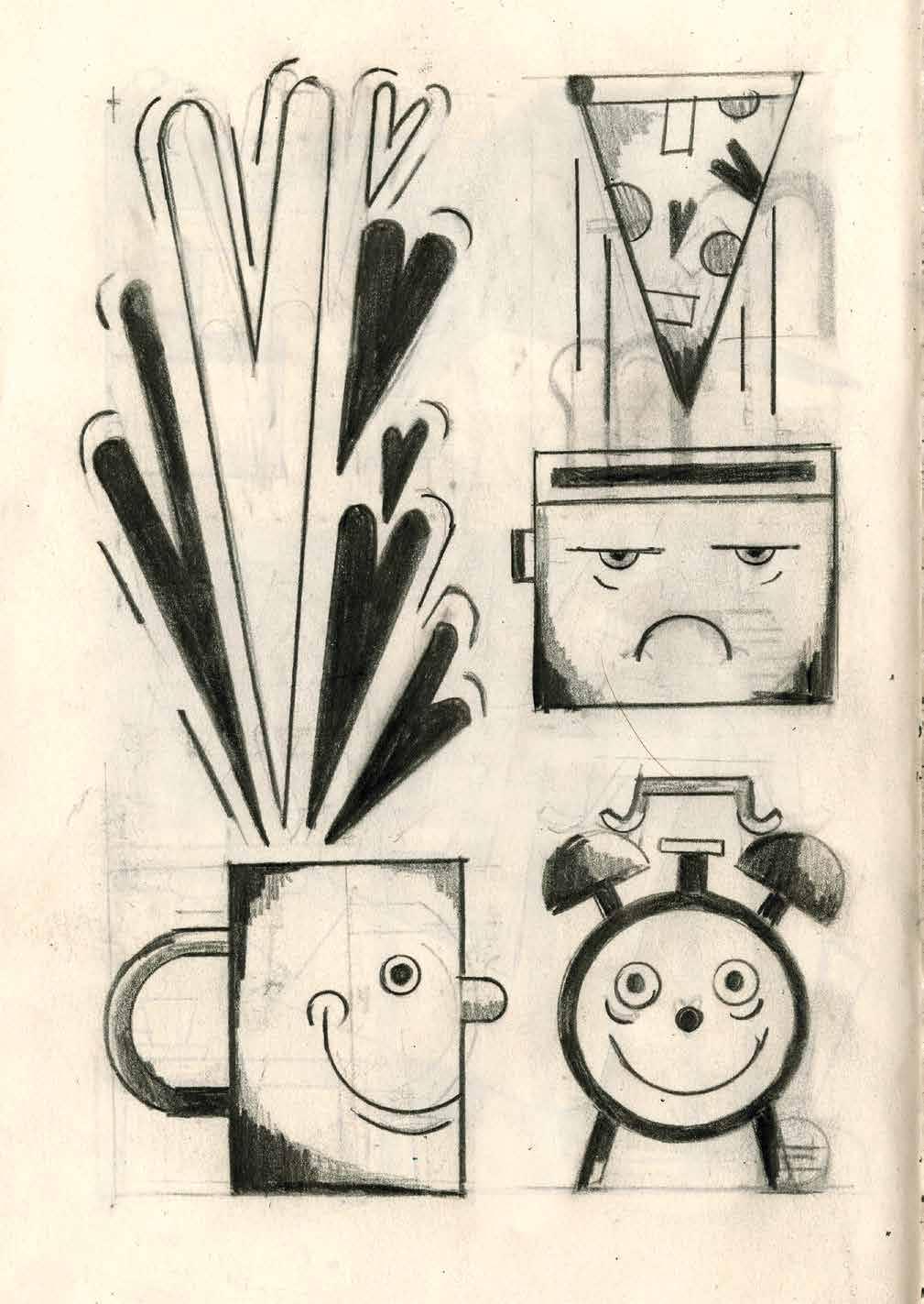
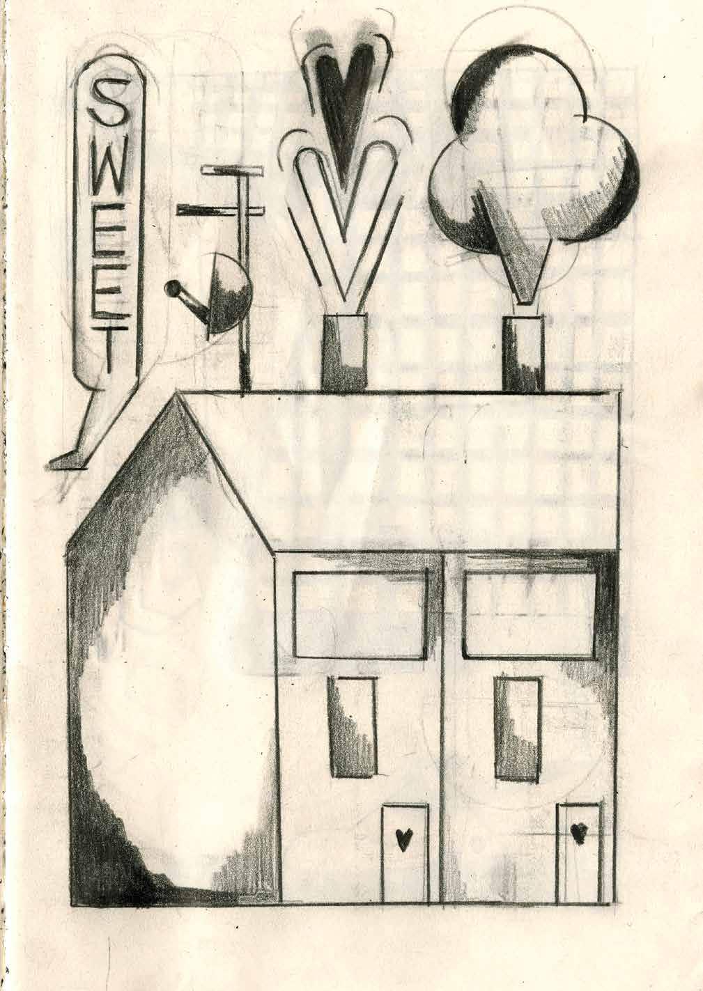
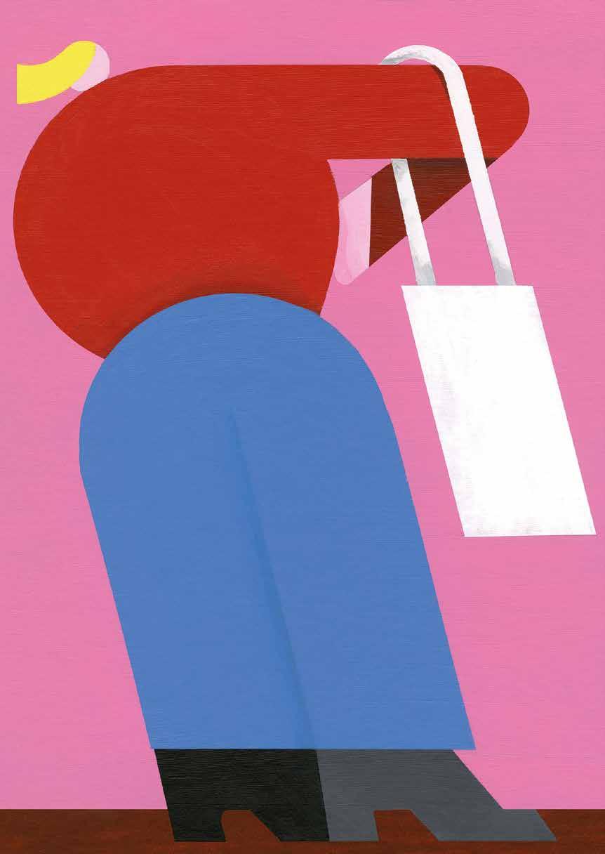
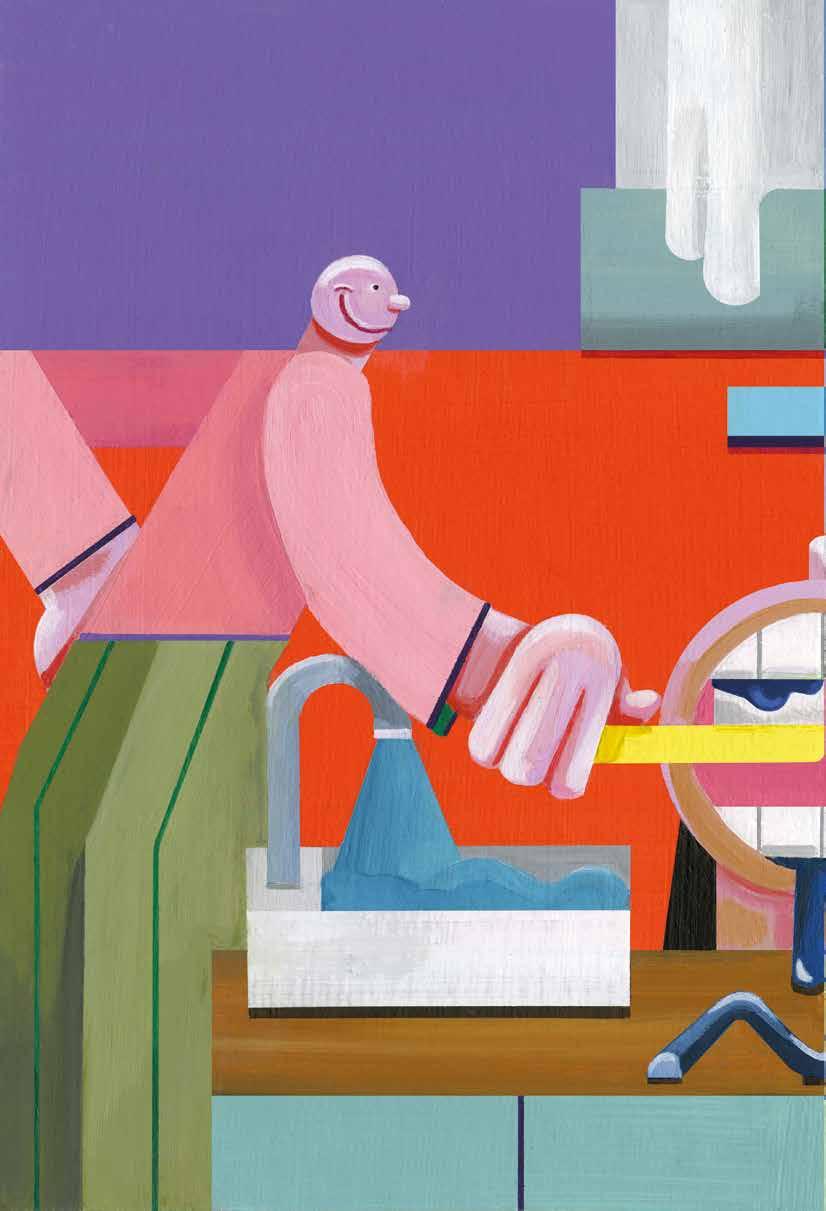
Jill Senft is a Berlin-based illustrator known for her distinctive use of bright colors and flat shapes. Working across disciplines, she transforms her ideas into sketches, paintings, and installations while maintaining a unique style. We spoke to her about working in her home studio, the process of developing and completing concepts, and how she manages to stay on track.
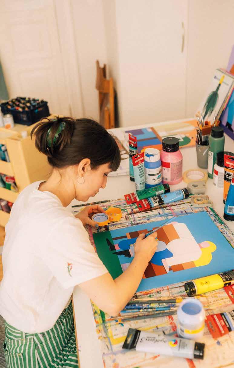
Do you draw your figures and sketches directly from off the top of your head onto the page?
Not really. Most of the time I usually do them off the top of my head, but when I started filming it for Instagram, I found it hard to do them just like that. Now I think if I want to do it for myself, it has to look good and then it loses that sketchy feel. So lately I prefer not to record it because I think it creates pressure.
And how does that develop when you turn the sketch into a painting? How closely do you stick to your plan?
If it’s a commission, it’s mostly fixed. You’ve made the sketch and you have to realize it exactly the same way, otherwise the client is disappointed. When I do something for myself, I do it however I feel like it. But most of the time I don’t have the time to realize them for myself and leave it as a sketch. A sketchbook is like a catalog of ideas. If you have a commission and it has to be done super quickly, you can open the sketchbook and reuse ideas.
Would you describe yourself as a perfectionist when it comes to your art?
No, not at all. I think you have to let go of that a bit, otherwise you can never send out your portfolio or show your work. That often changes too. If you look at stuff from 3-5 years ago, you can see that you did it yourself, but it’s changed. I think that’s okay. It’s part of the process. You have to let things go and move on. Being too perfectionist would be a hindrance, also fincially. You have to be quick and be able to move on.
What about your style? Was is always like this?
I studied in Weissensee and spent a semester abroad in Ghent, Belgium. I tried out a lot in Weissensee, but I didn’t really find myself. Many people painted in Ghent and the lecturers encouraged me to try it too. Then I started painting and I enjoyed it. I didn’t stop after Belgium. I only started sketching after corona and I’ve been doing it ever since. I now also work on the computer from time to time. I think it’s good to break up and change my work process from time to time. I also think you don’t always have to stick to your style. I think it’s much more important to maintain your own personality, if you keep it in your work, then that’s enough to keep it recognizable.
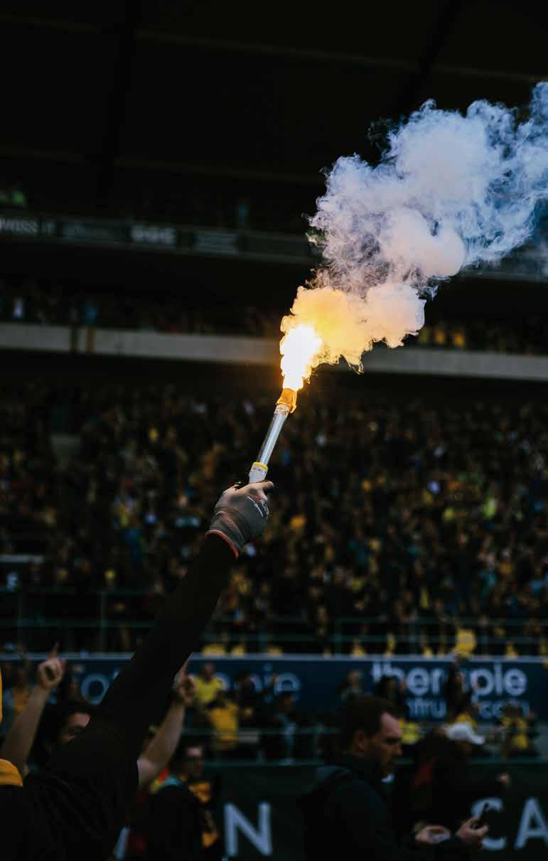
Letter from Boxhorn Magazine July 1st 2024
Are we ready? Or were we already ready? Will we be ready for what is to come? Ready for newer, faster and even bigger moves? For ideas, for acquaintances—for the world? What does being ready even mean? Always being prepared for everything? Would that be even possible? Can we be ready for what might happen within our universe? Or should we simply be ready—to be surprised? We might be ready in the moment we leave the house and face the world. But what happens when we face things that are not ready yet themselves? When is something ready? And what is the
point getting something ready faster, if the process itself is the main building block for personal growth? As designers, we are the ones who should actually know best that being ready is not always better. It does bring a brief moments of joy to hold something in your hands that is final. But it also drains us time and time again to bring a project and the associated process to an end
due to time constraints. And there are deep holes to fall in after such a process. Is that what we want as designers? How does it affect our personal development to create readyness? If contentment is stagnation, then imperfection is our progress. Sorry, we are not ready yet—and we don’t want to be, because the journey with all its ups and downs is our goal.
boxhorn-magazin.de Instagram: @boxhorn
Some Magazine
A Magazine for Visual Inventors
Issue #19: Ready Winter 2024 / 25
Editor-in-chief: Sven Völker
Editorial Team and Art Direction: Yevheniia
Shyrchenko, Fiete Prüfer, Felix Magnus Newrzella, Jolina Mumbela, Khaled Abdelrehim, Sara Malhas, Conquista Weineck, Ben Raisic, Kim Tuyen Truong
Cover Illustration: Fiete Prüfer
University of Applied Sciences Potsdam
Prof. Sven Völker (V.i.s.d.P) Kiepenheuerallee 5 14469 Potsdam, Germany welcome@somemag.com somemag.com @somemag_fhp
Slanted Publishers UG (haftungsbeschränkt)
Nördliche Uferstraße 4—6 76189 Karlsruhe, Germany
T +49 (0) 721 85148268 info@slanted.de slanted.de @slanted_publishers
© Slanted Publishers, Karlsruhe, 2024 All rights reserved.
ISBN 978-3-948440-78-7 1st edition 2024
Publishing Direction: Lars Harmsen, Julia Kahl
Production Management: Julia Kahl
Final Artwork: Julia Kahl
Printer: NINO Druck
Paper: Amber Graphic, 120 g / sm
About Some Magazine
Since 2010, changing editorial teams of graphic design students research, write, layout, and produce the bi-annual Some Magazine. It is a part of the Experimental Design course of Prof. Sven Völker at the University of Applied Sciences Potsdam.
About Slanted Publishers:
Slanted Publishers is an internationally active design, publishing and media house founded in 2014 by Lars Harmsen and Julia Kahl. They publish the award-winning print magazine Slanted, covering international developments in design and culture twice a year. Since its establishment in 2004, the daily Slanted blog highlights events and news from an international design scene and showcases inspiring portfolios from all over the world. In addition, Slanted Publishers initiates and creates publications, focusing on contemporary design and culture, working closely with editors and authors to produce outstanding publications with meaningful content and high quality. Slanted was born from great passion and has made a name for itself across the globe. Its design is vibrant and inspiring—its philosophy open-minded, tolerant, and curious.
Disclaimer:
The publisher assumes no responsibility for the accuracy of all information. Publisher and editor assume that material that was made available for publishing, is free of third party rights. Reproduction and storage require the permission of the publisher. Photos and texts are welcome, but there is no liability. Signed contributions do not necessarily represent the opinion of the publisher or the editor. The German National Library lists this publication in the German National Bibliography; detailed bibliographic data is available on the Internet at dnb.de.
