17 minute read
Commercial

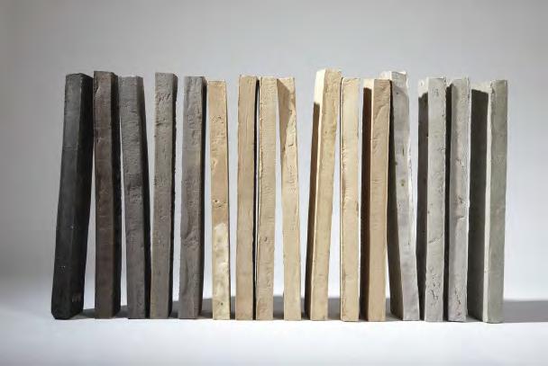
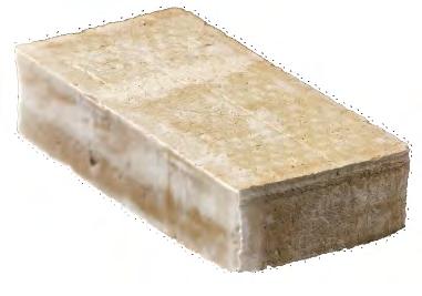
from Custom Bricks

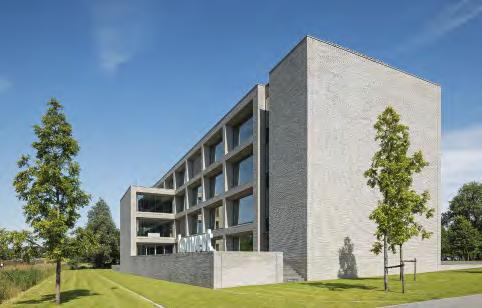
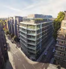
Konvert, headquarters, Kortrijk, Belgium
Client: Konvert NV
Architect: Bureau Goddeeris Architecten
Completed: 2019
Brick: Kolumba in custom colour, F261, F264, F287 various formats bricks in the same types of clay

Photos: Luuk Kramer
Blue brick echoes branding
The addition of minerals to the clay conjures up blue tones in the finished brick hat match the company’s logo.
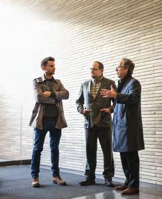
The client and architect wanted Konvert’s new headquarters to look architecturally straightforward, which made materials of the highest quality an obvious prerequisite. They also wanted the building to be as flexibl as possible.
Load-bearing concrete columns are incorporated into the façades, which makes some storeys column-free and affords the maximum interior flexibiity. The façades are rhythmic and minimal, with rectangular window sections without parapets, pulled back from the façade. Closed sections around the service cores enclose two of the gables. The brick borders that frame the window sections are cut at oblique angles, which makes the surfaces visible from all directions and creates a fascinating depth effect.
Kolumba was chosen for the façade to emphasise the building’s horizontal lines. Konvert wanted a distinctive look that would echo the company’s visual identity. Along with Petersen brickworks, they designed three custom bricks that use minerals to create the same delicate blue shades as Konvert’s logo.
To achieve brickwork that perfectly and silently wraps around the building, the architects designed a total of 43,500 custom bricks. These are deployed around the windows, doors, corners, crowning walls and on the undersides of lintels.
At firs glance, you might not notice the custom bricks. But that is the point – the impression is of a beautifully tailored wall surface that does not instantly give up the secret of how it was achieved.


About Konvert HQ
Konvert is a company based in West Flanders. Its portfolio spans a wide range of industries and includes service companies, employment agencies, offic administration, waste management and security services. In Kortrijk alone, Konvert employs 2,275 people.
In 2019, the company inaugurated a new headquarters in Kortrijk covering a total of approximately 6,000 m2 spread over six floors A figue that includes a partially subterranean ground floo and an underground car park the size of the whole building.

The new building is in a prominent spot on Kennedylaan, a broad avenue that runs through central Kortrijk. The building is designed as a wing located parallel to the avenue, with two smaller buildings on each side, forming a double L-shape. The side wing facing away from the avenue incorporates a large terrace overlooking surrounding green areas.
The various floor inside the building are designed as large, flexibl work areas, with service cores located at the front of the two wings. At the top of the building is a large terrace where staff gather for informal meetings and to enjoy unobstructed scenic views.

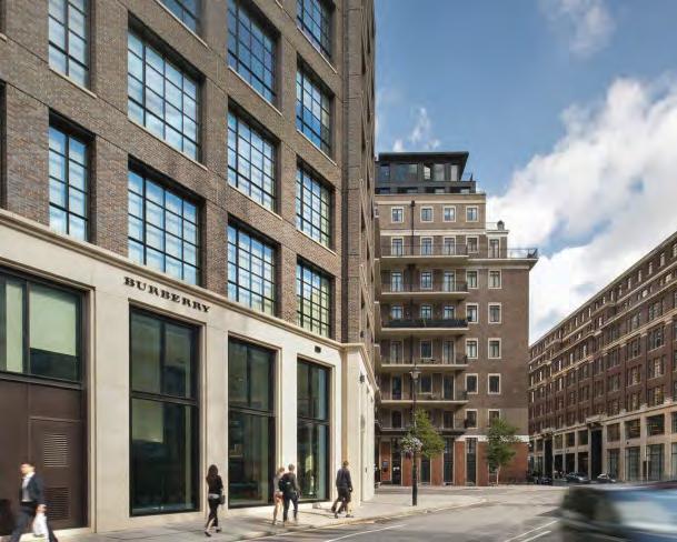
1A Page Street, Victoria, London, England
Client: Derwent London
Architect: PLP Architecture
Completed: 2014
Brick: D45 DNF custom colour + three bricks in custom format in the same clay
Photos: Philip Vile
“The people at the brickworks are just as passionate as we are. They don’t rest until the right brick is found for each building – and everything is possible in terms of colours and custom formats.” Simon Silver, director, retired, Derwent London
Glass converted to brick
Custom formats made it possible to clad the building in brick and to match the heritage building across the street.
The beautifully proportioned façades of 1 Page Street, in London’s prestigious Victoria district, give little indication of the enormous amounts of planning involved. The previous glass and steel cladding dated from 1999 and looked out of place in the area. As part of a complete renovation a decade ago, PLP Architecture proposed new brick façades.
“Normally, a building’s size is based on the dimensions of the bricks. In this case, the façade would have to be adapted to fi the existing concrete construction behind it. We had three extra formats specially made, and each brick was laid vertically to make the bond work. The John Islip Street corner is not a right angle, which is reflecte in the architecture, so Petersen produced a custom brick with an angle of 115°. Since the ceiling height varies throughout the building, we also had to intervene on the vertical plane – not that it’s visible in the finishe façade – to get the bonds to work,” explains Ron Bakker, architect and partner at PLP.


About 1A Page Street
After purchasing 1A Page Street, Victoria, owner and operator Derwent London decided to restore the approximately 16,000-m2 building so it more closely reflecte its upscale neighbour, Horseferry House in Dean Ryle Street, also owned by Derwent. Architecturally, brick and sandstone façades were the obvious choice for Page Street. Burberry, which leases both buildings, also expressed a desire for a more coherent look.

“Finding the right brick was crucial. We knew from working with Petersen Tegl in the past that they are just as passionate as we are,” says Simon Silver, former Derwent director.
“The tolerance of the bricks is also hugely important. All Petersen bricks are slightly different sizes, which results in an irregular and rich façade. The coal firin also gives each brick a crystalline surface that reflect light and enhances the effect,” adds architect Amy Holtz, CEO of PLP Architecture.
“At first we intended to use a mixture of bricks,” Bakker continues, “but during a visit to Broager, we spotted a brick that was not only red but also had the hints of purple and blue present in Horseferry House. It had been discontinued a decade ago, but Petersen was, of course, willing to resume production specificaly for our project.”
Astoria House, Stockholm, Sweden
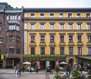
Client: Humlegården
Architect: 3XN
Completed: 2020
Brick: F154, custom format
Photos: Rasmus Hjortshøj, Ulf Celander
Unifying tiles
Innovative use of brick on the roof and façade adds a unique and modern twist to a new building complex.


To unify the whole complex, the big new roof covering both the restored Astoria House and the newly built adjacent offic building was to be clad in one material.
“It was only natural to go in the direction of brick, which is used in older buildings in the area,” says architect Audun Opdal of 3XN. “It was crucial for us that the new building would look weathered right from the very beginning as if it had been there for years and years, and at the same time it should be contemporary. We felt that bricks from Petersen could be the element that tied the two buildings together, particularly if we bypassed traditional, joint-based masonry and instead developed a new way to lay the bricks.”
The brickworks and the architects experimented to fin the right brick and a suitable mounting technique. The result was a special edition of Kolumba, 800 mm long, in a deep, rusty red. To get the most out of the hand-moulded bricks’ rich play of colours and uneven texture, the architects decided to mount them on the façade vertically, with the broad, more rustic underside facing outwards. This resulted in a completely new brickwork effect.
About Astoria House
Before it closed in 2007, the Astoria on Nybrogatan, Östermalm, Stockholm, was one of the Swedish capital’s oldest and best-known cinemas. The property that housed the cinema was known as Astoria House. Originally home to luxury apartments, the upper storeys were later converted into offices
An extensive and very successful restoration of the property was combined with the construction of a new 6,000-m2 offic building next door, replacing a former outbuilding. The preserved part of the complex, including the façade and the entrance to the former cinema on Nybrogatan, has been superbly and sensitively returned to its original residential use.
The overall project, handled by 3XN, has re-established the address as a contemporary landmark in Östermalm.
The complex’s roof is its most striking feature. The unique, two-storey construction starts as a pitched roof atop the preserved Astoria House and from here rises in a twisting movement over the new building volume, ending in a right angle - as a greeting to the neighbouring fie walls. In the process, the two storeys inside the pitched roof are transformed into more conventional offic space.

Turnmill office builing, Clerkenwell, London, England

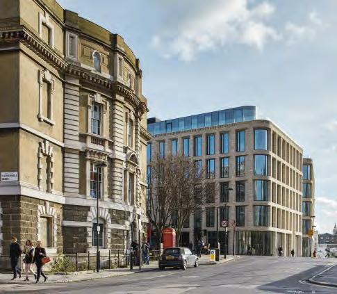
Client: Derwent London
Architect: Piercy&Company
Executive architect: Veretec
Completed: 2015
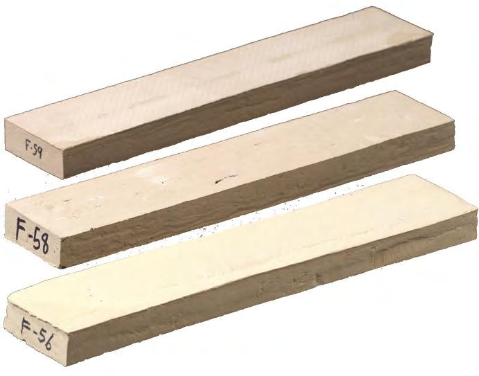
Brick: Three custom colours in Kolumba, F56, F58, F59. 27 custom format bricks made of the same clay
Photos: Allan Crow, Philip Vile
Adapting 18th-century colours
85,890 handmade bricks in 27 formats and three special colours make an office block in Clerkenwel simultaneously stand out and fit in
Brick was always going to be used to clad the building. It is the classic Clerkenwell material – unlike the City of London to the east, which is all about glass and steel. Machine-made bricks were also out of the question. At first the architects Piercy&Company and client Derwent London envisaged dark shades to reflec the building’s kinship with the nearby railway buildings. Along the way, however, they looked to the listed Session House across the road, which was built as a courthouse in 1780 using sandstone in various shades of warm grey.
The architects and client chose the handmade, 528-mm-long Kolumba due to the vertical profil of the building. However, the colours they wanted were not in the standard Kolumba range, which was either too grey or too golden compared to the sandstone of Session House. Instead, they developed three subtle, special colours at the brickworks in Broager. One complicating factor that emerged from the development work was that the light in London differs from that in Denmark.
The architects could not make fina decisions about shades until the bricks were mocked-up in situ with the right mortar. The three colours were mixed so that bricks of the same tone do not appear beside each other.
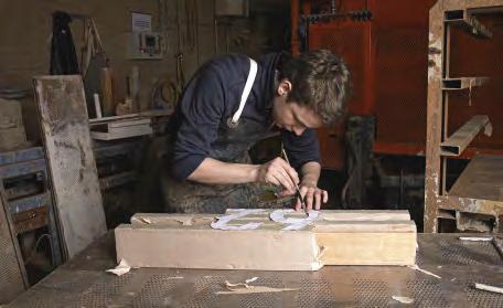
As well as producing three special colours, Piercy&Company designed 27 different custom bricks to accommodate a range of architectural details.
Standard Brick
Brick Special Type F
Brick Special Type A
Brick Special Type Ch
Brick Special Type B
Brick Special Type Dh
Brick Special Type C
Brick Special Type Eh
Brick Special Type D
Brick Special Type Fh
Brick Special Type E
Brick Special Type G1
Brick Special Type F
Brick Special Type G2
Brick Special Type Ch
Brick Special Type G2h
Brick Special Type Dh
Brick Special Type H1
Brick Special Type Eh
Brick Special Type H2
Brick Special Type Fh
Brick Special Type H2h
Brick Special Type G1
Brick Special Type I
Brick Special Type G2
Brick Special Type G2h
Brick Special Type H1
Brick Special Type H2
Brick Special Type H2h
Brick Special Type I
About Turnmill
The delicate, light and shimmering colours and the bricks’ handmade structure give the façade of the six-storey offic building the appearance of a refined woven piece of cloth, while the edifices volume and solidity invoke associations with the centuries-old warehouses that have played a key role in the local area’s colourful history.
The Great Northern Railway Company constructed the original building in 1886 as a multi-storey stable for the horses that used to pull the carriages on the underground. The local authority was very keen to preserve the building, even though all the original interior details had disappeared over the years.
Piercy&Company analysed all the options for the building but ultimately decided that it would not be suitable for either housing or offices In consultation with the London Borough of Islington, a decision was finaly made to demolish and rebuild, on condition that the new building would make a more positive contribution than the old building in both architectural and material terms –and it does.


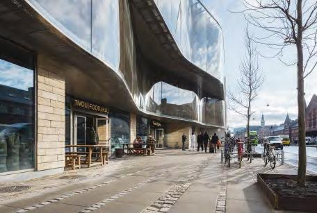
Tivoli Corner, Tivoli Gardens, Copenhagen, Denmark
Client: Tivoli
Architect: Pei Cobb Freed & Partners
Completed: 2017
Brick: Custom colours and formats of Petersen Cover developed by Pei Cobb Freed & Partners in cooperation with Tivoli
Photos: Anders Sune Berg
Inspired by local heritage

Handmade bricks forge a connection between Tivoli’s most recent addition and the 180-year-old amusement park.
The rear façade of Tivoli Corner, facing the gardens, comprises undulating terraces with green outdoor spaces. Although the surfaces are sub-divided and spread over different levels, the building has a unifie feel – not least thanks to the brick cladding chosen by Tivoli and Pei Cobb Freed & Partners, which has a natural look that complements the greenery of the Gardens. Denmark’s wonderful brick heritage, including the Church of the Holy Trinity, was a source of great inspiration for the architects so using natural Danish materials to pay homage to the history of Tivoli was an obvious choice.

The new building stands between the ceramic-tiled main entrance to Tivoli Gardens from 1890, and Hotel Nimb, with its Moorish-inspired façade in Venetian marble. As they wanted to establish a dialogue with the two older buildings, the architects commissioned Petersen Tegl to develop a special edition of Cover for the new brick façade. The result is a Danish blue-clay brick made in wooden moulds, using a greyish-white slurry as lubricant. Its white and yellow shades reflec the colours of the neighbouring buildings.
As well as the unique colour, the architects and client chose a special format that results in slightly less relief in the clinker-built construction. Another custom format is used on the façade facing Bernstorffsgade, where the bricks are flus with the façade.
The architects wanted façades with a limited profil and shadow effects, a look achieved by using this L-shaped custom version of Cover.
About Tivoli Corner
Tivoli Corner is the name of the latest attraction built as part of Tivoli’s mission to connect with the surrounding city. The 8,500m2, four-storey building on the corner of Bernstorffsgade and Vesterbrogade was designed by the American architects Pei Cobb Freed & Partners. Architect and partner Ian Bader has been the designer on the project since its initial conception 15 years ago. Accessible from both the Gardens and the street, Tivoli Corner houses restaurants, cafes, shops and a modern food hall with takeaway outlets and sit-in dining, all under one roof.
Facing the street, the exterior is decidedly urban, comprising two dynamic, undulating glass bands with vertically integrated rotating slats that provide shade and alter the view between the interior and the street. The two floor behind the glass house a restaurant and 21 new rooms of the five-sta Nimb Hotel. By day, the glass façade reflect the surrounding buildings and absorbs the colours of the city. By night, it sparkles and twinkles, enticing visitors to experience the fairy-tale adventures within.


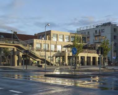
Kville Saluhall, Gothenburg, Sweden
Client: Älvstranden Utveckling
Architect: Gustav Appell Arkitektkontor
Completed: 2016
Brick: D71 FF + custom brick in the same clay with clear glaze

Photos: Ulf Celander
Shimmering brick
Glazing selected bricks reveals a surprising, illuminated pattern in a certain light.
Architect Gustav Appell’s vision for Kville Saluhall was for an architecturally simple structure, which required a brick with a strong idiom.
“The brick had to be handmade to bring the façade to life,” he explains. “We chose a yellow one that derives its light tones and unusual play of colours from the white porcelain clay used to ease the lump of clay out of the mould after the firin process. In the end, we decided on Flensburg Format, which is very elegant and works well with the other building components.”
Seeking a distinctive aesthetic for the façades, the architects decided that selected bricks would glisten when they caught the sunlight at certain angles. So they asked Petersen Tegl to glaze a number of bricks before firing
“The effect was just as refine and understated as we had hoped,” says Appell. “Once the building work was completed, we had the pleasure of the client and partners telling us that the brick had been worth the money and that they were glad we had insisted upon it. In 2014, the hall was named the best building project in Gothenburg – the fines accolade we could wish for because it didn’t come from architects!”
About Kville Saluhall
Southern European-style market halls have gained a foothold in Scandinavia in recent years and are now found at several locations around Sweden. The aim of the saluhaller (as they are called in Swedish) is to support small traders and producers in a consumer-friendly way.

Located in the Gothenburg suburb of Kvillebäcken, Kville Saluhall looks like a three-storey building that tapers off into a lantern-like structure at the top. This tapering of the main body allows the afternoon sun to reach the small, neighbouring square.
On the ground floo, one enters a double-height hall with shops side by side, creating a bustling, intimate atmosphere. A firs floo balcony has various restaurants that open onto a large terrace. Large windows provide plenty of light and open up the market hall to its surroundings.
The design called for materials that would correspond to the functional and architectural robustness of the hall, which made hardwearing, timeless and maintenance-free brick the obvious choice.

Design studio, Rancate, Switzerland

Client: Stocker Lee Architetti
Architect: Stocker Lee Architetti
Completed: 2019
Brick: C48, K49 + C48 custom format
Photos: Paul Kozlowski
Seamless integration of Kolumba and Cover
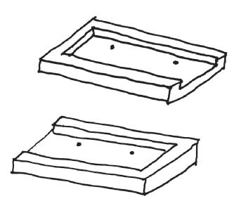
An architectural office in Switzerland uses a special version of Cover allowing for simple, elegant corners.
A few years ago, Stocker Lee Architetti designed and consummately executed a building that houses a design studio for their own use. The building is a sharply define brick volume with no overhanging eaves. Recessed glass façades at ground level make the upper storeys look as if they are floaing in the air. The studio feels straightforward in its appearance and entirely convincing in its hierarchy – a testament to both Stocker Lee’s natural incorporation of nature into the design, and the building’s striking precision and veneration for detail.
The upper gables are clad in Kolumba with a wild bond, while the roof and façades on the long sides of the building are clad in Cover fied in the same way and with the same colours. Two-thirds of the way up, the roof breaks sharply to make room for fla skylights.
The meeting of Kolumba on the gables and Cover on the long façades required a custom solution designed by Stocker Lee. Every Cover brick at the corners of the building has a side section that borders the gable end, giving the bricks a closed look. The Kolumba bricks, which also go all the way out to the corners, are cut to
About Stocker Lee design studio
The building in Rancate is on an elongated plot measuring 12.70 x 22.60 m and facing the imposing mountain Monte Generoso, between Lake Lugano and Lake Como. The shape of the plot is due to the shape of the old village, which is surrounded by vineyards, forests, small-scale industry and housing. Close to the forest, the design studio is semi-submerged to take up less space and leave more room for nature.
The floo plan measures 6.6 x 17.6 m, and the compact structure is based on 29 tightly packed load-bearing wooden beams rooted in the in-situ-cast concrete walls surrounding the partially submerged ground floo. Above this are the windows on the lower façade, which is slightly retracted from the deep reddish-brown solid Cover brick monolith of the upper volume. Cover was chosen as a nod to cottage architecture and blends in naturally with the colours of the landscape. Equally, the bricks emphasise the shape of the building without dominating the surroundings.

Petrol station, Skovshoved, Denmark
Builder: Texaco
Architect: Arne Jacobsen
Completed: 1938
Restoration project: 2001-2003
Client: Gentofte Kommune
Architect: Dissing+Weitling
Brick: Various custom format glazed ceramic tiles
Photos: Anders Sune Berg
Recreating iconic ceramics
Following a successful restoration almost two decades ago, a world-famous petrol station looks just as it did when completed in 1938.
Arne Jacobsen’s petrol station was restored in 2002 and 2003 to mark the centenary of the architect’s birth. The project was subject to close scrutiny by the conservation authorities and involved recasting the elliptical roof and resurfacing and cleaning up the site. The service building’s ceramic tile cladding – a key element in the overall aesthetic – was in poor condition and needed to be replaced.

According to Teit Weylandt, former partner at Dissing+Weitling and the architect who oversaw the restoration project, the texture, colour, finis and format of the replacement tiles were crucial.

“We didn’t manage to track down the original manufacturer, which we think may have been in Bohemia. We approached several others, only to fin tiles with smooth, uniform and lifeless surfaces with a bathroom-like feel. Luckily, Petersen Tegl offered what we were looking for.”
The original standard tile measures 150 x 300 mm, but the project also used 130 custom formats, including curved and double-curved tiles, which required specially produced plaster moulds. After shaping and drying the tiles, they were glazed.
“The brickworks came up with special methods to produce a rustic, raw, vibrant glaze and surface, with a slight variation in colouring as close to the original as possible,” Weylandt explains. The successful result on Kystvejen has been admired for the last two decades.
The original standard tile measuring 150 x 300 mm was recreated by hand for large sections of the façade. In addition, 130 custom formats, including curved and double-curved tiles, were produced with plaster moulds.

“The brickworks came up with special methods to land on a rustic, raw, vibrant glaze and surface, with a slight variation in colouring as close as possible to the original.”
Teit Weylandt, architect


“The seemingly simple tiles present myriad variants, corners and edges that manufacturers today aren’t equipped to accommodate to this degree of individual fiting. We were thrilled by Petersen Tegl’s commitment to our collaboration and achieving the desired result.”
Teit Weylandt, architect
About Arne Jacobsen’s petrol station
Located on Kystvejen in Skovshoved, north of Copenhagen, Arne Jacobsen’s famous petrol station was part of his modernist plan for the area around Bellevue: ‘The White City on the Sound’. In 1938, Texaco commissioned him to design a new type of petrol and service station. The result was a light and elegant construction that went on to be world famous and is today a listed building. Architecturally, Jacobsen had an experimental approach to materials and structures.
A distinctive roof construction provides shelter and acts like a giant lamp – the ellipse is illuminated from below by specially designed fixtues that reflec off the shiny underside. The roof’s distinctive contour is echoed in Jacobsen’s furniture design – most clearly in the classic Ant Chair from 1952.
The building measures just 9 x 15 m and consists of a car wash, office storage room, boiler room and two toilets. It is cast in reinforced concrete and clad in white ceramic tiles, reflecing Jacobsen’s preference for pure, minimalist design.
The petrol station is a fin example of free form and reflect Jacobsen’s openness to influence from peers in other countries such as Gunnar Asplund, Alvar Aalto, Mies van der Rohe and Le Corbusier.
The restoration of the petrol station was awarded the prestigious Europa Nostra Prize 2006.
Architectural drawings and Arne Jacobsen’s original watercolour for the petrol station from 1936.


Copyright: Arne Jacobsen
® Design, Photo: Danish National Art Library
Arcade building, Nordre Toldbod, Copenhagen, Denmark
Architect: Gustav Friedrich Hetsch
Completed: 1850
Client: A.P. Møller Mærsk
Restoration project: 2010
Architect: Fogh & Følner Arkitekter
Brick: custom format and custom colour brick in Danish blue clay
Photos: Anders Sune Berg
Golden bricks on historic port buildings
Restored a decade ago, the brickwork on the listed arcade buildings in this historic Copenhagen district looks as harmonious as ever.
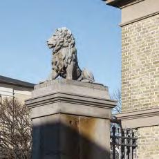
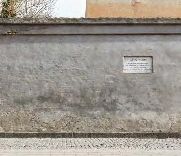
From the mid-1850s, access to Nordre Toldbodplads in the Port of Copenhagen was via a lattice gate, on the pillars of which sat two lions who still guard the spot to this day. Inside the gate, visitors pass two low arcade buildings, built in 1856 by the architect Gustav Friedrich Hetsch. The listed and partially preserved arcades bear witness to a historic era and are today owned by the shipping company A.P. Møller and the development company By & Havn. A decade ago, as part of a renovation project, the Fogh & Følner studio was commissioned to restore the brickwork in the southern arcade’s pillars.
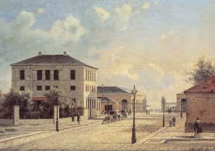
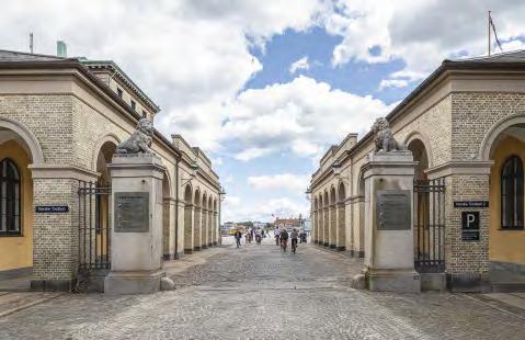
Petersen Tegl supplied golden-hued bricks to replace the damaged ones. These custom bricks are fied from Danish blue clay and laid with an extruded joint that allows them to blend in with the 165-yearold brickwork.
About the Arcade building
Københavns Toldbod (Copenhagen’s Customs House) was the name given to a large area in the north-east of inner Copenhagen in 1630. From here, customs officer controlled the seaward approach to the city, and the name stuck for centuries. Heads of state and other dignitaries would disembark there when they landed in the capital, including the world-renowned Danish sculptor Bertel Thorvaldsen when he arrived back from Rome in 1838.
As trade grew in the 18th and 19th centuries, the Customs Service erected a number of buildings in the area, several of which were later demolished. The abandoned warehouses came down in the mid-1970s when changes in the law meant that goods no longer had to be stored for physical inspection. Two arcade buildings from 1856 have been preserved and listed.