

A NEW HOME IN A HISTORIC PART OF ‘S-HERTOGENBOSCH RISES FROM AN OLD CANAL WALL, CASTING ITS REFLECTION ON THE WATER BELOW. GREEN TREETOPS EMBRACE THE NEWCOMER AND CAUSE SHADOWS TO FLIT ACROSS THE CALM, GREY BRICKWORK OF THE FAÇADES.
By Martin Søberg, ph.d., architectural historian
“If you get the brickwork wrong, you are stuck with it. So finding the right fit was crucial.”
Architect Thomas Kemme
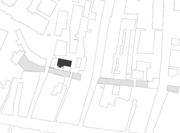
The new building is part of a large, five-hectare urban development known as the Gasthuiskwartier in the centre of the old canal city of ’s-Hertogenbosch in the south of the Netherlands. For centuries, the Grootziekengasthuis hospital stood here and was almost a separate town within the city, separated from the centre by the De Binnendieze canal system. Access to the hospital was via Gasthuis Bridge, to the right of which the new home is ensconced. The meandering layout of the streets mimics the medieval city, with constantly changing views that offer a very varied experience of the urban space. The new building plays a crucial role in the city plan, acting
as a point-de-vue at the end of the street. Pedestrians can pass on either side of it and choose which bridge to use as they head for the city centre.
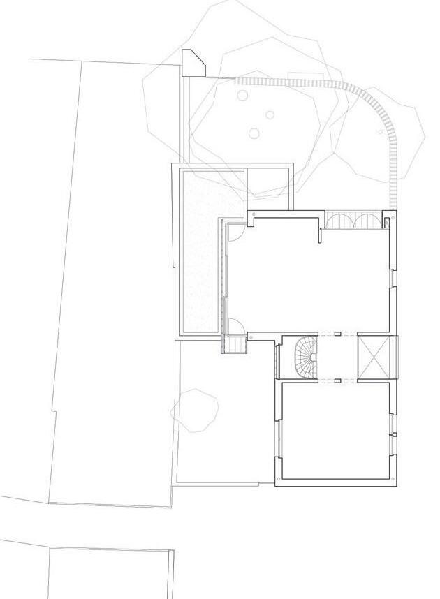
Facing the street, the home is three storeys tall and has a lowpitched roof. In the middle of the plot, it extends out to the canal wall. At the southeast corner, space was reserved for a terrace surrounded by walls. To the west, a third of the plot consists of a small, enclosed garden – a hortus conclusus. The bottom floor houses the kitchen-dining room and living room, from which large
provide
to the
and
and


“s-Hertogenbosch is one of the most wellpreserved cities in the Netherlands, so the building had to be something special. Indeed, that was a prerequisite for planning permission. That’s why we went with Kolumba, inspired by the Kolumba Museum in Cologne – same brick, same type of brickwork.”
Architect Thomas Kemme

a fluid transition between interior and exterior. The upper two floors are more private and house the bedrooms, guest rooms and smaller communal areas. To the south, both these floors have balconies and vertical sun shutters, each of which opens perpendicularly to the façade, which offers myriad options, from fully shut to wide open.
A staircase leads down from the open-plan space to a basement, the remains of a former bakery. Here, a large window creates a visual link between the canal, the open space and the garden. Unlike many other Dutch cities, where the canals run in front of the houses, in ’s-Hertogenbosch, the Binnendieze flows behind them and is only visible in glimpses. Like the older buildings that line the canal, the new house soars upwards as an unbroken extension of the quayside.
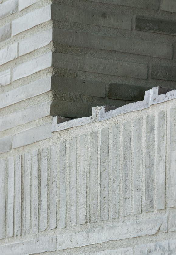
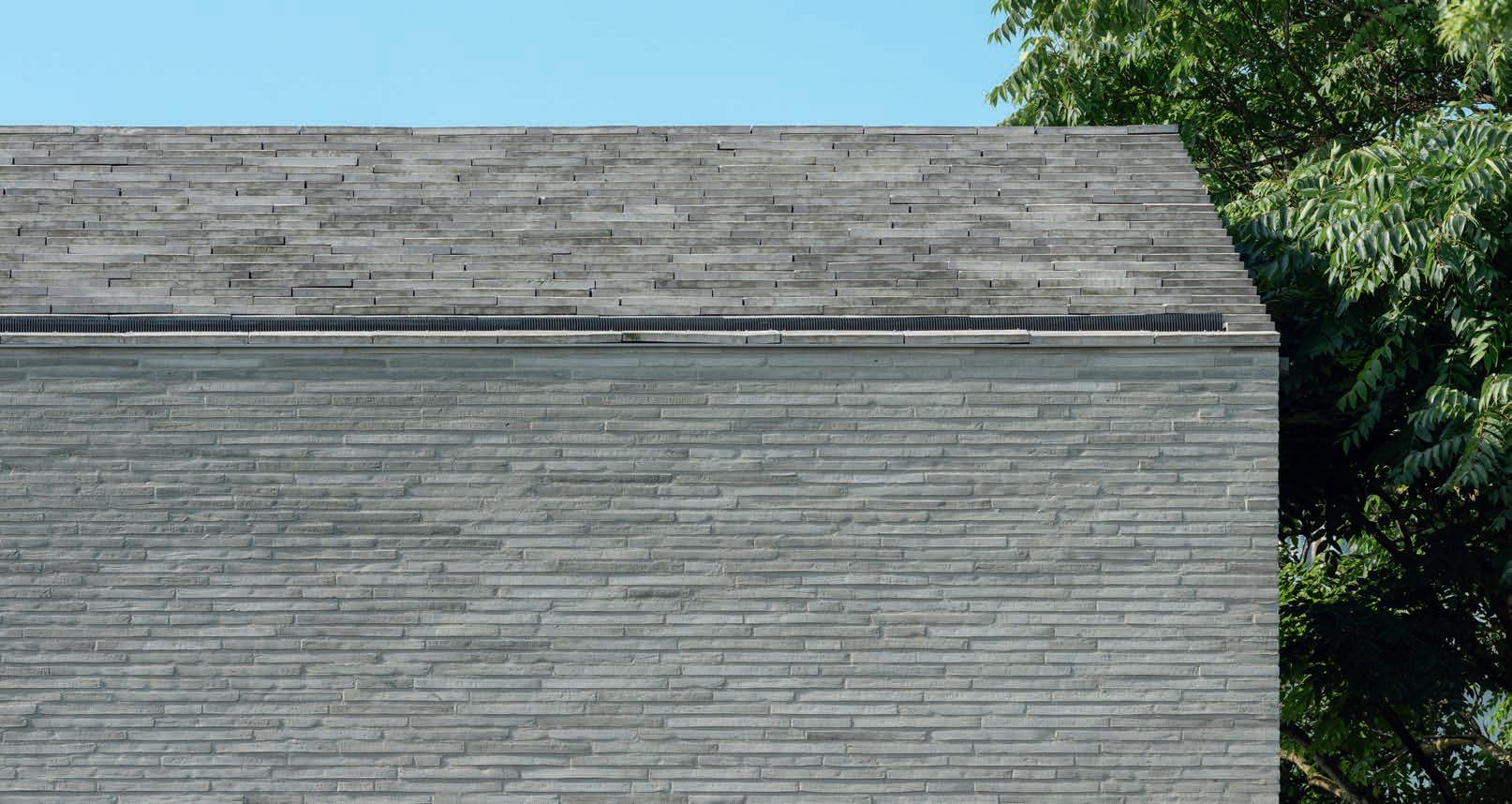
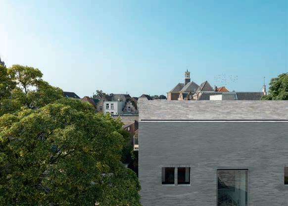
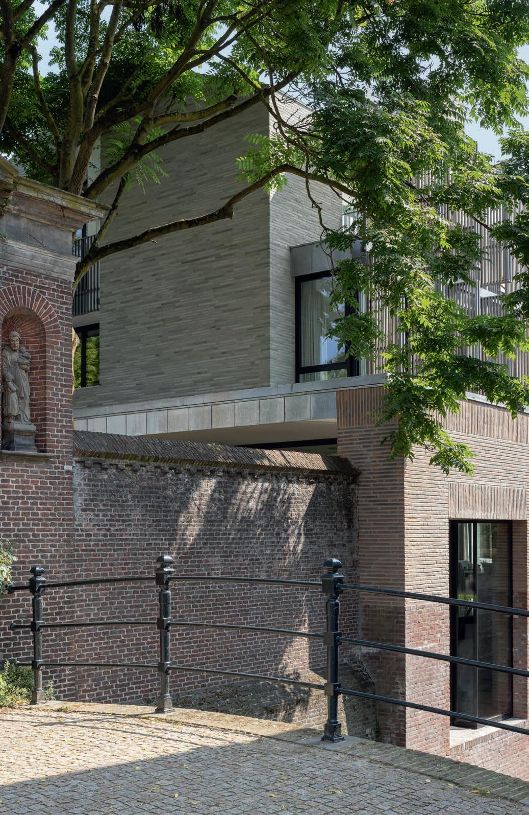
The light-grey Kolumba of the façade stands out against the predominantly red brickwork of the cityscape but maintains the link to the city’s proud brick tradition. The low-pitched roof is clad with Cover, custom made in the same colour as the façades, ensuring the building forms a cohesive whole.
“If you get the brickwork wrong, you are stuck with it,” architect Thomas Kemme explains, “so, finding the right fit was crucial. And because this is a central site in a historical city –‘s-Hertogenbosch is one of the most well-preserved cities in the Netherlands – the building had to be something special. Indeed, that was a prerequisite for planning permission. That’s why we went with Kolumba, inspired by the Kolumba Museum in Cologne – same brick, same type of brickwork.”
The long, narrow brick has been laid with a wide, 18 mm joint in a complementary shade of light grey.
“I wanted to use the same bricks as the Kolumba Museum, so I recommended my clients pay it a visit. They did and were convinced right away. The brick was perfect,” Kemme adds.
The architects also used Kolumba on the canal side but in three custom colours to blend in with the original wall. An enclosed garden, also on this side, is bordered by an older red-brick wall connected to the hospital’s monumental and beautifully preserved main gate from the mid-18th century.
On the street side, a wall in light-grey Kolumba brick curves around the garden. The wall is finished with a course of headers along the top and clad in a specially cut Cover, laid face-down to create a crenellated effect. In the garden, the dark trunks and branches of the tall trees contrast with the light-coloured brick. As the foliage filters the light and reflections from the canal flicker across the façade, you sense the modern city embracing its many layers of history.
Villa, ’s-Hertogenbosch, the Netherlands
Client: Private
Architect: Thomas Kemme Architekten
Contractor: Van den Heuvel Bouwbedrijf
Engineer: Goudstikker de Vries
Brick: K51, K51 in two radii, Cover F349, Kolumba F456, F457 and F458
Photos: Stijn Poelstra
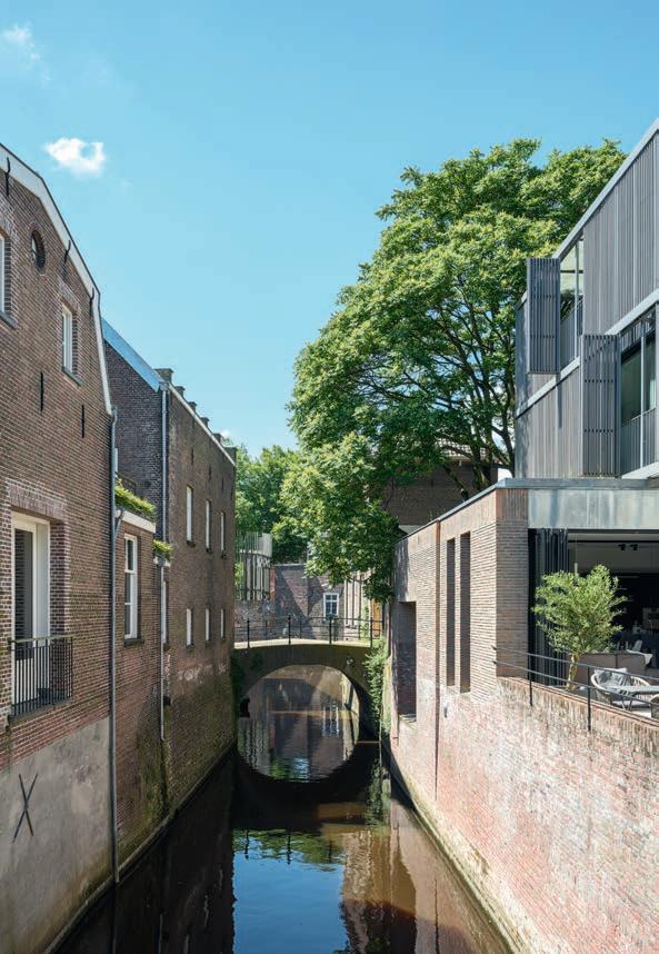
Along the De Binnendieze canal system, which cuts through the city, the houses appear to grow out of the canalside walls. The house does the same, while the vertical, movable shutters add a changeable element.



by Ida Præstegaard, MSc Architecture
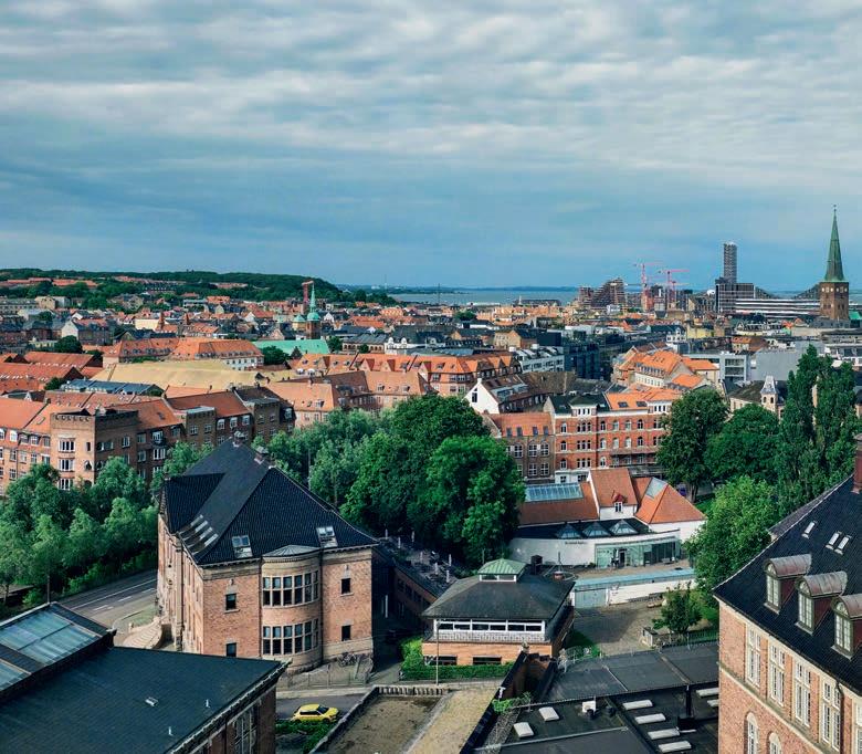
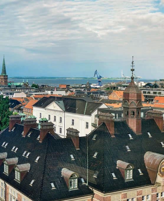
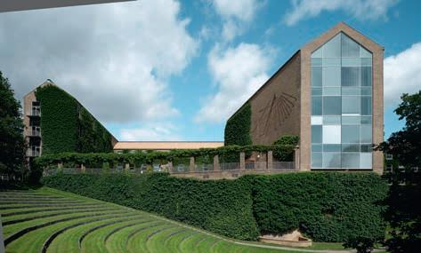
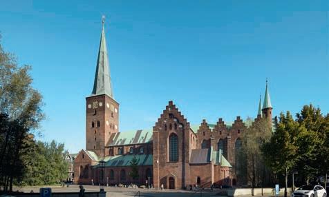
Aarhus has an abundance of architectural riches. The many buildings popular with tourists and loved by locals endow Denmark’s second largest city with its distinctive character. They include the 13th-century Aarhus Cathedral; the Psychiatric Hospital from 1849, designed by Gottlieb Bindesbøll; Aarhus Customs House from 1897, by Hack Kampmann; and Aarhus University, the first building of which was designed by Kay Fisker, P. Stegmann and C.F. Møller and was inaugurated in 1933.
The common denominator is that all these buildings are made of brick and have stood the test of time in an exemplary manner – as is evident from how long they have lasted – from 90 to 800 years.
Petersen Tegl has supplied bricks for many buildings in Aarhus over the years. On the next few pages, we feature five very different projects for which the architects took great care to choose bricks that harmoniously integrate with their surroundings.
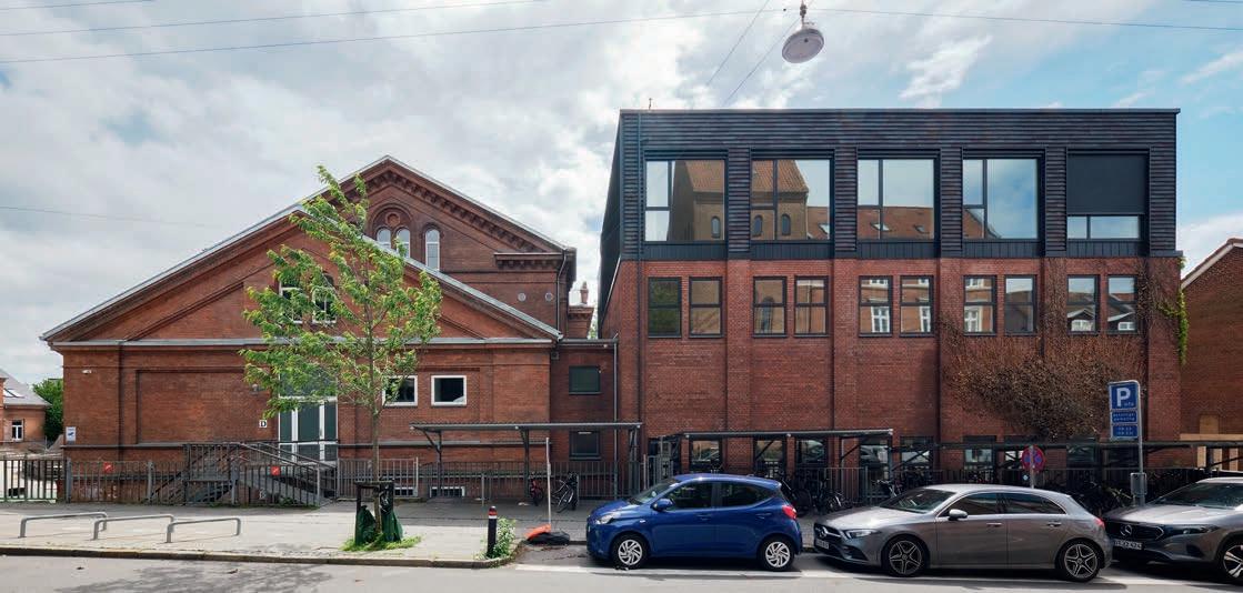
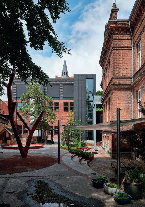


ONE OF THE OLDEST PRIVATE SCHOOLS IN DENMARK HAS AN AD HOC AND EMPATHETIC APPROACH TO ADDITIONS TO THE PREMISES. MOST RECENTLY, IT BUILT A LARGE ASSEMBLY HALL ON TOP OF A BLOCK FROM THE 1950s.
Øgade district, the cultural centre of Aarhus, is a key part of the Elise Smiths School’s DNA. The private school is surrounded by museums, theatres and other cultural institutions and draws on them in its teaching. Founded on this site in 1824, it has 540 pupils up to the ninth grade and close working relations with the other educational institutions in the area, so moving from Ny Munkegade has never been an option. The management prefers to adapt existing buildings to its changing needs. Over the years, Nodo Arkitekter has taken on several challenging projects for the school. A few years ago, they were asked to design a big new assembly hall for 150 pupils.
The school’s buildings are grouped around a central yard, the oldest and most prominent being the red-brick main building, which runs north-south and dates from 1888. Others, which are used by the older pupils, were built between 1950 and the 1990s. The architects’ brief was to build a new 165-m2 hall on top of a two-storey volume from 1953 that was taller than the other, more traditional buildings because it originally housed gyms on both floors. One of its long façades faces onto
Thunøgade. The other forms the rear wall of a small schoolyard for the youngest pupils. The building has a simple aesthetic, with supporting columns in the red façades bringing some variation to the otherwise smooth surface.
“Especially in a job like this, it’s crucial that you enter into a dialogue with the context,” say Louise Balle Rosbjerg (partner) and Tinne Søndergaard (project architect) of Nodo Arkitekter. “The addition had to be unobtrusive, understated and modern. Petersen Tegl’s facing bricks were on our shortlist from the very start, as they not only suit the location but also reinterpret traditional brick.”
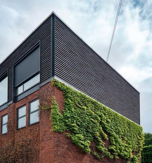
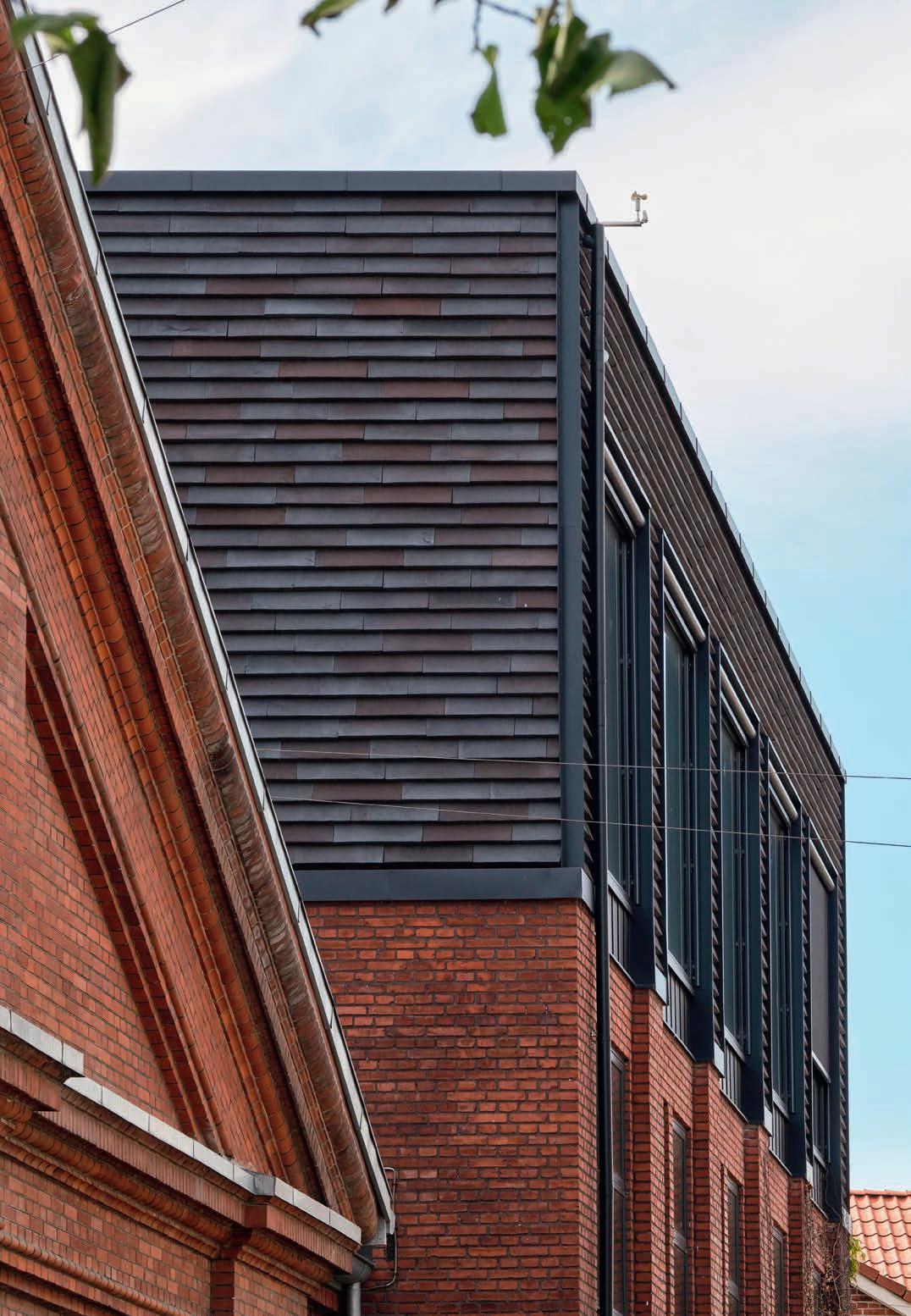
“Using Cover instead of bricks makes the building look less monolithic because it breaks up the surface. The trick was to get the tone right, and we soon found ourselves drawn to C56, which alternates from graphite grey over dark brown to lilac hues. Some of these shades are also found in the red-brick façades, but the brick is quite dark overall. The contrast with the red bricks underlines the impression that the recent addition could be a
C56’s play of colour alternates between graphite grey and very dark brown, with a hint of dark purple. The rich but softly muted colour allows the brick to harmonise with numerous other brick shades.
Elise Smiths School, Aarhus, Denmark
Client: Elise Smiths Skole
Architect: Nodo Arkitekter
Contractor: Brdr. Thybo
Engineer: Aarhus Ingeniørerne
Completed: 2020
Brick: C56, 528 x 170 x 37 mm
Photos: Anders Sune Berg
The cost of the handmade Petersen Cover was not a factor.
“Compared to the demanding, load-bearing construction, the brick was a minor outlay. Elise Smiths School is a good client that gets durability. They understand the point of high-quality materials that will stand the test of time and that people will still want to look at 50 years from now.”


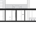
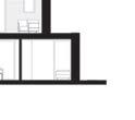
First-floor plan
Ground-floor plan


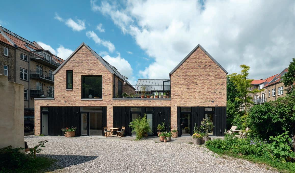


FOR HIS NEW HOUSE IN A BACKYARD IN CENTRAL AARHUS, THE ARCHITECT OPTED FOR A BRICK THAT COMBINES BOTH RED AND BLUE CLAY. WHEN FIRED, THE VARIED HUES OF RED, YELLOW AND PINK ECHO THE OTHER BUILDINGS IN THE YARD.
Designing and building your own house on a backyard plot in the city centre may sound like an architect’s utopian dream, but that is exactly what Kim Risager has done in Frederiksbjerg, the part of Aarhus named after King Frederik VI of Denmark.
Risager and his wife lived in Aarhus city centre 35 years ago. When they had children, the couple went to live in a house by Friis and Moltke architects in Braband, but they always planned to return to Aarhus once the children were grown up. When a friend had to abandon a project on a backyard plot in Sankt Pauls Gade 4f, Risager leapt at the opportunity.
A derelict factory on the site had been demolished, and it defined the footprint and height of the newbuild. Strict requirements were also placed on light and shade. “Restrictions are often a good place to start, and the new building follows the main contours of the factory,” Risager explains. The building is right on boundaries on two sides and
very close on a third, so maximising the light was challenging. “One requirement was that the new building did not overlook the neighbours’ gardens. So, wherever possible, the light intake is via the roof and small recesses on each floor allow daylight to penetrate all the way to the ground-floor.”
His architect friends may have expected a modernist, abstract idiom, but Risager had other ideas. “Given the classic and intimate urban environment, from around the turn of the last century, it seemed obvious to tap into the functional tradition, in particular the work of Kay Fisker.” The new home embraces simplicity, with a precast ground-floor and the three wings on the first floor arranged in a horseshoe around an elevated outdoor terrace. The wings have relatively steep pitched roofs and are open all the way up to the rafters on the inside. A total footprint of 265 m2 includes two homes – one for the couple and one for their daughter.
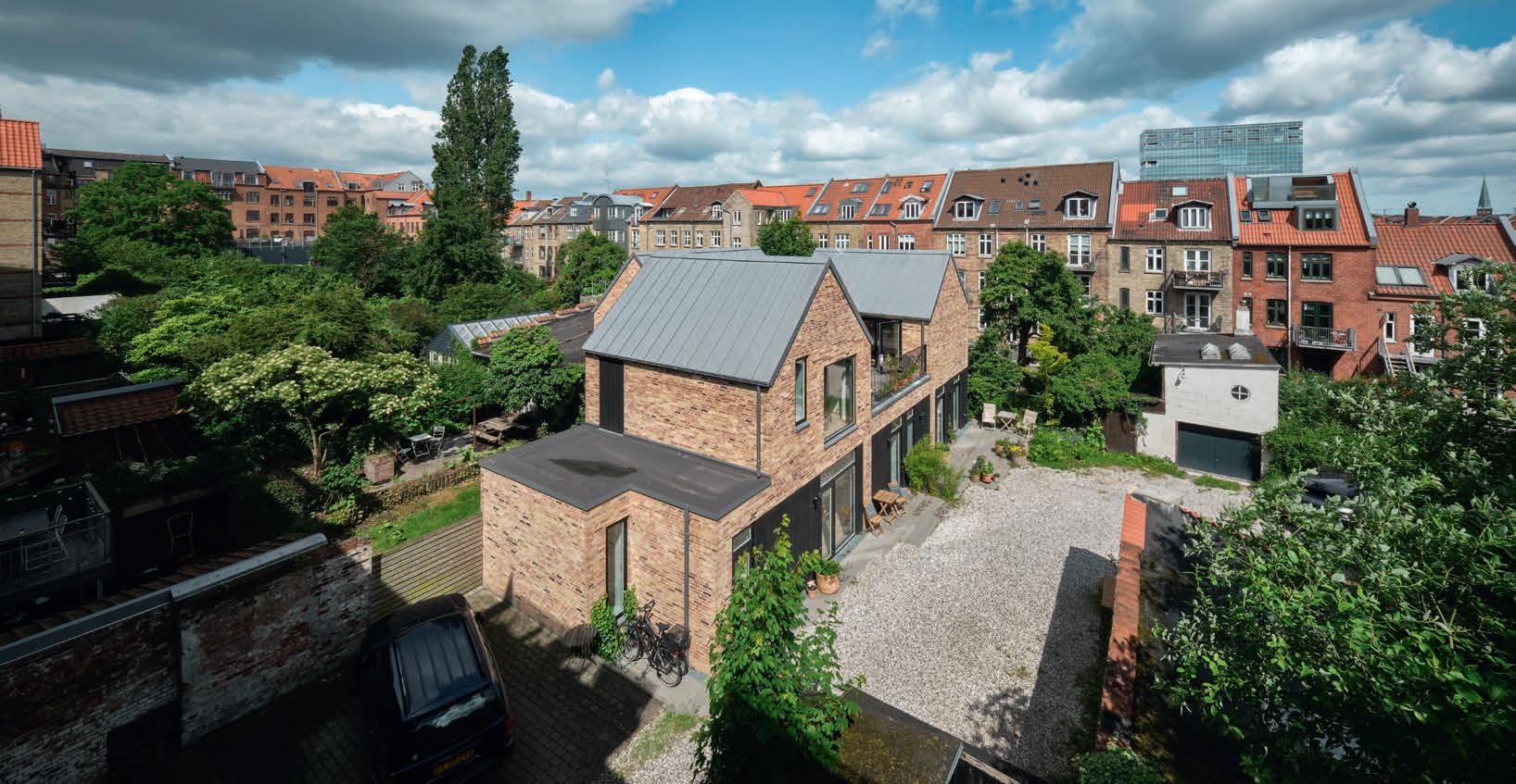

“It just had to be clad in brick like the surrounding buildings. And they had to be Petersen bricks, which have a textural look and catch the light in a unique way. It used to be standard practice to use mono-coloured brick on street-facing façades, while surplus bricks in a range of colours were used in the backyards, where animals were kept and there might be workshops. Petersen makes D20 from leftover blue and red clay. The fact that the hues echo the other buildings in the backyard made it an obvious choice. The many shades called for a wild bond, and I chose a joint that has minimal colour contrast with the bricks.”
The interior of the building matches the exterior in its consummate simplicity, expert craftsmanship and a limited palette of high-quality, natural materials. Oak is the only wood – on all the floors, doors, panels, central staircase and in the kitchen. The walls and ceilings are painted white, while the bathrooms have grey concrete tiles.
When Sankt Pauls Gade 4f was completed in 2022, the neighbours praised the end result, but the actual construction project had been stressful for everybody concerned. “Most people’s bedrooms face away from the street onto the backyard. So when the workers turned on music at six in the morning, we were a bit unpopular!”
Two homes in Sankt Pauls Gade 4f, Aarhus, Denmark
Client: Kim Risager
Architect: Kim Risager
Engineer: Niras, LB Consult
Landscape architect: Helena Høgenhav
Completed: 2019
Brick: D20 DNF
Photos: Anders Sune Berg
Architect Kim Risager



The Street House and the Yard House on Østboulevarden
EMPATHETIC, INNOVATIVE DESIGN AND HIGH-QUALITY MATERIALS
CHARACTERISE TWO NEW APARTMENT BLOCKS THAT PROVIDE HIGH-QUALITY HOUSING FOR RENT IN CENTRAL AARHUS.
The two buildings occupy a particularly attractive spot in the centre of Aarhus, with views of the North Cemetery to the east and the city centre to the west, and with private, west-facing gardens to the rear. A few years back, Loop Architects was commissioned to design a housing block for a classic infill site in the centre of Østboulevarden and a second building in the courtyard to the rear. The project consists of a total of 37 rental properties in multiple sizes.
“We believe in a new aesthetic that stands on the shoulders of what came before. We believe in thinking carefully and recycling,” the architects write on their website. The sensitively and innovatively integrated buildings in durable materials on Østboulevarden are a full-scale testament to this mindset.
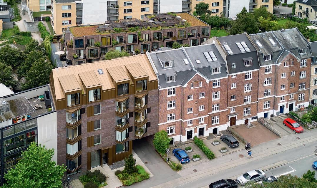
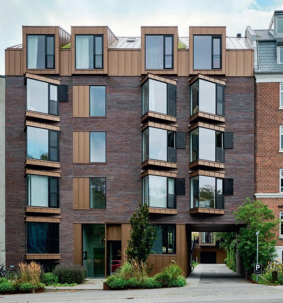
“The Street House (Gadehuset) had to relate to neighbours from 2006 and 1918, so we designed a façade with classic features, but which also signals its own identity,” says Morten Nymann, architect and partner at Loop Architects. “Bay windows are a great feature in a home, and we explored various options. Rectangular ones looked too heavy, but by making them asymmetrical and triangular, they seemed lighter, albeit only half the size. They are placed one above the other but not connected. The panes of glass in the triangular bays are glued together, with no mullions at the join. This positioning and the lack of visible joints help convey a sense of lightness, and the views of the harbour are fantastic.”
The neighbouring building from 1918 has a mansard roof clad in slate and several dormers. This motif is reinterpreted on the top floor of the Street House, with its own large dormers that rise flush with the façade but stop just below the very top of the building. The result is a dynamic, living roof rooted in a familiar tradition but with elements of modernity, lightness and elegance.
Like its neighbour from 1918 and several other buildings nearby, the Street House is also built in reddish-brown brick. The architects and client chose Kolumba K43 for the façade for several reasons. Its warm, reddish tones echo the golden anodised aluminium used in the bay windows, other window sections and roof, while the handmade texture contrasts beautifully with the smooth metal. A runner bond with a dark joint makes the dark brickwork surface stand out.
An open passageway leads through the ground-floor of the Street House to a private garden and the Yard House (Gårdhuset). Due to local planning regulations, the upper floors of this second property had to be pulled back to maintain the requisite distance to neighbouring buildings.
“As the neighbours are at various distances, our solution was a rectangular volume with bay windows at different depths,” says Nymann.
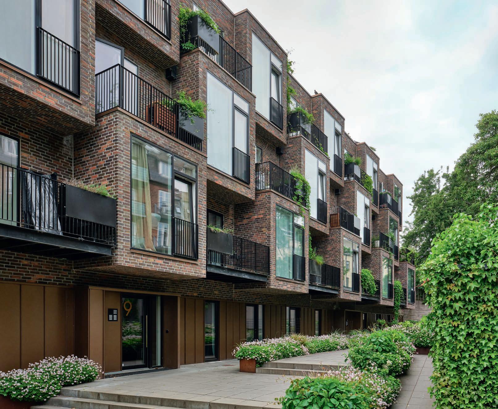
Not only does it meet the planning requirements, but this simple solution also has other positive effects. The variation in the protruding bay windows endows the building with a dynamic and vibrant look. However, it is more than just an aesthetic feature, as the spaces between the bay windows are used for balconies. All of the apartments have at least one bay window and one balcony, as well as Juliet balconies and large windows that optimise natural light and offer great views. The roof features a large communal terrace with a panoramic view over the city rooftops.
The Yard House also has red-brick façades, but the use of hard-fired D48 differentiates it from its neighbour on the street. Like K43, the shades of this brick harmonise beautifully with the golden, anodised aluminium cladding on the groundfloor. Light joints highlight the bond and accentuate the brick surfaces.
“The choice of every material used in the two rental properties, which won the City of Aarhus Architecture Award in 2020, was made after close consideration. The materials had to be natural and beautiful and age gracefully. They were expensive without being extravagant. But our client knows it will pay off. People will pay a little more for beauty and good quality.”
Street House and Yard House, with 11 and 26 apartments, Østboulevarden, Aarhus, Denmark
Client: Høgh Invest
Architect and landscape architect: Loop Architects
Contractor: Høgh Entreprise
Engineer: Tækker Rådgivende Ingeniører
Completed: 2020
Brick, Street House: K43, Yard House: D48 DNF
Anders Sune Berg,
Slanted glass bay windows protrude from the façade of the front building, and provide good views from the apartments. The mansard roof, like the windows, is made of golden, anodised aluminium.
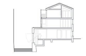
Cross-section through both buildings
The courtyard building is a large, rectangular volume with bay windows of varying depths, creating a vibrant look. For the façades, clinker-fired D48 was chosen, with a play of colours in red, blue, orange and brown. Runner bond 1 with a light joint accentuates the brickwork.


TWO NEW BUILDINGS WEAVE INTO THEIR SURROUNDINGS QUIETLY AND DISCREETLY, COMPLETING A PREVIOUSLY UNDEVELOPED CORNER. A GAP BETWEEN THEM LETS SOUTH- AND WEST-FACING LIGHT REACH THE BUILDINGS TO THE REAR.
A couple of years ago, Loop Architects were commissioned to design and develop a corner in the Øgade district, an area of historical interest built in the late 19th and early 20th centuries. It was on the outskirts of the city at the time, but a population boom and rapid industrialisation led to an explosion in the number of residential and commercial properties. Many buildings in the neighbourhood are worth preserving here, and any additions are subject to strict requirements about fitting in.
“The project involved designing a townhouse on the corner of Samsøgade and Grønnegade, as well as a bigger residential block on the plot next door on Grønnegade. We also added a new upper floor on the next building down the street. All of them are rental properties, mainly for students. The client was the same for all three projects, which presented an ideal opportunity to look at the three projects as a whole, even though each one had its own unique demands. This approach was particularly valuable when it came to the light, which we were able to optimise,” says architect and partner Morten Nymann.
The new townhouse on the previously undeveloped corner plot is, in effect, a continuation of the small townhouses on Samsøgade – once workers’ homes, now highly desirable and expensive. The new building has a modern look, but in terms of dimensions, roof height and general design, it is an architectural homage to its neighbours that nestles unobtrusively into the row. While the plot’s corners are not right angles, those of the building are. The first floor extends over the pavement, while the sloping entrance door at street level is cut into the corner. At the rear are a small but highly useful terrace, balconies on the first two floors and a Juliet balcony off the loft space.
The original buildings on Samsøgade had either plaster or brick façades. For the new one on the corner, Loop Architects and their client chose a darkred Kolumba that fits in with the neighbouring properties while also discreetly giving the newbuild an identity of its own. The balconies, roofs, window details and coverings are all in anodised aluminium.
The building next door on Grønnegade contains ten smaller flats over four floors at its tallest point – however, the building is staggered, descending to three and then two storeys towards Samsøgade. This makes the building seem more welcoming and allows more natural light to reach the new Corner House at the front and its neighbouring houses. The terraces are used as big and popular communal and private outdoor spaces. For the terraced housing, the architects chose the hard-fired D48. Like the building on the corner, the façades feature sections of patterned brickwork.
The third project involved adding eight flats to the top of Grønnegade 82, the neighbouring 1960s block made of yellow, machine-made brick. The new flats were hoisted into place as finished modules and replicate the look of the façade below without using any new bricks. Instead, the details are in anodised aluminium to create a coherent visual look between the three vastly different buildings.
The small urban development project in the Øgade district demonstrates the importance of listening. The two new buildings defer to their neighbours in terms of volume by not attempting to overpower them architecturally and speaking the same material language. As a result, they are sympathetically woven into the existing structure of the city and offer new and attractive places to live.

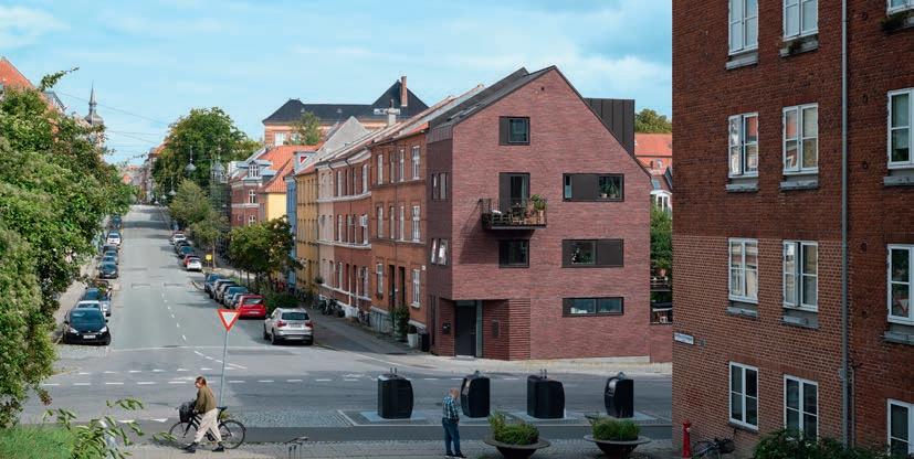

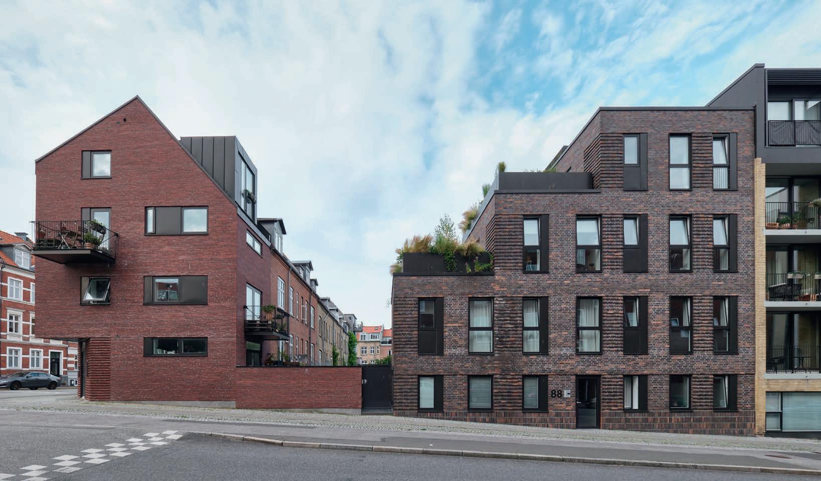


The entrance to the townhouse is under the cantilevered first floor. The rather homogeneous dark-red Kolumba brick is laid in a runner bond with a light grey joint to stand out as a contrast from the brick.
A green courtyard behind the terrace building and the roof-top terraces provide residents with plenty of opportunities to enjoy the outdoors.
Two apartment buildings, the Øgade District, Aarhus, Denmark
Client: Høgh Invest
Architect: LOOP Architects
Contractor: Høgh Entreprise
Engineer: Caspersen Rådgivende Ingeniørfirma and LNI Rådgivende Ingeniørfirma
Corner House, Samsøgade
Completed: 2020
Brick: Kolumba F6
Terrace House, Grønnegade
Completed: 2018
Brick: D48 DNF
Photos: Anders Sune Berg


SIMPLE, ELEGANT DESIGN AND MAINTENANCE-FREE FAÇADES MAKE THIS BLOCK OF APARTMENTS IN AARHUS C LOOK AS BEAUTIFUL TODAY AS IT DID WHEN IT WAS BUILT IN 2013.
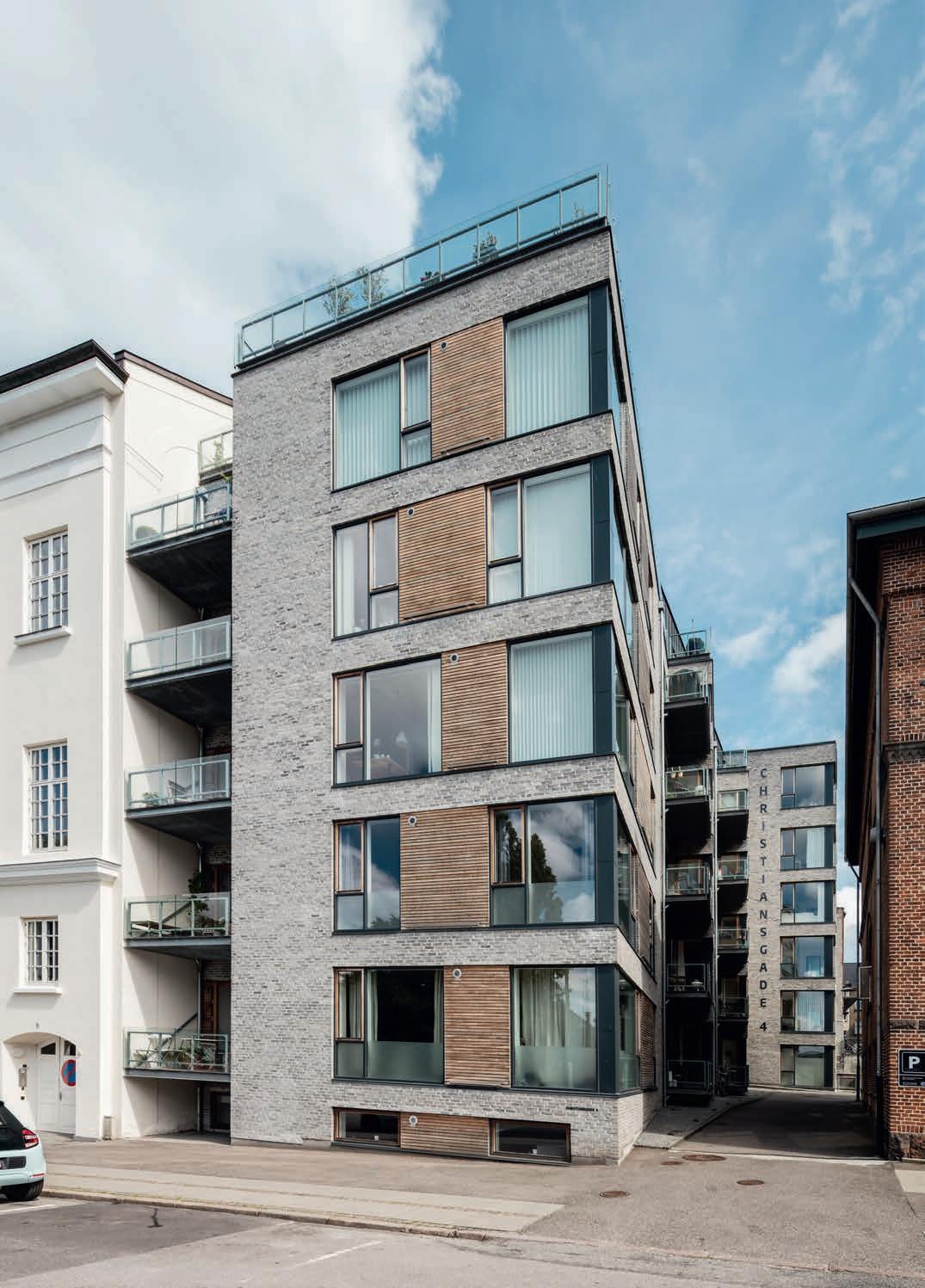
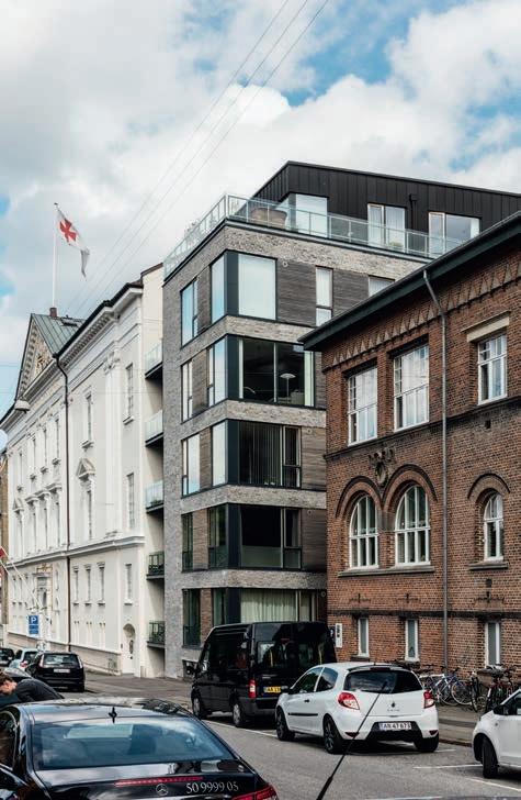
The client, Niels Albertsen, set the architects a demanding task. Luplau og Poulsen Arkitekter were commissioned to slot a new residence into a long, narrow plot on Christiansgade in Aarhus city centre, between two exquisite historical neighbours – the Masonic Lodge (Frimurerlogen, 1908) and General Education House (Folkeoplysningens Hus, 1900) – and across the road from the Law Courts (Retsbygningen, 1906).
The building was to have just two façades, 24 flats of varying sizes, including four penthouses, and ideally have views of Mølleparken to the west. The result was an 11 x 30-metre block, with its narrowest edge on Christiansgade. It stands 20 metres tall, so the roof is flush with the white plaster of the Masonic Lodge. Turning the body of the building in the longitudinal direction afforded its terraces and windows views of the park, even from apartments to the rear. The block is separated from the masonic building by a niche that runs its entire height, into which balconies have been inserted on every floor.
The block has a simple, modern look, but is also adapted to its surroundings. Calm brick surfaces alternate with window sections featuring narrow aluminium mullions and teak slats, which add a touch of lightness.
“The building had to last for many years, and not follow the latest fashion,” says architect and partner Jørn Lyager Poulsen. “So we chose classic materials, and the building has only become more beautiful since it was completed more than ten years ago. While working with the same client, Niels Albertsen, on a previous project, we had visited the brickworks together in Broager to assemble our own brick mixtures. For Christiansgade, we opted to use D91, which has both pure, grey shades, and a great play of colours. It looks soft, but has a solidity that makes it stand out from its historic neighbours.”
Apartment building, 24 units, Christiansgade, Aarhus, Denmark
Client: Pier 4, Niels Albertsen
Architect: Luplau og Poulsen Arkitekter
Contractor: A. Enggard
Engineer: Orbicon
Completed: 2013
Brick: D91DNF
Photos: Anders Sune Berg
Shifting the long, narrow house longitudinally means that all of the apartments have views of the scenic Mølleparken. The façades, of which there are actually only two, are designed as a composition in brick, glass and teak.
and
ALTHOUGH TECHNICALLY VERY MODERN, THIS TOWNHOUSE IN SØNDERBORG EMBRACES THE MARKET TOWN’S CLASSICIST BUILDING HERITAGE AND TRADITION OF SOLID BRICK CONSTRUCTION BY USING THE ELEGANT FLENSBURG FORMAT.
By Martin Søberg, ph.d., architectural historian
Perlegade has been the most important trading street in Sønderborg ever since the Middle Ages. The site at the junction with Jernbanegade was previously occupied by a classicist building from the 1820s, notable for its exquisite pilasters and cornices and half-timbered late-16th-century side building. Sadly, disaster struck in 2020, when the two were burned to the ground. Subsequent archaeological excavations uncovered the remains of constructions dating back to the 14th century. The new building on the spot is modern yet acknowledges its heritage.
The townhouse is divided into three large sections along Perlegade and six along Jernbanegade. Like two of the three other buildings at the junction, known as the City Crossing, the corner has been cut diagonally. The building height has been adapted to the cornices of its two neighbours and varies between two, three and four storeys. The groundfloor houses shops, while the rest of the building consists of ten apartments. A plinth-like cordon cornice separates the ground-floor from those above. The upper floors are emphasised by reliefs that rise towards the stepped main cornice, while classicist windows cluster in pairs between the pilasters.
The roof is covered in natural slate, which also wraps around the cubed dormers. This colour scheme continues in the windows and balconies, which have been painted slate grey. The prefabricated building has facing walls of light-yellow brick in Flensburg format. Petersen Tegl was a natural choice, as the brickworks is less than 10 kilometres away. The bricks are laid in what is known as the “August Rasmussen bond”, a special Flemish bond, and they bring softness and a light play of colour to the clear lines on the façade.
In its architectural forms and the choice of local brick, the townhouse on Perlegade has deep roots in its special location.
Apartment and retail building,
Client: Thordsen Ejendomme
Architect and construction engineer:
Oesten Ingeniører & Arkitekter Aps
Completed: 2023
Brick: D71 FF
Photo: Anders Sune Berg
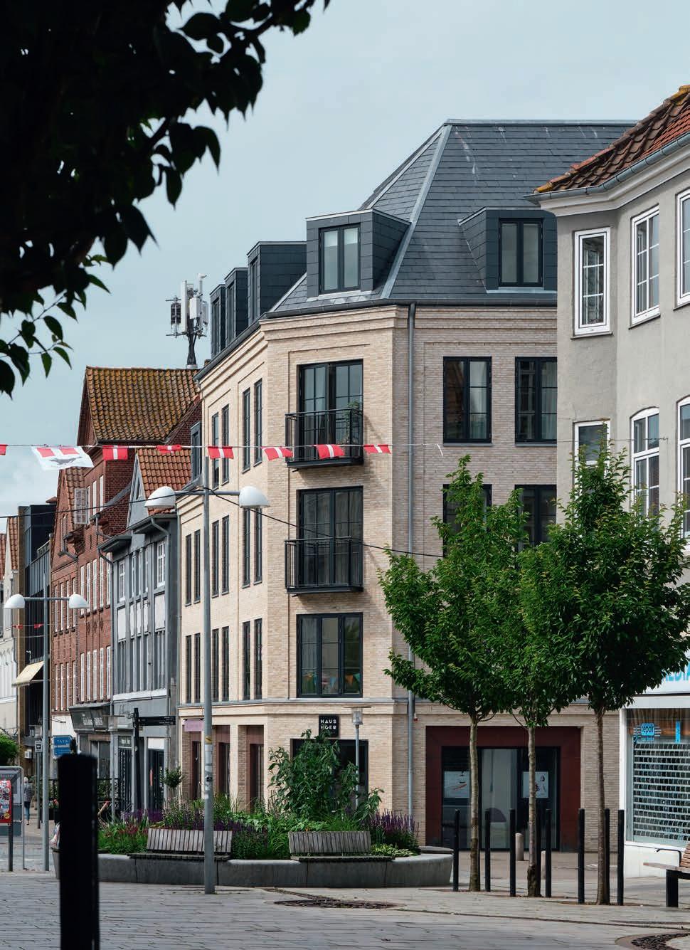
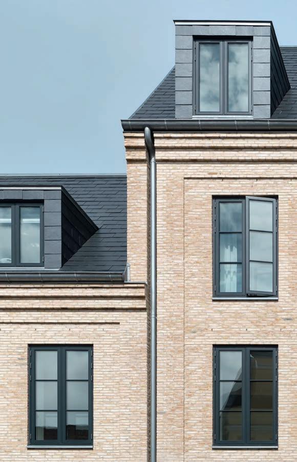
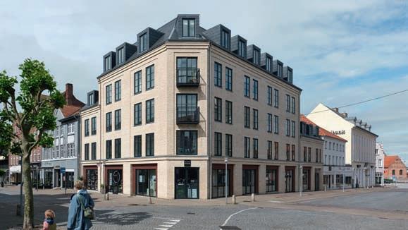

FADD ARCHITECTS CHOSE WATERSTRUCK BRICKS TO GENERATE THE ATMOSPHERE THEY WANTED FOR A NEW HIGH-END SHOP IN AN ELEGANT NAPLES NEIGHBOURHOOD CLOSE TO THE HARBOUR PROMENADE.
By Ida Præstegaard, MSc Architecture
In the middle of the bustling Via Calabritto is a narrow, one-storey, white-painted house featuring a symmetrical midnight-blue façade, with display windows on each side of a glass door. Stepping inside, you encounter a breathtaking, simple and perfectly crafted interior in which expensive shoes are displayed against a backdrop of carefully chosen natural materials.
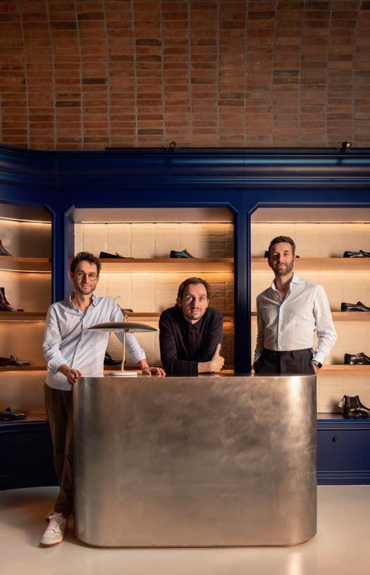
Founded in 2016 by the architects Marco Acri, Antonio Di Foggia and Fabrizio Fasolino, the Neapolitan design studio FADD, like many new studios, specialises in interior design. The client behind the shoe shop in Via Calabritto, who owns another shop on the same street, chose FADD based on their portfolio and glowing reviews.
“We weren’t really given a design brief, but our client is passionate about English culture and ‘gentleman’s style’, and we could easily see synergies and similarities with Neapolitan culture. Both London and Naples are world-renowned for elegant, tailor-made clothing. Bespoke tailors’ workshops often have an industrial air. For our interior, we tried to combine elegance with rawness. The way the materials are put together and the use of lighting creates a contrast between light and darkness in keeping with the Italian chiaroscuro tradition.”
The long, narrow, 4.6 by 12-metre shop space, previously rented by Gucci, has a 160 m² footprint across the ground-floor and the cellar. On the ground-floor, the ceiling is a large barrel vault with waterstruck, rustic D46. Explaining their choice, the architects say, “While brick is a classic Italian material, they are almost never left exposed in the south of the country. Naked brick pure, especially in an interior, is an industrial approach that invokes the north of Europe in Italian minds.”
By reopening the skylights in the barrel vault, FADD established a visual relationship with the neighbouring historical palace. Cladding both vaults’ tympanons with mirrored glass also creates an infinity effect. A classic, beautifully made wooden shelf for displaying shoes runs all the way around the ground-floor, reminiscent of both an English club library and a traditional Italian pharmacy. The shelf is painted in the same midnight blue as the façade, as is the staircase that leads down to the cellar. The walls behind the shelves feature white-painted bricks, indirectly illuminated by LED spots.
By using the same materials and repeating architectural features, albeit with subtle variations, FADD has achieved a clear, holistic aesthetic across the two floors. The ceiling’s new transverse brick vault with steel beams has an industrial feel. Here, the walls are in D46 in a stack bond, while the shoes are displayed on simple steel shelves attached to the walls. The brick’s red-brown shades recur in the floor-to-ceiling walnut cladding at both ends. Other customdesigned elements include brushed steel and library-style mirrors in steel frames.
In Officine, FADD Architects has coordinated the shapes, materials, colours, structures and lighting to achieve a harmonious whole that works well and is in line with the finest Italian traditions. As rents in Via Calabritto are high, time was very much money, and the refurbishment was completed in just five months.
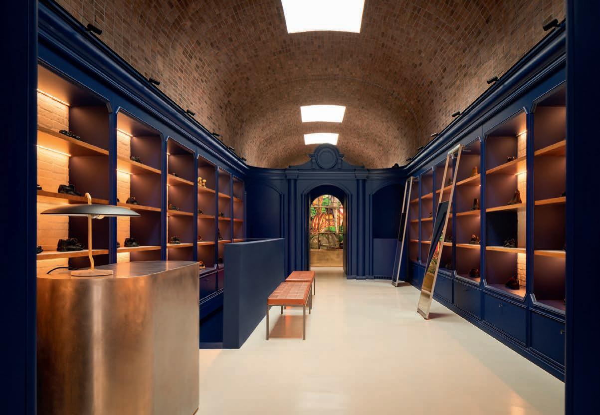

“For our interior, we tried to combine elegance with rawness. The way the materials are put together and the use of lighting creates a contrast between light and darkness in keeping with the Italian chiaroscuro tradition.”
Architect Marco Acri

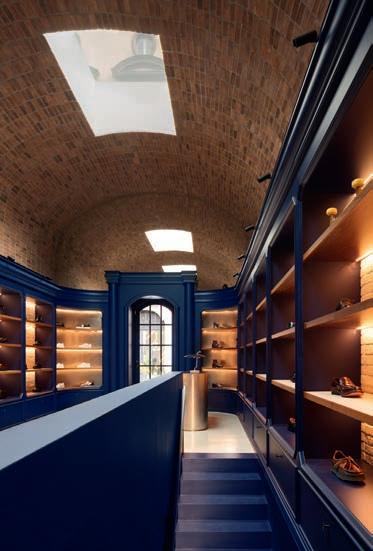
“While brick is a classic Italian material, they are almost never left exposed in the south of the country. Naked brick pure, especially in an interior, is an industrial approach that invokes the north of Europe in Italian minds.”
Architect Marco Acri


FIVE ASYMMETRICAL GABLES GIVE THIS NEW BLOCK IN KIEL A THOROUGHLY MODERN FEEL, WHILE THE OVERALL SCHEME, INCLUDING THE CHOICE OF MATERIALS AND COLOURS, BLENDS EFFORTLESSLY INTO THE NORTH GERMAN CITY.
By Morten Birk Jørgensen, architect MAA, associate professor
Within architectural discourse, the notion of place is regarded of key importance to the design of a building. Sites can be understood via a number of dimensions, from their immediate surroundings (e.g. the shapes, colours and materials of the neighbouring buildings) to the unique character of the town or city or broader regional, national or international contexts.
These dimensions have played a prominent role in the design of the Fünfgiebelhaus (five-gable building) in Kiel. Situated on the corner of Knooper Weg and stretching down Waitzstrasse, the building has commercial properties for rent at the ground level, while the five storeys above house apartments. Surrounding this detached block are buildings from both the turn of the last century and the post-war period.
While the buildings in the area vary in age, there are obvious similarities in architectural style and materials. The neighbourhood consists predominantly of unobtrusive 5–6-storey buildings with exposed brickwork. Fünfgiebelhaus, which quietly occupies a previously undeveloped corner site, was designed along this prevailing aesthetic.
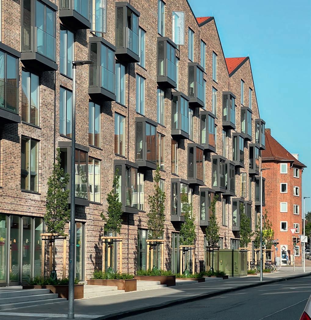
Most of the more recent buildings have classic pitched roofs, but several of the older ones have gable motifs – a feature typical of building traditions in northern German trading towns. As its name suggests, Fünfgiebelhaus fits right in, with its five triangular gables dancing cheerfully down Waitzstrasse.
Apart from its roof, the building is peacefully and consistently wrapped in shades of reddish-brown brick, laid in a runner-dominated bond with indented joints. The ground-floor, housing the commercial properties, is marked by a lower façade with horizontally protruding rows, which endows the building with a classic look.
A thin aluminium covering on the inset gutter separates the brickwork from the red roof. Small recesses in the brickwork accommodate the downpipes along the main façade facing Waitzstrasse, accentuate the corners and make the block look like five separate gabled houses.

Directly above the doors on the ground-floor are aluminium-clad bay windows that catch the morning and evening light. These large, outward-opening windows feature untraditional internal railings and act like a kind of Juliet balconies.
The gentle slope on Waitzstrasse climbs to a small plateau by the façade, with flower beds and trees. The sloping terrain means there are three steps up to the entrance at the north-east corner of the building, then two after the next flower bed, while the entrances to the commercial properties are at street level.
To the south, the gable sections are irregularly recessed, making the façade look like five interconnected volumes. This side of the building overlooks a cul-de-sac, with entrances to the ground-floor apartments, above which are large, open balconies. While the north façade meets the fast-paced city, the south-facing side emphasises the relationship between the homes and the immediate urban surroundings.
The gable motif is classic Kiel, and a characteristic feature of building traditions in northern German Hanseatic towns. In Fünfgiebelhaus, the architect wanted a modern look and made the gables asymmetric. Balconies in the southwest façade create openings in the otherwise compact brickwork.
Fünfgiebelhaus, residential development with 125 apartments, Kiel, Germany
Client: NGEG Norddeutsche Grundstücksentwicklungsgesellschaft mbH
Architect, competition: Kaden + Lager
Architect, realisation: rimpf Architektur & Generalplanung
Contractor: Various local companies
Completed: 2023
Brick: D46-V DNF
Photos: Daniel Sumesgutner
Page 19, 3 photos below: Arne Biederbeck
The two short gable walls at the ends of the building differ from the longer façades and have smaller, almost square windows, which establishes a kinship with the firewalls in Kiel’s historical urban fabric.
Fünfgiebelhaus contains 125 apartments, ranging from one-bedroom (21 m²) to fourbedroom (89 m²). Some are designated affordable housing, and accommodate a mix of single residents, students and families, or serve as communal living for disabled people.
This is a building that not only merges into the city’s architectural legacy but also seeks to take it forward.
“As part of our research, we visited Petersen Tegl, and quickly decided on D46. However, we wanted a shade that was a little lighter than the standard. The brickworks offered to sort them and reduce the proportion of dark ones. The result was the custom mixture D46-V. Arne Biederbeck, CEO and partner, NGEG.
With protruding sections in the façade and pairs of protruding headers on the

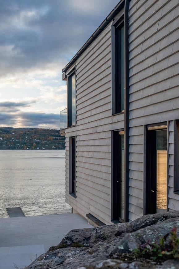
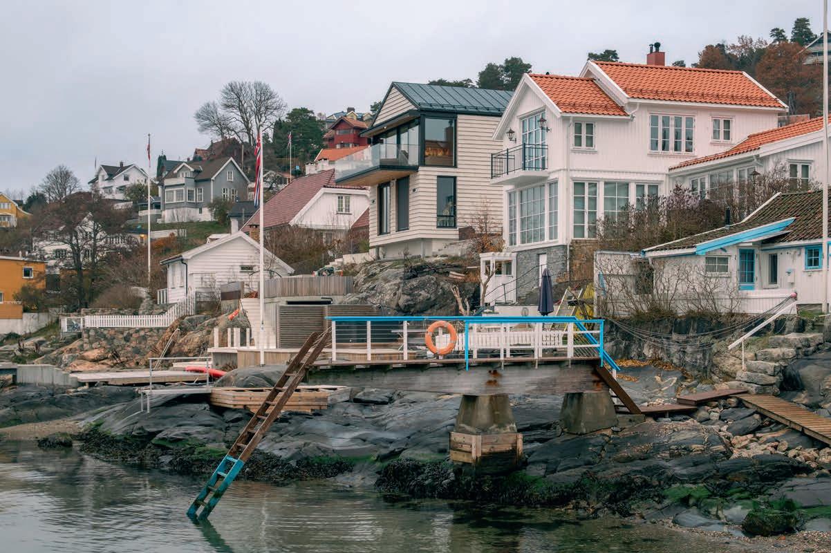
The client in Drøbak wanted a maintenance-free façade for his new house, so opted for brick cladding.

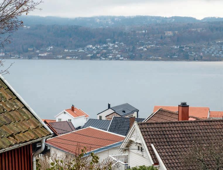
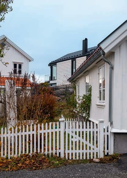
In terms of its body, roof shape and façade colour, the newcomer blends in seamlessly with its neighbours.
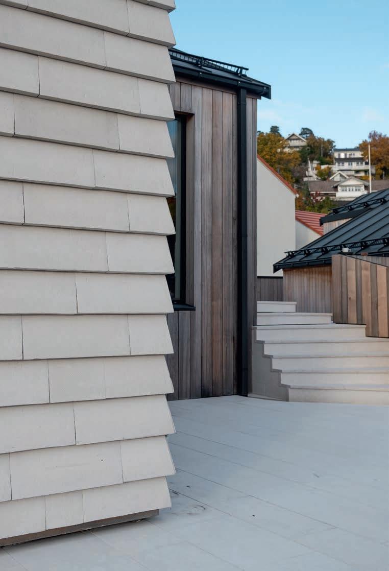
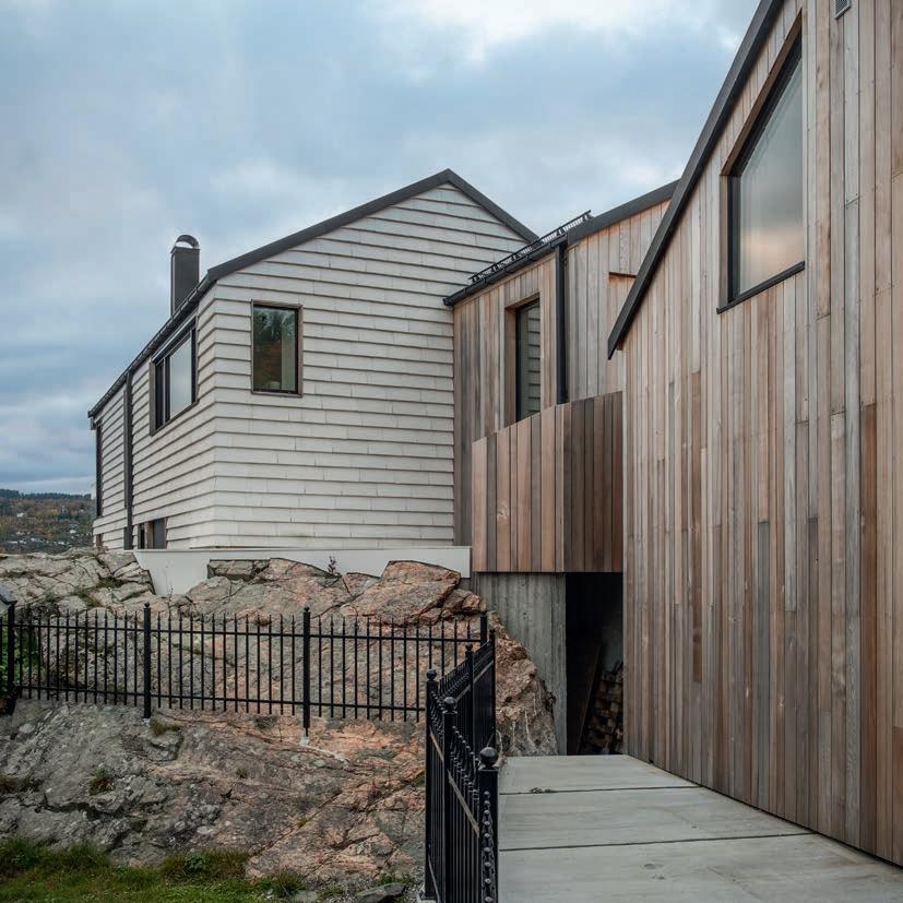
Splitting it into two volumes and cladding them with different materials makes the building seem smaller than it really is.
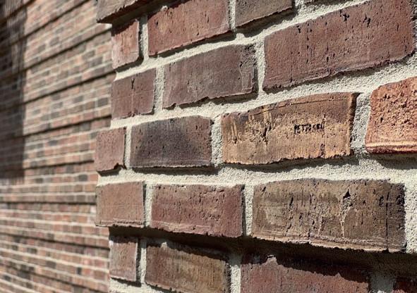
Instead of Cover bricks extending right up to a metal profile, the bricks have bevelled edges that meet at the corners of the house – almost as if they were wooden boards.
plateaux are used to create terraces and small sheltered areas. No cuts were made into the rock to build the stairs, which instead run up and down over the existing ridges.
appropriately named Drøbak
PETERSEN TEGL AND MIN2 BOUW-KUNST FROM THE NETHERLANDS DEVELOPED THE HANDMADE COVER IN 2009. SINCE THEN, IT HAS BEEN USED TO CLAD BUILDINGS ALL OVER THE WORLD, ONE OF THE MOST RECENT AND NORTHERLY EXAMPLES BEING ON THE BANKS OF OSLO FJORD.
By Ida Præstegaard, MSc Architecture
About half an hour before reaching Oslo by ferry, you pass the small town of Drøbak, which clings to the cliff on the east of the fjord. Until the late 19th century, it served as a winter port for Oslo, which was known as Kristiania at the time and had a tendency to freeze over in the cold. Actors, painters and writers would flock to this picturesque town in those days, including the well-known actor Johanne Dybwad. At the turn of the last century, she and her husband, the author and lawyer Vilhelm Dybwad, had a summer residence right by the fjord in Drøbak. Later on, the road they had lived on was named after the actor.
Given the history of the town, its fine architecture and the area’s natural beauty, the locals are understandably rather protective of their environment. When Aleksander Stein applied to build a family home on Johanne Dybwadsvei, the idea was not met with enthusiasm. The neighbours felt the uneven plot sloping down to the fjord he had acquired should not be built on. The application process was expected to take three weeks, but dragged on for three years due to the many objections and hearings involved. Ultimately, everyone acknowledged that the end result was not only beautiful but an excellent architectural fit in the neighbourhood.
On arrival at the site, which narrows significantly towards the road, you encounter the garage and then the house, which consists of two interlocking, two-storey wings of different sizes. “At 200 m², the house is bigger than its neighbours,
but breaking it up into two volumes and cladding them in different materials makes it all look smaller than it really is,” explains Line Stokholm from Kile Stokholm Arkitekter. When Aleksander Stein asked the studio to take on the project, he insisted on being closely involved in the process.
“The vast majority of houses in the area are clad in wood. Following their lead, we clad the smallest wing in cedar. Our client wanted the biggest wing to be maintenance free, which wood is not,” Stokholm continues. “When mouted, Cover’s profile resembles overlapping wood panels and requires no maintenance, so the client was on board with this idea right from the start. We chose a very light version, which harmonises with the white-painted wooden façades of the neighbouring houses. Brick cladding also helps to regulate the temperature during summer. Wooden façades absorb heat, which means buildings heat up and cool down far too rapidly.”
“It was important to both Aleksander and us to leave the cliff as intact as possible. Although we had to cut into it to accommodate the house, we used diamond wire to make the incisions as clean as possible, and the rest of the cliff remains untouched. We placed terraces and small shelters on natural plateaux and the stairs run up and down existing elevation points.”
The new home and garage have 28° pitched roofs, close to the angles of the neighbouring buildings, and are clad in
“When mounted, Cover’s profile resembles overlapping wood panels and requires no maintenance. We chose a very light version, which harmonises with the white-painted wooden façades of the neighbouring houses.” Architect Line Stokholm
black zinc. “We wanted a modern look, but a sense of kinship with the neighbours was also important. Using Cover for the roof would have made the building stand out too much.”
Inside, the layout is simple, functional and designed to meet the everyday needs of two adults and three small children. You arrive at the eastern entrance at ground level, but the slope of the mountain means that both storeys have entire façades overlooking the fjord. The lower floor of the main volume contains three bedrooms and bathrooms. In the longer term, the guest room in the wooden-clad wing on the same level could serve as a teenage hangout.
The spacious 85 m² upper floor is one big open-plan room, with the kitchen and dining area at one end and the living area at the other. Floor-to-ceiling glass panels, almost without visible joins, wrap around the façade, offering 180° views over the water and making the most of the excellent location in Drøbak.
Family home in Drøbak, Norway
Client: Aleksander Stein
Architect: Kile Stokholm Arkitekter
Contractor: Drøbak Tømrerservice
Engineer: SH Prosjekt
Completed: 2020
Brick: C11, 528 mm x 170 mm x 37 mm
Photos: Ruben Ratkusic

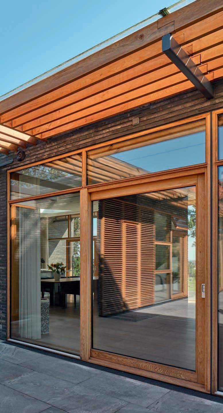
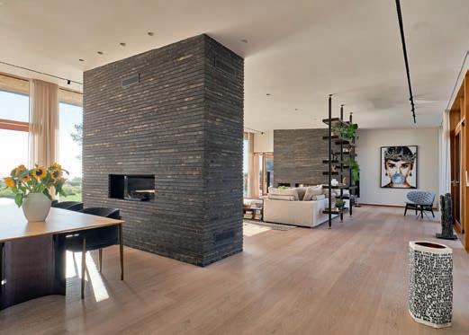
The varied hues of the granite recur in the Kolumba brick, which is characterised by dark-grey, almost black shades, with hints of blue and yellow. The brick contrasts with the widespread use of oak, as part of the relatively minimal material palette.
A NEW FAMILY HOME ON THE WATERFRONT NORTH OF COPENHAGEN HAS AN AIR OF STARK, UNDERSTATED ELEGANCE BUT AN ABUNDANCE OF EXQUISITE MATERIALS AND DETAILS. THE HORIZONTAL, GREYISH BRICKS OF THE FAÇADE AND THE LIGHT OAK AROUND THE WINDOWS HELP THE HOUSE BLEND INTO ITS BEACHFRONT LANDSCAPE.
By Morten Birk Jørgensen, architect MAA, associate professor
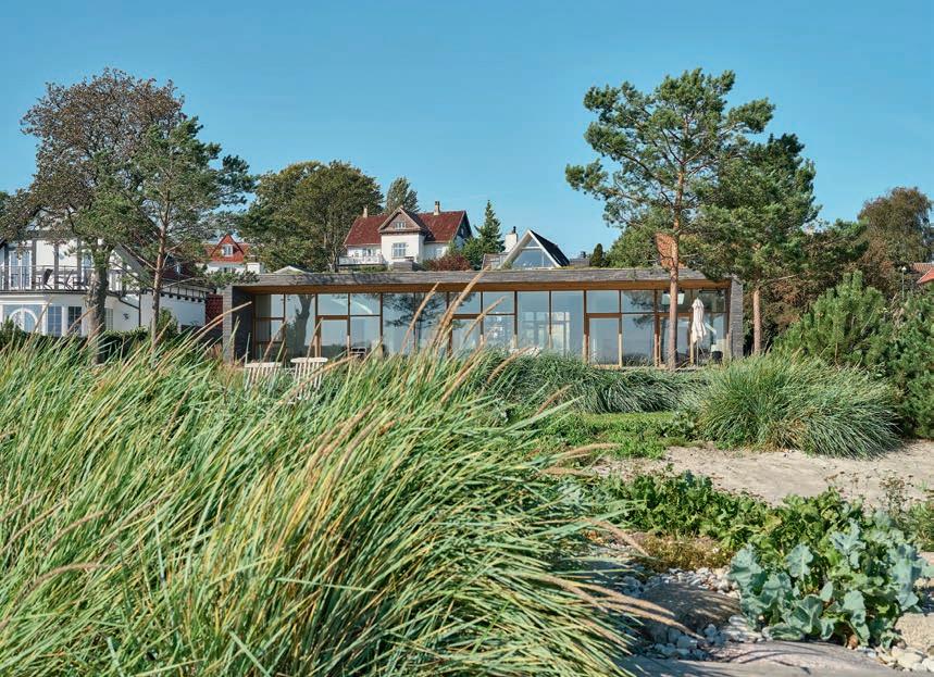
On the coast, just north of Humlebæk, is a quiet residential street with plots sloping down towards the beach and the Sound between Denmark and Sweden. An understated garden wall, a recess with new greenery, an oak entranceway and a garage have recently been added on the side facing the water, but the newly built home tucked into the beach is not visible from the road.
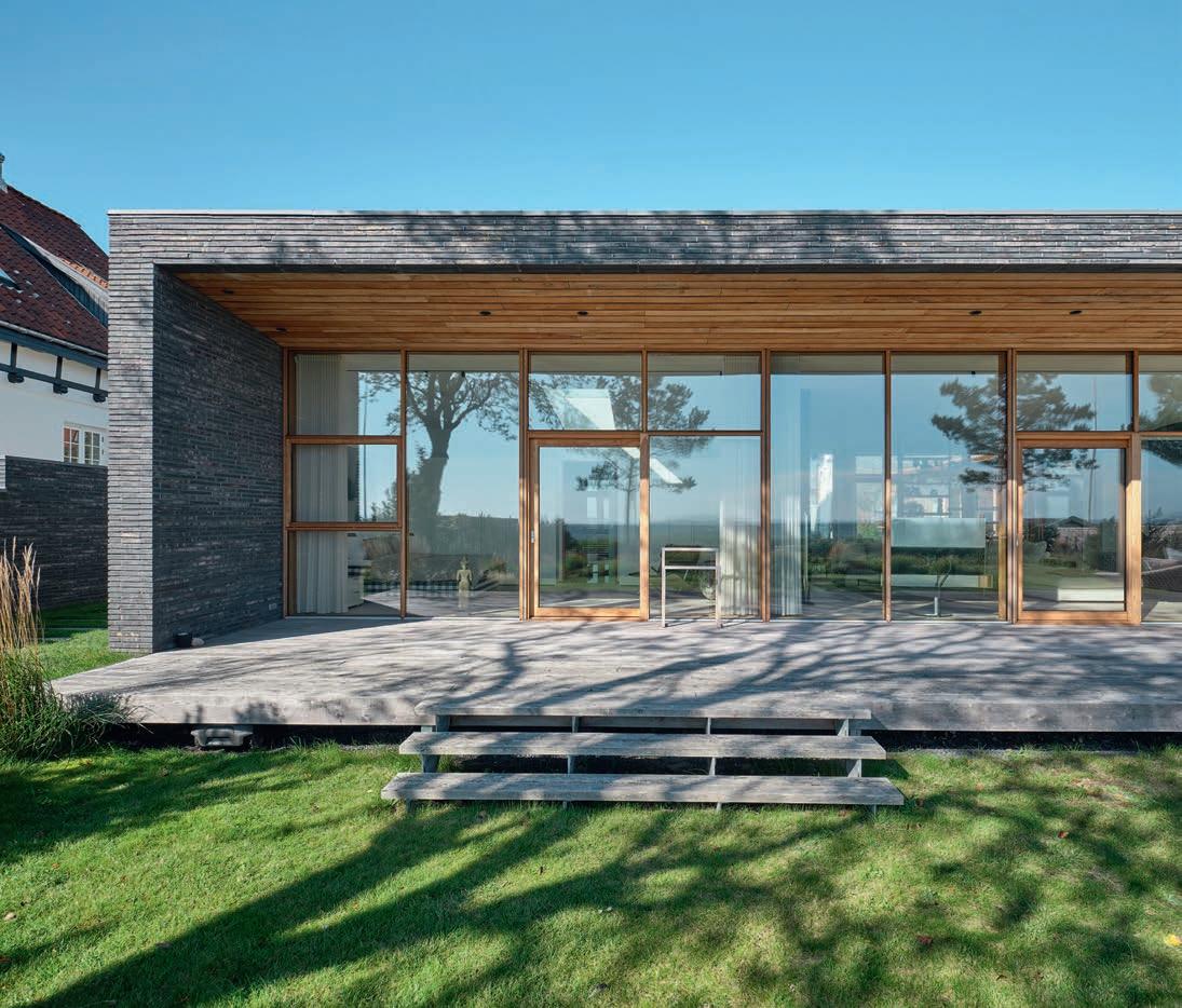
Once you pass through the garden wall, a view opens up over a flat sedum roof towards the Sound, the island Hven and the coast of Sweden. At the conceptual level, the house is simple – a single-storey home with two wings and a flat roof. The wing facing the water contains the primary living functions, such as the kitchen, living room, bedroom and bathroom, while the north wing houses the utility room, guest room, study and another bathroom.
The choice of materials is similarly subdued, focusing on horizontal brick with a grey base tone, complemented by shades of blue and yellow, aggregates of light clay and a rough, sandy surface. Oak has also been used extensively for the frames around the many large glass sections. Overall, the effect is bright and light, and the new addition nestles quietly into the beach to the east, facing the Sound. “How difficult can architecture be?” some might ask, but this is a very careful execution of a deceptively simple architectural concept that does justice to the fashionable location.
The L-shaped house delineates a courtyard below the stair winding down the slope from the entrance at street level. This little oasis is sheltered from the wind and welcomes the evening sun. Here and there, a few openings in the large granite paving stones provide space for carefully selected plants. The wings have large glass sections facing the courtyard, while fixed shutter sections offer privacy for the utility room and bathroom. From the courtyard, you can see through the living room in the east wing and the windows on the façades all the way to the Sound. On hot days, the glass doors slide open, offering direct access to the garden, beach and bathing jetty.
The main entrance is via a small glass-covered building that connects the two wings. The open-plan level in the wing facing the water is grounded by two large brick fireplace cores that separate the generous kitchen space from the living space and the private sleeping area to the south. This simple, lightly furnished level with its large skylights feels open and inviting throughout.
The careful, considerate approach continues in the detailing. Brick sections anchor the building solidly in the terrain, while filled stub joints reinforce the horizontal character of the

brickwork. The use of granite in the courtyard is repeated in the entrance hall and wet room. Light oak is used for the small eaves facing the courtyard, the windows, doors, indoor flooring, a terrace facing the water and various flashings. A sedum roof is the finishing touch that helps the newbuild blend into its beach landscape.
The details reflect a meticulous approach by the architects and craftspeople involved. Door and window frames sit flush with the walls and have minimal tolerances. Innovative hinges are hidden from view when the doors are shut. The marble in the bathrooms was measured and installed on-site by specialists from an Italian quarry. The entire house has an air of stark elegance. But while it seems modest in its volume and materials, it has a wealth of detail.
The influence of renowned Danish modernist architects is clearly felt here. Despite significant differences, the east wing references Halldor Gunnløgson’s house on the same eastcoast of Zealand. The courtyard is of a type familiar in popular Danish architecture and is established here by the L-shaped building and a garden wall – reminiscent of Jørn Utzon’s famous courtyard buildings a bit further north. Nevertheless, the new home is firmly rooted in its era in a laid-back way. It is distinctly luxurious but also fairly low-key. Its primary concern is being right here, right now, between the birds chirping in the courtyard and the waves lapping on the beach.
Private home, Espergærde, Denmark
Client: Private
Architect: Jørgen Juul
Landscape architect: DesignHaver
Biggest single contractor: Tømrerfirmaet Thomas Storm
Engineer: Okholm Rådgivende Ingeniørfirma
Completed: 2020
Brick: K58
Photos: Anders Sune Berg
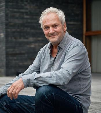


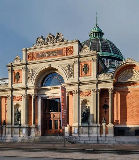
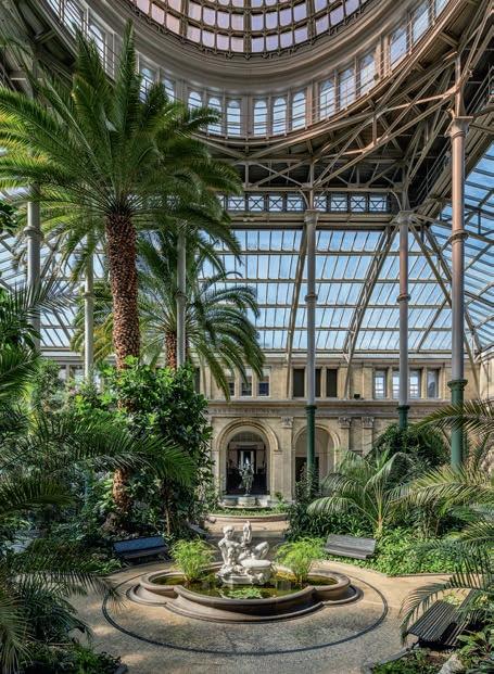
first building, which was completed in 1897.
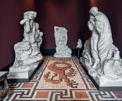
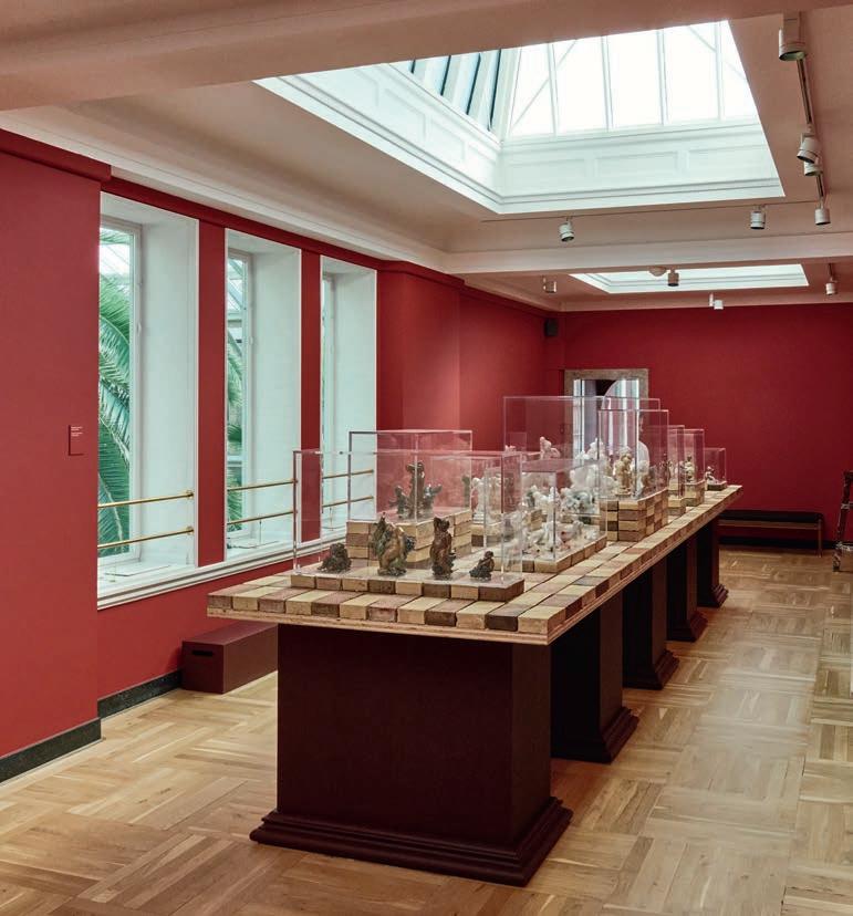
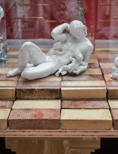
We all know just how useful bricks are in interiors. Right now, two products from the Petersen range form part of a major retrospective on the Danish sculptor Kai Nielsen at the Glyptotek in Copenhagen, a collaboration with Faaborg Museum on Funen, which is running a parallel exhibition about the artist. Both exhibitions are being staged by the architects Mathias Mentze and Alexander Ottenstein, who have done their best to draw a line between them.
Faaborg Museum dates from 1910 and was designed by the architect Carl Petersen. He drew inspiration from antiquity for its floors, designing squared patterns in tiles with contrasting colours. Mentze and Ottenstein used these floor tiles as a starting point when putting together a display of Nielsen’s small sculptures in one of the smaller rooms in the Glyptotek.
The architects custom-designed a table for the sculptures and wanted a tactile material that would conjure up associations with the floors in Faaborg.
They chose two waterstruck Petersen bricks, D46 and D31, alternately placed to form the worktop. The golden and brownish-red shades work harmoniously together, with a slight contrast, and fit in beautifully with the deep-red walls. Their rustic texture also creates a delicate counterpoint to the sculptures’ smooth surfaces. The bricks that form the podiums are stacked at different heights, so that each sculpture is displayed as effectively as possible.
The 6.3-metre-long tabletop, with a total of 534 bricks, is supported by large, dark plinths with profiles that pay homage to the ones Nielsen designed for his sculptures.
The exhibition “Kai Nielsen – Born of Everyday Life” runs at both museums until 5 January 2025.

TEGELMÄSTER AB CATHARINA HOLMSTRÖM P: +46 40 542 200 E: INFO@TEGELMASTER.SE
SCHLESWIG-HOLSTEIN, HAMBURG JUTTA ENGLER P: +49
E: BLU@PETERSEN-TEGL.DK NETHERLANDS LINEKE LUCASSEN P: +31 (0) 622529266 E: LLU@PETERSEN-TEGL.DK
LUCASSEN P: +31 (0)
When electing the material for the table in the Glyptotek, the architects took inspiration from the tiled floor in Faaborg Museum, where a parallel exhibition is running about Kai Nielsen. CONSULTANTS–PETERSEN
