ABOUT ME
Fiona Huang Vuong | 王颖维
(+61) 0431 333 226
f.huangvuong@gmail.com
Hello! I am Fiona a recent graduate from The University of Melbourne with a Bachelor of Design (majoring in Architecture). Through studying architecture I was drawn towards the graphic representation aspect of my degree. This eventually led me to be interested in Graphic Design. I am eager to transition to this design path and am enthusiastic to learn and develop new skills from others in the creative field. Art and design is something that I am passionate about. I am always trying my best to improve through observing works done by designers, architects and artists that inspire me.
EDUCATION
2018-2020
The University of Melbourne, Australia Bachelor of Design
Majoring in Architecture
2007 - 2017
Garden International School , Kuala Lumpur, Malaysia
Primary and Secondary Education
Completed GCE O-Level and GCE A-Level
WORK EXPERIENCE
2021-present | Tapt - Graphic Designer (Full-time)
2021 | Re-branding ‘Blessed Bali’ (freelance)
2021 - present | AZN Zine online magazine - Layout Designer (freelance)
2021 | ANGO Orchestra - Junior Graphic Designer (freelance)
2018 - 2020 | PANDORA ,The Glen - Casual Retail Assistant (seasonal)
2018 | Chaozhou Malaya Bistro Cafe - Waitress (casual)
2017 | Arkitek Rekacipta Sdn Bhd - Intern
SKILLS
InDesign Adobe Illustrator Adobe Photoshop
SPOKEN LANGUAGES
Adobe English Mandarin
Model Making Figma
EXHIBITIONS
2019 - MSDx | Model Exhibited in Studio Gamma Exhibition
2019 - MSDx | Model Exhibited in Studio Beta Exhibition
01 - ALBUM DESIGN PROJECT
The project involved desiging two album covers for the artist Jasrene. I was informed that the two albums link together to spell out her name. This allowed me to think carefully about the composition.
J.A.S.
In J.A.S. album cover, I tried to represent her in an authentic and quirky way, where she was having a blast in the bathroom.

Renegades
In the Renegades album cover, I wanted to convey her breaking free from those keeping her from doing what she wants. The chains were a metaphorical depiction of the fear holding her back.


02 - R-EBRANDING |
NATIONAL MUSEUM OF CHINA
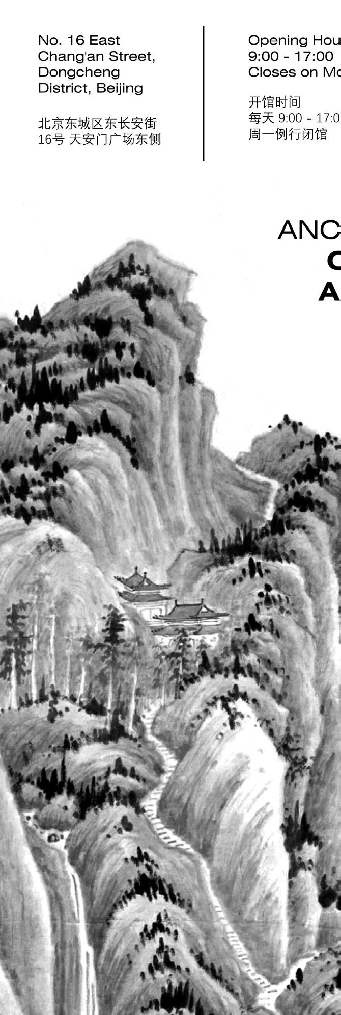
The brief was to select an art museum from a given list and rebrand it. I chose the National Museum of China as I thought the current branding was very classical and formal. Therefore throughout my design process, I experimented with a more contemporary style.


Rebrand Fashion Label

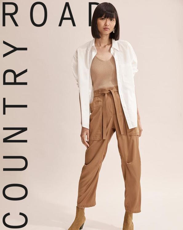
In this brief I was wanted to play
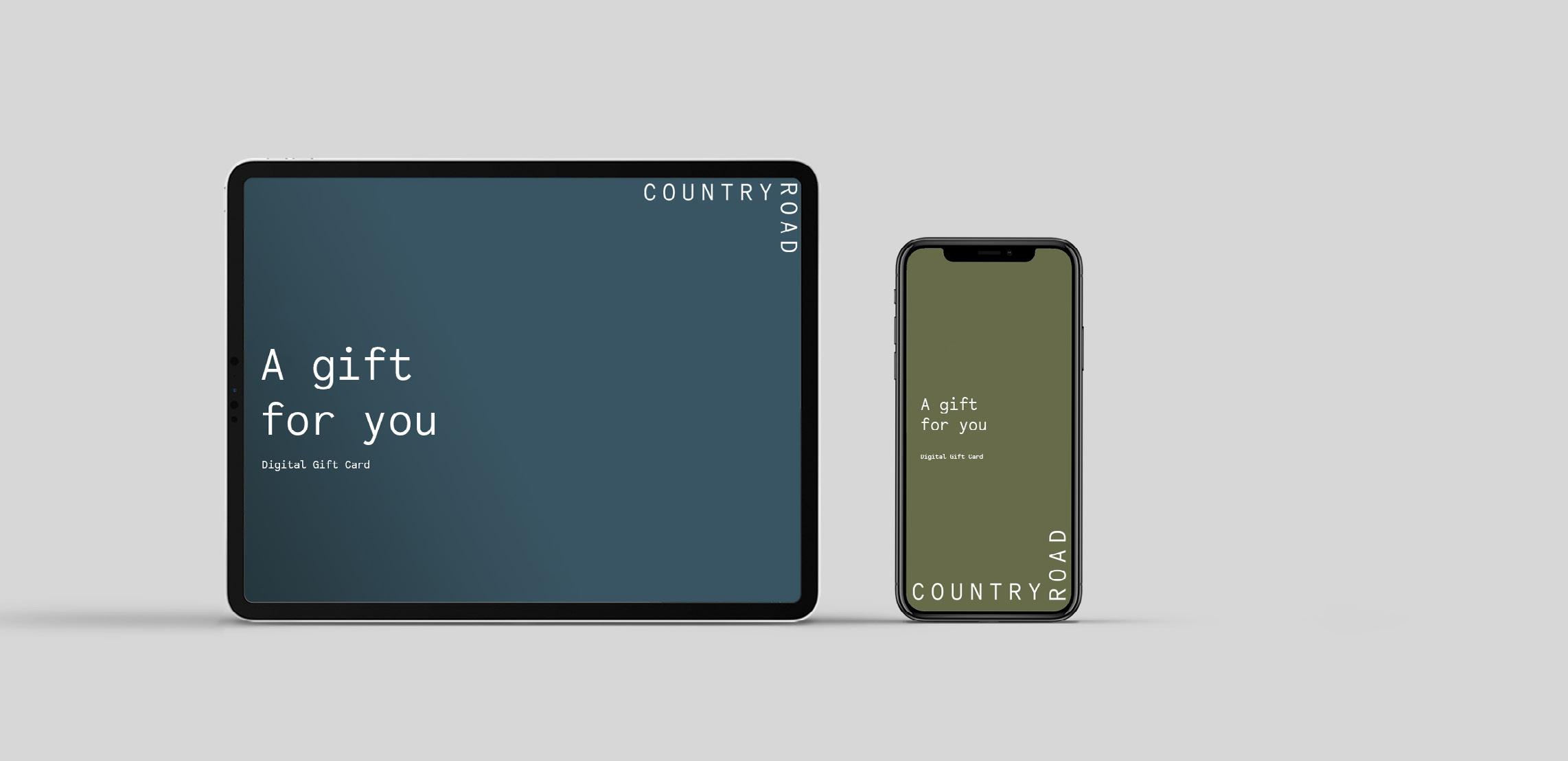
was tasked to rebrand a fashion label. For this specific branding, I play with typography and formating the words orthogonally.


02 - REBRANDING | PERSONAL BRIEF
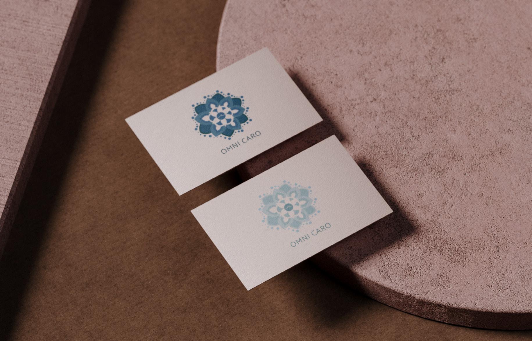
For this final brief, students were allowed to have the freedom to design anything relating to branding. In this brief, I decided to design a brand for a yoga social media platform. I got to experience what it was like to have a ‘client’ and to take in feedback and critique to improve my designs.

5: Personal Project
Media Promotional Photos


QUACK quack is a cosmetic and soap brand that I designed as a personal project. I wanted it to be a fun and playful brand by making a rubber duck the face of the brand. I felt that rubber ducks were often associated with bath-time and bathrooms.
For this make-believe brand, I wanted to introduce scents to bring more variety. For me to tie in the rubber duck shape to the fruit shapes I thought of playing around with positive and negative space. The outcome of this was quite interesting and was able to work cohesively with the main brand.


04 - COLLABORATION PROJECT WITH CARO GOH


Guideline:


This collaboration project demonstrates my ability to work with other designers. I was offered the opportunity to work with a fellow designer Caro Goh. Together we worked on a personal project called ‘DUYUNG’ which is a clothing brand based in Bali and Melbourne. This experience was extremely helpful to me as it gave me an understanding of what it was like to work with other designers. The works on this page showcase the designs and layouts done by both of us. Caro introduced to me what a brand guideline was. During our time on this project, we have learnt a lot of design tips and shortcuts from one another.

05 - MENU DESIGN + FOOD POSTERS
My client wanted to refresh their menu. Their main requirement was to have all their dishes in one sheet rather than a booklet.
I went with a relatively simple and clear design, and attempted to categorise the dishes so that it was easier for the customers to read and navigate the menu. For the food posters, I painted two digital paintings of some popular dishes from this restaurant. I enjoyed looking for inspiration on the composition of food posters.


Architectural Projects
This studio was based on a collaborative housing project. I got to deal with key topics such as inside and outside, apartment and house, adaptability and intelligence...etc. For this studio I wanted to go out of my comfort zone and add some curvy forms to counter the ‘boxy’ housing units.


Perspectives


Perspectives


06 - STUDIO GAMMA

For this studio, we were tasked to design a house that was based on a real location in Melbourne City.
I enjoyed that we had ‘clients’ and it gave me a slight exposure to what it was like in the architecture design industry. We had to think of ways to design a house that was multi-generational and the concept of private and communal spaces.

What I also enjoyed in this Studio was that we got to produce our drawings and plans through traditional mediums.


01 The Proposition
Connectivity - City to the Library
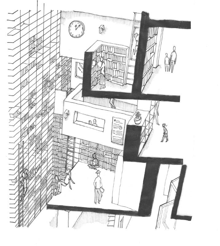
This project explores of journey and pathways both externally and internally How a person in the city depending on their situation (visiting library from the suburbs, exploring the city, living in the city) both encounter their own unique journey to library.
Connectivity- Horizontal and Vertical Paths
The intersection of both horizontal and vertical paths focuses more on the internal pathways that are occuring in the library. Horizontal and vertical elements may be represented as shelves and act as the ‘streets’ of the city. This helps to develop a unique and explorative journey for people visiting the library.
ITERATIONS:
During this studio we were tasked to design a library in the bustling Bourke Street. I got to research and analyse the libraries from all around the world and study why the architects made certain design choices.
04 The Plan (GF + Context)
04 The Plan (1F + 4F)
The Library as a City


Side
Main
Side
Vertical
Horizontal


