SURABHI AGARWAL
ARCHITECTURE PORTFOLIO 2015-23

SURABHI A GARWAL

“Experiencing Architecture, the Built Environment to me, is like a journey. A journey between the inside and the outside, between nature and the material, between the lights and the shadows, and the feelings and emotions it induces in the user when it all comes together.ItisthisfeelingandrhythmthatIwishtochase and continue to explore and offer as an Architect!”
Date of Birth Nationality Phone Email Address LinkedIn Languages........................
10th October 1996 Indian (+44) 7424374675 surabhi.agarwal@aaschool.ac.uk
Flat C, 85 Hartham Road London N7 9JJ
https:www.linkedin.com/in/ surabhi-agarwal-4a4931115 English, Hindi, Bengali
CURRICULUM VITAE
EDUCATION
2021- 23 Master of Architecture (Sustainable Environmental Design)
Architectural Association School of Architecture
Relevant Studios: Adaptive Architecturing, Environmental Design Research Tools, Sustainable City, Design for Comfort Health and Well Being, Building Studies
2015- 20
Bachelor of Architecture | First Division with Distinction | Gold Medalist
Chandigarh College of Architecture
Relevant Studios: Architectural Thesis, Architectural Design VIII-IX, Building Construction VIII-IX, Research Methodology, Interior Design, Lighting Design, Town Planning, Architectural Conservation, Urban Design, Traffic and Transportation, Low Cost Effective Building Design and Construction, Sustainable Architecture
2015- 18 Bachelor of Building Sciences | First Division with Distinction
Chandigarh College of Architecture Relevant Studios: Architectural Design I-VI, Building Construction I-VI, Building Services, Theory of Design, History of Built Environment, Principles of Human Settlement, Building Climatology, Elements of Landscape, Estimating and Costing
2015 12th Grade | 92.2%
Lakshmipat Singhania Academy, Kolkata, India
2013 10th Grade | CGPA 10
Lakshmipat Singhania Academy, Kolkata, India
EXPERIENCE
2022 PLP Architecture- London, United Kindom Part II Architectural Assistant | 3 months Schematic Design, 3D Modelling, Concept Drawings
2021 Salient Design Studio- Kolkata, India Architectural Assistant | 3 months Design Development, CAD Drawings, 3D Modelling
2020 Freelance Interior Designing of a 275 sqm. Apartment Graphic Designing for an upcoming Brand
2018 Enia Architectes- Paris, France Architectural Intern | 6 months Design Development, CAD Drawings, 3D Modelling, Research
2017 Chandigarh Municipal Corporation Research Consultant
Solution for Dumpsters and Designing the Space around it
2016 Chandigarh Administration - Geographic Information Systems Freelance Digital India Land Records and Modernisation Programme
2014 Asian Regional Space Settlement Design Competition Department Head for ‘Human Factors’ Sponsored by: National Aeronautics and Space Administration (NASA)
ACHIEVEMENTS
2020 B.Arch 2020 Gold Medalist Awarded for Highest Aggregate Marks in 10 semesters
2019 MN Sharma Scholarship Awardee For Highest Aggregate Marks in B.Arch
2018 Archumen Architectural Quiz Competition | Duo Qualified for Nationals (3rd place)
2017 National Winners | Group Head Annual NASA* Design Competition
2017 Top 50 Shortlisted Entries | Archasm | Trio To Design a Library at Hyde Park, London
2014 International Winners | Group International Space Settlement Design Competition Sponsored by National Aeronautics and Space Administration (NASA) Lunar Space Settlement Design
2014 Prashasti Award Awarded to the Students who made the Academy proud at an International Level
2013 Asian Region Winners | Group Asian Regional Space Settlement Design Competition Sponsored by National Aeronautics and Space Administration (NASA) Artificial Space Settlement Design
2013 General Proficiency Award Awarded for Exemplary Academic Performance in the 10th Grade
2012 Shreshth Award Awarded for both Scholastic and Co-Scholatic Achievements
curriculum vitae surabhi agarwal | architecture portfolio
SKILLS Drafting/Modelling Rendering Adobe Suite Others Soft Skills AutoCAD ArchiCAD Revit Twinmotion Enscape Photoshop Illustrator MS Office Suite Ladybug Tools Model Making Leadership Interpersonal Skills + + + + + SketchUp Rhinoceros Grasshopper Lumion VRay InDesign AfterEffects Climate Consultant Autodesk CFD Sketching
Solving Teamwork Skills advanced advanced basic advanced advanced advanced intermediate advanced advanced advanced subjective subjective
*NASA: National Association of Students of Architecture
Problem


CONTENTS ACADEMIC PROFESSIONAL RESIDENTIAL DEVELOPMENT AT SOMERSET ESTATE 05 16 33 29 39 RE-IMAGINING URBAN VOIDS CENTRE FOR SUSTAINABLE LIVING SCHOOL FOR ALTERNATIVE LEARNING CARCASSONNE AIRPORT EXTENSION COMPETITIONS
01
R ESIDENTIAL D EVELOPMENT AT S OMERSET E STATE
for Sustainability
Location: London, United Kingdom
Refurbishing the City: Design Research: M.Arch, January- March 2022
Mentors: Dr. Simos Yannas, Paula Cadima
Group of 4 Responsibilities: Design, Environmental Performance Analysis, Renders,Presentation
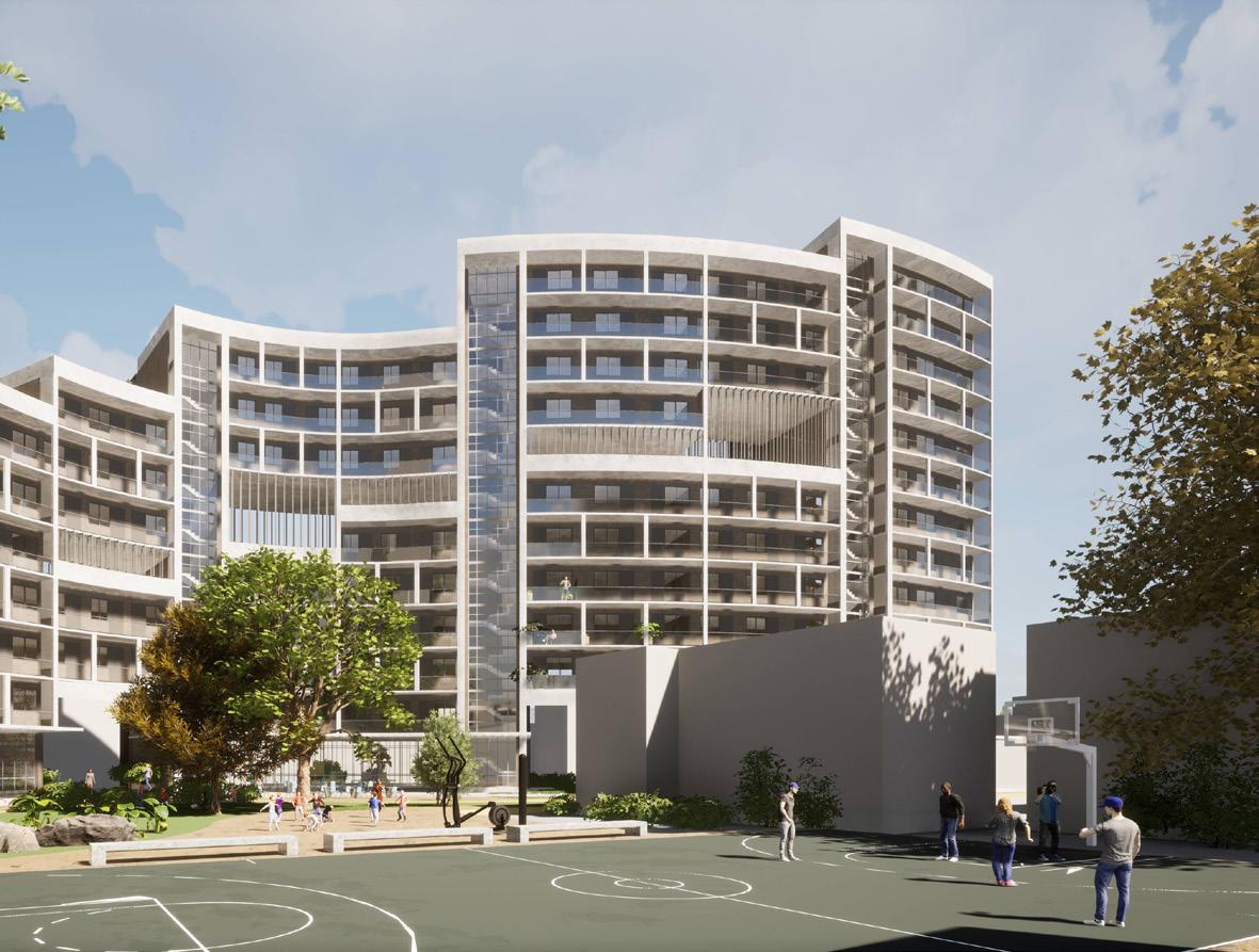
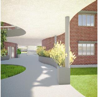
The project aimed to provide the required 100 homes for Somerset Estate keeping both architectural as well as environmental agendas paramount. The major issues and passive strategies were carefully analyzed and documented - which allowed a strategic and methodical approach, helping us to address the problems clearly and solving for them. Simultaneously a close attention was given to the way the spaces would be used by the occupants.

01 residential development at somerset estate surabhi agarwal | architecture portfolio pg. 5
100 HOMES RIVERWALK ACCESS TREES SAVED OPEN AREAS MAXIMIZED M.U.G.A PROVIDED CYCLE PARKING 100 HOMES RIVERWALK ACCESS TREES SAVED OPEN AREAS MAXIMIZED M.U.G.A PROVIDED CYCLE PARKING 100 HOMES RIVERWALK ACCESS TREES SAVED OPEN AREAS MAXIMIZED M.U.G.A PROVIDED CYCLE PARKING 100 HOMES RIVERWALK ACCESS TREES SAVED OPEN AREAS MAXIMIZED M.U.G.A PROVIDED CYCLE PARKING 100 HOMES RIVERWALK ACCESS TREES SAVED OPEN AREAS MAXIMIZED M.U.G.A PROVIDED CYCLE PARKING
Designing
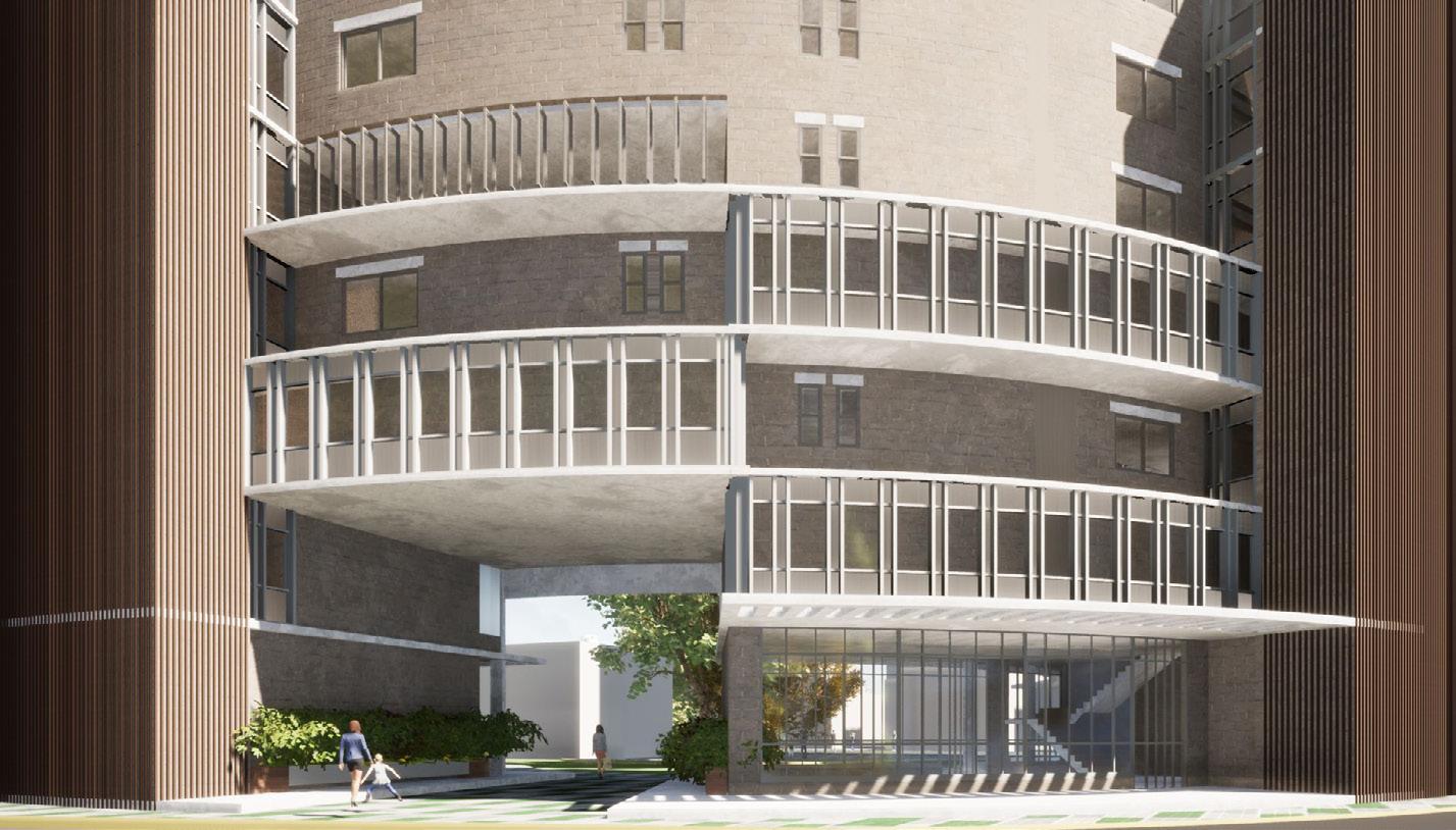
View of the Project
SITE AND ZONING
Latitude/ Longitude: 51.48°N; 0.17°W


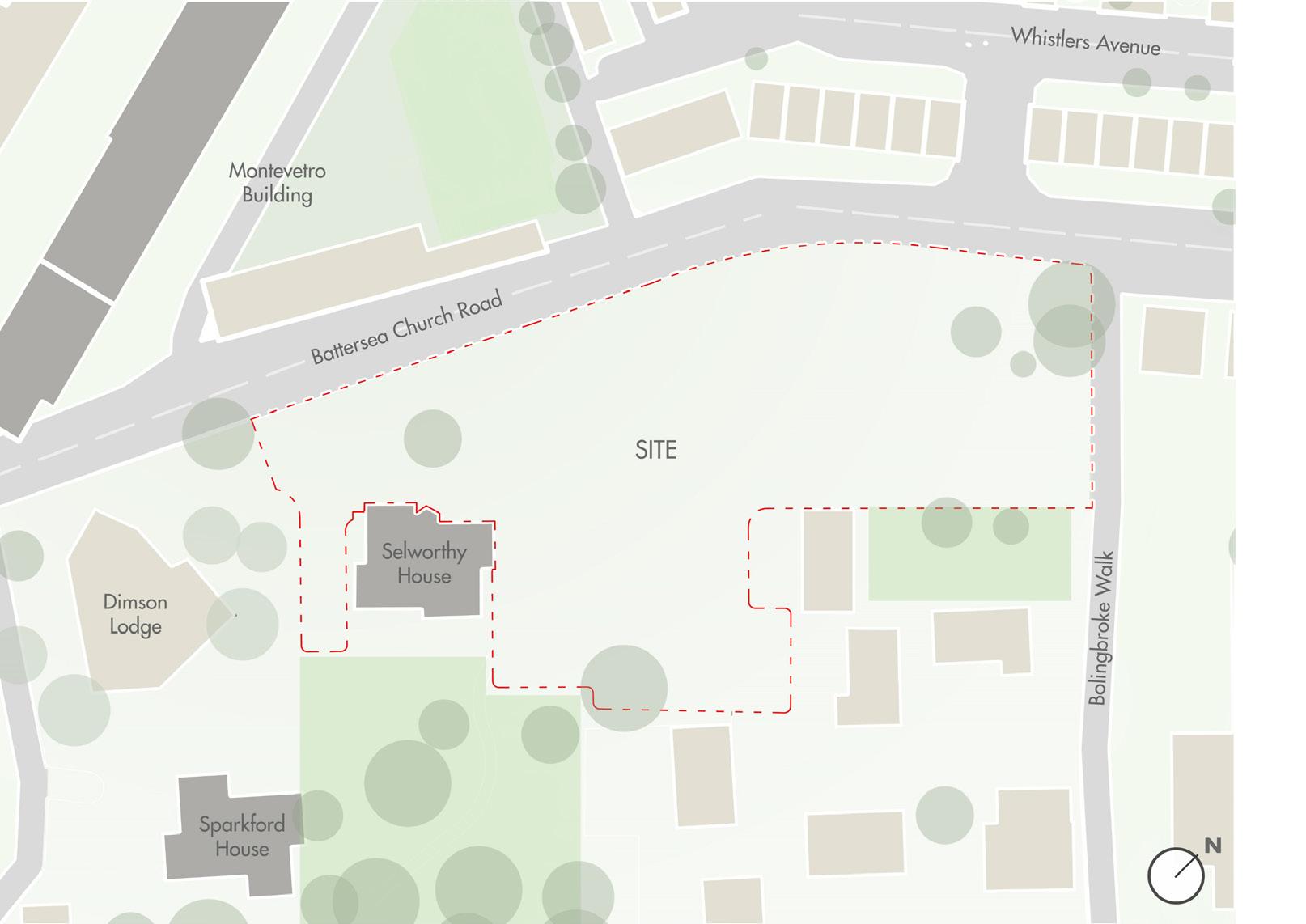
The site is located at the intersection of Battersea Church Road and Bolingbroke Walk as part of Somerset Estate in South London, with close proximity to the River Thames. For the project, the climate of London was analysed and it was observed that the mean outdoor temperatures are typically below the comfort band for the entirety of the year. Based on the study, the summer and winter periods were established along with the typical weeks:


1500 HRS 1200 HRS 0900 HRS
Axonometric
Site Axonometric
Existing Trees to be Protected Building Fabric Visually Similar to the Neighbourhood
permeability with neighbourhood
-Summer: Period- May to August, Typical Week- 10th August to 16th August -Winter: Period- November to February, Typical Week- 29th November to 5th December Based on the climate studies, and shadow analysis the site was zoned to avoid the facade from being blocked from the sun while at the same time forming public and semi public zones for the pedestrians and the occupants. connection with riverwalk

Public Zone Semi Public Zone
integration of open green spaces
Creating Allow the 100% Pedestrian Providing Private Outdoor Community to the Ground Integrating Spaces into Universal
Mid-Rise Development Creating Allow the 100% Pedestrian Providing Private Outdoor Community to the Ground Integrating Spaces into Universal 0m 10m 20m 30m 50m
vehicular & pedestrian segregation
Creating Allow the 100% Pedestrian Providing Private Outdoor Community to the Ground

surabhi agarwal | architecture portfolio pg. 6
01 residential development at somerset estate
SUMMER SOLSTICE
Permeability with Neighbourhood Linear Form with Southern Exposure Open Areas Integration EQUINOX WINTER SOLSTICE
Parking and Drop Off Zone Site
View of the Project
MASSING
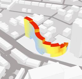
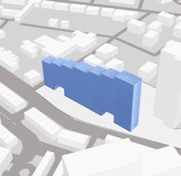
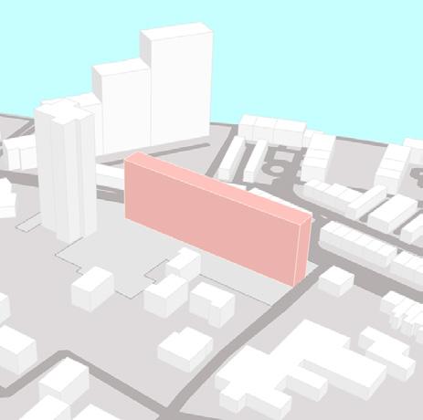
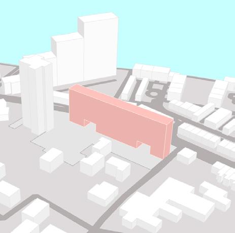
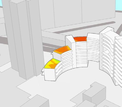
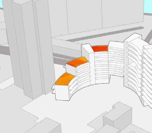
The massing process saw the zoning visualized three-dimensionally, and then further refined in a step-by-step process based on the scale of the building mass with respect to permeability with the neighbourhood, and an emphasis on the public and semi-public zones created - all while simultaneously checking the solar radiation on both the longer facades to ensure southern solar exposure.


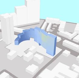
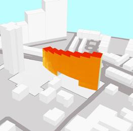
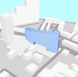
Upon analysis and careful considerations a ‘Final Base Form’ (Step V) was arrived at which was tested for solar radiation and solar access. The form attempted at reducing gains in summer while increasing as much as possible in winters.
STEP I: BLOCK ORIENTATION
STEP III: SCALE ADJUSTMENT
-stepped roof created to adjust the scale with respect to the neighbourhood -form checked for radiation

STEP II: NEIGHBOURHOOD PERMEABILITY
-linear mass of required volume taken block oriented to -have increased southern exposure -Punctures created on ground level to allow permeability into the green spaces
STEP IV: STEPPING REVERSAL
-stepping reversed to enable higher radiation on the tallest side -form convexed to emphasize the promenade -form checked for radiation
STEP V: FINAL BASE FORM
-form further elongated and scaled to suit the neighbourhood -curved in a way to make two distinct enclosures for: public and semipublic zones


estate surabhi agarwal | architecture portfolio pg. 7
01 residential development at somerset
SUMMER SUMMER SUMMER SE FACADE SE FACADE SE FACADE SE FACADE NW FACADE NW FACADE NW FACADE NW FACADE WINTER WINTER WINTER N Solar Radiation study for linear form Solar Radiation study for convex form 0 kwh/m2 600 kwh/m2 Solar Radiation Study for Final Base Form Solar Access Study for Final Base Form 0 kwh/m2 0 hrs 600 kwh/m 2400 hrs Semi Public Space Public Space
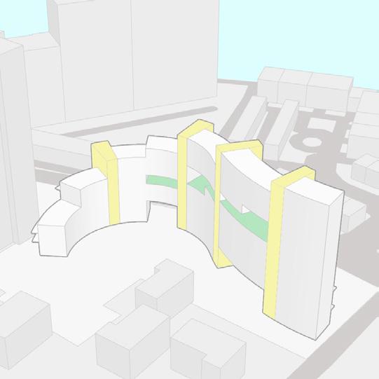
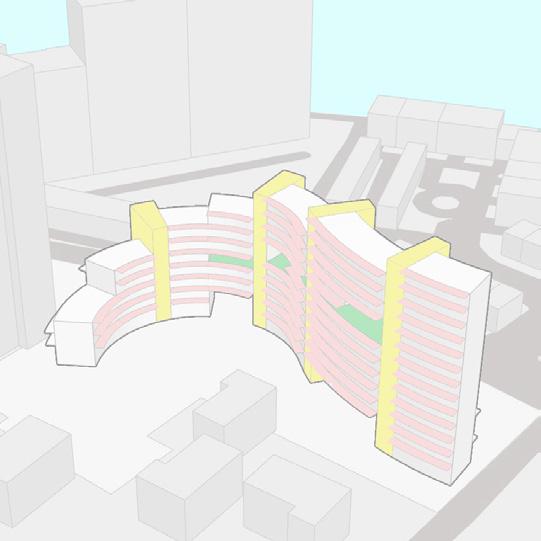
FORM REFINEMENT & HIERARCHY OF SPACES


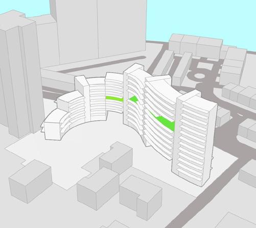
Some of the other functional as well as architectural and environmental agendas were incorporated to further refine the building mass without hampering the design intent. This allowed for the creation of multiple open and semi-open spaces with varying levels of public or private access; from the promenade, being the most public space serving as a node, to the most private semi open space in the form of a balcony. Each of these spaces were tested for UTCI Comfort % to understand the various zones that could be used during which periods.


Hierarchy of Open Spaces

01 residential development at somerset estate surabhi agarwal | architecture portfolio pg. 8
STEP VII: CREATING VOIDS STEP VIII: ADDING THE BALCONIES N STEP VI: ADDING THE CORES N UTCI Comfo Hours Hours UTCI Comfo Hours % Hours Promenade & Centralized Green Public & Semi-Public Terrace Gardens Semi-Private UTCI Comfo Voids Semi-Private UTCI Comfo Hours Hours UTCI Comfo Hours % Hours
Semi-Private Hours UTCI Comfo Voids Semi-Private Balconies Private UTCI Comfo UTCI Comfo Hours UTCI Comfo % Hours % Hours Hours % Hours Promenade & Centralized Green Public & Semi-Public Terrace Gardens Semi-Private % Hours UTCI Comfo Voids Semi-Private Balconies Private UTCI Comfo UTCI Comfo Hours % Hours Hours UTCI Comfort UTCI Comfor UTCI Comfor % Hours % Hours UTCI Comfo % Hours % Hours Promenade & Centralized Green Public & Semi-Public Terrace Gardens Semi-Private UTCI Comfor % Hours UTCI Comfo Voids Semi-Private Balconies Private UTCI Comfo UTCI Comfort % Hours % Hours Hours % Hours N UTCI Comfor % Hours % Hours UTCI Comfort N % Hours % Hours Promenade & Centralized Green Public & Semi-Public Terrace Gardens Semi-Private UTCI Comfort N Voids Semi-Private UTCI Comfor % Hours % Hours UTCI Comfor N % Hours % Hours Promenade & Centralized Green Public & Semi-Public Terrace Gardens Semi-Private % Hours UTCI Comfort N Voids Semi-Private Balconies Private UTCI Comfort UTCI Comfort % Hours UTCI Comfort UTCI Comfor UTCI Comfor N % Hours % Hours UTCI Comfort N % Hours % Hours Promenade & Centralized Green Public & Semi-Public Terrace Gardens Semi-Private UTCI Comfor N % Hours UTCI Comfor N Voids Semi-Private Balconies Private UTCI Comfor UTCI Comfor % Hours % Hours % Hours TYPICAL SUMMER WEEK TYPICAL WINTER WEEK Promenade & Centralized Green Public & Semi-Public Terrace Gardens Semi-Private Voids Semi-Private PUBLIC TO PRIVATE SPACES - Provides Amenities & Acts as a Neighbourhood Node - Allows Access & Visual Connectivity with Riverwalk - Integrates Adjoining Open Spaces into the Site - Placement of the Court Promotes in-flow of People - Community Spaces not restricted to Ground Level - Operable Louvers to Maximize Thermal Comfort - Community Spaces not restricted to Ground Level - Promotes Health & Well-Being - Private Outdoor Space attached to Living Areas - Runs Along the Full Length of the Facade 5 ° BALCONIES Private 4 ° VOIDS Semi-Private 3 ° TERRACE GARDENS Semi-Private 2 ° CENTRALIZED GREEN Semi-Public 1 ° PROMENADE Public
Promenade & Centralized Green Public & Semi-Public Terrace Gardens


01 residential development at somerset estate surabhi agarwal | architecture portfolio pg. 9
The Balconies
The Front Promenade
The Void
The Riverwalk Connection
SITE AND UNIT PLANNING
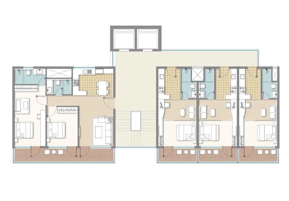
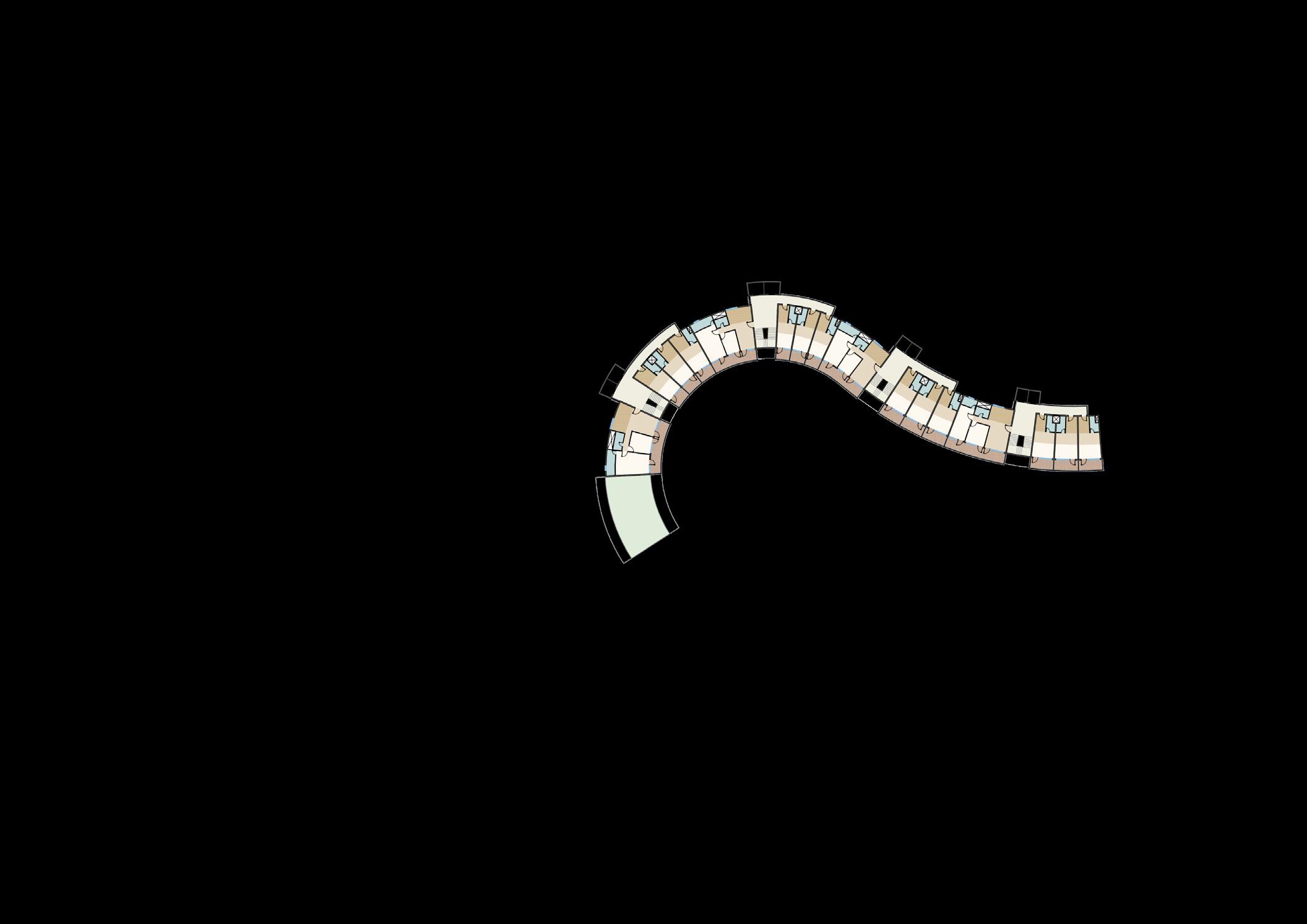
Based on the site zoning and the study of the open spaces conducted a layout was drawn which aimed to incorporate all architectural agendas. The ground floor was dedicated to outward facing retail spaces opening onto the public promenade, and inward facing community spaces opening into the semi-public central greens.
In terms of planning the units, the bedrooms and living room were placed towards the south so as to receive the southern solar exposure, while the bathrooms and kitchen were placed towards the north. Drawing from the linear and dual aspect plan, the units were planned with a maximum depth of 6m for the living spaces to ensure they would fall within the passive zone and hence receive adequate daylight.


Riverwalk Connection Multi Purpose Hall Indoor Games Gym Restaurant Cafe Cafe Co Working Grocery Store The Front Promenade
Bedroom
Living
TERRACE (UNIT BELOW) BEDROOM-1 DINING
STUDIO (32 SQM) STUDIO (32 SQM) STUDIO (32 SQM)
STUDIO
(32


residential development at somerset estate surabhi agarwal | architecture portfolio pg. 10
SQM)
Bedroom Living Room Kitchen/ Dining Bathroom Balcony Core/ Lobby BALCONY BALCONY BALCONY BALCONY 10M 4M 4M 4M
STUDIO (32 SQM) STUDIO (32 SQM)
THIRD FLOOR PLAN
STAIRS UP DN PASSAGE BEDROOM-2 LIVING ROOM PASSAGE KITCHEN TOI-1 TOI-2 BALCONY BALCONY BALCONY BALCONY BEDROOM BEDROOM BEDROOM LIVING AREA LIVING AREA LIVING AREA TOI TOI TOI KITCHENETTE KITCHENETTE KITCHENETTE 2M 6M 1.5M 10M 4M 4M 4M
Bedroom Living Room Kitchen/ Dining Bathroom Balcony Core/ Lobby
10m 20m 30m 50m (UNIT BELOW) -1 LIFT PASSAGE -2 LIVING ROOM PASSAGE KITCHEN TOI-1 TOI-2 BALCONY BALCONY BALCONY BALCONY BEDROOM BEDROOM BEDROOM LIVING AREA LIVING AREA LIVING AREA TOI TOI TOI KITCHENETTE KITCHENETTE 6M 1.5M
THIRD FLOOR PLAN
TERRACE (UNIT BELOW) BEDROOM-1 DINING 2 BEDROOM (80 SQM) STAIRS DN
LIVING
PASSAGE KITCHEN
TOI-2 BALCONY 2M 6M 1.5M 10M
Typical Floor Plan with Unit Plan
Room Kitchen/ Dining Bathroom Balcony Core/ Lobby
BEDROOM-2
ROOM
TOI-1
Accessible Central Greens Sandpit Play Area and Outdoor Gym M.U.G.A
THIRD FLOOR PLAN
BatterseaChurchRoad
THERMAL STUDIES
Upon completion of the planning, select few units chosen on the basis of orientation, exposure and volume were simulated using Ladybug Tools. The team aimed to achieve a heating demand of less than 25% than what is prescribed by LETI which is 15 kWh/m2/ year for this typology.
The results of the simulations showed satisfactory results for six out of the nine units (based on the team’s internal target), with the best performing studio unit and best performing 2-bedroom unit in tower 2. Meanwhile, the worst performing studio unit was the Tower-8 top floor unit and worst performing 2-bedroom unit was the Tower-3 first floor unit.


The three units with unsatisfactory performance were further analyzed to establish the cause for their poor performance. Possible solutions to increase heat gain such as increasing WWR or addition of windows on the exposed, and to reduce heat losses such as night shutters & further insulation were identified to optimize the thermal performance of these units.
LETI Standard Heating Demand
≤15 kWh/m²/yr
HL: 11.2 kWh/m2/yr CH (FR): 57% HL: 16.8 kWh/m2/yr CH (FR): 53%
01 residential development at somerset
HL: 10.9 kWh/m2/yr CH (FR): 67%
LETI Standard Heating Demand
≤15 kWh/m²/yr >25% reduction
LETI Standard Heating Demand from LETI Standard
N
HL: 5.8 kWh/m2/yr CH (FR): 76% HL: 14.8 kWh/m2/yr CH (FR): 58% HL: 4.6 kWh/m2/yr CH (FR): 69%
Step I Thermal Results for the Chosen Units
• Night Shutters
• Adding Window on Exposed Wall
• Further Insulating Exposed Wall
• Night Shutters
E-W Orientation
HL: 11.0 kWh/m2/yr CH (FR): 66%
HL: 2.0 kWh/m2/yr CH (FR): 89%
HL: 6.7 kWh/m2/yr CH (FR): 73%
Large Exposed Surface & Low Solar Exposure
• Night Shutters
• Further Insulating Exposed Floor
Problem Area for the Units
surabhi agarwal | architecture portfolio pg. 11
estate
Best
Best Performing Studio
Performing 2BHK
BEST PERFORMING WORST PERFORMING
TOWER 8 STUDIO WORST PERFORMING UNIT
The indoor operative temperature for the typical summer and winter weeks for the worst performing studio unit were analyzed and iterated with.

It was seen that although through natural ventilation and shading, the OT for this unit would be in the comfort band for the typical summer week, however, during the typical winter week the OT was significantly below comfort. It was found that through an additive process of introducing night shutters, adding a window on the exposed south-east facing wall and further insulating the same wall, the indoor operative temperature could be increased by 1.2°C in the typical winter week, and the space heating demand could consequently be reduced by 25%.
• Night Shutters
• Adding Window on Exposed Wall

• Further Insulating Exposed Wall
Large Exposed Surface & NE-SW Orientation
Total Energy Consumption
Total Heating Demand
01 residential development at somerset estate surabhi agarwal | architecture portfolio pg. 12
LETI Standard LETI Standard Step I Achieved Step I Achieved Step II Improved Step II Improved
≤35 kWh/m2 ≤15 kWh/m2 41.5 kWh/m2 16.8 kWh/m2 37.3 kWh/m2 12.6 kWh/m2
Thermal Studies for Tower 8 Studio
DAYLIGHT STUDIES
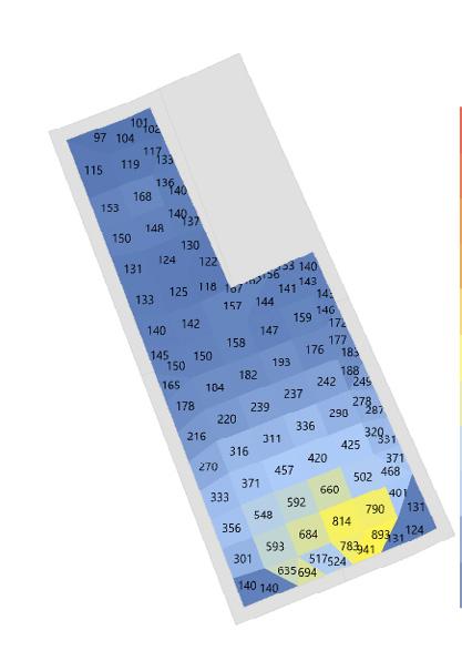
Similar to the thermal analysis, height and orientation were the two factors that could affect the units in terms of daylight performance. Therefore, for the comparison between the units, the results observed at 1200h of both solstices and sky conditions were considered. For the two studio units, they showed good results during both the solstices in a sunny sky condition. The lower value identified was higher than 100lux, at the entrance of the unit in tower 2 which is a satisfactory illuminance for a hallway. An overcast sky conditions showed decent results aswell except for the tower 2, 5th floor studio in winter, where lux levels fall to about 150-200 close to the window and only about 30 at the entrance.


Studio daylight comparatives between various units


Tower 2 - 5th floor
SUNNY OVERCAST


Tower 8 - 6th floor
Tower 2 - 5th floor
Tower 8 - 6th floor
01 residential development at somerset estate surabhi agarwal | architecture portfolio pg. 13
WINTER SOLSTICE SUMMER
SOLSTICE
N
Joana


Simos Yannas,


When earlier a home evolved from the functional needs and climatic requirements of the region, it has now shifted to rely on heating and cooling systems to achieve comfort conditions. This has led man and the built to grow distant leading to minimal interactions between them. The project attempted to rekindle this conversation through a


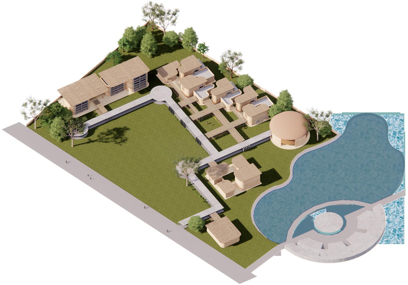
02 centre for sustainable living surabhi agarwal | architecture portfolio pg. 14 C ENTRE FOR S USTAINABLE L IVING 02 Location: Kolkata,
Bengal, India M.Arch
Mentors:
Re Kindling Interaction between Man & the Built Mid-Rise Development Access & Visual Connectivity Riverwalk Existing Trees Protected Building Fabric Visually Similar to the Neighbourhood Amenities Catering to the Creating a Permeable Promenade Allow the Neighbourhood In 100% Pedestrian-Friendly Site Providing Balconies – as Private Outdoor Spaces Community Spaces not restricted to the Ground Level Integrating Adjoining Open Mid-Rise Development Access & Visual Connectivity with Riverwalk Existing Trees to be Protected Building Fabric Visually Similar to the Neighbourhood Amenities Catering to the Neighbourhood’s Needs Formulating Semi -Public & Community Spaces Creating a Permeable Promenade to Allow the Neighbourhood In 100% Pedestrian-Friendly Site Providing Balconies – as Private Outdoor Spaces Community Spaces not restricted to the Ground Level Integrating Adjoining Open Spaces into the Site Universal Access Mid-Rise Development Access & Visual Connectivity with Riverwalk Existing Trees to be Protected Building Fabric Visually Similar to the Neighbourhood Amenities Catering to the Neighbourhood’s Needs Formulating Semi -Public & Community Spaces Creating a Permeable Promenade to Allow the Neighbourhood In 100% Pedestrian Friendly Site Providing Balconies as Private Outdoor Spaces Community Spaces not restricted to the Ground Level Integrating Adjoining Open Spaces into the Site Universal Access N-S Orientation to Maximize Solar Exposure Linear + Dual -Aspect Units for Maximum Daylight & Cross-Ventilation South-Facing Balconies Act as Shading Devices Minimizing WholeLife Carbon Site Zoning to Maximize Outdoor Comfort Avoid Shading Other Houses in the Neighbourhood Maximizing Occupant Health & Well -Being Designing to Cater for Climate Change Minimizing Energy Consumption & Heating Demand Maximizing Use of Renewables Maximize Comfort, Health & Well Being Integrate the Built with its Context Ensure efficient Zoning of Functions & Open Spaces Provide opportunties for Outdoor Learning
of the Project
West
Dissertation: May 2022- January 2023
Goncalves Dr.
Paula Cadima
learning centre aimed at inculcating a sustainable lifestyle amongst its occupants via its programme and architecture.
View
DESIGN APPROACH
A Design Approach for the project was formulated to achieve the ultimate goal of inculcation of a Sustainable Lifestyle amongst its occupants. First, different needs of a learning centre were established in terms of its programme, and their corresponding requirement of a learning space was listed. Then the goals for the built environment were established, aimed at improved interaction between man and the built and the types of learning it would inculcate in them to achieve the ultimate Project Goal!

Goals for The Programme Required Learning Spaces Goals for The Built Environment
Resultant Learnings Project Goal

Spaces for Theoretical Learning & Information Delivery


Direct Learning
Thermal & Visual ‘Comfort’
Spaces for Hands On Learning & Activities


Spaces for Discussions, Collaborations & Self Paced Learning

Applied Learning
Interpersonal Learning

Thermal & Visual ‘Delight’
Habituational Learning
Inculcation of a Sustainable Lifestyle
Sensorial Learning

02 centre for sustainable living surabhi agarwal | architecture portfolio pg. 15
Design
Summary
Approach
THERMAL ANALYTICAL STUDIES FOR OPTIMAL COMFORT


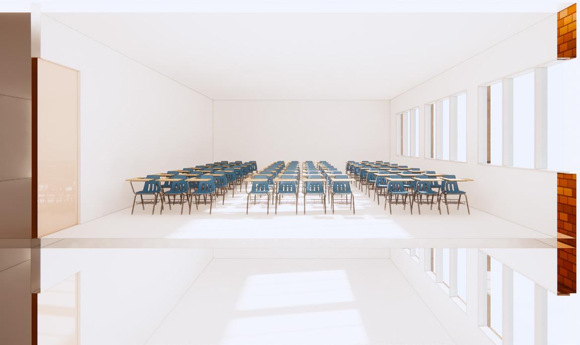
Before moving on to designing, the climate was studied in detail and passive strategies to achieve comfort were analysed. For the purpose, a basic shoe box was tested, starting from a base case which followed the current industry trends, to a step by step optimization of the box to maximise comfort in a free-running condition.
Orientation East West Orientation North South
Shading None Shading 4.6 x 1.8m x 0.75m
Ventilation None Ventilation Set Pt 24°C


WWR West: 40% WWR South: 75%
Roof Concrete Slab Roof Filler Slab + Roof


Floor Tiles & Concrete Floor Rammed Earth


Wall Brick & Plaster Wall Rammed Earth


Graphical representation of the Optimized results (bottom) as compared to the Base Case scenario (top)


02 centre for sustainable living surabhi agarwal | architecture portfolio pg. 16
Temperature and Relative Humidity Graphs for three typical days in the chosen periods for the Base Case and the Optimized Case Hours Hours Hours 0200 1000 1800 0600 1400 2200 0400 1200 2000 0800 1600 2400 0200 1000 1800 0600 1400 2200 0400 1200 2000 0800 1600 2400 0200 1000 1800 0600 1400 2200 0400 1200 2000 0800 1600 2400 15 20 25 30 35 40 45 50 55 75 60 80 65 85 95 70 90 100 ∆T -7°C ∆T -5°C ∆T -7°C ∆RH +2% ∆RH +1% ∆RH +2% Base Case - OT/RH Outdoor - DBT/RH Optimized Case - OT/RH from Base Case Temperature (°C) Relative Humidity (%) 21st May Hot and Dry 10th July Warm and Humid 11th February Cool
ZONING & MASSING
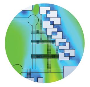
The learnings from the analytical work and the needs of the programme led to a step by step form development. Apart from keeping in mind the optimum zoning and the block orientation, special attention at reducing radiation on th facades was given. Furthermore, various open spaces were incorporated adequate wind circulation was ensured in the spaces.
Zoning
Reducing Radiation on Facade
Step 0 The Site - Sun and Wind laying out basic sun and wind directions on the site as is
Improving Wind Flow
Step 2 | Addition of Pedestrian Link shaded pathway created as pedestrian link
Step 3 | Staggering of Blocks to reduce radiation (see 3a) & allow wind from S

Step 6 | Added Links & Courtyards to add green, self shaded open spaces (see 6a)
Step 1 | Site Zoning central greens; N-S orientation; free flow of wind from S
Basic Site Analysis and Site Zoning


Step 4 | Introducing Level Play to reduce radiation on terraces (see 4a)


Step 5 | Adding an Extra Roof to minimize radiation on exposed roofs (see 5a)
Step 7 | Chamfering Walls to enhance windflow in smaller courtyards (see 7a)
Step 2a Step 3a Step 4a
Steps aimed at reducing radation on the Envelope & allowing for different types of Spaces
Step 6a Step 5a Step 7a
0 2500 kWh/m2
Addition of smaller Courtyards & Wind tests

02 centre for sustainable living surabhi agarwal | architecture portfolio pg. 17
0m/s 2m/s
DEVELOPED BASE FORM


02 centre for sustainable living surabhi agarwal | architecture portfolio pg. 18
Hierarchy of Open Spaces Developed Base Form for the Centre
of Open Spaces Step 8| Hierarchy of Open Spaces formation of various degrees of open spaces Mid Size Courtyards acting as shaded spillout and exhibition spaces Large Central Courtyard acting as a continuation to the eco park Verandas & Terraces shaded breakout spaces acting as an extension Small Courtyards more intimate courtyards for zone specific activities 2 1 3 4 5 1. Visitors’ Centre/Admin Block 2. Collab Hub 3. Multi Purpose Hall 4. Workshop Spaces 5. Classrooms N
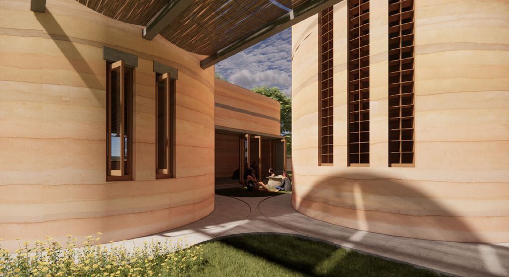
Through some conscious choices made, the massing of the Centre led to the formation of a number of different degrees of open spaces inspired from the vernacular, i.e. courtyards and verandas. Finally, a developed base form was achieved through the application of the materials derived during the Thermal Analytical Studies.
Hierarchy
DIRECT LEARNING SPACES


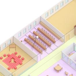
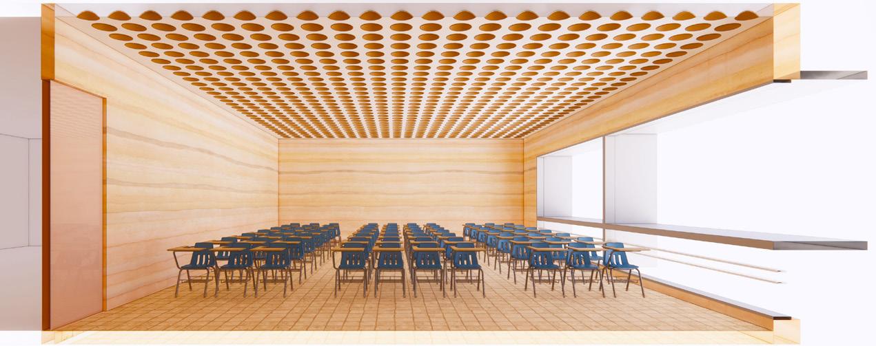
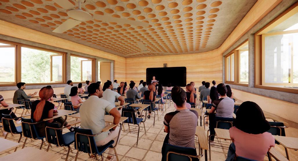
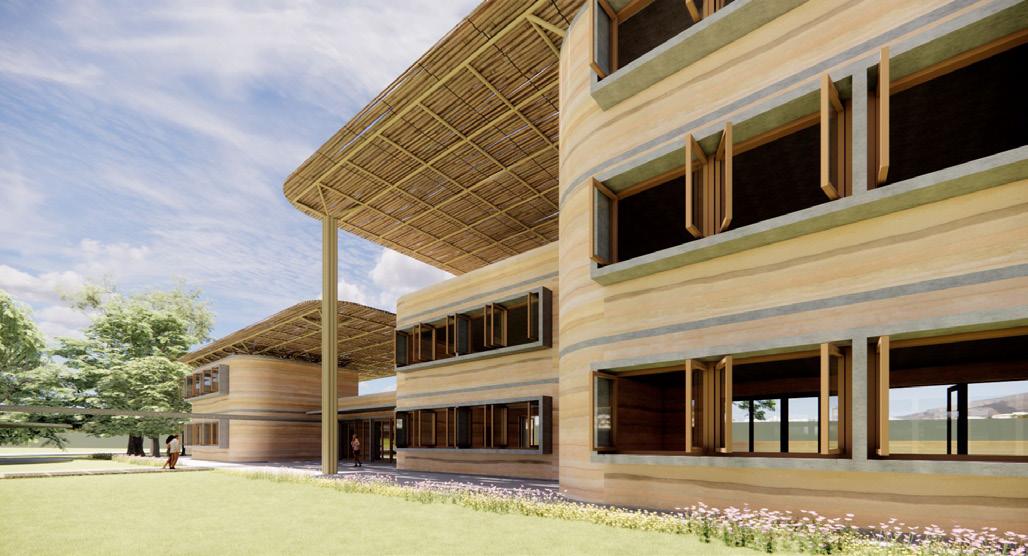
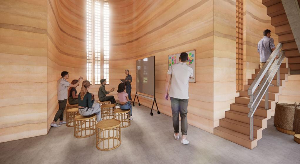
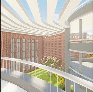
The spaces for this block were so designed that each of the rooms have an exit into a shaded outdoor space in the form of a veranda or a terrace. The strategies derived from analytical studies were applied with some modifications to aspects such as WWR due to change in the envelope boundary conditions.


02 centre for sustainable living surabhi agarwal | architecture portfolio pg. 19
Interior View of a Classroom
Rear View of the Direct Learning Block
N
Added Roof Bamboo Framework Roof Second Floor First Floor Ground Floor
Front View of the Direct Learning Block
Bamboo
INTERPERSONAL LEARNING SPACES
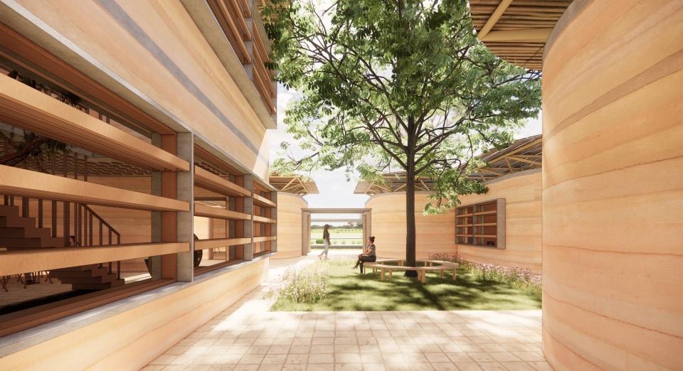
These spaces were provided in the form of a Collaborative Hub forming multiple spaces such as a cafe, a seminar hall, a library and an interaction zone. Passive strategies such as incorporation of a courtyard were used apart from the takeaways from the previous analytical studies to improve comfort.


02 centre for sustainable living surabhi agarwal | architecture portfolio pg. 20
Interior View of the Mezzanine Level
Interior View of the Collab Hub
N
View of the Central Courtyard in the Collab Hub
Bamboo Added Roof
Floor Vertical Circulation
Floor
Bamboo Framework Roof Mezzanine
Ground
APPLIED LEARNING SPACES


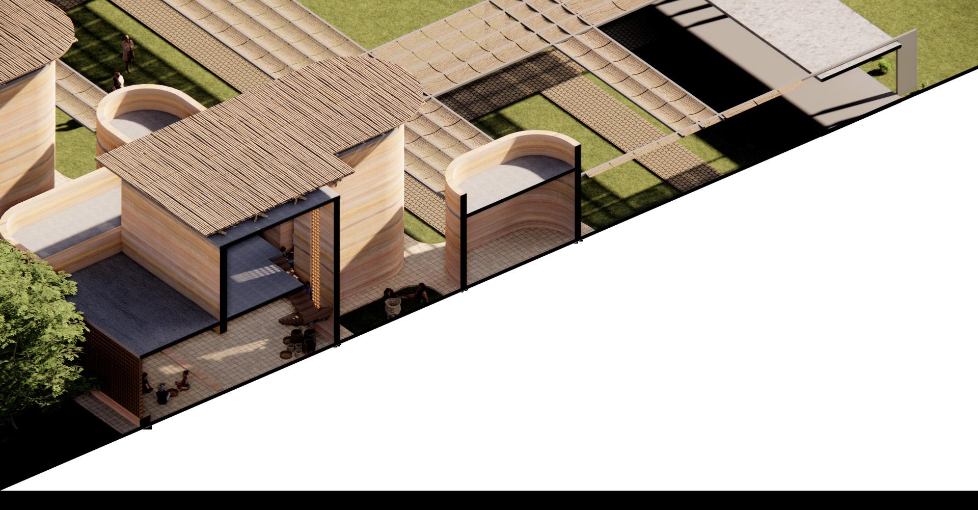
These form the workshop spaces in the centre housing activities such as pottery, wood carving, bamboo weaving etc. The design was driven by the idea of providing various niches and zones in a large space for various smaller groups to work hands-on on various activities with an attached semi outdoor space with each.

02 centre for sustainable living surabhi agarwal | architecture portfolio pg. 21
N Bamboo Added Roof Bamboo Framework Roof Mezzanine Floor Vertical Circulation Ground Floor
THERMAL STUDIES

(°C)


Thermal studies for the different spaces were carried out with a special attention towards incorporation of adaptive opportunities as a means of improving comfort in the spaces. Strategies such as stack effect, thermal inertia, ventilation were studied and comfort was improved by simple interaction of the occupants (man) with the built. Furthermore, aspects such as thermal alliesthesia were incorporated to bring in aspects of thermal ‘delight’ (see next page). 15 20 25 30 35 40 45 50 55 60 65 70 75 80 85 90 95 100 1:00 4:00 7:00 10:00 13:00 16:00 19:00 22:00


Condition on 21st May at 0800 hrs Condition on 21st May at 1200 hrs Condition on 21st May at 1600 hrs
21st May Hot and Dry
11TH FEBRUARY
10th July Warm and Humid 11th February Cool Temperature Stratification in the space (double vs single height space) Providing Opportunity for Stack Effect
02 centre for sustainable living surabhi agarwal | architecture portfolio pg. 22
0200
Improved Comfort upon using the right set of Adaptive Opportunities for the different seasons Temperature (°C) Relative Humidity (%) Hours Hours Hours
1000 1800 0600 1400 2200 0400 1200 2000 0800 1600 2400 0200 1000 1800 0600 1400 2200 0400 1200 2000 0800 1600 2400 0200 1000 1800 0600 1400 2200 0400 1200 2000 0800 1600 2400 15 20 25 30 35 40 45 50 55 75 60 80 65 85 95 70 90 100 Existing Scenario - OT/RH Outdoor - DBT/RH Adaptive Scenario - OT/RH
25 35 27 29 31 33
21ST MAY 15 20 25 30 35 40 45 50 55 60 65 70 75 80 85 90 95 100 1:00 4:00 7:00 10:00 13:00 16:00 19:00 22:00
10TH JULY 15 20 25 30 35 40 45 50 55 60 65 70 75 80 85 90 95 100 1:00 4:00 7:00 10:00 13:00 16:00 19:00 22:00
Occupied
0%
Hours existing adaptive 43 52 57 48
20% 40% 60% 80% 100% 17 17 83 83 0% 20% 40% 60% 80% 100% 12 18 85 80 0% 20% 40% 60% 80% 100%
Conditions: Hot & Dry 21st May, 1600 hrs
DBT: 34°C RH: 62% Warm & Humid 10th July, 1600 hrs
DBT: 31°C RH: 74% Cool 11th February, 1600 hrs DBT: 26°C RH: 57%


02 centre for sustainable living surabhi agarwal | architecture portfolio pg. 23 Shaded Pathway Mid Size Courtyard (Sun) Mid Size Courtyard (Shade) Indoor Workshop Spaces Indoor Workshop Spaces Verandas Small Courtyard 38°C 32°C 32°C 26°C 24°C 25°C 32°C 28°C 29°C Section through the various outdoor and indoor spaces showing alliesthesia in architecture 40°C 32°C 36°C 28°C 24°C 35°C 40°C 37°C
Outdoor
37°C 32°C 32°C 24°C 24°C 26°C 27°C 32°C 28°C
03
S CHOOL FOR A LTERNATIVE L EARNING

Location: Kolkata, West Bengal, India
Architecture Thesis: January- August 2020


Thesis Guide: Assoc Prof. Sujay Sengupta


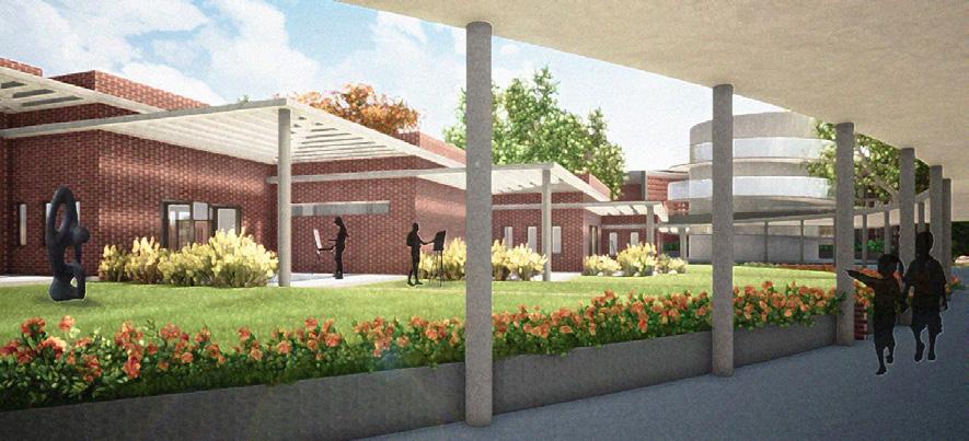
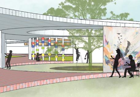
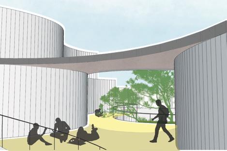
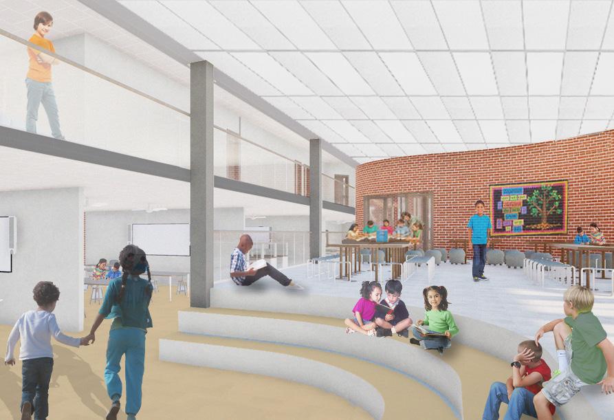
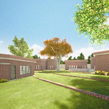
Students at schools in India today are trained at the same things in the same way, their individualism being ignored completely. Instead of fostering love for learning, they are bogged down by the fear of grades. Therefore, an alternative approach is crucial to let these young minds grow and embrace the beauty of education; through experiences, experiments and errors and not just textbooks. The thesis therefore focuses on experimenting with the various spatial needs of a child to not just make a learner out of him, but also a creator!

03 school for alternative learning surabhi agarwal | architecture portfolio pg. 24
The
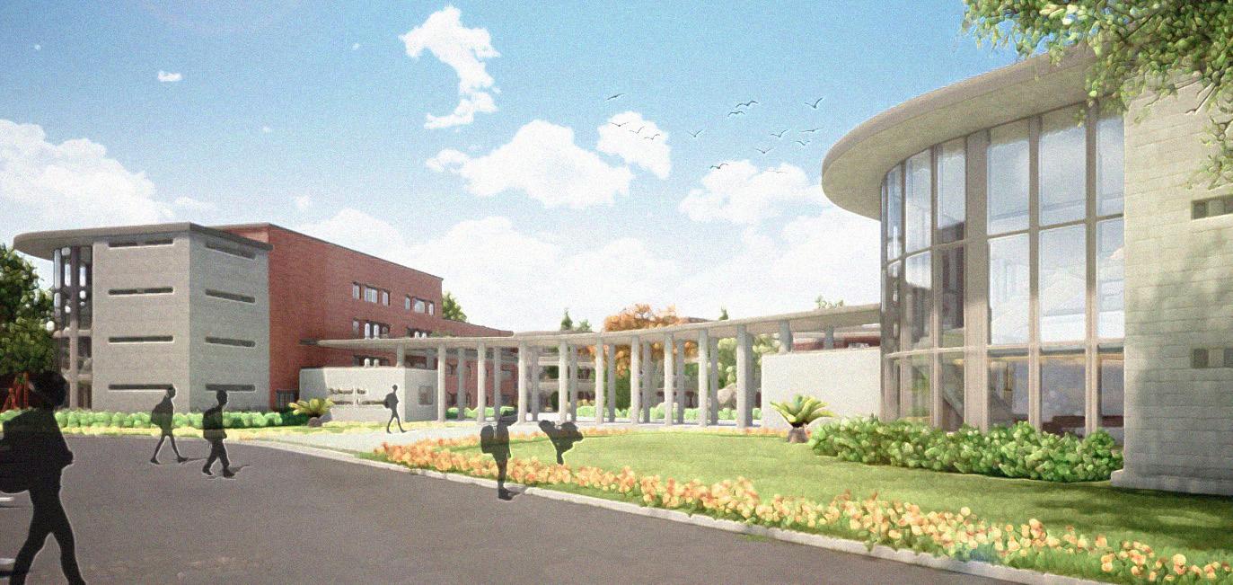
scope of the project was to design a campus with various different blocks catering to children from the age of 4 to 17 years with a major focus on creating multiple types of spaces for learning.
Individualised Approach Integration of Different Groups Cross Linking of Disciplines Experimenting Classroom Structure Multiple Methods of Evaluation Experiential Learning Physical Classroom Space Broken Aerial View
Re-Interpreting Spaces for Learning
Faculty/Visitors’ Entrance
The Kindergarten
The Art Village
Main School Block Entrance
“If we succeed in giving the love for learning the learning itself is sure to follow.”
John Lubbock
differenttypesof spacesforlearning multiple routes leading to a place from one space to another s tudents integralindecision making built environment withspacesto express
flexibilityintransformabilityofspacesthermalcomfort sunandwindfactorsvisualcomfort-lux levelsinvariousspaces no social discriminations
CONCEPT
For an Alternative School it was utmost important to be able to imbibe a feeling of love for learning amongst the students of the school. So keeping that one goal in mind a mind map was created twhich began with all the feelings associated with love: to finally derive the different spaces the students would need. Apart from these, the 4 emotions that are crucial for learning to take place were also kept in mind while designing the spaces
C Comfort F Freedom W Wholeness N Natural B Belonging
Surprise Interest C Confusion W Wonder
of m ovement of expressio n of choice p rid ec o mmunity car e
physical social
providespacestofoster interactionsbetweenvariousgroups equal importance and respect to all types of subjects and projects taken spaces keeping in mind Gardner’s Theory of Multiple Intelligences
COMFORT WHOLENES S NA T URA L BELONGIN G
humility at the same time
taking pride & practising
o wnershi p
holisti c learning mental wholenes s emotional wholenes s environ s
for the school
ntuitive
bgivingopportunitiesto uildata smallerscale kitchenscommunityandgarden collaborative settingwithneighbourhood love and pride
experiential learning/ learning by doing learning from one’s surroundings and the built environment self-directed learning/learning from peers mixed age learnin g giving oppor tunities for spiritual growth stress free, competition free school environment environments fostering creativity and compassion giving enough room for intuitive learningavoidingrigidlearningcreatingatmospheresspaceswith differentlearningsettingsthelivingwithandappreciating beautyofnaturelearningtolivea sustainablelifeinengagingstudents placemaking
03 school for alternative learning surabhi agarwal | architecture portfolio pg. 25
F REEDO M
Conceptual Mind Mapping
S
PLACE MAKING


I W W B


• •
Providing spaces and opportunities for art and activities


Promoting collaborations with the nearby villages and universities.
MIXED AGE SPACES

I C W C W
• •
CENTRAL CIRCULATION SPINE

S I C W F C N
Provide mixed age spaces between two blocks around existing trees. Forms a part of the circulation forcing students to cross these spaces.


• •
INTER-DISCIPLINARY SPACES


I C W F C W N
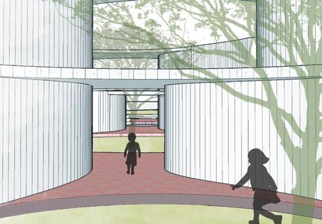
Circulation through the building blocks alternating between in and out. Elements of surprise due to curved and changing widths of walls.


• •
Central space for inter disciplinary projects.
Acts as a hub for interaction between mixed groups.


TRANSITION SPACES


S I W F C N
• •
Different types of learning spaces for a single group of students


Transitory spaces from indoor to semi outdoor to outdoor.


INTROSPECTIVE SPACES

C W F C W N
• •
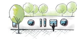
Niches in the boundary wall along the canal act as seating spaces.

Flowing water provides serenity & opportunity for introspection.

03 school for alternative learning surabhi agarwal | architecture portfolio pg. 26
S I C W Surprise Interest Confusion Wonder F C W N B Freedom Wholeness Natural Comfort Belonging ALL PATHS LEADIN G TO THE CENTRAL INTER-DISCIPLI NARY SPACE FIRST ROOMS FOR DIFFERENT SU BJ ECTS W ITH CENTRAL MIXED USE SPACES
CONCEPTUAL VIEW REALISED VIEW
PLAN DIAGRAM/SECTION
degree of interaction CONCEPT to REALISATION
LOCATION OF TREES
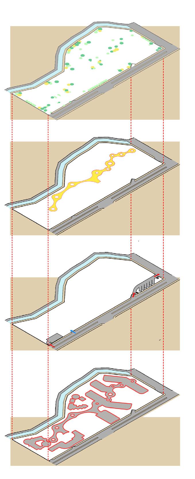
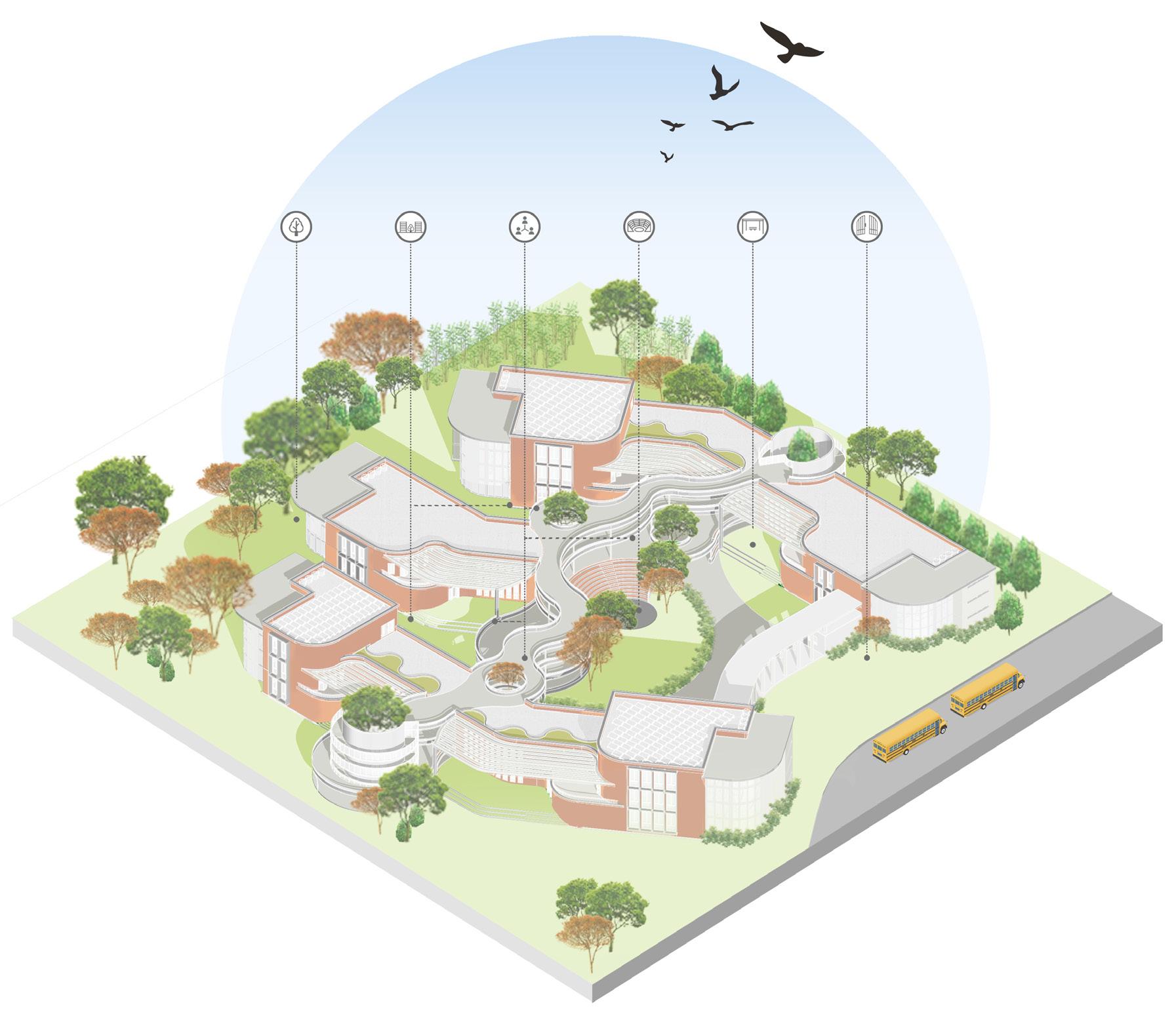
The site consists of a few existing trees which have been preserved along the circulation route and some along the canal. A number of trees have been planted to shade the courts.
PEDESTRIAN CIRCULATION SPINE
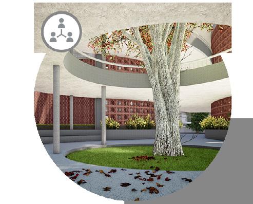
For pedestrian circulation, a central spine has been created with nodes encircling the existing trees. The spine connects all the blocks throughout the campus.

VEHICULAR ACCESS

The site has one entrance for the faculty and visitors’ cars and another separate entrance and exit for the school buses. Apart from this, there is a small entrance for a service truck adjoining the kitchen.
GROUND COVERAGE
Building Footprint= 33%
01 school for alternative learning surabhi agarwal | architecture portfolio pg. 27
Site Axonometric SITE
N
PLANNING
FORM DEVELOPMENT
MAIN SCHOOL BLOCK FORM

1 2 3 4 5
First, a block was placed along the N-S orientation to maximize wind flow into the building and avoid the harsh sun from the E-W.
Two more blocks were added and staggered to avoid wind shadows onto one another and allow more wind to pass.
The linearity of the blocks were broken to enable the formation of more intimate courtyards between them.

The form of the main building block was derived keeping in mind the wind direction and the location of existing trees so that no trees were cut from the site and enough breakout spaces were created in the form of courtyards, terraces and balconies. N


Punctures were created to keep the existing trees which act as hubs for mixed age interactions and were joined through a single pathway.
Finally, the blocks were stacked according to the area required and then joined through pathways at all levels.
03 school for alternative learning surabhi agarwal | architecture portfolio pg. 28
Landscaped Gardens Intimate Courtyards
Mixed Age Hubs Central OAT Semi Outdoor Spaces Main Entrance
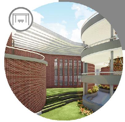
Mixed Age Hubs between Blocks to facilitate interaction
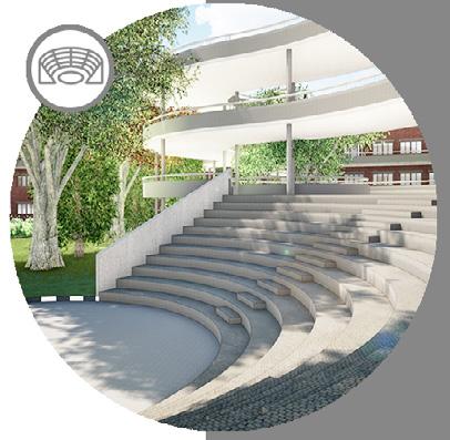
Open Amphitheatre at the Central Courtyard
Semi Outdoor Spaces from Inter-Disciplinary Spaces
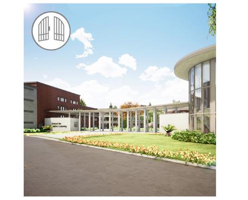
Main School Block Entrance for Junior, Middle & Senior School
THE MAIN SCHOOL BLOCK PLANNING

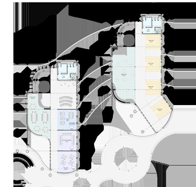
The main school consists of the junior, the middle and the senior school, with a major emphasis on mixed age learning. Some major features are as follows:
Home Rooms Project Spaces Infirmary/Counseling
Junior School Ground Floor Plan

Junior School First Floor Plan


-KEY PLAN
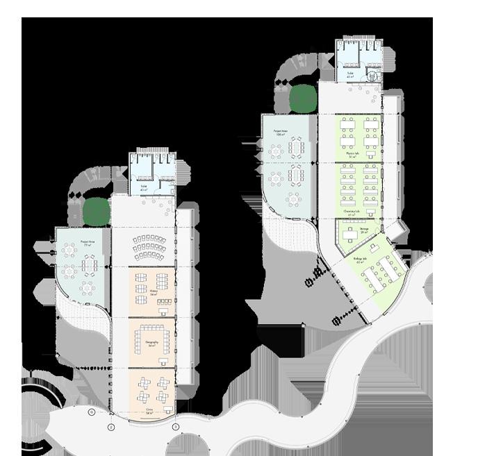
Classrooms are designed subject-wise instead of age-wise, except the Home Rooms from where the students begin and their day from. The schools are also provided with theory rooms, language rooms, computer/research labs and facilitators area on mid levels.
The overall arrangement is such that there is homogeneity in subjects clubbed and at the same time heterogeneity in the types of spaces offered.
/ THE JUNIOR SCHOOL
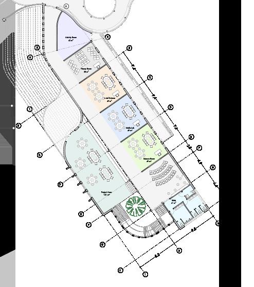
The Junior School consists of about 96 students from the age of 6 to 9 years, organized into mixed age groups of 16 students each.
The Junior School wing is located towards the SW side with its own play area and garden
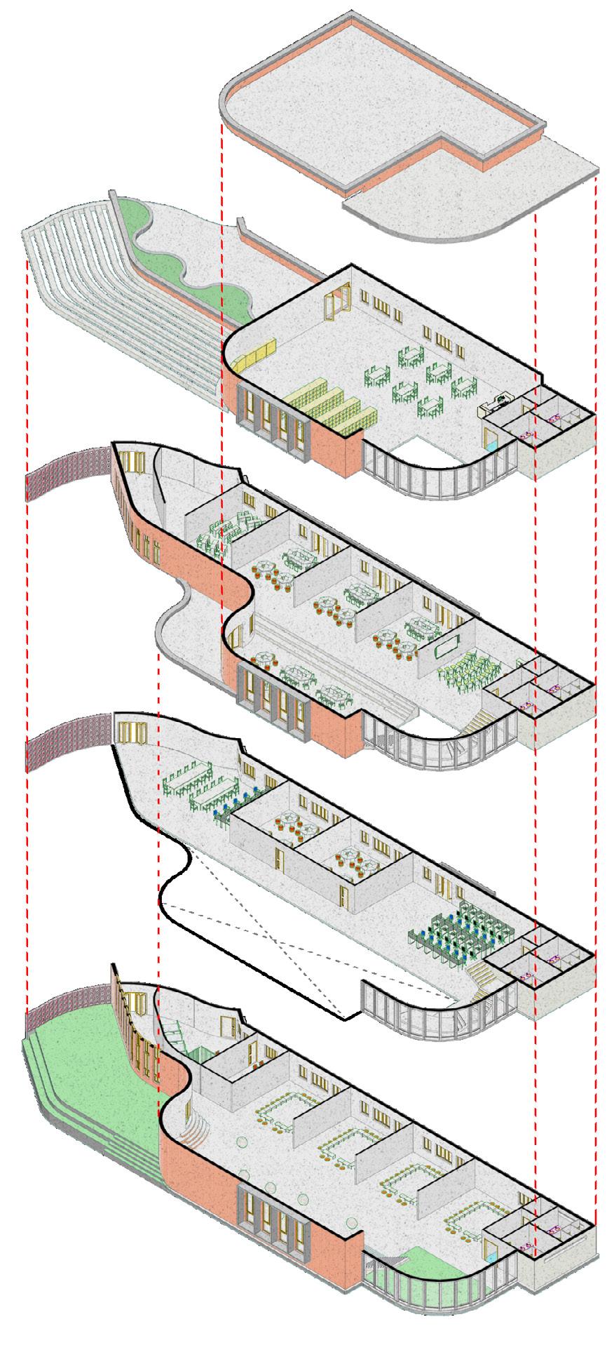
JUNIOR SCHOOL EXPLODED ISOMETRIC
THIRD FLOOR
Consists of the library and the landscaped terrace
SECOND FLOOR
Consists of the various subjects accompanied by a central interdisciplinary space with a terrace acting as a breakout zone
Facilitators’ Area Language Labs Computer Lab
FIRST FLOOR
This level caters to the theory subjects like the languages, the computer lab and has the facilitators’ area
GROUND FLOOR
This is the floor from where the children start and end their day and therefore consists of the Home Rooms
Junior School
Second Floor Plan

Activity Area Science Lab Inter-Disciplinary Project Area
Maths Lab Social Science Lab Theory Room
03 school for alternative learning surabhi agarwal | architecture portfolio pg. 29
MIDDLE SCHOOL
Middle School Ground Floor Plan

Maths Lab Home Room Commerce Labs Inter-Disciplinary Project Area
Middle School Second Floor Plan


Computer Lab Theory Rooms
Language Labs
Middle School First Floor Plan Facilitators’ Area

Located towards the West, the Middle School is designed in two wings, with about 96 students, from the age 10 to 13 years, again organized in mixed age groups. The wings on every floor are subject specific instead of being age specific, with the research/computer labs on the mid-level overlooking the interdisciplinary space below and finally the middle school library on the third floor.
Social Science Labs Science Labs Inter-Disciplinary Project Area

03 school for alternative learning surabhi agarwal | architecture portfolio pg. 30
KEY PLAN A
A’
A
/
THE
Subject Rooms and the Inter-Disciplinary Project Space
The Inter-Disciplinary Project Space Semi Outdoor Space/Breakout Space
/ THE SENIOR SCHOOL
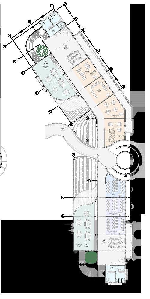
Located towards the Northern edge of the site, the Senior School organization of students shifts towards a more conventional method of arrangement to prepare them for a university kind of setup.
However, the spaces continue to be arranged in a subject specific/stream specific manner to ensure a more wholesome learning.
Play of Levels_ Each wing has an interesting play of levels so that the subject rooms or theory rooms have a more intimate environment for lectures and discussions while the common inter-disciplinary areas are more open for projects with a larger volume and breakout spaces.
The sections and elevations showing the play of levels with the breakout spaces
Home Rooms Science Labs Inter-Disciplinary Project Area
Computer Lab
Theory Rooms
Facilitators’ Area Language Labs
Senior School First Floor Plan


ELEVATION AT A
Social Science Lab Commerce Labs Inter-Disciplinary Project Area
Maths Lab
SECTION showing THE PLAY OF LEVELS
03 school
learning surabhi agarwal | architecture portfolio pg. 31
for alternative
Senior School Ground Floor Plan
Senior School Second Floor Plan
INTERDISCIPLINARY PROJECT AREA SUBJECT ROOMS SUBJECT ROOMS LIBRARY LEVEL THEORY ROOMS INTERDISCIPLINARY PROJECT AREA
KEY PLAN A A A’
SECTION AA’
The Art Village Plan
Exploded Isometric
The exhibition gallery along the central circulation spine
The court between the performing art and the visual arts studios
THE ART VILLAGE
The Art Village was placed along the central spine of the site, bordered by a canal on the rear side. The blocks were so arranged so as to form an exhibition gallery along the circulation spine and form a court between the performing and visual arts studios.
The Classroom Space with a pit for Circle Time and adjoining outdoor spaces


The Kindergarten Plan
Exploded Isometric

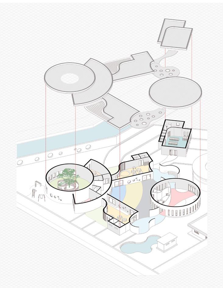
The indoor playroom with a central tree encircled by a looped ramp

THE KINDERGARTEN
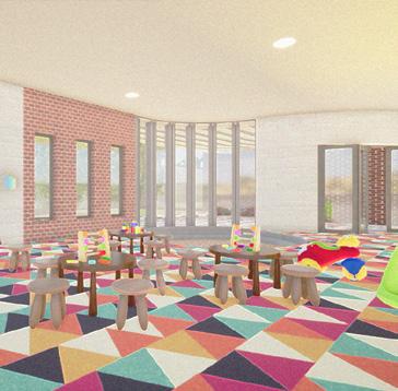
The Kindergarten was designed in a way so that it forms multiple outdoor spaces adjoining each room and a central learning courtyard with numbers and alphabets painted on the floor to facilitate fun learning activities.


03 school for alternative learning surabhi agarwal | architecture portfolio pg. 32
04
R E- I MAGINING U RBAN V OIDS
Solution for Abandoned Spaces in a City


Location: Chandigarh, India
Annual NASA* Design Competition May 2017- August 2017 National Winners
Team of 5;
Responsibilities: Group Head, Design, Presentation, Coordination
Looking around for abandoned urban spaces or voids in the city, the most common and hazardous spaces observed were around garbage bins or dumpsters. Because of the ill and poor maintenance of these bins the entire area around them, 36sqm. on an average is wasted. Chandigarh having approximately 500 dumpsters, renders a total area of about 18000m2 absolutely useless!
THE PROBLEM
Wastage of about 18000sqm. of area due to dumpsters and its poor condition
THE REASON
A city of non-places, where people are strangers, have no impetus to talk to one another
The City of Chandigarh is dotted with about 500 dumpsters. But due to the poor conditions of these dumpsters, the design and the ill-usage by the people makes the area around them filthy and abandoned.
But why hasn’t anyone done anything about it?
Maybe because people nowadays have become so indifferent about each others presence that they don’t even pause to reflect upon or even discuss their problems.
Makes us think, is an architect’s role only limited to designing buildings?

THE SOLUTION
Create a space of awe, which would activate the conscious minds of the people
Creating a space of awe, would bring people into the present, activating their conscious minds, and making them reach to a common foreground of feelings and emotions. This would then lead to interactions and them taking ownership of their actions and coming together to solve their problems!
THE GREAT REALIZATION
04 re-imagining urban voids surabhi agarwal | architecture portfolio pg. 34
THE RESEARCH
Therefore, our idea was not only to solve the problem at hand, but also to ensure that the people are made to think and are given an opportunity to come up with their own unique solution for the bin in their neighbourhood.


To further understand the people of the city we carried out various surveys, debates and discussions both online and at prominent locations of the city like the Sukhna Lake. Some ideas and reactions we received were as follows:


44.1%
20.3% 11.9% 23.7% 47.5%


22.0% 22.0% 8.5%
“For me, the reason behind the mess is the design of the bins. If thedesignwasre-thoughtofortweakedalittlelike‘this’maybethe situationwillimprovetoagreatextent.”
Will you work towards transforming the abandoned spaces?
What are your thoughts on the abandoned spaces in your city?
yes- self-initiated beneficial maybe never thought about it yes- but not self-initiated harmful no doesn’t matter
“Weneedinnovativeideasforspreadingawarenessasitistheneed ofthehourforChandigarh.Weneedtounderstandtheimportance ofcleanlinessandtakeresponsibilityofourowndump.”
Having conducted an online survey of the city dwellers as well, we realized that almost 50% of them felt that these abandoned spaces were beneficial for the city if taken care of. However, about 45% did not want to self initiate the process of solving the problem. Having had received views from the people the Municipal Corporation of the city was approached to further understand the problem and then analyzed the condition of the existing bins in use. We concluded the following:
Condition of Existing Bins

“Only if people used only the bin to dispose the garbage and not theareaarounditaswell,theproblemwouldbehalfsolved.Itsthe shearneglectandlazinessofthepeople.”
--
“The MC needs to take responsibility of the bins, we want to contributetoo,butwelackthemeansandprovisiontodoso.Onlyif someonecouldtakethefirststep..”
The design forces users to make direct contact with the bin, making them reluctant to do so, encouraging shooting of waste to the bin, further littering the area around
The lids are kept open at all times which is the major reason behind the stench in the area, releasing harmful gases like methane and a breading ground for insects
Current method of expulsion of waste is highly inefficient as a truck carries one entire bin to the dumping ground instead of only the trash in it and places an empty bin in its place, increasing fuel and labor costs tremendously.
Having had understood the problem and the thoughts of the people, firstly a new bin was designed and ideas for intervention were formulated around it. Designing an activity around was important as a place could be kept clean by its users only if its a space indispensable for its people, the neighbourhood!
04 re-imagining urban voids surabhi agarwal | architecture portfolio pg. 35
‘‘ ’’
THE BIN
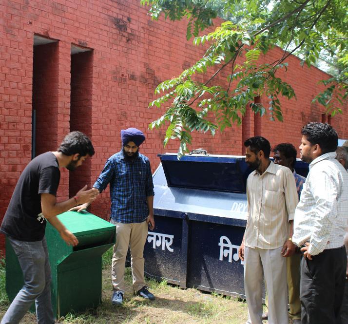
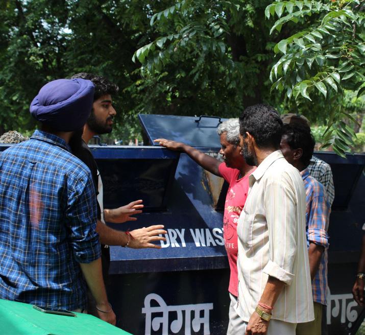
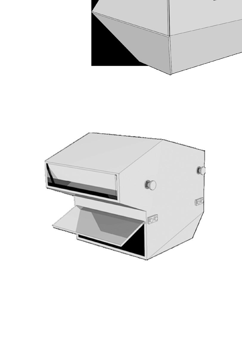
/ THE NEW BIN_ The design of the new bin was such that it catered to all the issues of stench, dirt, expulsion and prevention of the ragpickers from rummaging through the waste. A 1:2 model of the new bin was built to demonstrate the new features to the cleaners and workers and get their opinions. The features of the design were as follows:
The new bin was equipped with a compactor and flaps were hinged in a way so that garbage could be pushed in easily but cannot be accessed by ragpickers. The shape of the bin also protected the garbage from rain.


The expulsion of waste could be done by throwing the trash into the truck or by using the existing method of the truck carrying the entire bin. The existing method was also provided as changing the whole system needed time.
In case of larger neighborhoods or excess garbage an expandable system was added which would extend into the underground pit once the weight of the garbage exceeded the set limit.
/ CHANGES TO THE EXISTING BIN
Also a very simple modification to the existing bin was suggested to curb the immediate problems. It involved using mild steel plates welded to the existing bin with flaps. This changed the opening type significantly reducing the smell and the spillage.
+ + +
Extruded Cover for Dumping


Provides Protection from Rain Hinged Flaps
Easy to Throw Difficult to Take Out keeping in mind the Ragpickers


Rubber Gasket around Flap Prevents Foul Smell

04 re-imagining urban voids surabhi agarwal | architecture portfolio pg. 36
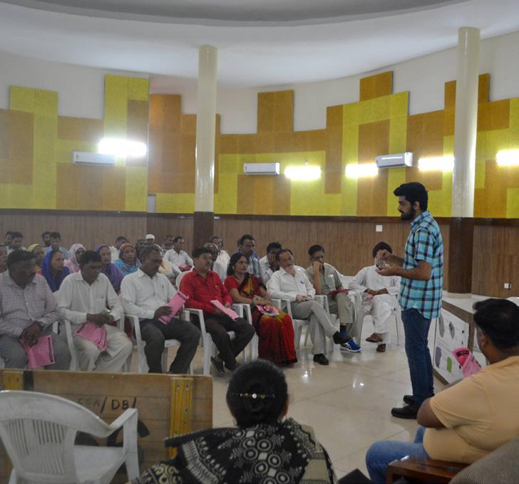
Demonstrating the New Bin to the Cleaners
Demonstrating the Modified Existing Bin
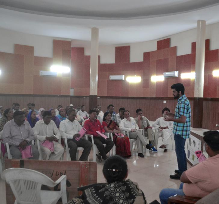
Seminar with the Workers
THE INTERVENTION
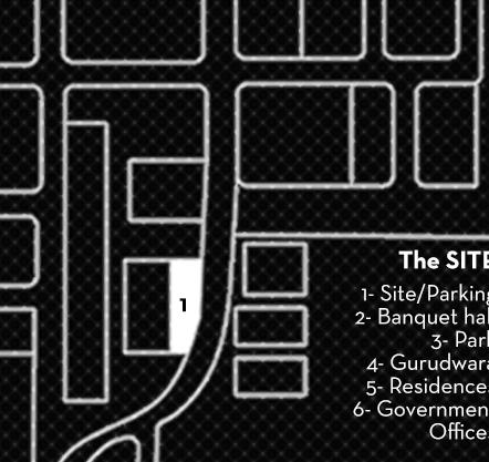
Moving on to the intervention, we picked a neighbourhood in the city which was on an underused parking site in front of the Community banquet with an area for the bin. Because of the stench, the area around remained unused, abandoned and dirty.


So to bring the area to use, we designed a flexible structure which could be altered to into various permutations to serve various purposes and be folded when the parking was needed. The design was synonymous to the caged mind of the society which has a growing tendency of negligence. Being able to foster community participation through this open cage would help the people to break away from such shackles of a mind that is so restricted.


Our goal of bringing people together for a cause and making them aware of their surroundings, especially garbage bins was successful. The intervention and effort was so encouraging and inspiring for the community that they decided to take it up on themselves to spread the ‘idea’ to their own sectors as well. Though they will be generating a whole new design specific to their own needs and requirements, but the area near the garbage bins would act as their blank canvas. Hence, the ‘idea’ became a prototype!

04 re-imagining urban voids surabhi agarwal | architecture portfolio pg. 37
Structure Being Used as a Spot for Meetings/Discussions As a Space for Exhibition/Interaction Hub As a Stage/Podium
Structure Folded for Car Parking
The SITE 1. Site/Parking 2. Banquet Hall 3. Public Park 4. Religious Place 5. Residences 6.
1 2 3 4 5 5 5 5 5 6 6 6
Offices
The structure as an Interactive Space
The structure as a Stage/Podium
05
C ARCASSONNE A IRPORT
E XTENSION
Solution for Increased Passenger Capacity
Location: Carcassonne, France
Competition | Enia Architectes, Paris August 2018- September 2018
Team of 5 Project Chief: Julien Berujeau
Responsibilities: Design Development, Drawing Drafting, Presentation

Carcassonne Airport is an international airport hub that hosts an average of 4,00,000 passengers per year. Due to current traffic growth assumptions, it was necessary to provide for deployment of its airport capacity in line with this development. So, an extension was to be planned proposing minimum changes in the existing built block of the airport.


05 carcassonne airport extension surabhi agarwal | architecture portfolio pg. 38
View of the designed Extension from the Airfield Side
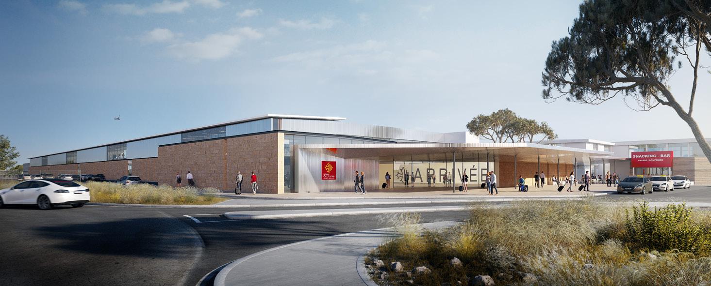
Entrance View
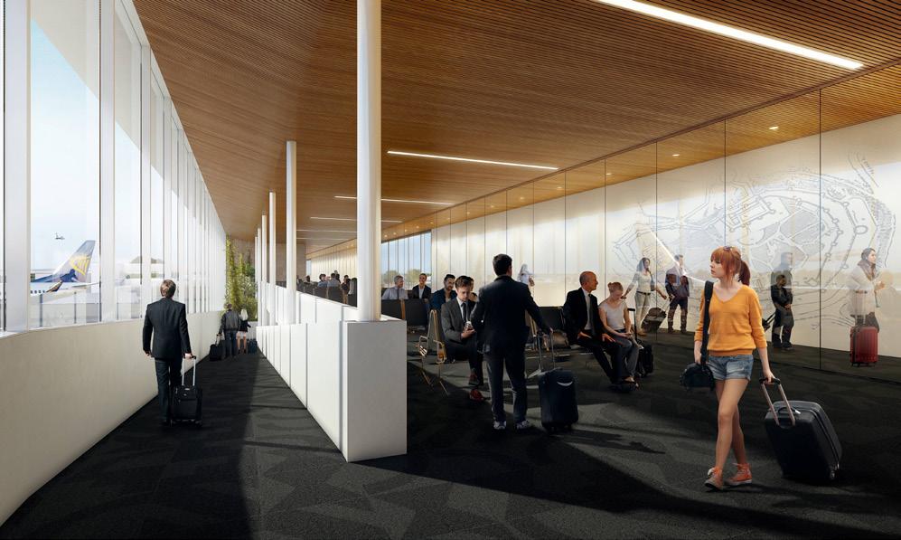
Boarding Gates Area
EXISTING AIRPORT PLAN

The existing airport had to be increased but with minimal changes and a continuous functioning of the airport during the process of renovation and construction.
It can be seen that only a part of the existing airport was available for renovation and in phases while the remaining part was to be left untouched.
SITE AND PROGRAMME
The program represents a minimum total useful surface of 2493m2 for a total floor area of 5536m2 (approx). The principles applied and the requirements in the context of this operation were:
• • • •
The construction of a jetty as a point of connection between the terminal and the aircraft. It will house waiting rooms for passengers departing and arrival halls
The construction of an arrival hall: Originally to be built as a temporary building for baggage delivery area (arrival hall), but in the interest of a sustainable building the hall will be a permanent construction with a possibility of extension in the future.


The redevelopment of the existing buildings: minimum work to be proposed
Treating individual outdoor spaces: attendants area, covered traffic areas, pedestrian paths, service roads etc. Operating offices: to be modified in the existing building at level G+1.
Some of the Major Challenges of the project were:
Architectural consistency between the new and old construction
Functionally sound with both, the new wing and the old building
Scalability, not only within the limits of today’s program, but also the site as a whole Economic Control of the construction costs, operation and maintenance of the project
Building in the built - results in the space-time and technical complexity that requires a clear architectural positioning in relation to the existing environment. and...
05 carcassonne airport extension surabhi agarwal | architecture portfolio pg. 39
• • • • • •
NS Boarding Hall Baggage Control Offices Land for Extension Extension Plot Line Zones to be Modified Security Check S Boarding Hall S Circulation Local Tech Rooms EXISITING AIRPORT EXTENSION LAND PARCEL AIRSIDE ZONE/ TARMAC ZONING OF SITE AND LAND PARCELS AVAILABLE
FIRST FLOOR PLAN GROUND FLOOR PLAN
FRONT ELEVATION
THE 12M WIDE JETÉE
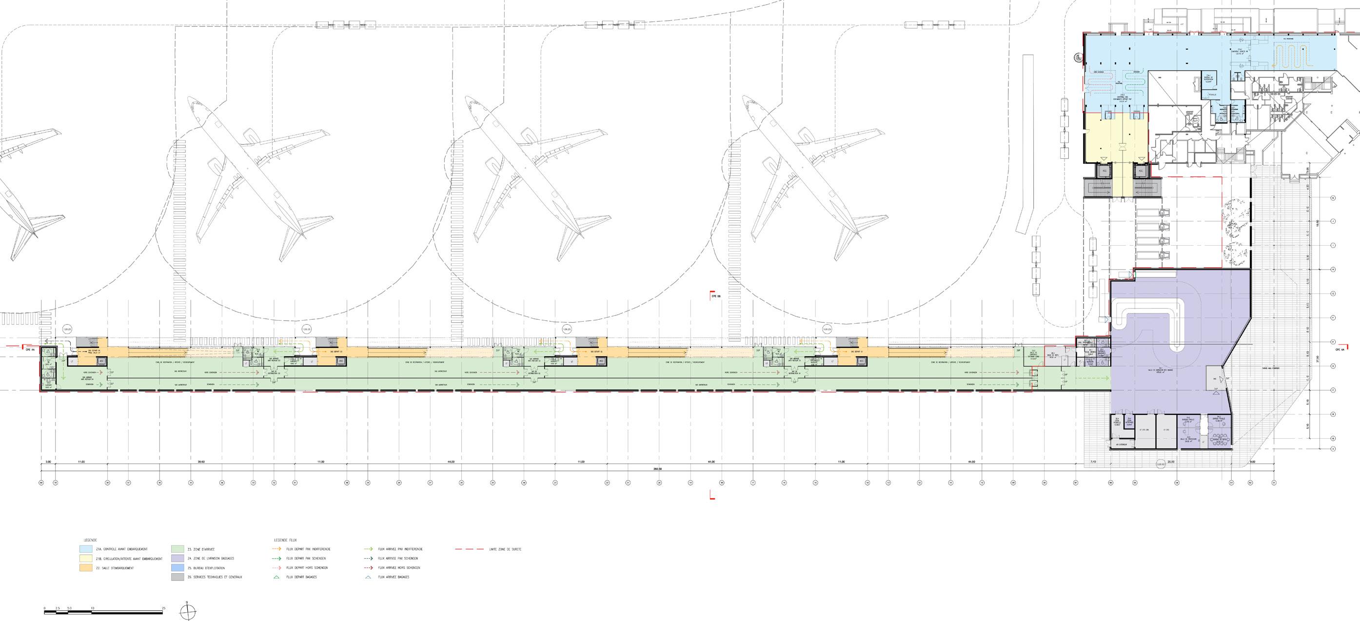
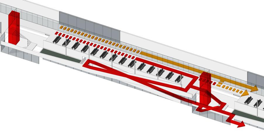
The most difficult part of the project was to design the jetée consisting of boarding lounges, vertical circulations, arrival pathways and each having separate circulations for Schengen and Non Schengen Passengers. The circulation and separation could be broadly designed in the following two ways due to limited width and area.
1. Making circulation corridors on two sides each one for each type thereby ensuring complete segregation and flexible usage of any of the gates for any kind of passenger but would also mean blocking the view of the flights and tarmac for passengers sitting in the lounges.
CONCEPT
An airport is a place full of symbols, symbolizing both the cultural identity of a place and its opening to the world. The airport is also the first and last place of exchange between the traveler and his homeland.
2. The second option was to keep both paths on one side which did limit the choice for the different flights that could be catered with the boarding gates but ensured a more feasible solution for the vertical cores with the option of a ramp.

- A New Image: The front side tracks is one of the first images that offer the traveler. The attraction must be immediate. A system of ramps that seems to float gently in the transparency of a glass facade welcomes the traveler.

- Cultural References: The formal aspects of the new building and its materiality demonstrate the will to root the project in its local context. Thus the pleated front of the delivery room luggage subtly recalls the many inflections that characterize the defensive wall of the medieval city of Carcassonne.

05 carcassonne airport extension surabhi agarwal | architecture portfolio pg. 40 HS S S S S HS S S HS S S HS S HS HS HS HS HS S HS départ 3 départ 4 départ 2 départ 1 aeronef 4 aeronef 3 aeronef 2 aeronef 1 ASC ASC livraison de bagage sous passerelle bureau
départ 3 départ 4 départ 2 départ 1 livraison de bagage sous passerelle 176 sièges/salle files d'attente 176 sièges/salle files d'attente 176 sièges/salle 12 files d'attente 176 sièges/salle files d'attente
PLAN DU NIVEAU 0 (1:750)
GROUND FLOOR PLAN
Control Area Pre-Boarding Circulation/Waiting Area Pre-Boarding Boarding Area
Arrival Zone Baggage Collection Area Operating Office
Departure Flow (Pax Undifferentiated)


Departure Flow (Pax Schengen)


Departure Flow (Pax Non-Schengen)
Arrival Flow (Pax Undifferentiated)


Arrival Flow (Pax Schengen)
Arrival Flow (Pax Non-Schengen)
05 carcassonne airport extension surabhi agarwal | architecture portfolio pg. 41
FIRST
0m 5m 10m 20m 50m
FLOOR PLAN
DEPARTURE SEQUENCE
Check-In Security Check
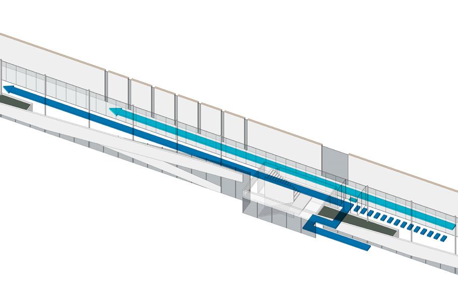
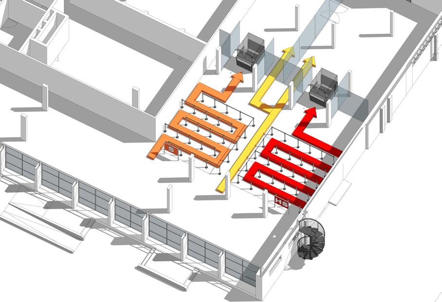
As indicated in the program, the area includes a space containing the queue and the pre-filter with optical reading of the bar code from the boarding pass. This area covers about 7.5 meters above the vanity area; itself forward 2.5 meters of control lines. On leaving the screening area, a breathing zone is created so that passengers recover their cabin luggage and belongings.
Security Check Emigration
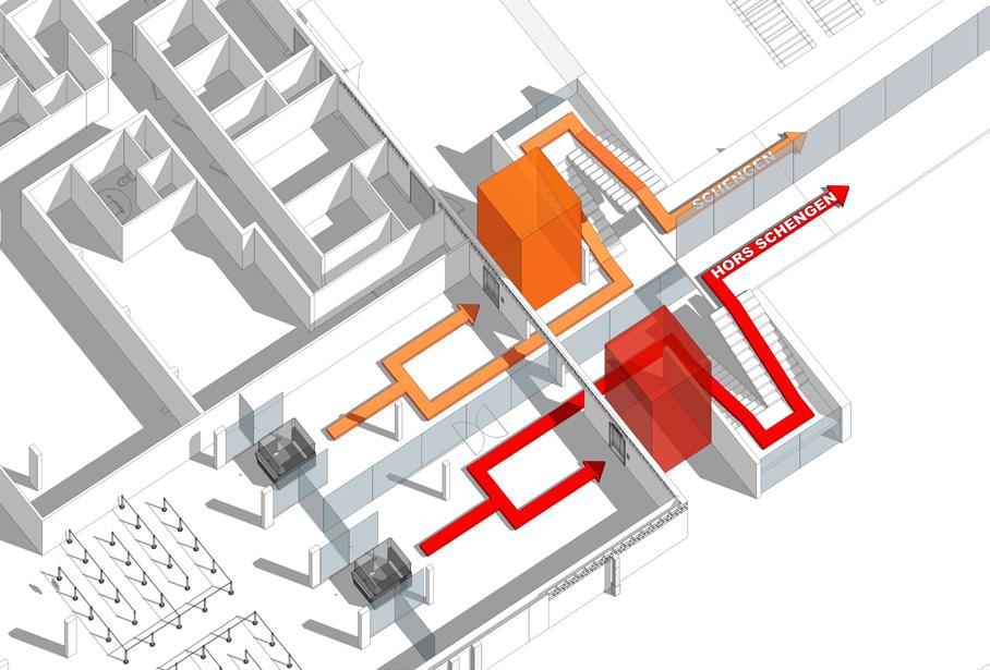
On leaving the Security Check area, passengers engage in a circulation area allowing them to reach a point of orientation and information before taking one of the circuits to their departure lounges (Schengen /Non- Schengen). Thus directional signage is set up at the sight of the entire flow and passengers should allow taking simple and easy decision for passengers to join the right queue.
Emigration Departure Lounge
A specific vertical circulation block in each circuit (Schengen / Non-Schengen) composed of a staircase and an elevator provides access to each lane of traffic on the bridge. This organization keeps the seal between the circuits. The layout of the elevator doors facilitates maximum flow on the ground floor offering a clear choice to passengers in front of the exit controls staircase or elevator.


Departure Lounge Gates
While the Non-Schengen passengers to go through the different Boarding rooms to find their gate conversely, the Schengen passengers take a separate aisle to reach their departure lounge. Each departure lounge is equipped with sanitary blocks, waiting area and comfortable seating for 70% of the passengers, a vertical movement block (stairs and lift) and a ramp joining the boarding hatch on the ground floor.
ARRIVAL SEQUENCE
Gates Immigration Control
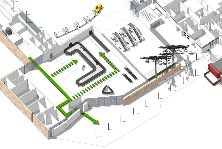
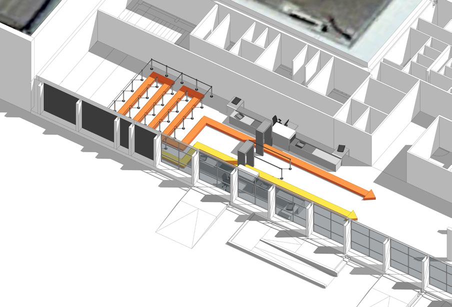
On the descent of the aircraft passengers are invited to an anti-return lock arrival gate. Here, passengers will also find a sanitary block. Depending on the status of their origin airport (Schengen and non-Schengen) they will automatically be guided to the right lane of traffic which can be preprogrammed. Post which, passengers head towards the immigration control.
Immigration Baggage Claim
Following the immigration passengers enter the baggage belts area where it is lined by the customs department for any claims or baggage checks. The exit is aligned so as to facilitate easy flow of passengers through the exit who are even without any checked in luggage. Following the exit the various circulations of transport is channelized for convenient segregation of passengers taking public transport or private vehicles.
05 carcassonne airport extension surabhi agarwal | architecture portfolio pg. 42 FLOW DIAGRAMS
05 carcassonne airport extension surabhi agarwal | architecture portfolio pg. 43

THANK YOU Surabhi Agarwal Architect surabhi.agarwal@aaschool.ac.uk +447424374675


