FRIEZE MASTERS

SUSAN SHEEHAN GALLERY
Cover: Andy Warhol, Flowers, 1970, from the complete portfolio of ten screenprints

SUSAN SHEEHAN GALLERY
Cover: Andy Warhol, Flowers, 1970, from the complete portfolio of ten screenprints
OCTOBER 9TH (BY INVITATION)
OCTOBER 10TH-13TH (PUBLIC DAYS)
LOCATION: GLOUCESTER GREEN, AT THE NORTHEAST CORNER THE REGENT’S PARK LONDON NW1 4HA FOR SHOW INFORMATION: https://www.frieze.com/fairs/frieze-masters
146 Greene Street
New York, NY 10012 +1-212-489-3331
info@susansheehangallery.com www.susansheehangallery.com

Ileana and Andy. Even the most fanciful intelligent design could not have conjured two characters as singular, as labyrinthine, and as unpredictably consequential as Ileana Sonnabend and Andy Warhol. Only the wondrously perverse adaptations of Darwinian millenia could account for these two supernovas improbably converging in our universe at the same time, in the same place. Among the most inscrutable and charismatic personalities of their time, Ileana and Andy, icons of idiosyncrasy, commanded extraordinary respect (and exercised substantial influence) in the admittedly circumscribed international art world of the 1960s to 1980s. These were the decades in which the motivation to collect contemporary art quite unexpectedly shifted from love to money, from intellectual passion to investment commodity. And the power of personality was not at all an insignificant factor in the alignment of status in those years.
Essay by Brenda Richardson, Warhol from the Sonnabend Collection, 2009
Printing and printmaking were central to Andy Warhol’s practice, providing him with a material means to interrogate themes of mass production and consumer culture. While the employment of silkscreen in his paintings enabled his direct appropriation of source imagery drawn from popular media, his use of commercial screenprint workshops beginning in the late 1960s furthered his exploration of the mechanization of art-making. Two manifestations of the artist’s predilection for seriality are sixteen silkscreen ink on canvases of his iconic Flowers from 1964–1965 and a complete set of ten screenprints of the same subject in different color combinations, executed in 1970. Many of the paintings were originally exhibited and sold by Ileana Sonnabend, the visionary collector and dealer credited with introducing American Pop Art and Minimalism to Europe. During the peak of the movement, Sonnabend was dubbed the “Mom of Pop,” an epithet which she loathed but spoke to her role in championing a generation of artists. These works therefore illustrate the intertwined history of two legendary figures who shaped the course of post-war American art.
The daughter of a wealthy Romanian industrialist and his Austrian wife, Sonnabend (née Schapira) was eager to embrace the vibrant cultural opportunities of a cosmopolitan life when she married the future art dealer Leo Castelli in 1932. Instead of an engagement ring, she asked Castelli for an artwork—a watercolor by Henri Matisse, which she cherished as her first introduction to modern art. The couple moved to Paris and soon became integrated into the city’s chic artistic society, where Sonnabend rubbed shoulders with the Surrealists and the Constructivists. Unfortunately, this vibrant chapter came to an all-too-soon end in the 1940s: rising anti-Semitism in Europe forced them on a zig-zag transatlantic journey to New York via Spain, North Africa, and Havana. Although she became closely associated in America with the Abstract Expressionist group whose work her husband showed at Castelli Gallery, when she returned to Paris in 1962 to open her own enterprise after their divorce, Galerie Ileana Sonnabend, she chose to foreground the younger generation of Pop artists. Many names on her roster—including Warhol, Robert Rauschenberg, Jasper Johns, James Rosenquist, and Tom Wesselmann—are now household names, but at the time they were little known.
An early supporter of Warhol, Sonnabend first met the artist and invited him to show with her in 1962 as his European debut. This exhibit, which opened in January 1964, symbolized a major professional turning point for Warhol and kicked off his meteoric rise to fame that year. In November, he rounded off this triumphant chapter by unveiling his new Flowers series at Castelli Gallery and producing a second set to show at Galerie Ileana Sonnabend the following year. By

1970, both Sonnabend and Warhol had solidified their reputations as contemporary art titans: the year the artist returned to his famed Flowers motif to execute his set of screenprints, she opened her second location, Sonnabend Gallery, with her second husband Michael Sonnabend, in New York. Her close relationship with the artist was facilitated by the friendship and partnership she maintained with Castelli and it is assumed that she acquired all of her paintings, sculptures, prints and drawings by Warhol directly from New York. Even after his last exhibit with Sonnabend in 1974, she continued to collect and advocate for Warhol’s work until his death.
The origin of the Flowers can be traced back to four photographs of seven hibiscus flowers, taken by Patricia Caulfield and featured in a foldout of the June 1964 issue of Modern Photography. Showcasing how different exposure times and filter settings produced various visual effects, the subtle tonal differences between the images produced a serial quality that appealed to Warhol’s interest in repetition and sequential imagery. Warhol made substantial changes when adapting the photographs for his paintings and prints, including cropping the image into a square with only four large flowers and rotating some of the blossoms. For the silkscreens, the artist and his “Factory” then applied flat areas of paint to the canvas and silkscreened the photographic representation on top. The early screenprint multiples were produced by and distributed through Warhol’s print-publishing business Factory Additions, which he established to create portfolios of ten images each, mainly derived from the imagery of his most iconic paintings.
The Flowers quickly became hallmarks of his oeuvre, with the art dealer Ivan Karp recalling that the initial works “were totally successful and we sold them all! And you could keep selling them right now! That’s it. That’s one of those immortal images… It was a grand success.” Having been instrumental in bringing Warhol’s approach to prominence, the fact that this set of prints and many of the canvases passed through Sonnabend’s hands serves as a testament to their essential place within his oeuvre and broader significance within the artist’s practice. An example of one of the screenprints even graced the cover of the catalogue raisonné of Warhol’s prints, cementing its place as a celebrated and definitive image within his printmaking legacy. Exemplifying Warhol’s groundbreaking visual idiom and Sonnabend’s role in his global recognition, these works encapsulate the partnership between two towering figures who helped define the trajectory of postwar art across Europe and North America and reshape the contemporary art landscape on both sides of the Atlantic.
Top: Ileana Sonnabend and Andy Warhol in Paris, 1987.
Bottom: Andy Warhol at his Flowers exhibition at Galerie Ileana Sonnabend, Paris, May 1965.


Flowers, 1970
Screenprints
Sheet size: 36 x 36 inches, each
Printer: Aetna Slikscreen Products, Inc., New York
Publisher: Factory Additions, New York
Edition size: 250, plus proofs
Catalogue Raisonné: Feldman and Schellmann II.64-73
Each sheet is signed in ball-point pen and stamp numbered with a rubber stamp, verso
The complete portfolio of ten screenprints that retains its original cardboard portfolio box.
Provenance:
The Artist
Galerie Ileana Sonnabend, Paris
By descent to the previous owner


Flowers, 1964
Silkscreen on linen canvas
8 x 8 inches
Catalogue Raisonné: Frei and Printz, Vol. 02B/Painting and Sculpture 1964-69, catalogue number 1667
Stamped on verso by the Andy Warhol Art Authentication Board, numbered A123.984, certificate available. Signed and dated “Andy Warhol 64” in ballpoint pen on overlap.
Provenance:
Leo Castelli Gallery, New York (LC 668)
Charles Denby
Frederick W. Hughes, New York
Heiner Bastian, Berlin
Susan Sheehan Gallery, New York
American Private Collection

Flowers, 1965
Silkscreen on linen canvas
8 x 8 inches
Catalogue Raisonné: Frei and Printz, Vol. 02B/Painting and Sculpture 1964-69, catalogue number 1697
Stamped on verso by the Andy Warhol Art Authentication Board, numbered A137.984, certificate available. Signed and dated “Andy Warhol 64” in ballpoint pen on overlap.
Provenance:
Todd Brassner, New York
Heiner Bastian, Berlin
Susan Sheehan Gallery, New York
American Private Collection

Flowers, 1965
Silkscreen on linen canvas
8 x 8 inches
Catalogue Raisonné: Frei and Printz, Vol. 02B/Painting and Sculpture 1964-69, catalogue number 1643
Stamped on verso by the Andy Warhol Art Authentication Board, numbered A134.984, certificate available. Signed and dated “Andy Warhol 64” in ballpoint pen on overlap.
Provenance:
Ileana Sonnabend, Paris
Frederick W. Hughes, New York
Heiner Bastian, Berlin
Susan Sheehan Gallery, New York
American Private Collection

Flowers, 1965
Silkscreen on linen canvas
8 x 8 inches
Catalogue Raisonné: Frei and Printz, Vol. 02B/Painting and Sculpture 1964-69, catalogue number 1641
Stamped on verso by the Andy Warhol Art Authentication Board, numbered A141.984, certificate available. Initialed and dated “A. W. 64” in felt-tip pen on overlap.
Provenance:
Ileana Sonnabend, Paris
Frederick W. Hughes, New York
Heiner Bastian, Berlin
Susan Sheehan Gallery, New York
American Private Collection

Flowers, 1965
Silkscreen ink on linen canvas
8 x 8 inches
Catalogue Raisonné: Frei and Printz, Vol. 02B/Painting and Sculpture 1964-69, catalogue number 1696
Stamped on verso overlap by the Andy Warhol Art Authentication Board, numbered A119.984, certificate available. Signed and dated “Andy Warhol 64” in felt-tip and inscribed “to Todd Brassner” in ball-point pen on overlap.
Provenance:
Todd Brassner, New York
Heiner Bastian, Berlin
Susan Sheehan Gallery, New York
American Private Collection

Flowers, 1965
Silkscreen on linen canvas
8 x 8 inches
Catalogue Raisonné: Frei and Printz, Vol. 02B/Painting and Sculpture 1964-69, catalogue number 1635
Stamped on verso by the Andy Warhol Art Authentication Board, numbered A131.984, certificate available. Initialed and dated “A. W 64” in felt-tip pen on overlap.
Provenance:
Ileana Sonnabend, Paris
Frederick W. Hughes, New York
Heiner and Aeneas Bastian, Berlin
Susan Sheehan Gallery, New York
American Private Collection

Flowers, 1965
Silkscreen on linen canvas
8 x 8 inches
Catalogue raisonné: Frei and Printz, Vol. 02B/Painting and Sculpture 1964-69, catalogue number 1630
Stamped on verso by the Andy Warhol Art Authentication Board, numbered A122.984, certificate available. Initialed and dated “A. W. 64” in ball-point pen on overlap.
Provenance:
Ileana Sonnabend, Paris
Frederick W. Hughes, New York
Bruno Bischofberger, Zurich
Heiner and Aeneas Bastian, Berlin
Susan Sheehan Gallery, New York
American Private Collection

Flowers, 1965
Silkscreen on linen canvas
8 x 8 inches
Catalogue Raisonné: Frei and Printz, Vol. 02B/Painting and Sculpture 1964-69, catalogue number 1638
Stamped on verso by the Andy Warhol Art Authentication Board, numbered A138.984, certificate available. Printed signature stamp on overlap. Stretcher inscribed in ball-point pen “Andy W” and “Warhol”.
Provenance:
Ileana Sonnabend, Paris
Frederick W. Hughes, New York
Heiner Bastian, Berlin
Susan Sheehan Gallery, New York
American Private Collection

Flowers, 1965
Silkscreen on linen canvas
8 x 8 inches
Catalogue Raisonné: Frei and Printz, Vol. 02B/Painting and Sculpture 1964-69, catalogue number 1699
Stamped on verso by the Andy Warhol Art Authentication Board, numbered A135.984, certificate available. Signed and dated “Andy Warhol 1964” and “64”in felt-tip pen and “Andy Warhol”in ball-point pen on overlap.
Provenance:
Vitas Gerulatis
Heiner Bastian, Berlin
Susan Sheehan Gallery, New York American Private Collection

Flowers, 1965
Silkscreen on linen canvas
8 x 8 inches
Catalogue Raisonné: Frei and Printz, Vol. 02B/Painting and Sculpture 1964-69, catalogue number 1628
Stamped on verso by the Andy Warhol Art Authentication Board, numbered A120.984, certificate available. Initialed and dated “A.W. 64”in felt-tip pen on overlap.
Provenance:
Ileana Sonnabend, Paris
Frederick W. Hughes, New York
Thomas Ammann Fine Art, Zurich
Heiner Bastian, Berlin
Susan Sheehan Gallery, New York
American Private Collection

Flowers, 1965
Silkscreen on linen canvas
8 x 8 inches
Catalogue Raisonné: Frei and Printz, Vol. 02B/Painting and Sculpture 1964-69, catalogue number 1637
Stamped on verso by the Andy Warhol Art Authentication Board, numbered A133.984, certificate available. Initialed and dated “AW 64” in felt-tip pen on overlap.
Provenance:
Ileana Sonnabend, Paris
Frederick W. Hughes, New York
Thomas Ammann Fine Art, Zurich
Heiner Bastian, Berlin
Susan Sheehan Gallery, New York
American Private Collection

Flowers, 1965
Silkscreen on linen canvas
8 x 8 inches
Catalogue Raisonné: Frei and Printz, Vol. 02B/Painting and Sculpture 1964-69, catalogue number 1626
Stamped on verso by the Andy Warhol Art Authentication Board, numbered A116.984, certificate available. Signed and dated “Andy Warhol 64”in ball-point pen on overlap.
Provenance:
Ileana Sonnabend, Paris
Frederick W. Hughes, New York
Heiner Bastian, Berlin
Susan Sheehan Gallery, New York
American Private Collection

Flowers, 1965
Silkscreen on linen canvas
8 x 8 inches
Catalogue Raisonné: Frei and Printz, Vol. 02B/Painting and Sculpture 1964-69, catalogue number 1632
Stamped on verso by the Andy Warhol Art Authentication Board, numbered A125.984, certificate available. Initialed and dated “A.W. 64” in felt-tip pen on overlap.
Provenance:
Ileana Sonnabend, Paris
Frederick W. Hughes, New York
Heiner Bastian, Berlin
Susan Sheehan Gallery, New York
American Private Collection

Flowers, 1965
Silkscreen on linen canvas
8 x 8 inches
Catalogue Raisonné: Frei and Printz, Vol. 02B/Painting and Sculpture 1964-69, catalogue number 1636
Stamped on verso by the Andy Warhol Art Authentication Board, numbered A132.984, certificate available. Signed and dated “Andy Warhol 64” in ballpoint pen on overlap.
Provenance:
Ileana Sonnabend, Paris
Frederick W. Hughes, New York
Heiner and Aeneas Bastian, Berlin
Susan Sheehan Gallery, New York
American Private Collection

Flowers, 1965
Silkscreen on linen canvas
8 x 8 inches
Catalogue Raisonné: Frei and Printz, Vol. 02B/Painting and Sculpture 1964-69, catalogue number 1629
Stamped on verso by the Andy Warhol Art Authentication Board, numbered A121.984, certificate available. Initialed and dated “AW 64” in felt-tip pen on overlap.
Provenance:
Ileana Sonnabend, Paris
Frederick W. Hughes, New York
Thomas Ammann Fine Art, Zurich
Heiner Bastian, Berlin
Susan Sheehan Gallery, New York
American Private Collection

Flowers, 1965
Silkscreen on linen canvas
8 x 8 inches
Catalogue Raisonné: Frei and Printz, Vol. 02B/Painting and Sculpture 1964-69, catalogue number 1703
Stamped on verso by the Andy Warhol Art Authentication Board, numbered A118.984, certificate available. Signed and dated “A. Warhol 64” in felt-tip pen on overlap.
Provenance:
Hokin Gallery, Inc., Florida
Heiner Bastian, Berlin
Susan Sheehan Gallery, Inc.
American Private Collection

Cy Twombly was not a prolific printmaker, which should not be surprising—he worked intuitively, and printmaking is by nature discontinuous and indirect. In other ways, however, he was a natural: the instincts of his hand were those of a graphic artist, and his intellectual affections were at home with printed matter. When he did turn to etchings and lithographs, it was to distill his central concerns: Western culture’s inheritance from the ancient Mediterranean, and the primordial physical and conceptual urge to make a mark. Or to put it another way, admiration for what has come before, and the desire to make something that remains after.
After visiting Robert Rauschenberg on Captiva Island in Florida, Twombly availed himself of the facility Rauschenberg had set up there with master printer Robert Petersen, Untitled Press, Inc.. Drawn on the stone in crayon, Twombly’s six Untitled lithographs have a crumbly density quite different from the spidery line of his etchings. Printed in different inks on different papers, they have the tenor, not of writing, but of furious weather..
For Twombly, as for Warhol, the portfolio was important. His prints echo the forms and ideas he was pursuing in painting, but where a painting series constitutes an impressive public display, the print portfolio is personal—a symposium on paper, where things talk to each while we listen and learn.
Essay by Susan Tallman

Cy Twombly
Untitled (Captiva Island) I, II, III, IV, V, VI, 1971
Lithographs
Sheet size: 22.4 x 30.1 or 21.6 x 29.5 inches
Printer and Publisher: Untitled Press Inc., Captiva Island, Florida
Edition size: 24, 25 or 26, plus proofs
Catalogue Raisonné: Bastian 29 - 34
Each sheet is sgined and numbered in pencil.
The complete set of 6 lithographs


Cy Twombly
Untitled II, 1967
Etching, open-bite with aquatint
Sheet size: 27 5/8 x 40 3/4 inches
Printer and Publisher: Universal Limited Art Editions, West Islip, New York
Edition: 23, plus proofs
Catalogue Raisonné: Bastian 11
Initialed, dated, and numbered in pencil.

Richard Pettibone’s (1938-2024) practice has daringly challenged all preconceived notions of authenticity and originality in art. Over the past six decades, his screenprinted and hand-painted, small-scale replicas of artworks by contemporary masters have wrestled with the relationship between media and reproduction, exploring the complexities of authorship in the postmodern world. In Girl with Ball, executed in 1968, Lichtenstein’s iconic 1961 image is subjected to Pettibone’s signature style of appropriation. Although Pettibone often made multiple version of a subject, we know of only this version of Girl with Ball; however, the image was included in one of his multi-image ‘combine’ paintings Seductive Girl, Girl with Ball, 4 Jackies, Woman with Flowered Hat, Madame Cezanne, The Kiss, and Four Marilyns, 1970 (Princeton University Art Museum). This miniature work’s tongue-in-cheek homage to one of Lichtenstein’s most famous images is emblematic of Pettibone’s parodic approach to art-making. Lichtenstein’s painting of this subject is now in the Museum of Modern Art as a gift of Phillip Johnson.
Pop masterworks were a ripe subject for Pettibone, as they were typically hand-painted and already derived from popular culture. For his painting, Lichtenstein used advertising imagery in The New York Times for a resort in the Pocono Mountains in Pennsylvania as source material. He then transformed the original photographic image into a painting using comic-book techniques, such as Ben-Day dots and simplified contours. When the painting was exhibited at Lichtenstein’s 1962 exhibition at Castelli Gallery, it was reproduced in a number of magazines, including Newsweek. Pettibone typically based the scale of his paintings off the sizes of reproductions in printed media; in this way, the miniature dimensions of his replica highlight the three levels of appropriation of the original image.
Executed only seven years after Lichtenstein’s work, this painting illuminates that the two artists were contemporaries. Indeed, Pettibone began his replicas two decades before appropriation became a prevalent artistic strategy in the 1980s. Although Girl with Ball is exquisitely accurate, it is not a simple imitation, but instead a dialogue with the past. By changing its scale, Pettibone’s manipulation of Lichtenstein’s artwork also altered its intimacy and impact. It is this blurring between original and copy, representation and represented, that has solidified Pettibone’s standing as a pioneer of appropriation art.

Size: 7 15/16 x 4 15/16 x 1/2 inches, overall
Signed, titled and dated on the stretcher. The work retains its original hand-made wood frame.


David Hockney (b. 1937) made his first, transformative visit to New York in 1961 while still a student at the Royal College of Art. When he returned to London he set a plan for eight etchings that would marry his New York adventures to William Hogarth’s cautionary print saga A Rake’s Progress (1732). Over the course of two years, the number of plates for the project swelled from Hogarth’s eight to about 35 before contracting to sixteen—half autobiographical, half fiction.
Like Hogarth’s rake, Hockney’s comes into some money, chooses pleasure over rectitude, fails at budgeting, and is abandoned by fair-weather friends. But while Hogarth’s ne’er-do-well is a user and abuser of others, Hockney’s—a young bespectacled art student looking much like the artist—is on a journey of creative and personal awakening, with all the euphoria and angst that entails. Both stories end in Bedlam, but in place of London’s infamous madhouse, Hockney gives us quintet of transistor-radio-addicted young men in WABC t-shirts—madness, not as aberration, but as conformity.
Hockney saunters between delicate precision and modernist bulk, and his arrangements of people and things behave less like objects in space than like clippings on a table. C hangeable weather, inked in red, stalks our hero: a tropical sun beckoning from the other side of a portal in The Start of the Spending Spree and the Door Opening for a Blond; a cloud of annoyance hovering over the young artist in Receiving the Inheritance as he watches a bearded gentleman examining a print marked “$20” and announcing “$18.”
Hogarth filled the page with telling detail and symphonic massing of engraved line, but Hockney relied on etching techniques that might be learned in Printmaking 101. (In American academic printmaking circles, artist Bruce Nauman recalls, Hockney’s prints were “heavily attacked… They thought the work had nothing to do with printmaking.” ) Guileless but sophisticated, A Rake’s Progress offered a preview of the qualities that would make Hockney so beloved in decades to come: it proved that contemporary art could be serious without being portentous, modern yet enamored with tradition, witty but not superficial. Hockney is a social artist, interested in the doings of people and, as Marco Livingstone put it, “taking a line not just for a walk as Paul Klee had done, but also for a talk.”
Essay by Susan Tallman
A Rake’s Progress, 1961-63
Etchings and aquatint
Sheet size: 19 1/2 x 24 1/2 inches, each
Printer: C.H. Welch, London
Publisher: Editions Alecto, London, in association with The Royal College of Art
Edition size: 50, plus proofs
Catalogue Raisonné: MCAT 12-27
Each sheet is signed and numbered, lower margin


The rare complete portfolio of 16 etchings with aquatint, which retains the title, artist’s statement and justification pages, the original red linen-covered portfolio, and black cloth slip-case, lettered on spine in gold ‘A RAKE’S PROGRESS DAVID HOCKNEY’ and the Editions Alecto logo.


David Hockney
Weather Series-Rain, 1973
Lithograph with screenprint
Sheet size: 39 x 31 5/8 inches
Printer and Publisher: Gemini G.E.L., Los Angeles
Edition: 98, plus proofs
Catalogue Raisonné: MCAT 128
Signed, dated, and numbered in green crayon.

David Hockney
Weather Series-Wind, 1973
Lithograph
Sheet size: 40 x 30 7/8 inches
Printer and Publisher: Gemini G.E.L., Los Angeles
Edition: 98, plus proofs
Catalogue Raisonné: MCAT 132
Signed, dated, and numbered in red crayon.


Joan Mitchell’s arresting images and gestural approach to mark-making cemented her standing as a leading figure of Abstract Expressionism by the early 1950s. Alongside her painting, she returned to printmaking time and time again throughout her career to explore the evocative power of abstraction in a remarkable body of graphic work that spanned silkscreens, etchings, and lithographs. Demonstrative of Mitchell’s experiments with a new medium, this untitled work is from a small group of hand-painted screenprints the artist produced while working with the printers at Tiber Press in New York during the late 1950s and early 1960s. Hand-painted strokes of vibrant green and white oil paint intermingle with black silkscreened elements in this dynamic image, one of a small number of such works made by the artist at this time.
Tiber Press was an innovative and short-lived printmaking studio in New York that was founded in 1953 by Floriano Vecchi, Richard Miller, and Daisy Aldan to promote the collaboration between artists and poets of the New York School. In 1960 Tiber Press began what was their most ambitious project: a set of four volumes of poetry illustrated with screenprints. The printers at Tiber selected a group of artists to participate in this project, poets John Ashbery, Kenneth Koch, Frank O’Hara, and James Schuyler and artists Michael Goldberg, Joan Mitchell, Grace Hartigan, and Alfred Leslie. Each artist’s prints were paired with one poet’s work in each of the four volumes. This livre d’artiste project is often referred to as the New York School Set and was seminal to all of the artists involved. The collaboration marked the first screenprints made by Mitchell and Goldberg and the first poems published by Schulyer.
Mitchell’s collaboration with Tiber was a fruitful one. She learned how to hand-paint the tusche directly onto the silkscreen matrix and eventually Vecchi taught her how to draw on mylar which he later photographically transferred to the screen. Mitchell inventively used a broken and frayed tongue depressor as a brush-like tool to apply the ink in slow layers. Although her printed works give the impression of spontaneity, the artist thoughtfully superimposed color while constructing the compositions in this series. Her experience at Tiber was formative and encouraged her to pursue more printmaking projects until the very end of her career.
The body of screenprints Mitchell executed for this collaboration are characterized by their contrasting masses of dark and vivid color. These prints also foreshadow the somber palette and mood of the so-called Black Paintings she would execute in the early 1960s. This untitled work not only embodies the lyrical force of Mitchell’s signature visual language but also provides insight into the artist’s thinking and creative process. According to former MoMA curator Riva Castleman, “the layered sweeps of black and colors that dominate Mitchell’s (Tiber) prints are among her most assured work in any medium of that period.”

Joan Mitchell
Untitled, 1959
Screenprint with extensive hand-painting
Sheet size: 20 x 16 inches
Printer: Tiber Press, New York
Unique impression hand-colored of this rare, early screenprint.
Signed in pencil, lower left
Provenance:
Floriano Vecchi, Tiber Press, New York
Susan Sheehan Gallery, New York
Private American Collection

Barnett Newman
Untitled, 1961
Lithograph
Sheet size: 30 x 22 3/8 inches
Printer: Pratt Graphic Art Center, New York
Publisher: The artist
Edition: 30, plus proofs
Catalogue Raisonné: BNF 203
Signed, dated, and numbered in pencil, lower margin

Kelly
Colored Paper Image II (Dark Green Curves), 1976
Colored and pressed paper pulp
Sheet size: 46 1/2 x 32 1/2 inches
Printer: Ellsworth Kelly and Kenneth Tyler, fabricated at HMP Paper Mill, Woodstock, CT
Publisher: Tyler Graphics Ltd., Bedford, NY
Catalogue Raisonné: Axsom 142
Signed and numbered in pencil.


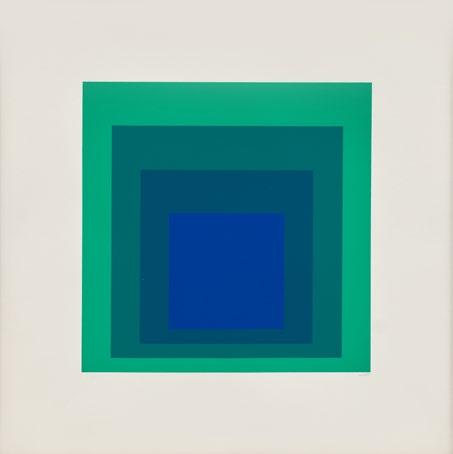
Homage to the Square: Edition Keller Ia-Ik, 1970
Screenprints
Sheet size: 21 5/8 x 21 5/8 inches, each
Printer: Herbert Geier, Ingolstadt, Germany
Publisher: Josef Keller Verlag, Starnberg, Germany
Edition size: 125, plus proofs
Catalogue Raisonné: Danilowitz 203.1-203.10
Each sheet is signed, dated, numbered, and titled sequentially ‘EK Ia’ through ‘EK Ik’ in pencil. Numbered in pencil on colophon.
The complete portfolio of ten screenprints that retains its original black linen-covered portfolio box, colophon, and interleaving sheets.


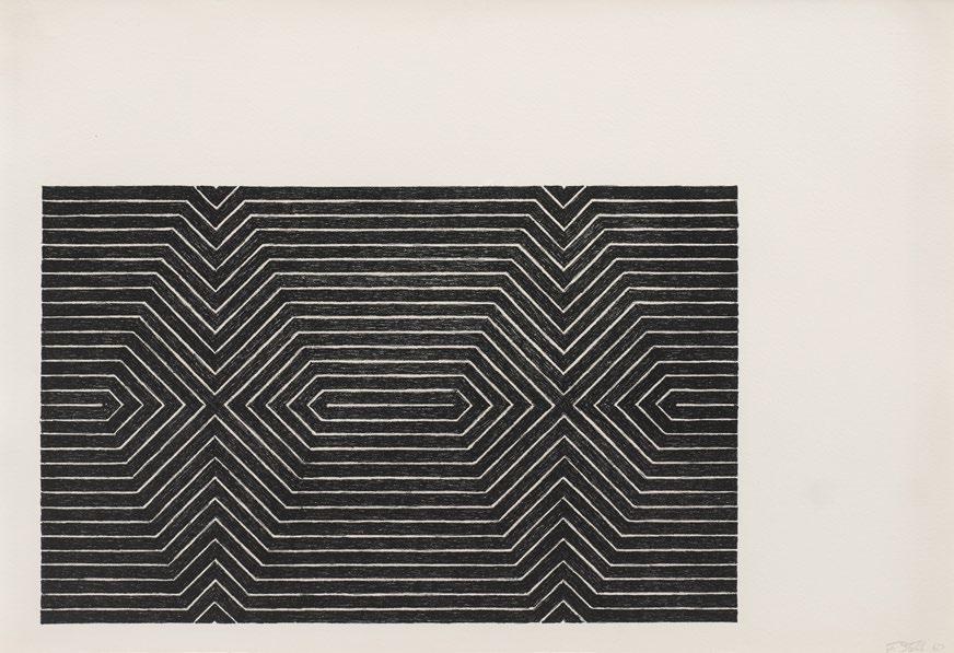
Gray Instrumentation I, 1974
Screenprints
Sheet size: 19 x 19 inches, each
Printer and Publisher: Tyler Graphics, Bedford, New York
Edition size: 36, plus proofs
Catalogue Raisonné: Danilowitz 225.1 - 225.12
Each sheet is signed, titled, and numbered in pencil.
The complete portfolio of twelve screenprints that retains its gray clothcovered portfolio box, black cloth-colored slipcase, title and colophon pages, and six interleaving sheets, each printed with verse written by the artist, together with the printer’s prospectus and a miniature screenprint.


Jasper Johns
White Target, 1968
Lithograph
Sheet size: 29 3/4 x 21 3/4 inches
Printer and Publisher: ULAE, West Islip, New York
Catalogue Raisonné: ULAE 54
Signed, dated and numbered dated in white crayon.

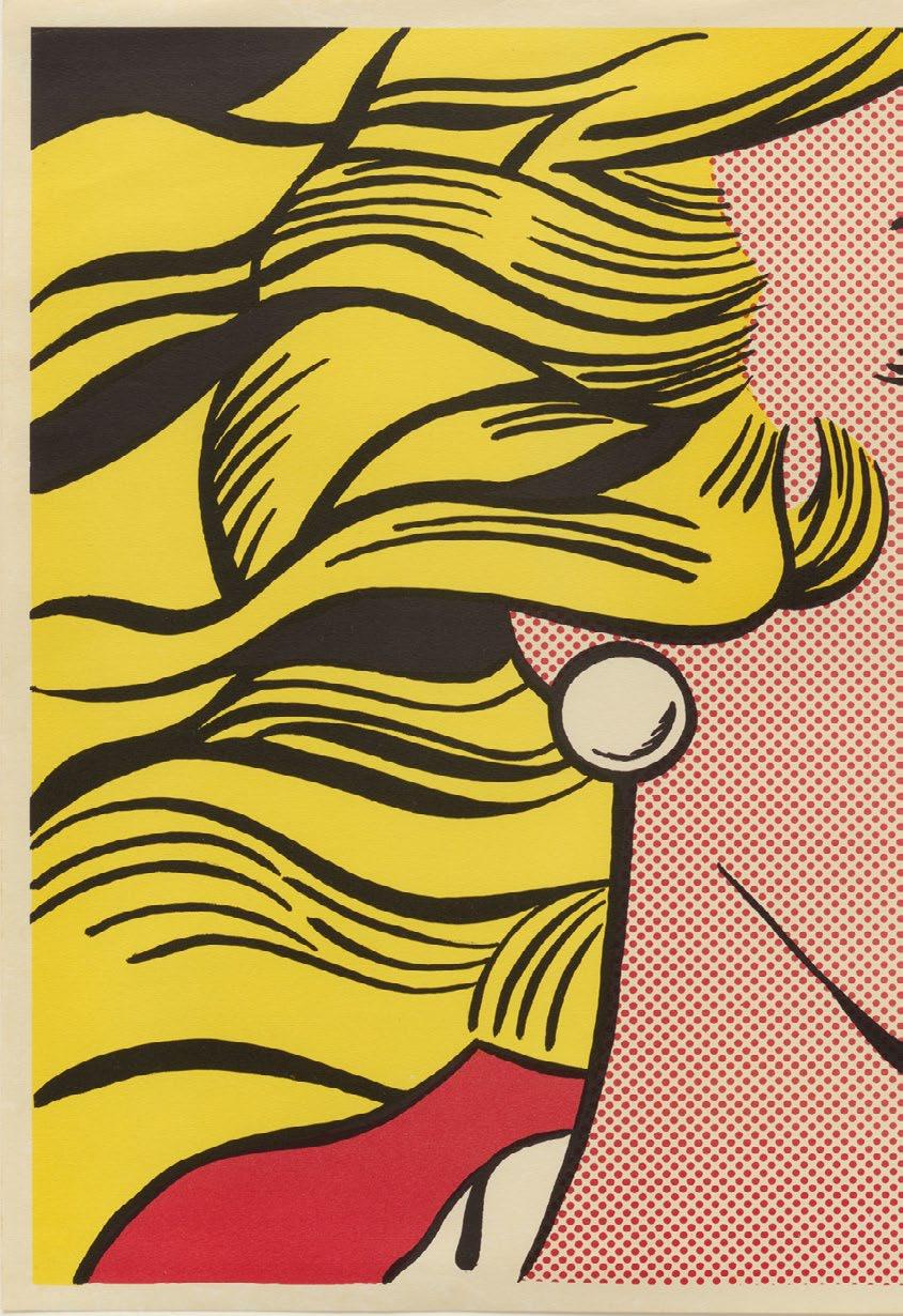
Roy Lichtenstein
Crying Girl, 1963
Offset lithograph
Sheet size: 18 x 23 7/8 inches
Printer: Leo Castelli Gallery, NY
Publisher: Colorcraft, New York
Edition: About 300
Catalogue Raisonné: Corlett Fine II.1
Signed in pencil.


Edward
Ruscha
Hollywood, 1968
Screenprint
Sheet size: 17 1/2 x 44 3/8 inches
Printer and Publisher: The Artist
Edition: 100, plus proofs
Catalogue Raisonné: Engberg 7
Signed, dated, and numbered in pencil.


Willem de Kooning’s works from the 1980s exude a vibrant intensity and ebullience that was unmatched elsewhere in his oeuvre. Marking a period of renewal, his paintings and prints from this period saw the artist revisit and revitalize his approach to abstraction, as the raw and gestural marks which typified his iconic contributions to Abstract Expressionism transformed into vacuous, organicist forms delineated by undulating lines. Published in 1986 by the French book publisher Éditions de la Différence, Quatre Lithographies exemplifies the lyricism and spatial complexity that characterized this late style. Sinuous ribbons of primary hues intertwine and cascade across the suite of four lithographs in a dynamic interplay of line, color, and movement. They stand as a highlight of his graphic work, showcasing his mature probing of the essence of color and form.
Although de Kooning experimented with printmaking as early as 1943, it was on a visit to California in 1960 that he made his first lithograph. The artist periodically returned to the medium throughout his career, especially at critical junctures in his corpus—such as in the 1980s. “Lithography allowed de Kooning to integrate the spontaneity of the Abstract Expressionist gesture with the technical process of printmaking,” the art historian Jennifer Field elucidated. “The use of tusche—a greasy medium that is applied to the lithographic stone with a brush or pen—can resemble the act of painting.” In this sense, the relationship between painting and printmaking was reciprocal; de Kooning’s use of the fluidity of tusche in some of his lithography was analogical to the artist’s gestural employment of oil paint, and the two media came to mutually inform each other.
This rare complete set of prints represents the culmination of de Kooning’s virtuosic experiments in abstraction and printmaking. As well as being one of very few lithographs produced by the artist in his late career, Quatre Lithographies is also among the small number of color prints that de Kooning made: much of his graphic work was rendered in black and white. This joyous, ethereal palette highlights the vital aspects of his practice, epitomizing the artist’s recommitment to expressive mark-making amidst a profound metamorphosis of his visual language.

Willem de Kooning
Quatre Lithographies, 1986
Lithographs
Sheet size: 28 1/4 x 24 5/8 inches, each
Printer: Art Estampe, Paris
Publisher: Éditions de la Différence, Paris
Edition: 100, plus proofs
Each sheet is signed, dated, and numbered in pencil
The complete portfolio of 4 lithographs, which retains the title page, colophon with edition number in pencil, and the original blue linencovered portfolio lettered in silver ‘WILLEM DE KOONING’.


Untitled, 1991-94

Sheet size: 26 1/2 x 39 1/8 inches, each
Printer: Derrière l’Etoile Studios, New York
Publisher: Brooke Alexander, New York
Edition: 15, plus proofs
Catalogue Raisonné: Schellmann 251-254
Each sheet is stamped by the estate, verso.
The rare complete set of four woodcuts.

Blue Surround, 1982
Aquatint with etching and drypoint
Sheet size: 35 x 26 1/2 inches
Printer and Publisher: Crown Point Press, San Francisco, CA
Edition: 35, plus proofs
Initialed, dated, and numbered in pencil with publisher’s blindstamp.


Suzhou I-IV, 1998
Etchings and aquatint
Etchings with aquatint, drypoint and scraping
Printer: Jennifer Melby, Brooklyn
Publisher: The Artist
Edition size: 45, plus proofs
Each sheet is signed, dated, numbered, and titled with pencil.
The complete set of four etchings.


Frank Stella
Black Series II, 1967
Lithographs


Size: 14 7/8 x 21 3/4 inches, each
Printer and Publisher: Gemini, G.E.L., Los Angeles, CA
Edition: 100, plus proofs
Catalogue Raisonné: Axsom 13-20
Each sheet is signed, dated, numbered in pencil.
The rare complete set of eight lithographs.


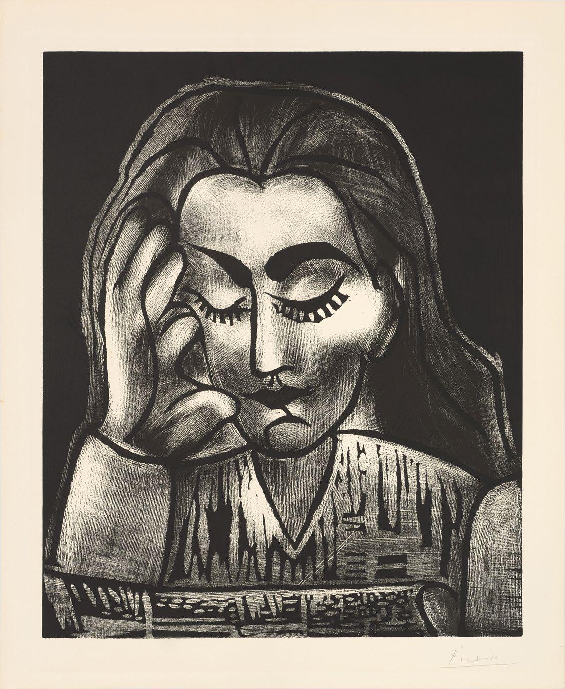
One of the greatest graphic artists of the twentieth century, Pablo Picasso executed an astoundingly diverse body of prints across his eight-decade-long career. Since producing his first print as a teenager in 1899, he experimented with a range of printmaking techniques, including engraving, etching, drypoint, lithography, monotype, and, as seen here, linocut. In Jacqueline lisant, Picasso returns to one of his most enduring motifs: a woman reading. The artist often depicted his lovers—from Marie-Thérèse Walter to Dora Maar to, in the present work, Jacqueline Roque—in this solitary, pensive act, which allowed him to capture the quiet introspection and subtle serenity of a woman’s face at rest. This larger-than-life example, created when Picasso was living in the south of France in 1964, showcases the renewed vigor and stylistic experimentation that characterized his late oeuvre.
Jacqueline was Picasso’s last love and their marriage lasted 12 years, until his death in 1973. Since first encountering her in the summer of 1952 at Madoura Pottery in Vallauris, where she worked as a salesperson, he executed over four hundred portraits of her—more than any of his other lovers. She is instantly recognizable in Jacqueline lisant by her high cheekbones, bold eyebrows, and distinctive feline face, which became recurrent emblems in Picasso’s late paintings and prints. This period of the artist’s life, which was dubbed by his biographer John Richardson as “l’époque Jacqueline,” shows the scope of the transformation of Picasso’s visual language through his images of his final muse.
Although Picasso had executed his first linocut in 1939, his interest in the medium was renewed in the 1950s, when he began experimenting with it in earnest with the master printer Hidalgo Anéra in Vallauris. The soft surface of linoleum allowed Picasso to carve fluid, continuous contours in relief, which mirrored the sinuous lines found in his paintings. Linocut had been taken up by previous modernist masters, such as Henri Matisse and Joan Miró, but Picasso’s development of a ‘reductive’ technique revolutionized the aesthetic and technical possibilities of relief printing. His unique process, which involved progressively carving away portions of the same linoleum block to print successive layers, created complex compositions that had previously been impossible. Unequivocally a master of graphic artmaking, Picasso pushed the boundaries of linoleum cutting to new heights; as the print expert Donald Karshan declared: “Picasso turned [linocuts] into an innovation of the first magnitude.”
lisant, 1964
Sheet size: 29 1/2 x 24 1/2 inches
Printer: Imprimerie Arnéra, Vallauris, France
Publisher: Galerie Louise Leiris, Paris
Catalogue Raisonné: Bloch 1181
Signed and numbered in pencil.