


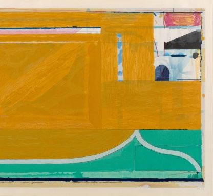
Cover: Richard Diebenkorn, Green, 1986

https://www.artbasel.com/basel/at-the-show
146 Greene Street New York, NY 10012 +1-212-489-3331
info@susansheehangallery.com www.susansheehangallery.com
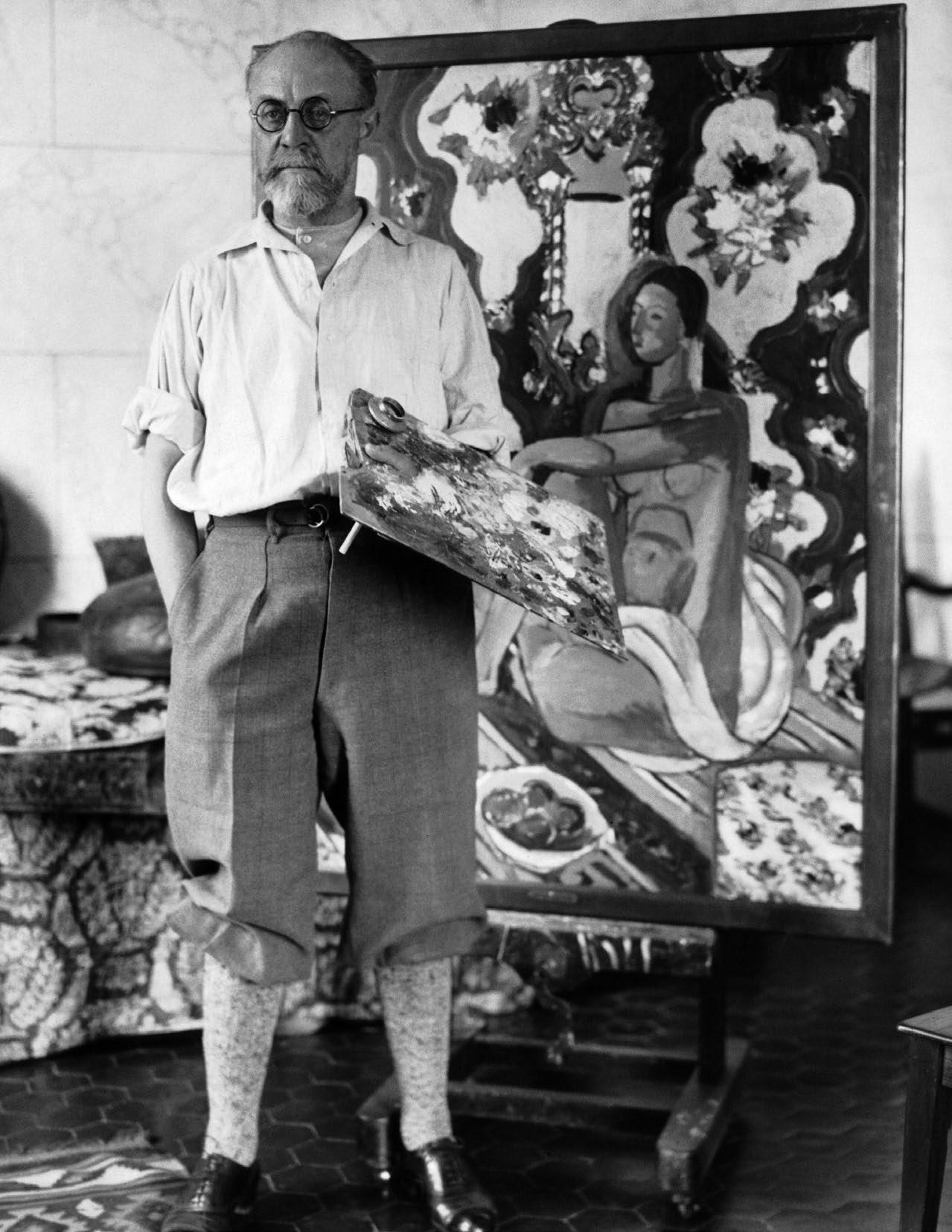
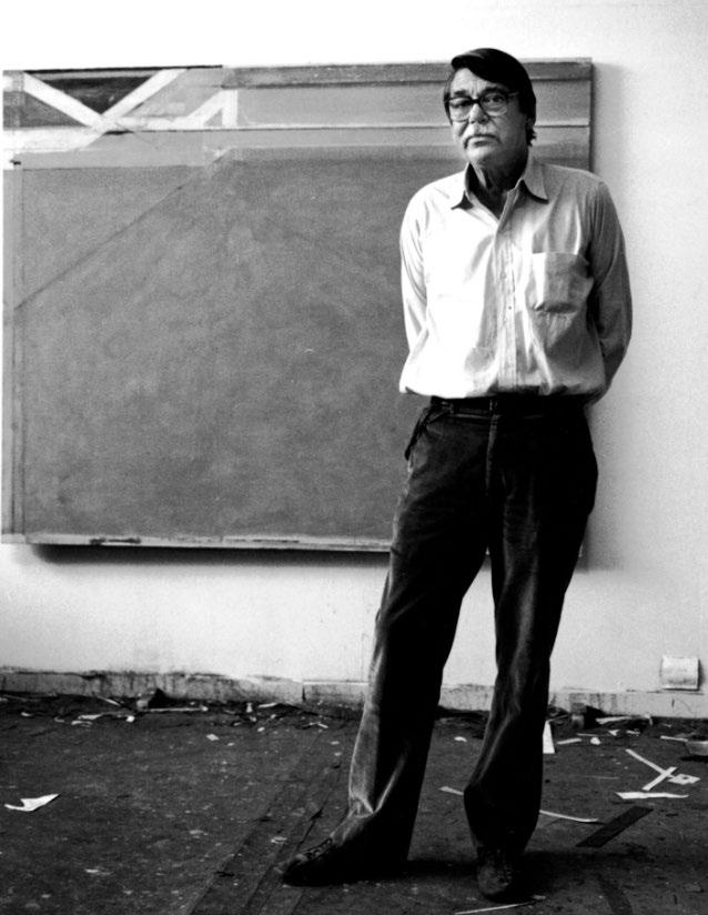
When Richard Diebenkorn visited the Soviet Union in 1964, it marked an inaugural gesture of cultural exchange for the two superpowers. For Diebenkorn, it was also a singular opportunity to view early works by Henri Matisse largely unseen in the West. Diebenkorn had never hidden his admiration for Matisse and he studied the older artist’s works at every opportunity. As the 2017 exhibition “Matisse/Diebenkorn” at SFMOMA demonstrated, works encountered during that 1964 trip left traces through the remainder of Diebenkorn’s career. This is easily spotted in the chromatic world of paintings—in the two artists’ manipulation of color as something limpid yet concrete enough to carry structural weight—but the echoes also reverberate through the architecture of the prints.
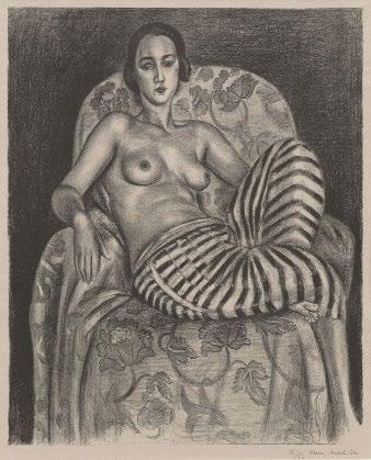
Though Matisse made more than 800 prints, almost none use color. An extension of drawing rather than painting, printmaking was for him a place to explore the vitality of black, white, and infinite shades of gray. Nowhere is this more visible than in his celebrated lithograph Grand odalisque à la culotte bayadère (1925). Moving between crumbly darkness and light sketchiness, he invoked matte skin, lustrous fabric, dense shadow. His attention to the model is elastic: her clavicle is almost palpable and her toes precisely animated, but her fingers and head have been distilled to an elegance more geometric than physiognomic.
The odalisque was a frequent subject for Matisse. But while he claimed to have seen them in Morocco, he knew that the odalisque of Western art—the eternally available harem girl lounging about on decorative display—was a fiction. Unlike Ingres or Delacroix, he doesn’t transport the viewer to a foreign location or alien culture. Instead he gives us a picture of a French girl (the ballet dancer and model Henriette Darricarrère) curled in an armchair that would have been at home in a Mary Cassatt painting. She is wearing nothing but striped harem pants, but her hair and bee-stung lips set her firmly in the 1920s. The putative exoticism was a chance to play with pattern (the arabesque fabric on the chair, the striped pants), and to paint the nude without recourse to mythology.
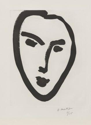
Both artists felt the push-pull of abstraction and things-in-the-world. Matisse moved gradually from the latter to the former (as a comparison of the 1925 Grand Odalisque and the 1952 Jeune Étudiant Masque I affirms), while Diebenkorn turned to figuration after first achieving renown as an abstract painter, then found a way to knit the two together in the great Ocean Park paintings he began a few years after his Soviet trip.
Like Matisse, Diebenkorn spent most of his printmaking career investigating the power of black, white and gray. In 1980, however, he began working in color aquatint at the suggestion of Kathan Brown of Crown Point Press (with whom he had worked since the early 1960s). Aquatint allowed for qualities painting did not: he could balance translucency and opacity, give space to a nervy thin line, to wispy swathes of tone, and dense territories of color.
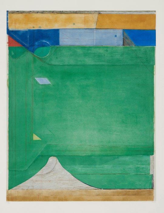
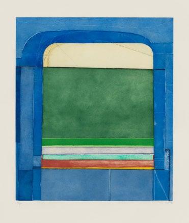
Like the Ocean Park paintings, Diebenkorn’s color aquatints are now seen as one of his defining bodies of work. In the grand, spellbinding Green (1986) we are pulled both to and through the surface, as if it were a lawn that in the right light or season reveals the ghosts of past gardens. Working proofs in the collection of the National Gallery (viewable online) show how he transformed a linear framework into a world: elements advance and retreat, nudge their neighbors, change hue and tone. Throughout, that Matissean quality of tensile structure—of cleaving to the picture plane while marking depth at the same time—remained remarkably consistent.
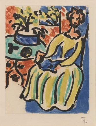
Matisse also tried his hand at color aquatint late in life. Marie-José en robe jaune (1950), loosely based on a painting of that year, shows a woman in a full-length dress, seated by wrought iron table with reading matter open in her lap. But where the painting relies on massed areas of opaque color, the print is carried along through swift strokes of black line, within which blue, red and yellow are puddled. Like Diebenkorn, he offers a master class in balance, deflection, disruption, and the pleasures of vision.
Richard Diebenkorn
Green, 1986
Aquatint and drypoint
Sheet size: 53 1/2 x 40 5/8 inches
Printer and Publisher: Crown Point Press, San Francisco
Edition size: 60, plus proofs
Initialed, dated, and numbered, lower margin
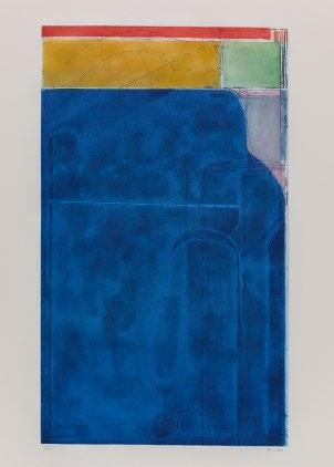
 Richard Diebenkorn
Large Bright Blue, 1980
Aquatint and etching
Sheet size: 39 5/8 x 26 1/8 inches
Printer and Publisher: Crown Point Press, Oakland, CA
Edition size: 35, plus proofs
Signed, dated, and numbered, lower margin
 Richard Diebenkorn
Blue Surround, 1982
Aquatint with etching and drypoint
Sheet size: 35 x 26 1/2 inches
Printer and Publisher: Crown Point Press, San Francisco
Edition size: 35, plus proofs
Initialed, dated, and numbered, lower margin
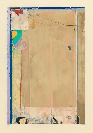
 Richard Diebenkorn
Touched Red, 1991
Etching, aquatint, and drypoint
Sheet size: 35 5/8 x 26 3/8 inches
Printer and Publisher: Crown Point Press, San Francisco
Edition size: 85, plus proofs
Initialed, dated, and numbered, lower margin
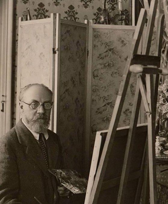
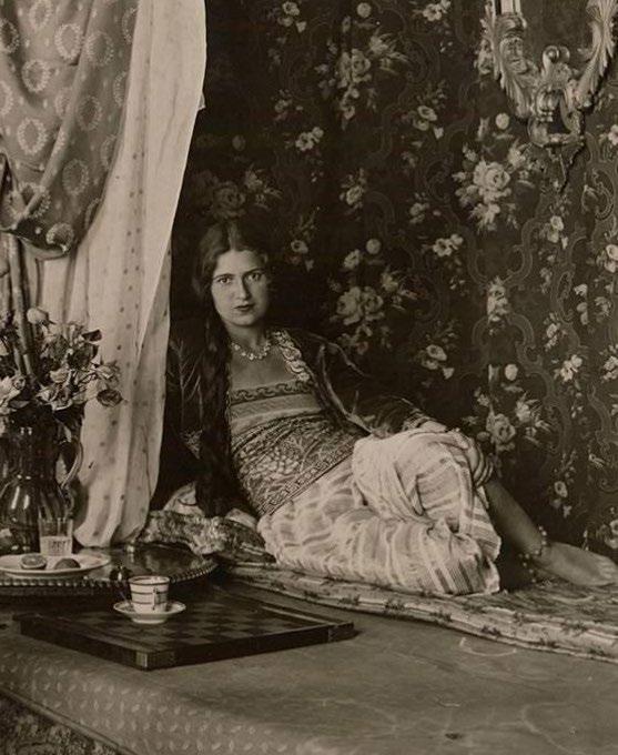 Henri Matisse and his model Henriette Darricarrère, Nice, France, 1928
Henri Matisse
Grande odalisque à la culotte bayadère, 1925
Lithograph
Sheet size: 27 3/8 x 22 inches
Printer: Atelier Duchâtel, Paris
Publisher: Edmond Frapier, Paris
Edition size: 50, plus proofs
Catalogue Raisonné: Duthuit 455
Signed and numbered, lower margin
Marie-José en robe jaune, 1950
Aquatint
Sheet size: 30 x 22 5/8 inches
Printer: Lacourière, Paris
Publisher: The artist
Edition size: 20
Catalogue Raisonné: Duthuit 817
Initialed and numbered, lower margin
From the very rare edition of 20 in this color combination. There were also proof impressions printed with the black outline only and two other editions printed in alternative color combinations.
 Henri Matisse
Jeune Étudiant. Masque I, 1952
Aquatint
Sheet size: 25 9/16 x 20 inches
Printer and Publisher: Lacourière, Paris
Edition size: 15, plus proofs
Catalogue Raisonné: Duthuit 818
Signed and numbered, lower margin
Blue with Red, 1987 Woodcut
Sheet size: 37 1/2 x 25 1/2 inches
Printer: Tadashi Toda at Shi-un-do Print Shop, Kyoto, Japan
Publisher: Crown Point Press, San Francisco
Edition size: 200, plus proofs
Initialed, dated, and numbered, lower margin
Richard Diebenkorn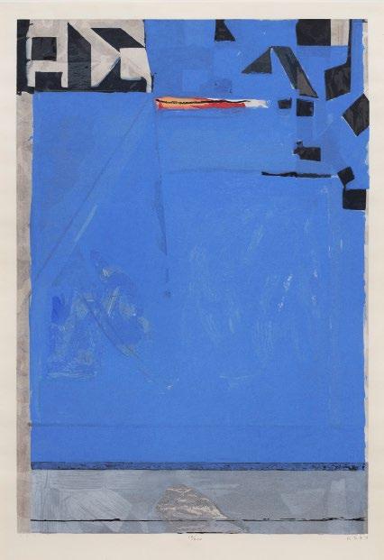 Richard Diebenkorn
Ochre, 1983
Woodcut
Sheet size: 27 1/4 x 38 1/8 inches
Printer: Tadashi Toda at Shi-un-do Print Shop, Kyoto, Japan
Publisher: Crown Point Press, San Francisco
Edition size: 200, plus proofs
Initialed, dated, and numbered, lower margin

He Disappeared into Complete Silence, 1949
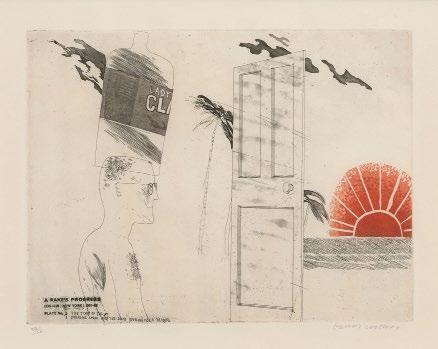
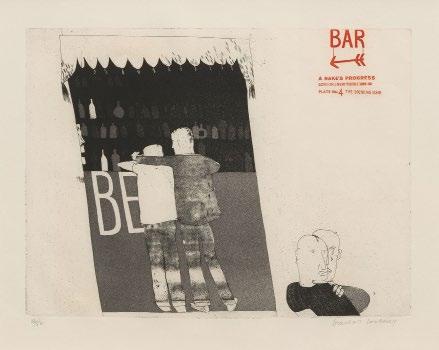
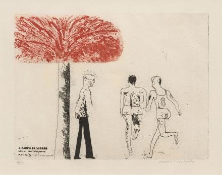
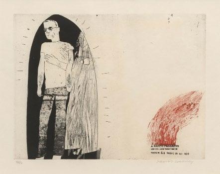
DAVID HOCKNEYA Rake’s Progress, 1961-63
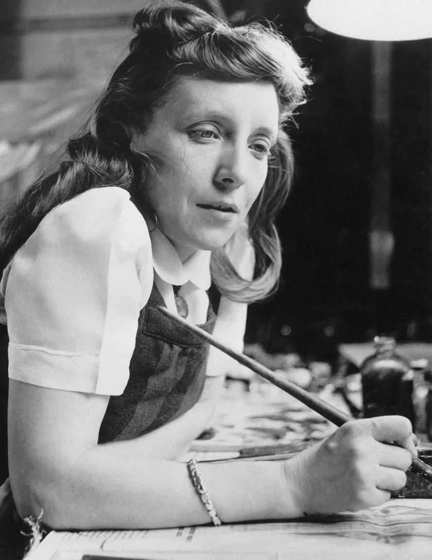
Created some fifteen years apart, Louise Bourgeois’ He Disappeared into Complete Silence and David Hockney’s A Rake’s Progress both present quixotic, autobiographical responses to New York City in the unexpected form of the intaglio print portfolio. Bourgeois’ He Disappeared into Complete Silence, made in 1947, is the definitive statement of a particular moment in the artist’s life and development. She had then been living in the city for nine years, ever since she left her native France to wed art historian Robert Goldwater. She had achieved a measure of success as a painter and printmaker—she participated in the Whitney Annual (the precursor to today’s Biennial) and exhibited with Pollock and Rothko—but she still felt herself a foreigner, and grappled with her position as a woman and a mother in an art world that took neither seriously.
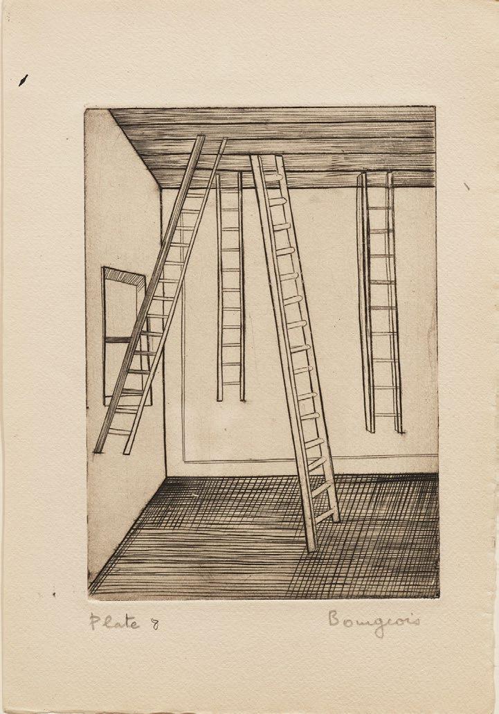
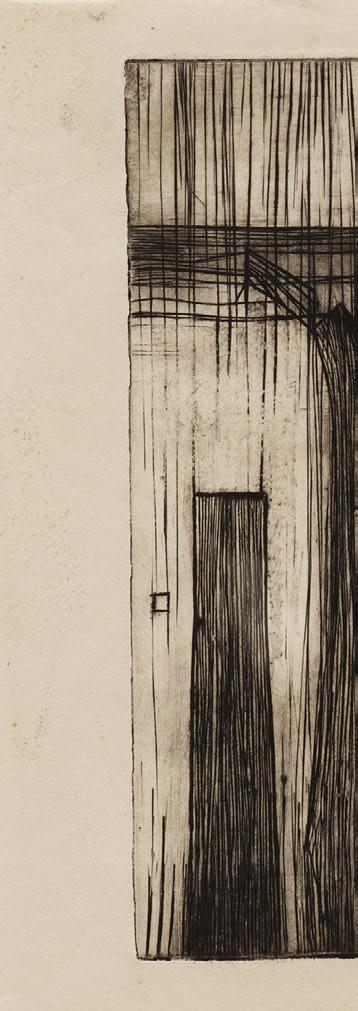
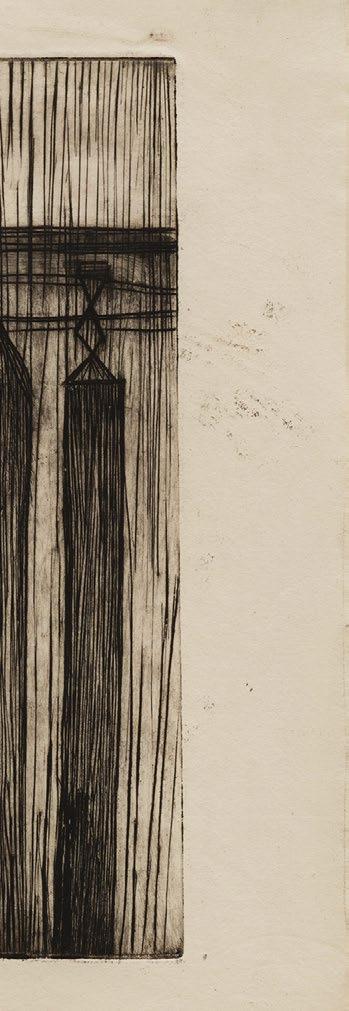
The tall, narrow structures that populate the portfolio’s nine engravings exhibit the proportions of skyscrapers or human beings, and the vulnerability of amateur carpentry. Opposite each engraving, Bourgeois placed bijoux texts—“tiny tragedies of human frustration” in the words of literary critic Marius Bewley, who wrote the portfolio introduction.
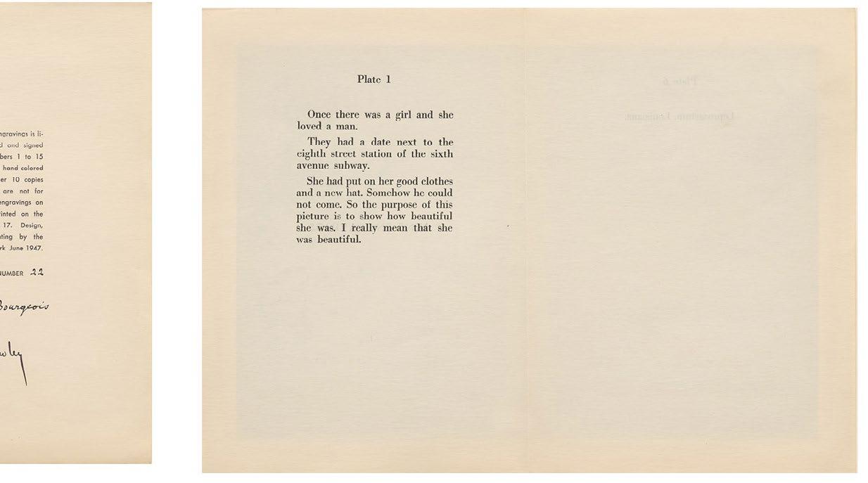
In one pairing, a figure resembling a matronly grandfather clock stands beside a short tale of girlnot-quite-meeting-boy. “The purpose of this picture,” the text tells us, “is to show how beautiful she was.” In another, two towers—one with cladding that might be shiplap or seersucker—are accompanied by the clause, “The solitary death of the Woolworth building.” In yet another, three leggy structures, one topped with a star, are placed beside the name of a leper asylum in Louisiana. Like the totem-like wood sculptures Bourgeois would begin exhibiting two years later, each is beautiful, imperfect, and all on its own.
Though she had been engraving experimentally since attending Stanley William Hayter’s Atelier 17 workshop during its New York exile, the portfolio was a more ambitious, more formal affair. Every aspect of its composition and production was carefully considered, from the texts (on which she conferred with Museum of Modern Art director Alfred Barr) to the portfolio construction. Despite these efforts, the audience proved meager and the full edition seems not to have been printed.
Louis Bourgeois in the studio of her apartment at 142 East 18th Street, New York, 1946.
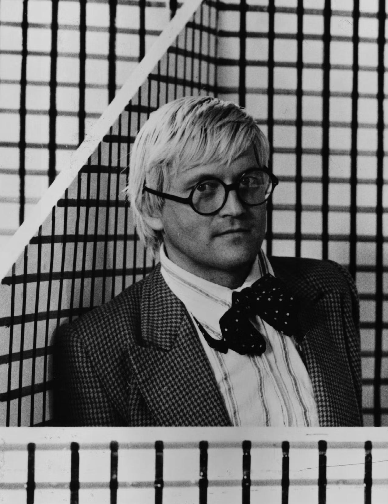
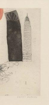
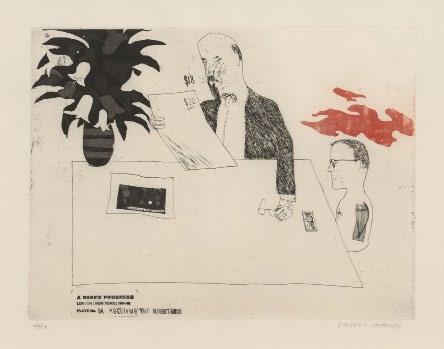
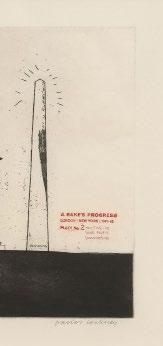
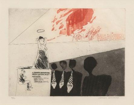
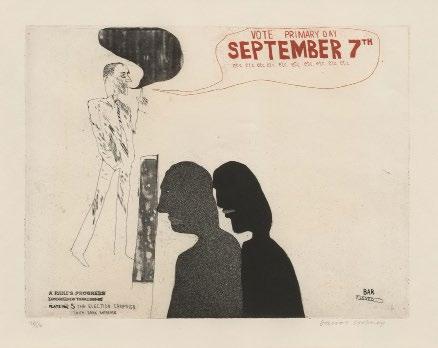
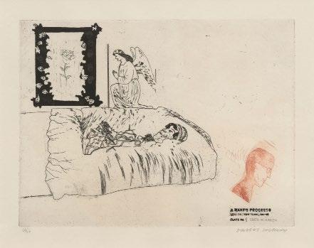
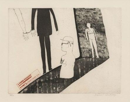
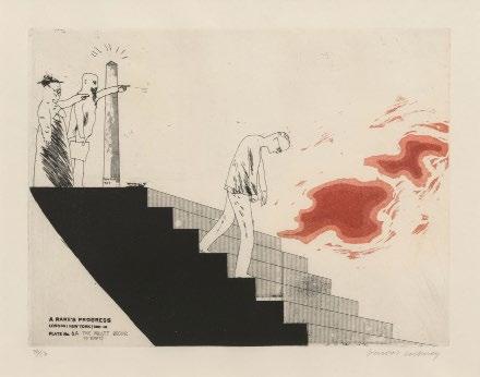
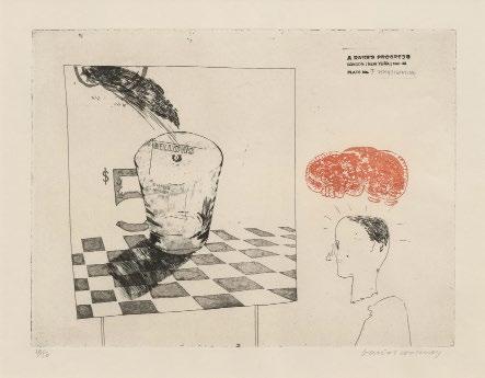
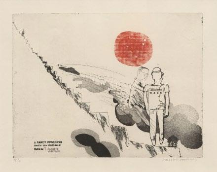
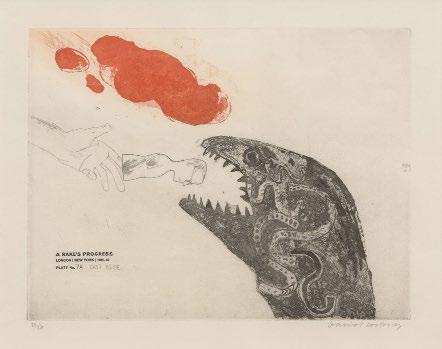
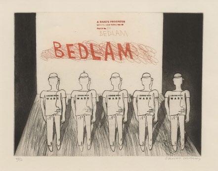
Hockney made his first, transformative visit to New York in 1961 while still a student at the Royal College of Art. When he returned to London he set a plan for eight etchings that would marry his New York adventures to William Hogarth’s cautionary print saga A Rake’s Progress (1732). Over the course of two years, the number of plates for the project swelled from Hogarth’s eight to about 35 before contracting to sixteen—half autobiographical, half fiction.
Like Hogarth’s rake, Hockney’s comes into some money, chooses pleasure over rectitude, fails at budgeting, and is abandoned by fair-weather friends. But while Hogarth’s ne’er-do-well is a user and abuser of others, Hockney’s—a young bespectacled art student looking much like the artist— is on a journey of creative and personal awakening, with all the euphoria and angst that entails. Both stories end in Bedlam, but in place of London’s infamous madhouse, Hockney gives us quintet of transistor-radio-addicted young men in WABC t-shirts—madness, not as aberration, but as conformity.
Hockney saunters between delicate precision and modernist bulk, and his arrangements of people and things behave less like objects in space than like clippings on a table. Changeable weather, inked in red, stalks our hero: a tropical sun beckoning from the other side of a portal in “The Start of the Spending Spree and the Door Opening for a Blond”; a cloud of annoyance hovering over the young artist in “Receiving the Inheritance” as he watches a bearded gentleman examining a print marked “$20” and announcing “$18.”
Hogarth filled the page with telling detail and symphonic massing of engraved line, but Hockney relied on etching techniques that might be learned in Printmaking 101. (In American academic printmaking circles, artist Bruce Nauman recalls, Hockney’s prints were “heavily attacked… They thought the work had nothing to do with printmaking.” ) Guileless but sophisticated, A Rake’s Progress offered a preview of the qualities that would make Hockney so beloved in decades to come: it proved that contemporary art could be serious without being portentous, modern yet enamored with tradition, witty but not superficial.
Hockney is a social artist, interested in the doings of people and, as Marco Livingstone put it, “taking a line not just for a walk as Paul Klee had done, but also for a talk.” The personality of A Rake’s Progress is very different from the quiet interiority of He Disappeared into Complete Silence, with its litany of missed and squandered connections. Yet both understand that capturing the multifaceted experience of the city requires a team of images rather than just one.
David Hockney on the set of The Rake’s Progress, which he designed for the Glyndebourne Opera Festival, 1975.
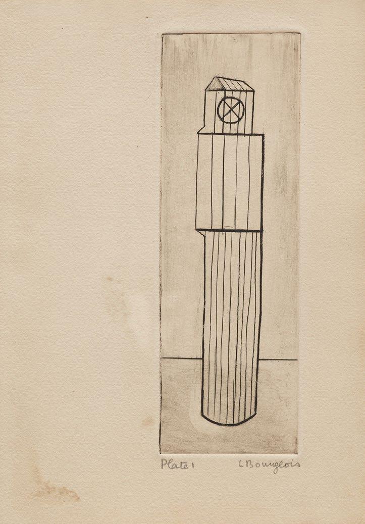
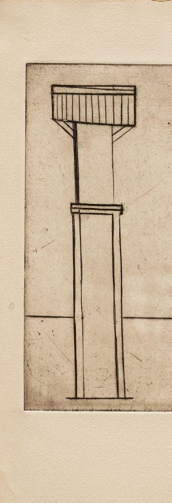
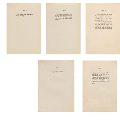
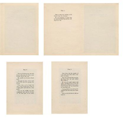
He Disappeared Into Complete Silence, 1947 Engravings
Sheet size: 10 x 7 inches, each
Edition size: projected 54, about 20 portfolios extant Catalogue Raisonné: Wye/Smith 29-38
The exceedingly rare portfolio of nine engravings which retains the introduction text by Marius Bewley, text pages by the artist, title and justification pages. Lacking the beige linen folder. Our example of this rare set is one of only 20 known examples, some complete and others incomplete, catalogued by the artist’s foundation. This set is numbered 22 on the colophon.
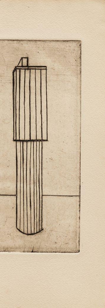
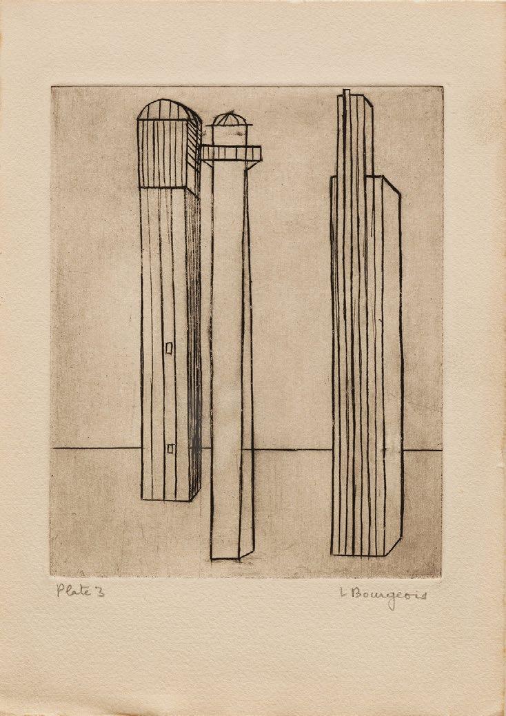
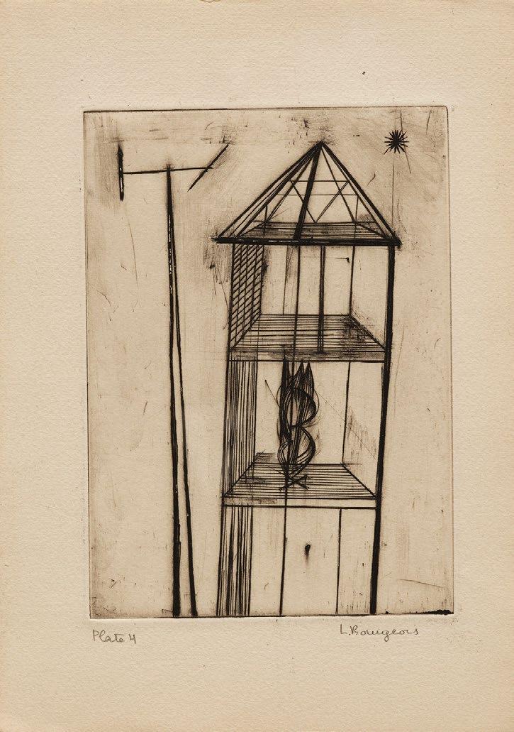
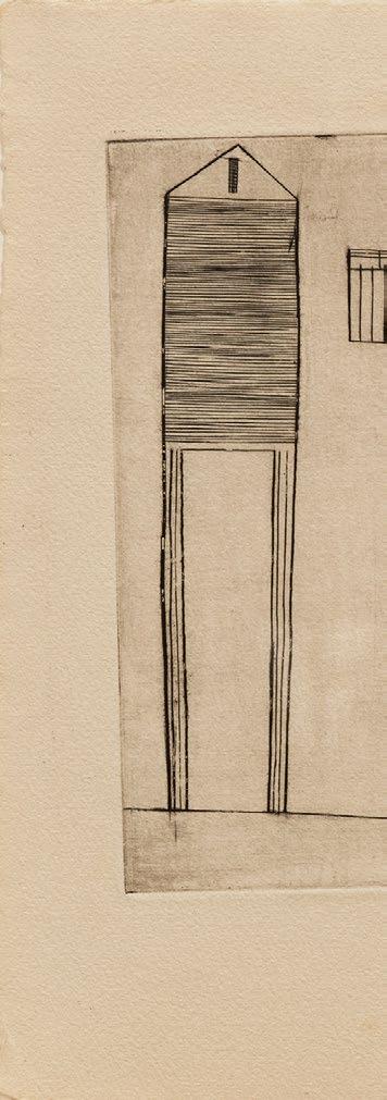
This early rare portfolio was originally intended to be published in an edition of 54. It appears that the edition was never completed and according to records kept at The Easton Foundation (founded by the artist), about 20 sets are currently accounted for. Of these sets, 10 were apparently assembled at the time of publication, these are referred to as “vintage” examples. The artist assembled the other sets later and they were given away or sold, these are referred to as “assembled” examples. The foundation’s meticulous records indicate that each set, both vintage and assembled, varies by whether it includes all of the parts: the engravings, the text pages, the linen-cover, and the introduction. Set-by-set variations also include which state of any one of the images was chosen. The prints themselves sometimes have a variety of annotations on them, and some are signed, some not. There are variations in the paper and in the typeset of the text, some also have hand drawn corrections on some of the text pages. Essentially each of these sets is unique and do not have the same precise compositional exactitude as many formally published artist’s book portfolios.
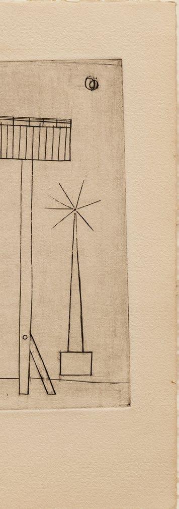
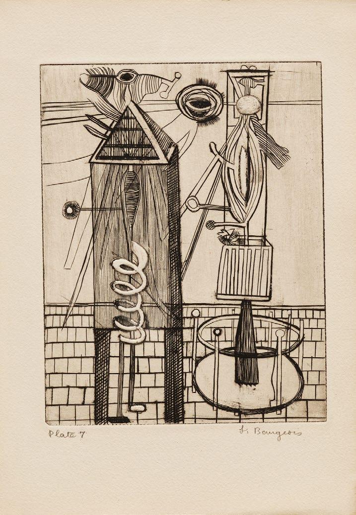
This example was once in the collection of Paul Facchetti (1912–2010). In July 1953 Bourgeois was to have a solo exhibition at Facchetti’s gallery in Paris. However, at a late stage in the preparations, Bourgeois backed out of the exhibition due to the escalation of her depression. She sent her husband Robert Goldwater to inform Facchetti and this example was likely given to him around this time as an apology. This assembled set was lacking Plate 5, however it now includes this plate which was aquired directly from The Easton Foundation.
Vintage sets of this portfolio are held in the permanent collections of Beinecke Rare Book and Manuscript Library, Yale University; Biblioteca Nazionale Centrale di Firenze, Florence; Louise Bourgeois Trust, New York; The Museum of Modern Art, New York; and the National Gallery of Art, Washington.
Assembled sets of this portfolio are held in the permanent collections of Bibliothèque Nationale de France; British Museum; National Gallery of Australia; and Toledo Museum of Art.

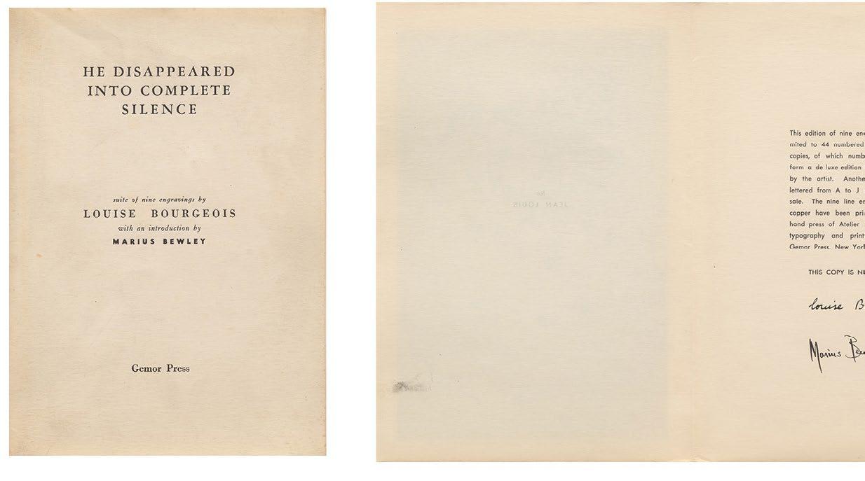
Title page, colophon, and text pages from He Disappeared Into Complete Silence
A Rake’s Progress, 1961-63
Etchings and aquatint
Sheet size: 19 1/2 x 24 1/2 inches, each
Printer: C.H. Welch, London
Publisher: Editions Alecto, London, in association with The Royal College of Art
Edition size: 50, plus proofs
Catalogue Raisonné: MCAT 12-27
Each sheet is signed and numbered, lower margin
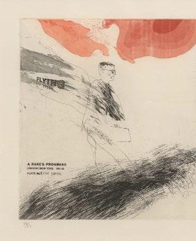
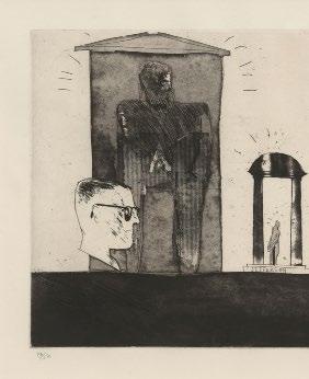
The rare complete portfolio of 16 etchings with aquatint, which retains the title, artist’s statement and justification pages, the original red linen-covered portfolio, and black cloth slip-case, lettered on spine in gold ‘A RAKE’S PROGRESS DAVID HOCKNEY’ and the Editions Alecto logo.
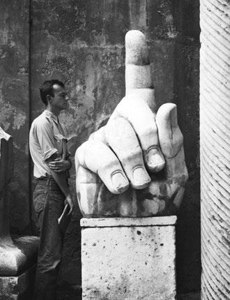
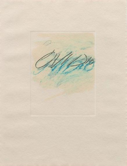
Cy Twombly’s first spate of serious printmaking was brief, but it delivered some masterworks of postwar art. Back in the United States for a visit in 1967 (Twombly had moved to Italy a decade earlier), he accompanied Robert Rauschenberg to Universal Limited Art Editions, the Long Island printshop where Rauschenberg had been working.
ULAE’s specialty was lithography, but Twombly was drawn to the etching workshop that master printer Don Steward had set up in the basement a few months earlier. In the space of a few weeks, Twombly completed plates for three multipart projects: a portfolio of six jangly line etchings titled Sketches; four slightly bigger etchings of massed calligraphic squiggles, grouped under the title Notes; and two large untitled prints that share the deep grays and drawn-out, looping lines of his new canvases—the crayon-and-oil Blackboard paintings, Twombly’s most iconic body of work.
Twombly’s approach in the etching studio was experimental, and it could hardly have been otherwise: he was new to the medium, and the medium was new to the workshop. A gestural artist, Twombly was interested in the dance between intention, materiality and circumstance. He tested various techniques and marks—abrupt scratching in Sketches, scribbled loops in Notes. Work on the Untitled prints started before his first plates had even been proofed, but he chose to venture beyond simple drawing with the etching needle to play with tonal techniques like aquatint and capricious ones like open bite (painting with acid directly on the plate).
As in the Blackboard paintings, the Untitled prints are filled with sequential rows of continuous coiled lines, which cross a slaty surface from edge to edge. At once orderly and disorderly, energetic and elegiac, they invoke both discipline (the ruled page of cursive practice pads) and exuberance (gesture freed from the strictures of orthography).
Cy Twombly posing with a Roman relic (photo taken by Robert Rauschenberg), Musei Capitolini, Rome, 1952.Because of the left-right reversal between the printing template and the printed image, the loops slant left rather than right, delaying our read of it as “writing.” And where the painting surfaces suggest palimpsests—layers announcing themselves through ghostly attenuation—the prints are palpably dimensional, more like roughly used floors or ancient stairs.
The twisting rows of Untitled II lack the light spontaneity of Twombly’s crayon marks on canvas. The line is distinguished by its irregular, eroded edges. Using open bite, Twombly created valleys and mesas, against whose tiny cliffs ink accumulates, like shadows or dust gathered in a corner. Expectations are further complicated by the decision to ink the plate in white, then roll black over the raised surface areas. Thus, the cliff shadows are more like auroras, and the looping line takes on the erratic grace and splotchiness of a water-damaged ribbon. These reversals—positive/ negative, light/dark, high/low—ripple across the image, producing the unstable, low-contrast shimmer of moonlight on open water. And then, suddenly, it looks like writing again.
Cy Twombly in his studio, Rome, 1966.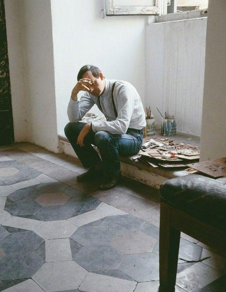
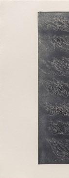
Cy Twombly
Untitled II, 1967
Intaglio with etching and aquatint
Sheet size: 27 5/8 x 40 3/4 inches
Printer and Publisher: Universal Limited Art Editions, West Islip, New York
Edition size: 23, plus proofs
Catalogue Raisonné: Bastian 11
Initialed, dated, and numbered, lower margin

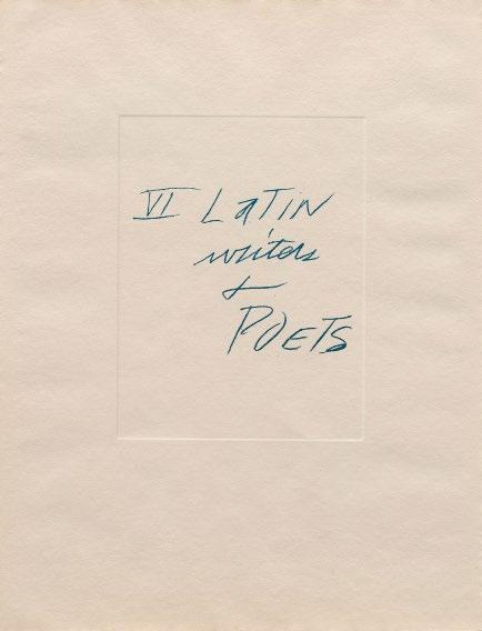
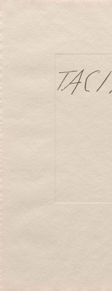
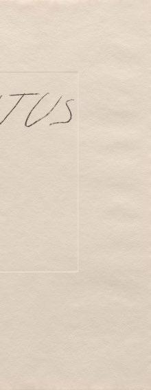
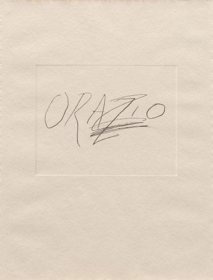
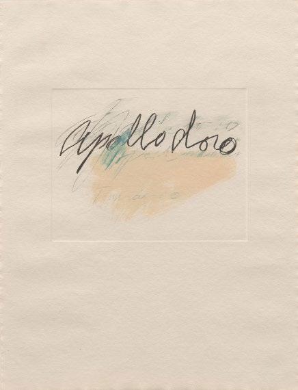
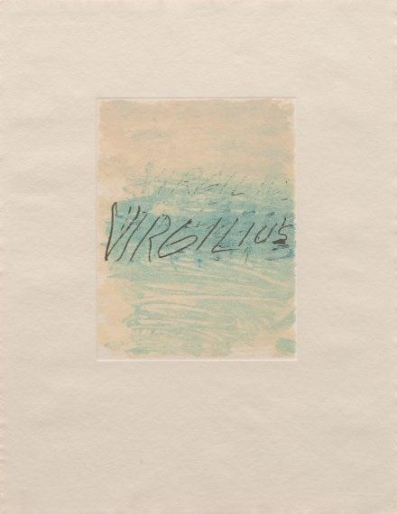
Six Latin Writers and Poets, 1976
Lithographs
Sheet size: 25 3/8 x 19 5/8 inches, each
Printer: Matthieu Studio, Zurich-Dielsdorf
Publisher: Propylaen Verlag, Berlin
Edition size: 60, plus proofs
Catalogue Raisonné: Bastian 60-66
Each sheet is initialed and numbered, verso
The complete portfolio of seven lithographs that retains its original paper-covered portfolio designed by the artist.

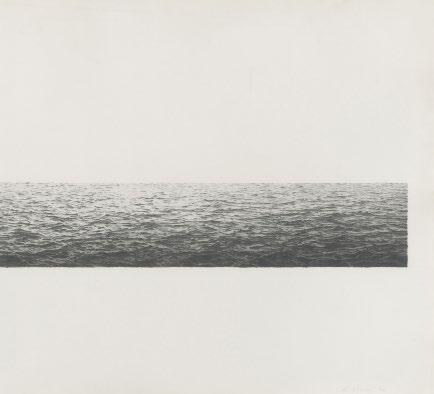
Vija Celmins had been making drawings of photographs for a number of years when she began taking pictures of the ocean as she walked her dog on the beach in Venice, California. In the drawings that followed, she excluded everything but the water’s surface: no shoreline, sky, or horizon. From top to bottom, left to right, she filled the page with water doing what water does, in different lights, at different tides, under different atmospheric conditions. (A baker’s dozen were included in her 2019 retrospective, “To Fix the Image in Memory.”) They are remarkable feats of attention, performed without schematizing and without an eraser, moving patiently, quadrant by quadrant, “redescribing” (her preferred word) what the photograph showed.
Invited to Tamarind Lithography Workshop in 1970, she set to work redescribing one such photograph on a large stone. “I found the stone surface pretty sympathetic,” she recalled. “It’s a gorgeous color and has a fine tooth.” Indeed, the textural minutiae of Untitled (1970) magically captures three essences at one: the specific grain of the stone, the distinctive grayscale range of photography, and the hard-yet-fluid surface of water. Optical depth was added by printing the image in two shades of gray.
The ocean surface was the first of what Celmins terms her “impossible images”—things that are too vast and too interchangeable for human habits of depiction and visual comprehension. Visiting deserts in California and the Southwest, she tasked herself with really seeing what was there—not a generic wasteland but an array distinct objects and incidents, all equally important in the scheme of things. The year after her Tamarind project, she began making lithographs with Cirrus Editions.
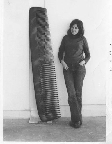
Vija Celmins with Untitled (Comb), 1970While the Tamarind ocean bled off the edge of the paper, Celmins’ Cirrus prints show her playing with the edge between image and support, the place, she says, where one sees “most clearly the decisions of how the work is made.” This happens dramatically in Untitled (Large Ocean) (1972), whose long lateral proportions and low placement on the page combine with the water’s brightness at the top to suggest a horizon, and with it, a sagittal depth rare in Celmins’ work.
Lithography is a chemical process, based on the resistance of oil to water, and its great virtue is that artists can work with pencils, pens and brushes, much as they would on paper. Celmins is highly attuned to working materials. Of her night sky drawings, she said, “even though you may think they come from lying under the stars, for me, they came out of loving the blackness of the pencil.” Given the chance, she jumped at the opportunity to make a mezzotint—a muscle-intensive intaglio process in which the artist selectively burnishes a roughened metal plate, making smooth areas that can wiped clear of ink in printing. Working with Doris Simmelinck at Gemini G.E.L. in Los Angeles, she assembled 25 plates to make the large night sky of Strata (1983). Here, rather than drawing the darkness, she was drawing the light, controlling the relative brightness of each star and its bleed, around which the rough plate creates a singular light-sucking darkness.
Mezzotint is less adept, however, at abrupt edges or sharp flecks of light, like those that dazzle us when sun hits water. In the wood engravings of ocean surfaces that Celmins began making with Leslie Miller at Grenfell Press in the early 1990s, we see her drawing with the tapered strokes of the knife—virtuosic slashes that gang up or scurry away, manifesting the fall of light on active water. In Untitled (1995), they dance up to the edge of the block, then stop, leaving a sensitive black rim between ocean and paper.
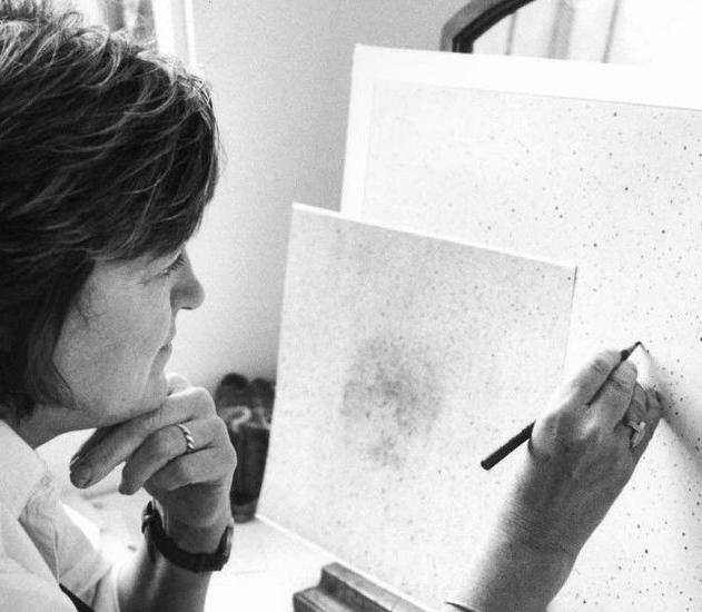 Vija Celmins working on the print Night Sky (Reversed) at Gemini G.E.L., 2002
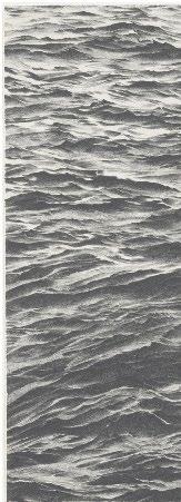
Untitled, 1970
Lithograph
Sheet size: 20 1/4 x 29 1/4 inches
Printer and Publisher: Tamarind Lithography Workshop, Inc., Los Angeles
Edition size: 20, plus proofs
Catalogue Reference: MMA 3
Signed and numbered, verso
An extraordinary impression of this exceedingly rare print. Examples of this print are in the permanent collections of Amon Carter Museum of American Art, Texas; Museum of Modern Art, New York; Norton Simon Museum, California; San Francisco Museum of Modern Art; and Smith College Museum of Art.
Vija Celmins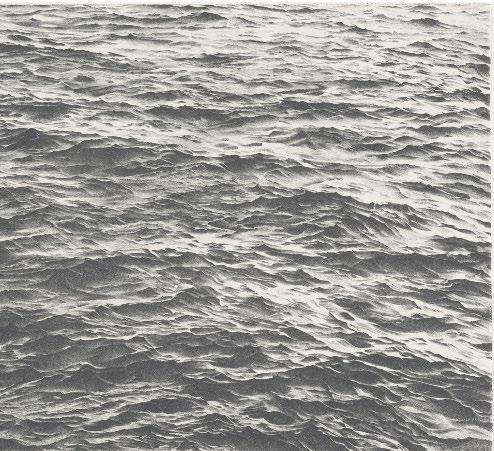
Untitled (Large Desert), 1971
Lithograph
Sheet size: 22 3/8 x 29 inches
Printer and Publisher: Cirrus Editions, Los Angeles
Edition size: 65, plus proofs
Catalogue Reference: MMA 4
Signed, dated, and numbered, lower margin
 Vija Celmins
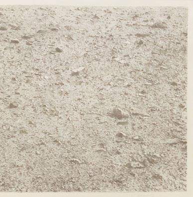

Untitled (Ocean), 1975
Lithograph
Sheet size: 16 1/8 x 20 1/16 inches
Printer and Publisher: Cirrus Editions, Los Angeles
Edition size: 75, plus proofs
Catalogue Reference: MMA 8
Signed, dated, and numbered, lower margin
Vija Celmins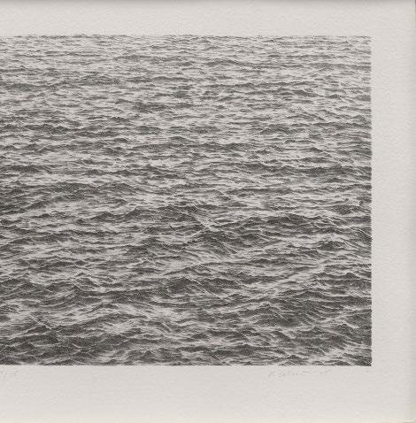
Night Sky Woodcut, 1997
Sheet size: 17 5/8 x 12 1/2 inches
Printer and Publisher: Grenfell Press, New York
Edition size: 30, plus proofs
Catalogue Reference: MMA 40
Signed, dated, and numbered, lower margin
Vija Celmins Woodcut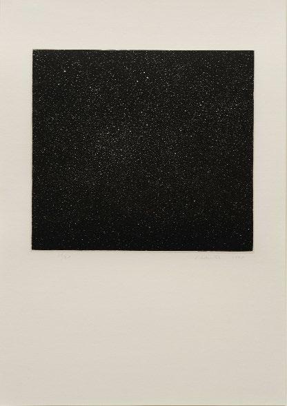

Untitled (Desert), 1975
Lithograph
Sheet size: 16 5/8 x 20 1/8 inches
Printer and Publisher: Cirrus Editions, Los Angeles
Edition size: 75, plus proofs
Catalogue Reference: MMA 6
Signed, dated, and numbered, lower margin
Vija Celmins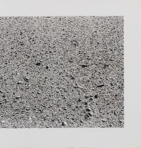

Strata, 1983
Mezzotint
Sheet size: 29 1/2 x 35 1/4 inches
Printer and Publisher: Gemini G.E.L., Los Angeles
Edition size: 37, plus proofs
Catalogue Reference: MMA 14
Signed and numbered, lower margin
Vija Celmins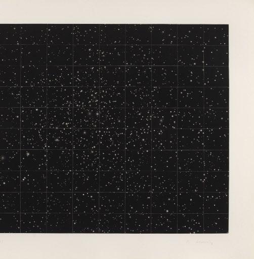
Untitled (Large Ocean), 1972
Lithograph
Sheet size: 28 1/2 x 45 1/2 inches
Printer and Publisher: Cirrus Editions, Los Angeles
Edition size: 65, plus proofs
Catalogue Reference: MMA 5
Signed, dated, and numbered, lower margin
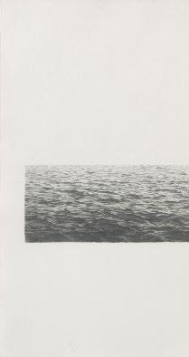 Vija Celmins
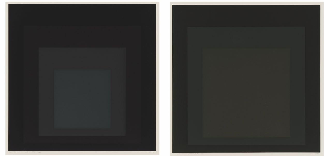
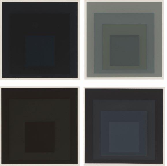
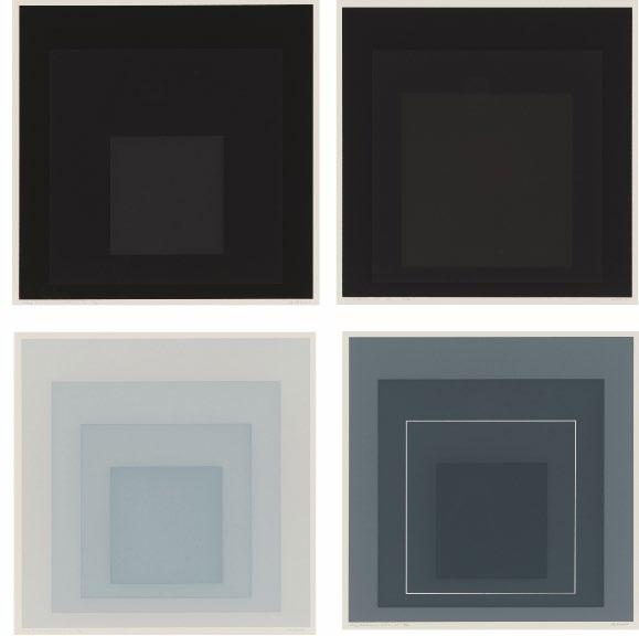
 Josef Albers
Gray Instrumentation I, 1974
Screenprints
Sheet size:19 x 19 inches, each
Printer and Publisher: Tyler Graphics, Bedford, New York
Edition size: 36, plus proofs
Catalogue Raisonné: Danilowitz 225.1 - 225.12
Each sheet is signed, titled, and numbered, lower margin
The complete portfolio of twelve screenprints that retains its gray cloth-covered portfolio box, black cloth-colored slipcase, title and colophon pages, and six interleaving sheets, each printed with verse written by the artist, together with the printer’s prospectus and a miniature screenprint.
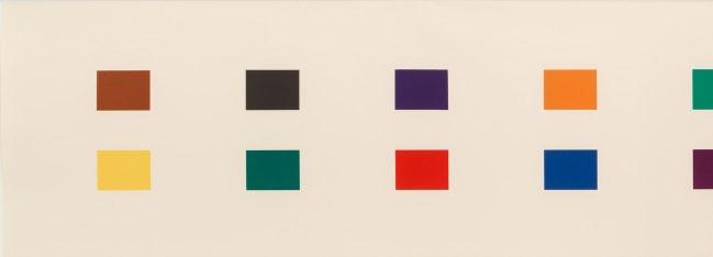
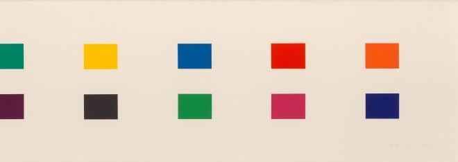
Ellsworth Kelly
18 Colors (Cincinnati), 1979-82
Lithograph
Sheet size: 16 x 90 1/2 inches
Printer and Publisher: Gemini, G.E.L., Los Angeles
Edition size: 57, plus proofs
Catalogue Raisonné: Axsom 193
Signed and numbered, lower margin
Colored Paper Image XIII (Yellow Green Black Blue Orange), 1976
Colored and pressed paper pulp
Sheet size: 32 1/4 x 31 1/4 inches
Printer: Printer: Ellsworth Kelly and Kenneth Tyler, fabricated at HMP Paper Mill, Woodstock, Connecticut
Publisher: Tyler Graphics Ltd., Bedford, New York
Edition size: 23, plus proofs
Catalogue Raisonné: Axsom 153
Signed and numbered, lower margin
Ellsworth Kelly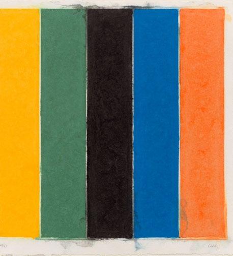
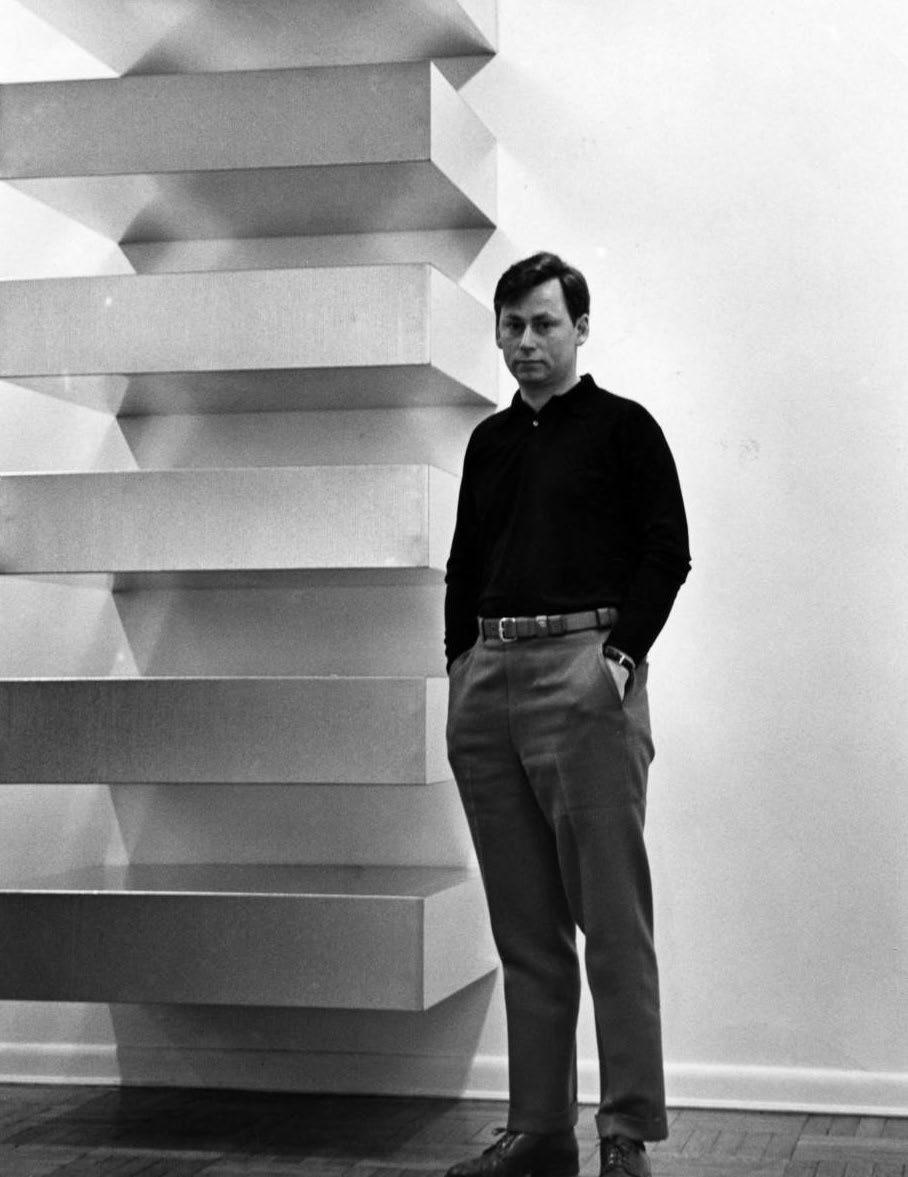
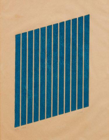
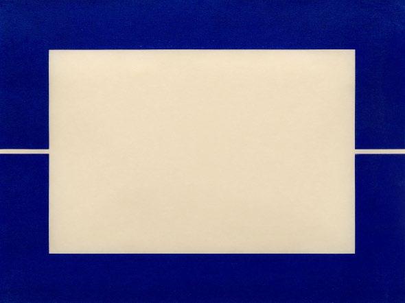
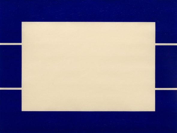
In 1961, concurrent with the dimensional experiments that would transform him from a painter into a sculptor, Donald Judd embarked on an extended series of woodcuts with his father, Roy. The senior Judd was an experienced woodworker, and while Donald had made his own gestural woodcuts, the work he had in mind required a linear precision beyond his skillset. Each of the new prints used a wood block in the shape of a parallelogram incised with twelve parallel grooves. In this, they were all alike. But each set of grooves behaved differently—they might run continuously off the top of the block, or stop short, or turn a corner to connect with a neighbor. Printed in portrait orientation, some blocks appear poised on their right acute corner, some on the left. In only one do the grooves divide the block from end to end, so that we perceive, not white stripes within the inked block, but inked stripes afloat on white paper.
The parallelograms were printed in cadmium red (a color Judd often applied to his sculptures) with ink so thickly applied that one can still see the miniature peaks and valleys that formed when the paper was peeled from the block. Blocks were also printed in manganese blue, which gave a luminous, mottled appearance. In the late sixties, Roy Judd printed additional impressions of 13 of the 38 parallelograms in red and blue for editions published by Heiner Friedrich. The one “stripe” block was omitted from this later set, and while cadmium red was again used, the manganese pigment was replaced with a darker, more consistent cerulean blue.
By working in series, Judd could make artworks that were both restricted in their parts and open-ended in their possibilities. Their shared rules and permutations are self-explanatory. In a commanding set of woodcuts from 1988—often hung in a stack formation that echoes his sculptures—all ten prints consist of a rectangle surrounded by a margin. In half the prints, the inner rectangle is inked; in the other half, it is the surrounding margin. Cut channels may bisect or trisect the inked block, either vertically or horizontally. Editions were printed in red, black and ultramarine blue.
Donald Judd at Leo Castelli Gallery, New York, 1966.
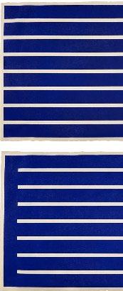
Judd’s series of twelve sets of woodcuts from the early 1990s are far simpler: four rectangular blocks, each cut with seven horizontal lines or seven vertical lines. In one, the lines extend fully across the block; in the other three they either stop just short on one side or the other; or on both sides. This time there were six color versions: oxide of chromium, venetian red, cadmium red, cadmium yellow, ivory black and french ultramarine blue.
Judd’s admirers often describe him as a “colorist.” (Dan Flavin subtitled a set of his own prints, “To Don Judd, colorist”). But while the word is usually reserved for artists engaged with intricate chromatic interactions (Monet, Kandinsky, Sonia Delaunay), Judd’s use of color was more elemental—a necessary attribute of a particular object. He explained his penchant for cadmium red, for example, as arising from “its capacity to define the form with clarity” rather than ebbing into shadow. This fits with Judd’s distaste for ambiguity, and museum director and Judd expert Rudi Fuchs compared Judd’s woodcuts to “Mozart playing the piano. Crystal clear, bright, clear, refined and there’s no misunderstanding.”
The blues, however, behave differently. The deep blue acrylic Judd used in sculptures produced an optical depth that was difficult for the eye to parse. In the prints, where we have the opportunity to look at the same design in different colors, we can see how the blue end of the spectrum is a place of optical complication, of twilights and uncertainty, even within a neatly bounded form.
Donald Judd, Marfa, Texas, 1993Donald Judd
Untitled, 1961-63
Woodcut
Sheet size: 30 x 21 7/8 inches
Printer: Roy C. Judd
Publisher: The Artist
Edition size: 3
Catalogue Raisonné: Schellmann 65
Signed, dated, and numbered, lower margin
An extremely rare example of this woodcut, one of very few known to be printed in manganese blue. This proof impression is one of only 3 printed in 1963 and was not included in the larger and later edition which was published by Heiner Friedrich.
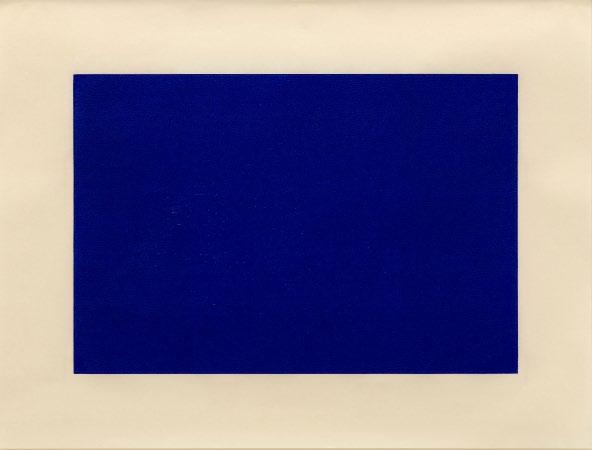
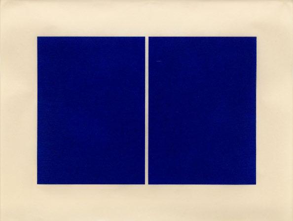
Untitled, 1988
Sheet size: 23 9/16 x 31 3/8 inches, each
Printer: Derrière l’Etoile Studios, New York
Publisher: Brooke Alexander Editions, New York
Edition size: 25, plus proofs
Catalogue Raisonné: Schellmann 167-176
Each sheet is signed and numbered, verso
The complete set of ten woodcuts.
Donald Judd Woodcuts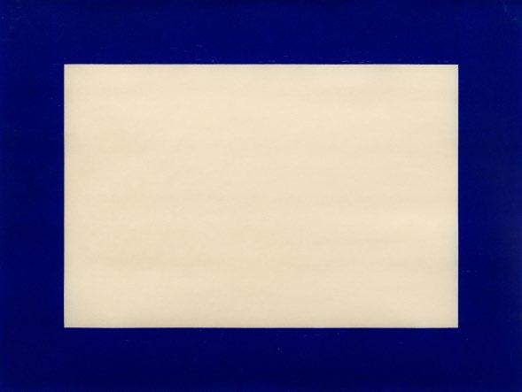
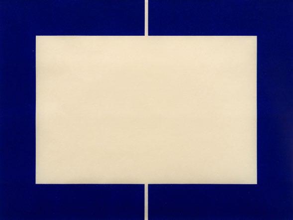
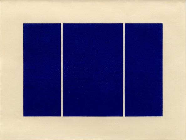

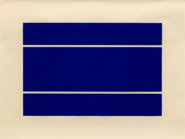
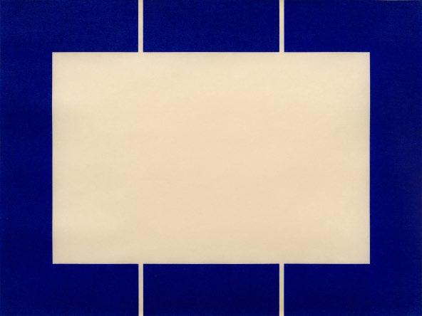
 Donald Judd
Untitled, 1991-94
Sheet size: 26 1/2 x 39 1/8 inches, each
Printer: Derrière l’Etoile Studios, New York
Publisher: Brooke Alexander Editions, New York
Edition size: 15, plus proofs
Catalogue Raisonné: Schellmann 251-254
Each sheet is stamped by the estate, verso. These woodcuts were printed during the artist’s lifetime and under his supervision. However, they were all estate stamped as the artist died before he could sign them.
The complete set of four woodcuts.
Woodcuts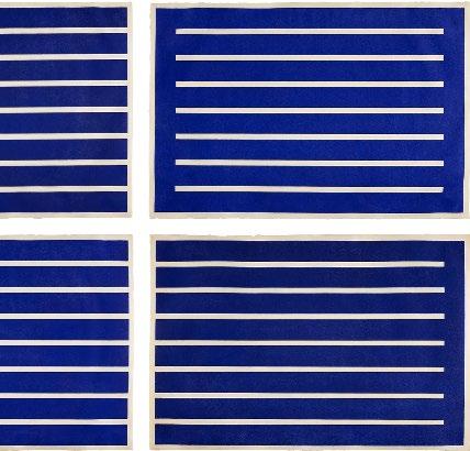
Untitled, 1991-94 Woodcuts
Sheet size: 26 1/2 x 39 1/8 inches, each
Printer: Derrière l’Etoile Studios, New York
Publisher: Brooke Alexander Editions, New York
Edition size: 15, plus proofs
Catalogue Raisonné: Schellmann 227-230
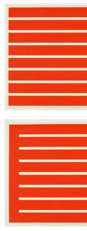
Each sheet is stamped by the estate, verso.These woodcuts were printed during the artist’s lifetime and under his supervision. However, they were all estate stamped as the artist died before he could sign them.
The complete set of four woodcuts.
Donald Judd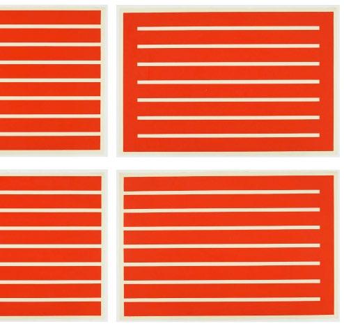
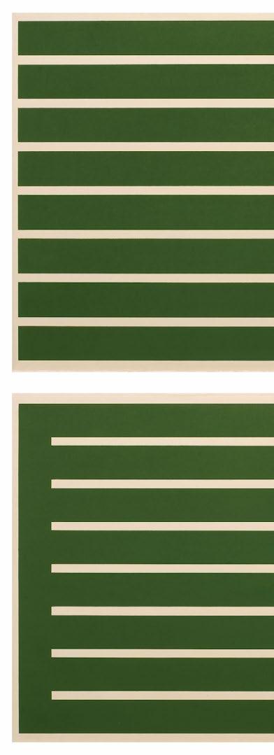 Donald Judd
Untitled, 1992 Woodcuts
Sheet size: 26 1/4 x 38 1/2 inches, each
Printer: Derrière l’Etoile Studios, New York
Publisher: Brooke Alexander Editions, New York
Edition size: 25, plus proofs
Catalogue Raisonné: Schellmann 211-214
Each sheet is signed and numbered, lower margin, verso
The complete set of four woodcuts.
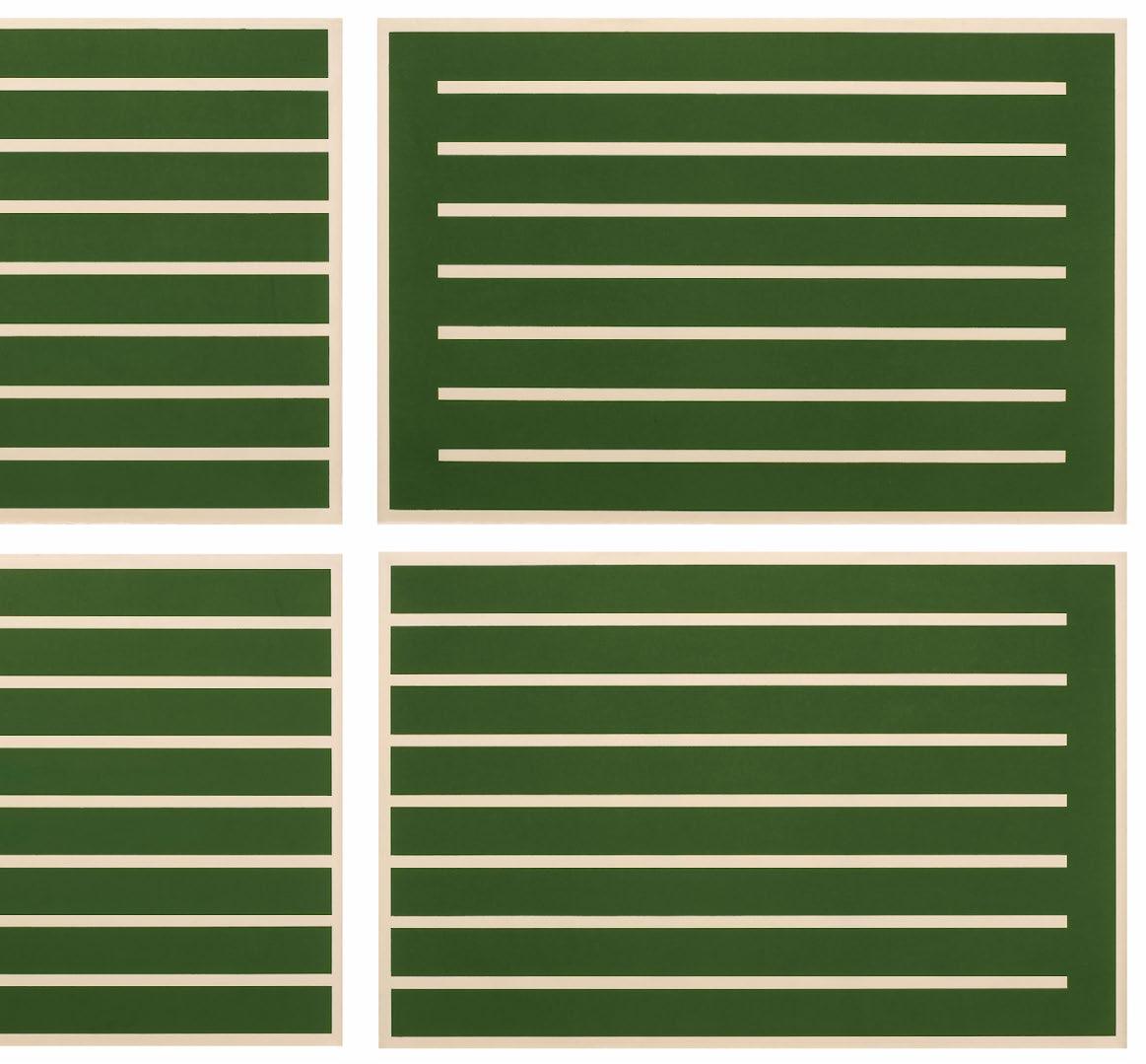
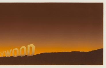
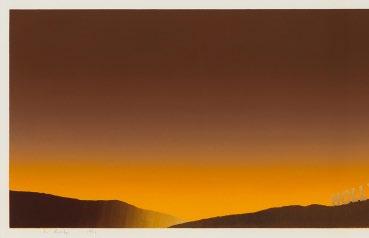 Ed Ruscha
Hollywood, 1968
Screenprint
Sheet size: 17 1/2 x 44 3/8 inches
Printer and Publisher: The Artist
Edition size: 100, plus proofs
Catalogue Raisonné: Engberg 7
Signed, dated, and numbered, lower margin
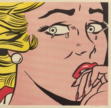
 Roy Lichtenstein
Crying Girl, 1963
Offset Lithograph
Sheet size: 18 x 23 7/8 inches
Printer: Colorcraft, New York
Publisher: Leo Castelli Gallery, New York
Edition size: about 300
Catalogue Raisonné: Corlett Fine II.1
Signed, lower margin
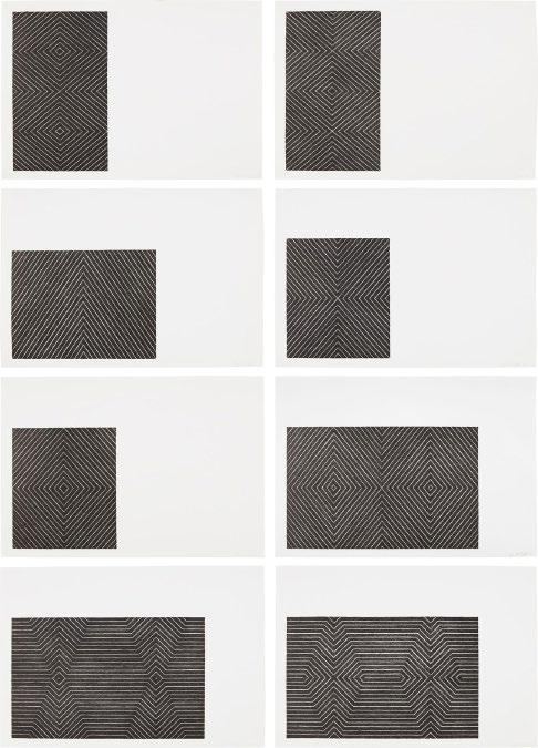
Frank Stella
Black Series II, 1967
Lithographs
Sheet size: 14 7/8 x 21 3/4 inches, each
Printer and Publisher: Gemini, G.E.L., Los Angeles
Edition size: 100, plus proofs
Catalogue Raisonné: Axsom 13-20
Each sheet is signed, dated, numbered, lower margin
The rare complete set of eight lithographs.
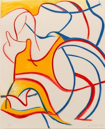
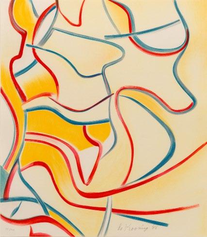
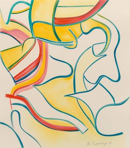
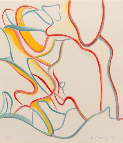
Quatre Lithographies, 1986
Lithographs
Sheet size: 28 1/4 x 24 5/8 inches
Printer: Art Estampe, Paris
Publisher: Éditions de la Différence, Paris
Edition size: 100, plus proofs
Each sheet is signed, dated, and numbered, lower margin
The complete portfolio of 4 lithographs, which retains the title page, colophon with edition number in pencil, and the original blue linen-covered portfolio lettered in silver ‘WILLEM DE KOONING’.
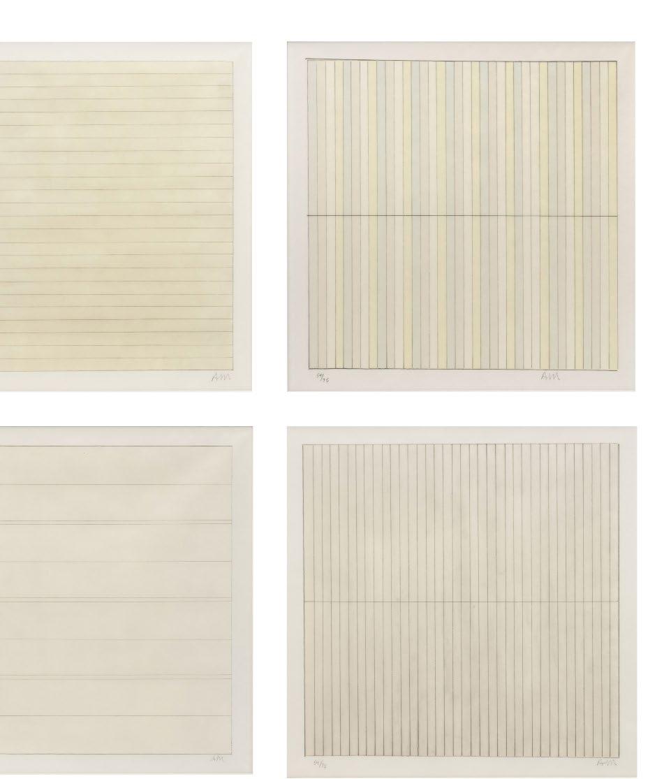
 Agnes Martin
Untitled, 1998
Lithographs
Sheet size: 12 x 12 inches
Printer: Diversified Graphics International, Minneapolis, MN
Publisher: Pace Editions, Inc., New York
Edition size: 75, plus proofs
Each sheet is initialed and numbered, lower margin

The complete set of four lithographs which retains the original portfolio cover and justification page.
Flowers, 1970
Screenprint
Sheet size: 36 x 36 inches
Printer: Aetna Silkscreen Products, Inc., New York
Publisher: Factory Additions, New York
Edition size: 250, plus proofs
Signed and numbered, verso
Andy Warhol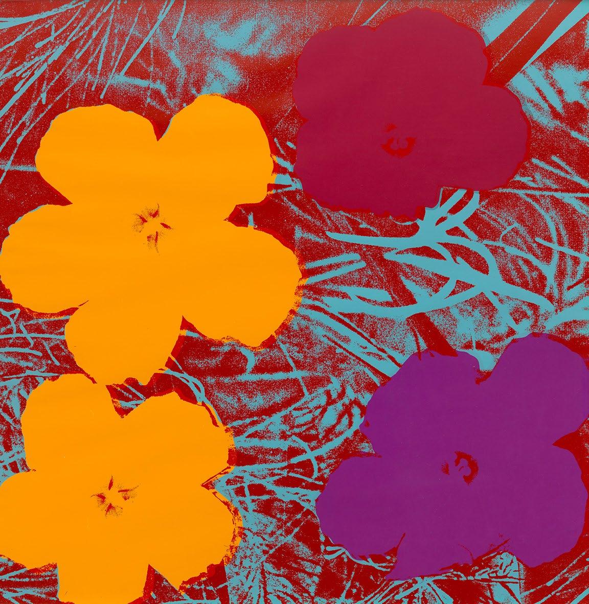
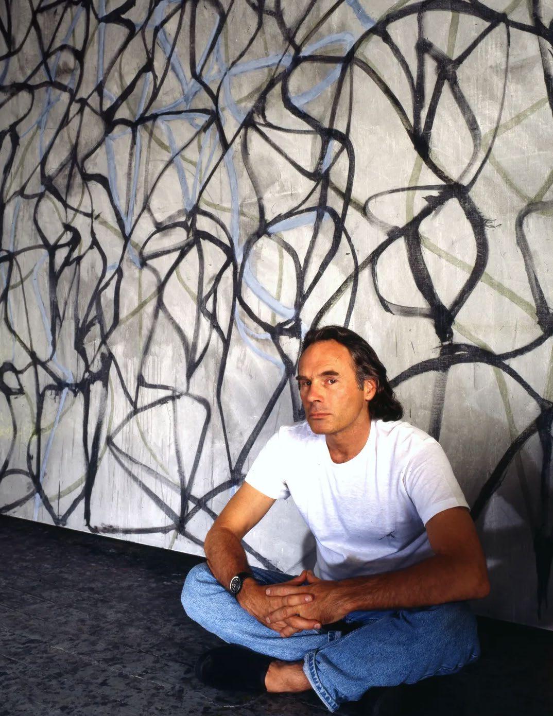
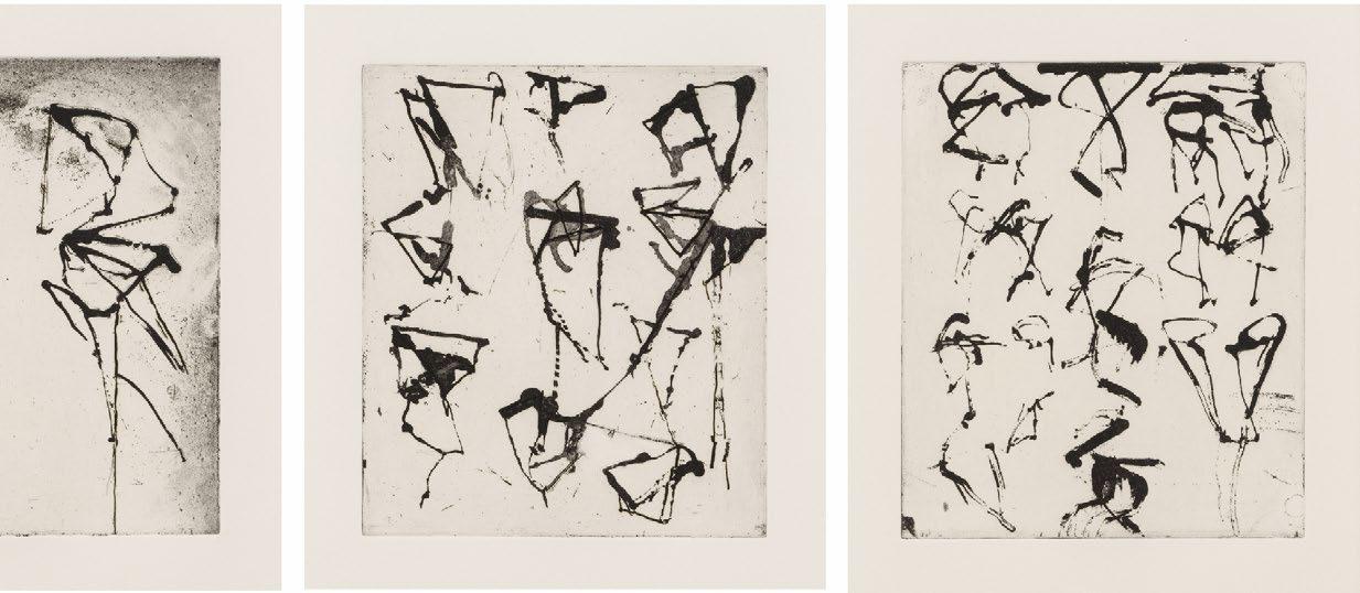
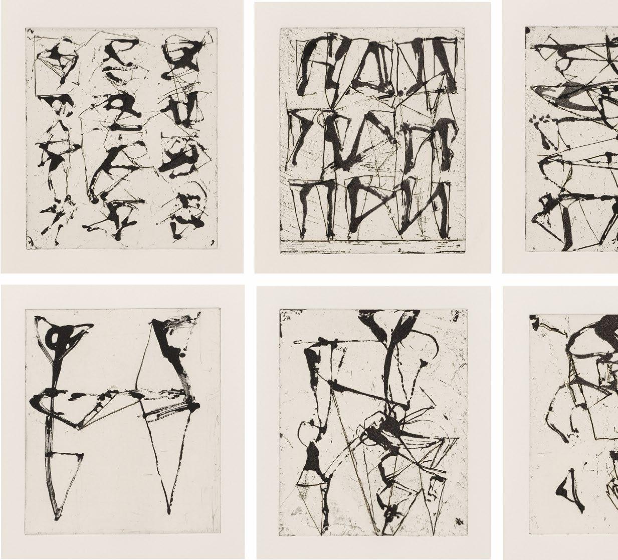
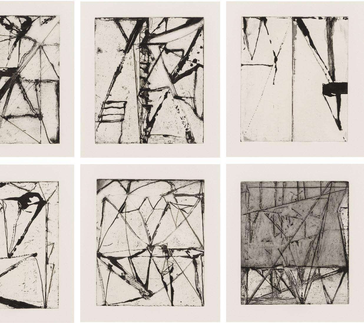
Brice Marden’s 25 Etchings to Rexroth (1986) mark a critical juncture in the artist’s career, when he turned away from the nuanced monochrome encaustic panels that had established his reputation, and toward the tangled gestural line he would pursue, one way or another, for the rest of his career.
The title is a shout-out to the poet Kenneth Rexroth, whose translations from the Chinese include the Tang Dynasty poems of Hanshan. A mysterious, possibly legendary figure, Hanshan’s poetry offered lessons in evanescence, transcendence, and nature in language that brims with humor and a sassy disregard for convention: “Just an instant then you’re gone / Why sit whining over things?/ When you’ve read the Classics through / You’ll know quite enough of death.” The poems are believed to have originally been written on rocks in the mountains. Marden found the poems inspiring both for their message, and for their formal appearance in historic Chinese calligraphy.
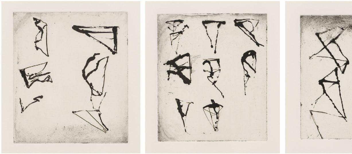
For the Etchings to Rexroth, Marden drew on the copper plate using twigs dipped in a sugar-lift solution (after his drawing, the plate would be coated with an acid-resist, then put in warm water where the sugar solution lifts up, exposing the plate below). The result is a semi-controlled line of fitful character, blobby in some places, wiry in others. Linked diagonals, small and large, combine with dribbles and the occasional curve into loose units—sometimes one to a page, sometimes many, arranged in vertical columns like Chinese poetry.
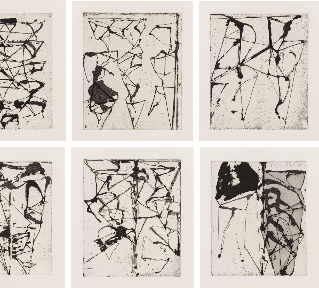
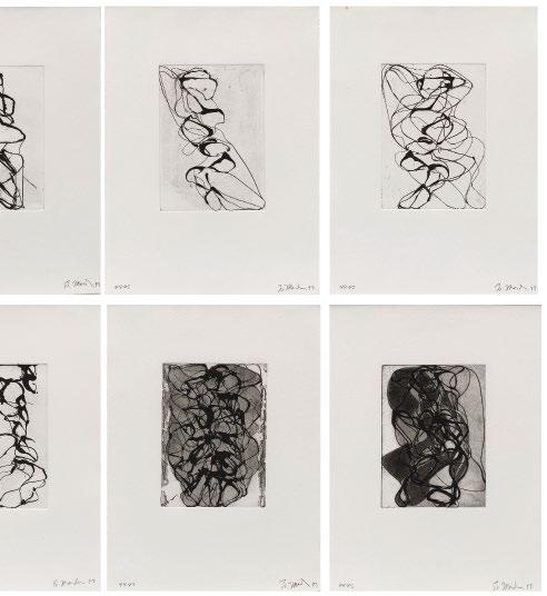
“Hanshan” translates as “Cold Mountain,” a title Marden gave to many works from the late 1980s and early 90s. Less angular in structure, the etchings of Han Shan Exit 1-6 (1992-1993) begin with a leaning tower of looping line and gradually accrue greater weight with territories of biomorphic aquatint.
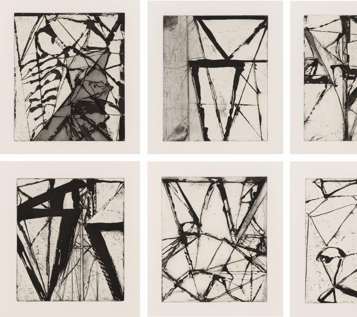
In After Botticelli: 1-5 (1993), the organic line of Han Shan Exit is still more active. Like tangled neurons or dropped thread, it ravels and unravels. The reference here, however, is not to calligraphic renderings of language but to Sandro Botticelli’s famous Birth of Venus, a muse Marden had been courting since the late 1980s. In all these sets, we see Marden using the portfolio format as a way to think through drawing, without proposing a single final or “right” answer.
 Brice Marden
Etchings to Rexroth, 1986
Etchings with aquatint
Sheet size: 19 5/8 x 16 inches
Printer: Jennifer Melby, New York
Publisher: Peter Blum Editions, New York
Edition size: 45, plus proofs
Catalogue Raisonné: Lewison 40/1-40/25
Each sheet is signed, dated, numbered, and inscribed, lower margin, on recto
The complete portfolio of 25 etchings with the title page and colophon that retains its original linen-covered portfolio box.
Han Shan Exit 1-6, 1992-93
Etchings with aquatint
Sheet size: 15 x 11 1/4 inches
Printer: Branstead Studio, New York
Publisher: The Artist
Edition size: 45, plus proofs
Each sheet is signed, dated, and numbered, lower margin
The complete set of six etchings with aquatint.
 Brice Marden
New York, NY 10012
Tel: +1-212 489-3331
info@susansheehangallery.com www.susansheehangallery.com
SUSAN SHEEHAN GALLERY