5 minute read
Spin The Wheel
theSPIN WHEEL
The colours we choose to paint our living spaces generally reflect our mood, both personally and on a larger scale. After these past two years of uncertainty the trend for 2022 is one of soothing, rejuvenation and happiness. Finally, we can look forward with optimism and hope for the future, and our homes are reflecting this. large rooms, but not so! A small room
Some home decorators are veering is always going to be a small room, so to the calming side of neutrals to one may as well make a feature out counter the turbulence of the pandemic, of it and enjoy a bold décor scheme. while some are opting for bright and Personally, I like nothing better than a bold colours to bring back positivity small dramatic bathroom, or something and happiness. A combination surprising like a rich, dark kitchen – a of the both could be room that is often given a light used to great effect as and airy colour scheme. well, with accent If colour design bold colours set leaves you feeling against neutral overwhelmed, try backgrounds. following these
Many people interior designer think colour can mantras; first use the only be used 60/30/10 strategy. appropriately in Use one colour for
Are you in the market for a decoration overhaul? Read on for some colour trends for 2022. Sara Whatley tells us more
60% of the room (this might be the walls), another colour for 30% (this could be sofas and window dressings) and a final colour for the remaining 10% (a few well-placed accents). This should create a pleasing balance of colour.
Another interior designer trick is to use complementary or analogous colour schemes depending on the room function. For a busy room like the kitchen dining area choose complementary colours (colours opposite each other on the colour wheel) to inject energy, and for rooms where you want to relax, like the living room or bedroom stick to analogous colour schemes (colours next to each other on the colour wheel).
Whatever camp you are in – bold and bright or calm and neutral – there are many beautiful colours just waiting to make a splash through your homes. With that in mind, we have looked at four of the key colour trends for 2022.
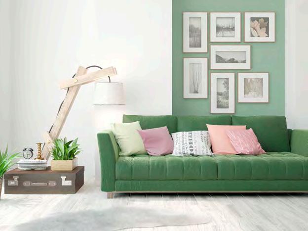
It is predicted that green is going to be a very popular colour in interior schemes this year. Giving off vibes of nature, renewal and growth as well as vitality and freshness, it is the perfect colour for a new start.
From subtle sage through sophisticated dark forest green to bright and zingy emerald, there are so many moods that can be created using this calming colour. And as it sits between warmer yellow and cooler blue on the colour spectrum it is infinitely adaptable.
Green interiors lend themselves to the still popular biophilic theme creeping through our homes; but could also make a retro art deco design shine in emerald, gold and black.


Giving off vibes of nature, renewal and growth it is the perfect colour for a new start


MOODY BLUES
Blue is the favourite colour of a lot of the population. Be it in clothes, homes, gadgets or vehicles, you can’t go wrong with blue!
It’s also a colour often found in nature – the pale blue of a summer sky, the deep blue of the sea – it is a colour that makes us feel serene, peaceful, secure and productive. Given all these great properties it is little wonder that blue is so popular in interior colour schemes. From the deep and moody blues through tones of grey and onto the light and airy pale hues, blue can find a place in all our homes.
Perhaps you might even stretch into the realms of blue/purple with a splash of violet. This retro colour will be big news in 2022 and is said to encourage creativity and courage.


Yellow is also having something of a moment in the spotlight, or perhaps we should say sunshine! Choosing yellow as a wall colour will instantly inject your space with a big dollop of joy – after all, who can stay frowning when the (metaphorical) sun is shining in their living room?
Yellow is particularly good in dark hallways or north facing rooms which lack natural light, and it makes a breakfast room shine too. Really, it will bring mood lifting qualities to any space it is in. Just choose the hue that resonates with you – from tobacco to honey, mustard to lemon – and energy, confidence and optimism await you at the end of the paintbrush.


BRIGHT & LIGHT
If bold blocks of colour are not your thing then a toned down more neutral palette might be better suited. In no way does this mean simply white-washed or boring either; using softer colours can create interest without overwhelming a space, or a person.
The range of bright and light neutrals is huge and can range from taupe and beige, to stone, warm whites and creams. 2022 is also seeing desert tones come into play in the neutral range such as blush, shades of orange and rust. These pair well with greens, to return to our number one colour, and can create soothing and cosy spaces.


