
24 minute read
Chapter 10 The LayOut Interface
Thischapter explains the intricacies of the LayOut interface and introduces all of the settings, toolbars, and features you’ll need to use LayOut. Use it now as a roadmap, while you tour LayOut and become familiar with the interface. Even after you’ve mastered the concepts explained here, you’ll be able to use it as a helpful resource to answer any questions you have about individual menus, settings, and dialogs.
g e TT ing S TA r T e D
Advertisement
To open LayOut, click the icon on your desktop. The Getting Started window will appear, allowing you to access new templates, recent files, and recovered presentations.
new Tab
Initially, you will be taken to the New tab by default (Figure 10.1). Preloaded templates that you can use to create new presentations will appear in the right pane. From the Default Templates library, select either a title block or a plain piece of paper. To select a default template (a template you will always start with), check the Always Use Selected Template box. Typically, you won’t need to use this feature because you will need different sizes of paper and title blocks for each presentation you create.
recent Tab
The Recent tab displays all of the documents you have worked on in the not-so-distant past. When you use this tab, be careful because it is similar to My Recent Documents. Even though a file is shown there today, it might not be shown there tomorrow if you open other LayOut presentations. If you are using the Recent tab, you may not be aware of where you are saving the actual file.
The best way to open a file that you have already created is to click the Open an Existing File button at the bottom-left corner of the Getting Started window. Make sure you know where you are saving files so you can navigate to the appropriate project folder when you need them. To open a file, you can either double-click on its thumbnail or select the thumbnail and choose Open.
recovered Tab
The Recovered tab at the top of the Getting Started window appears when files need to be recovered; you can use the recovery feature to help you get back work that was lost during a crash. LayOut does crash at times if you overload it, but it also does a great job of recovering files. Don’t worry, though; the techniques you’ll learn in this book will drastically reduce the number of crashes you experience. If LayOut does crash, re-open LayOut and look for your recovered document in the Recovered tab.
M A in Tool BA r
The Main toolbar in LayOut contains the most commonly used and basic tools (Figure 10.2). Undock a LayOut toolbar by clicking and dragging on the line at the far left of the toolbar. Dock a toolbar by dragging the header to the top, bottom, or side of the screen.
TIP See chapter 11, “The Professional’s layout environment,” for more information on creating and customizing the layout toolbars.
Doc UM en T Se TUP
The Document Setup settings apply to the currently open document; they are not global settings for LayOut. In other words, these settings can travel with a template or a presentation file, but they will not change globally for every document you open in LayOut. To open the Document Setup dialog, click on the Window drop-down menu and choose “Document Setup.”
general Tab
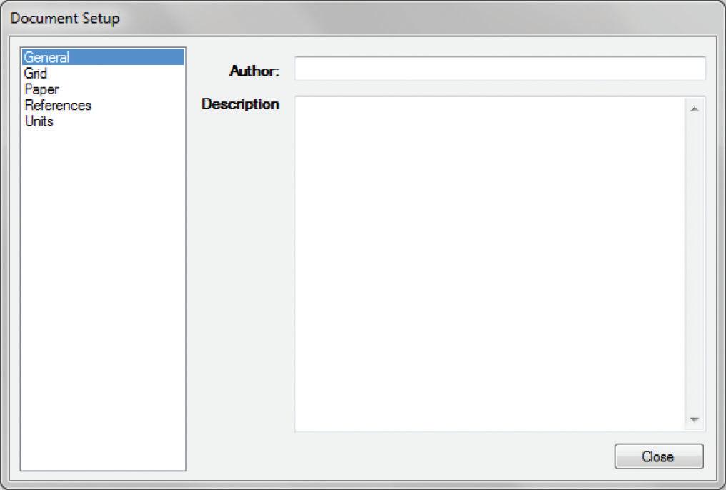
The General tab has fields where you can give credit to the author of the file and describe the contents of the file (Figure 10.3). These fields are rarely used. However, if you are sharing a template with others and would like to receive authorship credit, you might want to fill out this section.
grid Tab
The Grid tab is where you can adjust the size and visual properties of the grid (Figure 10.4).

TIP The numerals in the diagrams refer to the keyed notes and do not represent any order of operation.
1. You can check and uncheck the Show Grid check box to toggle between making the grid visible and invisible.
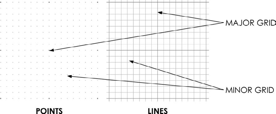
2. You can use the radio buttons to set the grid type to lines or points. Typically, a traditional line grid is the most useful option (Figure 10.5).
3. Click the Major Grid check box to toggle the visibility of the thicker grid lines on and off.
4. To adjust the major grid spacing, click in the Spacing text field, enter the grid spacing you want, and then press Enter. You can use decimal format or you can use a space to separate inches (the default units) from fractions.
5. To change the color of the major grid, click on the color block. This automatically opens the Color Inspector, where you can select a color from several different tabs: Wheel, RGB, HSB, Grays, Image, and List. Typically, the first three tabs offer the easiest way to make the color selection you want.
6. Click the Minor Grid check box to toggle the visibility of the thinner grid lines on and off.
7. The minor grid is composed of thinner lines and fills in the major grid by the specified number of subdivisions. Change the number of subdivisions by typing a new number into the Subdivisions text field, and then press Enter. You can also use the Up and Down arrows to the right of the Subdivisions field to adjust the number of subdivisions.
8. To change the color of the minor grid, click on the color block. This automatically opens the Color palette where you can select a color from several different tabs: Wheel, RGB, HSB, Grays, Image, and List. Typically, the first three tabs offer the easiest way to make the color selection you desire.
9. When the Print Grid box is checked, the grid will automatically be printed to paper from the printer. This feature is helpful when you are working with schematic drawings.
10. The Clip Grid to Page Margins setting limits the grid to the extents of the margins. The presentation margins are controlled in the Paper tab.
11. When the Draw Grid on Top box is checked, the grid will appear on top of any viewports and geometry created in LayOut.
TIP you can adjust how tools interact with the grid by right-clicking in the presentation background. from this right-click menu, you can turn the grid and object snap on or off, as well as toggle whether the grid is visible or not.
Paper Tab
The paper properties are where you indicate the overall size of the sheet of paper you will use for your presentation and where you determine the quality of the renderings within your presentation (Figure 10.6).
1. Click the Paper drop-down menu to choose from preloaded standard paper sizes.
2. The Portrait and Landscape radio buttons allow you to select the orientation of the sheet, portrait or landscape.
3. You can create a custom paper size by entering the dimensions of the sheet into the Width and Height text fields. Press Enter to lock in the dimension entries.

4. Change the color of the paper, or presentation background, by clicking on the color block. This automatically opens the Colors Inspector (discussed later in this chapter), where you can select a color from several different tabs: Wheel, RGB, HSB, Grays, Image, and List. Typically, the first three tabs provide the easiest way to make the color selection you want.
5. Check the Print Paper Color box only if you are using someone else’s printer. This will actually waste expensive ink by reproducing the background color on the paper, which is rarely necessary.
6. Turn on the margins by clicking the Margins check box.
7. Set your margin depths by entering the dimensions in the Left, Right, Top, and Bottom fields.
8. Change the color of the margin lines by clicking on the color block. This automatically opens the Color Inspector where you can select a color from several different tabs: Wheel, RGB, HSB, Grays, Image, and List. Typically, the first three tabs provide the easiest way to make your color selections.
9. Click the Print Margin Lines check box so that the margin lines will appear on the final prints and exports.
10. The Edit Quality setting determines the rendering quality while you’re working in a LayOut presentation. In other words, it indicates the quality (or how clear) the SketchUp models and images will appear on the screen while you’re working in LayOut.
11. The Output Quality setting determines the final rendering quality when the project is exported or printed. In other words, it determines how clear the SketchUp models and images will appear on the paper that comes out of the printer.
TIP Always use low quality settings when you’re editing a document. if you don’t, you will waste a lot of time rendering at a high resolution you don’t need.
references Tab
A reference is an external file that is inserted into your LayOut presentation and connected with a link (or path). The References tab allows you to control what files are linked, and it shows whether or not those files are current (Figure 10.7). LayOut can reference text, image, and SketchUp files.
1. When the Check References When Loading this Document box is checked, LayOut will alert you to any out-of-date references when a file opens. If a reference has been modified, it will appear in red in the References tab and its status will read “Out of Date.” This is a good setting to use when you’re first learning LayOut; however, as you become more familiar with the program, you will probably update the links manually.
2. The File Name column displays the name and extension of the linked file.
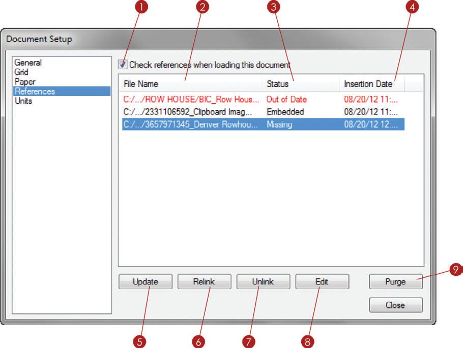
3. The Status column indicates whether the file’s reference is current or not—in other words, it tells you if the file needs to be updated. A reference’s status is Current, Out of Date, or Embedded. Current files are up-to-date and no action is necessary. Out-ofdate files need to have the references updated. An Embedded status means the file is no longer linked to the original source; instead, it is part of the LayOut presentation.
4. The Insertion Date column tells you when the file was added to the LayOut presentation.
5. To update a link, highlight the out-of-date red filename and click the Update button at the bottom of the Document Setup window. A selected viewport will highlight the reference within the References tab, and vice versa.
6. Relink a missing file by highlighting the filename and then clicking Relink. Navigate to the file you want to relink to, or swap, and choose Open. You’ll need to do this if you move the original file or want to swap to a different version of the original file.
7. If you click the Unlink button at the bottom of the Document Setup window, the file will be embedded (become part of the LayOut presentation).
8. Click the Edit button to automatically open the reference in the associated program. You can assign preferred programs for word documents and images in the Preferences menu (covered later in this chapter).

9. Click the Purge button to delete references that are no longer used in your presentation. Purging will keep the file size small and the presentation running fast.
TIP references are shown similar to the details view in a file explorer. click on the file name, Status, and insertion Date headers to sort the files.
Units Tab
The Units tab is where you indicate the type of measurement units to use, as well as the level of precision or accuracy (Figure 10.8).
1. Click the Format drop-down menu to choose decimal or fractional.
2. Click on the next drop-down menu to set the default units of the current presentation to Inches, Feet, Millimeter, Centimeter, Meter, or Points.
3. Click on the Precision drop-down menu to set the precision of the units used. Fractional units can be displayed at a precision from 1 g to 1/64 g. Decimal units can be displayed at precisions up to .01 g
Preference S Win D o W
The Preferences window is where you set up your system preferences for LayOut. It contains the default settings that will be the same every time you open LayOut, regardless of which presentation you open or start new. To adjust the settings, click the Edit (LayOut in Mac) drop-down menu and choose Preferences.
Applications Tab
The Applications tab contains the settings for default programs (Figure 10.9). These programs will launch automatically when you right-click on a reference and choose Edit from the right-click menu or from the References tab in the Document Setup window.

1. Set the Default Image Editor to your favorite image editor, such as Adobe Photoshop.
TIP giMP is a free and very powerful image editor available at www.gimp.org.
2. Set the Default Text Editor to your favorite text editor, such as Microsoft Word.
TIP openoffice is a free and very powerful word processor available at www.openoffice.org.
Backup Tab
You can use the BackUp settings to keep your work safe by creating additional files and automatically saving your work in case a file crashes or is corrupted (Figure 10.10).
1. The Create Backup File When Saving feature will create a duplicate of the file prefixed with BACKUP_. Even though using this feature requires double the storage space, it provides extra piece of mind in case of a catastrophic crash or a corrupt file.
2. When the Auto-Save Every box is checked, your presentation is saved automatically at a set interval of time.
3. Typically, five minutes is reasonable.

folders Tab
Add your own Template and Scrapbook collections to be accessed in LayOut (Figure 10.11). By default, the collections folders are already pathed (referenced) to the program files provided by LayOut, now add your own folder locations. This will give you easy access to your custom title blocks, templates, and scrapbooks.
1. Templates are displayed in the Getting Started window on the New tab. They can be title blocks, plain paper, or graph paper. You can add more locations by clicking on the plus sign (+).
2. Click on the minus sign (–) to remove a selected folder from the Templates collection.
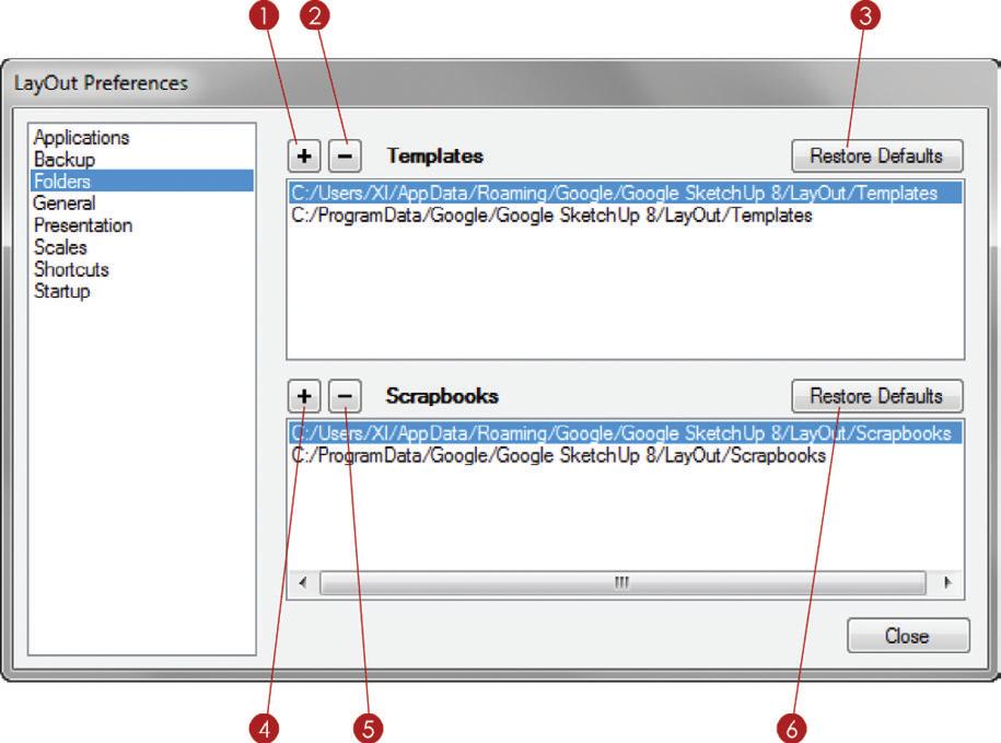
3. Click the Restore Defaults button to go back to the LayOut default folders.
4. The Scrapbooks folder contents are displayed in the Scrapbooks Inspector. Scrapbooks are LayOut presentations that contain prebuilt pieces of annotation and palettes for use in other LayOut presentations. Add more locations by clicking on the plus sign (+).
5. Click on the minus sign (–) to remove a folder from the Scrapbooks collection.

6. Click the Restore Defaults button to go back to the LayOut default folders.
general Tab
The General settings are the catch-all settings that just don’t fit anywhere else (Figure 10.12).
1. When you update a model or make any settings changes that invalidate the previously rendered image, you will have to re-render your SketchUp model. The Auto Render setting, when turned on, will automatically render all viewports that need to be rendered.
2. Change the color of the tools by clicking on the color block. This automatically opens the Color palette where you can select a color from several different tabs: Wheel, RGB, HSB, Grays, Image, and List. Typically, the first three tabs provide the easiest way to make the color selection you want.
3. Click on the Reset button to go back to the default LayOut tool color.
Presentation Tab
When you are using multiple monitors to make a presentation, you can display the presentation on the Same monitor as window, Primary monitor, or the Secondary monitor. You can make this selection in the Presentation tab (Figure 10.13).

Scales Tab
Under the Scales tab, you can manage the available scales at which to render your drawings (Figure 10.14).
1. The Available Model Scales section lists all of the scales that are available in LayOut.
2. Check the Show All Scales by Default check box to list all of the scales in the SketchUp Model dialog box. Uncheck the Show All Scales by Default check box to filter the scales based on the LayOut document’s units setting. Documents using metric units will display only metric scales, and documents using imperial units will display only imperial scales.

3. The Scale Text box displays the name of a scale. This box will fill in automatically when you create a new scale; you can decide if you want to rename the scale.
4. To add a new custom scale, such as 1 f = 1000 f-0 g, click in the Paper text box and enter 1 (the paper distance). Set the units as inches.
5. In the Model text box, define how the paper relates to the model space. Enter 1000 in the Model text box and choose ft as the units.
6. Click the Add Custom Scale button to finish.
7. To delete any scales that you do not need, click on the unwanted scale and then click the Delete Scale button. Hold down the Ctrl key to make multiple selections, or hold down the Shift key to select everything between two selections, then click the Delete Scale button.
Shortcuts Tab
You can add keyboard shortcuts to expedite the drafting process in LayOut (Figure 10.15).

1. To help locate what you are looking for faster, enter a command into the filter.
2. Using the bar on the right side, scroll down to see all of the commands that are eligible for a keyboard shortcut.
3. Enter the desired shortcut key into the text box. Use modifier keys such as Ctrl, Alt, and Shift to make several variations of one key.
4. Click on the plus sign (+) to add the current shortcut.
5. To remove an already assigned shortcut, select a command that already has a shortcut and then click on the minus sign (–).
TIP See chapter 11, “The Professional’s layout environment,” for tips on adding custom keyboard shortcuts and optimizing the layout interface.
Startup Tab
Upon first opening LayOut, you can tell it what to do to get started (Figure 10.16).
1. Upon opening, you can tell LayOut what to do to get started. Choose Create a New Document, Re-open Files from Last Session, or Don’t Do Anything. The settings you choose in the Startup tab are really based on your personal preferences.
2. The self-explanatory Automatically Check for Updates setting is a good one to turn on so your software is always current.
3. Once LayOut is open, you can tell LayOut what to do when you start a New Document. Choose from Open “Getting Started” (opens the window), Create a New Blank Document, and Use Default Template to Create a New Document (selects the default you’ve indicated).

i n SP ec T or S
Inspectors give you full control over LayOut’s geometry, viewports, and annotations. Take a moment to become familiar with all of the LayOut Inspectors. All Inspectors are accessed from the Window drop-down menu in LayOut.
Colors Inspector
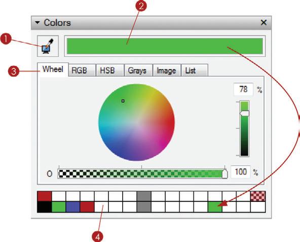
The Colors Inspector does not stand alone; it mainly supports the Text Style and Shape Style Inspectors, along with any dialogs or menus that require a color selection (Figure 10.17). When choosing colors for strokes, fills, and text you will use the Color Selection tools in the Colors Inspector.
1. The sample color from Screen tool allows you to match the active color to any pixel on your screen.
2. The Active Color Selection box displays the results from the Color Pickers.
3. This Inspector box has six tabs that accomplish the same goal of selecting a color: Wheel, RGB, HSB, Grays, Image, and List. Each tab allows you to mix and create using different properties of colors, although typically the first three are the easiest to use.
4. Click and drag your color selection to the white squares at the bottom of the Colors Inspector to create a collection of favorite colors for easy use in any LayOut presentation. These favorites are local to your machine and will be available for every LayOut presentation that you open.
Shape Style inspector

The Shape Style Inspector is where you change the appearance of shapes and lines (Figure 10.18). If an entity is selected, modifying the shape style will affect the selection. If no entity is selected, modifying the shape style will set the current tool’s Shape Style defaults.
1. When an entity is selected, you can toggle on the fill and stroke. Fill refers to the color within the shape. Stroke refers to the line surrounding the shape as well as any single lines (Figure 10.19). In Figure 10.18, the Fill is toggled off and the Stroke is toggled on, indicated by the blue highlight on the button.

2. Click on the Fill or Stroke color to modify it within the Colors Inspector. In Figure 10.18, the Stroke color is active in the Colors Inspector, indicated by the darker box around the color swatch.
3. Change the stroke thickness by clicking on the Stroke Thickness drop-down menu. Select a stroke thickness from the list or type in your own number and press Enter.
4. Assign dashes to a stroke by selecting a dashes pattern from the Dashes drop-down menu. A Dash pattern must be assigned to choose a dash’s Scale.
5. Adjust the Dash pattern’s length interval with the dash’s Scale drop-down menu. Select a dash’s Scale from the list, or type in your own number and press Enter.
6. Stroke Style refers to the visual properties of the edges around the shape. Corners can be set to miter, round, or beveled. Ends can be set to flat, round, or square. Miter corners with flat ends will typically give you the most desired effects.
7. You can adjust the Start Arrow and End Arrow lines by clicking on the drop-down menu and selecting from several arrow types.
8. Adjust the size of an arrow by clicking on the Arrow Scale drop-down menu with numbers. Select an Arrow Scale from the list, or type in your own number and press Enter.
SketchUp Model inspector
The SketchUp Model Inspector provides settings that affect the manner in which SketchUp Models are displayed in LayOut. The SketchUp Model Inspector has two tabs: View and Styles.
View Tab
The View tab contains the settings to adjust what is shown in the selected viewport as well as how it is shown (Figure 10.20). The most effective workflow is to first create scenes in SketchUp that already have all of the camera view, style, and shadow properties assigned. Then in LayOut, select a scene from the View tab within the SketchUp Model Inspector. You must select a viewport in order to use the SketchUp Model Inspector to modify a viewport’s properties.
1. Use the Scenes drop-down menu to choose from scenes already created in the SketchUp model. Using Scenes gives you the most control over a viewport and is by far the best method to use for this workflow.
2. Use the Standard Views drop-down menu to access top, bottom, front, back, left, and right views.
3. With the viewport selected, click on the Ortho button to toggle between perspective and parallel projection views.
4. Click on the Scale drop-down menu to assign an architectural scale to the selected viewport. A viewport must be selected and Ortho must be on in order to assign a scale.
5. The Preserve Scale on Resize button will keep your drawing at the scale regardless of how you modify the viewport. When this check box is unchecked, the drawing will change scale to match the modified viewport.
TIP Scale a viewport about the center by holding down the Alt key (command on Mac) and clicking and dragging on the perimeter. Scaling about the center overrides the “Preserve Scale on resize” setting.
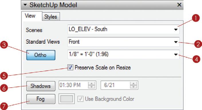
6. Click the Shadows button to display shadows in the selected viewport. You can modify the shadows by adjusting the time of day and date.
7. Click the Fog button to display fog in the selected viewport. Click on the color swatch to change the color of the fog, or check the Use Background Color box to set the fog color to be the same as the Style’s background.
TIP layout has limited Shadow and fog settings. for the best results, create a scene in SketchUp with the desired view, as well as the desired Shadow and fog settings, and then assign the scene to a viewport in layout.
Styles Tab
The Styles tab gives you access to any style in your model and even in your Styles library (Figure 10.21).
1. Click on the house icon to navigate through the In Model styles. Also, use the dropdown menu to navigate through your entire Styles library.
2. Change the style applied to a viewport by first selecting the viewport and then clicking on a style within the Styles tab.
3. Display the Styles in list view or thumbnail view, depending on your personal preference.
4. Click on the Background check box to fill in the background of a viewport. This means that nothing behind the viewport will be visible through the images in the foreground. This setting comes into play when you are creating a collage of several views and models and do not want the sky or background to show.
5. An exclamation mark on a yellow triangle next to the Render button indicates that a viewport needs to be rendered. To render a viewport, select the viewport and then click on the Render button in the SketchUp Model Inspector. Once the viewport is rendered, the Render button will change to Rendered.

6. Check the Auto check box to automatically render all viewports when they are out of date. This setting is also available in the Preferences dialog on the General tab.
7. Change the overall line weight applied to the selected viewport by entering a new number.
8. To change the rendering settings of a selected viewport, click on the Rendering Settings drop-down menu and choose Raster, Vector, or Hybrid.
Line Weight Theory
The number you enter into the Line Weight field is the thinnest line that will be displayed in the viewport. Any profiles, section cuts, or depth cues will be multiplied by this number to thicken them up (Figure 10.22). For instance, if the section cuts are set to 3, the profiles are set to 2, and the viewport Line Weight is set to .25; the thinnest lines will be .25, the profiles will be .5, and the section cuts will be .75.

You will need to adjust this number based on the detail in your drawing as well as the size and scale of your drawing. The topic of line weights and stacking viewports is covered in Chapter 20, “Construction Documents.”
Rendering Settings Theory
LayOut provides expanded rendering settings. You should set each viewport to render independently of the next as a vector, raster, or hybrid. Raster is ideal for anything heavy with texture images (Figure 10.23), and Vector is ideal for large, high-resolution prints of fairly simple line drawings (Figure 10.24). A hybrid combines both styles for a composite view with vector linework and raster texture images (Figure 10.25). Keep in mind that hybrid rendering can often take up to twice as long to complete.


Dimension Style inspector
The Dimension Style Inspector gives you full control over dimensions (Figure 10.26). Use it to set the default properties for the Dimension tool. Also, you can select a dimension and modify the properties of the selection within the Dimension Style Inspector.

1. Adjust the placement of the dimension text as either above, center, or below the dimension line.
2. Set the dimension text orientation to either vertical, horizontal, aligned, or perpendicular. Typically, dimensions are best shown aligned.
3. Toggle whether or not the units are displayed at the end of the dimension text.
4. Auto Scale will automatically set the dimension scale, depending on the scale assigned to the viewport you click on with the Dimension tool.
5. When the Auto Scale feature is turned off, you can set the Dimension Scale manually.
6. Length can be displayed as Decimal, Architectural, Engineering, or Fractional.
7. The unit type can be set to Inches, Feet, Millimeters, Centimeters, Meters, or Points only when the Length value is set to Decimal.
8. The Precision of the dimensions can be set to 1/64 g or .01 g, the same precision tolerances used in SketchUp.
9. Angular dimensions can be set to radians or degrees. The precision tolerances can be set up to .01 degrees or .0001 radians. The Angular Dimension tool must be activated to adjust these settings.
TIP The visual properties of dimension lines are set within the Shape Style inspector. Activate the Dimensions tool, and then set the default stroke thickness, arrow type, arrow scale, and color within the Shape Style inspector.
Text Style inspector
The Text Style Inspector has a familiar interface that is used in most word processors and email programs (Figure 10.27). Activate the Text tool and then use the Text Style Inspector to set the default text properties. You can also select a piece of text within a text box and modify the properties of the selection with the Text Style Inspector.

1. In LayOut you can access any font that is loaded in your system fonts. Choose a font family, typeface, and size. Keep in mind that you can select from the Size list or manually enter a font size that is not listed.
2. You can apply an underline and/or a strikethrough to text.
3. Click on the color swatch to modify the text color. This automatically opens the Colors Inspector where you can select a color. The active swatch will have a darker box around it, as shown in Figure 10.27.
4. Justify the text to the left, center, or right of the Text window.
5. Anchor the text to the top, middle, or bottom of the Text window.
6. Text in LayOut can be either bounded or unbounded. Bounded text is contained within a window and will drop to the next line as it approaches the boundary of the Text window. Unbounded text runs straight across the screen uninterrupted.
Pages inspector
The Pages Inspector is where you manage the pages in your presentation (Figure 10.28).

1. Click on the plus sign (+) to add a new page.
2. Click on the minus sign (–) to delete the current page.
3. Click on the Duplicate Page button to make a copy of the current page. You’ll be using this button frequently to create new pages and at the same time copy annotation pieces of the title block from page to page. Once a page is duplicated, it is easier to just erase what you don’t need.
4. Display the pages in list view or thumbnail view. Typically, list view is sleeker and allows you to see more of the pages in your presentation.
5. The current page is highlighted in blue. Double-click on a page name to rename the page. Click and drag a page to reposition it within your presentation.
6. Click on the monitor icon to the right of the page name to toggle whether or not that page is included in the screen presentation.
TIP right-click on the page to see a context menu. This also allows you to move the page up or down, rename the page, duplicate it, and choose whether or not to include the page in your screen presentation.
Layers Inspector
Layers in LayOut are similar to most page-creation software in that they control what is shown on top by the layer order, as well as what layers are visible. You manage layers in the Layers Inspector (Figure 10.29).
1. Click on the plus sign (+) to add a new layer.
2. Click on the minus sign (–) to delete the selected layer. If you delete a layer with entities on it, you will be prompted to delete the entities completely or move them to the active layer.
3. The active layer is highlighted in blue and is also indicated by a pencil icon to the left of the layer name.

4. A selected entity’s layer is represented by a small box to the left of the layer name.
5. Click on the eye icon to toggle the layer visibility on and off. The entities on the layer will disappear and reappear. Layer visibility is set on a per-page basis, meaning that if you turn a layer off on one page, it is still visible on other pages.
6. Click on the padlock icon to lock the layer. Locking a layer prevents the entities on it from being deleted or modified. Locking a layer applies across all pages.
7. Click on the last icon to toggle whether or not the layer is shared. A shared layer’s contents will appear the same on every page. If the contents of a shared layer are modified, they will be modified on every page. Repeating entities, such as title blocks and guides, should be on a shared layer.
TIP To change an entity's layer, first make the layer to which you want to move the entity active. next, right-click on the entity and choose Move to current layer. Be sure to move the active layer back to the desired layer; it is easy to forget this step!
Scrapbooks inspector
The Scrapbooks Inspector allows you to seamlessly access collections of prebuilt pieces of annotation from preloaded libraries as well as your own (Figure 10.30).
1. Select a scrapbook collection from the drop-down menu. LayOut comes with several scrapbooks that stylistically match the preloaded title blocks.
2. Use the arrows next to the Collections drop-down menu to navigate through the pages of the scrapbook.
3. Click on the Edit button to edit the scrapbook. This automatically opens the LayOut scrapbook file. Add, edit, or delete scrapbook pieces, and then close the file and save your changes. The updated scrapbook will appear in the Scrapbook Inspector.
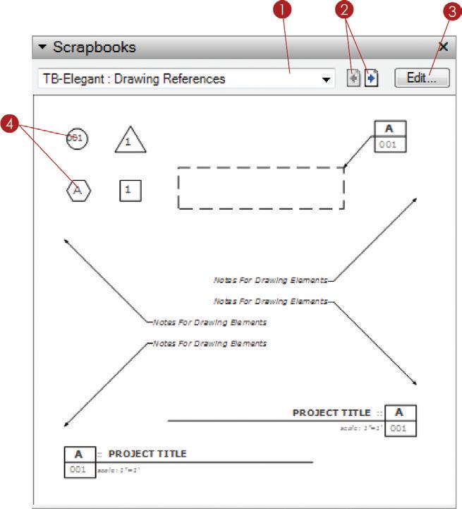
4. Add a scrapbook by clicking on a Scrapbook symbol in the Scrapbook area, and then click in your presentation to place it.
TIP Scrapbooks aren’t some magical file type buried in layout. A scrapbook is simply a layout file containing lines, shapes, text, and fills grouped together into meaningful symbols. you will create and organize your own custom collection of Scrapbooks in chapter 13: “layout collections.”
Instructor Inspector
The Instructor Inspector will help you explore LayOut and find hidden functions buried in the tools (Figure 10.31). Activate any tool and you’ll see the instructions for using that tool, as well as invaluable modifier keys associated with the tool.


