
KUTZTOWN UNIVERSITY: ARTSKUTZTOWNACADEMY Logo + Branding + Website Theresa CommunicationQuedenfeldDesign Kutztown University Class of 2019 Advisor: Dannell MacIlwraith
2 | Kutztown Arts Academy Kutztown University Honors Program | 2019 7 OverviewProject 10 SelectionCapstone 11 anChoosingAdvisor 12 DesignLogo 52 Icons 54 DesignWebsite 62 Postcards 67 Applications 77 Style Guide PART 1: THE PROCESS
Kutztown Arts Academy | 32019 | Kutztown University Honors Program 81 Introduction 82 WriteProjectUp 83 Relevant ExperienceClass 85 WIP 86 PresentationProfessional 93 Recap Conclusion& 94 Final Brand Guide PART 2: REFLECTION

ACKNOWLEDGEMENTS
Kutztown Arts Academy | 52019 | Kutztown University Honors Program
First and foremost, I thank my capstone advisor Dannell MacIlwraith of the Communication Design Department. Without her assistance and dedicated involvement in every step of the process, this project would not have been accomplished. I want to thank her for all her support. Furthermore, the time she worked with me through the summer and last year on this project. I also want to express gratitude to all of the Communication Design Department faculty members for all that they have taught me. Getting through my honors capstone project required more than academic support, and I have many people to thank for being supportive. I cannot begin to express my gratitude and appreciation for their friendship.

Kutztown Arts Academy | 72019 | Kutztown University Honors Program
PROJECT OVERVIEW
Kutztown University of Pennsylvania’s College of Visual and Performing Arts is holding it’s first annual Kutztown Arts Academy in June 2019. Kutztown’s Arts Academy offers week-long immersions to explore art, music, film, and design to create lasting memories for high school students. College professors engage with campers in fundamentals to help them become the next generation of visual and performing artists. Students come together for a week of creative exploration. Stay on campus, learn new skills, and get to know what is like to be a college art student. Each department in the College of Visual and Performing Arts hosts a camp. The summer Arts academy will encompass a Graphic Design Camp by the Communication Design Department, Film Institute by the Cinema, Television and Media Department, Music Festival by the Music Department, Fine Arts Camp by the Fine Arts Department, and a Crafts Camp by the Art Education and Crafts Department.
Film Institute Camp
The Film Institute will be an intense and fun week that provides students the opportunity to work with state-of-the-art technology and to produce, shoot and edit a film of their creation. Students will work with a crew on a large-scale film production. Throughout the week, they are trained on professional equipment and have fun while gaining hands-on experience making their ideas come to life.
Graphic Design Camp
The Graphic Design Camp is a hands-on experience that will introduce students to design as a career and raise awareness of design possibilities. The students will explore their creativity and critical thinking abilities and learn how they can impact society through design. Students will leave with work they can add to their portfolio.
Graphic Design Camp A similar experience to the Kutztown Arts Academy is the Kutztown University Communication Design Day Camp. This one-day hands-on design camp at Kutztown University will introduce sophomore, junior, and senior high school students to design as a career and raise awareness of design career possibilities. The student will explore their creativity and critical thinking abilities and learn how they can impact society through design. Students get to discover what it is like to be a graphic designer for one day.
8 | Kutztown Arts Academy Kutztown University Honors Program | 2019
Founded in 2010, the Kutztown University Summer Music Festival features an intensive and comprehensive approach to learning the core chamber music repertoire.
Art Education & Crafts Camp
Fine Arts Camp Fine Arts Camp will consist of Kutztown University’s award-winning studio art faculty for a week-long immersion in the visual arts. Students will learn from practicing artists within the first-class facilities of the Sharadin Arts Building. It will be an experience that culminates in exhibition opportunities on campus.
The Art Education and Crafts camp will touch on a variety of crafts. This camp is the ultimate camp adventure for the most curious, creative spirits interested in multiple mediums. Students will experience all of the art disciplines Kutztown University has to offer. Projects will be able to be taken home at the end of the week and can even be used in a student’s portfolio.
The festival’s mission is to provide opportunities for talented student. The Festival goes beyond the traditional summer music camp experience and creates a stimulating environment for musical and personal growth.

Going into my senior year, I wanted to do an independent study to learn more graphic design sectors and obtain more credits. I was unsure what I wanted to do until one of my professors asked me if I would like to create branding and a website for a new event on campus she was in charge of
CAPSTONE SELECTION
When deciding on a capstone idea, I was initially unsure of what to choose, which later became a long process of selecting a topic. I could choose many different options and directions, from package design to creating a book. I initially thought about creating wedding invitations for Disney couples or fictitious fairytale characters during my freshman and early sophomore year. After talking to one of my professors about this project idea, she suggested doing something more applicable and choosing a project where I could challenge myself to learn a new program.
During my junior year, I submitted a proposal for branding and a website for my service sorority, Epsilon Sigma Alpha. I was recently selected as the Public Relations Chair for the 2017-2018 school year. This opportunity has allowed me to have creative freedom and let me design things without the pressure of being graded. It also was a great group to give excellent design campaigns to benefit the “greater good” and give to a non-profit to promote their many philanthropies. After working on this project for almost a year, I felt unmotivated and struggled to see a strong result.
10 | Kutztown Arts Academy Kutztown University Honors Program | 2019
During my sophomore year, I was introduced to web design in my Digital Translation and Interactive I class. Throughout the year, I enjoyed both of these classes. I learned the whole process, from planning the design to hard-coding the website. The thing I liked the most about these classes was creating a final product anyone in the world could interact with and see.
To advise and help me through my project, I chose Professor Dannell MacIlwraith. I wanted to work with her because I admire her teaching style and experience in web design and graphics. She always has unique, fun elements to suggest for websites and even print pieces. She is very knowledgeable in a variety of design sectors! My advisor’s role in this project is to help and guide me through the process of making the logo, website, and brand guide. She was there to give advice and answer any questions I may have. Throughout 2018–2019 school year, we agreed to communicate through email and texting to ask questions and discuss progress. We also met together once a week to keep progress flowing. Professor MacIlwraith was such a massive help throughout the whole process.
After discussing the project more with my professor, and now current capstone advisor, I thought about how this would make a great capstone project to finish the Honors Program. Also at the time, there was pressure to pick a different direction because time was starting to run out to get the project done. I eventually chose to go through with this project because it felt like the right fit. Because I am concentrating on interactive design, which includes web design, it would also make a nice piece in my portfolio. I also really enjoy creating logos and working on creating brands. They are both something I am also fascinated with. I got to a lot of different components in the brand besides the logo, including a website and cool swag options for campers. Alongside the Kutztown Arts Academy logo and swag, I also got to create a logo and button for KUCD’s Design Day Camp.
Choosing an Advisor
Kutztown Arts Academy | 112019 | Kutztown University Honors Program
organizing, the Kutztown Arts Academy. I found it to be an excellent opportunity to create something that the University will use.
12 | Kutztown Arts Academy Kutztown University Honors Program | 2019


LOGO DESIGN
Kutztown Arts Academy | 132019 | Kutztown University Honors Program
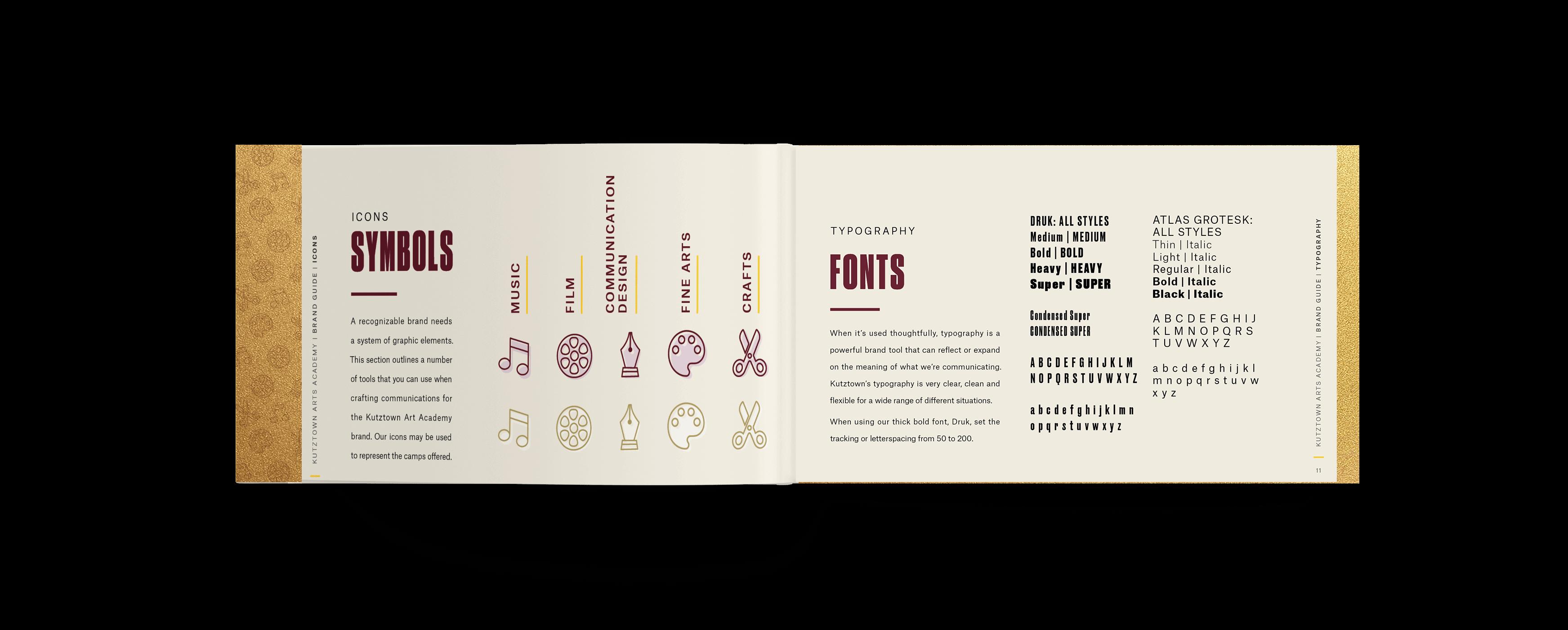
To develop the branding and style of the Kutztown Arts Academy, I needed to start with a logo. The first step in this project was developing a mood board. When looking for these images for inspiration, it was hard at times. The websites I used the most for reference were Pinterest, Logo Lounge, and Google Images. For logo inspiration, I searched for different art and design camps, general summer camps, and academic experiences for kids and high schoolers. Looking a lot at graphics, icons, and symbols was great to get an idea of different objects I could incorporate. I also sought inspiration from different logo shapes and lockups. I knew from the beginning that I wanted to pursue either a mono-weight, line-focused logo or one in the flat vector style. I like using the flat vector style because I like the minimalistic approach. It emphasizes the idea cleanly and transparently. The style is very functional, and the simple imagery can convey messages more clearly for the audience, to understand. Simple icons are also universal to audiences and can help grab a person’s attention.
After creating the mood board, it was time to start with rough sketches. I wanted to try and do a logo that was more than just a wordmark. I found sketching complex because it was hard to represent all four (at the time) camps equally. Not one icon represented them all, and incorporating all four was challenging.
Sketches: Round 1
14 | Kutztown Arts Academy Kutztown University Honors Program | 2019
On the first page of the sketches, I tried using a paintbrush to represent all the arts and then the piano to represent music and film. I wanted to try some that looked more like the baby grand piano shape from an aerial view but also one that was more abstract. In the other two logos on that page, I wanted to focus more on the words and less on the image. In the first sketch, I wanted to play with a way to connect the “arts.” I thought it would be interesting to use lines to represent the bars on sheet music, blobs with a border texture to show paint strokes to represent the arts, and sound waves to represent film camp. In the bottom sketch, I played around with the ideas of lines and how they felt like they could represent music lines could represent the sheet music or strings on an instrument, while in film camp, they could represent sound or the editing software they use. In the arts, lines are used a lot in graphic design, whether it be typography, symbols, or design elements. In the fine arts, lines are the strokes that make beautiful pictures or drawings.
Kutztown Arts Academy | 152019 | Kutztown University Honors Program

16 | Kutztown Arts Academy Kutztown University Honors Program | 2019


Kutztown Arts Academy | 172019 | Kutztown University Honors Program
Sketches: Round 2
In my second page of sketches, I wanted to play around more with how the different symbols could be used or arranged, but I also played with different flat illustrations and a video about logos and logo systems in my Identity Systems class, I wanted to try and think about how things would work if it were a logo system with interchangeable icons depending on the camp that is being advertised. I tried to create logos for when all camps are represented and how it would translate to one icon per logo. I also wanted to try and do some sketches focusing on the typography and using shapes to enclose the type and icons.
Aftershapes.watching
The next step to picking a logo to move forward with was to review my sketches with my capstone advisor. After discussing each logo, we concluded that the logo utilizing the banner was the best option due to being clear and concise, not favoring one specific camp topic, and also choosing a version without the shape to use on specific applications. Although a direction was chosen, I still had to move forward with trying different versions with line variations, fills, and color. Typically, in the Communication Design program at KU, we will solidify a black and white version of the logo before moving into color. This is because you want to ensure that it works well in both scenarios and when color is not available to a printer. I chose to move forward right away with color because of two reasons. The first reason is that my logo was already vectorized on the computer. The second reason I moved into color so quickly is to keep pushing forward to be finished in time for the deadline for the logo to be presented to the director and people involved in running the camp.
18 | Kutztown Arts Academy Kutztown University Honors Program | 2019
Sketches: Round 3
Kutztown Arts Academy | 192019 | Kutztown University Honors Program

20 | Kutztown Arts Academy Kutztown University Honors Program | 2019


22 | Kutztown Arts Academy Kutztown University Honors Program | 2019
COLOR PALETTES
The color palette I had available for my use during this project was limited. I was confined to using Kutztown University’s primary, secondary, and tertiary colors. To choose a direction of color combinations to explore further, I had to set up different small color palettes (page 24–25). I wanted to play with the maroon and gold feel on my first pair using the spirit gold instead of the “old gold.” In my second pair, I wanted to see how the logo would look, being monochromatic but also using tertiary colors. I wanted to do the more traditional maroon and old gold in the third pair with classic black text to keep it clear and concise. In my fourth pair (page 25), I wanted to play the secondary and tertiary colors. For this color combination, I wanted to convey the message that it was in the summer season and give it a fun color palette. The last combination I put together was a maroon monochromatic design. After looking at all the color combinations, I went on to do variations of the first and third pairs. It was suggested that I stay close to the classic Kutztown University colors in order to keep the brand and image recognizable to those who may not be familiar with Kutztown University’s other colors. Even though the fourth pair was not the traditional colors, I wanted to get feedback on if there would be interest in choosing colors that are not in the primary or secondary color palette. I was inspired by the promotional cards sitting next to the Dean’s office for this color combination. They played up the blue color range and showed that there was room to push the brand and challenge it. Exploring the different options and possibilities outside the expected is also more fun.
Kutztown Arts Academy | 232019 | Kutztown University Honors Program
TertiarySecondaryPrimary
24 | Kutztown Arts Academy Kutztown University Honors Program | 2019

Kutztown Arts Academy | 252019 | Kutztown University Honors Program

• Variations: Round 1 Page 3 (page 30): What if the lines went in different directions? Should they go vertical or horizontal? Diagonal? Are they all going to be the same way or go different ways?
Using the color palette I had, I did different line thickness variations, directions, and spacing. I also experimented with different layerings and how many layers there should be. Three layers reference the outline, solid color, and line layer. Two layers could include the outline and the solid, lines and solid, or the lines and outline layers. Then finally, I have one-layer options, which can include the “arts” logo all in line, solid, or outline, or a combination of two but not layered on each other. Throughout the process of making these, the name switched from the Summer Arts Academy at KU to Kutztown Arts Academy.
Variations: Round 1
• Variations: Round 1 Page 2 (page 29): I wanted to see what the logo would look like with fewer lines spread apart and thicker.
26 | Kutztown Arts Academy Kutztown University Honors Program | 2019
• Variations: Round 1 Page 5 (page 32): Using the thicker lines, using two layers on the logo.
• Variations: Round 1 Page 1 (page 28): Everything is the same as the color palette sample pages (pages 24–25). The biggest concern with this page of logos was that the fine lines might not print well on different printers.
• Variations: Round 1 Page 4 (page 31): Variations of what it would look like using the Kutztown Arts Academy name.
Kutztown Arts Academy | 272019 | Kutztown University Honors Program
• Variations: Round 1 Page 6 (page 33): Two-layered logos using the Kutztown Arts Academy name and horizontal lines.
• Variations: Round 1 Page 7 (page 34): Two-layered logos using diagonal lines.
• Variations: Round 1 Page 8 (page 35): I also experimented with single layer variations having two letters, one style, one layer, and the other two letters, a different style.
28 | Kutztown Arts Academy Kutztown University Honors Program | 2019

Kutztown Arts Academy | 292019 | Kutztown University Honors Program

30 | Kutztown Arts Academy Kutztown University Honors Program | 2019

Kutztown Arts Academy | 312019 | Kutztown University Honors Program

32 | Kutztown Arts Academy Kutztown University Honors Program | 2019

Kutztown Arts Academy | 332019 | Kutztown University Honors Program

34 | Kutztown Arts Academy Kutztown University Honors Program | 2019

Kutztown Arts Academy | 352019 | Kutztown University Honors Program


DESIGN DAY CAMP Logo & Variations: Round 1
• Variations: Round 1 Page 3 (page 41): Used horizontal lines to show different versions. I experimented with some letters with lines and others without the same logo.
• Variations: Round 1 Page 1 (page 39): Horizontal lines and three-layered type treatment.
Kutztown Arts Academy | 372019 | Kutztown University Honors Program
• Variations: Round 1 Page 2 (page 40): Playing with lines going in different directions on each letter and using different layers.
After doing variations of the Summer Arts Academy at KU and the Kutztown Arts Academy logo, it was time to move on to creating and colorizing a logo for KUCD’s Design Day Camp. When creating the logo for this camp, I was told they wanted it similar to the Academy logo. I also needed to try and stick to the same three-color palettes as before, but I decided to use the thicker lines spaced farther apart for readability purposes. In round 1 of the logos, I took the same shape and concept and rearranged the words. With camp being the only four-lettered word, it made sense to give it the same design and type treatments as the word “arts” in the original logo. The biggest challenge with this was making the word order make sense. When creating it, I was unsure if the day should be under camp, but design-wise, that made the most sense.
• Variations: Round 1 Page 6 (page 44): Designer two-layer logo utilizing different directional lines. Specifically, in this set, I wanted to see what it would look like with no offset on text.
• Variations: Round 1 Page 4 (page 42): Designed logos consisting of one layer, stripes, fill, or stroke.
• Variations: Round 1 Page 5 (page 43): Used two layers to create the logo and utilized horizontal and vertical line combinations.
38 | Kutztown Arts Academy Kutztown University Honors Program | 2019
Kutztown Arts Academy | 392019 | Kutztown University Honors Program

40 | Kutztown Arts Academy Kutztown University Honors Program | 2019

Kutztown Arts Academy | 412019 | Kutztown University Honors Program

42 | Kutztown Arts Academy Kutztown University Honors Program | 2019

Kutztown Arts Academy | 432019 | Kutztown University Honors Program

44 | Kutztown Arts Academy Kutztown University Honors Program | 2019

Kutztown Art Academy & Design Day Camp Logos Round 2
In the second round of logos (pages 46–47), I could narrow down the layers and style to move forward with. Going back and forth with my capstone advisor, we decided to present the Kutztown Arts Academy logo with three layers and horizontal lines to the director and organizers of the camp. We both agreed on this logo because it was detailed but also precise. The logos with the condensed lines were too complicated, and the logos with the lines going in all different directions was distracting. Then mimicking the Kutztown Art Academy logo, we treated the Design Day Camp the same way. Because the Design Day Camp was smaller and did not necessarily represent the University as a whole, I could use the blue and red logo as its primary logo and colors. The logo also matches the feel of the branding for KUCD’s new MFA programs, pamphlets, and handouts. It was suggested that I play with the direction of the banner to make it feel like a different event but under the same department. I also took the secondary text in one line for readability purposes. Doing this made the logo much clear to read and understand.
Kutztown Arts Academy | 452019 | Kutztown University Honors Program
46 | Kutztown Arts Academy Kutztown University Honors Program | 2019

Kutztown Arts Academy | 472019 | Kutztown University Honors Program

48 | Kutztown Arts Academy Kutztown University Honors Program | 2019
Kutztown Art Academy & Design Day Camp Logos Round 3
In the third round of logos, some minor adjustments were made. The most significant adjustment in this round of logos is the color. The issue with round two was the red text for Kutztown and Academy, and the stripes disappeared into the blue banner background. There needed to be more contrast overall, so I lightened the red to a lighter shad one on the Kutztown University color palette.

Kutztown Arts Academy | 492019 | Kutztown University Honors Program

In the final round of logos, it was decided that for the Kutztown Arts Academy logo, I was to use the Kutztown University primary colors in order to keep it relevant and recognizable to the University. I also had to change the fonts of the secondary text on the logos to match the University brand standards. Alongside the primary logo, I had to develop a more simplistic version. It was suggested that I do one without the offset and something with fewer layers and details. I changed the colors in the Design Day Camp logo to make the logo feel less dull and gloomy.
Kutztown Art Academy & Design Day Camp Logos Round 4
50 | Kutztown Arts Academy Kutztown University Honors Program | 2019

Kutztown Arts Academy | 512019 | Kutztown University Honors Program

52 | Kutztown Arts Academy Kutztown University Honors Program | 2019

Kutztown Arts Academy | 532019 | Kutztown University Honors Program
ICONS
I created icons to represent each camp. I wanted to take something that portrayed what each camp was about. These icons were then taken and utilized on the website as a brand element for each camp. I then took them and created different patterns on various applications and elements throughout the brand guide.
To start promoting the event, the Kutztown Arts Academy needed a website. The layout I chose was straightforward. There was a request to keep it a single page with buttons that could be pressed to link to individual camps and departments to sign up. In the beginning, there was a question about doing the red and blue logo versus maroon and gold. Ultimately, the maroon and gold were chosen to stay on brand. In the first set of website designs (page 55), I wanted to try and do a duo-tone to keep imagery feeling consistent and not let images of different colors distract from the theme. Over time, more text was added to give details and specific camp dates. While creating the website, there was a merger of camps. Instead of doing a camp for each specific department, the visual arts would work together to combine and give a wide array of experiences to campers. The final version of the website only features three different camps. Depicted on pages 56–58 is the mobile version of the website. This shows what it would look like on your phone. Things have to go in one column and stack to target the audience and allow them to have a good user experience and find the information they need.
54 | Kutztown Arts Academy Kutztown University Honors Program | 2019 WEBSITE DESIGN
Kutztown Arts Academy | 552019 | Kutztown University Honors Program

56 | Kutztown Arts Academy Kutztown University Honors Program | 2019

Kutztown Arts Academy | 572019 | Kutztown University Honors Program

58 | Kutztown Arts Academy Kutztown University Honors Program | 2019

Kutztown Arts Academy | 592019 | Kutztown University Honors Program

60 | Kutztown Arts Academy Kutztown University Honors Program | 2019

Kutztown Arts Academy | 612019 | Kutztown University Honors Program

62 | Kutztown Arts Academy Kutztown University Honors Program | 2019

POSTCARDS
Postcards: Round 1 In the first round of postcards, I had to come up with ways of portraying, at the time, all five camps on a postcard. Developing a grid that works with an odd number of images was challenging. We were not sure at the time if it should use images or be illustration based. I kept with the traditional Kutztown colors and utilized my pattern.
As part of the project, I created postcards to be mailed to parents of high school students. In this process, I went through multiple rounds of concepts to get to the final piece. I tried numerous styles and combinations, whether they be through illustrations, typography, or images.
Kutztown Arts Academy | 632019 | Kutztown University Honors Program

Postcards: Round 2
I wanted to try different options in the second round of postcards, with the icons being the main focus. I used the texture to give it depth. In the one with the images, I created a grid representing four of the camps to see what it would look like.
64 | Kutztown Arts Academy Kutztown University Honors Program | 2019
Postcards: Round 3 In round three of postcards, I experimented with making a typographic postcard using fun fonts and type lockups. I also tried some versions where the main focus was on the logo.

In round four, I tried to add more colors to make it enjoyable. I also wanted to see what it would be like if you put images inside the text. Unfortunately, even though it was a good idea, it was not practical or a readable option.
Postcards: Round 4
Kutztown Arts Academy | 652019 | Kutztown University Honors Program

66 | Kutztown Arts Academy Kutztown University Honors Program | 2019

Postcards: Round 5
The final postcard I created had four images featuring the different camps. It uses hierarchy to grab your attention and creatively features the logo. It also incorporated images with the same color palettes as the Kutztown University colors.
For both camps, the KUCD department wants to give away small items to the campers. For Design Day Camp, I came up with different concepts for buttons. I wanted to do something more than just put a logo on a button. I also wanted to incorporate the pen tool icon.
Kutztown Arts Academy | 672019 | Kutztown University Honors Program
APPLICATIONS

68 | Kutztown Arts Academy Kutztown University Honors Program | 2019
Button Design In the first round (page 69), I experimented with how the logo could be presented on the button. In round two (page 70), I worked more with color. I tried making different patterns on the background and using different fonts. The Final Design Day Camp displays the KUCD name to distinguish it from other art camps and uses the University fonts to stay on brand. Alongside the Design Day Camp button, I also created a version for the Communication Design part of the Visual Art Camp. I was able to apply the colors to translate it into a button for the Kutztown Art Academy. Final designs are shown on page 71 and 72.

Kutztown Arts Academy | 692019 | Kutztown University Honors Program

70 | Kutztown Arts Academy Kutztown University Honors Program | 2019

Kutztown Arts Academy | 712019 | Kutztown University Honors Program

72 | Kutztown Arts Academy Kutztown University Honors Program | 2019

Kutztown Arts Academy | 732019 | Kutztown University Honors Program

Other Applications
There are many places you can apply the logo. When creating different mock-ups for potential swag to give students, I had to remember what type of things high schoolers wanted. I decided to mock up a water bottle, shirt, and tote bag.
74 | Kutztown Arts Academy Kutztown University Honors Program | 2019

Kutztown Arts Academy | 752019 | Kutztown University Honors Program


Kutztown Arts Academy | 772019 | Kutztown University Honors Program
After finishing all the pieces of the logo, collateral, and applications, I put together a book called a style guide. Style guides are essential for establishing an identity. It helps non-designers create content consistent with the brand designers put in place. It shows numerous examples of how you can use the logo, what colors can be used, fonts to select from, and overall how to execute the brand when creating anything relating to the company. In my brand guide, I also included icons, patterns, photo styles and imagery, stationery, and the Visual Arts Camp statistics. I worked on the style guide for the whole Spring 2019 semester. Many mock books and revisions needed to be made along the way.
STYLE GUIDE
The challenge of creating the style guide was figuring out what to do with the cover. I did not want to do the same cover that all my other print pieces had. I wanted to do something that would stand out.
Cover Printing Concept & Process
I was inspired by the new admissions viewbook when thinking about the cover. I like the cover and thought it would be cool to use unique paper and ink treatments. Trying to find out how the printer achieved the cover was very hard. I had to go to numerous places and ask who printed the book. Eventually, I found that it was special printing and, on a small scale, would be expensive.
At first, I tried doing a sticker on the piece like a mailing piece would have to keep a folded piece together. It was an excellent idea and cute, but it was not practical. The sticker was tearing the pages of the style guide. Then I tried doing a “belly band” to keep it together. I first started by printing my design on a plain piece of paper. Unfortunately, it looked cheap and did not fit with the beautiful paper I chose. I was then told to try out the vellum paper so that it felt more luxe, but you could also see the gold paper and pattern underneath. Solidifying the cover was the last part of making the style guide. After I figured it out, I got my whole book printed and put together. Then my project was finally complete and ready to present at the AIGA Central Portfolio Review.
78 | Kutztown Arts Academy Kutztown University Honors Program | 2019
While searching in the bookstore one day, I found a gold pearlescent stardust paper that matched the cover of the admissions book. For a couple of weeks, I experimented with printing on that paper, which was hard because it was not taking ink well. I had to try printing on multiple printers, laser, and inkjet, to test colors and clarity. Throughout this process, I learned that laserjet is the way to go when printing on slick papers. With the inkjet printers, the ink bled so much that it filled in text and the Kutztown University logo. Originally when creating the cover, I just had plain text on the front and back. After viewing the cover multiple times, it was said it felt too empty. To resolve this issue, I used my pattern as an overlay on the front and back of the paper. It was also suggested that I add some band or way to keep it all together.
* The pouch includes a mock-up with revisions, cover test prints, and tests of the band.


Working on the Capstone Project was a rewarding experience. I have been working on this specific project since the summer of 2018 and have learned a lot throughout making the logo, brand guide, and everything that goes along with supporting the brand. It is incredible to create this well-rounded project that showcases the type of work I love and creates something that can be used in my portfolio. I am incredibly proud of all the work I have Whendone. first learning about the Capstone Project I had no idea what to do. In a way, I did not know what to do, how extensive the project needed, and what the expectations were, especially for a Communication Design major. I had many ideas when thinking about this project but was unsure how to make it happen or if it was to the standards of the Honors Program. At first, I thought the project was just a project but something big. Eventually, I learned that s good capstone project makes you learn more about yourself and challenges your knowledge in the field. Choosing a topic and then changing it after a year did not feel like a big deal at the time. I thought that in my senior year, I would have much time to work on the project and get it done. As it turned out, I wish I had solidified an idea sooner and stuck with it. Senior year for me has been very overwhelming at times. Balancing school, work, and club activities have been a lot. I was not expecting to take on so many classes and attend many activities and meetings daily. I am glad I switched, though, because I would instead be working on something I am passionate about than trying to drag myself to finish a project I was uninterested in.
Kutztown Arts Academy | 812019 | Kutztown University Honors Program
REFLECTION
If I had to go back and change my process, I would start earlier and let it stretch over more time. Doing my Capstone Project in one year felt rushed and, at times, too much work to do in two semesters. I would do something differently: start writing the process paper and do the actual work. When writing this paper, it was hard to remember the feedback I got or which things went in which order. Lastly, I wish I had kept better track of all my development and papers to submit. I know I probably had at least five other versions of the basic brand guide printed out, but they were thrown out due to not feeling like they needed to be put in.
When starting the process of writing up the project, it was hard to imagine the timeline I wanted to start for myself. Loosely there is a general recommendation of what items are to be completed in different semesters. It was hard imagining how much time I needed for each item. Usually, in a class, we have a schedule set out for us by the professor, who already knows how much the class should take on each task. For me, the project write-up took a long time. Trying to think about all that needed to be done was challenging. I eventually came up with a month-by-month breakdown of what needed to be done. I think in the end, I did not end up following the timeline because you never can predict how long revisions will take or how many rounds of sketches need to be done. I also did not consider the time I would be living at home and unable to meet with my advisor for half the semester. Even though I did not stick strictly to it was nice having a guideline and list of things that needed to be done.
One thing that needed to be included in the Capstone Project write-up was a list of classes and how they related to the project. Doing this part was monotonous, but it was interesting to see what classes I have taken and how much I have learned since beginning college.
82 | Kutztown Arts Academy Kutztown University Honors Program | 2019
PROJECT WRITE UP
Kutztown Arts Academy | 832019 | Kutztown University Honors Program
Relevant Class Experiences
• Corporate Publication: Corporate Publication is a great class to learn how to lay pages with much text. It focuses on editorial-type design. This class focuses on logo design and learning about what type of logos would be appropriate for different fields, whether through colors, type choices, or illustrations.
• Advanced Web/Multimedia: This class has taught me more about coding websites and the importance of tagging images to help boost your search results on Google or any other search engine. We also learned how to set up Google Analytics to see who is searching your website.
In my reflection paper, I wanted to expand on the list of classes I took outside the major and the senior year that allowed me to complete the Capstone Project.
• Identity Systems: The Identity Systems class I took in the fall of 2018 has taught me all about branding and making a style guide. I learned about the purpose behind a brand, its importance, and what it conveys. Taking this class allowed me to make a style guide for the Kutztown Arts Academy that people can use and understand. This class emphasizes giving non-designers the tools they need to allow the brand to succeed and the image to stay intact.
• Professional Practices: Professional Practices is a great class because I have learned a lot about how to introduce myself to an interviewer, be professional, and use proper etiquette. It is a great class to learn how to present yourself professionally. We specifically practiced interview skills and talked about our work.
• Photography: Although I did not use this much in this project, I was able to include one photo I took on my own. Overall, this class taught me a lot about photo manipulation, how to set up booklets, and how to take great photos. If I ever go back and replace the photos with my own, this class would come in handy.
• United States History Formative Years and the Federal Republic: This class is not a communications class nor a design class, but I learned a lot about writing. We would write reflections on what we read or watched that week. I think this class is excellent for learning how to write election papers.
• Oral Communications: I have to say Oral Communications was one of the most challenging classes I took, but I think it is a great thing to have as a mandatory class. I learned a lot about presentation skills and how to communicate with others.
84 | Kutztown Arts Academy Kutztown University Honors Program | 2019
• Internship: The internship I did was a great experience. I had to go to a company specializing in branding and identity. It was great learning about their processes, allowing me to incorporate some of the things they did into my process. I learned so much being there and about branding and what it is.
Kutztown Arts Academy | 852019 | Kutztown University Honors Program

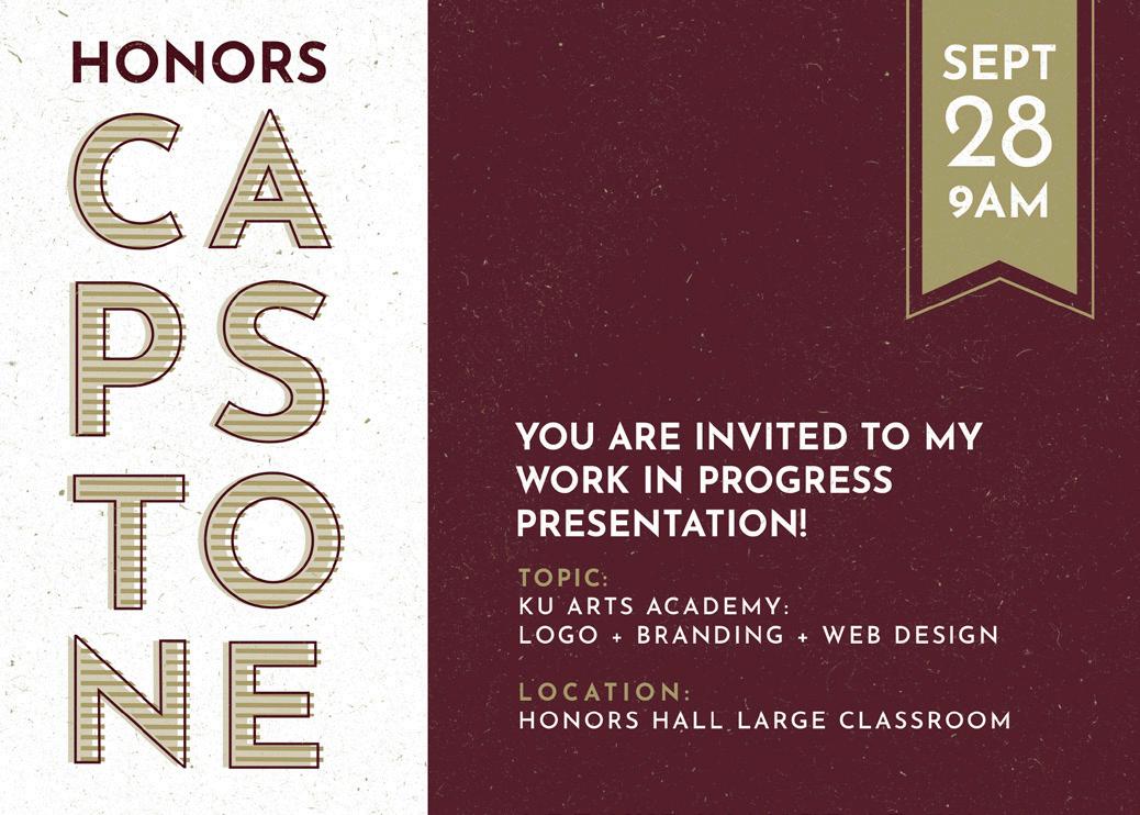
WIPS In the fall semester of 2018, I presented my work in progress. Going into it, I did not know what to expect or feel prepared to present, even though you were sharing progress. I think doing these WIPS are a great way to keep students on track and update everyone on the progress of your project. It is also fantastic to get feedback from friends and faculty on how you can improve and expand moving forward to finish your project. I think I got much great feedback that made me think about what I was doing and made me think about how I would answer that question in the future if someone happened to ask me the same question. In a way, it helped me to become more prepared for the final presentation.
Some alternatives that were suggested were to do a presentation to professionals in the field or an exhibition. For this option, I would have to find at least three professional designers specializing in branding and three professors teaching branding classes to attend the presentation. This council would be supplied with a review sheet where they would give written feedback and an opportunity for an in-person critique of the project work. In addition, I could invite family and peers to be present and participate in the critique. Another option listed in the Capstone Project packet but not the best option for a graphic design project was hosting a gallery opening and exhibition. Even though this would be the most flexible option for my schedule, I felt like I would not be getting the best feedback, even though this was one of the options my Capstone advisor and I highly considered. We discussed researching all the galleries on campus, seeing if they were booked or not, and how many pieces each gallery could hold and their setup. The work would be exhibited, and the professionals and faculty could come according to their schedules.
PROFESSIONAL PRESENTATION
Finding a place to present my project was a challenge. Because of prior commitments to other club organizations, I could not attend the Undergraduate Creativity Conference in Reading in April. At first, one of my professors suggested I host a meeting and book a room on campus to present my project to my peers and professors. However, after learning that was not an option, I talked to Professor Karen Kresge about other available options.
86 | Kutztown Arts Academy Kutztown University Honors Program | 2019
Kutztown Arts Academy | 872019 | Kutztown University Honors Program
If I had done a gallery exhibition, we talked about how to show development, which feels unusual in a gallery that usually showcases finished work. The downside to this option was the expense. It would have been costly to get the items printed and everything framed and time-consuming to hang up something that would only be up for a short time. It is also an unusual thing to put in a gallery setting because of the nature of branding, and at the time, we both felt that the gallery space was already booked for the year.


Kutztown Arts Academy | 892019 | Kutztown University Honors Program
The last idea I gave was to exhibit my work during the Central PA AIGA. AIGA stands for American Institute of Graphic Arts. AIGA is the profession’s oldest and largest professional membership organization for design. It encompasses both traditional and digital design. The organization hosts events and workshops for not only professionals but students and aspiring designers to give recognition to their work. Whether that be through portfolio reviews or workshops, they are there to inspire creativity, among others. This year the portfolio review was held at Kutztown University in the Sharadin Arts building on Saturday, April 13, 2019. Presenting there, I met with different reviewers with a wide range of experiences, positions, and companies. Before I came to the portfolio review, I put together a review sheet for feedback for the reviewers to fill out. The review sheet was explicitly for the complete style guide, but I still explained my reasoning behind my concepts and logos and why I did what I did for different sections.
CENTRAL PA AIGA
POOR ISSUES AVERAGE GOOD STRONG Color Do colors support readability, and enforce the theme of the design?
Reviewer’s
POOR ISSUES AVERAGE GOOD STRONG Overall attention to detail? POOR ISSUES AVERAGE GOOD STRONG
Reviewer’sCompany:Name:Position:Signature:Date:
POOR ISSUES AVERAGE GOOD STRONG Is the type hierarchy appropriate, and consistent?
POOR ISSUES AVERAGE GOOD STRONG Is the text void of any visible spelling or grammar errors, widows, orphans, rivers, etc?
___________________4/13/19___________________
POOR ISSUES AVERAGE GOOD STRONG Are images of high quality?
POOR ISSUES AVERAGE GOOD STRONG Are images thoughtfully placed and utilized to showcase the brand?
Layout Does the layout showcase the elements of the brand in a clear and concise way?
POOR ISSUES AVERAGE GOOD STRONG General Does the project feel complete?
POOR ISSUES AVERAGE GOOD STRONG Typography & Imagery Are the fonts used to create a strong verbal-visual connection within the work?
POOR ISSUES AVERAGE GOOD STRONG Does the design elements create depth and subtlety?
POOR ISSUES AVERAGE GOOD STRONG Is there unity among the text, imagery, and graphic elements?
90 | Kutztown Arts Academy Kutztown University Honors Program | 2019 THERSA QUEDENFELD Kutztown Arts Academy: Logo + Branding + Website Kutztown University Honors Program Capstone Presentation
Technical Issues Design GeneralAdviceComments
AIGA Portfolio Review
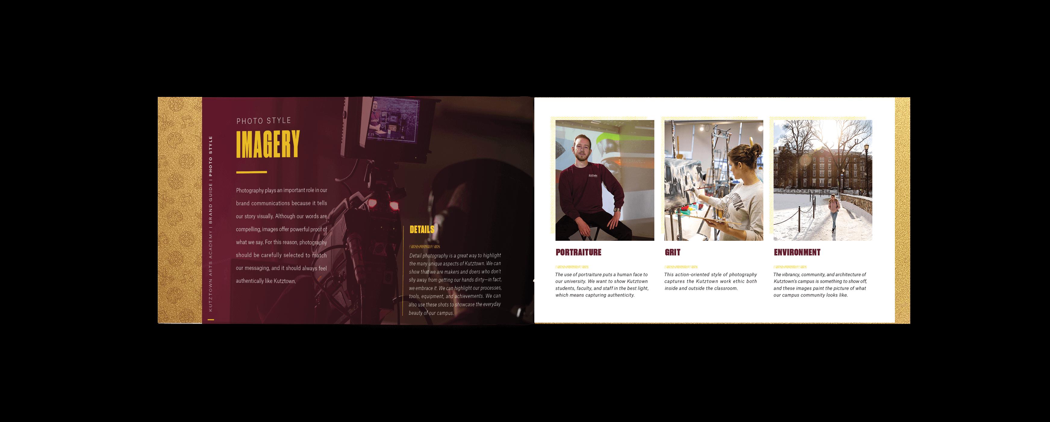
Review Sheet I included questions about the layout and if things were placed clearly and concisely on my review sheet while incorporating design elements. Many people liked the layout especially loved the unique cover concept. Reviewers also commented on how they loved the use of texture and how everything felt on brand with the more extensive Kutztown University guideline and image. The following section I covered was imagery and typography. The consensus about my type was that I needed to pay more attention to the details, alignments, and spacing. Everything just needed to be rechecked and consistent. When it comes to the imagery, reviews thought the photography was beautiful. One reviewer felt that since I am around a student who does all this work daily, it would be easily achievable to take and incorporate more of my photography in the brand guide. There was also a comment about how people liked the texture on top of photos but would have liked to see it throughout the book. For the next area of feedback, I had a question about color. Overall there was good reception on the printing and quality of the color. One person did comment about how some images felt washed out, but others did not seem to mind. There was also a comment about the gold color coming out dull and green, but they understood nothing could be done about that and the available color selection. In the last section of the sheet, I asked a question about details and completeness. Many reviewers felt it was complete. One change that was suggested was to keep extending the guide even more. Since social media and web presence is becoming a massive thing in our culture, one person wants to see a social media campaign, countdowns, and graphics to advertise.
Kutztown Arts Academy | 912019 | Kutztown University Honors Program
92 | Kutztown Arts Academy Kutztown University Honors Program | 2019
Reflecting on my experience and presentation, I think it was a great thing to do. I appreciated getting all of the excellent feedback from professionals practicing in the field. I will use that feedback to make changes over time to make my piece more I think presenting was also a great way to practice my presenting skills and learn how to talk about my projects and the concepts behind each decision made. Reviewers asked me questions about the project, so it almost felt like I was practicing my job interviewing skills, which is great because I am trying to find a job after college.
Another thing that was suggested was that I expand more on the website. They thought the page was good, but it needed to feel more like a home page and less like a detail page. They felt I should put a 100% width hero image as my header to grab people’s attention. The last thing I suggested was to be careful with my water bottle mock-up because it felt unrealistic about how the logo was placed on the bottle.
portfolio-ready.
Throughout this project, I learned valuable skills about planning a schedule and timeline and general time management skills. This project was both challenging and exciting. Working with an actual client and creating something that will be utilized each year is a fantastic opportunity. This will also make a great portfolio piece to show potential employers that I know how to work with clients and within another brand’s standards. I hope this will be a piece that can help me stand out from other designers in the graphic design and branding field. I am delighted with the outcome of my project and hope to be able to apply and use the skills I learned in the future.
* Style Guide After This Page ---->
Overall this project has provided me with many different learning opportunities and let me grow as a designer. It also has taught me handwork skills and professionalism. It has let me learn more about what I want to do in the future with my career. I think the Capstone Project for Communication Design majors is a great way to showcase our talents and skills. It is an excellent opportunity to pursue something we are interested in and passionate about. As KUCD Honors students, we are lucky to have this wonderful opportunity to further our knowledge and explore creative practices that are meaningful to us as designers. Although this project is not perfect, I will go back and make improvements and changes to the guide so that it feels even more complete. If I have time, I may create social media graphics and campaigns to go along with the brand.
RECAP & CONCLUSION
Kutztown Arts Academy | 932019 | Kutztown University Honors Program
Final
94 | Kutztown Arts Academy Kutztown University Honors Program | 2019

Kutztown Arts Academy | 952019 | Kutztown University Honors Program


96 | Kutztown Arts Academy Kutztown University Honors Program | 2019


Kutztown Arts Academy | 972019 | Kutztown University Honors Program

98 | Kutztown Arts Academy Kutztown University Honors Program | 2019

Kutztown Arts Academy | 992019 | Kutztown University Honors Program


100 | Kutztown Arts Academy Kutztown University Honors Program | 2019

