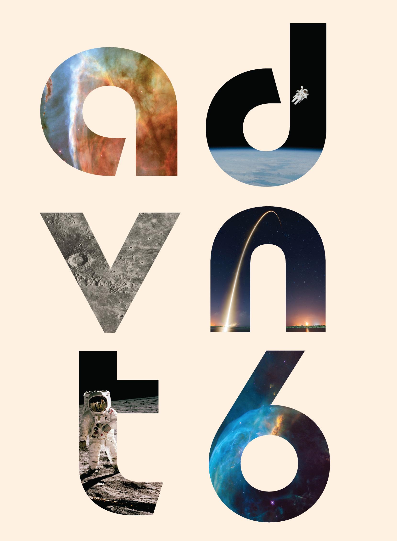
ADSTRONOMY The Universe of Advertising
advnt Vol 6

Front Cover: Allana DeRosa
Back Cover: Emma Riutort
Space illustrations: Paige Montero

College of Journalism and Communications University of Florida Weimer Hall 1885 Stadium Rd. Gainesville, FL 32611 @advntuf ufadvnt@gmail.com advntuf.com Volume 6
The sky’s just the beginning, so join us in reaching for the stars

Welcome to volume six of advnt, a student-led creative advertising publication. What you’re holding in your hands is worth more than diamonds, gold or any other really expensive thing you can imagine. In your hands, is the curated collection of creativity from the University of Florida’s College of Journalism and Communications’ advertising students.
The purpose of advnt is to put the spotlight on creatives and give them the platform they have earned. Copywriting, illustrating, graphic design, photography, social media; everywhere you look, some creative has made the world around you a little more colorful. Which is why we aspire to use our publication as a safe space to cultivate this talent and grow seeds into flowers.
advnt circulates both the digital and print publications to advertising agencies, working professionals, and UFCJC leadership. Each featured student and staff member also receives their own copy that they can show off to friends, future employers, or even first dates. This publication’s creation was only made possible by our team giving this issue their all; and we couldn’t be more thrilled for you to see it. With each new volume comes a new theme, so for volume six, feel free to ooh and even ahh as you join us on the strange and wonderful journey through Adstronomy: The Universe of Advertising.
Copy: Ayman Samir
Left Illustration: Elena Limonta
Upper Right Illustration: Paige Montero
08 13 15 31 21 THE TEAM
READER’S NOTE PRINT DIGITAL INTEGRATED CAMPAIGNS
CONT
49 BRANDING 57 THANK YOU 58 COLOPHON 60 INDEX ENTS
The Team


| Volume 6 | Adstronomy 8
Madison Calvert President
Sarah Pauli Director of Web Design
Emma Riutort Creative Director of Art
Lydia Barnard Director of Marketing
Aya El Ladiki Illustrator/Designer
Amanda Longa Vice President
Ayman Samir Creative Director of Copy
Allana Derosa Illustrator/Designer
Jadelyn Daniels Director of Finance


9
Christina Cho Illustrator/Designer
Caitlyn Daniels Illustrator/Designer
Elena Limonta Illustrator/Designer
Lara Priven Illustrator/Designer
Orionne Burbea Illustrator/Designer
Paige Montero Illustrator/Designer
Maja Growchowska Illustrator/Designer
Paige Mungall Illustrator/Designer
Lena Ngyuen Web Designer


| Volume 6 | Adstronomy 10
Alex Land Copywriter
Andrea Rivera Web Designer
Jenna Bartkovsky Copywriter
Lindsi Cohn Copywriter
Alyssa Infante Marketing Strategist
Jenna Benjamin Marketing Strategist
Jesse Cardona Copywriter
Kacie Ross Marketing Strategist
Rebecca Prieto Marketing Strategist


Picture frame illustrations : Caitlyn Daniels
Space illustrations: Paige Montero
Photography: Paige Mungall
11
READER’S NOTE
Three!
Two!
One!
BLASTOFF!!!
You’re now exiting the atmosphere of the mundane and entering the strange and wondrous realm of creativity. Of all of the places in the universe you could possibly be, you landed here. Right here. Right now. Reading this very page.
Welcome to Adstronomy: The Universe of Advertising.
Hi, reader. We’re glad you’re embarking on this cosmic journey with us. Collectively, our team believes that the universe is emblematic of the complexity of advertising. Through its iconic manifestations of shape and color, as well as its seeming endlessness of life, the universe parallels the staples of media in an inimitable way.
Within each member of our team and each of the creatives highlighted in this book, lives a supernatural sense of artistry that cannot be found across any other end of the cosmos. We encourage you to take in the sights, wonders and vast horizons that we have to offer.
So sit back, relax, and hold onto your helmet as you explore the celestial composition of volume six. Copy:
13
Our Copywriting Team


The Big Bang. The formation of the universe as we know it. Neurons! Protons! A hot mix of elementary particles swimming around in a sea of darkness. It sounds confusing, we know. But in the same way that the galaxy marks the beginning of our solar system’s formation, print media marks the beginning of advertising.
Galaxies are continuing to expand, just like how advertising expanded from print media out to other forms of media. Still, print media is so much more than just the beginning. Print advertisements are tangible. Now imagine a peaceful Sunday morning on your front porch, a hot coffee in your hand and a cool breeze in the air. On mornings like these, there’s a simple pleasure in kicking back with a newspaper or a magazine. You see, print media has a tactical charm that digital ads just can’t replicate.
Whether you’re a stellar stargazer or just starting out, we’re sure that the print media we’ve gathered from across the galaxy will inspire you. Now get ready to explore the universe of advertising starting from its very beginning!
Copy: Lindsi Cohn
Illustration: Aya El Ladiki
15
ICON Magazine
Caitlyn Daniels
After applying for the position in 2023, Caitlyn Daniels took on the role of Lead Director of ICON Magazine for the University of Florida’s Advertising Society. ICON is a printed magazine written and created for AdSociety, which is then distributed to individuals at meetings. The inside of ICON has written information of which guest speaker is at the meeting at the time, properly displaying their career path and advice.
As the sole creator of the design and layout for the printed issue, Caitlyn was allowed to express creative freedom with fun and ontheme issues that are printed and distributed to hundreds of people on a bi-weekly basis. From the time span of October to April, Caitlyn has single-handedly designed twelve volumes of the printed magazine, and loves each and every one of them.
| Volume 6 | Adstronomy 16


17
Caress
Nicole Knowles
After being inspired by print ads on magazines while waiting in a doctor’s office, Nicole Knowles decided to make one of her own with her favorite soap brand. She wanted the ad to reflect 3 of the 5 human senses that one experiences when using Caress: sight, touch, and smell. Nicole started off by making the background a darker shade of pink to represent the brand’s color while also allowing contrast to strengthen focus on the product. She then added a light gradient of white to imitate light coming from the front of the model to provide a sense of refreshment to the ad. Nicole included pink flowers to each end of the ad to not only provide aesthetic appeal, but to inform the consumer of the sweet smell Caress offers. She then added a model demonstrating the use of the product, as she knew this would appeal to the sense of touch.
| Volume 6 | Adstronomy 18
Barbie x Lenovo
Skyler Prieto
Skyler Prieto created “Barbie x Lenovo” for a course project. This advertisement is meant to showcase the ease in utilizing a Lenovo Yoga by drawing attention to the flexibility function of the device. With one of the most notable features of a Barbie doll being its flexible limbs, a collaboration between the two companies connects a childhood with dolls, to the reality of adult work-life in a witty, relatable manner.

19

DIGITAL
Humans create 2.5 quintillion bytes of data every day: videos, articles, audio, and literally anything else you could think of.
2.5 QUINTILLION! Did you know that was a real number? We didn’t. A number that size is practically incomprehensible. And that’s how much data is created. Every. Single. Day.
Akin to planets, digital media has an infinite scope that seemingly spans the ends of the universe.
With that much content out there, it’s literally impossible to see everything at our disposal. It can be scary to think about how much content we might love escapes us every day. Your next obsession or some life-changing piece of content could be just one click away. And you may never see it.
But that’s okay. We argue that you showuldn’t be scared of how much content you might miss. Instead, think about the incredible opportunity digital media gives us. You could find literally anything you can think of in the blink of an eye. Have a weird thought or niche interest? Digital media has you covered. While it’s true that we could be missing out on some transcendental, third-eye-opening piece of content, that’s the risk you have to take. Peering through the telescope of digital media allows us to engage in anything. Truly, the only limitation is the creativity of our imagination.
We hope the next section sparks that creativity as you Neptune into this display of iridescent individuality and dimensional diversity in the realm of digital media.
Copy: Alex Land
Illustration: Maja Growchowska
21
SKKN Native Ad
Madison Calvert

For a strategic communications course, Madison Calvert was tasked with designing a native ad that blended in with the platform it is on. Madison’s love of watching Keeping Up With The Kardashians inspired her to make this SKKN by Kim native ad on Vogue Magazine’s website. Kim Kardashian is someone you may see in Vogue, so it made sense to create an advertisement with her that would blend in on this platform.

Madison designed the ad by using words that SKKN’s branding uses and the font was selected to stand out over the image background, but maintain the simplicity of the company’s branding. Although the ad blends in on the Vogue platform, it is noted that it is sponsored where the article topic is located for the rest of the articles to the left of it for transparency to consumers.
| Volume 6 | Adstronomy 22
Doritos: Bite The Night

 Allana Derosa


Allana DeRosa developed her “Bite the Night!” campaign in the fall season, wanting the Doritos brand to celebrate the spooky season in style. She grabbed inspiration from the Lay’s Smiles Campaign, but instead of a toothy grin covering the front of the bag, she knew Doritos’ teeth would be sharper. Her idea? A seasonal “spicy garlic” flavored line of Doritos that could turn your mouth blood red, and a packaging that showed a vampire smile, with Doritos replacing the fangs. Her digital ad designs stuck to the Dorito-teeth theme, although she was inspired to create at least one vampire design, using Christopher Lee’s 1858 iconic “Dracula” image because even vampires crave a snack from time to time.
23
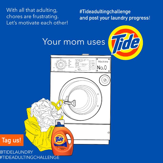
TIDE: Your mom
Uses Tide
Allana DeRosa


Allana DeRosa’s “Your Mom Uses Tide” campaign was largely inspired by the people around her. Many college students struggle with balancing their school life and responsibilities as newly independent adults without any assistance from their parents. That’s why this campaign keeps it simple, telling the audience exactly what their mom uses! Allana wanted each ad design to resonate with college students, so she drew a backpack in a laundromat, at a desk chair, and in a room full of clothes. Allana’s black and white crowded designs are meant to show how stressful adulting can be, and the bright orange Tide container reveals that Tide stands out against other laundry brands and will bring color into your life through its convenience. Additionally, the #TideAdultingChallenge is meant to change the mindset of college students who find laundry stressful by having students post when they’re progressing.
| Volume 6 | Adstronomy 24


25
Ariana Grande
Fragrances Native Ad
Erica Hoang


Erica Hoang was inspired by the duality of Ariana Grande’s first ever perfume duo, Mod Vanilla and Mod Blush. The idea was to highlight the dissimilarity between the sophisticated modern vanilla scent and the playful, fruity, floral scent. Both of these perfumes have a personality of their own, and this digital advertisement aimed to represent that through the native ad on Pinterest.
Erica wanted to present the idea of “freedom of individuality” in the slogans “Mod-ify your scent” and “Mod-ify your choices” to communicate that you can express yourself in a serious and high-spirited way. You don’t have to choose between the two; you can alternate which fragrance best represents you. Throughout the creative process, Erica wanted to emphasize that Mod Vanilla is more sophisticated and polished by utilizing more dark colors and a simple layout, while Mod Blush is more playful and posh, Erica utilized bright colors and decided to give it a lively pose. The objective of this was to create contrast, and Erica wanted it to have a structural feel.
| Volume 6 | Adstronomy 26
Get Your Hands
on a Coca-Cola
Nicole Knowles
Nicole Knowles wanted to revitalize the love for Coke, as she noticed that Coca-Cola became too dependent on its reputation to push sales. She decided to make an ad that displays the irresistible nature of wanting to crack open a bottle of Coke and did this by providing a light gradient to imitate light coming behind the product to illuminate the greatness of Coke. She then added a handprint on the Coke bottle to represent that the bottle is already claimed, while also including silhouettes of hands reaching for the bottle of Coke all around the edges, despite it already being claimed, to show the true craving of the soda. Lastly, Nicole added the text, “Get your hands on a Coca-Cola” to represent the tagline of the campaign.
27
Can I Sit Here? Ad
Amanda Longa, Nicole Valencia, Janelle Houston, and Sebastian Griffen
Amanda Longa’s “Can I Sit Here?” campaign aims to address the common challenge students face in initiating conversations with strangers. By encouraging students to simply ask, “Can I sit here?,” when seeking a place to sit, the campaign breaks the ice and opens the door to meaningful interactions.

It can be hard for students
We want to introduce a A student, looking for a class. They could ask someone a chair is available “Can
By incorporating a social media element, where students share their encounters using the #MeetSomeoneNew hashtag, the campaign fosters a sense of community and encourages students to connect beyond the initial encounter. Through this initiative, students are empowered to overcome social barriers, potentially forming new friendships and enriching their college experience. Amanda Longa created this digital campaign with the help of Sebastion Griffin, Janelle Houston and Nicolle Valencia.
Conversations are hard here?”, can turn into a
When getting up to leave, themselves with this filter, #MeetSomeoneNew. By medias or contact information.
When the students post person they meet and where A quick conversation may is ask.
| Volume 6 | Adstronomy 28
Zeta Tau Alpha
Paige MonteroWhat began as randomly themed playlists that Paige Montero collected songs and designed graphics for, Playlist of the Month now provides a more structured, consistent look. Paige spearheaded this mini-rebrand in order to better showcase the different personalities of the women in her chapter and increase interactivity among them, also strategizing to capture the attention of her target audience- potential new chapter members.


29

INTEGRATED CAMPAIGNS
Within the vast universe of advertising, integrated campaigns are like constellations, stitching together various parts to create a captivating whole. Just as Ursa major and minor have become unforgettable patterns of the night sky, a well-integrated campaign leaves an indelible mark on the minds of consumers. Each format is like stars in a constellation, playing a crucial role in the creative narrative to contribute to the brilliance of the campaign’s overall vision.
Consistency is the North Star of integrated campaigns, mirroring the tenacity of our celestial companions. Constellations, eternally fixed, provide a reliable guide to sailors, adventurers, and storytellers alike. Similarly, an integrated campaign, with its cohesive messaging across multiple platforms, acts as a beacon to consumers guiding them through the seemingly endless universe of advertising.
Just as every star shines in its own unique way, integrated campaigns must employ various mediums to best illuminate the brand message. Social media dazzles, while television glows. By strategically blending different mediums, advertisers can craft a captivating constellation that stands out in the ever-expanding realm of consumer attention.
So, next time you’re crafting an integrated campaign, think of it as forming a constellation for your brand. Unite the stars, embrace consistency, and let your campaign shine brightly, leaving your mark on the vast expanse of the advertising universe. After all, just like the constellations above, a well-crafted integrated campaign can be the stuff of marketing legends.
Copy: Jenna Bartkovsky
Illustration: Paige Mungall
31
Crystl Created Co.
Madison Calvert Campaign

Madison Calvert created her small business, CRYSTL Created Co, in 2020 and has done a holiday-time sale campaign every year since. For her 2023 holiday sale, she created the “12 Days of CRYSTmas” campaign to play on the word “CRYSTL” in her business name. For the 12 days leading up to Christmas, a graphic design was posted cross-platform for the sale of the day. Madison created these designs using the color palette and typeface of CRYSTL Created Co’s brand guidelines in order for consumers to recognize and engage with her business.
| Volume 6 | Adstronomy 32


33
Jesse Cardona


Jesse Cardona was inspired to create this project because he has been a customer for the Humane Society for his dog, Cody, and caught a close-up of what their mission is towards their brand. His idea was to focus on flier designs that not only provide a fun, artistic atmosphere that resembles Humane Society, but also a structure to tailor all the information it wanted to convey to the public; in this case, their Summer Toy Drive. After reviewing their website and social media platforms, Jesse gathered a great sense of what kind of imagery the Humane Society wants to distribute for what they want the brand to be known for, in terms of service. When placing
| Volume 6 | Adstronomy 34 Humane Society FALL PET TOY DRIVE 4205 NW 6TH STREET Gainesville FL 32609 Join us for donating new & old pet toys to our Toy Drive for the all the animals we have at our shelter Every donation, no matter how small, can make an impact August-October Every Saturday from 115pm Dates & Times: Contact Us +(352)373-5855 www.humanesocietyncfl.org @humanesocietyncfl Summer Pet Toy Drive For more information: (352)373-5855 info@humanesocietyncfl.org Join us for our Summer Dog Toy Drive here at Humane Society for donating dog/cat toys to provide for the ones we have here at our shelter. We appreciate your generosity. 4205 NW 6th St, Gainesville, FL 326 Humane Society May-July Every Saturday from 11-5pm
Campaign


the images in the flyers, the placement was thought over to ensure their biggest features were highlighted up close and personal. Lastly, placing all the necessary information (address, contact information, event details, social media accounts, etc.) was of high priority, so the public was not only well-informed, but knew all the best channels to reach the Humane Society.
35 Summer Pet Toy Drive Join us for donating new & old pet toys to our Toy Drive for the all the animals we have at our shelter Every donation, no matter how small, can make an impact Dates & Times May-July Every Saturday from 115pm 4205 NW 6th Street Gainesville FL 32609 Contact Us +(352)373-5855 www.humanesocietyncfl.org @humanesocietyncfl Address Thank Thank Thank you! you! you! PET TOY DRIVE 11 to 5pm Begins May 28th Every Saturday Thank Thank Thank you! you! you! 4205 NW 6th St Gainesville, FL 32609 (352)373-5855 info@humanesocietyncfl.org
Lindsi Cohn


During the summer of 2023, Lindsi Cohn took the course Principles of Advertising at the University of Florida. In this course, she was tasked with inventing a new product and creating a campaign for a brand using the new item.
Lindsi created a mushroom-based burger and utilized the brand BurgerFi to relay her ideas. This social media campaign used the platform Instagram for a post and Facebook’s stories. This project was a great way for Lindsi to create a product and work using a brand’s voice to relay her ideas.


| Volume 6 | Adstronomy 36 This advertisement was created to be cohesive with the brand and the overall social media campaign. I created this on Canva as well and it is designed as a post that is featured on Facebook's story option. I had to create a product and then design a social media post as an assignment for my Principles of Advertising course. I chose the platforms Instagram and Facebook. This is what I was able to create on Canva for the chain BurgerFi! Here is my Instagram advertisement that will be accompanied by a caption. I like this brand, so I decided to pick BurgerFi to work with for almost 8 weeks in this class Another assignment I am proud of is we had to create a full-page advertisement for a newspaper or magazine. I selected the media vehicle Food Network Magazine, and this is what I came up with. BurgerFi
Brand
Campaign
Gatorade: Caitlyn Daniels Fuel For Tomorrow

Brand


Gatorade released a national competition known as Gatorade’s Fuel for Tomorrow Innovation Challenge. Caitlyn Daniels worked diligently on a team to invent a new product to add to the Gatorade line! From product ideation, pitching the market success rates, and designing the packaging and promotional advertisements, Caitlyn Daniels is proud to have been a part of the creation of “GatoradeBelow Zero Ice Pops”. This innovative product introduces a novel approach to hydration by merging the refueling of Gatorade with the convenience of a frozen popsicle! As a graphic designer, Caitlyn enjoyed learning the other aspects of an advertising team, and is extremely proud of the work that she completed in a 20 hour timespan for submission!
37
Brand
Swamp Records
Show Posters
Jillian DundonAs the head of graphic design for Swamp Records, the University of Florida’s student-run artist-resource agency, Jillian Dundon has worked with many local artists and organizations to make informative yet creative show posters. When making these graphics, it is essential to include the necessary information, while still making the design aesthetically pleasing. Since these posters were made specifically for Swamp Records, she made sure to include the grungy branding that is associated with the organization.

| Volume 6 | Adstronomy 38


39
Brand
Advertising Campaign
Griffen Goebel
Taco Bell Strategic Strategic Advertising Campaign

For Consumer Growth and Brand Recognition

Presented To: Taco Bell
With a focus in advertising strategy, Griffen Goebel took the semester to work on developing a complete campaign based on strategic research for the Taco Bell company. Through native and social listening and research, Griffen went through and measured where Taco Bell stood among competitors and how this information could be used in order to reach the modern Taco Bell audience enhancing overall loyalty and recognition. The final 13-page report themed to Taco Bell branding showcases the complete findings from the situation analysis, SWOT analysis, target audience, goals, objectives, strategies, C-D map, creative strategies, media strategies, digital strategies, & closing statements.
https://www.tacobell.com/
(586) 913-5255
ggoebel@ufl edu
Presented By: Griffen Goebel
| Volume 6 | Adstronomy 40
APRIL 2023
Goals, Objectives, & Strategies Cont.
1. Online Ordering:
Strategies
Provide feedback survey at the end of orders and deliveries in order to gain insight into the customer experience
Work with digital team in order to update online and mobile ordering platforms to provide better access and use.
Configure app settings to allow for consumers to favorite their favorite purchases to make the process simpler.
· Make sure that consumers are able to save any gift card or personal card information in order to make the checkout option easy
2. Dietary Options:
Include individuals in advertising with specific dietary needs, whether they are vegan, vegetarian, pescetarian, gluten free, and so on, in order to show all options
Create a new menu section for individuals with dietary restrictions as a way for consumers to easily see their options.
Partner with popular meat substitute companies in order to bring in more meatless varieties.
Discuss any statistics and the care placed into ensuring that individuals dietary needs are properly met
3. Consumer Loyalty:
· Through the Taco Bell app, provide more opportunities for savings and for merchandise based around special events and promotions
Work with delivery services, such as Uber Eats and Doordash, in order to showcase new items through offering quality promotions
Update burrito boxes, and items such like it, to allow for customization to both save money and purchase favorite items.
Celebrate the consumer through offering deals, such as a free soft- or hard-shell taco on their birthday.
4. Taco Bell Foundation:
· Host donation events at all retail locations, such as tip and donation boxes in order to receive extra funding
Offer incentives, such as if consumers donate $5, they can receive a free item with their next purchase
Highlight how scholarships through the foundation offer higher opportunities to students and can change their lives.
5. Brand Recognition:
Create more promotional opportunities that involve celebrities in order to expand the company’s overall reach
· Allow influencers to include their input on possible partnerships, such as the highly successful Doja Cat Mexican Pizza TikTok
Develop meals that can bring together influencers or celebrities with their audience, while also bringing more recognition to Taco Bell
Create individual-specific items, such as new tacos or burritos, that connect audiences to the brand and bring in more consumers.

Brand 41
09
Brand
Opus Content
Marketing Proposal
Griffen Goebel

CONTENT MARKETING PROPOSAL
At the University of Florida, Griffen Goebel took a strategic communications course where he learned about developing new ways to promote companies, and who better to work on this project for than local businesses, such as Opus. Over the course of a semester Griffen worked on personally developing a website blog for Opus, and developed a campaign report to pitch my new idea for the business.
| Volume 6 | Adstronomy 42
P U S C O F F E E P r e p a r e d B y : G r i f f e n G o e b e l P r e p a r e d F o r : T h e O w n e r s o f O p u s C o f f e e "Opus // a creative work of art, a masterpiece"
O
Brand
Overview & Goals
Goal 1
Quality Assurance
Focusing on our delicious coffee and tea, our main goal is to assure customers that they are receiving the best quality out of any store in the city of Gainesville
Goal 2
Care & Connection
In order to connect with our consumers and build discussion of the brand, relations between our baristas and customers will be built through the development of a new weekly blog
Goal 3
Sustainability
Opus Coffee began in 2002 by Gainesville brothers Tim and Bret Larson Through two decades of expansion, Opus is ready for a revamp of brand image and understanding that will bring a breath of fresh air for the people of Gainesville

As we are in a time that stresses the importance of sustainability and environmental protection, our last goal is to build a better understanding that all of our products are sustainably sourced and are biodegradable
This deeply branded multi-page report assisted in building Griffen’s research and creative skills along with allowing him to develop a project for a real local business. The 9 page document provides goals, objectives, research, content calendars, signature story content, and knowledge branding content.
43
World Wildlife Fund x
Spotify
Sam Hawkins
Sam Hawkins goal of this campaign was to inspire Gen Z to take action for the planet’s future. It would be essential for WWF to engage them digitally in a way they are already familiar with- and that’s where Spotify comes in. In this campaign, Spotify, a Gen Z darling, would partner with WWF to create playlists and collaborate with artists in order to donate revenue from streams to endangered animals. The print advertisements in this campaign were inspired by Spotify’s own Wrapped campaign, as well as Apple’s iPod advertisements.
| Volume 6 | Adstronomy
44


45
Ralph Lauren Campaign
Adriana Rosales
After being assigned to create a fashion advertising campaign for a non-profit organization in her Fashion Advertising course at UF CJC, Adriana developed a concept to reposition Ralph Lauren as more than just a brand – a lifestyle. The “Ralph Lauren: It’s a way of living, not just a brand” campaign aimed to launch the designer’s new spring/summer lines by showcasing the aspirational and luxurious lifestyle associated with the brand.
RALPH


The campaign would feature a fictional couple, Melissa and Tyler, whose lives epitomize the Ralph Lauren aesthetic – sophisticated, affluent, and effortlessly chic. Through a series of content across traditional and digital media, viewers would glimpse into Melissa and Tyler’s world, from their impeccably decorated city apartment to their weekend retreats in the Hamptons, all while donning the latest collections. Adriana drew inspiration from “Ralph Lauren: A Way of Living: Home, Design, Inspiration.” by Ralph Lauren and her lifelong aspiration to embody the Ralph Lauren lifestyle.

| Volume 6 | Adstronomy
LAUREN IT’S A WAY OF LIVING, NOT JUST A BRAND BY: ADRIANA ROSALES
46


47 GOAL Create a compelling narrative for Melissa and Tyler's urban lifestyle, showcasing the versatility of Ralph Lauren lines Highlight everyday moments and special occasions to emphasize the brand's adaptability STRATEGY
capture
Lauren enhances Melissa and Tyler s styles in
modern American lives Show Ralph Lauren s diverse
integrate into the lives of young American couples who follow and don t follow the brand Strengthen brand identity evoke emot ons and estab ish Lauren as a ifestyle choice for casua outings and form events Show as C R E A T I V E C O N C E P T
SOCIAL MEDIA VIDEO CONTENT PRINT MEDIA Clips of Melissa and Tyler s story through social media channels Video clips and a series of videos bringing the narrative and the story we are trying to tell to life Lifestyle magazine spreads that showcase story scenes
Authentically
how Ralph
their
lines seamlessly
MEDIA USAGE

BRANDING
To shed a little bit of light on this wondrous journey through the universe of advertising, we conclude our expedition to the Branding section of our book. It serves as the center of our solar system, where all ideas and future explorations are given a radiant path.
Who doesn’t enjoy a nice, sunny day? Does today scream “beach” or “cafe?” Would you want to bask in the sunlight or lounge indoors? Do you prefer sunsets or sunrises? Do I need to break out the SPF-50 (or in my case, 100)?
Questions we ask about the Sun aren’t that different from the ones a brand asks themselves when they engage in the branding phase.
Who doesn’t enjoy a catchy name? Does this brand scream “Times New Roman” or “Comic Sans?” Would you want a logo that’s simple or cleverly constructed? Do you prefer bright or dark colors? How big is too big?
Cultivated from this round of questions, branding both revolves and starts from small beginnings. Branding shapes a connection between a company and its consumers; it’s the difference between a couch and your new home. Great branding sets everything else in equilibrium; from the culture it creates, to the values it inspires.
We hope you enjoyed this voyage as you become immersed in both the passion and spirit that is sparked from these branding efforts. Here’s counting down the days till you end up being the biggest star in the solar system.
Copy: Jesse Cardona
Illustration: Orionne Burbea
49
Tommy Autoworks
Caroline Emmerich
Tommy’s Autoworks, a family-owned and operated auto repair shop in Gainesville, entrusted Caroline Emmerich with designing their logo. With guidance from the client’s provided mood board and personal car images, Caroline crafted a logo reflecting their desired visual style. Utilizing their color palette, Caroline selected fonts evoking ruggedness and personalized service, fitting the automotive industry’s strength and small business charm.
| Volume 6 | Adstronomy 50


Hand-drawn elements from the mood board were included, infusing the logo with unique charm and personality and ensuring a cohesive visual narrative. Several mock-ups were created for merchandise like hats, t-shirts, and mugs. Tommy’s Autoworks’ new brand mark represents their services and is adaptable across their brand platforms, from their website to promotional materials and uniforms.
51
Fairy Findings
Caroline EmmerichFairy Findings is a fictional establishment blending a bookstore, plant shop, and café that targets a diverse audience of book lovers, plant enthusiasts, and coffee aficionados aged 18 to 60. Given the opportunity to craft its visual identity, Caroline Emmerich aimed to encapsulate a sense of warmth and community adaptable across various media platforms. Emphasizing friendliness, warmth, and invitation, the brand’s color palette blends earthy tones with vibrant hues to foster a cozy yet lively atmosphere.

Typography, featuring a wondrous script font and a serif typewriter font, adds a touch of magic and nostalgia while maintaining readability. The logo, a fusion of a fairy castle cactus, a real castle, and a bookstore entrance, was hand-illustrated to embody the brand’s magical essence. Additional materials, including menus, coffee cup sleeves, flyers, and social media posts, were designed to ensure a cohesive and immersive brand image that exudes warmth, magic, and community spirit, appealing to both locals and visitors alike.
| Volume 6 | Adstronomy 52


53
PPGA Mini Rebrand
Amanda Hiatt, Amelia Packham, Sophia Scribani

Though Planned Parenthood Generation Action at the University of Florida has been an established chapter since 2018, our current President Amelia Packham took the initiative to rebrand the Instagram page in 2022 to create a more cohesive and recognizable branding. Since then, our following and engagement has grown exponentially. By utilizing a thematic combination of colors, styles, and fonts in our posts, our branding has become recognizable to both University of Florida students and Generation Action members nationally. Being that we are associated with a national organization, our branding piggy-backed off that of Generation Action as a whole. Since the development of our Instagram, we have been asked to present media training to other PPGA chapters to help advance their own school pages. With this branding, our current media directors Amanda Hiatt and Sophia Scribani have been able to create posts that are associated with the brand and chapter no matter where they are seen!
| Volume 6 | Adstronomy 54
RIO TORRES
Emma Riutort

Emma Riutort developed the packaging for “Rio Torres” beer after being commissioned to create the labels for a wedding celebration. The design, created using Adobe Creative Suite software, draws from the idea of “Rio” meaning river in Spanish. Emma used the concept of a river to create a sleek and streamlined label with the abstracted image of a river. Emma also considered accessibility, adding Spanish copy to the cans due to the knowledge that many of the event’s attendees speak Spanish.
55
| Volume 6 | Adstronomy 56 Thank you THANK YOU

Volume 6 of advnt would not have been possible without the support of everyone mentioned.
Thank you to all of the creatives who submitted their work. Your pure talent and drive inspires us in our our own creative endeavors.
Thank you to Ad Society and Elevate for helping us to spread the word about recruitment and submissions.
Thank you to our staff advisor Dan Windels for your wisdom and guidance, and for helping to keep us grounded throughout this crazy journey.
Thank you to the College of Journalism and Communications for providing us a space to nurture and spread our creativity, as well as the advertising department staff for your continued support.
Thank you to Lee Jensen and the staff at Alta Systems for helping us to immortalize this work through the printing process.
Thank you to every UF student who shared our social media content and helped us to spread the word about our sixth volume.
57
Illustration:
Paige Montero
COLO
“Adstronomy: The Universe of Advertising” is the sixth volume of advnt. The theme of this book compares different elements of advertising to different elements of the universe. Throughout the book, our team members created visual illustrations and copy explanations to guide you through this universe of advertising. We hope you enjoyed the journey.
The portfolio is divided into four sections: Print, Digital, Integrated Campaigns, and Branding. Print is dedicated to work that is meant to be printed across mediums like newspapers, magazines, billboards, and posters . The Digital section features different digital activations and in-app integrations. Integrated Campaigns section features cross-platform cohesive campaign work made for placement across multiple media channels. Finally, Branding contains any work contributing to a brand’s identity and development.
| Volume 6 | Adstronomy 58
PHON
Between November 2023 to February 2024, our team solicited submissions from students across University of Florida’s College of Journalism and Communications (UF CJC) through an integrated campaign digitally & in print. Our team spoke to courses and encouraged students to submit any advertising work they had created for a course, for a job or an internship, or just for fun. After the submissions campaign closed, an internal team reviewed and screened the work and we proudly feature 17 students’ hard work in this volume.
The visual layout was created in Adobe InDesign CC 2024. The illustrations for the front and back covers as well as each divider were brought to life by our illustration team in Procreate®. The divider and editorial copy were created by members of our copy team.
This book wouldn’t have been made possible without the passion and dedication of our entire team. The vision behind Adstronomy was only realized through painstaking rewrites and meticulous visual polishing. Our portfolio is a love letter written to each creative who works day and night to fearlessly bring their art out into the world, and we hope to continue this tradition in our future publications and communications.
59
Index
Skylar Prieto
Allana DeRosa
Erica Hoang
Nicole Knowles
Amanda Longa, Nicole Valencia, Janelle Houston, and Sebastian Griffen
Paige Montero
Madison Calvert
Jesse Cardona
Caitlyn Daniels
Lindsi Cohn p. 19 p. 23, 24, 25 p. 26 p. 18, 27 p. 28 p. 29 p. 22, 32 p. 34, 35 p. 36 p.16, 17, 37
| Volume 6 | Adstronomy 60
Jillian Dundon
Griffen Goebel
Sam Hawkins
Adriana Rosales
Caroline Emmerich
Amanda Hiatt, Amelia Packham, and Sophia Scribani
p. 44, 45
p. 46, 47
p. 50, 51, 52, 53
Emma Riutort p. 38, 39 p. 40, 41, 42, 43
p. 54 p. 55
61
VOLUME 7
COMING SOON
Illustration: Caitlyn Daniels