2 minute read
process


brainstorm
process
Advertisement
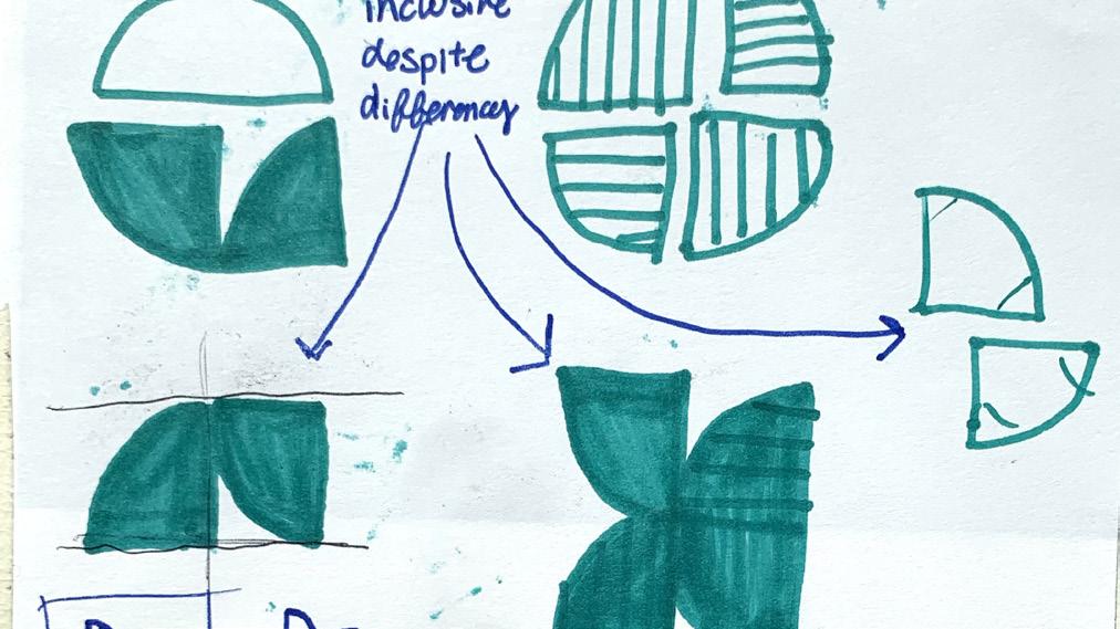
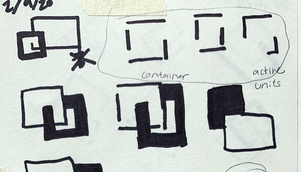
I began the project by creating a new visual mark and typographic mark. My goal was to create a logo that is flexible, appropriate, fitting, memorable, simple, and interesting in both content and form that will embody the origins, character, and aspirations of Corner Health + Wellness. The below word set and mission statement aided my beginning explorations. This process began with paper sketches. I began by exploring how a horizontal hierarchy emulates the non-judgmental patient/doctor relationship at the Corner; it is a symbiotic relationship. Patients have volition while the doctors are there to support them and include them. They two units are integrated and coexist.
mission statement
to inspire 12- to 25-year-olds (and their children) to achieve and sustain healthy lives by providing judgment free, affordable health and wellness care and education
brand personality
• welcoming • inclusive • nonjudgmental • supportive • dignified • respectful • engaging • diverse • special • integrated • unified • intersectional • valued • heard

digital iterations
The first motif I explored further digitally. It visually represented the symbiotic relationship between a doctor and a patient. One cannot exist with out the other. They rely upon each other, but the patient still maintains importance. These explorations also have the sense of a literal corner, which is a bonus and wasn’t my intention.
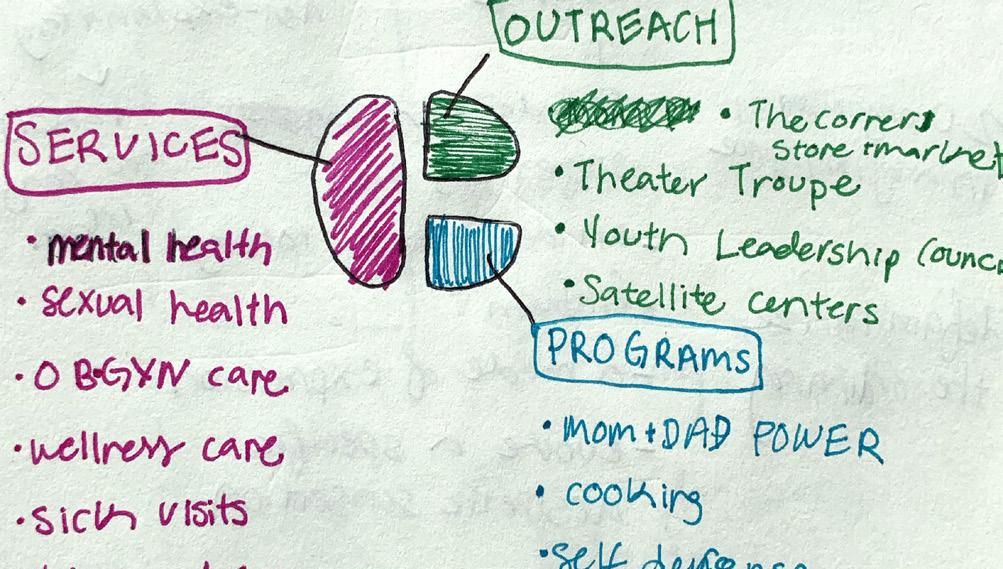
The second motif explored digtially was a segmented circle that represented the many different pursuits of the Corner. It is so much more than a health center. They do so much for the Ypsilanti community and I wanted to represent that visually.
typography explorations
I explored many different typefaces. I wanted to choose a typeface that reflected the openness and welcoming nature that the Corner exudes. I paid close attention to how a bold weight and light weight could be integrated for the word mark. I wanted a lowercase, sans serif to create a youthful essence.
corner
health + wellness
ITC Avant Garde Gothic Pro
corner health + wellness
Franklin Gothic URW
corner
health + wellness
Supria Sans
corner
health + wellness
Guanabara Sans
corner health + wellness
Montserrat
color exploration
After review with the client, he felt that it was imperative to have a new logo that stayed connected to their heritage while still signaling change to the community. He preferred a warmer color scheme and the circle design with all the units creating a whole, to signal inclusion.
Due to the first motif not being able to scale well, I pursued the second motif for the final iteration. I experimented with many different color schemes. I wanted the new color scheme to hark back to the old color scheme. I did this by still including an orange and green, but far less saturated and intense. original color scheme
corner health + wellness corner health + wellness corner health + wellness
corner health + wellness corner he alth + we llness corner health + wellness
corner health + wellness
new explorations corner health + wellness corner health + wellness


