For permission requests, contact
Dry Heat is a platform where we can share artist interviews, essays about art that matters, and more. You can find us on the campus of the University of Nevada, Las Vegas. Marjorie Barrick
The Marjorie Barrick Museum of Art supports smart, passionate art writing from Southern Nevada and beyond.
HALF OF WHAT WE SEE IS WHAT WE KNOW: A CONVERSATION WITH HARRY ROSEMAN
1 ISSUE 004
Copyright © 2024 Marjorie Barrick Museum of Art, Dry Heat. All rights reserved.
means, including photocopying, recording,
permission
the publisher, except as permitted by U.S. copyright law.
EXECUTIVE DIRECTOR Alisha Kerlin EDITOR D.K. Sole COPY EDITOR Michael Freborg, ¡Katie B Funk!, Montaysia Sims, & Summer Thompson CREATIVE DIRECTOR & ILLUSTRATIONS Chloe J. Bernardo ISSUE 004 SUMMER 2024 BEYOND PARODY: OMEGA MART AS A NON-TRADITIONAL ART SPACE
Museum of Art, University of Nevada, Las Vegas. 4505 S. Maryland Pkwy. Box 4012, Las Vegas, NV 89154 www.unlv.edu/barrickmuseum 702-895-3381 Published by www.PRINTNEWSPAPER.com, Paris, France.
No part of this publication may be reproduced, distributed, or transmitted in any form or by any
or other electronic or mechanical methods, without the prior written
of
barrick.museum@unlv.edu.
I MISS R.A.D.A.R. ALMOST ON THE BRINK OF ZEN COLLEGE OF FINE ARTS
OMEGA MART AS A NON-TRADITIONAL ART SPACE BEYOND PARODY
The concept of the artist store has become a significant place for artists and viewers alike to explore the lines between art and commodity. Exploring these blurred lines is particularly fascinating in a city like Las Vegas, where the two things seem inextricably tied. Like the idea of the store, the Las Vegas art scene also strays from the conventional aesthetic of the museum project. The museum has consistently sought to dominate how art is exhibited and perceived, with the white cube—a hushed room painted stark white—as its primary mode of exhibition. Although the white cube attempts to show itself as the tabula rasa supposedly needed to present serious art, it has transformed into the “cipher for institutional officiousness,” as Elena Filipovic describes in her novel essay, “The Global White Cube.” Filipovic argues that the legibility of an artwork as work depends on its surrounding structure.1 The white cube has become the primary vehicle that determines whether an artwork is perceived as art because, as she puts it, “an artwork belongs there [in the white cube] because it is there.”2 However, what should be said about art places beyond the traditional white cube? Moreover, how can we better understand art places in cities, like Las Vegas, that reject the white cube and other orthodox methods of displaying art?
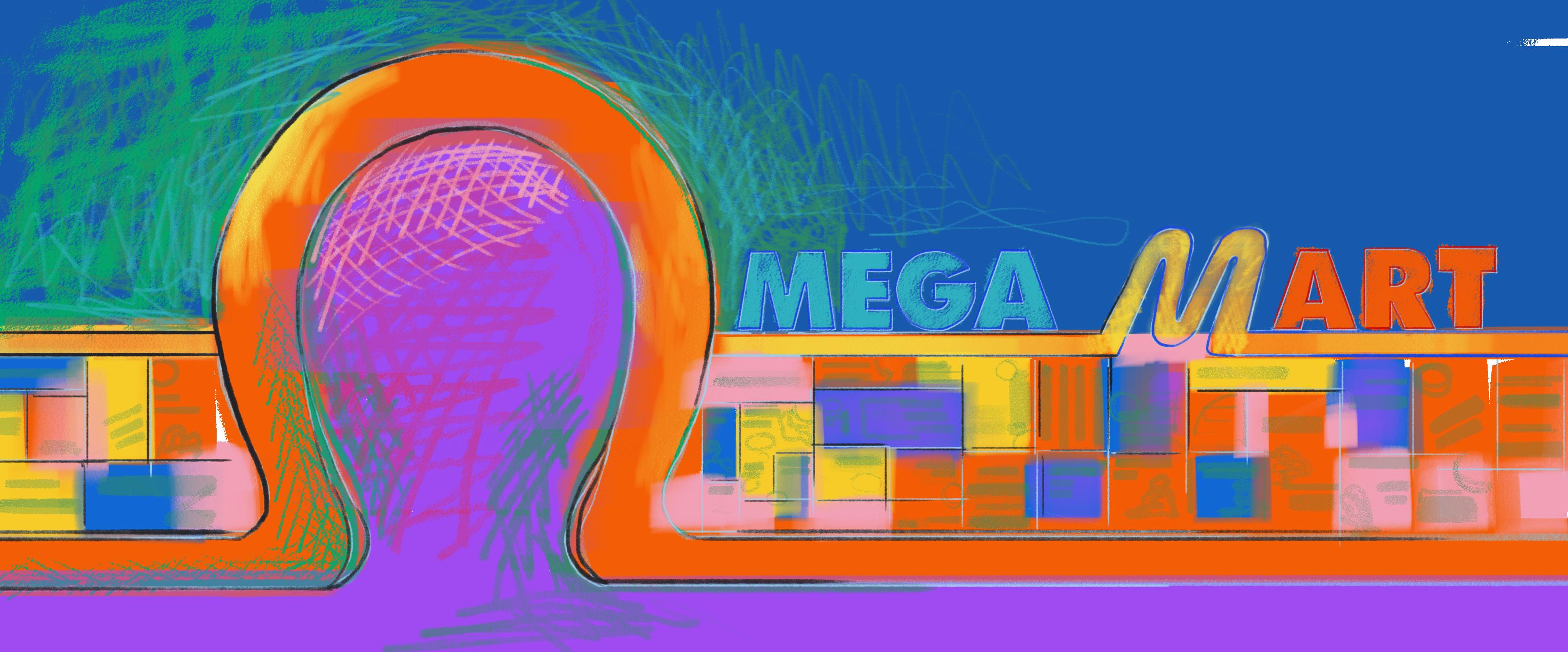
An important Las Vegas art place that extends beyond the white cube is Omega Mart, an interactive exhibition space that looks like an ordinary grocery store. Viewers enter and are welcomed to peruse the shopping aisles. At first glance, the products displayed on aisle shelves seem ordinary—cereals, soaps, and other everyday items appear ready for consumption. However, upon closer inspection, the space playfully disorients the viewer’s familiarity with such commonplace objects through parody.
1 Elena Filipovic, “The Global White Cube,” in The Manifesta Decade: Debates on Contemporary Art Exhibitions and Biennials in Post-Wall Europe, ed. Barbara Vanderlinden and Elena Filipovic (MIT Press, 2005), 324.
2 Filipovic, “The Global White Cube,” 324.
The parody expressed in Omega Mart reflects Linda Hutcheon’s famous description of parody as “a form of repetition with ironic critical distance, marking difference rather than similarity.”3 In other words, parody takes a familiar thing and humorously shifts its meaning to highlight difference, thus suggesting new meaning. Humor seems to be the most important binding factor when considering definitions of parody because, as Hutcheon describes, humor “overtly makes room for added social dimensions.”4 While humor and difference create parody, parody must begin from a place of similar understanding before it can be appreciated or even understood.5 This similar understanding takes into consideration the personal and the social of the instigator of the parody and its receiver.6
Because of parody’s humorous nature, it is often seen as derivative (or perhaps kitsch), thus largely snubbed by traditional art places like the white cube. Hutcheon explains that parody’s rejection by more formal institutions stems from its “trivialization through the inclusion of ridicule in its definition.”7 Furthermore, Hutcheon explains that because of the dichotomous nature of parody, it always implicitly reinforces as it ironically debunks, thus seeming ideologically suspect to some because of its ironic ambivalence.8 Robert Chambers similarly explains why parodic art receives such staunch criticism. Chambers argues that since parody treats art in all its glory and seriousness as a collection of reusable parts, “it is also likely to provoke distaste and misunderstanding from those who like their art
3 Linda Hutcheon, A Theory of Parody: The Teachings of TwentiethCentury Art Forms (1985; repr., Urbana and Chicago: University of Illinois Press, 2000), 14.
4 Hutcheon, A Theory of Parody, 133-134.
5 Hutcheon, A Theory of Parody, 15.
6 Ibid.
7 Hutcheon, A Theory of Parody, 138-139.
8 Hutcheon, A Theory of Parody, 14.
2 DRY HEAT SUMMER 2024
FRIDA PLATA AUTHOR
straight.”9 For those who do not like their art straight, Omega Mart is a distinct “other” art place that offers a prime example of good parodic art.
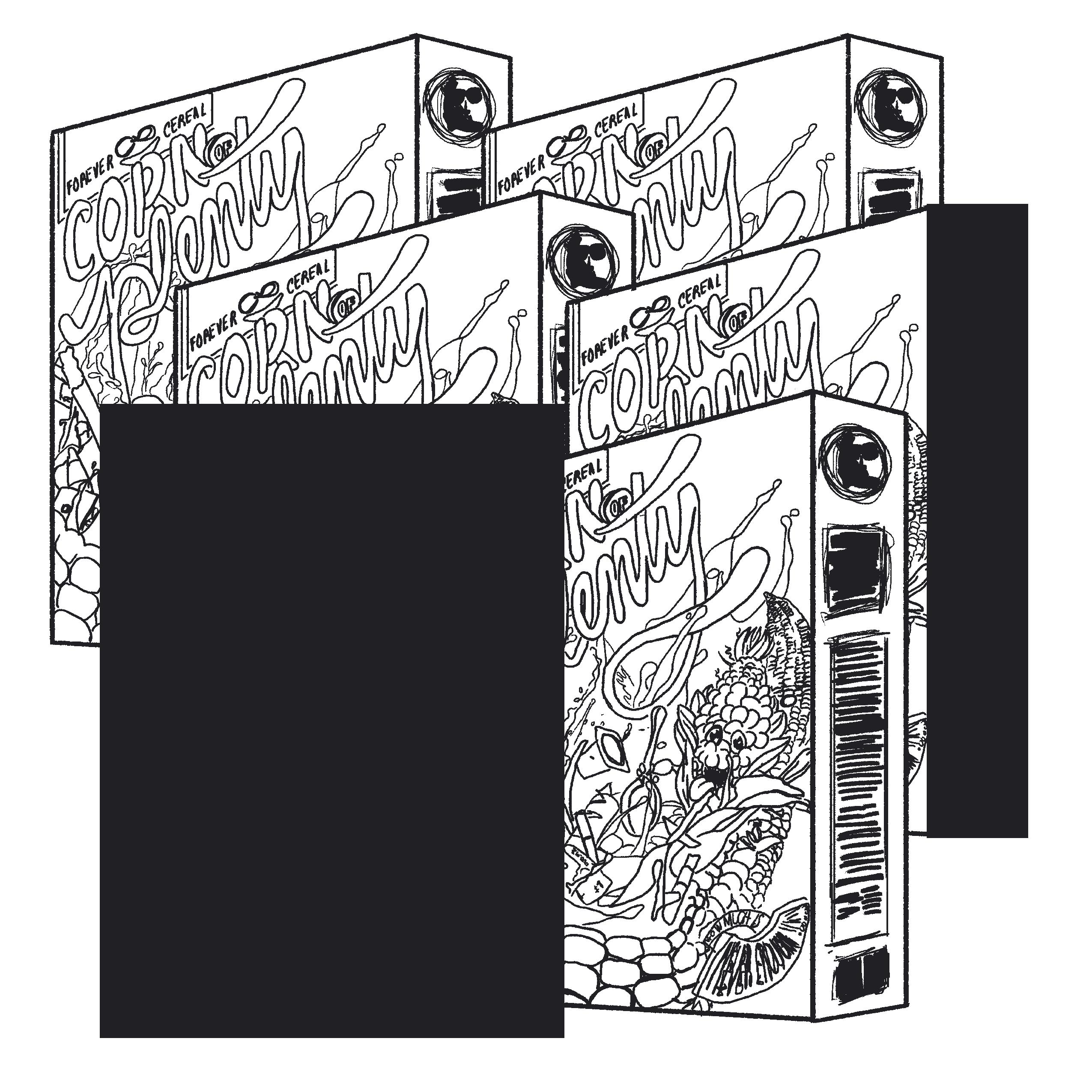
For example, one of the products sold in the store is a cereal, Corn of Plenty. Although this product seems like a run-of-the-mill children’s breakfast food because of its colorful packaging, playful typography, and product mascot (an enthusiastic anthropomorphic corn cob), it parodies a useful comestible good. Once the viewer opens Corn of Plenty, rather than finding cereal, they only find inedible plastic bits.
The parody observed in a “consumable” object like Corn of Plenty concerns the cereal’s utility (or lack thereof). The cereal appears just like ordinary cereals, and the setting in which the viewer encounters it models those that signal exorbitant consumption (e.g., a grocery store). As a result, the viewer’s desire is triggered, and the designed visual response compels them to consume the object. The ironic inversion in Corn of Plenty is that although it has become an object of consumptive desire, it cannot be consumed. The cereal’s entire existence—its usefulness—hinges on its ability to be ingestible. Yet, Corn of Plenty is only composed of the visually consumptive, not the nutritionally consumptive (what ordinary cereal is intended for), thus making its usefulness obsolete. Even the object itself warns the viewer of its own uselessness. Text on the box’s side panel informs readers that it “may appear novel or even satisfy one of your human needs” to eat the contents. But because the Corn of Plenty is merely made of plastic, the panel ultimately describes the cereal as “waste.”
Corn of Plenty and the other objects in Omega Mart demonstrate parody using three significant conventions. The first convention of parody is visual. Objects in Omega Mart have similar form, material, and scale to everyday consumptive objects. Since these products appear mimetic to the products they parody, they visually signal their consumptive appeal, thus their usefulness. More specifically, their usefulness and
the performance meant to extinguish desire would be to ingurgitate all the box’s contents. However, the products may seem useful for consumption but only contain virtually useless materials (like bits of plastic). Omega Mart products reveal their parody visually in their assumed consumptive appeal because these apparent “consumable” products only hold useless or non-consumptive materials inside.
The second parodic convention found in Omega Mart is linguistic. The naming conventions of its objects appear similar to those they imitate. By using abundant and fulfilling language such as plenty and more the products beckon the viewer towards desire and consumption. Other linguistic conventions include using words like alpha and omega. For instance, some of the pricing signs in the store’s produce section read, “alpha products omega savings,” with “alpha” and “omega” highlighted in yellow. These terms refer to the first and last letters of the Greek alphabet, imparting a sense of infinity to Omega Mart, where products seem abundant and desire unending. Additionally, the use of alpha and omega evokes the Book of Revelation, in which God says, “I am Alpha and Omega, the first and the last.” In other words, Omega Mart calls itself the alpha (or the first) from which the viewer understands their meaning and purpose. The omega (the last), used in the store’s name, reveals its eternal source of life—life ends at Omega Mart because with it the viewer can sustain a consumptive life, thus a meaningful life. Even the store’s doorway is omegashaped, enlarged and expanded in such an obvious way that it almost goes unnoticed before the viewer even passes through the entrance because all the consumptive objects inside immediately bewitch them. But without an alpha symbol near the doorway to pair with the enlarged omega, the viewer only enters into the “end,” which could perhaps imply something more insidious. As in, the viewer cannot leave the store because they are diverted into constant consumption by Omega Mart’s many offerings, potentially leading them to their end.
Omega Mart’s third important parodic convention is performative. Viewers participate in the work as themselves, performing as consumers because of the store’s visual similarities to a regular grocery store. The parody of the performative convention can be found in that the viewer eventually realizes they are shopping for virtually useless or nonsensical items, yet they pay real money to purchase these items, despite fully knowing their uselessness. Although viewers knowingly purchase the impractical objects, their willing participation stems from a reference familiar to basically all modern people—consumerism.
This familiarity with consumerism speaks to what Arjun Appadurai describes as tension between “cultural homogenization and cultural heterogenization.”10 In other words, while globalization brings a homogenized force to a city, it becomes indigenized in some form.11 In the case of Omega Mart, the space exhibits cultural
3 ISSUE 004
Arjun
295. 11
Nicholas Toll, Corn of Plenty Forever Cereal, n.d. Recycled plastic. Illustration reference courtesy of Frida Plata.
Appadurai, “Disjuncture and Difference in the Global Cultural Economy,” Theory, Culture & Society 7, no. 2-3 (1990): 295–310, https:// doi.org/10.1177/026327690007002017,
Ibid.
homogenization by behaving like a typical American store, replete with several variations on the same product. Additionally, it shows homogenization in its “immersive experience,” which seems to have gained traction in cities across the globe. Some recent immersive experiences include WNDR (Chicago, San Diego, Seattle, and Boston), Immersive Van Gogh (shown in over forty U.S. cities as well as in Europe and Asia), Frameless and Wake the Tiger in the UK, Theatre of Digital Arts in Dubai, Atelier des Lumières in Paris, A Midnight Visit in Australia, and the work of the international teamLab collective, just to name a few. The popularity of these immersive experiences has only grown, with more of them opening in Las Vegas and beyond.
What indigenizes Omega Mart to art places in Las Vegas is the store’s connection to local artists themselves, who partook in the shaping and visual narrative of the experience. Local artists helped create many of the objects found in Omega Mart, and some of their own artworks are for sale on-site. Another factor that indigenizes Omega Mart is the store’s unabashed excessiveness. It overflows with all kinds of stimuli simultaneously performing at maximum. By contrast, the white cube prioritizes quiet contemplation unencumbered by distraction and intensely regulates how the viewer should experience an artwork. However, Omega Mart shows how the nontraditional art place provides the freedom required to imaginatively unlock new forms of innovative exchange, both with the artwork itself but also with the viewer’s fellow participants/shoppers. This is largely due to—in addition to the fun maximal stimuli—the non-linear storytelling behind Omega Mart, which empowers the viewer to choose how closely to follow the store’s narrative. The participatory agency it gives the viewer, in addition to its unstuffy approach, is what attracts both locals and tourists alike to the store.
While Omega Mart is unique in its own right, the concept of an artist store is familiar to the art world. One of the most recognizable examples is Claes Oldenburg’s The Store (1961). To advertise his store, Oldenburg (like Omega Mart) created advertisements to welcome potential shoppers inside. The Store opened in the winter of 1961 and sold food items made out of painted plaster. Unlike Omega Mart, however, these painted plaster comestibles looked more like “grotesque copies of popular goods.”12 Despite their grotesqueness (perhaps even because of it), shoppers purchased Oldenburg’s “foods,” and his store remains one of the most recognized by the art world.
12 Naomi Huth, “Artist Stores: An Education in Art and Commerce”, 14.
The white cube’s hypocrisy is revealed when it criticizes non-traditional art places like "Omega Mart" for its apparent derivative nature and still venerates work like "The Store."
When comparing Oldenburg’s The Store with Omega Mart, it is important to highlight what some critics seem to gloss over—both stores offer objects for purchase. Indeed, while both stores function commercially, critics unfairly place Omega Mart in a category of entertainment rather than art precisely because the store foregrounds its commercial function. Granted, Oldenburg did not anticipate actual buyers because he advertised the project almost exclusively to artists and members of the art community.13 Furthermore, his Store already received funding from Green Gallery in exchange for a small commission on sales.14 However, both stores yielded a similar result in that they were beholden to funders and consequently maintained little decisionmaking power as to how commodified their works became. Once they were surrendered into the hands of their funders, both stores could no longer outrightly stand against art market commodification.15
The white cube’s hypocrisy is revealed when it criticizes non-traditional art places like Omega Mart for its apparent derivative nature and still venerates work like The Store. Oldenburg’s work continues to gain accolades and receive credit for inspiring other world-renowned artists like Damien Hirst (Pharmacy, 1992), Keith Haring (Pop Shop, 19862005), and Takashi Murakami (©Murakami Louis Vuitton Store, 20072008). In fact, Oldenburg’s store made him an “old master,” as art critic Jed Perl famously writes.16 Not to mention objects from The Store have been warmly received and exhibited in some of the most famous white cubes like the Whitney and New York’s Museum of Modern Art.
Besides a credit wall outside the store, each artists’ contribution to Omega Mart remains largely anonymous. The same cannot be said for The Store, which only features objects that the artist himself created. Non-traditional art places like Omega Mart retaliate against the traditionalism of the white cube by deviating from its rigid exhibition formula. This formula involves the display of a particular work within a minimally adorned space and, whenever possible, a specific crediting towards the artist(s) involved in creating the artwork. Omega Mart’s refusal to traditionally credit the artist’s contribution towards its institution leads to a twofold result. One, the space welcomes those with less exposure to art and museums to freely experience the artwork without feeling the need to follow the rigidity of object/artist identification that may intimidate many first-time museumgoers. Two, a different variety of artists is afforded paid creative opportunities when the exhibition is modeled like Omega Mart because their artistic value relies less on how recognizable their name is in the globalized art world. Hypothetically, this allows these artists to open new forms of creative possibilities since they are not limited by the white cube’s exhibition rules. At the very least, if these artists change their mind, they can always rely on the white cube’s unchanging rigidity in case they decide after all to desperately pander to the institution’s officiousness in exchange for a more traditional artist recognition.
The white cube’s traditionalism, as it remains, fails to recognize how emerging art places like Omega Mart can unlock new ideas, create new meanings, and bring life into art spaces. Indeed, Omega Mart stands as an important lesson for the Vegas art world and beyond: life is colorful, and the way we experience art should reflect that.
13 Ibid.”, 21.
14 Oldenburg, Store Days: Documents from The Store, 1961, and Ray Gun Theater, 1962, 150
15 Huth, “Artist Stores: An Education in Art and Commerce”, 22.
16 Jed Perl. “The Sanitizing of a Junk-Art Genius.” New Republic Magazine, April 25, 2013.
FRIDA PLATA
Plata
4 DRY HEAT SUMMER 2024
Art
the University
Chicago
2020. Institutions
has worked at include the Dallas Holocaust and Human Rights Museum (Dallas, Texas), and the Neon Museum in Las Vegas.
Frida
is a writing professional who specializes in fashion, culture, and the arts. She received her MA in
History from
of
in
she
A CONVERSATION WITH HARRY ROSEMAN
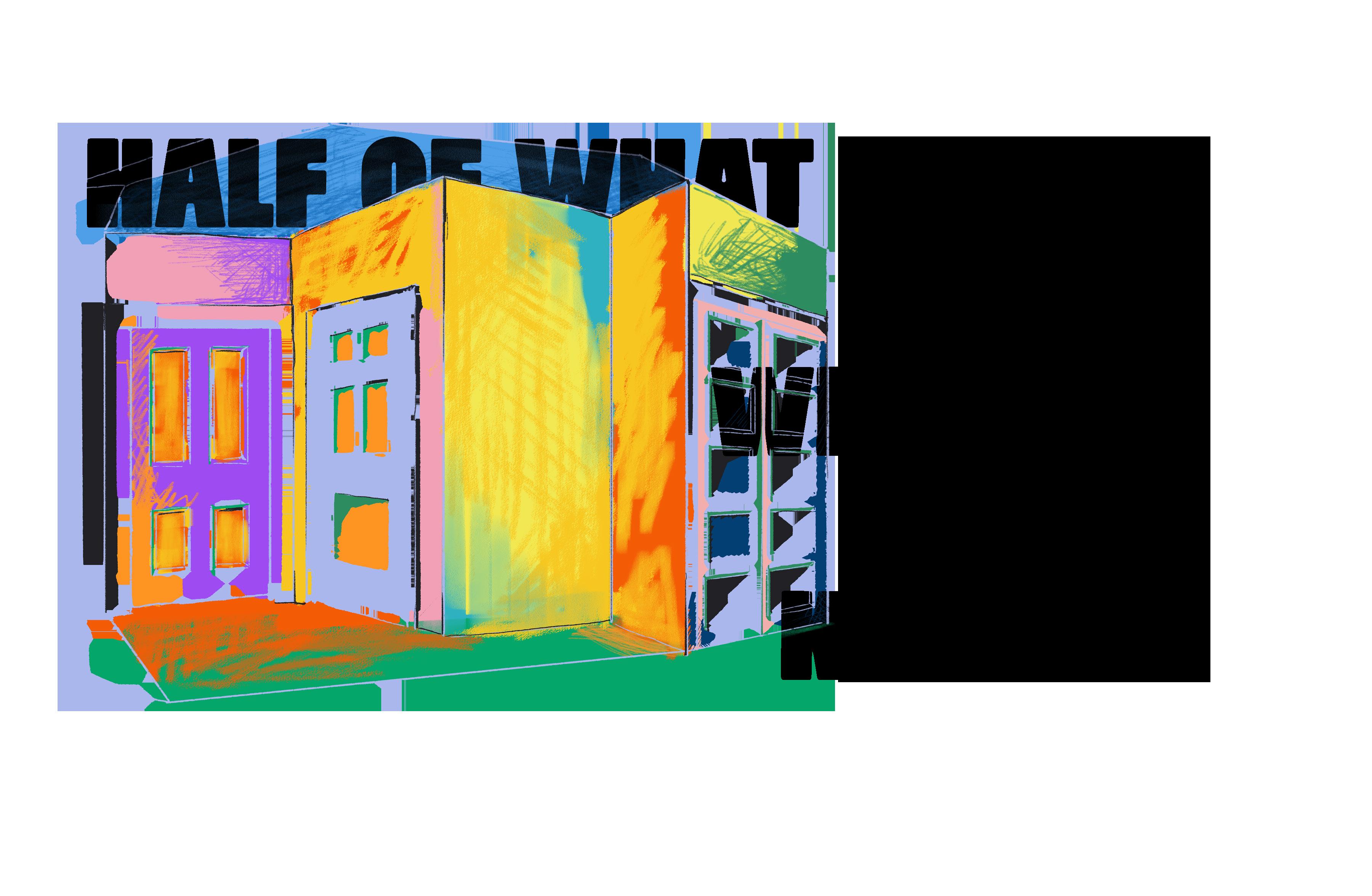
Roseman, who is based in New York, has previously talked about the “little jolt” that he feels when he sees a point of “tension between the two- and three-dimensional worlds.” “I like the notion of slippage,” he told the writer Carole Maso in 2003. As he talked, we were interested to hear his ideas of slippage and scale-shift carrying over briefly into a discussion of Las Vegas.
HARRY ROSEMAN So this one, if I’m not mistaken, if you want to know something technical—
ALISHA KERLIN Sure
—about why it looks the way it does, for instance the patina and the color, since that’s a bronze one, right?
Yes it is.
I got very attached to a certain kind of patina, which was acid and actually real silver that you would dissolve into the acid, and then when you would brush it on and heat up the work, if you got to a certain point, it became like this sculpture, almost black, with a little bit of hint of the silver. So I did a number of sculptures, relatively larger, maybe four or five feet high, which I also patina’d in the same way.
It does have a rich surface; it’s got a little kind of like the wetness of a chocolate bar.
Boy, I was so attached to that. Usually when you get an estimate at a foundry, they don’t start asking you about, how are you going to patina it, and the foundry would get pissed at me sometimes because I would use up a lot of silver. Other kinds of patinas are much less expensive to do. “Let’s throw some more silver into that acid over there.”
You know, I’m looking at your site as we’re speaking now— Oh good, good. Maybe I should pull it up too—
I’m seeing from that era, 1974 to 1990, a lot of work that— and your interest in, as you said, in compressed space, makes sense that you would be making sculptures of
very compressed in space, and they’re a relief in the sense that they have a front and a back, but unlike Three Doors and some of the other reliefs I did at that point, these are made to be seen all around. There’s a point that locks in to my viewpoint and then as you move out of that, the sculpture stays in that viewpoint, but you magically get to change your viewpoint. So that, if you’re looking at it from the side, it’s still facing the other way. It’s sort of a way of freezing time. I love reliefs, and a lot of my current work is still relief-related, I mean even the plywood sculptures, and I love the idea of experimenting with what part of making a relief is a decision, and what part has to do with actual perception. So the cityscapes was my way of very much trying to be visually analytical, to how I actually saw the world literally, and to jettison knowledge. Because half of what we see is what we know and not what we’re seeing. It’s not easy to jettison that information, because it’s so much a part of how we move through the world. So that was exciting for me. Then a lot of the others were how I understood compressing the space and reliefs in relationship to what I actually saw. So if you go to, let me see, I’m going to go to ‘74 to ‘90 where the Three Doors are, and you scroll down and get to, uh, close to the bottom, you see a painted sculpture, and then a rock and clouds, and then a still life in the middle?
Yeah.
I went through this series of reliefs where I was really pushing not only how flat I could talk about space, but also how I would deal with the surrounding space, and what its role was. In the one that I pointed out to you, you can see the board that the two objects are on moves into the plane of the plaque, which is a way for me then to have a, what would I say, maybe an anomalous, maybe a transactuality, of how we think about the way objects sit on spaces, to have those objects move independently, and then the flat plane is a given and doesn’t change, but the still life moves out of it and into it. I did a whole bunch of those. The first one was nothing but an inscribed line. I would say some of my most formidable things I looked at when I was young, like, a kid, revolved around two things: Egyptian art and train sets, or miniaturization —which deals with scale. When I was a kid and went to the Brooklyn Museum, where I hung out the most was in the Egyptian section and also the ethnographic section, because they had these little models of villages and people and stuff. Then riding the elevated train in the city. It wasn’t ‘till decades later and I started making grown-up work, and backed up for a minute and said, “Oh gees, that’s where all this stuff comes from.”
I went through this series of reliefs where I was really pushing not only how flat I could talk about space, but also how I would deal with the surrounding space, and what its role was.
I love hearing that, because we always like to fool ourselves we know exactly where things are coming from as we’re making them.
I think lots of times one doesn’t, until it seeps into your brain slowly, and you go, “Oh, that’s why I am who I am.” Actually I used to spend a lot of time in Las Vegas. My parents lived there for a while and my sister lived there until extremely recently, when she moved to Florida. So I would go visit once in a while. I don’t know, it’s a odd place and I got a kick out of going because it was intriguing. Part of what I do in my work, and have done, and still do, is to question perceptions of reality. And boy, Las Vegas does that. You know, big time.
Can we quote you on that?
Sure. One thing that I got a kick out of, when my sister moved to Las Vegas, many years ago, um, I grew up in Brooklyn, and I sound like I’m from New York but my sister had a Brooklyn accent like out of a movie or a comic book, and when New York-New York was first built she went in there and they kept offering her a job.
[laughter]
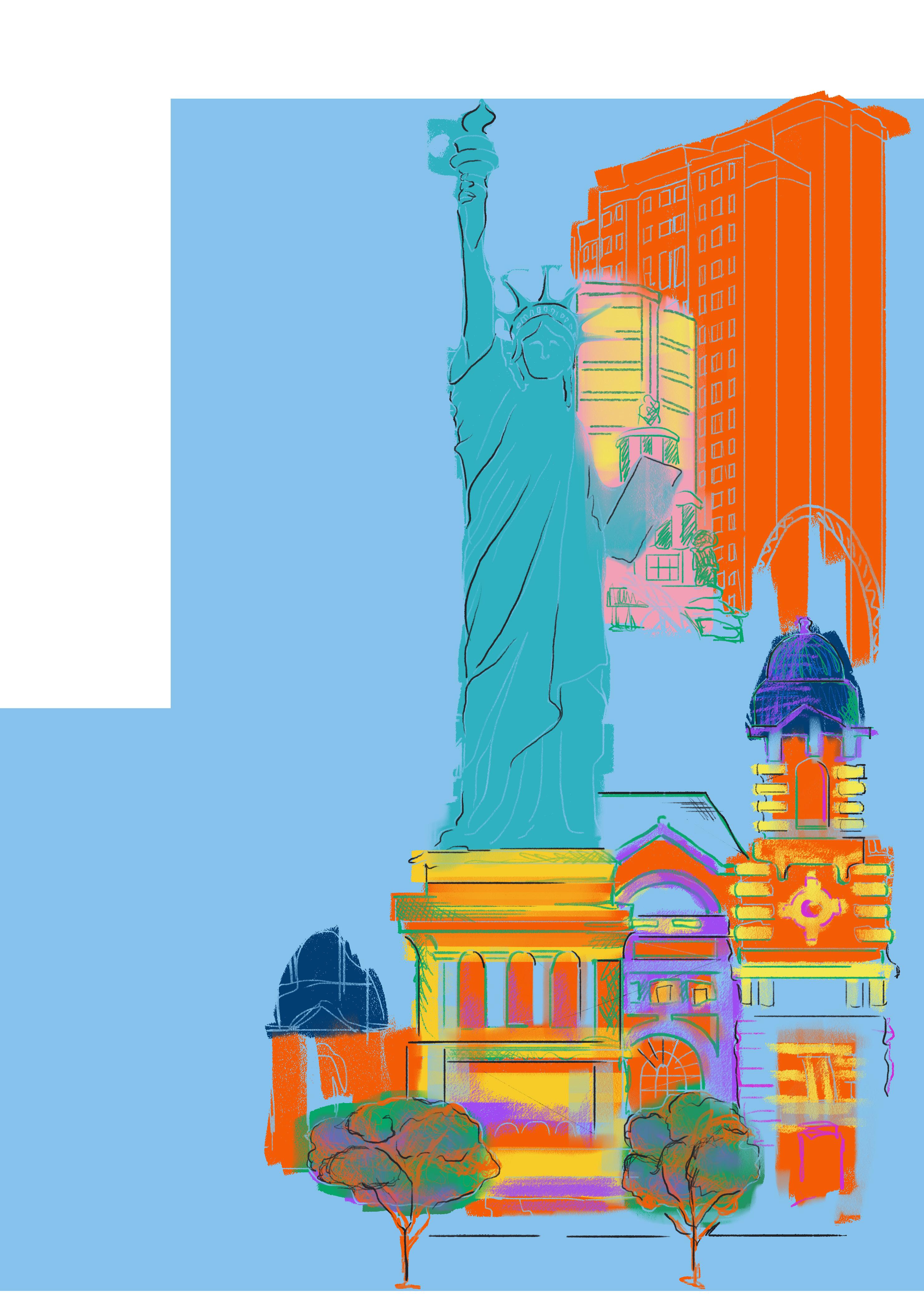
The thing I always loved about New YorkNew York, is it was three-dimensional. Where most of the other casinos have a front.
There’s even a roller coaster.
Yes, it’s much more sculptural because of that. Which I did like. The inside is more like the other ones, insofar as some places are nice and some places are just cheesy, but the outside I thought was spectacular, and still do. It compresses all these different places into a line of buildings as if they actually were originally next to each other, which they were not. The bridge is pretty good too.
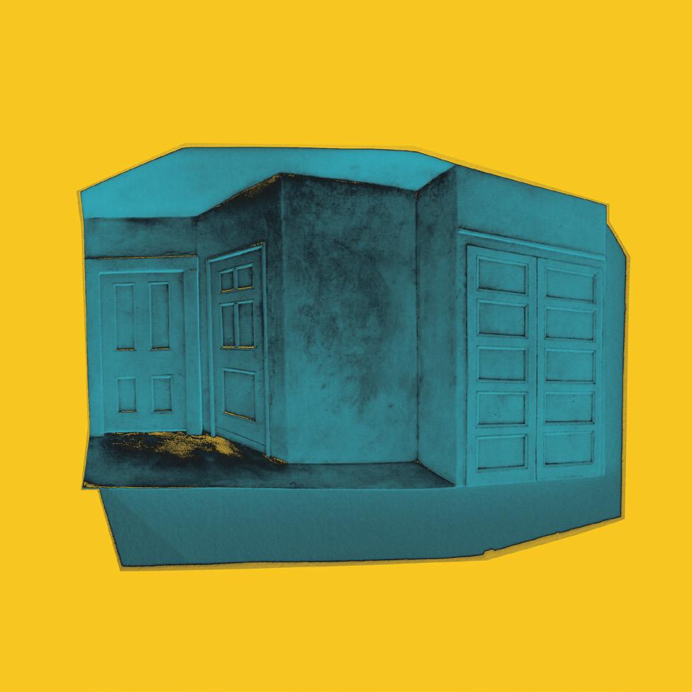
Altered photograph. Harry Roseman, Three Doors, 1978–1982 Bronze and patina. Marjorie Barrick Museum of Art Collection; Gift of the Las Vegas Art Museum, 2021; Gift of Patrick Duffy and Wally Goodman, Goodman Duffy Collection, 2008. 2021.08.172
I mean the students here, you don’t have to teach what juxtaposition is, they get it.
Yeah, yeah. I think it would be curious to go to art school in Las Vegas.
We’ve had professors teach art history and send students to the Strip, to write about it in the context of the Strip, and I found that to be so interesting, right, you can’t go see Art Deco, or sculptures, like if you were in New York, to go to The Met, but you can see their references.
Right, right, exactly.
A field trip to the Strip. Oh my gosh, we’ve got to get you to the top of the Stratosphere, here in Las Vegas.
I’ve been up there once.
HARRY ROSEMAN
Oh you have?
I have. And I did like it. Very much.
It spins. It spins. And then there’s the Big Shot at the very top, where you can ride up to—
I didn’t do that. [laughter] I said, “Uuuerr, I don’t know.”
It is amazing, because you can see where the city just ends, right at the edge of the mountains.
Well that’s another thing that’s so extremely interesting about Las Vegas. You get to the end of a block and then it’s not there any more. It’s just, when we were there, sometimes I would drive around and I would love when I got to the end of the neighborhood, and then to the desert. It was amazing, like a line was drawn. And I imagine it’s still the same, but it probably does spread, little by little, all the time.
It sure does. But there are spots where it just ends like that, still.
And I did love that a lot, actually. It was so surreal.
So I’m wondering if we could bring it back to Three Doors, so we have—
Sure.
I know you teach.
Yes, but this is my last year. I’ve been at Vasser for like thirty-nine years. And I said, “Eh, it’s enough.” And it’s the kind of job where you can spend a lot of time in your studio. But I’ll be happy just to spend all my time in my studio.
Well congratulations, early congratulations on that.
Thank you.
Part of this conversation is making available to students and aspiring curators and researchers some information about the piece. What can we add? Students who are maybe just starting to study casting might be interested in what you’re talking about, about the patina, but what about your process to arrive at your forms? Do you draw?
Sometimes I draw. A lot of times I sculpt directly. And I sculpt in—at that point it was either, it was often Plastilina, you know, an oil-based clay—since I knew I was casting, and I didn’t want to have to worry about keeping things wet and covered. I often worked with Plastilina. Do you know what that is?
Is it the same thing as plasticine?
Yes. And that comes in various hardnesses, and because I have a certain amount of control I’m able to get very sharp edges
Harry Roseman’s practice includes sculpture, drawing, web-based projects, photography, and video. He received his BFA from Pratt Institute in 1968. After graduation, he was an assistant to the artists Joseph Cornell and Tony Smith. He has had numerous one-person exhibitions and has shown his work in Sweden as well as widely in the United States. His public commissions include sculptures in John F. Kennedy International Airport, the New York City Subway, and the Library at Vassar College. His work is in many public and private collections. Roseman is the Isabelle Hyman Emeritus Professor of Art at Vassar College, New York.

6 DRY HEAT SUMMER 2024
with that. We all have attributes and flaws and one of mine, if I would think it’s an attribute, is I’m very patient. I can work something for a long time until I get it to where I want it to be.
You can tell that by how every plane on the door is nuanced. Everything about the way the door sits inside of the frame, all of it. […] I love it when artists seem to get Las Vegas in the way that I love Las Vegas, and you’re—
Well, very fascinated by it, that’s for sure.
You know, I think about my visits to Hoover Dam, and there’s this little model there—
I love going to Hoover Dam.
And also the New York-New York casino. You never know, right?
It’s just almost electric. I must say, sometimes Las Vegas strikes me as a dark place. Probably it is in a lot of ways. But visually every time I’ve been there I go through this series of looking and then being analytical and then being a little depressed and then fifteen minutes later being excited again. So, I—boy, is it not boring.
I’m excited about what you’ve said, because you’ve articulated that moment when I came out here for an artist residency years ago, before I had this role, and I had a very similar cycle of depression and excitement.
I think it’s a little like living in a dream.
It is.
My wife [the painter Catherine Murphy] has shown a couple of times in Las Vegas, mostly I think at Steve Wynn’s, if I’m not mistaken, because one time someone emailed and said to Catherine, “I saw one of your paintings in Las Vegas,” and of course, since artists aren’t often told where the work is, she said, “I think you’re mistaken.” But there it was, so that was of interest. Also, I’m having a block, who’s the guy who is a critic—I just feel ridiculous now—whose home was Las Vegas and he was very well known and somewhat outrageous?
Dave Hickey, you mean?
Yes, that’s who. Because one time we went there and we had coffee with him, which was a lot of fun, and it was funny because before we met him he said, “I might have to leave very quickly,” and then when we met up with him we talked for hours and I realized that was an escape card for him. So if he said, “I’m bored to death,” he would say, “Oh remember I had to leave.” But he didn’t do it, so that’s what made me think it was a safe way of getting out.
Taking notes on that one.
It was a good idea. If he left in five minutes we couldn’t have our feelings hurt, since he said he had an appointment. Which never came up again when we were sitting and talking.
7
R.A.D.A.R. i miss
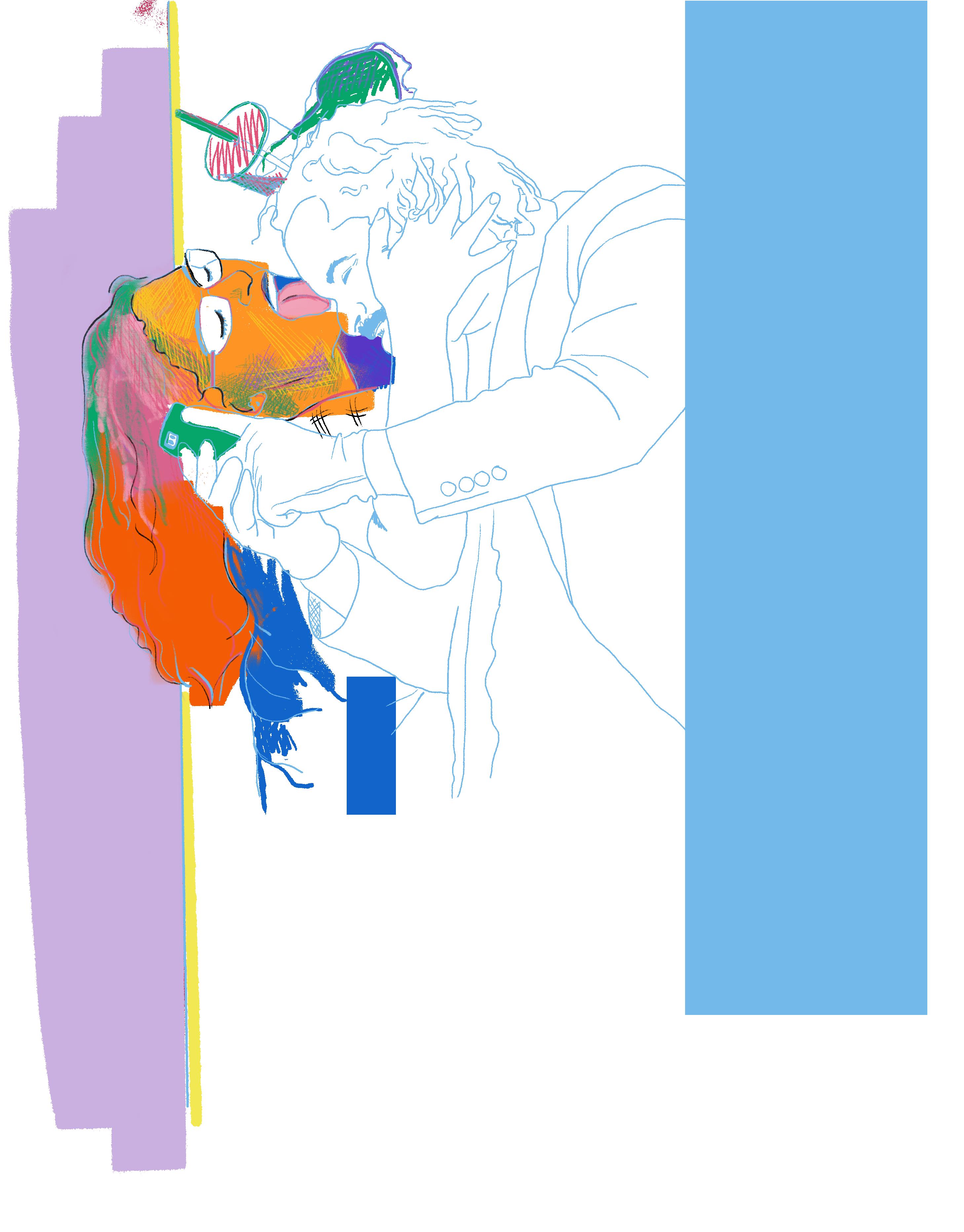
I miss R.A.D.A.R. I miss the gatherings every other Wednesday night where no one knew who would show up or what was going to happen, but attended anyway with the promise of an experience to remember. I miss meeting artists from every kind of performance stage, including comedy, music, theater, Cirque du Soleil, white box and black box galleries, and probably even Fremont Street too. I miss running into old friends, making new friends, and convincing skeptical friends to attend. I miss holding hands, eating, and talking with strangers about “What just happened?!” or “Did they just do that?”
I miss the food we ate, threw, shared, spit up, wore and cooked. I miss the grasshoppers in curry, homemade tortillas, beer, tea, chili, jalapeño cheese bread, Peeps, baklava, popcorn, birthday cake on head, gross candy concoction gulped down with cheap red wine, pomegranate seeds, personality-based custom-made nosh, etc.
I miss the made-up characters like book face, chair wrestler, plastic bag head, tripped-out cartoon creature, chef, healer, and loofah priest. I miss the not-so-made-up characters like oppressive Latino male father figure, tango dancers who just lost a friend, woman struggling with consent, struggling artist, daddy-issue-riddled son, dumb bigot cop, poet. I miss all the imitated characters like miming bride clown, ignoramus Rush Limbaugh, dumb dancing Trump, pompous Art Critic, earnest pyramid scheme saleswoman, and, one night, naive nincompoops in blackface.
I miss the intense intimacy and physicalness of it all, like the time everyone was asked to fullbody press Brent up against the wall like a vertical pileup trying to pop a balloon;
Or
the time Chris Jones played at Marina Abramović’s “Rhythm 0” and asked us to draw, kiss, and slap him among other options (I slapped);
Or the time Jung Min beat herself repeatedly with a yardlength wooden stick;
YASMINA CHAVEZ
Or
the time Alex, holding a dog shocker in her hand, asked the fifty or more audience members take turns at the control;
Or
the time Karla touched herself in front of us, hiding her act behind a mirror facing the audience (first and only time I blushed during an event);
Or
the time Clarice strangled her naked body in metal wire to the point of deformity or maybe in the hopes of it.
I miss the teary-eyed laughter-causing moments like the time Marcus wrestled a chair (albeit in spite of the disembodied wailing in the background);
Or when Ali used different brushes, including a toilet brush, to wash his mouth;
Or when Dan set up the equipment for a five-piece rock concert only to immediately take it down;
Or when Heidi climbed on top of audience members while wearing a diaper and feeding them popcorn.
I miss the therapizing, the shaved head, tattooed hand, emptying of backpack contents accompanied by pained gibberish, cathartic political rants, passed-around sand bottle filling in the style of a kumbaya circle, closed-circuited TV self-guided shaving cream ritual, bed of ice lethargic meditation, all the well-meaning acoustic guitar songs, and, of course, the HANDPAN!
I miss the self-mutilation, self-objectification, self-adoration, self-mortification, self-introspection, self-control, self-narrative, selfmade, and self-financed spectacles.
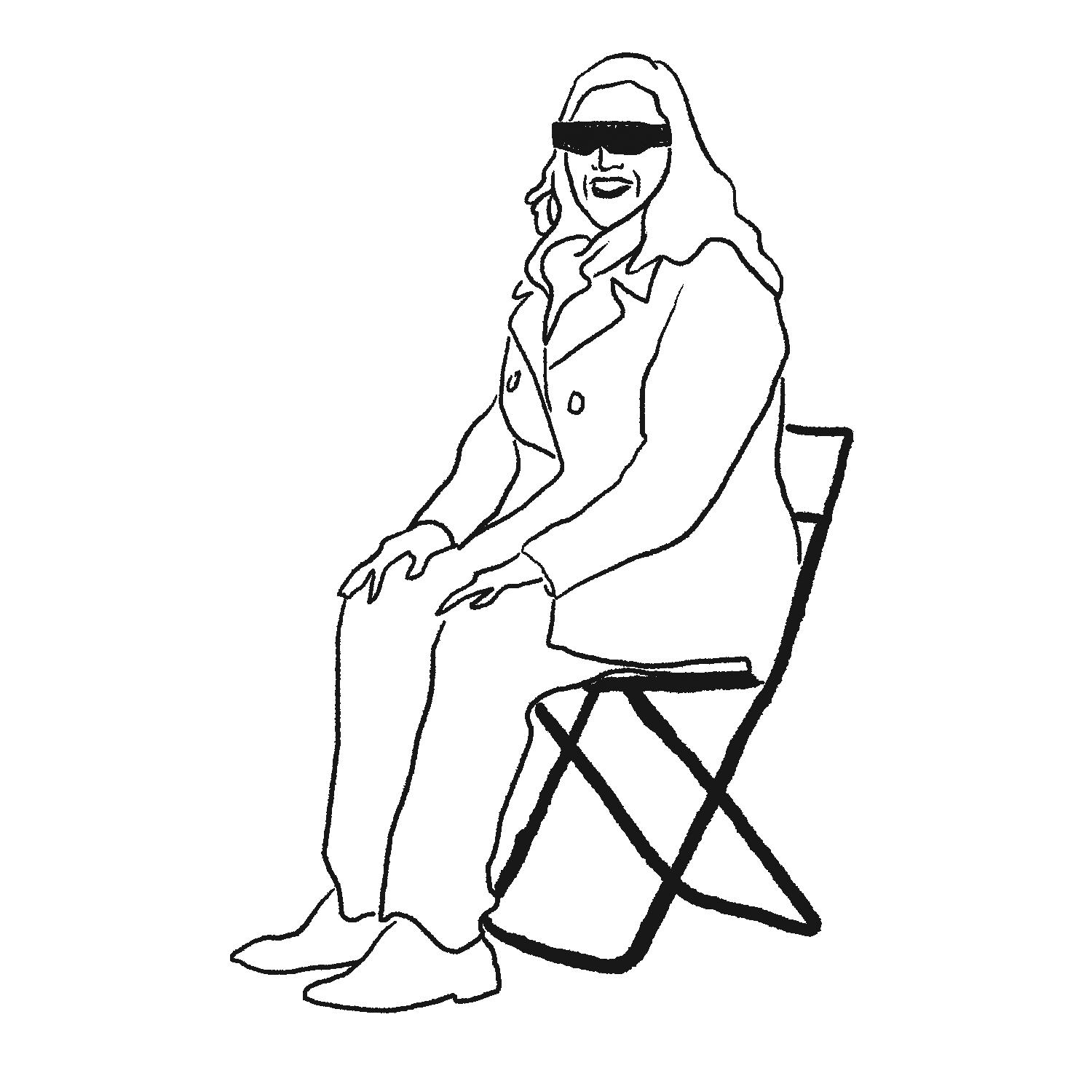
I miss the release, the reprieve, the reproach, the reprehensive, the retelling, the repenting, the repulsive, the regurgitation, the repetition, and, especially, the reactions.
I miss the awing, oohing, booing; the clapping, crying, cringing; the gagging, gasping, guffawing; the wincing, whispering, wishing; the reciting, writhing, realizing the shrieking, cheering, chit-chatting, the singing, sighing; sympathizing And the all-engulfing silence.
MFA in Electronic Integrated Arts from Alfred University, New York in 2016. Chavez works across disciplinary boundaries, including video and sound installations, experimental documentary cinema, dance, printmaking, photography and performance. She has exhibited nationally and internationally and has been a featured artist in numerous festivals. In 2011 she co-founded 5th Wall Gallery, bringing new genre installationbased work and performance art events to the Las Vegas art scene.
8 DRY HEAT SUMMER 2024
Yasmina Chavez is a time-based media artist and curator who lives and works in Las Vegas, Nevada. She received her BFA in photography from the University of Nevada, Las Vegas in 2011 and
YASMINA CHAVEZ
BY
I miss the love with its kissing, hugging, cherishing, doting, praising, rubbing, and caressing.
I miss the catharsis. “Where is the Catharsis!” (Heidi Rider)
Oh and do I miss the costumes from leotards to trench coats topped by big animal heads, wedding dress with a ten-foot veil to the business suit with a “gazillion” choking ties, nun outfit to fully bubble-wrapped skating notso-daredevil thrill seeker ensemble, the pink and gray jumpsuits to the red sequin minidress with a life-size American flag mask adorned with long gold fringe, and all monochromatic minimalist getups encompassing every color of the rainbow.
I miss the collaboration, cooperation, and participation.
I miss the last minute scramble for ideas, equipment, venue, and emcees.
I miss teaching basic Butoh in a bar, making salsa while teaching salsa, rollerblading and shotgunning a beer with an old pal while listening to Miley Cyrus’ “Party in the U.S.A.,” standing for three hours wearing a thick faux-leopard-print oversized coat while bearing a shoulder yoke carrying ten-pound bags of ice dripping over potted aloe plants on each side, the failed conga line breathing ritual, giving absolution through hand washing, patting down people with oversized Mickey Mouse hands. I miss licking, kicking, pinching, punching, biting, and climbing Brent the foiled activist! I miss performing.
Most of all I miss the experience of leaving a public art event feeling like I was part of something extraordinary; something unfettered by rules, beliefs, nepotism, associations, ambition, reputation, politeness, time and/or space, or any expectations. I miss feeling connected to my community through transcendent performance events which took courage to create, perform, endure, and witness. I miss having a home on Wednesday nights where safety was never guaranteed, but where I never felt unsafe. I miss the “nice to see you again(s),” the unconditional support, attention, camaraderie, and affection. I miss R.A.D.A.R. where I never felt ashamed, appalled, absurd, afraid, alarmed, or alone.
What was R.A.D.A.R.?
R.A.D.A.R. was a recurring performance art event envisioned during a hike where Brent Holmes, Marcus Civin, and Karla Lagunas were daydreaming about an ideal performance art event. Civin suggested it had to be “something under the radar.” Holmes declared “that’s its name,” and Karla affirmed its viability with an enthusiastic “I’d go to that.”
As the newly-hired chair of the UNLV Department of Art, Civin added legitimacy to the event and was able to secure a free space for it to take place. Holmes brought the talent, as diverse and unique as Vegas itself, that guaranteed something exciting would happen. Not only that, but Holmes, being locally known as a quirky intellectual and prolific multifaceted artist, provided a sense of trust and an underlying notion that R.A.D.A.R. would be a safe place for serious art making. And so, on November 28, 2018—at least by all verbal accounts since the first occurrence wasn’t documented—a renegade performance art incubator event was born in a large empty white-walled warehouse located at 920 S. Commerce St. in Downtown Las Vegas, NV.
R.A.D.A.R. was Kaprow’s Happenings, Vegas style; a synergetic moment in performance art that could have only happened in such a boldly existing city, where absurdity is our realism and not the other way around. Las Vegas thrives on the gambler; the power of chance. Losing takes on a different meaning here. If you lose in Vegas it means you played, which means you won the coveted Vegas story of a lifetime worth more than gold. Being creative in a place where you cannot lose allows for fearless creativity. R.A.D.A.R. pulled that out of the city into a puddle bursting with creative prowess. Unfortunately, as with most great things and puddles in Vegas, it was short-lived, with its last scheduled live gathering pivoting to livestream at the last minute due to the COVID shutdowns on March 18, 2020. The event tried to stay alive via video on YouTube, but lost its most important element, the live in-person audience.
Favorite description:
"Hey, it beats spending another Wednesday night at a bar" -EatMoreArtVegas.com
Thank you to Brent Holmes and my sister Suly Cortez for reminiscing with me and serving as my sources for this piece.
P.S. R.A.D.A.R. is not an acronym. The periods are not performing. They are just dots.
A few artists have been mentioned in this essay without their surnames. They are (in order of appearance) Alexandrea Parker, Clarice Tara Cuda, Ali Fathollahi, and Dan45 Hernandez.
Illustration references courtesy of Yasmina Chavez.
9 ISSUE 004
 WRITTEN BY SARAH BUN
ALMOST ON THE BRINK OF ZEN
"It was an amazing thing for me to grow up in Las Vegas, in the middle of the Mojave Desert, this island of light in the middle of darkness, and vast openness, vast absence, as some people would look at it, it is the Tao" — James Stanford
I often wonder what words I should use to describe the Las Vegas art identity. Is it cosmopolitan? Transient? Many artists come in, and many pack up and leave. The process repeats. Art is infused with fragility, memory, and illusion. Sometimes it leaves our mind without a trace and then comes back and continues perpetually. I’m curious. What is Las Vegas’ art identity? Local artist James Stanford’s Shimmering Zen series comes to mind to answer this enigma.
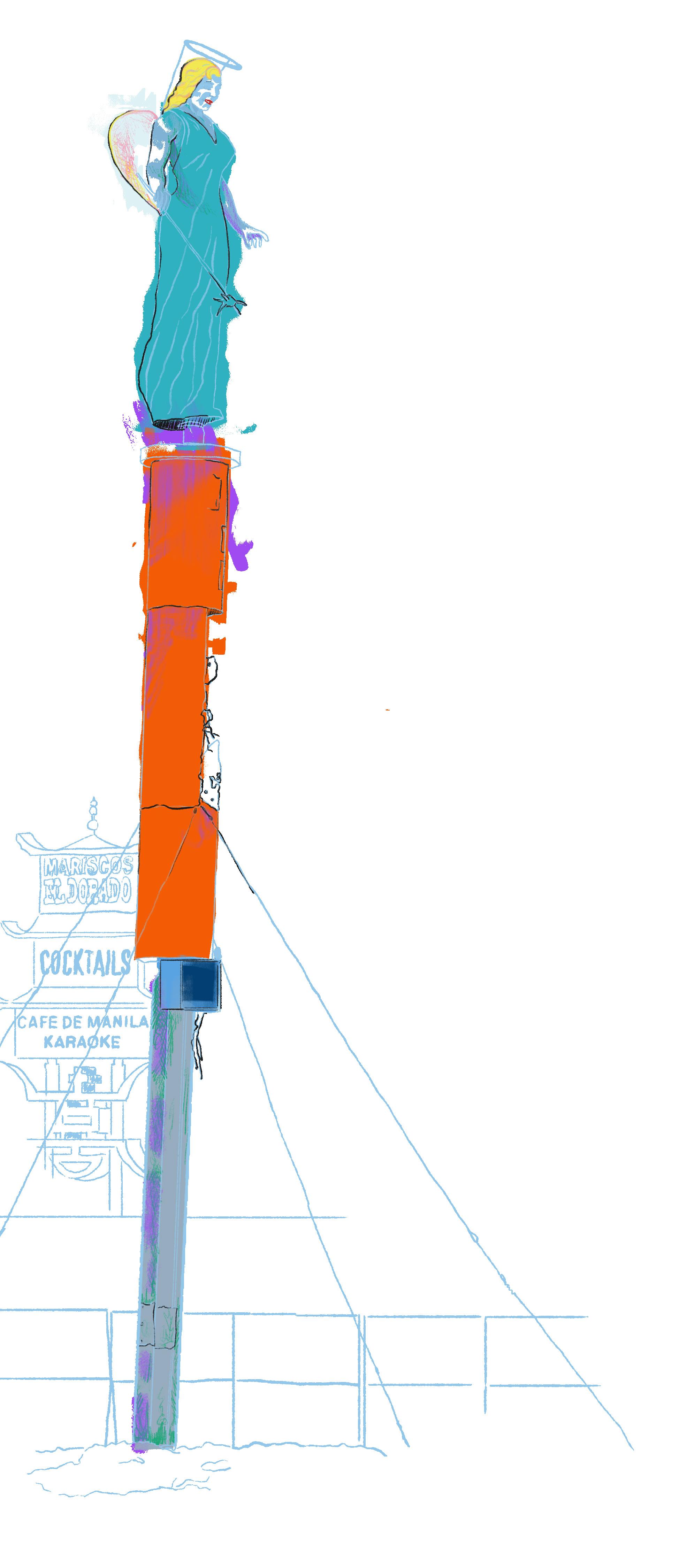
When I first learned about the series, it sparked a curiosity within me. Something lit up. I wondered if his being a native Las Vegan and my digging into Las Vegas’ past through his photographic work might give me some clues. There were other artists I considered, but his work with mid-century architecture and neon signs—a significant part of Las Vegas’ growth—led me to believe I would discover the city’s art identity and the word to describe it. Although identity evolves, changes, morphs, adapts, and coheres with its environment, looking at the past can add profound insight into the present. His photographs of the late Betty Willis’ Blue Angel from the Blue Angel Motel and my fascination with Willis’ design for the Welcome to Fabulous Las Vegas sign further cemented my desire to go on this search.
When I read the word “Zen” in the series title, I paused. I wanted his art to do the talking and for me to suspend my preconceived ideas over a word that evokes, at least to me, spiritual and quasiphilosophical notions. I wanted this search to be fair game, whether I found what I was looking for or not. Even if I didn’t, I might learn something from the experience. For me, part of viewing art is to be neutral and to keep an open mind because I never know what I might discover. And if I prematurely give up because an artist’s oeuvre is suggestive of something else, I lose the opportunity to marvel at the brilliance behind the behind-the-scenes creation. What if I discovered something that might provide an answer to a bigger thing I was searching for that I had forgotten about?
In the Shimmering Zen artworks, Stanford draws influences from his Las Vegas upbringing and Buddhist practice, photographs of the city’s landmarks, iconic architecture, and neon. He calls his kaleidoscopic photo montages “modern mandalas” that serve as compasses with the potential to take
individuals on a journey toward Zen. At this point, I wasn’t too convinced he would help me find my own route to enlightenment. I had never encountered an artwork that made it seem possible. But I dismissed that thought. What his words tell me is that art can take us on limitless journeys. That’s what sets an artist apart, when they’re able to tap into a space that allows viewers to expand their horizons through viewing (not living) vicariously through the artworks. The first time I learned about Zen was from my 8th grade teacher’s published book of poems where he explored the “brink of Zen” (part of the headline here). With my limited direct knowledge of Eastern tradition, I felt a block. My conscious mind got in the way. It couldn’t imagine a way through to space and time where reality is infinite. However, the artworks and my determination not to give up pushed me to transcend higher in my thinking. I kept going.
According to Stanford, it was his awakening after experimenting with LSD when he was an 18-year-old Baptist that led him to study this form of Mahayana Buddhism which I have come to understand as a philosophy of overcoming dualistic paradigm thinking by holding non dualistic views. "This sacrament showed me a universe that I was a part of," he says. "This flash of enlightenment showed me what I needed to know." His pieces unfold a symphony of symmetrical, rich, intricate colors, with sometimes recognizable and unrecognizable images. All the patterns exist in balance with each other. I imagined them as a visual representation of Zen unity, with lines, shapes, and curves commingling harmoniously while reflecting to the observer perfection in imperfection, the artist creating order out of the random disorder of the original photo.
Although I've never experimented with recreational drugs, as a seeker I knew there are many paths that can lead somebody to find their Truth. I don't recall how I stumbled upon this journey but I believe it was a combination of my desire to remove a sense of separation between myself and my core, and my desire to connect more with the wisdom inherent within me and in all of us. I remember reading the late Dr. Wayne Dyer's Living the Wisdom of the Tao, which might have first introduced me to duality and the importance of living the straight and narrow. Dualistic paradigms suggest separation and two opposing viewpoints, where only one thought can
10
Stanford's works acknowledge nostalgia by using pictures of neon, but they break it apart in fragments and reconfigure it for the present.
be held at one given time. Think of light and darkness. Both cannot be present in the same place. I believed holding non dualistic views would ease my difficulties in life and lead me to freedom and peace, but it requires work, and it's not easy. Viewing Stanford's art might guide me along a different path. I was open to where his art might take me.
When Stanford was led to study Zen he read books by Western advocates like R.H. Blyth, whose Zen in English Literature and Oriental Classics showed him that it could be found in texts by Charles Dickens, Miguel de Cervantes, and other authors who didn't seem to have been consciously aware of Eastern thought. "Blyth felt that the greatest literature of Europe was influenced by the ‘Spirit of Zen,’" he says.
Furnished with this viewpoint, it was natural for him to perceive Zen in Las Vegas. In an interview with Buddhistdoor, he reveals the conundrum that he sees as the reason for Shimmering Zen’s success. "Perhaps the reason … is that it combines Zen Buddhism with Las Vegas neon signage. Here we find a seeming paradox. Las Vegas is usually portrayed as a realm of samsara (greed and desire). Some claim that Las Vegas is devoid of Nirvana. Part of the message that I hoped to impart is that Las Vegas is as much Nirvana as it is samsara. As an artist, I work with the Buddhist concept of Unity of Polarity. Light and dark, happy, sad, right and wrong, all of these opposites reside on opposing ends of the same pole; I wish to remind everyone that Las Vegas exemplifies the nonduality of Nirvana and samsara."
a net that covers the palace of Indra, king of the celestial devas. At each point of the net there is a jewel, and each jewel reflects the other jewels. Las Vegas is Stanford's "crown jewel,” a force that reverberates through all the other jewel-points in his work.
In the same Buddhistdoor interview he describes his attraction to the gemlike “glow of neon lights.” It reminds me of my conversation last summer with YESCO's executive vice president, Jeff Young, about the future of signs and the transition from neon to LED. Neon, a light that seems infinite, became a huge cultural influence in Las Vegas, symbolizing the reassurance many people were seeking here decades ago. It served as a beacon of hope, confirming that everything was okay. "The bright neon signs became synonymous with a great economy, and bustling community, and a place where people wanted to be," Young told me. "People are just innately attracted to light."

When signs changed to LED I wondered if neon would return, but he says it has never left. YESCO still receives requests for it. One reason for its popularity is that it gives rise to nostalgia. Stanford's works acknowledge nostalgia by using pictures of neon, but they break it apart in fragments and reconfigure it for the present. This breakingapart gesture means that he resists the past at the same time as he invokes it, reminding us, “This is not real.” The method he has developed helps him to exploit the fact that Las Vegas artists are saturated with insistent vintage nostalgia and the vulnerable, commercialized present.
In works such as Binions, Sands, and Aladdin, his symmetrical allover patterning mirrors the detailed infill of traditional Buddhist mandalas and Indra's jewel net, a Hindu and Buddhist metaphor illustrating the interbeingness of all things. These jewels make up
His awareness of Indra's net set his mandalas apart from the other local mandala-themed works I can think of, like the Mandalas of Harmony by Rita Deanin Abbey, an older peer who guided him when he was starting out as an artist at university. The symmetry in her piece relies on a
11 ISSUE 004
Opposite Illustration reference: Vintage signs along E. Fremont Street, Las Vegas, Nevada, 27 October 2016. UNLV University Libraries Photographs of the Development of the Las Vegas Valley, Nevada. PH-00394. Special Collections and Archives, University Libraries, University of Nevada, Las Vegas. Las Vegas, Nevada.
James Stanford, Zignox, created 2006, printed 2014, Laser print on Fujicolor Crystal Archive Digital Pearl Paper. Image courtesy of James Stanford.
Shimmering Zen might not tell me exactly what the Las Vegas art world is, but it tells me that Las Vegas artists can say something about the city that could not be said by an artist from any other place.
straightforward contrast between squares and circles, but Stanford’s approach is multifaceted. Turning to a Shimmering Zen piece like Stardust, viewers can see a multitude of artifacts from Vegas' past transformed into what the artist calls a "jewel-like object of meditation." In Stardust, complex patterns of sparkling fragments give the demolished hotel a celestial significance. The past becomes as vital as the present, hinting that all times can be understood as one.
In Zignox, the letter A from the old Sahara sign is interposed in layers like a labyrinth around a dark center that holds the composition together and looks like a vortex. These twin notions of oneness and vortex remind me of Yayoi Kusama talking about the “obliteration” she sees behind her practice, coupled with her Infinity Rooms, mirrored spaces filled with symmetrical reflections. “[T]he reflective surfaces allowed her vision to transcend the physical limitations of her own productivity,” according to the website of the Hirshhorn Museum, which has two of the Rooms in its collection. “[E]ach of Kusama’s kaleidoscopic environments offers the chance to step into an illusion of infinite space.”

Stanford and Kusama also make me think of James Turrell’s now-closed Akhob inside Louis Vuitton at The Shops at Crystals. When I visited Akhob, I knew I was there physically, what I was getting myself into, and where I was, but at the same time, I felt like I had stepped into the unknown—this transcendence, into something higher, wherever that “sense of place” took me, all influenced by my past and present understanding that has allowed me to make sense of the world around me. These artworks (Kusama, Stanford, and Turrell) help me move beyond seeing what’s literally in front of me to a world that may be limitless. Through no intentions of my own, these pieces had that effect on me. When I leave and view them at another time, I might experience them differently because I have changed.
Change is at the heart of Stanford's artwork. Even though the patterns repeat, no two Shimmering Zen pieces are the same. And to understand his practice, it helps to know how he feels about his hometown,
which plays into his work. "Las Vegas is truly the only city I know of that subscribes to the one law that's unchanging in the Universe," he says. "And that is changing, changing all the time. So we know that, like no one else knows it. And we subscribe to it, and we do it. And it does not bother us a bit. And we move on. Because it is all about the here and now, isn't it?"
As I close the Shimmering Zen book, I believe he is asking us to look beyond the illusive state of "being attracted" and venture into the realm of imagination and consciousness—leaving old concepts behind like an emptying of the mind, he says—to see what he is getting at. For him, Zen was his creative portal. It was the focus that allowed him to coalesce the Strip, the desert, and his personal experiences as a Las Vegan. Viewing the outcome of those experiences helped to fuel my belief that I might find what Las Vegas art identity is.
Through the process of reading his book, I learned how to approach his work. Stanford says approaching a mandala is "about not knowing how to view a mandala, but viewing it anyway." Approaching Zen in art is about not knowing how to view Zen but viewing it anyway. Looking at the pieces in his book is different from observing them on the wall at his Art House, where I had the chance to experience his space. By walking into his garden governed by mesquite trees, I experience calm and peace: my brink of Zen.
In the end, Shimmering Zen might not tell me exactly what the Las Vegas art world is, but it tells me that Las Vegas artists can say something about the city that could not be said by an artist from any other place. And the experience did answer my initial curiosity. I found the word I was searching for through Stanford, who describes Las Vegas art identity as "emerging." Of all words, emerging feels right, at this moment, because Las Vegas is reinventing itself, constantly seeking to birth forth a new energy. Tomorrow, it might be a different word.
WORKS CITED
Stanford, James and Philip Lewis, 2017.
Shimmering Zen. Smallworks Press.
Stanford, James. Personal interview. 29 Dec. 2023. Stanford, James. “Question about Zen and Casinos.”
Received by Sarah Bun, 24 Jan. 2024
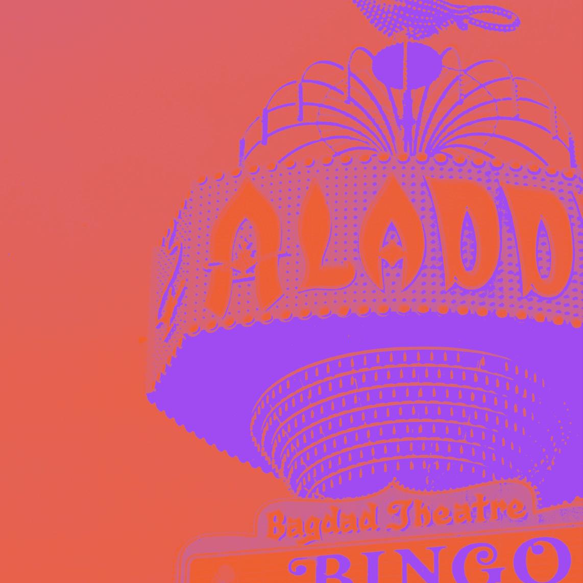
Altered photograph. Original: Aladdin Hotel sign and marquee, Las Vegas, Nevada, approximately 1970-1980. Bill Willard Photograph Collection. PH-00333. Special Collections and Archives, University Libraries, University of Nevada, Las Vegas. Las Vegas, Nevada.
SARAH BUN
Sarah Bun is a freelance writer and author based in Las Vegas. She crafts stories in various formats, from long-form to magazine features to profiles, sometimes with a faith and hope element. She’s also a passionate disability ally who writes health content for a mobile app geared toward parents raising kids with disabilities, where she also gets to coordinate and interview experts from top institutions such as UCLA and Stanford Medicine Children’s Health. Currently, Sarah is working on a prescriptive nonfiction book about chronic illness outliers whose stories of triumph amidst defeat illustrate that health is possible when they connect to their purpose.
12 DRY HEAT SUMMER 2024


 WRITTEN BY SARAH BUN
