8 minute read
TV/STREAMING: SOLAR OPPOSITES
SOLAR OPPOSITES: ONE SCI-FI ANIMATED SITCOM AND TWO WORLDS
By CHRIS McGOWAN
All images courtesy of Hulu.
TOP: The pupa is a cross between a child and a pet with the power to evolve into a super-computer that can rebuild Earth into the image of doomed planet Schlorp.
BOTTOM LEFT: David Marshall, Technical Director.
BOTTOM RIGHT: Yaoyao Ma Van As, Art Director. The artists and animators of Solar Opposites – Hulu’s hit animated comedy series about a warped alien family that has crash-landed in suburban America – had the unusual challenge of having to create two distinct realities for each episode. One is the world of a sci-fi sitcom that balances lighthearted zaniness with boundary-pushing crudity and violence. The other is “the wall,” the dog-eat-dog setting of a dystopian story within the main story.
Solar Opposites, which bowed in May, was created by Justin Roiland (animator/actor/co-creator of Rick and Morty) and writer Mike McMahan (creator of Star Trek: Lower Decks for CBS All Access). It concerns five aliens who have fled their destroyed home world of Schlorp and find themselves stuck on Earth. Korvo (voiced by Roiland) and Terry (Thomas Middleditch of Silicon Valley fame) are the adults, acting sometimes like brothers and other times like a same-sex couple. Korvo hates Earth (i.e., American) culture and Terry likes it.
They have two replicant offspring: innocent Jesse (Mary Mack) who loves humans, junk food and pop, and irascible Yumyulack (Sean Giambrone), who uses a shrink-ray gun to zap humans who annoy him and keeps them in a multi-level vivarium set into his bedroom wall. The latter, stuffed with a host of desperate, miniaturized people, has become a post-apocalyptic microcosm of society, a brutal hierarchy lorded over by the Duke (Alfred Molina). Meanwhile, the fifth member of the team – the pupa – is a cute child/pet that will one day end life as we know it by remaking the Earth in the image of Schlorp.
The aliens seek to fit into their new home – especially Jesse and Yumyulack in high school – yet lack all empathy for the earthlings around them. Inevitably, someone in the family unleashes something from alien biology or sci-fi tech that kills lots of people in a gruesome fashion. Yet, the show maintains a “fun above all” spirit. Indeed, Solar Opposites – which has a similar animation style to that of Rick and Morty – is lighthearted despite the carnage, and the bright and colorful look contrasts with the often-harrowing action.
“We like to play with the juxtaposition of those two things,” comments Technical Director David Marshall. “The show can be gory at times, but it is still extremely silly. I think blending the two gives you a broader range of styles than you’d have otherwise.”
“Sometimes we use bright colors to enhance the drama,” explains Art Director Yaoyao Ma Van As. “Other times they were there to show contrast. For example, I wanted the scenes in Episode 7, where the rebels are being drowned by the Duke, to have a kind of serene beauty to really contrast with all of the death and horror.”
Prior to working on Solar Opposites, Marshall worked as a technical director and animation supervisor for Rick and Morty. Ma Van As was also involved with that show as a background painter for Season 2. “Once the season wrapped, I had the opportunity to help Justin with his pitch for a new show. I painted some concepts and colored some characters for what would come to be Solar Opposites,” she recalls.
Solar Opposites was initially put into development by 20th Century Fox Television, which then shelved the project. In 2018,
Hulu took an interest and gave Roiland and McMahan an initial order of two seasons with eight episodes each. At that point, Ma Van As came aboard as Art Director. In June of this year, the show was renewed for a third season with 12 episodes.
The show’s main designs were generated in-house. “Everything is animated and comped using Harmony by Toon Boom,” explains Marshall. “We also used Adobe After Effects for some scenes. Animation was done by our amazing Canadian partners, Bardel Entertainment, with technical or creative retakes and revisions all being done in-house [Bardel also handles Rick and Morty]. I’m always impressed by the quality of work they produce on some extremely daunting projects.”


TOP: Solar Opposites’ Earthbound alien family: the pupa (in bed), Yumyulack, Korvo, Jesse and Terry.
BOTTOM: A cinematic style of storytelling was used to set the wall storyline apart from the “real world” of Solar Opposites.


TOP: Bright, bold colors are used to heighten the drama and contrast beauty with horror.
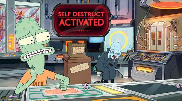
BOTTOM: Terry has inadvertently touched the self-destruct button.
“The post-production began in earnest in the winter of 2019 and continued until April 2020,” recalls Marshall. “We were in the middle of production of Solar Opposites and Rick and Morty at the time of the lockdown. The studio had to create an entire work-from-home pipeline in a weekend and refine it as we went along. The lockdown definitely presented us with a host of new challenges.”
Even without the pandemic, “the first season of any show is always challenging,” says Marshall. “There’s always something you didn’t think of in design or storyboard that all of a sudden has to be figured out ASAP. What might look great as a still image when designing could come back looking odd when you see it in motion. In the end, you come up with a bunch of different solutions and then try them all. The one that looks best and won’t slow down production ends up being what you go with.”
In creating the show’s look, Ma Van As remarks, “We tried to stick to Justin’s character style, but he gave us a lot of creative freedom for the artwork across the board. There were times where Justin and McMahan had specific ideas in mind for certain characters. Justin gave us quick, funny doodles to illustrate what he was thinking with the Gooblers, for example. Justin and McMahan had specific ideas of what the wall setting should be, how big the people within the wall should be, so that was very helpful to help us nail down the look and feel of the environment. For the most part, they
trusted the artists to help build this world.”
Marshall adds, “On the animation side of things, there’s always a huge amount of on-the-fly decision-making and last-minute changes as far as tone or style, and even more so on the first season of a show. I worked closely with Mike [McMahan] when designing effects and lighting, and he was always excited to hear our ideas. He always made time to look at something you were working on or toss ideas back and forth on the way something ought to look.”
Ma Van As notes that on the first season, the team worked on a very compressed schedule. “We had to be very efficient and communicate constantly to eliminate as many mistakes as early as possible. We assumed that since the show was set on Earth, it would be relatively smooth sailing. Once we got into the wall, it became instantly more challenging, because we wanted to really create this world that the show creators had in mind without cutting corners.”
The wall is an element that lends a certain gravitas to the series. “As far as the art style goes,” says Ma Van As, “we tried to make different areas of the wall feel different. There are the lower levels, which feel grungy and desolate. As you walk higher and into the richer areas, it gets more colorful and cleaner. When inside the wall, we really wanted to feel an expansive, yet trapped quality [like an ant farm] to contrast with the outside world, so we were very conscious of making sure the art reflected that in any way we could.
“For the design and color portion of the show,” she continues, “we wanted to really push the scale and difference between the real world and the wall storylines. We wanted to utilize mood and lighting to help us push the drama. We wanted to make sure the designs within the wall guided the story of the materials the characters had access to, the scale and cleanliness of the environment.” Marshall comments, “For sure, it was a conscious decision to treat what’s happening in the wall a little differently. Everything is a little more cinematic, a little more serious. You don’t want it to look so far off that you come back from an act break and think you’re watching a completely different show, but using that cinematic style of storytelling for those sequences lends both drama to what’s happening and an extra comedic aspect to how seriously we’re treating these tiny people stuck in a wall.”
Serialization also affected artistic choices for the show, as the team knew they had 16 episodes to work with. “The biggest thing is to keep things consistent,” Marshall advises. “Sometimes you make a quick decision on how something should look or you really go overboard on the FX side of things for a special one-off shot, and then you realize, ‘Oh, now we always have to do that.’ So you have to be careful when making those kinds of decisions that could come back to bite you three seasons from now.”
On working with Roiland, Ma Van As notes, “Justin gives the artists a lot of trust and leeway, while at the same time being very precise about the things he really needs to see for his vision.” Adds Marshall, “Justin has always been great to work with. It’s always refreshing to work with someone who has a clear vision of what they want and he has a grasp of the animation process that not every creator shares.”


TOP: Korvo, Yumyulack, Jesse, the pupa and Terry.
MIDDLE: A gathering of adults from Schlorp.
BOTTOM: A revolution is breaking out inside the wall, which gets a full treatment in Episode 7.


