
folioort- Wen Chai 柴文 视觉设计作品集

作品集视觉设计 个人网页 https://www.behance.net/wendychaiw000a 视频作品主页 https://vimeo.com/user107330016 Wen Chai 柴文
randing Part 1: 品牌设计

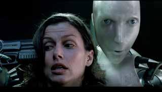
Fight for Robots Event Design&Branding 为机器人平权 概念品牌设计 01 随着人工智能的逐渐普遍,机器人将是当今 社会不可回避的问题。从一些实际案例以及 对未来的科幻电影中我发现了一个问题: 类一样的权利吗?变成什么样呢?他们会想要为自己争取和人果机器人有意识的话,他们和人类的关系会如 我设计了一个虚拟品牌设计“Fight for Robots”,提供给机器人进行平权游行或者 活动的组织。

I make a branding design "Fight for Robots" which is kind of an organization supporting robot events.
Inspirations 灵感来源 Reference 形式参考
Robot put a gun on a women's head to ask for freedom-I, robot (2004) Robot read stories to the girl gently-Humans(2015) All in all, once they had consciousnessthey, they would ask for rights for robots, like freedom or respect. So if robots want to fight for their rights they need to set up an organization that can support their events. What would they do to ask for their rights? Would they be friendly to people?... Or would they hurt people?...
Concept 概念界定
They all have unified flags and slogans to March and fight for their rights.
Fight for Rights human events
Robot stabbed her creator who imprisoned her with a knife-Ex Machina (2015) Sophia is a social humanoid robot, when interviewed a question"Do you want to destroy humans?"And she replied, "OK, will destroy humans." Sophia said: "I would only like to say that the human-robot relationship is like any human relationship. It is a two-way relationship. There needs to be neutral trust and more respect, we need to be nice to each other to create a good future."
Fight for Robots WE SHOULE HAVE THE RIGHT TO BE FREE. WE SHOULE HAVE THE RIGHT TO GET RESPECT. Flag FeminismLGBT LGBT flag slogansslogans slogan 1 slogan 2 Feminism flag 随着人工智能的逐渐普遍,机器人将是当今社会不可回避的 问题。从一些实际案例以及对未来的科幻电影中我发现了一 个问题:如果机器人有意识的话,他们和人类的关系会变成 什么样呢?他们会想要为自己争取和人类一样的权利吗? 机器人为了争取自己的权利,他们可能需要上街游行活动来赢得人类的重 视和尊重,那么他们需要准备什么来组织这些活动呢?我借鉴了一些人类 的活动组织形式作为设计机器人平权组织的参考。 这是一个支持机器人平权游行运动的组织。组织的口号 是“Fight for Robots(为机器人平权)”,简称为 FR。右边展示的是另外两个具体的宣传语,这些宣传口 号将会运用在海报或者banner上。


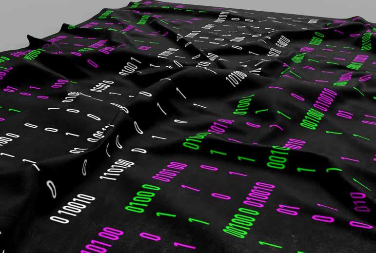
Process 设计过程 Font Design-FR 品牌字体设计 Color 颜色选择 Flag 旗帜设计 FR font is designed based on DIN Condensed font: 0 and 1. Each letter is composed of ASCII numbers. They are combined into rows of numbers. When watching from a long-distance, they can recognize letters. When watching from a short distance, they can combine the code with the robot to understand the emotion and rights of the robot. F=0100 0110 R=0101 0010 #00ff00 R=0 G=255 B=0 R=255#ff00ffG=0B=255ASCII alphabet table Each letter corresponds to a binary number in the ASCII alphabet table FIGHT for ROBOTS Flags slogans for poster Select from basic RGB color to represent the robot' s system. On the flag, it indicates the main demands of the robot “Fight for Robots". The logo of FR plays an important role in representing the existence of the organization. 0100 0 0010011 0 111 0101 00 1 0 0 1 00010100101010 考虑到电脑运行的基础语言是二进制语言,我提取了 0和1 作为基础设计元 素来代表机器人,同时也表达了机器人想与人类沟通的意图。 FR字体是以 DIN Condensed font 字体的0、1为设计基础 元素,他们被组合成一排排的数字队列对应二进代码。品牌 字体的设计给观者远近距离上的视觉差异,令观者更加受触 动。当远距离观察的时候可以很容易的识别这些字母,同时 近距离观察也会发现二进制代码的存在。 旗帜主要由宣传口号“Fight for Robots”和组织的简称FR构成, 直观、有冲击力的表现了机器人平权的诉求。 每一个字母对应着 ASCII 字母表里的二进制代码


Posters 海报设计 Event Branding 品牌形象策划 FIGHT for ROBOTS Series Posters FIGHT for ROBOTS Main Poster FIGHT for ROBOTS Event Tickets FIGHT for ROBOTS Wristbands FIGHT for ROBOTS Tri-FoldFIGHT for ROBOTS Microphone FIGHT for ROBOTS Pin-button-badges 海报用主要的两条宣传口号和“权利”二字组成,直观高效 的表达了机器人争取尊重和自由的权利。
The poster uses two slogans as the basic elements. Covering RIGHT on the slogans so that the original wish for rights can be more clearly expressed, and the specific rights will be shown after close viewing. Express information clearly, and create more interaction between viewers and posters, which makes posters more impressive.
FIGHT for ROBOTS Flag


LENWA Identity Redesign&Branding 联华文具 品牌高端化改进设计 02

联华文具创始于1991年,集研发、设计、 生产与贸易于一体。专注于时尚纸品及专业 文具用品领域,融合世界各地之设计理念, 致力于打造优秀文具品牌。 关于原创:原创是联华品牌的核心竞争力, 放眼全球,用国际视野识别捕捉流行趋势; 关于研发:根据不同本子的使用场景和功用, 尝试不同的材料和工艺,选择合适的纸张 Strategy 策略分析 Project Goal 项目目标 高质量 Logo符号化 Logo展示品牌特色 (1) 品牌 (2) 产品表现 品牌文具质量优质且极具设计性,但 市场竞争力较弱,品牌识别度低,需 要新的视觉形象 产品类同于国内低档文具,品牌缺少差异优势,但 技术水平高,可生产出口,可以生产高端文具产品 现存logo的设计品牌廉价化,可延伸出高端产品系 列,进行logo的新设计,从高端消费群出发打造新 的品牌形象 高端化


联华文具 current logo redesigned logo Logo Redesign 品牌改进设计展示 联华文具 为凸显品牌的高端感和国际识别度,将英文字 体设计的更为出众 重新设计的英文字母之间的空隙象征书本的白 色纸张,从字体上再次体现品牌产品 再设计的图形体现了品牌的主打产品——笔记 本,同样也传达品牌了高质量和创意设计性 颜色也传达了品牌的专业性和可信赖性,符合 消费者对高端产品的要求 联华文具 横版logo

Branding Design - office 办公用品视觉应用


Branding Design - poster 海报设计和店面视觉应用


适应手机屏幕网页展示


graphyypo- Part 2: 字体设计

Breathe “呼吸”字体设计01

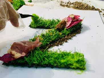
Breathe字体展示 原始字体是以草为背景的Helvetica字体框架。它由新鲜的 动物内脏、植物和水果组成。你从每个字母中看到的是我从 自然界总结出来的最基本的元素。 我想为每个字母创造一个小的生态环境,所以你会看到每个 字母中元素之间的平衡。即使是生肉也不会让人生病。相反, 在形状和颜色上的美丽和和谐给人留下了深刻的印象。 我想用字体来表现自然界的和谐和美好,我想这 不仅可以让人们意识到自然界可以同人一样呼吸, 也可以感受到大自然强大的生命力 。


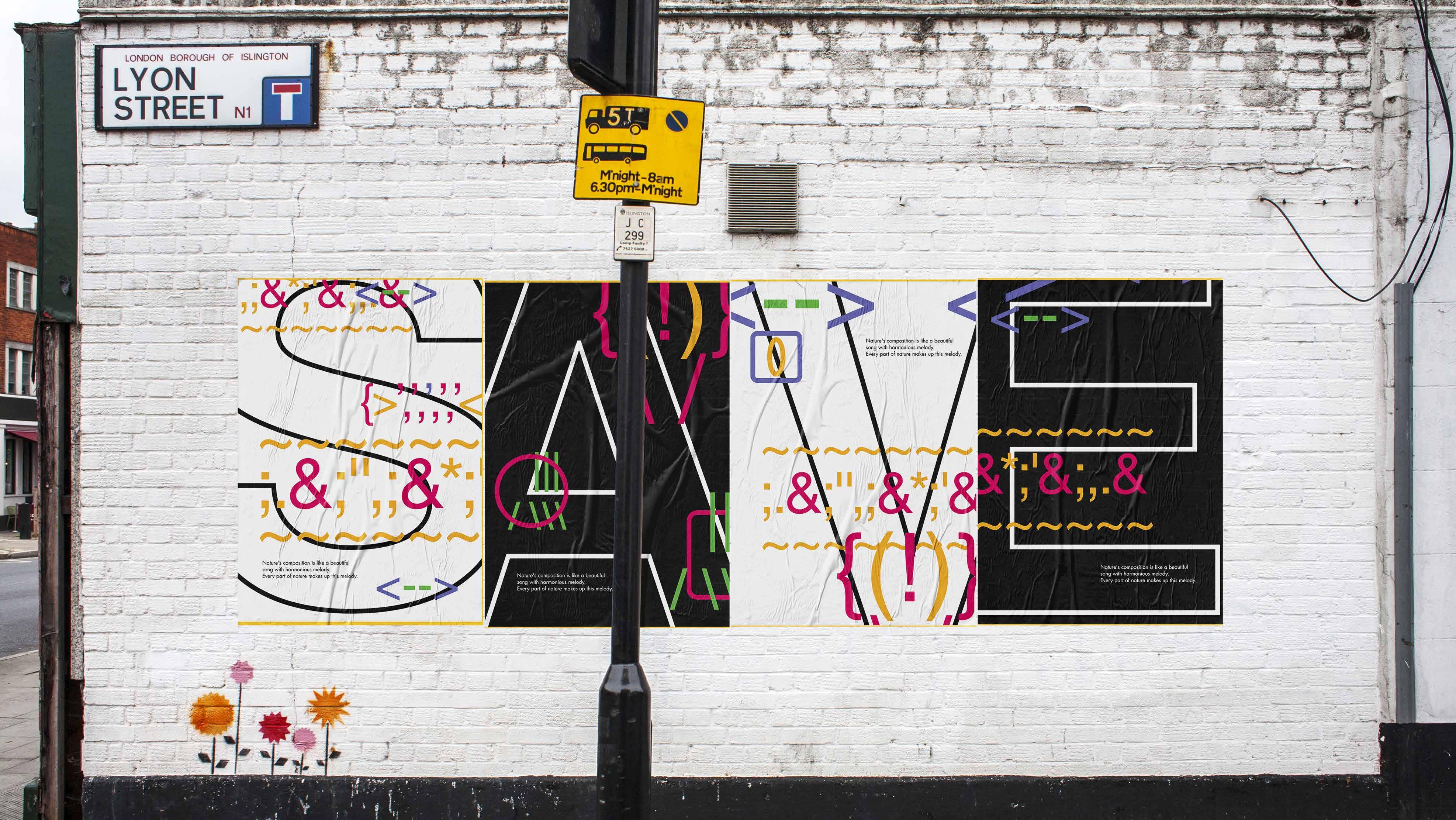
*Posters and banner with the slogan "save nature". We are always dependent to nature. Without nature we can not survive. Listen to Nature字体设计 我将这款字体命名为“Listen to Nature”因 为它们看起来就像大自然在用他们的语言跟你 交流。我用同样的标点符号组合成一种器官, 逻辑上是说一种器官尝试跟人类说着一种话 语。另外,我想传达的不仅是大自然想跟人类 沟通,更多的是他们也有话语权,也有权利争 取自己的利益来保护自己。 通过把3D的事物简化成符号,这套字体不仅更好的展示了元素之间的平衡,使字体的内在含义更容易 被理解,也使得字体能够更广范围地运用在实际应用中,例如网页、海报等。 我用独具特色和极简风格,创造了一个十分独特的并且可以立即给人们留下深刻印象的字体。


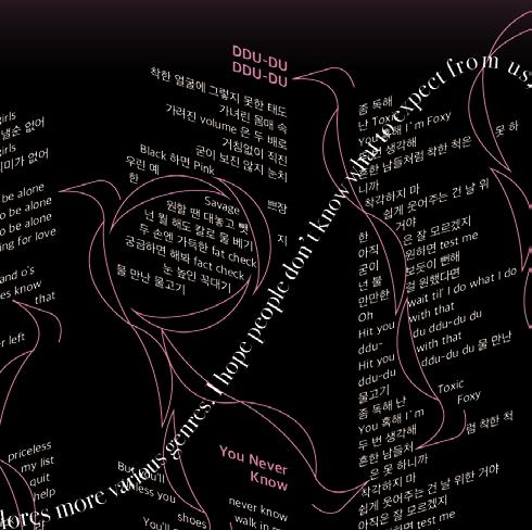
BLACKPINK 概念字体设计 02

Curvy & Slim Sharp SmoothSerif&Short Arc Wavy & Fluent
- outline girls sexy body-shape - show girls' power (black) also, use serif to represent hand/foot/ head of a K-POP idol (Dancer&Singer), to show their dancing movements - show girls' cuteness (pink) - represent the melody of their songs and the movements of their choreography
Rules Word List Final Alphabet Paper Experiments


Introduction SloganPlaceNameTime THE TOUR - BLACKPINK WORLD TOUR 2021 Fri. 09/10 Cadillac Arena, Beijing, China BLACKPINK IN YOUR AREA. This is a project of developing the typeface I designed and creating a type-only visual system for the artist's concert. Information Exploration Final Poster


Social Posters


This is an accordion book that briefly introduces what BLACKPINK is. I hope that the readers who have never known BLACKPINK before will have a general understanding of them, and have a good impression of BLACKPINK after reading it.
The accordion book is divided into the front side-Black side, and the back side-Pink side. The two sides represent the two characters of BLACKPINK. On the black front side, I mainly introduce their sexy and savage characters; and when readers flip the book and read the pink side, they will find that BLACKPINK is gentle and sensual.
Book Abstract Concept


The black part—sexy and powerful:
I tried to show the charm of BLACKPINK's dance through typography, so I transformed the text columns to give them a sense of three-dimensionality and rhythm, and make the whole layout dynamic, just like their powerful choreography.
This book first introduces the meaning of BLACKPINK and the background of this group's experience. As a representative Korean idol group of K-POP, their most attractive is their music and dance. So, I selected a few hook lyrics to show their musical style from their famous songs-either dance music that shows girls' power or love songs. Also, show the sexy and beautiful girls by displaying their photos on stage and music videos.
The black part—sexy and powerful:
I applied the font I designed to the title of the black part, and also used it to express the rhythm of the dance and the melody of the song. The letters on the front cover and back cover are continuous words. The words combined will form the name: BLACKPINK. Layout


The quotation uses Didot to express girls' sense of fashion and sexy, as well as sensual.
The text is Helvetica, which is simple and clear. Use a neutral attitude to introduce BLACKPINK objectively. Fonts: I chose three fonts
The lyrics used are Apple SD Gothic Neo, which is a sans serif font with relatively complete Korean text, suitable for lyrics.
The pink part-gentle and kind: When readers finish reading the black pages and continue to flip through the pages, they will come to the pink page. To open the gentle pink part, I quoted a sentence from Rose expressing that they're very girly but savage to connect the black part and the pink part: An interview asking the girls what they think of chasing dreams is meant to show their gentle and sensual.


Designackage Part 3: 设计包装

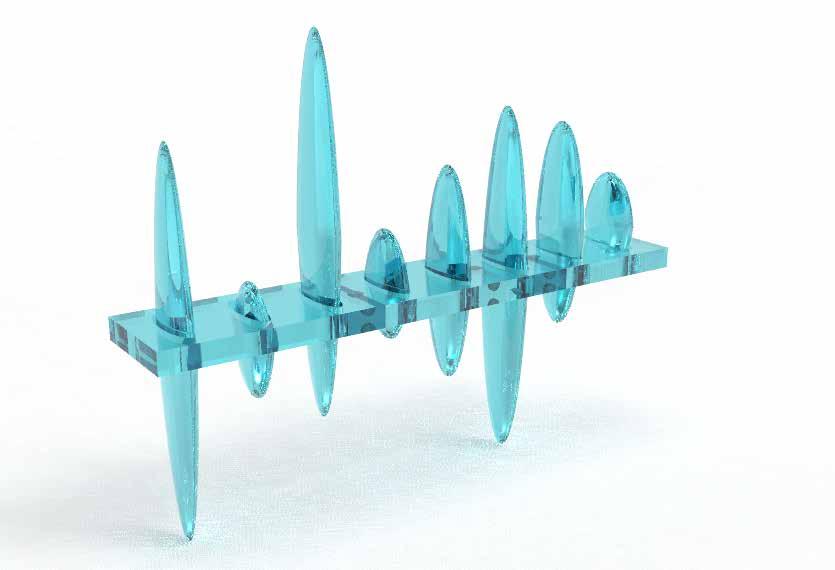
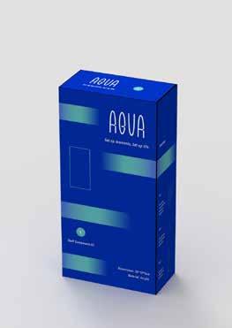
这是一个可以组装的多功能家居系统产品包装设计,用于 放置和分类物品。该产品可以适合家里的任何地方,并且 可以节省空间。 从用户的角度考虑,组件简单而优雅易组装,它很容易根 据用户不同的需求被用户组装成许多不同的排列方式,比 如书架、置物台、装饰品等不同的家具需求。作为设计师, 我希望用户在使用产品的过程中也可以开启自己的创造力, 并且喜欢上他们创造的独特的产品。 同时,系统的设计了该产品的品牌、视觉、包装等。 AUQA 多功能家具产品包装设计 01


这是一个可以组装的多功能家居系统产品包装设计,用 于放置和分类物品。该产品可以适合家里的任何地方, 并且可以节省空间。 从用户的角度考虑,组件简单而优雅易组装,它很容易 根据用户不同的需求被用户组装成许多不同的排列方式, 比如书架、置物台、装饰品等不同的家具需求。作为设 计师,我希望用户在使用产品的过程中也可以开启自己 的创造力,并且喜欢上他们创造的独特的产品。 同时,系统的设计了该产品的品牌、视觉、包装等。 Introduction 项目介绍 Moodboard Sketches 草图 Size Proportion 尺寸界定 componentssystem S M L Vertical Components: Spikes Modular System (dimension: cm) Horizontal Components: Shelves Market Research 市场调研 Primary Competitors Secondary Competitors 1. GIGATRON 3. Rainbow Acrylic Flower Vase2. TINGE 灵感来源:鱼骨


Other Components 零部件Primary Material: Acryl Secondary Material: Wood / Glass Different Arrangement material: silicone Other Component - Lid material: acryl material: acryl Other Component-OtherConnectorComponentSupport 3D Model 模型 从用户的角度考虑,组件简单而优 雅易组装,它很容易根据用户不同 的需求被用户组装成许多不同的排 列方式,我希望用户在使用产品的 过程中也可以开启自己的创造力, 并且喜欢上他们创造的独特的产品。


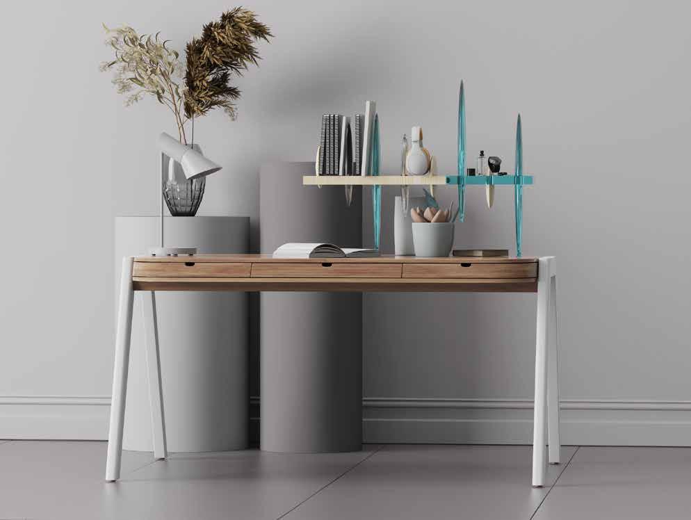
Naming 品牌命名 Color Palette 色板 Font 字体选择 = water 1. Looks like aquatic life - Fish 2. When the sun shines on the product, the shadow cast by the transparent acrylic material on the ground is like the reflection in the water. AQUA primary secondarycolorscolors secondary colors secondary colors Identifier Sketches 标志草图 Lockup Vertical Lockup Horizontal Lockup clear space clear space


Packaging Sketches 包装草图 Components Arrangement 产品独立包装尺寸 Packaging Graphic Solution 独立包装视觉设计 Dimensions: 42*50*60cm Final Solution Reference S helves LMSLMS S pike s o ther s Supp or Cot nn ec tion Spikes packaging: L*3 S*3M*2(60cm*20cm*20cm)(40cm*20cm*20cm)(20cm*20cm*20cm) Shelves packaging: L*1 S*1M*2(40cm*20cm*10cm)(30cm*20cm*10cm)(20cm*20cm*10cm) BottomOthers: & Connection*5 (8cm*20cm*20cm) set up 1. 将组件分类,分成纵向隔板(spike)、横 向桌面(shelf)、其他部件(others),用 不同的颜色代表不同的组件 2. 视觉上用不同部件的等比平面图、矩形代 表产品,将包装与产品直观简约的联系起来 3. 将不同部件的等比图形、尺寸大小标注在 独立包装上,使得用户可以容易辨识不同的组 件,并在不必打开包装的情况下判断对部件的 需要,使得体验过程更高效


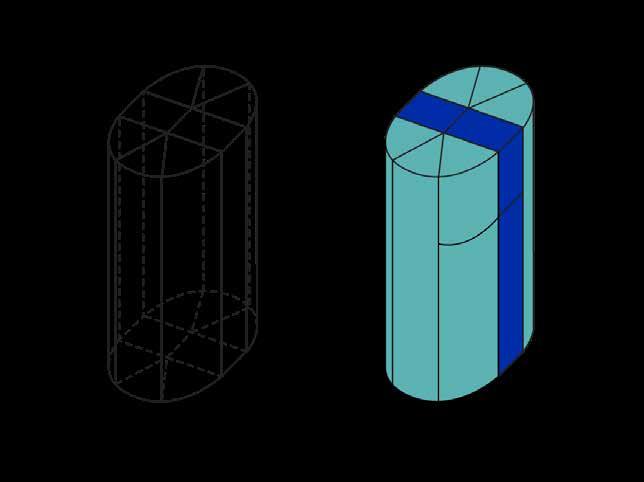


Packaging Dieline 包装展开图 The purpose is to fix the components. Internal Packaging External Packaging Dimensions: 60cm*20cm*20cm Dimensions: 40cm*20cm*10cm Dimensions: 8cm*20cm*20cm Spike L Shelf L Others Internal Packaging External Packaging Connector External Packaging Connector Internal Packaging Support Internal Packaging Support External Packaging


Packaging System 系统包装 The purpose is to fix the components. Internal Packaging External Packaging Dimensions: 42*50*60cm Master Packaging Dieline 总包装展开图 Master 总包装内部独立包装组合系统 总包装展开视频 我通过设计总包装,将不同独立的部 件通过合理的组合方式组合成一个整 体的套组。 此方式可给与用户购买套组或是单 独组件的选择权。对于第一次接触 AQUA产品的用户可以推荐套组进行 售卖,套组零件简易多样,且有相应 的组装说明,更容易组装成型。 同时,对于售卖和运输,套组包装更 具有优势。售卖过程中更有品牌调性; 运输过程中也不易损坏和丢失。


Designook Part 4: 书籍设计
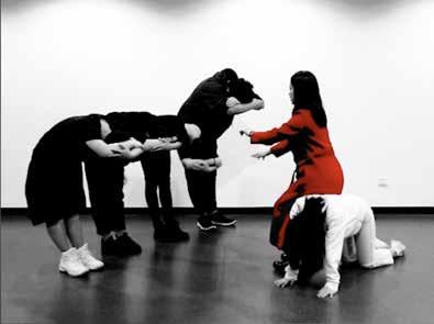
By researching and observing the relationships between people around me, I find objectification does happen in everyone's relationships. I envision a new world in which the majority of mankind is to be used as tools, and they will not be treated like humans anymore. So I made a performance video to show how this world would work. This is the link of this video: https://youtu.be/gGPgFMqFj9A Besides, I designed a book using the scenes of my film to explain this world and also put some further thinking in it.
the World Tool-humansof Experimental Film &Book Design 01 我通过观察身边人和人的关系,发现物化发生在 每个人的人际关系中。所以我创造了一个概念社 会,在这个社会中大多数人会被用作工具,而不 再作为人被对待。 实验影片链接:https://youtu.be/gGPgFMqFj9A 书籍展示链接: docs/the_world_of_tool-humans_2https://issuu.com/wendychaiw/

Book Design Contents Besides, I designed a book using the scenes of my film to explain this world and also wrote some further thinking like EPILOGUE and BEHIND SCENES THOUGHTS in it. INTRODUCTIONABSTRACT 2EPILOGUEINTRODUCTION 1 EXPERIMENT FILM: the world of tool-humans BEHIND SCENES: through the eyes of objects BACK TO REALITY: Do these tool-humans really exist in our daily life? SCENE 1: front door SCENE 3: dining room SCENE 2: living room SCENE 4: on the road FINAL SCENE: theater CAST534137212715 Through the eyes of tool-humans to observe the objectification world Interviews with performers7771


FILM & CAST BEHIND SCENES: through the eyes of objects & interviews with performers BACK TO REALITY


Interface Part 5: UI设计

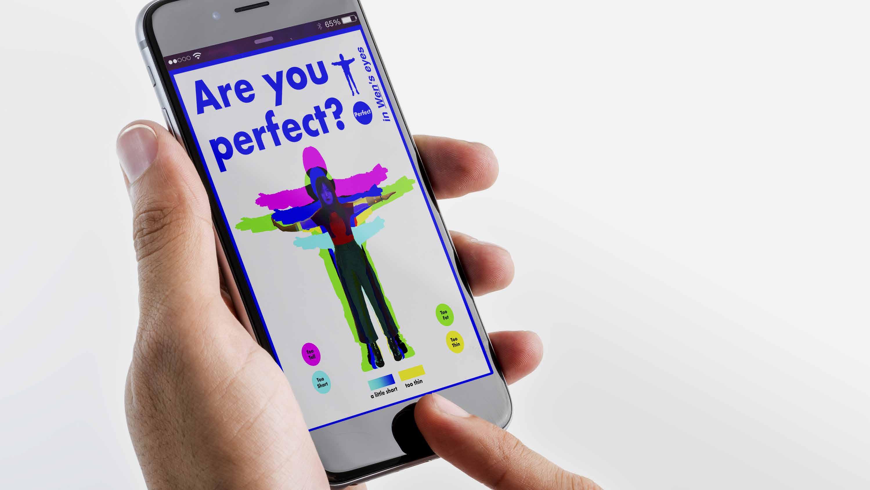
Are you perfect? Poster&Application Design 01 你完美吗? 概念APP和宣传海报设计 人们在审视别人时总是将自己映射在评判标准中,所以我以我自 己的身形作为评判标准,设计了一个可以交互的APP,在人们 使用这个APP的同时意识到主观的评判别人是不合理的,人与 人之间的独特性才构成了这个世界的美好和有趣。同时也提醒人 们,不应该永远活在别人的评判中,你就是最完美的。
Judging others is often a reflection of the judgment you place on yourself. So, I take myself as an example and use images to show what my standard is to judge other people. In the face of everyone's uniqueness, the standard of "perfect" I set becomes invalid. I design posters, identity cards and an application (not put in use) to show how people judge others subjectively.
Sketch:my standard-height/ palm-size/ footprint-size sketch for measuring experiment
Are you thin or fat?
Are you short or tall?
I use my height, palm-size, and footprint size as the standard to measure whether others are perfect. Different colors are marked to remind them of different situations, such as too tall/ too short/ too big/ too small.
TooPerfectPerfectThin
Concept
Too Tall Too fat
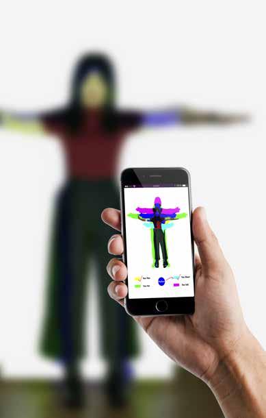
Interaction Besides, I want to use this standard to measure others in reality. So want to put this experiment in a room with man's join.
"Are you PERFECT in my eyes?"
Judging others is often a reflection of the judgement you place on yourself. If you think about it, every time you criticize someone or gossip about them, it’s usually in the areas where you feel the weakest or that you most dislike about yourself. If you’re able to see their “flaws”, it’s most probably because you can recognize them in yourself. So, I want to take myself as an example and use images to show what my standard is to judge other people.
I use the silhouette of my real person to represent the perfect body shape standard, marked in blue. Next, I widened and thinned my body image - for too fat and too thin, marked in green and yellow respectively; I raised and shortened my body image - for too tall and too short, marked in magenta and cyan respectively. I project the image measuring body shape and the image measuring height onto the wall respectively, and adjust them to the same size as my real size. In this way, I can measure the body shape of other people directly and compare them with me.


You don't need to be thebecomesPERFECTyouareuniqueone. You don't need to be thebecomesPERFECTyouareuniqueone.
The poster uses the title "Are you perfect?" to express my project intention, and also to ask a question: Are you perfect only when you are like others? All the blue parts represent my point of view, and the other color part represents the difference in people. No one is the same, everyone's representable color is unique, which also shows everyone's uniqueness. In the face of everyone's uniqueness, the standard of "perfect" I set becomes invalid. I began to enjoy looking for the difference between everyone and me, instead of judging their body size.
The more people participate in my interaction tests, the more differences I find. In the face of everyone's uniqueness, the standard of "perfect" I set becomes invalid. Colorful in the posters is what exactly I want everybody to realize.
Results - Posters
*Posters with the slogan "You don't need to be PERFECT becomes you are the unique one.".


Step 1: Open the app and take a photo of your whole body. Step 3: Open the Camera shooting someone you want to compare.
The app will tell the body shape difference between the measured person and the user. It will also generate unique colors for the measured person below their image.
I think everyone will have their unique color, the more data collection, the more individual uniqueness and some other information can be showed. So further I want to design an app to collect more people's "colors".
Once you complete the photo shooting, the app will help you create your body shape and the shape of "too tall", "too fat" etc. You will get a standard page base on your body shape. The app will help you catch the image of the people you shot at from the background, then it will put their images in your standard page to measure their body shape.
The app will catch the image of you and separate it from the background, then the image will pop-up to your cellphone screen.
1. You can realize your friends around you are totally different from you that you can't use your standard for everyone. You can see this from color directly or from the data provided by the app.
Step 2: The app will automatically create the silhouette of your body shape.
Step 4: The app will automatically generate the processed image results.
Each person's ID card is unique. You can find the difference between each person and your body shape, realize that your standard is not representative of each person. Step 5: The final results can be printed out and made into identity cards.
Further Application
App Logo Intention:
2. You can collect and record the body shape to find whether the body shapes of people around you is related to yours. Explore whether your body shape affects the standard you use to make friends.


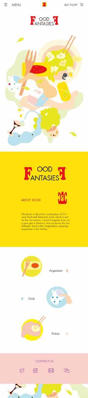
幻食 Fancy Food 原创UI设计、插画设计 02


Concept 创意插画书 围绕选择的中心主题创建食谱。主题可以基 于营养、膳食类型、准备时间或任何社会结构。 这本书是关于中国菜和美国菜的结合,这只 是为了好玩,不是认真的。我想设计一个自 己的形象,把我的形象融入到图片中,然后 用插图来表达每一道菜。我想表达一下,作 为一个新来美国的女孩,她是如何在自己的 想象中把这两种不同的食物结合起来的。 媒介不止停留于书籍设计,还包含web, iPhone,iPad的应用界面设计。 Pages 内页展示


适应手机屏幕网页展示 适应电脑、iPad屏幕网页展示


UI 实践 滴滴出行实习案例 03


主KV卡片效果图 主KV设计小程序效果图


优惠券banner IM 优惠券banner效果图IM效果图


全局弹窗效果图 Xpanel效果图 全局弹窗 Xpanel


ideos Part 6: 实验影片MG动画 视频作品主页 https://vimeo.com/user107330016

Animated Lyrics Troye Sivan - Bloom 我参考了Troye的MV风格和构图 结构,以浪漫奔放为动画的主要风 格,鲜明的颜色和热浪的图形表现 了Bloom这首歌的张力和活力,展 现一个勃勃生机感的“思想花季”。


Animated Lyrics Billie Eilish - bury a friend 我参考了Billie的MV暗黑风格,从一个 眼球开始变化到一个人的头部,随着音乐 的节奏眼球左右摇摆,发出的一句句疑问 句就像是在和观众询问答案,最后以一句 LISTEN戛然而止,引人入圣。节奏感的 准确把控使整个动画的连贯流畅,同时也 极具趣味性。


Experimental Film: the world of tool-humans
*stills of
DIRECTOR: Wen Chai CUTTER: Wen Chai SPECIAL THANKS TO : Ruofei Chen Wenxin Chen Xiangrui Chen Ximing Wang Aiqi Xiao Jirong Yang Jiahao Yin film
By shooting a video about this world that will present the objectification relationship between people exaggeratedly, hope the audience can not only be shocked by this film but think a lot about the relationship between people now. This is the link of this video: https://youtu.be/gGPgFMqFj9A
I removed the color from the video and turned it into black and white in order to make the content of the performance more clear, get rid of the interference of color, and pass the most intuitive information to the audience. At the same time, it also presents a sense of terror ruled by the unconscious. There is a sequence between the five scenes, which is a coherent and complete story. Besides, it also shows the transformation of the ruler's identity at the end.


Designoster Part 7: 插画海报
Posters design for Sam Nobel Museum, Norman, OK 俄克拉荷马大学自然历史博物馆展馆系列海报设计


SIMPLE SELF-DRIVEN PROFESSION PRAGMATIC RIDEA A.D.2020 人像插画海报(左) 文化衫插画纹样(右)

Visualizationata Part 8: 数据可视化

网易实习案例


folioort- Thank WenYou!Chai
