THE COLOR ISSUE
WITNESS THE DRAMATIC POWER OF PIGMENT
NATUREINSPIRED DESIGN RECONNECT & RECHARGE THE TEXTILE EYE ’S SAANA BAKER TALKS TRENDS AND TEXTILES AT THE WINDOWS OF KIPS BAY NEW YORK TRIMS AND TASSELS, OH MY!


NATUREINSPIRED DESIGN RECONNECT & RECHARGE THE TEXTILE EYE ’S SAANA BAKER TALKS TRENDS AND TEXTILES AT THE WINDOWS OF KIPS BAY NEW YORK TRIMS AND TASSELS, OH MY!


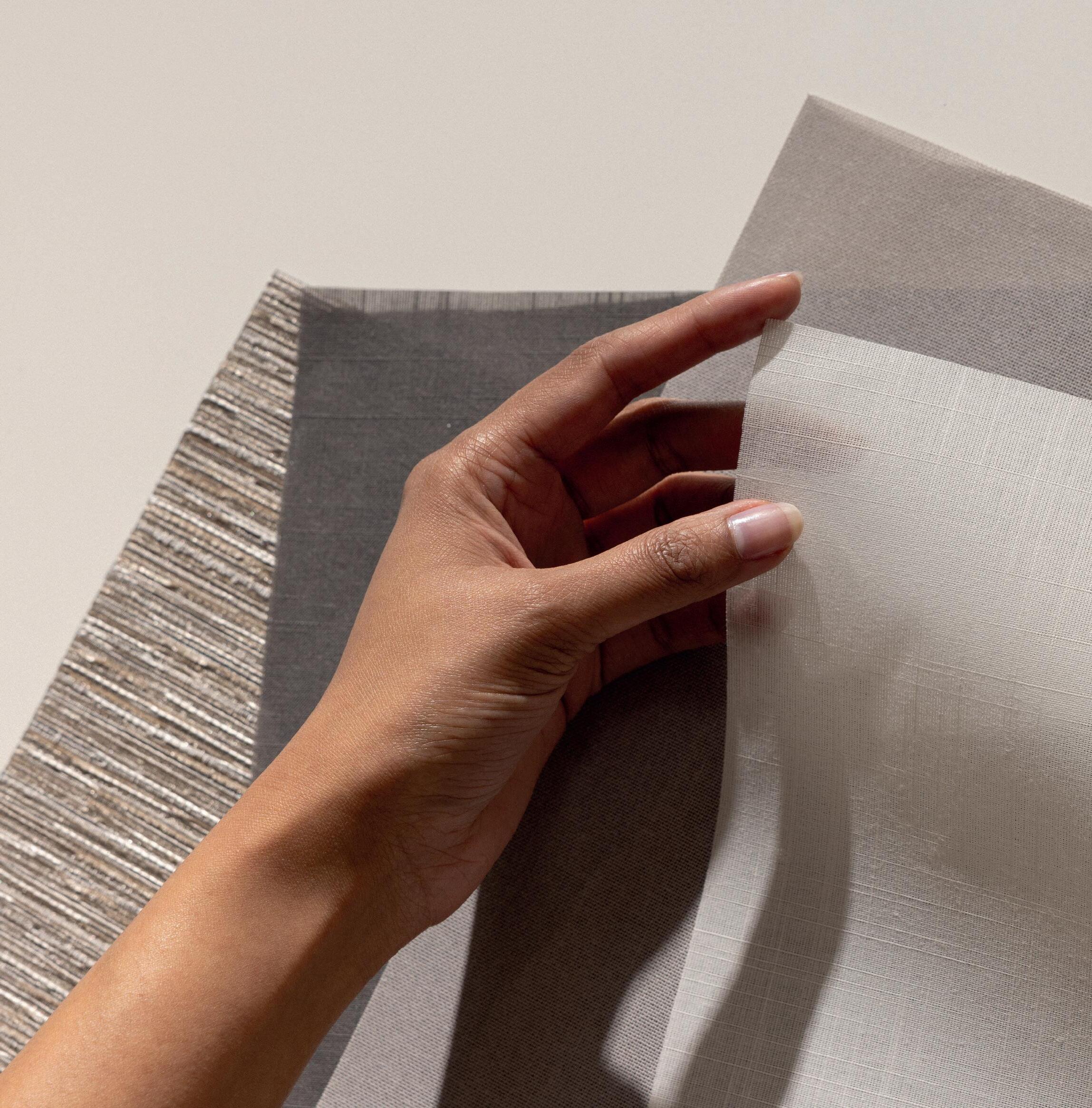
Discover the beauty and functionality of our thoroughly tested and Oeko-Tex certified honeycomb fabric collection for cellular shades. Inspired by nature’s wonders, these fabrics feature a cellular structure that offers exceptional insulation, acoustic comfort, and effective glare control. Discover the perfect blend of style and performance.


WINDOW TREATMENTS & INSPIRED DESIGN
VOLUME 45, ISSUE 5
President/Publisher | Grace McNamara grace@wf-vision.com
Associate Publisher & VP | Ania Munzer ania@wf-vision.com
Contributing Editor | Maude Campbell maude@wf-vision.com
Art Director | Eric Taylor eric@wf-vision.com
Event Manager | Shannon Flaherty shannon@wf-vision.com
Marketing Coordinator | Tracy Herold tracy@wf-vision.com
Social Media Manager | Melissa Savage media@wf-vision.com


Accounting | Heather Bradley accounting@wf-vision.com
Roger Magalhaes, LuAnn Nigara, Kathy Cragg Pace, Oliver Schreiber, Ralph Vasami
SUBSCRIPTION S 651-330-0574 • info@wf-vision.com
ON THE COVER:
Photography: Lisa Thoma
Project: Private Residence in Prospect, KY
Installer: Draped in Style LouisvilleWindowTreatments.com
Window Fashion VISION magazine makes every attempt to credit each person involved in the process of creating a window covering and will not be responsible for crediting any person whose name, company or participation did not surface during the information-gathering process. Crediting disputes between parties other than VISION magazine are solved at the discretion of those involved.
Window Fashion VISION (ISSN 08869669) (USPS 708930) published bi-monthly by AIM Communications LLC, 4707 Hwy 61 N #255, St Paul, MN 55110, Tel 651-3300574. Visit our website at WF-VISION.com. Periodicals postage paid at St Paul, MN.
Postmaster: Send address changes to Window Fashion VISION , 4707 Hwy 61 N #255, St Paul, MN 55110. Allow 60 days for address change. Subscription rates: $22/yr. U.S. and possessions; $29/yr. Canada; $90/yr. Foreign (includes airmail postage).

Copyright © 2023 by AIM Communications, LLC. Reproduction in whole or in part without written permission prohibited. Canadian Publications Agreement Number: #40036514. Canadian Return Address: 4707 Hwy 61 N #255, St Paul, MN 55110
+ OCTOBER 2023, VOLUME 45, ISSUE
For magazine updates, go to Facebook.com/wfvisionmagazine
Keep up with all the news @WFVMagazine




to work and start planning our seminar program for next year’s International Window Coverings Expo (IWCE). Yes, we are already in the throes of planning an outstanding event, as registration opens in October! You won’t want to miss this one, as we have vetted an incredible program with actionable seminars for every segment of our industry. IWCE will be held in Texas for the first time—get your cowboy boots ready!
Whew! What a busy and delightful summer! I hope you’ve had a chance to relax and recharge to prepare for a busy fall decorating season. This summer, I was fortunate to visit Northern Spain for a family wedding—what a beautiful part of the world, combining pristine beaches with majestic mountains. The people were friendly and cultured, and the food was amazing. It did take a bit to get used to eating lunch at 2 p.m. and dinner at 10, but it opened up the day to exploration. If you haven’t been to San Sebastian or the Guggenheim Museum in Bilbao, put them on your bucket list for great inspiration. Inspiration is just what I needed to return
This issue is full of inspiration for you to get excited about the last quarter of the year. We take a refreshing look into science in design and introduce the power of color and future predictions. Contributions provide the best insight into ways to increase your business revenue. Plus, updates in preparation for #NationalWindowCoveringSafetyMonth, which is in October.
When you get this issue, the deadline for entering the Grace Award competition, formerly the VISION Design & Workroom Competition, will be approaching. Collect your best projects and get ready to be recognized as the best in the industry! Visit Grace-Awards.com to submit your incredible projects.


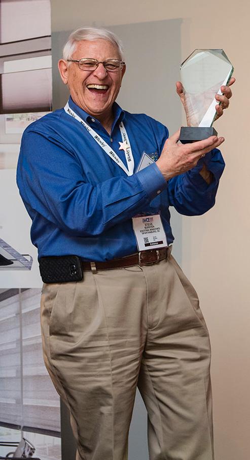
Sadly, we lost a pioneer and mentor in our industry this summer. Steve Bursten was a champion of fabrics and draperies—he knew where the money was. Steve also helped countless businesses understand how to sell custom window treatments and improve their bottom line. He always had time for you and was willing to listen and help. Steve loved what he did and worked until he passed peacefully in his sleep at 86. He will be missed by many. In honor of Steve’s memory and to carry on his legacy of mentorship, the Steve Bursten Scholarship Fund has been created with the goal of providing financial assistance to aspiring interior designers. More information can be found by visiting gofund.me/dfe0ee74.
With upcoming changes to legislation around child safety and window coverings, we are evolving our comprehensive range of products in manual and motorized solutions, so they comply with WCMA, Health Canada, and the pending CPCS Rulings.

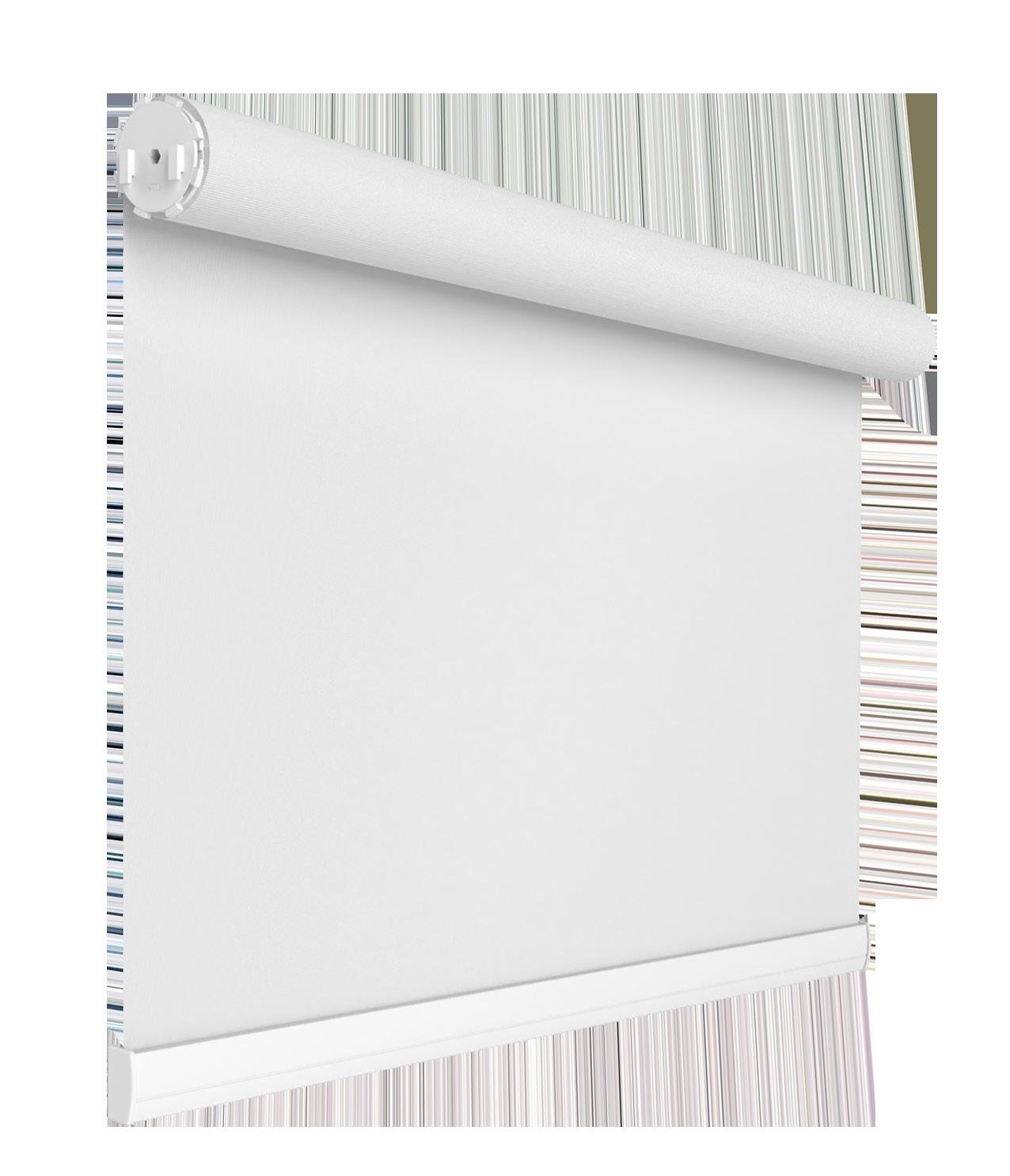
Learn more about our commitment to child safety at rolleaseacmeda.com/childsafety.

4 PUBLISHER’S NOTE Finding Beauty in the Breaks By Grace McNamara

8 disCOVER About the Cover
10 POINT-OF-VIEW: New & Noteworthy All That’s Interesting
14 ARTISAN ATELIER Trims and Tassels, Oh My!
18 FULL FRAME: Installation Paydays Across the USA By Roger Magalhaes
56 MARKETING Social Media
The Surprising Power of Social Media for Custom Window Treatments By Ania


58 SHOW ME THE MONEY Ditch the “Yeah, But…” Mentality and Break Free From Discounting By LuAnn Nigara
60 TRANSFORMATIONS Design Sales Appointments: You Never Know What You’re Going to Get By Kathy Cragg Pace
62 FLAIR Product Spotlight
64 Sold! Close Out the Year on a High Note By Oliver Schreiber

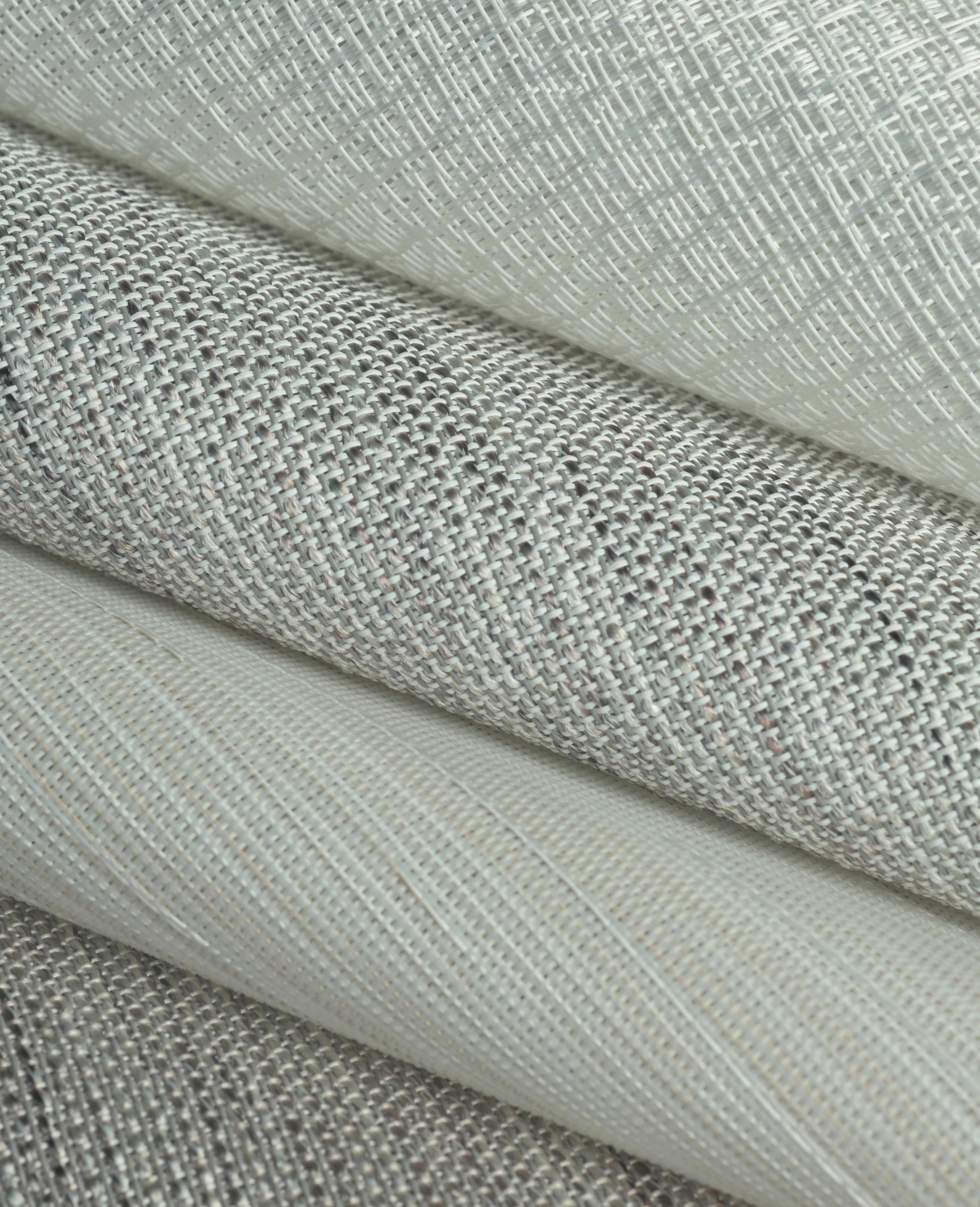
SheerWeave Style 5000 features roller shade fabrics that combine textured yarns with traditional patterns. With a color palette of hushed naturals and rich earth tones, this collection offers a range of classic options designed to suit any style of decor or personal preference.


The SheerWeave app is available for free download to all mobile devices.

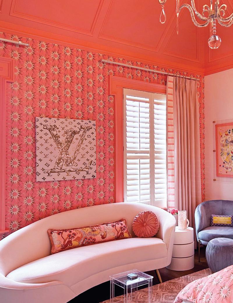
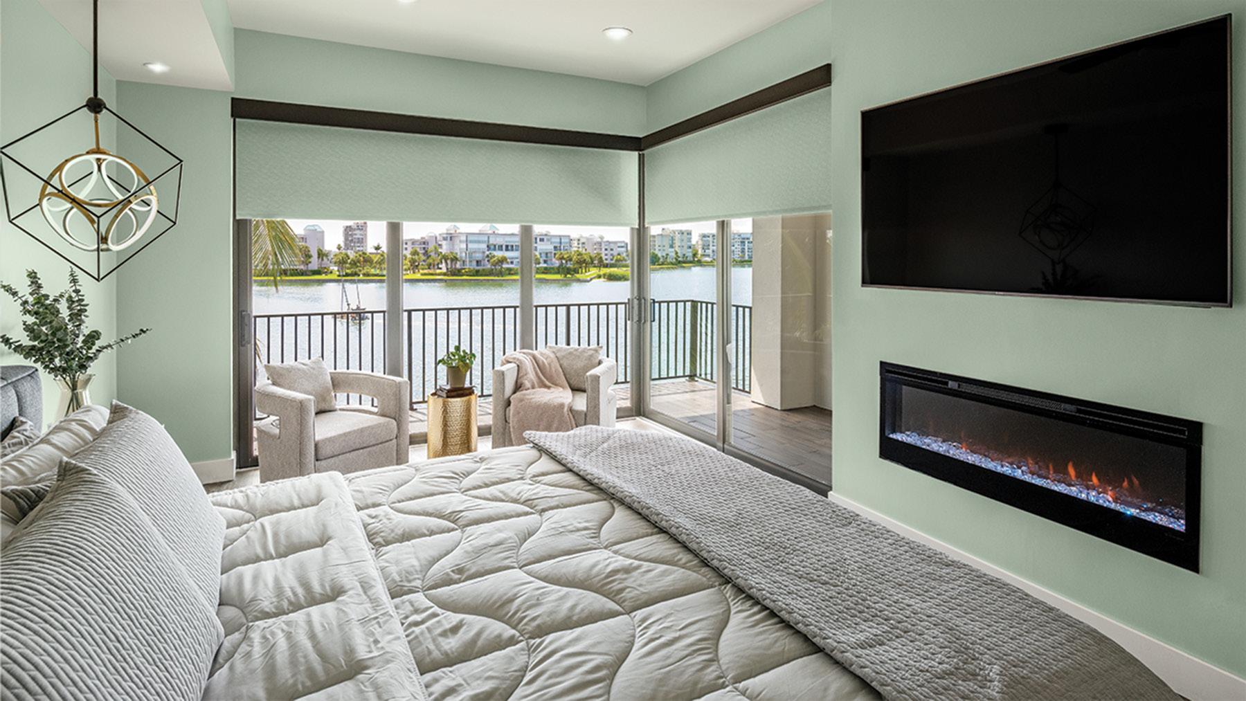
Just outside of Louisville, KY, sits Prospect, a charming little community on the Ohio River. When clients approached Draped in Style’s Lisa Thoma and Julie Ensor about decorating their daughter’s bedroom, they decided to pink out loud.
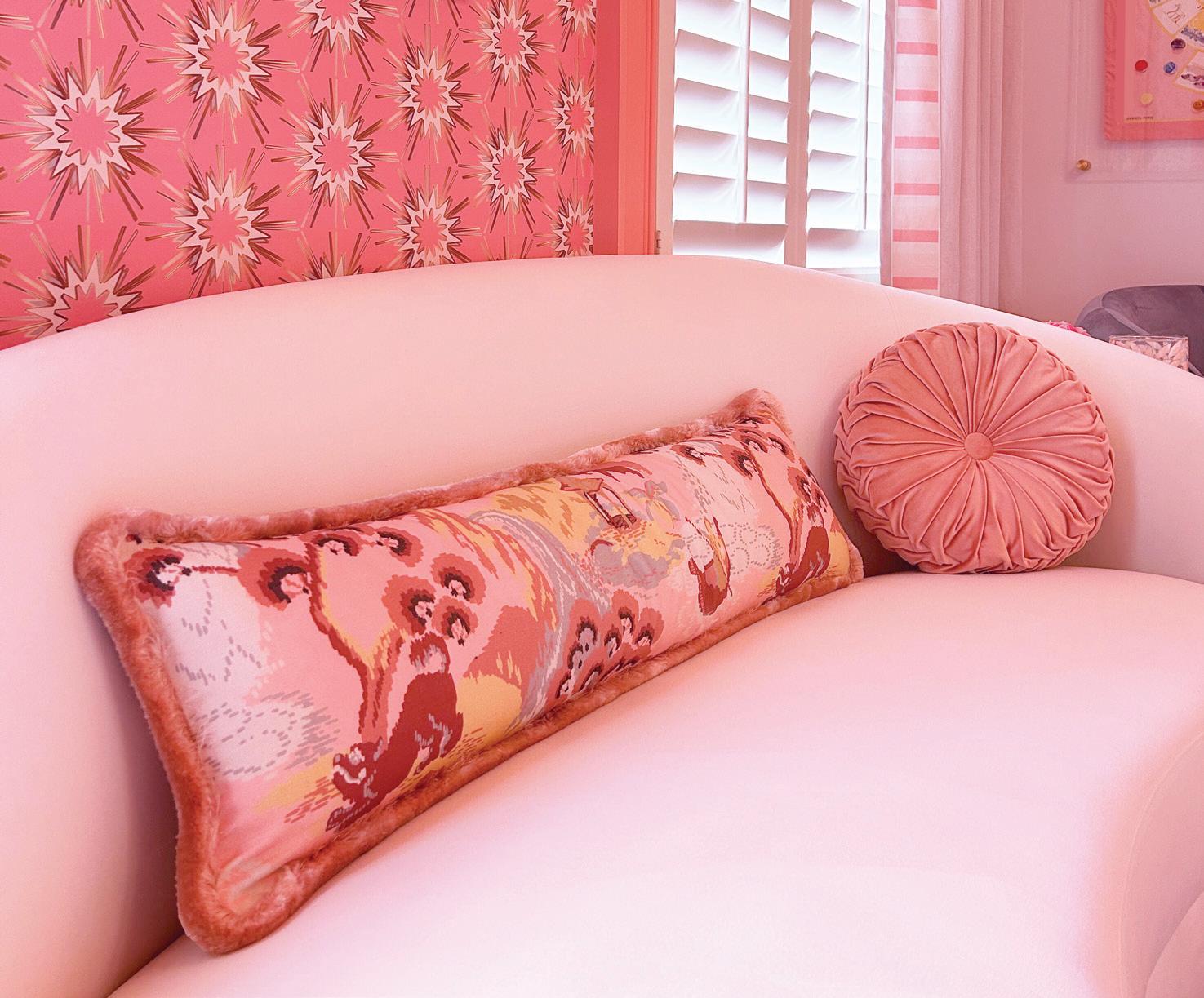
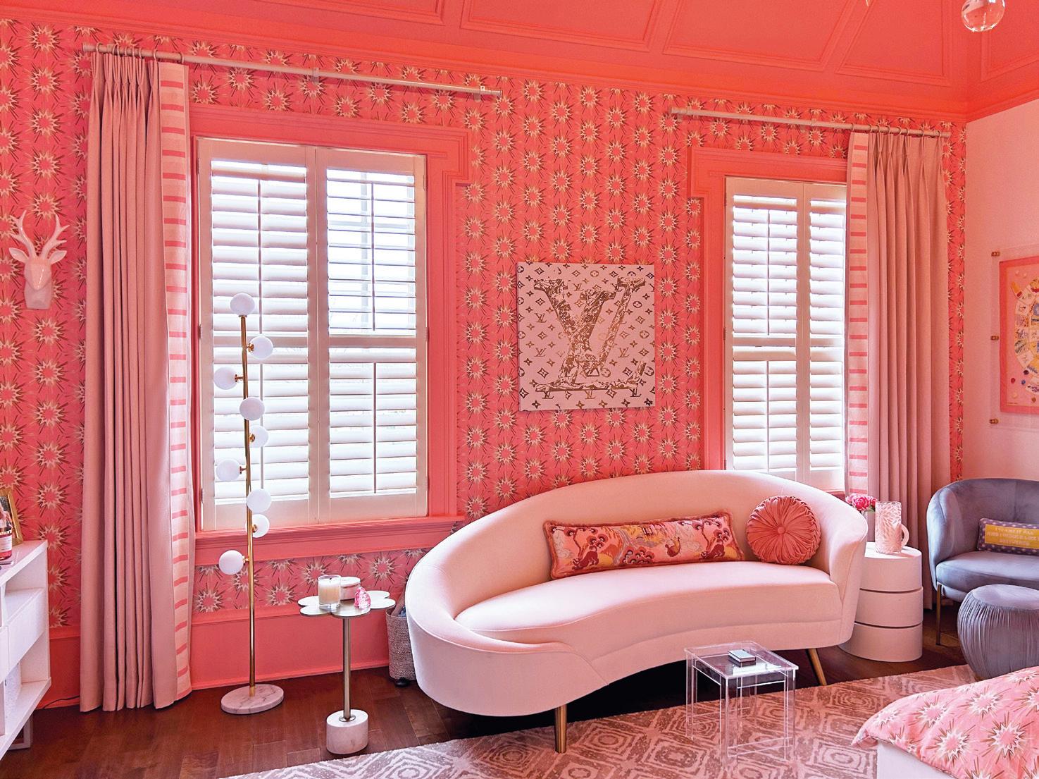
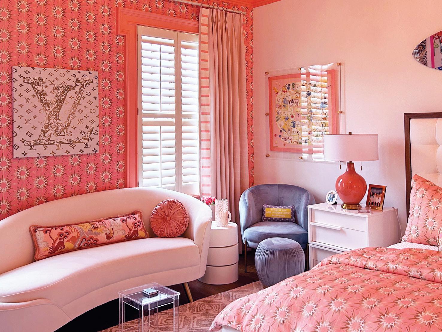
The hue is having a major moment across all industries and many are jumping on the bandwagon when finding inspiration for new projects. Knowing that the clients had a great appreciation for color, texture and pattern, Thoma and Ensor set out to layer these three elements together throughout the room.

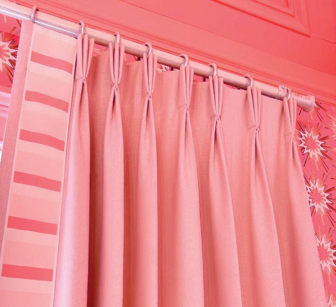
Working with a team of local seamstresses to bring their ideas to life—who stitched each triple pinch pleat by hand—Trend Cream fabric was chosen for the drapes and accented with Brimar Cotton Candy trim, all topped off by United Supply Company’s Select Iron Works Collection hardware. The treatment complemented the space’s existing shutters, neither overpowering nor weakening them.
The rest of the room was refreshed with Jennifer Latimer wallpaper and pillows featuring Madcap Cottage Old Peking/ Bahama Pink and Samuel & Sons Blush fabric. Thoma and Ensor created a rosy refuge fit for anything the occupant can dream up. V


DECORATIVE MOTORIZED COLLECTIONS: Control this handsome hardware with your favorite app, the Forest app, or easily integrate into your home automation system. All Shuttle drapery motors include a 10-year warranty. Plug and play installation or choose our battery powered option.


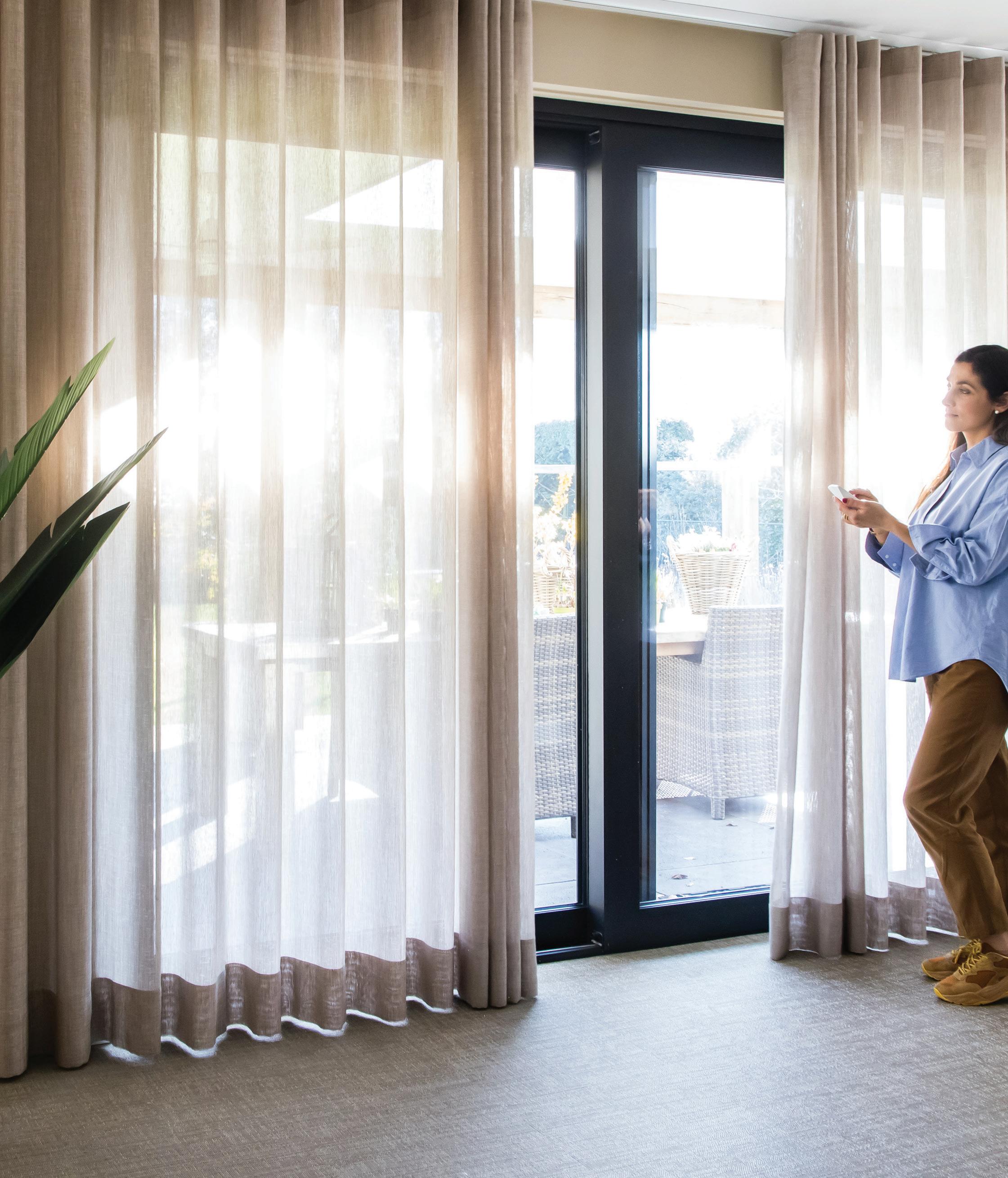
WORLD BEHIND YOUR DRAPERIES


Amp up the architecture of a roller shade with Rollease Acmeda’s hem bar. With the possibility of half or fully wrapping the bottom bar, this design flawlessly integrates into any space. The bar features flush fit endcaps and a section for a ballast to add additional weight. Available in anodized, white and black, using this bar with any shade system featuring fabrics up to 0.7mm thick guarantees easy fabrication.

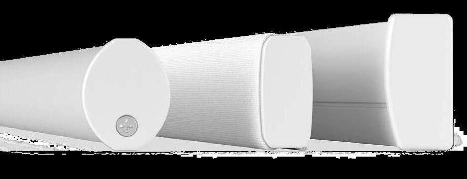
» RolleaseAcmeda.com
Scroll no more! The social media-famous Gleaming Primrose mirror is one of Anthropologie’s best-selling styles for a reason. Its vintageinspired details and adornments along the apex and edges reflect the timeless nature of the design. With an assortment of sizes, shapes and finishes, buy more than one and move them around your space for a fun and easy way to change with your tastes.
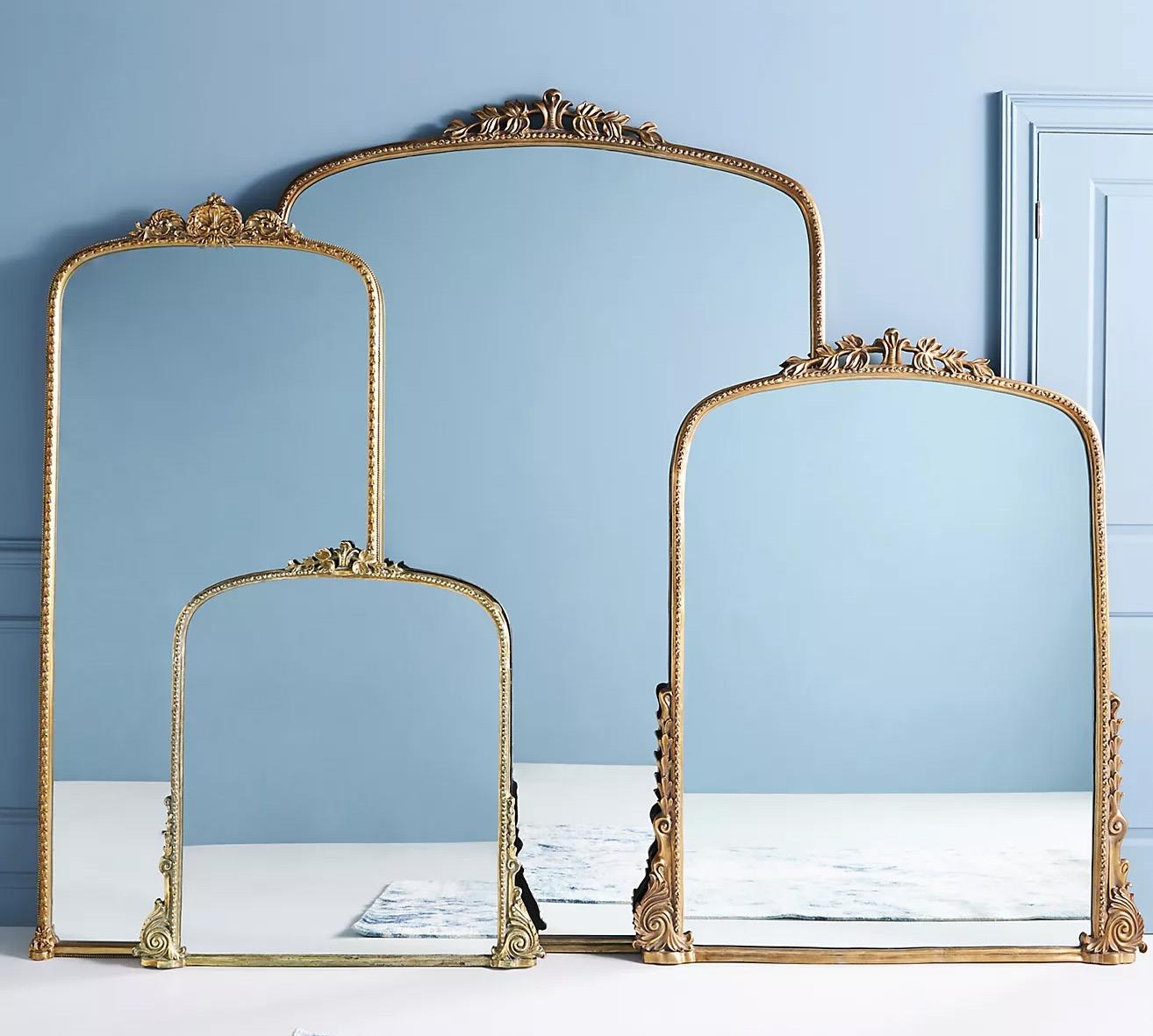
» Anthropologie.com
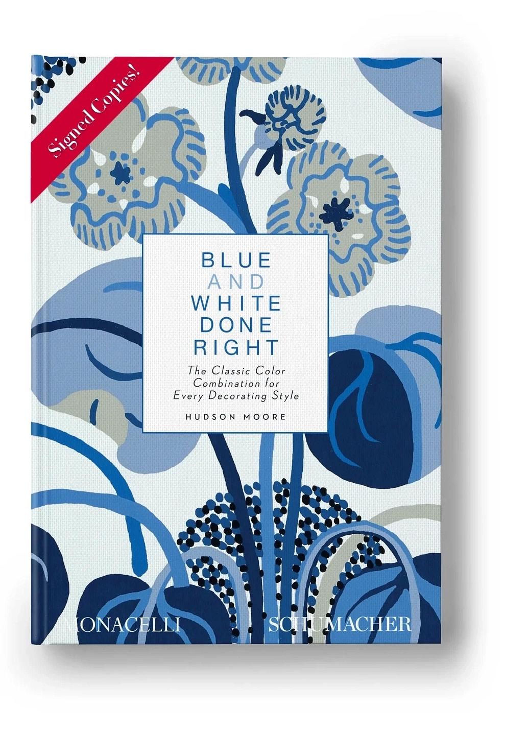
Blue and white is a color combination almost as timeless as black and white, but just how versatile can this pairing be? In “Blue and White Done Right: The Classic Color Combination for Every Decorating Style,” Schumacher explores how to utilize each and every shade in any style you can imagine across a variety of products. The work of interior designers and photographers illustrate the transformative powers of the hues.

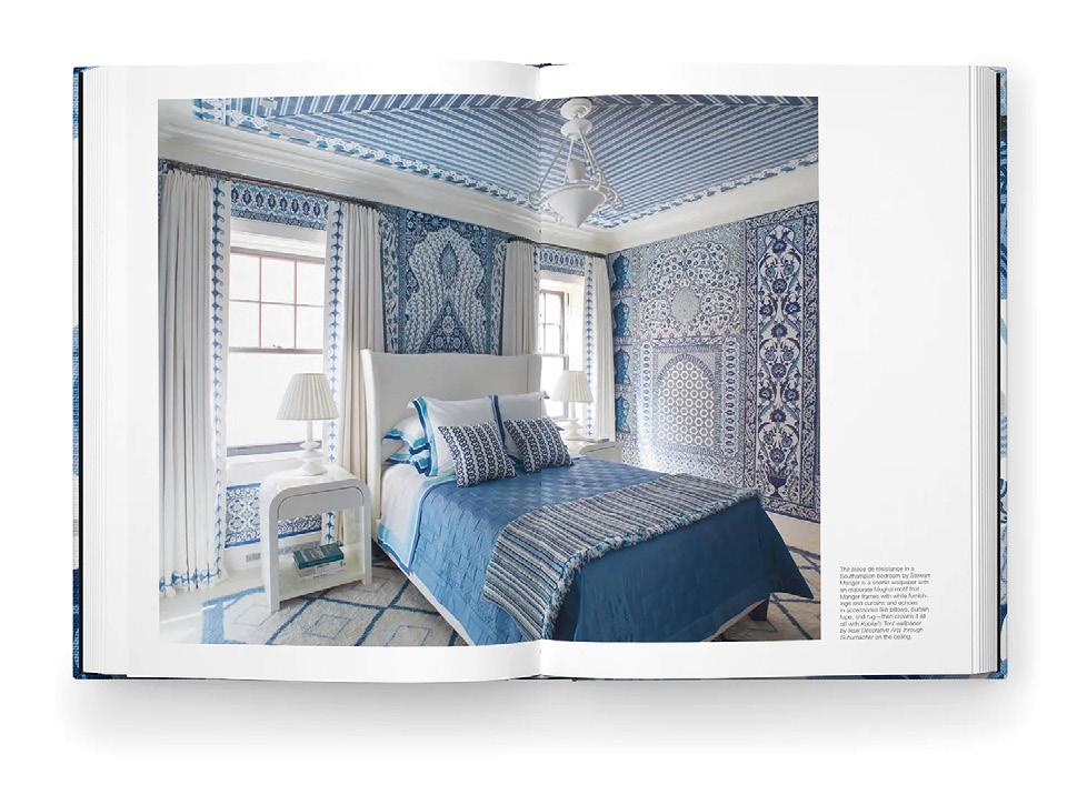
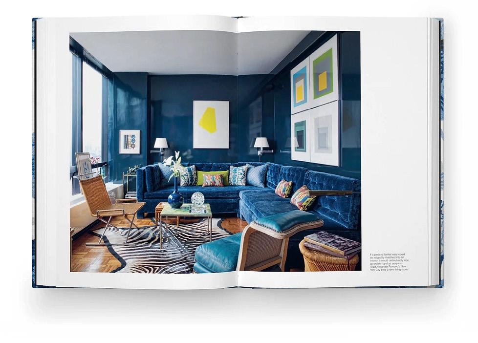
» ShopSchumacher.com


Kravet got the memo that Barbie was back in style and better than ever. On the heels of July’s movie premiere, the company has curated its favorite pink fabrics, passementerie and home decor. Whether you’re a maximalist or a little more subtle, any one of these picks will set you on the right path for creating a Dreamhouse.
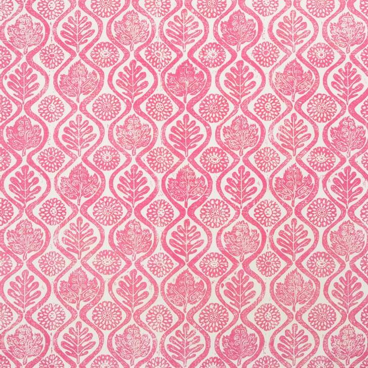


» Kravet.com


Nature doesn’t have to be left outside when the temperatures start to drop. Bring a woodsy look indoors with the Condesa cabinet, engineered hardwood hand-carved by artists in Mexico to create a unique texture. The structure features finished wood surrounds and plinth-style bases, which are stained and sealed by hand for a rich color topped by a coat of clear lacquer.

» Arhaus.com
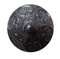
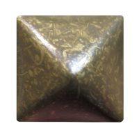
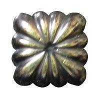
Don’t stop at fabric when choosing accents for furniture! Embellish custom upholstery with Brimar’s robust line of decorative nails, whether in a pattern or to complement the silhouette of a piece. No need to limit yourself to classic chairs and couches, let your imagination run free on tables, dressers or desks with a variety of styles, finishes and sizes.
» BrimarInc.com V


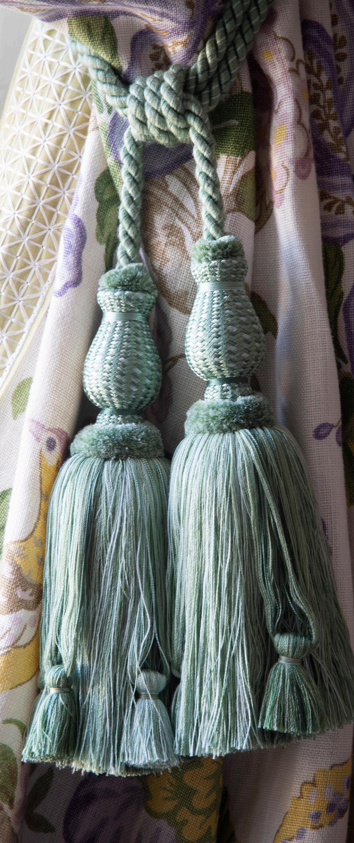
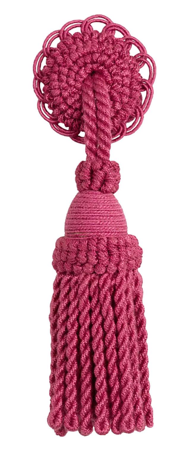
Every designer knows it’s all in the details. While trims and tassels might have recently faded in use, like changes in fashion, they come back around. As far back as the 16th century, when the Guild of Passementiers was established, fringes, tassels, cords, gimp and braids have been used to create dramatic effects or give a piece added color and texture.
Marisa Gutmacher, executive design director at Samuel & Sons, told SheerLuxe, “Overall, we’ve seen a new interpretation of ‘traditional.’ The new ‘traditional’ style is more refined and luxurious, but there’s still room to mix different period pieces and color palettes. We’re seeing real demand for skirt fringes, bold graphic geometric embroidered and applique borders, and unexpected material combinations.”

With Horizons’ Design Modification (DM) and Customer’s Own Material (COM) programs you can create one-of-a-kind window treatments that meet your client’s exact specifications. Our helpful design experts and talented team on the production floor work together to make your client’s dream a reality. Quality is more than an expectation, it’s the foundation for everything we do. Design Modification allows you to modify a design to fit your client’s exact needs. Want a specific cut out for an odd-shaped window? Just ask! Want to match patterns across your treatments? We can do that!
63% of all soft projects made by Horizons use the C.O.M. program.
Have you ever wondered how Horizons is able to produce high-quality, handmade products? Turn to page 54 to find out.
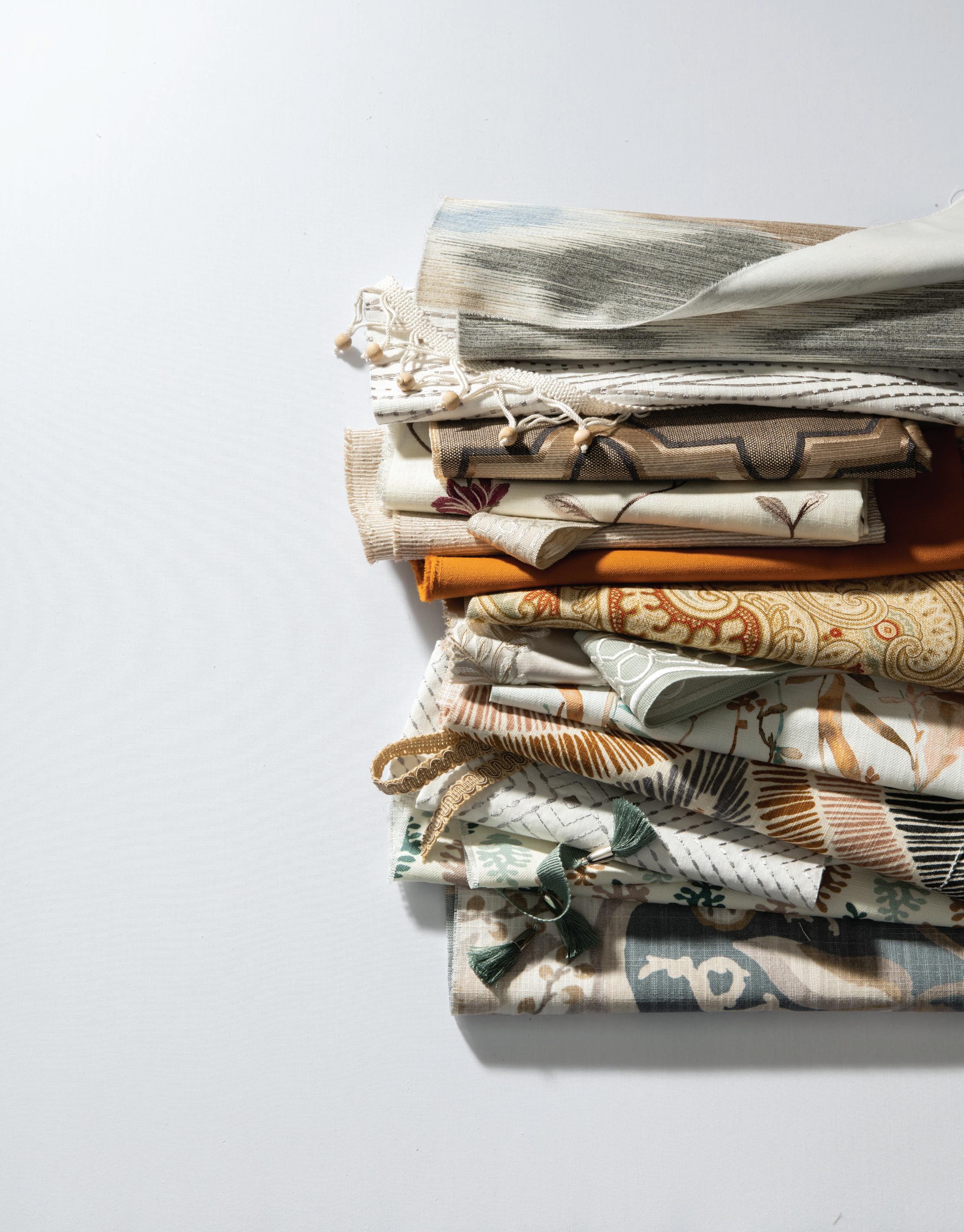
Some have shirked the decorations in favor of minimalism, but it’s all about finding the balance between too much and too little. To herald the comeback of trims and tassels, we spoke with Timothy Corrigan, interior designer of an eponymous firm responsible for many international projects who was featured at the Kips Bay Decorator Show House in New York.
Q: Is it fair to say trims and tassels are currently trending? Why or why not?
A: Trims and tassels have made a huge comeback. In 2022, the word “tassel” actually made it onto Google’s list of new words that had shown a significant increase in searches over the previous year. We’re seeing trims and tassels being used in new and unusual ways and younger designers who hadn’t been around when tassels and trims last played a major role in the design scene actually see them as feeling new and unusual as opposed to old and out of date.
Q: Are there particular brands, or materials, you use especially often in your work?
A: My two go-to brands for high-quality and innovative trim are Samuel & Sons and Schumacher. Between these two companies, you pretty much have all of your trim needs taken care of.

Q: How do you feel about patternmixing? Do you have tips or tricks for designers hoping to pull it off?
A: We often mix tapes and trims on the same piece. For example, we will use a wide tape or crete trim inset around 4 inches on
the leading edge and bottom of a drape and then have tassel fringe on the actual leading edge. Also, if I don’t find the header of a tassel fringe very interesting, we cover it with another tape trim.
Q: Can you tell us a bit about a recent project that incorporated trims or tassels?
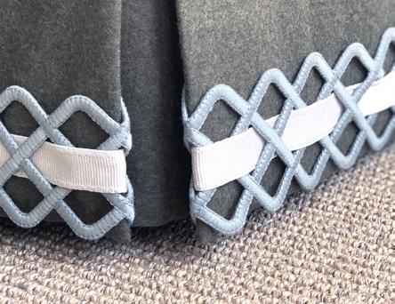
A: We use trims and tassels on almost all of our projects around the world … so much so that I’m nicknamed “Trimothy” in our office. A couple of examples of some of these projects include: the window coverings on the world’s largest private yacht, the American ambassador’s residence in Paris and a penthouse apartment on Central Park in New York City.
Q: Do you think the trims and tassels work in both modern and historical homes? Do you tend to style them differently?
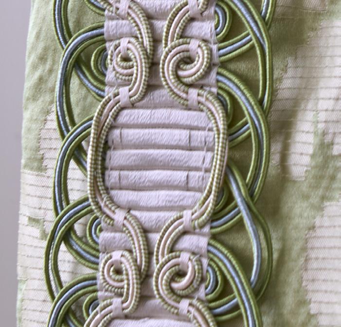
A: We use different types of trims on more modern projects. For example, in a more contemporary project, we might just use a tape trim on the leading edge of the drapes and we let them fall as a straight stack, whereas in a more classic home we would probably use a scalloped tassel fringe with an additional tape and then tassel curtain tiebacks. But in all cases, trim adds that extra layer of detailing that makes a space feel special and totally custom. Increasingly, clients want to feel that they have things in their home that cannot be found anywhere else; adding trim to a fabric is one of the easiest ways to achieve that more custom, bespoke look.
Q: Do you think the trend has staying power?
A: We experienced the clean, modernist look for much of the last 20 years, but like all trends, the pendulum has started to swing back to the more layered classical design look and we can expect this to be around for another 10 to 15 years so you can feel confident in using trim and tassels for the years to come. V
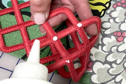
1. APPLY ADHESIVE: Following the trim pattern, draw dots or fine lines of fabric adhesive on the backside. Choose an adhesive that dries clear. It’s important to use a dispenser with a small tip to ensure thin, precise glue placement, and avoid messy overflow.
2. AFFIX TRIM: Carefully flip the trim over and apply it to the fabric, pressing down gently in sections. Allow it to dry.
3. INSTALL: It’s as easy as that! Your drapery panel is ready to be installed. Choose any of our open trim styles to embellish accent pillows, furniture, roman shades, cornices and lampshades.
Please join us in celebrating the winner of Window Fashion VISION ’s 2023 Workroom of the Year Award of Excellence: Addie Conte of Addie Designs, Lothian, MD.
» AddieDesigns.com
» @addiedesigns
1. TACK STITCHES: In some instances, tack stitching is best. Apply tacking by hand or a sewing machine. If using a machine, glue in a few spots or use pins to prevent the trim from shifting underneath the foot of the sewing machine.

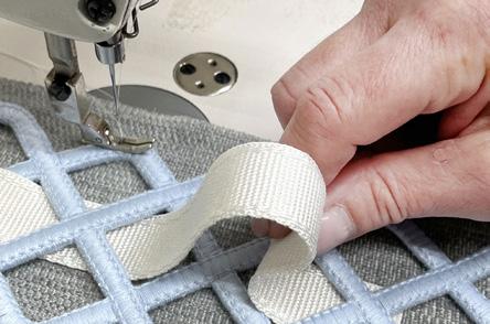
2. IT’S COMPLETE: The trim is sturdily attached and your piece is ready to be enjoyed.


Control by app, remote, or third-party integration
Power options include alkaline, lithium-ion, low voltage wall plug, and hardwired


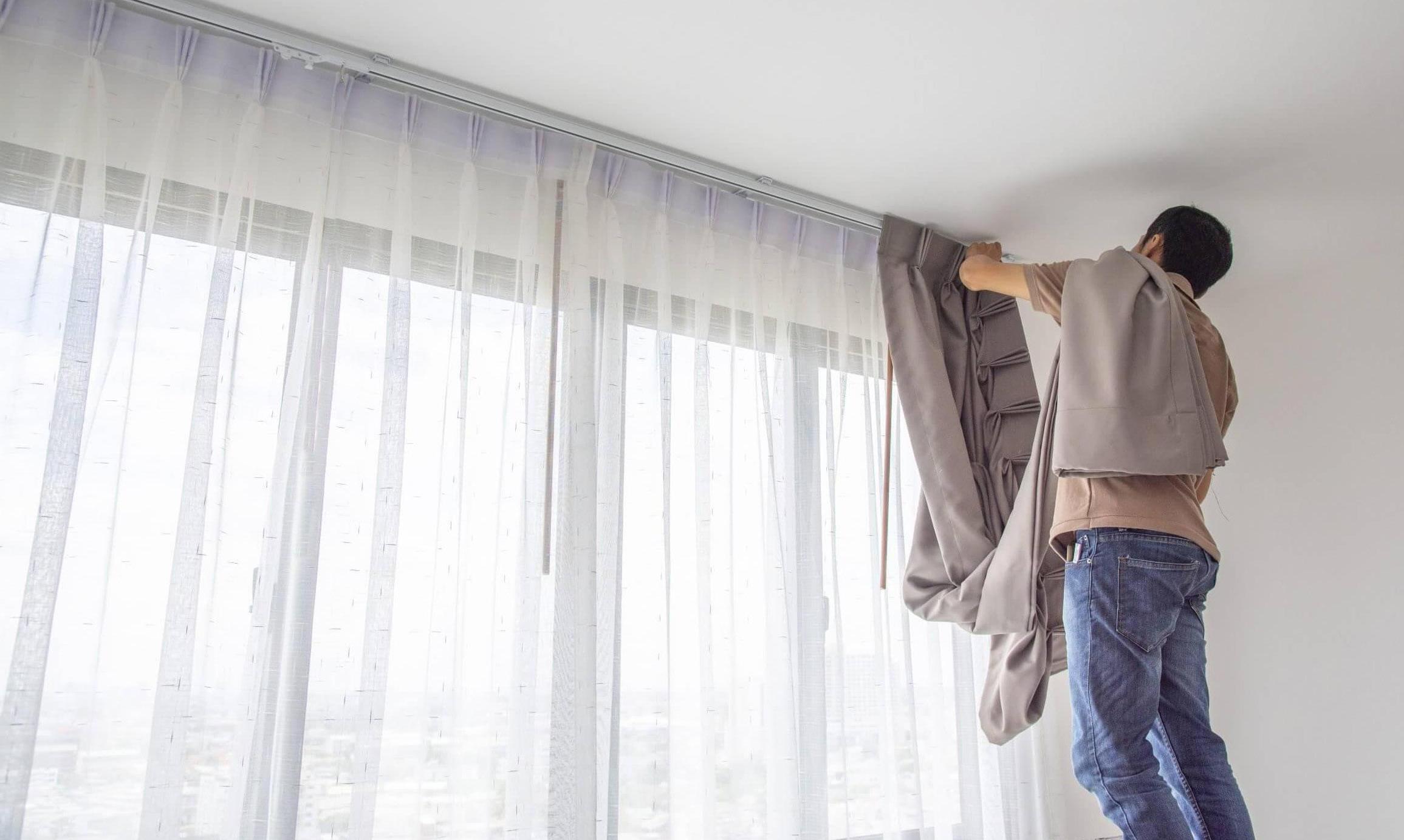
Window treatment installers play a crucial role in the interior design industry, enhancing the aesthetics and functionality of residential and commercial spaces. As they provide their expertise and skills, various compensation methods are used by employers/agents to attract and retain these talented professionals. From hourly to fixed salary or even by unit installed, compensation methods vary widely across the board.
Benefits
■ Stability: Window treatment installers often receive a consistent and predictable income based on the number of hours worked.
■ Overtime pay: In many cases, installers may be eligible for overtime pay if they work more than the standard 40 hours per week.
■ Fair compensation for time-consuming projects: Jobs that require extra time and effort will be fairly compensated on an hourly wage basis.
■ Limited earnings potential: Hourly wages may restrict earnings potential, especially for highly skilled and efficient installers who can complete jobs quickly.
■ Seasonal fluctuations: Installers may experience fluctuations in their income during slow seasons, potentially leading to financial uncertainty.
■ Incentive for efficiency: Installers can earn more by completing more projects within a given time, which encourages efficiency and productivity.
■ Your choice: Some installers charge per bracket or unit, while others prefer per linear foot or even choose per square foot.
■ Opportunities for skill development: Piecerate pay can motivate installers to improve their skills, leading to quicker and more accurate installations.
■ Speed versus quality: Some installers might prioritize speed over quality to maximize earnings, potentially compromising customer satisfaction.
■ No pay for noninstallation time: Installers may not receive compensation for administrative tasks, client communication or downtime between projects.
are the different compensation methods for window treatment installers, including the potential benefits and drawbacks?


Benefits
■ Earnings potential: Commission-based pay allows installers to earn more when they secure larger projects or sell higher-priced window treatments.

■ Motivation for sales: Installers may be more proactive in upselling additional products or services, benefiting both themselves and the company they are representing.
Benefits
■ Stability: Salaried installers receive a consistent income, regardless of the number of hours worked or fluctuations in project volume.
■ Benefits package: Some companies offer additional benefits such as health insurance, retirement plans, paid time off to salaried employees, company vehicles and more.
■ Inconsistent income: The income of commission-based installers can be unpredictable, especially during slow periods or when faced with challenging market conditions.

■ Pressure to sell: There might be pressure to prioritize sales over meeting customers’ needs, which could impact an installer’s reputation.
■ Fixed income: Salaried installers won’t directly benefit from working extra hours or taking on additional projects.
■ Lack of incentives: Without incentives based on productivity or sales, some installers may lack motivation to go above and beyond.
■ Independence: Self-employed installers have the flexibility to set their rates and choose their projects.
■ Tax deductions: Independent contractors can often deduct business-related expenses such as tools, vehicle-related costs and uniforms, potentially reducing their tax liability.
■ Financial risk: Self-employed installers must manage their finances, handle taxes and deal with the irregularity of work volume.
■ Lack of benefits: Independent contractors typically don’t receive benefits like health insurance or retirement plans.
Additionally, independent installers must consider their own experience, market conditions, overhead cost, insurance, the amount of hours willing to work per week, money to set aside for retirement or sickness before deciding on their own prices.
In conclusion, the compensation methods available for window treatment installers in the U.S. offer a range of advantages and disadvantages, catering to diverse needs and preferences. Hourly wages provide stability and security, while commission-based and piece-rate compensation incentivize performance and efficiency. Each approach comes with its unique set of challenges, and it is crucial for employers and installers to weigh these factors carefully. By understanding the benefits and drawbacks of each compensation method, employers can attract skilled professionals and foster a motivated workforce.
Likewise, installers can make informed decisions that align with their career goals and work-life balance. Ultimately, finding the right compensation balance will not only contribute to the success of individual installers but also enhance the window treatment industry as a whole. V
Roger Magalhaes is the founder of Trading Up Consulting, which provides installation training for window fashion professionals. Magalhaes has more than 15 years of experience as a professional window treatment installer in the Boston area. He is also the installation instructor for the Window Fashion Certified Professional FastTrack program and is the president of Window Coverings Association of America.
» TradingUpConsulting.com
Ultimately, finding the right compensation balance will not only contribute to the success of individual installers but also enhance the window treatment industry as a whole.
The Deco [R] collection from Vesta is perfect for modern interiors. It offers many mounting possibilities that can be effortlessly integrated thanks to five different finishes. The dominant facia accentuates noble finishes; brushed gold is gorgeous here. Deco [R] is made in Germany and comes from BÜSCHE®. With 150 years of experience, they have supplied the US market with premium products and Vesta for over 40 years.

sales@vestadraperyhardware.com


800.638.37812
www.vestadraperyhardware.com
Follow us:
Celebrating 12 and a half years at the company, Creative Director Catharina Idema is Coulisse’s head of brand and creative content. With a background in high-end interior design brands, teaching design at the styling Academy Artemis and graduating from the Design Academy Eindhoven, Catharina has the creativity, expertise and credentials to take design at Coulisse to the next level.

Having joined Coulisse in 2010, Catharina has come full circle in her career and is returning to what she loves the most: conceptual thinking and visual storytelling. “I have always been interested in the story behind a product— where it comes from, what it does and what it offers people. I’m always interested in the bigger picture—making products that have real meaning and, of course, are genuinely beautiful. I also appreciate that founders Christiaan and Maurice [Roetgering] have so much love and passion for new innovations, which means I always have new challenges in brand and design. Always looking to the future, and this vision is paramount to everything we do,” shared Catharina.
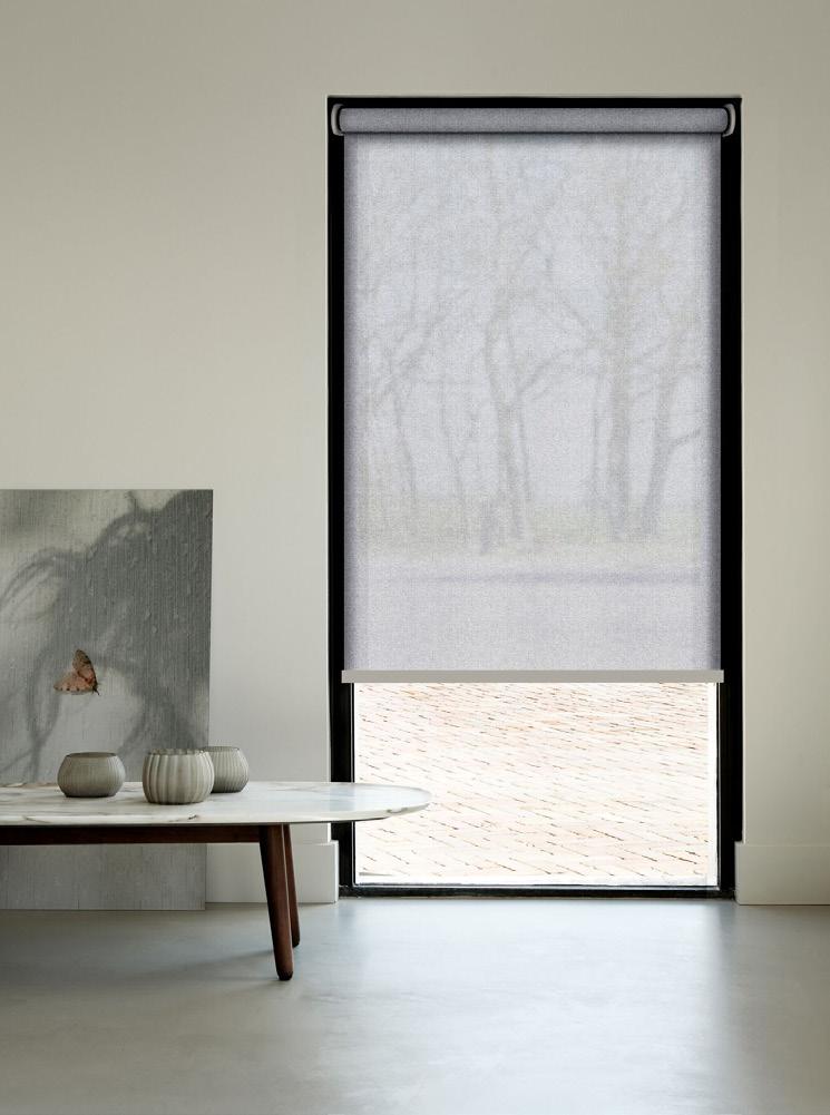
It’s an old saying, but it’s more relevant than ever in the current climate. During the pandemic, people spent much more time at home. “This was a new concept that most people welcomed. Home became a sanctuary—a place to treasure and to feel safe. It also became a new workspace, and home offices became more important than ever,” said Catharina. This forever changed the way people thought about their interiors. “In this new climate, people want to make choices and follow their intuition. Whether for work or pleasure—it’s about enjoying our surroundings.” For the interior industry, this allows us to create soft, relaxing and comfortable spaces—and window coverings are a major part of this.
“At Coulisse, beauty has always been a major part of our design, but now in these times, it will play an even bigger role.”
Catharina Idema, Creative Director
Beauty meets intelligence with MotionBlinds by Coulisse. Safety, convenience and energy efficiency are essential for every smart home. As an industry expert, Catharina shared what’s predicted to occur next. “We need to change our whole thought process. Not just the products themselves but a change in the industry and human behavior. We must use our intelligence and intuition to contribute to a better, healthier, safer place to live and work. With our window decoration solutions, we can add value by working together and putting real thought and vision into everything we do. This is how we can impact—now and for generations ahead of us.”
Beautiful tactile materials with a natural soft feeling are trending right now. “At Coulisse, beauty has always been a major part of our design, but now in these times, it will play an even bigger role,” said Catharina. The current Living Beauty concept fits this trend flawlessly. Coulisse is extremely thoughtful about what is added to collections and examines carefully what products are added into this disruptive world. “Everything we create is always aimed to be exquisite and captures our senses! It’s no secret that you feel much happier if you surround yourself with beautiful products. This is what our company as a whole believes in at Coulisse. Every product we design or marketing content we create in our in-house marketing department must be captivating and relevant. Always well thought out with an eye for beauty,” explained Catharina.
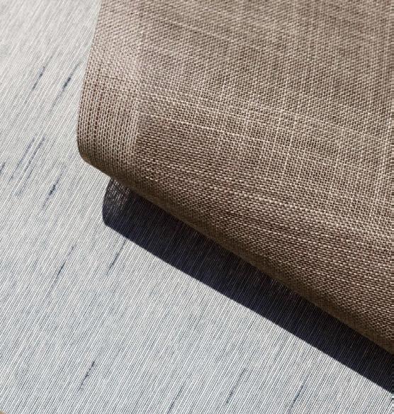
“Nature is an ultimate source of inspiration for Coulisse. We notice how people want to be closer to nature, escape the cities and be surrounded by natural materials, plants and trees—oxygen for one’s mind. Materials are inspired by colors from the earth, and natural materials are getting more and more important,” shared Caterina. The Living Beauty campaign with Jasper Abels is a perfect match for this trend. The campaign was shot in the Reggedal nature reserve in Enter, the Netherlands, which is currently being restored. It felt right to link this natural area with our Living Beauty collection close by, and together with Abels, Coulisse created captivating visual content where our fabrics match seamlessly into the nature of the Reggedal and reflect the design philosophy.

Coulisse—the global specialist in window coverings
» Coulisse.com
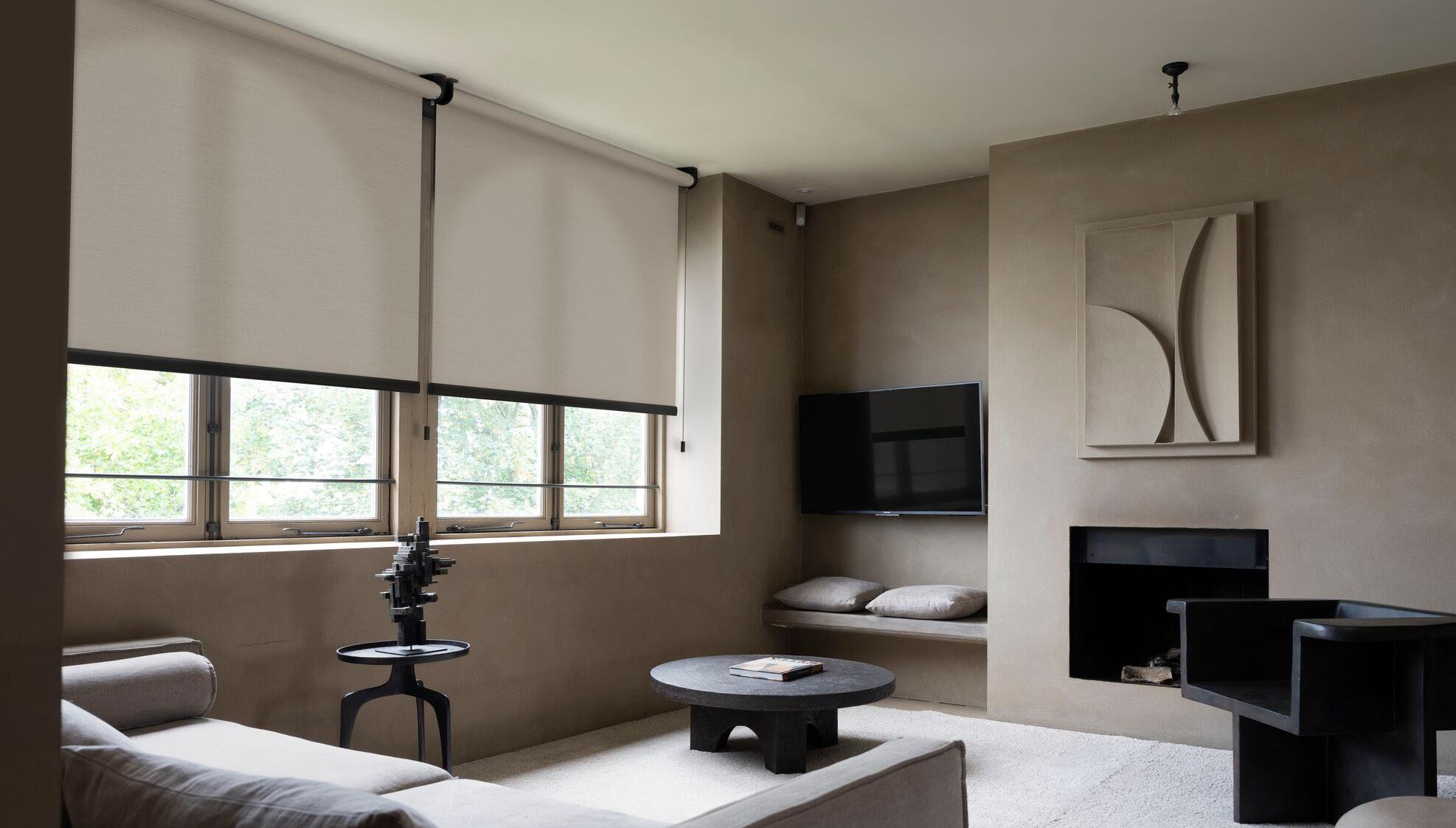


If you find yourself drawn to your patio for fresh air or taking breaks from work to gaze out the window, you can thank your early ancestors. Since we humans first walked the earth, we’ve been hard-wired to interact with our natural environment. And that’s not by chance. It’s because connecting with nature improves our physical and mental health—a fact that science now confirms.
One of the biggest movements in the quest to incorporate nature into interior design is the concept of biophilia, a word whose roots loosely translate to “love of nature.”

“Biophilic design is the attempt to bring our inherited affinity inside the home,” explained Mike Peterson, co-founder of Science in Design and president of Visionary Design Marketing. As he pointed out, it was only about 10,000 years ago that humans began to commune in city-like environments with walls and ceilings. “Prior to that, it was only us and nature.”
Our inherited tendency to crave nature is driving industry professionals to design with an eye on mimicking the elements our brains gravitate toward.
“Biophilic design is a phenomenal opportunity for the design industry to create a level of homeostasis in our lives, because we actually live in a very unnatural world,” Peterson said. The straight lines and right angles of modern-day buildings contrast starkly with the details and irregularities that draws us to nature.
“If you look at an oak tree with all those points on the leaves, and you put thousands of them together, you have something wildly attractive to our brains—the perfect example of organized complexity,” he said. “We now know that our brain is naturally attracted to organized complexity, because it’s what we’ve lived with for millions of years.”
As it turns out, our brains know what’s good for us, as research confirms a strong tie between exposure to nature and better physical and mental health. Thanks to advances in technology, it’s easy to measure that connection scientifically through cardio function, galvanic skin response and other biometrics.
Consider the results of a Harvard study on how our environment impacts the ability to complete mentally taxing tasks. Participants that operated in a virtually simulated biophilic environment responded better to these stressors than those in a less natural setting, both physically and psychologically. Other studies reveal similar health benefits to being exposed to nature, from slowing down our heart rate to reducing our levels of the stress hormone cortisol.
“Dr. Claudia Miller, the head of environmental medicine at the University of Texas at San Antonio, says architects and designers have a greater ability to improve public health than medical professionals,” Peterson shared. That belief goes right along with the emergence of fields like environmental psychology (the study of how the built environment impacts people) and neuroaesthetics (a newer area of neuroscience that studies how our brains respond to art).


Esterel Roetgering, product developer at window covering manufacturer Coulisse, sees several trends driving the surge in interest in nature-infused design— from a growing focus on wellness to the pandemic-induced shift away from urban living. She pointed out distinct advantages in using natural materials rather than synthetics.

“One key benefit lies in the irregular features, unique appearance and tactile feel that natural materials provide,” she said. “Each piece of jute, line, and paper is inherently distinct, contributing to a sense of individuality and uniqueness in your space.”
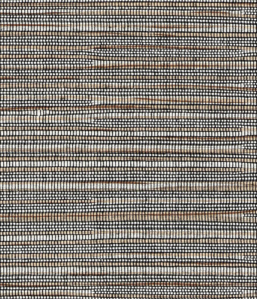
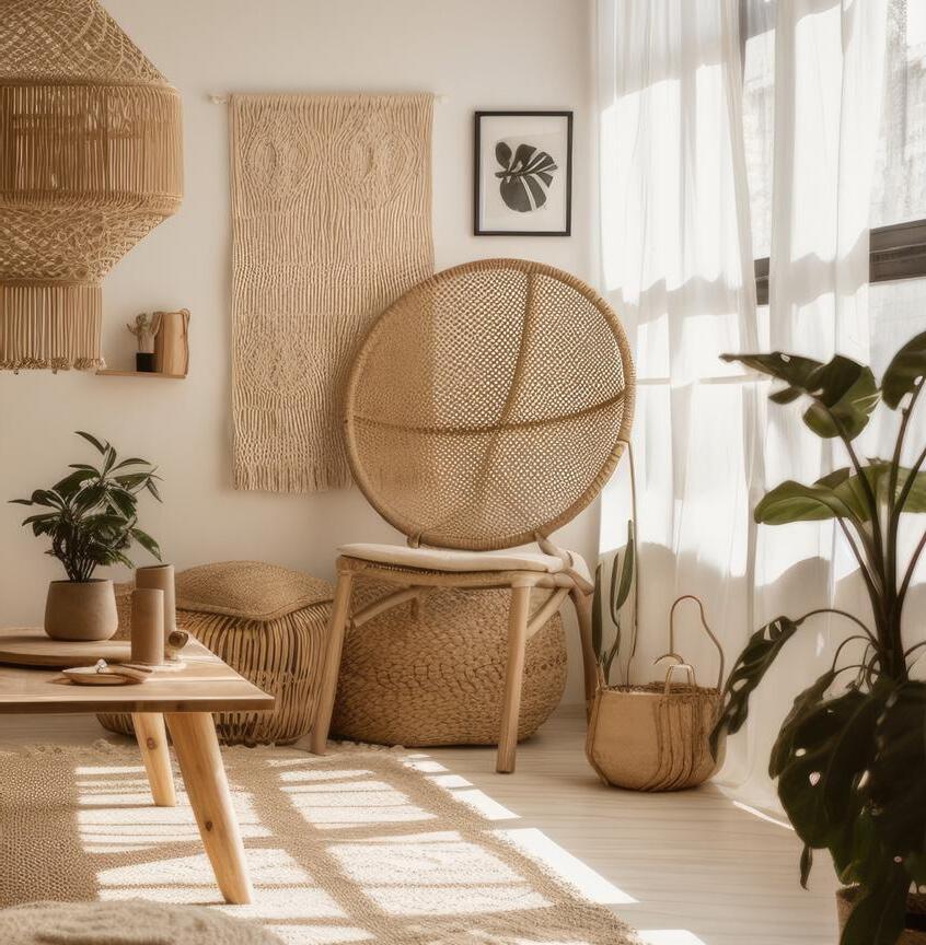
Designing with materials like these also improves sustainability. Using responsibly farmed and harvested plant-based fibers with minimal environmental impact helps in creating window treatments and other products that are both beautiful and ecologically sound, noted Michael Jones, founder of window covering manufacturer Hartmann&Forbes.


The consumer’s appreciation for natural aesthetics ties with another trend that Roetgering sees impacting interior design today. “It aligns with the rising trend of ‘green immersion,’ where individuals are striving to incorporate nature-inspired elements into their daily lives for a sense of tranquility and balance,” she said. Jones echoes that sentiment. “Designers and their clients are becoming more interested in how products are made, what they are made of and how the products they bring into their homes
contribute to the overall health and well-being of their space,” he said. In that vein, Roetgering has witnessed a noticeable shift toward window treatments that evoke nature or are made from natural materials, creating what she calls “a harmonious bridge between indoors spaces and the natural realm.”
For instance, roller or roman shades crafted from natural materials add a tactile quality that encourages touch and engagement, she said. “And earthy tones and colors reminiscent of the natural world foster a soothing and grounding atmosphere in any room.” When window coverings combine natural fibers and textures with colors tones reminiscent of the earth, “it mirrors nature’s beauty and creates a calming ambience,”
Peterson has organized a first-of-its-kind Science in Design Symposium taking place at this year’s High Point Market taking place on October 12-14. The experiential three-day event will bring architects, designers and academics together to learn about and experiment with biophilic design and neuroaesthetic principles, with artificial intelligence and other technologies assessing how participants react to different environments. Peterson’s firm is also launching a new certification program at the Market, with two dozen classes on biophilia and neuroaesthetic topics.

» Find more information at ScienceInDesign.com.

For interior designers, workrooms and window treatment professionals, opportunities abound to bring consumers the natural elements that will do their mind and body good. Ideas like the following are a good start!
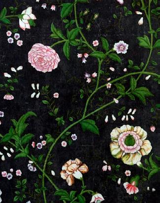
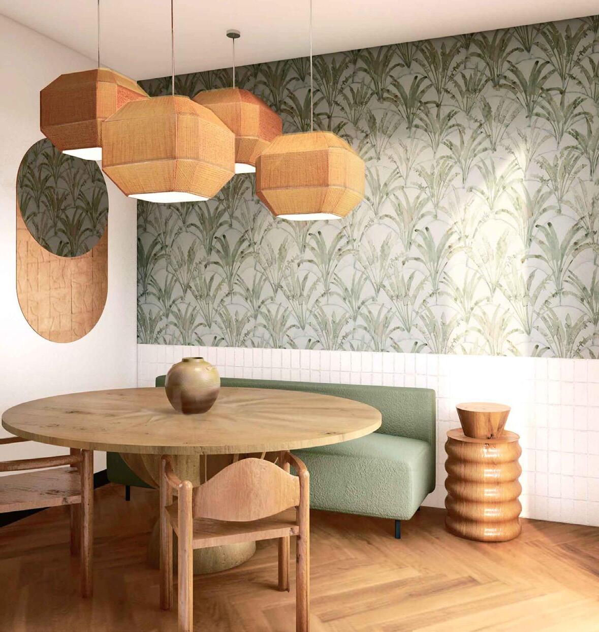
Whether in subtly patterned draperies or bold wallpaper designs, consider pulling in leaves and other botanicals in ways that play up the irregular edges and detailing found in nature.
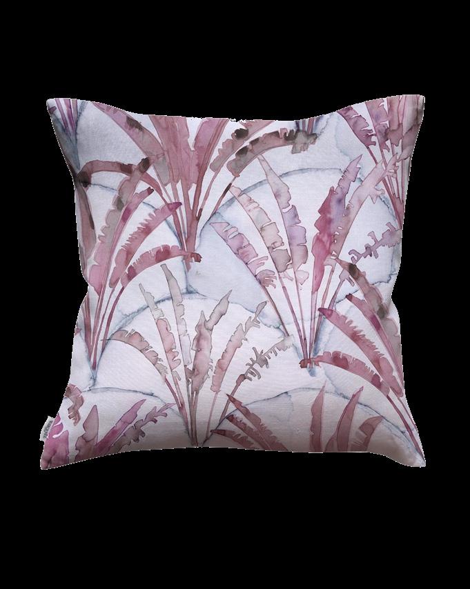
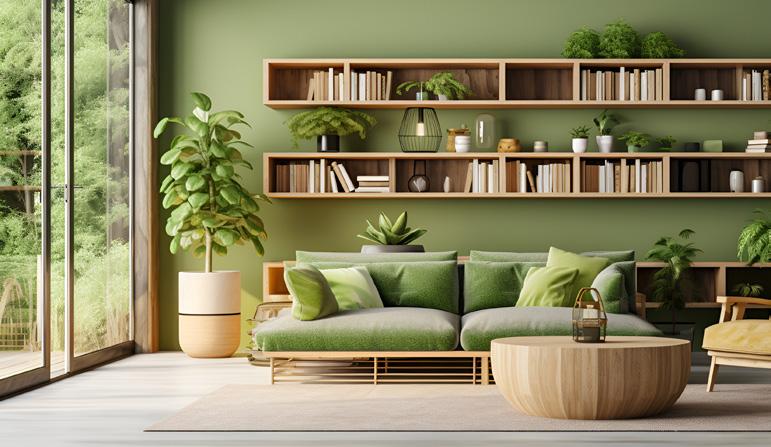
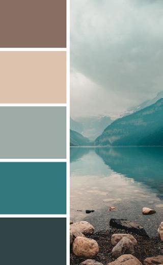
Color schemes that evoke the earth and sea can transport homeowners to places that nourish both body and soul. Look for opportunities to use a spectrum of shades of blue and green, along with warm neutrals in earth tones.

Organic cotton, linen, jute and bamboo are a few of the many natural fabrics that designers are gravitating toward, especially for window treatments. Think blinds made from woven woods or natural grasses, or sheers in nubby, irregular weaves. Coulisse is adding to its line of natural fabrics with new roller blind options that will incorporate a blend of cotton, linen and viscose, while Hartmann&Forbes emphasizes the use of rapidly renewable natural fibers like ramie, banana, vetiver and water hyacinth.

From upholstery to wallcoverings and draperies, the opportunities to build in biophilic design are endless. There are new options emerging all the time, like Eskayel’s fabric and wallpaper collection called Equatorial Geometry, inspired by the patterns and vegetation found in the tropics.
Wallpaper:
Homeowners want to experience the great outdoors even when they can’t be there, and that brings their windows front and center. Peterson is a big fan of window seats (“I tell builders, ‘Every one of your homes has to have a window seat!’”), while Roetgering believes “the allure of bringing the outdoors indoors through window treatments that echo nature’s beauty” is a trend that will persist into 2024. V

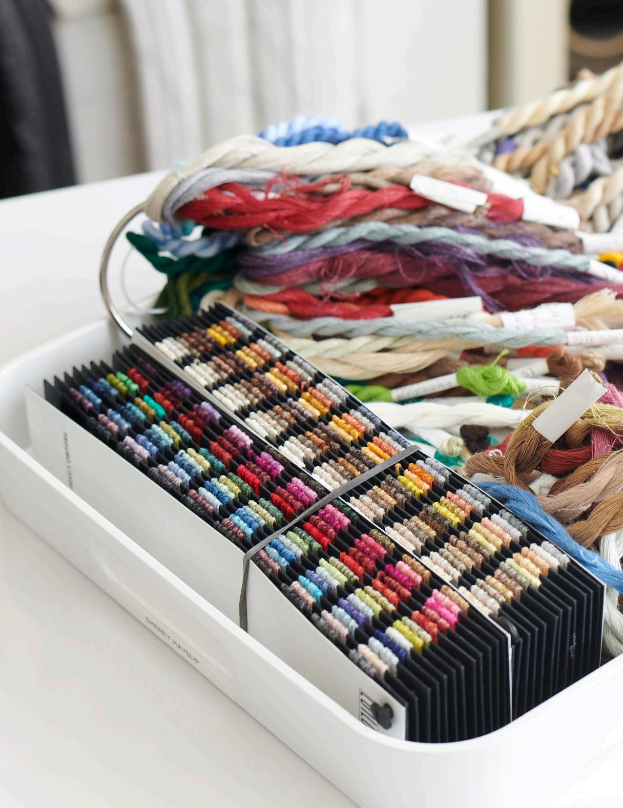
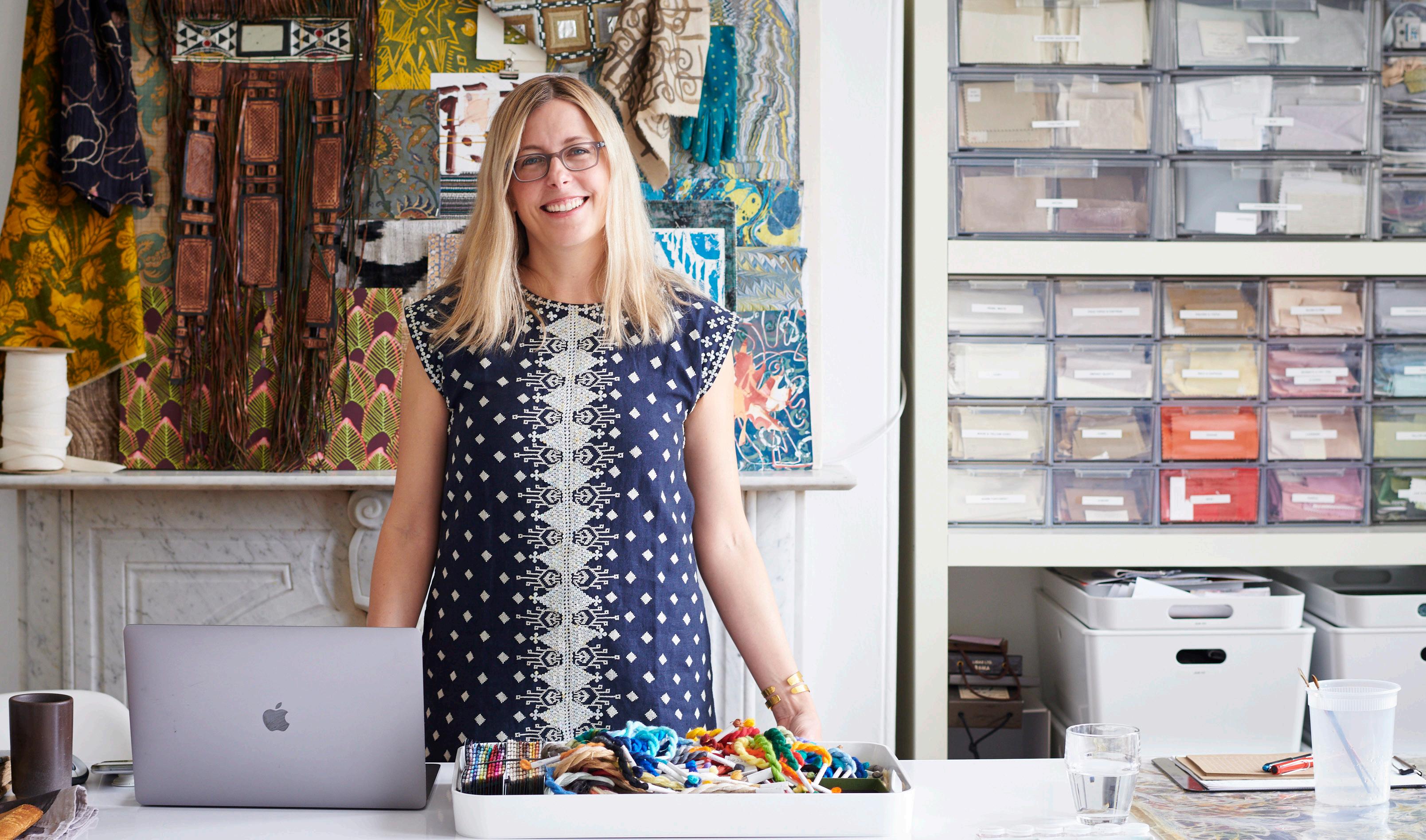
When discerning clients seek upholstery, bedding or rugs with a unique feel, they turn to Saana Baker. A textile designer who’s been creating inspirational designs for 25-plus years, Baker sat down with our editorial team to share insights on the trends she’s seeing at industry design shows and the undeniable imprint of nature on color and pattern.
When Baker travels to top design shows worldwide—whether for a client project or in her role as editor-in-chief of The Textile Eye—she becomes immersed: soaking in all she can and taking thousands of photos. But it’s not until she’s back home that the connections start to form. “It takes a while for my brain to assimilate things,” she said.
As she reflected on her observations from Milan Design Week, many of the themes circled back to one inspiration source: nature. At shows like Salone del Mobile e Fuorisalone, with their sprawling galleries spanning massive piazzas, Baker often spots the most interesting finds in the smallest alcove. That’s where she recently discovered a remarkable installation called Solid Nature: a display of stonework with luminous
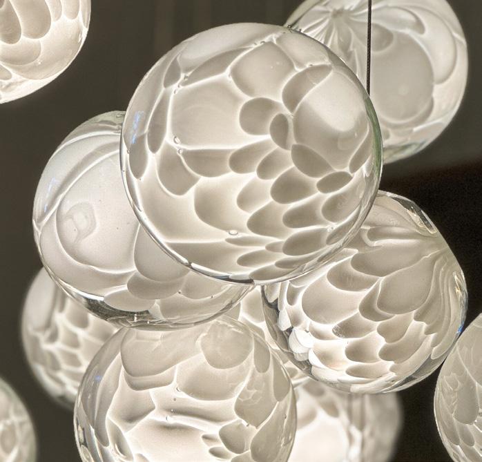
light streaming through it. Baker sees the use of luminosity in design becoming pervasive.
“It could be colored glass or a beautiful heavy material with light shining through it,” she said. “That got me thinking about how designers working on window coverings could use luminosity in their work, bringing in light through fabric, glass or acrylic.”
Baker views the luminosity trend as an outgrowth of nature’s overwhelming influence on design. “In all the interviews I’ve ever done with textile and interior designers, nature is probably the No. 1 inspiration,” she said. “All the brights and neutrals and funky colors are mixed together in nature in one palette, and that’s very inspiring.”
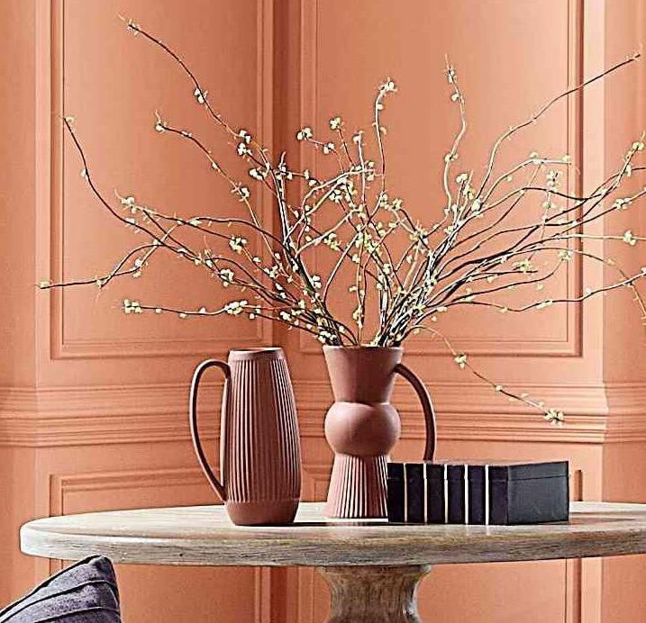
She sees the infusion of nature into design driving a noticeable shift from neutrals to richer colors, including warm tones like rust, copper, terra cotta and soft greens.
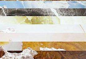
“When I worked with Barbara Barry, her favorite color was celadon,” she said. “I’m starting to see that again, even in avant-garde settings.” Likewise, green hues are among Baker’s favorites, partly because they reflect the breadth and depth of green in nature.
“There is such a gamut, from lichen green to malachite to British racing green,” she said. But more important than a favorite color, Baker gravitates toward analogous color schemes. “I love the way colors work together, where you put different shades together and it creates a richness you see in nature.”
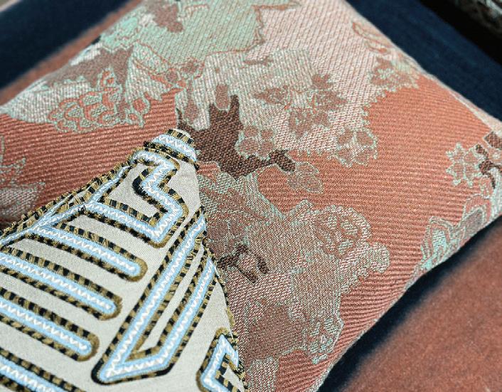
Sun-baked tones of terracotta, clay, sage, and verdigris are forming warm, irresistible palettes. Dull greens evoke feelings of security and peacefulness, while soft orange adds some optimism, creating a perfect combination for wellness and self care. A sophisticated split complimentary color relationship.

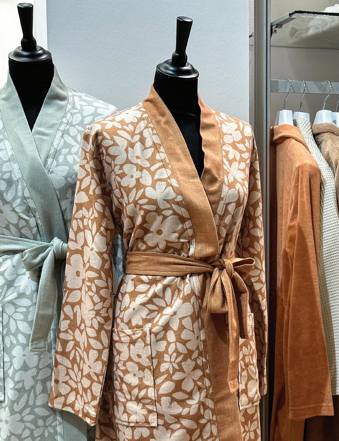

• Sun-baked tones of terracotta, clay, sage, and verdigris are forming warm, irresistible palettes.
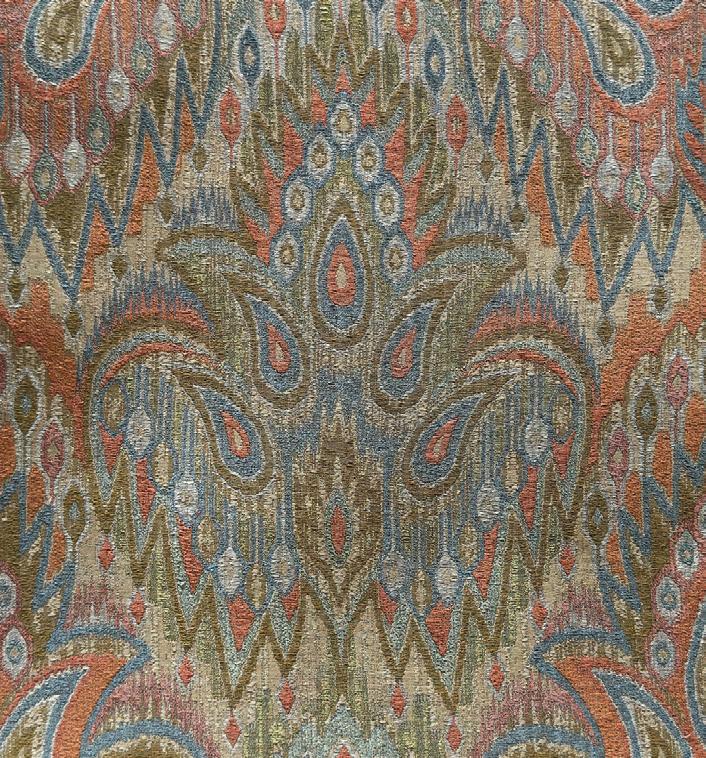
• Dull greens evoke feelings of security and peacefulness, while soft orange adds some optimism, creating a perfect combination for wellness and self care.
• A sophisticated split complimentary color relationship.
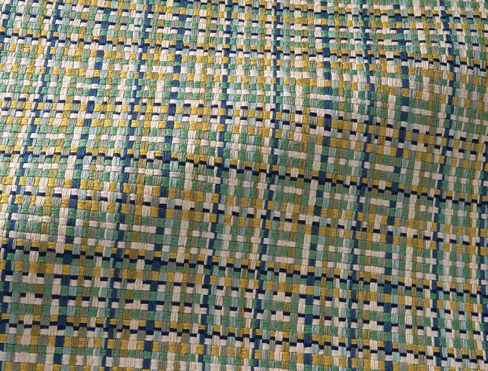
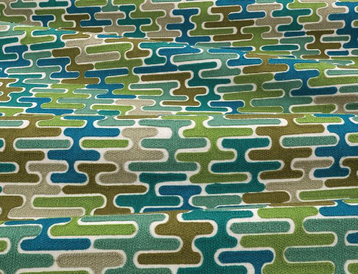
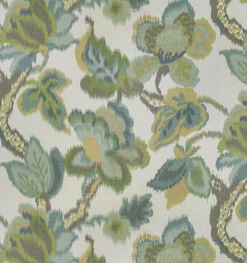
• Lush greens from cool to warm combine to create products that echo the mystery and energy of nature.
• Spearmint and aqua bring freshness, while earthy olive and blackened pine add a grounded contrast.
•
combine to create energy of nature. freshness, while earthy
contrast. act as a neutral, landscape.
• Greens—especially soft greens—can act as a neutral, the same way foliage does in a landscape.
I love the way colors work together, where you put different shades together and it creates a richness you see in nature.
The last few seasons, Baker has noticed textile designers incorporating nature’s inherent imperfections into their own work.
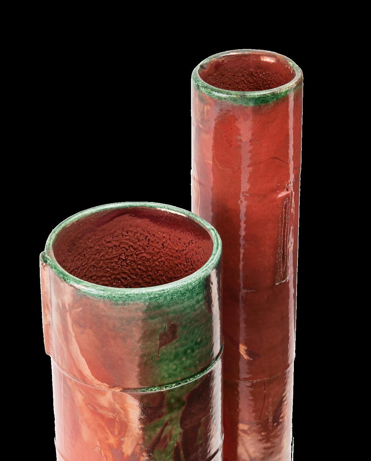
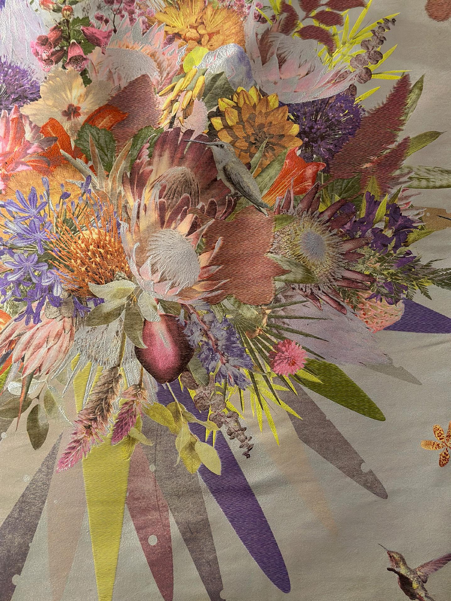
“We’ll always have perfect, stylized flowers (in textiles), but now designers are showing the ragged edge of a leaf or an insect hole or a broken stem,” she said. While many U.S. consumers go for perfection and newness, Baker sees beauty in nature’s imperfections, much like Europeans are drawn to objects that show age and patina.
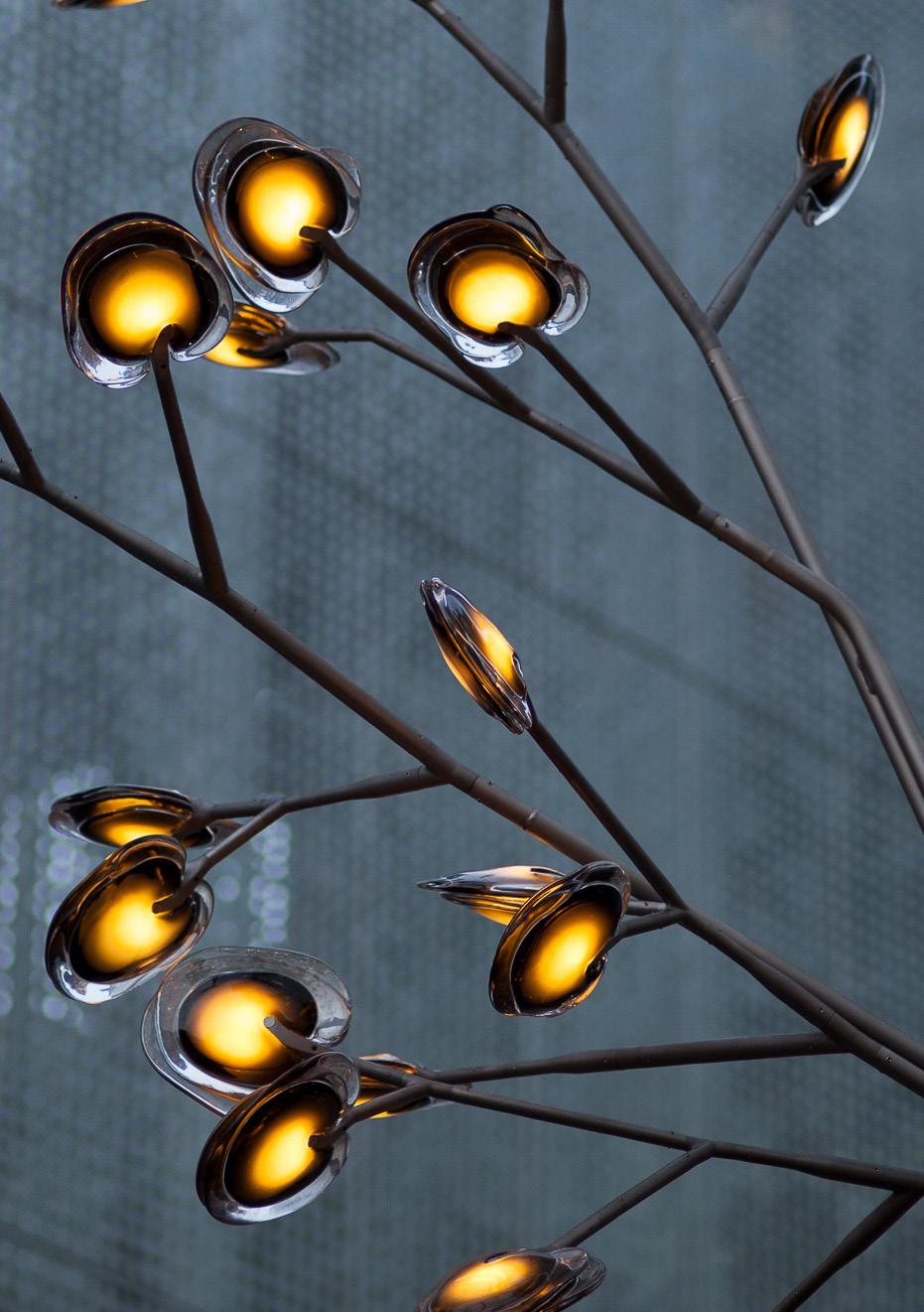
Nature’s innate blemishes become evident and attractive when working with natural fibers, she pointed out. “When you’re extruding polyester, you can make sure the red or the yellow is identical to what it was two years ago. When you’re working with alpaca or linen, there will be natural imperfections and that’s part of the beauty.”
According to Baker, natural fabrics like these are showing up in a big way in window coverings, particularly in open-work treatments.
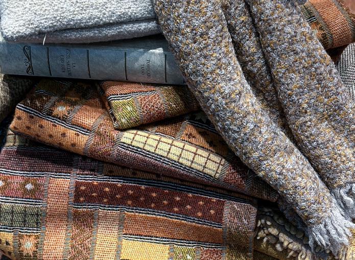
“It might be very structured, or it might be a loose knit or bouclé or fuzzy yarn that has a lot of dimension,” she said. She’s also seeing luxury fibers like cashmere and alpaca blends take their place at the window. One production process that makes these fibers practical for window treatments is leno weaving: a traditional weave structure used for stabilizing yarns that has recently become available in wide-width goods.
“I’m also seeing experimentation with different fibers for window coverings,” she said. “Italian suppliers are getting great at finishing hemp so it’s not so stiff.”
Baker finds that the latest design concepts to emerge on the international stage take time to take hold in mainstream American design.
“When a show’s themes or trends are acceptable to the American market, they might come along faster,” she said. Other times, it’s a longer stretch before it even reaches the high end of the U.S. market.
And, of course, every new color or pattern won’t necessarily gain traction. “Is it really going to take off, or will it be interesting for a while and then drop off?” Baker asked. At a recent design seminar she co-led with a colleague, a key discussion topic was how to separate trends
“People wanting to live more casually and comfortably over the last 50 years is a trend that isn’t going away anytime soon,” she explained. In contrast, most homeowners are unlikely to adopt every Pantone Color
One trend Baker believes consumers will continue to embrace is the concept of home as a place to feel cozy, safe and optimistic, especially post-pandemic.
“As much as many people today say, ‘I don’t want to spend money on objects, I want experiences,’ being in your home is an experience,” she noted. And that’s translating to how consumers view home design, fueling an interest in nostalgia and all things Americana.
One driver of Baker’s travels in search of the latest design trends is her role as editor-in-chief of The Textile Eye, a publication that grew out of a client project that took her to Maison&Objet and Paris Déco Off in 2018.
The two design shows revitalized her passion and creative vision, and she began to think that other textile and interior designers might experience the same uplift from the innovative work showcased at the industry’s top shows. “The biggest thing for me is feeding your creative spirit,” she said. “We all need that creative lift.”
So, The Textile Eye was born.
Every quarter, Baker curates and compiles new trends in textile and surface design, drawing from what she sees at each season’s shows. The reports transport readers across the globe, providing an up-close look at what’s new in color and pattern. Through informative articles,
exclusive interviews and stunning images, The Textile Eye aims to invigorate design professionals in their own work.
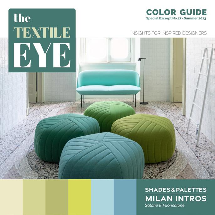

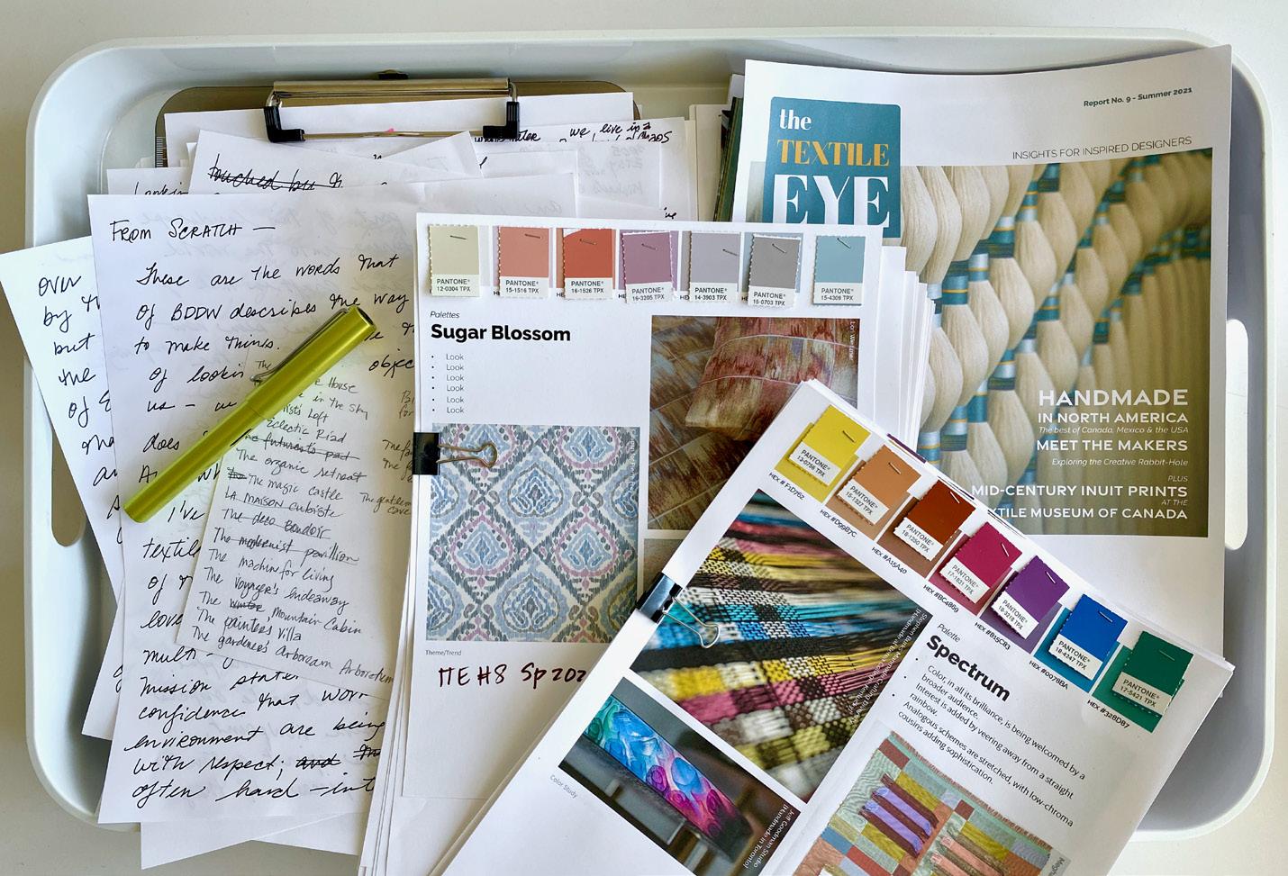
Baker and her team also produce quarterly Color Guides filled with recommendations inspired by the color palettes featured at the most recent design shows. The Color Guides are both practical and hands-on, with color analysis, color chips and HEX color codes that make it easy to transform concepts into reality. The Summer 2023 edition drew inspiration from Milan Design Week, showcasing 18 color shades and combinations and more than 80 HEX color chips reflecting the vibrant palette that dominated this year’s show.
For window treatment professionals, in Baker’s view, the latest directions in color, pattern and texture make it more important than ever to be open to experimentation.
“Custom workrooms can do things other people can’t, so don’t be afraid to try ideas that are difficult to sew!” She’s especially inspired by the work of innovative textile designer Dorothy Liebes, a mid-century designer whose work is currently on display at the Cooper Hewitt museum.
Baker noted that sustainability is now front and center at most textile mills and manufacturers, and she sees a direct link to the design concept of creating objects that last.
“Inherently in design, if it’s high quality, it will be kept for a long time, and that’s an important aspect of sustainability,” she said.
With those goals in mind, Baker sees a lot of interest in natural fibers like linen and cotton, along with recycled polyester—though she acknowledged that any material derived from petroleumbased products isn’t ideal. While there will never be a silver bullet, she believes steps like using renewable energy sources in production, shifting from traditional rotary to digital printing and making good choices elsewhere in the supply chain can make a big impact.
As for where sustainability in design is headed, Baker believes, “The trash of today will become tomorrow’s raw resource. It will be interesting to see where we are 10 years down the road. How will creative ways to reduce and reuse scale and roll out to mainstream design?” V




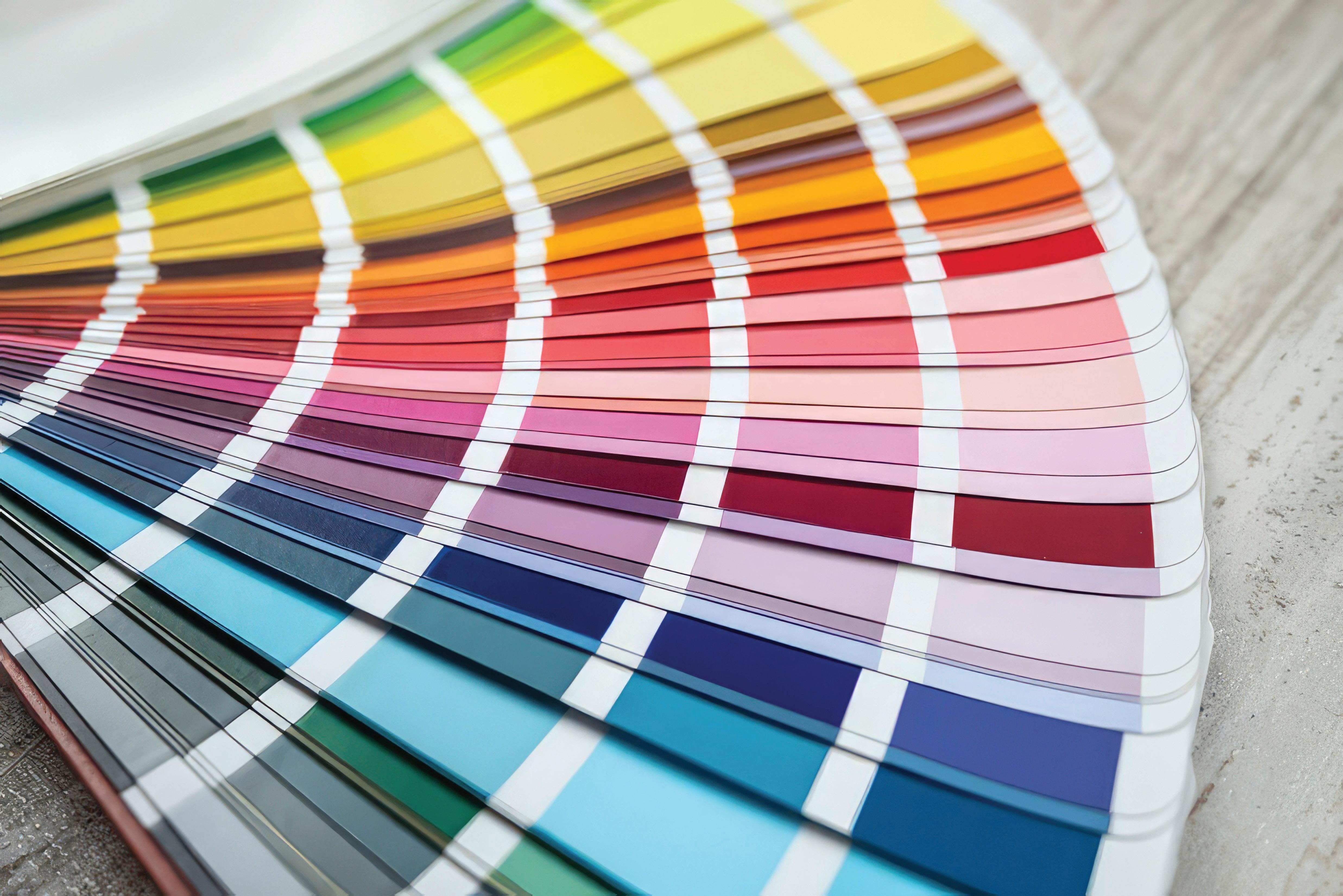
uite literally, color signifies life. Its presence is a necessity. You can change your style each day via your clothing, but what you choose for your home seems permanent and it doesn’t have to be. Over the years, brands have taken notice of homeowners’ interest in color, adding more colorways to their offerings and even custom options.
Color’s presence has long been proven to affect a person’s mood and energy level, but, further, certain shades can change one’s experience of a room. Your designer or decorator—as well as yourself—should think about the function of each room and what emotion(s) you’d like to feel before choosing a particular hue.
If you’re looking to make a major change, a color expert might come in handy to help you understand the psychology behind each hue. Leatrice Eiseman, a color expert and the executive director of the Pantone Color Institute (LeatriceEiseman.com), has built a career on educating individuals and brands on the context of color. She utilizes her years of practical experience, complemented by research, to inform her decisions, undoubtedly one of the many reasons Pantone has trusted her for more than 38 years.
The connection between color and psychology was documented as far back as 1810, when Johann Wolfgang von Goethe took note and penned “Theory of Colours.” More philosophy than scientific, he based his ideas on personal observation of color’s phenomena. Yellow “carries with it the nature of brightness,” red “conveys an impression of gravity and dignity” and blue “has a peculiar and almost indescribable effect on the eye.” His most powerful statement? “Colors are light’s suffering and joy.”
With the pandemic in the rearview mirror, many people are going back into an office for days in a row, missing out on their home setups specially designed to give them the best working conditions. Natural light is forgotten for fluorescent fixtures, backyards are swapped out for cubicles.
For her clients, Eiseman has devised a simple way to bring the look and feel of a window treatment into a small or windowless space. Grab a print of a window, stained glass or an outdoor scene, mount it on a wall, and put a real window covering over it. “What better way to get the look of nature into the cubicle than to create a window … You can put flowers on the sill.”

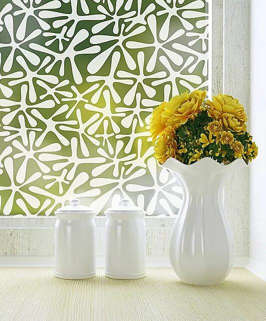
On the home front, a quick trick to let in natural light and add color is with window film. With a simple application process, this type of treatment provides benefits beyond appearance. Express yourself while increasing privacy, reduce glare and block the sun’s UV rays.
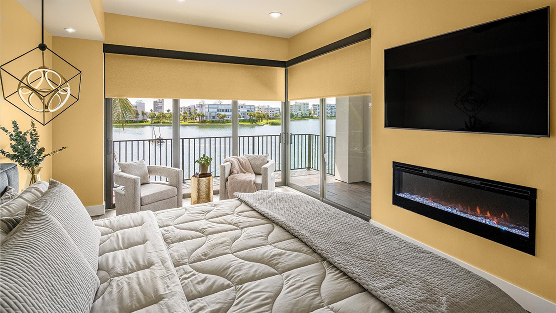
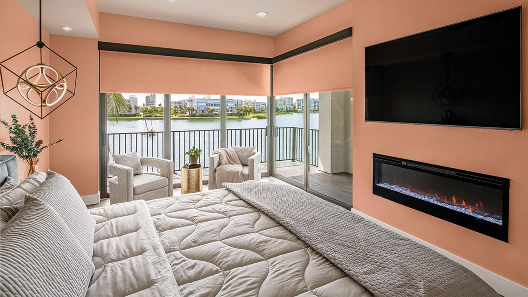
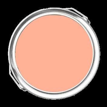
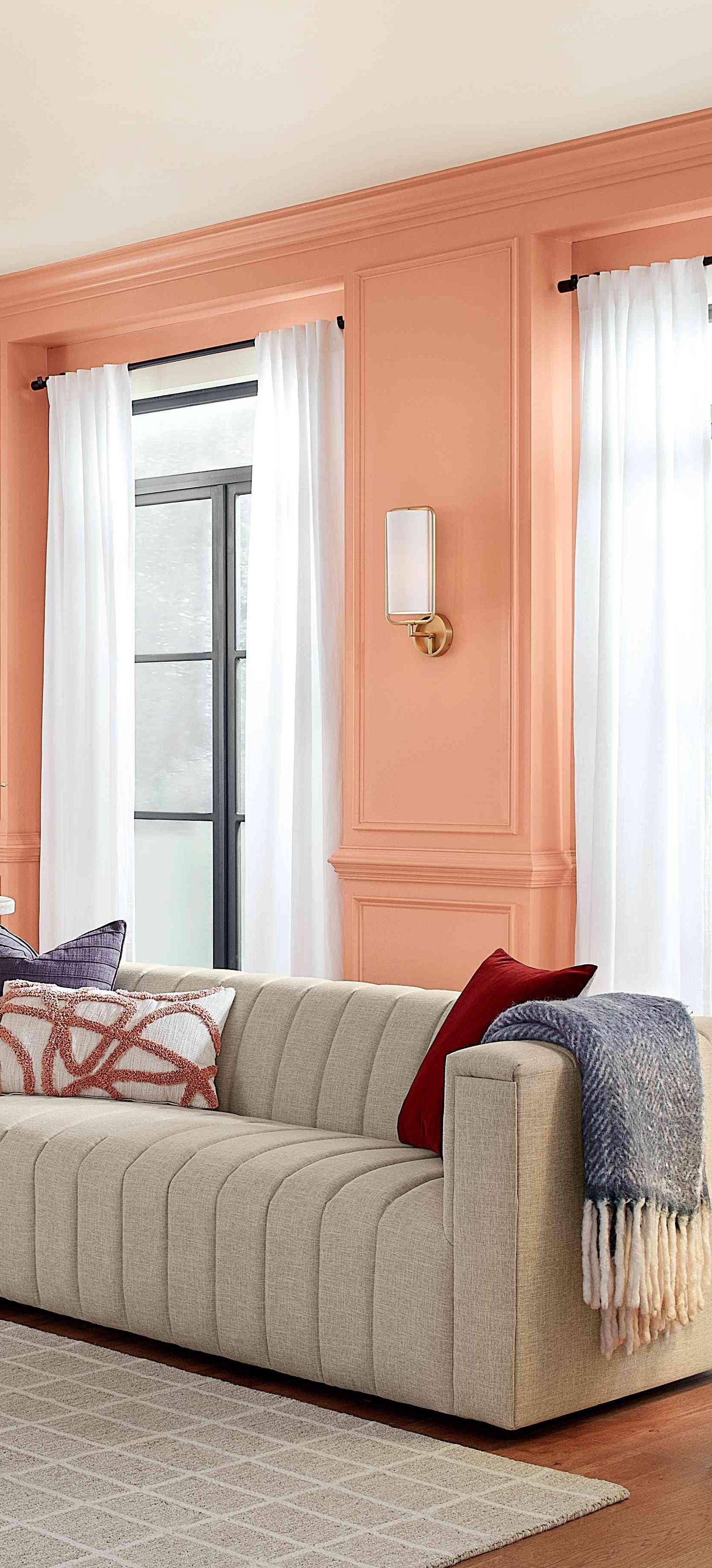
Another creative way to decorate a space and highlight a unique aspect in your home is with an accent wall. Eiseman said, “One of the least expensive things to do now is to repaint at least one wall, if not all four walls, to freshen up the atmosphere … You buy a can of paint and a little bit of grunt labor and you’ve got a new atmosphere in the room that feels fresh and new.”
If you’re not ready to commit to an entire wall, why not try out your new favorite color on a window frame? Or go for something not so permanent like throw pillows or curtains. It’s all about finding what you’re comfortable with and turning your home into an extension of your personality.

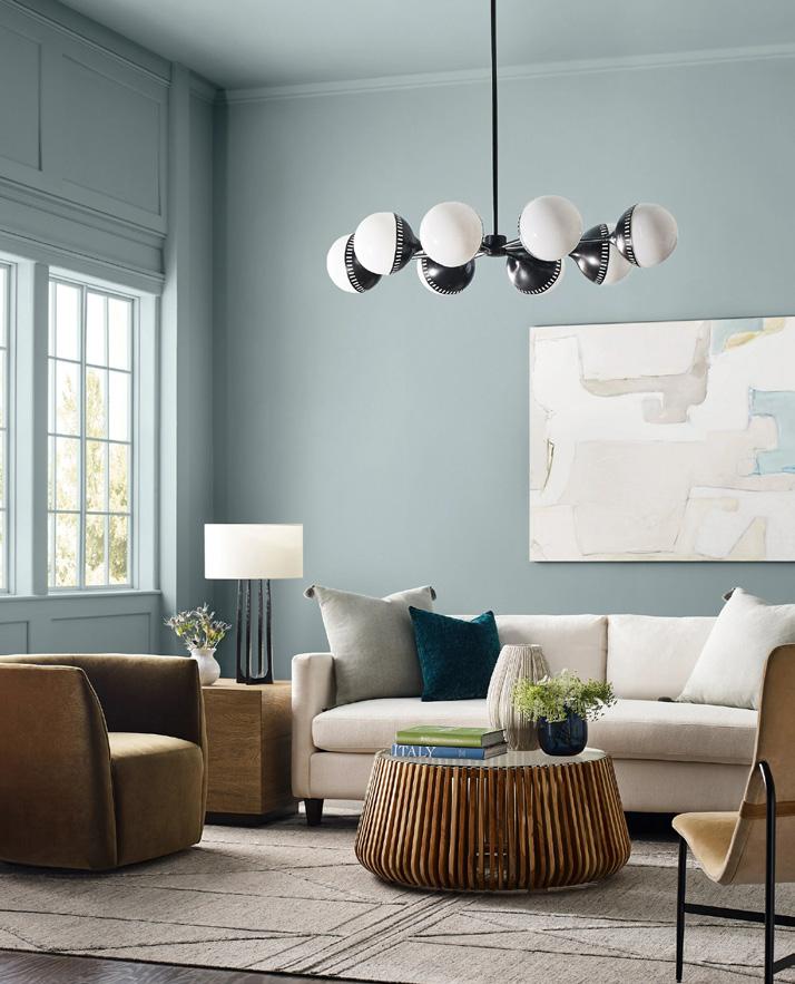
Social media has become so much more than it was pre-pandemic. People turn to Instagram and Tiktok for not only the latest in interior design, but to see what these trends looks like in others’ homes before taking the plunge themselves. Doing it yourself has never been more userfriendly—and attainable—than today, plus there’s an account out there for everyone’s tastes, whether they be dark tones or rainbow schemes.
Pink has always been a favorite for interior designers, but the “Barbie” movie reignited the flame (fanned briefly in 2008 when “Barbie Pink” became an official Pantone color). While the hue has continued to grow in popularity—millennial pink began trending around 2014—we’re finally breaking free from the conceit that it’s for girls only. Some of the words associated with pink are genderless, playful and powerful, according to Sherwin-Williams’ director of color marketing Sue Wadden.
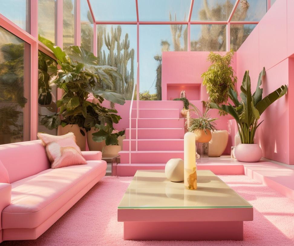
The 1950s used it as a pop of color in a postwar landscape, with pink making its way onto kitchen appliances, draperies and cosmetics. As the times changed, so did homeowners’ tastes. The late ’70s and early ’80s saw a rosy renaissance in bright shades, similar to the doll herself. According to Kim Culmone, senior vice president and head of Barbie and fashion doll design at Mattel, “The world truly made the pink connection with Barbie in the ’70s when we started consistently leaning into predominantly pink packaging as a core brand identifier.”
In 2019, Eiseman told Apartment Therapy, “There is more pink paint used in interiors now than ever historically.”
A major example of this is Barbie’s (albeit impractical) Dreamhouse. To create the multi-hued pink set for her movie, Greta Gerwig chose the perfect shade from Rosco and exhausted the company’s supply.
I wanted to capture what was so ridiculously fun about the Dreamhouses … I wanted the pinks to be very bright.
— Greta Gerwig in Architectural DigestPHOTO: TIDYMINILMALISM.COM PHOTO: SHERWIN-WILLIAMS PHOTO: WAYFAIR.COM
Get a painterly look with this handsplattered metal stool. Try it around a table or use it as a plant stand.
» BurkeDecor.com
Give any space dimension with this easily applied and removed privacy film. Perfect for shower doors, bathrooms or bedrooms!
» Wayfair.com

Looking for a zerocalorie way to satisfy your sweet tooth? Hang this LED sign in any room to treat yourself to a scoop of joy.
» Yellowpop.com

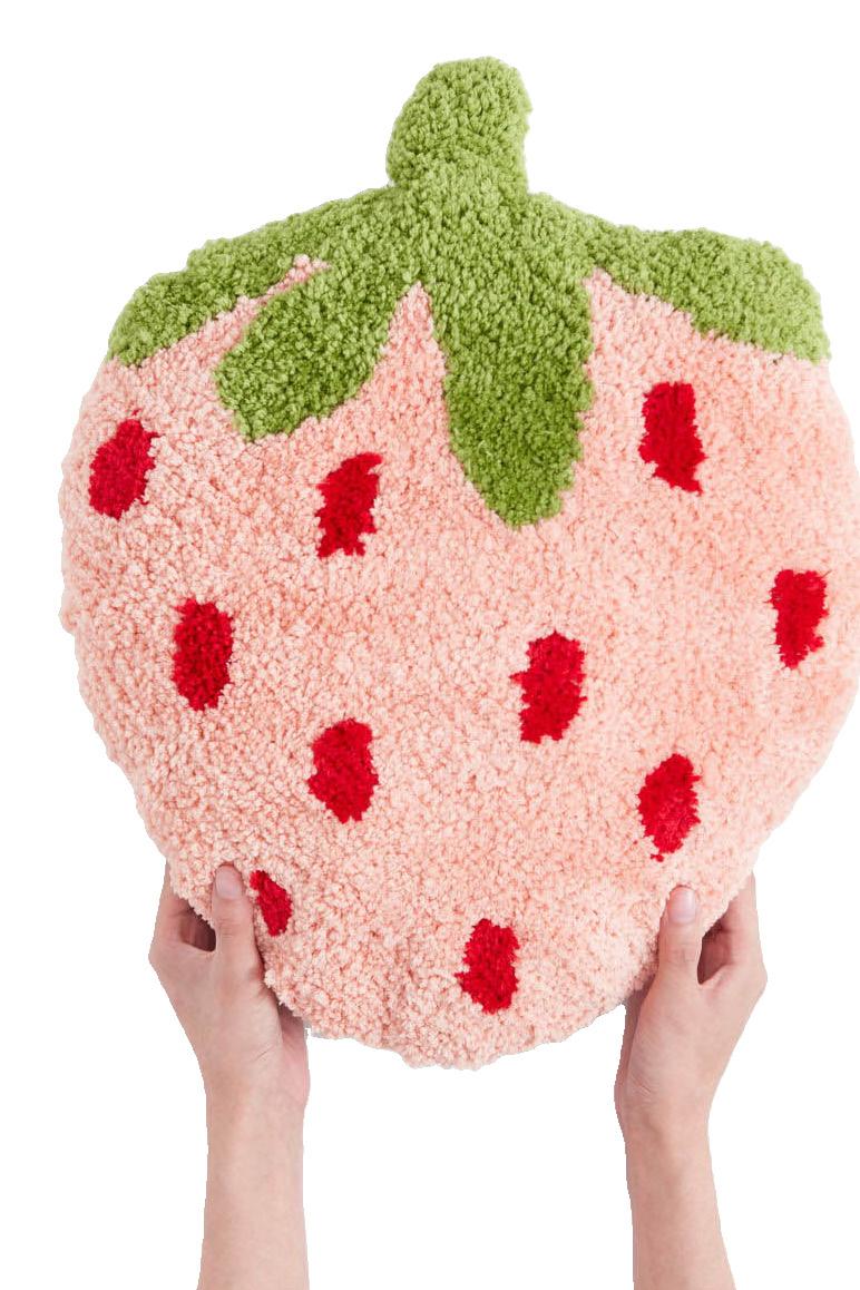
Strawberries might not always be in season, but they can be when lying on your sofa or bed.
» ShopCider.com


Accent your shelves, tables or mantels with these bright metallic mammals— or make spread them throughout your home to add an air of whimsy.
» Nova68.com
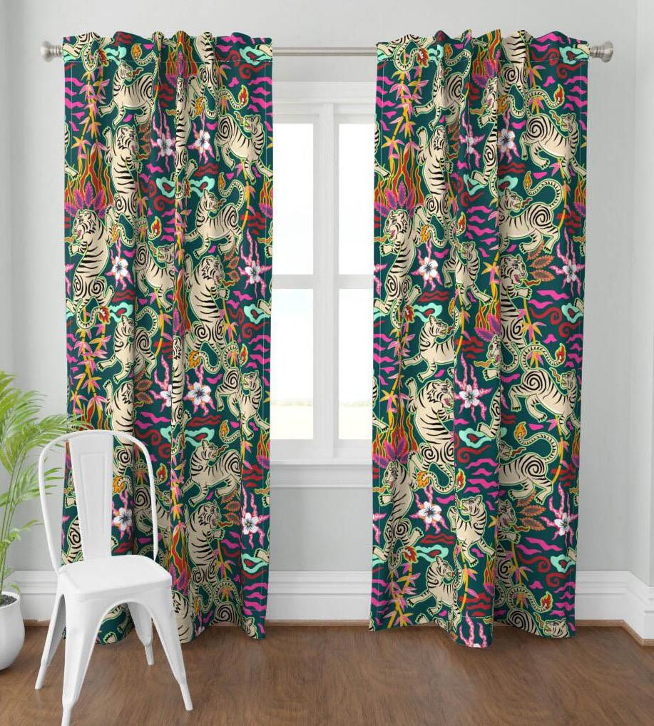
Bring a splash of color without the permanence by dressing up your windows with this wild print from misentangledvision.
» Spoonflower.com
As 2023 approaches its end, what can we expect from next year’s trends? We look to three of the industry’s leading color forecasters to do just that. Behr selected Cracked Pepper as its 2024 Color of the Year. After noticing that the shade was a top seller last year, on top of survey results showing that two-thirds of American homeowner respondents felt that using a black paint made an interior feel bold, it was a clear choice.

Sherwin-Williams has decided to switch up its annual color trend report by introducing the Colormix Forecast 2024, Anthology: Volume One. The company plans on alternating the color reference each year with its usual style and trend story. The first collection explores four chromatic families: blues and greens, reds and purples, deep and dark tones, and whites and tints. Along with starting a new system, SW revealed its 2024 Color of the Year as Persimmon.
In July, Eiseman and her colleague at Pantone, vice president of the Color Institute Laurie Pressman, along with the rest of the team, announced the most
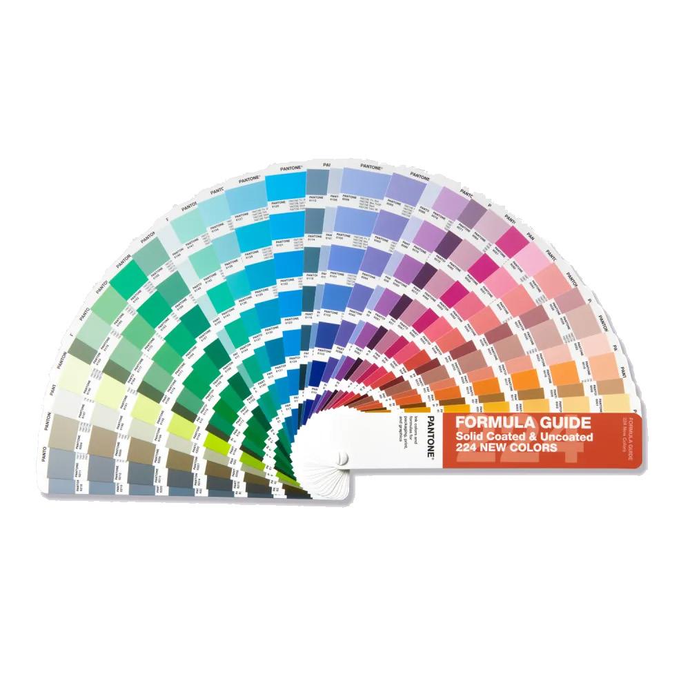
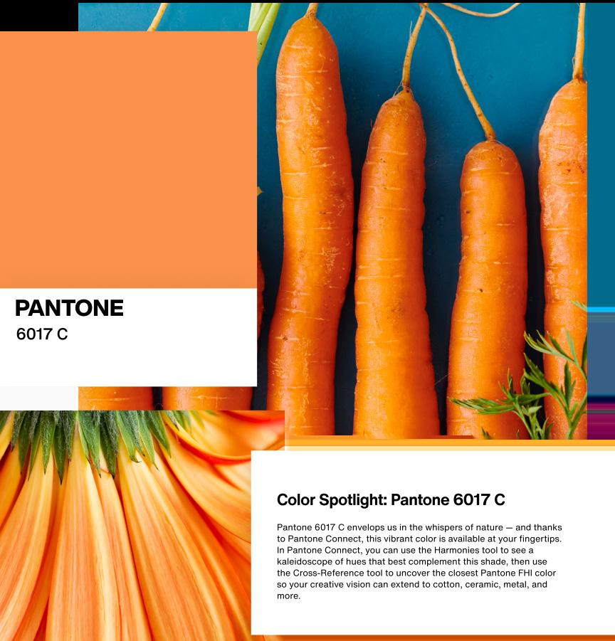
popular color families of the next decade and the addition of colors to its Formula Guide. Pressman told digital-only magazine Print: “Whenever we add new colors, it is always with our design community clients in mind. Color direction is influenced by many elements including demographics, geographical location, climate, new lifestyles and play styles, and cultural and social influences. Influences may also stem from new technologies, materials, textures and effects that impact color.”
In Pantone’s research, it found a desire for spicier and deeper shades of orange and luxurious neutrals in the brown family. Purple continued its reign as a favorite and green’s popularity hasn’t waned as the focus on environment and health has continued, sparking the Color Institute to add more shades to the Formula Guide.
Color as a concept is timeless, but how you choose to incorporate it into your life is what changes. Never be afraid to experiment, that’s one of the perks of being a homeowner! V
“I’m obsessed with the color blue! In any form or fashion—from bright or bold to dark and moody—there isn’t a shade I don’t love. This unique shade of turquoise pom-pom trim was the perfect accent color to pair with the Joshua Tree fabric from Schumacher for our client turned friend, Olympian Shawn Johnson East.”


 by Sherwin-Williams
“Leisure Blue is the perfect mid-tone blue that is timeless, yet still eye-catching. The gorgeous blue console table is definitely the star of the show.”
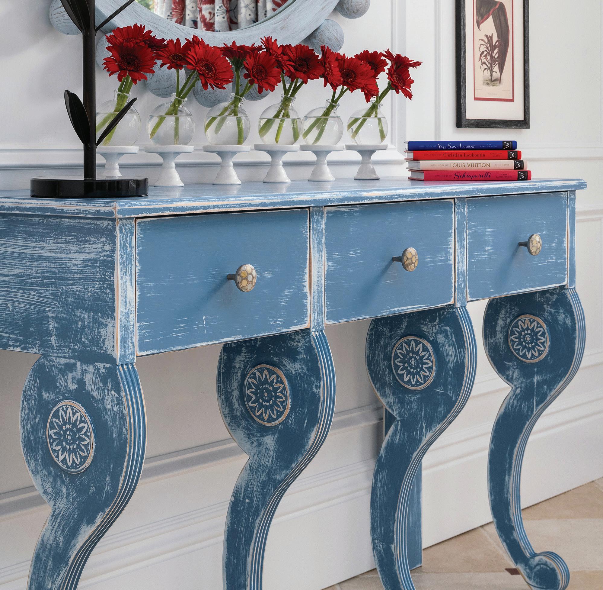
 by Farrow & Ball

“This is such a rich and deeply pigmented color, but it amazingly has life to it—it is not a dull, overused flat black. This color is a wonderful option instead of using a plain black paint and it looks spectacular on cabinetry, front doors and stair rails.”
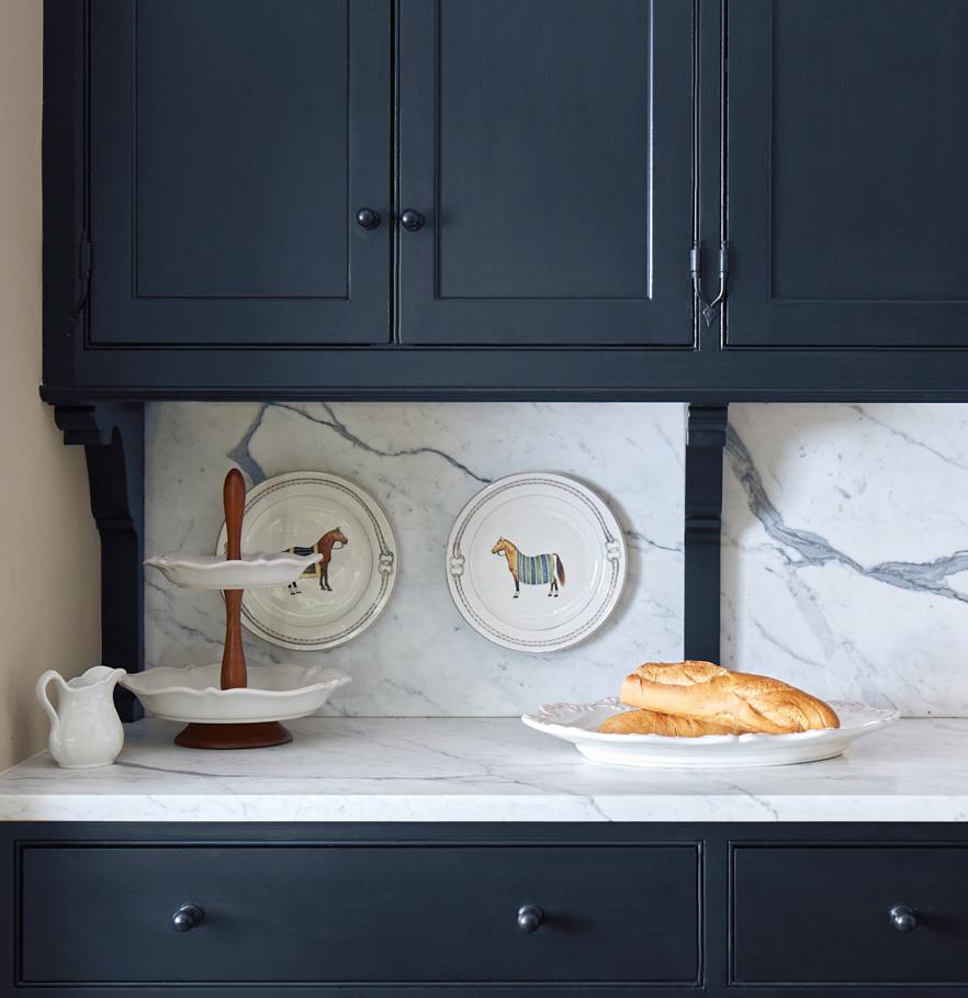
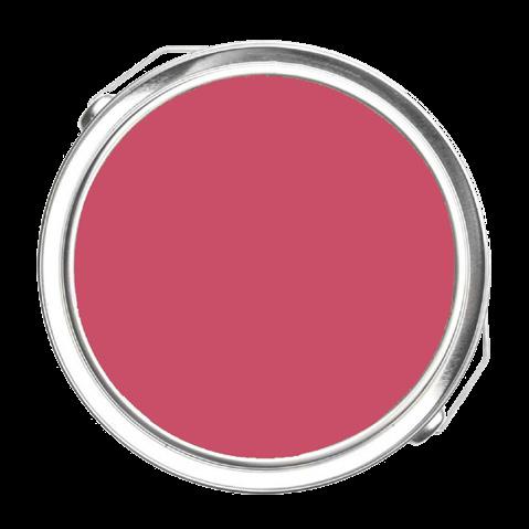 by Sherwin-Williams
“Since the ‘Barbie’ movie, people have been playing around a little more with pink tones. For a while, they were delegated only to little girls’ rooms. It’s nice to see them in an adult setting. This is Mackinac Island’s Grand Hotel lobby, decorated originally by Dorothy Draper and recently updated by her continuing firm, Dorothy Draper & Co. Timeless design never dies!”
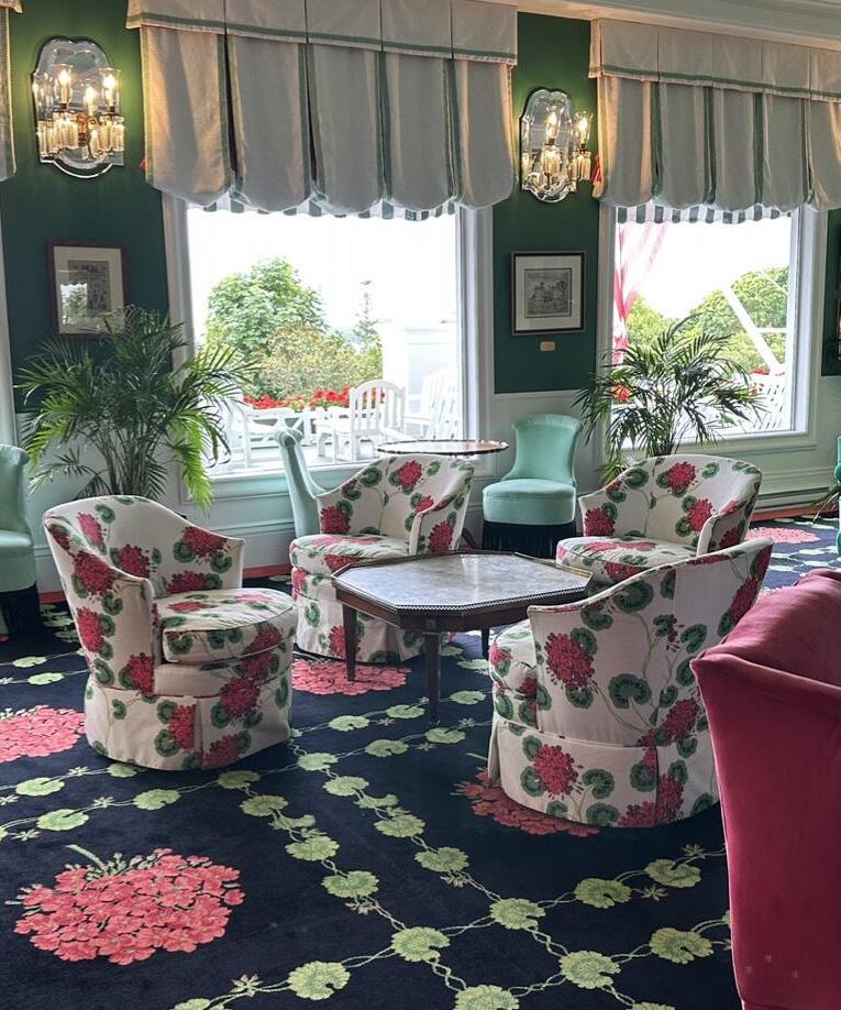
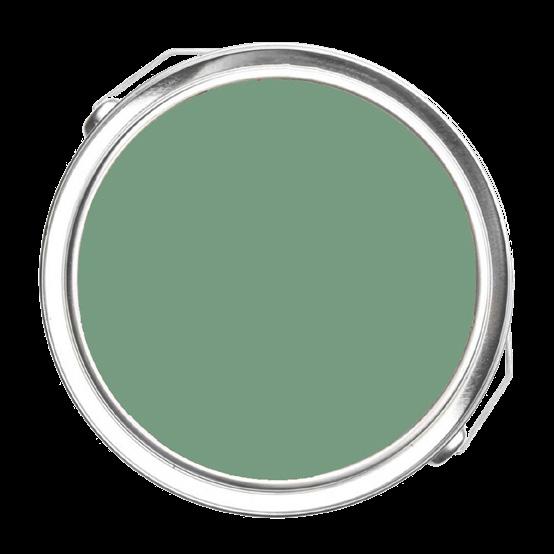 by Benjamin Moore

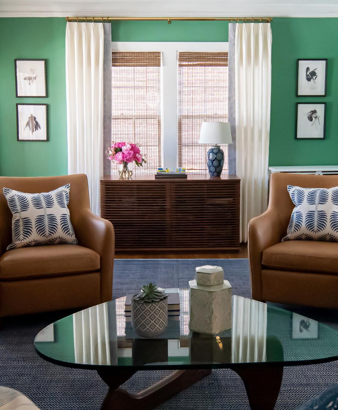
“Clearspring Green turns a regular family room into a happy, lively environment! It’s soft enough that it doesn’t overwhelm the senses, yet colorful enough to breathe life into a room.”
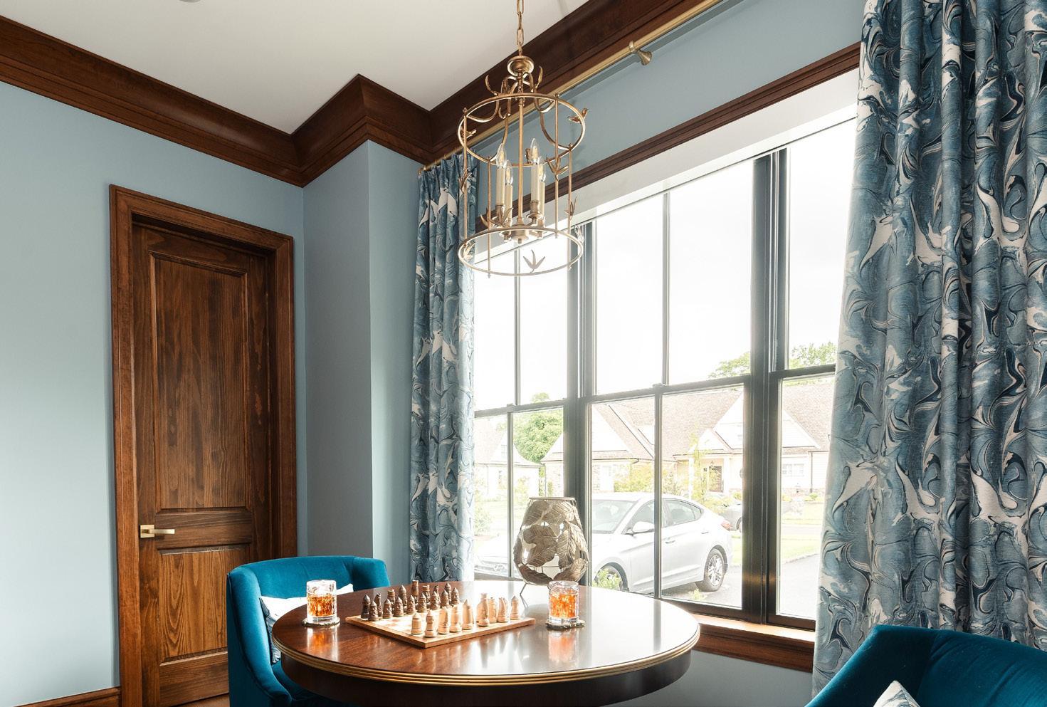
“One of my favorite colors to use in a sanctuary space like a bedroom or bathroom is Rainwashed. Just as it does in nature, this green has the natural ability to instantly life the mood of a place of relaxation and give the ambience of peace and serenity in a spa-like way!”

 by Sherwin-Williams
“Meditative was chosen for this library to create a rich and cozy mood. The color marries beautifully with the warm cherry millwork and inspires intellectual pursuits.”

“We are all about ‘light and bright’ spaces paired with moody vibes and this rich color accomplishes this in almost any space it’s used in! I think any space that has an accent wall is such a ‘fun’ move. We make beautiful accent walls in rich tones all the time, and when we pair them with light and bright walls throughout the home, these ‘pops’ of color on our feature walls create a gorgeous focal point and backdrop to any space.” V

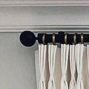
What a conversation piece! A stunning finish with this classic crisp black and white color block full-function drapery. Custom Drapery Designs pairs the window beautifully with black and gold custom hardware to coordinate with the chandelier.
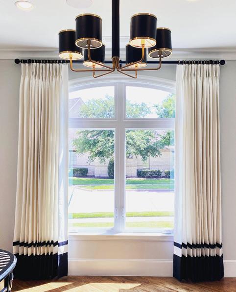
Bespoke black and gold drapery by Deco & Deco


Cafe curtains, the latest trend comeback, are the perfect option for natural lighting and privacy! Like designer Donna Sherry Interior Design did, you can mix and match with bronze, gold, silver and black options.
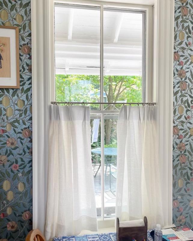
Drapery hardware by Vesta Drapery Hardware
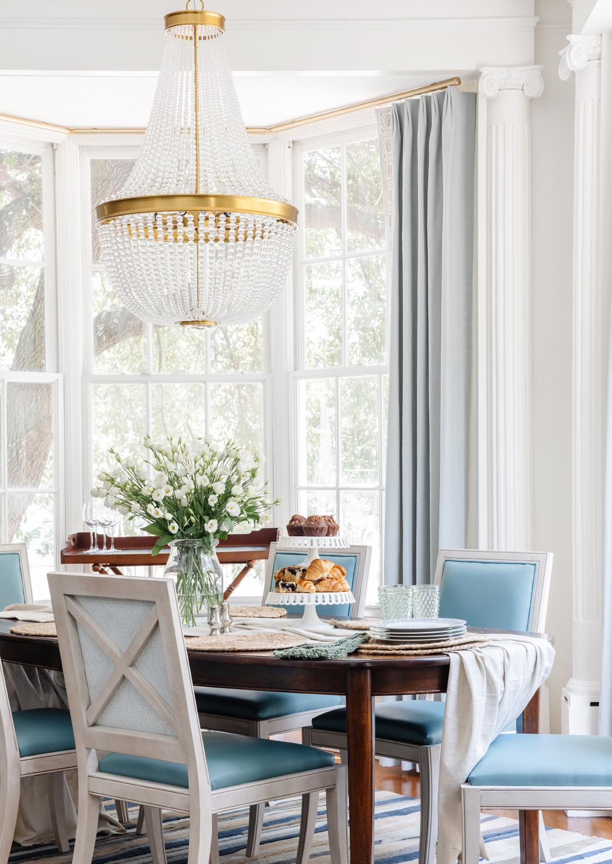
Gold drapery hardware adds a gorgeous finishing touch to rooms in this high-end, short-term livable Designer Showhouse in Savannah, GA, designed by Melissa Lee.

“The design goals with this high-end vacation rental are historic design elements, fun colors, and patterns and the selections’ durability.”
—Melissa
Dresden Motorized Collection in Brushed Gold and a mix of hand-drawn traversing plus ringed pole sets by Forest Drapery Hardware
AriA Metal Hardware by Rowley Company
Choose from seven designer hardware collections! There is a stunning range of final designs and a full line of coordinating accessories across two pole diameter options.

» Aria.RowleyCompany.com
Clear Vue Collection by Orion Ornamental Iron
Think of the possibilities! Perfect solution for bypass brackets, c-rings and award-winning French pole sets! Orion is a top choice for acrylic hardware and more.
» IronArtByOrion.com
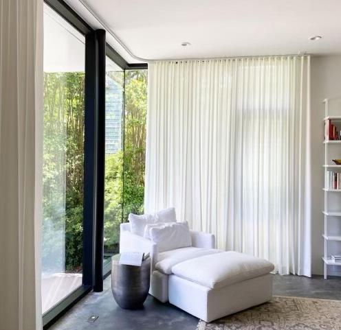
“Drapery on a curved track was the perfect solution for these corner windows! Doesn’t this make you want to grab a book and curl up in this lounge chair?” —Jim
Architrac by Kirsch Drapery Hardware
“Versatile hardware meshes well with many drapery styles. This golden drapery hardware pops against this blue and white drapery design so well. A fabulous ensemble!” —Ann

Cube Collection by Brimar, square acrylic rods mixed with gold metal endcaps, rings and brackets


“This room comes together perfectly with all the attention to detail, especially the custom curvy drapery rods. Beautiful things happen when you trust the design process, and clients let me bring the vision to life.” —Jessica
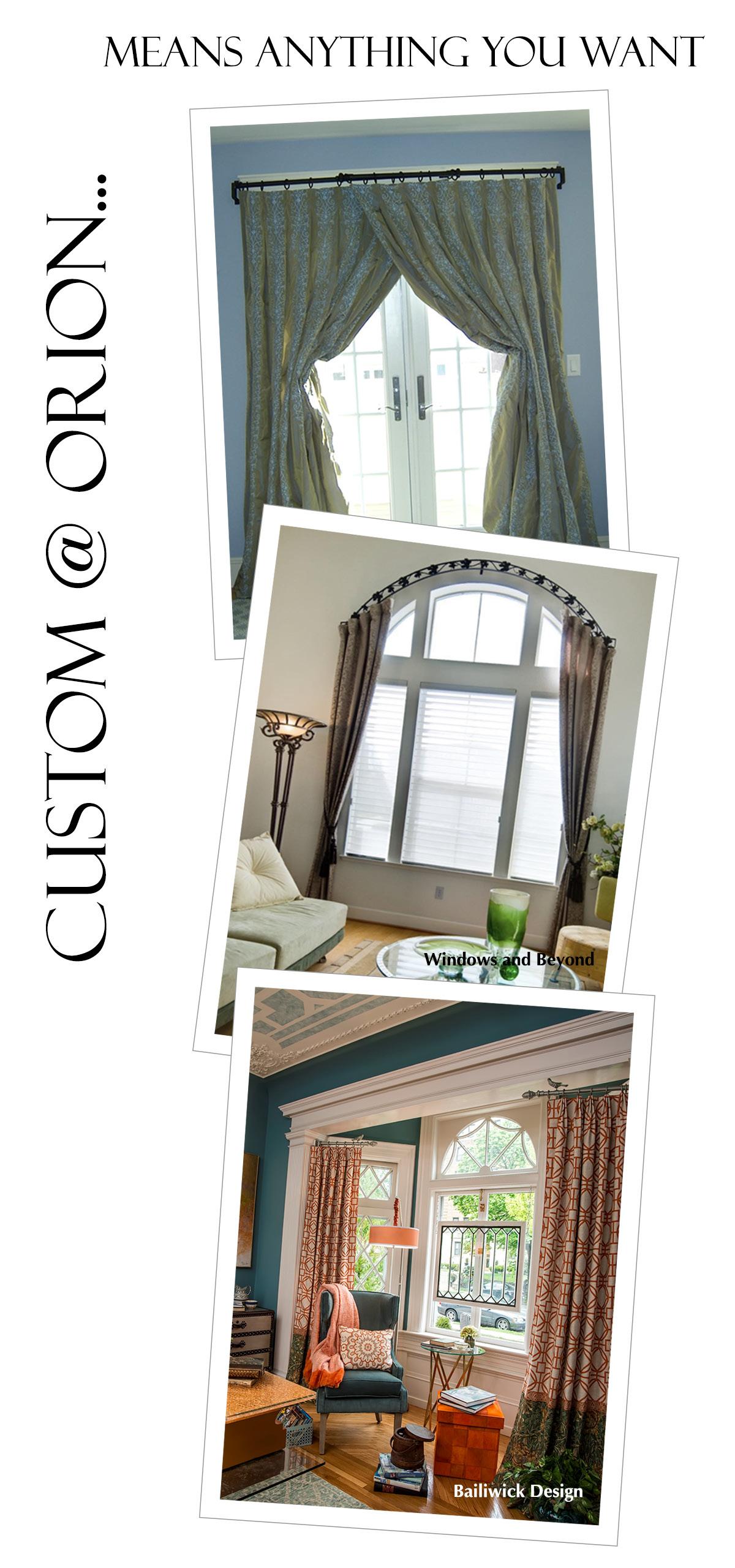
Custom bendability for arched, angled, and curved installations by Brimar Inc.
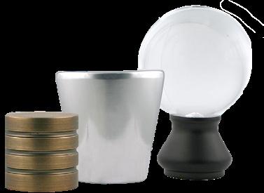
Handmade in Italy, delicate and uniquely handcrafted Murano glass finials highlight timeless beauty with each design.
» DecoNDeco.com
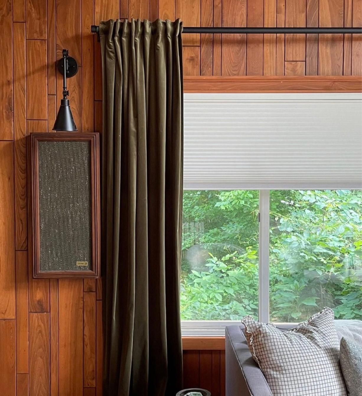
“I love layering window treatments! It makes the space extra cozy. Drapes and modern hardware help offset some of the more rustic features of the room” —Erin
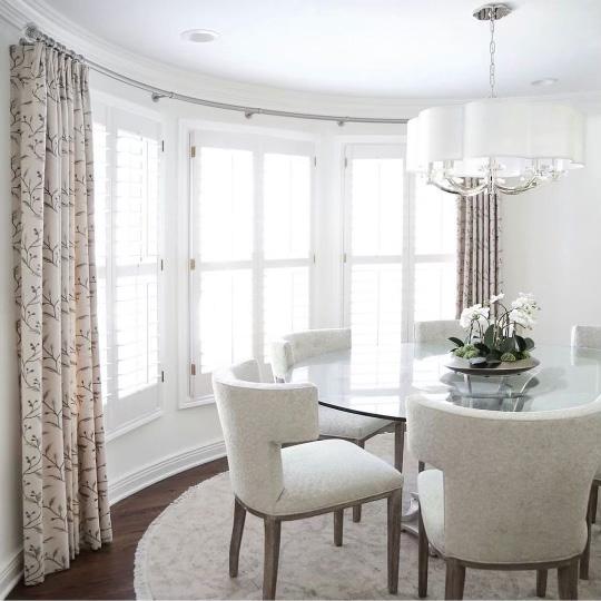
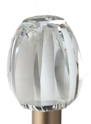
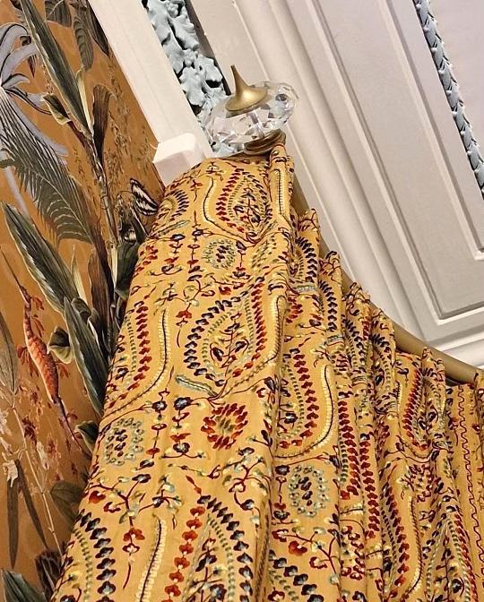
“This project required a unique bespoke curtain pole solution. This is a nonstandard bracket projection to avoid the architectural details, with a beautiful curve to allow the curtains to draw with ease and complement the structure of the window and a stunning cut crystal finial.”
 —Ryan and Pete
Bradley Collection’s Gliderpole bent to fit the bay with special projection brackets, complete in Gold and with cut Crystal Templar finials
Specialized in designing drapery hardware for the trade, Morgik offers custom beautiful spiral tiebacks in steel, brass, stainless and many more design options.
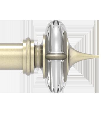

» Morgik.com
With bold strength of steel construction and five captivating finishes, the Apollo Collection provides a subtle elegance and various finial styles.
» VestaDraperyHardware.com


Window covering cord safety is of paramount importance for consumers—and the entire industry. The Window Covering Manufacturers Association (WCMA), in conjunction with the American National Standards Institute (ANSI), published the very first safety standard in 1996. Since then, as designs and technology have changed, the WCMA has responded by updating the standard eight times. Let’s review the current standard and preview the new, updated standard coming into effect next year.
In 2018, the WCMA, working with the Consumer Product Safety Commission (CPSC), safety advocates, retailers and the industry, updated the window covering safety standard to eliminate corded stock window covering products, requiring these products to be cordless, have only inaccessible cords or a short (helper) cord. This historic change to the safety standard effectively eliminated the strangulation hazard in stock products, which account for approximately 80% of all window covering products produced annually.
In addition to these changes to the stock product category, there were also new requirements added for custom products that further reduced the potential strangulation hazard from custom product window covering cords. This standard (ANSI/WCMA A-100 2018) went into effect in January 2018 and is the current industry standard that applies to all window covering products manufactured for the U.S. market.
In April 2021, the WCMA reopened the standard to address custom products. This process included input from the CPSC, safety advocates, retailers and the industry. Based on continued advances in technology and a review of the incident and injury data provided by the CPSC, the WCMA’s technical committee concluded that this next revision of the standard should eliminate all exposed free-hanging cords from custom products. The new requirements for custom products
in the standard will address every major hazard scenario reported in the data related to window coverings provided by the CPSC. Among other changes, the update will strengthen the standard as it relates to continuous cord loops with tension devices and will eliminate the use of a cord as the consumer interface for retractable systems (replaced with wands, etc.). This update to the standard will impact the custom product category in much the same way the 2018 standard impacted stock products. These proposed changes were adopted in the ANSI/WCMA A-100.1-2022 safety standard officially approved in December 2022. Currently, the new updated standard is set to take effect in June 2024.
The WCMA is committed to continuous improvement of its safety standard based upon available data and advancing technology and you’ll be hearing more about this updated standard in the coming months. Additionally, the Window Covering Safety Council will continue to support consumer and trade awareness and educational efforts.
At the same time the industry was updating the 2018 voluntary standard, the CPSC approved a mandatory standard for window coverings that would replace the voluntary standard. The CPSC published this mandatory standard in November 2022, one month before the approval date of the updated voluntary standard. The mandatory
standard would eliminate the use of all corded operating systems including cord loops under tension on all residential and commercial products. In addition, the mandatory standard would restrict retractable operating systems to a 12-inch stroke length. The CPSC also required the industry to comply with the mandatory standard in 180 days (May 2023).
The WCMA and its members opposed the mandatory rule and filed a lawsuit with the U.S. Court of Appeals for the D.C. Circuit to overturn it. In January 2023, the court granted a motion by the WCMA to stay the effective date of the CPSC mandatory standard pending the outcome of the lawsuit. As of this update, we are awaiting the court’s decision. This means that all manufacturers should continue to comply with the current voluntary standard (ANSI/ WCMA A-100 2018). The WCMA will update the industry on the outcome and the implications of the lawsuit as soon as the court renders a decision.
The WCMA continues to urge industry members to discuss the issue of child safety on each consumer call and to specify the products that best suit the clients’ needs. V

Window Covering Manufacturers Association » WMCANet.com
Window Covering Safety Council » WindowCoverings.org
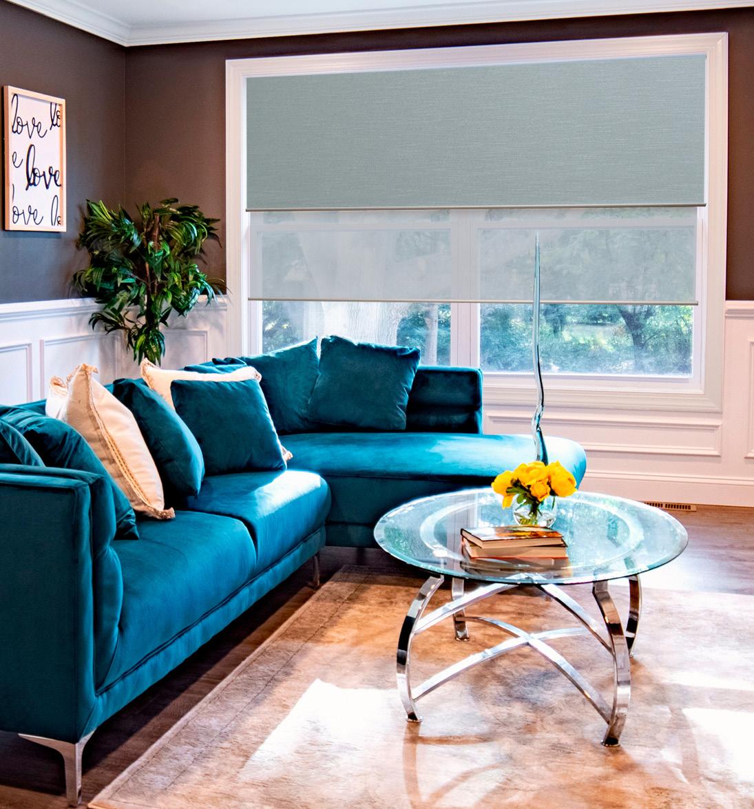
Hunter Douglas’ Duette® Honeycomb Shades help keep the house snug when cold and cool when it’s hot. Proof that energy-efficient honeycomb shades can be a stunning design addition to your home.

» HunterDouglas.com
Switching to motorized window treatments adds convenience to your busy life. Somfy’s Motorized Shade Solutions allow treatments to be opened or closed via remote control, smartphone app or voice commands, making them ideal for tall, hard-to-reach windows. Somfy makes going cordless an easy and beautiful option.
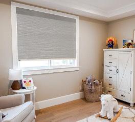
» SomfySystems.com
Soluna™ Roller Shades by Norman Shutters are great for room darkening, this solution features one-touch lift technology for quick and accurate control. The PrecisionLift™ Cordless lift system allows you to raise and lower the shade with no additional tugging. Certified Best for Kids too!
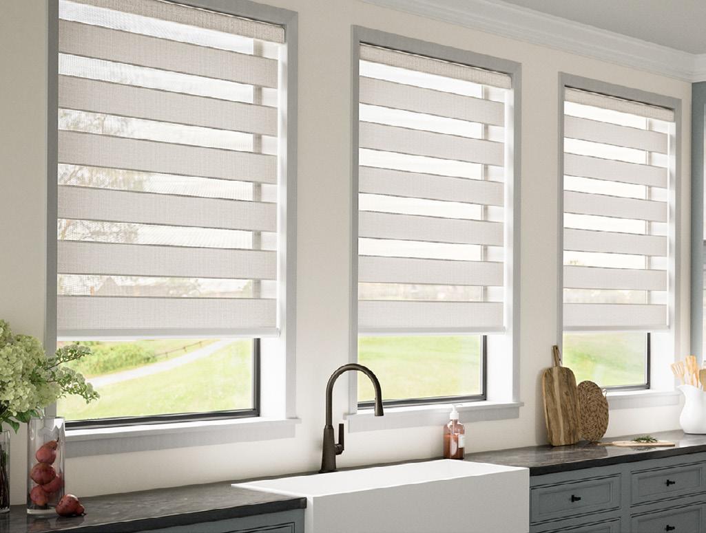
» NormanUSA.com
The magic of transitional shades lies in the unique vanes created with bands of fabric in varying opacities. Lafayette’s Allure® Transitional Shades offers many child-safe lifting options that are Best for Kids™.
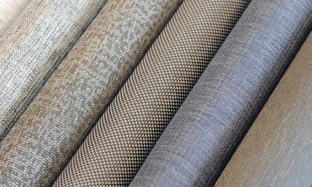
» LAFVB.com
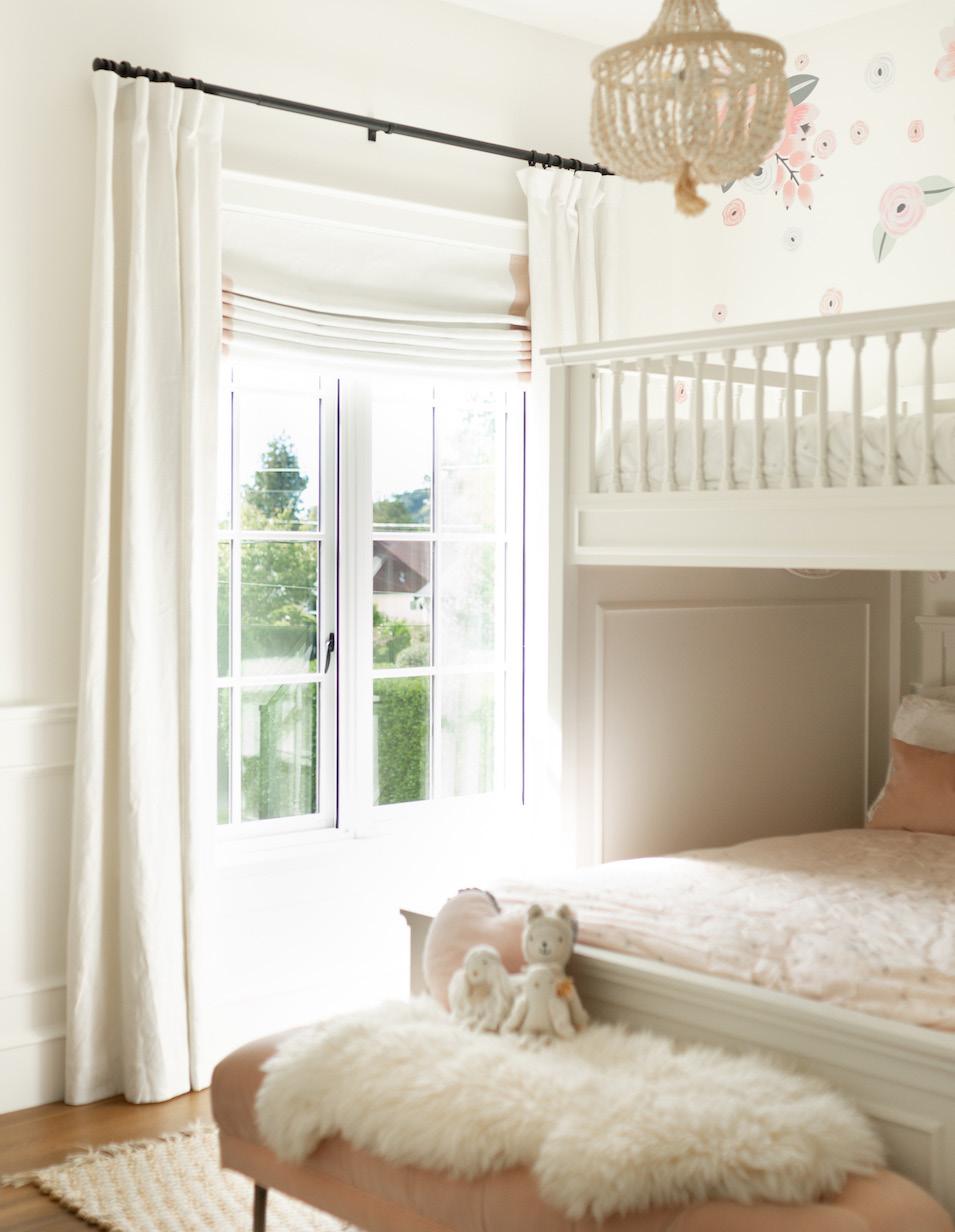
As a leader in advanced technology with innovative design, Current Luxury’s mission is clear: to refine everyday items using advanced technology, adding a touch of elegance and seamless convenience into the daily lives of their customers. Committed to maintaining the highest standards in their products and customer service, their main goal is to create the most significant benefits possible.
“The passion and core of our business is innovation,” shared Ed Slatton, vice president of marketing and sales.
The driving force for Current Luxury’s business approach is its founder and visionary, Willis Mullet, who has been a leader in the industry for decades through his innovative designs and products. “Our products are born from fresh perspectives and ideas, then honed to finished products through rigorous renderings, engineered drawings, conceptional parts, testing, beta sites, failures and successes. The end of this relentless process is the elegant products you see today in our dealer’s showrooms and, ultimately, a customer’s home or business,” Slatton explained.
The priority at Current Luxury has always been to offer world-class products through design and manufacturing. Hence why they set some big goals this year to ensure dealer and consumer experience matched their product offering. “One of our objectives was to create a new website experience that was multifaceted, providing visuals and learning tools for consumers to assist in driving customers to our dealers. We also modernized our dealer locator, making it easier than ever for a consumer to find the authorized dealer within their area; this updated tool also includes the website, email, phone number and intuitive mapping.
We committed to increasing the dealer experience by creating a resource center exclusively for our dealers, providing them with everything they will ever need for success, including sales brochures, media assets for marketing, spec sheets, pricing guides and installation videos, as well as troubleshooting. We are always satisfied when our dealers call us but understand sometimes dealers are working after hours, and our hope is this provides immediate resources at their fingertips,” described Slatton. Current Luxury has also bolstered its social media presence to share and educate followers on our family of products for the future.

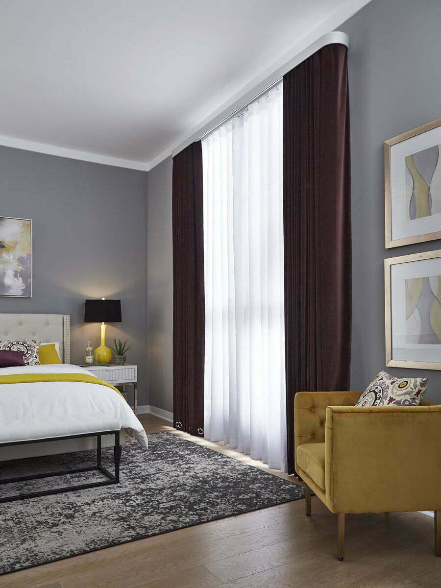
As an innovation company, Current Luxury proudly offers the SilenTrac motorized drapery track. This is the latest in-home innovation with effortless opening and closing of draperies. Open and closure choices range from manual, manual assist, motorized and motorized ready. The unique technology prevents delicate drapery from being accidentally damaged from catching and pulling (Curtain Saver). Control methods include manual control, pendant control, Smart Assist, handheld remote control, Current Touch (capacitive touch) remote control, and light and temperature sensor control (with sensor box). With Zigbee tracks, there is also phone app control, voice control and thirdparty integration. Power options include alkaline, lithium-ion, low voltage wall plug and hardwired. Power supplies are housed in the pendant and are interchangeable.

You can instantly add style and grace to a space with the Revolve Drapery System. With options for traditional or motorized and single or dual arrays, the result is a perfect fit. This system can be integrated with Alexa and Siri, as well as other third-party apps, and an optional remote is available for purchase. Current Luxury’s innovative anti-pulling safety feature is built into each curtain to help protect delicate fabrics. Revolve curtains link your life to your schedule. Grooved spirals present an elegant aesthetic while providing a motorized means to drive the draperies open and closed. Revolve is available with seven control options and four power options and in formed, fluted and smooth finishes. Motorized options are available only for formed rods; the manual version is compatible with all finishes.
New to the Current Luxury family product line is their Helux Solar Motorized Umbrella, the first solar-powered motorized umbrella. The Helux utilizes renewable energy through our patented solar technology, eliminating the need to charge the lithium-ion battery. Available in 9-, 10- and 11-foot canopies sized to fit medium- to large-size outdoor spaces, the double-vented canopy with high-quality yarn-dyed fabric reduces fading degradation. The Wi-Fi motor allows quick and easy integration; it is designed to be operated with the app, smart home devices, a remote and the manual push button on the motor housing. It is constructed with 1½" rustresistant powder-coated aluminum and eight ½"-diameter flexible fiberglass rods for enhanced integrity in the wind. This umbrella also comes standard with a wind detection system that automatically closes your umbrella in high winds. You have a choice of seven canopy color options.


Their Helux Manual Umbrella operates the rib assembly, which is counterbalanced with Easy Lift for effortless opening and closing. No more hand-cranking or pin assembly, simply twist to unlock the position and the umbrella will begin to open, leaving you to twist the pole and lock it into position. This umbrella also closes effortlessly. It has the same construction attributes as the motorized version, including frame and canopy colorways. This is available with black or white assembly.
The Bootsie Chair is an industry-first offering of learning innovation in an outdoor folding chair perfect for any setting. This patented design allows you to adjust the back tension on your chair while providing the perfect lumbar support. This is a self-locking chair, which eliminates the possibility of it closing as you get up from the chair. This chair will accommodate any size, offering a comfortable experience at any event. The frame comprises 22mm diameter 2mm gauge tubular aircraft grade aluminum. Rivets are made of stainless steel that resists degradation due to outdoor weather. Welds are strong nonporous, designed and manufactured to pressure vessel standards with no-slip non-marking POM material feet.
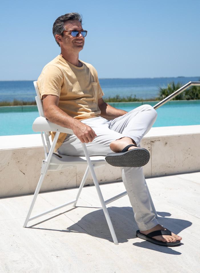
Current Luxury’s design, innovation and manufacturing is based in Pensacola, Florida. They encourage all dealers to schedule a tour and meet the team. Stay tuned as they continue to innovate and introduce new product announcements. To learn more, visit CurrentLuxury.com

PHOTOS: NICKOLAS SARGENT PHOTOGRAPHY
Each year, the Kips Bay Boys & Girls Club turns to leading designers and architects to transform a home in support of the organization’s mission. As the first Show House in New York since 2019, the 22 selected participants designed to impress and did not disappoint. The chosen location—the historic River Mansion on Manhattan’s Upper West Side—housed several high-profile residents throughout its lifetime, including actress Julia Marlowe and the Bronfman family, of Seagram’s. Among each room’s many points of inspiration, windows were not an afterthought.

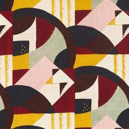
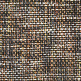
San Francisco designer Jay Jeffers used his Californialiving experience to inform his composition of this East Coast library. With an emphasis on the memories that are to be made within its walls, special attention was given to the window and its seat. Jeffers selected Abstract 1928 by Zoffany for the draperies and The Shade Store’s Artisan Weaves blinds in Cove for the surrounding windows. Everyone knows that the seat is just as important as the windows themselves, so he picked a tweed fabric design (Cestino) by Harlequin.
» JayJeffers.com @jayjeffers


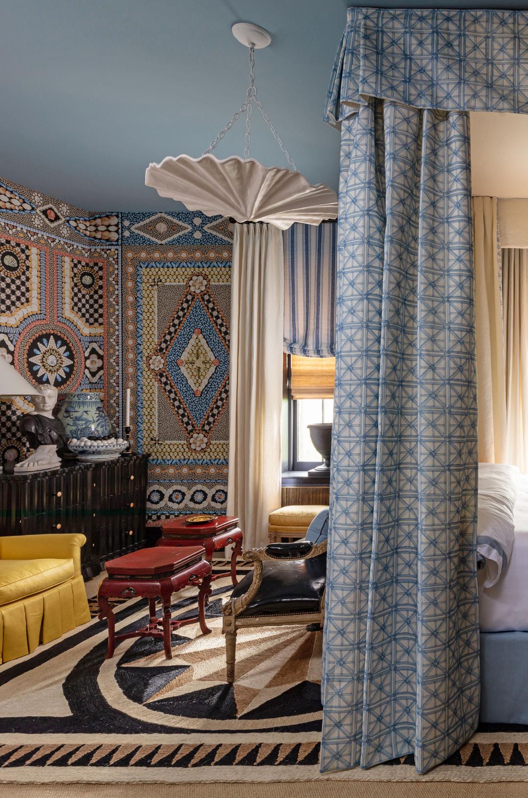
To transform this bedroom, Los Angeles designer Mary McDonald looked to her fellow females—particularly those of the past—for inspiration. Well-traveled women enjoy living among their collected curiosities, so McDonald made sure to fill the room with patterns and classical motifs. In keeping with what her name of the room, “Lady Borromeo’s Grotto,” wallpaper by Schumacher (Shell Grotto) and a mollusk-like Liz O’Brien lighting fixture complement the window treatments, which bring an otherworldly glow to the space. Even the barnacles at the bottom of the sea would float to the surface to spend a night in this haven.
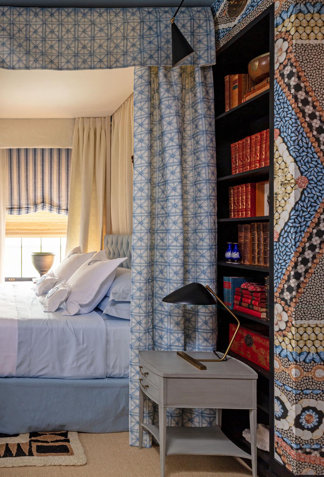
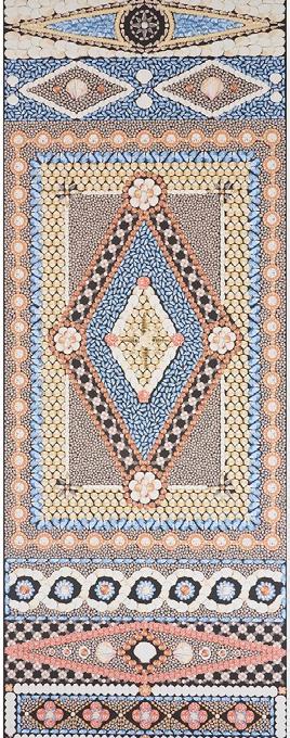
» MaryMcDonald.com @marymcdonaldinc

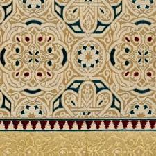
Designed as a modern cross between a dining room and a hookah lounge, New York City’s Georgis & Mirgorodsky invited guests to max and relax in sumptuous style. The historic interiors of Cairo, Istanbul and Damascus inspired each aspect of this space, promoting a union of Eastern and Western sensibilities. To make use of the natural light—and to not overwhelm the room—a simple window treatment was chosen, but to differentiate between the space’s three distinct areas, Georgis & Mirgorodsky picked Ottoman portiere panels.

» GMA.nyc @georgisandmirgorodsky


To deck out this den, Creative Director Kesha Franklin of New York’s Halden Interiors settled on vines as its influence. Symbolizing connection, friendship, strength and determination, the resulting space is full of natural touches grounded in artistic elements. One major moment comes in the form of Kravet’s Cuzco Verde Gastón y Daniela window fabric, which aims to whisk you away to a place of peace. A bespoke Italian Murano glass tulip chandelier by Cosulich Interiors & Antiques completes the picture and could be called a crowning achievement.
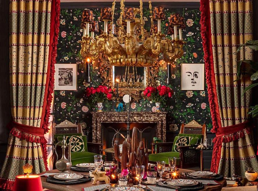
» HaldenInteriors.com @haldeninteriors
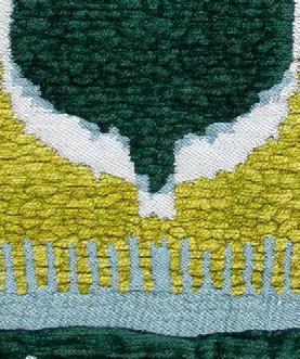
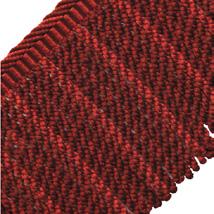

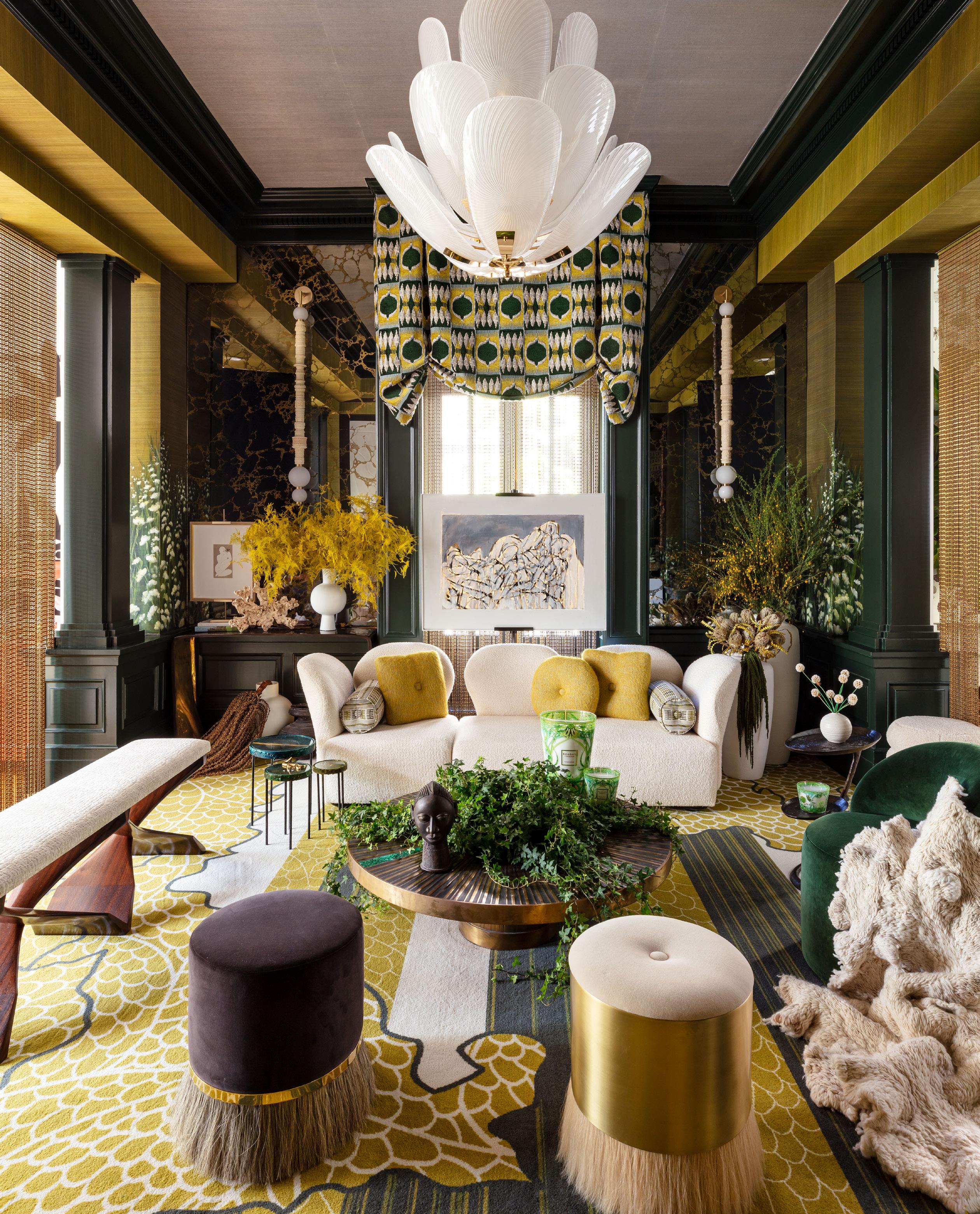
Labeled the “go-to decorator for Manhattan’s well-heeled millennial set” by the New York Post, Sasha Bikoff is no stranger to being bold. She made her Kips Bay mark in the 2018 house with a “kaleidescope” staircase design and, five years later, took her talents to the bedroom. While the centerpiece—and focal point—is certainly the bed, it’s foolish to let your eyes settle there when the room presents so much to see. From floor to ceiling, no surface was left untouched by Bikoff. Natural light brightens the playful colors, the windows adorned by treatments that matched her vision exactly. She gave us a behind-the-scenes look at her project and some insight into her decision-making process.

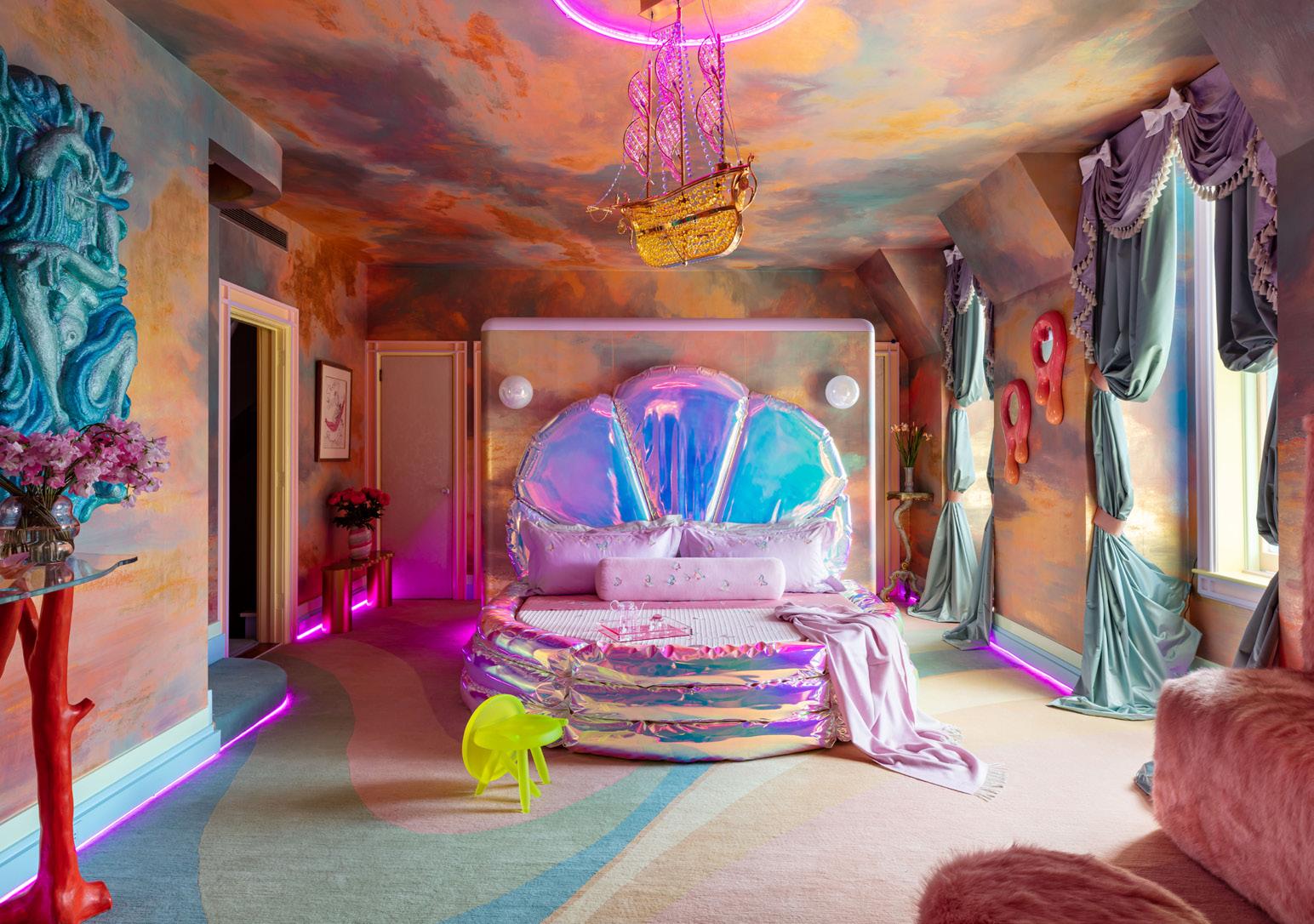
Tell us a bit about the room you worked on. Did it present any interesting challenges or opportunities? The room posed some challenges, as all the original millwork was there from the 1980s. I kind of liked the room because of that, but it needed a refresh. One moment that was really great was that we knocked out all of this cabinetry, which was originally a closet with doors, and we created a fuzzy nook. We also created a glam bar around the back-of-the-room divider.
What was your source of inspiration?
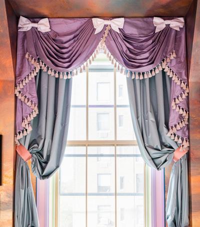
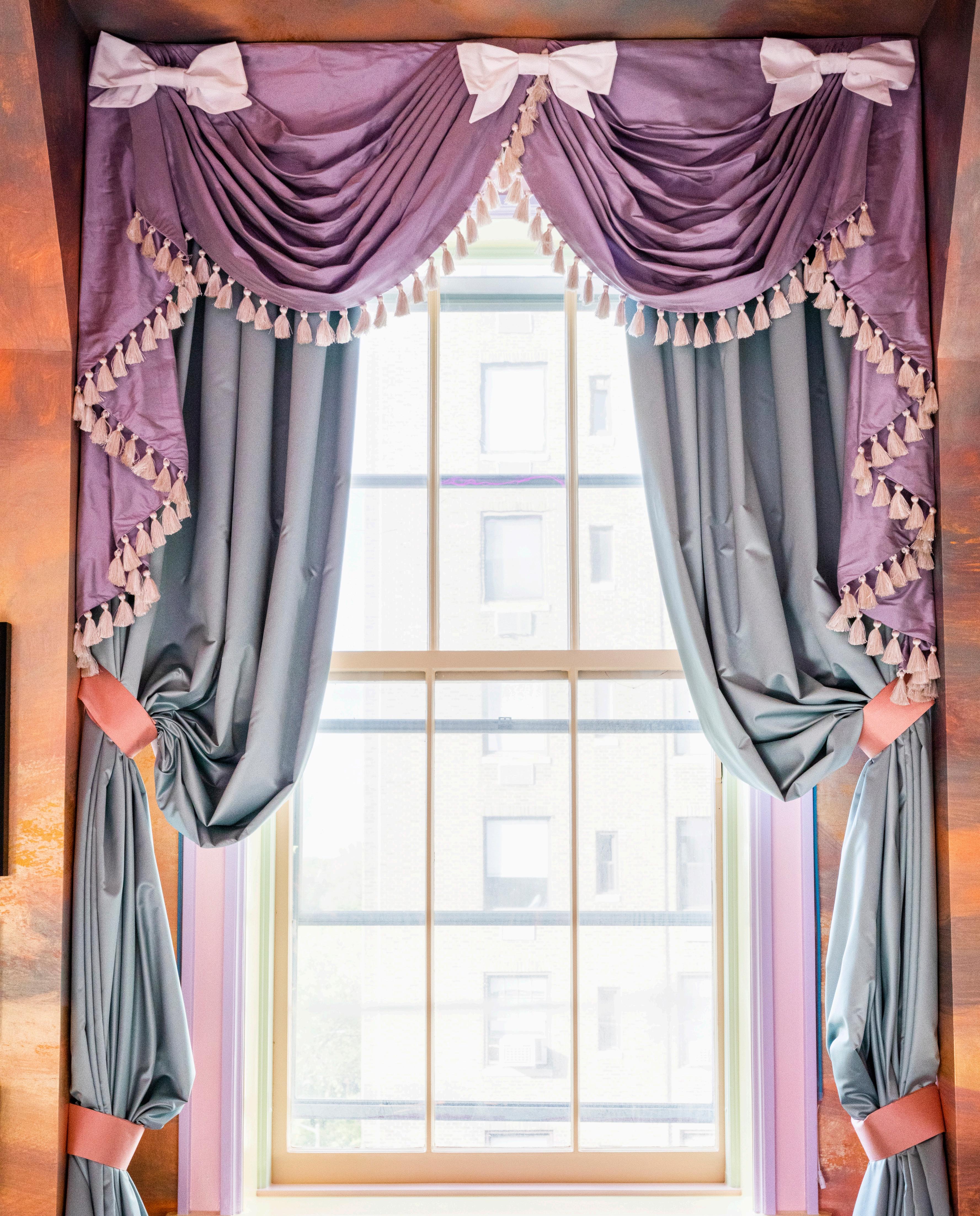
My source of inspiration came from this fantasy of nature. I thought about the sky and the sea and how they blend together in this kind of fantasyland in the midst of this summer sunset. I was also inspired by rococo and this French decorative style with its pastel damask silk tassels and bows.
What brands did you choose for the window treatments?
The window treatments were done by The Shade Store. The fabric was from S. Harris and the style was based on an image I found in an antique French draperies book.
How do the window treatments connect to the rest of the design?
The window treatments offer this glamorous pudding silk moment that brings together another layer to the space. It’s all about juxtaposing the old and the new to create something completely unique.
What do you think the importance of window treatments is and what value can they add to a room?
Window treatments add another dimension to a space. They are like eyelashes to eyes. They are needed to fully ground a room. V
» SashaBikoff.com » @sashabikoff
I was ... inspired by rococo and this French decorative style with its pastel damask silk tassels and bows.
— Sasha BikoffPHOTO: ANDREW FRASZ PHOTOGRAPHY PHOTO: NICKOLAS SARGENT PHOTOGRAPHY
If you ever find yourself in Waukegan, Illinois with some spare time on your hands, you will want to find a way to visit the workroom located at Horizons Window Fashions. While the building is unassuming and the small sign on the door is easy to miss if you don’t know where to look, don’t let the exterior dissuade you. Although you should call ahead to arrange your tour, there’s a good chance that if you drop by, a member of the staff will be more than happy to make time to show you the hidden gem that makes Horizons stand out among the rest.
Danny De Guzman is the General Manager of Horizons Window Fashions, and he has a passion for his profession that’s hard to come by these days. If you have Danny as your tour guide, count yourself lucky, as his time is in high demand. At the beginning of your tour, it’s likely that you’ll start in the main Horizons office. Almost all of the administrative staff sit in the same space, creating an atmosphere that feels more like a small business than a nationally beloved brand.
Don’t be surprised if you see a customer service agent or sales representative get up from their desk, put on a pair of safety goggles, and head out into the workroom. Most likely, they’re off to ask one of the associates on the line a question about a product and whether changes can be made to meet a client’s request. According to Danny, Horizons owes its success in part to this kind of relationship between sales and manufacturing. Questions about products are answered quickly and accurately by the exact people that will perform the Design Modifications.
As you put on your own pair of safety glasses and step out onto the workroom floor, you are greeted by rolls upon rolls of fabric sent by designers all over the country. Horizons is known for their Customer’s Own Material (COM) program,

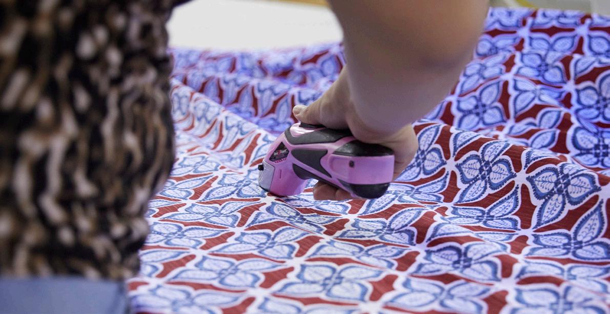
allowing designers to choose their own materials to use in a client’s home. Danny explains that this program is so popular, over 63% of all soft treatments made in the workroom are made with outside materials. As you pass, you might even see a few workers using giant light boxes to check each roll of fabric for cosmetic flaws as the material and project details are noted into the computer.
Continuing your tour, you might see a few folks look up and smile as you pass. Some might even wave to Danny or share a brief greeting. The workroom is a treat for the senses. Huge tables covered with beautiful fabrics, the smell of an iron, sounds of sewing machines whirring and even some music playing. But one thing stands out among the bustle: the people.
Over the past 3 years, Danny and his staff have faced the same economic challenges most businesses experienced during the COVID-19 pandemic. In the beginning, demand for home décor was low, which forced Horizons to make the difficult decision to lay off some of their staff. As the pandemic progressed, something curious happened. With folks spending more and more time at home, the demand for home renovation products and home décor swung the opposite direction and skyrocketed.
Demand for Horizons products grew quickly; however, more unforeseen challenges lay yet ahead. Even as positions reopened in the Horizons workroom, many of the previous staff were not able to return as they had young children to care for at home. Without the return of the previous Horizons employees and their skills, Danny knew he had to do something and fast.
So, he did what anyone in his position would do, he asked what he could do to make returning to the workroom easier.
And better yet, when associates on the floor told Danny what he could do, he listened.
As it would happen, building custom window treatments is a relatively niche profession and does not often present opportunities for career growth or advancement. A solution was created to develop a clear career path that allowed current and returning employees to learn skills and advance within Horizons and beyond. Suddenly, Horizons was able to open new doors for self-driven associates
looking for better pay, more responsibility, and a challenge. Cross-training associates also allowed for more flexibility within the workroom and helped employees build skill sets that could be applied to other forms of manufacturing. As a result, the new program encouraged employees to stay and grow with Horizons, which supplied the labor force necessary to increase production and decrease lead times.
Even with higher rates of retention, boosted morale and increased opportunity for existing employees, another problem remained: hiring.

According to Danny, hiring for positions within the Horizons workroom was already a bit challenging pre-pandemic. As the labor market got tighter, Horizons had to find a way to adapt and make hiring new employees easier. Simple changes like increasing the starting pay were a no-brainer but figuring out how to hire for a specialized skill set still proved to be challenging.
There’s a reason Horizons has been able to stick around as other companies in the industry have come and gone.
Danny and his team got to work building a training program that would allow them to hire people with little to no experience and teach them the proper skills to expertly craft Horizons window treatments. Just like the program developed to offer advancement opportunities to the existing employees, the training program for new employees worked.
In fact, Danny will tell you that most new hires have never built a window treatment or sewn prior to starting at Horizons. New hires usually complete the training program with a mentor over the course of 2 months and teamwork plays a huge role in the training process. When employees
are ready to advance, they repeat the same mentorship style training to learn new skills and stations. The process isn’t rushed to ensure that the quality of production stays at the forefront. Dealers and clients haven’t seen quality decrease, in fact, most will tell you they seek out Horizons because they can always rely on receiving a high-quality finished product.
There are testaments to the success of these programs all over the workroom. Photos and feedback from Horizons customers and dealers are posted at the stations where they were made. On the surface, it seems like a sweet gesture and nothing more, however these reviews play a big part in supporting and motivating the quality Horizons is known for.
If you ask an employee out on the floor why quality is so important to the Horizons brand, most of them will give you the same answer. These window treatments are made to be displayed in a home for many years. Each window treatment is constructed to order with an attention to detail that displays the emotional investment that the production specialist puts into their work.
You won’t want your tour to come to an end. There is something mesmerizing about the workroom and the way that everyone works together towards a common goal. The dealers, the administrative staff, and the associates working on the production line all make an important contribution to the process. From the early stages of design to the very last stitches, every single Horizons product is made with a quality that is hard to beat.
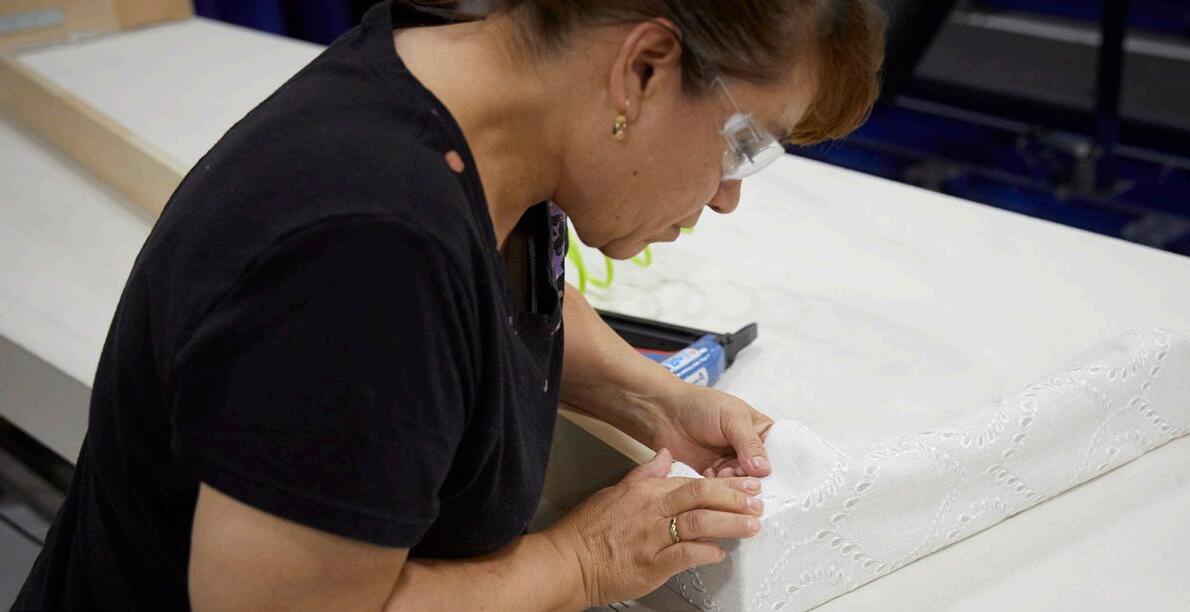

The proof is in the people.

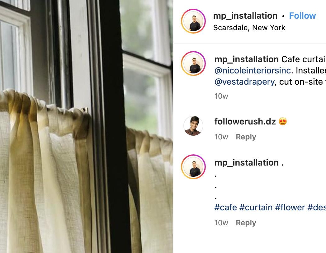
Social media continues to blow up and window treatments are no exception. One of the most exciting social media trends is the explosion of Instagram-worthy window treatments. The trend began with fashion and interior design but quickly caught on with window treatment professionals. Something about how treatments look makes people want them; they’re absolutely stunning! And while many brands have taken advantage of this new platform, there’s room for everyone because it’s not just for interior designers.
Pros worldwide are all on the train, including installers, workrooms, retailers and educators. As of August, the hashtag windowtreatments had more than 662,000 posts, a perfect hashtag to follow and be a part of. Big manufacturers such as Somfy and Rollease Acmeda were early adaptors, while others, such as Insolroll, entered more recently and are rocking it!
Powerful platforms like Instagram, Pinterest and TikTok have created media channels for pros to showcase gorgeous products, solutions and ideas, leaving viewers inspired and interested in learning more. This is the golden ticket because viewers become followers, followers become fans and, often, fans become customers.


One thing about social media: it’s ever-changing! Whether it’s a single post or a fully formed strategy, it’s imperative to put some thought into your social media efforts. Remember that although social media is relatively easy to contribute to, it takes time and effort to get accurate results. Here are five tips social media pros are doing and you should be too!
Social media has become heaven for marketing. It allows you to communicate with your customers quickly and directly, and it allows for a personal touch. Being involved in social media gives you an opportunity to interact directly with customers, but you need to decide which avenue you’ll choose. Pick one or two social media platforms

PRO TIP: Whichever platform you select, ensure your pages are completely filled out. Make it easy for new followers to find and clarify who you are and what you do. Don’t forget a link in your bio for followers to learn more.
that align with your company’s goals and objectives, and then blow those platforms out of the water. Michael Petrello, @mp_installation on Instagram, is building his trade installation business from the ground up using social media to introduce his service and skills. Clean, engaging and responsive, Michael’s leveraging this startup page to grow organically and using his business page to expand his business in the surrounding New York area.
You can create stunning pages, including profile pictures, cover photos and posts, using resources such as Canva for template-based design, Adobe Express for scaling a side hustle, Pablo by Buffer for quickly making images to share on social media and Snappa for creating occasional images.
When it comes to social media, beauty matters. Appearance plays a huge role in the results of your efforts toward social. People like to follow attractive pages. This means the presentation of your brand is key. From the aesthetics of pages to the content published, make this a priority. This includes how your page engages with followers. Your platform is the voice of your brand. What you publish and how you communicate and engage have long-lasting effects on your image. It’s recommended to be cohesive among your pages and have professional content that flows nicely from platform to post.


When it comes to social media, engagement is the key to success. Strategy and content will get you nowhere without engagement. Buffer, a social media scheduling platform, defines engagement as measuring how people interact with your social media accounts and content. The term is broad, but it’s a direct metric for tracking your return on investment. Taking the time to connect with your followers shows the real side of your brand and allows people to connect with brands in an authentic way. This also allows you to have more control of your brand and overall character. A Sprout Social study showed that social media is people’s No. 1 choice for customer care, beating out live web chat and email. People love seeing (and sharing) positive interactions between brands and real people. Answering a complaint on social media can increase customer advocacy by as much as 25%, according to Convince & Convert.
PRO TIP: Engaging on social media at least once per day—but no less than once per week—is recommended. The more “human” your brand feels, the more likely you’ll have a highly engaging platform.


If you’re not prioritizing video content, then get to filming today! No media is more powerful than video regarding any digital marketing strategy. It’s a low-cost, long-lasting medium that
can produce astounding results if appropriately targeted. Online content can be overwhelming and often overlooked. Video marketing allows you to create compelling content that really stands out and that’s highly engaging, increasing brand awareness. Creating videos, even as simple as Reels (short, creative and entertaining videos on Instagram), help build your content mix to include variety and makes your brand more personal. Suppose a viewer watches one video they liked on your page. In that case, they are more likely to view more videos, increasing your chances of that viewer becoming a follower, which is one step closer to a potential customer for you.
Social media is no longer a place where brands can hide their imperfections. In fact, it’s the opposite. Good social media is all about being honest and open with your audience, which means you have to be willing to share things that might make you feel vulnerable. Here’s the thing: What makes a great brand on social media isn’t perfection. It isn’t even perfectionism or over-the-top marketing tactics or manipulation. It’s authenticity and vulnerability because those are the things that will build trust with your audience and make them want to keep coming back for more. It sounds simple, but it’s true. The more authentic you are, the more likely you’ll sustain followers and fans. It doesn’t matter if you’re a big brand or a small business, if you want to keep people interested in what you say, just be yourself!
PRO TIP: Remember, social media is about celebrating what makes each day special. Don’t be afraid to get dirty!
I like how @lafayetteinteriorfashions isn’t afraid to show a playful side by posting staff photos and behind-the-scenes snaps at the office, with a mix of humor and entertainment, and how @insolroll shares a “Dealer Spotlight” with project videos and professional photos. My other favorites are customer spotlights, employee mentions, exciting events (like holidays) and occasionally asking questions! V
There’s no shortage of window treatment accounts to follow on Instagram, but here are 10 social pages that shine bright and can teach us a thing or two about successful social media marketing.


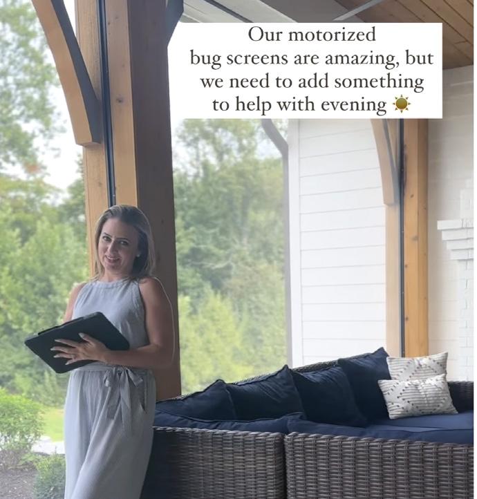
PRO TIP: Don’t know where to start? Let social media platforms do the work for you!
Platforms like Instagram or Canva will create Reels. That’s right–free content!

The world is a video-centric place. If you want to reach your audience, you need to be making videos. I like to look at @draperystreet on Instagram, which has a great library of Reels reaching as close as 100,000 views on a single Reel, including showcasing custom-designed modern window treatments for Olympic gymnast Shawn Johnson East (see page 39). Brands can’t go wrong investing in video marketing. Video allows for a unique content experience and really shows off the magic pros can create with custom treatments!
Ania Munzer is an associate publisher of Window Fashion VISION and co-producer of the International Window Coverings Expo since 2020. She received a bachelor’s in marketing and entrepreneurship from the University of Winona, Minnesota. Passionate about the intricate world of custom window treatments, she studies industry trends and resources, focusing on digital marketing and technology.

» Stay updated and learn more at WF-Vision.com.


Are you a “Yeah, but…” business owner? Meaning when you ask colleagues how they do a particular thing in their business and on hearing the reply you say: “Yeah, but that won’t work for me because of x, y, z.”
Throughout my career, I’ve had many colleagues ask me, “How do you attract designer clientele to your business?” “How do you maintain a high repeat and referral rate?” and “How do you sell at gross profits of 55% and higher?” And after explaining the tactics we’ve employed, I get the “Yeah, but…” line.
I understand the knee-jerk reaction of “Yeah, but…” It comes from fear, uncertainty and a lack of confidence. But what I don’t get is the belief that what a colleague is successfully doing is something that you can’t do. We all have superpowers, but running a business on a foundation of healthy business principles is not a talent, it’s a decision you make. A decision that you’ll run your business smartly, profitably and sustainably.

So, why is it that so many of us in the industry charge at gross profits upward of 50% to 55%, and get them, while so many others say it isn’t possible to charge more than at 40% or 30% or 35% gross profit? Let’s explore some of the reasons for adopting and hanging on to a mindset of discounting and explore the impact it has on your business.
You might think that competitors in your area charge lower prices and you have to as well. That’s incorrect. When you focus on a pricing strategy that’s strictly a transaction, you’re going to prove yourself right about needing to charge lower than everyone else. Instead, focus on your PODs, your points of differentiation. On my podcast “Window Treatments for Profit,” Glory & Brand’s Nicole Heymer described how to tap into your PODs in episode #167. She walked us through how to uncover the
ways we’re different from our competitors and how, when you know this, you know you aren’t in competition with anyone else. 2
In a custom industry like ours, selling to luxury consumers goes beyond just the product. Clients seek value in the overall transaction, including the product, service and experience you provide. By focusing on delivering this complete package, you shift the conversation away from pricing and highlight the added value customers receive when choosing your business over others.
Assuming that luxury consumers only care about the lowest price can backfire. In the luxury market, the lowest price often equates to a lower perceived value. Consider a scenario where you obtain three quotes for a project. One company quotes $10,000, another $8,500 and the last just $4,000. Do you immediately jump on the $4,000 offer? Probably not. You start to doubt the quality of their work, their materials and their professionalism.
Now, let’s explore the difference between the $8,500 and $10,000 quotes. The $10,000 contractor promises to use only the highest quality paint, provides free color changes between rooms, guarantees completion within three days and offers free yearly touch-ups for the first three years if scheduled during his slow season. Is it worth the extra $1,500? Absolutely! You can apply the same principles in your business by offering extra benefits, such as free labor on battery replacements during your slowest months. Building strong relationships with your customers is the key to success with luxury consumers.
It’s understandable to feel the temptation of pricing projects based on your immediate financial needs. However, selling out of need often leads to underselling and undervaluing your products and services. To avoid this trap, step back and remove emotions from the equation.
Instead, determine your pricing based on a formula that considers the net cost of goods, the value you bring, operating expenses and the fair market price for the product. Remember, your pricing strategy isn’t about how much money you owe in a particular week.
Let’s explore the actual results of discounting and low profit margins. I realize that you discount because you believe you’re helping your business, growing your customer base or creating money for the checkbook. By maintaining a philosophy of discounting, you’re impacting your business in ways that are far-reaching with devastating consequences.
When you consistently sell at discount pricing, you’ll inevitably create cash flow problems. While lower prices might attract more customers, the reduced profits mean there’s less money available to cover operational expenses. This can quickly spiral into a cycle of financial strain. When the price you charge for your products or services barely covers the cost of goods and installation, where exactly is the money for essential expenses?
The pool of money in your checkbook may appear to be sufficient, but, in reality, there’s little left for ongoing expenses.
To break free from this cash flow crunch and safeguard the future of your business and your peace of mind, it’s essential to adopt a healthy profit margin.
When you fail to generate healthy profit margins, you can make ends meet today; however, this short-term gain blinds you to the long-term struggles ahead. Without healthy profits, sustaining and growing your business becomes an uphill battle. This real-time struggle is not only mentally exhausting, it also robs you of any probability for planning and expansion.

Successful businesses thrive by investing in marketing initiatives to reach new customers and strengthen their brand presence. They allocate resources for professional development to ensure everyone stays informed, skilled and competitive. When you sacrifice profit margins for the discounted sale in hand, you also sacrifice the money to acquire crucial assets.
Think about this: You’ve made a high-ticket sale to a luxury consumer and when your installer arrives, your company van is old. If you think this isn’t subconsciously registered by your luxe consumer, you’re kidding yourself. Custom window treatments are an expensive, high-ticket item and anyone who invests their hardearned money in them wants to feel like they’ve made a solid choice in who they invest that money with.
Another consequence of operating on low profit margins is you’ve simply
created a job for yourself rather than a successful business. Reduced profitability robs your business of its potential. It limits your capacity to innovate, adapt to changing market conditions and seize new opportunities.
The race to gain a competitive advantage by discounting and by undercutting competitors puts you at a competitive disadvantage. This happens in two ways. First, instead of being recognized for superior service and outstanding experiences, your business becomes associated with the lowest price. When you’re known for having the lowest prices, customers often begin to question the quality and effectiveness of what you provide.
Second, when you don’t generate profits well beyond the cost of goods, you compromise your ability to invest in advertising, community events and great employees. Meanwhile, your competitor is charging more, doing fewer, more profitable projects, and has the time and money to do all of these things.
Window treatments are a full-service, luxury product demanding a comprehensive experience of expertise, quality and service. It’s not just about making sales; it’s about establishing lifetime relationships with customers who recognize and appreciate your expertise and commitment. By establishing fair prices that reflect the value you provide, you’ll have the means to invest in your business’ growth and maintain healthy profit margins.
In the pursuit of building a thriving and sustainable business, liberate yourself from the discount pricing mentality. Armed with the right mindset and a thoughtful pricing strategy, your business will flourish and you’ll attain the lifestyle you’ve always envisioned for yourself.
Decide to Be Excellent. V
With four decades of industry experience, LuAnn Nigara is an award-winning author, keynote speaker and the host of two podcasts: “A Well-Designed Business” and “Window Treatments for Profit.” She is also part of the ownership team of the Livingston, New Jerseybased Exciting Windows! and Window Works. Through Exciting Windows!, LuAnn University and her one-on-one coaching services, Nigara teaches window treatment pros and interior designers how to operate profitable businesses.


» LuAnnNigara.com » LuAnnUniversity.com
» ExcitingWindows.biz

•
•

The secret to closing more sales? You might be surprised. It’s often dark, sweet and a famous expression from one of my favorite movies that has taught me a valuable lesson about sales success. How can something so simple as chocolate influence my career as a designer? It stems back to my childhood and that feeling when a box of chocolates arrived and all the opportunities it presented. As I got older, I adopted Mama Gump’s mindset: entering each project without knowing what I’d get but confident that I could handle and even like whatever came my way. Here are five lessons I learned from one simple sweet treat (that just happens to be delicious). 1
Wouldn’t it be reassuring to know that the client on your calendar tomorrow will be easy to work with, a joy to design for and, indeed, buy from you? It would be nice, but you limit your opportunity when you get too picky. If you’ve been in business for a while, you have undoubtedly experienced your fair share of ups and downs. Some clients are easier to work with than others and some don’t have as much budget but do the math: 52 appointments in the hands of a sales pro will yield more sales than attempting to judge the best 26. So, take a deep breath and let go of your need to be picky. You’ll have time enough later to refine your process and choose only the best opportunities—for now, just focus on getting out there!
If you’re a salesperson, you know that the more appointments you set and run, the more likely you are to close a deal. But what if you could spend less time on those appointments? What if your clients were so happy with your service that they referred their friends to you, or even bought from you again? That’s what happens when you value every chance you get to help people in any way possible. Don’t pre-qualify and decide that people “in that area” or projects “that small” are not worth your time. Instead, run every appointment because you never know what you’ll get. Make a wholehearted, genuine connection and provide helpful information freely given because they took the time to invite you into their home. You’ll leave the door open for referrals or a future purchase when the client is ready.
It only takes a few of these disappointments to make you tempted to go into the next appointment somewhat guarded or try to determine in advance how likely they are to purchase from you. Redefine what success is. Choose to enjoy every appointment, not just the ones that result in a sale. Enter every home intending to help and you will leave every appointment feeling good.
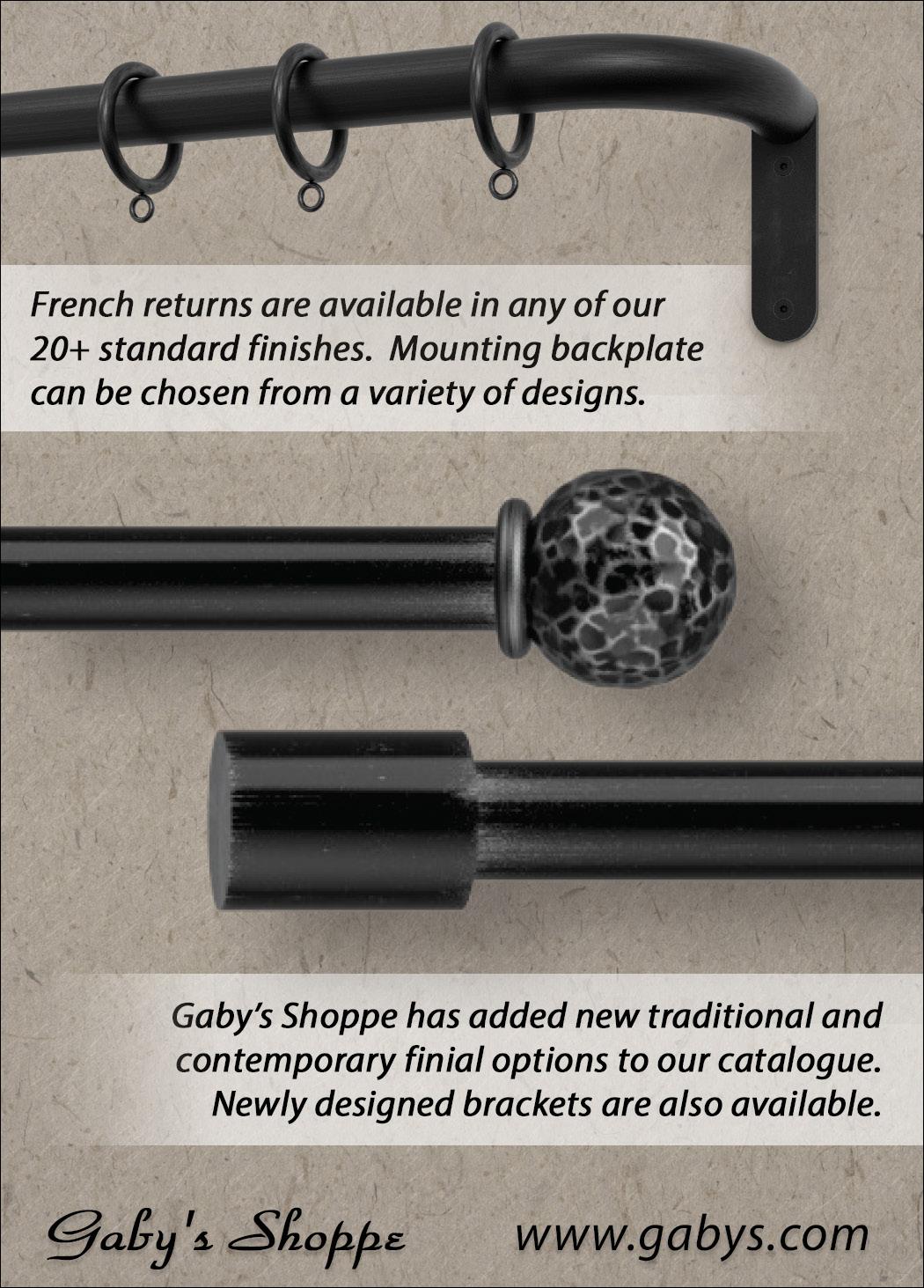
Salespeople come in all shapes and sizes and buyers never know what they are going to get. Most likely, your potential customers have had a disappointing sales experience in the past. They, too, will be curious about the kind of salesperson(s) they will work with and most likely in hopes that you will not be sales-y and use pressure tactics. There are many fear factors involved, including outrageous costs, pressure to decide and lack of compatibility with their style. Know these factors matter and be aware of the energy you give off. Understand sales tactics that are popular among buyers today and make it a more comfortable experience for your potential buyer. The more relaxed and comfortable they are, the more likely they will buy from you.
Once your appointment is confirmed, don’t hesitate to reach out to your client. We call it going the extra mile! It’s worth the effort to quiet their doubts by showing them that you’re friendly, helpful and that an appointment with you will be fun and informative. Help them look forward to your arrival with eager anticipation rather than worry. Reinforce the idea that you’re here to help, not sell. When clients feel good about the designer coming to their door, they’re relaxed and more open to how their rooms can be transformed.
Transformational sales professionals practice these five things daily. When you help people catch a glimpse of how their life will be different, you’ll never have to worry about your business bank account. You’ll turn leads into friends and friends into customers for your business. Your clients, once they’ve bought from you, enjoy comfortable, inviting homes. They proudly show off your work and their beautiful window treatments. You enjoy the resulting repeat and referral business. Sweet success is yours. From firsthand experience, I assure you that transforming a client’s feelings about their home releases even better feel-good triggers than a big box of the world’s best chocolate! V
Kathy Cragg Pace teaches modern sales for people who hate “salesy” people. Her specialty is elevated design sales for individuals and teams, empowering them to provide an irresistible selling experience. Throughout her decades-long career, she has led her own award-winning design franchise, real estate and custom home-building companies, a network of large and small independent window covering business owners and a nationwide retail team of in-home design professionals. She is currently director of sales for 3 Blind Mice USA in California.
 » KathyPace.com

From firsthand experience, I assure you that transforming a client’s feelings about their home releases even better feel-good triggers than a big box of the world’s best chocolate!


Surewin has quality components at competitive prices from its Florida warehouse, with custom sourcing available. Plastic bead chain-in-rolls or continuous loops; numerous colors in all lengths, nickel-plated and stainless chainin-rolls and continuous loops in all lengths, stop balls, connectors, safety devices, c-clips, alligator clips, tassels, lift cord, vertical components, cord locks and the easy-to-fabricate, low-profile Sure-Lift® Roman Headrail System for shades up to 50 pounds.
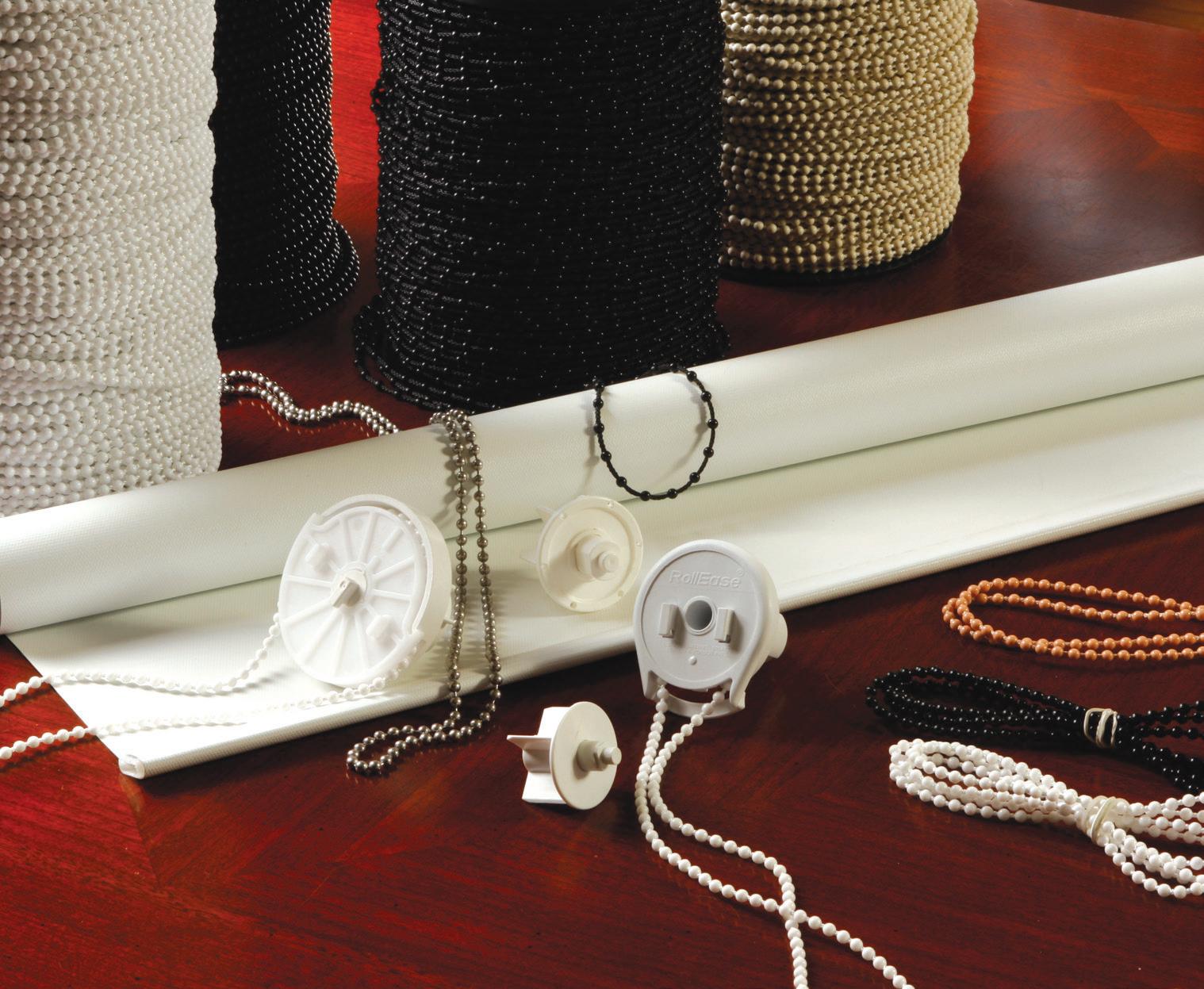
Learn more at Surewin@optonline.net or call 239-362-3342.

The source for custom-made drapery hardware. From contemporary to traditional, we offer an extensive selection of styles and finishes. We manufacture every rod set to order using only premium heavy-gauge steel, wrought iron, crystal and more. Custom curving is also available for all rod profiles. Be sure to look at our new acrylic rods, art glass finials and polished chrome finishes, in addition to our popular French rods and ONAVERSE™ Iron Cord Traverse Rods. We pride ourselves on quality workmanship, timely delivery and customer satisfaction.
For a free catalog, please call 800-231-4025 or visit OnaDrapery.com
Meet the best-selling collection, Devon, by Coulisse. Known for its luxurious look in six timeless colors, this collection is crafted with precision. Tactile fabric is the perfect choice for any building with dim-out and blackout options. Experience the next level of window shading with the new ¾" honeycomb collection, seamlessly blending performance and style. Inspired by nature, these cellular shades unlock endless possibilities in interior design. With exceptional insulating properties, they create an optimal indoor climate, enhance natural lighting, provide acoustic comfort and effectively control glare. Learn more at bit.ly/DevonbyCoulisse.
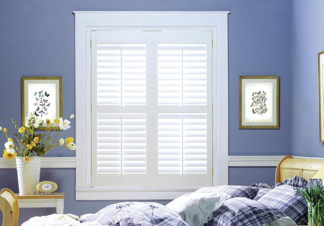
payments
Vesta
Golden accents in the interior are fashion highlights and bring noble flair. As a curtain track, it provides a luxurious backdrop for delicate fabrics. NOVI, the precision extruded square aluminum track, is available from Vesta in brushed gold and four other finishes.
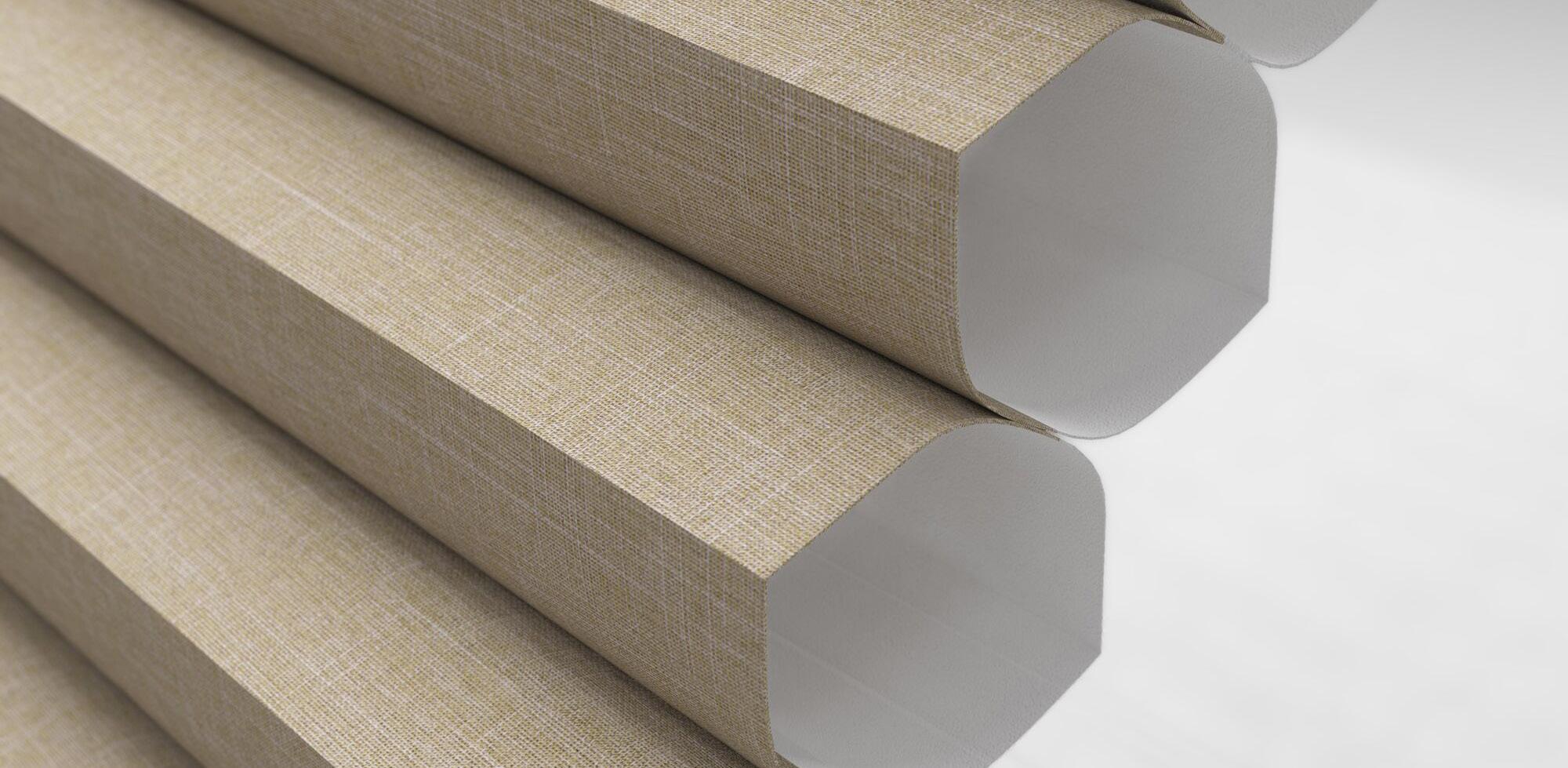
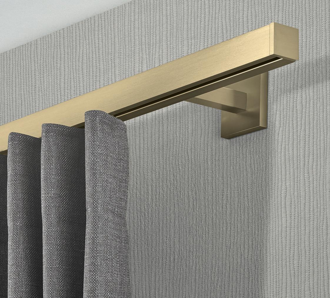
Learn more at VestaFineHardware.com. V
- Components
- Frames
- Configurations
- Necessary tools
- Benefits of them for your client’s home
$34.95

It’s that time of year again, when the kids have gone back to school and the long summer days are being replaced by short, cool evenings. It’s also when our businesses approach the last quarter of the year, which makes it a good time to reflect on the first nine months of 2023 and take stock of where we are with our sales numbers.
Have we hit our goals? Have we met our sales quotas for the first three quarters of the year? What do we need to do to close out the year strong?
Here are three strategies you can implement immediately to help you hit those sales goals and close out the year STRONG.

box and do things that we haven’t done before. In my business, we have instituted what we call a “10 Around” with both our sales team and our installation team. Before leaving a sales appointment or product installation, the designer or installer puts a company postcard in the door of the nearest 10 homes to the one they were visiting. Within the first week of implementation, we had three leads generated from this practice. Those were three leads we most likely would never have had and three more opportunities to get closer to hitting our sales goals.
YES
How many potential clients did you meet with so far this year that have not purchased yet? We often get so wrapped up in chasing down the next appointment or the next project that we forget about the ones that got away. Now is a great time to reach out to all those clients that haven’t purchased yet. Have you called, texted and emailed them? Many of us have taken time out of our day and spent money on travel to give someone a free estimate. I firmly believe I have earned at least one thing for providing that free estimate and that is a YES or a NO from the client. However, if I don’t call them back and ask for that YES or NO, how will I get to the conclusion of the story? Following up with your potential clients until they give you a true answer will get you additional sales and take the guesswork out of waiting to see who’s going to call you back.
When you meet with potential clients and make the sale, what is one of the biggest reasons they chose to do business with you? They genuinely LIKE you. Because they like you, they will want to HELP you. So, ask every person who buys from you for help! Before you leave the home with the signed paperwork, ask them if they have received five-star service so far. When they say YES, ask them right then and there to give you a Google review. Almost 100% of clients will do it when asked. Does your new customer live in a beautiful new neighborhood? Ask them if you can leave a company sign in their yard for a month. This will generate more clients at very little cost or effort to you. Lastly, ask them for one good referral. Ask them for the name and number of a person like them, who owns a home and may have the need for window treatments. You may not get this every time, but if you ask often enough, you will find that your customers are willing to help you and WILL give you referrals.
For many of us, the number of new customers ready to do business has fallen compared to the past few years. As leads stagnate and become harder to come by, it may be time to step outside the

2023 is not over! Reflect on where you are and reevaluate where you want to go and how you want to finish up the year. Then, use one or more of the strategies above to help you hit your goals. Do this and you may just find another check mark in the SOLD column! V
Oliver Schreiber began his sales career more than 30 years ago and is CEO of Beltway Blinds in Washington, D.C., Maryland and Virginia. He leads a team that generated more than $11 million in sales last year. He has been a speaker at the International Window Coverings Expo, has received awards for being the largest-volume dealer with Alta Window Fashions for four years running and sits on the National Advisory Committee for a window covering group, Exciting Windows!. He can be reached at oschreiber@beltwayblinds.com.

Interior Roller Shades.
Exterior Oasis® Patio Shades.
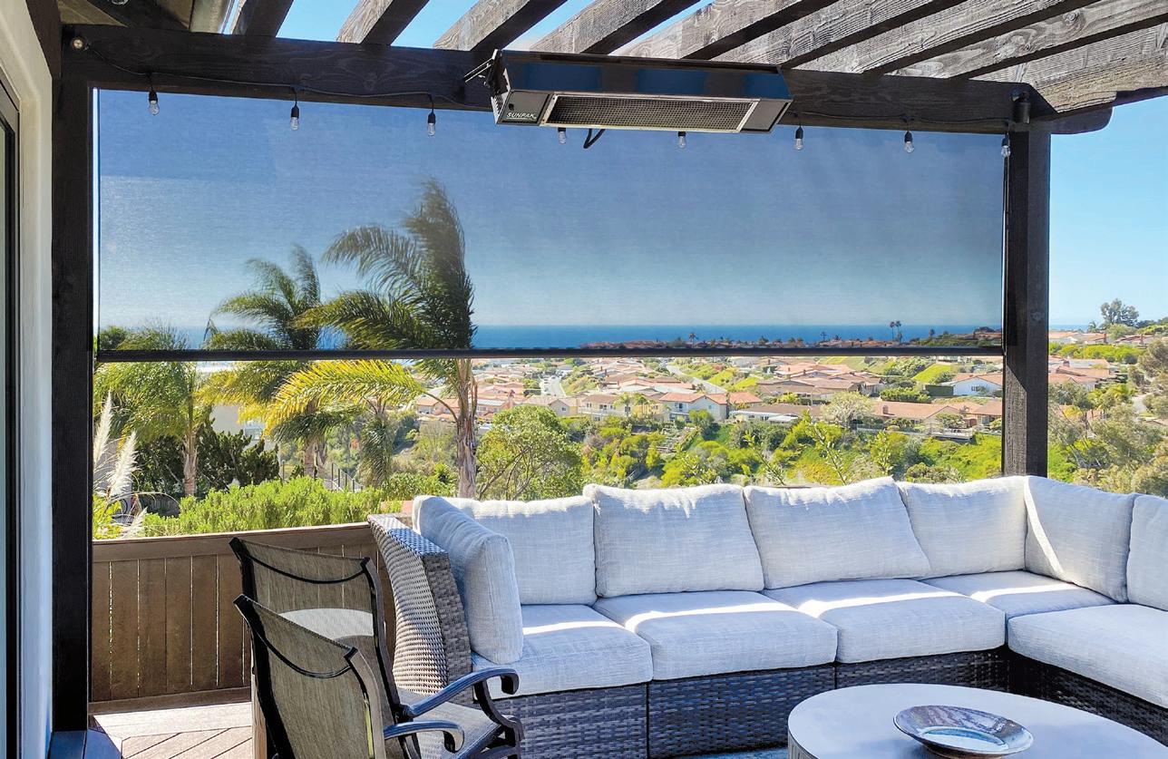
Roller shade technology for today’s lifestyles.
Interior Roller Shades
• Versatile, powerful embedded Li-ion battery motors by Somfy for interior shades.
• Solar & magnetic charging options
Exterior Oasis Patio Shades
• Exclusive partnership with Lutron to provide Driven by Lutron™ Patio Shades


• Somfy® motorization with time proven, reliable RTS controls
Large in-stock Solar Shade & Decorative Shade fabric inventory Award-winning customer service | Fabricated in Louisville, Colorado USA
