
12 minute read
Early Concept
Conclusion:
Chapter 2 dives into the research process of the overall project in order to gain a better understanding of the problem as a result supports the development of a solution. The overall research found that one of the most important aspects when it comes to accessibility with an aging user is effective methods of navigation. Additionally, the research has outlined the necessary steps when it comes to developing a design solution.
Advertisement
Chapter Three

Introduction:
While moving forward, the objective and solution in mind was always to create a concept website for Felton’s Tech Squad. However, after much research, the thought has evolved into designing a solution much more robust and backed by research to effectively help aging individuals. This chapter will focus on the development of a website that has design choices supported by data as well as shaped by the feedback of various experts.
Proposed Solution:
Project Parameters:
To redesign Felton Tech Squad’s website to be more accessible to older adults and to serve as their gateway to supportive resources and services as well as their gateway to the overall digital world.
• Primary focus on accessibility
• Follow guidelines from resources such as the World
Wide Web Consortium (W3C) standards
• Design an effective way for users to navigate
• Maintain elements of the main Felton Institution website
• Create an effective user design


Users & Environmental Context
Users:
The targeted users for this project are primarily aging individuals (60 years and older.) This includes Felton’s existing clientele along with new users interested in receiving support from Felton. Additionally, this website could be useful to caretakers/service providers who look towards helping the aging population with their technological and interweb struggles.
Environmental Context:
The website is intended to be used at home, or assisted living facilities where an aging user is most comfortable and living their lifestyle. Users could have an aide beside them, whether it is a family member, caretaker, service provider, the website will be designed to look aesthetically pleasing to all users and, most importantly, accessible for all users.
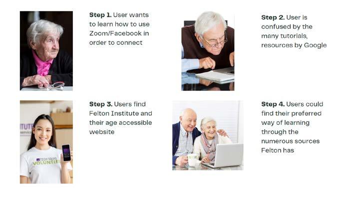
Persona Scenario:
Inspirations
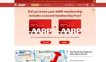
AARP Website:
The American Association of Retired Persons is a service/website designed for users 50 years and older. With a membership of more than 38 million (Investopedia), the AARP has ensured that their website is accessible for all those looking to use their services. Not to mention, its means of exploring the page and clearly indicating what section of the page a user is on is a result of effective navigation.
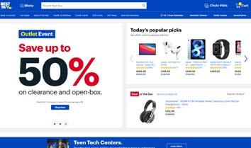
Best Buy Website:
The Best Buy website contains much more than commercial products for sale. It is also informational as well as offers services, such as their famous Geek Squad. The website’s organization of content is being looked at for inspiration.
Design Drivers
Concept Attributes Accessible:
The number one attribute that should come out of this project is that it is accessible to aging individuals. In order to make it accessible, elements such as visual aids that show the user where they are on the website will be implemented. Although the target users are those of the aging population, all users are considered when it comes to the design of this website.
Supportive:
The website should be a supportive service that works to benefit the user’s existing lifestyle. If the user is searching for information that could support their needs, this website will be able to provide it. If such information is not provided on this website, it could at least link the user to other websites that aim to fulfill the same mission to assist those with technological/digital trouble.
Navigational:
According to the W3C, one of the elements a web design must contain in order to be accessible is proper and effective navigation.
Branding Solution:

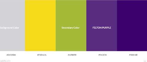
Although the Felton Tech Squad wasn’t looking for any changes to their branding, they were missing a selling point, or tagline. Although many iterations were created such as “Assisting the aging,” or “Bridging the Digital Gap,” one iteration truly embraced the Tech Squad’s purpose, which was to empower seniors with the benefit of technology. Thus, the tag line “Empowerment through Technology,” was created.
Concept Development:
In early sketches and ideations, multiple ways of navigating the site were conceptualized. The thought of having a landing page was considered, however a landing page may stray too far from the official Felton Institute website.
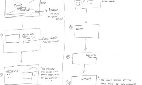
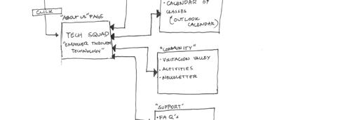
Early Iterations
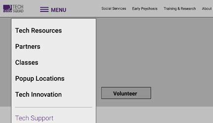
First iteration Tech Squad Website
Created a separate dropdown menu
Provide resources in one section
Contrast the background
Would mean changing entire website’s navigation
Expert Feedback:
The key feedback that resulted from the first round of iterations was how introducing a menu to Felton’s existing navigation bar may cause confusion. The concept was that this feature will only appear in the Tech Squad site, however, this introduces a major change to a feature that should remain consistent throughout the overall website, according to Edith.
Early Iterations (cont.)
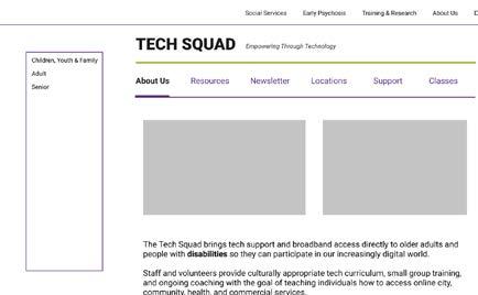
Maintain elements of the existing website
Cause less confusion
Simple aesthetics
Side menu remains to navigate to other Felton Services
Expert Feedback:
In another iteration where a different concept of a menu exclusive to the Tech Squad was designed, even more confusion arised. There was the side menu, listing all social services Felton has to offer, the main navigation bar, and a sub-navigation bar. The multiple ways of navigating could be confusing, as the sidebar has services that would mistakenly be associated with the Tech Squad.
Refinement and Final Design
Later, elements would be continued to be refined, such as font sizes, adding complementary colors, After helpful feedback from experts as well as a continuing analysis of the research, a final concept design was produced.
Operable User Interface & Navigation


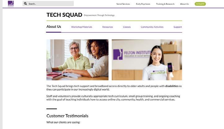
A sub navigation bar was designed to both alleviate a user’s navigating experience. It works as an interactive map to support the user experience.
Importantly, it has been designed to be accessible. In accordance with W3C’s Technique G128, the navigation bar clearly indicates the current location on the site. It is able to do so by contrasting in font size (30 pt) as well as weight and is accompanied by a bar that animates when clicking on each link.
Also buttons and links were made large enough for a user to click, as an aging user may struggle with dexterity and the use of a computer mouse
Testimonials
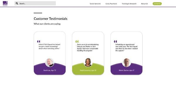
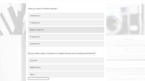
Testimonial assets and graphics were designed and added to the About Us page to establish more trust to the Tech Squad brand. Eighty percent of those who were surveyed were not familiar with Felton Institute, so it is important to gain trust from an unfamiliar user.
Although they may be browsing the website, that may be all they do. According to the Invesp website, 72% of consumers will take action only after reading a positive review
Avoiding Ambiguity
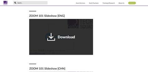
In order to avoid confusion and ambiguity, features and functions of the website are clearly presented
The search bar was changed from the magnifying glass icon to a rectangle that clearly indicates it can be used to search for something
Functions, such as downloading are stated explicitly if a user wishes to do so, avoiding any confusion as to what they are about to do
Resources, Materials, Services
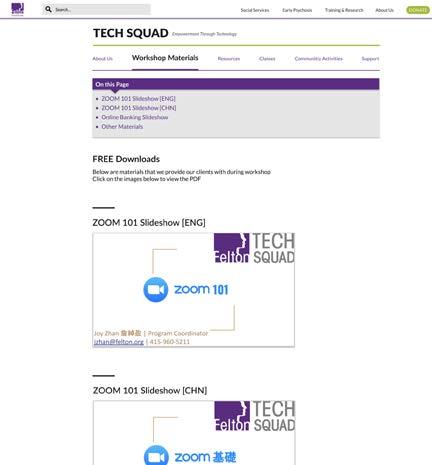
Now that elements and features have been designed to be more accessible, it can now help facilitate and deliver the resources and services Felton has to aging users
Users now have somewhere to click whether they are looking to help themselves within the “Workshop Materials” page or ask for help in the “Support” page
Users can register for classes that they would be interested in such as “Zoom 101”
Conclusion:
In this chapter, it has presented the problem in which aging individuals are continuing to feel excluded from resources within the internet. With the presented problem as well as the development of three possible hypotheses, further steps shall be taken to solidify the problem and ultimately develop a proposed solution.



Chapter Four

Introduction:
The final proposed design solution was now added to an additional comparative analysis, evaluating this project against the existing websites. Also, the solution was presented to experts who have various disciplines that relate to the projects. Their feedback will eventually lead into the future steps of further refining the project. User testing was also conducted to measure the effectiveness of the website as well as receive more beneficial insight.
Comparative Analysis with Design Concept
In another comparative analysis, this design was measured against the existing website that were compared in chapter two. The final solution checks out these criterias including a site that is aesthetically pleasing, supportive, accessible, navigational, providing useful materials, and informative.

Feedback
Feedback was given by the initial panel of experts as well as from a new expert who leads the IT department at Felton. Starting with Edith, she would love to see the implementation of more images and graphics as a heavily worded website may be too difficult for those with a short attention span. She likes the extra details that go into indicating what page a user is on within the navigation bar.
Another expert I was gladly able to connect with was Biwesh, the Associate Director of IT at Felton. He took a look at the prototype and thought it was great work. He suggested the possibility of including calendars in the support section for one on one meetings, as well as another calendar for the classes meeting. He also noted to include contact information in the support page.
Feedback (cont.)
Joy Zhan notes that this concept is a great foundation that organizes the content well. She notes that having a long list of Workshop Materials has its pros and cons. Although they might be able to download slideshows and pamphlets, they could be missing out on meaningful guidance that could come from a Tech Squad member.
Anita Wilhelm states that the overall functionality and navigational aspects of the website are great, but there’s always room for improvement. She notes that an organization of content could use some work and that it would be important to consider the content from a narrative standpoint. Should workshop materials be right after the ‘About Us’ page? Or perhaps after the classes page?
User Testing
I had Hermie Gordola perform a task in which he could locate a downloadable file and download it. Hermie is 64 years old and uses a computer nearly every day. He is currently retired, but taking Zoom classes on accounting. In his user testing, he was immediately able to identify the Materials page, and even click to download a resource he actually wanted, which was ZOOM 101. The minimal amount of time to recognize a page was a measure of effectiveness.

Next Steps
Conclusion
Some of the next steps include implementing the design into Felton’s existing Tech Squad webpage. There are a few changes to be made such as renaming tabs from “Workshop Materials” to “Learning Materials.” Also creating more physical resources that can deliver the website by including barcodes.
Regardless, this project has laid a foundation to create a much more age-accessible website that can assist aging communities in their journey to understanding the current digital and technological era.
This chapter analyzed the effectiveness of the final design solution. Elements such as organization and the look of content can be improved, and experts will continue to provide feedback in order to maintain the direction this project has established.


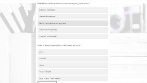
Appendix: Referenced Survey Questions:
Bibliography
• Curran, Kevin, and David Robinson. “An Investigation into Web Content Accessibility Guideline Conformance for an Aging Population.” International Journal on ELearning, vol. 6, no. 3, 2007, pp. 333-349. ProQuest, http://jpllnet.sfsu.edu/login?url=https://www-proquest-com.jpllnet.sfsu.edu/scholarly-journals/investigation-into-web-content-accessibility/docview/210365284/se-2?accountid=13802.
• “DIGITAL LITERACY: SUCCESSFUL AGING IN THE DIGITAL SOCIETY.” The Gerontologist 55.Suppl_2 (2015): 731. Web.
• Etcheverry, Isabelle, Baccino, Thierry, Terrier, Patrice, Marquié, Jean-Claude, and Mojahid, Mustapha. “Age
Differences in Information Finding Tasks: Performance and Visual Exploration Strategy with Different Web
Page Layouts.” Computers in Human Behavior 28.5 (2012): 1670-680. Web. • “Older Adults’ Perceived Sense of Social Exclusion from the Digital World.” Taylor & Francis, www.tandfonline.com/doi/full/10.1080/03601277.2019.1574415.
• Prodromou, M, and Lavranos, G. “Identifying Latent Needs in Elderly Digital Literacy: The PROADAS
Study.” European Journal of Public Health 29.Supplement_4 (2019): European Journal of Public Health, 2019-11-01, Vol.29 (Supplement_4). Web.
• “Resources to Bridge the Digital Divide Among Older Adults.” Resources Bridging the Digital Divide Among Older Adults | California Department of Aging - State of California, aging.ca.gov/covid19/Digital_Divide/. • Sacker, Amanda, Ross, Andy, MacLeod, Catherine A, Netuveli, Gopal, and Windle, Gill. “Health and Social
Exclusion in Older Age: Evidence from Understanding Society, the UK Household Longitudinal Study.” Journal of Epidemiology and Community Health (1979) 71.7 (2017): 681-90. Web. • Saleh, Khalid. “The Importance of Online Customer Reviews [Infographic].” Invesp, 11 Apr. 2018, www.invespcro.com/blog/the-importance-of-online-customer-reviews-infographic/. • Schreurs, Kathleen, Quan-Haase, Anabel, and Martin, Kim. “Problematizing the Digital Literacy Paradox in the Context of Older Adults’ ICT Use: Aging, Media Discourse, and Self-determination.” Canadian Journal of
Communication 42.2 (2017): 359-77. Web.
• “Senior Intervention Hotline for Crisis Support Services: IOA Friendship Line.” Institute on Aging, 9 Dec. 2020, www.ioaging.org/services/all-inclusive-health-care/friendship-line. • Tam, Sabrina, et al. “Home.” Community Tech Network, www.communitytechnetwork.org/. • “Tech Squad.” Felton Institute, felton.org/social-services/seniors/techsquad/. • (WAI), W3C Web Accessibility Initiative. “Accessibility Principles.” Web Accessibility Initiative (WAI), www. w3.org/WAI/fundamentals/accessibility-principles/#adaptable. • Xavier, André J, D’orsi, Eleonora, De Oliveira, Cesar M, Orrell, Martin, Demakakos, Panayotes, Biddulph, Jane
P, and Marmot, Michael G. “English Longitudinal Study of Aging: Can Internet/e-mail Use Reduce Cognitive
Decline?” The Journals of Gerontology. Series A, Biological Sciences and Medical Sciences 69.9 (2014): 1117121. Web.


