7 minute read
GOING DUTCH
This exquisite South African home references traditional Cape Dutch architecture and creates a contemporary new order with a vineyard and a gin garden.
WORDS GRAHAM WOOD PHOTOGRAPHY GREG COX
The winelands and valleys around Franschhoek, a small town in the Western Cape Province of South Africa, are some of the most beautiful anywhere in the world. Perhaps because of the area’s French heritage via the Huguenot settlers who began establishing vineyards here more than 300 years ago, new houses here often mimic Provençal, or sometimes Italian, styles.
The owner of this Winelands home wanted a chic, contemporary take on traditional Franschhoek architecture, and had a clear vision and comprehensive brief for the architect, Martin Kruger. It’s very much a working house – made for entertaining, relaxing and appreciating nature. “The vision was driven very much by the way I like to live,” says the owner. “I love having friends to stay, cooking together and listening to great music, but I also appreciate the tranquillity of the village and the calm of this beautiful art-filled space.”
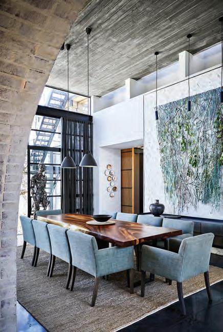
MADE FOR ENTERTAINING
The home owners love entertaining and having friends to stay in this beautiful art filled space.
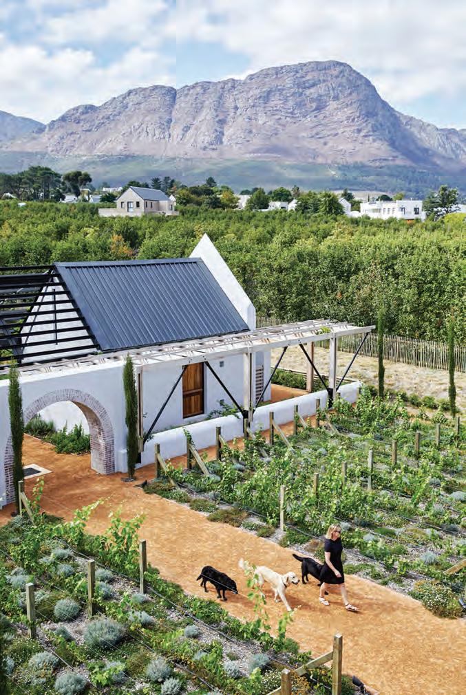
The owner had, as she puts it, “kissed a lot of frogs” in her long search to find this idyllic spot, not far from the village. It was a pear orchard – hence the name “Le Poirier”, the place of pears, with a stream running through it, mature oak trees and incredible mountain views. “It just had a presence,” she says. “If you stand on the roof, you can see very little that’s man-made, but you can see everything that nature gave.”
She was very clear that she wanted a design in which “architecture, interiors and landscape design were completely integrated”. She had a vision of a house surrounded by gardens, vines, veggies, fruit and olive trees, all to be reflected in the choice of art and interior palettes, too. She was after a sense of “connectedness” with the environment.
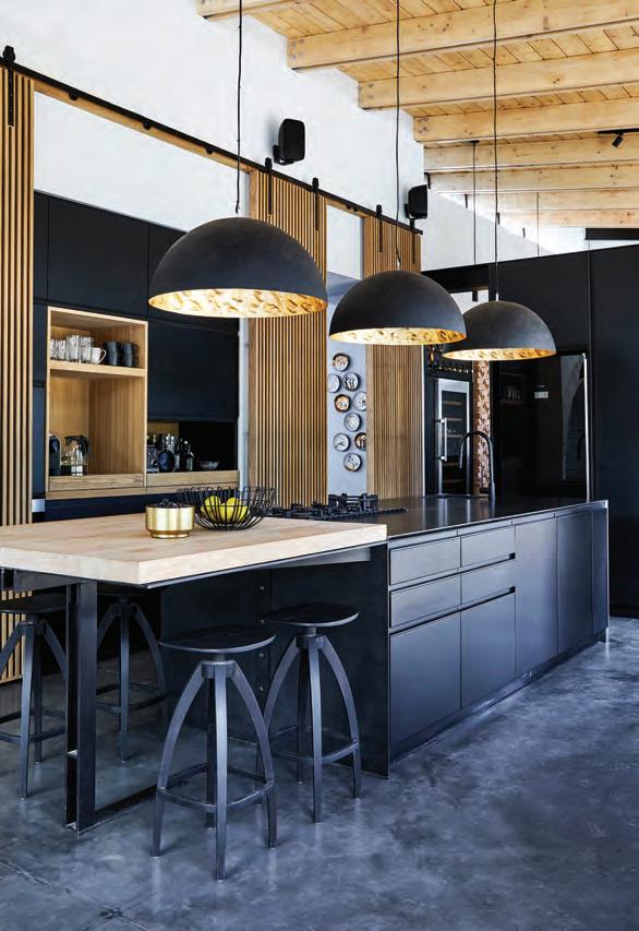
INDUSTRIAL FARMHOUSE
Modern industrial style meets farmhouse chic in this striking kitchen.
Together, over several years (and many a bottle of wine), she and Martin, with input from the interior designer, many friends and later the landscaper Danie Steenkamp, developed a complex and intricate plan for what became at once an architectural statement, and the opposite of a statement piece.
The house has two personalities – the southfacing entrance references a Cape Dutch manor house, whereas the house’s river side has a more modernist, industrial design language.
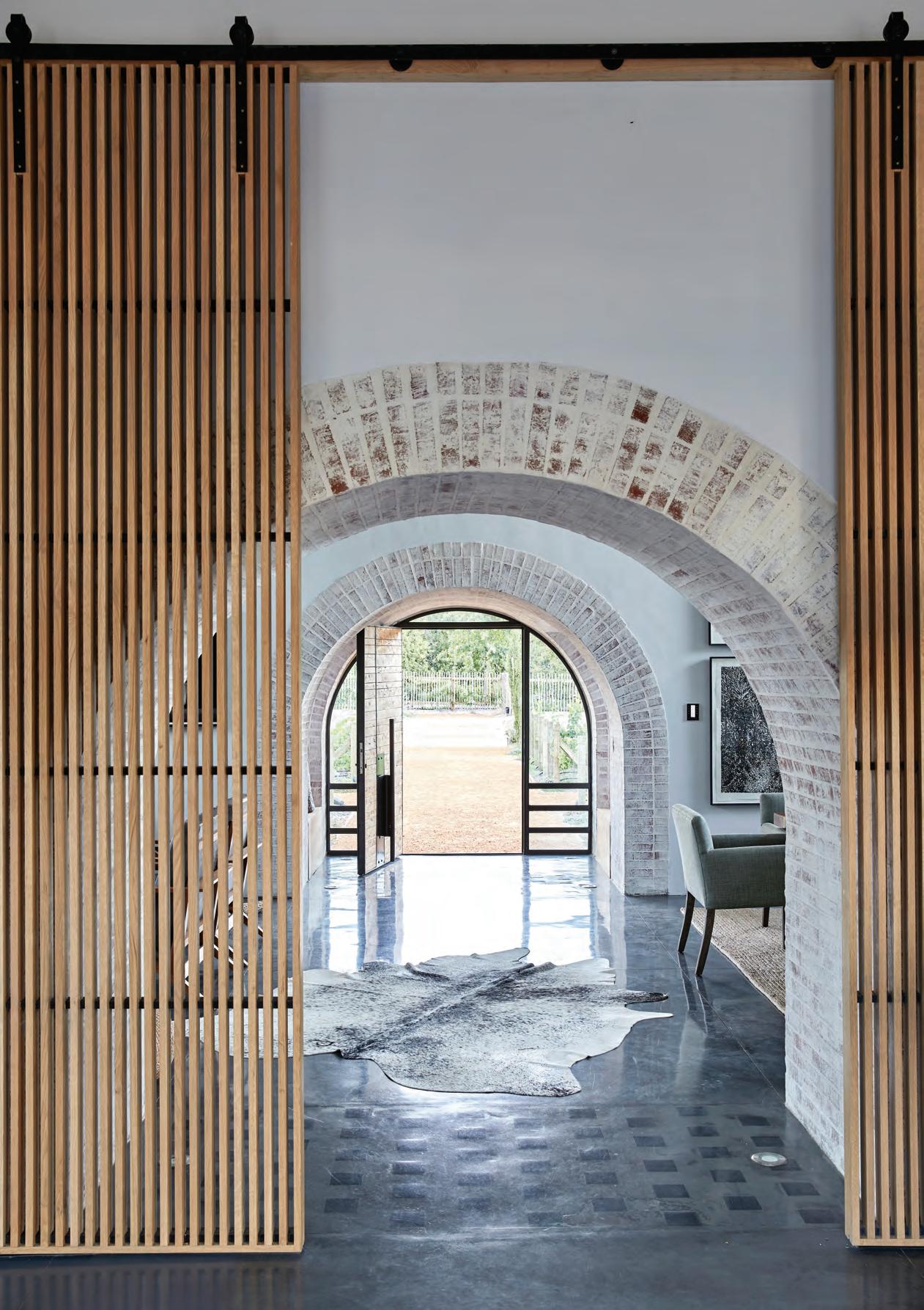
You enter the property from the parking area through the first of a series of arches, designed in homage to the arches and vaulted ceilings of historical Cape estates. The arches are repeated inside the house and throughout the gardens and courtyards, acting as interleading elements, creating gateways and stitching together the interior and exterior “rooms”. It’s hard to draw a line where architecture ends and landscape begins.
The manor house’s arched front door faces onto the vineyard and opens directly into the centre of the house, a high-volumed space holds the main living areas – the more formal sitting and dining rooms, and an informal living area and kitchen. With a simple but ingenious natural ventilation system, apart from being the cosy heart in winter, this cool volume also becomes a retreat when it’s too hot to sit outside in summer. Extra-height French doors open up onto a courtyard with a mature olive tree on either side of the formal space so that the garden can be brought inside.
The house is further purposefully divided for the seasons: there’s a dedicated summer bedroom on the western side and a winter bedroom towards the east. The owner and her partner migrate between them seasonally without having to move their wardrobes! The high, top-hung slatted timber screens can close off parts of the house or open them up as they’re needed, so you can simply close off the wing you’re not using according to the season. “The idea is that if we’re there on our own and not using the whole house, we can close parts off and make it shrink, so the house has a kind of flexibility to it.”
The natural stone wall at the entrance was built with rocks harvested from the site. Fluted concrete ceilings bear the imprints of sandblasted timber planks, another way of drawing nature into the architecture. In fact, the front door, details around some of the windows and a feature wall behind the bar are all made from wood from the pear trees that were removed to make way for the house.
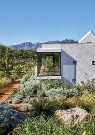
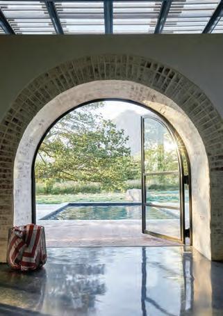
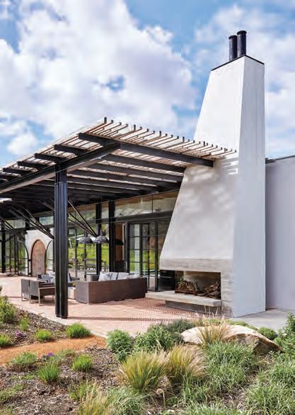
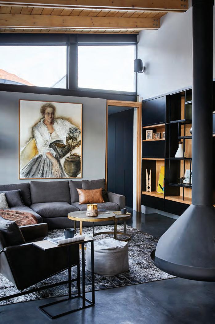
The walls are thick and sturdy like the wide stone walls of early Cape Dutch houses. In a time when environmental sustainability is a key concern, vernacular design has some useful lessons – in a climate with extremes of hot and cold, thick stone walls keep the heat out during the day, but release the embodied warmth they’ve gathered at night, so the temperature is always comfortable.
Other details such as the slim double roof beams pay a kind of homage to the big, heavy beams Cape heritage homes would have had. To try and bring those in now, Martin says, would be “fake”. Instead, they’re reinterpreted in an ongoing, playful dialogue with the traditional features of vineyards and wine cellars.
Landscaper Danie Steenkamp worked closely with the architect and owner, dovetailing the courtyards and gardens with the broader landscape and architecture. While the main court is devoted to the vineyard, the others have a vegetable garden, olive grove, and the “gin garden” with lemons, limes, grapefruit, oranges, and rosemary mix sundowners.
Other architectural features such as the water furrow (typical of Cape village design) in the citrus grove and the pond in the vegetable garden carry on the architectural “essay” on Cape vernacular that the house plays out.
Rainwater is harvested and stored, and sustainability worked into many aspects of the design. “We feel much more in touch with nature, with farming, and an appreciation of what the farmers in our country are going through right now, albeit on a very small scale,” says the owner.
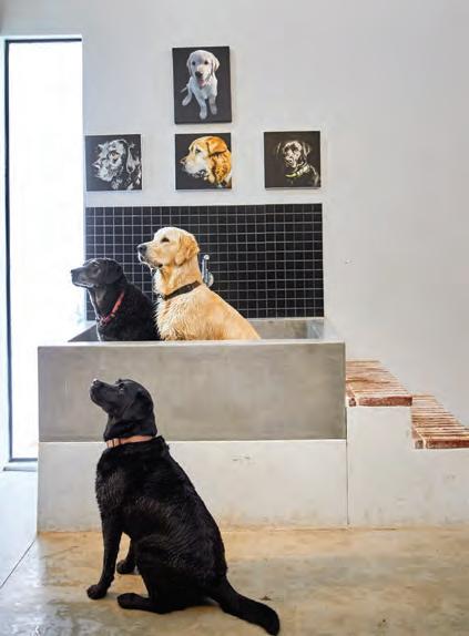
ANIMAL SANCTUARY
The family dogs enjoy their very own bath in the substantial home.

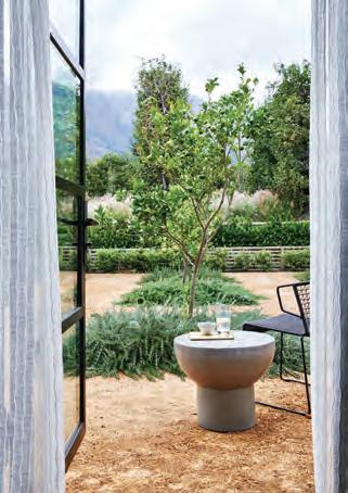
OLD MEETS NEW
The house has been lovingly restored with modern timber touches amongst the original stonework.

As much as it is fun to stroll through the garden and select herbs for a gin, there’s a farm-to-fork philosophy at play – ongoing opportunities to make grape juice, and when the vines mature, wine, and to make jam and preserves with the fruit. “Similarly, with the veggie garden, I think one of the most pleasurable things is walking out there and saying, what are we eating tonight? What’s ready to eat?” says the owner.
At the same time, this house seems in harmony with its surroundings, as if it belongs to the land. “I call it my sanctuary,” says the owner. “It’s where I find peace, and it is just such a privilege to be able to live here.”
The way it is both modern and of its place – says the owner, “contributes what becomes quite an amazing property versus something that might have been just a nice house”.
“I think the success of our project was due to the collective efforts of a remarkable team. The core – the architect, quantity surveyor, site foreman and myself – was supported by the skills and good-will of the Dempers building team. In this project, the relationship between the architect and myself was critical. Martin brought great depth and breadth of experience but was always open to my input at every step of the process. His passion for good design, dedication to getting the detail right, and willingness to work with me throughout the process has created a marvellous home and a lifeexperience to treasure.”


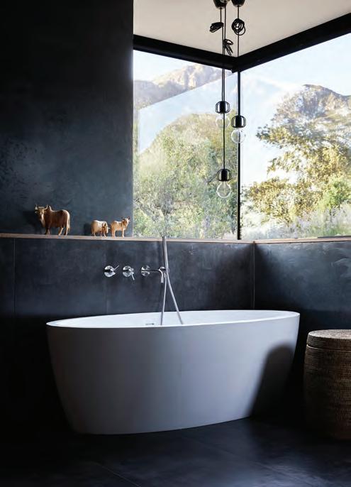
CREATE THE LOOK earthy industrial
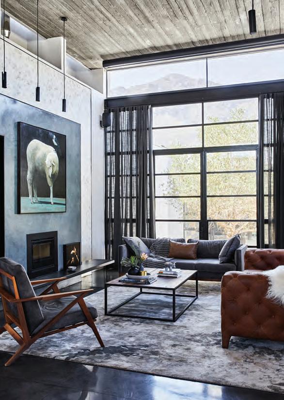




CLOCKWISE FROM TOP LEFT Kiombo Elephant Sculpture gillieandmarc.com; Graz Occasional Chair thedesignstore.co.nz; Storm Rug designerrugs.com.au; Lester Sheep art print margaretpetchellartist.com; Heavy Linen Jute Cushion Covers cittadesign.com; Westminster Feather Sofa dawsonandco.nz; Rina Menardi Royal Vases Collection ecc.co.nz; Icelandic Sheepskin fluxboutique.co.nz

