
1 minute read
Sketches


The following is the first iteration of sketches where i explored This first sketch explored incorporating the key tasks into a mobile screen.
Too many driver interactions to complete a certain task
Advertisement
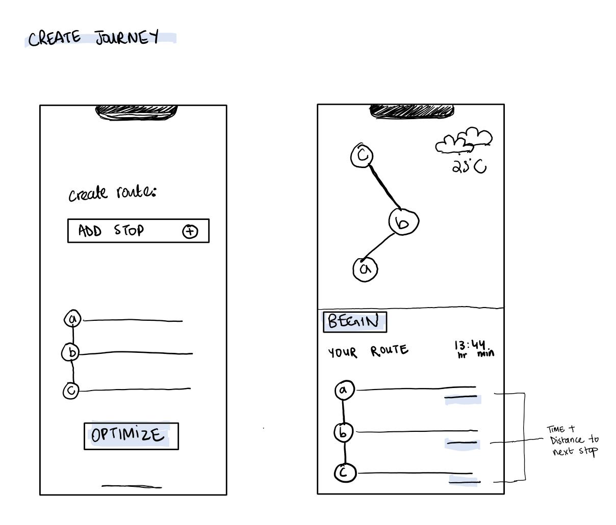
A route is given by the dispatch officer after which the driver inputs it into their maps and optimize.
Possibility of a human error when a driver inputs addresses
A dashboard view while driving may be distracting. It could instead be offered in a non-driving, expanded mode.
A dashboard is a lot to process while driving.

Alerts are a lot to read while driving. Maybe an assistant reads it out.
It was natural to explore a driving view very much like existing navigational apps.
Focusing on the key task unclutters the view

Next, a primary and secondary menu navigation bar was explored to account for the complexity in the app specifically designed for a truck driver.
Keeping primary menu items close to the driver i.e. left most side of the screen (assuming the tablet is fitted on the right side of the driver), and secondary options right at the top. This Layout seems most promising.
Layout with primary and secondary menu items easily accessible to the driver


