MOMENTUM LEADERS IN MOTION
2025 CONVENTION BRAND MANUAL

2025 CONVENTION BRAND MANUAL
This year, we are shifting to predominately using the ALPFA wordmark for Convention rather than the main ALFPA logo. We are doing this to streamline our design process as well as more closely match what is currently being used on our website. You can find the ALPFA Logo and ALPFA Wordmark here. Please see below for their general usage.
Clear space is a safe zone around the logo that should be around the logo at all times. This means that nothing else should be within the logo’s clear space.
Clear space allows the logo to breathe, maximize the visibility and make the best impact.
For ALPFA’s logo, the clear space should be 10% of the width and height of the logo on all four sizes.
Please exercise care when using both the ALPFA logo. DO NOT modify, change or otherwise alter any of the logo elements (color, typeface, proportions, etc.)
We have prepared a few incorrect uses of the logo on this page as an example of what NOT to do.
DO NOT: change the logo’s orientation or rotation
DO NOT: disproportionally scale or resize the logo
DO NOT: change the color of the logo, even if it looks similar OR is another ALPFA color
DO NOT: display the logo with color combinations that render it unreadable DO NOT: add an outline or stroke to the logo or display the logo as an outline. DO NOT: display any additional text or graphics within the logo’s clear space or add any effects to the logo
CONVENTION LOGO
CONVENTION LOGO
You can find the Convention Logo and Theme Wordmark here.
When co-branding with an outside organization or partner being mindful of placement and size is important. The ALFPA logo and the partner logo should be the same size and should follow the clear space regulations for both ALPFA and the other organitization.
When co-branding with the ALPFA logo, separate the two logos with a vertical line in ALFPA grey. Depending on the logos and placement needs, they can be horizontal or stacked. When co-branding with the ALPFA wordmark, separate the two logos with a lowercase “x” in Poppins Black. In this case, clear space rules can be ignored when using the wordmark.
As part of our Partners’ contracts, they receive designated logo placements on signage and other materials. The size of each partner’s logo on these deliverables follows a straightforward ratio, which corresponds to their partnership tier for the convention.
The ratio is based off of the size of our Lead Partner’s logo per signage. In cases where the sizing renders the logo unreadable, please use your best judgment to make it so that the logo is both legible as well as in compliance of the basic size guide.
The Lead Partner logo size will always be considered Full Size, or 100%
Platinum Parter Logos are 75% of the size of the Lead Logo.
Gold Parter Logos are 50% of the size of the Lead Logo.
Silver Parter Logos are 25% of the size of the Lead Logo.
Bronze & General Parter Logos are 15% of the size of the Lead Logo.
Our main typeface for convention will be Latino Gothic. This font was designed by Alfonso Garcia from Latinotype, a Chilean font foundry. This is a variable font on Adobe which allows us to customize width, weight, and slant to maximize our ability to emphasize text while remaining consistent. This font is available for free through Adobe Fonts with a Adobe Creative Cloud subscription. For those who do not have Adobe, our alternate font, which is free to use, is Poppins, which is available on Canva and the Google Suite.
Bb Cc Dd Ee Ff Gg Hh Ii Jj Kk Ll Mm Nn
Pp Qq Rr Ss Tt Uu Rr V Ww Xx Yy Zz 1234567890 !@#$%^&*(),.?
Bb Cc Dd Ee Ff Gg Hh Ii Jj Kk Ll Mm Nn
Pp Qq Rr Ss Tt Uu Rr V Ww Xx Yy Zz 1234567890 !@#$%^&*(),.?
Why these colors? Because of what they evoke. Colors can evoke powerful emotions, and understanding this is how we will create the right atmosphere for the 2025 Convention.
We have chosen our main colors from opposite sides of the color wheel to express the duality of momentum: movement and stillness working in tandem. To bridge the gap, we have included neutrals as well.
Orange is fresh, youthful and creative. It has the warmth of red and the optimism of yellow and communicates activity & energy. It also encourages socialization.
In contrast, blue is a calming color associated with nature and promotes a restful and peaceful environment. These two emotional responses to the colors will give our attendees a range of ways to engage with our brand that is most comfortable for them.
Grey will be our neutral and will give our brand a sense of balance and grounding.
Color hierarchy refers to the strategic use of colors to create a visual order and guide the viewer’s attention in a specific way. This principle is important as it helps prioritize information, establish a sense of flow, and make communication more effective.
The color usage order is used in conjunction with the hierarchy and is, put simply, the order in which colors should be used in succession (For example, in a chart or graph).
Our tone of voice shapes perceptions, drives engagement, and ensures the right experience for attendees, both before and during the event. It’s not just about what you say, but how you say it. We strive to engage, inform, and amplify our community. We are honest and direct, fun and inspiring. Everyone’s path, everyone’s momentum looks different, so keep that in mind as you create brand collateral. 2025 ALPFA Convention is one of dualities: we are walking a line between high-energy and mindful calm. We want to engage our attendees on both sides of the momentum spectrum: movement and stillness.
Our main, overarching graphic within the Convention branding is the intersecting and overlapping lines. It is important that the lines intersect and overlap but also begin and end in the same places. We are using this graphic to convey the concept of how everyone’s momentum and journey is different, but our goals are the same. The lines can be static, but in most cases will be animated to pulse from straight lines to their intersected, curved paths. You can find downloadable graphics and other assets here.
Clickable buttons, callouts and other text boxes should have rounded corners.
EXAMPLE BUTTONS
EXAMPLE TEXTBOX/CALLOUT
Pa destem dolor re officae nimaximus, asit, qui odi tem. Ut re se eatusant aditatio vel et et restin perepeles nonseru ndiaept aquodi tem ut venisit atasped mint aceaque vid quias si asperestecus et omnis siminul lorroressed est, eum vere ea nimagnia sitiand undae. Name nist
Additional patterns and shapes may be used, but be sure to keep them rounded. All shapes within this convention brand should be organic and smooth so as to evoke the feelings of waves or motion.
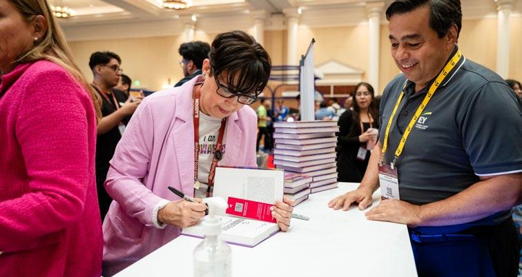
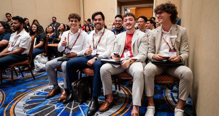
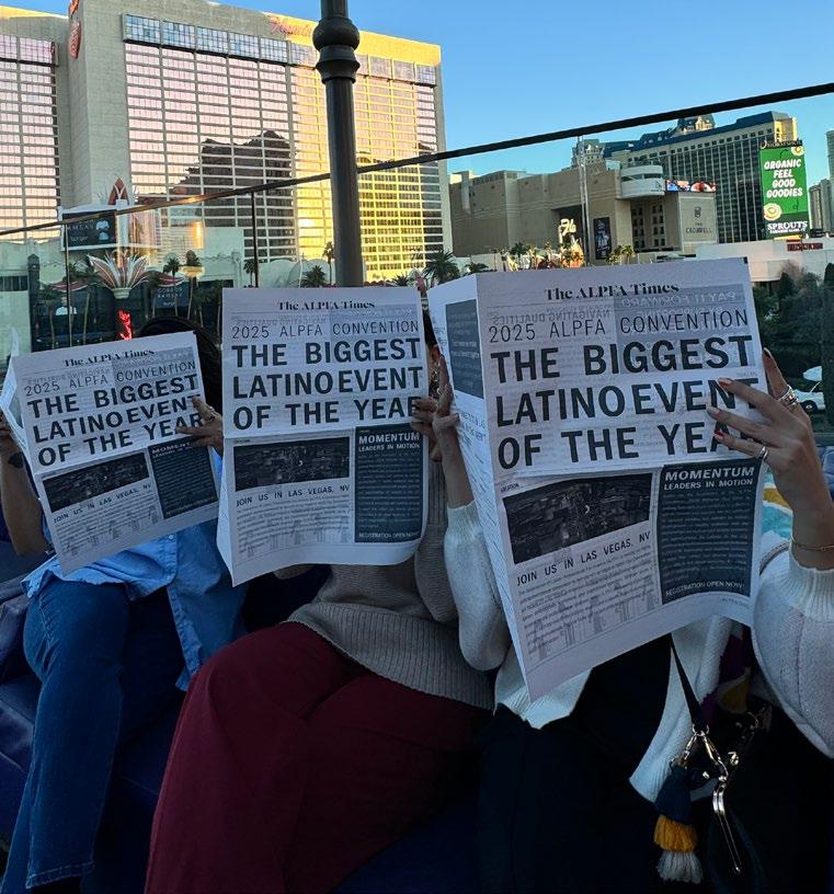
At ALPFA, we strive to use images of our members. You can access our ALPFA photo data bank here. Imagery for this convention should evoke either movement or rest. Candids are preferred over posed photos. If there is any alcohol in the photo, please do not use it or crop it out. Below is a sampling of images that are in the style/mood that we would like for convention.


(alexandra.larson@national.alpfa.org)