

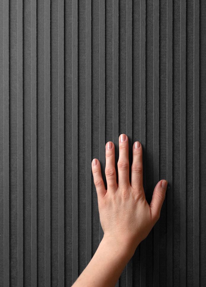
A bold, 3D, through-colored façade panel made to create contrast. EQUITONE [linea] in Graphite creates a visually striking architectural statement with its linear ridged surface and unlimited design possibilities.

Receive your free sample of Graphite EQUITONE.COM

Local codes have improved the regulation of sustainability and energy efficiency in buildings but don’t yet fully address the sourcing of materials and their relative long-term energy costs. In this month’s Focus section, AN considers projects of various scales that rehabilitate damaged industrial sites, recycle construction materials, adaptively reuse existing structures, support landscape explorations, and design new possibilities for familiar elements.
Eight architects in London—Adam Khan Architects, Architecture 00, Mole Architects, SelgasCano, 6a, Barozzi Veiga, HNNA, and David Kohn Architects— have inserted a series of dynamic structures on the rehabilitated site of a former industrial natural gas plant. The stylized facades of Greenwich Design District create an engaging public space for offices, a food hall, and an experimental media center.
Testbeds is a project of New York–based firm New Affiliates with Sam Stewart-Halevy that repurposes mock-ups from construction sites to support community gardens. In Queens, they partnered with the Department of Parks and Recreation’s GreenThumb program to demonstrate how the mock-ups—normally thrown away after use in design and construction projects—can be recycled. The architects hope Testbeds, currently on view at MoMA as part of its New York, New Publics exhibition, can be adopted by developers and expanded to serve other community gardens.
In Cambridge, Massachusetts, TenBerke’s adaptive reuse of the Lewis International Law Center at Harvard surgically rehabilitates Shepley, Bulfinch, and Abbott’s 1957 stone-clad concrete structure, adding square footage by expanding the top floor and reconfiguring the interior to accommodate more flexibility and social interaction.

The Four Rooftop Pavilion, by Los Angeles–based firms Found Projects and >Schneider Luescher, offers public programs within the recently completed Pingshan Children’s Park in fast-developing Shenzhen, China. The site preserves a landscape of banyan, eucalyptus, and lychee trees as a children’s play area to educate the next generation about the value of ecology and the natural environment. Grand Mulberry, in New York’s Little Italy neighborhood, uses custom-designed red bricks manufactured by Glen-Gary to preserve neighborhood character and history. The 20-unit residential building, designed by Morris Adjmi Architects, houses the Italian American Museum on its ground floor and takes inspiration from the 19th-century Italianate style, inflected with Adjmi’s contemporary flair.

In small ways, each facade-forward project makes a difference in its context.


A range of facade projects demonstrates an interest in material flows.


With buildings by Barozzi Veiga, 6a architects, and SelgasCano, among others, Greenwich Design District is an architectural playground.
Architects: 6a architects, Adam Khan Architects, Architecture 00, Barozzi Veiga, David Kohn Architects, Mole Architects, SelgasCano
Location: London
Developer: Knight Dragon
“When David Kohn first told me he was designing some workspaces for North Greenwich which would have giant nude figurative statues by Damien Hirst on the facade I thought he was joking,” said Phineas Harper, chief executive of Open City, a British charitable organization dedicated to making architecture and neighborhoods more accessible and equitable.
Open City moved into the Greenwich Design District when it launched in 2021. Back then some buildings in London’s first purpose-built creative quarter, realized on top of a former natural gas plant, were still
under construction, and they’ve steadily been opening since. A master plan from Allies and Morrison protects views of the adjacent Richard Rogers–designed O2 Arena, capping building heights at four stories. Studio HNNA laid out the circulation, creating a network of mini streets and squares with an array of plots to be filled on the condensed site.
The Design District in this sense is a big architectural experiment—and one that attracted big names. The developer, Knight Dragon, invited eight architects to design two buildings each, with the caveat that all offices work entirely independently. Adam Khan Architects,
Architecture 00, Mole Architects, SelgasCano, 6a, Barozzi Veiga, HNNA, and David Kohn Architects all stepped up, with the latter making good on its promise of nude figurines. The latter’s two buildings, A4 and B4, are laced with playful references. Kohn used the glowing green of James Stirling’s Staatsgalerie for window framing and oversized brick pillars to support the base of A4, which is topped by a Hollywood-esque sign that reads DESIGN DISTRICT. Headless female nudes courtesy of Damien Hirst adorn A4’s corners. Six niches in B4 display works from local artists.
 TARAN WILKHU
May 2023

Less colorful, but still just as fun, Architecture 00’s C1 boasts a basketball court on its roof and a metal mesh net as the building’s envelope, allowing floor-to-ceiling sliding windows to fully open without the need for a balustrade. From above, the orange basketball court makes for a good photo, in contrast to the proudly gray building, while at ground level, the mesh provides porosity, allowing the building to be easily read. With its corner plot, the bright orange makes C1 a handy portal to the area. D1, by contrast, also by Architecture 00, is much more understated, eschewing any netting but retaining a set of expressive concrete decks.
Unlike any other firm, 6a architects opted for two almost identical buildings, both easily recognizable by their dramatic slanting roofs.
“If you do two buildings and one is better than the other, shouldn’t you just do the better one twice?” Tom Emerson, cofounder of 6a, related to AN in 2020. The two buildings, A2 and B2, are in part inspired by the late American artist Richard Artschwager, attempting, as Emerson remarked, to turn his “graphic, Pop Art expression into a sculptural form.” Architecturally, this manifests as a pair of buildings that celebrate the layers of construction, with a diagrid imprinted onto
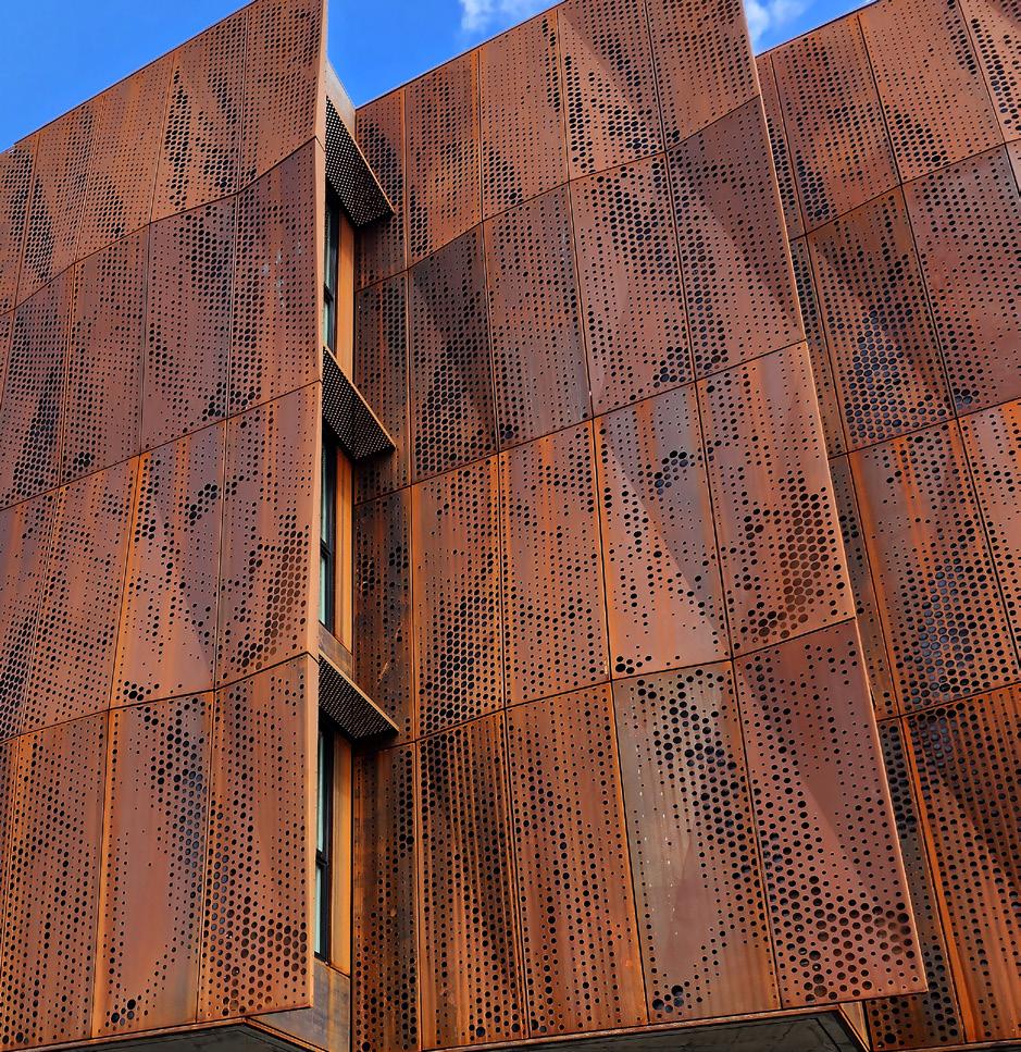
Previous spread: London’s Design District exhibits a museum surveylike variety of facade treatments, including window walls, extruded aluminum, metal mesh, diamond-shaped grids, and Cor-ten steel.


Top, left: Oversized brick pillars support the base of David Kohn Architects’ A4, topped by a DESIGN DISTRICT sign. Headless female nudes by Damien Hirst adorn its corners.
Left: A green grid referencing James Stirling’s Staatsgalerie frames glass blocks, masonry, and windows in A4’s facade.

the slanted roof. “It’s not an explicit reference but allowed us to enjoy working with these architectural products and layers which are ordinary in themselves but together can be interesting and playful,” added Emerson.
Mole Architects takes the opposite approach. “Mole’s two buildings [C2 and D2] are different from each other—one compact and angular, the other stacked like a ziggurat,” said director Meredith Bowles. “[They] play one against the other, the larger one heavy and solid, the smaller one with changing colors, like the flame of burning gas.” Internally, however, the two share the same sensibilities:
Above: A corrugated aluminum facade meets the slanted diagonal roof of 6a architects’ twin A2 and B2 buildings.
Made entirely from timber, they evoke the qualities of an old warehouse. C2 features stepped sides and diagonal Cor-ten cladding, while D2 serves up a shimmering facade—or more precisely, pyramidal profiled cladding with a two-tone color that changes with the direction of the light. Fins surrounding the windows in dichroic glass refract colored light over the facades. “The colors are inspired by a gas flame,” said Bowles, who added that the buildings are a nod to Victorian gas holders that originally occupied the site.
Along with its layout of the district, HNNA contributed two buildings: D3, which remains

Left, above: Building C2 by Mole Architects features a ziggurat-like volume of stepped sides and diagonal Cor-ten cladding, while Architecture 00’s C1 has a metal mesh net as the building’s envelope.


Left: The colors of the two buildings by Mole are inspired by a gas flame, referencing the 19th-century gas plant that originally occupied the site.
Above: Extruded aluminum wraps around a timber and concrete structure in HNNA’s C3 building designed as a coworking space.
unbuilt while authorities finalize plans for a car tunnel beneath the district, and C3, whose tall, thin windows are fissures in an undulating white exterior inhabited by pocket-sized workspaces. Roz Barr Architects designed the interiors for Bureau, a coworking members’ club featuring a sumptuous lounge dubbed the Salon, dressed top to bottom with striking red furnishings.
Spanish outfit SelgasCano made extensive use of ETFE in the studio’s B1 and Canteen, the latter acting as the district’s central nexus. A bulbous, translucent, caterpillar-like food hall spans two levels, its giant doors swinging open,
displaying the mechanics celebrated through its bright yellow structure. B1, the most recent building to finish on site, retains the character of Canteen within its box plot. Working areas are connected by platforms and winding stairs that traverse a four-story winter garden.
Buildings A1 and D4 by fellow Spaniards Barozzi Veiga are comparatively orthogonal in form, adding delight through a polished aluminum facade. Cementing the district as a creative hub for the long term, A1 is entirely occupied by the Ravensbourne Institute for Creativity and Technology, a kind of university-sponsored experimental design-and-media makerspace.

Pilkington
The thermal performance of conventional double glazing in the same thickness as a single pane for historical restoration. Bring your historical buildings up to code while keeping the same look and feel with Pilkington Spacia™.

1.800.221.0444
buildingproducts.pna@nsg.com
www.pilkington.com/na

Finally, London-based Adam Khan Architects’ A3 offers a moment of architectural respite. Its subdued concrete facade uses awnings on the southern and eastern sides to add character and limit solar heat gain. B3, meanwhile, is on hold, also awaiting transportation infrastructure.


“Today, [the] Design District supports an ecosystem of 160 businesses, encompassing individual makers, ambitious start-ups, groundbreaking social enterprises, and industry leaders,” said Design District director Helen Arvanitakis.

“It’s not a template that should be rolled out everywhere,” Harper offered. “But as a playful and fully pedestrianized cluster of characterful pavilions, it is fantastic place to base the Open City team and has much to teach the po-faced bricky baldness which defines so much new London architecture.”
Jason Sayer is a writer and lecturer based in London. Previously at AN and later the London School of Architecture, he works for U.K. publication Architecture Today
Above: 6a architects designed A2 and B2, buildings whic are in part inspired by the late American artist Richard Artschwager. Right, top: SelgasCano made extensive use of ETFE for Canteen, a bulbous, translucent, caterpillar-like food hall that spans two levels. Right, bottom: Phineas Harper of Open City, headquartered in the district, described the area as a “playful and fully pedestrianized cluster of characterful pavilions.”
The cutting-edge ultracompact stone provides comprehensive, customized, and sustainable façade solutions. Dekton® meets the most complex technical requirements and o ers unmatched beauty, durability, and resistance.

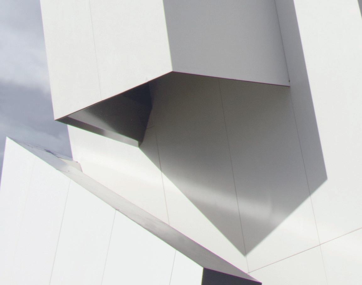


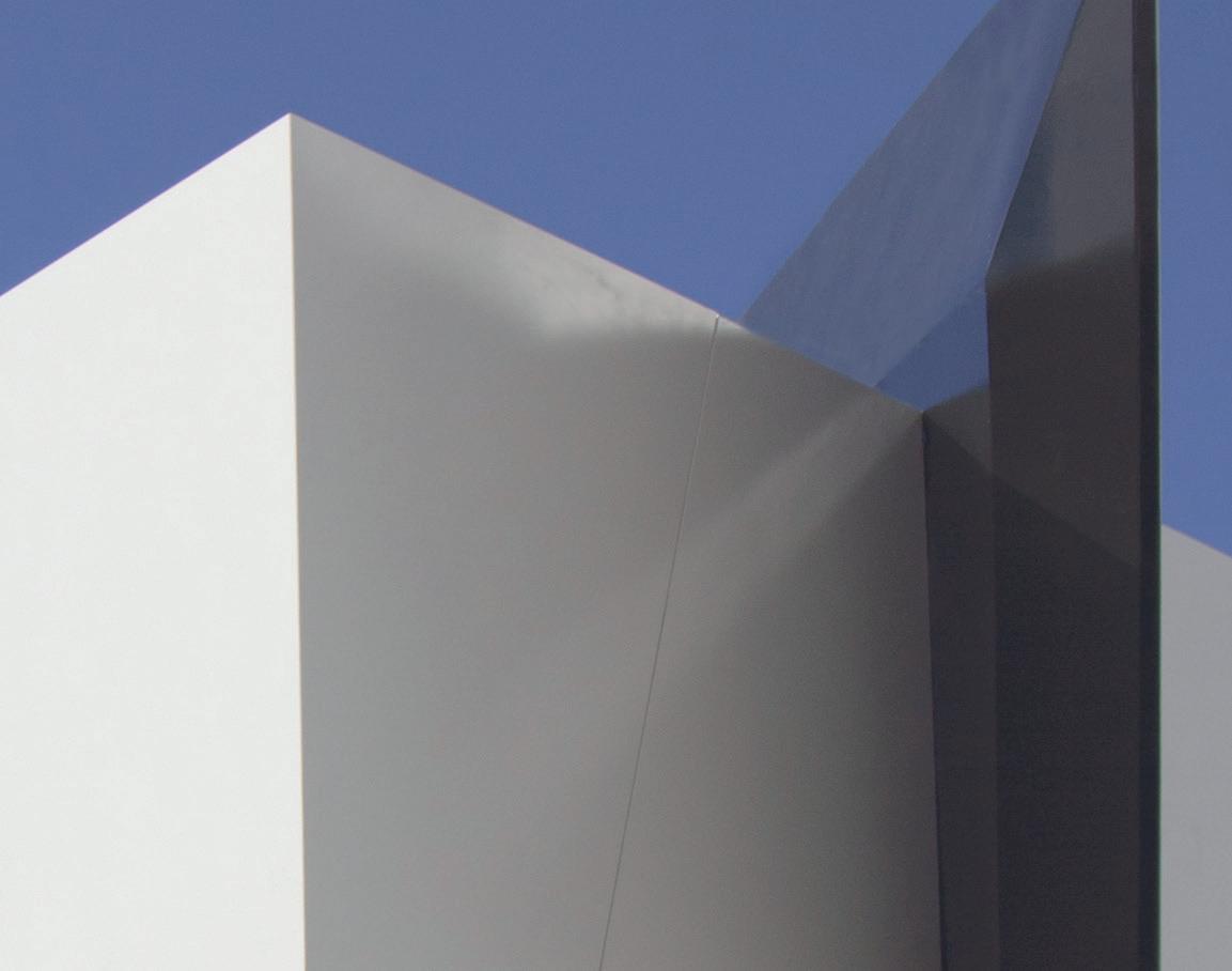

To enhance the strength and beauty of natural materials like stone, metal, wood, and clay, these composite products incorporate scientifically engineered materials to create reliable and costeffective cladding solutions. To combining aesthetics with performance, consider the following organically inspired options deliver reliability across a spectrum of sensibilities.
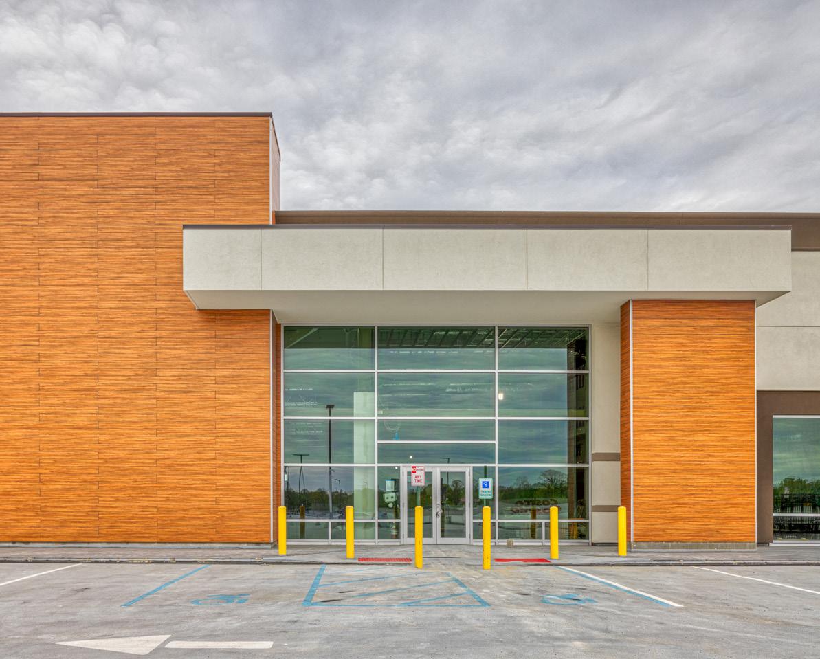

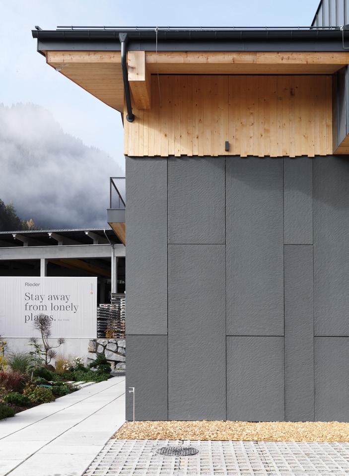
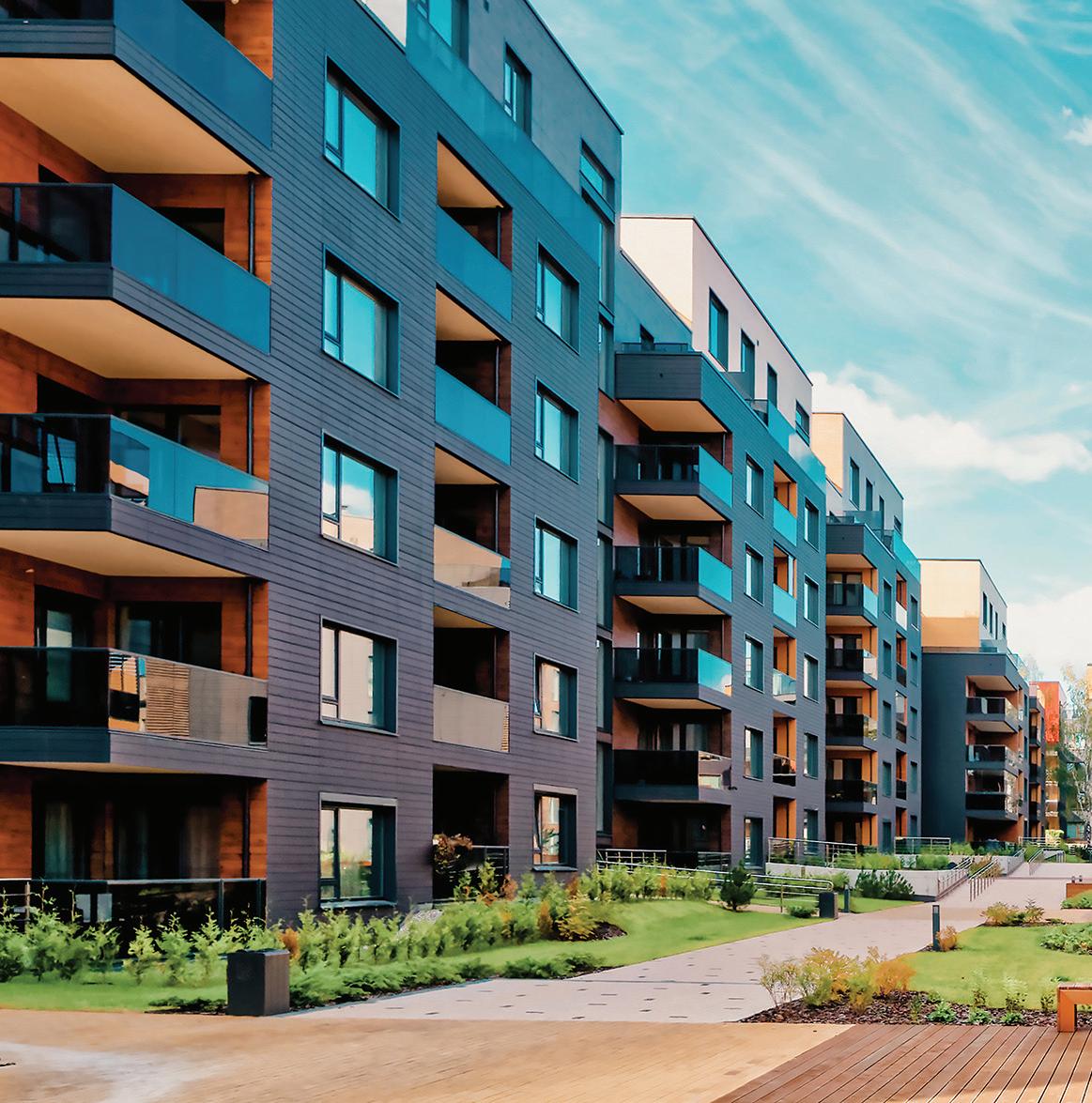
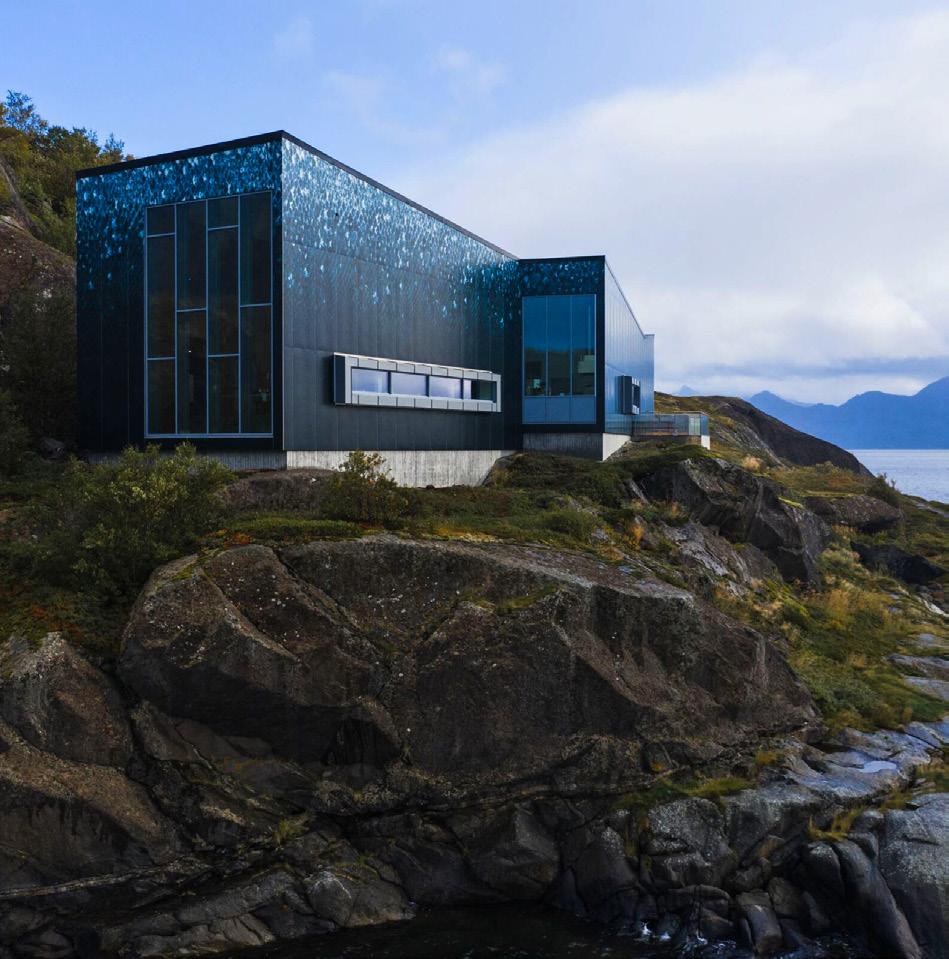
 Sophie Aliece Hollis
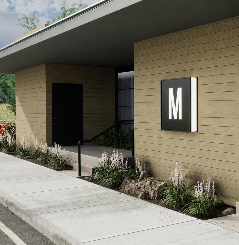
Moistureshield Cladding Moistureshield moistureshield.com
Steni Engineered Stone Rainscreen Panels Omnis omnisusa.com
K-Roc HF Series Kingspan kingspan.com
EASY MEG Abet Laminati abetlaminati.com
StoCast Wood Sto Corp. stocorp.com

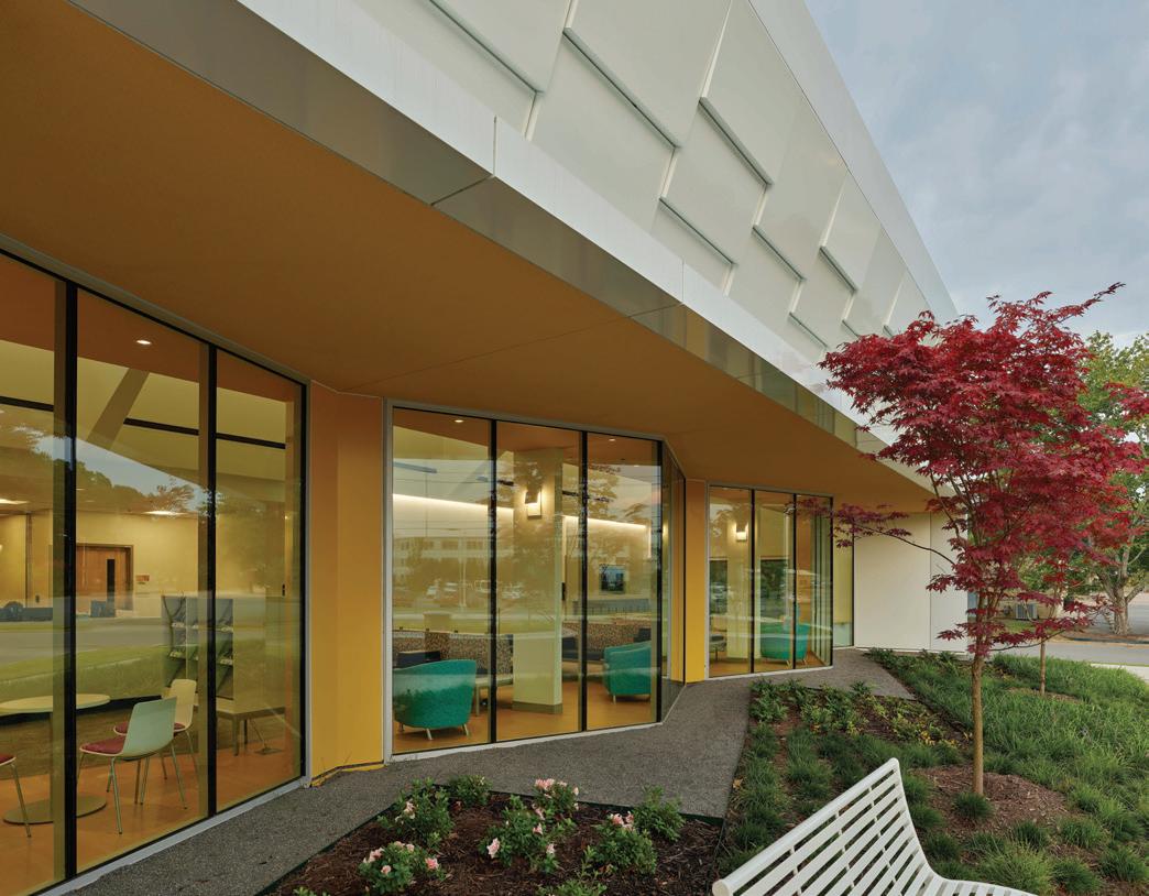
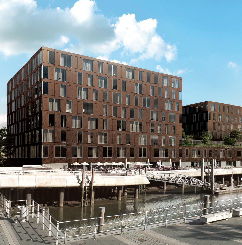
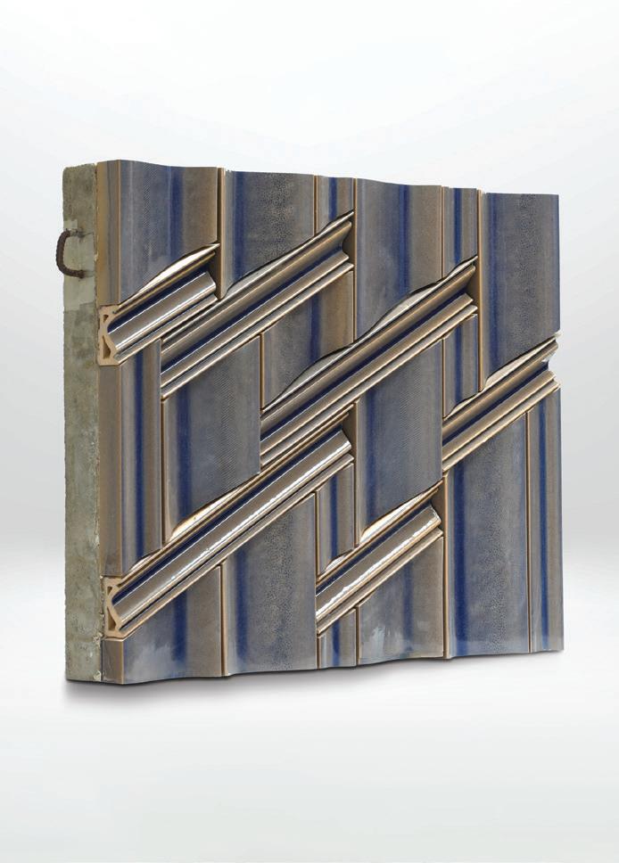
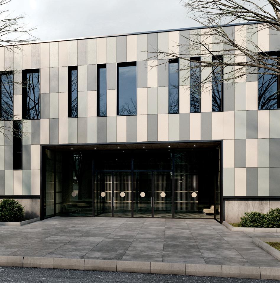
By harnessing the power of natural minerals, the following ceramic and cementitious facade panels stand up to the elements. Available in a multitude of colors, shapes, and sizes, cladding possibilities are not only increasingly varied but also increasingly durable thanks to the latest developments in mineral mixing and manufacturing.



 Sophie
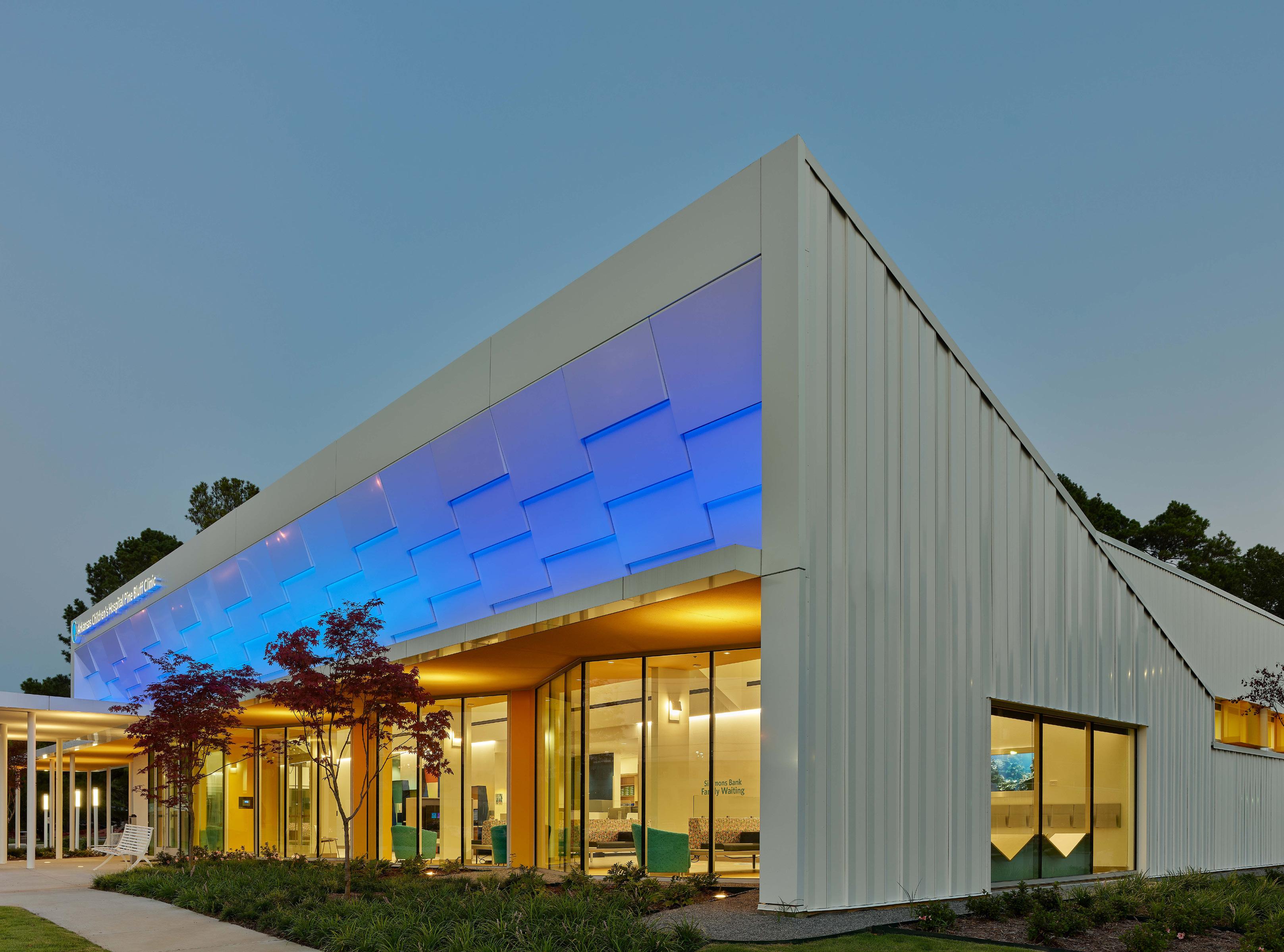
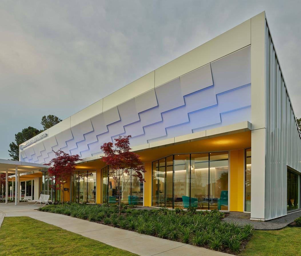
EQUITONE [linea] in Graphite Equitone equitone.com
Exa-TECH Exagres exagres.es
Dekton Kraftizen Cosentino cosentino.com
TAKTL SOLA TAKTL taktl-llc.com
TerraPreCast Boston Valley Terracotta bostonvalley.com
Design2Curtain Florim florim.com
Terracotta Baguette Panel Shildan shildan.com
 Vivid concrete facade made of öko skin slats.
rieder.cc made in the US
The Highlands, Arlington, Virginia, USA, STUDIOS Architecture
Testbeds recycles mock-ups once treated as construction waste into investments in public space.
Project leads: New Affiliates and Sam Stewart-Halevy
Location: New York
Structural engineering: Silman Engineering
Contracting: Think Construction
Mock-up storage: AM Glass
Support: Cape Advisors, The Architectural League of New York, The Garden Conservancy, and NYC Department of Parks and Recreation’s GreenThumb program

Architectural mock-ups are curious creatures. Peeking over construction fences, the isolated chunks of facade often appear like sculptures. However, unlike a Rachel Whiteread cast, once the assemblies have been tested for durability or visual cohesion they are typically thrown away rather than sold at the Gagosian. Designers of the project Testbeds— New Affiliates cofounders Jaffer Kolb and Ivi Diamantopoulou and architect and PhD candidate at Columbia GSAPP Sam Stewart-Halevy— were inspired to test alternative afterlives of the mock-ups through reuse instead of waste.
Testbeds proposes the reuse of architectural facade mock-ups from many of New York’s construction sites as support structures for community gardens. The city owns over 500 locations, which are run by volunteers. Last year, the initiative, with support from the Department of Parks and Recreation’s GreenThumb program, completed its first pilot project in Rockaway, Queens.
The effort is also currently on view in the exhibition Architecture Now: New York, New Publics at the Museum of Modern Art as one of 12 projects that consider the city as a “fragile ecosystem in need of care.” In the exhibition, Testbeds exists as a built and speculative project through renderings, a board game, and a video of daily life at its first location. Hyperrealistic renderings of different mockups propel viewers into the near future, with a white speckled panel tilted to form a quasi-Aframe, a greenhouse popping out of one of its openings. Another facade stays upright, forming a theater. Flipped horizontally in another, windows become skylights. The circular board game imagines the city as a “reconfigurable space instead of a space of consumption” where the players negotiate matching architectural prototypes with community gardens across the boroughs. Tiny 3D-printed mockups crisscross their way to new green homes. In the video that flanks the corner, real volunteers work with the lush produce of harvest time while the first built Testbed, dubbed The Garden by the Bay, glints in the sun. StewartHalevy told AN that “the exhibition at MoMA seems to have captured the imagination of many different ‘publics’ in the city, and it has been wonderful to see the work of The Garden by the Bay gain visibility on this stage.”
I visited this garden on a misty spring weekday in Edgemere, a neighborhood on the Rockaway Peninsula in Queens. Jackie Rogers and Laquetta Little welcomed me to share their
experience directing the site. The Testbeds project couldn’t have come at a better time. The garden’s president and a longtime Edgemere homeowner, Rogers said the structure “helped people imagine the space” and what it could be. She recounted how, after a couple of years developing the garden near the northern end of the peninsula, watching the structure get built was a very exciting time, from seeing its foundations poured in late 2021 to witnessing its completion in late 2022. Its largest wall is faced in ridged high-performance–concrete panels originally used in a mock-up for a new condominium at 30 Warren Street in Manhattan. The pieces enclose a massive gold-tinged aluminum window frame, with clear twin-wall polycarbonate sheets sliding within the frame that open for airflow and views. Each of the structure’s three rooms combines the programs of greenhouse, toolshed, and gathering space. Aside from the salvaged materials, off-the-shelf materials like corrugated aluminum, raw lumber, and plywood compose the other facades, while CMU blocks and steel columns anchor the pavilion to its concrete floors and footings.
The garden’s organizers are already planning for expansions facilitated by their new Testbed venue. Rogers remarked that it’s “not about working harder [but] about working smarter,” as the garden has already doubled in size to around 15,000 square feet with the acquisition of a neighboring lot. The garden now has about 35 members who regularly volunteer. With its growth in membership and
the Testbeds addition came an increase in visitors, including NYC City Council Member Selvena N. Brooks-Powers, and Girl Scout troops. Rogers and Little are already imagining architectural expansions to accommodate a range of functions from garden support services to a community center. The current wish list includes wi-fi, electricity, PV panels, bug screens, and water access beyond a public hydrant to quench the thirst of vegetables, flowers, grapevines, and fruit trees. Across the street, there are many city-owned vacant lots now destined to become affordable homes under the Edgemere Community Land Trust, and perhaps, Rogers and Little pondered, even more public garden spaces.
Through the first Testbed installation and projections of many to come, Kolb, Diamantopoulou, and Stewart-Halevy imagine that mock-up reuse could become a systematic part of the construction process in New York. When asked about the project’s future, Stewart-Halevy said the team is “now in the process of forming a nonprofit, with the counsel of the Lawyers Alliance for New York, that will lay the legal and financial groundwork for Testbeds to continue.” He also shared that GreenThumb remains a partner in the project, and together they look forward to matching future homes for Testbeds elsewhere in the city.
Angie Door is a writer and designer who lives in Brooklyn.

Previous spread: Clear twinwall polycarbonate sheets and CMU blocks enclose part of the Testbeds structure, which recycles panels from a condominium mock-up.
Top, left: Corrugated aluminum, raw lumber, and plywood constitute other parts of the facade, anchored with steel columns to concrete footings.

Top, right: The community garden organizers use the Testbeds spaces for greenhouses, toolsheds, and gathering spaces.
Left: Testbeds’ protagonists imagine that mock-ups reused from construction sites could become a systematic part of the construction process in New York.

Above: Once the assemblies have been tested for durability and visual cohesion, they can be more widely adopted as supportive community spaces for gardens and other programs throughout the city.

Archiproducts
Date 2022
Location Milan, Italy
Designer Carla Di Benedetto
This was the fifth time Kriskadecor clad the facade of the showroom during Milan Design Week. In this case, in addition to attracting the attention of both locals and visitors, the double-skin facade covered the imperfections of an old building.

Project Ecuador Pavilion
Date 2015
Location Expo Milano, Italy
Designer Zorrozua y Asociados
In the case of Ecuador's pavilion during the 2015 Milan Expo, the folkloric motifs that made up the composition of the façade were a universal reflection of Ecuadorian culture and were inspired by the traditional textile craftsmanship of the Otavalo region. The chain curtains offered the sensation of movement, simulating the flow of the fabrics themselves.

Date 2022
Location Montpellier, France
Designer Archikubik
Finally, we refer to the Kley Group's student residence. Designed by Archikubik, the 11-storey building is in the heart of the new Port-Marianne district. The double skin envelope system provide an intimate filter that shields the view from the public space while screening sunlight. The chains also create a light veil that dematerialises the building, allowing subtle light variations thanks to their slight movement and the delicate, sparkling brilliant finish of part of them.
The façade is the only part of the building that can be seen from the outside and has the function of communicating a message derived from its design. It therefore deserves special attention in every detail. A façade that is well proportioned in terms of colors and materials, which facilitates the connection between the interior and the exterior, will generate an initial attraction for pedestrians, inviting them to enter.
Kriskadecor's exterior cladding combines design and functionality. Thanks to the versatility and lightness of the aluminum links, large surfaces can be covered with infinite creative possibilities, providing color, texture and presence with a system that allows the reproduction of patterns, logos and even images thanks to in-house technology and a dynamic palette of RAL colors tested under solar exposure.
From the outside, its solid appearance provides privacy. From the inside, the transparency of the chain links allows full visibility.

The system, designed and tested to guarantee a safe and durable structure, adapts to the shape of any building, is resistant, quick to install, easy to maintain and extremely light. The chains have been tested with wind gusts of 210 km/h.
In terms of sustainability, the open area of the chain links significantly helps to improve the thermal environment inside the building, reducing heat transfer from direct sunlight, thus allowing its ventilation. Furthermore, Both the chains and the profiles are aluminum, a sustainable and infinitely recyclable material.

The technical department develops ad hoc projects, providing technical, graphic, and artistic support throughout the process, from the conception of the idea to the completion of the project.
kriskadecor.com/en-US/cladding


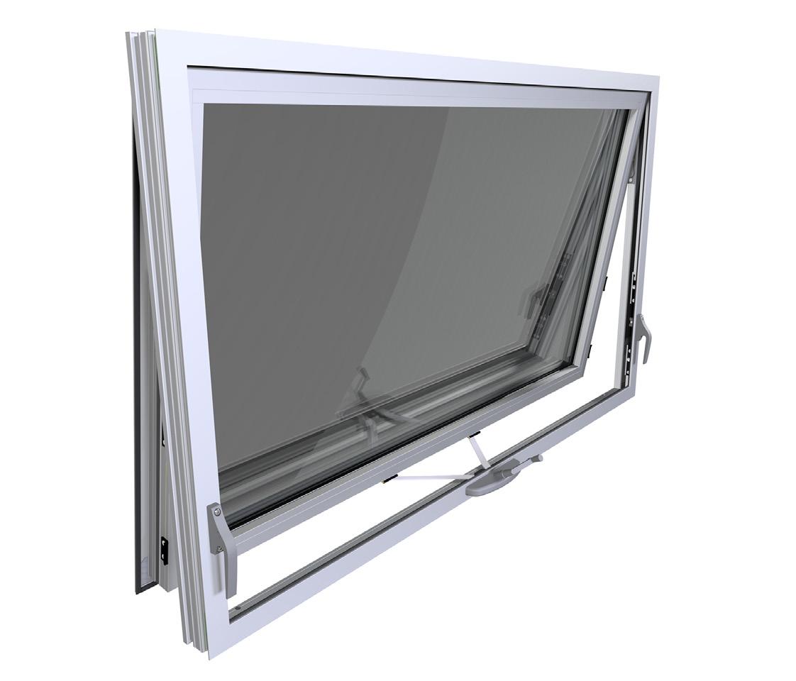
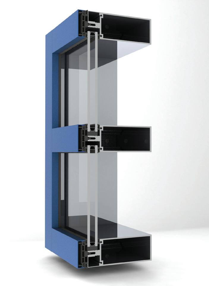
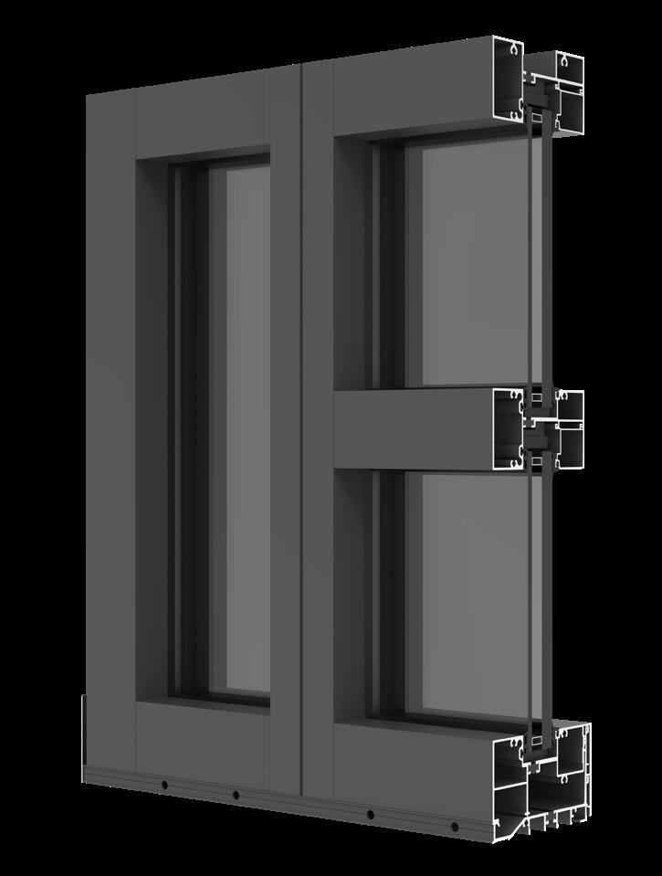
Supported by decades of research and technical innovation, the following manufacturers present a range of new products. From curtain wall and window wall to storefronts and items with integrated solar energy arrays, these glazing systems implement the best engineering to both elegantly and sustainably meet the needs of any building envelope.
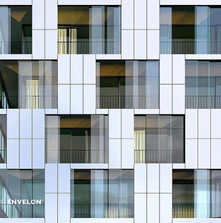
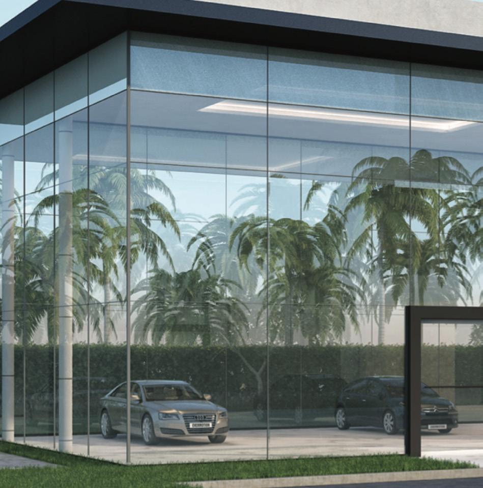
Pioneering Products that Elevate Design and Efficiency. At Kingspan Insulated Panels, we’re pioneering better technologies and methods of building for a low carbon world. Kingspan insulated metal panels are the next generation of building envelope, offering an unparalleled combination of aesthetic flexibility, energy efficiency and thermal, air, water and vapor barrier performance.
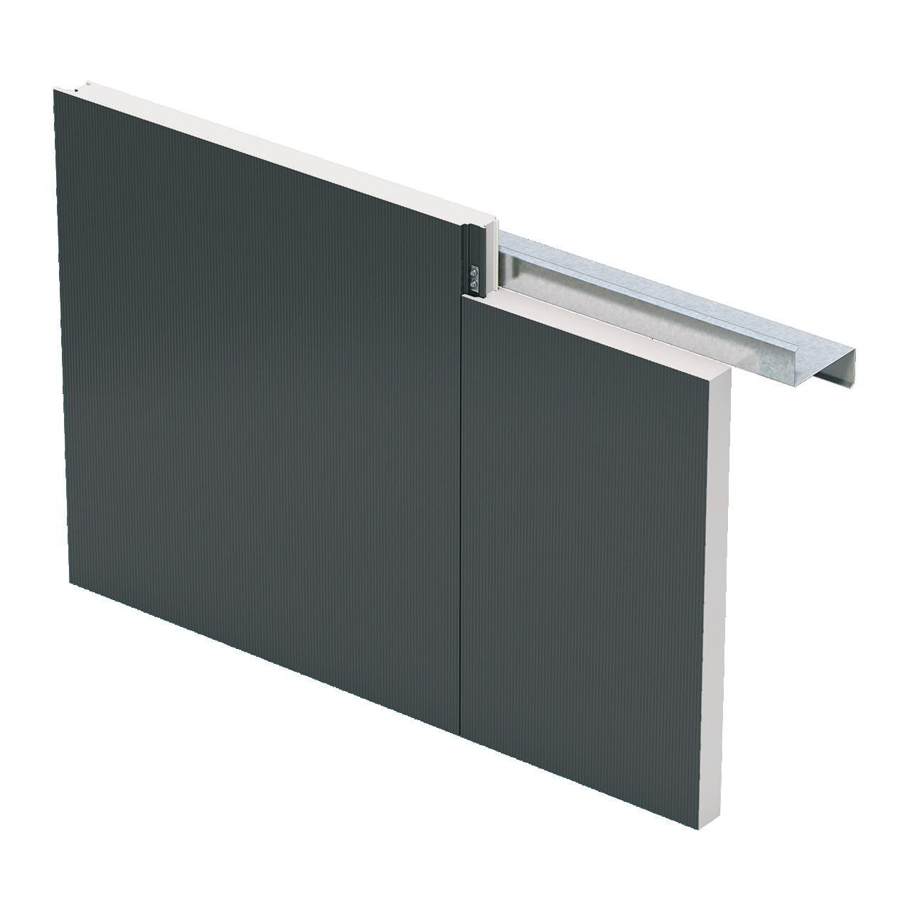


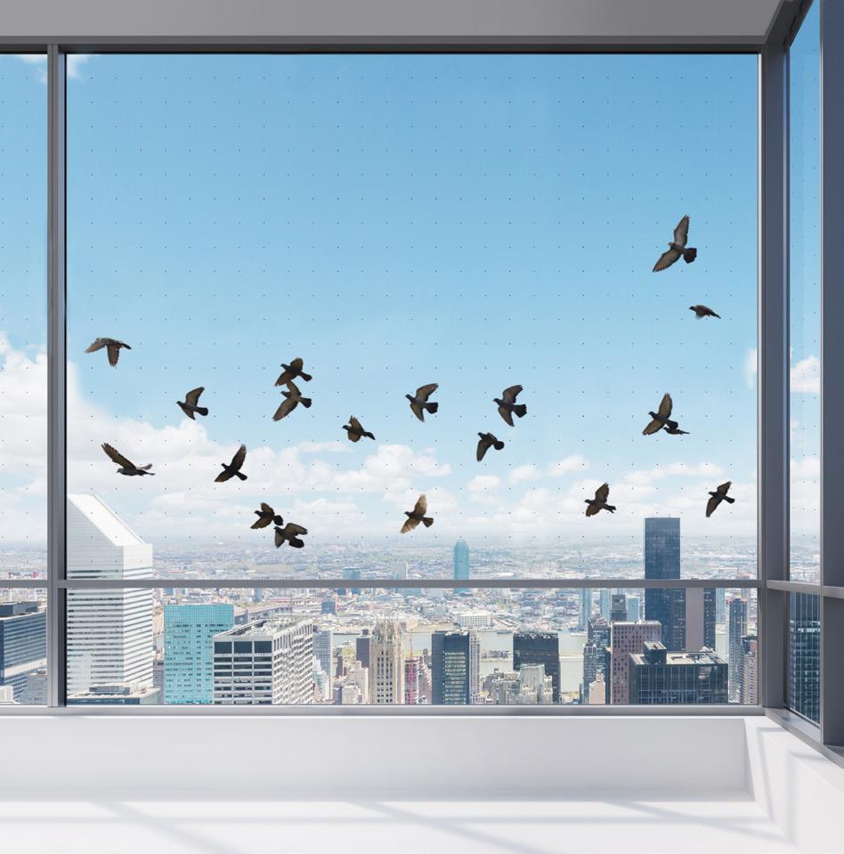
Proper glazing is paramount to both the user experience and overall building performance. Whether the intention is to reduce solar heat gain, minimize bird strikes, or protect from the unexpected, these recently released products build upon decades of research and development in glass manufacturing to deliver top-of-the-line performance.

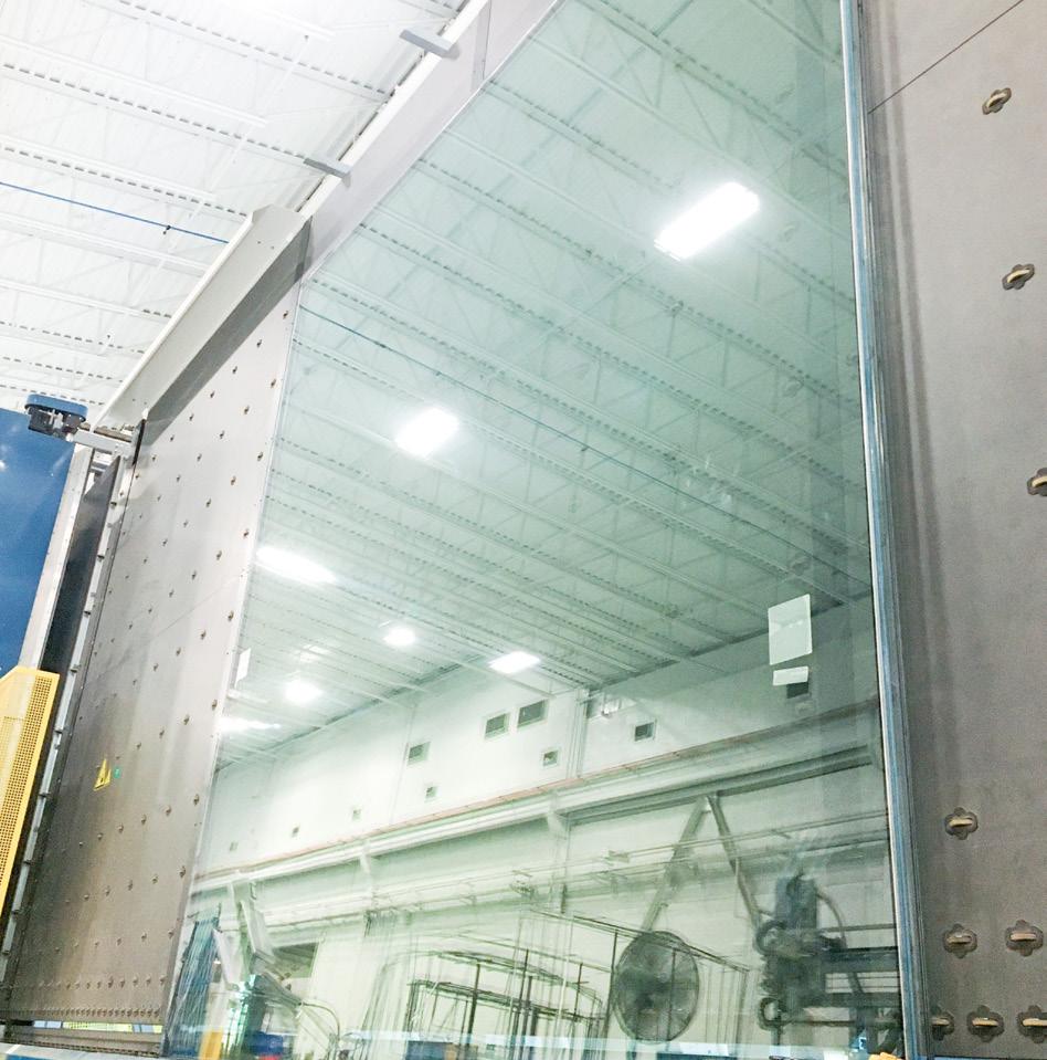
 Sophie Aliece Hollis
Solarban R77 Vitro vitroglazings.com
Synergy VIG Thermglass thermglass.com
BirdSecure Pro Kuraray kuraray.com
SecureGlaze Agnora agnora.com
Spacia Pilkington pilkington.com

TenBerke deftly blends new and old at Harvard’s Lewis International Law Center.
Architect and interior designer: TenBerke
Location: Cambridge, Massachusetts
Landscape architect: Michael Van Valkenburgh Associates
Lighting designer: One Lux
Structural engineer & envelope consultant: Simpson Gumpertz & Heger
MEP/FP engineer: Altieri Sebor Wieber
Sustainability consultant: Atelier Ten
Civil engineer: Nitsch Engineering
Geotechnical consultant: Haley & Aldrich
IT, AV, and security consultant: Cerami
Code consultant: R.W. Sullivan
Signage designer: AFreeman
In spring 2022, Harvard University welcomed students into the newly renovated Lewis International Law Center, located on the northern stretches of the Cambridge campus, a stone’s throw from the Cambridge Common. The 50,500-square-foot project was led by New York–based firm TenBerke (formerly Deborah Berke Partners), whose expertise in adaptive reuse has helped it transform the midcentury structure into a learning center that emphasizes social interchange, shared teaching, and flexible office spaces.
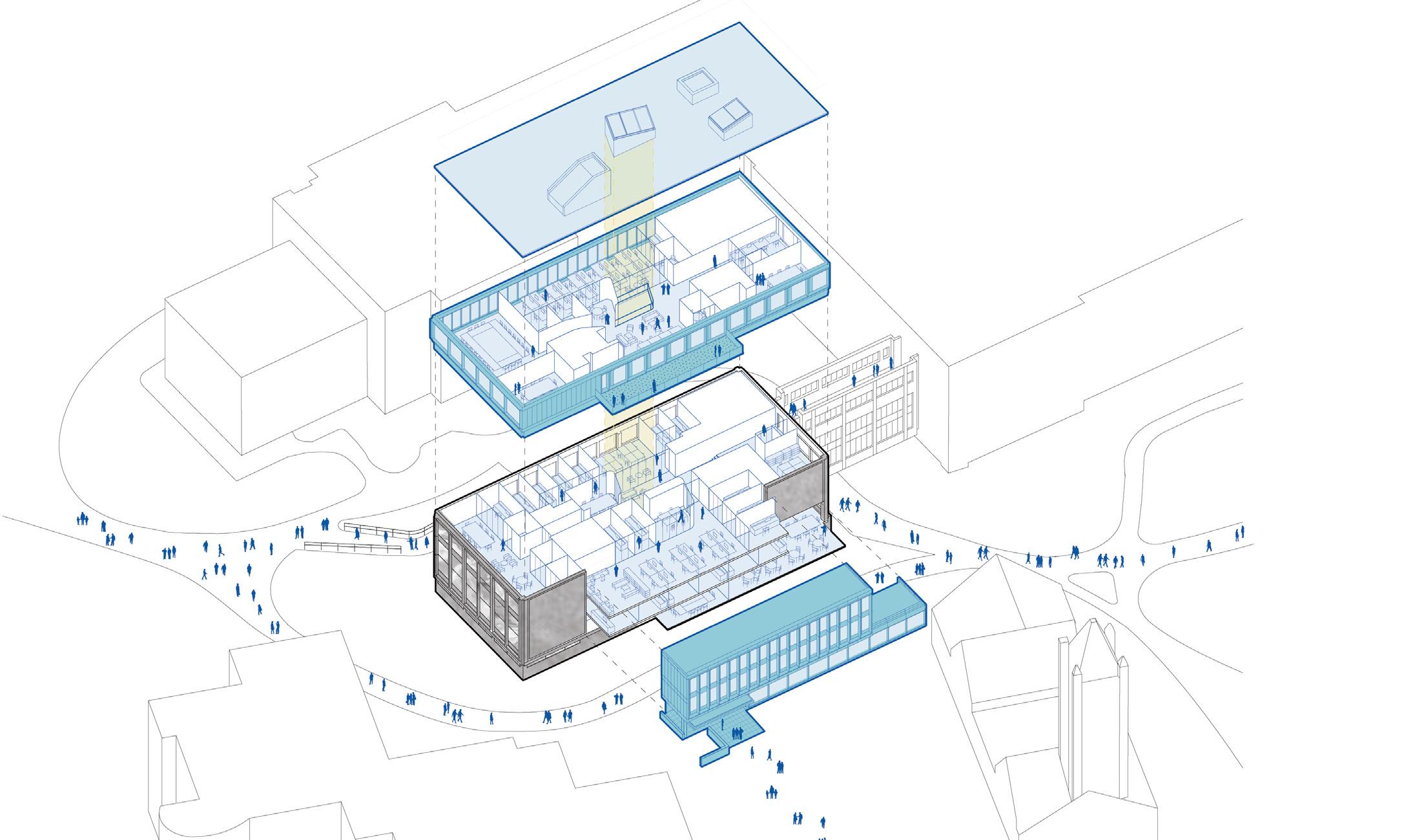
The original building dates from 1957 and was designed by Shepley, Bulfinch, and Abbott as an annex of the existing law library’s stacks, accompanied by a reading room and independent circulation desk. Its high-modernist design, executed with concrete, stone, and a curtain wall, ultimately proved outmoded for contemporary pedagogical demands. The renovation keeps the original library functions in place while adding an array of conference and meeting rooms, private offices, study carrels, reconfigurable classrooms, and client consultation rooms.

Any adaptive reuse project requires a near surgical methodology. TenBerke collaborated with structural engineer and envelope consultant Simpson Gumpertz & Heger to analyze the
existing structure and enclosure. “A deep investigation by structural and envelope specialists revealed opportunities but also limitations. We realized we needed to be surgical with our interventions,” noted Ameet Hiremath, partner at TenBerke. “For example, we capitalized on the demolition of a mechanical penthouse to create a big opening to the top new floor and turned a blank facade into a transparent one that created a new front door and stitched pathways back into the campus precinct.”
Through subtraction and addition, the firm introduced new facade elements on the top-floor addition and at the entrance, using aluminum composite panels fabricated by Massachusetts-based Sunrise Erectors to secure the windows and provide shading. The replacement windows and the new high-performance glazing were treated with a pinstriped ceramic frit and placed over an insulated spandrel to optimize the window-to-wall ratio and mitigate solar heat gain and glare. The slenderness and depth of vertically oriented aluminum composite fins that shade the additions’ glazing also blend with the original structure’s tall stone piers. The result is not so much an addition as a melding of new and old.
Adaptive reuse is also an act of conservation that responds to present-day demands
for sustainability. The design team demolished just 20 percent of the existing building. TenBerke partnered with sustainability consultant Atelier Ten to develop a life-cycle assessment of the intervention to determine the project’s embodied carbon emissions and estimate total avoided emissions of the structure and enclosure.
“Overall, the adaptive reuse project saved about one million tons of embodied carbon emissions, which is equal to the annual energy emissions of 120,000 homes, according to the USEPA,” continued Hiremath. “The energy efficiency upgrades result in a 31 percent reduction in annual operational emissions, which is equal to 4.69 million kgCO2e cumulative emissions over the 60-year life cycle.”
With its refined and high-performance facade and newly public-oriented building program, the Lewis International Law Center will anchor this corner of Harvard University’s campus for years to come.
Matthew Marani, studying city and regional planning at Pratt Institute, writes about architecture and urban design.


Previous spread: The concrete, stone, and curtain wall of the Lewis International Law Center is supplemented by an expanded top floor and entrance clad in aluminum composite panels.

Above: “We realized we needed to be surgical with our interventions,” said TenBerke partner Ameet Hiremath of the adaptations.
Left: As seen in the circulation depicted in the exploded axonometric, he project "created a new front door and stitched pathways back into the campus precinct,” Hiremath said.
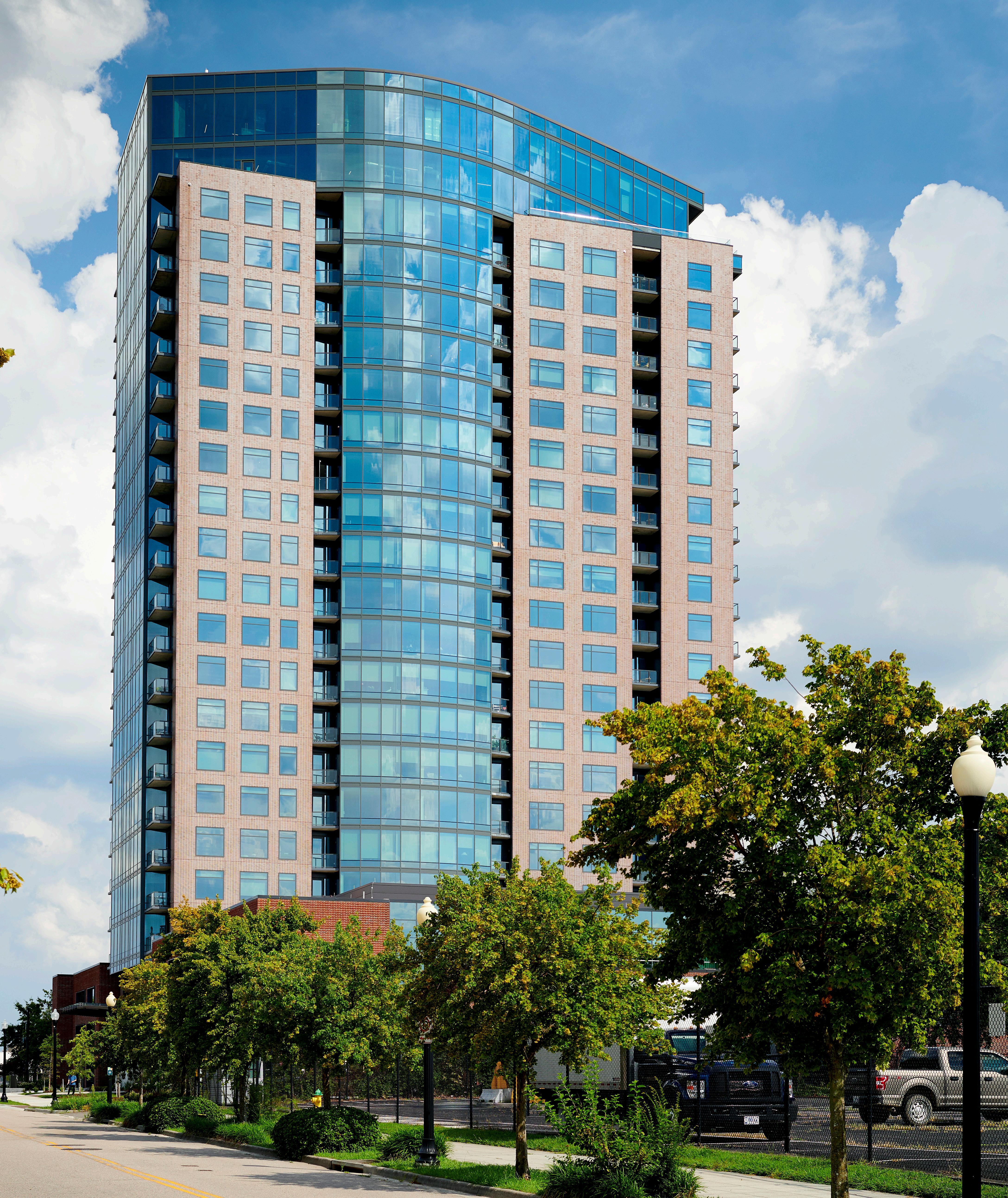
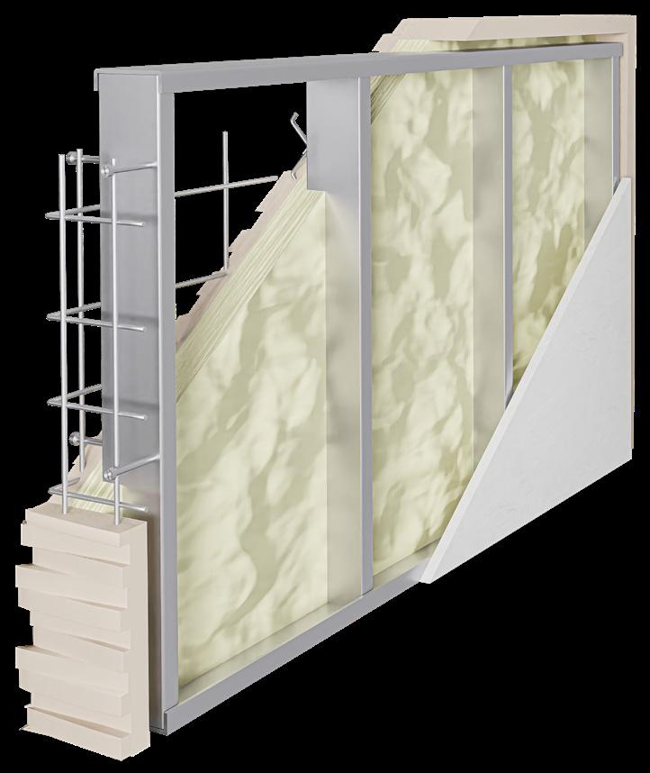

A longtime favorite for facades, metal cladding seems to deliver in every category: It’s strong, lightweight, waterproof, easy to clean, and relatively inexpensive. Thanks to the efforts of the following manufacturers, it also can be easily manipulated and customized to create the perfect application for your next project.

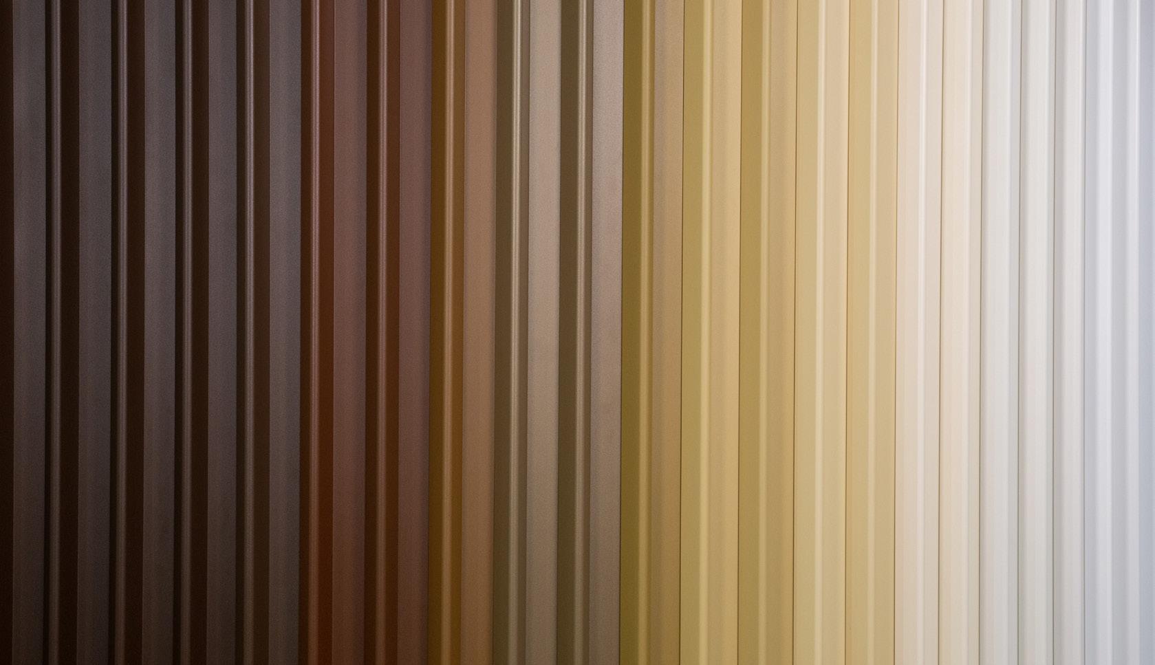


 Sophie Aliece Hollis
NOVA Fins Centria centria.com
Facade Wall Panels Drexel Metals drexmet.com
Linarte Cone Renson renson-outdoor.com
Ready to Ship Woodgrains Pure + Freeform purefreeform.com


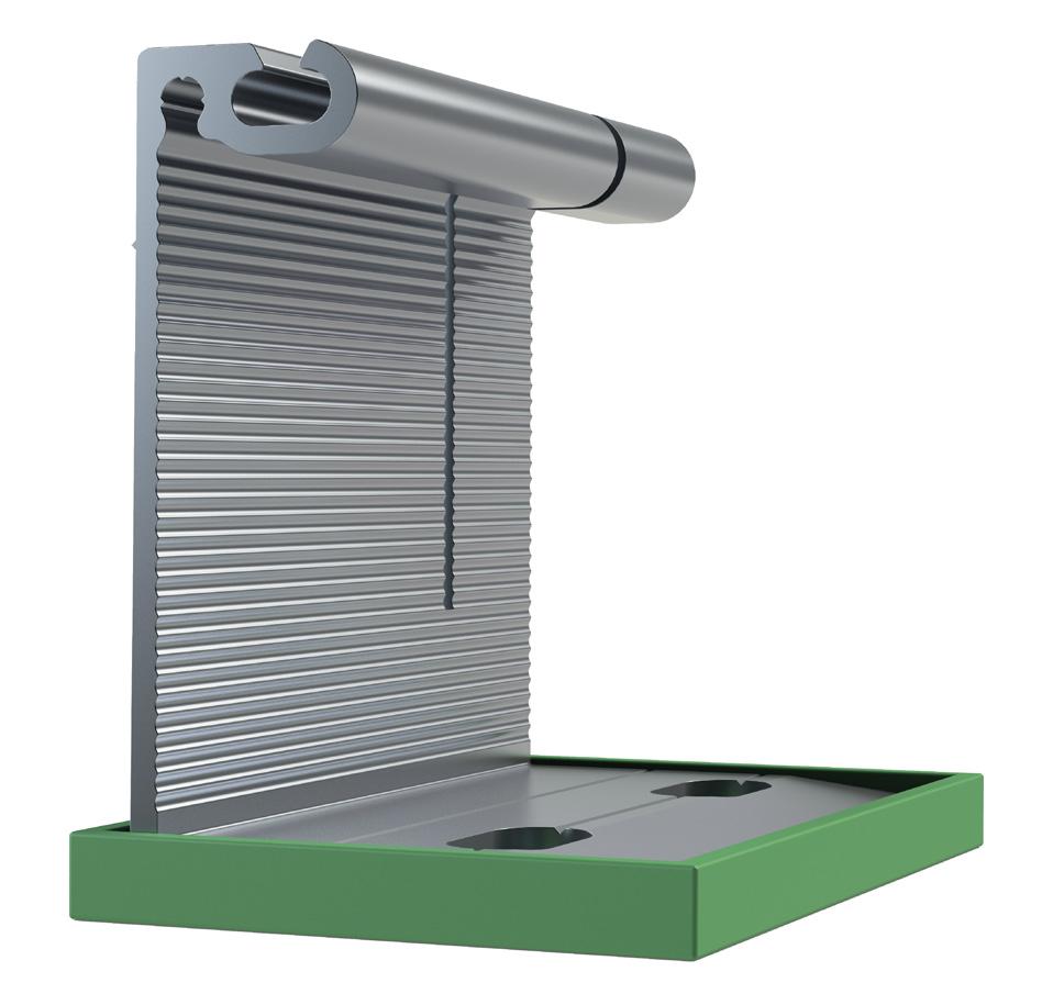
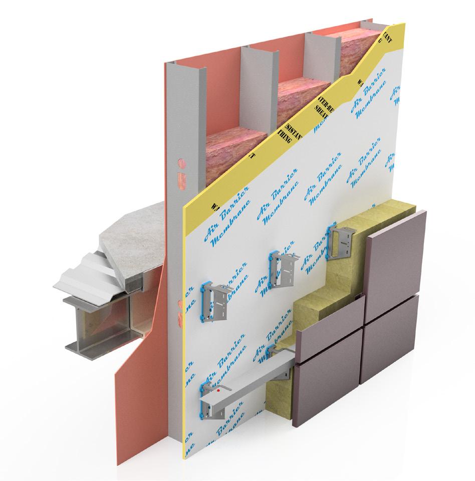
Aside from their critical function within the building envelope, cladding attachment systems also significantly impact construction timelines. Complicated and convoluted attachment details can add weeks or even months to projects. For this reason, the following systems and solutions were selected for their structural strength and ease of installation.



The Four Roof Pavilion welcomes with angled canopies and public programming.
Design architect: Found Projects & >Schneider Luescher
Location: Shenzhen, China
Executive architect: KMCM
Landscape architect: WEi Studio, USA
Construction administration: China
Resources Land (Shenzhen)
Construction team: Shenzhen Sincere
Environmental Art Engineering, Guangdong Chengji Ecological Technology
Supervision: Shenzhen Qijun Construction Engineering Consultant
Engineering technical consultant: Lattice
Landscape
Plant design consultant: DENG Huijuan
Signage system design: WEi Studio, Shenzhen Direction Ecological Development
The city of Shenzhen straddles the border of Guangdong and Hong Kong and has undergone great change over the last half century.
The former fishing town, perched on the South China Sea, has grown from approximately 300,000 residents in 1980 to nearly 20 million today. Unsurprisingly, that growth has fueled a long-running construction boom that includes myriad civic institutions. One such project is the Four Roof Pavilion by Los Angeles–based firms Found Projects and >Schneider Luescher: Its airy design and public quarters act as a gateway for the recently completed Pingshan Children’s Park.
Pingshan Children’s Park, designed by WEi Studio, is located within a rolling landscape of Chinese banyan, eucalyptus, and lychee trees. The pavilion’s design team drew on that bucolic setting, as well as taking inspiration from 11th-century Chinese landscape paintings, to develop the pavilion’s foliage-like color palette and open-air form.

The 13,000-square-foot project dates to 2020, during the height of the COVID-19
pandemic, when the design team was brought on to determine a program and design the castin-place concrete structural grid, a system that had already been approved by the local planning authorities. Due to travel restrictions, the design team was unable to visit the site during the design or construction phases and had to conduct all of its work from its home base in California and over Zoom. Those relatively hands-off circumstances called for the introduction of a straightforward building system.
Simplicity is the name of the game here: The rectilinear structural grid is topped by two steel roofs on the north and south facades, while the roof garden is supported by concrete. “During the design process, our thinking was to make the details and materials very simple, with nothing customized except for the centrally placed spiral stairwells,” noted Found Projects cofounder Ted Zhang. “We introduced a 13-foot-by-13-foot structural grid with three stories, and we developed several public-facing programs, such as a library, coffee shop, and roof garden.”
The north-facing canopy is, for the most part, topped with perforated metal panels, while the south one alternates between solid metal and translucent polycarbonate. In both cases, the materials are arranged in a diamond pattern that mirrors and obscures the cross-framing that supports the canopies from below. A hinge-like bracket embedded within the cast-in-place structural grid holds the canopies in place. The glazing comes in the form of a modular window wall facade system composed of two different sizes of glass.
“In general, we always were concerned because it is one big gesture of lifting the whole facade, and we wanted the building to be translucent, transparent, and light, and grappled with how to do that with a concrete-frame building,” said >Schneider Luescher cofounder Anton Schneider. “Obviously, there are very few materials that can do it as well as glazing, but acquiring high-performance glass would have blown up our budget. This was, in effect, a low-tech version of a high-tech building.” MM


Left: "We wanted the building to be translucent, transparent, and light, and grappled with how to do that with a concrete-frame building,” said Anton Schneider of >Schneider Luescher.
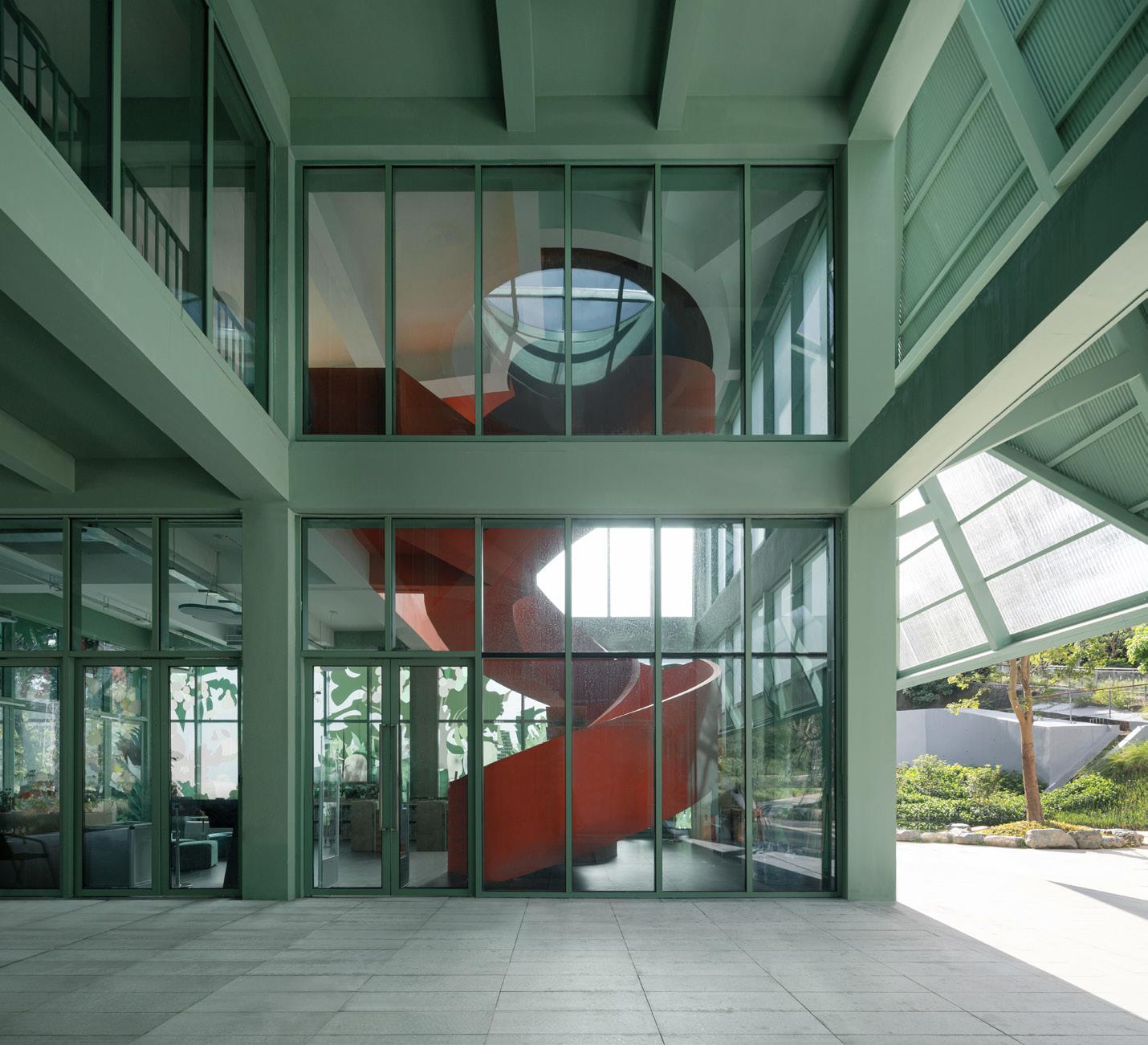


Above:
to make the details and materials very simple, with nothing customized except for the centrally placed spiral stairwells,” said Ted Zhang
thinking
 Previous spread: The airy design and public quarters of the Four Roof Pavilion act as a gateway for the recently completed Pingshan Children’s Park.
Left, top: The two steel roofs are attached to a cast-inplace concrete structure, a system that had already been approved by the local planning authorities.
Above, top: The perforated metal panels of the roof are arranged in a diamond pattern that mirrors and obscures the cross-framing.


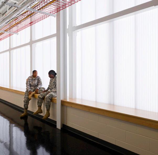


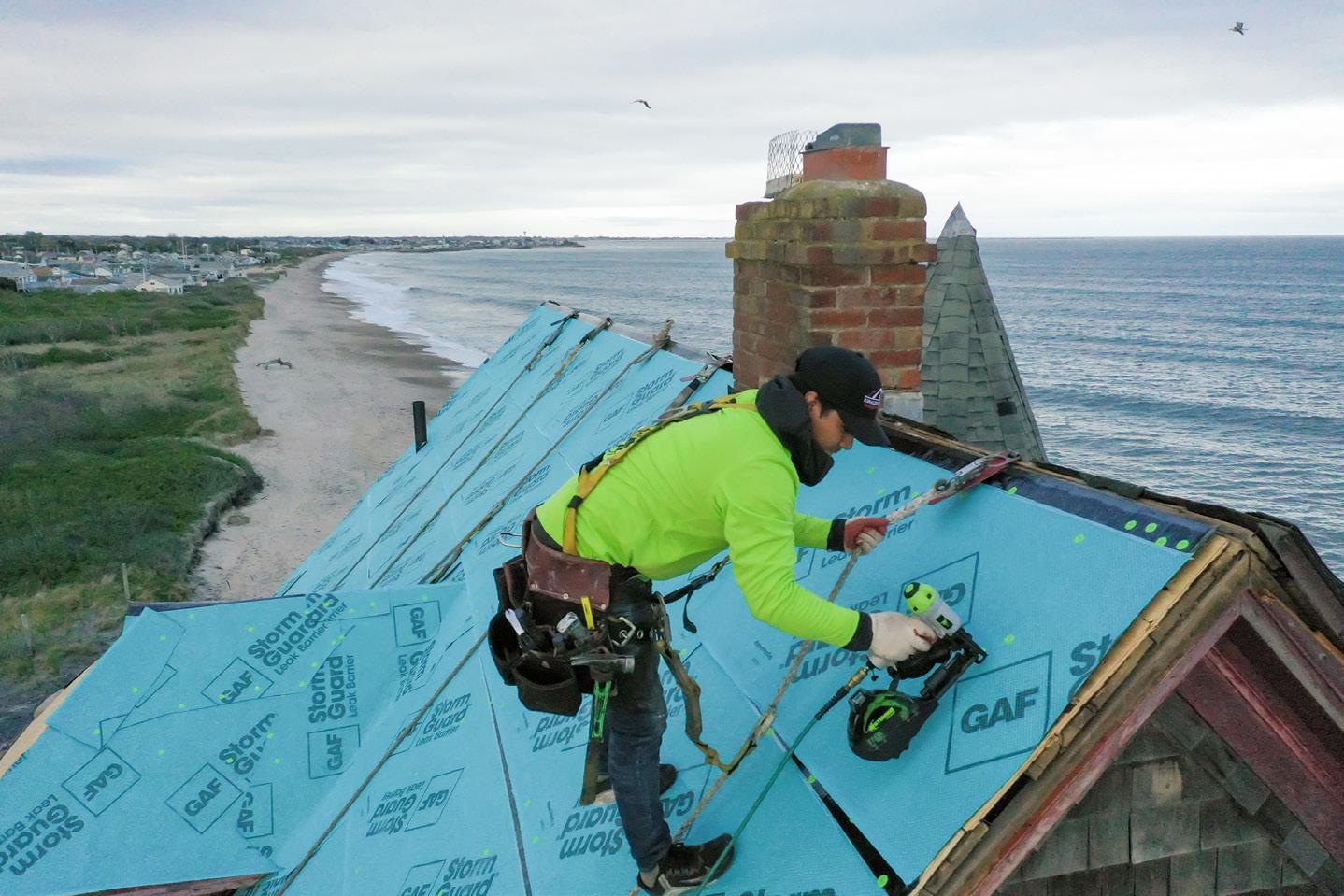
Often referred to as the “fifth facade,” roofs weather faster than other building assemblies due to its horizontal exposure to the sky. Here, thoughtful engineering and reliable products unite to ensure that this critical surface remains strong and sealed. To facilitate this act, these new products present innovation in varied forms and functions critical to the success of roofing systems. Sophie Aliece

The David Rubenstein Forum project at the University of Chicago utilized 60,000 square feet of custom Versa-Lok and custom fabricated wall panels that were manufactured by ATAS in 1.0 mm grey zinc. The panels were used as exterior wall cladding on this 166-foot-tall building consisting of 10 stories (a two-story base, and an eight-story tower).

Vertical zinc panels were chosen to express the idea of connectivity on the facade. Zinc was favored because it is a natural and durable material that is timeless and creates its own patina which protects the material for a long time. Zinc is very flexible, which worked well with this building’s geometry, and the way it reflects sunlight was appealing to the design team. The vertical panels also accentuate the height of the building.
David Rubenstein Forum at University of Chicago
1st place winner in ATAS’ 2020 Project of the Year Competition
Wall Panels: Versa-Lok (custom) | Custom Fabricated Panel - Grey Zinc


Architect: Diller Scofidio + Renfro | Brininstool + Lynch
Contractor: Tuschall Engineering

The Grand Mulberry uses a custom-formed brick to animate a New York facade.

Architect: MA | Morris Adjmi Architects
Location: New York
Interior design: MA | Morris Adjmi Architects
Museum architect: op.Architecture +
Landscape
Structural engineering: RCM Engineering
Civil engineer: Sullivan Group Design
MEP/FP: ABS Engineering
Lighting: Delta Light
Facade consultant: Buro Happold Engineering
Masonry subcontractor: ARK Builders
Brick manufacturer: Glen-Gery
In 1932, 98 percent of the heads of households in the area of New York City now variously known as Little Italy, Soho, or the Lower East Side were Italian emigrants, The New York Times reported. This wave of immigrants, who largely arrived in the U.S. from the 1880s through the 1920s, were preceded by the Italianate, a mid-19th-century tripartite style of ornamentation and brickwork that changes as the building rises.
Almost a century later, the area’s demographics have changed. But for the facade of the Grand Mulberry, a seven-story, 20-unit building at 185 Grand Street completed last year at the corner of the area’s famed Mulberry Street, Morris Adjmi Architects (MA) looked back to the Italianate for its local resonance. “Emulating this tradition,” according to the office’s press materials, “the Grand Mulberry’s facade pattern consists of banding at the building’s base on floors one to two, pediment windows on floors three to five, and arched windows and a cornice on floor six.”
The zoning required the seventh floor to step back, an opportunity Adjmi seized to create an extensive terrace for the penthouse, then wrap the entire unit and bulkhead in gray metal panels. The metal intervention throws into relief the building’s main
feature: double-stacked running bonds of brick the color of old-fashioned red pavers. Manufacturer Glen-Gery hand-molded each brick, creating distinctive half-spherical bulbs that bring to mind sheets of fresh ravioli.
The swells of the bricks create patterns of light and shade across the exterior, while their arrangements seem like echoes of historical tenement windows. (The actual windows are large tilt-and-turns with extruded aluminum surrounds.) The brickwork creates “a spectral reference to the heritage of the neighborhood,” the office stated, a connection made through both pattern and hue.
The project’s extensive use of mosaics also has a vaguely Italian, if not Italianate, quality. They spill out of the lobby to form a brass logo on the sidewalk. Another series serve as elegant black-and-white wayfinding in the lobby and public hallways. Stacked white tile patterns define the primary bathrooms in all 20 units, and a custom mosaic floor details the penthouse’s powder room.
In an unusual development agreement, the project replaced a row of not-very-Italianate townhouses that previously housed the Italian American Museum. The museum sold its three buildings in 2013 for $13 million, along with a
covenant to house its expanded ground-floor space in the new building, rent free, with a distinct Mulberry Street entrance.
Bricks are the key to the discreet insertion of a defining new building into an old neighborhood. “We worked closely with our masonry subcontractor, ARK Builders,” Morris Adjmi himself said in an interview provided to AN . “The unique masonry pattern—chosen for its ability to provide relief and add depth— could have presented a challenge during construction. But the level of detail put into the development of MA’s drawings and the quality of work provided by the subcontractor allowed for a smooth construction process.”
The finished result gains resonance through reference to the neighborhood’s poor, immigrant roots, while its pricing—ranging from second-floor one-bedrooms selling for $1.295 million to penthouse units marketed for $7.35 million—is altogether contemporary.
The Grand Mulberry’s exterior is “an example of how modern concepts can be applied to traditional methods and materials to develop unique and intricate facade designs,” Adjmi said.
Jesse Dorris is a writer in New York City and host of Polyglot, a show on WFMU.
COURTESY May 2023
GLEN-GERY
Previous spread: The new structure is set within the brick-heavy context of the Little Italy neighborhood. Upper levels are set back from the cornice line and remain invisible from the street below.
Above, left: The custom bricks are installed in a pattern which implies a grid of windows “interrupted” by the rectangular punches of the actual glazed openings.


Above, top: Curved custom brick units are used on the outer corner and at the residents’ entrance.
Above: The index od brick shapes manufactured by Glen-Gery for the building

SELVON

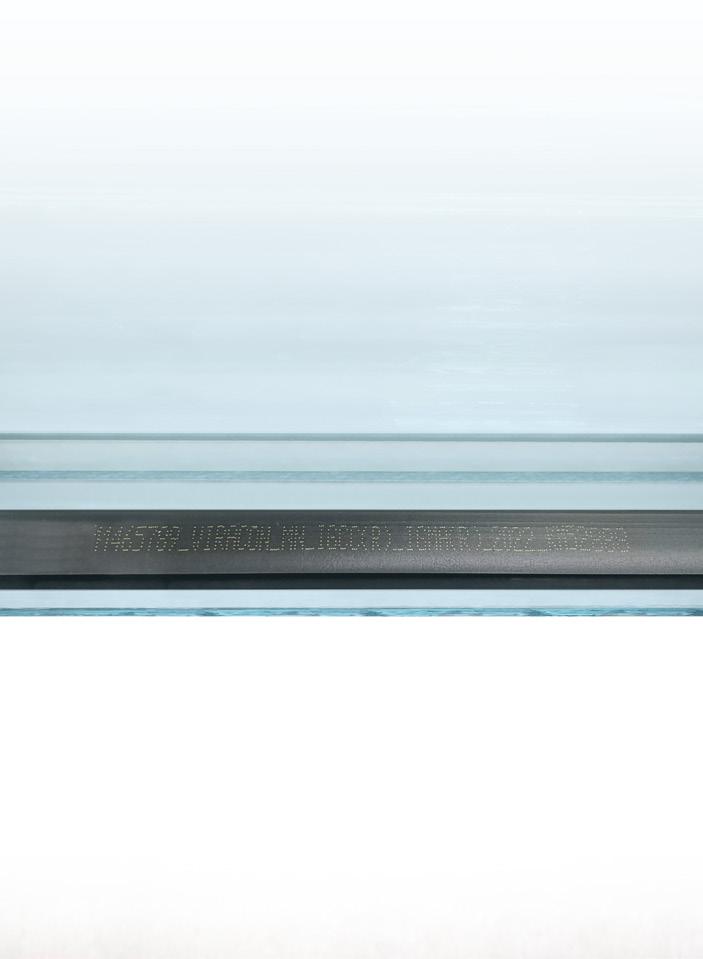
INTRODUCING THE VIRACON IDENTIFICATION NUMBER (VIN):
A New Asset Management Tool for Your Glass. At Viracon, we never stop improving our glass or the customer experience. The Viracon Identification Number (VIN) is further proof of this commitment.
Discreetly printed on the thermal spacer, the VIN is a unique number that contains all the information you need about an insulating unit installed on a building, including glass type, composition, and finished size. With the Viracon Identification Number, the number of reasons to choose Viracon keeps growing. Learn more at Viracon.com/VIN.

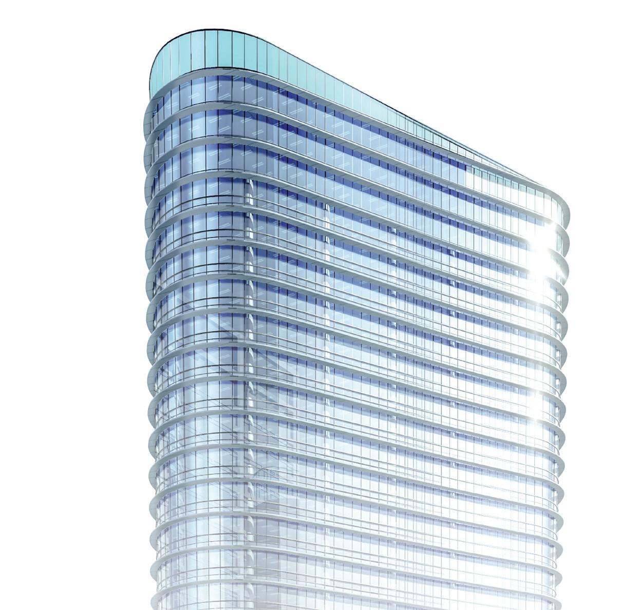

Avoiding costly and tedious additional maintenance requires selecting the proper paints, coatings, and finishes from the outset. With applications for a number of materials—wood, metals, composites—the following products use tested technologies to ensure that your facade will withstand the test of time.


 Sophie Aliece Hollis


Kawneer’s commitment to the impact market is driven by our vision to create positive environments that shape a better world. Our advanced technologies are designed to infuse buildings with natural light, maximize energy efficiency and withstand adverse climate conditions.

3M 3m.com
DuPont Tyvek dupont.com
Georgia-Pacific gp.com Henry henry.com
Huber Engineered Woods huberwood.com
Huntsman Building Solutions huntsmanbuildingsolutions.com
Kuraray kuraray.com
LP Building Solutions lpcorp.com
Rockwool rockwool.com
Thermafiber thermafiber.com
Longboard Architectural Products longboardproducts.com
National Nail nationalnail.com
Northern Facades isoclips.com
SFS sfs.com
Strongwell strongwell.com
Abet Laminati abetlaminati.com
Alpolic alpolic-americas.com
American Fiber Cement americanfibercement.com
Elemex elemex.com
Fiberon fiberoncladding.com
Kingspan kingspan.com
Moistureshield moistureshield.com
Omnis omnisusa.com
Owens Corning owenscorning.com
Slenderwall slenderwall.com Sto Corp. stocorp.com
Glass Agnora agnora.com
Oldcastle BuildingEnvelope obe.com
Pilkington pilkington.com
Pulp Studio pulpstudio.com
Thermglass thermglass.com
Viracon viracon.com
Vitro vitroglazings.com
Walker Glass walkerglass.com
C.R. Laurence crlaurence.com
ENVELON envelon.net
Extech extechinc.com
Faour Glass Technologies faourglass.com
GAMCO gamcocorp.com
Glasswerks glasswerks.com
Gutmann gutmann-na.com
Kawneer kawneer.com
Tubelite tubeliteinc.com
YKK AP ykkap.com
Fabcon fabconprecast.com
Gates Precast gateprecast.com
Glen-Gery glengery.com
High Concrete highconcrete.com
Alucobond alucobondusa.com
American Metal Craft americanmetalcraft.com
ATAS atas.com
BōK Modern bokmodern.com
Centria centria.com
Drexel Metals drexmet.com
Hydro hydro.com
Kriskadecor kriskadecor.com
Longboard longboardproducts.com
Metl-Span metlspan.com
Pure + Freeform purefreeform.com
Renson renson-outdoor.com
Reynaers reynaers.com
Rigidized Metals rigidized.com
American Fiber Cement americanfibercement.com
Boston Valley Terracotta bostonvalley.com
Ceramics of Italy ceramica.info Cosentino cosentino.com
Equitone equitone.com
Exagres exagres.es
Fiandre granitifiandre.com
Florim florim.com
Neolith neolith.com
Porcelanosa porcelanosa-usa.com
Rieder rieder.cc
Shildan shildan.com
Swiss Pearl swisspearl.com
TAKTL taktl-llc.com
Terreal North America terrealna.com
Akzo Nobel chemcraft.com
Axalta axalta.com
Behr behr.com
PPG ppgindustrialcoatings.com
Sherwin Williams sherwin-williams.com
Valspar valspar.com
CertainTeed certainteed.com
GAF gaf.com
LP Building Solutions lpcorp.com
Mule-Hide Products mulehide.com
Owens Corning owenscorning.com


