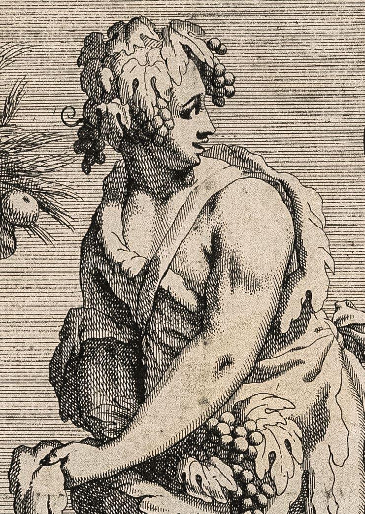
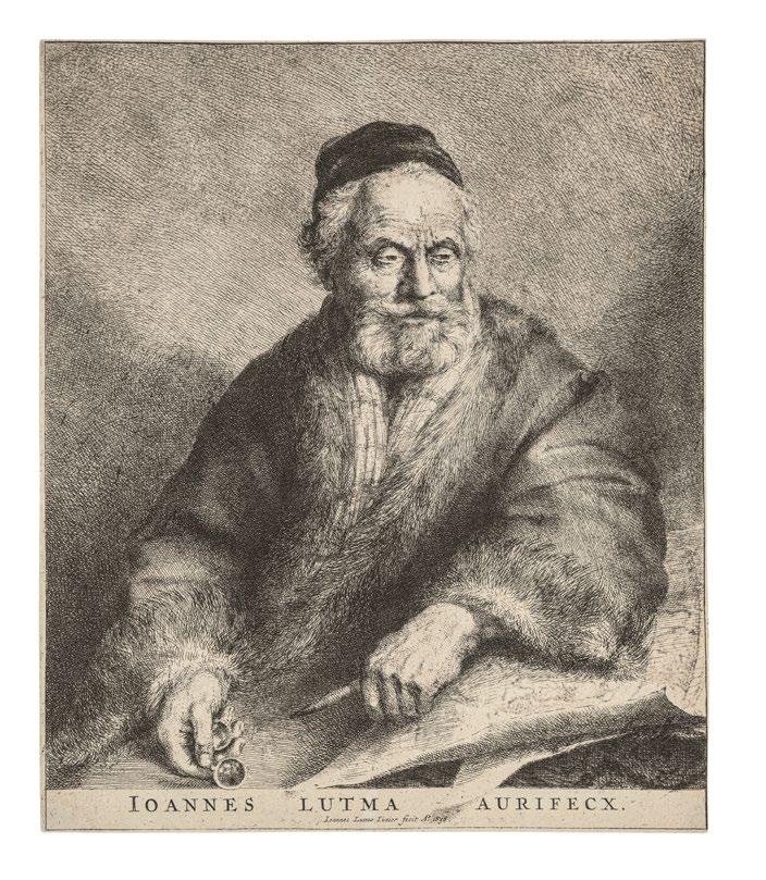
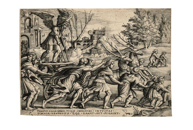
Brillanter Abzug der reifen Komposition. Zschelletzschky galt der Stich als einer der s chönsten aus Aldegrevers Werk
Mit 6 mm Papierrand um die Plattenkante. Tadellos.
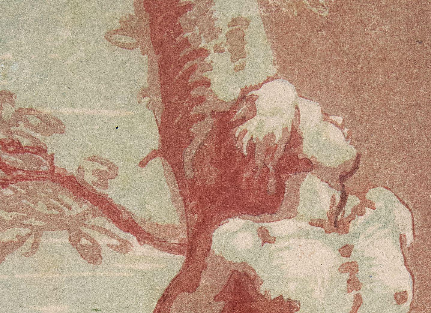
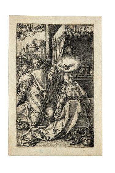
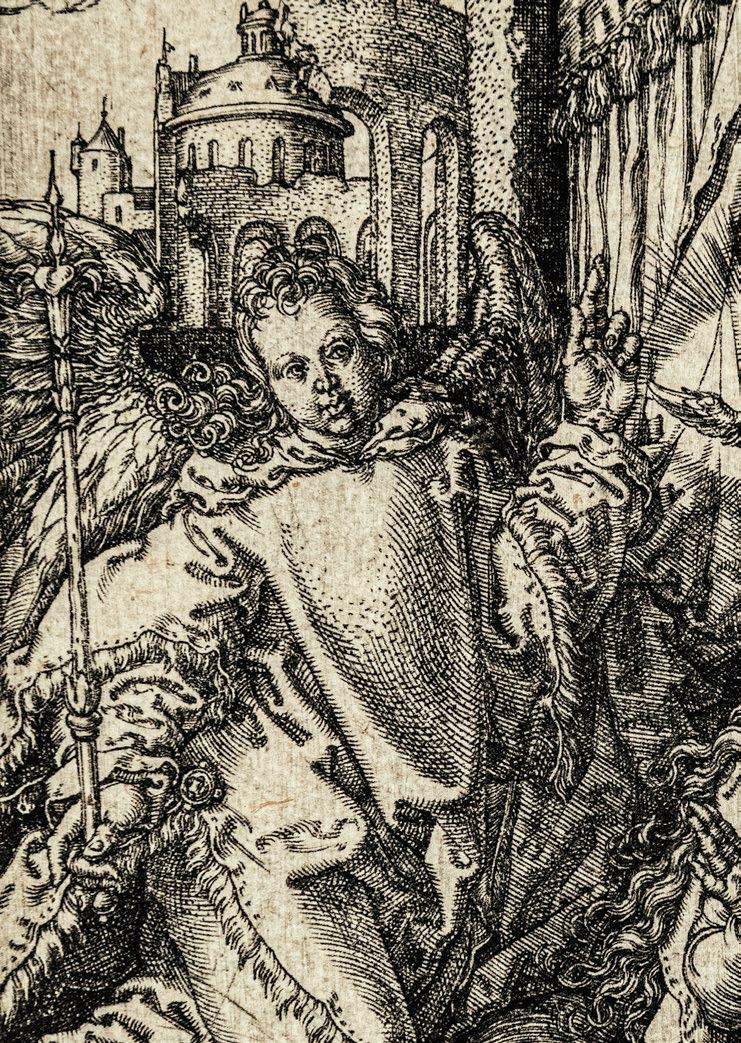
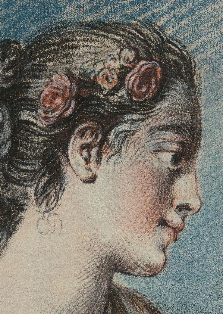
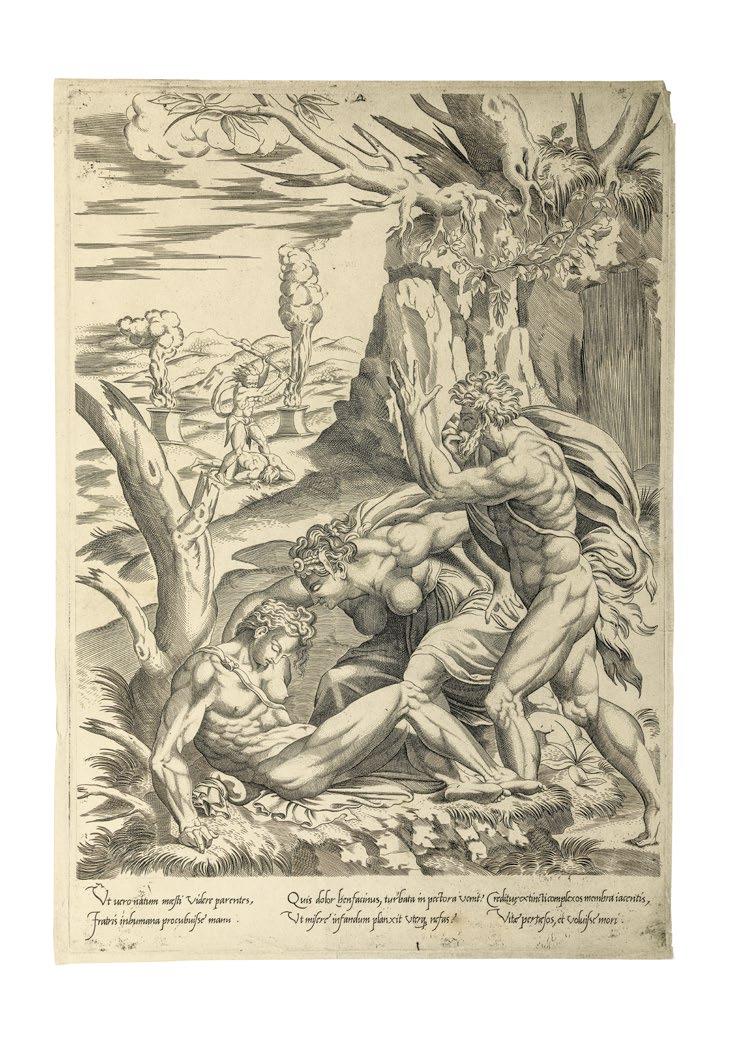
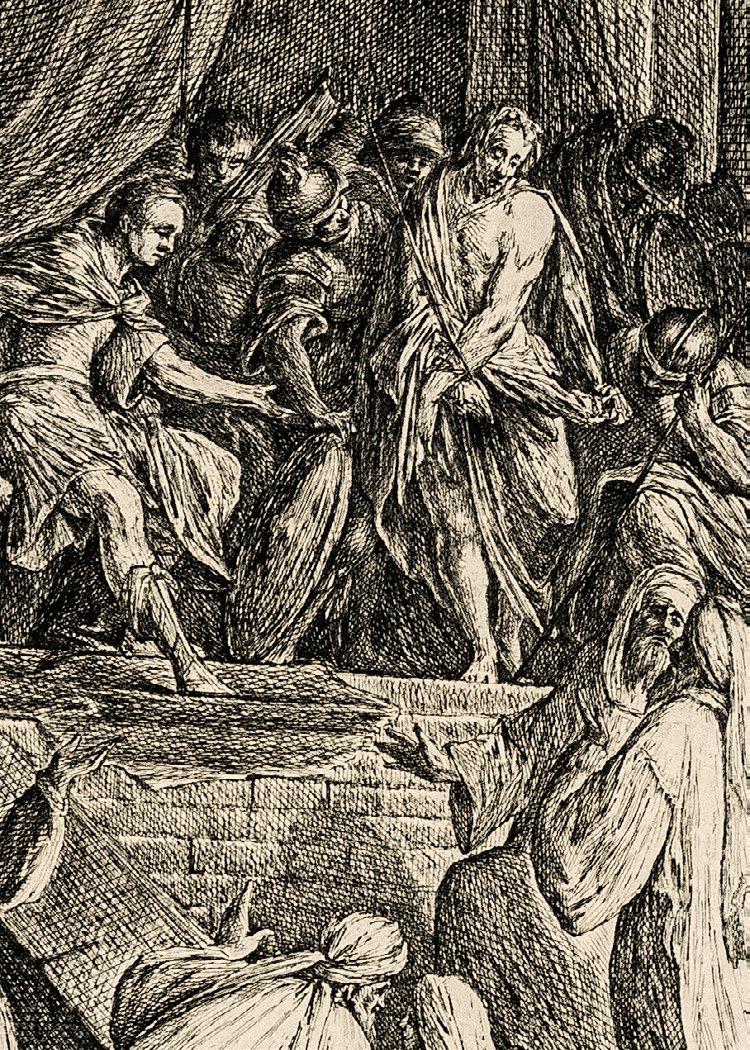
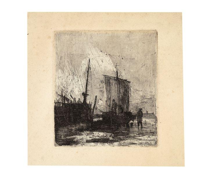
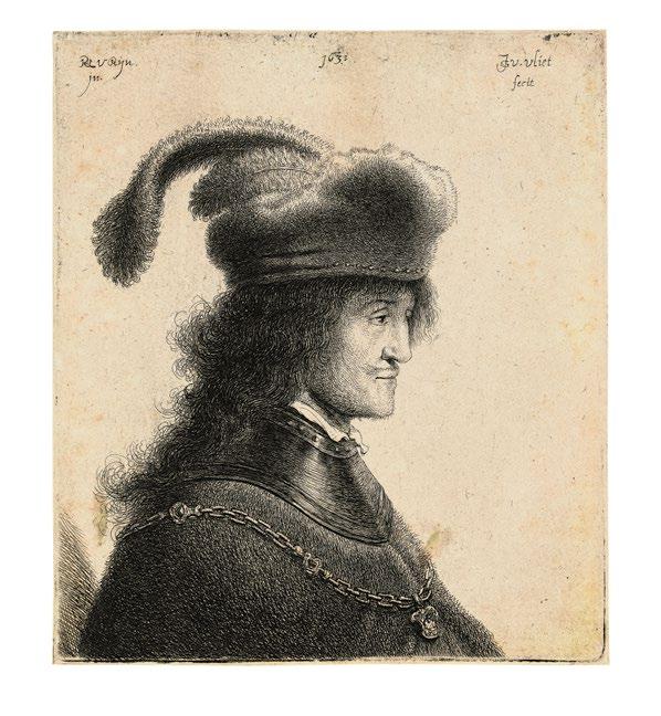
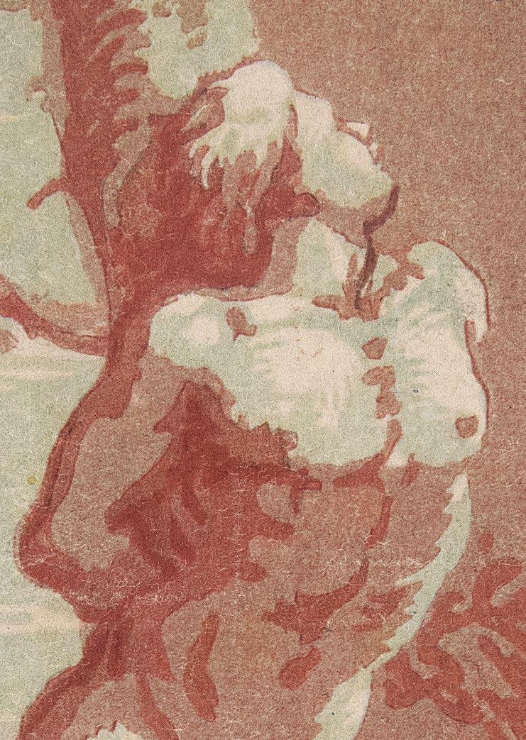
Wie so häufig, nimmt Aldegrever auch für seine Verkündigung von 1553 unmittelbar Bezug auf sein großes Vorbild Dürer, dessen entsprechende Komposition aus der Kleinen Holzschnittpassion er hier virtuos paraphrasiert, gleichsam amalgamiert mit Elementen des Antwerpener Manierismus, worauf S. Sell überzeugend hingewiesen hat: This stylistic influence is particularly notable in the decorative and artificial puckering of the drapery, which is echoed in the wrinkled clouds. As Stephen Goddard has pointed out in relation to Aldegrever’s Nativity, Carel van Mander criticized Aldegrever for his depictions of drapery, which the biographer considered “confused, with too many folds and wrinkles.” This fascination with ornamental detail is prominent throughout the engraving, imparting a metallic hardness to all the surfaces. The attention to surface pattern recalls Aldegrever’s role as an engraver of ornamental prints, which were often used as models by craftsmen and decorative artists. Also characteristic of Aldegrever’s work are the figure types, with their knobby, expressive hands and somewhat cramped composition, with the figures pushed close together in the foreground, enhancing the decorative surface effect.
Aldegrevers Vorzeichnung befindet sich heute in der National Gallery, Washington.
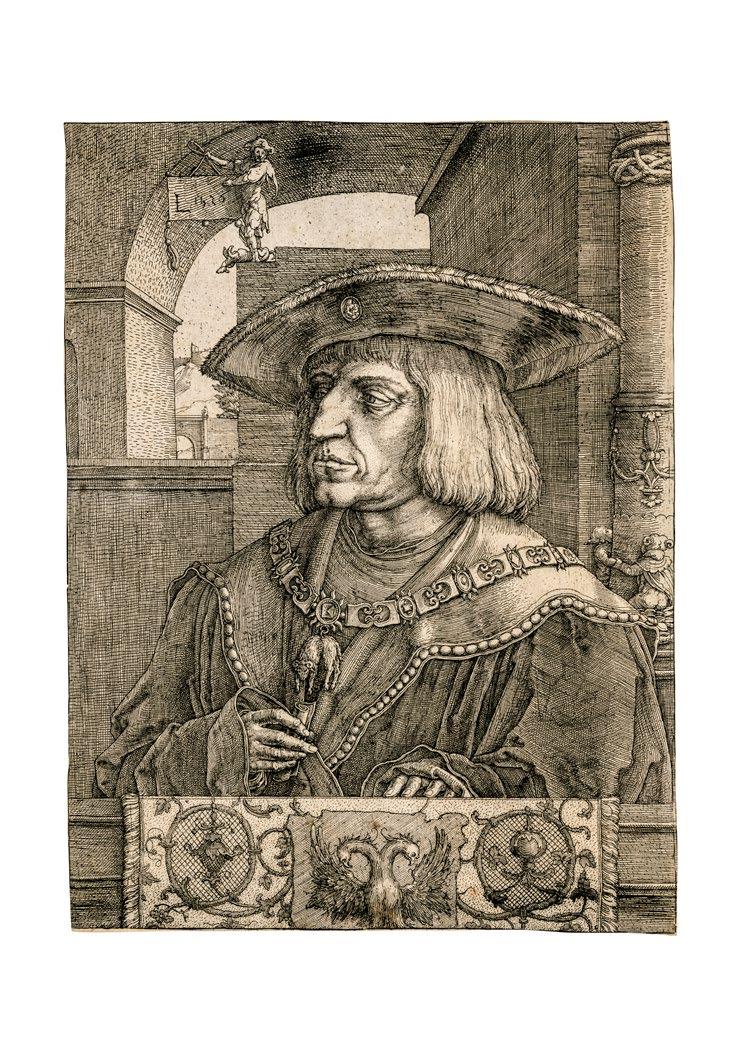
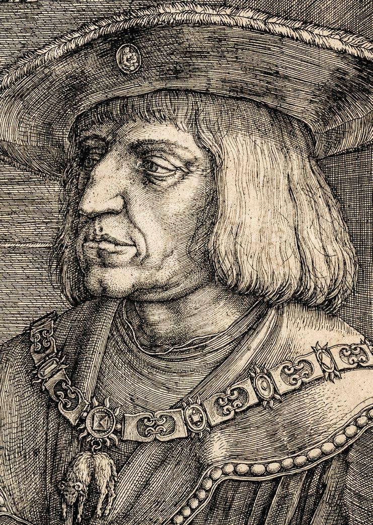
The Annunciation. 1553
Engraving. 10.8 x 6.8 cm
Bartsch, Hollstein, and New Hollstein 38
Brilliant exemplar of the mature composition. Zschelletzschky regards this engraving as one of Aldegrever’s most beautiful works
With 6 mm paper margins around the platemark. Pristine.
In his Annunciation of 1553, Aldegrever refers – as is often the case – to his great model Dürer, whose counterpart from the Small Woodcut Passion he paraphrases with virtuosity, at the same time amalgamating it with elements of Antwerp Mannerism, as S. Sell has convincingly shown: This stylistic influence is particularly notable in the decorative and artificial puckering of the drapery, which is echoed in the wrinkled clouds. As Stephen Goddard has pointed out in relation to Aldegrever’s Nativity, Carel van Mander criticized Aldegrever for his depictions of drapery, which the biographer considered “confused, with too many folds and wrinkles.” This fascination with ornamental detail is prominent throughout the engraving, imparting a metallic hardness to all the surfaces. The attention to surface pattern recalls Aldegrever’s role as an engraver of ornamental prints, which were often used as models by craftsmen and decorative artists. Also characteristic of Aldegrever’s work are the figure types, with their knobby, expressive hands and somewhat cramped composition, with the figures pushed close together in the foreground, enhancing the decorative surface effect.
Aldegrever’s preliminary drawing is preserved today in the National Gallery in Washington, DC.
2
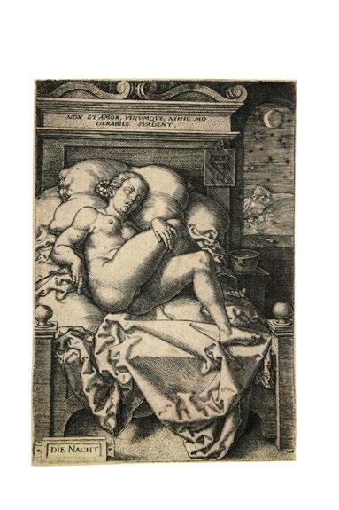
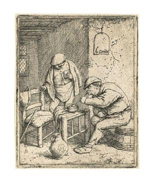
Die Nacht. 1553
Nach H. S. Beham
Kupferstich. 11,2 x 7,7 cm
Bartsch, Hollstein und New Hollstein 180 Provenienz: P. Mariette 1670 (Lugt 1788)
Doublette der Albertina, Wien (Lugt 5 e und 5 h)
Deutsche Privatsammlung
Exquisiter Frühdruck von schönster Brillanz und kaum zu überbietendem Reichtum an fein differenzierten Tonvaleurs, die so wichtig sind für die Wirkung dieses berühmten Nachtstücks.
Mit hauchfeinem Rändchen um die rauh zeichnende Plattenkante. Selten so schön.
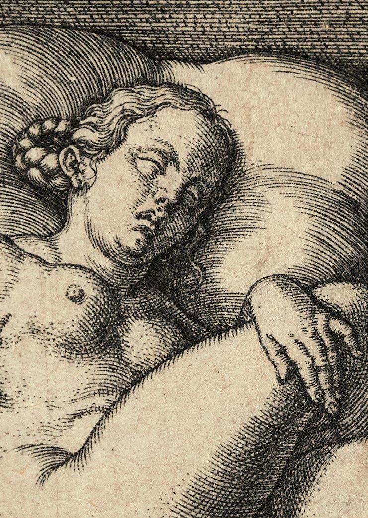
Aldegrever’s beautiful engraving is a reverse copy of one of Sebald Beham’s most provocative erotic prints. The image depicts a nude woman reclining on a bed in an attitude of sexual abandon, presenting herself to the viewer as if the viewer were a lover. The darkened room and the moon and stars visible through the window at the right, while the Latin inscription across the headboard of the bed echoes the erotic promise of the image: “Night and love, and wine, urge nothing moderate.” The erotic character of the image is further enhanced by such formal devices as the placement of the woman’s genitalia near the center of the composition, where they demand our attention, and by sensual appeal of the print itself, with its elegant linework and shimmering light. However, Aldegrever has toned down the eroticism of the original by obscuring the woman’s genitalia in shadow and moving the title Die Nacht from its original position just below the woman, where it helped to focus on her genitalia, to the lower left corner of the print. (J. L. Levy)
2
Night. 1553
After H. S. Beham
Engraving. 11.2 x 7.7 cm
Bartsch, Hollstein, and New Hollstein 180 Provenance: P. Mariette 1670 (Lugt 1788)
Duplicate from the Albertina, Vienna (Lugt 5 e and 5 h)
Private collection, Germany
Exquisite early impression of the most marvelous brilliancy and of virtually unsurpassable richness with regard to the finely differentiated tonal values, of such importance for the effect of this celebrated night piece.
With extremely fine margins around the still inky platemark. Rarely so lovely.
Aldegrever’s beautiful engraving is a reverse copy of one of Sebald Beham’s most provocative erotic prints. The image depicts a nude woman reclining on a bed in an attitude of sexual abandon, presenting herself to the viewer as if the viewer were a lover. The darkened room and the moon and stars visible through the window at the right, while the Latin inscription across the headboard of the bed echoes the erotic promise of the image: “Night and love, and wine, urge nothing moderate.” The erotic character of the image is further enhanced by such formal devices as the placement of the woman’s genitalia near the center of the composition, where they demand our attention, and by sensual appeal of the print itself, with its elegant linework and shimmering light. However, Aldegrever has toned down the eroticism of the original by obscuring the woman’s genitalia in shadow and moving the title Die Nacht from its original position just below the woman, where it helped to focus on her genitalia, to the lower left corner of the print. (J. L. Levy)
3
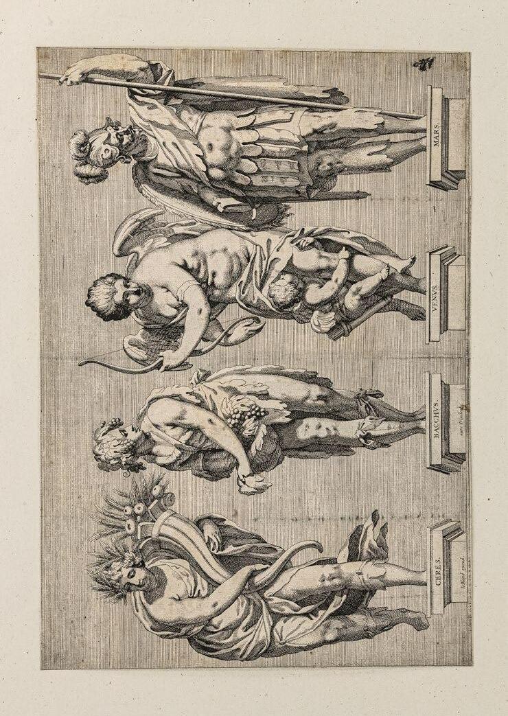
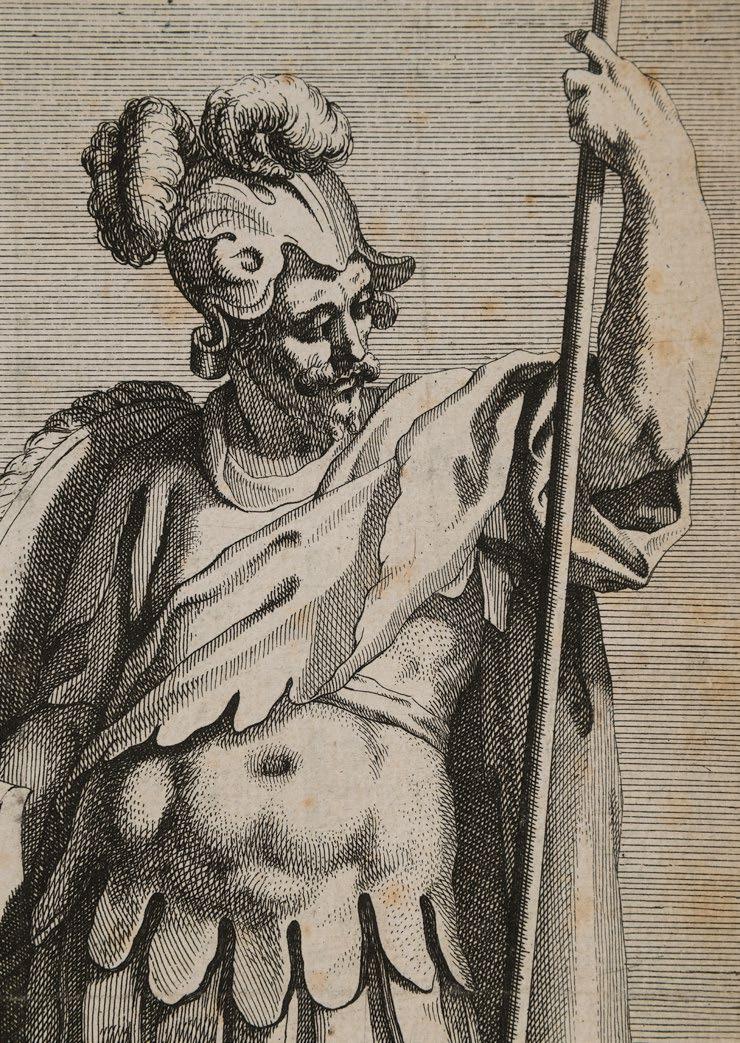
Vier römische Gottheiten als Skulpturen –Ceres, Bacchus, Venus und Mars. Um 1620
Radierung. 28,0 x 40,1 cm
Fehlt im IFF, Graveurs du XVII e siècle, tome VII
Provenienz: Fürsten zu Liechtenstein
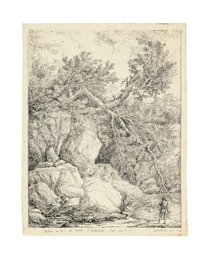
Mit vier durchaus monumentalen, zugleich aber in ihren individuellen Bewegungsmustern überaus graziösen Skulpturen römischer Gottheiten will uns Jean LeBlond I., in dessen Verlag das nicht weiter bezeichnete Blatt erschien, hier bekannt machen. Die trotz ihrer betont kräftigen Leibesmitte gelängten, raffiniert gedrehten Gestalten von Ceres, Bacchus, Venus und Mars scheinen fast zu schweben, gleichsam abheben zu wollen von ihren beschrifteten Postamenten. Sie kommen damit einem Stilideal nahe, das J. Bellange am Herzoglich-Lothringischen Hof in Nancy zu Beginn des 17. Jahrhundert kultiviert und durch seine Radierungen verbreitet hatte. Es mag sein, daß selbst der anonym bleibende Radierer unseres Blattes an dessen feinsinnige Radiertechnik, die Strichlagen und subtil modellierende Pünktchen raffiniert kombinierte, anzuknüpfen bestrebt war, als er die vier manieristischen Götterstandbilder vor einheitlich horizontal schraffiertem Hintergrund platzierte – so wie Bellange seine Apostel wenige Jahre zuvor.
Eines der am besten dokumentierten, wenn auch nicht erhaltenen Skulpturenprojekte am Herzoglichen Hof in Nancy stand im Zusammenhang der Erweiterung des hinter dem Herzogspalast gelegenen unteren Parterres um ein weiteres, die gesamte Bastion ausfüllendes oberes Parterre. Die Stiche von C. Deruet und J. Callot vermitteln eine Vorstellung der Gesamtanlage. Für die Nischen der Stützwand, in deren Mitte eine zweiläufige Treppenanlage vom unteren in das obere Parterre führte, erhielt der erst 1615 aus Rom in die Lothringische Heimat zurückgekehrte und in den Dienst Heinrich II. getretene Bildhauer Siméon Drouin 1616 den Auftrag für 14 mythologische Statuen. Es erscheint nicht unwahrscheinlich, daß LeBlond uns im vorliegenden Blatt vier dieser, den späteren Umbaumaßnahmen unter Stanislaus Leszczy ń ski zum Opfer gefallenen Bildwerke überliefert, für die Drouin 1618 entlohnt worden war.
Ganz ausgezeichneter, gleichmäßig gedruckter Abzug.
Mit feinem Rändchen um die Einfassung bzw. unten mit der sichtbaren Plattenkante. Im unteren Rand ein kleiner Papierverlust alt hinterlegt. An den Rändern punktuell montiert auf die originale Sammlungsunterlage der Fürsten zu Liechtenstein.
Von größter Seltenheit. Wir konnten bislang nur ein einziges weiteres Exemplar in der Bibliothèque interuniverstaire de la Sorbonne, Paris nachweisen [SALLE DE RESERVE Magasin A310 (ESTAMPES 41 Pièce 49)]
3 Four Roman Divinities as Sculptures: Ceres, Bacchus, Venus, and Mars. Circa 1620
Etching. 28.0 x 40.1 cm
Missing from IFF, Graveurs du XVIIe siècle , tome VII
Provenance: The Princes of Liechtenstein
It is Jean LeBlond I’s intention here to introduce us to four sculptures of Roman deities that are certainly monumental, but at the same time extremely graceful in their individual patterns of movement. Despite their emphatically ample midsections, the elongated, ingeniously rotated figures of Ceres, Bacchus, Venus, and Mars seem almost to float, as though striving to ascend into the air from their pedestals, which bear inscriptions. Thus, they closely approached the stylistic ideal cultivated by J. Bellange at the court of the Duchy of Lorraine in Nancy in the early 17th century, as disseminated via his etchings. It is not unlikely that the anonymous etcher of the present sheet sought to emulate Bellange’s subtle etching technique, with its sophisticated combination of strokes and subtly modeled dotting when positioning his four Mannerist statues of deities before a uniform horizontal hatched background – just as Bellange had done with his Apostles a few years earlier.
One of the best documented – albeit not preserved – sculptural projects undertaken at the ducal court in Nancy was related to the extension of the lower parterre via an additional upper parterre, which filled the entire bastion. Engravings by C. Deruet and J. Callot transmit an impression of the complex as a whole. Awarded the commission in 1616 for 14 mythological statues intended for the niches of the retaining wall – at whose center a double staircase ascended from the lower to the upper parterre – was the sculptor Siméon Drouin, who had returned from Rome to his native Lorraine only in 1615, where he entered the service of Henry II. It appears likely that with this print, LeBlond transmits four of these statues, for which Drouin was remunerated in 1618, and which however fell victim to conversion measures undertaken later under Stanislaus Leszczy ń ski .
A quite excellent uniformly printed impression.
With fine margins around the frame and with the platemark visible below. A small area of damage to the paper in the lower margin received an early repair. Given a punctate mounting along the edges on the original collection support of the Princes of Liechtenstein.
Of the greatest rarity. Up to this point, we have been able to document only a single further impression, now in the Bibliothèque interuniverstaire de la Sorbonne, Paris [SALLE DE RESERVE Magasin A310 (ESTAMPES 41 Pièce 49)]
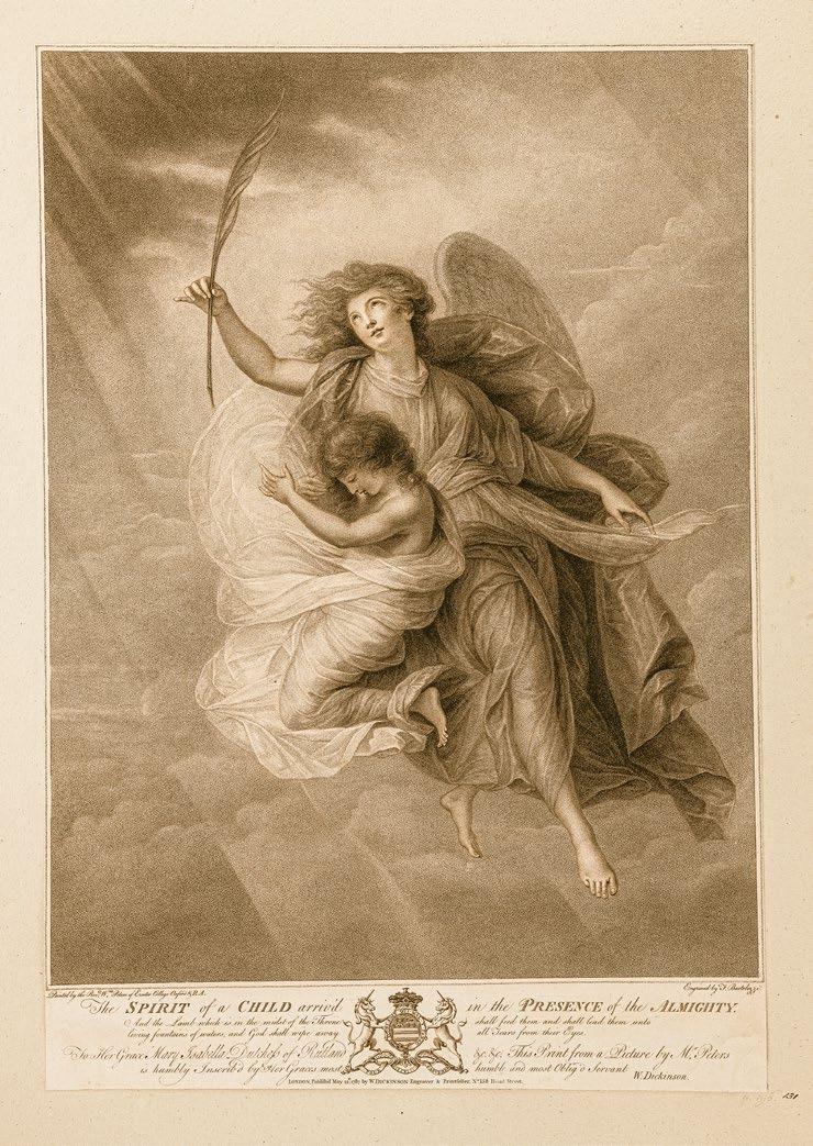
4
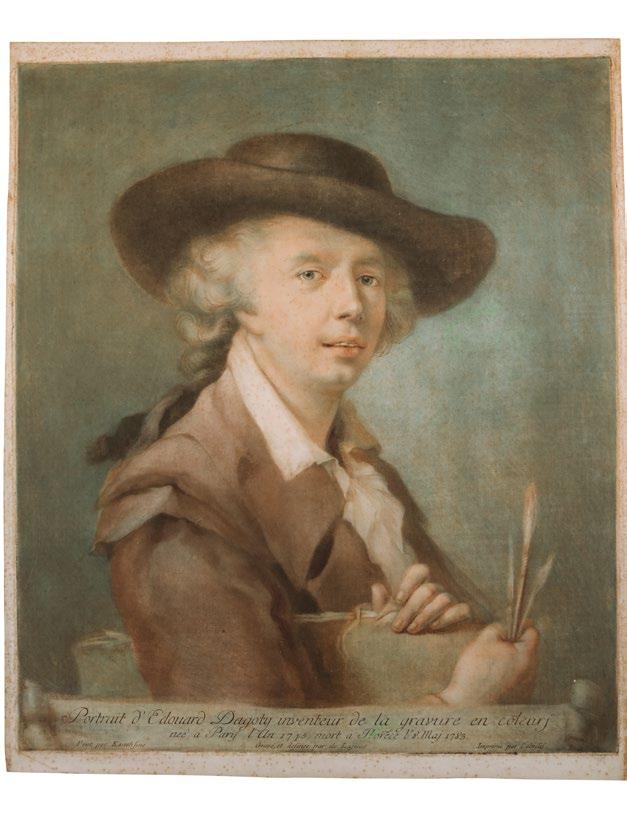
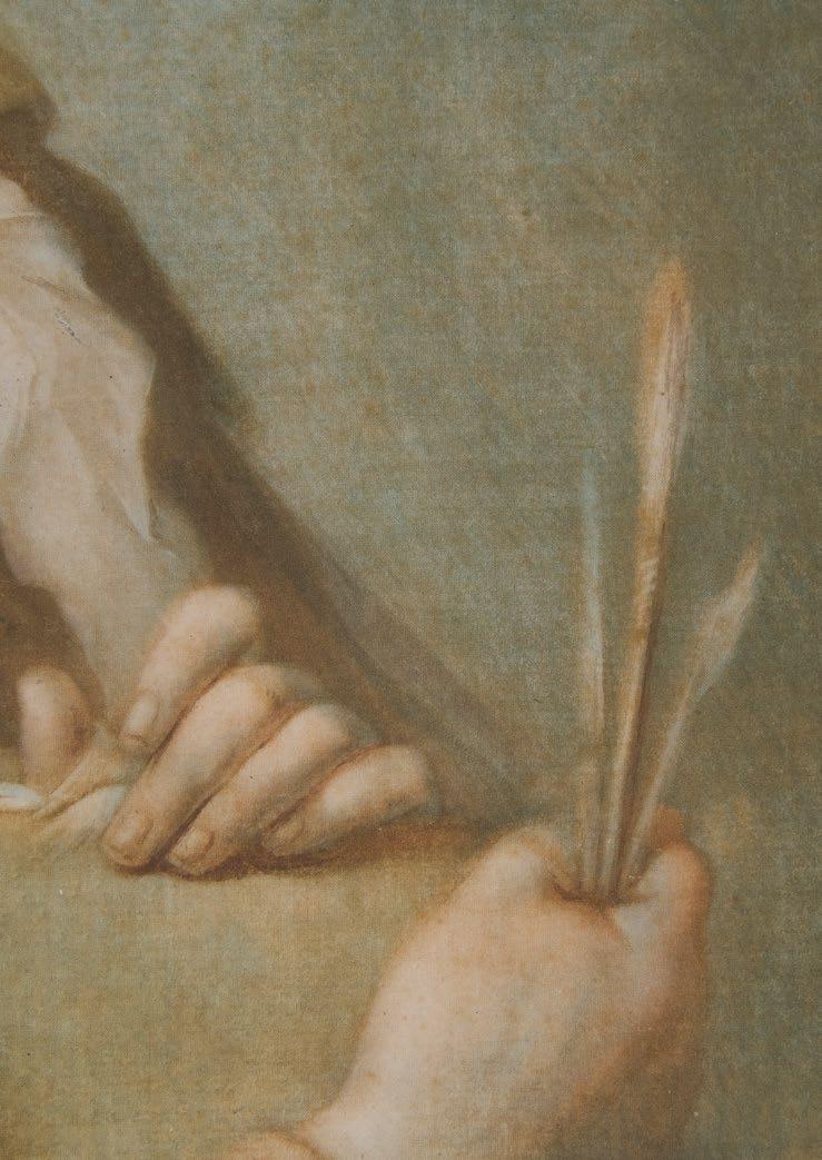
FRANCESCO BARTOLOZZI
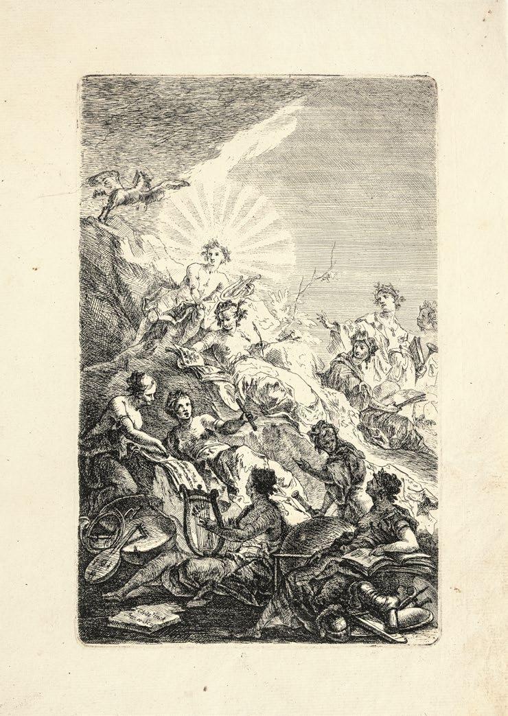
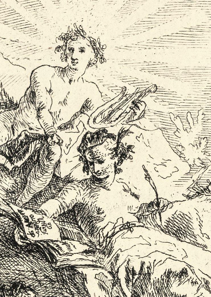
The SPIRIT of a CHILD arriv’d in the PRESENCE of the ALMIGHTY –Die Seele eines Kindes erreicht die Gegenwart des Allmächtigen. 1787
Nach M. W. Peters
Radierung und Punktiermanier, gedruckt in Braunschwarz. 56,1 x 38,6 cm Tuer 2066; De Vesme-Calabi 342/V
Provenienz: Fürsten zu Liechenstein
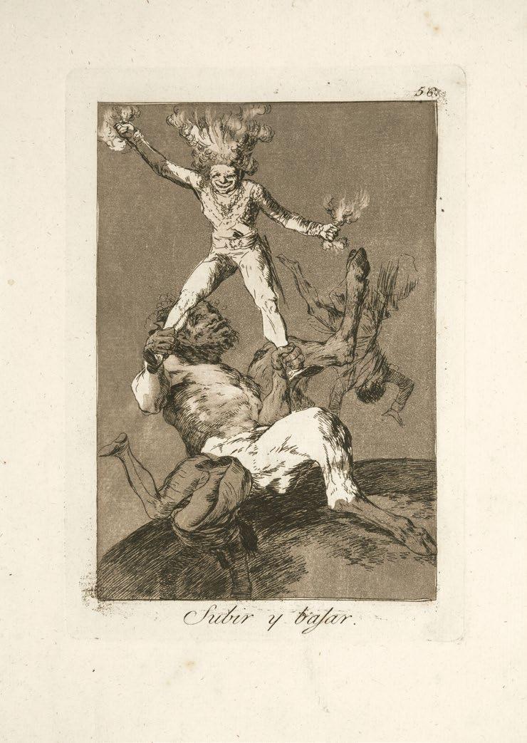
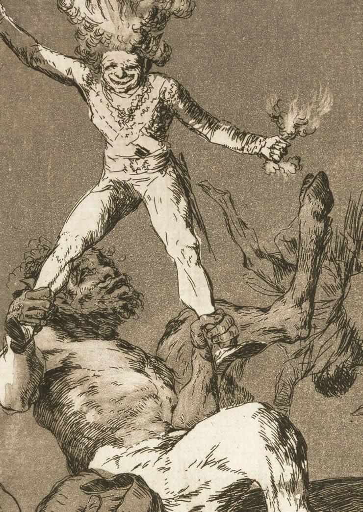
Eines der Hauptwerke der gefühlsbetonten religiösen Druckgraphik in England.
Im Unterschied zu Frankreich, wo das mitunter überakzentuiert religiöse Sentiment in der Druckgraphik als Instrument antiklerikaler Propaganda im Kampf gegen die Katholische Kirche dienstbar gemacht wurde, galt es in England verbreitet als willkommenes Werkzeug zur Förderung der individuellen Frömmigkeit. Die starke sentimentale Pointierung, wie sie namentlich die Werke von M. W. Peters, der 1783 zum Priester geweiht worden war, kennzeichneten, reizte gleichwohl zu beißendem Spott. J. Gilray parodierte die vorliegende Komposition erfolgreich mit seinem 1791 publizierten The Accusing Spirit which Flew up to Heaven’s Chancery…, Dedicated (without Permission to the Revd. Mr. Peters) . Statt eine fromme Kinderseele in die himmlischen Gefilde zu begleiten, reicht ein Engel in der Himmerlskanzlei eine Petition ein: He shall not dye by XXX
Ausgezeichneter, in Braunschwarz gedruckter Abzug.
Mit Rändchen um die Einfassung bzw. mit dem vollständigen Text im Unterrand. An den Rändern punktuell montiert auf die originale Sammlungsunterlage der Fürsten zu Liechtenstein.
1728 Florenz – Lissabon 1815
4
The SPIRIT of a CHILD arriv’d in the PRESENCE of the ALMIGHTY 1787
After M. W. Peters
Etching and stipple engraving, printed in brown-black. 56.1 x 38.6 cm
Tuer 2066; De Vesme-Calabi 342/V
Provenance: The Princes of Liechtenstein
One of the principal works of the highly emotive religious printmaking so characteristic of England.
In contrast to France, where occasionally excessive religious sentiment in printmaking served as an instrument of anti-clerical propaganda in the battle against the Catholic church, this type of emotive approach was widespread in England as a welcome tool for the promotion of individual piety. Such emphatic sentimentality – so characteristic of the works of M. W. Peters, who was ordained to the priesthood in 1783 – nonetheless provoked biting mockery. J. Gilray successfully parodied the present composition with his The Accusing Spirit which Flew up to Heaven’s Chancery…, Dedicated (without Permission to the Revd. Mr. Peters), published in 1791. Instead of guiding a devout, childish soul upward into the celestial spheres, an angel submits a petition to the heavenly chancellery: He shall not dye by XXX
Excellent impression, printed in brown-black.
With margins around the framing line and the complete text along the lower edge. Given a punctate mounting to the original collection support of the Princes of Liechtenstein.
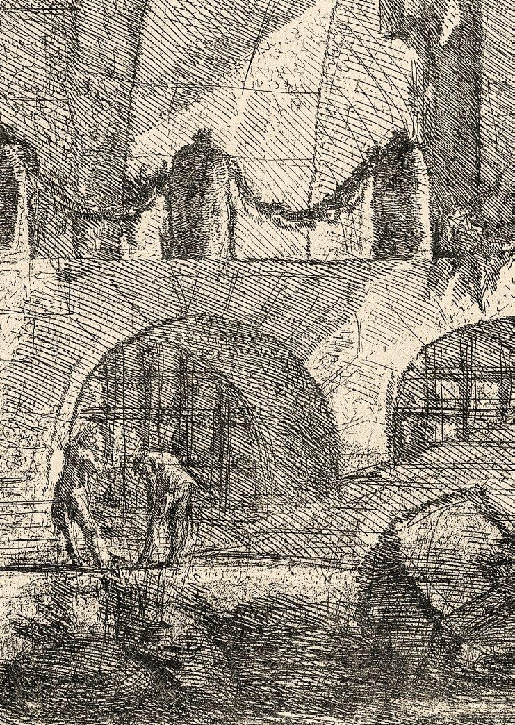
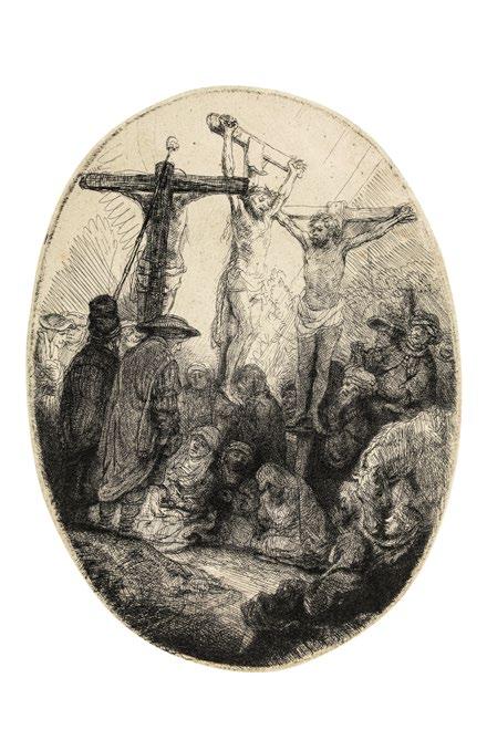
5 Judith mit dem Haupt des Holofernes. Um 1525/27
Kupferstich. 8,6 x 6,8 cm
Bartsch, Pauli, Hollstein und New Hollstein 4
Provenienz: A. Freiherr von Lanna, Eisgrub (Singer 846)
H. G. Gutekunst, Stuttgart, Auktion 66, 1909, Nr. 467
Ernst von Gussmann, Stuttgart
C. G. Boerner, Leipzig, Auktion 191, 1936, Nr. 18
Deutsche Privatsammlung
Brillanter, gestochen scharfer Frühdruck. Vergleichbar den Exemplaren im British Museum, London, im Metropolitan Museum of Art, New York und im Minneapolis Art Institute, noch vor dem Kratzer im oberen Bereich der Halbsäule in der Fensterleibung, den Römer-Kann im jüngst publizierten The New Hollstein zwar nicht eigens erwähnt, der jedoch bei dem von Ihr zur Illustration herangezogenen, beschädigten Exemplar des Rijksmuseums ebenso zu sehen ist wie bei dem Abzug in der Graphischen Sammlung, München.
Das von Hollstein namentlich mehrfach erwähnte Exemplar der Sammlung Lanna, das in der Auktion der Sammlung bei H. G. Gutekunst, Stuttgart 1909 als Vorzüglicher Abzug beschrieben, von E. v. Gussmann für seine Kollektion erworben wurde.
Auf der Plattenkante geschnitten, gelegentlich minimal knapp. In ganz ausgezeichneter Erhaltung.
This image of Judith is faithful to the apocryphal account in showing the heroine in the sumptuous dress and jewelry that she put on to make herself more attractive to Holofernes. An example of a “good Judith,” she is shown as a strong, virtuous woman. The blank wall behind her is broken only by a small window with a column suggesting fortitude, a virtue often associated with this heroine. Some small grasses growing in the opening seem to be causing the wall crumble, perhaps alluding to the frail, young woman who was able to fell a powerful male enemy. The face of Holofernes has an agonized expression, as if he were still alive and begging for mercy. Judith looks sharply in the opposite direction – a majestic image of female power. (B. Barnes)
5 Judith with the Head of Holofernes. Circa 1525/27
Engraving. 8.6 x 6.8 cm
Bartsch, Pauli, Hollstein, and New Hollstein 4
Provenance: A. Freiherr von Lanna, Eisgrub (Singer 846)
H. G. Gutekunst, Stuttgart, auction 66, 1909, no. 467
Ernst von Gussmann, Stuttgart
C. G. Boerner, Leipzig, auction 191, 1936, no. 18
Private collection, Germany
Brilliant, razor-sharp early impression. Comparable to the examples in the British Museum in London, the Metropolitan Museum of Art in New York, and the Minneapolis Art Institute, still before the scratches in the upper area of the halfcolumn in the window reveal, which Röver-Kann does not specifically mention in the recently published The New Hollstein, but which can be seen in the damaged copy of the Rijksmuseum she used for an illustration, as well as in the impression owned by the Graphische Sammlung, Munich.
The exemplar from the Lanna Collection, mentioned specifically a number of times in Hollstein; described at the auction of the collection by H. G. Gutekunst in Stuttgart in 1909 as an excellent impression , and purchased by E. v. Gussmann for his collection.
Cut down to the platemark, or slightly beyond it in places. In an excellent state of preservation.
This image of Judith is faithful to the apocryphal account in showing the heroine in the sumptuous dress and jewelry that she put on to make herself more attractive to Holofernes. An example of a “good Judith,” she is shown as a strong, virtuous woman. The blank wall behind her is broken only by a small window with a column suggesting fortitude, a virtue often associated with this heroine. Some small grasses growing in the opening seem to be causing the wall crumble, perhaps alluding to the frail, young woman who was able to fell a powerful male enemy. The face of Holofernes has an agonized expression, as if he were still alive and begging for mercy. Judith looks sharply in the opposite direction – a majestic image of female power. (B. Barnes)
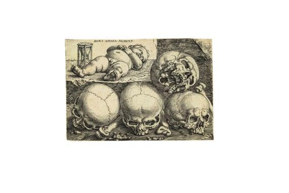
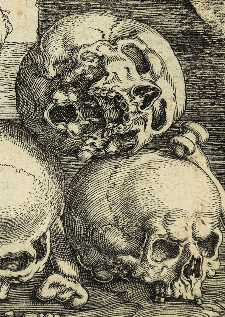
6
Der Knabe mit den vier Totenschädeln. Um 1528/30
1502 Nürnberg – Italien 1540
Kupferstich. 5,3 x 7,7 cm
Bartsch 28; Pauli und Hollstein 36/II (von III); New Hollstein 36/IIa (von IIb)
Provenienz: W. H. F. K. v. Lepell (Lugt 1672)
Doublette des Kupferstichkabinetts, Staatliche Museen zu Berlin (Lugt 1606 und 5615)
Amsler & Ruthardt, Berlin, Auktion XXXII, 1886, Nr. 76 P & D Colnaghi, London, Lagernummer c.12173
Bartel Beham’s Child with Four Skulls is the most evolved of four related compositions on the theme of death. (S. H. Goddard)
Einer der wenigen bekannten Abzüge mit der noch nicht vollständig abgebrochenen rechten oberen Ecke, die hier nur noch ganz ungleich im Druckbild erscheint, im Unterschied zum Abzug in der Albertina, Wien. Ansonsten herrlich klar und prägnant im Lineament und insofern sowohl dem insgesamt sehr schwach gedruckten Exemplar des II. Zustandes in Dresden, als auch den meisten der späteren Abzüge des III. Zustandes weit überlegen, bei denen die Ecke vollständig verloren gegangen ist. Den ersten Etat konnte Röver-Kann jüngst nur in den öffentlichen Sammlungen in Berlin, London (V&A) und New York nachweisen.
Zumeist auf der Plattenkante geschnitten bzw. gelegentlich minimal knapp. Rückseitig mit Resten alter Falze, sonst tadellos.
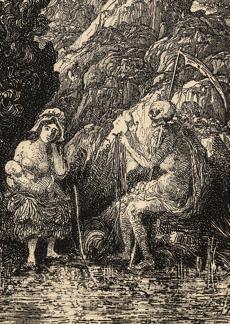
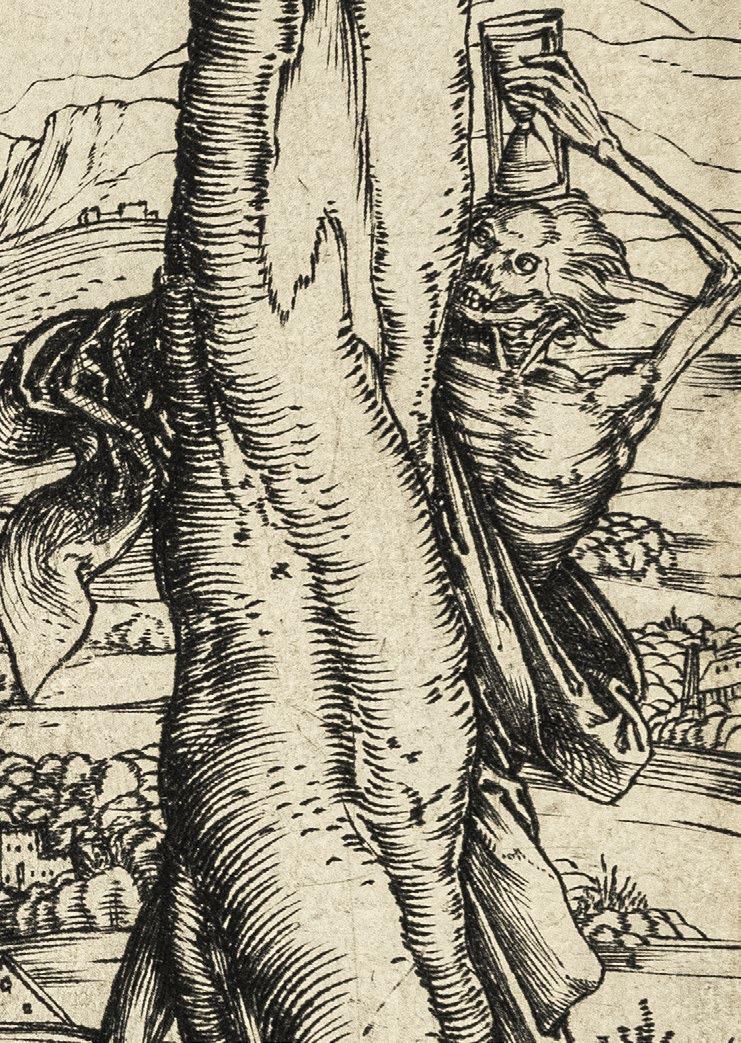
Das berühmte memento mori Barthel Behams gilt als his most striking illustration of the subject. (H. W. Janson). Inspiriert an Italienischen Vorbildern des ausgehenden 15. Jahrhunderts mit Darstellungen eines auf einem Totenkopf schlafenden Kindes, entwickelt Beham hier eine ganz eigene Interpretation des Themas unter dem Motto MORS OMNIA AEQVAT (Der Tod macht alle gleich):
Das italienische Motiv eines Puttos mit Totenkopf ist hier von Beham, bei dem die Kenntnis italienischer Vorbilder vorausgesetzt werden kann, zu einer Situation eines Karners assoziierenden Komposition mit totem Kind und Totenschäden umgestaltet. Damit wurde eine aktuelle, prägnante und vielrezipierte Bildformel für den im Spätmittelalter allgegenwärtigen Gedanken der Vanitas, der Vorstellung von der Vergänglichkeit und Kürze des Lebens und der Allgegenwart des Todes, geprägt. Das vorliegende Blatt ist Behams komplexeste Bildschöpfung dieser Art, die durch den die Verkürzung gegebenen liegenden Knaben und die in unterschiedlichen Ansichten gezeigten Totenschädel auf jeweils verschiedenen Ebenen eine zusätzliche Spannung erhält. Spätere Abdrucke zeigen – als dritten Plattenzustand – das Fehlen der rechten oberen Ecke der Druckplatte, womit der im Thema angelegte und mit dem Vanitas Gedanken verbundene Aspekt des Ruinösen noch unterstrichen wird. In einer 1614 datierten seitenverkehrten Kopie dieser erfolgreichen, vielrezipierten Bildschöpfung von Lucas Kilian (1579 1637) ist auch dieses Detail wieder aufgenommen worden. (C. Wiebel)
Von größter Seltenheit.
6 Sleeping Child with Four Skulls. Circa 1528/30
Engraving. 5.3 x 7.7 cm
Bartsch 28; Pauli, and Hollstein 36/II (of III); New Hollstein 36/IIa (of IIb)
Provenance: W. H. F. K. v. Lepell (Lugt 1672)
Duplicate from the Kupferstichkabinett, Staatliche Museen zu Berlin (Lugt 1606 and 5615)
Amsler & Ruthardt, Berlin, auction XXXII, 1886, no. 76 P & D Colnaghi, London, Lagernummer c.12173
Bartel Beham’s Child with Four Skulls is the most evolved of four related compositions on the theme of death. (S. H. Goddard)
One of the few known impressions with the right upper corner – which only ap pears quite unevenly in the printed image here – not completely broken off, in contrast to the exemplar in the Albertina in Vienna. Otherwise marvelously clear and incisive in the lineaments, and hence far superior to the exemplar of the 2nd state in Dresden, which is printed quite weakly overall, as well as most of the later impressions from the 3rd state, where the corner is missing entirely. Recently, Röver-Kann was able to document the 1st state only in public collections in Berlin, London (V&A), and New York.
For the most part cut down to the platemark, in places slightly beyond it. With residues from old hinges on the reverse, otherwise impeccable.
Barthel Beham’s famous memento mori is regarded as his most striking illustration of the subject. (H. W. (Janson). Inspired by Italian models from the late 15th century showing a child sleeping on a death’s head, Beham develops a highly original interpretation of the theme here under the motto MORS OMNIA AEQVAT (Death makes all things equal):
In this image, Beham – who was presumably familiar with Italian models – has reshaped the Italian motif of the putto with death’s head into a composition that is reminiscent of an ossuary, and shows a dead child with skulls. In so doing, he gives shape to an up to date, incisive, and much emulated pictorial formula for the idea – so ubiquitous during the Late Middle Ages – of the Vanitas, the notion of the transitoriness and brevity of life and the ubiquitous character of death. The present sheet is Beham’s most complex creation in this genre, and is endowed with additional tension through the foreshortening of the recumbent boy and the diverse views of the skulls, positioned on divergent levels. Later impressions –reflecting the 3rd state – display the missing upper right corner of the printing plate, which further underscores the theme of ruin that is bound up with the Vanitas motif. This detail has also been incorporated into a laterally reversed copy of this successful, much imitated composition by Lucas Kilian /1579 1637), which is dated 1614. (C. Wiebel)
Of the greatest rarity.
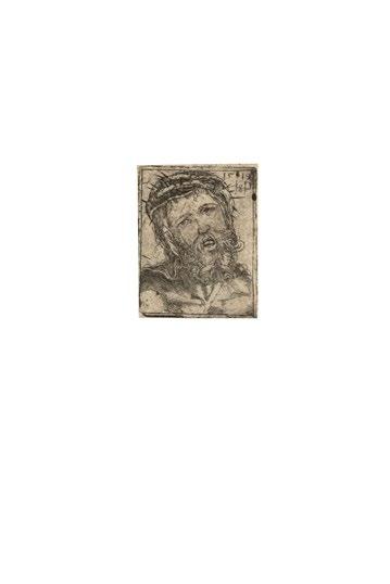
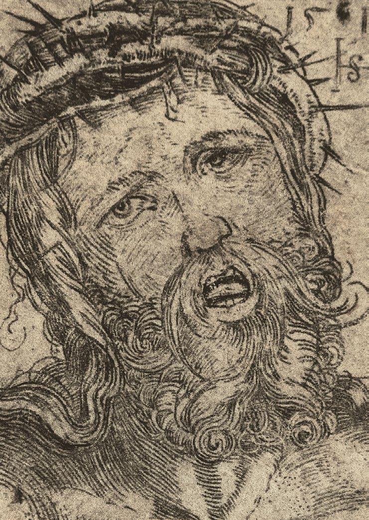
HANS SEBALD BEHAM
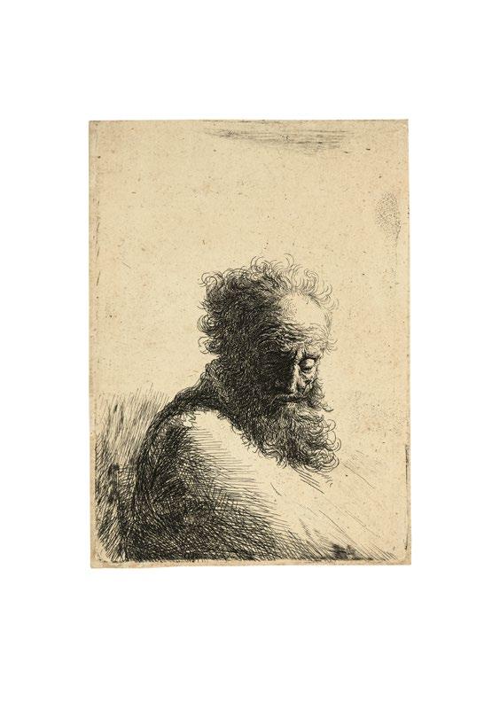
Der Kopf Christi. 1519
Kupferstich. 3,8 x 2,9 cm
Bartsch 27; Pauli und Hollstein 29
Provenienz: Deutsche Privatsammlung
Das sehr seltene Blatt in einem gestochen scharfen, tiefschwarzen Abzug höchster Brillanz, der die aus dem Wechselspiel von expressiver Mimik, ornamentaler Schönlinigkeit und miniaturhaftem Format lebende Darstellung in ihrem ganzen Reichtum zur Geltung bringt.
Mit feinem Rändchen bzw. mit der voll sichtbaren tonig rauh zeichnende Plattenkante. Tadellos.
Die früheste von insgesamt drei gestochenen Darstellungen des Kopfes Christi, die der Künstler in kurzer Folge zwischen 1519 und 1520 schuf. Dabei handelt es sich um ikonographische Neuschöpfungen, die vom Bildtypus des Schmerzensmannes bzw. des Schweißtuches der Hl. Veronika abgeleitet sind, wobei zum Vergleich beispielsweise auf Dürers Blatt aus der Großen Holzschnittpassion (Meder 113) von 1511 sowie seinen Kupferstich (Meder 26) von 1513 hingewiesen werden kann.
Die früheste Darstellung zeichnet sich dadurch aus, daß hier zwar der Ausdruck des Leidens und Schmerzes dominiert, jedoch schon eine gewisse Verhaltenheit mitklingt, in der die Wendung ins Heroische vorgezeichnet ist, wie sie in den nachfolgenden Stichen ausgeprägt ist.
The Head of Christ. 1519
Engraving. 3.8 x 2.9 cm
Bartsch 27; Pauli und Hollstein 29
Provenance: private collection, Germany
The extremely rare sheet in a razor-sharp, deep-black impression of the greatest brilliance that brings out the motif – animated by an interplay of facial expression, ornamental linear grace, and miniature format – in all of its richness.
With fine margins around the fully visible, inky, raspy platemark. Impeccable.
The earliest of altogether three engraved depictions of the head of Christ produced by the artist in a brief series between 1519 and 1520. The motif constitutes an iconographic novum derived from the image type of the Man of Sorrows and the Sudarium of St. Veronica, an achievement that is comparable to Dürer’s sheet from the Large Woodcut Passion (Meder 113) of 1511, as well as his engraved version of the subject (Meder 26) of 1513.
Dominant in the earliest member of the series is an expression of suffering and pain, although a hint of reticence already foreshadows the turn toward the heroic that characterizes the two successor engravings.
8
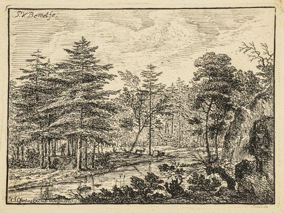
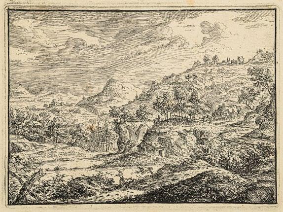
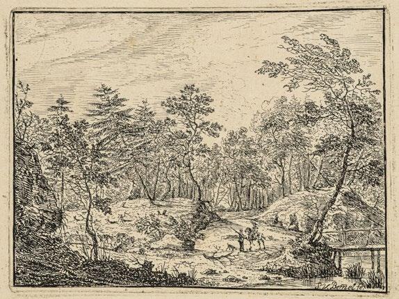
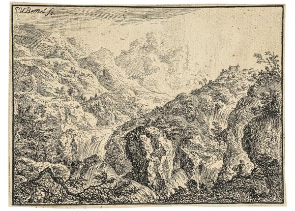
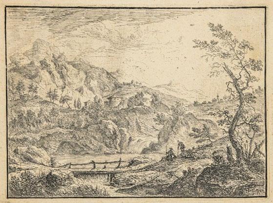
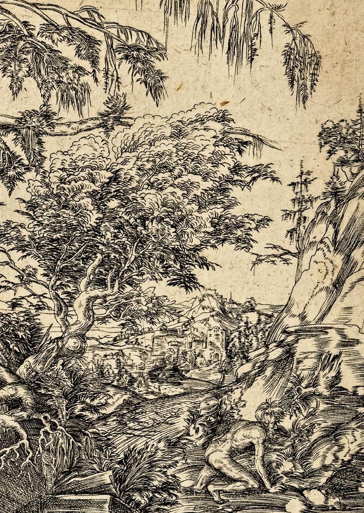
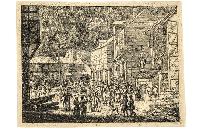
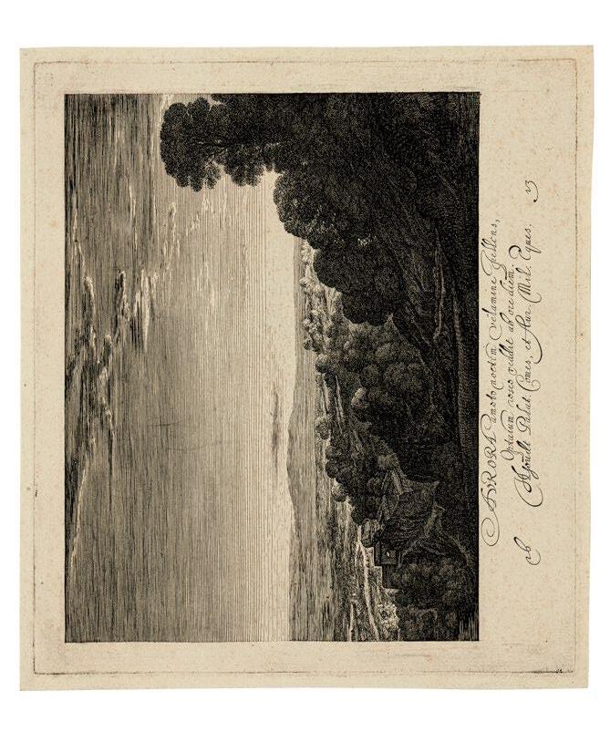
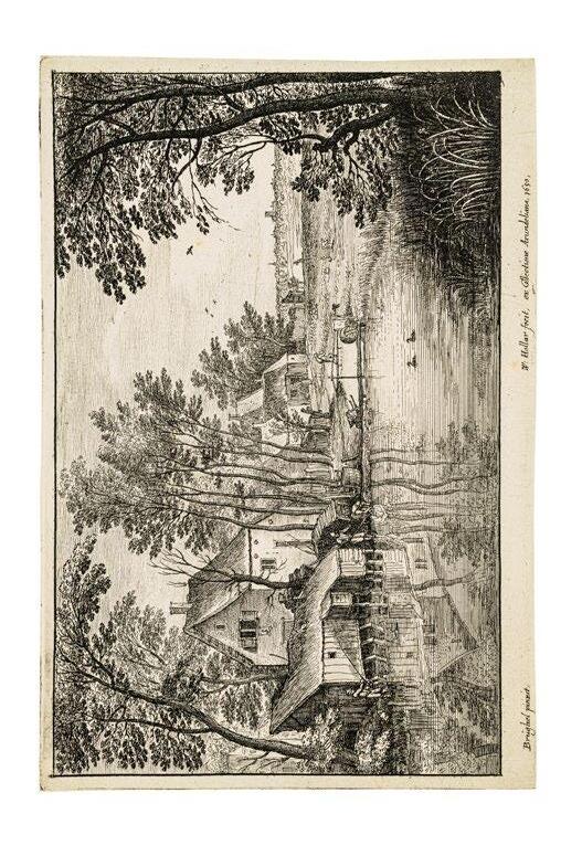
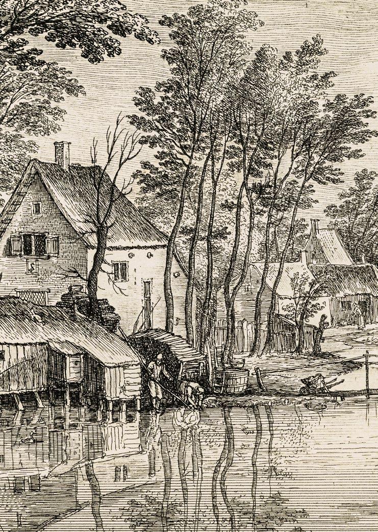
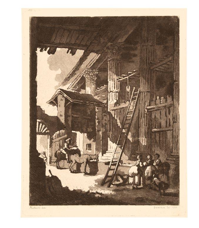
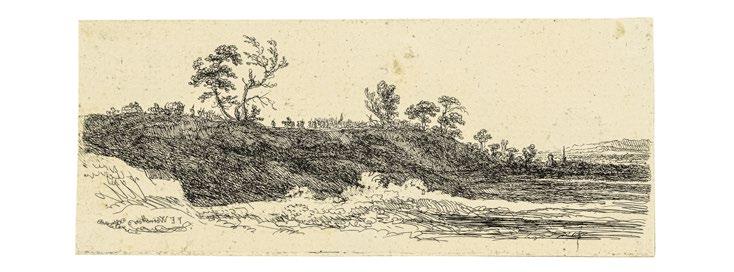
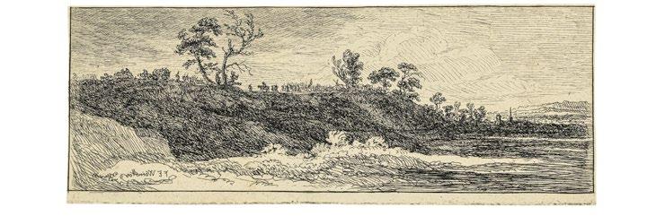
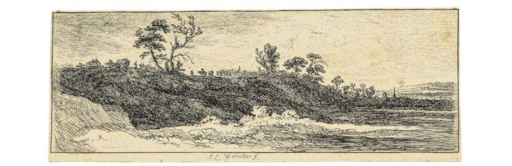
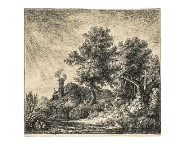
Die bergigen und waldigen Landschaften. 1716
Fluß mit waldiger Umgebung. Die Hütte am Wasserfall.
Der Steg vor dem Wasserfall.
Der Zeichner in der Nähe des Wasserfalls
Der Fußgänger bei dem Reiter
Eine einsame Gebirgsgegend
Folge von 6 Blätter. Radierung. Je ca. 13,7-14,1 x 18,5-18,7 cm
Heller Andresen 1; Andresen und Le Blanc 1-6
Die von Andresen besonders geschätzte, bei H. J. Ostertag in Regenburg publizierte Folge in durchgängig prachtvollen Frühdrucken. Rußig tiefschwarz, von fast gratiger Wirkung und mit den noch delikaten, zumeist vertikalen Wischspuren, die den phantasievollen Landschaftskompositionen ihren jeweils ganz eigenen atmosphärischen Reiz verleihen.
Mit vereinzelten Braunfleckchen zumeist außerhalb der Darstellung in den bis zu 3 cm breiten Papierrändern. Lediglich Blatt 4 der Folge unmittelbar auf der Plattenkante geschnitten. Sämtlich unberührt und noch mit der wunderbar warmtonigen Alterspatina.
In seiner Malerei, namentlich aber mit seinem gesamthaft nur 8 Radierungen umfassenden druckgraphischen Werk knüpfte Peter von Bemmel unmittelbar an das Schaffen seines aus Utrecht stammenden Vaters Willem Gerritz van Bemmel an, dessen Schulung bei H. Saftleven bis in die Arbeiten des Sohnes Wirksamkeit entfaltet zu haben scheint.
Als komplette Folge von großer Seltenheit.
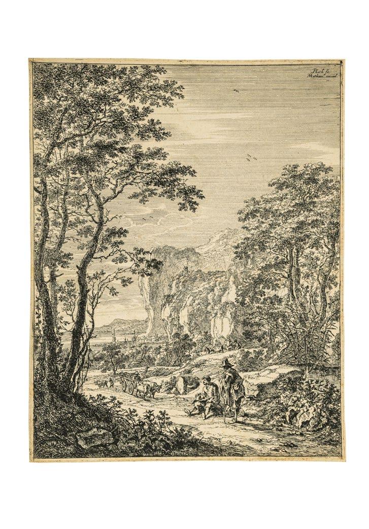
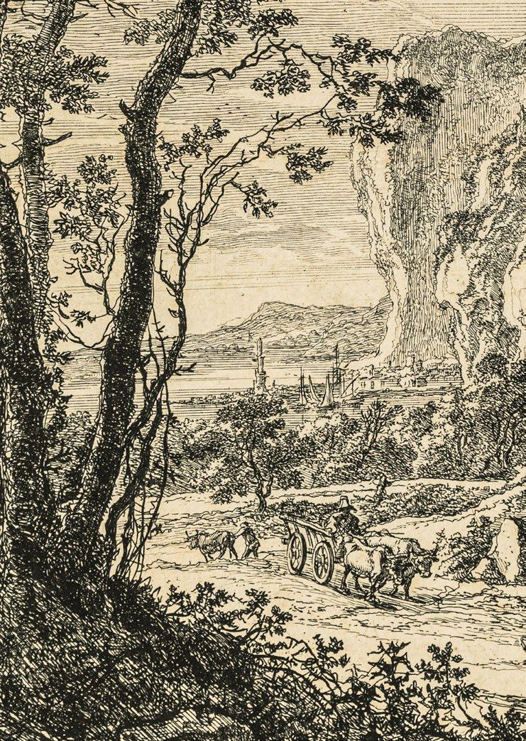
8 The Mountainous and Wooded Landscapes. 1716
River with Wooded Surroundings
Hut by a Waterfall
Footbridge in Front of a Waterfall Man Sketching near a Waterfall Man on Foot Conversing with a Rider
A Lonely Mountain Spot
Series of 6 sheets. Etching. Each ca. 13.7-14.1 x 18.5-18.7 cm
Heller Andresen 1; Andresen and Le Blanc 1-6
The full series – published by H. J. Ostertag in Regenburg, and singled out for special praise by Andresen – in a set of uniformly splendid early impressions. Sooty deep black, making an almost burry impression, and with the still delicate, predominantly vertical wipe marks that endow these fantastical landscape compositions with their individual and highly singular atmospheric charm.
With isolated brown spotting, mainly outside of the scenes, i.e. in the paper margins, which measure up to 3 cm. Only sheet 4 of the series is cut down all the way to the platemark. All sheets pristine and still displaying the marvelous warmtoned patina of age.
In his paintings, but in his print oeuvre as well, consisting of just eight etchings, Peter von Bemmel relied directly on the achievement of his father Willem Gerritz van Bemmel, a native of Utrecht, whose training with H. Saftleven is manifestly reflected in the works of his son as well.
As a complete series, of the greatest rarity.
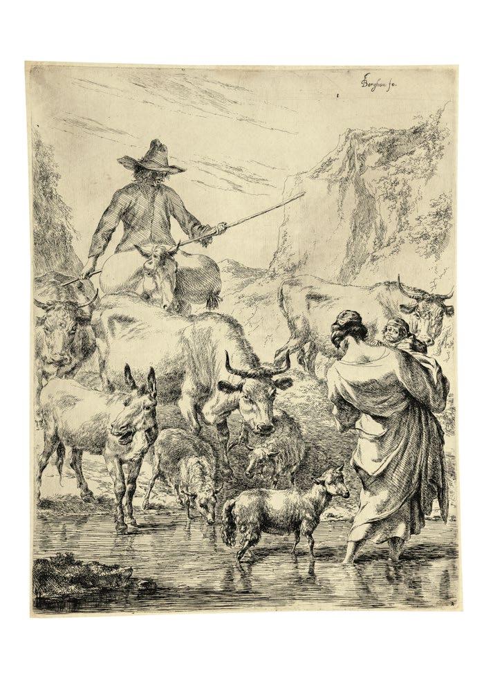
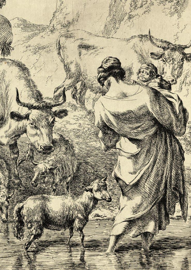
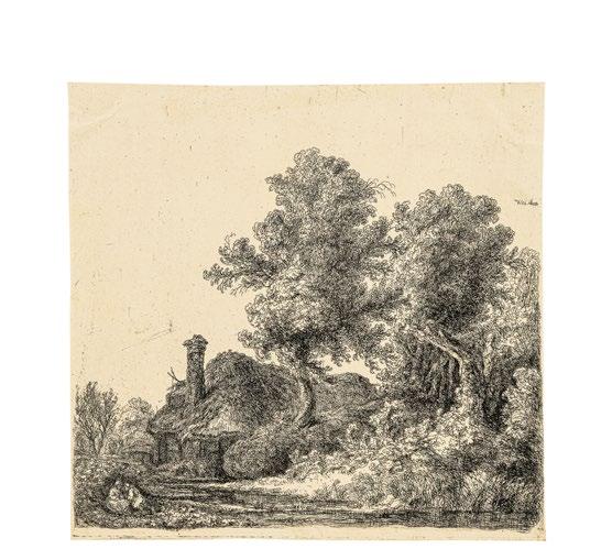
Die Herde an der Furt. Um 1652
Radierung. 26,2 x 20,6 cm
Bartsch 9, Dutuit und Hollstein 9/III
Wasserzeichen: sieben-zackige Schellenkappe
Superbes Exemplar. Mit der Nummer 2 unten rechts.
Exquisiter Frühdruck auf Schellenkappen-Papier, der noch den ganzen tonalen Reichtum der Ätzung vom tiefsten Schwarz bis zu den zarten Übergängen der lichten Grautöne zeigt. Den fein differenziert ausgewischten Plattenton und die erst unvollständig gelöschten Wischspuren benutzt der Künstler in vollendeter Weise, um die atmosphärische Stimmung einer sonnenüberfluteten Mittagsstunde wiederzugeben.
Rings mit feinem Rand. Bis auf Reste alter Falze auf der Rückseite, einer davon in der Mitte des oberen Randes minimal durchschlagend, in unberührter Frische, die durch zwei leichte Hängefalten des Papiers nicht weiter gestört wird.
Die Radierung ist Teil einer Folge von Hirtendarstellungen, die am Beginn der fünfziger Jahre entstand. Zweifellos handelt es sich hier um eine italienische Reminiszenz. Dafür spricht nicht nur die von Berchem bevorzugte bergige Kulisse, sondern vor allem jene von südlicher Sonne in helles Licht getauchte idyllische Szene selbst. Menschen und Tiere agieren in des Künstlers ›Arkadien‹. (H. Baudis)
The Herd at the Ford. Circa 1652
Etching. 26.2 x 20.6 cm
Bartsch 9, Dutuit and Hollstein 9/III
Watermark: seven-pointed foolscap
Superb exemplar.
With the number 2, lower right.
Exquisite early impression on foolscap paper, still displaying the entire richness of the etching, from the deepest black to the most delicate transitions between paler gray tones. The artist has exploited the finely differentiated plate tone and the incompletely erased wipe marks in the most consummate manner to invoke the mood and atmosphere of a sundrenched midday scene.
With fine margins all the way around. In a state of pristine freshness apart from the remains of old hinges on the reverse, one of which shows through slightly at the center of the upper edge, and not impaired by two slight creases in the paper surface.
This etching is one part of a series of depictions of shepherds dating from the early 1650s. Unquestionably, the work is a reminiscence of Italy. Arguing for this is not only the mountainous backdrop so favored by Berchem, but in particular the idyllic scene itself, immersed in the brilliant light of the southern sunshine. Both people and animals play a role in this artist’s ‘Arcadias.’ (H. Baudis)
10
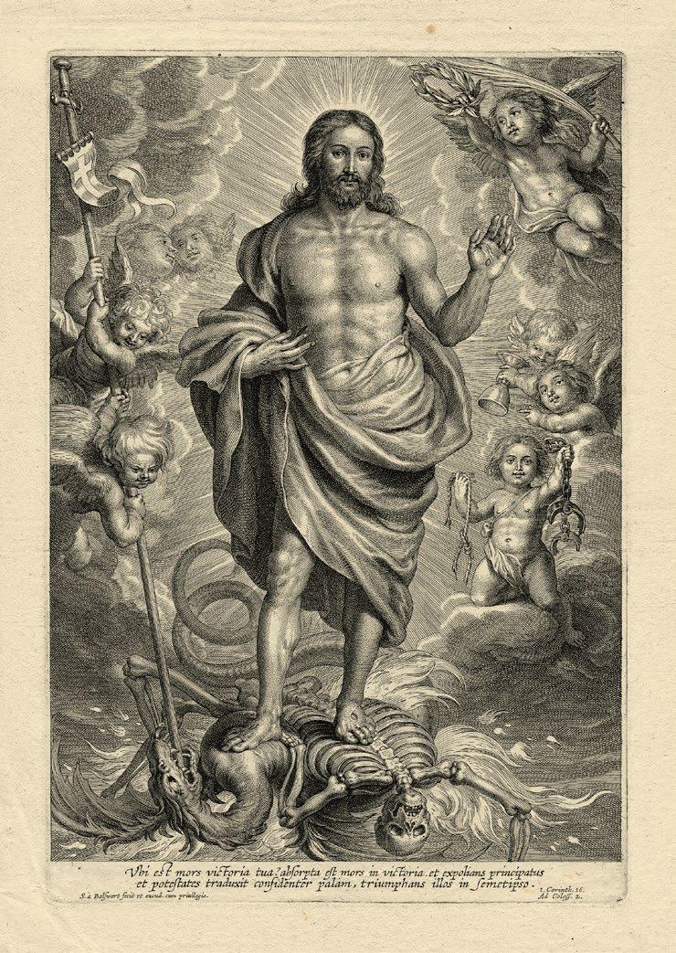
Christus als Überwinder des Todes. Um 1630
Kupferstich. 29,1 x 19,9 cm
Fehlt bei Wurzbach und Hollstein
Wasserzeichen: Doppeltes C unter Krone
Die seltene, selbst Hollstein unbekannt gebliebene Komposition in einem ganz vortrefflichen Abzug von schönster Brillanz und Klarheit.
Mit ca. 2 cm Papierrand um die tonig abgesetzte Plattenkante. Eine schwache Horizontalfalte nur verso sichtbar, sonst taldellos.
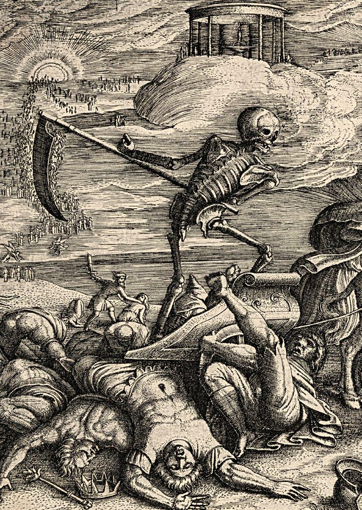
Von Bolswert selbst verlegt, verrät das Blatt nichts über den Autor der eindrucksvollen Bildschöpfung, die den auferstandenen Christus als Überwinder des Todes und der Sünde vorstellt, umgeben von Engeln als Kommentatoren dieser Glaubenswahrheit.
Die Leiden der Passion liegen hinter ihm und sein verklärter Leib zeigt nur noch die fünf Wundmale, durch die der Sieg errungen wurde. Sein Blut wurde vergossen, wie es im Messkanon heißt, zur Vergebung der Sünden. Darauf verweisen mit explizit eucharistischem Bezug der umgekehrt gehaltene Kelch des Engels rechts, während die Engel links mit der Stafette des Auferstandenen dem satanischen Drachen den Todesstoß versetzen. Mit der Auferstehung ist die Macht des Todes gebrochen, seine Fesseln sind gesprengt. Dem Auferstandenen Christus gebührt der Siegeslorbeer.
Die Verse des Unterrandes zitieren entsprechend den ersten Korintherbrief: Der Tod ist verschlungen in den Sieg. Tod wo ist dein Stachel? Hölle wo ist dein Sieg?
SCHELTE ADAMSZ. BOLSWERT
Death. Circa 1630
Engraving. 29.1 x 19.9 cm
Not listed in either Wurzbach or Hollstein
Watermark: double C beneath crown
The rare composition – it was unknown even to Hollstein – in a quite splendid impression of the most marvelous brilliance and clarity.
With ca. 2 cm margins around the tonally distinct platemark. A faint horizontal fold is visible on the verso only, otherwise impeccable.
Published by Bolswert himself, this sheet betrays nothing concerning the author of this striking pictorial invention, which depicts the Risen Christ as the conqueror of Death and Sin, surrounded by angels who function as commentators on this truth of the faith.
The sufferings of the Passion lie behind him, and his transfigured body displays only the five stigmata through which victory has been achieved. His blood was shed, as we read in the canon of the mass, to atone for our sins. An allusion to this, with explicit reference to the Eucharist, is the inverted chalice held by the angel on the right, while the angel on the left wields the staff of the Resurrection to deal a death blow to the satanic dragon. With the Resurrection, the power of Death has been broken, his chains rent apart. The resurrected Christ has earned the victory laurel.
Accordingly, the verse along the lower margin cites the First Epistle to the Corinthians: Death is swallowed up in victory. O death, where is thy sting? O grave, where is thy victory?
Tête d’une jeune fille de profli a droit. 1768
Nach F. Boucher
Pastellmanier in Farben gedruckt. 25,7 x 20,2 cm
H é rold 19/II (von V); Fehlt im I.F.F., Graveurs du Graveurs du XVIII e siècle, tome III; nicht bei Jean-Richard
Wasserzeichen: Schrift
Provenienz: Graf von Plessen-Cronstern, Nehmten
Christie’s, London, Auktion am 10. Dezember 1991, Nr. 141 Deutsche Privatsammlung
Herrlich farbfrischer Frühdruck mit dem vollen, von Hérold beschriebenen
Farb-Spektrum: Rot, Mauve, Braun, Gelb, Schwarz, Blau und Grün, wobei Bonnet die verschiedenen Druckplatten mitunter auch in mehrere Farben à la poupée einfärbte.
Die Farben in geradezu haptisch fühlbar feinem Relief gleichsam pudernd aufliegend – eine nahezu perfekte Imitation einer Pastellzeichnung.
An drei Seiten auf der Plattenkante bzw. minimal knapp, unten unter Verlust der Adress-Zeile A. Paris chez Bonnet rue Gallande, Place Maubert, la Porte Cocher à côté d’un Layetier et un Chandelier geschnitten, jedoch noch mit den beiden Künstleradressen F. Boucher invenit und L. Bonnet sculplsit unter sowie der N o 19 oberhalb der sieben Einfassungslinien, zwei davon verdeckt durch ein zeitgenössisch aufmontiertes Goldfilet, sowie ergänzt um einen grünlichen Aquarell-Streifen als Imitation einer Zeichnungsmontage der Zeit. Im Plattenrand darüber hinaus noch mit den vier Fixierungslöchern zur passgenauen Positionierung der möglichst exakt übereinander zu druckenden Farbplatten. Leicht wellig im Papier, doch nur im unteren Bildbereich, möglicherweise bedingt durch die Aufbringung des feinen Goldfilets. Sonst in tadelloser, unberührter Erhaltung.
Hérold erwähnt neben der in 8 Farben gedruckten reichsten Fassung, wie hier vorliegend, Abzüge in einem bescheideneren, unvollständigen Farbspektrum ebenso wie Abzüge à deux crayons, noir et rouge bzw. à un seul crayon in Schwarz oder Rot.
Von großer Seltenheit. Selbst in der nahezu umfassenden Spezialsammlung der Collection Edmond de Rothschild, die der Graphik nach F. Boucher gewidmet ist, fehlt das Blatt ebenso wie, ausweislich des I.F.F., in der Bibliothèque Nationale.
Erstmals annonciert in der November-Ausgabe des ›Mercure‹ 1768, zählt die reizende Kopfstudie zu den frühesten Beispielen der von mehr als drei Platten in mehreren Farben gedruckten Gravures dans le genre du pastel Bonnets , deren baldige Offerte er erstmals im ›Avant-Coureur‹ vom 18. Mai 1767 seinem Publikum in Aussicht gestellt hatte.
Tête d’une jeune fille de profil a droit. 1768
After F. Boucher
Pastel manner, printed in various colors. 25.7 x 20.2 cm
Hérold 19/II (of V); absent from I.F.F., Graveurs du Graveurs du XVIIIe siècle , tome III; absent from Jean-Richard
Watermark: script
Provenance: Count of Plessen-Cronstern, Nehmten
Christie’s, London, auction on December 10, 1991, no. 141
Private collection, Germany
Marvelous early impression with fresh colors and with the full spectrum of tones described by Hérold: red, mauve, brown, yellow, black, blue, and green, with Bonnet at times coloring the various printing plates in multiple tones à la poupée. The colors applied in an almost haptically perceptible fine relief, as though powdered – a virtually flawless imitation of a pastel drawing.
Cut down on three sides to the platemark or just beyond it, and trimmed below, resulting in the loss of the address line A. Paris chez Bonnet rue Gallande, Place Maubert, la Porte Cocher à côté d’un Layetier et un Chandelier, but still with the two artist’s addresses F. Boucher invenit and L. Bonnet sculplsit below, as well as the “N o 19” above the seven framing lines, two of which are covered through the mounting of a contemporary gold fillet, and supplemented by a greenish watercolor strip that imitates a contemporary mounting of a drawing. Still visible in the margins outside of the plate are the four fixing points which facilitated the maximally precise positioning of the various colored plates, which had to be printed one on top of the next.
The paper surface is slightly wavy in the lower area, possibly the result of the application of the fine gold fillet. Otherwise in an impeccable, pristine state of preservation.
Alongside the most elaborate version, printed in eight colors, and exemplified by the present sheet, Hérold mentions a more modest version with an incomplete spectrum of colors, as well as exemplars à deux crayons, noir et rouge or à un seul crayon, i.e. printed in black or red.
Of the greatest rarity. This sheet is even missing from the virtually comprehensive special collection of Edmond de Rothschild, devoted to prints after F. Boucher, as well as – according to I.F.F. – the Bibliothèque Nationale.
First advertised in the November 1768 edition of Mercure , this delightful study of a head is one of the first examples of Bonnet’s “gravures” dans le genre du pastel, printed in multiple colors using more than three plates, whose imminent availability for sale he had first announced to the public in the Avant Coureur on May 18, 1767.
Prachtvoller, kontrastreicher Abzug. Vor der Nummer, jedoch bereits mit dem Namen des Künstlers und Mathams Verlegeradresse, wie von Dutuit und Hollstein für die Abzüge des IV. Zustandes beschrieben. Vor der späteren Löschung der Matham-Adresse sowie vor der späteren Abänderung der Nummerierung.
Auf der Plattenkante geschnitten, bzw. mit hauchfeinem Rändchen darüber hinaus. Bis auf vereinzelte Reste alter Falze am linken Rand, in unberührter Frische.
Eine der gesamthaft nur zehn lichtdurchfluteten Landschaftsradierungen des Künstlers, die sämtlich auf der Grundlage von Gemälden entstanden, in denen Both die während seines mehrjährigen Romaufenthaltes gemachten Erfahrungen südländischer Atmosphäre verarbeitete nachdem er wieder in seine Heimatstadt Utrecht zurückgekehrt war. Durchweg handelt es sich dabei jedoch nicht um getreue Reproduktionen. Both scheint vielmehr in seinen Radierungen die in den Gemälden formulierten Sujets mehr oder weniger frei variiert zu haben.
Die unter dem Namen Der Ochsenkarren bekannte Radierung, die in einer Folge von 4 Landschaften im Hochformat publiziert wurde, geht auf ein Gemälde Boths zurück, das sich heute unter dem Titel Italienische Landschaft mit rastenden Reisenden im Spencer Museum of Art, Lawrence befindet. Im Unterschied zu dem vermutlich unmittelbar nach der Rückkehr des Künstlers in die Heimat um 1641 in Utrecht entstandenen Gemälde, von dem sich eine Replik im Centraal Museum in Utrecht befindet, hat Both den gewählten Landschaftsausschnitt in der Radierung etwas mehr fokusiert, indem er jeweils am rechten und linken Bildrand auf einen schmalen Streifen verzichtete und dadurch die Komposition zugunsten einer stärkeren Dynamisierung in ein steileres Hochformat übersetzte.
In the etchings one finds Both searching for the black and white equivalent of the golden haze of southern light that vaporizes or makes the forms of the landscape translucent in the artist’s paintings. (C. S. Ackley)
The Oxcart. Circa 1645/50
Etching. 26.3 x 20.6 cm
Weigel 2/III (of V); Dutuit and Hollstein 2/III-IV (of VI); Burke p. 292/III (of V)
Watermark: crowned crest with Paschal lamb (?)
Splendid exemplar, rich in contrasts.
Prior to the number, but already with the artist’s name and Matham’s publisher’s address, as described by Dutuit and Hollstein for impressions from the 4th state. Prior to the later erasure of the Matham address, as well as the later alteration of the numbering.
Cut down to the platemark or with extremely fine margins beyond it. In a state of pristine freshness apart from the intermittent remains of old hinges along the left-hand margin.
One of altogether only ten light-flooded landscape etchings by this artist, all based on paintings that elaborate the artist’s perceptions of the atmosphere of southern Europe accumulated during a stay in Rome which lasted several years, and produced after Both had returned to his hometown of Utrecht. None of his prints however are faithful reproductions of his paintings. In his etchings, Both seems instead to have more or less freely varied the motifs developed in the paintings.
The etching familiar under the title The Oxcart – which was published as one of a series of four landscapes having vertical formats – can be traced back to a painting by Both that is now owned by the Spencer Museum of Art in Lawrence, Kansas, and currently bears the title Italian Landscape with Resting Travelers . In contrast to the painting (a replica of which is preserved in the Centraal Museum in Utrecht), presumably executed in Utrecht immediately after the artist had returned home, the etched landscape is more tightly framed, with a narrow strip along the right and left edges of the picture having been eliminated, so that the composition has been intensified through its translation into a narrower vertical format.
In the etchings one finds Both searching for the black and white equivalent of the golden haze of southern light that vaporizes or makes the forms of the landscape translucent in the artist’s paintings. (C. S. Ackley)
1822 Montrelais- Sèvres 1885
13
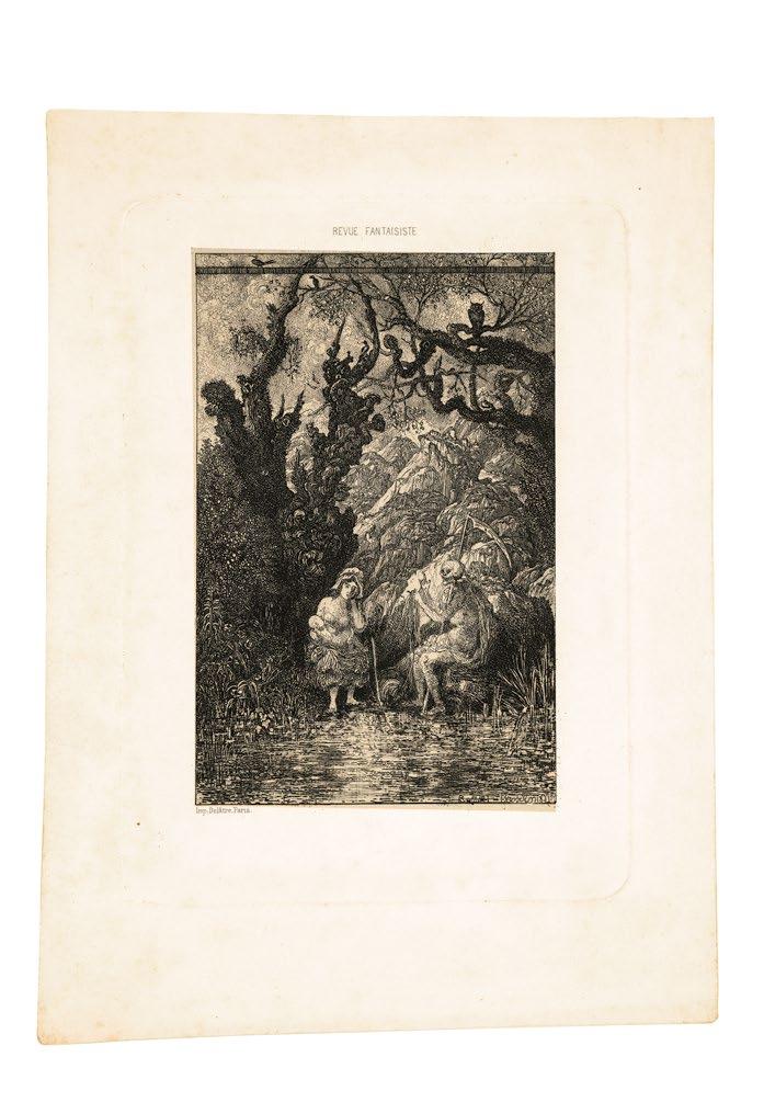
La Mère et la Mort. 1861
Radierung. 14,2 x 13,0 cm
Van Gelder 104/II (von IV); Préaud, Ausst. Kat. ›Rodolphe Bresdin‹, Paris 2000, Nr. 137/II (von IV)
Brillanter Abzug auf cremefarbigem chine collé.
Mit 2-3 cm Papierrand um die Plattenkante.
Die Komposition erschien in einer vermutlich sehr kleinen, von A. Delâtre gedruckten Auflage als Beilage der 11. Lieferung der von Théophile Gautier herausgegebenen ›Revue Fantaisiste‹.
Auf Empfehlung Ch. Baudelaires war Bresdin, der sich seit Mitte März 1861 wieder in Paris aufhielt, mit T. Gautier in Kontakt gekommen. Bereits in der 5. Lieferung der ›Revue Fantaisiste‹, die am 15. April 1861 erschien, kündigte Gautier seinen Lesern an, daß vom 1. Mai an jede Lieferung der vierzehntägig erscheinenden literarischen Zeitschrift jeweils une magnifique eau forte par M. Rodolphe Bresdin beigefügt werden würde. Der höhere Preis dieser Luxusedition mag Abonnenten abgeschreckt haben, so daß die meisten Exemplare der folgenden Ausgaben wie bisher ohne die Künstlerbeilage ausgeliefert wurden. Mit der 19. Lieferung vom 19. November 1861 stellte die Zeitschrift ihr Erscheinen ein.
RODOLPHE
1822 Montrelais- Sèvres 1885 13 La Mère et la Mort. 1861
Etching. 14.2 x 13.0 cm
Van Gelder 104/II (of IV); Préaud, exhib. cat. Rodolphe Bresdin , Paris 2000, no. 137/II (of IV)
Brilliant impression on crème-colored chine-collé.
With 2-3 cm margins around the platemark.
The composition – printed by A. Delâtre, probably in a very small edition– served as a supplement to the 11th issue of Revue Fantaisiste , edited by Théophile Gautier.
On a recommendation from Ch. Baudelaire, Bresdin – who was staying in Paris again beginning in mid-March of 1861 – became acquainted with T. Gautier. Soon afterwards, in the 5 th issue of Revue Fantaisiste , published on April 15, 1861, Gautier announced to his readers that beginning on May 1st , une magnifique eauforte par M. Rodolphe Bresdin would be inserted in each forthcoming issue of the biweekly literary magazine. The higher price of this luxury edition may have deterred subscribers, and most of the copies of the ensuing issues were delivered without the artist’s supplement. The magazine was discontinued with the 19 th issue, published on November 19, 1861.
14
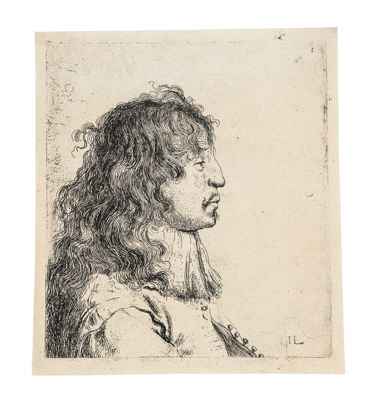
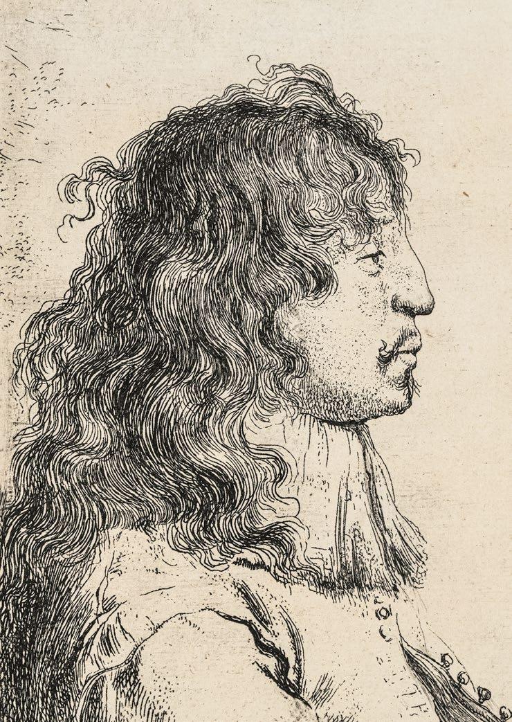
Bärtiger nach unten schauender Greis, von der Seite gesehen. Um 1770/75
Nach Rembrandt
Radierung. 13,3 x 9,4 cm
White-Boon 260, copy 1; New Hollstein 84, copy b Provenienz: Deutsche Privatsammlung
Eine der 17 täuschend getreuen Kopien Brethertons nach Radierungen Rembrandts in einem prachtvollen, kontrastreichen Abzug, der, wie das Exemplar im The Clark Institute, Williamstown, noch sowohl die markanten Schleifspuren am oberen Plattenrand als auch die Spuren eines wohl unbeabsichtigten Ätzflecks rechts zeigt und insofern den beiden Exemplaren in Amsterdam weit überlegen ist, einer davon oben erheblich beschnitten, der andere durch einen langen Riß schwer beschädigt.
Mit feinem Rändchen um die Plattenkante, oben partiell darauf geschnitten. Tadellos.
Bretherton gilt als the most proficient copyist among the professionals (E. G. d’Oench) im Rembrandt-begeisterten England des 18. Jahnhunderts. Bevor er sich zu Beginn der 1770er Jahre in London als Verleger niederließ, war Bretherton als Zeichenlehrer in Cambridge tätig gewesen, wo sich seit den 1750er Jahren eine Gruppe von enthusiastischen Amateuren mehr oder weniger erfolgreich im Kopieren von Radierungen Rembrandts versuchte, noch ganz im Geiste der Rembrandt-Imitationen von T. Worlidge. Brethertons Rembrandt-Kopien hingegen –14 davon publizierte er 1775 als Album im eigenen Verlag – sind im Radierduktus ihren Vorlagen so ähnlich, daß sie leicht als original hätten durchgehen können, wie d’Oench betonte: they are triumphs of the reproductive etcher’s dexterity and sympathy with the original artist’s intent . Nichtsdestotrotz wählte Bretherton für seine Kopie der 1631 von Rembrandt radierten Tronje eines alten bärtigen Mannes ein markant vom Original abweichendes, deutlich hochrechteckiges und zudem schmaleres Plattenformat (13,3 x 9,4 cm). Rembrandt hatte demgegenüber zunächst eine annähernd quadratische Kupferplatte (11,9 x 11,7 cm) für seine Komposition verwendet, die er erst im Zuge der weiteren Überarbeitung im dritten Zustand in der Breite etwas auf 10,5 cm reduzierte.
Bearded
Old Man
Looking
Down,
Seen from the Side. Circa 1770/75 After Rembrandt
Etching. 13.3 x 9.4 cm
White-Boon 260, copy 1; New Hollstein 84, copy b Provenance: private collection, Germany
One of Bretherton’s 17 deceptively faithful copies of etchings by Rembrandt in a splendid, richly contrasting impression which – like the exemplar in the Clark Institute in Williamstown, Massachusetts – still displays the striking grinding marks along the upper edge of the plate and the traces of a probably unintentional etching spot on the right, and is hence far superior to the two examples in Amsterdam, one of which has been cut down significantly above, the other being damaged by a long tear.
With fine margins around the platemark, partially trimmed down to it above. Impeccable.
Bretherton is regarded as the most proficient copyist among the professionals (E. G. d’Oench) in 18th century England, with its enthusiasm for the art of Rembrandt. Before settling in London as a publisher in the early 1770s, Bretherton was active as a drawing instructor in Cambridge, where beginning in the 1750s, a group of enthusiastic amateurs attempted, more or less successfully, to copy etchings by Rembrandt, still very much in the spirit of Rembrandt imitations by T. Worlidge. In style and technique, Bretherton’s Rembrandts – 14 of which he brought out through his own publishing house as an album in 1775 – are so close to their models that they could easily have passed for originals, as d’Oench emphasized: They are triumphs of the reproductive etcher’s dexterity and sympathy with the original artist’s intent . For his copy of a tronie of a bearded old man etched by Rembrandt in 1631, Bretherton nonetheless chose a format that departs strikingly from the original by virtue of its conspicuously narrower, more vertical format (13.3 x 9.4 cm). Rembrandt had instead used an almost square copperplate (11.9 x 11.7 cm) for his composition, reducing it in width somewhat to measure 10.5 cm when preparing the 3rd state.
15
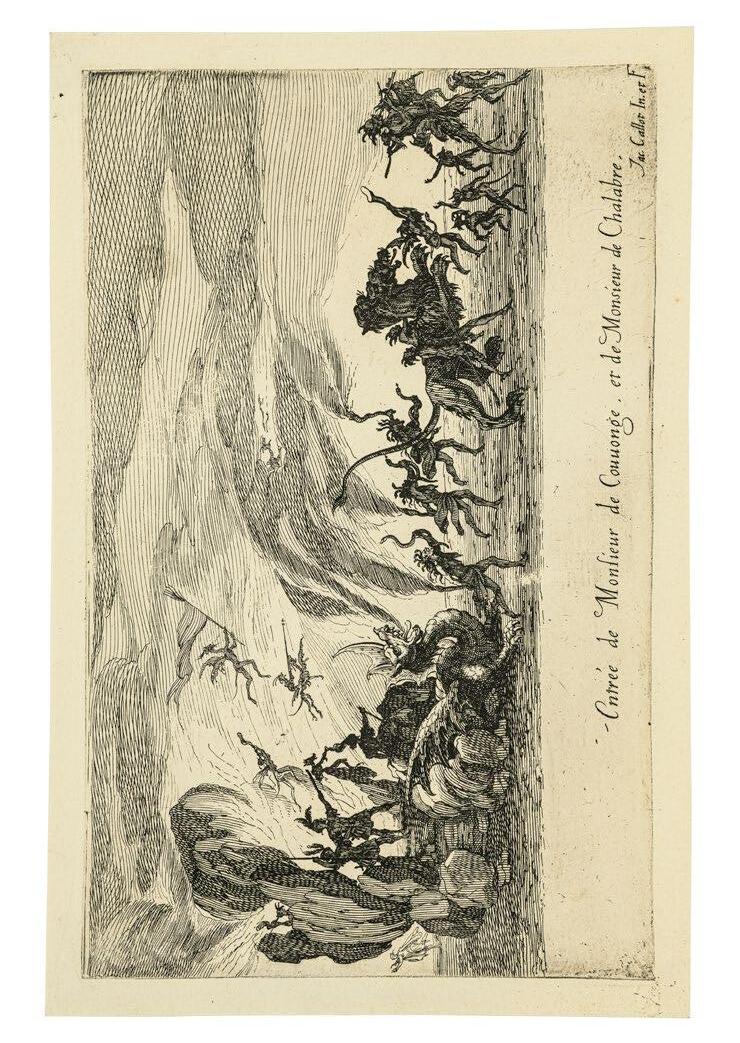
Entrée de Monsieur de Couuonge et de Monsieur de Chalabre. –
Der Einzug des Herrn von Couuonge und des Herrn von Chalabre. 1627
Radierung. 15,3 x 24,2 cm
Lieure 579
Wasserzeichen: Engel (L. 27)
Blatt 5 der Folge ›Combat à la Barrière‹
Superber Frühdruck von schönster Brillanz. Die Plattenecken spitz, sowie die Kanten noch partiell rauh zeichnend. Wie von Lieure speziell für die premier tirage erwähnt gedruckt auf Papier mit dem Wasserzeichen Engel (L. 26)
Rußig tiefschwarz, mit bemerkenswert schönem Plattenton.
Mit ca. 1 cm Papierrand um die in scharfem Relief eingetiefte Plattenkante. Bis auf rückseitige Reste einer alten Montage auf einer Sammlungsunterlage, makellos.
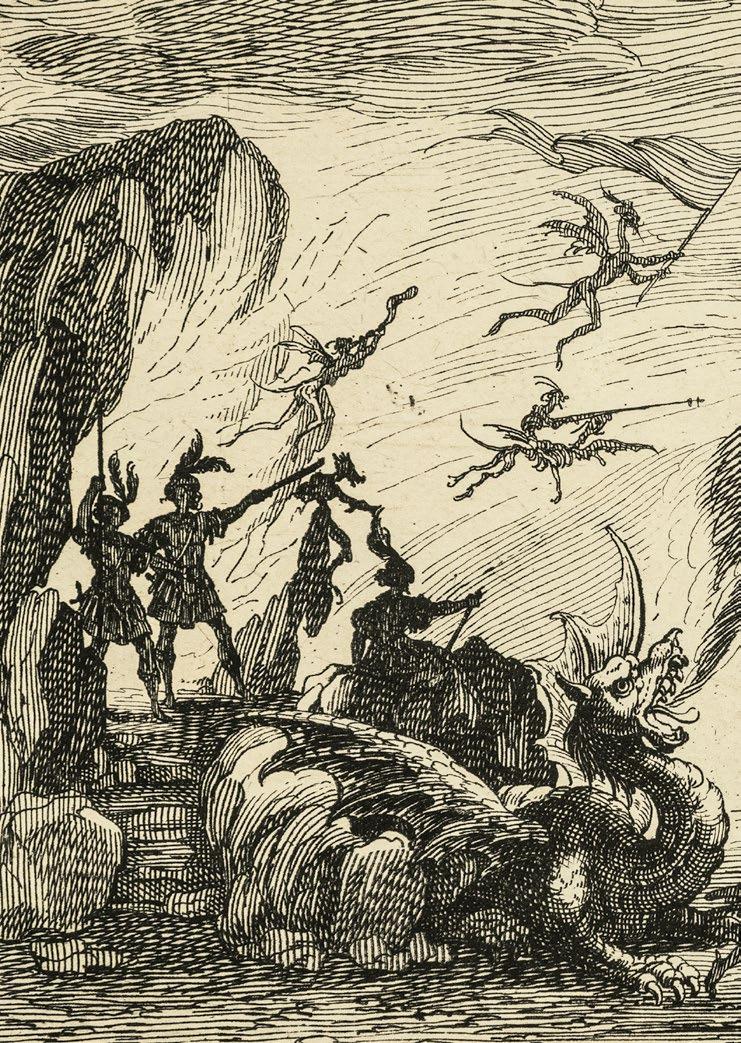
Die wohl dramatischste Komposition der ›Combat à la Barrière‹, in der Callot Ausstattungen und Szenen eines großartigen Festes dokumentierte, das Herzog Karl IV. von Lothringen am 14. Februar 1627 in der Salle Neuve des Schlosses von Nancy zu Ehren seiner Cousine, der Herzogin von Chevreuse, gab. Beteiligt an einer misslungenen Verschwörung gegen Ludwig XIII., hatte sie ein Jahr zuvor Frankreich fluchtartig verlassen müssen und in Lothringen politisches Asyl gefunden, das mit diesem kalkulierten Affront gegen seinen großen Nachbarn Frankreich seine Unabhängigkeit demonstrativ unter Beweis stellen wollte. Die prunkvolle Festivität war eine Inszenierung dieser Politik und wurde entsprechend propagandistisch ausgeschlachtet. H. Humbert hat den Verlauf der Veranstaltung detailliert beschrieben. Sein Buch erschien noch im gleichen Jahr, begleitet von 10 Radierungen Callots, der zusammen mit dem Hofmaler Claude Déruet die Festdekorationen entworfen hatte.
Das Fest begann mit dem feierlichen Einzug der Teilnehmer am anschließenden Schau-‚Turnier an der Schranke‘ . Die vorliegende Komposition schildert das Entrée der Herren de Couuonge und Chalabre, die als Minos und Radamante, Söhne des Zeus und der Europa, auf ihrem Grottenwagen von einem feuerspeienden Drachen durch ein Flammeninferno gezogen werden. Dämonen begleiten sie, drei Frauen mit Schlangenhäuptern, die laut Humbert den Hofstaat der Prinzessin der Hölle bilden, schreiten Ihnen voran.
15
Entrée de Monsieur de Couuonge et de Monsieur de Chalabre –
The Entrance of Monsieur de Couuonge and of Monsieur de Chalabre. 1627
Etching. 15.3 x 24.2 cm
Lieure 579
Watermark: angel (L. 27)
Sheet 5 from the series Combat à la Barrière
Superb early impression of the loveliest brilliance. The corners of the plate pointed, and the edges still partially rough in appearance. Printed on paper with an angel watermark (L. 26), as mentioned specifically by Lieure for the premier tirage
Sooty deep black, with a remarkably lovely plate tone.
With ca. 1 cm paper margins around the platemark, impressed deeply in sharp relief. Flawless apart from traces on the reverse of an early mounting on a collector’s support.
Probably the most dramatic composition from Combat à la Barrière , in which Callot documents decorations and scenes from the magnificent celebration given by Duke Charles IV of Lorraine on February 14, 1627 in the Salle Neuve in the Palace of Nancy in honor of his cousin, the Duchess of Chevreuse. Having participated in a failed conspiracy against Louis XIII, she had been compelled to flee France the previous year and had found political asylum in Lorraine, which strove to demonstrate its independence through this calculated affront to its great neighbor France. The ostentatious festivities were designed to place this policy on display, and were exploited for propagandistic purposes accordingly.
H. Humbert describes the course of the events in detail. His book appeared that same year, accompanied by ten etchings by Callot, who had designed the festive decorations in conjunction with the court painter Claude Déruet.
The festival began with the grand entrance of the participants in the ensuing spectacle, a “Tournament at the Barrier.” The present composition depicts the entrée of Monsieur de Couuonge and Monsieur de Chalabre, who played the roles of Minos and Radamante, the sons of Zeus and Europa, and are drawn through a fiery inferno in a grotto chariot by a fire-breathing dragon. They are accompanied by demons, while three women with snake’s heads – who, according to Humbert, form the court of the Princess of Hell – stride ahead of them.
16
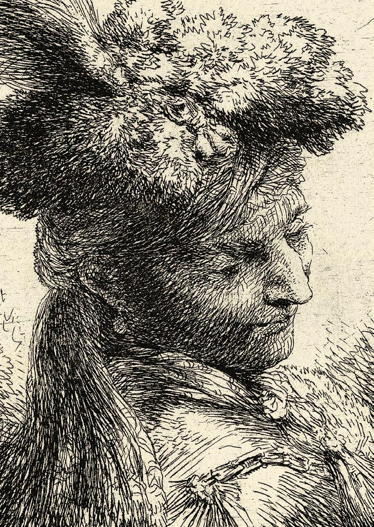
GIOVANNI BENEDETTO CASTIGLIONE
Kopf eines jungen Mannes, nach rechts gewendet. Um 1645/50
Radierung. 11,0 x 8,1 cm
Bartsch 39; Bellini 30/I (von II); T. I. B. 46 Commentary 039 S2 (von S3)
Wasserzeichen: Anker (?) im Kreis unter einem Stern
Prachtexemplar vor dem späteren schwarzen Fleck auf der rechten Schulter. Noch mit den intensiv rauh zeichnenden Plattenrändern.
Tiefschwarz mit hauchzartem Plattenton gedruckt, so daß die gleichsam mit zeichnerischer Radiernadel angelegte Komposition ihr rembrandteskes Chiaroscuro auf das Schönste entfaltet.
Mit ungewöhnlich 5-7 cm breiten Papierrändern. In perfekter, unberührt frischer Erhaltung.
Die virtuose Studie eines über die Schulter niederblickenden Jünglings mit federgeschmücktem Kopfputz gehört zu der Serie von orientalischen Charakterköpfen. Castiglione radierte sie möglicherweise noch in Genua, zum überwiegenden Teil aber während seines zweiten Romaufenthaltes in den Jahren 1647-51. Entsprechend findet sich die stolze Herkunftsbezeichnung ‚Genovese‘, die nur bei einem in der Fremde Weilenden sinnvoll zu sein scheint.
Der Künstler greift thematisch wie radiertechnisch unmittelbar auf niederländische Vorbilder zurück. Unverkennbar ist die Kenntnis der sogenannten ‚Tronjen‘ von Rembrandt und Lievens aus den 30er Jahren. Als modellhafte Charakterstudien von effektvoll orientalisch Kostümierten gelangten sie schon bald auch nach Italien. Rembrandts Radierungen wurden bekanntermaßen seit dem zweiten Drittel des 17. Jahrhunderts in Italien bewundert. Sein Einfluß auf das Werk Castigliones wird vor allem in den 50er Jahren eindrucksvoll sichtbar, weshalb S. Welsh Reed eine Datierung erst um 1650 vorgeschlagen hat, während Bellini eine frühere Entstehung für möglich hält.
16
Young man Wearing a Fur Headdress with a Headband, Facing Right. Ca.1645/50
Etching. 11.0 x 8.1 cm
Bartsch 39; Bellini 30/I (of II); T. I. B. 46 Commentary 039 S2 (of S3)
Watermark: anchor (?) in a circle below a star
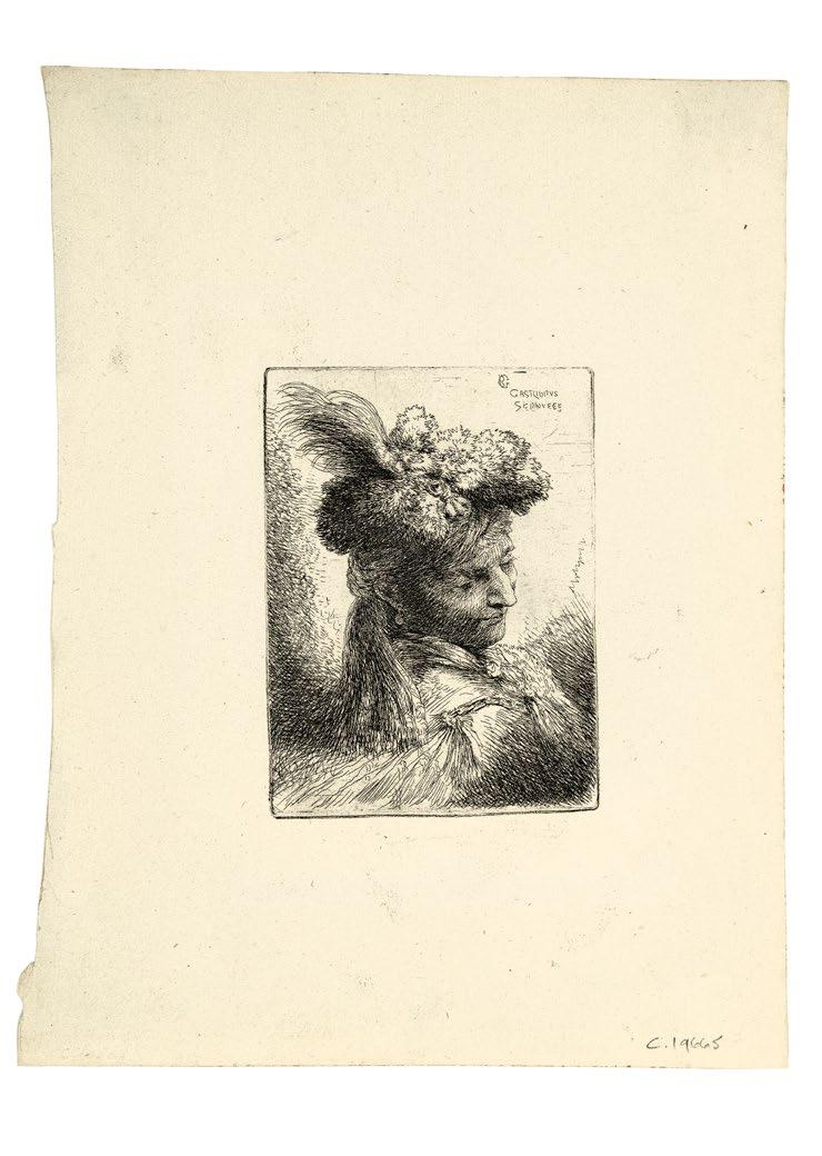
Provenance: Colnaghi, London, stock number “c 19665”
Magnificent impression before the later black mark on the right shoulder. Still with the intensively inky platemark.
Printed in deep black ink with a delicate plate tone, allowing the composition –produced by handling the etching needle like a sketching tool – to display its ‘Rembrandtesque’ chiaroscuro to best advantage.
With unusually wide margins that measure 5-7 cm. In a perfect, pristine, fresh state of preservation.
This virtuoso study of a youth who wears a headdress adorned with feathers and looks back over his shoulder belongs to the series of oriental character heads. Castiglione may have etched some of them when still in Genoa, while most date from his stay in Rome in 1647-51. Hence, the artist’s proud reference to himself as a “Genovese,” which makes sense only for someone working abroad.
With regard to both the subject and the etching technique, Castiglione has recourse to Dutch prototypes . Unmistakable here is his familiarity with the so-called “tronies” of Rembrandt and Lievens. Executed in the late 1630s as exemplary character studies, they probably arrived in Italy shortly afterwards. Rembrandt’s etchings were admired in Italy beginning in the second third of the 17th century. His influence on Castiglione’s work is conspicuous in the 1650s, hence S. Welsh Reed’s proposed date of circa 1650, whereas Bellini regards an earlier one is plausible.
17 Die Buße des Heiligen Johannes Chrysostomus. 1509
Kupferstich. 25,1 x 19,9 cm
Bartsch und Hollstein 1
Provenienz: Alfred Morrison (Lugt 151)
Peter Gellatly (Lugt 1185)
H. G. Gutekunst, Stuttgart, Auktion No. 70, 1911, Nr. 274
Charles Deering (Lugt 516)
The Art Institute Chicago (Lugt 32b)
Das Hauptblatt des Künstlers, das in seiner sinnenfreudigen Naturschilderung zu den wichtigsten Werken der altdeutschen Graphik überhaupt zählt.
Der von Hollstein namentlich genannte, reich nuancierte Abzug aus der Sammlung Gellatly. Prägnant in den Schattenpartien, mit schönen Übergängen zu fast silbrigen Tönen in den stärker lichtdurchfluteten Bereichen rechts und auf dem Erdhügel links. Minimal knapp innerhalb der Plattenkante geschnitten. In ausgezeichneter Erhaltung.
Cranachs grandiose Naturidylle, in der sich Mutter und Kind in ursprünglicher Nacktheit wie selbstverständlich einfügen in eine friedvoll paradiesische Welt, akzentuiert einen wahrhaft legendären Aspekt der Vita des Heiligen Johannes Chrysostomus, der als auf allen Vieren kriechender Büßer lediglich im Hintergrund von aufmerksamen Augen auszumachen ist.
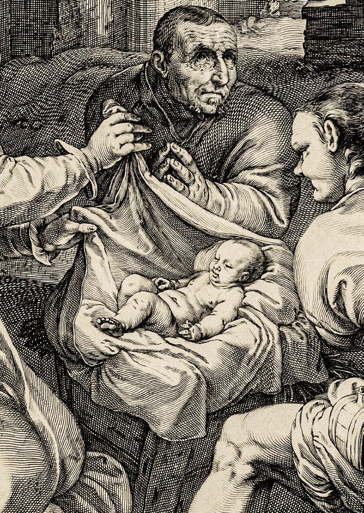
Einer sich aus verschiedenen Quellen speisenden Legende zufolge, soll der junge Johannes als ein den Verlockungen der Welt in der Abgeschiedenheit des Waldes entsagender Eremit den Reizen einer Kaisertochter erlegen sein, die sich bei einem Unwetter im Wald verirrte. In verzweifelter Scham über den Bruch seines Keuscheitsgelübdes stürzt er sie über die Felsen in den vermeindlichen Tod und gelobt zur Buße fortan wie ein Tier auf allen Vieren zu kriechen und Gras zu fressen bis ihn ein sieben Tage altes Kind lossprechen werde. Als dem Kaiser ein zweites Kind geboren wird, läßt er Johannes Chrysostomus holen, um den Säugling zu taufen, der auf wundersame Weise endlich die erlösenden Worte spricht. Die Kaisertochter wird daraufhin unversehrt im Wald gefunden. Von einem im Liebesrausch gezeugten Kind, das Cranach, wie schon Dürer vor ihm in seinem Kupferstich von 1496 (Meder 54), der jungen Frau beifügt, weiß die Legende gleichwohl nichts.
The Penance of Saint John Chrysostom. 1509
Engraving. 25.1 x 19.9 cm
Bartsch and Hollstein 1
Provenance: Alfred Morrison (Lugt 151)
Peter Gellatly (Lugt 1185)
H. G. Gutekunst, Stuttgart, auction no. 70, 1911, no. 274
Charles Deering (Lugt 516)
The Art Institute of Chicago (Lugt 32b)
The artist’s principal print work, whose sensuous delight in the depiction of nature single it out as a central achievement among early German prints in general.
The richly nuanced impression, mentioned specifically by Hollstein, from the Gellatly collection. Concise in the shadowed areas, with lovely transitions to the almost silvery tones in the light-flooded sections on the right and on the mound of earth on the left. Cut down very slightly within the platemark. In excellent condition.
Cranach’s magnificent nature idyll, within which the mother and child, adorned in primordial nakedness, blend unaffectedly into a peaceful, paradisiac world, illustrates a legendary episode from the biography of Saint John Chrysostom, who attentive viewers will notice creeping along the ground on all fours in the background in an act of contrition.
According to a legend found in a variety of sources, the young John – a hermit who has withdrawn to the remote wilderness in order to renounce the world’s temptations – succumbs to the charms of an emperor’s daughter, who has become lost in the forest during a storm. In despair over having broken his vow of chastity, he flings her off a cliff to her presumed death, vowing to remain on all fours like an animal, consuming nothing but grass, until the day when a seven-day-old child speaks to him, absolving him of his transgressions. When a second child is born to the Emperor, he has John Chrysostom fetched in order to baptize the infant, who then miraculously pronounces the long-awaited, redeeming words. Meanwhile, the Emperor’s daughter is found in the forest unharmed. And although Cranach – like Dürer before him in his engraving of 1496 (Meder 54) –provides the young woman with an infant, the legend itself makes no mention of a child being conceived through the saint’s erring passion.
Ganz reiner, früher Abzug, der den ganzen tonalen Reichtum des Kupferstichs wiedergibt. Klar und gegensatzreich bis in die dichtesten Kreuzlagen. Tiefschwarz, gelegentlich fast gratig überschwärzt, wie von Meder speziell für die Frühdrucke beschrieben. Gedruckt auf feinem Bütten ohne Wasserzeichen, wie für die a-Variante angegeben.
Auf der Plattenkante geschnitten bzw. mit hauchfeinem Rändchen darüber hinaus. In ausgezeichneter Erhaltung.
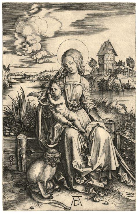
In künstlerischer wie technischer Hinsicht markiert die ›Maria mit der Meerkatze‹ einen Wendepunkt in Dürers Kupferstichwerk. Entstanden kurz nach der Italienreise des Künstlers, verbindet sich hier harmonisch Altdeutsches mit erst jüngst südlich der Alpen Kennengelerntem zu einem intensiven Wechselspiel zwischen Körper und Raum, von Naturbeobachtung und Wiedergabe verschiedener Oberflächen. Dabei versteht es der Künstler mit seinem jetzt straff disziplinierten graphischen System aus langen, geschmeidig geführten Linien und Kreuzlagen sowohl den Figuren wirkliches Volumen zu schaffen, wie auch ganz unterschiedliche Texturen zu charakterisieren:
Fast einem Bildwerk gleich, sitzt die Madonna auf der Rasenbank vor einer weiten Flußlandschaft, die Dürer seinem um 1496 nach der Natur gezeichneten Aquarell des Weiherhäuschens in Nürnberg entlehnt hat (British Museum, London). Meisterhaft sind die spiegelnden Effekte der schimmernden Wasseroberfläche beobachtet und wiedergegeben, wie auch der weich fallende Samt des Ärmels Mariens, das ausgewitterte Holz der Rasenbank oder das Fell des angeketteten Affen, der nicht nur belebendes Genremotiv ist, sondern Sinnbild für das durch Jesus überwundene Böse.
Der Singvogel, dem das Jesuskind im Spiel sein Saugbeutelchen, seinen Schnuller, reicht, mag hingegen die befreite Seele symbolisieren.
An absolutely clean early impression that reproduces the entire tonal richness of this engraving. Clear and with a wealth of contrasts down to the densest hatching lines. Deep black, at times almost burry and excessively black, as characterized by Meder in particular for early impressions. Printed on a fine laid paper without watermark, as referenced with regard to the a variant.
Cut right up to the platemark or with extremely fine margins around it. In an excellent state of preservation.
Artistically as well as technically, Mary with the Guenon Monkey marks a turning point in Dürer’s approach to engraving. Produced shortly after the artist’s Italian journey, the work harmoniously integrates a traditional German setting with the world south of the Alps that was still a new experience for Dürer, in an intensive interplay of objects in space, the observation of nature, and the rendering of a variety of surfaces. Using a by now rigorously disciplined graphic system that exploits long, sinuous lines and crosshatching, Dürer is able to generate a convincing sense of figural volume while at the same time characterizing a variety of textures:
Almost like a sculpture, the Madonna is seated on a grassy bench in front of an expansive riverine landscape, borrowed by Dürer from his own watercolor, painted from nature in 1496, of a cottage set on a pond in Nuremberg (British Museum, London). The effects of reflection on the shimmering surface of the water are rendered masterfully, as is the softly cascading velvet of Mary’s sleeve, the weathered wood of the grassy bench, and the fur of the chained monkey – not merely an enlivening genre motif, but also an emblem of the evil that Jesus will overcome.
The songbird, toward which the infant Jesus playfully extends his sucking bag, or pacifier, may symbolize the liberated soul.
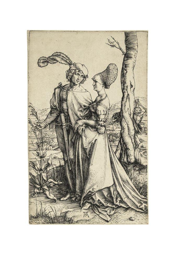
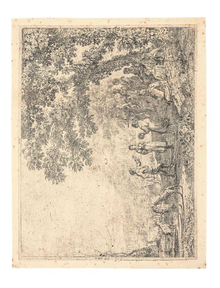
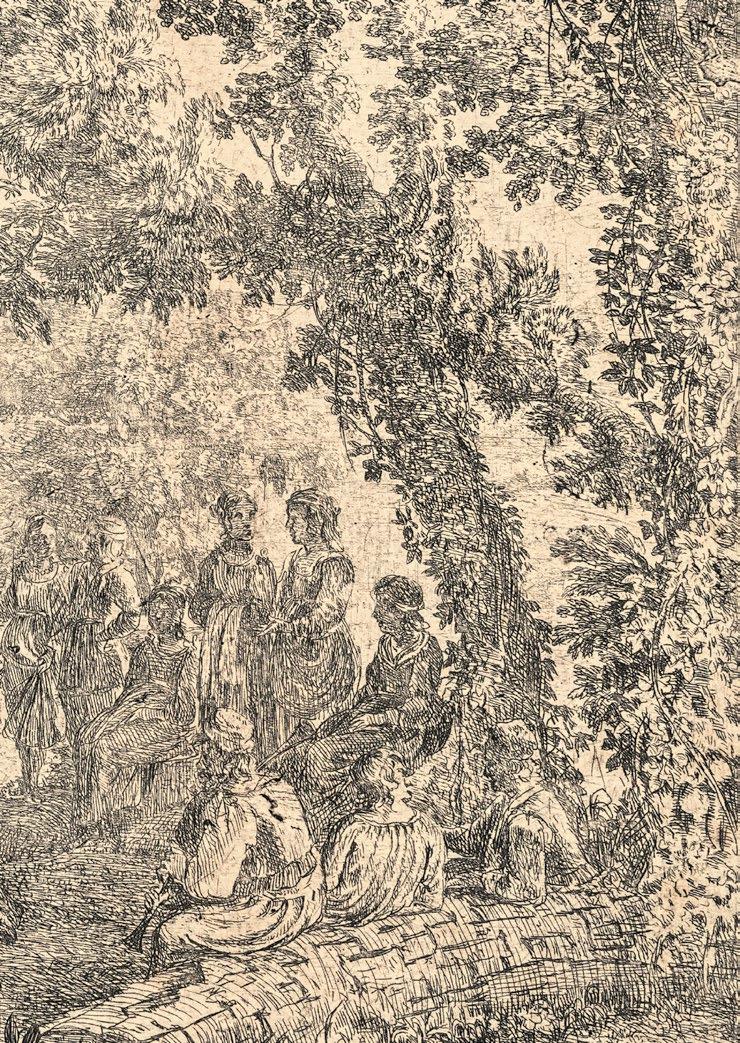
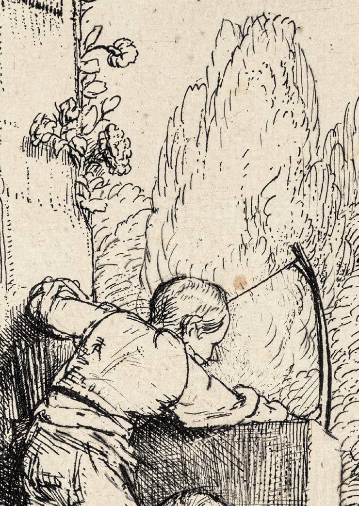
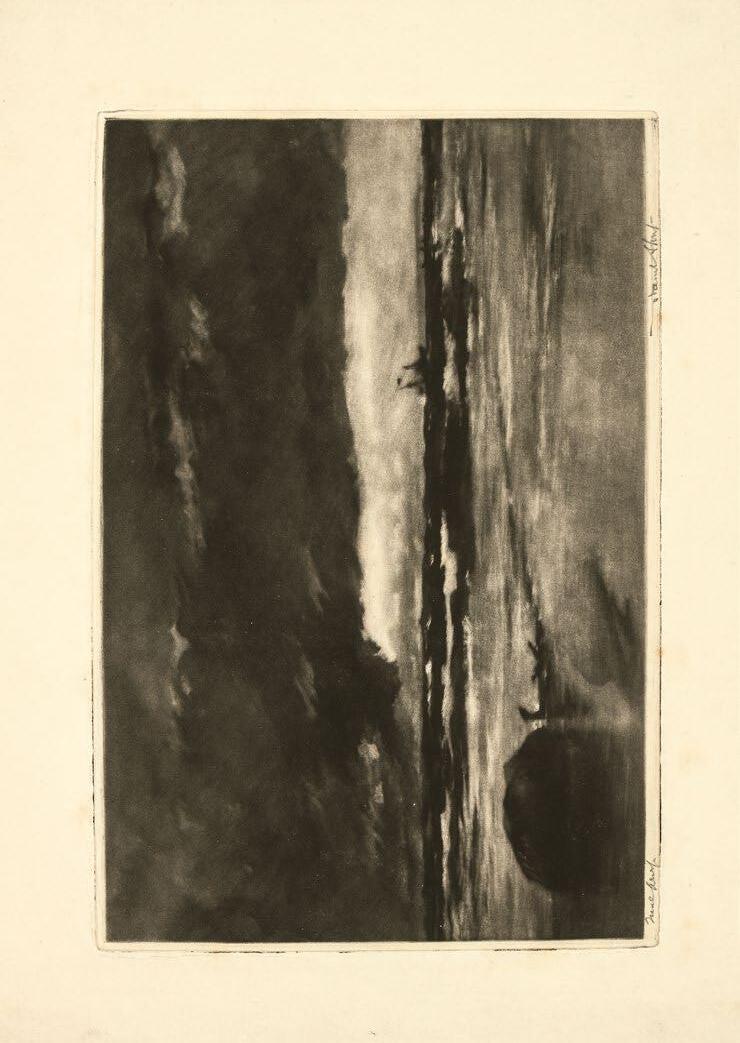
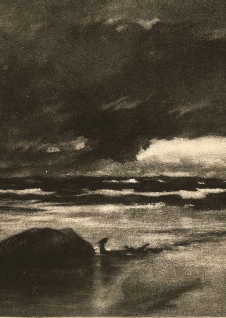
19 Das Liebespaar und der Tod (Der Spaziergang). Um 1498
Tiefschwarz, von fast gratiger Wirkung. Das Ornament auf der Haube sehr klar und vollkommen wie von Meder als Charakteristikum der a-Variante speziell beschrieben. Vor allen späteren Kratzern und Wischspuren bzw. vor der Überarbeitung der Falten des Kleides. Gedruckt auf Papier mit dem Wasserzeichen Hohe Krone, das Meder nur für die ersten Abzüge nennt.
Mit zumeist hauchfeinem Rändchen um die partiell rauh zeichnende, voll sichtbare Plattenkante. Rückseitig entlang der Ränder Leimreste einer ehemaligen ‚Fenstermontage‘. Eine winzige, nahezu unsichtbare Ausbesserung links neben dem Kopf des jungen Mannes in der freien Fläche des Himmels ist zu vernachlässigen angesichts der sonst ganz ausgezeichneten Erhaltung und exzeptionellen
Druckqualität des Blattes.
Selten so schön.
Hinter dem populären, von Bartsch eingeführten Titel »La promenade « (Der Spaziergang) verbirgt sich mehr als ein idyllisches Genrebild: Das Thema von Liebe und Tod – ein Lieblingsthema des jungen Dürer – ist hier auf besonders einfühlsame und psychologisch komplexe Weise behandelt. (R. Schoch)
ALBRECHT DÜRER
Young Couple Threatened by Death (The Promenade). Circa 1498
Deep black, almost burry in appearance. The ornamentation on the bonnet quite clear and complete, as specified by Meder as characteristic of the a variants. Prior to all later scratches and traces of wiping and prior to the reworking of the pleats of the dress. Printed on paper with the high crown watermark, as mentioned by Meder for the initial impressions only.
With for the most part extremely fine margins around the partially inky, still fully visible platemark. Remnants of glue along the edges on the reverse from a former ‘window mounting.’ A tiny and virtually imperceptible repair on the left above the head of the young man in the open area of the sky can surely be overlooked in view of the otherwise quite excellent state of preservation and exceptional print quality of this sheet.
Rarely so beautiful.
The popular title La promenade, introduced by Bartsch, conceals something beyond an idyllic genre scene: the theme of love and death – a favorite of the young Dürer – is treated here in an especially empathetic and psychologically complex manner. (R. Schoch)
ALBRECHT DÜRER
20 Ulrich Varnbüler. 1522
Schweizer Jurist und Kaiserlicher Rat.
Holzschnitt. 43,3 x 32,5 cm
1471 Nürnberg 1528
Bartsch 155; Meder und Schoch-Mende-Scherbaum 256/ I d-e (von III b)
Das grandiose Portrait, das in seiner Monumentalität selbst das wenige Jahre zuvor entstandene stattliche Bildnis des Kaisers Maximilian I. noch übertrifft.
Zeitgenössischer Abzug.
Vor der Stockverletzung des linken Auges und vor dem langen Sprung, sowie vor den späteren, in den Niederlanden mit Tonplatten gedruckten Abzügen.
Von Meder unbeschriebener Zwischenzustand: mit der Lücke in der oberen Einfassungslinie, sowie links unten (= Meder d). Der für die e-Variante genannte Ausbruch von 1 cm in der unteren Einfassung ist zwar bereits vorhanden, aber die linke obere Ecke ist noch weitgehend intakt. Das gelegentlich leicht unscharfe Erscheinungsbild erklärt sich aus dem minimalen Verrutschen beim Druck, was dazu geführt hat, daß die rechte untere Ecke nur unvollständig gekommen ist. Die Reste von Druckerschwärze auf der Stirn, der Wange und am Hals, sowie die 2 Patzer auf dem Hut und am Rücken sind gleichfalls solche Charakteristika. Meder nennet für die d- und e-Ausgabe kein Wasserzeichen, genau wie bei dem hier vorliegenden Abzug.
Die, mit Ausnahme der üblichen Hängefalte (hier nur rückseitig sichtbar), absolut perfekte, völlig unverbrauchte Erhaltung, auch was die unangetastete Papierpatina betrifft, verdient höchste Erwähnung. Nahezu alle von uns gesehenen Abzüge weisen erhebliche Tusch-Korrekturen im Bereich der Einfassungslinien auf, z. B. im Berliner Kupferstichkabinett bzw. großzügige Reparaturen wie der Abzug der Albertina, Wien, bei dem die gesamte obere Einfassungslinie abgeschnitten und ab dem ‚E‘ von VARNBVLER bis zum Datum, inklusive dem Ornamentschnörkel komplett ergänzt ist. (Siehe Ausst. Kat. Wien 2003, pag. 522)
Wie die Inschrift besagt, wollte der Künstler mit diesem kraftvollen Portrait seinem hochgeschätzten Freund ein dauerhaftes Denkmal setzen: Albrecht Dürer aus Nürnberg will durch dieses Bild den Geheim- und Hauptschreiber der römisch kaiserlichen Reichsregierung Ulrich mit dem Familiennamen Varnbüler, den er außerordentlich liebt, auch der Nachwelt bekannt machen und versucht ihn zu ehren.
Der Höhepunkt in Dürers Kunst des gedruckten Portraits.
Über alle von Meder angeführten zeitgenössischen Varianten in vielleicht nur 25 Abzügen bekannt und entsprechend im Handel fast nicht auffindbar.
ALBRECHT DÜRER
20 Ulrich Varnbüler. 1522
S wiss Jurist and Imperial Councillor.
Woodcut. 43.3 x 32.5 cm
Bartsch 155; Meder und Schoch-Mende-Scherbaum 256/ I d-e (III b)
The magnificent portrait, whose monumentality exceeds even that of the imposing portrait of the Emperor Maximilian I.
Contemporary impression.
Prior to the damage to the printing block on the left eye and prior to the long crack, and prior to the later impressions that were printed in the Netherlands with tone blocks.
An intermediate state not described by Meder: with the gap in the upper framing line, as well as on the lower left (= Meder d). The break in the lower framing line, which measures 1 cm, and is mentioned for the e variants, is already present, but the left upper corner is still substantially intact.
The slightly out of focus appearance in places is explained by minimal slippage during the printing process, resulting in the incomplete printing of the lower right corner. The residues of printing ink on the forehead, cheeks, and throat, as well as the two slips on the hat and the back are related characteristics. Meder mentions no watermark for the d- and e- editions, just as with the present impression.
Quite remarkable by virtue of its absolutely perfect, utterly fresh state of preservation (!) apart from the usual hanging fold (visible here only on the reverse), as well as regarding the intact paper patina.
Nearly all of the impressions we have viewed display substantial ink corrections in the area of the framing line, for example the one in the Kupferstichkabinett in Berlin, or else large-scale repairs, like the one in the Albertina in Vienna, where the entire upper framing line has been cut off and entirely supplemented, from the “E” of VARNBVLER and all the way to the date, including the ornamental scroll (see exh. cat. Vienna 2003, p. 522).
With this powerful portrait, as the inscription states, Dürer sought to create a lasting monument to his esteemed friend: “Albrecht Durer of Nuremberg wishes to make known to posterity and to preserve by this likeness his singular friend, Ulrich surnamed Varnbüler, Chancellor of the Supreme Court of the Roman Empire at the same time privately a distinguished scholar of language.”
The highpoint of Dürer’s art of the printed portrait.
Beyond all of the contemporary variants listed by Meder, known in perhaps only 25 impressions, and accordingly virtually impossible to find on the market.
21
Die vier Mineralquellen in und um Spa. Um 1660
Die erste Quelle – Tonnelet bei Watroz
Die zweite Quelle – Spa
Die dritte Quelle – Geronstère
Die vierte Quelle – Groesbeek bei Sauvenière
Folge von 4 Blättern. Radierung. 12,9-13,3 x 17,2-17,9 cm
Wasserzeichen: Sieben Provinzen [H. 95 und H. 97 ] bzw. Schellenkappe [H. 98]
Provenienz: K. E. von Liphart (Lugt 1687) [H. 98]
T. Graf. (Lugt 1092a) [H. 98]
Die komplette Folge in ganz ausgezeichneten Abzügen. Die drei ersten Quellen jeweils im endgültigen Zustand, die vierte Quelle (Hollstein 98) sogar noch vor der Verstärkung der Einfassungslinie.
Nach seiner Lehrzeit bei R. Savery in Utrecht und bei P. Molijn in Haarlem, war Everdingen zwischen 1645 und 1651 in Schweden und Norwegen tätig, bevor er sich in Amsterdam niederließ. Es ist unbestritten, daß die meisten seiner Landschaftsradierungen auf Eindrücke der Norwegenreise zurückgehen. Gleichwohl hat es nicht an Versuchen gefehlt, die von Bartsch noch ganz neutral unter dem Titel ›Les fontaines d’eaux minerales‹ geführte Folge von Brunnenansichten auch außerhalb Norwegens zu lokalisieren. Drugulin wollte sich eindeutig weder für das in Rede stehende Eidsvold in Norwegen noch für das in den belgischen Ardennen gelegene Spa entscheiden und sprach deshalb lieber von Inventionen, basierend auf Motiven nach unmittelbar vor Ort in Spa und seiner Umgebung entstandenen Zeichnungen des Künstlers. Ölskizzen auf Papier, die sich mit der zweiten, dritten und vierten Quelle (Hollstein 96, 97 und 98) in Verbindung bringen lassen, haben sich in London und Hamburg erhalten. Während die Londoner Skizzen sich eindeutig identifizieren lassen mit dem im Stadtzentrum von Spa, unweit des Marktes gelegenen Brunnen und der von Graf Conrad von Burgsdorff 1651 aufwendig gefaßten Quelle von Geronstère unweit von Spa, dürfte die Hamburger Ölskizze, auf die ›Die vierte Quelle‹ (Hollstein 98) Bezug nimmt, wohl kaum, wie von Davies vorgeschlagen, als Watroz zu identifizieren sein. Es dürfte sich vielmehr um die von Baron Paul Jean de Groesbeek 1651 architektonisch gefaßte und deshalb nach ihm benannte Quelle unweit von Sauvenière handeln, schließlich trat in Watroz, gemäß der 1798 in Jena und Leipzig publizierten ›Systematischen Beschreibung aller Gesundbrunnen und Bäder...‹ noch zur damaligen Zeit die Quelle am Abhang einer Waldwiese aus der Erde, und war damals noch ringsum mit sumpfigen Stellen umgeben,aber fast gar nicht gefaßt. Diese im Weiteren als ein unförmich Loch, über welches ein Kasten gestürzt ist, der die Oeffung nach dem Abgang des Berges zu hat beschriebene Watroz-Quelle kann gleichwohl ebensowenig Vorlage für Everdingens sogenannte erste Quelle (Hollstein 95) gewesen sein, wie gelegentlich vorgeschlagen. Bei ihr dürfte es sich um die unweit von Watroz gelegene Quelle mit Namen Tonnelet handeln. Noch 1839 scheinen Überreste der von Everdingen wiedergegebenen, frei in die Ebene gebauten Brunnenarchitektur aufrecht gestanden zu haben, wie die damals in ›Les délices de Spa et ses environs‹ publizierte Lithographie von T. Fourmois ›Vue de la Fontaine de Tonnelet près de Spa‹ belegt.
21 The Four Mineral Springs in and around Spa. Circa 1660
The First Spring – Tonnelet near Watroz
The Second Spring – Spa
The Third Spring – Geronstère
The Fourth Spring – Groesbeek near Sauvenière
Series of four sheets. Etching. 12.9-13.3 x 17.2-17.9 cm
Watermark: Seven Provinces [H. 95 and H. 97 ] or foolscap [H. 98]
Provenance: K. E. von Liphart (Lugt 1687) [H. 98]
T. Graf. (Lugt 1092a) [H. 98]
The complete series in quite excellent impressions. Each of the first three springs in the final state; the fourth spring (Hollstein 98) even prior to the strengthening of the framing line.
After apprenticeships with R. Savery in Utrecht and P. Molijn in Haarlem, Everdingen was active in Sweden and Norway between 1645 and 1651 before settling in Amsterdam. Indisputably, most of his landscape etchings go back to impressions of his travels in Norway. Nonetheless, many have been tempted to localize the series of views of springs – still listed by Bartsch quite neutrally under the title Les fontaines d’eaux minerals – outside of Norway. Drugulin avoided deciding explicitly between Eidsvold in Norway or Spa in the Ardennes in Belgium, preferring to speak of inventions based on drawings by the artist of motifs found in the immediate vicinity of Spa and its surroundings. Oil sketches on paper that can be related to the second, third, and fourth springs (Hollstein 96, 97, and 98) are preserved in London and Hamburg. While the London sketch can be explicitly identified with the spring set in the town center of Spa, not far from marketplace, and with the elaborate architectural setting of the spring of Geronstère, not far from Spa, the work of Count Konrad von Burgsdorff in 1651, the oil sketch in Hamburg, which is related to The Fourth Spring (Hollstein 98), can hardly be identified as Watroz, as proposed by Davies. It seems far more likely that it depicts the spring, located in close proximity to Sauvenière, which was framed architecturally in 1651 by Baron Paul Jean de Groesbeek, and hence named for him. In Watroz, finally, according to the Systematic Description of All Mineral Springs Health Springs and Spas…, published in Jena and Leipzig in 1798, the spring at that time still emerged directly from the earth on a sloping, wooded meadow, and was still surrounded by swampy places, and furnished with hardly any containment. This spring at Watroz, further described as a shapeless hole onto which a box has been dropped which opens toward the downhill slope of the mountain, can hardly have served as the model for Everdingen’s so-called First Spring (Hollstein 95), as occasionally proposed. Its real model may well have been the spring – located not far from Watroz – which bears the name Tonnelet. As late as 1839, the remains of the spring architecture depicted by Everdingen, constructed freely into the plain, seems to have been preserved, as documented by the lithograph entitled Vue de la Fontaine de Tonnelet près de Spa, the work of T. Fourmois, published as part of Les délices de Spa et ses environs .
22
GIROLAMO FACCIOLI (FAGIUOLI) ? Tätig in Bologna und Rom (?) um 1530 – 1574
Adam und Eva beweinen den Tod Abels. Um 1539/44
Nach F. Salviati
Kupferstich. 38,6 x 26,8 cm
Nagler (Philip Soye) 3/I (von III); Hermann Voss, ›Kompositionen des Francesco Salviati in der Graphik des XVI. Jahrhunderts‹, in Mitteilungen der Gesellschaft für Vervielfältigende Kunst XXXV, 1912, pag 60-70; Ausst. Kat. ›Francesco Salviati o la Bella Maniera‹, Rom/Paris 1989, Nr. 127; Birte Rubach, ›Ant. Lafreri Formis Romae. Der Verleger Antonio Lafreri und seine Druckgraphikproduktion‹, Berlin 2016, 2/I (von III)
Ausgezeichneter, homogen tiefschwarzer Frühdruck des seltenen Blattes, vor den verschiedenen Verlegeradressen von A. Lafrerij und P. de Nobilibus.
Mit 4-6 mm Rand um die Plattenkante. Zwei vertikale Falten fast nur rückseitig wahrnehmbar. Leichte Läsuren der unteren rechten Ecke sorgsam hinterlegt, ein kleiner Papierverlust in der oberen rechten Ecke ohne Beeinträchtigung der Darstellung. Sonst unberührt bewahrt mit vereinzelten Braunfleckchen und herrlich warmtoniger Papierpatina.
Von Nagler noch unter den Arbeiten von Philipp Soye verzeichnet, wurde die Komposition erstmals von H. Voss als eines der Blätter identifiziert, die, Vasari zufolge, G. Faccioli nach Zeichnungen gestochen haben soll, die F. Salviati ihm bei seinem Weggang aus Bologna anvertraut habe. B. Rubach zufolge, dürften Facciolis Kupferstiche nach Salviatis Entwürfen zu den ersten Blättern gehört haben, die A. Lafreri seit 1544 in Rom publizierte, nachdem der auch als Goldschmied und Medailleur tätige Künstler zuvor mit A. Salamanca zusammengearbeitet hatte.
Die vorliegende Komposition ist, worauf P. Costamagna hingewiesen hat, inspiriert von einzelnen Motiven aus anderen Stichen, wie etwa der Grablegung Parmigianinos (B. 5) und Raimondis Bethlehemitischem Kindermord nach Baccio Bandinelli (B. 21).
GIROLAMO FACCIOLI (FAGIUOLI) ?
22 Adam and Eve Mourning the Death of Abel. Circa 1539/44
After F. Salviati
Engraving. 38.6 x 26.8 cm
Nagler (Philip Soye) 3/I (of III); Hermann Voss, “Kompositionen des Francesco Salviati in der Graphik des XVI. Jahrhunderts,” in Mitteilungen der Gesellschaft für Vervielfältigende
Kunst XXXV, 1912, pp. 60-70; exh. cat. Francesco Salviati o la Bella Maniera , Rome/Paris
1989, no. 127; Birte Rubach, Ant. Lafreri Formis Romae. Der Verleger Antonio Lafreri und seine Druckgraphikproduktion , Berlin 2016, 2/I (of III)
Excellent, homogenous, deep black early impression of the rare sheet, prior to the various publishers’s addresses, namely those of A. Lafrerij and P. de Nobilibus.
With 4-6 mm margins around the platemark. Two vertical folds are visible almost exclusively on the reverse. Minor damage to the lower right corner has been carefully backed; a small area of paper loss along the upper right edge in no way impairs the scene itself. Otherwise in a pristine state of preservation, with isolated brown spotting and a marvelous, warm-toned paper patina.
Still recorded by Nagler among the works of Philipp Soye, the composition was first identified by H. Voss as one of the sheets that were engraved (according to Vasari) by G. Faccioli after drawings by F. Salviati which the artist himself had entrusted to Faccioli before leaving Bologna. According to B. Rubach, Faccioli’s engravings after designs by Salviati were among the first sheets published by A. Lafreri in Rome beginning in 1544; earlier, the artist – who was also active as a goldsmith and medalist – had collaborated with A. Salamanca.
As P. Costamagna has pointed out, the present composition was inspired by individual motifs from other engravings, among them Parmigianino’s Entombment (B. 5) and Raimondi’s Massacre of the Innocents after Baccio Bandinelli (B. 21).
Wasserzeichen: Krone unter einem Stern (Russell, Appendix B fig. 19)
Provenienz: T. Graf (Lugt Suppl. 1092 a)
Galerie Gerda Bassenge, Berlin, Auktion 75, 2000, Nr. 5308
Deutsche Privatsammlung
One of Claude’s most boldly experimental etchings. (H. D. Russel)
Einer der wenigen noch zeitgenössischen Abzüge der nur schwach geätzten Komposition, bei der sich der Künstler in der Produktion von atmosphärischen Flächentönen versuchte.
Ganz ausgezeichneter, lichter Druck von der bereits sehr bald leicht beschädigten Platte. Noch mit den zarten tonalen Effekten der experimentellen Lavisätzung bzw. den Spuren der partiellen Aufrauhung der Platte mit Hilfe eines Bimssteines. Vor den späteren Überarbeitungen.
Mannocci verzeichnete lediglich 5 Exemplare dieses frühen Zustandes in öffentlichem Besitz, wobei das hier vorliegende Wasserzeichen ‚Krone unter einem Stern‘ speziell Erwähnung findet.
Mit ca. 1 cm Papierrand um die in deutlichem Relief sich abzeichnende Plattenkante. Bis auf wenige Braunfleckchen, überwiegend im Randbereich, tadellos und unberührt.
Der ›Ländliche Tanz‹ ist das wohl früheste druckgraphische Beispiel für dieses Lieblingsmotiv Claudes. Die Radierung gibt seitenverkehrt ein Gemälde wieder, das sich heute in den Uffizien in Florenz befindet. Im Schatten zweier großer Bäume tanzen ein bekränzter Hirte und zwei Frauen zum Klang von Dudelsack und Tamburin. Andere stehende und sitzende Gestalten sehen zu und unterhalten sich. Links ist eine Ziegenherde dargestellt, zwei Ziegenböcke springen gleichfalls wie im Tanz. (M. Sonnabend)
One of Claude’s most boldly experimental etchings. (H. D. Russel)
Extremely rare period impression of the only lightly etched composition, in which the artist experimented with the creation of atmospheric surface tones.
Exceptionally fine, luminous exemplar printed after the plate suffered minor damage at a very early stage. Still with the delicate tonal effects of the experimental lavis etching, and with traces of the partial roughening of the plate using a pumice stone. Prior to subsequent reworking.
Mannocci lists just five impressions of this early state in public collections, with the watermark “crown topped with a star,” used in the present impression, receiving special mention.
With c. 1 cm margins around the platemark, which is still visible in strong relief. Flawless and pristine apart from a small number of brown stains, predominantly along the margins.
The Country Dance is perhaps the earliest print version of this motif, a favorite of Claude. The etching is a mirror reversed reproduction of a painting that is now in the Uffizi. Shown dancing to the sound of a bagpipe and a tambourine in the shadow of two large trees are two women and a garlanded herdsman. Other seated and standing figures observe and engage in conversation. At the left is a herd of goats; two he goats leap into the air, as though taking part in the dance. (M. Sonnabend)
24
CONTE CESARE
MASSIMILIANO GINI Tätig in Bologna in der 2. Hälfte des 18. Jahrhunderts
Avanzi interni d’un Tempio dedicato ad Anubi. 1787
Avanzi d’interne Sale Egizie è di esteri Edifici. 1787
Nach M. Tesi
2 Blätter. Radierung und Aquatinta. 31,1 x 23,6 cm und 30,8 x 23,5 cm
Vgl. Nagler Monogrammisten I, pag. 1004, Nr. 2411; vgl. Nagler (Tesi); Katalog der Ornamentstichsammlung der Staatlichen Kunstbibliothek Berlin aus 2644
Die beiden effektvoll in Braun gedruckten Aquatintablätter Ginis nach den frühen ägyptisierenden Architekturphantasien des bereits 1766 in jungen Jahren verstorbenen M. Tesi für die unter seinem Pseudonym L. Inig 1787 in Bologna publizierte ›Raccolta Di Disegni Originale Di Mauro Tesi…‹.
Der Zeitpunkt war günstig gewählt: Die eine Generation zuvor 1752 bis 1767 erschienenen ›Recueils d’antiquités, égyptiennes, étrusques, grècques et romaines‹ des Comte de Caylus, eines der Protagonisten der Ägyptenrezeption des 18. Jahrhunderts, hatten die künstlerische Phantasie entfacht; die Ägyptenmode stand am Hofe Marie Antoinettes in voller Blüte.
M. Tesi erfreute sich Zeit seines Lebens der besonderen Gunst seines Mentors, des Grafen F. Algarotti. Der vielseitig hochgebildete Gelehrte und Kenner der schönen Wissenschaften war bestens vertraut mit der Theoriediskussion in Frankreich, die in Rom durch die Stipendiaten der ›Académie de France› vermittelt wurde und die Rezeption der ägyptischen Kunst in Italien entscheidend prägen sollte. Er dürfe seinen Schützling in Bologna zu seinen phantasievollen Architekturvisionen ägyptischer Altertümer angeregt haben. Noch vor G. B. Piranesis berühmter und einflußreicher ägyptisierenden Innendekoration des ›Caffé degli Inglesi‹ an der Spanischen Treppe (1765-1767) entstanden, gehören Tesis Entwürfe zu den frühesten eigenständigen Zeugnissen der Ägyptomanie des Frühklassizismus in Italien.
Erst drei Jahre nachdem M. Tesi über der Ausführung des Grabmals seines väterlichen Freundes und Mäzens Algarotti verstorben war, veröffentlichte Piranesi seine epochemachenden Entwürfe 1769 in den ›Diverse maniere d’adornare i cammini›.
C. Wiebel zufolge nehmen Ginis als Reproduktionen der Zeichnungen Mauro Tesis in der Technik der Aquatinta ausgeführten Blätter […] einen besonderen Platz unter den im 18. Jahrhundert in Italien entstandenen Aquatinten ein, denn diese jeweils monochrom gehaltenen Wiedergaben zeigen insgesamt eine breite Palette subtiler Farbigkeit und in einigen Fällen – offenbar je nach Vorlage – interessante Beispiele der Helldunkelwirkung in diesem Medium.
24
CONTE CESARE
GINI Active in Bologna, second half of the 18th century
Avanzi interni d’un Tempio dedicato ad Anubi. 1787
Avanzi d’interne Sale Egizie è di esteri Edifici. 1787
After M. Tesi
2 sheets. Etching and aquatint. 30.8 x 23.5 cm
Cf. Nagler Monogrammisten I, p. 1004, no. 2411; cf. Nagler (Tesi); Katalog der Ornamentstichsammlung der Staatlichen Kunstbibliothek Berlin from 2644)
Effective, brown-toned impressions of the two aquatints by Gini after the early Egyptianesque architectural fantasies of M. Tesi, who had died as a young man already in 1766, which were published in Bologna in 1787 under the pseudonym L. Inig as part of his Raccolta Di Disegni Originale Di Mauro Tesi….
The moment was propitious: the Recueils d’antiquités, égyptiennes, étrusques, grècques et romaines, published between 1752 and 1767 – and hence a generation earlier –by Comte de Caylus, a key protagonist of 18th century reception of ancient Egypt, had given rise to a mood of artistic fantasy; at the court of Marie Antoinette, the fashion for all things Egyptian was in full bloom.
Throughout his lifetime, M. Tesi enjoyed the special favor of his mentor, Count F. Algarotti. The versatile, highly educated scholar and connoisseur of the arts and sciences was well-versed in theoretical discussions taking place in France, which were imparted in Rome by the stipendiaries of the “Académie de France,” and which would decisively shape the reception of Egyptian art in Italy. It seems likely that he served as the stimulus for the fantastic architectural visions of ancient Egypt produced by his protége in Bologna.
Produced even before G. B. Piranesi’s celebrated and inf luential Egyptianizing interior decor for the “Caffé degli Inglesi” near the Spanish Steps (1765-1767), Tesi’s designs are among the earliest independent evidence of Egyptomania in early Italian neoclassicism.
Only in 1769, three years after M. Tesi died while carrying out work on the tomb of his fatherly friend and patron Algarotti, did Piranesi publish his epochal designs in the Diverse maniere d’adornare i cammini
According to Wiebel, Gini’s aquatint sheets which replicate drawings by Mauro Tesi […] occupy a special position among 18th century Italian aquatints, for on the whole, these consistently monochrome reproductions display a broad palette of subtle coloration, and in a few instances (depending, evidently, on their models), interesting examples of chiaroscuro effects in this medium.
C. G. Boerner, Leipzig, Auktion 138, 1922, aus Nr. 573
Prachtvoller Abdruck in gestochen scharfer und brillanter Qualität, so daß die subtilen Lichteffekte des Nachtstücks bravourös zur Geltung kommen.
Wie von Strauß speziell erwähnt, gedruckt auf Papier mit dem Wasserzeichen ‚Vogel im Kreis‘. Bis auf ein winziges Braunfleckchen unten links in makellos frischer, unangetasteter Erhaltung. Mit 6 mm Papierrand.
Einer der sogenannten ‚Sechs Meisterstiche‘ des ›Marienlebens‹, die sämtlich als Hauptwerke des Künstlers gelten.
1591 hatte sich Goltzius zu Studien in Venedig, Florenz und Rom aufgehalten, wo vermutlich die ersten gedanklichen Entwürfe entstanden. Es galt, mit den größten Meistern des 16. Jahrhunderts zu wetteifern bzw. wie van Mander schreibt mit seiner [Goltzius‘] Hand die Eigentümlichkeiten verschiedener Hände in Kompositionen eigener Erfindung zum Ausdruck zu bringen – im vorliegenden Blatt die von Jacopo Bassano.
Oberhuber beschreibt diese Arbeiten in verschiedenen Manieren als eines der interessantesten Phänomene des 16. Jahrhunderts. Ohne eine Komposition sklavisch nachzuahmen, war es eine der vielen Möglichkeiten des künstlerischen Ausdrucks, mit denen man bewußt spielte, um seine Vielseitigkeit und technische Brillanz unter Beweis zu stellen.
Die Kompositionen fanden bereits zu Lebzeiten des Künstlers den höchsten Beifall der Zeitgenossen. Van Mander überliefert dabei die Anekdote, Goltzius hätte sein Monogramm aus einigen Blättern herausgebrannt, den restaurierten Blättern eine Patina gegeben und so selbst die größten Kenner seiner Zeit getäuscht.
Provenance: Dr. Julius Hoffmann, Vienna (Lugt 1264)
C. G. Boerner, Leipzig, sale 138, 1922, from no. 573
Splendid impression. Printed with remarkable sharpness and brilliance, and hence showing off the subtle effects of light in this night piece to their best advantage.
As mentioned specifically by Strauss, printed on paper with the watermark “bird in a circle.” Apart from a minute brown stain at the lower left, impeccably fresh. With 6 mm margins.
One of the so-called Six master engravings from the Life of the Virgin . All of them are regarded as masterpieces by this artist.
In 1591, Goltzius travelled to Italy, visiting Venice, Florence, and Rome. It was there that he seems to have received the initial inspiration for these six important and celebrated compositions. He sought here to compete with the great masters of the sixteenth century, aspiring, according to van Mander to imitate the characteristics of different artistic hands in compositions of his own invention. The model for the present composition was Jacopo Bassano.
Oberhuber believed these works – executed in contrasting manners – to be among the most interesting phenomena in sixteenth century art. Without involving the slavish imitation of a model, paraphrase was among the many possible forms of artistic expression that could be exploited in order to demonstrate the practitioner’s versatility and technical brilliance.
The compositions were acclaimed by contemporaries already during Goltzius’s lifetime. Van Mander reports an anecdote according to which Goltzius burned his monogram from a number of sheets and gave the restored sheets a patina, hence deceiving even the greatest connoisseurs of the time.
26
Portraits von Jacques de la Faille und Josina Hamels. 1580
2 Blätter. Kupferstich. 19,9 x 13,2 bzw. 19,9 x 13,0 cm
Bartsch 212 und 213; Hirschmann und Hollstein 184/IV (von V) und 185/II (von III); Strauss 130/IV (von V) und 131/IV; New Hollstein 216/IV und 217/II (von III)
Provenienz: Duc d’Arenberg (Lugt 567) [B. 212]
P. Mariette 1697 (Lugt 1790) [B. 213]
Doublette des Prentenkabinet, Universiteitsbibliotheek Leiden (Lugt 1665) [B. 213]
Die als Gegenstücke konzipierten Portraits der am 19. August 1580 in Antwerpen getrauten Brautleute Jacques de la Faille und Josina Hamels. Er in der wehrhaften Ausstattung eines streitbaren Offiziers vor dem Hintergrund von Truppenbewegungen, sie mit dem als Brautgeschenk empfangenen Taschentuch, einem Symbol ehelicher Treue, gleichwohl eingedenk der Vergänglichkeit alles Irdischen mit der auf dem Totenschädel ruhenden linken Hand, im Hintergund die für ein Hochzeitsbild beziehungsreich gewählte alttestamentarischen Szene, der Brautwerbung des Eliezer für seinen Herrn Isaak bei Rebecca, die er am Brunnen trifft. Überaus sprechend ist auch der Zierat der Rahmungen gewählt: ganz martialisch umgeben den Bräutigam ein Feldlagerzelt mit Trommler und Helebardier sowie ein ganzes Arsenal militärischer Waffen, voller Liebreiz hingegen begleiten die Braut ein Früchtekorb flankiert von anmutigen Musikantinnen sowie symbolträchtige Pfauen, die Liebligstiere der Juno, die als Göttin der Ehe und Fürsorge galt.
Mit den lateinischen Umschriften der ovalen Rahmenleisten treten die Brautleute gleichsam in einen geschlechterstereotypen Dialog: Auf seine heroische Feststellung: Hier stehe ich, bewaffnet, um das Gesetz zu schützen und das Vaterland zu verteidigen, und furchtlos zu fallen und Blut zu vergießen für das Wohl des Volkes. Denn dies ist die einzige Tugend eines Bürgers und eines guten Generals antwortet sie ganz ergeben: Ich bin bereit, dir zu folgen, ob das Vaterland dich als General im Krieg oder als Bürger in Friedenszeiten anruft, wie Rebekka oder Mutter Sarah. Das ist das einzige Gesetz für eine Ehefrau: ihrem Mann zu folgen.
Prachtvolle, herrlich kontrastreiche Abzüge von schönster Brillanz. Beide im jeweils vermutlich endgültigen Zustand, nachdem der von Hischmann noch als V. Zustand des Jacques de la Faille , nach der Löschung der Adresse von Harman Adolfz., von M. Leesberg nicht übernommen worden ist und bisher kein Exemplar der Josina Hamels mit der von Hirschmann erwähnten Verlegeradresse hat nachgewiesen werden können.
Beide auf der Plattenkante bzw. minimal knapp geschnitten. Bis auf ein kurzes, sorgsam geschlossenes Einrißchen im linken Rand der Josina Hamels , tadellos, ganz entsprechend der jeweils illustren Provenienz.
HENDRICK
26
HENDRICK GOLTZIUS
Portraits of Jacques de la Faille and Josina Hamels. 1580
Two sheets. Engraving. 19.9 x 13.2 and 19.9 x 13.0 cm
Bartsch 212 and 213; Hirschmann and Hollstein 184/IV (of V) and 185/II (of III); Strauss 130/IV (of V) and 131/IV; New Hollstein 216/IV and 217/II (of III)
Provenance: Duc d’Arenberg (Lugt 567) [B. 212]
P. Mariette 1697 (Lugt 1790) [B. 213]
Duplicate from the Prentenkabinet, Universiteitsbibliotheek Leiden (Lugt 1665) [B. 213]
The portraits, conceived as pendants, of the bride and groom Jacques de la Faille and Josina Hamels, who were married in Antwerp on August 19, 1580. He wears the protective attire tire of a pugnacious military officer, and is set against a background of troop movements. She carries a handkerchief she received as a bridal gift, a symbol of marital fidelity, but at the same rests her left hand on a death’s head, a reminder of the transitory nature of earthly things. In the background is an Old Testament scene rich in implications for a wedding portrait, namely Eliezer attempting to win Rebecca, who he meets at a well, as a wife for his master Isaac. Highly eloquent as well is the ornamentation Goltzius has chosen for the frames: in martial style, the bridegroom is framed by the tent of a military encampment with drummer and halberdiers, along with an entire arsenal of military equipment. The graceful accompaniment of the bride, in contrast, consists of a basket of fruit flanked by elegant musicians, along with symbolically charged peacocks, the favorite animal of Juno, the goddess of marriage and parental care.
Through the Latin inscriptions on the oval framing strips, the bridal couple enters into a kind of gender-typical dialogue: she responds to his heroic declaration: Here I stand, armed, in order to protect the law and to defend the fatherland, to fall fearlessly, to shed my blood for the welfare of the people. For this is the sole virtue of a citizen and a good general. To which she replies devotedly : I am prepared to follow you, whether the fatherland calls you as a general in times of war, or in times of peace, like Rebecca or Mother Sarah. That is the sole law for a wife: to follow her husband.
Splendid impressions, rich in contrasts and of the greatest brilliance. Both sheets presumably representing the final state, since the state of Jacques de la Faille still referred to by Hirschmann as the 5th state, after the deletion of the address of Harman Adolfz., was not adopted by Leesberg, and to date, it has not proven possible to document exemplars of Josina Hamels with the publisher’s address referenced by Hirschmann.
Both cut down to the platemark or just beyond it. Impeccable apart from a short, painstakingly closed tear along the left-hand edge of Josina Hamels , and entirely in keeping with the illustrious provenance of both sheets.
HENDRIK GOLTZIUS
WERKSTATT 27
1558 Mühlbracht – Haarlem 1617
Jupiter berät sich mit den Göttern über die Zerstörung des Universums. 1589
Nach H. Goltzius
Kupferstich. 17,6 x 25,4 cm
Bartsch III, 104,38; Hollstein (after H. Goltzius) 17; New Hollstein (Prints after Inventions by Goltzius) 539/I (von II)
Wasserzeichen: Fleur de Lis
Provenienz: König Friedrich August II. von Sachsen (Lugt 971)
Prachtvoller Frühdruck vor der späteren zweiten Nummer 8 rechts unten. Von schönster Brillanz und Klarheit.
Mit bis zu 1 cm Papierrand um die Plattenkante. Schwache Mittelfalte und vereinzelte blasse Braunfleckchen, sonst unberührt.
Die Erde versank im Blutrausch des Eisernen Zeitalters, der Sturm der Giganten auf den Himmel hat gerade noch abgewehrt werden können, doch nun hat sich ein weiteres mordlustiges, die Götter verachtendes Menschengeschlecht erhoben, da ruft Zeus, so berichtet Ovid in den Metamorposen (I,163-208), im Zorn den Götterrat ein, um darüber zu befinden, wie mit den Menschen weiter verfahren werden soll. Bei Goltzius versammeln sich die Götter jedoch nicht wie von Ovid beschrieben in einem Marmorgemach. Mit besonderem dramaturgischen Geschick läßt Goltzius sie stattdessen auf den wild bewegten, dunklen Wolkenbänken eines sich weit in die Bildtiefe entwickelnden, dramatisch beleuchteten Gewitterhimmels Platz nehmen, der das drohende Unheil der kommenden Sintflut sozusagen bereits in sich birgt.
Die Komposition gehört zu den ersten, 1589 noch in der Werkstatt des Meisters unter seiner Aufsicht entstandenen Blättern zu den Metamorphosen des Ovid, dem wohl ambitioniertesten Illustrationszyklus des Künstlers, der gleichwohl Fragment geblieben ist. Nach der Rückkehr aus Italien scheint Goltzius die bis dahin gezeichneten 52 Entwürfe nicht weiter ergänzt zu haben.
27
HENDRIK GOLTZIUS
1558 Mühlbracht – Haarlem 1617 WORKSHOP
Jupiter Consults the Gods concerning the Destruction of the Universe. 1589 After H. Goltzius
Engraving. 17.6 x 25.4 cm
Bartsch III, 104.38; Hollstein (after H. Goltzius) 17; New Hollstein (Prints after Inventions by Goltzius) 539/I (of II)
Watermark: Fleur de Lis
Provenance: King Friedrich August II of Saxony (Lugt 971)
Splendid early impression prior to the later number “8” on the lower right. Displaying the most beautiful loveliness and clarity.
With paper margins measuring up to 1 cm around the platemark. Pristine apart from a weak central fold and isolated pale brown spotting.
The world has descended into the bloodlust of the Iron Age; the aggression of the Giants against the Olympians has barely been averted, and now another murderous race has emerged, contemptuous of the gods. Enraged, Zeus – as reported by Ovid in the Metamorphoses (I: 163-208) assembles a council of the gods to decide how to deal with the humans. With Goltzius, the gods do not assemble – as described by Ovid – in a marble hall. With remarkable theatrical skill, Goltzius shows them taking their places instead on the wildly turbulent, dark cloud banks of a dramatically illuminated stormy sky that extends far into the depths of the picture space, already prefiguring the calamity of the impending deluge.
The composition is one of the first sheets, executed in 1589, still in the master’s workshop, and under his supervision, devoted to Ovid’s Metamorphoses , probably the artist’s most ambitious cycle of illustrations, which nonetheless remained a fragment. Following his return from Italy, evidently, Goltzius did not add to the 52 designs he had completed up to that point.
28
Landschaft bei Sonnenaufgang –
AURORA. 1613
Nach A. Elsheimer
Kupferstich. 16,6 x 18,7 cm
Dutuit,7/II; Wurzbach und Reitlinger 7; Hollstein 7/II
Wasserzeichen: Straßburger Bindenschild mit Fleur de Lis (ähnlich Heawood 141)
Provenienz: F. C. Gray (Lugt 4836)
Doublette des Fogg Art Museum of Harvard University (Lugt 4835)
Christie’s London, Auktion am 1. Dezember 1987, Nr. 45
Deutsche Privatsammlung
Brillanter Abzug, der in seinem Kontrastreichtum wunderbar die intendierte Lichtstimmung einer Morgendämmerung evoziert. Rußig tiefschwarz und zugleich von schönster Transparenz, so daß sowohl die detaillierten landschaftlichen Strukturen im noch ganz ins nächtliche Dunkel getauchten Vordergrundes auszumachen sind als auch, gleichsam suggestiv, sich das atemberaubende, sich stetig verändernde atmosphärische Farbspiel eines Sonnenaufgangs vermittelt mit all den flüchtigen Reflexen des ersten Tageslichts, das den Horizont erglühen läßt.
Noch mit den vor allem im Plattenrand deutlich sichtbaren Wischspuren als zusätzliches Indiz für einen frühen Abzug.
Mit 5 mm Papierrand um die tonig abgesetzte, unverpreßt bewahrte Plattenkante. Unberührt.
Die einzige reine Landschaft unter den gesamthaft sieben Kupferstichen, die Goudt nach Gemälden Adam Elsheimers geschaffen hat. Goud hatte das vermutlich unvollendet gebliebene, heute unter dem Namen ‚Aurora‘ bekannte Gemälde (Herzog Anton Ulrich Museum, Braunschweig) nach dem Tod des Künstlers, dessen Hausgenosse er in Rom gewesen war, mit nach Utrecht gebracht und möglicherweise dort eigenhändig komplettiert. Wohl nicht von ungefähr konzentrierte er sich bei seinem Kupferstich jedoch auf die sozusagen authentischen Teile der Komposition, die Elsheimer zunächst als Historienbild konzipiert, dann aber schon selbst begonnen hatte, als reine Landschaft zu überarbeiten, indem er die Figuren von Arcis und Galathea im Vordergrund links mit der Baumgruppe überdeckte. Goudt verzichtete folglich auf den von ihm weiter überarbeiteten Streifen am linken Rand und beschnitt die Komposition zur Optimierung der Proportion ebenfalls um einen schmalen Streifen am oberen Rand.
This is Elsheimer’s most ‚Virgilian’ landscape, and the delicate sunlight with which it is suffused became important for artists such as Segers and Jan van der Velde (Vesper).
(K. Andrews)
HENDRICK GOUDT circa 1580 The Hague (?) – Utrecht 1648
28
Landscape at Sunrise –AURORA. 1613
After A. Elsheimer
Engraving. 16.6 x 18.7 cm
Dutuit,7/II; Wurzbach and Reitlinger 7; Hollstein 7/II
Watermark: Strasbourg bend with fleur de lis (similar to Heawood 141)
Provenance: F. C. Gray (Lugt 4836)
Duplicate from the Fogg Art Museum, Harvard University (Lugt 4835)
Christie’s London, auction on December 1, 1987, no. 45
Private collection, Germany
Brilliant impression whose wealth of contrasts marvelously evokes the luminous atmosphere of the morning dawn. Sooty deep-black, and at the same time of the loveliest transparency, so that the detailed forms in the foreground – still immersed in nocturnal darkness – are legible, while at the same time suggestive of the breathtaking, continually shifting play of atmospheric color of a sunrise, together with the fleeting reflections of the emerging daylight which glow on the horizon.
Still with the visible traces of wiping clearly visible, in particular at the edges of the plate, as an additional indicator of an early impression.
With 5 mm paper margins around the inky, unpressed platemark. Pristine.
The only pure landscape among the altogether seven engravings Goudt produced after paintings by Adam Elsheimer. Following the death of the artist, whose was Goudt’s housemate in Rome, Goudt brought the presumably unfinished painting – known today under the title Aurora (Herzog Anton Ulrich Museum, Braunschweig) – with him to Utrecht, where he evidently completed it in his own hand. In the engraving, presumably not by chance, Goudt concentrates on the ‘authentic’ portions of the composition, which Elsheimer initially conceived as a history painting, but then reworked into a pure landscape, covering over the figures of Acis and Galathea in the foreground with a group of trees. Goudt therefore removed the strip he had himself reworked on the left hand side, optimizing the proportions of the composition by omitting a narrow strip along the upper edge as well.
This is Elsheimer’s most ‘Virgilian’ landscape, and the delicate sunlight with which it is suffused became important for artists such as Segers and Jan van der Velde (Vesper). (K. Andrews)
Prachtvoller Abzug der ersten Ausgabe (1799), der einzigen zu Lebzeiten des Künstlers. Wie stets auf wenig geleimtem Bütten ohne Wasserzeichen.
Mit 2,7 – 5,4 cm breiten Papierrändern um die unverpreßt bewahrte Plattenkante. In tadelloser, unangetasteter Erhaltung.
Many manuscripts of explanation identify the officer as Manuel Godoy, whose rise to power was due to his being for many years the queen’s lover… By 1798 Godoy had become a general, then Prime Minister, and finally, had been given the title, Prince of Peace. In his hands was the real government of Spain. On March 28, 1798, he lost his offices and was replaced by two ministers, one of them Goya’s friend Jovellanos. They, in turn, were dismissed the following August and Godoy’s power was felt again. Enlightened intellectuals were galled that the quality of Spanish government should seem dependent on the queen’s amorous involvements.
The smoke that issues from Godoy’s head may be understood in the light of the connotations of the word “smoke” in Spanish. In the eighteenth century, it could allude to vanity, arrogance and presumption. As the López de Ayala manuscript says: “His head is being filled with smoke and wind.” (A. A. Sayre)
Splendid impression from the first edition (1799), the only one issued during the artist’s lifetime. As always, on slightly glued laid paper without watermark.
With 2.7 – 5.4 cm paper margins around the still unpressed platemark. In an impeccable, intact state of preservation.
Many manuscripts of explanation identify the officer as Manuel Godoy, whose rise to power was due to his being for many years the queen’s lover… By 1798 Godoy had become a general, then Prime Minister, and finally, had been given the title, Prince of Peace. In his hands was the real government of Spain. On March 28, 1798, he lost his offices and was replaced by two ministers, one of them Goya’s friend Jovellanos. They, in turn, were dismissed the following August and Godoy’s power was felt again. Enlightened intellectuals were galled that the quality of Spanish government should seem dependent on the queen’s amorous involvements.
The smoke that issues from Godoy’s head may be understood in the light of the connotations of the word “smoke” in Spanish. In the eighteenth century, it could allude to vanity, arrogance and presumption. As the López de Ayala manuscript says: “His head is being filled with smoke and wind.” (A. A. Sayre)
30
VAN DEN
HOECKE
Der Hufschmied im Feldlager. Um 1660
1622 Antwerpen – Bergues-Saint-Winoc 1668
Radierung. 9,2 x 13,5 cm
Bartsch 11; Hollstein 11/II
Provenienz: König Friedrich August II. von Sachsen (Lugt 971)
C. G. Boerner, Leipzig, Auktion CLXXXIII, 1933, aus Nr. 376
Sehr schöner Abzug des nur zart radierten Blattes, das zu einer Folge von sechs Darstellungen aus dem Feldlagerleben gehört. Mit der Adresse von F. van Wijngaerde.
Van den Hoeckes druckgraphisches Œ uvre umfaßt lediglich 22 Blätter. Bis auf zwei, sind es sämtlich mit leichter Nadel radierte Landschaften mit militärischen Sujets, was sich sicher dem Umstand verdankt, daß der Künstler neben seinem Amt als Hofmaler Erzherzog Leopold Wilhelms von Österreich, dem Gouverneur der Habsburgischen Niederlande, auch die Position des Côntolleur des fortifications pour le service de sa Maj. en Flandre bekleidete. Auf der vorliegenden Komposition trägt der Planwagen hinter dem Pferd, das gerade beschlagen wird, die bekrönten Initialen seines Dienstherrn LW.
Selten und gesucht, wie alle Blätter des Künstlers.
ROBERT
30 The Farrier in an Encampment. Circa 1660
Etching. 9.2 x 13.5 cm
Bartsch 11; Hollstein 11/II
Provenance: King Friedrich August II of Saxony (Lugt 971)
C. G. Boerner, Leipzig, auction CLXXXIII, 1933, from no. 376
Very beautiful impression of the lightly etched sheet, which belongs to a series of six depictions of life in military encampments. With the address of F. van Wijngaerde.
Van den Hoecke’s print oeuvre encompasses just 22 sheets. Apart from two of them, all are lightly etched landscapes featuring military subjects, which can likely be attributed to the circumstance that apart from his position as court painter to Archduke Leopold Wilhelm of Austria, Governor of the Habsburg Netherlands, the artist also occupied the position of côntolleur des fortifications pour le service de sa Maj. en Flandre . In the present composition, the covered wagon behind the horse – which is shown in the process of being shod – bears the crown initials “LW,” belonging to his employer.
Rare and sought-after, like all sheets by this artist.
1607 Prag – London 1677
31
Betendes Mädchen mit aufgelöstem Haar. 1646
Nach A. Dürer
Radierung. 25,6 x 18,5 cm
Heller 2496; Parthey 1535; Pennington 1535/II; New Hollstein 869/II
Wasserzeichen: Fünfzackige Schellenkappe
Provenienz: A. Apell (Lugt 17)
J. A. Boerner (Lugt 270)
J. P. Hesseltine (Lugt 1508)
A.Freiherr von Lanna (Lugt 2773, Singer 4636)
H. G. Gutekunst, Stuttgart, Auktion 67, 1910, Nr. 880 Deutsche Privatsammlung
Eine heikle diplomatische Mission führte einen der bedeutendsten englischen Kunstsammler des 17. Jahrhunderts 1636 in das vom 30-Jährigen Krieg geschundene Deutschland. Auch wenn die Verhandlungen, die Thomas Howard, Earl of Arundel mit Kaiser Ferdinand II. in Wien um die Restitution der Familie des 1632 verstorbenen „Winterkönigs“ Kurfürst Friedrich V. von der Pfalz in ihre angestammten Rechte führte, erfolglos blieben, so war die Reise für den Kunstliebhaber von um so größerer Bedeutung. Die langgehegte Sehnsucht des passionierten Sammlers, ein Bild von A. Dürer zu besitzen, wurde überreich befriedigt. Und er traf bei einem Aufenthalt in Köln auf einen Künstler, der durch seine Druckgraphiken wesentlich zum nachhaltigen Ruhm der Sammlung beitragen sollte, die Arundel gemeinsam mit seiner Frau Alethea Talbot zusammengetragen hat: Wenzel Hollar.
Neben dem Selbstbildnis Dürers von 1498 (Prado, Madrid) und dem Bildnis des Vaters von 1497 (National Gallery, London), die er vom Rat der Stadt Nürnberg als Geschenk erhielt, erwarb Arundel ein von ihm offenbar besonders geschätztes Madonnenbild, das sich heute nicht mehr nachweisen läßt und vermutlich die beiden im 1655 erstellten Inventar der Sammlung erwähnten two portraits of women , die sich heute im Städel in Frankfurt bzw. in der Berliner Gemäldegalerie befinden.
Die vier Radierungen, die W. Hollar zwischen 1644 und 1646 nach den vier Dürer-Portrais aus der Arundel-Sammlung angefertigt hat, zählen, A. Bubenik zufolge, among the most spectacular of Hollar’s oeuvre .
Das betende Mädchen mit aufgelöstem Haar, das fast an eine Maria aus einer Verkündigungsdarstellung erinnert, ist eine der beiden sogenannten „Fürlegerinnen“, eine heute überholte Betitelung der beiden Frauenportraits, die lange als die Bildnisse zweier Schwestern aus dem Nürnberger Patriziergeschlecht der Fürleger galten. Sowohl die Identität der Betenden mit offenem Haar, als auch die der 18-jährigen jungen Dame auf dem Pendant sind bis heute nicht eindeutig geklärt. Dem Typus eines Brautbildes entsprechend, elegant gekleidet und modisch frisiert, scheint nicht nur ihr geradezu provokativ unverschämter Blick nach ihrem Bräutigam, sondern auch die präsentierten Sternkraut- und Stabwurz-Stängel erotisches Verlangen und Liebeswerben zu signalisieren. Offensiv sucht sie ihr Glück in der Welt, die durch den Fensterausschnitt lockt. Die ganz in sich gekehrte kontemplative junge Beterin jedoch hat den Verführungen der Welt entsagt. Sie möchte in der Abgeschiedenheit allein Gott dienen, wie es im Vers heißt, den Hollar seiner Radierung beigefügt hat. Sie fühlt sich als Braut Christi.
Superbes Prachtexemplar, von kaum zu überbietender Brillanz und Schönheit. Besonders qualifiziert durch seine Herkunft aus der berühmten Hollar-Sammlung v. A. Apell.
31 Praying Girl with Loose Hair. 1646
After A. Dürer
Etching. 25.6 x 18.5 cm
Heller 2496; Parthey 1535; Pennington 1535/II; New Hollstein 869 II
Watermark: five-pointed foolscap
Provenance: A. Apell (Lugt 17)
J. A. Boerner (Lugt 270)
J. P. Hesseltine (Lugt 1508)
A. Freiherr von Lanna (Lugt 2773, Singer 4636)
H. G. Gutekunst, Stuttgart, auction 67, 1910, no. 880
Private collection, Germany
In the year 1636, a delicate diplomatic mission brought one of England’s most important art collectors to a Germany that was being decimated by the Thirty Years’ War. And although the negotiations which Thomas Howard, Earl of Arundel, conducted with the Emperor Ferdinand II in Vienna – in the hopes of restoring the hereditary rights of the family of the “Winter King,” the Elector Friedrich V of the Palatinate, who had died in 1632 – were ultimately unsuccessful, the trip would have even greater significance for the English connoisseur. At long last, the collector’s cherished desire to own a picture by A. Dürer was fulfilled – and to excess. And in Cologne, he met an artist whose print works would contribute greatly to the enduring fame of the collection Arundel had assembled together with his wife Alethea Talbot. That artist was Wenzel Hollar.
Alongside Dürer’s Self Portrait of 1498 (Prado, Madrid) and a portrait of the artist’s father from 1497 (National Gallery, London), which he received as a gift from the Nuremberg city council, Arundel acquired a painting of the Virgin Mary, which he evidently prized highly, a work that is no longer traceable today, along with, presumably, the “two portraits of women” mentioned in the inventory of the collection compiled in 1655, which are preserved today in the Städel in Frankfurt and the Gemäldegalerie in Berlin.
According to A. Bubenik, the four etchings of the four Dürer portraits from the Arundel collection, executed by W. Hollar between 1644 and 1646, are among the most spectacular of Hollar’s oeuvre
The Praying Girl with Loose Hair, which is almost reminiscent of a Virgin Mary from an Annunciation, is one of the two so-called “Fürleger women,” an obsolete title for the two female portraits, whose sitters were long regarded as sisters from the Fürleger family of Nuremberg patricians. To date, neither the pray-ing girl with loose hair nor the young woman depicted in the pendant has been satisfactorily identified. The latter image corresponds to the type of the bridal portrait: elegantly attired and with a fashionable hairstyle, she seems to glance in an almost shamelessly provocative way toward her bridegroom, while the stems of Starwort and Lad’s love she holds in her hand seem to signal erotic yearning and courtship. With little restraint, she seeks the worldly happiness that beckons through the adjacent window. In contrast, her counterpart appears to be entirely immersed in prayer and contemplation, having renounced the seductions of this world. Now in retreat from it, she seeks to serve God alone, as we read in the verse Hollar has added to his etching. According to it, she regards herself now as the bride of Christ.
An absolutely superb exemplar, of virtually unsurpassable brilliance and beauty. Particularly qualified by virtue of its origin in the celebrated Hollar collection of A. Apell.
1607 Prag – London 1677
32
Landschaft mit Angler. 1650
Nach J. Brueghel d. Ä
Radierung. 12,0 x 17,6 cm
Parthey 1214/I (von II); Hollstein (nach J. Breughel d.Ä.) 24; Pennington 1214/I (von II); New Hollstein 1103/I (von III)
Eine der gesamthaft nur sechs Landschaften, die Hollar zwischen 1649 und 1652 nach Vorlagen von J. Brueghel d. Ä. radiert hat, in einem b rillant klaren Frühdruck vor dem späteren Titel buyten Brussel bzw. der Nummer 7 unten rechts.
Dank des in seiner Frische unberührt erhaltenen Papiers zeigt sich die Darstellung in der ganzen Schönheit ihres zarten Radierstils. Besonders effektvoll die Spiegelungen im Wasser des aufgestauten Baches, an dem ein Angler geduldig auf seinen Fang wartet, während sich zwei andere Gestalten in unmittelbarer Nähe zum Stauwehr möglicherweise um ihre dort ausgelegte Fischreuse kümmern.
Gemäß der Adresse, schuf Hollar die vorliegende Radierung nach einer Vorlage aus der legendären Kollektion des Thomas Howard, Earl of Arundel, der schon seit 1642 mit dem Großteil seiner Kollektion nach Antwerpen übersiedelt war. Das 1655 nach dem Tod der Gattin des Earls, die ihn um acht Jahre überlebt hatte, erstellte Inventar der Sammlung verzeichnet etwa 20 Gemälde und Zeichnungen Brueghels, ohne zwischen Jan und Pieter zu unterscheiden. Die Vorlage Hollars, der seinem Gönner 1644 nach Antwerpen gefolgt war, dürfte ein heute nicht mehr nachweisbares Gemälde von J. Breughel d. Ä. gewesen sein, das T. Gerszi zufolge um 1610 entstanden sein dürfte.
32
Landscape with Angler. 1650
After J. Brueghel the Elder
Etching. 12.0 x 17.6 cm
Parthey 1214/ I (of II); Hollstein (after J. Breughel the Elder) 24; Pennington 1214/I (of II); New Hollstein 1103/I (of III)
One of altogether just six landscapes etched by Hollar between 1649 and 1652 after works by J. Brueghel the Elder in a brilliantly clear early impression prior to the addition of the title buyten Brussel and the number 7 on the lower right.
Thanks to the freshness of the pristine paper, the scene still displays all the beauty characteristic of its delicate etching style. Particularly effective are the reflections in the water of the dammed up brook, where an angler waits patiently for his catch, while two other figures in the immediate vicinity of the weir seem to be occupied with fish traps they have set there.
According to the address, Hollar executed this etching after a work in the legendary collection of Thomas Howard, Earl of Arundel, who had settled in Antwerp in 1642, accompanied by the greater part of his collection. The inventory of the collection prepared in 1655 – after the death of Howard’s wife, who survived him by eight years – lists 20 paintings and drawings by “Brueghel,” without however distinguishing between Jan and Pieter. The work etched by Hollar –who followed his benefactor to Antwerp in 1644 – may have been a meanwhile untraceable painting by J. Breughel the Elder, which T. Gerszi believes may have dated from 1610.
Portrait d’Edouard Dagoty inventeur de la gravure en couleurs. Um 1784
Nach E. Heinsius
Schabkunst von vier Platten. 50,0 x 43,2 cm
Nagler 3; Le Blanc 149; Singer 444/I (von II) Wasserzeichen: Wappen mit Schrift im Schild COLLE IN TOSCANA
One of the great triumphs of the art of color mezzotint. (H. Joachim)
Prachtexemplar des I. Zustandes vor der ‘N o 4‘ rechts unten. Auf dem von Singer für Frühdrucke speziell erwähnten Papier mit dem Wasserzeichen ‚COLLE in TOSCANA‘.
Wie die meisten bekannten Exemplare mit delikater Raffinesse punktuell mit Wasserfarbe akzentuierend überarbeitet. Herrlich frisch im lichten Kolorit, ganz den Intentionen des Künstlers entsprechend, von wunderbar malerischer Wirkung.
Mit 0,5-1,8 cm breiten Papierrändern um die tief eingeprägte Plattenkante. Mit leichten Braunfleckchen, sonst bemerkenswert tadellos und unberührt.
So schön, von allergrößter Seltenheit. H. Joachim bemerkt dazu bereits im Ausst. Kat. ›Prints 1400-1800‹, Minneapolis, Cleveland, Chicago 1956/57: Color prints of this type were not usually kept in portfolios but hung on the walls. It is rare therefore to find them in … radiant freshness.
Lasinio war einer der letzten Künstler, die die von J. C. Le Blon entwickelte kunstvolle Technik des Farbdrucks anwendeten. Sein Hauptwerk in technischer wie künstlerischer Hinsicht ist sicherlich das hier vorliegende Bildnis seines Lehrers Edouard Gautier-Dagoty, den er im Überschwang irrtümlich als ‚inventeur de la gravure en coleurs‘ bezeichnete. Le Blons Hauptkonkurrent auf dem Gebiet des Farbdrucks war Jacques-Fabien Gautier-Dagoty, Edouards Vater. Er gilt als der Erfinder der von 4 Platten in vier Farben zu druckenden Schabkunstblätter. Nach 1750 hatte die Familie Gautier-Dagoty quasi eine Monopolstellung auf dem Gebiet der farbig gedruckten Schabkunst. So verwundert es nicht, daß Edouard, als er nach Italien kam, gleichsam als Erfinder der bravourösen Technik angesehen wurde.
33
CARLO LASINIO
Portrait d’Edouard Dagoty inventeur de la gravure en couleurs. Circa 1784
After E. Heinsius
Mezzotint printed from four plates. 50.0 x 43.2 cm
Nagler 3; Le Blanc 149; Singer 444/I (of II)
Watermark: coat-of-arms with the words COLLE IN TOSCANA
One of the great triumphs of the art of color mezzotint. (H. Joachim)
Superb impression of the first state before the “N o 4” at lower right. Printed on paper with the “COLLE IN TOSCANA” watermark, as mentioned specifically by Singer for early impressions.
Like most known impressions, carefully reworked with watercolor to accentuate certain details. The bright colors superbly fresh, entirely in keeping with the artist’s intentions, and producing marvelous painterly effects.
With 0.5-1.8 cm margins around the deeply indented platemark. Apart from a few inconspicuous brown stains, in a perfect and pristine state of preservation.
Impressions of such fine quality are of the utmost rarity. In the exhibition catalog Prints 1400 1800 (Minneapolis, Cleveland, Chicago 1956/57), H. Joachim remarks that Color prints of this type were not usually kept in portfolios but hung on walls. It is rare therefore to find them … in radiant freshness...
Lasinio was one of the last artists to practice the technique of color printing as developed by J. C. Le Blon. The present portrait of his teacher Edouard GautierDagoty can be regarded as his technical and artistic masterpiece. Buoyed by excessive enthusiasm, he credits his subject with the invention of color printing, lauding him in the inscription found along the lower margin as the “inventeur de la gravure en coleurs.” In fact, Le Blon’s main competitor in color printing was Jacques-Fabien Gautier-Dagoty, Edouard’s father, who is regarded as the inventor of the mezzotint printed in four colors from four plates. After 1750, the GautierDagoty family held a virtual monopoly on mezzotint color printing. It hardly seems surprising, then, that Edouard should have been celebrated upon his arrival in Italy as the inventor of the bravura technique.
34
LUCAS VAN LEYDEN
Bildnis Kaiser Maximilian I. 1520
Radierung und Kupferstich. 25,7 x 19,3 cm
Bartsch, Hollstein und New Hollstein 172
Wasserzeichen: Bekröntes Wappenschild mit Sonne (Hollstein 4, datierbar 1520; New Hollstein pag. 275)
Provenienz: J. P. Zoomer, Amsterdam
A. M. Zanetti d. Ä.
Baron D. Viant-Denon
M. Brunet-Denon
W. Smith (?)
H. J. Brooke (Lugt 1325)
Sotheby`s, London, Auktion am 23.-28. May 1853, Nr. 523
H. Weber (Lugt 1383)
Graf von Plessen-Cronstern, Nehmten
Christie’s, London, Auktion am 10. Dezember 1991, Nr. 10
Kunsthandlung Helmut H. Rumbler, Katalog 28, 1992, Nr. 9 Privatsammlung, Rheinland
Das technisch einzigartige und denkwürdige Blatt (M. Friedländer) in einem höchst eindrucksvollen Exemplar, das sich über mehr als 250 Jahre bis zu dem mit Rembrandts Sohn Titus befreundeten Amsterdamer Kunsthändler J. P. Zoomer zurückverfolgen läßt.
Sehr schön kräftiger Abzug, der in seiner dichten und gleichmäßigen Tiefe – wirksam unterstützt durch das leicht patinierte, nie gereinigte Büttenpapier – weniger auf Brillanz als auf warme Ausstrahlung, Harmonie und Fülle ausgerichtet ist.
Seine fast makellose Erhaltung, bis auf winzige alt hinterlegte Rißchen im Rand und nur rückseitig sichtbare dünne Partien vom Lösen aus dem Zoomerschen Sammelband, verdient nachdrückliche Erwähnung, zumal alle uns bekannt gewordenen Exemplare mehr oder weniger stark beschädigt oder gefaltet sind bzw. inzwischen gereinigt wurden.
Von letzter Seltenheit.
Selbst das Rijksprentenkabinet in Amsterdam, dessen bedeutende Sammlung von van Leyden-Blättern sich bis zu V. Röver (1686-1739) zurückverfolgen läß, konnte erst 1927 das Firmin-Didotsche Exemplar seiner Sammlung hinzufügen. Erst 60 Jahre später, 1985 konnte die Graphische Sammlung München den Abzug der Chatsworth Collection für ihre Bestände erwerben.
Leydens Bildnis Kaiser Maximilian I. gilt als Hauptblatt des Künstlers und einer der Höhepunkte der Stecherkunst überhaupt.
Es ist der erste entscheidende Versuch in der Geschichte der Druckgraphik, nebeneinander die gestalterischen Möglichkeiten von Kupferstich und Radiertechnik virtuos sich ergänzend zu nutzen. Die präzise Linie des Kupferstichs dient allein dazu, die plastischen Feinheiten der Physiognomie nachzuzeichnen, während alle übrigen Partien in ihrem freien, skizzenhaften Charakter radiert sind. Als weitere entscheidende Erfindung diente dabei die von van Leyden zum ersten Mal für die Radierung benutzte Kupferplatte (statt Eisen), deren Verwendung den entscheidenden Wendepunkt auf dem Gebiet der erst kurz zuvor erfundenen neuen Technik markiert.
Als Portrait per se, mit dem gegenüber dem Dürerschen Holzschnitt-Vorbild eingeführten interessanten, Räumlichkeit suggerierenden architektonischen Hintergrund und den vorstehend beschriebenen Neuerungen gehört das Blatt zu den wichtigsten Darstellungen altniederländischer, gotischer Bildtradition.
34
Portrait of Emperor Maximilian I. 1520
Engraving and etching. 25.7 x 19.3 cm
Bartsch, Hollstein and New Hollstein 172
Watermark: crowned escutcheon with sun (Hollstein 4, datable to 1520; New Hollstein p. 275)
Provenance: J. P. Zoomer, Amsterdam
A. M. Zanetti the Elder
Baron D. Viant-Denon
M. Brunet-Denon
W. Smith (?)
H. J. Brooke (Lugt 1325)
Sotheby’s, London, auction on May 23-28, 1853, no. 523
H. Weber (Lugt 1383)
Count of Plessen-Cronstern, Nehmten
Christie’s, London, auction on December 10, 1991, no. 10
Kunsthandlung Helmut H. Rumbler, Catalog 28, 1992, no. 9
Private collection, The Rhineland
The technically singular and noteworthy sheet (M. Friedländer) in a quite striking impression, which can be traced back over a period of more than 250 years, all the way to the Amsterdam art dealer J. P. Zoomer, a personal friend of Rembrandt’s son Titus.
Very beautiful, powerful exemplar, whose density and uniform depth – effectively enhanced by the slightly patinated, never cleaned laid paper – is characterized less by brilliance than by a warm radiance, by richness and harmony.
Deserving special mention is the sheet’s almost flawless state of preservation apart from tiny tears along the edge, which received early repairs, and thin areas, visible only on the reverse, created when the print was detached from Zoomer’s collection volume, particularly since all of the exemplars known to us have suffered various degrees of damage or folding, or been cleaned.
Of the greatest possible rarity.
Even the Rijksprentenkabinet in Amsterdam – whose important collection of sheets by van Leyden can be traced all the way back to V. Röver (1686-1739) – was able to add the Firmin-Didot exemplar to the collection only in 1927. Only 60 years later, in 1985, was the Graphische Sammlung in Munich able to acquire the exemplar from the Chatsworth Collection.
Leyden’s portrait of the Emperor Maximilian I is regarded as the artist’s most important print work, and counts as a highpoint of the art of engraving in general.
Notable for being the first decisive attempt in the history of printmaking to exploit the artistic possibilities of engraving and etching together in a virtuosic and complementary way. The precise linearity of engraving technique serves here exclusively to render the three-dimensional subtleties of the sitter’s physiognomy, while the remaining etched areas are characterized by a freer, sketch-like style of execution.
A further decisive innovation is van Leyden’s then unprecedented use of a copperplate for an etching (instead of iron), an important turning point in the history of the technique, which had only been invented slightly earlier.
By virtue of its addition – in relation to Dürer’s woodcut portrait, which served as a model – of an intriguing architectural background, with its suggestion of spatial depth, and given the above described innovations, this sheet is one of the most important portraits of the Early Netherlandish and Gothic image traditions.
Brustbild eines nach rechts gewendeten jungen Mannes. Um 1630 31
Radierung. 16,0 x 14,4 cm
Bartsch 17 und Dutuit 17/vor I (von III); Rovinski 17/I (von V); Hollstein 34/I (von V)
Wasserzeichen: Krug (ähnlich Heawood 3583)
Provenienz: Deutsche Privatsammlung
Exquisiter reiner Ätzdruck. Vor der späteren Überarbeitung der Schattenparien, den verschiedenen Verlegeradressen von P. de Baillu und F. Wijngaerde, bzw. deren Löschung.
Von schönster Brillanz im kraftvoll tiefschwarz, ohne jede Schwäche gedruckten Lineament, wobei der subtile Plattenton die nahezu gänzlich unbehandelt gebliebenen Partien des Hintergrundes wunderbar belebt, und so gleichsam eine duftig luzide Atmosphäre kreiert.
Als Lievens gegen Ende seiner Leidener Jahre sieben Tronjen zu einer kleinen Folge gruppierte, stellte er dieses Profilbildnis eines jungen Mannes mit einem hoch am Hals ansetzenden modischen Kragen an den Anfang.
Lievens‘ technique combines close hatching to articulate textures of fur, fabric, and hair with sharply drawn contours and delicate stippling to trace the planes and wrinkles of each rugged face. He clearly took delight in defining heads and costume details with wiry, curving strokes of the needle. Backgrounds are summarily indicated, focusing all attention on the figure, as if sketched from life. (S. S. Dickey)
35 Bust Portrait of a Young Man Turned toward the Right. Circa 1630 31
Etching. 16.0 x 14.4 cm
Bartsch 17 and Dutuit 17/Ivor I (of III); Rovinski 17/I (of V); Hollstein 34/I (of V)
Watermark: jug (similar to Heawood 3583)
Provenance: private collection, Germany
Exquisitely pure etching. Prior to the later reworkings of the shadowed areas, the various publishing addresses of P. de Baillu and F. Wijngaerde, and prior to their deletion.
Of the loveliest brilliance, with the contours printed in a powerful deep black, without any weaknesses, and with the completely untreated areas of the background marvelously enlivened by the subtle plate tone, engendering an airy, lucid atmosphere.
When, toward the end of his years in Leiden, Lievens produced seven tronies , grouping them into a small series, he positioned this profile portrait of a young man wearing a fashionable high collar in first place.
Lievens’ technique combines close hatching to articulate textures of fur, fabric, and hair with sharply drawn contours and delicate stippling to trace the planes and wrinkles of each rugged face. He clearly took delight in defining heads and costume details with wiry, curving strokes of the needle. Backgrounds are summarily indicated, focusing all attention on the figure, as if sketched from life. (S. S. Dickey)
36 Jan Lutma der Ältere –
IOANNES LUTMA AURIFEX. 1656
Radierung und Punzenstich. 23,8 x 19,9 cm
Bartsch 75; Rovinski 48; Hollstein 5
Wasserzeichen: Bekröntes Straßburger Lilienwappen mit angeh ängtem Buchstaben ‚B‘
Provenienz: Deutsche Privatsammlung
Der berühmte Silberschmied Jan Lutma saß im Jahr 1656 nicht nur Rembrandt Modell für dessen großartiges radiertes Portrait des Freundes, sondern auch seinem Sohn gleichen Namens. Jan Lutma der Jüngere hatte das gleiche Handwerk wie der Vater erlernt und war 1643 Meister geworden. Vorwiegend in seinem eigentlichen Metier als Silberschmied und Graveur tätig, hinterließ er gleichwohl auch ein kleines druckgraphisches Oeuvre, das sich namentlich durch eine spezielle druckgraphische Technik auszeichnet, die es ihm erlaubte, feine tonale Effekte zu erzielen mithilfe kleiner Punkte, die er mit Punze und Hammer in die Kupferplatte trieb – ein handwerkliches Verfahren, das der Atelierpraxis der Gold- und Silberschmiede entstammte.
Gleich einem feinen Tonregen überziehen diese kleinen Pünktchen, mal dichter, mal lockerer gefügt, das einfühlsame Porträt des greisen Vaters, kreieren ein wunderbar weiches Sfumato sowohl im diffus beleuchteten Hintergrund als auch in der Textur des Pelzbesetzten Hausmantels oder im liebevoll beobachteten Inkarnat. Auch markieren sie ganz subtil schemenhafte Strukturen einer Zeichnung, an der der 72-Jährige trotz seines schweren Augenleidens gerade noch gearbeitet zu haben scheint. Der fast etwas abwesend wirkende, geradezu indifferente Blick, der uns auch in Rembrandts Radierung begegnet, mag Resultat dieses Augenleidens gewesen sein, das fast zur Erblindung geführt haben soll. Es heißt, daß just im Jahr, als die beiden radierten Portraits entstanden, eine Linderung des Leidens eingetreten gewesen sei.
Superber, fein modulierter Abzug, der noch den ganzen tonalen Reichtum der Komposition vermittelt. Selten so schön.
Mit feinem Rändchen um die Einfassungslinie. Rückseitig mit Resten alter Falze, sonst in sehr schöner Erhaltung.
36 Jan Lutma the Elder–IOANNES LUTMA AURIFEX. 1656
Etching and punchwork. 23.8 x 19.9 cm
Bartsch 75; Rovinski 48; Hollstein 5
Watermark: crowned Strasbourg lily with suspended letter “B”
Provenance: private collection, Germany
In 1656, the celebrated silversmith Jan Lutma not only sat for Rembrandt, who created a marvelous etched portrait of his friend, but also for his own son, an artist who bore his name. Jan Lutma the Younger had been trained in his father’s craft, becoming a master in 1543. Primarily active in his own métier as a silversmith and engraver, Lutma left behind a small print oeuvre that is distinguished by a specialized printmaking technique, which allowed him to attain subtle tonal effects by means of the tiny points he applied to the copperplate using a punch and hammer – a manual procedure derived from the studio practice of gold and silversmiths.
Like a fine mist, these tiny points – now denser, now more dispersed – cover this sensitive portrait of the artist’s elderly father, generating a marvelously soft sfumato effect, whether on the diffusely illuminated background, the texture of the fur-lined housecoat, or the affectionately observed flesh areas. They also mark the quite subtle, hazy structure of the drawing on which the 72-year-old man –despite his severe visual malady – seems to be working. The almost absent, even indifferent gaze that also greets us in Rembrandt’s etching may be the result of this ocular complaint, which evidently resulted in nearly complete blindness. It is said that his suffering was however alleviated in the very year when these two portraits were executed.
Superb, finely modulated impression that still conveys all of the composition’s tonal richness. Rarely so lovely.
With fine margins around the framing line. With remnants of old hinges on the reverse, otherwise in a quite beautiful state of preservation.
MEISTER MIT DEN PFERDEKÖPFEN
37
Tätig in den Niederlanden im 1. Drittel des 16. Jahrhunderts
Rankenornament mit zwei Sphinxen und zwei Kindern auf ihren Schultern stehend. Um 1530
Kupferstich. 9,7 x 8,3 cm
Bartsch X, 159, 35 und 160, 36; Passavant IV, 290, 252; Hollstein XIII, 56, 9
Provenienz: Marchese Jacopo Durazzo, Genua
H. G. Gutekunst, Stuttgart, Auktion XI, 1872, Nr. 191
A. Freiherr von Lanna (Lugt 2773; Singer 6675)
H. G. Gutekunst, Stuttgart, Auktion 67, 1910, Nr. 943
Deutsche Privatsammlung
Einer der gelungensten Ornamententwürfe unter den gesamthaft 20 Kupferstichen eines vermutlich in den Niederlanden tätigen Anonymus, der aufgrund seiner Vorliebe für Pferdeköpfe oder -schädel, die er höchst phantasievoll in seine grotesken Rankenornamente zu integrieren wußte, von A. Lichtwark 1888 als der ‚Meister mit den Pferdeköpfen‘ in die Kunstgeschichte eingeführt worden ist.
Pferdeköpfe bilden auch im vorliegenden Ornamentblatt mithin den Ausgangsund Endpunkt eines mehr oder weniger symmetrisch aufgebauten Rankenornaments, das sich zu beiden Seiten eines kurioserweise von Innen gesehenen Pferdeschädels aus den Leibern von Sphinxen entwickelt und in zwei gegenläufigen, flatternd bewegten Arkanthusspiralen mit Blüten aus Pferdeköpfen elegant ausschwingt. Von geradezu ungezügelter, wilder Energie erweisen sich demgegenüber die beiden Knaben, die der Meister den beiden Sphinxen sozusagen auf den Köpfen herumtanzen läßt. Übermütig schlagen sie von ihren erhöhten Standpunkten aus, gleichsam in einer Gegenbewegung zum aufstrebenden Rankenwerk, an dem sie sich festzuhalten versuchen, mit Knochen nach dem zentralen Pferdeschädel.
Ausgezeichneter Abzug des seltenen Blattes. Besonders qualifiziert durch seine Herkunft aus den berühmten Sammlungen Durazzo und Lanna.
Mit feinem Rändchen um die Plattenkante, die lediglich unten partiell minimal angeschnitten erscheint. Tadellos.
MASTER OF THE HORSE HEADS active in the Netherlands, 1rst third of the 16th century
37 Tendril Ornament with Two Sphinxes and Two Children on Their Shoulders. Circa 1530
Engraving. 9.7 x 8.3 cm
Bartsch X, 159, 35, and 160, 36; Passavant IV, 290, 252; Hollstein XIII, 56, 9
Provenance: Marchese Jacopo Durazzo, Genoa
H. G. Gutekunst, Stuttgart, auction XI, 1872, no. 191
A. Freiherr von Lanna (Lugt 2773; Singer 6675)
H. G. Gutekunst, Stuttgart, auction 67, 1910, no. 943
Private collection, Germany
One of the most successful ornamental designs among the altogether 20 engravings by this anonymous artist, who was presumably active in the Netherlands, and who has entered the history of art as the “Master of the Horse Heads” (he received this title from A. Lichtwark in 1888) by virtue of his fondness for horse heads or skulls, which he integrated in a highly imaginative fashion into his grotesque tendril ornamentation.
In the present ornamental sheet as well, horse heads form the departure and endpoint of a more or less symmetrically structured tendril ornament that emerges from the bodies of sphinxes positioned on either side of a horse skull, itself presented in a curious internal view, and which continue to form elegant curves consisting of two counterposed, fluttering acanthus spirals whose blossoms consist of horse heads. Displaying an almost unbridled, wild energy in contrast are the two boys who the artist has gamboling across the heads of the two sphinxes. In high spirits, they use bones to strike the central horse skull from their elevated position, embodying a countermovement of sorts in relation to the ascending tendril ornamentation, which they grasp for support.
Excellent exemplar of the rare sheet. Particularly well qualified through its provenance from the celebrated Durazzo and Lanna collections.
With fine margins around the platemark, which is trimmed minimally to some extent only below. Impeccable.
38
Der Raucher und der Trinker. Um 167179
Radierung. 7,9 x 6,3 cm
Davidsohn, Godefroy und Hollstein 24a/I (von V); New Hollstein 49/I (von VI)
Superber Frühdruck des schon von Godefroy mit dem Prädikat Rarissime ausgezeichneten ersten Etats, vor der ersten Überarbeitung der reinen Ätzung, d. h. vor der von links nach rechts fallenden Strichlage im verschatteten Zwickel unter dem Sitz des Stuhles links zwischen dem daran gelehnten Stock und dem Bein der Rücklehne.
Godefroy kannte nur die beiden Exemplare in Amsterdam und Paris (Dutuit). Giordani/Rutgers konnten jüngst nur ein weiteres Exemplar in Paris (Bibliothèque Nationale) nachweisen.
Prachtexemplar von kaum zu überbietender Schönheit.
Mit feinem Rändchen um die noch rauh zeichnende, tonig abgesetzte Plattenkante. Tadellos.
Although Godefroy dated this print late in Van Ostade’s career, 1682, Schnackenburg more reasonably located it with a group of prints which he generally grouped together after 1670. A comparison of the use of the graphic means and the drawing style of this sheet with those present in two dated etchings of 1671 and 1679 allows for a very slight narrowing of the chronological parameters. The work dated 1671 is ›The Cobbler‹ (B. 27) and the 1679 print is ›The Doll‹ (B. 16). This dating is fully consistent with the style of Van Ostade’s drawing in Hamburg, actually utilized in the making of this print. In mirror image to the etching, the drawing was intended during the transfer process. (L. J. Slatkes)
The Smoker and the Drinker. Circa 167179
Etching. 7.9 x 6.3 cm
Davidsohn, Godefroy and Hollstein 24a/I (of V); New Hollstein 49/I (of VI)
Superb early impression of the 1st state, already characterized by Godefroy as rarissime, prior to the initial reworking of the pure etching, which is to say, prior to the lines that descends diagonally from left to right in the shadowed brace below the seat of the chair on the left between the stick that leans on it on the left and the bar of the backrest.
Godefroy was familiar only with the two exemplars in Amsterdam and Paris (Dutuit). Recently, Giordani/Rutgers were able to document an additional exemplar in Paris (Bibliothèque Nationale).
Magnificent specimen of virtually unsurpassable beauty.
With fine margins around the still inky, tonally distinct platemark. Pristine.
Although Godefroy dated this print late in Van Ostade’s career, 1682, Schnackenburg more reasonably located it with a group of prints which he generally grouped together after 1670. A comparison of the use of the graphic means and the drawing style of this sheet with those present in two dated etchings of 1671 and 1679 allows for a very slight narrowing of the chronological parameters. The work dated 1671 is The Cobbler (B. 27) and the 1679 print is The Doll (B. 16). This dating is fully consistent with the style of Van Ostade’s drawing in Hamburg, actually utilized in the making of this print. In mirror image to the etching, the drawing was intended during the transfer process. (L. J. Slatkes)
Um 1500 Nürnberg – Leipzig (?) 1550
39 Laßt die Kinder zu mir kommen. Um 1548
Kupferstich. 8,0 x 11,8 cm
Bartsch 56; Landau 59; Hollstein 35
Provenienz: Deutsche Privatsammlung
Die von H. Zschelletzschky zu den hervorragendsten Arbeiten des Georg Pencz gerechnete Komposition, vermutlich einer seiner letzten Stiche, in einem herrlich kontrastreichen Frühdruck.
Mit der voll sichtbaren, noch rauh zeichnenden Plattenkante und teilweise hauchfeinem Rändchen darüber hinaus.
Mit seinem Kupferstich der Kindersegnung durch Christus popularisierte Georg Pencz scheinbar im Widerspruch zu seiner persönlichen Überzeugung eine der folgenreichsten Bildschöpfungen der Reformation. Die Szene wurde in der Auseinandersetzung mit den Täufern von den Lutheranern gern zur Unterstützung ihrer Forderung nach der Kindstaufe herangezogen. Pencz selbst jedoch hatte im Verlauf des ihm 1525 vom Nürnberger Rat wegen Gottlosigkeit gemachten Prozesses ausdrücklich der Taufe jeglichen Wert abgesprochen.
In what way does this engraving have a new and peculiar meaning? Because it is, I believe, the graphic representation of the artist’s own life, a sort of final balance drawn up, perhaps in sickness, by Pencz. This would explain the presence of only three women, instead of the many who would normally make their appearance (as they had done in all previous iconography of the subject); they may be identified with the three women of Pencz’s life. And it would explain the seven children, his sons. This theory would justify the intensity of the scene which is pervaded by an unusual sweetness… We may also recall that neither in his paintings nor – still less – in his engravings, had Pencz shown any particular inclination to portray children, either as such or in the form of putti or spirits. (D. Landau)
GEORG PENCZ
circa 1500 Nuremberg – Leipzig (?) 1550
39 Let the Children Come to Me. Circa 1548
Engraving. 8.0 x 11.8 cm
Bartsch 56; Landau 59; Hollstein 35
Provenance: private collection, Germany
The composition, characterized by H. Zschelletzschky as among the most outstanding works by Georg Pencz , presumably one of his last engravings, in an excellent impression that is rich in contrasts.
With the still fully visible, still inky platemark, to some extent with very fine margins beyond it.
With his engraving of Christ blessing the children, Georg Pencz popularized one of the most successful pictorial inventions of the Reformation – in opposition, evidently, to his own personal convictions. In their confrontation with the Anabaptists, the Lutherans were fond of invoking the scene in support of their demand for infant baptism. In 1525, in the course of the trial that charged Pencz with godlessness, initiated by the Nuremberg city council, the artist himself expressly refused to attribute any importance to the act of baptism.
In what way does this engraving have a new and peculiar meaning? Because it is, I believe, the graphic representation of the artist’s own life, a sort of final balance drawn up, perhaps in sickness, by Pencz. This would explain the presence of only three women, instead of the many who would normally make their appearance (as they had done in all previous iconography of the subject); they may be identified with the three women of Pencz’s life. And it would explain the seven children, his sons. This theory would justify the intensity of the scene, which is pervaded by an unusual sweetness… We may also recall that neither in his paintings nor – still less – in his engravings, had Pencz shown any particular inclination to portray children, either as such or in the form of putti or spirits. (D. Landau)
GEORG PENCZ
40 Die Triumphe des Petrarca. Um 1539 – 1543
Triumph der Liebe
Triumph der Keuschheit
Triumph des Ruhms
Triumph der Zeit
Triumph des Todes
Triumph der Ewigkeit
Um 1500 Nürnberg – Leipzig (?) 1550
Folge von 6 Blättern. Kupferstich. Je ca. 13,7-15,1 x 20,6-21,0
Wasserzeichen: Bär mit Halsband (ähnlich Briquet 12327) [H. 99]
Provenienz: Collection d’Arenberg (Lugt 567) [H. 97-100, 102] Doublette der Albertina, Wien (Lugt 5e und 5h) [H. 101]
Die selten komplette Folge in durchgängig superben, samtig tiefschwarzen Frühdrucken mit allen Kennzeichen der von Landau beschriebenen jeweils ersten Druckzustände, d. h. sämtlich noch mit den feinen Hilfslinien für den Text bzw. Der Triumph des Rums und Der Triumph der Ewigkeit noch vor den Textkorrekturen.
Gelegentlich minimal knapp auf die Darstellung geschnitten bzw. unten mit dem vollständigen Text. Das erste und letzte Blatt der Folge mit sorgsam geglätteten Mittelfalten. Sonst, bis auf leichte Papierausbesserungen im Randbereich beim Schlußblatt, die nur auf der Rückseite wahrnehmbar sind, in ganz ausgezeichneter Erhaltung.
Allein schon durch ihr Format, das sich von dem üblicherweise von den Kleinmeistern präferierten deutlich abhebt, sticht Pencz‘ sechsteilige Folge nach Petrarcas berühmter Versdichtung Trionfi aus seinem druckgraphischen Œuvre heraus. Sie gilt als eines der Hauptwerke des Künstlers. Die sechs Kupferstiche der Folge entsprechen in ihrer thematischen Ausrichtung den lateinischen Überschriften der Versdichtung. In Petrarcas persönlicher Vision seiner eigenen Erlebnisse mit Laura w ä hrt der Triumph der sinnlichen Liebe nur solange wie die Keuschheit sich ihr nicht entzieht. Überwunden vom Tod bleibt zunächst der Ruhm, der gleichwohl mit dem Lauf der Zeit verblaßt. Letztlich triumphiert jedoch bei Petrarca die Ewigkeit über die Zeit.
Pencz hat interessanterweise nur ein einziges Blatt der Folge nummeriert und damit eine, von Petrarca abweichende Reihenfolge vorgegeben:
Die Angabe ›5.‹ im Triumph des Todes eröffnet als Interpretationsschlüssel eine neue Lesart der Triumphfolge. Statt an dritter Stelle tritt der Tod vor dem Schlußbild und synchron mit dem Jüngsten Gericht auf. Pencz hat sich demnach von der narrativen Logik des Versepos gelöst und die Trionfi neu gruppiert. Petrarcas Sequenz war durch den einleitenden Dreischritt Dichterliebe – Keuschheit der Geliebten – Tod der Laura geprägt. Die Neutralisierung des biographischen Ansatztes durch Pencz führte zu einer neuen Erzählstruktur. Der Tod , dem alles menschliche Leben ohne Rücksicht auf Stand, auf kirchliche und weltliche Herrschaft zum Opfer fällt, steht unmittelbar vor dem Jüngsten Gericht , das im Landschaftsprospekt motivisch breit elaboriert wird. Die Dynamik des aufsteigenden Ochsengespanns und des zum Todeshieb ausholenden Sensenmannes bildet die Klimax einer Bewegungssteigerung in den ersten vier Blättern, die noch im Triumph der Ewigkeit nachhallt. Ruhm – Zeit – Tod – Ewigkeit stellen eine neue, sinnvolle Stufenfolge menschlichen Daseins her. R. Schleier)
1500 Nuremberg – Leipzig (?) 1550 40 The Triumphs of Petrarch. Circa 1539 1543
The Triumph of Love
The Triumph of Chastity
The Triumph of Fame
The Triumph of Time
The Triumph of Death
The Triumph of Eternity
Series of 6 sheets. Engraving. Each ca. 13.7-15.,1 x 20.6-21
Duplicate from the Albertina, Vienna (Lugt 5e and 5h) [H. 101]
The rarely complete series in uniformly superb, velvety deep black early impressions with all of the characteristics of the first printing state as described by Landau, which is to say all still with the fine guide lines for the text, and prior to the textual corrections on The Triumph of Fame and The Triumph of Eternity
In places trimmed minimally within the scene, with the complete text below. The first and final sheet of the series display carefully smoothed central folds. Otherwise in an excellent state of preservation aside from minor repairs to the paper in border areas on the final sheet, which are however perceptible only on the reverse.
Already by virtue of its format, which departs markedly from the one customarily preferred by the so-called “German Little Masters,” Pencz’s six-part series after Petrarch’s celebrated poem Trionfi occupies an exceptional position within his print oeuvre. It is regarded as one of the artist’s principal works. With regard to thematic orientation, the six engravings of the series correspond to the Latin captions from the verse poetry. In Petrarch’s personal vision of his experiences with Laura, sensual love survives only for as long as it succeeds in eluding Chastity. Overcome by Death, Fame remains at first, who nonetheless fades with the passage of time. In Petrarch, ultimately, Eternity, however triumphs over Time.
Interestingly, Pencz has numbered only a single sheet, hence prescribing a sequence that departs from Petrarch:
As an interpretive key, the number “5” in the Triumph of Death opens up a new reading of the Triumphs series. Rather than appearing in third place, Death comes before the final image, and is synchronous with The Last Judgment . Accordingly, Pencz has abandoned the narrative logic of the epic poem, reconfiguring the Trionfi . Petrarch’s sequence was characterized by the introductory trichotomy consisting of The Poet’s Love – Chastity of the Beloved – The Death of Laura . Pencz’s neutralization of the biographical approach resulted in a new narrative structure. Death , who claims as his victims all of human life, with no regard for status or for ecclesiastical or worldly authority, is positioned directly in front of The Last Judgment, a motif that is broadly elaborated in the vast landscape. The dynamism of the ascending oxcart and the fatal blows of the Grim Reaper form the climax of the progressive heightening of movement that is found in the first four sheets, and which continues to reverberate in the Triumph of Eternity Fame – Time – Death – Eternity represent a new and meaningful hierarchy for human existence. (R. Schleier)
GIOVANNI BATTISTA PIRANESI
41 Das Sägepferd. Um 1749
1720 Venedig – Rom 1778
Radierung, Kupferstich, Schwefelstaubätzung und Schleiftechnik. 41,0 x 55,4 cm
Robison 38/II (von VI) First Edition, First through Third Issue (von 6 Editions)
Wasserzeichen: Lilie im Kreis (ähnlich Robison Wz. 5)
Superber, tiefschwarz gedruckter Abzug der I. Ausgabe. Mit den feinen Schleifspuren auf den Wänden rechts und links des Torweges. Vor der grundlegenden Überarbeitung für die zweite, 1761 publizierte Ausgabe, bei der das skizzenhaft und spontane Kompositionsprinzip der Kerker-Capriccios eine konsequente Metamorphose durchlaufen sollte.
Herrlich transparent in der wild vorgetragenen Textur, die nur vereinzelt sich zu fast undurchdringlich erscheinenden Liniengespinsten verdichtet, um in der imaginierten unterirdischen, gleichwohl unwirklich lichterfüllten Szenerie wirkungsvolle, mitunter beängstigend dunkle Akzente zu setzten. Der subtile Plattenton und die feinen Schleifspuren unterstützen diesen Effekt auf das Glücklichste.
Mit bis zu 8 cm breiten Papierrändern. Die übliche Mittelfalte sorgsam geglättet. Tadellos.
Im Alter von erst 25 Jahren, deutlich unter Tiepolos Einfluß stehend und eingebunden in die flimmernde Atmosphäre der venezianischen Veduten, der ›Capricci‹ und ›Scherzi di Fantasia‹, beginnt Piranesi mit der Arbeit für die erste Ausgabe der ›CARCERI‹.
Die Frage, warum der Künstler diese irrationalen Raumphantasien als ‚Kerker‘ bezeichnet hat, wird sich wohl nie eindeutig klären lassen. In jedem Fall muß erwähnt werden, daß bei den Bühnenbildern des 18. Jahrhunderts Kerker-Kulissen zu den relativ häufigen Theaterdekorationen gehören und Piranesi sich zweifelsohne mit deren Konstruktionsprinzipien intensiv beschäftigte. Mit der nur einem jungen Künstler eigenen Experimentierfreudigkeit werden es bei Piranesi aus der Einbildungskraft des Sujets gewonnene Traumkulissen, Phantasieschöpfungen von grandiosen Palastanlagen eines imaginären Rom.
Von Gradmann als ungeheurer Monolog der Architektur gefeiert, zeitlos und zu jeder Zeit modern , sind es möglicherweise ‚launenhafte‘ Erfindungen der Phantasie (Capricci) mit dem primären Interesse des Künstlers an pathetischen Formen, weitläufigen Strukturen und Raumbewältigungen.
Das Skizzenhafte, oft noch verstärkt durch Nebel- und Dampfwolken, führt schließlich zu einer völligen Auflösung räumlich gesicherter Verhältnisse. Vielleicht ist es gerade die Verleugnung aller architektonisch-logischer Grundregeln, die den Künstler mit seiner visionären Inspiration zum Schöpfer eines neuen Universums werden läßt.
GIOVANNI BATTISTA PIRANESI
41 The Sawhorse. Circa 1749
Etching, engraving, sulfur tint or open bite, scratching. 41.0 x 55.4 cm
Watermark: lily in a circle (similar to Robison Wz. 5)
Superb, deep black impression from the 1st edition. With the fine grinding marks on the walls to the right and left of the gateway.
Prior to the far-reaching alterations of the 2nd edition, published in 1761, during which the sketch-style, spontaneous compositional principle of the Carceri capriccios would undergo a consistent metamorphosis.
Marvelously transparent in the vehemently rendered texture, which becomes concentrated to form seemingly impenetrable linear webs only in isolated areas, inserting an occasional dark, menacing accent into the imaginary subterranean setting, which is bathed in light in a thoroughly unrealistic fashion. The subtle plate tone and the fine grinding marks enhance this effect in the most serendipitous way.
With paper margins measuring up to 8 cm. The usual central fold carefully smoothed. Pristine.
Piranesi began work on the first edition of the CARCERI when he was just 25 years old, and still strongly influenced by Tiepolo and deeply involved with the shimmering atmosphere of the Venetian veduta, as seen in the Capricci and the Scherzi di Fantasia
We may never really know exactly why Piranesi chose to refer to these irrational spatial fantasies as Carceri (dungeons). It should be pointed out, however, that dungeon scenes were a prominent feature of 18th century stage sets, and that Piranesi was undoubtedly intensively preoccupied with the constructive principles of such theater decor.
Propelled by a delight in experimentation so characteristic of young artists, the motif fired Piranesi’s powers of imagination, allowing him to conjure the dream landscapes and fantasy palaces of an imaginary Rome.
Hailed by Gradmann as the most prodigious architectural monologue , as timeless and forever modern, these ‘capricious’ inventions (Capricci ) seem to be motivated primarily by the artist’s fascination for dramatic forms, expansive structures, and the mastery of space.
Ultimately, the characteristic sketch-like quality, often enhanced by clouds of mist or steam, leads to the total disintegration of reliable spatial relationships. Perhaps it was precisely this repudiation of the fundamental laws of architectural logic that allowed the artist, driven by his visionary inspiration, to become the creator of a new universe.
Selbstbildnis mit dem Säbel. 1634
Radierung und Kupferstich. 12,3 x 10,2 cm
Bartsch 18; Rovinski und Seidlitz 18/II (von III); White-Boon 18/II; Hind 109/II (von III); Biörklund-Barnard 34-A/II; New Hollstein 134/II
Wasserzeichen: Wappen vom Württemberg [unterer Teil ] (Hinterding variante A.a.a [datiert um 1634] )
Bemerkenswert ebenmäßiger, kontrastreicher Abzug von höchst eindrucksvoller Gesamtwirkung. Die verschiedenen Graduierungen von tiefschwarzen, breit geätzten Partien, in harmonisch fließendem Wechsel zu den zart-grauen, nur fein geritzten Strukturen sind bei dem vorliegenden Abdruck exemplarisch schön zu sehen. Gerade Dank dieser Vielfalt an graphischen Texturen gelingt es Rembrandt die unterschiedlichen Stofflichkeiten beinahe greifbar herauszuarbeiten.
Ungewöhnlich breitrandiges Exemplar mit herrlich warmtoniger, völlig unbehandelter Papierpatina, die zwei kleine Wasserfleckchen ganz in den Hintergrund treten läßt.
Rembrandt portraitiert sich hier in frontaler Pose als orientalischer Potentat. In der Hand hält der Künstler nicht, wie im überlieferten Titel angegeben, einen Säbel, sondern einen malaiischen Kris.
Seine Vorliebe für prunkvolle Kleidung, für die Kostbarkeit antiker und exotischer Waffen wird bei der Behandlung biblischer Themen und den Selbstbildnissen besonders offenkundig. Es ist die Zeit erster reifer Meisterschaft als erfolgreicher Künstler, das Jahr, als er Saskia van Uylenbutgh heiratet. So zeugt die Darstellung von materiellem Wohlstand ebenso wie von den weitgespannten Sammlungsinteressen des selbstbewussten Künstlers, kurz vom Glück dieser Lebensphase.
42 Self Portrait with Saber. 1634
Etching and engraving. 12.3 x 10.2 cm
Bartsch 18; Rovinski and Seidlitz 18/II (of III); White-Boon 18/II; Hind 109/II (of III); Biörklund-Barnard 34-A/II; New Hollstein 134/II
Watermark: arms of Württemberg [ lower part ] (Hinterding variant A.a.a [dated circa 1634] )
A remarkably consistent impression, rich in contrasts and with an impressive overall impact. In this exemplar, the harmonious, flowing interchange between the gradations of deep black, broadly etched areas and delicate, grayish, only finely scratched textures is displayed to its best advantage. And it is thanks to this diversity of graphic textures that Rembrandt succeeds in rendering a variety of materials and an almost tangible way.
With unusually wide margins and a marvelously warm-toned, utterly untreated paper patina, which allows two small waterstains to fade into the background.
In this portrait, Rembrandt presents himself in a frontal pose as an Oriental potentate. In his hand, the artist holds not a saber, as suggested by the traditional title, and instead a Malayan kris.
The artist’s fondness for splendid attire and precious antique or exotic weaponry is particularly evident in his treatment of biblical themes and in his self-portraits. This portrait dates from the period of his early mastery as a successful artist, and from the year of his marriage to Saskia van Uylenburgh. This image testifies to his material prosperity, as well as to the broad collecting interests of this self-confident artist, in short: to the happiness that characterized this phase of his life.
43 Abraham, die Engel bewirtend. 1656
Radierung. 15,9 x 13,2 cm
Bartsch, Rovinski, Seidlitz und White-Boon 29 Hind 286; Biörklund-Barnard 56-B; New Hollstein 295
Wasserzeichen: Straßburger Lilienwappen (?) mit angehängten Buchstaben WR [unterer Teil ]
Provenienz: Robert Dumesnil (Lugt 2200)
Philipps, London, Auktion am 12. April 1836, Nr. 36
Unidentifizierte Sammlung ‘R’ (Lugt 2169)
Stuttgarter Kunstkabinett, Stuttgart, Auktion 15, 1952, Nr. 1012
C. G. Boerner, Düsseldorf, Neue Lagerliste 5, 1952, Nr. 125
Sotheby’s, London, Auktion am 7. März 1985, Nr. 133
Deutsche Privatsammlung
Exquisiter Abzug von schönster Brillanz und reicher Gratwirkung. Der delikate, hauchzarte Plattenton harmoniert auf das glücklichste mit den samtigen Schwärzen der Kaltnadelarbeiten und evoziert höchst eindrucksvoll die intendierte lichte, in ein warmes Sonnenlicht getauchte Atmosphäre der Komposition.
Rings mit 2-3 mm Papierrand um die noch markant rauh zeichnende Plattenkante. Unberührt.
Die Darstellung entstand im selben Jahr, als Rembrandt wegen seiner finanziellen Schwierigkeiten gezwungen war, sein Gesamtvermögen inventarisieren zu lassen. Die umfangreiche Auflistung verzeichnet in seiner bedeutenden Kunstsammlung unter anderem ein Album mit indo-persischen Miniaturen. Eine dieser Miniaturen der Mogulschule, die sich seit 1762 im Schloß Schönbrunn in Wien befindet, hat Rembrandt noch vor dem Zwangsverkauf in einer Federzeichnung, heute im British Museum, London, kopiert. Sie diente ihm als Inspirationsquelle für seine Darstellung der im 1. Buch Mose, 18. Kapitel, Verse 2-10 geschilderte Begebenheit: Abraham bewirtet die Engel, die ihm prophezeien, daß seine Ehefrau Sarah wider Erwarten in ihrem fortgeschrittenen Alter doch noch einen bereits lang ersehnten Sohn namens Isaak gebären wird. Während Sarah hinter der Tür lauschend die frohe Nachricht vernimmt, spielt Ismael, der Sohn Abrahams mit der Magd Hagar, im Hintergrund mit Pfeil und Bogen – noch völlig unbefangen von der neuen Situation, die für ihn und seine Mutter die Vertreibung bedeuten wird.
43 Abraham Entertaining the Angels. 1656
Etching. 15.9 x 13.2 cm
Bartsch, Rovinski, Seidlitz and White-Boon 29 Hind 286; Biörklund-Barnard 56-B; New Hollstein 295
C. G. Boerner, Düsseldorf, Neue Lagerliste 5, 1952, no. 125
Sotheby’s, London, auction on March 7, 1985, no. 133
Private collection, Germany
Exquisite impression of the loveliest brilliance and with a rich burry effect. The delicate, gossamer plate tone harmonizes in the most fortuitous way with the velvety blacks of the drypoint work, evoking the intended bright atmosphere of the composition, bathed in warm sunlight, in the most striking way.
With continuous paper margins measuring 2-3 mm and a still strikingly inky platemark. Pristine.
This image dates from the year when Rembrandt was compelled to inventory all of his assets due to financial difficulties. Among other things, the wide-ranging listing of his quite significant art collection includes an album of Indo-Persian miniatures. One of them – the work of the Mughal School that has been preserved in Schönbrunn Palace in Vienna since 1762 – was copied by Rembrandt in pen and ink prior to its forced sale; it is now in the British Museum in London. It served as a source of inspiration for his depiction of the events described in Genesis 18, verses 2-10:
Abraham shows hospitality to the angels, who prophecy that his wife, Sarah –despite her advanced age – will soon give birth to their long desired son, Isaac. While Sarah eavesdrops on this welcome news from behind a door, Ishmael, Abraham’s son by the servant Hagar, plays with a bow and arrow in the background – still oblivious to the new situation, which will mean banishment for him and his mother.
44
Christus am Kreuz zwischen den zwei Schächern. Um 1641/45
Ganz ausgezeichneter, nuancenreicher Frühdruck des seltenen Blattes. Vor den beiden Punkten oben in der Mitte, der Markierung eines späteren Besitzers der Druckplatte, sowie vor der späteren Überarbeitung mit dem Wiegeeisen.
Auf der Plattenkante geschnitten bzw. mit hauchfeinem Rändchen darüber hinaus. Tadellos.
Rembrandt scheint in der dramatisch beleuchteten, figurenreichen Komposition im Oval den Fokus insbesondere auf das bei Lukas berichtete Gespräch zwischen Jesus und den beiden mit ihm gekreuzigten Schächern zu richten. Fast meint man den zur Linken Jesu gekreuzigten Mörder, der sich aus seiner Schattenzone mit geradezu provokantem Blick an den leidenden Messias richtet, noch spotten zu hören: Bist Du nicht Christus? Hilf dir selbst und uns! Doch schon erfasst der Lichtkegel, der den Heiland in ein geradezu transzendentes Licht taucht, auch Dismas, den reuigen Schächer zu seiner Rechten, gleich einer Vorwegnahme der Verheißung Jesu: Wahrlich ich sage dir: Heute noch wirst du mit mir im Paradiese sein
Christ Crucified between the Two Thieves. Circa 1641/45
Etching and drypoint. 13.6 x 10.1 cm in oval format
Quite excellent, richly nuanced early impression of the rare sheet. Prior to the two points in the upper center, the mark of a later owner of the printing plate, and prior to the later reworking with the rocker.
Cut down to the platemark or with fine margins beyond it. Impeccable.
In this dramatically illuminated oval composition, with its dense mass of figures, Rembrandt seems to focus our attention on the interaction between Jesus and the two thieves who have been crucified with him, as reported by St. Luke. We can almost hear the crucified murderer, immersed in shadow, who is positioned to the right of Jesus, ridiculing the suffering Messiah, who he pinions with his aggressive gaze: If thou be Christ, save thyself and us! But the cone of light that bathes the Savior in an almost transcendental light also extends to Dismas, the Penitent Thief seen on the left, like an anticipation of Christ’s promise: Verily I say unto thee, Today thou shalt be with me in paradise .
Cornelis Claesz. Anslo. 1641
Radierung und Kaltnadel. 18,7 x 15,9 cm
Bartsch, Rovinski, Seidlitz und White-Boon 271/II; Hind 187/II; Biörklund-Barnard 41-J/II (von IV); New Hollstein 197/II (von V)
Provenienz: George Biörklund, Stockholm (Lugt 1138c)
Cradock & Barnard, London 1969, Catalogue 115, Nr. 267
S. William Pelletier, Athens, GA (Lugt 4193)
Sotheby’s, London, Auktion am 2. Dezember 2004, Nr. 77 Privatsammlung, Rheinland
Ausstellung: Etchings by Rembrandt from the S. William Pelletier Collection. Cornell University, Ithaca, NY, 2004, Nr. 19
Prachtvoller Abzug des seltenen zweiten Zustandes – vor der späteren Überarbeitung durch William Baillie. Von schönstem atmosphärischem Reiz.
Hinterding und Rutgers konnten den ersten Etat – vor der Überarbeitung des zunächst frei belassenen Unterrandes – nur in gesamthaft sechs Exemplaren in öffentlichen Sammlungen nachweisen.
Mit ca. 6 mm Papierrand, der die Komposition rahmenartig einfaßt. Unberührt.
Rembrandt devoted unusually careful preparation to his Portrait of Cornelis Claesz. Anslo (1592 1646), a cloth merchant and preacher in the Waterland Congregation, a sect of the Mennonite brotherhood. In 1640, Rembrandt made two different preparatory drawings for the etching (now in the British Museum and the Louvre); the one he chose shows evidence of having been transferred directly to the plate. In 1641, Rembrandt also made a masterful painted portrait of Anslo and his wife, now in Berlin.
Rembrandt brings to this portrait etching a supreme painterly polish, rendering the surfaces and textures of the felt hat, the starched ruff, and especially the fur trimmed mantle. Through these details, in the context of the capitalist economy of the United Provinces, Rembrandt shows us a Mennonite preacher famed for his sermons who was also a rich merchant, fond of fine clothes. Seated at his desk, Anslo gestures with his left hand toward a book that seems to emit its own light – his chief inspiration, the Bible. Anslo’s right hand, holding a pen, rests atop another book, likely full of his own theological writings. Lips subtly parted, he turns his head to an unseen listener, a gesture through which Rembrandt clearly evokes the act of preaching… (A. C. Weislogel)
45 Cornelis Claesz. Anslo. 1641
Etching and drypoint. 18.7 x 15.9 cm
Bartsch, Rovinski, Seidlitz and White-Boon 271/II; Hind 187/II; Biörklund-Barnard 41-J/II (of IV); New Hollstein 197/II (of V)
Provenance: George Biörklund, Stockholm (Lugt 1138c)
Cradock & Barnard, London 1969, Catalogue 115, no. 267
S. William Pelletier, Athens, GA (Lugt 4193)
Sotheby’s, London, auction on December 2, 2004, no. 77
Private collection, The Rhineland Exhibition: Etchings by Rembrandt from the S. William Pelletier Collection, Cornell University, Ithaca, NY, 2004, no. 19
Splendid impression of the rare 2nd state – prior to later reworking by William Baillie. Displaying the loveliest atmospheric charm.
Hinterding and Rutgers were able to document the 1st state – prior to the reworking of the lower border area, initially left untreated – in altogether only six impres sions in public collections.
With paper margins measuring ca. 6 mm, which contain the composition like a frame. Pristine.
Rembrandt devoted unusually careful preparation to his Portrait of Cornelis Claesz. Anslo (1592 1646), a cloth merchant and preacher in the Waterland Congregation, a sect of the Mennonite brotherhood. In 1640, Rembrandt made two different preparatory drawings for the etching (now in the British Museum and the Louvre); the one he chose shows evidence of having been transferred directly to the plate. In 1641, Rembrandt also made a masterful painted portrait of Anslo and his wife, now in Berlin.
Rembrandt brings to this portrait etching a supreme painterly polish, rendering the surfaces and textures of the felt hat, the starched ruff, and especially the fur trimmed mantle. Through these details, in the context of the capitalist economy of the United Provinces, Rembrandt shows us a Mennonite preacher famed for his sermons who was also a rich merchant, fond of fine clothes. Seated at his desk, Anslo gestures with his left hand toward a book that seems to emit its own light – his chief inspiration, the Bible. Anslo’s right hand, holding a pen, rests atop another book, likely full of his own theological writings. Lips subtly parted, he turns his head to an unseen listener, a gesture through which Rembrandt clear ly evokes the act of preaching… (A. C. Weislogel)
46
Landschaft mit abgebrochenem Baum. 1764
Radierung. 19,2 x 14,8 cm
Baudicour 14
Eine der ganz wenigen eigenhändigen Radierungen des Künstlers, der in den letzten Jahren seines Aufenthaltes in Rom neben der aus 10 Blättern bestehenden Folge ›Soirées de Rome‹ und den beiden Illustrationen zu Louis de Subleyras ›Nella ventura in Roma di Madama le Comte e die Signori Watelet et Copette‹ nur 6 nicht weiter zusammenhängende Einzelblätter radierte. Die hier vorliegende Komposition gehört zu diesen Einzelblättern. Sie ist die einzige Landschaft im graphischen Œuvre von Robert.
Auf der Plattenkante geschnitten bzw. mit hauchfeinem Rändchen darüber hinaus. Bis auf 2 geringfügige Leimspuren im Randbereich in unberührt schöner Erhaltung.
Robert hatte als Student der Französischen Akademie in Rom die Technik der Radierung erst kurz zuvor unter dem Einfluß von C. H. Watelet, J. C. R. de SaintNon und F. E. Weirotter erlernt, so daß auch diesem Blatt noch ein durchaus experimenteller Charakter eigen ist. Die Komposition dürfte keine Auflage erlebt haben.
Von allergrößter Seltenheit. Der Nachweis im Handel der letzten 50 Jahre war uns nicht möglich.
HUBERT ROBERT
Landscape with Fallen Tree. 1764
Etching. 19.2 x 14.8 cm
Baudicour 14
One of the very few etchings from the artist’s own hand. Robert etched only six additional related single works during the final years of his stay in Rome, alongside the series Soirées de Rome , consisting of ten sheets, and two illustrations of Louis de Subleyras’s Nella ventura in Roma di Madama le Comte e die Signori Watelet et Copette
The present composition is among these individual works. It is the sole landscape in Robert’s graphic oeuvre.
Trimmed down to the platemark or with very fine margins around it. In a beautiful, pristine state of preservation aside from two negligible traces of glue along the edges.
Robert had acquired expertise in etching technique only slightly earlier as a student at the French Academy in Rome under the influence of C. H. Watelet, J. C. R. de Saint Non, and F. E. Weirotter, so that this sheet is still thoroughly experimental in character. The composition was never published as an edition.
Of the greatest possible rarity. We have been unable to document any sales during the past 50 years.
Ecce Homo –Die Vorstellung Christi von Pilato. 1752
Nach C. B. Rode
Radierung. 48,8 x 36,2 cm
K. H. v. Heinecken, Nachrichten von Künstlern und Kunstsachen vol. 1, Leipzig 1768, pag. 78, Nr. 7; Nagler 5/II; Le Blanc 2/II
Provenienz: Fürsten zu Liechtenstein
Eine der ersten, gleichsam frühreifen Radierungen des frühverstorbenen Künstlers, die Heinecken zufolge noch in Berlin vor Rodes Abreise nach Paris entstand, wo er auf Empfehlung G. F. Schmidts im Kreis um J. G. Wille vom Frühjahr 1752 an für etwa vier Jahre Aufnahme finden sollte. Sein Bruder Christian Bernhard war erst 1750 von dort in die Heimat zurückgekehrt, um hier zu versuchen, sich mit verschiedenen Aufträgen für Altarbilder einen Namen als Historienmaler zu machen. Noch bevor er selbst seine ersten eigenen Radierversuche – vermutlich unter Anleitung seines Bruders – unternahm, nutzte er dessen druckgraphische Fähigkeiten, um eine seiner ersten, monumental angelegten Bildschöpfungen einem breiteren Publikum bekannt zu machen. Noch 1755 bedurfte er der brüderlichen Hilfe bei Fertigstellung der Radierung, die sein Altarbild in der Marienkirche zu Berlin wiedergibt (Jacobs 67).
In geradezu wildem, unverkennbar an Rembrandt geschultem Duktus sich mitunter ganz eng verdichtender Kreuzlagen vermittelt uns der junge Künstler einen überzeugenden Eindruck von den dramatischen Beleuchtungseffekten des heute verlorenen figurenreichen Altarbildes, das seinerseits Rembrandts berühmtes Ecce Homo von 1636 (B. 77) paraphrasierte. Es verwundert nicht, daß G. F. Schmidt, einer der einflußreichsten Protagonisten der deutschen Rembrandtisten des 18. Jahrhunderts, den Schöpfer dieser Radierung dans le goût de Rembrandt an seinen Freund Wille zur weiteren Ausbildung nach Paris empfahl.
Prachtvoller Frühdruck vor der nach Rodes Tod 1759 abgeänderten Schrift im Unterrand: Ev: Johan: XIX.5. / Exivit ergo Jesus portans coronam Spineam, / et purpureum vestimentum. Et dicit eis: / Ecce Homo / Phil: Andr: Kilian R. M. Pol: Chalc: excudit. Aug: Vind. / C. B. Rode, Berol: pinx. / J. H. Rode, fecit., die Nagler offenbar noch unbekannt geblieben war.
Mit der Einfassung und dem vollständigen Text im Unterrand. Punktuell entlang der Ränder montiert auf die originale Sammlungsunterlage der Fürsten zu Liechtenstein. Tadellos.
47
JOHANN HEINRICH RODE
Ecce Homo –
Christ Presented by Pilate. 1752
After C. B. Rode
Etching. 48.8 x 36.2 cm
K. H. v. Heinecken, Nachrichten von Künstlern und Kunstsachen vol. 1, Leipzig 1768, p. 78, no. 7; Nagler 5/II; Le Blanc 2/II
Provenance: The Princes of Liechtenstein
One of the first so speak precocious etchings by the artist, who died at a young age, still produced – according to Heinecken – in Berlin prior to Rode’s trip to Paris, where, on the recommendation of G. F. Schmidt, he would be welcomed beginning in spring of 1752, and continuing for a period of four years, by the circle around J. G. Wille. Rode’s brother Christian Bernhard had left Paris already in 1750 and returned to their homeland, where he strove to make a name for himself as a painter of altarpieces and historical imagery, for which he received various commissions. Even before his initial forays into etching, presumably guided by his brother, he exploited the latter’s mastery of the technique to familiarize a wider public with his first, monumental pictorial creations. As late as 1755, he still required his brother’s assistance to complete an etching that reproduced his altarpiece in the Marienkirche in Berlin (Jacobs 67).
In an almost furious manner that is unmistakably indebted to Rembrandt, in places with quite closely condensed cross hatching, the young artist conveys a convincing impression of the dramatic effects of illumination characterizing the now lost altarpiece, with its wealth of figures, a paraphrase of Rembrandt’s celebrated Ecce Homo of 1636 (B. 77). It hardly seems surprising that G. F. Schmidt –one of the most influential protagonists among the 18th century imitators of Rembrandt in Germany – would have recommended the creator of this etching dans le goût de Rembrandt to his friend Wille for further training in Paris.
Splendid early impression prior to the modification of the text following Rode’s death in 1759: Ev: Johan: XIX.5. / Exivit ergo Jesus portans coronam Spineam, / et purpureum vestimentum. Et dicit eis: / Ecce Homo / Phil: Andr: Kilian R. M. Pol: Chalc: excudit. Aug: Vind. / C. B. Rode, Berol: pinx. / J. H. Rode, fecit., which was still evidently unknown to Nagler.
With the framing line and the full text along the lower margin. Mounted pointwise along the margins to the original collecting support of the Princes of Liechtenstein. Impeccable.
JOHANN HEINRICH RODE
48 Bildnis eines Mannes mit Hausmütze. Um 1755
Radierung. 9,6 x 7,6 cm
Nagler aus 32
Provenienz: Fürsten zu Liechtenstein
Das einfühlsame Bildnis eines Mannes im Hausmantel mit Pelzbesatz und Hausmütze besticht durch seine raffinierte Stufenätzung von ganz unterschiedlichen graphischen Texturen, die gleichsam übereinanderliegen wie transparente Lasuren: zunächst ist da ein hauchzartes Gespinst von wie gekratzt wirkenden feinen Linien, die namentlich im Inkarnat für die delikatesten Modulationen sorgen neben bzw. unter den möglicherweise mit der Roulette anschließend gesetzten flächigen Akzenten von feinsten Pünktchen, die sich nur gelegentlich höchst effektvoll zu nahezu opak schwarzen Inseln verdichten, wie z. B. in den Augen, den Augenbrauen und in den Schattenpartien unter der Nase, der Lippe oder am Kinn. Das hauchzarte Liniengespinst bildet aber auch die Grundlage für die kritzelnden Strukturen einer etwas stärkeren Ätzung, der sich die flauschige Optik des pelzbesetzten Hausmantels verdankt. Wiederum ganz eigene Texturen evozieren, über diesem ‚Fond‘ gelegt, den fließenden Charakter der samtenen Hausmütze. Von all diesem Raffinement deutlich abgesetzt sind die dynamischen Kreuzlagen des Hintergrundes, die dort, wo sie sich in Strichlagen auflösen, lichte Akzente setzen, wie im Rücken des Dargestellten, dessen Gesichtszüge an diejenigen von G. F. Schmidt erinnern, einem der wichtigsten Graphiker des Rokokos in Preußen.
Das in der Platte unbezeichnet gebliebene Bildnis ist mit brauner Feder oben rechts im Hintergrund bezeichnet Rhode fecit und dürfe zu den von Nagler unter den Radierungen von J. H. Rode erwähnten Sechs Büsten, zwei von Weibern und vier von Männern. Ohne Namen gehören. Und es erscheint nicht unwahrscheinlich, daß Rode in einer der vier Männerbüsten das Konterfei seines Mentors Schmidt festgehalten hat, dem er schließlich seine Empfehlung an G. Wille in Paris verdankte.
Ganz ausgezeichneter, nuancenreicher Abzug des seltenen Blattes. Bis auf vereinzelten Braunfleckchen, zumeist im bis zu 1,3 cm breiten Papierrand, in ausgezeichneter Erhaltung. Unberührt.
JOHANN HEINRICH RODE
48 Portrait of a Man with a House Cap. Circa 1755
Etching. 9.6 x 7.6 cm
Nagler from 32
Provenance: The Princes of Liechtenstein
This sensitive portrait of a man wearing a fur-trimmed housecoat and house cap captivates through its sophisticated gradation etching, featuring highly diverse graphic textures, which are superimposed on one another almost like transparent glazes: to begin with, there is the delicate web of lightly scratched fine lines, which produce the subtlest modulations in the flesh areas, found alongside or underneath extensive accenting, consisting of the finest dotting, possibly executed using a roulette, which are concentrated only occasionally to form highly effective, nearly to opaque islands of black, for example in the eyes, the eyebrows, and the shadows below the nose, lips, and chin. The delicate web of lines however, also forms the basis for the scrawled structures of the sharper etching that generates the fluffy look of the fur-trimmed housecoat. Entirely different textures, laid over this background, evoke the flowing character of the velvety house cap. Contrasting distinctly with all of these refinements is the dynamic cross hatch ing of the background, which forms bright accents where they dissolve into parallel lines, as on the back of the sitter, whose facial features are reminiscent of G. F. Schmidt, one of the most important graphic artists of the Rococo era in Prussia.
The portrait, which remained unsigned in the plate, has been inscribed with Rhode fecit in brown pen on the upper-right background, and may be among the Six busts, two of women, and four of men. Without names mentioned by Nagler as being among the etchings of J. H. Rode. And it seems plausible that in one of his four male busts, Rode would have captured the likeness of his mentor Schmidt, who was kind enough to recommend him to G. Wille in Paris.
Quite superb, richly nuanced impression of the rare sheet. Apart from isolated brown spotting, mostly in the paper margins, which measure up to 1.3 cm, in an excellent state of reservation. Pristine.
THEODORE ROUSSEL
49 Little Girls and Perambulators, Chelsea Embankment. Um 1888/89
Radierung. 6,4 x 9,0 cm
Roussel -MacKay 21; Hausberg 13
Einer von etwa nur 30 Abzügen der köstlichen, impressionistischen MiniaturDarstellung aus Chelsea, die ganz im Stil einer Federzeichnung vom Künstler direkt vor der Natur in die Kupferplatte geritzt wurde. Die dabei angestrebte Leichtigkeit und Spontaneität – typische Merkmale des ›free etching‹ – kommen hier besonders schön zum Ausdruck.
Um 1885 machte Roussel die Bekanntschaft mit Whistler, der sogleich entscheidenden Einfluß auf seine künstlerische Entwicklung nahm. Insbesondere Whistlers rasche, oft skizzierende Handhabung der Radiernadel, der eigenhändige Abzug der malerisch und nuancenreich eingefärbten Platte wurden von Roussel begeistert aufgenommen und praktiziert. Selbst das knappe Beschneiden der Blätter bis zum Rand der Darstellung, wobei lediglich ein kleines Tablett für die Signatur erhalten blieb, übernahm er von Whistler.
Mit Bleistift signiert ‚Theodore Roussel. Imp.‘
THEODORE
49 Little Girls and Perambulators, Chelsea Embankment. Circa 1888/89
Etching. 6.4 x 9.0 cm
Roussel-MacKay 21; Hausberg 13
One of approximately 30 impressions of this exquisite impressionistic miniature, which depicts Chelsea, scratched by the artist from nature directly onto the copper plate in the style of a pen and ink drawing. The aspired to lightness and spontaneity – typical features of ‘free etching’ – are endowed with expression here in an especially lovely way.
Around 1885, Roussel became acquainted with Whistler, who immediately became a decisive influence on his artistic development. In particular Whistler’s rapid, often sketch-style handling of the etching needle, and the way he took charge of the printing process, inking the plates in a painterly and richly nuanced way, were enthusiastically emulated and cultivated by Roussel. Even the trimming of the sheet right to the edge of the composition, leaving just a small panel for the artist’s signature, was adopted from Whistler.
Signed in pencil “Theodore Roussel. Imp.”
LUIGI SABATELLI
50
La Peste di Firenze dal Boccaccio descritta
1772 Florenz- Mailand 1850
Die Pest in Florenz nach Boccaccios Beschreibung. Um 1801 2
Radierung. 65,4 x 86,4 cm
Nagler 44; Heller-Andresen 2/II; Le Blanc 44/II; Ausst. Kat. Luigi Sabatelli (1772-1850)
Disegni e Incisioni. Firenze 1978, Nr. 42/II
Provenienz: Fürsten zu Liechtenstein
Kunsthandlung Helmut H. Rumbler, Katalog 17, 1986, Nr. 86 Deutsche Privatsammlung
Die beklemmend realistische Beschreibung der Pest von 1348 in Florenz, mit der Boccaccio die Rahmenerzählung seines Decamerone einleitete, inspirierte Sabatelli zu der hier vorliegenden großformatigen Radierung, der wohl berühmtesten Komposition des Künstlers überhaupt. In seinem gleichsam monumentalen memento mori läßt er den Dichter sogar selbst als Zeuge jener Massengrab-Szene auftreten, in der Boccaccio seine schonungslose Schilderung des mit der Epidemie einhergehenden ökonomischen, sozialen und moralischen Fiaskos hatte kulminieren lassen:
...Oft ereignete es sich auch, daß, wenn ein paar Geistliche vor einer mit dem Kreuz hergingen, sich gleich drei oder vier Bahren mit anschlossen und die Priester, die einen Toten begraben zu sollen glaubten, nun deren sechs, acht und zuweilen noch mehr hatten. Dabei wurden dann die Verstorbenen mit keiner Kerze, Träne oder Begleitung geehrt, vielmehr war es soweit gekommen, daß man sich nicht mehr darum kümmerte, wenn Menschen starben... Da für die große Menge Leichen, die, wie gesagt, in jeder Kirche täglich und fast stündlich zusammengetragen wurden, der geweihte Boden nicht langte, besonders wenn man nach alter Sitte jedem Toten eine besondere Grabstätte hätte einräumen wollen, so machte man, statt der kirchlichen Gottesäcker, weil diese bereits überfüllt waren, sehr tiefe Gruben und warf die neu Hinzugekommenen in diese zu Hunderten. Hier wurden die Leichen aufgehäuft wie die Waren in einem Schiff und von Schicht zu Schicht mit ein wenig Erde bedeckt, bis die Grube bis zum Rand voll war...
Sabatelli gilt als einer der bedeutendsten Protagonisten des Neoklassizismus in Italien. Als Sohn eines Bediensteten der Florentiner Familie Capponi erfuhr der junge Künstler die besondere Förderung durch den Marchese Pier Roberto, der ihn nach anfänglicher Ausbildung an der Akademie in Florenz mehrjährige Aufenthalte in Rom und Venedig ermöglichte. 1795 ließ sich Sabatelli zunächst wieder in seiner Heimatstadt nieder. ›La Peste di Firenze ...‹ entstand nach akribischen Vorstudien, die sich zum Teil in der Galeria del’Arte Moderna in Rom befinden, vermutlich im Laufe des Jahres 1801. Die fertiggestellte Kupferplatte wurde, der Überlieferung durch den Sohn des Künstlers zufolge, am 5. Januar 1802 an Volpini geliefert, der die Komposition mit der Widmung an Pier Roberto Capponi druckte, der sich zu diesem Zeitpunkt freilich bereits mit dem zur Abdankung gezwungenen Großherzog Ferdinand III. im Exil in Wien aufhielt.
Prachtvoller Abzug des seltenen, monumentalen Blattes. Punktuell montiert im 2 cm breiten Papierrand auf die Sammlungsunterlage der Fürsten zu Liechtenstein.
LUIGI SABATELLI
50 La Peste di Firenze dal Boccaccio descritta
1772 Florence - Milan 1850
The Plague in Florence, as Described by Boccaccio. Circa 1801 2
Etching. 65.4 x 86.4 cm
Nagler 44; Heller-Andresen 2/II; Le Blanc 44/II; exh. cat. Luigi Sabatelli (1772 1850)
Disegni e Incisioni . Firenze 1978, no. 42/II
Provenance: The Princes of Liechtenstein
Kunsthandlung Helmut H. Rumbler, Catalog 17, no. 86
Private collection, Germany
The nightmarishly realistic description of the plague of 1348 in Florence with which Boccaccio introduced the framing narrative of his Decameron inspired Sabatelli to create the present large-format etching, probably the artist’s most celebrated composition. In his so to speak monumental memento mori, he allows the poet to appear as a witness to the scene of a mass grave, the culmination of Boccaccio’s unsparing account of the economic, social, and moral disaster that accompanied the epidemic:
...And times without number it happened that, as two priests, bearing the cross, were on their way to perform the last office for someone, three or four biers were brought up by the porters in the rear of them, so that, whereas the priests supposed they had but one corpse to bury, they discovered that there were six or eight, or sometimes more. Nor, for all their number, were their obsequies honoured by either tears or lights; rather, it was come to this, that a dead man was then of no more consequence than a dead goat would be today. […] As consecrated ground there was not in extent sufficient to provide tombs for the vast multitude of corpses which day and night, and almost every hour, were brought in eager haste to the churches for internment, least of all, if ancient custom were to be observed and a separate resting place assigned to each, they dug, for each graveyard, as soon as it was full, a huge trench, in which they laid up the corpses, as they arrived by hundreds at a, piling them up as merchandise is stowed in the hold of the ship, tier upon tier, each covered with a little earth, until the trench would hold no more…
Sabatelli is regarded as one of the most important protagonists of neoclassicism in Italy. The son of a servant to the Florentine Capponi family, the young artist enjoyed the patronage of Marchese Pier Roberto, who made it possible for him to spend a number of years in Rome and Venice following his initial training at the Florence Academy. In 1795, Sabatelli settled again in his hometown for time. La Peste di Firenze … was executed after meticulous preparatory studies (some of which are preserved in the Galeria del’Arte Moderna in Rome), presumably during of the year 1801. According to an account from artist’s son, the completed copperplate was delivered on January 5, 1802 to Volpini, who printed the composition with a dedication to Pier Roberto Capponi, who was by that time already living in exile in Vienna together with Grand Duke Ferdinand III, who had been forced to abdicate.
Splendid impression of the rare, monumental sheet. Mounted pointwise along the 2 cm wide paper margins on the collection support of the Princes of Liechtenstein.
51 Die Tränke in einer Ruine. 1766
Nach H. Robert
Radierung und Aquatinta. 18,3 x 14,3
Guimbaud 31; de Cayeux 104
Provenienz: D. Allan, 1797
M. Fenaille, Paris (vgl. Lugt 655)
Eine der ersten Aquatinta-Radierungen des Künstlers.
Prachtvoller früher Abzug. Gedruckt in dunkelbraunem Bisterton, der in seiner fein differenzierten Abstufung die durch ihre Hell-Dunkel-Kontraste beeindruckende Komposition Huberts faszinierend wiedergibt.
Mit 2 mm Papierrändchen um die Plattenkante. Tadellos.
Saint-Non hatte sich während seines Italien-Aufenthaltes 1759-61 eng mit J. – H. Fragonard und H. Robert befreundet und sowohl mit dem einen wie mit dem anderen die Ewige Stadt und das Umland bis nach Neapel erkundet.
Nach Paris zurückgekehrt, unternahm Saint-Non in Zusammenarbeit mit J. B. Delafosse seit 1765 Versuche zur Entwicklung einer neuen Technik des Flächendrucks, der sogenannten Aquatinta, die er möglicherweise im Atelier von Le Prince in rudimentären Anfängen kennen gelernt hatte. Jahre bevor Le Prince das neue Verfahren 1769 der Pariser Akademie überlassen sollte, gelangen ihm, inspiriert durch lavierte Zeichnungen seines Freundes H. Robert, großartige, reife Aquatinta-Radierungen, die mit ihren verschiedenen Flächentönen virtuoseste Pinsellavierungen zu imitieren vermochten.
JEAN-CLAUDE-RICHARD DE SAINT-NON
51 The Watering Place. 1766
After H. Robert
Etching and aquatint. 18.3 x 14.3
Guimbaud 31; de Cayeux 104
Provenance: D. Allan, 1797
M. Fenaille, Paris (cf. Lugt 655)
One of the artist’s very first aquatint etchings.
Exemplary, fine early impression. Printed in dark brown bister tones whose delicate, subtle gradations perfectly match the rich contrasts of light and dark that distinguish H. Robert’s design.
With 2 mm margins. Perfect.
During his stay in Italy in 1759-61, Saint-Non formed friendships with J.-H. Fragonard and H. Robert. Accompanied by one or the other artist, he intensively explored Rome and the environs of the Eternal City as far as Naples.
Upon returning to Paris, Saint-Non began experimenting together with J. B. Delafosse on the development of a new technique for printing surface tones, so-called aquatint, whose rudimentary beginnings he may have witnessed in Le Prince’s workshop. Even some years before 1769, when Le Prince presented the new technique to the Paris Academy, he had already succeeded in producing marvelous, extremely advanced aquatint etchings which imitate the virtuoso pen and wash drawings of his friend H. Robert – the present work being an excellent example.
52
Der Tod der Maria. Um 1512
Holzschnitt. 8,6 x 5,8 cm
Bartsch VII, 249,15; Dodgson II, pag. 28, Nr. 72; Oldenbourg 289; Schreyl 502; Hollstein 993
Provenienz: Gutekunst & Klipstein, Bern, Lageliste XXXII, 1934, Nr. 225
A.B. Blum (Lugt 79 b)
Süddeutsche Privatsammlung
Prachtvoller, ganz gleichmäßig und klar gedruckter Abzug der miniaturhaften Komposition aus den frühen Augsburger Jahren Schäufeleins, den P. Strieder im Hinblick auf Kompositionen wie die vorliegende, als einen der begabtesten Illustratoren seiner Zeit und phantasievollsten Erzähler nannte.
Wie immer, ohne rückseitigen Text und entsprechend im Lagerkatalog von Gutekunst und Klipstein als Probedruck beschrieben. Mit der voll sichtbaren Einfassung. Tadellos.
›Der Tod Mariens‹ gehört zu einer Gruppe von gesamthaft 18 Holzschnitten, die vermutlich zusammen mit den Illustrationen zum 1512 von Hans Schönsperger in Augsburg publizierten Evangelienbuch entstanden. Eine Buchverwendung ist bis anhin jedoch nicht bekannt geworden.
52
HANS SCHÄUFELEIN
The Death of the Virgin. Ca. 1512
Woodcut. 8.6 x 5.8 cm
Ca. 1480/85 Nuremberg - Nördlingen ca 1539/40
Bartsch VII, 249, 15; Dodgson II, p. 28, no. 72; Oldenbourg 289; Schreyl 502; Hollstein 993
Splendid, entirely uniform, clearly printed impression of the miniature-style composition from the early Augsburg years of Schäufelein, deemed by P. Strieder to be one of the most gifted illustrators of his time, and among its most imaginative storytellers.
As always, without a texted reverse, and hence described in the inventory catalog of Gutekunst and Klipstein as a trial proof . With the fully visible framing line. Impeccable.
The Death of the Virgin belongs to a group of altogether 18 woodcuts that were presumably executed in connection with the illustrations of a book of Gospels published by Hans Schönsperger in Augsburg in 1512. To date, we have no knowledge of its use in a book context.
The Lifting Cloud. 1901
Mezzotint 15,3 x 22,7 cm
Strange 231; Hardie 118 Wasserzeichen: O. W. P &
Superber ‚Trial Proof‘ auf kräftigem Büttenpapier, der die feinen tonalen Möglichkeiten der Schabkunsttechnik in ihrer höchsten Vollendung präsentiert. Von schönster Brillanz sowohl in den samtigen Schwärzen als auch den hellen Lichtern, die nur gelegentlich ganz rein aufscheinen, dort etwa, wo die Gewitterwolken über dem tiefen Horizont sich zu heben beginnen oder auf der Gischt der wilden Brandung, zugleich jedoch von sublimer Transparenz in der delikaten Tonmodulation – gleichsam wie mit dem Pinsel laviert.
Hardie zufolge entwickelte Short die vorliegende Komposition auf der Grundlage eines seiner in Whitby entstandenen Aquarelle.
Vom Künstler mit Bleistift im Plattenrand unten rechts voll signiert ‚Frank Short‘ und links bezeichnet als ‚Trial Proof‘.
Breitrandiges Exemplar (Papiermaß: 22,9 x 29,6 cm) unten links bezeichnet mit ‚S.231‘ bezugnehmend auf E. F. Stranges erstes Werkverzeichnis der Druckgraphik des Künstlers, das bereits 1908 in London publiziert wurde, und rechts mit dem Titel ‚Lifting Cloud‘.
Short gilt als einer der wichtigsten Erneuerer der Schabkunsttechnik im England des späten 19. Jahrhunderts: In a long series of original works..., his subtle renderings of Nature’s moods in every aspect of storm or calm, have been the outcome of rarest accomplishment and the most absolute sincerity, coupled with an element of poetry which moulds and recreates “nearer to the heart’s desire” the transient and fleeting effect which Nature presents. In the whole past history of mezzotint there are no such direct transcripts of Nature to be found, no landscapes of such suggestiveness and loving truthfulness, as The Lifting Ground… (M. Hardie)
The Lifting Cloud. 1901
Mezzotint 15.3 x 22.7 cm
Strange 231; Hardie 118
Watermark: O. W. P &
Superb trial proof on heavy laid paper, presenting the subtle tonal capacities of mezzotint technique in their most consummate form. Of the most marvelous brilliance both in the velvety blacks as well as the bright highlights, which are only occasionally quite pure in appearance, for example where the storm clouds begin to lift above the deep horizon, or on the spray of the tumultuous surf, but also of sublime transparency in the delicate tonal modulations – as though these were applied with a paintbrush.
According to Hardie, Short developed the present composition based on one of the watercolors he produced in Whitby.
Signed fully on the lower right at the edge of the plate with “Frank Short” and labeled on the left has a “trial proof.”
Exemplar with broad margins (the sheet measures 22.9 x 29.6 cm), inscribed with “S.231” on the lower left, referring to E. F. Strange’s initial catalogue raisonné of the artist’s prints, published in London as early as 1908, and on the right with the title “Lifting Cloud.”
Short is regarded as being among the most important innovators of mezzotint technique in late 19th century England: In a long series of original works..., his subtle renderings of Nature’s moods in every aspect of storm or calm, have been the outcome of rarest accomplishment and the most absolute sincerity, coupled with an element of poetry which moulds and recreates “nearer to the heart’s desire” the transient and fleeting effect which Nature presents. In the whole past history of mezzotint there are no such direct transcripts of Nature to be found, no landscapes of such suggestiveness and loving truthfulness, as The Lifting Ground (M. Hardie)
54 Die Vision der Heiligen Theresa von Avila. –Das Martyrium der vierzig Jesuiten Missionare. Um 1667
Kupferstich. 28,2 x 19,7 cm
Nagler und Le Blanc 21 und 23; Ausst. Kat. ›Claude Lorrain e i pittori lorensi in Italia nel XVII secolo‹, Rom 1982, Nr. 157; Frauke van der Wall, ›François Spierre. Ein lothringischer Maler und Stecher des 17. Jahrhunderts‹, Diss. Würzburg 1987, R 15/III (von IV); Ciuffa V.2.7/II (of IV)
Provenienz: Fürsten zu Liechtenstein
Bereits von Nagler als schön und selten beschriebenes Blatt une des plus importantes que Spierre ait produites de son propre dessin (J. Thuillier). Van der Wall zählte im Œuvre Spierres gesamthaft nur 15 Stiche nach eigenem Entwurf.
Ausgezeichneter Abzug mit dem vollständigen Text im Unterrand. Mit dem Kruzifix auf dem Mauersockel rechts und dem Marienbild in der linken Hand des auf einer Wolke gen Himmel getragenen Heiligen Ignatius von Azevedo. Van der Wall nennt nur einen Probedruck des I. Etats in Wien bzw. zwei Abzüge des II. Zustandes in Wien und Rom. Vor der späteren Abänderung der Schrift.
Mit Rändchen um die Einfassung. Ein kurzes sorgsam geschlossenes Einrißchen im linken Rand, sonst tadellos. Die rückseitig mit Bleistift nachgezeichnete Kontur des Engels belegt den Gebrauch des Blattes in einer Künstlerwerkstatt.
Durchgehend ohne Kreuzlagen geschaffene Komposition (!), bei der die Schatten und die einzelnen skulpturhaften Volumina allein durch den Rhythmus, durch Veränderung der an- und abschwellenden Linien erzeugt werden. Mariette rühmte das in der Technik der ‚taille unique‘ ausgeführte Blatt ganz besonders: Ce morceau lui fait bien de l’honneur. Que graveur eût composé autant en peintre?
Basierend auf P. G. Fozios 1664 und 1667 publizierten ›Informatio pro venerabili servo die Ignatio Azebedo Societas Iesu…‹ schildert Spierre die Vision der heiligen Theresa von Avila.
Die Mystikerin, die einen entfernten Verwandten unter den im Gefolge von Ignatius Azevedo 1570 zu einer Missionsfahrt nach Brasilien aufgebrochenen 39 Jesuiten hatte, sah in einer Vision den ‚Triumph der Seligen‘. Noch bevor die Nachricht vom Überfall durch ein calvinistisches Piratenschiff aus La Rochelle, bei dem die 40 Jesuiten ermordet und über Bord geworfen wurden, das Festland erreichte, konnte sie den Märtyrertod der Missionare verkünden. Wie auf einer schmalen Vordergrundbühne sitzt die verzückte Heilige und schaut ihre Vision. Simultan erscheint sowohl das makabre Schauspiel des Mordgeschehens auf hoher See, wie auch der triumphale Empfang der Märtyrer im Himmel durch die Engel. Ignatius Azevedo ist als Protagonist besonders in Szene gesetzt. Unten wird sein noch das Marienbild in Händen haltender Leichnam von den Wellen des Meeres auf die Bühne gespült, oben ist er durch eben dieses Marienbild als einziger zu identifizieren. Vielleicht war es das ursprüngliche Fehlen dieser Identifikationsmöglichkeit, das den unbekannten Auftraggeber veranlasste, auf die Einfügung dieses Attributs des Heiligen zu bestehen.
54
The Vision of St. Teresa of Avila –The Martyrdom of the Forty Jesuit Missionaries. Circa 1667
Engraving. 28.2 x 19.7 cm
Nagler and Le Blanc 21 and 23; exh. cat. Claude Lorrain e i pittori lorensi in Italia nel XVII secolo , Rome 1982, no. 157; Frauke van der Wall, “François Spierre. Ein lothringischer Maler und Stecher des 17. Jahrhunderts,” dissertation, Würzburg 1987, R 15/III (of IV); Ciuffa V.2.7/II (of IV)
Provenance: The Princes of Liechtenstein
Described already by Nagler as a rare and beautiful sheet, une des plus importantes que Spierre ait produites de son propre dessin (J. Thuillier). In Spierre’s oeuvre as a whole van der Wall has identified only 15 engravings after the artist’s own designs.
Excellent impression with the full text along the lower margin. With the crucifix on the base of the wall on the right and the portrait of the Virgin Mary held in the left hand of St. Ignatius of Azevedo, who is carried toward heaven on a cloud. Van der Wall names only a single proof copy from the 1st state in Vienna and two exemplars of the 2nd state in Vienna and Rome. Prior to the subsequent modification of the text.
With margins around the framing line. A short, carefully closed tear along the left margin, otherwise impeccable. The contour of an angel, drawn in pencil on the reverse, testifies to the use of this sheet in an artist’s workshop.
Executed entirely without crosshatching (!), the shadows and individual sculptural volumes being instead generated entirely by the rhythmic augmentation and diminution of the line thicknesses. Executed in the technique of the ‘taille unique,’ the sheet was singled out for special praise by Mariette: Ce morceau lui fait bien de l’honneur. Que graveur eût composé autant en peintre?
Based on P. G. Fozio’s Informatio pro venerabili servo die Ignatio Azebedo Societas Iesu…, Published in 1664 and 1667, Spierre depicts a vision of St. Teresa of Avila. Through it, the mystic – one of whose distant relatives was among the entourage of 39 Jesuits who set out on a missionizing journey to Brazil in 1570, led by Ignatius de Azevedo – witnessed the “Triumph of the Blessed.” Even before news of the atrocity had reached the mainland, she was able to proclaim the martyrdom of the 40 Jesuit missionaries, who were murdered and thrown overboard during an attack by a Calvinist pirate ship from La Rochelle.
The enraptured saint is shown seated, as though on a narrow foreground stage, transfixed by her vision. Visualized in the image simultaneously is the macabre spectacle of the slaughter on the high seas, as well as the triumphal reception of the martyrs by angels in heaven. Ignatius de Azevedo, the main protagonist, features prominently in the scene. Below, we see the waves of the sea play across his corpse, which lies on the stage area, the image of Mary – which identifies the saint in the airborne scene above – still held in his hand. It may even have been the original absence of any clear identifying element that motivated an unknown client to insist upon the insertion of this attribute of the saint.
JOSEPH STANNARD
55 Yarmouth Jetty. 1825
Radierung, Aquatinta, Lavis ärzung und Polierstahl. 10,7 x 9,5 cm Bolingbroke 3
Eine der vielleicht stimmungsvollsten, in jedem Fall technisch raffiniertesten Radierungen im nur gesamthaft 12 Blätter umfassenden Oeuvre des früh verstorbenen Landschafts- und Marinemalers. Schon im Alter von 14 Jahren hatte er 1811 mit der Norwich Society of Artists ausgestellt, die sein Lehrer, Robert Ladbrooke 1803 zusammen mit John Crome gegründet hatte. Neben J. Crome und J. S. Cotman gilt er als der bedeutendste Vertreter der Norwich School, die sich nicht nur mit ihrer Malerei, sondern auch im Medium der Radierung der unprätentiösen intimen Wiedergabe ihrer heimatlichen Landschaft widmeten. Fernab des Londoner geschäftigen Graphikmarktes bildeten sie die erste Gruppe Englischer Maler-Radierer, gleichsam als Vorreiter des Etching Rivival der Mitte des 19. Jahrhunderts.
Exquisiter Frühdruck auf chine collé, aufgewalzt auf gelblichem Velin. Er besitz noch den ganzen tonalen Reichtum sowohl der dichten, zumeist vertikal verlaufenden Schleifspuren, als auch der verschiedenen, experimentell anmutenden Aquatinta- und Lavisätzungen, mit deren Hilfe der Künstler eine faszinierend dunstige Stimmung zu evozierren wußte für seine kleine, liebevoll beobachtete Szene am Landungssteg in Yarmouth. Zunächst ist da eine zarte, fast vollflächig aufgebrachte Lavisätzung, die Stannard mit dem Polierstahl im Himmel absichtsvoll wieder bearbeitet hat, so daß sie im Druckbild wie ein monotypieratig ausgewischter Plattenton erscheint. Und da sind die etwas zufällig, atmosphärisch jedoch um so bedeutsamer erscheinenden Spuren einer vermutlich zuerst aufgebrachten Aquatinta, die partiell wieder fast gänzlich getilgt wurde und im Himmel nurmehr rudimentär als unkoordinierte Fleckchen und Pünktchen in Erscheinung tritt, am Strand jedoch, vor allem rechts im Vordergrund markante Akzente setzt und hier das Wasser gleichsam in einem dünnen Film über den Sand gleiten läßt. Subtile Effekte feinster Oberflächenbearbeitungen der Kupferplatte, die nur ganz wenige voll befriedigende Abzüge, wie den hier vorliegenden erlauben. Sie verlieren sich rasch und verschwinden letztlich so gut wie ganz.
Bolingbroke erwähnt die Existenz von zwei Druckzuständen, ohne jedoch genaue Unterscheidungskriterien zu nennen. Im British Museum werden entsprechend die vier dort vorhandenen Exemplare unterschieden in ‚early state‘ (Museum Number 1902,0414.964) und ‚later state‘ (Museum Number 1848,0205.27; 1857.0520.406; 1902,0514.965), wobei es sich bei dem als ‚early state‘ katalogisierten Exemplar wohl kaum um einen Abzug vor der Lavisätzung handeln dürfte, sondern um einen ganz späten, blassen Abzug, bei dem von den Aquatinta- und Lavisätzungen nur noch wenige dunkle ‚Flecken‘ im Himmel übrig geblieben sind. Auch die feinen Schleifspuren im Himmel haben sich so gut wie ganz verloren, die nur schwach geätzten Linien des Azurs am tief liegenden Horizont sind nur noch zu erahnen.
Die hinter die spiegelschriftliche Signatur unten rechts gesetzte Datierung läßt sich deutlich als ‚1825‘ entziffern, entgegen der unsicheren Lesart von Bolingbroke, der sich nicht recht zwischen 1826 und 1828 entscheiden konnte.
Selten so schön.
Etching, aquatint, lavis etching, burnisher. 10.7 x 9.5 cm
Bolingbroke 3
One of the most atmospheric – and certainly among the most technically sophisticated – sheets from the ensemble of etchings, consisting of altogether 12 sheets, by the regrettably short-lived landscape and marine painter. In 1811, when he was just 14 years old, Stannard exhibited with the Norwich Society of Artists, founded in 1803 by his teacher Robert Ladbrooke together with John Crome. Along with J. Crome and J. S. Cotman, Stannard is regarded as among the most important representatives of the Norwich School, whose intimate, unpretentious depictions of the local landscape exploited the medium of etching alongside that of painting. Far from London, with its bustling market in art prints, they formed the first group of English landscape painter-etchers, thereby anticipating the etching revival of the mid-19th century.
Exquisite early impression on chine collé, rolled onto yellowish vellum. Still displaying all of its tonal richness, along with the dense, mostly vertical grinding marks, and the various evidently experimental aquatint and lavis etching procedures with whose help the artist succeeds in evoking a fascinating, hazy atmosphere in this small, affectionately observed scene of the jetty in Yarmouth. To begin with, there is the delicate, nearly continuous layer of lavis etching, which Stannard deliberately reworked in the sky with the burnisher, which creates the impression of a monotype-style blotted plate tone on the printed sheet. And there are the somewhat adventitious traces, all the more effective however atmospherically, of a presumably initial aquatint layer, part of which has been effaced completely, and which appears in the sky only in a rudimentary form as uncoordinated spotting and dotting, but which sets striking accents on the shoreline, especially in the right foreground, allowing the water to glide across the sand like a thin film. The subtle effects of highly sophisticated surface treatments of the copper plate made possible only a small number of entirely satisfactory impressions, among them the present sheet. These effects faded rapidly, ultimately disappearing altogether.
Bolingbroke references two print states, without however providing precise criteria for distinguishing them. Accordingly, the four exemplars in the British Museum are categorized as “early state” (Museum Number 1902,0414.964) and “later state” (Museum Number 1848,0205.27; 1857.0520.406; 1902,0514.965), although the exemplar labeled “early state” can hardly have been created prior to the lavis etching, and is instead a very late, pale impression on which only a few dark ‘splotches’ remain in the sky from the aquatint and lavis etching phases. In that exemplar, the fine grinding marks in the sky too have essentially become lost, and the only weakly etched lines in the azure of the low horizon have become barely perceptible.
The date, positioned behind the mirror-reversed signature on the lower right, is clearly decipherable as “1825,” despite the doubtful reading of Bolingbroke, who was unable to decide between 1826 and 1828.
Rarely so lovely.
Das Gasthaus in Prima Porta. Um 1653
Radierung. 11,6 x 18,6 cm
Bartsch 60; Hollstein 55/I (von III)
Wasserzeichen: Krug
Provenienz: Ludwig Puttrich (Lugt 2064)
K. E. von Liphart (Lugt 1687)
C. G. Boerner, Leipzig, Auktion XXII, 1876, aus Nr. 1664
Deutsche Privatsammlung
Superber Frühduck, vor der Löschung des Zusatzes et ex in Swanevelts Signatur und vor der Hinzufügung der neuen Verlegeradresse von H. Bonnart, bzw. vor deren Löschung.
Noch mit dem vollen atmosphärischen Reichtum der feinen vertikalen Schleifspuren, wie sie in ähnlicher Intensität auch das Exemplar im Rijksmusem Amsterdam zeigt.
Mit 2-3 mm Papierrand um die tonig abgesetzte Plattenkante. Makellos.
Swanevelt gilt als der profilierteste Radierer unter den niederländischen Italisanten. Seit spätestens 1627 in Rom ansässig, scheint er, ähnlich wie der etwa gleichaltrige Claude Lorrain, unermüdlich nach der Natur zeichnend in der Ewigen Stadt und ihrer Umgebung unterwegs gewesen zu sein, immer auf der Suche nach Motiven idyllischer Ideallandschaften, die er mit besonderem Gespür für den atmosphärischen Reiz milder Lichtstimmungen verschiedener Tageszeiten in seinen Skizzenbüchern festhielt. Obwohl er bereits noch in Rom während der 1630er Jahre begonnen hat zu radieren, entstand der Großteil seines druckgraphischen Werkes erst nach seiner vermutlich 1643 erfolgten Übersiedlung nach Paris. Für seine hier zumeist im eigenen Verlag publizierten Folgen von Landschaften mit Motiven aus Rom und dessen Umgebung hob er den in seinen Skizzenbüchern gesammelte Schatz an Naturstudien.
Für die vorliegende Komposition, die Swanevelt in einer Serie von 13 Blättern unter dem Titel ›Diverses veu ë s dedans et dehors de Rome‹ 1653 publizierte, hat der Künstler in einer lavierten Vorzeichnung (Uffizien, Florenz, Steland Z1, 16.F) vorbereitet. Dabei mag er auf eine noch unmittelbar vor Ort in Prima Porta entstandene erste Skizze zurückgegriffen haben, die sich heute jedoch nicht mehr nachweisen läßt.
HERMANN SWANEVELT
The Inn at Prima Porta. Circa 1653
Etching. 11.6 x 18.6 cm
Bartsch 60; Hollstein 55/I (of III)
Watermark: jug
Provenance: Ludwig Puttrich (Lugt 2064)
K. E. von Liphart (Lugt 1687)
C. G. Boerner, Leipzig, auction XXII, 1876, from no. 1664
Private collection, Germany
Superb early impression, prior to the deletion of the supplement “et ex” to Swanevelt’s signature, prior to the addition of the new publisher’s address of H. Bonnart, and prior to its deletion.
Still with the full atmospheric richness of the fine vertical grinding marks, also displayed with similar intensity in the exemplar in the Rijksmusem in Amsterdam.
With paper margins measuring 2-3 mm around the still distinct, inky platemark. Flawless.
Swanevelt is regarded as one of the most distinguished etchers among the Italianate Dutch artists. A resident of Rome at the latest by 1627, he seems – like his approximate contemporary Claude Lorrain – to have roamed the Eternal City and its vicinity, tirelessly sketching from life, continuously searching for motifs for idyllic landscapes, which he captured in his sketchbooks with an exceptional sensibility for the atmospheric allure and mellow luminosity characteristic of various times of day. Although he began etching already in Rome in the 1630s, the greater part of his print oeuvre dates from the period after he settled in Paris, presumably in 1643. For his series of landscapes featuring motifs from Rome and vicinity, most of them printed by his own publishing house, he drew upon the treasury of studies from nature he had accumulated in the sketchbooks.
For the present composition, published in 1653 by Swanevelt in a series of 13 sheets under the title Diverses veu ës dedans et dehors de Rome , the artist executed a preliminary study with wash (Uffizi, Florence, Steland Z1, 16.F). He may have had recourse to an initial sketch executed directly on location at the Prima Porta, which can however no longer be traced.
HERMANN SWANEVELT
JAN GILLISZ VAN VLIET
57
Um 1600/10 Leiden 1668 (?)
Brustbildnis eines Mannes mit Halsberge und Federbarett –
Sogenanntes Portrait von Georg I Rákóczy. 1631
Nach Rembrandt
Radierung. 14,9 x 13,0 cm
Bartsch 26; Rovinski und Hollstein 26/I (von IV); vgl. Ausst. Kat. ›Rembrandt & van Vliet‹, Amsterdam 1996, Nr. 5
Wasserzeichen: Wappen von Burgund und Österreich (Hinterding, ›Appendix: Catalogue of Watermarks in Prints by Jan van Vliet‹, 4, variant A.a.b, fig. 2b
Provenienz: Hermann Weber (Lugt 1383)
Eduard von Asten, Eupen (nicht bei Lugt)
Venator & Hanstein, Auktion 132, 2014, Nr. 520 Deutsche Privatsammlung
Höchst seltener Frühdruck des ersten Etats, vor der späteren Überarbeitung mit dem Grabstichel, namentlich am Kinn, der rechten Backe und um das rechte Auge. Von schönster Transparenz und Strahlkraft. Vor der Entfernung der Künstleradressen, sowie vor der späten Verlagsadresse I: de Ram Excudit
C. Schuckman konnte nur zwei Exemplare des ersten Zustandes in den öffentlichen Sammlungen von Amsterdam und Dresden nachweisen.
Wie der Abzug in Amsterdam, gedruckt auf Papier mit dem Wasserzeichen ›Wappen von Burgund und Österreich‹, das auch Rembrandt zu Beginn der 1630er Jahre verwendete.
Mit schmalem, gelegentlich nur hauchfeinem Rändchen um die partiell noch rauh zeichnende Plattenkante. Zwei blass-bräunliche (Tusch?)-Spritzer und eine schwache Faltspur über die rechte untere Ecke und rückseitig verschiedene Reste alter Montierungen. Sonst in sehr schöner Erhaltung.
Das 1631 datierte Brustbildnis eines Mannes mit Halsberge und Federbarett kann als die früheste Radierung van Vliets nach einer heute verlorenen Tronje Rembrandts gelten. Bislang nicht eindeutig geklärt ist, inwieweit die typographische Bezeichnung GEORGIUS RAGOCY eines Abzuges des II. Etats in der Hofbibliothek in Wien, die den Dargestellten als den Siebenbürgischen Fürsten Georg I. Rágóczi (1593-1648) identifiziert, auf Vliet selbst zurückgeht. Sie wurde später auch von Hugo Allard übernommen, der die Kupferplatte gegen Ende des 17. Jahrhunderts erwarb und für seine Publikation sowohl das Datum, wie auch die beiden Künstleradressen löschte.
1600/10 Leiden 1668 (?)
57 Half Length Portrait of a Man with a Gorget and Feathered Beret –So Called Portrait of Georg I Rákóczy. 1631
After Rembrandt
Etching. 14.9 x 13.0 cm
Bartsch 26; Rovinski and Hollstein 26/I (of IV); cf. exh. cat. Rembrandt & van Vliet, Amsterdam 1996, no. 5
Watermark: arms of Burgundy and Austria (Hinterding, Appendix: Catalogue of Watermarks in Prints by Jan van Vliet, 4, variant A.a.b, fig. 2b)
Provenance: Hermann Weber (Lugt 1383)
Eduard von Asten, Eupen (not in Lugt)
Venator & Hanstein, auction 132, 2014, no. 520
Private collection, Germany
Extremely rare early impression from the 1st state, prior to subsequent reworking with the graver, specifically on the chin, right cheek, and right eye. Of the loveliest transparency and radiance. Prior to the deletion of the artist’s address, and prior to the later publisher’s address I: de Ram Excudit.
C. Schuckman was able to identify only two exemplars from the 1st state in public collections in Amsterdam and Dresden.
Like the impression in Amsterdam, printed on paper with the watermark “arms of Burgundy and Austria,” used by Rembrandt in the early 1630s.
With narrow and in places extremely fine borders around the partially still inky platemark. Two pale brownish (ink?) splatters and the weak trace of a fold above the lower right corner; residues of old mountings on the reverse. Otherwise in a quite beautiful state of preservation.
The bust portrait of a man wearing a gorget and a feathered beret, dated 1631, can be regarded as van Vliet’s earliest etching after a now lost tronie by Rembrandt. To date, it remains uncertain whether the typographic denotation GEORGIUS RAGOCY, found on an impression from the 2nd state now in the Austrian National Library in Vienna, which identifies the sitter as the Prince Georg I Rágóczi of Transylvania (1593-1648), goes back to Vliet himself. It was later adopted by Hugo Allard, who acquired the copper plate in the late 17th century, and deleted both the date as well as the two artists’ addresses for his publication.
58 Zwei Landschaften
– Die Hütte unter den großen Bäumen – Küstenlandschaft mit vorbeiziehender Militärkolonne. 1760
7 Blätter. Radierung. 21,0 x 15,8 bzw. 14,6 x 15,4 und 5,8 x 15,5 cm Winterberg 58 und 209 Provenienz: Fürsten zu Liechtenstein
Hochinteressante Zusammenstellung von sieben bis anhin größtenteils unbeschriebenen Zustandsdrucken, die es möglich machen, die von Winterberg vorgeschlagene Abfolge der Zustände neu zu ordnen. Sie belegen eindrucksvoll die tastende Arbeitsweise des jungen Künstlers bei der Entwicklung von zwei rembrandtesken Landschaftskompositionen:
A Die ungeteilte Platte (21,0 x 15,8 cm)
Auf der unteren Hälfte der hochrechteckigen Kupferplatte ›Die Hütte unter den großen Bäumen‹ radiert ohne Himmel. Am rechten Rand in der Mitte bezeichnet Weirotter. Vor der oberen Darstellung. (Zustand A.I)
Die obere Darstellung hinzugefügt ohne Himmel. Mit der spiegelbildlichen Signatur F E Weirotter. (Zustand A.II)
Die Kontur des zentralen Baumes unmittelbar neben der Hütte oben in der Mitte bereinigt und rechts gefiederte Zweige auspoliert. (Zustand: A.III = Winterberg 58/209 Probedruck)
B Nach der Teilung der Platte in a: 6,0 x 15,8 cm und b: 15,0 x 15,8 cm
Die ehemals obere Darstellung noch unverändert (Zustand B.a.I)
Die ehemals obere Landschaft mit einem Himmel versehen, seitlich minimal ergänzt, die Böschung links schraffiert. Eine Einfassungslinie hinzugefügt. Noch mit der Signatur links unten. (Zustand B.a.II = Winterberg 109,I)
Die Signatur links unten entfernt. Im Unterrand neu bezeichnet: ‚F. E. Weirotter f. Oben rechts der Buchstabe ‚a‘, sowie links die Nummer ‚11‘ ›Suite de XVIII Paysages…‹. (Zustand B.a.III = Winterberg 209,II)
Die ehemals untere Darstellung noch unverändert. (Zustand B.b.I)
Die ehemals untere Darstellung mit einem dunkeln Himmel versehen, partiell unter Verwendung der Kaltnadel. Aus dem Schornstein steigt nun Rauch auf. Die Stämme des Gehölzes links hinter dem abgestorbenen Baumstumpf rechts stärker schattiert. Die unteren Ecken der Komposition ergänzt. Mit der Einfassungslinie (Zustand B.b.II)
Die Wolken durch Polieren partiell wieder aufgehellt namentlich über dem Strauch am linken Rand, sowie oberhalb der Signatur rechts. Der Qualm ist intensiviert. (Zustand B.b.III = Winterberg 58,I)
Im Unterrand mit der Bezeichnung F. E. Weirotter fecit, oben im Rand rechts der Buchstabe a und links die Nummer ‚12‘ der ›XII Vues de la Normandie‹. (Zustand B.b.IV = Winterberg 57,II)
B.a.III
B.a.II
B.a.I
58 Two Landscapes
The Cottage beneath the Large Trees
Coastal Landscape with Passing Military Column. 1760
7 sheets. Etching. 21.0 x 15.8 and 14.6 x 15.4 and 5.8 x 15.5 cm
Winterberg 58 and 209
Provenance: The Princes of Liechtenstein
A highly interesting compilation of seven still for the most part undescribed state proofs which make it possible to reorder the sequence proposed by Winterberg. These impressions strikingly document the tentative working approach of this young artist in developing these Rembrandtesque landscape compositions:
A the undivided plate (21.0 x 15.8 cm)
On the lower half of the vertical copperplate, The Cottage beneath the Large Trees was etched without sky. Inscribed along the right-hand edge with “Weirotter.” Prior to the uppermost scene. (state A.I).
The uppermost scene added without sky. With the mirror-reversed signature “F E Weirotter.” (state A.II)
The contour of the central tree directly alongside the cottage in the upper middle area adjusted and the feathery branches burnished out. (State: A.III = Winterberg 58/209 proof copy)
B after the division of the plate into a: 6.0 x 15.8 cm and b: 15.0 x 15.8 cm
The earlier upper scene still unaltered (state B.a.I)
The earlier uppermost landscape given a sky, supplemented minimally at the sides, the embankment on the left crosshatched. A framing line is added. Still with the signature on the lower left. (state B.a.II = Winterberg 109,I)
The signature on the lower left removed. Inscribed now at the lower edge with: “F. E. Weirotter f.” and along the upper edge the letter “a” on the right and the number “11” from Suite de XVIII Paysages… at left. (State B.a.III = Winterberg 209,II)
The earlier lowermost scene still unaltered. (state B.b.I)
The earlier lowermost scene given a dark sky, partially through the use of drypoint. Now, smoke rises from the chimney. The trunks of the grove on the left behind the dead tree trunk more strongly shadowed. The lower corners of the composition supplemented. With the framing line (state B.b.II)
The clouds partially brightened again through polishing, specifically above the shrub along the left-hand side edge, as well as above the signature on the right. The smoke is intensified. (State B.b.III = Winterberg 58,I)
Along the lower edge with the inscription “F. E. Weirotter fecit,” along the upper edge the letter “a” on the right and the number “12,” from XII Vues de la Normandie at left. (State B.b.IV = Winterberg 57,II)
B.b.I
JOHANN THOMAS CHRISTIAN WINK
59 Apoll auf dem Helikon oder Parnass von den neun Musen umgeben. 1768
Radierung. 22,4 x 14,1 cm
Nagler 4/ unbeschriebener I. Zustand Wasserzeichen: Bekröntes Wappen mit Posthorn und C & I HONIG
Eine der gesamthaft vier Radierungen, die Wink zur Neuausgabe der Ecôle de l’Architecture Bavariose F. Cuvillés beisteuerte, die dessen Sohn um 1770 vorbereitete. Sie sollten im Rahmen einer mit dem Buchstaben T bezeichneten ergänzenden Folge von figürlichen Darstellungen verschiedener Meister als Blätter 2, 3, 8 und 9 im zweiten Band erscheinen.
Prachtvoller, herrlich kontrastreicher Frühdruck vor der erst für die Publikation in der Ecôle de l’architecture Bavaroise hinzugefügten Nummer 2 , dem Kaiserlichen Druckprivileg CPSCM , dem Datum 1768 , sowie der Buchstabenfolge C. P. R. T. am oberen Rand.
Mit 3-4 cm breiten Papierrändern um die Plattenkante. In ganz ausgezeichneter, unberührter Erhaltung.
Wink steht kurz vor seiner 1769 erfolgten Ernennung zum Kurfürstlichen Hofmaler in München im Zenit seines künstlerischen Schaffens. Noch ganz erfüllt von der Dynamik des süddeutschen Rokoko gruppiert er seine neun Musen als Begleiterinnen des Apoll, des Gottes der Künste, am Fuße des Helikon oder Parnass, von dessen Gipfel aus sich Pegasus in die Lüfte erhebt. Das mythische Pferd soll verschiedenen Orts mit seinen Hufen Quellen aus dem Fels geschlagen haben – so auch am Helikon die beiden Quellen Aganippe und Hipokrene, die den Musen heilig waren, denn der Genuss ihres Wassers förderte ihre Kreativität.
JOHANN THOMAS CHRISTIAN WINK
59 Apollo on Mount Helicon or Parnassus Surrounded by the Nine Muses. 1768
Etching. 22.4 x 14.1 cm
Nagler 4/ undescribed 1st state
Watermark: crowned arms with post horn and C & I HONIG
One of altogether four etchings contributed by Wink to the new edition of the Ecôle de l’Architecture Bavariose of F. Cuvillés, prepared by Cuvillés the Younger around 1770. They were to have appeared in the second volume in the context of a supplementary series of figural scenes by various masers, designated with the letter T, as sheets 2, 3, 8, and 9.
Splendid, richly contrasting early impression prior to the number 2, added for publication in the Ecôle de l’architecture Bavaroise , the imperial printing privilege CPSCM , the date 1768 , as well as the series of letters C. P. R. T. along the upper margin.
With broad paper margins measuring 3-4 cm around the platemark. In a quite excellent, pristine state of preservation.
Not long before his appointment as electoral court painter in Munich in 1769, Wink stands now at the zenith of his artistic power. Still permeated by the dynamism of South German Rococo, he groups his nine Muses as attendants of Apollo, the god of the arts, at the feet of Mount Helicon or Parnassus, at whose summit Pegasus ascends into the air. The mythical horse is said to have struck springs out of the rocks with its hooves at various locations – including the two springs of Aganippe and Hippocrene, which were sacred to the Muses since consumption of their waters enhanced their creativity.
CONTE ANTONIO MARIA ZANETTI
60 Heiliger Sebastian. 1723
Nach F. Parmigianino
Clair-obscur-Holzschnitt von vier Blöcken. 17,1 x 10,1 cm
Bartsch XII, pag. 169, Nr. 21; T.I.B. 48, pag. 286, Nr. 21
1680 Venedig 1767
Exquisiter Abzug, in der ganz besonders reizvollen Farbkombination von drei Abstufungen von Rot und einem blassen Türkis. Das Weiß des frischen Papiers tritt in den wenigen Aussparungen des hell türkisfarbigen Druckstocks effektvoll als Höhungen in Erscheinung.
Bartsch irrte bei der Angabe von nur drei Druckstöcken.
Mit 2 mm Rändchen um die Einfassungslinie. Die Kinnpartie möglicherweise leicht mit Feder akzentuiert. Bis auf geringfügig verwischte Farbspritzer rechts unten, herrlich farbfrisch in der Erhaltung.
Die Komposition gehört zu den frühen Clair-obscur-Holzschnitten des Künstlers. Sie entstand nach der Rückkehr Zanettis von seiner zweijährigen Grand Tour, die ihn über Paris 1721 nach London geführt hatte. Die Gruppe von 130 Zeichnungen Parmigianinos, die er dort aus der Sammlung des Earl of Arundel erwerben konnte, wurden für ihn ein unerschöpflicher Quell der Inspiration. Sie regten ihn an, sich intensiv mit den italienischen Chiaroscuro-Holzschnitten des 16. Jahrhunderts zu beschäftigen, für die sie mitunter einst als Vorlagen entstanden waren. Für seine eigenen virtuosen Reproduktionen belebte Zanetti die Technik glanzvoll neu.
Die an einen Baum gefesselte Gestalt eines nackten Mannes, die traditionell als Heiliger Sebastian identifiziert wird, paraphrasiert in ihrer Torsion, der gespreizten Beinstellung und dem emporgestreckten Oberkörper und Kopfhaltung virtuos die zentrale Figur der 1506 wiederaufgefundenen Laokoongruppe.
CONTE ANTONIO MARIA ZANETTI
60 Saint Sebastian. 1723
After F. Parmigianino
Chiaroscuro woodcut from four blocks. 17.2 x 10.0 cm
Bartsch XII, p. 169, no. 21; T.I.B. 48, p. 286, no. 21
Exquisite impression in the particularly attractive color sheme of three gradations of red and pale turquoise. In the few unprinted areas of the pale turquoise printing block, the white of the fresh, untreated paper appears quite effectively as heightening.
Bartsch refers erroneously to only three printing blocks.
With 2mm margins around the border line. The chin area possibly slightly accentuated with pen. Except for slightly smudged color splashes on the lower right, in a splendidly fresh condition with regard to color.
The composition is among the earliest chiaroscuro woodcuts by this artist. It was executed following Zanetti’s return from his two-year ‘Grand Tour,’ which took him to London via Paris in 1721. The ensemble of 130 drawings by Parmigianino he was able to acquire there from the collection of the Earl of Arundel would become an inexhaustible source of inspiration. They stimulated his intense preoccupation with the Italian chiaroscuro woodcuts of the 16th century, for which some of the drawings had indeed originally served as models. For his own virtuoso reproductions, Zanetti brilliantly invested the technique with fresh vigor.
In its torsion and splayed legs, and in the upward-striving energy of the upper body, the figure of a nude man tied to a tree – traditionally identified with Saint Sebastian – constitutes a masterful paraphrase of the central figure of the Laocoon group that was rediscovered in Rome in 1506.
VERKAUFSBEDINGUNGEN
Die Echtheit aller Graphikblätter wird ohne Einschränkung garantiert.
Rückgaberecht bei Nachweis von Mängeln gegenüber Katalogangaben.
Die Preise verstehen sich in Euro und sind Nettopreise. Bei Zahlung in fremder Währung gilt der uns auf dem Konto gutgeschriebene Euro-Betrag als geleistete Zahlung.
(Bankkonto bei der Frankfurter Volksbank e.G., Börsenstraße 1, D-60313 Frankfurt am Main, BLZ 501 900 00, Konto 144100)
EU-Standardüberweisung:
IBAN: DE85 5019 0000 0000 1441 00, BIC (SWIFT): FFVBDEFF Der Galerie unbekannte Kunden bitten wir um Referenzangaben.
Ansichtssendungen werden gerne ausgeführt, müssen jedoch 3 Tage nach Erhalt zurückgeschickt werden. Festbestellungen haben Priorität. Versand auf Kosten und Gefahr des Bestellers. Versicherung zu seinen Lasten.
Alle Waren bleiben bis zur vollständigen Bezahlung unser Eigentum (§449 BGB).
Erfüllungsort und ausschließlicher Gerichtsstand ist Frankfurt am Main.
CONDITIONS OF SALE
The authenticity of all items is unconditionally guaranteed. If any print is found to be inaccurately described it will be taken back.
The prices are payable in Euro and are net. If payment is made in foreign currency, only the amount in Euro is current, which is credited to our account at:
Frankfurter Volksbank eG, Börsenstraße 1, D 60313 Frankfurt am Main, BLZ 501 900 00, account no. 144100
(IBAN: DE85 5019 0000 0000 1441 00, BIC (SWIFT): FFVBDEFF) Foreign clients are requested to remit payment net of bank charges.
Items will be sent on approval to institutions or clients known to us, but must be returned within 3 days of receipt. Firm orders will take precedence. The client is liable for all costs and risks of shipping, including transit insurance.
Title is reserved until complete payment of good (§449 Civil Code of Germany).
If any dispute arises, the Court in Frankfurt is competent for both parties.