This document will provide the basic rules for using our corporate identity when creating any materials.


Brand guidelines are rules and standards that outline our company style for typography, logo usage, and any other style elements we want to keep consistent. They help our team choose the perfect font, color, and visuals every time.
Brand guidelines are used to help us showcase our visual identity and keep our team on the same page. When a team member plans to create a piece of media like a presentation or social media post, especially if it’s being shared externally, they can refer to our brand guidelines to make sure they style it to be on-brand.

Our brand has its own personality and conveys the vibrancy, color and diversity of where we live. Real people, real places, real stories.
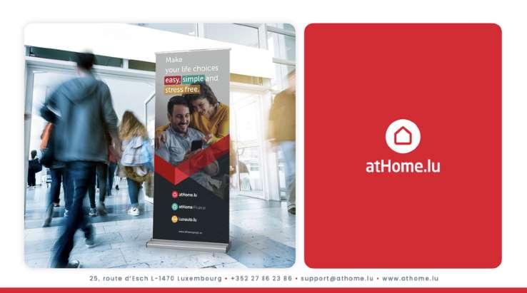
Our purpose is empowering people by making life choices easy, simple and stress free.
Using technology as our foundation and property as our focal point, our motivation stems from our steadfast desire to create a meaningful impact in people’s lives.
Our aim is for our audience to experience a sense of understanding, stimulation, and confidence. To foster these emotions, our tone consistently embodies a personal, vibrant, and intelligent approach.

atHome Group is the market leader in property and auto classifieds with fastgrowing financial services spanning mortgages and tax. The company operates in the greater Luxembourg region, a high-velocity, highvalue market that benefits from significant cross-border commuter flows.
As an ecosystem, we aim to go beyond just property or car listings, but helping our consumers through all stages of a transaction.
Contextual use within ecosystem
Service logos should only appear when it's clear that they are part of the atHomegroup ecosystem.
This means using them in situations where the audience is already familiar with the atHome brand, such as internal communications, existing customer communications, or platforms and events where atHome is already a recognized presence.
Always introduce the atHome brand prominently before any service logos are used.
This reinforces the connection to the main brand and prevents confusion about the origin of the service.
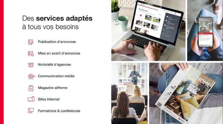
Our services guide our users through every step of their property journey.
Service logos such as atHomeFinance, atHomeData, and others, should only be used within the ecosystem once the atHome brand has been clearly established in the communication or context.
This ensures that the core brand identity remains the primary focus, while the service logos act as complementary extensions that support specific areas of expertise or offerings.
Do not overload communications with multiple service logos at once. Focus on the primary atHome brand and introduce the service logo only when relevant to the specific offering or message. Overuse can dilute brand identity.
By following these guidelines, we ensure that each service logo is used effectively, reinforcing the trust and recognition of the atHome brand while promoting its individual services seamlessly.
The logos for services like atHomeFinance, should only appear once the atHome brand itself has been introduced. This ensures that users are aware they are engaging with a service under the trusted atHome umbrella.
Service logos are appropriate in scenarios where users are navigating within atHome platforms (website, app, etc.), where the atHome identity is already prominent.
For instance, when users are already interacting with atHome's real estate services, you can introduce atHomeFinance for mortgage solutions without requiring further explanation.
Services logos should not be used independently of the primary atHome brand in external contexts where the atHome name isn’t already established.
For example, the logo atHomeFinance should not appear alone on external advertising or third-party platforms unless the atHome brand is also featured prominently.
Imagine an email campaign targeting users who have recently shown interest in property searches on atHome. In this context, the email can feature the atHomeFinance logo to promote financing options, as the user is already aware of the atHome brand through their prior engagement.
If atHomeFinance were used as the primary logo in a social media campaign targeting new users, it could cause confusion. The audience may not recognize the connection to the trusted atHome brand. In this case, the atHome logo should be featured first, with atHomeFinance introduced as a service underneath it.
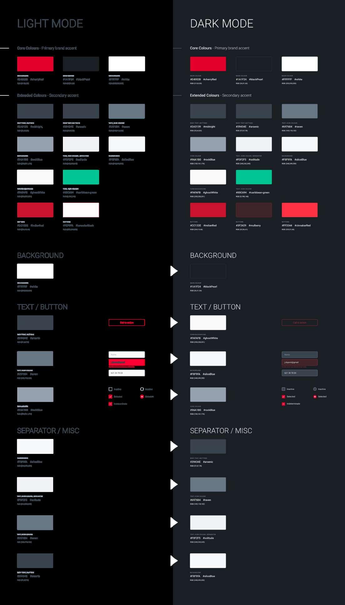
The core of our brand identity.
Using our logo
We are very proud of our logo. Follow these guidelines to ensure it always looks its best.
Our logo is a combination of a glyph and a wordmark.
Our identity is much more than just a logo, but obviously the logo is the most important element that identifies us and let us to stand out.
That's why it's so important to use the logo exactly as specified in these guidelines Our logo is a fresh, bold identity that unites all of our communications.
All logo elements should stay together to best represent our brand. However the glyph can be used separately as an icon, favicon, branding or design element.
atHome logo colors
Our logo comes in 3 ways : Inline, stacked and glyph. The inline logo is the primary logo and should be used in most instances.

Our glyph is a shorter version of our logo. Use the glyph on its own only if you do not have enough room for the full logo or in cases when the atHome brand has already been established. While the glyph can exist without the wordmark, the wordmark should never exist without the glyph.
To preserve the integrity of our logo, always maintain a minimum clear space around it. This clear space insulates our logo from distracting visual elements. The logo and the symbol's exclusion zone is equal to half the height of the symbol.
To ensure accurate and consistent use, never alter, rotate, embellish or attempt to recreate our logo. The proportions and shape of the logo should never be altered for any reason.
Exclusion zone
Establishing a minimum size ensures that the impact and legibility of the logo aren't compromised. The logo should never be smaller than 90px in digital or 25 mm in print.
The logo can be placed on a background or over an image using one of the colors from the primary color palette, as well as black, or gray. Here are examples of the logo applied in these instances.
The one-color logo should be used only on photographs and color backgrounds within the atHome color palette.
The one-color logo should be only on black and white colorways.
Please never use a color variation outside of these combinations.
To ensure legibility and sufficient contrast, use a black version of the logo over a light background and a white version over a dark background.


Improper logo usage
It is important that the appearance of the logo remains consistent. The logo should not be misinterpreted, modified, or added to.
No attempt should be made to alter the logo in any way. Its orientation, color and composition should remain as indicated in this document - there are no exceptions.
Correct spelling
There is only one way to write the brand name: atHome.
Lowercase "a" and uppercase "H". There are no other variations, whether it's at the beginning of a sentence or standing alone. "atHome Group" is always written as two words.
Avoid these usages:

Do not change the transparency of the logo

Do not use drop shadows or any other effects
Do not use different colors
Do not re-create using any other typeface
Do not change the size of the symbol and wordmark
Do not outline logotype
Do not distort the logo
Do not rotate any part of the logo
As previously noted, service-specific logos should only appear in contexts where the atHome brand has been clearly established within the communication. It goes without saying that the rules outlined in the previous pages must also be strictly applied to these logos (clearspace, etc.).
Correct spelling
There is only one way to write the brand name: atHomeFinance
Lowercase "a", uppercase "H"and uppercase "F".
There is only one way to write the brand name: taxx.lu
Lowercase "t".
There are no other variations, whether it's at the beginning of a sentence or standing alone.
Poppins is our core typeface and should be used wherever possible.
Clear and simple, self-confident, straight and optimistic –our corporate typeface, called Poppins, perfectly transfers our brand values.
Edgy and soft, full of optimism: the font communicates expressively without exaggerating and forms our communicative message in a focused, elegant and inspiring way with a high degree of recognition.
Poppins is a sans-serif font so the fallback fonts for digital applications (in order of priority):
01. Helvetica Sans
02. Arial
03. Open Sans
The only exception is our logo, where we use Neo Sans.
Do not set in all caps or all lowercase. Avoid italics, avoid using underline.
When using Poppins to typeset headings on the web, set the letter spacing to -1px for smaller headlines and -2px for larger headlines.
Typography|Main font
Poppins ExtraBold 800
ABCDEFGHIJKLMNOPQRSTUVWXYZ
Abcdefghijklmnopqrstuvwxyz
0123456789
!@#€%&*?
Poppins Bold 700
ABCDEFGHIJKLMNOPQRSTUVWXYZ
Abcdefghijklmnopqrstuvwxyz
0123456789
!@#€%&*?
Poppins SemiBold 600
ABCDEFGHIJKLMNOPQRSTUVWXYZ
Abcdefghijklmnopqrstuvwxyz
0123456789
!@#€%&*?
Poppins Regular 400
ABCDEFGHIJKLMNOPQRSTUVWXYZ
Abcdefghijklmnopqrstuvwxyz
0123456789
!@#€%&*?
Poppins ExtraLight 200
ABCDEFGHIJKLMNOPQRSTUVWXYZ
Abcdefghijklmnopqrstuvwxyz
0123456789
!@#€%&*?
Display headlines
Display headlines may scaled up or down to suit your communication and layout.
Always use sentence case.
When we want to communicate on a personable/friendly refined level we use this style.
Bold headlines used for display purposes.
We use Extrabold when we need more legibility - for OOH or in a busy environment. Headlines are generally left aligned.
We love red… Red is the color of passion, excitement and confidence.
All the feelings you get when you move to a new property.
Our primary hero color, ”Cherry Red“, is a key identifying feature of the brand, along with the logo and the brand‘s distinctive rhythm. This is our core atHome palette which makes us immediately recognizable. It should be used on all internal and external communications.
Keep it light and bright. Use Red as powerful accent. Red always appears on the first, last or only interaction with the brand online and offline.
White supports our hero colors and complements the primary duo. It reflects the fresh, open and friendly character of the brand and structures the visual look in all applications.
We all need a little color in our life. It keeps things vibrant.
Colors from the secondary palette should only be used on secondary interactions with the brand. They should never be more dominant than the primary colors. Consider their use for additional elements, secondary color blocks, backgrounds, infographics, color accents, highlights and auxiliary UI/UX elements.
These colors have been carefully selected, therefore never tint these colors.
Simplicity is always more powerful. The secondary color palette should never interact or directly touch the red in our primary color palette (infographics excluded).
#692467
#E79F07
#345790
#823D81
#F3C24F
#6681AC #99ABC7
#9E689D
#F6D17B
#BA93B9
#F9E1A7
#CCD5E3
#E3D4E3
#FCF0D3
#E5EAF1
#F7FCFC #F7F8FA
#F1E9F1 #F6F1F5
#FDF7E9 #FEFCF8
#F7F6F3 #FBFAF9
We love red… Red is the color of passion, excitement and confidence. All the feelings you get when you move to a new property.
Our primary hero color, ”Cherry Red“, is a key identifying feature of the brand, along with the logo and the brand‘s distinctive rhythm. This is our core atHome palette which makes us immediately recognizable. It should be used on all internal and external communications.

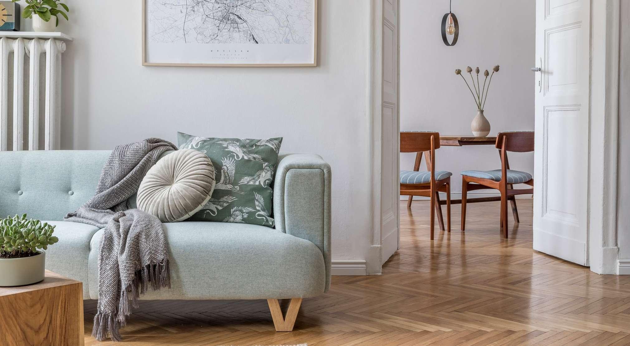
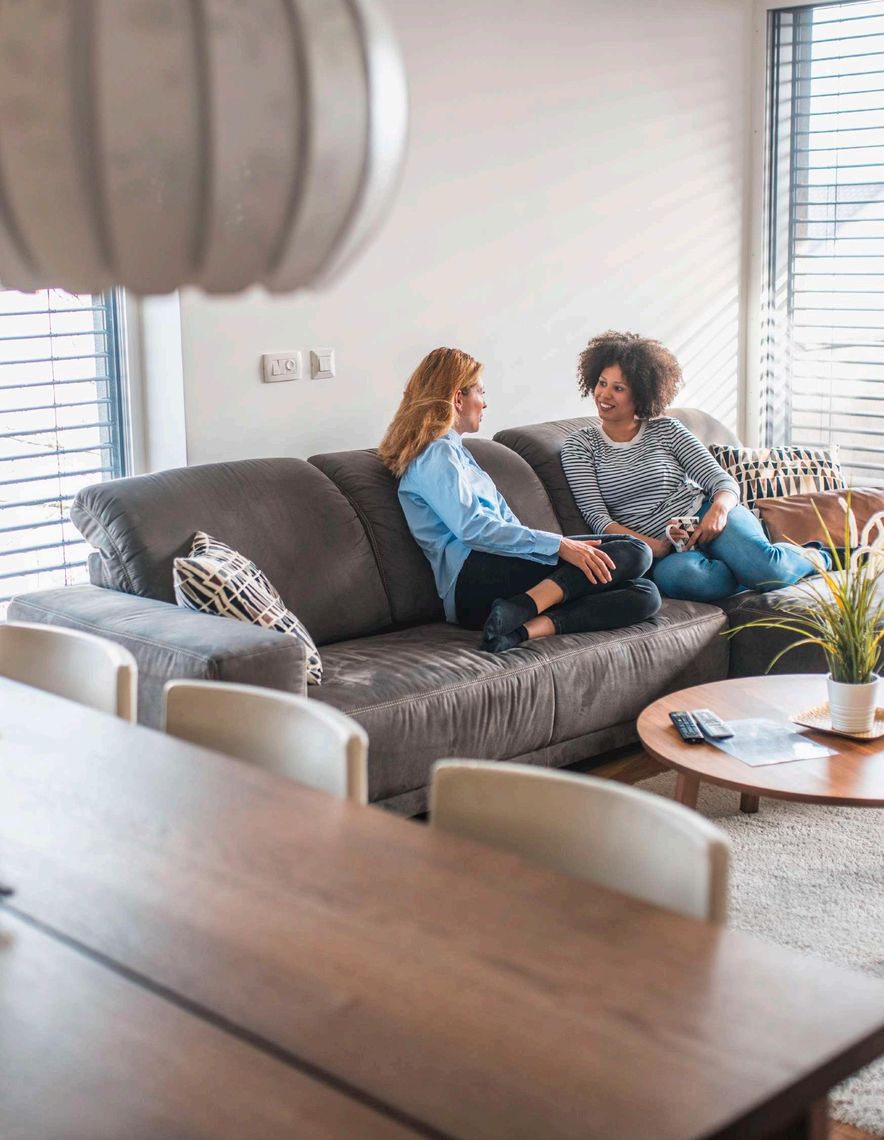
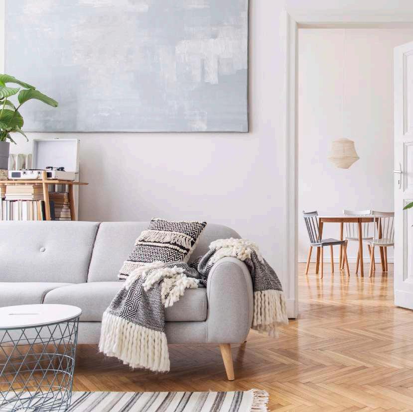
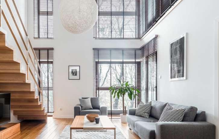
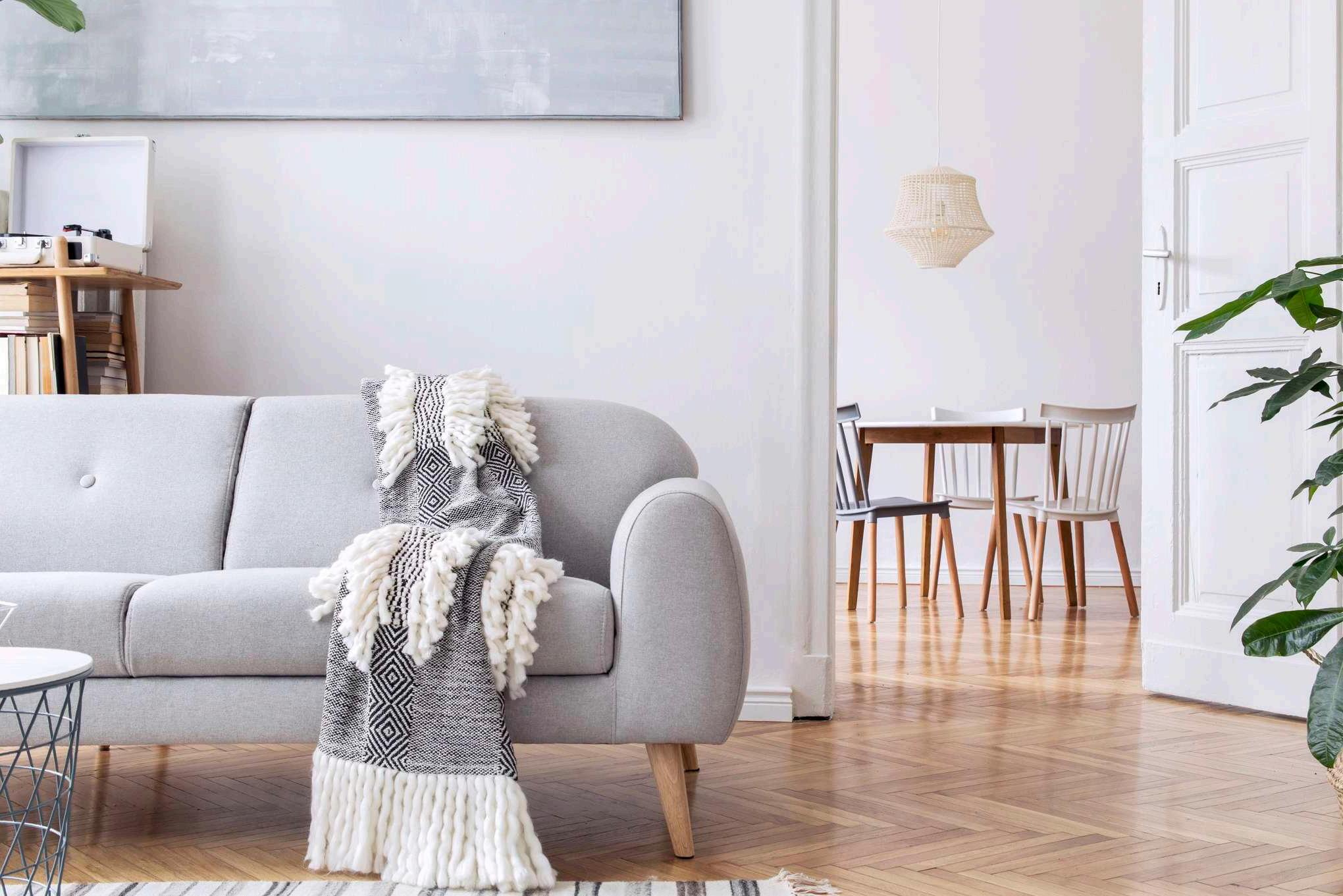
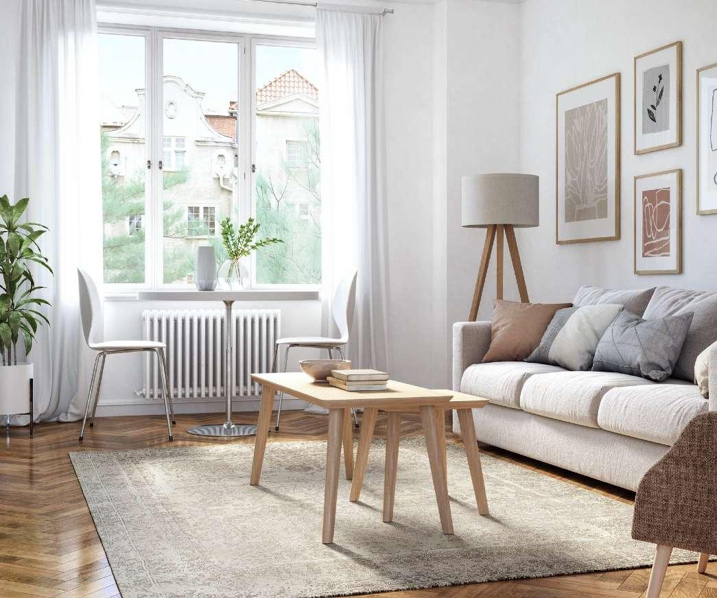
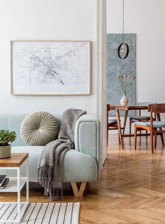
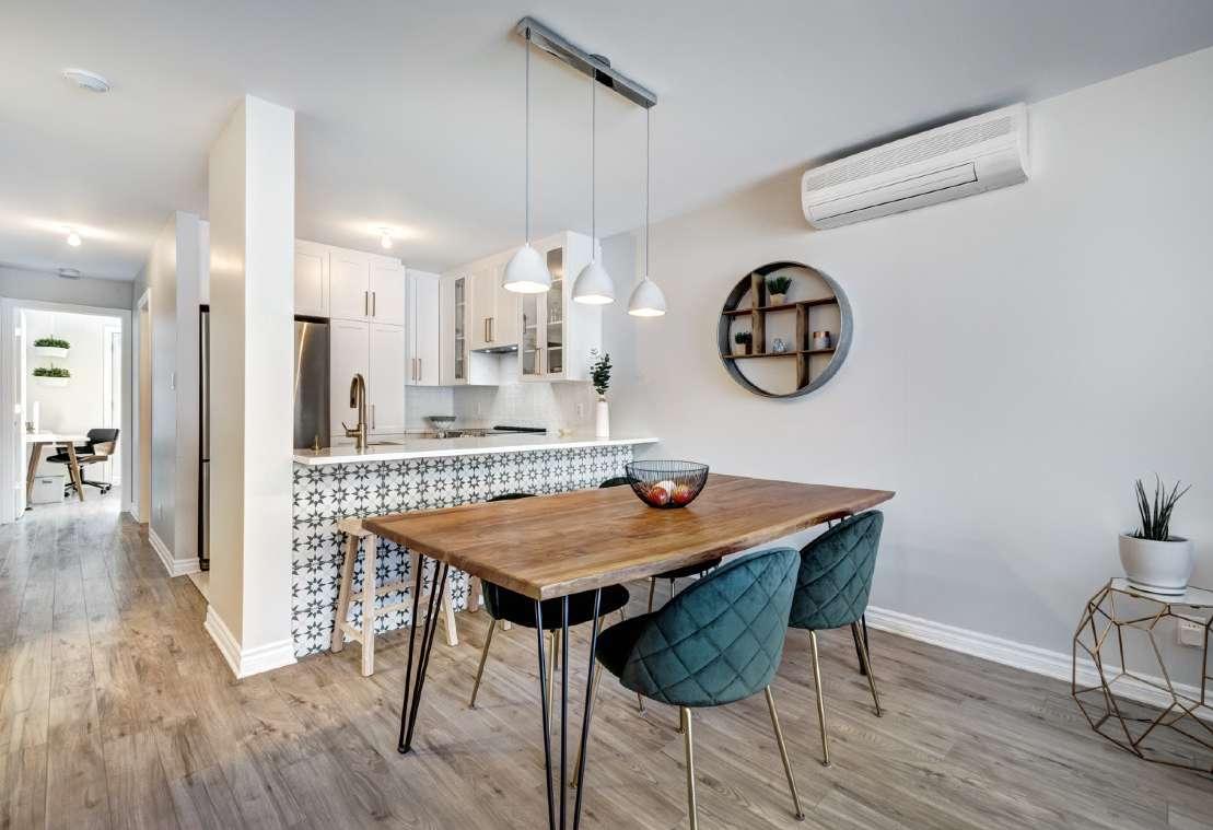
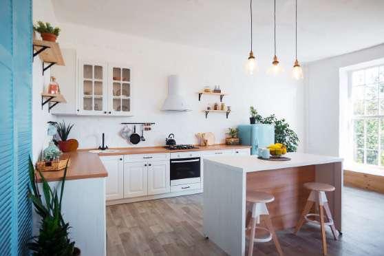
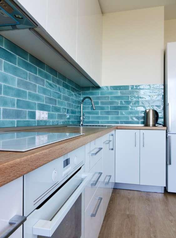
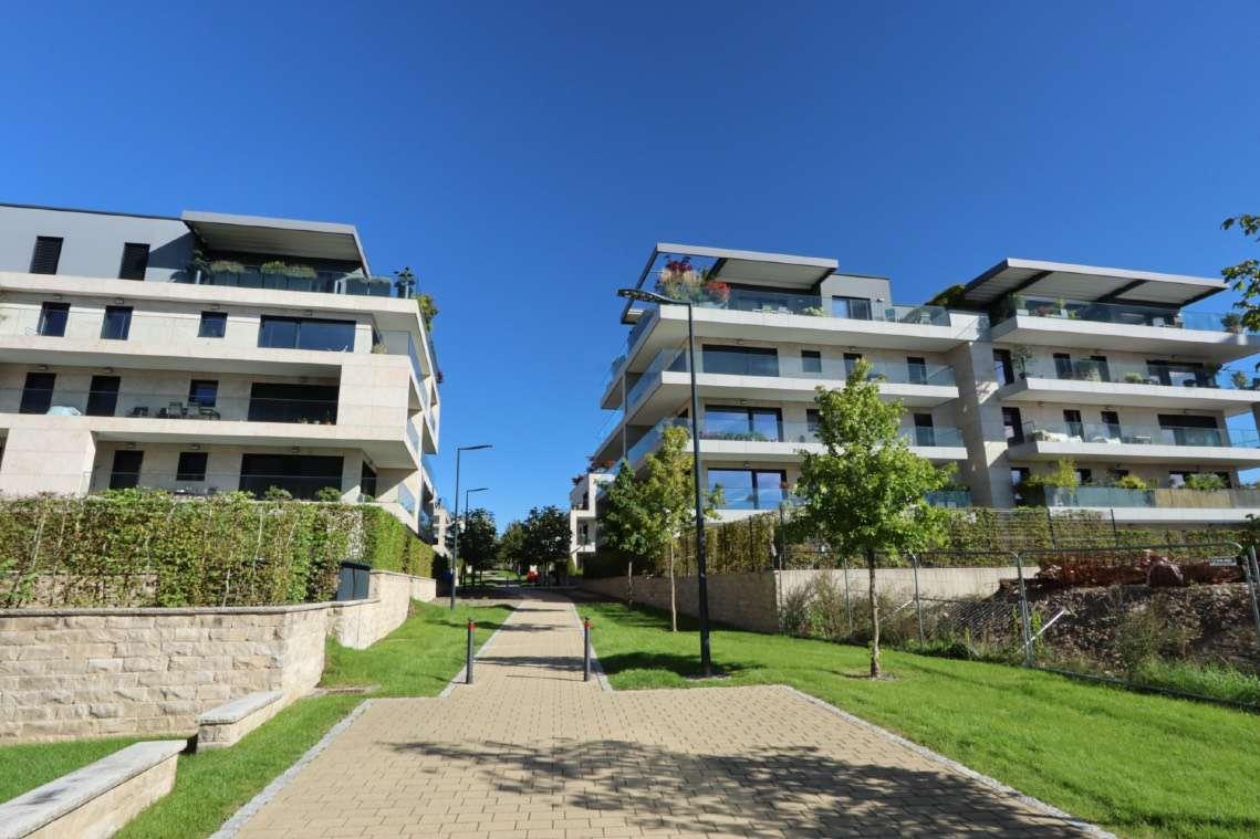
An authentic and unobtrusive look-in on real life as it happens…
Authenticity is one of the most important things to keep in mind when choosing imagery to associate with our brand. Authentic images don’t look contrived, staged or gimmicky.
To convey authenticity our photography style needs to represent real people, real places and represent real life. They should always remain light, bright and natural and retain an edge of optimism and aspiration.
The best images leave a lasting impression because the viewer relates to the subject of the photo.
Images are intended to add additional context to your content, not to contradict or confuse.
Make sure every image you choose is relevant and serves a purpose.
When using images in print or online, it’s vital to get the sizes, dimensions and resolutions correct.
Always make sure you have the right to use the image and correct licensing rights before buying or downloading any images.


By using imagery that focuses on people and what is important to them, we demonstrate our purpose: making people life choices easy, simple and stress free.
Along with capturing atHome's personality, these images demonstrate the important role atHome plays in the day-to-day lives of our users. Imagery should capture authentic life interactions and expressions between people who happen to be caught in a moment.
Avoid imagery where people are intentionally looking at the camera as this loses the spontaneity of capturing a moment in time.


Ensure imagery represents diversity (ethnicity, gender, age, body type,…)


Ensure that the images chosen to showcase the interiors depict genuine spaces that evoke a sense of livability for everyone.
Visuals must distinctly convey the location as Luxembourg or a neighboring country, thus avoiding images featuring elements like swimming pools and palm trees that could misrepresent this context.
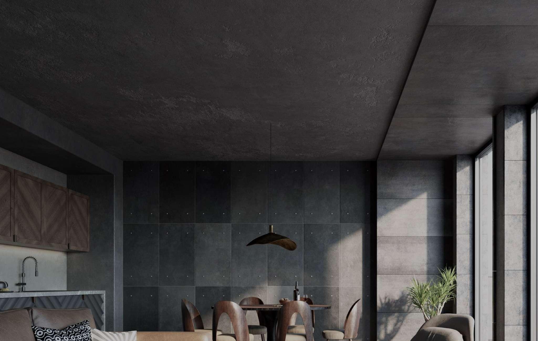
Use authentic photographs rather than relying on 3D renderings to accurately portray the desired ambiance and setting.


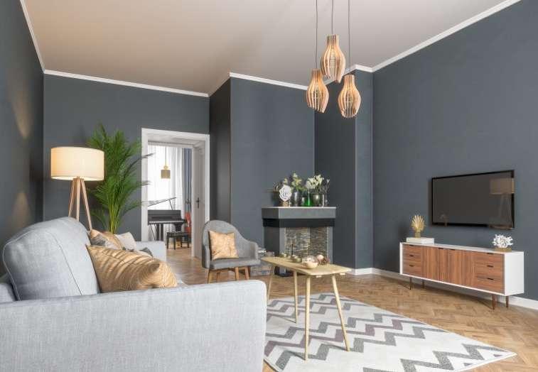
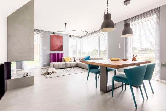


Exterior and building illustrations should align with the architectural style prevalent in Luxembourg.
Opt for images of buildings that are relatively new, well-maintained, and exhibit a contemporary aesthetic, facilitating easy association and projection for the audience.
Ideally, capture these images on a sunny day, striving to take your own highquality photographs for optimal authenticity.


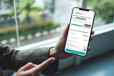


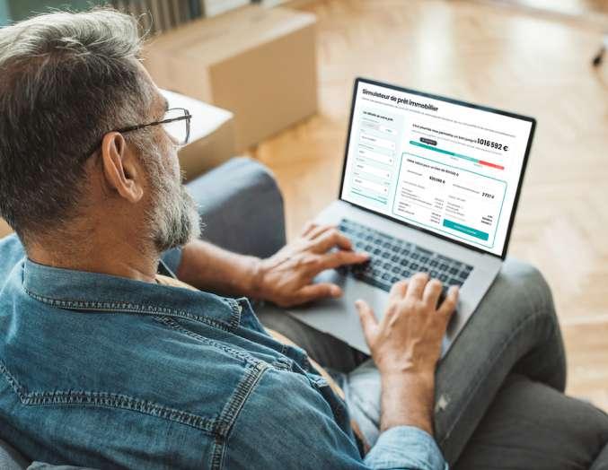
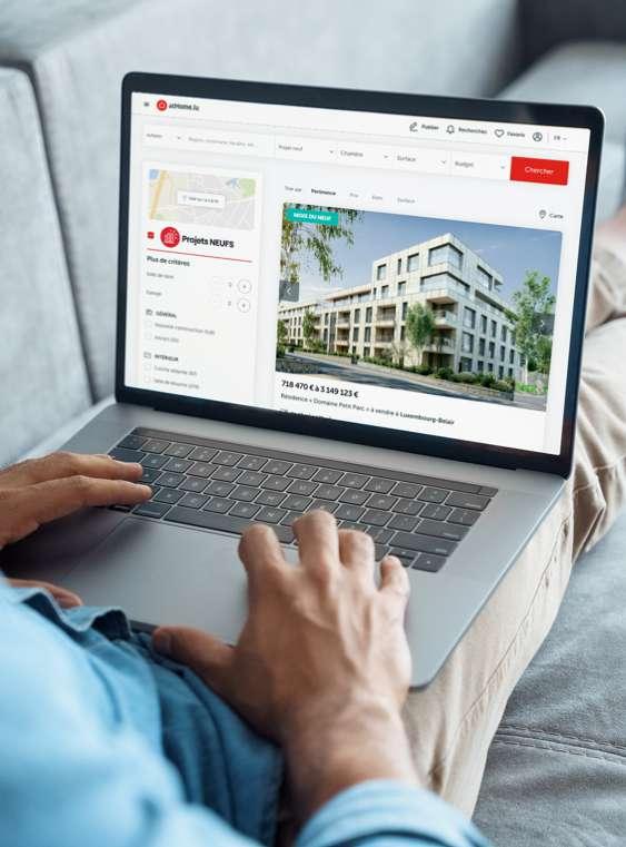
People and products should not be imposed on an environment but rather shown naturally how they would appear. The product does not always need to be the hero or even fully visible; it's about the story you are trying to tell.
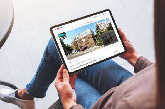
Always prioritize the use of devices in real life situations.
Show real product interaction, environments infused with bright, natural light.
Because words are overrated.
Illustration to replace photography
It’s not always easy to find relevant imagery for a service business, life style shots for a product or showing how a product is used. When photography just won’t work you can use illustrations to create maximum effect.
A mix of typography and illustrations can create a high impact that will be aesthetically pleasing and support your message just as much.


Icons/pictograms
Our icons are used across different brand touchpoint from marketing, environment to product. They provide symbolism, conceptual clarity, and visual interest in simplistic shapes and forms. Pictograms are for both print and online use.
We use 2 sets of icons:
• For actions : simple, easily understandable, bolder
• To illustrate : more detailed, thiner Unlike images, pictograms usually have clear self-explanatory meaning. However, in some cases, pictograms may need supporting text.
We use round corners to communicate a sense of simplicity, warmth and openness. The rounded corners compliments the bright and bold colors of our primary brand palette.
Like circles and rounded corners are all about positive feelings.
Rounded corners are softer and less aggressive to the eye than sharp corners. Their gentle curvature suggests smoothness, making the overall design feel friendlier and more inviting. This fosters a sense of ease and comfort for users navigating the interface.
The additional white space within the grid layout produced by rounded corners provides some “breathing room”, making the entire page feel less overwhelming for the user.

financez, profitez.

There must be rounded corners on cards and text boxes. Additionally, you can add round corners on images.
Keep it clean, light and elegant.
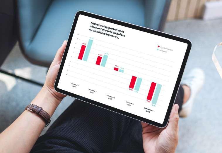
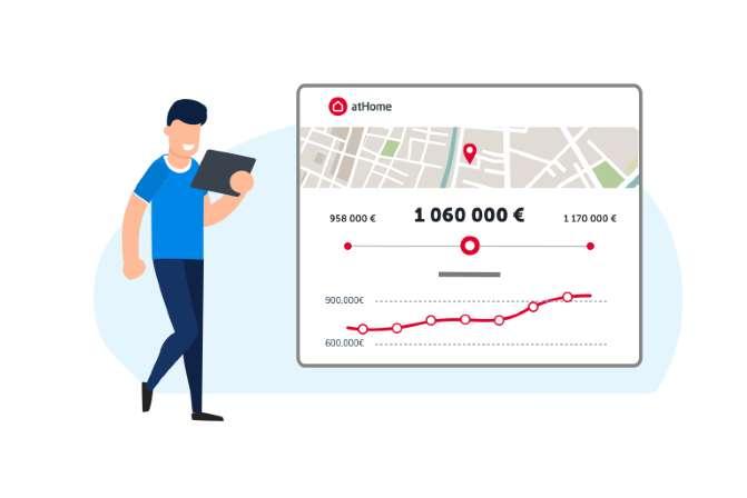
Graphs and charts should only use our primary color palette, supported by our secondary palette. Don’t introduce new colors.
Typography should follow the principles outlined in the typography section.
Plenty of white space to let our impressive figures speak for themselves.
Data should be kept clean and minimal, avoiding repeating numbers already represented graphically. The most harmonious title alignment can be determined by best design judgement of the space available and the other elements on the page.
Facts and figures can be a little dry sometimes - so we use color to add bit of life.


The way a brand looks is just as important as the way it sounds.
Brand tone of voice is a consistent way of conveying your brand’s message to your audience.
Your brand's tone of voice is the way you express your brand's identity and values in communications, both internally and externally.
It needs to feel true to your brand persona and be consistent over channels. Here’s what we are
• Confident
• Respectful
• Honest
• Inspirational
• Friendly
• Helpful
Be the expert
Deliver high-value information clearly and with confidence, positioning yourself and the company as the go-to source for information and market intelligence.
Use strong verbs and active, declarative sentences. Be proud of our products ans successes.
Don’t use 5 words when one will do. People are busy and want you to get to the point fast.
Short and snappy always wins! (also take it easy on the exclamation points).
Always put the user first
People don’t care how great you are, they care about how you’ll make their life choices easy, simple and stress free.
Be clear about what’s in it for them. Say “you” a lot and tone down your use of “I” and “we.”
Casual but professional
Make sure your messaging is friendly, approachable and human.
Inform, but never talk down. Be like that good friend who’s an expert in something, taking time to explain complex ideas in simple terms.
Humour is fine, as long as it doesn’t make fun of anyone and still sound professional.
Our tagline
It encapsulates the range of services we offer to our users, assisting them in finding their homes, securing financing, and facilitating property sales.
The tagline is used on external-facing content, media, experiences, and especially whenever the context ad messaging are outside of atHome’s control.
power of clarity.
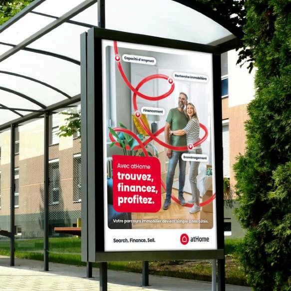
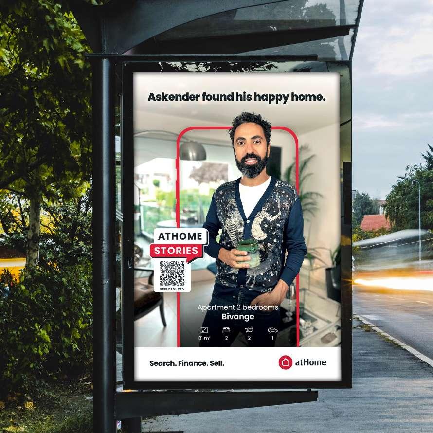
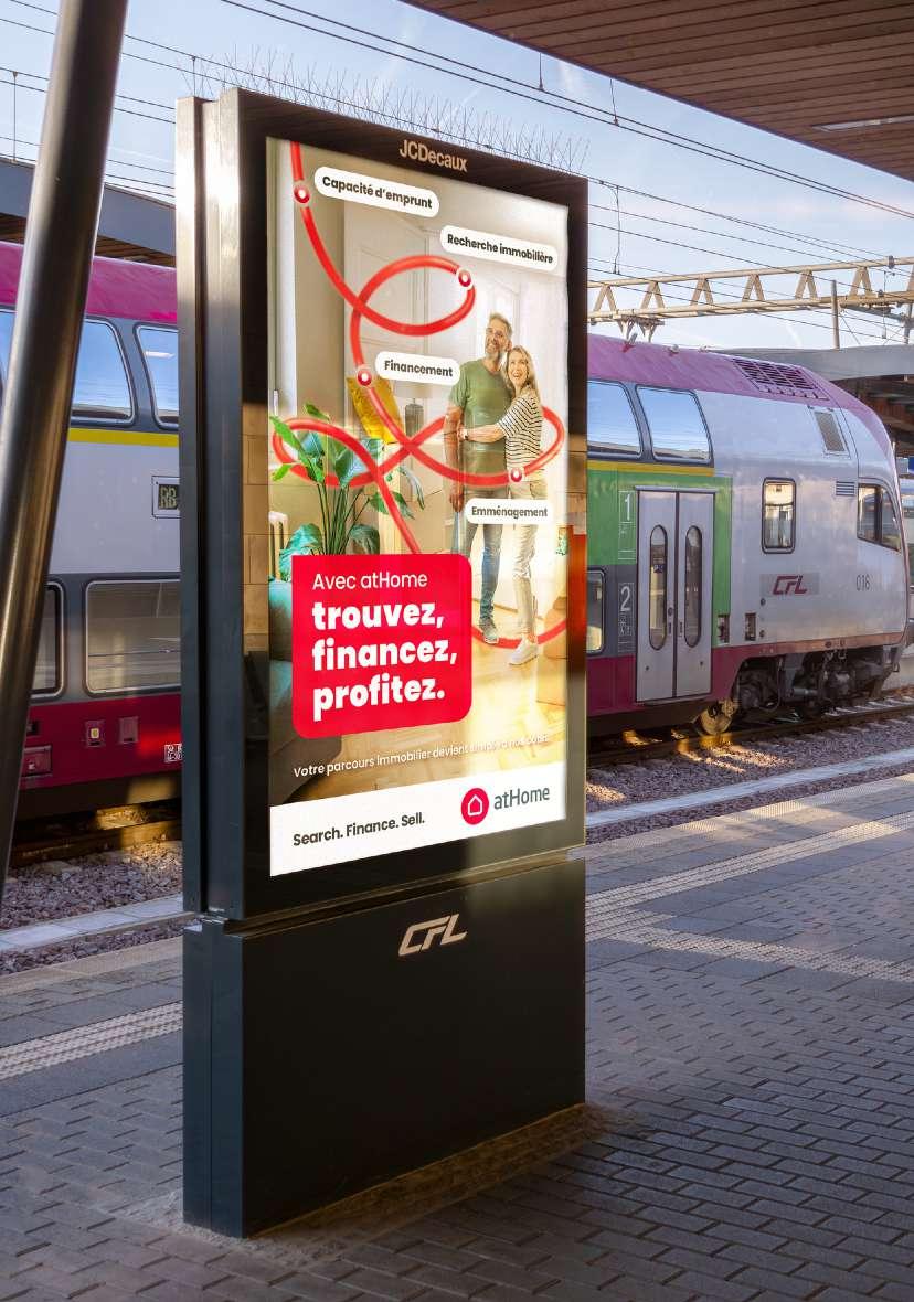
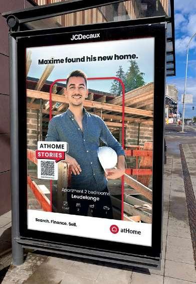
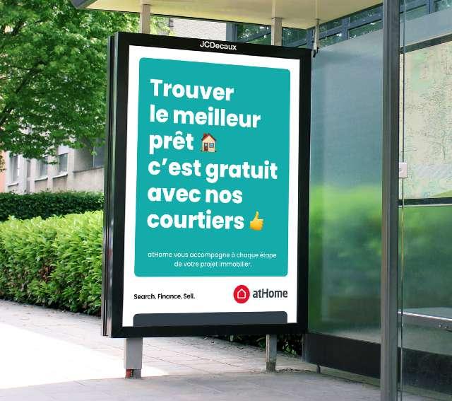
When it comes to OOH advertising, clarity and simplicity are paramount.
Use bold, legible fonts and high-quality visuals to capture attention while ensuring your message is concise and easy to understand at a glance.
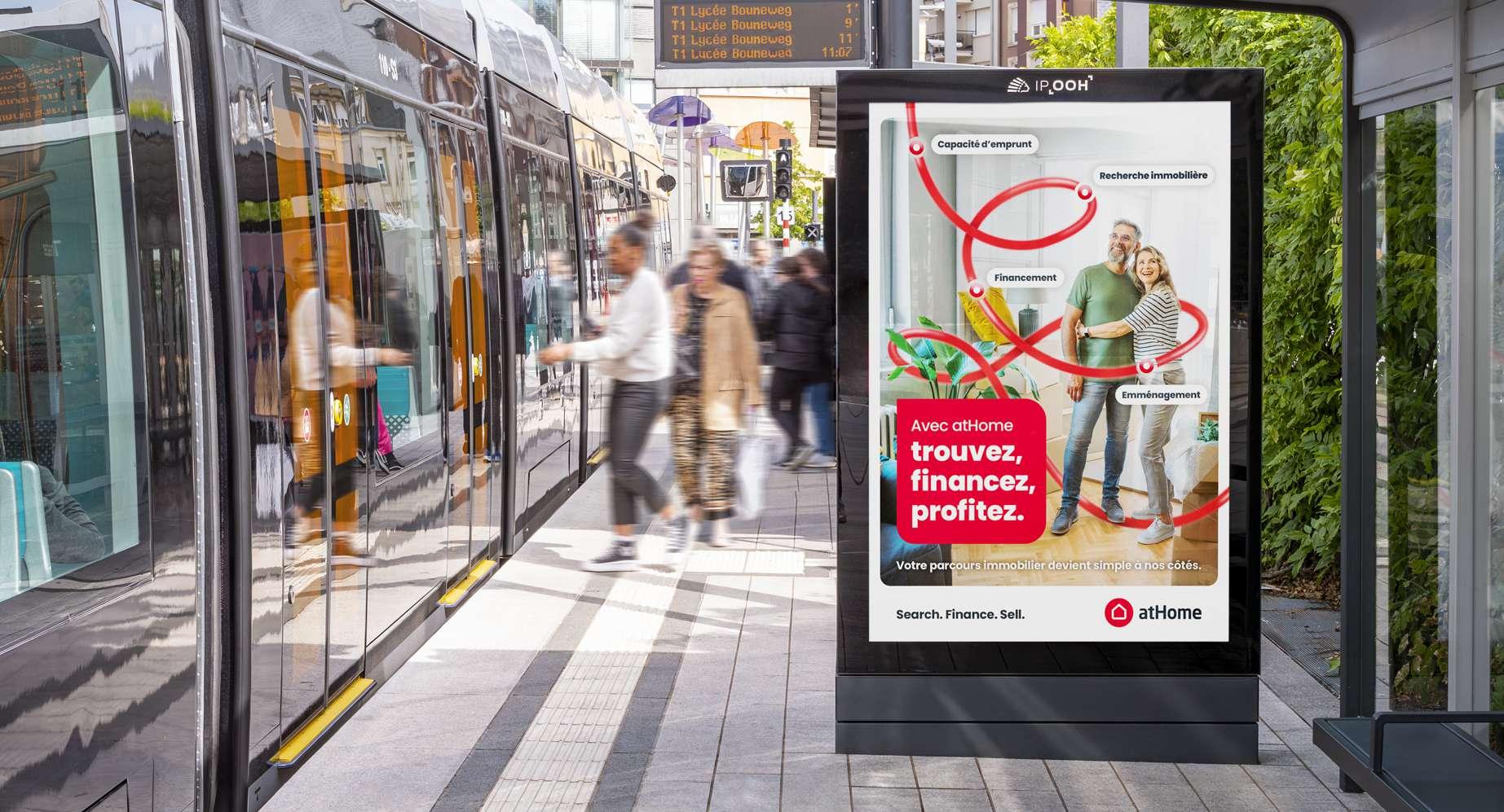
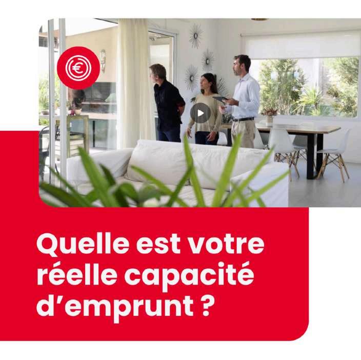
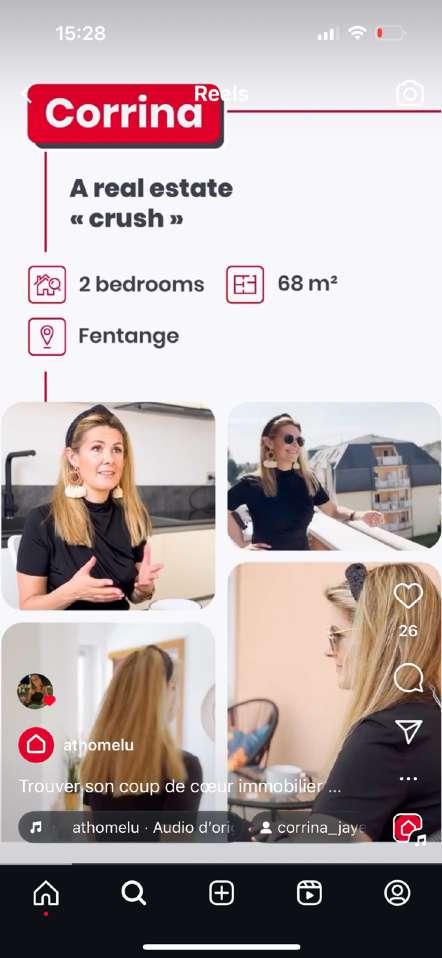
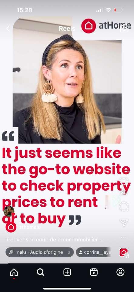
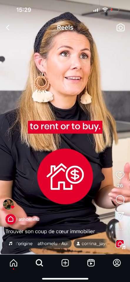
Grab attention and engage!
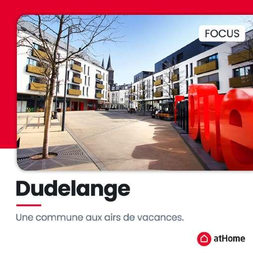
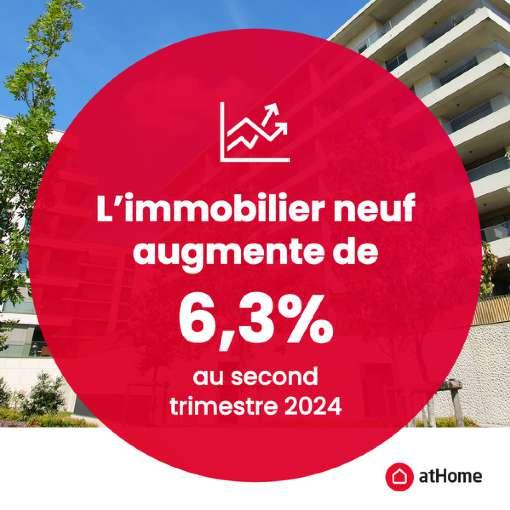
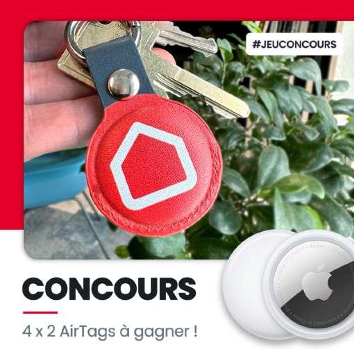
Striking visuals are essential for capturing attention and driving engagement on social media.
Use clear graphics and relatable content that reflect our brand's identity. Ensure your images are optimized for each platform to maximize impact and create a consistent, inviting presence that encourages interaction with our audience.

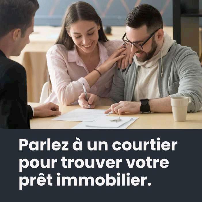
Incorporate a Call-to-Action
Encourage viewers to take the next step, whether it’s visiting our website, downloading our app, or talk to a broker.
Don’t forget to measure impact
Track performance metrics to continually refine and improve our visual strategy!
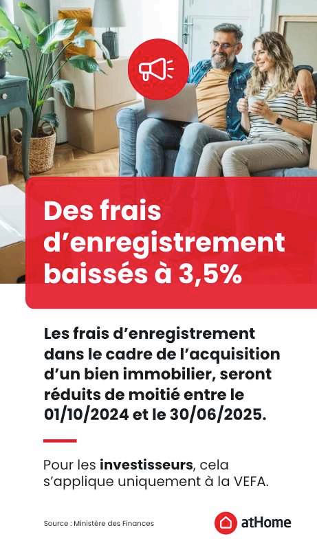

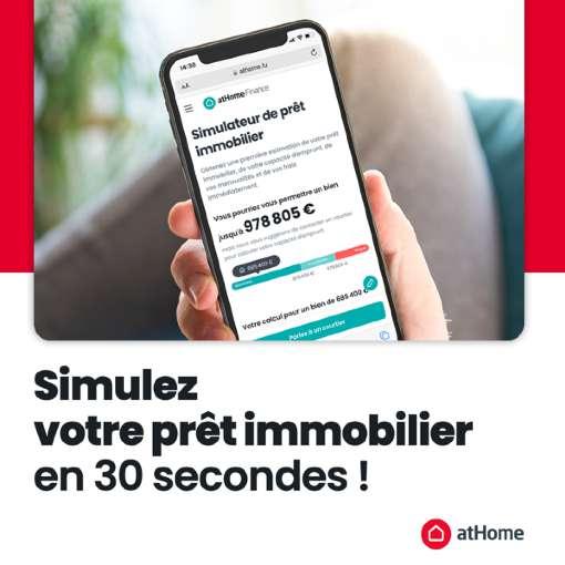
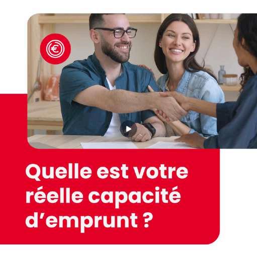


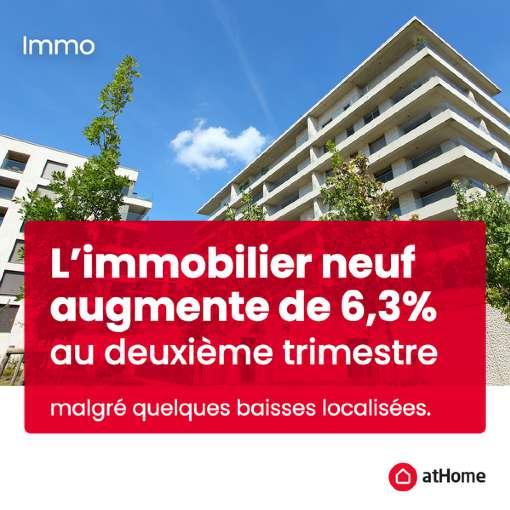
All visuals must include an atHome logo, except when the logo is already present in the picture.
Use of service logos and colors for online content
Our service logos and specific colors (e.g., for atHomeFinance) may be used in social media content to promote our various offerings.
However, as previously noted, servicespecific logos should only appear in contexts where the atHome brand has been clearly established within the communication.
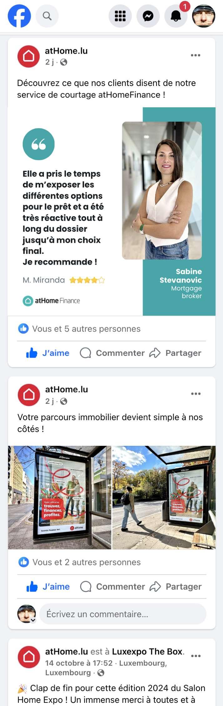
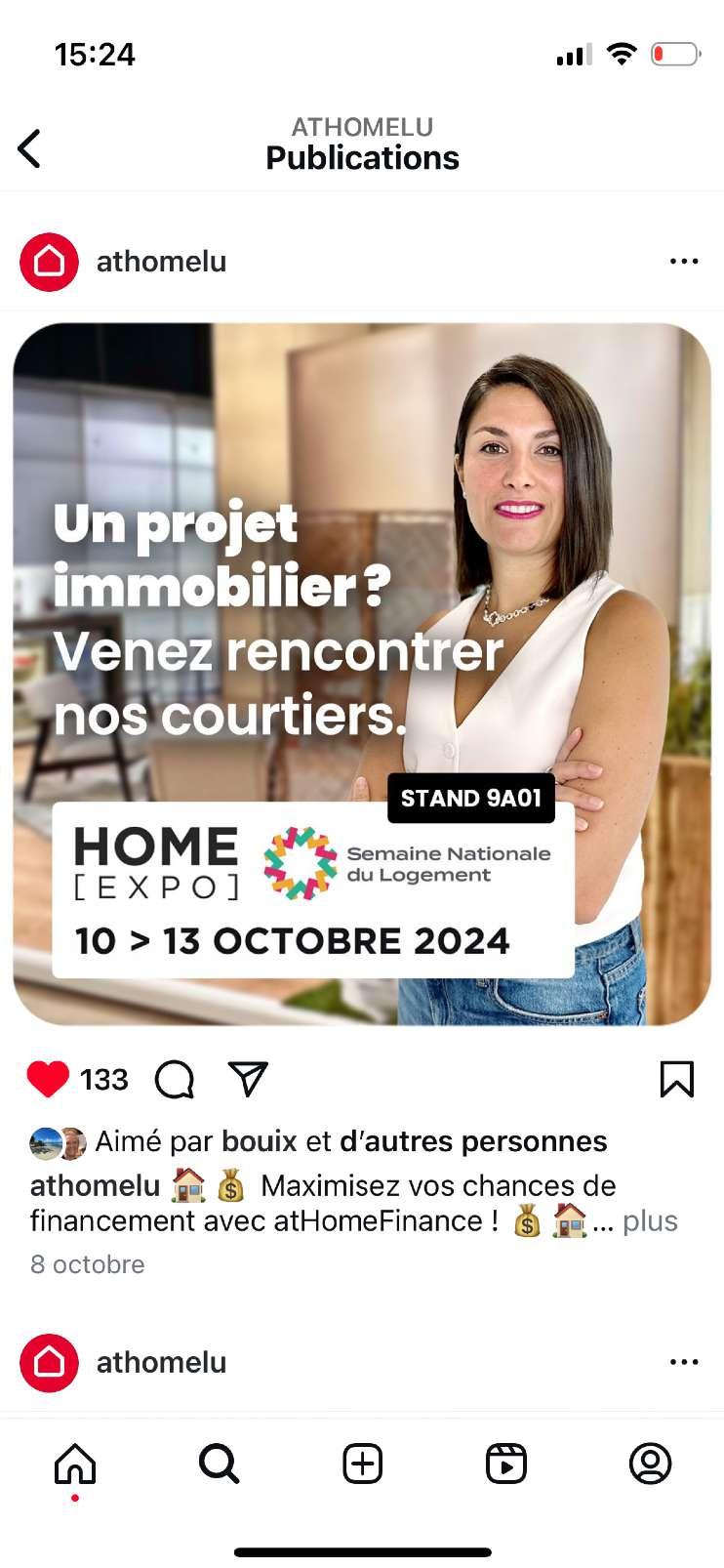
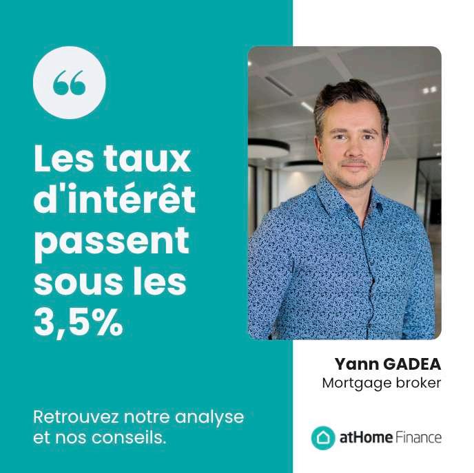
For example, service-specific logos and colors can be featured in promotional posts on our atHome official social media accounts (e.g., Facebook, Instagram, LinkedIn), as the audience is already aware that the post originates from atHome.
This ensures brand continuity while effectively promoting individual services.


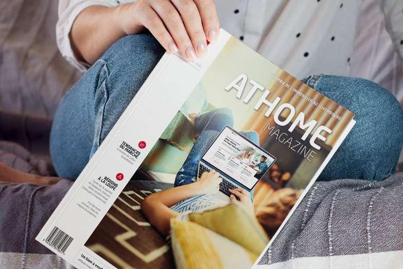
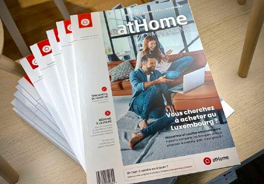
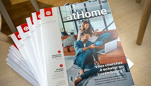
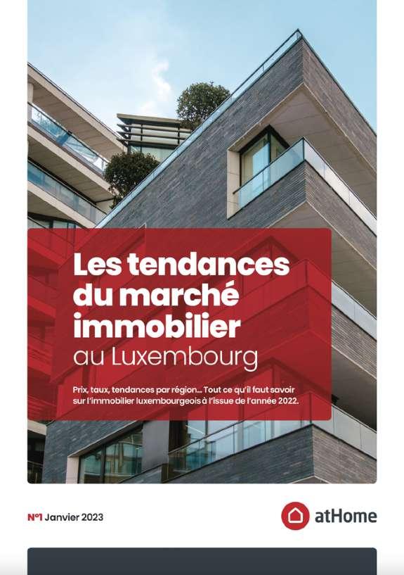
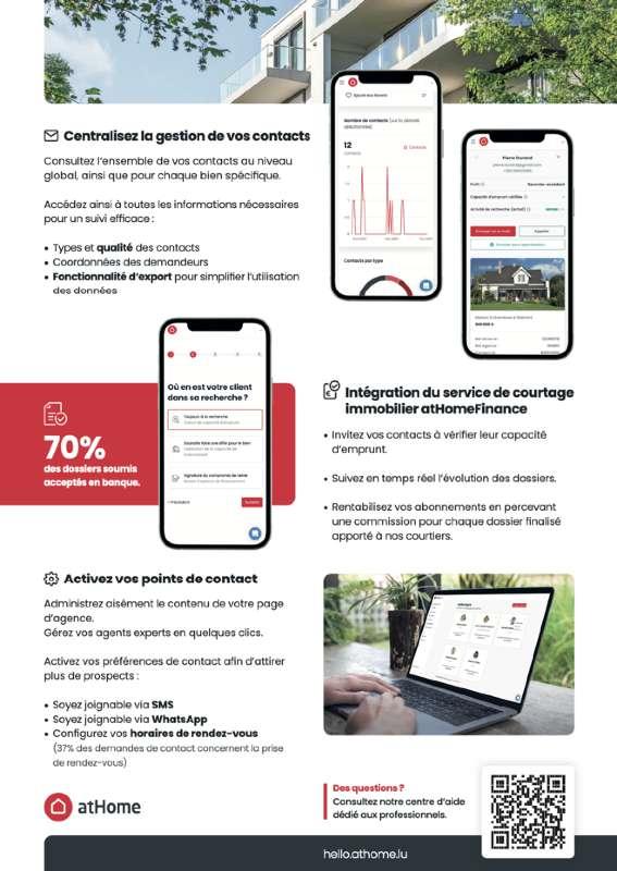
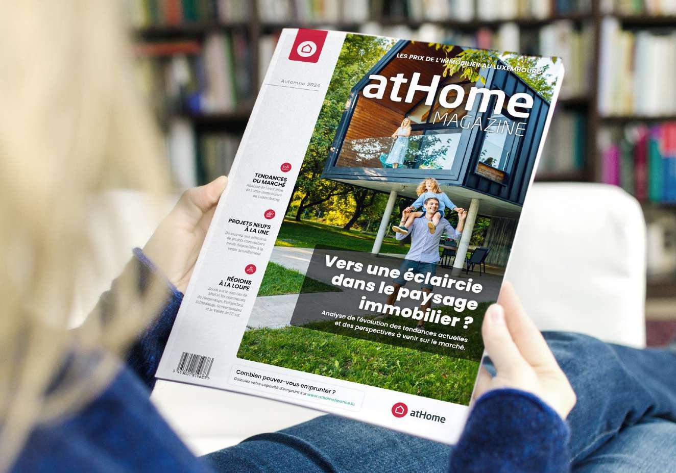
In print media, atHome's brand shines through high-quality magazine ads, brochures, and publications. Whether it’s a sleek magazine spread or a targeted printout, the goal is to convey our message with clarity and style. Focus on visually appealing layouts, bold headlines, and concise copy to engage readers.
Every printed piece should be a reflection of our identity, ensuring consistency in colors, fonts, and tone while adapting to the format’s unique strengths.


Connecting you to your next home.
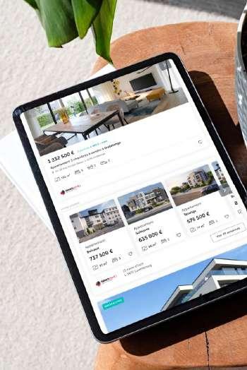
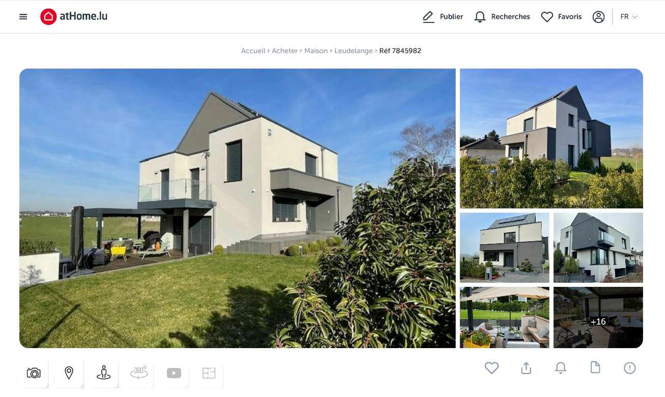
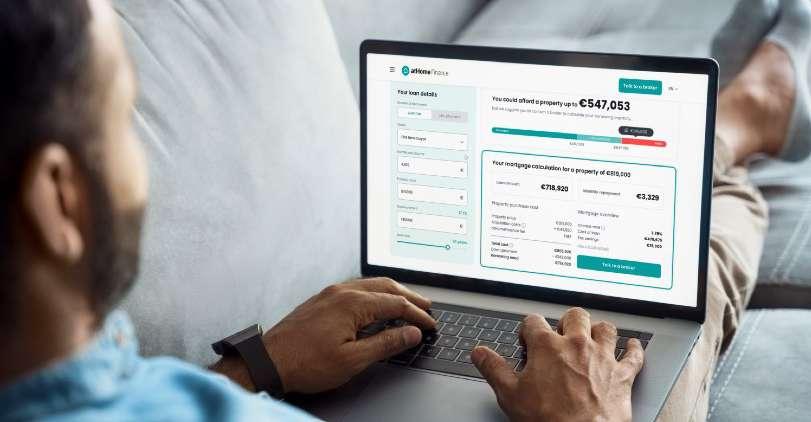
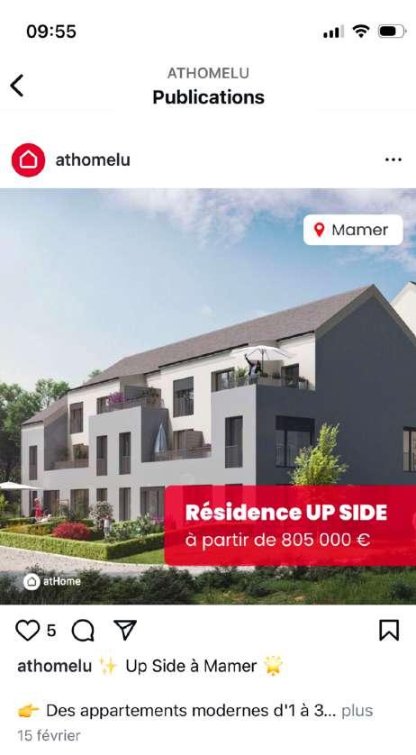
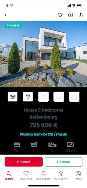
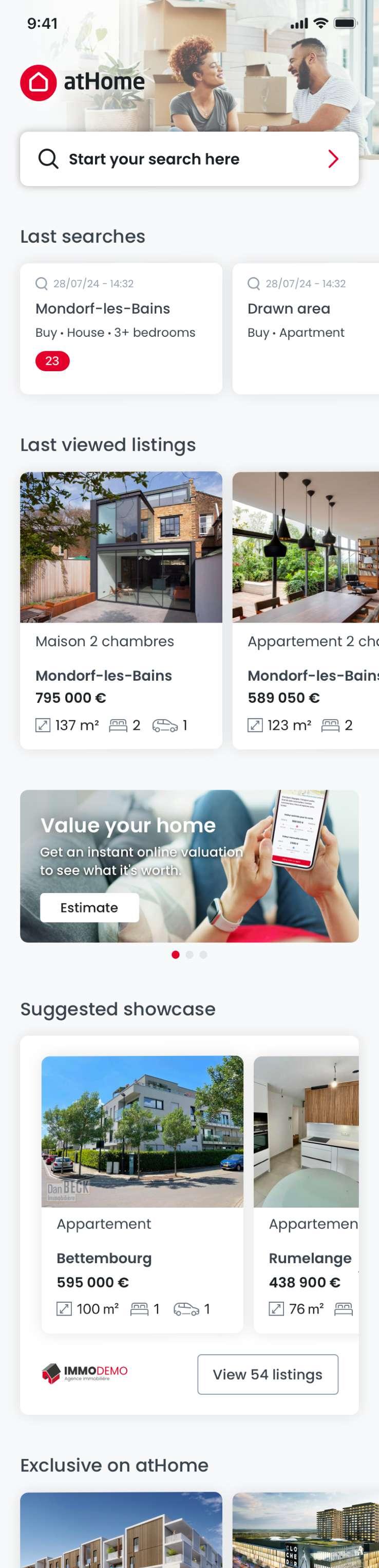
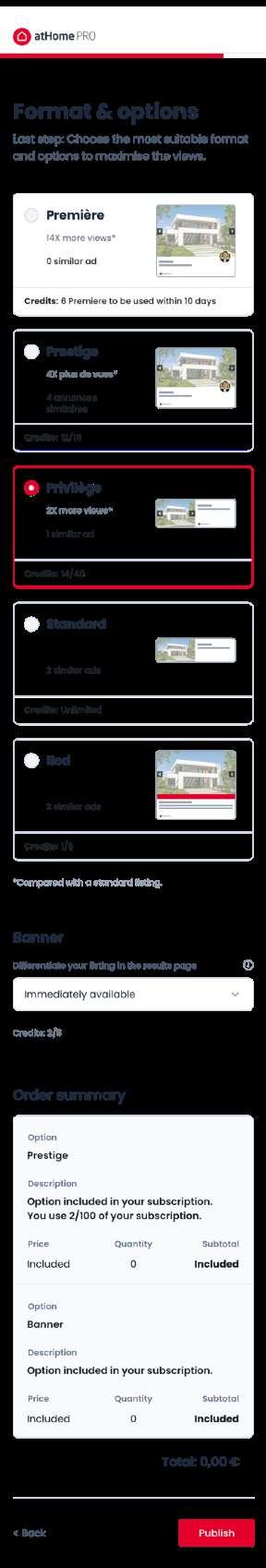
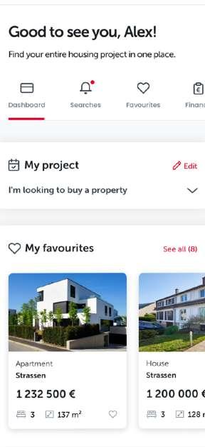
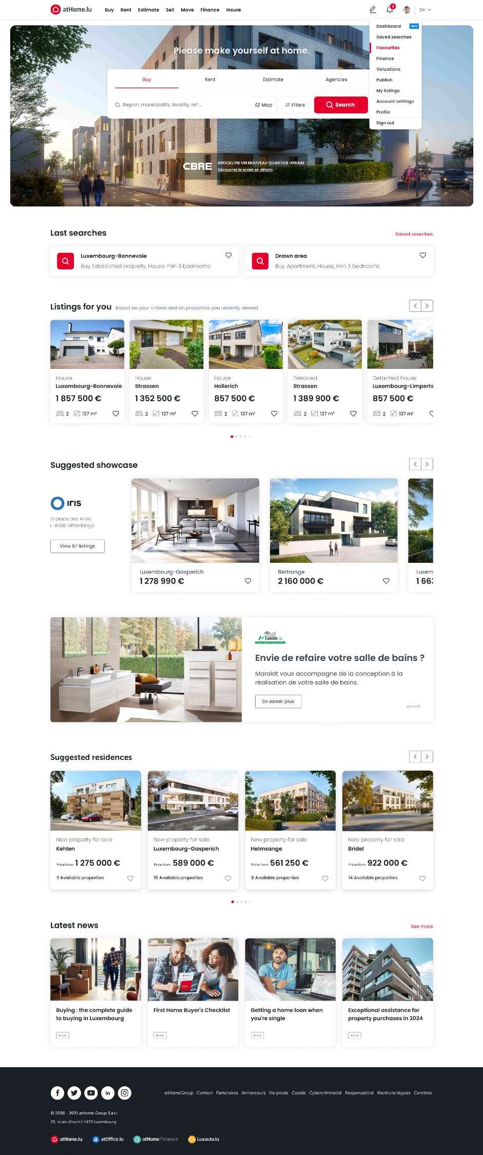
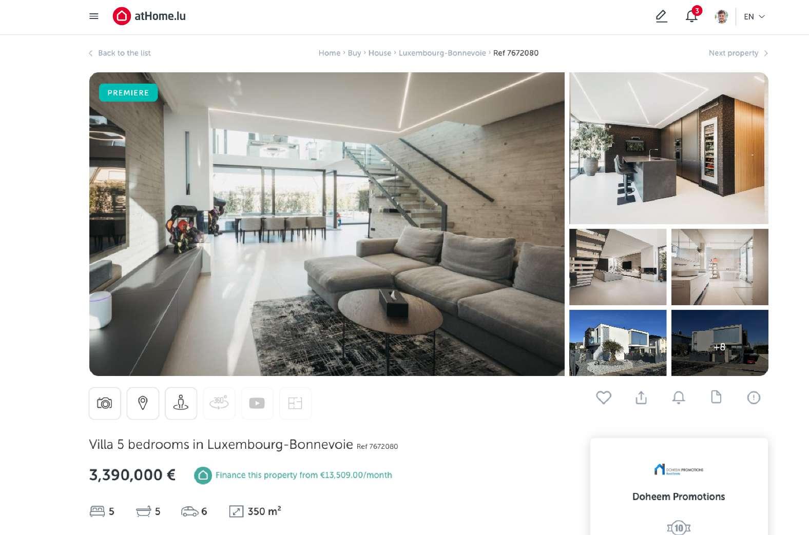
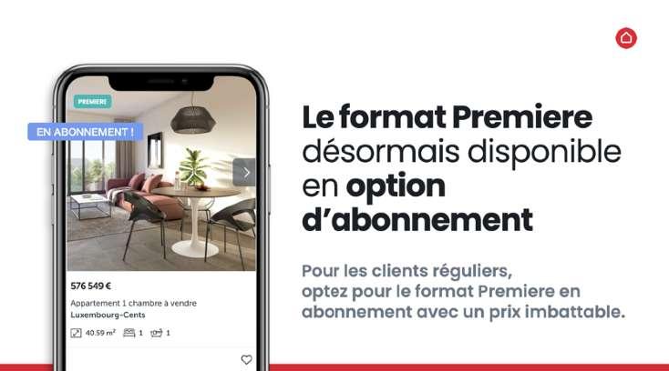
Our mobile app is designed to enhance user experience, providing seamless access to all atHome services right at their fingertips. Focused on intuitive navigation and user-friendly features, the app reflects our brand's commitment to convenience and innovation. Whether browsing listings, managing inquiries, or accessing financing options, users can expect a cohesive experience that aligns with our brand identity.


Connecting you to your next home.
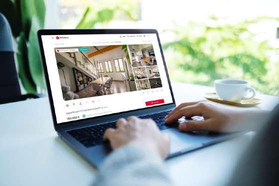
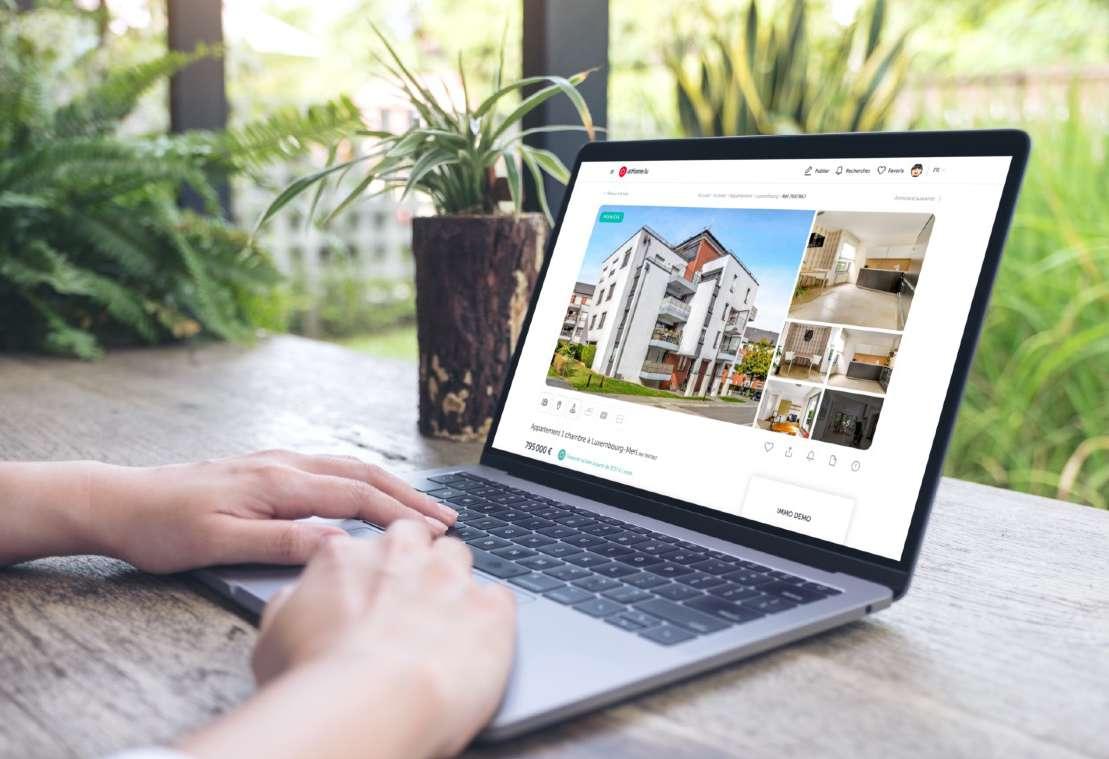
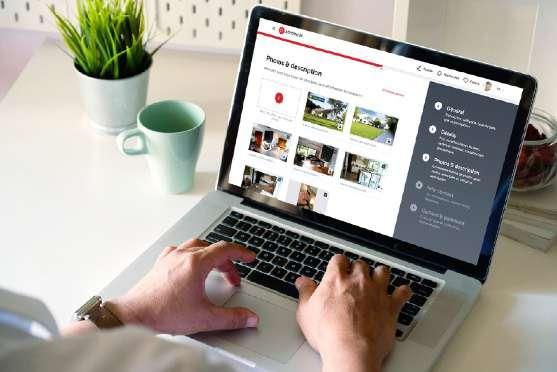
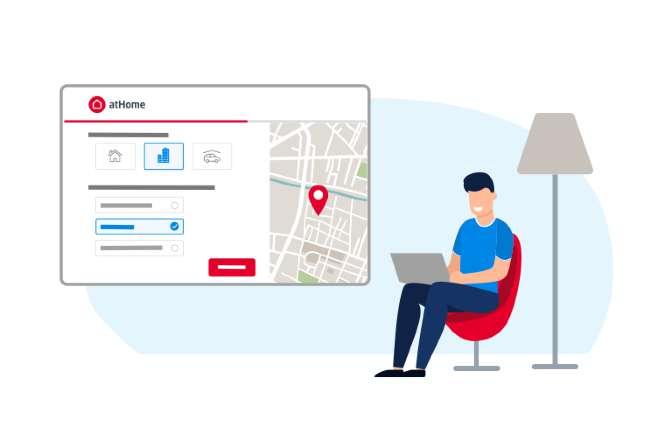
Our website is built to deliver an efficient and user-friendly experience, connecting you effortlessly to all atHome services. With a focus on modern design, intuitive navigation, and simplicity, the platform embodies our commitment to innovation and accessibility. Whether you're browsing property listings, exploring financing options, or managing your account, every feature is thoughtfully designed to ensure a seamless journey. The website reflects our brand identity, offering a cohesive and enjoyable experience tailored to meet user needs.


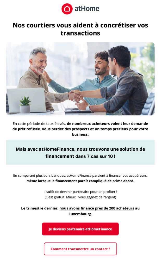
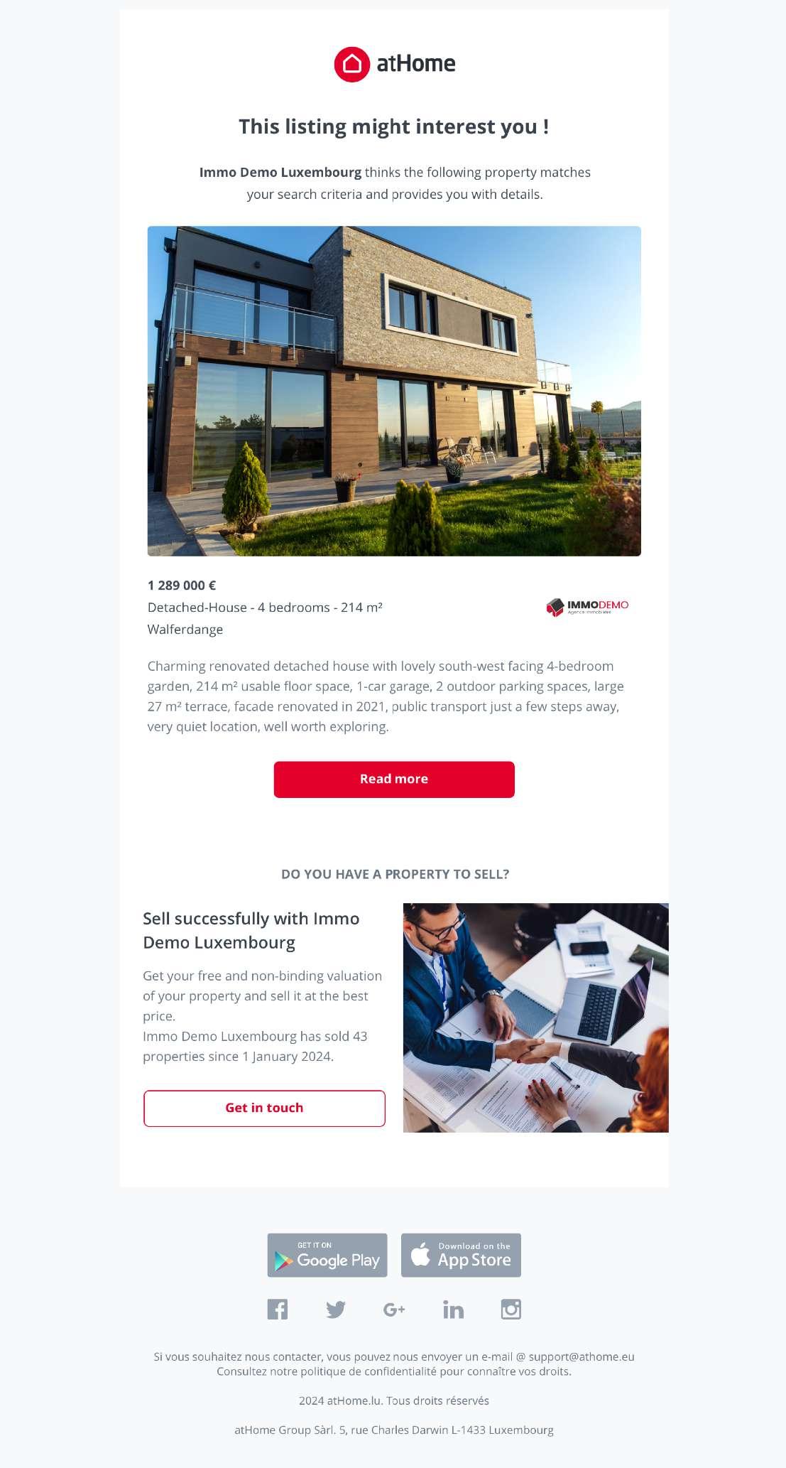
Every email is an opportunity to build relationships, provide value, and guide recipients through their journey with atHome.
Whether it's newsletters, email alerts, or personalized messages, our emails should always be clear, concise, and engaging.
Focus on strong subject lines, compelling content, and a consistent tone that reflects our brand identity.
Consistency in design, tone, and layout is crucial to maintain brand recognition. Whether it’s a newsletter, promotional offer, or transactional message, ensure that emails are mobile-friendly and visually appealing, with a clear call to action that drives engagement.
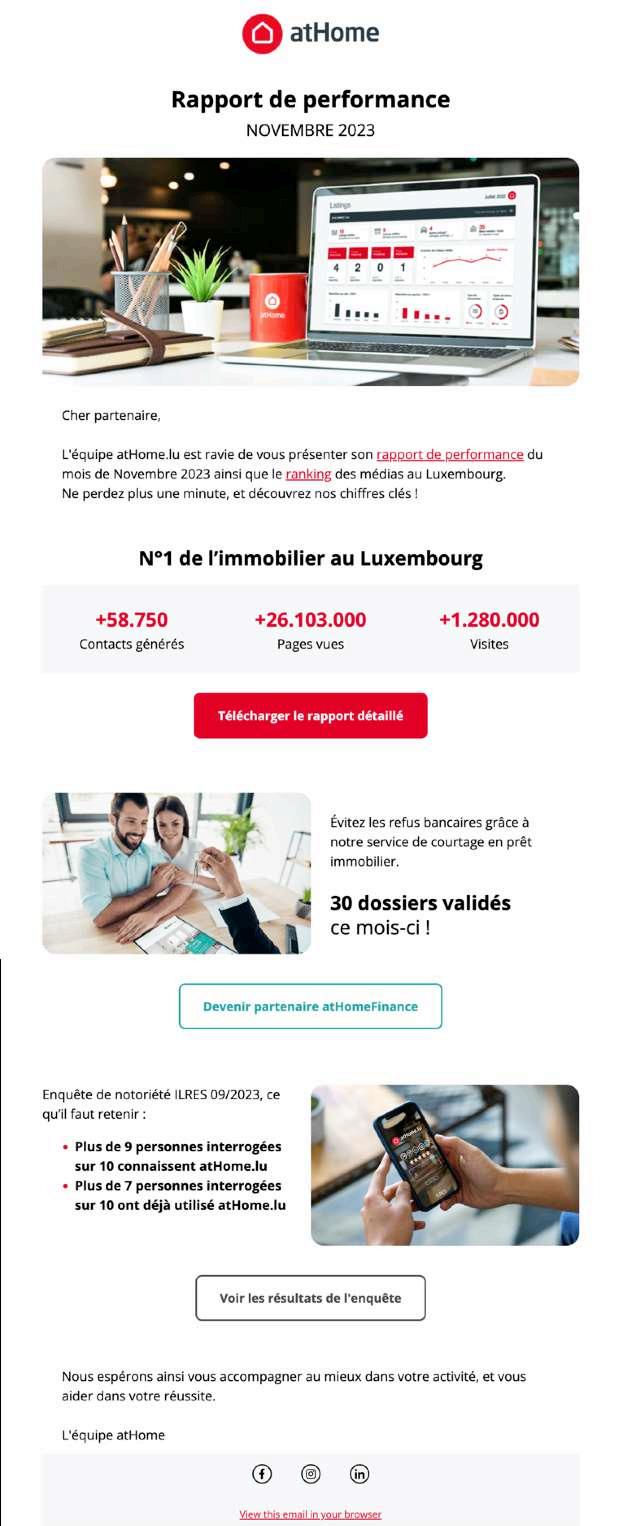
In our emails, we include no more than two promotional spaces to highlight products or services, ensuring readers aren’t overwhelmed with information.

Give your email a great visual appeal by choosing an appropriate hero image.
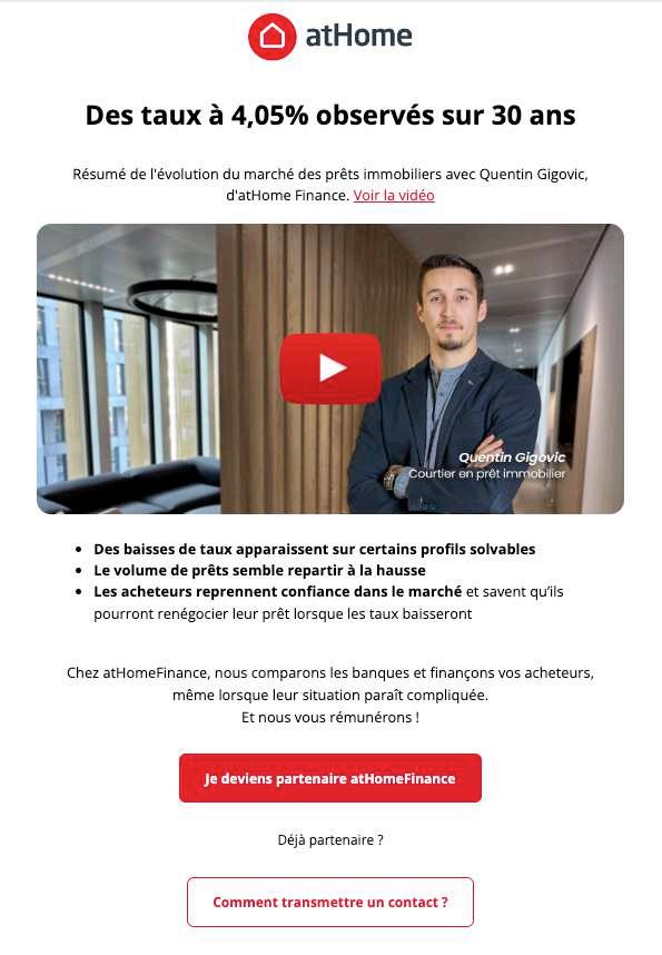

Use only one main call-to-action to guide users effectively.
Secondary CTAs can be included but should be outlined to maintain focus on the primary action.

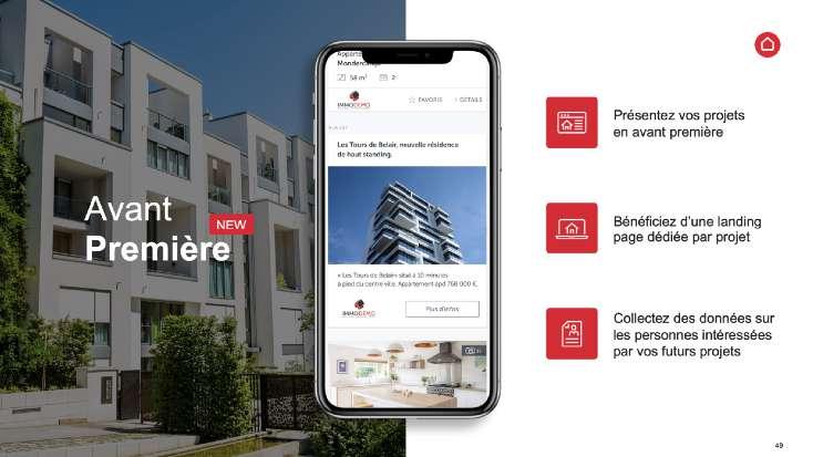
Bringing our story to life in slides.
Our presentation slides are a visual extension of the atHome brand, designed to communicate ideas clearly and effectively.
Each slide should be clean, with minimal text and high-quality visuals that align with our brand’s colors, fonts, and style.
Focus on creating a consistent flow, with key points highlighted and one idea per slide. Visuals, charts, and infographics should be used to enhance understanding and engagement.
Every presentation is an opportunity to showcase our professionalism and creativity while delivering a cohesive message.


Capturing motion, telling stories.
Videos and motion graphics are powerful tools for bringing the atHome brand to life, engaging viewers with dynamic storytelling.
Each video should align with our visual identity, using consistent colors, fonts, and tone.
Whether it’s a short promo or a detailed explainer, focus on clear messaging, smooth transitions, and high-quality visuals. Motion elements should enhance, not distract, ensuring the content remains the focal point.
Every video is an opportunity to connect emotionally with our audience, reinforce our brand values, and leave a lasting impression.