6 minute read
Seaside Escape
Photography by Prue Ruscoe
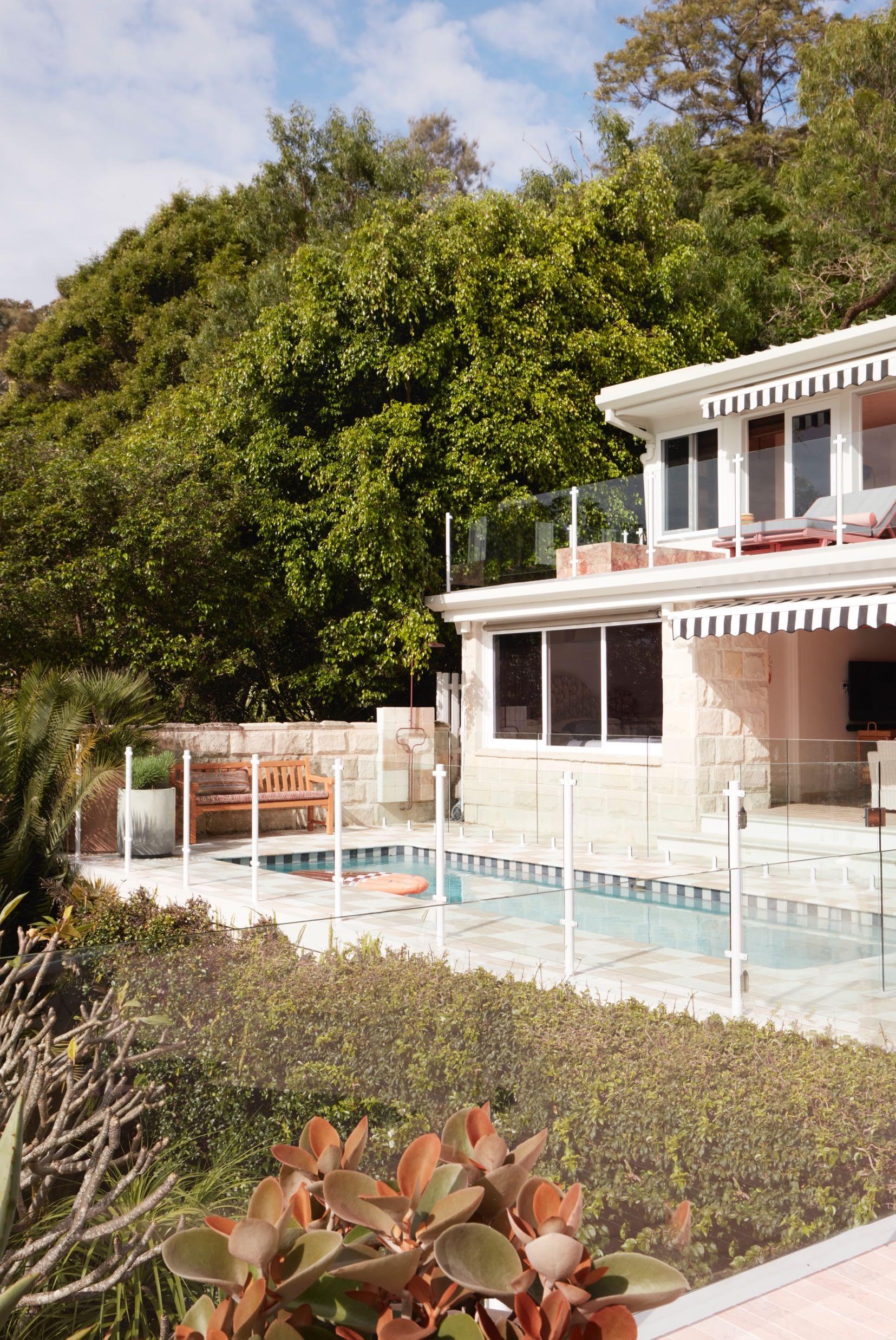
Located in the Sydney seaside suburb of Palm Beach, YSG Studio has redesigned a multi-level 400 m² holiday house for a young family featuring a kaleidoscopic array of exquisite fabrics, tropical rattan and raffia furnishings and sculptural lighting.
Savouring summer all year round with its earthen glow spliced with citrus accents, this tiered house nestled amongst palm trees in Sydney’s Northern Beaches taps into carefree sun dappled adventures along remote Mexican shores with a twist of the Côte d’Azur’s refinement. The clients, busy Sydney professionals, had acquired the holiday house with the hopes of spending more time there with their young family, balancing working from home and embarking on extended breaks over vacation periods. Sequenced over two levels, the residence (built in the early 2000’s) required substantial revitalisation given its weathered features and clichéd seaside themes as furnishings were packaged with the sale. Nautical shades and seaside tropes (decorative surfboards, model yachts, an all-white kitchen, lounge room and bedrooms, plus shell collections scattered everywhere) deterred their visits. The design team has replaced all the windows and doors to lighten their mass, sanding back the worn floorboards to reveal warmer timber accents. The deeper tones of the French washed walls and ceilings scattered like a patchwork pattern throughout both levels ground the expanses of white with their saturated sheaths. In addition, within the sunroom, v-groove walls were removed, as was a mirrored wall that overheated the space in summer. Cooling rose-tinted marble pavers now line its floors, creeping up to its skirting (as do all the tiles in the wet rooms). A wall enriched with different artworks is a succession of swirls - hand painted by Creative Finishes to soften the beams turning them into beam-like beams.
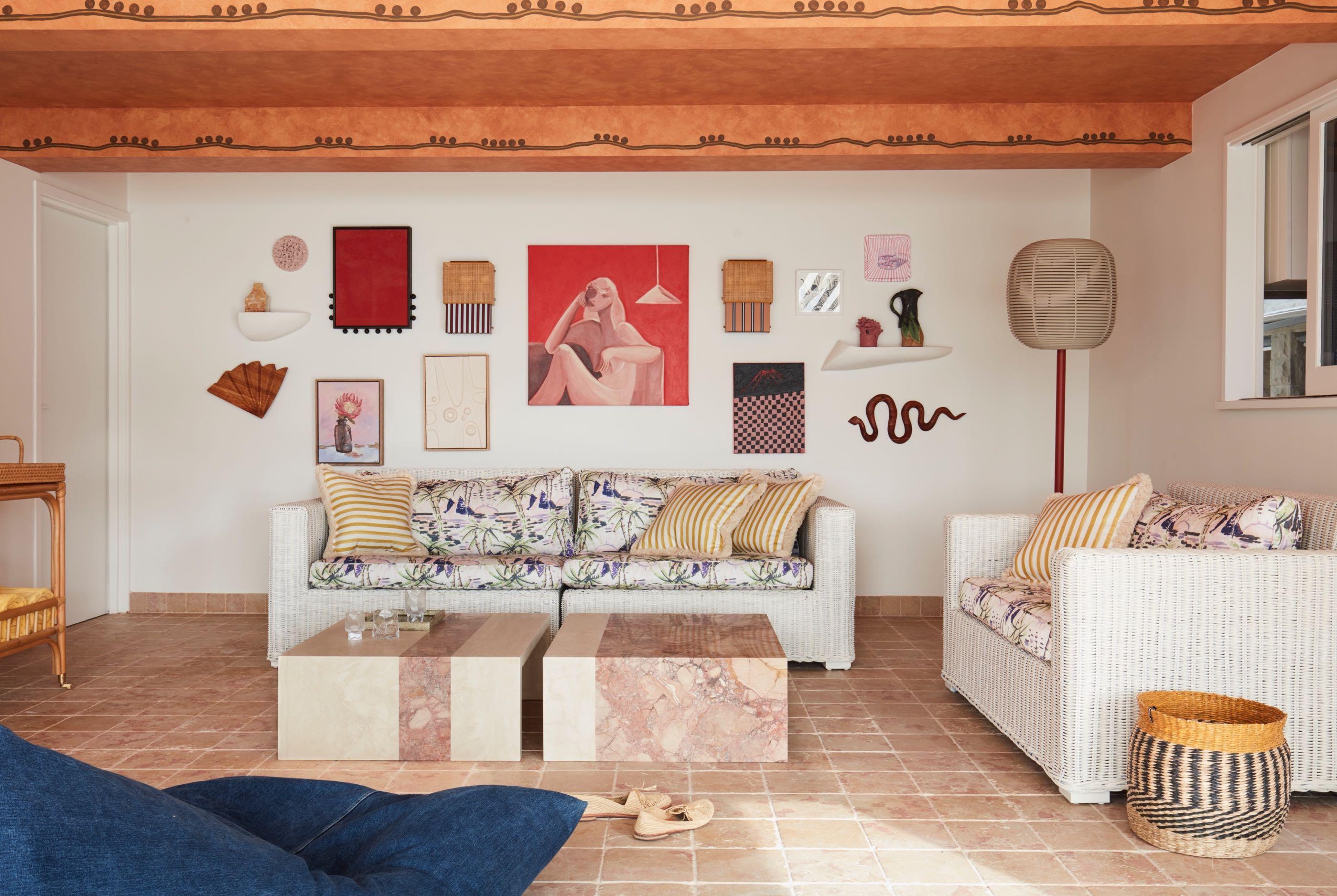
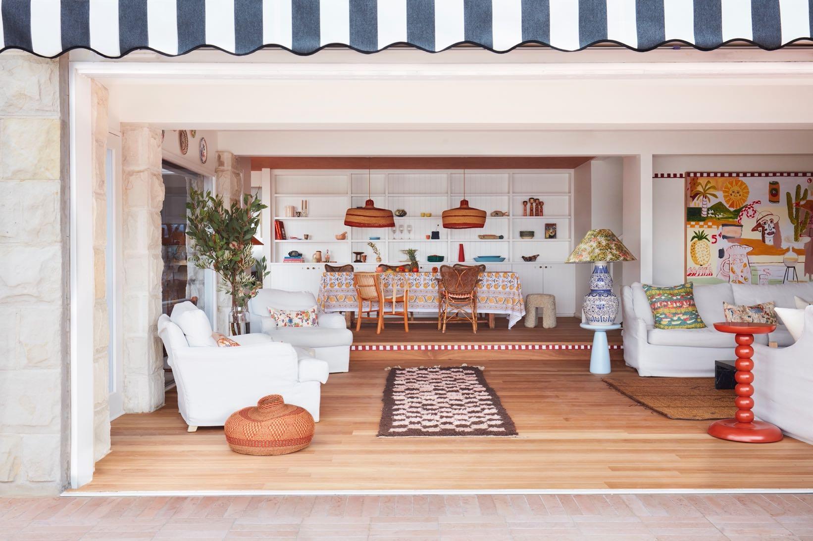
Inspired by rustic Ibiza beach clubs and Cancun’s rendered coastal resorts, the clients wanted to create a palpably playful mood that introduced a perennial approach to entertaining and above all else invited soft landings - both indoors and out.
In the living room we find the painting that inspired much of the home’s tonal scheme and spirit given many of its colours and motifs are integrated throughout. They include patterns and iconography range from rodeo cowboys to clusters of clay urns and rippled teal zebra stripes, plus prints of tropical fruit trays including pineapples on lounge cushions bringing to life the raw canvas of the upholstery. In addition, silk kimono pieces used for cushions tether the blue porcelain lamp bases and oriental plates dotting the wall above together. Echoed in the underfoot checkerboard patterns, a naively painted rust datum extents from the top of the painting’s frame to revive the neutral walls within the room, plus the border of the raised step leading to the dining area. Two raffia pendants hover above the dining table like sombrero hats echoing the style of the painting. In the background we find a custom-made bookcase which houses a rich collection of art objects, many of which are in ceramic. Next to it, we find the kitchen that was fully gutted to introduce new joinery and a stone island bench that recalls the ombré shades of a freshly poured tequila sunrise. The entire living area is connected to the outside where the heavy paving and greyed timber around the pool have been removed to guarantee a uniform look with the interior; also, the pool’s dark mosaic tiles have been replaced with lighter ones. A new BBQ area now lines a re-clad boundary wall, whilst checkered tumbled marble cobblestones surround the pool and float in gridded formation to support the outdoor shower, adding a striking Mexican foundation that continues in the two master ensuites. Revitalising existing elements, the fence’s reflective chrome posts were powder-coated to eliminate glaring reflections and the aged timber furniture was re-booted with amiable ginger shades and adorned with upholstered cushions and bolsters. Plump rounded armchairs punctuate the orthogonal geometries, as do zesty side tables, refreshing the scene with their unorthodox shapes. New black and white striped awnings flutter above with an air of nostalgia.
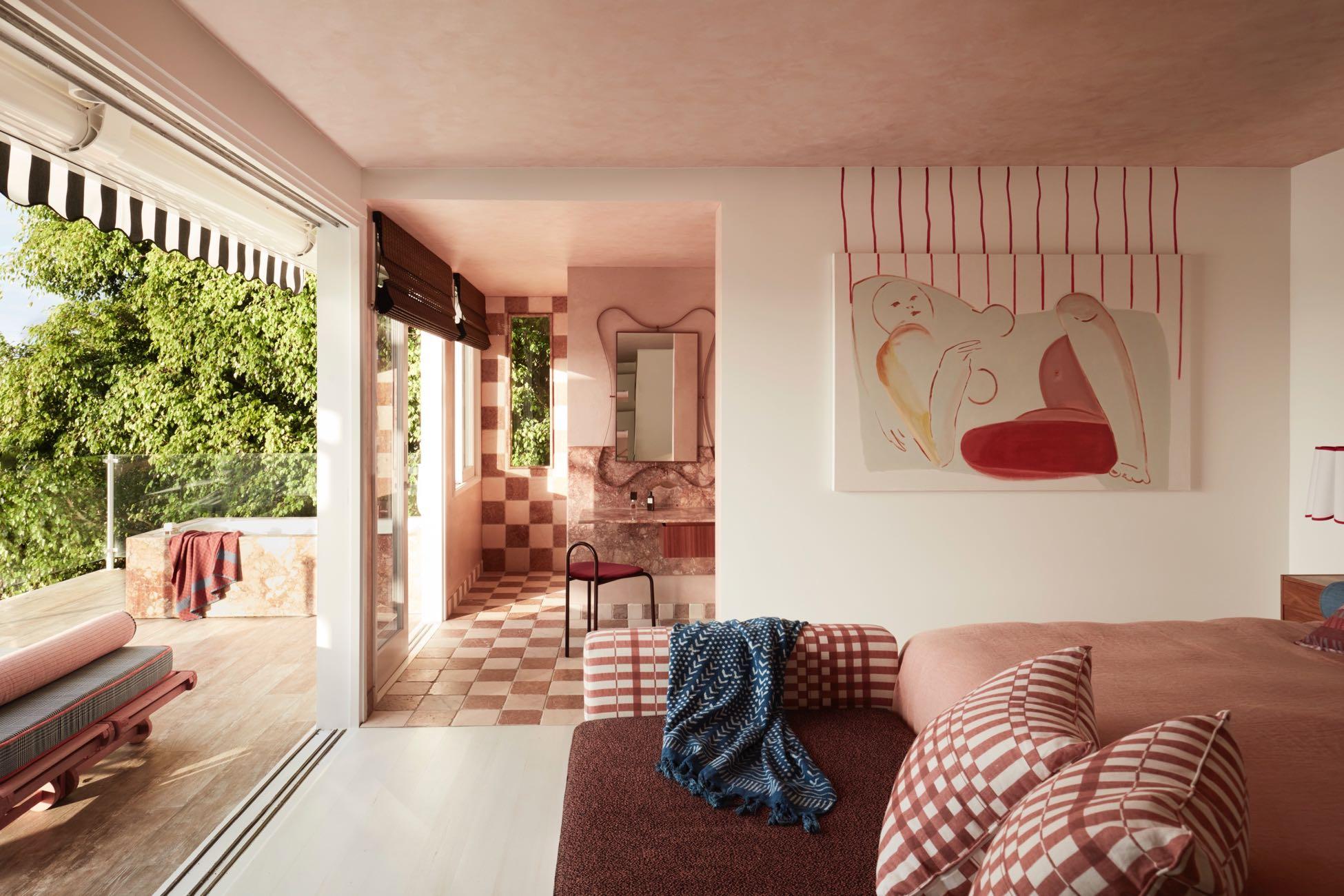
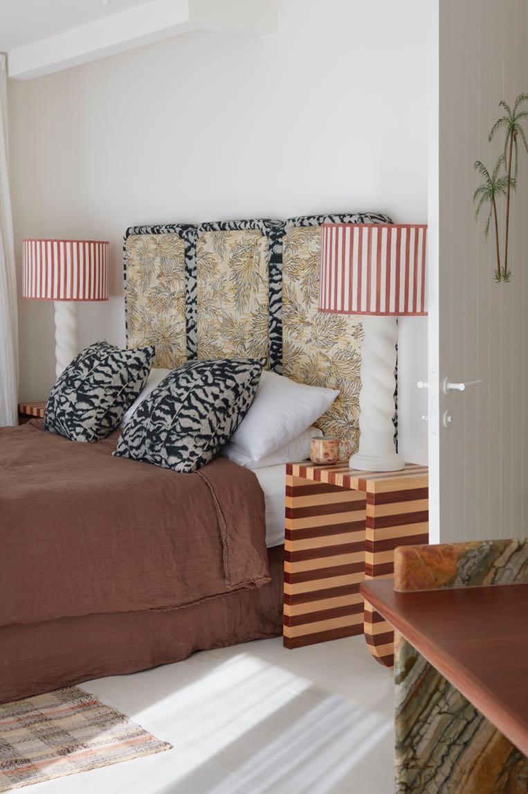
Upstairs, where we find the sleeping area, the floor has been covered with cream colored wood to have a light visual effect. Each room enjoys the impressive views of the Pittwater ocean inlet and verdant shores. Flipping customary convention, one of the two guest rooms has been transformed into an additional master suite, in this way furnishing ‘his’ and ‘her’ spaces with complimentary ensuites. Enabling both to simultaneously work privately from their rooms the custom marble and timber desks were integrated. The 'her' master suite is characterised by a warm brown color with some blue accents in the textiles. The headboard of the bed, designed by YSG Studio, is upholstered in a palm tree motif while the light wall behind it enhances its shape with curves. The wooden coffee table by Livio Lucca Tobler combines another elements in the wood such as the desktop and the suspended drawers adjacent to the bed that act as bedside tables. The brusque parallel lines flow from a Matisse-like nude painting, extending towards the ceiling. Her curves are loosely outlined in the adjoining ensuite’s mirror frame, easily viewed thanks to partial wall removal to extend its opening and expose the new elongated stone-framed window that draws the lush surrounds within. Honed Tiberio marble was also used in the bathroom (the same used for the desktop) for the vanities and splashback while the furniture is in wood. To continue with the geometric motifs (present in the bedroom textiles), the bathroom floor is covered with tumbled checkered marble tiles ‘Portagallo marble’ and ‘Rosso Verona’ from Aeria County Floors.
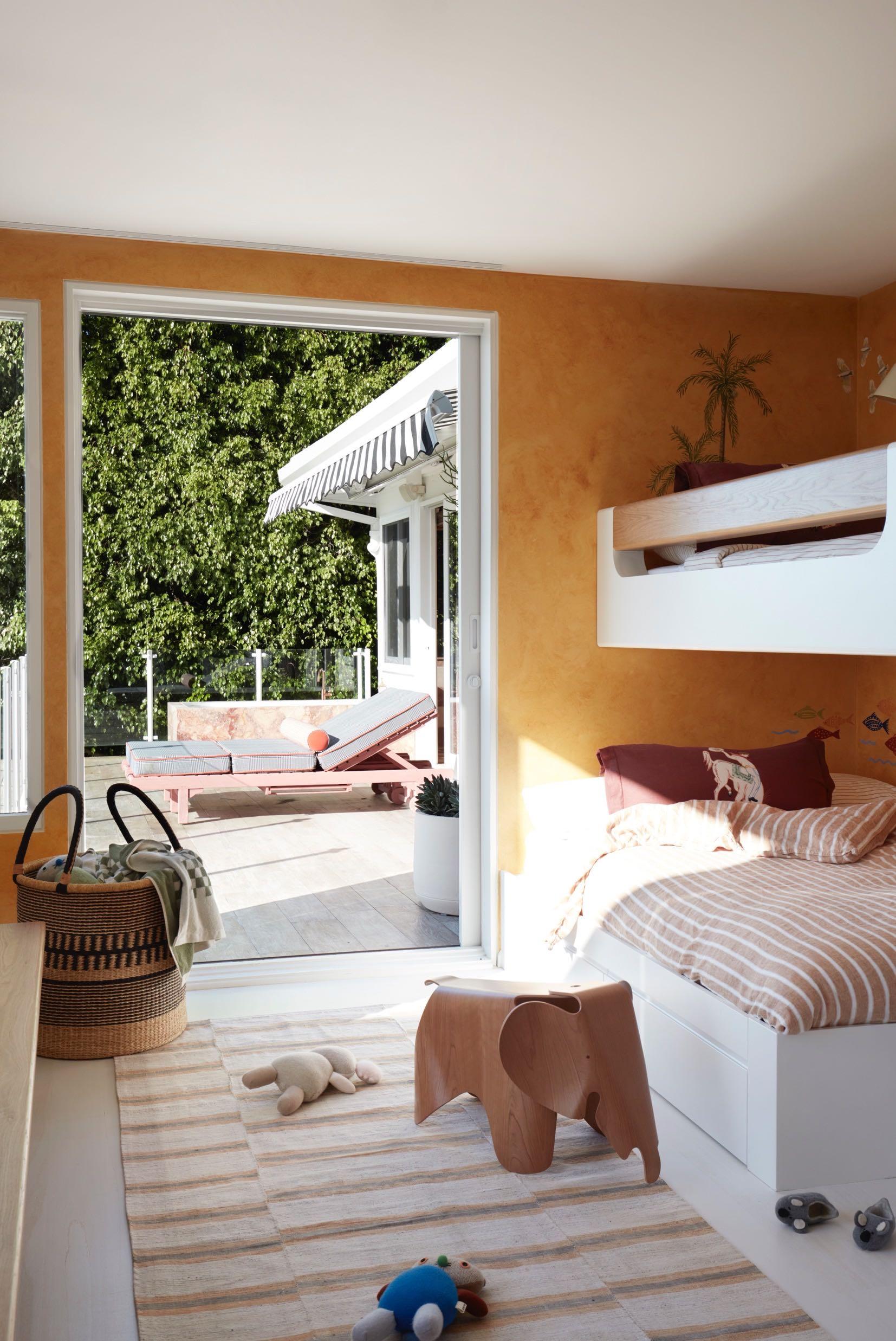
The 'him' master suite follows the same design: geometric and floral prints, the use of Toledo marble, warm wood but with small differences in the choice of productsa more masculine look was obtained. For example, white walls bring out the colors more and create a slight contrast, as does the addition of black. In marble we find veins in green and, in the bathroom, the tiled floor (always checkered) in white and blue tones gives a decidedly colder effect. Both here and the children’s bunk room hand-painted mural details were designed by Creative Finishes to add fringe movements to the ambiance.
Visit www.gandgmagazine.eu for more gorgeous projects!


