4 minute read
Period Piece
Photography by Matthew Millman
In collaboration with The Wiseman Group, Richard Beard Architects has completely renovated a Victorian era residence on the Buchanan Street in San Francisco.
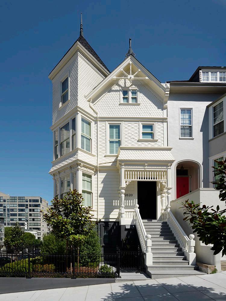
Over several years of scrupulous planning and construction the house underwent a complete restructuring and received a brand new interior layout to accommodate a large family. The exteriors were repaired and preserved according to the Secretary of Interior Standards for the treatment for historic properties, giving a fresh and welcome look to this prominent corner of the neighborhood. The first step in the renovation involving lifting the home to create a multi-car underground garage and basement, while also allowing for a more spacious interior layout. The lower portion of the exterior has been painted a dark charcoal color, contrasting with the clean, bright white of everything above. This two-color palette creates a striking, modern, and timeless aesthetic.
DARKER COLOR ON THE LOWER FLOOR GIVES THE HOUSE A SENSE OF GROUNDING, WHILE THE WHITE COLOR ENHANCES THE AIRY LIVING SPACES ON THE UPPER FLOORS.
The jet-black front door harmonizes with the base color and serves as a transition between the classic exterior and the contemporary interiors within. The interior designer for the project, Paul Wiseman, emphasizes that they intentionally avoided incorporating Victorian details into the interior design, aiming for a deliberate contrast with the traditional exterior. Indeed, as you enter the house, the front door reveals the modern interior, with the mahogany wood ebonized to maintain a cohesive flow that seamlessly blends the interior and exterior spaces.
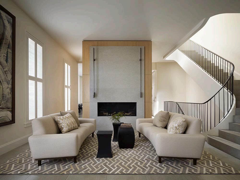
The four stories of the house are furnished in a minimalist style and connected by a curvilinear staircase with a handrail crafted by Chris French Metal. The first floor is the heart of the house, it represents the living area. The first floor is the heart of the house, it represents the living area. In the living room, the dark wood furniture is softened by a couple of sofas in soft shades of beige. An adjacent fireplace completes the modern look of the space.
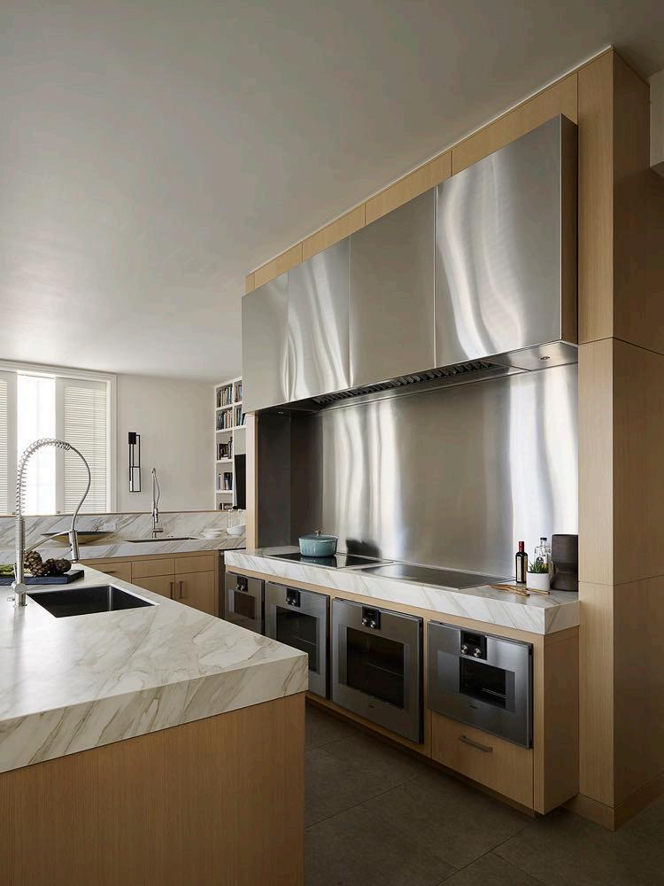
A bespoke roof to floor cupboard has been built in light wood which leads from the sitting room to the kitchen. It houses a bar area and then turns into kitchen furniture; even the island was clad in the same wood. The worktop is white with light brown veining, built-in appliances complete the design. The dining area has been placed next to it: here a long and slender dining table that seats twelve people, a majestic curved bench and comfortable chairs echo the graceful curves of the staircase.
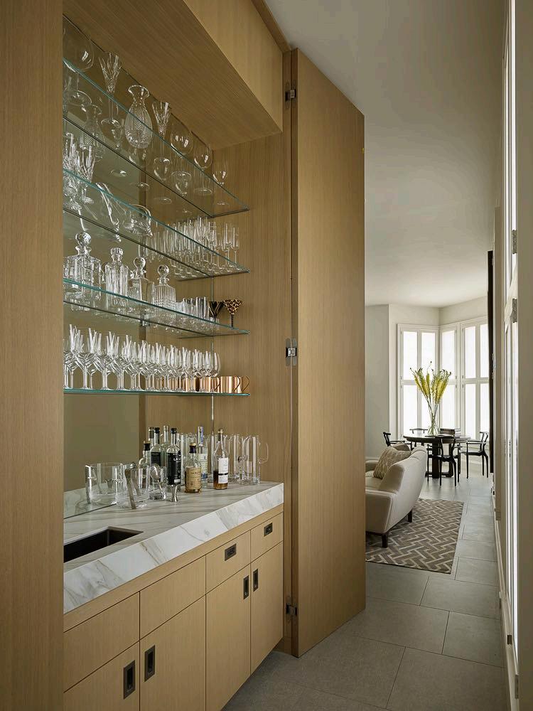
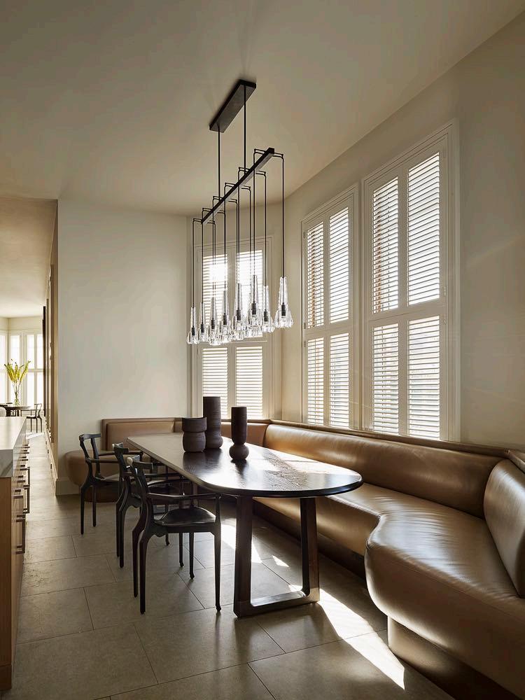
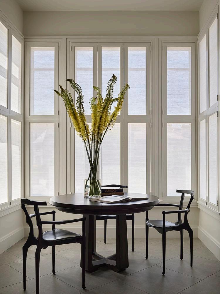
UNLIKE MANY VICTORIAN HOUSES, WHICH CAN BE DARK INSIDE, THE CORNER LOCATION OF THE HOUSE ALLOWED FOR MORE WINDOWS ALONG THREE SIDES OF THE HOUSE. THE ABUNDANCE OF NATURAL LIGHT PROMPTED US TO CONSIDER LIGHT, AIRY AND CONTEMPORARY INTERIOR ARCHITECTURE.
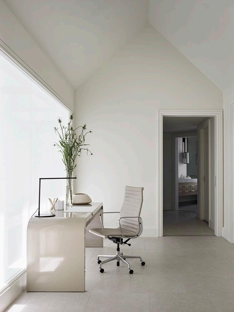
Also, the design of the upper floors adopts a more contemporary and neutral color scheme that accentuates the spatial qualities of the house, and better suiting the needs and lifestyle of the active family.
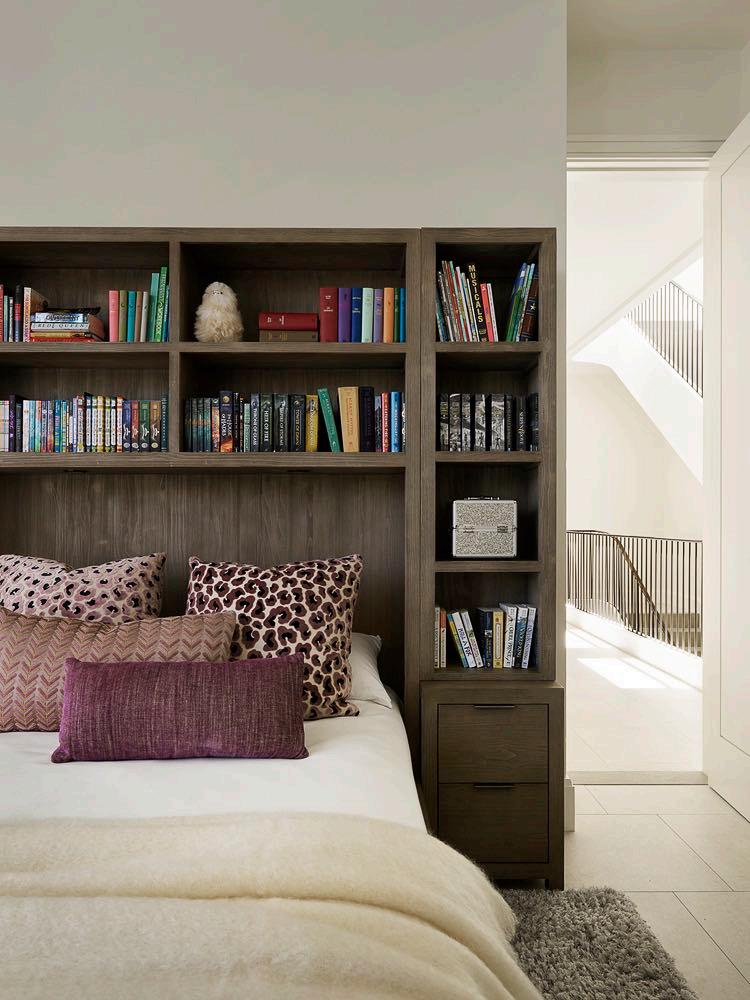
THE STAIR WAS AN OPPORTUNITY TO CREATE A MORE OPEN AND CONTINUOUS FLOW OF SPACE BETWEEN FLOORS, A SPATIAL QUALITY UNCOMMON IN HISTORIC HOUSES.
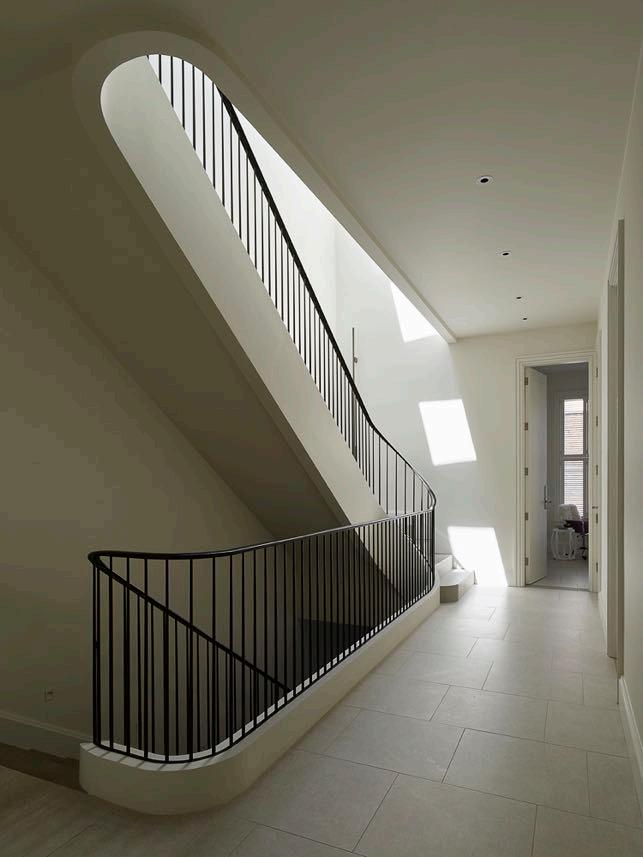
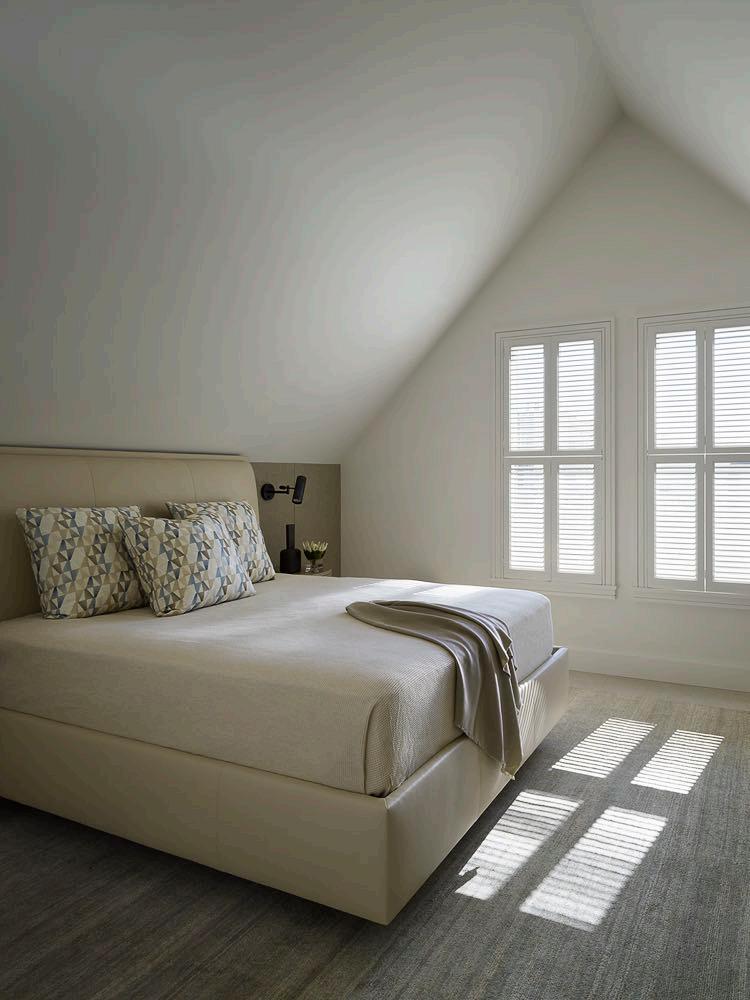
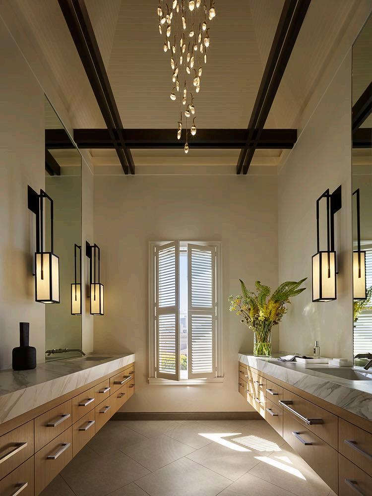
Large skylights on the roof channel light into the home to create a more expansive atmosphere. Here, at the pinnacle of the staircase lies the fourth floor, where the primary suite is nestled. The primary bath has been placed in the turret, with modern light fixtures creating a dramatic interplay between the new and old elements of the residence.
Visit www.gandgmagazine.eu for more wonderful projects!


