5 minute read
Modern Nostalgia
Photography by Oded Samder
An old house in Even Yehuda, Israel, underwent extensive renovation and adjustments to accommodate the growing family, with the assistance of interior designer Adi Aronov.

This old house is considered a nostalgic piece of history by its owners, serving as a reminder of how their journey began. They welcomed three children into the family over the years, now 16, 18, and 20 years old. At the beginning of their journey, the young family relocated abroad due to the father's job. They returned to Israel a few years ago and started searching for the home of their dreams. After an extensive search for the perfect property, they realized that the same old house where the couple lived at the beginning of their life together. was what they were looking for all along.
Demolishing the house and building a new one would have been the easiest option. The client’s wish to preserve the old house and enjoy its sentimental charm required space manipulation, constructive reinforcements, and thinking outside the box, and the result is wonderful! Nostalgia remains and is an integral part of the house, yet the outcome is modern and contemporary, suitable for the current household’s needs.
The owners' initial request was to leave the original main façade intact, allowing the essence of the old property to still shine through while transforming the rest of the property. And so, it was done: the original façade was maintained as a daily reminder for the couple of where it all began. The goal, according to Aronov, was not to "escape" from the character of the original house, but to embrace it in a modern way. From an old and undefined house, this property transformed into a modern, cleanlined, and luxurious home that opens to a lush green landscape.

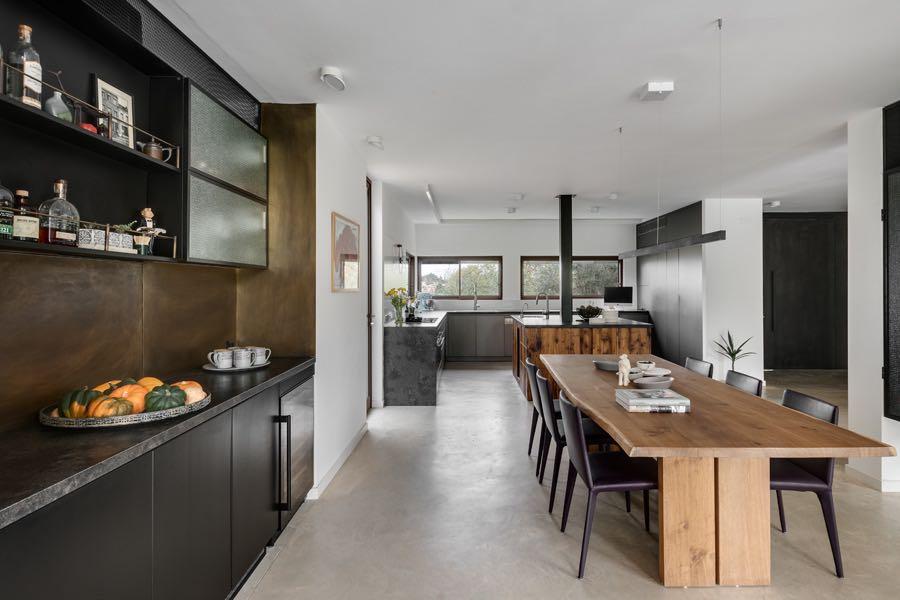
Within the framework of the new design, about 170 m² were added that blend perfectly with the original facade. The entire property was decorated in a uniform colour, and a new large steel door was fitted, seamlessly integrating with the facade; floating concrete steps lead to it. To the left of the entrance a new glossy charcoal-gray kitchen was designed with a range of concealed electrical appliances. The kitchen island was made of imported Douglas fir wood, chosen as a memento from the family’s years abroad.

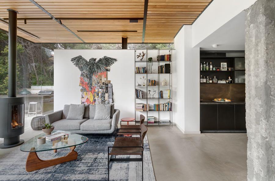
The kitchen overlooks the clean-lined dining corner, which remained the same per the couple’s request unlike all other purchased furniture. The area was also fitted with a bar with designated space for wine bottles, glasses, etc., and the teak wood ceiling creates seamless continuity with the outdoor pergola. It was also decided to leave a concrete pillar from the original structure standing in its original place, between the new living room and the dining area, serving as a nostalgic column that marks the spot where the old structure ended, and the new construction began. A white wall that seems freestanding, with a floating ceiling, was designed to add natural light and display art pieces in the living room. The chosen artwork is by an artist named DEDE, an internationally acclaimed Israeli artist, and it was sold under the condition that twice a year it is taken abroad to be displayed in various exhibitions. The creation is made of small details that are interconnected like fabric threads, creating a dominant artwork that was strategically positioned in the house to enjoy optimal daylight during the day.


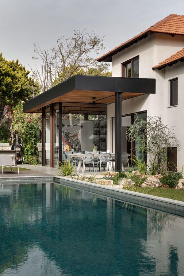
Adjacent to the living room and dining area, we find the family corner where a bold red sofa stands out among the neutral accents. A wall-mounted television was positioned against the black cork dining room wall, concealing the air conditioning system behind it. A thin glass wall offers a view of lush greenery from the beautiful rear garden. The outdoor space underwent a significant facelift, thanks to landscape designer Shai Yaffe, who worked in collaboration with Aronov. A large 40 sqm swimming pool was added, significantly upgrading the area, along with a fully equipped outdoor kitchen, a seating area for gatherings, a gazebo, and walking paths in the expanded garden. Large windows adorn the house and blur the boundaries between the interior and the exterior.


The clients are very cosmopolitan and are very knowledgeable about architecture and design. Thus, the entire process was accompanied by interesting conversations regarding the choice of materials, designs, and general decisions that needed to be made during the process.
The children's area is located half a floor up while the master suite is located another half floor up. The latter includes a bedroom, closets with book storage, a sizeable balcony, and a luxurious freestanding bathtub in the en-suite bathroom.

Visit www.gandgmagazine.eu for more amazing projects!


