4 minute read
Beautifully Functional
Photography by Biderbost Photo
Irantzu Hurtado Inteorismo projected a 290 m² duplex from the 70's in Madrid transforming it into a fresh and comfortable space.
Housing with two floors and three entrance doors (two at the bottom and one on the top floor) is located in an urbanization in the Arturo Soria area of Madrid, one of the greenest areas of the city surrounded by large parks. Tranquility and security are two values that describe this neighborhood, well-connected and with leisure areas. The property is a house from the 70's in which all the walls were covered with hardwood with different paneling and with natural raffias in the rest of the walls of each of the rooms.
Our clients wanted something fresh, dynamic, comfortable, functional and modern, that is to say, a house to live in and enjoy with their two children of 8 and 10 years old.
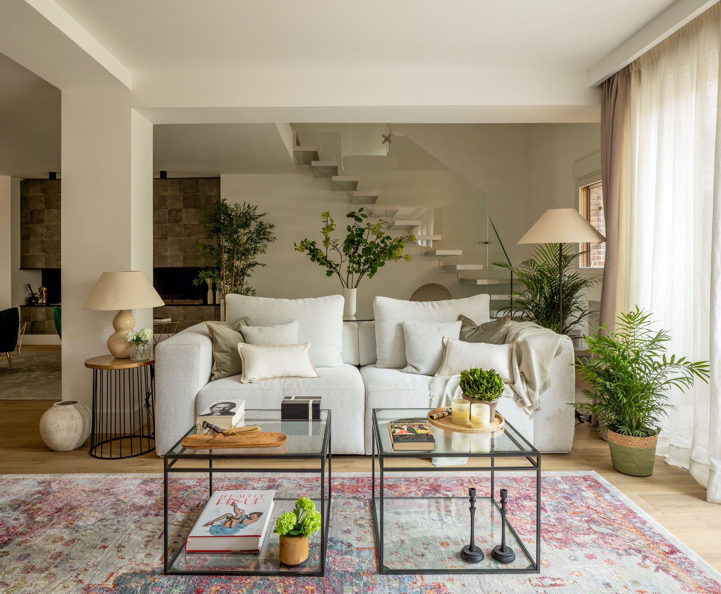
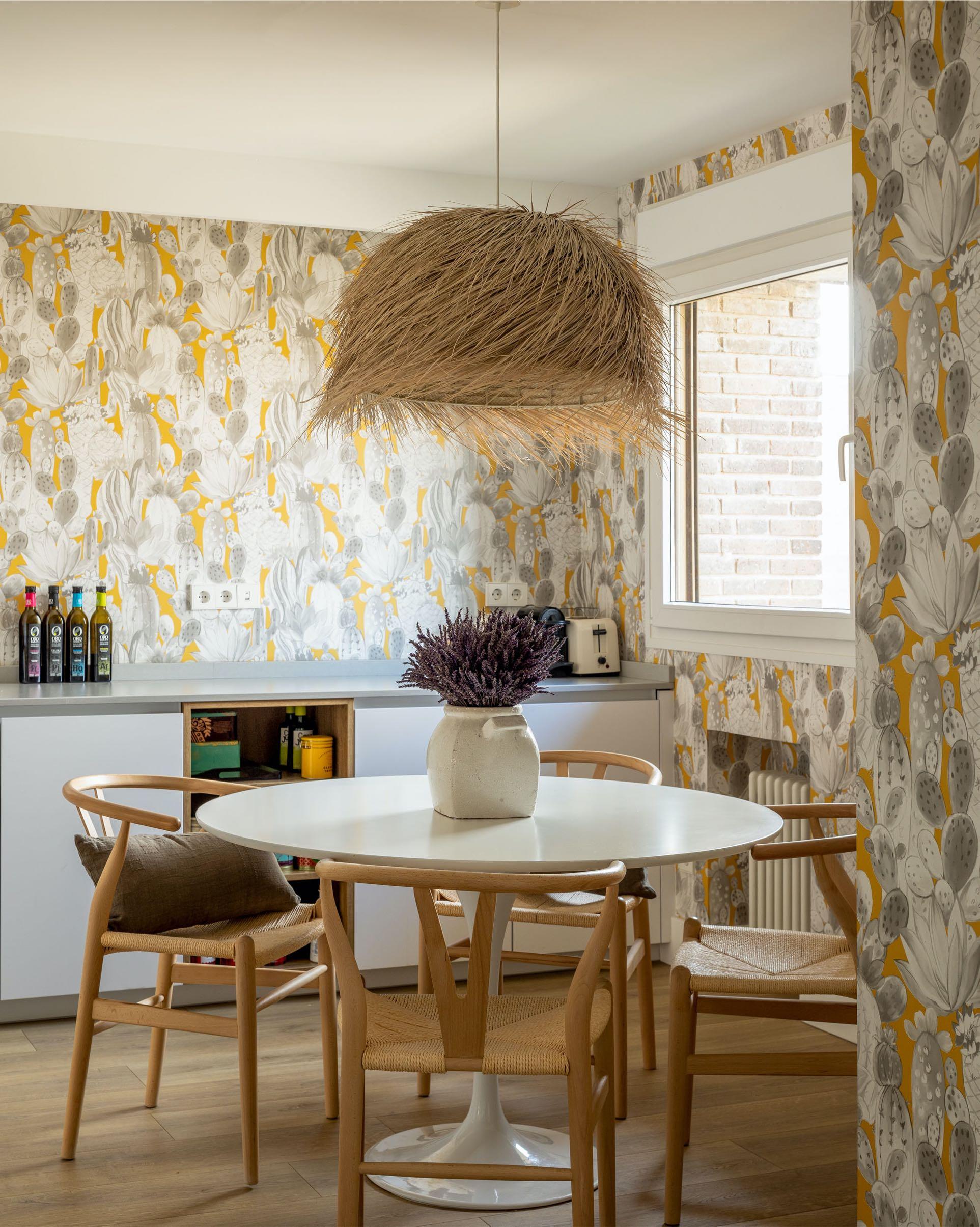
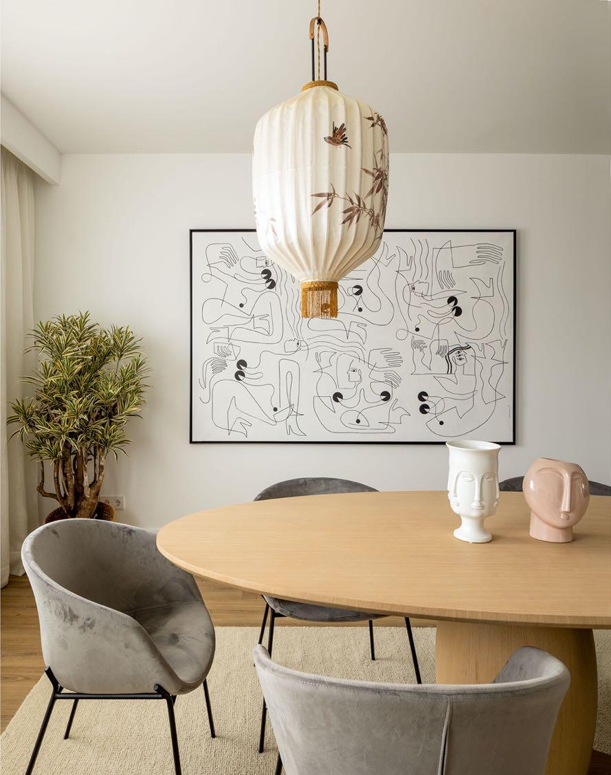
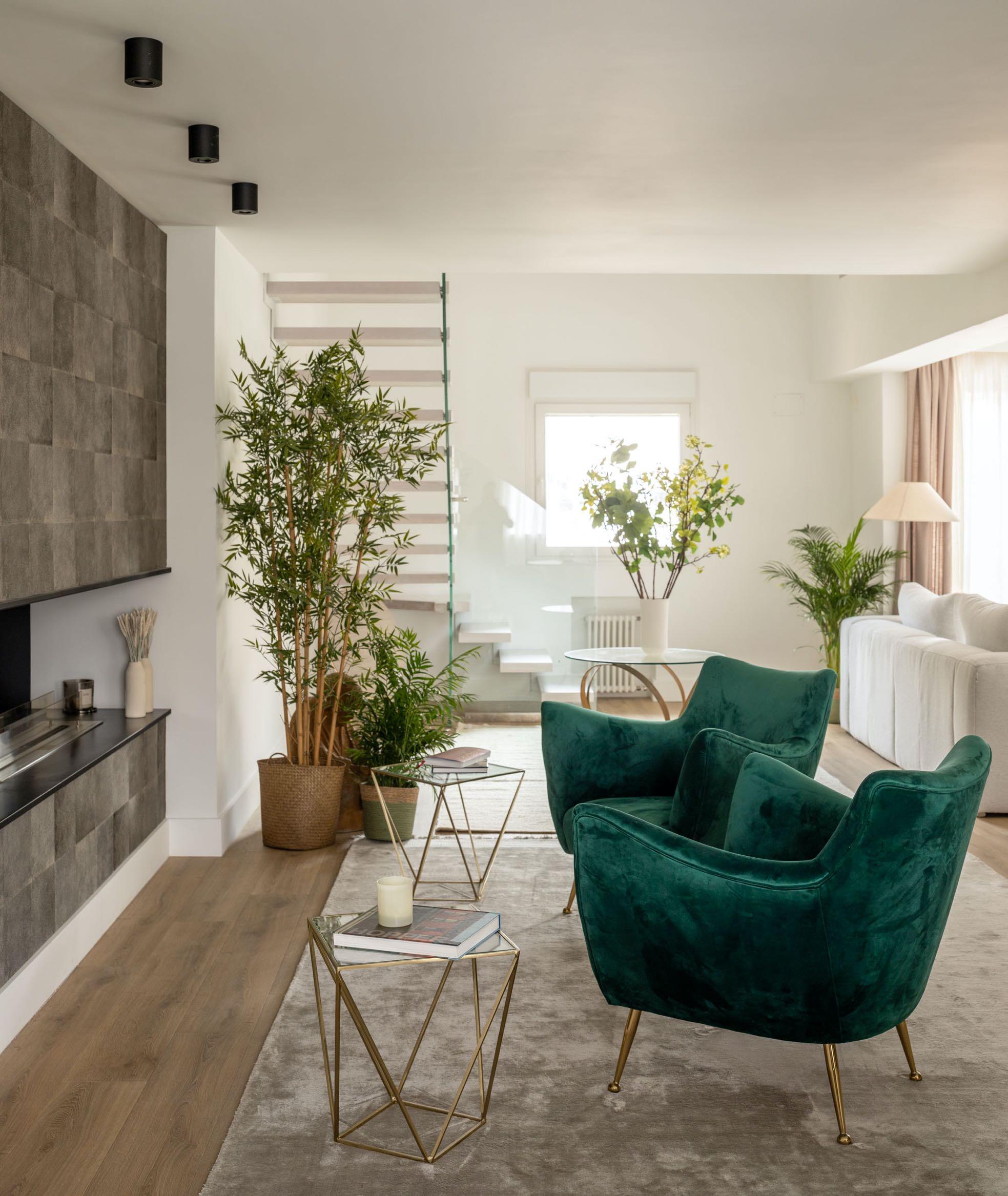
The first floor hosts the day area. Upon entering the house, we can see a large living room in which three areas are marked: living, fireplace and dining room. Between the dining area and the living one, the designers projected the kitchen having access from the previous ones, being the axis that communicates all the rooms on this floor. The kitchen consists of a large island on which all the work area is concentrated in it, we can distinguish two areas, the work area and the dining area in which reigns a circular table and a countertop for breakfast, all wrapped with James Malone wallpaper and a large raffia lamp. From the kitchen there is also the access to a small laundry room which is equipped with everything necessary for the care of clothes.
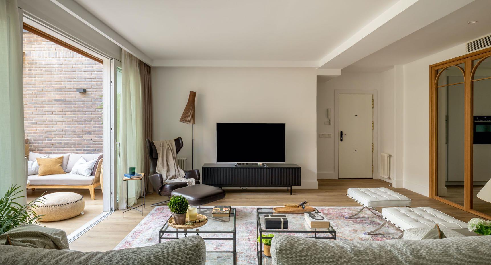
From the kitchen there is also access to the dining area of the living room through a sliding door which in turn leads to the fireplace area and living area again. A large oak folding door composed of 6 leaves communicates with the living area and terrace, being able to play with its opening at times of increased traffic. Originally, the wood staircase was in the middle of the house, and being narrow, it was gloomy, so it was essential to move it. So, behind the living area we find the new cantilevered staircase without a partition with open pore white lacquered wooden tread. Transparent glass railing that joins at the second level with a fixed glass floor to ceiling makes the sound does not rise.
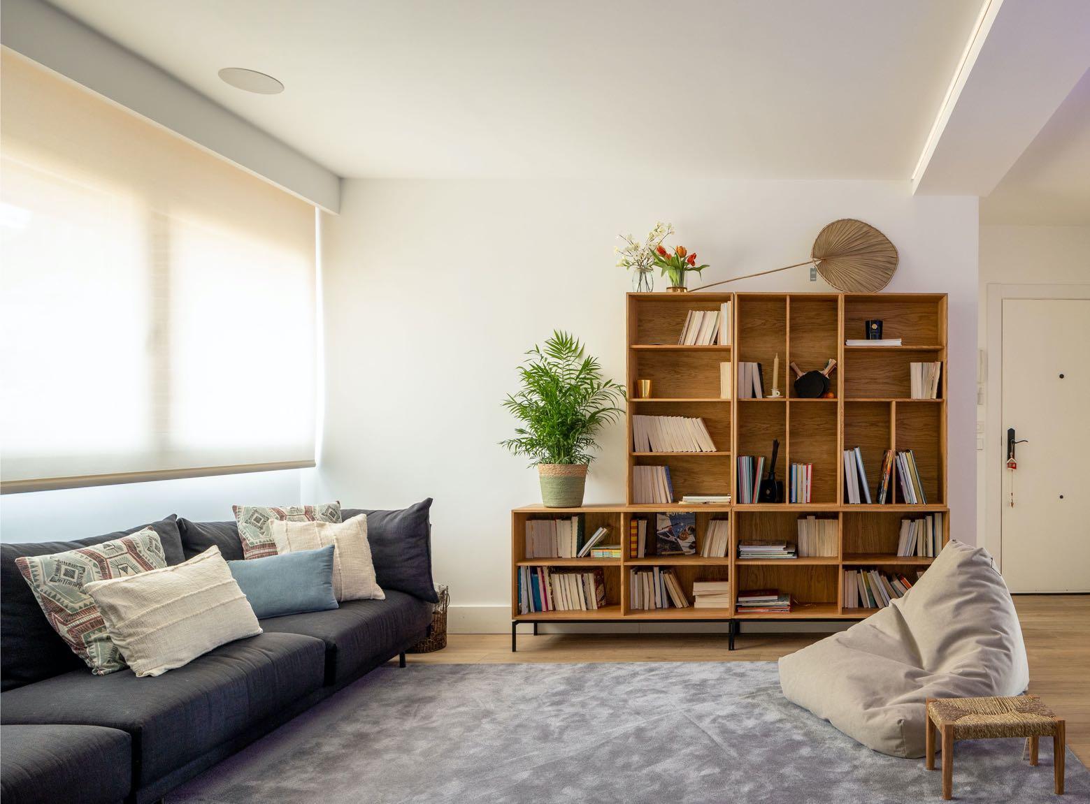
Upstairs we find another large living area, this time for children, equipped with a large sofa with chaise longue, a bookcase and a large screen with projector. This is where we have the third entrance door. This large room leads to the bedrooms and another bathroom.
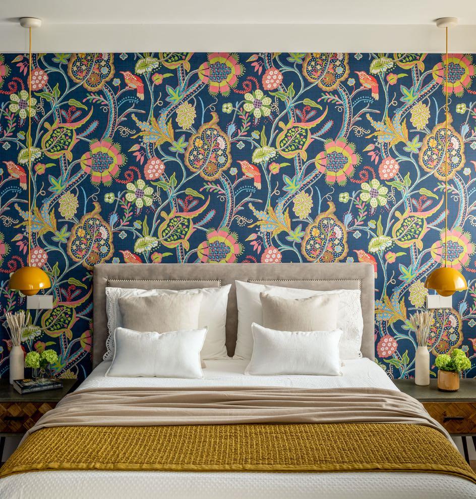
The first door we find at the top of the stairs is the one that gives access to the master bedroom suite. Equipped with a dressing area and work area bathed in neutral tones, the bathroom area with porcelain coating imitation stone. The bedroom area is accessed through two sliding doors from the work area inside the dressing room. This room breaks with the previous, wrapped in a great colorful with a beautiful Thibaut paper.
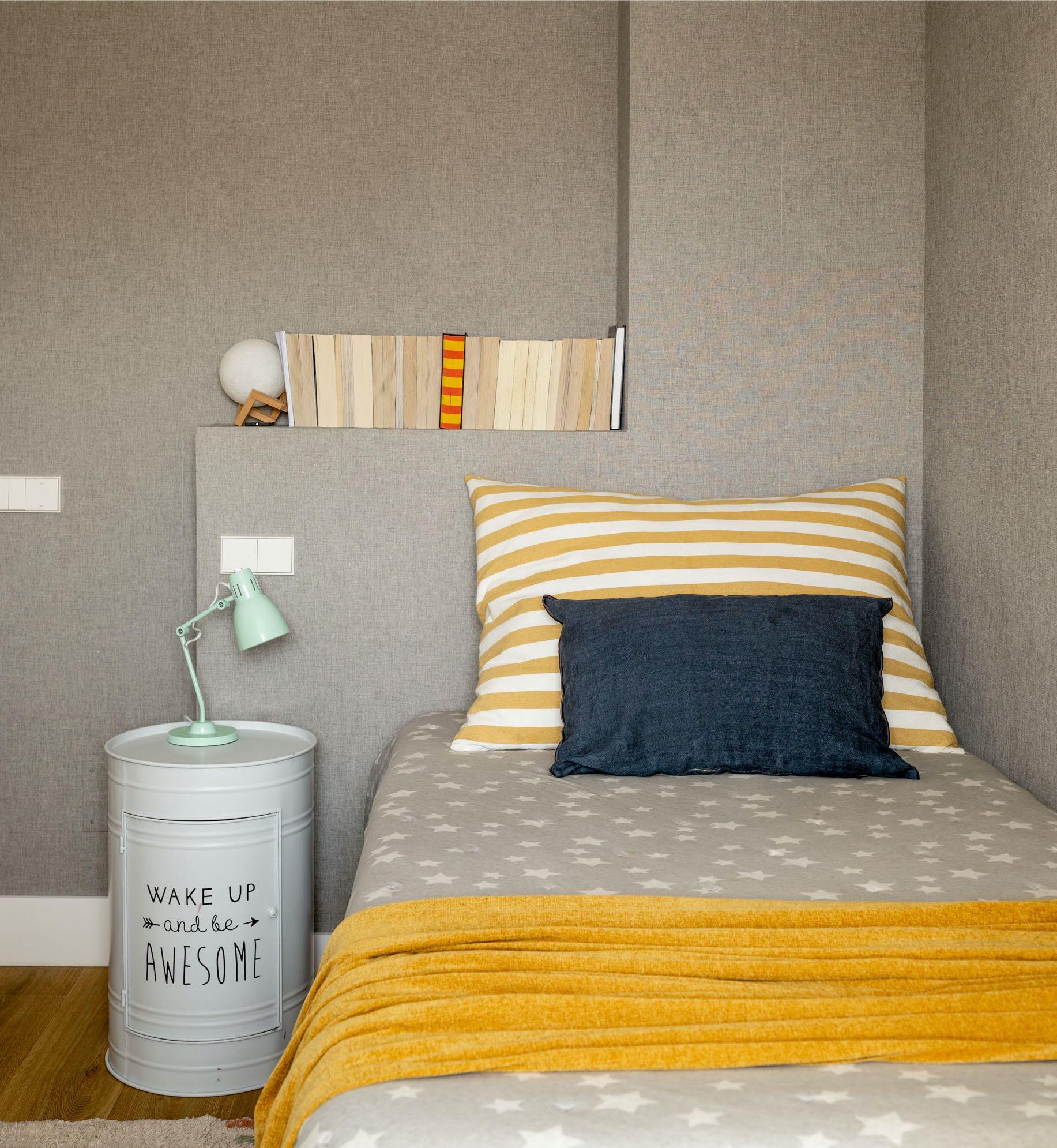
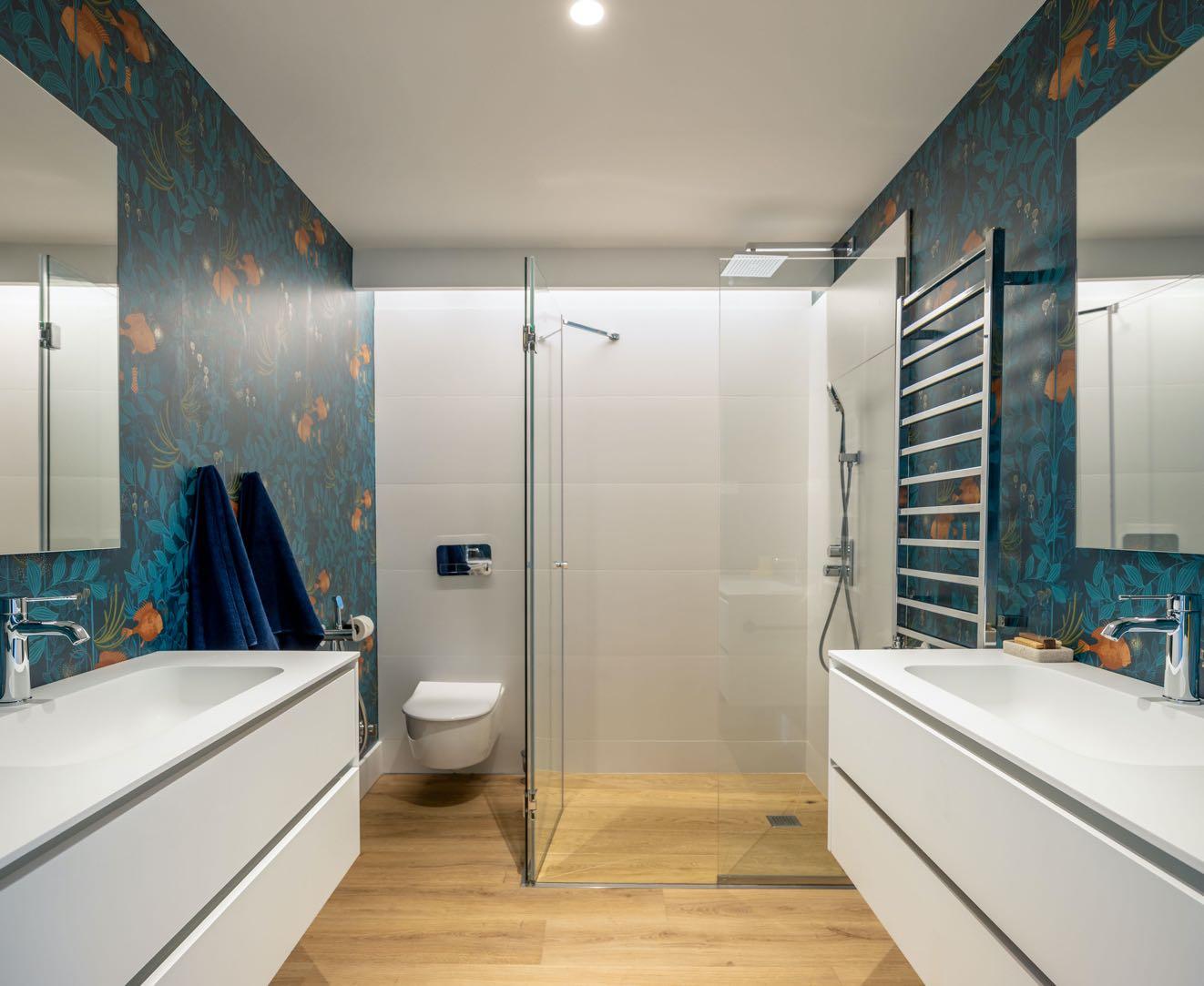
On the other side of the upper floor the two children's' rooms are placed. Both are in neutral colors with colorful accessories and well flooded with natural light. In addition, we find a shared bathroom in which each has its own separate sink area. Here, the designers only tiled the shower area and wallpapered the rest.
Again, we dared with color and a wonderful Cole and Son wallpaper.
Visit www.gandgmagazine.eu for more projects!


