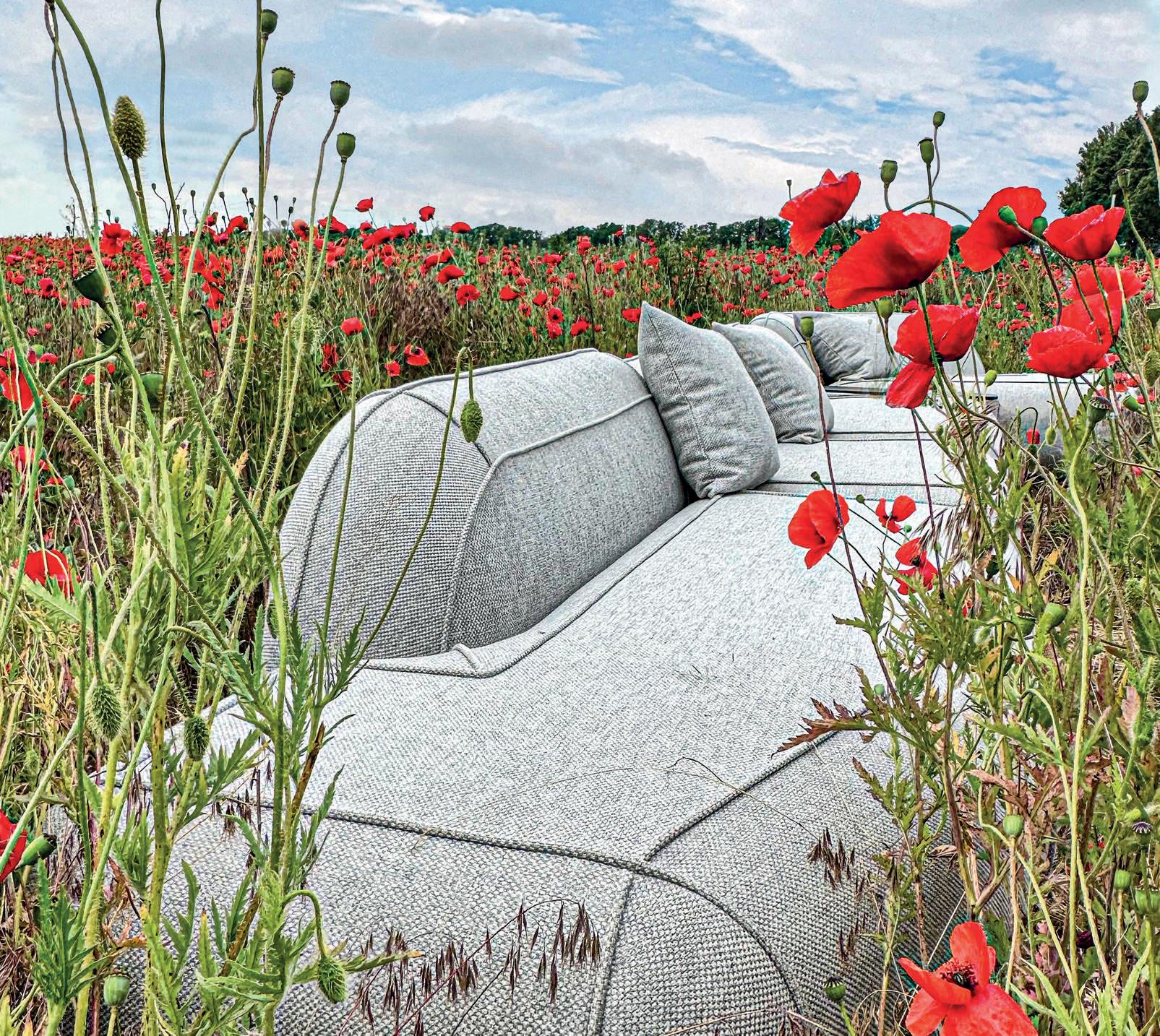
GG G&G _ Magazine N°39 – July 2023 & A DREAM COME TRUE FULL OF LIFE #SUMMER2023 SEASIDE ESCAPE


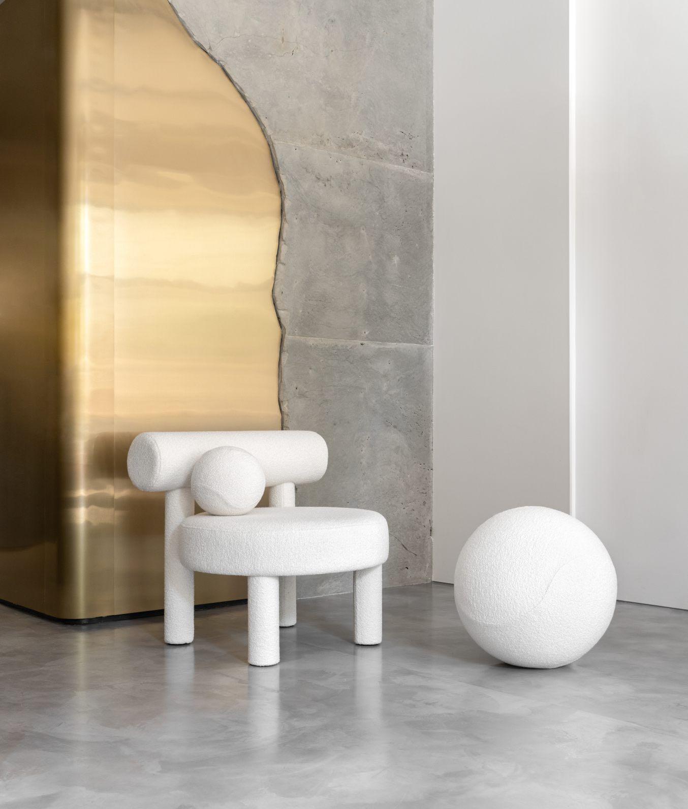
+39 392 089 8038 www.studio-donna.com.ua/en info.donnafurniture@gmail.com @studio_furniture_donna @donna.furniture.studio
11 EDITOR’S LETTER

TRENDS
17 DESIGN SELECTION BEYOND GREEN / SUMMER 2023
27 E-SHOP DESIGN PRODUCTS WITH A SIMPLE CLICK

INSPIRATION
33 LATEST NEWS FROM DESIGN WORLD INTERIORS

46 A DREAM COME TRUE APARTMENT BY LEANDRO GARCIA / CURITIBA, BRAZIL
54 MODERN NOSTALGIA HOUSE BY ADI ARONOV / EVEN YEHUDA, ISRAEL
64 FULL OF LIFE
APARTMENT BY OPEN ARCHITECTURE DESIGN / RIGA, LATVIA
SEASIDE ESCAPE ON THE COVER
#SUMMER2023
& A DREAM COME TRUE FULL OF LIFE
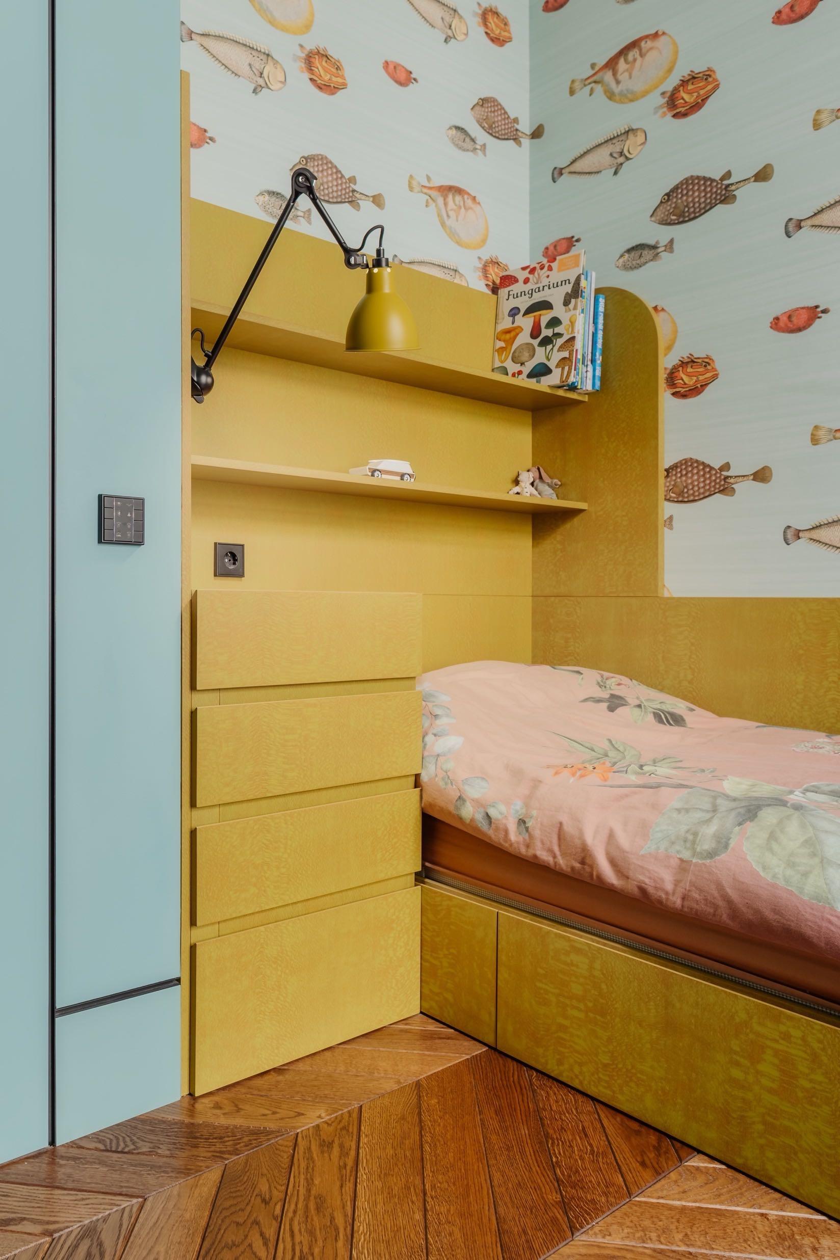
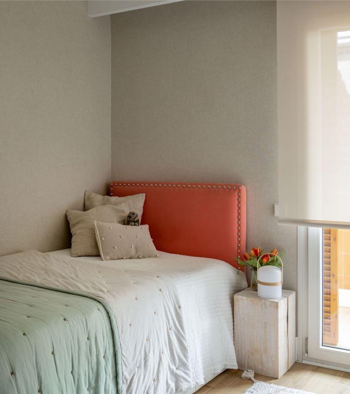
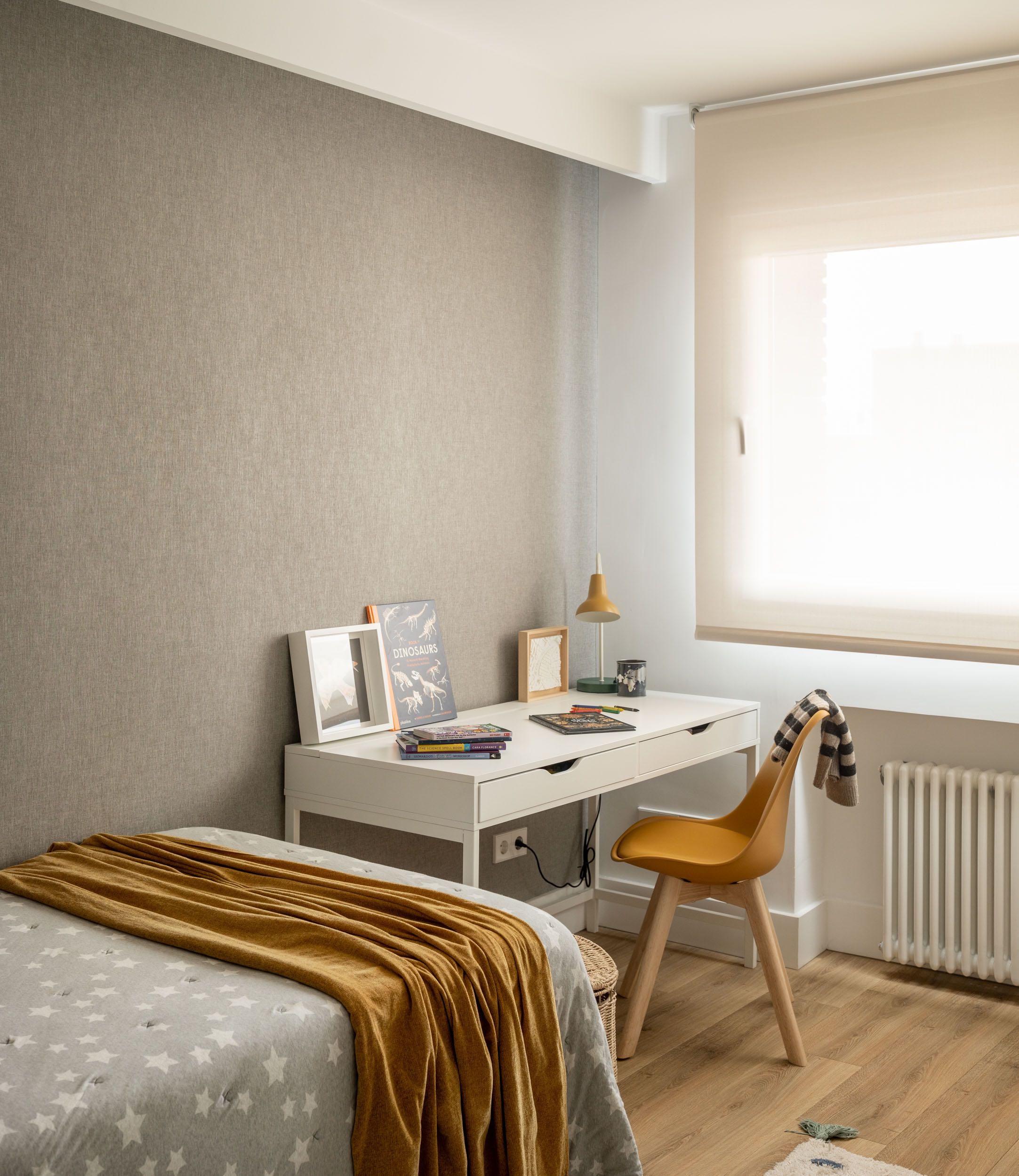
The child’s room from the Madrid project by Irantzu Hurtado Inteorismo
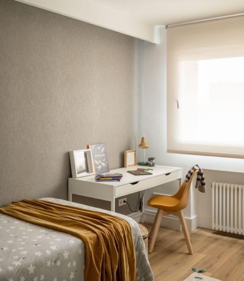
Page 102
74 SEASIDE ESCAPE
HOLIDAY HOUSE BY YSG STUDIO / SYDNEY, AUSTRALIA
84 PERIOD PIECE
RESIDENCE BY RICHARD BEARD ARCHITECTS / SAN FRANCISCO, USA

94 BEAUTIFULLY FUNCTIONAL DUPLEX BY IRANTZU HURTADO INTEORISMO / MADRID, SPAIN
108 ALL OFFICIAL SOURCES
58
CONTENTS
29
GG
93 38






G ANDG MAGAZINE.EU
INTERIORS
RESTAURANTS
Fettle, the London and LA based interior architecture and design studio has unveiled the interiors for San Carlo in Liverpool, which has undergone a complete transformation.
BARS
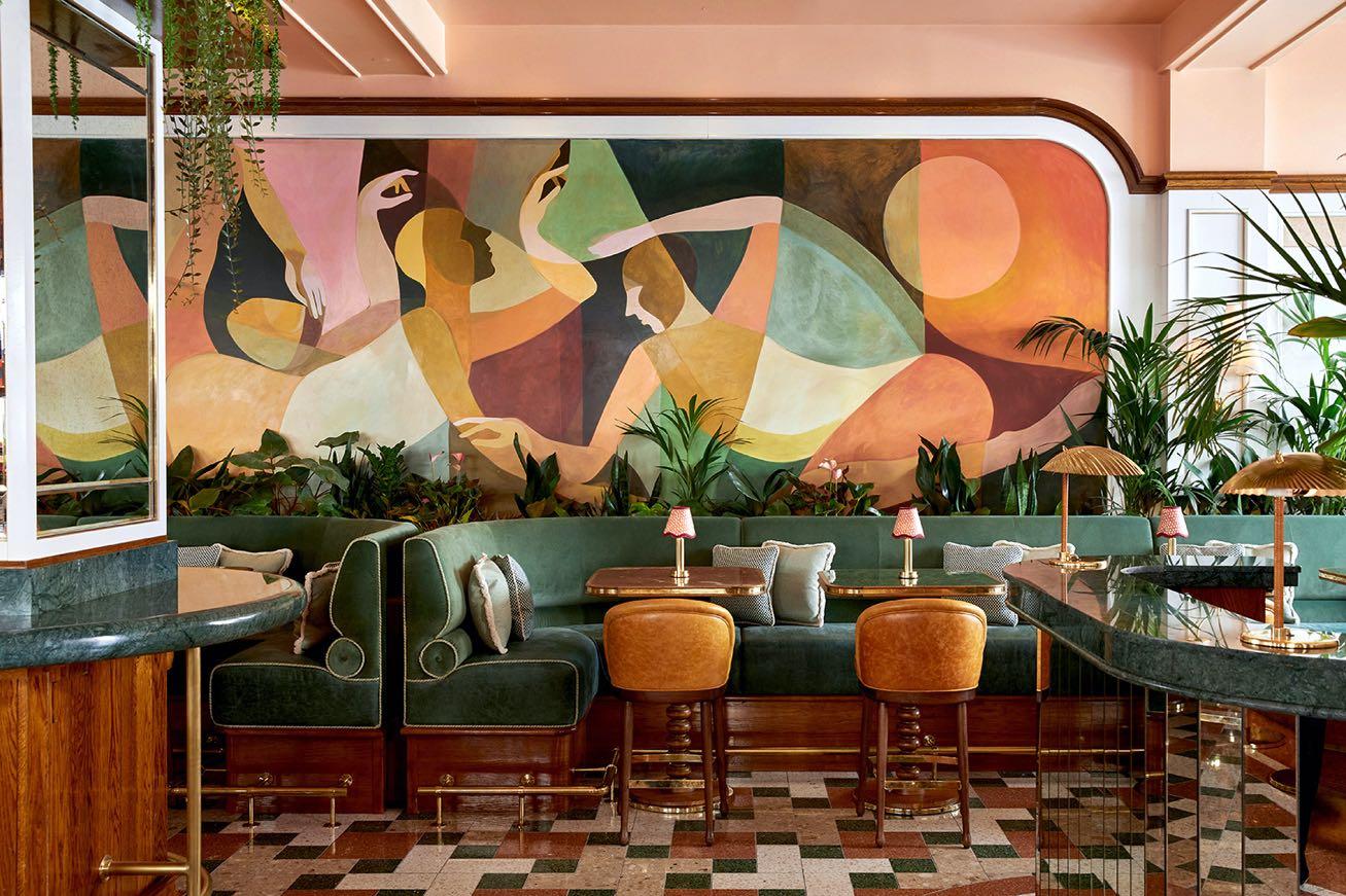
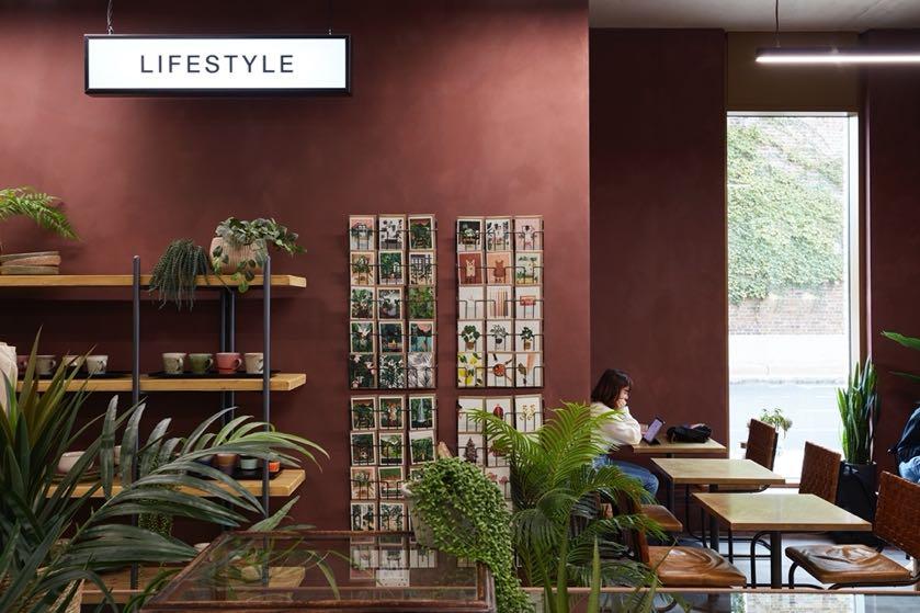
The London-based award-winning design studio Run For The Hills is proud to present their interior and brand makeover of East End treasure, Yeast Bakery.
!"##$!% &'(#)*+)%")"*,
!"#%-!%


ENQUIRIES info@gandgmagazine.eu
NEWSLETTER
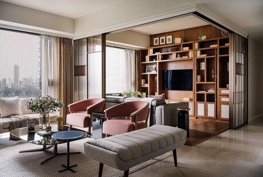
Amber House Purple Backyard designed an apartment located in the iconic structure called Marquis, near the Trump Tower in Mumbai.

WWW.MAISON-OBJET.COM PARIS 07-11 SEPT. 2023
PREMIUM BOHEMIAN GLASSWARE VISIT EU.KLIMCHI.COM
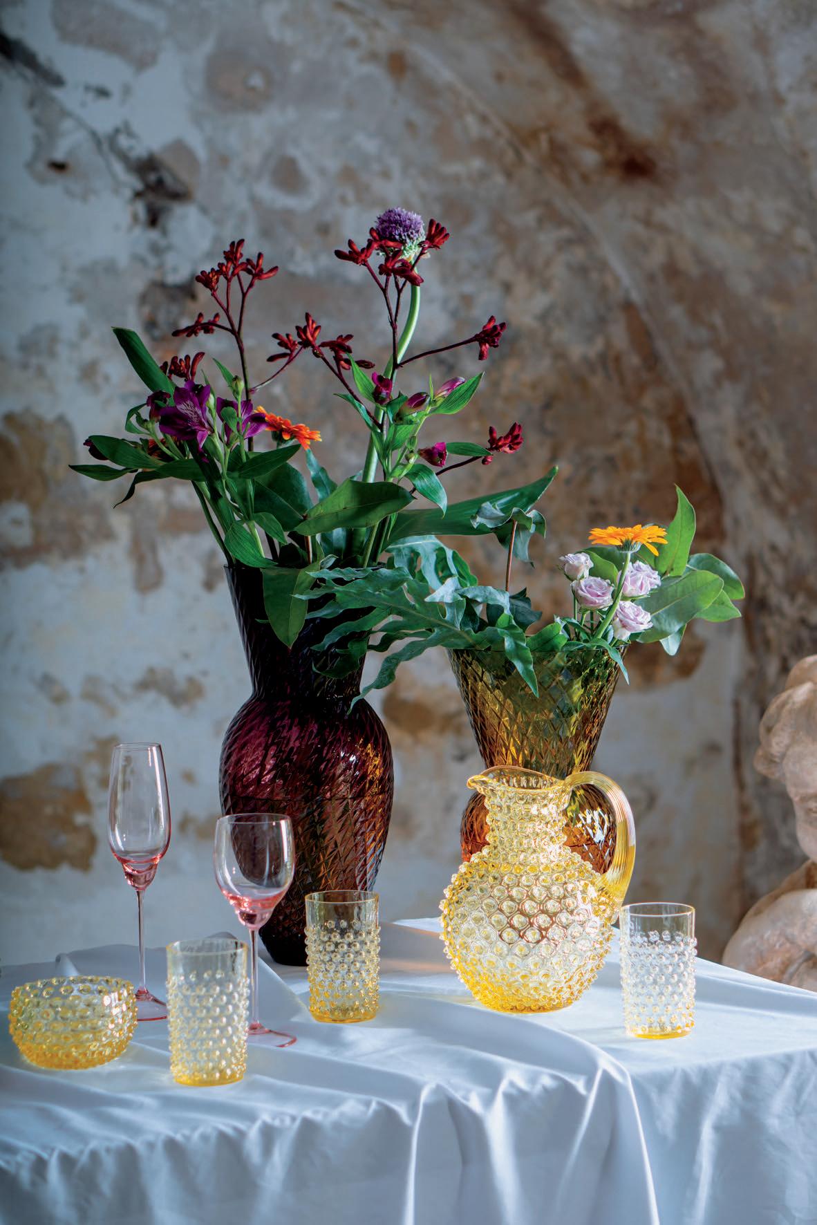
FOLLOW @KLIMCHISTUDIO

DESIGN TRENDS



BEYOND GREEN

Inspired by Pantone's Synergy Palette, we unveil trendy shades that mark the future of biophilic design, going beyond the standard tones with which it is often associated. These are all the colors that we find in nature and which can give a refreshing look to our interiors with the aim of lasting over time.
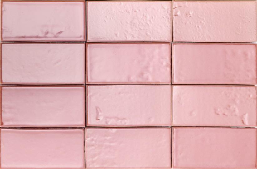
IT IS A WARM SHADE FROM THE RED FAMILY THAT EVOKES FEELINGS OF ROMANCE AND SWEETNESS. ITS INTENSE ESSENCE MAKES IT THE PERFECT STANDALONE COLOR BUT IT ALSO PAIRS EASILY WITH ANY OF THE COLORS ON THIS LIST.

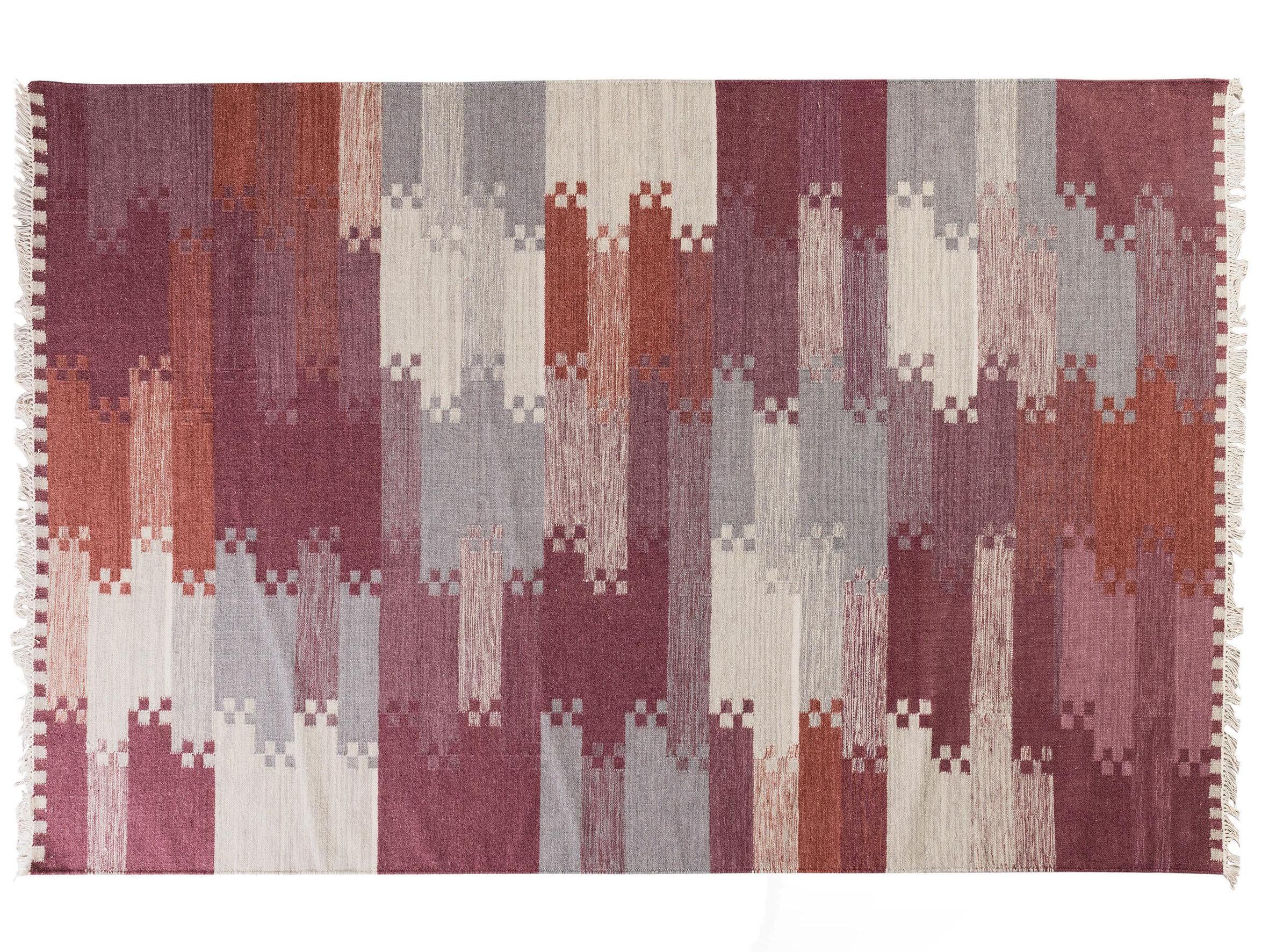
 Hav Maroon Rug by VOLVER
Verto Mirror by AYTM DESIGN
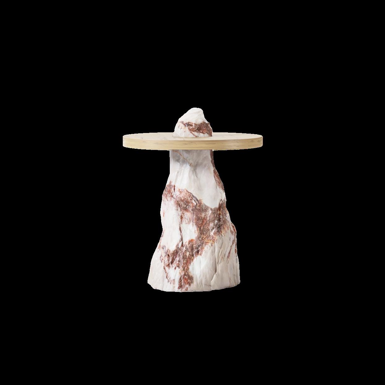
Beloko Baby table by BEA PERNIA
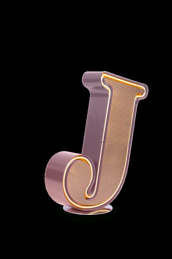
Letter J Lamp by DELIGHTFULL
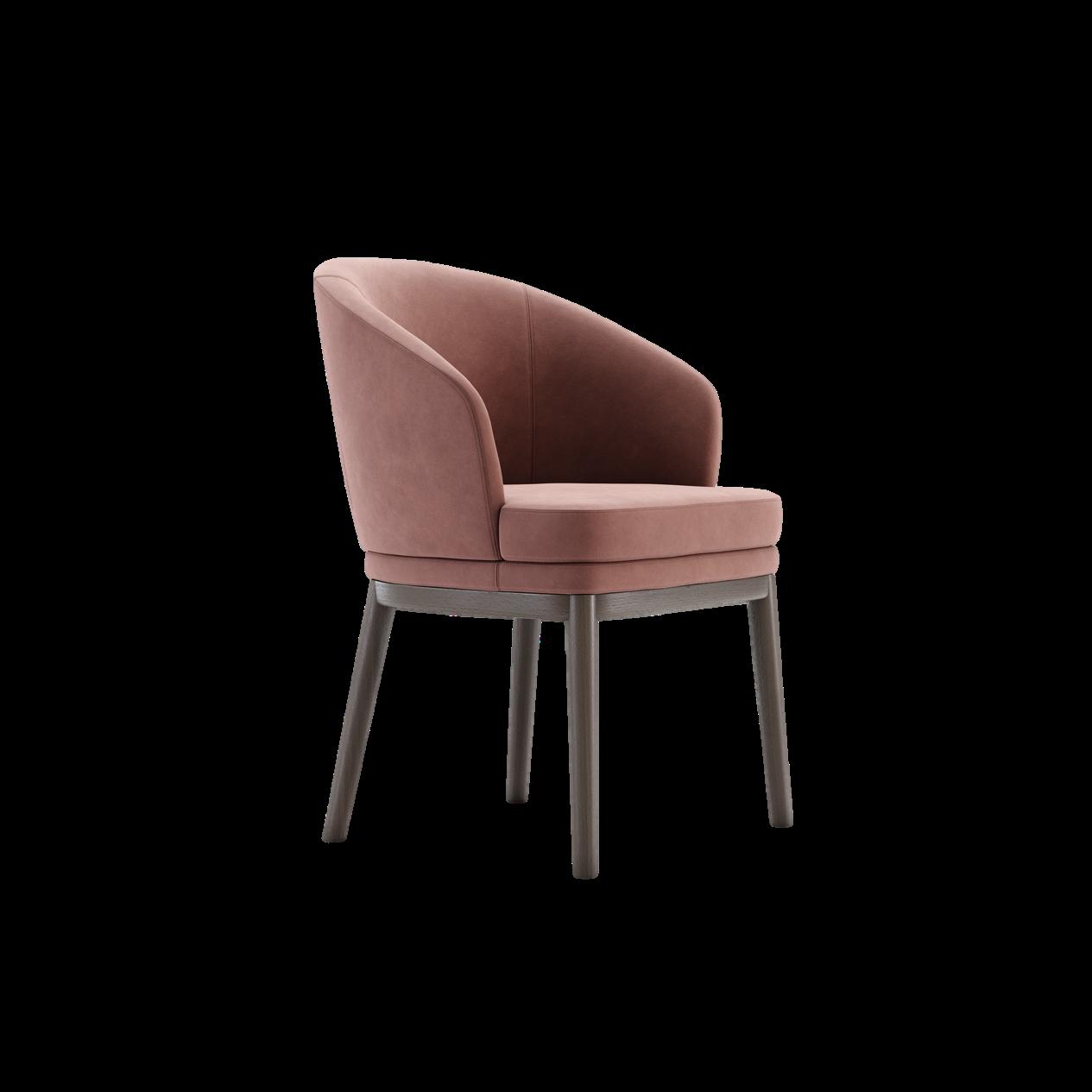
Ruth Chair by DOMKAPA
Mesa Rose
PANTONE 17-1609 TCX
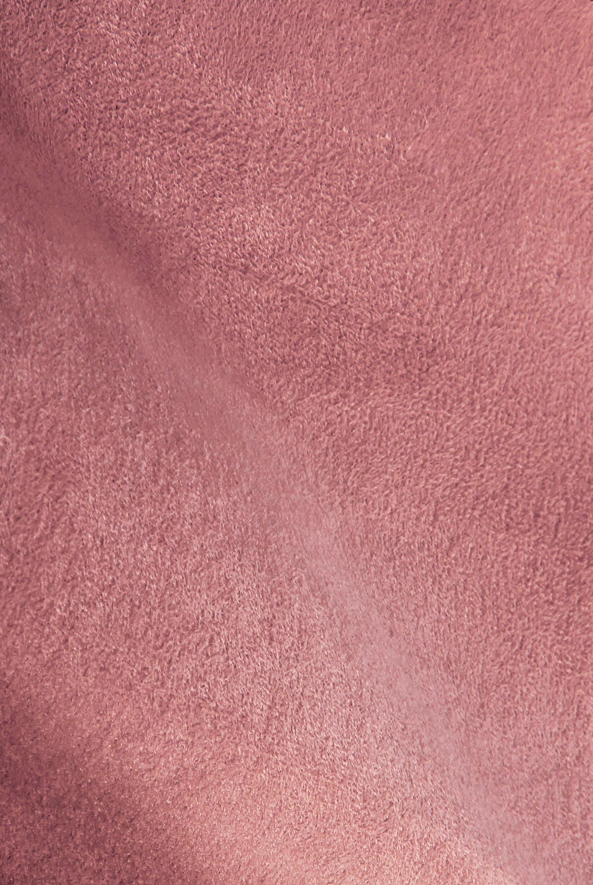
Candy pink Fabric by KOKET
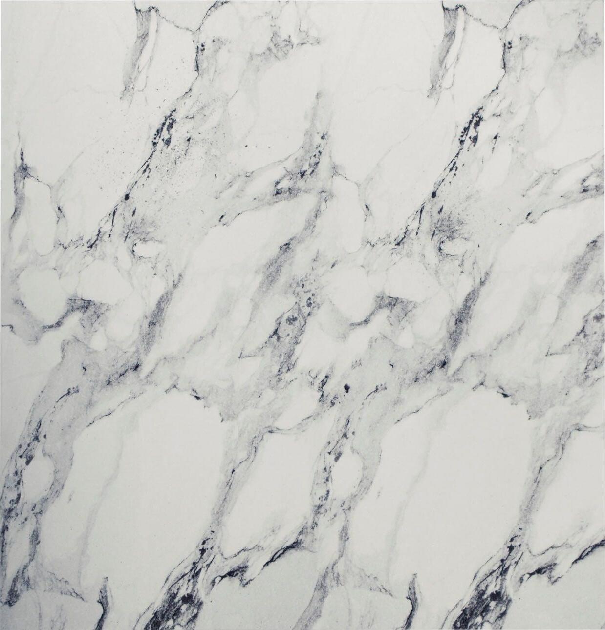
Dawn Blue
IT'S A COOL COLOR FROM THE GREY FAMILY BUT UNDER THE RIGHT LIGHT YOU CAN SEE SOME SLIGHT BLUISH UNDERTONES. TIMELESS AND ELEGANT, IT CAN HAVE A



#SUMMER2023
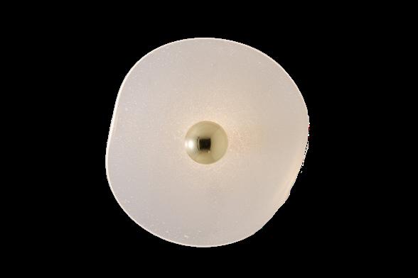
Constellation Wall lamp by MYDRIAZ
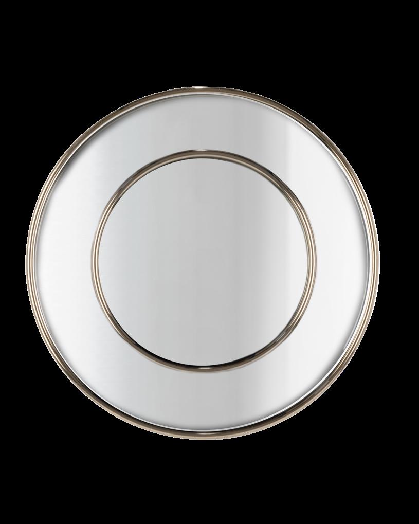
Roma Mirror by CASTRO LIGHTING
PANTONE 13-4303 TCX
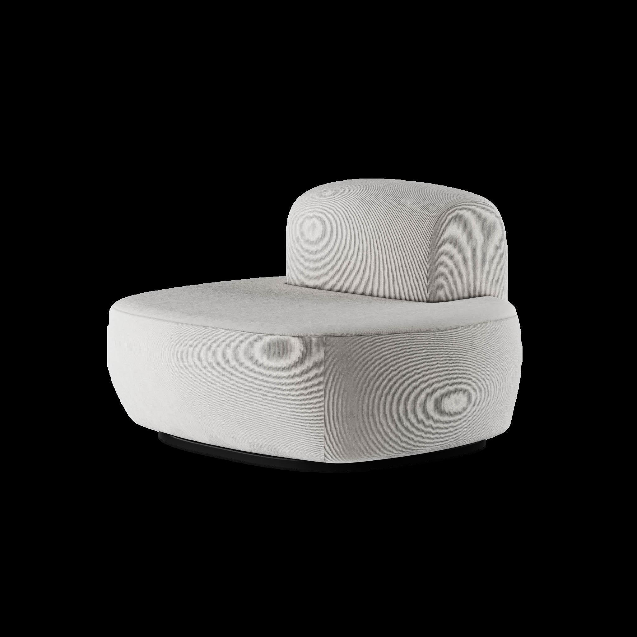
Lunarys Sofa by HOMMÉS STUDIO
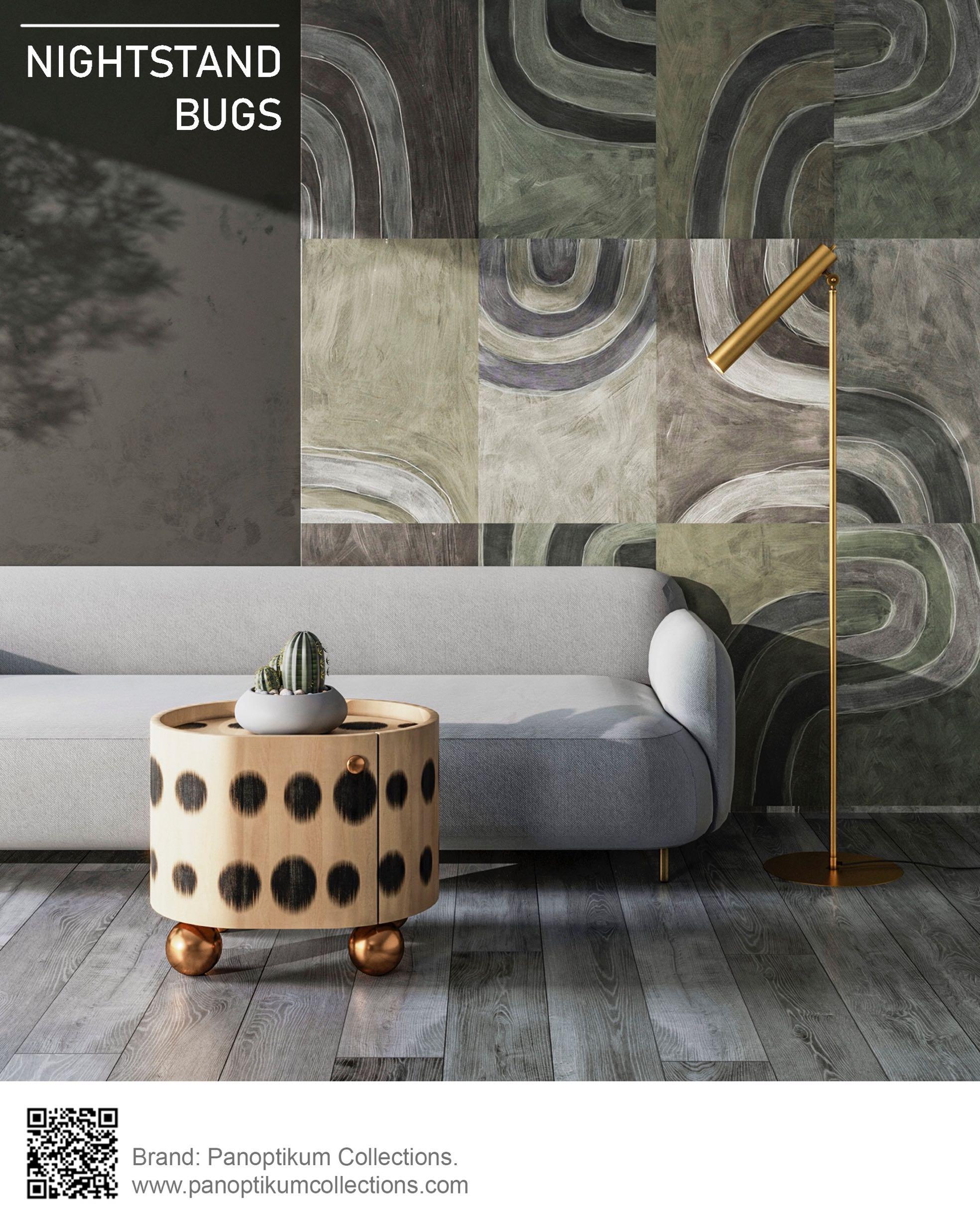
Fairy Nightstand by FAIRYTALE
18 | G&G _ Magazine
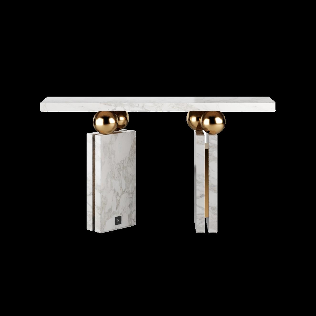
Quantic Estremoz Console table by HOMMÉS STUDIO
+38099 234 26 27 nerobot@prodan-design.com.ua prodan-design.com.ua Instagram @nelly_prodan
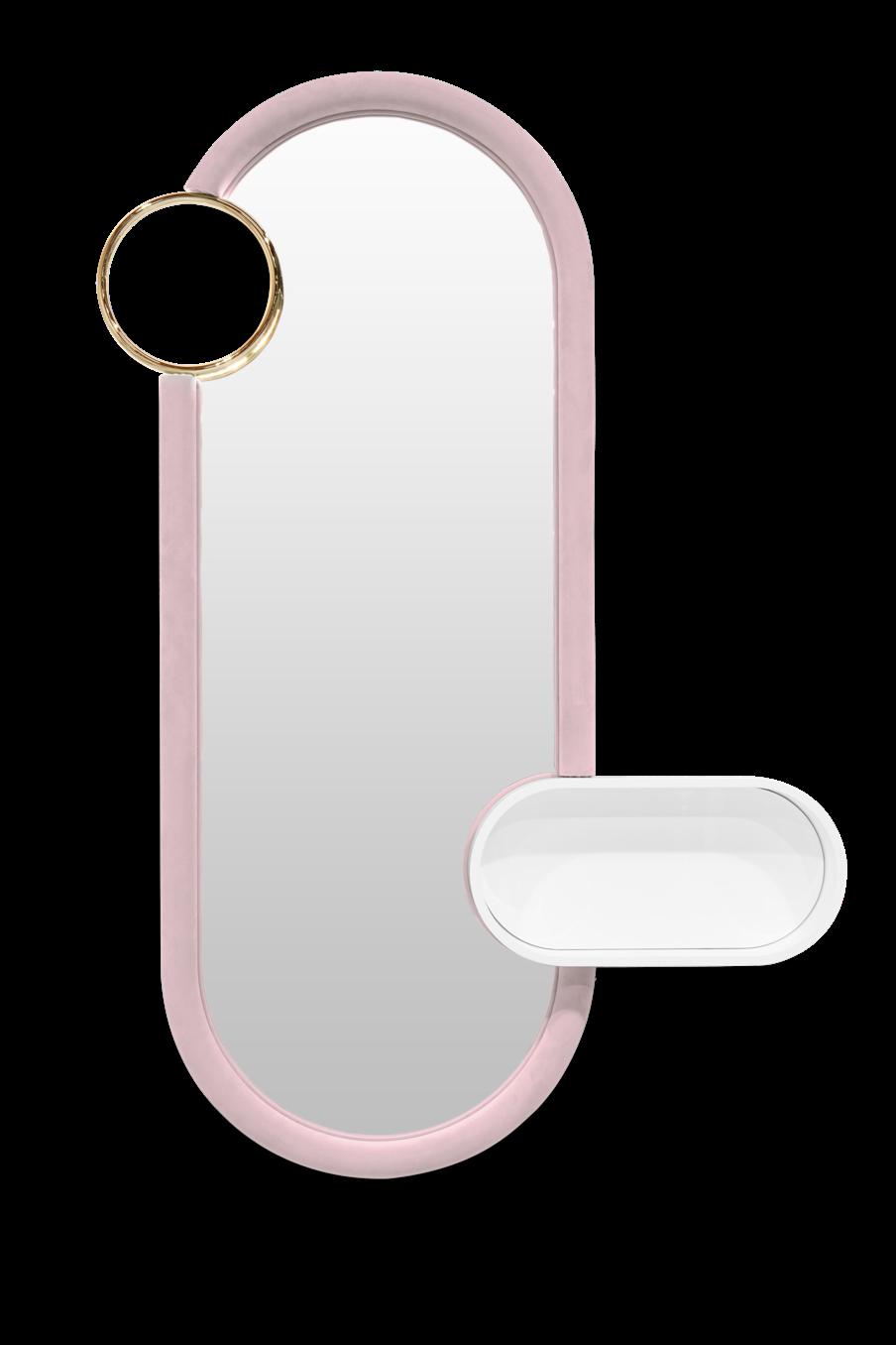
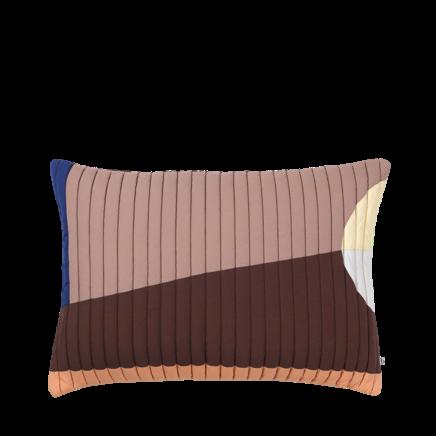
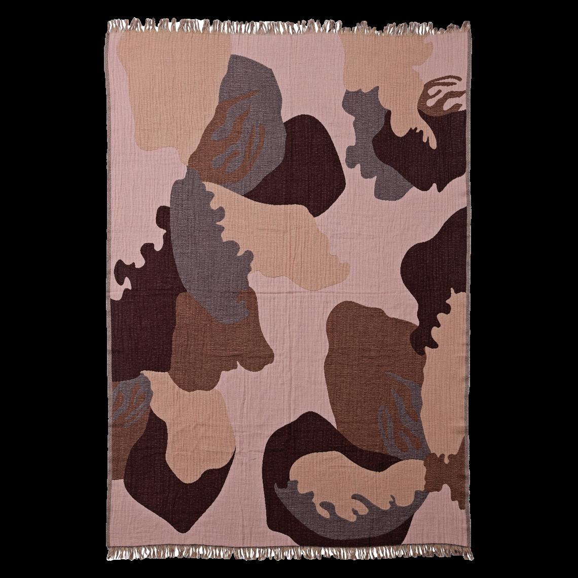
KEEPSAKE LILAC OWNS A CREATIVE ENERGY WHICH ATTRACT THE EYES OF THE AUDIENCE, GIVING PEOPLE AN ALMOST DREAMY FEELING. THIS MUTED SHADE IS A POPULAR CHOICE FOR MANY DESIGNERS, ESPECIALLY IF YOU LIKE TO CREATE HARMONIOUS CONTRASTS: EARTHY COLORS IS THE BEST CHOICE BECAUSE, ONCE COMBINED, THEY CAN GIVE THE DESIGN A COMFORTABLE AND ROMANTIC SENSE.






#SUMMER2023
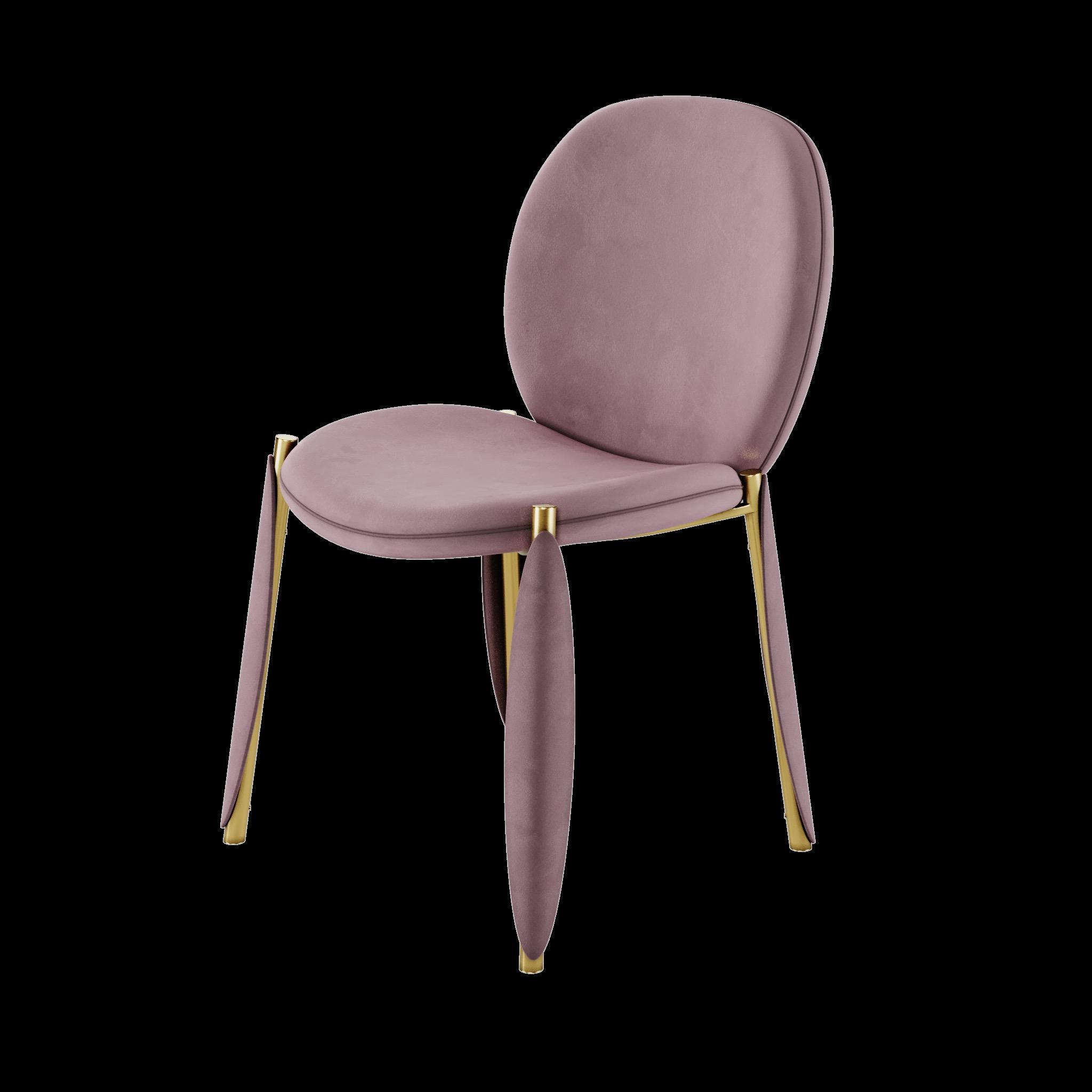
Baltea Dining armchair by Marco
Zito for
Flores Throw by AYTM DESIGN
Letter A Lamp by DELIGHTFULL
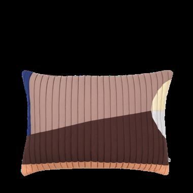
Pillowcase by BROSTE COPENHAGEN
PANTONE 15-2705 TCX
Bubble Gum Big Wall mirror by CIRCU
Coral Gold


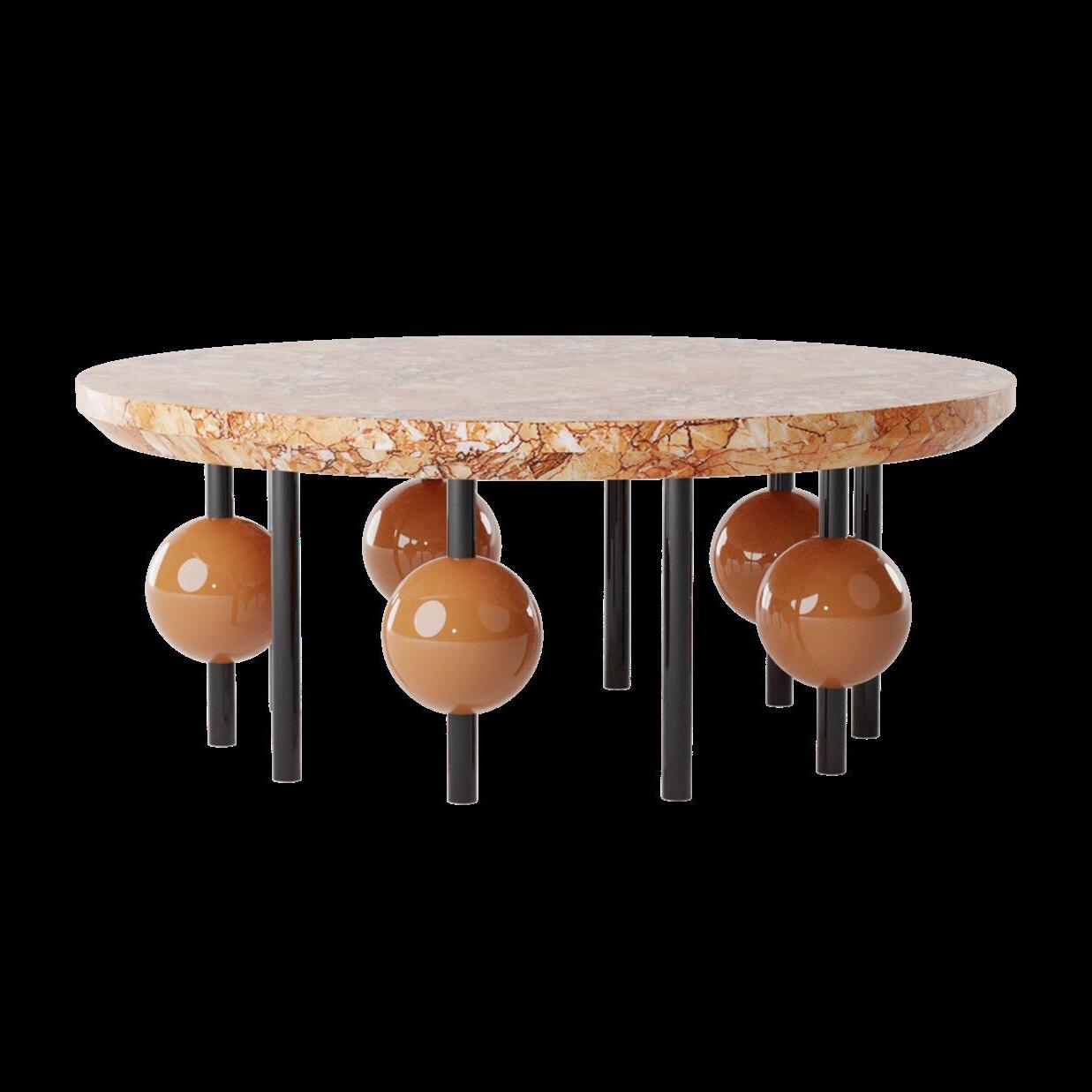

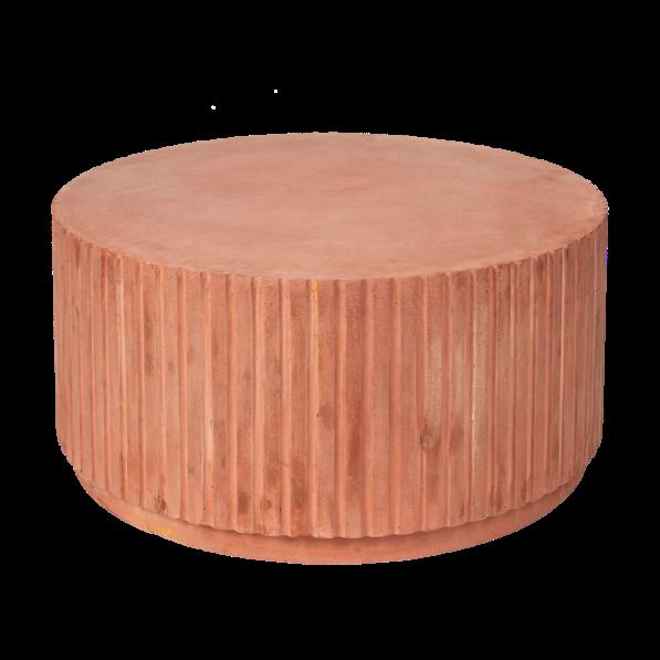
OFTEN DESCRIBED AS INVIGORATING AND PARTICULARLY STRIKING, THIS COLOR BLENDS THE BOLDNESS OF RED AND THE ENTHUSIASM OF ORANGE TO CREATE A SURPRISINGLY VERSATILE AND BEAUTIFUL PIGMENT. TO GET A SOFT AND FEMININE FEEL, IT SHOULD BE PAIRED WITH DEEP RED WHICH EMPHASIZES ITS GOLDEN UNDERTONE. HOWEVER, TO ACHIEVE A MORE "MASCULINE" CONTRAST, THE USE OF BLACK IS ENCOURAGED.
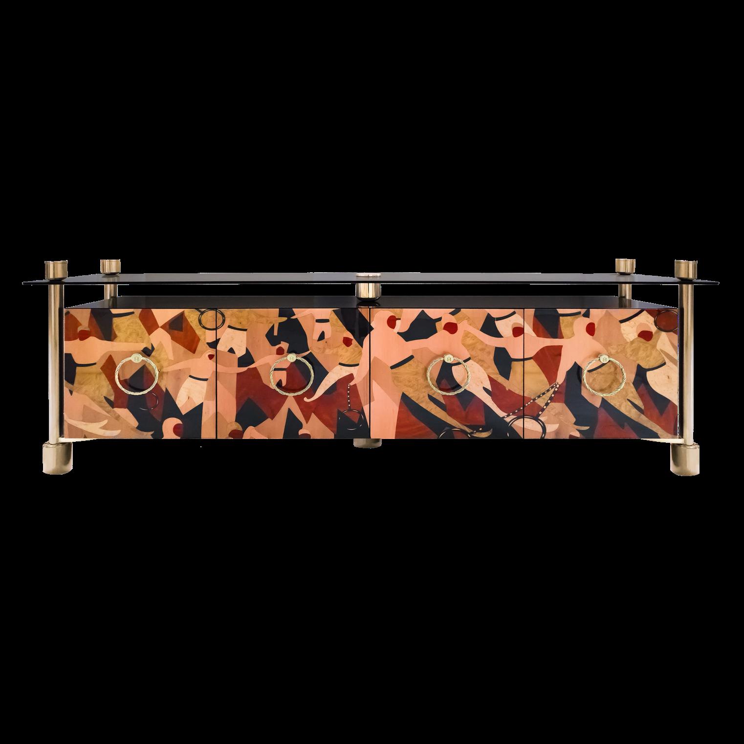

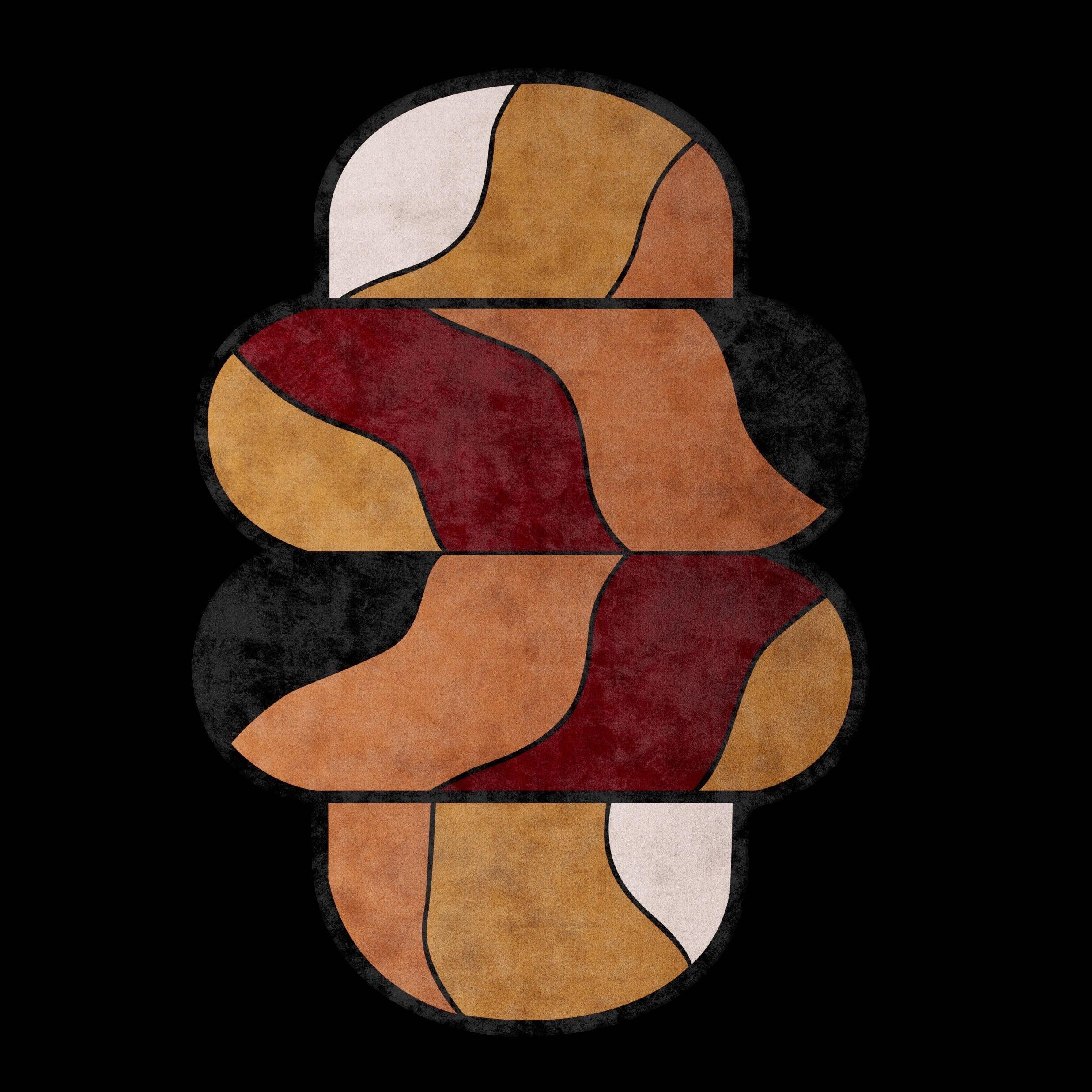



#SUMMER2023
Rillo Podium by BROSTE COPENHAGEN
Rebus
Sideboard by HOMMÉS STUDIO
Folium
Vase by AYTM
22 | G&G _ Magazine



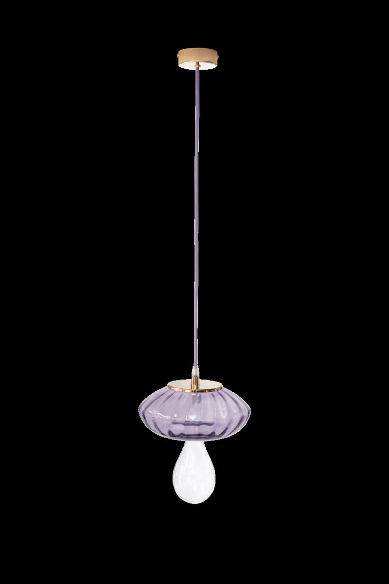


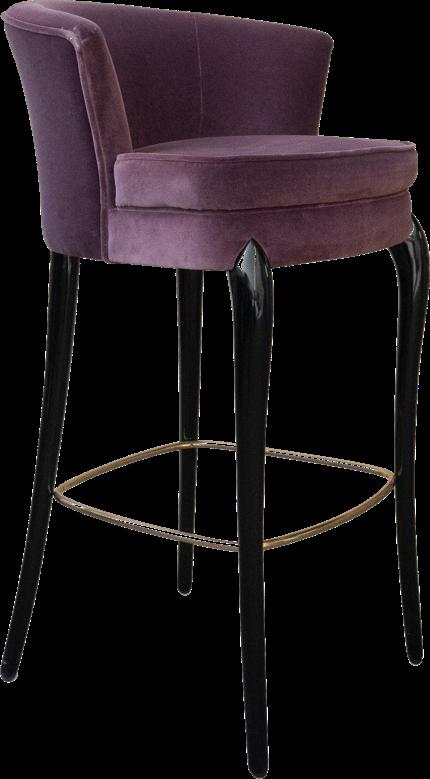
24 | G&G _ Magazine
PANTONE 18-3715 TCX
E-SHOP 3

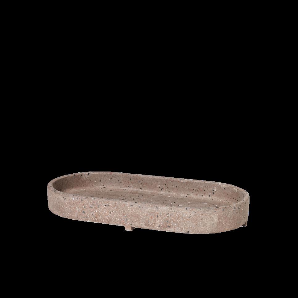
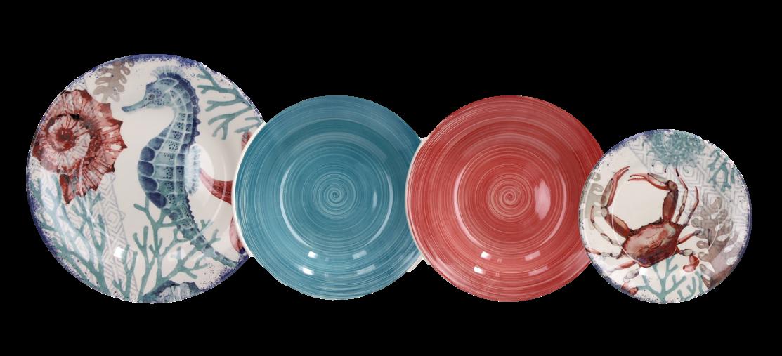
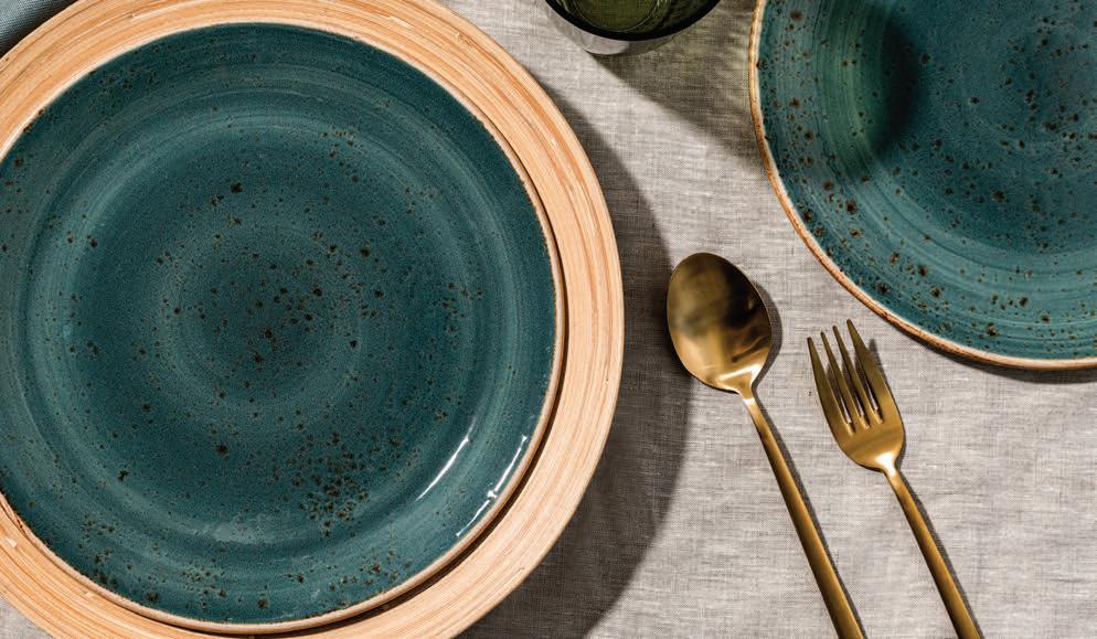
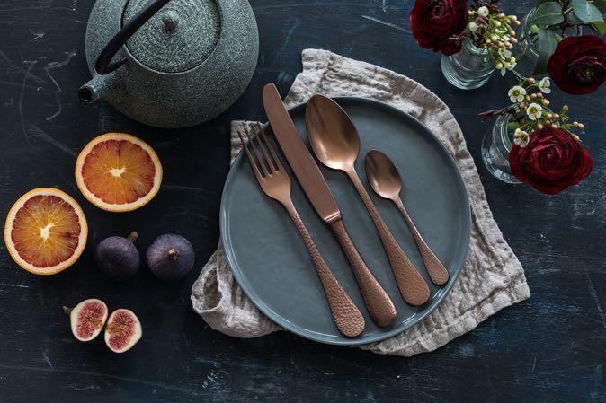
 dinner service by TOGNANA €106,60
A tavola!
7 8
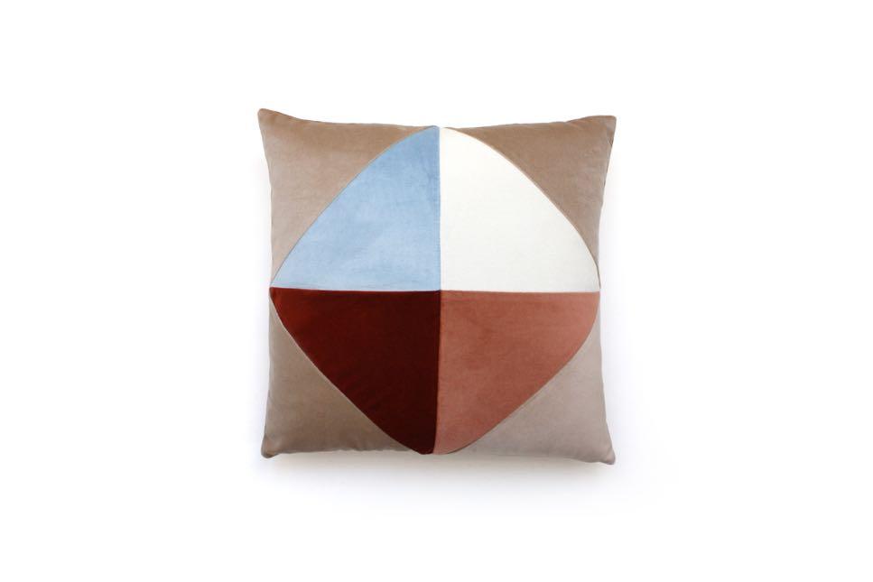
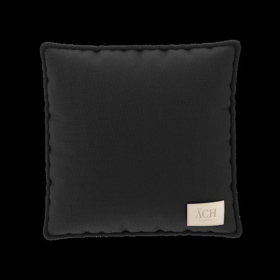
Diamond Velvet pillow by MY FRIEND PACO 109,00


9
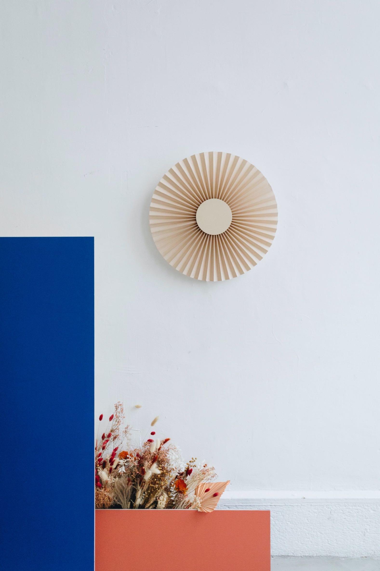
Pigna Jaune Lamp by POPOLO €335,00
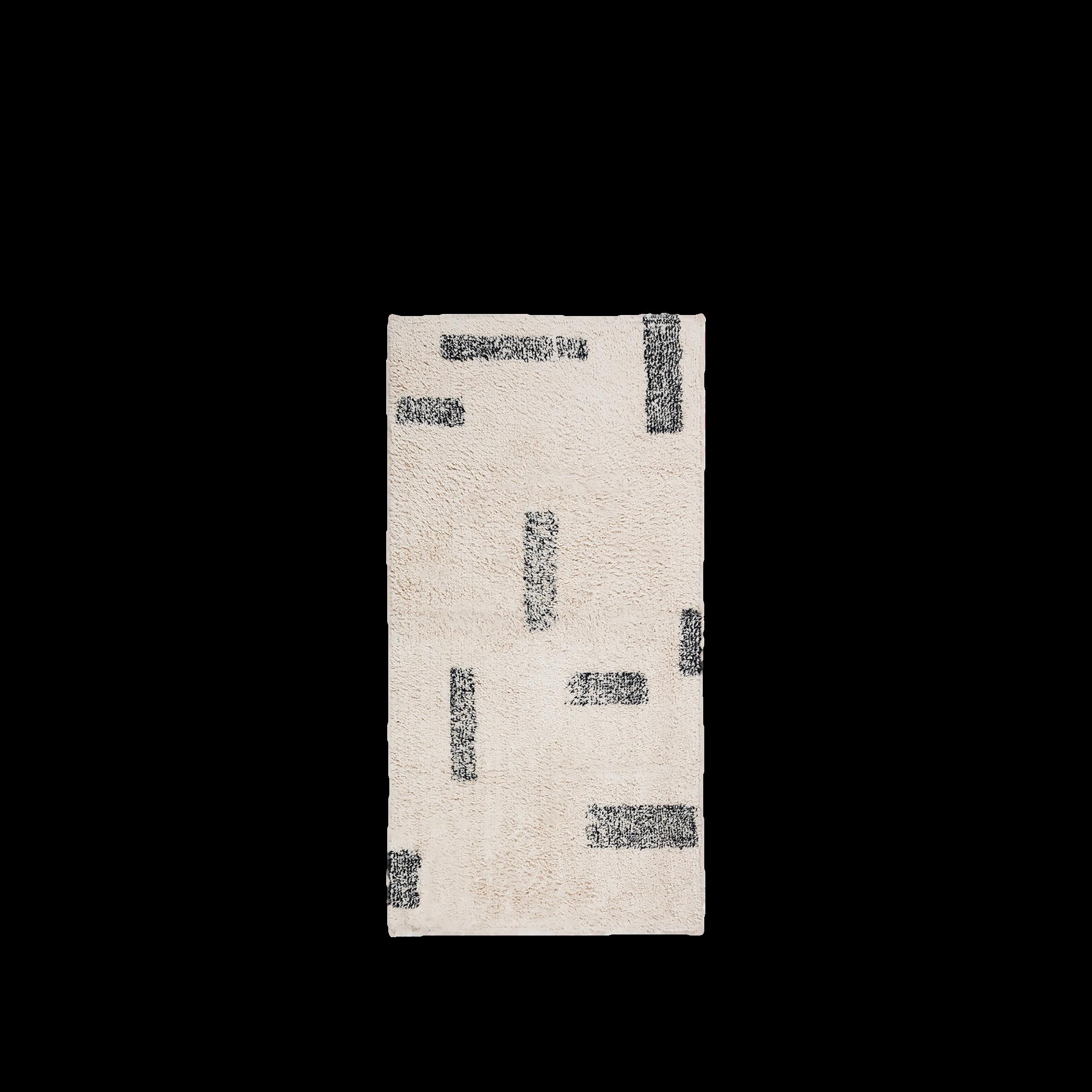
Amira Rug by BROSTE COPENHAGEN €95,00
Welles
#ESHOP 13
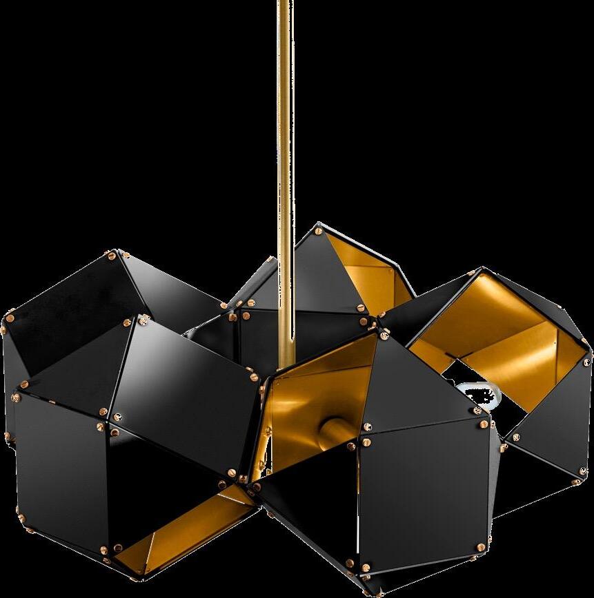
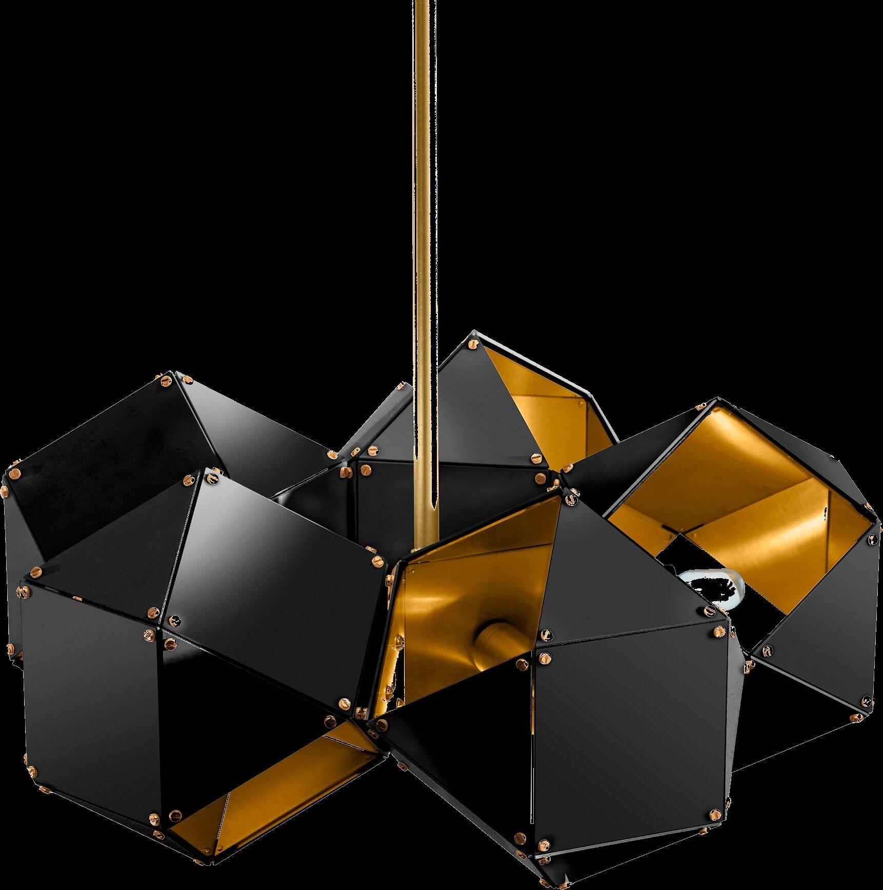
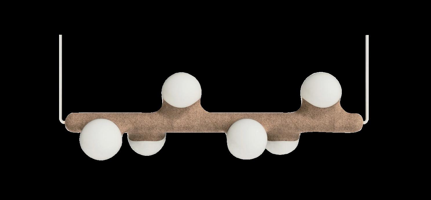
Steel 5-spoke pendant by GABRIEL SCOTT €7.859,95
Marx
14
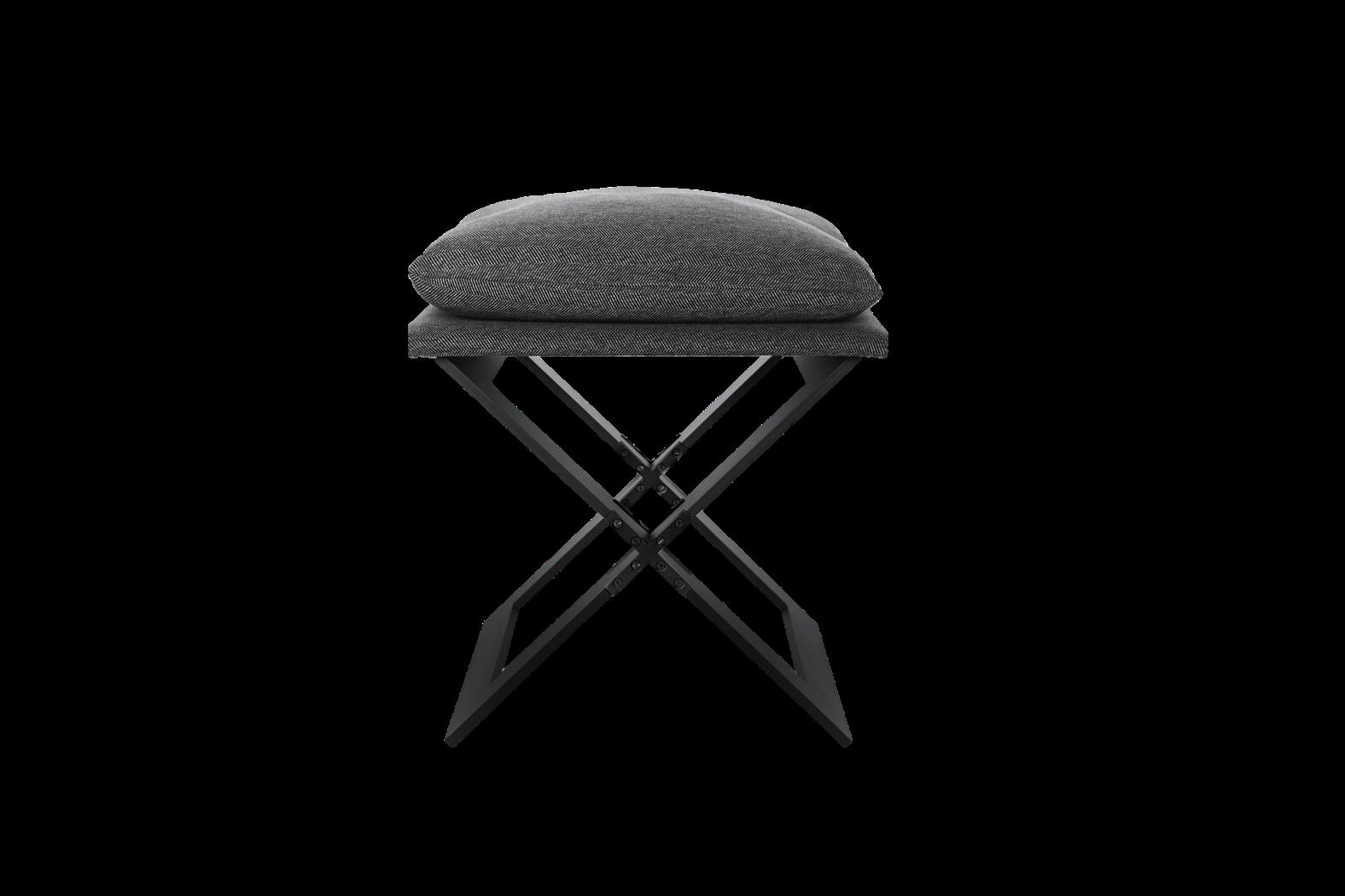
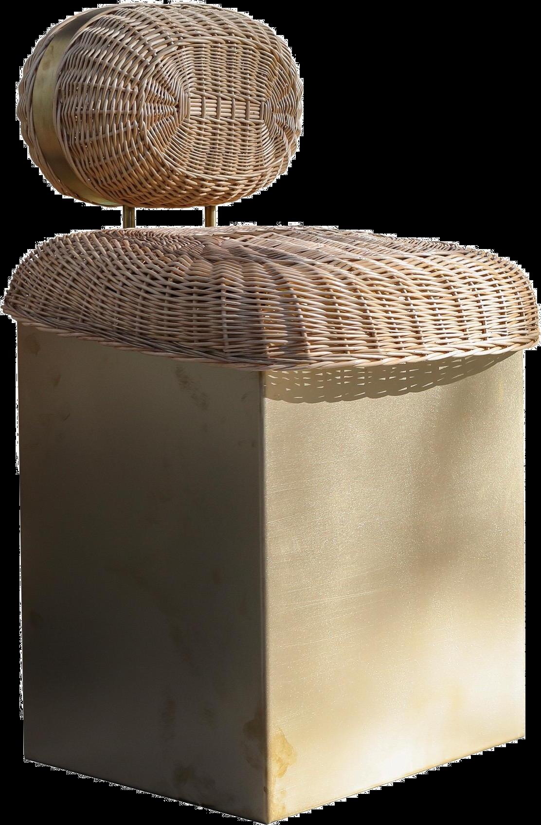
Stool by GABRIEL SCOTT €2.339,95
19 18
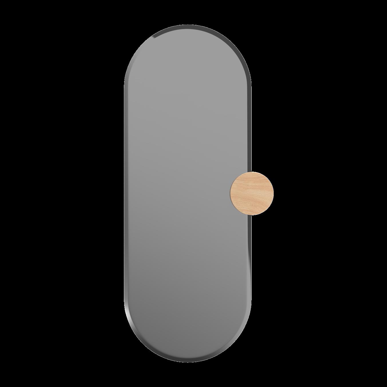
Sonia Mirror by HARTÔ €279,00
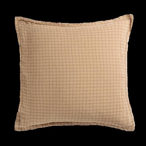
Hanky Izamal Pillowcase by LE MONDE SAUVAGE €65,00 #ESHOP 15 20 30 | G&G _ Magazine
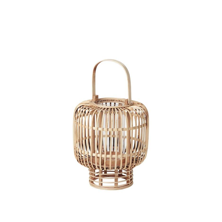
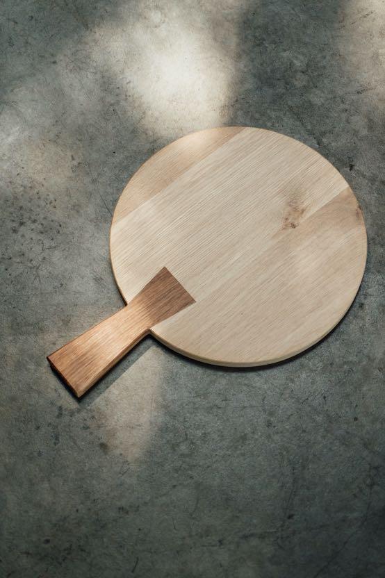
Goran Lantern by BROSTE COPENHAGEN €95,00 Brad Round board by NIROH €167,00
Pricky Pear Sable Naturel Chandelier by MICKAEL KOSKA €1.900,00

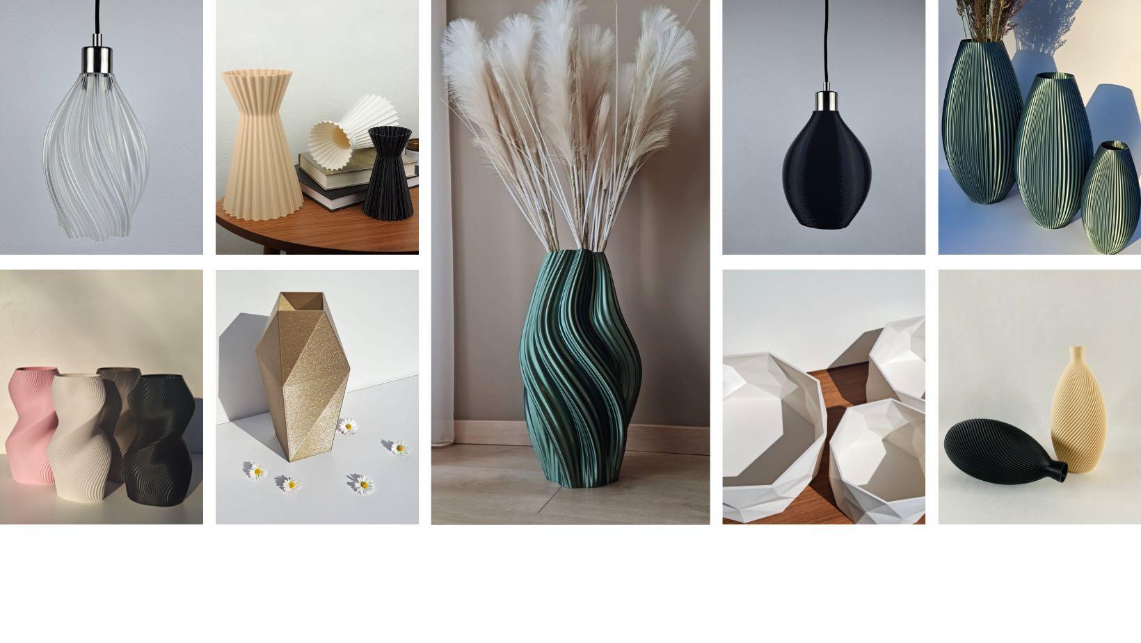
A U R A 3 D
AURA 3D is a family of creators from Latvia that cares about the environment, offering eco-friendly solutions in today's technological world. All the interior items is 3D printed and sustainable, because the used material polylactic acid (PLA) is nontoxic and biodegradable, which is produced from renewable resources, such as corn and sugarcane. Factories produce millions of products every day, most of which are unable to find their owners and end up in world's oceans. They believe that mass production needs to be kept to a minimum and that more attention should be paid to 21st century technologies.
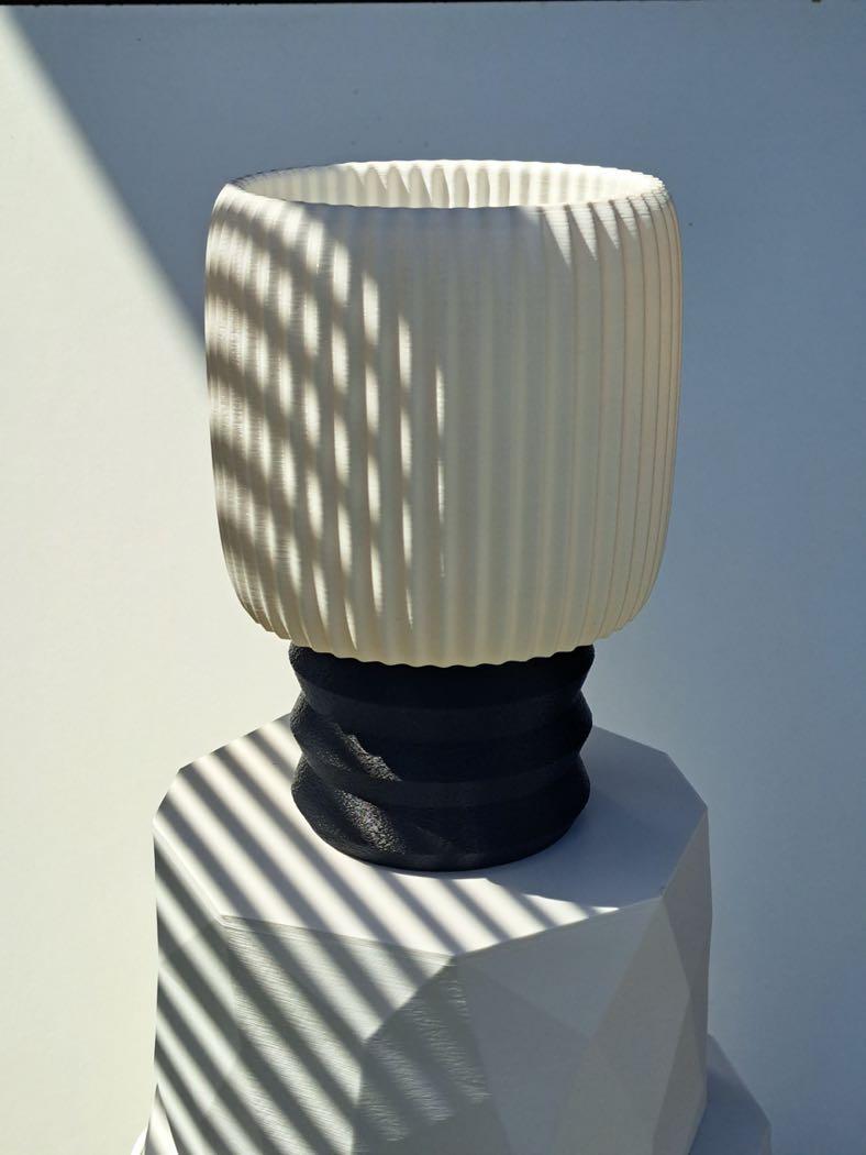
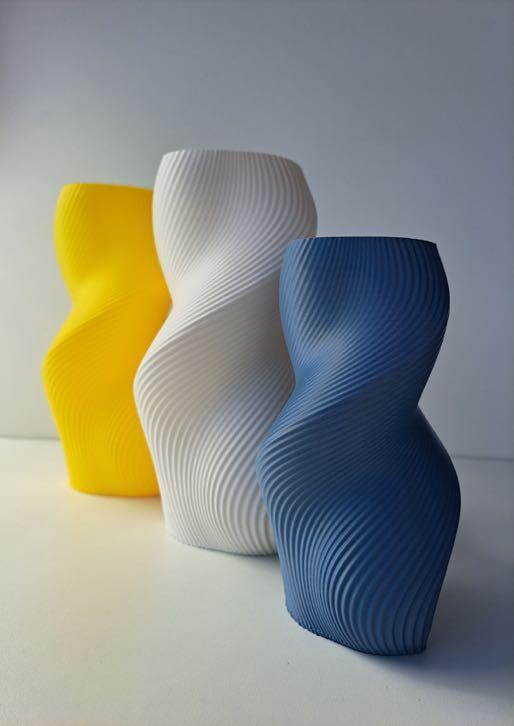
Today, we can be unique and create something that no one else has. With it's own design, color and style. Match vases or flowerpots with lamps and vice versa. Stand out and keep up with the times with new innovations. The choice of colors is endless and for design variations only the sky is the limit. Join us in this adventure of freedom!
Vidvuds & Daina w i t h l o v e ,
LATEST NEWS
Surrounded by local history
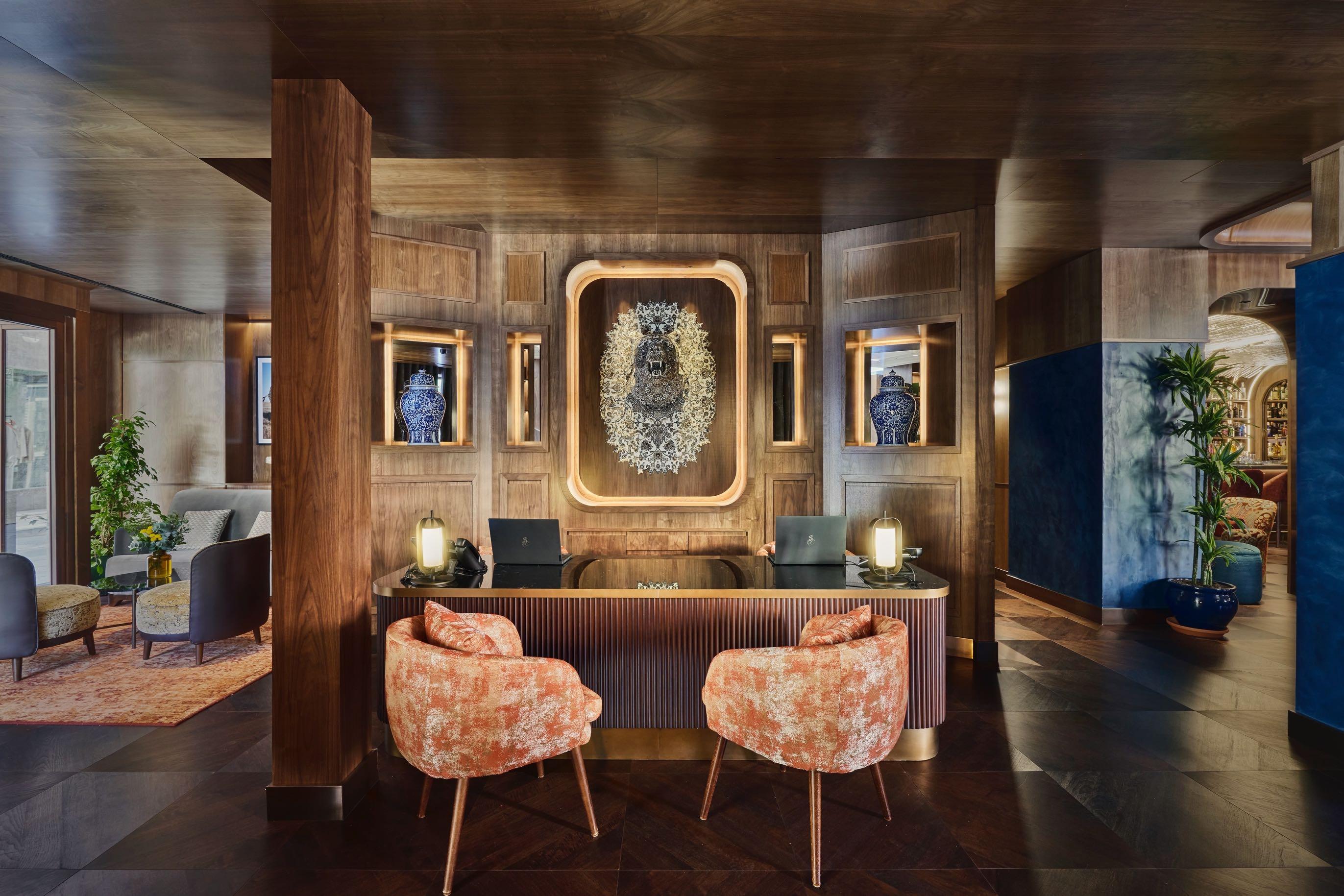
Rockwell Group has completed the interiors for the Seda Club Hotel in Granada, inspired by the city's centuries of Muslim rule (specifically the silk trade) and then the complete control to the Spanish Catholic Monarchs. The hotel has a luxurious social club feel, which has been achieved through use of materials such as rich woods, bronze metal, velvet, and marble that results in an opulent yet familiar aesthetic. Address: Plaza de la Trinidad, C. Buensuceso 2, 18001 - Granada, Spain
www.rockwellgroup.com
Made by hand
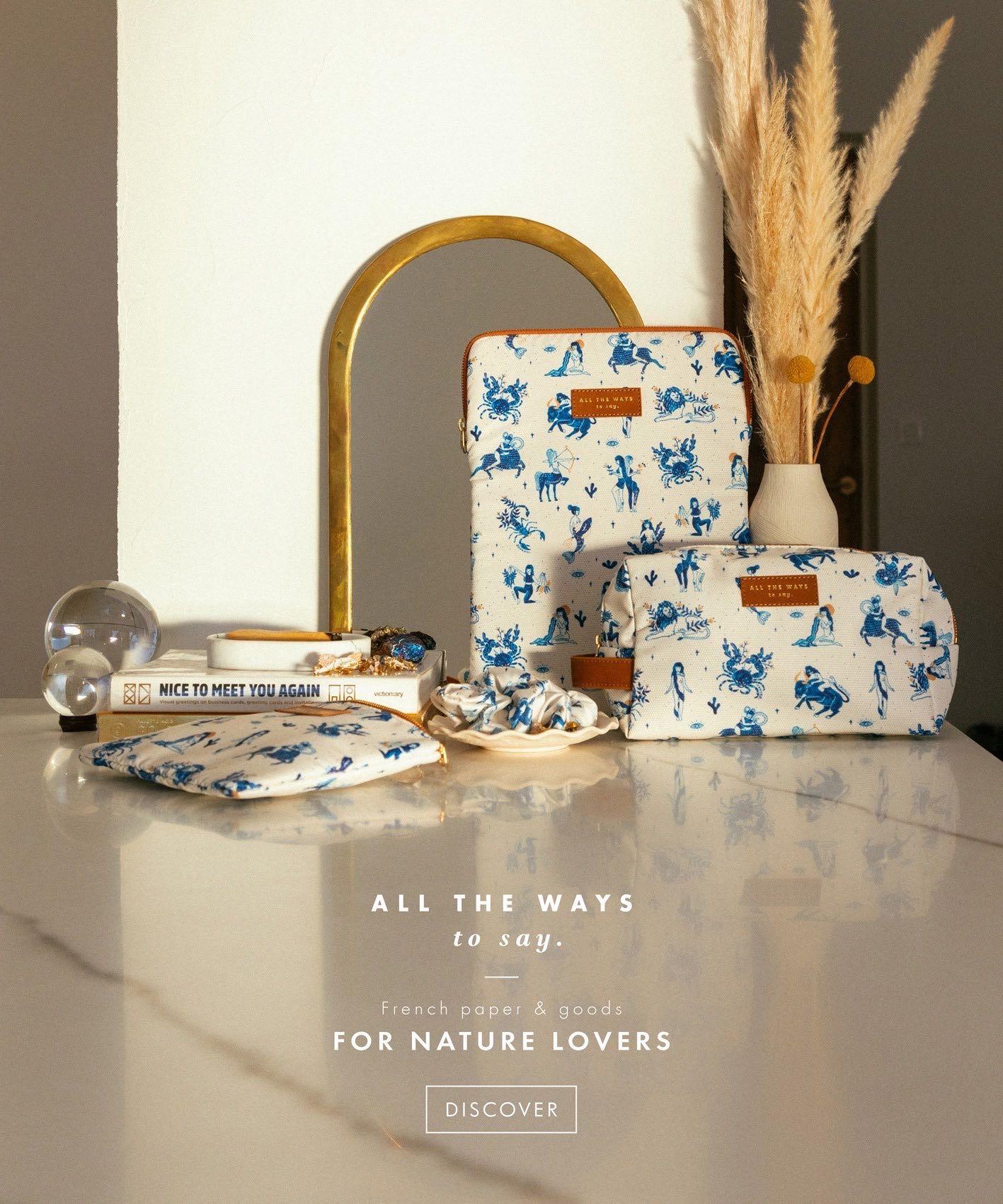
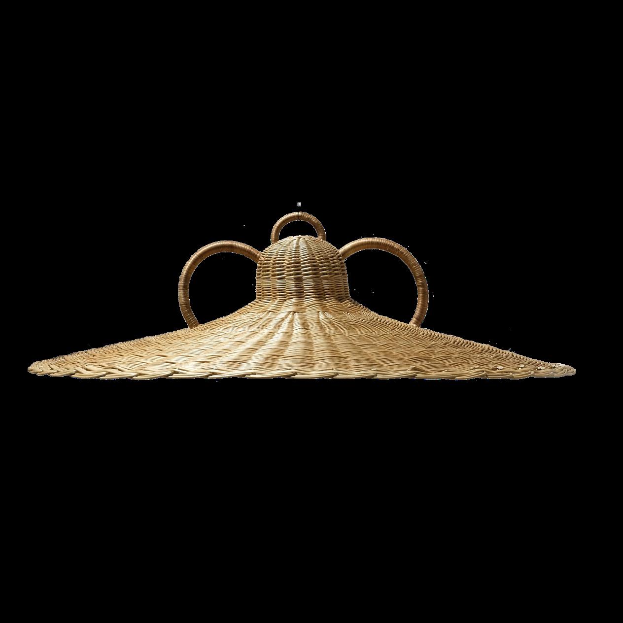
For this summer Margaux Keller Collection unveils the Capeo suspension, an exceptional handwoven wicker pendant inspired by an oversized Provençal hat. Its large handles personify the object and give it a unique character, ideal for both outdoor and indoor. www.margauxkellercollections.com
Bespoke solutions
Garde Hvalsøe, the Danish design brand known for its exquisite craftsmanship in cabinetry and kitchen design, has unveiled a new look showroom in Copenhagen, by Bunn Studio. The design is understated, yet impactful, while celebrating the brand’s philosophy of high quality craftmanship. The aspiration for this project was to push the context of the Garde Hvalsøe kitchen by elevating the inspiration behind each style, illustrating the high level of customisation and attention to detail.
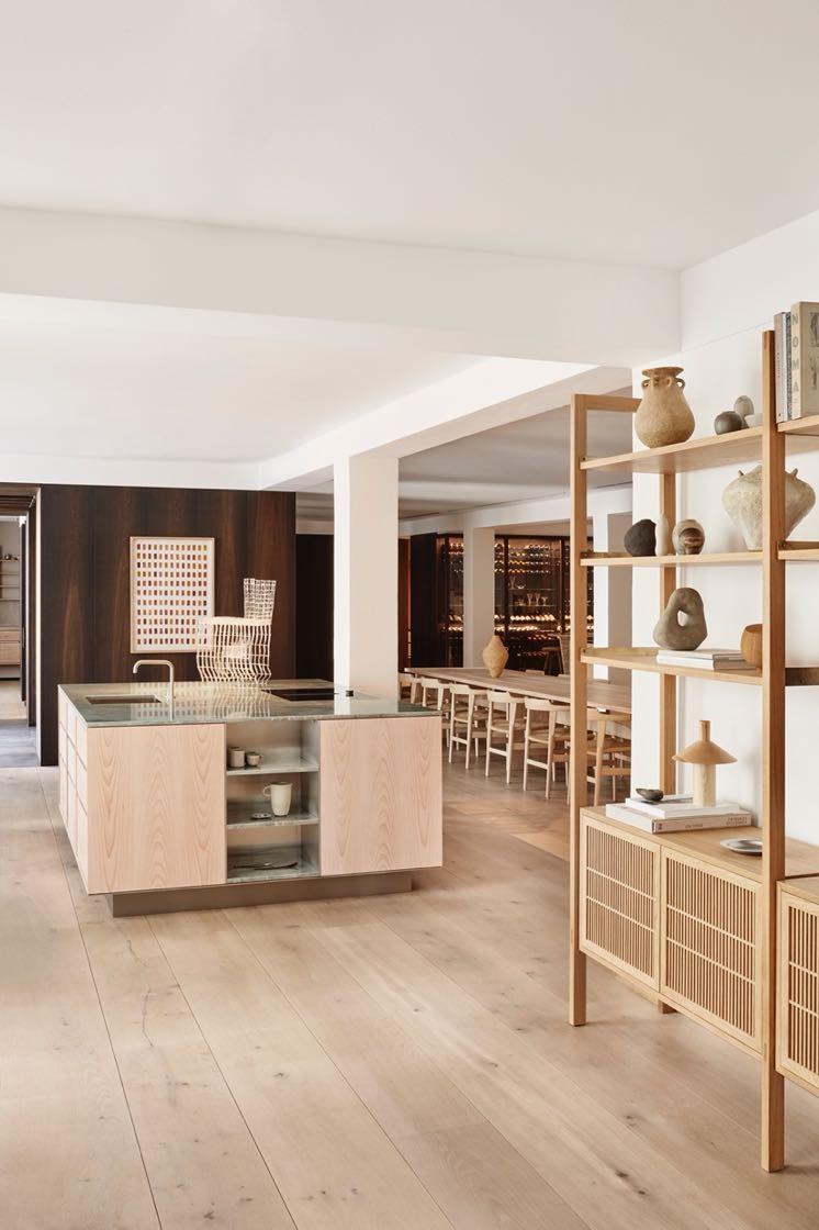
Address: Esplanaden 8D - Copenhagen, Denmark
www.gardehvalsoe.dk
Bold move
Studio Modijefsky designed Marcella, a just 39m² bar on the corner of a canal in Amsterdam, Marcella. Once inside, the attention is captured by the hypnotising swirls of yellow ochre, brown and blue on the marble ceiling. A soft glow radiates across the room provided by a long yellow neon light that outlines the silhouette of the zigzag ceiling. This play of glares, textures and figures bounces off the many mirrors to transform the tiny café into something much more spacious and dynamic.
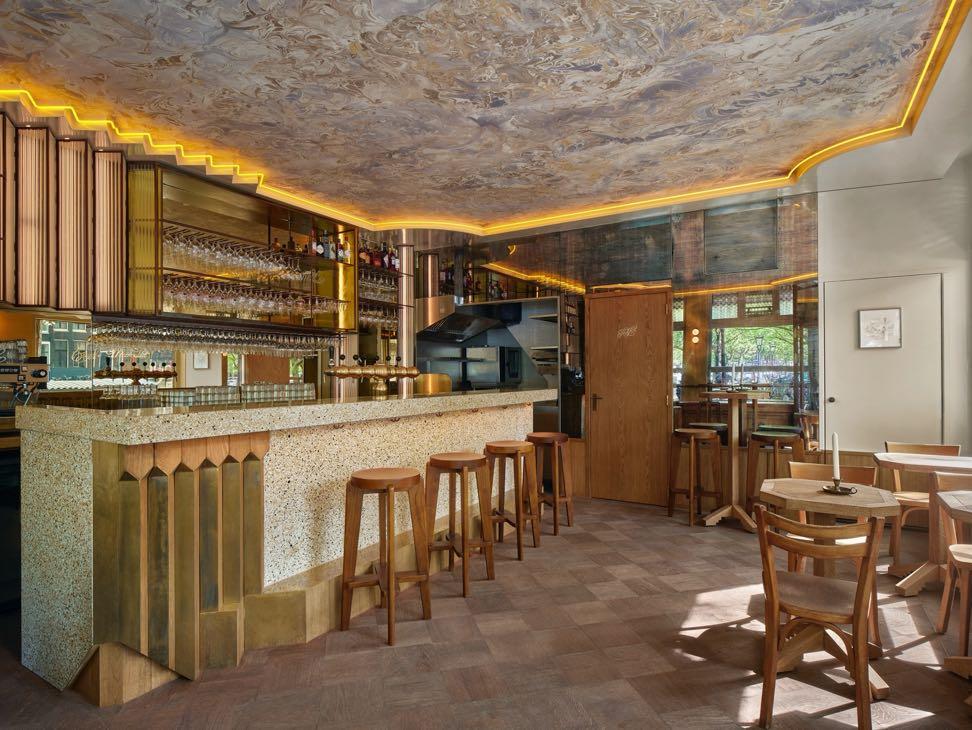
Address: Amstelveld 21, 1017 JDAmsterdam, The Netherlands
www.studiomodijefsky.nl
#LATESTNEWS
Rounded shapes
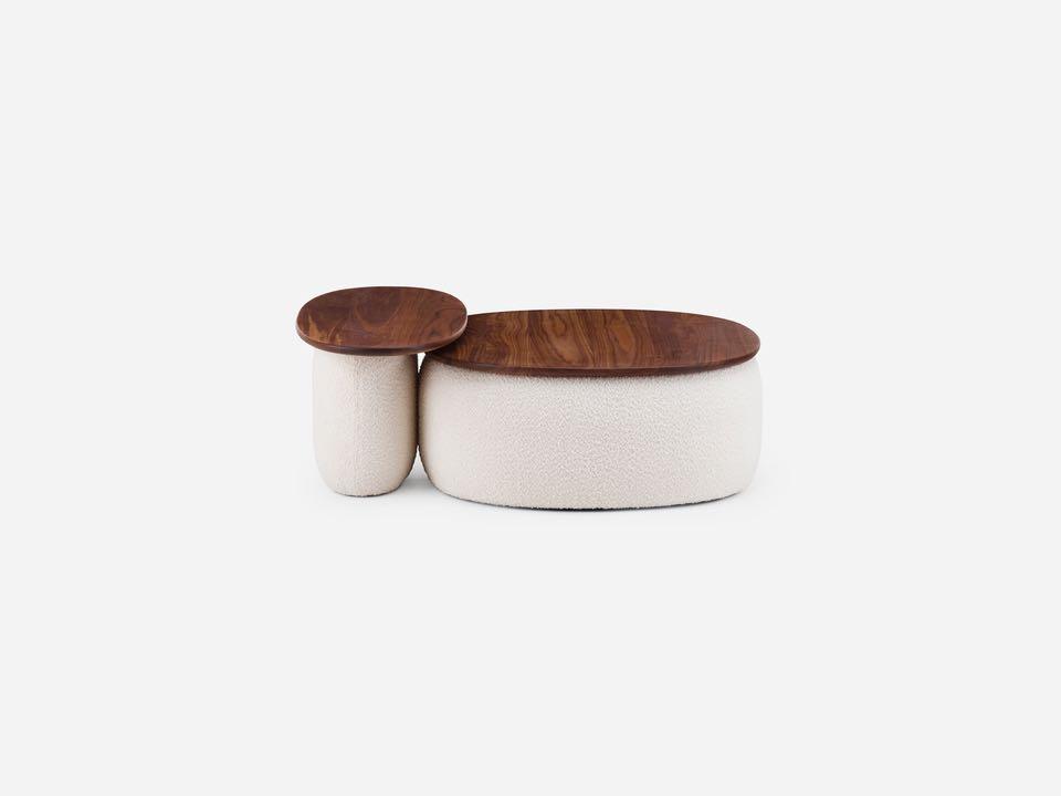
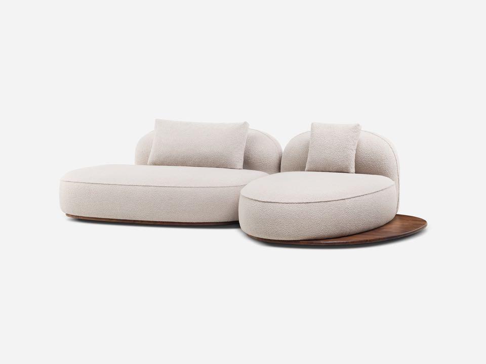
Named after the awe-inspiring Portuguese archipelago in the Atlantic Ocean, Azores is a new modular collection of sofas and small tables with soft designed by Luca Nichetto for De La Espada. The elements of the Azores are conceived as islands, designed to stand alone or in combination; when styled together, they create flexible compositions to suit unique spaces.
www.delaespada.com
Fine materials
The Molteni Group inaugurates its first Molteni&C Flagship Store in Finland, demonstrating the group’s continual expansion on the contemporary design scene. Covering more than 500 m² over two levels, the store is located in the southernmost district of the centre of Helsinki - Ullanlinna, a residential area known for its splendid Art Nouveau properties, numerous parks and seafront promenades. The Flagship Store offers a spectacular experience in pure Molteni&C style, showcasing some of the most recent collections and its iconic pieces.
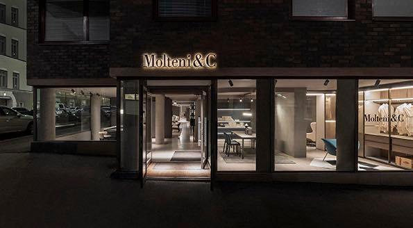
Address: Neitsytpolku 5, 00140 - Helsinki, Finland
www.moltenigroup.com
Curated for you

Designed to meet the needs of future spouses (but not only), Design Italy offers a new wedding registry service which consists of a tailor-made consultancy to personalize your home with 100% Made in Italy design objects. This service helps to compose a perfect wedding list, also offering advice, accurate services and attention to the smallest detail to choose selected design objects, ranging from home decor to lighting, up to furnishing accessories.
www.designitaly.com
#LATESTNEWS
36 | G&G _ Magazine
“Feeling of home”
Set within a restored and expanded neo-renaissance building and designed by Matteo Thun & Partners, The Julius Prague has opened the doors of its first location in the city. The hotel reflects a new style of hospitality, offering guests a range of 168 individual residences, many complete with living rooms and separate bedroom spaces, and featuring an plan kitchen. To guarantee an authentic Czech experience, Matteo Thun & Partners carefully selected a colour palette inspired by the rich art heritage of the Czech Mucha and F. Kupka.
Prague, Czech Republic
www.thejulius.eu
New chapter

Mater, the green-tech design brand, introduces the Conscious chair in three new colourways following its recent relaunch using Matek®, Mater’s cuttingedge technology and patented circular material. The Conscious chair is an upcycled reimagination of an original 1958 model, also known as the school chair, by renowned Danish designers and architects
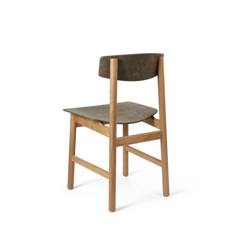
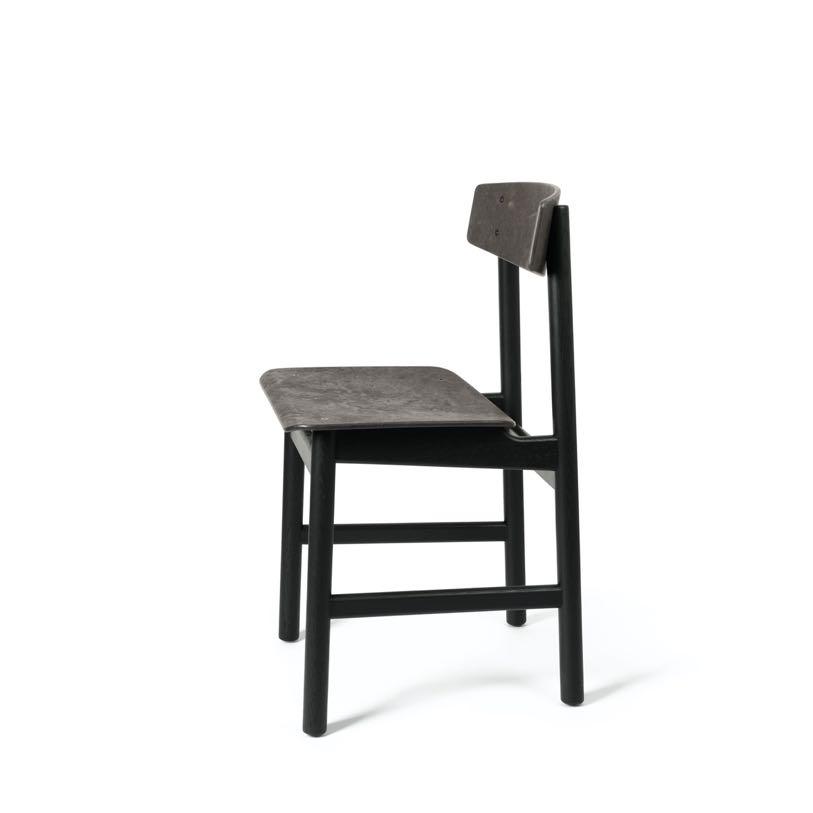
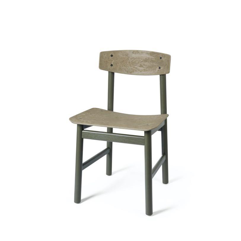
Børge Mogensen and Esben Klint.
www.materdesign.com

Always with the focus and desire to make pieces with mid-century design with a modern touch, Mezzo Collection is now starting its journey in the world of decor launching Mezzo Decor. The brand breaks patterns and trends and presents us with pieces out of the ordinary, with colors and textures so common in the 50's and 60’s.
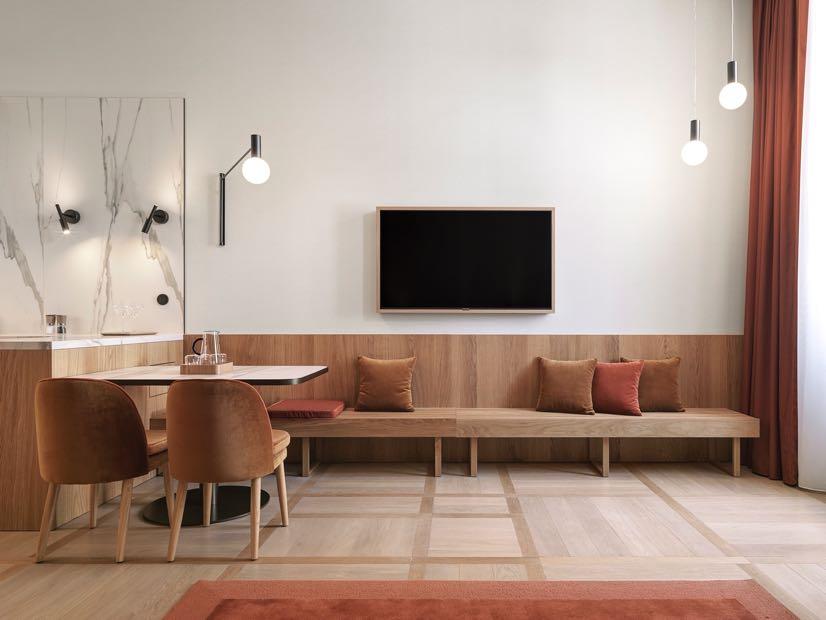
www.mezzocollection.com

#LATESTNEWS
38 | G&G _ Magazine


Follow us The
future in motion.
Read & Support
we want to inspire people to create and not be silent, and above all to show our closeness to the Ukrainian people.

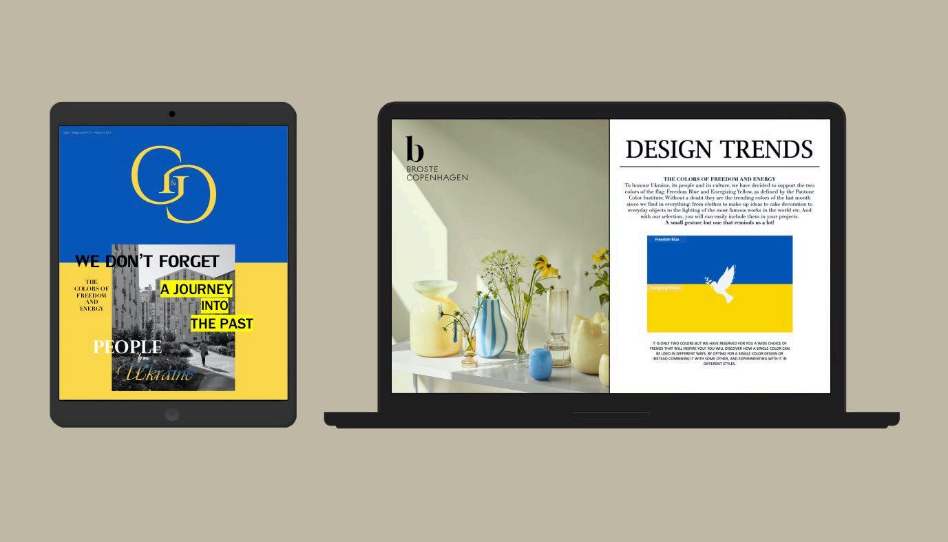
DISCOVER
PEOPLE
UKRAINE
EDITION
NOW “
FROM
”



A DREAM COME TRUE
 Photography by Fran Parente
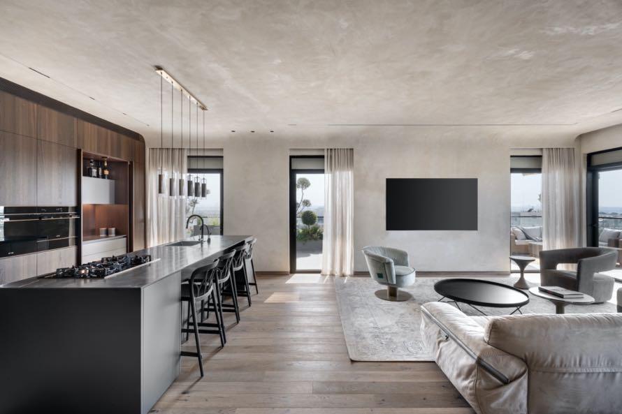
Leandro Garcia designed the interiors of his 108 m² apartment together with his architect wife in Curitiba, Brazil.
The apartment originally belonged to the parents of Leandro's wife where they lived for about 10 years and
then kept it rented for another 30 years. The younger daughter always asked her parents no to sell the apartment, because she wanted to move there one day, a wish recently fulfilled when she, an architect and designer, decided to remodel the apartment with her partner Leandro (also architect and designer). The couple was
won by the surroundings, which encourage stimulating walks through the central part of the city that lives in constant change. Walking a few blocks, they arrive at their favorite cafes and restaurants and in their studio, where they work together. From the apartment the view is expansive, a rare characteristic in the city’s centers, and they were both captivated by the natural light, the sun and wind streaming in through the windows.

The place required the replacement of all the electrical and plumbing installation, besides a radical change in the plan. Three bedrooms became two, the utility area was reduced, and the service bedroom was eliminated, all this so the living and dining room could become larger, brighter and integrated to the kitchen. The pre-existing window frames and the original Imbuia parquet floor were kept, which was revived after its restoration.
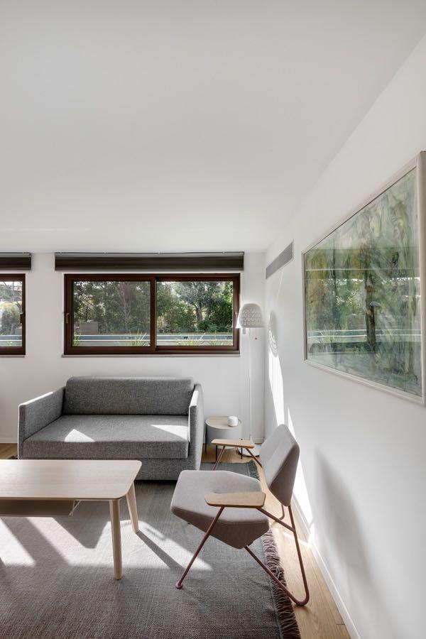
In the living room, the furniture - not only the armchairs, but also the carpets, had to be soft to sit on the ground - was chosen, thrifted and positioned for conversations and readings. Over the neutral parquet base and the white walls and doors, points of color were applied to the most important furniture pieces, such as the light blue sofa and the caramel armchair and ottoman by Percival Lafer, Flavio de Carvalho's brown armchair and the green chair by Geraldo de Barros. Among several other important pieced are the jacaranda wood rack by Celina Zilberberg, the Spindel vase by Willy Guhl, the auditorium jacaranda wood sitting designed by Sergio Rodrigues for the SESC SP, the Girafa stool by Lina Bo Bardi, Marcelo Suzuki and Marcelo Ferraz, the Mocho stool by Sergio Rodrigues, the Luminator floor lamp by Pietro Chiesa for FontanaArte and the Varetas coat stand and the Folhas buffet table by Leandro Garcia.
“This apartment was, during the 1980s, the scenario for great memories for a newly married couple. 30 years later, their daughter, who is also an architect and designer and became my wife, decided with me to remodel the original 1970s apartment, a beginning of another history, full of modern and contemporary design.”


The residents and authors of the project wanted the result to be different what they had done before for studio clients,
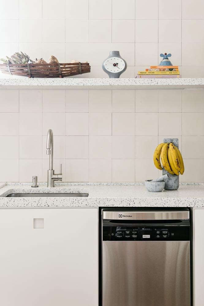
with the intention to create in their home a place to pause and retreat. For this reason, they experimented with materials they had never used before, such as terrazzo and hydraulic tile, and the cabinetry was restricted to the closets and kitchen and bathroom cabinets.


It is around the large 4,5 m long solid wood table designed by the architects and custom-made that everything happens: the
couple's daily conviviality, who, also in the company of friends and family, eat their meals, cook, write, draw, and paint. The dinner table and the kitchen countertop are united in a single element and are subtly distinguished by the industrial vintage lamps rhythm and by the white object collection (Nicole Toldi, Heloísa Galvão among other vases) that interrupts the surface length.


52 | G&G _ Magazine
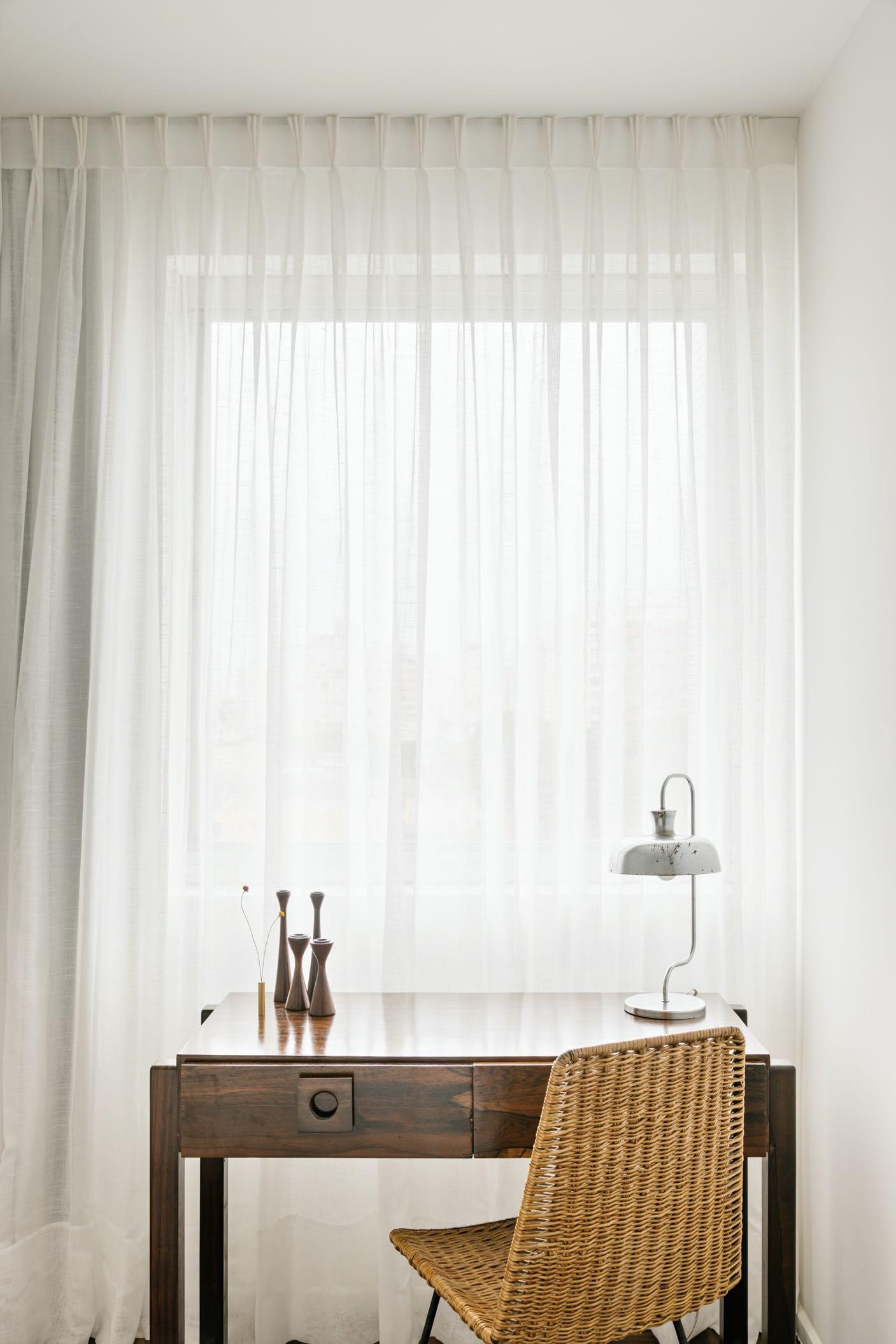
The master bedroom has a simple yet elegant style: a semi-transparent white curtain has been placed along the entire window wall, thus enlarging the space and making it very bright. As in the rest of the house, the walls are white, and the geometric pattern of the parquet stands out.

In the guest bathroom, a wall was removed to make room for a spacious shower; it is completely white - from the small square white tiles to the furniture and bathroom fixtures. The only highlights are like the wooden frame of the mirror and the rattan accessories.

MODERN NOSTALGIA
An old house in Even Yehuda, Israel
underwent extensive renovation and adjustments to accommodate the growing family, with the assistance of interior designer Adi Aronov.
Photography by Oded Samder

54 | G&G _ Magazine

“Demolishing the house and building a new one would have been the easiest option. The client’s wish to preserve the old house and enjoy its sentimental charm required space manipulation, constructive reinforcements, and thinking outside the box, and the result is wonderful! Nostalgia remains and is an integral part of the house, yet the outcome is modern and contemporary, suitable for the current household’s needs.”
Adi Aronov
This old house is considered a nostalgic piece of history by its owners, serving as a reminder of how their journey began. They welcomed three children into the family over the years, now 16, 18, and 20 years old. At the beginning of their journey, the young family
relocated abroad due to the father's job. They returned to Israel a few years ago and started searching for the home of their dreams. After an extensive search for the perfect property, they realized that the same old house where the couple lived at the beginning of their life together. was what they were looking for all along.
The owners' initial request was to leave the original main façade intact, allowing the essence of the old property to still shine through while transforming the rest of the property. And so, it was done: the original façade was maintained as a daily reminder for the couple of where it all began. The goal, according to Aronov, was not to "escape" from the character of the original house, but to embrace it in a modern way. From an old and undefined house, this property transformed into a modern, cleanlined, and luxurious home that opens to a lush green landscape.
Within the framework of the new design, about 170 m² were added that blend perfectly with the original facade. The entire property was decorated in a uniform colour, and a new large steel door was fitted, seamlessly integrating with the facade; floating concrete steps lead to it.
To the left of the entrance a new glossy charcoal-gray kitchen was designed with a range of concealed electrical appliances. The kitchen island was made of imported Douglas fir wood, chosen as a memento from the family’s years abroad.

56 | G&G _ Magazine

The kitchen overlooks the clean-lined dining corner, which remained the same per the couple’s request unlike all other purchased furniture. The area was also fitted with a bar with designated space for wine bottles, glasses, etc., and the teak wood ceiling creates seamless continuity with the outdoor pergola. It was also decided to leave a concrete pillar from the original structure standing in its original place, between the new living room and the dining area, serving as a nostalgic column that marks the spot where the old structure ended, and the new construction began. A white wall that seems freestanding, with a floating ceiling, was designed to add natural light and display art pieces in the living room. The chosen artwork is by an artist named DEDE, an internationally acclaimed Israeli artist, and it was sold under the condition that twice a year it is taken abroad to be displayed in various exhibitions. The creation is made of small details that are interconnected like fabric threads, creating a dominant artwork that was strategically positioned in the house to enjoy optimal daylight during the day.


58 | G&G _ Magazine

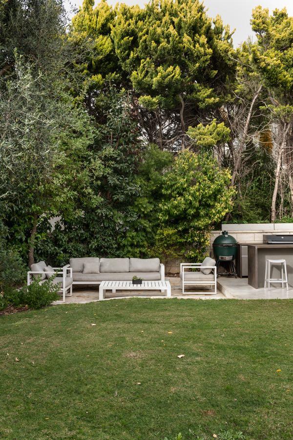
Adjacent to the living room and dining area, we find the family corner where a bold red sofa stands out among the neutral accents. A wall-mounted television was positioned against the black cork dining room wall, concealing the air conditioning system behind it. A thin glass wall offers a view of lush greenery from the beautiful rear garden. The outdoor space underwent a significant facelift, thanks to landscape designer Shai Yaffe, who worked in collaboration with Aronov. A large 40 sqm swimming pool was added, significantly upgrading the area, along with a fully equipped outdoor kitchen, a seating area for gatherings, a gazebo, and walking paths in the expanded garden. Large windows adorn the house and blur the boundaries between the interior and the exterior.


60 | G&G _ Magazine


62 | G&G _ Magazine
To complement the new modern design language, the new furniture was purchased for all the rooms. The design is clean and modern, with oak parquet flooring. The children's rooms were extended as well as the parents' suite; additionally, a handy utility room was added.
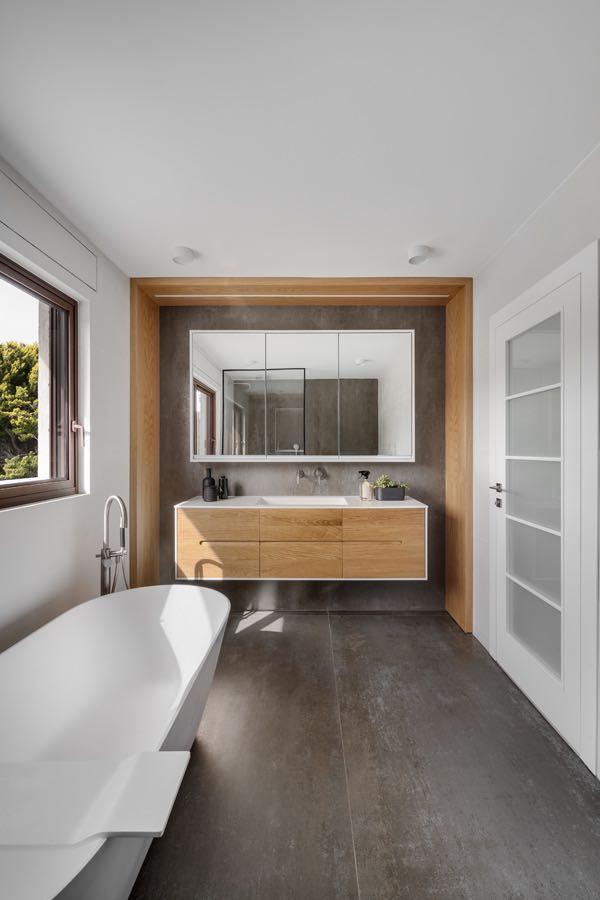
The children's area is located half a floor up while the master suite is located another half floor up. The latter includes a bedroom, closets with book storage, a sizeable balcony, and a luxurious freestanding bathtub in the en-suite bathroom.

“The clients are very cosmopolitan and are very knowledgeable about architecture and design. Thus, the entire process was accompanied by interesting conversations regarding the choice of materials, designs, and general decisions that needed to be made during the process.”
The innovative and progressive architecture bureau Open Architecture Design designed a large family apartment in Riga creating a highly personalised and comfortable home.

FULL OF
Photography by Alvis Rozenbergs
64 | G&G _ Magazine
LIFE

“The clients - a family of five - allow themselves to enjoy life to the fullest, and their joy and passion both fuelled and inspired us too.”
In a late 19th century eclecticism style building, one part of the apartment had acquired new layers in the Soviet years and “wild” 1990s after Latvia regained its independence. Fortunately, the other part still maintained many of its original features, such as cornices and coved ceilings. This contrast is one the designers decided to keep in place, play with and enhance in this 250 m² apartment. The tactful balance between the old and new forms the backbone of the design as we preserved what was left and injected brave new elements, upholding the distinction between the two parts of the apartment. Another guiding motive was the clients’ collection of art by Latvian painter Kristīne


66 | G&G _ Magazine
Luīze Avotiņa, whose expressive style resonates with their sense of taste and attitude to life. Her works markedly influenced the apartment’s colour palette and fabric selection.
The original floor was long lost, so the design team created a Chevron parquet rooted in the authentic floors of historical homes and castles where each plank is different after years of being touched by the sun and the pitter patter of feet.

In the living room the furniture is kept to a minimum to keep the focus on the authentic value of the space. The TV stand, for example, is a one-of-a-kind design to serve the particular function.
Adjacent, a children’s play area has been created with a custom design that incorporates climbing infrastructure, soft play areas, reading nooks and sleeping space for friends. In this way, while the children have their own little universe to get lost in, they are also present and involved in the family’s happenings because they are not behind the closed doors of their individual bedrooms.
The play area is beside a small corner of the home, which holds special meaning for the mother of the family. Her hobby is caring for plants, particularly Ficus trees, and the orangery a space doused in
From the living room you can see the dining area where the level of detail shines through every solution from the gold leaf on the walls to the bespoke cabinetry. The sideboard hints at historical aristocracy via the colour palette, materiality, and sheen. The room called for a table of over three metres in length, but the designers found that most ready-made pieces didn’t exceed 2,80 metres. Instead of opting for compromise, they produced a table, pairing wood and stone, since no single piece of marble was large enough to shape a monolith surface.
Another example of the quality of craftsmanship in Latvia is the hallway closet, which leads into the kitchen whose units are standalone, so as not to damage the room’s


68 | G&G _ Magazine


From the kitchen, a striking green corridor connects the two distinct parts of the apartment leading from the shared living space into each family member’s personal universe. The corridor lighting is the work of artisan Edgars Spridzāns.

On the left are the three children's rooms, while on the right are the master bedroom with ensuite and wardrobe, and children's bathroom. While at the end of the corridor is a reading nook and resting area for the family’s nanny. The master bedroom is deliberately darker, also because it faces an inner courtyard. The bed is also a bespoke design; its deep red hues go perfectly with blackout curtains in shades of blue and turquoise.


While similar in some ways, the children’s rooms reflect each son’s interests. Also, their bathroom is best characterised by the degree of personalization, which is seen in the tailor-made furniture and touches like the three sinks: one for each son, depending on their age.


SEASIDE ESCAPE

Located in the Sydney seaside suburb of Palm Beach, YSG Studio has redesigned a multi-level 400 m² holiday house for a young family featuring a kaleidoscopic array of exquisite fabrics, tropical rattan and raffia furnishings and sculptural lighting.
Photography by Prue Ruscoe

Savouring summer all year round with its earthen glow spliced with citrus accents, this tiered house nestled amongst palm trees in Sydney’s Northern Beaches taps into carefree sun dappled
adventures along remote Mexican shores with a twist of the Côte d’Azur’s refinement. The clients, busy Sydney professionals, had acquired the holiday house with the hopes of spending more time there with their young family, balancing working from home and embarking on extended breaks over vacation periods. Sequenced over two levels, the residence (built in the early 2000’s) required substantial revitalisation given its weathered features and clichéd seaside themes as furnishings were packaged with the sale. Nautical shades and seaside tropes (decorative surfboards, model yachts, an all-white kitchen, lounge room and bedrooms, plus shell collections scattered everywhere) deterred their visits. The design team has replaced all the windows and doors to lighten their mass, sanding back the worn floorboards to reveal warmer timber accents. The deeper tones of the French washed walls and ceilings scattered like a patchwork pattern throughout both levels ground the expanses of white with their saturated sheaths.
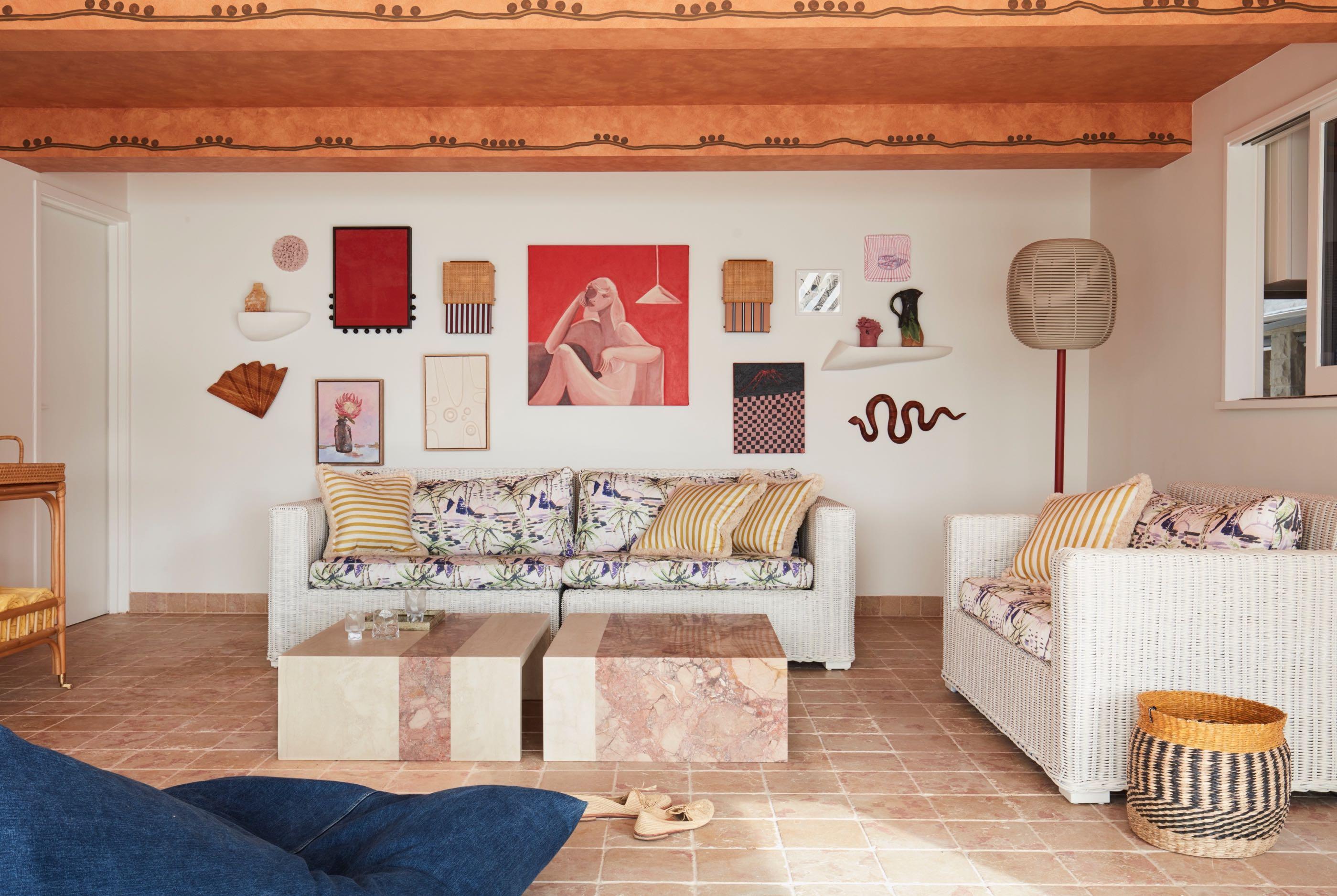
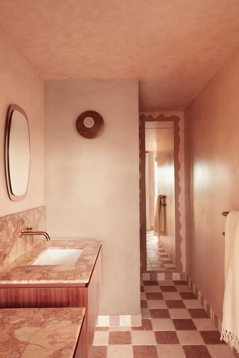
In addition, within the sunroom, v-groove walls were removed, as was a mirrored wall that overheated the space in summer. Cooling rose-tinted marble pavers now line its floors, creeping up to its skirting (as do all the tiles in the wet rooms). A wall enriched with different artworks is a succession of swirls - hand painted by Creative Finishes to soften the beams turning them into beam-like beams. Among the newly sourced pieces hung, we find a checkered painting floating amidst
geometric planes and rippling contours, including an amoebic custom display shelf supporting the pottery. While two custom designed coffee tables by YSG Studio made by Med Marble echo the pink marble of the floor.

76 | G&G _ Magazine
“Inspired by rustic Ibiza beach clubs and Cancun’s rendered coastal resorts, the clients wanted to create a palpably playful mood that introduced a perennial approach to entertaining and above all else invited soft

“Over two days, we poured over Think Positive’s archives (Australia’s leading textile design and digital printing company) with one of the clients, selecting fabrics to adorn cushions through to headboards and blinds using an image of the painting to guide selections.”
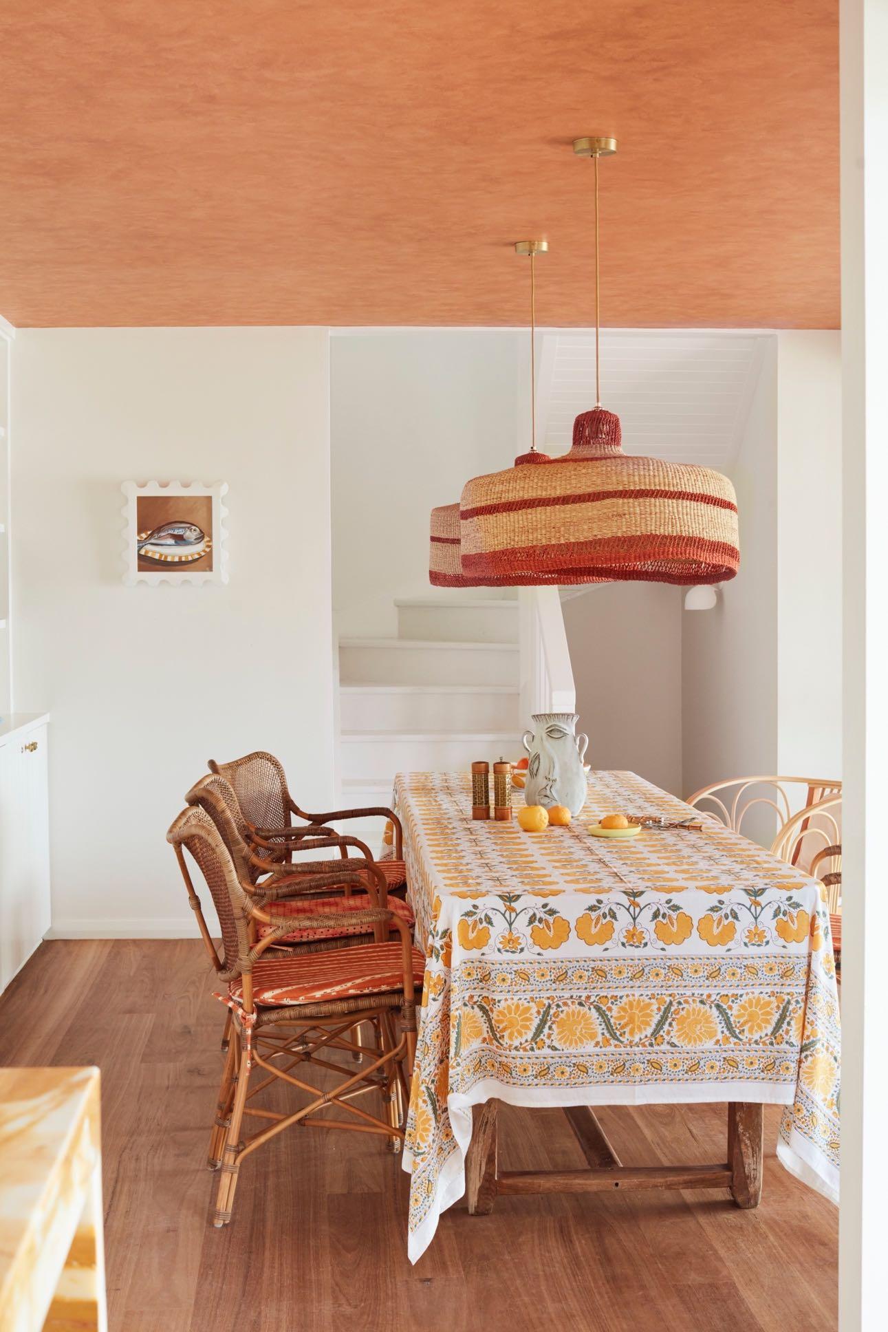
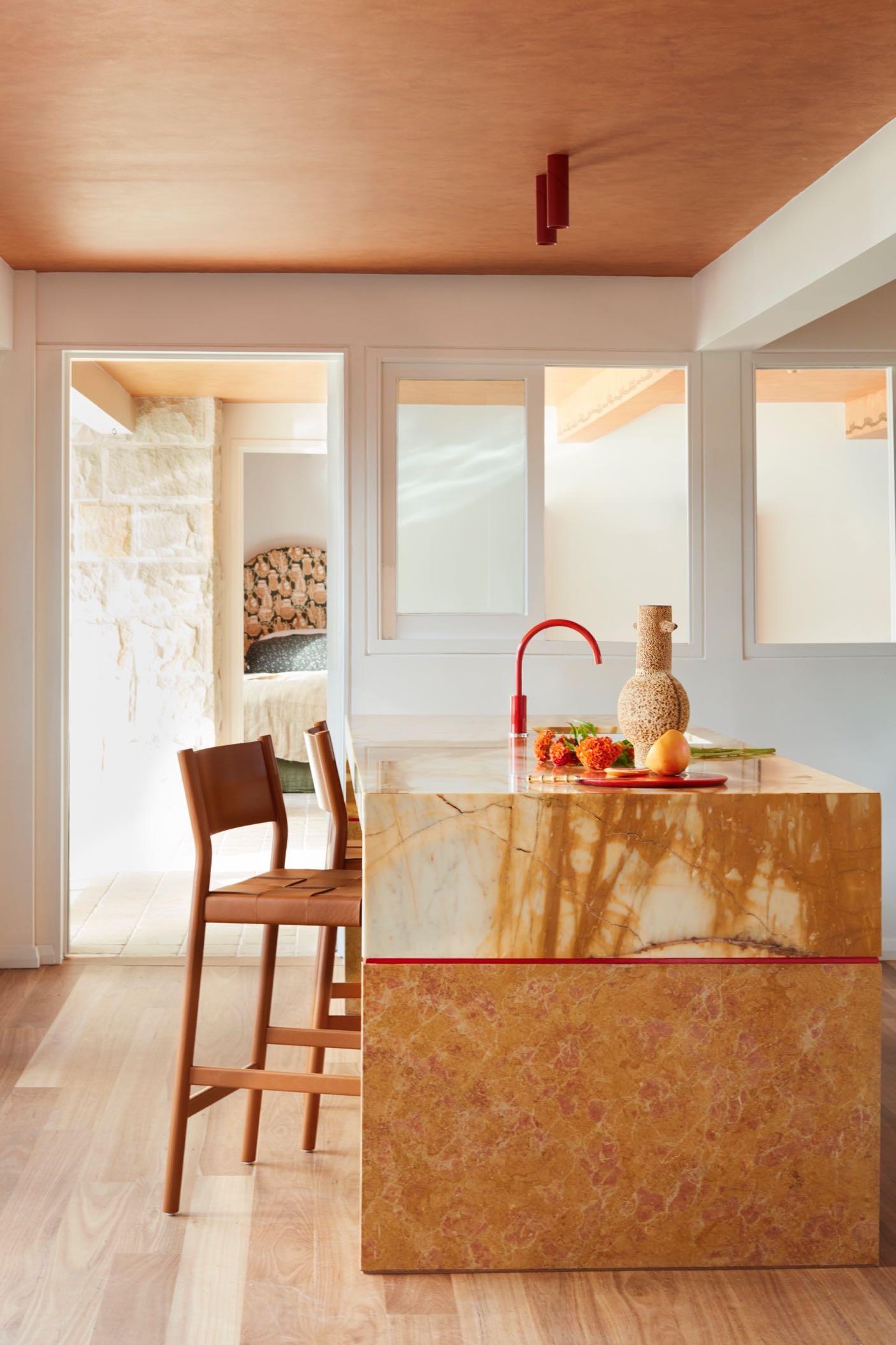
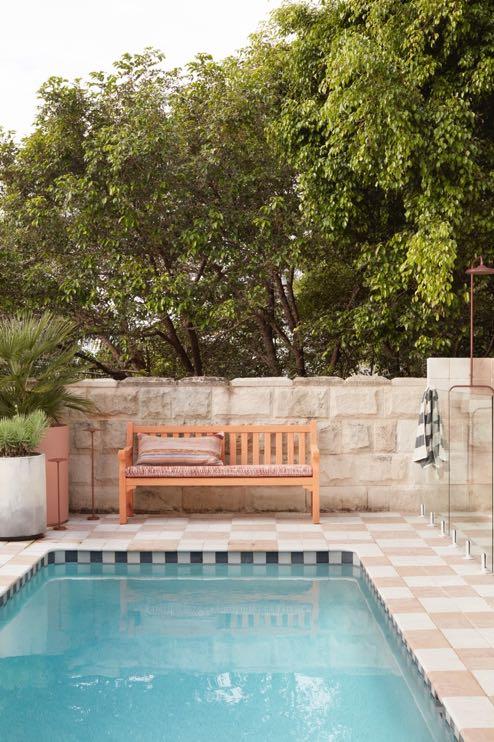
In the living room we find the painting that inspired much of the home’s tonal scheme and spirit given many of its colours and motifs are integrated throughout. They include patterns and iconography range from rodeo cowboys to clusters of clay urns and rippled teal zebra stripes, plus prints of tropical fruit trays including pineapples on lounge cushions bringing to life the raw canvas of the upholstery. In addition, silk kimono pieces used for cushions tether the blue porcelain lamp bases and oriental plates dotting the wall above together. Echoed in the underfoot checkerboard patterns, a naively painted rust datum extents from the top of the painting’s frame to revive the neutral walls within the room, plus the border of the raised step leading to the dining area. Two raffia pendants hover above the dining table like sombrero hats echoing the style of the painting. In the background we find a custom-made bookcase which houses a rich collection of art objects, many of which are in ceramic. Next to it, we find the kitchen that was fully gutted to introduce new joinery and a stone island bench that recalls the ombré shades of a freshly poured tequila sunrise. The entire living area is connected to the outside where the heavy paving and greyed timber around the pool have been removed to guarantee a uniform look with the interior; also, the pool’s dark mosaic tiles have been replaced with lighter ones. A new BBQ area now lines a re-clad boundary wall, whilst checkered tumbled marble cobblestones surround the pool and float in gridded formation to support the outdoor shower, adding a striking
Mexican foundation that continues in the two master ensuites. Revitalising existing elements, the fence’s reflective chrome posts were powder-coated to eliminate glaring reflections and the aged timber furniture was re-booted with amiable ginger shades and adorned with upholstered cushions and bolsters. Plump rounded armchairs punctuate the orthogonal geometries, as do zesty side tables, refreshing the scene with their unorthodox shapes. New black and white striped awnings flutter above with an air of nostalgia.

78 | G&G _ Magazine


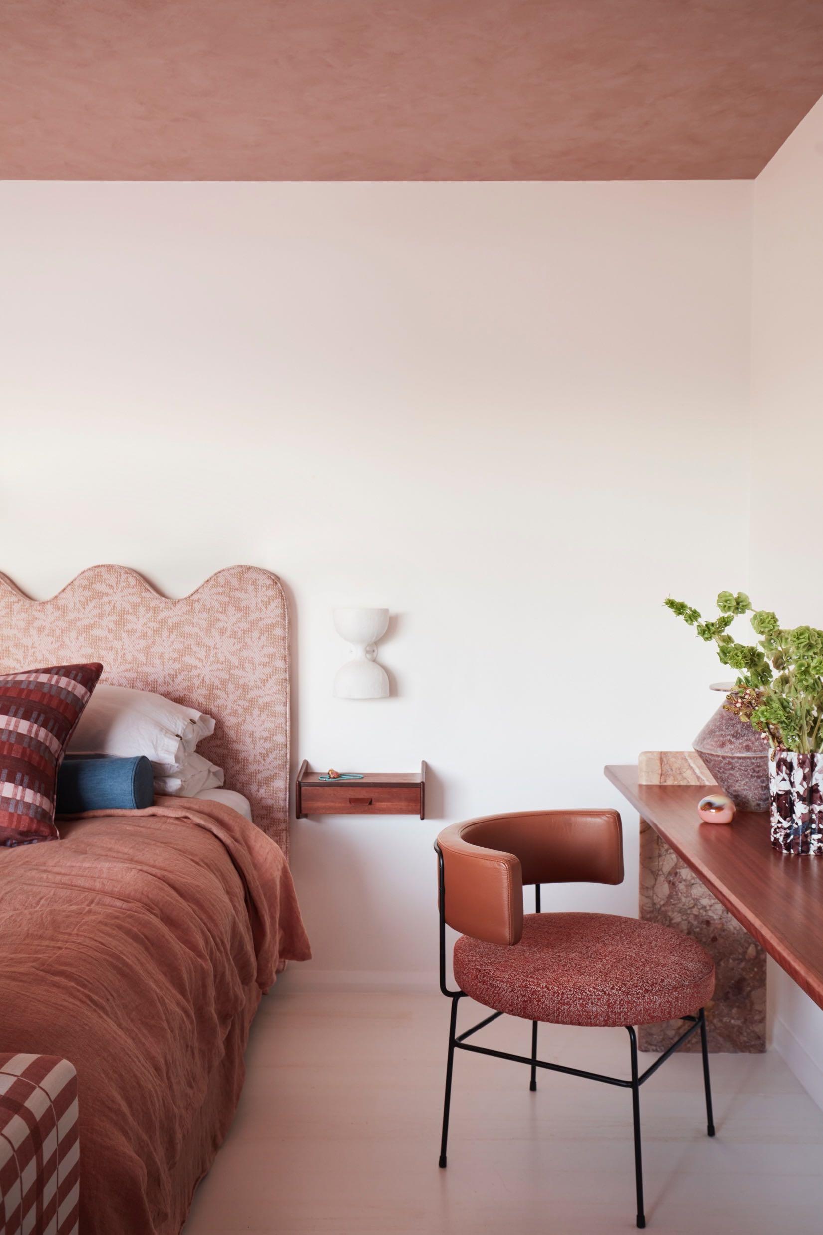
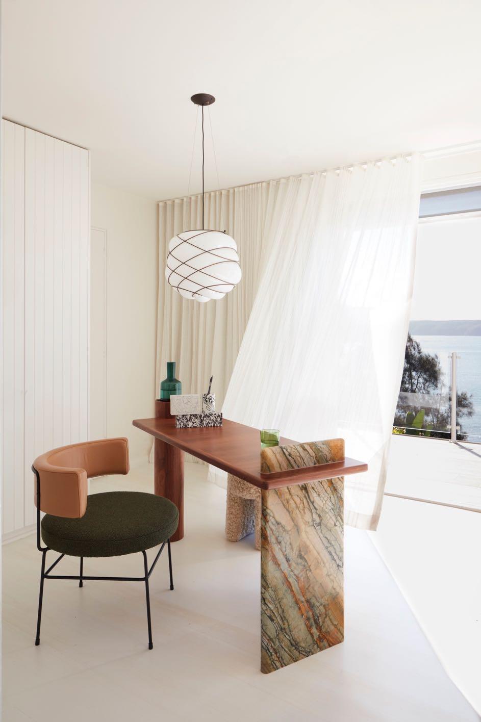
Upstairs, where we find the sleeping area, the floor has been covered with cream colored wood to have a light visual effect. Each room enjoys the impressive views of the Pittwater ocean inlet and verdant shores. Flipping customary convention, one of the two guest rooms has been transformed into an additional master suite, in this way furnishing ‘his’ and ‘her’ spaces with complimentary ensuites. Enabling both to simultaneously work privately from their rooms the custom
marble and timber desks were integrated. The 'her' master suite is characterised by a warm brown color with some blue accents in the textiles. The headboard of the bed, designed by YSG Studio, is upholstered in a palm tree motif while the light wall behind it enhances its shape with curves. The wooden coffee table by Livio Lucca Tobler combines another elements in the wood such as the desktop and the suspended drawers adjacent to the bed that act as bedside tables. The brusque parallel lines


80 | G&G _ Magazine
flow from a Matisse-like nude painting, extending towards the ceiling. Her curves are loosely outlined in the adjoining ensuite’s mirror frame, easily viewed thanks to partial wall removal to extend its opening and expose the new elongated stone-framed window that draws the lush surrounds within. Honed Tiberio marble was also used in the bathroom (the same used for the desktop) for the vanities and splashback while the furniture is in wood. To continue with the geometric motifs (present in the bedroom textiles), the bathroom floor is covered with tumbled checkered marble tiles ‘Portagallo marble’ and ‘Rosso Verona’ from Aeria County Floors.


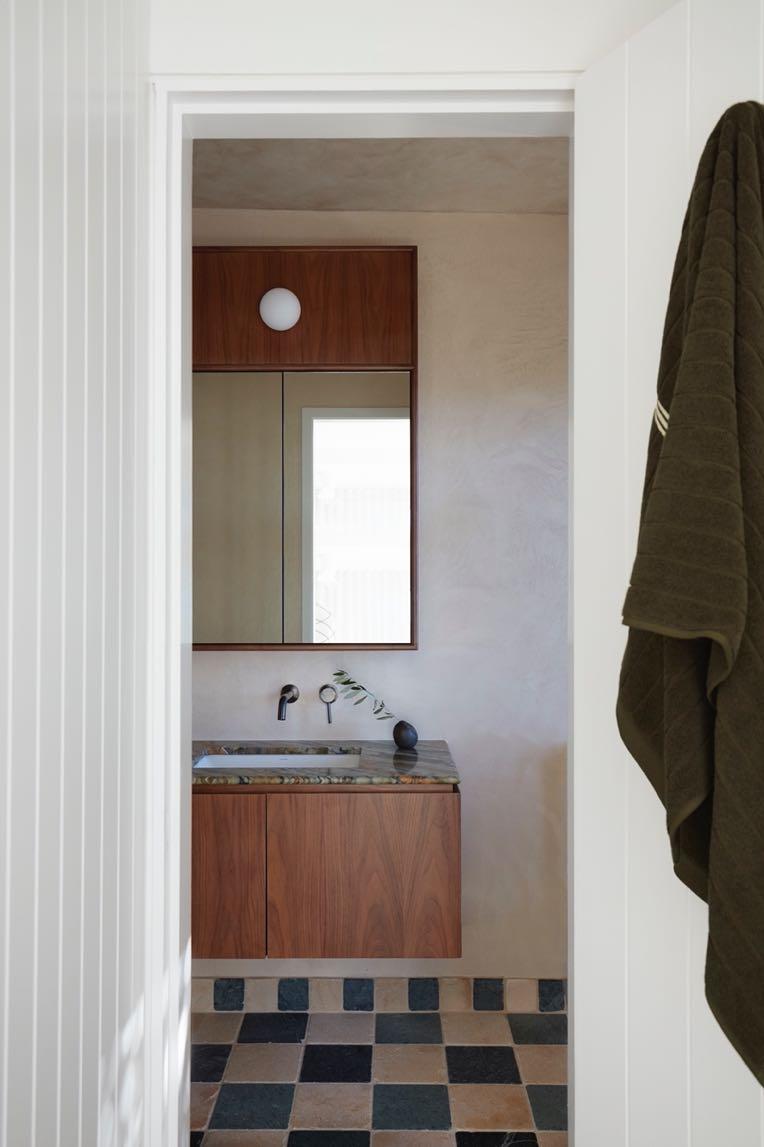
The 'him' master suite follows the same design: geometric and floral prints, the use of Toledo marble, warm wood but with small differences in the choice of productsa more masculine look was obtained. For example, white walls bring out the colors more and create a slight contrast, as does the addition of black. In marble we find veins in green and, in the bathroom, the tiled floor (always checkered) in white and blue tones gives a decidedly colder effect. Both here and the children’s bunk room hand-painted mural details were designed by Creative Finishes to add fringe movements to the ambiance.


82 | G&G _ Magazine


84 | G&G _ Magazine
PERIOD PIECE
In collaboration with The Wiseman Group, Richard Beard Architects has completely renovated a Victorian era residence on the Buchanan Street in San Francisco.
Photography by Matthew Millman
Over several years of scrupulous planning and construction the house underwent a complete restructuring and received a
brand new interior layout to accommodate a large family. The exteriors were repaired and preserved according to the Secretary of Interior Standards for the treatment for historic properties, giving a fresh and welcome look to this prominent corner of the neighborhood.

The first step in the renovation involving lifting the home to create a multi-car underground garage and basement, while also allowing for a more spacious interior layout. The lower portion of the exterior has been painted a dark charcoal color, contrasting with the clean, bright white of everything above. This two-color palette creates a striking, modern, and timeless aesthetic.
The jet-black front door harmonizes with the base color and serves as a transition
between the classic exterior and the contemporary interiors within. The interior designer for the project, Paul Wiseman, emphasizes that they intentionally avoided incorporating Victorian details into the interior design, aiming for a deliberate contrast with the traditional exterior. Indeed, as you enter the house, the front door reveals the modern interior, with the mahogany wood ebonized to maintain a cohesive flow that seamlessly blends the interior and exterior spaces.
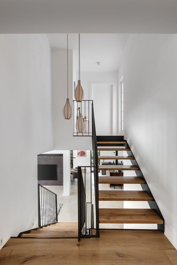
The four stories of the house are furnished in a minimalist style and connected by a curvilinear staircase with a handrail crafted by Chris French Metal. The first floor is the heart of the house, it represents the living area. The first floor is the heart of the house, it represents the living area. In the living room, the dark wood furniture is softened by a couple of sofas in soft shades of beige. An adjacent fireplace completes the modern look of the space.
“DARKER COLOR ON THE LOWER FLOOR GIVES THE HOUSE A SENSE OF GROUNDING, WHILE THE WHITE COLOR ENHANCES THE AIRY LIVING SPACES ON THE UPPER FLOORS.”
PAUL WISEMAN, THE LEAD INTERIOR DESIGNER
86 | G&G _ Magazine

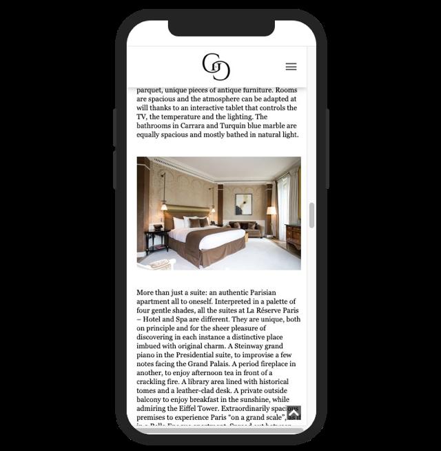
A bespoke roof to floor cupboard has been built in light wood which leads from the sitting room to the kitchen. It houses a bar area and then turns into kitchen furniture; even the island was clad in the same wood. The worktop is white with light brown

veining, built-in appliances complete the design. The dining area has been placed next to it: here a long and slender dining table that seats twelve people, a majestic curved bench and comfortable chairs echo the graceful curves of the staircase.

88 | G&G _ Magazine

“UNLIKE MANY VICTORIAN HOUSES, WHICH CAN BE DARK INSIDE, THE CORNER LOCATION OF THE HOUSE ALLOWED FOR MORE WINDOWS ALONG THREE SIDES OF THE HOUSE. THE ABUNDANCE OF NATURAL LIGHT PROMPTED US TO CONSIDER LIGHT, AIRY AND CONTEMPORARY INTERIOR ARCHITECTURE.” RICHARD BEARD, THE LEAD ARCHITECT

90 | G&G _ Magazine
Also, the design of the upper floors adopts a more contemporary and neutral color scheme that accentuates the spatial qualities of the house, and better suiting the needs and lifestyle of the active family.

Large skylights on the roof channel light into the home to create a more expansive atmosphere. Here, at the pinnacle of the staircase lies the fourth floor, where the primary suite is nestled. The primary bath has been placed in the turret, with modern light fixtures creating a dramatic interplay between the new and old elements of the residence.

There is also a minimalist office area marked by an abundance of natural light and exclusively light colours.


“THE STAIR WAS AN OPPORTUNITY TO CREATE A MORE OPEN AND CONTINUOUS FLOW OF SPACE BETWEEN FLOORS, A SPATIAL QUALITY UNCOMMON IN HISTORIC HOUSES.”
92 | G&G _ Magazine


FUNCTIONAL
Irantzu Hurtado Inteorismo projected a 290 m² duplex from the 70's in Madrid transforming it into a fresh and comfortable space.
 Photography by Biderbost Photo
beautifully

96 | G&G _ Magazine
Housing with two floors and three entrance doors (two at the bottom and one on the top floor) is located in an urbanization in the Arturo Soria area of Madrid, one of
the greenest areas of the city surrounded by large parks. Tranquility and security are two values that describe this neighborhood, well-connected and with leisure areas. The property is a house from the 70's in which all the walls were covered with hardwood with different paneling and with natural raffias in the rest of the walls of each of the rooms.
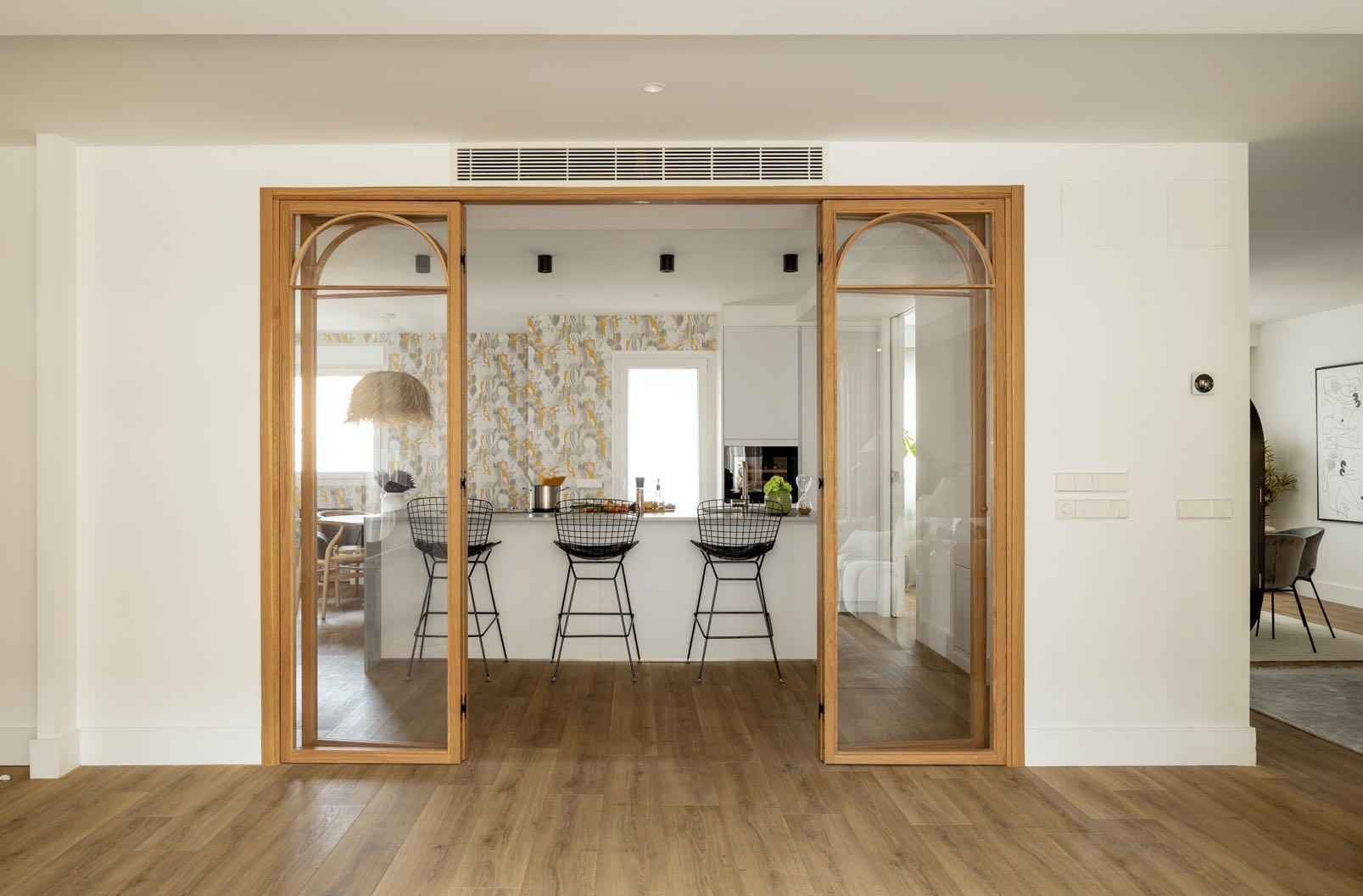
The first floor hosts the day area. Upon entering the house, we can see a large living room in which three areas are marked: living, fireplace and dining room. Between the dining area and the living one, the designers projected the kitchen having access from the previous ones, being the axis that communicates all the rooms on this floor. The kitchen consists of a large island on which all the work area is concentrated in it, we can distinguish two areas, the work area and the dining area in which reigns a circular table and a countertop for breakfast, all wrapped with James Malone wallpaper and a large raffia lamp. From the kitchen there is also the access to a small laundry room which is equipped with everything necessary for the care of clothes.
“Our clients wanted something fresh, dynamic, comfortable, functional and modern, that is to say, a house to live in and enjoy with their two children of 8 and 10 years old.”

From the kitchen there is also access to the dining area of the living room through a sliding door which in turn leads to the fireplace area and living area again. A large oak folding door composed of 6 leaves communicates with the living area


98 | G&G _ Magazine
and terrace, being able to play with its opening at times of increased traffic. Originally, the wood staircase was in the middle of the house, and being narrow, it was gloomy, so it was essential to move it. So, behind the living area we find the new cantilevered staircase without a partition with open pore white lacquered wooden tread. Transparent glass railing that joins at the second level with a fixed glass floor to ceiling makes the sound does not rise.

Upstairs we find another large living area, this time for children, equipped with a large sofa with chaise longue, a bookcase and a large screen with projector. This is where we have the third entrance door. This large room leads to the bedrooms and another bathroom.

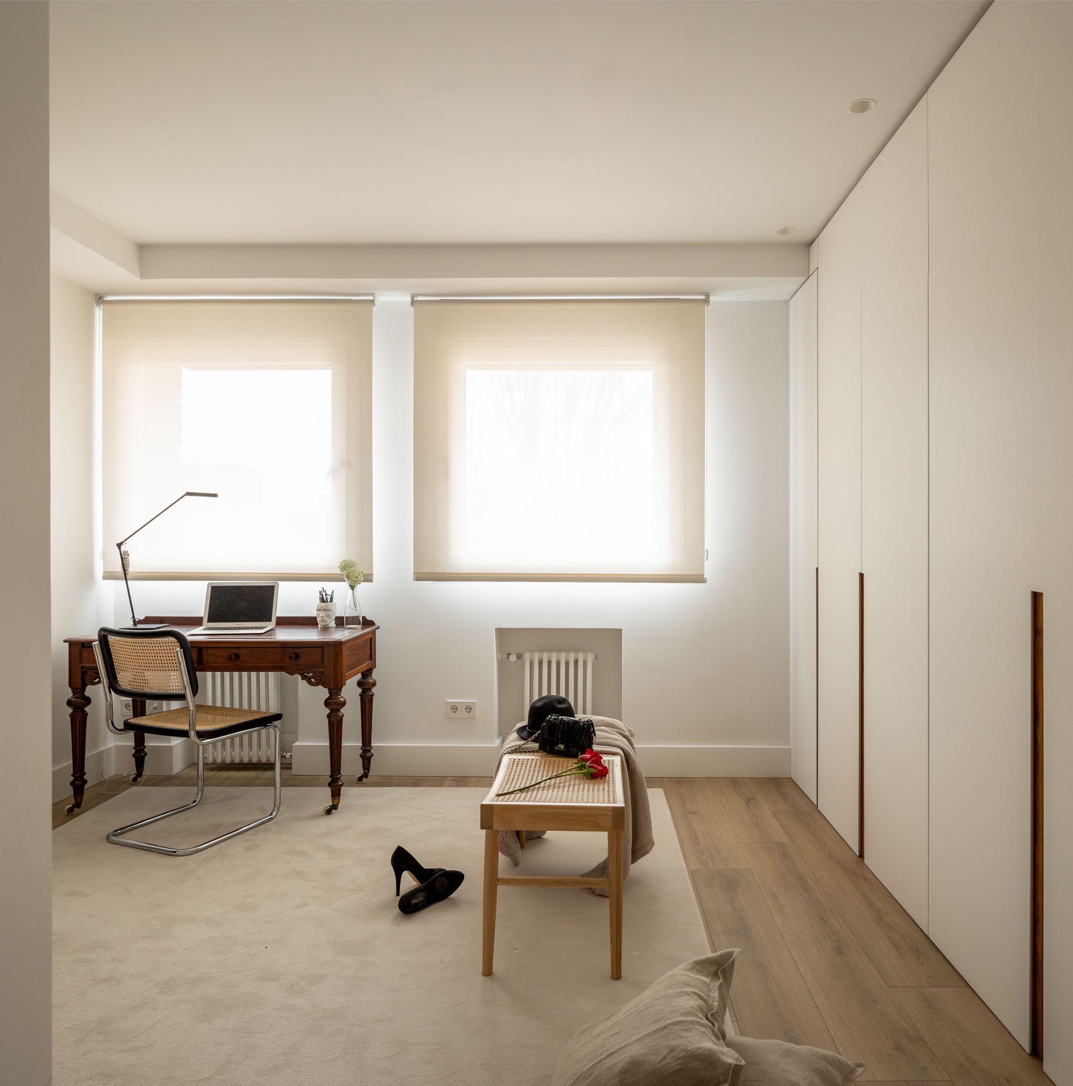
The first door we find at the top of the stairs is the one that gives access to the master bedroom suite. Equipped with a dressing area and work area bathed in neutral tones, the bathroom area with porcelain coating imitation stone. The bedroom area is accessed through two sliding doors from the work area inside the dressing room. This room breaks with the previous, wrapped in a great colorful with a beautiful Thibaut paper.

100 | G&G _ Magazine


102 | G&G _ Magazine
“Again, we dared with color and a wonderful Cole and Son wallpaper.”
On the other side of the upper floor the two children's' rooms are placed. Both are in neutral colors with colorful accessories and well flooded with natural light. In
addition, we find a shared bathroom in which each has its own separate sink area. Here, the designers only tiled the shower area and wallpapered the rest.

FOLLOW & LIKE


h / h Z p / k / Z
ALL OFFICIAL SOURCES:
Africa
donatoengineeringsystem.com
America
beainteriorsdesign.com
danielorozcoestudio.com
gabriel-scott.com
leandrogarcia.com.br
luxurylifestyleawards.com
richard-beard.com
rockwellgroup.com
Asia
adiaronov.com
designfairasia.com
designshanghai.com
kgd-a.org
index-saudi.com
lifestyle-expo.jp
Europe
achcollection.com
allthewaystosay.com
altaidea.com.ua
amiciburo.com
aura3d.eu
aytmdesign.com
bross-italy.com
brostecopenhagen.com
bykoket.com
castrolighting.com
circu.net
decorex.com
delaespada.com
delightfull.eu
designitaly.com
domkapa.com
essentialhome.eu
gandgmagazine.eu
gardehvalsoe.dk
gardenglory.com
georgesstore.fr gornceramics.com
hartodesign.fr
hommes.studio
ihinteriorismo.com
jklabarchitects.com
karchitects.com.ua
klimchi.com
kmdesignlab.com
lemondesauvage.com
letsdesign.com.ua livawards.com
llab.design
maison-objet.com
margauxkellercollections.com
materdesign.com
mezzocollection.com
mickaelkoska.com
moltenigroup.com
mydriaz-paris.com
myfriendpaco.com
niroh.de noom-home.com
oad.archi
panoptikumcollections.com
pinik.com.ua popolo.fr
prodan-design.com.ua rugsociety.eu
studio-donna.com.ua studiomodijefsky.nl
tapis-studio.com
the-fairytale.com
thejulius.eu
tognana.com
volverstudios.com
workspaceshow.nl
za-za.com.ua zaditaly.com
zannierhotels.com
zikzakarchitects.com
Oceania ysg.studio
108 | G&G _ Magazine


MORE INSPIRATION FOR YOUR HOME WWW.GANDGMAGAZINE.EU Click to our latest issues now to see even more of trend updates, stylish ideas and exciting projects. G&G Magazine N 36 – January 2023 GG & DIVE INTO ART COLOR Mirrored powerfulVIVA MAGENTA G&G _ Magazine N – h GG & #SPRING2023 SERENE emotions REVIVAL GG G&G Magazine N 38 – May 2023 & THE WORLD OF TOMORROW Creativity electric brights SIMPLE DREAM Unleashing and inBLACK WHITE


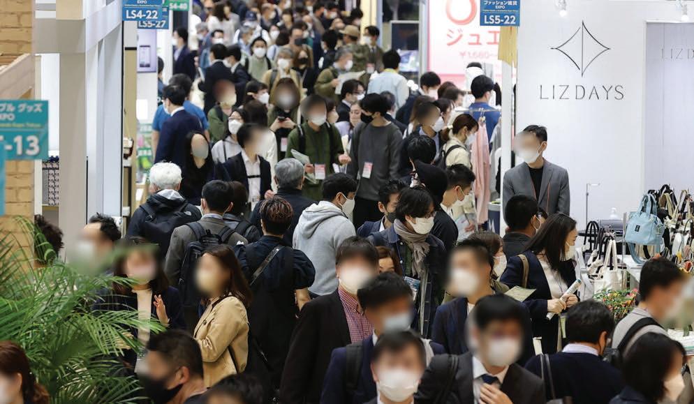
Trade Fair for Gifts, Stationery, Homeware and Fashion SEPTEMBER 27(Wed) - 29 (Fri) JULY 19 (Wed) - 21(Fri) OSAKA SHOW INTEX Osaka TOKYO SHOW Tokyo Big Sight Built by Organised by RX Japan Ltd. https://www.lifestyle-expo.jp/en/ lifestyle-eng.jp@rxglobal.com lifestyle_week.jp lifestyleweekjp


 Hav Maroon Rug by VOLVER
Verto Mirror by AYTM DESIGN
Beloko Baby table by BEA PERNIA
Letter J Lamp by DELIGHTFULL
Ruth Chair by DOMKAPA
Mesa Rose
PANTONE 17-1609 TCX
Candy pink Fabric by KOKET


 dinner service by TOGNANA €106,60
A tavola!


 Photography by Fran Parente
Leandro Garcia designed the interiors of his 108 m² apartment together with his architect wife in Curitiba, Brazil.


