GG G&G _ Magazine N°43 – March 2024
& winning blend BORN OF SERENDIPITY
MIXING MATERIALS LIVING ON
nerobot@prodan-design.com.ua prodan-design.com.ua
Instagram @nelly_prodan
+38099 234 26 27




GG G&G Magazine N –& winning blend BORN OF SERENDIPITY MIXING MATERIALS LIVING ON ON THE COVER The living room of the apartment in São Paulo designed by Studio Guilherme Torres Page 100 44 11 EDITOR’S LETTER TRENDS 17 DESIGN SELECTION SPRING 2024 28 E-SHOP DESIGN PRODUCTS WITH A SIMPLE CLICK INSPIRATION 37 LATEST NEWS FROM DESIGN WORLD INTERIORS 52 BORN OF SERENDIPITY APARTMENT BY STUDIO GAMEIRO / LISBON, PORTUGAL 62 MIXING MATERIALS HOUSE BY VICTORIA MARIA / ZURICH, SWISS 72 LIVING ON APARTMENT BY ALTA IDEA STUDIO / KYIV, UKRAINE 82 REFINING THE AESTHETIC REQUIREMENTS FAMILY VILLA BY ARRCC / CAPE TOWN, SOUTH AFRICA 90 WINNING BLEND HOUSE BY STUDIO GRAM / ADELAIDE, AUSTRALIA 100 HERITAGE HOME APARTMENT BY STUDIO GUILHERME TORRES / SÃO PAULO, BRAZIL 112 ALL OFFICIAL SOURCES 61 CONTENTS 96 20
+39 392 089 8038 www.studio-donna.com.ua/en info.donnafurniture@gmail.com @studio_furniture_donna @donna.furniture.studio
Springtime has arrived as well as new Design Trends! In each edition, we try to predict which of them will be majorly trending in the home interior world throughout the coming season, thus offering you an intriguing list that can satisfy all tastes. This time, many tendencies are already in vogue, but we added a note that takes inspiration from the past (page 17). For example, we were influenced by the romanticism of aged looking floral motifs and mixed them with pastel tones; or we combined retro-inspired graphic patterns with furniture with maximalist silhouettes and so on. In short - it's a respite from the onward march of technology. Furthermore, instead of bright colors (which are usually proposed for spring), we suggest you consider earthy tones. By choosing them carefully and applying a mixand-match approach, you can create a personal and unique home infusing that "new & fresh" touch that you so long for.

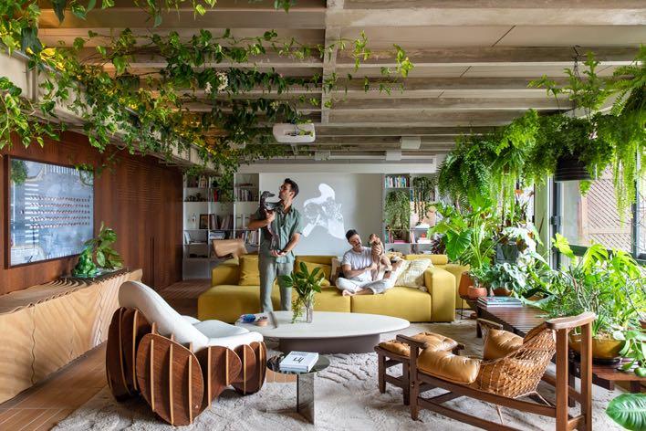
Within these pages you will also find exciting interior projects with the reflection of these trends. These are houses, which rather than being "for display", arouse emotions. Where "unbridled consumerism" does not dominate. The designers prefer to highlight the building’s history and opt for iconic furniture - a statement that timeless design is truly unsurpassed! On page 62, the designer Victoria Maria made the strength and inspiration of the Zurich house’s Brutalist architecture, transforming it into a perfect example of the marriage of tradition and innovation. The similar approach was also applied by Studio Gram in Adelaide where the "old" of a Queen Anne style villa meets the "new" of a modern extension of it (page 90). While on page 100, you can admire how Studio Guilherme Torres gave value to the sculptural furniture in the São Paulo apartment, highlighting them in a fun and creative way, pushing the design boundaries but still meeting the high levels of coziness and comfort.
Finally, I would like to extend my gratitude to the entire Design Community who follows and reads us, and to all our partners and participants who take part in the editions of G&G _ Magazine!
Enjoy the issue!



!"#$%&'(%()*&#" I’m always interested in your opinion, send me any feedback or suggestions at zhanna@gandgmagazine.eu

G ANDG MAGAZINE.EU
INTERIORS
HOTELS
STORES
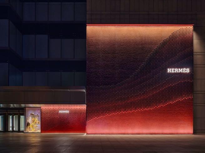
Hermès Tianjin
RDAI designed the first store of Hermès in the lively coastal metropolis of Tianjin, the 28° Hermès store in mainland China, emphasising the Parisian house’s commitment and cherished history with the region.



ENQUIRIES info@gandgmagazine.eu !"##$!% &'(#)*+)%")"*, NEWSLETTER !"#%-!%
Urban Forest
Estudio Guto Requena transformed an icon of São Paulo's modern architecture, dating from 1962 and designed by Botti and Rubin, into a hyper-connected apartment that prioritizes sustainable solutions.
Raffles Boston is a new hybrid condo-hotel located in the city’s stately Back Bay neighborhood projected by Rockwell Group.
ALTA IDEA DESIGN STUDIO

• interior design & project management
• residential and commercial projects
• working worldwide
• based in the UK
altaidea.uk

DESIGN TRENDS



This year, Spring brings us some delicious retro vibes where maximized patterns and saturated colors dominate. The exciting mix of trends in this list has a touch of elegant sensibility and a return to romanticism but, at the same time, savours the idyllic charm of modernism.

Deep Earth Tones
DARK SHADES
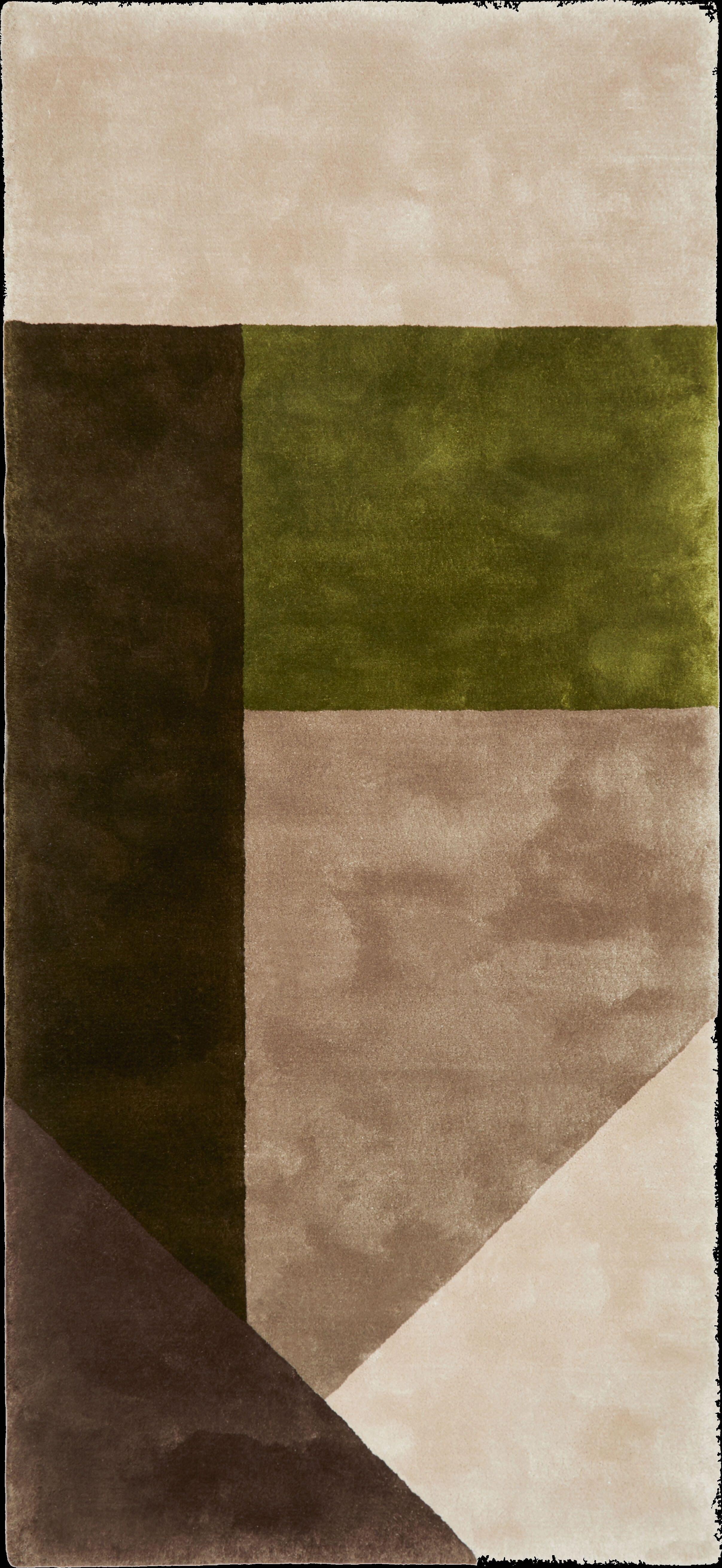
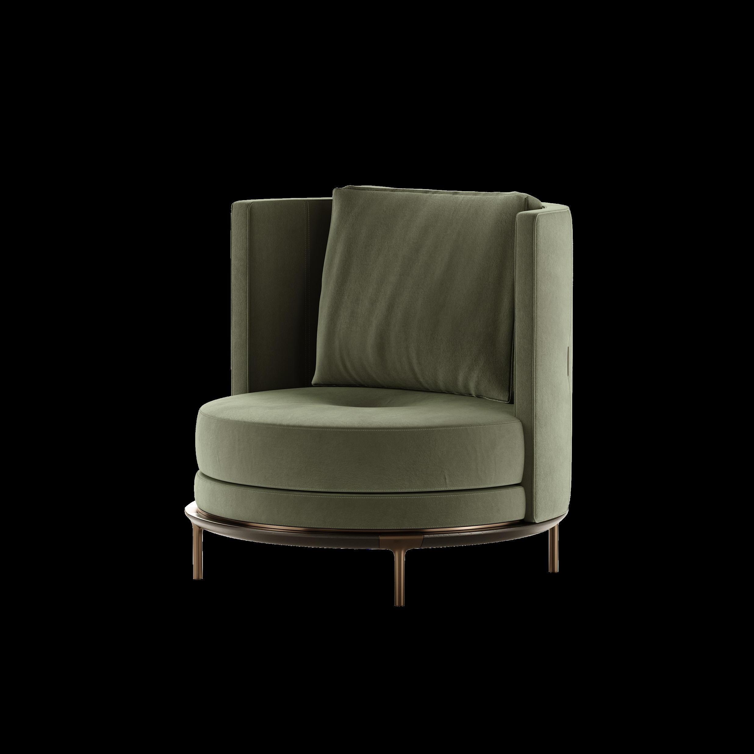
INSPIRED BY THE NATURAL WORLD: MUTED BROWNS, GREENS AND BLUES GIVE A SENSE OF VELVETY MYSTERY AND CAN CREATE A STRONG COUNTERPOINT TO ALMOST ANY INTERIOR. THEY BRING WARMTH AND COMFORT WHICH MAKES THEM A PERFECT WAY TO INCORPORATE RICHNESS INTO OUR HOMES.
 Estee Armchair by ASTER
Lisette – Grès verveine Suspension by ENAMOURA
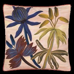
Gua0za Peche Cushion by CHRISTIAN LACROIX MAISON
Ilni Cup by LA REDOUTE INTERIEURS
Color
Blox
Small
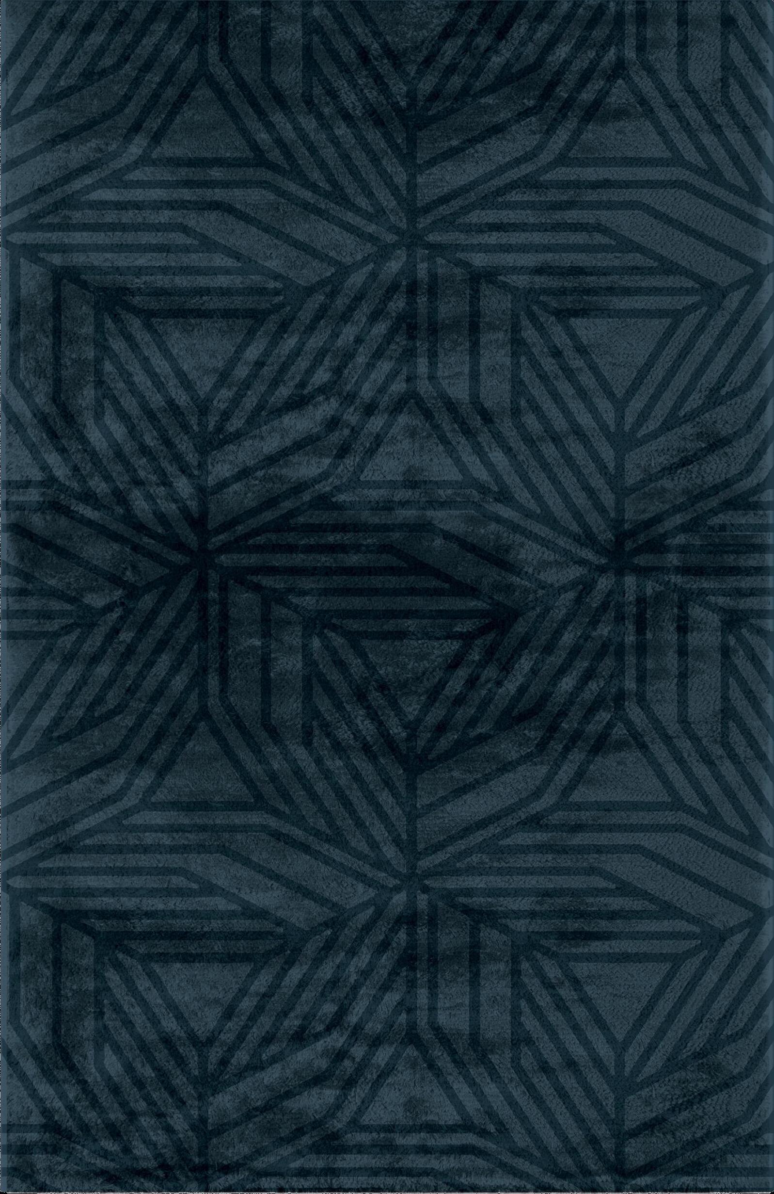
Rug by DESIGN BY US
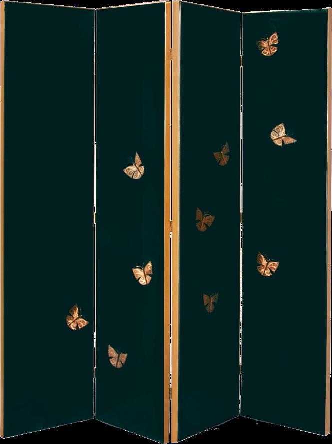
Euphoria Screen by KOKET
#SPRING2024
Energised Pastels
WITH A CAPTIVATING NOTE, THIS SPRING'S PASTELS OFFER A DELICATE BRIGHTNESS AND AT ONCE AN UNDENIABLE ENERGY. THESE JOYFUL SHADES AROUSE FEELINGS OF POSITIVITY, AND THANKS TO THEIR SOFTNESS, IT IS EASY TO APPLY THEM WITH THE OTHER TRENDS ON THIS LIST.

Letter E
Graphic lamp by DELIGHTFULL


Periwinkle Wall lamp by CIRCU
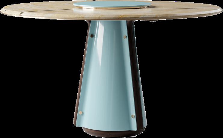
Magnolia Dining table by ALVA MUSA
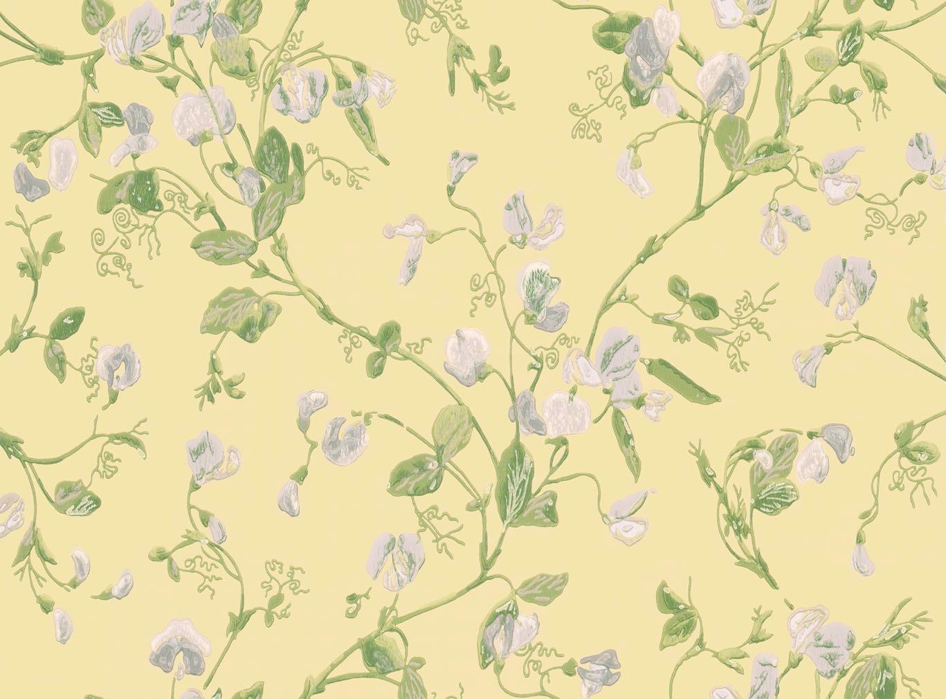
Sweet Pea Archive Anthology
Wallpaper by COLE & SON

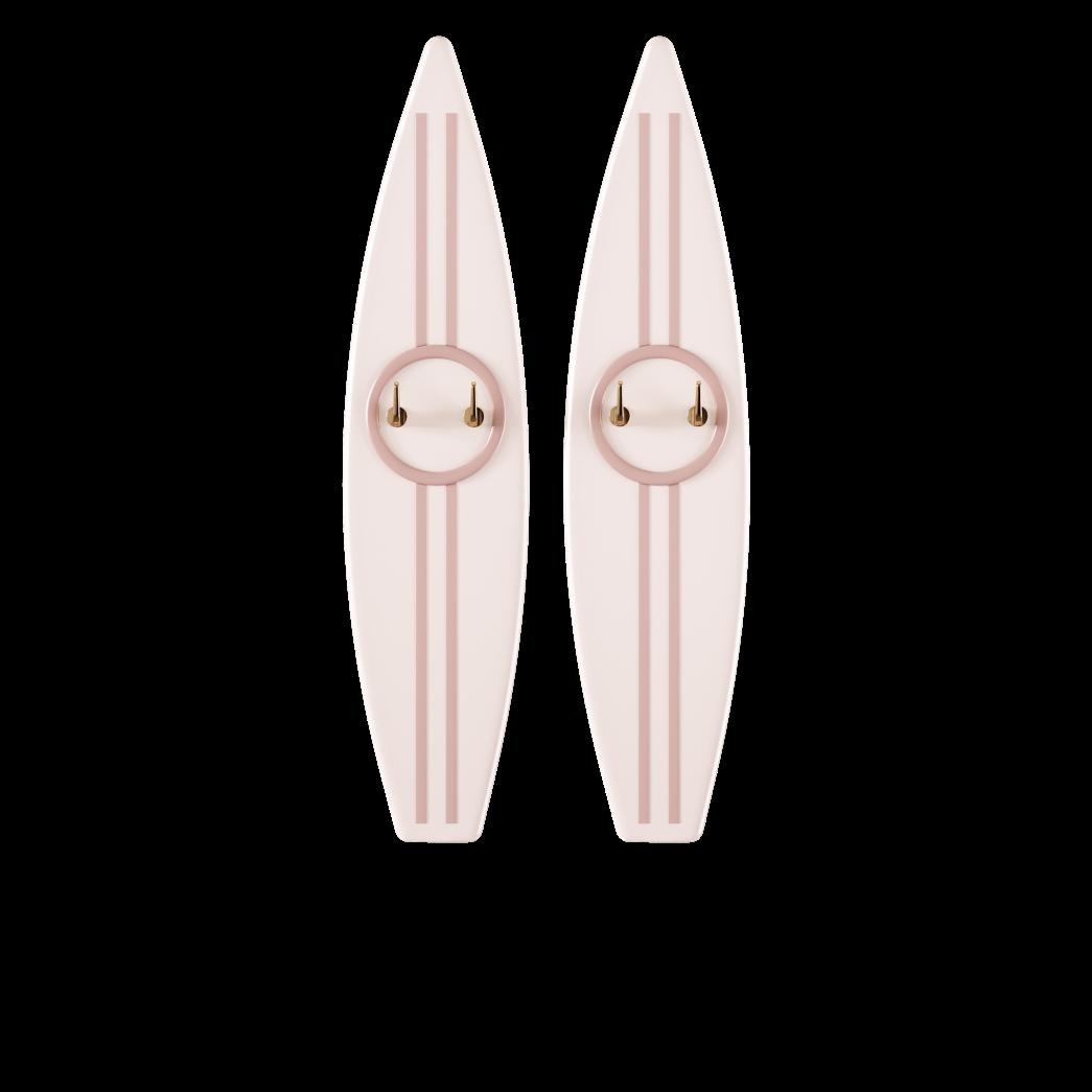
Surfboard Hanger by FAIRYTALE
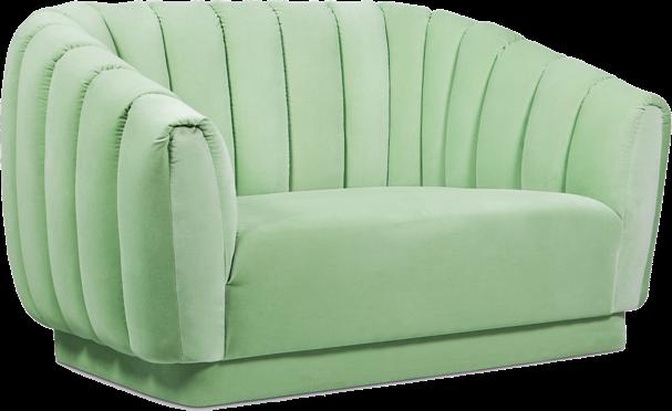
Oreas Single sofa by BRABBU
Provençal Modern Tiles by CAROCIM

18 | G&G _ Magazine

ORDINARY IS BORING. BE BOLD. BE UNIQUE. @MISSGARDENGLORY WWW.GARDENGLORY.COM the collection NEW CANVAS COUTURE
FLOAT
POOL
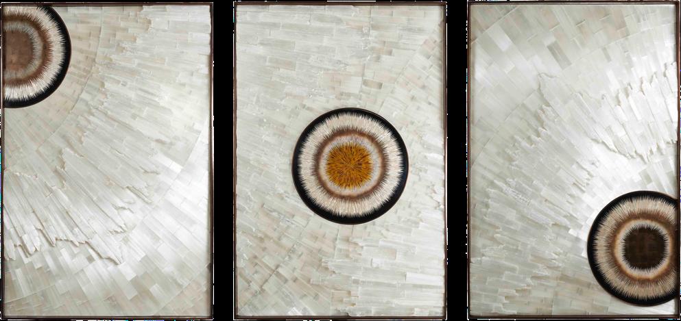


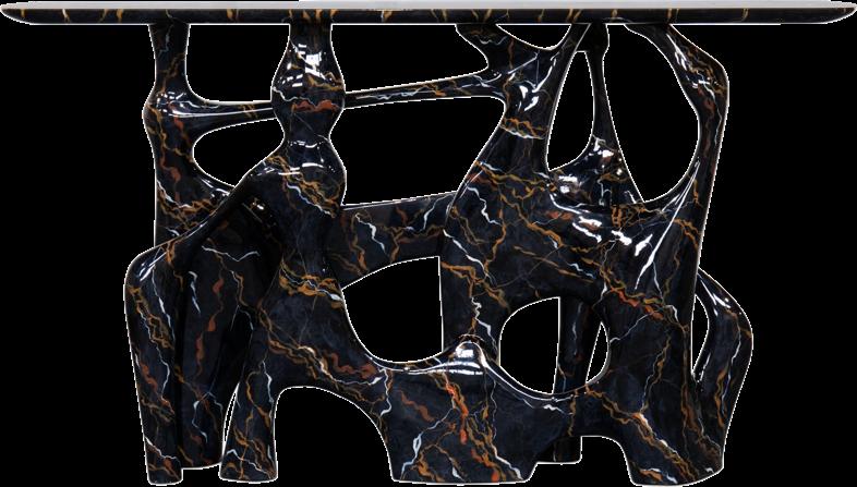

Distinctive interiors
DECORATING YOUR HOME WITH UNIQUE PIECES WITH AN EXCITING DESIGN CONTINUES TO BE IN VOGUE! IMMEDIATELY ATTRACTING ATTENTION WITH THEIR VOLUMINOUS SHAPES AND INTERESTING MATERIALS, THEY MAKE THE INTERIOR ECLECTIC AND PERSONAL WITH DETAIL AIMED AT COMFORT AND PRACTICALITY.


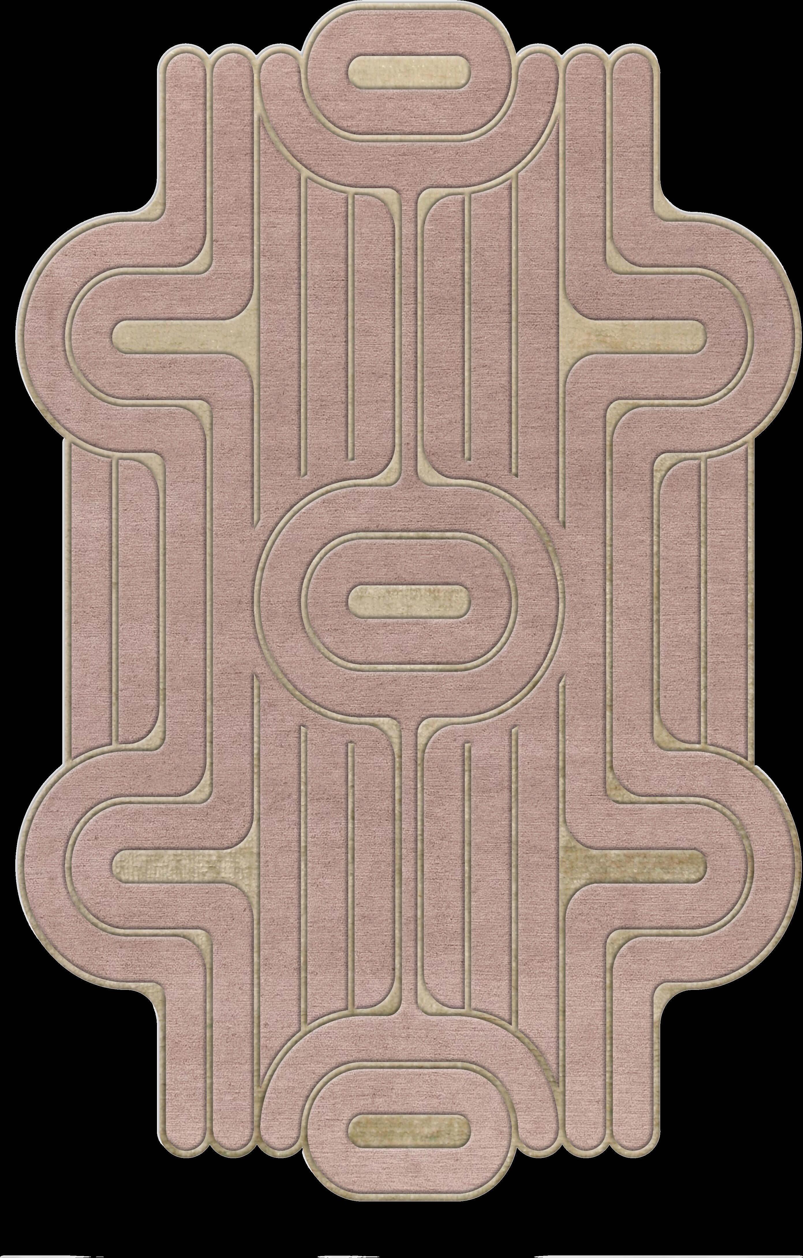

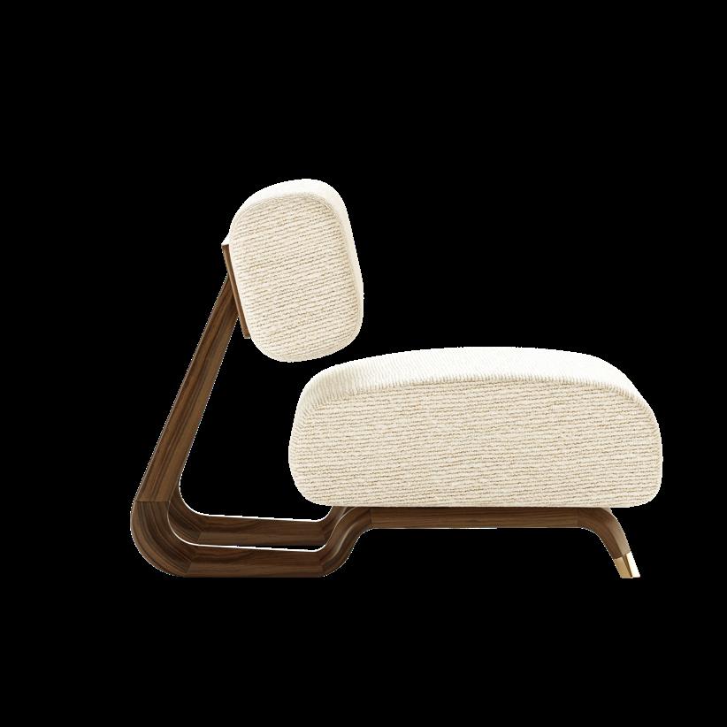
#SPRING2024
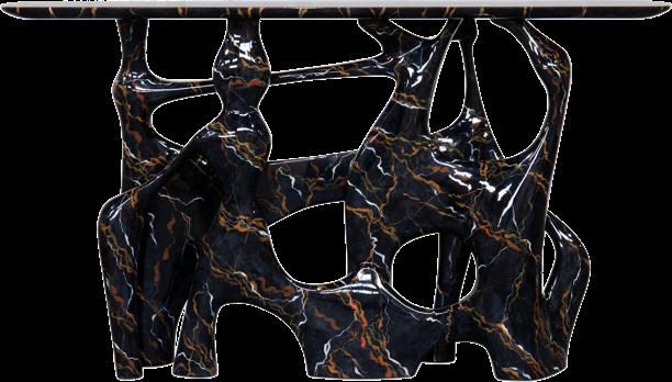
Bastei Faux Marble Console by BRABBU
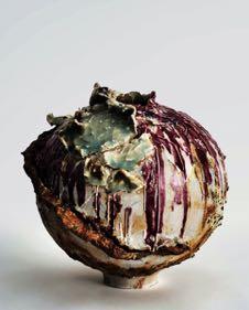
Moon shell Artwork by STÉPHANIE COUTAS
Ondula Rug by MASSIMO SPERONI Smilla Rug by BROSTE COPENHAGEN
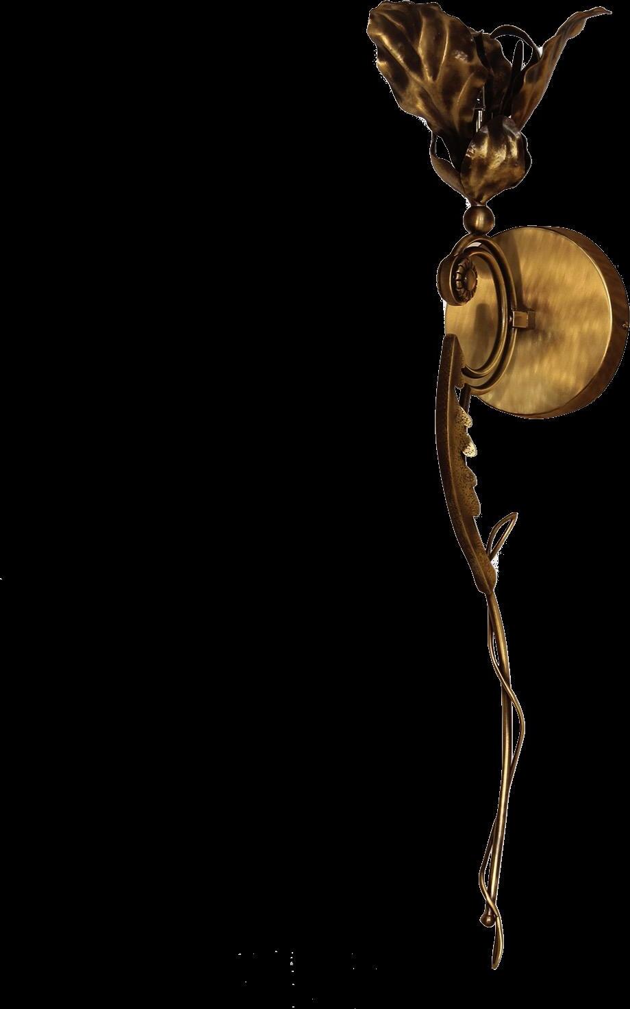
Flora Sconce by KOKET
20 | G&G _ Magazine
Lewis Armchair by MEZZO COLLECTION


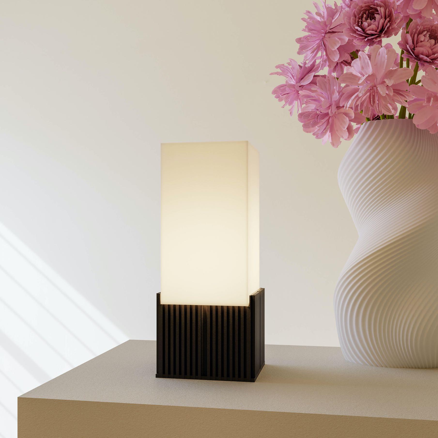
SUSTAINABLE • UNIQUE • 3D PRINTED • DURABLE • ECO-FRIENDLY
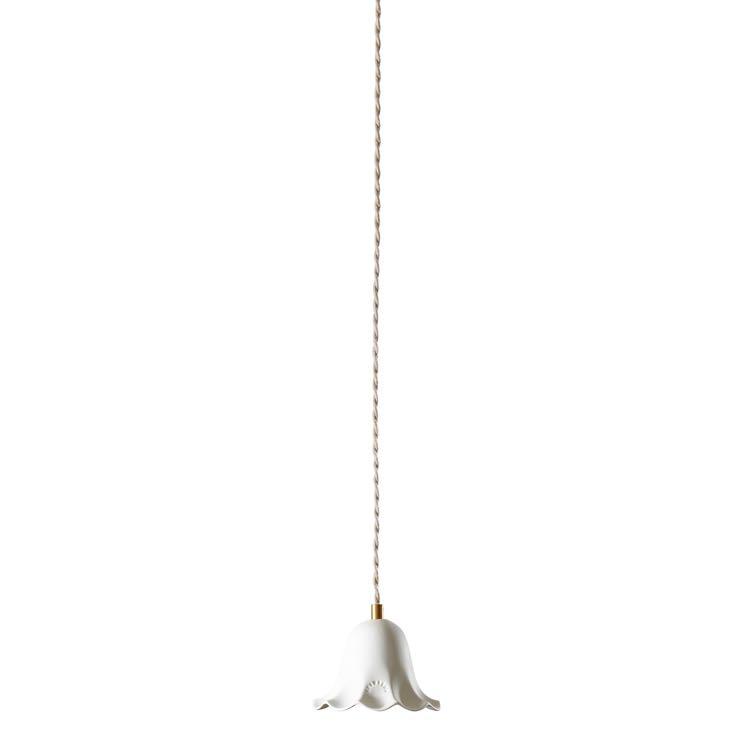
GirofleVanille & Rose
Poudré, Rose
Poudré & Vanille
Tiles by CAROCIM

Lili - Porcelaine
Biscuit
Suspension by ENAMOURA


Charming Chintz BY VIRTUE OF THE REDISCOVERY OF FLORAL DESIGN, CHINTZ IS EXPERIENCING ANOTHER PERIOD OF SUCCESS. IT BRINGS WITH IT A JOYFUL AND AT THE SAME TIME NOSTALGIC FEELING, INFUSING THE HOUSE WITH A FASCINATING ELEGANCE AND AN IRRESISTIBLE PICTORIAL VIBE.

Myrina
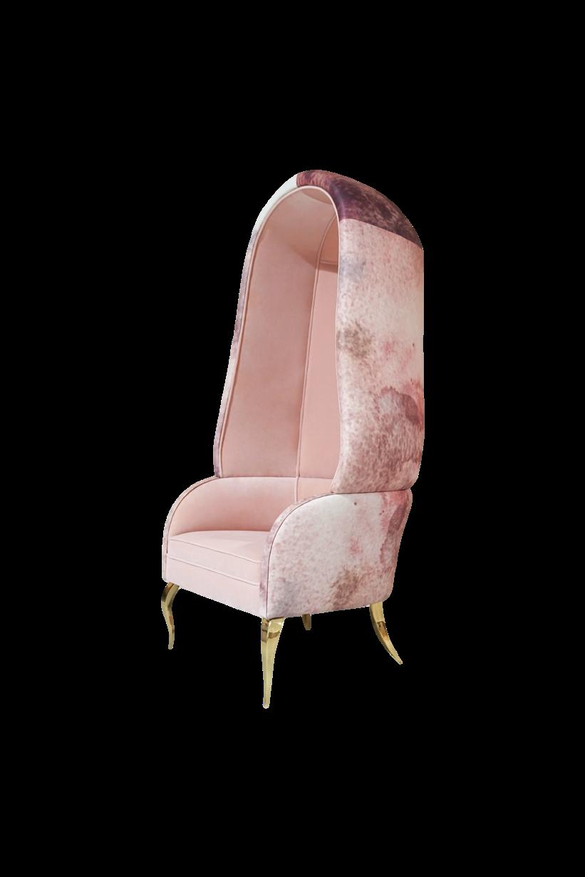
Bouquet
Aubergine Fabric by KATHRYN M. IRELAND

#SPRING2024
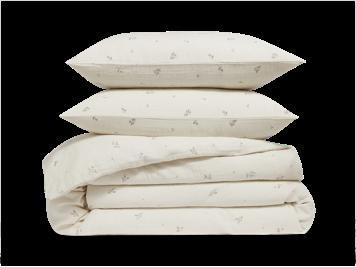
Fleurs Double thickness cotton gauze set by BONSOIRS
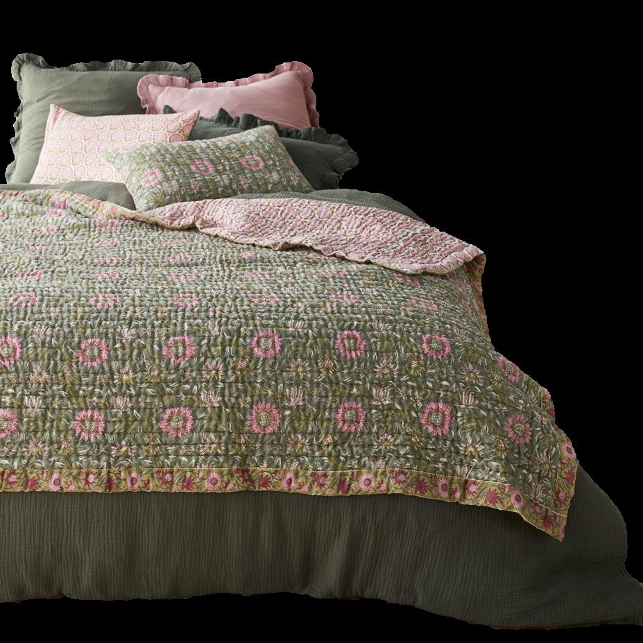
Duvet cover & Pillowcases, Quilt & Pillowcases by LA REDOUTE INTERIEURS
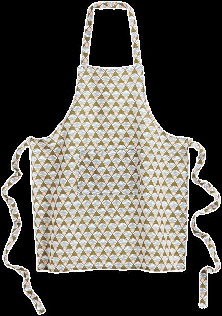
Kitchen apron by LA REDOUTE INTERIEURS
Artisanship
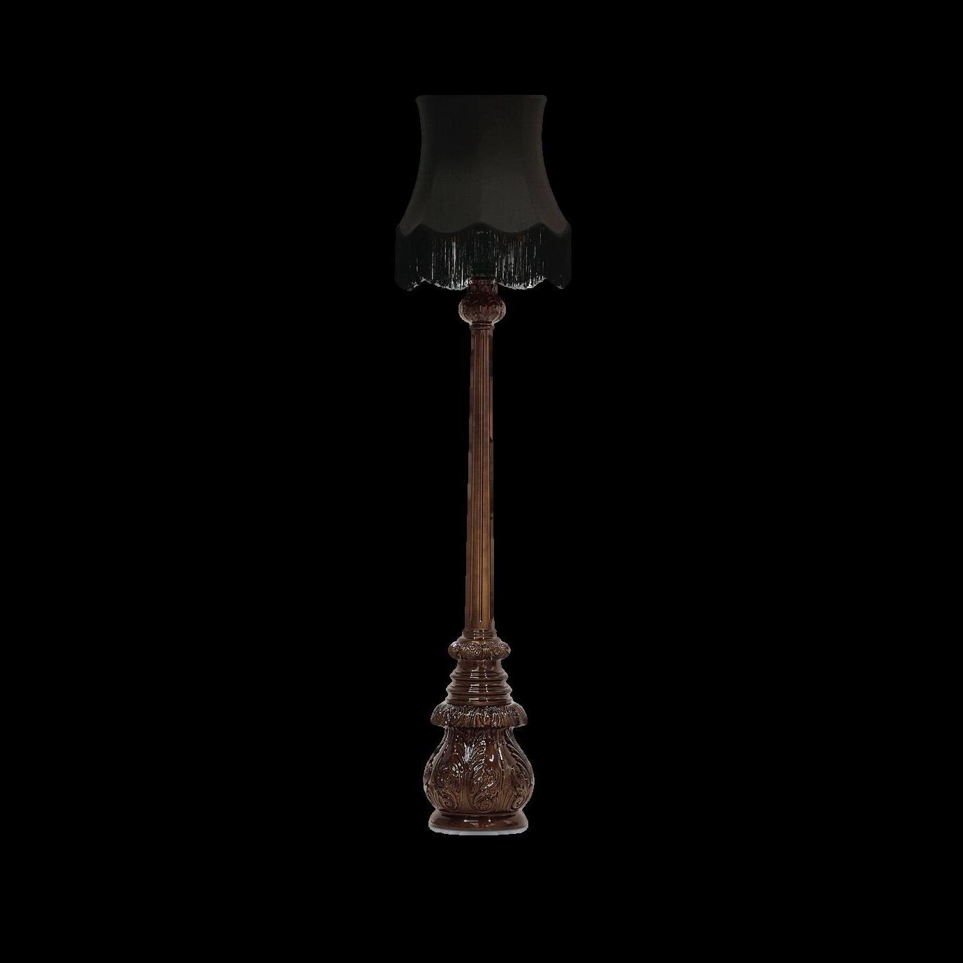
HAND-WOVEN RUGS, MIXED ARTWORKS OR ARTISANAL FURNITURE WILL NEVER GO OUT OF STYLE - THERE WILL ALWAYS BE SOMETHING PRECIOUS ABOUT OWNING A ONCE-IN-A-LIFETIME PIECE THAT EVOKES FEELINGS AND HONORS THE LEGACY OF THE TECHNIQUES USED TO MAKE IT.


#SPRING2024
Terra Wall light by CASTRO LIGHTING
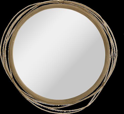
Kayan Mirror by BRABBU
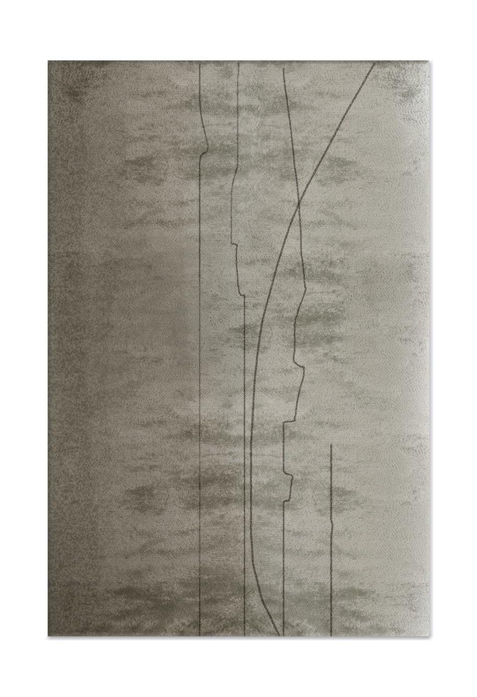
Kalina Rug by BRABBU
24 | G&G _ Magazine
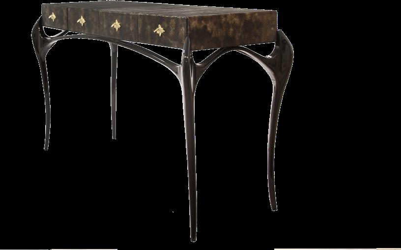
Tempta0on Console by KOKET





#SPRING2024
Ebène & Casse-noiseXe Paints by PURE & PAINT
Kaiwa Rug by BRABBU Ezra Rug by BROSTE COPENHAGEN
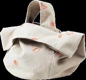
Bag by BROSTE COPENHAGEN
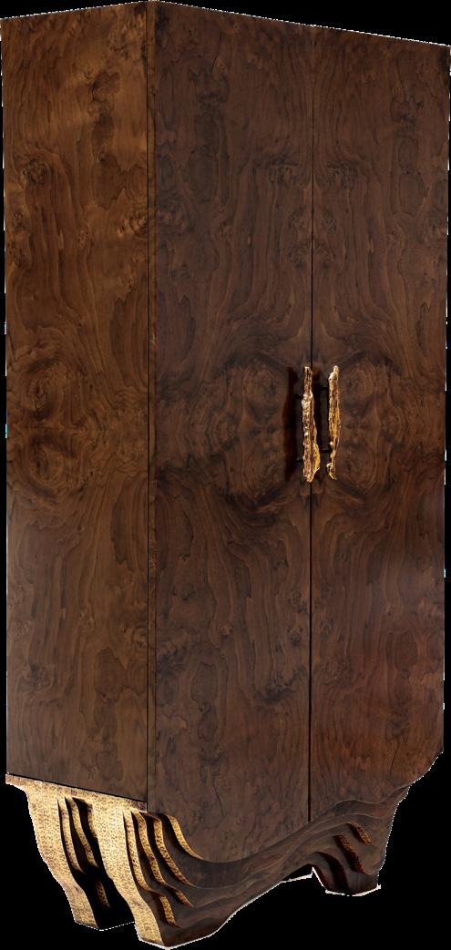
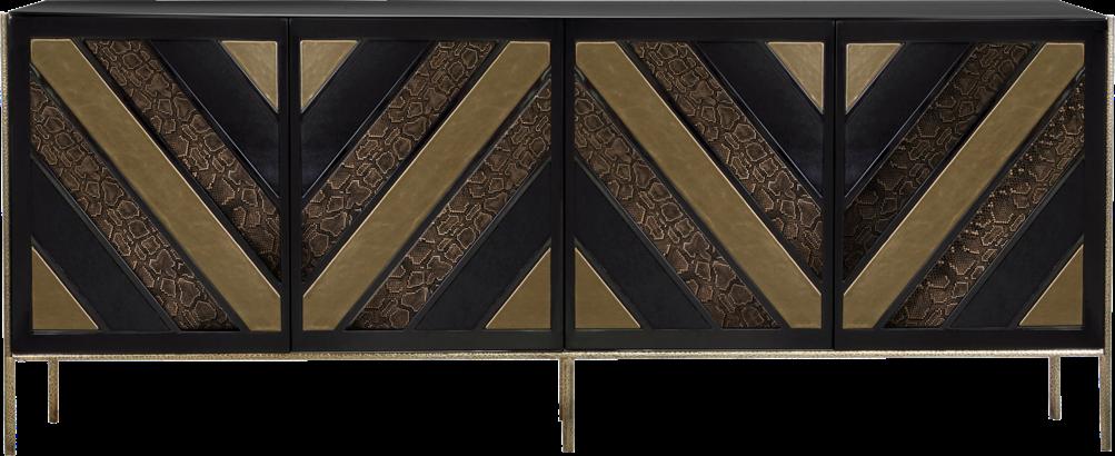
Opium Cabinet by KOKET
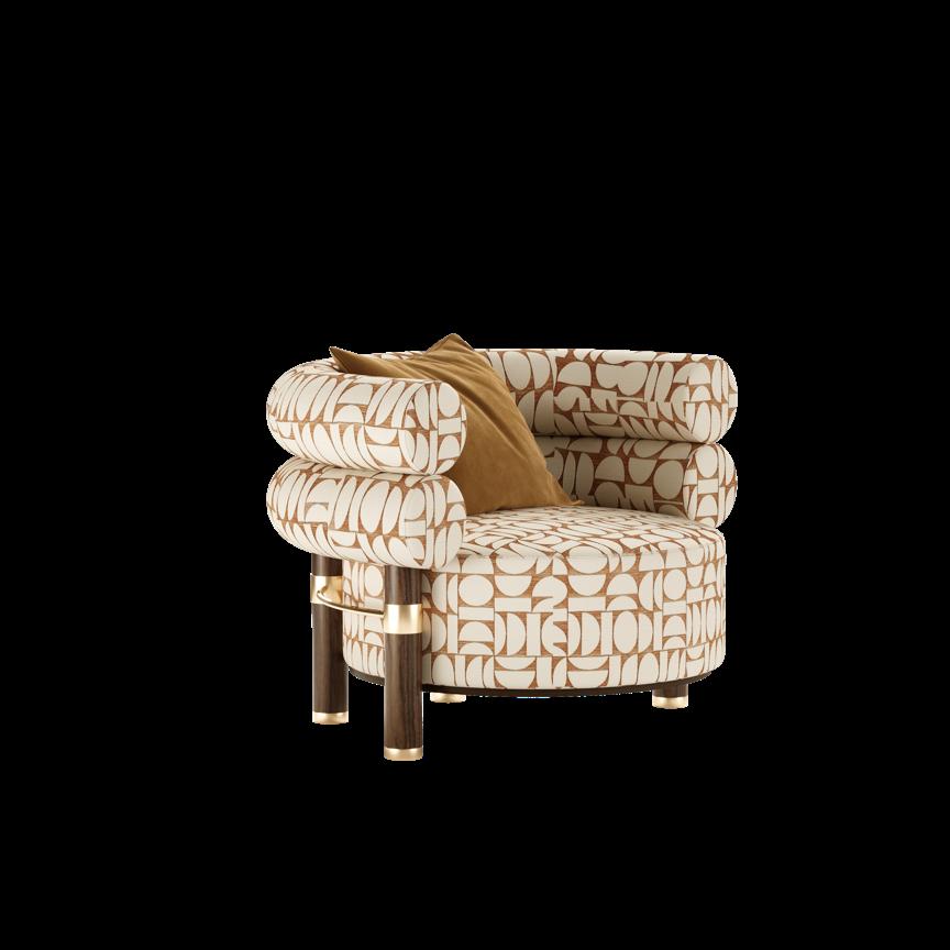
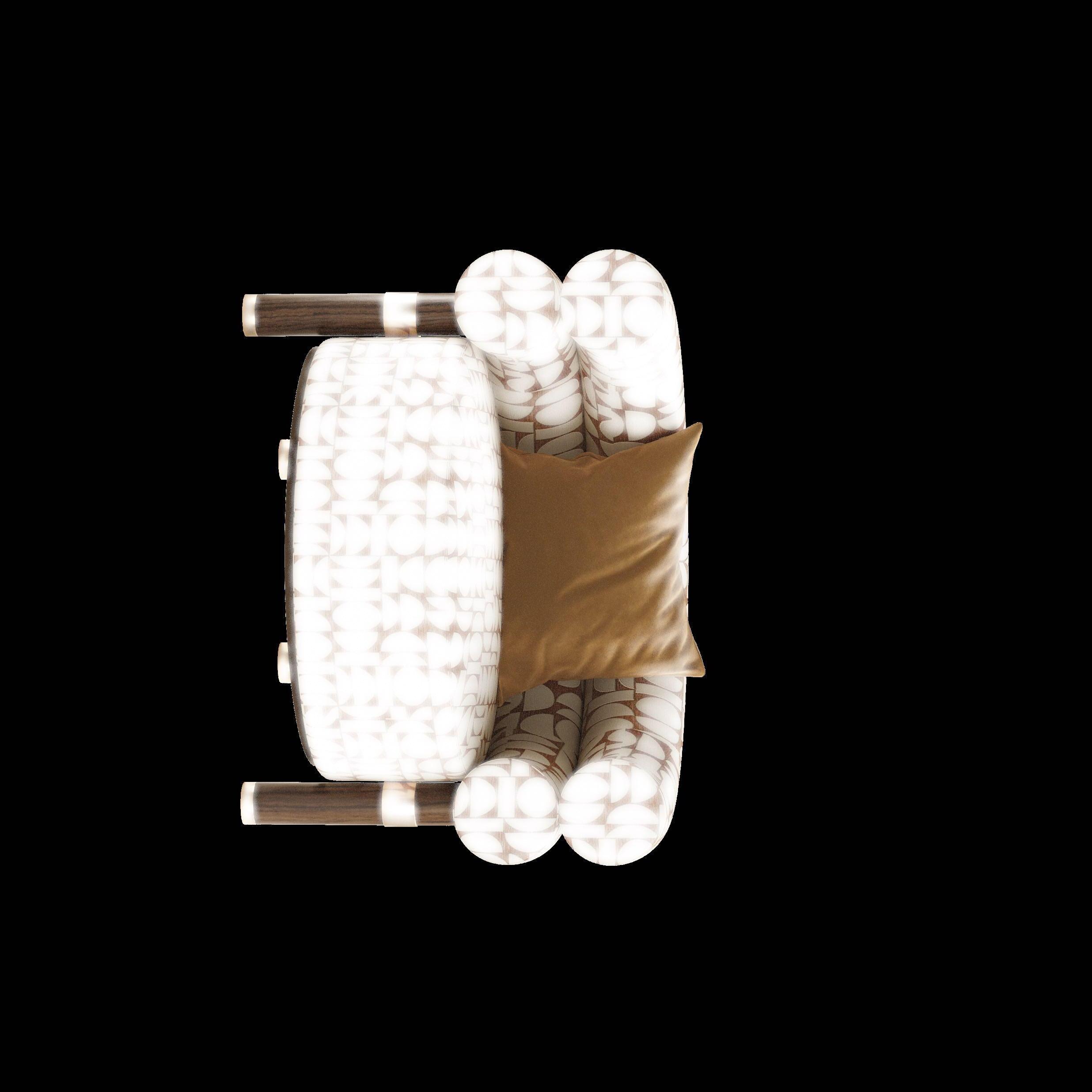
Rogers Armchair by MEZZO COLLECTION
Hurry up and buy Extraordinary Design products for every room in your home with a simple click!
1
Cyrille

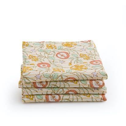
Pack of 4 washed co[on napkins by LA REDOUTE
Taverna
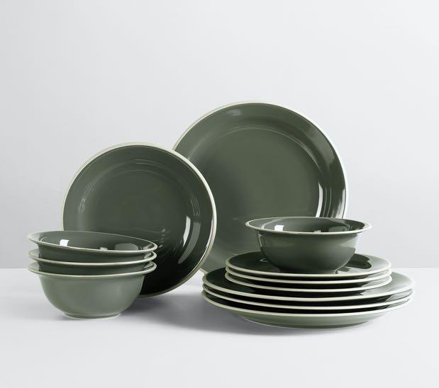
Dinner set for four by BROSTE
The Meaning

2 E SHOP
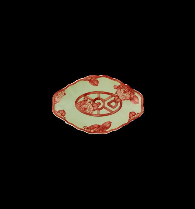
Small platter by VISTA ALEGRE x BORDALLO PINHEIRO €50,00
DINING
INTERIEURS €15,99
Wilhelmina
Napkin by BROSTE COPENHAGEN €13,90
Hune
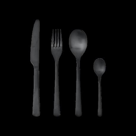
Cutlery by BROSTE COPENHAGEN €75,00
28 | G&G _ Magazine
COPENHAGEN €269,00
3 6

FILL YOUR SPACE WITH INSPIRATION
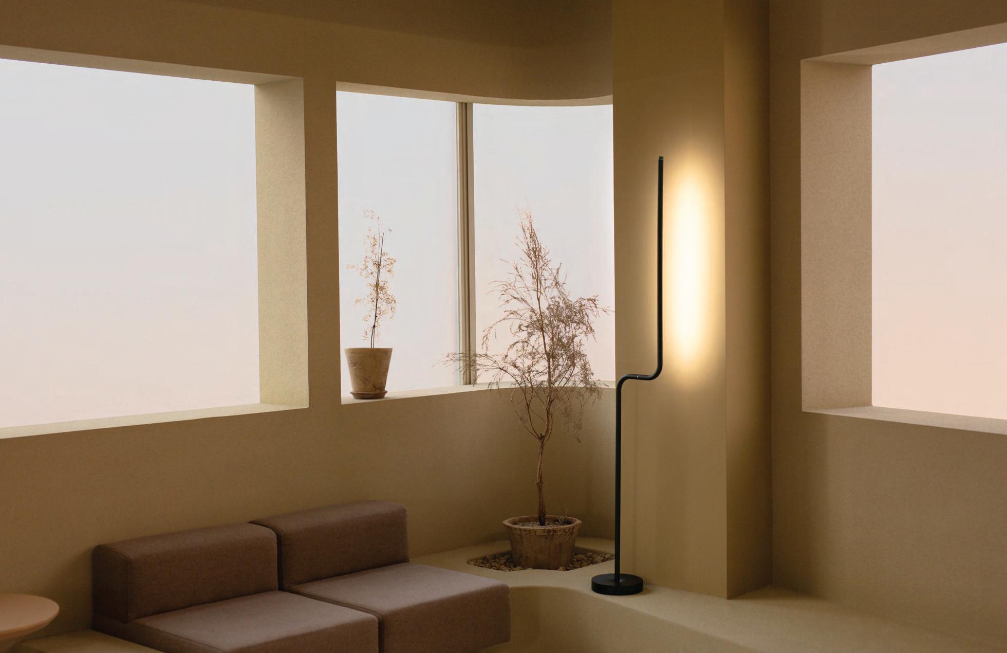
All new motion-control technology
From desk lamp to ambiance lighting
Info@tangramfactory.com
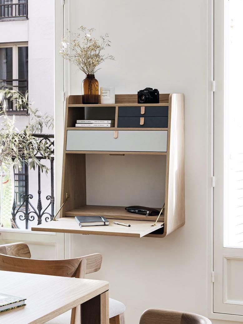
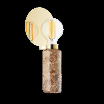
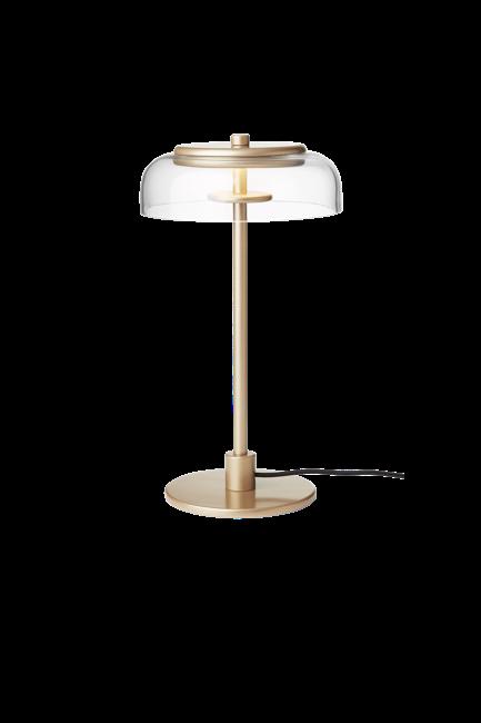
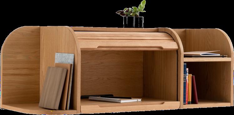
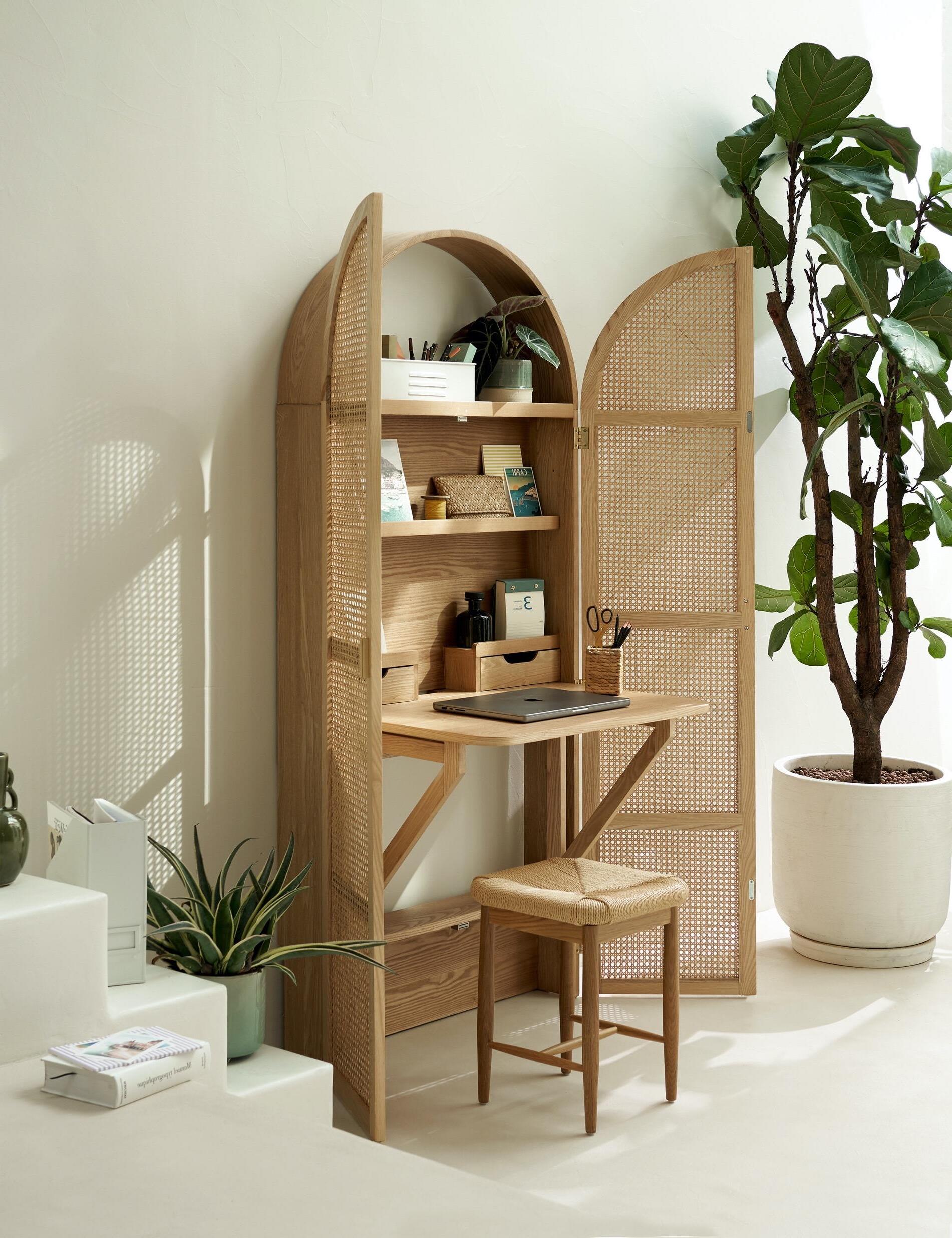
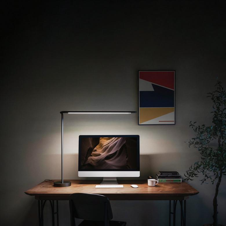
7 Gaston Desk by HARTÔ €785,00 8 #ESHOP HOME OFFICE 9 Matheo Desk cabinet by LA REDOUTE INTERIEURS €799,00 Andre Stool by LA REDOUTE INTERIEURS €149,00 Blossi Table lamp by NUURA €679,00 12 11 Wapong Side wall desk by LA REDOUTE INTERIEURS €399,00 Small table DESIGN BY US

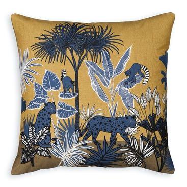
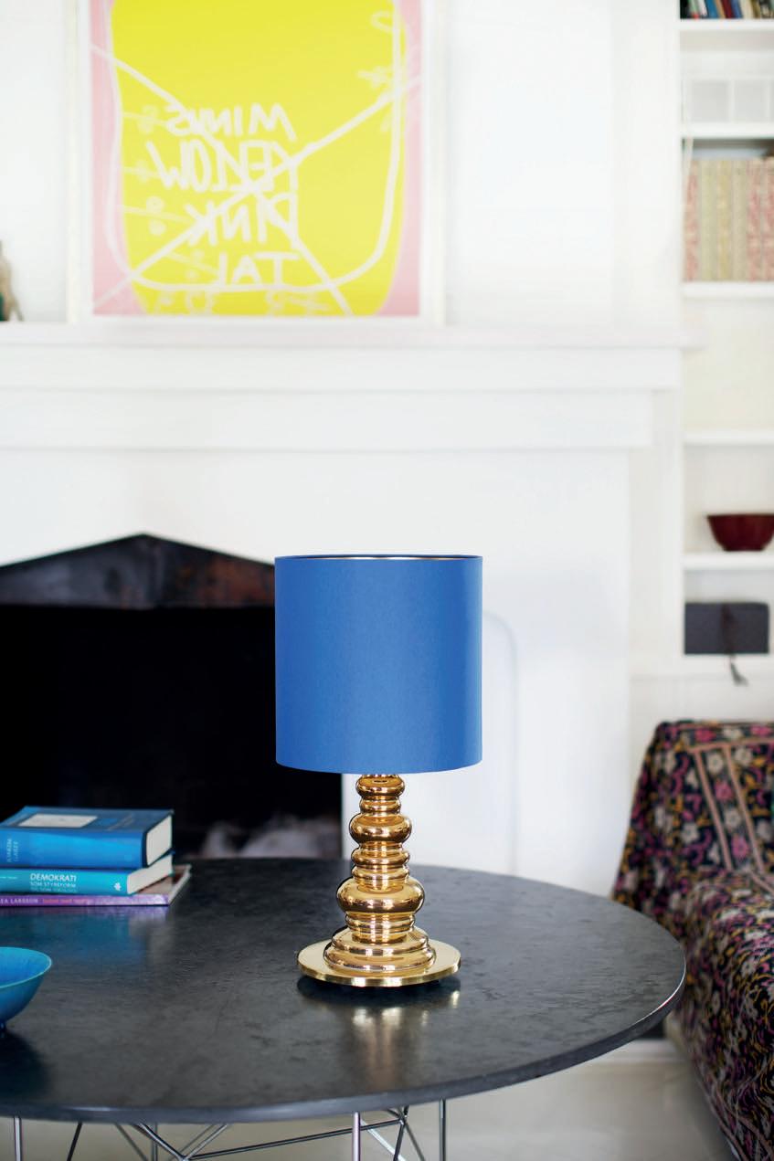
18 14 13
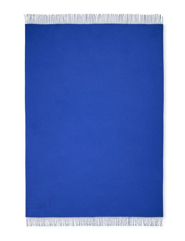
ELVANG
15
Deluxe
lamp
DESIGN
#ESHOP
LIVING
Luxury Throw by
€259,00
Punk
Table
by
BY US €750,00
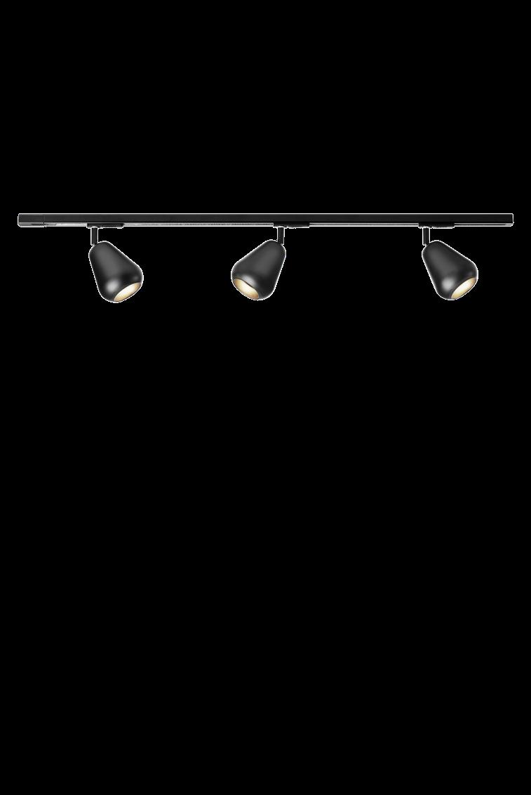
Anoli Spot track by NUURA €679,00
16
32 | G&G _ Magazine
Malacca Embroidered cushion cover by LA REDOUTE INTERIEURS €18,99 Kuro Vase by LA REDOUTE INTERIEURS €29,99
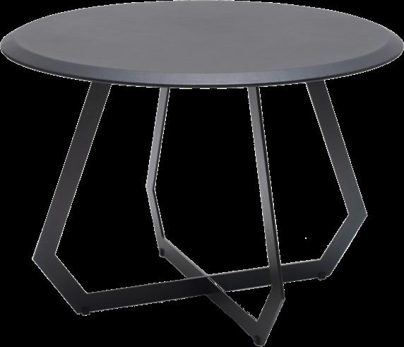
Fetish Table by DESIGN BY US €620,00
Wilma
Pond
21 23 24 25 BEDROOM
19 20
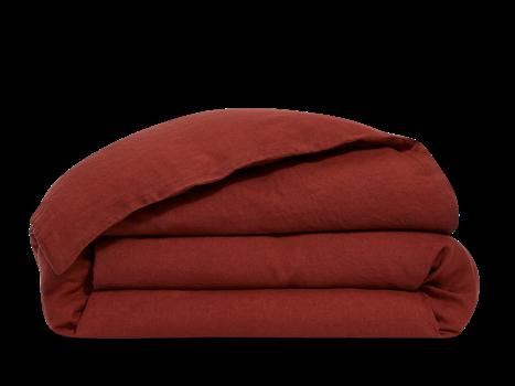
French washed linen - Brique Duvet cover by BONSOIRS €215,00
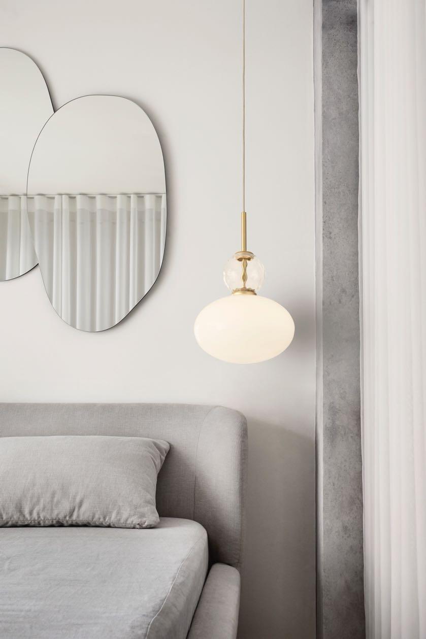
Rizzatto Pendant by NUURA €539,00
#ESHOP
Pouf by BROSTE COPENHAGEN
22
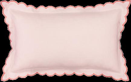
Antoinette Cushion cover by LA REDOUTE INTERIEURS €14,99
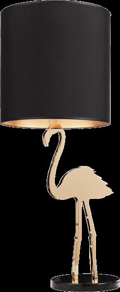
Crazy Flamingo Lamp by DESIGN BY US €1.138,00
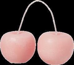
Cherry Sculpture candle by BROSTE COPENHAGEN €21,00
34 | G&G _ Magazine
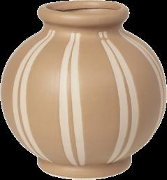
Vase by BROSTE COPENHAGEN €42,00
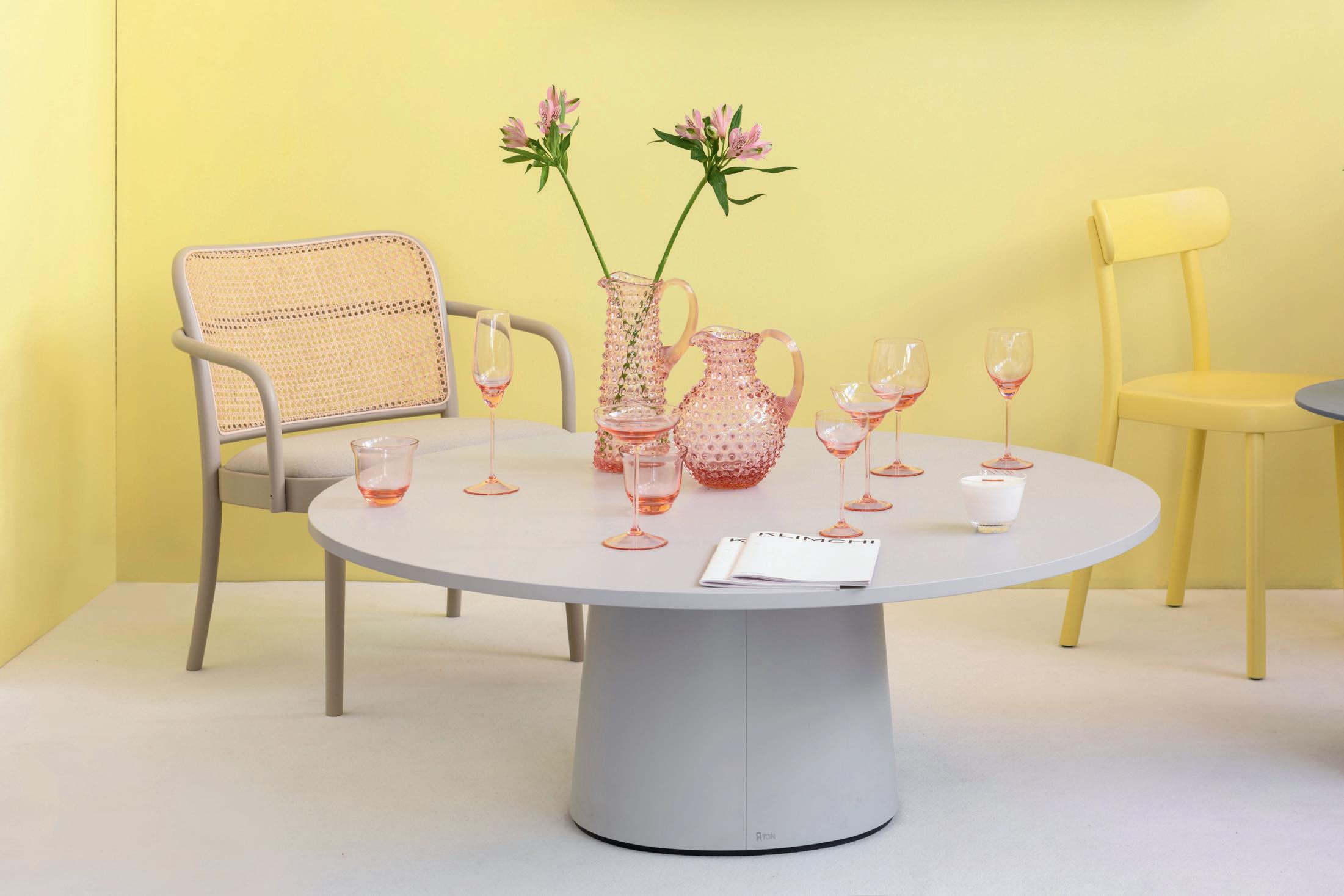
BOHEMIAN
@KLIMCHISTUDIO
PREMIUM
GLASSWARE VISIT EU.KLIMCHI.COM FOLLOW
LATEST NEWS
Holiday glamour
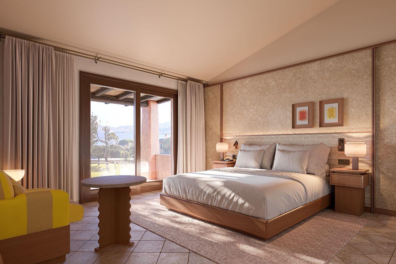
Aethos is thrilled to announce its newest five-star destination: Aethos Sardinia. The luxurious resort is set to open on 18 May 2024 on Sardinia's Costa Smeralda, offering guests a secluded oasis in the heart of the Mediterranean. The hotel will have a total of 64 rooms and suites, including Classic Deluxe Rooms, Deluxe Rooms with Sea View, Suites with Garden View, Suites with Sea View, and Pool Suites with Sea View. The lush gardens of the Mediterranean-style resort create a sense of privacy and serenity, and each room features either a terrace or balcony equipped with tables, chairs, and chaise lounges for ultimate relaxation. For those seeking even more seclusion and tranquility, there will be six 2 and 3bedroom suites, each with a private garden, terrace and freshwater pool.
Address: Via Monti Corru, Località La Conia, 07021 - Cannigione, Sardinia, Italy
www.aethos.com/sardinia
Extraterrestrial backdrop
In conjunction with the 60th Venice Biennale, Belgian contemporary artist Arne Quinze will present an immersive exhibition ‘Are We The Aliens_’ fusing his large-scale site-specific sculptures, saturated in an ethereal acoustic environment and soundscapes by the acclaimed American music producer world class Swizz Beatz. This event marks the first ever contemporary show to debut in the historic 16th century church, San Francesco della Vigna, completed by the influential Renaissance architect Andrea Palladio in Campo San Francesco, Castello, Venice. The exhibition will present Quinze's first largescale glass and ceramic sculptures created in collaboration with master craftsmen Berengo Studio and Atelier Vierkant www.arnequinze.com
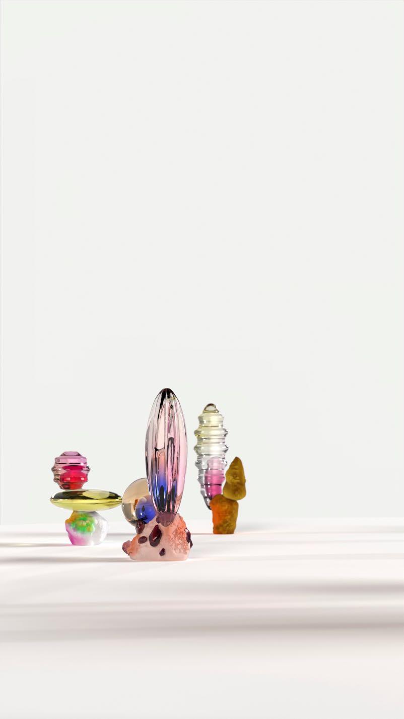
VIP & Press Preview: April 17 - 19, 2024
On view: April 20 -November 24, 2024
Attractive from any angle
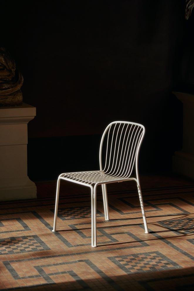
Space Copenhagen has collaborated with longterm collaborators &Tradi`on to reveal Thorvald, a modern collec`on of outdoor furniture designed by Space Copenhagen. The new line is created to pay homage to Copenhagen’s architecture and encourage the art of outdoor living in the world. www.spacecph.dk
A wish from the heart
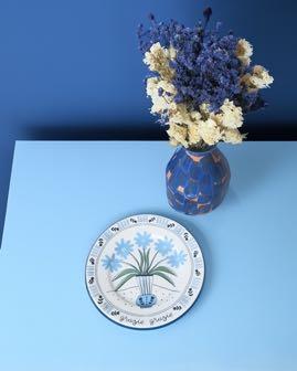
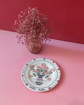
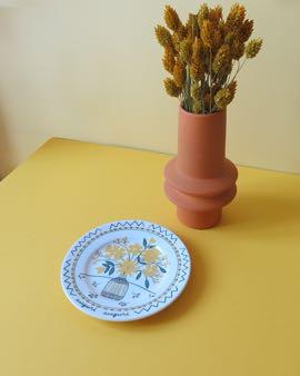
Ilaria.i is presents its new ‘Still Life’ collection, with yellow, pink and blue protagonist colors. The line tells of a specific moment: the delivery of a bouquet with the related card, whether it is a wish, a compliment or a thank you. ‘Auguri auguri ’, ‘grazie grazie’ and ‘bello bello’ are represented by three vases of flowers that will never fade, drawn freehand as if they were charcoal sketches and subsequently fixed on porcelain, with a semi-industrial process and production which has always characterized the brand.
www.ilariai.com
#LATESTNEWS
38 | G&G _ Magazine
Beauty and functionality
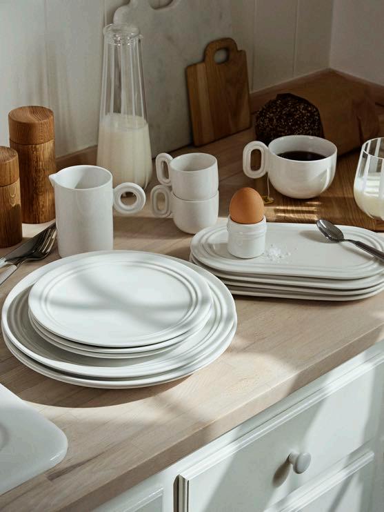
Broste Copenhagen proudly introduces Stevns - the new tableware inspired by the breathtaking nature of the UNESCOprotected Danish natural area Stevns Klint. Designed by the talented ceramic artist Julie Bonde, the tableware seamlessly blends craftsmanship with the aesthetic beauty of the impressive landscape. The series features 15 pieces and each design features clean lines and understated textures by translating the layers into reliefs. The tableware is crafted from white stoneware, providing a clean and timeless aesthetic. www.brostecopenhagen.com
From e-waste
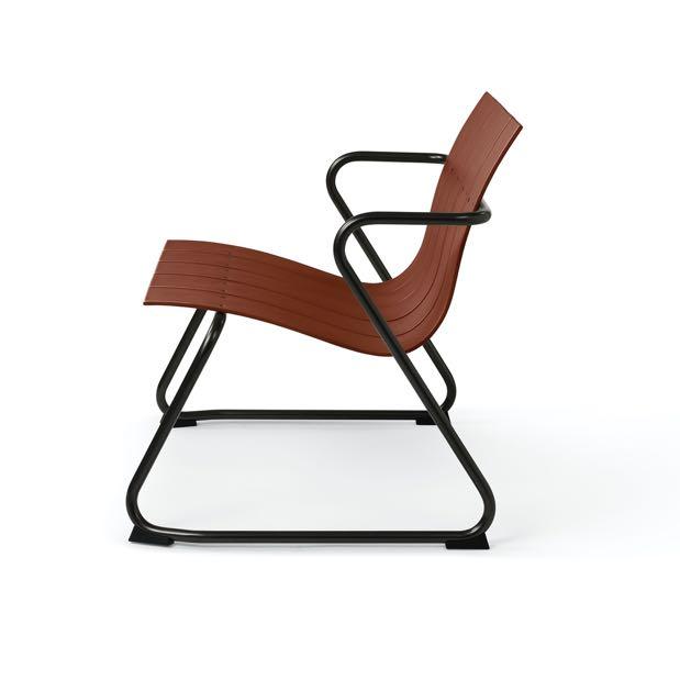
Mater pays homage to Jørgen and Nanna Ditzel with a new itera`on of the outdoor series Ocean, which combines postconsumer e-waste with fiberglass. The products are characterised by its light structure, with repeated slats and sturdy metal frames, tried and tested for outdoor use, and this spring, Mater has refreshed the six-piece collec`on with a rich new colourway in ‘Burnt Red’. www.materdesign.com

Breathe new life
Studio Modijefsky was commissioned to add an all-day brasserie to the 3-screen cinema De Witt located in the heart of Dordrecht. The design concept captures the building’s rich history: before it served as a convent, school and laboratory. Studio Modijefsky wove these historical layers into a timeless visual language with expressive shapes, warm colours and materials that incorporate and evoke echoes of the past. The result is a new combination of fantastic flavours and visual entertainment in/outside the cinema.
Address: Nieuwstraat 62, 3311 - Dordrecht, The Netherlands
www.studiomodijefsky.nl
#LATESTNEWS
40 | G&G _ Magazine
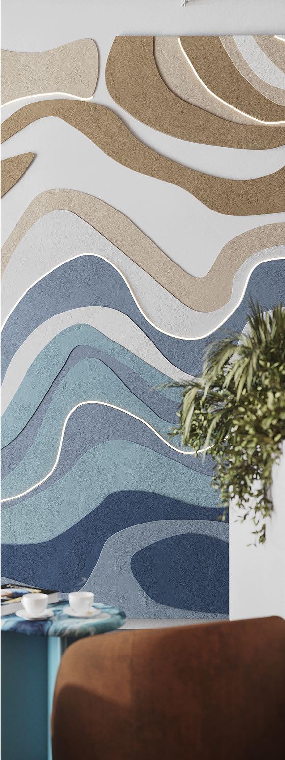
Our expert designs transform ofces into powerful assets that amplify your brand and foster collaboration. Discover the art transformation! Contact us today!
ip@zikzakarchitects.com +357 96 135 446 +380 97 534 7450
commercial interior design
ZIKZAK Architects
Archilecture and design company specializing in workplace design and commercial interior
Visual experience
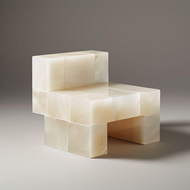
Pietro Franceschini introduces the Sugar Daddy Chair, a composi`on of white onyx cubes that sweetens the senses with its brutalist elegance. Each cube reflects and refracts light, unveiling a dance of shadows and sparks. This chair is an object for contempla`on and introspec`on defined by the interplay of strength and subtlety.
www.pietro-franceschini.com
Celebration of Sustainability
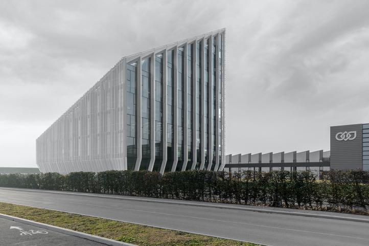
Peter Pichler Architecture unveils the recently completed Bonfiglioli headquarters located in Calderara di Reno, Italy. The new HQ was born from the need to create an efficient and functional office building that expresses the professionalism, innovation and proud history of the Italian company, leader in the production and supply of a complete range of gearmotors, drive systems, planetary gearboxes and inverter.
www.peterpichler.eu
Relatively minimalist
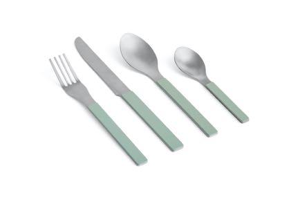
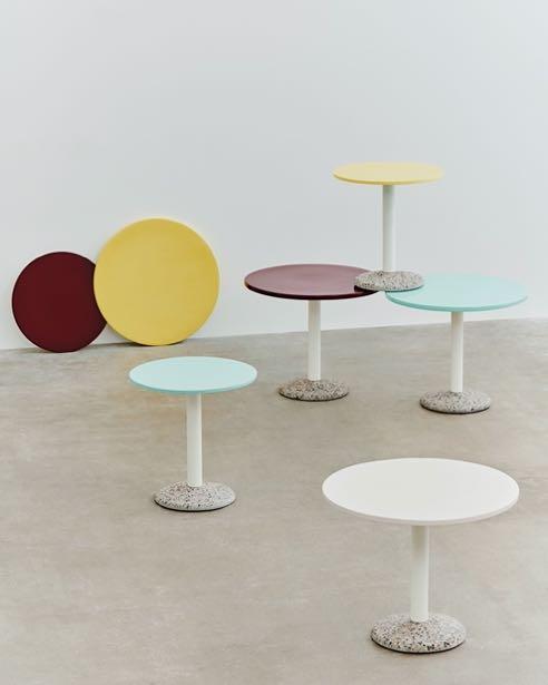
Muller Van Severen continues its collaboration with HAY by adding 2 new objects: the Ceramic Table and the MVS Cutlery & Serving Spoons. The Ceramic Table is a perfect example of the Belgian designers’ signature minimalistic expression, with a porcelain tabletop standing on a concrete base. While MVS collection brings a modern touch thanks to the brushed stainless steel and painted handles.
www.mullervanseveren.be
#LATESTNEWS
42 | G&G _ Magazine
ARCHITECTURAL STUDIO P I N I K +380 50 451 39 55 іnstagram am pinik
www.pinik.com.ua
Silence 2 –dyptique (2022), Min Jung-Yeon // Presented by Galerie Maria Lund, France
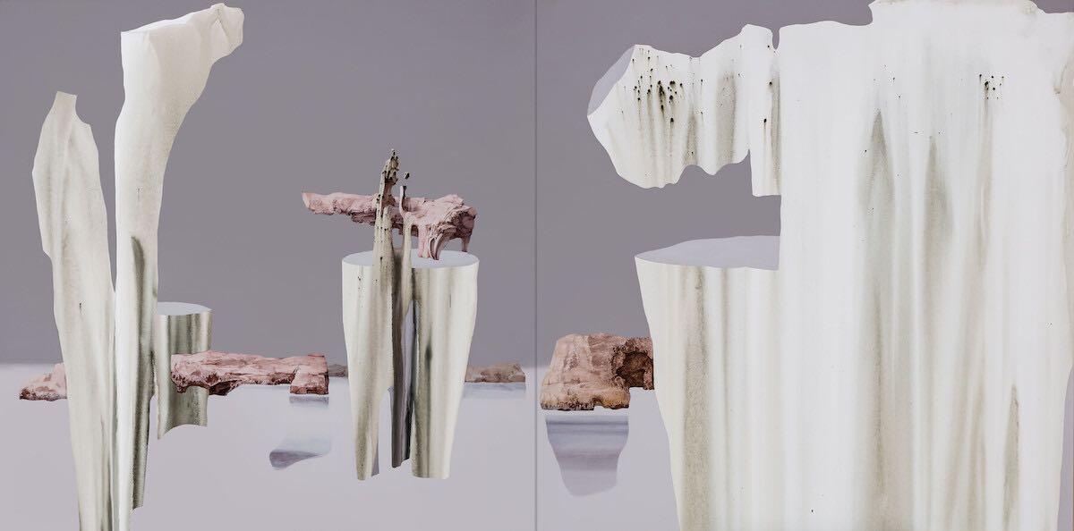

Presented by Gallery , South Korea

Untitled (2023), Jane YangD'Haene // Presented by Bienvenu Steinberg & J, USA
Sal Comporta (2022(, Patrick Kim-Gustafson
// Presented by Galerie Marguo France
Opening VIP & Press
Preview: April 3, 2024
11 AM - 9 PM
On view: April 4 - 7, 2024
The French Scene Renaissance
Le Perroquet (2022), Katia Kameli //Presented by 110 Galerie Véronique Rieffel, France
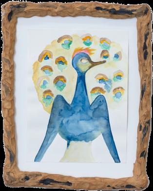

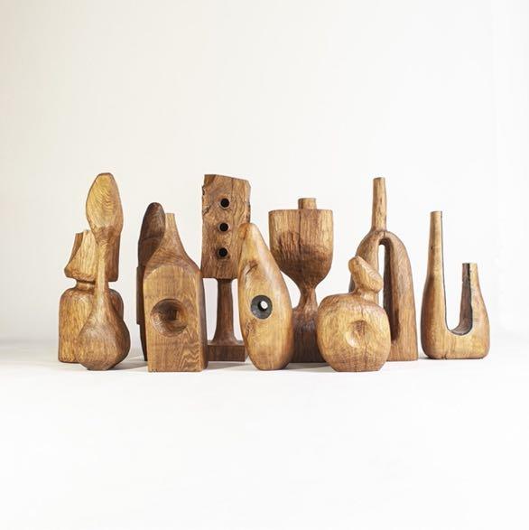
Reestablishing the strong presence of the French capital’s impact across the global cultural scene, the regional and cosmopolitan art fair Art Paris 2024 will unveil its 26th edition at the Grand Palais Éphémère bringing together the best modern and contemporary artistic creation, re-establishing its presence as a major spring art event. Following a consistent focus on discovery and innovation since its founding in 1999, the fair will be welcoming a strong international presence, encompassing 135 modern and contemporary art galleries from 25 countries. This edition will be exploring two themes: Fragile Utopias. A Focus on the French Scene and Art & Craft, led respectively by guest curators Éric de Chassey and Nicolas Trembley. In parallel, The Promises sector for young galleries will support new talents whilst the Solo Show sector will feature historical figures through monographic exhibitions contributing to their re-discovery.
www.artparis.com
#LATESTNEWS
44 | G&G _ Magazine







GG G&G _ Magazine N 38 – May 2023 & THE WORLD OF TOMORROW Creativity electric brights SIMPLE DREAM Unleashing and inBLACK WHITE Follow & Like @gandgmagazineeu

BORN OF
52 | G&G _ Magazine
SERENDIPITY

STUDIO GAMEIRO
RECENTLY RENOVATED AN APARTMENT IN ONE OF LISBON’S MOST COVETED AND BEAUTIFUL NEIGHBOURHOODS, PRÍNCIPE REAL.
Photography by Francisco Nogueira

54 | G&G _ Magazine
After undergoing a classic-driven intervention, this apartment is the synonym of the balance between the artistry of a bygone era, preserving the exquisite craftsmanship of the late 19th century, and the incredible energy with doing something new and original. Therefore, during the renovation works, the paramount objective was to carefully curate a house which should immediately feel like a home, restoring its original features while seamlessly infusing the essence of the particularly exotic and textured neighbourhood of Príncipe Real into the property. The geography of the area, never quite modular, infuses the interior with a warmth and depth that turns every room completely original with its own identity and character, as it does with the magical garden.
The living area is a very long room, it occupies the entire width of the building and includes the living and the dining zone. In the living room, the key piece is the bespoke fireplace, its design was inspired by the natural and organic shapes found outdoors, in the beautiful garden. The relationship with the exterior was always key throughout the interior design, and so it felt natural and useful to bring inside those organic shapes to create a base that is made of white and red travertine. The hut is designed for the hot air to flow and is made of lacquered metal. The intention was to create a shape that came out of the wall, and which resembles the various ornamental details found throughout the house, where the different shapes protrude the wall and ceiling surfaces: something under, something over - what some call cross-references. The designers decorated the room with attractively designed furniture such as the white armless sofa by Afra, the armchair made directly by Studio
Gameiro, HAMREI's side table with Murano crystal and the iconic black chair of Vitra designed by Charles & Ray Eames. The dining area has an intentionally different design where the designers played with fabrics and patterns. Here the highlight is the surrealist tapestry by the Portuguese artist, Cruzeiro Seixas.

“The idea was to create a setting that not only mirrored our client’s character and way of living - sophisticated, cosmopolitan, bold - but that would also portray her home country of Brazil.”

From the early design stages, the client had expressed the desire for the kitchen to be a prime space. It should provide obvious functionality and comfort, and it needed to be aesthetically pleasing as a daily usage space. As such, the main goal was to provide these qualities and characteristics devising a framework that should not only be perceived as a space for cooking but also as an enjoyable environment where people could socialise. The materials have different degrees of presence. Some necessary functional elements such as upper cabinets, tall cabinets, and other appliances are painted in neutral tones, close to the colour of the walls. These are meant to blend in, as is the case with the ceiling, leaving space for other natural materials to stand-out. Instead, a clear distinction in the level of detail and texture the designers sought to develop throughout can be found in the kitchen’s countertops and low cabinets. The lower cabinets, designed with a simple and continuous grid of drawers, finished in oak with a brushed varnish, act in unison with the stone countertop. The chosen stone for
the countertop and backsplash is granite, an original cut from Canada. The natural patterns of the stone bring a strong dynamic and complexity to the space, acting as a conceptual footprint with the wave-shaped cuts found in the backsplash. The entire living area (including the kitchen) overlooks the lush garden with pool. Many elements introduced into the interior take their inspiration from the outside, such as the custom-made natural stone steps, which have a clear relationship with the base of the fireplace, in its organic shape and material, and in its modular perception. The pool was custom-made with the highest level of detail and endeavor. Every tile was designed, and 3D modeled individually to accommodate the different features of the pool, including the infinity framework. The colour of the tiles is the result of careful experimentation of hues of cobalt blue and blue Klein. The use of this colour, combined with the beautiful roughness of the handmade tiles, where each one is different, has resulted in a pool that is immediately capable of conveying a tranquil ambience.


The sleeping area is located on the other side of the house and has a decidedly more intimate character thanks to the use of warm wood on the floor. In addition to the bedrooms, there is an informal office and TV room. In this last room, unlike the living room, the designers included only a couple of sofas and the same coffee table by HAMREI but with the brass structure this time.

58 | G&G _ Magazine


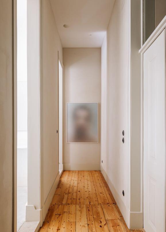
During the creation of the entire project, the designers worked closely with a group of extraordinary local artisans - this is especially noticeable in the master bedroom where a hand-carved wooden bed frame was custom designed. In front of the bed the designers opted for a couple of designer pieces such as Philippe Starck's console and the chair by Petit H from Hermès which takes up the style of Vanessa Barragão's tapestry hanging next to it.
“It proved to be a challenge that left any nostalgic attachment behind, by finding inspiration in the heritage and craft, but reworking it with a twist by pushing it forward, test and trial.”
In the master ensuite bathroom the craftsmen created a custom-made marble basin and vanity with marble countertop. The black taps match perfectly with the frames of the window and the shower, giving a touch of refinement.


MIXING MATERIALS
62 | G&G _ Magazine
INSPIRED BY THE BRUTALIST ARCHITECTURE OF THE 20TH CENTURY
MARIA DESIGNED THE INTERIORS OF A 260 M² HOUSE IN ZURICH.
 Photography by Belen Imaz & Pedro Bermejo
, VICTORIA
O"I was captivated by the unapologetic use of raw, industrial materials and the monumental scale of these structures. Their bold, sculptural forms and honest expression of materials resonated with me deeply, guiding my design journey as I sought to echo their strength and integrity within the interiors of this residence."
Victoria Maria
riginnally projected by the Swiss architect Ernst Gisel, the house pays homage to his vision while allowing the art collection to stand on its own, as the clients requested. It was crucial to strike a delicate balance between preserving the architectural heritage of the house and infusing it with a contemporary flair that would enhance the display of the artwork, creating a seamless fusion of past and present.
In crafting the colour palette and selecting materials for this project, Victoria Maria was driven by the spirit of merging tradition with innovation. By juxtaposing rough, tactile materials such as concrete and aged metals with luxurious textiles and sleek
fi
nishes, she aimed to create a sensory experience that was both tangible and visually captivating, inviting the residents to engage with their surroundings. Also inspired by the rugged, textural qualities of Brutalist architecture, she has curated a palette that celebrates earthy tones and rich, deep hues, complemented by unexpected bursts of vibrant colour.
All these characteristics can be seen already upon entering the house where in the living room we find a mix of different materials. Concrete ceiling, original from 1990 designed by Ernst Gisel, has been retained. The softness of the wool and the warmth of the pale dirty pink of the iconic Togo

modular sofa by Ligne Roset offset the coolness given by the rustic texolit flooring. Together with the vintage coffee table by Willy Rizzo, the FOS lamp with the concrete base takes up the concept of rawness. Peppi Bottrop's abstract artwork contrasts with Andi Fischer's joyful paintingbut both have the common characteristic of being noticed at first glance. The pop of color was added by Sara Regal Alonso's red table.
64 | G&G _ Magazine


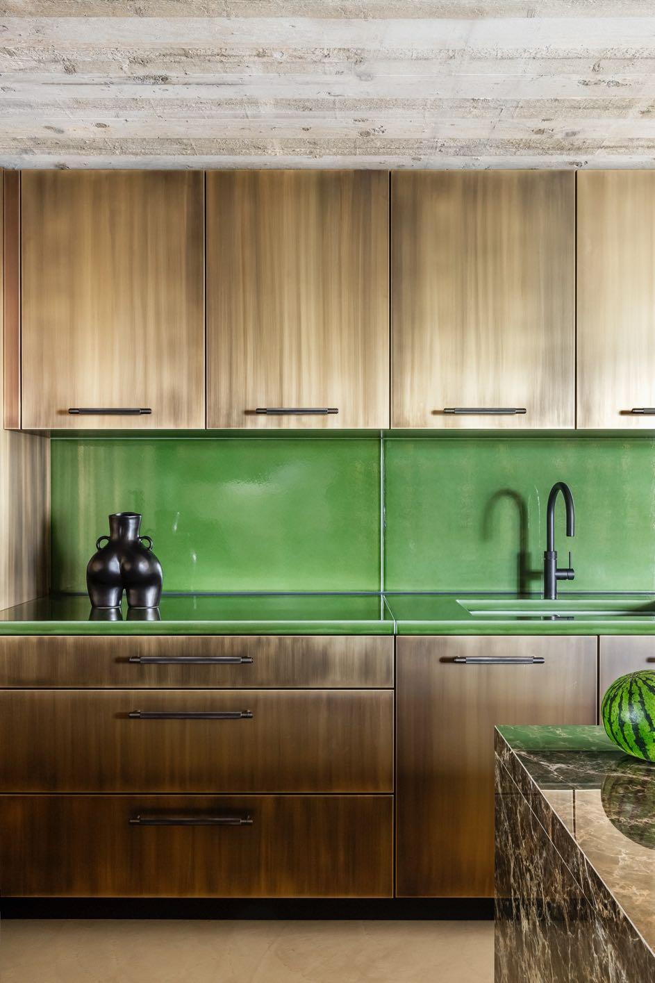
Amidst the expansive layout of this house, the kitchen and dining area are the cherished focal points, infusing the home with a soulful essence. These spaces not only serve as the epicenter of culinary creativity and convivial gatherings but also provide a canvas for expressing the synthesis of form and function. By meticulously choreographing every detail, from the layout of the space to the selection of furnishings and lighting, Victoria Maria sought to create an immersive environment that fostered a sense of warmth, intimacy and connectiona sanctuary where cherished memories would be forged and shared. The kitchen furniture is in polished brass embellished with Buster & Punch handles.
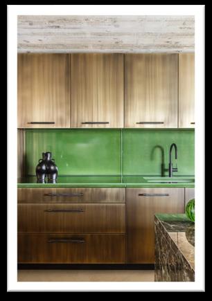
The custom worktop and backsplash are in Pyrolave, French lava stone covered in green enamel; the marble island unit made entirely of emperador dark Spanish marble. A pair of brass shelves (above a small window) and decor pieces add the artistic touch. As for the lighting, no chandeliers or similar were inserted, Victoria Maria opted to put modern LED under-furniture lighting. The dining area next door is a continuation of the kitchen. A custom-made bench along the entire wall accompanies the acrobatic dining table Roger by Victoria Maria which incorporates the same shades of green. Pamela Rosenkranz's wall picture offers a bit of romance while the curtains incorporate some bold colors giving an eclectic touch.


"By embracing the unexpected and daring to challenge convention, we transcended the boundaries of time and tradition, weaving a tapestry of design that speaks to the past, present, and future. In doing so, we not only elevated the inherent uniqueness of the space but also imbued it with a timeless allure - a testament to the transformative power of visionary design.”
Going down the stairs, downstairs, we find a storage room that reflects the rustic design of the entire house. Here, an original kitchen cabinet from "Unité d'habitation, Briey-en-Foret" - Le Corbusier, has been positioned as a chest of drawers, flanked by
a series of decorative elements. The wall facing the outside is made up of a series of white frames with white darkening glass inserts, including the entrance door - this allows natural light to make the entire space well lit.
68 | G&G _ Magazine


To the left of the stairs, we find a lounge room that contrasts with the storage room. Both the ceiling and floor are painted cobalt blue while white carpet has been placed on the floor. We immediately come across Roland's digital piano with its matching stool. Steve McQueen's "Pink Nails" wall art is hung above. On the opposite side we find "Doisneau" by Roland Schappert flanked by a pair of brass sconces by Gubi giving it an air of elegance. Custom-made bookcases (also in cobalt blue) have been set in the other two walls; a huge linen sofa with many cushions covered in Pierre Frey velvet fabric complete the room.

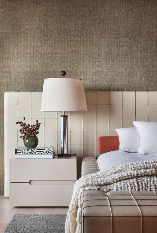
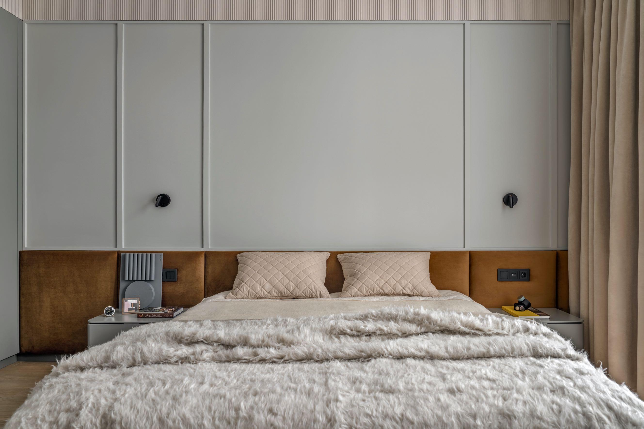
On the first floor, the master bedroom has a very simple and minimalist design. Victoria Maria inserted a white carpet that matches the Pierre Frey curtains. The protagonist of the room is the bed with its custom-made warm golden-brown headboard. Next to it, the fiberglass chair designed by Charles & Ray Eames for Vitra acts as a bedside table.
The master bathroom seems to have a richer character given by the Italian Roman travertine that we find inside. The wall picture by Bernd & Hilla Becher was hung above the bathtub. In front, a wall includes the cabinet with the double sink and a custom-made mirror, where the same image can be glimpsed. A large open shower was positioned behind it.
The open office was located on the top floor. The shelving unit was custom-made
in dark oak which covers the entire wall and even frames a small window. The designer opted to include some iconic design pieces: the Quaderna 2600 desk by Zanotta, Flos' Snoopy table lamp, the vintage Camaleonda sofa by B&B Italia. Many elements present reflect the design of the entire house such as the simple white carpet, the fabric curtains, the Vitra chair.

70 | G&G _ Magazine


LIVING ON

Led by designer Julia Baydyk, Alta Idea studio projected a 116 m² apartment by the natural simplicity with a Ukrainian artistic spirit in Kyiv.
Photography by Andriy Bezuglov

"In a narrow corridor, squeezed between the supporting columns and walls, we have installed darkened bronze mirrors illuminated along their entire rim. These techniques have helped to create a pleasant feeling of free space."
Julia Baydyk

74 | G&G _ Magazine
As of early 2022, this home project was nearly complete (only a few details and decorations left to add) and about to be unveiled by
clients. Due to the large-scale invasion of Ukraine, many of their plans were ruined. However, despite the difficult circumstances, this indomitable family continues to live, enjoying each day with gratitude and inspiring others to work and fight for their dreams and a happy and peaceful future.
The clients wished the interior would create the feeling of a comfortable private house, natural and environmentally friendly, but with a touch of a modern vision. They were reluctant to live outside the city, because they appreciate its comfortable infrastructure and love urban energy and rhythm. However, they were eager to create a warm home that would reflect natural emotions and feelings. Therefore, the
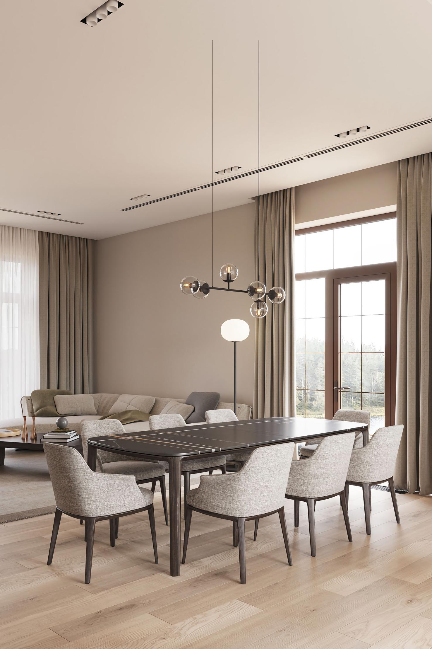
design team of Alta Idea studio chose the Earth-hues colour palette and designed the interior using the tactile aesthetics of clay, stone, timber and grass fields.
At the entrance of the house, a small but comfortable "welcome" area has been set up where a bench as well as a huge backrest have been covered in earth red fabric. A LED light highlights them. A fullheight custom-made wardrobe has been included along the corridor. It leads us to the open plan social area.
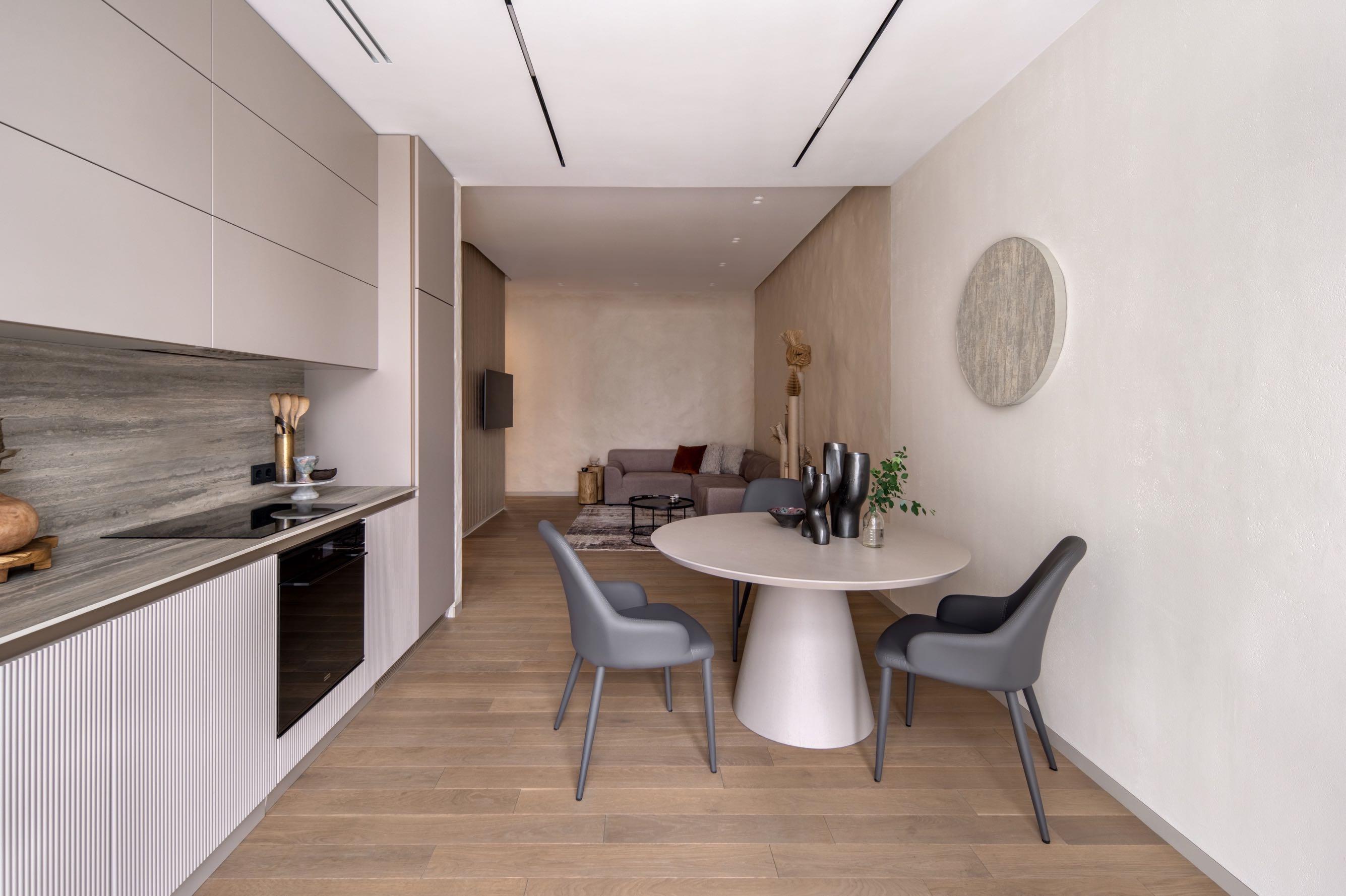
On the right kitchen-dining room with casual sophistication was positioned; in the background a huge window with curtains illuminates the entire living area. The linear kitchen is in gray line, with some decorative details in light wood. The dark gray dining chairs contrast with the round table which matches the shade of the wall. Above, black vases with organic lines emphasise its roundness and the curves of the round painting above it.


Visually separated by a darker colored wall; the modern living area includes the corner sofa in dirty lilac, a pair of wooden side tables and a copy of black coffee tableseverything is assembled by the carpet below. The imperfect walls give a natural rustic look while the natural fiber and cardboard sculpture by Ukrainian artist Tasha Oro adds a chic ethnic touch. In front, a dividing wall covered with wooden slats has been inserted which reflects the vertical motif.
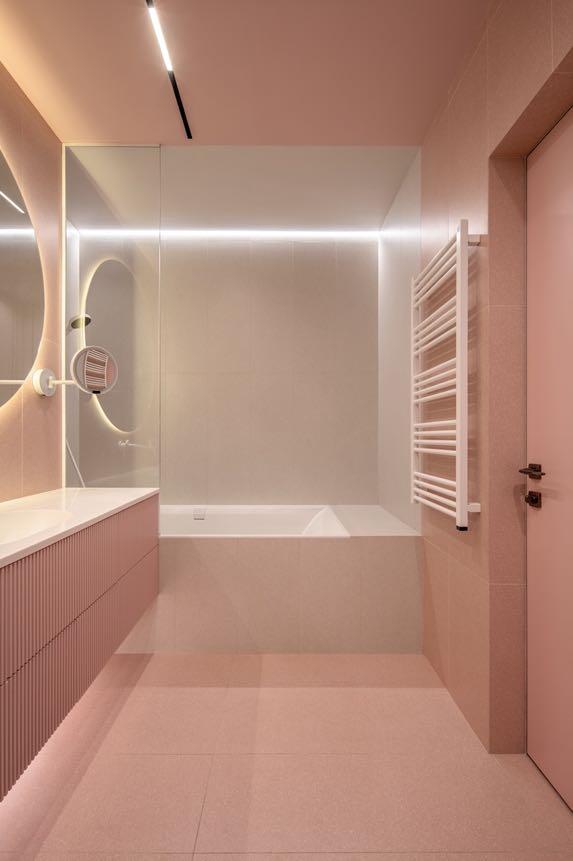
Behind it, the design team included the bathroom which is synonymous with an elegant blend of glamor and minimalist aesthetics. From the furniture to the built-in tub to the floors and ceilings, it is dressed entirely in pink - a color associated with dreams and hope. A backlit mirror gives a dreamlike feeling.
76 | G&G _ Magazine


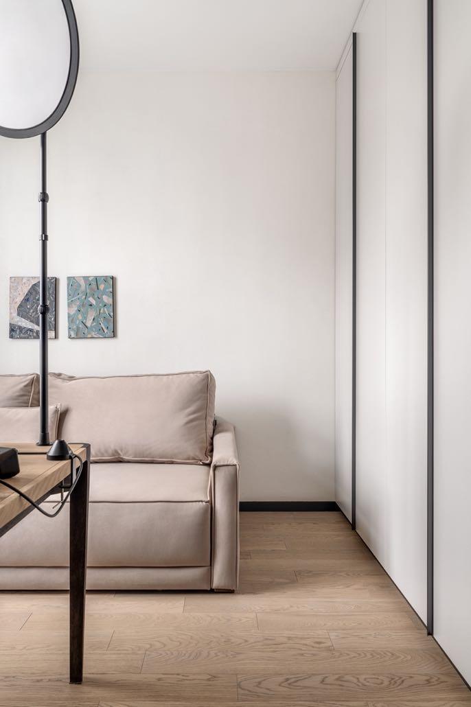
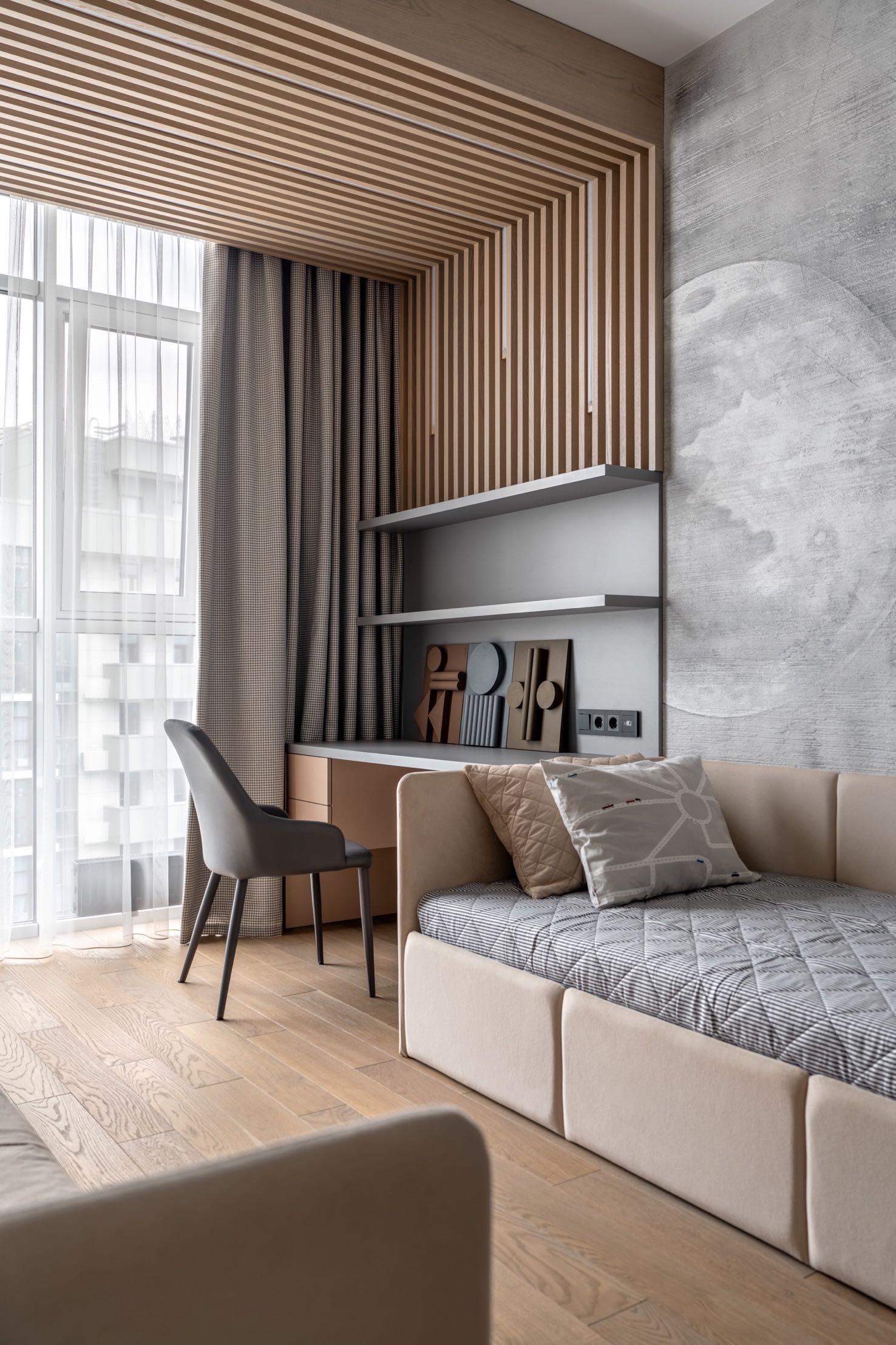
A mandatory element in the house was a soundproof office, since the owner of the apartment is a professional presenter who works with sound and often hosts online programs. So, the design team opted for soundproof gray walls that match perfectly with the desk and wooden floor. The room also includes a comfortable beige sofa and all the necessary professional equipment. The youth room has a certain symmetry, aside from a two-tone wardrobe. On opposite sides of the room, we find the same beds, wall lamps and desks with shelves. Above the latter, a square arch created by wooden slats frames the enormous French window through which natural light passes.
"We used soft panels with sound-absorbing filling and special curtains with noise-insulating lining."


78 | G&G _ Magazine


80 | G&G _ Magazine
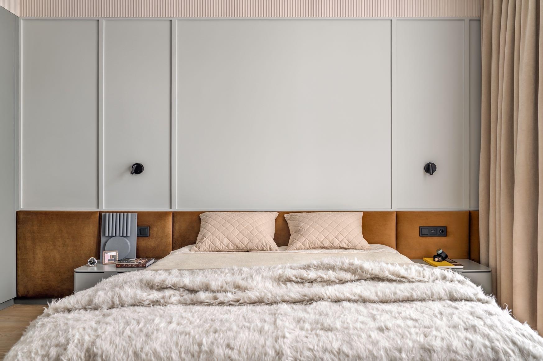
The master bedroom has a rich but at the same time well-balanced character. The dull pastel blue lacquered wardrobes and furniture were custom made. The wall behind the bed was painted the same shade and creates a pleasant contrast with the huge rust brown headboard. The rest of the walls are in pale pink as is the bed linen. An array of avant-garde decorations has been included above the chest of drawers.

The second bathroom of the house includes a hanging cabinet with sink. Above, directly in the mirror, the design team inserted the light bulb-shaped wall lamp. In the shower the walls are covered with tiles inspired by nature. They are reflected in the opposite wall entirely made of mirror, giving a modern dynamic to the space.

refining the aesthetic requirements
IN COLLABORATION WITH SAOTA AND SALOMÉ INTERIORS, ARRCC PROJECTED A FAMILY VILLA WITH A STRONG INDOOR-OUTDOOR CONNECTION, YET STILL FEEL INTIMATE ENOUGH TO BE PRIVATE IN CAPE TOWN.

82 | G&G _ Magazine
Photography by Adam Letch


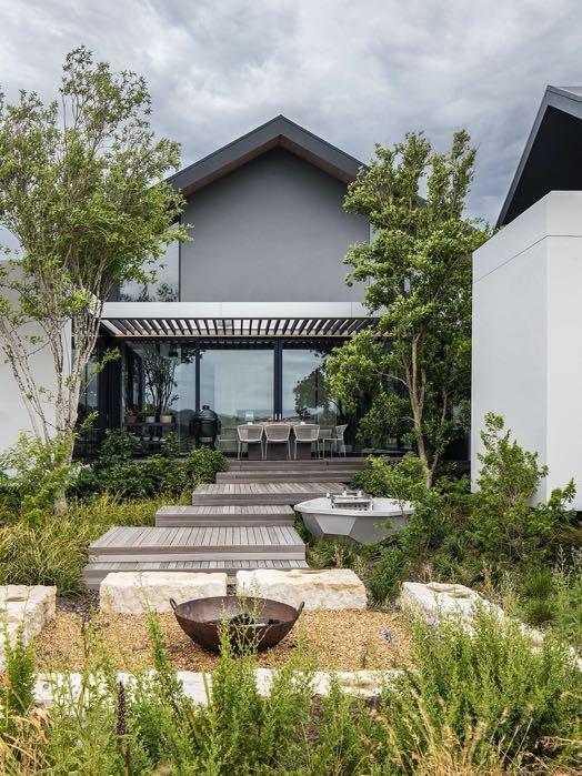
Situated in the Gentleman’s Estate at Val de Vie Estate in the Paarl-Franschhoek Valley, the villa was conceived as a luxury smallholding along the banks of the Berg River offering views of the Drakenstein, Simonsberg, and Paarl Rock Mountains within a landscape of
rehabilitated fynbos.
The estate’s aesthetic guidelines specify a contemporary interpretation of Provençal and Cape vernacular architecture, prescribing pitched roofs, exposed timber rafters, and a material palette of timber cladding, off-shutter concrete, and natural stonework offset with white plastered walls. Within this framework, ARRCC refined the original client brief for an H-shaped footprint to create a cruciform arrangement of five overlapping squares: one central square for the living and dining areas with an interlocking square on each corner for the bedrooms, plus one for the kitchen and utilities.
The high, pitched ceiling creates a grand, double-volume entrance and a lofty interior space for the lounge area, which, together with clerestory windows, responds to the vastness of the surrounding landscape. Variations in ceiling height balance the proportions with sensitivity to human scale, creating cozier, more intimate spaces within an interconnecting open-plan arrangement, resulting in a casually luxurious, flowing sense of interior space.
The main living area is centered on a bespoke, hand-chiselled sandstone plinth for the fireplace. Its raw materiality is complemented with simple, natural materials such as timber and screed floors and raw off-shutter concrete. Besides, on both sides there are sheltered terraces so that at any time at least one is protected from prevailing winds. The relationship between the living space and entertainment terraces has a resort-like quality, with a floating island over the swimming pool, and a long, elegant canopy that folds down to provide shelter and privacy while framing views of the landscape and sky. Such extensions emphasize the horizontal lines of the architecture and balance the high central volume.
84 | G&G _ Magazine


“The absence of structural columns made for a seamless indooroutdoor connection, enhances the sense of a light, floating structure and the immediacy of its relationship with the setting.”


On the other side of the fireplace, in the formal dining area, a majestic pendant lamp by Stephen Pikus was hung above the dining table. Next to it, in the minimalist kitchen the designers decided to include the exposed roof beams clad in timber in a sleek, modern interpretation of rustic ones. Furthermore, the pitched ceiling has a dynamic, asymmetrical detail near its apex.
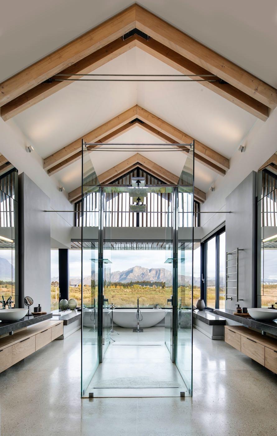
The geometry of the floorplan opens the interior to views in all directions. Floor-toceiling glass sliding doors pocket into the walls so that, when the weather allows, the views “flow” right through the living space as if it were a pavilion. At the same time, it creates a series of green pockets and courtyards around the house, so that it appears “stitched” into the landscape. In particular, the en-suite bathroom off the master bedroom is designed to create a sense of unmediated connection with its natural setting. Here, too, the symmetrical design creates a balanced interior that emphasizes the view as a focal point.


88 | G&G _ Magazine
“While this home remains respectful of the estate guidelines, its complex response to its setting and the client’s lifestyle requirements demonstrates that stylistic limitations need not hamper a rich and unique architectural response.”


winning
90 | G&G _ Magazine
blend

ARCHITECTURE AND INTERIOR DESIGN FIRM STUDIO GRAM HAS REDESIGNED AN EARLY 20TH CENTURY HOUSE WITH THE ADDITION OF A MODERN EXTENSION IN ADELAIDE, SOUTH AUSTRALIA.
Photography by Timothy Kaye
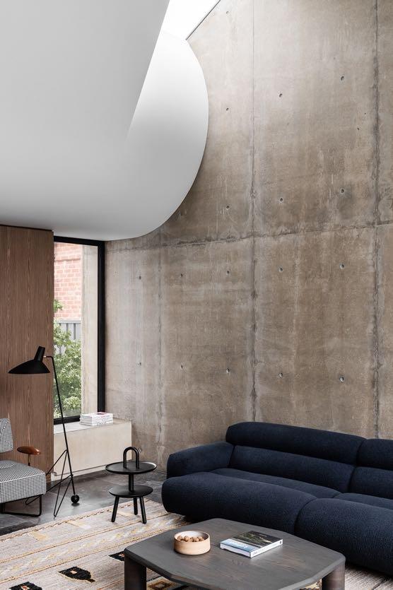
Nestled amongst a leafy Adelaide neighbourhood - Rose Park, this 382 m² house celebrates the meeting of the old and the new. Early investigations revealed that the walls of the original dwelling were constructed from off-form concrete, making it a unique building for its age and location. This discovery served as a key material direction of the project. To maintain the integrity of the original dwelling, only subtle changes in plan were made. The central corridor maintains the original spatial arrangement of the home and leads to the extension wing of the house. It is 162 m² and includes the social living area composed of living, dining area and kitchen. Here, a billowing form on the ceiling becomes the transition between the original dwelling and the extension, celebrating the coming together of old and new. The curved bulkhead feels weighty yet soft and is an example of compression and release in action. The curves are then taken up in the furnishings of the living room: the
“FROM THE STREET THIS EARLY 1900’S QUEEN ANNE VILLA APPEARS LIKE ANY OTHER, HOWEVER BENEATH THE SURFACE LIES A SERIES OF SPACES DESIGNED TO BE UNIQUE IN THEIR FUNCTION AND EXPRESSION, YET CONSISTENT IN THEIR APPROACH, RESULTING IN AN ARCHITECTURE THAT IS COMPLETELY UNEXPECTED.”
DAVE BICKMORE, STUDIO GRAM'S DIRECTOR


92 | G&G _ Magazine

dark blue sofa by Jardan, next to it Cassina’s side table, and the central fireplace with suspended hearth. With light retro detailing, the Stellar Works' chair makes a warm addition, embodying the relaxed spirit of Australian living today. On the floor, the camel kilim-style carpet from Jardam was placed; it is decorated with tufts of textural pom poms, in both warm earth tones and dark ones. A touch of minimalism is given by &tradition’s floor lamp with clean lines. Apertures in the walls
and ceiling creates a connection between the sky and the garden, allowing a moment for its occupants to witness the ephemerality of the garden and its seasonal change. Besides, the living room enjoys a beautiful view of the existing pool that was retained. It served as a key driver for the location and arrangement of the extension. The gentle curves of the pool would also later serve as a key inspiration for the sculptured forms found throughout each of the spaces.

The sculptural quality of the thresholds accentuates the act of moving from one space to the next, resulting in an architecture that’s completely unexpected. Thus, the delicate curve of the bulkhead is repeated in the walnut joinery below and is also found in the sculptural wooden backrest of the dining chairs by De La Espada. They surround a rectangular wooden table, while above a triangle pendant by Apparatus Studio hangs which creates a soft light. A cabinet that includes a bar acts as a divider between the living and
the dining room.
Next to it, the kitchen was placed, centered around the Elegant Gray stone island bench from CDK. Crackling veins on a dark surface give this limestone a sophisticated look. This natural stone provides a textural juxtaposition alongside the American walnut joinery. Two Grazia & Co stools in cream wool lend a luxurious tactility. An array of modern appliances complete the kitchen, including a cooktop by Wolf, Miele dishwasher and warming drawer, and SubZero fridge.
94 | G&G _ Magazine


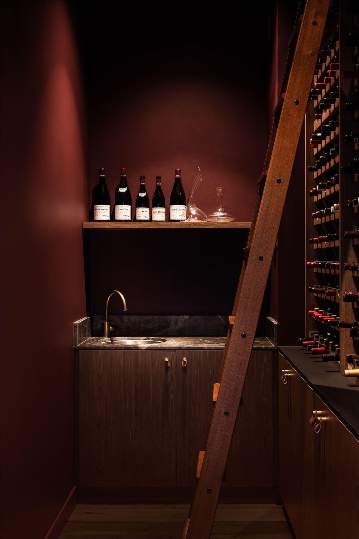
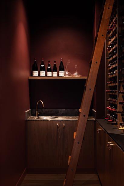
Each room explores the use of colour and materiality to evoke a feeling that is akin to its function. Leaving the living area, on the right we find the cellar, which reveals a rich burgundy color - a celebration of the client’s impressive wine collection. But at the same time, it remains united in its use of the same walnut wood panels and stone top as the other spaces within the extension. Next door, the private bathroom highlights a darker and more intimate palette.
In front of these two spaces, there is the simply designed office with a bookcase set into the wall and a suspended desk (both in walnut wood). The Flos Snoopy table lamp in black with the white marble base creates an iconic design moment
“TO BE WITHIN ITS WALLS IS TO BE REMINDED OF THE INTERPLAY BETWEEN TIME, SPACE, LIGHT, COLOUR AND MASS - THE PHENOMENA THAT SHAPE THE EBB AND FLOW OF OUR EXPERIENCES.”

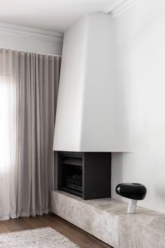
On the opposite side of the open living area, there is an informal lounge. Here we find a black fireplace while its chimney hood is hidden in the white wall and creates undulating curves, echoing the sculptural architecture of the entire house - the result is an elegant contrast. Placed on the fireplace mantel, the Snoopy lamp by Flos takes up its design (the same one present in the office).

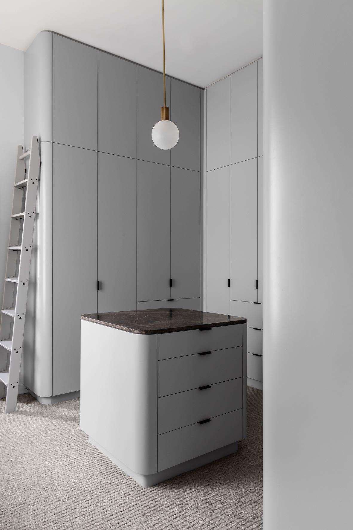
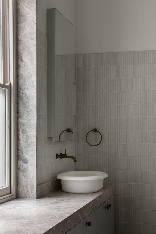
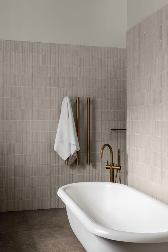
At the clients' request, slight changes were made to the floor plan of the original home to incorporate a master wing that includes a walk-in-robe and ensuite. In particular, the walk-in closet has wardrobes with curved corners that cover the entire height of the room, from the ceiling to the floor, thus creating a large space for storing objects. In the center, an island dresser was incorporated above which Marz Designs' pendant lamp hangs. Its delicate frosted globe and solid brass give it the touch of elegant luxury. These details are echoed in the en-suite bathroom thanks to Brodware's antique brass taps. Resembling a sanctuary, the space includes a long vanity with a rich stone top including a round sink on each side flanked by the mirror. In between, a window illuminates the freestanding bathtub in front of. The walls are covered with shiny ceramic tiles from Academy Tiles which feature light texture, subtle crackle effects and natural color movement.

98 | G&G _ Magazine


HERITAGE

HOME
STUDIO GUILHERME TORRES DESIGNED THE COSY AND CONTEMPORARY INTERIORS BY SINUOUS AND MOVING SHAPES FOR AN APARTMENT WITH A PRIVILEGED VIEW OF THE CITY OF SÃO PAULO.
Photography by Denilson Machado (MCA Studio)
"This project represents the synthesis of the style of living that I propose to my clients. Spaces with drama, emotion and, at the same time, cosy." Guilherme Torres
The apartment emerges with the desire to inhabit a space where coziness is one of its pillars, for a family with a core of 4 people, being the parents and two teenage children.
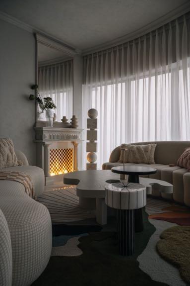
With an area of 570 m² , the apartment is designed with two zones: the social area and the intimate one; both with a wood frame in light wood, featuring natural oak on the floor, ceiling, and walls. A natural stone conglomerate is also used, but it's not rustic; rather, it's treated subtly with a refined, smooth, and light finish. This maintains the soft continuity provided by the wood.
In the entrance hall, black wood is used, so the individual enters a dark environment and follows the path towards the light, thus creating a poetic atmosphere between light and dark, and playing with lights and shadows.
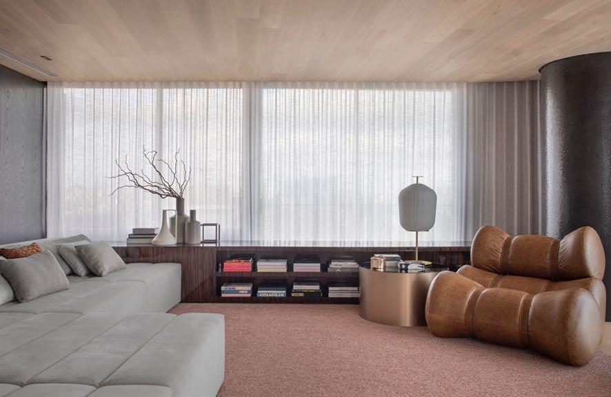
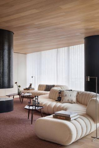
Thus, you enter the large living room where the emphasis is focused on the curved sofa designed by Guilherme Torres. The curves are echoed by a pair of black armchairs with a sculptural structure and a modern fireplace in the middle of the room. The integration between the living room and the balcony takes center stage, transforming into a large living area like a home theater thanks to the wall made of revolving doors.


102 | G&G _ Magazine


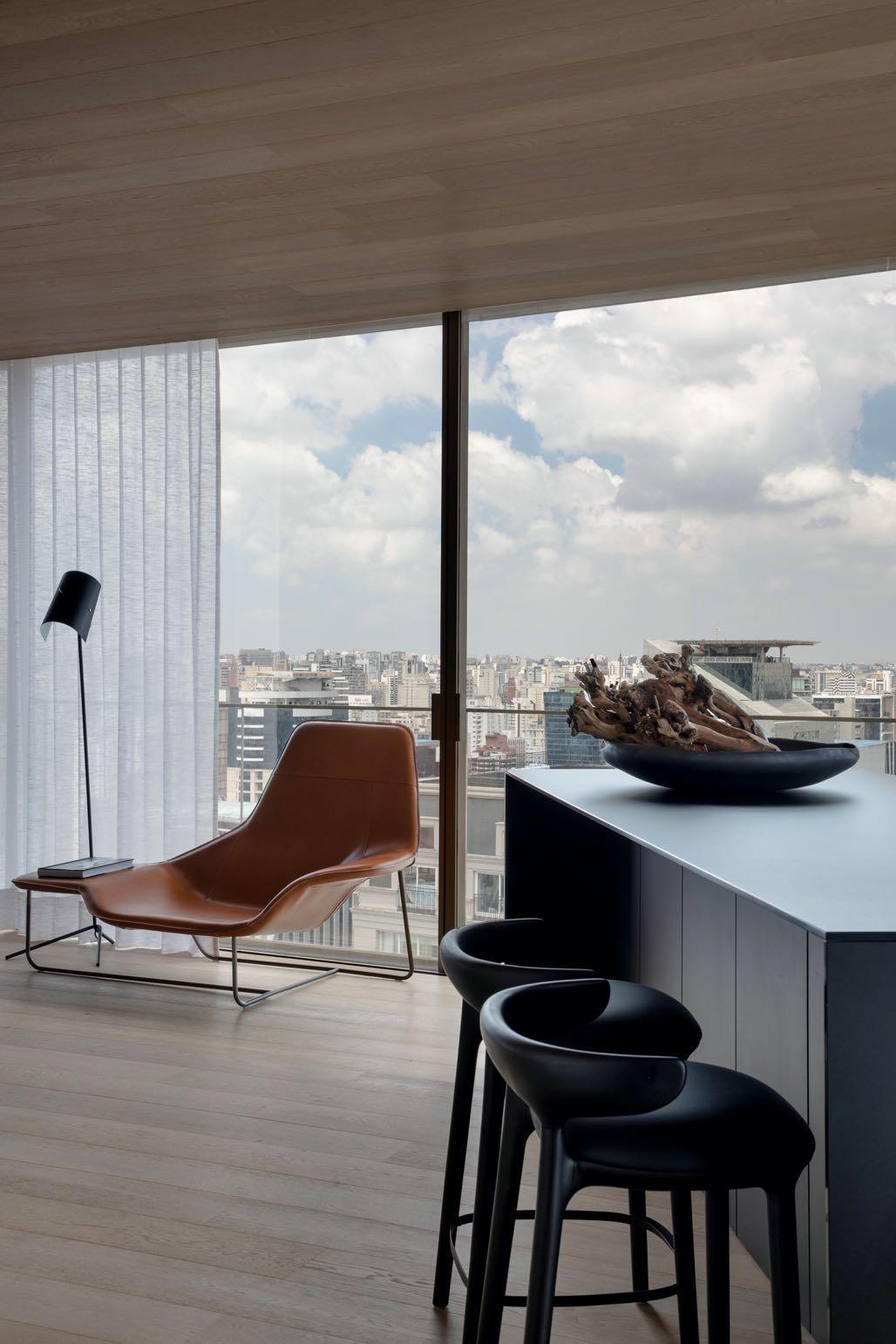
On the other side the living room is integrated with the dining room and the gourmet area. Here, the elements found in the comfort of the soft wood and the rawness of the walls create the feeling of a mountain house. But at the same time, it brings with it the duality of the view of the
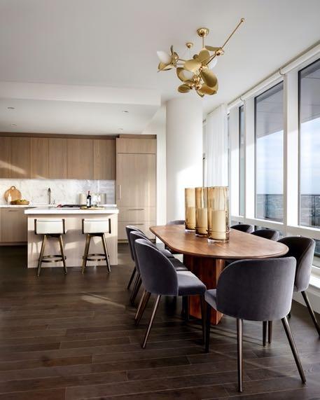
single-color balcony together with bar stools takes up the black color present in the enormous dining table and chairs; Hanging lamps above them give a touch of drama. A few designer objects on the sideboard hanging nearby complete the whole ambience.
104 | G&G _ Magazine

As for the kitchen, it's isolated - it's located at the back of the apartment, as it has an industrial structure, with a large hood, designed for events and celebrations. Here, the European oak wood, a light and soft material, meets in contrast with the Basaltina stone, a harder materialcompletely opposite materials that connect and integrate in a subtle and sophisticated way.
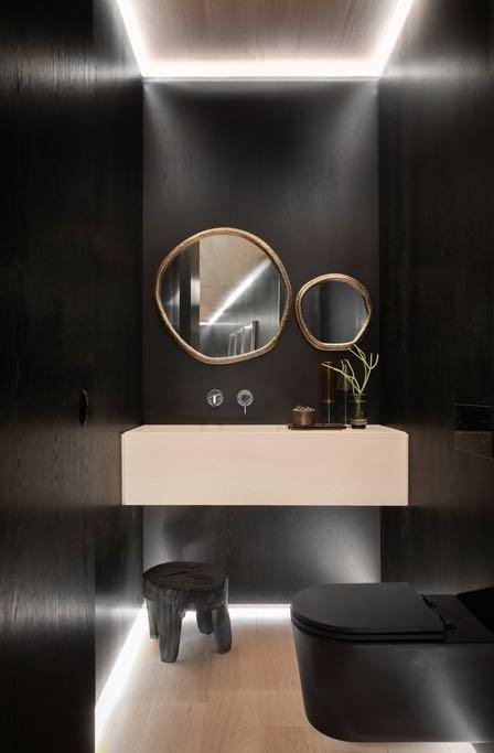
A wine cellar and the powder bathroom complete the service area. In the latter, in particular, importance was given to the integrated lighting on the perimeter of both the ceiling and the floor as all the walls of the black, the toilet and the


106 | G&G _ Magazine


The intimate area is located on the other wing of the apartment, it is made up of five suites: one for each child, the suite for the couple, the new games room and another for guests. The design of this area is simpler with a soft color palette.
The couple's master suite is the most spacious and has a large walk-in closet, and the couple has a bathroom each.


Follow us
The future in motion.
Africa
arrcc.com
donatoengineeringsystem.com
America
guilhermetorres.com
luxurylifestyleawards.com
Asia
designshanghai.com
designtokyo.jp
giftionery.net
kgd-a.org
megashowbangkok.com
tangramfactory.com
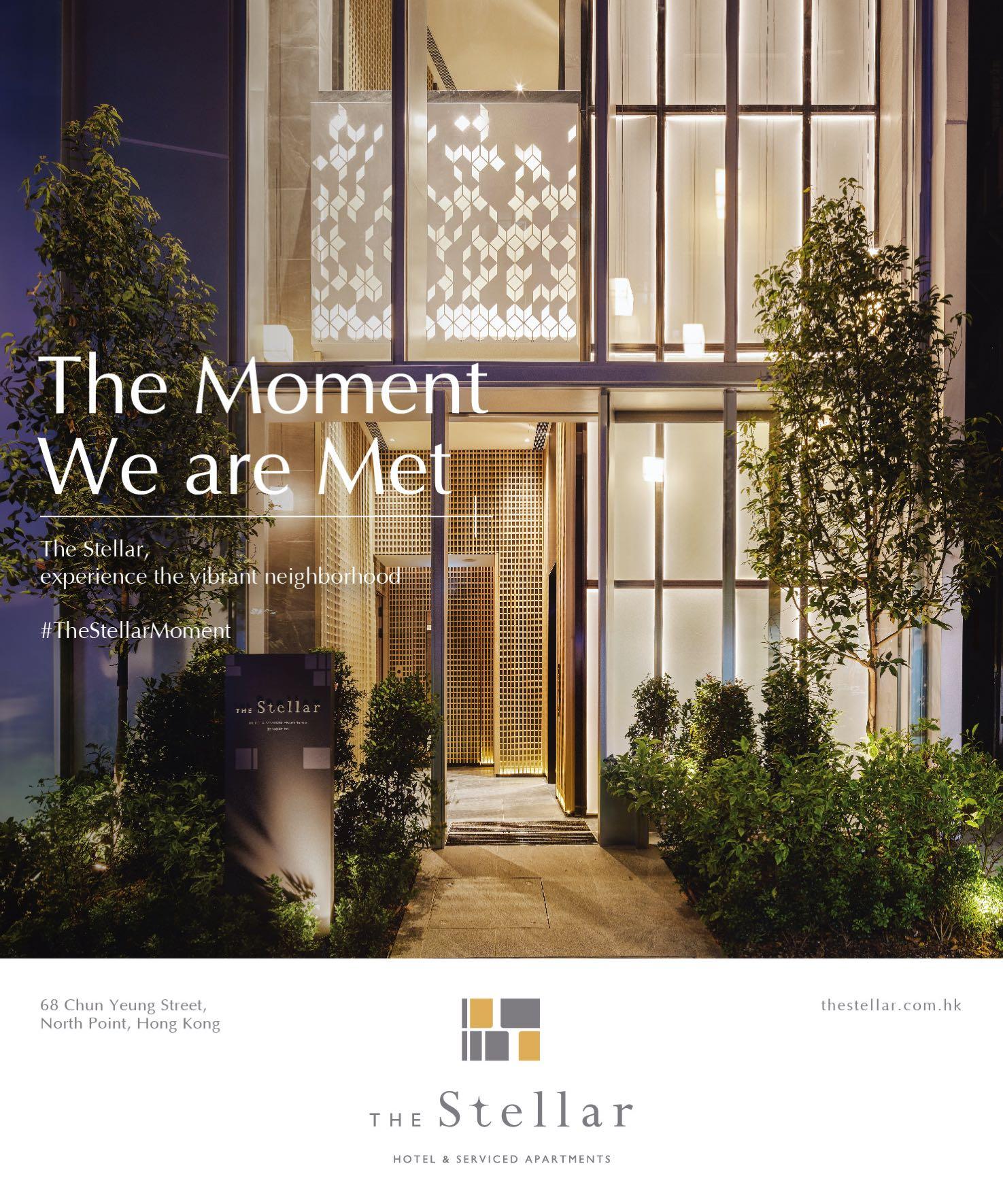
thestellar.com.hk
Europe
aethos.com/sardinia
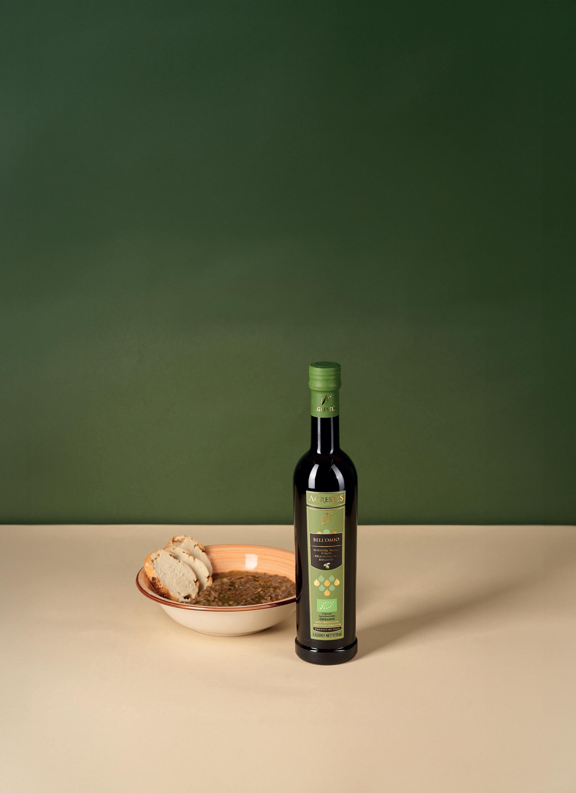
agrestis.eu
altaidea.uk
alvamusa.com
amiciburo.com
arnequinze.com
artparis.com
aura3d.eu
bonsoirs.com
brabbu.com
brostecopenhagen.com
bykoket.com
carocim.com
castrolighting.com
christian-lacroix.com
circu.net
cole-and-son.com
delightfull.eu
design-by-us.com
elvangdenmark.com
enamoura.com
gandgmagazine.eu
gardenglory.com
gornceramics.com
hartodesign.fr
ilariai.com
jklabarchitects.com
karchitects.com.ua
kathrynireland.com
klimchi.com
kmdesignlab.com
laredoute.com
letsdesign.com.ua livawards.com
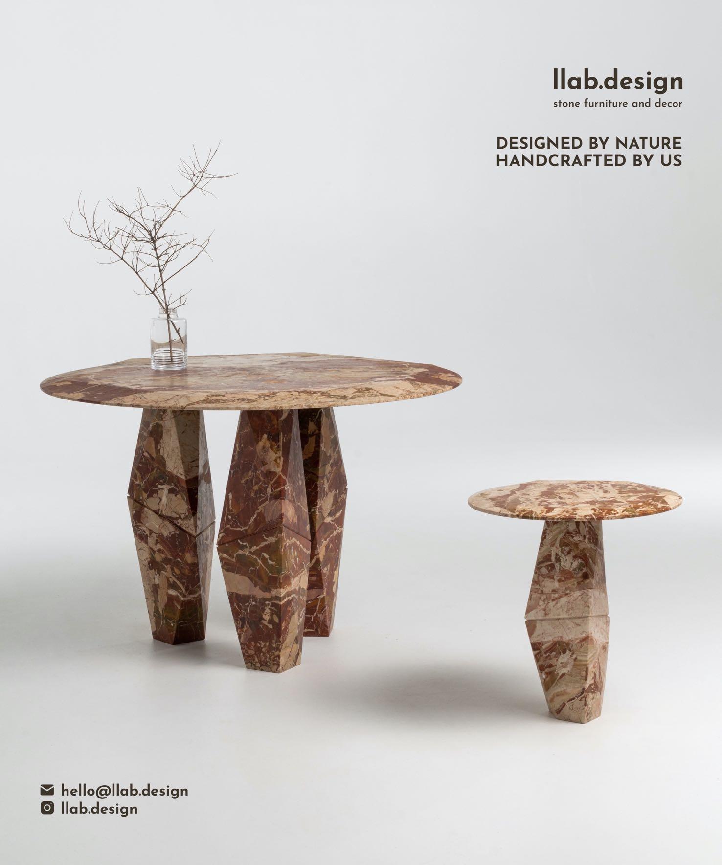
llab.design
materdesign.com
mezzocollecaon.com
mullervanseveren.be
noom-home.com
nuura.com
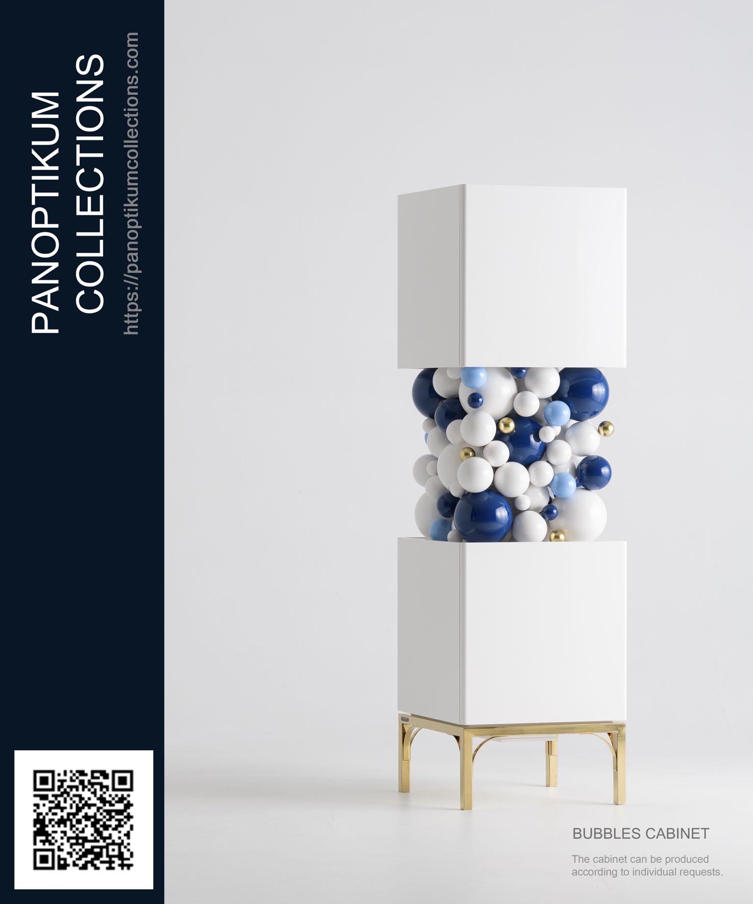
panopakumcollecaons.com
peterpichler.eu
pietro-franceschini.com
pinik.com.ua
prodan-design.com.ua
pureandpaint.com
stephaniecoutas.com
studio-donna.com.ua
studiogameiro.com
spacecph.dk
studiomodijefsky.nl
tatararazors.com
the-aster.com
the-fairytale.com
victoria-maria.com
vistaalegre.com
za-za.com.ua
zaditaly.com
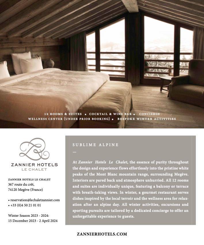
zannierhotels.com
zikzakarchitects.com
Oceania
massimointeriors.com.au
studio-gram.com.au
ALL OFFICIAL SOURCES: 112 | G&G _ Magazine


GG G&G _ Magazine N 41 – November 2023 & DIAMOND BLACK THE PURSUIT OF ENJOYMENT Retreat art, mastery and beauty Scandinavian GG G&G Magazine N 42 – January 2024 & CRISP CHOREOGRAPHY NEW DEFINITION OF LUXURY bespoke approach Peach tender Fuzz #WINTER2024 MORE INSPIRATION FOR YOUR HOME GG G&G _ Magazine N 40 – September 2023 & #AUTUMN2023 Paris Design Week DYNAMIC energy WWW.GANDGMAGAZINE.EU Click to our latest issues now to see even more of trend updates, stylish ideas and exciting projects.


 Estee Armchair by ASTER
Lisette – Grès verveine Suspension by ENAMOURA
Gua0za Peche Cushion by CHRISTIAN LACROIX MAISON
Ilni Cup by LA REDOUTE INTERIEURS
Color
Blox
Small
Rug by DESIGN BY US
Euphoria Screen by KOKET


 Photography by Belen Imaz & Pedro Bermejo
, VICTORIA


