GG G&G _ Magazine N°40 – September 2023 & #AUTUMN2023 Paris Design Week RUSTIC AESTHETIC First DYNAMIC energy Blush

WWW.MAISON-OBJET.COM PARIS 07-11 SEPT. 2023
Are you ready to join us on our revolutionary journey towards sustainability?
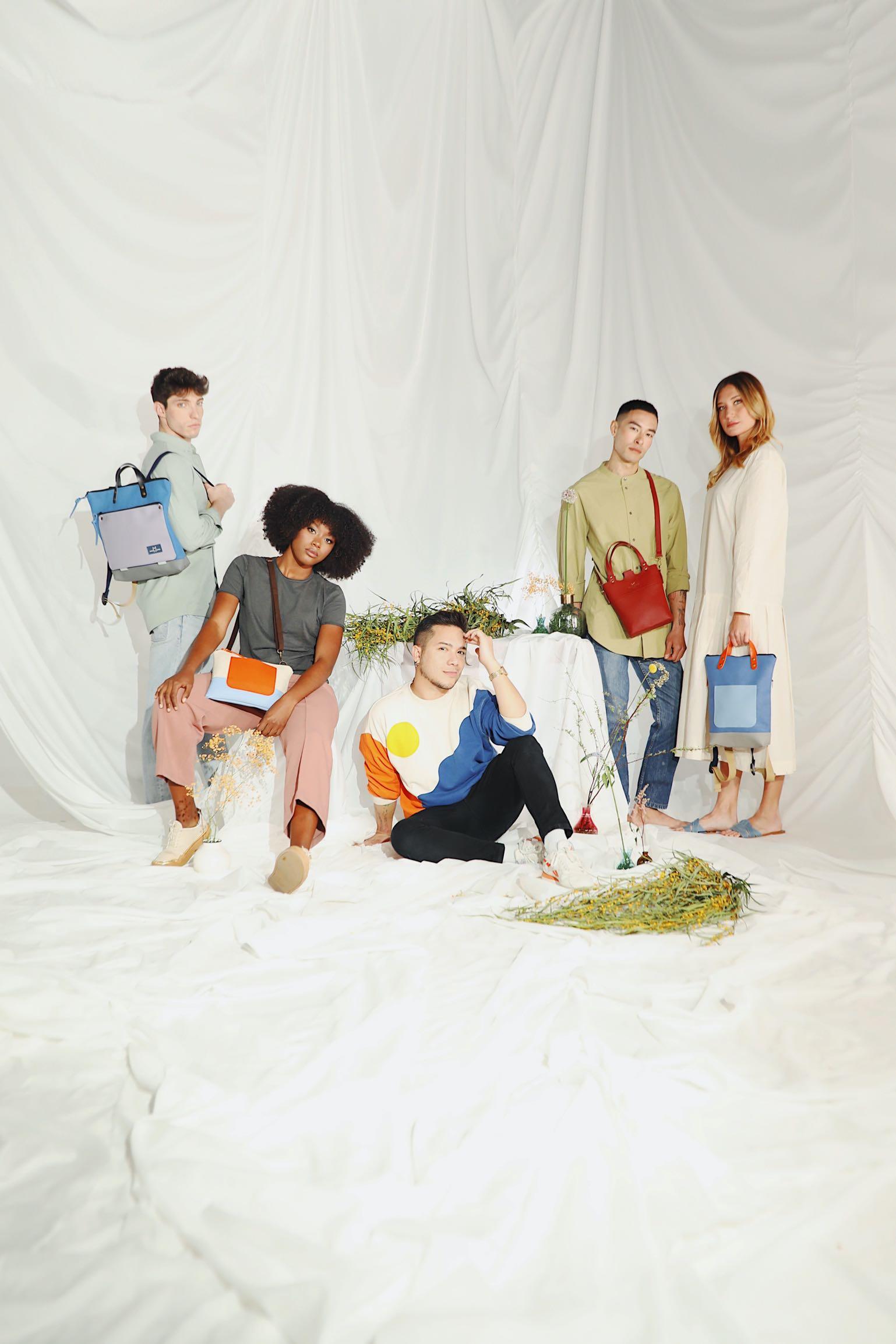
At the heart of our brand lies sustainability. Our vibrant and captivating backpacks, handbags, accessories, and clothing are meticulously crafted using recycled and sustainable materials that are sourced locally This is just one of the ways in which we actively contribute to making a positive impact on the environment.
Email: hola@daniel-chong.com
Instagram: @danielchong_brand

D A N I E L – C H O N G C O M

BVCe r t 6019453 www.cristel.com
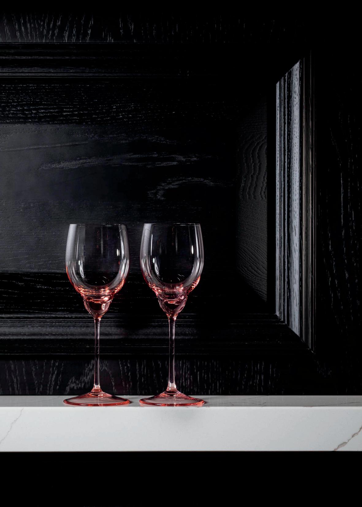
PREMIUM BOHEMIAN GLASSWARE VISIT EU.KLIMCHI.COM
FOLLOW @KLIMCHISTUDIO

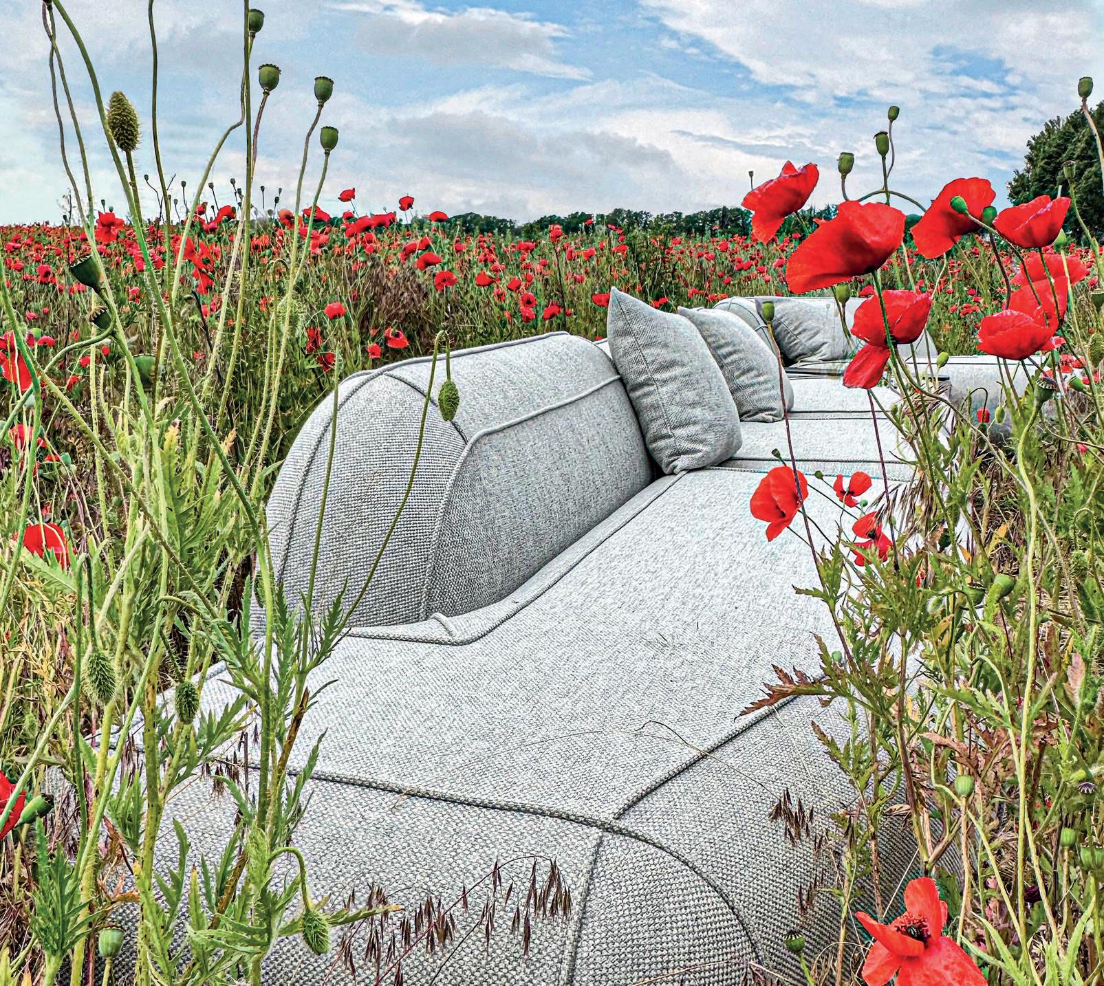
+39 392 089 8038 www.studio-donna.com.ua/en info.donnafurniture@gmail.com @studio_furniture_donna @donna.furniture.studio

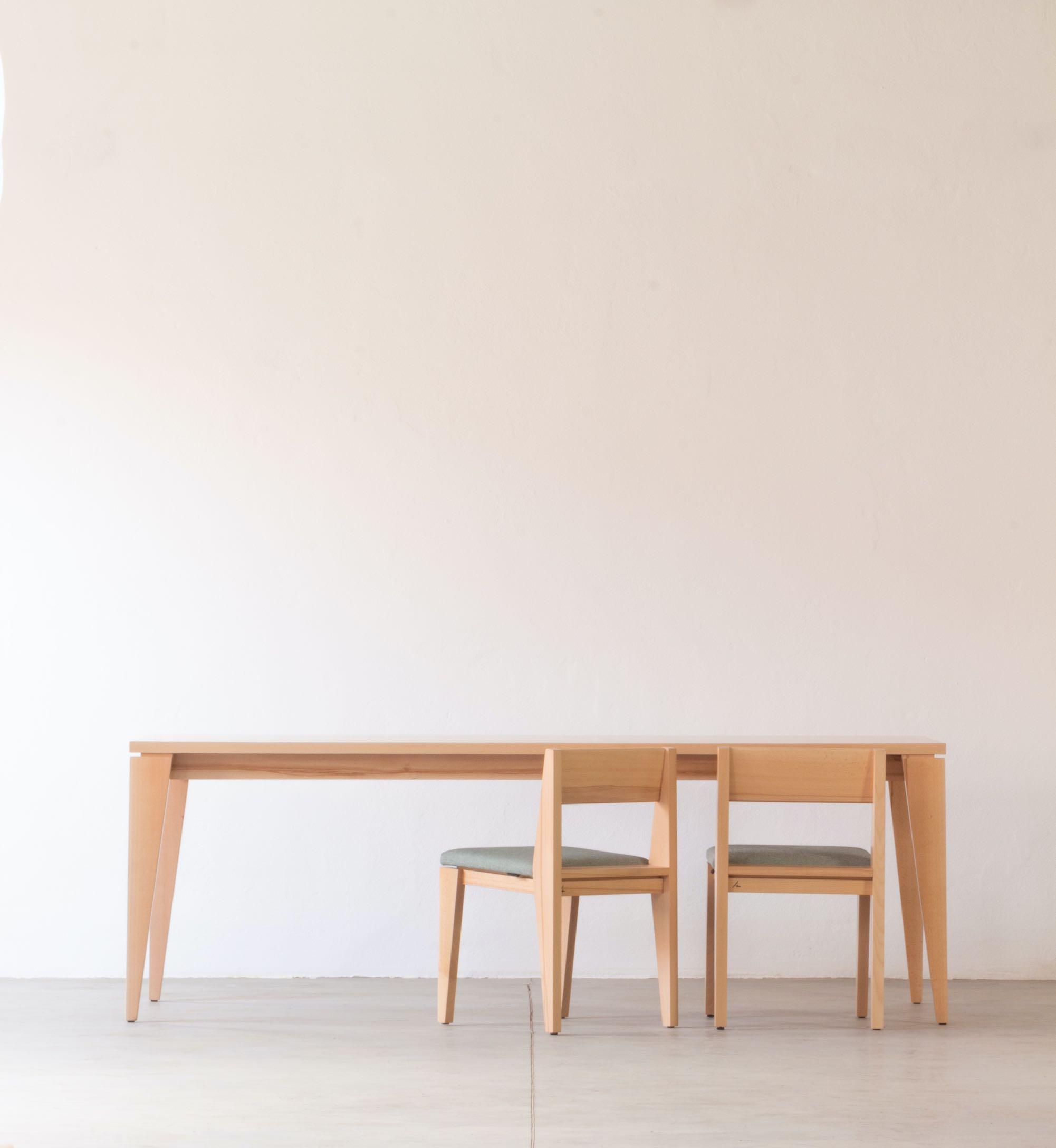


alsena.ro | +40 740 147 091 547515 Sarmasu, Garii street, no. 1, Mures County, Romania
furniture manufacturer
M&O Hall 6 Stand D137
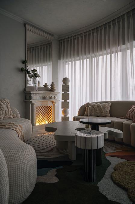


GG G&G _ Magazine N 40 – September 2023 & #AUTUMN2023 Paris Design Week RUSTIC AESTHETIC First DYNAMIC energy Blush CONTENTS ON THE COVER The living room from the Mumbai’s project by Purple Backyard Page 98 TRENDS 20 DESIGN SELECTION AUTUMN 2023 31 E-SHOP DESIGN PRODUCTS WITH A SIMPLE CLICK INSPIRATION 39 LATEST NEWS FROM DESIGN WORLD 47 PARIS DESIGN WEEK 48 MAISON&OBJET THEME «ENJOY» 54 DESIGNER(S) OF THE YEAR FIEN MULLER & HANNES VAN SEVEREN 56 HOSPITALITY LAB AND COOK&SHARE HOTEL AND CATERING INDUSTRY 60 FEEL GOOD ALLERT! WELL-BEING&BEAUTY 62 YOUNG FRENCH DESIGN SCENE RISING TALENTS AWARDS 57 33 23


CONTENTS INTERIORS 66 RUSTIC AESTHETIC HOUSE BY KELLY HOPPEN / THE COTSWOLDS, UK 76 DYNAMIC ENERGY MULTI-FUNCTIONAL HOUSE BY MICHELLE NUSSBAUMER / LAGUNA BEACH, CALIFORNIA 88 UNSOPHISTICATED CHARM RESIDENCE BY GRANDE INTERIOR DESIGN / HONG KONG 96 LITERALLY IN THE CLOUDS HOLIDAY APARTMENT BY PURPLE BACKYARD / MUMBAI, INDIA 108 FIRST BLUSH HOUSE BY SMAC STUDIO / SYDNEY, AUSTRALIA 118 FLASHES OF LUXURY FAMILY HOUSE BY PRUSTA / VILNIUS, LITHUANIA 131 EVENTS CALENDAR SEPTEMBER – OCTOBER 140 ALL OFFICIAL SOURCES 100 78 126
eptember. This month for me (and for many others) is like the New Year. After a pleasant holiday, we return to everyday life: work, school, home, commitments - everything returns to normal. Obviously like any new beginning, this involves good intentions and now is the time to bring out our magical list of good resolutions that we have been preparing all summer. And in mine there are many new ideas for redecorating the house, making it more functional but at the same time trendy. When we start something new, we tend to be very "rigid" to have the desired change immediately; this leads to greater stress and a large part of the time we "fail". We should be more flexible and start small; so also, with the decor changes in our homes. Going from summer vibes straight into a cold autumn isn't exactly pleasant. This is why on page 20 we offer you a list of Design Trends colors with a new perspective: in addition to the typically autumnal tones such as Olive Oil or Fired Brick, there are unusual accents of blue that alleviate the transition from warm to cold. Surely, this season is about to start in a "hastier" way than usual. The long-awaited Paris Design Week starts in a few days and with it one of my favorite fairs: Maison&Objet. This year I was more than enthusiastic to discover all the new things that the event will offer us and I'm even more excited to show them to you! (You will find them from page 48.) In the foreground, the theme of "living pleasantly" and "enjoying life" is addressed. And in this edition M&O has fully hit the target by proposing to explore our senses and needs. In Hall 6 we find the new functional solutions of the Hospitality sector while in Hall 3 we can watch the cooking demos. Another very interesting point that I find the proposal of Hall 5A where we find products that improve us to feel good at home. There are not only scented candles or home care products, but also a varied range of cosmetics & skincare, relaxation ingredients, fitness accessories and even "soft" techniques such as light therapy or aromatherapy. So don't miss this edition of M&O and go in search of pleasures. Hope this issue brings you more fresh ideas and perspectives to get you off to a great start this Autumn. Enjoy!









S !"#$%&'(%()*&#" I’m always interested in your opinion, send me any feedback or suggestions at zhanna@gandgmagazine.eu
G ANDG MAGAZINE.EU
House with art
INTERIORS
RESORTS
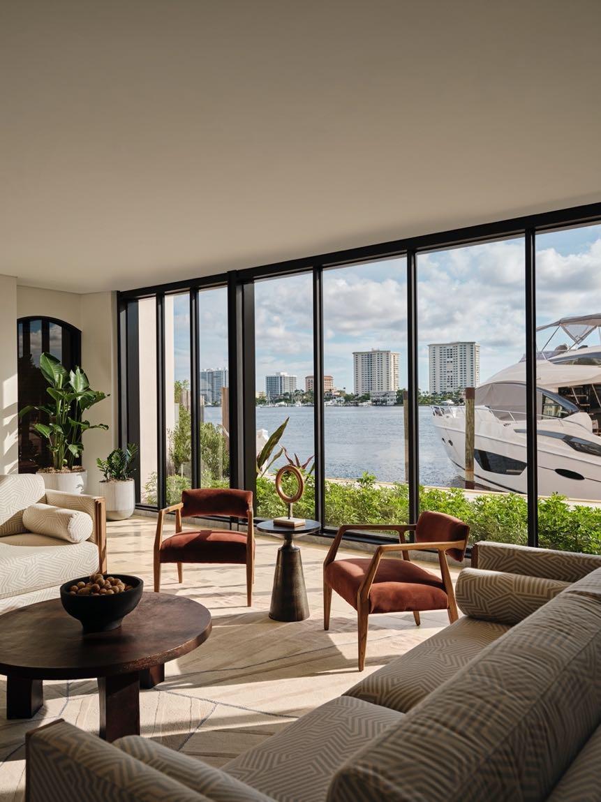
Rockwell Grouphas completed the interiors for the guestrooms and many of the premiere amenity and dining venues at The Boca Raton in Florida, which was originally founded in 1926 as the Ritz-Carlton Cloister Inn.
!"##$!% &'(#)*+)%")"*,


ENQUIRIES info@gandgmagazine.eu
NEWSLETTER
!"#%-!%
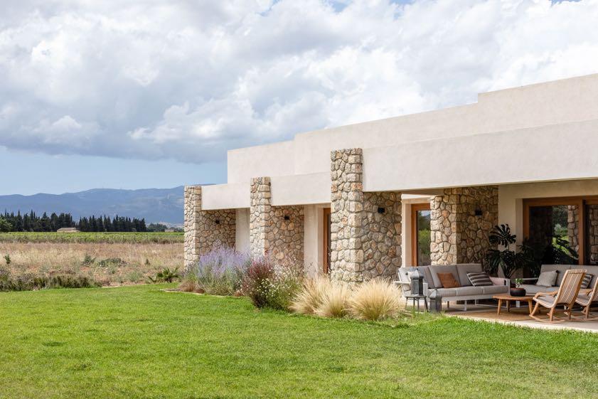
A traditional property among vineyards in Mallorca Jaime Salvá, the architecture and interior design office based in Palma de Mallorca, unveiled one of its latest project: Mormaiquel House, a charming rustic house located in Biniagual, a few minutes from Binissalem, ideal for a summer in the Mediterranean
ARCHITECTURE
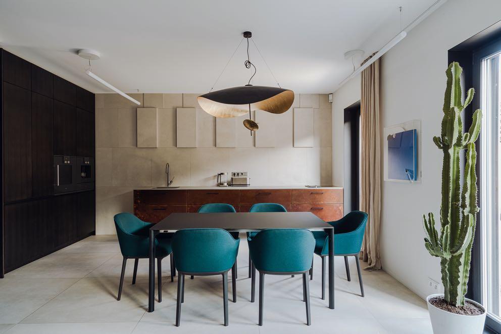
Mili Młodzi Ludzie designed an elegant and functional 3-story townhouse project located in the eastern part of Poznan, Poland.
DESIGN TRENDS

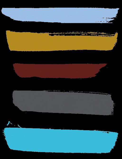
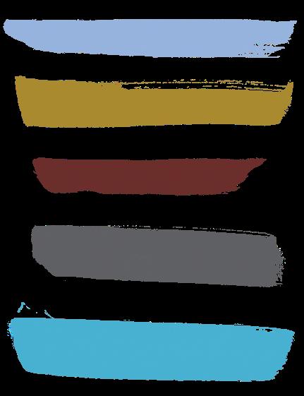
Inspired by Pantone’s Autumn proposals from London Fashion Week, we present you some glimpses for this season with a fresh and vibrant color palette. The shades presented enjoy individuality and creativity while remaining refined and timeless.
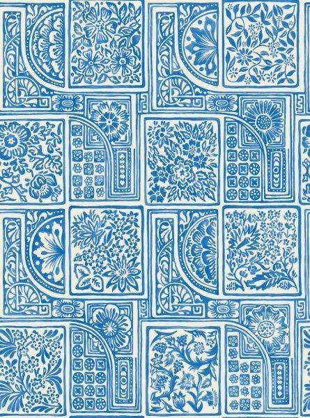
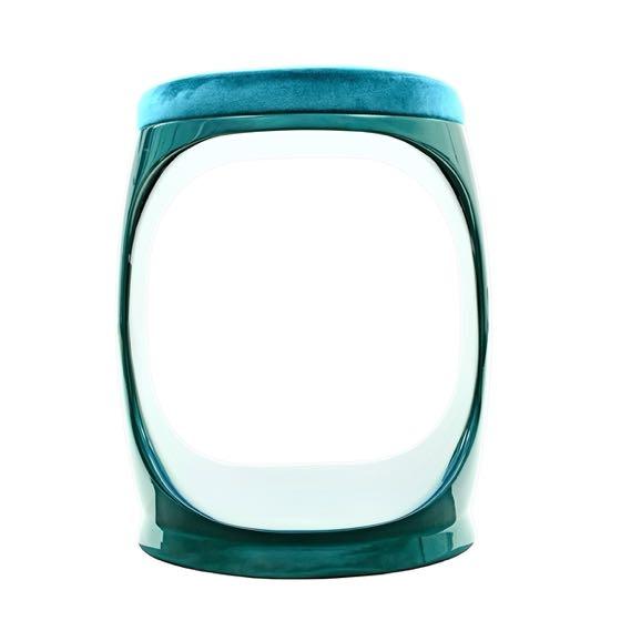
A SUPER VIBRANT BLUE, MORE TYPICAL OF SUMMER THAN AUTUMN. WE CHOSE TO START THIS LIST OF COLORS WITH BLUE ATOLL TO REMIND US THAT BOLD TONES CAN BE USED NOT ONLY IN THE WARM SEASONS. THIS TROPICAL SHADE LOOKS GOOD ON ITS OWN BUT CAN BE PAIRED PERFECTLY WITH WHITE.

 PANTONE 16-4535 TCX
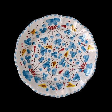
Turquoises Plate by POPOLO
Signet RingTurquoise Stool by SOFTICATED
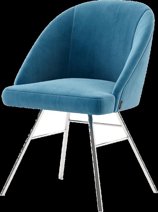
Loren Chair by LASKASAS Blue Atoll
Lily Vase by MEZZO DECOR
Bellini Wallpaper by COLE & SON
20 | G&G _ Magazine
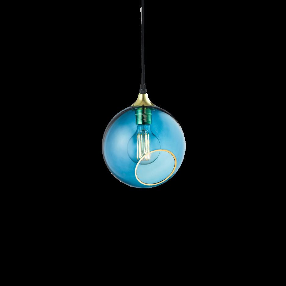
Ballroom Pendant by DESIGN BY US

8 - 11 October 2023 Olympia London Decorex Nat Maks decorex.com

+38099 234 26 27 nerobot@prodan-design.com.ua prodan-design.com.ua Instagram @nelly_prodan

 Barth Stool by LEBERREVEVAUD
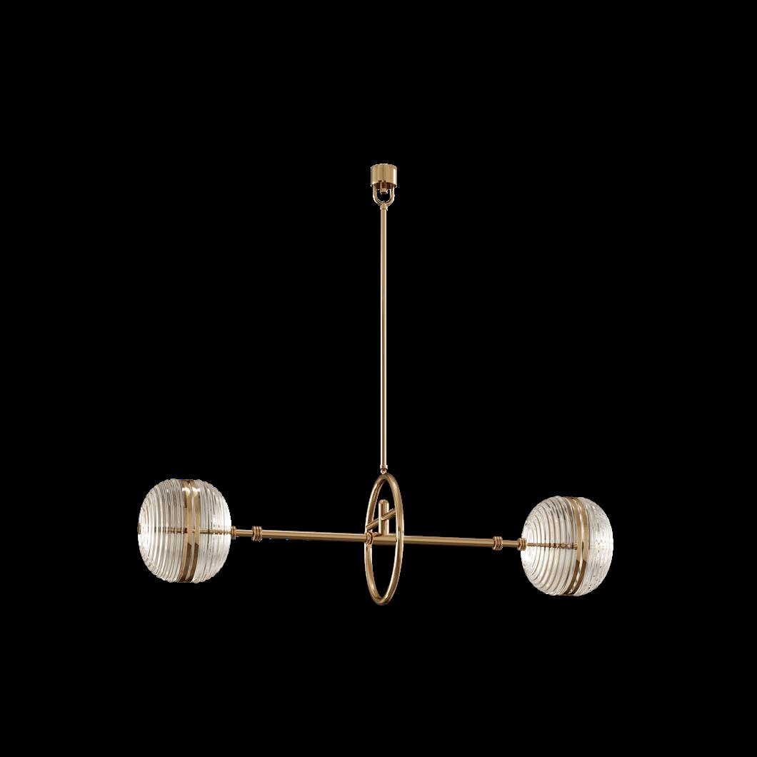
Ayler II
Ceiling lamp by MEZZO COLLECTION
FITS PERFECTLY IF YOU WANT TO RECREATE A CONTEMPORARY OR MODERN DESIGN.

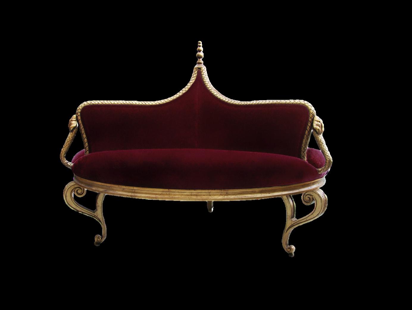
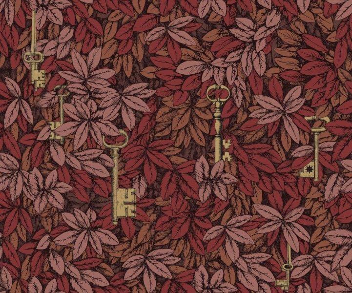
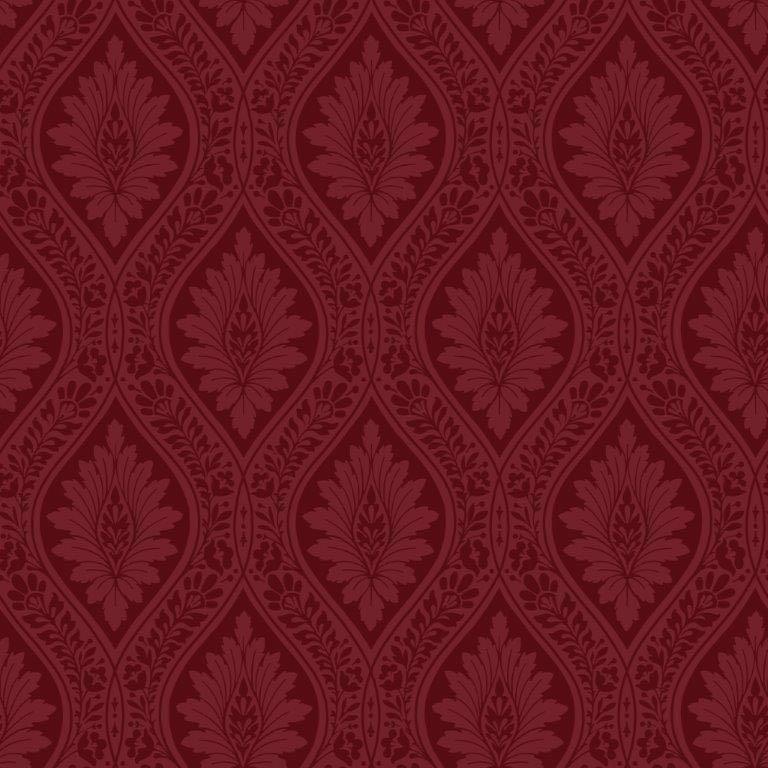 Bloomsbury Edimbourg
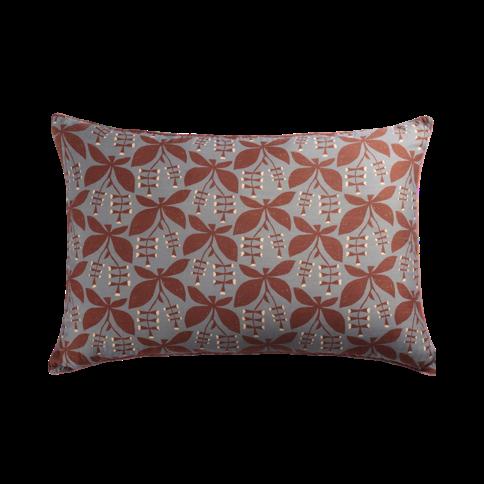
XL cushion by LE MONDE SAUVAGE
Pam
Table by BROSTE COPENHAGEN
24 | G&G _ Magazine
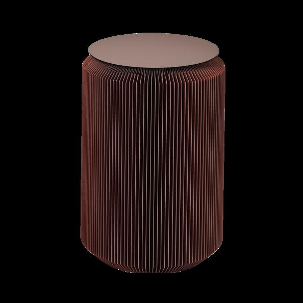
Luminous Floor lamp by HOMMÉS STUDIO

2023
L’HÔTELDEMAISONS 51RUEDEL’UNIVERSITÉ PARIS, FRANCE PREVIEW DAY PUBLICDAYS OCTOBER17 OCTOBER18–22 17–22OCTOBER DESIGN DESIGNMIAMI.COM@DESIGNMIAMI#DESIGNMIAMI
GLOBALFORUM FOR THE
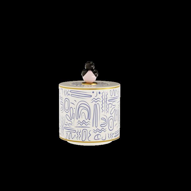
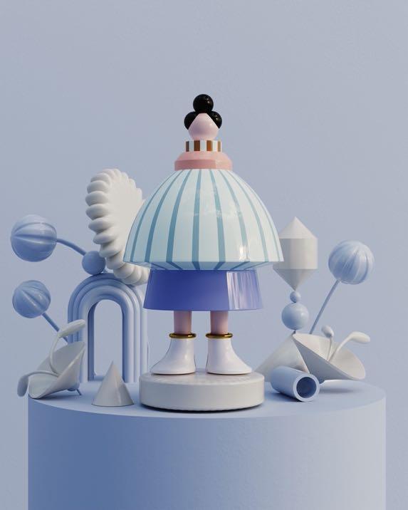
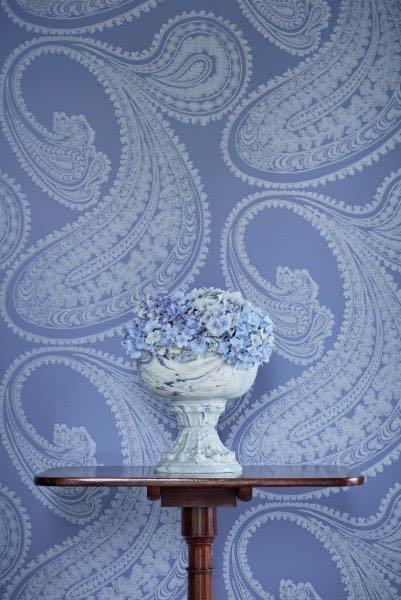
THIS AUTHENTIC SHADE OF BLUE CONVEYS A CERTAIN SENSE OF FRESHNESS BUT NOT COLD. COMBINED WITH THE CLEAN SHADES OF WHITE OR LIGHT GRAY IT GIVES HARMONY TO ANY ENVIRONMENT. INSTEAD, TO HAVE A FEMININE TOUCH, JUST ADD A LITTLE PASTEL PINK.




#AUTUMN2023
PANTONE 14-3921 TSX
Lacecap Hydrangea
Rajapur Wallpaper by COLE & SON
Midsummer Bloom Wallpaper by COLE & SON
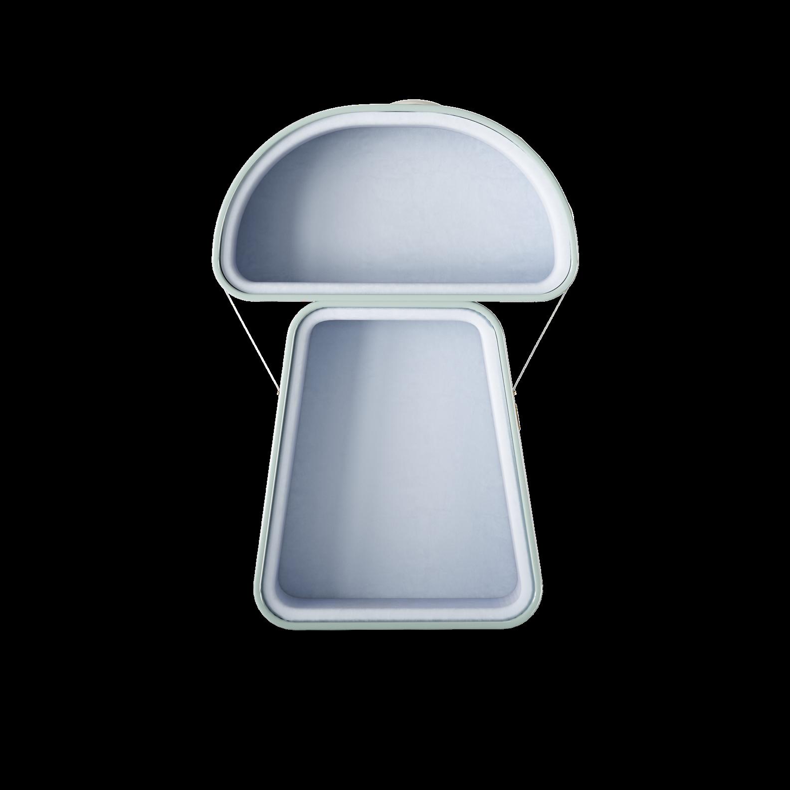
Mushroom Lounge by THE FAIRYTALE
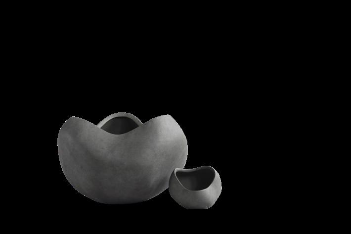
Lava Smoke

THIS DARK MEDIUM GRAY IS UNDERSTATED AND VERY VERSATILE, MAKING IT A GREAT PARTNER FOR A WIDE VARIETY OF COLOURS. NOT BEING A "CHEERFUL" COLOR, WE SUGGEST YOU COMBINE IT WITH OLIVE GREEN OR ADD METALLIC ACCENTS TO DEFUSE IT. HOWEVER, LAVA SMOKE REMAINS A CLASSIC FOR INTERIOR DESIGNS WITH A SOPHISTICATED ATMOSPHERE.


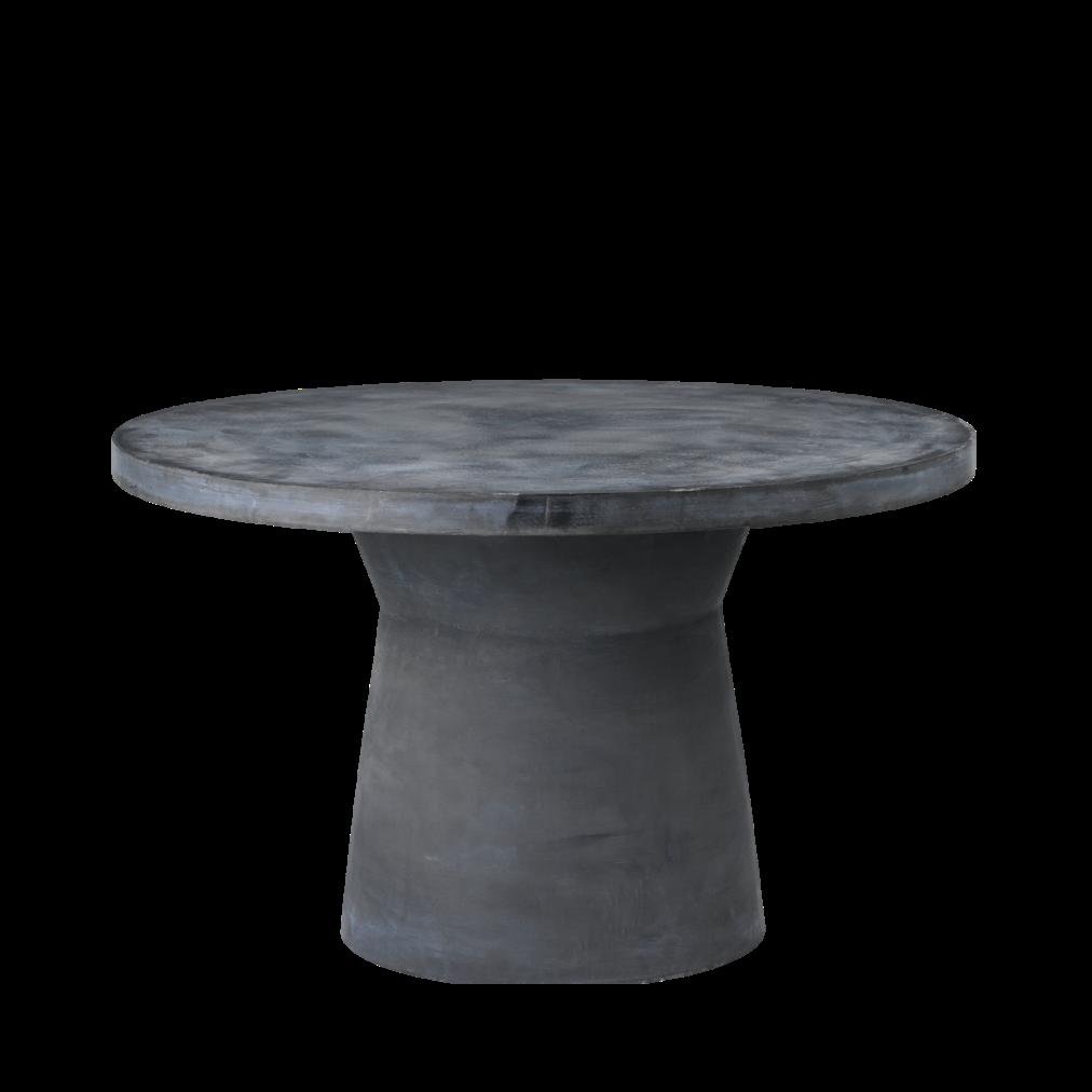
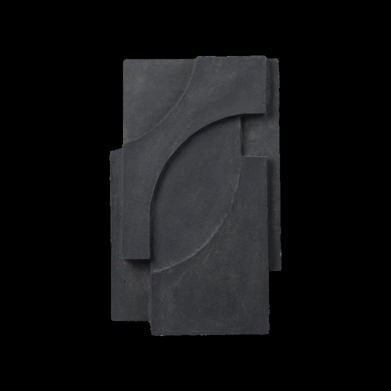
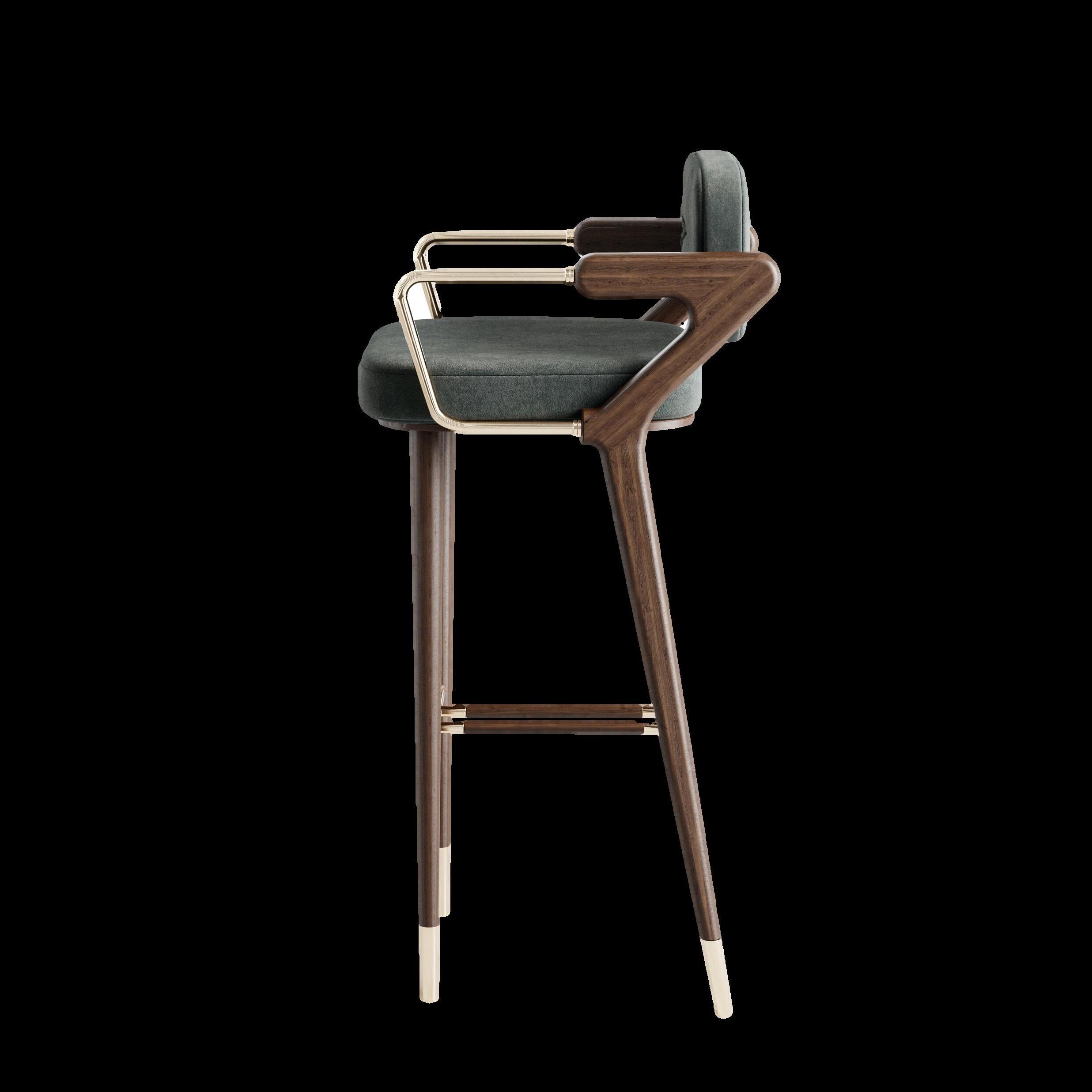


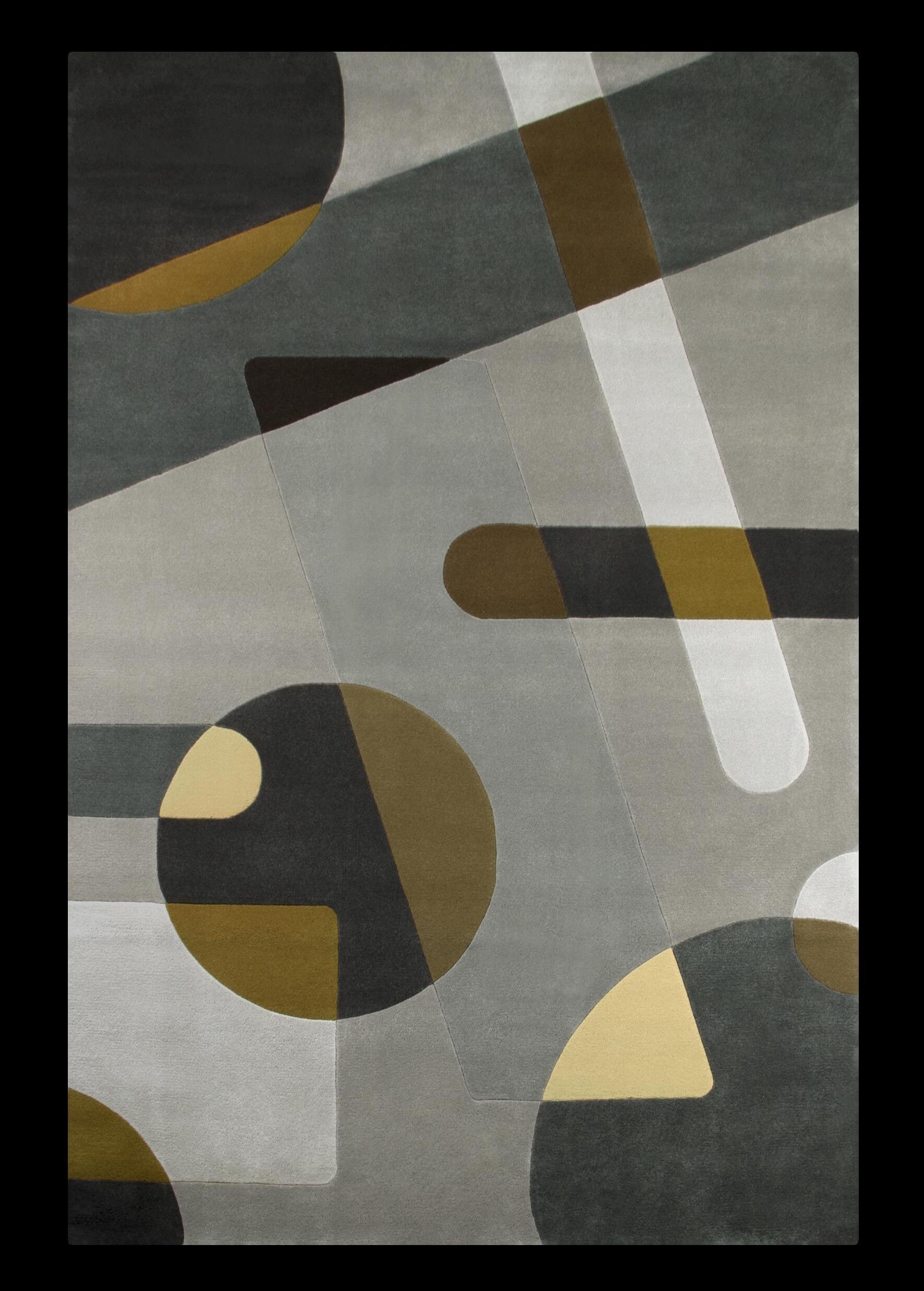 PANTONE 18-0202 TCX
Serif Relief by KRISTINA DAM
#AUTUMN2023
Curve Bowls by 101 COPENHAGEN
Joh Rug by RUG’ SOCIETY
Fiber Table by BROSTE COPENHAGEN
28 | G&G _ Magazine
Zimbro Bar chair by ALVA MUSA

2 3 4 5 6
Forward-thinking
Designing a Sustainable Future On the Path to Net Zero · Nature positive design Biodiversity · Sponge Cities · Passive House design · Net Zero & Net Carbon smart buildings · Carbon negative construction · AI driven Carbon data analytics circular design matters The Empathic Workplace · Increasing the lifetime of your assets · Life cycle assessment (LCA) tools · Materiality:- Innovative sustainable materials · The third space- the new workplace · The agile workplace · Social sustainability/ building community Towards a Greener Future Holistic Hospitality · Financing for Sustainability Impact · Building ESG Leadership (Sharing Best Practices) · BRE China Awards · Zero waste hospitality · Hyper local design · Holistic Wellness strategies 21–23 September 2023 Beijing Exhibition Center www.sustainabledesignchina.com Shaping a sustainable future by design Purchase Summit Tickets through the QR code now
1
6
Themes
E-SHOP
Hurry up and buy Extraordinary Design products for your home with a simple click!

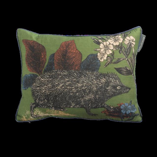
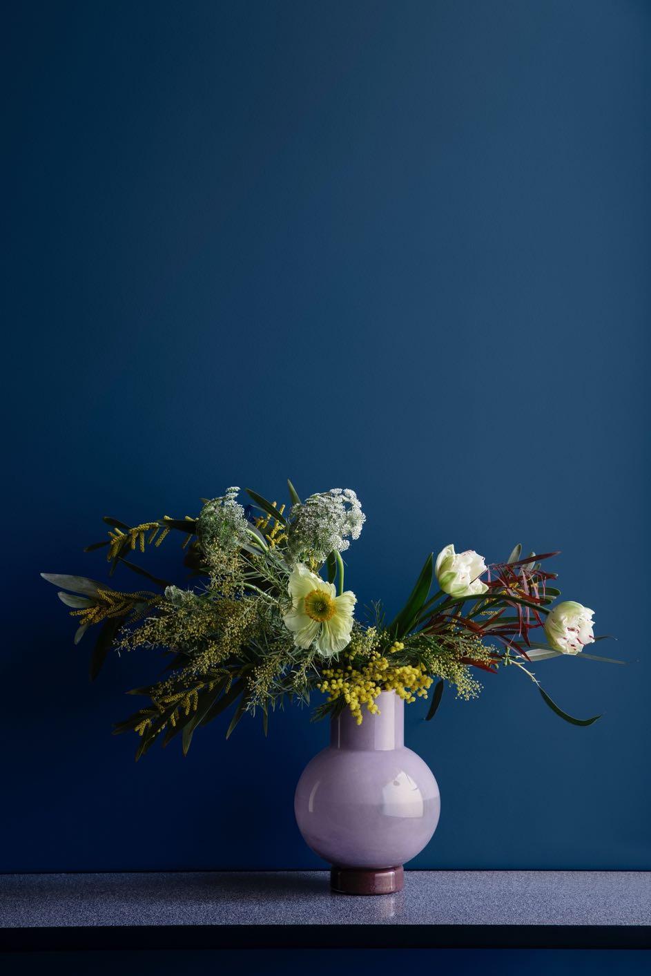
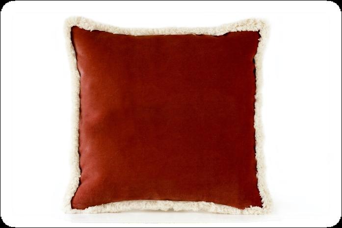
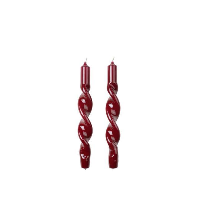
5 6
 3
2 Daisy Velvet pillow by MY FRIEND PACO €109,00
4
La Nonna Plate by POPOLO €26,00
Mari Vase by BROSTE COPENHAGEN €99,00 Twist Taper candle by BROSTE COPENHAGEN €13,90
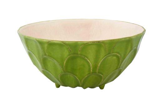
7Tropical fruits Salad bowl by BORDALLO PINHEIRO €86,00
Bestiaire Sonic Cushion by LE MONDE SAUVAGE €63,00



9
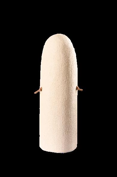
Grès chamotté blanc
#ESHOP 12
10 11 13
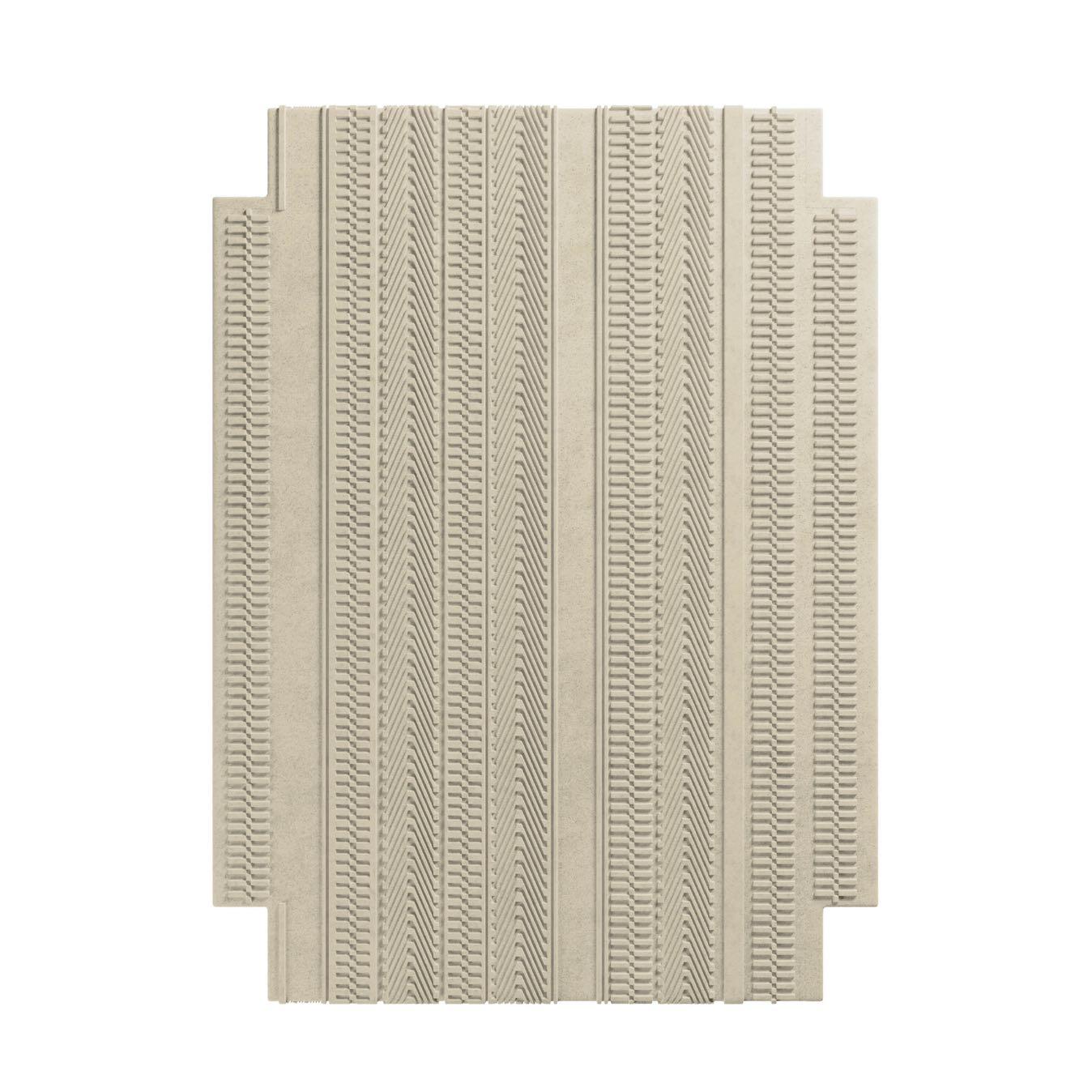
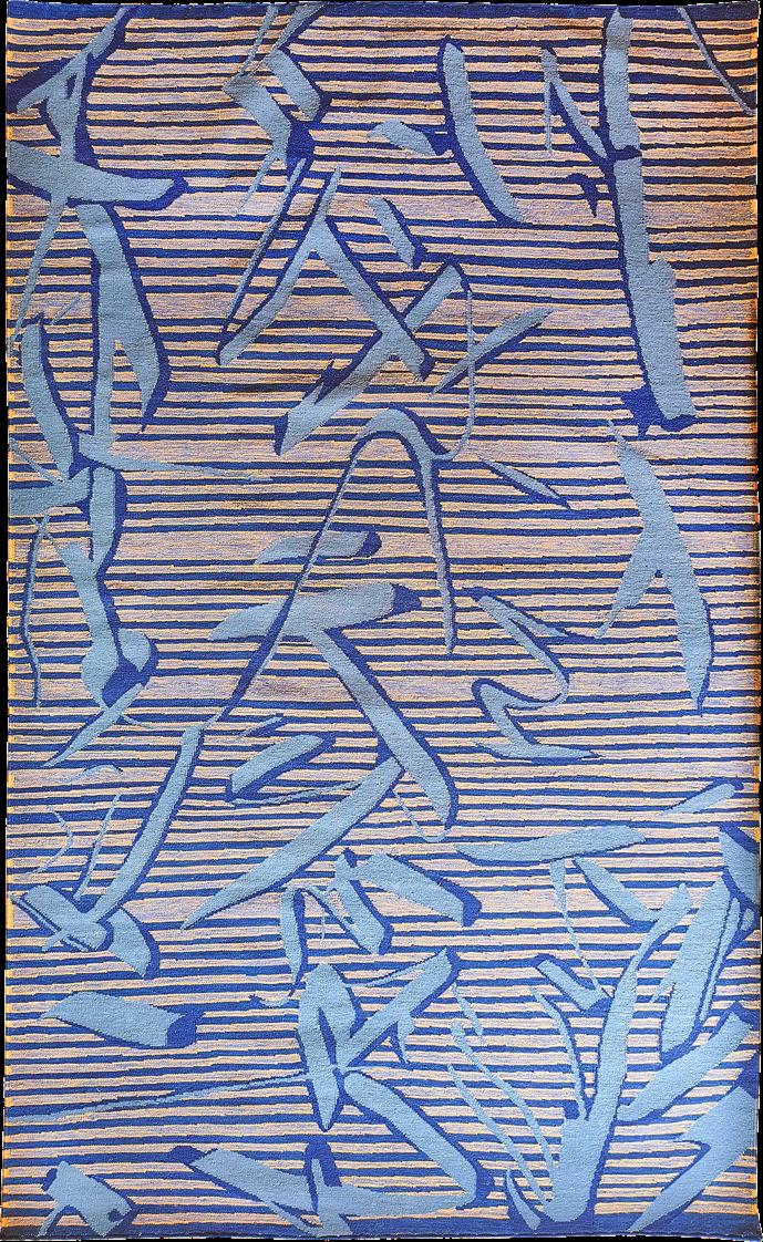
Menizia #03 Rug by TAPIS STUDIO €3.390,00
Rosario
Applique by ENAMOURA €190,00
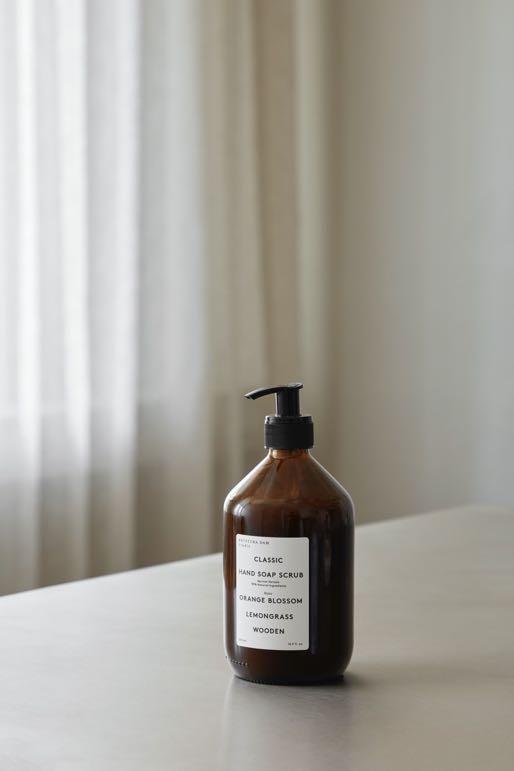
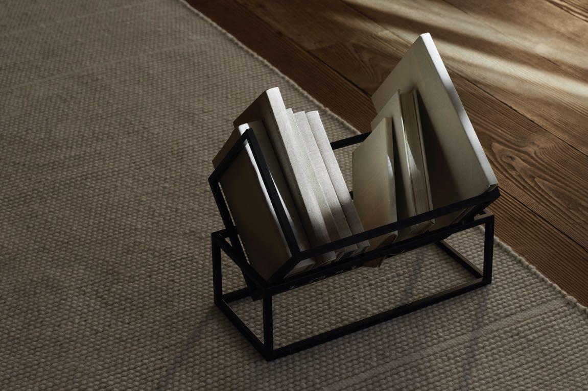
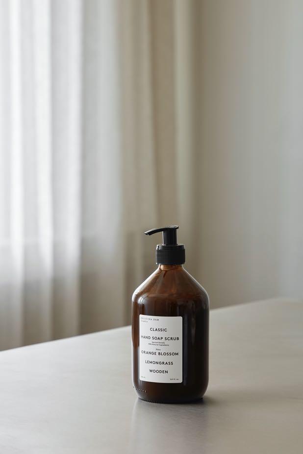
Book Keeper by KRISTINA DAM €235,00 Classic Hand soap scrub by KRISTINA DAM €40,00
Opal Bowl S by KRISTINA DAM €149,00 Duna Side table by HOMMÉS STUDIO €3.900,00

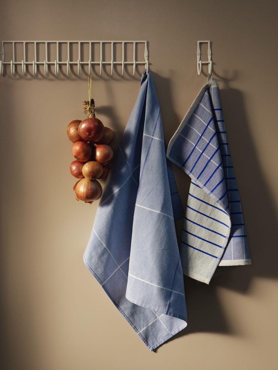

19 18 #ESHOP 16 Herman Tea towel by BROSTE COPENHAGEN €25,00
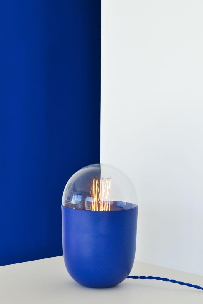
Bleu Majorelle Lamp by MICKAEL KOSKA
14 17 Herman Kitchen towel by BROSTE COPENHAGEN €11,90
by VOLVER
9 Le Magicien Cushion by LE MONDE SAUVAGE €165,00 Campo De' Fiori Plate by POPOLO
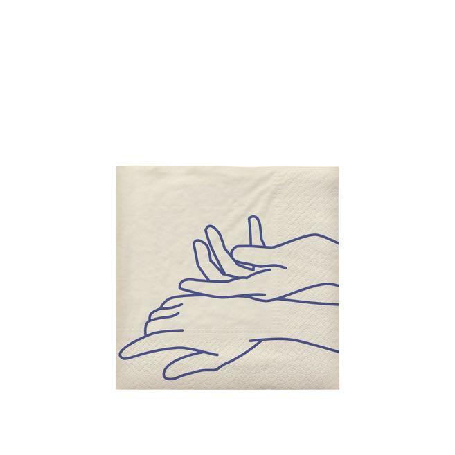
15 20 Touch Paper napkin by BROSTE COPENHAGEN €4,90
Coco
€190,00
Fjord Rug
€730,00
€40,00
find out more clerkenwelldesignweek.com Join a series of showroom events including product launches, workshops, talks, parties & more in Clerkenwell this Autumn spotlighting the uk’s hub for design cdwfestival clerkenwell.design.week clerkenwelldesignweek @clerkenwelldesignweek

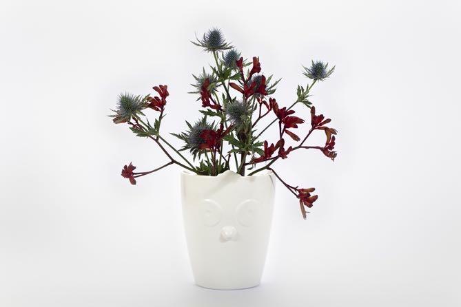
LATEST NEWS
Full of flavours
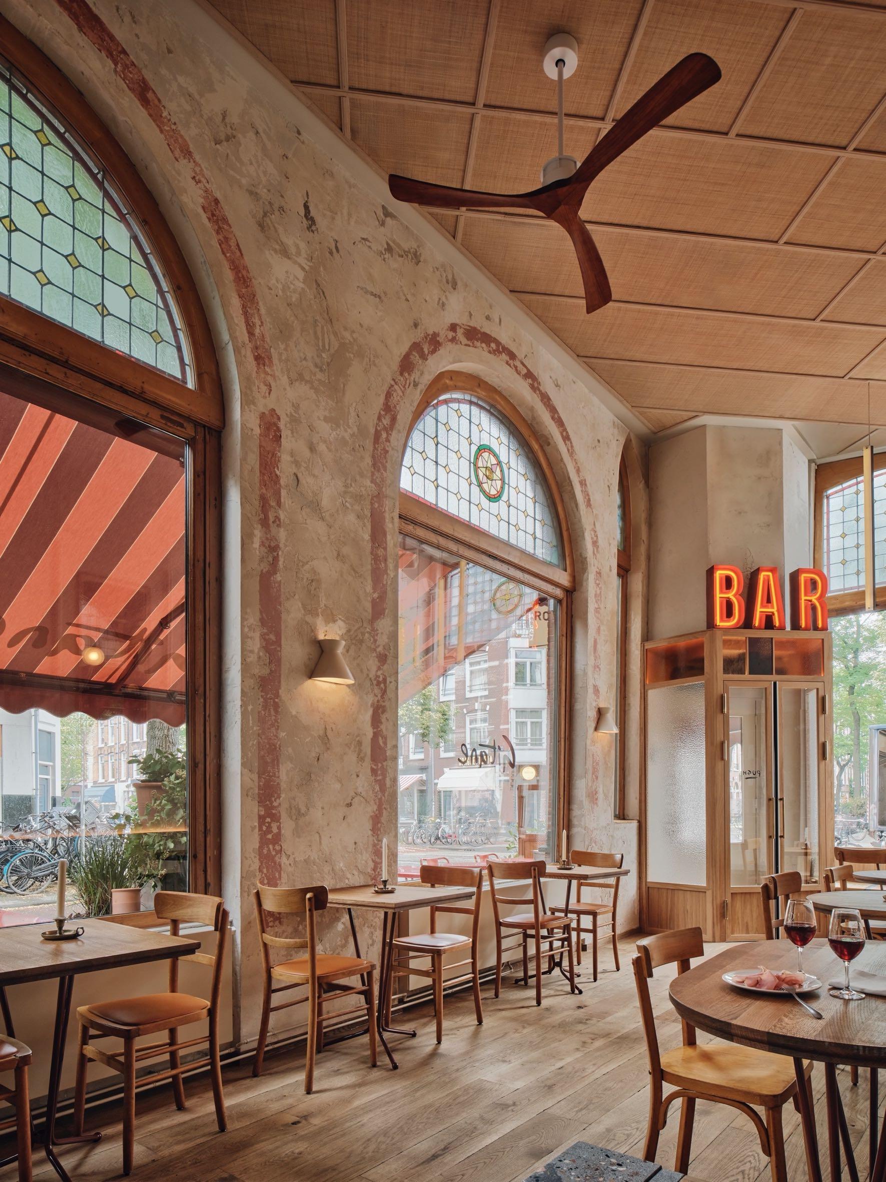
Studio Modijefsky designed Gitane - the first restaurant in West Amsterdam of the renowned young chef Angelo Kremmydas. The venue had to embody his culinary signature: refined food that reflects a mix of cultures and flavours, served without fuss. Studio Modijefsky translated this vision into a casual but elegant spatial design that radiates a welcoming atmosphere from inside to out. The interior is divided into 3 areas: ground floor, mezzanine and bar: each area has a unique atmosphere to suit a different mood, activity and time of day. Together they compose a drinking and dining destination where everyone from food connoisseurs to local residents will feel at home.
Address: Jan Pieter Heijestraat 146, 1054 - Amsterdam, the Netherlans
www.studiomodijefsky.nl

Modernist Icon
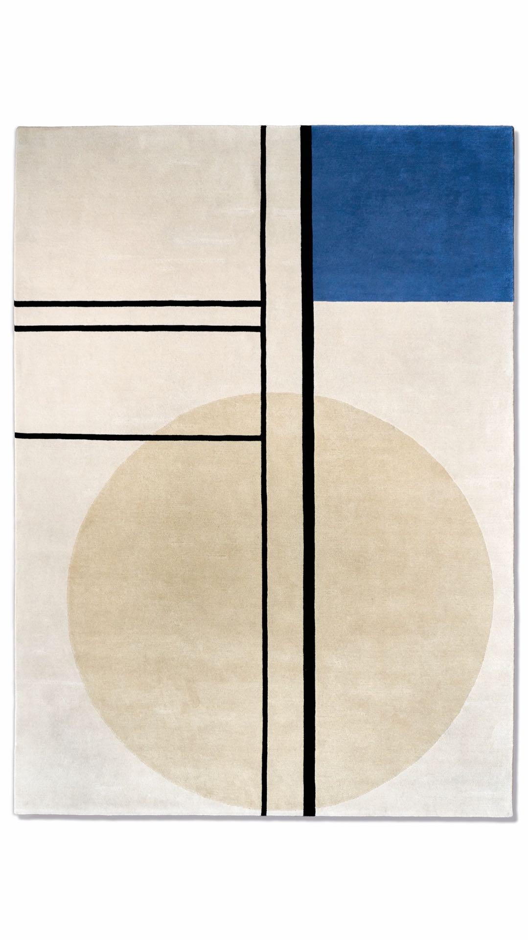
Aram, the celebrated retail destination for designer furniture, lighting, and home accessories will introduce four new rug designs inspired by Eileen Gray’s gouaches, drawings, and collages as part of the London Design Festival. www.aram.co.uk
Rich cultural narratives
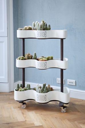
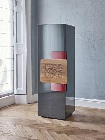
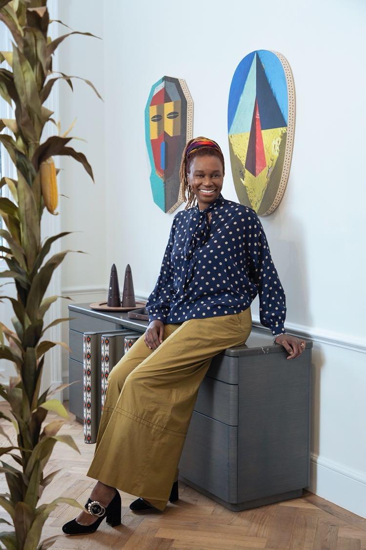
SoShiro is a 360-degree cultural hub that not only produces, curates, and showcases collections inspired by global cultures but also acts as a creative incubator and event space. For this year’s London Design Festival, gallerist and designer Shiro Muchiri has curated a collection of over 30 pieces of tableware and furniture whose origins span from Japan, Kenya and Cuba“SoShiro Collections Story”. www.soshiro.co
London Design Festival 2023
from 16 to 24 September
#LATESTNEWS
40 | G&G _ Magazine

Fine textures
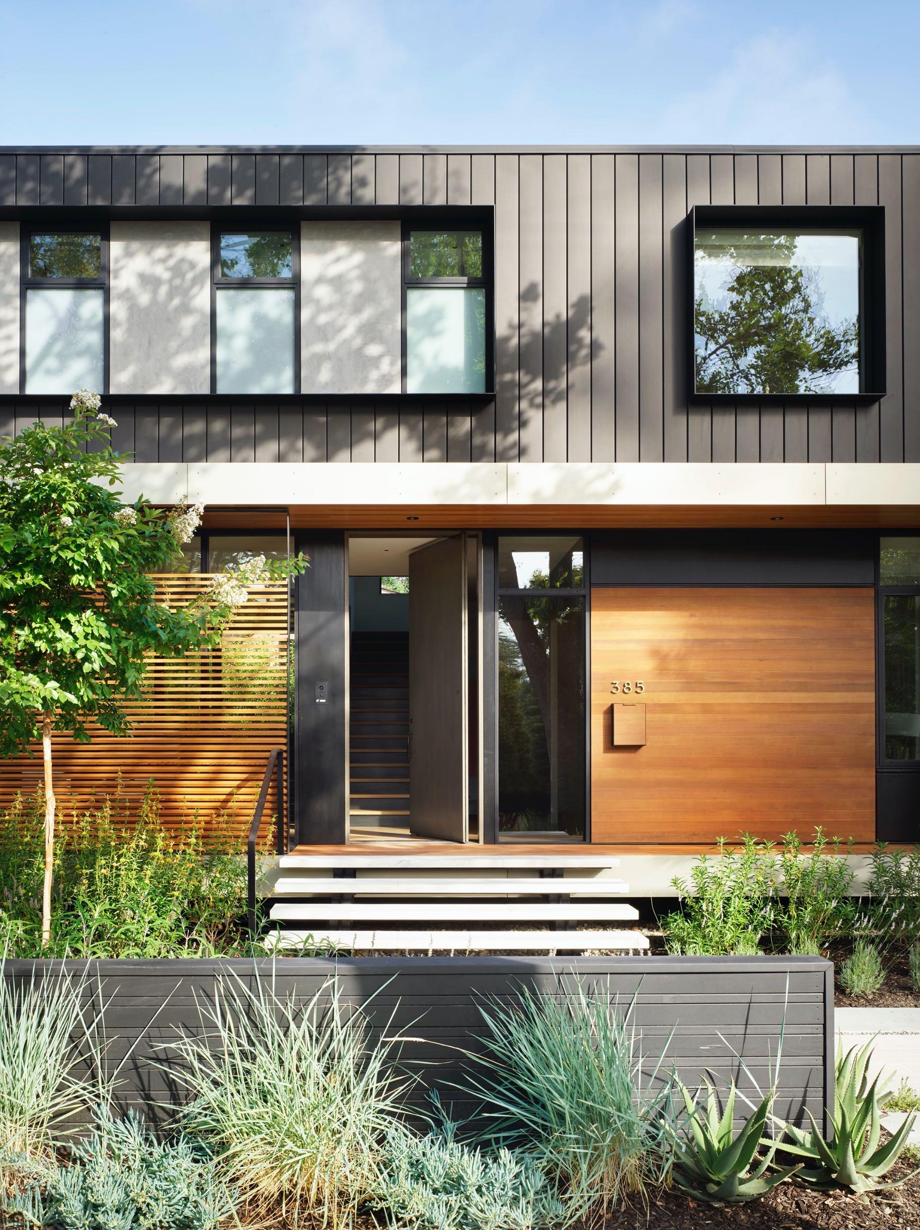
Studio VARA unveiled its latest project in California: the Palo Alto Residence, a new groundup house for a young couple on a prominent yet petite corner lot. To solve this puzzle, the design team conceived of the 418 m² house as a Rubik’s Cube of tightly interlocking spaces that expand outward into a landscape of intimate yet generous outdoor rooms. www.studiovara.com
#LATESTNEWS
Light play
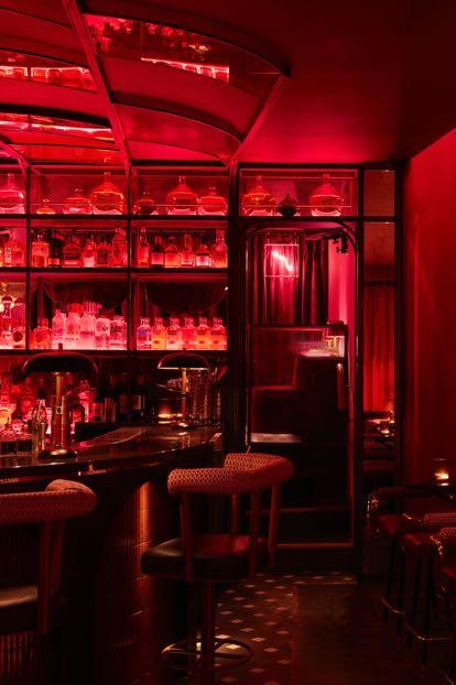
Run For The Hills is delighted to share its latest hospitality project - Heartbreaker, a destination cocktail bar and lounge newly launched in Worthing , the pretty seaside town in West Sussex. The project is a true collaboration between Run For The Hills’ branding and interiors teams; designing not just the inside of the bar with all the joineries, banquette seating, decorative lighting and furnishings, but also originating the brand, the logo, signage, wayfinding and drinks menu design.
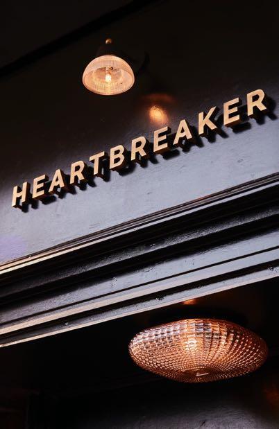
Address: The Broadway 3, Brighton Rd – Worthing , UK www.runforthehills.com
Expressive façade
Designed by Baldridge Architects the ARRIVE Austin Hotel comprises eighty-three rooms situated within a five-story, L-shaped tower and adjoining two-story podium which houses two restaurants, three bars, a coffee shop, leasable street-side retail space and parking. The owners required a dynamic hotel that eschewed brand and established a subtly powerful focal point that knits into the rapidly developing Plaza Saltillo neighborhood.
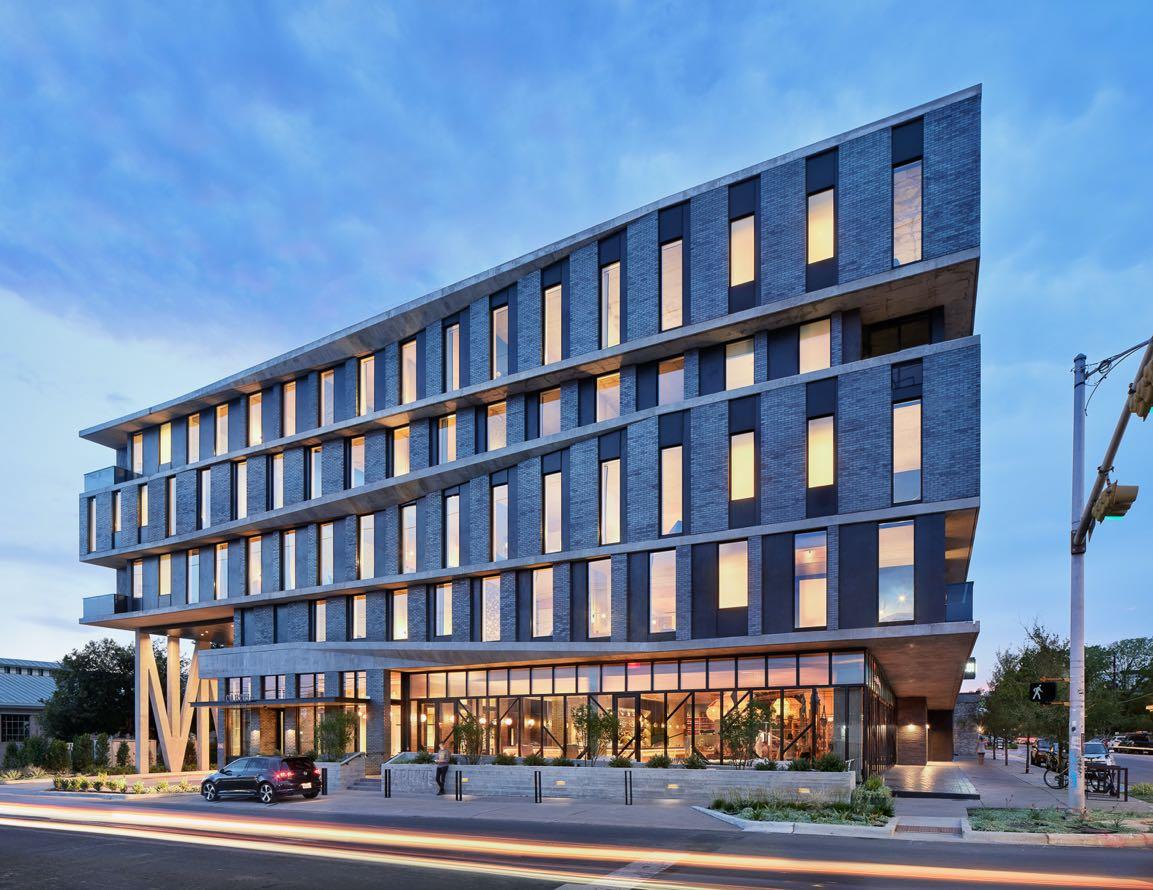
Address: 1813 E 6th St, 78702 - Austin, USA
www.baldridge-architects.com
Nature, Art, Perception, Territory
Set in the woods of the village of Rossa, in the Calanca Valley, Swiss, undertaken by Davide Macullo Architects ISPACE is a project of 8 timber pavilions and sculptures born out of the idea of combining art and architecture to create environments that stimulate people to perceive the influence of a space on their moods.
www.macullo.com

#LATESTNEWS
44 | G&G _ Magazine

A little more love on the table


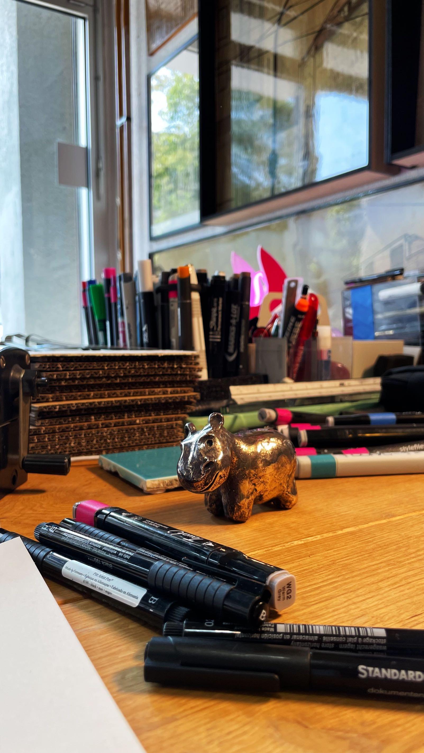
BRONZE OBJECTS
YACHTS AND INTERIORS IN GENERAL. ERMANY STAND L12
FOR DESKS, LIVING ROOMS,
Tony The Tiny Hippo
deerBLN studio, @ deerBLN
Paris Design Week

from 7 to 16 September 2023
With some 450 participants in 350 venues, the French capital is mobilising for this 13th edition to showcase design in in all its diversity offering nine itineraries to suit all tastes among art, know-how, the environment, gastronomy etc.
DESIGNERS ARCHITECTS ART GALLERIES DECORATORS
SCHOOLS YOUNG EMERGING TALENTS
PUBLISHERS MUSEUMS & INSTITUTIONS DESIGN LOVERS
Like every year, one of the most important trade fairs will be held in the center of the Paris Design Week: Maison&Objet . From 7 to 11 September, more than 2500 exhibitors will be ready to showcase their new design innovations and welcome visitors from all over the world.
Achille
a
rmchair
by TH É OR È ME EDITIONS / theoremeediBons.com
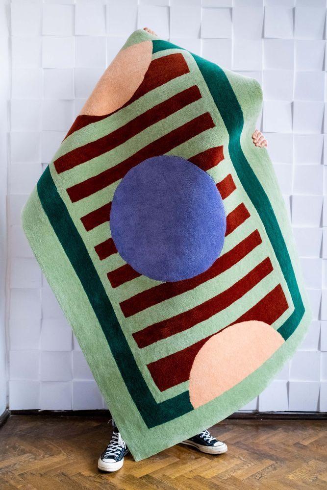
Tufté Green Poetry rug by COLORTHERAPIS / colortherapis.com
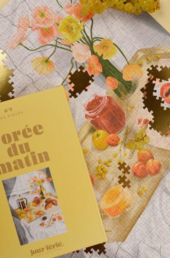
L'orée
du
matin
puzzle by JOUR FÉRIÉ / puzzlejourferie.com
AN INVITATION TO REDISCOVER EXALTATION
The inspiration theme of this Maison&Objet edition is ENJOY . It is an enchantment freed from the austerity to which society and brands have submitted to adapt their line of conduct to the crisis context. Maison&Objet will be "in search of pleasures" and is already showing colour, but also extravagance, audacity, and humor as added value of this new edition.

HEDONISM EXALTED & RENEWED OPTIMISM
In recent years the notion of 'well-being' has been associated with with the words like 'the virtuous and reasonable consumption' and 'a connection with our environment and nature'. It is apparent that we need to to ease off without losing sight of these issues, looking for new ways to make our life pleasant. The Peclers agency defines this new aspiration as an "exalted hedonism" whose vibrations have been detected for some time by the sociological observatory of the styling office.
“We are reaching such an alarming climax that we are now almost in a tipping point. We try to be ultra reasonable, and we realise that, in the end, we are all a collection of contradictions. We need to get to these more reserved, exclusive, individual, almost selfish territories to maintain a form of well-being.”
Patricia Beausoleil, Director of Home, Environments & Consumer Goods at Peclers
#MAISONETOBJET
48 | G&G _ Magazine
Gravity candle holder by ATELIER FIG / atelierfig.com
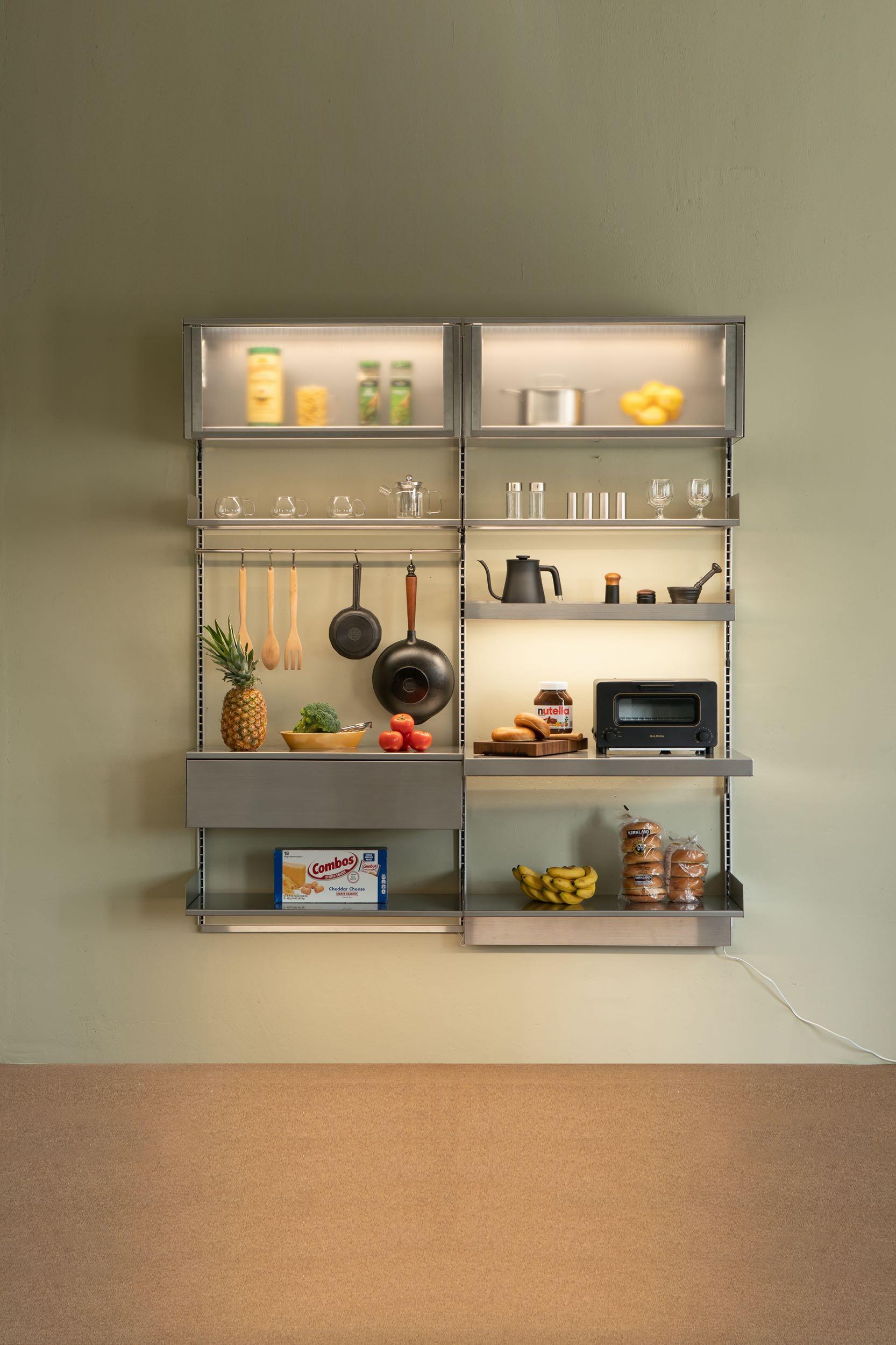


ORIGINATED, DESIGNED & MADE IN SOUTH KOREA Visit us at M&O Hall 6 Stand I76 - J75 "Rareraw" is a combination of words "Rare" (presence) and "Raw" (Materiality). To be specific, RARERAW means making the most of the nature of raw materials to produce rare results. We create small changes in our daily life, by developing curious details. We focus on sustainability in the whole manufacturing process. We create unique products through collaborations with designers and makers.
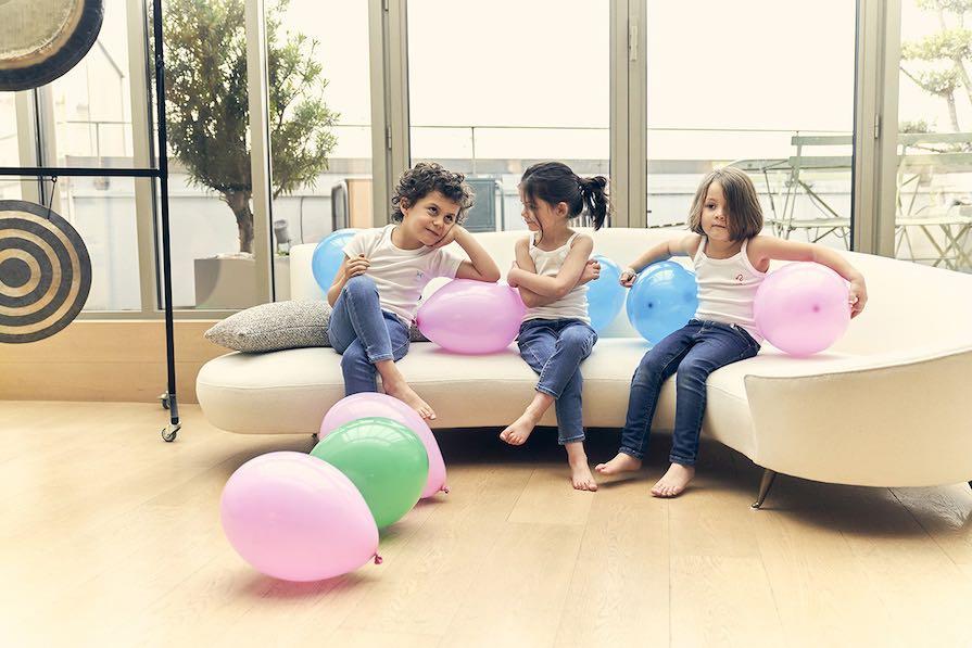



Visit us at M&O Hall 4 Stand G 3 2 T ANK T O P & P AN T IES | BODYS U I T | T - SHIR T | C ARD GAME www.charliedanslesetoiles.com
This "quest for pleasure", led today by artists and designers, will achieve its fulfilment in the autumn, as the programme of Paris Design Week and the exhibitors of Maison&Objet express this new and joyful mood loudly and in colour to the professionals of the sector. There will be three stages of pleasure to be discovered on Maison&Objet:
Seductive expressiveness
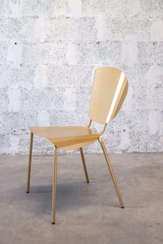
The most visible part of this quest for pleasures is driven by brands and creators who are not afraid to stand out: they desire to compose a diverse and creative identity, as with the Lensa AI application that allows one to put on a new costume and a new artificial identity in a few seconds. For this ‘home’, whose definition as a place of retreat and tranquility has been replaced by an ultra-expressive venue, light comes into play, the effects are glossy, metallic, and the shapes sensual. These qualifiers
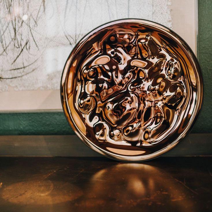
can be applied to the collections of the new Theoreme Editions design atelier which appeared on ‘In the city. This brilliant repertoire is also expressed in accents, for example in one of Matière Grise's classics, the Batchair, which can be adorned with glamorous brass. It signs An&Angel's decorative glass objects with copper leaf effects and voluptuous curves.
“There is a kind of revival of the glam, the eroticism, the extravagance of the late 70s and 80s. The younger generations are adopting a very sexualised aesthetic. We also have all the night-life milieu that will influence and inspire today's design activities.”
#MAISONETOBJET
Sun&Moon art piece – Mars by AN&ANGEL / angel.lv
Patricia Beausoleil
Batchair chair by MATIERE GRISE / maBeregrise-design.com
Liberating creativity
Today, some people want to find moments of recklessness in adult life. Regressive references and recreational philosophy animate their daily life. Astonishment takes a central place. Radically optimistic, several artists, architects and designers have the right to daydream or to a “Great escape”. This quest for pleasures is expressed through staging with quirky humor and nourishes utopian imaginations and fantastical universes. Somewhere between diversion and proportional scale, daring aesthetics and regressive experiments, new perceptions of reality are brought out. The Nigerian Yinka Ilori also expresses his joyful radicalism and chromatic audacity in his London offices.
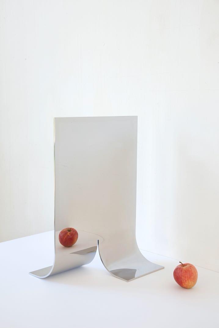
Bold, vivid and confident colours are a great way to bring joy back to everyday life. The materials are reassuring, the play of proportions conveys a playful doll's house feeling. Muller Van Severen's tubular structures with pure, almost childlike lines could be among the ‘collective optimists’ identified by Peclers Paris agency. This invigorating trend is reminiscent of the collections of 13desserts, a little gem from Marseille, which has been making a name for itself for several seasons now at the show and at Paris Design Week.
#MAISONETOBJET
“At present, the relationship with the mind is very important. The idea of looking for emotion and a positive dynamic is truly the foundation of this movement toward pleasures. We venture into more fun, more expressive, more colourful, more pop territory. We are close to the entire generation of Utopian designers of the 60s who invented a kind of retro futurism with a sort of almost naive aspect of the vision of the future that we would like to see.”
Patricia Beausoleil
52 | G&G _ Magazine
Bended mirror #3 by MULLER VAN SEVEREN / mullervanseveren.be
Heightened sensitivity
When well-being is associated with a return to basics, pleasure is no longer exuberant but requires ultra-experiential exploration. Digital then becomes the gateway to new perceptions of oneself, to a more fun, uncomplicated, attractive and accessible well-being. The quest for peace combines augmented reality with sensory immersion when its material translation suggests new forms and sensations.
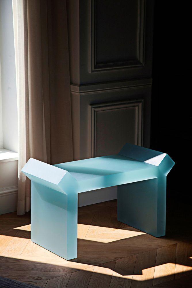
This approach evokes that of designer Sabine Marcelis, whose Virtual Tactility experience offered a virtual representation of design works presented as genuine sensory experiences. The metallic and repetitive architecture of the Kataba Fréquence shelves seems to adopt the same language, as do the soft and rounded creations of Francesco Balzano for Théorème Editions, the Unstressed chair of the Swedish design studio Stamuli, or the vases with an iridescent finish in 3D print by Studio Argot.
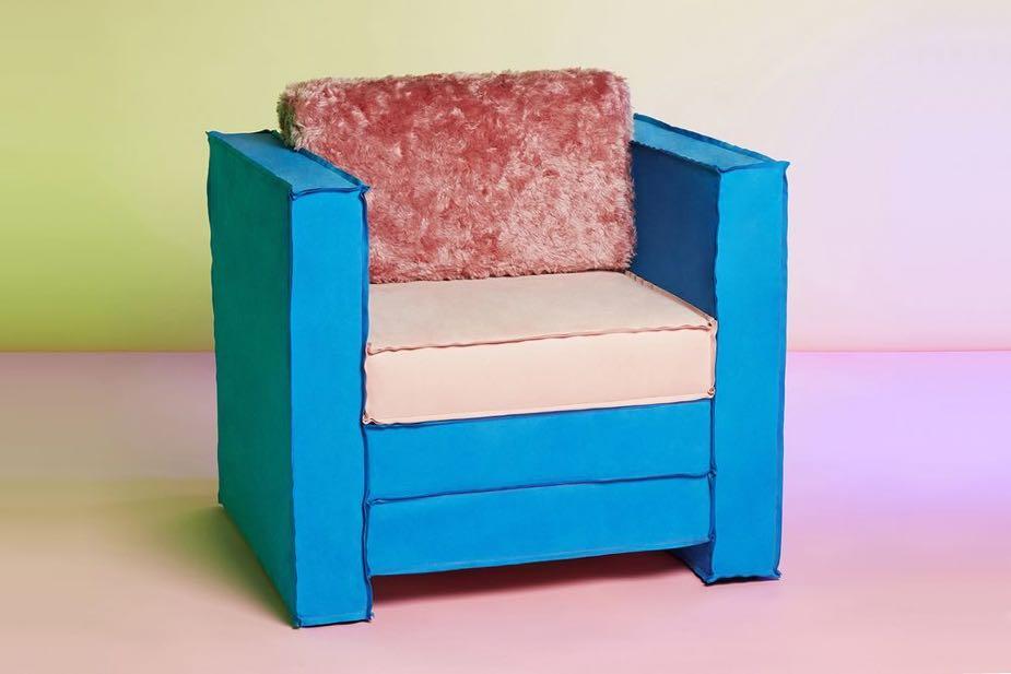
A trend space embodied in the fair, in three dimensions and 5 senses.
The Peclers Paris agency will showcase the theme of the show in an area of some 200 m² . This immersion experience through object, materials and works of art will set one out a sensory and playful journey, animated by artists' performances, contributions by craftsmen, designers and stylist. peclersparis . com
Tagadà armchair by STAMULI / stimuli.com
Constanfn stool by Francesco Balzano for THÉORÈME EDITIONS / theoremeediBons.com
#MAISONETOBJET DESIGNER(S) OF THE YEAR
Maison&Objet distinguishes the duo Fien Muller and Hannes Van Severen from the Muller Van Severen studio as ‘Designer(s) of the Year" 2023. The Belgian couple will be awarded the prestigious prize at the upcoming edition of the show. On this occasion, Muller Van Severen will offer an unprecedented 'cocoon exhibition', deploying an intimate and joyful panorama of more than a decade of creation.
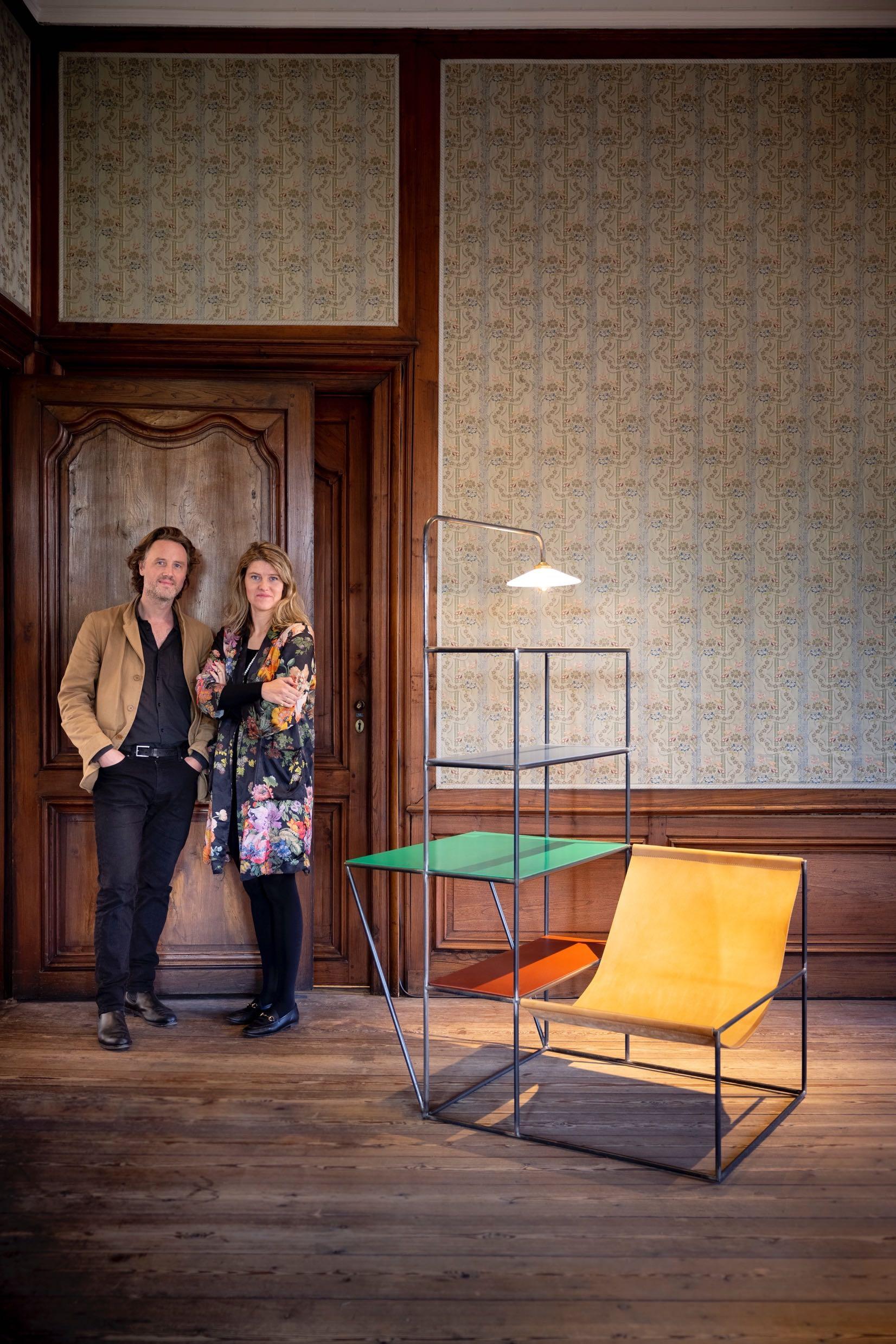 Installation small from the FUTURE PRIMITIVE series
Fien Muller and Hannes Van Severen began their collaboration from photography and sculpture backgrounds in 2011. Nourished by the visual and plastic arts, the fusional Belgian duo based in Ghent, dubbed ‘Muller Van Severen’, parted ways from their two original fields to better invest in the territory of design with the well-crafted idea of shaking up the codes and uses of interior furniture. Their unique stylistic language, based on the juxtaposition of materials and colours in an astonishing formal purity, quickly placed them among the important figures of contemporary design. Their avant-garde pieces, anticipating trends as much as societal changes and market transformations, enrich their
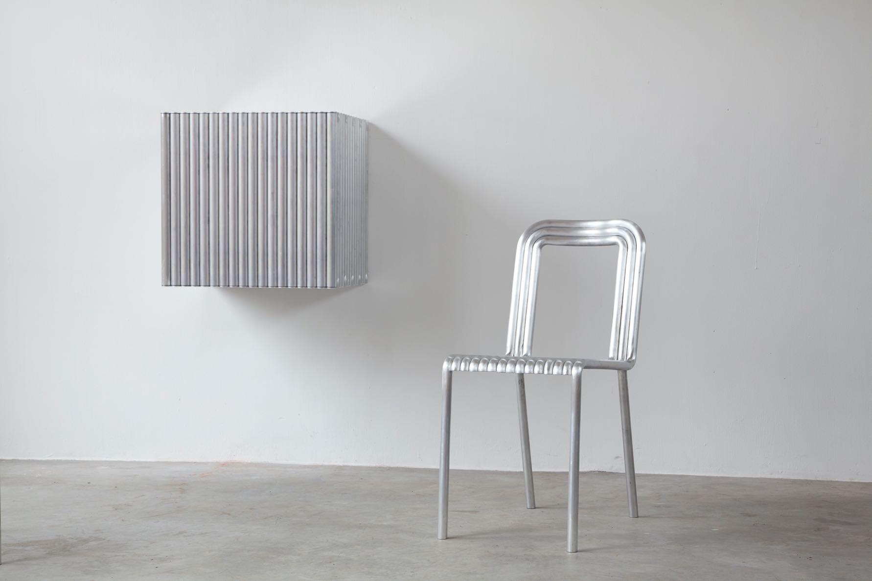
collection and delight the many brands they forge innovative collaborations with. For Maison&Objet, rather than a simple chronological frieze retracing nearly twelve years of creation, Muller Van Severen curates an actual exhibition full of colour to create a dialogue between the different eras of their already impressive career. Each project is the place of a unique sensory experience, a continuously renewed and singular exploration. The exhibition will reflect their creative territory, combining pieces from their iconic 'Future Primitive", "Wire", or "ALLTUBES" series.
mullervanseveren . be
Alltubes wall cabinet and chair
HOSPITALITY LAB AND COOK&SHARE
The theme of this Maison&Objet edition, ENJOY, celebrates new trends with enthusiasm and optimism. This quest for pleasure and well-being is reflected in the sectors designed for professionals in the hotel and catering industry.
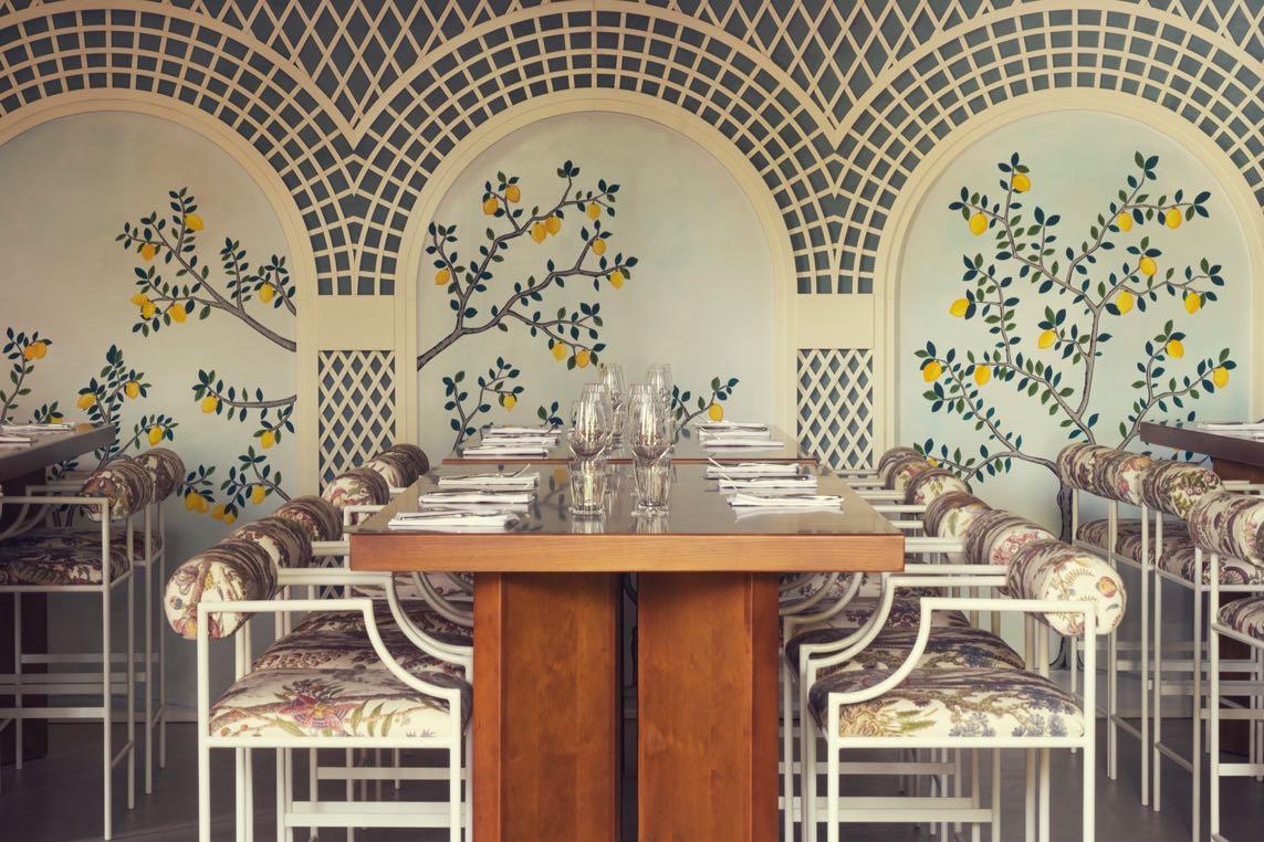
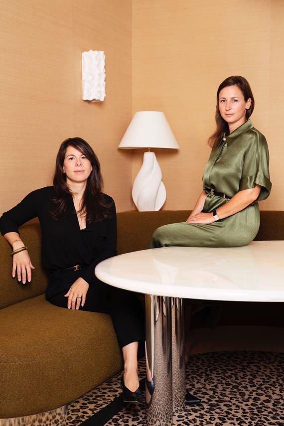
A NEW LOOK AT HOSPITALITY
The Hospitality Lab , the new area of Maison&Objet dedicated to hospitality, in Hall 6 , invites visitors to discover inspiring settings at the cutting edge of aesthetics and functionality while deciphering recent trends in the hotel industry.
The duo Virginie Friedmann and Delphine Versace (Friedmann & Versace ) help their clients to write and design unique ‘art of living’ spaces. In the Hospitality Lab, they present a hybrid space that invites you to let go. Imagined as a protective place, a holistic approach, a dreamlike figure that leaves room for the imagination and travel
to read, write, create, meditate, or recharge one's batteries. The natural materials intertwine, the frescoes transport you to a place where past and future merge and the chaise longue invites you to contemplate the interior. A place where anything is still possible.
friedmann - versace . com
#MAISONETOBJET
Bambini project
56 | G&G _ Magazine
Photography by Alexandre Tabaste
HALL 6
The Socialite Family is a decorating brand that promotes a taste for embodied interiors, both personal and eclectic and unlike any other. Alongside Constance Gennari, its founder and artistic director, the design studio imagines a collection of bold, timeless furniture, lighting, and decorative accessories season after season. At Maison&Objet, The Socialite Family presents its interpretation of a hotel room to be lived in all year round in a 50 m² space. Since many actors, writers, and artists have lived in a hotel, experiencing the convenience of permanent check-in, room service, and housekeeping included, what better way to present the ideal room than combining an enveloping atmosphere with sophisticated decoration for an even more singular experience.
thesocialitefamily com
The founder of Roque Int é rieurs , Fabien Roque has always been inspired by the beauty of the interiors of the most fabulous designers and by the quality of detail, so it was only natural that he should turn to interior architecture. His studio handles materials and light with sensitivity and expertise, generating unique emotions for everyone. For Maison&Objet, Fabien Roque has reinterpreted a multi-purpose reception area, the ‘Lobby’, a hybrid space that evolves throughout the day from a hotel reception area to a workspace to a trendy bar. The idea is to immerse visitors in a warm, immersive, festive atmosphere, but also one that is studious and calmer when required, by playing on the interplay of materials, colours, and the reflections of mirrors that reflect the light.

roqueinterieurs . com

THE PLACE FOR GOURMET INTERACTION
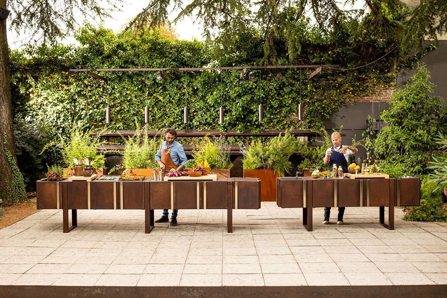
To continue with the topic of hospitality, Maison&Objet offers two highlights by Gault&Millau and Waww La Table to be discovered in the Cook&Share , Hall 3 , the tableware and kitchenware sector.
The Gault&Millau area is a place to meet and exchange ideas, offering cooking demos, tastings, and encounters with the young guard of French cuisine as well as with its flagships. During the 5 days of the Maison&Objet show, a number of talented chefs will be giving cooking demonstrations 3 times a day, including 1 in tandem with young talent and a leading name in French gastronomy.
Putting the tableware in the spotlight and celebrating the plate: that's the vocation of Waww la Table , which this year is once again taking over the Cook&Share hall with
a cheerful exhibition designed to inspire visitors. Created by Péri Cochin and Arabelle Reille, Waww la Table is an inspirational Instagram and an ecommerce site with an inimitable style that practices the art of mixing vintage objects with collections created exclusively by designers and craftsmen. In September, the space takes up the show's theme of Enjoy, a quest for personal happiness that injects fun into life.
waww . fr
Besides, in the HOME section, hoteliers and restaurateurs will be able to discover new talent, iconic designers, excellent manufacturers, and craftsmen in the Forever, Signature, Today, and Unique&Eclectic sectors. It will be a decor and furniture offer to reinvent the codes of the art of living and boost the customer experience.
#MAISONETOBJET
58 | G&G _ Magazine
Il giardino di corten
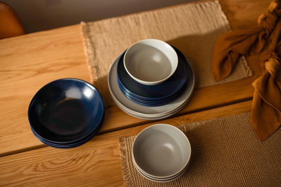
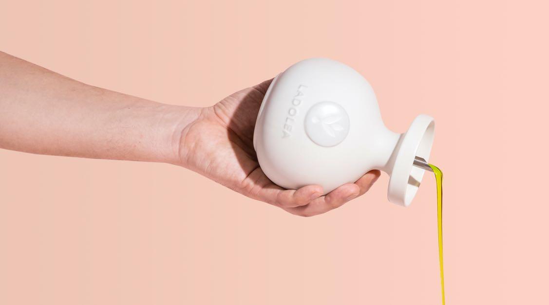
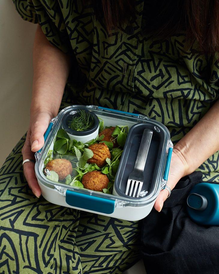
While in the OBJECT section, you’ll find food preparation professionals and key players in the world of tableware, such as Cristel, the French manufacturers of top-of-therange kitchen utensils, the sustainable tableware from Fable and innovative products by Black+Blum.
HALL 3
Lunch Box Original by BLACK + BLUM / black - blum . com
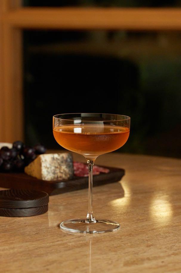
The Coupe glasse by FABLE / fable.com
Organic extra virgin olive oil by LADOLEA / ladolea.gr
Base dinnerware set by FABLE / fable.com
FEEL GOOD ALLERT!
Maison&Objet presents the new section for this September edition: WELL - BEING&BEAUTY , defined as "the space where we feel good in out skin," which is part of a strong trend and resonates with the Maison&Objet theme of the year, ENJOY.

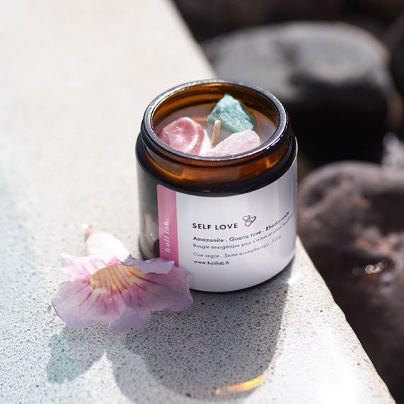
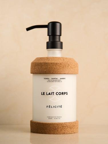
In Hall 5 A the Maison&Objet ecosystem will bring together brands and exhibitors with the same values: to contribute on improving the well-being at home and with yourself - inside and out. The originality of the Well-Being&Beauty section lies in its multiple dimensions: body, mind, and spirit. Alongside cosmetics and skincare there will be reunited fitness accessories, 'soft' techniques such as light therapy, music therapy and aromatherapy, detox and relaxation ingredients, clean home care products, as well as home fragrances. You will find brands like Equilibre and their products based on cannabidiol (CBD), extracted from hemp, reputed to promote sleep, stimulate energy, boost libido, and reduce stress. Not to mention the ranges of elegant sex-toys, or Holi Lab., a brand created a year ago around lithotherapy, the science of stones, and their healing vibrations.
Being good to yourself in ways that will allow you to be good with others, shining joy, reconnecting with humour, and letting go. In this spiritual approach to the product, where it is a question of positive energy and vibrations, a perfume brings more than a simple scent, it is a vehicle for our mood. It is in this philosophy that the natural scents of the French brand Le Jardin Retrouvé are built.
HALL 5A
#MAISONETOBJET
Body lofon by Félicité / felicite-paris.com
Self Love scented vegan energy candle by HOLILAB / holilab.fr
Solid deodorant with cocoa butter by COMME AVANT / comme-avant.bio
60 | G&G _ Magazine
UNIQUE UPCYCLED OBJECTS & JEWELRY CAREFULLY HAND CRAFTED FROM BLENDED TIMELESS ANTIQUE OR VINTAGE ITEMS OF INTEREST

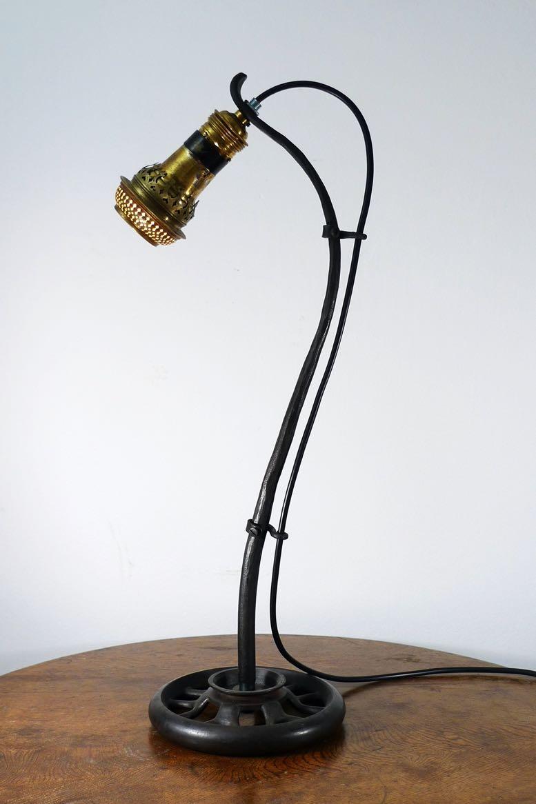
Upcycling Phenomenon offers a selection of carefully handcrafted objects & jewelry, upcycled from timeless antique or vintage items, consciously selected for their shape, story, purpose, choice of material or craftsmanship. Scratches as well as unevenness are part of the uniqueness and absolutely wanted to show the upcycledness of the product.


Meet us at M&O Hall 5A Stand H34
Forged lamp
A PANORAMA OF THE YOUNG FRENCH DESIGN SCENE

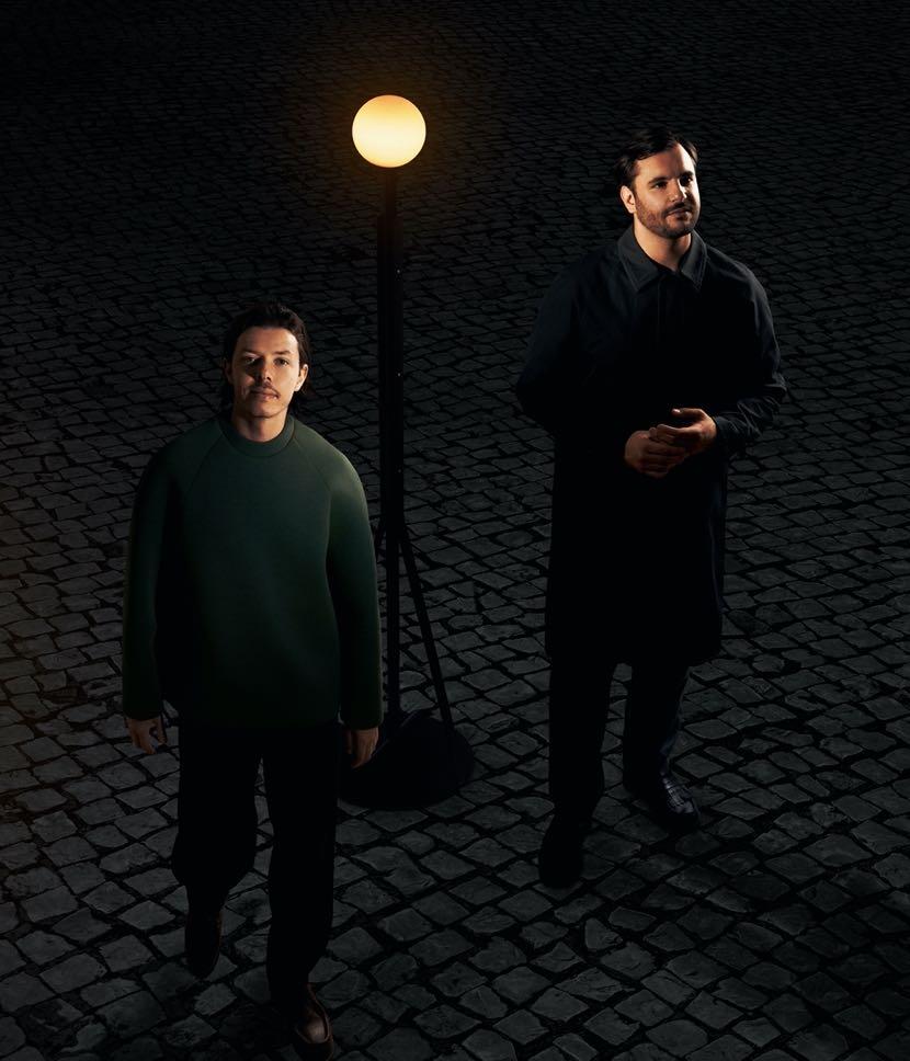
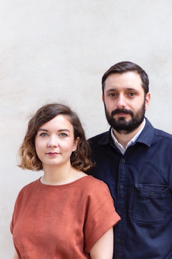
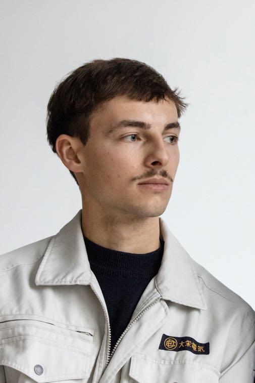
After editions highlighting Lebanon, the United States, Japan, the Netherlands, and recently Spain, thus drawing a map of emerging designs worldwide, the Rising Talent Awards are returning to France.
The jury, chaired by designer Philippe Starck, has selected seven talents to be showcased at the next edition of Maison&Objet.
Inscribed in a double filiation with the history of the decorative arts and the ’industrial arts’, Made-in-France-Design makes its young talents shine well beyond the country's borders; and with it, an exceptional know-how to which is added a creativity imbued with freedom and a certain taste for storytelling. While consumers' desires and designers' practices seem to be converging on a large scale to meet universalized needs, the particularities of the French ecosystem remain or are being strengthened thanks to the energy of a new generation of designers determined to put tradition at the service of progress.
#MAISONETOBJET
62 | G&G _ Magazine
Passage (Arthur Fosse & Samuel Perhirin) / passageoffice.com
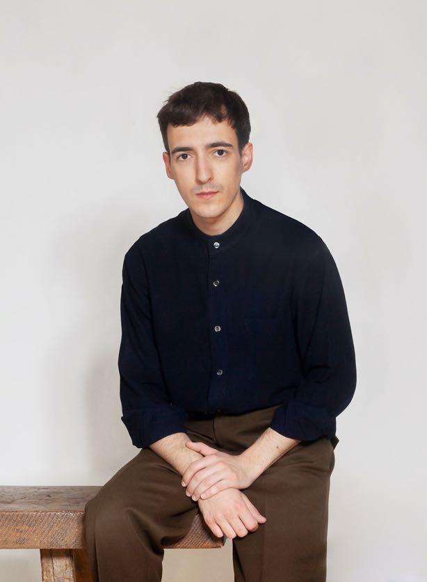
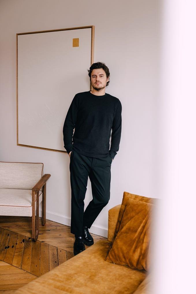

 Nicolas Verschaeve / nicolasverschaeve.com
Athime de Crécy (Studio ADC) / athimedecrecy.com
Hugo Drubay / hugodrubay.com
Tim Leclabart / timleclabart.com
Sébasfen Cluzel & Morgane Pluchon (SCMP DESIGN OFFICE) / scmpdesignoffice.com
Jeanne Andrieu / jeanneandrieu.com
Step into the world of cutting-edge interior design and sustainability with this remarkable collection Explore the intricate beauty of the 3D printed vases, lamps and flowerpots, all carefully crafted from environmentally friendly materials.

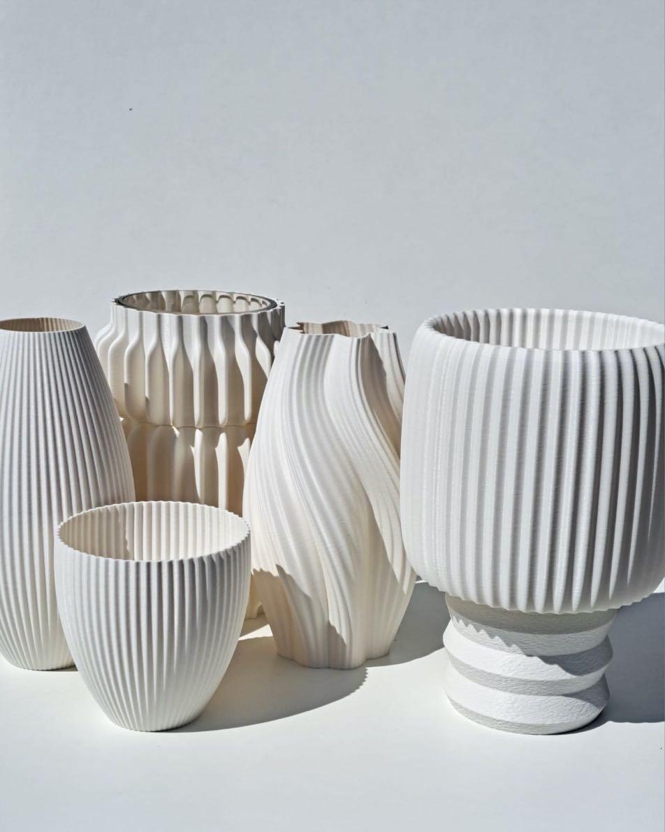
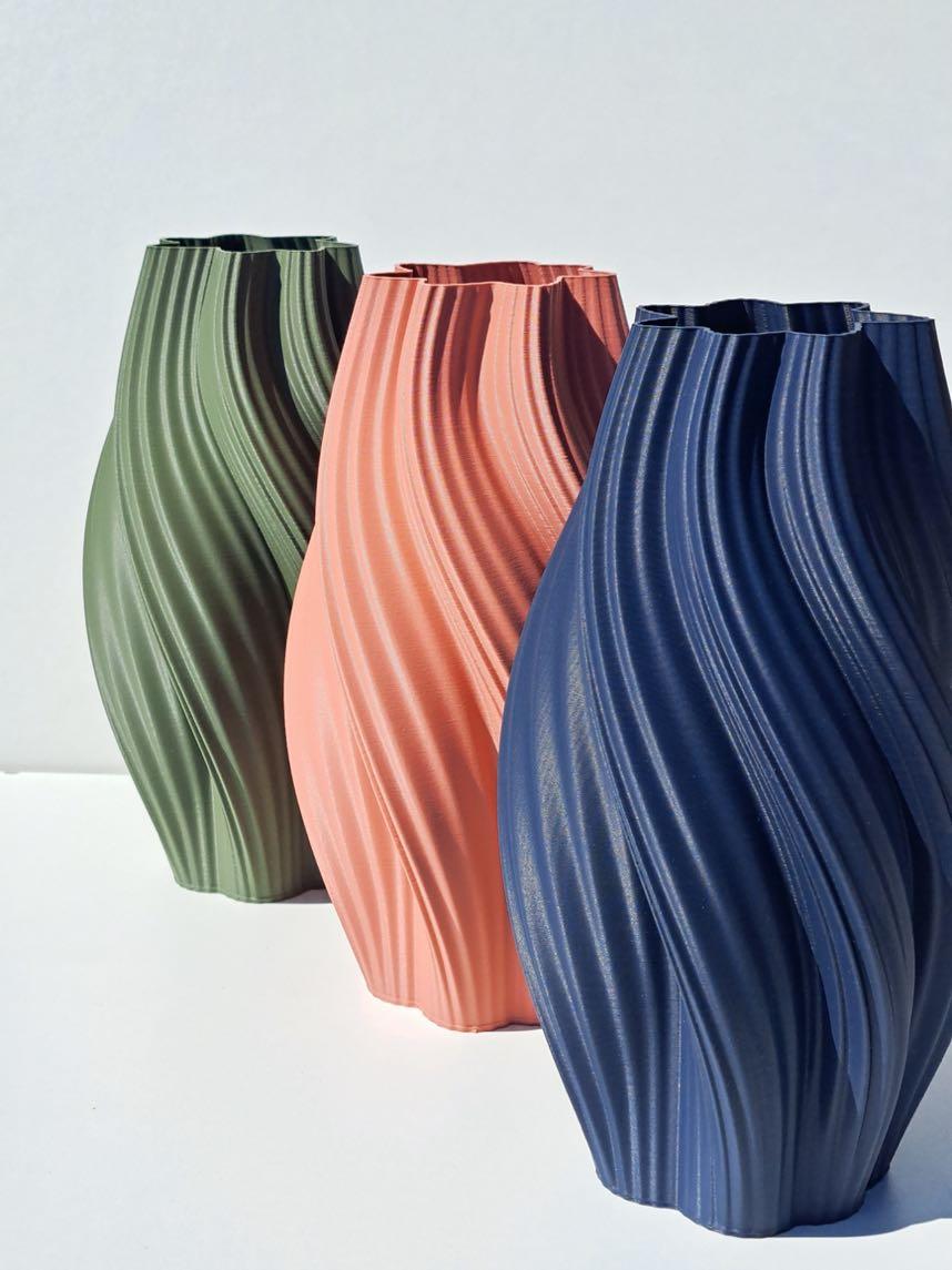
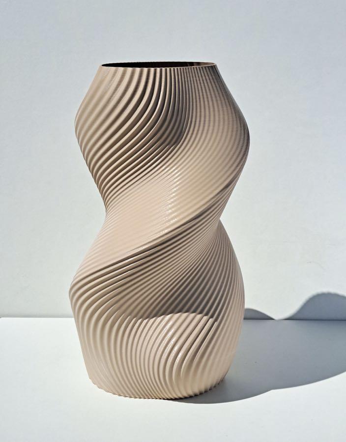
Each piece showcases unrivaled individuality and a delicate charm, embodying the fusion of artistic ingenuity and eco-friendly innovation.
Technologies come to life in the form of uniquely designed pieces that add a touch of elegance to any space.
66 | G&G _ Magazine
RUSTIC AESTHETIC
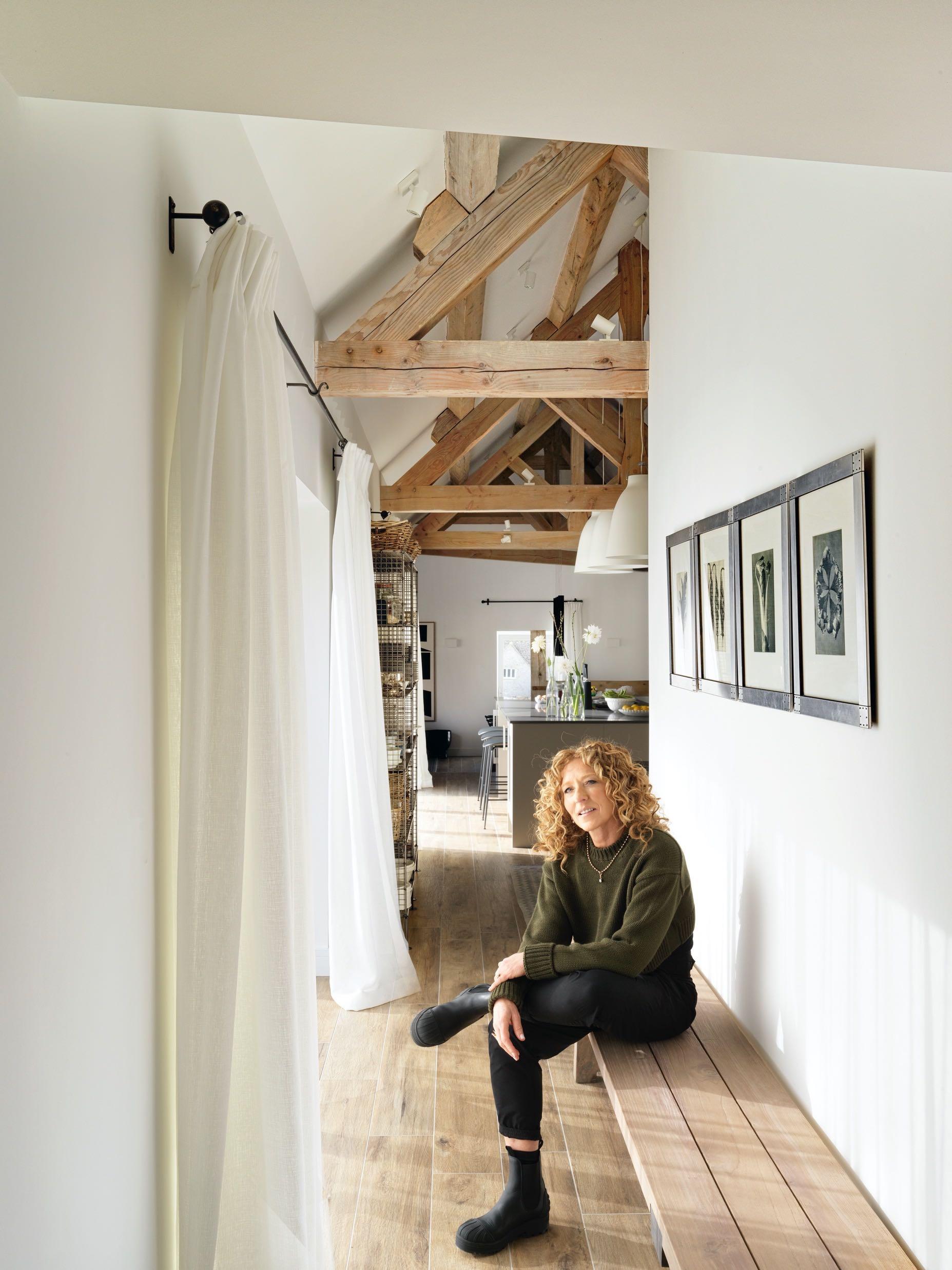
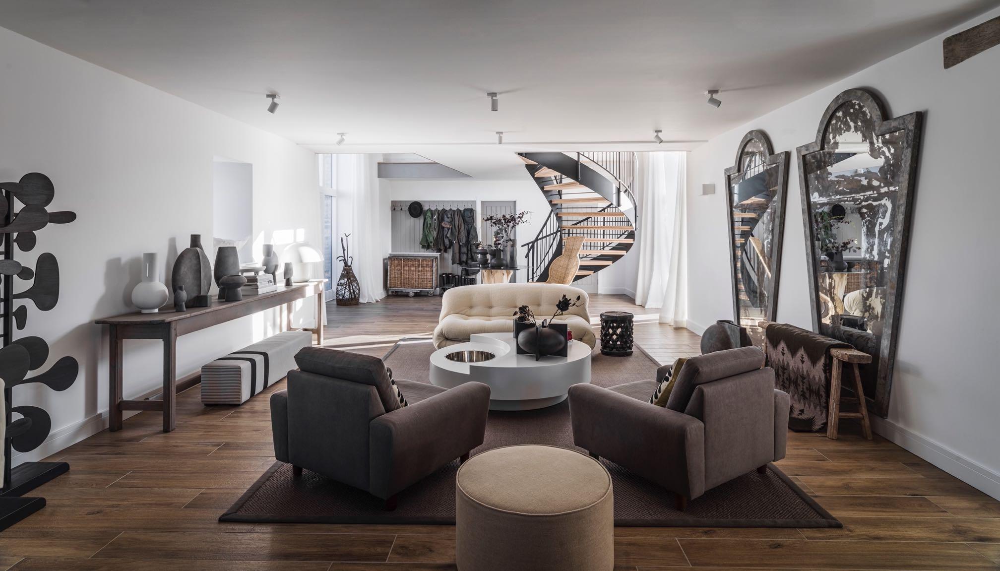
Kelly Hoppen, world-renowned interior designer, is delighted to reveal her own home in the Cotswolds, UK: a renovated country barn that combines a London urban house with a country one.
Set over 232 m² in the British countryside, this home embodies a unique design choice for Kelly Hoppen with its blend of both urban and rural living. The classic
3-wing U shape barn features four bedrooms, two living rooms, kitchen and dining room, surrounding a beautiful central courtyard.
Grounded in a contemporary yet timeless neutral colour palette, the space is distinctively modern and metropolitan whilst also drawing on original features and vintage touches.

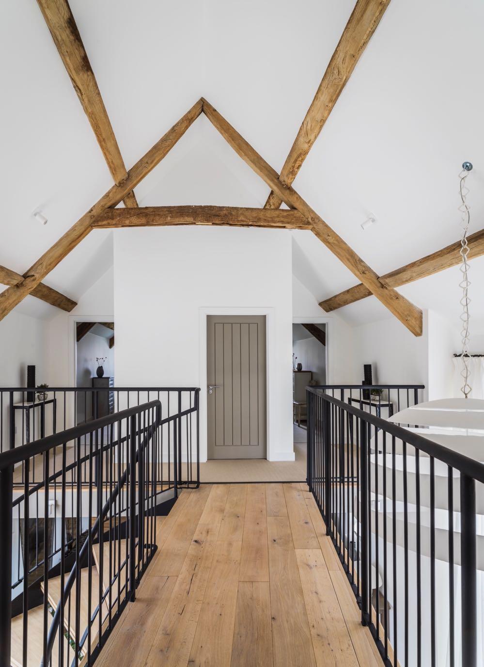
Entering the house, you are greeted by a light and spacious hallway, with beautiful high ceilings and original wooden beams.
"I'm so excited to share our countryside home, where I have created a space that encompasses both country and city into one, providing balance through the juxtaposition of modern style and vintage pieces."
Kelly Hoppen
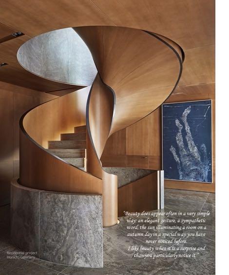
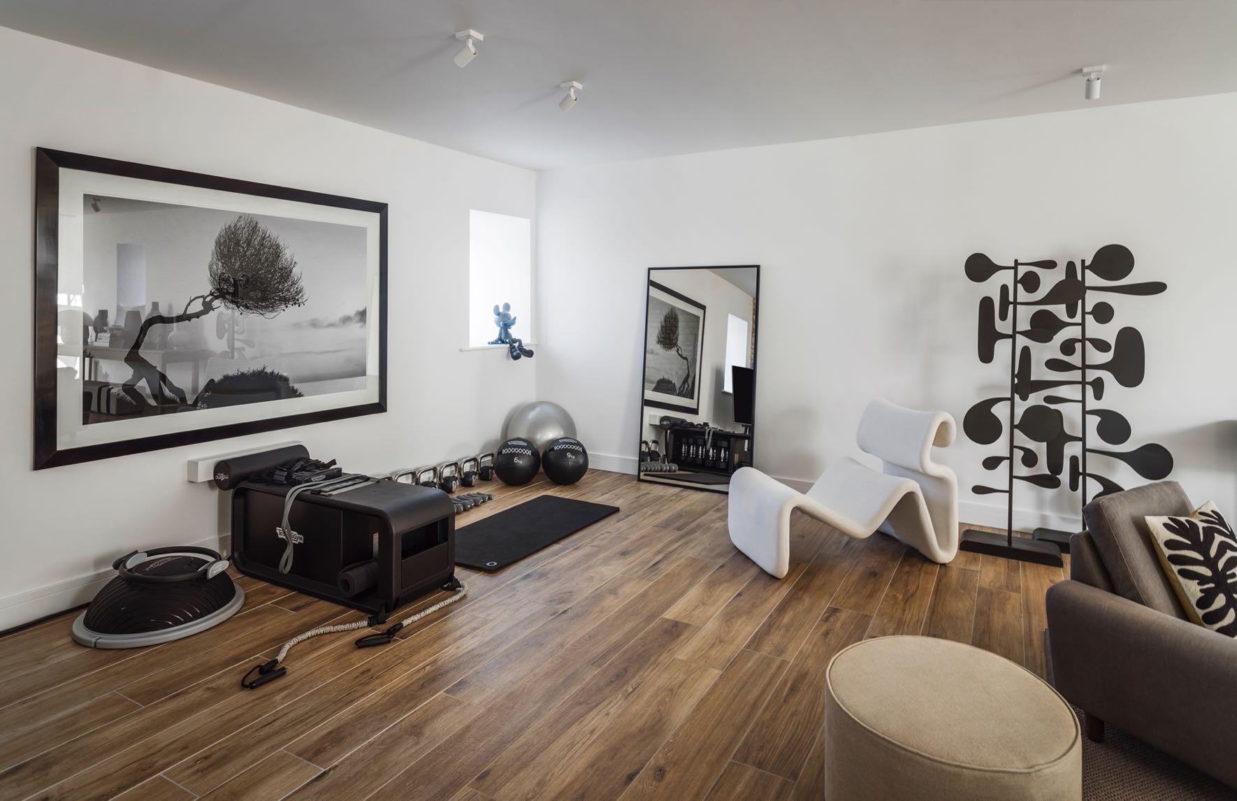
The sweeping spiral staircase sits behind the statement lighting feature custommade: Kelly Hoppen used black to balance the white and creams. In line with Kelly’s signature experimentation and merging of tactile materials and textures, the dark ceramic matte-finish vases contrast with the original wood and natural feel of the space. Gervasoni’s table and vintage seagrass lounger by Puckhaber Decorative Antiques complete the design. Next to it, a cosy lounge is home to a classic linen sofa and beautiful deep vintage chairs. Decorating the walls are distressed vintage mirrors, along with the art pieces. At the back of the lounge area is the home gym, using equipment from Techno Gym.
68 | G&G _ Magazine
70 | G&G _ Magazine
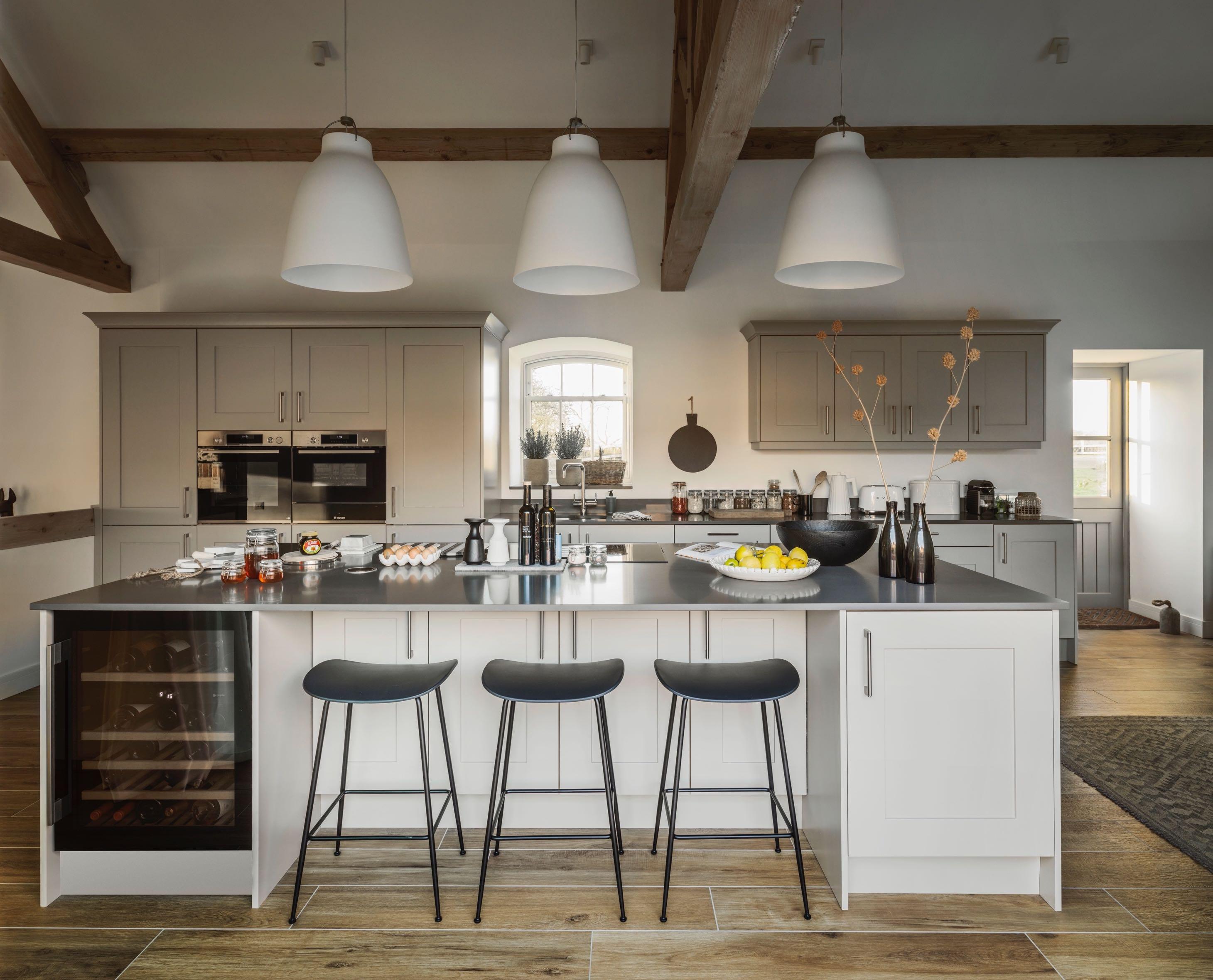
From the entrance you enter into kitchen, dining area and two living rooms - it is a fluid space without doors. The choice of light tones for walls and furnishings elevate the brightness and space of the property, especially in this walkway between the hallway and the kitchen. Rare photographs by Karl Blossfeldt and a wooden bench face the glass doors which lead to the courtyard. The heart of the home is the classic barn style kitchen looks onto the central courtyard. Kelly’s trademark neutral colour palette gives the kitchen a contemporary yet timeless look, utilising a range of tones to achieve depth and dynamism in the space. A huge island has been inserted in the kitchen which on one side serves as a work area with induction hob and hood including the balcony for breakfast on the other; it also houses the wine cellar. Bar stools at the kitchen island make this space a more casual alternative to the elegant dining room nearby. Industrial-style cabinets offer added storage along with an extra touch of urban design to the kitchen. The geometric rug similarly provides a modern accent to complement the timber floors and joinery.

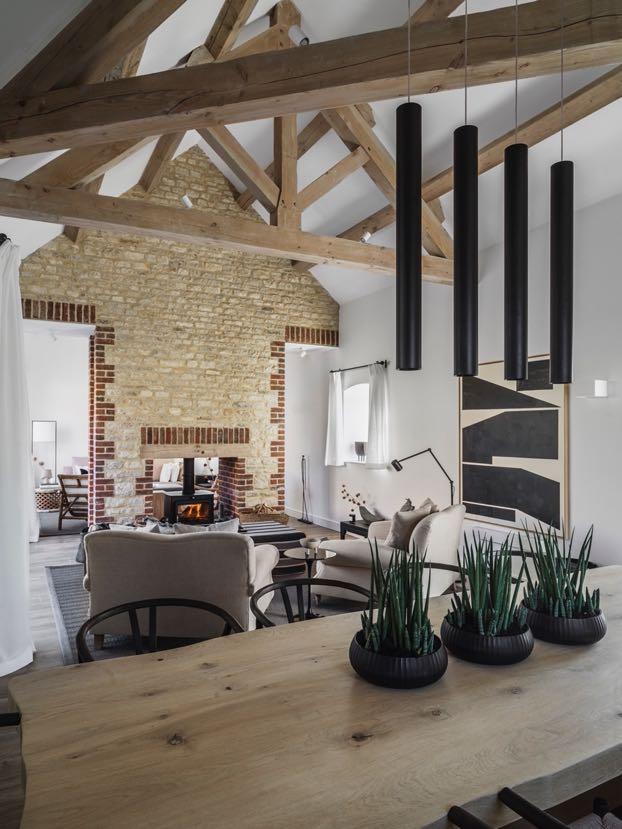
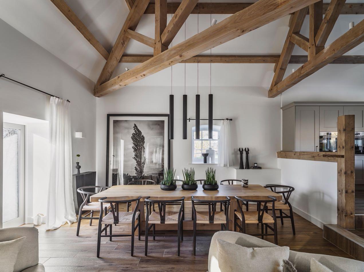
Leading off from the kitchen is a spacious and warm dining-room, with beautiful views of the courtyard. The elegant timber dining table sits under unique modern black hanging lamps, a juxtaposition with the original ceiling beams, and is surrounded by a console, a black & white photograph/artwork and dark accessories contrasting the white walls and wooden features.
A relaxing seating area is located next to the dining table and features a double-way cast iron fireplace built within a brick feature wall. This unique fireplace provides a snapshot into the next room, creating a dynamic and natural flow through the house. Loaf's classic linen armchairs sit alongside modern art and a sleek standing lamp, offering a dynamic touch to the traditional space. Subtle spotlights and the standing lamp help to build the atmosphere of this relaxing space.
Minimalism is the dominant theme in the second living room, with creased linen
providing an elegant yet relaxed base for textured and embellished cushions. The vintage bamboo chairs are combined with the blocks of wood. The unique and distinctive texture and pattern of the side tables by Zoco Home Bamileke bring an eclectic touch to the room.
72 | G&G _ Magazine

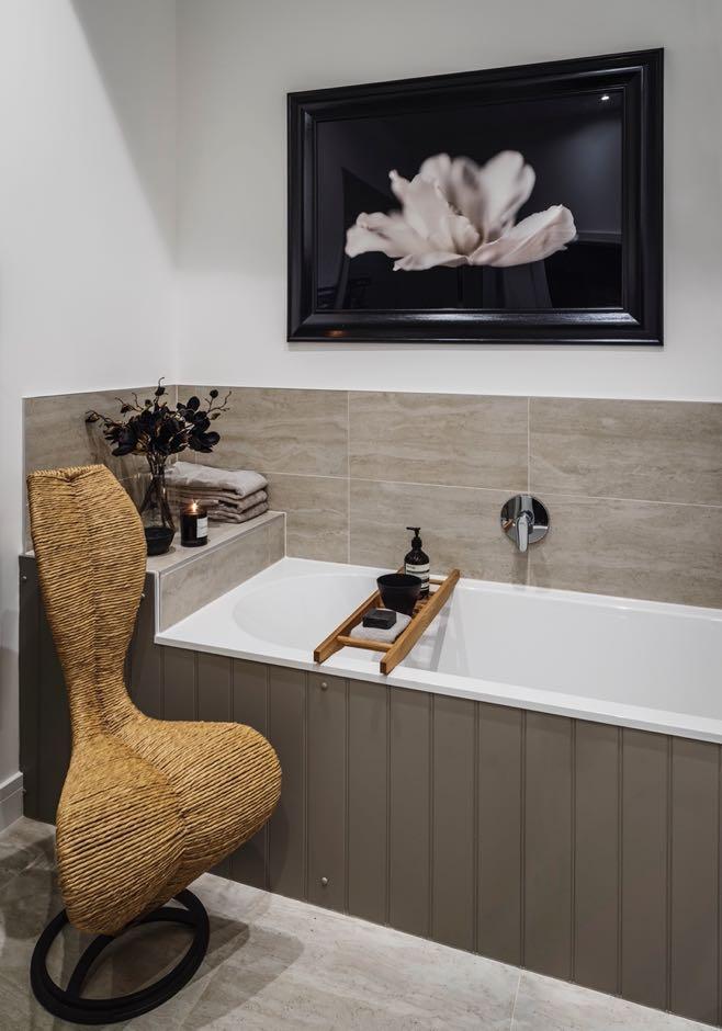
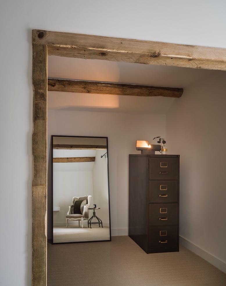
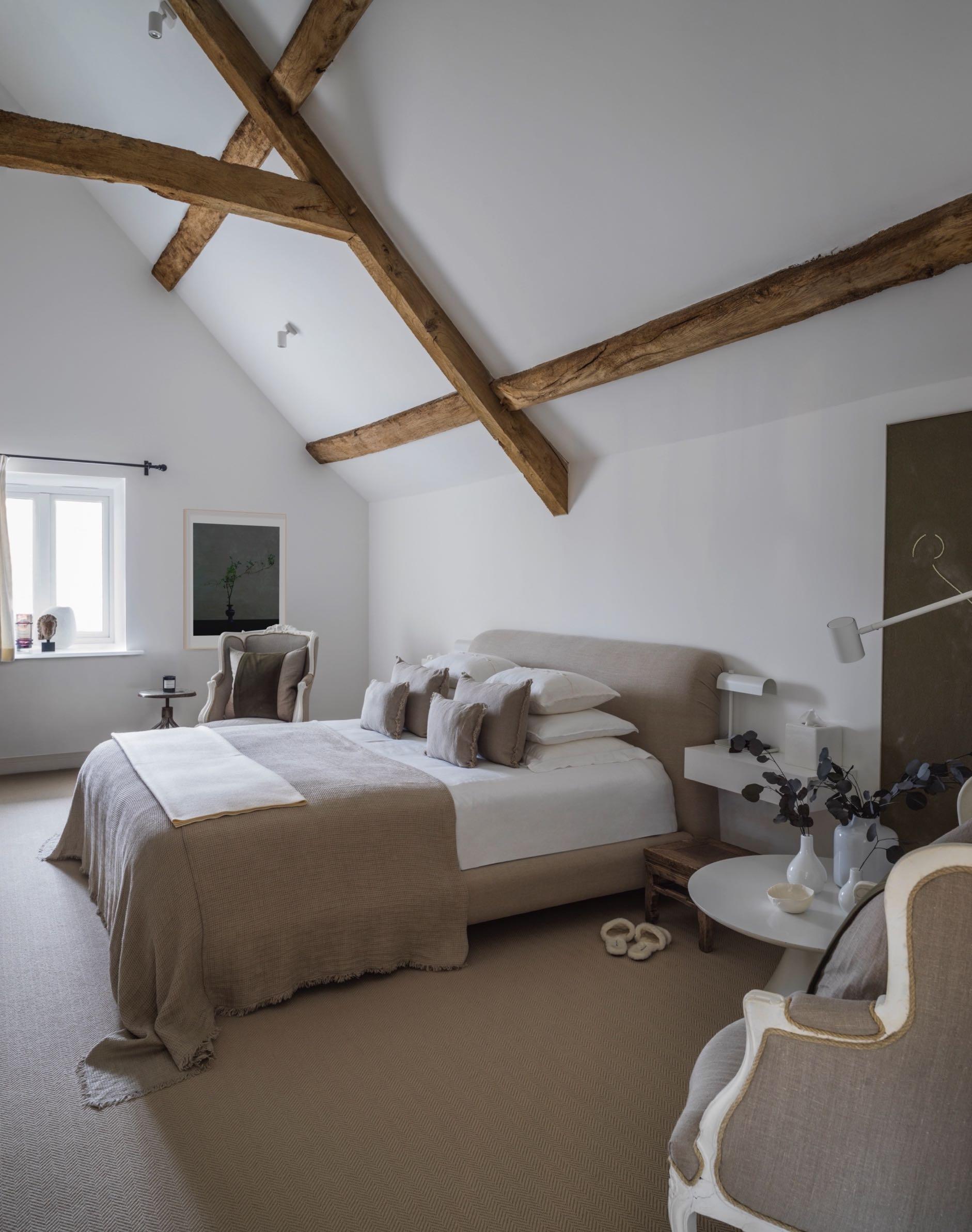
Upstairs, under the high ceilings of the barn there are three bedrooms. The master bedroom continues the natural linen texture and vintage furniture that is found throughout the rest of the home. Modern accents are provided by the addition of contemporary art, achieving a balanced symmetry of old and new. The walk-in wardrobe opens the space up and creates a seamless flow between zones in the room. An industrial-style filing cabinet acts as a unique dresser. The bathroom continues the elegant and vintage style of the property.
74 | G&G _ Magazine
DYNAMIC energy
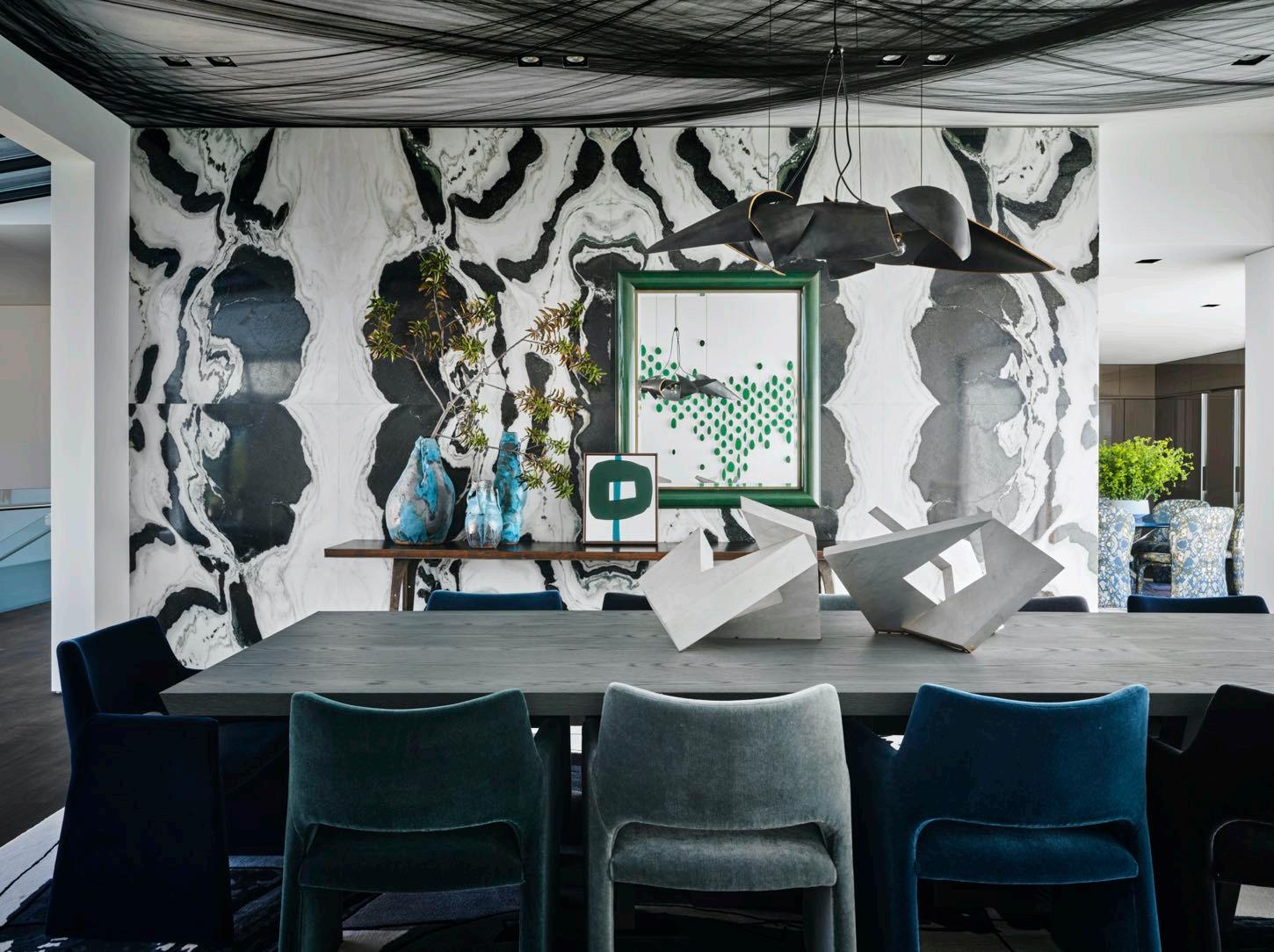
Overlooking Laguna Beach, California, Michelle Nussbaumer created a multi-functional home full of imagination and maximalism, that serves as both a luxurious retreat and family-friendly sanctuary.
 Photography by Douglas Friedman
76 | G&G _ Magazine
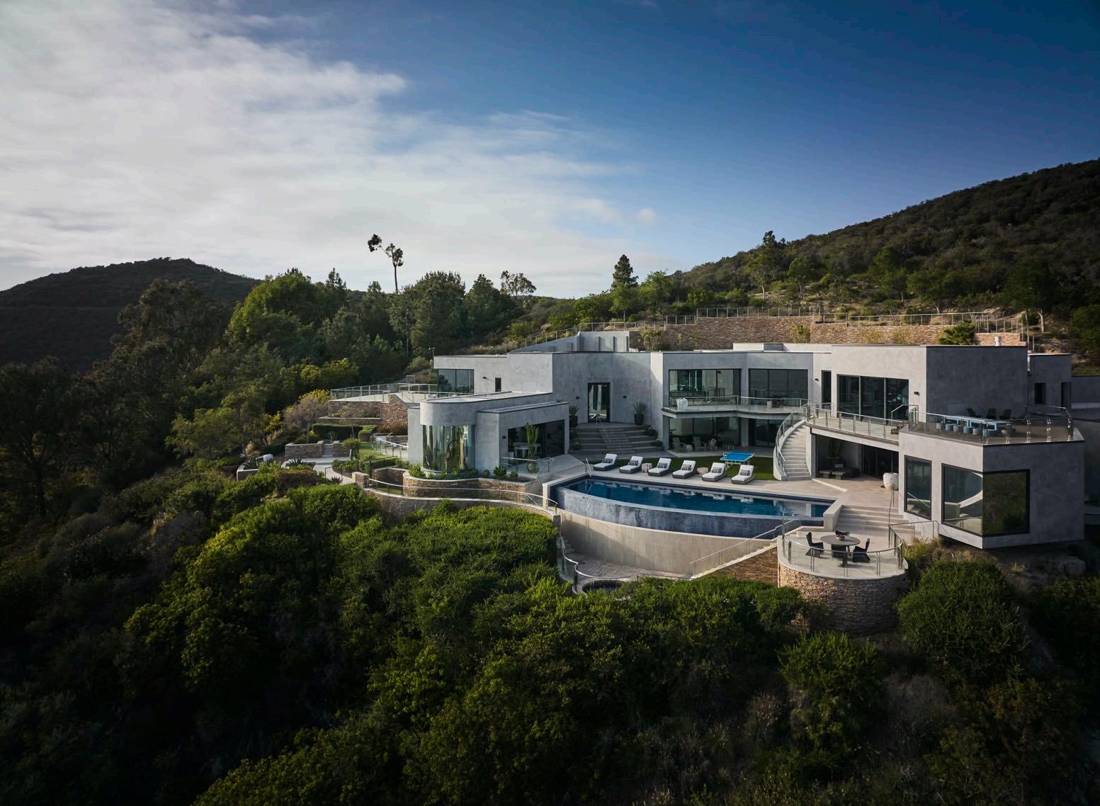
Inspired by the magnitude of the Pacific Ocean, the house looks almost to be cut directly from the mountainside. An infinity pool, boasts panoramic views of the iconic seascape, whilst voluminous windows and doors invite the outside in.
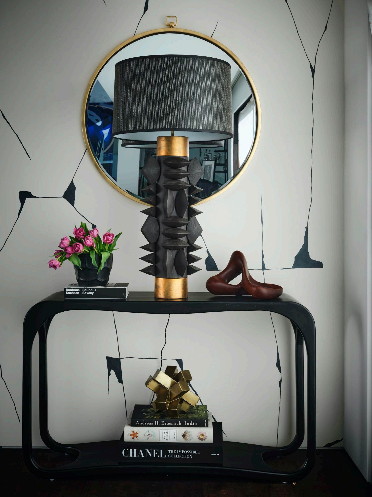
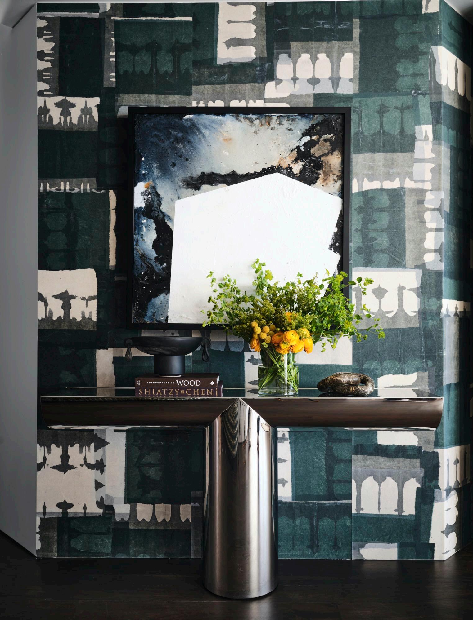
A restrained colour palette, featuring tonal variations of grey and navy, is enlivened by touchstones of colour and bold graphics and pattern – a signature of the studio –lending a dynamic energy to the space. The blue hues can be glimpsed right from the entryway where an Elliott Routledge artwork has been hung above the white ottoman by Roche Bobois. Custom made furniture pieces and patterned wallpaper are featured throughout and complimented by pieces from the family’s grandmother who was a designer herself. The modern
"This is the fourth house I have worked on for the particular client spanning years of collaboration. It’s a multi-family home and vacation home. While it’s a family of boys (3 generations who are all very sports minded) they wanted the house to feel like a luxurious retreat with the kind of comfort suitable for young children.”
Michelle Nussbaumer
scheme is infused with eclectic worldly influence, calling to mind styles from the mid-20th century, offset by contemporary artworks carefully chosen by the owners. Sleek functionality and comfort is at the heart of this property; a beautiful blend of the contemporary with the organic, this house epitomises all that is modern family living.
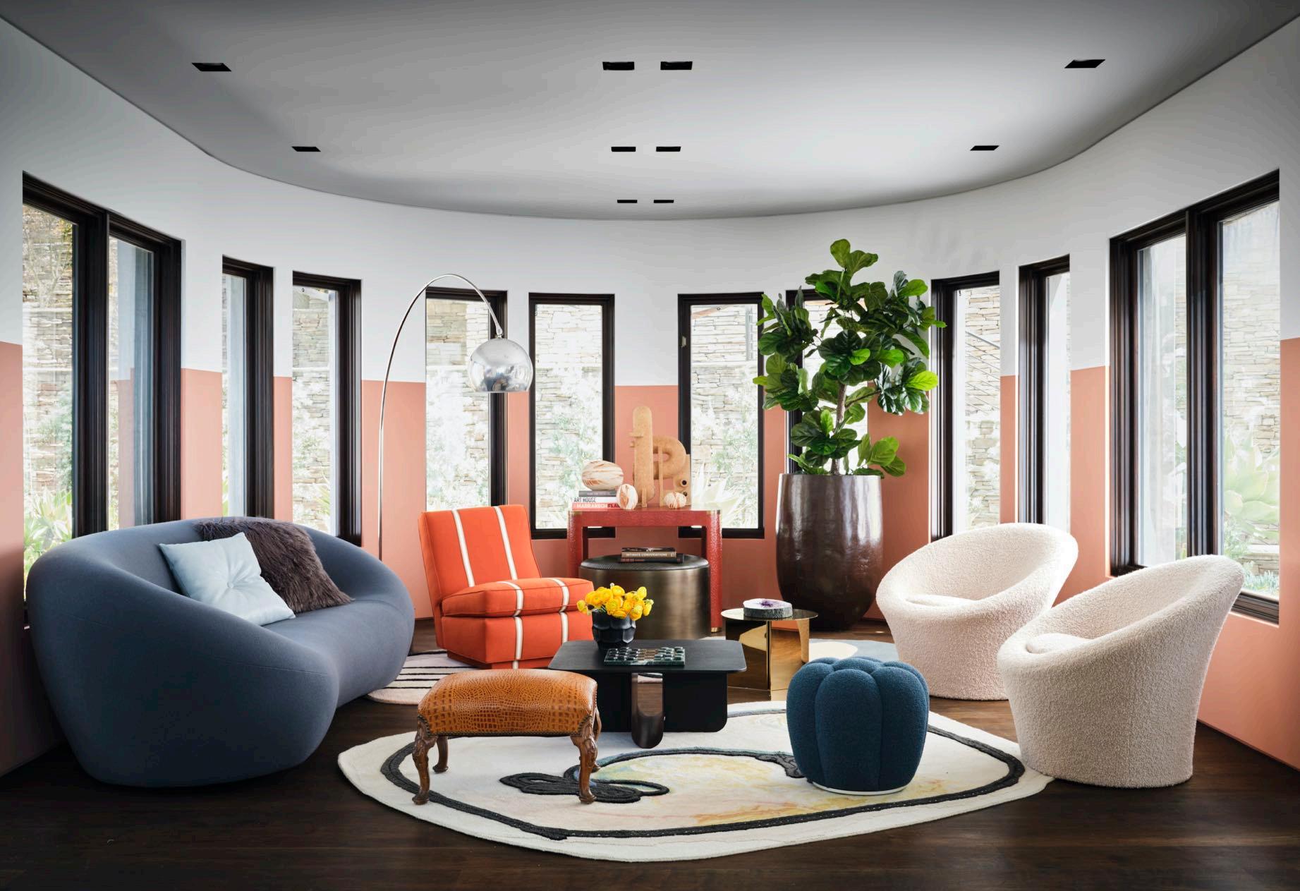
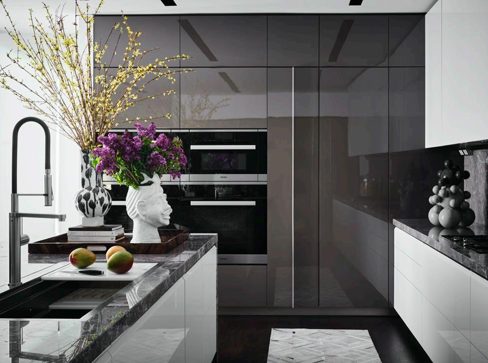
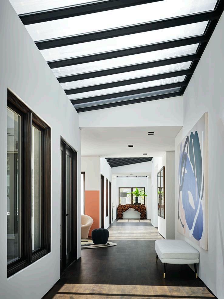
Continuing to the left we find the living room with the painterly CC Tapis rug underfoot. Also in that rounded area, we find embedded with thin vertical windows marked by black frames, Michelle applied a trendy paint dip to the walls in a pretty salmon hue. Next to it, we find the wellequipped kitchen with all Miele appliances; the furniture is lacquered and echoes the glossy surfaces of the other rooms. Here too there is no shortage of art objects.
78 | G&G _ Magazine
78 | G&G _ Magazine
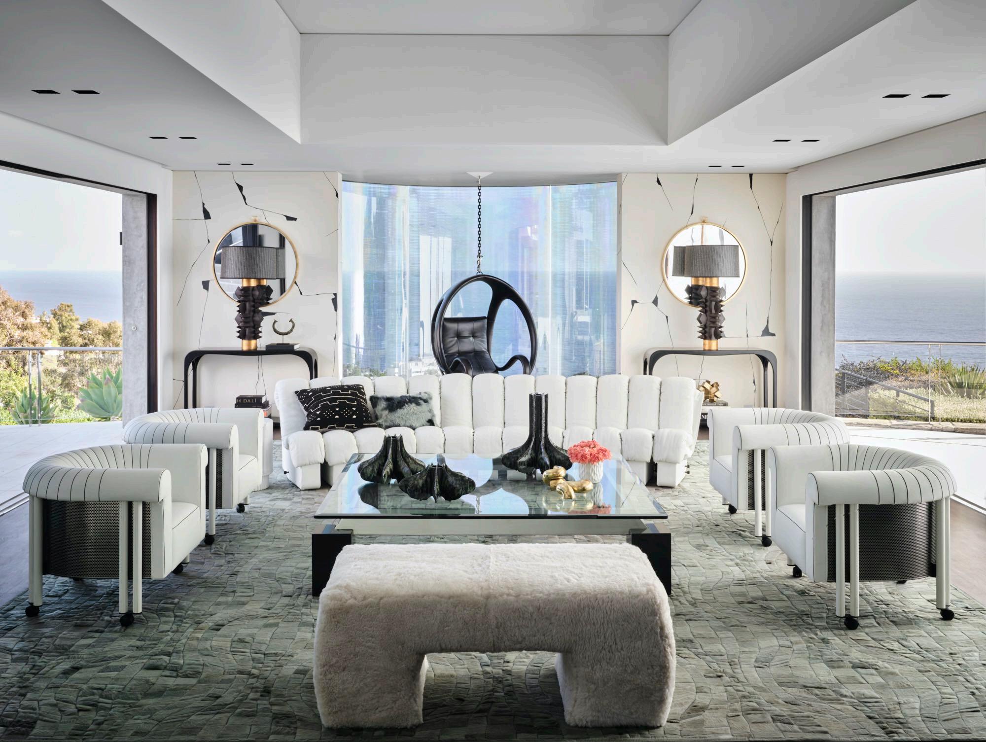
In the large living room of the property, the huge windows flood the space with natural light, making it extremely bright. To ensure a continuous flow between inside and outside, it was decided not to include any type of curtains: you are inside the house, but it seems to be outside. Unlike the rest of the house, the colors here are basic: we find white everywhere with black accents. This room also offers a certain symmetry: we find a white armless sofa by De Sede with a pair of armchairs on either side; as well as two black consoles with sinuous shapes with Dragonette lamps on their respective sides. Porter Teleo's wallpaper with its black veining forms the background together with a pair of round mirrors with a gold frame that recalls the finishes of the lamps. In the middle another window with a view of the sea, and where Blackman Cruz's black swing chair has been hanging. A series of home accessories such as cushions and decorative pieces complete the touch of black in the room.
80 | G&G _ Magazine

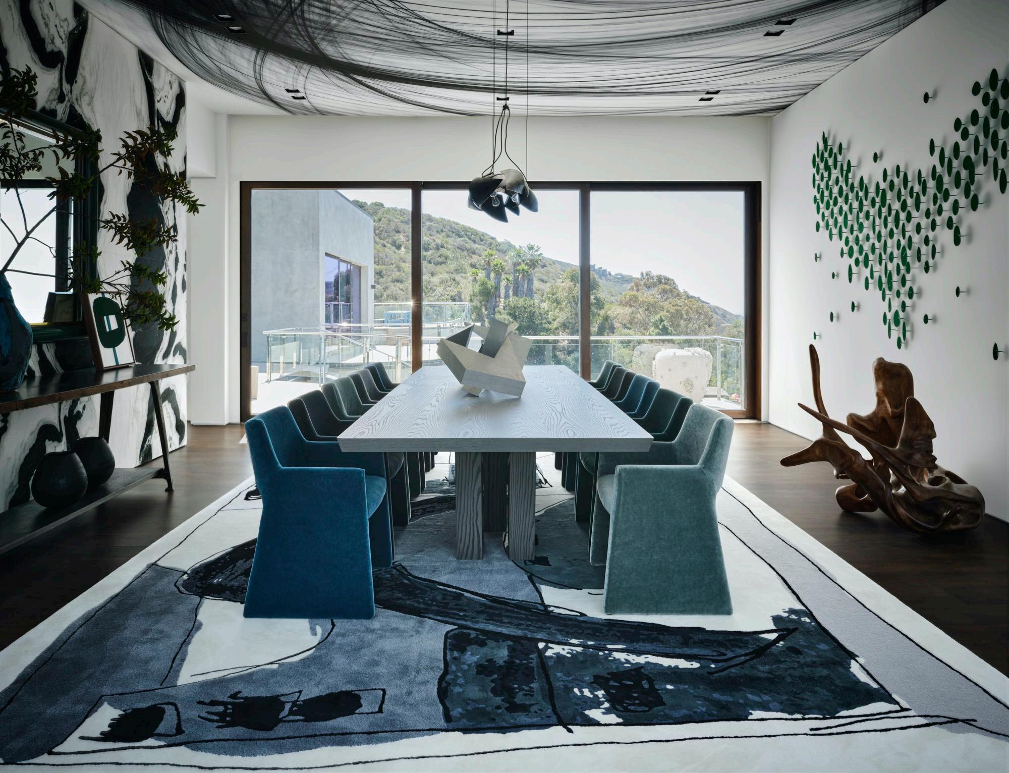
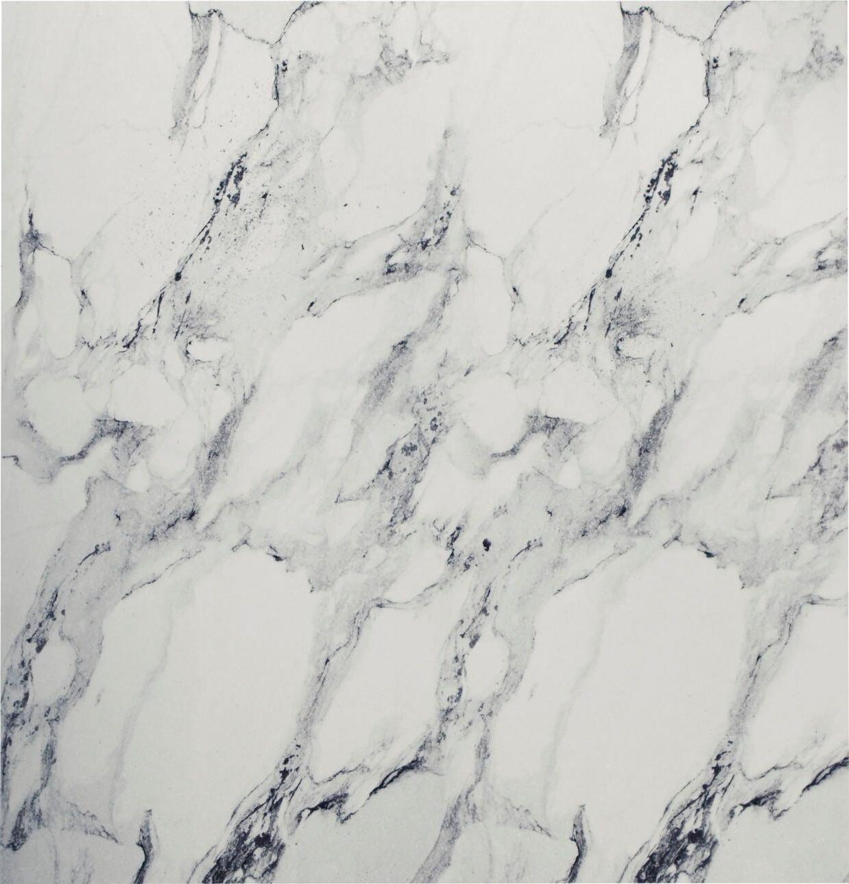
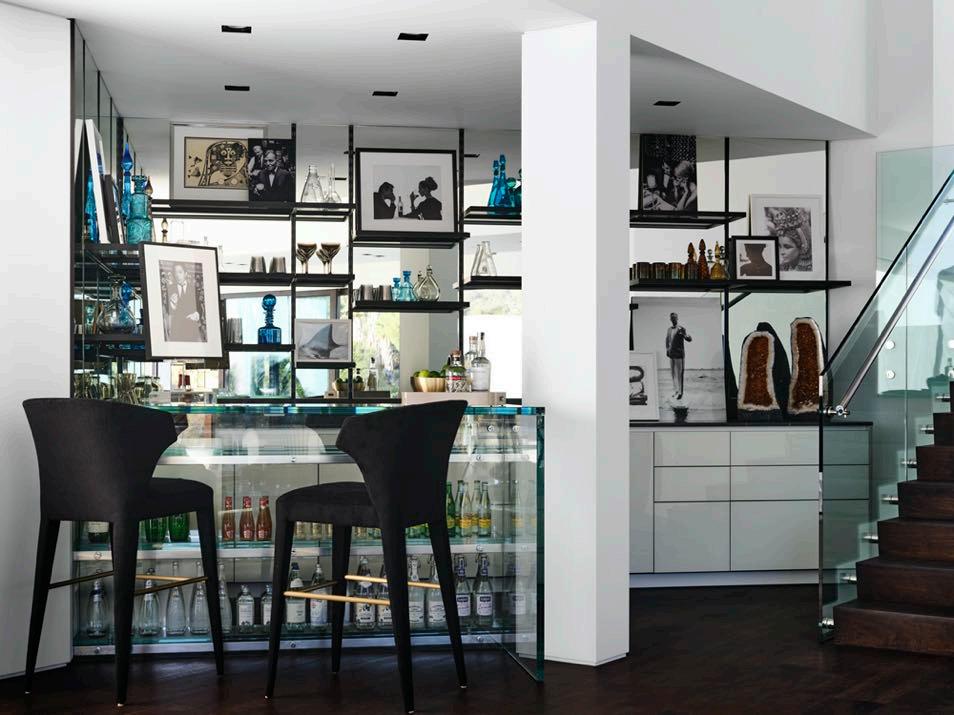
In the formal dining room, the custom Bettinger Studio ceiling mural evokes the swags of a fishing net with its smudgy charcoal lines. While the wall installation by Argentinian sculptor Carolina Sardi brings green metal cutouts together in the shape of a heart. On other side we find a marble wall with JF Chen's console, decorative pieces by Ceylon et Cie and a green-rimmed Karl Springer mirror. Michelle dressed the custom dining chairs in Opuzen mohair in various oceanic tones. Not far away, an all-glass bar is an undeniable showstopper.

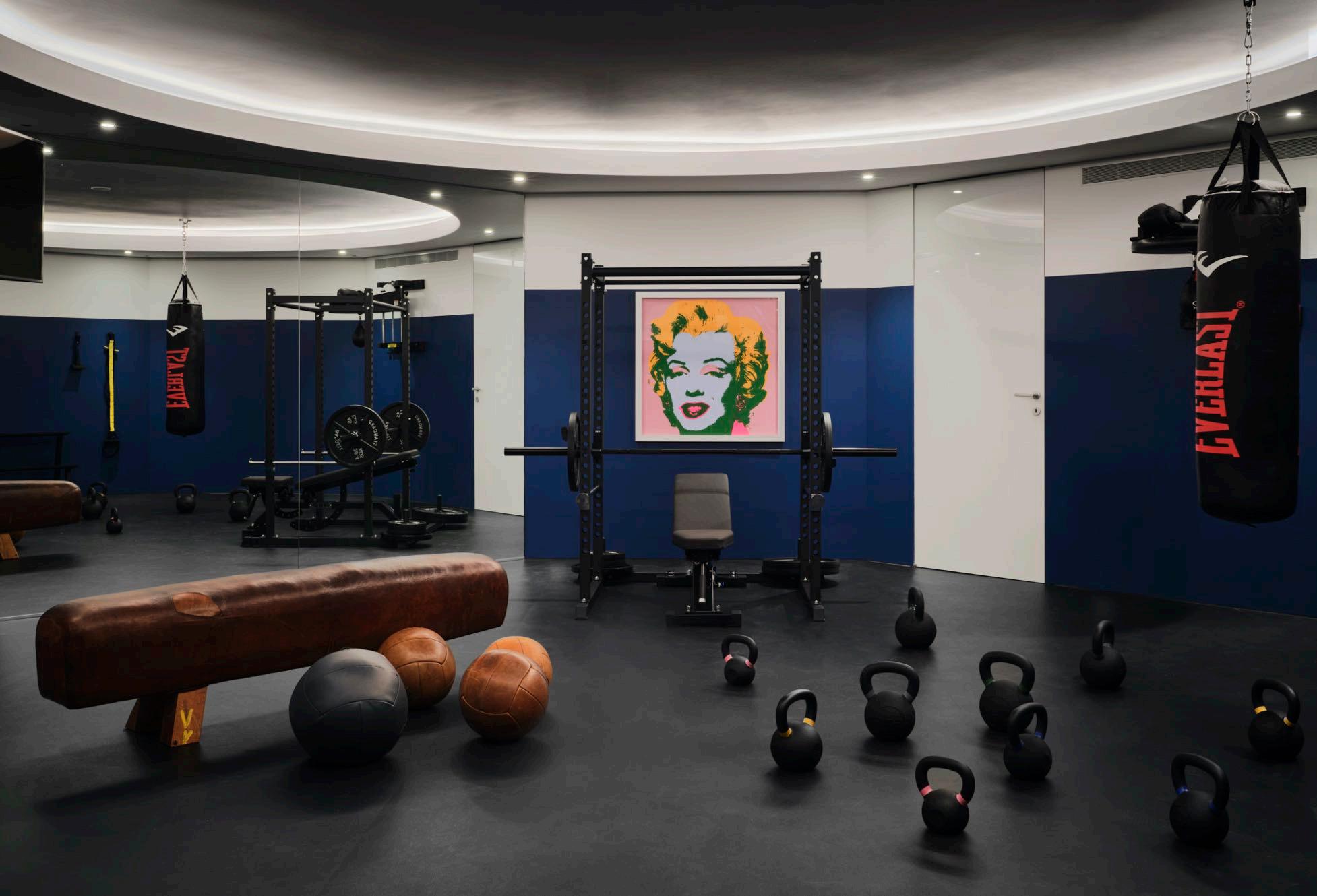
One of the family members is a sports agent and quite a few boxing stars come to use the gym with the family. It features vintage medicine balls alongside modern gym equipment. There are teenage boys as well as toddlers, so the house had to serve multiple uses with areas for privacy and staff.
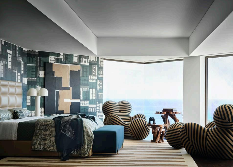
In the master bedroom, Michelle has included the striped Patterson Flynn Martin carpet that recalls the lines of the iconic Up chairs by Gaetano Pesce. The blocky tufted headboard and wallpaper by Phillip Jeffries seem to push back on any curvaceous advancements.
84 | G&G _ Magazine
86 | G&G _ Magazine
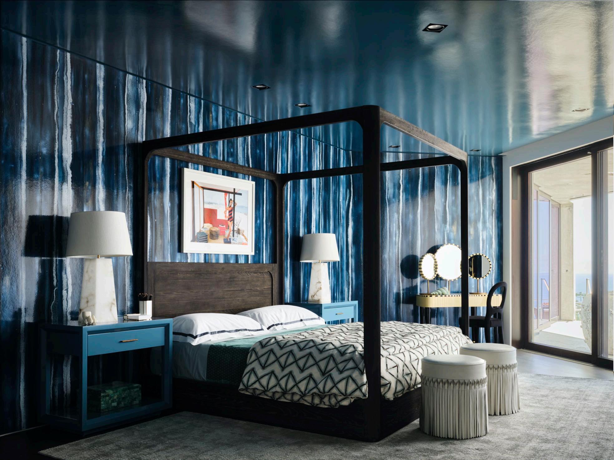
In the daughter’s bedroom, an azure wallcovering by Phillip Jeffries conjures cascading water, while the ceiling has been painted in 17 coats of lacquer. A corner with a dressing table by Matteo Cibic and
round stools by Martyn Lawrence Bullard at the end of the bed give a touch of femininity to the room. Stately lamps by Kelly Wearstler and custom nightstands complete the design.
UNSOPHISTICATED CHARM
Grande Interior Design projected a high-end residence awash in a decent aura with the use of the dominant color of light grey in Hong Kong.

Basking on a modern and neutral note, this copious dwelling of 109 m² is located in the 70-story Harbourfront Landmark
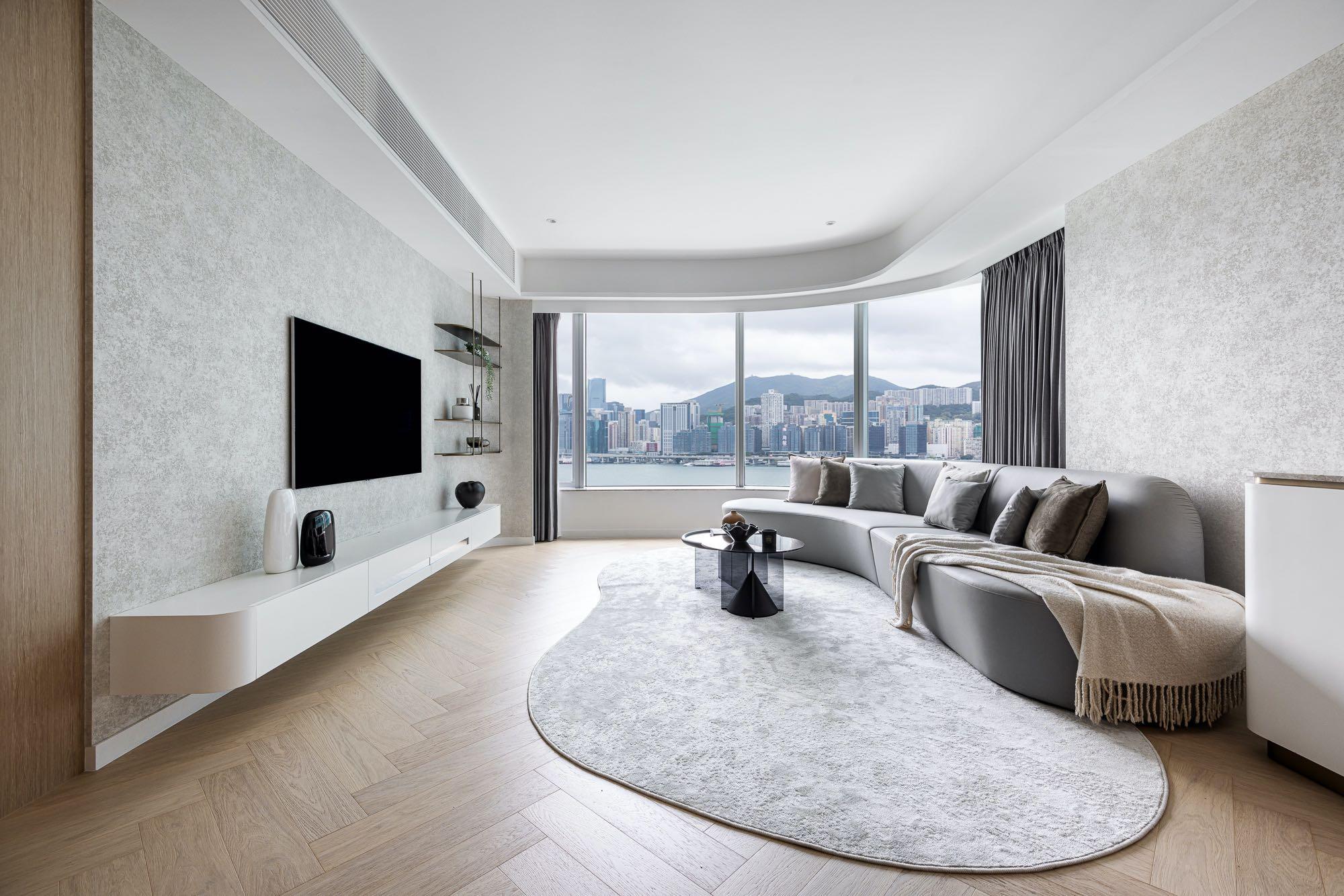
skyscraper in Hung Hom district. The living spaces are adorned with a serene light grey that harmonizes the overall visual temperature by appropriately utilizing light shades of earthy tones and wood, creating a tranquil atmosphere within the home. The family desires a style that is 'durable and timeless' so the designer composed a color palette with a high degree of fusion, including wood, earth tones, and grey color. Different natural materials are used to pave on a minimal setting, resulting in a minimalist yet aesthetically layered dwelling.
unique furniture to echo the layout such as the sinuous sofa and carpet below. The designer added a unique marble steel accent hanging shelf, embellished with antique bronze materials to outline the design, also connected to the one near the TV wall. While cement wall-like wallpaper gives off a rich textured layering. In the dining area, a cloud-shaped delicate pendant becomes the spot of the room, using its warm color to merge with the
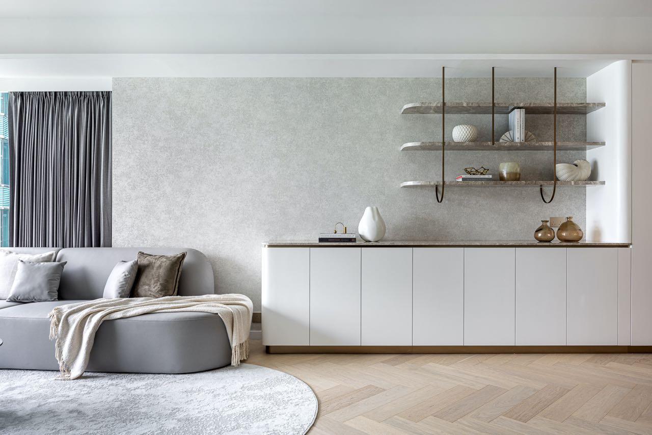
Once we enter the residence, we immediately find ourselves in the large living area: the living room on the left and the dining area on the right, which leads to the rest of the house. According to the original curvy layout, the living room is adorned by a curved-shaped panel and earthy accents; on the side which is a full-height cabinet for storage and display, the hanging design is made to reduce the bagginess of space on the cabinet design.
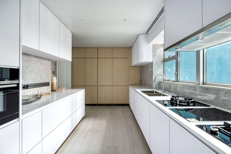
Through a flush door you enter the kitchen where, considering the owner's cooking habits, the original maid's room was demolished to expand the space and enhance its flexibility.
90 | G&G _ Magazine

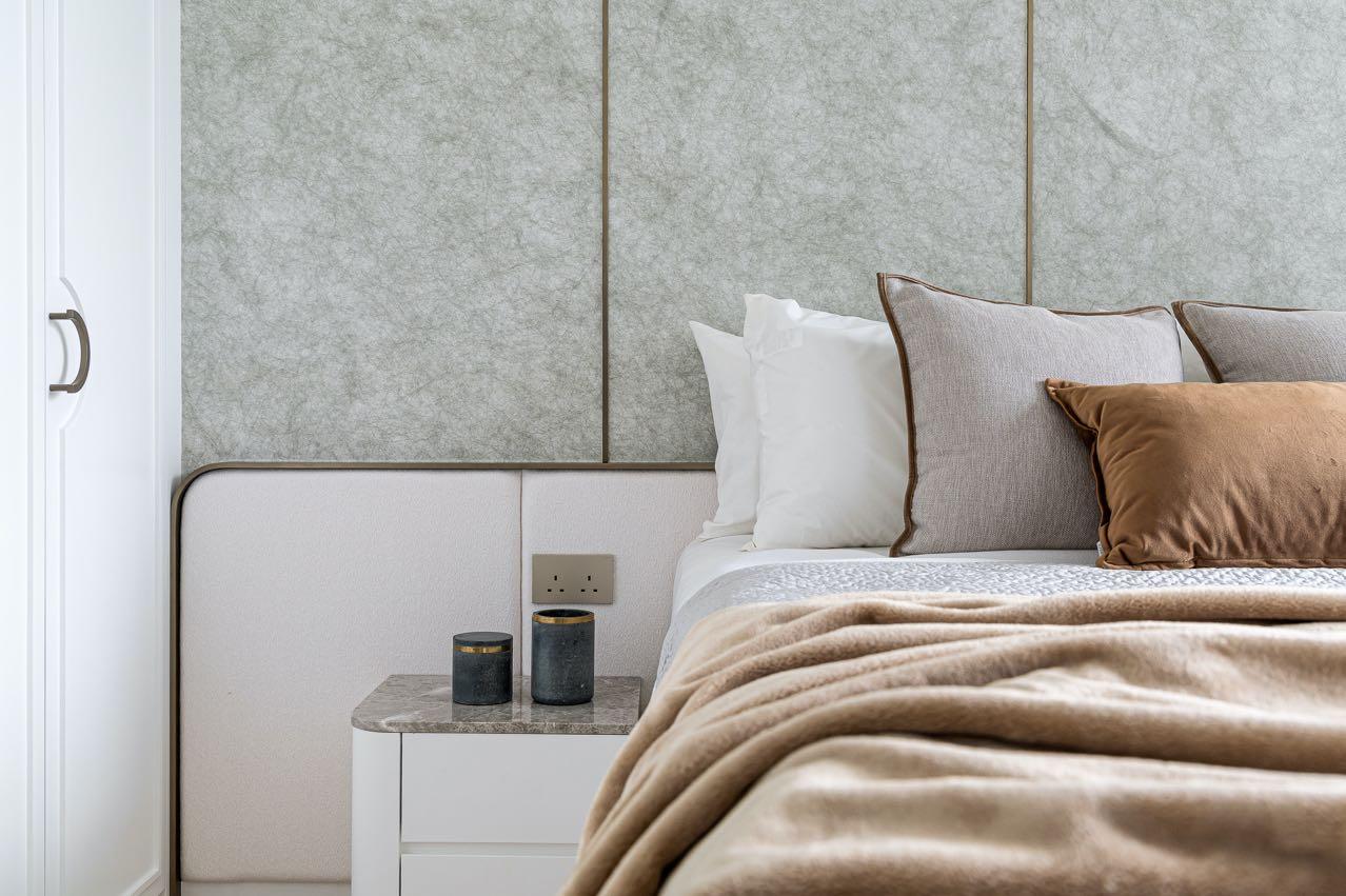
The master bedroom is blended with light European style into modern with elements of moulding lines and metal handles on the full-height wardrobe to add femininity to the space and design it as a unique feature TV wall. The headboard is also made with textured wallpaper which is adorned by

bronze lines, the room is surrounded with full of details.
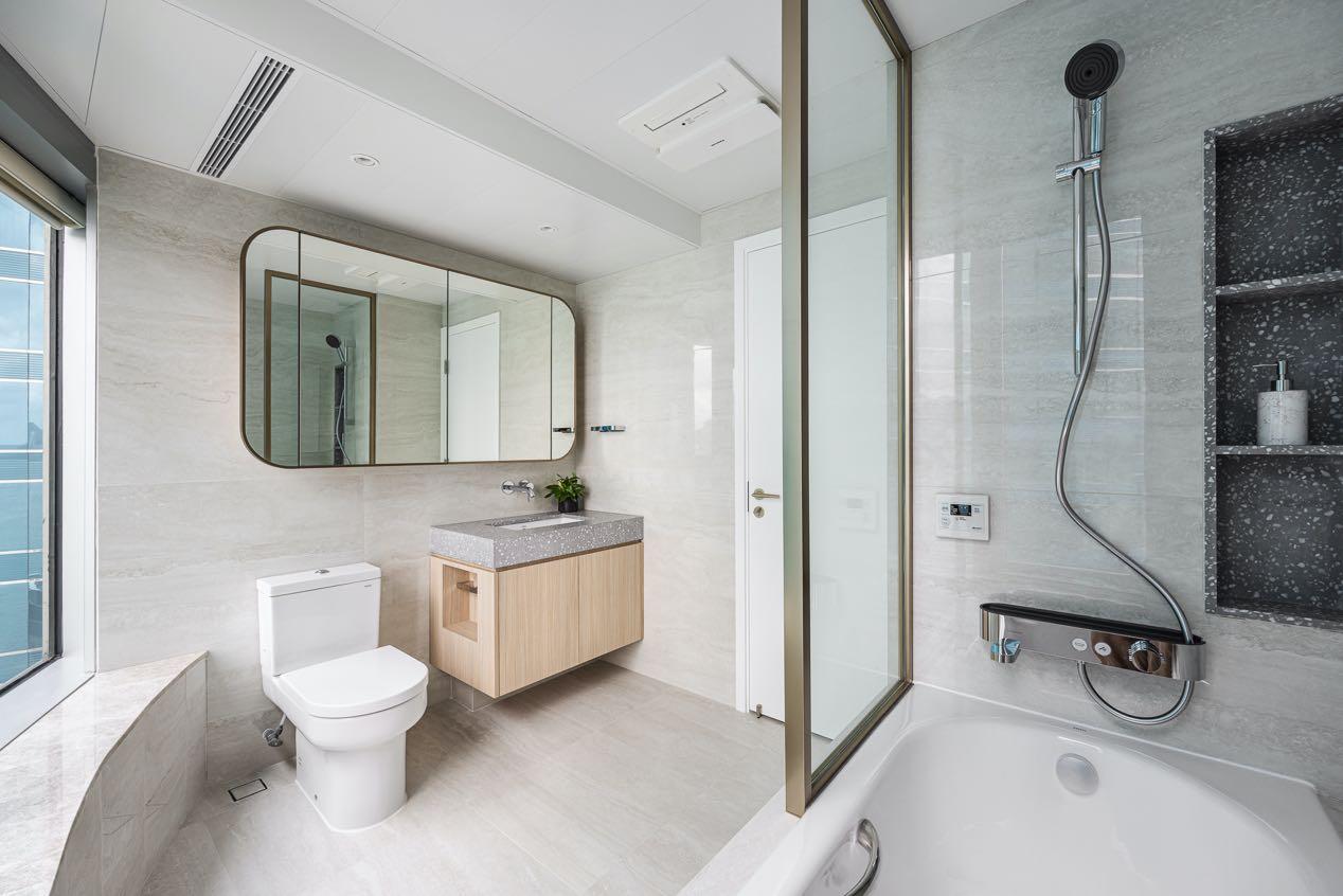
In the master bathroom, retains the style in bright minimal tones, applied some unique tile patterns with bronze to outline the design, creating this modern bathroom aura.
92 | G&G _ Magazine

94 | G&G _ Magazine
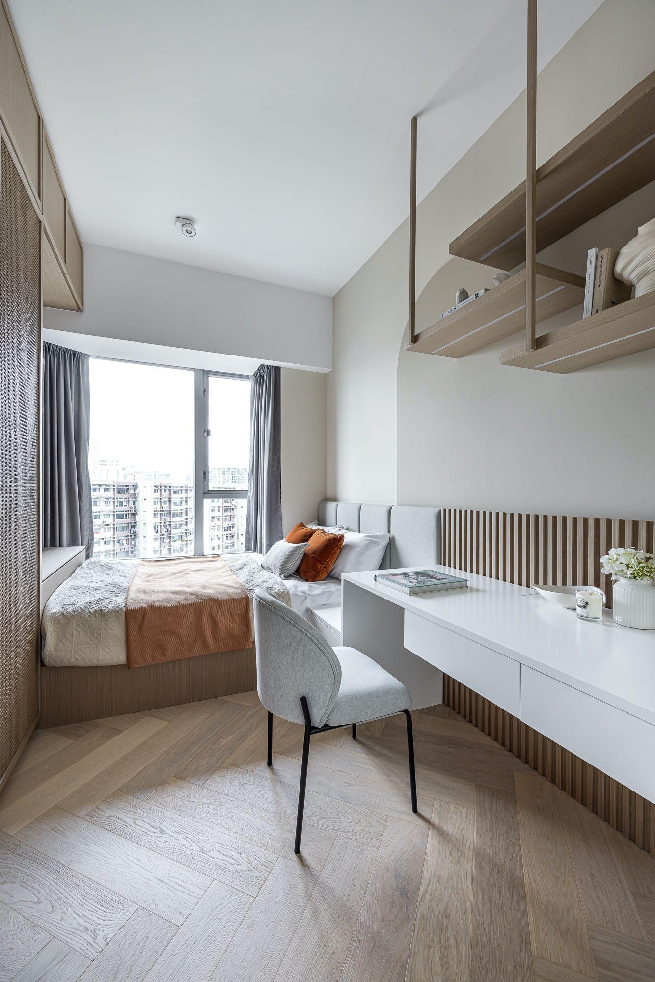
Another bedroom follows the Japanese aesthetic of wabi-sabi, embracing the simplicity and serenity of the style. It is complemented by natural elements such as rattan wardrobes, wooden materials, and wooden slats to balance the visual temperature of the entire residence and
evoke a sense of natural beauty.
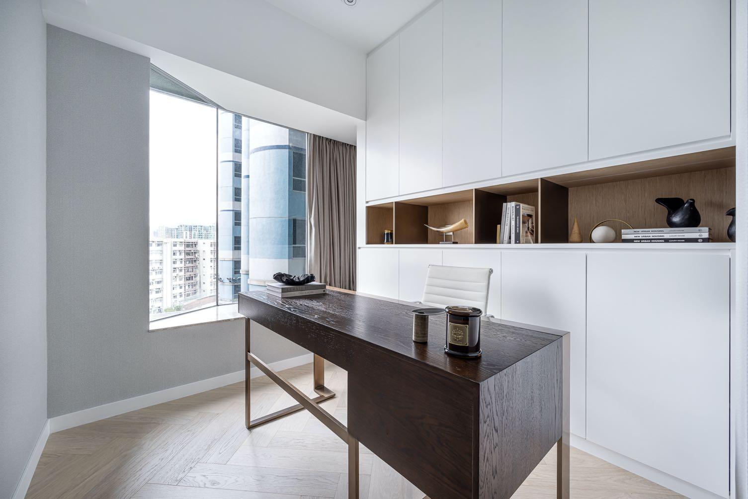
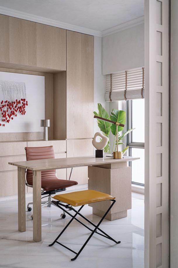
The study room maintains a minimalist design, featuring a desk for home office purposes. A full- height storage cabinet is equipped with display shelves and light trough design to enhance the overall layering.
96 | G&G _ Magazine
IN THE CLOUDS literally
The interior design firm Purple Backyard, led by Kumpal Vaid, designed a 200 m² holiday apartment in Mumbai with the breathtaking views while creating a transitional sanctuary for a couple.
 Photography by Ishita Sitwala
Located on the 73rd floor of the tallest building in India, the apartment offers the boundless views of the
eternal sky, sea, and the teeming metropolitan. Edgy and yet suffused with repose, the home bears a Transitional Avant-Garde DNA that walks the line between bold sensibilities and minimalism. The family’s requirements were centered around a functional home that would function seamlessly as a secondary residence with snug spaces to entertain loved ones and privacy-laced zones in the form of independent home offices for the couple.
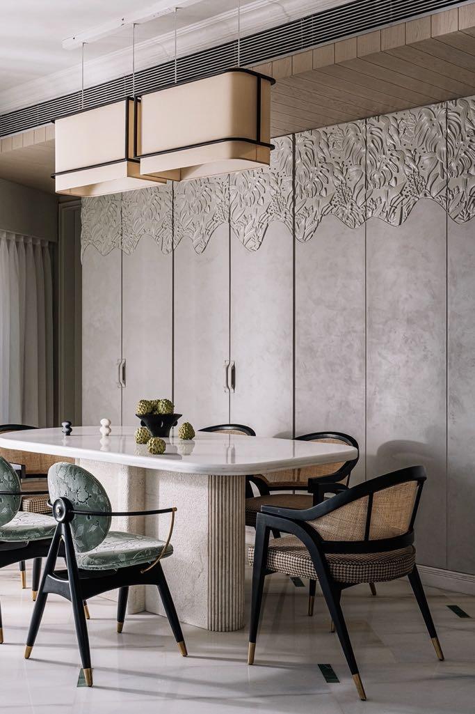
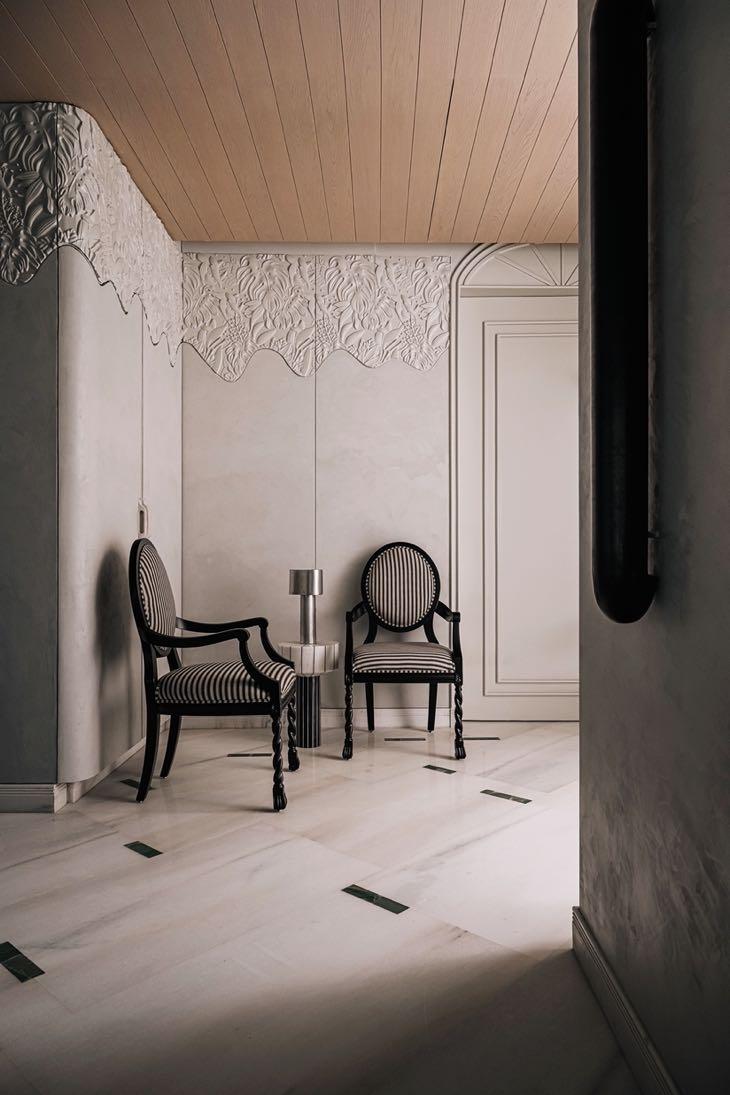
The quaint foyer is steeped in a pareddown identity which devotes itself to the romance of monochromes. A carved, wood relief-inspired backdrop graces this nook and travels further into the shared zones to create a contiguous visual. Threedimensional motifs of foliage crown the top of the walls, travelling down as smooth panels which inconspicuously anchor storage. A pair of Victorian-style chairs with turned legs anchor this corner, accompanied by the Leviosa Design funnel lamp.
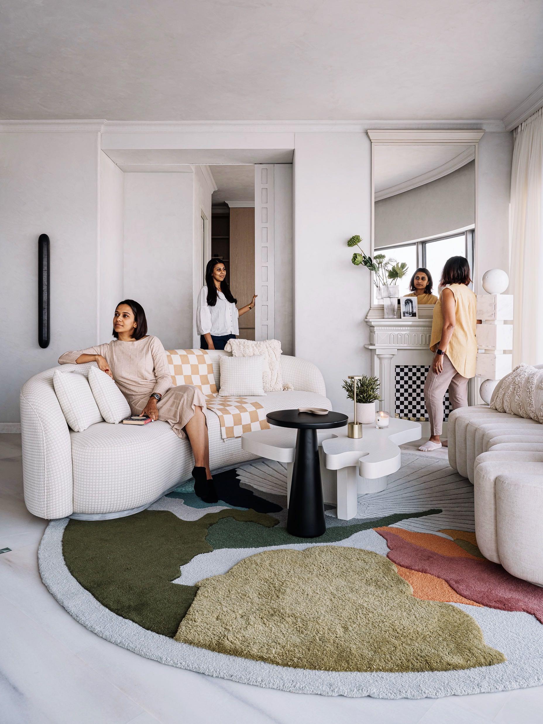
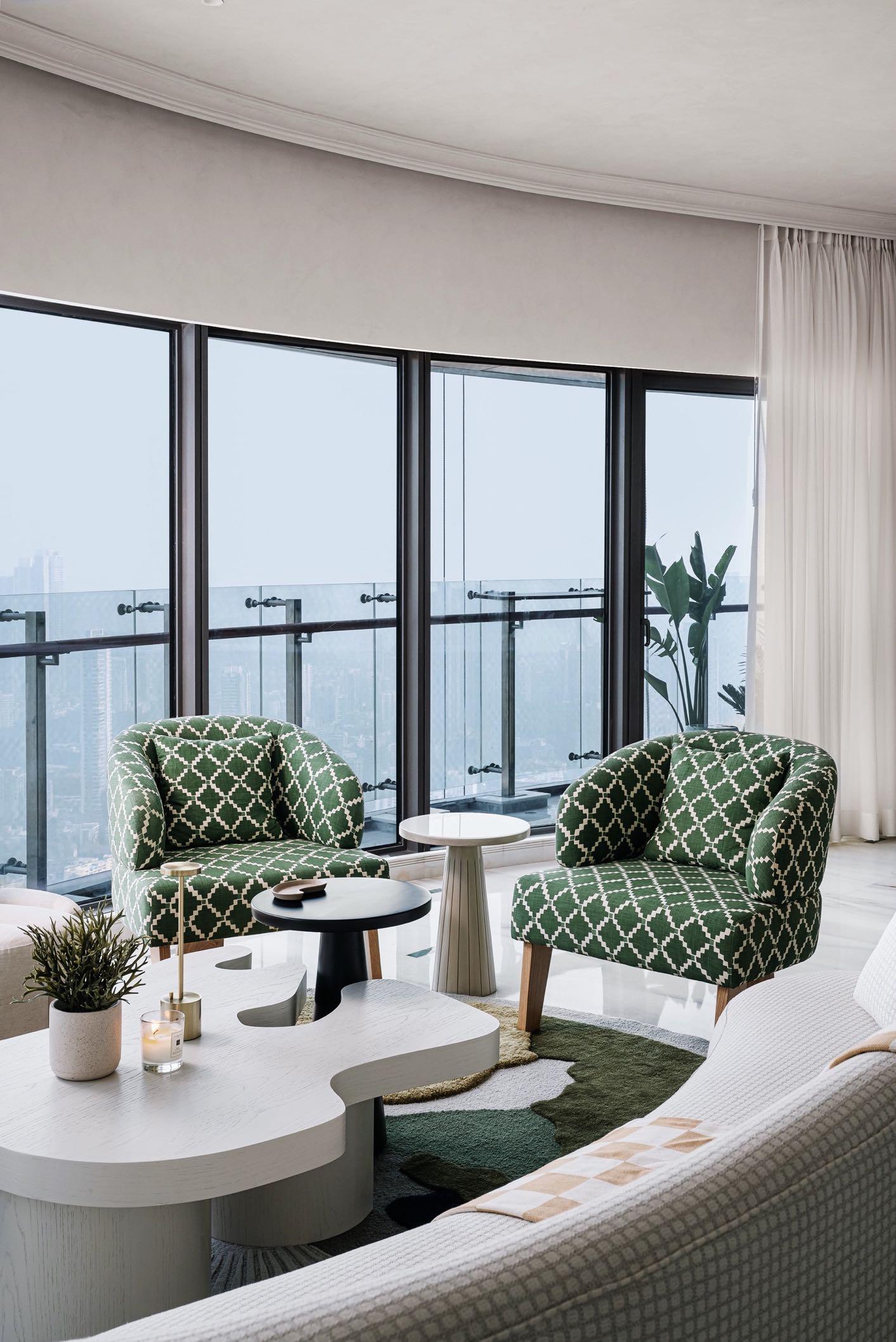
Moving into the heart of the residence, one is lured into a rendezvous with Mumbai’s enticing skyline, which morphs as dawn melts into dusk. The living area sits nestled within an envelope of a glazed façade on one end, a porous skin that beckons abundant light inside. The silhouette of every element within this open-plan living area has been painstakingly devised in relation to the views. Hence, the soft-edged and sweeping forms debut here while keeping the eyeline focused outwards. A pair of bean-form sofas sit facing each other to create a conversational layout resting atop an eclectic circular area rug. The artisanal rug from the house of Loops by Latika hosts a collage of hues in varying
pile heights, which come together as an abstract composition. The organicallyshaped coffee table echoes the silhouettes and adds to the mellow feel of the zone. Upping the playful quotient here, a duo of upholstered armchairs in a deep green and white pattern completes this area, ushering in green ingeniously. Old-world charm meets a modernist sensibility in the form of the faux fireplace, which frames the background of the living area. The moulding-clad mantle hosts a ceiling-length mirror above it, reflecting the volume of the space. The faux fireplace cavity below has been lined with a checkered lining, enunciating a play of patterns. A totemic sculpture designed by Purple Backyard is the object d’art in this corner and interestingly spells the word ‘Joy’ in morse code.

98 | G&G _ Magazine
EVERY SITE VISIT WAS AN EXPERIENCE IN ITSELF! WE HAD CLOUDS DRIFT IN THROUGH THE WINDOWS AND PORTALS OF THE HOME. SPOILT FOR VIEWS, THE RESIDENCE FRAMES VIGNETTES OF THE GLORIOUS SEA LINK ON ONE SIDE AND THE DOCKYARD ON ANOTHER, WHILE THE CONCRETE JUNGLE BELOW IS MINIMISED TO MINUSCULE PROPORTIONS. IT ALLOWED US TO ENVISION THE BELOVED CITY FROM A NEW LENS.”
KUMPAL VAID

“

100 | G&G _ Magazine
Bordering the living, the dining space emulates the indescribable bliss of conversations and shared meals with loved ones. The protagonist of this space is the bespoke Banswara white marble dining table with stone from Rajasthan's rich quarries. This element is the linchpin, around which the other components were designed. The chairs have been upholstered in a houndstooth and junglethemed pattern, paired with classic, blackstained wood and accents of brushed brass. The contiguous elevation of panels can be opened to offer discreet storage. A certain section reveals itself to be a concealed built-in bar, complete with its tropical print-doused wallpaper, embodying a touch of whimsy in unexpected details! The clean-lined fabric pendants levitate over the dining nook, introducing poise into the space.
Opening into the living area’s volume through a coffered pocket door, we find his study with a retro-chic demeanour.

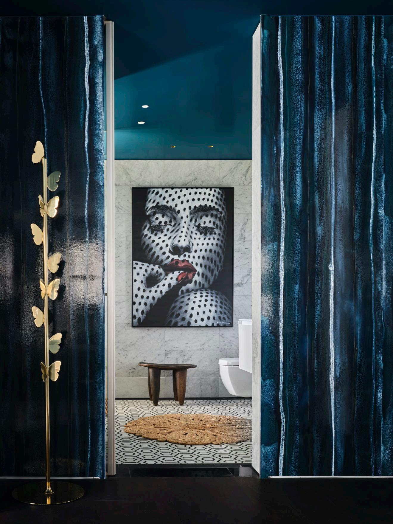
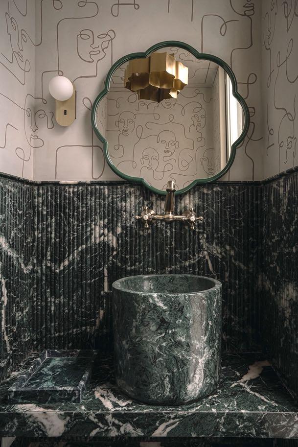
Leveraging its wee blueprint to create a theatrically immersive experience, the powder bathroom within the study indulges in a decadent green hue, slivers of brushed brass, and a monochrome canvas of illustrated patterns. Adorned in swirling veins, the Indian green marble variety makes its way across the flooring and pedestal-style vanity. The hand-illustrated frescoes of faces have been transformed into the ubiquitous wallpaper which clads the bathroom’s volume.
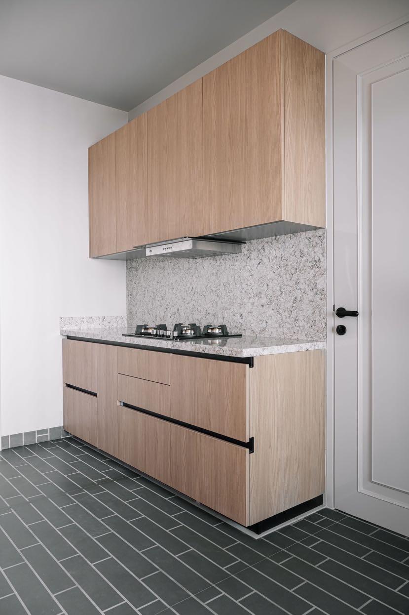
The galley-style kitchen crafted by Ernestomeda carries forward the overarching aesthetic of the living spaces. A deep green hue claims the floors in the form of acid-grooved tiles, visually elongating the petite kitchen’s expanse. The integrated construct of the space anchors a light veneer variety and a speckled Quantra quartz stone which seamlessly melds the countertops and dado.
Leading one into the home’s resting spaces, the passageway presents itself as a segue that draws one into its seductive simplicity. An array of voluminous arches frame the path, punctuated with globe pendants that inculcate a visual rhythm. The entrance into the passageway is earmarked by a green marble accent table with a checkered top (created in situ with surplus marble) and a
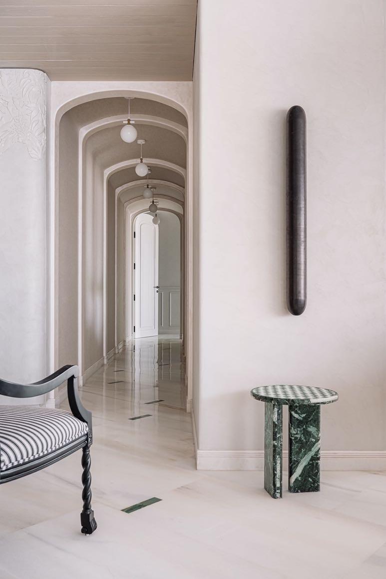
suave, linear wall light conceived by the studio for this space.
A treat to the senses, the ensuite guest bedroom is dreamt to be a sweet escape! The room’s floors display a dense and swirling hatch-like pattern, offsetting the solid doses of neutrals. The nature-inspired headboard painted by Artist Manoj Kharde is the pièce de résistance, framing the backdrop with visuals of a surreal pastel landscape that draws the gaze into dreamlike oblivion. A duo of wallpaper panelling and light wood-toned veneer unite to create the wardrobe fasciae, underscoring the neutrality of the space.
In her study, the wainscoting along the walls exudes an ombre finish, with the greys bleeding into a forest green tint. The black and white stone desk has been positioned in centre to soak in the views of the skyline. The ochre-bathed backdrop to the desk is, in fact, a pair of wallpaper-clad pocket doors that divulge a tucked bar - a hidden gem to mark the day’s end with the city night lights flickering in the distance.
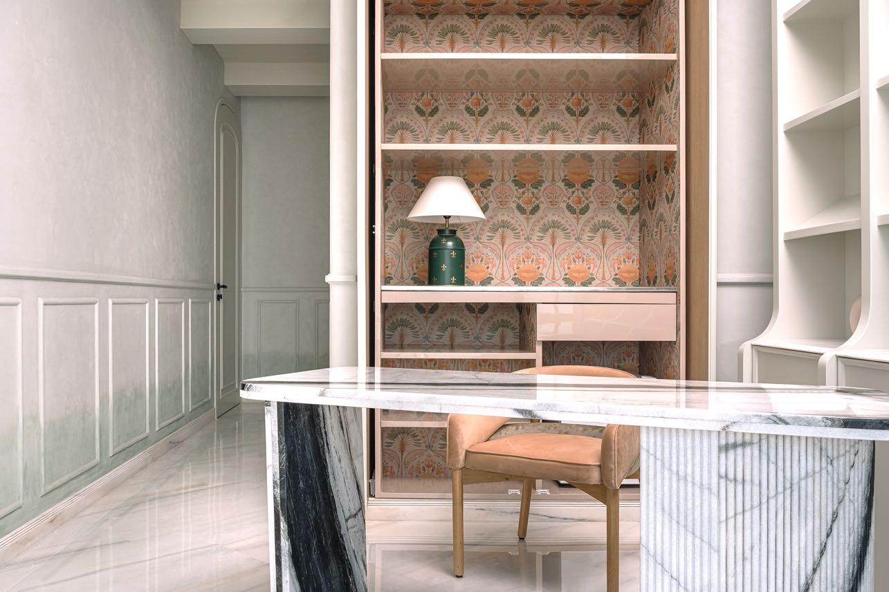
“THIS PART OF THE RESIDENCE IMMORTALISES THE CLIENT AS ITS MUSE, OFFERING HER AN EDGY YET TIMELESS MILIEU TO CALL HER OWN."
102 | G&G _ Magazine
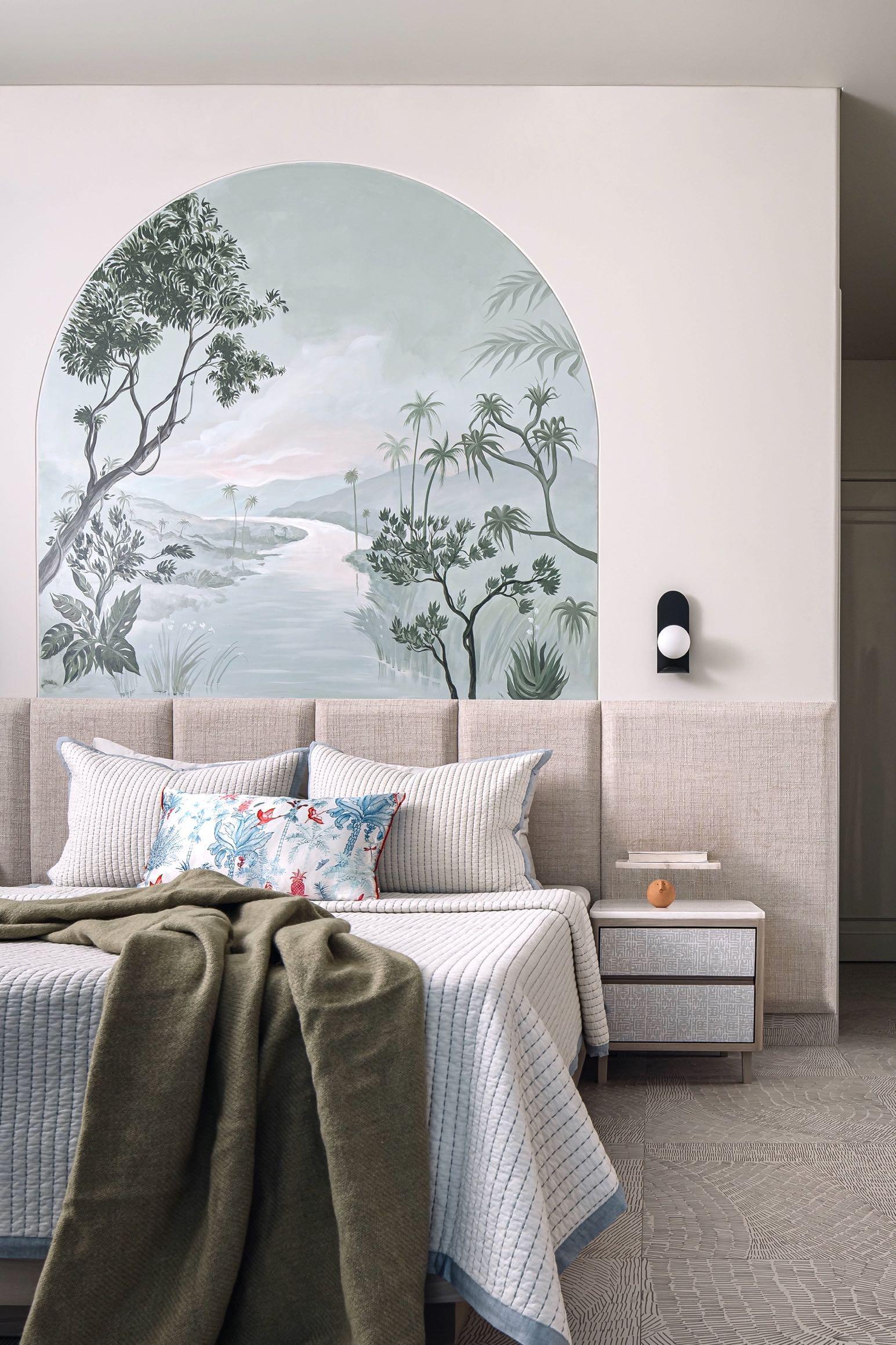
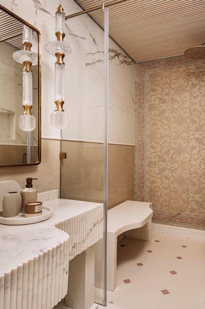
The master suite bears a raw appeal, with a palette of taupe, ivory, and greens layering its entirety. An organic-form silhouette defines the colossal headboard finished in beige and white gingham. The nightstands flank the bedside, allowing the colours of the linen, upholstery, and light fixtures to come through effortlessly. Against the tall fenestrations, two emerald armchairs create a conversation space atop an abstract rug. Her bath is reminiscent of the charm of regal Turkish Hammams, viewed from a

104 | G&G _ Magazine
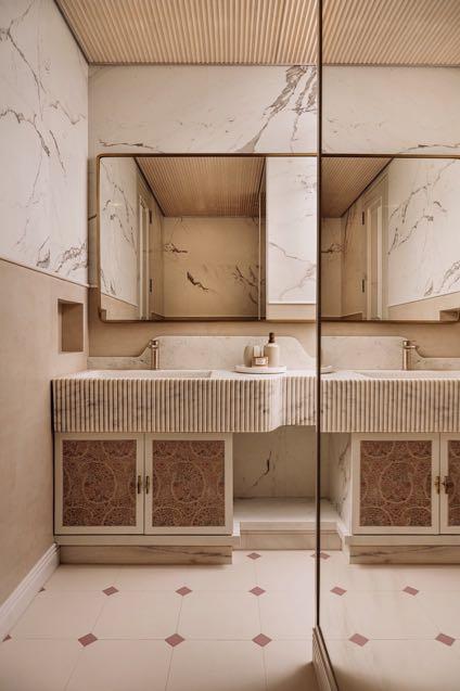
modern gaze. Hinting at stated luxury, the bathroom dabbles in shades of taupe, rust red, white marble, and artisanal tiles with intricate motif work that take centre stage. The checkered floors meet the extensive canvas of printed Jamavar series tiles by FCML in the shower cubicle, conjuring imagery of finely detailed Pashminas. His love for monochromes is fully realised
in the form of his bathroom, reprising silent opulence. Weighing over 150 kg, the monolithic Indian panda stone basin was conceptualised to be seemingly jointless and warranted a large group of people to aid in its installation. The ornate, black, and white patterned tiles delineate focal zones along the floors and walls, framing nooks tastefully.


Read & Support
we want to inspire people to create and not be silent, and above all to show our closeness to the Ukrainian people.

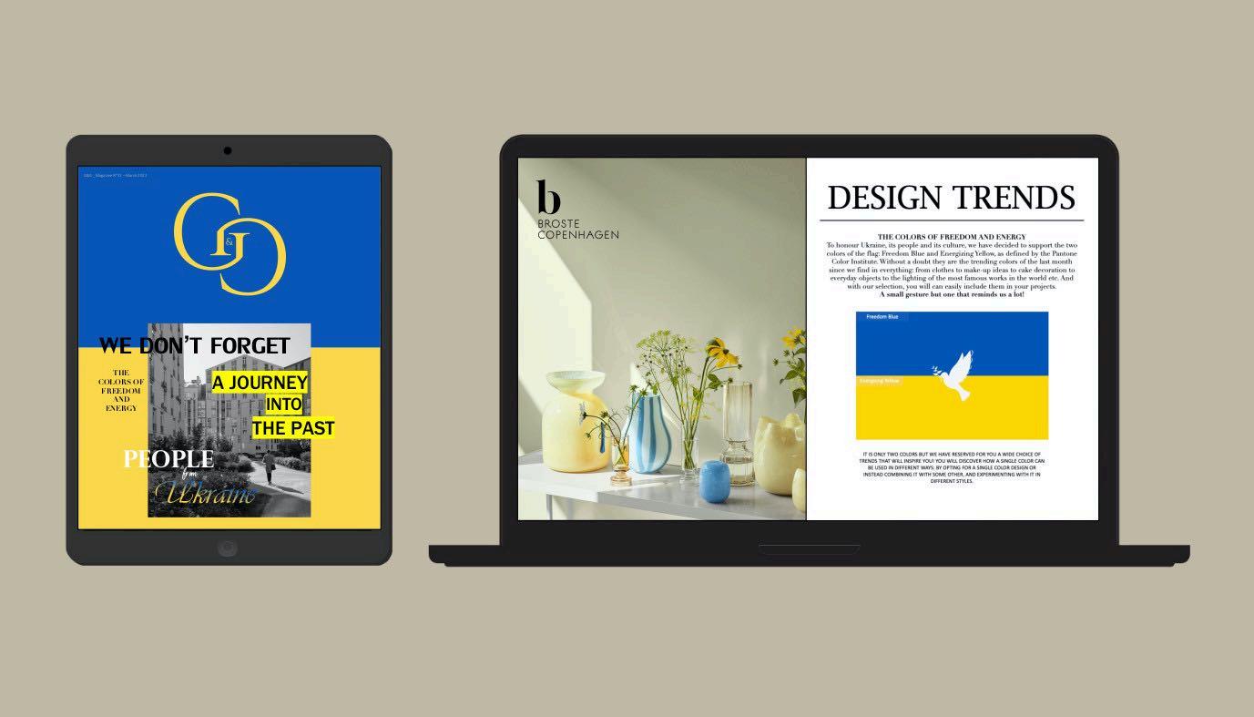
DISCOVER NOW
PEOPLE
UKRAINE” EDITION
“
FROM
First Blush
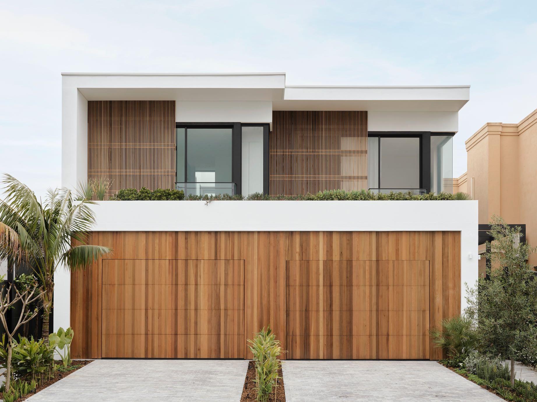
SMAC STUDIO DESIGNED A HOUSE FOR A BUSY FAMILY WITH THREE YOUNG DAUGHTERS AND A DOG, YET DUE TO CLEVER STORAGE SOLUTIONS THE SPACE REMAINS UNCLUTTERED AND ZEN IN THE COASTAL SUBURB DOVER HEIGHTS IN SYDNEY.
Photography by Anson Smart
108 | G&G _ Magazine
”SPATIAL PLANNING IS ACTUALLY ONE OF MY FAVOURITE THINGS TO DO. I LIKE TO SEE HOW SPACES CAN BE BETTER PLANNED TO MEET DIFFERENT NEEDS AND HOW YOU CAN WORK IN THE SAME SQUARE METER SPACE AND CREATE REALLY DIFFERENT RESULTS. AND SO THAT WAS REALLY EVIDENT IN THAT
Clients wanted a home that was welcoming and functional as a sanctuary that reflected their family. The owner is really into pretty glam stuff, but she also wanted to feel pretty calm. She definitely spearheaded the restructuring while her husband took a backseat and was happy to let her carry on. The build space was one of the biggest challenges – trying to cram in four upstairs bedrooms, two bathrooms and a utility room and make this semi-detached house as functional as possible for a family of five. And then there was also the added factor of wanting to entertain up to 50 people. Smac Studio created a lovely warm feeling welcomes at the entrance, which is not
PROJECT, I THINK.”
SHONA MCELROY, INTERIOR DESIGNER AND DIRECTOR OF SMAC STUDIO
110 | G&G _ Magazine
usually done in the duplex/semi properties that they're often involved in. There are the beautiful curves, one to the right of the kitchen and then one up around the staircase.
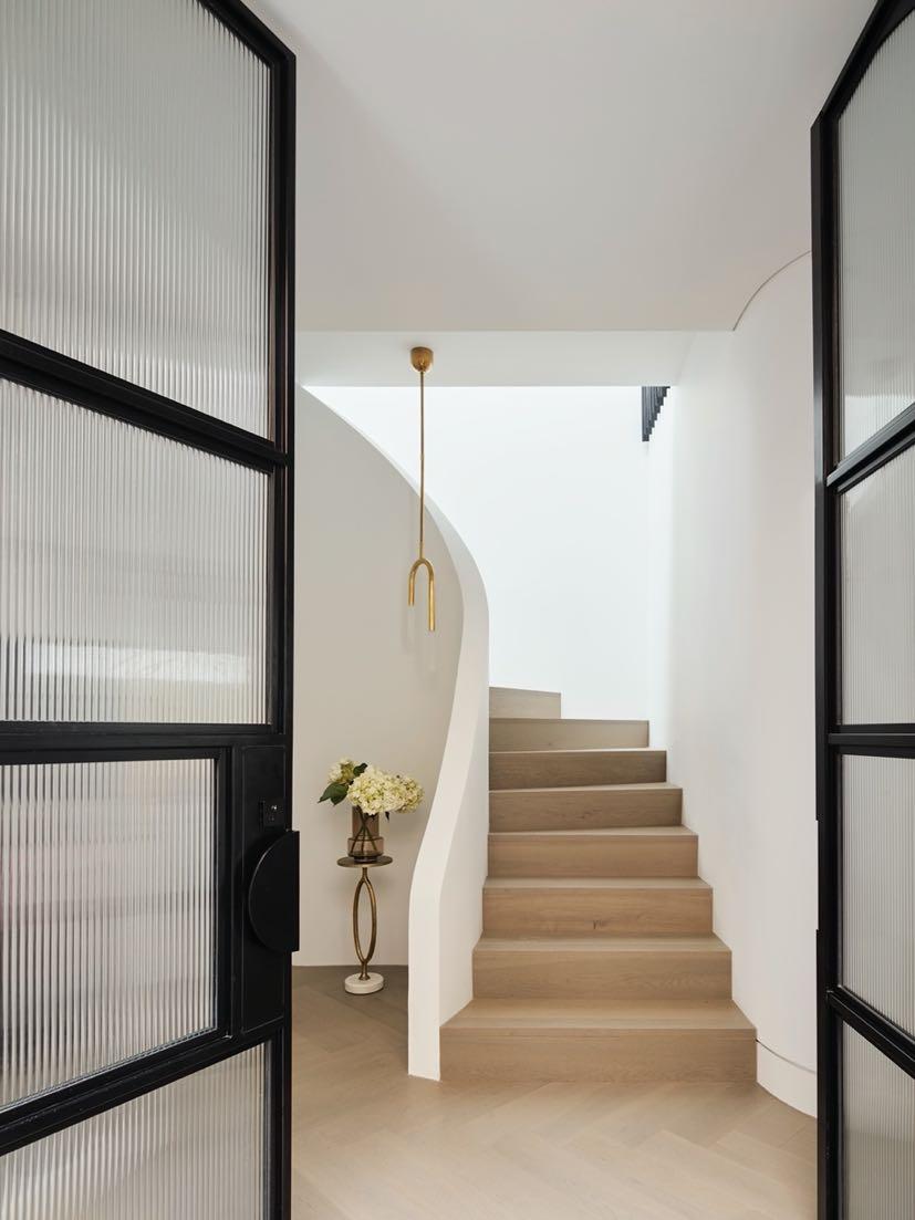
The powder room has been inserted just below the staircase - it's private, it's out of sight, and it just feels so luxurious, especially in a house of this size. It speaks
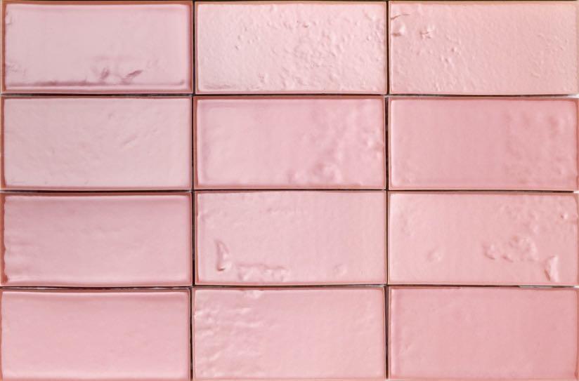
to the entire design, which is overall modern but with a few classical touches that just bring it a little bit more depth. Furthermore, this space has a feminine energy - the Venetian plaster in pink shade was applied to both the ceiling and walls. The paneled mirror is a real feature as well as the beautiful pendant light from Spence & Lyda.

112 | G&G _ Magazine
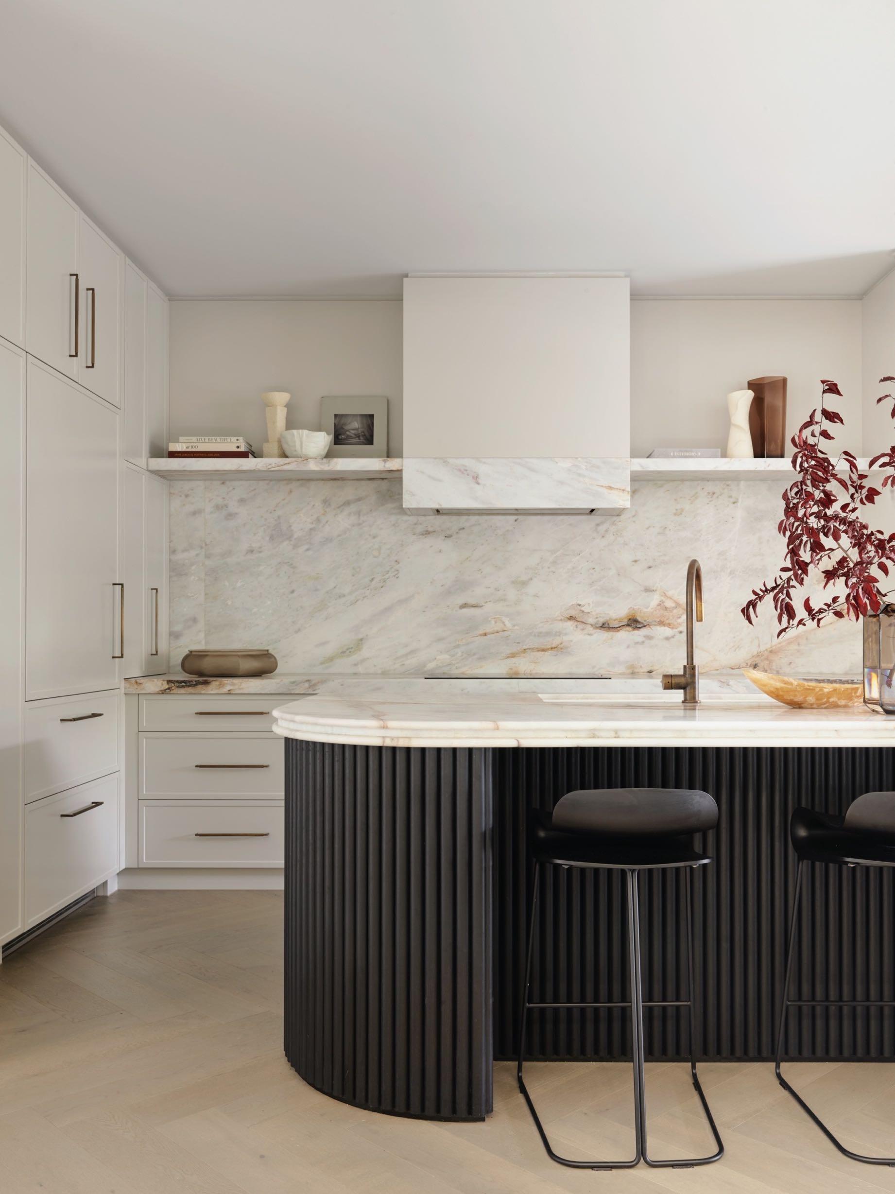
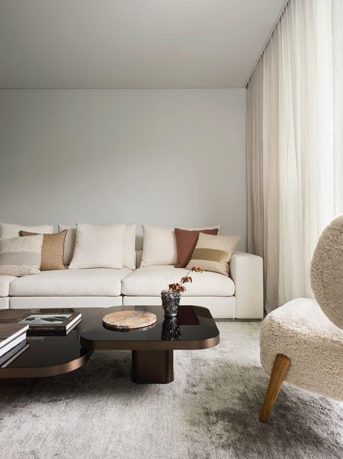
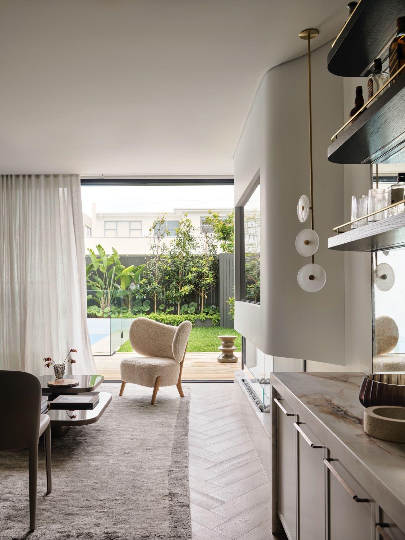
To the right of the entrance, you enter the living area formed by an open scape of kitchen, dining and living areas. To have an inviting effect the designers have chosen the wood floor. It's incredibly warm and cosy, it's elegant and speaks back to the French style with the herringbone. The full white kitchen has a more traditional style with a curved and inviting island that everyone could come and sit around. There is the fridge with two double doors and a drawer. While on the left of that, on the same plane, on the same side, there are two big double doors that then slide back as pocket cavity sliders: they host a big sort of very functional pantry in there that makes use of the curved space. The designers left the two shelves on either side of the rangehood free, and they're quite nice and thick and structural. An unusual and sculptural choice was to extend the stone also onto the rangehood to create the datum lines throughout that kitchen. The bronze handles and taps complete the design. The clients wanted a lot of storage: a big bench has been inserted in front of the island. Besides, the homeowners wanted the most space possible to be able to host the most people. And in this way, it's possible to have a few people chatting there while a few people are in the kitchen. In addition, since the clients have a lot of sentimental items and the ability to kind of build their collection of items over time the designers have reserved a few places to showcase some of these gorgeous items. The niche next to the bench seat is specially made to kind of have everything showcased as well as the big shelves above the kitchen.
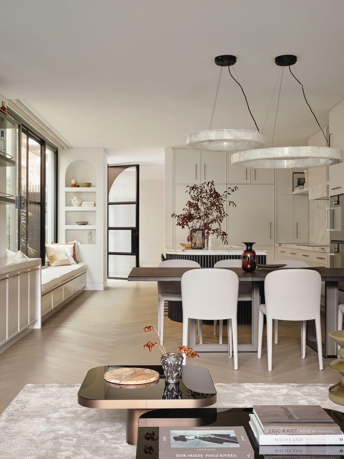
Next to the kitchen there is the dining area including a beautiful mirrored bar, and then the living room. The entire space is flooded with natural light: the designers changed around all the windows and the configuration. And that enabled them to open up all of these side passage windows, which had originally been designed as highlevel windows.
The dining table and chairs are from Mizura give an elegant atmosphere. Two big pendant lights are from Coco Republic chosen directly by the clients. Shades of
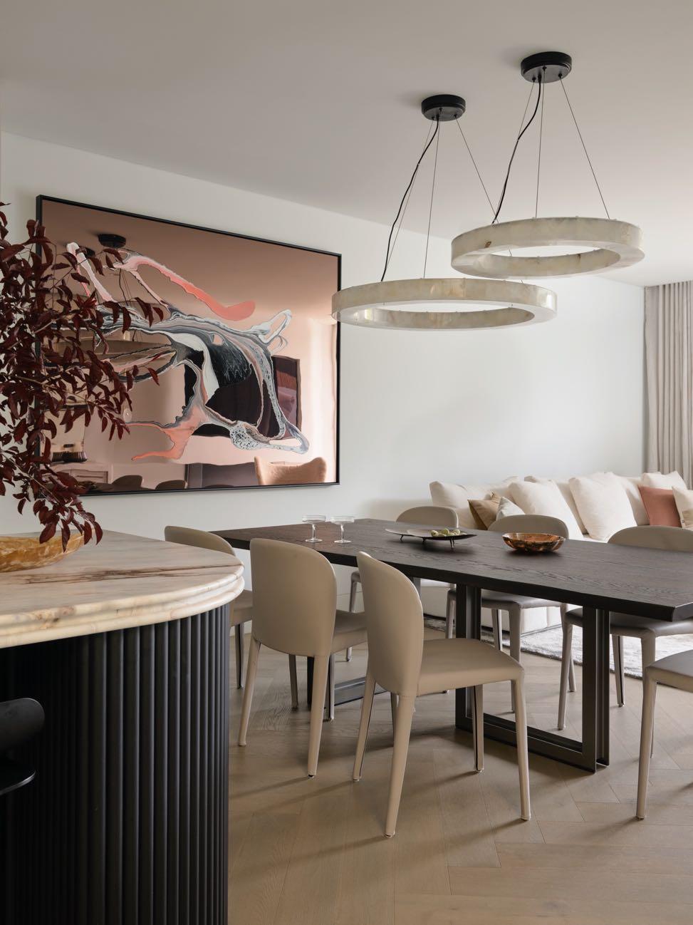
pink are found in the artwork commissioned from Vicki Lee. To give some touch of provincial style the designers put a French mirror behind the bar. It gives a reflective quality to the space; it makes everything feel a little more open. While the shelves with bronze rails give very classic touch. A curvy fireplace has also been inserted next to it. The designers have created one that kind of comes out. But it's still soft thanks to its curves that come from the wall and look as organic as possible in the rendered plaster. And with the stone also into the fireplace, everything merges all really nicely.

114 | G&G _ Magazine
“THERE WAS A CHALLENGE WITH THE BAR, THE KITCHEN, AND THE LIVING AREA, THOSE THREE SPACES, BECAUSE THEY WERE ALL ALONG THE SAME LINE. WE WANTED TO MAKE THEM FEEL LIKE DIFFERENT SPACES, BUT THEY HAD TO KIND OF MERGE WELL INTO ONE ANOTHER.”
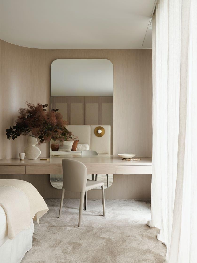
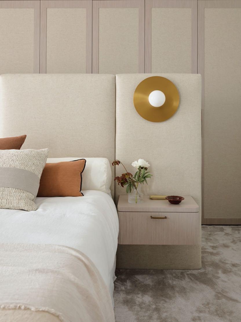
The master bedroom is at the rear of the property, north facing with a terrace to the back, so it is really lovely, and James Dunlop sheer curtains give the calming touch. The homeowner needed to have good storage for all their clothes without losing the charm of a large bedroom and very plush. Instead of closing it with a full wall, the designers made the bedhead act as a little wall to the cabinetry behind. They put the linen and the timber veneer on the wardrobes to soften the entire thing. Also, the linen of the bed head and the linen of the cabinets are the same. Then the timber veneer to the cabinets and the bedside, they all match, so it's very all encompassing as a room together. And the cabinets, like the wardrobes, don't so much look like wardrobes as just a lovely rear paneled wall. Here we find a very particular corner which is that of a dressing table with a large mirror with rounded corners. This intimate space reminds the owner of her grandmother's chest of drawers where she would sit every night while she did her hair. The bathroom upstairs is T-shaped with the toilet and the shower kind of hidden between a dividing wall and a bath and a vanity on the other side. The designers added to the side of the bathroom a panel of bronze framed mirrors that goes the
“THE DESIGN CHOICES ARE BOLD AND ECLECTIC, BUT THEY ALSO CREATE HARMONIOUS LAYERS OF COLOUR AND TEXTURE MAKING THE HOME FEEL VERY PERSONAL. THERE ARE EMOTIONAL TOUCH POINTS THROUGHOUT THE HOUSE, FOR EXAMPLE, THE DRESSING TABLE IN THE MASTER BEDROOM WHERE THE OWNER BRAIDS HER DAUGHTERS’ HAIR.”
116 | G&G _ Magazine
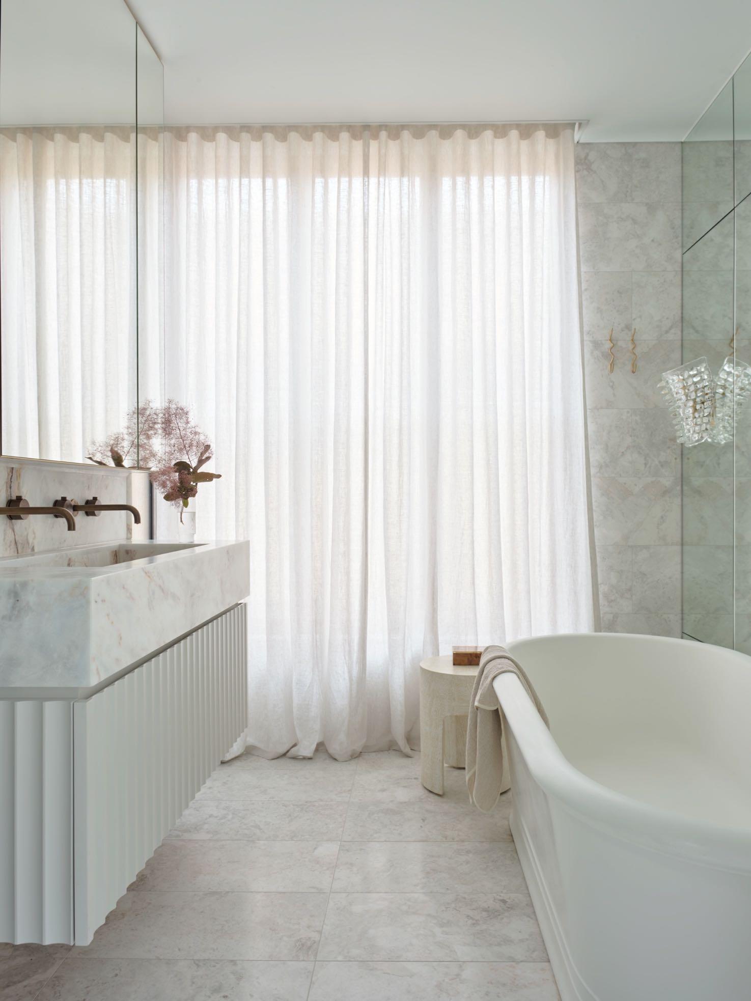
entire length and height of the wall - it makes it feel a lot bigger. Off that side panel, the beautiful Murano wall sconces were hung, and the sheer curtains were
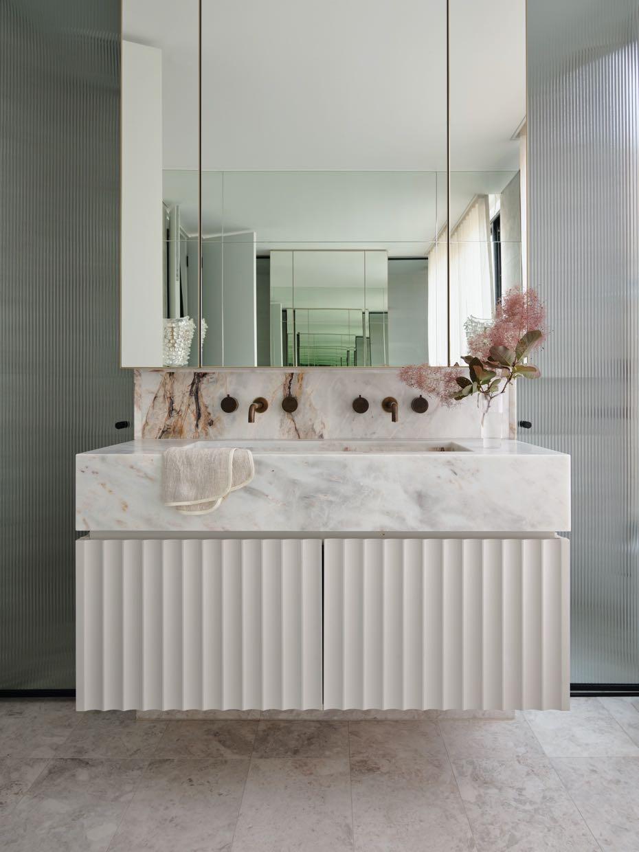
added. The double vanity trough sink is made of the beautiful stone with all the kind of pink tones through it and the bronze tones through it.
of FLASHES LUXURY
PRUSTA, THE LITHUANIAN ARCHITECTURE AND CONSTRUCTION STUDIO, PROJECTED A FAMILY HOUSE WITH A PANORAMIC VIEW OF VILNIUS.
 Photography by Leonas Garbačiauskas
118 | G&G _ Magazine


The four-person family wanted a funky, luxuriously flavored home. Among their requests were a spacious kitchen, a large dining table, two rooms for children, a comfortable bedroom with a wardrobe and a place to store things. Ieva Prunskaitė, the principal architect-designer admits that it was not easy to accommodate everything functionally. Especially since it was necessary to think not only about the capacity, but also about a beautiful, functional, uncrowded space.
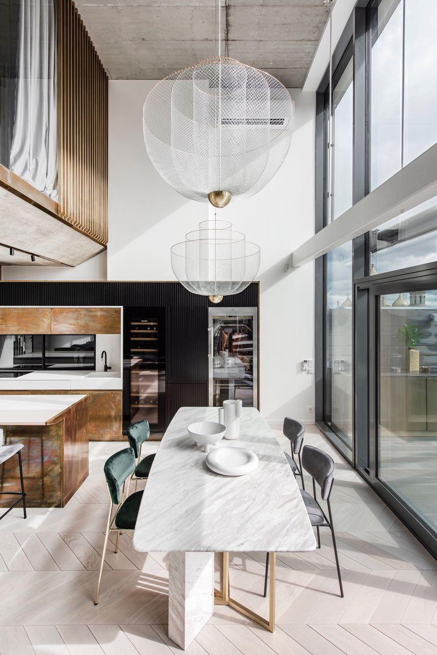
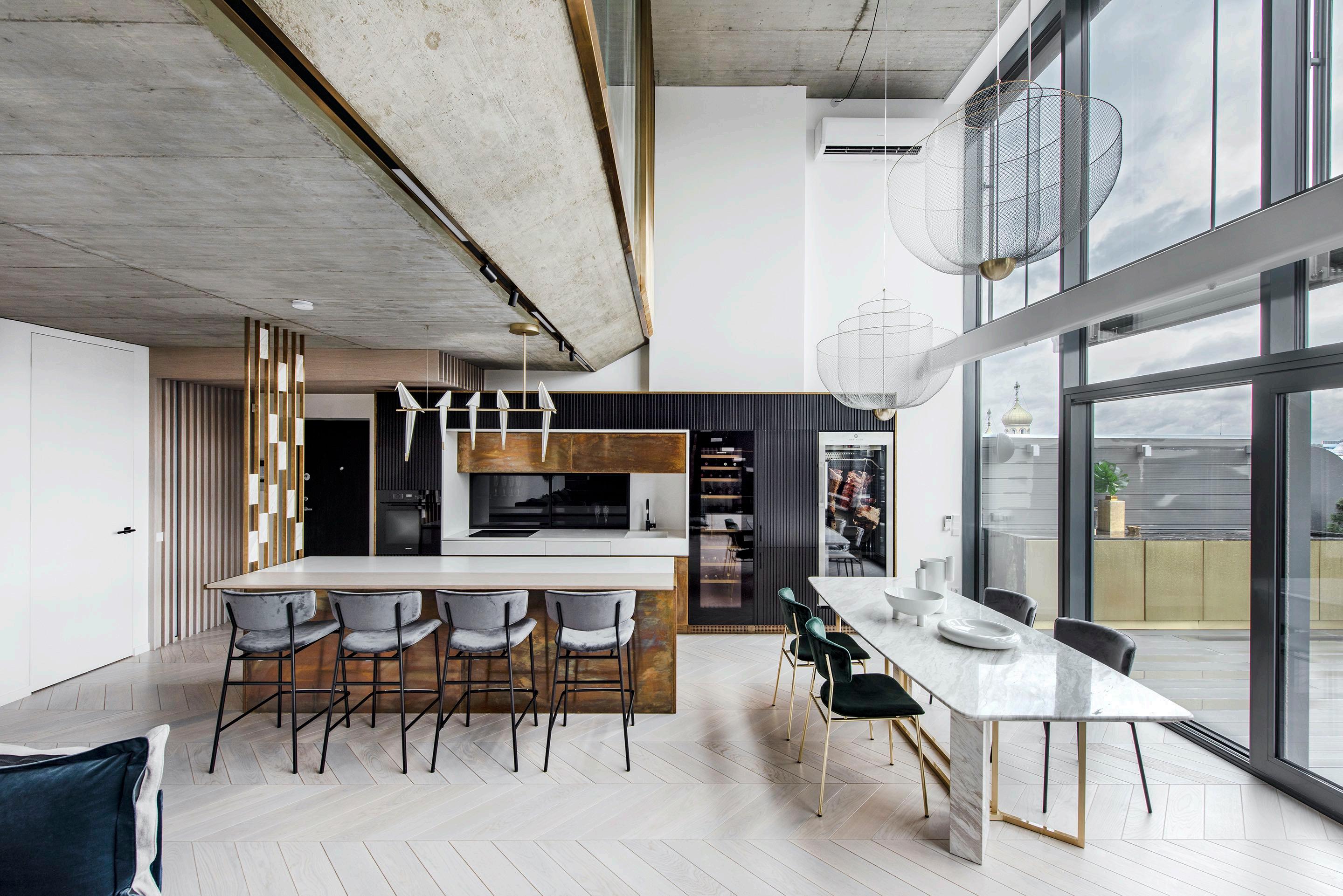
Upon entering the apartment, the living space is located on the left composed by a kitchen, dining area and the living room. A wall made by openwork brass elements with marble inserts has been added to the kitchen balcony. In this way, the zones are functionally divided, but space and light the feeling is not lost.
The ceiling of the apartment was left as it was - a monolithic overlay - which was decided to be preserved as a valuable, industrial detail. So that the ceiling does not cut too much into the living space over 2 heights, the architect decided to bevel its edge, thus the edge of the ceiling looks visually lighter. Ieva says that it was not easy to achieve the result of a clean ceiling, because it was necessary to hide the electrical wires and to design both functional and aesthetically concise lighting.

"Every architectural solution has created a new challenge, because everything was non-standard."
Ieva Prunskaitė
The owners, who actively participated in the process, asked to create a luxury house with elements of industrial style. Some of the recurring details in the apartment, such as brass inserts, were suggested by the towering church towers just outside the window. All-day sunbathing into the apartment allows the bronze surfaces to sound different colors and create a different mood each time. The large, black stone panels that cover the wall contrast with the brass and help it even more reveal. We find brass flashes also in the frame of the mezzanine, in the lamp above the sofa and also in the kitchen furniture, moving to the outdoor kitchen. The almost white wooden herringbone floor is a counterbalance to this black stone wall. In

"A lot of work, a lot of effort, a lot of details. Every angle has been explored, the profile has been calculated, coordinated, thought out, many unconventional solutions.”
this case, the gray monolith is just a neutral background that allows other important interior elements to take center stage. Bright colors appear in detail like royal blue sofa and dining chairs. While the black and white color is enhanced by brass elements. The sculptural openwork metal mesh lamps hanging above the marble dining table are carefully composed detail. Since they hang in such a large space in front of the showcase windows, they had to be sculptural, large and expressive in design, but at the same time not obscure the view through the windows when viewed from the bedroom.
A cantilevered bleached oak step staircase leads to the private master space on the mezzanine level.
122 | G&G _ Magazine

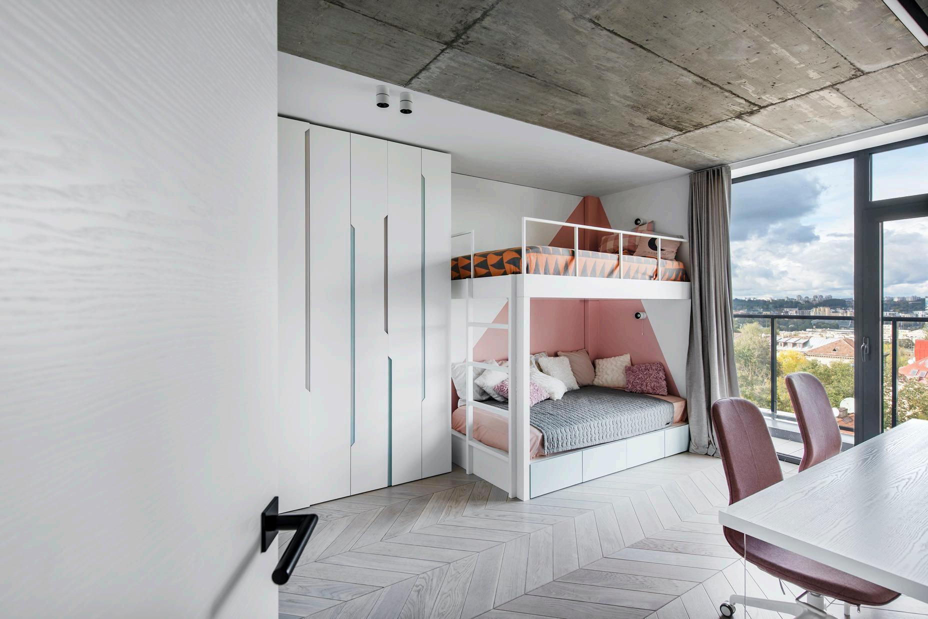
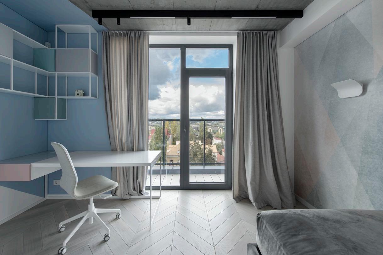
On the other side of the apartment, separated by a corridor, we find the children's bedrooms, bathroom and auxiliary rooms. The walls of the passage leading to the children's bedrooms are rounded to make the space visually wider. The two bedrooms are marked by a light design thanks to pastel shades of blue and
pink. Both offer spectacular views of the city thanks to the huge windows - which also makes the space well lit. While the bathroom follows the design of the house: we have the balanced contrast between black, dark blue and white and the continued use of brass in the details (taps, lighting, accessories).

124 | G&G _ Magazine


"Each architectural decision caused a new challenge, because everything was non-standard. All the challenges have been dealt with and now the interior, full of harmony, is reflected in wideopen eyes."

126 | G&G _ Magazine
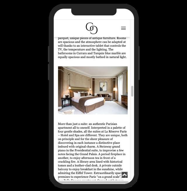
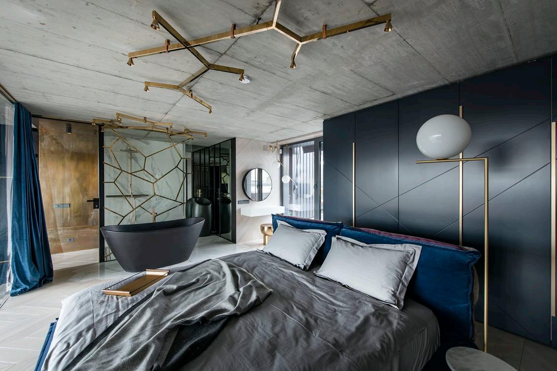
The bedroom is separated from the common living area by a transparent laminated glass partition, covered from the outside with vertical brass elements, which create an impression of privacy while in the bedroom, but also do not close the space and the view of the city. From the inside, bedroom is equipped with blinds made soft velvet curtains that suppress both view and the sound even more, ensuring the privacy of the owners if necessary. The central axis of the room is bed facing the city skyline. The architect designed spacious wardrobes along both walls of the bedroom. Tiles blending into the wooden floor symbolically lead into the bathroom area. The brass motifs unifying the interior are repeated in glass shower wall, as if extending the ceiling lights of the same metal. There is a white vanity table by the window, above it, the wall that reproduces the pattern on floor, hangs a mirror with a cabinet. The space between the toilet and the shower is separated by a wardrobe, created after thinking about the practical issue of storing things.

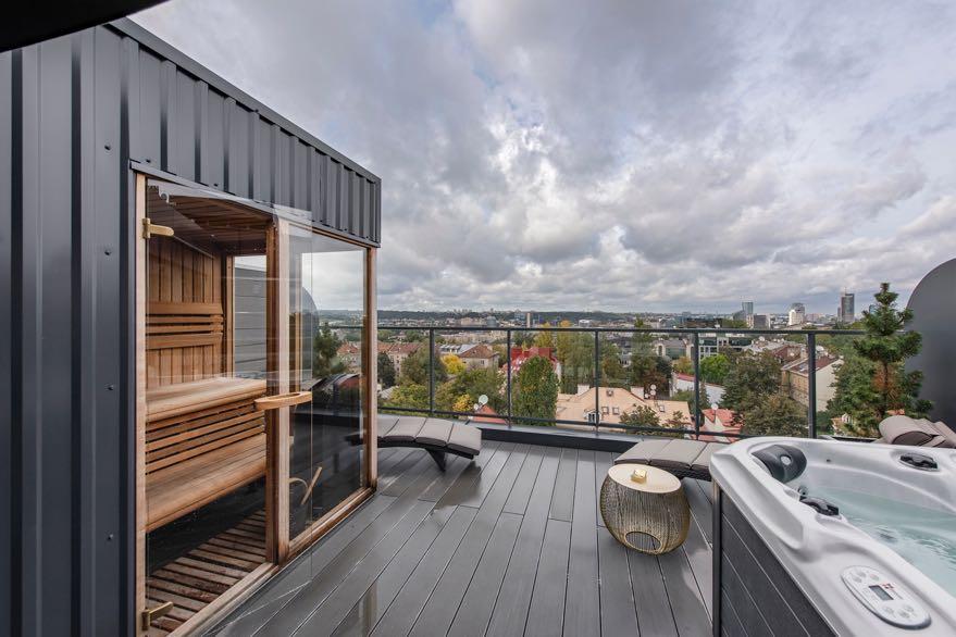
The bedroom leads to the terrace, where architect implemented another wish of owners - to have a sauna and a whirlpool.


B-to-B Trade Fair for Gifts, Stationery, Homeware and Fashion Organised by RX Japan Ltd. TEL: +81-3-6739-4105 https://www.lifestyle-expo.jp/en/ lifestyle-eng.jp@rxglobal.com lifestyle_week.jp lifestyleweekjp OSAKA SHOW TOKYO SHOW TOKYO SHOW Tokyo Big Sight Tokyo Big Sight INTEX Osaka MARCH 13 (Wed) - 15 (Fri) 2024 JULY 3 (Wed) - 5 (Fri) 2024 SEPTEMBER 27(Wed) - 29 (Fri) 2023 2023 2024

EVENTS CALENDAR
September – October
G&G Magazine guides professionals in the design, architecture and innovation sectors to a series of events around the world including conferences, fairs, exhibitions and design weeks.
September 7-16, Paris
Paris Design Week is one of the most important design weeks in the world that promotes creation and young talent. It's an opportunity for some brands to showcase, in their showroom or gallery, their new products to a mixed audience of professionals and general public, without performing at the fairs.

www.maison-objet.com/en/paris-design-week
September 7-11, Paris
In synergy with Paris Design Week, this year's first inperson tradeshow of Maison&Objet will return with

the theme «ENJOY». The fair has a unique ability to generate connecgons, accelerate business both during tradeshows and on its digital plahorm, MOM, that enables buyers and brands to congnue their conversagons all year round, launch collecgons and create connecgons beyond physical meegngs.
www.maison-objet.com
September 10-12,
Riyadh
Set at the Riyadh Front Exhibition & Conference Center at the same time, The Lighting Design & Technology Expo and INDEX Saudi Arabia and Hotel & Hospitality Expo Saudi Arabia present the grandest and most popular industry events in the Middle East. They not only include the fundamentals of a trade exhibition, but an array of intriguing conferences, inspiring features and innovative products. It is a meeting place where the thousands of professionals attend every year to connect with global brands and manufacturers and discover the next big thing in interior design.
www.index-saudi.com

www.lightingdesign-techexpo.com

www.thehotelshowsaudiarabia.com

September 21-23,
Beijing
Building on the success of Design China Beijing's Forum, attracting over 300 expert speakers over the last four years, the Sustainable Design China Summit is an upgraded and expanded format to explore the design world through a sustainable lens, shining a spotlight on innovative solutions and material use for the built environment and ground-breaking net-zero design concepts that have new performance led systems embedded within the design process to guarantee real, sustainable innovation.

www.sustainabledesignchina.com
September 21-23,
Singapore
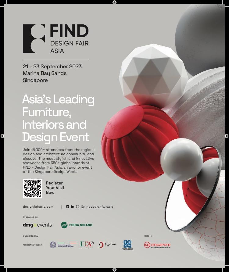
FIND – Design Fair Asia is an opportunity for exchange and inspiration in West meets East, putting Asia firmly on the global design circuit. As part of a joint venture with Fiera Milano, dmg events will bring together the largest carefully selected collection of interior brands, key opinion leaders, designers and content from across the globe. Visitors are invited to draw inspiration, network and trade at this new 3-day event located in Singapore, the gateway to Asia.
www.designfairasia.com

September 27-29, Osaka
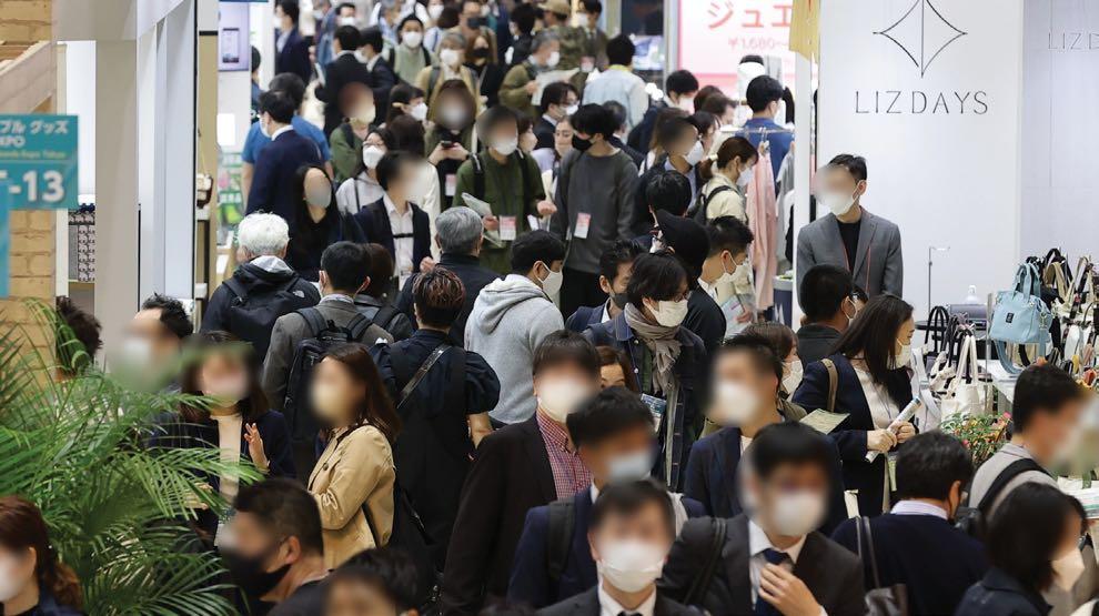
LIFESTYLE Week OSAKA is Japan's leading trade fair for Gifts, Stationery, Homeware and Fashion. It’s the best sourcing venue for Made-in-Japan & worldwide products as well as finding new OEM/ODM partners. Osaka edition will be a great opportunity to expand business in Japan because Osaka area is the 2nd largest economical market in Japan.
www.lifestyle-expo.jp

132 | G&G _ Magazine


October 4-5, London
Clerkenwell Design Trail (CDT) is a stand-alone event aimed at bringing the A&D community back to Clerkenwell this Autumn. As a showroombased event, participating brands will be showcasing product launches and new collections as well as hosting workshops, talks, demonstrations, parties and more.
www.clerkenwelldesignweek.com
October 8-11, London

Decorex is a high-end interior design exhibition which has brought together the best of the design community each years

year for 45 years. Across four days in October, they host the industry, allowing individuals to connect with one another and be inspired by the plethora of beautiful products on show. Decorex is a place to meet emerging and established interior design brands and discover their unique products. The event features a programme of talks and exhibitions, as well as an online event where visitors can experience exhibits virtually. The talks cover a variety of subjects including lighting design, the value of real estate, and sustainability. www.decorex.com
October 11-12, Amsterdam

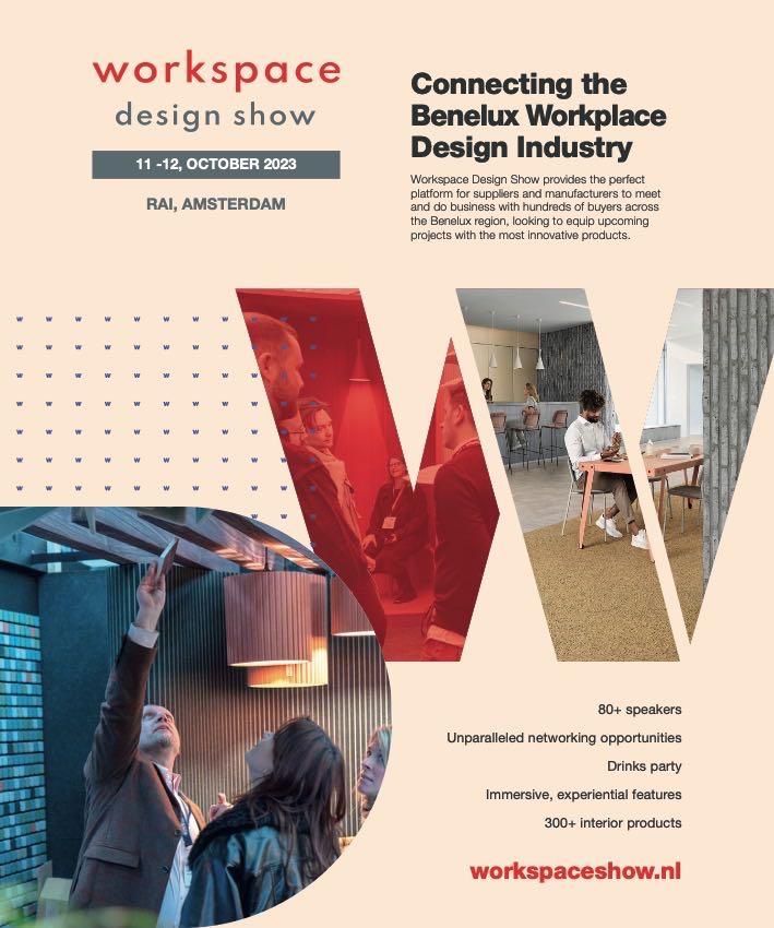
Hosted in the heart of Amsterdam, Workspace Design Show brings together the Benelux workplace interiors community to explore the experience of tomorrow’s workspaces. Now more than ever, the future is based on togetherness, collaboration, and the spirit of cooperation. Workspaces need to create environments that foster creativity and innovation, while also being agile for the flexible working models that people require. For two exciting days, industry professionals and enthusiasts converge upon this remarkable showcase, immersing themselves in a world of cutting-edge design. www.workspaceshow.nl

October 16-28, Barcelona
Barcelona Design Week (BDW) is coming with the theme 'Design for Human Future'. Facing a global scenario marked by uncertainty, complexity and a key element for people’s present and future, to create a human future. In year we have set ourselves a clear goal, to launch a global initiative to number 18: Design for Human Future.
www.barcelonadesignweek.com
October 17-22, Paris
The global forum for collectible design, Design Miami/ has announced the dates and location for its first Paris edition. As the sister fair to Art Basel, the inaugural Design Miami/ Paris fair will coincide with Paris+ par Art Basel over 17-22 October, joining the flagship fairs in Basel, Switzerland, and Miami Beach, Florida. Marking its debut in the Paris design scene, Design Miami/ will present its first Paris edigon at L’hôtel de Maisons, situated in SaintGermain-des-Prés, a cultural hub that is home to many of the world’s leading collecgble design galleries. The 18th century mansion stands as an iconic landmark deeply rooted in Parisian historypreviously home to Karl Lagerfeld and several generagons of the Pozzo di Borgo family.
www.designmiami.com
October 20-23 & 27-29, Hong Kong
Hong Kong will again be the meeting place for international buyers and suppliers as MEGA SHOW Hong Kong is set to make a strong come back with over 4200 booths. With a wide array of on-trend products on display, the Show is a must-attend event for international buyers looking for their next best seller products.

MEGA SHOW Part 1 will run from 20 to 23 October, showcasing gifts & premiums, housewares and kitchen, toys and baby products, festive, Christmas and seasonal, sporting goods, tech gifts, gadget accessories. While from 27 to 29 October, MEGA SHOW Part 2 will showcase travel goods, stationery & office supplies, as well as bathroom accessories. All shows take place at the downtown venue, Hong Kong Convention and Exhibition Centre.
www.mega-show.com
October
23-25,
Doha
INDEX Design Qatar serves as a pivotal platform where interior designers, retailers, distributors, fit-out contractors, and high-profile buyers come together to strike seamless business interactions and gain insight on the latest industry trends. The three-day show will be held at the Doha Exhibition & Convention Center (DECC).

www.index-qatar.com

WWW.GANDGMAGAZINE.EU/EVENTS 136 | G&G _ Magazine
MORE DESIGN EVENTS AT

FOLLOW & LIKE


ALL OFFICIAL SOURCES:
Africa
donatoengineeringsystem.com
America
baldridge-architects.com
fable.com
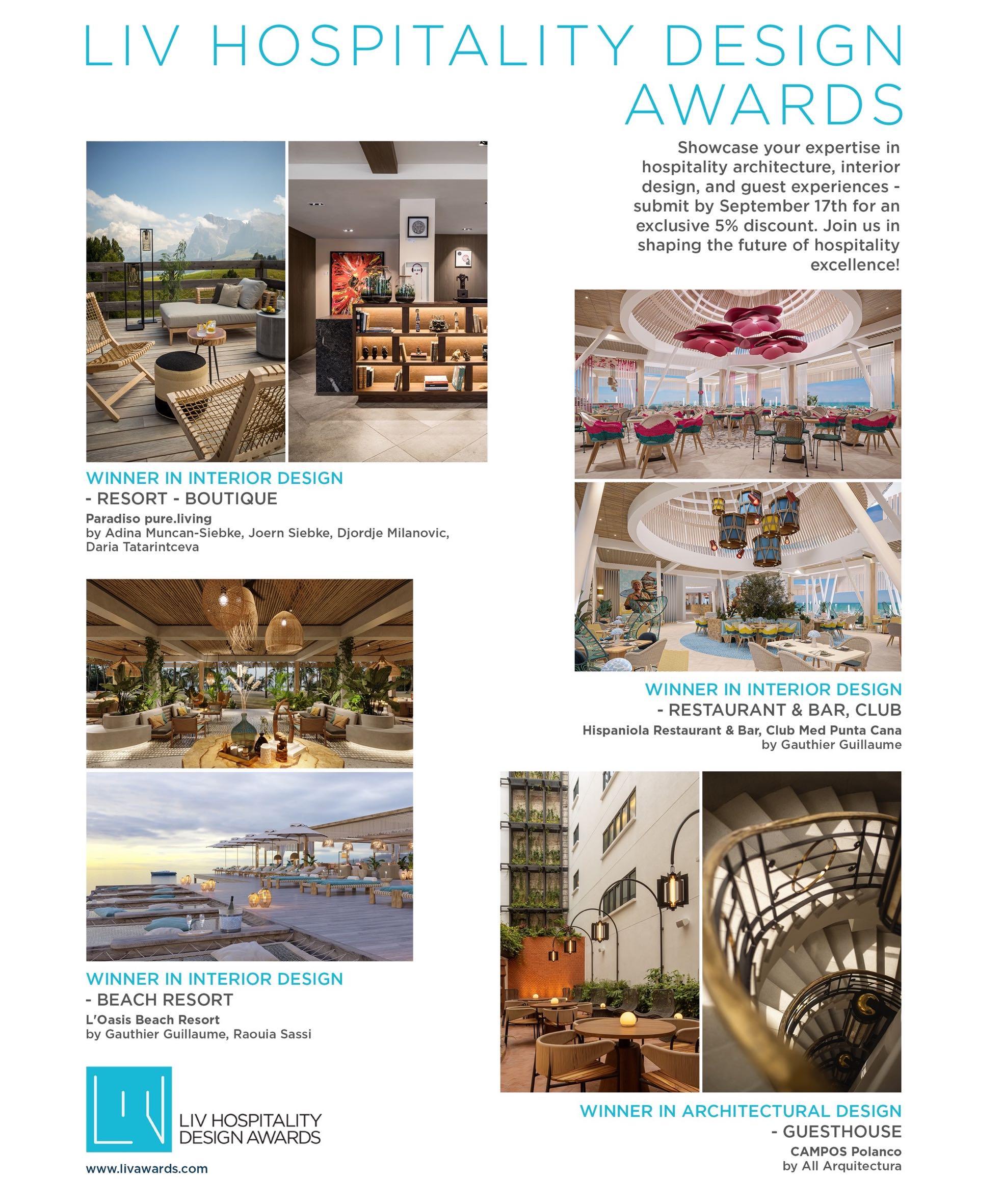
luxurylifestyleawards.com
michellenussbaumer.com
studiovara.com
Asia designfairasia.com
designshanghai.com
grandeinterior.com
kgd-a.org
index-saudi.com
index-qatar.com
lifestyle-expo.jp
lightingdesign-techexpo.com
mega-show.com
rareraw.com
sustainabledesignchina.com
thehotelshowsaudiarabia.com
Europe 101cph.com
allthewaystosay.com
alsena.ro
altaidea.com.ua
alvamusa.com
amiciburo.com
aram.co.uk
aura3d.eu
barcelonadesignweek.com
black-blum.com
bordallopinheiro.com
brostecopenhagen.com
bykoket.com
castrolighting.com
charliedanslesetoiles.com
clerkenwelldesignweek.com
cole-and-son.com
cristel.com
daniel–chong.com
decorex.com
design-by-us.com
designmiami.com
devinast.com
enamoura.com
gandgmagazine.eu
gardenglory.com
glassvariations.com
gornceramics.com
hommes.studio
karchitects.com.ua kellyhoppeninteriors.com
klimchi.com
kristinadam.dk ladolea.gr
laskasas.com
leberrevevaud.com
lemondesauvage.com
letsdesign.com.ua livawards.com
llab.design macullo.com
maison-objet.com
mezzocollection.com
mickaelkoska.com
myfriendpaco.com
noom-home.com
panoptikumcollections.com
pinik.com.ua popolo.fr
prodan-design.com.ua prusta.lt
runforthehills.com
rugsociety.eu
softicated.com
soshiro.co
studio-donna.com.ua studiomodijefsky.nl tapis-studio.com
tatararazors.com
the-fairytale.com
upcyclingphenomenon.com
volverstudios.com
workspaceshow.nl
za-za.com.ua zaditaly.com
zannierhotels.com
zikzakarchitects.com
Oceania smacstudio.com.au
140 | G&G _ Magazine


MORE INSPIRATION FOR YOUR HOME GG G&G Magazine N 39 – July 2023 & #SUMMER2023 SEASIDE ESCAPE WWW.GANDGMAGAZINE.EU Click to our latest issues now to see even more of trend updates, stylish ideas and exciting projects. G&G _ Magazine N – h GG & #SPRING2023 SERENE emotions REVIVAL GG G&G Magazine N 38 – May 2023 & THE WORLD OF TOMORROW Creativity electric brights SIMPLE DREAM Unleashing and inBLACK WHITE


Follow us
The future in motion.


 PANTONE 16-4535 TCX
Turquoises Plate by POPOLO
Signet RingTurquoise Stool by SOFTICATED
Loren Chair by LASKASAS Blue Atoll
Lily Vase by MEZZO DECOR
Bellini Wallpaper by COLE & SON


 Barth Stool by LEBERREVEVAUD
Ayler II
Ceiling lamp by MEZZO COLLECTION


 Bloomsbury Edimbourg
XL cushion by LE MONDE SAUVAGE
Pam
Table by BROSTE COPENHAGEN


 PANTONE 18-0202 TCX
Serif Relief by KRISTINA DAM


 3
2 Daisy Velvet pillow by MY FRIEND PACO €109,00
4
La Nonna Plate by POPOLO €26,00
Mari Vase by BROSTE COPENHAGEN €99,00 Twist Taper candle by BROSTE COPENHAGEN €13,90
7Tropical fruits Salad bowl by BORDALLO PINHEIRO €86,00
Bestiaire Sonic Cushion by LE MONDE SAUVAGE €63,00


 Installation small from the FUTURE PRIMITIVE series


 Nicolas Verschaeve / nicolasverschaeve.com
Athime de Crécy (Studio ADC) / athimedecrecy.com
Hugo Drubay / hugodrubay.com
Tim Leclabart / timleclabart.com
Sébasfen Cluzel & Morgane Pluchon (SCMP DESIGN OFFICE) / scmpdesignoffice.com
Jeanne Andrieu / jeanneandrieu.com


 Photography by Douglas Friedman


 Photography by Ishita Sitwala


 Photography by Leonas Garbačiauskas


